DESIGN REFERENCE
doda PRESENTS: パ・リーグ球団 仕事図鑑2026
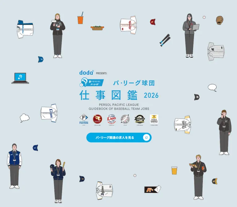
淡いブルーグレーに球団職員や野球道具のイラストを配し、シアンの題字と求人ボタンを組み合わせた仕事紹介コンテンツ。縦型ナビゲーション、17職種の図鑑、写真を使った対談記事が特徴。
オリジナルサイトを見るdoda PRESENTS: パ・リーグ球団 仕事図鑑2026 — Style Reference
An illustrated baseball careers guide with a cyan masthead, a book-like navigation spine, and spacious interview spreads.
Original URL: dodasports.doda.jp/shigotozukan/2026/
Final URL: dodasports.doda.jp/shigotozukan/2026/
Theme: light; blue-gray cover, white editorial sections, and a pale neutral footer.
Inspected: September 12, 2026. Supplied retrieval timestamp: 2026-09-12T07:55:31.837Z, or 16:55:31 JST.
Viewports: 1440 × 1000 and 390 × 844 CSS pixels.
Scope: the current 2026 guide. Visual evidence covers the desktop cover, a sponsorship interview stage, the desktop footer, and mobile cover/footer states. Rendered DOM evidence additionally covers navigation, the 17-job index, job-detail content, recruitment information, and supporting sections. Linked articles and external destinations were not inspected.
This page presents baseball through the people who work around the game. Slender illustrated employees, uniforms, caps, refreshments, computers, and equipment surround a carefully protected central title. Thin irregular outlines and subdued clothing colors make the illustration approachable, while cyan branding and a prominent recruitment link give the cover a clear hierarchy.
Beyond the cover, the page becomes an editorial publication. A narrow desktop identity rail resembles a book spine; numbered chapter tabs occupy the opposite edge. Large white areas separate photographs, paired organization logos, interview headlines, and compact controls. The page combines a careers reference, interview collection, and recruitment gateway, with a substantial supporting information section.
How to Read This Reference
- Measured means a value explicitly supplied by the rendered DOM or computed-style evidence. Values are rounded where that improves readability.
- Calculated means arithmetic using those measurements, such as gaps between adjacent cards.
- Estimated means a visual approximation from an attached original-page capture. It is not an extracted CSS declaration or a programmatic pixel sample.
- Recommended means an implementation choice for a new adaptation. The CSS starter, its breakpoint, and its hover endpoints fall into this category.
- DOM-only identifies components with supplied layout/style evidence but no screenshot of their active state. A layout rectangle does not establish visibility or successful interaction.
- The captured document widths are 1429px and 379px, each 11px narrower than its nominal viewport. Account for this inspection gutter when comparing measurements; do not reproduce it as a permanent white strip.
- Token aliases in this document are descriptive unless explicitly marked as source custom properties.
Tokens — Colors
Default Palette
| Name | Value | Source / adaptation token | Role and evidence |
|---|---|---|---|
| Cover Blue-Gray | #d8e3ea |
Source --gray-bg; alias --color-scene |
Measured source token, visually consistent with the illustrated cover |
| Pacific Cyan | #00a8e3 |
Source --pa-blue-color; alias --color-cyan |
Measured recruitment-button fill; cyan also dominates the visible brand graphics |
| White | #ffffff |
Source --main-bg; alias --color-white |
Main canvas, measured job-card surfaces, and white button details |
| Black | #000000 |
Source --main-color; alias --color-ink |
Editorial text, menu fill, fine boundaries, and article-button details |
| Chapter Blue | #0059aa |
Source --blue-color; alias --color-blue |
Source token consistent with the dark blue chapter tab in the sponsorship capture |
| Secondary Blue | #007ec6 |
Source --blue-color02; alias --color-blue-secondary |
Measured fill of an associated menu-layer icon button |
| Reading Navy | #1f2c5c |
Source --navy-color; alias --color-navy |
Measured job-detail headings, paragraphs, and related-story headlines |
| Interaction Blue | #1558d6 |
Source --hover-color; alias --color-hover |
Declared interaction token; actual hovered endpoints were not captured |
| Subtle Rule | #0000004d |
Part of source --gray-dashed-line |
Approximately 30% black in a repeating dashed-line definition |
| Footer Neutral | Approximately #f3f3f1 |
Recommended alias --color-footer |
Visual estimate of the footer field; no matching computed fill was supplied |
| Inactive Tab Blue | Approximately #d9eff8 |
Recommended alias --color-tab-pale |
Visual estimate of the pale chapter tab |
Color Behavior
Color has a specific hierarchy: blue-gray establishes the illustrated setting, cyan carries the publication identity and recruitment route, black anchors editorial reading, and deeper blues organize chapters and detail content. Team and sponsor logos retain their own colors.
The job-detail category text is measured as rgba(0, 89, 170, 0.5). This is translucent blue text, not evidence of a solid blue badge background. Its measured paragraph background is transparent.
The source also defines translucent white tap highlighting through --tap-highlight-color: #fff3 and a translucent blue selection color through --selection-color: #39f6. Neither demonstrates a selectable color theme. No alternate theme was evidenced.
Tokens — Typography
Japanese Reading and Interface Text
Measured family: YakuHanJP, "Noto Sans JP", sans-serif.
This stack appears on the body, Japanese navigation descriptions, recruitment labels, job headings, and job descriptions. A second source variable, --font-family-noyakuhan, contains "Noto Sans JP", sans-serif.
Weights vary by role: regular paragraphs use 400, the guide introduction uses 500 in the supplied parent element, prominent controls and job-detail headings use 700, and the guide section heading declares 900. Font-loading details and the glyph source for every character were not supplied.
The HTML element reports Times, but the body overrides that family. Times should not be treated as the page's visible editorial typeface.
English Navigation and Categories
Measured family: Inter, sans-serif.
The table-of-contents English labels use weight 800 with a tight 0.9 line height. Job-detail category labels use Inter 500 at about 12.4px. These are separate roles: navigation is bold and compressed, while categories remain small and quiet.
Brand Lockup and Display Lettering
The cover combines the doda presenter mark, league identity, widely spaced Japanese title, year, English subtitle, and team logos. Preserve this as a composed brand lockup.
The H1 container reports ordinary body-sized typography despite occupying a large graphic area. Its computed font size does not measure the visible title lettering. The supplied evidence does not expose enough of its children to identify the title's construction or font.
The sponsorship heading, BEYOND THE SPONSORSHIP, appears as heavy condensed uppercase lettering. Its exact family is unverified. Do not assign Inter to that heading solely because Inter is present elsewhere.
Type Scale
| Role | Desktop measurement | Mobile measurement | Weight / line height | Evidence |
|---|---|---|---|---|
| Root and body base | 16.4572px | 16.64px | 400; body declares 1 |
Computed; not a recommended paragraph leading |
| English contents label | 32.9144px | 27.04px | Inter 800 / 0.9 |
DOM-only navigation layer |
| Japanese contents description | 13.3715px | 12.48px | 700 / 1.4 |
DOM-only navigation layer |
| Hero recruitment label | 18.5143px | 15.6px | 700 / 1.3 |
Computed and visually supported |
| Job-detail title | 28.8001px | 29.12px | 700 / 1.4 |
DOM-only detail content |
| Job-detail paragraph | 15.4286px | 15.6px | 400 / 2 |
DOM-only detail content |
| Related-story headline | 16.4572px | 16.64px | 700 / 1.6 |
DOM-only detail content |
| Job category | 12.3429px | 12.48px | Inter 500 / 1 |
DOM-only detail content |
| Sponsorship display heading | Approximately 40–44px | Not visually established | Heavy, condensed | Desktop visual estimate |
| Sponsorship interview headline | Approximately 30–32px | Not visually established | Bold; approximately 40px leading | Desktop visual estimate |
| Footer credits | Approximately 13–14px | Approximately 13–14px | Regular, comfortably spaced | Visual estimate |
Recruitment labels have measured tracking of 0.02em: approximately 0.3703px on desktop and 0.312px on mobile. Most other sampled text uses normal letter spacing. Do not apply the cover title's expansive spacing to paragraphs or interview headlines.
Tokens — Spacing & Shapes
Responsive Unit
The root sizes remain close to 16px at both inspected widths. The evidence therefore supports nearly constant reading sizes while the layout reorganizes substantially.
The source exposes --vw: 14.4px and --vh: 10px on desktop, changing to 3.9px and 8.44px on mobile. It also declares unitless values --section-width: 1240 and --header-height-sp: 56. Their consuming formulas were not supplied, so these values should not automatically become a 1240px content maximum or an exact 56px rendered header.
For practical reuse, retain a conventional root size and define component dimensions explicitly. The starter below uses rounded measurements rather than inventing a universal source scaling formula.
Spacing Scale
| Use | Desktop | Mobile | Status |
|---|---|---|---|
| Menu icon-to-label gap | 10.29px | 10.4px | Measured |
| Job-card top padding | 12.34px | 12.48px | Measured |
| Job-card side padding | Approximately 12.22px | 8.25px | Measured |
| Job-card bottom padding | 18.51px | 18.72px | Measured |
| Job-grid column gap | Approximately 24.67px | Approximately 8.31px | Calculated from adjacent rectangles |
| Job-grid row gap | Approximately 22.63px | Approximately 8.31px | Calculated |
| Contents-link vertical padding | 24.69px top / 20.57px bottom | 16.64px top and bottom | Measured |
| Related-story column gap | 32.91px | Single column | Measured layout |
| Hero title-to-subtitle gap | Approximately 20.56px | Approximately 11.44px | Calculated from rectangles |
| Sponsor photo-to-copy gap | Approximately 70px | Not established | Visual estimate |
| Footer text left inset | Approximately 82px beyond the rail | Approximately 16px | Visual estimate |
A useful adaptation scale is 8, 12, 16, 24, 32, 64, and 80px, with larger editorial separation determined by composition rather than applied uniformly.
Border Radius
| Element | Value | Status |
|---|---|---|
| Job-index button | 8.23px desktop / 8.32px mobile | Measured |
| Recruitment and menu pills | Oversized source radius: 1440px desktop / 844px mobile | Measured; use 9999px in an adaptation |
| Category label | 9999px | Measured radius; background remains transparent in the sample |
| Associated menu-layer icon button | 0 16.46px desktop / 0 16.64px mobile |
Measured asymmetric corner treatment |
| Sponsorship photo | Approximately 20–24px | Visual estimate |
| Large support panel above footer | Approximately 20–24px | Visual estimate |
| Trailing action icon | Circle | Visually observed |
Layout Measurements
| Element | Desktop | Mobile | Status |
|---|---|---|---|
| Rendered document | 1429 × 21463.98px | 379 × 21571.5px | Measured |
| First guide section begins | y = 1000px | y = 843.98px | Measured |
| Desktop identity rail | 123.42px wide, 1000px high | Replaced by top header | Measured desktop; screenshots support the change |
| Mobile top-header allocation | Not applicable | Approximately 58.23px | Measured body offset |
| Cover H1 lockup | 436 × 170.02px | 265.19 × 101.22px | Measured container |
| Cover H1 position | x = 496.48, y = 300.69px | x = 56.91, y = 300.06px | Measured |
| English subtitle region | 361.02 × 37.94px | 191.34 × 20.11px | Measured |
| Hero recruitment button | 390.84 × 57.59px | 265.19 × 58.23px | Measured |
| Hero recruitment position | x = 519.06, y = 666.70px | x = 56.91, y = 520.81px | Measured |
| Typical job-index button | 256.88 × 306.81px | 173.5 × 259.42px | Measured; some rows grow taller |
| Job-grid column count | Four | Two | Measured positions |
| Job-detail paragraph width | 480.58px | 260px | DOM-only measurement |
| Related-story layout width | 720.88px | 260px | DOM-only measurement |
| Sponsorship photo | Approximately 510 × 392px | Not captured | Visual estimate |
| Right chapter strip | Approximately 41px per tab | Not visually established | Visual estimate |
Components
Illustrated Cover
Role: establish the publication, the six participating teams, and the recruitment route.
The desktop cover occupies the opening viewport without the later left navigation rail. Its composition has two layers: a central identity block and a dispersed collection of illustrated people and objects.
The central block stacks the presenter mark, league/title composition, English subtitle, six team logos, and a cyan recruitment pill. The title occupies only about 30.5% of the usable desktop width, allowing the surrounding illustrations to remain distinct and readable.
The illustrated people stand mostly upright and retain their full bodies. Their lanyards, jackets, cameras, computers, phones, and refreshments communicate work around the stadium. Uniforms, caps, balls, a glove, cheering sticks, speech bubbles, and food items fill smaller gaps. Individual objects vary in orientation; the people supply the vertical rhythm.
Maintain an exclusion zone around the central block. The composition depends on visible background between objects, especially around the recruitment control. Avoid placing a decorative asset over a logo or Japanese title character.
Recruitment Pill
Role: provide a consistent route to relevant jobs.
The main control is a wide cyan capsule with centered bold white Japanese text and a separate white circular medallion near the right edge. A small overlapping-square symbol sits inside that medallion.
On desktop the hero reads パ・リーグ関連の求人を見る; the mobile capture visibly shortens the label to パ・リーグ関連の求人. The DOM extraction retains longer text in some responsive elements, so use the screenshot when describing the visible cover wording.
The measured height stays almost unchanged between desktop and mobile, while width reduces from about 391px to 265px. The trailing grid column measures about 49–50px; that is not a direct measurement of the smaller visible white circle.
The destination is an external doda recruitment URL present in the supplied links. Treat the whole pill as one anchor. The square symbol is not evidence of a clipboard action, and the evidence does not establish whether the destination opens in a new tab.
Persistent Recruitment Variant
Role: keep the recruitment route available during reading.
The sponsorship and footer captures show a compact cyan pill near the lower-right edge. It has a soft shadow, unlike the largely flat surrounding publication. Estimated dimensions are approximately 196 × 46px on desktop and 228 × 50px in the mobile footer.
This compact version uses shorter copy and a smaller trailing white circle. It does not appear as a second visible control in the captured cover states. The precise appearance threshold and positioning mechanism were not supplied.
For an adaptation, show it after the cover CTA leaves view and reserve sufficient bottom space around the footer. This visibility rule is a recommendation.
Desktop Identity Rail
Role: preserve orientation through a long publication.
After the cover, a narrow rail occupies the left edge. The doda presenter mark sits at the top, the league identity and vertical publication masthead occupy the middle, and a black 目次 pill sits near the bottom. A fine black rule separates the rail from the page; pale dotted horizontal rules divide its top and bottom zones.
The measured rail width is 123.42px. Its large vertical identity region measures approximately 101 × 442px. In the screenshots, this rail remains aligned to the viewport across the sponsorship and footer states. The evidence supports persistent placement, but does not resolve the exact fixed-versus-sticky implementation.
The sampled initial header rectangle begins at y = 1000px, consistent with the desktop rail starting after the full-height cover. Preserve that entrance relationship rather than placing a rail over the initial cover.
Mobile Identity Header
Role: retain publication identity and contents access without consuming a side column.
The mobile capture replaces the rail with a white top strip about 58px high. A compact horizontal brand composition sits left; the black 目次 pill sits right. A thin gray bottom boundary separates the header from the page.
Measured brand bounds are approximately 202.80 × 32.23px at x = 15.78px. The menu button measures 93.59 × 42.63px and begins near x = 272.94px.
The same header is visible in the mobile cover and footer captures. The outer HEADER element itself reports zero height because its rendered children are positioned independently; this does not indicate that the visible header is missing.
Table of Contents
Role: provide seven direct routes through the publication.
The rendered links target #guide, #about, #sponsorship, #hr, #recruit, #day, and #archive. Each combines a large English label with a smaller bold Japanese description.
The supplied menu-layer rectangles show a two-column desktop arrangement and a single-column mobile arrangement. Desktop links are roughly 280px wide, with a larger measured heading region around 595px wide. Mobile links are about 278px wide within a narrower inset panel.
Long English labels, including Beyond The Sponsorship and HR Learning Session, wrap over two tightly spaced lines. Their measured line height is 0.9. The source defines transitions for link color and label translation.
This is DOM-only evidence. No open-menu screenshot or activation record establishes the panel background, backdrop, entrance animation, focus behavior, or the function of its associated unlabeled icon button. Implement those behaviors explicitly in a new version rather than treating them as verified source features.
Job Guide Index
Role: make 17 baseball-business occupations discoverable.
The index consists of actual BUTTON elements. Each contains a serial number, Japanese occupation name, English keyword, and category. Examples include No. 001, 営業, SALES, and Business.
The categories are content-defined: Business, Entertainment, and Marketing & Promotion. The serial sequence runs from 001 to 017; duplicated job descriptions elsewhere in the DOM do not increase the number of unique occupations.
Measured buttons are white, use approximately 8px corners, and have compact internal padding. The desktop grid has four columns with approximately 25px horizontal gaps. Mobile has two columns with approximately 8px gaps. The final seventeenth entry occupies the first column of its last row.
Some rows increase in height to accommodate longer labels. Desktop samples range from about 307px to 327px; mobile samples include approximately 259px and 277px rows. Preserve natural wrapping instead of clipping occupation names to a fixed text height.
The guide is explicitly described as illustrated, but card-level image bounds were not supplied. Exact artwork placement inside the buttons remains unverified. The confirmed control anatomy and responsive geometry are reusable independently of that missing detail.
Job-Detail Content
Role: explain an occupation and connect it to relevant interviews.
The DOM includes laterally offset blocks containing a category label, navy job heading, navy description, related stories, and recruitment links. This arrangement is consistent with a panel or slider presentation, but the opening interaction was not captured.
The reading style is specific: headings are about 29px and bold; body copy is about 15.5px with a generous 2.0 line height. Paragraph width changes from approximately 481px on desktop to 260px on mobile. Mobile retains the desktop reading size instead of shrinking the whole panel.
Related-story anchors use a desktop grid with a 226.28px media column, a 32.91px gap, and a 461.69px information column. The mobile grid becomes one 260px column, with the headline positioned below the media region. Long headlines gain lines naturally.
Controls labeled 前へ and 次へ occur in the extracted text. Their labels establish navigation affordances, but do not verify wraparound, swipe support, animation, or keyboard operation. Some occupations have no related interview in the supplied content; the layout must support that case.
Sponsorship Interview Stage
Role: present collaboration between a team and a sponsor as an editorial feature.
The desktop capture shows a large white stage headed BEYOND THE SPONSORSHIP. A rounded photograph sits left; paired organization logos, a bold Japanese headline, participant details, and an outlined 記事を読む control sit right.
The photograph begins near x = 184px, y = 304px and measures approximately 510 × 392px. Several narrow offset outlines along its right edge create the appearance of stacked sheets. This is a visible graphic treatment, not evidence of page-turn animation.
The copy column begins around x = 765px. Its hierarchy is logo pairing first, a headline of approximately three lines, two compact participant lines, and then the article control. The photographed mascot introduces a strong yellow-orange area within otherwise neutral page chrome.
Five story identities are supported by the rendered links. The screenshot shows four pale dots and a baseball-shaped marker near the right side of the stage. A lower strip repeats team-and-sponsor pairings separated by multiplication marks. These elements suggest a sequenced presentation, but autoplay, scroll linkage, marker click behavior, and continuous logo movement remain unverified.
Article Button
Role: distinguish editorial reading from the recruitment route.
The sponsorship article control is a white capsule with a fine black outline, black label, and black trailing circle containing a small white overlapping-square symbol. Estimated size is approximately 226 × 62px.
This deliberately shares the recruitment pill's anatomy while changing the color hierarchy. Keep one continuous link target with the icon nested inside it. No separate icon action is evidenced.
Numbered Chapter Tabs
Role: reinforce chapter orientation along the desktop page edge.
The sponsorship capture shows two narrow strips at the right edge: a dark blue 02 tab and a pale blue 01 tab. Numbers sit at the top, with Japanese chapter labels reading vertically below them. Each strip is approximately 41px wide.
Use vertical typesetting for the Japanese labels while preserving a legible horizontal number. The dark strip identifies the displayed sponsorship chapter in this capture. The link evidence includes numbered routes for the guide, sponsorship feature, and HR feature.
The supplied mobile screenshots do not show these tabs. Their absence from those two states does not establish their behavior across every mobile chapter.
Supporting Editorial Sections
Role: connect the guide to recruitment, organizations, events, and the wider publication.
The rendered content includes an About introduction, an HR learning feature, five career-change accounts, company information for six teams and PLM, a tabloid introduction, six sponsored-game entries, archive links, and related service promotions.
These sections establish the page's breadth and information architecture. Their detailed card styling, image treatment, and responsive arrangements are not shown in the supplied captures. Do not invent a uniform testimonial slider, event-card grid, or archive layout from text presence alone.
Footer and Colophon
Role: close the publication with credits, organizational identity, and season context.
The desktop footer uses a pale neutral field and substantial open space. A publication title appears above publisher/planning label-value rows and a longer production-credit block. Cooperation text follows beneath. A separate area toward the right contains the 2026 season note, black doda and corporate marks, and copyright.
The top of the desktop footer capture also shows the lower portion of a broad white support panel with rounded corners, small outlined service links, and a photographic corporate banner.
On mobile, the colophon becomes a single reading column with approximately 16px side insets. Long names and affiliations wrap naturally. The season note, organization marks, and copyright follow the cooperation text, with the floating recruitment pill near the bottom.
The mobile footer capture starts partway through the colophon. The publication title's absence from that crop is not evidence that mobile hides it.
The current original-page footer independently credits 半田 淳也(AND WHAT NOT design) for art direction and design, and YUNOSUKE and 高城 琢郎 for illustration. It names パーソルグループ as publisher and displays the PERSOL CAREER copyright and corporate link.
Tokens — Motion & Interaction
| Treatment | Supplied value or evidence | What is established | What remains unverified |
|---|---|---|---|
| Shared transition | 300ms cubic-bezier(.215, .61, .355, 1) |
Source --transition and multiple computed transitions |
Whether every control uses this token |
| Menu pill | Color, background-color, and border-color transitions | Transition properties and timing | Actual hover colors |
| Recruitment pill | Background-color and border-color transitions; label color transition | Transition properties and timing | Complete hovered appearance |
| Job-index buttons | rotate and scale, both with the shared transition |
Geometry is prepared to transition | Rotation angle, scale amount, and trigger |
| Contents links | Color transition; child translate transitions |
Defined responsive feedback properties | Translation distance and tested activation |
| Menu-layer icon button | Background-color transition | Defined style change | Button purpose and endpoint |
| Numbered chapter navigation | Anchor destinations and persistent-looking tabs | Navigation targets and captured appearance | Scroll tracking and exact positioning mechanism |
| Job-detail sequence | Laterally offset content plus previous/next labels | Structural evidence of a sequence | Opening, swiping, wrapping, and transition timing |
| Sponsorship sequence | Five story identities, markers, and stacked image edges | Visible sequence affordances | Autoplay, scroll-driven changes, and marker behavior |
| Cover illustration movement | Static captures only | Final illustrated arrangements at two widths | Floating, entrance choreography, parallax, or looping motion |
The sampled elements report animation: none, but that does not prove the entire page is static. Child elements, pseudo-elements, and script-driven transforms may fall outside the supplied sample.
The capture procedure waited for document load, image decoding, and sampled layout stability, and handled finite and perpetual animation during readiness checks. Those procedural notes do not establish a site-specific motion pattern. Reuse the measured 300ms easing for modest feedback; leave decorative motion static unless separately verified.
Surfaces
| Surface | Appearance | Structural purpose |
|---|---|---|
| Cover | Solid blue-gray with isolated full-color illustrations | Establishes the publication's visual world |
| Editorial stage | White, broad empty areas, black text | Gives interviews a magazine-spread hierarchy |
| Identity rail | Light field, fine vertical rule, dotted zone separators | Persistent publication identity |
| Job-index button | Measured white fill and approximately 8px corners | Repeated occupation selection target |
| Sponsorship image | Rounded crop with thin offset edges | Introduces a restrained stacked-paper motif |
| Main recruitment link | Cyan fill, white text and medallion | Strongest recurring navigation action |
| Article link | White fill, black outline and medallion | Secondary editorial action |
| Floating recruitment link | Cyan capsule with soft shadow | Separation from content beneath it |
| Footer | Pale neutral field with sparse black text | Colophon and organization information |
There is no evidence of a general glossy elevation system. The visible hierarchy relies on fields of color, whitespace, typography, rules, and a few clearly differentiated pill controls.
Imagery
The opening illustrations use slender proportions, dark hand-drawn outlines, flat fills, and restrained shading. Clothing is mostly charcoal, gray, navy, and white. Team colors appear in caps and uniforms; orange and yellow refreshments add smaller warm accents.
The subject matter is occupational. Cameras, laptops, phones, staff passes, uniforms, and stadium food make the surrounding business visible. Preserve these specific cues when commissioning new artwork. Generic athletes or abstract office icons would weaken the page's focus on work outside the playing field.
The six team marks form a compact horizontal identity row. Preserve native logo proportions and optical balance; a shared bounding box should not force every logo to the same visible width.
Editorial photography remains in natural color. In the supplied sponsorship stage, the people, mascot, and workplace setting form the main visual evidence for the interview. Keep faces and the mascot recognizable when adapting the crop.
Observed Asset References
The supplied evidence contains no image source paths, font-file URLs, or native asset dimensions. The following is an inventory of visible asset roles, not a filename manifest.
| Visible asset | Observed use | Implementation guidance |
|---|---|---|
| doda presenter identity | Cover, desktop rail, mobile header | Use an authorized logo asset at its native ratio |
| League/title/year composition | Cover masthead and compact navigation identities | Preserve the composed lockup; do not infer its font from the H1 container |
| Six team marks | Cover row and editorial pairings | Keep original colors and proportions |
| Staff illustrations | Distributed around the cover | Use transparent artwork with independently authored responsive placement |
| Uniforms, caps, food, and equipment | Smaller cover details | Preserve open space and varied orientation |
| Interview photograph | Sponsorship feature | Use responsive image sources and check the crop around people |
| Sponsor/team logo pairs | Story heading and lower strip | Retain the multiplication-sign relationship |
| Baseball marker and overlapping-square symbols | Sequence indicator and action medallions | Preserve the visual motif without inventing unsupported behavior |
| Corporate marks and banner | Footer/support content | Keep them visually distinct from the illustrated cover |
Use original assets when authorized and available. CSS can recreate the page structure, but the publication's character depends heavily on its commissioned illustration and brand compositions.
Layout & Responsive Behavior
Cover Recomposition
The mobile cover is a new arrangement of the same visual vocabulary. A laptop-using figure moves to the upper center, the camera operator appears toward the upper left, and other employees and objects redistribute above and below the title. This cannot be reproduced by scaling down the desktop scene as one image.
The central H1 lockup changes from 436px wide to 265.19px wide. Relative to the usable page, that is approximately 30.5% on desktop versus 70% on mobile. The mobile cover gives the title a much larger share of the width while reducing surrounding character sizes.
The mobile header allocates approximately 58.23px at the top. The guide section begins at y ≈ 844px, so the opening cover occupies the remainder of the first viewport. Desktop places the guide at y = 1000px, after a full opening viewport.
Navigation Transformation
The desktop identity rail starts after the cover and frames subsequent reading. Mobile uses a compact top header visible from the beginning. The table-of-contents layout changes from two columns to one in its supplied DOM geometry.
Do not reserve a desktop-style side gutter on the phone. Conversely, keep desktop content clear of both the identity rail and the chapter tabs.
Index and Reading Layout
The job grid changes from four columns to two. Gaps reduce much more aggressively than type sizes. Job-detail body text remains close to 15.5px, headings remain near 29px, and related-story rows become vertical stacks.
Long Japanese job names gain lines. Some mobile detail headings occupy two lines at their retained size. Avoid forcing desktop line breaks onto these narrow blocks.
Footer Flow
Desktop separates the colophon from the season note and corporate signatures. Mobile places them in a single sequence. Retain adequate bottom clearance for the floating recruitment link and allow affiliation strings to wrap without truncation.
Boundaries of the Evidence
Only two viewport sizes were supplied. The actual breakpoint, tablet behavior, landscape layout, safe-area handling, and browser-toolbar resizing are unknown. The similar overall document heights at the two widths do not prove identical chapter behavior; responsive grids, hidden layers, and section staging can change the relationship between content and scroll distance.
Do’s and Don’ts
Do
- Preserve the exact blue-gray
#d8e3eaand recruitment cyan#00a8e3as identity colors. - Keep an open central area around the cover title, six team marks, and recruitment pill.
- Use full-body staff illustrations and recognizable occupational tools.
- Author a separate mobile arrangement for decorative assets.
- Preserve the transition from a full-width desktop cover to a publication framed by side navigation.
- Keep article actions and recruitment actions visually related through their pill-and-medallion anatomy.
- Use the measured Japanese sans-serif stack and Inter only in roles supported by the evidence.
- Maintain four desktop job columns and two mobile columns at the inspected sizes.
- Preserve readable mobile detail type and generous paragraph leading.
- Retain natural logo colors and editorial photography.
- Use fine rules and whitespace as the main structural devices.
- Allow long Japanese labels and credits to wrap.
Don’t
- Don’t reduce the page to only a recruitment hero; the guide and editorial chapters are central content.
- Don’t shrink the desktop cover into a single miniature composition on mobile.
- Don’t invent a font for the branded title or condensed sponsorship heading.
- Don’t copy the H1 container's body-sized font declaration as the visible masthead scale.
- Don’t give every section the same rounded-card and shadow treatment.
- Don’t replace the staff artwork with generic athlete silhouettes or anonymous office icons.
- Don’t turn the trailing overlapping-square symbol into a separate copy button.
- Don’t assume that duplicate DOM stories are distinct content entries.
- Don’t claim autoplay, parallax, swipe support, or menu behavior from static captures.
- Don’t hardcode the inspection's 11px gutter into the design.
- Don’t describe a cropped-out footer title as a mobile visibility rule.
Recommended Implementation Additions
These are recommendations for a new implementation, not verified original-page features.
- Provide a semantic H1 and meaningful text alternatives for brand lockups that carry the page title. Mark purely decorative people and objects appropriately so they do not overwhelm navigation.
- Implement
目次with an explicit expanded state and controlled panel. If the panel is modal, support focus containment, Escape dismissal, and focus restoration. - Keep anchor destinations usable without animation. Add scroll offsets so the mobile header does not cover section headings.
- Give job buttons an accessible relationship to the detail content they reveal. Keep hidden panels and any cloned slide content out of keyboard navigation.
- Use named previous/next controls and meaningful position announcements if a sequenced detail view is implemented. Make reading possible without swiping.
- Increase small interactive targets to at least 44px where practical; this slightly enlarges the measured menu button's height.
- Check action contrast. Calculated white-on-
#00a8e3contrast is approximately 2.7:1. For an accessible adaptation, consider white text on#0059aa, or navy text on cyan. This is an intentional adjustment to the observed appearance. - Respect reduced-motion preferences and keep essential content visible when decorative motion is disabled.
- Reserve image dimensions to prevent layout shifts. Use separate responsive artwork coordinates rather than absolute positions tied to one screenshot.
- Add safe-area and bottom-content clearance around persistent controls, and verify at text zoom and narrow landscape sizes.
Agent Prompt Guide
Quick Color Reference
- Cover field:
#d8e3ea. - Brand and recruitment accent:
#00a8e3. - Main editorial surface:
#ffffff. - Editorial text, menu pill, and article icon circle:
#000000. - Job-detail text:
#1f2c5c. - Dark chapter blue:
#0059aa. - Secondary blue:
#007ec6. - Footer approximation:
#f3f3f1. - Recruitment anatomy: cyan capsule, bold white label, white trailing circle.
- Article anatomy: white capsule, black outline, black label and trailing circle.
Overall Prompt
“Create an editorial baseball careers guide with a full-viewport illustrated cover. Use a blue-gray #d8e3ea field, a compact centered cyan publication lockup, a row of six team logos, and a cyan recruitment pill with a white circular icon at the right. Surround the center with slender hand-drawn staff members and stadium work objects, keeping clear space around text. After the desktop cover, introduce a narrow left identity rail, a bottom contents pill, and numbered vertical chapter tabs at the right. Use spacious white interview spreads with natural-color photographs, paired organization logos, bold Japanese headlines, and outlined article pills. Build a 17-entry occupation index with four desktop columns and two mobile columns. On mobile, replace the rail with a compact white top header and independently rearrange the cover illustrations. Use Noto Sans JP with the evidenced punctuation stack for Japanese text, and Inter for English contents labels. Keep motion restrained and distinguish measured source values from adaptation choices.”
Example Component Prompts
- Cover: “Compose a blue-gray baseball careers cover around a centered cyan masthead, a small English subtitle, six team marks, and a recruitment capsule. Place upright staff illustrations and small uniforms, caps, food, cameras, and computers around the perimeter. Protect the central text area. Create a separate portrait arrangement for mobile.”
- Identity navigation: “Build a roughly 123px desktop publication spine with a small presenter mark at the top, a vertical masthead in the middle, fine rules, and a black contents pill near the bottom. Begin it after the cover. Replace it with a roughly 58px white mobile header containing a horizontal identity and contents pill.”
- Occupation index: “Build 17 white occupation buttons with approximately 8px corners, serial numbers, Japanese role names, English keywords, and category labels. Use four desktop columns with about 25px gaps and two mobile columns with about 8px gaps. Allow longer labels to increase row height. Treat the internal illustration layout as a separate asset-design task.”
- Sponsorship spread: “Create a spacious white editorial spread with a heavy condensed English section heading, a rounded workplace photo at left, and paired organization logos above a bold Japanese interview headline at right. Add compact participant details and an outlined article pill with a black circular icon. Give the photo thin offset edges suggesting stacked sheets.”
- Job detail: “Use navy Japanese text, a small Inter category label, a 29px bold heading, and approximately 15.5px body copy with double leading. Show related stories as photo-and-text rows on desktop and vertical stacks on mobile. Keep previous and next navigation explicit if implementing a sequence.”
- Colophon: “Create a pale neutral footer with a publication title, publisher and planning rows, a plain production-credit list, cooperation text, a season note, and black corporate signatures. Use generous desktop separation and a single mobile column with natural wrapping and room for the floating recruitment pill.”
Quick Start
CSS Custom Properties
This is a recommended, unexecuted adaptation, not extracted source CSS. It keeps a conventional root font size, uses measured colors, and rounds component dimensions. The 48rem breakpoint, feature-heading fallback, mobile interview stacking, photo edge recipe, and hover endpoints are recommendations. Load authorized font and artwork assets separately; no original asset filenames were supplied.
Place .hero before .publication. Inside .publication, use .brand-rail and .publication__content as siblings. Give each decorative image desktop and mobile coordinate variables. A recruitment anchor contains a label and one decorative .action__icon; the icon is not a separate control. Use the hidden attribute to manage the compact recruitment link's visibility.
:root {
  /* Measured source colors */
  --color-scene: #d8e3ea;
  --color-cyan: #00a8e3;
  --color-white: #fff;
  --color-ink: #000;
  --color-blue: #0059aa;
  --color-blue-secondary: #007ec6;
  --color-navy: #1f2c5c;
  --color-hover: #1558d6;
  --color-rule: #0000004d;

  /* Visual approximations */
  --color-footer: #f3f3f1;
  --color-tab-pale: #d9eff8;

  /* Evidenced stacks; font loading is separate */
  --font-jp: YakuHanJP, 'Noto Sans JP', sans-serif;
  --font-en: Inter, sans-serif;
  --font-feature: sans-serif;

  /* Rounded adaptation tokens */
  --space-1: 8px;
  --space-2: 12px;
  --space-3: 16px;
  --space-4: 24px;
  --space-5: 32px;
  --space-6: 64px;
  --space-7: 80px;
  --rail-width: 123.42px;
  --mobile-header: 58.24px;
  --radius-card: 8.3px;
  --radius-photo: 22px;
  --radius-pill: 9999px;
  --safe-top: env(safe-area-inset-top, 0px);
  --safe-bottom: env(safe-area-inset-bottom, 0px);

  /* Measured shared transition */
  --ease-out: cubic-bezier(.215, .61, .355, 1);
  --motion-ui: 300ms var(--ease-out);
}

* { box-sizing: border-box; }
[hidden] { display: none !important; }

body {
  margin: 0;
  color: var(--color-ink);
  background: var(--color-white);
  font-family: var(--font-jp);
  line-height: 1.7;
}

button, a { -webkit-tap-highlight-color: #fff3; }
button { font: inherit; }
img { display: block; max-width: 100%; }
figure { margin: 0; }

:where(a, button):focus-visible {
  outline: 3px solid var(--color-navy);
  outline-offset: 4px;
}

.hero {
  position: relative;
  isolation: isolate;
  display: grid;
  place-items: center;
  min-height: 100svh;
  overflow: hidden;
  background: var(--color-scene);
}

.hero__core {
  position: relative;
  z-index: 2;
  width: min(472px, calc(100% - 32px));
  padding-block: 24px;
  text-align: center;
  transform: translateY(12px);
}

.hero__brand {
  width: 92.4%;
  margin: 0 auto;
}

.hero__brand img { width: 100%; height: auto; }

.hero__tagline {
  width: 76.5%;
  margin: 20px auto 24px;
}

.team-marks {
  display: grid;
  grid-template-columns: repeat(6, minmax(0, 1fr));
  align-items: center;
  gap: 16px;
}

.team-marks img {
  width: 100%;
  height: 72px;
  object-fit: contain;
}

.hero__decoration {
  position: absolute;
  z-index: 1;
  left: var(--x, 0%);
  top: var(--y, 0%);
  height: var(--h, 100px);
  width: auto;
  max-width: none;
  object-fit: contain;
  pointer-events: none;
}

.action {
  --icon-size: 42px;
  display: grid;
  grid-template-columns: minmax(0, 1fr) var(--icon-size);
  align-items: center;
  gap: 16px;
  width: min(391px, 100%);
  min-height: 58px;
  padding: 6px 8px 6px 18px;
  border: 1px solid transparent;
  border-radius: var(--radius-pill);
  color: var(--color-white);
  background: var(--color-cyan);
  font-size: 18.5px;
  font-weight: 700;
  line-height: 1.3;
  letter-spacing: .02em;
  text-align: center;
  text-decoration: none;
  transition:
    color var(--motion-ui),
    background-color var(--motion-ui),
    border-color var(--motion-ui);
}

.hero .action { margin: 40px auto 0; }

.action__icon {
  display: grid;
  place-items: center;
  width: var(--icon-size);
  height: var(--icon-size);
  border-radius: 50%;
  color: var(--color-cyan);
  background: var(--color-white);
}

/* Decorative approximation of the observed square symbol */
.action__icon::before {
  content: '';
  width: 10px;
  height: 10px;
  border: 1px solid currentColor;
  box-shadow: -2px 2px 0 -1px var(--color-white),
              -2px 2px 0 0 currentColor;
}

.action--article {
  width: min(226px, 100%);
  min-height: 62px;
  border-color: var(--color-ink);
  color: var(--color-ink);
  background: var(--color-white);
  font-size: 16px;
}

.action--article .action__icon {
  color: var(--color-white);
  background: var(--color-ink);
}

.action--article .action__icon::before {
  box-shadow: -2px 2px 0 -1px var(--color-ink),
              -2px 2px 0 0 currentColor;
}

.action--floating {
  --icon-size: 30px;
  position: fixed;
  z-index: 40;
  right: 20px;
  bottom: calc(20px + var(--safe-bottom));
  width: 196px;
  min-height: 46px;
  gap: 10px;
  font-size: 13px;
  box-shadow: 0 4px 16px #0002;
}

/* Recommended alternative for stronger text contrast */
.action--contrast { background: var(--color-blue); }

.publication {
  display: grid;
  grid-template-columns: var(--rail-width) minmax(0, 1fr);
  align-items: start;
}

.publication__content { min-width: 0; }
.mobile-header { display: none; }

.brand-rail {
  position: sticky;
  top: 0;
  display: grid;
  grid-template-rows: auto 1fr auto;
  height: 100svh;
  border-right: 1px solid var(--color-ink);
  background: var(--color-white);
}

.brand-rail__top {
  padding: 24px 28px;
  border-bottom: 1px dotted var(--color-rule);
}

.brand-rail__identity {
  align-self: center;
  width: min(101px, 100%);
  margin-inline: auto;
}

.brand-rail__bottom {
  padding: 18px 12px 20px;
  border-top: 1px dotted var(--color-rule);
}

.menu-button {
  display: flex;
  align-items: center;
  justify-content: center;
  gap: 10px;
  min-width: 94px;
  min-height: 44px;
  padding: 8px 16px;
  border: 0;
  border-radius: var(--radius-pill);
  color: var(--color-white);
  background: var(--color-ink);
  font-size: 13px;
  font-weight: 700;
  cursor: pointer;
  transition: background-color var(--motion-ui);
}

.toc-links {
  display: grid;
  grid-template-columns: repeat(2, minmax(0, 1fr));
  column-gap: 24.7px;
  width: min(595px, 100%);
}

.toc-link {
  display: block;
  padding: 24.7px 0 20.6px;
  color: inherit;
  text-decoration: none;
  transition: color var(--motion-ui);
}

.toc-link__en {
  display: block;
  font-family: var(--font-en);
  font-size: 32.9px;
  font-weight: 800;
  line-height: .9;
}

.toc-link__jp {
  display: block;
  margin-top: 5px;
  font-size: 13.37px;
  font-weight: 700;
  line-height: 1.4;
}

.job-grid {
  display: grid;
  grid-template-columns: repeat(4, minmax(0, 1fr));
  gap: 22.6px 24.7px;
  width: min(1102px, calc(100% - 64px));
  margin-inline: auto;
}

.job-card {
  display: flex;
  flex-direction: column;
  min-width: 0;
  min-height: 307px;
  padding: 12.3px 12.2px 18.5px;
  border: 0;
  border-radius: var(--radius-card);
  color: var(--color-ink);
  background: var(--color-white);
  cursor: pointer;
  transition: rotate var(--motion-ui), scale var(--motion-ui);
}

.job-detail__title {
  margin: 10px 0 20px;
  color: var(--color-navy);
  font-size: 28.8px;
  font-weight: 700;
  line-height: 1.4;
}

.job-detail__copy {
  max-width: 481px;
  color: var(--color-navy);
  font-size: 15.43px;
  line-height: 2;
}

.job-category {
  display: inline-block;
  padding: 3px 9px;
  border-radius: var(--radius-pill);
  color: rgb(0 89 170 / 50%);
  font: 500 12.34px/1 var(--font-en);
}

.related-story {
  display: grid;
  grid-template-columns: minmax(0, 226px) minmax(0, 1fr);
  gap: 32.9px;
  width: min(721px, 100%);
  color: var(--color-navy);
  text-decoration: none;
}

.related-story__title {
  margin: 0;
  font-size: 16.46px;
  font-weight: 700;
  line-height: 1.6;
}

.feature-stage {
  position: relative;
  padding: 64px 62px 80px;
  background: var(--color-white);
}

.feature-heading {
  margin: 0 0 120px;
  font-family: var(--font-feature);
  font-size: clamp(30px, 3vw, 44px);
  font-weight: 900;
  line-height: 1;
  text-align: center;
  text-transform: uppercase;
}

.feature-row {
  display: grid;
  grid-template-columns: minmax(0, 1.1fr) minmax(0, 1fr);
  align-items: center;
  gap: 70px;
}

.feature-media {
  aspect-ratio: 510 / 392;
  border: 1px solid var(--color-ink);
  border-radius: var(--radius-photo);
  box-shadow: 4px 0 0 var(--color-white),
              5px 0 0 var(--color-ink),
              9px 0 0 var(--color-white),
              10px 0 0 var(--color-ink);
}

.feature-media img {
  width: 100%;
  height: 100%;
  border-radius: inherit;
  object-fit: cover;
}

.feature-title {
  margin: 32px 0 20px;
  font-size: clamp(24px, 2.2vw, 32px);
  font-weight: 700;
  line-height: 1.3;
}

.feature-people {
  margin-bottom: 32px;
  font-size: 13px;
  line-height: 1.7;
}

.chapter-tabs {
  position: absolute;
  inset-block: 0;
  right: 0;
  display: flex;
}

.chapter-tab {
  display: flex;
  flex-direction: column;
  align-items: center;
  gap: 16px;
  width: 41px;
  padding: 24px 8px;
  color: var(--color-ink);
  background: var(--color-tab-pale);
  text-decoration: none;
}

.chapter-tab[aria-current] {
  color: var(--color-white);
  background: var(--color-blue);
}

.chapter-tab__label { writing-mode: vertical-rl; }

.colophon {
  display: grid;
  grid-template-columns: minmax(0, 2fr) minmax(0, 1fr);
  gap: 80px;
  padding: 120px 82px;
  background: var(--color-footer);
  font-size: 14px;
  line-height: 1.8;
}

.colophon__credits { overflow-wrap: anywhere; }
.colophon__signature { align-self: end; }

@media (hover: hover) and (prefers-reduced-motion: no-preference) {
  /* Recommended endpoints; source amounts were not supplied */
  .job-card:hover { rotate: -1deg; scale: 1.015; }
  .toc-link:hover { color: var(--color-hover); }
  .menu-button:hover { background: var(--color-blue); }
}

@media (max-width: 48rem) {
  /* Recommended breakpoint, not a recovered source query */
  body { padding-top: calc(var(--mobile-header) + var(--safe-top)); }
  section[id] { scroll-margin-top: calc(var(--mobile-header) + 16px); }

  .mobile-header {
    position: fixed;
    z-index: 50;
    inset: 0 0 auto;
    display: flex;
    align-items: center;
    justify-content: space-between;
    gap: 16px;
    min-height: calc(var(--mobile-header) + var(--safe-top));
    padding: calc(7px + var(--safe-top)) 12px 7px 16px;
    border-bottom: 1px solid var(--color-rule);
    background: var(--color-white);
  }

  .mobile-header__brand { width: min(203px, 56%); }
  .publication { display: block; }
  .brand-rail { display: none; }

  .hero {
    min-height: calc(100svh - var(--mobile-header) - var(--safe-top));
  }

  .hero__core { width: 70%; transform: translateY(-12px); }
  .hero__brand { width: 100%; }
  .hero__tagline { width: 72.2%; margin: 11px auto 16px; }
  .team-marks { gap: 10px; }
  .team-marks img { height: 42px; }
  .hero .action { margin-top: 32px; }

  .hero__decoration {
    left: var(--x-mobile, var(--x, 0%));
    top: var(--y-mobile, var(--y, 0%));
    height: var(--h-mobile, var(--h, 100px));
  }

  .action { font-size: 15.6px; gap: 12px; }
  .action--floating {
    --icon-size: 36px;
    width: 228px;
    min-height: 50px;
    font-size: 13px;
  }

  .toc-links { grid-template-columns: minmax(0, 1fr); }
  .toc-link { padding-block: 16.64px; }
  .toc-link__en { font-size: 27.04px; }
  .toc-link__jp { font-size: 12.48px; }

  .job-grid {
    grid-template-columns: repeat(2, minmax(0, 1fr));
    gap: 8.32px;
    width: calc(100% - 24px);
  }

  .job-card { min-height: 259px; padding: 12.48px 8.25px 18.72px; }
  .job-detail__title { font-size: 29.12px; }
  .job-detail__copy { max-width: 260px; font-size: 15.6px; }
  .related-story { grid-template-columns: 1fr; width: min(260px, 100%); }
  .related-story__title { font-size: 16.64px; }

  /* Recommended layout for the uncaptured mobile feature */
  .feature-stage { padding: 64px 24px; }
  .feature-heading { margin-bottom: 48px; }
  .feature-row { grid-template-columns: 1fr; gap: 32px; }
  .chapter-tabs { display: none; }

  .colophon {
    grid-template-columns: 1fr;
    gap: 64px;
    padding: 64px 16px calc(108px + var(--safe-bottom));
  }
}

@media (prefers-reduced-motion: reduce) {
  .job-card, .action, .menu-button, .toc-link { transition: none; }
  .job-card { rotate: none; scale: none; }
}
The CSS establishes visual structure only. Contents-panel state, job-detail selection, chapter-current state, and floating-link visibility require application logic. Keep all content available in a readable fallback before adding those behaviors. The card surround is intentionally left to its host section because its visible background was not established by the captures.
Tailwind v4 Token Mapping
Optional aliases for an implementation already using Tailwind v4. This is not evidence that the original site uses Tailwind. Define the custom properties above first.
@theme inline {
  --color-scene: #d8e3ea;
  --color-cyan: #00a8e3;
  --color-ink: #000;
  --color-navy: #1f2c5c;
  --color-chapter: #0059aa;
  --color-footer: #f3f3f1;

  --font-japanese: YakuHanJP, 'Noto Sans JP', sans-serif;
  --font-english: Inter, sans-serif;

  --text-detail: 15.5px;
  --text-detail-heading: 29px;
  --text-category: 12.4px;
  --text-contents: 33px;

  --spacing-card-gap: 24.7px;
  --spacing-card-gap-mobile: 8.32px;
  --spacing-identity-rail: 123.42px;

  --radius-job: 8.3px;
  --radius-editorial-photo: 22px;
  --radius-capsule: 9999px;

  --ease-publication: cubic-bezier(.215, .61, .355, 1);
}
Sources & Evidence
- Inspected original and final page: doda PRESENTS: パ・リーグ球団 仕事図鑑2026. Both supplied URLs are identical, and the supplied response status is HTTP 200.
- Capture record: September 12, 2026, with retrieval timestamp
2026-09-12T07:55:31.837Z. Viewports were 1440 × 1000 and 390 × 844 CSS pixels. - Original-page visual evidence: three desktop captures showing the opening cover, a sponsorship interview stage, and the footer; two mobile captures showing the cover and footer.
- Rendered evidence: page title, extracted text, anchor destinations, custom properties, computed typography, transitions, and element rectangles at both viewports. Navigation and job-detail measurements include layers whose active visual state was not captured.
- Observed traversal: the supplied capture process traversed intermediate scroll positions and recorded settled views. It does not provide a click-by-click interaction transcript or establish a particular scroll-snap implementation.
- Readiness limitations: the process waited for load, finite animation settlement, image decoding, and sampled text/layout stability under bounded waits. Delayed content and unexercised interactions remain unverified. SharedWorkers and service workers were disabled during inspection.
- Analysis limits: no additional browsing, commands, or local-file inspection was performed. Image source paths, full stylesheets, exact breakpoints, active menu behavior, job-panel activation, carousel timing, and linked article layouts were not available. The CSS starter was not executed or browser-tested.
This reference describes the current 2026 page supported by the supplied inspection. Measured declarations, screenshot estimates, and recommended implementation choices are distinguished throughout.
# doda PRESENTS: パ・リーグ球団 仕事図鑑2026 — Style Reference

> An illustrated baseball careers guide with a cyan masthead, a book-like navigation spine, and spacious interview spreads.

**Original URL:** [dodasports.doda.jp/shigotozukan/2026/](https://dodasports.doda.jp/shigotozukan/2026/)
**Final URL:** [dodasports.doda.jp/shigotozukan/2026/](https://dodasports.doda.jp/shigotozukan/2026/)
**Theme:** light; blue-gray cover, white editorial sections, and a pale neutral footer.
**Inspected:** September 12, 2026. Supplied retrieval timestamp: `2026-09-12T07:55:31.837Z`, or 16:55:31 JST.
**Viewports:** 1440 × 1000 and 390 × 844 CSS pixels.
**Scope:** the current 2026 guide. Visual evidence covers the desktop cover, a sponsorship interview stage, the desktop footer, and mobile cover/footer states. Rendered DOM evidence additionally covers navigation, the 17-job index, job-detail content, recruitment information, and supporting sections. Linked articles and external destinations were not inspected.

This page presents baseball through the people who work around the game. Slender illustrated employees, uniforms, caps, refreshments, computers, and equipment surround a carefully protected central title. Thin irregular outlines and subdued clothing colors make the illustration approachable, while cyan branding and a prominent recruitment link give the cover a clear hierarchy.

Beyond the cover, the page becomes an editorial publication. A narrow desktop identity rail resembles a book spine; numbered chapter tabs occupy the opposite edge. Large white areas separate photographs, paired organization logos, interview headlines, and compact controls. The page combines a careers reference, interview collection, and recruitment gateway, with a substantial supporting information section.

## How to Read This Reference

- **Measured** means a value explicitly supplied by the rendered DOM or computed-style evidence. Values are rounded where that improves readability.
- **Calculated** means arithmetic using those measurements, such as gaps between adjacent cards.
- **Estimated** means a visual approximation from an attached original-page capture. It is not an extracted CSS declaration or a programmatic pixel sample.
- **Recommended** means an implementation choice for a new adaptation. The CSS starter, its breakpoint, and its hover endpoints fall into this category.
- **DOM-only** identifies components with supplied layout/style evidence but no screenshot of their active state. A layout rectangle does not establish visibility or successful interaction.
- The captured document widths are **1429px** and **379px**, each 11px narrower than its nominal viewport. Account for this inspection gutter when comparing measurements; do not reproduce it as a permanent white strip.
- Token aliases in this document are descriptive unless explicitly marked as source custom properties.

## Tokens — Colors

### Default Palette

| Name | Value | Source / adaptation token | Role and evidence |
| --- | --- | --- | --- |
| Cover Blue-Gray | `#d8e3ea` | Source `--gray-bg`; alias `--color-scene` | Measured source token, visually consistent with the illustrated cover |
| Pacific Cyan | `#00a8e3` | Source `--pa-blue-color`; alias `--color-cyan` | Measured recruitment-button fill; cyan also dominates the visible brand graphics |
| White | `#ffffff` | Source `--main-bg`; alias `--color-white` | Main canvas, measured job-card surfaces, and white button details |
| Black | `#000000` | Source `--main-color`; alias `--color-ink` | Editorial text, menu fill, fine boundaries, and article-button details |
| Chapter Blue | `#0059aa` | Source `--blue-color`; alias `--color-blue` | Source token consistent with the dark blue chapter tab in the sponsorship capture |
| Secondary Blue | `#007ec6` | Source `--blue-color02`; alias `--color-blue-secondary` | Measured fill of an associated menu-layer icon button |
| Reading Navy | `#1f2c5c` | Source `--navy-color`; alias `--color-navy` | Measured job-detail headings, paragraphs, and related-story headlines |
| Interaction Blue | `#1558d6` | Source `--hover-color`; alias `--color-hover` | Declared interaction token; actual hovered endpoints were not captured |
| Subtle Rule | `#0000004d` | Part of source `--gray-dashed-line` | Approximately 30% black in a repeating dashed-line definition |
| Footer Neutral | Approximately `#f3f3f1` | Recommended alias `--color-footer` | Visual estimate of the footer field; no matching computed fill was supplied |
| Inactive Tab Blue | Approximately `#d9eff8` | Recommended alias `--color-tab-pale` | Visual estimate of the pale chapter tab |

### Color Behavior

Color has a specific hierarchy: blue-gray establishes the illustrated setting, cyan carries the publication identity and recruitment route, black anchors editorial reading, and deeper blues organize chapters and detail content. Team and sponsor logos retain their own colors.

The job-detail category text is measured as `rgba(0, 89, 170, 0.5)`. This is translucent blue text, not evidence of a solid blue badge background. Its measured paragraph background is transparent.

The source also defines translucent white tap highlighting through `--tap-highlight-color: #fff3` and a translucent blue selection color through `--selection-color: #39f6`. Neither demonstrates a selectable color theme. No alternate theme was evidenced.

## Tokens — Typography

### Japanese Reading and Interface Text

**Measured family:** `YakuHanJP, "Noto Sans JP", sans-serif`.

This stack appears on the body, Japanese navigation descriptions, recruitment labels, job headings, and job descriptions. A second source variable, `--font-family-noyakuhan`, contains `"Noto Sans JP", sans-serif`.

Weights vary by role: regular paragraphs use 400, the guide introduction uses 500 in the supplied parent element, prominent controls and job-detail headings use 700, and the guide section heading declares 900. Font-loading details and the glyph source for every character were not supplied.

The HTML element reports Times, but the body overrides that family. Times should not be treated as the page's visible editorial typeface.

### English Navigation and Categories

**Measured family:** `Inter, sans-serif`.

The table-of-contents English labels use weight 800 with a tight `0.9` line height. Job-detail category labels use Inter 500 at about 12.4px. These are separate roles: navigation is bold and compressed, while categories remain small and quiet.

### Brand Lockup and Display Lettering

The cover combines the doda presenter mark, league identity, widely spaced Japanese title, year, English subtitle, and team logos. Preserve this as a composed brand lockup.

The H1 container reports ordinary body-sized typography despite occupying a large graphic area. Its computed font size does **not** measure the visible title lettering. The supplied evidence does not expose enough of its children to identify the title's construction or font.

The sponsorship heading, `BEYOND THE SPONSORSHIP`, appears as heavy condensed uppercase lettering. Its exact family is unverified. Do not assign Inter to that heading solely because Inter is present elsewhere.

### Type Scale

| Role | Desktop measurement | Mobile measurement | Weight / line height | Evidence |
| --- | --- | --- | --- | --- |
| Root and body base | 16.4572px | 16.64px | 400; body declares `1` | Computed; not a recommended paragraph leading |
| English contents label | 32.9144px | 27.04px | Inter 800 / `0.9` | DOM-only navigation layer |
| Japanese contents description | 13.3715px | 12.48px | 700 / `1.4` | DOM-only navigation layer |
| Hero recruitment label | 18.5143px | 15.6px | 700 / `1.3` | Computed and visually supported |
| Job-detail title | 28.8001px | 29.12px | 700 / `1.4` | DOM-only detail content |
| Job-detail paragraph | 15.4286px | 15.6px | 400 / `2` | DOM-only detail content |
| Related-story headline | 16.4572px | 16.64px | 700 / `1.6` | DOM-only detail content |
| Job category | 12.3429px | 12.48px | Inter 500 / `1` | DOM-only detail content |
| Sponsorship display heading | Approximately 40–44px | Not visually established | Heavy, condensed | Desktop visual estimate |
| Sponsorship interview headline | Approximately 30–32px | Not visually established | Bold; approximately 40px leading | Desktop visual estimate |
| Footer credits | Approximately 13–14px | Approximately 13–14px | Regular, comfortably spaced | Visual estimate |

Recruitment labels have measured tracking of **0.02em**: approximately 0.3703px on desktop and 0.312px on mobile. Most other sampled text uses normal letter spacing. Do not apply the cover title's expansive spacing to paragraphs or interview headlines.

## Tokens — Spacing & Shapes

### Responsive Unit

The root sizes remain close to 16px at both inspected widths. The evidence therefore supports nearly constant reading sizes while the layout reorganizes substantially.

The source exposes `--vw: 14.4px` and `--vh: 10px` on desktop, changing to `3.9px` and `8.44px` on mobile. It also declares unitless values `--section-width: 1240` and `--header-height-sp: 56`. Their consuming formulas were not supplied, so these values should not automatically become a 1240px content maximum or an exact 56px rendered header.

For practical reuse, retain a conventional root size and define component dimensions explicitly. The starter below uses rounded measurements rather than inventing a universal source scaling formula.

### Spacing Scale

| Use | Desktop | Mobile | Status |
| --- | --- | --- | --- |
| Menu icon-to-label gap | 10.29px | 10.4px | Measured |
| Job-card top padding | 12.34px | 12.48px | Measured |
| Job-card side padding | Approximately 12.22px | 8.25px | Measured |
| Job-card bottom padding | 18.51px | 18.72px | Measured |
| Job-grid column gap | Approximately 24.67px | Approximately 8.31px | Calculated from adjacent rectangles |
| Job-grid row gap | Approximately 22.63px | Approximately 8.31px | Calculated |
| Contents-link vertical padding | 24.69px top / 20.57px bottom | 16.64px top and bottom | Measured |
| Related-story column gap | 32.91px | Single column | Measured layout |
| Hero title-to-subtitle gap | Approximately 20.56px | Approximately 11.44px | Calculated from rectangles |
| Sponsor photo-to-copy gap | Approximately 70px | Not established | Visual estimate |
| Footer text left inset | Approximately 82px beyond the rail | Approximately 16px | Visual estimate |

A useful adaptation scale is **8, 12, 16, 24, 32, 64, and 80px**, with larger editorial separation determined by composition rather than applied uniformly.

### Border Radius

| Element | Value | Status |
| --- | --- | --- |
| Job-index button | 8.23px desktop / 8.32px mobile | Measured |
| Recruitment and menu pills | Oversized source radius: 1440px desktop / 844px mobile | Measured; use `9999px` in an adaptation |
| Category label | 9999px | Measured radius; background remains transparent in the sample |
| Associated menu-layer icon button | `0 16.46px` desktop / `0 16.64px` mobile | Measured asymmetric corner treatment |
| Sponsorship photo | Approximately 20–24px | Visual estimate |
| Large support panel above footer | Approximately 20–24px | Visual estimate |
| Trailing action icon | Circle | Visually observed |

### Layout Measurements

| Element | Desktop | Mobile | Status |
| --- | --- | --- | --- |
| Rendered document | 1429 × 21463.98px | 379 × 21571.5px | Measured |
| First guide section begins | y = 1000px | y = 843.98px | Measured |
| Desktop identity rail | 123.42px wide, 1000px high | Replaced by top header | Measured desktop; screenshots support the change |
| Mobile top-header allocation | Not applicable | Approximately 58.23px | Measured body offset |
| Cover H1 lockup | 436 × 170.02px | 265.19 × 101.22px | Measured container |
| Cover H1 position | x = 496.48, y = 300.69px | x = 56.91, y = 300.06px | Measured |
| English subtitle region | 361.02 × 37.94px | 191.34 × 20.11px | Measured |
| Hero recruitment button | 390.84 × 57.59px | 265.19 × 58.23px | Measured |
| Hero recruitment position | x = 519.06, y = 666.70px | x = 56.91, y = 520.81px | Measured |
| Typical job-index button | 256.88 × 306.81px | 173.5 × 259.42px | Measured; some rows grow taller |
| Job-grid column count | Four | Two | Measured positions |
| Job-detail paragraph width | 480.58px | 260px | DOM-only measurement |
| Related-story layout width | 720.88px | 260px | DOM-only measurement |
| Sponsorship photo | Approximately 510 × 392px | Not captured | Visual estimate |
| Right chapter strip | Approximately 41px per tab | Not visually established | Visual estimate |

## Components

### Illustrated Cover

**Role:** establish the publication, the six participating teams, and the recruitment route.

The desktop cover occupies the opening viewport without the later left navigation rail. Its composition has two layers: a central identity block and a dispersed collection of illustrated people and objects.

The central block stacks the presenter mark, league/title composition, English subtitle, six team logos, and a cyan recruitment pill. The title occupies only about 30.5% of the usable desktop width, allowing the surrounding illustrations to remain distinct and readable.

The illustrated people stand mostly upright and retain their full bodies. Their lanyards, jackets, cameras, computers, phones, and refreshments communicate work around the stadium. Uniforms, caps, balls, a glove, cheering sticks, speech bubbles, and food items fill smaller gaps. Individual objects vary in orientation; the people supply the vertical rhythm.

Maintain an exclusion zone around the central block. The composition depends on visible background between objects, especially around the recruitment control. Avoid placing a decorative asset over a logo or Japanese title character.

### Recruitment Pill

**Role:** provide a consistent route to relevant jobs.

The main control is a wide cyan capsule with centered bold white Japanese text and a separate white circular medallion near the right edge. A small overlapping-square symbol sits inside that medallion.

On desktop the hero reads `パ・リーグ関連の求人を見る`; the mobile capture visibly shortens the label to `パ・リーグ関連の求人`. The DOM extraction retains longer text in some responsive elements, so use the screenshot when describing the visible cover wording.

The measured height stays almost unchanged between desktop and mobile, while width reduces from about 391px to 265px. The trailing grid column measures about 49–50px; that is not a direct measurement of the smaller visible white circle.

The destination is an external doda recruitment URL present in the supplied links. Treat the whole pill as one anchor. The square symbol is not evidence of a clipboard action, and the evidence does not establish whether the destination opens in a new tab.

### Persistent Recruitment Variant

**Role:** keep the recruitment route available during reading.

The sponsorship and footer captures show a compact cyan pill near the lower-right edge. It has a soft shadow, unlike the largely flat surrounding publication. Estimated dimensions are approximately **196 × 46px** on desktop and **228 × 50px** in the mobile footer.

This compact version uses shorter copy and a smaller trailing white circle. It does not appear as a second visible control in the captured cover states. The precise appearance threshold and positioning mechanism were not supplied.

For an adaptation, show it after the cover CTA leaves view and reserve sufficient bottom space around the footer. This visibility rule is a recommendation.

### Desktop Identity Rail

**Role:** preserve orientation through a long publication.

After the cover, a narrow rail occupies the left edge. The doda presenter mark sits at the top, the league identity and vertical publication masthead occupy the middle, and a black `目次` pill sits near the bottom. A fine black rule separates the rail from the page; pale dotted horizontal rules divide its top and bottom zones.

The measured rail width is 123.42px. Its large vertical identity region measures approximately 101 × 442px. In the screenshots, this rail remains aligned to the viewport across the sponsorship and footer states. The evidence supports persistent placement, but does not resolve the exact fixed-versus-sticky implementation.

The sampled initial header rectangle begins at y = 1000px, consistent with the desktop rail starting after the full-height cover. Preserve that entrance relationship rather than placing a rail over the initial cover.

### Mobile Identity Header

**Role:** retain publication identity and contents access without consuming a side column.

The mobile capture replaces the rail with a white top strip about 58px high. A compact horizontal brand composition sits left; the black `目次` pill sits right. A thin gray bottom boundary separates the header from the page.

Measured brand bounds are approximately 202.80 × 32.23px at x = 15.78px. The menu button measures 93.59 × 42.63px and begins near x = 272.94px.

The same header is visible in the mobile cover and footer captures. The outer HEADER element itself reports zero height because its rendered children are positioned independently; this does not indicate that the visible header is missing.

### Table of Contents

**Role:** provide seven direct routes through the publication.

The rendered links target `#guide`, `#about`, `#sponsorship`, `#hr`, `#recruit`, `#day`, and `#archive`. Each combines a large English label with a smaller bold Japanese description.

The supplied menu-layer rectangles show a two-column desktop arrangement and a single-column mobile arrangement. Desktop links are roughly 280px wide, with a larger measured heading region around 595px wide. Mobile links are about 278px wide within a narrower inset panel.

Long English labels, including `Beyond The Sponsorship` and `HR Learning Session`, wrap over two tightly spaced lines. Their measured line height is 0.9. The source defines transitions for link color and label translation.

This is **DOM-only evidence**. No open-menu screenshot or activation record establishes the panel background, backdrop, entrance animation, focus behavior, or the function of its associated unlabeled icon button. Implement those behaviors explicitly in a new version rather than treating them as verified source features.

### Job Guide Index

**Role:** make 17 baseball-business occupations discoverable.

The index consists of actual BUTTON elements. Each contains a serial number, Japanese occupation name, English keyword, and category. Examples include `No. 001`, `営業`, `SALES`, and `Business`.

The categories are content-defined: Business, Entertainment, and Marketing & Promotion. The serial sequence runs from 001 to 017; duplicated job descriptions elsewhere in the DOM do not increase the number of unique occupations.

Measured buttons are white, use approximately 8px corners, and have compact internal padding. The desktop grid has four columns with approximately 25px horizontal gaps. Mobile has two columns with approximately 8px gaps. The final seventeenth entry occupies the first column of its last row.

Some rows increase in height to accommodate longer labels. Desktop samples range from about 307px to 327px; mobile samples include approximately 259px and 277px rows. Preserve natural wrapping instead of clipping occupation names to a fixed text height.

The guide is explicitly described as illustrated, but card-level image bounds were not supplied. Exact artwork placement inside the buttons remains unverified. The confirmed control anatomy and responsive geometry are reusable independently of that missing detail.

### Job-Detail Content

**Role:** explain an occupation and connect it to relevant interviews.

The DOM includes laterally offset blocks containing a category label, navy job heading, navy description, related stories, and recruitment links. This arrangement is consistent with a panel or slider presentation, but the opening interaction was not captured.

The reading style is specific: headings are about 29px and bold; body copy is about 15.5px with a generous 2.0 line height. Paragraph width changes from approximately 481px on desktop to 260px on mobile. Mobile retains the desktop reading size instead of shrinking the whole panel.

Related-story anchors use a desktop grid with a 226.28px media column, a 32.91px gap, and a 461.69px information column. The mobile grid becomes one 260px column, with the headline positioned below the media region. Long headlines gain lines naturally.

Controls labeled `前へ` and `次へ` occur in the extracted text. Their labels establish navigation affordances, but do not verify wraparound, swipe support, animation, or keyboard operation. Some occupations have no related interview in the supplied content; the layout must support that case.

### Sponsorship Interview Stage

**Role:** present collaboration between a team and a sponsor as an editorial feature.

The desktop capture shows a large white stage headed `BEYOND THE SPONSORSHIP`. A rounded photograph sits left; paired organization logos, a bold Japanese headline, participant details, and an outlined `記事を読む` control sit right.

The photograph begins near x = 184px, y = 304px and measures approximately 510 × 392px. Several narrow offset outlines along its right edge create the appearance of stacked sheets. This is a visible graphic treatment, not evidence of page-turn animation.

The copy column begins around x = 765px. Its hierarchy is logo pairing first, a headline of approximately three lines, two compact participant lines, and then the article control. The photographed mascot introduces a strong yellow-orange area within otherwise neutral page chrome.

Five story identities are supported by the rendered links. The screenshot shows four pale dots and a baseball-shaped marker near the right side of the stage. A lower strip repeats team-and-sponsor pairings separated by multiplication marks. These elements suggest a sequenced presentation, but autoplay, scroll linkage, marker click behavior, and continuous logo movement remain unverified.

### Article Button

**Role:** distinguish editorial reading from the recruitment route.

The sponsorship article control is a white capsule with a fine black outline, black label, and black trailing circle containing a small white overlapping-square symbol. Estimated size is approximately 226 × 62px.

This deliberately shares the recruitment pill's anatomy while changing the color hierarchy. Keep one continuous link target with the icon nested inside it. No separate icon action is evidenced.

### Numbered Chapter Tabs

**Role:** reinforce chapter orientation along the desktop page edge.

The sponsorship capture shows two narrow strips at the right edge: a dark blue `02` tab and a pale blue `01` tab. Numbers sit at the top, with Japanese chapter labels reading vertically below them. Each strip is approximately 41px wide.

Use vertical typesetting for the Japanese labels while preserving a legible horizontal number. The dark strip identifies the displayed sponsorship chapter in this capture. The link evidence includes numbered routes for the guide, sponsorship feature, and HR feature.

The supplied mobile screenshots do not show these tabs. Their absence from those two states does not establish their behavior across every mobile chapter.

### Supporting Editorial Sections

**Role:** connect the guide to recruitment, organizations, events, and the wider publication.

The rendered content includes an About introduction, an HR learning feature, five career-change accounts, company information for six teams and PLM, a tabloid introduction, six sponsored-game entries, archive links, and related service promotions.

These sections establish the page's breadth and information architecture. Their detailed card styling, image treatment, and responsive arrangements are not shown in the supplied captures. Do not invent a uniform testimonial slider, event-card grid, or archive layout from text presence alone.

### Footer and Colophon

**Role:** close the publication with credits, organizational identity, and season context.

The desktop footer uses a pale neutral field and substantial open space. A publication title appears above publisher/planning label-value rows and a longer production-credit block. Cooperation text follows beneath. A separate area toward the right contains the 2026 season note, black doda and corporate marks, and copyright.

The top of the desktop footer capture also shows the lower portion of a broad white support panel with rounded corners, small outlined service links, and a photographic corporate banner.

On mobile, the colophon becomes a single reading column with approximately 16px side insets. Long names and affiliations wrap naturally. The season note, organization marks, and copyright follow the cooperation text, with the floating recruitment pill near the bottom.

The mobile footer capture starts partway through the colophon. The publication title's absence from that crop is not evidence that mobile hides it.

The current original-page footer independently credits 半田 淳也(AND WHAT NOT design) for art direction and design, and YUNOSUKE and 高城 琢郎 for illustration. It names パーソルグループ as publisher and displays the PERSOL CAREER copyright and corporate link.

## Tokens — Motion & Interaction

| Treatment | Supplied value or evidence | What is established | What remains unverified |
| --- | --- | --- | --- |
| Shared transition | `300ms cubic-bezier(.215, .61, .355, 1)` | Source `--transition` and multiple computed transitions | Whether every control uses this token |
| Menu pill | Color, background-color, and border-color transitions | Transition properties and timing | Actual hover colors |
| Recruitment pill | Background-color and border-color transitions; label color transition | Transition properties and timing | Complete hovered appearance |
| Job-index buttons | `rotate` and `scale`, both with the shared transition | Geometry is prepared to transition | Rotation angle, scale amount, and trigger |
| Contents links | Color transition; child `translate` transitions | Defined responsive feedback properties | Translation distance and tested activation |
| Menu-layer icon button | Background-color transition | Defined style change | Button purpose and endpoint |
| Numbered chapter navigation | Anchor destinations and persistent-looking tabs | Navigation targets and captured appearance | Scroll tracking and exact positioning mechanism |
| Job-detail sequence | Laterally offset content plus previous/next labels | Structural evidence of a sequence | Opening, swiping, wrapping, and transition timing |
| Sponsorship sequence | Five story identities, markers, and stacked image edges | Visible sequence affordances | Autoplay, scroll-driven changes, and marker behavior |
| Cover illustration movement | Static captures only | Final illustrated arrangements at two widths | Floating, entrance choreography, parallax, or looping motion |

The sampled elements report `animation: none`, but that does not prove the entire page is static. Child elements, pseudo-elements, and script-driven transforms may fall outside the supplied sample.

The capture procedure waited for document load, image decoding, and sampled layout stability, and handled finite and perpetual animation during readiness checks. Those procedural notes do not establish a site-specific motion pattern. Reuse the measured 300ms easing for modest feedback; leave decorative motion static unless separately verified.

## Surfaces

| Surface | Appearance | Structural purpose |
| --- | --- | --- |
| Cover | Solid blue-gray with isolated full-color illustrations | Establishes the publication's visual world |
| Editorial stage | White, broad empty areas, black text | Gives interviews a magazine-spread hierarchy |
| Identity rail | Light field, fine vertical rule, dotted zone separators | Persistent publication identity |
| Job-index button | Measured white fill and approximately 8px corners | Repeated occupation selection target |
| Sponsorship image | Rounded crop with thin offset edges | Introduces a restrained stacked-paper motif |
| Main recruitment link | Cyan fill, white text and medallion | Strongest recurring navigation action |
| Article link | White fill, black outline and medallion | Secondary editorial action |
| Floating recruitment link | Cyan capsule with soft shadow | Separation from content beneath it |
| Footer | Pale neutral field with sparse black text | Colophon and organization information |

There is no evidence of a general glossy elevation system. The visible hierarchy relies on fields of color, whitespace, typography, rules, and a few clearly differentiated pill controls.

## Imagery

The opening illustrations use slender proportions, dark hand-drawn outlines, flat fills, and restrained shading. Clothing is mostly charcoal, gray, navy, and white. Team colors appear in caps and uniforms; orange and yellow refreshments add smaller warm accents.

The subject matter is occupational. Cameras, laptops, phones, staff passes, uniforms, and stadium food make the surrounding business visible. Preserve these specific cues when commissioning new artwork. Generic athletes or abstract office icons would weaken the page's focus on work outside the playing field.

The six team marks form a compact horizontal identity row. Preserve native logo proportions and optical balance; a shared bounding box should not force every logo to the same visible width.

Editorial photography remains in natural color. In the supplied sponsorship stage, the people, mascot, and workplace setting form the main visual evidence for the interview. Keep faces and the mascot recognizable when adapting the crop.

### Observed Asset References

The supplied evidence contains no image source paths, font-file URLs, or native asset dimensions. The following is an inventory of visible asset roles, not a filename manifest.

| Visible asset | Observed use | Implementation guidance |
| --- | --- | --- |
| doda presenter identity | Cover, desktop rail, mobile header | Use an authorized logo asset at its native ratio |
| League/title/year composition | Cover masthead and compact navigation identities | Preserve the composed lockup; do not infer its font from the H1 container |
| Six team marks | Cover row and editorial pairings | Keep original colors and proportions |
| Staff illustrations | Distributed around the cover | Use transparent artwork with independently authored responsive placement |
| Uniforms, caps, food, and equipment | Smaller cover details | Preserve open space and varied orientation |
| Interview photograph | Sponsorship feature | Use responsive image sources and check the crop around people |
| Sponsor/team logo pairs | Story heading and lower strip | Retain the multiplication-sign relationship |
| Baseball marker and overlapping-square symbols | Sequence indicator and action medallions | Preserve the visual motif without inventing unsupported behavior |
| Corporate marks and banner | Footer/support content | Keep them visually distinct from the illustrated cover |

Use original assets when authorized and available. CSS can recreate the page structure, but the publication's character depends heavily on its commissioned illustration and brand compositions.

## Layout & Responsive Behavior

### Cover Recomposition

The mobile cover is a new arrangement of the same visual vocabulary. A laptop-using figure moves to the upper center, the camera operator appears toward the upper left, and other employees and objects redistribute above and below the title. This cannot be reproduced by scaling down the desktop scene as one image.

The central H1 lockup changes from 436px wide to 265.19px wide. Relative to the usable page, that is approximately **30.5% on desktop versus 70% on mobile**. The mobile cover gives the title a much larger share of the width while reducing surrounding character sizes.

The mobile header allocates approximately 58.23px at the top. The guide section begins at y ≈ 844px, so the opening cover occupies the remainder of the first viewport. Desktop places the guide at y = 1000px, after a full opening viewport.

### Navigation Transformation

The desktop identity rail starts after the cover and frames subsequent reading. Mobile uses a compact top header visible from the beginning. The table-of-contents layout changes from two columns to one in its supplied DOM geometry.

Do not reserve a desktop-style side gutter on the phone. Conversely, keep desktop content clear of both the identity rail and the chapter tabs.

### Index and Reading Layout

The job grid changes from four columns to two. Gaps reduce much more aggressively than type sizes. Job-detail body text remains close to 15.5px, headings remain near 29px, and related-story rows become vertical stacks.

Long Japanese job names gain lines. Some mobile detail headings occupy two lines at their retained size. Avoid forcing desktop line breaks onto these narrow blocks.

### Footer Flow

Desktop separates the colophon from the season note and corporate signatures. Mobile places them in a single sequence. Retain adequate bottom clearance for the floating recruitment link and allow affiliation strings to wrap without truncation.

### Boundaries of the Evidence

Only two viewport sizes were supplied. The actual breakpoint, tablet behavior, landscape layout, safe-area handling, and browser-toolbar resizing are unknown. The similar overall document heights at the two widths do not prove identical chapter behavior; responsive grids, hidden layers, and section staging can change the relationship between content and scroll distance.

## Do’s and Don’ts

### Do

- Preserve the exact blue-gray `#d8e3ea` and recruitment cyan `#00a8e3` as identity colors.
- Keep an open central area around the cover title, six team marks, and recruitment pill.
- Use full-body staff illustrations and recognizable occupational tools.
- Author a separate mobile arrangement for decorative assets.
- Preserve the transition from a full-width desktop cover to a publication framed by side navigation.
- Keep article actions and recruitment actions visually related through their pill-and-medallion anatomy.
- Use the measured Japanese sans-serif stack and Inter only in roles supported by the evidence.
- Maintain four desktop job columns and two mobile columns at the inspected sizes.
- Preserve readable mobile detail type and generous paragraph leading.
- Retain natural logo colors and editorial photography.
- Use fine rules and whitespace as the main structural devices.
- Allow long Japanese labels and credits to wrap.

### Don’t

- Don’t reduce the page to only a recruitment hero; the guide and editorial chapters are central content.
- Don’t shrink the desktop cover into a single miniature composition on mobile.
- Don’t invent a font for the branded title or condensed sponsorship heading.
- Don’t copy the H1 container's body-sized font declaration as the visible masthead scale.
- Don’t give every section the same rounded-card and shadow treatment.
- Don’t replace the staff artwork with generic athlete silhouettes or anonymous office icons.
- Don’t turn the trailing overlapping-square symbol into a separate copy button.
- Don’t assume that duplicate DOM stories are distinct content entries.
- Don’t claim autoplay, parallax, swipe support, or menu behavior from static captures.
- Don’t hardcode the inspection's 11px gutter into the design.
- Don’t describe a cropped-out footer title as a mobile visibility rule.

## Recommended Implementation Additions

These are recommendations for a new implementation, not verified original-page features.

- Provide a semantic H1 and meaningful text alternatives for brand lockups that carry the page title. Mark purely decorative people and objects appropriately so they do not overwhelm navigation.
- Implement `目次` with an explicit expanded state and controlled panel. If the panel is modal, support focus containment, Escape dismissal, and focus restoration.
- Keep anchor destinations usable without animation. Add scroll offsets so the mobile header does not cover section headings.
- Give job buttons an accessible relationship to the detail content they reveal. Keep hidden panels and any cloned slide content out of keyboard navigation.
- Use named previous/next controls and meaningful position announcements if a sequenced detail view is implemented. Make reading possible without swiping.
- Increase small interactive targets to at least 44px where practical; this slightly enlarges the measured menu button's height.
- Check action contrast. Calculated white-on-`#00a8e3` contrast is approximately **2.7:1**. For an accessible adaptation, consider white text on `#0059aa`, or navy text on cyan. This is an intentional adjustment to the observed appearance.
- Respect reduced-motion preferences and keep essential content visible when decorative motion is disabled.
- Reserve image dimensions to prevent layout shifts. Use separate responsive artwork coordinates rather than absolute positions tied to one screenshot.
- Add safe-area and bottom-content clearance around persistent controls, and verify at text zoom and narrow landscape sizes.

## Agent Prompt Guide

### Quick Color Reference

- Cover field: `#d8e3ea`.
- Brand and recruitment accent: `#00a8e3`.
- Main editorial surface: `#ffffff`.
- Editorial text, menu pill, and article icon circle: `#000000`.
- Job-detail text: `#1f2c5c`.
- Dark chapter blue: `#0059aa`.
- Secondary blue: `#007ec6`.
- Footer approximation: `#f3f3f1`.
- Recruitment anatomy: cyan capsule, bold white label, white trailing circle.
- Article anatomy: white capsule, black outline, black label and trailing circle.

### Overall Prompt

“Create an editorial baseball careers guide with a full-viewport illustrated cover. Use a blue-gray `#d8e3ea` field, a compact centered cyan publication lockup, a row of six team logos, and a cyan recruitment pill with a white circular icon at the right. Surround the center with slender hand-drawn staff members and stadium work objects, keeping clear space around text. After the desktop cover, introduce a narrow left identity rail, a bottom contents pill, and numbered vertical chapter tabs at the right. Use spacious white interview spreads with natural-color photographs, paired organization logos, bold Japanese headlines, and outlined article pills. Build a 17-entry occupation index with four desktop columns and two mobile columns. On mobile, replace the rail with a compact white top header and independently rearrange the cover illustrations. Use Noto Sans JP with the evidenced punctuation stack for Japanese text, and Inter for English contents labels. Keep motion restrained and distinguish measured source values from adaptation choices.”

### Example Component Prompts

1. **Cover:** “Compose a blue-gray baseball careers cover around a centered cyan masthead, a small English subtitle, six team marks, and a recruitment capsule. Place upright staff illustrations and small uniforms, caps, food, cameras, and computers around the perimeter. Protect the central text area. Create a separate portrait arrangement for mobile.”
2. **Identity navigation:** “Build a roughly 123px desktop publication spine with a small presenter mark at the top, a vertical masthead in the middle, fine rules, and a black contents pill near the bottom. Begin it after the cover. Replace it with a roughly 58px white mobile header containing a horizontal identity and contents pill.”
3. **Occupation index:** “Build 17 white occupation buttons with approximately 8px corners, serial numbers, Japanese role names, English keywords, and category labels. Use four desktop columns with about 25px gaps and two mobile columns with about 8px gaps. Allow longer labels to increase row height. Treat the internal illustration layout as a separate asset-design task.”
4. **Sponsorship spread:** “Create a spacious white editorial spread with a heavy condensed English section heading, a rounded workplace photo at left, and paired organization logos above a bold Japanese interview headline at right. Add compact participant details and an outlined article pill with a black circular icon. Give the photo thin offset edges suggesting stacked sheets.”
5. **Job detail:** “Use navy Japanese text, a small Inter category label, a 29px bold heading, and approximately 15.5px body copy with double leading. Show related stories as photo-and-text rows on desktop and vertical stacks on mobile. Keep previous and next navigation explicit if implementing a sequence.”
6. **Colophon:** “Create a pale neutral footer with a publication title, publisher and planning rows, a plain production-credit list, cooperation text, a season note, and black corporate signatures. Use generous desktop separation and a single mobile column with natural wrapping and room for the floating recruitment pill.”

## Quick Start

### CSS Custom Properties

This is a **recommended, unexecuted adaptation**, not extracted source CSS. It keeps a conventional root font size, uses measured colors, and rounds component dimensions. The 48rem breakpoint, feature-heading fallback, mobile interview stacking, photo edge recipe, and hover endpoints are recommendations. Load authorized font and artwork assets separately; no original asset filenames were supplied.

Place `.hero` before `.publication`. Inside `.publication`, use `.brand-rail` and `.publication__content` as siblings. Give each decorative image desktop and mobile coordinate variables. A recruitment anchor contains a label and one decorative `.action__icon`; the icon is not a separate control. Use the `hidden` attribute to manage the compact recruitment link's visibility.

```css
:root {
  /* Measured source colors */
  --color-scene: #d8e3ea;
  --color-cyan: #00a8e3;
  --color-white: #fff;
  --color-ink: #000;
  --color-blue: #0059aa;
  --color-blue-secondary: #007ec6;
  --color-navy: #1f2c5c;
  --color-hover: #1558d6;
  --color-rule: #0000004d;

  /* Visual approximations */
  --color-footer: #f3f3f1;
  --color-tab-pale: #d9eff8;

  /* Evidenced stacks; font loading is separate */
  --font-jp: YakuHanJP, 'Noto Sans JP', sans-serif;
  --font-en: Inter, sans-serif;
  --font-feature: sans-serif;

  /* Rounded adaptation tokens */
  --space-1: 8px;
  --space-2: 12px;
  --space-3: 16px;
  --space-4: 24px;
  --space-5: 32px;
  --space-6: 64px;
  --space-7: 80px;
  --rail-width: 123.42px;
  --mobile-header: 58.24px;
  --radius-card: 8.3px;
  --radius-photo: 22px;
  --radius-pill: 9999px;
  --safe-top: env(safe-area-inset-top, 0px);
  --safe-bottom: env(safe-area-inset-bottom, 0px);

  /* Measured shared transition */
  --ease-out: cubic-bezier(.215, .61, .355, 1);
  --motion-ui: 300ms var(--ease-out);
}

* { box-sizing: border-box; }
[hidden] { display: none !important; }

body {
  margin: 0;
  color: var(--color-ink);
  background: var(--color-white);
  font-family: var(--font-jp);
  line-height: 1.7;
}

button, a { -webkit-tap-highlight-color: #fff3; }
button { font: inherit; }
img { display: block; max-width: 100%; }
figure { margin: 0; }

:where(a, button):focus-visible {
  outline: 3px solid var(--color-navy);
  outline-offset: 4px;
}

.hero {
  position: relative;
  isolation: isolate;
  display: grid;
  place-items: center;
  min-height: 100svh;
  overflow: hidden;
  background: var(--color-scene);
}

.hero__core {
  position: relative;
  z-index: 2;
  width: min(472px, calc(100% - 32px));
  padding-block: 24px;
  text-align: center;
  transform: translateY(12px);
}

.hero__brand {
  width: 92.4%;
  margin: 0 auto;
}

.hero__brand img { width: 100%; height: auto; }

.hero__tagline {
  width: 76.5%;
  margin: 20px auto 24px;
}

.team-marks {
  display: grid;
  grid-template-columns: repeat(6, minmax(0, 1fr));
  align-items: center;
  gap: 16px;
}

.team-marks img {
  width: 100%;
  height: 72px;
  object-fit: contain;
}

.hero__decoration {
  position: absolute;
  z-index: 1;
  left: var(--x, 0%);
  top: var(--y, 0%);
  height: var(--h, 100px);
  width: auto;
  max-width: none;
  object-fit: contain;
  pointer-events: none;
}

.action {
  --icon-size: 42px;
  display: grid;
  grid-template-columns: minmax(0, 1fr) var(--icon-size);
  align-items: center;
  gap: 16px;
  width: min(391px, 100%);
  min-height: 58px;
  padding: 6px 8px 6px 18px;
  border: 1px solid transparent;
  border-radius: var(--radius-pill);
  color: var(--color-white);
  background: var(--color-cyan);
  font-size: 18.5px;
  font-weight: 700;
  line-height: 1.3;
  letter-spacing: .02em;
  text-align: center;
  text-decoration: none;
  transition:
    color var(--motion-ui),
    background-color var(--motion-ui),
    border-color var(--motion-ui);
}

.hero .action { margin: 40px auto 0; }

.action__icon {
  display: grid;
  place-items: center;
  width: var(--icon-size);
  height: var(--icon-size);
  border-radius: 50%;
  color: var(--color-cyan);
  background: var(--color-white);
}

/* Decorative approximation of the observed square symbol */
.action__icon::before {
  content: '';
  width: 10px;
  height: 10px;
  border: 1px solid currentColor;
  box-shadow: -2px 2px 0 -1px var(--color-white),
              -2px 2px 0 0 currentColor;
}

.action--article {
  width: min(226px, 100%);
  min-height: 62px;
  border-color: var(--color-ink);
  color: var(--color-ink);
  background: var(--color-white);
  font-size: 16px;
}

.action--article .action__icon {
  color: var(--color-white);
  background: var(--color-ink);
}

.action--article .action__icon::before {
  box-shadow: -2px 2px 0 -1px var(--color-ink),
              -2px 2px 0 0 currentColor;
}

.action--floating {
  --icon-size: 30px;
  position: fixed;
  z-index: 40;
  right: 20px;
  bottom: calc(20px + var(--safe-bottom));
  width: 196px;
  min-height: 46px;
  gap: 10px;
  font-size: 13px;
  box-shadow: 0 4px 16px #0002;
}

/* Recommended alternative for stronger text contrast */
.action--contrast { background: var(--color-blue); }

.publication {
  display: grid;
  grid-template-columns: var(--rail-width) minmax(0, 1fr);
  align-items: start;
}

.publication__content { min-width: 0; }
.mobile-header { display: none; }

.brand-rail {
  position: sticky;
  top: 0;
  display: grid;
  grid-template-rows: auto 1fr auto;
  height: 100svh;
  border-right: 1px solid var(--color-ink);
  background: var(--color-white);
}

.brand-rail__top {
  padding: 24px 28px;
  border-bottom: 1px dotted var(--color-rule);
}

.brand-rail__identity {
  align-self: center;
  width: min(101px, 100%);
  margin-inline: auto;
}

.brand-rail__bottom {
  padding: 18px 12px 20px;
  border-top: 1px dotted var(--color-rule);
}

.menu-button {
  display: flex;
  align-items: center;
  justify-content: center;
  gap: 10px;
  min-width: 94px;
  min-height: 44px;
  padding: 8px 16px;
  border: 0;
  border-radius: var(--radius-pill);
  color: var(--color-white);
  background: var(--color-ink);
  font-size: 13px;
  font-weight: 700;
  cursor: pointer;
  transition: background-color var(--motion-ui);
}

.toc-links {
  display: grid;
  grid-template-columns: repeat(2, minmax(0, 1fr));
  column-gap: 24.7px;
  width: min(595px, 100%);
}

.toc-link {
  display: block;
  padding: 24.7px 0 20.6px;
  color: inherit;
  text-decoration: none;
  transition: color var(--motion-ui);
}

.toc-link__en {
  display: block;
  font-family: var(--font-en);
  font-size: 32.9px;
  font-weight: 800;
  line-height: .9;
}

.toc-link__jp {
  display: block;
  margin-top: 5px;
  font-size: 13.37px;
  font-weight: 700;
  line-height: 1.4;
}

.job-grid {
  display: grid;
  grid-template-columns: repeat(4, minmax(0, 1fr));
  gap: 22.6px 24.7px;
  width: min(1102px, calc(100% - 64px));
  margin-inline: auto;
}

.job-card {
  display: flex;
  flex-direction: column;
  min-width: 0;
  min-height: 307px;
  padding: 12.3px 12.2px 18.5px;
  border: 0;
  border-radius: var(--radius-card);
  color: var(--color-ink);
  background: var(--color-white);
  cursor: pointer;
  transition: rotate var(--motion-ui), scale var(--motion-ui);
}

.job-detail__title {
  margin: 10px 0 20px;
  color: var(--color-navy);
  font-size: 28.8px;
  font-weight: 700;
  line-height: 1.4;
}

.job-detail__copy {
  max-width: 481px;
  color: var(--color-navy);
  font-size: 15.43px;
  line-height: 2;
}

.job-category {
  display: inline-block;
  padding: 3px 9px;
  border-radius: var(--radius-pill);
  color: rgb(0 89 170 / 50%);
  font: 500 12.34px/1 var(--font-en);
}

.related-story {
  display: grid;
  grid-template-columns: minmax(0, 226px) minmax(0, 1fr);
  gap: 32.9px;
  width: min(721px, 100%);
  color: var(--color-navy);
  text-decoration: none;
}

.related-story__title {
  margin: 0;
  font-size: 16.46px;
  font-weight: 700;
  line-height: 1.6;
}

.feature-stage {
  position: relative;
  padding: 64px 62px 80px;
  background: var(--color-white);
}

.feature-heading {
  margin: 0 0 120px;
  font-family: var(--font-feature);
  font-size: clamp(30px, 3vw, 44px);
  font-weight: 900;
  line-height: 1;
  text-align: center;
  text-transform: uppercase;
}

.feature-row {
  display: grid;
  grid-template-columns: minmax(0, 1.1fr) minmax(0, 1fr);
  align-items: center;
  gap: 70px;
}

.feature-media {
  aspect-ratio: 510 / 392;
  border: 1px solid var(--color-ink);
  border-radius: var(--radius-photo);
  box-shadow: 4px 0 0 var(--color-white),
              5px 0 0 var(--color-ink),
              9px 0 0 var(--color-white),
              10px 0 0 var(--color-ink);
}

.feature-media img {
  width: 100%;
  height: 100%;
  border-radius: inherit;
  object-fit: cover;
}

.feature-title {
  margin: 32px 0 20px;
  font-size: clamp(24px, 2.2vw, 32px);
  font-weight: 700;
  line-height: 1.3;
}

.feature-people {
  margin-bottom: 32px;
  font-size: 13px;
  line-height: 1.7;
}

.chapter-tabs {
  position: absolute;
  inset-block: 0;
  right: 0;
  display: flex;
}

.chapter-tab {
  display: flex;
  flex-direction: column;
  align-items: center;
  gap: 16px;
  width: 41px;
  padding: 24px 8px;
  color: var(--color-ink);
  background: var(--color-tab-pale);
  text-decoration: none;
}

.chapter-tab[aria-current] {
  color: var(--color-white);
  background: var(--color-blue);
}

.chapter-tab__label { writing-mode: vertical-rl; }

.colophon {
  display: grid;
  grid-template-columns: minmax(0, 2fr) minmax(0, 1fr);
  gap: 80px;
  padding: 120px 82px;
  background: var(--color-footer);
  font-size: 14px;
  line-height: 1.8;
}

.colophon__credits { overflow-wrap: anywhere; }
.colophon__signature { align-self: end; }

@media (hover: hover) and (prefers-reduced-motion: no-preference) {
  /* Recommended endpoints; source amounts were not supplied */
  .job-card:hover { rotate: -1deg; scale: 1.015; }
  .toc-link:hover { color: var(--color-hover); }
  .menu-button:hover { background: var(--color-blue); }
}

@media (max-width: 48rem) {
  /* Recommended breakpoint, not a recovered source query */
  body { padding-top: calc(var(--mobile-header) + var(--safe-top)); }
  section[id] { scroll-margin-top: calc(var(--mobile-header) + 16px); }

  .mobile-header {
    position: fixed;
    z-index: 50;
    inset: 0 0 auto;
    display: flex;
    align-items: center;
    justify-content: space-between;
    gap: 16px;
    min-height: calc(var(--mobile-header) + var(--safe-top));
    padding: calc(7px + var(--safe-top)) 12px 7px 16px;
    border-bottom: 1px solid var(--color-rule);
    background: var(--color-white);
  }

  .mobile-header__brand { width: min(203px, 56%); }
  .publication { display: block; }
  .brand-rail { display: none; }

  .hero {
    min-height: calc(100svh - var(--mobile-header) - var(--safe-top));
  }

  .hero__core { width: 70%; transform: translateY(-12px); }
  .hero__brand { width: 100%; }
  .hero__tagline { width: 72.2%; margin: 11px auto 16px; }
  .team-marks { gap: 10px; }
  .team-marks img { height: 42px; }
  .hero .action { margin-top: 32px; }

  .hero__decoration {
    left: var(--x-mobile, var(--x, 0%));
    top: var(--y-mobile, var(--y, 0%));
    height: var(--h-mobile, var(--h, 100px));
  }

  .action { font-size: 15.6px; gap: 12px; }
  .action--floating {
    --icon-size: 36px;
    width: 228px;
    min-height: 50px;
    font-size: 13px;
  }

  .toc-links { grid-template-columns: minmax(0, 1fr); }
  .toc-link { padding-block: 16.64px; }
  .toc-link__en { font-size: 27.04px; }
  .toc-link__jp { font-size: 12.48px; }

  .job-grid {
    grid-template-columns: repeat(2, minmax(0, 1fr));
    gap: 8.32px;
    width: calc(100% - 24px);
  }

  .job-card { min-height: 259px; padding: 12.48px 8.25px 18.72px; }
  .job-detail__title { font-size: 29.12px; }
  .job-detail__copy { max-width: 260px; font-size: 15.6px; }
  .related-story { grid-template-columns: 1fr; width: min(260px, 100%); }
  .related-story__title { font-size: 16.64px; }

  /* Recommended layout for the uncaptured mobile feature */
  .feature-stage { padding: 64px 24px; }
  .feature-heading { margin-bottom: 48px; }
  .feature-row { grid-template-columns: 1fr; gap: 32px; }
  .chapter-tabs { display: none; }

  .colophon {
    grid-template-columns: 1fr;
    gap: 64px;
    padding: 64px 16px calc(108px + var(--safe-bottom));
  }
}

@media (prefers-reduced-motion: reduce) {
  .job-card, .action, .menu-button, .toc-link { transition: none; }
  .job-card { rotate: none; scale: none; }
}
```

The CSS establishes visual structure only. Contents-panel state, job-detail selection, chapter-current state, and floating-link visibility require application logic. Keep all content available in a readable fallback before adding those behaviors. The card surround is intentionally left to its host section because its visible background was not established by the captures.

### Tailwind v4 Token Mapping

Optional aliases for an implementation already using Tailwind v4. This is not evidence that the original site uses Tailwind. Define the custom properties above first.

```css
@theme inline {
  --color-scene: #d8e3ea;
  --color-cyan: #00a8e3;
  --color-ink: #000;
  --color-navy: #1f2c5c;
  --color-chapter: #0059aa;
  --color-footer: #f3f3f1;

  --font-japanese: YakuHanJP, 'Noto Sans JP', sans-serif;
  --font-english: Inter, sans-serif;

  --text-detail: 15.5px;
  --text-detail-heading: 29px;
  --text-category: 12.4px;
  --text-contents: 33px;

  --spacing-card-gap: 24.7px;
  --spacing-card-gap-mobile: 8.32px;
  --spacing-identity-rail: 123.42px;

  --radius-job: 8.3px;
  --radius-editorial-photo: 22px;
  --radius-capsule: 9999px;

  --ease-publication: cubic-bezier(.215, .61, .355, 1);
}
```

## Sources & Evidence

- **Inspected original and final page:** [doda PRESENTS: パ・リーグ球団 仕事図鑑2026](https://dodasports.doda.jp/shigotozukan/2026/). Both supplied URLs are identical, and the supplied response status is HTTP 200.
- **Capture record:** September 12, 2026, with retrieval timestamp `2026-09-12T07:55:31.837Z`. Viewports were 1440 × 1000 and 390 × 844 CSS pixels.
- **Original-page visual evidence:** three desktop captures showing the opening cover, a sponsorship interview stage, and the footer; two mobile captures showing the cover and footer.
- **Rendered evidence:** page title, extracted text, anchor destinations, custom properties, computed typography, transitions, and element rectangles at both viewports. Navigation and job-detail measurements include layers whose active visual state was not captured.
- **Observed traversal:** the supplied capture process traversed intermediate scroll positions and recorded settled views. It does not provide a click-by-click interaction transcript or establish a particular scroll-snap implementation.
- **Readiness limitations:** the process waited for load, finite animation settlement, image decoding, and sampled text/layout stability under bounded waits. Delayed content and unexercised interactions remain unverified. SharedWorkers and service workers were disabled during inspection.
- **Analysis limits:** no additional browsing, commands, or local-file inspection was performed. Image source paths, full stylesheets, exact breakpoints, active menu behavior, job-panel activation, carousel timing, and linked article layouts were not available. The CSS starter was not executed or browser-tested.

This reference describes the current 2026 page supported by the supplied inspection. Measured declarations, screenshot estimates, and recommended implementation choices are distinguished throughout.