
DESIGN REFERENCE
僕と私と株式会社 – Z世代の企画屋さん
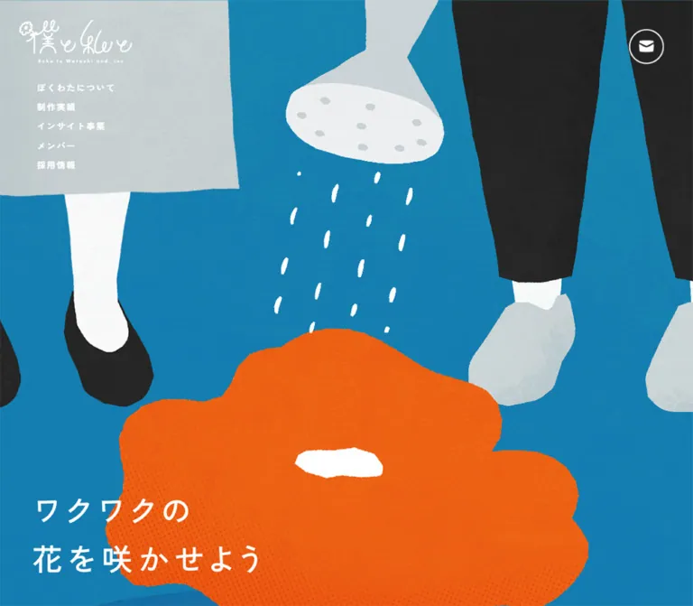
青い紙のような質感に、手描きの人物と大きな花を組み合わせた企業サイト。固定ナビゲーション、方眼紙風の実績一覧、余白を生かした構成が特徴です。
オリジナルサイトを見るBoku to Watashi and inc. — Style Reference
A textured blue garden where oversized flowers carry the imagination and small, carefully spaced text carries the information.
Website / original URL: boku-to-watashi-and.com Final URL: https://boku-to-watashi-and.com/ Response: HTTP 200; original and final URLs are identical. Theme: saturated blue illustrated canvas, white typography, yellow section labels, and a white graph-paper works surface. No theme selector was evidenced. Inspected: supplied browser observation recorded September 17, 2026, at 05:08:50.387 JST; September 16, 2026, at 20:08:50.387 UTC. Viewports: 1440 × 1000 and 390 × 844 CSS pixels. Scope: the current corporate homepage of 僕と私と株式会社. Visual captures show the desktop hero, lower works section, desktop footer, mobile hero, and mobile footer. Rendered DOM evidence additionally covers the introduction, three services, six featured projects, member strip, recruitment, client-history heading, and contact form. Linked pages and expanded interaction states were not inspected.
The company describes itself on the homepage as a planning and marketing business specializing in Generation Z. Its visual identity translates collaboration and growth into a garden: two cropped figures water a huge orange flower in the opening scene, and a densely planted flower bed closes the page. The illustrations use uneven contours, grainy color, pale clothing, dark silhouettes, and small white marks. They feel like painted paper cutouts.
The interface is deliberately quieter than the artwork. A white hand-drawn wordmark and compact navigation float over the scene. Most body copy uses medium-weight Zen Kaku Gothic New with generous tracking and leading. Project captions become unusually heavy and compact. Content changes pace between broad illustrated space, narrow passages of copy, a disciplined project grid, and a horizontal member strip.
This is a substantial corporate homepage with multiple onward routes and an embedded inquiry form. Its identity depends on the relationship between illustration, space, and restrained controls throughout the page.
How to Read This Reference
- Measured values come from the supplied rendered DOM and computed-style records. They describe the two recorded viewport states, not a complete stylesheet.
- Calculated values are arithmetic differences between measured rectangles, such as column gaps and spacing between text blocks.
- Visual estimates come from the supplied original-page captures. Estimated hexadecimal colors are implementation approximations, not pixel samples or recovered source declarations.
- Recommendations describe a new implementation. They do not establish behavior or accessibility features on the original website.
- Token names are descriptive aliases unless explicitly identified as source custom properties.
- Document coordinates identify captured text landmarks. They are not specifications for absolute positioning or fixed section heights.
The visible hero slogan and wordmark are not represented by corresponding text measurements in the supplied element sample. Their exact font construction is therefore unknown. Likewise, a wrapper's computed font, color, or radius may differ from its visible child artwork. The default Times family on the document root does not describe the main interface typography.
Tokens — Colors
Interface Palette
| Name | Value | Suggested token | Evidence and role |
|---|---|---|---|
| Source Blue | #2e6ca0 |
--color-brand-blue |
Measured source variables --s-color-c5a3eb4d and --s-color-bab5f45b; their individual applications are not established by the supplied sample |
| Works Blue | #3c7fad |
--color-link |
Measured project-caption and works-index label color: rgb(60, 127, 173) |
| Label Yellow | #f7cd47 |
--color-label |
Measured section-label color; source --s-color-cfa600c1: #f7cd47ff |
| White | #ffffff |
--color-white |
Measured introduction, service, member, and form-label text; visually also used for logos, clouds, and paper |
| Muted Gray | #cfcfcf |
--color-muted |
Measured required-field explanatory note |
| Submit Charcoal | #333333 |
--color-submit |
Measured mobile submit-button background |
Illustrated Palette
These are visual estimates for adaptation. The artwork contains texture and local variation, so a single flat color cannot reproduce each surface.
| Name | Approximation | Suggested token | Visual role |
|---|---|---|---|
| Garden Blue | #147fac |
--color-canvas |
Dominant blue field in the opening and closing scenes |
| Deep Garden Blue | #176e9d |
--color-canvas-deep |
Darker blue areas visible around the paper section and lower page |
| Flower Orange | #ff6900 |
--color-flower-orange |
Large hero bloom and several footer flowers |
| Flower Yellow | #ffbd00 |
--color-flower-yellow |
Bright footer petals; distinct from the softer measured label yellow |
| Flower Indigo | #34549a |
--color-flower-indigo |
Blue-purple flowers and foreground shapes |
| Clothing Gray | #c9d2d4 |
--color-figure-gray |
Clothing, shoes, and watering-can surfaces |
| Figure Charcoal | #262626 |
--color-figure-dark |
Trousers, shoes, and hair in the illustrations |
| Paper Grid | #eef1f3 |
--color-grid |
Approximation of the very faint grid on the white works surface |
Keep interface and illustration colors distinct. Orange supplies a large pictorial focal point; it is not evidenced as a general button fill. The measured blue custom property is also not an exact description of the textured blue image field.
The document body's measured background is white, but illustrated layers dominate the visible page. Do not interpret that fallback as a white overall theme. The repeated transparent gradient variables in the computed records do not establish a visible multicolor gradient treatment.
Tokens — Typography
Primary Interface Family
Measured family: 'Zen Kaku Gothic New', also named by source variable --s-font-508f9cfa.
The sampled introduction, service text, section labels, project captions, member labels, and form labels use this family. The prevailing weight is 500. Its open Japanese forms remain light in feeling because the design combines modest sizes with considerable space between letters and lines.
Weight creates hierarchy more strongly than size in the works grid: captions use 900, while service titles remain 500. Member names use 700.
Secondary Declaration
Measured family: Lato, also named by source variable --s-font-c3b7e05b.
The mobile service-link labels declare Lato at weight 400; the desktop equivalents declare Zen Kaku Gothic New at 500. The mobile submit-button wrapper also declares Lato. A computed Lato declaration does not identify the fallback font used to draw Japanese glyphs. Do not infer an additional Japanese font name.
Wordmark and Hero Lettering
The wordmark is a fine white hand-drawn mark with a small English company line underneath. Treat it as supplied brand artwork, not as an invitation to choose a script font.
The visible hero copy is ワクワクの followed by 花を咲かせよう. Its approximate visual scale is 44–46px on desktop and 28–30px on mobile, with generous spacing and two clearly separated lines. Those sizes are estimates. The supplied DOM does not establish whether this lettering is live text or an image.
Type Scale
All rows below are measured unless explicitly marked as estimates. Tracking is expressed in pixels; equivalent em values are calculated.
| Role | Desktop size / line height | Mobile size / line height | Weight | Tracking |
|---|---|---|---|---|
| Introductory lead | 18 / 43.2px |
17 / 34px |
500 |
0.9 / 0.85px, both 0.05em |
| Introduction supporting copy | 13 / 29.9px |
13 / 26px |
500 |
1.95px, 0.15em |
| Section labels | 14 / 26.6px |
Same | 500 |
1.82px, 0.13em |
| Service English labels | 14 / 26.6px |
Same | 500 |
1.82px, 0.13em |
| Service titles | 24 / 45.6px |
24 / 38.4px |
500 |
3.12px, 0.13em |
| Service descriptions | 14 / 26.6px |
Same | 500 |
1.82px, 0.13em |
| Small service-link label | 13 / 24.7px |
Same | 500 / 400 |
1.43px, 0.11em |
| About-link label | 13 / 26px |
Same | 500 |
0.65px, 0.05em |
| Project captions | 15 / 18px |
13 / 15.6px |
900 |
Normal |
| Index-button label | 14 / 26.6px |
Same | 500 |
1.82px, 0.13em |
| Member descriptor | 12 / 12px |
10 / 10px |
500 |
0.24 / 0.2px, both 0.02em |
| Member name | 23 / 27.6px |
17 / 20.4px |
700 |
1.15 / 0.85px, both 0.05em |
| Recruitment paragraph | 14 / 26.6px |
Same | 500 |
1.82px, 0.13em |
| Contact introduction | 14 / 29.4px |
Same | 500 |
1.82px, 0.13em |
| Form labels | 14 / 19.6px |
Same | 500 |
Usually 1.26px, 0.09em |
| Required-field note | 11 / 23.1px |
Same | 500 |
1.43px, 0.13em |
| Hero slogan — estimate | About 44–46 / 75px |
About 28–30 / 48px |
Not measured | Visibly expanded; exact value unknown |
The long mobile discovery-source question reduces tracking to 0.7px, or 0.05em. This is a targeted adjustment to fit a long label rather than a global reduction in typography.
Desktop rail labels appear approximately 13px with about 29–30px between successive lines. Mobile footer links appear approximately 12px. These are visual estimates, not recovered computed styles.
Tokens — Spacing & Shapes
Density: small information blocks surrounded by large pictorial intervals. Base system: no single source spacing unit was established. Use component-specific measurements instead of forcing every distance into an eight-pixel scale.
Measured Geometry
| Element | Desktop | Mobile | Evidence |
|---|---|---|---|
| Document height | 9763.67px |
8619.94px |
Measured document rectangles |
| Contact-link box | 53 × 53px |
Approximately 40 × 40px |
Desktop measured; mobile estimated from capture |
| Contact placement | 44px from top and right |
Approximately 26px from top, beside menu control |
Desktop measured; mobile estimated |
| About link | 173 × 42px |
205 × 53px |
Measured |
| Works/member index link | 258 × 61px |
258 × 61px |
Measured |
| Works grid span | 800px |
351px |
Calculated from outer card edges |
| Works card width | 253px |
168.47px |
Measured |
| Works card height | 175px or 193px |
Approximately 126.2–141.94px |
Measured; depends on caption wrapping |
| Works column gap | 20.5px |
14.06px |
Calculated |
| Works row gap | 38px |
24px |
Calculated after the tallest card in each row |
| Member item | 228 × 228px |
178 × 178px |
Measured |
| Member horizontal pitch | 256px |
193px |
Calculated between successive positions |
| Member gap | 28px |
15px |
Calculated from pitch minus item width |
| Introductory copy width | 294px |
267.75px |
Measured |
| Recruitment paragraph width | 367px |
331.5px |
Measured |
Internal Spacing
| Relationship | Desktop | Mobile | Status |
|---|---|---|---|
| Introduction lead to supporting paragraph | 30px |
30px |
Calculated |
| Introduction copy to About link | 46px |
46px |
Calculated |
| Service title to description | 21px |
14px |
Calculated |
| Service description to small detail link | 38px |
28px |
Calculated |
| Works grid bottom to index link | 78px |
56px |
Calculated |
| Member item bottom to index link | 63px |
62px |
Calculated |
| Successive first four form-label positions | 99.59px |
88.59px |
Calculated row rhythm, not input height |
| Works paper grid cell | About 24px square |
Not visually inspected | Desktop visual estimate |
Border Radius and Edges
| Element | Value or treatment | Status |
|---|---|---|
| About link | 21px desktop; 26.5px mobile |
Measured |
| Works/member index link | 30.5px |
Measured |
| Mobile submit button | 30px |
Measured |
| Project thumbnail | Approximately 10–12px corners |
Desktop visual estimate |
| Project and member anchor wrappers | 0px |
Measured wrapper radius; does not establish every child's shape |
| Contact/menu graphics | Circular outline | Visually observed |
| Works paper boundary | Slanted left edge and broad, uneven lower curve | Visually observed; exact mask unknown |
| Clouds and petals | Irregular rounded silhouettes with textured edges | Visually observed artwork |
The contact anchor itself reports a zero radius despite its circular appearance. Its visible ring is therefore not reliably reproduced by copying the wrapper radius alone. Recreating the circular shape on a semantic control is a reasonable implementation adaptation.
Components
Persistent Desktop Identity and Navigation
Role: maintain identity and access to the corporate site's main destinations while the long page scrolls.
The white wordmark sits near the upper-left corner, approximately 30px from both edges, at roughly 170px wide. Below it, a narrow stack of eight Japanese links begins around x = 56px and y = 128px. The rail has no conventional rectangular panel or shadow. It floats directly over the illustration and blue field.
The visible order is About, works, insight, planning, brand, client interviews, members, and recruitment. Actual labels include ぼくわたについて, 実績一覧, and クライアントインタビュー.
The rail remains at the same apparent viewport position in the hero, works, and footer captures. This supports persistent placement, although the exact source positioning rule was not supplied. A fixed implementation is recommended for matching those states.
A separate white envelope inside an outlined circle occupies the upper-right corner. Its measured anchor is 53px square at x = 1343px, y = 44px. The destination is /#contact: this is an in-page contact link, not an evidenced mailto: action.
Mobile Header
Role: retain recognizable identity while freeing the page width for illustration.
At 390px wide, the desktop text rail is absent. A smaller white wordmark sits approximately 12px from the left and 22px from the top. Two circular controls appear at the upper-right: the envelope and a menu symbol formed from two short horizontal strokes.
The circles appear about 40px in diameter, with roughly 13px between them. Their approximate left positions are 271px and 324px. Header elements remain visible in both mobile captures.
Only the closed menu control is shown. The menu's contents, opening transition, overlay treatment, focus behavior, and close state are unverified. The English navigation block in the bottom capture belongs to the footer; it is not evidence of an opened mobile menu.
Illustrated Hero
Role: express the company's collaborative growth metaphor before introducing detailed business information.
The scene fills the first captured viewport. Cropped bodies enter from the top: a pale skirt and dark shoes on the left, dark trousers and pale shoes on the right. A watering can occupies the center area, with small white drops connecting it visually to an enormous orange bloom below.
Desktop composition is intentionally oversized. The flower begins around the middle of the viewport and extends beyond the lower edge. The slogan sits low at the left, outside the central watering stream. The wordmark and navigation overlap the pale clothing, so the gray area is part of the scene rather than a standard sidebar surface.
Mobile uses a substantially different arrangement. The figures occupy approximately the top 380px. The two-line slogan appears around y = 438–510px. The flower begins near y = 566px and extends through the bottom edge. This leaves a blue interval for the copy between the figures and flower.
Implementation recommendation: use separately positioned illustration layers or an art-directed mobile image. A single desktop image with an unchanged background-size: cover rule is unlikely to preserve all three focal relationships. Keep the slogan readable as text in an accessible adaptation, while recognizing that the original text construction was not established.
The captures establish the watering motif, not an animation sequence. Do not assign a falling-drop loop, bloom animation, or scroll-linked zoom without additional evidence.
Company Introduction
Role: explain the company in a small, paced reading block.
The desktop introduction begins at x = 208.5px, y = 1143px, with a 294px text width. The lead is 18px with 43.2px leading. Supporting copy follows after 30px, reducing to 13px while widening tracking to 0.15em.
The mobile block is centered at x = 61.125px with a width of 267.75px. Its lead becomes 17px with 34px leading; the supporting paragraph keeps its 13px size but tightens leading to 26px.
The About link follows 46px after the supporting copy. It grows from 173 × 42px on desktop to 205 × 53px on mobile. Preserve that increase in usable control size rather than scaling every element downward.
Only the text geometry is documented for this section. Surrounding illustrations and their exact placement are outside the supplied visual captures.
Service Story Blocks
Role: introduce three distinct business areas and route visitors to their detail pages.
Each block contains a small English label, a larger Japanese service title, a short paragraph, and a small detail link. The evidenced pairings are:
| Label | Source title | Destination |
|---|---|---|
| Planning | プランニング事業 |
/planning |
| Zview | インサイト事業 |
/zview |
| Brand | ブランド事業 |
/brand |
Desktop text positions alternate: the first and third begin at x = 437.5px, while the second begins at x = 753.34px. These are vertically separated passages, not three simultaneous columns. The first two English labels are 456px apart vertically.
On mobile, all three text blocks begin at x = 32px. Successive English labels are approximately 480px apart. The 24px service-title size is retained; its line height decreases from 45.6px to 38.4px. Description sizes remain unchanged.
The small detail-link wrapper measures approximately 144 × 31.86px on both viewports. Its visible label is 詳しくはこちら. The supplied evidence does not establish its complete icon anatomy or hover treatment.
Works Paper Surface and Project Grid
Role: create a clear portfolio-reading interval within the illustrated blue environment.
The desktop capture shows a large white surface with faint square grid lines. Its left boundary slopes down toward the right; its lower boundary bends into a broad, asymmetric wave. Blue remains visible around it. The project grid itself stays straight and level inside that irregular silhouette.
Six projects form three desktop columns and two rows. The outer span runs from x = 320px to x = 1120px, centered on the viewport. Each card is 253px wide, with 20.5px between columns.
Card anatomy: a landscape project image, a short gap, and a heavy blue caption. The image has visibly rounded corners, while the overall link wrapper has no boxed fill, border, or shadow. Caption size is 15px, weight 900, with an 18px line height. The visible desktop thumbnail area is approximately 253 × 136px; that image height is a visual estimate.
The current featured subjects include a TOEIC® TikTok drama, recruitment for エイブル, a ドンキ×サントリー campaign, a クライナー commercial, エッセンシャル for 花王, and ウェイウェイらんど!. Their photographs, product graphics, and campaign lettering keep their own colors. Do not recolor every project image into the garden palette.
Mobile uses two columns and three rows. The grid spans 351px, exactly 90% of the 390px viewport by calculation. Card width becomes approximately 168.47px, and the gap becomes 14.06px. Captions reduce to 13px with 15.6px leading. Longer titles wrap naturally into two lines.
A centered 一覧はこちら link follows the grid. It is a 258 × 61px outlined pill with blue text and a tiny blue diamond-like mark toward the right. In the desktop capture, the paper remains visible through the transparent button interior.
Implementation recommendation: keep the organic paper silhouette in a decorative background layer. Masking or rotating the content container itself would interfere with grid alignment, links, and focus outlines.
Shared Action Treatments
The page contains several related but distinct actions:
| Variant | Anatomy | Evidence |
|---|---|---|
| About | Compact capsule with centered 13px label | Measured at both viewports |
| Service detail | Small, unfilled text-and-utility region | Label and wrapper measured; full decoration unverified |
| Works index | Thin blue capsule, 14px label, tiny right-side mark | Desktop visual evidence and both viewport measurements |
| Member index | Same 258 × 61px geometry with white label | Measured; full border appearance not separately captured |
| Form submit | Charcoal filled capsule with light visible contents | Mobile capture and measured background |
For the desktop works capsule, the label begins 40px inside the left edge. It is not centered across the whole button width; the small mark balances it on the right. Use a label-and-marker layout rather than a centered label with an arbitrary arrow appended.
Member Strip
Role: introduce individuals through a short personal descriptor and name.
The rendered text contains 33 named members. The first examples pair エモと企画の天才 with KENT and 真面目の天才 with Masato. An additional recruitment-linked visual tile appears among the member items.
The measured layout is a single horizontal sequence extending well beyond the viewport. Desktop items are 228px square, separated by 28px. Mobile items are 178px square, separated by 15px. Offscreen item coordinates confirm that mobile does not convert this sequence into the two-column works grid.
Descriptors and names sit near the upper center of each item. Desktop descriptors use 12px white text and names use 23px bold white text, with a calculated 4px gap. Mobile uses 10px descriptors and 17px names with no corresponding extra gap between their measured line boxes.
Several items link to individual note articles. The member index links to /member. Actual portraits, clipping shapes, and the strip's navigation controls are not shown in the supplied visual captures. Horizontal arrangement does not prove autoplay, dragging, looping, or swipe handling.
Recruitment and Client History
Role: provide an employment route and a business-history reference after the team introduction.
The recruitment paragraph uses the same 14px, weight-500, widely tracked text as service descriptions. On desktop, it occupies a 367px block at x = 983px. On mobile, it becomes a 331.5px block at x = 29.25px.
The desktop recruitment link reads 詳しくはこちら; the mobile version reads 一覧はこちら. Both point to /recruit, but their measured wrappers differ: 286 × 61px on desktop and 258 × 61px on mobile. Preserve the distinction if reproducing the recorded page.
The following client-history heading, 過去の取引実績, uses yellow 24px text, 45.6px leading, and 0.13em tracking. The supplied captures do not document the associated logo arrangement. Its exact contents and geometry should remain unspecified.
Contact Form
Role: accept business inquiries within the homepage.
A yellow section label precedes a white introductory paragraph and an 11px gray required-field note. The introduction occupies two lines on desktop and three on mobile, using a measured 29.4px line height.
The evidenced field order is:
- Name,
お名前. - Company,
会社名. - Email,
メールアドレス. - Phone,
電話番号. - How the visitor discovered the company.
- Inquiry purpose,
ご用件について. - Inquiry message,
お問い合わせ内容.
Required indicators accompany all seven labels. The discovery options include X, note, web search, media, and referral sources. Inquiry purposes cover new work, interviews or speaking, competition invitations, and sales inquiries. The supplied records do not identify the choice controls reliably enough to specify radio buttons versus selects.
Form labels begin at x = 470px on desktop and x = 39px on mobile. The first four labels repeat at approximately 99.59px and 88.59px vertical intervals respectively. These intervals do not establish input heights, fills, or border radii.
The mobile 送信する button is measured at x = 66px, y = 7795.30px, with a 258 × 61px charcoal body and 30px radius. The computed button wrapper reports charcoal text as well, but the capture shows light visible contents. Inner text styling must therefore be treated separately from the wrapper's color.
No validation, submission, loading, confirmation, or error state was exercised in the supplied evidence.
Illustrated Footer
Role: close the garden narrative while providing a second navigation system and social destinations.
The desktop footer arranges a larger white wordmark, a general navigation column, a services column, and a social/legal block across the page. The wordmark begins around x = 228px. The next columns begin around x = 500px and x = 740px. A thin vertical divider near x = 930px separates the social block. These positions are visual estimates.
White Pinterest, X, and note marks form a prominent row above the privacy link and copyright. The rendered links confirm those destinations. The copyright reads ©Boku to Watashi and inc..
Below the information, considerable blue space leads into white cloud masses and overlapping orange, yellow, and indigo flowers. Small figures tend the garden. Soft foreground shapes add depth within the artwork; the evidence does not identify a live CSS blur effect.
Mobile changes the footer's information architecture as well as its layout. A roughly 194px-wide wordmark is centered above two compact English link columns: Top, About, Works, Recruit on the left; Planning, Insight, Brand, Contact on the right. A horizontal divider replaces the desktop vertical separator. Social marks sit below it, followed by the privacy link and copyright.
The bottom garden compresses into a shallow band spanning the phone width. The large centered footer logo is separate from the smaller persistent header logo.
The charcoal submit capsule visible near the top of the mobile footer capture belongs to the preceding form. Its document coordinate is consistent with that position at the end of the page. Do not reproduce its overlap with the persistent header as a special floating-submit feature.
Tokens — Motion & Interaction
Measured Transition Declarations
| Target | Measured value | What this establishes |
|---|---|---|
| Many sampled links and text elements | 0.3s cubic-bezier(0.4, 0.4, 0, 1) with additional custom-property transitions |
A common transition declaration; no particular hover transformation is established |
| Document body background | background 0.5s cubic-bezier(0.4, 0.4, 0, 1) |
Background changes are configured to transition; a triggered change was not supplied |
| Mobile submit button | 0.4s cubic-bezier(0.4, 0.4, 0, 1) |
A separate control transition duration |
| Sampled elements' CSS animation | none |
No named CSS animation on those sampled elements at capture time |
The repeated transition lists include gradient-related custom properties. Their presence is not proof of a visible animated gradient.
Evidenced Affordances and Limits
| Feature | Supported observation | Unverified behavior |
|---|---|---|
| Desktop navigation and contact | Persist across the supplied scroll captures; destinations are present in rendered links | Exact positioning implementation and hover states |
| Contact icon | Links to /#contact |
Smooth-scroll timing and focus transfer |
| Mobile menu | Closed circular menu control is visible | Open panel, animation, keyboard handling |
| Works cards | Individual project anchors and a works-index anchor | Hover zoom, image transitions, destination layouts |
| Member strip | Items continue horizontally beyond the viewport | Autoplay, drag, swipe, loop, and controls |
| Recruitment tile | A GIF URL is present in the rendered CSS | Frame content, playback timing, and whether it visibly animates |
| Hero watering scene | Can, drops, and flower are visible | Drop movement, flower growth, parallax, or scroll synchronization |
| Submit action | Button is present | Validation and submission result |
The capture procedure waited for page and image readiness and sampled layout stability. Perpetual animations were temporarily paused during readiness checks and then resumed. Static frames and sampled animation: none values cannot establish that the entire experience is motionless.
Recommended adaptation: use the measured 300ms easing for modest color or opacity feedback. Keep decorative animation optional, and provide a static composition under reduced-motion preferences. Do not invent a complex motion system to compensate for missing evidence.
Surfaces
| Layer | Appearance | Purpose |
|---|---|---|
| Main environment | Textured saturated blue with local tonal variation | Continuous brand setting across the long page |
| Hero figures | Pale gray and charcoal painted shapes | Large compositional frame around the watering motif |
| Works surface | White, faint square grid, irregular perimeter | Readable portfolio interval within the blue environment |
| Project media | Full-color campaign photography and graphics | Preserve each project's identity |
| Utility controls | Thin white circular outlines | Keep navigation recognizable without large solid panels |
| Index actions | Thin outlined capsules with restrained labels | Mark onward routes without competing with illustrations |
| Submit action | Solid charcoal capsule | Distinguish form completion from browsing links |
| Footer foreground | Overlapping petals, clouds, and small figures | Finish the garden narrative and create depth |
The captured components do not show a general card-shadow or elevation system. Separation comes from changes in color, illustration scale, whitespace, thin rules, and silhouette.
Imagery
Illustration Direction
Use broad, imperfect shapes with a fine printed or painted grain. Petals have irregular lobes and small white centers. Figures are simplified: pale faces and limbs, minimal facial detail, flat clothing shapes, and dark hair or trousers. The watering can connects the two figures to the flower through a sparse column of white marks.
Scale is essential. The opening flower is far larger than an ornamental icon and is deliberately cropped by the viewport. The footer contains many overlapping flowers, with small gardeners positioned between them. Repeating a few small flower stickers around otherwise conventional sections would lose the observed composition.
Keep the background texture fine enough that small white text remains clear. The grain is not a pixel-art treatment; image-rendering: pixelated would be inappropriate for these captures.
Photography and Project Graphics
The works section contains photographic people, product packaging, a bottle image, campaign composites, and prominent artwork lettering. These images remain unfiltered and colorful. Their shared frame, caption styling, and grid placement organize them without forcing a common image palette.
Observed Asset References
The following complete URLs appear in the supplied original-page rendered CSS. They were not independently downloaded. Dimensions embedded in filenames are not independent measurements of decoded intrinsic size.
| Asset | Observed URL | Evidence |
|---|---|---|
| エイブル project image | https://storage.googleapis.com/studio-cms-assets/projects/RQqJy48eOg/s-1950x1097_e7549817-3996-4c0f-b75f-5735184bd8a1.webp |
Background image in a rendered project element's pseudo-element rule |
| クライナー commercial image | https://storage.googleapis.com/studio-cms-assets/projects/RQqJy48eOg/s-1920x1080_14419927-930c-4fa6-9b57-cf03ed8bbd8e.webp |
Background image in a rendered project element's pseudo-element rule |
| Recruitment tile among members | https://storage.googleapis.com/studio-cms-assets/projects/RQqJy48eOg/s-900x900_4b054b2c-5cb8-45f6-afcb-576322faab24.gif |
Mobile rendered recruitment-link background rule |
Complete hero, logo, texture, and footer-art URLs were not supplied. Several member-asset URLs are truncated and are intentionally omitted. Use authorized artwork when available, or commission original imagery with the same compositional principles. Do not guess asset paths.
Layout & Responsive Behavior
Confirmed Changes
| System | 1440 × 1000 | 390 × 844 |
|---|---|---|
| Primary navigation | Persistent left text rail and separate contact circle | Smaller logo with contact and menu circles; no visible text rail |
| Hero | Broad scene; slogan low at left; huge flower in lower center | Figures above, slogan in the middle, flower below |
| Introduction | Narrow block offset toward the left | Narrow block centered horizontally |
| Services | Alternating horizontal text positions | Common 32px left inset |
| Service titles | 24px with 45.6px leading | Same size with 38.4px leading |
| Works | Three columns, two rows | Two columns, three rows |
| Works captions | 15px, weight 900 | 13px, weight 900 |
| Member strip | 228px items, 28px gaps | 178px items, 15px gaps |
| Index controls | 258 × 61px | Same dimensions |
| About control | 173 × 42px | Larger at 205 × 53px |
| Recruitment copy | 367px block at right | 331.5px block spanning most of the phone width |
| Footer | Japanese navigation across several columns | Compact English links in two centered columns |
| Footer separator | Vertical | Horizontal |
Measured Text Landmarks
These rounded document y-coordinates show the page's pacing. They are not section-boundary measurements.
| Landmark | Desktop y | Mobile y |
|---|---|---|
| Introduction lead | 1143px |
887px |
| Services label | 2317px |
2126px |
| Works label | 4241px |
3928px |
| Members label | 5437px |
4883px |
| Recruitment label | 6214px |
5448px |
| Client-history heading | 6988px |
6260px |
| Contact label | 7538px |
6673px |
Although the works grid gains a row on mobile, the full document becomes shorter. This confirms that responsive treatment involves more than stacking desktop blocks. Large scene dimensions and section intervals change too.
A rendered stylesheet excerpt contains a max-width: 1140px rule for responsive line-break visibility. It does not establish the breakpoint for every component. Intermediate widths, landscape phones, browser zoom, and safe-area behavior were not tested.
Recommended implementation approach: preserve the observed endpoint layouts, then test the transition widths explicitly. Use a viewport-centered works grid, independent decorative layers, and a contained horizontal member region. Avoid hardcoding the full document heights or sampled section coordinates.
Do’s and Don’ts
Do
- Build the page around a continuous textured blue environment.
- Let oversized figures and flowers provide the opening impact.
- Preserve the mobile sequence of figures, readable blue copy area, and flower.
- Use Zen Kaku Gothic New for the measured Japanese interface roles.
- Keep body copy mostly medium-weight, widely tracked, and generously led.
- Use compact weight-900 blue captions for project cards.
- Keep the project grid straight inside the irregular graph-paper silhouette.
- Retain three works columns on desktop and two at the recorded mobile width.
- Keep the member sequence horizontal and distinct from the works grid.
- Use thin circular utility controls and restrained capsule links.
- Give the footer substantial compositional attention, including its garden foreground.
- Separate measured values from approximations when extending the system.
Don’t
- Don't reduce the artwork to small decorative stickers around generic cards.
- Don't replace the wordmark with a guessed script font.
- Don't use the document's default Times declaration as the interface typeface.
- Don't turn orange petals into a universal conversion-button color.
- Don't recolor campaign images into a uniform blue treatment.
- Don't add shadows, glass panels, or large raised cards to the evidenced components.
- Don't apply the works paper's angle or clipping to its text and links.
- Don't assume every mobile element becomes smaller; several controls retain or increase their size.
- Don't interpret the member strip's offscreen coordinates as proof of autoplay.
- Don't describe the mobile footer as an open navigation overlay.
- Don't reproduce the form-button/header overlap as intentional sticky behavior.
- Don't claim falling water, parallax, hover zoom, or form success states from static captures.
Recommended Implementation Additions
These are additions for a new implementation, not verified features of the original page.
- Use a real heading hierarchy for the hero and section titles. Several sampled visual headings are paragraph elements.
- Give the envelope, menu, and social links explicit accessible names. The envelope should identify its contact-section destination.
- Keep visible focus rings outside decorative masks. A paper silhouette must not clip the focus outline of a project or button.
- Check white navigation against the pale clothing in the hero, and blue captions against the final paper composite. Adjust the local background or text treatment where needed while preserving the palette.
- Make offscreen member entries reachable by keyboard and touch. A contained native horizontal scroller is a suitable baseline until richer behavior is specified.
- Raise the 10px mobile member descriptors where readability requires it, and allow sufficient height for wrapped text.
- Associate form labels and required indicators programmatically. Use suitable email and telephone input types and provide persistent, readable error messages.
- Keep menu and decorative animation optional under reduced-motion preferences. Animated raster assets need a separate static alternative; a CSS media query alone cannot pause a GIF.
- Reserve image dimensions, serve appropriately sized artwork, and load lower-page media progressively. Keep the opening scene available without waiting for the entire member strip.
- Prevent fixed header controls from obscuring form actions or footer links at narrow widths and increased text sizes.
Agent Prompt Guide
Quick Color Reference
- Illustrated page field: approximately
#147fac, with darker areas near#176e9d; both are visual approximations. - Exact measured works text:
#3c7fad. - Exact measured section-label yellow:
#f7cd47. - Main reversed text and logos: white.
- Hero flower: approximately
#ff6900. - Additional flower colors: approximately
#ffbd00and#34549a. - Works surface: white with an extremely faint square grid.
- Submit action: measured
#333333background.
Overall Prompt
“Create a Japanese planning and marketing company homepage inspired by the current Boku to Watashi and inc. composition. Use a textured saturated blue environment, oversized painted-paper figures, a watering can, and a huge orange flower. Keep the interface restrained: a white hand-drawn brand asset, compact persistent desktop navigation, circular contact and mobile menu controls, medium-weight Zen Kaku Gothic New text with generous tracking, and small yellow section labels. Alternate narrow service passages through generous illustrated space. Place six full-color project thumbnails in a straight three-column grid over an irregular white graph-paper surface, switching to two columns on mobile. Add a distinct horizontal member strip, recruitment content, an inquiry form, and a spacious illustrated garden footer. Art-direct the mobile hero so the figures, two-line slogan, and flower occupy separate vertical zones. Use only documented interactions; specify any added motion as a new design choice.”
Example Component Prompts
- Hero: “Compose a full-viewport blue paper scene with cropped pale and charcoal figures entering from above, a central watering can, small white drop marks, and an oversized orange flower below. Place
ワクワクのand花を咲かせようin two white lines. On a 390px phone, move the copy into clear blue space between the figures and flower. Keep the exact original lettering construction unspecified.” - Works section: “Build a white graph-paper island with a slanted left boundary and an uneven curved lower edge. Keep its foreground grid level: 800px wide on desktop, three 253px columns, 20.5px horizontal gaps, full-color rounded thumbnails, and 15px weight-900 captions in #3c7fad. At 390px, use a 351px two-column grid and 13px captions. Follow with a 258 × 61px outlined capsule.”
- Service block: “Create an unboxed service passage using a 14px English label, a 24px medium-weight Japanese title, a 14px description with 1.9 line height and 0.13em tracking, and a small detail link. Alternate text positions across desktop rows and align all mobile passages to a 32px left inset.”
- Member strip: “Create a horizontal sequence of 228px square member items with 28px gaps, changing to 178px items and 15px gaps on mobile. Place a small white personal descriptor above a larger bold name near the upper center. Use supplied member imagery. Implement a keyboard-reachable horizontal scroller as a recommended baseline, without claiming source autoplay.”
- Footer: “Arrange a white brand asset, general navigation, service links, and social/legal information across a textured blue desktop footer. Separate the social block with a fine vertical rule. On mobile, center a 194px brand asset, two short English link columns, a horizontal rule, and Pinterest, X, and note marks. Anchor overlapping orange, yellow, and indigo flowers with white clouds and small gardeners along the bottom.”
- Action capsule: “Create a transparent 258 × 61px capsule with a fine current-color border and 30.5px radius. Use a 14px medium-weight tracked label, roughly 40px left inset, and a tiny diamond toward the right. Use blue on paper and white on blue. Reserve a charcoal fill for form submission.”
Quick Start
CSS Custom Properties
This is an implementation adaptation, not extracted source code. It combines measured tokens with explicitly approximate illustration colors and recommended layout rules. Load the evidenced fonts separately through an authorized font source. Supply your own authorized logo, figures, flower, texture, and footer artwork; no missing source asset path is invented here.
The hero assumes separate .hero-figures and .hero-flower image elements plus live .hero-message text. Each .service-step contains .service-copy. Each .work-card contains .work-thumb and .work-title. The optional --works-mask accepts an authored silhouette; its default is a simple rounded approximation. The footer illustration is a separate image beneath its information layer.
:root {
  /* Measured interface colors */
  --color-brand-blue: #2e6ca0;
  --color-link: #3c7fad;
  --color-label: #f7cd47;
  --color-white: #ffffff;
  --color-muted: #cfcfcf;
  --color-submit: #333333;

  /* Visual approximations of illustrated colors */
  --color-canvas: #147fac;
  --color-canvas-deep: #176e9d;
  --color-flower-orange: #ff6900;
  --color-flower-yellow: #ffbd00;
  --color-flower-indigo: #34549a;
  --color-figure-gray: #c9d2d4;
  --color-grid: #eef1f3;

  /* Evidenced family names; fallback is an adaptation */
  --font-ui: 'Zen Kaku Gothic New', sans-serif;
  --font-latin: 'Lato', sans-serif;
  --weight-body: 500;
  --weight-name: 700;
  --weight-project: 900;
  --tracking-body: 0.13em;
  --leading-body: 1.9;

  /* Measured or calculated component geometry */
  --works-width: 800px;
  --works-gap-x: 20.5px;
  --works-gap-y: 38px;
  --member-size: 228px;
  --member-gap: 28px;
  --pill-width: 258px;
  --pill-height: 61px;
  --pill-radius: 30.5px;
  --utility-size: 53px;

  /* Estimated thumbnail radius and recommended asset hooks */
  --radius-image: 10px;
  --canvas-texture: none;
  --works-mask: none;

  /* Measured transition timing */
  --ease-site: cubic-bezier(0.4, 0.4, 0, 1);
  --duration-link: 300ms;
  --duration-submit: 400ms;
}

* { box-sizing: border-box; }
body {
  margin: 0;
  color: var(--color-white);
  background-color: var(--color-canvas);
  background-image: var(--canvas-texture);
  font-family: var(--font-ui);
  font-size: 14px;
  font-weight: var(--weight-body);
  line-height: var(--leading-body);
  letter-spacing: var(--tracking-body);
}
a { color: inherit; }
img { display: block; max-width: 100%; }
button, input, select, textarea { font: inherit; }

/* Recommended persistent shell matching the captured placement */
.site-brand {
  position: fixed;
  z-index: 40;
  top: 30px;
  left: 30px;
  width: 170px;
}
.site-brand img { width: 100%; height: auto; }
.site-nav {
  position: fixed;
  z-index: 40;
  top: 124px;
  left: 56px;
  display: flex;
  flex-direction: column;
  gap: 9px;
  font-size: 13px;
  line-height: 20px;
  font-weight: 700;
}
.site-nav a { text-decoration: none; }
.header-actions {
  position: fixed;
  z-index: 40;
  top: 44px;
  right: 44px;
  display: flex;
  gap: 13px;
}
.circle-control {
  display: grid;
  place-items: center;
  width: var(--utility-size);
  height: var(--utility-size);
  padding: 0;
  color: var(--color-white);
  background: transparent;
  border: 2px solid currentColor;
  border-radius: 50%;
  cursor: pointer;
}
.circle-control svg { width: 24px; height: 24px; }
.menu-control { display: none; }

/* Art direction is an approximation requiring suitable assets */
.hero {
  position: relative;
  isolation: isolate;
  min-height: max(720px, 100svh);
  overflow: clip;
}
.hero-figures {
  position: absolute;
  inset: 0 0 auto;
  width: 100%;
  height: 68%;
  object-fit: cover;
  object-position: center top;
  pointer-events: none;
}
.hero-flower {
  position: absolute;
  left: 21%;
  bottom: -7%;
  width: 58%;
  height: auto;
  pointer-events: none;
}
.hero-message {
  position: absolute;
  z-index: 1;
  left: 3.4%;
  bottom: 4%;
  margin: 0;
  font-size: 44px;
  font-weight: 600;
  line-height: 1.7;
  letter-spacing: 0.13em;
}
.hero-message span { display: block; }

/* Measured text treatments; section spacing remains content-driven */
.story {
  width: min(294px, calc(100% - 48px));
  margin-left: clamp(24px, 14.48vw, 208.5px);
  padding-top: 143px;
}
.story-lead {
  margin: 0;
  font-size: 18px;
  line-height: 2.4;
  letter-spacing: 0.05em;
}
.story-copy {
  margin: 30px 0 46px;
  font-size: 13px;
  line-height: 2.3;
  letter-spacing: 0.15em;
}
.section-label {
  margin: 0;
  color: var(--color-label);
  text-align: center;
  font-size: 14px;
  font-weight: 500;
  line-height: 1.9;
  letter-spacing: 0.13em;
}
.service-list {
  width: min(565px, calc(100% - 64px));
  margin-inline: auto;
}
.service-step { min-height: 456px; }
.service-copy { width: min(249px, 100%); }
.service-step:nth-child(even) .service-copy { margin-left: auto; }
.service-eyebrow { margin: 0; font-size: 14px; }
.service-title {
  margin: 0;
  font-size: 24px;
  font-weight: 500;
  line-height: 1.9;
}
.service-description { margin: 21px 0 38px; }
.service-link {
  display: inline-flex;
  align-items: center;
  min-height: 32px;
  font-size: 13px;
  line-height: 1.9;
  letter-spacing: 0.11em;
}

/* Shared capsule geometry */
.pill {
  display: flex;
  align-items: center;
  justify-content: space-between;
  width: min(var(--pill-width), 100%);
  min-height: var(--pill-height);
  padding: 12px 40px;
  border: 1px solid currentColor;
  border-radius: var(--pill-radius);
  color: inherit;
  background: transparent;
  font: 500 14px / 1.9 var(--font-ui);
  letter-spacing: 0.13em;
  text-decoration: none;
  cursor: pointer;
}
.pill::after {
  content: '';
  flex: 0 0 3px;
  width: 3px;
  height: 3px;
  background: currentColor;
  transform: rotate(45deg);
}
.pill--about {
  justify-content: center;
  width: 173px;
  min-height: 42px;
  padding: 8px 16px;
  border-radius: 21px;
  font-size: 13px;
  line-height: 2;
  letter-spacing: 0.05em;
}
.pill--about::after { display: none; }
.pill--submit {
  color: var(--color-white);
  background: var(--color-submit);
  border-color: var(--color-submit);
  transition: opacity var(--duration-submit) var(--ease-site);
}

/* Decorative paper stays independent from interactive content */
.works {
  position: relative;
  isolation: isolate;
  padding-block: 96px 180px;
  color: var(--color-link);
}
.works::before {
  content: '';
  position: absolute;
  z-index: -1;
  inset: 0;
  pointer-events: none;
  background-color: var(--color-white);
  background-image:
    linear-gradient(var(--color-grid) 1px, transparent 1px),
    linear-gradient(90deg, var(--color-grid) 1px, transparent 1px);
  background-size: 24px 24px;
  border-radius: 3% 2% 30% 16% / 2% 2% 8% 9%;
  mask-image: var(--works-mask);
  mask-size: 100% 100%;
  mask-repeat: no-repeat;
}
.work-grid {
  display: grid;
  grid-template-columns: repeat(3, minmax(0, 1fr));
  gap: var(--works-gap-y) var(--works-gap-x);
  width: min(90%, var(--works-width));
  margin-inline: auto;
}
.work-card {
  min-width: 0;
  padding-bottom: 6px;
  text-decoration: none;
}
.work-thumb {
  width: 100%;
  aspect-ratio: 253 / 136;
  object-fit: cover;
  border-radius: var(--radius-image);
}
.work-title {
  margin: 15px 0 0;
  font-size: 15px;
  font-weight: var(--weight-project);
  line-height: 1.2;
  letter-spacing: normal;
  overflow-wrap: anywhere;
}
.works .pill { margin: 78px auto 0; }

/* Native horizontal scrolling is a recommended baseline */
.member-viewport { overflow-x: auto; }
.member-track {
  display: flex;
  gap: var(--member-gap);
  width: max-content;
  padding: 8px max(24px, calc((100vw - 1096px) / 2));
}
.member-card {
  position: relative;
  flex: 0 0 var(--member-size);
  width: var(--member-size);
  height: var(--member-size);
  text-decoration: none;
}
.member-art { width: 100%; height: 100%; object-fit: cover; }
.member-info {
  position: absolute;
  top: 28.7px;
  inset-inline: 8px;
  text-align: center;
}
.member-descriptor {
  margin: 0;
  font-size: 12px;
  line-height: 1;
  letter-spacing: 0.02em;
}
.member-name {
  margin: 4px 0 0;
  font-size: 23px;
  font-weight: 700;
  line-height: 1.2;
  letter-spacing: 0.05em;
}

/* Footer dimensions below approximate the supplied captures */
.site-footer {
  position: relative;
  isolation: isolate;
  padding: 150px 24px 360px;
}
.footer-inner {
  display: grid;
  grid-template-columns: 200px 170px 120px 280px;
  gap: 70px;
  width: min(980px, 100%);
  margin-inline: auto;
}
.footer-brand { width: 194px; }
.footer-nav { display: grid; align-content: start; gap: 8px; }
.footer-nav a { text-decoration: none; }
.footer-nav-mobile { display: none; }
.footer-social {
  border-left: 1px solid rgb(255 255 255 / 50%);
  padding-left: 72px;
}
.social-links { display: flex; align-items: center; gap: 36px; }
.social-links a { display: block; flex: 0 0 44px; }
.footer-legal {
  margin-top: 32px;
  font-size: 10px;
  line-height: 2;
  letter-spacing: 0.15em;
}
.footer-garden {
  position: absolute;
  z-index: -1;
  inset: auto 0 0;
  width: 100%;
  height: auto;
  pointer-events: none;
}

/* Recommended form controls; original input styling is unverified */
.contact-form { width: min(500px, 80%); margin-inline: auto; }
.form-field { display: grid; gap: 9px; margin-bottom: 25px; }
.form-field label { font-size: 14px; line-height: 1.4; letter-spacing: 0.09em; }
.form-field :is(input, select, textarea) {
  width: 100%;
  min-width: 0;
  min-height: 44px;
  padding: 10px 12px;
  border: 1px solid var(--color-white);
  border-radius: 4px;
  color: var(--color-submit);
  background: var(--color-white);
  font-size: 16px;
  letter-spacing: normal;
}
.form-field textarea { min-height: 180px; resize: vertical; }
.contact-form .pill { margin-inline: auto; }
#contact { scroll-margin-top: 100px; }

/* Recommended states; specific source hover effects were not captured */
a, .circle-control {
  transition: opacity var(--duration-link) var(--ease-site);
}
:where(a, button, input, select, textarea):focus-visible {
  outline: 3px solid currentColor;
  outline-offset: 5px;
}
@media (hover: hover) {
  .site-nav a:hover, .circle-control:hover, .pill:hover { opacity: 0.8; }
  .work-card:hover .work-title { text-decoration: underline; }
}

/* Chosen shell breakpoint; 1140px is only evidenced for source line breaks */
@media (max-width: 1140px) {
  .site-brand { top: 22px; left: 12px; width: 128px; }
  .site-nav { display: none; }
  .header-actions { top: 26px; right: 26px; }
  .circle-control { --utility-size: 40px; }
  .circle-control svg { width: 20px; height: 20px; }
  .menu-control { display: grid; }
  .footer-inner { display: flex; flex-direction: column; width: 194px; gap: 0; }
  .footer-nav-desktop { display: none; }
  .footer-nav-mobile {
    display: grid;
    grid-template-columns: repeat(2, minmax(0, 1fr));
    gap: 4px 24px;
    margin-top: 40px;
    font-size: 12px;
    line-height: 2;
  }
  .footer-social {
    margin-top: 44px;
    padding: 40px 0 0;
    border-left: 0;
    border-top: 1px solid rgb(255 255 255 / 50%);
  }
  .social-links { justify-content: center; gap: 22px; }
  .social-links a { flex-basis: 40px; }
  .footer-legal { text-align: center; }
}

/* Chosen content breakpoint, not a recovered original breakpoint */
@media (max-width: 640px) {
  :root {
    --works-gap-y: 24px;
    --member-size: 178px;
    --member-gap: 15px;
  }
  .hero-figures { height: 45%; }
  .hero-flower { width: 116%; max-width: none; left: -8%; bottom: 0; }
  .hero-message { left: 5%; top: 50.5%; bottom: auto; font-size: 28px; }
  .story { width: min(267.75px, calc(100% - 48px)); margin-inline: auto; padding-top: 43px; }
  .story-lead { font-size: 17px; line-height: 2; }
  .story-copy { line-height: 2; }
  .pill--about { width: 205px; min-height: 53px; border-radius: 26.5px; margin-inline: auto; }
  .service-step { min-height: 480px; }
  .service-step:nth-child(even) .service-copy { margin-left: 0; }
  .service-title { line-height: 1.6; }
  .service-description { margin: 14px 0 28px; }
  .work-grid { grid-template-columns: repeat(2, minmax(0, 1fr)); column-gap: 4%; }
  .work-card { padding-bottom: 5px; }
  .work-thumb { aspect-ratio: 16 / 9; }
  .work-title { margin-top: 10px; font-size: 13px; }
  .works .pill { margin-top: 56px; }
  .member-track { padding-inline: 24px; }
  .member-info { top: 22.3px; }
  .member-descriptor { font-size: 10px; }
  .member-name { margin-top: 0; font-size: 17px; }
  .site-footer { padding-bottom: 200px; }
}

@media (prefers-reduced-motion: reduce) {
  a, button, .circle-control { transition: none; }
  html { scroll-behavior: auto; }
  /* Supply static alternatives separately for animated image assets. */
}
The CSS provides component proportions and a usable baseline. It does not reproduce the complete long-page illustration sequence, wire a menu, submit a form, or establish the source member-strip behavior. The rounded works backdrop is a fallback; replace it with an authored mask to reproduce the broad asymmetrical paper edge. Check all supplied assets at both recorded viewports before finalizing their crop positions.
Tailwind v4 Token Mapping
Optional aliases for a project already using Tailwind v4. These are adaptation tokens and do not imply that the original website uses Tailwind.
@theme inline {
  --color-garden: var(--color-canvas);
  --color-garden-deep: var(--color-canvas-deep);
  --color-work-ink: var(--color-link);
  --color-section-label: var(--color-label);
  --color-flower-orange: #ff6900;
  --color-flower-yellow: #ffbd00;
  --color-flower-indigo: #34549a;
  --color-paper-grid: #eef1f3;

  --font-japanese: var(--font-ui);
  --font-latin-ui: var(--font-latin);

  --text-caption: 13px;
  --text-body: 14px;
  --text-project: 15px;
  --text-service: 24px;

  --spacing-works: var(--works-width);
  --spacing-member: var(--member-size);
  --spacing-member-gap: var(--member-gap);
  --spacing-action: var(--pill-height);

  --radius-project: var(--radius-image);
  --radius-action: var(--pill-radius);
  --ease-garden: var(--ease-site);
}
Sources & Evidence
- Inspected original and final website: https://boku-to-watashi-and.com/. The supplied observation reports HTTP 200 with no URL change. The page title, introduction, navigation, and copyright support the company identity described here.
- Recorded inspection timestamp:
2026-09-16T20:08:50.387Z, equivalent to September 17, 2026, 05:08:50.387 JST. Individual image timestamps were not separately supplied. - Desktop evidence: 1440 × 1000 CSS pixels; three original-page captures showing the hero, lower works region, and footer; rendered text, links, custom properties, and sampled computed element styles. Recorded document height: approximately 9764px.
- Mobile evidence: 390 × 844 CSS pixels; two original-page captures showing the hero and footer; rendered text, links, custom properties, and sampled computed element styles. Recorded document height: approximately 8620px.
- Observed traversal: initial loading observation and scrolling through intermediate positions to settled captures. The capture procedure included document readiness, image decoding, and sampled layout/text stability checks. SharedWorkers and service workers were disabled during inspection.
- Limits: no direct browser session was performed for this reference. The supplied evidence does not include an opened menu, hovered controls, exercised member navigation, form submission, linked-page inspection, a complete asset inventory, or a motion recording. Delayed content and unexercised interactions remain unverified. Introductory, service, member, recruitment, and form details rely primarily on DOM evidence where corresponding visual captures were not supplied.
This reference describes the current homepage represented by those captures and measurements. Estimated colors, artwork placement rules, responsive breakpoint choices, accessible behavior, and the CSS/Tailwind adaptation are explicitly separate from measured source facts.
# Boku to Watashi and inc. — Style Reference

> A textured blue garden where oversized flowers carry the imagination and small, carefully spaced text carries the information.

**Website / original URL:** [boku-to-watashi-and.com](https://boku-to-watashi-and.com/)
**Final URL:** [https://boku-to-watashi-and.com/](https://boku-to-watashi-and.com/)
**Response:** HTTP 200; original and final URLs are identical.
**Theme:** saturated blue illustrated canvas, white typography, yellow section labels, and a white graph-paper works surface. No theme selector was evidenced.
**Inspected:** supplied browser observation recorded September 17, 2026, at 05:08:50.387 JST; September 16, 2026, at 20:08:50.387 UTC.
**Viewports:** 1440 × 1000 and 390 × 844 CSS pixels.
**Scope:** the current corporate homepage of 僕と私と株式会社. Visual captures show the desktop hero, lower works section, desktop footer, mobile hero, and mobile footer. Rendered DOM evidence additionally covers the introduction, three services, six featured projects, member strip, recruitment, client-history heading, and contact form. Linked pages and expanded interaction states were not inspected.

The company describes itself on the homepage as a planning and marketing business specializing in Generation Z. Its visual identity translates collaboration and growth into a garden: two cropped figures water a huge orange flower in the opening scene, and a densely planted flower bed closes the page. The illustrations use uneven contours, grainy color, pale clothing, dark silhouettes, and small white marks. They feel like painted paper cutouts.

The interface is deliberately quieter than the artwork. A white hand-drawn wordmark and compact navigation float over the scene. Most body copy uses medium-weight Zen Kaku Gothic New with generous tracking and leading. Project captions become unusually heavy and compact. Content changes pace between broad illustrated space, narrow passages of copy, a disciplined project grid, and a horizontal member strip.

This is a substantial corporate homepage with multiple onward routes and an embedded inquiry form. Its identity depends on the relationship between illustration, space, and restrained controls throughout the page.

## How to Read This Reference

- **Measured** values come from the supplied rendered DOM and computed-style records. They describe the two recorded viewport states, not a complete stylesheet.
- **Calculated** values are arithmetic differences between measured rectangles, such as column gaps and spacing between text blocks.
- **Visual estimates** come from the supplied original-page captures. Estimated hexadecimal colors are implementation approximations, not pixel samples or recovered source declarations.
- **Recommendations** describe a new implementation. They do not establish behavior or accessibility features on the original website.
- **Token names** are descriptive aliases unless explicitly identified as source custom properties.
- Document coordinates identify captured text landmarks. They are not specifications for absolute positioning or fixed section heights.

The visible hero slogan and wordmark are not represented by corresponding text measurements in the supplied element sample. Their exact font construction is therefore unknown. Likewise, a wrapper's computed font, color, or radius may differ from its visible child artwork. The default `Times` family on the document root does not describe the main interface typography.

## Tokens — Colors

### Interface Palette

| Name | Value | Suggested token | Evidence and role |
| --- | --- | --- | --- |
| Source Blue | `#2e6ca0` | `--color-brand-blue` | Measured source variables `--s-color-c5a3eb4d` and `--s-color-bab5f45b`; their individual applications are not established by the supplied sample |
| Works Blue | `#3c7fad` | `--color-link` | Measured project-caption and works-index label color: `rgb(60, 127, 173)` |
| Label Yellow | `#f7cd47` | `--color-label` | Measured section-label color; source `--s-color-cfa600c1: #f7cd47ff` |
| White | `#ffffff` | `--color-white` | Measured introduction, service, member, and form-label text; visually also used for logos, clouds, and paper |
| Muted Gray | `#cfcfcf` | `--color-muted` | Measured required-field explanatory note |
| Submit Charcoal | `#333333` | `--color-submit` | Measured mobile submit-button background |

### Illustrated Palette

These are visual estimates for adaptation. The artwork contains texture and local variation, so a single flat color cannot reproduce each surface.

| Name | Approximation | Suggested token | Visual role |
| --- | --- | --- | --- |
| Garden Blue | `#147fac` | `--color-canvas` | Dominant blue field in the opening and closing scenes |
| Deep Garden Blue | `#176e9d` | `--color-canvas-deep` | Darker blue areas visible around the paper section and lower page |
| Flower Orange | `#ff6900` | `--color-flower-orange` | Large hero bloom and several footer flowers |
| Flower Yellow | `#ffbd00` | `--color-flower-yellow` | Bright footer petals; distinct from the softer measured label yellow |
| Flower Indigo | `#34549a` | `--color-flower-indigo` | Blue-purple flowers and foreground shapes |
| Clothing Gray | `#c9d2d4` | `--color-figure-gray` | Clothing, shoes, and watering-can surfaces |
| Figure Charcoal | `#262626` | `--color-figure-dark` | Trousers, shoes, and hair in the illustrations |
| Paper Grid | `#eef1f3` | `--color-grid` | Approximation of the very faint grid on the white works surface |

**Keep interface and illustration colors distinct.** Orange supplies a large pictorial focal point; it is not evidenced as a general button fill. The measured blue custom property is also not an exact description of the textured blue image field.

The document body's measured background is white, but illustrated layers dominate the visible page. Do not interpret that fallback as a white overall theme. The repeated transparent gradient variables in the computed records do not establish a visible multicolor gradient treatment.

## Tokens — Typography

### Primary Interface Family

**Measured family:** `'Zen Kaku Gothic New'`, also named by source variable `--s-font-508f9cfa`.

The sampled introduction, service text, section labels, project captions, member labels, and form labels use this family. The prevailing weight is `500`. Its open Japanese forms remain light in feeling because the design combines modest sizes with considerable space between letters and lines.

Weight creates hierarchy more strongly than size in the works grid: captions use `900`, while service titles remain `500`. Member names use `700`.

### Secondary Declaration

**Measured family:** `Lato`, also named by source variable `--s-font-c3b7e05b`.

The mobile service-link labels declare Lato at weight `400`; the desktop equivalents declare Zen Kaku Gothic New at `500`. The mobile submit-button wrapper also declares Lato. A computed Lato declaration does not identify the fallback font used to draw Japanese glyphs. Do not infer an additional Japanese font name.

### Wordmark and Hero Lettering

The wordmark is a fine white hand-drawn mark with a small English company line underneath. Treat it as supplied brand artwork, not as an invitation to choose a script font.

The visible hero copy is `ワクワクの` followed by `花を咲かせよう`. Its approximate visual scale is 44–46px on desktop and 28–30px on mobile, with generous spacing and two clearly separated lines. Those sizes are estimates. The supplied DOM does not establish whether this lettering is live text or an image.

### Type Scale

All rows below are measured unless explicitly marked as estimates. Tracking is expressed in pixels; equivalent em values are calculated.

| Role | Desktop size / line height | Mobile size / line height | Weight | Tracking |
| --- | --- | --- | --- | --- |
| Introductory lead | `18 / 43.2px` | `17 / 34px` | `500` | `0.9 / 0.85px`, both `0.05em` |
| Introduction supporting copy | `13 / 29.9px` | `13 / 26px` | `500` | `1.95px`, `0.15em` |
| Section labels | `14 / 26.6px` | Same | `500` | `1.82px`, `0.13em` |
| Service English labels | `14 / 26.6px` | Same | `500` | `1.82px`, `0.13em` |
| Service titles | `24 / 45.6px` | `24 / 38.4px` | `500` | `3.12px`, `0.13em` |
| Service descriptions | `14 / 26.6px` | Same | `500` | `1.82px`, `0.13em` |
| Small service-link label | `13 / 24.7px` | Same | `500 / 400` | `1.43px`, `0.11em` |
| About-link label | `13 / 26px` | Same | `500` | `0.65px`, `0.05em` |
| Project captions | `15 / 18px` | `13 / 15.6px` | `900` | Normal |
| Index-button label | `14 / 26.6px` | Same | `500` | `1.82px`, `0.13em` |
| Member descriptor | `12 / 12px` | `10 / 10px` | `500` | `0.24 / 0.2px`, both `0.02em` |
| Member name | `23 / 27.6px` | `17 / 20.4px` | `700` | `1.15 / 0.85px`, both `0.05em` |
| Recruitment paragraph | `14 / 26.6px` | Same | `500` | `1.82px`, `0.13em` |
| Contact introduction | `14 / 29.4px` | Same | `500` | `1.82px`, `0.13em` |
| Form labels | `14 / 19.6px` | Same | `500` | Usually `1.26px`, `0.09em` |
| Required-field note | `11 / 23.1px` | Same | `500` | `1.43px`, `0.13em` |
| Hero slogan — estimate | About `44–46 / 75px` | About `28–30 / 48px` | Not measured | Visibly expanded; exact value unknown |

The long mobile discovery-source question reduces tracking to `0.7px`, or `0.05em`. This is a targeted adjustment to fit a long label rather than a global reduction in typography.

Desktop rail labels appear approximately 13px with about 29–30px between successive lines. Mobile footer links appear approximately 12px. These are visual estimates, not recovered computed styles.

## Tokens — Spacing & Shapes

**Density:** small information blocks surrounded by large pictorial intervals.
**Base system:** no single source spacing unit was established. Use component-specific measurements instead of forcing every distance into an eight-pixel scale.

### Measured Geometry

| Element | Desktop | Mobile | Evidence |
| --- | --- | --- | --- |
| Document height | `9763.67px` | `8619.94px` | Measured document rectangles |
| Contact-link box | `53 × 53px` | Approximately `40 × 40px` | Desktop measured; mobile estimated from capture |
| Contact placement | `44px` from top and right | Approximately `26px` from top, beside menu control | Desktop measured; mobile estimated |
| About link | `173 × 42px` | `205 × 53px` | Measured |
| Works/member index link | `258 × 61px` | `258 × 61px` | Measured |
| Works grid span | `800px` | `351px` | Calculated from outer card edges |
| Works card width | `253px` | `168.47px` | Measured |
| Works card height | `175px` or `193px` | Approximately `126.2–141.94px` | Measured; depends on caption wrapping |
| Works column gap | `20.5px` | `14.06px` | Calculated |
| Works row gap | `38px` | `24px` | Calculated after the tallest card in each row |
| Member item | `228 × 228px` | `178 × 178px` | Measured |
| Member horizontal pitch | `256px` | `193px` | Calculated between successive positions |
| Member gap | `28px` | `15px` | Calculated from pitch minus item width |
| Introductory copy width | `294px` | `267.75px` | Measured |
| Recruitment paragraph width | `367px` | `331.5px` | Measured |

### Internal Spacing

| Relationship | Desktop | Mobile | Status |
| --- | --- | --- | --- |
| Introduction lead to supporting paragraph | `30px` | `30px` | Calculated |
| Introduction copy to About link | `46px` | `46px` | Calculated |
| Service title to description | `21px` | `14px` | Calculated |
| Service description to small detail link | `38px` | `28px` | Calculated |
| Works grid bottom to index link | `78px` | `56px` | Calculated |
| Member item bottom to index link | `63px` | `62px` | Calculated |
| Successive first four form-label positions | `99.59px` | `88.59px` | Calculated row rhythm, not input height |
| Works paper grid cell | About `24px` square | Not visually inspected | Desktop visual estimate |

### Border Radius and Edges

| Element | Value or treatment | Status |
| --- | --- | --- |
| About link | `21px` desktop; `26.5px` mobile | Measured |
| Works/member index link | `30.5px` | Measured |
| Mobile submit button | `30px` | Measured |
| Project thumbnail | Approximately `10–12px` corners | Desktop visual estimate |
| Project and member anchor wrappers | `0px` | Measured wrapper radius; does not establish every child's shape |
| Contact/menu graphics | Circular outline | Visually observed |
| Works paper boundary | Slanted left edge and broad, uneven lower curve | Visually observed; exact mask unknown |
| Clouds and petals | Irregular rounded silhouettes with textured edges | Visually observed artwork |

The contact anchor itself reports a zero radius despite its circular appearance. Its visible ring is therefore not reliably reproduced by copying the wrapper radius alone. Recreating the circular shape on a semantic control is a reasonable implementation adaptation.

## Components

### Persistent Desktop Identity and Navigation

**Role:** maintain identity and access to the corporate site's main destinations while the long page scrolls.

The white wordmark sits near the upper-left corner, approximately 30px from both edges, at roughly 170px wide. Below it, a narrow stack of eight Japanese links begins around x = 56px and y = 128px. The rail has no conventional rectangular panel or shadow. It floats directly over the illustration and blue field.

The visible order is About, works, insight, planning, brand, client interviews, members, and recruitment. Actual labels include `ぼくわたについて`, `実績一覧`, and `クライアントインタビュー`.

The rail remains at the same apparent viewport position in the hero, works, and footer captures. This supports persistent placement, although the exact source positioning rule was not supplied. A fixed implementation is recommended for matching those states.

A separate white envelope inside an outlined circle occupies the upper-right corner. Its measured anchor is 53px square at x = 1343px, y = 44px. The destination is `/#contact`: this is an in-page contact link, not an evidenced `mailto:` action.

### Mobile Header

**Role:** retain recognizable identity while freeing the page width for illustration.

At 390px wide, the desktop text rail is absent. A smaller white wordmark sits approximately 12px from the left and 22px from the top. Two circular controls appear at the upper-right: the envelope and a menu symbol formed from two short horizontal strokes.

The circles appear about 40px in diameter, with roughly 13px between them. Their approximate left positions are 271px and 324px. Header elements remain visible in both mobile captures.

Only the closed menu control is shown. The menu's contents, opening transition, overlay treatment, focus behavior, and close state are unverified. The English navigation block in the bottom capture belongs to the footer; it is not evidence of an opened mobile menu.

### Illustrated Hero

**Role:** express the company's collaborative growth metaphor before introducing detailed business information.

The scene fills the first captured viewport. Cropped bodies enter from the top: a pale skirt and dark shoes on the left, dark trousers and pale shoes on the right. A watering can occupies the center area, with small white drops connecting it visually to an enormous orange bloom below.

Desktop composition is intentionally oversized. The flower begins around the middle of the viewport and extends beyond the lower edge. The slogan sits low at the left, outside the central watering stream. The wordmark and navigation overlap the pale clothing, so the gray area is part of the scene rather than a standard sidebar surface.

Mobile uses a substantially different arrangement. The figures occupy approximately the top 380px. The two-line slogan appears around y = 438–510px. The flower begins near y = 566px and extends through the bottom edge. This leaves a blue interval for the copy between the figures and flower.

**Implementation recommendation:** use separately positioned illustration layers or an art-directed mobile image. A single desktop image with an unchanged `background-size: cover` rule is unlikely to preserve all three focal relationships. Keep the slogan readable as text in an accessible adaptation, while recognizing that the original text construction was not established.

The captures establish the watering motif, not an animation sequence. Do not assign a falling-drop loop, bloom animation, or scroll-linked zoom without additional evidence.

### Company Introduction

**Role:** explain the company in a small, paced reading block.

The desktop introduction begins at x = 208.5px, y = 1143px, with a 294px text width. The lead is 18px with 43.2px leading. Supporting copy follows after 30px, reducing to 13px while widening tracking to 0.15em.

The mobile block is centered at x = 61.125px with a width of 267.75px. Its lead becomes 17px with 34px leading; the supporting paragraph keeps its 13px size but tightens leading to 26px.

The About link follows 46px after the supporting copy. It grows from 173 × 42px on desktop to 205 × 53px on mobile. Preserve that increase in usable control size rather than scaling every element downward.

Only the text geometry is documented for this section. Surrounding illustrations and their exact placement are outside the supplied visual captures.

### Service Story Blocks

**Role:** introduce three distinct business areas and route visitors to their detail pages.

Each block contains a small English label, a larger Japanese service title, a short paragraph, and a small detail link. The evidenced pairings are:

| Label | Source title | Destination |
| --- | --- | --- |
| Planning | `プランニング事業` | `/planning` |
| Zview | `インサイト事業` | `/zview` |
| Brand | `ブランド事業` | `/brand` |

Desktop text positions alternate: the first and third begin at x = 437.5px, while the second begins at x = 753.34px. These are vertically separated passages, not three simultaneous columns. The first two English labels are 456px apart vertically.

On mobile, all three text blocks begin at x = 32px. Successive English labels are approximately 480px apart. The 24px service-title size is retained; its line height decreases from 45.6px to 38.4px. Description sizes remain unchanged.

The small detail-link wrapper measures approximately 144 × 31.86px on both viewports. Its visible label is `詳しくはこちら`. The supplied evidence does not establish its complete icon anatomy or hover treatment.

### Works Paper Surface and Project Grid

**Role:** create a clear portfolio-reading interval within the illustrated blue environment.

The desktop capture shows a large white surface with faint square grid lines. Its left boundary slopes down toward the right; its lower boundary bends into a broad, asymmetric wave. Blue remains visible around it. The project grid itself stays straight and level inside that irregular silhouette.

Six projects form three desktop columns and two rows. The outer span runs from x = 320px to x = 1120px, centered on the viewport. Each card is 253px wide, with 20.5px between columns.

**Card anatomy:** a landscape project image, a short gap, and a heavy blue caption. The image has visibly rounded corners, while the overall link wrapper has no boxed fill, border, or shadow. Caption size is 15px, weight 900, with an 18px line height. The visible desktop thumbnail area is approximately 253 × 136px; that image height is a visual estimate.

The current featured subjects include a TOEIC® TikTok drama, recruitment for エイブル, a ドンキ×サントリー campaign, a クライナー commercial, エッセンシャル for 花王, and ウェイウェイらんど!. Their photographs, product graphics, and campaign lettering keep their own colors. Do not recolor every project image into the garden palette.

Mobile uses two columns and three rows. The grid spans 351px, exactly 90% of the 390px viewport by calculation. Card width becomes approximately 168.47px, and the gap becomes 14.06px. Captions reduce to 13px with 15.6px leading. Longer titles wrap naturally into two lines.

A centered `一覧はこちら` link follows the grid. It is a 258 × 61px outlined pill with blue text and a tiny blue diamond-like mark toward the right. In the desktop capture, the paper remains visible through the transparent button interior.

**Implementation recommendation:** keep the organic paper silhouette in a decorative background layer. Masking or rotating the content container itself would interfere with grid alignment, links, and focus outlines.

### Shared Action Treatments

The page contains several related but distinct actions:

| Variant | Anatomy | Evidence |
| --- | --- | --- |
| About | Compact capsule with centered 13px label | Measured at both viewports |
| Service detail | Small, unfilled text-and-utility region | Label and wrapper measured; full decoration unverified |
| Works index | Thin blue capsule, 14px label, tiny right-side mark | Desktop visual evidence and both viewport measurements |
| Member index | Same 258 × 61px geometry with white label | Measured; full border appearance not separately captured |
| Form submit | Charcoal filled capsule with light visible contents | Mobile capture and measured background |

For the desktop works capsule, the label begins 40px inside the left edge. It is not centered across the whole button width; the small mark balances it on the right. Use a label-and-marker layout rather than a centered label with an arbitrary arrow appended.

### Member Strip

**Role:** introduce individuals through a short personal descriptor and name.

The rendered text contains 33 named members. The first examples pair `エモと企画の天才` with KENT and `真面目の天才` with Masato. An additional recruitment-linked visual tile appears among the member items.

The measured layout is a single horizontal sequence extending well beyond the viewport. Desktop items are 228px square, separated by 28px. Mobile items are 178px square, separated by 15px. Offscreen item coordinates confirm that mobile does not convert this sequence into the two-column works grid.

Descriptors and names sit near the upper center of each item. Desktop descriptors use 12px white text and names use 23px bold white text, with a calculated 4px gap. Mobile uses 10px descriptors and 17px names with no corresponding extra gap between their measured line boxes.

Several items link to individual note articles. The member index links to `/member`. Actual portraits, clipping shapes, and the strip's navigation controls are not shown in the supplied visual captures. Horizontal arrangement does not prove autoplay, dragging, looping, or swipe handling.

### Recruitment and Client History

**Role:** provide an employment route and a business-history reference after the team introduction.

The recruitment paragraph uses the same 14px, weight-500, widely tracked text as service descriptions. On desktop, it occupies a 367px block at x = 983px. On mobile, it becomes a 331.5px block at x = 29.25px.

The desktop recruitment link reads `詳しくはこちら`; the mobile version reads `一覧はこちら`. Both point to `/recruit`, but their measured wrappers differ: 286 × 61px on desktop and 258 × 61px on mobile. Preserve the distinction if reproducing the recorded page.

The following client-history heading, `過去の取引実績`, uses yellow 24px text, 45.6px leading, and 0.13em tracking. The supplied captures do not document the associated logo arrangement. Its exact contents and geometry should remain unspecified.

### Contact Form

**Role:** accept business inquiries within the homepage.

A yellow section label precedes a white introductory paragraph and an 11px gray required-field note. The introduction occupies two lines on desktop and three on mobile, using a measured 29.4px line height.

The evidenced field order is:

1. Name, `お名前`.
2. Company, `会社名`.
3. Email, `メールアドレス`.
4. Phone, `電話番号`.
5. How the visitor discovered the company.
6. Inquiry purpose, `ご用件について`.
7. Inquiry message, `お問い合わせ内容`.

Required indicators accompany all seven labels. The discovery options include X, note, web search, media, and referral sources. Inquiry purposes cover new work, interviews or speaking, competition invitations, and sales inquiries. The supplied records do not identify the choice controls reliably enough to specify radio buttons versus selects.

Form labels begin at x = 470px on desktop and x = 39px on mobile. The first four labels repeat at approximately 99.59px and 88.59px vertical intervals respectively. These intervals do not establish input heights, fills, or border radii.

The mobile `送信する` button is measured at x = 66px, y = 7795.30px, with a 258 × 61px charcoal body and 30px radius. The computed button wrapper reports charcoal text as well, but the capture shows light visible contents. Inner text styling must therefore be treated separately from the wrapper's color.

No validation, submission, loading, confirmation, or error state was exercised in the supplied evidence.

### Illustrated Footer

**Role:** close the garden narrative while providing a second navigation system and social destinations.

The desktop footer arranges a larger white wordmark, a general navigation column, a services column, and a social/legal block across the page. The wordmark begins around x = 228px. The next columns begin around x = 500px and x = 740px. A thin vertical divider near x = 930px separates the social block. These positions are visual estimates.

White Pinterest, X, and note marks form a prominent row above the privacy link and copyright. The rendered links confirm those destinations. The copyright reads `©Boku to Watashi and inc.`.

Below the information, considerable blue space leads into white cloud masses and overlapping orange, yellow, and indigo flowers. Small figures tend the garden. Soft foreground shapes add depth within the artwork; the evidence does not identify a live CSS blur effect.

Mobile changes the footer's information architecture as well as its layout. A roughly 194px-wide wordmark is centered above two compact English link columns: Top, About, Works, Recruit on the left; Planning, Insight, Brand, Contact on the right. A horizontal divider replaces the desktop vertical separator. Social marks sit below it, followed by the privacy link and copyright.

The bottom garden compresses into a shallow band spanning the phone width. The large centered footer logo is separate from the smaller persistent header logo.

The charcoal submit capsule visible near the top of the mobile footer capture belongs to the preceding form. Its document coordinate is consistent with that position at the end of the page. Do not reproduce its overlap with the persistent header as a special floating-submit feature.

## Tokens — Motion & Interaction

### Measured Transition Declarations

| Target | Measured value | What this establishes |
| --- | --- | --- |
| Many sampled links and text elements | `0.3s cubic-bezier(0.4, 0.4, 0, 1)` with additional custom-property transitions | A common transition declaration; no particular hover transformation is established |
| Document body background | `background 0.5s cubic-bezier(0.4, 0.4, 0, 1)` | Background changes are configured to transition; a triggered change was not supplied |
| Mobile submit button | `0.4s cubic-bezier(0.4, 0.4, 0, 1)` | A separate control transition duration |
| Sampled elements' CSS animation | `none` | No named CSS animation on those sampled elements at capture time |

The repeated transition lists include gradient-related custom properties. Their presence is not proof of a visible animated gradient.

### Evidenced Affordances and Limits

| Feature | Supported observation | Unverified behavior |
| --- | --- | --- |
| Desktop navigation and contact | Persist across the supplied scroll captures; destinations are present in rendered links | Exact positioning implementation and hover states |
| Contact icon | Links to `/#contact` | Smooth-scroll timing and focus transfer |
| Mobile menu | Closed circular menu control is visible | Open panel, animation, keyboard handling |
| Works cards | Individual project anchors and a works-index anchor | Hover zoom, image transitions, destination layouts |
| Member strip | Items continue horizontally beyond the viewport | Autoplay, drag, swipe, loop, and controls |
| Recruitment tile | A GIF URL is present in the rendered CSS | Frame content, playback timing, and whether it visibly animates |
| Hero watering scene | Can, drops, and flower are visible | Drop movement, flower growth, parallax, or scroll synchronization |
| Submit action | Button is present | Validation and submission result |

The capture procedure waited for page and image readiness and sampled layout stability. Perpetual animations were temporarily paused during readiness checks and then resumed. Static frames and sampled `animation: none` values cannot establish that the entire experience is motionless.

**Recommended adaptation:** use the measured 300ms easing for modest color or opacity feedback. Keep decorative animation optional, and provide a static composition under reduced-motion preferences. Do not invent a complex motion system to compensate for missing evidence.

## Surfaces

| Layer | Appearance | Purpose |
| --- | --- | --- |
| Main environment | Textured saturated blue with local tonal variation | Continuous brand setting across the long page |
| Hero figures | Pale gray and charcoal painted shapes | Large compositional frame around the watering motif |
| Works surface | White, faint square grid, irregular perimeter | Readable portfolio interval within the blue environment |
| Project media | Full-color campaign photography and graphics | Preserve each project's identity |
| Utility controls | Thin white circular outlines | Keep navigation recognizable without large solid panels |
| Index actions | Thin outlined capsules with restrained labels | Mark onward routes without competing with illustrations |
| Submit action | Solid charcoal capsule | Distinguish form completion from browsing links |
| Footer foreground | Overlapping petals, clouds, and small figures | Finish the garden narrative and create depth |

The captured components do not show a general card-shadow or elevation system. Separation comes from changes in color, illustration scale, whitespace, thin rules, and silhouette.

## Imagery

### Illustration Direction

Use broad, imperfect shapes with a fine printed or painted grain. Petals have irregular lobes and small white centers. Figures are simplified: pale faces and limbs, minimal facial detail, flat clothing shapes, and dark hair or trousers. The watering can connects the two figures to the flower through a sparse column of white marks.

Scale is essential. The opening flower is far larger than an ornamental icon and is deliberately cropped by the viewport. The footer contains many overlapping flowers, with small gardeners positioned between them. Repeating a few small flower stickers around otherwise conventional sections would lose the observed composition.

Keep the background texture fine enough that small white text remains clear. The grain is not a pixel-art treatment; `image-rendering: pixelated` would be inappropriate for these captures.

### Photography and Project Graphics

The works section contains photographic people, product packaging, a bottle image, campaign composites, and prominent artwork lettering. These images remain unfiltered and colorful. Their shared frame, caption styling, and grid placement organize them without forcing a common image palette.

### Observed Asset References

The following complete URLs appear in the supplied original-page rendered CSS. They were not independently downloaded. Dimensions embedded in filenames are not independent measurements of decoded intrinsic size.

| Asset | Observed URL | Evidence |
| --- | --- | --- |
| エイブル project image | `https://storage.googleapis.com/studio-cms-assets/projects/RQqJy48eOg/s-1950x1097_e7549817-3996-4c0f-b75f-5735184bd8a1.webp` | Background image in a rendered project element's pseudo-element rule |
| クライナー commercial image | `https://storage.googleapis.com/studio-cms-assets/projects/RQqJy48eOg/s-1920x1080_14419927-930c-4fa6-9b57-cf03ed8bbd8e.webp` | Background image in a rendered project element's pseudo-element rule |
| Recruitment tile among members | `https://storage.googleapis.com/studio-cms-assets/projects/RQqJy48eOg/s-900x900_4b054b2c-5cb8-45f6-afcb-576322faab24.gif` | Mobile rendered recruitment-link background rule |

Complete hero, logo, texture, and footer-art URLs were not supplied. Several member-asset URLs are truncated and are intentionally omitted. Use authorized artwork when available, or commission original imagery with the same compositional principles. Do not guess asset paths.

## Layout & Responsive Behavior

### Confirmed Changes

| System | 1440 × 1000 | 390 × 844 |
| --- | --- | --- |
| Primary navigation | Persistent left text rail and separate contact circle | Smaller logo with contact and menu circles; no visible text rail |
| Hero | Broad scene; slogan low at left; huge flower in lower center | Figures above, slogan in the middle, flower below |
| Introduction | Narrow block offset toward the left | Narrow block centered horizontally |
| Services | Alternating horizontal text positions | Common 32px left inset |
| Service titles | 24px with 45.6px leading | Same size with 38.4px leading |
| Works | Three columns, two rows | Two columns, three rows |
| Works captions | 15px, weight 900 | 13px, weight 900 |
| Member strip | 228px items, 28px gaps | 178px items, 15px gaps |
| Index controls | 258 × 61px | Same dimensions |
| About control | 173 × 42px | Larger at 205 × 53px |
| Recruitment copy | 367px block at right | 331.5px block spanning most of the phone width |
| Footer | Japanese navigation across several columns | Compact English links in two centered columns |
| Footer separator | Vertical | Horizontal |

### Measured Text Landmarks

These rounded document y-coordinates show the page's pacing. They are not section-boundary measurements.

| Landmark | Desktop y | Mobile y |
| --- | --- | --- |
| Introduction lead | `1143px` | `887px` |
| Services label | `2317px` | `2126px` |
| Works label | `4241px` | `3928px` |
| Members label | `5437px` | `4883px` |
| Recruitment label | `6214px` | `5448px` |
| Client-history heading | `6988px` | `6260px` |
| Contact label | `7538px` | `6673px` |

Although the works grid gains a row on mobile, the full document becomes shorter. This confirms that responsive treatment involves more than stacking desktop blocks. Large scene dimensions and section intervals change too.

A rendered stylesheet excerpt contains a `max-width: 1140px` rule for responsive line-break visibility. It does not establish the breakpoint for every component. Intermediate widths, landscape phones, browser zoom, and safe-area behavior were not tested.

**Recommended implementation approach:** preserve the observed endpoint layouts, then test the transition widths explicitly. Use a viewport-centered works grid, independent decorative layers, and a contained horizontal member region. Avoid hardcoding the full document heights or sampled section coordinates.

## Do’s and Don’ts

### Do

- Build the page around a continuous textured blue environment.
- Let oversized figures and flowers provide the opening impact.
- Preserve the mobile sequence of figures, readable blue copy area, and flower.
- Use Zen Kaku Gothic New for the measured Japanese interface roles.
- Keep body copy mostly medium-weight, widely tracked, and generously led.
- Use compact weight-900 blue captions for project cards.
- Keep the project grid straight inside the irregular graph-paper silhouette.
- Retain three works columns on desktop and two at the recorded mobile width.
- Keep the member sequence horizontal and distinct from the works grid.
- Use thin circular utility controls and restrained capsule links.
- Give the footer substantial compositional attention, including its garden foreground.
- Separate measured values from approximations when extending the system.

### Don’t

- Don't reduce the artwork to small decorative stickers around generic cards.
- Don't replace the wordmark with a guessed script font.
- Don't use the document's default Times declaration as the interface typeface.
- Don't turn orange petals into a universal conversion-button color.
- Don't recolor campaign images into a uniform blue treatment.
- Don't add shadows, glass panels, or large raised cards to the evidenced components.
- Don't apply the works paper's angle or clipping to its text and links.
- Don't assume every mobile element becomes smaller; several controls retain or increase their size.
- Don't interpret the member strip's offscreen coordinates as proof of autoplay.
- Don't describe the mobile footer as an open navigation overlay.
- Don't reproduce the form-button/header overlap as intentional sticky behavior.
- Don't claim falling water, parallax, hover zoom, or form success states from static captures.

## Recommended Implementation Additions

These are additions for a new implementation, not verified features of the original page.

- Use a real heading hierarchy for the hero and section titles. Several sampled visual headings are paragraph elements.
- Give the envelope, menu, and social links explicit accessible names. The envelope should identify its contact-section destination.
- Keep visible focus rings outside decorative masks. A paper silhouette must not clip the focus outline of a project or button.
- Check white navigation against the pale clothing in the hero, and blue captions against the final paper composite. Adjust the local background or text treatment where needed while preserving the palette.
- Make offscreen member entries reachable by keyboard and touch. A contained native horizontal scroller is a suitable baseline until richer behavior is specified.
- Raise the 10px mobile member descriptors where readability requires it, and allow sufficient height for wrapped text.
- Associate form labels and required indicators programmatically. Use suitable email and telephone input types and provide persistent, readable error messages.
- Keep menu and decorative animation optional under reduced-motion preferences. Animated raster assets need a separate static alternative; a CSS media query alone cannot pause a GIF.
- Reserve image dimensions, serve appropriately sized artwork, and load lower-page media progressively. Keep the opening scene available without waiting for the entire member strip.
- Prevent fixed header controls from obscuring form actions or footer links at narrow widths and increased text sizes.

## Agent Prompt Guide

### Quick Color Reference

- Illustrated page field: approximately `#147fac`, with darker areas near `#176e9d`; both are visual approximations.
- Exact measured works text: `#3c7fad`.
- Exact measured section-label yellow: `#f7cd47`.
- Main reversed text and logos: white.
- Hero flower: approximately `#ff6900`.
- Additional flower colors: approximately `#ffbd00` and `#34549a`.
- Works surface: white with an extremely faint square grid.
- Submit action: measured `#333333` background.

### Overall Prompt

“Create a Japanese planning and marketing company homepage inspired by the current Boku to Watashi and inc. composition. Use a textured saturated blue environment, oversized painted-paper figures, a watering can, and a huge orange flower. Keep the interface restrained: a white hand-drawn brand asset, compact persistent desktop navigation, circular contact and mobile menu controls, medium-weight Zen Kaku Gothic New text with generous tracking, and small yellow section labels. Alternate narrow service passages through generous illustrated space. Place six full-color project thumbnails in a straight three-column grid over an irregular white graph-paper surface, switching to two columns on mobile. Add a distinct horizontal member strip, recruitment content, an inquiry form, and a spacious illustrated garden footer. Art-direct the mobile hero so the figures, two-line slogan, and flower occupy separate vertical zones. Use only documented interactions; specify any added motion as a new design choice.”

### Example Component Prompts

1. **Hero:** “Compose a full-viewport blue paper scene with cropped pale and charcoal figures entering from above, a central watering can, small white drop marks, and an oversized orange flower below. Place `ワクワクの` and `花を咲かせよう` in two white lines. On a 390px phone, move the copy into clear blue space between the figures and flower. Keep the exact original lettering construction unspecified.”
2. **Works section:** “Build a white graph-paper island with a slanted left boundary and an uneven curved lower edge. Keep its foreground grid level: 800px wide on desktop, three 253px columns, 20.5px horizontal gaps, full-color rounded thumbnails, and 15px weight-900 captions in #3c7fad. At 390px, use a 351px two-column grid and 13px captions. Follow with a 258 × 61px outlined capsule.”
3. **Service block:** “Create an unboxed service passage using a 14px English label, a 24px medium-weight Japanese title, a 14px description with 1.9 line height and 0.13em tracking, and a small detail link. Alternate text positions across desktop rows and align all mobile passages to a 32px left inset.”
4. **Member strip:** “Create a horizontal sequence of 228px square member items with 28px gaps, changing to 178px items and 15px gaps on mobile. Place a small white personal descriptor above a larger bold name near the upper center. Use supplied member imagery. Implement a keyboard-reachable horizontal scroller as a recommended baseline, without claiming source autoplay.”
5. **Footer:** “Arrange a white brand asset, general navigation, service links, and social/legal information across a textured blue desktop footer. Separate the social block with a fine vertical rule. On mobile, center a 194px brand asset, two short English link columns, a horizontal rule, and Pinterest, X, and note marks. Anchor overlapping orange, yellow, and indigo flowers with white clouds and small gardeners along the bottom.”
6. **Action capsule:** “Create a transparent 258 × 61px capsule with a fine current-color border and 30.5px radius. Use a 14px medium-weight tracked label, roughly 40px left inset, and a tiny diamond toward the right. Use blue on paper and white on blue. Reserve a charcoal fill for form submission.”

## Quick Start

### CSS Custom Properties

This is an implementation adaptation, not extracted source code. It combines measured tokens with explicitly approximate illustration colors and recommended layout rules. Load the evidenced fonts separately through an authorized font source. Supply your own authorized logo, figures, flower, texture, and footer artwork; no missing source asset path is invented here.

The hero assumes separate `.hero-figures` and `.hero-flower` image elements plus live `.hero-message` text. Each `.service-step` contains `.service-copy`. Each `.work-card` contains `.work-thumb` and `.work-title`. The optional `--works-mask` accepts an authored silhouette; its default is a simple rounded approximation. The footer illustration is a separate image beneath its information layer.

```css
:root {
  /* Measured interface colors */
  --color-brand-blue: #2e6ca0;
  --color-link: #3c7fad;
  --color-label: #f7cd47;
  --color-white: #ffffff;
  --color-muted: #cfcfcf;
  --color-submit: #333333;

  /* Visual approximations of illustrated colors */
  --color-canvas: #147fac;
  --color-canvas-deep: #176e9d;
  --color-flower-orange: #ff6900;
  --color-flower-yellow: #ffbd00;
  --color-flower-indigo: #34549a;
  --color-figure-gray: #c9d2d4;
  --color-grid: #eef1f3;

  /* Evidenced family names; fallback is an adaptation */
  --font-ui: 'Zen Kaku Gothic New', sans-serif;
  --font-latin: 'Lato', sans-serif;
  --weight-body: 500;
  --weight-name: 700;
  --weight-project: 900;
  --tracking-body: 0.13em;
  --leading-body: 1.9;

  /* Measured or calculated component geometry */
  --works-width: 800px;
  --works-gap-x: 20.5px;
  --works-gap-y: 38px;
  --member-size: 228px;
  --member-gap: 28px;
  --pill-width: 258px;
  --pill-height: 61px;
  --pill-radius: 30.5px;
  --utility-size: 53px;

  /* Estimated thumbnail radius and recommended asset hooks */
  --radius-image: 10px;
  --canvas-texture: none;
  --works-mask: none;

  /* Measured transition timing */
  --ease-site: cubic-bezier(0.4, 0.4, 0, 1);
  --duration-link: 300ms;
  --duration-submit: 400ms;
}

* { box-sizing: border-box; }
body {
  margin: 0;
  color: var(--color-white);
  background-color: var(--color-canvas);
  background-image: var(--canvas-texture);
  font-family: var(--font-ui);
  font-size: 14px;
  font-weight: var(--weight-body);
  line-height: var(--leading-body);
  letter-spacing: var(--tracking-body);
}
a { color: inherit; }
img { display: block; max-width: 100%; }
button, input, select, textarea { font: inherit; }

/* Recommended persistent shell matching the captured placement */
.site-brand {
  position: fixed;
  z-index: 40;
  top: 30px;
  left: 30px;
  width: 170px;
}
.site-brand img { width: 100%; height: auto; }
.site-nav {
  position: fixed;
  z-index: 40;
  top: 124px;
  left: 56px;
  display: flex;
  flex-direction: column;
  gap: 9px;
  font-size: 13px;
  line-height: 20px;
  font-weight: 700;
}
.site-nav a { text-decoration: none; }
.header-actions {
  position: fixed;
  z-index: 40;
  top: 44px;
  right: 44px;
  display: flex;
  gap: 13px;
}
.circle-control {
  display: grid;
  place-items: center;
  width: var(--utility-size);
  height: var(--utility-size);
  padding: 0;
  color: var(--color-white);
  background: transparent;
  border: 2px solid currentColor;
  border-radius: 50%;
  cursor: pointer;
}
.circle-control svg { width: 24px; height: 24px; }
.menu-control { display: none; }

/* Art direction is an approximation requiring suitable assets */
.hero {
  position: relative;
  isolation: isolate;
  min-height: max(720px, 100svh);
  overflow: clip;
}
.hero-figures {
  position: absolute;
  inset: 0 0 auto;
  width: 100%;
  height: 68%;
  object-fit: cover;
  object-position: center top;
  pointer-events: none;
}
.hero-flower {
  position: absolute;
  left: 21%;
  bottom: -7%;
  width: 58%;
  height: auto;
  pointer-events: none;
}
.hero-message {
  position: absolute;
  z-index: 1;
  left: 3.4%;
  bottom: 4%;
  margin: 0;
  font-size: 44px;
  font-weight: 600;
  line-height: 1.7;
  letter-spacing: 0.13em;
}
.hero-message span { display: block; }

/* Measured text treatments; section spacing remains content-driven */
.story {
  width: min(294px, calc(100% - 48px));
  margin-left: clamp(24px, 14.48vw, 208.5px);
  padding-top: 143px;
}
.story-lead {
  margin: 0;
  font-size: 18px;
  line-height: 2.4;
  letter-spacing: 0.05em;
}
.story-copy {
  margin: 30px 0 46px;
  font-size: 13px;
  line-height: 2.3;
  letter-spacing: 0.15em;
}
.section-label {
  margin: 0;
  color: var(--color-label);
  text-align: center;
  font-size: 14px;
  font-weight: 500;
  line-height: 1.9;
  letter-spacing: 0.13em;
}
.service-list {
  width: min(565px, calc(100% - 64px));
  margin-inline: auto;
}
.service-step { min-height: 456px; }
.service-copy { width: min(249px, 100%); }
.service-step:nth-child(even) .service-copy { margin-left: auto; }
.service-eyebrow { margin: 0; font-size: 14px; }
.service-title {
  margin: 0;
  font-size: 24px;
  font-weight: 500;
  line-height: 1.9;
}
.service-description { margin: 21px 0 38px; }
.service-link {
  display: inline-flex;
  align-items: center;
  min-height: 32px;
  font-size: 13px;
  line-height: 1.9;
  letter-spacing: 0.11em;
}

/* Shared capsule geometry */
.pill {
  display: flex;
  align-items: center;
  justify-content: space-between;
  width: min(var(--pill-width), 100%);
  min-height: var(--pill-height);
  padding: 12px 40px;
  border: 1px solid currentColor;
  border-radius: var(--pill-radius);
  color: inherit;
  background: transparent;
  font: 500 14px / 1.9 var(--font-ui);
  letter-spacing: 0.13em;
  text-decoration: none;
  cursor: pointer;
}
.pill::after {
  content: '';
  flex: 0 0 3px;
  width: 3px;
  height: 3px;
  background: currentColor;
  transform: rotate(45deg);
}
.pill--about {
  justify-content: center;
  width: 173px;
  min-height: 42px;
  padding: 8px 16px;
  border-radius: 21px;
  font-size: 13px;
  line-height: 2;
  letter-spacing: 0.05em;
}
.pill--about::after { display: none; }
.pill--submit {
  color: var(--color-white);
  background: var(--color-submit);
  border-color: var(--color-submit);
  transition: opacity var(--duration-submit) var(--ease-site);
}

/* Decorative paper stays independent from interactive content */
.works {
  position: relative;
  isolation: isolate;
  padding-block: 96px 180px;
  color: var(--color-link);
}
.works::before {
  content: '';
  position: absolute;
  z-index: -1;
  inset: 0;
  pointer-events: none;
  background-color: var(--color-white);
  background-image:
    linear-gradient(var(--color-grid) 1px, transparent 1px),
    linear-gradient(90deg, var(--color-grid) 1px, transparent 1px);
  background-size: 24px 24px;
  border-radius: 3% 2% 30% 16% / 2% 2% 8% 9%;
  mask-image: var(--works-mask);
  mask-size: 100% 100%;
  mask-repeat: no-repeat;
}
.work-grid {
  display: grid;
  grid-template-columns: repeat(3, minmax(0, 1fr));
  gap: var(--works-gap-y) var(--works-gap-x);
  width: min(90%, var(--works-width));
  margin-inline: auto;
}
.work-card {
  min-width: 0;
  padding-bottom: 6px;
  text-decoration: none;
}
.work-thumb {
  width: 100%;
  aspect-ratio: 253 / 136;
  object-fit: cover;
  border-radius: var(--radius-image);
}
.work-title {
  margin: 15px 0 0;
  font-size: 15px;
  font-weight: var(--weight-project);
  line-height: 1.2;
  letter-spacing: normal;
  overflow-wrap: anywhere;
}
.works .pill { margin: 78px auto 0; }

/* Native horizontal scrolling is a recommended baseline */
.member-viewport { overflow-x: auto; }
.member-track {
  display: flex;
  gap: var(--member-gap);
  width: max-content;
  padding: 8px max(24px, calc((100vw - 1096px) / 2));
}
.member-card {
  position: relative;
  flex: 0 0 var(--member-size);
  width: var(--member-size);
  height: var(--member-size);
  text-decoration: none;
}
.member-art { width: 100%; height: 100%; object-fit: cover; }
.member-info {
  position: absolute;
  top: 28.7px;
  inset-inline: 8px;
  text-align: center;
}
.member-descriptor {
  margin: 0;
  font-size: 12px;
  line-height: 1;
  letter-spacing: 0.02em;
}
.member-name {
  margin: 4px 0 0;
  font-size: 23px;
  font-weight: 700;
  line-height: 1.2;
  letter-spacing: 0.05em;
}

/* Footer dimensions below approximate the supplied captures */
.site-footer {
  position: relative;
  isolation: isolate;
  padding: 150px 24px 360px;
}
.footer-inner {
  display: grid;
  grid-template-columns: 200px 170px 120px 280px;
  gap: 70px;
  width: min(980px, 100%);
  margin-inline: auto;
}
.footer-brand { width: 194px; }
.footer-nav { display: grid; align-content: start; gap: 8px; }
.footer-nav a { text-decoration: none; }
.footer-nav-mobile { display: none; }
.footer-social {
  border-left: 1px solid rgb(255 255 255 / 50%);
  padding-left: 72px;
}
.social-links { display: flex; align-items: center; gap: 36px; }
.social-links a { display: block; flex: 0 0 44px; }
.footer-legal {
  margin-top: 32px;
  font-size: 10px;
  line-height: 2;
  letter-spacing: 0.15em;
}
.footer-garden {
  position: absolute;
  z-index: -1;
  inset: auto 0 0;
  width: 100%;
  height: auto;
  pointer-events: none;
}

/* Recommended form controls; original input styling is unverified */
.contact-form { width: min(500px, 80%); margin-inline: auto; }
.form-field { display: grid; gap: 9px; margin-bottom: 25px; }
.form-field label { font-size: 14px; line-height: 1.4; letter-spacing: 0.09em; }
.form-field :is(input, select, textarea) {
  width: 100%;
  min-width: 0;
  min-height: 44px;
  padding: 10px 12px;
  border: 1px solid var(--color-white);
  border-radius: 4px;
  color: var(--color-submit);
  background: var(--color-white);
  font-size: 16px;
  letter-spacing: normal;
}
.form-field textarea { min-height: 180px; resize: vertical; }
.contact-form .pill { margin-inline: auto; }
#contact { scroll-margin-top: 100px; }

/* Recommended states; specific source hover effects were not captured */
a, .circle-control {
  transition: opacity var(--duration-link) var(--ease-site);
}
:where(a, button, input, select, textarea):focus-visible {
  outline: 3px solid currentColor;
  outline-offset: 5px;
}
@media (hover: hover) {
  .site-nav a:hover, .circle-control:hover, .pill:hover { opacity: 0.8; }
  .work-card:hover .work-title { text-decoration: underline; }
}

/* Chosen shell breakpoint; 1140px is only evidenced for source line breaks */
@media (max-width: 1140px) {
  .site-brand { top: 22px; left: 12px; width: 128px; }
  .site-nav { display: none; }
  .header-actions { top: 26px; right: 26px; }
  .circle-control { --utility-size: 40px; }
  .circle-control svg { width: 20px; height: 20px; }
  .menu-control { display: grid; }
  .footer-inner { display: flex; flex-direction: column; width: 194px; gap: 0; }
  .footer-nav-desktop { display: none; }
  .footer-nav-mobile {
    display: grid;
    grid-template-columns: repeat(2, minmax(0, 1fr));
    gap: 4px 24px;
    margin-top: 40px;
    font-size: 12px;
    line-height: 2;
  }
  .footer-social {
    margin-top: 44px;
    padding: 40px 0 0;
    border-left: 0;
    border-top: 1px solid rgb(255 255 255 / 50%);
  }
  .social-links { justify-content: center; gap: 22px; }
  .social-links a { flex-basis: 40px; }
  .footer-legal { text-align: center; }
}

/* Chosen content breakpoint, not a recovered original breakpoint */
@media (max-width: 640px) {
  :root {
    --works-gap-y: 24px;
    --member-size: 178px;
    --member-gap: 15px;
  }
  .hero-figures { height: 45%; }
  .hero-flower { width: 116%; max-width: none; left: -8%; bottom: 0; }
  .hero-message { left: 5%; top: 50.5%; bottom: auto; font-size: 28px; }
  .story { width: min(267.75px, calc(100% - 48px)); margin-inline: auto; padding-top: 43px; }
  .story-lead { font-size: 17px; line-height: 2; }
  .story-copy { line-height: 2; }
  .pill--about { width: 205px; min-height: 53px; border-radius: 26.5px; margin-inline: auto; }
  .service-step { min-height: 480px; }
  .service-step:nth-child(even) .service-copy { margin-left: 0; }
  .service-title { line-height: 1.6; }
  .service-description { margin: 14px 0 28px; }
  .work-grid { grid-template-columns: repeat(2, minmax(0, 1fr)); column-gap: 4%; }
  .work-card { padding-bottom: 5px; }
  .work-thumb { aspect-ratio: 16 / 9; }
  .work-title { margin-top: 10px; font-size: 13px; }
  .works .pill { margin-top: 56px; }
  .member-track { padding-inline: 24px; }
  .member-info { top: 22.3px; }
  .member-descriptor { font-size: 10px; }
  .member-name { margin-top: 0; font-size: 17px; }
  .site-footer { padding-bottom: 200px; }
}

@media (prefers-reduced-motion: reduce) {
  a, button, .circle-control { transition: none; }
  html { scroll-behavior: auto; }
  /* Supply static alternatives separately for animated image assets. */
}
```

The CSS provides component proportions and a usable baseline. It does not reproduce the complete long-page illustration sequence, wire a menu, submit a form, or establish the source member-strip behavior. The rounded works backdrop is a fallback; replace it with an authored mask to reproduce the broad asymmetrical paper edge. Check all supplied assets at both recorded viewports before finalizing their crop positions.

### Tailwind v4 Token Mapping

Optional aliases for a project already using Tailwind v4. These are adaptation tokens and do not imply that the original website uses Tailwind.

```css
@theme inline {
  --color-garden: var(--color-canvas);
  --color-garden-deep: var(--color-canvas-deep);
  --color-work-ink: var(--color-link);
  --color-section-label: var(--color-label);
  --color-flower-orange: #ff6900;
  --color-flower-yellow: #ffbd00;
  --color-flower-indigo: #34549a;
  --color-paper-grid: #eef1f3;

  --font-japanese: var(--font-ui);
  --font-latin-ui: var(--font-latin);

  --text-caption: 13px;
  --text-body: 14px;
  --text-project: 15px;
  --text-service: 24px;

  --spacing-works: var(--works-width);
  --spacing-member: var(--member-size);
  --spacing-member-gap: var(--member-gap);
  --spacing-action: var(--pill-height);

  --radius-project: var(--radius-image);
  --radius-action: var(--pill-radius);
  --ease-garden: var(--ease-site);
}
```

## Sources & Evidence

- **Inspected original and final website:** [https://boku-to-watashi-and.com/](https://boku-to-watashi-and.com/). The supplied observation reports HTTP 200 with no URL change. The page title, introduction, navigation, and copyright support the company identity described here.
- **Recorded inspection timestamp:** `2026-09-16T20:08:50.387Z`, equivalent to September 17, 2026, 05:08:50.387 JST. Individual image timestamps were not separately supplied.
- **Desktop evidence:** 1440 × 1000 CSS pixels; three original-page captures showing the hero, lower works region, and footer; rendered text, links, custom properties, and sampled computed element styles. Recorded document height: approximately 9764px.
- **Mobile evidence:** 390 × 844 CSS pixels; two original-page captures showing the hero and footer; rendered text, links, custom properties, and sampled computed element styles. Recorded document height: approximately 8620px.
- **Observed traversal:** initial loading observation and scrolling through intermediate positions to settled captures. The capture procedure included document readiness, image decoding, and sampled layout/text stability checks. SharedWorkers and service workers were disabled during inspection.
- **Limits:** no direct browser session was performed for this reference. The supplied evidence does not include an opened menu, hovered controls, exercised member navigation, form submission, linked-page inspection, a complete asset inventory, or a motion recording. Delayed content and unexercised interactions remain unverified. Introductory, service, member, recruitment, and form details rely primarily on DOM evidence where corresponding visual captures were not supplied.

This reference describes the current homepage represented by those captures and measurements. Estimated colors, artwork placement rules, responsive breakpoint choices, accessible behavior, and the CSS/Tailwind adaptation are explicitly separate from measured source facts.