
DESIGN REFERENCE
JY-CONTENTS|ネオンカラーと大胆な文字が踊るクリエイティブブログ
ライトグレーの背景と細い罫線を基調に、蛍光イエロー、ピンク、大きなスラブセリフ、絵文字を組み合わせた個人ブログ。記事一覧やランキング、タグ探索を遊び心のある構成で展開しています。
オリジナルサイトを見るJY-CONTENTS — Style Reference
A creative notebook ruled in black, highlighted in neon, and covered with expressive stickers.
Website: JY-CONTENTS Original URL: https://jy-contents.com/ Final URL: https://jy-contents.com/ Response: HTTP 200; unchanged destination. Theme: light gray and white, with fluorescent yellow and vivid pink accents. No theme selector was verified. Inspected: September 13, 2026, at 02:53 JST; supplied retrieval timestamp: September 12, 2026, 17:53:44.250 UTC. Viewports: desktop 1440 × 1000 CSS pixels; mobile 390 × 844 CSS pixels. Scope: the current blog homepage, including its masthead, featured articles, news, article count, New Topics, categories, ranking, tag sections, random articles, footer navigation, keyword playground, and closing wordmark. Visual coverage consists of three desktop captures and two mobile captures, supplemented by rendered text, links, element rectangles, and computed styles. Article destinations and expanded menu states were not inspected.
JY-CONTENTS presents design, programming, freelance work, and personal interests through a dense editorial homepage. Its identity comes from a disciplined underlying grid carrying exuberant decoration: enormous slab-serif lettering, fluorescent article highlights, emoji faces, circular stamps, repeated text, and tilted keyword capsules. Light gray occupies most of the page. Fine black rules make the long document feel organized even when its typography and artwork deliberately overflow their local frames.
The browsing structure offers several routes into the same archive: featured stories, recent or updated posts, categories, popular articles, tags, and random selections. Small dates and category labels support large, colorful article artwork. The strongest contrast is between the quiet structural canvas and the loud content placed on it.
How to Read This Reference
- Measured values come directly from the supplied rendered DOM and computed styles. They describe the two recorded viewport states, not a complete stylesheet.
- Declared tokens are exact custom-property values present in the page. A declaration alone does not establish that every matching-looking component uses that variable.
- Visual estimates, marked approximately or with
≈, come from the original-page captures. They are not pixel-sampled colors or computed dimensions. - Recommendations and all Quick Start code are adaptations for a new implementation. Proposed breakpoints, accessibility improvements, and fallback behavior are not claims about the original site.
- Font stacks are recorded exactly where available. Font files, full loading behavior, and the family used by every illustrated or unsampled label were not supplied.
- The DOM includes repeated ribbons and offscreen carousel slides. Their large or negative coordinates should not be interpreted as the dimensions of the visible page.
- Static captures establish appearance and available states. They do not establish autoplay intervals, easing curves, drag physics, hover outcomes, or successful control activation.
Tokens — Colors
Default Palette
| Name | Value | Evidence | Role / implementation alias |
|---|---|---|---|
| Notebook Gray | #EDEDED |
Measured body background: rgb(237, 237, 237) at both viewports |
Dominant canvas; --color-canvas |
| Charcoal Ink | #262626 |
Measured body text and menu fill; declared --wp--preset--color--black |
Typography, dark labels, and menu surface; --color-ink |
| White Paper | #FFFFFF |
Measured desktop article-count surface and reversed text; declared white preset | White sections, sticker interiors, and reversed labels; --color-paper |
| Fluorescent Yellow | #F8FF3C |
Exact declared --wp--preset--color--yellow; visually consistent with feature panels and highlights |
Featured content, selected emphasis, and mobile slogan ribbon; --color-yellow |
| Signal Pink | #FF2167 |
Exact declared --wp--preset--color--red; visually consistent with title bands and circular actions |
Article-title highlights and prominent archive actions; --color-pink |
| Rule Black | #000000 |
Exact declared --clr-border |
Recommended structural stroke token; individual border colors were not comprehensively sampled |
| News Blush | ≈#FFD7F6 |
Visual estimate from the desktop news strip | Secondary announcement surface; --color-news |
The yellow and pink values are exact source presets, while their association with particular unsampled fills is supported visually. The gray body, charcoal text, dark menu background, and white reversed text have direct computed-color evidence.
The custom-property inventory also contains generic WordPress colors, gradients, shadows, code-highlighting settings, and a blue slider variable. Those declarations are not evidence of a broad rainbow interface or a general elevation system. Keep the reusable UI palette focused on the colors above.
Accent Distribution
- Yellow creates a field: the featured article sits inside a large fluorescent panel; ranking titles receive smaller yellow highlights.
- Pink creates a signal: featured titles use white text on pink strips, and the ranking archive action uses a pink circle.
- Gray creates continuity: ranking rows, borders, and keyword areas remain connected to the surrounding canvas.
- White creates a pause: the large brand oval and footer regions provide relief from the dense content.
- Additional colors belong primarily to imagery: poster greens, oranges, blues, and purples vary by article. The central smiling face contains a soft pastel gradient, and the partly visible TAG graphic uses blue dimensional shading.
Tokens — Typography
Zilla Slab — Identity and Editorial Display
Measured stack: 'Zilla Slab', serif.
The header JY mark and enormous opening JY use weight 600. CONTENTS uses 700; Latin keyword capsules use 500; NEW TOPICS uses 600; the outlined ENJOY BEING CREATIVE! ribbon uses 700.
This family provides the page's broad, sturdy letterforms. Preserve the extreme size difference between the opening identity and the compact article information. The closing wordmark is visually consistent with the slab-serif system, but its computed family was not included in the supplied sample.
Zen Kaku Gothic New — Japanese Content and Metadata
Measured stack: 'Zen Kaku Gothic New', serif.
The body uses weight 400. Featured dates and excerpts use 500, featured titles use 600, and New Topics titles and sequence numbers use 700. Japanese keywords switch to this stack while neighboring Latin keywords use Zilla Slab.
The serif fallback is part of the recorded stack. Do not silently describe it as a generic sans-serif fallback. A new implementation may choose a more suitable fallback deliberately, but that would be an adaptation.
VT323 — Utility Labels and Counters
Measured stack: VT323, serif, generally weight 400.
Verified uses include MENU, GO!, MORE, and the large total-article number. Its narrow pixel-like shapes make small controls feel like arcade or terminal labels. The footer's copyright text also looks pixel-like, but its computed family was not sampled.
Article sequence numbers in New Topics use Zen Kaku Gothic New, not VT323. Keep these two numeric systems distinct.
Doto — The News Label
Measured stack: Doto, serif, weight 400.
The English NEWS label uses a dotted display treatment. Its neighboring Japanese prefix, 超-, uses Zen Kaku Gothic New. This mixed-font label is a specific detail worth retaining.
Type Scale
All values below are measured CSS pixels. Desktop and mobile values are independent observations; they are not inferred from a shared scaling formula.
| Role | Desktop | Mobile | Weight / line-height detail |
|---|---|---|---|
| Body | 16px |
16px |
400; body line height 24px |
| Header JY | 47.52px |
31.2px |
Zilla Slab 600; line height 1 |
| Opening JY | 331.2px |
234px |
Zilla Slab 600; line height 1 |
| Opening CONTENTS | 67.68px |
46.8px |
Zilla Slab 700; line height 1 |
| Latin header keywords | 31.68px |
19.5px |
Zilla Slab 500; line height 1 |
| Japanese header keyword | 28.8px |
16.38px |
Zen Kaku Gothic New 500 |
| MENU | 21.6px |
18.72px |
VT323 400; line height 1 |
| Featured date | 15.84px |
13.65px |
500; line height 1 |
| Featured title | 20.88px |
19.5px |
600; line heights 27.144px / 25.35px |
| Featured excerpt | 14.4px |
12.87px |
500; line heights 18.72px / 16.731px |
| Featured GO! text | 24.48px |
23.4px |
VT323 400; line height 1 |
| NEWS | 25.92px |
23.4px |
Doto 400; line height 1 |
| News story text | 17.28px |
15.6px |
400; line heights 17.28px / 21.84px |
| Outlined slogan | 95.04px |
58.5px |
Zilla Slab 700; tracking 4.32px / 1.17px |
| Total article number | 120.96px |
105.3px |
VT323 400; line height 1 |
| NEW TOPICS | 43.2px |
31.2px |
Zilla Slab 600; line height 1 |
| New Topics sequence number | 24.48px |
27.3px |
700; larger on mobile |
| New Topics date | 13.392px |
14.43px |
400; narrow vertical arrangement |
| New Topics category | 11.52px |
13.65px |
400; outlined capsule |
| New Topics title | 16.848px |
17.55px |
700; line heights 21.9024px / 22.815px |
| New Topics excerpt | 13.68px |
13.65px |
400; line heights 17.784px / 17.745px |
Most sampled text uses normal letter spacing. The outlined slogan's explicit tracking is an exception. Several section containers inherit a 16px line height even though the body is 24px; use component-specific leading rather than assuming the body setting applies everywhere.
The featured GO! anchor reports a larger inherited font size and browser-blue color, but its visible child reports VT323 and charcoal on desktop, white on mobile. The visible child is the relevant typography evidence; browser-blue is not a visible action-color token.
Tokens — Spacing & Shapes
Structural character: fine rules, nearly full-width sections, compact labels, and concentrated pockets of oversized artwork.
Source scaling limitation: several dimensions equal simple viewport percentages at the recorded widths. For example, desktop JY is numerically 23vw, while mobile JY is 60vw. These are arithmetic equivalents, not verified source declarations. The original breakpoints and complete formulas were not supplied.
Spacing Scale
| Use | Desktop measurement | Mobile measurement |
|---|---|---|
| Header horizontal outer inset | 21.58px |
5.83px |
| Header top position | 17.27px |
9.75px |
| Header horizontal inner padding | 21.58px |
5.83px |
| Menu padding | 5.39px 13.5px |
4.68px 10.92px |
| Keyword horizontal padding | 14.4px |
7.8px |
| Featured date-to-title gap | ≈11.52px, calculated from rectangles |
≈5.84px, calculated from rectangles |
| Featured title-to-excerpt gap | ≈12.95px, calculated from rectangles |
≈8.58px, calculated from rectangles |
| New Topics card outer padding | 33.12px |
23.4px 0 |
| New Topics text left inset within card | 33.11px |
39.86px |
| NEW TOPICS heading padding | 6.048px 48.96px |
3.9px 31.2px |
There is no demonstrated universal 8px source grid. For a reusable implementation, a recommended spacing vocabulary is 4, 8, 12, 16, 24, 32, 48, 64px, supplemented by fluid dimensions for the identity, ribbons, and featured panel.
Border Radius
| Element | Value / appearance | Evidence status |
|---|---|---|
| Masthead | 10.08px desktop; 6.63px mobile |
Measured |
| Menu and header keyword capsules | 100px |
Measured |
| NEW TOPICS heading | 50% |
Measured; creates an oval around a wide label |
| Article cards | 0 |
Measured |
| Featured outer panel | ≈18–20px desktop; ≈4–6px mobile |
Visual estimate |
| Brand background | Circular desktop; horizontally oval mobile | Visual observation |
| Stamps and circular GO! action | Circle | Visual observation |
| Footer keyword capsules | Fully rounded | Visual observation |
Layout Measurements
| Element | Desktop at 1440 × 1000 | Mobile at 390 × 844 |
|---|---|---|
| Document height | 8687.67px |
11918.56px |
| Main content width | 1439px |
389px |
| Header box | 1395.83 × 86.56px |
377.33 × 50.45px |
| Featured section | Starts at y=218.27; height 505.42px |
Starts at y=137.56; height 853.11px |
| News section | Starts at y=723.69; height 40.31px |
Starts at y=1080.36; height 137.64px |
| Article-count section | Starts at y=982.86; height 200.16px |
Starts at y=1348.63; height 159.89px |
| New Topics content plane | x=330.98; width 1108.02px |
x=0; width 389px |
| First New Topics card | 368.33 × 444.31px |
389 × 435.52px |
Additional screenshot estimates:
- The desktop featured panel begins near
(564, 245)and measures approximately807 × 396px. - Its poster is approximately
387 × 363px; the information column is measured at366.31pxwide. - The mobile featured panel begins near
(41, 399)and is approximately341pxwide. Its poster is about320 × 304px. - The mobile panel continues below the first capture; its complete outer height is not directly visible.
- The central header face is approximately
84pxacross on desktop and48pxon mobile. - The desktop keyword playground occupies about
580pxvertically in the bottom capture; the mobile version occupies about400px.
Components
Framed Masthead
Role: compact identity and access to the main menu/search affordance.
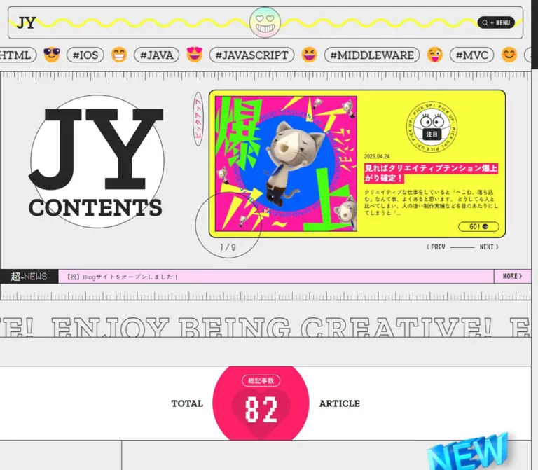
A thin rounded frame sits just inside the viewport edges. JY is aligned left, a circular smiling face is centered independently, and a dark MENU capsule sits right. A fluorescent yellow wave runs horizontally behind them. The face has heart-shaped eyes, a wide toothy grin, delicate black outlines, and a soft pastel fill.
The desktop menu box measures approximately 101.30 × 32.38px; mobile measures 85.80 × 28.06px. Its visible anatomy is a magnifying-glass symbol, a plus sign, and the VT323 MENU caption. The recorded trigger has no usable destination URL in the evidence. Treat it as a menu affordance; the expanded state and search execution were not tested.
The header's DOM contains menu-related labels, archive destinations, SEARCH, and recent-topic text. That establishes available content in the markup, not the appearance or accessibility of an opened overlay.
Header Keyword Ribbon
Role: expose the taxonomy while immediately establishing the site's playful character.
Single-line outlined capsules alternate with colorful emoji faces. Latin tags use Zilla Slab; Japanese tags use Zen Kaku Gothic New. The ribbon is visibly clipped at the viewport edges. It remains a horizontal ribbon on mobile.
Measured Latin capsule height is 40px on desktop and 25px on mobile. The repeated text groups measure 4778.08px and 2676.59px wide respectively. Links resolve to actual tag archives, such as /tag/canvas/ and /tag/javascript/.
Duplication and the sampled horizontal offset support a marquee-like construction. Exact movement direction, speed, pause behavior, and implementation are unknown.
Ruler Dividers
Role: give the page a notebook or measuring-tool rhythm.
A fine horizontal rule supports a sequence of short vertical ticks, with periodically longer marks. One ruler separates the keyword ribbon from the opening feature; another appears below the news strip. Desktop tick height is approximately 15–23px.
These details are thin and regular. Repeating CSS gradients or an SVG can reproduce them. Such a technique would be an implementation recommendation because the original rendering method was not supplied.
Opening Brand Emblem
Role: the dominant identity gesture above the article archive.
Large JY lettering overlaps a white outlined shape, with CONTENTS tightly positioned below. On desktop the white shape is nearly circular, approximately 360px across. On mobile it becomes a wide oval, approximately 319 × 212px, while the JY remains exceptionally large at 234px.
Desktop places this emblem to the left of the feature panel. Mobile gives it a dedicated centered block above the panel. Preserve the close spacing and overlap between JY, CONTENTS, and the white shape; ordinary heading margins would weaken the emblem.
Featured Article Panel
Role: foreground one article from an eight-item selection.
The desktop anatomy is:
- A fluorescent yellow outer panel with a dark outline and moderately rounded corners.
- A large, nearly square poster at left, with a thin dark edge.
- A narrow vertical oval outside the left edge containing
ピックアップin pink. - A circular PICK UP stamp above the right-hand copy.
- A date, a white-on-pink title, a short charcoal excerpt, and a small outlined GO! link.
- An overlapping outlined progress circle below the panel and PREV / NEXT controls aligned toward the right.
The desktop capture displays the article dated 2025.10.01, with the counter 3 / 8. Its poster combines oversized black lettering with orange, cyan, lime, and purple shapes. The stamp contains cartoon eyes and a dark center label reading 見テ.
The mobile capture displays the 2025.05.20 article, corresponding to 4 / 8 in the DOM. The composition stacks: poster first, an overlapping circular stamp near its lower edge, then date and text. Its green and purple poster has very large rounded black lettering, and the stamp's center reads 注目.
Title highlights follow the wrapped lines rather than filling the entire information column. For a new implementation, an inline span with box-decoration-break: clone is a useful way to reproduce this appearance.
On mobile the GO! text becomes white, and its measured anchor width increases from approximately 108px to 286px. The complete painted mobile button lies below the initial screenshot, so its fill should not be inferred from the text color alone.
Carousel Navigation
Role: identify the current feature and offer adjacent slides.
The desktop counter sits near the bottom of a large outlined circle overlapping the card's lower-left edge. PREV and NEXT are compact text controls separated by a short horizontal line. The DOM includes all eight article entries, including offscreen slides.
The two captured states establish different active slides. They do not establish whether the change came from autoplay, manual input, or another lifecycle event. Swipe support, looping rules, disabled states, and timing remain unverified.
News Strip
Role: provide a brief site announcement between the feature and the archive.
Desktop uses three adjoining cells: a dark label block, a flexible pale-pink story region, and a narrow MORE cell. The label combines the Japanese prefix with dotted NEWS lettering. Fine vertical rules divide the cells.
At mobile width the section changes from flex to block and grows from 40.31px to 137.64px. The label appears above the wrapped story, and MORE becomes a full-width bottom row. This is a substantive rearrangement rather than a uniformly scaled desktop strip.
Outlined Slogan Band
Role: provide a large typographic transition.
ENJOY BEING CREATIVE! repeats beyond the viewport. Letters are transparent inside and outlined with a fine dark stroke. At desktop size, portions of the large lettering are visibly masked by adjacent horizontal boundaries.
The computed text color is transparent; it should not be treated as missing text. The visible outline supplies the shape. Keep the slogan much larger than ordinary headings while allowing it to be cropped within its decorative band.
Total Article Counter
Role: communicate the archive's size.
The current rendered count is 89 at both viewports. The number uses VT323 at 120.96px desktop and 105.3px mobile, with a small outlined 総記事数 label above it. Desktop rendered text includes TOTAL and ARTICLE on either side; those flanking words are absent from the mobile visible-text extraction.
The desktop section has a measured white background. The mobile section's sampled background is transparent over the gray page. The large pink center treatment is only partially visible at the bottom of the supplied desktop opening capture; its complete geometry is not documented by that crop.
New Topics Article Grid
Role: present recently added or updated content through numbered editorial cards.
Desktop reserves approximately 23% of the main width before the New Topics content plane. Within the remaining approximately 77%, cards occupy three columns. The first row's cards are about 368–369px wide, with approximately 1px between adjoining rectangles. The supplied rendered text contains nine entries.
Each linked card contains a principal content column and a narrow metadata rail on its right. The rail groups a sequence number, date, and category capsule. The date and category rectangles are tall and narrow, consistent with a vertical arrangement. Below the upper media region, a bold Japanese title and compact excerpt align to the principal content column.
The mobile cards span the 389px content width and stack vertically. Their text column begins around x=39.86px and measures 260.63px wide; metadata remains near x=319–344px. Sequence numbers, dates, category labels, and titles become slightly larger on mobile, even though the overall page is narrower.
Six entries appear in the mobile rendered index, compared with nine on desktop. The ALL POST destination remains available. Preserve access to the complete archive when using a smaller mobile selection.
The supplied screenshots do not show this section directly. Its layout and typography above are grounded in DOM rectangles and computed styles; image crop details and hover behavior remain unverified.
Category Navigation
Role: provide five broad editorial entry points.
The rendered categories pair English labels with Japanese labels: OTHERS / その他, DESIGN / デザイン, FREELANCE / フリーランス, PROGRAMMING / プログラミング, and BOOKS / 本.
All five are present at both viewports and link to category archives. Their complete visual arrangement is outside the supplied screenshot crops. Reuse the verified bilingual hierarchy, but treat any proposed category-row layout as a recommendation.
Ranking Section
Role: combine prominent popular stories with a faster compact list.
The desktop screenshot shows two equal-width regions divided near x=720px. The left side contains larger panels for the top three articles. The right side contains compact entries for ranks four through ten, as established by the full rendered text.
The large panel anatomy includes a dark repeated NO.2 or NO.3 strip, a large underlined rank number with a smaller Japanese suffix, top-right date and category, a yellow-highlighted title, a short excerpt, and an article thumbnail at the lower right. Visible thumbnails are approximately 169 × 162px.
Compact rows use a rank number at left, a title with date below, and a small thumbnail at the far right. Visible rows are approximately 137px high, and thumbnails are approximately 62 × 60px. Long titles can visibly truncate in this compact format. Thin rules, shared backgrounds, and aligned columns establish hierarchy without elevated cards.
Below both regions, a broad band centers a pink GO! circle beside RANKING TOP 50. The circle is approximately 83px across and the band approximately 210px high in the desktop crop.
All ten ranked entries are present in the mobile text evidence. Their mobile visual arrangement was not captured, so stacking the desktop halves is a recommendation rather than an observed rule.
Middle Tag Section and Random Articles
Role: encourage exploration beyond recency and popularity.
Below ranking, the desktop crop reveals part of a large blue extruded TAG graphic with dimensional shading and a soft shadow. The DOM contains four pairs of repeated tag groups, alternating English TAG and Japanese tag captions, plus repeated JYCONTENTS text.
The complete middle tag composition is not pictured. Its direction of movement, spatial arrangement, and any 3D implementation are unknown; the visible lettering might be a rendered asset.
The following UNINTENTIONAL section is labeled as random articles and contains four linked entries in both viewport records. Each entry includes a number, date, category, title, and excerpt. A single captured set cannot establish when or how randomization occurs.
Footer Archive and Utility Navigation
Role: repeat major destinations near the end of a long document.
The rendered footer includes POST, RANK, CATE, and TAG with Japanese descriptions, followed by repeated identity text, a GO TOP link, and secondary navigation.
The mobile screenshot clearly shows four white, rule-separated rows: ABOUT, SOCIAL(X), NEWS, and 仕事依頼. Each has a small parenthesized index number beside the large label. Rows are approximately 48–50px tall. PRIVACY POLICY and TOP appear beneath as smaller text links in a taller white region.
A compact two-cell utility rail is visible at the upper-right edge of the lower-page captures. It combines a menu/search symbol and an upward chevron. Its repeated viewport-edge placement supports a persistent-control appearance; its exact fixed or sticky positioning rule and activation behavior were not supplied.
Keyword Playground
Role: close the browsing experience with an expressive taxonomy scene.
A gray, outlined field has a small centered KEY WORD label. White keyword capsules appear at varied rotations, overlapping and partly cropped at the field edges. Small attached capsules say drag. Large yellow expressive faces are mixed into the composition.
Desktop tags are approximately 40–46px in visible text size; mobile tags are approximately 25–30px. These are visual estimates, not computed font measurements. The desktop scene includes more terms in its rendered text than the mobile scene.
The drag labels advertise manipulation. No pointer-drag trace was provided, so gravity, collisions, throwing, bounce, and the underlying engine are unverified. For an adaptation, keep the archive destinations available in ordinary links even when a decorative physics scene is added.
Closing Wordmark and Slogan
Role: end the page with a strong typographic signature.
Desktop places a straight slogan line above the oversized JY-CONTENTS wordmark on white. COPYRIGHT, ALL RIGHTS RESERVED., and the year [2026] sit in compact utility text around it. Fine horizontal rules separate the bands.
The mobile capture shows a fluorescent yellow slogan ribbon tilted across the boundary between the keyword scene and the footer. It carries 「創る」をおもいっきり楽しむ!✌. The wordmark fits nearly edge to edge beneath the ribbon, with copyright information compressed into small strips.
These are the two recorded presentations. The precise breakpoint and whether additional animated states exist are unknown.
Tokens — Motion & Interaction
| Treatment | Evidence | Verified limit |
|---|---|---|
| Menu plus and caption | Computed transition 0.2s at both viewports |
Transition target and resulting state not recorded |
| Header keyword links | Desktop transition 0.2s; mobile none |
Hover color or transform not recorded |
| Featured GO! text | Computed transition 0.3s at both viewports |
End-state appearance not recorded |
| MORE control | Computed transition 0.2s at both viewports |
Activation and hover result not recorded |
| Featured carousel | Eight entries; desktop 3 / 8, mobile 4 / 8; PREV / NEXT labels |
No verified autoplay interval, easing, swipe behavior, or click result |
| Header keyword ribbon | Duplicated groups, overflow, and a sampled mobile horizontal offset | No measured loop duration or direction |
| Outlined slogan and ranking text | Repeated text extending beyond visible bounds | Motion timing and triggering conditions unknown |
| Keyword playground | Rotated overlapping capsules with drag labels | Actual drag behavior and physics untested |
| Utility rail / GO TOP | Visible controls and a top anchor in the rendered links | Scroll behavior and positioning mechanism untested |
Most sampled elements report animation: none. That does not rule out motion on ancestors, pseudo-elements, JavaScript-controlled transforms, or unsampled artwork. A bare transition: all without a duration does not establish a meaningful animation token.
The supplied capture process waited for load and stability, temporarily paused perpetual animations during readiness checks, and resumed them afterward. Consequently, the screenshots may show different animation phases. No frame sequence or action-by-action interaction log was supplied.
Recommended motion direction: keep expressive movement concentrated in decorative ribbons, stamps, and the keyword scene. Preserve reading stability in article titles and metadata. Use explicit carousel controls and offer a pause mechanism for ongoing motion. Select durations through testing rather than presenting invented values as source measurements.
Surfaces
| Layer | Appearance | Purpose |
|---|---|---|
| Main canvas | Solid #EDEDED |
Continuous editorial background |
| White pause | White fill with thin black boundaries | Brand oval, footer, and desktop counter region |
| Featured field | Fluorescent yellow, dark outline, rounded corners | Priority article selection |
| Title highlight | Pink behind white text, or yellow behind charcoal text | Differentiate feature titles from ranking titles |
| News strip | Pale pink with a dark label cell | Brief announcement |
| Article and ranking cells | Shared gray surface, square corners, fine rules | Dense browsing structure |
| Capsule / sticker | Thin outline, rounded or circular shape | Keywords, badges, and playful labels |
| Dimensional graphic | Blue extruded lettering with visible shading | Isolated visual accent below ranking |
There is no visible general-purpose card-shadow system. The dimensional TAG artwork is a localized exception; its shadow may be embedded in an asset. Likewise, the pastel face gradient should not become a gradient treatment for every UI surface.
Imagery
The main article images behave like miniature graphic posters. The desktop feature uses stretched black lettering over orange, cyan, purple, and lime forms. The mobile feature uses chunky black lettering on vivid green with a purple typographic background. Ranking thumbnails repeat these article identities at much smaller sizes.
The interface combines these posters with a different kind of imagery: expressive yellow faces, outlined cartoon eyes, a smiling pastel medallion, circular stamps, and blue dimensional lettering. Their shared quality is graphic exaggeration rather than a uniform illustration technique.
Preserve the distinction between ordinary UI text and lettering embedded in article images. Article posters should remain legible as complete compositions where possible. Do not globally apply pixelated image rendering: the pixel-like character is verified in utility fonts, while the posters and face outlines are visually smooth.
Observed Asset References
Image source URLs were not included in the supplied evidence. The following are article destinations associated with visible artwork, not image download paths.
| Artwork | Original-page association | What is established |
|---|---|---|
| Orange/cyan/lime/purple feature poster | Design article ③ | Visible in the current desktop feature and a compact ranking thumbnail |
| Green/purple feature poster | Design article ② | Visible in the current mobile feature |
| Blue/purple/yellow VGD poster | First design roundup | Visible beside rank two in the desktop crop |
| Green typographic poster with eyes | Blog production article | Visible beside rank three in the desktop crop |
| Pastel smiling medallion | Homepage masthead | Appearance is visible; file path and construction method unknown |
| Circular PICK UP eye stamp | Featured panel | Two center-label states are visible; asset implementation unknown |
| Blue dimensional TAG lettering | Below desktop ranking | Partially visible; complete asset and rendering technique unknown |
The article destinations above were present in the homepage links. Their pages were not opened during this analysis.
Layout & Responsive Behavior
The desktop homepage is a long, nearly full-width editorial composition. Its opening pairs a large identity zone with a landscape featured panel. Later sections alternate between dense article arrangements and broad typographic or decorative breaks. The ranking crop uses equal left and right halves, while New Topics occupies an offset content plane with three columns.
At 390px, the hierarchy is recomposed. The brand emblem gets its own block, the feature becomes vertical, the news strip stacks, and New Topics becomes a one-column list. The mobile document is about 11,919px tall, compared with about 8,688px on desktop, despite the smaller New Topics selection.
| Area | Observed desktop | Observed mobile |
|---|---|---|
| Masthead | Wide frame, 86.56px high |
Compact frame, 50.45px high |
| Keywords | Single-line capsules and faces | Same ribbon model at smaller size; edge clipping retained |
| Opening identity | Left of feature; circular white shape | Above feature; wider oval shape |
| Featured story | Poster and copy side by side | Poster above copy; stamp overlaps the lower poster edge |
| Featured title | 20.88px |
19.5px; remains prominent |
| News | Three adjoining horizontal regions | Vertically arranged label, story, and MORE |
| Article counter | White section; flanking English words present | Transparent section background; flanking words absent from visible text |
| New Topics | Three columns; nine rendered entries | One column; six rendered entries |
| New Topics metadata | Narrow right rail | Right rail retained; several labels become larger |
| Footer slogan | Straight line on white | Tilted fluorescent ribbon in the captured state |
| Keyword playground | Approximately 580px high |
Approximately 400px high |
Only these two viewport sizes were supplied. Tablet layouts, landscape phones, browser zoom, text enlargement, and safe-area behavior remain unverified. Do not infer an exact source breakpoint from the endpoint captures.
For a new implementation, start with a breakpoint near 48rem, then test whether the featured copy and article grid remain comfortable around that width. Contain overflow within decorative ribbons and scenes; maintain ordinary document flow for articles and navigation.
Do’s and Don’ts
Do
- Anchor the page in measured gray
#EDEDED, charcoal#262626, and fine structural rules. - Use yellow for large feature fields and ranking highlights, with pink for feature-title bands and prominent circular actions.
- Preserve the three distinct typographic roles: slab-serif identity, Japanese editorial copy, and pixel-like utility labels.
- Retain Doto specifically for the dotted NEWS label.
- Keep the huge JY emblem, tightly joined CONTENTS line, and white circle or oval.
- Make poster artwork a major part of article discovery.
- Preserve the narrow metadata rail in New Topics cards across the two observed layouts.
- Use square article cells alongside a limited vocabulary of capsules, circles, and ovals.
- Recompose the feature and news sections for mobile.
- Provide several meaningful routes into the archive.
- Treat cartoon stamps and tilted keywords as distinctive components with clear boundaries.
- Keep counts, dates, slide totals, and article selections driven by current content.
Don’t
- Replace the archive structure with an unrelated conversion funnel.
- Put every article inside a spacious rounded card with a soft shadow.
- Apply all declared WordPress preset colors to the visible interface.
- Use VT323 for every number or Zilla Slab for Japanese body copy.
- Shrink the desktop layout uniformly until it fits a phone.
- Turn decorative edge clipping into page-wide horizontal overflow.
- Crop away the defining lettering of article posters merely to enforce a generic ratio.
- Convert every image into pixel art because some labels use a pixel-like font.
- Treat repeated DOM text as multiple distinct articles or assume all carousel slides are simultaneously visible.
- Specify autoplay, physics engines, hover transformations, or opening animations as verified features.
- Generalize the blue 3D artwork into a site-wide elevation style.
Recommended Implementation Additions
These are recommendations for a new implementation, not verified features of the current page:
- Use semantic buttons for menu and carousel operations, with explicit names and an accurate expanded state for the menu.
- Give small visible controls a comfortable hit area. The observed menu and featured links have compact painted dimensions; a
44pxinteraction target is a useful adaptation. - Provide a visible focus indicator and make complete article destinations accessible without nested links.
- Keep one logical page heading and a clear section hierarchy, even if the visual identity is repeated at several sizes.
- Exclude decorative ribbon copies from assistive technology and keyboard navigation. Keep a canonical, accessible collection of tag links.
- Pause automatic carousel movement when appropriate, and let users pause persistent ribbons. Respect reduced-motion preferences in both CSS and JavaScript.
- Provide keyboard-accessible tag archives alongside any drag scene. Dragging must not be the sole route to a topic.
- Check white-on-pink text at its actual size and weight; use a darker approved pink where smaller text requires greater contrast.
- Consider a slightly larger minimum for mobile excerpts, whose observed featured size is
12.87px. - Preserve image dimensions during loading, prioritize the initially visible poster, and defer below-the-fold imagery.
- Keep decorative animation dormant when offscreen, while preserving article readability and ordinary scrolling.
Agent Prompt Guide
Quick Color Reference
- Main page:
#EDEDED. - Text and dark menu:
#262626. - Structural rules:
#000000as a declared source border token. - Featured field and ranking highlights: source yellow
#F8FF3C. - Featured title bands and prominent circular action: source pink
#FF2167. - White shapes and reversed labels:
#FFFFFF. - News surface: approximately
#FFD7F6, a screenshot-based estimate. - Multicolor variation: concentrate it inside posters, faces, stamps, and isolated decorative lettering.
Overall Prompt
“Create an editorial homepage for a Japanese creative and programming blog inspired by JY-CONTENTS. Use a light gray #EDEDED canvas, charcoal text, and fine black rules. Pair enormous Zilla Slab identity lettering with Zen Kaku Gothic New article copy, VT323 utility labels, and a dotted Doto NEWS caption. Build a framed masthead with a central smiling medallion and yellow wave, an overflowing ribbon of outlined keyword capsules and expressive faces, and a featured article in fluorescent yellow with a colorful poster and pink title highlights. Follow with a numbered article grid, category navigation, a ranking section combining large stories and compact rows, and a strong typographic footer with a keyword playground. On mobile, stack the feature and news, retain the article metadata rail, and preserve the oversized identity. Treat decorative movement as optional and pausable; do not invent source timings.”
Example Component Prompts
- Featured article: “A fluorescent yellow panel with a thin dark outline, a nearly square graphic poster at left, and compact Japanese article details at right. Place a circular cartoon-eye PICK UP stamp above the date, use white text on pink line-following title highlights, and add an outlined GO! link. On a phone, put the poster above the copy and overlap the stamp at the poster's lower edge.”
- New Topics card: “A square-cornered editorial cell on light gray. Use a main media and text column plus a narrow right rail containing a bold sequence number, vertically arranged date, and outlined category capsule. Separate adjoining cards with fine rules. Use three columns on a wide screen and one column on mobile.”
- Ranking: “Split a desktop section into two equal halves. On the left, use large top-three panels with repeated dark rank strips, yellow-highlighted titles, excerpts, and colorful thumbnails. On the right, use compact numbered rows with a date and a small thumbnail aligned to the far edge. Finish with a large pink GO! circle beside RANKING TOP 50.”
- Masthead and ribbon: “A shallow rounded outline frame containing a slab-serif JY mark, an independently centered pastel smiling face, and a dark pixel-caption MENU control. Run a fluorescent wave behind these elements. Below, arrange outlined keyword capsules and yellow expressive faces in a single clipped horizontal ribbon.”
- Footer playground: “A gray field with a small centered KEY WORD caption, white outlined keyword capsules at varied angles, small drag labels, and expressive yellow faces. Follow with a nearly full-width slab-serif wordmark and tiny utility copyright text. On mobile, place a tilted yellow slogan ribbon across the boundary. Provide ordinary topic links alongside any optional drag interaction.”
Quick Start
CSS Custom Properties
This is a usable adaptation, not extracted source CSS. It retains a conventional 16px root, uses the verified font stacks, and approximates the recorded desktop proportions with fluid values. The 48rem breakpoint is recommended, not measured. Small control hit areas and mobile excerpt sizes are deliberately increased.
Load the named fonts through the new project's font setup; no font-file URLs were supplied. Provide project-owned or authorized artwork for the face, stamps, and posters. CSS reproduces the shell, not the original illustrations, carousel logic, or drag behavior.
:root {
  /* Measured colors and exact declared accent presets */
  --color-canvas: #ededed;
  --color-ink: #262626;
  --color-paper: #ffffff;
  --color-rule: #000000;
  --color-yellow: #f8ff3c;
  --color-pink: #ff2167;

  /* Visual approximation, not a sampled source color */
  --color-news: #ffd7f6;

  /* Recorded computed font stacks */
  --font-editorial: 'Zilla Slab', serif;
  --font-body: 'Zen Kaku Gothic New', serif;
  --font-utility: 'VT323', serif;
  --font-news: 'Doto', serif;

  /* Adapted fluid scale, matching desktop reference endpoints */
  --text-logo: clamp(1.95rem, 3.3vw, 2.97rem);
  --text-brand: clamp(12rem, 23vw, 20.7rem);
  --text-contents: clamp(2.925rem, 4.7vw, 4.23rem);
  --text-tag: clamp(1.21875rem, 2.2vw, 1.98rem);
  --text-feature: clamp(1.21875rem, 1.45vw, 1.305rem);
  --text-section: clamp(1.95rem, 3vw, 2.7rem);
  --text-utility: clamp(1.17rem, 1.5vw, 1.35rem);

  /* Recommended reusable spacing vocabulary */
  --space-1: 4px;
  --space-2: 8px;
  --space-3: 12px;
  --space-4: 16px;
  --space-6: 24px;
  --space-8: 32px;
  --space-12: 48px;
  --space-16: 64px;

  --rule: 1px solid var(--color-rule);
  --radius-pill: 100px;
  --radius-header: clamp(6.63px, .7vw, 10.08px);
  --radius-feature: clamp(6px, 1.4vw, 20px);
  --transition-control: 200ms;
}

* { box-sizing: border-box; }

body {
  margin: 0;
  color: var(--color-ink);
  background: var(--color-canvas);
  font: 400 1rem/1.5 var(--font-body);
}

button, input { font: inherit; }
a { color: inherit; }
img { display: block; max-inline-size: 100%; }

.jy-page { border-inline-end: var(--rule); }

.site-header {
  position: relative;
  isolation: isolate;
  display: grid;
  grid-template-columns: 1fr auto 1fr;
  align-items: center;
  min-block-size: clamp(50.45px, 6vw, 86.56px);
  margin: 1.2vw 1.5vw 0;
  padding-inline: 1.5vw;
  border: var(--rule);
  border-radius: var(--radius-header);
}

.site-logo {
  justify-self: start;
  font: 600 var(--text-logo)/1 var(--font-editorial);
  text-decoration: none;
}

.header-face {
  inline-size: clamp(48px, 5.84vw, 84px);
  aspect-ratio: 1;
}

/* Supply an SVG containing the repeated wave shape. */
.header-wave {
  position: absolute;
  z-index: -1;
  inset-inline: 0;
  inset-block-start: 50%;
  inline-size: 100%;
  block-size: 32px;
  transform: translateY(-50%);
  fill: none;
  stroke: var(--color-yellow);
  stroke-width: 7;
  pointer-events: none;
}

.menu-trigger {
  justify-self: end;
  display: inline-flex;
  align-items: center;
  gap: 6px;
  min-block-size: 44px;
  padding: 4px 13px;
  border: 0;
  border-radius: var(--radius-pill);
  color: var(--color-paper);
  background: var(--color-ink);
  font: 400 var(--text-utility)/1 var(--font-utility);
  cursor: pointer;
}

.tag-ribbon {
  overflow: hidden;
  padding-block: clamp(15px, 1.6vw, 23px);
}

.tag-track {
  display: flex;
  align-items: center;
  gap: clamp(12px, 1.2vw, 18px);
  inline-size: max-content;
}

.tag-pill {
  display: inline-block;
  padding-inline: clamp(7.8px, 1vw, 14.4px);
  border: var(--rule);
  border-radius: var(--radius-pill);
  font: 500 var(--text-tag)/1.2 var(--font-editorial);
  text-decoration: none;
  white-space: nowrap;
}

.tag-pill:lang(ja) { font-family: var(--font-body); }

.tag-face {
  flex: none;
  inline-size: clamp(26px, 3vw, 44px);
}

.ruler {
  block-size: 24px;
  border-block-start: var(--rule);
  background-image:
    linear-gradient(90deg, var(--color-rule) 1px, transparent 1px),
    linear-gradient(90deg, var(--color-rule) 1px, transparent 1px);
  background-size: 9.6px 15px, 48px 23px;
  background-repeat: repeat-x;
}

.feature-section {
  display: grid;
  grid-template-columns: 37.8% minmax(0, 1fr);
  gap: 3.2vw;
  align-items: start;
  padding: 1.8vw 4.8vw 3.4vw 0;
}

.feature-brand {
  position: relative;
  isolation: isolate;
  inline-size: 26.5vw;
  margin-inline: auto;
  text-align: center;
  font-family: var(--font-editorial);
}

.feature-brand::before {
  content: '';
  position: absolute;
  z-index: -1;
  inset: 12px 10px -12px;
  border: var(--rule);
  border-radius: 50%;
  background: var(--color-paper);
}

.brand-jy {
  display: block;
  font-size: var(--text-brand);
  font-weight: 600;
  line-height: 1;
}

.brand-contents {
  display: block;
  margin-block-start: -2.64vw;
  font-size: var(--text-contents);
  font-weight: 700;
  line-height: 1;
}

.feature-card {
  position: relative;
  display: grid;
  grid-template-columns: 1.06fr minmax(0, 1fr);
  gap: 1.3vw;
  padding: 1vw;
  border: 2px solid var(--color-ink);
  border-radius: var(--radius-feature);
  background: var(--color-yellow);
}

.feature-poster {
  inline-size: 100%;
  block-size: auto;
  border: var(--rule);
}

.pickup-label {
  position: absolute;
  inset-block-start: 4px;
  inset-inline-start: -3vw;
  padding: 14px 3px;
  border: var(--rule);
  border-radius: 50%;
  color: var(--color-pink);
  font-style: italic;
  writing-mode: vertical-rl;
}

.feature-copy {
  position: relative;
  min-inline-size: 0;
  padding-block-start: 11.8vw;
}

.pick-stamp {
  position: absolute;
  inset-block-start: 1vw;
  inset-inline-start: 50%;
  inline-size: 9.7vw;
  transform: translateX(-50%);
}

.feature-date {
  display: block;
  margin-block-end: .8vw;
  font-size: .99rem;
  font-weight: 500;
  line-height: 1;
}

.feature-title {
  margin: 0 0 .9vw;
  font-size: var(--text-feature);
  font-weight: 600;
  line-height: 1.3;
}

.marker {
  padding-inline: .12em;
  color: var(--color-paper);
  background: var(--color-pink);
  -webkit-box-decoration-break: clone;
  box-decoration-break: clone;
}

.feature-excerpt {
  margin: 0 0 1vw;
  font-size: .9rem;
  font-weight: 500;
  line-height: 1.3;
}

.feature-go {
  display: flex;
  align-items: center;
  justify-content: center;
  gap: 8px;
  inline-size: 110px;
  min-block-size: 44px;
  margin-inline-start: auto;
  border: var(--rule);
  border-radius: var(--radius-pill);
  font: 400 1.53rem/1 var(--font-utility);
  text-decoration: none;
}

.news-strip {
  display: grid;
  grid-template-columns: 11% minmax(0, 1fr) 100px;
  border-block: var(--rule);
  background: var(--color-news);
}

.news-label, .news-more {
  display: flex;
  align-items: center;
  justify-content: center;
  min-block-size: 40px;
}

.news-label {
  color: var(--color-paper);
  background: var(--color-ink);
}

.news-label strong {
  font: 400 1.62rem/1 var(--font-news);
}

.news-story {
  align-self: center;
  padding: 8px 14px;
  text-decoration: none;
}

.news-more {
  border-inline-start: var(--rule);
  font: 400 1.53rem/1 var(--font-utility);
  text-decoration: none;
}

.outline-band {
  overflow: hidden;
  border-block-end: var(--rule);
}

.outline-text {
  margin: 0;
  color: transparent;
  font: 700 clamp(58.5px, 6.6vw, 95.04px)/1 var(--font-editorial);
  letter-spacing: .045em;
  white-space: nowrap;
  -webkit-text-stroke: 1px var(--color-ink);
}

.topics-main {
  inline-size: 77%;
  margin-inline-start: 23%;
}

.section-heading {
  margin: 0;
  padding: 64px 16px 48px;
  text-align: center;
  font: 600 var(--text-section)/1 var(--font-editorial);
}

.topic-grid {
  display: grid;
  grid-template-columns: repeat(3, minmax(0, 1fr));
  gap: 1px;
  border-block: var(--rule);
  background: var(--color-rule);
}

.topic-card {
  display: grid;
  grid-template-columns: minmax(0, 1fr) 28px;
  gap: 20px;
  padding: 2.3vw;
  background: var(--color-canvas);
  text-decoration: none;
}

.topic-content { min-inline-size: 0; }
.topic-image { inline-size: 100%; block-size: auto; }

.topic-title {
  margin: 14px 0 10px;
  font-size: 1.053rem;
  font-weight: 700;
  line-height: 1.3;
}

.topic-excerpt {
  margin: 0;
  font-size: .855rem;
  line-height: 1.3;
}

.topic-meta {
  display: flex;
  flex-direction: column;
  align-items: center;
  gap: 12px;
}

.topic-number {
  border-block-end: var(--rule);
  font-size: 1.53rem;
  font-weight: 700;
  line-height: 1.2;
}

/* Recommended method for the observed vertical metadata rail. */
.topic-date, .topic-category {
  writing-mode: vertical-rl;
  white-space: nowrap;
  font-size: .837rem;
  line-height: 1;
}

.topic-category {
  padding: 7px 2px;
  border: var(--rule);
  border-radius: var(--radius-pill);
  font-size: .72rem;
}

.ranking-columns {
  display: grid;
  grid-template-columns: repeat(2, minmax(0, 1fr));
  border-block: var(--rule);
}

.ranking-columns > :first-child { border-inline-end: var(--rule); }

.rank-strip {
  overflow: hidden;
  padding-block: 7px;
  color: var(--color-paper);
  background: var(--color-ink);
  white-space: nowrap;
  font-family: var(--font-utility);
}

.rank-title .marker {
  color: var(--color-ink);
  background: var(--color-yellow);
}

.rank-row {
  display: grid;
  grid-template-columns: 28px minmax(0, 1fr) 62px;
  gap: 18px;
  align-items: center;
  min-block-size: 137px;
  padding: 18px;
  border-block-end: var(--rule);
  text-decoration: none;
}

.rank-row img { inline-size: 62px; block-size: auto; }

.archive-action {
  display: flex;
  align-items: center;
  justify-content: center;
  gap: 14px;
  min-block-size: 210px;
  border-block-end: var(--rule);
  text-decoration: none;
  font-weight: 700;
}

.go-disc {
  display: grid;
  place-items: center;
  inline-size: 83px;
  aspect-ratio: 1;
  border-radius: 50%;
  color: var(--color-paper);
  background: var(--color-pink);
  font: 400 2.25rem/1 var(--font-utility);
}

.footer-links { background: var(--color-paper); }

.footer-links a {
  display: block;
  min-block-size: 49px;
  padding: 8px 10px;
  border-block-end: var(--rule);
  font: 600 1.65rem/1.2 var(--font-editorial);
  text-decoration: none;
}

.footer-links sup { font: 400 .65rem/1 var(--font-body); }

.keyword-field {
  position: relative;
  min-block-size: clamp(400px, 40.3vw, 580px);
  border-block: var(--rule);
  background: var(--color-canvas);
}

/* Static accessible fallback; physics is a separate enhancement. */
.keyword-links {
  display: flex;
  flex-wrap: wrap;
  gap: 18px;
  padding: 32px;
}

.keyword-links .tag-pill { background: var(--color-paper); }

.footer-signature {
  position: relative;
  background: var(--color-paper);
}

.footer-slogan {
  margin: 0;
  padding: 36px 16px 12px;
  border-block-end: var(--rule);
  text-align: center;
  font-size: clamp(1rem, 2.3vw, 2.1rem);
}

.footer-wordmark {
  margin: 0;
  overflow: hidden;
  border-block-end: var(--rule);
  font: 600 14vw/.95 var(--font-editorial);
  white-space: nowrap;
}

.footer-legal {
  display: flex;
  justify-content: space-between;
  gap: 12px;
  padding: 10px 16px;
  font: 400 1.25rem/1 var(--font-utility);
}

/* Recommended interaction feedback, not a measured hover state. */
@media (hover: hover) {
  .tag-pill { transition: background-color var(--transition-control); }
  .tag-pill:hover { background: var(--color-yellow); }
}

:where(a, button, input):focus-visible {
  outline: 3px solid var(--color-ink);
  outline-offset: 4px;
}

/* Recommended breakpoint; the original breakpoint is unknown. */
@media (max-width: 48rem) {
  :root {
    --text-logo: 8vw;
    --text-brand: 60vw;
    --text-contents: 12vw;
    --text-tag: 5vw;
    --text-feature: 5vw;
    --radius-feature: 5px;
  }

  .site-header {
    margin-block-start: 2.5vw;
    padding-inline: 1.5vw;
  }

  .ruler {
    block-size: 20px;
    background-size: 7.8px 12px, 39px 19px;
  }

  .feature-section {
    display: block;
    padding: 0 1.7vw 40px;
  }

  .feature-brand {
    inline-size: 82vw;
    margin-block-end: 8vw;
  }

  .feature-brand::before { inset: 28px 0 0; }
  .brand-contents { margin-block-start: -8.2vw; }

  .feature-card {
    display: block;
    margin-inline-start: 8.5vw;
    padding: 2.4vw;
  }

  .pickup-label { inset-inline-start: -8vw; }
  .feature-copy { padding-block-start: 19.5vw; }

  .pick-stamp {
    inset-block-start: -13.5vw;
    inline-size: 32vw;
  }

  .feature-date {
    margin-block-end: 6px;
    font-size: .853rem;
  }

  .feature-title { margin-block-end: 9px; }

  .feature-excerpt {
    margin-block-end: 16px;
    font-size: .875rem;
    line-height: 1.45;
  }

  .feature-go {
    inline-size: 90%;
    margin-inline: auto;
  }

  .news-strip { grid-template-columns: 1fr; }
  .news-story { padding: 14px 8px; }

  .news-more {
    border-inline-start: 0;
    border-block-start: var(--rule);
  }

  .topics-main { inline-size: 100%; margin-inline-start: 0; }
  .topic-grid { grid-template-columns: 1fr; }
  .topic-card { padding: 24px 10.2%; gap: 19px; }
  .topic-title { font-size: 1.097rem; }
  .topic-excerpt { font-size: .875rem; }
  .topic-number { font-size: 1.706rem; }
  .topic-date { font-size: .902rem; }
  .topic-category { font-size: .853rem; }

  /* Proposed mobile ranking arrangement; not visually verified. */
  .ranking-columns { grid-template-columns: 1fr; }
  .ranking-columns > :first-child { border-inline-end: 0; }

  .footer-slogan {
    position: relative;
    z-index: 1;
    padding: 16px 8px;
    border: var(--rule);
    background: var(--color-yellow);
    transform: rotate(9deg);
    font-weight: 700;
  }

  .footer-wordmark { padding-block-start: 12px; font-size: 12.8vw; }
  .footer-legal { padding: 8px; font-size: .9rem; }
}

@media (prefers-reduced-motion: reduce) {
  .tag-track, .outline-text, .pick-stamp {
    animation: none;
    transition: none;
  }

  /* Also disable automatic motion in the associated JavaScript. */
  .tag-ribbon:focus-within { overflow-x: auto; }
}
A minimal featured-card structure follows. The filenames are local implementation placeholders, not discovered original-site asset paths. This example is one static slide; navigation and slide state need a separate implementation.
<article class='feature-card' aria-labelledby='feature-title'>
  <span class='pickup-label' aria-hidden='true'>ピックアップ</span>
  <img
    class='feature-poster'
    src='/assets/feature-poster.webp'
    width='960'
    height='900'
    alt='Colorful typographic poster for the featured design article'
  >
  <div class='feature-copy'>
    <img class='pick-stamp' src='/assets/pick-stamp.svg' alt=''>
    <time class='feature-date' datetime='2025-10-01'>2025.10.01</time>
    <h2 class='feature-title' id='feature-title'>
      <span class='marker'>ここ最近で凄いなと思ったwebデザインをご紹介③</span>
    </h2>
    <p class='feature-excerpt'>A short introduction to the selected article.</p>
    <a class='feature-go' href='/articles/design-selection/'>
      GO! <span aria-hidden='true'>→</span>
    </a>
  </div>
</article>
Tailwind v4 Token Mapping
Optional aliases for a project already using Tailwind v4. These do not imply that the original website uses Tailwind. Define the custom properties above first.
@theme inline {
  --color-canvas: #ededed;
  --color-ink: #262626;
  --color-paper: #ffffff;
  --color-rule: #000000;
  --color-yellow: #f8ff3c;
  --color-pink: #ff2167;
  --color-news: #ffd7f6;

  --font-editorial: 'Zilla Slab', serif;
  --font-body: 'Zen Kaku Gothic New', serif;
  --font-utility: 'VT323', serif;
  --font-news: 'Doto', serif;

  --text-identity: var(--text-brand);
  --text-keyword: var(--text-tag);
  --text-feature-title: var(--text-feature);
  --text-section-title: var(--text-section);

  --radius-capsule: 100px;
  --radius-masthead: var(--radius-header);
  --radius-feature-panel: var(--radius-feature);
}
Sources & Evidence
- Inspected original page: https://jy-contents.com/. The supplied browser record reports HTTP 200 and the same final URL.
- Capture timestamp:
2026-09-12T17:53:44.250Z, equivalent to September 13, 2026, 02:53:44.250 JST. - Desktop evidence: three original-page captures at
1440 × 1000, showing the opening composition, a ranking segment, and the bottom keyword/footer area. The rendered document height is8687.671875px. - Mobile evidence: two original-page captures at
390 × 844, showing the opening composition and the bottom navigation/keyword/footer area. The rendered document height is11918.5625px. - Rendered evidence: page title, visible-text extraction, original-page link destinations, custom properties, element rectangles, font stacks, font sizes, weights, line heights, spacing, radii, display modes, and selected transition values.
- Interaction evidence: supplied scroll-based capture coverage, visible navigation affordances, different recorded carousel states, repeated ribbon content, and drag labels. No menu activation, carousel-button test, hover sequence, drag trace, or destination-page inspection was supplied.
- Inspection limitations: the screenshots are selected crops rather than a complete visual record of every section. The computed-style sample is partial and includes offscreen content. Image source paths, full CSS, media queries, motion keyframes, font files, and JavaScript behavior were not available. The capture process disabled SharedWorkers and service workers and cannot establish delayed-content completeness.
This reference describes the current homepage at the recorded destination. Exact values are attributed to supplied measurements or declarations; screenshot estimates and implementation recommendations are labeled separately.
# JY-CONTENTS — Style Reference

> A creative notebook ruled in black, highlighted in neon, and covered with expressive stickers.

**Website:** [JY-CONTENTS](https://jy-contents.com/)
**Original URL:** https://jy-contents.com/
**Final URL:** https://jy-contents.com/
**Response:** HTTP 200; unchanged destination.
**Theme:** light gray and white, with fluorescent yellow and vivid pink accents. No theme selector was verified.
**Inspected:** September 13, 2026, at 02:53 JST; supplied retrieval timestamp: September 12, 2026, 17:53:44.250 UTC.
**Viewports:** desktop 1440 × 1000 CSS pixels; mobile 390 × 844 CSS pixels.
**Scope:** the current blog homepage, including its masthead, featured articles, news, article count, New Topics, categories, ranking, tag sections, random articles, footer navigation, keyword playground, and closing wordmark. Visual coverage consists of three desktop captures and two mobile captures, supplemented by rendered text, links, element rectangles, and computed styles. Article destinations and expanded menu states were not inspected.

JY-CONTENTS presents design, programming, freelance work, and personal interests through a dense editorial homepage. Its identity comes from a disciplined underlying grid carrying exuberant decoration: enormous slab-serif lettering, fluorescent article highlights, emoji faces, circular stamps, repeated text, and tilted keyword capsules. Light gray occupies most of the page. Fine black rules make the long document feel organized even when its typography and artwork deliberately overflow their local frames.

The browsing structure offers several routes into the same archive: featured stories, recent or updated posts, categories, popular articles, tags, and random selections. Small dates and category labels support large, colorful article artwork. The strongest contrast is between the quiet structural canvas and the loud content placed on it.

## How to Read This Reference

- **Measured** values come directly from the supplied rendered DOM and computed styles. They describe the two recorded viewport states, not a complete stylesheet.
- **Declared tokens** are exact custom-property values present in the page. A declaration alone does not establish that every matching-looking component uses that variable.
- **Visual estimates**, marked approximately or with `≈`, come from the original-page captures. They are not pixel-sampled colors or computed dimensions.
- **Recommendations** and all Quick Start code are adaptations for a new implementation. Proposed breakpoints, accessibility improvements, and fallback behavior are not claims about the original site.
- Font stacks are recorded exactly where available. Font files, full loading behavior, and the family used by every illustrated or unsampled label were not supplied.
- The DOM includes repeated ribbons and offscreen carousel slides. Their large or negative coordinates should not be interpreted as the dimensions of the visible page.
- Static captures establish appearance and available states. They do not establish autoplay intervals, easing curves, drag physics, hover outcomes, or successful control activation.

## Tokens — Colors

### Default Palette

| Name | Value | Evidence | Role / implementation alias |
| --- | --- | --- | --- |
| Notebook Gray | `#EDEDED` | Measured body background: `rgb(237, 237, 237)` at both viewports | Dominant canvas; `--color-canvas` |
| Charcoal Ink | `#262626` | Measured body text and menu fill; declared `--wp--preset--color--black` | Typography, dark labels, and menu surface; `--color-ink` |
| White Paper | `#FFFFFF` | Measured desktop article-count surface and reversed text; declared white preset | White sections, sticker interiors, and reversed labels; `--color-paper` |
| Fluorescent Yellow | `#F8FF3C` | Exact declared `--wp--preset--color--yellow`; visually consistent with feature panels and highlights | Featured content, selected emphasis, and mobile slogan ribbon; `--color-yellow` |
| Signal Pink | `#FF2167` | Exact declared `--wp--preset--color--red`; visually consistent with title bands and circular actions | Article-title highlights and prominent archive actions; `--color-pink` |
| Rule Black | `#000000` | Exact declared `--clr-border` | Recommended structural stroke token; individual border colors were not comprehensively sampled |
| News Blush | `≈#FFD7F6` | Visual estimate from the desktop news strip | Secondary announcement surface; `--color-news` |

The yellow and pink values are exact source presets, while their association with particular unsampled fills is supported visually. The gray body, charcoal text, dark menu background, and white reversed text have direct computed-color evidence.

The custom-property inventory also contains generic WordPress colors, gradients, shadows, code-highlighting settings, and a blue slider variable. Those declarations are not evidence of a broad rainbow interface or a general elevation system. Keep the reusable UI palette focused on the colors above.

### Accent Distribution

- **Yellow creates a field:** the featured article sits inside a large fluorescent panel; ranking titles receive smaller yellow highlights.
- **Pink creates a signal:** featured titles use white text on pink strips, and the ranking archive action uses a pink circle.
- **Gray creates continuity:** ranking rows, borders, and keyword areas remain connected to the surrounding canvas.
- **White creates a pause:** the large brand oval and footer regions provide relief from the dense content.
- **Additional colors belong primarily to imagery:** poster greens, oranges, blues, and purples vary by article. The central smiling face contains a soft pastel gradient, and the partly visible TAG graphic uses blue dimensional shading.

## Tokens — Typography

### Zilla Slab — Identity and Editorial Display

**Measured stack:** `'Zilla Slab', serif`.

The header JY mark and enormous opening JY use weight `600`. CONTENTS uses `700`; Latin keyword capsules use `500`; NEW TOPICS uses `600`; the outlined ENJOY BEING CREATIVE! ribbon uses `700`.

This family provides the page's broad, sturdy letterforms. Preserve the extreme size difference between the opening identity and the compact article information. The closing wordmark is visually consistent with the slab-serif system, but its computed family was not included in the supplied sample.

### Zen Kaku Gothic New — Japanese Content and Metadata

**Measured stack:** `'Zen Kaku Gothic New', serif`.

The body uses weight `400`. Featured dates and excerpts use `500`, featured titles use `600`, and New Topics titles and sequence numbers use `700`. Japanese keywords switch to this stack while neighboring Latin keywords use Zilla Slab.

The serif fallback is part of the recorded stack. Do not silently describe it as a generic sans-serif fallback. A new implementation may choose a more suitable fallback deliberately, but that would be an adaptation.

### VT323 — Utility Labels and Counters

**Measured stack:** `VT323, serif`, generally weight `400`.

Verified uses include MENU, GO!, MORE, and the large total-article number. Its narrow pixel-like shapes make small controls feel like arcade or terminal labels. The footer's copyright text also looks pixel-like, but its computed family was not sampled.

Article sequence numbers in New Topics use Zen Kaku Gothic New, not VT323. Keep these two numeric systems distinct.

### Doto — The News Label

**Measured stack:** `Doto, serif`, weight `400`.

The English NEWS label uses a dotted display treatment. Its neighboring Japanese prefix, `超-`, uses Zen Kaku Gothic New. This mixed-font label is a specific detail worth retaining.

### Type Scale

All values below are measured CSS pixels. Desktop and mobile values are independent observations; they are not inferred from a shared scaling formula.

| Role | Desktop | Mobile | Weight / line-height detail |
| --- | --- | --- | --- |
| Body | `16px` | `16px` | `400`; body line height `24px` |
| Header JY | `47.52px` | `31.2px` | Zilla Slab `600`; line height `1` |
| Opening JY | `331.2px` | `234px` | Zilla Slab `600`; line height `1` |
| Opening CONTENTS | `67.68px` | `46.8px` | Zilla Slab `700`; line height `1` |
| Latin header keywords | `31.68px` | `19.5px` | Zilla Slab `500`; line height `1` |
| Japanese header keyword | `28.8px` | `16.38px` | Zen Kaku Gothic New `500` |
| MENU | `21.6px` | `18.72px` | VT323 `400`; line height `1` |
| Featured date | `15.84px` | `13.65px` | `500`; line height `1` |
| Featured title | `20.88px` | `19.5px` | `600`; line heights `27.144px` / `25.35px` |
| Featured excerpt | `14.4px` | `12.87px` | `500`; line heights `18.72px` / `16.731px` |
| Featured GO! text | `24.48px` | `23.4px` | VT323 `400`; line height `1` |
| NEWS | `25.92px` | `23.4px` | Doto `400`; line height `1` |
| News story text | `17.28px` | `15.6px` | `400`; line heights `17.28px` / `21.84px` |
| Outlined slogan | `95.04px` | `58.5px` | Zilla Slab `700`; tracking `4.32px` / `1.17px` |
| Total article number | `120.96px` | `105.3px` | VT323 `400`; line height `1` |
| NEW TOPICS | `43.2px` | `31.2px` | Zilla Slab `600`; line height `1` |
| New Topics sequence number | `24.48px` | `27.3px` | `700`; larger on mobile |
| New Topics date | `13.392px` | `14.43px` | `400`; narrow vertical arrangement |
| New Topics category | `11.52px` | `13.65px` | `400`; outlined capsule |
| New Topics title | `16.848px` | `17.55px` | `700`; line heights `21.9024px` / `22.815px` |
| New Topics excerpt | `13.68px` | `13.65px` | `400`; line heights `17.784px` / `17.745px` |

Most sampled text uses normal letter spacing. The outlined slogan's explicit tracking is an exception. Several section containers inherit a `16px` line height even though the body is `24px`; use component-specific leading rather than assuming the body setting applies everywhere.

The featured GO! anchor reports a larger inherited font size and browser-blue color, but its visible child reports VT323 and charcoal on desktop, white on mobile. The visible child is the relevant typography evidence; browser-blue is not a visible action-color token.

## Tokens — Spacing & Shapes

**Structural character:** fine rules, nearly full-width sections, compact labels, and concentrated pockets of oversized artwork.

**Source scaling limitation:** several dimensions equal simple viewport percentages at the recorded widths. For example, desktop JY is numerically `23vw`, while mobile JY is `60vw`. These are arithmetic equivalents, not verified source declarations. The original breakpoints and complete formulas were not supplied.

### Spacing Scale

| Use | Desktop measurement | Mobile measurement |
| --- | --- | --- |
| Header horizontal outer inset | `21.58px` | `5.83px` |
| Header top position | `17.27px` | `9.75px` |
| Header horizontal inner padding | `21.58px` | `5.83px` |
| Menu padding | `5.39px 13.5px` | `4.68px 10.92px` |
| Keyword horizontal padding | `14.4px` | `7.8px` |
| Featured date-to-title gap | `≈11.52px`, calculated from rectangles | `≈5.84px`, calculated from rectangles |
| Featured title-to-excerpt gap | `≈12.95px`, calculated from rectangles | `≈8.58px`, calculated from rectangles |
| New Topics card outer padding | `33.12px` | `23.4px 0` |
| New Topics text left inset within card | `33.11px` | `39.86px` |
| NEW TOPICS heading padding | `6.048px 48.96px` | `3.9px 31.2px` |

There is no demonstrated universal 8px source grid. For a reusable implementation, a recommended spacing vocabulary is `4, 8, 12, 16, 24, 32, 48, 64px`, supplemented by fluid dimensions for the identity, ribbons, and featured panel.

### Border Radius

| Element | Value / appearance | Evidence status |
| --- | --- | --- |
| Masthead | `10.08px` desktop; `6.63px` mobile | Measured |
| Menu and header keyword capsules | `100px` | Measured |
| NEW TOPICS heading | `50%` | Measured; creates an oval around a wide label |
| Article cards | `0` | Measured |
| Featured outer panel | `≈18–20px` desktop; `≈4–6px` mobile | Visual estimate |
| Brand background | Circular desktop; horizontally oval mobile | Visual observation |
| Stamps and circular GO! action | Circle | Visual observation |
| Footer keyword capsules | Fully rounded | Visual observation |

### Layout Measurements

| Element | Desktop at 1440 × 1000 | Mobile at 390 × 844 |
| --- | --- | --- |
| Document height | `8687.67px` | `11918.56px` |
| Main content width | `1439px` | `389px` |
| Header box | `1395.83 × 86.56px` | `377.33 × 50.45px` |
| Featured section | Starts at `y=218.27`; height `505.42px` | Starts at `y=137.56`; height `853.11px` |
| News section | Starts at `y=723.69`; height `40.31px` | Starts at `y=1080.36`; height `137.64px` |
| Article-count section | Starts at `y=982.86`; height `200.16px` | Starts at `y=1348.63`; height `159.89px` |
| New Topics content plane | `x=330.98`; width `1108.02px` | `x=0`; width `389px` |
| First New Topics card | `368.33 × 444.31px` | `389 × 435.52px` |

Additional screenshot estimates:

- The desktop featured panel begins near `(564, 245)` and measures approximately `807 × 396px`.
- Its poster is approximately `387 × 363px`; the information column is measured at `366.31px` wide.
- The mobile featured panel begins near `(41, 399)` and is approximately `341px` wide. Its poster is about `320 × 304px`.
- The mobile panel continues below the first capture; its complete outer height is not directly visible.
- The central header face is approximately `84px` across on desktop and `48px` on mobile.
- The desktop keyword playground occupies about `580px` vertically in the bottom capture; the mobile version occupies about `400px`.

## Components

### Framed Masthead

**Role:** compact identity and access to the main menu/search affordance.

A thin rounded frame sits just inside the viewport edges. JY is aligned left, a circular smiling face is centered independently, and a dark MENU capsule sits right. A fluorescent yellow wave runs horizontally behind them. The face has heart-shaped eyes, a wide toothy grin, delicate black outlines, and a soft pastel fill.

The desktop menu box measures approximately `101.30 × 32.38px`; mobile measures `85.80 × 28.06px`. Its visible anatomy is a magnifying-glass symbol, a plus sign, and the VT323 MENU caption. The recorded trigger has no usable destination URL in the evidence. Treat it as a menu affordance; the expanded state and search execution were not tested.

The header's DOM contains menu-related labels, archive destinations, SEARCH, and recent-topic text. That establishes available content in the markup, not the appearance or accessibility of an opened overlay.

### Header Keyword Ribbon

**Role:** expose the taxonomy while immediately establishing the site's playful character.

Single-line outlined capsules alternate with colorful emoji faces. Latin tags use Zilla Slab; Japanese tags use Zen Kaku Gothic New. The ribbon is visibly clipped at the viewport edges. It remains a horizontal ribbon on mobile.

Measured Latin capsule height is `40px` on desktop and `25px` on mobile. The repeated text groups measure `4778.08px` and `2676.59px` wide respectively. Links resolve to actual tag archives, such as `/tag/canvas/` and `/tag/javascript/`.

Duplication and the sampled horizontal offset support a marquee-like construction. Exact movement direction, speed, pause behavior, and implementation are unknown.

### Ruler Dividers

**Role:** give the page a notebook or measuring-tool rhythm.

A fine horizontal rule supports a sequence of short vertical ticks, with periodically longer marks. One ruler separates the keyword ribbon from the opening feature; another appears below the news strip. Desktop tick height is approximately `15–23px`.

These details are thin and regular. Repeating CSS gradients or an SVG can reproduce them. Such a technique would be an implementation recommendation because the original rendering method was not supplied.

### Opening Brand Emblem

**Role:** the dominant identity gesture above the article archive.

Large JY lettering overlaps a white outlined shape, with CONTENTS tightly positioned below. On desktop the white shape is nearly circular, approximately `360px` across. On mobile it becomes a wide oval, approximately `319 × 212px`, while the JY remains exceptionally large at `234px`.

Desktop places this emblem to the left of the feature panel. Mobile gives it a dedicated centered block above the panel. Preserve the close spacing and overlap between JY, CONTENTS, and the white shape; ordinary heading margins would weaken the emblem.

### Featured Article Panel

**Role:** foreground one article from an eight-item selection.

The desktop anatomy is:

1. A fluorescent yellow outer panel with a dark outline and moderately rounded corners.
2. A large, nearly square poster at left, with a thin dark edge.
3. A narrow vertical oval outside the left edge containing `ピックアップ` in pink.
4. A circular PICK UP stamp above the right-hand copy.
5. A date, a white-on-pink title, a short charcoal excerpt, and a small outlined GO! link.
6. An overlapping outlined progress circle below the panel and PREV / NEXT controls aligned toward the right.

The desktop capture displays the article dated `2025.10.01`, with the counter `3 / 8`. Its poster combines oversized black lettering with orange, cyan, lime, and purple shapes. The stamp contains cartoon eyes and a dark center label reading `見テ`.

The mobile capture displays the `2025.05.20` article, corresponding to `4 / 8` in the DOM. The composition stacks: poster first, an overlapping circular stamp near its lower edge, then date and text. Its green and purple poster has very large rounded black lettering, and the stamp's center reads `注目`.

Title highlights follow the wrapped lines rather than filling the entire information column. For a new implementation, an inline span with `box-decoration-break: clone` is a useful way to reproduce this appearance.

On mobile the GO! text becomes white, and its measured anchor width increases from approximately `108px` to `286px`. The complete painted mobile button lies below the initial screenshot, so its fill should not be inferred from the text color alone.

### Carousel Navigation

**Role:** identify the current feature and offer adjacent slides.

The desktop counter sits near the bottom of a large outlined circle overlapping the card's lower-left edge. PREV and NEXT are compact text controls separated by a short horizontal line. The DOM includes all eight article entries, including offscreen slides.

The two captured states establish different active slides. They do not establish whether the change came from autoplay, manual input, or another lifecycle event. Swipe support, looping rules, disabled states, and timing remain unverified.

### News Strip

**Role:** provide a brief site announcement between the feature and the archive.

Desktop uses three adjoining cells: a dark label block, a flexible pale-pink story region, and a narrow MORE cell. The label combines the Japanese prefix with dotted NEWS lettering. Fine vertical rules divide the cells.

At mobile width the section changes from `flex` to `block` and grows from `40.31px` to `137.64px`. The label appears above the wrapped story, and MORE becomes a full-width bottom row. This is a substantive rearrangement rather than a uniformly scaled desktop strip.

### Outlined Slogan Band

**Role:** provide a large typographic transition.

ENJOY BEING CREATIVE! repeats beyond the viewport. Letters are transparent inside and outlined with a fine dark stroke. At desktop size, portions of the large lettering are visibly masked by adjacent horizontal boundaries.

The computed text color is transparent; it should not be treated as missing text. The visible outline supplies the shape. Keep the slogan much larger than ordinary headings while allowing it to be cropped within its decorative band.

### Total Article Counter

**Role:** communicate the archive's size.

The current rendered count is `89` at both viewports. The number uses VT323 at `120.96px` desktop and `105.3px` mobile, with a small outlined `総記事数` label above it. Desktop rendered text includes TOTAL and ARTICLE on either side; those flanking words are absent from the mobile visible-text extraction.

The desktop section has a measured white background. The mobile section's sampled background is transparent over the gray page. The large pink center treatment is only partially visible at the bottom of the supplied desktop opening capture; its complete geometry is not documented by that crop.

### New Topics Article Grid

**Role:** present recently added or updated content through numbered editorial cards.

Desktop reserves approximately `23%` of the main width before the New Topics content plane. Within the remaining approximately `77%`, cards occupy three columns. The first row's cards are about `368–369px` wide, with approximately `1px` between adjoining rectangles. The supplied rendered text contains nine entries.

Each linked card contains a principal content column and a narrow metadata rail on its right. The rail groups a sequence number, date, and category capsule. The date and category rectangles are tall and narrow, consistent with a vertical arrangement. Below the upper media region, a bold Japanese title and compact excerpt align to the principal content column.

The mobile cards span the `389px` content width and stack vertically. Their text column begins around `x=39.86px` and measures `260.63px` wide; metadata remains near `x=319–344px`. Sequence numbers, dates, category labels, and titles become slightly larger on mobile, even though the overall page is narrower.

Six entries appear in the mobile rendered index, compared with nine on desktop. The ALL POST destination remains available. Preserve access to the complete archive when using a smaller mobile selection.

The supplied screenshots do not show this section directly. Its layout and typography above are grounded in DOM rectangles and computed styles; image crop details and hover behavior remain unverified.

### Category Navigation

**Role:** provide five broad editorial entry points.

The rendered categories pair English labels with Japanese labels: OTHERS / `その他`, DESIGN / `デザイン`, FREELANCE / `フリーランス`, PROGRAMMING / `プログラミング`, and BOOKS / `本`.

All five are present at both viewports and link to category archives. Their complete visual arrangement is outside the supplied screenshot crops. Reuse the verified bilingual hierarchy, but treat any proposed category-row layout as a recommendation.

### Ranking Section

**Role:** combine prominent popular stories with a faster compact list.

The desktop screenshot shows two equal-width regions divided near `x=720px`. The left side contains larger panels for the top three articles. The right side contains compact entries for ranks four through ten, as established by the full rendered text.

The large panel anatomy includes a dark repeated NO.2 or NO.3 strip, a large underlined rank number with a smaller Japanese suffix, top-right date and category, a yellow-highlighted title, a short excerpt, and an article thumbnail at the lower right. Visible thumbnails are approximately `169 × 162px`.

Compact rows use a rank number at left, a title with date below, and a small thumbnail at the far right. Visible rows are approximately `137px` high, and thumbnails are approximately `62 × 60px`. Long titles can visibly truncate in this compact format. Thin rules, shared backgrounds, and aligned columns establish hierarchy without elevated cards.

Below both regions, a broad band centers a pink GO! circle beside RANKING TOP 50. The circle is approximately `83px` across and the band approximately `210px` high in the desktop crop.

All ten ranked entries are present in the mobile text evidence. Their mobile visual arrangement was not captured, so stacking the desktop halves is a recommendation rather than an observed rule.

### Middle Tag Section and Random Articles

**Role:** encourage exploration beyond recency and popularity.

Below ranking, the desktop crop reveals part of a large blue extruded TAG graphic with dimensional shading and a soft shadow. The DOM contains four pairs of repeated tag groups, alternating English TAG and Japanese tag captions, plus repeated JYCONTENTS text.

The complete middle tag composition is not pictured. Its direction of movement, spatial arrangement, and any 3D implementation are unknown; the visible lettering might be a rendered asset.

The following UNINTENTIONAL section is labeled as random articles and contains four linked entries in both viewport records. Each entry includes a number, date, category, title, and excerpt. A single captured set cannot establish when or how randomization occurs.

### Footer Archive and Utility Navigation

**Role:** repeat major destinations near the end of a long document.

The rendered footer includes POST, RANK, CATE, and TAG with Japanese descriptions, followed by repeated identity text, a GO TOP link, and secondary navigation.

The mobile screenshot clearly shows four white, rule-separated rows: ABOUT, SOCIAL(X), NEWS, and `仕事依頼`. Each has a small parenthesized index number beside the large label. Rows are approximately `48–50px` tall. PRIVACY POLICY and TOP appear beneath as smaller text links in a taller white region.

A compact two-cell utility rail is visible at the upper-right edge of the lower-page captures. It combines a menu/search symbol and an upward chevron. Its repeated viewport-edge placement supports a persistent-control appearance; its exact fixed or sticky positioning rule and activation behavior were not supplied.

### Keyword Playground

**Role:** close the browsing experience with an expressive taxonomy scene.

A gray, outlined field has a small centered KEY WORD label. White keyword capsules appear at varied rotations, overlapping and partly cropped at the field edges. Small attached capsules say drag. Large yellow expressive faces are mixed into the composition.

Desktop tags are approximately `40–46px` in visible text size; mobile tags are approximately `25–30px`. These are visual estimates, not computed font measurements. The desktop scene includes more terms in its rendered text than the mobile scene.

The drag labels advertise manipulation. No pointer-drag trace was provided, so gravity, collisions, throwing, bounce, and the underlying engine are unverified. For an adaptation, keep the archive destinations available in ordinary links even when a decorative physics scene is added.

### Closing Wordmark and Slogan

**Role:** end the page with a strong typographic signature.

Desktop places a straight slogan line above the oversized JY-CONTENTS wordmark on white. COPYRIGHT, ALL RIGHTS RESERVED., and the year `[2026]` sit in compact utility text around it. Fine horizontal rules separate the bands.

The mobile capture shows a fluorescent yellow slogan ribbon tilted across the boundary between the keyword scene and the footer. It carries `「創る」をおもいっきり楽しむ!✌`. The wordmark fits nearly edge to edge beneath the ribbon, with copyright information compressed into small strips.

These are the two recorded presentations. The precise breakpoint and whether additional animated states exist are unknown.

## Tokens — Motion & Interaction

| Treatment | Evidence | Verified limit |
| --- | --- | --- |
| Menu plus and caption | Computed transition `0.2s` at both viewports | Transition target and resulting state not recorded |
| Header keyword links | Desktop transition `0.2s`; mobile `none` | Hover color or transform not recorded |
| Featured GO! text | Computed transition `0.3s` at both viewports | End-state appearance not recorded |
| MORE control | Computed transition `0.2s` at both viewports | Activation and hover result not recorded |
| Featured carousel | Eight entries; desktop `3 / 8`, mobile `4 / 8`; PREV / NEXT labels | No verified autoplay interval, easing, swipe behavior, or click result |
| Header keyword ribbon | Duplicated groups, overflow, and a sampled mobile horizontal offset | No measured loop duration or direction |
| Outlined slogan and ranking text | Repeated text extending beyond visible bounds | Motion timing and triggering conditions unknown |
| Keyword playground | Rotated overlapping capsules with drag labels | Actual drag behavior and physics untested |
| Utility rail / GO TOP | Visible controls and a top anchor in the rendered links | Scroll behavior and positioning mechanism untested |

Most sampled elements report `animation: none`. That does not rule out motion on ancestors, pseudo-elements, JavaScript-controlled transforms, or unsampled artwork. A bare `transition: all` without a duration does not establish a meaningful animation token.

The supplied capture process waited for load and stability, temporarily paused perpetual animations during readiness checks, and resumed them afterward. Consequently, the screenshots may show different animation phases. No frame sequence or action-by-action interaction log was supplied.

**Recommended motion direction:** keep expressive movement concentrated in decorative ribbons, stamps, and the keyword scene. Preserve reading stability in article titles and metadata. Use explicit carousel controls and offer a pause mechanism for ongoing motion. Select durations through testing rather than presenting invented values as source measurements.

## Surfaces

| Layer | Appearance | Purpose |
| --- | --- | --- |
| Main canvas | Solid `#EDEDED` | Continuous editorial background |
| White pause | White fill with thin black boundaries | Brand oval, footer, and desktop counter region |
| Featured field | Fluorescent yellow, dark outline, rounded corners | Priority article selection |
| Title highlight | Pink behind white text, or yellow behind charcoal text | Differentiate feature titles from ranking titles |
| News strip | Pale pink with a dark label cell | Brief announcement |
| Article and ranking cells | Shared gray surface, square corners, fine rules | Dense browsing structure |
| Capsule / sticker | Thin outline, rounded or circular shape | Keywords, badges, and playful labels |
| Dimensional graphic | Blue extruded lettering with visible shading | Isolated visual accent below ranking |

There is no visible general-purpose card-shadow system. The dimensional TAG artwork is a localized exception; its shadow may be embedded in an asset. Likewise, the pastel face gradient should not become a gradient treatment for every UI surface.

## Imagery

The main article images behave like miniature graphic posters. The desktop feature uses stretched black lettering over orange, cyan, purple, and lime forms. The mobile feature uses chunky black lettering on vivid green with a purple typographic background. Ranking thumbnails repeat these article identities at much smaller sizes.

The interface combines these posters with a different kind of imagery: expressive yellow faces, outlined cartoon eyes, a smiling pastel medallion, circular stamps, and blue dimensional lettering. Their shared quality is graphic exaggeration rather than a uniform illustration technique.

Preserve the distinction between ordinary UI text and lettering embedded in article images. Article posters should remain legible as complete compositions where possible. Do not globally apply pixelated image rendering: the pixel-like character is verified in utility fonts, while the posters and face outlines are visually smooth.

### Observed Asset References

Image source URLs were not included in the supplied evidence. The following are article destinations associated with visible artwork, not image download paths.

| Artwork | Original-page association | What is established |
| --- | --- | --- |
| Orange/cyan/lime/purple feature poster | [Design article ③](https://jy-contents.com/very-good-design-3/) | Visible in the current desktop feature and a compact ranking thumbnail |
| Green/purple feature poster | [Design article ②](https://jy-contents.com/very-good-design-2/) | Visible in the current mobile feature |
| Blue/purple/yellow VGD poster | [First design roundup](https://jy-contents.com/very-good-design/) | Visible beside rank two in the desktop crop |
| Green typographic poster with eyes | [Blog production article](https://jy-contents.com/blog-production/) | Visible beside rank three in the desktop crop |
| Pastel smiling medallion | Homepage masthead | Appearance is visible; file path and construction method unknown |
| Circular PICK UP eye stamp | Featured panel | Two center-label states are visible; asset implementation unknown |
| Blue dimensional TAG lettering | Below desktop ranking | Partially visible; complete asset and rendering technique unknown |

The article destinations above were present in the homepage links. Their pages were not opened during this analysis.

## Layout & Responsive Behavior

The desktop homepage is a long, nearly full-width editorial composition. Its opening pairs a large identity zone with a landscape featured panel. Later sections alternate between dense article arrangements and broad typographic or decorative breaks. The ranking crop uses equal left and right halves, while New Topics occupies an offset content plane with three columns.

At 390px, the hierarchy is recomposed. The brand emblem gets its own block, the feature becomes vertical, the news strip stacks, and New Topics becomes a one-column list. The mobile document is about `11,919px` tall, compared with about `8,688px` on desktop, despite the smaller New Topics selection.

| Area | Observed desktop | Observed mobile |
| --- | --- | --- |
| Masthead | Wide frame, `86.56px` high | Compact frame, `50.45px` high |
| Keywords | Single-line capsules and faces | Same ribbon model at smaller size; edge clipping retained |
| Opening identity | Left of feature; circular white shape | Above feature; wider oval shape |
| Featured story | Poster and copy side by side | Poster above copy; stamp overlaps the lower poster edge |
| Featured title | `20.88px` | `19.5px`; remains prominent |
| News | Three adjoining horizontal regions | Vertically arranged label, story, and MORE |
| Article counter | White section; flanking English words present | Transparent section background; flanking words absent from visible text |
| New Topics | Three columns; nine rendered entries | One column; six rendered entries |
| New Topics metadata | Narrow right rail | Right rail retained; several labels become larger |
| Footer slogan | Straight line on white | Tilted fluorescent ribbon in the captured state |
| Keyword playground | Approximately `580px` high | Approximately `400px` high |

Only these two viewport sizes were supplied. Tablet layouts, landscape phones, browser zoom, text enlargement, and safe-area behavior remain unverified. Do not infer an exact source breakpoint from the endpoint captures.

For a new implementation, start with a breakpoint near `48rem`, then test whether the featured copy and article grid remain comfortable around that width. Contain overflow within decorative ribbons and scenes; maintain ordinary document flow for articles and navigation.

## Do’s and Don’ts

### Do

- Anchor the page in measured gray `#EDEDED`, charcoal `#262626`, and fine structural rules.
- Use yellow for large feature fields and ranking highlights, with pink for feature-title bands and prominent circular actions.
- Preserve the three distinct typographic roles: slab-serif identity, Japanese editorial copy, and pixel-like utility labels.
- Retain Doto specifically for the dotted NEWS label.
- Keep the huge JY emblem, tightly joined CONTENTS line, and white circle or oval.
- Make poster artwork a major part of article discovery.
- Preserve the narrow metadata rail in New Topics cards across the two observed layouts.
- Use square article cells alongside a limited vocabulary of capsules, circles, and ovals.
- Recompose the feature and news sections for mobile.
- Provide several meaningful routes into the archive.
- Treat cartoon stamps and tilted keywords as distinctive components with clear boundaries.
- Keep counts, dates, slide totals, and article selections driven by current content.

### Don’t

- Replace the archive structure with an unrelated conversion funnel.
- Put every article inside a spacious rounded card with a soft shadow.
- Apply all declared WordPress preset colors to the visible interface.
- Use VT323 for every number or Zilla Slab for Japanese body copy.
- Shrink the desktop layout uniformly until it fits a phone.
- Turn decorative edge clipping into page-wide horizontal overflow.
- Crop away the defining lettering of article posters merely to enforce a generic ratio.
- Convert every image into pixel art because some labels use a pixel-like font.
- Treat repeated DOM text as multiple distinct articles or assume all carousel slides are simultaneously visible.
- Specify autoplay, physics engines, hover transformations, or opening animations as verified features.
- Generalize the blue 3D artwork into a site-wide elevation style.

## Recommended Implementation Additions

These are recommendations for a new implementation, not verified features of the current page:

- Use semantic buttons for menu and carousel operations, with explicit names and an accurate expanded state for the menu.
- Give small visible controls a comfortable hit area. The observed menu and featured links have compact painted dimensions; a `44px` interaction target is a useful adaptation.
- Provide a visible focus indicator and make complete article destinations accessible without nested links.
- Keep one logical page heading and a clear section hierarchy, even if the visual identity is repeated at several sizes.
- Exclude decorative ribbon copies from assistive technology and keyboard navigation. Keep a canonical, accessible collection of tag links.
- Pause automatic carousel movement when appropriate, and let users pause persistent ribbons. Respect reduced-motion preferences in both CSS and JavaScript.
- Provide keyboard-accessible tag archives alongside any drag scene. Dragging must not be the sole route to a topic.
- Check white-on-pink text at its actual size and weight; use a darker approved pink where smaller text requires greater contrast.
- Consider a slightly larger minimum for mobile excerpts, whose observed featured size is `12.87px`.
- Preserve image dimensions during loading, prioritize the initially visible poster, and defer below-the-fold imagery.
- Keep decorative animation dormant when offscreen, while preserving article readability and ordinary scrolling.

## Agent Prompt Guide

### Quick Color Reference

- Main page: `#EDEDED`.
- Text and dark menu: `#262626`.
- Structural rules: `#000000` as a declared source border token.
- Featured field and ranking highlights: source yellow `#F8FF3C`.
- Featured title bands and prominent circular action: source pink `#FF2167`.
- White shapes and reversed labels: `#FFFFFF`.
- News surface: approximately `#FFD7F6`, a screenshot-based estimate.
- Multicolor variation: concentrate it inside posters, faces, stamps, and isolated decorative lettering.

### Overall Prompt

“Create an editorial homepage for a Japanese creative and programming blog inspired by JY-CONTENTS. Use a light gray `#EDEDED` canvas, charcoal text, and fine black rules. Pair enormous Zilla Slab identity lettering with Zen Kaku Gothic New article copy, VT323 utility labels, and a dotted Doto NEWS caption. Build a framed masthead with a central smiling medallion and yellow wave, an overflowing ribbon of outlined keyword capsules and expressive faces, and a featured article in fluorescent yellow with a colorful poster and pink title highlights. Follow with a numbered article grid, category navigation, a ranking section combining large stories and compact rows, and a strong typographic footer with a keyword playground. On mobile, stack the feature and news, retain the article metadata rail, and preserve the oversized identity. Treat decorative movement as optional and pausable; do not invent source timings.”

### Example Component Prompts

1. **Featured article:** “A fluorescent yellow panel with a thin dark outline, a nearly square graphic poster at left, and compact Japanese article details at right. Place a circular cartoon-eye PICK UP stamp above the date, use white text on pink line-following title highlights, and add an outlined GO! link. On a phone, put the poster above the copy and overlap the stamp at the poster's lower edge.”
2. **New Topics card:** “A square-cornered editorial cell on light gray. Use a main media and text column plus a narrow right rail containing a bold sequence number, vertically arranged date, and outlined category capsule. Separate adjoining cards with fine rules. Use three columns on a wide screen and one column on mobile.”
3. **Ranking:** “Split a desktop section into two equal halves. On the left, use large top-three panels with repeated dark rank strips, yellow-highlighted titles, excerpts, and colorful thumbnails. On the right, use compact numbered rows with a date and a small thumbnail aligned to the far edge. Finish with a large pink GO! circle beside RANKING TOP 50.”
4. **Masthead and ribbon:** “A shallow rounded outline frame containing a slab-serif JY mark, an independently centered pastel smiling face, and a dark pixel-caption MENU control. Run a fluorescent wave behind these elements. Below, arrange outlined keyword capsules and yellow expressive faces in a single clipped horizontal ribbon.”
5. **Footer playground:** “A gray field with a small centered KEY WORD caption, white outlined keyword capsules at varied angles, small drag labels, and expressive yellow faces. Follow with a nearly full-width slab-serif wordmark and tiny utility copyright text. On mobile, place a tilted yellow slogan ribbon across the boundary. Provide ordinary topic links alongside any optional drag interaction.”

## Quick Start

### CSS Custom Properties

This is a usable adaptation, not extracted source CSS. It retains a conventional `16px` root, uses the verified font stacks, and approximates the recorded desktop proportions with fluid values. The `48rem` breakpoint is recommended, not measured. Small control hit areas and mobile excerpt sizes are deliberately increased.

Load the named fonts through the new project's font setup; no font-file URLs were supplied. Provide project-owned or authorized artwork for the face, stamps, and posters. CSS reproduces the shell, not the original illustrations, carousel logic, or drag behavior.

```css
:root {
  /* Measured colors and exact declared accent presets */
  --color-canvas: #ededed;
  --color-ink: #262626;
  --color-paper: #ffffff;
  --color-rule: #000000;
  --color-yellow: #f8ff3c;
  --color-pink: #ff2167;

  /* Visual approximation, not a sampled source color */
  --color-news: #ffd7f6;

  /* Recorded computed font stacks */
  --font-editorial: 'Zilla Slab', serif;
  --font-body: 'Zen Kaku Gothic New', serif;
  --font-utility: 'VT323', serif;
  --font-news: 'Doto', serif;

  /* Adapted fluid scale, matching desktop reference endpoints */
  --text-logo: clamp(1.95rem, 3.3vw, 2.97rem);
  --text-brand: clamp(12rem, 23vw, 20.7rem);
  --text-contents: clamp(2.925rem, 4.7vw, 4.23rem);
  --text-tag: clamp(1.21875rem, 2.2vw, 1.98rem);
  --text-feature: clamp(1.21875rem, 1.45vw, 1.305rem);
  --text-section: clamp(1.95rem, 3vw, 2.7rem);
  --text-utility: clamp(1.17rem, 1.5vw, 1.35rem);

  /* Recommended reusable spacing vocabulary */
  --space-1: 4px;
  --space-2: 8px;
  --space-3: 12px;
  --space-4: 16px;
  --space-6: 24px;
  --space-8: 32px;
  --space-12: 48px;
  --space-16: 64px;

  --rule: 1px solid var(--color-rule);
  --radius-pill: 100px;
  --radius-header: clamp(6.63px, .7vw, 10.08px);
  --radius-feature: clamp(6px, 1.4vw, 20px);
  --transition-control: 200ms;
}

* { box-sizing: border-box; }

body {
  margin: 0;
  color: var(--color-ink);
  background: var(--color-canvas);
  font: 400 1rem/1.5 var(--font-body);
}

button, input { font: inherit; }
a { color: inherit; }
img { display: block; max-inline-size: 100%; }

.jy-page { border-inline-end: var(--rule); }

.site-header {
  position: relative;
  isolation: isolate;
  display: grid;
  grid-template-columns: 1fr auto 1fr;
  align-items: center;
  min-block-size: clamp(50.45px, 6vw, 86.56px);
  margin: 1.2vw 1.5vw 0;
  padding-inline: 1.5vw;
  border: var(--rule);
  border-radius: var(--radius-header);
}

.site-logo {
  justify-self: start;
  font: 600 var(--text-logo)/1 var(--font-editorial);
  text-decoration: none;
}

.header-face {
  inline-size: clamp(48px, 5.84vw, 84px);
  aspect-ratio: 1;
}

/* Supply an SVG containing the repeated wave shape. */
.header-wave {
  position: absolute;
  z-index: -1;
  inset-inline: 0;
  inset-block-start: 50%;
  inline-size: 100%;
  block-size: 32px;
  transform: translateY(-50%);
  fill: none;
  stroke: var(--color-yellow);
  stroke-width: 7;
  pointer-events: none;
}

.menu-trigger {
  justify-self: end;
  display: inline-flex;
  align-items: center;
  gap: 6px;
  min-block-size: 44px;
  padding: 4px 13px;
  border: 0;
  border-radius: var(--radius-pill);
  color: var(--color-paper);
  background: var(--color-ink);
  font: 400 var(--text-utility)/1 var(--font-utility);
  cursor: pointer;
}

.tag-ribbon {
  overflow: hidden;
  padding-block: clamp(15px, 1.6vw, 23px);
}

.tag-track {
  display: flex;
  align-items: center;
  gap: clamp(12px, 1.2vw, 18px);
  inline-size: max-content;
}

.tag-pill {
  display: inline-block;
  padding-inline: clamp(7.8px, 1vw, 14.4px);
  border: var(--rule);
  border-radius: var(--radius-pill);
  font: 500 var(--text-tag)/1.2 var(--font-editorial);
  text-decoration: none;
  white-space: nowrap;
}

.tag-pill:lang(ja) { font-family: var(--font-body); }

.tag-face {
  flex: none;
  inline-size: clamp(26px, 3vw, 44px);
}

.ruler {
  block-size: 24px;
  border-block-start: var(--rule);
  background-image:
    linear-gradient(90deg, var(--color-rule) 1px, transparent 1px),
    linear-gradient(90deg, var(--color-rule) 1px, transparent 1px);
  background-size: 9.6px 15px, 48px 23px;
  background-repeat: repeat-x;
}

.feature-section {
  display: grid;
  grid-template-columns: 37.8% minmax(0, 1fr);
  gap: 3.2vw;
  align-items: start;
  padding: 1.8vw 4.8vw 3.4vw 0;
}

.feature-brand {
  position: relative;
  isolation: isolate;
  inline-size: 26.5vw;
  margin-inline: auto;
  text-align: center;
  font-family: var(--font-editorial);
}

.feature-brand::before {
  content: '';
  position: absolute;
  z-index: -1;
  inset: 12px 10px -12px;
  border: var(--rule);
  border-radius: 50%;
  background: var(--color-paper);
}

.brand-jy {
  display: block;
  font-size: var(--text-brand);
  font-weight: 600;
  line-height: 1;
}

.brand-contents {
  display: block;
  margin-block-start: -2.64vw;
  font-size: var(--text-contents);
  font-weight: 700;
  line-height: 1;
}

.feature-card {
  position: relative;
  display: grid;
  grid-template-columns: 1.06fr minmax(0, 1fr);
  gap: 1.3vw;
  padding: 1vw;
  border: 2px solid var(--color-ink);
  border-radius: var(--radius-feature);
  background: var(--color-yellow);
}

.feature-poster {
  inline-size: 100%;
  block-size: auto;
  border: var(--rule);
}

.pickup-label {
  position: absolute;
  inset-block-start: 4px;
  inset-inline-start: -3vw;
  padding: 14px 3px;
  border: var(--rule);
  border-radius: 50%;
  color: var(--color-pink);
  font-style: italic;
  writing-mode: vertical-rl;
}

.feature-copy {
  position: relative;
  min-inline-size: 0;
  padding-block-start: 11.8vw;
}

.pick-stamp {
  position: absolute;
  inset-block-start: 1vw;
  inset-inline-start: 50%;
  inline-size: 9.7vw;
  transform: translateX(-50%);
}

.feature-date {
  display: block;
  margin-block-end: .8vw;
  font-size: .99rem;
  font-weight: 500;
  line-height: 1;
}

.feature-title {
  margin: 0 0 .9vw;
  font-size: var(--text-feature);
  font-weight: 600;
  line-height: 1.3;
}

.marker {
  padding-inline: .12em;
  color: var(--color-paper);
  background: var(--color-pink);
  -webkit-box-decoration-break: clone;
  box-decoration-break: clone;
}

.feature-excerpt {
  margin: 0 0 1vw;
  font-size: .9rem;
  font-weight: 500;
  line-height: 1.3;
}

.feature-go {
  display: flex;
  align-items: center;
  justify-content: center;
  gap: 8px;
  inline-size: 110px;
  min-block-size: 44px;
  margin-inline-start: auto;
  border: var(--rule);
  border-radius: var(--radius-pill);
  font: 400 1.53rem/1 var(--font-utility);
  text-decoration: none;
}

.news-strip {
  display: grid;
  grid-template-columns: 11% minmax(0, 1fr) 100px;
  border-block: var(--rule);
  background: var(--color-news);
}

.news-label, .news-more {
  display: flex;
  align-items: center;
  justify-content: center;
  min-block-size: 40px;
}

.news-label {
  color: var(--color-paper);
  background: var(--color-ink);
}

.news-label strong {
  font: 400 1.62rem/1 var(--font-news);
}

.news-story {
  align-self: center;
  padding: 8px 14px;
  text-decoration: none;
}

.news-more {
  border-inline-start: var(--rule);
  font: 400 1.53rem/1 var(--font-utility);
  text-decoration: none;
}

.outline-band {
  overflow: hidden;
  border-block-end: var(--rule);
}

.outline-text {
  margin: 0;
  color: transparent;
  font: 700 clamp(58.5px, 6.6vw, 95.04px)/1 var(--font-editorial);
  letter-spacing: .045em;
  white-space: nowrap;
  -webkit-text-stroke: 1px var(--color-ink);
}

.topics-main {
  inline-size: 77%;
  margin-inline-start: 23%;
}

.section-heading {
  margin: 0;
  padding: 64px 16px 48px;
  text-align: center;
  font: 600 var(--text-section)/1 var(--font-editorial);
}

.topic-grid {
  display: grid;
  grid-template-columns: repeat(3, minmax(0, 1fr));
  gap: 1px;
  border-block: var(--rule);
  background: var(--color-rule);
}

.topic-card {
  display: grid;
  grid-template-columns: minmax(0, 1fr) 28px;
  gap: 20px;
  padding: 2.3vw;
  background: var(--color-canvas);
  text-decoration: none;
}

.topic-content { min-inline-size: 0; }
.topic-image { inline-size: 100%; block-size: auto; }

.topic-title {
  margin: 14px 0 10px;
  font-size: 1.053rem;
  font-weight: 700;
  line-height: 1.3;
}

.topic-excerpt {
  margin: 0;
  font-size: .855rem;
  line-height: 1.3;
}

.topic-meta {
  display: flex;
  flex-direction: column;
  align-items: center;
  gap: 12px;
}

.topic-number {
  border-block-end: var(--rule);
  font-size: 1.53rem;
  font-weight: 700;
  line-height: 1.2;
}

/* Recommended method for the observed vertical metadata rail. */
.topic-date, .topic-category {
  writing-mode: vertical-rl;
  white-space: nowrap;
  font-size: .837rem;
  line-height: 1;
}

.topic-category {
  padding: 7px 2px;
  border: var(--rule);
  border-radius: var(--radius-pill);
  font-size: .72rem;
}

.ranking-columns {
  display: grid;
  grid-template-columns: repeat(2, minmax(0, 1fr));
  border-block: var(--rule);
}

.ranking-columns > :first-child { border-inline-end: var(--rule); }

.rank-strip {
  overflow: hidden;
  padding-block: 7px;
  color: var(--color-paper);
  background: var(--color-ink);
  white-space: nowrap;
  font-family: var(--font-utility);
}

.rank-title .marker {
  color: var(--color-ink);
  background: var(--color-yellow);
}

.rank-row {
  display: grid;
  grid-template-columns: 28px minmax(0, 1fr) 62px;
  gap: 18px;
  align-items: center;
  min-block-size: 137px;
  padding: 18px;
  border-block-end: var(--rule);
  text-decoration: none;
}

.rank-row img { inline-size: 62px; block-size: auto; }

.archive-action {
  display: flex;
  align-items: center;
  justify-content: center;
  gap: 14px;
  min-block-size: 210px;
  border-block-end: var(--rule);
  text-decoration: none;
  font-weight: 700;
}

.go-disc {
  display: grid;
  place-items: center;
  inline-size: 83px;
  aspect-ratio: 1;
  border-radius: 50%;
  color: var(--color-paper);
  background: var(--color-pink);
  font: 400 2.25rem/1 var(--font-utility);
}

.footer-links { background: var(--color-paper); }

.footer-links a {
  display: block;
  min-block-size: 49px;
  padding: 8px 10px;
  border-block-end: var(--rule);
  font: 600 1.65rem/1.2 var(--font-editorial);
  text-decoration: none;
}

.footer-links sup { font: 400 .65rem/1 var(--font-body); }

.keyword-field {
  position: relative;
  min-block-size: clamp(400px, 40.3vw, 580px);
  border-block: var(--rule);
  background: var(--color-canvas);
}

/* Static accessible fallback; physics is a separate enhancement. */
.keyword-links {
  display: flex;
  flex-wrap: wrap;
  gap: 18px;
  padding: 32px;
}

.keyword-links .tag-pill { background: var(--color-paper); }

.footer-signature {
  position: relative;
  background: var(--color-paper);
}

.footer-slogan {
  margin: 0;
  padding: 36px 16px 12px;
  border-block-end: var(--rule);
  text-align: center;
  font-size: clamp(1rem, 2.3vw, 2.1rem);
}

.footer-wordmark {
  margin: 0;
  overflow: hidden;
  border-block-end: var(--rule);
  font: 600 14vw/.95 var(--font-editorial);
  white-space: nowrap;
}

.footer-legal {
  display: flex;
  justify-content: space-between;
  gap: 12px;
  padding: 10px 16px;
  font: 400 1.25rem/1 var(--font-utility);
}

/* Recommended interaction feedback, not a measured hover state. */
@media (hover: hover) {
  .tag-pill { transition: background-color var(--transition-control); }
  .tag-pill:hover { background: var(--color-yellow); }
}

:where(a, button, input):focus-visible {
  outline: 3px solid var(--color-ink);
  outline-offset: 4px;
}

/* Recommended breakpoint; the original breakpoint is unknown. */
@media (max-width: 48rem) {
  :root {
    --text-logo: 8vw;
    --text-brand: 60vw;
    --text-contents: 12vw;
    --text-tag: 5vw;
    --text-feature: 5vw;
    --radius-feature: 5px;
  }

  .site-header {
    margin-block-start: 2.5vw;
    padding-inline: 1.5vw;
  }

  .ruler {
    block-size: 20px;
    background-size: 7.8px 12px, 39px 19px;
  }

  .feature-section {
    display: block;
    padding: 0 1.7vw 40px;
  }

  .feature-brand {
    inline-size: 82vw;
    margin-block-end: 8vw;
  }

  .feature-brand::before { inset: 28px 0 0; }
  .brand-contents { margin-block-start: -8.2vw; }

  .feature-card {
    display: block;
    margin-inline-start: 8.5vw;
    padding: 2.4vw;
  }

  .pickup-label { inset-inline-start: -8vw; }
  .feature-copy { padding-block-start: 19.5vw; }

  .pick-stamp {
    inset-block-start: -13.5vw;
    inline-size: 32vw;
  }

  .feature-date {
    margin-block-end: 6px;
    font-size: .853rem;
  }

  .feature-title { margin-block-end: 9px; }

  .feature-excerpt {
    margin-block-end: 16px;
    font-size: .875rem;
    line-height: 1.45;
  }

  .feature-go {
    inline-size: 90%;
    margin-inline: auto;
  }

  .news-strip { grid-template-columns: 1fr; }
  .news-story { padding: 14px 8px; }

  .news-more {
    border-inline-start: 0;
    border-block-start: var(--rule);
  }

  .topics-main { inline-size: 100%; margin-inline-start: 0; }
  .topic-grid { grid-template-columns: 1fr; }
  .topic-card { padding: 24px 10.2%; gap: 19px; }
  .topic-title { font-size: 1.097rem; }
  .topic-excerpt { font-size: .875rem; }
  .topic-number { font-size: 1.706rem; }
  .topic-date { font-size: .902rem; }
  .topic-category { font-size: .853rem; }

  /* Proposed mobile ranking arrangement; not visually verified. */
  .ranking-columns { grid-template-columns: 1fr; }
  .ranking-columns > :first-child { border-inline-end: 0; }

  .footer-slogan {
    position: relative;
    z-index: 1;
    padding: 16px 8px;
    border: var(--rule);
    background: var(--color-yellow);
    transform: rotate(9deg);
    font-weight: 700;
  }

  .footer-wordmark { padding-block-start: 12px; font-size: 12.8vw; }
  .footer-legal { padding: 8px; font-size: .9rem; }
}

@media (prefers-reduced-motion: reduce) {
  .tag-track, .outline-text, .pick-stamp {
    animation: none;
    transition: none;
  }

  /* Also disable automatic motion in the associated JavaScript. */
  .tag-ribbon:focus-within { overflow-x: auto; }
}
```

A minimal featured-card structure follows. The filenames are local implementation placeholders, not discovered original-site asset paths. This example is one static slide; navigation and slide state need a separate implementation.

```html
<article class='feature-card' aria-labelledby='feature-title'>
  <span class='pickup-label' aria-hidden='true'>ピックアップ</span>
  <img
    class='feature-poster'
    src='/assets/feature-poster.webp'
    width='960'
    height='900'
    alt='Colorful typographic poster for the featured design article'
  >
  <div class='feature-copy'>
    <img class='pick-stamp' src='/assets/pick-stamp.svg' alt=''>
    <time class='feature-date' datetime='2025-10-01'>2025.10.01</time>
    <h2 class='feature-title' id='feature-title'>
      <span class='marker'>ここ最近で凄いなと思ったwebデザインをご紹介③</span>
    </h2>
    <p class='feature-excerpt'>A short introduction to the selected article.</p>
    <a class='feature-go' href='/articles/design-selection/'>
      GO! <span aria-hidden='true'>→</span>
    </a>
  </div>
</article>
```

### Tailwind v4 Token Mapping

Optional aliases for a project already using Tailwind v4. These do not imply that the original website uses Tailwind. Define the custom properties above first.

```css
@theme inline {
  --color-canvas: #ededed;
  --color-ink: #262626;
  --color-paper: #ffffff;
  --color-rule: #000000;
  --color-yellow: #f8ff3c;
  --color-pink: #ff2167;
  --color-news: #ffd7f6;

  --font-editorial: 'Zilla Slab', serif;
  --font-body: 'Zen Kaku Gothic New', serif;
  --font-utility: 'VT323', serif;
  --font-news: 'Doto', serif;

  --text-identity: var(--text-brand);
  --text-keyword: var(--text-tag);
  --text-feature-title: var(--text-feature);
  --text-section-title: var(--text-section);

  --radius-capsule: 100px;
  --radius-masthead: var(--radius-header);
  --radius-feature-panel: var(--radius-feature);
}
```

## Sources & Evidence

- **Inspected original page:** [https://jy-contents.com/](https://jy-contents.com/). The supplied browser record reports HTTP 200 and the same final URL.
- **Capture timestamp:** `2026-09-12T17:53:44.250Z`, equivalent to September 13, 2026, 02:53:44.250 JST.
- **Desktop evidence:** three original-page captures at `1440 × 1000`, showing the opening composition, a ranking segment, and the bottom keyword/footer area. The rendered document height is `8687.671875px`.
- **Mobile evidence:** two original-page captures at `390 × 844`, showing the opening composition and the bottom navigation/keyword/footer area. The rendered document height is `11918.5625px`.
- **Rendered evidence:** page title, visible-text extraction, original-page link destinations, custom properties, element rectangles, font stacks, font sizes, weights, line heights, spacing, radii, display modes, and selected transition values.
- **Interaction evidence:** supplied scroll-based capture coverage, visible navigation affordances, different recorded carousel states, repeated ribbon content, and drag labels. No menu activation, carousel-button test, hover sequence, drag trace, or destination-page inspection was supplied.
- **Inspection limitations:** the screenshots are selected crops rather than a complete visual record of every section. The computed-style sample is partial and includes offscreen content. Image source paths, full CSS, media queries, motion keyframes, font files, and JavaScript behavior were not available. The capture process disabled SharedWorkers and service workers and cannot establish delayed-content completeness.

This reference describes the current homepage at the recorded destination. Exact values are attributed to supplied measurements or declarations; screenshot estimates and implementation recommendations are labeled separately.