
DESIGN REFERENCE
amu株式会社|余白と力強い文字で伝える資源循環
白と黒を基調に、布の写真、巨大な連番、非対称の段組みを組み合わせたコーポレートサイト。取り消し線のブランド表現と、日英のタイポグラフィが特徴です。
オリジナルサイトを見るamu — Nothing is Worthless. — Style Reference
White space, emphatic type, and material photography turn discarded resources into a confident corporate story.
Website: amu.co.jp
Original URL: https://www.amu.co.jp/
Final URL: https://www.amu.co.jp/
Theme: white canvas with black typography and photographic color
Inspected: September 17, 2026, 04:29 JST; supplied capture timestamp: 2026-09-16T19:29:26.257Z
Viewports: desktop 1440 × 1000 and mobile 390 × 844 CSS pixels
Scope: the current Japanese corporate homepage: opening media area, mission, About introduction, three services, five news entries, community announcement, contact link, and footer. Supplied screenshots show the desktop opening, Service 02, desktop footer, mobile opening, and mobile footer. Rendered DOM measurements cover additional homepage content. Linked pages and the open mobile menu were not inspected.
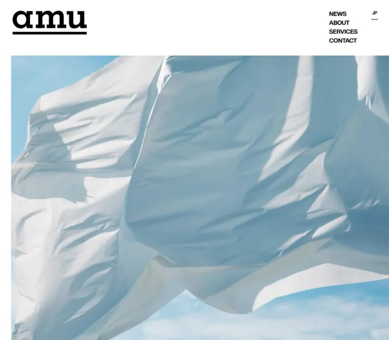
amu presents its work through an unusually spacious editorial layout. A heavy, underlined wordmark occupies the upper-left corner while compact English navigation sits at the upper right. The desktop opening is dominated by pale fabric against blue sky. Farther down, huge service numbers and carefully broken Japanese headings share the page with narrow paragraphs and square imagery. The contrast comes from scale, alignment, and empty space.
This is a corporate homepage with routes into company information, services, news, and contact. Its visual rhythm follows those different content types: an expansive opening, a company narrative offset toward the right, services anchored to the left, a news column on the right, and a large closing identity block. Crossed-out words such as “Useless?” and the footer sequence “Worthless? Useless? Impossible?” reinforce the page’s central proposition. These marks are brand graphics, not evidence of disabled controls.
How to Read This Reference
- Measured means a value reported in the supplied rendered DOM or computed styles. Measurements are CSS pixels unless stated otherwise.
- Calculated means arithmetic using those measurements, such as the space between two element rectangles.
- Visual estimate means an approximate dimension or appearance read from an original-page screenshot. It is not a recovered CSS declaration or an exact color sample.
- Recommended means guidance for a new implementation. The Quick Start is an adaptation, not the original stylesheet.
- Token names are descriptive aliases unless explicitly identified as source custom properties.
- DOM
ypositions below are document coordinates. Screenshot coordinates at scrolled positions have a different origin. - The source splits some headings into separate paragraph elements that share a line. Use their coordinates to determine line composition; the flattened text transcript alone overstates the number of lines.
- The mobile opening contains a large white region with no visible hero image. Its cause is unresolved. The remaining evidence is sufficient to document the homepage, but not to establish the intended mobile media state.
Tokens — Colors
Default Palette
| Name | Value | Suggested token | Evidence and role |
|---|---|---|---|
| Canvas White | #ffffff |
--color-canvas |
Measured body background and news-row surfaces; the dominant page field |
| Graphic Black | #000000 |
--color-ink |
Measured visible text; visually also used for identity marks, arrows, and rules |
| Fabric Sky | Approximately #90b7c7 |
--color-photo-sky |
Visual approximation of a midtone in the opening photograph; not a measured UI color |
| Material Blue | Approximately #2000ff |
--color-material-blue |
Visual approximation of the amuca artwork in Service 02; not a general action color |
The stable interface is effectively black and white. Blue enters through the media: diffuse sky and fabric shadows in the opening, then a much more saturated amuca mark on pale cloth. Preserve this separation. The service image does not establish a blue button system.
Some anchor wrappers compute to #333333, but their visible child labels compute to black. Use the child text values when matching the rendered appearance.
The supplied custom properties also include --rebranding-loading-bar: #222 and --rebranding-loading-bg: #e5e5e5. These are declared loading colors, not demonstrated permanent surfaces. Likewise, the many --g-color-* entries are transparent in the sampled state; their presence does not establish visible gradients.
Theme Presets
No theme selector or alternate color scheme was demonstrated. Treat white and black as the observed interface palette.
Tokens — Typography
English Interface — Inter Tight
Measured family: Inter Tight, also exposed through source custom property --s-font-7284d804.
The English type is compact and firm. Navigation uses weight 700, while language labels, dates, service numerals, and “More Details” use 500. Small section labels and selected supporting links use 600. Slight negative tracking helps the uppercase navigation and large numerals feel tightly assembled.
Use this family for English navigation, numerical indexes, dates, secondary link labels, and the community announcement. Do not infer the wordmark’s typeface from the interface family.
Japanese Display and Body — Source-Named Gothic
Measured family: 見出ゴMB31 JIS2004, also exposed through source custom property --s-font-37bd19f1.
The source uses this family for both large Japanese statements and long explanatory paragraphs. Most of those elements compute to weight 400, despite their substantial visual weight. The face itself contributes the emphatic appearance. News titles are separately declared at 900; the contact helper and address use 600.
Headings have -0.03em tracking and generally 1.4 line height. Body paragraphs retain a 16px size and generous leading. Match the measured weight before adding synthetic bold to an available font.
The body element’s inherited Times declaration is not representative of the visible typography: the sampled content elements explicitly select the two families above.
Wordmarks and Graphic Lettering
The black amu identity has broad, heavy letterforms and a thick underline. A larger version returns in the footer. Its font family and asset format were not supplied. Preserve an authorized wordmark asset rather than approximating it with typed text.
The blue amuca mark is visible within the Service 02 image. The sidebar slogan and footer slogans also have graphic treatments whose individual computed styles were not included. Their sizes below are estimates, not font specifications recovered from the DOM.
Type Scale
Values separated by a slash indicate font size and line height.
| Role | Desktop | Mobile | Weight | Tracking |
|---|---|---|---|---|
| Header and footer primary navigation | 16 / 22.4px |
16 / 22.4px |
700 |
-0.02em |
Mobile MENU label |
Not present | 16 / 22.4px |
700 |
-0.02em |
| Language labels | 12 / 16.8px |
Same | 500 |
Normal |
| English section label | 13px; rendered line box about 16px |
Same | 600 |
Normal |
| Japanese section label | 13 / 13px |
Same | 400 |
Normal |
| Mission statement | 72 / 100.8px |
40 / 56px |
400 |
-0.03em |
| About statement | 60 / 84px |
40 / 56px |
400 |
-0.03em |
| Service heading | 48 / 67.2px |
36 / 50.4px |
400 |
-0.03em |
| Service number | 144 / 144px |
01: 90 / 90px; 02 and 03: 100 / 100px |
500 |
-0.03em |
| Narrative body | 16 / 36px |
Usually 16 / 32px |
400 |
Normal |
| Service 01 source note | 13 / 29.25px |
Same | 400 |
Normal |
| News date | 13 / 13px |
12 / 12px |
500 |
Normal |
| News category | 12 / 12px |
Same | 400 |
-0.03em |
| News title | 16 / 20px |
Same | 900 |
Normal |
| Ruled link title | 20 / 20px |
Same | 700 |
-0.02em |
More Details |
16 / 16px |
Same | 500 |
Normal |
| Service 02 external-link label | 16 / 36px |
Same | 600 |
Normal |
Coming soon... |
72 / 72px |
64 / 64px |
600 |
-0.03em |
| Contact helper | 16 / 16px |
13 / 13px |
600 |
-0.03em |
| Address and copyright | 13px |
Same | 600 |
Normal |
| Footer crossed-out slogans | Visually about 64–72px |
Visually about 16–18px |
Visually heavy; unmeasured | Unmeasured |
Mobile leading has real exceptions. About paragraphs compute to 31.84px; the third service paragraph remains at 36px. Do not normalize these observations into a claim that every mobile paragraph uses exactly 32px.
Tokens — Spacing & Shapes
The page combines small utility spacing with very large section intervals. There is no demonstrated universal spacing unit. The following aliases collect recurring measurements without claiming a source token system.
Spacing Scale
| Use | Value | Evidence |
|---|---|---|
| News date-to-category gap | 10px |
Calculated from adjacent text bounds |
| Mobile footer primary-to-external navigation gap | 15px |
Calculated from group bounds |
| English-to-Japanese section-label gap | 20px |
Calculated on desktop and mobile |
| Ruled link vertical padding | 20px |
Measured |
| Main horizontal inset | Desktop 30px; mobile 25px |
Measured content and link positions |
| Mission horizontal inset | Desktop 50px; mobile 35px |
Measured |
| Service number-to-heading gap | Desktop 30px; mobile 20px |
Calculated |
| Service heading-to-body gap | Desktop 40px; mobile 30px |
Calculated |
| Body-to-Service 02 link gap | 20px |
Calculated |
| Section label-to-following content | Frequently 50px |
Calculated in About and News |
| Services detail link-to-News label | Desktop 200px |
Calculated |
| News detail link-to-community label | Desktop 200px; mobile 150px |
Calculated |
| Contact row-to-desktop footer navigation | 300px |
Calculated |
Long blank intervals can also contain images or other elements omitted from the text measurements. Do not interpret every gap between text rectangles as empty padding.
Border Radius
| Element | Treatment | Evidence |
|---|---|---|
| Sampled links and news rows | 0px |
Measured |
| Service image | Square corners | Screenshot observation |
| Contact strip | Straight horizontal edges | Screenshot observation |
| Wordmark underline and slogan bars | Hard, rectangular strokes | Screenshot observation |
No rounded-card or shadow-based elevation system is visible in the supplied captures.
Layout Measurements
| Element | Desktop at 1440px | Mobile at 390px | Status |
|---|---|---|---|
| Document height | 8192.16px |
9570.25px |
Measured; specific to this content and capture |
| General inset content width | 1380px |
340px |
Measured |
| Header wordmark visible ink | About 200 × 65px |
About 120 × 39px |
Visual estimate |
| Header navigation | Starts at x ≈ 1274.28, y = 25; four 24px rows |
Replaced by a 48.52 × 24px MENU button at x ≈ 316.48, y = 25 |
Measured |
| Opening media | Visible from approximately x = 30, y = 150 to the right viewport edge |
No visible media in opening capture | Screenshot observation |
| Mission copy | 496px wide at x = 50 |
320px wide at x = 35 |
Measured |
| About heading origin | x = 298 |
x = 25 |
Measured |
| About paragraph column | 464px wide at x = 946 |
340px wide at x = 25 |
Measured |
| Services content span | 1128px from x = 30 |
Text and detail links span 340px |
Desktop span confirmed by detail link and visible rules |
| Service paragraph width | 485.59px |
340px |
Measured |
| Service 02 image | Approximately 500 × 500px, starting at x = 658 |
Image rectangle not supplied | Visual estimate |
| News column | 808px wide at x = 602 |
340px wide at x = 25 |
Measured |
| About, Services, and News detail links | 81px high |
81px high |
Measured |
| Contact link | 1380 × 81px |
340 × 134px |
Measured |
| Footer wordmark visible ink | About 345 × 110px |
About 204 × 65px |
Visual estimate |
| Footer slogan band | About 170px high with 10px edge rules |
About 162px high with 6px edge rules |
Visual estimate |
Components
Persistent Corner Header
Role: maintain identity and direct access to the main corporate routes.
The desktop header is a composition of corner elements: the underlined amu mark at left, a four-line navigation group at right, and a smaller language column farther right. Its menu reads NEWS, ABOUT US, SERVICES, and CONTACT, linking to /news, /about, /services, and /contact.
The same corner positions remain visible in the supplied scrolled captures, consistent with fixed positioning. The actual position declaration was not included. In the service capture, document content reaches behind the upper-left identity area, so a tall, opaque, full-width header bar would change the observed layering.
Navigation labels use Inter Tight at 16px, weight 700, with 24px link rows. Their density contrasts with the broad empty space around them. There is no visible enclosing button, pill, or header divider.
On mobile, the four links disappear from the header and a plain MENU button appears. The button is a real BUTTON in the rendered DOM. Its open state, dismissal behavior, focus handling, and transition were not exercised.
Language Selector
Role: identify the current language and provide access to the English site.
The selector uses 12px Inter Tight at weight 500. Desktop labels form a short vertical stack. On mobile, JP and EN sit side by side beneath MENU, with their text beginning at approximately x = 318.53 and 347.80.
JP has a visible line through it; EN is an anchor to /en. This repeats the brand’s crossing-out vocabulary in a very small utility element. Preserve the visual distinction while providing an explicit accessible indication of the current language in a new implementation.
Opening Media Area
Role: establish a tactile, airy material world before the company narrative.
The desktop image begins around 150px below the viewport top and 30px from the left edge. It extends to the right edge of the supplied capture and continues below the first viewport. Large white fabric folds occupy most of the composition; blue sky and pale shadows create soft depth. No text overlay or action button is visible over this opening frame.
The screenshot establishes the image’s appearance, not its playback format. A still photograph, a video frame, and another media implementation cannot be distinguished from this evidence. Autoplay, looping, sound, and media controls remain unverified.
The mobile opening shows white space down to the beginning of the mission heading near y = 818. Do not describe this as an intentional blank hero or a confirmed loading animation. For a new implementation, provide a reliable static fallback and treat mobile cropping as a design decision requiring validation.
Mission Statement
Role: introduce the company’s value proposition after the opening media.
The statement uses large Japanese typography followed by a narrow, generously led paragraph. Desktop text begins at x = 50, y = 1230; the supporting paragraph starts at y ≈ 1471.59 and is 496px wide.
The actual line composition is:
| Viewport | Heading lines |
|---|---|
| Desktop | いらないものはない / 世界をつくる。 |
| Mobile | いらない / ものはない / 世界をつくる。 |
At mobile width, the statement becomes 40px rather than simply shrinking in proportion to the viewport. The copy remains 16px and receives 32px leading. Keep the text as accessible live content and preserve the intended phrase groups when introducing responsive breaks.
Bilingual Section Label
Role: quietly identify a major content section.
Pair a small English label with its Japanese counterpart, separated by 20px. Examples include ABOUT US with 私たちについて, SERVICES with 事業内容, and NEWS with お知らせ.
The English label is 13px Inter Tight, weight 600. The Japanese label is 13px in the source Japanese family, weight 400. These labels orient the reader without competing with the large statements or service numbers beneath them.
About Introduction
Role: connect the company’s mission to the discarded-fishing-gear problem.
Desktop uses a strongly offset arrangement. The label and large statement begin at x = 298; the narrative paragraphs start at x = 946, creating two distinct reading zones. The Japanese statement uses three lines at 60px with 84px leading. The paragraph column is 464px wide, with 16px text and 36px leading.
Mobile brings both zones to the same 25px left inset. The statement becomes 40px with 56px leading; the first paragraph begins 40px after the heading block. The two body paragraphs are separated by a calculated 10px gap.
A wide ABOUT US / More Details link follows later in the section. The text-only measurements do not account for all intervening visual content, so they should not be used to invent an empty spacer of the same height.
Numbered Service Row
Role: explain three stages of the business: collection, material development and sales, and product planning and sales support.
Each service has a large two-digit index, a Japanese heading, explanatory copy, and associated media. The fully visible Service 02 row demonstrates the component’s anatomy:
- A thin horizontal rule spans approximately 1128px.
- The left column starts with
02, set at144 / 144px, weight 500. - After a 30px gap, a three-line heading reads
廃漁具由来/マテリアルの/開発・販売at48 / 67.2px. - A 40px gap leads to a 485.59px-wide paragraph with 36px leading.
- A 20px gap leads to the
“amuca” Brand Websitelink and diagonal arrow. - A square image, approximately 500px on each side, aligns near the row’s top at the right.
- A broad lower interval precedes the next divider.
At the inspected desktop size, the image begins around x = 658, leaving approximately 142px between the paragraph column’s right edge and the image. This open center is a defining part of the composition.
Service 01 includes a 13px explanatory source note. Service 03 has longer copy and no separate external brand link in the supplied text. Preserve these content differences rather than forcing equal-height cards.
Mobile measurements place all service text at x = 25, with 340px paragraphs and 36px headings. The first numeral is 90px; the next two are 100px. Exact mobile media placement is not established by the attached screenshots or supplied image rectangles.
Service Margin Slogan
Role: extend the brand’s verbal identity into the large desktop margin.
The Service 02 capture shows a large, vertically oriented Useless? with a strong line through the lettering. It sits to the right of the service image and outside the main 1128px content span.
Treat it as a graphic accent subordinate to the service content. Its rotation implementation, scroll attachment, visibility at other positions, and mobile treatment were not measured. A sticky slogan or animated rotation would be an additional implementation choice.
Ruled Detail Link
Role: provide a section-level route without introducing a conventional filled CTA.
The component is an entire wide anchor, 81px high, with 20px 0 padding. Its left side contains the section name at 20 / 20px, weight 700. The right side pairs More Details at 16 / 16px, weight 500, with a long, thin arrow. The desktop contact capture clearly shows the horizontal rules and approximately 50px-wide arrow.
Widths follow the section: About is 1112px, Services 1128px, News 808px, and Contact 1380px on desktop. The first three become 340px wide on mobile while retaining their 81px height.
Use one anchor for the whole component. Avoid nested clickable labels or a separate button wrapped around the arrow.
News List
Role: offer recent company updates in a compact editorial index.
The list contains five dated entries. Desktop places the 808px column against the right inset, beginning at x = 602. On mobile it expands to the standard 340px content width.
Each entry is an anchor containing a metadata line and a title. Date and category are separated by 10px. The title begins approximately 44px below the row’s top. Desktop titles occupy 729px; mobile titles occupy 261px. Both leave 79px of horizontal space within the enclosing anchor for the remaining layout. The exact allocation of that space to an icon and gap was not supplied.
Desktop row heights are 94px or 114px according to title wrapping. Mobile rows range from 114px to 154px. Titles remain 16 / 20px at both sizes, while dates decrease from 13px to 12px. This is content-driven height, not an equal-height card grid.
The DOM confirms white backgrounds and square corners. The news section is not included in the supplied visual crops, so exact divider strokes and hover appearance remain unverified.
Community Announcement
Role: reserve a place for a forthcoming private community.
The section label reads amu's Secret Base with amuのアジト. Below it, Coming soon... is set in Inter Tight at 72 / 72px, weight 600, with negative tracking. A short Japanese explanation states that the community is in preparation.
At mobile width, the announcement is 64px and its measured block is 128px high, indicating two lines. No signup control or active community destination appears in the supplied link inventory. Keep this as an announcement unless a real next action exists.
Contact Strip
Role: close the main content with a direct inquiry route.
The desktop strip stretches between the 30px page insets. CONTACT sits at the far left. A Japanese helper, ( まずはお気軽にお問い合わせください ), precedes More Details and the right-pointing arrow at the far right. Its measured height is 81px.
Mobile changes the composition substantially: the anchor becomes 134px high, CONTACT occupies the first line, the helper appears below at 13px, and More Details sits lower toward the right. The wrapper has a measured 10px gap. Do not squeeze the full desktop sequence into a single mobile row.
The extracted anchor text contains the helper twice, while the rendered measurement identifies one visible helper per viewport. Use the visible state as the design reference rather than displaying duplicate copy.
Footer Identity and Navigation
Role: repeat the brand, provide a compact site map, and connect to related destinations.
Desktop gives the footer a large amount of air after the contact strip. The navigation begins 300px after the contact anchor’s bottom. A large amu mark sits at left. At right, separate columns contain the four primary routes, five external destinations, and language controls.
The external destinations are the amuca brand site, its online store, President's Note, Facebook, and X. Each has a small diagonal arrow. Their labels use 16px Inter Tight at weight 700 and -0.02em tracking. The external-link rows advance at 25px intervals.
Mobile stacks the footer content. A roughly 204px-wide wordmark precedes the primary links, the external links, and a language row aligned right. The fixed corner header remains visible in the footer screenshot. The larger second wordmark belongs to the footer; this capture is not evidence of an open MENU state.
Crossed-Out Footer Band and Legal Details
Role: finish with a memorable statement, then practical company information.
A full-width white band is framed by heavy black rules. Three large English words are evenly distributed across it: Worthless?, Useless?, and Impossible?. Each has a thick line through its center. Desktop lettering is visually around 64–72px; mobile lettering is around 16–18px, while the band keeps substantial vertical space.
Below the band, the Japanese and English addresses sit at the left. Desktop copyright aligns at the lower right; mobile moves it beneath the address. Address and copyright text remain 13px. The original-page text identifies amu株式会社 in the service explanation and uses ©amu inc. All rights reserved. in the footer.
The slogan words are visible in screenshots but absent from the supplied text extraction. Their exact implementation and accessible text alternatives are unknown.
Tokens — Motion & Interaction
Measured Declarations
| Target | Supplied computed value | What this establishes |
|---|---|---|
| Most labels, links, and content elements | 0.3s cubic-bezier(0.4, 0.4, 0, 1) |
A shared transition timing; no specific hover result was demonstrated |
| Body background | background 0.5s cubic-bezier(0.4, 0.4, 0, 1) |
Background changes have a defined transition; no alternate visible background was captured |
| First desktop mission line | 0.6s with 0.2s delay, same easing |
A staggered transition declaration |
| Second desktop mission line | 0.6s with 0.4s delay, same easing |
A later transition declaration |
| Desktop mission paragraph | 0.6s with 0.6s delay, same easing |
A third stage in the declared sequence |
| Mobile mission elements | 0.3s, same easing |
Sampled mobile declarations differ from desktop |
| Sampled element animations | animation: none |
No CSS keyframe animation reported on those sampled elements in that state |
The transition strings also enumerate generated gradient properties. Those declarations do not prove that gradients visibly animate. Similarly, staggered timing does not reveal the triggering event or whether opacity, position, clipping, or another property changes.
Observed Behavior and Limits
The supplied inspection traversed the page and captured settled scroll positions. The corner identity and utilities remain visible across the supplied scrolled screenshots. Real anchor destinations and the mobile MENU button are present in the DOM.
No hover, menu activation, language navigation, contact submission, or media playback sequence was supplied. Do not invent a menu overlay, smooth-scroll behavior, animated strike-through, parallax effect, or autoplay specification.
For an adaptation, the measured 300ms easing is a useful starting point for restrained feedback. Any opacity or transform effect should be introduced as a recommendation, remain nonessential, and leave all content visible when scripting or motion is unavailable.
Surfaces
| Surface | Appearance | Structural purpose |
|---|---|---|
| Page canvas | Solid white | Continuity across all sections |
| Navigation | Black text on the existing canvas | Persistent orientation with minimal chrome |
| Service region | White, thin dividers, square imagery | Separates long-form business explanations |
| News anchors | Measured white backgrounds and square corners | Compact, content-driven navigation rows |
| Contact strip | White with black horizontal rules | A wide, clear closing action |
| Footer slogan band | White between heavy black rules | Strong terminal brand statement |
Hierarchy comes from space, typography, and rule weight. There is no demonstrated need for translucent panels, colored cards, or soft shadows.
Imagery
The opening image is tactile and expansive. White fabric catches daylight against a blue sky, with folds large enough to read almost as landscape. Its pale tonal range lets the black wordmark remain the strongest graphic element above it.
Service 02 uses a different crop and scale: a square field of pale folded cloth with the saturated blue amuca identity centered within it. The mark combines lettering, a registered symbol, and a sequence of horizontal bars that become denser toward the bottom. Treat the whole composition as supplied artwork; replacing it with a generic blue text label would remove much of its character.
Keep photographic detail smooth and natural. Pixelated rendering, duotone conversion, heavy tint overlays, and artificial paper grain are not supported by these captures. Texture comes from the photographed material itself.
Observed Asset References
The supplied evidence does not expose complete usable URLs for the main visual assets.
| Asset | Direct observation | Reference limitation |
|---|---|---|
| amu identity | Underlined black wordmark in header and footer | Asset path, format, and originating typeface not supplied |
| Opening fabric media | White cloth against blue sky in desktop opening | Media URL, intrinsic dimensions, and playback type not supplied |
| Service 02 material image | Square pale-fabric composition with blue amuca artwork | Asset URL not supplied |
| External-link arrows | Small diagonal arrows in service and footer links | Partial pseudo-element background references are present, but filenames are truncated |
| Section-detail arrow | Long, thin right-pointing arrow in the contact strip | Source vector or image path not supplied |
| Crossed-out slogans | Vertical service-margin graphic and horizontal footer band | Asset or DOM construction not supplied |
Use authorized identity and material assets when available. Keep replacement filenames clearly separate from recorded source evidence. The available fragments should not be expanded into guessed download URLs.
Layout & Responsive Behavior
Desktop Composition
The desktop layout has multiple horizontal origins rather than one centered content column. Services begin at 30px, the mission at 50px, About at 298px, and News at 602px. These offsets create a deliberate rhythm across the long page.
Services reserve a broad right margin for the crossed-out slogan. The Service 02 text and image occupy approximately 1128px, leaving 252px between that content span and the general right inset. News then shifts into an 808px column aligned to the right edge. The footer returns to the full width.
The source’s many display: flex measurements describe individual elements, not enough of the parent hierarchy to establish an exact grid implementation. CSS Grid is a practical way to reproduce the measured relationships in a new build, but it is not a claim about the source’s layout technology.
Mobile Composition
| Aspect | Observed change |
|---|---|
| Header | Four desktop routes become MENU; language choices become horizontal beneath it |
| Main insets | Most content moves to 25px; the mission uses 35px |
| Mission heading | 72px becomes 40px; two desktop lines become three mobile lines |
| About | Separate heading and paragraph columns become a shared 340px text column |
| Services | Headings become 36px; paragraph width becomes 340px; numbers use 90px or 100px |
| News | Right-offset column becomes inset full width; row height grows with title wrapping |
| Detail links | About, Services, and News retain 81px height |
| Contact | Expands to a 134px, multi-line composition |
| Footer | Identity and navigation stack; language controls align right; copyright moves below the address |
| Slogan band | Three words remain in one horizontal sequence with much smaller type |
The inspected document becomes approximately 1378px taller on mobile. This is a content-specific result of reflow and other layout changes, not a height target to hardcode.
Breakpoints and Unresolved Areas
An inline stylesheet fragment explicitly contains a max-width: 840px rule for responsive line breaks. It does not prove that the navigation, columns, and imagery all change at that same width. Their exact breakpoints were not supplied.
Only 1440px and 390px widths were measured. Tablet behavior, intermediate column sizing, landscape phones, browser zoom, safe-area handling, and mobile service image order remain unverified. The Quick Start uses 840px as a recommended initial layout breakpoint and requires validation between the two reference widths.
Do’s and Don’ts
Do
- Keep the primary interface white and black, allowing material photography to supply color.
- Preserve the strong underline in the authorized amu wordmark.
- Use Inter Tight for the measured English interface roles and the source-named Japanese family when available.
- Retain the unusually large service numbers and the measured 48px desktop service headings.
- Preserve narrow body columns, generous leading, and broad gaps between text and imagery.
- Let major sections begin at different horizontal positions on desktop.
- Use square images, straight rules, plain text links, and slender directional arrows.
- Keep the three services as substantial sequential explanations.
- Reflow the contact strip and footer deliberately for mobile.
- Treat crossing-out as a recognizable identity motif with meaningful accessible alternatives.
Don't
- Don't turn the corporate homepage into a generic conversion funnel with repeated filled buttons.
- Don't replace the numbered service sections with three equal rounded cards.
- Don't apply the amuca image’s saturated blue to all navigation or actions.
- Don't use the body’s inherited Times declaration as the visible site font.
- Don't substitute a guessed typeface for the amu wordmark.
- Don't make every mobile service numeral the same size when documenting the measured page.
- Don't reproduce every extracted paragraph fragment as a separate visual heading line.
- Don't treat the mobile footer screenshot as an open-menu state.
- Don't manufacture a permanent blank mobile hero from an unresolved capture state.
- Don't claim video playback, parallax, hover effects, or menu transitions from still images and timing declarations alone.
Recommended Implementation Additions
These are recommendations for a new implementation, not verified features of the original page:
- Use one semantic H1 for the mission and a logical heading hierarchy for About, Services, News, and Contact. Phrase-level spans can preserve the visual line groups.
- Keep the MENU button’s
aria-expandedandaria-controlssynchronized with an implemented navigation panel. Define focus entry, Escape dismissal, and focus restoration if it behaves as an overlay. - Expand the small language and navigation touch targets while preserving their compact visible typography. A 44px target can be introduced without scaling the text.
- Provide a visible black focus outline. Give repeated “More Details” links accessible names that include the destination section.
- Use meaningful material-image alternatives and an accessible description of the crossed-out slogan treatment when it carries content.
- Provide a static poster or image fallback if the hero uses motion media. Ensure a failed media request does not leave an unexplained empty opening.
- Respect reduced-motion preferences and avoid making text visibility depend on animation completion.
- Reassess dense news-title leading and the long English address at smaller widths and increased text size.
- Validate fixed-header overlap, footer wrapping, and service-column transitions at intermediate widths, not only the two supplied sizes.
Agent Prompt Guide
Quick Color Reference
- Canvas and surfaces:
#ffffff. - Visible text and graphic structure:
#000000. - Opening media: pale cloth, diffuse blue sky, soft cool shadows.
- Service 02 artwork: saturated blue confined to the material-brand image.
- Separation: thin section rules and heavy footer rules.
- Action treatment: wide ruled text links with thin arrows; no required colored fill.
Overall Prompt
“Create an editorial corporate homepage for a company that turns discarded fishing gear into new materials. Use a pure-white canvas, black typography, an authorized underlined wordmark, compact English navigation, and tactile fabric photography. Establish a persistent corner header, then a large desktop media opening, a Japanese mission statement, an offset company narrative, three sequential numbered services, a right-aligned news column, a community announcement, a ruled contact strip, and a spacious footer. Use Inter Tight for English labels and numbers. Preserve 144px desktop service indexes, 48px service headings, narrow 16px body copy with 36px leading, square imagery, and a crossed-out slogan motif. Reflow into 25px mobile insets, 36px service headings, stacked footer links, and a multi-line contact strip. Keep unsupported motion and media behavior optional.”
Example Component Prompts
- Service row: “Build a white, ruled service section with a giant black 02, a three-line Japanese heading, a narrow paragraph, and a plain external brand link. Place an approximately 500px square material image to its right at a 1440px viewport, leaving broad white space between columns. Reserve the far-right margin for a vertically oriented crossed-out slogan. Use square corners and no shadow.”
- Corner header: “Place an authorized black underlined wordmark at the upper left and a compact four-line Inter Tight navigation at the upper right. Add small JP and EN controls farther right. On mobile, show a plain MENU button with a horizontal language row below. Keep the open-menu implementation separate until its behavior is specified.”
- News list: “Create five white news-link rows in an 808px column aligned to the desktop right inset. Use a small date and category line, then a 16px title with 20px leading. Let row height follow the title. At 390px, use a 340px column, 12px dates, and space on the right for the link affordance.”
- Contact strip: “Create a wide white anchor bounded by black rules. Place CONTACT at left and a Japanese helper, More Details, and a long thin arrow at right. Use an 81px desktop row. On mobile, place the label, helper, and right-aligned detail action on separate levels within an approximately 134px strip.”
- Footer: “Compose a large underlined wordmark at left and compact primary, external, and language navigation at right. Follow with a full-width white band between heavy black rules containing the crossed-out words Worthless?, Useless?, and Impossible?. Stack navigation on mobile while keeping the three slogan words horizontal.”
Quick Start
CSS Custom Properties
This is a standalone visual starting point using a conventional 16px root. Font declarations require the corresponding font files or licensed loading setup; they do not load fonts by themselves. Use an authorized image or SVG for each wordmark.
Measured typography and spacing inform the tokens. Grid formulas, the 840px layout breakpoint, hero aspect ratios, slogan sizing, focus treatment, and hover feedback are recommended adaptations. The mobile hero intentionally receives a usable media layout rather than reproducing the unexplained blank capture. Menu state management and any media playback require separate implementation.
:root {
  /* Measured interface palette */
  --color-canvas: #fff;
  --color-ink: #000;

  /* Source-named families; font loading is project-specific */
  --font-latin: 'Inter Tight', sans-serif;
  --font-jp: '見出ゴMB31 JIS2004', sans-serif;

  --text-utility: 0.75rem;
  --text-label: 0.8125rem;
  --text-body: 1rem;
  --text-action: 1.25rem;
  --text-service: 3rem;
  --text-about: 3.75rem;
  --text-mission: 4.5rem;
  --text-index: 9rem;
  --text-coming: 4.5rem;
  --leading-body: 2.25;
  --leading-display: 1.4;
  --tracking-ui: -0.02em;
  --tracking-display: -0.03em;

  --page-inset: 30px;
  --mission-extra-inset: 20px;
  --space-small: 10px;
  --space-label: 20px;
  --space-number: 30px;
  --space-copy: 40px;
  --space-section: 200px;
  --service-rail: 252px;
  --rule-fine: 1px;
  --rule-heavy: 10px;
  --radius: 0;

  /* Measured timings; applied effects below are recommendations */
  --ease-brand: cubic-bezier(0.4, 0.4, 0, 1);
  --duration-ui: 300ms;
  --duration-intro: 600ms;
}

* { box-sizing: border-box; }
html { color-scheme: light; }
body {
  margin: 0;
  color: var(--color-ink);
  background: var(--color-canvas);
  font-family: var(--font-jp);
  font-size: var(--text-body);
  font-weight: 400;
  line-height: var(--leading-body);
}
img, video { display: block; max-width: 100%; }
a { color: inherit; }
button { font: inherit; color: inherit; }
.page-inset { margin-inline: var(--page-inset); }

/* Persistent corner composition inferred from the captures */
.corner-header {
  position: fixed;
  inset: 25px var(--page-inset) auto;
  z-index: 20;
  display: flex;
  justify-content: space-between;
  align-items: flex-start;
  pointer-events: none;
}
.corner-header > * { pointer-events: auto; }
.header-brand { width: 204px; }
.header-brand img { width: 100%; height: auto; }
.header-tools { display: flex; gap: 35px; align-items: flex-start; }
.header-nav, .footer-nav { display: grid; }
.header-nav a, .footer-nav a, .menu-trigger {
  display: block;
  min-height: 24px;
  padding-inline: 2px;
  font: 700 1rem/1.4 var(--font-latin);
  letter-spacing: var(--tracking-ui);
  text-decoration: none;
}
.menu-trigger {
  display: none;
  padding-block: 0;
  border: 0;
  border-radius: 0;
  background: transparent;
  cursor: pointer;
}
.language-controls {
  display: flex;
  flex-direction: column;
  gap: 2px;
  font: 500 var(--text-utility)/1.4 var(--font-latin);
}
.language-controls > * { padding: 2px; text-decoration: none; }
.language-controls .is-current {
  text-decoration: line-through;
  text-decoration-thickness: 2px;
}

/* Recommended media proportions; source ratio was not measured */
.hero-media {
  margin: 150px 0 0 var(--page-inset);
  aspect-ratio: 3 / 2;
  overflow: hidden;
}
.hero-media > img, .hero-media > video {
  width: 100%;
  height: 100%;
  object-fit: cover;
}
.mission {
  margin: 140px calc(var(--page-inset) + var(--mission-extra-inset)) 170px;
}
.mission-title, .about-title, .service-title {
  margin: 0;
  font-family: var(--font-jp);
  font-weight: 400;
  line-height: var(--leading-display);
  letter-spacing: var(--tracking-display);
}
.mission-title { font-size: var(--text-mission); }
.mission-copy { max-width: 496px; margin: var(--space-copy) 0 0; }
.display-line { display: block; }
.section-label {
  display: flex;
  flex-wrap: wrap;
  align-items: center;
  gap: 8px var(--space-label);
  margin: 0 0 50px;
  font-size: var(--text-label);
  line-height: 1;
}
.section-label .latin { font-family: var(--font-latin); font-weight: 600; }
.about-section { margin-inline-start: min(18.61vw, 268px); }
.about-grid {
  display: grid;
  grid-template-columns: minmax(0, 1fr) minmax(0, 464px);
  gap: 40px;
}
.about-title { font-size: var(--text-about); }
.about-copy p { margin: 0; }
.about-copy p + p { margin-top: 20px; }

/* The right rail reproduces the measured desktop content reserve */
.services-layout {
  display: grid;
  grid-template-columns: minmax(0, 1fr) var(--service-rail);
}
.service {
  display: grid;
  grid-template-columns: minmax(0, 1fr) minmax(0, 1.02965fr);
  align-items: start;
  gap: clamp(40px, 9.89vw, 142.4px);
  padding-block: 30px 100px;
  border-top: var(--rule-fine) solid currentColor;
}
.service-number {
  margin: 0 0 var(--space-number);
  font: 500 var(--text-index)/1 var(--font-latin);
  letter-spacing: var(--tracking-display);
}
.service-title { font-size: var(--text-service); }
.service-copy { margin: var(--space-copy) 0 0; }
.service-note { margin: 20px 0 0; font-size: 13px; line-height: 2.25; }
.service-media { margin: 0; aspect-ratio: 1; }
.service-media img { width: 100%; height: 100%; object-fit: cover; }
.external-link {
  display: inline-flex;
  align-items: center;
  gap: 8px;
  margin-top: 20px;
  min-height: 40px;
  font: 600 1rem/2.25 var(--font-latin);
  text-decoration: none;
}
.external-link .arrow-diagonal { font-size: 23px; line-height: 1; }
.service-aside {
  justify-self: center;
  align-self: center;
  writing-mode: vertical-rl;
  text-orientation: sideways;
  font: 700 72px/1 var(--font-latin);
  text-decoration: line-through;
  text-decoration-thickness: 0.12em;
}

.detail-link {
  display: flex;
  justify-content: space-between;
  align-items: center;
  gap: 20px;
  min-height: 81px;
  padding-block: 20px;
  border-block: var(--rule-fine) solid currentColor;
  text-decoration: none;
}
.detail-label {
  font: 700 var(--text-action)/1 var(--font-latin);
  letter-spacing: var(--tracking-ui);
}
.detail-action {
  display: inline-flex;
  align-items: center;
  gap: 20px;
  margin-left: auto;
  white-space: nowrap;
  font: 500 1rem/1 var(--font-latin);
}
.arrow-right {
  display: block;
  width: 50px;
  height: 40px;
  fill: none;
  stroke: currentColor;
  stroke-width: 1.5;
  transition: transform var(--duration-ui) var(--ease-brand);
}
.news-section { width: min(808px, 100%); margin: var(--space-section) 0 0 auto; }
.news-row {
  display: block;
  padding: 20px 79px 30px 0;
  border-top: 1px solid currentColor;
  background: var(--color-canvas);
  text-decoration: none;
}
.news-meta { display: flex; flex-wrap: wrap; align-items: center; gap: 10px; }
.news-date { font: 500 13px/13px var(--font-latin); }
.news-category { font-size: 12px; line-height: 1; letter-spacing: -0.03em; }
.news-title { margin: 10px 0 0; font-size: 16px; font-weight: 900; line-height: 20px; }
.news-section > .detail-link { margin-top: 50px; }
.community-section { margin-top: var(--space-section); }
.coming-title {
  margin: 0;
  font: 600 var(--text-coming)/1 var(--font-latin);
  letter-spacing: var(--tracking-display);
}
.contact-helper { margin-left: auto; font-size: 16px; line-height: 1; }
.contact-link .detail-action { margin-left: 0; }

.footer-main {
  display: grid;
  grid-template-columns: minmax(0, 1fr) auto auto auto;
  align-items: start;
  gap: 30px;
  margin-top: 300px;
  padding-bottom: 50px;
}
.footer-brand { width: 345px; max-width: 100%; }
.footer-external { display: grid; gap: 3px; }
.footer-external a {
  display: flex;
  align-items: center;
  gap: 5px;
  min-height: 22px;
  font: 700 16px/1 var(--font-latin);
  letter-spacing: -0.02em;
  text-decoration: none;
}
.slogan-banner {
  display: flex;
  align-items: center;
  justify-content: space-around;
  gap: 15px;
  min-height: 170px;
  padding: 20px;
  border-block: var(--rule-heavy) solid currentColor;
  font: 800 clamp(16px, 4.6vw, 68px)/1 var(--font-latin);
}
.slogan-banner span {
  white-space: nowrap;
  text-decoration: line-through;
  text-decoration-thickness: 0.14em;
  text-decoration-skip-ink: none;
}
.footer-legal {
  display: flex;
  justify-content: space-between;
  align-items: flex-end;
  gap: 30px;
  padding-block: 40px 30px;
  font-size: 13px;
  font-weight: 600;
}
.footer-legal address { font-style: normal; }
.footer-legal p { margin: 0; }
.footer-legal .latin { font-family: var(--font-latin); line-height: 1.4; }

/* Recommended interaction additions */
:where(a, button):focus-visible { outline: 2px solid currentColor; outline-offset: 4px; }
@media (hover: hover) {
  .detail-link:hover .arrow-right { transform: translateX(4px); }
  .external-link:hover { text-decoration: underline; text-underline-offset: 4px; }
}

/* Recommended layout breakpoint, not a recovered global source rule */
@media (max-width: 840px) {
  :root {
    --page-inset: 25px;
    --mission-extra-inset: 10px;
    --text-mission: 2.5rem;
    --text-about: 2.5rem;
    --text-service: 2.25rem;
    --text-index: 6.25rem;
    --text-coming: 4rem;
    --leading-body: 2;
    --space-number: 20px;
    --space-copy: 30px;
    --space-section: 150px;
    --rule-heavy: 6px;
  }
  .header-brand { width: 124px; }
  .header-tools { flex-direction: column; align-items: flex-end; gap: 15px; }
  .header-nav { display: none; }
  .menu-trigger { display: block; }
  .language-controls { flex-direction: row; gap: 12px; }
  .hero-media { margin-top: 120px; aspect-ratio: 4 / 5; }
  .mission { margin-top: 80px; }
  .about-section { margin-inline-start: 0; }
  .about-grid, .services-layout, .service { grid-template-columns: minmax(0, 1fr); }
  .about-copy { line-height: 1.99; }
  .about-copy p + p { margin-top: 10px; }
  .service { gap: 40px; padding-bottom: 80px; }
  .service--first .service-number { font-size: 90px; }
  .service--third .service-copy { line-height: 2.25; }
  .service-aside { display: none; }
  .news-date { font-size: 12px; line-height: 12px; }
  .contact-link { flex-direction: column; align-items: stretch; gap: 10px; min-height: 134px; }
  .contact-helper { margin: 0; font-size: 13px; line-height: 1.4; }
  .contact-link .detail-action { align-self: flex-end; }
  .footer-main { grid-template-columns: minmax(0, 1fr); gap: 15px; margin-top: 200px; padding-bottom: 30px; }
  .footer-brand { width: 204px; margin-bottom: 35px; }
  .footer-main > .language-controls { justify-self: end; }
  .slogan-banner { min-height: 162px; }
  .footer-legal { flex-direction: column; align-items: flex-start; padding-block: 30px 50px; }
}
@media (prefers-reduced-motion: reduce) {
  .arrow-right { transition: none; }
  .detail-link:hover .arrow-right { transform: none; }
}
The news divider, mobile service image placement, and hidden mobile slogan in this starter are recommended choices because those details lack complete visual evidence. Section media and content should determine vertical space; do not hardcode the captured document heights.
Example Component Markup
The image path below is a project-local placeholder, not an observed asset URL. Replace it with an authorized image. The arrow SVG is a simple implementation approximation.
<section class='service' aria-labelledby='service-02-title'>
  <div>
    <p class='service-number'>02</p>
    <h3 id='service-02-title' class='service-title' lang='ja'>
      <span class='display-line'>廃漁具由来</span>
      <span class='display-line'>マテリアルの</span>
      <span class='display-line'>開発・販売</span>
    </h3>
    <p class='service-copy'>
      Explain how recovered fishing gear becomes usable material,
      keeping the paragraph specific and concise.
    </p>
    <a class='external-link' href='https://amuca.world/'>
      <span>“amuca” Brand Website</span>
      <span class='arrow-diagonal' aria-hidden='true'>↗</span>
    </a>
  </div>
  <figure class='service-media'>
    <img src='assets/material-placeholder.jpg'
      width='1000' height='1000'
      alt='Pale folded fabric carrying the blue amuca identity'>
  </figure>
</section>

<a class='detail-link contact-link' href='https://www.amu.co.jp/contact'>
  <span class='detail-label'>CONTACT</span>
  <span class='contact-helper' lang='ja'>
    ( まずはお気軽にお問い合わせください )
  </span>
  <span class='detail-action'>
    <span>More Details</span>
    <svg class='arrow-right' viewBox='0 0 50 40' aria-hidden='true'>
      <path d='M0 20H48 M25 4L48 20L25 36'/>
    </svg>
  </span>
</a>
Tailwind v4 Token Mapping
Optional mapping for projects already using Tailwind v4. These aliases describe the adaptation and do not identify the original implementation framework. Define the preceding custom properties first.
@theme inline {
  --color-canvas: #ffffff;
  --color-ink: #000000;
  --font-latin: 'Inter Tight', sans-serif;
  --font-japanese: '見出ゴMB31 JIS2004', sans-serif;

  --text-utility: 0.75rem;
  --text-caption: 0.8125rem;
  --text-copy: 1rem;
  --text-action: 1.25rem;
  --text-service-heading: var(--text-service);
  --text-mission-heading: var(--text-mission);
  --text-service-index: var(--text-index);

  --spacing-page: var(--page-inset);
  --spacing-section: var(--space-section);
  --spacing-copy-gap: var(--space-copy);
  --radius-flat: 0px;
  --ease-brand: cubic-bezier(0.4, 0.4, 0, 1);
}
Sources & Evidence
- Inspected original and final website: amu — Nothing is Worthless.. Both recorded URLs are
https://www.amu.co.jp/; the supplied response status is HTTP 200. - Capture date:
2026-09-16T19:29:26.257Z, corresponding to September 17, 2026, 04:29:26 JST. No separate timestamp was supplied for each individual screenshot. - Desktop evidence:
1440 × 1000viewport; opening, Service 02, and footer screenshots; rendered text, link destinations, element rectangles, computed typography, backgrounds, transitions, and custom properties. Measured document height: approximately 8192.16px. - Mobile evidence:
390 × 844viewport; opening and footer screenshots; rendered text and computed measurements throughout the homepage. Measured document height: approximately 9570.25px. - Inspection procedure supplied with the evidence: initial observation lasted at least five seconds. Readiness checks considered document load, finite animation completion, layout and text stability, and visible image decoding, with finite time limits. Perpetual animations were paused during readiness checks and resumed afterward. Scroll collection traversed intermediate positions. SharedWorkers and service workers were disabled.
- Limitations: readiness checks do not establish semantic completeness. The mobile opening media state, delayed content, media playback, menu opening, hover and focus states, linked-page layouts, and exact intermediate breakpoints were not demonstrated. Complete visual asset URLs and a full stylesheet were not supplied.
This reference analyzes the supplied current-page evidence. The CSS and markup are implementation guidance and have not been browser-tested as part of this analysis.
# amu — Nothing is Worthless. — Style Reference

> White space, emphatic type, and material photography turn discarded resources into a confident corporate story.

**Website:** [amu.co.jp](https://www.amu.co.jp/)
**Original URL:** https://www.amu.co.jp/
**Final URL:** https://www.amu.co.jp/
**Theme:** white canvas with black typography and photographic color
**Inspected:** September 17, 2026, 04:29 JST; supplied capture timestamp: `2026-09-16T19:29:26.257Z`
**Viewports:** desktop `1440 × 1000` and mobile `390 × 844` CSS pixels
**Scope:** the current Japanese corporate homepage: opening media area, mission, About introduction, three services, five news entries, community announcement, contact link, and footer. Supplied screenshots show the desktop opening, Service 02, desktop footer, mobile opening, and mobile footer. Rendered DOM measurements cover additional homepage content. Linked pages and the open mobile menu were not inspected.

amu presents its work through an unusually spacious editorial layout. A heavy, underlined wordmark occupies the upper-left corner while compact English navigation sits at the upper right. The desktop opening is dominated by pale fabric against blue sky. Farther down, huge service numbers and carefully broken Japanese headings share the page with narrow paragraphs and square imagery. The contrast comes from scale, alignment, and empty space.

This is a corporate homepage with routes into company information, services, news, and contact. Its visual rhythm follows those different content types: an expansive opening, a company narrative offset toward the right, services anchored to the left, a news column on the right, and a large closing identity block. Crossed-out words such as “Useless?” and the footer sequence “Worthless? Useless? Impossible?” reinforce the page’s central proposition. These marks are brand graphics, not evidence of disabled controls.

## How to Read This Reference

- **Measured** means a value reported in the supplied rendered DOM or computed styles. Measurements are CSS pixels unless stated otherwise.
- **Calculated** means arithmetic using those measurements, such as the space between two element rectangles.
- **Visual estimate** means an approximate dimension or appearance read from an original-page screenshot. It is not a recovered CSS declaration or an exact color sample.
- **Recommended** means guidance for a new implementation. The Quick Start is an adaptation, not the original stylesheet.
- Token names are descriptive aliases unless explicitly identified as source custom properties.
- DOM `y` positions below are document coordinates. Screenshot coordinates at scrolled positions have a different origin.
- The source splits some headings into separate paragraph elements that share a line. Use their coordinates to determine line composition; the flattened text transcript alone overstates the number of lines.
- The mobile opening contains a large white region with no visible hero image. Its cause is unresolved. The remaining evidence is sufficient to document the homepage, but not to establish the intended mobile media state.

## Tokens — Colors

### Default Palette

| Name | Value | Suggested token | Evidence and role |
| --- | --- | --- | --- |
| Canvas White | `#ffffff` | `--color-canvas` | Measured body background and news-row surfaces; the dominant page field |
| Graphic Black | `#000000` | `--color-ink` | Measured visible text; visually also used for identity marks, arrows, and rules |
| Fabric Sky | Approximately `#90b7c7` | `--color-photo-sky` | Visual approximation of a midtone in the opening photograph; not a measured UI color |
| Material Blue | Approximately `#2000ff` | `--color-material-blue` | Visual approximation of the amuca artwork in Service 02; not a general action color |

The stable interface is effectively black and white. Blue enters through the media: diffuse sky and fabric shadows in the opening, then a much more saturated amuca mark on pale cloth. Preserve this separation. The service image does not establish a blue button system.

Some anchor wrappers compute to `#333333`, but their visible child labels compute to black. Use the child text values when matching the rendered appearance.

The supplied custom properties also include `--rebranding-loading-bar: #222` and `--rebranding-loading-bg: #e5e5e5`. These are declared loading colors, not demonstrated permanent surfaces. Likewise, the many `--g-color-*` entries are transparent in the sampled state; their presence does not establish visible gradients.

### Theme Presets

No theme selector or alternate color scheme was demonstrated. Treat white and black as the observed interface palette.

## Tokens — Typography

### English Interface — Inter Tight

**Measured family:** `Inter Tight`, also exposed through source custom property `--s-font-7284d804`.

The English type is compact and firm. Navigation uses weight `700`, while language labels, dates, service numerals, and “More Details” use `500`. Small section labels and selected supporting links use `600`. Slight negative tracking helps the uppercase navigation and large numerals feel tightly assembled.

Use this family for English navigation, numerical indexes, dates, secondary link labels, and the community announcement. Do not infer the wordmark’s typeface from the interface family.

### Japanese Display and Body — Source-Named Gothic

**Measured family:** `見出ゴMB31 JIS2004`, also exposed through source custom property `--s-font-37bd19f1`.

The source uses this family for both large Japanese statements and long explanatory paragraphs. Most of those elements compute to weight `400`, despite their substantial visual weight. The face itself contributes the emphatic appearance. News titles are separately declared at `900`; the contact helper and address use `600`.

Headings have `-0.03em` tracking and generally `1.4` line height. Body paragraphs retain a 16px size and generous leading. Match the measured weight before adding synthetic bold to an available font.

The body element’s inherited `Times` declaration is not representative of the visible typography: the sampled content elements explicitly select the two families above.

### Wordmarks and Graphic Lettering

The black amu identity has broad, heavy letterforms and a thick underline. A larger version returns in the footer. Its font family and asset format were not supplied. Preserve an authorized wordmark asset rather than approximating it with typed text.

The blue amuca mark is visible within the Service 02 image. The sidebar slogan and footer slogans also have graphic treatments whose individual computed styles were not included. Their sizes below are estimates, not font specifications recovered from the DOM.

### Type Scale

Values separated by a slash indicate font size and line height.

| Role | Desktop | Mobile | Weight | Tracking |
| --- | --- | --- | --- | --- |
| Header and footer primary navigation | `16 / 22.4px` | `16 / 22.4px` | `700` | `-0.02em` |
| Mobile `MENU` label | Not present | `16 / 22.4px` | `700` | `-0.02em` |
| Language labels | `12 / 16.8px` | Same | `500` | Normal |
| English section label | `13px`; rendered line box about `16px` | Same | `600` | Normal |
| Japanese section label | `13 / 13px` | Same | `400` | Normal |
| Mission statement | `72 / 100.8px` | `40 / 56px` | `400` | `-0.03em` |
| About statement | `60 / 84px` | `40 / 56px` | `400` | `-0.03em` |
| Service heading | `48 / 67.2px` | `36 / 50.4px` | `400` | `-0.03em` |
| Service number | `144 / 144px` | `01`: `90 / 90px`; `02` and `03`: `100 / 100px` | `500` | `-0.03em` |
| Narrative body | `16 / 36px` | Usually `16 / 32px` | `400` | Normal |
| Service 01 source note | `13 / 29.25px` | Same | `400` | Normal |
| News date | `13 / 13px` | `12 / 12px` | `500` | Normal |
| News category | `12 / 12px` | Same | `400` | `-0.03em` |
| News title | `16 / 20px` | Same | `900` | Normal |
| Ruled link title | `20 / 20px` | Same | `700` | `-0.02em` |
| `More Details` | `16 / 16px` | Same | `500` | Normal |
| Service 02 external-link label | `16 / 36px` | Same | `600` | Normal |
| `Coming soon...` | `72 / 72px` | `64 / 64px` | `600` | `-0.03em` |
| Contact helper | `16 / 16px` | `13 / 13px` | `600` | `-0.03em` |
| Address and copyright | `13px` | Same | `600` | Normal |
| Footer crossed-out slogans | Visually about `64–72px` | Visually about `16–18px` | Visually heavy; unmeasured | Unmeasured |

Mobile leading has real exceptions. About paragraphs compute to `31.84px`; the third service paragraph remains at `36px`. Do not normalize these observations into a claim that every mobile paragraph uses exactly 32px.

## Tokens — Spacing & Shapes

The page combines small utility spacing with very large section intervals. There is no demonstrated universal spacing unit. The following aliases collect recurring measurements without claiming a source token system.

### Spacing Scale

| Use | Value | Evidence |
| --- | --- | --- |
| News date-to-category gap | `10px` | Calculated from adjacent text bounds |
| Mobile footer primary-to-external navigation gap | `15px` | Calculated from group bounds |
| English-to-Japanese section-label gap | `20px` | Calculated on desktop and mobile |
| Ruled link vertical padding | `20px` | Measured |
| Main horizontal inset | Desktop `30px`; mobile `25px` | Measured content and link positions |
| Mission horizontal inset | Desktop `50px`; mobile `35px` | Measured |
| Service number-to-heading gap | Desktop `30px`; mobile `20px` | Calculated |
| Service heading-to-body gap | Desktop `40px`; mobile `30px` | Calculated |
| Body-to-Service 02 link gap | `20px` | Calculated |
| Section label-to-following content | Frequently `50px` | Calculated in About and News |
| Services detail link-to-News label | Desktop `200px` | Calculated |
| News detail link-to-community label | Desktop `200px`; mobile `150px` | Calculated |
| Contact row-to-desktop footer navigation | `300px` | Calculated |

Long blank intervals can also contain images or other elements omitted from the text measurements. Do not interpret every gap between text rectangles as empty padding.

### Border Radius

| Element | Treatment | Evidence |
| --- | --- | --- |
| Sampled links and news rows | `0px` | Measured |
| Service image | Square corners | Screenshot observation |
| Contact strip | Straight horizontal edges | Screenshot observation |
| Wordmark underline and slogan bars | Hard, rectangular strokes | Screenshot observation |

No rounded-card or shadow-based elevation system is visible in the supplied captures.

### Layout Measurements

| Element | Desktop at 1440px | Mobile at 390px | Status |
| --- | --- | --- | --- |
| Document height | `8192.16px` | `9570.25px` | Measured; specific to this content and capture |
| General inset content width | `1380px` | `340px` | Measured |
| Header wordmark visible ink | About `200 × 65px` | About `120 × 39px` | Visual estimate |
| Header navigation | Starts at `x ≈ 1274.28`, `y = 25`; four `24px` rows | Replaced by a `48.52 × 24px` MENU button at `x ≈ 316.48`, `y = 25` | Measured |
| Opening media | Visible from approximately `x = 30`, `y = 150` to the right viewport edge | No visible media in opening capture | Screenshot observation |
| Mission copy | `496px` wide at `x = 50` | `320px` wide at `x = 35` | Measured |
| About heading origin | `x = 298` | `x = 25` | Measured |
| About paragraph column | `464px` wide at `x = 946` | `340px` wide at `x = 25` | Measured |
| Services content span | `1128px` from `x = 30` | Text and detail links span `340px` | Desktop span confirmed by detail link and visible rules |
| Service paragraph width | `485.59px` | `340px` | Measured |
| Service 02 image | Approximately `500 × 500px`, starting at `x = 658` | Image rectangle not supplied | Visual estimate |
| News column | `808px` wide at `x = 602` | `340px` wide at `x = 25` | Measured |
| About, Services, and News detail links | `81px` high | `81px` high | Measured |
| Contact link | `1380 × 81px` | `340 × 134px` | Measured |
| Footer wordmark visible ink | About `345 × 110px` | About `204 × 65px` | Visual estimate |
| Footer slogan band | About `170px` high with `10px` edge rules | About `162px` high with `6px` edge rules | Visual estimate |

## Components

### Persistent Corner Header

**Role:** maintain identity and direct access to the main corporate routes.

The desktop header is a composition of corner elements: the underlined amu mark at left, a four-line navigation group at right, and a smaller language column farther right. Its menu reads `NEWS`, `ABOUT US`, `SERVICES`, and `CONTACT`, linking to `/news`, `/about`, `/services`, and `/contact`.

The same corner positions remain visible in the supplied scrolled captures, consistent with fixed positioning. The actual `position` declaration was not included. In the service capture, document content reaches behind the upper-left identity area, so a tall, opaque, full-width header bar would change the observed layering.

Navigation labels use Inter Tight at 16px, weight 700, with 24px link rows. Their density contrasts with the broad empty space around them. There is no visible enclosing button, pill, or header divider.

On mobile, the four links disappear from the header and a plain `MENU` button appears. The button is a real `BUTTON` in the rendered DOM. Its open state, dismissal behavior, focus handling, and transition were not exercised.

### Language Selector

**Role:** identify the current language and provide access to the English site.

The selector uses 12px Inter Tight at weight 500. Desktop labels form a short vertical stack. On mobile, `JP` and `EN` sit side by side beneath MENU, with their text beginning at approximately `x = 318.53` and `347.80`.

`JP` has a visible line through it; `EN` is an anchor to `/en`. This repeats the brand’s crossing-out vocabulary in a very small utility element. Preserve the visual distinction while providing an explicit accessible indication of the current language in a new implementation.

### Opening Media Area

**Role:** establish a tactile, airy material world before the company narrative.

The desktop image begins around 150px below the viewport top and 30px from the left edge. It extends to the right edge of the supplied capture and continues below the first viewport. Large white fabric folds occupy most of the composition; blue sky and pale shadows create soft depth. No text overlay or action button is visible over this opening frame.

The screenshot establishes the image’s appearance, not its playback format. A still photograph, a video frame, and another media implementation cannot be distinguished from this evidence. Autoplay, looping, sound, and media controls remain unverified.

The mobile opening shows white space down to the beginning of the mission heading near `y = 818`. Do not describe this as an intentional blank hero or a confirmed loading animation. For a new implementation, provide a reliable static fallback and treat mobile cropping as a design decision requiring validation.

### Mission Statement

**Role:** introduce the company’s value proposition after the opening media.

The statement uses large Japanese typography followed by a narrow, generously led paragraph. Desktop text begins at `x = 50`, `y = 1230`; the supporting paragraph starts at `y ≈ 1471.59` and is 496px wide.

The actual line composition is:

| Viewport | Heading lines |
| --- | --- |
| Desktop | `いらないものはない` / `世界をつくる。` |
| Mobile | `いらない` / `ものはない` / `世界をつくる。` |

At mobile width, the statement becomes 40px rather than simply shrinking in proportion to the viewport. The copy remains 16px and receives 32px leading. Keep the text as accessible live content and preserve the intended phrase groups when introducing responsive breaks.

### Bilingual Section Label

**Role:** quietly identify a major content section.

Pair a small English label with its Japanese counterpart, separated by 20px. Examples include `ABOUT US` with `私たちについて`, `SERVICES` with `事業内容`, and `NEWS` with `お知らせ`.

The English label is 13px Inter Tight, weight 600. The Japanese label is 13px in the source Japanese family, weight 400. These labels orient the reader without competing with the large statements or service numbers beneath them.

### About Introduction

**Role:** connect the company’s mission to the discarded-fishing-gear problem.

Desktop uses a strongly offset arrangement. The label and large statement begin at `x = 298`; the narrative paragraphs start at `x = 946`, creating two distinct reading zones. The Japanese statement uses three lines at 60px with 84px leading. The paragraph column is 464px wide, with 16px text and 36px leading.

Mobile brings both zones to the same 25px left inset. The statement becomes 40px with 56px leading; the first paragraph begins 40px after the heading block. The two body paragraphs are separated by a calculated 10px gap.

A wide `ABOUT US / More Details` link follows later in the section. The text-only measurements do not account for all intervening visual content, so they should not be used to invent an empty spacer of the same height.

### Numbered Service Row

**Role:** explain three stages of the business: collection, material development and sales, and product planning and sales support.

Each service has a large two-digit index, a Japanese heading, explanatory copy, and associated media. The fully visible Service 02 row demonstrates the component’s anatomy:

1. A thin horizontal rule spans approximately 1128px.
2. The left column starts with `02`, set at `144 / 144px`, weight 500.
3. After a 30px gap, a three-line heading reads `廃漁具由来` / `マテリアルの` / `開発・販売` at `48 / 67.2px`.
4. A 40px gap leads to a 485.59px-wide paragraph with 36px leading.
5. A 20px gap leads to the `“amuca” Brand Website` link and diagonal arrow.
6. A square image, approximately 500px on each side, aligns near the row’s top at the right.
7. A broad lower interval precedes the next divider.

At the inspected desktop size, the image begins around `x = 658`, leaving approximately 142px between the paragraph column’s right edge and the image. This open center is a defining part of the composition.

Service 01 includes a 13px explanatory source note. Service 03 has longer copy and no separate external brand link in the supplied text. Preserve these content differences rather than forcing equal-height cards.

Mobile measurements place all service text at `x = 25`, with 340px paragraphs and 36px headings. The first numeral is 90px; the next two are 100px. Exact mobile media placement is not established by the attached screenshots or supplied image rectangles.

### Service Margin Slogan

**Role:** extend the brand’s verbal identity into the large desktop margin.

The Service 02 capture shows a large, vertically oriented `Useless?` with a strong line through the lettering. It sits to the right of the service image and outside the main 1128px content span.

Treat it as a graphic accent subordinate to the service content. Its rotation implementation, scroll attachment, visibility at other positions, and mobile treatment were not measured. A sticky slogan or animated rotation would be an additional implementation choice.

### Ruled Detail Link

**Role:** provide a section-level route without introducing a conventional filled CTA.

The component is an entire wide anchor, 81px high, with `20px 0` padding. Its left side contains the section name at `20 / 20px`, weight 700. The right side pairs `More Details` at `16 / 16px`, weight 500, with a long, thin arrow. The desktop contact capture clearly shows the horizontal rules and approximately 50px-wide arrow.

Widths follow the section: About is 1112px, Services 1128px, News 808px, and Contact 1380px on desktop. The first three become 340px wide on mobile while retaining their 81px height.

Use one anchor for the whole component. Avoid nested clickable labels or a separate button wrapped around the arrow.

### News List

**Role:** offer recent company updates in a compact editorial index.

The list contains five dated entries. Desktop places the 808px column against the right inset, beginning at `x = 602`. On mobile it expands to the standard 340px content width.

Each entry is an anchor containing a metadata line and a title. Date and category are separated by 10px. The title begins approximately 44px below the row’s top. Desktop titles occupy 729px; mobile titles occupy 261px. Both leave 79px of horizontal space within the enclosing anchor for the remaining layout. The exact allocation of that space to an icon and gap was not supplied.

Desktop row heights are 94px or 114px according to title wrapping. Mobile rows range from 114px to 154px. Titles remain `16 / 20px` at both sizes, while dates decrease from 13px to 12px. This is content-driven height, not an equal-height card grid.

The DOM confirms white backgrounds and square corners. The news section is not included in the supplied visual crops, so exact divider strokes and hover appearance remain unverified.

### Community Announcement

**Role:** reserve a place for a forthcoming private community.

The section label reads `amu's Secret Base` with `amuのアジト`. Below it, `Coming soon...` is set in Inter Tight at `72 / 72px`, weight 600, with negative tracking. A short Japanese explanation states that the community is in preparation.

At mobile width, the announcement is 64px and its measured block is 128px high, indicating two lines. No signup control or active community destination appears in the supplied link inventory. Keep this as an announcement unless a real next action exists.

### Contact Strip

**Role:** close the main content with a direct inquiry route.

The desktop strip stretches between the 30px page insets. `CONTACT` sits at the far left. A Japanese helper, `( まずはお気軽にお問い合わせください )`, precedes `More Details` and the right-pointing arrow at the far right. Its measured height is 81px.

Mobile changes the composition substantially: the anchor becomes 134px high, CONTACT occupies the first line, the helper appears below at 13px, and More Details sits lower toward the right. The wrapper has a measured 10px gap. Do not squeeze the full desktop sequence into a single mobile row.

The extracted anchor text contains the helper twice, while the rendered measurement identifies one visible helper per viewport. Use the visible state as the design reference rather than displaying duplicate copy.

### Footer Identity and Navigation

**Role:** repeat the brand, provide a compact site map, and connect to related destinations.

Desktop gives the footer a large amount of air after the contact strip. The navigation begins 300px after the contact anchor’s bottom. A large amu mark sits at left. At right, separate columns contain the four primary routes, five external destinations, and language controls.

The external destinations are the amuca brand site, its online store, `President's Note`, Facebook, and X. Each has a small diagonal arrow. Their labels use 16px Inter Tight at weight 700 and `-0.02em` tracking. The external-link rows advance at 25px intervals.

Mobile stacks the footer content. A roughly 204px-wide wordmark precedes the primary links, the external links, and a language row aligned right. The fixed corner header remains visible in the footer screenshot. The larger second wordmark belongs to the footer; this capture is not evidence of an open MENU state.

### Crossed-Out Footer Band and Legal Details

**Role:** finish with a memorable statement, then practical company information.

A full-width white band is framed by heavy black rules. Three large English words are evenly distributed across it: `Worthless?`, `Useless?`, and `Impossible?`. Each has a thick line through its center. Desktop lettering is visually around 64–72px; mobile lettering is around 16–18px, while the band keeps substantial vertical space.

Below the band, the Japanese and English addresses sit at the left. Desktop copyright aligns at the lower right; mobile moves it beneath the address. Address and copyright text remain 13px. The original-page text identifies amu株式会社 in the service explanation and uses `©amu inc. All rights reserved.` in the footer.

The slogan words are visible in screenshots but absent from the supplied text extraction. Their exact implementation and accessible text alternatives are unknown.

## Tokens — Motion & Interaction

### Measured Declarations

| Target | Supplied computed value | What this establishes |
| --- | --- | --- |
| Most labels, links, and content elements | `0.3s cubic-bezier(0.4, 0.4, 0, 1)` | A shared transition timing; no specific hover result was demonstrated |
| Body background | `background 0.5s cubic-bezier(0.4, 0.4, 0, 1)` | Background changes have a defined transition; no alternate visible background was captured |
| First desktop mission line | `0.6s` with `0.2s` delay, same easing | A staggered transition declaration |
| Second desktop mission line | `0.6s` with `0.4s` delay, same easing | A later transition declaration |
| Desktop mission paragraph | `0.6s` with `0.6s` delay, same easing | A third stage in the declared sequence |
| Mobile mission elements | `0.3s`, same easing | Sampled mobile declarations differ from desktop |
| Sampled element animations | `animation: none` | No CSS keyframe animation reported on those sampled elements in that state |

The transition strings also enumerate generated gradient properties. Those declarations do not prove that gradients visibly animate. Similarly, staggered timing does not reveal the triggering event or whether opacity, position, clipping, or another property changes.

### Observed Behavior and Limits

The supplied inspection traversed the page and captured settled scroll positions. The corner identity and utilities remain visible across the supplied scrolled screenshots. Real anchor destinations and the mobile MENU button are present in the DOM.

No hover, menu activation, language navigation, contact submission, or media playback sequence was supplied. Do not invent a menu overlay, smooth-scroll behavior, animated strike-through, parallax effect, or autoplay specification.

For an adaptation, the measured 300ms easing is a useful starting point for restrained feedback. Any opacity or transform effect should be introduced as a recommendation, remain nonessential, and leave all content visible when scripting or motion is unavailable.

## Surfaces

| Surface | Appearance | Structural purpose |
| --- | --- | --- |
| Page canvas | Solid white | Continuity across all sections |
| Navigation | Black text on the existing canvas | Persistent orientation with minimal chrome |
| Service region | White, thin dividers, square imagery | Separates long-form business explanations |
| News anchors | Measured white backgrounds and square corners | Compact, content-driven navigation rows |
| Contact strip | White with black horizontal rules | A wide, clear closing action |
| Footer slogan band | White between heavy black rules | Strong terminal brand statement |

Hierarchy comes from space, typography, and rule weight. There is no demonstrated need for translucent panels, colored cards, or soft shadows.

## Imagery

The opening image is tactile and expansive. White fabric catches daylight against a blue sky, with folds large enough to read almost as landscape. Its pale tonal range lets the black wordmark remain the strongest graphic element above it.

Service 02 uses a different crop and scale: a square field of pale folded cloth with the saturated blue amuca identity centered within it. The mark combines lettering, a registered symbol, and a sequence of horizontal bars that become denser toward the bottom. Treat the whole composition as supplied artwork; replacing it with a generic blue text label would remove much of its character.

Keep photographic detail smooth and natural. Pixelated rendering, duotone conversion, heavy tint overlays, and artificial paper grain are not supported by these captures. Texture comes from the photographed material itself.

### Observed Asset References

The supplied evidence does not expose complete usable URLs for the main visual assets.

| Asset | Direct observation | Reference limitation |
| --- | --- | --- |
| amu identity | Underlined black wordmark in header and footer | Asset path, format, and originating typeface not supplied |
| Opening fabric media | White cloth against blue sky in desktop opening | Media URL, intrinsic dimensions, and playback type not supplied |
| Service 02 material image | Square pale-fabric composition with blue amuca artwork | Asset URL not supplied |
| External-link arrows | Small diagonal arrows in service and footer links | Partial pseudo-element background references are present, but filenames are truncated |
| Section-detail arrow | Long, thin right-pointing arrow in the contact strip | Source vector or image path not supplied |
| Crossed-out slogans | Vertical service-margin graphic and horizontal footer band | Asset or DOM construction not supplied |

Use authorized identity and material assets when available. Keep replacement filenames clearly separate from recorded source evidence. The available fragments should not be expanded into guessed download URLs.

## Layout & Responsive Behavior

### Desktop Composition

The desktop layout has multiple horizontal origins rather than one centered content column. Services begin at 30px, the mission at 50px, About at 298px, and News at 602px. These offsets create a deliberate rhythm across the long page.

Services reserve a broad right margin for the crossed-out slogan. The Service 02 text and image occupy approximately 1128px, leaving 252px between that content span and the general right inset. News then shifts into an 808px column aligned to the right edge. The footer returns to the full width.

The source’s many `display: flex` measurements describe individual elements, not enough of the parent hierarchy to establish an exact grid implementation. CSS Grid is a practical way to reproduce the measured relationships in a new build, but it is not a claim about the source’s layout technology.

### Mobile Composition

| Aspect | Observed change |
| --- | --- |
| Header | Four desktop routes become MENU; language choices become horizontal beneath it |
| Main insets | Most content moves to 25px; the mission uses 35px |
| Mission heading | 72px becomes 40px; two desktop lines become three mobile lines |
| About | Separate heading and paragraph columns become a shared 340px text column |
| Services | Headings become 36px; paragraph width becomes 340px; numbers use 90px or 100px |
| News | Right-offset column becomes inset full width; row height grows with title wrapping |
| Detail links | About, Services, and News retain 81px height |
| Contact | Expands to a 134px, multi-line composition |
| Footer | Identity and navigation stack; language controls align right; copyright moves below the address |
| Slogan band | Three words remain in one horizontal sequence with much smaller type |

The inspected document becomes approximately 1378px taller on mobile. This is a content-specific result of reflow and other layout changes, not a height target to hardcode.

### Breakpoints and Unresolved Areas

An inline stylesheet fragment explicitly contains a `max-width: 840px` rule for responsive line breaks. It does not prove that the navigation, columns, and imagery all change at that same width. Their exact breakpoints were not supplied.

Only 1440px and 390px widths were measured. Tablet behavior, intermediate column sizing, landscape phones, browser zoom, safe-area handling, and mobile service image order remain unverified. The Quick Start uses 840px as a recommended initial layout breakpoint and requires validation between the two reference widths.

## Do’s and Don’ts

### Do

- Keep the primary interface white and black, allowing material photography to supply color.
- Preserve the strong underline in the authorized amu wordmark.
- Use Inter Tight for the measured English interface roles and the source-named Japanese family when available.
- Retain the unusually large service numbers and the measured 48px desktop service headings.
- Preserve narrow body columns, generous leading, and broad gaps between text and imagery.
- Let major sections begin at different horizontal positions on desktop.
- Use square images, straight rules, plain text links, and slender directional arrows.
- Keep the three services as substantial sequential explanations.
- Reflow the contact strip and footer deliberately for mobile.
- Treat crossing-out as a recognizable identity motif with meaningful accessible alternatives.

### Don't

- Don't turn the corporate homepage into a generic conversion funnel with repeated filled buttons.
- Don't replace the numbered service sections with three equal rounded cards.
- Don't apply the amuca image’s saturated blue to all navigation or actions.
- Don't use the body’s inherited Times declaration as the visible site font.
- Don't substitute a guessed typeface for the amu wordmark.
- Don't make every mobile service numeral the same size when documenting the measured page.
- Don't reproduce every extracted paragraph fragment as a separate visual heading line.
- Don't treat the mobile footer screenshot as an open-menu state.
- Don't manufacture a permanent blank mobile hero from an unresolved capture state.
- Don't claim video playback, parallax, hover effects, or menu transitions from still images and timing declarations alone.

## Recommended Implementation Additions

These are recommendations for a new implementation, not verified features of the original page:

- Use one semantic H1 for the mission and a logical heading hierarchy for About, Services, News, and Contact. Phrase-level spans can preserve the visual line groups.
- Keep the MENU button’s `aria-expanded` and `aria-controls` synchronized with an implemented navigation panel. Define focus entry, Escape dismissal, and focus restoration if it behaves as an overlay.
- Expand the small language and navigation touch targets while preserving their compact visible typography. A 44px target can be introduced without scaling the text.
- Provide a visible black focus outline. Give repeated “More Details” links accessible names that include the destination section.
- Use meaningful material-image alternatives and an accessible description of the crossed-out slogan treatment when it carries content.
- Provide a static poster or image fallback if the hero uses motion media. Ensure a failed media request does not leave an unexplained empty opening.
- Respect reduced-motion preferences and avoid making text visibility depend on animation completion.
- Reassess dense news-title leading and the long English address at smaller widths and increased text size.
- Validate fixed-header overlap, footer wrapping, and service-column transitions at intermediate widths, not only the two supplied sizes.

## Agent Prompt Guide

### Quick Color Reference

- Canvas and surfaces: `#ffffff`.
- Visible text and graphic structure: `#000000`.
- Opening media: pale cloth, diffuse blue sky, soft cool shadows.
- Service 02 artwork: saturated blue confined to the material-brand image.
- Separation: thin section rules and heavy footer rules.
- Action treatment: wide ruled text links with thin arrows; no required colored fill.

### Overall Prompt

“Create an editorial corporate homepage for a company that turns discarded fishing gear into new materials. Use a pure-white canvas, black typography, an authorized underlined wordmark, compact English navigation, and tactile fabric photography. Establish a persistent corner header, then a large desktop media opening, a Japanese mission statement, an offset company narrative, three sequential numbered services, a right-aligned news column, a community announcement, a ruled contact strip, and a spacious footer. Use Inter Tight for English labels and numbers. Preserve 144px desktop service indexes, 48px service headings, narrow 16px body copy with 36px leading, square imagery, and a crossed-out slogan motif. Reflow into 25px mobile insets, 36px service headings, stacked footer links, and a multi-line contact strip. Keep unsupported motion and media behavior optional.”

### Example Component Prompts

1. **Service row:** “Build a white, ruled service section with a giant black 02, a three-line Japanese heading, a narrow paragraph, and a plain external brand link. Place an approximately 500px square material image to its right at a 1440px viewport, leaving broad white space between columns. Reserve the far-right margin for a vertically oriented crossed-out slogan. Use square corners and no shadow.”
2. **Corner header:** “Place an authorized black underlined wordmark at the upper left and a compact four-line Inter Tight navigation at the upper right. Add small JP and EN controls farther right. On mobile, show a plain MENU button with a horizontal language row below. Keep the open-menu implementation separate until its behavior is specified.”
3. **News list:** “Create five white news-link rows in an 808px column aligned to the desktop right inset. Use a small date and category line, then a 16px title with 20px leading. Let row height follow the title. At 390px, use a 340px column, 12px dates, and space on the right for the link affordance.”
4. **Contact strip:** “Create a wide white anchor bounded by black rules. Place CONTACT at left and a Japanese helper, More Details, and a long thin arrow at right. Use an 81px desktop row. On mobile, place the label, helper, and right-aligned detail action on separate levels within an approximately 134px strip.”
5. **Footer:** “Compose a large underlined wordmark at left and compact primary, external, and language navigation at right. Follow with a full-width white band between heavy black rules containing the crossed-out words Worthless?, Useless?, and Impossible?. Stack navigation on mobile while keeping the three slogan words horizontal.”

## Quick Start

### CSS Custom Properties

This is a standalone visual starting point using a conventional 16px root. Font declarations require the corresponding font files or licensed loading setup; they do not load fonts by themselves. Use an authorized image or SVG for each wordmark.

Measured typography and spacing inform the tokens. Grid formulas, the 840px layout breakpoint, hero aspect ratios, slogan sizing, focus treatment, and hover feedback are recommended adaptations. The mobile hero intentionally receives a usable media layout rather than reproducing the unexplained blank capture. Menu state management and any media playback require separate implementation.

```css
:root {
  /* Measured interface palette */
  --color-canvas: #fff;
  --color-ink: #000;

  /* Source-named families; font loading is project-specific */
  --font-latin: 'Inter Tight', sans-serif;
  --font-jp: '見出ゴMB31 JIS2004', sans-serif;

  --text-utility: 0.75rem;
  --text-label: 0.8125rem;
  --text-body: 1rem;
  --text-action: 1.25rem;
  --text-service: 3rem;
  --text-about: 3.75rem;
  --text-mission: 4.5rem;
  --text-index: 9rem;
  --text-coming: 4.5rem;
  --leading-body: 2.25;
  --leading-display: 1.4;
  --tracking-ui: -0.02em;
  --tracking-display: -0.03em;

  --page-inset: 30px;
  --mission-extra-inset: 20px;
  --space-small: 10px;
  --space-label: 20px;
  --space-number: 30px;
  --space-copy: 40px;
  --space-section: 200px;
  --service-rail: 252px;
  --rule-fine: 1px;
  --rule-heavy: 10px;
  --radius: 0;

  /* Measured timings; applied effects below are recommendations */
  --ease-brand: cubic-bezier(0.4, 0.4, 0, 1);
  --duration-ui: 300ms;
  --duration-intro: 600ms;
}

* { box-sizing: border-box; }
html { color-scheme: light; }
body {
  margin: 0;
  color: var(--color-ink);
  background: var(--color-canvas);
  font-family: var(--font-jp);
  font-size: var(--text-body);
  font-weight: 400;
  line-height: var(--leading-body);
}
img, video { display: block; max-width: 100%; }
a { color: inherit; }
button { font: inherit; color: inherit; }
.page-inset { margin-inline: var(--page-inset); }

/* Persistent corner composition inferred from the captures */
.corner-header {
  position: fixed;
  inset: 25px var(--page-inset) auto;
  z-index: 20;
  display: flex;
  justify-content: space-between;
  align-items: flex-start;
  pointer-events: none;
}
.corner-header > * { pointer-events: auto; }
.header-brand { width: 204px; }
.header-brand img { width: 100%; height: auto; }
.header-tools { display: flex; gap: 35px; align-items: flex-start; }
.header-nav, .footer-nav { display: grid; }
.header-nav a, .footer-nav a, .menu-trigger {
  display: block;
  min-height: 24px;
  padding-inline: 2px;
  font: 700 1rem/1.4 var(--font-latin);
  letter-spacing: var(--tracking-ui);
  text-decoration: none;
}
.menu-trigger {
  display: none;
  padding-block: 0;
  border: 0;
  border-radius: 0;
  background: transparent;
  cursor: pointer;
}
.language-controls {
  display: flex;
  flex-direction: column;
  gap: 2px;
  font: 500 var(--text-utility)/1.4 var(--font-latin);
}
.language-controls > * { padding: 2px; text-decoration: none; }
.language-controls .is-current {
  text-decoration: line-through;
  text-decoration-thickness: 2px;
}

/* Recommended media proportions; source ratio was not measured */
.hero-media {
  margin: 150px 0 0 var(--page-inset);
  aspect-ratio: 3 / 2;
  overflow: hidden;
}
.hero-media > img, .hero-media > video {
  width: 100%;
  height: 100%;
  object-fit: cover;
}
.mission {
  margin: 140px calc(var(--page-inset) + var(--mission-extra-inset)) 170px;
}
.mission-title, .about-title, .service-title {
  margin: 0;
  font-family: var(--font-jp);
  font-weight: 400;
  line-height: var(--leading-display);
  letter-spacing: var(--tracking-display);
}
.mission-title { font-size: var(--text-mission); }
.mission-copy { max-width: 496px; margin: var(--space-copy) 0 0; }
.display-line { display: block; }
.section-label {
  display: flex;
  flex-wrap: wrap;
  align-items: center;
  gap: 8px var(--space-label);
  margin: 0 0 50px;
  font-size: var(--text-label);
  line-height: 1;
}
.section-label .latin { font-family: var(--font-latin); font-weight: 600; }
.about-section { margin-inline-start: min(18.61vw, 268px); }
.about-grid {
  display: grid;
  grid-template-columns: minmax(0, 1fr) minmax(0, 464px);
  gap: 40px;
}
.about-title { font-size: var(--text-about); }
.about-copy p { margin: 0; }
.about-copy p + p { margin-top: 20px; }

/* The right rail reproduces the measured desktop content reserve */
.services-layout {
  display: grid;
  grid-template-columns: minmax(0, 1fr) var(--service-rail);
}
.service {
  display: grid;
  grid-template-columns: minmax(0, 1fr) minmax(0, 1.02965fr);
  align-items: start;
  gap: clamp(40px, 9.89vw, 142.4px);
  padding-block: 30px 100px;
  border-top: var(--rule-fine) solid currentColor;
}
.service-number {
  margin: 0 0 var(--space-number);
  font: 500 var(--text-index)/1 var(--font-latin);
  letter-spacing: var(--tracking-display);
}
.service-title { font-size: var(--text-service); }
.service-copy { margin: var(--space-copy) 0 0; }
.service-note { margin: 20px 0 0; font-size: 13px; line-height: 2.25; }
.service-media { margin: 0; aspect-ratio: 1; }
.service-media img { width: 100%; height: 100%; object-fit: cover; }
.external-link {
  display: inline-flex;
  align-items: center;
  gap: 8px;
  margin-top: 20px;
  min-height: 40px;
  font: 600 1rem/2.25 var(--font-latin);
  text-decoration: none;
}
.external-link .arrow-diagonal { font-size: 23px; line-height: 1; }
.service-aside {
  justify-self: center;
  align-self: center;
  writing-mode: vertical-rl;
  text-orientation: sideways;
  font: 700 72px/1 var(--font-latin);
  text-decoration: line-through;
  text-decoration-thickness: 0.12em;
}

.detail-link {
  display: flex;
  justify-content: space-between;
  align-items: center;
  gap: 20px;
  min-height: 81px;
  padding-block: 20px;
  border-block: var(--rule-fine) solid currentColor;
  text-decoration: none;
}
.detail-label {
  font: 700 var(--text-action)/1 var(--font-latin);
  letter-spacing: var(--tracking-ui);
}
.detail-action {
  display: inline-flex;
  align-items: center;
  gap: 20px;
  margin-left: auto;
  white-space: nowrap;
  font: 500 1rem/1 var(--font-latin);
}
.arrow-right {
  display: block;
  width: 50px;
  height: 40px;
  fill: none;
  stroke: currentColor;
  stroke-width: 1.5;
  transition: transform var(--duration-ui) var(--ease-brand);
}
.news-section { width: min(808px, 100%); margin: var(--space-section) 0 0 auto; }
.news-row {
  display: block;
  padding: 20px 79px 30px 0;
  border-top: 1px solid currentColor;
  background: var(--color-canvas);
  text-decoration: none;
}
.news-meta { display: flex; flex-wrap: wrap; align-items: center; gap: 10px; }
.news-date { font: 500 13px/13px var(--font-latin); }
.news-category { font-size: 12px; line-height: 1; letter-spacing: -0.03em; }
.news-title { margin: 10px 0 0; font-size: 16px; font-weight: 900; line-height: 20px; }
.news-section > .detail-link { margin-top: 50px; }
.community-section { margin-top: var(--space-section); }
.coming-title {
  margin: 0;
  font: 600 var(--text-coming)/1 var(--font-latin);
  letter-spacing: var(--tracking-display);
}
.contact-helper { margin-left: auto; font-size: 16px; line-height: 1; }
.contact-link .detail-action { margin-left: 0; }

.footer-main {
  display: grid;
  grid-template-columns: minmax(0, 1fr) auto auto auto;
  align-items: start;
  gap: 30px;
  margin-top: 300px;
  padding-bottom: 50px;
}
.footer-brand { width: 345px; max-width: 100%; }
.footer-external { display: grid; gap: 3px; }
.footer-external a {
  display: flex;
  align-items: center;
  gap: 5px;
  min-height: 22px;
  font: 700 16px/1 var(--font-latin);
  letter-spacing: -0.02em;
  text-decoration: none;
}
.slogan-banner {
  display: flex;
  align-items: center;
  justify-content: space-around;
  gap: 15px;
  min-height: 170px;
  padding: 20px;
  border-block: var(--rule-heavy) solid currentColor;
  font: 800 clamp(16px, 4.6vw, 68px)/1 var(--font-latin);
}
.slogan-banner span {
  white-space: nowrap;
  text-decoration: line-through;
  text-decoration-thickness: 0.14em;
  text-decoration-skip-ink: none;
}
.footer-legal {
  display: flex;
  justify-content: space-between;
  align-items: flex-end;
  gap: 30px;
  padding-block: 40px 30px;
  font-size: 13px;
  font-weight: 600;
}
.footer-legal address { font-style: normal; }
.footer-legal p { margin: 0; }
.footer-legal .latin { font-family: var(--font-latin); line-height: 1.4; }

/* Recommended interaction additions */
:where(a, button):focus-visible { outline: 2px solid currentColor; outline-offset: 4px; }
@media (hover: hover) {
  .detail-link:hover .arrow-right { transform: translateX(4px); }
  .external-link:hover { text-decoration: underline; text-underline-offset: 4px; }
}

/* Recommended layout breakpoint, not a recovered global source rule */
@media (max-width: 840px) {
  :root {
    --page-inset: 25px;
    --mission-extra-inset: 10px;
    --text-mission: 2.5rem;
    --text-about: 2.5rem;
    --text-service: 2.25rem;
    --text-index: 6.25rem;
    --text-coming: 4rem;
    --leading-body: 2;
    --space-number: 20px;
    --space-copy: 30px;
    --space-section: 150px;
    --rule-heavy: 6px;
  }
  .header-brand { width: 124px; }
  .header-tools { flex-direction: column; align-items: flex-end; gap: 15px; }
  .header-nav { display: none; }
  .menu-trigger { display: block; }
  .language-controls { flex-direction: row; gap: 12px; }
  .hero-media { margin-top: 120px; aspect-ratio: 4 / 5; }
  .mission { margin-top: 80px; }
  .about-section { margin-inline-start: 0; }
  .about-grid, .services-layout, .service { grid-template-columns: minmax(0, 1fr); }
  .about-copy { line-height: 1.99; }
  .about-copy p + p { margin-top: 10px; }
  .service { gap: 40px; padding-bottom: 80px; }
  .service--first .service-number { font-size: 90px; }
  .service--third .service-copy { line-height: 2.25; }
  .service-aside { display: none; }
  .news-date { font-size: 12px; line-height: 12px; }
  .contact-link { flex-direction: column; align-items: stretch; gap: 10px; min-height: 134px; }
  .contact-helper { margin: 0; font-size: 13px; line-height: 1.4; }
  .contact-link .detail-action { align-self: flex-end; }
  .footer-main { grid-template-columns: minmax(0, 1fr); gap: 15px; margin-top: 200px; padding-bottom: 30px; }
  .footer-brand { width: 204px; margin-bottom: 35px; }
  .footer-main > .language-controls { justify-self: end; }
  .slogan-banner { min-height: 162px; }
  .footer-legal { flex-direction: column; align-items: flex-start; padding-block: 30px 50px; }
}
@media (prefers-reduced-motion: reduce) {
  .arrow-right { transition: none; }
  .detail-link:hover .arrow-right { transform: none; }
}
```

The news divider, mobile service image placement, and hidden mobile slogan in this starter are recommended choices because those details lack complete visual evidence. Section media and content should determine vertical space; do not hardcode the captured document heights.

### Example Component Markup

The image path below is a project-local placeholder, not an observed asset URL. Replace it with an authorized image. The arrow SVG is a simple implementation approximation.

```html
<section class='service' aria-labelledby='service-02-title'>
  <div>
    <p class='service-number'>02</p>
    <h3 id='service-02-title' class='service-title' lang='ja'>
      <span class='display-line'>廃漁具由来</span>
      <span class='display-line'>マテリアルの</span>
      <span class='display-line'>開発・販売</span>
    </h3>
    <p class='service-copy'>
      Explain how recovered fishing gear becomes usable material,
      keeping the paragraph specific and concise.
    </p>
    <a class='external-link' href='https://amuca.world/'>
      <span>“amuca” Brand Website</span>
      <span class='arrow-diagonal' aria-hidden='true'>↗</span>
    </a>
  </div>
  <figure class='service-media'>
    <img src='assets/material-placeholder.jpg'
      width='1000' height='1000'
      alt='Pale folded fabric carrying the blue amuca identity'>
  </figure>
</section>

<a class='detail-link contact-link' href='https://www.amu.co.jp/contact'>
  <span class='detail-label'>CONTACT</span>
  <span class='contact-helper' lang='ja'>
    ( まずはお気軽にお問い合わせください )
  </span>
  <span class='detail-action'>
    <span>More Details</span>
    <svg class='arrow-right' viewBox='0 0 50 40' aria-hidden='true'>
      <path d='M0 20H48 M25 4L48 20L25 36'/>
    </svg>
  </span>
</a>
```

### Tailwind v4 Token Mapping

Optional mapping for projects already using Tailwind v4. These aliases describe the adaptation and do not identify the original implementation framework. Define the preceding custom properties first.

```css
@theme inline {
  --color-canvas: #ffffff;
  --color-ink: #000000;
  --font-latin: 'Inter Tight', sans-serif;
  --font-japanese: '見出ゴMB31 JIS2004', sans-serif;

  --text-utility: 0.75rem;
  --text-caption: 0.8125rem;
  --text-copy: 1rem;
  --text-action: 1.25rem;
  --text-service-heading: var(--text-service);
  --text-mission-heading: var(--text-mission);
  --text-service-index: var(--text-index);

  --spacing-page: var(--page-inset);
  --spacing-section: var(--space-section);
  --spacing-copy-gap: var(--space-copy);
  --radius-flat: 0px;
  --ease-brand: cubic-bezier(0.4, 0.4, 0, 1);
}
```

## Sources & Evidence

- **Inspected original and final website:** [amu — Nothing is Worthless.](https://www.amu.co.jp/). Both recorded URLs are `https://www.amu.co.jp/`; the supplied response status is HTTP 200.
- **Capture date:** `2026-09-16T19:29:26.257Z`, corresponding to September 17, 2026, 04:29:26 JST. No separate timestamp was supplied for each individual screenshot.
- **Desktop evidence:** `1440 × 1000` viewport; opening, Service 02, and footer screenshots; rendered text, link destinations, element rectangles, computed typography, backgrounds, transitions, and custom properties. Measured document height: approximately 8192.16px.
- **Mobile evidence:** `390 × 844` viewport; opening and footer screenshots; rendered text and computed measurements throughout the homepage. Measured document height: approximately 9570.25px.
- **Inspection procedure supplied with the evidence:** initial observation lasted at least five seconds. Readiness checks considered document load, finite animation completion, layout and text stability, and visible image decoding, with finite time limits. Perpetual animations were paused during readiness checks and resumed afterward. Scroll collection traversed intermediate positions. SharedWorkers and service workers were disabled.
- **Limitations:** readiness checks do not establish semantic completeness. The mobile opening media state, delayed content, media playback, menu opening, hover and focus states, linked-page layouts, and exact intermediate breakpoints were not demonstrated. Complete visual asset URLs and a full stylesheet were not supplied.

This reference analyzes the supplied current-page evidence. The CSS and markup are implementation guidance and have not been browser-tested as part of this analysis.