DESIGN REFERENCE
エシカルデイコ!|エコノベルティ制作
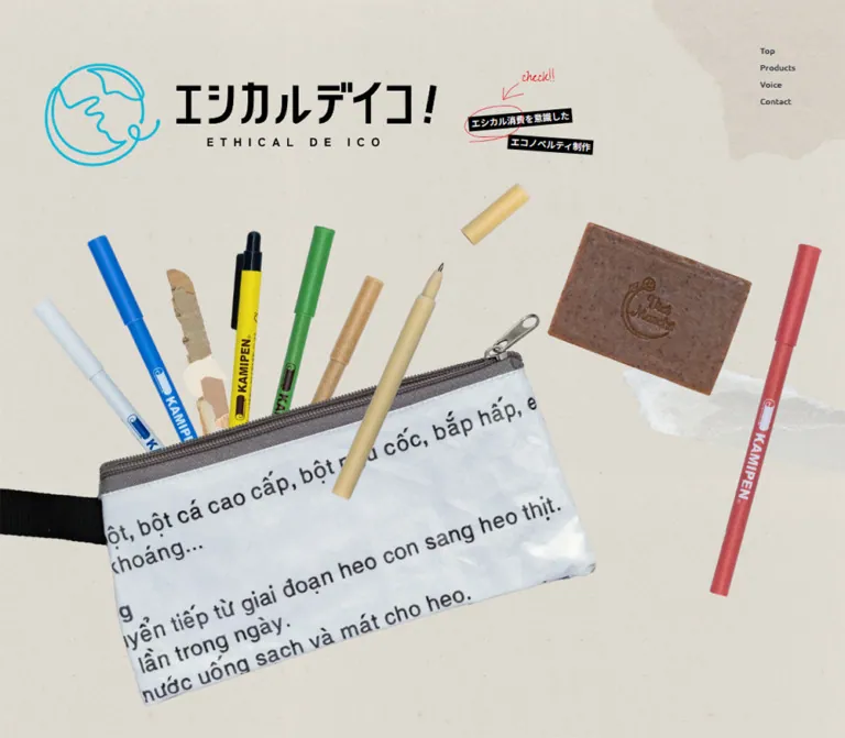
再生紙のような背景に、文具や雑貨の切り抜き写真を大胆に配置。手書きの注釈、鮮やかな商品紹介、余白を生かした構成が特徴のエコノベルティブランドサイト。
オリジナルサイトを見るETHICAL DE ICO / エシカルデイコ! — Style Reference
Colorful everyday objects scattered across recycled paper, with handwritten notes and room to breathe.
Website: www.e-d-i.jp
Original URL: https://www.e-d-i.jp/
Final URL: https://www.e-d-i.jp/
Theme: light paper surfaces, black and brown typography, and saturated product and editorial accents.
Inspected: supplied evidence captured September 13, 2026, at 05:01 JST; timestamp 2026-09-12T20:01:00.215Z.
Viewports: desktop 1440 × 1000 and mobile 390 × 844 CSS pixels.
Scope: the current brand homepage: opening collage, introductory statement, three Features entries, five product destinations, two Voice stories, and footer. Three desktop captures show the opening, a product-section view, and the footer; two mobile captures show the opening and footer. Rendered DOM measurements extend across the homepage. Menu and ethical-consumption explanation content are present in the DOM, but their open states were not visually demonstrated.
This is a brand homepage that introduces an approach to making promotional goods, presents products, and connects visitors to customer stories and contact services. Its visual identity comes from material: paper fibers, translucent scraps, printed packaging, bamboo, soap, fabric, and brightly colored pens. Large photographic cutouts overlap and run beyond the viewport, while a cyan globe and bold black wordmark establish the brand immediately.
The page alternates expansive compositions with narrower reading areas. Compact English navigation and section labels sit beside Japanese copy with generous line spacing. Irregular paper edges, tilted black labels, and handwritten annotations make the layout feel assembled by hand. Desktop uses lateral space for product photography and staggered stories; mobile deliberately rearranges these relationships.
How to Read This Reference
- Measured values come from the supplied rendered DOM and computed-style records. Tables round most measurements to two decimals.
- Declared values are custom properties found in the original page. Their presence does not, by itself, prove that a particular visible element uses them.
- Visual estimates describe the five original-page captures. Estimated colors are approximations, not sampled or computed values.
- Calculated values are derived from recorded dimensions. They are identified separately from authored CSS.
- Recommendations and the Quick Start are implementation guidance. The original stylesheet, asset manifest, and interaction handlers were not supplied in full.
- Bounding rectangles can include transformed artwork or hidden layers. A parent element's font size does not establish the size of lettering drawn inside a logo or styled child.
The supplied evidence is sufficient to describe this homepage. It does not establish the appearance of linked product pages, contact forms, or article detail pages.
Tokens — Colors
Default Palette
| Name | Value | Evidence | Role / reuse alias |
|---|---|---|---|
| Paper foundation | #d7d3cb |
Measured BODY background at both viewports | Underlying warm gray canvas; --color-canvas |
| Light paper | #eee8dd |
Declared --c-light-beige |
Light paper token; useful for hero and footer adaptations, whose visible texture has varying tones; --color-paper |
| Brown ink | #42362b |
Declared --c-beige; measured introduction, footer tagline, and utility links |
Warm reading text; --color-ink |
| Black | #000000 |
Declared --c-black; measured label backgrounds and story text |
Wordmark, tape labels, primary text; --color-black |
| White | #ffffff |
Declared --c-white; measured product text and section headings |
Reversed text and light control surfaces; --color-white |
| Editorial blue | #4f90f1 |
Declared --c-blue; a textured blue field is visible above the footer |
Large editorial color field; --color-blue |
| Annotation red | #e5040e |
Measured color of check!! |
Handwritten emphasis; --color-mark |
| Annotation gold | #efb244 |
Measured color of Thisproduct |
Product-related handwritten annotation in Voice; --color-note |
| Globe cyan | Approximately #10b5cf |
Visual estimate | Opening globe linework; --color-globe |
| Contact coral | Approximately #ed6248 |
Visual estimate | Textured footer Contact surface; --color-contact |
| Return-marker coral | Approximately #ea4850 |
Visual estimate | Small upward triangle near the footer bottom; --color-return |
The visible paper is not a flat swatch. Pale fibers, mottling, and translucent scraps modify its appearance. The measured BODY background is therefore a foundation, not an exact replacement for the hero photograph's surrounding paper.
Declared Product Accents
| Source property | Exact value | Source naming / observation |
|---|---|---|
--c-kamipen |
#eb3131 |
KAMIPEN; the corresponding featured banner is visibly red |
--c-soop |
#00b3a8 |
Soap-related token; retain the source spelling when documenting it |
--c-takepen |
#05ae99 |
Bamboo-pen token |
--c-pencase |
#f39810 |
Pencil-case token |
--c-pouch |
#f77c7c |
Pouch token |
The four smaller product cards are measured in the DOM, but their complete appearance is outside the supplied screenshot selections. Their named accent variables are confirmed; their exact background layering is not.
Additional declared values include --c-base: #fcfeff, --c-gray: #cfcdcb, and --c-orange: #ffcbb5. The last value is a pale peach and should not be confused with the visibly stronger footer Contact coral. Generic --wp--preset-* gradients and shadows are also present; they do not establish a visible gradient or elevation system for this design.
Rendered Color Versus Computed Color
Desktop navigation links report computed white text, while they appear dark over the opening paper and warm gold over the blue section. This discrepancy indicates that the raw link color alone does not explain the final rendering. A blend effect or other rendering state may be involved, but its mechanism is not included in the evidence.
For a new implementation, explicit navigation colors for light and saturated sections are a practical recommendation. Do not claim a specific blend mode or scrolling color handler as an observed source feature.
Tokens — Typography
Japanese Reading Text
- Declared source stack:
"Noto Sans JP", sans-serif, through--f-normal. - Computed use: body, introduction, product descriptions, story headings, and footer utility links.
- Observed weights:
400for regular paragraphs,500for several labels and story headings, and700for product-section and series headings. - Character: clear contemporary Japanese sans-serif, softened by brown ink, loose line spacing, and textured surroundings.
Feature paragraphs use approximately 2.1 line height. The desktop introductory statement is unusually airy at 3.3; mobile tightens it to 2. This distinction is central to the page's pacing.
English Utility Text
- Declared source stack:
"Ubuntu", sans-serif, through--f-en. - Confirmed assignment: desktop navigation.
- Measured navigation:
13.33px, weight400,21.2pxline height, and0.8pxtracking.
The page also uses short English labels such as Product, Voice, and Contact. Their individual child-element font assignments are not all exposed in the records. Using Ubuntu for these labels is a reasonable adaptation based on the declared English stack, not a measurement of every label.
Handwritten Annotations
- Source stack:
"Zeyada", system-ui, through--f-zeyada. - Confirmed examples:
check!!andThisproduct. - Desktop size:
29.52px, weight400. - Line heights:
46.94pxforcheck!!;23.62pxforThisproduct.
Use handwriting as a small annotation layer. It does not replace the main Japanese headings or long-form copy.
Brand Lettering
The large Japanese wordmark and spaced ETHICAL DE ICO lettering are brand artwork. Their parent link inherits the body font, but that computed value does not identify the artwork's letterforms. Preserve an authorized logo asset rather than approximating it with Noto Sans JP or Ubuntu.
The H1 エシカルデイコ オフィシャルサイト occupies a 1 × 1px offscreen rectangle in the supplied DOM. It supplies a semantic page title; it is not the large visible hero headline.
Type Scale
Values below are computed unless explicitly identified as visual estimates.
| Role | Desktop size / line height | Mobile size / line height | Weight | Tracking, desktop → mobile |
|---|---|---|---|---|
| Body default | 15.24px / normal |
16px / normal |
400 | Normal |
| Desktop navigation | 13.33px / 21.2px |
Replaced by menu trigger | 400 | 0.8px |
| Black tape labels | 15.24px / 24.23px |
12px / 19.08px |
500 | Normal |
| Introductory statement | 19.05px / 62.86px |
16px / 32px |
400 | 0.76px → -0.48px |
| Feature paragraphs | 15.24px / 32px |
14px / 29.4px |
400 | 1.52px → 1.4px |
| Product section heading | 23.81px / 23.81px |
18px / 18px |
700 | 1.19px → 1.8px |
| Series heading | 22.86px / 22.86px |
22px / 28.6px |
700 | 2.29px → 0.88px |
| Featured product description | 13.33px / 25.33px |
13px / 23.4px |
400 | 1.33px → 1.3px |
| Other product descriptions | 13.33px / 25.33px |
13px / 23.4px |
400 | 1.07px → 1.04px |
| Story customer label | 12.38px / 12.38px |
12px / 12px |
500 | 0.50px → 0.48px |
| Story heading | 19.05px / 30.48px |
18px / 28.8px |
500 | 0.76px → 0.72px |
| Story description | 13.33px / 25.33px |
13px / 20.8px |
400 | 1.33px → 1.3px |
| Footer tagline | 19.05px / 19.05px |
14px / 14px |
500 | 1.90px → 0.84px |
| Footer utility links | 12px / 12px |
12px / 12px |
400 | Normal |
| KAMIPEN display lettering | Approximately 40px; visual estimate |
Not visually measured | Visually bold | Visibly expanded |
| Contact display label | Approximately 24px; visual estimate |
Approximately 22px; visual estimate |
Not independently measured | Visibly expanded |
The computed size of a heading wrapper is sometimes only its inherited default. Where child spans were not sampled, the table avoids treating the wrapper as the actual display type size.
Tokens — Spacing & Shapes
Responsive Unit
The recorded HTML font size is 0.952381px at desktop and 1px at mobile. The source also declares:
| Property | Desktop | Mobile |
|---|---|---|
--vw |
1440px |
390px |
--base-vw |
1512 |
390 |
These values are consistent with a viewport-to-reference-width scale: 1440 / 1512 = 0.952381 and 390 / 390 = 1. The full root-size rule, breakpoint, and any limits were not supplied.
For discussion, 1u means one recorded source rem. Nominal values such as 73u below are reverse-calculated equivalents, not transcriptions of authored declarations. Keep a conventional root font size in a new application and use a separate length token if reproducing this scaling.
Spacing Scale
| Use | Desktop measurement | Mobile measurement | Interpretation |
|---|---|---|---|
| Main section side inset | 69.52px, approximately 73u |
25px |
Broad desktop frame; stable phone gutter |
| Hero logo left inset | 74.28px |
24px |
Slightly distinct from section grid |
| Featured product top padding | 99.05px, approximately 104u |
56px |
Spacious lead-in above product copy |
| Featured product side padding | 76.19px, approximately 80u |
35px |
Nested reading inset |
| Featured heading internal gap | 7.62px |
4px |
Caption-to-name grouping |
| Featured heading-to-description gap | 3.81px |
4px |
Tight content grouping |
| Product grid column gap | 83.84px, calculated |
Single column | Strong separation of desktop tiles |
| Product grid row gap | 66.66px, calculated |
8px, calculated |
Phone tiles form a more continuous stack |
| Other product description inset | 69.52px from card left |
33px from card left |
Text is narrower than the card artwork |
| Footer top padding | 171.43px |
225px |
Mobile retains a large quiet arrival space |
| Footer bottom padding | 61.90px |
24px |
Utility baseline clearance |
This is not a uniformly tight spacing system. Small internal gaps coexist with several hundred pixels of compositional space.
Border Radius and Edges
| Element | Evidence | Design implication |
|---|---|---|
| Product links | Computed 0px radius |
Avoid a general rounded-card system |
| Black tape labels | Computed 0px radius |
Use square strips with slight rotation |
| Featured red banner | Visibly irregular perimeter | Reproduce with an asset or an irregular mask, not rounded corners |
| Section boundary above footer | Repeating small triangular teeth | Use a regular cut-paper edge treatment |
| Product arrow | Approximately 60px white circle, visually estimated |
A simple circular directional marker |
| Desktop Contact | Visible organic oval, about 310 × 284px |
Its painted shape is separate from ordinary card geometry |
| Mobile Contact | Visible rectangular color field, 340 × 87px link box |
Recompose the CTA for phone width |
| Contact link wrapper | Computed radius 9.52px desktop / 10px mobile |
Does not describe the full visible background shape |
The desktop oval and mobile rectangle are visible despite the link wrapper's similar computed radius. Do not derive the painted Contact silhouette from that one property.
Layout Measurements
| Element | Desktop 1440 × 1000 |
Mobile 390 × 844 |
|---|---|---|
| Document height | 8893.36px |
10124.47px |
| Hero brand link | 672.38 × 179.05px, at 74.28, 105.70 |
342 × 90.41px, at 24, 90 |
| Menu trigger | Desktop text navigation instead | 100 × 100px, at 290, 0 |
| Introductory paragraph | 947.63px wide, starts at document y 1301.89px |
342px wide, starts at y 812px |
| Main product content width | 1300.97px |
340px |
| Featured product link | 1300.97 × 407.61px |
340 × 459px |
| Featured description width | 295.23px |
270px |
| Other product links | Two columns, each 608.56px wide |
One column, each 340px wide |
| Other product link heights | About 504.88–530.67px |
About 340.17px |
| First Voice story link | 886.64 × 621.86px, aligned right |
340 × 907.06px |
| Second Voice story link | 885.69 × 616.70px, aligned left |
340 × 898.97px |
| Footer | 821.58px high |
748.70px high |
| Footer Contact link | 309.52 × 283.80px |
340 × 87px |
Coordinates in this table are document coordinates or initial-viewport coordinates as indicated. They are not recommended fixed scroll targets.
Components
Brand Identity and Persistent Navigation
Role: establish identity while keeping primary destinations available.
The brand link contains the cyan globe, bold Japanese wordmark, and widely tracked English brand line. On desktop it sits roughly 74px from the left and 106px from the top. The header's sampled normal-flow height is zero, consistent with identity and controls being layered over the composition.
Desktop navigation is a small vertical stack in the upper-right corner: Top, Products, Voice, and Contact. Its first link box begins at 1318.47, 52.20px. Each row is approximately 28.78px high, including 3.81px top and bottom padding. There is no visible enclosing navigation bar.
The stack remains in the same upper-right region across the desktop captures. This supports a visually persistent navigation treatment; the exact positioning rule was not supplied.
On mobile, the text stack is replaced by a large 100 × 100px button region at the top right. The visible mark consists of two thin horizontal lines, approximately 40px wide, with substantial empty space around them. A similar trigger remains visible in the footer capture.
Opening Product Collage
Role: make the product materials and colorful variety the main first impression.
The desktop composition spreads across the viewport. A cluster of pens rises out of an upcycled printed pouch, a loose bamboo-colored pen crosses in front, a cap floats above it, and a soap bar occupies the upper-right product area. A red pen runs near the right edge. Objects are photographed with realistic fibers, printing, translucent material, and surface imperfections.
The large pouch is partially cropped by the bottom of the 1000px desktop capture. This is a viewport crop, not evidence that the asset itself ends there.
Mobile has a different composition. The logo occupies the upper band, the black labels sit below it toward the right, and the product cluster starts around y 300px. The pouch crosses the middle diagonally. The soap moves below it toward the right, overlapping the red pen. Introductory text begins at y 812px.
For implementation, use independently placed cutouts or separately art-directed desktop and mobile collage exports. The source asset structure is not exposed. A single centered background with cover is unlikely to preserve both observed arrangements.
Ethical-Consumption Tape Callout
Role: connect the playful product composition to the brand's ethical-consumption explanation.
Two black strips carry white Japanese labels: エシカル消費を意識した and エコノベルティ制作. The upper strip tilts slightly counterclockwise, while the lower one sits farther right with a slight clockwise tilt. Approximately −5° and +4° are useful visual estimates, not source transform values.
A thin red hand-drawn circle marks the first strip. Desktop adds check!! in red Zeyada above it, with a drawn arrow. Mobile shows a small white circular plus marker beside the upper strip; the handwritten check!! is absent from the visible mobile composition.
The DOM includes a button associated with this area and explanation content titled エシカル消費とは. No supplied interaction trace demonstrates opening it. Treat it as an evidenced explanation affordance with unverified activation and animation behavior.
Introductory Statement
Role: shift from visual impact into the brand's reasoning.
Desktop places a broad paragraph to the right, beginning at x 418.09px, with a width of 947.63px. Brown text at 19.05px uses 62.86px line height. The left-side emptiness extends the asymmetry of the hero.
Mobile resets the paragraph to x 24px, width 342px, and 16px / 32px. Tracking changes from slightly positive to −0.48px. The result is a readable paragraph rather than a miniaturized desktop text block.
Preserve deliberate line breaks only where they remain useful at the target width. The supplied mobile text wraps differently from the desktop statement.
Features Narrative
Role: explain three brand principles through numbered editorial sections.
The DOM contains a section introduction and three entries numbered 01, 02, and 03. Their subjects concern individual variation, environmental responsibility, and product quality.
Desktop measurements place the section introduction at x 69.52px and the main feature text at x 412.39px, with a reading width of 380.94px. Paragraphs use white 15.24px text with 32px line height. This establishes a sidebar-and-reading-column relationship.
Mobile moves the introduction, numbered headings, and paragraphs into the same 340px column at x 25px. Number/title groups change from a recorded vertical gap on desktop to an 8px horizontal gap on mobile. Feature paragraphs become 14px / 29.4px.
The supplied screenshots do not show the complete Features region. Its precise background hue, supporting image placements, and any sticky behavior are not established. Do not fill these gaps by assuming it uses the same composition as the visible product or footer sections.
Lifestyle Photography Strip
Role: reconnect the narrative with everyday use before the product catalog.
The product-section screenshot includes a full-width strip of notebook-writing photography above the section heading. Three adjacent image regions are visible, separated by narrow white seams. Wooden surfaces and daylight provide warmth; the right image includes soft green foreground blur.
Approximately 210px of the strip is visible in this capture. That is a visible fragment, not a measured full image-strip height. The bottom edge has small repeating teeth that connect photography to the paper field beneath.
No carousel controls, advancing frames, or swipe behavior are demonstrated. Treat the strip as a photographic sequence unless additional interaction evidence is supplied.
Featured KAMIPEN Banner
Role: give the flagship product a larger, immediate destination.
The centered Product label and Japanese heading introduce a banner spanning the 1300.97px desktop content width. The banner's visible red surface has a subtly irregular edge and printed texture.
Its anatomy is:
- A short Japanese material caption.
- Large, tracked
KAMIPENlettering. - A narrow Japanese description beneath it.
- A lineup of differently colored pens occupying most of the right side and reaching the bottom edge.
- A white circular arrow near the right edge.
The entire banner is a link to https://www.kamipen.jp/. The arrow is a directional marker within that destination; the evidence does not identify it as a separate carousel control.
At desktop, content begins about 99px below the banner top and 76px inside its left edge. The description remains only 295.23px wide, leaving ample space for photography. The banner is about 3.19:1 in aspect ratio, calculated from its measured box.
Mobile changes the link to 340 × 459px, approximately 0.74:1. Text starts 56px from the top and 35px from the left, with a 270px reading width. This demonstrates a tall recomposition. The exact mobile pen-image crop is not visible in the supplied captures.
Product Series and Product Tiles
Role: introduce a related collection and provide four further destinations.
The series introduction uses a Japanese heading and a paragraph explaining the collection. Desktop places the heading at x 69.52px and the description at x 348.66px. Mobile stacks them, with the paragraph 24px below the heading box.
Four product links follow: handmade soap, bamboo pens, an upcycled feed-bag pencil case, and an embroidered drawstring pouch. Each contains a short material or benefit caption, a product name, and descriptive copy.
Desktop uses two columns of 608.56px, separated by about 83.84px. Mobile uses one 340px column with approximately 8px between tile boxes. Description widths change from 400px to 274px; mobile copy has a 33px inset from the card edge.
The destinations mix original-site routes and external product services. Implement them as links, preserving their actual destination relationships. Do not add shopping-cart or purchase behavior that the homepage evidence does not show.
Voice Story Features
Role: present customer experiences with editorial prominence.
The DOM establishes this story anatomy: product label, small customer name, Japanese headline, descriptive excerpt, and a Read more cue. A nearby handwritten Thisproduct annotation is also recorded on desktop.
Desktop staggers the two large story links. The first begins at x 483.84px and reaches the right content edge; the second begins at x 69.52px. Both are approximately 886px wide. Their reading columns are much narrower at 277.14px, creating room within the overall composition beyond the text.
Mobile aligns both story links at x 25px, width 340px. They grow to roughly 900px tall, with 270px reading columns beginning 35px inside the card. Titles use 18px / 28.8px; excerpts tighten to 13px / 20.8px.
The selected screenshots show only the end of the blue editorial field and the centered underlined 一覧をみる link. Full story imagery and card-surface details are not visually available. Their layout measurements are useful, but do not establish an exact image crop or paper-card silhouette.
Footer Brand Statement
Role: close the long page with a quiet restatement of identity.
A pale globe outline sits behind the bold black wordmark and a single brown Japanese tagline. On desktop, the mark occupies the center while the Contact surface sits lower right. The footer begins with generous paper space and has no conventional multi-column sitemap.
Mobile retains an especially large top breathing area: measured padding is 225px. The brand group is approximately 340 × 219.70px. A 14px tagline remains on one line in the supplied 390px viewport.
The visual artwork can extend beyond its measured link wrapper. Preserve the composition as artwork instead of assigning the wrapper's inherited font size to the wordmark.
Contact and Footer Utilities
Role: offer a clear inquiry destination after the narrative.
Desktop Contact is a large, textured coral oval at the lower right, with an English label over a small Japanese invitation. The link box is 309.52 × 283.80px. Mobile turns this into a full-content-width 340 × 87px rectangular surface, positioned 45px below the brand-group box.
The destination is https://www.j-p.co.jp/contact/, as exposed by the homepage link. The contact form itself was not inspected.
Footer utilities include facebook, プライバシーポリシー, and 運営会社, set in underlined 12px text. Desktop places them alongside the copyright near the lower left. Mobile centers the three links beneath Contact, then separates the copyright and small upward triangle into a lower row.
The upward-triangle button measures approximately 39 × 37px on desktop, including padding, but only 17 × 15px on mobile. Its appearance suggests a return-to-top action; activation was not demonstrated.
Explanation Layer and Mobile Menu
Role: secondary explanation and compact navigation.
The DOM contains an ethical-consumption explanation paragraph and a 閉じる button. Its paragraph measures 254.28px wide on desktop and 267px on mobile, with approximately double line height. These records confirm content and geometry, not an open visual state.
The mobile menu DOM includes a logo link, top-page link, product group, individual product destinations, Voice, Contact, and legal links. Product menu rows measure 326px wide at x 32px. A separate menu Contact link measures 342 × 87px.
Neither the menu's open appearance nor its transition, focus handling, backdrop, scroll lock, or close behavior is demonstrated. The soap destination also differs between the main product tile and mobile menu. Preserve the distinction in documentation; verify intended routing before consolidating it in an implementation.
Tokens — Motion & Interaction
| Treatment | Evidence | What can be concluded |
|---|---|---|
| Footer utility transition | opacity 0.4s cubic-bezier(0.19, 1, 0.22, 1) |
An opacity transition is defined; its triggering state and target opacity were not supplied |
| General sampled elements | Often transition: all, animation: none |
No complete timed animation can be inferred from these entries alone |
| Easing token | --e-out-expo: cubic-bezier(0.19, 1, 0.22, 1) |
Confirmed and used by the utility-link transition |
| Additional easing tokens | Quad, cubic, quart, quint, expo, circ, and back variants; --gleasing: cubic-bezier(0.4, 0, 0, 1) |
Available declarations, not proof of particular component motion |
| Layer tokens | --z-base: 100, --z-open: 101, --z-fv-modal: 102, --z-menu: 103 |
Named layer ordering exists; assignments were not fully supplied |
| Persistent navigation | Similar viewport placement across scroll captures | Persistent visual behavior is supported; implementation rule is unverified |
| Products / Voice navigation | Recorded #products and #voice hrefs |
In-page targets exist; smooth-scrolling behavior was not tested |
| Product and story destinations | Anchor hrefs present | Navigation intent is confirmed; destination pages were not inspected |
| Hero explanation and menu | Buttons and associated content appear in DOM | Open/close behavior is not demonstrated |
| Product collage | Static settled captures | Floating, parallax, entrance timing, and scroll-linked motion are unverified |
The capture procedure waited for document load, visible image decoding, and sampled geometric/text stability, with bounded waits. Perpetual animations were temporarily paused during readiness checks and then resumed. This improves confidence in the captured layouts but does not establish a complete animation specification.
For a new implementation, the observed 400ms opacity easing is a useful restrained interaction token. Keep decorative movement optional and avoid inventing continuous floating motion simply because the cutouts look suspended. The content should remain visible without waiting for an entrance animation.
Surfaces
| Layer | Appearance | Evidence / purpose |
|---|---|---|
| Page foundation | Warm gray paper | Measured BODY fill plus visible texture |
| Hero and footer | Lighter mottled paper with occasional scraps | Visually observed material atmosphere |
| Tape annotation | Black rectangular strips with white text | Strong small-scale contrast |
| Featured product | Saturated textured red with irregular edge | Visually observed flagship destination |
| Editorial field near footer | Textured blue with white link and toothed boundary | Visually observed section transition |
| Contact | Coral textured oval on desktop; rectangle on mobile | Visually observed conversion surface |
| Arrow control | White circle with black chevron | Visually observed directional emphasis |
| Utility links | Unboxed and underlined | Measured compact footer navigation |
There is no visible general-purpose shadow elevation system in the supplied captures. Material boundaries, overlap, photography, and color create separation. Keep photographic shading within the assets; avoid adding identical UI drop shadows around every object.
Imagery
The image language is tactile product photography assembled as collage. Recycled material should remain recognizably recycled: the pouch has foreign-language printing, translucent areas, seams, and irregularities. Bamboo and paper pens retain natural grain; soap retains a rough, flecked surface and embossed mark. These details support the brand's material story.
Product photography is colorful and sharply legible. Lifestyle photography is warmer and softer, showing hands writing in notebooks on wooden tables. The contrast between isolated objects and contextual scenes creates variety without introducing a different visual language.
Observed Asset References
The supplied evidence does not include image src values, native asset dimensions, or a downloadable asset manifest. The following references identify visible roles rather than inventing original file paths.
| Visual asset | Original-page evidence | Required qualities |
|---|---|---|
| Opening brand lockup | Desktop and mobile opening captures | Cyan globe, black Japanese lettering, spaced English line |
| Product collage | Desktop and mobile opening captures | Colorful pens, printed upcycled pouch, soap, loose cap, natural material detail |
| Paper and translucent scraps | Opening and footer captures | Fine grain, subtle tonal variation, irregular scrap edges |
| Notebook photography | Desktop product-section capture | Hands, notebooks, wooden surfaces, natural light |
| KAMIPEN lineup | Desktop product-section capture | Multiple pen colors, aligned black tops, lower-edge crop |
| Footer brand artwork | Desktop and mobile footer captures | Pale globe behind black lettering |
| Contact texture | Desktop and mobile footer captures | Coral material surface with device-specific silhouette |
| Scribbles and edge treatments | Opening and section-boundary captures | Thin red annotations, rough banner edges, repeated small teeth |
Use authorized assets or create original equivalents for a new brand. CSS can reproduce layout and supporting geometry; it cannot substitute for the logo or material specificity of the photographs. Do not pixelate these photographic assets.
Layout & Responsive Behavior
The page is a long scrolling document. Main content uses approximately 69.52px desktop gutters and 25px mobile gutters, but hero artwork can bleed beyond that grid.
| Region | Desktop behavior | Mobile behavior | Confidence |
|---|---|---|---|
| Identity | Large upper-left horizontal lockup | Compact lockup spanning 342px |
Screenshots and DOM |
| Navigation | Small vertical upper-right links | Two-line trigger in 100px square target |
Screenshots and DOM |
| Hero imagery | Wide scattered composition; pouch cropped by initial viewport | Vertically rearranged collage with soap below pouch | Screenshots |
| Tape callout | Beside logo, with handwritten check!! |
Below logo toward right, with plus marker | Screenshots and DOM |
| Introduction | Right-offset, very loose leading | Full reading column, tighter leading | DOM; mobile opening edge visible |
| Features | Separate introduction and reading-column positions | Single aligned column | DOM only for full region |
| Featured product | Wide shallow banner | Narrow tall link box | Desktop screenshot and both DOM records |
| Product series introduction | Heading and description side by side | Stacked | DOM |
| Product tiles | Two columns with wide gap | Single stack with small inter-card gap | DOM |
| Voice stories | Alternating right/left placement | Aligned vertical sequence | DOM |
| Footer Contact | Lower-right organic oval | Wide rectangle under centered brand | Screenshots and DOM |
| Footer utilities | Shared lower baseline | Centered links, then separate bottom row | Screenshots and DOM |
The responsive strategy involves composition, type, spacing, and shape changes. It is not proportional shrinking: the mobile body default is slightly larger than the measured desktop body, while individual feature and product text sizes are adjusted separately.
The exact breakpoint is unknown. The Quick Start uses 767px as an explicitly recommended implementation breakpoint. Intermediate tablet widths, landscape phones, very narrow screens, safe-area treatment, zoom behavior, and menu scrolling were not inspected.
Do’s and Don’ts
Do
- Build the atmosphere from paper texture and real material detail.
- Preserve the large cyan-and-black identity artwork.
- Let product photography overlap and extend beyond the content grid where composition requires it.
- Recompose the hero for mobile, including the soap and pouch relationship.
- Pair Noto Sans JP reading text with Ubuntu utility text and occasional Zeyada annotations.
- Keep Japanese paragraphs comfortably spaced, with different rhythms for introduction, features, and stories.
- Make the flagship product banner a single coherent link with a visible directional cue.
- Preserve desktop product columns and staggered story placement where the evidence supports them.
- Change the footer Contact silhouette between desktop and mobile.
- Distinguish irregular torn edges from the regularly repeated triangular section boundary.
- Keep footer utilities compact and visibly underlined.
Don’t
- Don’t replace the photographic collage with generic sustainability icons.
- Don’t render the brand wordmark using the body font.
- Don’t turn every content block into a rounded, shadowed card.
- Don’t treat the declared BODY fill as the complete paper texture.
- Don’t assign every declared platform gradient or shadow to the visible design.
- Don’t assume the small circular banner arrow advances a carousel.
- Don’t infer animation timing, parallax, or modal behavior from still images.
- Don’t scale the desktop hero down unchanged for mobile.
- Don’t copy the source's tiny numerical rem values into a conventional
16pxroot. - Don’t use wrapper radii or inherited font sizes as measurements of artwork painted inside them.
- Don’t reconstruct unshown story imagery or Features surfaces as if they were verified.
Recommended Implementation Additions
These are recommendations for a new implementation, not verified behavior of the original website.
- Give the menu, explanation trigger, and upward-triangle button accessible names. The extracted text alone does not reveal their complete accessible naming.
- Expand the mobile return-to-top hit area to at least
44 × 44px, while retaining the small visible triangle. - Use semantic links for product and story destinations; keep decorative arrows outside the accessibility reading order.
- If implementing an explanation dialog or menu overlay, support keyboard operation, Escape dismissal, focus restoration, and scrollable content on short screens.
- Keep a visible focus outline around complete interactive regions, including irregularly shaped surfaces.
- Check text contrast against the final textured backgrounds. The white Product heading over gray paper is visually low contrast; a darker heading or quieter local surface would improve readability in an adaptation.
- Provide reduced-motion handling and keep the page readable if entrance effects do not execute.
- Supply useful product-image alternatives while marking paper scraps and decorative scribbles as decorative.
- Load the documented font families intentionally, with fallback behavior that preserves readable Japanese text.
- Verify the differing soap destinations before reusing the navigation structure.
Agent Prompt Guide
Quick Color Reference
- Measured page foundation:
#d7d3cb. - Declared light paper:
#eee8dd; add authorized texture separately. - Brown reading ink:
#42362b. - Wordmark and tape labels:
#000000. - Reversed text and circular arrow surface:
#ffffff. - KAMIPEN accent:
#eb3131. - Editorial blue:
#4f90f1. - Handwritten red:
#e5040e. - Globe cyan: approximately
#10b5cf, visual estimate. - Contact coral: approximately
#ed6248, visual estimate.
Overall Prompt
“Create a Japanese product-brand homepage with a tactile recycled-paper atmosphere. Use warm gray and cream paper, brown Japanese reading text, a bold black brand lockup with cyan linework, colorful photographic product cutouts, and small handwritten red annotations. Compose an expansive desktop hero with overlapping pens, an upcycled printed pouch, and natural-material products. Follow it with a spacious introduction, numbered brand principles, a prominent red product banner, a two-column product collection, staggered customer stories, and a quiet paper footer. Use Noto Sans JP for Japanese copy, Ubuntu for compact English utilities, and Zeyada only for annotations. On mobile, rearrange the collage, stack product and story content, replace navigation links with a two-line menu trigger, and change the footer's coral oval Contact link into a wide rectangle. Treat any unverified animation or overlay styling as a new design decision.”
Example Component Prompts
- Opening collage: “Place an authorized cyan-and-black brand lockup in the upper left of warm textured paper. Spread real product cutouts diagonally below it, allowing selected objects to bleed beyond the viewport. Add two slightly tilted black Japanese labels with white text and a thin red hand-drawn circle. Create a separately composed mobile arrangement.”
- Featured product: “Build a wide textured red banner with an irregular paper edge. Put a small material caption, large tracked product name, and narrow Japanese description at left; let a colorful pen lineup dominate the right. Include a white circular chevron marker within the full-banner link. Reflow to a tall
340pxphone composition.” - Product collection: “Use two generous desktop columns inside approximately
70pxpage gutters. Give product photography room above compact Japanese descriptions. On a390pxphone, use a340pxsingle column, roughly33pxinternal text insets, and close spacing between tiles.” - Customer stories: “Arrange large story destinations alternately against the right and left content edges. Keep the text column substantially narrower than the overall story composition, with a small customer label, medium-weight Japanese heading, and readable excerpt. Stack the stories on mobile. Choose imagery and surface details explicitly because they are not fully established by the reference evidence.”
- Footer: “Create a large quiet paper footer with a pale globe behind bold black brand artwork. Add a coral textured organic oval Contact destination at the desktop lower right. On mobile, center the brand and place a
340 × 87pxrectangular Contact link beneath it, followed by underlined utilities and a separate copyright row.”
Quick Start
CSS Custom Properties
This CSS is an adaptation, not the original stylesheet. It preserves several measured dimensions at the supplied viewports while retaining a conventional root font size. The desktop scaling limits, 767px breakpoint, approximate colors, torn-edge polygon, and hero scene placement are recommendations.
Use semantic markup with .brand-logo as a logo link, .hero-note as an explanation button, .product-feature and .product-card as links, and .contact-link as a contact destination. Supply authorized logo and collage images; use a <picture> element for .hero-art when separate mobile artwork is available. The optional --paper-grain value should reference a subtle transparent texture supplied by the implementing project. No original asset path is assumed here.
:root {
  /* Measured or declared source colors */
  --color-canvas: #d7d3cb;
  --color-paper: #eee8dd;
  --color-ink: #42362b;
  --color-black: #000;
  --color-white: #fff;
  --color-kamipen: #eb3131;
  --color-soap: #00b3a8;
  --color-bamboo: #05ae99;
  --color-pencilcase: #f39810;
  --color-pouch: #f77c7c;
  --color-blue: #4f90f1;
  --color-mark: #e5040e;
  --color-note: #efb244;

  /* Visual approximations, not sampled source colors */
  --color-globe: #10b5cf;
  --color-contact: #ed6248;
  --color-return: #ea4850;

  --font-body: "Noto Sans JP", sans-serif;
  --font-en: "Ubuntu", sans-serif;
  --font-note: "Zeyada", system-ui;
  --paper-grain: none;

  /* Recommended scaling model; 0.952381px at 1440px */
  --u: clamp(0.8px, calc(100vw / 1512), 1.1px);
  --gutter: calc(73 * var(--u));
  --grid-gap: calc(88 * var(--u));
  --text-body: clamp(15px, calc(16 * var(--u)), 18px);
  --text-small: clamp(13px, calc(14 * var(--u)), 15px);
  --ease-out-expo: cubic-bezier(0.19, 1, 0.22, 1);
  --motion-link: 400ms var(--ease-out-expo);
}

* {
  box-sizing: border-box;
}

html {
  font-size: 100%;
}

body {
  margin: 0;
  color: var(--color-ink);
  background: var(--color-canvas);
  font-family: var(--font-body);
  font-size: var(--text-body);
}

button,
input,
textarea {
  font: inherit;
}

img {
  display: block;
  max-inline-size: 100%;
  block-size: auto;
}

a {
  color: inherit;
}

button {
  cursor: pointer;
}

.site-container {
  margin-inline: var(--gutter);
}

.paper-surface {
  background-color: var(--color-paper);
  background-image: var(--paper-grain);
  background-repeat: repeat;
}

.visually-hidden {
  position: absolute;
  inline-size: 1px;
  block-size: 1px;
  padding: 0;
  overflow: hidden;
  clip-path: inset(50%);
  white-space: nowrap;
  border: 0;
}

/* Hero height and scene placement are adaptation choices. */
.hero {
  position: relative;
  min-block-size: calc(1320 * var(--u));
  isolation: isolate;
}

.brand-logo {
  position: absolute;
  inset-block-start: calc(111 * var(--u));
  inset-inline-start: calc(78 * var(--u));
  inline-size: calc(706 * var(--u));
  z-index: 2;
}

.brand-logo img {
  inline-size: 100%;
}

.hero-art {
  position: absolute;
  inset-inline: 0;
  inset-block-start: calc(320 * var(--u));
  overflow: clip;
  pointer-events: none;
}

.hero-art img {
  inline-size: 100%;
}

.site-nav {
  position: fixed;
  inset-block-start: calc(55 * var(--u));
  inset-inline-end: calc(64 * var(--u));
  z-index: 20;
  color: var(--nav-ink, var(--color-ink));
  font-family: var(--font-en);
  font-size: calc(14 * var(--u));
  line-height: 1.59;
  letter-spacing: 0.06em;
}

.site-nav a {
  display: block;
  padding-block: calc(4 * var(--u));
  text-decoration: none;
}

/* Explicit state is recommended; the source mechanism is unknown. */
.site-nav[data-surface="blue"] {
  --nav-ink: var(--color-note);
}

.menu-trigger {
  display: none;
}

.hero-note {
  position: absolute;
  inset-inline-start: calc(837 * var(--u));
  inset-block-start: calc(193 * var(--u));
  z-index: 3;
  padding: 0;
  border: 0;
  background: transparent;
  text-align: start;
}

.tape-label {
  display: table;
  padding-inline: calc(5 * var(--u));
  color: var(--color-white);
  background: var(--color-black);
  font-size: calc(16 * var(--u));
  font-weight: 500;
  line-height: 1.59;
  transform: rotate(-5deg);
}

.tape-label + .tape-label {
  margin-block-start: calc(14 * var(--u));
  margin-inline-start: calc(70 * var(--u));
  transform: rotate(4deg);
}

.handwritten {
  color: var(--color-mark);
  font-family: var(--font-note);
  font-size: calc(31 * var(--u));
  font-weight: 400;
}

.intro {
  margin-block: calc(48 * var(--u)) calc(240 * var(--u));
  margin-inline: 29.03% 5.16%;
  font-size: calc(20 * var(--u));
  line-height: 3.3;
  letter-spacing: 0.04em;
}

.section-heading {
  margin-block: 0 calc(79 * var(--u));
  color: var(--color-white);
  text-align: center;
}

.section-heading .eyebrow {
  display: block;
  margin-block-end: calc(20 * var(--u));
  font-family: var(--font-en);
  font-size: var(--text-body);
  font-weight: 400;
}

.section-heading h2 {
  margin: 0;
  font-size: calc(25 * var(--u));
  line-height: 1;
  letter-spacing: 0.05em;
}

.product-feature {
  position: relative;
  display: block;
  min-block-size: calc(428 * var(--u));
  padding: calc(104 * var(--u)) calc(80 * var(--u)))
    calc(40 * var(--u));
  color: var(--color-white);
  text-decoration: none;
  isolation: isolate;
}

/* Irregular clipping affects only the painted layer. */
.product-feature::before {
  content: "";
  position: absolute;
  inset: 0;
  z-index: -1;
  background-color: var(--color-kamipen);
  background-image: var(--paper-grain);
  clip-path: polygon(
    0 0, 18% 0.7%, 40% 0, 72% 0.4%, 100% 0,
    99.8% 18%, 100% 34%, 99.7% 57%, 100% 78%,
    99.9% 100%, 75% 99.5%, 45% 100%, 20% 99.7%,
    0 100%, 0.4% 81%, 0 62%, 0.3% 42%, 0 20%
  );
}

.product-feature__copy {
  position: relative;
  z-index: 1;
  max-inline-size: calc(310 * var(--u));
}

.product-kicker {
  margin: 0 0 calc(8 * var(--u));
  font-size: var(--text-small);
  font-weight: 500;
  letter-spacing: 0.08em;
}

.product-title {
  margin: 0;
  font-family: var(--font-en);
  font-size: clamp(32px, calc(42 * var(--u)), 46px);
  font-weight: 700;
  line-height: 1.4;
  letter-spacing: 0.12em;
}

.product-description {
  margin-block: calc(4 * var(--u)) 0;
  font-size: var(--text-small);
  line-height: 1.9;
  letter-spacing: 0.1em;
}

/* Supply a transparent pen lineup; tune crop to the actual asset. */
.product-feature__art {
  position: absolute;
  inset-inline-end: 5%;
  inset-block-end: 0;
  inline-size: 61%;
  max-block-size: 90%;
  object-fit: contain;
  object-position: bottom;
  pointer-events: none;
}

.product-arrow {
  position: absolute;
  inset-inline-end: calc(48 * var(--u));
  inset-block-start: 50%;
  display: grid;
  place-items: center;
  inline-size: 60px;
  aspect-ratio: 1;
  border-radius: 50%;
  color: var(--color-black);
  background: var(--color-white);
  transform: translateY(-50%);
}

.product-grid {
  display: grid;
  grid-template-columns: repeat(2, minmax(0, 1fr));
  gap: calc(70 * var(--u)) var(--grid-gap);
}

.product-card {
  display: block;
  min-inline-size: 0;
  color: var(--color-white);
  background-color: var(--product-color, var(--color-bamboo));
  background-image: var(--paper-grain);
  text-decoration: none;
}

.product-card__copy {
  padding: calc(24 * var(--u)) calc(73 * var(--u))
    calc(50 * var(--u));
}

/* Product surface assignments are a recommended mapping. */
.product-card[data-product="soap"] {
  --product-color: var(--color-soap);
}

.product-card[data-product="pencilcase"] {
  --product-color: var(--color-pencilcase);
}

.product-card[data-product="pouch"] {
  --product-color: var(--color-pouch);
}

.site-footer {
  position: relative;
  min-block-size: calc(863 * var(--u));
  padding: calc(180 * var(--u)) var(--gutter)
    calc(65 * var(--u));
}

.footer-brand {
  display: block;
  inline-size: calc(496 * var(--u));
  min-block-size: calc(442 * var(--u));
  margin-inline: auto;
  text-align: center;
  text-decoration: none;
}

.footer-brand img {
  inline-size: 100%;
}

.footer-tagline {
  font-size: calc(20 * var(--u));
  font-weight: 500;
  line-height: 1;
  letter-spacing: 0.1em;
}

.contact-link {
  position: absolute;
  inset-inline-end: var(--gutter);
  inset-block-end: calc(47 * var(--u));
  display: flex;
  flex-direction: column;
  align-items: center;
  justify-content: center;
  gap: calc(8 * var(--u));
  inline-size: calc(325 * var(--u));
  min-block-size: calc(298 * var(--u));
  padding: 20px;
  color: var(--color-white);
  background-color: var(--color-contact);
  background-image: var(--paper-grain);
  border-radius: 49% 51% 47% 53% / 51% 49% 51% 49%;
  text-align: center;
  text-decoration: none;
}

.contact-link__title {
  font-family: var(--font-en);
  font-size: 24px;
  line-height: 1;
  letter-spacing: 0.08em;
}

.contact-link__caption {
  font-size: 12px;
  line-height: 1.5;
}

.footer-meta {
  position: absolute;
  inset-inline-start: var(--gutter);
  inset-block-end: calc(65 * var(--u));
  display: flex;
  align-items: center;
  gap: calc(40 * var(--u));
  font-size: 12px;
}

.footer-links {
  display: flex;
  flex-wrap: wrap;
  gap: calc(16 * var(--u));
}

.footer-links a {
  text-decoration: underline;
  text-underline-offset: 2px;
  transition: opacity var(--motion-link);
}

/* Hover opacity is recommended; only the transition was observed. */
@media (hover: hover) {
  .footer-links a:hover {
    opacity: 0.7;
  }
}

.return-top {
  position: absolute;
  inset-inline-start: 50%;
  inset-block-end: 44px;
  display: grid;
  place-items: center;
  inline-size: 44px;
  block-size: 44px;
  padding: 0;
  border: 0;
  background: transparent;
  transform: translateX(-50%);
}

.return-top::before {
  content: "";
  inline-size: 17px;
  block-size: 15px;
  background: var(--color-return);
  clip-path: polygon(50% 0, 100% 100%, 0 100%);
}

:where(a, button):focus-visible {
  outline: 3px solid var(--color-ink);
  outline-offset: 4px;
}

@media (max-width: 767px) {
  :root {
    --u: 1px;
    --gutter: 25px;
    --text-body: 16px;
    --text-small: 13px;
  }

  .hero {
    min-block-size: 780px;
  }

  .brand-logo {
    inset-block-start: 90px;
    inset-inline-start: 24px;
    inline-size: calc(100% - 48px);
  }

  .hero-art {
    inset-block-start: 300px;
  }

  .site-nav {
    display: none;
  }

  .menu-trigger {
    position: fixed;
    inset-block-start: 0;
    inset-inline-end: 0;
    z-index: 30;
    display: flex;
    flex-direction: column;
    align-items: center;
    justify-content: center;
    gap: 10px;
    inline-size: 100px;
    block-size: 100px;
    padding: 0;
    border: 0;
    color: var(--color-ink);
    background: transparent;
  }

  .menu-trigger::before,
  .menu-trigger::after {
    content: "";
    inline-size: 40px;
    block-size: 2px;
    background: currentColor;
  }

  .hero-note {
    inset-inline-start: auto;
    inset-inline-end: 25px;
    inset-block-start: 218px;
  }

  .tape-label {
    padding: 2px 11px 3px;
    font-size: 12px;
  }

  .tape-label + .tape-label {
    margin-inline-start: 67px;
    margin-block-start: 12px;
  }

  .hero-note .handwritten {
    display: none;
  }

  .intro {
    margin: 32px 24px 160px;
    font-size: 16px;
    line-height: 2;
    letter-spacing: -0.03em;
  }

  .section-heading {
    margin-block-end: 48px;
  }

  .section-heading h2 {
    font-size: 18px;
    letter-spacing: 0.1em;
  }

  .product-feature {
    min-block-size: 459px;
    padding: 56px 35px 200px;
  }

  .product-feature__copy {
    max-inline-size: none;
  }

  .product-description {
    font-size: 13px;
    line-height: 1.8;
  }

  .product-feature__art {
    inset-inline-end: 0;
    inline-size: 100%;
    max-block-size: 180px;
  }

  .product-arrow {
    inset-inline-end: 16px;
    inset-block-start: auto;
    inset-block-end: 24px;
    inline-size: 48px;
    transform: none;
  }

  .product-grid {
    grid-template-columns: minmax(0, 1fr);
    gap: 8px;
  }

  .product-card__copy {
    padding: 24px 33px;
  }

  .site-footer {
    min-block-size: 749px;
    padding: 225px 25px 24px;
  }

  .footer-brand {
    inline-size: 100%;
    min-block-size: 219.7px;
  }

  .footer-tagline {
    font-size: 14px;
    line-height: 1.4;
    letter-spacing: 0.06em;
  }

  .contact-link {
    position: static;
    inline-size: 100%;
    min-block-size: 87px;
    margin-block-start: 45px;
    padding: 16px;
    border-radius: 0;
  }

  .contact-link__title {
    font-size: 22px;
  }

  .footer-meta {
    position: static;
    flex-direction: column;
    align-items: stretch;
    gap: 96px;
    margin-block-start: 24px;
  }

  .footer-links {
    order: -1;
    justify-content: center;
    gap: 24px;
  }

  .return-top {
    inset-inline-start: auto;
    inset-inline-end: 12px;
    inset-block-end: 10px;
    transform: none;
  }
}

@media (prefers-reduced-motion: reduce) {
  .footer-links a {
    transition: none;
  }

  html {
    scroll-behavior: auto;
  }
}
Implementation correction: in the .product-feature padding declaration above, use the following valid declaration; the intended three values are top, horizontal, and bottom padding:
.product-feature {
  padding: calc(104 * var(--u)) calc(80 * var(--u))
    calc(40 * var(--u));
}
The mobile image placement and arrow dimensions in this adaptation are recommendations because no mobile product screenshot was supplied. Let content increase component height when needed. The CSS does not implement menu state, a dialog, return-to-top behavior, asset loading, or navigation color tracking.
Tailwind v4 Token Mapping
Optional aliases for a project already using Tailwind v4. These do not imply that the original website uses Tailwind. Define the custom properties above first.
@theme inline {
  --color-canvas: #d7d3cb;
  --color-paper: #eee8dd;
  --color-ink: #42362b;
  --color-kamipen: #eb3131;
  --color-editorial-blue: #4f90f1;
  --color-annotation-red: #e5040e;
  --color-contact-coral: #ed6248;

  --font-japanese: "Noto Sans JP", sans-serif;
  --font-english: "Ubuntu", sans-serif;
  --font-handwritten: "Zeyada", system-ui;

  --spacing-unit: var(--u);
  --spacing-page-gutter: var(--gutter);
  --spacing-product-gap: var(--grid-gap);

  --text-reading: var(--text-body);
  --text-detail: var(--text-small);
  --ease-paper-link: cubic-bezier(0.19, 1, 0.22, 1);
}
Sources & Evidence
- Original homepage: original and final URL are identical; supplied response status is HTTP
200. - Capture timestamp:
2026-09-12T20:01:00.215Z, equivalent to September 13, 2026, 05:01 JST. - Desktop evidence:
1440 × 1000CSS-pixel viewport, three selected original-page captures, and rendered DOM/computed-style records across a document measured at8893.36pxtall. - Mobile evidence:
390 × 844CSS-pixel viewport, two selected original-page captures, and rendered DOM/computed-style records across a document measured at10124.47pxtall. - Measurements include text styles, element rectangles, padding, gaps, radii, custom properties, and exposed link destinations. Screenshots establish visible material texture, collage composition, navigation appearance, banner geometry, and footer changes.
- Inspection limitations: no additional browsing was performed. No complete stylesheet, asset paths, interaction event trace, open overlay capture, intermediate responsive viewport, or linked-page inspection was provided. Full Features and Voice visual compositions are only partially represented by the selected screenshots.
This reference describes the current homepage represented by the supplied evidence. Declared tokens, measured layouts, visual estimates, and recommended implementation choices remain explicitly distinguished.
# ETHICAL DE ICO / エシカルデイコ! — Style Reference

> Colorful everyday objects scattered across recycled paper, with handwritten notes and room to breathe.

**Website:** [www.e-d-i.jp](https://www.e-d-i.jp/)
**Original URL:** https://www.e-d-i.jp/
**Final URL:** https://www.e-d-i.jp/
**Theme:** light paper surfaces, black and brown typography, and saturated product and editorial accents.
**Inspected:** supplied evidence captured September 13, 2026, at 05:01 JST; timestamp `2026-09-12T20:01:00.215Z`.
**Viewports:** desktop `1440 × 1000` and mobile `390 × 844` CSS pixels.
**Scope:** the current brand homepage: opening collage, introductory statement, three Features entries, five product destinations, two Voice stories, and footer. Three desktop captures show the opening, a product-section view, and the footer; two mobile captures show the opening and footer. Rendered DOM measurements extend across the homepage. Menu and ethical-consumption explanation content are present in the DOM, but their open states were not visually demonstrated.

This is a brand homepage that introduces an approach to making promotional goods, presents products, and connects visitors to customer stories and contact services. Its visual identity comes from material: paper fibers, translucent scraps, printed packaging, bamboo, soap, fabric, and brightly colored pens. Large photographic cutouts overlap and run beyond the viewport, while a cyan globe and bold black wordmark establish the brand immediately.

The page alternates expansive compositions with narrower reading areas. Compact English navigation and section labels sit beside Japanese copy with generous line spacing. Irregular paper edges, tilted black labels, and handwritten annotations make the layout feel assembled by hand. Desktop uses lateral space for product photography and staggered stories; mobile deliberately rearranges these relationships.

## How to Read This Reference

- **Measured** values come from the supplied rendered DOM and computed-style records. Tables round most measurements to two decimals.
- **Declared** values are custom properties found in the original page. Their presence does not, by itself, prove that a particular visible element uses them.
- **Visual estimates** describe the five original-page captures. Estimated colors are approximations, not sampled or computed values.
- **Calculated** values are derived from recorded dimensions. They are identified separately from authored CSS.
- **Recommendations** and the Quick Start are implementation guidance. The original stylesheet, asset manifest, and interaction handlers were not supplied in full.
- Bounding rectangles can include transformed artwork or hidden layers. A parent element's font size does not establish the size of lettering drawn inside a logo or styled child.

The supplied evidence is sufficient to describe this homepage. It does not establish the appearance of linked product pages, contact forms, or article detail pages.

## Tokens — Colors

### Default Palette

| Name | Value | Evidence | Role / reuse alias |
| --- | --- | --- | --- |
| Paper foundation | `#d7d3cb` | Measured BODY background at both viewports | Underlying warm gray canvas; `--color-canvas` |
| Light paper | `#eee8dd` | Declared `--c-light-beige` | Light paper token; useful for hero and footer adaptations, whose visible texture has varying tones; `--color-paper` |
| Brown ink | `#42362b` | Declared `--c-beige`; measured introduction, footer tagline, and utility links | Warm reading text; `--color-ink` |
| Black | `#000000` | Declared `--c-black`; measured label backgrounds and story text | Wordmark, tape labels, primary text; `--color-black` |
| White | `#ffffff` | Declared `--c-white`; measured product text and section headings | Reversed text and light control surfaces; `--color-white` |
| Editorial blue | `#4f90f1` | Declared `--c-blue`; a textured blue field is visible above the footer | Large editorial color field; `--color-blue` |
| Annotation red | `#e5040e` | Measured color of `check!!` | Handwritten emphasis; `--color-mark` |
| Annotation gold | `#efb244` | Measured color of `Thisproduct` | Product-related handwritten annotation in Voice; `--color-note` |
| Globe cyan | Approximately `#10b5cf` | Visual estimate | Opening globe linework; `--color-globe` |
| Contact coral | Approximately `#ed6248` | Visual estimate | Textured footer Contact surface; `--color-contact` |
| Return-marker coral | Approximately `#ea4850` | Visual estimate | Small upward triangle near the footer bottom; `--color-return` |

The visible paper is not a flat swatch. Pale fibers, mottling, and translucent scraps modify its appearance. The measured BODY background is therefore a foundation, not an exact replacement for the hero photograph's surrounding paper.

### Declared Product Accents

| Source property | Exact value | Source naming / observation |
| --- | --- | --- |
| `--c-kamipen` | `#eb3131` | KAMIPEN; the corresponding featured banner is visibly red |
| `--c-soop` | `#00b3a8` | Soap-related token; retain the source spelling when documenting it |
| `--c-takepen` | `#05ae99` | Bamboo-pen token |
| `--c-pencase` | `#f39810` | Pencil-case token |
| `--c-pouch` | `#f77c7c` | Pouch token |

The four smaller product cards are measured in the DOM, but their complete appearance is outside the supplied screenshot selections. Their named accent variables are confirmed; their exact background layering is not.

Additional declared values include `--c-base: #fcfeff`, `--c-gray: #cfcdcb`, and `--c-orange: #ffcbb5`. The last value is a pale peach and should not be confused with the visibly stronger footer Contact coral. Generic `--wp--preset-*` gradients and shadows are also present; they do not establish a visible gradient or elevation system for this design.

### Rendered Color Versus Computed Color

Desktop navigation links report computed white text, while they appear dark over the opening paper and warm gold over the blue section. This discrepancy indicates that the raw link color alone does not explain the final rendering. A blend effect or other rendering state may be involved, but its mechanism is not included in the evidence.

For a new implementation, explicit navigation colors for light and saturated sections are a practical recommendation. Do not claim a specific blend mode or scrolling color handler as an observed source feature.

## Tokens — Typography

### Japanese Reading Text

- **Declared source stack:** `"Noto Sans JP", sans-serif`, through `--f-normal`.
- **Computed use:** body, introduction, product descriptions, story headings, and footer utility links.
- **Observed weights:** `400` for regular paragraphs, `500` for several labels and story headings, and `700` for product-section and series headings.
- **Character:** clear contemporary Japanese sans-serif, softened by brown ink, loose line spacing, and textured surroundings.

Feature paragraphs use approximately `2.1` line height. The desktop introductory statement is unusually airy at `3.3`; mobile tightens it to `2`. This distinction is central to the page's pacing.

### English Utility Text

- **Declared source stack:** `"Ubuntu", sans-serif`, through `--f-en`.
- **Confirmed assignment:** desktop navigation.
- **Measured navigation:** `13.33px`, weight `400`, `21.2px` line height, and `0.8px` tracking.

The page also uses short English labels such as `Product`, `Voice`, and `Contact`. Their individual child-element font assignments are not all exposed in the records. Using Ubuntu for these labels is a reasonable adaptation based on the declared English stack, not a measurement of every label.

### Handwritten Annotations

- **Source stack:** `"Zeyada", system-ui`, through `--f-zeyada`.
- **Confirmed examples:** `check!!` and `Thisproduct`.
- **Desktop size:** `29.52px`, weight `400`.
- **Line heights:** `46.94px` for `check!!`; `23.62px` for `Thisproduct`.

Use handwriting as a small annotation layer. It does not replace the main Japanese headings or long-form copy.

### Brand Lettering

The large Japanese wordmark and spaced `ETHICAL DE ICO` lettering are brand artwork. Their parent link inherits the body font, but that computed value does not identify the artwork's letterforms. Preserve an authorized logo asset rather than approximating it with Noto Sans JP or Ubuntu.

The H1 `エシカルデイコ オフィシャルサイト` occupies a `1 × 1px` offscreen rectangle in the supplied DOM. It supplies a semantic page title; it is not the large visible hero headline.

### Type Scale

Values below are computed unless explicitly identified as visual estimates.

| Role | Desktop size / line height | Mobile size / line height | Weight | Tracking, desktop → mobile |
| --- | --- | --- | --- | --- |
| Body default | `15.24px / normal` | `16px / normal` | 400 | Normal |
| Desktop navigation | `13.33px / 21.2px` | Replaced by menu trigger | 400 | `0.8px` |
| Black tape labels | `15.24px / 24.23px` | `12px / 19.08px` | 500 | Normal |
| Introductory statement | `19.05px / 62.86px` | `16px / 32px` | 400 | `0.76px → -0.48px` |
| Feature paragraphs | `15.24px / 32px` | `14px / 29.4px` | 400 | `1.52px → 1.4px` |
| Product section heading | `23.81px / 23.81px` | `18px / 18px` | 700 | `1.19px → 1.8px` |
| Series heading | `22.86px / 22.86px` | `22px / 28.6px` | 700 | `2.29px → 0.88px` |
| Featured product description | `13.33px / 25.33px` | `13px / 23.4px` | 400 | `1.33px → 1.3px` |
| Other product descriptions | `13.33px / 25.33px` | `13px / 23.4px` | 400 | `1.07px → 1.04px` |
| Story customer label | `12.38px / 12.38px` | `12px / 12px` | 500 | `0.50px → 0.48px` |
| Story heading | `19.05px / 30.48px` | `18px / 28.8px` | 500 | `0.76px → 0.72px` |
| Story description | `13.33px / 25.33px` | `13px / 20.8px` | 400 | `1.33px → 1.3px` |
| Footer tagline | `19.05px / 19.05px` | `14px / 14px` | 500 | `1.90px → 0.84px` |
| Footer utility links | `12px / 12px` | `12px / 12px` | 400 | Normal |
| KAMIPEN display lettering | Approximately `40px`; visual estimate | Not visually measured | Visually bold | Visibly expanded |
| Contact display label | Approximately `24px`; visual estimate | Approximately `22px`; visual estimate | Not independently measured | Visibly expanded |

The computed size of a heading wrapper is sometimes only its inherited default. Where child spans were not sampled, the table avoids treating the wrapper as the actual display type size.

## Tokens — Spacing & Shapes

### Responsive Unit

The recorded HTML font size is `0.952381px` at desktop and `1px` at mobile. The source also declares:

| Property | Desktop | Mobile |
| --- | --- | --- |
| `--vw` | `1440px` | `390px` |
| `--base-vw` | `1512` | `390` |

These values are consistent with a viewport-to-reference-width scale: `1440 / 1512 = 0.952381` and `390 / 390 = 1`. The full root-size rule, breakpoint, and any limits were not supplied.

For discussion, **1u means one recorded source rem**. Nominal values such as `73u` below are reverse-calculated equivalents, not transcriptions of authored declarations. Keep a conventional root font size in a new application and use a separate length token if reproducing this scaling.

### Spacing Scale

| Use | Desktop measurement | Mobile measurement | Interpretation |
| --- | --- | --- | --- |
| Main section side inset | `69.52px`, approximately `73u` | `25px` | Broad desktop frame; stable phone gutter |
| Hero logo left inset | `74.28px` | `24px` | Slightly distinct from section grid |
| Featured product top padding | `99.05px`, approximately `104u` | `56px` | Spacious lead-in above product copy |
| Featured product side padding | `76.19px`, approximately `80u` | `35px` | Nested reading inset |
| Featured heading internal gap | `7.62px` | `4px` | Caption-to-name grouping |
| Featured heading-to-description gap | `3.81px` | `4px` | Tight content grouping |
| Product grid column gap | `83.84px`, calculated | Single column | Strong separation of desktop tiles |
| Product grid row gap | `66.66px`, calculated | `8px`, calculated | Phone tiles form a more continuous stack |
| Other product description inset | `69.52px` from card left | `33px` from card left | Text is narrower than the card artwork |
| Footer top padding | `171.43px` | `225px` | Mobile retains a large quiet arrival space |
| Footer bottom padding | `61.90px` | `24px` | Utility baseline clearance |

This is not a uniformly tight spacing system. Small internal gaps coexist with several hundred pixels of compositional space.

### Border Radius and Edges

| Element | Evidence | Design implication |
| --- | --- | --- |
| Product links | Computed `0px` radius | Avoid a general rounded-card system |
| Black tape labels | Computed `0px` radius | Use square strips with slight rotation |
| Featured red banner | Visibly irregular perimeter | Reproduce with an asset or an irregular mask, not rounded corners |
| Section boundary above footer | Repeating small triangular teeth | Use a regular cut-paper edge treatment |
| Product arrow | Approximately `60px` white circle, visually estimated | A simple circular directional marker |
| Desktop Contact | Visible organic oval, about `310 × 284px` | Its painted shape is separate from ordinary card geometry |
| Mobile Contact | Visible rectangular color field, `340 × 87px` link box | Recompose the CTA for phone width |
| Contact link wrapper | Computed radius `9.52px` desktop / `10px` mobile | Does not describe the full visible background shape |

The desktop oval and mobile rectangle are visible despite the link wrapper's similar computed radius. Do not derive the painted Contact silhouette from that one property.

### Layout Measurements

| Element | Desktop `1440 × 1000` | Mobile `390 × 844` |
| --- | --- | --- |
| Document height | `8893.36px` | `10124.47px` |
| Hero brand link | `672.38 × 179.05px`, at `74.28, 105.70` | `342 × 90.41px`, at `24, 90` |
| Menu trigger | Desktop text navigation instead | `100 × 100px`, at `290, 0` |
| Introductory paragraph | `947.63px` wide, starts at document y `1301.89px` | `342px` wide, starts at y `812px` |
| Main product content width | `1300.97px` | `340px` |
| Featured product link | `1300.97 × 407.61px` | `340 × 459px` |
| Featured description width | `295.23px` | `270px` |
| Other product links | Two columns, each `608.56px` wide | One column, each `340px` wide |
| Other product link heights | About `504.88–530.67px` | About `340.17px` |
| First Voice story link | `886.64 × 621.86px`, aligned right | `340 × 907.06px` |
| Second Voice story link | `885.69 × 616.70px`, aligned left | `340 × 898.97px` |
| Footer | `821.58px` high | `748.70px` high |
| Footer Contact link | `309.52 × 283.80px` | `340 × 87px` |

Coordinates in this table are document coordinates or initial-viewport coordinates as indicated. They are not recommended fixed scroll targets.

## Components

### Brand Identity and Persistent Navigation

**Role:** establish identity while keeping primary destinations available.

The brand link contains the cyan globe, bold Japanese wordmark, and widely tracked English brand line. On desktop it sits roughly `74px` from the left and `106px` from the top. The header's sampled normal-flow height is zero, consistent with identity and controls being layered over the composition.

Desktop navigation is a small vertical stack in the upper-right corner: `Top`, `Products`, `Voice`, and `Contact`. Its first link box begins at `1318.47, 52.20px`. Each row is approximately `28.78px` high, including `3.81px` top and bottom padding. There is no visible enclosing navigation bar.

The stack remains in the same upper-right region across the desktop captures. This supports a visually persistent navigation treatment; the exact positioning rule was not supplied.

On mobile, the text stack is replaced by a large `100 × 100px` button region at the top right. The visible mark consists of two thin horizontal lines, approximately `40px` wide, with substantial empty space around them. A similar trigger remains visible in the footer capture.

### Opening Product Collage

**Role:** make the product materials and colorful variety the main first impression.

The desktop composition spreads across the viewport. A cluster of pens rises out of an upcycled printed pouch, a loose bamboo-colored pen crosses in front, a cap floats above it, and a soap bar occupies the upper-right product area. A red pen runs near the right edge. Objects are photographed with realistic fibers, printing, translucent material, and surface imperfections.

The large pouch is partially cropped by the bottom of the `1000px` desktop capture. This is a viewport crop, not evidence that the asset itself ends there.

Mobile has a different composition. The logo occupies the upper band, the black labels sit below it toward the right, and the product cluster starts around y `300px`. The pouch crosses the middle diagonally. The soap moves below it toward the right, overlapping the red pen. Introductory text begins at y `812px`.

For implementation, use independently placed cutouts or separately art-directed desktop and mobile collage exports. The source asset structure is not exposed. A single centered background with `cover` is unlikely to preserve both observed arrangements.

### Ethical-Consumption Tape Callout

**Role:** connect the playful product composition to the brand's ethical-consumption explanation.

Two black strips carry white Japanese labels: `エシカル消費を意識した` and `エコノベルティ制作`. The upper strip tilts slightly counterclockwise, while the lower one sits farther right with a slight clockwise tilt. Approximately `−5°` and `+4°` are useful visual estimates, not source transform values.

A thin red hand-drawn circle marks the first strip. Desktop adds `check!!` in red Zeyada above it, with a drawn arrow. Mobile shows a small white circular plus marker beside the upper strip; the handwritten `check!!` is absent from the visible mobile composition.

The DOM includes a button associated with this area and explanation content titled `エシカル消費とは`. No supplied interaction trace demonstrates opening it. Treat it as an evidenced explanation affordance with unverified activation and animation behavior.

### Introductory Statement

**Role:** shift from visual impact into the brand's reasoning.

Desktop places a broad paragraph to the right, beginning at x `418.09px`, with a width of `947.63px`. Brown text at `19.05px` uses `62.86px` line height. The left-side emptiness extends the asymmetry of the hero.

Mobile resets the paragraph to x `24px`, width `342px`, and `16px / 32px`. Tracking changes from slightly positive to `−0.48px`. The result is a readable paragraph rather than a miniaturized desktop text block.

Preserve deliberate line breaks only where they remain useful at the target width. The supplied mobile text wraps differently from the desktop statement.

### Features Narrative

**Role:** explain three brand principles through numbered editorial sections.

The DOM contains a section introduction and three entries numbered `01`, `02`, and `03`. Their subjects concern individual variation, environmental responsibility, and product quality.

Desktop measurements place the section introduction at x `69.52px` and the main feature text at x `412.39px`, with a reading width of `380.94px`. Paragraphs use white `15.24px` text with `32px` line height. This establishes a sidebar-and-reading-column relationship.

Mobile moves the introduction, numbered headings, and paragraphs into the same `340px` column at x `25px`. Number/title groups change from a recorded vertical gap on desktop to an `8px` horizontal gap on mobile. Feature paragraphs become `14px / 29.4px`.

The supplied screenshots do not show the complete Features region. Its precise background hue, supporting image placements, and any sticky behavior are not established. Do not fill these gaps by assuming it uses the same composition as the visible product or footer sections.

### Lifestyle Photography Strip

**Role:** reconnect the narrative with everyday use before the product catalog.

The product-section screenshot includes a full-width strip of notebook-writing photography above the section heading. Three adjacent image regions are visible, separated by narrow white seams. Wooden surfaces and daylight provide warmth; the right image includes soft green foreground blur.

Approximately `210px` of the strip is visible in this capture. That is a visible fragment, not a measured full image-strip height. The bottom edge has small repeating teeth that connect photography to the paper field beneath.

No carousel controls, advancing frames, or swipe behavior are demonstrated. Treat the strip as a photographic sequence unless additional interaction evidence is supplied.

### Featured KAMIPEN Banner

**Role:** give the flagship product a larger, immediate destination.

The centered `Product` label and Japanese heading introduce a banner spanning the `1300.97px` desktop content width. The banner's visible red surface has a subtly irregular edge and printed texture.

Its anatomy is:

1. A short Japanese material caption.
2. Large, tracked `KAMIPEN` lettering.
3. A narrow Japanese description beneath it.
4. A lineup of differently colored pens occupying most of the right side and reaching the bottom edge.
5. A white circular arrow near the right edge.

The entire banner is a link to `https://www.kamipen.jp/`. The arrow is a directional marker within that destination; the evidence does not identify it as a separate carousel control.

At desktop, content begins about `99px` below the banner top and `76px` inside its left edge. The description remains only `295.23px` wide, leaving ample space for photography. The banner is about `3.19:1` in aspect ratio, calculated from its measured box.

Mobile changes the link to `340 × 459px`, approximately `0.74:1`. Text starts `56px` from the top and `35px` from the left, with a `270px` reading width. This demonstrates a tall recomposition. The exact mobile pen-image crop is not visible in the supplied captures.

### Product Series and Product Tiles

**Role:** introduce a related collection and provide four further destinations.

The series introduction uses a Japanese heading and a paragraph explaining the collection. Desktop places the heading at x `69.52px` and the description at x `348.66px`. Mobile stacks them, with the paragraph `24px` below the heading box.

Four product links follow: handmade soap, bamboo pens, an upcycled feed-bag pencil case, and an embroidered drawstring pouch. Each contains a short material or benefit caption, a product name, and descriptive copy.

Desktop uses two columns of `608.56px`, separated by about `83.84px`. Mobile uses one `340px` column with approximately `8px` between tile boxes. Description widths change from `400px` to `274px`; mobile copy has a `33px` inset from the card edge.

The destinations mix original-site routes and external product services. Implement them as links, preserving their actual destination relationships. Do not add shopping-cart or purchase behavior that the homepage evidence does not show.

### Voice Story Features

**Role:** present customer experiences with editorial prominence.

The DOM establishes this story anatomy: product label, small customer name, Japanese headline, descriptive excerpt, and a `Read more` cue. A nearby handwritten `Thisproduct` annotation is also recorded on desktop.

Desktop staggers the two large story links. The first begins at x `483.84px` and reaches the right content edge; the second begins at x `69.52px`. Both are approximately `886px` wide. Their reading columns are much narrower at `277.14px`, creating room within the overall composition beyond the text.

Mobile aligns both story links at x `25px`, width `340px`. They grow to roughly `900px` tall, with `270px` reading columns beginning `35px` inside the card. Titles use `18px / 28.8px`; excerpts tighten to `13px / 20.8px`.

The selected screenshots show only the end of the blue editorial field and the centered underlined `一覧をみる` link. Full story imagery and card-surface details are not visually available. Their layout measurements are useful, but do not establish an exact image crop or paper-card silhouette.

### Footer Brand Statement

**Role:** close the long page with a quiet restatement of identity.

A pale globe outline sits behind the bold black wordmark and a single brown Japanese tagline. On desktop, the mark occupies the center while the Contact surface sits lower right. The footer begins with generous paper space and has no conventional multi-column sitemap.

Mobile retains an especially large top breathing area: measured padding is `225px`. The brand group is approximately `340 × 219.70px`. A `14px` tagline remains on one line in the supplied `390px` viewport.

The visual artwork can extend beyond its measured link wrapper. Preserve the composition as artwork instead of assigning the wrapper's inherited font size to the wordmark.

### Contact and Footer Utilities

**Role:** offer a clear inquiry destination after the narrative.

Desktop Contact is a large, textured coral oval at the lower right, with an English label over a small Japanese invitation. The link box is `309.52 × 283.80px`. Mobile turns this into a full-content-width `340 × 87px` rectangular surface, positioned `45px` below the brand-group box.

The destination is `https://www.j-p.co.jp/contact/`, as exposed by the homepage link. The contact form itself was not inspected.

Footer utilities include `facebook`, `プライバシーポリシー`, and `運営会社`, set in underlined `12px` text. Desktop places them alongside the copyright near the lower left. Mobile centers the three links beneath Contact, then separates the copyright and small upward triangle into a lower row.

The upward-triangle button measures approximately `39 × 37px` on desktop, including padding, but only `17 × 15px` on mobile. Its appearance suggests a return-to-top action; activation was not demonstrated.

### Explanation Layer and Mobile Menu

**Role:** secondary explanation and compact navigation.

The DOM contains an ethical-consumption explanation paragraph and a `閉じる` button. Its paragraph measures `254.28px` wide on desktop and `267px` on mobile, with approximately double line height. These records confirm content and geometry, not an open visual state.

The mobile menu DOM includes a logo link, top-page link, product group, individual product destinations, Voice, Contact, and legal links. Product menu rows measure `326px` wide at x `32px`. A separate menu Contact link measures `342 × 87px`.

Neither the menu's open appearance nor its transition, focus handling, backdrop, scroll lock, or close behavior is demonstrated. The soap destination also differs between the main product tile and mobile menu. Preserve the distinction in documentation; verify intended routing before consolidating it in an implementation.

## Tokens — Motion & Interaction

| Treatment | Evidence | What can be concluded |
| --- | --- | --- |
| Footer utility transition | `opacity 0.4s cubic-bezier(0.19, 1, 0.22, 1)` | An opacity transition is defined; its triggering state and target opacity were not supplied |
| General sampled elements | Often `transition: all`, `animation: none` | No complete timed animation can be inferred from these entries alone |
| Easing token | `--e-out-expo: cubic-bezier(0.19, 1, 0.22, 1)` | Confirmed and used by the utility-link transition |
| Additional easing tokens | Quad, cubic, quart, quint, expo, circ, and back variants; `--gleasing: cubic-bezier(0.4, 0, 0, 1)` | Available declarations, not proof of particular component motion |
| Layer tokens | `--z-base: 100`, `--z-open: 101`, `--z-fv-modal: 102`, `--z-menu: 103` | Named layer ordering exists; assignments were not fully supplied |
| Persistent navigation | Similar viewport placement across scroll captures | Persistent visual behavior is supported; implementation rule is unverified |
| Products / Voice navigation | Recorded `#products` and `#voice` hrefs | In-page targets exist; smooth-scrolling behavior was not tested |
| Product and story destinations | Anchor hrefs present | Navigation intent is confirmed; destination pages were not inspected |
| Hero explanation and menu | Buttons and associated content appear in DOM | Open/close behavior is not demonstrated |
| Product collage | Static settled captures | Floating, parallax, entrance timing, and scroll-linked motion are unverified |

The capture procedure waited for document load, visible image decoding, and sampled geometric/text stability, with bounded waits. Perpetual animations were temporarily paused during readiness checks and then resumed. This improves confidence in the captured layouts but does not establish a complete animation specification.

For a new implementation, the observed `400ms` opacity easing is a useful restrained interaction token. Keep decorative movement optional and avoid inventing continuous floating motion simply because the cutouts look suspended. The content should remain visible without waiting for an entrance animation.

## Surfaces

| Layer | Appearance | Evidence / purpose |
| --- | --- | --- |
| Page foundation | Warm gray paper | Measured BODY fill plus visible texture |
| Hero and footer | Lighter mottled paper with occasional scraps | Visually observed material atmosphere |
| Tape annotation | Black rectangular strips with white text | Strong small-scale contrast |
| Featured product | Saturated textured red with irregular edge | Visually observed flagship destination |
| Editorial field near footer | Textured blue with white link and toothed boundary | Visually observed section transition |
| Contact | Coral textured oval on desktop; rectangle on mobile | Visually observed conversion surface |
| Arrow control | White circle with black chevron | Visually observed directional emphasis |
| Utility links | Unboxed and underlined | Measured compact footer navigation |

There is no visible general-purpose shadow elevation system in the supplied captures. Material boundaries, overlap, photography, and color create separation. Keep photographic shading within the assets; avoid adding identical UI drop shadows around every object.

## Imagery

The image language is tactile product photography assembled as collage. Recycled material should remain recognizably recycled: the pouch has foreign-language printing, translucent areas, seams, and irregularities. Bamboo and paper pens retain natural grain; soap retains a rough, flecked surface and embossed mark. These details support the brand's material story.

Product photography is colorful and sharply legible. Lifestyle photography is warmer and softer, showing hands writing in notebooks on wooden tables. The contrast between isolated objects and contextual scenes creates variety without introducing a different visual language.

### Observed Asset References

The supplied evidence does not include image `src` values, native asset dimensions, or a downloadable asset manifest. The following references identify visible roles rather than inventing original file paths.

| Visual asset | Original-page evidence | Required qualities |
| --- | --- | --- |
| Opening brand lockup | Desktop and mobile opening captures | Cyan globe, black Japanese lettering, spaced English line |
| Product collage | Desktop and mobile opening captures | Colorful pens, printed upcycled pouch, soap, loose cap, natural material detail |
| Paper and translucent scraps | Opening and footer captures | Fine grain, subtle tonal variation, irregular scrap edges |
| Notebook photography | Desktop product-section capture | Hands, notebooks, wooden surfaces, natural light |
| KAMIPEN lineup | Desktop product-section capture | Multiple pen colors, aligned black tops, lower-edge crop |
| Footer brand artwork | Desktop and mobile footer captures | Pale globe behind black lettering |
| Contact texture | Desktop and mobile footer captures | Coral material surface with device-specific silhouette |
| Scribbles and edge treatments | Opening and section-boundary captures | Thin red annotations, rough banner edges, repeated small teeth |

Use authorized assets or create original equivalents for a new brand. CSS can reproduce layout and supporting geometry; it cannot substitute for the logo or material specificity of the photographs. Do not pixelate these photographic assets.

## Layout & Responsive Behavior

The page is a long scrolling document. Main content uses approximately `69.52px` desktop gutters and `25px` mobile gutters, but hero artwork can bleed beyond that grid.

| Region | Desktop behavior | Mobile behavior | Confidence |
| --- | --- | --- | --- |
| Identity | Large upper-left horizontal lockup | Compact lockup spanning `342px` | Screenshots and DOM |
| Navigation | Small vertical upper-right links | Two-line trigger in `100px` square target | Screenshots and DOM |
| Hero imagery | Wide scattered composition; pouch cropped by initial viewport | Vertically rearranged collage with soap below pouch | Screenshots |
| Tape callout | Beside logo, with handwritten `check!!` | Below logo toward right, with plus marker | Screenshots and DOM |
| Introduction | Right-offset, very loose leading | Full reading column, tighter leading | DOM; mobile opening edge visible |
| Features | Separate introduction and reading-column positions | Single aligned column | DOM only for full region |
| Featured product | Wide shallow banner | Narrow tall link box | Desktop screenshot and both DOM records |
| Product series introduction | Heading and description side by side | Stacked | DOM |
| Product tiles | Two columns with wide gap | Single stack with small inter-card gap | DOM |
| Voice stories | Alternating right/left placement | Aligned vertical sequence | DOM |
| Footer Contact | Lower-right organic oval | Wide rectangle under centered brand | Screenshots and DOM |
| Footer utilities | Shared lower baseline | Centered links, then separate bottom row | Screenshots and DOM |

The responsive strategy involves composition, type, spacing, and shape changes. It is not proportional shrinking: the mobile body default is slightly larger than the measured desktop body, while individual feature and product text sizes are adjusted separately.

The exact breakpoint is unknown. The Quick Start uses `767px` as an explicitly recommended implementation breakpoint. Intermediate tablet widths, landscape phones, very narrow screens, safe-area treatment, zoom behavior, and menu scrolling were not inspected.

## Do’s and Don’ts

### Do

- Build the atmosphere from paper texture and real material detail.
- Preserve the large cyan-and-black identity artwork.
- Let product photography overlap and extend beyond the content grid where composition requires it.
- Recompose the hero for mobile, including the soap and pouch relationship.
- Pair Noto Sans JP reading text with Ubuntu utility text and occasional Zeyada annotations.
- Keep Japanese paragraphs comfortably spaced, with different rhythms for introduction, features, and stories.
- Make the flagship product banner a single coherent link with a visible directional cue.
- Preserve desktop product columns and staggered story placement where the evidence supports them.
- Change the footer Contact silhouette between desktop and mobile.
- Distinguish irregular torn edges from the regularly repeated triangular section boundary.
- Keep footer utilities compact and visibly underlined.

### Don’t

- Don’t replace the photographic collage with generic sustainability icons.
- Don’t render the brand wordmark using the body font.
- Don’t turn every content block into a rounded, shadowed card.
- Don’t treat the declared BODY fill as the complete paper texture.
- Don’t assign every declared platform gradient or shadow to the visible design.
- Don’t assume the small circular banner arrow advances a carousel.
- Don’t infer animation timing, parallax, or modal behavior from still images.
- Don’t scale the desktop hero down unchanged for mobile.
- Don’t copy the source's tiny numerical rem values into a conventional `16px` root.
- Don’t use wrapper radii or inherited font sizes as measurements of artwork painted inside them.
- Don’t reconstruct unshown story imagery or Features surfaces as if they were verified.

## Recommended Implementation Additions

These are recommendations for a new implementation, not verified behavior of the original website.

- Give the menu, explanation trigger, and upward-triangle button accessible names. The extracted text alone does not reveal their complete accessible naming.
- Expand the mobile return-to-top hit area to at least `44 × 44px`, while retaining the small visible triangle.
- Use semantic links for product and story destinations; keep decorative arrows outside the accessibility reading order.
- If implementing an explanation dialog or menu overlay, support keyboard operation, Escape dismissal, focus restoration, and scrollable content on short screens.
- Keep a visible focus outline around complete interactive regions, including irregularly shaped surfaces.
- Check text contrast against the final textured backgrounds. The white Product heading over gray paper is visually low contrast; a darker heading or quieter local surface would improve readability in an adaptation.
- Provide reduced-motion handling and keep the page readable if entrance effects do not execute.
- Supply useful product-image alternatives while marking paper scraps and decorative scribbles as decorative.
- Load the documented font families intentionally, with fallback behavior that preserves readable Japanese text.
- Verify the differing soap destinations before reusing the navigation structure.

## Agent Prompt Guide

### Quick Color Reference

- Measured page foundation: `#d7d3cb`.
- Declared light paper: `#eee8dd`; add authorized texture separately.
- Brown reading ink: `#42362b`.
- Wordmark and tape labels: `#000000`.
- Reversed text and circular arrow surface: `#ffffff`.
- KAMIPEN accent: `#eb3131`.
- Editorial blue: `#4f90f1`.
- Handwritten red: `#e5040e`.
- Globe cyan: approximately `#10b5cf`, visual estimate.
- Contact coral: approximately `#ed6248`, visual estimate.

### Overall Prompt

“Create a Japanese product-brand homepage with a tactile recycled-paper atmosphere. Use warm gray and cream paper, brown Japanese reading text, a bold black brand lockup with cyan linework, colorful photographic product cutouts, and small handwritten red annotations. Compose an expansive desktop hero with overlapping pens, an upcycled printed pouch, and natural-material products. Follow it with a spacious introduction, numbered brand principles, a prominent red product banner, a two-column product collection, staggered customer stories, and a quiet paper footer. Use Noto Sans JP for Japanese copy, Ubuntu for compact English utilities, and Zeyada only for annotations. On mobile, rearrange the collage, stack product and story content, replace navigation links with a two-line menu trigger, and change the footer's coral oval Contact link into a wide rectangle. Treat any unverified animation or overlay styling as a new design decision.”

### Example Component Prompts

1. **Opening collage:** “Place an authorized cyan-and-black brand lockup in the upper left of warm textured paper. Spread real product cutouts diagonally below it, allowing selected objects to bleed beyond the viewport. Add two slightly tilted black Japanese labels with white text and a thin red hand-drawn circle. Create a separately composed mobile arrangement.”
2. **Featured product:** “Build a wide textured red banner with an irregular paper edge. Put a small material caption, large tracked product name, and narrow Japanese description at left; let a colorful pen lineup dominate the right. Include a white circular chevron marker within the full-banner link. Reflow to a tall `340px` phone composition.”
3. **Product collection:** “Use two generous desktop columns inside approximately `70px` page gutters. Give product photography room above compact Japanese descriptions. On a `390px` phone, use a `340px` single column, roughly `33px` internal text insets, and close spacing between tiles.”
4. **Customer stories:** “Arrange large story destinations alternately against the right and left content edges. Keep the text column substantially narrower than the overall story composition, with a small customer label, medium-weight Japanese heading, and readable excerpt. Stack the stories on mobile. Choose imagery and surface details explicitly because they are not fully established by the reference evidence.”
5. **Footer:** “Create a large quiet paper footer with a pale globe behind bold black brand artwork. Add a coral textured organic oval Contact destination at the desktop lower right. On mobile, center the brand and place a `340 × 87px` rectangular Contact link beneath it, followed by underlined utilities and a separate copyright row.”

## Quick Start

### CSS Custom Properties

This CSS is an adaptation, not the original stylesheet. It preserves several measured dimensions at the supplied viewports while retaining a conventional root font size. The desktop scaling limits, `767px` breakpoint, approximate colors, torn-edge polygon, and hero scene placement are recommendations.

Use semantic markup with `.brand-logo` as a logo link, `.hero-note` as an explanation button, `.product-feature` and `.product-card` as links, and `.contact-link` as a contact destination. Supply authorized logo and collage images; use a `<picture>` element for `.hero-art` when separate mobile artwork is available. The optional `--paper-grain` value should reference a subtle transparent texture supplied by the implementing project. No original asset path is assumed here.

```css
:root {
  /* Measured or declared source colors */
  --color-canvas: #d7d3cb;
  --color-paper: #eee8dd;
  --color-ink: #42362b;
  --color-black: #000;
  --color-white: #fff;
  --color-kamipen: #eb3131;
  --color-soap: #00b3a8;
  --color-bamboo: #05ae99;
  --color-pencilcase: #f39810;
  --color-pouch: #f77c7c;
  --color-blue: #4f90f1;
  --color-mark: #e5040e;
  --color-note: #efb244;

  /* Visual approximations, not sampled source colors */
  --color-globe: #10b5cf;
  --color-contact: #ed6248;
  --color-return: #ea4850;

  --font-body: "Noto Sans JP", sans-serif;
  --font-en: "Ubuntu", sans-serif;
  --font-note: "Zeyada", system-ui;
  --paper-grain: none;

  /* Recommended scaling model; 0.952381px at 1440px */
  --u: clamp(0.8px, calc(100vw / 1512), 1.1px);
  --gutter: calc(73 * var(--u));
  --grid-gap: calc(88 * var(--u));
  --text-body: clamp(15px, calc(16 * var(--u)), 18px);
  --text-small: clamp(13px, calc(14 * var(--u)), 15px);
  --ease-out-expo: cubic-bezier(0.19, 1, 0.22, 1);
  --motion-link: 400ms var(--ease-out-expo);
}

* {
  box-sizing: border-box;
}

html {
  font-size: 100%;
}

body {
  margin: 0;
  color: var(--color-ink);
  background: var(--color-canvas);
  font-family: var(--font-body);
  font-size: var(--text-body);
}

button,
input,
textarea {
  font: inherit;
}

img {
  display: block;
  max-inline-size: 100%;
  block-size: auto;
}

a {
  color: inherit;
}

button {
  cursor: pointer;
}

.site-container {
  margin-inline: var(--gutter);
}

.paper-surface {
  background-color: var(--color-paper);
  background-image: var(--paper-grain);
  background-repeat: repeat;
}

.visually-hidden {
  position: absolute;
  inline-size: 1px;
  block-size: 1px;
  padding: 0;
  overflow: hidden;
  clip-path: inset(50%);
  white-space: nowrap;
  border: 0;
}

/* Hero height and scene placement are adaptation choices. */
.hero {
  position: relative;
  min-block-size: calc(1320 * var(--u));
  isolation: isolate;
}

.brand-logo {
  position: absolute;
  inset-block-start: calc(111 * var(--u));
  inset-inline-start: calc(78 * var(--u));
  inline-size: calc(706 * var(--u));
  z-index: 2;
}

.brand-logo img {
  inline-size: 100%;
}

.hero-art {
  position: absolute;
  inset-inline: 0;
  inset-block-start: calc(320 * var(--u));
  overflow: clip;
  pointer-events: none;
}

.hero-art img {
  inline-size: 100%;
}

.site-nav {
  position: fixed;
  inset-block-start: calc(55 * var(--u));
  inset-inline-end: calc(64 * var(--u));
  z-index: 20;
  color: var(--nav-ink, var(--color-ink));
  font-family: var(--font-en);
  font-size: calc(14 * var(--u));
  line-height: 1.59;
  letter-spacing: 0.06em;
}

.site-nav a {
  display: block;
  padding-block: calc(4 * var(--u));
  text-decoration: none;
}

/* Explicit state is recommended; the source mechanism is unknown. */
.site-nav[data-surface="blue"] {
  --nav-ink: var(--color-note);
}

.menu-trigger {
  display: none;
}

.hero-note {
  position: absolute;
  inset-inline-start: calc(837 * var(--u));
  inset-block-start: calc(193 * var(--u));
  z-index: 3;
  padding: 0;
  border: 0;
  background: transparent;
  text-align: start;
}

.tape-label {
  display: table;
  padding-inline: calc(5 * var(--u));
  color: var(--color-white);
  background: var(--color-black);
  font-size: calc(16 * var(--u));
  font-weight: 500;
  line-height: 1.59;
  transform: rotate(-5deg);
}

.tape-label + .tape-label {
  margin-block-start: calc(14 * var(--u));
  margin-inline-start: calc(70 * var(--u));
  transform: rotate(4deg);
}

.handwritten {
  color: var(--color-mark);
  font-family: var(--font-note);
  font-size: calc(31 * var(--u));
  font-weight: 400;
}

.intro {
  margin-block: calc(48 * var(--u)) calc(240 * var(--u));
  margin-inline: 29.03% 5.16%;
  font-size: calc(20 * var(--u));
  line-height: 3.3;
  letter-spacing: 0.04em;
}

.section-heading {
  margin-block: 0 calc(79 * var(--u));
  color: var(--color-white);
  text-align: center;
}

.section-heading .eyebrow {
  display: block;
  margin-block-end: calc(20 * var(--u));
  font-family: var(--font-en);
  font-size: var(--text-body);
  font-weight: 400;
}

.section-heading h2 {
  margin: 0;
  font-size: calc(25 * var(--u));
  line-height: 1;
  letter-spacing: 0.05em;
}

.product-feature {
  position: relative;
  display: block;
  min-block-size: calc(428 * var(--u));
  padding: calc(104 * var(--u)) calc(80 * var(--u)))
    calc(40 * var(--u));
  color: var(--color-white);
  text-decoration: none;
  isolation: isolate;
}

/* Irregular clipping affects only the painted layer. */
.product-feature::before {
  content: "";
  position: absolute;
  inset: 0;
  z-index: -1;
  background-color: var(--color-kamipen);
  background-image: var(--paper-grain);
  clip-path: polygon(
    0 0, 18% 0.7%, 40% 0, 72% 0.4%, 100% 0,
    99.8% 18%, 100% 34%, 99.7% 57%, 100% 78%,
    99.9% 100%, 75% 99.5%, 45% 100%, 20% 99.7%,
    0 100%, 0.4% 81%, 0 62%, 0.3% 42%, 0 20%
  );
}

.product-feature__copy {
  position: relative;
  z-index: 1;
  max-inline-size: calc(310 * var(--u));
}

.product-kicker {
  margin: 0 0 calc(8 * var(--u));
  font-size: var(--text-small);
  font-weight: 500;
  letter-spacing: 0.08em;
}

.product-title {
  margin: 0;
  font-family: var(--font-en);
  font-size: clamp(32px, calc(42 * var(--u)), 46px);
  font-weight: 700;
  line-height: 1.4;
  letter-spacing: 0.12em;
}

.product-description {
  margin-block: calc(4 * var(--u)) 0;
  font-size: var(--text-small);
  line-height: 1.9;
  letter-spacing: 0.1em;
}

/* Supply a transparent pen lineup; tune crop to the actual asset. */
.product-feature__art {
  position: absolute;
  inset-inline-end: 5%;
  inset-block-end: 0;
  inline-size: 61%;
  max-block-size: 90%;
  object-fit: contain;
  object-position: bottom;
  pointer-events: none;
}

.product-arrow {
  position: absolute;
  inset-inline-end: calc(48 * var(--u));
  inset-block-start: 50%;
  display: grid;
  place-items: center;
  inline-size: 60px;
  aspect-ratio: 1;
  border-radius: 50%;
  color: var(--color-black);
  background: var(--color-white);
  transform: translateY(-50%);
}

.product-grid {
  display: grid;
  grid-template-columns: repeat(2, minmax(0, 1fr));
  gap: calc(70 * var(--u)) var(--grid-gap);
}

.product-card {
  display: block;
  min-inline-size: 0;
  color: var(--color-white);
  background-color: var(--product-color, var(--color-bamboo));
  background-image: var(--paper-grain);
  text-decoration: none;
}

.product-card__copy {
  padding: calc(24 * var(--u)) calc(73 * var(--u))
    calc(50 * var(--u));
}

/* Product surface assignments are a recommended mapping. */
.product-card[data-product="soap"] {
  --product-color: var(--color-soap);
}

.product-card[data-product="pencilcase"] {
  --product-color: var(--color-pencilcase);
}

.product-card[data-product="pouch"] {
  --product-color: var(--color-pouch);
}

.site-footer {
  position: relative;
  min-block-size: calc(863 * var(--u));
  padding: calc(180 * var(--u)) var(--gutter)
    calc(65 * var(--u));
}

.footer-brand {
  display: block;
  inline-size: calc(496 * var(--u));
  min-block-size: calc(442 * var(--u));
  margin-inline: auto;
  text-align: center;
  text-decoration: none;
}

.footer-brand img {
  inline-size: 100%;
}

.footer-tagline {
  font-size: calc(20 * var(--u));
  font-weight: 500;
  line-height: 1;
  letter-spacing: 0.1em;
}

.contact-link {
  position: absolute;
  inset-inline-end: var(--gutter);
  inset-block-end: calc(47 * var(--u));
  display: flex;
  flex-direction: column;
  align-items: center;
  justify-content: center;
  gap: calc(8 * var(--u));
  inline-size: calc(325 * var(--u));
  min-block-size: calc(298 * var(--u));
  padding: 20px;
  color: var(--color-white);
  background-color: var(--color-contact);
  background-image: var(--paper-grain);
  border-radius: 49% 51% 47% 53% / 51% 49% 51% 49%;
  text-align: center;
  text-decoration: none;
}

.contact-link__title {
  font-family: var(--font-en);
  font-size: 24px;
  line-height: 1;
  letter-spacing: 0.08em;
}

.contact-link__caption {
  font-size: 12px;
  line-height: 1.5;
}

.footer-meta {
  position: absolute;
  inset-inline-start: var(--gutter);
  inset-block-end: calc(65 * var(--u));
  display: flex;
  align-items: center;
  gap: calc(40 * var(--u));
  font-size: 12px;
}

.footer-links {
  display: flex;
  flex-wrap: wrap;
  gap: calc(16 * var(--u));
}

.footer-links a {
  text-decoration: underline;
  text-underline-offset: 2px;
  transition: opacity var(--motion-link);
}

/* Hover opacity is recommended; only the transition was observed. */
@media (hover: hover) {
  .footer-links a:hover {
    opacity: 0.7;
  }
}

.return-top {
  position: absolute;
  inset-inline-start: 50%;
  inset-block-end: 44px;
  display: grid;
  place-items: center;
  inline-size: 44px;
  block-size: 44px;
  padding: 0;
  border: 0;
  background: transparent;
  transform: translateX(-50%);
}

.return-top::before {
  content: "";
  inline-size: 17px;
  block-size: 15px;
  background: var(--color-return);
  clip-path: polygon(50% 0, 100% 100%, 0 100%);
}

:where(a, button):focus-visible {
  outline: 3px solid var(--color-ink);
  outline-offset: 4px;
}

@media (max-width: 767px) {
  :root {
    --u: 1px;
    --gutter: 25px;
    --text-body: 16px;
    --text-small: 13px;
  }

  .hero {
    min-block-size: 780px;
  }

  .brand-logo {
    inset-block-start: 90px;
    inset-inline-start: 24px;
    inline-size: calc(100% - 48px);
  }

  .hero-art {
    inset-block-start: 300px;
  }

  .site-nav {
    display: none;
  }

  .menu-trigger {
    position: fixed;
    inset-block-start: 0;
    inset-inline-end: 0;
    z-index: 30;
    display: flex;
    flex-direction: column;
    align-items: center;
    justify-content: center;
    gap: 10px;
    inline-size: 100px;
    block-size: 100px;
    padding: 0;
    border: 0;
    color: var(--color-ink);
    background: transparent;
  }

  .menu-trigger::before,
  .menu-trigger::after {
    content: "";
    inline-size: 40px;
    block-size: 2px;
    background: currentColor;
  }

  .hero-note {
    inset-inline-start: auto;
    inset-inline-end: 25px;
    inset-block-start: 218px;
  }

  .tape-label {
    padding: 2px 11px 3px;
    font-size: 12px;
  }

  .tape-label + .tape-label {
    margin-inline-start: 67px;
    margin-block-start: 12px;
  }

  .hero-note .handwritten {
    display: none;
  }

  .intro {
    margin: 32px 24px 160px;
    font-size: 16px;
    line-height: 2;
    letter-spacing: -0.03em;
  }

  .section-heading {
    margin-block-end: 48px;
  }

  .section-heading h2 {
    font-size: 18px;
    letter-spacing: 0.1em;
  }

  .product-feature {
    min-block-size: 459px;
    padding: 56px 35px 200px;
  }

  .product-feature__copy {
    max-inline-size: none;
  }

  .product-description {
    font-size: 13px;
    line-height: 1.8;
  }

  .product-feature__art {
    inset-inline-end: 0;
    inline-size: 100%;
    max-block-size: 180px;
  }

  .product-arrow {
    inset-inline-end: 16px;
    inset-block-start: auto;
    inset-block-end: 24px;
    inline-size: 48px;
    transform: none;
  }

  .product-grid {
    grid-template-columns: minmax(0, 1fr);
    gap: 8px;
  }

  .product-card__copy {
    padding: 24px 33px;
  }

  .site-footer {
    min-block-size: 749px;
    padding: 225px 25px 24px;
  }

  .footer-brand {
    inline-size: 100%;
    min-block-size: 219.7px;
  }

  .footer-tagline {
    font-size: 14px;
    line-height: 1.4;
    letter-spacing: 0.06em;
  }

  .contact-link {
    position: static;
    inline-size: 100%;
    min-block-size: 87px;
    margin-block-start: 45px;
    padding: 16px;
    border-radius: 0;
  }

  .contact-link__title {
    font-size: 22px;
  }

  .footer-meta {
    position: static;
    flex-direction: column;
    align-items: stretch;
    gap: 96px;
    margin-block-start: 24px;
  }

  .footer-links {
    order: -1;
    justify-content: center;
    gap: 24px;
  }

  .return-top {
    inset-inline-start: auto;
    inset-inline-end: 12px;
    inset-block-end: 10px;
    transform: none;
  }
}

@media (prefers-reduced-motion: reduce) {
  .footer-links a {
    transition: none;
  }

  html {
    scroll-behavior: auto;
  }
}
```

**Implementation correction:** in the `.product-feature` padding declaration above, use the following valid declaration; the intended three values are top, horizontal, and bottom padding:

```css
.product-feature {
  padding: calc(104 * var(--u)) calc(80 * var(--u))
    calc(40 * var(--u));
}
```

The mobile image placement and arrow dimensions in this adaptation are recommendations because no mobile product screenshot was supplied. Let content increase component height when needed. The CSS does not implement menu state, a dialog, return-to-top behavior, asset loading, or navigation color tracking.

### Tailwind v4 Token Mapping

Optional aliases for a project already using Tailwind v4. These do not imply that the original website uses Tailwind. Define the custom properties above first.

```css
@theme inline {
  --color-canvas: #d7d3cb;
  --color-paper: #eee8dd;
  --color-ink: #42362b;
  --color-kamipen: #eb3131;
  --color-editorial-blue: #4f90f1;
  --color-annotation-red: #e5040e;
  --color-contact-coral: #ed6248;

  --font-japanese: "Noto Sans JP", sans-serif;
  --font-english: "Ubuntu", sans-serif;
  --font-handwritten: "Zeyada", system-ui;

  --spacing-unit: var(--u);
  --spacing-page-gutter: var(--gutter);
  --spacing-product-gap: var(--grid-gap);

  --text-reading: var(--text-body);
  --text-detail: var(--text-small);
  --ease-paper-link: cubic-bezier(0.19, 1, 0.22, 1);
}
```

## Sources & Evidence

- [Original homepage](https://www.e-d-i.jp/): original and final URL are identical; supplied response status is HTTP `200`.
- Capture timestamp: `2026-09-12T20:01:00.215Z`, equivalent to September 13, 2026, 05:01 JST.
- Desktop evidence: `1440 × 1000` CSS-pixel viewport, three selected original-page captures, and rendered DOM/computed-style records across a document measured at `8893.36px` tall.
- Mobile evidence: `390 × 844` CSS-pixel viewport, two selected original-page captures, and rendered DOM/computed-style records across a document measured at `10124.47px` tall.
- Measurements include text styles, element rectangles, padding, gaps, radii, custom properties, and exposed link destinations. Screenshots establish visible material texture, collage composition, navigation appearance, banner geometry, and footer changes.
- Inspection limitations: no additional browsing was performed. No complete stylesheet, asset paths, interaction event trace, open overlay capture, intermediate responsive viewport, or linked-page inspection was provided. Full Features and Voice visual compositions are only partially represented by the selected screenshots.

This reference describes the current homepage represented by the supplied evidence. Declared tokens, measured layouts, visual estimates, and recommended implementation choices remain explicitly distinguished.