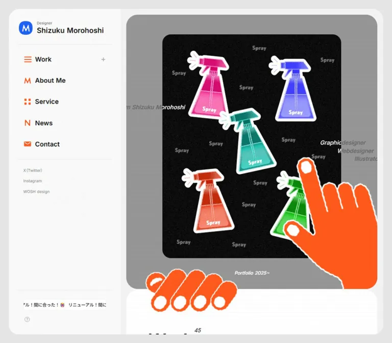
DESIGN REFERENCE
Shizuku Morohoshi|デザイナー・ポートフォリオ
方眼背景と角丸パネルに、鮮やかな青とオレンジ、手描きの手やイラストを組み合わせたポートフォリオ。PCのサイドバーとスマートフォンの下部ナビゲーションが特徴です。
オリジナルサイトを見るShizuku Morohoshi — Style Reference
A designer’s portfolio arranged like a rounded desktop workspace, with graph paper, bright color blocks, and orange hands reaching across the artwork.
Website: morohoshi.site
Original URL: https://morohoshi.site/
Final URL: https://morohoshi.site/
Theme: light, with saturated blue and orange accents; no alternative theme was observed.
Inspected: September 12, 2026. Supplied browser record timestamp: 2026-09-12T12:27:57.731Z, or 21:27:57.731 JST.
Viewports: desktop 1440 × 1000 and mobile 390 × 844 CSS pixels.
Scope: the current homepage: desktop navigation rail, mobile header and bottom dock, opening artwork composition, eight featured work entries, service links, bilingual profile, news structure, inquiry form, and illustrated footer. Linked pages and expanded interaction states were not inspected.
The page presents a working designer’s portfolio through a restrained interface and expressive artwork. Pale gray framing, white panels, faint square grids, compact sans-serif labels, and consistent rounded corners organize the content. Blue identifies navigation, selected categories, and the footer. Orange connects small navigation symbols, contact actions, a service tile, and the large illustrated hands.
The opening composition places a portrait artwork inside a much wider gray stage. Small italic identity labels cross the artwork’s edges, while one hand points into the picture and another grips the boundary above the work collection. Further down, a tightly joined service grid turns the same palette into large navigational surfaces. The footer finishes with a textured character illustration against blue graph paper.
Responsive behavior is a defining part of the design. Desktop reserves a persistent left column for identity and navigation. Mobile replaces that column with a floating wordmark, contact link, menu control, and five-icon bottom dock. Work and service collections retain two columns even at 390px. Spacing, typography, artwork dimensions, and navigation change independently.
How to Read This Reference
- Measured means a value is present in the supplied rendered DOM or computed styles. Decimal measurements below are rounded for readability.
- Derived means a value was calculated from recorded element positions or dimensions.
- Visual estimate means the value or treatment was assessed from the original-page captures without a corresponding computed property.
- Recommendation means implementation guidance for a new project. The Quick Start is an adaptation, not recovered source code.
- Source custom-property names are identified explicitly. Other token names are descriptive aliases.
- Computed font stacks establish declarations, not which font file rendered every individual glyph.
- DOM text can include clipped or collapsed descendants. Its presence does not prove that all content was simultaneously visible.
- The three desktop and two mobile original-page captures support the visual analysis. No additional navigation, interaction testing, file inspection, or browsing was performed for this reference.
Tokens — Colors
Default Palette
Eight-digit source hex values below end in ff, meaning fully opaque. The aliases use equivalent six-digit values.
| Name | Value | Source evidence | Role |
|---|---|---|---|
| Canvas Gray | #e5e5e5 |
--s-color-6cac8802; computed body background at both viewports |
Outer page canvas and mobile space between panels |
| Desktop Main Backing | #f2f2f2 |
Computed desktop main background |
Narrow backing around the content panels |
| White | #ffffff |
--s-color-90b2f0a5 |
Content panels, form fields, reversed labels, email pill, and illustration details |
| Soft Surface | #f7f7f7 |
--s-color-ffb25fd4; computed category and contact tiles |
Quiet secondary surfaces and unselected pills |
| Pale Rule | #eeeeee |
--s-color-f299dc44; computed profile email surface |
Subtle separation and pale secondary controls; exact rule assignment varies |
| Main Ink | #121212 |
--s-color-a19839f2; computed text |
Identity, navigation labels, project titles, and Japanese body text |
| Reading Gray | #6e6e6e |
--s-color-0189945e; computed news body text |
Supporting explanations and news descriptions |
| Muted Gray | #888888 |
--s-color-bfafb6aa; computed social links, English profile, and illustration tile |
Secondary text and the Illustration service surface |
| Portfolio Blue | #1f61f7 |
--s-color-329731c1; computed selected category and Graphic tile |
Navigation identity, selected state, metadata accents, and blue footer/dock appearance |
| Portfolio Orange | #ff5c24 |
--s-color-9a89a859; computed Web tile and contact controls |
Contact actions, Web service, navigation symbols, and matching hand artwork |
| Inline Link Blue | #007cff |
Computed profile and contact-support links | Links embedded in Japanese prose |
| Stage Gray | Approximately #999999 |
Visual estimate from the opening captures | Gray artwork stage beneath a faint grid |
The saturated colors have distinct jobs. Blue carries the navigation system and selected state. Orange carries contact emphasis and the hand motif, while also identifying Web services. The Illustration tile uses gray, and the fourth service-grid cell returns to a pale contact surface. Preserve this mapping when reusing the four-cell arrangement.
The source also declares pale blue #d9e4ff, but the supplied evidence does not establish a prominent visible application. Keep it outside the essential palette until a specific component needs it.
Compositing and Texture
The opening identity labels compute to white, yet appear dark over the white artwork and gray over the gray stage. This establishes a difference between declared text color and final appearance. The supplied properties do not include the blend, filter, or ancestor treatment needed to identify its cause.
For an adaptation, a white label with mix-blend-mode: difference is a possible visual approximation. It must be tested over the actual artwork. A consistently readable dark label is a simpler alternative. Neither choice should be described as verified source behavior.
The graph-paper lines are extremely quiet on white and more visible on blue. Their exact color, opacity, and spacing were not recorded. A 12px grid with low-opacity lines is a recommended starting point, based on the captures.
Tokens — Typography
Main Interface — Inter with Noto Sans
Measured stack: Inter, 'Noto Sans', matching source variable --s-font-0887da2d.
This stack appears on the desktop identity, navigation, hero annotations, work titles, category labels, service labels, English profile, and footer utilities. Most interface emphasis uses weight 600; service labels and hero annotations use 500. The small Designer descriptor uses 300.
The effect is clear and compact. The artwork supplies visual complexity, while interface lettering stays easy to scan.
Japanese Reading Text — Noto Sans JP
Measured family: 'Noto Sans JP', matching --s-font-eba6ae66.
Japanese profile and introductory contact text use weight 500 with generous line height. News headlines use 600, and news descriptions use 400. The sidebar’s repeated fish-related message also uses this family.
Limited Secondary Families
- DM Sans: measured on the profile’s
(About Me→)link, at weight600. Do not extend this finding to every heading. - Lato: measured on required-field asterisks and the submit button wrapper. The visible Japanese submit label itself uses Noto Sans JP.
- A1 Gothic R and M: source variables declare
'A1ゴシック R'and'A1ゴシック M'. No supplied element establishes their visible role. - Times: appears on the root and body defaults. The inspected interface descendants override it; it is not the page’s visual typography system.
Display Lettering
Works and Service appear as bold italic black lettering in the captures. Their heading wrappers have empty extracted text, so the wrappers’ generic font-family and font-size cannot identify the visible lettering. The content may be supplied through an image or another non-text descendant; its exact format was not established.
| Heading artwork/wrapper | Desktop measured box | Mobile measured box |
|---|---|---|
| Works | 144 × 36.78px |
96 × 24.52px |
| Service | 144 × 32.09px |
104 × 23.17px |
| Contact | 168 × 35.27px |
112 × 23.39px |
Use authorized heading assets when available. For a text-based adaptation, bold italic Inter at approximately 44px desktop and 32px mobile is a recommendation, not an observed font measurement.
Type Scale
Values in this table are measured computed styles. A slash separates font size and line height.
| Role | Desktop | Mobile | Weight and details |
|---|---|---|---|
| Sidebar Designer descriptor | 10 / 14px |
Sidebar absent | 300; 0.1px tracking |
| Sidebar name | 20 / 28px |
Sidebar absent | 600 |
| Main sidebar navigation | 18 / 25.2px |
Replaced by icons | 600 |
| Sidebar work-category descendants | 15 / 15px |
Not shown in the rail | 500; visibility depends on unverified disclosure state |
| Sidebar social links | 11 / 15.4px |
Repositioned to footer | 400 |
| Sidebar repeated message | 12 / 12px |
Not shown | 500; Noto Sans JP |
| Hero identity and disciplines | 16 / 22.4px |
11 / 15.4px |
500; italic appearance in captures |
| Portfolio caption | 13 / 18.2px |
11 / 15.4px |
500 |
| Works count | 15 / 18px |
13 / 15.6px |
400 |
| Main category pills | 13 / 15.6px |
13 / 15.6px |
500; selected All is 600 |
| Typical work title | 18 / 28.8px |
14 / 19.6px |
600 |
| First logo-project title | 20 / 32px |
15 / 21px |
600; a measured exception |
| Project category tags | 12 / 14.4px |
10 / 12px |
500 |
| First New label | 14 / 19.6px |
10 / 14px |
600; blue |
| Collection and service More links | 16 / 22.4px |
14 / 19.6px |
600 |
| Service tile label | 28 / 39.2px |
18 / 25.2px |
500 |
| Service tile more label | 13 / 18.2px |
10 / 14px |
600; 0.02em tracking |
| Profile name | 24 / 33.6px |
21 / 29.4px |
600 |
| Japanese profile | 15 / 27px |
14 / 25.2px |
500; 0.02em tracking |
| English profile | 12 / 19.2px |
11 / 19.8px |
400; 0.02em tracking; muted gray |
| News date | 10 / 22px |
10 / 22px |
500; Noto Sans JP; blue |
| News headline | 15 / 23.25px |
14 / 22.4px |
600; Noto Sans JP |
| News description | 13 / 23.4px |
13 / 24.7px |
400; Noto Sans JP |
| Form label | Not supplied | 15 / 21px |
500; Noto Sans JP |
| Submit label | Not supplied | 15 / 15px |
600; Noto Sans JP |
| Mobile header Contact | Not applicable | 15 / 21px |
600 |
| Footer email label | Not supplied | 13 / 18.2px |
600 |
| Footer social links | Not supplied | 12 / 16.8px |
500 |
| Footer copyright | Not supplied | 10 / 14px |
500 |
Typography does not shrink uniformly. Category pills and news dates keep their sizes. Japanese reading text changes only slightly, while service titles reduce substantially to fit narrow two-column tiles.
Tokens — Spacing & Shapes
Spacing Scale
The page uses conventional pixel-sized interface elements; there is no evidence of a special fluid root unit. The following values describe recurring relationships rather than a recovered global spacing scale.
| Relationship | Desktop | Mobile | Evidence |
|---|---|---|---|
| Outer horizontal margin | 25px |
9px |
Derived from main/frame positions |
| Main backing inset | 16px |
0px |
Measured main padding |
| Work/service content inset from panel edge | 48px |
24px |
Derived from card and panel positions |
| Work columns | 16px gap |
12px gap |
Derived |
| Work rows | 48px after the taller card |
24px after the taller card |
Derived from successive rows |
| Work image to information | 20px |
12px |
Measured card gap |
| Ordinary category-pill gap | 4px |
4px |
Derived; All has additional separation |
| Navigation control inset | 16px |
Not applicable | Measured |
| News header padding | 24px 32px |
24px |
Measured |
| Japanese-to-English profile gap | 24px |
24px |
Derived |
| Footer social-link gap | Approximately 40px |
24px |
Desktop visual estimate; mobile derived |
| Footer utility-group vertical gap | Single row | 32px |
Mobile derived |
| Form inner inset | Approximately 40px |
Approximately 20px |
Visual estimates; borders add about 1px |
Border Radius
| Element | Value | Evidence |
|---|---|---|
| Desktop main backing | 0 32px 32px 0 |
Measured |
| Large content/stage panels | Approximately 32px |
Visual estimate |
| Service tiles | 32px desktop; 24px mobile |
Measured |
| Desktop navigation controls | 10px |
Measured |
| Unselected category pills | 56px |
Measured; visually fully rounded |
| Selected All pill | 32px |
Measured; visually fully rounded |
| Mobile Contact pill | 32px |
Measured |
| Email pills | 56px |
Measured |
| Mobile submit button | 48px |
Measured |
| Hero artwork frame | Approximately 24px |
Visual estimate |
| Form field corners | Approximately 4px |
Visual estimate from textarea |
| Mobile dock upper corners | Approximately 24px |
Visual estimate |
Do not round every image simply because the large panels are rounded. Work-card wrappers measure 0px radius, and the visible gallery thumbnails have crisp rectangular boundaries. The service grid has a deliberately different shape language from the work collection.
Layout Measurements
| Element | Desktop 1440 × 1000 |
Mobile 390 × 844 |
Status |
|---|---|---|---|
| Document height | 7983.69px |
5888.67px |
Measured; depends on content and captured state |
| Main origin | x337, y25 |
x9, y9 |
Measured |
| Main width | 1078px |
372px |
Measured |
| Main content width after padding | 1046px |
372px |
Derived |
| Desktop rail allocation | 312px |
Absent | Derived from outer frame to main origin |
| Rail identity/navigation width | 264px |
Not applicable | Measured |
| Navigation row height | 59.19px |
Not applicable | Measured |
| Hero stage | Approximately 1046 × 800px |
Approximately 372 × 520px |
Capture-based estimate |
| Central hero artwork | Approximately 500 × 625px |
Approximately 286 × 358px |
Capture-based estimate; approximately 4:5 |
| Work collection inner width | 950px |
324px |
Derived |
| Work card width | 467px |
156px |
Measured |
| Service tile | 475 × 320px |
162 × 200px |
Measured |
| Profile reading column | 802px |
296px |
Measured |
| First news header | 948 × 105.25px |
338 × 124.78px |
Measured |
| Footer panel | Approximately 1046 × 562px |
Approximately 372 × 360px |
Capture-based estimate |
| Footer email pill | Approximately 210 × 48px |
210.02 × 44.19px |
Desktop estimate; mobile measured |
| Submit button | Approximately 868 × 57px |
298 × 55px |
Desktop estimate; mobile measured |
| Mobile menu control | Not applicable | 44 × 44px |
Measured |
| Mobile dock icon links | Not applicable | 30 × 30px |
Measured link rectangles, not a complete hit-testing audit |
| Mobile dock | Not applicable | Approximately 390 × 80px |
Visual estimate |
Components
Desktop Identity and Navigation Rail
Role: keep the designer’s identity and main destinations available beside a long portfolio page.
The rail occupies approximately 312px, with 24px horizontal inner margins. A blue circular M mark sits beside a two-line identity block: a small Designer descriptor above the semibold name. The identity link has a 12px horizontal gap and 24px bottom padding, followed by a fine horizontal rule.
Five navigation rows follow: Work, About Me, Service, News, and Contact. Each row combines an orange symbol with an 18px semibold black label. Work additionally shows a small gray plus at the right. The recorded controls are approximately 264 × 59.19px, with 10px corner radii and 16px insets.
The original link evidence distinguishes page navigation from homepage anchors. About Me links to /about-me, Service to /service, News to /#news, and Contact to /#contact. Work is represented by a button, with category-link descendants in the DOM. The capture shows the compact state; expansion behavior was not exercised.
After another rule, small gray links provide X, Instagram, and WOSH design access. Near the bottom, a narrow white capsule clips repeated fish-related availability text. A small question-mark control appears underneath. Its action is unknown.
The rail persists through the desktop scroll captures, although its content is vertically shifted near the document end. The exact fixed/sticky positioning mechanism is not included in the supplied styles.
Mobile Header
Role: preserve identity and direct contact access without reserving a side column.
The mobile header has three visible parts: a blue MORO wordmark, an orange Contact pill, and a blue circular menu button with white horizontal strokes. It floats over both the opening stage and the lower form capture, without a full-width opaque header surface.
The home-link artwork box is 72 × 18.52px at x28. Contact measures 85.39 × 31px, with 5px 14px padding and a 32px radius. The menu control is 44 × 44px at x318, y20; the blue circle is visible within that area even though the sampled button wrapper is transparent and square.
Keep the visible wordmark separate from the desktop name lockup. Its exact lettering asset and font were not identified. The open menu, close state, backdrop, and focus behavior remain unverified.
Mobile Bottom Dock
Role: provide persistent access to the five main destinations.
A solid blue bar spans the full viewport width, independently of the 9px panel margins. Its top corners are rounded. Five white symbols represent Home, Works, About, Service, and News; their destinations are confirmed by the rendered links.
The icon-link rectangles are 30 × 30px, centered at approximately x62, 128.5, 195, 261.5, and 328. The News symbol has a small orange dot in both mobile captures. Its semantics were not established; do not describe it as an unread count or a tested notification state.
The dock overlays the gallery in the opening capture. At the document end, the footer remains visible above it. A reusable implementation should reserve bottom clearance and enlarge the interactive hit areas while retaining the 30px visual symbols.
Opening Artwork Stage
Role: introduce the designer through the work itself and a distinctive illustrated composition.
The desktop stage starts at approximately x353, y41 and measures 1046 × 800px. It has a medium-gray background, faint square grid, and large rounded corners. A portrait artwork sits near its horizontal center, approximately 500 × 625px, with its top about 72px below the stage top.
The desktop artwork contains three luminous, irregular star forms on white, with small lettering embedded in the artwork. The mobile capture instead shows soft translucent circular forms and lime-yellow accents on a lavender field. These are observed artwork states; the mechanism that selects or changes them is unknown.
Two small italic annotations cross the composition: the designer’s introduction at the left and a staggered three-line discipline list at the right. They remain interface text, while the tiny poster lettering belongs to the image. A centered white Portfolio caption sits near the stage’s lower edge.
The pointed orange hand overlaps the artwork at the lower right and is clipped at the stage bottom. The separate gripping hand extends across the boundary into the Works panel. The uneven white outline and visible white fingernails are essential details. These hands are illustrations; the captures do not establish cursor tracking, drag behavior, or an interactive hand control.
Use a wrapper that permits the gripping hand to overflow, with a separate clipped inner stage for the pointing hand. A single overflow: hidden container around both would remove the cross-panel overlap.
Section Heading and Count
Role: organize the page without competing with the work imagery.
A black italic title pairs with a small count aligned above its right edge. Works shows 37, Service shows 3, and the news region includes 5 in the DOM. These are content values, not a numbered sequence of sections.
The featured work collection contains eight extracted entries. The service count refers to three disciplines, followed by an additional Contact tile. Four news headers were supplied despite the displayed count of five; the missing item or count logic was not established.
Works places its category navigation to the right of the title on desktop. On mobile, that navigation moves below the title with a 24px derived gap from the heading box to the pill row. Service instead places a compact (More→) link at the right of its heading row.
Work Category Navigation
Role: provide routes into the complete work collection and its categories.
All is blue with white semibold lettering. Other categories use a pale-gray fill, subtle edge, black labels, and fully rounded ends. The labels retain 13px / 15.6px typography at both viewports, and the pills remain approximately 29.59px high.
Ordinary pills use 6px 10px padding. The All pill uses asymmetric 6px 14px 6px 12px padding. Additional space and a fine vertical separator visually distinguish All from the other categories.
On mobile, the row extends beyond the visible area: Clientwork is partially visible, and Originalwork begins outside the viewport. Horizontal overflow is supported by the geometry and capture; swipe or scroll operation was not tested. A reusable implementation should make the entire row horizontally reachable.
These are links to /works and category routes, not evidence of client-side filtering in place. Preserve the observed route spellings when referencing the original site, including /works/tags/cliantwork and /works/tags/oliginalwork.
Featured Work Card
Role: present a project image, title, and compact classification as one entry.
The measured card wrapper is a transparent button with square corners and a vertical gap of 20px desktop or 12px mobile. Beneath the image, a semibold title precedes small pale category pills. A blue outlined circular New badge overlaps the image boundary in the mobile capture.
The first row’s image height can be derived as 467px desktop and 156px mobile, giving square media. The second row’s derived media height is approximately 583.25px desktop and 194.5px mobile, close to a 4:5 portrait ratio. Let media proportions vary with the project instead of forcing every entry into one crop.
The collection uses two aligned columns at both sizes. Each row begins below the taller card in the previous row, with 48px desktop or 24px mobile clearance. This is an aligned row grid, not evidence of independent masonry columns.
Titles generally change from 18px / 1.6 to 14px / 1.4. The first logo-project title is slightly larger. Mobile category labels reduce to 10px; a third tag can wrap to another line. Preserve room for this variable information height.
The card button semantics suggest an action, but the destination or resulting overlay was not captured. Do not invent a project modal, lightbox, or detail-page transition.
Service Tile Grid
Role: convert three design disciplines into large, immediately recognizable navigation targets.
Four tiles form a tightly joined 2 × 2 grid with no inter-tile gap. Desktop tiles measure 475 × 320px with 32px corners. Mobile retains the arrangement with 162 × 200px tiles and 24px corners.
| Position | Label | Surface | Destination |
|---|---|---|---|
| Upper left | (Graphic) |
Blue | /service#graphic |
| Upper right | (Web) |
Orange | /service#web |
| Lower left | (Illustration) |
Gray | /service#illustration |
| Lower right | (Contact) |
Soft white-gray | /#contact |
Each discipline tile has a small cluster of overlapping circles at the upper left: an icon, a miniature project image, and an outlined circle. The cluster is approximately 40px high in the desktop capture, inset about 24px. Its mobile geometry was not visually supplied.
The main parenthesized label sits near the center. A smaller parenthesized more label and diagonal arrow sit at the lower right. The source makes the whole tile an anchor; the corner label is not a separate nested control.
The Contact tile uses dark text and a pale circular plus above the label. Its quieter surface completes the grid without creating a fourth discipline color.
Bilingual Profile
Role: provide professional background after the image-led sections.
The DOM establishes an identity row, email link, small blue Profile label, Japanese biography, English translation, and centered About Me link. A dedicated profile screenshot was not supplied, so its surrounding illustration or decorative treatment is not reconstructed here.
On desktop, the 24px name and email pill share approximately the same vertical band. The Japanese and English texts occupy an 802px reading column. On mobile, the name reduces to 21px, and the email pill moves below it, spanning 322px. The reading column narrows to 296px.
Japanese copy uses stronger ink and larger type. English follows after 24px, with smaller muted text. The desktop English line height is 1.6; mobile increases it to 1.8, keeping the denser translation readable in a narrow column.
The profile email link computes to a pale #eeeeee surface with #b3b3b3 label text. This is a measured appearance, not evidence that the link is disabled.
News Entry
Role: present updates through compact metadata and expandable-looking summaries.
Each recorded header is a button containing a blue date, a News label, a Japanese category, a headline, and an arrow glyph. Its desktop padding is 24px 32px; mobile uses 24px on all sides. The first header grows from 105.25px to 124.78px high as its headline wraps.
The hierarchy is deliberate: 10px date, 11–12px metadata, then a 14–15px semibold Japanese headline. Supporting text uses 13px reading gray with a line height of 1.8 desktop or 1.9 mobile.
Descriptions and outbound links are present in the extracted DOM, but some rectangles overlap subsequent summary positions. This is insufficient to establish expanded visibility. No accordion toggle was exercised, and no dedicated news capture establishes its exact borders or surface treatment.
For a new implementation, use a semantic disclosure with a separate summary control and body. Keep outbound links in the body, outside the summary button.
Inquiry Form
Role: collect a project inquiry with clear categories, budget context, and a free-text message.
The form sits inside a pale rounded container on a white graph-paper section. Fields are white with fine pale borders. The textarea has small corners, creating a useful contrast with the large rounded form container and pill-shaped submit action.
| Source label | Meaning | Required marker observed |
|---|---|---|
お問い合わせの種類 |
Inquiry category | Yes |
お名前 |
Name | Yes |
フリガナ |
Phonetic name | Yes |
会社名 |
Company | No |
メールアドレス |
Email address | Yes |
ご予算 |
Budget | Yes |
お問い合わせ内容 |
Message | Yes |
The category options cover graphic design, web production, illustration, and other inquiries. Budget options cover four price bands and an undecided/consultation choice. The default prompt is 選択してください. Option text and chevrons are present, but the supplied evidence does not identify whether the controls use native or custom select rendering.
Mobile labels measure 15px / 21px, with blue required asterisks offset by about 5px. The submit button measures 298 × 55px, with a 48px radius, orange fill, white 15px semibold Japanese label, and a right arrow. Its recorded padding is 20px 16px with a 12px internal gap.
The introductory copy states a three-business-day response expectation and supplies an Instagram fallback. Keep help text close to the form. Validation, keyboard behavior, delivery, loading, success, and error states were not tested.
Illustrated Footer
Role: repeat contact access and finish the page with a large piece of visual identity.
The footer is a blue rounded panel with a faint grid and a short white dashed/perforated-looking top edge. A white email pill with a blue paper-plane symbol appears alongside social links and copyright on desktop. Mobile stacks the email pill, the three-link row, and copyright with 32px gaps.
The illustration fills the lower width: a blue and turquoise character, broad cream clothing, an orange-and-mint drink, orange shapes, and black lattice/stipple textures. The image reaches the rounded lower corners and is cropped by the panel boundary.
The desktop panel is approximately 562px high, while mobile is approximately 360px. The illustration scales down with width, but the utility content becomes taller through stacking. Do not scale the entire footer as one image; the text and illustration follow different responsive rules.
Tokens — Motion & Interaction
Recorded Transition Values
| Element or property | Measured declaration | What it establishes |
|---|---|---|
| Many links, labels, cards, and main containers | 0.3s cubic-bezier(0.4, 0.4, 0, 1) |
A common transition timing; changed properties and triggers are not fully documented |
| Sidebar navigation buttons | 0.4s cubic-bezier(0.4, 0.4, 0, 1) |
Slightly longer control timing |
| News summary buttons | 0.4s cubic-bezier(0.4, 0.4, 0, 1) |
Declared transition timing; expansion animation not demonstrated |
| Mobile submit button | 0.4s cubic-bezier(0.4, 0.4, 0, 1) |
Declared button transition timing |
| Body background | background 0.5s cubic-bezier(0.4, 0.4, 0, 1) |
Background transitions are supported; a theme change was not observed |
| Repeated sidebar message paragraphs | 0.3s linear |
Linear transition declaration; not a measured marquee cycle |
The supplied sample reports animation: none on the listed elements. This does not rule out motion on ancestors, pseudo-elements, JavaScript-controlled transforms, or animated image assets.
Evidence and Limits
- The capture process waited at least five seconds initially and checked loading, image decoding, and sampled layout stability. This is readiness evidence, not an animation timeline.
- The desktop and mobile hero images differ. Autoplay, image order, interval, gesture support, and transition style remain unknown.
- The repeated sidebar message and offscreen duplicate rectangles support a ticker-like structure. Direction, speed, looping, and pause behavior were not established.
- Scrolled captures establish the persistence of navigation chrome. They do not establish smooth scrolling, parallax, or scroll snapping on this page.
- No hover, keyboard focus, menu opening, Work disclosure, project opening, news toggle, select opening, or form submission was recorded.
Recommended motion language: use the measured 300–400ms timing family for restrained color and opacity feedback. Add artwork sequencing or hand movement only as an explicitly designed enhancement. Keep a stable initial composition and honor reduced-motion preferences.
Surfaces
| Layer | Appearance | Purpose |
|---|---|---|
| Outer canvas | Flat light gray | Frames the page and separates mobile panels |
| Desktop backing | Slightly lighter gray with a 16px inset |
Holds the content beside the rail |
| Reading/content panels | White with very faint square grid | Groups work, services, and contact content |
| Opening stage | Medium gray with faint grid | Gives the portrait artwork room and contrast |
| Work cards | Transparent wrappers, rectangular media | Lets each project retain its own identity |
| Service tiles | Blue, orange, gray, and pale neutral | Makes destinations visible as large color fields |
| Form container | Pale neutral with fine edge | Separates data entry from the grid background |
| Form fields | White, fine border, small radius | Provides clear writing areas |
| Footer | Blue grid with large textured illustration | Carries contact information and visual closure |
| Mobile dock | Solid blue, white symbols, orange dot | Persistent primary navigation |
There is no visible general-purpose shadow elevation system in the supplied captures. Separation comes from inset framing, color, fine rules, and rounded boundaries. The soft gradients belong primarily to the artwork, not to the control surfaces.
Imagery
The interface combines clean geometry with deliberately irregular illustration. The orange hands have uneven white outlines, blunt forms, and white nail shapes. They act as compositional anchors across the opening stage and the next section.
The hero artwork introduces a different material quality: luminous stars with grainy color transitions on desktop, and translucent rounded forms on lavender in the mobile capture. Preserve those textures inside the image assets. Applying gradients to generic interface cards would not reproduce their role.
The footer uses broad flat colors interrupted by rough black stippling and lattice patterns. Its illustration extends across the entire content width, while the email and social controls remain crisp live text above it.
Avoid applying image-rendering: pixelated globally. The evidence supports textured artwork, but does not establish intentional nearest-neighbor scaling. Standard image rendering is a suitable default for the smooth hero forms and detailed footer textures.
Observed Asset References
Complete original asset URLs were not supplied. The DOM includes truncated background-image references, which are insufficient to reproduce usable asset paths.
| Asset | Original-page evidence | Reuse treatment |
|---|---|---|
| Blue circular M identity mark | Desktop opening and scrolled captures | Keep as a compact brand asset beside the live name |
| Blue MORO wordmark | Both mobile captures | Use a separate mobile identity asset; do not guess its font |
| Star artwork on white | Desktop opening capture | Preserve the portrait composition and embedded lettering |
| Translucent circular artwork on lavender | Mobile opening capture | Preserve the observed colors and soft material treatment |
| Orange pointing hand | Desktop and mobile opening captures | Transparent artwork over the stage; clip at its lower boundary |
| Orange gripping hand | Desktop and mobile opening captures | Separate decorative layer crossing into Works |
| Service preview circles | Desktop service capture | Small clipped artwork thumbnails combined with an icon and outline |
| Italic section lettering | Captures and empty heading-wrapper measurements | Use authorized assets or an explicitly approximate text replacement |
| Footer character illustration | Desktop and mobile footer captures | Scale by width; preserve texture and lower-edge composition |
| Navigation and utility symbols | Desktop rail, mobile dock, and footer | Match the observed M, N, grid, list, home, envelope, and paper-plane forms |
Font Awesome families are declared in the supplied source variables. That does not identify every visible symbol as a Font Awesome glyph. Preserve the custom-looking letter symbols rather than replacing the entire icon system with unrelated stock icons.
Layout & Responsive Behavior
Desktop
The page has a persistent navigation column beside a long scrolling main region. At 1440px, the horizontal composition is:
25px outer margin + 312px rail + 1078px main + 25px outer margin.
The main’s 16px padding leaves 1046px panels. A further 48px content inset creates a 950px work/service area. Two 467px work cards and a 16px gap fit this width exactly; two 475px service tiles fill it without a gap.
The captures show rounded framing at the viewport edges, but the recorded main is almost 7934px tall. Do not infer a full-viewport application with a mandatory internal scroller. The exact frame-clipping mechanism was not recorded.
Mobile
At 390px, the page uses 9px outside margins and a 372px main region with no additional main padding. Work and service content use 24px panel insets, leaving 324px.
Work cards remain two columns: 156px + 12px + 156px. Service tiles also remain two columns: 162px + 162px. Gallery media gets smaller, while text wraps and category tags can occupy additional lines.
The gray hero is approximately 520px tall, beginning at y9. Its artwork begins around y86 and is approximately 286px wide. This means the artwork remains about 77px below the stage top despite the much smaller viewport. Its position is recomposed, not uniformly scaled from desktop.
The category row stays on one line and overflows horizontally. The header and dock remain visible over lower content. The recorded document extends approximately 89px beyond the main’s bottom; this is consistent with bottom navigation clearance, although the exact source spacer rule is unknown.
The profile email moves below the name and becomes nearly full width. Reading text narrows to 296px. Footer utilities stack above the width-scaled illustration.
Breakpoint and Device Limits
A source max-width: 1008px rule is visible for responsive line breaks. It does not prove that the sidebar/header switch uses the same breakpoint. Only the two recorded viewports were inspected.
Using 1008px as an adaptation breakpoint is reasonable, but should be tested at tablet widths. Safe-area declarations, mobile keyboard handling, orientation changes, browser zoom, and intermediate layouts were not supplied.
Do’s and Don’ts
Do
- Preserve the relationship between a pale structural shell and expressive artwork.
- Keep blue
#1f61f7and orange#ff5c24as the principal saturated interface colors. - Distinguish work cards from service tiles: rectangular project media versus large rounded color fields.
- Retain two columns for both collections at the observed mobile width.
- Keep category pills readable at their observed
13pxsize while reducing surrounding spacing. - Recompose the hero annotations and hands for mobile.
- Let the gripping hand cross the Works boundary through a separate overflow layer.
- Use the small count as a companion to the italic section title.
- Preserve Japanese and English profile hierarchy and generous Japanese line height.
- Stack footer utilities independently from the illustration’s scaling.
- Keep the graph-paper texture faint enough to remain background structure.
- Treat routes, buttons, and unverified disclosures according to their actual evidence.
Don't
- Don't replace the portfolio structure with a sales page containing invented benefits, testimonials, or pricing plans.
- Don't turn the mobile gallery into one oversized card per row at 390px.
- Don't assign a different saturated color to every work tag.
- Don't add drop shadows or glass effects to every rounded panel.
- Don't flatten the entire hero or footer into a screenshot with embedded interface text.
- Don't crop all work media to the same aspect ratio.
- Don't identify the empty heading wrappers’ generic fonts as the visible display-lettering font.
- Don't describe the orange hand as a custom cursor without interaction evidence.
- Don't invent autoplay timing, project modals, or accordion animation from static captures.
- Don't interpret pale link styling as a disabled state.
- Don't let the mobile dock make the final controls or footer unreachable.
Recommended Implementation Additions
These are recommendations for a new implementation, not verified features of the original site.
- Give every icon-only link an accessible name. Keep the observed
30pxdock symbols inside targets at least44pxacross. - Use a real button for menu/disclosure actions and a real anchor for navigation. Avoid nested interactive elements even where the extracted source shows button and anchor wrappers around the same region.
- Provide semantic text for image-based section titles and a meaningful heading hierarchy. Empty extracted heading text does not establish an accessible name.
- Make decorative hands noninteractive with empty alternative text and
pointer-events: none. Give project images meaningful alternatives. - Ensure category overflow is reachable with touch, keyboard, and focus. Do not remove the offscreen categories from navigation.
- Add visible keyboard focus and offsets for the floating mobile header and bottom dock.
- Associate form labels and errors with their controls. Use suitable email input, autocomplete, native required state, and an announced submission result.
- Review small-text contrast. Calculated from the declared solid colors, white on orange is approximately
3.1:1, and white on#888888is approximately3.5:1. Small labels need a darker surface or dark ink treatment. These calculations do not assess artwork compositing. - Improve the pale profile email label and very small muted text where necessary for legibility.
- If adding automatic artwork changes or a continuous ticker, provide reduced-motion behavior and a stable readable state.
- Reserve image dimensions and choose responsive image sizes to avoid layout changes and unnecessary mobile downloads.
Agent Prompt Guide
Quick Color Reference
- Outer canvas:
#e5e5e5. - Desktop backing:
#f2f2f2. - Content panels and fields:
#ffffff. - Secondary surfaces:
#f7f7f7; fine pale edges near#eeeeee. - Main text:
#121212. - Supporting text:
#6e6e6e; quieter metadata:#888888. - Navigation, selected category, Graphic tile, footer, and mobile dock:
#1f61f7. - Contact controls, Web tile, and matching hand artwork:
#ff5c24. - Illustration service tile:
#888888. - Opening stage: approximately
#999999, with a faint square grid.
Overall Prompt
“Create an image-led designer portfolio with pale gray outer framing, white graph-paper panels, blue #1f61f7, orange #ff5c24, and compact Inter/Noto Sans interface typography. On desktop, reserve a 312px left rail for identity, orange-symbol navigation, small social links, and a clipped availability message. Place a portrait artwork inside a large rounded gray stage, with small italic identity annotations and separate orange illustrated hands overlapping the composition. Follow with an aligned two-column project grid, small category pills, a gapless two-by-two service grid, bilingual profile, news summaries, inquiry form, and a blue illustrated footer. At 390px, replace the rail with a floating wordmark/contact/menu header and a five-icon blue bottom dock. Retain two-column work and service layouts. Treat artwork animation and expanded states as separate requirements.”
Example Component Prompts
- Opening stage: “Build a rounded gray graph-paper stage approximately 1046 by 800px on desktop, with a centered 500 by 625px portrait artwork. Add small italic introduction and discipline labels crossing its edges, a white caption near the bottom, an orange pointing-hand image clipped within the stage, and a separate gripping-hand image overflowing into the following section. Recompose this at 372 by 520px on mobile.”
- Work collection: “Create two aligned columns of transparent project cards. Use 467px-wide cards with 16px column gaps and 48px row gaps at the desktop reference size. At 390px, use 156px-wide cards with 12px column gaps and 24px row gaps. Preserve square and portrait media, semibold titles, pale rounded classification tags, and a small blue outlined New badge.”
- Service grid: “Create four adjoining rounded anchor tiles: blue Graphic, orange Web, gray Illustration, and pale Contact. Center parenthesized labels; place overlapping preview circles at the top left and a small more label with a diagonal arrow at the bottom right. Use 475 by 320px tiles on desktop and 162 by 200px tiles at the mobile reference size.”
- Mobile navigation: “Create a transparent floating header with a blue MORO asset at left, orange Contact pill, and 44px blue circular menu control. Add an 80px blue bottom dock with rounded upper corners and five white symbols for home, works, about, services, and news. Preserve 30px visual symbols inside larger accessible targets.”
- Footer: “Create a rounded blue graph-paper footer. Keep the white email pill, social links, and copyright as live content in one desktop row and a centered mobile stack. Place a broad textured character illustration below, with blue, turquoise, cream, orange, and black lattice details. Let the image scale by width while the utility layout changes independently.”
Quick Start
CSS Custom Properties
This CSS provides a reusable shell and the main component relationships. Colors and several dimensions come from measured values; texture, heading-font substitution, decorative positioning, footer geometry, and the navigation breakpoint are adaptations.
Expected structure: .portfolio-shell contains .sidebar and .portfolio-main. The mobile header and dock sit outside that shell. A .hero-wrap contains the clipped .hero-stage and a separate .hand-grip image. Work cards contain .work-media and .work-info; service tiles are single anchors. Supply authorized artwork and icon assets separately. This stylesheet does not implement a menu, project opening, artwork sequencing, or form delivery.
:root {
  /* Exact source colors, with descriptive aliases */
  --color-canvas: #e5e5e5;
  --color-backing: #f2f2f2;
  --color-paper: #ffffff;
  --color-soft: #f7f7f7;
  --color-rule: #eeeeee;
  --color-ink: #121212;
  --color-reading: #6e6e6e;
  --color-muted: #888888;
  --color-blue: #1f61f7;
  --color-orange: #ff5c24;

  /* Visual approximations */
  --color-stage: #999999;
  --grid-line: rgb(18 18 18 / 0.025);
  --grid-size: 12px;

  /* Observed font stacks; load fonts separately */
  --font-ui: Inter, 'Noto Sans', sans-serif;
  --font-ja: 'Noto Sans JP', sans-serif;
  --font-more: 'DM Sans', sans-serif;

  --frame: 25px;
  --rail-width: 312px;
  --main-inset: 16px;
  --section-inset: 48px;
  --work-column-gap: 16px;
  --work-row-gap: 48px;
  --work-content-gap: 20px;
  --radius-panel: 32px;
  --radius-service: 32px;
  --radius-pill: 56px;
  --hero-height: 800px;
  --service-height: 320px;
  --text-work: 18px;
  --text-tag: 12px;
  --text-service: 28px;
  --footer-inset: 48px;
  --safe-top: env(safe-area-inset-top, 0px);
  --safe-bottom: env(safe-area-inset-bottom, 0px);

  /* Measured timing family; state changes are implementation choices */
  --ease-ui: cubic-bezier(0.4, 0.4, 0, 1);
  --motion-ui: 300ms var(--ease-ui);
  --motion-control: 400ms var(--ease-ui);
}

* { box-sizing: border-box; }

body {
  margin: 0;
  padding: var(--frame);
  color: var(--color-ink);
  background: var(--color-canvas);
  font-family: var(--font-ui);
}

button, input, select, textarea { font: inherit; }
a { color: inherit; }
img { max-width: 100%; }

.portfolio-shell {
  display: grid;
  grid-template-columns: var(--rail-width) minmax(0, 1fr);
  align-items: start;
  border-radius: var(--radius-panel);
  background: var(--color-backing);
}

/* Sticky positioning is an adaptation of the observed persistent rail. */
.sidebar {
  position: sticky;
  top: var(--frame);
  display: flex;
  flex-direction: column;
  height: calc(100dvh - 2 * var(--frame));
  overflow-y: auto;
  padding: 32px 24px;
  border-radius: 32px 0 0 32px;
  background: var(--color-soft);
}

.brand {
  display: flex;
  align-items: center;
  gap: 12px;
  padding: 0 0 24px 4px;
  border-bottom: 1px solid var(--color-canvas);
  text-decoration: none;
}

.brand-mark { width: 38px; height: 38px; }
.brand-kicker { margin: 0; font-size: 10px; line-height: 1.4; font-weight: 300; }
.brand-name { margin: 0; font-size: 20px; line-height: 1.4; font-weight: 600; }
.side-nav { display: grid; margin-top: 12px; }

.nav-link {
  display: flex;
  align-items: center;
  gap: 12px;
  min-height: 59.2px;
  padding: 16px;
  border: 0;
  border-radius: 10px;
  background: transparent;
  text-align: left;
  text-decoration: none;
  font-size: 18px;
  line-height: 1.4;
  font-weight: 600;
  transition: background-color var(--motion-control);
}

.nav-icon { width: 21px; height: 21px; color: var(--color-orange); }
.nav-extra { margin-left: auto; color: var(--color-muted); }

.side-social {
  display: grid;
  gap: 14px;
  margin-top: 12px;
  padding: 24px 16px;
  border-top: 1px solid var(--color-canvas);
  color: var(--color-muted);
  font-size: 11px;
  line-height: 1.4;
}

.sidebar-bottom { margin-top: auto; padding-top: 24px; }

.availability {
  overflow: hidden;
  padding: 8px;
  border: 1px solid var(--color-rule);
  border-radius: 6px;
  background: var(--color-paper);
  white-space: nowrap;
  font: 500 12px/1 var(--font-ja);
}

.portfolio-main {
  min-width: 0;
  padding: var(--main-inset);
  border-radius: 0 32px 32px 0;
  background: var(--color-backing);
}

/* Recommended CSS approximation of the visible graph-paper texture. */
.grid-surface {
  background-image:
    linear-gradient(var(--grid-line) 1px, transparent 1px),
    linear-gradient(90deg, var(--grid-line) 1px, transparent 1px);
  background-size: var(--grid-size) var(--grid-size);
}

.panel {
  border-radius: var(--radius-panel);
  background-color: var(--color-paper);
}

.content-panel { padding: 64px var(--section-inset); }
.hero-wrap { position: relative; z-index: 1; }

.hero-stage {
  position: relative;
  isolation: isolate;
  height: var(--hero-height);
  overflow: hidden;
  border-radius: var(--radius-panel);
  background-color: var(--color-stage);
  --grid-line: rgb(255 255 255 / 0.035);
}

.hero-art {
  position: absolute;
  top: 72px;
  left: 50%;
  width: min(500px, calc(100% - 72px));
  aspect-ratio: 4 / 5;
  object-fit: contain;
  border-radius: 24px;
  transform: translateX(-50%);
}

.hero-note {
  position: absolute;
  z-index: 2;
  margin: 0;
  font-size: 16px;
  line-height: 1.4;
  font-style: italic;
  font-weight: 500;
  color: var(--color-ink);
}

/* Optional approximation; the original compositing mechanism is unknown. */
.hero-stage[data-adaptive-ink] .hero-note {
  color: white;
  mix-blend-mode: difference;
}

.hero-intro { left: 15.2%; top: 33%; }
.hero-disciplines { right: 15.7%; top: 45.4%; text-align: right; }

.hero-caption {
  position: absolute;
  right: 0;
  bottom: 32px;
  left: 0;
  margin: 0;
  color: white;
  text-align: center;
  font-size: 13px;
  line-height: 1.4;
  font-style: italic;
}

.hand-point, .hand-grip { pointer-events: none; height: auto; }
.hand-point { position: absolute; z-index: 3; right: 11%; bottom: 0; width: 30%; }
.hand-grip { position: absolute; z-index: 4; left: 5%; bottom: -64px; width: 25%; }

.works-panel { padding-top: 107px; }
.section-header { display: flex; align-items: end; justify-content: space-between; gap: 24px; margin: 0 16px 40px; }
.works-panel .section-header { margin-bottom: 48px; }
.heading-group { flex: none; display: flex; flex-direction: column; align-items: flex-end; }
.section-count { font-size: 15px; line-height: 1.2; font-style: italic; }
.heading-art { display: block; width: 144px; height: auto; }
.heading-art--contact { width: 168px; }

/* Text substitute for heading artwork; not a verified source font. */
.display-heading { margin: 0; font: italic 700 44px/1.1 var(--font-ui); }
.more-link { flex: none; font-size: 16px; line-height: 1.4; font-weight: 600; text-decoration: none; }

.filter-nav { display: flex; gap: 4px; min-width: 0; max-width: 100%; overflow-x: auto; padding: 1px; }

.chip, .tag {
  display: inline-flex;
  align-items: center;
  flex: none;
  border: 1px solid var(--color-rule);
  border-radius: var(--radius-pill);
  background: var(--color-soft);
  text-decoration: none;
  white-space: nowrap;
}

.chip { padding: 6px 10px; font-size: 13px; line-height: 1.2; font-weight: 500; }
.chip.is-current { margin-right: 22px; padding-inline: 12px 14px; color: white; background: var(--color-blue); font-weight: 600; }

.work-grid {
  display: grid;
  grid-template-columns: repeat(2, minmax(0, 1fr));
  align-items: start;
  gap: var(--work-row-gap) var(--work-column-gap);
}

.work-card {
  display: grid;
  gap: var(--work-content-gap);
  min-width: 0;
  padding: 0;
  border: 0;
  border-radius: 0;
  background: transparent;
  color: inherit;
  text-align: left;
  text-decoration: none;
}

.work-media { position: relative; }
.work-media > img { display: block; width: 100%; height: auto; }
.work-info { display: grid; gap: 12px; padding-inline: 4px; }
.work-title { margin: 0; font-size: var(--text-work); line-height: 1.6; font-weight: 600; }
.work-title--featured { font-size: 20px; }
.tags { display: flex; flex-wrap: wrap; gap: 4px; }
.tag { padding: 6px 10px; font-size: var(--text-tag); line-height: 1.2; font-weight: 500; }

/* Badge geometry is an adaptation; mobile appearance is approximately 32px. */
.new-badge {
  position: absolute;
  top: -8px;
  left: 8px;
  display: grid;
  place-items: center;
  width: 44px;
  aspect-ratio: 1;
  border: 1px solid var(--color-blue);
  border-radius: 50%;
  color: var(--color-blue);
  background: var(--color-paper);
  font-size: 14px;
  font-weight: 600;
}

.collection-more { display: block; width: fit-content; margin: 72px auto 0; }
.service-grid { display: grid; grid-template-columns: repeat(2, minmax(0, 1fr)); gap: 0; }

.service-card {
  position: relative;
  display: grid;
  place-items: center;
  min-width: 0;
  min-height: var(--service-height);
  padding: 24px;
  border-radius: var(--radius-service);
  color: white;
  background: var(--tile-color, var(--color-blue));
  text-decoration: none;
}

.service-card--web { --tile-color: var(--color-orange); }
.service-card--illustration { --tile-color: var(--color-muted); }
.service-card--contact { --tile-color: var(--color-soft); color: var(--color-ink); }
.service-label { margin: 0; font-size: var(--text-service); line-height: 1.4; font-weight: 500; text-align: center; }
.service-more { position: absolute; right: 24px; bottom: 24px; font-size: 13px; line-height: 1.4; font-weight: 600; letter-spacing: 0.02em; }
.preview-stack { position: absolute; top: 24px; left: 24px; display: flex; }
.preview-stack > * { width: 42px; height: 42px; border: 2px solid white; border-radius: 50%; object-fit: cover; }
.preview-stack > * + * { margin-left: -10px; }

.profile-head { display: flex; flex-wrap: wrap; justify-content: space-between; align-items: center; gap: 24px; }
.profile-name { margin: 0; font-size: 24px; line-height: 1.4; font-weight: 600; }
.profile-copy { max-width: 802px; margin: 64px auto 0; }
.profile-ja { margin: 0; font: 500 15px/1.8 var(--font-ja); letter-spacing: 0.02em; }
.profile-en { margin: 24px 0 0; color: var(--color-muted); font-size: 12px; line-height: 1.6; letter-spacing: 0.02em; }

.news-summary { padding: 24px 32px; cursor: pointer; }
.news-meta { display: flex; align-items: center; gap: 10px; color: var(--color-blue); }
.news-date { font: 500 10px/22px var(--font-ja); }
.news-title { margin: 10px 0 0; font: 600 15px/1.55 var(--font-ja); }
.news-body { padding: 0 32px 24px; color: var(--color-reading); font: 400 13px/1.8 var(--font-ja); overflow-wrap: anywhere; }

.contact-form { display: grid; gap: 28px; padding: 40px; border: 1px solid var(--color-rule); border-radius: 32px; background: var(--color-soft); }
.field { display: grid; gap: 8px; min-width: 0; }
.field label { padding-inline: 4px; font: 500 15px/1.4 var(--font-ja); }
.required { margin-left: 5px; color: var(--color-blue); font-weight: 700; }

/* Field dimensions are recommended defaults; exact input styles were absent. */
.field :is(input, select, textarea) {
  width: 100%;
  min-width: 0;
  padding: 14px 20px;
  border: 1px solid var(--color-rule);
  border-radius: 4px;
  background: white;
  color: var(--color-ink);
  font: 400 16px/1.5 var(--font-ja);
}

.field textarea { min-height: 200px; resize: vertical; }

.submit-button {
  display: flex;
  align-items: center;
  justify-content: center;
  gap: 12px;
  width: 100%;
  min-height: 55px;
  padding: 20px 16px;
  border: 0;
  border-radius: 48px;
  color: white;
  background: var(--color-orange);
  font: 600 15px/1 var(--font-ja);
  cursor: pointer;
}

.site-footer {
  display: flex;
  flex-direction: column;
  gap: 40px;
  min-height: 562px;
  overflow: hidden;
  padding: 56px var(--footer-inset) 0;
  border-radius: var(--radius-panel);
  color: white;
  background-color: var(--color-blue);
  --grid-line: rgb(255 255 255 / 0.045);
}

.footer-utils { display: grid; grid-template-columns: auto 1fr auto; align-items: center; gap: 32px; }
.email-pill { display: inline-flex; align-items: center; justify-content: center; gap: 8px; min-height: 48px; padding: 12px 24px; border-radius: 56px; color: var(--color-blue); background: white; font-size: 13px; line-height: 1.4; font-weight: 600; text-decoration: none; }
.footer-links { display: flex; justify-content: center; flex-wrap: wrap; gap: 40px; font-size: 12px; line-height: 1.4; }
.footer-links a { text-decoration: none; }
.copyright { margin: 0; font-size: 10px; line-height: 1.4; }
.footer-art { display: block; width: calc(100% + 2 * var(--footer-inset)); max-width: none; height: auto; margin: auto calc(-1 * var(--footer-inset)) 0; }
.mobile-header, .mobile-dock { display: none; }

/* Recommended feedback; the original hover outcomes were not captured. */
@media (hover: hover) {
  .nav-link:hover { background: var(--color-rule); }
  .more-link:hover { text-decoration: underline; }
}

:where(a, button, input, select, textarea, summary):focus-visible {
  outline: 2px solid var(--color-ink);
  outline-offset: 4px;
}

/* Adaptation breakpoint: only a source line-break rule was verified at 1008px. */
@media (max-width: 1008px) {
  :root {
    --frame: 9px;
    --main-inset: 0px;
    --section-inset: 24px;
    --work-column-gap: 12px;
    --work-row-gap: 24px;
    --work-content-gap: 12px;
    --radius-service: 24px;
    --hero-height: 520px;
    --service-height: 200px;
    --text-work: 14px;
    --text-tag: 10px;
    --text-service: 18px;
    --footer-inset: 24px;
  }

  body { padding-bottom: calc(89px + var(--safe-bottom)); }
  .portfolio-shell { display: block; background: var(--color-canvas); }
  .sidebar { display: none; }
  .portfolio-main { background: var(--color-canvas); }
  .content-panel { padding-block: 48px; }
  .works-panel { padding-top: 66px; }
  .hero-art { top: 77px; width: 77%; }
  .hero-note { font-size: 11px; }
  .hero-intro { left: 4.8%; top: 32.4%; }
  .hero-disciplines { right: 4%; top: 49.3%; }
  .hero-caption { font-size: 11px; }
  .hand-point { right: 0; width: 42%; }
  .hand-grip { left: 9%; bottom: -26px; width: 32%; }
  .section-header { margin-inline: 4px; margin-bottom: 24px; }
  .works-panel .section-header { flex-direction: column; align-items: stretch; margin-bottom: 24px; }
  .heading-group { align-self: flex-start; }
  .section-count { font-size: 13px; }
  .heading-art { width: 96px; }
  .heading-art--service { width: 104px; }
  .heading-art--contact { width: 112px; }
  .display-heading { font-size: 32px; }
  .more-link { font-size: 14px; }
  .chip.is-current { margin-right: 14px; }
  .work-info { gap: 10px; padding-inline: 2px; }
  .work-title { line-height: 1.4; }
  .work-title--featured { font-size: 15px; }
  .tag { padding: 4px 6px; }
  .new-badge { width: 32px; font-size: 10px; }
  .collection-more { margin-top: 40px; }
  .service-card { padding: 16px; }
  .service-more { right: 16px; bottom: 16px; font-size: 10px; }
  .preview-stack { top: 16px; left: 16px; }
  .preview-stack > * { width: 26px; height: 26px; }
  .preview-stack > * + * { margin-left: -6px; }
  .profile-name { font-size: 21px; }
  .profile-head .email-pill { width: 100%; }
  .profile-copy { margin-inline: 14px; }
  .profile-ja { font-size: 14px; }
  .profile-en { font-size: 11px; line-height: 1.8; }
  .news-summary { padding: 24px; }
  .news-title { font-size: 14px; line-height: 1.6; }
  .news-body { padding-inline: 24px; line-height: 1.9; }
  .contact-panel { padding-inline: 16px; }
  .contact-form { padding: 20px; }
  .site-footer { min-height: 360px; padding-top: 40px; gap: 32px; }
  .footer-utils { display: flex; flex-direction: column; gap: 32px; }
  .footer-links { gap: 24px; }
  .email-pill { min-height: 44px; }

  .mobile-header {
    position: fixed;
    z-index: 100;
    top: calc(20px + var(--safe-top));
    right: 28px;
    left: 28px;
    display: flex;
    align-items: center;
    gap: 12px;
    pointer-events: none;
  }

  .mobile-header > * { pointer-events: auto; }
  .mobile-logo { width: 72px; margin-right: auto; }
  .mobile-contact { padding: 5px 14px; border-radius: 32px; color: white; background: var(--color-orange); font-size: 15px; line-height: 21px; font-weight: 600; text-decoration: none; }
  .menu-toggle { display: grid; place-items: center; flex: none; width: 44px; height: 44px; padding: 0; border: 0; border-radius: 50%; color: white; background: var(--color-blue); }

  .mobile-dock {
    position: fixed;
    z-index: 100;
    right: 0;
    bottom: 0;
    left: 0;
    display: grid;
    grid-template-columns: repeat(5, minmax(0, 1fr));
    place-items: center;
    height: calc(80px + var(--safe-bottom));
    padding: 0 29px var(--safe-bottom);
    border-radius: 24px 24px 0 0;
    color: white;
    background: var(--color-blue);
  }

  /* Recommended larger targets around the observed 30px symbols. */
  .mobile-dock a { display: grid; place-items: center; width: 44px; height: 44px; }
  .mobile-dock :is(svg, img) { width: 30px; height: 30px; }
  .mobile-dock a:focus-visible, .site-footer a:focus-visible { outline-color: white; }
  :is(section, input, select, textarea, button) { scroll-margin-block: 88px 100px; }
}

@media (prefers-reduced-motion: reduce) {
  .portfolio-shell *, .mobile-header *, .mobile-dock * {
    animation: none !important;
    transition: none !important;
    scroll-behavior: auto !important;
  }
}
The footer image is kept in normal flow so enlarged utility text can increase the panel height. The service previews’ mobile sizes and the desktop New badge size are recommendations. The orange button labels reproduce the observed appearance; apply the contrast recommendations before treating this as a production accessibility baseline.
Tailwind v4 Token Mapping
Optional aliases for a project already using Tailwind v4. This is not evidence that the original site uses Tailwind. Define the custom properties above first.
@theme inline {
  --color-canvas: #e5e5e5;
  --color-backing: #f2f2f2;
  --color-paper: #ffffff;
  --color-soft: #f7f7f7;
  --color-rule: #eeeeee;
  --color-ink: #121212;
  --color-reading: #6e6e6e;
  --color-muted: #888888;
  --color-portfolio-blue: #1f61f7;
  --color-portfolio-orange: #ff5c24;

  --font-interface: Inter, 'Noto Sans', sans-serif;
  --font-japanese: 'Noto Sans JP', sans-serif;
  --text-category: 13px;
  --text-project: var(--text-work);
  --text-project-tag: var(--text-tag);
  --text-discipline: var(--text-service);

  --spacing-frame: var(--frame);
  --spacing-rail: var(--rail-width);
  --spacing-panel-inset: var(--section-inset);
  --spacing-work-column: var(--work-column-gap);
  --spacing-work-row: var(--work-row-gap);
  --radius-panel: 32px;
  --radius-service-tile: var(--radius-service);
  --radius-pill: 56px;
  --ease-portfolio: cubic-bezier(0.4, 0.4, 0, 1);
}
Sources & Evidence
- Inspected original and final page: Shizuku Morohoshi — Designer Portfolio. The supplied browser record reports HTTP
200, with no URL change. - Inspection timestamp:
2026-09-12T12:27:57.731Z. Individual screenshot timestamps were not supplied. - Desktop:
1440 × 1000CSS pixels; original-page captures show the opening composition, service region, and lower form/footer. Recorded document height:7983.6875px. - Mobile:
390 × 844CSS pixels; original-page captures show the opening/gallery boundary and lower form/footer. Recorded document height:5888.671875px. - Rendered evidence: page text, link destinations, custom properties, computed typography, padding, gaps, radii, transitions, and element rectangles. Profile and news anatomy relies primarily on this evidence because dedicated captures of those regions were not supplied.
- Observed state coverage: loaded homepage at two widths and multiple scroll positions. No user-triggered menu, disclosure, project, hover, focus, or submission result was recorded.
- Capture limitations: readiness checks awaited document load, finite visible/revealing motion, sampled stability, and visible image decoding within stated time limits. Perpetual animations were temporarily paused for readiness checks and resumed. SharedWorkers and service workers were disabled. Delayed content and unexercised behavior remain unverified.
- Asset and styling limits: no complete artwork URLs, font-file verification, full stylesheet, exact navigation breakpoint, compositing rules, or animation timeline were supplied.
This reference describes the current homepage represented by those captures and measurements. Estimates and implementation recommendations are labeled separately from observed source values.
# Shizuku Morohoshi — Style Reference

> A designer’s portfolio arranged like a rounded desktop workspace, with graph paper, bright color blocks, and orange hands reaching across the artwork.

**Website:** [morohoshi.site](https://morohoshi.site/)
**Original URL:** https://morohoshi.site/
**Final URL:** https://morohoshi.site/
**Theme:** light, with saturated blue and orange accents; no alternative theme was observed.
**Inspected:** September 12, 2026. Supplied browser record timestamp: `2026-09-12T12:27:57.731Z`, or `21:27:57.731 JST`.
**Viewports:** desktop `1440 × 1000` and mobile `390 × 844` CSS pixels.
**Scope:** the current homepage: desktop navigation rail, mobile header and bottom dock, opening artwork composition, eight featured work entries, service links, bilingual profile, news structure, inquiry form, and illustrated footer. Linked pages and expanded interaction states were not inspected.

The page presents a working designer’s portfolio through a restrained interface and expressive artwork. Pale gray framing, white panels, faint square grids, compact sans-serif labels, and consistent rounded corners organize the content. Blue identifies navigation, selected categories, and the footer. Orange connects small navigation symbols, contact actions, a service tile, and the large illustrated hands.

The opening composition places a portrait artwork inside a much wider gray stage. Small italic identity labels cross the artwork’s edges, while one hand points into the picture and another grips the boundary above the work collection. Further down, a tightly joined service grid turns the same palette into large navigational surfaces. The footer finishes with a textured character illustration against blue graph paper.

Responsive behavior is a defining part of the design. Desktop reserves a persistent left column for identity and navigation. Mobile replaces that column with a floating wordmark, contact link, menu control, and five-icon bottom dock. Work and service collections retain two columns even at 390px. Spacing, typography, artwork dimensions, and navigation change independently.

## How to Read This Reference

- **Measured** means a value is present in the supplied rendered DOM or computed styles. Decimal measurements below are rounded for readability.
- **Derived** means a value was calculated from recorded element positions or dimensions.
- **Visual estimate** means the value or treatment was assessed from the original-page captures without a corresponding computed property.
- **Recommendation** means implementation guidance for a new project. The Quick Start is an adaptation, not recovered source code.
- Source custom-property names are identified explicitly. Other token names are descriptive aliases.
- Computed font stacks establish declarations, not which font file rendered every individual glyph.
- DOM text can include clipped or collapsed descendants. Its presence does not prove that all content was simultaneously visible.
- The three desktop and two mobile original-page captures support the visual analysis. No additional navigation, interaction testing, file inspection, or browsing was performed for this reference.

## Tokens — Colors

### Default Palette

Eight-digit source hex values below end in `ff`, meaning fully opaque. The aliases use equivalent six-digit values.

| Name | Value | Source evidence | Role |
| --- | --- | --- | --- |
| Canvas Gray | `#e5e5e5` | `--s-color-6cac8802`; computed body background at both viewports | Outer page canvas and mobile space between panels |
| Desktop Main Backing | `#f2f2f2` | Computed desktop `main` background | Narrow backing around the content panels |
| White | `#ffffff` | `--s-color-90b2f0a5` | Content panels, form fields, reversed labels, email pill, and illustration details |
| Soft Surface | `#f7f7f7` | `--s-color-ffb25fd4`; computed category and contact tiles | Quiet secondary surfaces and unselected pills |
| Pale Rule | `#eeeeee` | `--s-color-f299dc44`; computed profile email surface | Subtle separation and pale secondary controls; exact rule assignment varies |
| Main Ink | `#121212` | `--s-color-a19839f2`; computed text | Identity, navigation labels, project titles, and Japanese body text |
| Reading Gray | `#6e6e6e` | `--s-color-0189945e`; computed news body text | Supporting explanations and news descriptions |
| Muted Gray | `#888888` | `--s-color-bfafb6aa`; computed social links, English profile, and illustration tile | Secondary text and the Illustration service surface |
| Portfolio Blue | `#1f61f7` | `--s-color-329731c1`; computed selected category and Graphic tile | Navigation identity, selected state, metadata accents, and blue footer/dock appearance |
| Portfolio Orange | `#ff5c24` | `--s-color-9a89a859`; computed Web tile and contact controls | Contact actions, Web service, navigation symbols, and matching hand artwork |
| Inline Link Blue | `#007cff` | Computed profile and contact-support links | Links embedded in Japanese prose |
| Stage Gray | Approximately `#999999` | Visual estimate from the opening captures | Gray artwork stage beneath a faint grid |

The saturated colors have distinct jobs. Blue carries the navigation system and selected state. Orange carries contact emphasis and the hand motif, while also identifying Web services. The Illustration tile uses gray, and the fourth service-grid cell returns to a pale contact surface. Preserve this mapping when reusing the four-cell arrangement.

The source also declares pale blue `#d9e4ff`, but the supplied evidence does not establish a prominent visible application. Keep it outside the essential palette until a specific component needs it.

### Compositing and Texture

The opening identity labels compute to white, yet appear dark over the white artwork and gray over the gray stage. This establishes a difference between declared text color and final appearance. The supplied properties do not include the blend, filter, or ancestor treatment needed to identify its cause.

For an adaptation, a white label with `mix-blend-mode: difference` is a possible visual approximation. It must be tested over the actual artwork. A consistently readable dark label is a simpler alternative. Neither choice should be described as verified source behavior.

The graph-paper lines are extremely quiet on white and more visible on blue. Their exact color, opacity, and spacing were not recorded. A `12px` grid with low-opacity lines is a recommended starting point, based on the captures.

## Tokens — Typography

### Main Interface — Inter with Noto Sans

**Measured stack:** `Inter, 'Noto Sans'`, matching source variable `--s-font-0887da2d`.

This stack appears on the desktop identity, navigation, hero annotations, work titles, category labels, service labels, English profile, and footer utilities. Most interface emphasis uses weight `600`; service labels and hero annotations use `500`. The small Designer descriptor uses `300`.

The effect is clear and compact. The artwork supplies visual complexity, while interface lettering stays easy to scan.

### Japanese Reading Text — Noto Sans JP

**Measured family:** `'Noto Sans JP'`, matching `--s-font-eba6ae66`.

Japanese profile and introductory contact text use weight `500` with generous line height. News headlines use `600`, and news descriptions use `400`. The sidebar’s repeated fish-related message also uses this family.

### Limited Secondary Families

- **DM Sans:** measured on the profile’s `(About Me→)` link, at weight `600`. Do not extend this finding to every heading.
- **Lato:** measured on required-field asterisks and the submit button wrapper. The visible Japanese submit label itself uses Noto Sans JP.
- **A1 Gothic R and M:** source variables declare `'A1ゴシック R'` and `'A1ゴシック M'`. No supplied element establishes their visible role.
- **Times:** appears on the root and body defaults. The inspected interface descendants override it; it is not the page’s visual typography system.

### Display Lettering

Works and Service appear as bold italic black lettering in the captures. Their heading wrappers have empty extracted text, so the wrappers’ generic `font-family` and `font-size` cannot identify the visible lettering. The content may be supplied through an image or another non-text descendant; its exact format was not established.

| Heading artwork/wrapper | Desktop measured box | Mobile measured box |
| --- | --- | --- |
| Works | `144 × 36.78px` | `96 × 24.52px` |
| Service | `144 × 32.09px` | `104 × 23.17px` |
| Contact | `168 × 35.27px` | `112 × 23.39px` |

Use authorized heading assets when available. For a text-based adaptation, bold italic Inter at approximately `44px` desktop and `32px` mobile is a recommendation, not an observed font measurement.

### Type Scale

Values in this table are measured computed styles. A slash separates font size and line height.

| Role | Desktop | Mobile | Weight and details |
| --- | --- | --- | --- |
| Sidebar Designer descriptor | `10 / 14px` | Sidebar absent | `300`; `0.1px` tracking |
| Sidebar name | `20 / 28px` | Sidebar absent | `600` |
| Main sidebar navigation | `18 / 25.2px` | Replaced by icons | `600` |
| Sidebar work-category descendants | `15 / 15px` | Not shown in the rail | `500`; visibility depends on unverified disclosure state |
| Sidebar social links | `11 / 15.4px` | Repositioned to footer | `400` |
| Sidebar repeated message | `12 / 12px` | Not shown | `500`; Noto Sans JP |
| Hero identity and disciplines | `16 / 22.4px` | `11 / 15.4px` | `500`; italic appearance in captures |
| Portfolio caption | `13 / 18.2px` | `11 / 15.4px` | `500` |
| Works count | `15 / 18px` | `13 / 15.6px` | `400` |
| Main category pills | `13 / 15.6px` | `13 / 15.6px` | `500`; selected All is `600` |
| Typical work title | `18 / 28.8px` | `14 / 19.6px` | `600` |
| First logo-project title | `20 / 32px` | `15 / 21px` | `600`; a measured exception |
| Project category tags | `12 / 14.4px` | `10 / 12px` | `500` |
| First New label | `14 / 19.6px` | `10 / 14px` | `600`; blue |
| Collection and service More links | `16 / 22.4px` | `14 / 19.6px` | `600` |
| Service tile label | `28 / 39.2px` | `18 / 25.2px` | `500` |
| Service tile more label | `13 / 18.2px` | `10 / 14px` | `600`; `0.02em` tracking |
| Profile name | `24 / 33.6px` | `21 / 29.4px` | `600` |
| Japanese profile | `15 / 27px` | `14 / 25.2px` | `500`; `0.02em` tracking |
| English profile | `12 / 19.2px` | `11 / 19.8px` | `400`; `0.02em` tracking; muted gray |
| News date | `10 / 22px` | `10 / 22px` | `500`; Noto Sans JP; blue |
| News headline | `15 / 23.25px` | `14 / 22.4px` | `600`; Noto Sans JP |
| News description | `13 / 23.4px` | `13 / 24.7px` | `400`; Noto Sans JP |
| Form label | Not supplied | `15 / 21px` | `500`; Noto Sans JP |
| Submit label | Not supplied | `15 / 15px` | `600`; Noto Sans JP |
| Mobile header Contact | Not applicable | `15 / 21px` | `600` |
| Footer email label | Not supplied | `13 / 18.2px` | `600` |
| Footer social links | Not supplied | `12 / 16.8px` | `500` |
| Footer copyright | Not supplied | `10 / 14px` | `500` |

Typography does not shrink uniformly. Category pills and news dates keep their sizes. Japanese reading text changes only slightly, while service titles reduce substantially to fit narrow two-column tiles.

## Tokens — Spacing & Shapes

### Spacing Scale

The page uses conventional pixel-sized interface elements; there is no evidence of a special fluid root unit. The following values describe recurring relationships rather than a recovered global spacing scale.

| Relationship | Desktop | Mobile | Evidence |
| --- | --- | --- | --- |
| Outer horizontal margin | `25px` | `9px` | Derived from main/frame positions |
| Main backing inset | `16px` | `0px` | Measured main padding |
| Work/service content inset from panel edge | `48px` | `24px` | Derived from card and panel positions |
| Work columns | `16px` gap | `12px` gap | Derived |
| Work rows | `48px` after the taller card | `24px` after the taller card | Derived from successive rows |
| Work image to information | `20px` | `12px` | Measured card gap |
| Ordinary category-pill gap | `4px` | `4px` | Derived; All has additional separation |
| Navigation control inset | `16px` | Not applicable | Measured |
| News header padding | `24px 32px` | `24px` | Measured |
| Japanese-to-English profile gap | `24px` | `24px` | Derived |
| Footer social-link gap | Approximately `40px` | `24px` | Desktop visual estimate; mobile derived |
| Footer utility-group vertical gap | Single row | `32px` | Mobile derived |
| Form inner inset | Approximately `40px` | Approximately `20px` | Visual estimates; borders add about `1px` |

### Border Radius

| Element | Value | Evidence |
| --- | --- | --- |
| Desktop main backing | `0 32px 32px 0` | Measured |
| Large content/stage panels | Approximately `32px` | Visual estimate |
| Service tiles | `32px` desktop; `24px` mobile | Measured |
| Desktop navigation controls | `10px` | Measured |
| Unselected category pills | `56px` | Measured; visually fully rounded |
| Selected All pill | `32px` | Measured; visually fully rounded |
| Mobile Contact pill | `32px` | Measured |
| Email pills | `56px` | Measured |
| Mobile submit button | `48px` | Measured |
| Hero artwork frame | Approximately `24px` | Visual estimate |
| Form field corners | Approximately `4px` | Visual estimate from textarea |
| Mobile dock upper corners | Approximately `24px` | Visual estimate |

Do not round every image simply because the large panels are rounded. Work-card wrappers measure `0px` radius, and the visible gallery thumbnails have crisp rectangular boundaries. The service grid has a deliberately different shape language from the work collection.

### Layout Measurements

| Element | Desktop `1440 × 1000` | Mobile `390 × 844` | Status |
| --- | --- | --- | --- |
| Document height | `7983.69px` | `5888.67px` | Measured; depends on content and captured state |
| Main origin | `x337, y25` | `x9, y9` | Measured |
| Main width | `1078px` | `372px` | Measured |
| Main content width after padding | `1046px` | `372px` | Derived |
| Desktop rail allocation | `312px` | Absent | Derived from outer frame to main origin |
| Rail identity/navigation width | `264px` | Not applicable | Measured |
| Navigation row height | `59.19px` | Not applicable | Measured |
| Hero stage | Approximately `1046 × 800px` | Approximately `372 × 520px` | Capture-based estimate |
| Central hero artwork | Approximately `500 × 625px` | Approximately `286 × 358px` | Capture-based estimate; approximately `4:5` |
| Work collection inner width | `950px` | `324px` | Derived |
| Work card width | `467px` | `156px` | Measured |
| Service tile | `475 × 320px` | `162 × 200px` | Measured |
| Profile reading column | `802px` | `296px` | Measured |
| First news header | `948 × 105.25px` | `338 × 124.78px` | Measured |
| Footer panel | Approximately `1046 × 562px` | Approximately `372 × 360px` | Capture-based estimate |
| Footer email pill | Approximately `210 × 48px` | `210.02 × 44.19px` | Desktop estimate; mobile measured |
| Submit button | Approximately `868 × 57px` | `298 × 55px` | Desktop estimate; mobile measured |
| Mobile menu control | Not applicable | `44 × 44px` | Measured |
| Mobile dock icon links | Not applicable | `30 × 30px` | Measured link rectangles, not a complete hit-testing audit |
| Mobile dock | Not applicable | Approximately `390 × 80px` | Visual estimate |

## Components

### Desktop Identity and Navigation Rail

**Role:** keep the designer’s identity and main destinations available beside a long portfolio page.

The rail occupies approximately `312px`, with `24px` horizontal inner margins. A blue circular M mark sits beside a two-line identity block: a small Designer descriptor above the semibold name. The identity link has a `12px` horizontal gap and `24px` bottom padding, followed by a fine horizontal rule.

Five navigation rows follow: Work, About Me, Service, News, and Contact. Each row combines an orange symbol with an `18px` semibold black label. Work additionally shows a small gray plus at the right. The recorded controls are approximately `264 × 59.19px`, with `10px` corner radii and `16px` insets.

The original link evidence distinguishes page navigation from homepage anchors. About Me links to `/about-me`, Service to `/service`, News to `/#news`, and Contact to `/#contact`. Work is represented by a button, with category-link descendants in the DOM. The capture shows the compact state; expansion behavior was not exercised.

After another rule, small gray links provide X, Instagram, and WOSH design access. Near the bottom, a narrow white capsule clips repeated fish-related availability text. A small question-mark control appears underneath. Its action is unknown.

The rail persists through the desktop scroll captures, although its content is vertically shifted near the document end. The exact fixed/sticky positioning mechanism is not included in the supplied styles.

### Mobile Header

**Role:** preserve identity and direct contact access without reserving a side column.

The mobile header has three visible parts: a blue MORO wordmark, an orange Contact pill, and a blue circular menu button with white horizontal strokes. It floats over both the opening stage and the lower form capture, without a full-width opaque header surface.

The home-link artwork box is `72 × 18.52px` at `x28`. Contact measures `85.39 × 31px`, with `5px 14px` padding and a `32px` radius. The menu control is `44 × 44px` at `x318, y20`; the blue circle is visible within that area even though the sampled button wrapper is transparent and square.

Keep the visible wordmark separate from the desktop name lockup. Its exact lettering asset and font were not identified. The open menu, close state, backdrop, and focus behavior remain unverified.

### Mobile Bottom Dock

**Role:** provide persistent access to the five main destinations.

A solid blue bar spans the full viewport width, independently of the `9px` panel margins. Its top corners are rounded. Five white symbols represent Home, Works, About, Service, and News; their destinations are confirmed by the rendered links.

The icon-link rectangles are `30 × 30px`, centered at approximately `x62`, `128.5`, `195`, `261.5`, and `328`. The News symbol has a small orange dot in both mobile captures. Its semantics were not established; do not describe it as an unread count or a tested notification state.

The dock overlays the gallery in the opening capture. At the document end, the footer remains visible above it. A reusable implementation should reserve bottom clearance and enlarge the interactive hit areas while retaining the `30px` visual symbols.

### Opening Artwork Stage

**Role:** introduce the designer through the work itself and a distinctive illustrated composition.

The desktop stage starts at approximately `x353, y41` and measures `1046 × 800px`. It has a medium-gray background, faint square grid, and large rounded corners. A portrait artwork sits near its horizontal center, approximately `500 × 625px`, with its top about `72px` below the stage top.

The desktop artwork contains three luminous, irregular star forms on white, with small lettering embedded in the artwork. The mobile capture instead shows soft translucent circular forms and lime-yellow accents on a lavender field. These are observed artwork states; the mechanism that selects or changes them is unknown.

Two small italic annotations cross the composition: the designer’s introduction at the left and a staggered three-line discipline list at the right. They remain interface text, while the tiny poster lettering belongs to the image. A centered white Portfolio caption sits near the stage’s lower edge.

The pointed orange hand overlaps the artwork at the lower right and is clipped at the stage bottom. The separate gripping hand extends across the boundary into the Works panel. The uneven white outline and visible white fingernails are essential details. These hands are illustrations; the captures do not establish cursor tracking, drag behavior, or an interactive hand control.

Use a wrapper that permits the gripping hand to overflow, with a separate clipped inner stage for the pointing hand. A single `overflow: hidden` container around both would remove the cross-panel overlap.

### Section Heading and Count

**Role:** organize the page without competing with the work imagery.

A black italic title pairs with a small count aligned above its right edge. Works shows `37`, Service shows `3`, and the news region includes `5` in the DOM. These are content values, not a numbered sequence of sections.

The featured work collection contains eight extracted entries. The service count refers to three disciplines, followed by an additional Contact tile. Four news headers were supplied despite the displayed count of five; the missing item or count logic was not established.

Works places its category navigation to the right of the title on desktop. On mobile, that navigation moves below the title with a `24px` derived gap from the heading box to the pill row. Service instead places a compact `(More→)` link at the right of its heading row.

### Work Category Navigation

**Role:** provide routes into the complete work collection and its categories.

All is blue with white semibold lettering. Other categories use a pale-gray fill, subtle edge, black labels, and fully rounded ends. The labels retain `13px / 15.6px` typography at both viewports, and the pills remain approximately `29.59px` high.

Ordinary pills use `6px 10px` padding. The All pill uses asymmetric `6px 14px 6px 12px` padding. Additional space and a fine vertical separator visually distinguish All from the other categories.

On mobile, the row extends beyond the visible area: Clientwork is partially visible, and Originalwork begins outside the viewport. Horizontal overflow is supported by the geometry and capture; swipe or scroll operation was not tested. A reusable implementation should make the entire row horizontally reachable.

These are links to `/works` and category routes, not evidence of client-side filtering in place. Preserve the observed route spellings when referencing the original site, including `/works/tags/cliantwork` and `/works/tags/oliginalwork`.

### Featured Work Card

**Role:** present a project image, title, and compact classification as one entry.

The measured card wrapper is a transparent button with square corners and a vertical gap of `20px` desktop or `12px` mobile. Beneath the image, a semibold title precedes small pale category pills. A blue outlined circular New badge overlaps the image boundary in the mobile capture.

The first row’s image height can be derived as `467px` desktop and `156px` mobile, giving square media. The second row’s derived media height is approximately `583.25px` desktop and `194.5px` mobile, close to a `4:5` portrait ratio. Let media proportions vary with the project instead of forcing every entry into one crop.

The collection uses two aligned columns at both sizes. Each row begins below the taller card in the previous row, with `48px` desktop or `24px` mobile clearance. This is an aligned row grid, not evidence of independent masonry columns.

Titles generally change from `18px / 1.6` to `14px / 1.4`. The first logo-project title is slightly larger. Mobile category labels reduce to `10px`; a third tag can wrap to another line. Preserve room for this variable information height.

The card button semantics suggest an action, but the destination or resulting overlay was not captured. Do not invent a project modal, lightbox, or detail-page transition.

### Service Tile Grid

**Role:** convert three design disciplines into large, immediately recognizable navigation targets.

Four tiles form a tightly joined `2 × 2` grid with no inter-tile gap. Desktop tiles measure `475 × 320px` with `32px` corners. Mobile retains the arrangement with `162 × 200px` tiles and `24px` corners.

| Position | Label | Surface | Destination |
| --- | --- | --- | --- |
| Upper left | `(Graphic)` | Blue | `/service#graphic` |
| Upper right | `(Web)` | Orange | `/service#web` |
| Lower left | `(Illustration)` | Gray | `/service#illustration` |
| Lower right | `(Contact)` | Soft white-gray | `/#contact` |

Each discipline tile has a small cluster of overlapping circles at the upper left: an icon, a miniature project image, and an outlined circle. The cluster is approximately `40px` high in the desktop capture, inset about `24px`. Its mobile geometry was not visually supplied.

The main parenthesized label sits near the center. A smaller parenthesized more label and diagonal arrow sit at the lower right. The source makes the whole tile an anchor; the corner label is not a separate nested control.

The Contact tile uses dark text and a pale circular plus above the label. Its quieter surface completes the grid without creating a fourth discipline color.

### Bilingual Profile

**Role:** provide professional background after the image-led sections.

The DOM establishes an identity row, email link, small blue Profile label, Japanese biography, English translation, and centered About Me link. A dedicated profile screenshot was not supplied, so its surrounding illustration or decorative treatment is not reconstructed here.

On desktop, the `24px` name and email pill share approximately the same vertical band. The Japanese and English texts occupy an `802px` reading column. On mobile, the name reduces to `21px`, and the email pill moves below it, spanning `322px`. The reading column narrows to `296px`.

Japanese copy uses stronger ink and larger type. English follows after `24px`, with smaller muted text. The desktop English line height is `1.6`; mobile increases it to `1.8`, keeping the denser translation readable in a narrow column.

The profile email link computes to a pale `#eeeeee` surface with `#b3b3b3` label text. This is a measured appearance, not evidence that the link is disabled.

### News Entry

**Role:** present updates through compact metadata and expandable-looking summaries.

Each recorded header is a button containing a blue date, a News label, a Japanese category, a headline, and an arrow glyph. Its desktop padding is `24px 32px`; mobile uses `24px` on all sides. The first header grows from `105.25px` to `124.78px` high as its headline wraps.

The hierarchy is deliberate: `10px` date, `11–12px` metadata, then a `14–15px` semibold Japanese headline. Supporting text uses `13px` reading gray with a line height of `1.8` desktop or `1.9` mobile.

Descriptions and outbound links are present in the extracted DOM, but some rectangles overlap subsequent summary positions. This is insufficient to establish expanded visibility. No accordion toggle was exercised, and no dedicated news capture establishes its exact borders or surface treatment.

For a new implementation, use a semantic disclosure with a separate summary control and body. Keep outbound links in the body, outside the summary button.

### Inquiry Form

**Role:** collect a project inquiry with clear categories, budget context, and a free-text message.

The form sits inside a pale rounded container on a white graph-paper section. Fields are white with fine pale borders. The textarea has small corners, creating a useful contrast with the large rounded form container and pill-shaped submit action.

| Source label | Meaning | Required marker observed |
| --- | --- | --- |
| `お問い合わせの種類` | Inquiry category | Yes |
| `お名前` | Name | Yes |
| `フリガナ` | Phonetic name | Yes |
| `会社名` | Company | No |
| `メールアドレス` | Email address | Yes |
| `ご予算` | Budget | Yes |
| `お問い合わせ内容` | Message | Yes |

The category options cover graphic design, web production, illustration, and other inquiries. Budget options cover four price bands and an undecided/consultation choice. The default prompt is `選択してください`. Option text and chevrons are present, but the supplied evidence does not identify whether the controls use native or custom select rendering.

Mobile labels measure `15px / 21px`, with blue required asterisks offset by about `5px`. The submit button measures `298 × 55px`, with a `48px` radius, orange fill, white `15px` semibold Japanese label, and a right arrow. Its recorded padding is `20px 16px` with a `12px` internal gap.

The introductory copy states a three-business-day response expectation and supplies an Instagram fallback. Keep help text close to the form. Validation, keyboard behavior, delivery, loading, success, and error states were not tested.

### Illustrated Footer

**Role:** repeat contact access and finish the page with a large piece of visual identity.

The footer is a blue rounded panel with a faint grid and a short white dashed/perforated-looking top edge. A white email pill with a blue paper-plane symbol appears alongside social links and copyright on desktop. Mobile stacks the email pill, the three-link row, and copyright with `32px` gaps.

The illustration fills the lower width: a blue and turquoise character, broad cream clothing, an orange-and-mint drink, orange shapes, and black lattice/stipple textures. The image reaches the rounded lower corners and is cropped by the panel boundary.

The desktop panel is approximately `562px` high, while mobile is approximately `360px`. The illustration scales down with width, but the utility content becomes taller through stacking. Do not scale the entire footer as one image; the text and illustration follow different responsive rules.

## Tokens — Motion & Interaction

### Recorded Transition Values

| Element or property | Measured declaration | What it establishes |
| --- | --- | --- |
| Many links, labels, cards, and main containers | `0.3s cubic-bezier(0.4, 0.4, 0, 1)` | A common transition timing; changed properties and triggers are not fully documented |
| Sidebar navigation buttons | `0.4s cubic-bezier(0.4, 0.4, 0, 1)` | Slightly longer control timing |
| News summary buttons | `0.4s cubic-bezier(0.4, 0.4, 0, 1)` | Declared transition timing; expansion animation not demonstrated |
| Mobile submit button | `0.4s cubic-bezier(0.4, 0.4, 0, 1)` | Declared button transition timing |
| Body background | `background 0.5s cubic-bezier(0.4, 0.4, 0, 1)` | Background transitions are supported; a theme change was not observed |
| Repeated sidebar message paragraphs | `0.3s linear` | Linear transition declaration; not a measured marquee cycle |

The supplied sample reports `animation: none` on the listed elements. This does not rule out motion on ancestors, pseudo-elements, JavaScript-controlled transforms, or animated image assets.

### Evidence and Limits

- The capture process waited at least five seconds initially and checked loading, image decoding, and sampled layout stability. This is readiness evidence, not an animation timeline.
- The desktop and mobile hero images differ. Autoplay, image order, interval, gesture support, and transition style remain unknown.
- The repeated sidebar message and offscreen duplicate rectangles support a ticker-like structure. Direction, speed, looping, and pause behavior were not established.
- Scrolled captures establish the persistence of navigation chrome. They do not establish smooth scrolling, parallax, or scroll snapping on this page.
- No hover, keyboard focus, menu opening, Work disclosure, project opening, news toggle, select opening, or form submission was recorded.

**Recommended motion language:** use the measured `300–400ms` timing family for restrained color and opacity feedback. Add artwork sequencing or hand movement only as an explicitly designed enhancement. Keep a stable initial composition and honor reduced-motion preferences.

## Surfaces

| Layer | Appearance | Purpose |
| --- | --- | --- |
| Outer canvas | Flat light gray | Frames the page and separates mobile panels |
| Desktop backing | Slightly lighter gray with a `16px` inset | Holds the content beside the rail |
| Reading/content panels | White with very faint square grid | Groups work, services, and contact content |
| Opening stage | Medium gray with faint grid | Gives the portrait artwork room and contrast |
| Work cards | Transparent wrappers, rectangular media | Lets each project retain its own identity |
| Service tiles | Blue, orange, gray, and pale neutral | Makes destinations visible as large color fields |
| Form container | Pale neutral with fine edge | Separates data entry from the grid background |
| Form fields | White, fine border, small radius | Provides clear writing areas |
| Footer | Blue grid with large textured illustration | Carries contact information and visual closure |
| Mobile dock | Solid blue, white symbols, orange dot | Persistent primary navigation |

There is no visible general-purpose shadow elevation system in the supplied captures. Separation comes from inset framing, color, fine rules, and rounded boundaries. The soft gradients belong primarily to the artwork, not to the control surfaces.

## Imagery

The interface combines clean geometry with deliberately irregular illustration. The orange hands have uneven white outlines, blunt forms, and white nail shapes. They act as compositional anchors across the opening stage and the next section.

The hero artwork introduces a different material quality: luminous stars with grainy color transitions on desktop, and translucent rounded forms on lavender in the mobile capture. Preserve those textures inside the image assets. Applying gradients to generic interface cards would not reproduce their role.

The footer uses broad flat colors interrupted by rough black stippling and lattice patterns. Its illustration extends across the entire content width, while the email and social controls remain crisp live text above it.

Avoid applying `image-rendering: pixelated` globally. The evidence supports textured artwork, but does not establish intentional nearest-neighbor scaling. Standard image rendering is a suitable default for the smooth hero forms and detailed footer textures.

### Observed Asset References

Complete original asset URLs were not supplied. The DOM includes truncated background-image references, which are insufficient to reproduce usable asset paths.

| Asset | Original-page evidence | Reuse treatment |
| --- | --- | --- |
| Blue circular M identity mark | Desktop opening and scrolled captures | Keep as a compact brand asset beside the live name |
| Blue MORO wordmark | Both mobile captures | Use a separate mobile identity asset; do not guess its font |
| Star artwork on white | Desktop opening capture | Preserve the portrait composition and embedded lettering |
| Translucent circular artwork on lavender | Mobile opening capture | Preserve the observed colors and soft material treatment |
| Orange pointing hand | Desktop and mobile opening captures | Transparent artwork over the stage; clip at its lower boundary |
| Orange gripping hand | Desktop and mobile opening captures | Separate decorative layer crossing into Works |
| Service preview circles | Desktop service capture | Small clipped artwork thumbnails combined with an icon and outline |
| Italic section lettering | Captures and empty heading-wrapper measurements | Use authorized assets or an explicitly approximate text replacement |
| Footer character illustration | Desktop and mobile footer captures | Scale by width; preserve texture and lower-edge composition |
| Navigation and utility symbols | Desktop rail, mobile dock, and footer | Match the observed M, N, grid, list, home, envelope, and paper-plane forms |

Font Awesome families are declared in the supplied source variables. That does not identify every visible symbol as a Font Awesome glyph. Preserve the custom-looking letter symbols rather than replacing the entire icon system with unrelated stock icons.

## Layout & Responsive Behavior

### Desktop

The page has a persistent navigation column beside a long scrolling main region. At `1440px`, the horizontal composition is:

`25px outer margin + 312px rail + 1078px main + 25px outer margin`.

The main’s `16px` padding leaves `1046px` panels. A further `48px` content inset creates a `950px` work/service area. Two `467px` work cards and a `16px` gap fit this width exactly; two `475px` service tiles fill it without a gap.

The captures show rounded framing at the viewport edges, but the recorded main is almost `7934px` tall. Do not infer a full-viewport application with a mandatory internal scroller. The exact frame-clipping mechanism was not recorded.

### Mobile

At `390px`, the page uses `9px` outside margins and a `372px` main region with no additional main padding. Work and service content use `24px` panel insets, leaving `324px`.

Work cards remain two columns: `156px + 12px + 156px`. Service tiles also remain two columns: `162px + 162px`. Gallery media gets smaller, while text wraps and category tags can occupy additional lines.

The gray hero is approximately `520px` tall, beginning at `y9`. Its artwork begins around `y86` and is approximately `286px` wide. This means the artwork remains about `77px` below the stage top despite the much smaller viewport. Its position is recomposed, not uniformly scaled from desktop.

The category row stays on one line and overflows horizontally. The header and dock remain visible over lower content. The recorded document extends approximately `89px` beyond the main’s bottom; this is consistent with bottom navigation clearance, although the exact source spacer rule is unknown.

The profile email moves below the name and becomes nearly full width. Reading text narrows to `296px`. Footer utilities stack above the width-scaled illustration.

### Breakpoint and Device Limits

A source `max-width: 1008px` rule is visible for responsive line breaks. It does not prove that the sidebar/header switch uses the same breakpoint. Only the two recorded viewports were inspected.

Using `1008px` as an adaptation breakpoint is reasonable, but should be tested at tablet widths. Safe-area declarations, mobile keyboard handling, orientation changes, browser zoom, and intermediate layouts were not supplied.

## Do’s and Don’ts

### Do

- Preserve the relationship between a pale structural shell and expressive artwork.
- Keep blue `#1f61f7` and orange `#ff5c24` as the principal saturated interface colors.
- Distinguish work cards from service tiles: rectangular project media versus large rounded color fields.
- Retain two columns for both collections at the observed mobile width.
- Keep category pills readable at their observed `13px` size while reducing surrounding spacing.
- Recompose the hero annotations and hands for mobile.
- Let the gripping hand cross the Works boundary through a separate overflow layer.
- Use the small count as a companion to the italic section title.
- Preserve Japanese and English profile hierarchy and generous Japanese line height.
- Stack footer utilities independently from the illustration’s scaling.
- Keep the graph-paper texture faint enough to remain background structure.
- Treat routes, buttons, and unverified disclosures according to their actual evidence.

### Don't

- Don't replace the portfolio structure with a sales page containing invented benefits, testimonials, or pricing plans.
- Don't turn the mobile gallery into one oversized card per row at 390px.
- Don't assign a different saturated color to every work tag.
- Don't add drop shadows or glass effects to every rounded panel.
- Don't flatten the entire hero or footer into a screenshot with embedded interface text.
- Don't crop all work media to the same aspect ratio.
- Don't identify the empty heading wrappers’ generic fonts as the visible display-lettering font.
- Don't describe the orange hand as a custom cursor without interaction evidence.
- Don't invent autoplay timing, project modals, or accordion animation from static captures.
- Don't interpret pale link styling as a disabled state.
- Don't let the mobile dock make the final controls or footer unreachable.

## Recommended Implementation Additions

These are recommendations for a new implementation, not verified features of the original site.

- Give every icon-only link an accessible name. Keep the observed `30px` dock symbols inside targets at least `44px` across.
- Use a real button for menu/disclosure actions and a real anchor for navigation. Avoid nested interactive elements even where the extracted source shows button and anchor wrappers around the same region.
- Provide semantic text for image-based section titles and a meaningful heading hierarchy. Empty extracted heading text does not establish an accessible name.
- Make decorative hands noninteractive with empty alternative text and `pointer-events: none`. Give project images meaningful alternatives.
- Ensure category overflow is reachable with touch, keyboard, and focus. Do not remove the offscreen categories from navigation.
- Add visible keyboard focus and offsets for the floating mobile header and bottom dock.
- Associate form labels and errors with their controls. Use suitable email input, autocomplete, native required state, and an announced submission result.
- Review small-text contrast. Calculated from the declared solid colors, white on orange is approximately `3.1:1`, and white on `#888888` is approximately `3.5:1`. Small labels need a darker surface or dark ink treatment. These calculations do not assess artwork compositing.
- Improve the pale profile email label and very small muted text where necessary for legibility.
- If adding automatic artwork changes or a continuous ticker, provide reduced-motion behavior and a stable readable state.
- Reserve image dimensions and choose responsive image sizes to avoid layout changes and unnecessary mobile downloads.

## Agent Prompt Guide

### Quick Color Reference

- Outer canvas: `#e5e5e5`.
- Desktop backing: `#f2f2f2`.
- Content panels and fields: `#ffffff`.
- Secondary surfaces: `#f7f7f7`; fine pale edges near `#eeeeee`.
- Main text: `#121212`.
- Supporting text: `#6e6e6e`; quieter metadata: `#888888`.
- Navigation, selected category, Graphic tile, footer, and mobile dock: `#1f61f7`.
- Contact controls, Web tile, and matching hand artwork: `#ff5c24`.
- Illustration service tile: `#888888`.
- Opening stage: approximately `#999999`, with a faint square grid.

### Overall Prompt

“Create an image-led designer portfolio with pale gray outer framing, white graph-paper panels, blue `#1f61f7`, orange `#ff5c24`, and compact Inter/Noto Sans interface typography. On desktop, reserve a 312px left rail for identity, orange-symbol navigation, small social links, and a clipped availability message. Place a portrait artwork inside a large rounded gray stage, with small italic identity annotations and separate orange illustrated hands overlapping the composition. Follow with an aligned two-column project grid, small category pills, a gapless two-by-two service grid, bilingual profile, news summaries, inquiry form, and a blue illustrated footer. At 390px, replace the rail with a floating wordmark/contact/menu header and a five-icon blue bottom dock. Retain two-column work and service layouts. Treat artwork animation and expanded states as separate requirements.”

### Example Component Prompts

1. **Opening stage:** “Build a rounded gray graph-paper stage approximately 1046 by 800px on desktop, with a centered 500 by 625px portrait artwork. Add small italic introduction and discipline labels crossing its edges, a white caption near the bottom, an orange pointing-hand image clipped within the stage, and a separate gripping-hand image overflowing into the following section. Recompose this at 372 by 520px on mobile.”
2. **Work collection:** “Create two aligned columns of transparent project cards. Use 467px-wide cards with 16px column gaps and 48px row gaps at the desktop reference size. At 390px, use 156px-wide cards with 12px column gaps and 24px row gaps. Preserve square and portrait media, semibold titles, pale rounded classification tags, and a small blue outlined New badge.”
3. **Service grid:** “Create four adjoining rounded anchor tiles: blue Graphic, orange Web, gray Illustration, and pale Contact. Center parenthesized labels; place overlapping preview circles at the top left and a small more label with a diagonal arrow at the bottom right. Use 475 by 320px tiles on desktop and 162 by 200px tiles at the mobile reference size.”
4. **Mobile navigation:** “Create a transparent floating header with a blue MORO asset at left, orange Contact pill, and 44px blue circular menu control. Add an 80px blue bottom dock with rounded upper corners and five white symbols for home, works, about, services, and news. Preserve 30px visual symbols inside larger accessible targets.”
5. **Footer:** “Create a rounded blue graph-paper footer. Keep the white email pill, social links, and copyright as live content in one desktop row and a centered mobile stack. Place a broad textured character illustration below, with blue, turquoise, cream, orange, and black lattice details. Let the image scale by width while the utility layout changes independently.”

## Quick Start

### CSS Custom Properties

This CSS provides a reusable shell and the main component relationships. Colors and several dimensions come from measured values; texture, heading-font substitution, decorative positioning, footer geometry, and the navigation breakpoint are adaptations.

Expected structure: `.portfolio-shell` contains `.sidebar` and `.portfolio-main`. The mobile header and dock sit outside that shell. A `.hero-wrap` contains the clipped `.hero-stage` and a separate `.hand-grip` image. Work cards contain `.work-media` and `.work-info`; service tiles are single anchors. Supply authorized artwork and icon assets separately. This stylesheet does not implement a menu, project opening, artwork sequencing, or form delivery.

```css
:root {
  /* Exact source colors, with descriptive aliases */
  --color-canvas: #e5e5e5;
  --color-backing: #f2f2f2;
  --color-paper: #ffffff;
  --color-soft: #f7f7f7;
  --color-rule: #eeeeee;
  --color-ink: #121212;
  --color-reading: #6e6e6e;
  --color-muted: #888888;
  --color-blue: #1f61f7;
  --color-orange: #ff5c24;

  /* Visual approximations */
  --color-stage: #999999;
  --grid-line: rgb(18 18 18 / 0.025);
  --grid-size: 12px;

  /* Observed font stacks; load fonts separately */
  --font-ui: Inter, 'Noto Sans', sans-serif;
  --font-ja: 'Noto Sans JP', sans-serif;
  --font-more: 'DM Sans', sans-serif;

  --frame: 25px;
  --rail-width: 312px;
  --main-inset: 16px;
  --section-inset: 48px;
  --work-column-gap: 16px;
  --work-row-gap: 48px;
  --work-content-gap: 20px;
  --radius-panel: 32px;
  --radius-service: 32px;
  --radius-pill: 56px;
  --hero-height: 800px;
  --service-height: 320px;
  --text-work: 18px;
  --text-tag: 12px;
  --text-service: 28px;
  --footer-inset: 48px;
  --safe-top: env(safe-area-inset-top, 0px);
  --safe-bottom: env(safe-area-inset-bottom, 0px);

  /* Measured timing family; state changes are implementation choices */
  --ease-ui: cubic-bezier(0.4, 0.4, 0, 1);
  --motion-ui: 300ms var(--ease-ui);
  --motion-control: 400ms var(--ease-ui);
}

* { box-sizing: border-box; }

body {
  margin: 0;
  padding: var(--frame);
  color: var(--color-ink);
  background: var(--color-canvas);
  font-family: var(--font-ui);
}

button, input, select, textarea { font: inherit; }
a { color: inherit; }
img { max-width: 100%; }

.portfolio-shell {
  display: grid;
  grid-template-columns: var(--rail-width) minmax(0, 1fr);
  align-items: start;
  border-radius: var(--radius-panel);
  background: var(--color-backing);
}

/* Sticky positioning is an adaptation of the observed persistent rail. */
.sidebar {
  position: sticky;
  top: var(--frame);
  display: flex;
  flex-direction: column;
  height: calc(100dvh - 2 * var(--frame));
  overflow-y: auto;
  padding: 32px 24px;
  border-radius: 32px 0 0 32px;
  background: var(--color-soft);
}

.brand {
  display: flex;
  align-items: center;
  gap: 12px;
  padding: 0 0 24px 4px;
  border-bottom: 1px solid var(--color-canvas);
  text-decoration: none;
}

.brand-mark { width: 38px; height: 38px; }
.brand-kicker { margin: 0; font-size: 10px; line-height: 1.4; font-weight: 300; }
.brand-name { margin: 0; font-size: 20px; line-height: 1.4; font-weight: 600; }
.side-nav { display: grid; margin-top: 12px; }

.nav-link {
  display: flex;
  align-items: center;
  gap: 12px;
  min-height: 59.2px;
  padding: 16px;
  border: 0;
  border-radius: 10px;
  background: transparent;
  text-align: left;
  text-decoration: none;
  font-size: 18px;
  line-height: 1.4;
  font-weight: 600;
  transition: background-color var(--motion-control);
}

.nav-icon { width: 21px; height: 21px; color: var(--color-orange); }
.nav-extra { margin-left: auto; color: var(--color-muted); }

.side-social {
  display: grid;
  gap: 14px;
  margin-top: 12px;
  padding: 24px 16px;
  border-top: 1px solid var(--color-canvas);
  color: var(--color-muted);
  font-size: 11px;
  line-height: 1.4;
}

.sidebar-bottom { margin-top: auto; padding-top: 24px; }

.availability {
  overflow: hidden;
  padding: 8px;
  border: 1px solid var(--color-rule);
  border-radius: 6px;
  background: var(--color-paper);
  white-space: nowrap;
  font: 500 12px/1 var(--font-ja);
}

.portfolio-main {
  min-width: 0;
  padding: var(--main-inset);
  border-radius: 0 32px 32px 0;
  background: var(--color-backing);
}

/* Recommended CSS approximation of the visible graph-paper texture. */
.grid-surface {
  background-image:
    linear-gradient(var(--grid-line) 1px, transparent 1px),
    linear-gradient(90deg, var(--grid-line) 1px, transparent 1px);
  background-size: var(--grid-size) var(--grid-size);
}

.panel {
  border-radius: var(--radius-panel);
  background-color: var(--color-paper);
}

.content-panel { padding: 64px var(--section-inset); }
.hero-wrap { position: relative; z-index: 1; }

.hero-stage {
  position: relative;
  isolation: isolate;
  height: var(--hero-height);
  overflow: hidden;
  border-radius: var(--radius-panel);
  background-color: var(--color-stage);
  --grid-line: rgb(255 255 255 / 0.035);
}

.hero-art {
  position: absolute;
  top: 72px;
  left: 50%;
  width: min(500px, calc(100% - 72px));
  aspect-ratio: 4 / 5;
  object-fit: contain;
  border-radius: 24px;
  transform: translateX(-50%);
}

.hero-note {
  position: absolute;
  z-index: 2;
  margin: 0;
  font-size: 16px;
  line-height: 1.4;
  font-style: italic;
  font-weight: 500;
  color: var(--color-ink);
}

/* Optional approximation; the original compositing mechanism is unknown. */
.hero-stage[data-adaptive-ink] .hero-note {
  color: white;
  mix-blend-mode: difference;
}

.hero-intro { left: 15.2%; top: 33%; }
.hero-disciplines { right: 15.7%; top: 45.4%; text-align: right; }

.hero-caption {
  position: absolute;
  right: 0;
  bottom: 32px;
  left: 0;
  margin: 0;
  color: white;
  text-align: center;
  font-size: 13px;
  line-height: 1.4;
  font-style: italic;
}

.hand-point, .hand-grip { pointer-events: none; height: auto; }
.hand-point { position: absolute; z-index: 3; right: 11%; bottom: 0; width: 30%; }
.hand-grip { position: absolute; z-index: 4; left: 5%; bottom: -64px; width: 25%; }

.works-panel { padding-top: 107px; }
.section-header { display: flex; align-items: end; justify-content: space-between; gap: 24px; margin: 0 16px 40px; }
.works-panel .section-header { margin-bottom: 48px; }
.heading-group { flex: none; display: flex; flex-direction: column; align-items: flex-end; }
.section-count { font-size: 15px; line-height: 1.2; font-style: italic; }
.heading-art { display: block; width: 144px; height: auto; }
.heading-art--contact { width: 168px; }

/* Text substitute for heading artwork; not a verified source font. */
.display-heading { margin: 0; font: italic 700 44px/1.1 var(--font-ui); }
.more-link { flex: none; font-size: 16px; line-height: 1.4; font-weight: 600; text-decoration: none; }

.filter-nav { display: flex; gap: 4px; min-width: 0; max-width: 100%; overflow-x: auto; padding: 1px; }

.chip, .tag {
  display: inline-flex;
  align-items: center;
  flex: none;
  border: 1px solid var(--color-rule);
  border-radius: var(--radius-pill);
  background: var(--color-soft);
  text-decoration: none;
  white-space: nowrap;
}

.chip { padding: 6px 10px; font-size: 13px; line-height: 1.2; font-weight: 500; }
.chip.is-current { margin-right: 22px; padding-inline: 12px 14px; color: white; background: var(--color-blue); font-weight: 600; }

.work-grid {
  display: grid;
  grid-template-columns: repeat(2, minmax(0, 1fr));
  align-items: start;
  gap: var(--work-row-gap) var(--work-column-gap);
}

.work-card {
  display: grid;
  gap: var(--work-content-gap);
  min-width: 0;
  padding: 0;
  border: 0;
  border-radius: 0;
  background: transparent;
  color: inherit;
  text-align: left;
  text-decoration: none;
}

.work-media { position: relative; }
.work-media > img { display: block; width: 100%; height: auto; }
.work-info { display: grid; gap: 12px; padding-inline: 4px; }
.work-title { margin: 0; font-size: var(--text-work); line-height: 1.6; font-weight: 600; }
.work-title--featured { font-size: 20px; }
.tags { display: flex; flex-wrap: wrap; gap: 4px; }
.tag { padding: 6px 10px; font-size: var(--text-tag); line-height: 1.2; font-weight: 500; }

/* Badge geometry is an adaptation; mobile appearance is approximately 32px. */
.new-badge {
  position: absolute;
  top: -8px;
  left: 8px;
  display: grid;
  place-items: center;
  width: 44px;
  aspect-ratio: 1;
  border: 1px solid var(--color-blue);
  border-radius: 50%;
  color: var(--color-blue);
  background: var(--color-paper);
  font-size: 14px;
  font-weight: 600;
}

.collection-more { display: block; width: fit-content; margin: 72px auto 0; }
.service-grid { display: grid; grid-template-columns: repeat(2, minmax(0, 1fr)); gap: 0; }

.service-card {
  position: relative;
  display: grid;
  place-items: center;
  min-width: 0;
  min-height: var(--service-height);
  padding: 24px;
  border-radius: var(--radius-service);
  color: white;
  background: var(--tile-color, var(--color-blue));
  text-decoration: none;
}

.service-card--web { --tile-color: var(--color-orange); }
.service-card--illustration { --tile-color: var(--color-muted); }
.service-card--contact { --tile-color: var(--color-soft); color: var(--color-ink); }
.service-label { margin: 0; font-size: var(--text-service); line-height: 1.4; font-weight: 500; text-align: center; }
.service-more { position: absolute; right: 24px; bottom: 24px; font-size: 13px; line-height: 1.4; font-weight: 600; letter-spacing: 0.02em; }
.preview-stack { position: absolute; top: 24px; left: 24px; display: flex; }
.preview-stack > * { width: 42px; height: 42px; border: 2px solid white; border-radius: 50%; object-fit: cover; }
.preview-stack > * + * { margin-left: -10px; }

.profile-head { display: flex; flex-wrap: wrap; justify-content: space-between; align-items: center; gap: 24px; }
.profile-name { margin: 0; font-size: 24px; line-height: 1.4; font-weight: 600; }
.profile-copy { max-width: 802px; margin: 64px auto 0; }
.profile-ja { margin: 0; font: 500 15px/1.8 var(--font-ja); letter-spacing: 0.02em; }
.profile-en { margin: 24px 0 0; color: var(--color-muted); font-size: 12px; line-height: 1.6; letter-spacing: 0.02em; }

.news-summary { padding: 24px 32px; cursor: pointer; }
.news-meta { display: flex; align-items: center; gap: 10px; color: var(--color-blue); }
.news-date { font: 500 10px/22px var(--font-ja); }
.news-title { margin: 10px 0 0; font: 600 15px/1.55 var(--font-ja); }
.news-body { padding: 0 32px 24px; color: var(--color-reading); font: 400 13px/1.8 var(--font-ja); overflow-wrap: anywhere; }

.contact-form { display: grid; gap: 28px; padding: 40px; border: 1px solid var(--color-rule); border-radius: 32px; background: var(--color-soft); }
.field { display: grid; gap: 8px; min-width: 0; }
.field label { padding-inline: 4px; font: 500 15px/1.4 var(--font-ja); }
.required { margin-left: 5px; color: var(--color-blue); font-weight: 700; }

/* Field dimensions are recommended defaults; exact input styles were absent. */
.field :is(input, select, textarea) {
  width: 100%;
  min-width: 0;
  padding: 14px 20px;
  border: 1px solid var(--color-rule);
  border-radius: 4px;
  background: white;
  color: var(--color-ink);
  font: 400 16px/1.5 var(--font-ja);
}

.field textarea { min-height: 200px; resize: vertical; }

.submit-button {
  display: flex;
  align-items: center;
  justify-content: center;
  gap: 12px;
  width: 100%;
  min-height: 55px;
  padding: 20px 16px;
  border: 0;
  border-radius: 48px;
  color: white;
  background: var(--color-orange);
  font: 600 15px/1 var(--font-ja);
  cursor: pointer;
}

.site-footer {
  display: flex;
  flex-direction: column;
  gap: 40px;
  min-height: 562px;
  overflow: hidden;
  padding: 56px var(--footer-inset) 0;
  border-radius: var(--radius-panel);
  color: white;
  background-color: var(--color-blue);
  --grid-line: rgb(255 255 255 / 0.045);
}

.footer-utils { display: grid; grid-template-columns: auto 1fr auto; align-items: center; gap: 32px; }
.email-pill { display: inline-flex; align-items: center; justify-content: center; gap: 8px; min-height: 48px; padding: 12px 24px; border-radius: 56px; color: var(--color-blue); background: white; font-size: 13px; line-height: 1.4; font-weight: 600; text-decoration: none; }
.footer-links { display: flex; justify-content: center; flex-wrap: wrap; gap: 40px; font-size: 12px; line-height: 1.4; }
.footer-links a { text-decoration: none; }
.copyright { margin: 0; font-size: 10px; line-height: 1.4; }
.footer-art { display: block; width: calc(100% + 2 * var(--footer-inset)); max-width: none; height: auto; margin: auto calc(-1 * var(--footer-inset)) 0; }
.mobile-header, .mobile-dock { display: none; }

/* Recommended feedback; the original hover outcomes were not captured. */
@media (hover: hover) {
  .nav-link:hover { background: var(--color-rule); }
  .more-link:hover { text-decoration: underline; }
}

:where(a, button, input, select, textarea, summary):focus-visible {
  outline: 2px solid var(--color-ink);
  outline-offset: 4px;
}

/* Adaptation breakpoint: only a source line-break rule was verified at 1008px. */
@media (max-width: 1008px) {
  :root {
    --frame: 9px;
    --main-inset: 0px;
    --section-inset: 24px;
    --work-column-gap: 12px;
    --work-row-gap: 24px;
    --work-content-gap: 12px;
    --radius-service: 24px;
    --hero-height: 520px;
    --service-height: 200px;
    --text-work: 14px;
    --text-tag: 10px;
    --text-service: 18px;
    --footer-inset: 24px;
  }

  body { padding-bottom: calc(89px + var(--safe-bottom)); }
  .portfolio-shell { display: block; background: var(--color-canvas); }
  .sidebar { display: none; }
  .portfolio-main { background: var(--color-canvas); }
  .content-panel { padding-block: 48px; }
  .works-panel { padding-top: 66px; }
  .hero-art { top: 77px; width: 77%; }
  .hero-note { font-size: 11px; }
  .hero-intro { left: 4.8%; top: 32.4%; }
  .hero-disciplines { right: 4%; top: 49.3%; }
  .hero-caption { font-size: 11px; }
  .hand-point { right: 0; width: 42%; }
  .hand-grip { left: 9%; bottom: -26px; width: 32%; }
  .section-header { margin-inline: 4px; margin-bottom: 24px; }
  .works-panel .section-header { flex-direction: column; align-items: stretch; margin-bottom: 24px; }
  .heading-group { align-self: flex-start; }
  .section-count { font-size: 13px; }
  .heading-art { width: 96px; }
  .heading-art--service { width: 104px; }
  .heading-art--contact { width: 112px; }
  .display-heading { font-size: 32px; }
  .more-link { font-size: 14px; }
  .chip.is-current { margin-right: 14px; }
  .work-info { gap: 10px; padding-inline: 2px; }
  .work-title { line-height: 1.4; }
  .work-title--featured { font-size: 15px; }
  .tag { padding: 4px 6px; }
  .new-badge { width: 32px; font-size: 10px; }
  .collection-more { margin-top: 40px; }
  .service-card { padding: 16px; }
  .service-more { right: 16px; bottom: 16px; font-size: 10px; }
  .preview-stack { top: 16px; left: 16px; }
  .preview-stack > * { width: 26px; height: 26px; }
  .preview-stack > * + * { margin-left: -6px; }
  .profile-name { font-size: 21px; }
  .profile-head .email-pill { width: 100%; }
  .profile-copy { margin-inline: 14px; }
  .profile-ja { font-size: 14px; }
  .profile-en { font-size: 11px; line-height: 1.8; }
  .news-summary { padding: 24px; }
  .news-title { font-size: 14px; line-height: 1.6; }
  .news-body { padding-inline: 24px; line-height: 1.9; }
  .contact-panel { padding-inline: 16px; }
  .contact-form { padding: 20px; }
  .site-footer { min-height: 360px; padding-top: 40px; gap: 32px; }
  .footer-utils { display: flex; flex-direction: column; gap: 32px; }
  .footer-links { gap: 24px; }
  .email-pill { min-height: 44px; }

  .mobile-header {
    position: fixed;
    z-index: 100;
    top: calc(20px + var(--safe-top));
    right: 28px;
    left: 28px;
    display: flex;
    align-items: center;
    gap: 12px;
    pointer-events: none;
  }

  .mobile-header > * { pointer-events: auto; }
  .mobile-logo { width: 72px; margin-right: auto; }
  .mobile-contact { padding: 5px 14px; border-radius: 32px; color: white; background: var(--color-orange); font-size: 15px; line-height: 21px; font-weight: 600; text-decoration: none; }
  .menu-toggle { display: grid; place-items: center; flex: none; width: 44px; height: 44px; padding: 0; border: 0; border-radius: 50%; color: white; background: var(--color-blue); }

  .mobile-dock {
    position: fixed;
    z-index: 100;
    right: 0;
    bottom: 0;
    left: 0;
    display: grid;
    grid-template-columns: repeat(5, minmax(0, 1fr));
    place-items: center;
    height: calc(80px + var(--safe-bottom));
    padding: 0 29px var(--safe-bottom);
    border-radius: 24px 24px 0 0;
    color: white;
    background: var(--color-blue);
  }

  /* Recommended larger targets around the observed 30px symbols. */
  .mobile-dock a { display: grid; place-items: center; width: 44px; height: 44px; }
  .mobile-dock :is(svg, img) { width: 30px; height: 30px; }
  .mobile-dock a:focus-visible, .site-footer a:focus-visible { outline-color: white; }
  :is(section, input, select, textarea, button) { scroll-margin-block: 88px 100px; }
}

@media (prefers-reduced-motion: reduce) {
  .portfolio-shell *, .mobile-header *, .mobile-dock * {
    animation: none !important;
    transition: none !important;
    scroll-behavior: auto !important;
  }
}
```

The footer image is kept in normal flow so enlarged utility text can increase the panel height. The service previews’ mobile sizes and the desktop New badge size are recommendations. The orange button labels reproduce the observed appearance; apply the contrast recommendations before treating this as a production accessibility baseline.

### Tailwind v4 Token Mapping

Optional aliases for a project already using Tailwind v4. This is not evidence that the original site uses Tailwind. Define the custom properties above first.

```css
@theme inline {
  --color-canvas: #e5e5e5;
  --color-backing: #f2f2f2;
  --color-paper: #ffffff;
  --color-soft: #f7f7f7;
  --color-rule: #eeeeee;
  --color-ink: #121212;
  --color-reading: #6e6e6e;
  --color-muted: #888888;
  --color-portfolio-blue: #1f61f7;
  --color-portfolio-orange: #ff5c24;

  --font-interface: Inter, 'Noto Sans', sans-serif;
  --font-japanese: 'Noto Sans JP', sans-serif;
  --text-category: 13px;
  --text-project: var(--text-work);
  --text-project-tag: var(--text-tag);
  --text-discipline: var(--text-service);

  --spacing-frame: var(--frame);
  --spacing-rail: var(--rail-width);
  --spacing-panel-inset: var(--section-inset);
  --spacing-work-column: var(--work-column-gap);
  --spacing-work-row: var(--work-row-gap);
  --radius-panel: 32px;
  --radius-service-tile: var(--radius-service);
  --radius-pill: 56px;
  --ease-portfolio: cubic-bezier(0.4, 0.4, 0, 1);
}
```

## Sources & Evidence

- **Inspected original and final page:** [Shizuku Morohoshi — Designer Portfolio](https://morohoshi.site/). The supplied browser record reports HTTP `200`, with no URL change.
- **Inspection timestamp:** `2026-09-12T12:27:57.731Z`. Individual screenshot timestamps were not supplied.
- **Desktop:** `1440 × 1000` CSS pixels; original-page captures show the opening composition, service region, and lower form/footer. Recorded document height: `7983.6875px`.
- **Mobile:** `390 × 844` CSS pixels; original-page captures show the opening/gallery boundary and lower form/footer. Recorded document height: `5888.671875px`.
- **Rendered evidence:** page text, link destinations, custom properties, computed typography, padding, gaps, radii, transitions, and element rectangles. Profile and news anatomy relies primarily on this evidence because dedicated captures of those regions were not supplied.
- **Observed state coverage:** loaded homepage at two widths and multiple scroll positions. No user-triggered menu, disclosure, project, hover, focus, or submission result was recorded.
- **Capture limitations:** readiness checks awaited document load, finite visible/revealing motion, sampled stability, and visible image decoding within stated time limits. Perpetual animations were temporarily paused for readiness checks and resumed. SharedWorkers and service workers were disabled. Delayed content and unexercised behavior remain unverified.
- **Asset and styling limits:** no complete artwork URLs, font-file verification, full stylesheet, exact navigation breakpoint, compositing rules, or animation timeline were supplied.

This reference describes the current homepage represented by those captures and measurements. Estimates and implementation recommendations are labeled separately from observed source values.