
DESIGN REFERENCE
サーバーレスオペレーションズ|立体ロゴとブルーの企業サイト
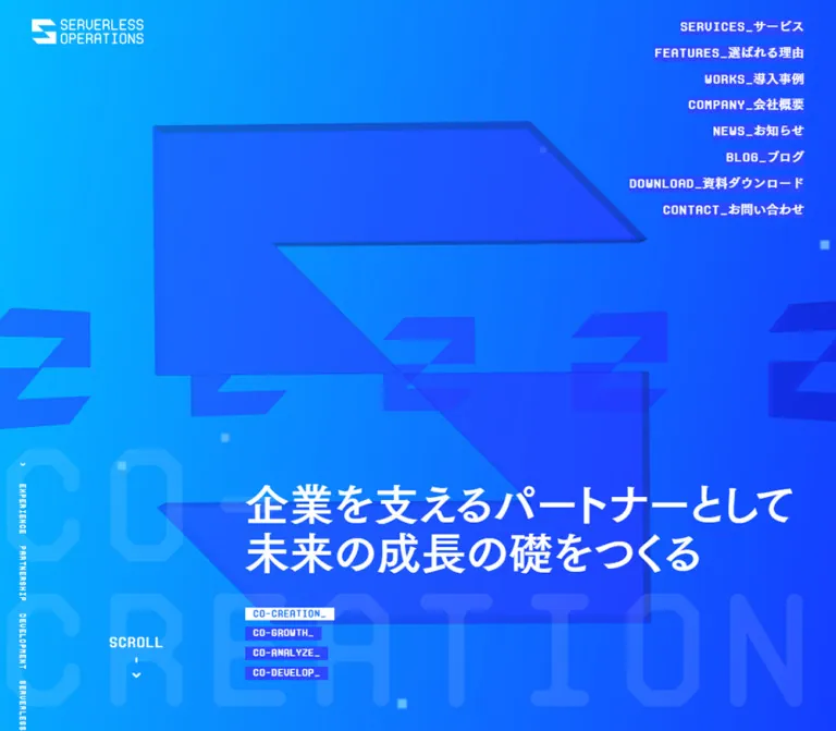
鮮やかな青のグラデーション、立体的なロゴ、端末風の英字書体を組み合わせたクラウド開発支援企業のサイト。段差のあるサービス一覧、細い罫線のグリッド、円形リンク、巨大なワードマークが特徴。
オリジナルサイトを見るServerless Operations — Style Reference
A cloud engineering company presented through blue spatial graphics and the language of a terminal.
Website: serverless.co.jp Original URL: https://serverless.co.jp/ Final URL: https://serverless.co.jp/ — HTTP 200 Theme: saturated cyan-to-blue fields alternating with pale blue-gray content surfaces; white technical lettering and slate text. Inspected: September 17, 2026, at 04:58 JST; supplied retrieval timestamp: September 16, 2026, 19:58:24.728 UTC. Viewports: desktop 1440 × 1000 and mobile 390 × 844 CSS pixels. Scope: the current corporate homepage. Supplied screenshots cover the desktop opening, a features/partner transition, the final brand panel, and the mobile opening and page ending. Rendered DOM and computed-style evidence cover the broader homepage, including services, case studies, news, contact entry points, and the footer directory. Destination pages and activated menu states were not inspected.
Serverless Operations combines a dense corporate information architecture with an unusually graphic presentation. Its identity comes from an oversized extruded S-shaped emblem, electric blue label strips, segmented technical lettering, command-like captions, and enormous background words. The page moves between immersive blue fields and quieter pale sections, where fine white rules and slate typography organize evidence about the company's services and experience.
This is a substantial corporate homepage, with six featured services, customer stories, partner credentials, news, and a detailed site directory. Preserve that breadth when adapting the design. The most useful contrast is between expressive brand scenery and clearly structured information: large abstract forms establish character, while small labels, numbered items, metadata, and explicit links make the company navigable.
How to Read This Reference
- Measured values come from the supplied rendered DOM, computed styles, or element rectangles. They describe the captured state, not necessarily the original CSS formula.
- Derived values are calculations from those measurements, such as the 12px navigation gap or service-card column spacing.
- Estimated values describe screenshot appearance where no relevant computed property was supplied. These are explicitly identified.
- Recommended values and behaviors belong to the reusable implementation, not to verified original functionality.
- Token names below are implementation aliases. The evidence does not expose a complete branded token system.
- A computed font on a parent does not necessarily describe all nested lettering. Several composite headings have unusual bounding boxes or transparent text, so their visible treatment cannot be reconstructed from the parent alone.
- The current hero screenshots do not clearly show the main Japanese headline, although the rendered DOM contains it. Its reveal mechanism, visibility timing, and relationship to the graphic layer remain unverified.
Tokens — Colors
Default Palette
| Name | Value | Suggested token | Evidence and role |
|---|---|---|---|
| Electric Blue | #2c48ff |
--color-blue |
Measured navigation-link background, mobile Menu background, and feature-heading color. The signature compact highlight color. |
| Clear Blue | #0f68ff |
--color-blue-secondary |
Measured in the small Serverless Operations / Services lettering. Distinct from the navigation blue. |
| Pale Blue Canvas | #dee6f2 |
--color-paper |
Measured body background; visibly used behind the feature matrix and final brand panel. |
| White | #ffffff |
--color-white |
Measured reversed navigation text, major copy in blue regions, and multiple labels. Also visible in the logo and final wordmark. |
| Near White | #f5f8fc |
--color-code-light |
Measured small comment-like and content-syntax decorations. |
| Slate Heading | #353f58 |
--color-ink |
Measured case-study headline color. A related dark slate appearance is visible in the partner section, but its background color was not directly measured. |
| Slate Copy | #3c4968 |
--color-copy |
Measured introductory sentence above the features matrix. |
| Slate Label | #4a5a80 |
--color-label |
Measured customer-name strips, case-study arrow squares, and Works heading color. |
| Muted Slate | #5e729a |
--color-meta |
Measured case-study category and industry links. |
| Light Slate | #c6d3e8 |
--color-muted-light |
Measured explanatory copy in the partner panels. |
| Partner Orange | #f49d00 |
--color-partner |
Measured fill of the small AWS PARTNER label. A localized credential accent. |
The blue label strips are flat, opaque rectangles. They are not translucent glass panels and do not use a pill shape. Much of the surrounding page structure has a transparent computed background, so the final color depends on artwork or an underlying section layer.
Gradient Fields
The opening screenshot shows a bright cyan area at the left flowing toward stronger blue at the right. The mobile opening retains the same blue family and contains large cropped logo geometry. The mobile footer ending also shows a vivid blue field.
Estimated reconstruction: linear-gradient(110deg, #00bcef 0%, #0795ff 45%, #164cff 100%). These stops and the angle are visual approximations, not extracted source declarations.
Keep three color roles separate:
- The gradient supplies the environmental color.
- The S-shaped objects use darker blue faces and edge shading to create depth.
- The
#2c48fflabels provide a stable foreground surface for white text.
No theme selector or alternate user-selectable palette is evidenced. Framework variables such as --swiper-theme-color are not sufficient evidence of a visible brand color or a particular control.
Tokens — Typography
Japanese Display and Body
Measured stack: "FOT-筑紫ゴシック Pro B", TsukuGoPro-B, sans-serif.
This family is declared on the body, navigation fallback, major Japanese headlines, service copy, case-study titles, and much of the footer. The sampled computed weight is 400, including elements whose family name contains B. Do not automatically replace this with font-weight: 700; the selected face contributes its own visual weight.
The result is substantial but approachable Japanese text, with generous line spacing in the introductory narrative. It balances the angular technical English lettering without looking like a conventional terminal font.
Technical Display and Navigation
Measured families: ProtoMono-Medium and ProtoMono-Regular.
ProtoMono-Medium appears in navigation, command captions, oversized CO- lettering, the AWS Professional display, and directory headings. ProtoMono-Regular appears on several View More controls, the AWS PARTNER stamp, and the Works heading wrapper.
The supplied screenshots show geometric, segmented-looking letterforms with clipped or rounded transitions. This character is especially important in the giant closing wordmark. A generic monospace fallback preserves the functional distinction but will not reproduce those contours.
Navigation combines ProtoMono-Medium with the Japanese display stack. English and Japanese are joined directly by an underscore, as in SERVICES_サービス. Most sampled navigation tracking is normal; do not introduce broad tracking across every label.
Supporting Japanese Copy
Measured stack: "FOT-筑紫ゴシック Pr5 D", TsukuGoPr5-D, sans-serif.
This face is present in partner-section explanatory paragraphs. It provides a quieter reading texture than the display face. Recorded sizes range from 18px for the desktop lead paragraph to 12px for mobile panel descriptions.
Font file URLs and licensing details were not supplied. The Quick Start uses observed family names with fallbacks and does not invent font resources.
Type Scale
Values below are measured computed font size / line height. They are not all visible glyph heights.
| Role | Desktop | Mobile | Notes |
|---|---|---|---|
| Main hero heading wrapper | 64 / 89.6px |
26.91 / 32.292px |
White Japanese text in the DOM; visual completeness is uncertain in the captures. |
| Primary navigation | 16 / 20.8px |
16 / 20.8px |
Maintains its size when moved into the mobile hero. |
| Menu label | Not shown | 14 / 16.8px |
Compact blue-backed control. |
| Introductory subheading | 40 / 64px |
24 / 38.4px |
Mobile tracking is 1.08px. |
| Introductory paragraph | 24 / 57.6px |
16 / 35.2px |
Exceptionally open leading: 2.4 and 2.2 respectively. |
| Growth statement | 64 / 76.8px |
33.28 / 39.936px |
Two-line Japanese statement after the service collection. |
| Feature-section heading | 40 / 52px |
20 / 26px |
Blue text. |
| Feature lead sentence | 32 / 44.8px |
18 / 25.2px |
Slate copy on pale canvas. |
| Decorative CO- lettering | 273.6 / 246.24px |
74.1 / 66.69px |
Both sizes equal 19% of viewport width. Mobile tracking is 3px. |
| AWS Professional display | 170 / 153px |
48.75 / 43.875px |
Tracking changes from 9px to 2px. |
| Case-study title | 22 / 35.2px |
18 / 25.2px |
Slate heading color. |
| Case-study metadata links | 12 / 16.8px |
12 / 16.8px |
Restrained secondary detail. |
| News title | 24 / 33.6px |
18 / 25.2px |
White text in the footer region. |
| Download/contact heading wrapper | 32 / 44.8px |
18 / 26.1px |
Composite English/Japanese headings may contain additional nested styling. |
| Footer directory heading | 32 / 28.8px |
28 / 25.2px |
ProtoMono-Medium. |
| Footer directory link | 14 / 21px |
14 / 21px |
Japanese display stack. |
| Vertical technical rail | 10 / 9px |
10 / 9px |
A decorative microtext role, not a body-copy model. |
The root remains a conventional measured 16px. The design's scale comes from individual element sizes and responsive layout changes, not an unusually small root unit.
Tokens — Spacing & Shapes
Overall rhythm: very small technical details within large compositional spaces. Desktop section spacing is expansive; mobile reduces those spaces selectively while preserving graphic interruptions.
Spacing Scale
| Use | Desktop measurement | Mobile measurement | Interpretation |
|---|---|---|---|
| Header padding | 24px 40px |
24px |
Logo keeps its size; side clearance changes. |
| Navigation gap | 12px, derived |
12px, derived |
Link starts are about 32.8px apart, with 20.8px link boxes. |
| Main content side inset | Often 48px |
Often 24px |
Applies to Works and News content, not every section. |
| Services side inset | 108px |
24px left, open right edge |
Desktop uses 7.5% of this viewport width. Mobile exposes a horizontal rail. |
| Service-card gap | 40px, derived |
12px, derived |
Different collection geometry by viewport. |
| Service-card text inset | About 41px from card edge |
About 17px |
Derived from child rectangles; exact padding/border decomposition is unknown. |
| Service column offset | 120px per column, derived |
None in the captured row | Creates the rising desktop staircase. |
| Intro top padding | 256px |
80px |
Major reduction in mobile vertical staging. |
| Intro subheading-to-paragraph gap | 40px, derived |
40px, derived |
A retained reading rhythm. |
| Partner outer inset | 20px |
12px |
Large framed credential block. |
| Conversion-pair side padding | 44px |
44px |
Mobile cards are narrower than ordinary body content. |
| Footer top padding | 380px |
160px |
The footer includes News, not just the final directory. |
Do not force all these values into one universal gutter. The shifting insets are part of the composition: edge-to-edge rules, inset service cards, narrow conversion panels, and oversized graphics coexist.
Border Radius and Edge Treatment
| Element | Evidence | Reusable treatment |
|---|---|---|
| Navigation strips and small labels | Measured 0px radius |
Square rectangles fitted closely to their text. |
| Service-card links | Measured 8px radius |
A small exception to the predominantly angular system. |
| Circular View More controls | Visible circles; some source anchors use 9999px |
Use a thin circular outline without a shadow. |
| Partner frame and panels | Visibly clipped upper corners | Approximately 12px chamfers are a useful estimate. Exact clipping geometry was not supplied. |
| Case-study media | Rectangular measured slots | Preserve a 16:9 ratio; no large rounded-card treatment is evidenced. |
| Closing wireframe emblem | Thin linework with angular facets | Preserve the original geometry as artwork. |
Layout Measurements
| Element | Desktop | Mobile |
|---|---|---|
| Logo link | 140 × 30.83px, at 40, 24 |
Same size, at 24, 24 |
| Opening section | 1440 × 1000px |
390 × 844px |
| Hero heading wrapper | x:432, y:672.81, width 976px |
x:24, y:160, width 346px |
| Intro paragraph | Width 500px |
Width 342px |
| Service cards | About 381.33 × 441.03px |
240 × 277.45px |
| Service-card x positions | 108, 529.33, 950.66px |
24, 276, 528px, continuing offscreen |
| Feature View More | 225 × 225px |
90 × 90px |
| Other sampled View More controls | 140 × 140px |
90 × 90px |
| Case-study media links | About 383–385 × 215–217px |
About 342–343 × 192–193px |
| Partner section | 1400 × 669.88px |
366 × 1020.63px |
| Full document height | 14045.67px |
12905.50px |
The two recorded document heights are observations, not target heights for a recreation. Different font availability, content, and rendering phases can change them.
Components
Persistent Identity and Primary Navigation
Role: retain the company identity and access to the main site destinations while the page moves through dramatically different scenes.
The desktop header places the white logo at the upper left and eight separate navigation strips at the upper right. Their right edge is 40px from the viewport edge. Each strip follows its own text width, so the left edge forms a ragged staircase. There is no large enclosing menu panel.
The destinations are services, features, works, company information, news, blog, downloads, and contact. Labels combine uppercase English, an underscore, and Japanese text. The measured link boxes use white text on #2c48ff, 16px / 20.8px, no padding, and square corners.
The header remains in the same visual position in the supplied scrolled desktop captures. This supports a persistent-header interpretation, although the exact position declaration was not included.
On mobile, the logo remains 140px wide and a compact Menu control appears at the upper right. Its recorded box is approximately 58.84 × 16.80px at 307.16, 41. Separately, the opening section visibly contains the full right-aligned destination list, ending 20px from the right edge. Do not describe that list as an opened menu overlay: no menu activation was recorded.
Full-Viewport Brand Scene
Role: introduce the company through an abstract technical environment.
Layer the scene as follows:
- A full-bleed cyan-to-blue field.
- Large extruded S-shaped objects with darker side faces, some heavily cropped by the viewport.
- Smaller repetitions of the emblem across the scene.
- Sparse luminous square particles and very large translucent CO- lettering.
- Japanese headline content and four stacked labels:
CO-CREATION_,CO-GROWTH_,CO-ANALYZE_, andCO-DEVELOP_. - A fine vertical technical rail at the left and a small Scroll cue near the lower edge.
The large object is scenery rather than a centered product illustration inside a content card. Desktop and mobile both crop it aggressively. The mobile composition relocates the measured headline wrapper near the upper left and the navigation list into the middle-right area.
The DOM contains several pairs of Japanese headline phrases, including データの価値を引き出し and ビジネスを加速させる. Their coexistence suggests a stateful presentation, but the sequence, timing, and label interaction are not established. The supplied current screenshots do not clearly expose the complete headline. Do not imitate an invisible headline as a required design feature; use a visible static fallback in a new implementation.
The rendering technology behind the extruded objects is unknown. Their appearance alone does not establish WebGL, a particular animation library, or a video asset.
Introductory Narrative and Featured Story
Role: connect the graphic opening to the company's AWS support proposition.
The desktop introduction sits in a 1088px-wide section beginning at x=176, with text starting at x=204. The lead subheading spans up to 716px, while the main paragraph is restricted to 500px. White Japanese copy uses unusually generous leading: the measured paragraph is 24px / 57.6px.
On mobile, the introduction uses 24px side padding, a 342px text column, and 16px / 35.2px paragraph text. Its top padding drops from 256px to 80px. This keeps the contemplative pacing without preserving desktop-sized empty areas.
A featured Works teaser follows. On desktop it occupies a 460px region toward the right; on mobile it expands to the 342px content width. It combines a section label, a customer name, a media region, and a linked story title. The DOM repeats the teaser title within one link, but that is not sufficient evidence that duplicate text should be visibly rendered twice.
Terminal Labels and Command Captions
Role: provide a consistent technical vocabulary for section identity and navigation.
The page uses >_, ->, cd /…, comment-like captions, braces, and uppercase labels as graphic devices. They appear next to section names, service numbers, conversion entries, and footer links.
Keep these marks small and precise. Their effect comes from repetition and alignment, not from turning the whole interface into a terminal simulator. There is no evidenced command input.
Visible path captions are not always the actual link destination:
| Service | Displayed caption | Actual observed href |
|---|---|---|
| Internal development support | >_ cd /services/co-growth |
/services/co-growth |
| Modernization support | >_ cd /services/co-modernization |
/services/u-rx60i3ok |
| Generative AI support | >_ cd /services/co-generativeai |
/services/chodk9vdsxn |
Preserve link semantics independently of decorative path text. Do not construct destinations by copying the caption.
Staggered Service Collection
Role: present six service categories as a distinctive linked collection.
Each card contains a >_serviceNN identifier, a short proposition, the service name, a command-style caption, and an arrow. The current categories include internal development and training, AWS modernization, frontend development, AI search, generative AI, and commissioned AWS development.
At desktop width, the cards form three columns and two rows. Each column is about 381.33px wide with a 40px horizontal gap. The second column begins 120px above the first; the third begins another 120px higher. The second row preserves the same staircase. Card link wrappers have an 8px radius.
On mobile, all six cards share one y position and continue horizontally in 252px increments: 240px cards plus 12px gaps. The first card is fully visible and part of the next card fits inside the viewport. This establishes a horizontal collection rather than six vertically stacked cards. Swipe, snapping, drag, and arrow-control behavior were not exercised.
The supplied screenshots do not directly show the service-card artwork. Their transparent wrapper backgrounds and mixed child colors do not reveal the full surface construction. Treat the measured geometry and text hierarchy as authoritative; do not invent a specific illustration or card fill and call it observed.
Features Matrix
Role: make the company's differentiators feel systematic and technical.
The captured desktop lower row consists of three equal-width cells: feature 03, feature 04, and a View More cell. Thin white rules divide the pale blue-gray surface at approximately 480px intervals. Small square marks appear at rule intersections.
Feature cells combine a vertical English category label near the left edge, a large abstract geometric illustration, a blue two-digit number, and a multiline Japanese statement. Important phrases are reversed into blue rectangular highlights. The visible examples emphasize モダナイゼーション and フロントエンド開発.
The illustrations are simple solids rather than line icons: paired triangular prisms and overlapping circular discs with blue faces, shaded edges, and pale or translucent counterparts. The displayed text is approximately 32px in the desktop screenshot; that estimate should not be confused with a supplied computed size for these particular lines.
The DOM also confirms the section introduction and features 01 and 02. Mobile element positions are consistent with a two-column matrix, but the complete mobile feature layout is not pictured. A two-column adaptation is therefore a recommendation supported by partial geometry, not a fully verified mobile screenshot reconstruction.
Circular View More Link
Role: provide a quiet but spatially prominent route to a larger collection.
A thin outlined circle contains a centered uppercase label and a separate -> line. It uses technical lettering, ample empty space, and no raised surface. On the pale feature grid, the circle is approximately 225px across. Other desktop examples measure 140px; mobile examples measure 90px.
Some source anchors have a computed radius of zero despite the visible circular treatment, so the outline may belong to a descendant or graphic. Reproducing the appearance with a circular anchor border is a practical adaptation, not a claim about the source markup.
AWS Partner Panel
Role: present credentials as a substantial visual proof section.
A dark slate frame sits 20px inside the desktop viewport. Its upper corners are chamfered rather than rounded. The left column contains a small orange AWS PARTNER stamp, a white Japanese heading, and supporting copy. Two larger panels to the right show partner artwork and explanatory information.
The screenshot includes an AWS Partner Network composition and a group of official-looking partner badges. The visible badge artwork includes Select Tier Services and delivery badges associated with API Gateway, DynamoDB, Lambda, and OpenSearch Service. Preserve these as supplied artwork when appropriate; rebuilding them with ordinary text would lose their proportions and visual detail.
The desktop section is approximately 670px high. On mobile it becomes a 366px-wide section approximately 1021px high. Both panel headings share the same x position at different y positions, establishing vertical stacking. Supporting text reduces from 18px to 14px for the lead paragraph, and from 14px to 12px within the panels.
Orange is confined to the credential stamp and badge artwork. It is not the site's general action color.
Case-Study Collection
Role: show concrete customer outcomes and provide routes into detailed stories.
Desktop presents three columns. Each story follows this anatomy:
- A linked 16:9 media slot.
- A slate-filled customer-name strip with white text.
- A multiline title in
#353f58. - Two metadata rows labeled Category and Type of Business.
- A small square arrow link near the lower-right edge.
The customer strips use 16px / 19.2px text and measured padding of 0 40px 3px 4px, leaving an intentionally extended right end. Story titles use 22px / 35.2px; metadata links use 12px / 16.8px in muted slate.
On mobile, stories stack vertically with approximately 342px-wide media and 18px / 25.2px titles. The small arrow remains a 24px square near the viewport's right edge. Category and industry values are genuine separate links in the evidence; preserve that structure rather than nesting them inside one large card anchor.
Media dimensions are known, but the supplied screenshot set does not establish the subjects or photographic treatment of these thumbnails.
News Rows
Role: show recent company activity in a structured, timestamped format.
News belongs to the source page's large footer region. Each entry is a full-width link containing Date and Time metadata, a Japanese headline, and an arrow. Retaining the exact time and JST suffix gives the list a technical-log character.
Desktop rows are approximately 235.5px high with 64px 48px padding. Their headline begins around x=342.47, after the metadata area, and uses 24px / 33.6px white text.
Mobile rows use 24px padding and place the title below the metadata. Titles become 18px / 25.2px; row height increases when a title needs an extra line. These are roomy editorial entries, not small notification chips.
Download and Contact Entries
Role: offer two different ways to continue: obtain company information or begin an inquiry.
Both entries combine a vertical >_ cd /… caption, a large visual region, an English label ending in an underscore, a Japanese heading, supporting copy, and an arrow. The download entry adds Data Type PDF / Size 210×297. That is displayed source text, not a verified inspection of the download file.
The contact entry adds a telephone link and compact opening-hours information. The observed telephone href is tel:0368203247.
Desktop places the entries side by side. Mobile stacks them in 302px-wide columns within 44px outer margins. Their narrower width differentiates them from the regular 342px reading column. No form or download interaction was opened during the supplied inspection.
Footer Directory
Role: make the site's breadth visible and provide a second route to its content.
The directory includes Home, Services, Features, Company, News, Blog, Works, and social links. Services expands beyond the six homepage cards to include security, marketplace support, data infrastructure, and an application-stack catalog.
Desktop places large ProtoMono section names beside grouped links and includes a Works teaser to the right. Mobile moves the section name above its links. Directory heading size decreases only slightly, from 32px to 28px; link text remains 14px with 21px leading.
The mobile ending also shows a compact AWS Partner badge group and the copyright line © Serverless Operations, inc. This original-page evidence supports the company identity. No production credit is established by the supplied original-page content.
Closing Brand Panel
Role: end the long page with a quiet, oversized identity statement.
After the blue footer, the surface returns to pale blue-gray. A thin wireframe S-shaped emblem sits above two enormous white lines: SERVERLESS and OPERATIONS. The treatment is spatial but sparse, in contrast to the dense footer directory.
The emblem appears approximately 144px across in both the desktop and mobile ending captures; this is a visual estimate. The lettering scales strongly with viewport width and nearly fills it. Its visible desktop capital height is roughly 150–160px per line, versus roughly 40px on mobile; these are screenshot estimates, not measured font sizes.
The document extends beyond the measured body rectangle by 1024px on desktop and 480px on mobile, consistent with the extra closing composition. This does not establish the exact source height rule. The panel is a page ending, not evidence of a loading splash.
Tokens — Motion & Interaction
| Treatment | Evidence | What can be concluded |
|---|---|---|
| Footer gradient | Computed 6s linear infinite bgGradient on both viewports |
A six-second repeating CSS animation is declared. Its keyframes and exact gradient stops were not supplied. |
| Hero copy states | Several phrase pairs in the DOM; one pair in extracted visible text | Multiple content states exist. Autoplay interval, ordering, and manual switching remain unverified. |
| Extruded logo scenery | Large and repeated 3D-looking forms in screenshots | Geometry and depth are visible. Rotation, parallax, camera motion, and renderer cannot be established from still captures. |
| Persistent header | Logo/navigation remain at the viewport top in scrolled captures | Persistence is visually supported; the exact positioning implementation is not supplied. |
| Mobile services | Cards share one y position and extend beyond the viewport | Horizontal presentation is measured. Dragging, swiping, snapping, and autoplay were not tested. |
| Mobile Menu | A button is present | Opening, closing, focus behavior, and overlay appearance are unverified. |
| Hover/focus transitions | Sampled elements report transition: all without useful timing detail |
No specific hover animation or duration should be inferred. |
The supplied readiness process waited for document loading, sampled layout/text stability, image decoding, and relevant finite animation, with bounded waits. Perpetual animations were paused during checks and then resumed. Those safeguards do not prove that every delayed reveal became semantically complete.
For an adaptation, keep ambient motion subordinate to readable content. A short 150–200ms color or outline response is a reasonable recommendation for links, but is not an observed source token. Do not reuse the footer's six-second duration as a supposed measurement for the hero.
Surfaces
| Surface | Appearance | Purpose |
|---|---|---|
| Brand field | Bright cyan/blue gradient with blue spatial objects | Opening identity and lower-page continuity. |
| Information canvas | Solid #dee6f2, slate text, fine white rules |
Features, case-study organization, and the final brand panel. |
| Navigation strip | Flat #2c48ff, white text, square corners |
Keep compact links legible over changing scenery. |
| Highlight phrase | Blue rectangle fitted to a line of white text | Emphasize a specific service capability. |
| Partner frame | Dark slate with chamfered corners and darker inset artwork panels | Concentrate credentials and supporting explanation. |
| Customer strip | #4a5a80 with white lettering |
Identify the client before the story headline. |
| View More control | Transparent interior and thin circular outline | Mark a destination without introducing a large filled button. |
There is no evidenced general shadow-elevation system. Depth comes mainly from the artwork, not from lifting every interface card above the page.
Imagery
The distinctive imagery is geometric and brand-specific: extruded S-shaped emblems, faceted triangular solids, layered discs, small luminous squares, and a wireframe version of the emblem. The large forms are deliberately cropped. Darker edge faces make them readable against backgrounds that remain within the same blue family.
Do not substitute generic cloud icons, stock server racks, or unrelated abstract blobs for this system. The repeated emblem is the visual connective tissue between the opening and the closing panel. Thin interface rules and compact terminal labels complement the objects without competing with them.
Partner artwork is a different category: retain the recognizable badge shapes and original wordmarks. Its detailed branding should remain readable rather than being flattened into a monochrome decorative pattern.
Observed Asset References
No image src, model URL, or font-resource URL was supplied. The references below identify visible assets and measured slots without inventing paths.
| Asset or slot | Evidence | Implementation guidance |
|---|---|---|
| White company logo | Desktop and mobile header captures; measured 140px-wide link | Use the approved logo artwork and preserve its aspect ratio. |
| Extruded S emblem scene | Opening captures | Use authorized artwork or a deliberately rebuilt geometric scene; rendering technology is unspecified. |
| Feature prisms and discs | Desktop features capture | Preserve simple forms, blue faces, dimensional edges, and ample surrounding space. |
| AWS partner artwork | Desktop partner capture and mobile footer ending | Keep supplied badge artwork intact and sized for legibility. |
| Case-study media | Rendered link rectangles near 16:9 | Preserve the ratio; image subject and crop are not established here. |
| Wireframe S emblem | Desktop and mobile ending captures | Use thin angular linework and retain the compact central scale. |
| Closing two-line wordmark | Ending captures | Preserve its near-edge-to-edge width and technical letterforms. |
Layout & Responsive Behavior
This is a normal long scrolling document, not a fixed application shell. Its opening section equals the inspected viewport height, while the rest of the page continues through multiple content and brand sections.
| Area | Desktop observation | Mobile observation |
|---|---|---|
| Header | Full eight-link list at upper right | Compact Menu button; full destination list also appears within the opening section. |
| Hero copy | Measured wrapper begins at 30% of viewport width | Wrapper moves to x=24, y=160. |
| Introductory reading column | 500px paragraph with very open 24px text | 342px paragraph with 16px text and retained generous leading. |
| Services | Three staggered columns, two rows | One horizontal row of 240px cards. |
| Features | Captured lower row has three equal cells | Partial geometry supports a two-column interpretation; full appearance is unverified. |
| Partner credentials | Intro plus two panels across the frame | Intro and panels stack vertically. |
| Case studies | Three columns | One vertical sequence. |
| News | Metadata at left, headline to its right | Metadata above the headline. |
| Download/contact | Side-by-side entries | Two stacked 302px-wide entries. |
| Footer directory | Large labels beside grouped links | Labels above links, with natural wrapping. |
| Final brand panel | Wide wordmark beneath a small emblem | Same two-line structure with much smaller lettering. |
The exact media-query boundaries were not supplied. The Quick Start uses 768px as a recommended switch point, not an extracted breakpoint. Intermediate tablet behavior, landscape phones, zoomed layouts, and safe-area handling were not inspected.
The mobile page is only moderately shorter than the desktop page despite stacked stories and footer content. One major reason visible in the measurements is that the desktop service staircase becomes a compact horizontal rail. Do not infer that every section simply scales down by the viewport-width ratio.
Do’s and Don’ts
Do
- Keep
#2c48fffor compact navigation and emphasis strips, with#dee6f2as the quieter content canvas. - Pair the observed Japanese face with ProtoMono-style technical lettering; retain the measured
400weight where applicable. - Use oversized cropped emblem geometry as scenery, with small precise labels in front.
- Preserve the right-aligned, text-width navigation strips and English/Japanese underscore pattern.
- Maintain the desktop service staircase and the separate mobile horizontal collection.
- Use fine white rules, blue number labels, and geometric illustrations in the feature matrix.
- Preserve circular View More links as spacious outlines rather than filled pills.
- Treat partner orange as a localized credential accent.
- Keep the dense footer directory and the sparse closing wordmark panel as distinct experiences.
Don’t
- Don’t simplify the corporate homepage into a single conversion-focused page with only a hero and a contact button.
- Don’t replace every section with identical rounded cards, white panels, and soft shadows.
- Don’t make all blue values identical; scenery, labels, and supporting lettering have different roles.
- Don’t use the hero's huge decorative type scale for ordinary reading content.
- Don’t claim that the CO- labels are tested tabs or that the Menu screenshot represents an opened overlay.
- Don’t infer animation timing, WebGL technology, or a carousel API from a still image or a framework variable.
- Don’t invent service artwork or case-study photography from link rectangles.
- Don’t derive working hrefs from the decorative command captions.
- Don’t preserve missing headline visibility or low-contrast white-on-pale identity treatment as an accessibility requirement.
Recommended Implementation Additions
These are recommendations for a new implementation, not verified original features:
- Ensure the main proposition remains visible when animation, custom fonts, or the graphic renderer fails. Keep an ordinary semantic heading beneath any visual enhancement.
- Give Menu a real disclosure implementation with
aria-expanded,aria-controls, keyboard operation, and appropriate focus management for the chosen panel behavior. - Enlarge compact touch targets toward 44px without necessarily enlarging their visible blue labels. Reflow the mobile navigation if those larger targets need more room.
- Make the service rail keyboard reachable and visibly indicate that more content exists horizontally. Provide a non-drag method of reaching every service.
- Supply clear focus indicators for label links, circular controls, and arrow links. Avoid placing interactive category links inside another anchor.
- Use a blue logo variant or a restrained backing surface when the persistent white identity crosses pale content. The supplied captures show low visual contrast there.
- Respect reduced-motion preferences for gradient and scene animation. JavaScript-rendered graphics need their own pause/static logic in addition to CSS overrides.
- Keep decorative syntax and large background words out of the accessibility tree when they repeat meaningful content. Provide useful alternatives for informative images and badge groups.
- Reserve media dimensions, use appropriate image sizes, and load licensed font resources deliberately. No performance measurements were supplied, so these are implementation practices rather than diagnosed fixes.
Agent Prompt Guide
Quick Color Reference
- Main navigation and phrase highlights:
#2c48ffwith white text. - Content canvas:
#dee6f2. - Main story headings:
#353f58; explanatory slate copy:#3c4968. - Customer strips and small arrow squares:
#4a5a80. - Metadata links:
#5e729a. - Partner stamp:
#f49d00. - Hero gradient approximation: cyan
#00bcefthrough#0795ffto blue#164cff; these stops are estimates. - Separation: fine rules, color fields, and chamfered frames rather than a general shadow system.
Overall Prompt
“Create a substantial Japanese cloud engineering corporate homepage inspired by the current Serverless Operations design. Use a saturated cyan-to-blue opening scene with huge cropped extruded emblem geometry, small luminous squares, translucent oversized technical lettering, and a visible Japanese proposition. Keep a compact white logo at upper left and separate blue-backed, right-aligned bilingual navigation strips at upper right. Pair Japanese Gothic text with ProtoMono-like technical lettering and command-style captions. Follow the opening with an expansive introduction, six services in a three-column staircase, a pale blue-gray ruled feature matrix, a dark chamfered partner section, case studies, timestamped news, download/contact entries, and a detailed footer directory. End with a small wireframe emblem above a nearly full-width two-line white wordmark. On mobile, use a horizontal service rail, stacked stories and credentials, and a compact header Menu control. Use static readable fallbacks; do not invent unverified menu or animation behavior.”
Example Component Prompts
- Navigation: “A persistent white 140px logo at upper left and eight independent right-aligned links at upper right. Use white 16px technical lettering on square
#2c48fftext-width strips, joined English/Japanese labels, 20.8px line boxes, and 12px gaps. Avoid a surrounding panel.” - Service collection: “Six linked service entries with small numbered terminal labels, propositions, service names, command captions, and arrows. At 1440px, use approximately 381px cards with 40px gaps and columns stepping upward by 120px. At 390px, use a horizontal row of 240px cards with 12px gaps. Artwork is a supplied asset requirement, not an invented source detail.”
- Feature cell: “A pale
#dee6f2grid cell separated by fine white rules, with a tiny vertical category label, a dimensional blue prism or paired-disc illustration, a blue two-digit number, and slate Japanese copy. Reverse one important phrase into a square blue highlight. No shadow.” - Partner section: “A dark slate credential frame with clipped upper corners. Place a small orange AWS PARTNER stamp and white introduction beside two substantial badge panels. Preserve original badge artwork. Stack the panels vertically on mobile.”
- Case study: “A rectangular 16:9 media link, a slate customer-name strip with an extended right edge, a multiline slate headline, Category and Type of Business metadata links, and a small square arrow at the lower right. Use three desktop columns and one mobile column.”
- Closing identity: “After a vivid blue footer, switch to a quiet pale blue-gray field. Center a small thin wireframe emblem above two enormous white lines of segmented technical lettering. Let the wordmark nearly touch the viewport sides; keep the emblem much smaller than the type.”
Quick Start
CSS Custom Properties
This is a usable structural adaptation, not recovered source CSS. Exact colors and several endpoint dimensions come from the evidence. Gradient stops, breakpoint, unpictured service surfaces, intermediate scaling, and closing-wordmark sizing are recommendations or estimates. Original artwork and licensed fonts must be supplied separately.
The class contract uses .so-nav for a list of links, .so-service-grid for six linked cards in document order, and .so-case-grid for story articles with independently linked media, titles, and metadata. Menu disclosure behavior requires a separate implementation.
:root {
  /* Measured colors */
  --so-blue: #2c48ff;
  --so-blue-secondary: #0f68ff;
  --so-paper: #dee6f2;
  --so-white: #ffffff;
  --so-ink: #353f58;
  --so-copy: #3c4968;
  --so-label: #4a5a80;
  --so-meta: #5e729a;
  --so-muted-light: #c6d3e8;
  --so-partner: #f49d00;

  /* Observed family names; font resources are not bundled */
  --so-font-jp: 'FOT-筑紫ゴシック Pro B', TsukuGoPro-B, sans-serif;
  --so-font-body: 'FOT-筑紫ゴシック Pr5 D', TsukuGoPr5-D, sans-serif;
  --so-font-tech: 'ProtoMono-Medium', monospace;
  --so-font-nav: 'ProtoMono-Medium', TsukuGoPro-B, sans-serif;

  /* Estimated gradient and recommended structural aliases */
  --so-gradient: linear-gradient(110deg, #00bcef, #0795ff 45%, #164cff);
  --so-gutter: 48px;
  --so-card-radius: 8px;
  --so-rule: 1px solid #fff;
  --so-feedback: 160ms ease;
}

* { box-sizing: border-box; }
html { font-size: 16px; }
body {
  margin: 0;
  color: var(--so-ink);
  background: var(--so-paper);
  font-family: var(--so-font-jp);
  font-weight: 400;
}
img { max-inline-size: 100%; }
button, input { font: inherit; }
a { color: inherit; }

.so-header {
  position: fixed;
  inset: 0 0 auto;
  z-index: 30;
  display: flex;
  justify-content: space-between;
  align-items: flex-start;
  padding: 24px 40px;
  pointer-events: none;
}
.so-header a, .so-header button { pointer-events: auto; }
.so-logo { display: block; inline-size: 140px; }
.so-logo img { display: block; inline-size: 100%; block-size: auto; }
.so-nav {
  display: flex;
  flex-direction: column;
  align-items: flex-end;
  gap: 12px;
  margin: 0;
  padding: 0;
  list-style: none;
}
.so-nav a {
  display: block;
  inline-size: fit-content;
  color: var(--so-white);
  background: var(--so-blue);
  font: 400 16px/1.3 var(--so-font-nav);
  text-decoration: none;
}
.so-menu { display: none; }
.so-hero-nav { display: none; }

.so-hero {
  position: relative;
  min-block-size: 100vh;
  min-block-size: 100svh;
  overflow: clip;
  isolation: isolate;
  color: var(--so-white);
  background: var(--so-gradient);
}
.so-hero__art {
  position: absolute;
  inset: 0;
  z-index: -1;
  pointer-events: none;
}
.so-hero__art img, .so-hero__art canvas {
  display: block;
  inline-size: 100%;
  block-size: 100%;
  object-fit: cover;
}
.so-hero__echo {
  position: absolute;
  inset-inline-start: -1vw;
  inset-block-end: 0;
  margin: 0;
  color: rgb(255 255 255 / 0.12);
  font: 400 19vw/0.9 var(--so-font-tech);
  pointer-events: none;
}
.so-hero__copy {
  position: absolute;
  inset-inline: 30% 32px;
  inset-block-end: 70px;
}
.so-hero h1 {
  margin: 0;
  font-size: clamp(32px, 4.444vw, 64px);
  font-weight: 400;
  line-height: 1.4;
}
.so-hero__modes {
  display: grid;
  justify-items: start;
  gap: 8px;
  margin-block-start: 24px;
  font: 400 11px/1.3 var(--so-font-tech);
}
.so-hero__modes span {
  padding-inline: 8px;
  background: var(--so-blue);
}
.so-rail {
  position: absolute;
  inset-inline-start: 24px;
  inset-block-end: 70px;
  writing-mode: vertical-rl;
  font: 400 10px/0.9 var(--so-font-tech);
}

.so-intro {
  max-inline-size: 1088px;
  margin-inline: auto;
  padding: 256px 0 80px 28px;
}
.so-intro h2 { font-size: 40px; line-height: 1.6; font-weight: 400; }
.so-intro p {
  max-inline-size: 500px;
  font-size: 24px;
  line-height: 2.4;
}
.so-command {
  font: 400 12px/1.2 var(--so-font-tech);
  letter-spacing: 0.05em;
}

.so-services { padding: 0 7.5vw 384px; }
.so-service-grid {
  display: grid;
  grid-template-columns: repeat(3, minmax(0, 1fr));
  gap: 40px;
  padding-block-start: 240px;
}
.so-service-card {
  display: flex;
  flex-direction: column;
  min-inline-size: 0;
  min-block-size: 441px;
  padding: 40px;
  border: var(--so-rule);
  border-radius: var(--so-card-radius);
  text-decoration: none;
  /* Readable fallback surface; original service artwork is not supplied. */
  color: var(--so-ink);
  background: var(--so-paper);
}
.so-service-card:nth-child(3n + 2) { transform: translateY(-120px); }
.so-service-card:nth-child(3n) { transform: translateY(-240px); }
.so-service-card .so-command {
  margin-block-start: auto;
  overflow-wrap: anywhere;
}

.so-feature-grid {
  display: grid;
  grid-template-columns: repeat(3, minmax(0, 1fr));
  border-block-start: var(--so-rule);
}
.so-feature-cell {
  display: flex;
  flex-direction: column;
  min-inline-size: 0;
  min-block-size: 504px;
  padding: 48px;
  border-inline-end: var(--so-rule);
  border-block-end: var(--so-rule);
}
.so-feature-art {
  display: block;
  inline-size: min(100%, 240px);
  block-size: 200px;
  margin: 16px auto 40px;
  object-fit: contain;
}
.so-feature-number {
  color: var(--so-blue);
  font: 400 24px/1.2 var(--so-font-tech);
}
.so-feature-copy { font-size: 32px; line-height: 1.4; }
.so-highlight {
  padding-inline: 0.12em;
  color: var(--so-white);
  background: var(--so-blue);
  box-decoration-break: clone;
  -webkit-box-decoration-break: clone;
}
.so-more {
  display: grid;
  place-content: center;
  inline-size: 140px;
  aspect-ratio: 1;
  flex-shrink: 0;
  border: 1px solid currentColor;
  border-radius: 50%;
  text-align: center;
  text-decoration: none;
  font: 400 18px/1.2 var(--so-font-tech);
}
.so-feature-cell .so-more { inline-size: 225px; margin: auto; }

.so-partner {
  display: grid;
  grid-template-columns: 240px repeat(2, minmax(0, 1fr));
  gap: 30px;
  margin-inline: 20px;
  padding: 64px;
  color: var(--so-white);
  background: var(--so-ink);
  clip-path: polygon(12px 0, calc(100% - 12px) 0, 100% 12px,
    100% 100%, 0 100%, 0 12px);
}
.so-partner-stamp {
  display: inline-block;
  padding: 2px;
  color: var(--so-white);
  background: var(--so-partner);
  font: 400 18px/0.9 var(--so-font-tech);
}
.so-partner p { font-family: var(--so-font-body); }

.so-case-grid {
  display: grid;
  grid-template-columns: repeat(3, minmax(0, 1fr));
}
.so-case { min-inline-size: 0; padding: 48px; }
.so-case-media {
  display: block;
  inline-size: 100%;
  aspect-ratio: 16 / 9;
  object-fit: cover;
}
.so-client {
  display: inline-block;
  margin-block-start: 40px;
  padding: 0 40px 3px 4px;
  color: var(--so-white);
  background: var(--so-label);
  font-size: 16px;
  line-height: 1.2;
}
.so-case h3 { font-size: 22px; line-height: 1.6; font-weight: 400; }
.so-case-meta { color: var(--so-meta); font-size: 12px; line-height: 1.4; }

.so-footer {
  padding-block-start: 380px;
  color: var(--so-white);
  background: var(--so-gradient);
  /* Static fallback: the source loop is 6s, but its keyframes are unknown. */
}
.so-news-row {
  display: grid;
  grid-template-columns: 246px minmax(0, 1fr) auto;
  align-items: center;
  gap: 48px;
  padding: 64px 48px;
  border-block-start: 1px solid rgb(255 255 255 / 0.4);
  text-decoration: none;
}
.so-news-row h3 { font-size: 24px; line-height: 1.4; font-weight: 400; }
.so-cta-pair {
  display: grid;
  grid-template-columns: repeat(2, minmax(0, 1fr));
  gap: clamp(40px, 14.27vw, 206px);
  inline-size: calc(100% - 88px);
  max-inline-size: 1094px;
  margin: 180px auto;
}
.so-directory { padding: 80px var(--so-gutter); }
.so-directory h2 { font: 400 32px/0.9 var(--so-font-tech); }
.so-directory a { font-size: 14px; line-height: 1.5; }

.so-endcap {
  display: grid;
  grid-template-rows: 1fr auto;
  justify-items: center;
  min-block-size: 1024px;
  background: var(--so-paper);
}
.so-endcap__mark { align-self: center; inline-size: 144px; block-size: 144px; }
.so-endcap__wordmark {
  margin: 0;
  color: var(--so-white);
  font: 400 clamp(44px, 14.8vw, 220px)/0.94 var(--so-font-tech);
  text-align: center;
}
.so-endcap__wordmark span { display: block; }

/* Recommended focus treatment, not an observed original state. */
:where(a, button, [tabindex]):focus-visible {
  outline: 3px solid currentColor;
  outline-offset: 4px;
}
.so-nav a { transition: color var(--so-feedback), background var(--so-feedback); }
@media (hover: hover) {
  .so-nav a:hover { color: var(--so-blue); background: var(--so-white); }
}

/* Recommended breakpoint; only the two supplied endpoints were inspected. */
@media (max-width: 767px) {
  :root { --so-gutter: 24px; }
  .so-header { padding: 24px; }
  .so-header > .so-nav { display: none; }
  .so-menu {
    display: inline-flex;
    align-items: center;
    justify-content: center;
    min-inline-size: 59px;
    min-block-size: 44px;
    padding: 0;
    border: 0;
    color: var(--so-white);
    background: transparent;
  }
  .so-menu span { background: var(--so-blue); font: 400 14px/1.2 var(--so-font-tech); }
  .so-hero-nav { display: flex; position: absolute; top: 50%; right: 20px; }
  .so-hero__copy { inset: 160px 20px auto 24px; }
  .so-hero h1 { font-size: 6.9vw; line-height: 1.2; }
  .so-hero__modes { margin-block-start: 72px; }
  .so-hero__echo { top: 44.2%; bottom: auto; letter-spacing: 3px; }
  .so-rail { left: 12px; bottom: 0; }
  .so-intro { padding: 80px 24px; }
  .so-intro h2 { font-size: 24px; line-height: 1.6; }
  .so-intro p { font-size: 16px; line-height: 2.2; }
  .so-services { padding: 0 0 136px 24px; }
  .so-service-grid {
    display: flex;
    gap: 12px;
    overflow-x: auto;
    padding: 0 24px 20px 0;
    scroll-snap-type: x proximity;
  }
  .so-service-card:nth-child(n) {
    flex: 0 0 240px;
    min-block-size: 277.45px;
    padding: 16px;
    transform: none;
    scroll-snap-align: start;
  }
  .so-feature-grid { grid-template-columns: repeat(2, minmax(0, 1fr)); }
  .so-feature-cell { min-block-size: 280px; padding: 24px; }
  .so-feature-art { block-size: 120px; margin: 8px auto 24px; }
  .so-feature-copy { font-size: 18px; }
  .so-more, .so-feature-cell .so-more { inline-size: 90px; font-size: 12px; }
  .so-partner { grid-template-columns: 1fr; margin-inline: 12px; padding: 75px 20px; }
  .so-partner-stamp { font-size: 12px; }
  .so-case-grid { grid-template-columns: 1fr; }
  .so-case { padding: 40px 24px; }
  .so-client { margin-block-start: 20px; }
  .so-case h3 { font-size: 18px; line-height: 1.4; }
  .so-footer { padding-block-start: 160px; }
  .so-news-row { grid-template-columns: 1fr; gap: 24px; padding: 24px; }
  .so-news-row h3 { font-size: 18px; }
  .so-cta-pair { grid-template-columns: 1fr; gap: 40px; margin-block: 80px; }
  .so-directory h2 { font-size: 28px; }
  .so-endcap { min-block-size: 480px; }
}

@media (prefers-reduced-motion: reduce) {
  .so-footer, .so-hero__art, .so-nav a {
    animation: none !important;
    transition: none !important;
  }
  .so-service-grid { scroll-behavior: auto; scroll-snap-type: none; }
}

/* Recommended readable fallback for short mobile viewports. */
@media (max-width: 767px) and (max-height: 740px) {
  .so-hero { min-block-size: 900px; }
  .so-hero__copy { position: relative; inset: auto; padding: 140px 24px 24px; }
  .so-hero-nav { position: relative; inset: auto; margin: 24px 20px 80px; }
}
The CSS intentionally does not fabricate an emblem, badge image, menu overlay, or hero state machine. Its static gradient and readable content form a baseline onto which those assets and behaviors can be added. JavaScript scenes must explicitly honor reduced-motion preferences; the CSS rule alone cannot pause a canvas renderer.
Tailwind v4 Token Mapping
Optional aliases for an implementation already using Tailwind v4. They are not a claim about the original site's framework version. Define the custom properties above first.
@theme inline {
  --color-brand: var(--so-blue);
  --color-brand-secondary: var(--so-blue-secondary);
  --color-paper: var(--so-paper);
  --color-ink: var(--so-ink);
  --color-label: var(--so-label);
  --color-meta: var(--so-meta);
  --color-partner: var(--so-partner);
  --font-japanese: var(--so-font-jp);
  --font-technical: var(--so-font-tech);
  --spacing-page: var(--so-gutter);
  --radius-service: var(--so-card-radius);
}
Sources & Evidence
- Serverless Operations homepage: original and final inspected URL, returned with HTTP 200. The supplied page title identifies Serverless Operations and its corporate proposition.
- Supplied browser retrieval timestamp:
2026-09-16T19:58:24.728Z, corresponding to September 17, 2026, 04:58:24.728 JST. - Desktop evidence: 1440 × 1000 CSS-pixel viewport, three supplied captures covering the opening, lower features/partner transition, and closing identity panel. Rendered document height: approximately 14045.67px.
- Mobile evidence: 390 × 844 CSS-pixel viewport, two supplied captures covering the opening and page ending. Rendered document height: approximately 12905.50px.
- Supplied rendered DOM, hrefs, computed colors, font stacks, line heights, element rectangles, and animation declarations support the measured tokens and component geometry. Subpage links are recorded destinations, not separately inspected pages.
- The browser traversed intermediate scroll positions and used bounded readiness checks. SharedWorkers and service workers were disabled during inspection. No recorded action establishes menu disclosure behavior, service-rail gestures, hover states, form behavior, or hero timing.
- Resource URLs, full stylesheets, animation keyframes, and rendering implementation were not supplied. Visual estimates and recommended CSS are labeled accordingly.
This reference describes the current homepage represented by the supplied original-page evidence. It does not reconstruct an earlier version or claim that every dynamic state was successfully captured.
# Serverless Operations — Style Reference

> A cloud engineering company presented through blue spatial graphics and the language of a terminal.

**Website:** [serverless.co.jp](https://serverless.co.jp/)
**Original URL:** https://serverless.co.jp/
**Final URL:** https://serverless.co.jp/ — HTTP 200
**Theme:** saturated cyan-to-blue fields alternating with pale blue-gray content surfaces; white technical lettering and slate text.
**Inspected:** September 17, 2026, at 04:58 JST; supplied retrieval timestamp: September 16, 2026, 19:58:24.728 UTC.
**Viewports:** desktop 1440 × 1000 and mobile 390 × 844 CSS pixels.
**Scope:** the current corporate homepage. Supplied screenshots cover the desktop opening, a features/partner transition, the final brand panel, and the mobile opening and page ending. Rendered DOM and computed-style evidence cover the broader homepage, including services, case studies, news, contact entry points, and the footer directory. Destination pages and activated menu states were not inspected.

Serverless Operations combines a dense corporate information architecture with an unusually graphic presentation. Its identity comes from an oversized extruded S-shaped emblem, electric blue label strips, segmented technical lettering, command-like captions, and enormous background words. The page moves between immersive blue fields and quieter pale sections, where fine white rules and slate typography organize evidence about the company's services and experience.

This is a substantial corporate homepage, with six featured services, customer stories, partner credentials, news, and a detailed site directory. Preserve that breadth when adapting the design. The most useful contrast is between expressive brand scenery and clearly structured information: large abstract forms establish character, while small labels, numbered items, metadata, and explicit links make the company navigable.

## How to Read This Reference

- **Measured** values come from the supplied rendered DOM, computed styles, or element rectangles. They describe the captured state, not necessarily the original CSS formula.
- **Derived** values are calculations from those measurements, such as the 12px navigation gap or service-card column spacing.
- **Estimated** values describe screenshot appearance where no relevant computed property was supplied. These are explicitly identified.
- **Recommended** values and behaviors belong to the reusable implementation, not to verified original functionality.
- Token names below are implementation aliases. The evidence does not expose a complete branded token system.
- A computed font on a parent does not necessarily describe all nested lettering. Several composite headings have unusual bounding boxes or transparent text, so their visible treatment cannot be reconstructed from the parent alone.
- The current hero screenshots do not clearly show the main Japanese headline, although the rendered DOM contains it. Its reveal mechanism, visibility timing, and relationship to the graphic layer remain unverified.

## Tokens — Colors

### Default Palette

| Name | Value | Suggested token | Evidence and role |
| --- | --- | --- | --- |
| Electric Blue | `#2c48ff` | `--color-blue` | Measured navigation-link background, mobile Menu background, and feature-heading color. The signature compact highlight color. |
| Clear Blue | `#0f68ff` | `--color-blue-secondary` | Measured in the small Serverless Operations / Services lettering. Distinct from the navigation blue. |
| Pale Blue Canvas | `#dee6f2` | `--color-paper` | Measured body background; visibly used behind the feature matrix and final brand panel. |
| White | `#ffffff` | `--color-white` | Measured reversed navigation text, major copy in blue regions, and multiple labels. Also visible in the logo and final wordmark. |
| Near White | `#f5f8fc` | `--color-code-light` | Measured small comment-like and content-syntax decorations. |
| Slate Heading | `#353f58` | `--color-ink` | Measured case-study headline color. A related dark slate appearance is visible in the partner section, but its background color was not directly measured. |
| Slate Copy | `#3c4968` | `--color-copy` | Measured introductory sentence above the features matrix. |
| Slate Label | `#4a5a80` | `--color-label` | Measured customer-name strips, case-study arrow squares, and Works heading color. |
| Muted Slate | `#5e729a` | `--color-meta` | Measured case-study category and industry links. |
| Light Slate | `#c6d3e8` | `--color-muted-light` | Measured explanatory copy in the partner panels. |
| Partner Orange | `#f49d00` | `--color-partner` | Measured fill of the small AWS PARTNER label. A localized credential accent. |

The blue label strips are flat, opaque rectangles. They are not translucent glass panels and do not use a pill shape. Much of the surrounding page structure has a transparent computed background, so the final color depends on artwork or an underlying section layer.

### Gradient Fields

The opening screenshot shows a bright cyan area at the left flowing toward stronger blue at the right. The mobile opening retains the same blue family and contains large cropped logo geometry. The mobile footer ending also shows a vivid blue field.

**Estimated reconstruction:** `linear-gradient(110deg, #00bcef 0%, #0795ff 45%, #164cff 100%)`. These stops and the angle are visual approximations, not extracted source declarations.

Keep three color roles separate:

1. The gradient supplies the environmental color.
2. The S-shaped objects use darker blue faces and edge shading to create depth.
3. The `#2c48ff` labels provide a stable foreground surface for white text.

No theme selector or alternate user-selectable palette is evidenced. Framework variables such as `--swiper-theme-color` are not sufficient evidence of a visible brand color or a particular control.

## Tokens — Typography

### Japanese Display and Body

**Measured stack:** `"FOT-筑紫ゴシック Pro B", TsukuGoPro-B, sans-serif`.

This family is declared on the body, navigation fallback, major Japanese headlines, service copy, case-study titles, and much of the footer. The sampled computed weight is `400`, including elements whose family name contains B. Do not automatically replace this with `font-weight: 700`; the selected face contributes its own visual weight.

The result is substantial but approachable Japanese text, with generous line spacing in the introductory narrative. It balances the angular technical English lettering without looking like a conventional terminal font.

### Technical Display and Navigation

**Measured families:** `ProtoMono-Medium` and `ProtoMono-Regular`.

ProtoMono-Medium appears in navigation, command captions, oversized CO- lettering, the AWS Professional display, and directory headings. ProtoMono-Regular appears on several View More controls, the AWS PARTNER stamp, and the Works heading wrapper.

The supplied screenshots show geometric, segmented-looking letterforms with clipped or rounded transitions. This character is especially important in the giant closing wordmark. A generic monospace fallback preserves the functional distinction but will not reproduce those contours.

Navigation combines ProtoMono-Medium with the Japanese display stack. English and Japanese are joined directly by an underscore, as in `SERVICES_サービス`. Most sampled navigation tracking is `normal`; do not introduce broad tracking across every label.

### Supporting Japanese Copy

**Measured stack:** `"FOT-筑紫ゴシック Pr5 D", TsukuGoPr5-D, sans-serif`.

This face is present in partner-section explanatory paragraphs. It provides a quieter reading texture than the display face. Recorded sizes range from 18px for the desktop lead paragraph to 12px for mobile panel descriptions.

Font file URLs and licensing details were not supplied. The Quick Start uses observed family names with fallbacks and does not invent font resources.

### Type Scale

Values below are measured computed font size / line height. They are not all visible glyph heights.

| Role | Desktop | Mobile | Notes |
| --- | --- | --- | --- |
| Main hero heading wrapper | `64 / 89.6px` | `26.91 / 32.292px` | White Japanese text in the DOM; visual completeness is uncertain in the captures. |
| Primary navigation | `16 / 20.8px` | `16 / 20.8px` | Maintains its size when moved into the mobile hero. |
| Menu label | Not shown | `14 / 16.8px` | Compact blue-backed control. |
| Introductory subheading | `40 / 64px` | `24 / 38.4px` | Mobile tracking is `1.08px`. |
| Introductory paragraph | `24 / 57.6px` | `16 / 35.2px` | Exceptionally open leading: 2.4 and 2.2 respectively. |
| Growth statement | `64 / 76.8px` | `33.28 / 39.936px` | Two-line Japanese statement after the service collection. |
| Feature-section heading | `40 / 52px` | `20 / 26px` | Blue text. |
| Feature lead sentence | `32 / 44.8px` | `18 / 25.2px` | Slate copy on pale canvas. |
| Decorative CO- lettering | `273.6 / 246.24px` | `74.1 / 66.69px` | Both sizes equal 19% of viewport width. Mobile tracking is `3px`. |
| AWS Professional display | `170 / 153px` | `48.75 / 43.875px` | Tracking changes from `9px` to `2px`. |
| Case-study title | `22 / 35.2px` | `18 / 25.2px` | Slate heading color. |
| Case-study metadata links | `12 / 16.8px` | `12 / 16.8px` | Restrained secondary detail. |
| News title | `24 / 33.6px` | `18 / 25.2px` | White text in the footer region. |
| Download/contact heading wrapper | `32 / 44.8px` | `18 / 26.1px` | Composite English/Japanese headings may contain additional nested styling. |
| Footer directory heading | `32 / 28.8px` | `28 / 25.2px` | ProtoMono-Medium. |
| Footer directory link | `14 / 21px` | `14 / 21px` | Japanese display stack. |
| Vertical technical rail | `10 / 9px` | `10 / 9px` | A decorative microtext role, not a body-copy model. |

The root remains a conventional measured `16px`. The design's scale comes from individual element sizes and responsive layout changes, not an unusually small root unit.

## Tokens — Spacing & Shapes

**Overall rhythm:** very small technical details within large compositional spaces. Desktop section spacing is expansive; mobile reduces those spaces selectively while preserving graphic interruptions.

### Spacing Scale

| Use | Desktop measurement | Mobile measurement | Interpretation |
| --- | --- | --- | --- |
| Header padding | `24px 40px` | `24px` | Logo keeps its size; side clearance changes. |
| Navigation gap | `12px`, derived | `12px`, derived | Link starts are about 32.8px apart, with 20.8px link boxes. |
| Main content side inset | Often `48px` | Often `24px` | Applies to Works and News content, not every section. |
| Services side inset | `108px` | `24px` left, open right edge | Desktop uses 7.5% of this viewport width. Mobile exposes a horizontal rail. |
| Service-card gap | `40px`, derived | `12px`, derived | Different collection geometry by viewport. |
| Service-card text inset | About `41px` from card edge | About `17px` | Derived from child rectangles; exact padding/border decomposition is unknown. |
| Service column offset | `120px` per column, derived | None in the captured row | Creates the rising desktop staircase. |
| Intro top padding | `256px` | `80px` | Major reduction in mobile vertical staging. |
| Intro subheading-to-paragraph gap | `40px`, derived | `40px`, derived | A retained reading rhythm. |
| Partner outer inset | `20px` | `12px` | Large framed credential block. |
| Conversion-pair side padding | `44px` | `44px` | Mobile cards are narrower than ordinary body content. |
| Footer top padding | `380px` | `160px` | The footer includes News, not just the final directory. |

Do not force all these values into one universal gutter. The shifting insets are part of the composition: edge-to-edge rules, inset service cards, narrow conversion panels, and oversized graphics coexist.

### Border Radius and Edge Treatment

| Element | Evidence | Reusable treatment |
| --- | --- | --- |
| Navigation strips and small labels | Measured `0px` radius | Square rectangles fitted closely to their text. |
| Service-card links | Measured `8px` radius | A small exception to the predominantly angular system. |
| Circular View More controls | Visible circles; some source anchors use `9999px` | Use a thin circular outline without a shadow. |
| Partner frame and panels | Visibly clipped upper corners | Approximately 12px chamfers are a useful estimate. Exact clipping geometry was not supplied. |
| Case-study media | Rectangular measured slots | Preserve a 16:9 ratio; no large rounded-card treatment is evidenced. |
| Closing wireframe emblem | Thin linework with angular facets | Preserve the original geometry as artwork. |

### Layout Measurements

| Element | Desktop | Mobile |
| --- | --- | --- |
| Logo link | `140 × 30.83px`, at `40, 24` | Same size, at `24, 24` |
| Opening section | `1440 × 1000px` | `390 × 844px` |
| Hero heading wrapper | `x:432`, `y:672.81`, width `976px` | `x:24`, `y:160`, width `346px` |
| Intro paragraph | Width `500px` | Width `342px` |
| Service cards | About `381.33 × 441.03px` | `240 × 277.45px` |
| Service-card x positions | `108`, `529.33`, `950.66px` | `24`, `276`, `528px`, continuing offscreen |
| Feature View More | `225 × 225px` | `90 × 90px` |
| Other sampled View More controls | `140 × 140px` | `90 × 90px` |
| Case-study media links | About `383–385 × 215–217px` | About `342–343 × 192–193px` |
| Partner section | `1400 × 669.88px` | `366 × 1020.63px` |
| Full document height | `14045.67px` | `12905.50px` |

The two recorded document heights are observations, not target heights for a recreation. Different font availability, content, and rendering phases can change them.

## Components

### Persistent Identity and Primary Navigation

**Role:** retain the company identity and access to the main site destinations while the page moves through dramatically different scenes.

The desktop header places the white logo at the upper left and eight separate navigation strips at the upper right. Their right edge is 40px from the viewport edge. Each strip follows its own text width, so the left edge forms a ragged staircase. There is no large enclosing menu panel.

The destinations are services, features, works, company information, news, blog, downloads, and contact. Labels combine uppercase English, an underscore, and Japanese text. The measured link boxes use white text on `#2c48ff`, `16px / 20.8px`, no padding, and square corners.

The header remains in the same visual position in the supplied scrolled desktop captures. This supports a persistent-header interpretation, although the exact `position` declaration was not included.

On mobile, the logo remains 140px wide and a compact Menu control appears at the upper right. Its recorded box is approximately `58.84 × 16.80px` at `307.16, 41`. Separately, the opening section visibly contains the full right-aligned destination list, ending 20px from the right edge. Do not describe that list as an opened menu overlay: no menu activation was recorded.

### Full-Viewport Brand Scene

**Role:** introduce the company through an abstract technical environment.

Layer the scene as follows:

1. A full-bleed cyan-to-blue field.
2. Large extruded S-shaped objects with darker side faces, some heavily cropped by the viewport.
3. Smaller repetitions of the emblem across the scene.
4. Sparse luminous square particles and very large translucent CO- lettering.
5. Japanese headline content and four stacked labels: `CO-CREATION_`, `CO-GROWTH_`, `CO-ANALYZE_`, and `CO-DEVELOP_`.
6. A fine vertical technical rail at the left and a small Scroll cue near the lower edge.

The large object is scenery rather than a centered product illustration inside a content card. Desktop and mobile both crop it aggressively. The mobile composition relocates the measured headline wrapper near the upper left and the navigation list into the middle-right area.

The DOM contains several pairs of Japanese headline phrases, including `データの価値を引き出し` and `ビジネスを加速させる`. Their coexistence suggests a stateful presentation, but the sequence, timing, and label interaction are not established. The supplied current screenshots do not clearly expose the complete headline. Do not imitate an invisible headline as a required design feature; use a visible static fallback in a new implementation.

The rendering technology behind the extruded objects is unknown. Their appearance alone does not establish WebGL, a particular animation library, or a video asset.

### Introductory Narrative and Featured Story

**Role:** connect the graphic opening to the company's AWS support proposition.

The desktop introduction sits in a 1088px-wide section beginning at x=176, with text starting at x=204. The lead subheading spans up to 716px, while the main paragraph is restricted to 500px. White Japanese copy uses unusually generous leading: the measured paragraph is `24px / 57.6px`.

On mobile, the introduction uses 24px side padding, a 342px text column, and `16px / 35.2px` paragraph text. Its top padding drops from 256px to 80px. This keeps the contemplative pacing without preserving desktop-sized empty areas.

A featured Works teaser follows. On desktop it occupies a 460px region toward the right; on mobile it expands to the 342px content width. It combines a section label, a customer name, a media region, and a linked story title. The DOM repeats the teaser title within one link, but that is not sufficient evidence that duplicate text should be visibly rendered twice.

### Terminal Labels and Command Captions

**Role:** provide a consistent technical vocabulary for section identity and navigation.

The page uses `>_`, `->`, `cd /…`, comment-like captions, braces, and uppercase labels as graphic devices. They appear next to section names, service numbers, conversion entries, and footer links.

Keep these marks small and precise. Their effect comes from repetition and alignment, not from turning the whole interface into a terminal simulator. There is no evidenced command input.

Visible path captions are not always the actual link destination:

| Service | Displayed caption | Actual observed href |
| --- | --- | --- |
| Internal development support | `>_ cd /services/co-growth` | `/services/co-growth` |
| Modernization support | `>_ cd /services/co-modernization` | `/services/u-rx60i3ok` |
| Generative AI support | `>_ cd /services/co-generativeai` | `/services/chodk9vdsxn` |

Preserve link semantics independently of decorative path text. Do not construct destinations by copying the caption.

### Staggered Service Collection

**Role:** present six service categories as a distinctive linked collection.

Each card contains a `>_serviceNN` identifier, a short proposition, the service name, a command-style caption, and an arrow. The current categories include internal development and training, AWS modernization, frontend development, AI search, generative AI, and commissioned AWS development.

At desktop width, the cards form three columns and two rows. Each column is about 381.33px wide with a 40px horizontal gap. The second column begins 120px above the first; the third begins another 120px higher. The second row preserves the same staircase. Card link wrappers have an 8px radius.

On mobile, all six cards share one y position and continue horizontally in 252px increments: 240px cards plus 12px gaps. The first card is fully visible and part of the next card fits inside the viewport. This establishes a horizontal collection rather than six vertically stacked cards. Swipe, snapping, drag, and arrow-control behavior were not exercised.

The supplied screenshots do not directly show the service-card artwork. Their transparent wrapper backgrounds and mixed child colors do not reveal the full surface construction. Treat the measured geometry and text hierarchy as authoritative; do not invent a specific illustration or card fill and call it observed.

### Features Matrix

**Role:** make the company's differentiators feel systematic and technical.

The captured desktop lower row consists of three equal-width cells: feature 03, feature 04, and a View More cell. Thin white rules divide the pale blue-gray surface at approximately 480px intervals. Small square marks appear at rule intersections.

Feature cells combine a vertical English category label near the left edge, a large abstract geometric illustration, a blue two-digit number, and a multiline Japanese statement. Important phrases are reversed into blue rectangular highlights. The visible examples emphasize `モダナイゼーション` and `フロントエンド開発`.

The illustrations are simple solids rather than line icons: paired triangular prisms and overlapping circular discs with blue faces, shaded edges, and pale or translucent counterparts. The displayed text is approximately 32px in the desktop screenshot; that estimate should not be confused with a supplied computed size for these particular lines.

The DOM also confirms the section introduction and features 01 and 02. Mobile element positions are consistent with a two-column matrix, but the complete mobile feature layout is not pictured. A two-column adaptation is therefore a recommendation supported by partial geometry, not a fully verified mobile screenshot reconstruction.

### Circular View More Link

**Role:** provide a quiet but spatially prominent route to a larger collection.

A thin outlined circle contains a centered uppercase label and a separate `->` line. It uses technical lettering, ample empty space, and no raised surface. On the pale feature grid, the circle is approximately 225px across. Other desktop examples measure 140px; mobile examples measure 90px.

Some source anchors have a computed radius of zero despite the visible circular treatment, so the outline may belong to a descendant or graphic. Reproducing the appearance with a circular anchor border is a practical adaptation, not a claim about the source markup.

### AWS Partner Panel

**Role:** present credentials as a substantial visual proof section.

A dark slate frame sits 20px inside the desktop viewport. Its upper corners are chamfered rather than rounded. The left column contains a small orange AWS PARTNER stamp, a white Japanese heading, and supporting copy. Two larger panels to the right show partner artwork and explanatory information.

The screenshot includes an AWS Partner Network composition and a group of official-looking partner badges. The visible badge artwork includes Select Tier Services and delivery badges associated with API Gateway, DynamoDB, Lambda, and OpenSearch Service. Preserve these as supplied artwork when appropriate; rebuilding them with ordinary text would lose their proportions and visual detail.

The desktop section is approximately 670px high. On mobile it becomes a 366px-wide section approximately 1021px high. Both panel headings share the same x position at different y positions, establishing vertical stacking. Supporting text reduces from 18px to 14px for the lead paragraph, and from 14px to 12px within the panels.

Orange is confined to the credential stamp and badge artwork. It is not the site's general action color.

### Case-Study Collection

**Role:** show concrete customer outcomes and provide routes into detailed stories.

Desktop presents three columns. Each story follows this anatomy:

1. A linked 16:9 media slot.
2. A slate-filled customer-name strip with white text.
3. A multiline title in `#353f58`.
4. Two metadata rows labeled Category and Type of Business.
5. A small square arrow link near the lower-right edge.

The customer strips use `16px / 19.2px` text and measured padding of `0 40px 3px 4px`, leaving an intentionally extended right end. Story titles use `22px / 35.2px`; metadata links use `12px / 16.8px` in muted slate.

On mobile, stories stack vertically with approximately 342px-wide media and `18px / 25.2px` titles. The small arrow remains a 24px square near the viewport's right edge. Category and industry values are genuine separate links in the evidence; preserve that structure rather than nesting them inside one large card anchor.

Media dimensions are known, but the supplied screenshot set does not establish the subjects or photographic treatment of these thumbnails.

### News Rows

**Role:** show recent company activity in a structured, timestamped format.

News belongs to the source page's large footer region. Each entry is a full-width link containing Date and Time metadata, a Japanese headline, and an arrow. Retaining the exact time and JST suffix gives the list a technical-log character.

Desktop rows are approximately 235.5px high with `64px 48px` padding. Their headline begins around x=342.47, after the metadata area, and uses `24px / 33.6px` white text.

Mobile rows use 24px padding and place the title below the metadata. Titles become `18px / 25.2px`; row height increases when a title needs an extra line. These are roomy editorial entries, not small notification chips.

### Download and Contact Entries

**Role:** offer two different ways to continue: obtain company information or begin an inquiry.

Both entries combine a vertical `>_ cd /…` caption, a large visual region, an English label ending in an underscore, a Japanese heading, supporting copy, and an arrow. The download entry adds `Data Type PDF / Size 210×297`. That is displayed source text, not a verified inspection of the download file.

The contact entry adds a telephone link and compact opening-hours information. The observed telephone href is `tel:0368203247`.

Desktop places the entries side by side. Mobile stacks them in 302px-wide columns within 44px outer margins. Their narrower width differentiates them from the regular 342px reading column. No form or download interaction was opened during the supplied inspection.

### Footer Directory

**Role:** make the site's breadth visible and provide a second route to its content.

The directory includes Home, Services, Features, Company, News, Blog, Works, and social links. Services expands beyond the six homepage cards to include security, marketplace support, data infrastructure, and an application-stack catalog.

Desktop places large ProtoMono section names beside grouped links and includes a Works teaser to the right. Mobile moves the section name above its links. Directory heading size decreases only slightly, from 32px to 28px; link text remains 14px with 21px leading.

The mobile ending also shows a compact AWS Partner badge group and the copyright line `© Serverless Operations, inc`. This original-page evidence supports the company identity. No production credit is established by the supplied original-page content.

### Closing Brand Panel

**Role:** end the long page with a quiet, oversized identity statement.

After the blue footer, the surface returns to pale blue-gray. A thin wireframe S-shaped emblem sits above two enormous white lines: SERVERLESS and OPERATIONS. The treatment is spatial but sparse, in contrast to the dense footer directory.

The emblem appears approximately 144px across in both the desktop and mobile ending captures; this is a visual estimate. The lettering scales strongly with viewport width and nearly fills it. Its visible desktop capital height is roughly 150–160px per line, versus roughly 40px on mobile; these are screenshot estimates, not measured font sizes.

The document extends beyond the measured body rectangle by 1024px on desktop and 480px on mobile, consistent with the extra closing composition. This does not establish the exact source height rule. The panel is a page ending, not evidence of a loading splash.

## Tokens — Motion & Interaction

| Treatment | Evidence | What can be concluded |
| --- | --- | --- |
| Footer gradient | Computed `6s linear infinite bgGradient` on both viewports | A six-second repeating CSS animation is declared. Its keyframes and exact gradient stops were not supplied. |
| Hero copy states | Several phrase pairs in the DOM; one pair in extracted visible text | Multiple content states exist. Autoplay interval, ordering, and manual switching remain unverified. |
| Extruded logo scenery | Large and repeated 3D-looking forms in screenshots | Geometry and depth are visible. Rotation, parallax, camera motion, and renderer cannot be established from still captures. |
| Persistent header | Logo/navigation remain at the viewport top in scrolled captures | Persistence is visually supported; the exact positioning implementation is not supplied. |
| Mobile services | Cards share one y position and extend beyond the viewport | Horizontal presentation is measured. Dragging, swiping, snapping, and autoplay were not tested. |
| Mobile Menu | A button is present | Opening, closing, focus behavior, and overlay appearance are unverified. |
| Hover/focus transitions | Sampled elements report `transition: all` without useful timing detail | No specific hover animation or duration should be inferred. |

The supplied readiness process waited for document loading, sampled layout/text stability, image decoding, and relevant finite animation, with bounded waits. Perpetual animations were paused during checks and then resumed. Those safeguards do not prove that every delayed reveal became semantically complete.

For an adaptation, keep ambient motion subordinate to readable content. A short 150–200ms color or outline response is a reasonable recommendation for links, but is not an observed source token. Do not reuse the footer's six-second duration as a supposed measurement for the hero.

## Surfaces

| Surface | Appearance | Purpose |
| --- | --- | --- |
| Brand field | Bright cyan/blue gradient with blue spatial objects | Opening identity and lower-page continuity. |
| Information canvas | Solid `#dee6f2`, slate text, fine white rules | Features, case-study organization, and the final brand panel. |
| Navigation strip | Flat `#2c48ff`, white text, square corners | Keep compact links legible over changing scenery. |
| Highlight phrase | Blue rectangle fitted to a line of white text | Emphasize a specific service capability. |
| Partner frame | Dark slate with chamfered corners and darker inset artwork panels | Concentrate credentials and supporting explanation. |
| Customer strip | `#4a5a80` with white lettering | Identify the client before the story headline. |
| View More control | Transparent interior and thin circular outline | Mark a destination without introducing a large filled button. |

There is no evidenced general shadow-elevation system. Depth comes mainly from the artwork, not from lifting every interface card above the page.

## Imagery

The distinctive imagery is geometric and brand-specific: extruded S-shaped emblems, faceted triangular solids, layered discs, small luminous squares, and a wireframe version of the emblem. The large forms are deliberately cropped. Darker edge faces make them readable against backgrounds that remain within the same blue family.

Do not substitute generic cloud icons, stock server racks, or unrelated abstract blobs for this system. The repeated emblem is the visual connective tissue between the opening and the closing panel. Thin interface rules and compact terminal labels complement the objects without competing with them.

Partner artwork is a different category: retain the recognizable badge shapes and original wordmarks. Its detailed branding should remain readable rather than being flattened into a monochrome decorative pattern.

### Observed Asset References

No image `src`, model URL, or font-resource URL was supplied. The references below identify visible assets and measured slots without inventing paths.

| Asset or slot | Evidence | Implementation guidance |
| --- | --- | --- |
| White company logo | Desktop and mobile header captures; measured 140px-wide link | Use the approved logo artwork and preserve its aspect ratio. |
| Extruded S emblem scene | Opening captures | Use authorized artwork or a deliberately rebuilt geometric scene; rendering technology is unspecified. |
| Feature prisms and discs | Desktop features capture | Preserve simple forms, blue faces, dimensional edges, and ample surrounding space. |
| AWS partner artwork | Desktop partner capture and mobile footer ending | Keep supplied badge artwork intact and sized for legibility. |
| Case-study media | Rendered link rectangles near 16:9 | Preserve the ratio; image subject and crop are not established here. |
| Wireframe S emblem | Desktop and mobile ending captures | Use thin angular linework and retain the compact central scale. |
| Closing two-line wordmark | Ending captures | Preserve its near-edge-to-edge width and technical letterforms. |

## Layout & Responsive Behavior

This is a normal long scrolling document, not a fixed application shell. Its opening section equals the inspected viewport height, while the rest of the page continues through multiple content and brand sections.

| Area | Desktop observation | Mobile observation |
| --- | --- | --- |
| Header | Full eight-link list at upper right | Compact Menu button; full destination list also appears within the opening section. |
| Hero copy | Measured wrapper begins at 30% of viewport width | Wrapper moves to x=24, y=160. |
| Introductory reading column | 500px paragraph with very open 24px text | 342px paragraph with 16px text and retained generous leading. |
| Services | Three staggered columns, two rows | One horizontal row of 240px cards. |
| Features | Captured lower row has three equal cells | Partial geometry supports a two-column interpretation; full appearance is unverified. |
| Partner credentials | Intro plus two panels across the frame | Intro and panels stack vertically. |
| Case studies | Three columns | One vertical sequence. |
| News | Metadata at left, headline to its right | Metadata above the headline. |
| Download/contact | Side-by-side entries | Two stacked 302px-wide entries. |
| Footer directory | Large labels beside grouped links | Labels above links, with natural wrapping. |
| Final brand panel | Wide wordmark beneath a small emblem | Same two-line structure with much smaller lettering. |

The exact media-query boundaries were not supplied. The Quick Start uses 768px as a recommended switch point, not an extracted breakpoint. Intermediate tablet behavior, landscape phones, zoomed layouts, and safe-area handling were not inspected.

The mobile page is only moderately shorter than the desktop page despite stacked stories and footer content. One major reason visible in the measurements is that the desktop service staircase becomes a compact horizontal rail. Do not infer that every section simply scales down by the viewport-width ratio.

## Do’s and Don’ts

### Do

- Keep `#2c48ff` for compact navigation and emphasis strips, with `#dee6f2` as the quieter content canvas.
- Pair the observed Japanese face with ProtoMono-style technical lettering; retain the measured `400` weight where applicable.
- Use oversized cropped emblem geometry as scenery, with small precise labels in front.
- Preserve the right-aligned, text-width navigation strips and English/Japanese underscore pattern.
- Maintain the desktop service staircase and the separate mobile horizontal collection.
- Use fine white rules, blue number labels, and geometric illustrations in the feature matrix.
- Preserve circular View More links as spacious outlines rather than filled pills.
- Treat partner orange as a localized credential accent.
- Keep the dense footer directory and the sparse closing wordmark panel as distinct experiences.

### Don’t

- Don’t simplify the corporate homepage into a single conversion-focused page with only a hero and a contact button.
- Don’t replace every section with identical rounded cards, white panels, and soft shadows.
- Don’t make all blue values identical; scenery, labels, and supporting lettering have different roles.
- Don’t use the hero's huge decorative type scale for ordinary reading content.
- Don’t claim that the CO- labels are tested tabs or that the Menu screenshot represents an opened overlay.
- Don’t infer animation timing, WebGL technology, or a carousel API from a still image or a framework variable.
- Don’t invent service artwork or case-study photography from link rectangles.
- Don’t derive working hrefs from the decorative command captions.
- Don’t preserve missing headline visibility or low-contrast white-on-pale identity treatment as an accessibility requirement.

## Recommended Implementation Additions

These are recommendations for a new implementation, not verified original features:

- Ensure the main proposition remains visible when animation, custom fonts, or the graphic renderer fails. Keep an ordinary semantic heading beneath any visual enhancement.
- Give Menu a real disclosure implementation with `aria-expanded`, `aria-controls`, keyboard operation, and appropriate focus management for the chosen panel behavior.
- Enlarge compact touch targets toward 44px without necessarily enlarging their visible blue labels. Reflow the mobile navigation if those larger targets need more room.
- Make the service rail keyboard reachable and visibly indicate that more content exists horizontally. Provide a non-drag method of reaching every service.
- Supply clear focus indicators for label links, circular controls, and arrow links. Avoid placing interactive category links inside another anchor.
- Use a blue logo variant or a restrained backing surface when the persistent white identity crosses pale content. The supplied captures show low visual contrast there.
- Respect reduced-motion preferences for gradient and scene animation. JavaScript-rendered graphics need their own pause/static logic in addition to CSS overrides.
- Keep decorative syntax and large background words out of the accessibility tree when they repeat meaningful content. Provide useful alternatives for informative images and badge groups.
- Reserve media dimensions, use appropriate image sizes, and load licensed font resources deliberately. No performance measurements were supplied, so these are implementation practices rather than diagnosed fixes.

## Agent Prompt Guide

### Quick Color Reference

- Main navigation and phrase highlights: `#2c48ff` with white text.
- Content canvas: `#dee6f2`.
- Main story headings: `#353f58`; explanatory slate copy: `#3c4968`.
- Customer strips and small arrow squares: `#4a5a80`.
- Metadata links: `#5e729a`.
- Partner stamp: `#f49d00`.
- Hero gradient approximation: cyan `#00bcef` through `#0795ff` to blue `#164cff`; these stops are estimates.
- Separation: fine rules, color fields, and chamfered frames rather than a general shadow system.

### Overall Prompt

“Create a substantial Japanese cloud engineering corporate homepage inspired by the current Serverless Operations design. Use a saturated cyan-to-blue opening scene with huge cropped extruded emblem geometry, small luminous squares, translucent oversized technical lettering, and a visible Japanese proposition. Keep a compact white logo at upper left and separate blue-backed, right-aligned bilingual navigation strips at upper right. Pair Japanese Gothic text with ProtoMono-like technical lettering and command-style captions. Follow the opening with an expansive introduction, six services in a three-column staircase, a pale blue-gray ruled feature matrix, a dark chamfered partner section, case studies, timestamped news, download/contact entries, and a detailed footer directory. End with a small wireframe emblem above a nearly full-width two-line white wordmark. On mobile, use a horizontal service rail, stacked stories and credentials, and a compact header Menu control. Use static readable fallbacks; do not invent unverified menu or animation behavior.”

### Example Component Prompts

1. **Navigation:** “A persistent white 140px logo at upper left and eight independent right-aligned links at upper right. Use white 16px technical lettering on square `#2c48ff` text-width strips, joined English/Japanese labels, 20.8px line boxes, and 12px gaps. Avoid a surrounding panel.”
2. **Service collection:** “Six linked service entries with small numbered terminal labels, propositions, service names, command captions, and arrows. At 1440px, use approximately 381px cards with 40px gaps and columns stepping upward by 120px. At 390px, use a horizontal row of 240px cards with 12px gaps. Artwork is a supplied asset requirement, not an invented source detail.”
3. **Feature cell:** “A pale `#dee6f2` grid cell separated by fine white rules, with a tiny vertical category label, a dimensional blue prism or paired-disc illustration, a blue two-digit number, and slate Japanese copy. Reverse one important phrase into a square blue highlight. No shadow.”
4. **Partner section:** “A dark slate credential frame with clipped upper corners. Place a small orange AWS PARTNER stamp and white introduction beside two substantial badge panels. Preserve original badge artwork. Stack the panels vertically on mobile.”
5. **Case study:** “A rectangular 16:9 media link, a slate customer-name strip with an extended right edge, a multiline slate headline, Category and Type of Business metadata links, and a small square arrow at the lower right. Use three desktop columns and one mobile column.”
6. **Closing identity:** “After a vivid blue footer, switch to a quiet pale blue-gray field. Center a small thin wireframe emblem above two enormous white lines of segmented technical lettering. Let the wordmark nearly touch the viewport sides; keep the emblem much smaller than the type.”

## Quick Start

### CSS Custom Properties

This is a usable structural adaptation, not recovered source CSS. Exact colors and several endpoint dimensions come from the evidence. Gradient stops, breakpoint, unpictured service surfaces, intermediate scaling, and closing-wordmark sizing are recommendations or estimates. Original artwork and licensed fonts must be supplied separately.

The class contract uses `.so-nav` for a list of links, `.so-service-grid` for six linked cards in document order, and `.so-case-grid` for story articles with independently linked media, titles, and metadata. Menu disclosure behavior requires a separate implementation.

```css
:root {
  /* Measured colors */
  --so-blue: #2c48ff;
  --so-blue-secondary: #0f68ff;
  --so-paper: #dee6f2;
  --so-white: #ffffff;
  --so-ink: #353f58;
  --so-copy: #3c4968;
  --so-label: #4a5a80;
  --so-meta: #5e729a;
  --so-muted-light: #c6d3e8;
  --so-partner: #f49d00;

  /* Observed family names; font resources are not bundled */
  --so-font-jp: 'FOT-筑紫ゴシック Pro B', TsukuGoPro-B, sans-serif;
  --so-font-body: 'FOT-筑紫ゴシック Pr5 D', TsukuGoPr5-D, sans-serif;
  --so-font-tech: 'ProtoMono-Medium', monospace;
  --so-font-nav: 'ProtoMono-Medium', TsukuGoPro-B, sans-serif;

  /* Estimated gradient and recommended structural aliases */
  --so-gradient: linear-gradient(110deg, #00bcef, #0795ff 45%, #164cff);
  --so-gutter: 48px;
  --so-card-radius: 8px;
  --so-rule: 1px solid #fff;
  --so-feedback: 160ms ease;
}

* { box-sizing: border-box; }
html { font-size: 16px; }
body {
  margin: 0;
  color: var(--so-ink);
  background: var(--so-paper);
  font-family: var(--so-font-jp);
  font-weight: 400;
}
img { max-inline-size: 100%; }
button, input { font: inherit; }
a { color: inherit; }

.so-header {
  position: fixed;
  inset: 0 0 auto;
  z-index: 30;
  display: flex;
  justify-content: space-between;
  align-items: flex-start;
  padding: 24px 40px;
  pointer-events: none;
}
.so-header a, .so-header button { pointer-events: auto; }
.so-logo { display: block; inline-size: 140px; }
.so-logo img { display: block; inline-size: 100%; block-size: auto; }
.so-nav {
  display: flex;
  flex-direction: column;
  align-items: flex-end;
  gap: 12px;
  margin: 0;
  padding: 0;
  list-style: none;
}
.so-nav a {
  display: block;
  inline-size: fit-content;
  color: var(--so-white);
  background: var(--so-blue);
  font: 400 16px/1.3 var(--so-font-nav);
  text-decoration: none;
}
.so-menu { display: none; }
.so-hero-nav { display: none; }

.so-hero {
  position: relative;
  min-block-size: 100vh;
  min-block-size: 100svh;
  overflow: clip;
  isolation: isolate;
  color: var(--so-white);
  background: var(--so-gradient);
}
.so-hero__art {
  position: absolute;
  inset: 0;
  z-index: -1;
  pointer-events: none;
}
.so-hero__art img, .so-hero__art canvas {
  display: block;
  inline-size: 100%;
  block-size: 100%;
  object-fit: cover;
}
.so-hero__echo {
  position: absolute;
  inset-inline-start: -1vw;
  inset-block-end: 0;
  margin: 0;
  color: rgb(255 255 255 / 0.12);
  font: 400 19vw/0.9 var(--so-font-tech);
  pointer-events: none;
}
.so-hero__copy {
  position: absolute;
  inset-inline: 30% 32px;
  inset-block-end: 70px;
}
.so-hero h1 {
  margin: 0;
  font-size: clamp(32px, 4.444vw, 64px);
  font-weight: 400;
  line-height: 1.4;
}
.so-hero__modes {
  display: grid;
  justify-items: start;
  gap: 8px;
  margin-block-start: 24px;
  font: 400 11px/1.3 var(--so-font-tech);
}
.so-hero__modes span {
  padding-inline: 8px;
  background: var(--so-blue);
}
.so-rail {
  position: absolute;
  inset-inline-start: 24px;
  inset-block-end: 70px;
  writing-mode: vertical-rl;
  font: 400 10px/0.9 var(--so-font-tech);
}

.so-intro {
  max-inline-size: 1088px;
  margin-inline: auto;
  padding: 256px 0 80px 28px;
}
.so-intro h2 { font-size: 40px; line-height: 1.6; font-weight: 400; }
.so-intro p {
  max-inline-size: 500px;
  font-size: 24px;
  line-height: 2.4;
}
.so-command {
  font: 400 12px/1.2 var(--so-font-tech);
  letter-spacing: 0.05em;
}

.so-services { padding: 0 7.5vw 384px; }
.so-service-grid {
  display: grid;
  grid-template-columns: repeat(3, minmax(0, 1fr));
  gap: 40px;
  padding-block-start: 240px;
}
.so-service-card {
  display: flex;
  flex-direction: column;
  min-inline-size: 0;
  min-block-size: 441px;
  padding: 40px;
  border: var(--so-rule);
  border-radius: var(--so-card-radius);
  text-decoration: none;
  /* Readable fallback surface; original service artwork is not supplied. */
  color: var(--so-ink);
  background: var(--so-paper);
}
.so-service-card:nth-child(3n + 2) { transform: translateY(-120px); }
.so-service-card:nth-child(3n) { transform: translateY(-240px); }
.so-service-card .so-command {
  margin-block-start: auto;
  overflow-wrap: anywhere;
}

.so-feature-grid {
  display: grid;
  grid-template-columns: repeat(3, minmax(0, 1fr));
  border-block-start: var(--so-rule);
}
.so-feature-cell {
  display: flex;
  flex-direction: column;
  min-inline-size: 0;
  min-block-size: 504px;
  padding: 48px;
  border-inline-end: var(--so-rule);
  border-block-end: var(--so-rule);
}
.so-feature-art {
  display: block;
  inline-size: min(100%, 240px);
  block-size: 200px;
  margin: 16px auto 40px;
  object-fit: contain;
}
.so-feature-number {
  color: var(--so-blue);
  font: 400 24px/1.2 var(--so-font-tech);
}
.so-feature-copy { font-size: 32px; line-height: 1.4; }
.so-highlight {
  padding-inline: 0.12em;
  color: var(--so-white);
  background: var(--so-blue);
  box-decoration-break: clone;
  -webkit-box-decoration-break: clone;
}
.so-more {
  display: grid;
  place-content: center;
  inline-size: 140px;
  aspect-ratio: 1;
  flex-shrink: 0;
  border: 1px solid currentColor;
  border-radius: 50%;
  text-align: center;
  text-decoration: none;
  font: 400 18px/1.2 var(--so-font-tech);
}
.so-feature-cell .so-more { inline-size: 225px; margin: auto; }

.so-partner {
  display: grid;
  grid-template-columns: 240px repeat(2, minmax(0, 1fr));
  gap: 30px;
  margin-inline: 20px;
  padding: 64px;
  color: var(--so-white);
  background: var(--so-ink);
  clip-path: polygon(12px 0, calc(100% - 12px) 0, 100% 12px,
    100% 100%, 0 100%, 0 12px);
}
.so-partner-stamp {
  display: inline-block;
  padding: 2px;
  color: var(--so-white);
  background: var(--so-partner);
  font: 400 18px/0.9 var(--so-font-tech);
}
.so-partner p { font-family: var(--so-font-body); }

.so-case-grid {
  display: grid;
  grid-template-columns: repeat(3, minmax(0, 1fr));
}
.so-case { min-inline-size: 0; padding: 48px; }
.so-case-media {
  display: block;
  inline-size: 100%;
  aspect-ratio: 16 / 9;
  object-fit: cover;
}
.so-client {
  display: inline-block;
  margin-block-start: 40px;
  padding: 0 40px 3px 4px;
  color: var(--so-white);
  background: var(--so-label);
  font-size: 16px;
  line-height: 1.2;
}
.so-case h3 { font-size: 22px; line-height: 1.6; font-weight: 400; }
.so-case-meta { color: var(--so-meta); font-size: 12px; line-height: 1.4; }

.so-footer {
  padding-block-start: 380px;
  color: var(--so-white);
  background: var(--so-gradient);
  /* Static fallback: the source loop is 6s, but its keyframes are unknown. */
}
.so-news-row {
  display: grid;
  grid-template-columns: 246px minmax(0, 1fr) auto;
  align-items: center;
  gap: 48px;
  padding: 64px 48px;
  border-block-start: 1px solid rgb(255 255 255 / 0.4);
  text-decoration: none;
}
.so-news-row h3 { font-size: 24px; line-height: 1.4; font-weight: 400; }
.so-cta-pair {
  display: grid;
  grid-template-columns: repeat(2, minmax(0, 1fr));
  gap: clamp(40px, 14.27vw, 206px);
  inline-size: calc(100% - 88px);
  max-inline-size: 1094px;
  margin: 180px auto;
}
.so-directory { padding: 80px var(--so-gutter); }
.so-directory h2 { font: 400 32px/0.9 var(--so-font-tech); }
.so-directory a { font-size: 14px; line-height: 1.5; }

.so-endcap {
  display: grid;
  grid-template-rows: 1fr auto;
  justify-items: center;
  min-block-size: 1024px;
  background: var(--so-paper);
}
.so-endcap__mark { align-self: center; inline-size: 144px; block-size: 144px; }
.so-endcap__wordmark {
  margin: 0;
  color: var(--so-white);
  font: 400 clamp(44px, 14.8vw, 220px)/0.94 var(--so-font-tech);
  text-align: center;
}
.so-endcap__wordmark span { display: block; }

/* Recommended focus treatment, not an observed original state. */
:where(a, button, [tabindex]):focus-visible {
  outline: 3px solid currentColor;
  outline-offset: 4px;
}
.so-nav a { transition: color var(--so-feedback), background var(--so-feedback); }
@media (hover: hover) {
  .so-nav a:hover { color: var(--so-blue); background: var(--so-white); }
}

/* Recommended breakpoint; only the two supplied endpoints were inspected. */
@media (max-width: 767px) {
  :root { --so-gutter: 24px; }
  .so-header { padding: 24px; }
  .so-header > .so-nav { display: none; }
  .so-menu {
    display: inline-flex;
    align-items: center;
    justify-content: center;
    min-inline-size: 59px;
    min-block-size: 44px;
    padding: 0;
    border: 0;
    color: var(--so-white);
    background: transparent;
  }
  .so-menu span { background: var(--so-blue); font: 400 14px/1.2 var(--so-font-tech); }
  .so-hero-nav { display: flex; position: absolute; top: 50%; right: 20px; }
  .so-hero__copy { inset: 160px 20px auto 24px; }
  .so-hero h1 { font-size: 6.9vw; line-height: 1.2; }
  .so-hero__modes { margin-block-start: 72px; }
  .so-hero__echo { top: 44.2%; bottom: auto; letter-spacing: 3px; }
  .so-rail { left: 12px; bottom: 0; }
  .so-intro { padding: 80px 24px; }
  .so-intro h2 { font-size: 24px; line-height: 1.6; }
  .so-intro p { font-size: 16px; line-height: 2.2; }
  .so-services { padding: 0 0 136px 24px; }
  .so-service-grid {
    display: flex;
    gap: 12px;
    overflow-x: auto;
    padding: 0 24px 20px 0;
    scroll-snap-type: x proximity;
  }
  .so-service-card:nth-child(n) {
    flex: 0 0 240px;
    min-block-size: 277.45px;
    padding: 16px;
    transform: none;
    scroll-snap-align: start;
  }
  .so-feature-grid { grid-template-columns: repeat(2, minmax(0, 1fr)); }
  .so-feature-cell { min-block-size: 280px; padding: 24px; }
  .so-feature-art { block-size: 120px; margin: 8px auto 24px; }
  .so-feature-copy { font-size: 18px; }
  .so-more, .so-feature-cell .so-more { inline-size: 90px; font-size: 12px; }
  .so-partner { grid-template-columns: 1fr; margin-inline: 12px; padding: 75px 20px; }
  .so-partner-stamp { font-size: 12px; }
  .so-case-grid { grid-template-columns: 1fr; }
  .so-case { padding: 40px 24px; }
  .so-client { margin-block-start: 20px; }
  .so-case h3 { font-size: 18px; line-height: 1.4; }
  .so-footer { padding-block-start: 160px; }
  .so-news-row { grid-template-columns: 1fr; gap: 24px; padding: 24px; }
  .so-news-row h3 { font-size: 18px; }
  .so-cta-pair { grid-template-columns: 1fr; gap: 40px; margin-block: 80px; }
  .so-directory h2 { font-size: 28px; }
  .so-endcap { min-block-size: 480px; }
}

@media (prefers-reduced-motion: reduce) {
  .so-footer, .so-hero__art, .so-nav a {
    animation: none !important;
    transition: none !important;
  }
  .so-service-grid { scroll-behavior: auto; scroll-snap-type: none; }
}

/* Recommended readable fallback for short mobile viewports. */
@media (max-width: 767px) and (max-height: 740px) {
  .so-hero { min-block-size: 900px; }
  .so-hero__copy { position: relative; inset: auto; padding: 140px 24px 24px; }
  .so-hero-nav { position: relative; inset: auto; margin: 24px 20px 80px; }
}
```

The CSS intentionally does not fabricate an emblem, badge image, menu overlay, or hero state machine. Its static gradient and readable content form a baseline onto which those assets and behaviors can be added. JavaScript scenes must explicitly honor reduced-motion preferences; the CSS rule alone cannot pause a canvas renderer.

### Tailwind v4 Token Mapping

Optional aliases for an implementation already using Tailwind v4. They are not a claim about the original site's framework version. Define the custom properties above first.

```css
@theme inline {
  --color-brand: var(--so-blue);
  --color-brand-secondary: var(--so-blue-secondary);
  --color-paper: var(--so-paper);
  --color-ink: var(--so-ink);
  --color-label: var(--so-label);
  --color-meta: var(--so-meta);
  --color-partner: var(--so-partner);
  --font-japanese: var(--so-font-jp);
  --font-technical: var(--so-font-tech);
  --spacing-page: var(--so-gutter);
  --radius-service: var(--so-card-radius);
}
```

## Sources & Evidence

- [Serverless Operations homepage](https://serverless.co.jp/): original and final inspected URL, returned with HTTP 200. The supplied page title identifies Serverless Operations and its corporate proposition.
- Supplied browser retrieval timestamp: `2026-09-16T19:58:24.728Z`, corresponding to September 17, 2026, 04:58:24.728 JST.
- Desktop evidence: 1440 × 1000 CSS-pixel viewport, three supplied captures covering the opening, lower features/partner transition, and closing identity panel. Rendered document height: approximately 14045.67px.
- Mobile evidence: 390 × 844 CSS-pixel viewport, two supplied captures covering the opening and page ending. Rendered document height: approximately 12905.50px.
- Supplied rendered DOM, hrefs, computed colors, font stacks, line heights, element rectangles, and animation declarations support the measured tokens and component geometry. Subpage links are recorded destinations, not separately inspected pages.
- The browser traversed intermediate scroll positions and used bounded readiness checks. SharedWorkers and service workers were disabled during inspection. No recorded action establishes menu disclosure behavior, service-rail gestures, hover states, form behavior, or hero timing.
- Resource URLs, full stylesheets, animation keyframes, and rendering implementation were not supplied. Visual estimates and recommended CSS are labeled accordingly.

This reference describes the current homepage represented by the supplied original-page evidence. It does not reconstruct an earlier version or claim that every dynamic state was successfully captured.