
DESIGN REFERENCE
GO!PEACE! PEACEな百貨店|フェリシモ
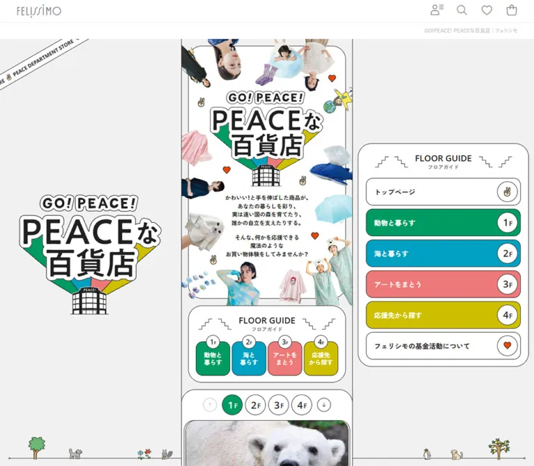
細い商品紹介カラムを中心に、切り抜き写真とイラスト、4色のフロアガイドを組み合わせた特集ページ。デスクトップの左右のブランド表示・ナビゲーションと、スマートフォンの縦長構成が特徴。
オリジナルサイトを見るGO!PEACE! / PEACEな百貨店 — Style Reference
A miniature department store built from colorful floor signs, fashion cutouts, and friendly illustrated details.
Website: GO!PEACE! PEACEな百貨店
Original URL: https://www.felissimo.co.jp/contents/gopeace/peacestore_fc.html
Final URL: https://www.felissimo.co.jp/contents/gopeace/peacestore_fc.html — unchanged; supplied HTTP status: 200.
Theme: light surfaces with four category colors and a changing illustrated desktop backdrop.
Inspected: September 12, 2026, at 06:01 JST. Supplied retrieval timestamp: 2026-09-11T21:01:15.014Z.
Viewports: desktop 1440 × 1000; mobile 390 × 844 CSS pixels. Their measured document widths were 1425px and 375px, respectively.
Scope: the current FELISSIMO editorial shopping feature: commerce header, opening collage, floor navigation, product stories, cause-based browsing, fund-report promotion, sharing controls, and commerce footer. Visual evidence comprises three desktop captures and two mobile captures. Rendered text covers the complete content sequence; detailed element measurements cover the opening and substantial portions of the product catalog.
The page presents shopping as a visit to a small, illustrated department store. Four numbered floors connect animals, the sea, art, and supported causes. Rounded white signs, thin dark outlines, circular floor badges, and bold Japanese labels make the navigation immediately recognizable. Cutout photographs of models and unusual household products surround the campaign wordmark, while tiny animals, trees, hearts, and peace-sign hands supply a playful secondary layer.
The defining desktop relationship is a 400px central story strip between broad side areas. The left side holds campaign identity; the right side holds a large floor guide. Products remain in one long sequence instead of expanding into a desktop merchandise grid. On mobile, the central experience fills the measured 375px document width and a small bottom MENU control appears. The standard FELISSIMO header and footer frame this more expressive campaign design.
How to Read This Reference
- Measured means a value appears in the supplied element rectangles, computed styles, or custom properties. No additional browsing or file inspection was performed.
- Visual estimate means a dimension or treatment was read from a supplied screenshot without a corresponding computed property.
- Declared means a source custom property exists, but its application to a particular visible element is not independently established.
- Calculated means arithmetic derived from measured values. These calculations do not establish behavior at untested widths.
- Recommended means an implementation choice for a new version, including the CSS adaptation below.
- The captures show the opening, one sea-product position, and the end of the page. They do not visually document every floor, carousel slide, or disclosure state.
- Named implementation tokens are descriptive aliases unless explicitly identified as source variables.
Tokens — Colors
Default Palette
| Name | Value | Evidence | Role |
|---|---|---|---|
| White | #ffffff |
Measured body and main backgrounds; visible panels | Poster interiors, floor-guide panels, badges, footer, and reversed labels |
| Campaign Ink | #212121 |
Measured main text and product CTA fill; source --fc-color-black |
Campaign text, dark action pills, outlines, and number stamps |
| Neutral Surround | #f1f1f1 |
Measured opening-section background; declared light-gray RGB | Neutral opening environment around the white collage poster |
| Animal Green | #009b63 |
Measured first-floor tile; source --fc-color-green |
Animal floor identification |
| Sea Blue | #00a0c1 |
Measured second-floor tile | Sea floor identification; visually consistent with the captured sea product field |
| Art Coral | #ed7978 |
Measured third-floor tile | Art floor identification |
| Cause Yellow | #cdbf00 |
Measured fourth-floor tile | Cause-based browsing identification |
| Light Blue | #63d5ec |
Source --fc-color-light-blue; visually consistent with the sea backdrop |
Lighter desktop surround during the captured sea section |
| Utility Gray | #777777 |
Measured commerce-header controls | Thin shopping, account, search, and favorite icons |
| Tagline Gray | #bbbbbb |
Measured page-title line | Quiet page identification beneath the commerce header |
The four floor colors are an information system. Preserve their order and association with floor numbers. White badges and dark outlines make the color blocks read as department-store signs rather than unrelated promotional cards.
The link containers for floor tiles and product CTAs report dark inherited text in the sampled DOM, while the screenshots visibly show white label content. Apply colors to the actual label descendants when reproducing the design; copying only the ancestor's computed color would be misleading.
Supporting Colors
| Name | Value | Evidence and limitation | Suggested use |
|---|---|---|---|
| Light Green | #47c99a |
Declared source color; its full-page application is not shown | Companion color for animal content when extending the system |
| Light Pink | #fbb0b0 |
Declared source color | Companion color for art content |
| Light Yellow | #e9df60 |
Declared source color | Companion color for cause content |
| Sharing Purple | #ac8ac6 |
Declared source color; visually consistent with the copy-link tile | Copy-link sharing action |
| LINE Green | #06c755 |
Declared as RGB 6 199 85; visually consistent with the sharing tile |
LINE sharing action |
| Heart Orange | #e94709 |
Declared source red; orange hearts are visible, but asset fills were not extracted | Small support and affection accents |
| X Black | Approximately #000000 |
Visual estimate from the sharing tile | X sharing action |
| Green Hover Candidate | #33af82 |
Source --fc-color-green-hover; no exercised hover capture |
Available source companion, not a verified hover endpoint |
Do not treat every exposed global variable as part of the campaign palette. Generic commerce values such as --success, --pink, and --skin-primary-color-1 coexist with campaign-specific values and do not explain the visible floor system.
Color Behavior
The opening and ending captures use a pale neutral surround. The middle desktop capture uses a light-blue surround with a stronger blue central product field. This establishes a section-associated change of environment. The exact scroll threshold, interpolation, and background implementation are unverified.
The navigation keeps all four category colors visible together. It is not a user-selectable theme palette. Full background states for the animal, art, and cause floors were not supplied as screenshots.
Tokens — Typography
Campaign Japanese Typography
Measured family: YakuHanJP, 'Zen Kaku Gothic New', sans-serif.
This stack appears on the campaign main element, introductory copy, product titles, floor links, and most campaign controls. Product names and opening copy use weight 700; the main inherited weight is 500. The effect is compact, friendly, and firm enough to sit beside busy cutout imagery.
Keep ordinary copy as live text. The giant outlined campaign lettering is artwork, not evidence of a particular display font. Its sampled H2 has no text content and its visible shape includes custom outlines, colored wedges, and a building illustration.
English Floor Labels
Measured family: 'Open Sans', sans-serif.
Measured weight: 600.
The labels WITH ANIMALS and WITH SEA use this stack at 14px on desktop and 13.125px in the mobile rendering. They act as small editorial identifiers above the Japanese floor presentation.
Dense Support Explanations
Measured family: YakuHanJP, 'Noto Sans JP', sans-serif.
Measured weight: 400.
The small explanations beneath 応援ポイント use a different Japanese sans-serif stack from the main campaign copy. Their desktop text boxes are only about 96–112px wide. This is a deliberate miniature information layer, although its observed mobile size is a candidate for accessibility improvement.
Commerce Shell
The surrounding commerce interface retains a separate stack based on Yu Gothic, Hiragino, Meiryo, and Noto Sans, ending in system and generic sans-serif fallbacks. The body reports 16px / 24px, weight 500.
These are reported font-family stacks. The evidence does not establish which font file supplied every glyph or whether every named fallback was loaded.
Type Scale
| Role | Desktop measurement | Mobile measurement | Weight | Notes |
|---|---|---|---|---|
| Campaign inherited body | 13px / 20.8px |
12.1875px / 19.5px |
500 |
Base text rhythm |
| Opening message | 13px / 19.5px |
12.1875px / 18.2812px |
700 |
Centered, intentionally short lines |
| Product title | 20px / 25px |
18.75px / 23.4375px |
700 |
Usually one or two lines |
| English floor identifier | 14px / 14px |
13.125px / 13.125px |
600 |
Open Sans |
| Floor introduction | 14px / 21px |
13.125px / 19.6875px |
700 |
Main explanatory paragraph |
| Support-point label | 11px / 11px |
10.3125px / 10.3125px |
700 |
Small label above dense copy |
| Support explanation | 10px / 15px |
9.375px / 14.0625px |
400 |
Noto Sans JP stack |
| Overseas banner | 20px / 24px |
13px / 15.6px |
700 |
Commerce-shell sizing, not uniform campaign scaling |
| Small page-title line | 12px / 14.4px |
11px / 13.2px |
500 |
Right aligned beneath header |
Visual estimates: the large FLOOR GUIDE label is approximately 20px; product price numerals appear around 16px; sharing headings appear around 20px. Their individual descendants were not measured. The price wrapper's reported 13px font size should not be mistaken for a measurement of every numeral or tax label within it.
Most sampled campaign text reports normal tracking. Source tracking variables of 0.02em and 0.04em exist, but their presence is not evidence that all headings use letter spacing.
Tokens — Spacing & Shapes
Base relationship: one campaign unit equals 16px on desktop and 15px in the supplied mobile rendering.
Density: compact typography and controls inside a narrow strip; expansive desktop side areas; large photo frames and generous gaps between product stories.
Responsive Unit
The supplied custom properties report:
/* Desktop values reported in the supplied evidence */
--fc-rem: 16px;
--fc-font-size-base: calc(16px * 0.8125);
--fc-border-radius-item: calc(16px * 1);
--fc-border-radius-card: calc(16px * 2);

/* Mobile values reported for a 375px document width */
--fc-rem: calc(375px / 25);
--fc-font-size-base: calc(calc(375px / 25) * 0.8125);
--fc-border-radius-item: calc(calc(375px / 25) * 1);
--fc-border-radius-card: calc(calc(375px / 25) * 2);
The mobile-to-desktop ratio is 15 / 16 = 0.9375. This explains the measured changes from 80px tiles to 75px, 48px circles to 45px, and 20px titles to 18.75px.
The browser root remains 16px; --fc-rem is a campaign custom property. Do not resize the entire commerce interface by changing the root font size.
Spacing Scale
| Use | Desktop | Mobile | Evidence |
|---|---|---|---|
| Inline tile gap | 4px |
3.75px |
Calculated from adjacent measured tile rectangles |
| Floor-number internal gap | 2px |
1.875px |
Measured |
| Hero and inline-guide side inset | 16px |
15px |
Measured section padding |
| Product information side inset | 24px |
22.5px |
Calculated from title and stream coordinates |
| Main CTA padding | 7px 7px 7px 19px |
6.5625px 6.5625px 6.5625px 17.8125px |
Measured |
| Photo-caption padding | 11px 14px 9px |
10.3125px 13.125px 8.4375px |
Measured |
| Opening paragraph separation | 14.5px |
About 13.594px |
Calculated between measured text boxes |
| Typical product-story pitch | About 608–612px |
About 570–574px |
Calculated from repeated product coordinates; content varies |
Border Radius
| Element | Desktop | Mobile | Evidence |
|---|---|---|---|
| Inline floor tile | 16px |
15px |
Measured |
| Floor section upper corners | 32px 32px 0 0 |
30px 30px 0 0 |
Measured |
| Product CTA | 32px |
30px |
Measured |
| Photo-caption upper corners | 16px 16px 0 0 |
15px 15px 0 0 |
Measured |
| Circular floor controls | 9999px |
9999px |
Measured |
| Large guide panel | Approximately 32px |
Not shown expanded | Visual estimate |
| Product photo frame | Approximately 32px |
Not visually documented mid-page | Visual estimate |
The source also declares an inner-radius token of 8px on desktop and 5.625px on mobile. Its component assignment is not established, and it does not follow the simple 0.9375 ratio.
Visible outlines are approximately 1px. Border widths were not included in the supplied computed-style fields, so this is a visual estimate. Use a crisp 1px rule as the implementation starting point.
Layout Measurements
| Element | Desktop | Mobile | Status |
|---|---|---|---|
| Document content width | 1425px |
375px |
Measured |
| Central campaign strip | 400px, starting at x = 512.5px |
375px, starting at x = 0 |
Measured |
| Space on each desktop side | 512.5px |
Absent | Calculated from document and strip widths |
| Campaign start | y = 191.390625px |
y = 158.1875px |
Measured |
| Opening section height | 623px |
656.25px |
Measured |
| Main campaign wordmark box | 266.125 × 225.25px |
249.484 × 211.172px |
Measured |
| Opening copy width | 195.5px |
About 183.172px |
Measured |
| Inline-guide section height | 196px |
183.875px |
Measured |
| Inline floor tile | 80 × 80px |
75 × 75px |
Measured |
| Floor-number navigation target | 48 × 48px |
45 × 45px |
Measured |
| Product detail CTA | 140 × 48px |
131.25 × 45.125px |
Measured |
| Large desktop guide | About 368 × 522px |
Hidden in the supplied resting capture | Visual estimate |
| Desktop guide row | About 330 × 64px |
Unverified | Visual estimate |
| Complete document height | About 17,435px |
About 16,418px |
Measured |
The opening section is taller on mobile despite the smaller campaign unit. Do not uniformly scale its height down with the other components.
Components
Overseas Shopping Banner
Role: a commerce-level route for international customers.
A white rectangular banner sits inside a red-and-blue diagonal airmail border. It combines a gray postmark-and-airplane illustration, the sentence For overseas customers please click here., and a small right chevron.
The desktop inner link measures 1154 × 84px at x = 135.5px, y = 8px; the whole band occupies about 100px of height. On mobile the inner link measures 363 × 68px with a 6px outside inset, and the band occupies 80px.
The mobile screenshot shows the postmark crowding the start of the text. This is a captured limitation, not a detail to reproduce deliberately. A new implementation should reserve a real icon column and allow wrapping when necessary.
Commerce Header and Page Identification
Role: retain the parent shopping site's identity and utility access.
The desktop header is 53px high beneath the overseas banner. Its logo sits toward the left of an approximately 1170px inner area; account, search, favorite, and shopping-bag controls sit at the right. Their measured desktop boxes are 58 × 52px.
The mobile header is 49px high. The brand is centered in the 375px document, account access moves to the left, and three shopping utilities remain on the right with 42 × 48px boxes.
Below it, a small gray page-title line is right aligned. This line is the textual page H1; the much larger campaign identity appears separately as artwork. The header is absent from the supplied middle and ending captures, so persistent header behavior should not be assumed.
Desktop Campaign Frame
Role: turn a mobile-width shopping story into a composed desktop scene.
The central strip has thin vertical boundaries. A large campaign mark occupies the left region. A rounded white floor guide occupies the right. Tiny outlined animals and plants stand along a fine horizontal ground line near the bottom of the side areas. A diagonal printed ribbon crosses the upper-left corner of the campaign environment.
The identity mark is approximately 336px wide in the screenshots. Keep it visually larger than the central poster's mark, while leaving substantial clear space around it.
The side elements remain present in the opening and middle desktop captures, then are clipped or displaced as the campaign ends above the footer. This supports a persistent side-rail presentation, but the evidence does not establish whether the implementation uses sticky positioning, fixed positioning with boundary logic, or another technique. A sticky treatment bounded by the campaign is recommended for reuse.
Opening Collage Poster
Role: explain the shopping concept through product personality and a concise message.
A white rounded poster sits inside a pale-gray section. The large outlined campaign mark occupies the center. Two compact, bold paragraphs sit beneath it. Models, clothing, a whale pouch, an umbrella, and animal-themed goods enter from the poster edges. Several photographic figures are rotated or upside down. Small illustrated hearts and peace-sign hands fill selected gaps.
The measured desktop wordmark box begins about 120.625px below the section start. On mobile, its offset is about 149.172px. Its width scales from about 266px to 249px, while the overall hero becomes taller.
Keep the collage edges lively and the central reading area quiet. Cropping at the outer edge is intentional; obscuring the explanatory copy is not. The photographic arrangement and custom wordmark carry much of the identity and cannot be replaced by a generic text heading without changing the design.
Inline Floor Guide
Role: introduce the four content routes immediately after the poster.
The panel has a white fill, thin dark outline, broad rounded corners, and a centered FLOOR GUIDE heading with a small フロアガイド subtitle. Thin stepped line ornaments flank the heading, suggesting stairs or a department-store diagram.
Four rounded square links form one row. Each contains a two-line Japanese category label, with a small white numbered circle overlapping its top edge. The measured desktop tiles are 80px square with 4px gaps. Mobile retains all four tiles in a row at 75px square with 3.75px gaps.
The targets are real same-page links:
#peacestore-floor-1—動物と暮らす.#peacestore-floor-2—海と暮らす.#peacestore-floor-3—アートをまとう.#peacestore-floor-4—応援先から探す.
Desktop Floor Guide
Role: keep direct section access available beside the long product sequence.
The large guide repeats the stair ornaments and bilingual heading, then stacks six rounded rows: campaign top, four floors, and the fund-report link. The four floor rows use their category colors with white labels. The first and last rows are white with dark labels.
A white outlined circle occupies the right end of every row. Floor rows use numbered badges; the top row uses a peace-sign hand; the fund-report row uses an orange heart. The rows are approximately 64px high with 8px gaps. Their enclosing panel is approximately 368px wide and 522px high.
Keep the full row clickable. The numbered circle is part of the row's hierarchy, not a separate competing action.
Floor Chapter Entrance
Role: identify a department and connect its products to a supported activity.
Each chapter begins with a compact row of numbered circular links and directional controls. Measured number circles are 48px on desktop and 45px on mobile; smaller directional links are 32px and 30px.
The rendered content groups an English floor identifier, Japanese title artwork, a bold introduction, and a small 応援ポイント explanation. The measured animal introduction sits toward the left with its support explanation toward the right; the sea introduction reverses that emphasis. Preserve this local asymmetry when extending the pattern.
The first two floor containers have rounded top corners. The second begins 32px before the measured bottom of the first on desktop, and 30px before it on mobile. This establishes overlapping chapter geometry; the source positioning technique was not supplied.
Product Story and Image Gallery
Role: present one item as a small editorial feature with a shopping route and a support explanation.
The repeated anatomy is:
- A large rounded photo frame, approximately
368pxsquare in the desktop sea capture, with neighboring slide edges visible within the narrow strip. - A circular dark product-number stamp near an upper corner. The visible sea example uses
04with small ring lettering. - One or two vertical white caption strips with dark outlines and rounded ends. Their placement alternates between the left and right edges across measured products.
- Optional white caption tabs attached near the bottom of individual gallery images. Measured tabs have rounded upper corners and compact padding.
- A centered row of previous/next controls and pagination dots beneath the image.
- Product name and price at the lower left; a black detail pill and small support control at the lower right.
- A thin separator with tiny endpoint marks before the next story.
Product names use 20px / 25px, weight 700, on desktop. The detail pill is 140 × 48px, with the label 詳しく見る and a small white GO! disc. The support control below it reads 応援できることは?, with a small heart and underlined label visible in the sea capture.
The DOM identifies these as different interactions: product details are links to item pages, while support explanations are buttons. No support-button result was supplied, so its contents and presentation must not be invented as an observed modal or accordion.
The catalog contains seven animal items, seven sea items, and six art items in the rendered text. Pagination counts vary by product. Repeated offscreen captions in the DOM are consistent with gallery content or duplicated slides; they should not become duplicate product entries.
Capture limitation: the whale-pouch image frame in the middle desktop screenshot is visibly empty while its slogan, gallery controls, title, price, and action remain present. The cause is not established. Do not treat an empty blue frame as the intended product image or claim the complete gallery was visually verified.
Cause-Based Browsing
Role: provide an alternative route from a desired social outcome to related products.
The fourth floor introduces the idea of finding products through a future the visitor wants to support. The rendered page includes six destination links: the zoo-and-forest fund, living-creature fund, cat fund, sea fund, UNICOLART fund, and Her smile fund.
Their existence, labels, and destinations are supported by rendered text and links. Their complete visual arrangement is not included in the supplied screenshots. When building a new interpretation, use the fourth-floor yellow and the established outline-and-badge language, but label that layout as an adaptation rather than a measured reproduction.
Fund Report and Sharing
Role: connect the product stories to broader activity and provide a closing action.
The fund-report block contains an illustrated horizontal banner in a rounded frame, followed by a compact paragraph. The page states that FELISSIMO's fund activities began in 1990. The banner and navigation link point to /gopeace/fundreport/; that destination was not separately inspected.
A thin horizontal divider introduces the sharing block. A bold centered two-line heading sits above three equal rounded tiles: black for X, green for LINE, and purple for copying the link. Each tile has a small white outlined arrow circle overlapping its top edge and a short two-line label.
The tiles are approximately 114 × 80px on desktop and 107 × 75px on mobile. Their three-column relationship is retained on the phone. The capture establishes their appearance, not successful posting, messaging, clipboard access, or confirmation feedback.
Mobile MENU Control
Role: expose campaign navigation without occupying a desktop side column.
The opening mobile capture shows a compact dark capsule near the bottom center, approximately 104 × 37px. It contains MENU between two outlined circular arrow symbols. It overlaps the transition between the opening poster and inline floor guide.
The expanded menu was not supplied. Opening direction, contents, focus behavior, and dismissal behavior are unverified. The control is absent from the mobile ending capture, so its visibility appears conditional; the exact boundary logic is unknown.
Commerce Footer
Role: return visitors to the broader store and support system.
A pale breadcrumb strip marks the end of the campaign. The footer then presents item search, support links, a return-to-top control, legal links, a black FELISSIMO logo panel, and copyright text.
On desktop, the search links form two columns and the support links form four columns inside a wide centered area. On mobile, both groups use two columns, with the support group continuing onto a second row. Fine gray dividers and vertical separators organize the links. The mobile return-to-top control occupies its own pale full-width band.
This footer uses restrained commerce typography and spacing. Keep its visual reset after the colorful campaign, rather than extending illustrated backgrounds through every utility link.
Tokens — Motion & Interaction
| Element or behavior | Supplied evidence | What is established |
|---|---|---|
| Inline floor tiles | transition: background 0.42s |
A 420ms background transition is defined |
| Numbered floor links | transition: color 0.3s, background-color 0.3s |
300ms color transitions are defined |
| Smaller floor-direction links | transition: color 0.42s, background-color 0.42s |
420ms color transitions are defined |
| Product detail pills | transition: background 0.42s, border-color 0.42s |
Fill and border transitions are defined |
| Support explanation buttons | transition: color 0.42s |
A text-color transition is defined |
| Floor navigation | Same-page fragment URLs | Destinations exist; smooth-scrolling duration and focus changes are unverified |
| Product galleries | Arrow buttons, pagination buttons, neighboring frames | Gallery affordances exist; autoplay, swipe, looping, and transition timing are unverified |
| Desktop background change | Neutral opening and ending; blue sea capture | Different section-associated visual states exist; interpolation is unverified |
| Desktop side rails | Present across separated scroll captures; bounded near the ending | Persistent presentation is visible; exact positioning implementation is unverified |
| Mobile menu | Closed capsule visible in the opening capture | Trigger appearance only; expanded interaction is unverified |
| Sharing controls | Three visible sharing actions | Labels and styling only; resulting actions were not exercised |
The source declares --fc-hover-ease: ease and a library of power, back, circular, and exponential easing curves. Their availability does not prove that specific hero elements bounce, rotate, or animate on scroll.
Sampled elements generally report animation: none. That does not exclude JavaScript animation, animated assets, SVG behavior, or pseudo-element motion outside the sampled fields. No frame-by-frame motion recording or exercised hover sequence was supplied.
For reuse, retain the measured 300ms and 420ms color-transition rhythm. Introduce movement only for a functional reason, and identify any new animation as a recommendation.
Surfaces
| Layer | Appearance | Purpose |
|---|---|---|
| Commerce shell | White with thin gray rules and subdued icons | Familiar shopping utilities |
| Campaign surround | Neutral at the opening and ending; light blue in the sea capture | A spacious illustrated environment |
| Central poster | White, rounded, thin dark outline | A quiet reading area within the collage |
| Product field | Saturated blue in the supplied sea capture | Continuous floor identity behind product stories |
| Floor-guide panel | White rounded enclosure | Keeps all navigation colors legible together |
| Floor tile or row | Category fill, dark outline, white label | Fast category recognition |
| Badge | White circle with thin dark outline and dark content | Floor numbers and action symbols |
| Product action | Dark pill with white label and white circular end mark | Strong shopping route |
| Sharing block | White section with three branded color tiles | Clear closing actions |
| Footer | White and very pale gray with simple separators | Broad navigation and support |
There is no visible general shadow-elevation system. Depth comes from overlapping photographs, caption strips, floating badges, and crisp outlines. The supplied element samples do not enumerate every box-shadow declaration, so this is a visual observation rather than a complete stylesheet audit.
Imagery
The page combines two distinct image languages. Photography gives products material detail and human scale. Illustration gives the campaign a small, welcoming world. Preserve their difference: photographic cutouts should remain photographic, and the little animals and symbols should retain their irregular outlined character.
The opening collage uses isolated objects and people, sometimes rotated, cropped by the outer boundary, or entering from unexpected directions. The central wordmark remains the largest and most stable shape. Small hearts and hand signs punctuate gaps without competing with it.
Product galleries use more conventional photographic frames, including clothing on models and object views. Vertical slogans and number stamps sit over or beside the image. Crop each image deliberately; the hero cutouts should not inherit the same object-fit: cover behavior as a gallery photograph.
The desktop ground-line illustrations include trees, a cat, flowers, a small fish, a squirrel-like animal, a monkey-like figure, a penguin, and a dog. Their small scale is essential. Enlarging them into dominant mascots would change the balance of the page.
Observed Asset References
No image src values, background-image URLs, or asset filenames were included in the supplied evidence. The following is a visual inventory, not a list of downloadable files.
| Asset group | Evidence | Reuse guidance |
|---|---|---|
| Campaign wordmark and building | Desktop side identity and desktop/mobile poster | Use authorized original artwork; do not infer a font from its lettering |
| Model and product cutouts | Opening desktop and mobile captures | Preserve transparency, individual rotation, and edge cropping |
| Peace signs, hearts, and globe | Opening poster and navigation details | Keep dark outlines and small, irregular shapes |
| Ground-line animals and plants | Desktop opening, middle, and ending captures | Treat as secondary decoration, with empty alternative text when appropriate |
| Rounded product photography | Sea capture and gallery-related DOM content | Maintain image proportions and inspect each crop |
| Fund-report banner | Desktop ending capture, partly visible | Retain its illustrated editorial character |
| Commerce logo and utility icons | Both viewport families | Keep the parent store's separate visual system |
Image licensing, native dimensions, file formats, and complete alternative-text coverage were not established. The CSS shell cannot substitute for the campaign artwork.
Layout & Responsive Behavior
Desktop Composition
The measured 1425px document contains a centered 400px strip and 512.5px on each side. This relationship explains the page's unusually narrow central presentation in a large viewport. The side areas are part of the composition, not unused space awaiting extra product columns.
The central story stays vertical for the entire catalog. Product names and actions share one row beneath each gallery, but products themselves do not form a desktop grid. The full document is approximately 17,435px tall, making repeated floor navigation a significant usability feature.
The background and side illustrations belong to the campaign region. The ending capture shows the ordinary commerce footer below their boundary. A new implementation should constrain persistent campaign elements so they cannot cover that footer.
Mobile Composition
The 390px capture has a measured 375px document width. The 15px difference is consistent with the capture environment's scrollbar allocation. It is not evidence that the design intentionally reserves a permanent right gutter. Use the available content width rather than hardcoding a 15px subtraction.
The main strip fills that available width. Most campaign dimensions scale by 0.9375, including tiles, circles, product titles, and detail actions. The compact inline floor guide remains four columns. Product information and the detail CTA remain side by side in the measured mobile DOM.
The large desktop identity and side guide are absent from the mobile opening capture. The small bottom MENU capsule provides an alternative entry point. The commerce header rearranges its controls, and the footer reduces its support-link grid from four columns to two.
Hero Exception
The desktop opening section is 623px high; the mobile section is 656.25px high. Its start moves from about 191px to 158px, while the inline guide begins at approximately 814px in both captures. The wordmark also has a larger offset within the mobile section.
This is evidence of a separate opening layout adjustment, not a single uniform scaling transform. The source property --fc-first-view-height reports 1000px in both snapshots, including the 844px-high mobile viewport. Do not assume that this property equals the current viewport height or copy it as a universal 100vh rule.
Breakpoint Limits
Declared campaign breakpoints include 320px, 1024px, 1440px, and 1680px. Other generic breakpoint variables also coexist in the page. The actual media-query rules were not supplied, so the precise side-rail switch cannot be proven from those variable names alone.
Using 1024px as the desktop-rail threshold is a reasonable implementation recommendation. Tablet, landscape-phone, zoomed-text, and extra-wide states still need separate validation.
Do’s and Don’ts
Do
- Preserve the narrow central strip and use desktop side space for identity, guidance, and small illustrations.
- Keep floor numbers, category labels, and the four colors connected consistently.
- Use white rounded panels, thin dark outlines, and overlapping circular badges.
- Retain the campaign's measured Japanese font stacks and compact bold product titles when available.
- Separate custom wordmark artwork from live explanatory and product text.
- Mix photographic cutouts with small outlined illustrations without flattening them into one visual treatment.
- Give every product its own image story, title, price, detail route, and support explanation entry point.
- Preserve the four-column inline guide and three-column sharing row on the inspected phone width.
- Keep repeated floor navigation available throughout the long catalog.
- End the campaign cleanly before the parent store's footer.
Don’t
- Don’t widen the catalog into a multi-column product grid just because the viewport is large.
- Don’t replace the opening collage with a generic full-width photograph or text-only marketing headline.
- Don’t use one CTA color for every floor and discard the numbered department-store metaphor.
- Don’t add glossy gradients, soft card shadows, or blurred glass surfaces to the campaign panels.
- Don’t assume all text uses the body font or that artwork lettering identifies a downloadable font.
- Don’t scale the commerce shell by changing the document root to the campaign unit.
- Don’t reproduce the blank whale-image capture as intentional imagery.
- Don’t treat offscreen repeated gallery captions as duplicate products.
- Don’t claim autoplay, parallax, smooth scrolling, or menu animation without further evidence.
- Don’t preserve tiny text or crowded mobile banner content at the expense of readability in a new implementation.
Recommended Implementation Additions
These are recommendations, not verified features of the original page:
- Keep native fragment links for floor navigation, with sensible
scroll-margin-topand a visible keyboard focus state. - If active-floor highlighting is added, retain floor numbers and text so color is not the only signal.
- Increase the effective target size of gallery arrows, dots, and support buttons to approximately
44px, while keeping their visible symbols compact. - Reassess the observed
9.375pxmobile support explanations. A new layout may need wider text areas and14–16pxexplanatory text rather than simply increasing the font inside the same tiny box. - Check white labels on the blue, coral, and especially yellow fills. Use darker text or an inset white label where necessary to meet the chosen contrast target.
- Give the mobile menu an accessible name, expanded state, keyboard behavior, and an explicit close action. If implemented as a modal panel, manage focus and restore it on dismissal.
- Add gallery slide labels, keyboard controls, and useful image alternatives. Do not duplicate cloned slides in the accessibility tree.
- Reserve image dimensions and handle failed images with a useful fallback instead of leaving an unexplained empty colored frame.
- Announce successful copy-link actions without stealing focus. Keep sharing labels explicit about their destination.
- Hide purely decorative collage pieces and ground-line illustrations from assistive technology, while preserving useful product descriptions.
- Respect reduced-motion preferences for any added scrolling, carousel movement, or decorative animation.
- Validate sticky boundaries, footer access, safe areas, and increased text size at widths between the two inspected viewports.
Agent Prompt Guide
Quick Color Reference
- Poster and navigation surfaces:
#ffffff. - Campaign text, outlines, and detail pills:
#212121. - Neutral opening surround:
#f1f1f1. - Floor 1:
#009b63. - Floor 2:
#00a0c1. - Floor 3:
#ed7978. - Floor 4:
#cdbf00. - Sea surround reference: declared
#63d5ec, visually consistent with the capture. - Sharing companions:
#06c755and#ac8ac6. - No general card shadow; use thin outlines and overlapping circles.
Overall Prompt
“Create an editorial shopping feature organized as a miniature four-floor department store. Center a 400px story strip on desktop, with a large campaign identity on the left and a rounded white floor guide on the right. Use white surfaces, pale gray surroundings, dark #212121 outlines, and floor colors #009b63, #00a0c1, #ed7978, and #cdbf00. Build an opening poster from authorized model and product cutouts around a custom campaign mark, with compact centered Japanese copy and small illustrated hearts and peace signs. Present products one at a time with rounded photo galleries, vertical white slogans, number stamps, bold names, prices, and black detail pills. On mobile, fill the available width, retain the compact four-tile guide, and provide a small bottom menu entry point. Keep the standard commerce footer visually separate. Treat expanded menus, gallery behavior, and scroll effects as implementation choices requiring validation.”
Example Component Prompts
- Inline floor guide: “Design a white panel with a thin dark outline and 32px corners. Center FLOOR GUIDE above a small subtitle, with delicate stair-step ornaments on both sides. Add four 80px rounded square category links separated by 4px. Use green, blue, coral, and yellow fills, short two-line labels, and small white numbered circles overlapping the top edges.”
- Desktop navigation: “Create a roughly 368px-wide white department-store guide with six stacked 64px rows. The middle four rows use category colors. Place a 48px white outlined badge at each row’s right edge. Use clear bold labels, an 8px row gap, thin outlines, and no shadow.”
- Opening poster: “Arrange photographic cutouts around a quiet central campaign mark and two short bold paragraphs. Let selected figures enter upside down or cross the poster edge. Add tiny outlined hearts and peace signs. Keep the poster white inside a pale-gray surround and protect the text from collage overlap.”
- Product story: “Build a narrow editorial product module with a rounded square gallery, a dark circular item number, and white vertical caption strips along one edge. Beneath the gallery, center small arrow and dot controls. Align the bold product name and price left, and a dark 140-by-48px detail pill right, followed by a small heart-led support action.”
- Sharing block: “Use a white closing section with a thin top rule, a bold centered two-line heading, and three equal rounded tiles for X, LINE, and copying a link. Use black, green, and muted purple. Overlap each tile’s top edge with a small white circular arrow badge. Keep all three tiles on one row at phone width.”
- Responsive adaptation: “Preserve one product column across viewport sizes. Scale campaign units from 16px at a 400px strip to 15px at a 375px strip, but give the phone opening poster a separately tuned taller layout. Remove desktop side rails on small screens and keep the mobile menu from covering the closing commerce footer.”
Quick Start
CSS Custom Properties
This is an implementation adaptation, not the original stylesheet. It preserves the measured strip width, campaign-unit relationship, floor colors, and principal component proportions. The 1024px rail breakpoint, sticky implementation, hover endpoints, and container-query sizing are recommendations.
Expected structure: .peace-stage > .peace-layout, containing .identity-rail, .peace-stream, and .guide-rail. Place .peace-content inside .peace-stream; it receives a unit based on the stream's actual width. Use the original fragment IDs for the four floor sections. A .floor-tile contains .floor-badge and .floor-label; a .detail-link contains its text and .go-disc.
Authorized images must be supplied separately. The gallery controls, menu opening, active-floor updates, and sharing actions require application behavior. The CSS does not fabricate those interactions.
:root {
  /* Measured colors and declared supporting colors */
  --peace-paper: #ffffff;
  --peace-ink: #212121;
  --peace-neutral: #f1f1f1;
  --peace-animal: #009b63;
  --peace-sea: #00a0c1;
  --peace-art: #ed7978;
  --peace-cause: #cdbf00;
  --peace-sky: #63d5ec;
  --peace-purple: #ac8ac6;
  --peace-line: #06c755;
  --peace-muted: #808080;

  /* Reported campaign font stacks */
  --peace-font: YakuHanJP, 'Zen Kaku Gothic New', sans-serif;
  --peace-font-latin: 'Open Sans', sans-serif;
  --peace-font-note: YakuHanJP, 'Noto Sans JP', sans-serif;

  /* Preserve the document's normal root font size */
  --peace-u: 16px;
  --peace-stream-width: 400px;
  --peace-rule: 1px;
  --peace-duration: 420ms;
  --peace-duration-short: 300ms;
}

.peace-stage,
.peace-stage *,
.peace-stage *::before,
.peace-stage *::after {
  box-sizing: border-box;
}

.peace-stage {
  color: var(--peace-ink);
  background: var(--peace-neutral);
  font-family: var(--peace-font);
  font-weight: 500;
}

/* Application code may set this state as the sea floor is reached. */
.peace-stage[data-current-floor='2'] {
  background: var(--peace-sky);
}

.peace-layout {
  display: block;
}

.peace-stream {
  position: relative;
  width: min(100%, var(--peace-stream-width));
  margin-inline: auto;
  container-type: inline-size;
}

.peace-content {
  /* 400px container -> 16px; 375px container -> 15px. */
  --peace-u: min(16px, 4cqi);
  font-size: calc(0.8125 * var(--peace-u));
  line-height: 1.6;
}

.identity-rail,
.guide-rail {
  display: none;
  min-width: 0;
}

/* Opening proportions are tuned separately on small screens. */
.peace-hero {
  position: relative;
  isolation: isolate;
  min-height: calc(43.75 * var(--peace-u));
  padding: calc(9.945 * var(--peace-u)) var(--peace-u)
    var(--peace-u);
  background: var(--peace-neutral);
}

.peace-hero::before {
  content: '';
  position: absolute;
  inset: var(--peace-u);
  z-index: -1;
  border: var(--peace-rule) solid var(--peace-ink);
  border-radius: calc(2 * var(--peace-u));
  background: var(--peace-paper);
}

.hero-wordmark {
  display: block;
  width: calc(16.6328 * var(--peace-u));
  max-width: 100%;
  aspect-ratio: 266.125 / 225.25;
  margin-inline: auto;
  object-fit: contain;
}

.hero-message {
  width: min(100%, calc(12.22 * var(--peace-u)));
  margin: calc(0.9 * var(--peace-u)) auto 0;
  font-weight: 700;
  line-height: 1.5;
  text-align: center;
}

.hero-message p {
  margin: 0;
}

.hero-message p + p {
  margin-top: calc(0.90625 * var(--peace-u));
}

/* Position each authorized cutout individually. */
.hero-cutout {
  position: absolute;
  pointer-events: none;
  object-fit: contain;
}

.floor-guide {
  margin: 0 var(--peace-u) var(--peace-u);
  padding: calc(1.5 * var(--peace-u)) var(--peace-u)
    var(--peace-u);
  border: var(--peace-rule) solid var(--peace-ink);
  border-radius: calc(2 * var(--peace-u));
  background: var(--peace-paper);
}

.floor-guide-title {
  display: flex;
  flex-direction: column;
  align-items: center;
  gap: calc(0.25 * var(--peace-u));
  margin: 0;
  font-size: calc(1.25 * var(--peace-u));
  font-weight: 700;
  line-height: 1;
}

.floor-guide-title small {
  color: var(--peace-muted);
  font-size: calc(0.75 * var(--peace-u));
}

.floor-tiles {
  display: flex;
  justify-content: center;
  gap: calc(0.25 * var(--peace-u));
  margin-top: calc(1.5 * var(--peace-u));
}

[data-floor='1'] { --floor-color: var(--peace-animal); }
[data-floor='2'] { --floor-color: var(--peace-sea); }
[data-floor='3'] { --floor-color: var(--peace-art); }
[data-floor='4'] { --floor-color: var(--peace-cause); }

.floor-tile {
  position: relative;
  display: flex;
  align-items: center;
  justify-content: center;
  flex: 0 0 calc(5 * var(--peace-u));
  min-height: calc(5 * var(--peace-u));
  padding: calc(0.75 * var(--peace-u))
    calc(0.25 * var(--peace-u));
  border: var(--peace-rule) solid var(--peace-ink);
  border-radius: var(--peace-u);
  color: var(--peace-paper);
  background: var(--floor-color);
  font-weight: 700;
  line-height: 1.2;
  text-align: center;
  text-decoration: none;
  transition: background var(--peace-duration) ease;
}

.floor-badge {
  display: inline-flex;
  align-items: center;
  justify-content: center;
  flex: none;
  width: calc(3 * var(--peace-u));
  height: calc(3 * var(--peace-u));
  border: var(--peace-rule) solid var(--peace-ink);
  border-radius: 50%;
  color: var(--peace-ink);
  background: var(--peace-paper);
  font-weight: 700;
  line-height: 1;
}

.floor-tile .floor-badge {
  position: absolute;
  top: calc(-1 * var(--peace-u));
  left: 50%;
  width: calc(2 * var(--peace-u));
  height: calc(2 * var(--peace-u));
  transform: translateX(-50%);
}

/* Applying floor colors to every chapter is an adaptation. */
.peace-floor {
  position: relative;
  padding-block: calc(0.75 * var(--peace-u))
    calc(2 * var(--peace-u));
  border-radius: calc(2 * var(--peace-u))
    calc(2 * var(--peace-u)) 0 0;
  color: var(--peace-paper);
  background: var(--floor-color);
  scroll-margin-top: 24px;
}

.floor-kicker {
  font-family: var(--peace-font-latin);
  font-size: calc(0.875 * var(--peace-u));
  font-weight: 600;
  line-height: 1;
}

.product-story {
  position: relative;
  padding-block: calc(3.75 * var(--peace-u));
}

.product-media {
  margin-inline: var(--peace-u);
  aspect-ratio: 1;
  overflow: hidden;
  border: var(--peace-rule) solid var(--peace-ink);
  border-radius: calc(2 * var(--peace-u));
}

.product-media img {
  display: block;
  width: 100%;
  height: 100%;
  object-fit: cover;
}

.product-slogan {
  position: absolute;
  top: calc(2.25 * var(--peace-u));
  left: 0;
  display: flex;
  flex-direction: row-reverse;
  margin: 0;
}

.product-story.is-reversed .product-slogan {
  right: 0;
  left: auto;
}

.product-slogan span {
  padding: calc(0.5 * var(--peace-u))
    calc(0.375 * var(--peace-u));
  border: var(--peace-rule) solid var(--peace-ink);
  border-radius: 9999px;
  color: var(--peace-ink);
  background: var(--peace-paper);
  font-size: calc(1.125 * var(--peace-u));
  font-weight: 700;
  line-height: 1.15;
  writing-mode: vertical-rl;
}

.gallery-controls {
  display: flex;
  align-items: center;
  justify-content: center;
  margin-block: calc(0.5 * var(--peace-u));
  color: var(--peace-ink);
}

/* Larger targets are recommended additions to the observed controls. */
.gallery-controls button {
  display: grid;
  place-items: center;
  min-width: 44px;
  min-height: 44px;
  padding: 0;
  border: 0;
  color: inherit;
  background: transparent;
  font: inherit;
  cursor: pointer;
}

.gallery-dot::before {
  content: '';
  width: 5px;
  height: 5px;
  border: 1px solid currentColor;
  border-radius: 50%;
  background: var(--peace-paper);
}

.gallery-dot[aria-current='true']::before {
  background: currentColor;
}

.product-meta {
  display: grid;
  grid-template-columns: minmax(0, 1fr)
    calc(8.75 * var(--peace-u));
  align-items: start;
  gap: calc(0.75 * var(--peace-u));
  padding-inline: calc(1.5 * var(--peace-u));
}

.product-title {
  margin: 0;
  font-size: calc(1.25 * var(--peace-u));
  font-weight: 700;
  line-height: 1.25;
}

.product-price {
  margin: calc(0.5 * var(--peace-u)) 0 0;
  font-size: var(--peace-u);
  font-weight: 700;
  line-height: 1;
}

.detail-link {
  display: flex;
  align-items: center;
  justify-content: space-between;
  min-height: calc(3 * var(--peace-u));
  padding: calc(0.4375 * var(--peace-u))
    calc(0.4375 * var(--peace-u))
    calc(0.4375 * var(--peace-u))
    calc(1.1875 * var(--peace-u));
  border: var(--peace-rule) solid var(--peace-paper);
  border-radius: calc(2 * var(--peace-u));
  color: var(--peace-paper);
  background: var(--peace-ink);
  font-weight: 700;
  text-decoration: none;
  transition: background var(--peace-duration) ease,
    border-color var(--peace-duration) ease;
}

.go-disc {
  display: grid;
  place-items: center;
  flex: none;
  width: calc(2 * var(--peace-u));
  height: calc(2 * var(--peace-u));
  border-radius: 50%;
  color: var(--peace-ink);
  background: var(--peace-paper);
}

.support-link {
  display: flex;
  align-items: center;
  justify-content: center;
  gap: calc(0.25 * var(--peace-u));
  width: 100%;
  min-height: 44px;
  padding: 0;
  border: 0;
  color: inherit;
  background: transparent;
  font: inherit;
  font-size: max(12px, calc(0.6875 * var(--peace-u)));
  text-decoration: underline;
  text-underline-offset: 2px;
  cursor: pointer;
}

.share-panel {
  padding: calc(2.25 * var(--peace-u))
    calc(1.5 * var(--peace-u));
  border-top: var(--peace-rule) solid var(--peace-ink);
  color: var(--peace-ink);
  background: var(--peace-paper);
  text-align: center;
}

.share-title {
  margin: 0 0 calc(1.5 * var(--peace-u));
  font-size: calc(1.25 * var(--peace-u));
  font-weight: 700;
  line-height: 1.25;
}

.share-actions {
  display: grid;
  grid-template-columns: repeat(3, minmax(0, 1fr));
  gap: calc(0.25 * var(--peace-u));
}

.share-action {
  position: relative;
  display: grid;
  place-items: center;
  min-height: calc(5 * var(--peace-u));
  padding: var(--peace-u) calc(0.5 * var(--peace-u));
  border: var(--peace-rule) solid var(--peace-ink);
  border-radius: var(--peace-u);
  color: var(--peace-paper);
  background: var(--peace-ink);
  font: inherit;
  font-weight: 700;
  line-height: 1.2;
  text-decoration: none;
  cursor: pointer;
}

.share-action[data-service='x'] { background: #000000; }
.share-action[data-service='line'] { background: var(--peace-line); }
.share-action[data-service='copy'] { background: var(--peace-purple); }

.share-arrow {
  position: absolute;
  top: calc(-1 * var(--peace-u));
  left: 50%;
  display: grid;
  place-items: center;
  width: calc(2 * var(--peace-u));
  height: calc(2 * var(--peace-u));
  transform: translateX(-50%);
  border: var(--peace-rule) solid var(--peace-ink);
  border-radius: 50%;
  color: var(--peace-ink);
  background: var(--peace-paper);
}

/* Place this outside the container-query stream. */
.mobile-floor-menu {
  position: fixed;
  left: 50%;
  bottom: max(12px, env(safe-area-inset-bottom, 0px));
  z-index: 20;
  display: flex;
  align-items: center;
  justify-content: center;
  gap: 8px;
  min-width: 104px;
  min-height: 44px;
  padding: 6px 8px;
  transform: translateX(-50%);
  border: 1px solid var(--peace-paper);
  border-radius: 9999px;
  color: var(--peace-paper);
  background: var(--peace-ink);
  font: 700 10px / 1 var(--peace-font);
}

.mobile-floor-menu[hidden] {
  display: none;
}

@media (min-width: 1024px) {
  .peace-layout {
    display: grid;
    grid-template-columns: minmax(0, 1fr) 400px minmax(0, 1fr);
    align-items: stretch;
  }

  .identity-rail,
  .guide-rail {
    display: block;
  }

  .rail-inner {
    position: sticky;
    top: 24px;
    display: grid;
    place-items: center;
    min-height: calc(100dvh - 48px);
    padding: 24px 16px;
  }

  .identity-art {
    display: block;
    width: min(100%, 336px);
    height: auto;
  }

  .peace-stream::after {
    content: '';
    position: absolute;
    inset: 0;
    z-index: 5;
    border-inline: var(--peace-rule) solid var(--peace-ink);
    pointer-events: none;
  }

  .peace-hero {
    min-height: calc(38.9375 * var(--peace-u));
    padding-top: calc(7.54 * var(--peace-u));
  }

  .guide-rail .floor-guide {
    width: min(100%, 368px);
    margin: 0;
    padding: 24px 18px 16px;
  }

  .floor-links {
    display: grid;
    gap: 8px;
    margin-top: 24px;
  }

  .floor-link {
    display: flex;
    align-items: center;
    justify-content: space-between;
    gap: 8px;
    min-height: 64px;
    padding: 7px 7px 7px 18px;
    border: 1px solid var(--peace-ink);
    border-radius: 16px;
    color: var(--peace-paper);
    background: var(--floor-color, var(--peace-paper));
    font-weight: 700;
    text-decoration: none;
  }

  .floor-link.is-neutral {
    color: var(--peace-ink);
    background: var(--peace-paper);
  }

  .mobile-floor-menu {
    display: none;
  }
}

/* Hover endpoints below are recommendations, not verified states. */
@media (hover: hover) {
  .floor-tile:hover {
    background: var(--peace-ink);
  }

  .detail-link:hover {
    background: #444444;
  }
}

.peace-stage :focus-visible {
  outline: 2px solid var(--peace-ink);
  outline-offset: 3px;
}

@media (prefers-reduced-motion: reduce) {
  .peace-stage *,
  .peace-stage *::before,
  .peace-stage *::after {
    scroll-behavior: auto !important;
    transition: none !important;
    animation: none !important;
  }
}
The larger gallery, support, and mobile-menu targets intentionally differ from the observed compact controls. The desktop rail positioning is a bounded sticky approximation; it does not reproduce the original's unverified opening alignment logic. The implementation must also control menu visibility near the footer and supply any decorative stair ornaments, ground-line artwork, or gallery peeking behavior.
Tailwind v4 Token Mapping
Optional aliases for a project already using Tailwind v4. This is not evidence that the original page uses Tailwind. Define the CSS properties above first; the spacing unit resolves within the campaign component scope.
@theme inline {
  --color-peace-paper: var(--peace-paper);
  --color-peace-ink: var(--peace-ink);
  --color-peace-neutral: var(--peace-neutral);
  --color-peace-animal: var(--peace-animal);
  --color-peace-sea: var(--peace-sea);
  --color-peace-art: var(--peace-art);
  --color-peace-cause: var(--peace-cause);
  --color-peace-sky: var(--peace-sky);
  --color-peace-purple: var(--peace-purple);

  --font-peace: var(--peace-font);
  --font-peace-latin: var(--peace-font-latin);
  --font-peace-note: var(--peace-font-note);

  --spacing-peace-unit: var(--peace-u);
  --text-peace-body: calc(0.8125 * var(--peace-u));
  --text-peace-product: calc(1.25 * var(--peace-u));
  --radius-peace-item: var(--peace-u);
  --radius-peace-panel: calc(2 * var(--peace-u));
}
Sources & Evidence
- Inspected original and final page: GO!PEACE! PEACEな百貨店 — FELISSIMO. The supplied final URL is identical to the original URL and reports HTTP
200. - Capture timestamp:
2026-09-11T21:01:15.014Z, equivalent to September 12, 2026, 06:01:15 JST. - Desktop evidence:
1440 × 1000viewport; opening, sea-product, and ending screenshots; measured document width1425px; document height approximately17,435px. - Mobile evidence:
390 × 844viewport; opening and ending screenshots; measured document width375px; document height approximately16,418px. - Rendered evidence: page text, link destinations, selected element rectangles, computed font stacks, font sizes, line heights, colors, padding, radii, transitions, and campaign custom properties. The full stylesheet, image source URLs, and JavaScript implementation were not supplied.
- Observed interaction scope: scrolling was used by the supplied inspection to obtain separated page positions. Click outcomes for galleries, support explanations, sharing, commerce utilities, and the mobile menu were not documented. Linked product and fund-report pages were not separately inspected.
- Readiness limits: the supplied inspection observed the initial page for at least five seconds and performed bounded layout, animation, and image-readiness checks. These checks do not establish that every delayed asset or interaction completed. The empty whale-product frame remains a visible limitation.
This reference describes the current page represented by the supplied captures and rendered evidence. Intermediate responsive states, exact sticky behavior, complete animation behavior, and expanded controls remain unverified; the reusable CSS and accessibility additions are explicitly identified as adaptations.
# GO!PEACE! / PEACEな百貨店 — Style Reference

> A miniature department store built from colorful floor signs, fashion cutouts, and friendly illustrated details.

**Website:** [GO!PEACE! PEACEな百貨店](https://www.felissimo.co.jp/contents/gopeace/peacestore_fc.html)
**Original URL:** https://www.felissimo.co.jp/contents/gopeace/peacestore_fc.html
**Final URL:** https://www.felissimo.co.jp/contents/gopeace/peacestore_fc.html — unchanged; supplied HTTP status: `200`.
**Theme:** light surfaces with four category colors and a changing illustrated desktop backdrop.
**Inspected:** September 12, 2026, at 06:01 JST. Supplied retrieval timestamp: `2026-09-11T21:01:15.014Z`.
**Viewports:** desktop `1440 × 1000`; mobile `390 × 844` CSS pixels. Their measured document widths were `1425px` and `375px`, respectively.
**Scope:** the current FELISSIMO editorial shopping feature: commerce header, opening collage, floor navigation, product stories, cause-based browsing, fund-report promotion, sharing controls, and commerce footer. Visual evidence comprises three desktop captures and two mobile captures. Rendered text covers the complete content sequence; detailed element measurements cover the opening and substantial portions of the product catalog.

The page presents shopping as a visit to a small, illustrated department store. Four numbered floors connect animals, the sea, art, and supported causes. Rounded white signs, thin dark outlines, circular floor badges, and bold Japanese labels make the navigation immediately recognizable. Cutout photographs of models and unusual household products surround the campaign wordmark, while tiny animals, trees, hearts, and peace-sign hands supply a playful secondary layer.

The defining desktop relationship is a `400px` central story strip between broad side areas. The left side holds campaign identity; the right side holds a large floor guide. Products remain in one long sequence instead of expanding into a desktop merchandise grid. On mobile, the central experience fills the measured `375px` document width and a small bottom `MENU` control appears. The standard FELISSIMO header and footer frame this more expressive campaign design.

## How to Read This Reference

- **Measured** means a value appears in the supplied element rectangles, computed styles, or custom properties. No additional browsing or file inspection was performed.
- **Visual estimate** means a dimension or treatment was read from a supplied screenshot without a corresponding computed property.
- **Declared** means a source custom property exists, but its application to a particular visible element is not independently established.
- **Calculated** means arithmetic derived from measured values. These calculations do not establish behavior at untested widths.
- **Recommended** means an implementation choice for a new version, including the CSS adaptation below.
- The captures show the opening, one sea-product position, and the end of the page. They do not visually document every floor, carousel slide, or disclosure state.
- Named implementation tokens are descriptive aliases unless explicitly identified as source variables.

## Tokens — Colors

### Default Palette

| Name | Value | Evidence | Role |
| --- | --- | --- | --- |
| White | `#ffffff` | Measured body and main backgrounds; visible panels | Poster interiors, floor-guide panels, badges, footer, and reversed labels |
| Campaign Ink | `#212121` | Measured main text and product CTA fill; source `--fc-color-black` | Campaign text, dark action pills, outlines, and number stamps |
| Neutral Surround | `#f1f1f1` | Measured opening-section background; declared light-gray RGB | Neutral opening environment around the white collage poster |
| Animal Green | `#009b63` | Measured first-floor tile; source `--fc-color-green` | Animal floor identification |
| Sea Blue | `#00a0c1` | Measured second-floor tile | Sea floor identification; visually consistent with the captured sea product field |
| Art Coral | `#ed7978` | Measured third-floor tile | Art floor identification |
| Cause Yellow | `#cdbf00` | Measured fourth-floor tile | Cause-based browsing identification |
| Light Blue | `#63d5ec` | Source `--fc-color-light-blue`; visually consistent with the sea backdrop | Lighter desktop surround during the captured sea section |
| Utility Gray | `#777777` | Measured commerce-header controls | Thin shopping, account, search, and favorite icons |
| Tagline Gray | `#bbbbbb` | Measured page-title line | Quiet page identification beneath the commerce header |

The four floor colors are an information system. Preserve their order and association with floor numbers. White badges and dark outlines make the color blocks read as department-store signs rather than unrelated promotional cards.

The link containers for floor tiles and product CTAs report dark inherited text in the sampled DOM, while the screenshots visibly show white label content. Apply colors to the actual label descendants when reproducing the design; copying only the ancestor's computed `color` would be misleading.

### Supporting Colors

| Name | Value | Evidence and limitation | Suggested use |
| --- | --- | --- | --- |
| Light Green | `#47c99a` | Declared source color; its full-page application is not shown | Companion color for animal content when extending the system |
| Light Pink | `#fbb0b0` | Declared source color | Companion color for art content |
| Light Yellow | `#e9df60` | Declared source color | Companion color for cause content |
| Sharing Purple | `#ac8ac6` | Declared source color; visually consistent with the copy-link tile | Copy-link sharing action |
| LINE Green | `#06c755` | Declared as RGB `6 199 85`; visually consistent with the sharing tile | LINE sharing action |
| Heart Orange | `#e94709` | Declared source red; orange hearts are visible, but asset fills were not extracted | Small support and affection accents |
| X Black | Approximately `#000000` | Visual estimate from the sharing tile | X sharing action |
| Green Hover Candidate | `#33af82` | Source `--fc-color-green-hover`; no exercised hover capture | Available source companion, not a verified hover endpoint |

Do not treat every exposed global variable as part of the campaign palette. Generic commerce values such as `--success`, `--pink`, and `--skin-primary-color-1` coexist with campaign-specific values and do not explain the visible floor system.

### Color Behavior

The opening and ending captures use a pale neutral surround. The middle desktop capture uses a light-blue surround with a stronger blue central product field. This establishes a section-associated change of environment. The exact scroll threshold, interpolation, and background implementation are unverified.

The navigation keeps all four category colors visible together. It is not a user-selectable theme palette. Full background states for the animal, art, and cause floors were not supplied as screenshots.

## Tokens — Typography

### Campaign Japanese Typography

**Measured family:** `YakuHanJP, 'Zen Kaku Gothic New', sans-serif`.

This stack appears on the campaign main element, introductory copy, product titles, floor links, and most campaign controls. Product names and opening copy use weight `700`; the main inherited weight is `500`. The effect is compact, friendly, and firm enough to sit beside busy cutout imagery.

Keep ordinary copy as live text. The giant outlined campaign lettering is artwork, not evidence of a particular display font. Its sampled `H2` has no text content and its visible shape includes custom outlines, colored wedges, and a building illustration.

### English Floor Labels

**Measured family:** `'Open Sans', sans-serif`.
**Measured weight:** `600`.

The labels `WITH ANIMALS` and `WITH SEA` use this stack at `14px` on desktop and `13.125px` in the mobile rendering. They act as small editorial identifiers above the Japanese floor presentation.

### Dense Support Explanations

**Measured family:** `YakuHanJP, 'Noto Sans JP', sans-serif`.
**Measured weight:** `400`.

The small explanations beneath `応援ポイント` use a different Japanese sans-serif stack from the main campaign copy. Their desktop text boxes are only about `96–112px` wide. This is a deliberate miniature information layer, although its observed mobile size is a candidate for accessibility improvement.

### Commerce Shell

The surrounding commerce interface retains a separate stack based on Yu Gothic, Hiragino, Meiryo, and Noto Sans, ending in system and generic sans-serif fallbacks. The body reports `16px / 24px`, weight `500`.

These are reported font-family stacks. The evidence does not establish which font file supplied every glyph or whether every named fallback was loaded.

### Type Scale

| Role | Desktop measurement | Mobile measurement | Weight | Notes |
| --- | --- | --- | --- | --- |
| Campaign inherited body | `13px / 20.8px` | `12.1875px / 19.5px` | `500` | Base text rhythm |
| Opening message | `13px / 19.5px` | `12.1875px / 18.2812px` | `700` | Centered, intentionally short lines |
| Product title | `20px / 25px` | `18.75px / 23.4375px` | `700` | Usually one or two lines |
| English floor identifier | `14px / 14px` | `13.125px / 13.125px` | `600` | Open Sans |
| Floor introduction | `14px / 21px` | `13.125px / 19.6875px` | `700` | Main explanatory paragraph |
| Support-point label | `11px / 11px` | `10.3125px / 10.3125px` | `700` | Small label above dense copy |
| Support explanation | `10px / 15px` | `9.375px / 14.0625px` | `400` | Noto Sans JP stack |
| Overseas banner | `20px / 24px` | `13px / 15.6px` | `700` | Commerce-shell sizing, not uniform campaign scaling |
| Small page-title line | `12px / 14.4px` | `11px / 13.2px` | `500` | Right aligned beneath header |

**Visual estimates:** the large `FLOOR GUIDE` label is approximately `20px`; product price numerals appear around `16px`; sharing headings appear around `20px`. Their individual descendants were not measured. The price wrapper's reported `13px` font size should not be mistaken for a measurement of every numeral or tax label within it.

Most sampled campaign text reports normal tracking. Source tracking variables of `0.02em` and `0.04em` exist, but their presence is not evidence that all headings use letter spacing.

## Tokens — Spacing & Shapes

**Base relationship:** one campaign unit equals `16px` on desktop and `15px` in the supplied mobile rendering.
**Density:** compact typography and controls inside a narrow strip; expansive desktop side areas; large photo frames and generous gaps between product stories.

### Responsive Unit

The supplied custom properties report:

```css
/* Desktop values reported in the supplied evidence */
--fc-rem: 16px;
--fc-font-size-base: calc(16px * 0.8125);
--fc-border-radius-item: calc(16px * 1);
--fc-border-radius-card: calc(16px * 2);

/* Mobile values reported for a 375px document width */
--fc-rem: calc(375px / 25);
--fc-font-size-base: calc(calc(375px / 25) * 0.8125);
--fc-border-radius-item: calc(calc(375px / 25) * 1);
--fc-border-radius-card: calc(calc(375px / 25) * 2);
```

The mobile-to-desktop ratio is `15 / 16 = 0.9375`. This explains the measured changes from `80px` tiles to `75px`, `48px` circles to `45px`, and `20px` titles to `18.75px`.

The browser root remains `16px`; `--fc-rem` is a campaign custom property. Do not resize the entire commerce interface by changing the root font size.

### Spacing Scale

| Use | Desktop | Mobile | Evidence |
| --- | --- | --- | --- |
| Inline tile gap | `4px` | `3.75px` | Calculated from adjacent measured tile rectangles |
| Floor-number internal gap | `2px` | `1.875px` | Measured |
| Hero and inline-guide side inset | `16px` | `15px` | Measured section padding |
| Product information side inset | `24px` | `22.5px` | Calculated from title and stream coordinates |
| Main CTA padding | `7px 7px 7px 19px` | `6.5625px 6.5625px 6.5625px 17.8125px` | Measured |
| Photo-caption padding | `11px 14px 9px` | `10.3125px 13.125px 8.4375px` | Measured |
| Opening paragraph separation | `14.5px` | About `13.594px` | Calculated between measured text boxes |
| Typical product-story pitch | About `608–612px` | About `570–574px` | Calculated from repeated product coordinates; content varies |

### Border Radius

| Element | Desktop | Mobile | Evidence |
| --- | --- | --- | --- |
| Inline floor tile | `16px` | `15px` | Measured |
| Floor section upper corners | `32px 32px 0 0` | `30px 30px 0 0` | Measured |
| Product CTA | `32px` | `30px` | Measured |
| Photo-caption upper corners | `16px 16px 0 0` | `15px 15px 0 0` | Measured |
| Circular floor controls | `9999px` | `9999px` | Measured |
| Large guide panel | Approximately `32px` | Not shown expanded | Visual estimate |
| Product photo frame | Approximately `32px` | Not visually documented mid-page | Visual estimate |

The source also declares an inner-radius token of `8px` on desktop and `5.625px` on mobile. Its component assignment is not established, and it does not follow the simple `0.9375` ratio.

Visible outlines are approximately `1px`. Border widths were not included in the supplied computed-style fields, so this is a visual estimate. Use a crisp `1px` rule as the implementation starting point.

### Layout Measurements

| Element | Desktop | Mobile | Status |
| --- | --- | --- | --- |
| Document content width | `1425px` | `375px` | Measured |
| Central campaign strip | `400px`, starting at `x = 512.5px` | `375px`, starting at `x = 0` | Measured |
| Space on each desktop side | `512.5px` | Absent | Calculated from document and strip widths |
| Campaign start | `y = 191.390625px` | `y = 158.1875px` | Measured |
| Opening section height | `623px` | `656.25px` | Measured |
| Main campaign wordmark box | `266.125 × 225.25px` | `249.484 × 211.172px` | Measured |
| Opening copy width | `195.5px` | About `183.172px` | Measured |
| Inline-guide section height | `196px` | `183.875px` | Measured |
| Inline floor tile | `80 × 80px` | `75 × 75px` | Measured |
| Floor-number navigation target | `48 × 48px` | `45 × 45px` | Measured |
| Product detail CTA | `140 × 48px` | `131.25 × 45.125px` | Measured |
| Large desktop guide | About `368 × 522px` | Hidden in the supplied resting capture | Visual estimate |
| Desktop guide row | About `330 × 64px` | Unverified | Visual estimate |
| Complete document height | About `17,435px` | About `16,418px` | Measured |

The opening section is taller on mobile despite the smaller campaign unit. Do not uniformly scale its height down with the other components.

## Components

### Overseas Shopping Banner

**Role:** a commerce-level route for international customers.

A white rectangular banner sits inside a red-and-blue diagonal airmail border. It combines a gray postmark-and-airplane illustration, the sentence `For overseas customers please click here.`, and a small right chevron.

The desktop inner link measures `1154 × 84px` at `x = 135.5px`, `y = 8px`; the whole band occupies about `100px` of height. On mobile the inner link measures `363 × 68px` with a `6px` outside inset, and the band occupies `80px`.

The mobile screenshot shows the postmark crowding the start of the text. This is a captured limitation, not a detail to reproduce deliberately. A new implementation should reserve a real icon column and allow wrapping when necessary.

### Commerce Header and Page Identification

**Role:** retain the parent shopping site's identity and utility access.

The desktop header is `53px` high beneath the overseas banner. Its logo sits toward the left of an approximately `1170px` inner area; account, search, favorite, and shopping-bag controls sit at the right. Their measured desktop boxes are `58 × 52px`.

The mobile header is `49px` high. The brand is centered in the `375px` document, account access moves to the left, and three shopping utilities remain on the right with `42 × 48px` boxes.

Below it, a small gray page-title line is right aligned. This line is the textual page `H1`; the much larger campaign identity appears separately as artwork. The header is absent from the supplied middle and ending captures, so persistent header behavior should not be assumed.

### Desktop Campaign Frame

**Role:** turn a mobile-width shopping story into a composed desktop scene.

The central strip has thin vertical boundaries. A large campaign mark occupies the left region. A rounded white floor guide occupies the right. Tiny outlined animals and plants stand along a fine horizontal ground line near the bottom of the side areas. A diagonal printed ribbon crosses the upper-left corner of the campaign environment.

The identity mark is approximately `336px` wide in the screenshots. Keep it visually larger than the central poster's mark, while leaving substantial clear space around it.

The side elements remain present in the opening and middle desktop captures, then are clipped or displaced as the campaign ends above the footer. This supports a persistent side-rail presentation, but the evidence does not establish whether the implementation uses sticky positioning, fixed positioning with boundary logic, or another technique. A sticky treatment bounded by the campaign is recommended for reuse.

### Opening Collage Poster

**Role:** explain the shopping concept through product personality and a concise message.

A white rounded poster sits inside a pale-gray section. The large outlined campaign mark occupies the center. Two compact, bold paragraphs sit beneath it. Models, clothing, a whale pouch, an umbrella, and animal-themed goods enter from the poster edges. Several photographic figures are rotated or upside down. Small illustrated hearts and peace-sign hands fill selected gaps.

The measured desktop wordmark box begins about `120.625px` below the section start. On mobile, its offset is about `149.172px`. Its width scales from about `266px` to `249px`, while the overall hero becomes taller.

Keep the collage edges lively and the central reading area quiet. Cropping at the outer edge is intentional; obscuring the explanatory copy is not. The photographic arrangement and custom wordmark carry much of the identity and cannot be replaced by a generic text heading without changing the design.

### Inline Floor Guide

**Role:** introduce the four content routes immediately after the poster.

The panel has a white fill, thin dark outline, broad rounded corners, and a centered `FLOOR GUIDE` heading with a small `フロアガイド` subtitle. Thin stepped line ornaments flank the heading, suggesting stairs or a department-store diagram.

Four rounded square links form one row. Each contains a two-line Japanese category label, with a small white numbered circle overlapping its top edge. The measured desktop tiles are `80px` square with `4px` gaps. Mobile retains all four tiles in a row at `75px` square with `3.75px` gaps.

The targets are real same-page links:

- `#peacestore-floor-1` — `動物と暮らす`.
- `#peacestore-floor-2` — `海と暮らす`.
- `#peacestore-floor-3` — `アートをまとう`.
- `#peacestore-floor-4` — `応援先から探す`.

### Desktop Floor Guide

**Role:** keep direct section access available beside the long product sequence.

The large guide repeats the stair ornaments and bilingual heading, then stacks six rounded rows: campaign top, four floors, and the fund-report link. The four floor rows use their category colors with white labels. The first and last rows are white with dark labels.

A white outlined circle occupies the right end of every row. Floor rows use numbered badges; the top row uses a peace-sign hand; the fund-report row uses an orange heart. The rows are approximately `64px` high with `8px` gaps. Their enclosing panel is approximately `368px` wide and `522px` high.

Keep the full row clickable. The numbered circle is part of the row's hierarchy, not a separate competing action.

### Floor Chapter Entrance

**Role:** identify a department and connect its products to a supported activity.

Each chapter begins with a compact row of numbered circular links and directional controls. Measured number circles are `48px` on desktop and `45px` on mobile; smaller directional links are `32px` and `30px`.

The rendered content groups an English floor identifier, Japanese title artwork, a bold introduction, and a small `応援ポイント` explanation. The measured animal introduction sits toward the left with its support explanation toward the right; the sea introduction reverses that emphasis. Preserve this local asymmetry when extending the pattern.

The first two floor containers have rounded top corners. The second begins `32px` before the measured bottom of the first on desktop, and `30px` before it on mobile. This establishes overlapping chapter geometry; the source positioning technique was not supplied.

### Product Story and Image Gallery

**Role:** present one item as a small editorial feature with a shopping route and a support explanation.

The repeated anatomy is:

1. A large rounded photo frame, approximately `368px` square in the desktop sea capture, with neighboring slide edges visible within the narrow strip.
2. A circular dark product-number stamp near an upper corner. The visible sea example uses `04` with small ring lettering.
3. One or two vertical white caption strips with dark outlines and rounded ends. Their placement alternates between the left and right edges across measured products.
4. Optional white caption tabs attached near the bottom of individual gallery images. Measured tabs have rounded upper corners and compact padding.
5. A centered row of previous/next controls and pagination dots beneath the image.
6. Product name and price at the lower left; a black detail pill and small support control at the lower right.
7. A thin separator with tiny endpoint marks before the next story.

Product names use `20px / 25px`, weight `700`, on desktop. The detail pill is `140 × 48px`, with the label `詳しく見る` and a small white `GO!` disc. The support control below it reads `応援できることは?`, with a small heart and underlined label visible in the sea capture.

The DOM identifies these as different interactions: product details are links to item pages, while support explanations are buttons. No support-button result was supplied, so its contents and presentation must not be invented as an observed modal or accordion.

The catalog contains seven animal items, seven sea items, and six art items in the rendered text. Pagination counts vary by product. Repeated offscreen captions in the DOM are consistent with gallery content or duplicated slides; they should not become duplicate product entries.

**Capture limitation:** the whale-pouch image frame in the middle desktop screenshot is visibly empty while its slogan, gallery controls, title, price, and action remain present. The cause is not established. Do not treat an empty blue frame as the intended product image or claim the complete gallery was visually verified.

### Cause-Based Browsing

**Role:** provide an alternative route from a desired social outcome to related products.

The fourth floor introduces the idea of finding products through a future the visitor wants to support. The rendered page includes six destination links: the zoo-and-forest fund, living-creature fund, cat fund, sea fund, UNICOLART fund, and Her smile fund.

Their existence, labels, and destinations are supported by rendered text and links. Their complete visual arrangement is not included in the supplied screenshots. When building a new interpretation, use the fourth-floor yellow and the established outline-and-badge language, but label that layout as an adaptation rather than a measured reproduction.

### Fund Report and Sharing

**Role:** connect the product stories to broader activity and provide a closing action.

The fund-report block contains an illustrated horizontal banner in a rounded frame, followed by a compact paragraph. The page states that FELISSIMO's fund activities began in 1990. The banner and navigation link point to `/gopeace/fundreport/`; that destination was not separately inspected.

A thin horizontal divider introduces the sharing block. A bold centered two-line heading sits above three equal rounded tiles: black for X, green for LINE, and purple for copying the link. Each tile has a small white outlined arrow circle overlapping its top edge and a short two-line label.

The tiles are approximately `114 × 80px` on desktop and `107 × 75px` on mobile. Their three-column relationship is retained on the phone. The capture establishes their appearance, not successful posting, messaging, clipboard access, or confirmation feedback.

### Mobile MENU Control

**Role:** expose campaign navigation without occupying a desktop side column.

The opening mobile capture shows a compact dark capsule near the bottom center, approximately `104 × 37px`. It contains `MENU` between two outlined circular arrow symbols. It overlaps the transition between the opening poster and inline floor guide.

The expanded menu was not supplied. Opening direction, contents, focus behavior, and dismissal behavior are unverified. The control is absent from the mobile ending capture, so its visibility appears conditional; the exact boundary logic is unknown.

### Commerce Footer

**Role:** return visitors to the broader store and support system.

A pale breadcrumb strip marks the end of the campaign. The footer then presents item search, support links, a return-to-top control, legal links, a black FELISSIMO logo panel, and copyright text.

On desktop, the search links form two columns and the support links form four columns inside a wide centered area. On mobile, both groups use two columns, with the support group continuing onto a second row. Fine gray dividers and vertical separators organize the links. The mobile return-to-top control occupies its own pale full-width band.

This footer uses restrained commerce typography and spacing. Keep its visual reset after the colorful campaign, rather than extending illustrated backgrounds through every utility link.

## Tokens — Motion & Interaction

| Element or behavior | Supplied evidence | What is established |
| --- | --- | --- |
| Inline floor tiles | `transition: background 0.42s` | A `420ms` background transition is defined |
| Numbered floor links | `transition: color 0.3s, background-color 0.3s` | `300ms` color transitions are defined |
| Smaller floor-direction links | `transition: color 0.42s, background-color 0.42s` | `420ms` color transitions are defined |
| Product detail pills | `transition: background 0.42s, border-color 0.42s` | Fill and border transitions are defined |
| Support explanation buttons | `transition: color 0.42s` | A text-color transition is defined |
| Floor navigation | Same-page fragment URLs | Destinations exist; smooth-scrolling duration and focus changes are unverified |
| Product galleries | Arrow buttons, pagination buttons, neighboring frames | Gallery affordances exist; autoplay, swipe, looping, and transition timing are unverified |
| Desktop background change | Neutral opening and ending; blue sea capture | Different section-associated visual states exist; interpolation is unverified |
| Desktop side rails | Present across separated scroll captures; bounded near the ending | Persistent presentation is visible; exact positioning implementation is unverified |
| Mobile menu | Closed capsule visible in the opening capture | Trigger appearance only; expanded interaction is unverified |
| Sharing controls | Three visible sharing actions | Labels and styling only; resulting actions were not exercised |

The source declares `--fc-hover-ease: ease` and a library of power, back, circular, and exponential easing curves. Their availability does not prove that specific hero elements bounce, rotate, or animate on scroll.

Sampled elements generally report `animation: none`. That does not exclude JavaScript animation, animated assets, SVG behavior, or pseudo-element motion outside the sampled fields. No frame-by-frame motion recording or exercised hover sequence was supplied.

For reuse, retain the measured `300ms` and `420ms` color-transition rhythm. Introduce movement only for a functional reason, and identify any new animation as a recommendation.

## Surfaces

| Layer | Appearance | Purpose |
| --- | --- | --- |
| Commerce shell | White with thin gray rules and subdued icons | Familiar shopping utilities |
| Campaign surround | Neutral at the opening and ending; light blue in the sea capture | A spacious illustrated environment |
| Central poster | White, rounded, thin dark outline | A quiet reading area within the collage |
| Product field | Saturated blue in the supplied sea capture | Continuous floor identity behind product stories |
| Floor-guide panel | White rounded enclosure | Keeps all navigation colors legible together |
| Floor tile or row | Category fill, dark outline, white label | Fast category recognition |
| Badge | White circle with thin dark outline and dark content | Floor numbers and action symbols |
| Product action | Dark pill with white label and white circular end mark | Strong shopping route |
| Sharing block | White section with three branded color tiles | Clear closing actions |
| Footer | White and very pale gray with simple separators | Broad navigation and support |

There is no visible general shadow-elevation system. Depth comes from overlapping photographs, caption strips, floating badges, and crisp outlines. The supplied element samples do not enumerate every box-shadow declaration, so this is a visual observation rather than a complete stylesheet audit.

## Imagery

The page combines two distinct image languages. Photography gives products material detail and human scale. Illustration gives the campaign a small, welcoming world. Preserve their difference: photographic cutouts should remain photographic, and the little animals and symbols should retain their irregular outlined character.

The opening collage uses isolated objects and people, sometimes rotated, cropped by the outer boundary, or entering from unexpected directions. The central wordmark remains the largest and most stable shape. Small hearts and hand signs punctuate gaps without competing with it.

Product galleries use more conventional photographic frames, including clothing on models and object views. Vertical slogans and number stamps sit over or beside the image. Crop each image deliberately; the hero cutouts should not inherit the same `object-fit: cover` behavior as a gallery photograph.

The desktop ground-line illustrations include trees, a cat, flowers, a small fish, a squirrel-like animal, a monkey-like figure, a penguin, and a dog. Their small scale is essential. Enlarging them into dominant mascots would change the balance of the page.

### Observed Asset References

No image `src` values, background-image URLs, or asset filenames were included in the supplied evidence. The following is a visual inventory, not a list of downloadable files.

| Asset group | Evidence | Reuse guidance |
| --- | --- | --- |
| Campaign wordmark and building | Desktop side identity and desktop/mobile poster | Use authorized original artwork; do not infer a font from its lettering |
| Model and product cutouts | Opening desktop and mobile captures | Preserve transparency, individual rotation, and edge cropping |
| Peace signs, hearts, and globe | Opening poster and navigation details | Keep dark outlines and small, irregular shapes |
| Ground-line animals and plants | Desktop opening, middle, and ending captures | Treat as secondary decoration, with empty alternative text when appropriate |
| Rounded product photography | Sea capture and gallery-related DOM content | Maintain image proportions and inspect each crop |
| Fund-report banner | Desktop ending capture, partly visible | Retain its illustrated editorial character |
| Commerce logo and utility icons | Both viewport families | Keep the parent store's separate visual system |

Image licensing, native dimensions, file formats, and complete alternative-text coverage were not established. The CSS shell cannot substitute for the campaign artwork.

## Layout & Responsive Behavior

### Desktop Composition

The measured `1425px` document contains a centered `400px` strip and `512.5px` on each side. This relationship explains the page's unusually narrow central presentation in a large viewport. The side areas are part of the composition, not unused space awaiting extra product columns.

The central story stays vertical for the entire catalog. Product names and actions share one row beneath each gallery, but products themselves do not form a desktop grid. The full document is approximately `17,435px` tall, making repeated floor navigation a significant usability feature.

The background and side illustrations belong to the campaign region. The ending capture shows the ordinary commerce footer below their boundary. A new implementation should constrain persistent campaign elements so they cannot cover that footer.

### Mobile Composition

The `390px` capture has a measured `375px` document width. The `15px` difference is consistent with the capture environment's scrollbar allocation. It is not evidence that the design intentionally reserves a permanent right gutter. Use the available content width rather than hardcoding a `15px` subtraction.

The main strip fills that available width. Most campaign dimensions scale by `0.9375`, including tiles, circles, product titles, and detail actions. The compact inline floor guide remains four columns. Product information and the detail CTA remain side by side in the measured mobile DOM.

The large desktop identity and side guide are absent from the mobile opening capture. The small bottom `MENU` capsule provides an alternative entry point. The commerce header rearranges its controls, and the footer reduces its support-link grid from four columns to two.

### Hero Exception

The desktop opening section is `623px` high; the mobile section is `656.25px` high. Its start moves from about `191px` to `158px`, while the inline guide begins at approximately `814px` in both captures. The wordmark also has a larger offset within the mobile section.

This is evidence of a separate opening layout adjustment, not a single uniform scaling transform. The source property `--fc-first-view-height` reports `1000px` in both snapshots, including the `844px`-high mobile viewport. Do not assume that this property equals the current viewport height or copy it as a universal `100vh` rule.

### Breakpoint Limits

Declared campaign breakpoints include `320px`, `1024px`, `1440px`, and `1680px`. Other generic breakpoint variables also coexist in the page. The actual media-query rules were not supplied, so the precise side-rail switch cannot be proven from those variable names alone.

Using `1024px` as the desktop-rail threshold is a reasonable implementation recommendation. Tablet, landscape-phone, zoomed-text, and extra-wide states still need separate validation.

## Do’s and Don’ts

### Do

- Preserve the narrow central strip and use desktop side space for identity, guidance, and small illustrations.
- Keep floor numbers, category labels, and the four colors connected consistently.
- Use white rounded panels, thin dark outlines, and overlapping circular badges.
- Retain the campaign's measured Japanese font stacks and compact bold product titles when available.
- Separate custom wordmark artwork from live explanatory and product text.
- Mix photographic cutouts with small outlined illustrations without flattening them into one visual treatment.
- Give every product its own image story, title, price, detail route, and support explanation entry point.
- Preserve the four-column inline guide and three-column sharing row on the inspected phone width.
- Keep repeated floor navigation available throughout the long catalog.
- End the campaign cleanly before the parent store's footer.

### Don’t

- Don’t widen the catalog into a multi-column product grid just because the viewport is large.
- Don’t replace the opening collage with a generic full-width photograph or text-only marketing headline.
- Don’t use one CTA color for every floor and discard the numbered department-store metaphor.
- Don’t add glossy gradients, soft card shadows, or blurred glass surfaces to the campaign panels.
- Don’t assume all text uses the body font or that artwork lettering identifies a downloadable font.
- Don’t scale the commerce shell by changing the document root to the campaign unit.
- Don’t reproduce the blank whale-image capture as intentional imagery.
- Don’t treat offscreen repeated gallery captions as duplicate products.
- Don’t claim autoplay, parallax, smooth scrolling, or menu animation without further evidence.
- Don’t preserve tiny text or crowded mobile banner content at the expense of readability in a new implementation.

## Recommended Implementation Additions

These are recommendations, not verified features of the original page:

- Keep native fragment links for floor navigation, with sensible `scroll-margin-top` and a visible keyboard focus state.
- If active-floor highlighting is added, retain floor numbers and text so color is not the only signal.
- Increase the effective target size of gallery arrows, dots, and support buttons to approximately `44px`, while keeping their visible symbols compact.
- Reassess the observed `9.375px` mobile support explanations. A new layout may need wider text areas and `14–16px` explanatory text rather than simply increasing the font inside the same tiny box.
- Check white labels on the blue, coral, and especially yellow fills. Use darker text or an inset white label where necessary to meet the chosen contrast target.
- Give the mobile menu an accessible name, expanded state, keyboard behavior, and an explicit close action. If implemented as a modal panel, manage focus and restore it on dismissal.
- Add gallery slide labels, keyboard controls, and useful image alternatives. Do not duplicate cloned slides in the accessibility tree.
- Reserve image dimensions and handle failed images with a useful fallback instead of leaving an unexplained empty colored frame.
- Announce successful copy-link actions without stealing focus. Keep sharing labels explicit about their destination.
- Hide purely decorative collage pieces and ground-line illustrations from assistive technology, while preserving useful product descriptions.
- Respect reduced-motion preferences for any added scrolling, carousel movement, or decorative animation.
- Validate sticky boundaries, footer access, safe areas, and increased text size at widths between the two inspected viewports.

## Agent Prompt Guide

### Quick Color Reference

- Poster and navigation surfaces: `#ffffff`.
- Campaign text, outlines, and detail pills: `#212121`.
- Neutral opening surround: `#f1f1f1`.
- Floor 1: `#009b63`.
- Floor 2: `#00a0c1`.
- Floor 3: `#ed7978`.
- Floor 4: `#cdbf00`.
- Sea surround reference: declared `#63d5ec`, visually consistent with the capture.
- Sharing companions: `#06c755` and `#ac8ac6`.
- No general card shadow; use thin outlines and overlapping circles.

### Overall Prompt

“Create an editorial shopping feature organized as a miniature four-floor department store. Center a 400px story strip on desktop, with a large campaign identity on the left and a rounded white floor guide on the right. Use white surfaces, pale gray surroundings, dark #212121 outlines, and floor colors #009b63, #00a0c1, #ed7978, and #cdbf00. Build an opening poster from authorized model and product cutouts around a custom campaign mark, with compact centered Japanese copy and small illustrated hearts and peace signs. Present products one at a time with rounded photo galleries, vertical white slogans, number stamps, bold names, prices, and black detail pills. On mobile, fill the available width, retain the compact four-tile guide, and provide a small bottom menu entry point. Keep the standard commerce footer visually separate. Treat expanded menus, gallery behavior, and scroll effects as implementation choices requiring validation.”

### Example Component Prompts

1. **Inline floor guide:** “Design a white panel with a thin dark outline and 32px corners. Center FLOOR GUIDE above a small subtitle, with delicate stair-step ornaments on both sides. Add four 80px rounded square category links separated by 4px. Use green, blue, coral, and yellow fills, short two-line labels, and small white numbered circles overlapping the top edges.”
2. **Desktop navigation:** “Create a roughly 368px-wide white department-store guide with six stacked 64px rows. The middle four rows use category colors. Place a 48px white outlined badge at each row’s right edge. Use clear bold labels, an 8px row gap, thin outlines, and no shadow.”
3. **Opening poster:** “Arrange photographic cutouts around a quiet central campaign mark and two short bold paragraphs. Let selected figures enter upside down or cross the poster edge. Add tiny outlined hearts and peace signs. Keep the poster white inside a pale-gray surround and protect the text from collage overlap.”
4. **Product story:** “Build a narrow editorial product module with a rounded square gallery, a dark circular item number, and white vertical caption strips along one edge. Beneath the gallery, center small arrow and dot controls. Align the bold product name and price left, and a dark 140-by-48px detail pill right, followed by a small heart-led support action.”
5. **Sharing block:** “Use a white closing section with a thin top rule, a bold centered two-line heading, and three equal rounded tiles for X, LINE, and copying a link. Use black, green, and muted purple. Overlap each tile’s top edge with a small white circular arrow badge. Keep all three tiles on one row at phone width.”
6. **Responsive adaptation:** “Preserve one product column across viewport sizes. Scale campaign units from 16px at a 400px strip to 15px at a 375px strip, but give the phone opening poster a separately tuned taller layout. Remove desktop side rails on small screens and keep the mobile menu from covering the closing commerce footer.”

## Quick Start

### CSS Custom Properties

This is an implementation adaptation, not the original stylesheet. It preserves the measured strip width, campaign-unit relationship, floor colors, and principal component proportions. The `1024px` rail breakpoint, sticky implementation, hover endpoints, and container-query sizing are recommendations.

Expected structure: `.peace-stage > .peace-layout`, containing `.identity-rail`, `.peace-stream`, and `.guide-rail`. Place `.peace-content` inside `.peace-stream`; it receives a unit based on the stream's actual width. Use the original fragment IDs for the four floor sections. A `.floor-tile` contains `.floor-badge` and `.floor-label`; a `.detail-link` contains its text and `.go-disc`.

Authorized images must be supplied separately. The gallery controls, menu opening, active-floor updates, and sharing actions require application behavior. The CSS does not fabricate those interactions.

```css
:root {
  /* Measured colors and declared supporting colors */
  --peace-paper: #ffffff;
  --peace-ink: #212121;
  --peace-neutral: #f1f1f1;
  --peace-animal: #009b63;
  --peace-sea: #00a0c1;
  --peace-art: #ed7978;
  --peace-cause: #cdbf00;
  --peace-sky: #63d5ec;
  --peace-purple: #ac8ac6;
  --peace-line: #06c755;
  --peace-muted: #808080;

  /* Reported campaign font stacks */
  --peace-font: YakuHanJP, 'Zen Kaku Gothic New', sans-serif;
  --peace-font-latin: 'Open Sans', sans-serif;
  --peace-font-note: YakuHanJP, 'Noto Sans JP', sans-serif;

  /* Preserve the document's normal root font size */
  --peace-u: 16px;
  --peace-stream-width: 400px;
  --peace-rule: 1px;
  --peace-duration: 420ms;
  --peace-duration-short: 300ms;
}

.peace-stage,
.peace-stage *,
.peace-stage *::before,
.peace-stage *::after {
  box-sizing: border-box;
}

.peace-stage {
  color: var(--peace-ink);
  background: var(--peace-neutral);
  font-family: var(--peace-font);
  font-weight: 500;
}

/* Application code may set this state as the sea floor is reached. */
.peace-stage[data-current-floor='2'] {
  background: var(--peace-sky);
}

.peace-layout {
  display: block;
}

.peace-stream {
  position: relative;
  width: min(100%, var(--peace-stream-width));
  margin-inline: auto;
  container-type: inline-size;
}

.peace-content {
  /* 400px container -> 16px; 375px container -> 15px. */
  --peace-u: min(16px, 4cqi);
  font-size: calc(0.8125 * var(--peace-u));
  line-height: 1.6;
}

.identity-rail,
.guide-rail {
  display: none;
  min-width: 0;
}

/* Opening proportions are tuned separately on small screens. */
.peace-hero {
  position: relative;
  isolation: isolate;
  min-height: calc(43.75 * var(--peace-u));
  padding: calc(9.945 * var(--peace-u)) var(--peace-u)
    var(--peace-u);
  background: var(--peace-neutral);
}

.peace-hero::before {
  content: '';
  position: absolute;
  inset: var(--peace-u);
  z-index: -1;
  border: var(--peace-rule) solid var(--peace-ink);
  border-radius: calc(2 * var(--peace-u));
  background: var(--peace-paper);
}

.hero-wordmark {
  display: block;
  width: calc(16.6328 * var(--peace-u));
  max-width: 100%;
  aspect-ratio: 266.125 / 225.25;
  margin-inline: auto;
  object-fit: contain;
}

.hero-message {
  width: min(100%, calc(12.22 * var(--peace-u)));
  margin: calc(0.9 * var(--peace-u)) auto 0;
  font-weight: 700;
  line-height: 1.5;
  text-align: center;
}

.hero-message p {
  margin: 0;
}

.hero-message p + p {
  margin-top: calc(0.90625 * var(--peace-u));
}

/* Position each authorized cutout individually. */
.hero-cutout {
  position: absolute;
  pointer-events: none;
  object-fit: contain;
}

.floor-guide {
  margin: 0 var(--peace-u) var(--peace-u);
  padding: calc(1.5 * var(--peace-u)) var(--peace-u)
    var(--peace-u);
  border: var(--peace-rule) solid var(--peace-ink);
  border-radius: calc(2 * var(--peace-u));
  background: var(--peace-paper);
}

.floor-guide-title {
  display: flex;
  flex-direction: column;
  align-items: center;
  gap: calc(0.25 * var(--peace-u));
  margin: 0;
  font-size: calc(1.25 * var(--peace-u));
  font-weight: 700;
  line-height: 1;
}

.floor-guide-title small {
  color: var(--peace-muted);
  font-size: calc(0.75 * var(--peace-u));
}

.floor-tiles {
  display: flex;
  justify-content: center;
  gap: calc(0.25 * var(--peace-u));
  margin-top: calc(1.5 * var(--peace-u));
}

[data-floor='1'] { --floor-color: var(--peace-animal); }
[data-floor='2'] { --floor-color: var(--peace-sea); }
[data-floor='3'] { --floor-color: var(--peace-art); }
[data-floor='4'] { --floor-color: var(--peace-cause); }

.floor-tile {
  position: relative;
  display: flex;
  align-items: center;
  justify-content: center;
  flex: 0 0 calc(5 * var(--peace-u));
  min-height: calc(5 * var(--peace-u));
  padding: calc(0.75 * var(--peace-u))
    calc(0.25 * var(--peace-u));
  border: var(--peace-rule) solid var(--peace-ink);
  border-radius: var(--peace-u);
  color: var(--peace-paper);
  background: var(--floor-color);
  font-weight: 700;
  line-height: 1.2;
  text-align: center;
  text-decoration: none;
  transition: background var(--peace-duration) ease;
}

.floor-badge {
  display: inline-flex;
  align-items: center;
  justify-content: center;
  flex: none;
  width: calc(3 * var(--peace-u));
  height: calc(3 * var(--peace-u));
  border: var(--peace-rule) solid var(--peace-ink);
  border-radius: 50%;
  color: var(--peace-ink);
  background: var(--peace-paper);
  font-weight: 700;
  line-height: 1;
}

.floor-tile .floor-badge {
  position: absolute;
  top: calc(-1 * var(--peace-u));
  left: 50%;
  width: calc(2 * var(--peace-u));
  height: calc(2 * var(--peace-u));
  transform: translateX(-50%);
}

/* Applying floor colors to every chapter is an adaptation. */
.peace-floor {
  position: relative;
  padding-block: calc(0.75 * var(--peace-u))
    calc(2 * var(--peace-u));
  border-radius: calc(2 * var(--peace-u))
    calc(2 * var(--peace-u)) 0 0;
  color: var(--peace-paper);
  background: var(--floor-color);
  scroll-margin-top: 24px;
}

.floor-kicker {
  font-family: var(--peace-font-latin);
  font-size: calc(0.875 * var(--peace-u));
  font-weight: 600;
  line-height: 1;
}

.product-story {
  position: relative;
  padding-block: calc(3.75 * var(--peace-u));
}

.product-media {
  margin-inline: var(--peace-u);
  aspect-ratio: 1;
  overflow: hidden;
  border: var(--peace-rule) solid var(--peace-ink);
  border-radius: calc(2 * var(--peace-u));
}

.product-media img {
  display: block;
  width: 100%;
  height: 100%;
  object-fit: cover;
}

.product-slogan {
  position: absolute;
  top: calc(2.25 * var(--peace-u));
  left: 0;
  display: flex;
  flex-direction: row-reverse;
  margin: 0;
}

.product-story.is-reversed .product-slogan {
  right: 0;
  left: auto;
}

.product-slogan span {
  padding: calc(0.5 * var(--peace-u))
    calc(0.375 * var(--peace-u));
  border: var(--peace-rule) solid var(--peace-ink);
  border-radius: 9999px;
  color: var(--peace-ink);
  background: var(--peace-paper);
  font-size: calc(1.125 * var(--peace-u));
  font-weight: 700;
  line-height: 1.15;
  writing-mode: vertical-rl;
}

.gallery-controls {
  display: flex;
  align-items: center;
  justify-content: center;
  margin-block: calc(0.5 * var(--peace-u));
  color: var(--peace-ink);
}

/* Larger targets are recommended additions to the observed controls. */
.gallery-controls button {
  display: grid;
  place-items: center;
  min-width: 44px;
  min-height: 44px;
  padding: 0;
  border: 0;
  color: inherit;
  background: transparent;
  font: inherit;
  cursor: pointer;
}

.gallery-dot::before {
  content: '';
  width: 5px;
  height: 5px;
  border: 1px solid currentColor;
  border-radius: 50%;
  background: var(--peace-paper);
}

.gallery-dot[aria-current='true']::before {
  background: currentColor;
}

.product-meta {
  display: grid;
  grid-template-columns: minmax(0, 1fr)
    calc(8.75 * var(--peace-u));
  align-items: start;
  gap: calc(0.75 * var(--peace-u));
  padding-inline: calc(1.5 * var(--peace-u));
}

.product-title {
  margin: 0;
  font-size: calc(1.25 * var(--peace-u));
  font-weight: 700;
  line-height: 1.25;
}

.product-price {
  margin: calc(0.5 * var(--peace-u)) 0 0;
  font-size: var(--peace-u);
  font-weight: 700;
  line-height: 1;
}

.detail-link {
  display: flex;
  align-items: center;
  justify-content: space-between;
  min-height: calc(3 * var(--peace-u));
  padding: calc(0.4375 * var(--peace-u))
    calc(0.4375 * var(--peace-u))
    calc(0.4375 * var(--peace-u))
    calc(1.1875 * var(--peace-u));
  border: var(--peace-rule) solid var(--peace-paper);
  border-radius: calc(2 * var(--peace-u));
  color: var(--peace-paper);
  background: var(--peace-ink);
  font-weight: 700;
  text-decoration: none;
  transition: background var(--peace-duration) ease,
    border-color var(--peace-duration) ease;
}

.go-disc {
  display: grid;
  place-items: center;
  flex: none;
  width: calc(2 * var(--peace-u));
  height: calc(2 * var(--peace-u));
  border-radius: 50%;
  color: var(--peace-ink);
  background: var(--peace-paper);
}

.support-link {
  display: flex;
  align-items: center;
  justify-content: center;
  gap: calc(0.25 * var(--peace-u));
  width: 100%;
  min-height: 44px;
  padding: 0;
  border: 0;
  color: inherit;
  background: transparent;
  font: inherit;
  font-size: max(12px, calc(0.6875 * var(--peace-u)));
  text-decoration: underline;
  text-underline-offset: 2px;
  cursor: pointer;
}

.share-panel {
  padding: calc(2.25 * var(--peace-u))
    calc(1.5 * var(--peace-u));
  border-top: var(--peace-rule) solid var(--peace-ink);
  color: var(--peace-ink);
  background: var(--peace-paper);
  text-align: center;
}

.share-title {
  margin: 0 0 calc(1.5 * var(--peace-u));
  font-size: calc(1.25 * var(--peace-u));
  font-weight: 700;
  line-height: 1.25;
}

.share-actions {
  display: grid;
  grid-template-columns: repeat(3, minmax(0, 1fr));
  gap: calc(0.25 * var(--peace-u));
}

.share-action {
  position: relative;
  display: grid;
  place-items: center;
  min-height: calc(5 * var(--peace-u));
  padding: var(--peace-u) calc(0.5 * var(--peace-u));
  border: var(--peace-rule) solid var(--peace-ink);
  border-radius: var(--peace-u);
  color: var(--peace-paper);
  background: var(--peace-ink);
  font: inherit;
  font-weight: 700;
  line-height: 1.2;
  text-decoration: none;
  cursor: pointer;
}

.share-action[data-service='x'] { background: #000000; }
.share-action[data-service='line'] { background: var(--peace-line); }
.share-action[data-service='copy'] { background: var(--peace-purple); }

.share-arrow {
  position: absolute;
  top: calc(-1 * var(--peace-u));
  left: 50%;
  display: grid;
  place-items: center;
  width: calc(2 * var(--peace-u));
  height: calc(2 * var(--peace-u));
  transform: translateX(-50%);
  border: var(--peace-rule) solid var(--peace-ink);
  border-radius: 50%;
  color: var(--peace-ink);
  background: var(--peace-paper);
}

/* Place this outside the container-query stream. */
.mobile-floor-menu {
  position: fixed;
  left: 50%;
  bottom: max(12px, env(safe-area-inset-bottom, 0px));
  z-index: 20;
  display: flex;
  align-items: center;
  justify-content: center;
  gap: 8px;
  min-width: 104px;
  min-height: 44px;
  padding: 6px 8px;
  transform: translateX(-50%);
  border: 1px solid var(--peace-paper);
  border-radius: 9999px;
  color: var(--peace-paper);
  background: var(--peace-ink);
  font: 700 10px / 1 var(--peace-font);
}

.mobile-floor-menu[hidden] {
  display: none;
}

@media (min-width: 1024px) {
  .peace-layout {
    display: grid;
    grid-template-columns: minmax(0, 1fr) 400px minmax(0, 1fr);
    align-items: stretch;
  }

  .identity-rail,
  .guide-rail {
    display: block;
  }

  .rail-inner {
    position: sticky;
    top: 24px;
    display: grid;
    place-items: center;
    min-height: calc(100dvh - 48px);
    padding: 24px 16px;
  }

  .identity-art {
    display: block;
    width: min(100%, 336px);
    height: auto;
  }

  .peace-stream::after {
    content: '';
    position: absolute;
    inset: 0;
    z-index: 5;
    border-inline: var(--peace-rule) solid var(--peace-ink);
    pointer-events: none;
  }

  .peace-hero {
    min-height: calc(38.9375 * var(--peace-u));
    padding-top: calc(7.54 * var(--peace-u));
  }

  .guide-rail .floor-guide {
    width: min(100%, 368px);
    margin: 0;
    padding: 24px 18px 16px;
  }

  .floor-links {
    display: grid;
    gap: 8px;
    margin-top: 24px;
  }

  .floor-link {
    display: flex;
    align-items: center;
    justify-content: space-between;
    gap: 8px;
    min-height: 64px;
    padding: 7px 7px 7px 18px;
    border: 1px solid var(--peace-ink);
    border-radius: 16px;
    color: var(--peace-paper);
    background: var(--floor-color, var(--peace-paper));
    font-weight: 700;
    text-decoration: none;
  }

  .floor-link.is-neutral {
    color: var(--peace-ink);
    background: var(--peace-paper);
  }

  .mobile-floor-menu {
    display: none;
  }
}

/* Hover endpoints below are recommendations, not verified states. */
@media (hover: hover) {
  .floor-tile:hover {
    background: var(--peace-ink);
  }

  .detail-link:hover {
    background: #444444;
  }
}

.peace-stage :focus-visible {
  outline: 2px solid var(--peace-ink);
  outline-offset: 3px;
}

@media (prefers-reduced-motion: reduce) {
  .peace-stage *,
  .peace-stage *::before,
  .peace-stage *::after {
    scroll-behavior: auto !important;
    transition: none !important;
    animation: none !important;
  }
}
```

The larger gallery, support, and mobile-menu targets intentionally differ from the observed compact controls. The desktop rail positioning is a bounded sticky approximation; it does not reproduce the original's unverified opening alignment logic. The implementation must also control menu visibility near the footer and supply any decorative stair ornaments, ground-line artwork, or gallery peeking behavior.

### Tailwind v4 Token Mapping

Optional aliases for a project already using Tailwind v4. This is not evidence that the original page uses Tailwind. Define the CSS properties above first; the spacing unit resolves within the campaign component scope.

```css
@theme inline {
  --color-peace-paper: var(--peace-paper);
  --color-peace-ink: var(--peace-ink);
  --color-peace-neutral: var(--peace-neutral);
  --color-peace-animal: var(--peace-animal);
  --color-peace-sea: var(--peace-sea);
  --color-peace-art: var(--peace-art);
  --color-peace-cause: var(--peace-cause);
  --color-peace-sky: var(--peace-sky);
  --color-peace-purple: var(--peace-purple);

  --font-peace: var(--peace-font);
  --font-peace-latin: var(--peace-font-latin);
  --font-peace-note: var(--peace-font-note);

  --spacing-peace-unit: var(--peace-u);
  --text-peace-body: calc(0.8125 * var(--peace-u));
  --text-peace-product: calc(1.25 * var(--peace-u));
  --radius-peace-item: var(--peace-u);
  --radius-peace-panel: calc(2 * var(--peace-u));
}
```

## Sources & Evidence

- **Inspected original and final page:** [GO!PEACE! PEACEな百貨店 — FELISSIMO](https://www.felissimo.co.jp/contents/gopeace/peacestore_fc.html). The supplied final URL is identical to the original URL and reports HTTP `200`.
- **Capture timestamp:** `2026-09-11T21:01:15.014Z`, equivalent to September 12, 2026, 06:01:15 JST.
- **Desktop evidence:** `1440 × 1000` viewport; opening, sea-product, and ending screenshots; measured document width `1425px`; document height approximately `17,435px`.
- **Mobile evidence:** `390 × 844` viewport; opening and ending screenshots; measured document width `375px`; document height approximately `16,418px`.
- **Rendered evidence:** page text, link destinations, selected element rectangles, computed font stacks, font sizes, line heights, colors, padding, radii, transitions, and campaign custom properties. The full stylesheet, image source URLs, and JavaScript implementation were not supplied.
- **Observed interaction scope:** scrolling was used by the supplied inspection to obtain separated page positions. Click outcomes for galleries, support explanations, sharing, commerce utilities, and the mobile menu were not documented. Linked product and fund-report pages were not separately inspected.
- **Readiness limits:** the supplied inspection observed the initial page for at least five seconds and performed bounded layout, animation, and image-readiness checks. These checks do not establish that every delayed asset or interaction completed. The empty whale-product frame remains a visible limitation.

This reference describes the current page represented by the supplied captures and rendered evidence. Intermediate responsive states, exact sticky behavior, complete animation behavior, and expanded controls remain unverified; the reusable CSS and accessibility additions are explicitly identified as adaptations.