DESIGN REFERENCE
デンソーウェーブ|ラボラトリオートメーション
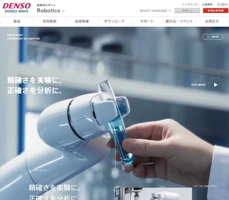
研究用ロボットの映像と、方眼・目盛りを組み合わせた製品紹介ページ。白と淡いブルー、濃紺の文字、大きな余白と丸い導線で精密さを伝える。
オリジナルサイトを見るDENSO WAVE / Laboratory Automation — Style Reference
Precision laboratory imagery framed by blue graph paper, instrument markings, and generous white space.
Original URL: denso-wave.com/fsys/ja/robot/ex/lab/lab.html
Final URL: denso-wave.com/fsys/ja/robot/ex/lab/lab.html — unchanged; reported HTTP status 200.
Theme: light surfaces with navy typography and cool laboratory imagery. No theme selector was evidenced.
Inspected: September 13, 2026, 04:45 JST; supplied retrieval timestamp 2026-09-12T19:45:09.517Z.
Viewports: desktop 1440 × 1000 and mobile 390 × 844 CSS pixels.
Scope: supplied desktop opening, middle, and footer captures; mobile opening and footer captures; rendered text and sampled computed styles throughout the page. Menu opening, movie playback, dragging, form submission, and consent actions were not exercised in the supplied evidence.
This is a laboratory-automation overview within DENSO WAVE’s corporate robotics website. Its identity comes from the relationship between real laboratory equipment and a restrained scientific graphic system: white robot housings, glass vessels, cyan liquid, navy text, pale blue graph lines, a ruler along the left edge, and small instrument-like labels. The opening presents the two-line statement “精確さを実験に。正確さを分析に。” over laboratory imagery, with a separate movie control.
The page combines two visible design systems. The laboratory presentation uses expansive spacing, lightly weighted text, alternating image-and-copy sections, oversized blue solution markers, and broad pill-shaped links. The surrounding corporate interface uses a compact masthead, rectangular account controls, conventional form fields, and a dense gray footer. Preserve this coexistence when referencing the complete page. The laboratory design is the central experience, while the corporate shell supplies navigation and member services.
How to Read This Reference
- Measured means a value supplied in the rendered DOM or computed-style evidence. Unless stated otherwise, dimensions are CSS pixels.
- Visual estimate means a proportion, color, or boundary inferred from an original-page screenshot. It is not a sampled CSS declaration.
- Calculated means arithmetic using supplied measurements, such as section heights or viewport coverage.
- Recommended means an implementation choice for a new project. The CSS and prompts below are adaptations, not recovered source code.
- Named tokens are descriptive aliases. The only supplied source custom property was
--global-header-height. - Computed styles on a parent do not necessarily describe its visible descendants. Some sampled links and buttons report gray or navy while their visible labels and strokes appear white over the hero.
- Offscreen element bounds establish content placement, but do not prove that an overlay was open or that its contents were visible. The supplied screenshots show the local menu closed.
Tokens — Colors
Default Palette
| Name | Value | Suggested token | Role and evidence |
|---|---|---|---|
| White | #ffffff |
--lab-white |
Measured body background; corporate header; several laboratory section surfaces; white pill variants |
| Laboratory Navy | #18344d |
--lab-ink |
Measured main-content color, headings, body copy, and selected utility elements |
| Solution Blue | #47a0f0 |
--lab-blue |
Measured color on the large SOLUTION01 and SOLUTION02 marker containers |
| Pale Pill Blue | #e7eef5 |
--lab-pill |
Measured background of the history and COBOTTA detail links |
| Laboratory Mist | #eaf2f8 |
--lab-mist |
Measured base background of the laboratory contact and member sections |
| Corporate Gray | #4b4b4b |
--corporate-ink |
Measured body, corporate navigation, shared member area, and footer text |
| Footer Gray | #e3e3e3 |
--corporate-footer |
Measured corporate footer background |
| Consent Red | #dc0032 |
--consent-red |
Measured cookie-policy link, settings text, and acceptance-button fill |
Supporting Visual Estimates
| Treatment | Estimate or proposed value | Use |
|---|---|---|
| Graph-paper line | Approximately #e8f1fa |
Extremely light blue lines on the white benefit-section field |
| Shared member-panel surface | Approximately #f8f8f8 |
Near-white rectangular form and registration panels |
| Corporate divider | Approximately #cccccc |
Fine rules under headings and between navigation areas |
| Corporate registration red | Approximately #df2419 |
Brighter, warmer red than the consent action; visible on account-registration controls |
| Left-edge ruler | Muted blue; proposed rgba(71, 160, 240, 0.5) |
Decorative ticks linking the page to measurement and laboratory instruments |
The estimated registration red must remain distinct from the measured consent red. The shared registration controls have a slightly shaded appearance; their full background declarations were not supplied.
Color Behavior
White hero lettering is visually established by the screenshots. However, the sampled local identity anchor reports #4b4b4b, and the sampled MENU and movie-button containers report #18344d. Their visible descendants or another rendering treatment account for the difference; the evidence does not identify the mechanism. Reproduce the visible white-on-media treatment without inventing a blend-mode implementation.
The contact section presents a similar limitation: its base computes to pale blue while its heading computes to white. Background-image, pseudo-element, and compositing details were not supplied. Do not conclude that the final design intentionally places white text directly on a flat pale-blue surface. For a new flat-surface implementation, navy text is the recommended readable fallback.
Tokens — Typography
Laboratory Content — denso_tp
- Computed source stack:
denso_tp, "ヒラギノ角ゴ Pro W3", "Hiragino Kaku Gothic Pro", メイリオ, Meiryo, "MS Pゴシック", sans-serif. - Roles: local navigation, hero statement, concept and benefit copy, solution markers, and laboratory calls to action.
- Weights:
700for the hero; commonly500for section headings;300for explanatory copy;400for many controls and product titles. - Character: clean sans-serif typography with generous line spacing. Light paragraph weights and restrained heading weights support the laboratory atmosphere.
- Limitation:
denso_tpis an evidenced CSS family name. The supplied evidence does not establish a commercial font identity, font-file URL, or the resolved font for every glyph.
Corporate Interface — Japanese System Sans
The shared header, member form, and footer use the Japanese sans-serif stack without the leading denso_tp family. Their base is measured at 16px / 23.52px, weight 400, with 0.8px tracking. Compact utility links drop to 12px.
Do not extend the laboratory typography indiscriminately into the corporate shell. The member heading is heavier and more compact than the laboratory section headings, and its controls use conventional form proportions.
Footer Utility — Oswald
Oswald, sans-serif is explicitly reported for the copyright line and mobile Facebook/YouTube labels. The copyright uses 12px, weight 300, 12px line height, and 0.5px tracking. Mobile social labels use 20px / 29.4px, weight 300.
This is a narrow utility role. Oswald is not evidenced as the laboratory body or headline family.
Type Scale
Values below are computed on the sampled elements. A parent’s font size does not establish the size of every nested span.
| Role | Desktop size / line height | Mobile size / line height | Weight | Notes |
|---|---|---|---|---|
| Hero statement | 45 / 63px |
31.2 / 43.68px |
700 |
Two lines in both opening captures |
| Concept heading | 43.2 / 69.12px |
31.2 / 49.92px |
500 |
White text in the supplied computed styles |
| Benefit and COBOTTA section heading | 43.2 / 69.12px |
23.4 / 37.44px |
500 |
Main editorial hierarchy |
| Precision subsection heading | 28.8 / 46.08px |
18.72 / 29.952px |
500 |
Separate from the larger section-heading tier |
| Individual benefit heading | 28.8 / 40.32px |
18.72 / 29.952px |
500 desktop; 300 mobile |
Mobile weight is explicitly lighter |
| General benefit paragraph | 14.4 / 28.8px |
15.6 / 29.64px |
300 |
Body type grows on mobile |
| Benefit introduction | 14.4 / 30.24px |
15.6 / 32.76px |
300 |
Approximately 2.1 line height |
| Concept paragraph | 14.4 / 37.44px |
13.3575 / 33.3937px |
300 |
Exceptionally open leading: about 2.6 and 2.5 |
| Solution marker container | 86.4 / 120.96px |
55.575 / 77.805px |
300 |
Measured parent containing SOLUTION and its number |
| Solution introductory line | 21.6 / 32.4px |
13 / 18.2px |
400 |
Small line above the product name |
| Solution product name | 43.2 / 64.8px |
23.4 / 35.1px |
400 |
Source uses paragraph elements for these names |
| Solution description | 14.4 / 30.24px |
13 / 28.6px |
300 |
Smaller mobile copy than benefit paragraphs |
| Laboratory detail-link container | 17.28 / 17.28px |
15.6 / 15.6px |
400 |
Wrapped child text can produce taller controls |
| Local MENU container | 16px / normal |
15.6px / normal |
400 |
Visible label may have nested styling |
| Shared member heading | 24 / 24px |
20 / 28px |
700 |
Gray corporate typography |
| Consent controls | 13.008 / 15.6096px |
Same | 600 |
Policy link uses weight 700 |
Tracking
General laboratory tracking changes from 0.8px on desktop to 0.312px on mobile. Several large section headings use near-zero tracking: 0.0432px at 43.2px and 0.0234px at 23.4px, equivalent to 0.001em.
Concept paragraphs have their own tracking: 0.432px desktop and 0.400725px mobile. Treat tracking as a role-specific choice rather than applying a single wide-letter-spacing rule everywhere.
Tokens — Spacing & Shapes
Density: expansive laboratory presentation, compact corporate utilities.
Geometry: square media and rectangular corporate controls, contrasted with fully rounded laboratory links and an outlined MENU capsule.
Spacing Scale
No authored spacing formula or breakpoint definition was supplied. These recurring measurements can inform implementation aliases, but they are not confirmed source token names.
| Use | Desktop | Mobile | Evidence |
|---|---|---|---|
| Hero/local-navigation left inset | 45px |
17.55px |
Measured positions and hero padding |
| Common laboratory introduction inset | 180px |
39px |
Measured concept and benefit-introduction positions |
| Benefit paragraph width | Often 450px |
351px |
Measured individual benefit paragraphs |
| Mobile benefit paragraph side margins | — | 19.5px each |
Calculated from a 351px paragraph in 390px |
| Concept paragraph width | 540px |
331.5px |
Mobile starts at 39px, leaving 19.5px at right |
| Laboratory pill horizontal padding | 33.3px |
23.4px |
Measured links |
| Laboratory pill internal gap | 25.2px |
15.6px |
Measured flex gap |
| Precision-section top padding | 72px |
97.5px |
Measured section padding |
| Benefit-section top padding | 180px |
195px |
Measured section padding |
| Solution-section bottom padding | 270px |
0px on sampled wrapper |
Other mobile spacing remains in descendants |
| Corporate container side margins | 170px |
10px |
1100px desktop and 370px mobile containers |
Desktop values often occur in multiples of 18px; mobile values often use 19.5px increments. This supports a deliberate proportional rhythm, but does not reveal the original scaling equation.
Border Radius
| Element | Desktop | Mobile | Interpretation |
|---|---|---|---|
| Local MENU | 27px |
29.25px |
Capsule at the observed button heights |
| Laboratory detail links | 72px |
78px |
Fully rounded ends; radius exceeds half the height |
| Sampled menu close control | 50% |
50% |
Circular control present in the DOM; open state unverified |
| Consent buttons | 2px |
2px |
Almost rectangular |
| Shared registration link | 0px |
0px |
Square corporate control |
| Main photographic panels | Visually square | Not sufficiently shown | No rounded photo-card system evidenced |
Layout Measurements
| Element | Desktop | Mobile |
|---|---|---|
| Global header | 1440 × 129px |
390 × 50px |
| Global mobile logo link | — | 88 × 30px at (10, 10) |
| Local MENU | 126.5 × 34.375px |
121.516 × 35.141px |
| Hero band, calculated to concept start | 900px high |
794px high |
| Movie-button container | 194.797 × 91.797px |
64.109 × 77.984px |
| History link | 352.984 × 94.875px |
324.656 × 73.688px |
| Standard-system detail link | 385.906 × 94.875px |
324.656 × 98.625px |
| Modules detail link | 495.719 × 94.875px |
324.656 × 98.625px |
| Contact action | Approximately 334.984 × 69.656px |
Approximately 311.969 × 73.688px |
| Shared registration button | 240 × 40px |
240 × 37px |
| Consent acceptance button | 156.156 × 41.609px |
350 × 41.609px |
| Document height | Approximately 11029px |
Approximately 11394px |
The source custom property --global-header-height reports 129px in both snapshots, although the measured mobile header is 50px. Use the actual mobile bounds when reproducing placement; do not assume that this custom property describes the mobile header correctly in every context.
Components
Corporate Header
Role: corporate identity, robotics navigation, language and account utilities.
At desktop, a white 129px header contains an upper masthead and lower navigation row. The central content spans 1100px, starting at x = 170px. The DENSO logo sits left, with the robotics identity beside it. Small corporate links sit above the language selector and two 122 × 24px account controls at the right.
The lower navigation contains seven nearly equal links, each about 157.14px wide, with fine vertical separators. A horizontal rule separates this row from the masthead. Typical navigation type is 16px; upper utilities are 12px.
On mobile, the header becomes a 50px strip with an 88 × 30px logo at the left and a three-line menu icon at the right. The desktop category row and account utilities are absent from the initial mobile view. The corporate mobile menu and the laboratory MENU below it are separate controls.
Laboratory Identity and Local MENU
Role: identifies and navigates the laboratory section independently of the corporate website.
The identity occupies two small uppercase lines: DENSO WAVE and LABORATORY AUTOMATION. On the opening desktop view it starts at approximately (45, 169.5), over the media. The MENU capsule is aligned near the upper-right edge at (1268.5, 174.97).
The capsule combines two fine horizontal strokes and the word MENU, with a one-pixel-looking outline and no solid fill over the hero. Its rendered opening treatment is white. Mobile preserves the same arrangement at smaller side insets, immediately below the corporate header.
In the desktop middle capture, the identity and MENU sit in a white top strip approximately 90px high, using navy details. The corporate header is no longer visible. The laboratory strip is absent from the supplied corporate-footer view. These captures establish a scoped persistent-navigation treatment, but not its exact fixed/sticky implementation or activation threshold.
The DOM contains local destinations for the overview, development history, standard systems and three subtypes, modules, COBOTTA, brochures, and useful materials. It also contains a circular close control. These establish menu content, not an observed open-menu layout or tested opening animation.
Laboratory Hero
Role: introduces precision and the robot’s relationship to laboratory work.
A full-width laboratory scene begins immediately below the corporate header. The original desktop capture shows automated equipment, dispensing tools, racks, glassware, and a DENSO robot. The mobile capture shows a closer view of a robot gripper and a glass tube containing blue liquid.
The white two-line statement sits at the left. Its desktop content line box begins about 301.5px below the hero’s top, with a 45px left inset. Mobile places it about 375.375px below the hero’s top, with a 17.55px inset. This is a composition change: the mobile statement sits lower within the portrait scene.
The concept section starts at document y = 1029px on desktop and 844px on mobile. These positions establish hero bands of 900px and 794px after subtracting the respective corporate-header heights. The visible media ends earlier in the opening screenshots because the consent banner overlays it.
The left-edge ruler and small status labels add a measurement motif. They should remain visually subordinate to the machinery and headline.
Movie Trigger and Scroll Cue
Role: offers explicit access to the movie and indicates that the presentation continues below.
The desktop movie control places PLAY MOVIE to the left of an approximately 92px dotted circular perimeter containing a white play triangle. Its overall measured box is about 195 × 92px.
Mobile changes the anatomy: a smaller circle sits above the caption, producing a narrow 64 × 78px control at the right of the statement. The circle itself is approximately 55–56px across by visual estimate.
A small SCROLL label and long thin vertical line appear near the desktop center. The mobile DOM retains SCROLL, but its visibility is not established by the consent-obscured opening screenshot.
The movie destination, player surface, audio state, controls, and close behavior are unverified. Do not invent a particular modal or video provider.
Concept and Precision Narrative
Role: explains the relationship between repeatable experiments and reliable analysis.
The [ OUR CONCEPT ] section repeats the opening statement and follows it with several separated paragraphs. Desktop copy occupies a 540px column starting at x = 180px. Its 14.4px text uses unusually generous 37.44px leading. Mobile uses a 331.5px column starting at 39px, with 13.3575px text and 33.3937px leading.
The computed concept heading and paragraphs are white. A complete original-page screenshot of this section’s background was not supplied, so its media and compositing treatment should remain unspecified.
The subsequent precision section switches to a measured white surface and navy copy. Desktop places the heading at x = 270px and a 630px paragraph at x = 630px, establishing a side-by-side editorial layout. Mobile stacks them at x = 39px.
A DRAG label appears in the rendered text. It signals an interactive affordance, but does not establish whether the associated content is a carousel, comparison, rotating object, or another interaction.
Benefit Introduction and Alternating Feature Rows
Role: develops three benefits: repeatable skilled movements, compactness, and accumulated development experience.
The desktop introduction pairs a 594px heading region at x = 180px with a 450px paragraph at x = 810px. Subsequent benefit copy alternates across the page: right-side paragraphs begin around x = 828px, while the middle benefit’s paragraph starts at x = 162px.
The supplied middle screenshot shows a wide laboratory-equipment photo occupying the left half of the viewport and a text column on the right. Both sit over a fine pale-blue graph-paper field. The image is flush with the viewport’s left edge and has square corners.
On mobile, the DOM places the benefit paragraphs in 351px columns with 19.5px side margins. Individual headings are centered in narrower text boxes and drop from weight 500 to 300. The exact image crops between these mobile text blocks were not visually captured.
Use the repeated alternation and large open spaces as the organizing structure. The benefits are not presented as a compact grid of interchangeable cards.
History Link and Atmospheric Section Transition
Role: provides a secondary detail route and separates the benefits from the solutions.
The history link, “開発の歩みを見る”, is centered beneath the benefit content. Its measured desktop size is approximately 353 × 95px, with a pale-blue fill and 72px radius. The screenshot shows a centered navy label and a small navy dot to its right; the dot is approximately 9px across by visual estimate.
On mobile the link becomes approximately 325 × 74px. It remains broad and rounded rather than becoming a small inline text link.
Below it, the supplied middle capture shows substantial open space, with graph lines fading into overlapping pale-blue wave-like shapes. The curves are broad and shallow. Their exact asset, CSS construction, and motion are not evidenced. A restrained gradient and large elliptical surface can approximate this transition in a new implementation.
Numbered Solution Sections
Role: presents the standard system and the modular COBOTTA LAB Modules offering.
Each solution contains a blue marker, a smaller introductory line, a product name, a light paragraph, and a detail link. The first desktop copy group begins at x = 144px; the second begins at approximately x = 776.56px, demonstrating an alternating arrangement.
The solution-marker parent is measured at 86.4px, weight 300, in #47a0f0. Product names are 43.2px / 64.8px, weight 400. Complete solution screenshots were not supplied, so exact media arrangements and nested marker typography remain unverified.
On mobile both copy groups begin at x = 39px with a 331.5px width. Product names reduce to 23.4px; descriptions use 13px / 28.6px. Both detail links share a 324.656px width and grow to 98.625px high as their labels wrap to two lines. Preserve this explicit multiline treatment.
COBOTTA Introduction
Role: introduces the compact collaborative robot as a laboratory partner.
The section uses the [ COBOTTA ] eyebrow, a two-line navy heading, explanatory copy, and a pale-blue detail pill. On desktop, its heading starts at x = 270px, and its paragraph occupies 540px. Mobile uses the common 39px left inset and 331.5px text width.
The desktop detail link is approximately 369 × 95px; mobile uses the same 325 × 74px family as the history link. The supplied text and bounds confirm the component hierarchy, while its complete photographic composition is not visually documented.
Laboratory Contact and Member Sections
Role: connects the presentation to brochure requests, inquiries, and member resources.
These are two consecutive laboratory sections before the shared corporate support area. Both have a measured #eaf2f8 base surface and bracketed English eyebrows.
The contact section has two white pill links: brochure download and email inquiry. Desktop places them in one row with roughly 27px between them. Mobile stacks them, each approximately 312 × 74px, separated vertically by about 29.25px.
The following member section explains available resources and offers a white registration pill. Its mobile wrapper includes 341.25px bottom padding. The evidence does not identify everything occupying that space, so do not replace it with an invented card or illustration.
These laboratory calls to action are visually different from the shared account form further down the page.
Shared Corporate Support and Member Form
Role: provides general, technical, and maintenance inquiry routes, telephone information, and account access.
The shared corporate typography returns here. Desktop support links occupy three large targets, each 260 × 192px in the sampled bounds. Mobile places two 180px targets on the first row and the third on a second row. The telephone-support block follows.
The desktop member area begins with a bold gray DENSO ROBOT MEMBER heading and a thin gray rule. Below it, two near-white rectangular panels sit side by side: login on the left and registration information on the right. The screenshot indicates panels approximately 540px wide, separated by 20px.
The login anatomy is conventional: ID and PW labels, email and password fields, a right-aligned reminder link with a red chevron, and a centered gray gradient login control. Inputs are approximately 345 × 36px in the desktop screenshot; these are visual estimates because input-element measurements were not supplied.
Mobile combines the content into a vertically continuous near-white area. Fields are approximately 305 × 31px, followed by the reminder link, login control, registration explanation, and a centered 240 × 37px red link. The shared corporate section uses 10px outer margins, tighter than the laboratory content.
Only the visible form state was inspected. Validation, authentication, focus states, and submission behavior are unverified.
Corporate Footer
Role: exposes the broader corporate website and legal information.
The desktop footer is a full-width #e3e3e3 surface, approximately 412.55px high in the sampled document. Its 1100px content area contains grouped navigation, fine rules, compact link lists, social icons, and a lower legal/copyright row. Most small links use 12px text.
Mobile changes the information hierarchy. Facebook and YouTube become two prominent side-by-side labeled links at the top. Legal links stack underneath, and the rendered text also includes a language selector and copyright. The dense desktop corporate sitemap is absent from the mobile visible-text sequence.
The supplied mobile screenshot does not show the entire footer because the consent panel covers its lower portion. The original footer identifies DENSO WAVE INCORPORATED in its copyright text.
Persistent Consent Banner
Role: presents cookie information and consent controls independently of the laboratory content.
A white panel occupies the bottom of every supplied original-page screenshot. Desktop keeps the explanatory text on the left and the settings and acceptance controls on the right. Cookie Policy and Cookies Settings are red and underlined; Accept All Cookies uses a solid #dc0032 fill, white text, and 2px corners.
Mobile places the paragraph, full-width settings target, and full-width acceptance button in a vertical stack. Both button boxes are 350px wide with 20px side margins. The acceptance button is measured at 41.609px high.
The panel’s visible boundary is approximately y = 929px on desktop and y = 595px on mobile. This implies about 71px and 249px of viewport coverage, respectively: approximately 7.1% versus 29.5%. These panel heights are screenshot estimates, not supplied wrapper measurements.
The banner covers page content; it does not mark the end of the hero or footer. Settings, acceptance, and subsequent banner dismissal were not tested.
Tokens — Motion & Interaction
| Element or treatment | Supplied evidence | What can be concluded |
|---|---|---|
| Ordinary links | Reported transition 0.3s |
A transition is defined; changed properties and end states were not supplied |
| Desktop local MENU | 0.2s ease-out |
Short control transition; opening geometry unverified |
| Mobile local MENU | 0.35s cubic-bezier(0.23, 1, 0.32, 1) |
Mobile timing differs from desktop |
| Circular local-menu control | 0.2s cubic-bezier(0.23, 1, 0.32, 1) |
Transition on a DOM-resident control; visible open state unverified |
| Laboratory pill links | border-color and background-color, each 0.25s cubic-bezier(0.23, 1, 0.32, 1) |
Restrained color feedback is defined; exact hover colors unknown |
| Laboratory hero | Different scenes in desktop and mobile captures; PLAY MOVIE button |
Media presentation is evident; autoplay, looping, audio, and frame timing are not established |
DRAG affordance |
Present in rendered text | Interactive intent is indicated; mechanics and results unknown |
| Local navigation at scroll | White top strip in the middle desktop capture | A scrolled presentation exists; threshold and positioning implementation unknown |
Ruler and X:0, Y:0 labels |
Visible decoration and rendered labels | Measurement motif; no verified pointer tracking or live coordinate behavior |
| Wave-like transition | Visible in one middle capture | Surface geometry is observed; animation is unverified |
Many sampled elements report animation: none. This does not rule out media playback, JavaScript-driven effects, descendant animation, or other unsampled behavior.
The capture process waited for layout and text stability, visible image decoding, and finite animations within stated time limits. Perpetual animations were temporarily paused during readiness checks and resumed. That procedure is not proof that a particular perpetual animation exists on this page, nor does it verify every delayed reveal.
For a new implementation, use the measured short color-transition family for controls. Treat any parallax, animated ruler, autoplay sequence, or draggable gallery as an additional design decision requiring its own specification.
Surfaces
| Layer | Appearance | Purpose |
|---|---|---|
| Corporate masthead | White, thin gray dividers | Corporate identity and navigation |
| Opening laboratory field | Cool laboratory imagery with white overlays | Product context and introductory statement |
| Scrolled local navigation | White strip with navy details | Persistent section identity |
| Benefit field | White with faint blue graph lines | Scientific structure without visual heaviness |
| Transition field | Soft pale-blue curves and fading grid | Separation between long narrative sections |
| Laboratory action | Pale-blue or white pill | Spacious, low-pressure detail navigation |
| Shared member panel | Near-white rectangle | Conventional account interaction |
| Corporate footer | Flat light gray | Dense site-wide navigation |
| Consent layer | White bottom panel with red actions | Independent persistent utility |
There is no general elevated-card system in the inspected laboratory presentation. Structure comes from image placement, text alignment, changes in background, and generous spacing. The gray login gradient and soft blue transition are specific treatments, not evidence for glossy styling throughout the page.
Imagery
Use real laboratory subjects: compact collaborative robots, grippers, dispensers, glass tubes, flasks, sample racks, cables, metallic fixtures, and complete bench assemblies. The original captures combine close operational details with wider system views. White and gray hardware dominate; blue liquid and occasional colored tubing provide contained accents.
The opening scene is immersive and may crop equipment to fill the available field. The benefit photograph is documentary and explains the assembled system. Keep these roles distinct: an expressive hero crop should not justify cropping important apparatus out of an explanatory image.
The overall photographic impression is cool and softly lit. The screenshots do not establish a CSS color filter, so achieve a similar result through appropriate source material or explicitly chosen grading. Avoid inventing a numeric filter recipe as a source measurement.
Graphic additions are sparse: ruler ticks, small uppercase labels, bracketed section names, graph lines, a play triangle, and a dotted circular perimeter. These details suggest measurement without becoming an elaborate dashboard.
Observed Asset References
No image, video, poster, or font-file URLs were included in the supplied evidence. The following are evidenced media roles, not recoverable filenames.
| Media role | Original-page evidence | Asset-path status |
|---|---|---|
| Hero laboratory scene | Desktop opening capture: robot, dispensing equipment, sample racks, and glassware | Not supplied |
| Portrait hero scene | Mobile opening capture: robot gripper beside a glass tube with blue liquid | Not supplied; relationship to desktop media source unverified |
| Complete laboratory assembly | Desktop middle capture: wide equipment view on the left | Not supplied |
| DENSO corporate logo | Desktop and mobile corporate headers | Not supplied |
| Graph paper and ruler | Opening and middle captures | Could be CSS or assets; implementation unverified |
| Pale-blue wave transition | Desktop middle capture | Not supplied |
Use authorized media with suitable desktop and portrait crops. CSS can recreate the page’s structure and scientific graphic vocabulary, but cannot replace accurate photographs of the actual equipment.
Layout & Responsive Behavior
Page Sequence and Vertical Rhythm
The document is a long scrolling overview rather than a fixed application shell. Supplied positions establish the following sequence; heights include wrapper spacing and should not be interpreted as pure text height.
| Region | Desktop start / height | Mobile start / height |
|---|---|---|
| Hero band, calculated | 129 / 900px |
50 / 794px |
| Concept | 1029 / 1101.59px |
844 / 1305.64px |
| Precision narrative | 2130.59 / 1101.47px |
2149.64 / 686.5px |
| Benefits | 3232.06 / 2565px |
2836.14 / 2850.44px |
| Solutions | 5887.06 / 1971.75px |
5686.58 / 1882.19px |
| COBOTTA | 7903.81 / 854.09px |
7754.02 / 942.22px |
| Laboratory contact | 8757.91 / 448.02px |
8696.23 / 472.34px |
| Laboratory member promotion | 9205.92 / 494.83px |
9168.58 / 706.31px |
| Corporate footer | 10616.23 / 412.55px |
10995.66 / 398.39px |
Gaps between some regions are real differences between sampled bounds. They should not be filled with invented content. Shared corporate support and account content occupy the interval between the laboratory member promotion and corporate footer.
Responsive Changes That Are Established
- The corporate header reduces from
129pxto50px, while local laboratory navigation remains a separate layer. - Desktop editorial columns become vertically ordered mobile text groups.
- General benefit body text increases from
14.4pxto15.6px; headings become smaller. Responsive design is role-specific, not a uniform scale reduction. - Common mobile introduction columns use a
39pxleft inset and331.5pxwidth. Benefit paragraphs use a wider, symmetric351pxcolumn with19.5pxmargins. - The movie trigger changes from a horizontal label-and-circle arrangement to a vertical circle-and-caption arrangement.
- Solution detail links wrap intentionally and become taller. History and COBOTTA links remain shorter.
- Contact links change from a row to a stack.
- Shared login and registration panels change from two columns to one continuous vertical area.
- The desktop footer sitemap yields to a compact mobile footer led by labeled social links.
- Consent content changes from a shallow horizontal panel to a tall vertical panel, substantially reducing the visible mobile page area.
Only two viewport widths were supplied. The exact breakpoint, tablet behavior, landscape layout, maximum-width rules beyond this desktop size, and browser-chrome resizing behavior remain unverified.
Do’s and Don’ts
Do
- Lead with real laboratory activity and recognizable equipment.
- Use navy
#18344dfor the laboratory text system and reserve bright blue#47a0f0for solution emphasis. - Preserve the pale-blue grid, edge ruler, and small labels as quiet scientific details.
- Give narrative paragraphs generous leading and allow broad vertical pauses.
- Alternate desktop image and copy placement instead of repeating identical centered blocks.
- Keep laboratory detail links large, pill-shaped, and visually calm.
- Preserve separate corporate and laboratory navigation roles.
- Adapt heading, paragraph, and button typography independently on mobile.
- Let long solution-link labels wrap into taller controls.
- Account for the consent banner when evaluating what is actually visible in a screenshot.
Don’t
- Don’t turn every benefit into a rounded, shadowed card.
- Don’t replace the laboratory photographs with generic futuristic robot illustrations.
- Don’t use the consent red as the laboratory section’s primary action color.
- Don’t flatten the shared corporate form and footer into the laboratory pill-based system when documenting the complete original page.
- Don’t infer autoplay, parallax, a 360-degree viewer, or animated coordinates from affordance labels alone.
- Don’t treat the consent panel’s top edge as the hero’s bottom boundary.
- Don’t copy parent-level gray or navy computed colors when the visible hero details are white.
- Don’t assume
denso_tpidentifies a particular commercial font without additional evidence. - Don’t apply one desktop-to-mobile scaling factor to all type and spacing.
- Don’t present estimated grid colors, missing asset paths, or proposed breakpoints as recovered source values.
Recommended Implementation Additions
These are recommendations for a new implementation, not verified original-page features:
- Give the corporate mobile menu and laboratory MENU distinct accessible names and maintain separate expanded states.
- Implement local-menu focus management, Escape dismissal, and focus restoration if the menu opens as an overlay.
- Provide an accessible movie name, visible playback controls, a pause option for any background motion, and a reduced-motion poster mode.
- Supply keyboard and button alternatives if the
DRAGarea is recreated as an interactive gallery. - Keep ruler ticks, graph lines, decorative dots, and coordinate-like labels out of the accessibility tree unless they convey real information.
- Use one primary page heading and semantic section headings in a new implementation, even where the original product-name elements are paragraphs.
- Preserve visible field labels, appropriate email/password input types, and readable validation messages for the shared member form.
- Consider larger mobile input and control hit areas than the approximately
31pxfields and35pxMENU seen here. - Make the consent panel internally scrollable on short screens and keep focused content reachable around persistent overlays.
- Use navy text when a pale contact surface is reproduced without its original background treatment.
- Verify portrait media crops separately; keep the robot’s working tool and vessel legible.
Agent Prompt Guide
Quick Color Reference
- Laboratory canvas:
#ffffff. - Laboratory typography and fine control details:
#18344d. - Large solution markers:
#47a0f0. - Pale detail pills:
#e7eef5. - Soft section bases and transition fields:
#eaf2f8. - Corporate text and footer:
#4b4b4bon#e3e3e3. - Consent actions only:
#dc0032. - Graph lines: very faint blue;
#e8f1fais an approximation.
Overall Prompt
“Create a laboratory-automation product overview within a corporate robotics website. Use real photographs or supplied footage of compact robots, glassware, sample racks, and precision dispensing. Build a light laboratory identity with navy #18344d text, white and pale-blue surfaces, a fine graph-paper field, left-edge ruler ticks, and small bracketed English section labels. Place a bold two-line Japanese statement over the opening media, with a separate outlined MENU capsule and dotted circular movie trigger. Follow with spacious editorial copy, alternating equipment photographs and benefit text, lightweight blue solution markers, and broad pill-shaped detail links. Keep the corporate header, rectangular account form, and dense gray footer visually distinct. Adapt mobile typography by role and allow longer solution buttons to wrap.”
Example Component Prompts
- Hero: “A full-width laboratory scene beneath a compact corporate header. White Japanese statement at left, small two-line laboratory identity above, outlined MENU capsule at upper right, and a dotted circular play control. Use real glass, white robot housings, and a restrained cyan-liquid accent. Preserve a useful portrait crop on mobile.”
- Benefit row: “A white scientific editorial section with extremely faint blue graph lines. Place a square-cornered photograph of a complete laboratory assembly across the left half of the desktop viewport and a narrow navy text column on the right. Use a medium two-line heading, light body text with approximately double leading, and substantial surrounding space.”
- History link: “A centered pale-blue pill approximately 353 by 95 pixels on desktop, with navy Japanese text and a small solid dot to the right. No shadow. On a 390-pixel phone, make it approximately 325 by 74 pixels.”
- Solution group: “A spacious product explanation with a large lightweight blue solution marker, small introductory line, navy product name, light explanatory paragraph, and white rounded detail link. Alternate the desktop text position between the first and second solutions. Stack on mobile and allow the detail label to occupy two lines.”
- Shared member area: “A conventional corporate account section with a bold gray title and thin rule. Use two near-white rectangular desktop panels: labeled email/password inputs and gray login control on the left, registration explanation and red rectangular link on the right. Stack into one continuous area on mobile.”
- Consent panel: “A white bottom utility panel with compact gray text, underlined red policy/settings links, and a nearly square-cornered red acceptance button. Arrange horizontally on desktop and stack with 20-pixel side margins on mobile. Keep it usable when text wraps or the viewport is short.”
Quick Start
CSS Custom Properties
This CSS is a recommended adaptation using measured endpoint values and explicitly estimated surface details. The 48rem breakpoint, intermediate scaling, hover colors, and wave construction are implementation choices. They are not recovered source rules.
Use .lab-reference around the complete page and .lab-experience around the laboratory presentation. A .lab-nav contains the local identity and menu; .lab-hero contains supplied media, the headline, and movie button. Use .lab-inner for introductions and .feature-row for alternating media/copy pairs. The .is-scrolled class represents a state that application code must manage; no menu or media behavior is implemented by this CSS.
Font declarations do not download fonts. Supply authorized font files separately, or allow the evidenced fallback stack to render.
:root {
  /* Measured colors */
  --lab-white: #ffffff;
  --lab-ink: #18344d;
  --lab-blue: #47a0f0;
  --lab-pill: #e7eef5;
  --lab-mist: #eaf2f8;
  --corporate-ink: #4b4b4b;
  --corporate-footer: #e3e3e3;
  --consent-red: #dc0032;

  /* Visual approximations */
  --lab-grid-line: #e8f1fa;
  --corporate-panel: #f8f8f8;
  --corporate-rule: #cccccc;
  --corporate-registration: #df2419;

  /* Evidenced family names; font files are not included */
  --font-corporate: 'ヒラギノ角ゴ Pro W3',
    'Hiragino Kaku Gothic Pro', 'メイリオ', Meiryo,
    'MS Pゴシック', sans-serif;
  --font-lab: denso_tp, var(--font-corporate);
  --font-footer-utility: Oswald, sans-serif;

  /* Desktop endpoint values */
  --corporate-header-height: 129px;
  --lab-edge: 45px;
  --lab-body-size: 14.4px;
  --lab-body-leading: 28.8px;
  --lab-heading-size: 43.2px;
  --lab-subheading-size: 28.8px;
  --lab-tracking: 0.8px;
  --lab-pill-height: 94.875px;
  --lab-pill-radius: 72px;
  --lab-pill-padding: 33.3px;
  --lab-pill-gap: 25.2px;
  --lab-action-size: 17.28px;
  --lab-section-space: 180px;

  /* Measured transition family */
  --lab-ease: cubic-bezier(0.23, 1, 0.32, 1);
  --lab-color-motion: 250ms var(--lab-ease);
}

.lab-reference,
.lab-reference *,
.lab-reference *::before,
.lab-reference *::after {
  box-sizing: border-box;
}

.lab-reference {
  margin: 0;
  color: var(--corporate-ink);
  background: var(--lab-white);
  font: 400 16px/1.47 var(--font-corporate);
}

.corporate-container {
  width: min(1100px, calc(100% - 20px));
  margin-inline: auto;
}

.corporate-header {
  min-height: var(--corporate-header-height);
  background: var(--lab-white);
  border-bottom: 1px solid var(--corporate-rule);
}

.lab-experience {
  position: relative;
  color: var(--lab-ink);
  font-family: var(--font-lab);
  letter-spacing: var(--lab-tracking);
}

/* Recommended CSS approximation of the decorative edge ruler */
.lab-experience::before {
  content: '';
  position: absolute;
  inset: 0 auto 0 0;
  z-index: 5;
  width: 7px;
  pointer-events: none;
  background: repeating-linear-gradient(
    to bottom,
    rgb(71 160 240 / 50%) 0 1px,
    transparent 1px 9px
  );
}

.lab-nav {
  position: absolute;
  inset: 40.5px var(--lab-edge) auto;
  z-index: 20;
  display: flex;
  align-items: center;
  justify-content: space-between;
  gap: 20px;
  color: white;
}

.lab-nav__identity {
  color: inherit;
  font-size: 13px;
  line-height: 1.65;
  text-decoration: none;
}

.lab-menu {
  display: inline-flex;
  flex: 0 0 auto;
  align-items: center;
  justify-content: center;
  gap: 11.025px;
  width: 126.5px;
  height: 34.375px;
  padding: 0;
  border: 1px solid currentColor;
  border-radius: 27px;
  color: inherit;
  background: transparent;
  font: inherit;
  cursor: pointer;
  transition: color 200ms ease-out,
    background-color 200ms ease-out;
}

/* Nested label sizing is a visual approximation */
.lab-menu__label {
  font-size: 13px;
  line-height: 1;
}

.lab-menu__icon {
  width: 18px;
  height: 7px;
  border-block: 1px solid currentColor;
}

/* Application code must activate and clear this scoped state */
.lab-nav.is-scrolled {
  position: fixed;
  inset: 0 0 auto;
  min-height: 90px;
  padding: 18px var(--lab-edge);
  color: var(--lab-ink);
  background: var(--lab-white);
}

.lab-hero {
  position: relative;
  isolation: isolate;
  min-height: 90svh;
  overflow: clip;
  color: white;
  background: var(--lab-ink);
}

.lab-hero__media,
.lab-hero__scrim {
  position: absolute;
  inset: 0;
  width: 100%;
  height: 100%;
}

.lab-hero__media {
  z-index: -2;
  object-fit: cover;
  object-position: var(--hero-position, center);
}

/* Optional contrast aid, not an observed source declaration */
.lab-hero__scrim {
  z-index: -1;
  background: rgb(24 52 77 / 14%);
}

.lab-hero__title {
  position: absolute;
  top: 33.5%;
  left: var(--lab-edge);
  margin: 0;
  font-size: 45px;
  font-weight: 700;
  line-height: 1.4;
}

/* Markup order: circle, then caption */
.movie-trigger {
  position: absolute;
  top: 35.3%;
  right: var(--lab-edge);
  display: flex;
  flex-direction: row-reverse;
  align-items: center;
  gap: 18px;
  padding: 0;
  border: 0;
  color: white;
  background: transparent;
  font: 400 13px/1.3 var(--font-lab);
  cursor: pointer;
}

.movie-trigger__circle {
  display: grid;
  place-items: center;
  width: 92px;
  aspect-ratio: 1;
  border: 2px dotted rgb(255 255 255 / 70%);
  border-radius: 50%;
}

.movie-trigger__circle::after {
  content: '';
  width: 0;
  height: 0;
  margin-left: 4px;
  border-block: 12px solid transparent;
  border-left: 21px solid white;
}

.lab-inner {
  width: 75%;
  max-width: 1200px;
  margin-inline: auto;
}

.lab-section {
  padding-block: var(--lab-section-space);
}

.lab-grid {
  background-color: var(--lab-white);
  background-image:
    linear-gradient(var(--lab-grid-line) 1px, transparent 1px),
    linear-gradient(90deg, var(--lab-grid-line) 1px, transparent 1px);
  background-size: 18px 18px;
}

.lab-heading {
  margin: 0;
  font-size: var(--lab-heading-size);
  font-weight: 500;
  line-height: 1.6;
  letter-spacing: 0.001em;
}

.lab-copy {
  margin: 0;
  font-size: var(--lab-body-size);
  font-weight: 300;
  line-height: var(--lab-body-leading);
}

.lab-copy + .lab-copy {
  margin-top: 43.2px;
}

.lab-concept__copy {
  font-size: 14.4px;
  line-height: 2.6;
  letter-spacing: 0.03em;
}

.merit-intro {
  display: grid;
  grid-template-columns: 1.32fr 1fr;
  align-items: center;
  gap: 36px;
}

.feature-row {
  display: grid;
  grid-template-columns: repeat(2, minmax(0, 1fr));
  align-items: center;
  margin-top: 90px;
}

.feature-media img {
  display: block;
  width: 100%;
  height: auto;
  border-radius: 0;
}

.feature-copy {
  width: 62.5%;
  margin-inline: 15% 22.5%;
}

.feature-copy h3 {
  margin: 0 0 49.5px;
  font-size: var(--lab-subheading-size);
  font-weight: 500;
  line-height: 1.4;
}

.feature-row--reverse .feature-media {
  grid-column: 2;
  grid-row: 1;
}

.feature-row--reverse .feature-copy {
  grid-column: 1;
  grid-row: 1;
}

.lab-pill {
  display: flex;
  align-items: center;
  justify-content: center;
  gap: var(--lab-pill-gap);
  width: fit-content;
  min-width: 352.984px;
  max-width: 100%;
  min-height: var(--lab-pill-height);
  margin-inline: auto;
  padding: 18px var(--lab-pill-padding);
  border: 1px solid transparent;
  border-radius: var(--lab-pill-radius);
  color: var(--lab-ink);
  background: var(--lab-pill);
  font-size: var(--lab-action-size);
  line-height: 1.6;
  text-align: center;
  text-decoration: none;
  transition: border-color var(--lab-color-motion),
    background-color var(--lab-color-motion);
}

.lab-pill__dot {
  flex: 0 0 9px;
  width: 9px;
  height: 9px;
  border-radius: 50%;
  background: currentColor;
}

.lab-pill--white {
  background: white;
}

.lab-solution__marker {
  margin: 0;
  color: var(--lab-blue);
  font-size: 86.4px;
  font-weight: 300;
  line-height: 1.4;
}

.lab-solution__name {
  margin: 10.8px 0 43.2px;
  font-size: 43.2px;
  font-weight: 400;
  line-height: 1.5;
}

/* Suggested construction for the observed broad blue transition */
.lab-transition {
  position: relative;
  height: clamp(140px, 22vw, 340px);
  overflow: clip;
  background: linear-gradient(transparent, var(--lab-mist));
}

.lab-transition::before {
  content: '';
  position: absolute;
  inset: 35% -10% -40%;
  border-radius: 50% 50% 0 0;
  background: var(--lab-mist);
  transform: rotate(-3deg);
}

.lab-contact {
  padding-block: 81px 90px;
  color: var(--lab-ink);
  background: var(--lab-mist);
}

.lab-contact__actions {
  display: flex;
  flex-wrap: wrap;
  gap: 27px;
  margin-top: 72px;
}

.lab-contact__actions .lab-pill {
  min-width: 0;
  width: 334.984px;
  min-height: 69.656px;
  margin: 0;
}

.member-heading {
  margin: 0 0 20px;
  padding-bottom: 10px;
  border-bottom: 1px solid var(--corporate-rule);
  font-size: 24px;
  line-height: 1;
}

.member-columns {
  display: grid;
  grid-template-columns: repeat(2, minmax(0, 1fr));
  gap: 20px;
}

.member-panel {
  padding: 30px 40px;
  background: var(--corporate-panel);
}

.member-form {
  display: grid;
  grid-template-columns: 30px minmax(0, 1fr);
  align-items: center;
  gap: 10px 5px;
  max-width: 380px;
  margin-inline: auto;
}

.member-form input {
  width: 100%;
  min-width: 0;
  height: 36px;
  padding: 4px 10px;
  border: 1px solid #888888;
  border-radius: 0;
  background: white;
  font: inherit;
}

.member-login,
.member-register {
  display: block;
  width: min(240px, 100%);
  min-height: 40px;
  margin: 20px auto 0;
  padding: 10px;
  border-radius: 0;
  text-align: center;
  text-decoration: none;
  font: inherit;
}

.member-login {
  border: 1px solid #999999;
  color: var(--corporate-ink);
  background: linear-gradient(#eeeeee, #bfbfbf);
}

.member-register {
  border: 0;
  color: white;
  background: var(--corporate-registration);
}

.corporate-footer {
  margin-top: 90px;
  padding-block: 30px;
  background: var(--corporate-footer);
}

.corporate-footer__copyright {
  font: 300 12px/1 var(--font-footer-utility);
  letter-spacing: 0.5px;
}

.consent-panel {
  position: fixed;
  inset: auto 0 0;
  z-index: 100;
  max-height: calc(100svh - 16px);
  overflow-y: auto;
  padding: 13px 32px calc(16px + env(safe-area-inset-bottom, 0px));
  color: #666666;
  background: white;
  font-family: var(--font-corporate);
  letter-spacing: normal;
}

.consent-panel__inner {
  display: grid;
  grid-template-columns: minmax(0, 1fr) 125px 156.156px;
  align-items: center;
  gap: 18px;
  max-width: 1220px;
}

.consent-panel p {
  max-width: 760px;
  margin: 0;
  font-size: 13.008px;
  line-height: 1.5;
}

.consent-panel a,
.consent-panel__settings {
  color: var(--consent-red);
  text-decoration: underline;
}

.consent-panel button {
  font: 600 13.008px/1.2 var(--font-corporate);
  letter-spacing: 0.01em;
  border-radius: 2px;
  cursor: pointer;
}

.consent-panel__settings {
  padding: 12px 0;
  border: 0;
  background: white;
}

.consent-panel__accept {
  padding: 12px 10px;
  border: 1px solid var(--consent-red);
  color: white;
  background: var(--consent-red);
}

/* Recommended hover and focus states */
@media (hover: hover) {
  .lab-pill:hover {
    border-color: var(--lab-ink);
    background-color: var(--lab-mist);
  }
}

.lab-reference :focus-visible {
  outline: 2px solid currentColor;
  outline-offset: 4px;
}

/* Recommended breakpoint; only the endpoint layouts were measured */
@media (max-width: 48rem) {
  :root {
    --corporate-header-height: 50px;
    --lab-edge: 17.55px;
    --lab-body-size: 15.6px;
    --lab-body-leading: 29.64px;
    --lab-heading-size: 23.4px;
    --lab-subheading-size: 18.72px;
    --lab-tracking: 0.312px;
    --lab-pill-height: 73.688px;
    --lab-pill-radius: 78px;
    --lab-pill-padding: 23.4px;
    --lab-pill-gap: 15.6px;
    --lab-action-size: 15.6px;
    --lab-section-space: 195px;
  }

  .lab-nav {
    top: 14.625px;
  }

  .lab-menu {
    width: 121.516px;
    height: 35.141px;
    border-radius: 29.25px;
    transition-duration: 350ms;
    transition-timing-function: var(--lab-ease);
  }

  .lab-hero {
    min-height: calc(100svh - var(--corporate-header-height));
  }

  .lab-hero__title {
    top: 47.3%;
    font-size: 31.2px;
  }

  .movie-trigger {
    top: 47.3%;
    right: 6.75%;
    flex-direction: column;
    gap: 10px;
    font-size: 10px;
  }

  .movie-trigger__circle {
    width: 55px;
  }

  .movie-trigger__circle::after {
    border-block-width: 9px;
    border-left-width: 15px;
  }

  .lab-inner {
    width: 85%;
    margin-left: 10%;
    margin-right: 5%;
  }

  .lab-concept__heading {
    font-size: 31.2px;
  }

  .lab-concept__copy {
    font-size: 13.3575px;
    line-height: 2.5;
  }

  .merit-intro,
  .feature-row {
    display: block;
  }

  .merit-intro .lab-copy {
    margin-top: 19.5px;
    line-height: 2.1;
  }

  .feature-copy {
    width: 90%;
    margin: 39px auto 0;
  }

  .feature-copy h3 {
    width: fit-content;
    max-width: 100%;
    margin: 0 auto 38px;
    font-weight: 300;
    line-height: 1.6;
  }

  .lab-pill {
    width: 83.245%;
    min-width: 0;
  }

  .lab-pill--multiline {
    min-height: 98.625px;
  }

  .lab-solution__marker {
    font-size: 55.575px;
  }

  .lab-solution__name {
    margin-block: 7.8px 23.4px;
    font-size: 23.4px;
  }

  .lab-solution .lab-copy {
    font-size: 13px;
    line-height: 2.2;
  }

  .lab-contact {
    padding: 54.6px 10% 84.825px;
  }

  .lab-contact__actions {
    flex-direction: column;
    gap: 29.25px;
    margin-top: 39px;
  }

  .lab-contact__actions .lab-pill {
    width: 100%;
    min-height: 73.688px;
  }

  .member-heading {
    font-size: 20px;
    line-height: 1.4;
  }

  .member-columns {
    grid-template-columns: 1fr;
    gap: 0;
    background: var(--corporate-panel);
  }

  .member-panel {
    padding: 15px;
  }

  .member-form input {
    height: 31px;
  }

  .member-panel p,
  .member-register {
    font-size: 13px;
  }

  .corporate-footer {
    margin-top: 40px;
  }

  .consent-panel {
    padding: 44px 20px calc(16px + env(safe-area-inset-bottom, 0px));
  }

  .consent-panel__inner {
    grid-template-columns: 1fr;
    gap: 16px;
  }

  .consent-panel button {
    width: 100%;
  }
}

/* Recommended reduced-motion control treatment */
@media (prefers-reduced-motion: reduce) {
  .lab-reference {
    scroll-behavior: auto;
  }

  .lab-menu,
  .lab-pill {
    transition: none;
  }
}
The grid construction, repeated ruler, dotted play circle, optional scrim, wave, and hover state are approximations. The example regularizes some asymmetric desktop feature alignments. Background-media playback, reduced-motion poster selection, navigation state, consent persistence, and form behavior require separate implementation. The CSS has not been executed or browser-tested as part of this evidence-only analysis.
Tailwind v4 Token Mapping
Optional aliases for a project already using Tailwind v4. Define the properties above first. This is not a claim that the original site uses Tailwind.
@theme inline {
  --color-lab-white: var(--lab-white);
  --color-lab-ink: var(--lab-ink);
  --color-lab-blue: var(--lab-blue);
  --color-lab-pill: var(--lab-pill);
  --color-lab-mist: var(--lab-mist);
  --color-corporate-ink: var(--corporate-ink);
  --color-corporate-footer: var(--corporate-footer);
  --color-consent-red: var(--consent-red);

  --font-laboratory: var(--font-lab);
  --font-corporate-ui: var(--font-corporate);
  --font-footer-condensed: var(--font-footer-utility);

  --text-lab-body: var(--lab-body-size);
  --text-lab-heading: var(--lab-heading-size);
  --text-lab-subheading: var(--lab-subheading-size);
  --text-lab-action: var(--lab-action-size);

  --spacing-lab-edge: var(--lab-edge);
  --spacing-lab-section: var(--lab-section-space);
  --spacing-lab-pill-height: var(--lab-pill-height);
  --radius-lab-pill: var(--lab-pill-radius);
}
Sources & Evidence
- Inspected original and final page: DENSO WAVE Laboratory Automation. The supplied browser evidence reports HTTP 200 and no URL change.
- Capture timestamp:
2026-09-12T19:45:09.517Z, equivalent to September 13, 2026, 04:45:09.517 JST. This document analyzes those supplied captures; no additional browsing was performed. - Desktop evidence: three original-page screenshots at
1440 × 1000, covering the opening hero, a middle benefit/history transition, and the shared member/footer area. - Mobile evidence: two original-page screenshots at
390 × 844, covering the opening hero and shared member/footer area. - Rendered DOM evidence: page title, text sequence, link destinations, document heights, element bounds, sampled computed typography, colors, backgrounds, spacing, radii, and transitions at both viewports.
- Observed states: initial closed local MENU; different laboratory scenes across desktop/mobile captures; local navigation on a white strip in the desktop middle capture; persistent consent panel across the supplied scroll positions.
- Unverified behavior: menu opening and closing, movie playback, dragging, hover/focus outcomes, account submission, consent actions, and any delayed or scroll-driven animation not directly established by the captures.
- Evidence limits: no media-source URLs, font-file URLs, complete stylesheet, exact breakpoints, open-overlay screenshots, or playback event records were supplied. Some middle sections are documented through DOM measurements without a corresponding complete visual capture. Linked detail pages were not inspected.
All design observations above refer to the current original-page evidence. Numerical estimates and recommended implementation choices are labeled separately from measured values.
# DENSO WAVE / Laboratory Automation — Style Reference

> Precision laboratory imagery framed by blue graph paper, instrument markings, and generous white space.

**Original URL:** [denso-wave.com/fsys/ja/robot/ex/lab/lab.html](https://www.denso-wave.com/fsys/ja/robot/ex/lab/lab.html)
**Final URL:** [denso-wave.com/fsys/ja/robot/ex/lab/lab.html](https://www.denso-wave.com/fsys/ja/robot/ex/lab/lab.html) — unchanged; reported HTTP status 200.
**Theme:** light surfaces with navy typography and cool laboratory imagery. No theme selector was evidenced.
**Inspected:** September 13, 2026, 04:45 JST; supplied retrieval timestamp `2026-09-12T19:45:09.517Z`.
**Viewports:** desktop `1440 × 1000` and mobile `390 × 844` CSS pixels.
**Scope:** supplied desktop opening, middle, and footer captures; mobile opening and footer captures; rendered text and sampled computed styles throughout the page. Menu opening, movie playback, dragging, form submission, and consent actions were not exercised in the supplied evidence.

This is a laboratory-automation overview within DENSO WAVE’s corporate robotics website. Its identity comes from the relationship between real laboratory equipment and a restrained scientific graphic system: white robot housings, glass vessels, cyan liquid, navy text, pale blue graph lines, a ruler along the left edge, and small instrument-like labels. The opening presents the two-line statement “精確さを実験に。正確さを分析に。” over laboratory imagery, with a separate movie control.

The page combines two visible design systems. The laboratory presentation uses expansive spacing, lightly weighted text, alternating image-and-copy sections, oversized blue solution markers, and broad pill-shaped links. The surrounding corporate interface uses a compact masthead, rectangular account controls, conventional form fields, and a dense gray footer. Preserve this coexistence when referencing the complete page. The laboratory design is the central experience, while the corporate shell supplies navigation and member services.

## How to Read This Reference

- **Measured** means a value supplied in the rendered DOM or computed-style evidence. Unless stated otherwise, dimensions are CSS pixels.
- **Visual estimate** means a proportion, color, or boundary inferred from an original-page screenshot. It is not a sampled CSS declaration.
- **Calculated** means arithmetic using supplied measurements, such as section heights or viewport coverage.
- **Recommended** means an implementation choice for a new project. The CSS and prompts below are adaptations, not recovered source code.
- **Named tokens** are descriptive aliases. The only supplied source custom property was `--global-header-height`.
- Computed styles on a parent do not necessarily describe its visible descendants. Some sampled links and buttons report gray or navy while their visible labels and strokes appear white over the hero.
- Offscreen element bounds establish content placement, but do not prove that an overlay was open or that its contents were visible. The supplied screenshots show the local menu closed.

## Tokens — Colors

### Default Palette

| Name | Value | Suggested token | Role and evidence |
| --- | --- | --- | --- |
| White | `#ffffff` | `--lab-white` | Measured body background; corporate header; several laboratory section surfaces; white pill variants |
| Laboratory Navy | `#18344d` | `--lab-ink` | Measured main-content color, headings, body copy, and selected utility elements |
| Solution Blue | `#47a0f0` | `--lab-blue` | Measured color on the large `SOLUTION01` and `SOLUTION02` marker containers |
| Pale Pill Blue | `#e7eef5` | `--lab-pill` | Measured background of the history and COBOTTA detail links |
| Laboratory Mist | `#eaf2f8` | `--lab-mist` | Measured base background of the laboratory contact and member sections |
| Corporate Gray | `#4b4b4b` | `--corporate-ink` | Measured body, corporate navigation, shared member area, and footer text |
| Footer Gray | `#e3e3e3` | `--corporate-footer` | Measured corporate footer background |
| Consent Red | `#dc0032` | `--consent-red` | Measured cookie-policy link, settings text, and acceptance-button fill |

### Supporting Visual Estimates

| Treatment | Estimate or proposed value | Use |
| --- | --- | --- |
| Graph-paper line | Approximately `#e8f1fa` | Extremely light blue lines on the white benefit-section field |
| Shared member-panel surface | Approximately `#f8f8f8` | Near-white rectangular form and registration panels |
| Corporate divider | Approximately `#cccccc` | Fine rules under headings and between navigation areas |
| Corporate registration red | Approximately `#df2419` | Brighter, warmer red than the consent action; visible on account-registration controls |
| Left-edge ruler | Muted blue; proposed `rgba(71, 160, 240, 0.5)` | Decorative ticks linking the page to measurement and laboratory instruments |

The estimated registration red must remain distinct from the measured consent red. The shared registration controls have a slightly shaded appearance; their full background declarations were not supplied.

### Color Behavior

White hero lettering is visually established by the screenshots. However, the sampled local identity anchor reports `#4b4b4b`, and the sampled MENU and movie-button containers report `#18344d`. Their visible descendants or another rendering treatment account for the difference; the evidence does not identify the mechanism. Reproduce the visible white-on-media treatment without inventing a blend-mode implementation.

The contact section presents a similar limitation: its base computes to pale blue while its heading computes to white. Background-image, pseudo-element, and compositing details were not supplied. Do not conclude that the final design intentionally places white text directly on a flat pale-blue surface. For a new flat-surface implementation, navy text is the recommended readable fallback.

## Tokens — Typography

### Laboratory Content — `denso_tp`

- **Computed source stack:** `denso_tp, "ヒラギノ角ゴ Pro W3", "Hiragino Kaku Gothic Pro", メイリオ, Meiryo, "MS Pゴシック", sans-serif`.
- **Roles:** local navigation, hero statement, concept and benefit copy, solution markers, and laboratory calls to action.
- **Weights:** `700` for the hero; commonly `500` for section headings; `300` for explanatory copy; `400` for many controls and product titles.
- **Character:** clean sans-serif typography with generous line spacing. Light paragraph weights and restrained heading weights support the laboratory atmosphere.
- **Limitation:** `denso_tp` is an evidenced CSS family name. The supplied evidence does not establish a commercial font identity, font-file URL, or the resolved font for every glyph.

### Corporate Interface — Japanese System Sans

The shared header, member form, and footer use the Japanese sans-serif stack without the leading `denso_tp` family. Their base is measured at `16px / 23.52px`, weight `400`, with `0.8px` tracking. Compact utility links drop to `12px`.

Do not extend the laboratory typography indiscriminately into the corporate shell. The member heading is heavier and more compact than the laboratory section headings, and its controls use conventional form proportions.

### Footer Utility — Oswald

`Oswald, sans-serif` is explicitly reported for the copyright line and mobile Facebook/YouTube labels. The copyright uses `12px`, weight `300`, `12px` line height, and `0.5px` tracking. Mobile social labels use `20px / 29.4px`, weight `300`.

This is a narrow utility role. Oswald is not evidenced as the laboratory body or headline family.

### Type Scale

Values below are computed on the sampled elements. A parent’s font size does not establish the size of every nested span.

| Role | Desktop size / line height | Mobile size / line height | Weight | Notes |
| --- | --- | --- | --- | --- |
| Hero statement | `45 / 63px` | `31.2 / 43.68px` | `700` | Two lines in both opening captures |
| Concept heading | `43.2 / 69.12px` | `31.2 / 49.92px` | `500` | White text in the supplied computed styles |
| Benefit and COBOTTA section heading | `43.2 / 69.12px` | `23.4 / 37.44px` | `500` | Main editorial hierarchy |
| Precision subsection heading | `28.8 / 46.08px` | `18.72 / 29.952px` | `500` | Separate from the larger section-heading tier |
| Individual benefit heading | `28.8 / 40.32px` | `18.72 / 29.952px` | `500` desktop; `300` mobile | Mobile weight is explicitly lighter |
| General benefit paragraph | `14.4 / 28.8px` | `15.6 / 29.64px` | `300` | Body type grows on mobile |
| Benefit introduction | `14.4 / 30.24px` | `15.6 / 32.76px` | `300` | Approximately `2.1` line height |
| Concept paragraph | `14.4 / 37.44px` | `13.3575 / 33.3937px` | `300` | Exceptionally open leading: about `2.6` and `2.5` |
| Solution marker container | `86.4 / 120.96px` | `55.575 / 77.805px` | `300` | Measured parent containing `SOLUTION` and its number |
| Solution introductory line | `21.6 / 32.4px` | `13 / 18.2px` | `400` | Small line above the product name |
| Solution product name | `43.2 / 64.8px` | `23.4 / 35.1px` | `400` | Source uses paragraph elements for these names |
| Solution description | `14.4 / 30.24px` | `13 / 28.6px` | `300` | Smaller mobile copy than benefit paragraphs |
| Laboratory detail-link container | `17.28 / 17.28px` | `15.6 / 15.6px` | `400` | Wrapped child text can produce taller controls |
| Local MENU container | `16px / normal` | `15.6px / normal` | `400` | Visible label may have nested styling |
| Shared member heading | `24 / 24px` | `20 / 28px` | `700` | Gray corporate typography |
| Consent controls | `13.008 / 15.6096px` | Same | `600` | Policy link uses weight `700` |

### Tracking

General laboratory tracking changes from `0.8px` on desktop to `0.312px` on mobile. Several large section headings use near-zero tracking: `0.0432px` at `43.2px` and `0.0234px` at `23.4px`, equivalent to `0.001em`.

Concept paragraphs have their own tracking: `0.432px` desktop and `0.400725px` mobile. Treat tracking as a role-specific choice rather than applying a single wide-letter-spacing rule everywhere.

## Tokens — Spacing & Shapes

**Density:** expansive laboratory presentation, compact corporate utilities.
**Geometry:** square media and rectangular corporate controls, contrasted with fully rounded laboratory links and an outlined MENU capsule.

### Spacing Scale

No authored spacing formula or breakpoint definition was supplied. These recurring measurements can inform implementation aliases, but they are not confirmed source token names.

| Use | Desktop | Mobile | Evidence |
| --- | --- | --- | --- |
| Hero/local-navigation left inset | `45px` | `17.55px` | Measured positions and hero padding |
| Common laboratory introduction inset | `180px` | `39px` | Measured concept and benefit-introduction positions |
| Benefit paragraph width | Often `450px` | `351px` | Measured individual benefit paragraphs |
| Mobile benefit paragraph side margins | — | `19.5px` each | Calculated from a `351px` paragraph in `390px` |
| Concept paragraph width | `540px` | `331.5px` | Mobile starts at `39px`, leaving `19.5px` at right |
| Laboratory pill horizontal padding | `33.3px` | `23.4px` | Measured links |
| Laboratory pill internal gap | `25.2px` | `15.6px` | Measured flex gap |
| Precision-section top padding | `72px` | `97.5px` | Measured section padding |
| Benefit-section top padding | `180px` | `195px` | Measured section padding |
| Solution-section bottom padding | `270px` | `0px` on sampled wrapper | Other mobile spacing remains in descendants |
| Corporate container side margins | `170px` | `10px` | `1100px` desktop and `370px` mobile containers |

Desktop values often occur in multiples of `18px`; mobile values often use `19.5px` increments. This supports a deliberate proportional rhythm, but does not reveal the original scaling equation.

### Border Radius

| Element | Desktop | Mobile | Interpretation |
| --- | --- | --- | --- |
| Local MENU | `27px` | `29.25px` | Capsule at the observed button heights |
| Laboratory detail links | `72px` | `78px` | Fully rounded ends; radius exceeds half the height |
| Sampled menu close control | `50%` | `50%` | Circular control present in the DOM; open state unverified |
| Consent buttons | `2px` | `2px` | Almost rectangular |
| Shared registration link | `0px` | `0px` | Square corporate control |
| Main photographic panels | Visually square | Not sufficiently shown | No rounded photo-card system evidenced |

### Layout Measurements

| Element | Desktop | Mobile |
| --- | --- | --- |
| Global header | `1440 × 129px` | `390 × 50px` |
| Global mobile logo link | — | `88 × 30px` at `(10, 10)` |
| Local MENU | `126.5 × 34.375px` | `121.516 × 35.141px` |
| Hero band, calculated to concept start | `900px` high | `794px` high |
| Movie-button container | `194.797 × 91.797px` | `64.109 × 77.984px` |
| History link | `352.984 × 94.875px` | `324.656 × 73.688px` |
| Standard-system detail link | `385.906 × 94.875px` | `324.656 × 98.625px` |
| Modules detail link | `495.719 × 94.875px` | `324.656 × 98.625px` |
| Contact action | Approximately `334.984 × 69.656px` | Approximately `311.969 × 73.688px` |
| Shared registration button | `240 × 40px` | `240 × 37px` |
| Consent acceptance button | `156.156 × 41.609px` | `350 × 41.609px` |
| Document height | Approximately `11029px` | Approximately `11394px` |

The source custom property `--global-header-height` reports `129px` in both snapshots, although the measured mobile header is `50px`. Use the actual mobile bounds when reproducing placement; do not assume that this custom property describes the mobile header correctly in every context.

## Components

### Corporate Header

**Role:** corporate identity, robotics navigation, language and account utilities.

At desktop, a white `129px` header contains an upper masthead and lower navigation row. The central content spans `1100px`, starting at `x = 170px`. The DENSO logo sits left, with the robotics identity beside it. Small corporate links sit above the language selector and two `122 × 24px` account controls at the right.

The lower navigation contains seven nearly equal links, each about `157.14px` wide, with fine vertical separators. A horizontal rule separates this row from the masthead. Typical navigation type is `16px`; upper utilities are `12px`.

On mobile, the header becomes a `50px` strip with an `88 × 30px` logo at the left and a three-line menu icon at the right. The desktop category row and account utilities are absent from the initial mobile view. The corporate mobile menu and the laboratory MENU below it are separate controls.

### Laboratory Identity and Local MENU

**Role:** identifies and navigates the laboratory section independently of the corporate website.

The identity occupies two small uppercase lines: `DENSO WAVE` and `LABORATORY AUTOMATION`. On the opening desktop view it starts at approximately `(45, 169.5)`, over the media. The MENU capsule is aligned near the upper-right edge at `(1268.5, 174.97)`.

The capsule combines two fine horizontal strokes and the word `MENU`, with a one-pixel-looking outline and no solid fill over the hero. Its rendered opening treatment is white. Mobile preserves the same arrangement at smaller side insets, immediately below the corporate header.

In the desktop middle capture, the identity and MENU sit in a white top strip approximately `90px` high, using navy details. The corporate header is no longer visible. The laboratory strip is absent from the supplied corporate-footer view. These captures establish a scoped persistent-navigation treatment, but not its exact fixed/sticky implementation or activation threshold.

The DOM contains local destinations for the overview, development history, standard systems and three subtypes, modules, COBOTTA, brochures, and useful materials. It also contains a circular close control. These establish menu content, not an observed open-menu layout or tested opening animation.

### Laboratory Hero

**Role:** introduces precision and the robot’s relationship to laboratory work.

A full-width laboratory scene begins immediately below the corporate header. The original desktop capture shows automated equipment, dispensing tools, racks, glassware, and a DENSO robot. The mobile capture shows a closer view of a robot gripper and a glass tube containing blue liquid.

The white two-line statement sits at the left. Its desktop content line box begins about `301.5px` below the hero’s top, with a `45px` left inset. Mobile places it about `375.375px` below the hero’s top, with a `17.55px` inset. This is a composition change: the mobile statement sits lower within the portrait scene.

The concept section starts at document `y = 1029px` on desktop and `844px` on mobile. These positions establish hero bands of `900px` and `794px` after subtracting the respective corporate-header heights. The visible media ends earlier in the opening screenshots because the consent banner overlays it.

The left-edge ruler and small status labels add a measurement motif. They should remain visually subordinate to the machinery and headline.

### Movie Trigger and Scroll Cue

**Role:** offers explicit access to the movie and indicates that the presentation continues below.

The desktop movie control places `PLAY MOVIE` to the left of an approximately `92px` dotted circular perimeter containing a white play triangle. Its overall measured box is about `195 × 92px`.

Mobile changes the anatomy: a smaller circle sits above the caption, producing a narrow `64 × 78px` control at the right of the statement. The circle itself is approximately `55–56px` across by visual estimate.

A small `SCROLL` label and long thin vertical line appear near the desktop center. The mobile DOM retains `SCROLL`, but its visibility is not established by the consent-obscured opening screenshot.

The movie destination, player surface, audio state, controls, and close behavior are unverified. Do not invent a particular modal or video provider.

### Concept and Precision Narrative

**Role:** explains the relationship between repeatable experiments and reliable analysis.

The `[ OUR CONCEPT ]` section repeats the opening statement and follows it with several separated paragraphs. Desktop copy occupies a `540px` column starting at `x = 180px`. Its `14.4px` text uses unusually generous `37.44px` leading. Mobile uses a `331.5px` column starting at `39px`, with `13.3575px` text and `33.3937px` leading.

The computed concept heading and paragraphs are white. A complete original-page screenshot of this section’s background was not supplied, so its media and compositing treatment should remain unspecified.

The subsequent precision section switches to a measured white surface and navy copy. Desktop places the heading at `x = 270px` and a `630px` paragraph at `x = 630px`, establishing a side-by-side editorial layout. Mobile stacks them at `x = 39px`.

A `DRAG` label appears in the rendered text. It signals an interactive affordance, but does not establish whether the associated content is a carousel, comparison, rotating object, or another interaction.

### Benefit Introduction and Alternating Feature Rows

**Role:** develops three benefits: repeatable skilled movements, compactness, and accumulated development experience.

The desktop introduction pairs a `594px` heading region at `x = 180px` with a `450px` paragraph at `x = 810px`. Subsequent benefit copy alternates across the page: right-side paragraphs begin around `x = 828px`, while the middle benefit’s paragraph starts at `x = 162px`.

The supplied middle screenshot shows a wide laboratory-equipment photo occupying the left half of the viewport and a text column on the right. Both sit over a fine pale-blue graph-paper field. The image is flush with the viewport’s left edge and has square corners.

On mobile, the DOM places the benefit paragraphs in `351px` columns with `19.5px` side margins. Individual headings are centered in narrower text boxes and drop from weight `500` to `300`. The exact image crops between these mobile text blocks were not visually captured.

Use the repeated alternation and large open spaces as the organizing structure. The benefits are not presented as a compact grid of interchangeable cards.

### History Link and Atmospheric Section Transition

**Role:** provides a secondary detail route and separates the benefits from the solutions.

The history link, “開発の歩みを見る”, is centered beneath the benefit content. Its measured desktop size is approximately `353 × 95px`, with a pale-blue fill and `72px` radius. The screenshot shows a centered navy label and a small navy dot to its right; the dot is approximately `9px` across by visual estimate.

On mobile the link becomes approximately `325 × 74px`. It remains broad and rounded rather than becoming a small inline text link.

Below it, the supplied middle capture shows substantial open space, with graph lines fading into overlapping pale-blue wave-like shapes. The curves are broad and shallow. Their exact asset, CSS construction, and motion are not evidenced. A restrained gradient and large elliptical surface can approximate this transition in a new implementation.

### Numbered Solution Sections

**Role:** presents the standard system and the modular `COBOTTA LAB Modules` offering.

Each solution contains a blue marker, a smaller introductory line, a product name, a light paragraph, and a detail link. The first desktop copy group begins at `x = 144px`; the second begins at approximately `x = 776.56px`, demonstrating an alternating arrangement.

The solution-marker parent is measured at `86.4px`, weight `300`, in `#47a0f0`. Product names are `43.2px / 64.8px`, weight `400`. Complete solution screenshots were not supplied, so exact media arrangements and nested marker typography remain unverified.

On mobile both copy groups begin at `x = 39px` with a `331.5px` width. Product names reduce to `23.4px`; descriptions use `13px / 28.6px`. Both detail links share a `324.656px` width and grow to `98.625px` high as their labels wrap to two lines. Preserve this explicit multiline treatment.

### COBOTTA Introduction

**Role:** introduces the compact collaborative robot as a laboratory partner.

The section uses the `[ COBOTTA ]` eyebrow, a two-line navy heading, explanatory copy, and a pale-blue detail pill. On desktop, its heading starts at `x = 270px`, and its paragraph occupies `540px`. Mobile uses the common `39px` left inset and `331.5px` text width.

The desktop detail link is approximately `369 × 95px`; mobile uses the same `325 × 74px` family as the history link. The supplied text and bounds confirm the component hierarchy, while its complete photographic composition is not visually documented.

### Laboratory Contact and Member Sections

**Role:** connects the presentation to brochure requests, inquiries, and member resources.

These are two consecutive laboratory sections before the shared corporate support area. Both have a measured `#eaf2f8` base surface and bracketed English eyebrows.

The contact section has two white pill links: brochure download and email inquiry. Desktop places them in one row with roughly `27px` between them. Mobile stacks them, each approximately `312 × 74px`, separated vertically by about `29.25px`.

The following member section explains available resources and offers a white registration pill. Its mobile wrapper includes `341.25px` bottom padding. The evidence does not identify everything occupying that space, so do not replace it with an invented card or illustration.

These laboratory calls to action are visually different from the shared account form further down the page.

### Shared Corporate Support and Member Form

**Role:** provides general, technical, and maintenance inquiry routes, telephone information, and account access.

The shared corporate typography returns here. Desktop support links occupy three large targets, each `260 × 192px` in the sampled bounds. Mobile places two `180px` targets on the first row and the third on a second row. The telephone-support block follows.

The desktop member area begins with a bold gray `DENSO ROBOT MEMBER` heading and a thin gray rule. Below it, two near-white rectangular panels sit side by side: login on the left and registration information on the right. The screenshot indicates panels approximately `540px` wide, separated by `20px`.

The login anatomy is conventional: `ID` and `PW` labels, email and password fields, a right-aligned reminder link with a red chevron, and a centered gray gradient login control. Inputs are approximately `345 × 36px` in the desktop screenshot; these are visual estimates because input-element measurements were not supplied.

Mobile combines the content into a vertically continuous near-white area. Fields are approximately `305 × 31px`, followed by the reminder link, login control, registration explanation, and a centered `240 × 37px` red link. The shared corporate section uses `10px` outer margins, tighter than the laboratory content.

Only the visible form state was inspected. Validation, authentication, focus states, and submission behavior are unverified.

### Corporate Footer

**Role:** exposes the broader corporate website and legal information.

The desktop footer is a full-width `#e3e3e3` surface, approximately `412.55px` high in the sampled document. Its `1100px` content area contains grouped navigation, fine rules, compact link lists, social icons, and a lower legal/copyright row. Most small links use `12px` text.

Mobile changes the information hierarchy. Facebook and YouTube become two prominent side-by-side labeled links at the top. Legal links stack underneath, and the rendered text also includes a language selector and copyright. The dense desktop corporate sitemap is absent from the mobile visible-text sequence.

The supplied mobile screenshot does not show the entire footer because the consent panel covers its lower portion. The original footer identifies `DENSO WAVE INCORPORATED` in its copyright text.

### Persistent Consent Banner

**Role:** presents cookie information and consent controls independently of the laboratory content.

A white panel occupies the bottom of every supplied original-page screenshot. Desktop keeps the explanatory text on the left and the settings and acceptance controls on the right. `Cookie Policy` and `Cookies Settings` are red and underlined; `Accept All Cookies` uses a solid `#dc0032` fill, white text, and `2px` corners.

Mobile places the paragraph, full-width settings target, and full-width acceptance button in a vertical stack. Both button boxes are `350px` wide with `20px` side margins. The acceptance button is measured at `41.609px` high.

The panel’s visible boundary is approximately `y = 929px` on desktop and `y = 595px` on mobile. This implies about `71px` and `249px` of viewport coverage, respectively: approximately `7.1%` versus `29.5%`. These panel heights are screenshot estimates, not supplied wrapper measurements.

The banner covers page content; it does not mark the end of the hero or footer. Settings, acceptance, and subsequent banner dismissal were not tested.

## Tokens — Motion & Interaction

| Element or treatment | Supplied evidence | What can be concluded |
| --- | --- | --- |
| Ordinary links | Reported transition `0.3s` | A transition is defined; changed properties and end states were not supplied |
| Desktop local MENU | `0.2s ease-out` | Short control transition; opening geometry unverified |
| Mobile local MENU | `0.35s cubic-bezier(0.23, 1, 0.32, 1)` | Mobile timing differs from desktop |
| Circular local-menu control | `0.2s cubic-bezier(0.23, 1, 0.32, 1)` | Transition on a DOM-resident control; visible open state unverified |
| Laboratory pill links | `border-color` and `background-color`, each `0.25s cubic-bezier(0.23, 1, 0.32, 1)` | Restrained color feedback is defined; exact hover colors unknown |
| Laboratory hero | Different scenes in desktop and mobile captures; `PLAY MOVIE` button | Media presentation is evident; autoplay, looping, audio, and frame timing are not established |
| `DRAG` affordance | Present in rendered text | Interactive intent is indicated; mechanics and results unknown |
| Local navigation at scroll | White top strip in the middle desktop capture | A scrolled presentation exists; threshold and positioning implementation unknown |
| Ruler and `X:0`, `Y:0` labels | Visible decoration and rendered labels | Measurement motif; no verified pointer tracking or live coordinate behavior |
| Wave-like transition | Visible in one middle capture | Surface geometry is observed; animation is unverified |

Many sampled elements report `animation: none`. This does not rule out media playback, JavaScript-driven effects, descendant animation, or other unsampled behavior.

The capture process waited for layout and text stability, visible image decoding, and finite animations within stated time limits. Perpetual animations were temporarily paused during readiness checks and resumed. That procedure is not proof that a particular perpetual animation exists on this page, nor does it verify every delayed reveal.

For a new implementation, use the measured short color-transition family for controls. Treat any parallax, animated ruler, autoplay sequence, or draggable gallery as an additional design decision requiring its own specification.

## Surfaces

| Layer | Appearance | Purpose |
| --- | --- | --- |
| Corporate masthead | White, thin gray dividers | Corporate identity and navigation |
| Opening laboratory field | Cool laboratory imagery with white overlays | Product context and introductory statement |
| Scrolled local navigation | White strip with navy details | Persistent section identity |
| Benefit field | White with faint blue graph lines | Scientific structure without visual heaviness |
| Transition field | Soft pale-blue curves and fading grid | Separation between long narrative sections |
| Laboratory action | Pale-blue or white pill | Spacious, low-pressure detail navigation |
| Shared member panel | Near-white rectangle | Conventional account interaction |
| Corporate footer | Flat light gray | Dense site-wide navigation |
| Consent layer | White bottom panel with red actions | Independent persistent utility |

There is no general elevated-card system in the inspected laboratory presentation. Structure comes from image placement, text alignment, changes in background, and generous spacing. The gray login gradient and soft blue transition are specific treatments, not evidence for glossy styling throughout the page.

## Imagery

Use real laboratory subjects: compact collaborative robots, grippers, dispensers, glass tubes, flasks, sample racks, cables, metallic fixtures, and complete bench assemblies. The original captures combine close operational details with wider system views. White and gray hardware dominate; blue liquid and occasional colored tubing provide contained accents.

The opening scene is immersive and may crop equipment to fill the available field. The benefit photograph is documentary and explains the assembled system. Keep these roles distinct: an expressive hero crop should not justify cropping important apparatus out of an explanatory image.

The overall photographic impression is cool and softly lit. The screenshots do not establish a CSS color filter, so achieve a similar result through appropriate source material or explicitly chosen grading. Avoid inventing a numeric filter recipe as a source measurement.

Graphic additions are sparse: ruler ticks, small uppercase labels, bracketed section names, graph lines, a play triangle, and a dotted circular perimeter. These details suggest measurement without becoming an elaborate dashboard.

### Observed Asset References

No image, video, poster, or font-file URLs were included in the supplied evidence. The following are evidenced media roles, not recoverable filenames.

| Media role | Original-page evidence | Asset-path status |
| --- | --- | --- |
| Hero laboratory scene | Desktop opening capture: robot, dispensing equipment, sample racks, and glassware | Not supplied |
| Portrait hero scene | Mobile opening capture: robot gripper beside a glass tube with blue liquid | Not supplied; relationship to desktop media source unverified |
| Complete laboratory assembly | Desktop middle capture: wide equipment view on the left | Not supplied |
| DENSO corporate logo | Desktop and mobile corporate headers | Not supplied |
| Graph paper and ruler | Opening and middle captures | Could be CSS or assets; implementation unverified |
| Pale-blue wave transition | Desktop middle capture | Not supplied |

Use authorized media with suitable desktop and portrait crops. CSS can recreate the page’s structure and scientific graphic vocabulary, but cannot replace accurate photographs of the actual equipment.

## Layout & Responsive Behavior

### Page Sequence and Vertical Rhythm

The document is a long scrolling overview rather than a fixed application shell. Supplied positions establish the following sequence; heights include wrapper spacing and should not be interpreted as pure text height.

| Region | Desktop start / height | Mobile start / height |
| --- | --- | --- |
| Hero band, calculated | `129 / 900px` | `50 / 794px` |
| Concept | `1029 / 1101.59px` | `844 / 1305.64px` |
| Precision narrative | `2130.59 / 1101.47px` | `2149.64 / 686.5px` |
| Benefits | `3232.06 / 2565px` | `2836.14 / 2850.44px` |
| Solutions | `5887.06 / 1971.75px` | `5686.58 / 1882.19px` |
| COBOTTA | `7903.81 / 854.09px` | `7754.02 / 942.22px` |
| Laboratory contact | `8757.91 / 448.02px` | `8696.23 / 472.34px` |
| Laboratory member promotion | `9205.92 / 494.83px` | `9168.58 / 706.31px` |
| Corporate footer | `10616.23 / 412.55px` | `10995.66 / 398.39px` |

Gaps between some regions are real differences between sampled bounds. They should not be filled with invented content. Shared corporate support and account content occupy the interval between the laboratory member promotion and corporate footer.

### Responsive Changes That Are Established

- The corporate header reduces from `129px` to `50px`, while local laboratory navigation remains a separate layer.
- Desktop editorial columns become vertically ordered mobile text groups.
- General benefit body text increases from `14.4px` to `15.6px`; headings become smaller. Responsive design is role-specific, not a uniform scale reduction.
- Common mobile introduction columns use a `39px` left inset and `331.5px` width. Benefit paragraphs use a wider, symmetric `351px` column with `19.5px` margins.
- The movie trigger changes from a horizontal label-and-circle arrangement to a vertical circle-and-caption arrangement.
- Solution detail links wrap intentionally and become taller. History and COBOTTA links remain shorter.
- Contact links change from a row to a stack.
- Shared login and registration panels change from two columns to one continuous vertical area.
- The desktop footer sitemap yields to a compact mobile footer led by labeled social links.
- Consent content changes from a shallow horizontal panel to a tall vertical panel, substantially reducing the visible mobile page area.

Only two viewport widths were supplied. The exact breakpoint, tablet behavior, landscape layout, maximum-width rules beyond this desktop size, and browser-chrome resizing behavior remain unverified.

## Do’s and Don’ts

### Do

- Lead with real laboratory activity and recognizable equipment.
- Use navy `#18344d` for the laboratory text system and reserve bright blue `#47a0f0` for solution emphasis.
- Preserve the pale-blue grid, edge ruler, and small labels as quiet scientific details.
- Give narrative paragraphs generous leading and allow broad vertical pauses.
- Alternate desktop image and copy placement instead of repeating identical centered blocks.
- Keep laboratory detail links large, pill-shaped, and visually calm.
- Preserve separate corporate and laboratory navigation roles.
- Adapt heading, paragraph, and button typography independently on mobile.
- Let long solution-link labels wrap into taller controls.
- Account for the consent banner when evaluating what is actually visible in a screenshot.

### Don’t

- Don’t turn every benefit into a rounded, shadowed card.
- Don’t replace the laboratory photographs with generic futuristic robot illustrations.
- Don’t use the consent red as the laboratory section’s primary action color.
- Don’t flatten the shared corporate form and footer into the laboratory pill-based system when documenting the complete original page.
- Don’t infer autoplay, parallax, a 360-degree viewer, or animated coordinates from affordance labels alone.
- Don’t treat the consent panel’s top edge as the hero’s bottom boundary.
- Don’t copy parent-level gray or navy computed colors when the visible hero details are white.
- Don’t assume `denso_tp` identifies a particular commercial font without additional evidence.
- Don’t apply one desktop-to-mobile scaling factor to all type and spacing.
- Don’t present estimated grid colors, missing asset paths, or proposed breakpoints as recovered source values.

## Recommended Implementation Additions

These are recommendations for a new implementation, not verified original-page features:

- Give the corporate mobile menu and laboratory MENU distinct accessible names and maintain separate expanded states.
- Implement local-menu focus management, Escape dismissal, and focus restoration if the menu opens as an overlay.
- Provide an accessible movie name, visible playback controls, a pause option for any background motion, and a reduced-motion poster mode.
- Supply keyboard and button alternatives if the `DRAG` area is recreated as an interactive gallery.
- Keep ruler ticks, graph lines, decorative dots, and coordinate-like labels out of the accessibility tree unless they convey real information.
- Use one primary page heading and semantic section headings in a new implementation, even where the original product-name elements are paragraphs.
- Preserve visible field labels, appropriate email/password input types, and readable validation messages for the shared member form.
- Consider larger mobile input and control hit areas than the approximately `31px` fields and `35px` MENU seen here.
- Make the consent panel internally scrollable on short screens and keep focused content reachable around persistent overlays.
- Use navy text when a pale contact surface is reproduced without its original background treatment.
- Verify portrait media crops separately; keep the robot’s working tool and vessel legible.

## Agent Prompt Guide

### Quick Color Reference

- Laboratory canvas: `#ffffff`.
- Laboratory typography and fine control details: `#18344d`.
- Large solution markers: `#47a0f0`.
- Pale detail pills: `#e7eef5`.
- Soft section bases and transition fields: `#eaf2f8`.
- Corporate text and footer: `#4b4b4b` on `#e3e3e3`.
- Consent actions only: `#dc0032`.
- Graph lines: very faint blue; `#e8f1fa` is an approximation.

### Overall Prompt

“Create a laboratory-automation product overview within a corporate robotics website. Use real photographs or supplied footage of compact robots, glassware, sample racks, and precision dispensing. Build a light laboratory identity with navy `#18344d` text, white and pale-blue surfaces, a fine graph-paper field, left-edge ruler ticks, and small bracketed English section labels. Place a bold two-line Japanese statement over the opening media, with a separate outlined MENU capsule and dotted circular movie trigger. Follow with spacious editorial copy, alternating equipment photographs and benefit text, lightweight blue solution markers, and broad pill-shaped detail links. Keep the corporate header, rectangular account form, and dense gray footer visually distinct. Adapt mobile typography by role and allow longer solution buttons to wrap.”

### Example Component Prompts

1. **Hero:** “A full-width laboratory scene beneath a compact corporate header. White Japanese statement at left, small two-line laboratory identity above, outlined MENU capsule at upper right, and a dotted circular play control. Use real glass, white robot housings, and a restrained cyan-liquid accent. Preserve a useful portrait crop on mobile.”
2. **Benefit row:** “A white scientific editorial section with extremely faint blue graph lines. Place a square-cornered photograph of a complete laboratory assembly across the left half of the desktop viewport and a narrow navy text column on the right. Use a medium two-line heading, light body text with approximately double leading, and substantial surrounding space.”
3. **History link:** “A centered pale-blue pill approximately 353 by 95 pixels on desktop, with navy Japanese text and a small solid dot to the right. No shadow. On a 390-pixel phone, make it approximately 325 by 74 pixels.”
4. **Solution group:** “A spacious product explanation with a large lightweight blue solution marker, small introductory line, navy product name, light explanatory paragraph, and white rounded detail link. Alternate the desktop text position between the first and second solutions. Stack on mobile and allow the detail label to occupy two lines.”
5. **Shared member area:** “A conventional corporate account section with a bold gray title and thin rule. Use two near-white rectangular desktop panels: labeled email/password inputs and gray login control on the left, registration explanation and red rectangular link on the right. Stack into one continuous area on mobile.”
6. **Consent panel:** “A white bottom utility panel with compact gray text, underlined red policy/settings links, and a nearly square-cornered red acceptance button. Arrange horizontally on desktop and stack with 20-pixel side margins on mobile. Keep it usable when text wraps or the viewport is short.”

## Quick Start

### CSS Custom Properties

This CSS is a recommended adaptation using measured endpoint values and explicitly estimated surface details. The `48rem` breakpoint, intermediate scaling, hover colors, and wave construction are implementation choices. They are not recovered source rules.

Use `.lab-reference` around the complete page and `.lab-experience` around the laboratory presentation. A `.lab-nav` contains the local identity and menu; `.lab-hero` contains supplied media, the headline, and movie button. Use `.lab-inner` for introductions and `.feature-row` for alternating media/copy pairs. The `.is-scrolled` class represents a state that application code must manage; no menu or media behavior is implemented by this CSS.

Font declarations do not download fonts. Supply authorized font files separately, or allow the evidenced fallback stack to render.

```css
:root {
  /* Measured colors */
  --lab-white: #ffffff;
  --lab-ink: #18344d;
  --lab-blue: #47a0f0;
  --lab-pill: #e7eef5;
  --lab-mist: #eaf2f8;
  --corporate-ink: #4b4b4b;
  --corporate-footer: #e3e3e3;
  --consent-red: #dc0032;

  /* Visual approximations */
  --lab-grid-line: #e8f1fa;
  --corporate-panel: #f8f8f8;
  --corporate-rule: #cccccc;
  --corporate-registration: #df2419;

  /* Evidenced family names; font files are not included */
  --font-corporate: 'ヒラギノ角ゴ Pro W3',
    'Hiragino Kaku Gothic Pro', 'メイリオ', Meiryo,
    'MS Pゴシック', sans-serif;
  --font-lab: denso_tp, var(--font-corporate);
  --font-footer-utility: Oswald, sans-serif;

  /* Desktop endpoint values */
  --corporate-header-height: 129px;
  --lab-edge: 45px;
  --lab-body-size: 14.4px;
  --lab-body-leading: 28.8px;
  --lab-heading-size: 43.2px;
  --lab-subheading-size: 28.8px;
  --lab-tracking: 0.8px;
  --lab-pill-height: 94.875px;
  --lab-pill-radius: 72px;
  --lab-pill-padding: 33.3px;
  --lab-pill-gap: 25.2px;
  --lab-action-size: 17.28px;
  --lab-section-space: 180px;

  /* Measured transition family */
  --lab-ease: cubic-bezier(0.23, 1, 0.32, 1);
  --lab-color-motion: 250ms var(--lab-ease);
}

.lab-reference,
.lab-reference *,
.lab-reference *::before,
.lab-reference *::after {
  box-sizing: border-box;
}

.lab-reference {
  margin: 0;
  color: var(--corporate-ink);
  background: var(--lab-white);
  font: 400 16px/1.47 var(--font-corporate);
}

.corporate-container {
  width: min(1100px, calc(100% - 20px));
  margin-inline: auto;
}

.corporate-header {
  min-height: var(--corporate-header-height);
  background: var(--lab-white);
  border-bottom: 1px solid var(--corporate-rule);
}

.lab-experience {
  position: relative;
  color: var(--lab-ink);
  font-family: var(--font-lab);
  letter-spacing: var(--lab-tracking);
}

/* Recommended CSS approximation of the decorative edge ruler */
.lab-experience::before {
  content: '';
  position: absolute;
  inset: 0 auto 0 0;
  z-index: 5;
  width: 7px;
  pointer-events: none;
  background: repeating-linear-gradient(
    to bottom,
    rgb(71 160 240 / 50%) 0 1px,
    transparent 1px 9px
  );
}

.lab-nav {
  position: absolute;
  inset: 40.5px var(--lab-edge) auto;
  z-index: 20;
  display: flex;
  align-items: center;
  justify-content: space-between;
  gap: 20px;
  color: white;
}

.lab-nav__identity {
  color: inherit;
  font-size: 13px;
  line-height: 1.65;
  text-decoration: none;
}

.lab-menu {
  display: inline-flex;
  flex: 0 0 auto;
  align-items: center;
  justify-content: center;
  gap: 11.025px;
  width: 126.5px;
  height: 34.375px;
  padding: 0;
  border: 1px solid currentColor;
  border-radius: 27px;
  color: inherit;
  background: transparent;
  font: inherit;
  cursor: pointer;
  transition: color 200ms ease-out,
    background-color 200ms ease-out;
}

/* Nested label sizing is a visual approximation */
.lab-menu__label {
  font-size: 13px;
  line-height: 1;
}

.lab-menu__icon {
  width: 18px;
  height: 7px;
  border-block: 1px solid currentColor;
}

/* Application code must activate and clear this scoped state */
.lab-nav.is-scrolled {
  position: fixed;
  inset: 0 0 auto;
  min-height: 90px;
  padding: 18px var(--lab-edge);
  color: var(--lab-ink);
  background: var(--lab-white);
}

.lab-hero {
  position: relative;
  isolation: isolate;
  min-height: 90svh;
  overflow: clip;
  color: white;
  background: var(--lab-ink);
}

.lab-hero__media,
.lab-hero__scrim {
  position: absolute;
  inset: 0;
  width: 100%;
  height: 100%;
}

.lab-hero__media {
  z-index: -2;
  object-fit: cover;
  object-position: var(--hero-position, center);
}

/* Optional contrast aid, not an observed source declaration */
.lab-hero__scrim {
  z-index: -1;
  background: rgb(24 52 77 / 14%);
}

.lab-hero__title {
  position: absolute;
  top: 33.5%;
  left: var(--lab-edge);
  margin: 0;
  font-size: 45px;
  font-weight: 700;
  line-height: 1.4;
}

/* Markup order: circle, then caption */
.movie-trigger {
  position: absolute;
  top: 35.3%;
  right: var(--lab-edge);
  display: flex;
  flex-direction: row-reverse;
  align-items: center;
  gap: 18px;
  padding: 0;
  border: 0;
  color: white;
  background: transparent;
  font: 400 13px/1.3 var(--font-lab);
  cursor: pointer;
}

.movie-trigger__circle {
  display: grid;
  place-items: center;
  width: 92px;
  aspect-ratio: 1;
  border: 2px dotted rgb(255 255 255 / 70%);
  border-radius: 50%;
}

.movie-trigger__circle::after {
  content: '';
  width: 0;
  height: 0;
  margin-left: 4px;
  border-block: 12px solid transparent;
  border-left: 21px solid white;
}

.lab-inner {
  width: 75%;
  max-width: 1200px;
  margin-inline: auto;
}

.lab-section {
  padding-block: var(--lab-section-space);
}

.lab-grid {
  background-color: var(--lab-white);
  background-image:
    linear-gradient(var(--lab-grid-line) 1px, transparent 1px),
    linear-gradient(90deg, var(--lab-grid-line) 1px, transparent 1px);
  background-size: 18px 18px;
}

.lab-heading {
  margin: 0;
  font-size: var(--lab-heading-size);
  font-weight: 500;
  line-height: 1.6;
  letter-spacing: 0.001em;
}

.lab-copy {
  margin: 0;
  font-size: var(--lab-body-size);
  font-weight: 300;
  line-height: var(--lab-body-leading);
}

.lab-copy + .lab-copy {
  margin-top: 43.2px;
}

.lab-concept__copy {
  font-size: 14.4px;
  line-height: 2.6;
  letter-spacing: 0.03em;
}

.merit-intro {
  display: grid;
  grid-template-columns: 1.32fr 1fr;
  align-items: center;
  gap: 36px;
}

.feature-row {
  display: grid;
  grid-template-columns: repeat(2, minmax(0, 1fr));
  align-items: center;
  margin-top: 90px;
}

.feature-media img {
  display: block;
  width: 100%;
  height: auto;
  border-radius: 0;
}

.feature-copy {
  width: 62.5%;
  margin-inline: 15% 22.5%;
}

.feature-copy h3 {
  margin: 0 0 49.5px;
  font-size: var(--lab-subheading-size);
  font-weight: 500;
  line-height: 1.4;
}

.feature-row--reverse .feature-media {
  grid-column: 2;
  grid-row: 1;
}

.feature-row--reverse .feature-copy {
  grid-column: 1;
  grid-row: 1;
}

.lab-pill {
  display: flex;
  align-items: center;
  justify-content: center;
  gap: var(--lab-pill-gap);
  width: fit-content;
  min-width: 352.984px;
  max-width: 100%;
  min-height: var(--lab-pill-height);
  margin-inline: auto;
  padding: 18px var(--lab-pill-padding);
  border: 1px solid transparent;
  border-radius: var(--lab-pill-radius);
  color: var(--lab-ink);
  background: var(--lab-pill);
  font-size: var(--lab-action-size);
  line-height: 1.6;
  text-align: center;
  text-decoration: none;
  transition: border-color var(--lab-color-motion),
    background-color var(--lab-color-motion);
}

.lab-pill__dot {
  flex: 0 0 9px;
  width: 9px;
  height: 9px;
  border-radius: 50%;
  background: currentColor;
}

.lab-pill--white {
  background: white;
}

.lab-solution__marker {
  margin: 0;
  color: var(--lab-blue);
  font-size: 86.4px;
  font-weight: 300;
  line-height: 1.4;
}

.lab-solution__name {
  margin: 10.8px 0 43.2px;
  font-size: 43.2px;
  font-weight: 400;
  line-height: 1.5;
}

/* Suggested construction for the observed broad blue transition */
.lab-transition {
  position: relative;
  height: clamp(140px, 22vw, 340px);
  overflow: clip;
  background: linear-gradient(transparent, var(--lab-mist));
}

.lab-transition::before {
  content: '';
  position: absolute;
  inset: 35% -10% -40%;
  border-radius: 50% 50% 0 0;
  background: var(--lab-mist);
  transform: rotate(-3deg);
}

.lab-contact {
  padding-block: 81px 90px;
  color: var(--lab-ink);
  background: var(--lab-mist);
}

.lab-contact__actions {
  display: flex;
  flex-wrap: wrap;
  gap: 27px;
  margin-top: 72px;
}

.lab-contact__actions .lab-pill {
  min-width: 0;
  width: 334.984px;
  min-height: 69.656px;
  margin: 0;
}

.member-heading {
  margin: 0 0 20px;
  padding-bottom: 10px;
  border-bottom: 1px solid var(--corporate-rule);
  font-size: 24px;
  line-height: 1;
}

.member-columns {
  display: grid;
  grid-template-columns: repeat(2, minmax(0, 1fr));
  gap: 20px;
}

.member-panel {
  padding: 30px 40px;
  background: var(--corporate-panel);
}

.member-form {
  display: grid;
  grid-template-columns: 30px minmax(0, 1fr);
  align-items: center;
  gap: 10px 5px;
  max-width: 380px;
  margin-inline: auto;
}

.member-form input {
  width: 100%;
  min-width: 0;
  height: 36px;
  padding: 4px 10px;
  border: 1px solid #888888;
  border-radius: 0;
  background: white;
  font: inherit;
}

.member-login,
.member-register {
  display: block;
  width: min(240px, 100%);
  min-height: 40px;
  margin: 20px auto 0;
  padding: 10px;
  border-radius: 0;
  text-align: center;
  text-decoration: none;
  font: inherit;
}

.member-login {
  border: 1px solid #999999;
  color: var(--corporate-ink);
  background: linear-gradient(#eeeeee, #bfbfbf);
}

.member-register {
  border: 0;
  color: white;
  background: var(--corporate-registration);
}

.corporate-footer {
  margin-top: 90px;
  padding-block: 30px;
  background: var(--corporate-footer);
}

.corporate-footer__copyright {
  font: 300 12px/1 var(--font-footer-utility);
  letter-spacing: 0.5px;
}

.consent-panel {
  position: fixed;
  inset: auto 0 0;
  z-index: 100;
  max-height: calc(100svh - 16px);
  overflow-y: auto;
  padding: 13px 32px calc(16px + env(safe-area-inset-bottom, 0px));
  color: #666666;
  background: white;
  font-family: var(--font-corporate);
  letter-spacing: normal;
}

.consent-panel__inner {
  display: grid;
  grid-template-columns: minmax(0, 1fr) 125px 156.156px;
  align-items: center;
  gap: 18px;
  max-width: 1220px;
}

.consent-panel p {
  max-width: 760px;
  margin: 0;
  font-size: 13.008px;
  line-height: 1.5;
}

.consent-panel a,
.consent-panel__settings {
  color: var(--consent-red);
  text-decoration: underline;
}

.consent-panel button {
  font: 600 13.008px/1.2 var(--font-corporate);
  letter-spacing: 0.01em;
  border-radius: 2px;
  cursor: pointer;
}

.consent-panel__settings {
  padding: 12px 0;
  border: 0;
  background: white;
}

.consent-panel__accept {
  padding: 12px 10px;
  border: 1px solid var(--consent-red);
  color: white;
  background: var(--consent-red);
}

/* Recommended hover and focus states */
@media (hover: hover) {
  .lab-pill:hover {
    border-color: var(--lab-ink);
    background-color: var(--lab-mist);
  }
}

.lab-reference :focus-visible {
  outline: 2px solid currentColor;
  outline-offset: 4px;
}

/* Recommended breakpoint; only the endpoint layouts were measured */
@media (max-width: 48rem) {
  :root {
    --corporate-header-height: 50px;
    --lab-edge: 17.55px;
    --lab-body-size: 15.6px;
    --lab-body-leading: 29.64px;
    --lab-heading-size: 23.4px;
    --lab-subheading-size: 18.72px;
    --lab-tracking: 0.312px;
    --lab-pill-height: 73.688px;
    --lab-pill-radius: 78px;
    --lab-pill-padding: 23.4px;
    --lab-pill-gap: 15.6px;
    --lab-action-size: 15.6px;
    --lab-section-space: 195px;
  }

  .lab-nav {
    top: 14.625px;
  }

  .lab-menu {
    width: 121.516px;
    height: 35.141px;
    border-radius: 29.25px;
    transition-duration: 350ms;
    transition-timing-function: var(--lab-ease);
  }

  .lab-hero {
    min-height: calc(100svh - var(--corporate-header-height));
  }

  .lab-hero__title {
    top: 47.3%;
    font-size: 31.2px;
  }

  .movie-trigger {
    top: 47.3%;
    right: 6.75%;
    flex-direction: column;
    gap: 10px;
    font-size: 10px;
  }

  .movie-trigger__circle {
    width: 55px;
  }

  .movie-trigger__circle::after {
    border-block-width: 9px;
    border-left-width: 15px;
  }

  .lab-inner {
    width: 85%;
    margin-left: 10%;
    margin-right: 5%;
  }

  .lab-concept__heading {
    font-size: 31.2px;
  }

  .lab-concept__copy {
    font-size: 13.3575px;
    line-height: 2.5;
  }

  .merit-intro,
  .feature-row {
    display: block;
  }

  .merit-intro .lab-copy {
    margin-top: 19.5px;
    line-height: 2.1;
  }

  .feature-copy {
    width: 90%;
    margin: 39px auto 0;
  }

  .feature-copy h3 {
    width: fit-content;
    max-width: 100%;
    margin: 0 auto 38px;
    font-weight: 300;
    line-height: 1.6;
  }

  .lab-pill {
    width: 83.245%;
    min-width: 0;
  }

  .lab-pill--multiline {
    min-height: 98.625px;
  }

  .lab-solution__marker {
    font-size: 55.575px;
  }

  .lab-solution__name {
    margin-block: 7.8px 23.4px;
    font-size: 23.4px;
  }

  .lab-solution .lab-copy {
    font-size: 13px;
    line-height: 2.2;
  }

  .lab-contact {
    padding: 54.6px 10% 84.825px;
  }

  .lab-contact__actions {
    flex-direction: column;
    gap: 29.25px;
    margin-top: 39px;
  }

  .lab-contact__actions .lab-pill {
    width: 100%;
    min-height: 73.688px;
  }

  .member-heading {
    font-size: 20px;
    line-height: 1.4;
  }

  .member-columns {
    grid-template-columns: 1fr;
    gap: 0;
    background: var(--corporate-panel);
  }

  .member-panel {
    padding: 15px;
  }

  .member-form input {
    height: 31px;
  }

  .member-panel p,
  .member-register {
    font-size: 13px;
  }

  .corporate-footer {
    margin-top: 40px;
  }

  .consent-panel {
    padding: 44px 20px calc(16px + env(safe-area-inset-bottom, 0px));
  }

  .consent-panel__inner {
    grid-template-columns: 1fr;
    gap: 16px;
  }

  .consent-panel button {
    width: 100%;
  }
}

/* Recommended reduced-motion control treatment */
@media (prefers-reduced-motion: reduce) {
  .lab-reference {
    scroll-behavior: auto;
  }

  .lab-menu,
  .lab-pill {
    transition: none;
  }
}
```

The grid construction, repeated ruler, dotted play circle, optional scrim, wave, and hover state are approximations. The example regularizes some asymmetric desktop feature alignments. Background-media playback, reduced-motion poster selection, navigation state, consent persistence, and form behavior require separate implementation. The CSS has not been executed or browser-tested as part of this evidence-only analysis.

### Tailwind v4 Token Mapping

Optional aliases for a project already using Tailwind v4. Define the properties above first. This is not a claim that the original site uses Tailwind.

```css
@theme inline {
  --color-lab-white: var(--lab-white);
  --color-lab-ink: var(--lab-ink);
  --color-lab-blue: var(--lab-blue);
  --color-lab-pill: var(--lab-pill);
  --color-lab-mist: var(--lab-mist);
  --color-corporate-ink: var(--corporate-ink);
  --color-corporate-footer: var(--corporate-footer);
  --color-consent-red: var(--consent-red);

  --font-laboratory: var(--font-lab);
  --font-corporate-ui: var(--font-corporate);
  --font-footer-condensed: var(--font-footer-utility);

  --text-lab-body: var(--lab-body-size);
  --text-lab-heading: var(--lab-heading-size);
  --text-lab-subheading: var(--lab-subheading-size);
  --text-lab-action: var(--lab-action-size);

  --spacing-lab-edge: var(--lab-edge);
  --spacing-lab-section: var(--lab-section-space);
  --spacing-lab-pill-height: var(--lab-pill-height);
  --radius-lab-pill: var(--lab-pill-radius);
}
```

## Sources & Evidence

- **Inspected original and final page:** [DENSO WAVE Laboratory Automation](https://www.denso-wave.com/fsys/ja/robot/ex/lab/lab.html). The supplied browser evidence reports HTTP 200 and no URL change.
- **Capture timestamp:** `2026-09-12T19:45:09.517Z`, equivalent to September 13, 2026, 04:45:09.517 JST. This document analyzes those supplied captures; no additional browsing was performed.
- **Desktop evidence:** three original-page screenshots at `1440 × 1000`, covering the opening hero, a middle benefit/history transition, and the shared member/footer area.
- **Mobile evidence:** two original-page screenshots at `390 × 844`, covering the opening hero and shared member/footer area.
- **Rendered DOM evidence:** page title, text sequence, link destinations, document heights, element bounds, sampled computed typography, colors, backgrounds, spacing, radii, and transitions at both viewports.
- **Observed states:** initial closed local MENU; different laboratory scenes across desktop/mobile captures; local navigation on a white strip in the desktop middle capture; persistent consent panel across the supplied scroll positions.
- **Unverified behavior:** menu opening and closing, movie playback, dragging, hover/focus outcomes, account submission, consent actions, and any delayed or scroll-driven animation not directly established by the captures.
- **Evidence limits:** no media-source URLs, font-file URLs, complete stylesheet, exact breakpoints, open-overlay screenshots, or playback event records were supplied. Some middle sections are documented through DOM measurements without a corresponding complete visual capture. Linked detail pages were not inspected.

All design observations above refer to the current original-page evidence. Numerical estimates and recommended implementation choices are labeled separately from measured values.