DESIGN REFERENCE
ランドソリューション株式会社
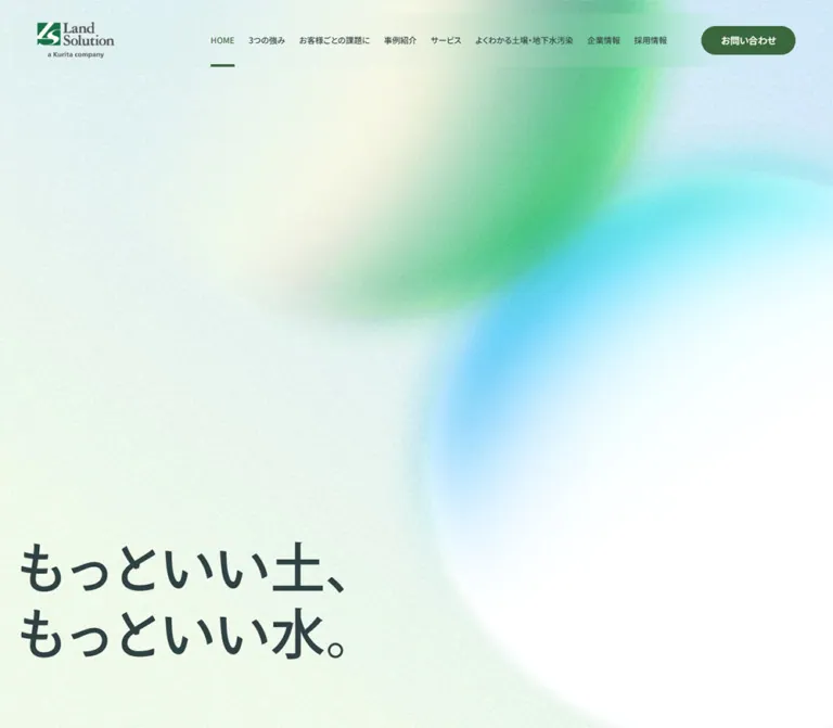
土壌・地下水汚染の専門企業のコーポレートサイト。粒状感のある淡い背景にグリーンと水色のグラデーションを重ね、大きな余白、縦書き見出し、細い罫線、丸いボタンで構成しています。
オリジナルサイトを見るLand Solution — Style Reference
Soft green and water-blue fields drifting across lightly grained paper, held together by precise corporate typography.
Website: Land Solution Original URL: https://www.landsolution.co.jp/ Final URL: https://www.landsolution.co.jp/ Theme: light appearance in the supplied captures Inspected: September 12, 2026, 05:37 JST; evidence timestamp September 11, 2026, 20:37:08.833 UTC Viewports: desktop 1440 × 1000 CSS pixels; mobile 390 × 844 CSS pixels Scope: the current corporate homepage, using three desktop screenshots, two mobile screenshots, and rendered DOM/computed-style evidence for both layouts. Visual coverage includes the opening hero, the desktop case-study ending and service introduction, the desktop utility/footer area, and the mobile footer ending. Other homepage sections are documented from DOM evidence where screenshots are unavailable. Linked pages and opened interaction states were not inspected.
Land Solution presents environmental expertise through an unusually spacious corporate homepage. A pale, granular canvas carries diffuse green and cyan shapes that suggest soil, water, and their relationship without depicting a literal landscape. The opening statement, “もっといい土、もっといい水。”, sits low on the left. A compact persistent header leaves most of the opening viewport available to atmosphere and typography.
The page then becomes a substantial directory of expertise: philosophy, three strengths, customer situations, case studies, services, educational material, company information, recruitment, news, and contact resources. Its character comes from alternating compositions rather than a repeated card template. Centered introductions, vertical headings, square customer entry areas, wide linked rows, and a detailed footer share the same restrained green accents and fine rules.
How to Read This Reference
- Measured means supplied computed styles or rendered element rectangles. Values are CSS pixels unless otherwise stated; long decimals are rounded for readability.
- Visual estimate means an appearance or approximate dimension judged from the supplied screenshots. Estimated hex colors are practical approximations, not pixel samples or recovered CSS declarations.
- Calculated means arithmetic from measured rectangles, such as column gaps or distances between elements.
- Recommended means a proposed implementation choice. The Quick Start uses new descriptive tokens and selectors; these are not recovered source names.
- Coverage matters: DOM evidence establishes content, links, and sampled geometry beyond the screenshots. It does not establish the appearance of every illustration, background layer, or nested text element.
The source root computes to 10px, while the body computes to 16px. The Quick Start retains a conventional browser root and uses explicit sizes. Numerous framework preset variables are present in the supplied data, but their presence does not establish their use in the visible design.
Tokens — Colors
Default Palette
| Name | Value | Suggested token | Evidence and role |
|---|---|---|---|
| Deep blue-green ink | #2f4243 |
--ls-ink |
Measured: body text, headings, navigation, and many links compute to rgb(47, 66, 67) |
| Forest action | #3b673d |
--ls-action |
Measured: filled contact button and active HOME text compute to rgb(59, 103, 61) |
| Reversed white | #ffffff |
--ls-white |
Measured: contact-button text and sampled Topics text |
| Pale paper | approximately #f4f5ed |
--ls-paper |
Visual estimate: the light, slightly warm canvas outside stronger colored fields |
| Warm panel | approximately #e7e7dd |
--ls-panel |
Visual estimate: the broad case-study ending visible above the service section |
| Fresh green | approximately #54bd72 |
--ls-green |
Visual estimate: the stronger green portion of the atmospheric artwork |
| Water blue | approximately #73d3ef |
--ls-water |
Visual estimate: cyan and pale blue in the hero and desktop footer |
| Muted gray-green | approximately #899796 |
--ls-muted |
Visual estimate: the subdued appearance of English labels, address information, and copyright |
| Fine rule | approximately #aab1a8 |
--ls-rule |
Visual estimate: button outlines, footer rules, and quiet structural borders |
The sampled body and section backgrounds are transparent. Consequently, the visible paper, grain, and colored fields cannot be attributed to a particular background declaration from this excerpt. They may be supplied by other elements, pseudo-elements, or media. Use the estimated surface colors to reproduce the appearance without presenting them as recovered source values.
Color Distribution
The strongest solid green belongs to small navigation and action details. Most of the page remains pale. Green and blue become expansive only inside soft background artwork; they do not become a collection of competing button colors.
In the desktop hero, the green field descends from the upper-right region toward the center. A cyan region sits farther down and right, adjoining a large white area. Pale yellow-green and cool gray occupy the quieter left side. The footer repeats this atmospheric relationship behind a much denser information layout.
The mobile hero preserves the palette but changes the framing. Green occupies much of the upper center, blue crosses the right-middle area, and white opens behind the lower-right portion of the message. Treat this as a distinct responsive composition rather than a miniature desktop screenshot.
Tokens — Typography
Primary Japanese Interface
The computed body stack begins with Noto Sans JP, followed by Japanese system fallbacks including Yu Gothic, YuGothic, Hiragino Kaku Gothic Pro, and Meiryo, ending in sans-serif.
- Measured default weight:
500. - Measured secondary weight:
400for several captions, utility descriptions, address text, and legal links. - Measured tracking: generally
normal. - Character: calm, moderately substantial Japanese sans-serif typography, with hierarchy established chiefly through size, line spacing, and placement.
A computed family stack establishes the CSS declaration. It does not prove which font file supplied every glyph or whether a remote font loaded successfully.
English Section Labels
Small labels such as “Service & Solution” sit above Japanese headings. In the supplied service screenshot, their visible letterforms appear serif-like and lighter than the main Japanese text. However, the sampled label wrapper reports the primary sans-serif stack. Nested text styling or graphic content was not captured sufficiently to resolve this difference.
Recommended approximation: use a restrained generic serif at about 16px for these labels, with a muted color. Do not identify a specific English typeface as verified.
Hero Lettering and Brand Marks
The hero headline is visible in the screenshots, but its sampled H2 has an empty text value and an inherited 16px font size. That wrapper value does not describe the large visible lettering. The asset format, nested structure, and exact display font are unverified.
The logo also contains its own distinctive serif wordmark and the line “a Kurita company”. Preserve the complete authorized brand asset when available. Ordinary body-font settings do not reproduce it.
Type Scale
| Role | Desktop | Mobile | Weight / evidence |
|---|---|---|---|
| Main navigation | 14px / 14px |
Hidden in the captured header | 500, measured |
| Header contact label | 14px / 14px |
12px / 12px |
500, measured |
| Outline-button label | 18px / 18px |
16px / 16px |
500, measured |
| Philosophy statement | 30px / 69px |
18px / 41.4px |
500, measured; line-height ratio 2.3 |
| Main section heading | 48px / 54.72px |
34px / 38.76px |
500, measured; line-height ratio 1.14 |
| Customer-section subtitle | 32px / 36.48px |
20px / 22.8px |
500, measured |
| Standard explanatory paragraph | 16px / 32px |
16px / 32px |
500, measured |
| Customer-section introduction | 18px / 36px |
18px / 36px |
500, measured |
| Knowledge-link heading | 20px / 32px |
18px / 28.8px |
500, measured |
| Company / recruitment heading | 40px / 40px |
30px / 30px |
500, measured |
| Utility-tile heading | 24px / 28.8px |
20px / 24px |
500, measured |
| Utility-tile description | 14px / 25.2px |
12px / 21.6px |
400, measured |
| Footer primary link | 15px / 27px |
15px / 27px |
500, measured |
| Address | 13px / 23.4px |
13px / 23.4px |
400, measured |
| Legal link | 12px / 21.6px |
13px / 23.4px |
400, measured |
| Copyright | 14px / 25.2px |
14px / 25.2px |
400, measured |
The case-study heading adds 0.1em tracking: 4.8px on desktop and 3.4px on mobile. The desktop Topics heading also uses 0.1em tracking; its mobile counterpart returns to normal tracking.
Some customer and case-study H3 wrappers report 16px / 16px despite much taller visible content boxes. Their descendants were not resolved. Do not use those wrapper values as proof of the final display lettering size.
Tokens — Spacing & Shapes
Spacing Scale
The page uses a recognizable set of small interface gaps alongside very large section intervals. The larger numbers belong to particular compositions; they are not a universal padding rule.
| Use | Value | Status |
|---|---|---|
| Compact media-banner inset | 8px |
Measured |
| Footer notice inset and internal gap | 10px |
Measured |
| Section-label icon gap | 13px desktop; 12px mobile |
Measured on wrappers |
| Outline-button label-to-arrow gap | 20px |
Measured |
| Desktop navigation item gap | 24px |
Calculated from adjacent link rectangles |
| Mobile page inset | 24px |
Measured across main content and footer |
| Standard heading-to-paragraph distance | 40px |
Calculated in the service section and other sampled sections |
| Paragraph-to-outline-button distance | 60px |
Calculated in the service and strengths sections |
| Customer-grid desktop gap | 60px |
Calculated |
| Desktop main-content side margin | 120px at 1440px |
Measured |
| Desktop service label top offset | 195px |
Calculated from section start |
| Mobile service label top offset | 258px |
Calculated from section start |
Border Radius
| Element | Value | Evidence |
|---|---|---|
| Header contact button | 1440px desktop; 844px mobile |
Measured computed values; both render as pills |
| Outline links | Same large computed radii | Measured; use a semantic pill radius in a new implementation |
| Introduction-video banner | 10px |
Measured |
| Footer assessment notice | 8px |
Measured |
| Large case-study region ending | Approximately 80px lower corners on desktop |
Visual estimate |
| Circular arrow inside outline link | Approximately 26px diameter |
Visual estimate, consistent with button geometry |
| Mobile PAGE TOP circle | Approximately 36px diameter |
Visual estimate; complete control height measures 36px |
Most sampled content links and rows have a zero border radius. Rounded geometry is concentrated in actions, compact notices, and a few large section boundaries.
Layout Measurements
| Element | Desktop 1440 × 1000 | Mobile 390 × 844 |
|---|---|---|
| Document height | 11321.92px |
14416.25px |
| Header rectangle | x 20, y 20, 1400 × 80px |
x 0, y 0, 390 × 75px |
| Header logo link | x 60, 115 × 54.69px |
x 24, 100 × 47.56px |
| Header contact button | 141 × 43px |
107 × 32px |
| Menu button | Not visible | 24 × 24px, x 342, y 25.5 |
| Typical main-content width | 1200px, x 120 |
342px, x 24 |
| Opening section | 1440 × 1000px |
390 × 812px |
| Hero heading wrapper | x 120, y 708, 504 × 202px |
x 24, y 579.75, 342 × 128.25px |
| Customer entry link | 360 × 360px, three across |
342 × 342px, stacked |
| Introduction-video banner | 960 × 176px |
327 × 94.56px |
| Service introduction section | 694.72px high |
935.33px high |
| Knowledge link | 420 × 113px |
342 × 85px |
| Utility tile | 480 × 480px |
390 × approximately 273px |
| Footer | 703.17px high |
2121.70px high |
The mobile hero wrapper includes 22px of right padding. Its usable content area is therefore approximately 320 × 128.25px, which has almost the same aspect ratio as the desktop 504 × 202px area: approximately 2.495:1. This is consistent with proportionally scaled graphic lettering, although the actual asset implementation remains unknown.
Components
Persistent Header
Role: keep corporate identity, major destinations, and contact access available throughout a long page.
On desktop, an 80px-high strip sits 20px from the top and side edges. The logo begins at x60. The navigation starts much farther right, at approximately x421, and uses 14px medium-weight labels with 24px gaps. The final contact link is a solid forest-green pill with white text.
HOME has green text and a short green underline along the header’s lower edge. The visible navigation shortens the service label to “サービス”, while the supplied link text includes “サービス&ソリューション”. Use context-specific display labels without changing the destination’s identity.
The header remains in the same screen position in the supplied scrolled captures. This establishes persistent behavior; the excerpt does not identify whether the source uses fixed positioning, sticky positioning, or another mechanism. Its surface appears translucent or softly tinted, but the sampled HEADER itself has a transparent background. A blur filter is not verified.
On mobile, the header becomes a flush 75px strip. The logo, contact pill, and three-line menu icon remain visible. The desktop link row disappears. The contact button begins at x211; the menu glyph occupies a 24px square at x342. Only the closed menu state is supplied.
Opening Hero and Philosophy Statement
Role: establish the environmental brand before introducing services and credentials.
The opening screen is almost entirely atmospheric artwork. There is no visible photograph, card grid, or body paragraph inside the captured hero. The large two-line message sits in the lower-left area, well below the header.
On desktop, the heading wrapper ends 90px above the opening section’s bottom. On mobile, it ends 104px above the measured 812px section bottom. The mobile section is 32px shorter than the supplied viewport; the source rule responsible for that difference is not available. Do not label it as a verified 100vh, 100dvh, or browser-chrome calculation.
The following philosophy paragraph is another major visual event. It starts at document y1235 on desktop and y975.13 on mobile. Its measured 2.3 line-height ratio creates a slow reading rhythm. A 56px-high desktop outline link, “企業フィロソフィー”, follows with 60px of separation; mobile reduces the control to 52px high.
Section Heading System
Role: identify each subject while allowing the composition to change.
The common horizontal anatomy is:
- Two small overlapping green and blue dots beside a quiet English label.
- A Japanese heading below it.
- Explanatory text after a larger interval.
- An optional outline destination link.
In the service section, the label-to-heading gap is 25px on desktop and approximately 16px on mobile. The heading-to-body gap is 40px at both sizes. Main headings reduce from 48px to 34px while body text stays at 16px.
The alignment is contextual. The service and customer introductions are centered. The strengths and knowledge sections begin at the content’s left edge. Case Studies uses a vertical title rail. Avoid assigning every section the same centered heading template.
Outline Destination Link
Role: provide a consistent, modest route to deeper content.
The component combines a thin outlined capsule, a medium-weight text label, and a small solid green circle containing a white right arrow. The label and arrow are separated by a measured 20px gap.
Desktop anatomy is 56px high, with 29px left padding, 18px right padding, and 18px text. Mobile uses 52px height, 24px left padding, 16px right padding, and 16px text. Width follows the label: the desktop case-study link measures 203px, while the service link measures approximately 291.41px.
Placement also varies. The service button is centered. Customer and case-study section links align to the right on desktop and to the left in the supplied mobile geometry. Do not make all destination links full-width by default.
Three Strengths and Introduction-Video Banner
Role: establish capability, then introduce a specific information-management service.
The strengths section contains an English label, a two-line Japanese title, explanatory copy, three named strengths, and a destination link. Desktop copy occupies a 480px-wide area beginning at x120.
Mobile geometry shows a meaningful reorder: the section heading appears around y1715, the three strength labels occupy positions around y2029–2231, and the paragraph begins at y2373.59. Preserve the relationship between heading, strength presentation, and explanation instead of simply stacking desktop columns in an arbitrary order.
The three mobile strength-label H3 elements compute to 8.32px with a 10.816px line height. Their surrounding graphic treatment is not shown in the supplied screenshots. This is a measured small-text condition, not a recommendation for ordinary body copy.
The separate Introduction Video link is a rounded horizontal banner, 960 × 176px on desktop and 327 × 94.56px on mobile. It uses a 10px radius and an 8px inset. Its internal gap changes from 42px to 16px, and its descriptive heading changes from 20px / 32px to 12px / 19.2px.
The link targets /#video. That establishes an in-page destination, but does not establish a modal, autoplay, player controls, or playback behavior.
Customer Situation Entries
Role: organize services around the visitor’s situation.
Three square links cover ongoing factory environmental management, land sale or reuse, and land asset evaluation. At 1440px, they are 360px squares positioned at x120, x540, and x960. Their calculated gap is 60px.
Each title area is inset 40px from the square’s sides and bottom. Supporting text sits outside the square, 30px below it on desktop and 20px below it on mobile. These descriptions use regular weight; they decrease from 16px to 14px on mobile.
At 390px, each square remains large at 342 × 342px and the entries stack. The next square begins 60px after the preceding supporting description. The squares therefore retain their visual importance rather than shrinking into compact mobile list thumbnails.
The excerpt does not expose the media inside these squares. Preserve the measured grouping without inventing photographic subjects or illustration styles.
Case Studies
Role: present concrete work through an editorial arrangement.
The title “事例紹介” is arranged vertically on both inspected layouts. Desktop geometry gives it a narrow 54.72px-wide, 211.2px-high box; mobile gives it a 38.75px-wide, 149.61px-high box. The English label occupies a neighboring narrow vertical area.
Desktop explanatory text begins at x301, to the right of the title rail. Three linked case entries follow in columns. Their measured widths are approximately 283.66px, and the first begins at x335. Each contains a title and a smaller supporting sentence. Space above the title is present in the measured link layout, but its media content is not visible in the supplied screenshots.
Mobile keeps the vertical heading beside an introductory paragraph approximately 253.25px wide. The case entries then become full-width 342px blocks below the introduction. The vertical heading is not automatically converted to a horizontal mobile heading.
The desktop screenshot shows the end of this area as a full-width warm-gray surface with generously rounded lower corners, followed by the much lighter service section. The sampled section itself is transparent, so the background belongs to an unsampled layer or wrapper.
Service Introduction
Role: create a quiet, centered overview between denser sections.
This is the most fully visible middle-page composition. “Service & Solution” sits above “サービス&ソリューション”, followed by four lines of centered desktop copy and an outline link.
Its measured vertical sequence is particularly reusable:
- Section start to label: 195px on desktop.
- Label height: 16px.
- Label to heading: 25px.
- Heading height: approximately 54.72px.
- Heading to body: 40px.
- Body height: 128px, using
16px / 32px. - Body to button: 60px.
- Button height: 56px.
- Button to section end: 120px.
On mobile, the heading becomes two lines, the paragraph becomes seven lines, and the button remains centered. The top interval grows to 258px and the bottom interval to 192px. This section becomes taller despite its smaller typography, preserving the page’s spacious pacing.
Knowledge Directory
Role: make technical subject matter approachable through direct questions.
Seven linked questions cover soil contamination, groundwater contamination, legislation, surveys, countermeasures, unattended risks, and PFAS. The sampled anchors lead to separate content URLs. They are not evidence of accordion behavior.
Desktop links form two columns beginning at x420 and x900. Each column is 420px wide, with a calculated 60px gap. The first column contains four items; the second contains three. The 300px region between the main content edge and the first list is not explained by the supplied media evidence.
Each desktop link measures 113px high and has padding 40px 10px 32px 0. Mobile converts the directory into one 342px-wide list with 85px-high rows and padding 25px 16px 19px 8px. Question headings reduce from 20px to 18px.
Company, Recruitment, and Topics
Role: extend the homepage beyond services into organizational information and current activity.
The company and recruitment destinations are wide linked rows. Desktop anchors measure 1200 × 321px and use flex layout, with headings beginning at x120 and explanatory copy at x660.
Mobile retains some internal structure: each anchor becomes a two-column grid of 171px + 171px with a 40px row gap, while explanatory paragraphs span the full 342px width below. Company and recruitment heights become approximately 417px and 487.48px respectively. The unpictured media areas should not be assigned invented photographs.
Topics has two dated news entries in the supplied content. Its title and links compute to white. Desktop positions a vertical heading on the right of the news list; mobile switches to a horizontal heading above a narrower 284px-wide list. The actual background behind the white text is not present in the supplied screenshots and cannot be recovered from the transparent sampled containers.
Utility Tiles
Role: offer three parallel ways to continue: FAQ, contact, and newsletter registration.
Desktop uses three full-width adjacent tiles, each 480 × 480px. Their visible lower portions show left-aligned titles and short descriptions, with fine vertical separators between tiles. Green and cyan icon artwork is partially visible above the text.
Each tile contains an icon area, an English label, a Japanese heading, and supporting copy. The internal text region is 360px wide and begins 60px from the tile’s left edge. Headings use 24px type; supporting text uses regular 14px type with a 1.8 line-height ratio.
Mobile stacks the tiles at full viewport width. Each is approximately 273px high, with measured padding of 44px 24px 47px. Headings reduce to 20px and descriptions to 12px. These are broad linked destinations, not small buttons embedded inside independent cards.
Footer, Assessment Notice, and PAGE TOP
Role: provide a complete site directory and a second expression of the brand.
The desktop footer returns to the blurred green-and-blue atmosphere of the hero. A large Land Solution mark sits in the left identity area above the company name and address. Two outbound company banners follow, labeled “栗田工業株式会社” and “株式会社ランドマネジメント”. Their visible artwork includes distinct blue branding, which belongs to those marks rather than the site’s primary action palette.
To the right, the directory uses three columns approximately 268.14px wide with 60px gaps. Primary links have fine bottom rules and small right arrows. They use 15px / 27px, 12px bottom padding, and measured 41px-high boxes. Successive primary rows begin 71px apart on desktop.
The assessment link is a compact outlined notice with an 8px radius, 10px padding, a green clipboard symbol, descriptive text, and a right arrow. It measures approximately 268.14 × 72.98px on desktop and 342 × 79.98px on mobile. Its small date note refers specifically to that assessment form and should remain attached to it.
The mobile footer becomes a long single-column directory. Primary rows begin 65px apart, maintaining the 41px row box with 24px between rows. The legal links stack below the notice. A right-aligned PAGE TOP control follows, pairing a small text label with a green circular up arrow; copyright is centered beneath it.
The footer logo’s inline anchor reports a 24px-high rectangle even though the visible artwork is much taller. Inline-link rectangles should not be used as the rendered image dimensions. The supplied screenshots indicate a large mark approximately 240px wide.
Tokens — Motion & Interaction
| Element or behavior | Evidence | What is established |
|---|---|---|
| Header logo and navigation links | opacity 0.3s |
A 300ms opacity transition is defined; endpoint opacity is not supplied |
| Header contact button | background-color 0.3s ease-out, color 0.3s ease-out |
Color changes are configured for 300ms; actual hover colors were not captured |
| Outline destination links | 0.3s ease-out |
A short transition is defined; changed properties and end states are unresolved |
| Footer subsidiary links | color 0.3s ease-out |
A 300ms text-color transition is defined |
| Persistent header | Same screen placement in scrolled screenshots | Header persistence is visible; implementation mechanism is unverified |
| Mobile menu | Closed three-line button visible | Trigger exists; open panel, animation, focus behavior, and dismissal are unverified |
| Introduction Video | Anchor points to /#video |
In-page destination exists; player and opening behavior are unverified |
| PAGE TOP | Button in mobile DOM and screenshot | Return-to-top affordance exists; resulting scroll behavior was not exercised |
| Hero and footer atmosphere | Still captures only | Shape, grain, and color are visible; animation timing and movement are unverified |
Many sampled elements show animation: none. That statement applies to those elements, not necessarily to their descendants, pseudo-elements, canvas content, or JavaScript effects. Likewise, a serialized transition: all without a nonzero duration is not evidence of an animated interaction.
The capture process waited for finite animation and sampled layout stability, temporarily paused perpetual animations during readiness checks, and resumed them afterward. These precautions improve capture reliability but do not reveal motion trajectories or prove that all delayed content appeared.
Recommended motion policy: retain the measured 300ms interaction scale for subtle link feedback. Keep the atmospheric background static until a motion specification is independently established. Do not invent cursor-following blobs, parallax, automatic video playback, or entrance sequences as original behavior.
Surfaces
| Layer | Appearance | Evidence and purpose |
|---|---|---|
| Main canvas | Pale, lightly granular paper | Visually observed; provides continuity between sections |
| Hero atmosphere | Broad green, cyan, ivory, and white fields with soft boundaries | Visually observed; establishes the environmental identity |
| Header veil | Quiet tinted or translucent strip | Visually observed; exact compositing and blur are unknown |
| Case-study ending | Warm-gray field with large curved lower corners | Visually observed in desktop middle capture |
| Standard content | Mostly open surface with typography and restrained rules | Supported by screenshots and measured transparent containers |
| Topics contrast area | White text over an unresolved underlying surface | Text color measured; background not visually supplied |
| Footer | Atmospheric color behind a structured directory | Visually observed on desktop; mobile ending is mostly pale |
| Notice and outline links | Thin outlines with little visual elevation | Visually observed; no shadow system is established |
The inspected areas do not suggest a general elevated-card system. Separation comes from spacing, alignment, rules, and selective background changes.
Imagery
The strongest visual asset is the abstract background, not a conventional hero photograph. Its edges are extensively softened, and fine grain prevents the large color fields from looking like polished interface gradients. The grain is visible across both pale and colored areas. Preserve that fine scale; coarse speckles or large paper fibers would create a different material impression.
The green and blue forms overlap and leave substantial white space. Avoid composing them as hard-edged circles, equal-sized gradient blobs, or a uniform linear wash. Their asymmetry allows the hero statement to remain readable while the upper and right portions carry most of the color.
Brand assets remain crisp against the soft background. Utility icons introduce more saturated green, small blue details, and recognizable symbols such as a question mark, communication imagery, and a clipboard. Only parts of the larger utility icons are visible, so their complete construction is not established.
Observed Asset References
No image source URLs or asset filenames were included in the supplied original-page evidence. The following references identify visible material without inventing paths.
| Asset or media area | Where observed | What can be reused as a design reference |
|---|---|---|
| Land Solution logo with company tagline | Desktop and mobile headers; desktop footer | Complete wordmark proportions and contrasting green symbol |
| Two-line Japanese hero message | Desktop and mobile opening screenshots | Lower-left placement and approximately 2.495:1 content proportion |
| Abstract environmental background | Hero screenshots and desktop footer | Soft green/cyan fields, broad white regions, fine grain |
| Paired section dots | Desktop service introduction | Small overlapping green and blue circles |
| Partner-company banners | Desktop footer | Their distinct brand graphics and separation from site navigation |
| Utility illustrations | Partially visible above the desktop footer | Green/blue symbol palette; full illustration details remain unavailable |
| Assessment clipboard symbol | Desktop and mobile footer notice | Small recognizable illustration within a compact outlined link |
| Customer, case-study, and other media regions | DOM layout only | Allocation and grouping can be documented; subjects, crops, and asset styles cannot |
The Quick Start’s CSS gradients and procedural grain are recommended approximations. They do not reproduce a recovered original asset or its rendering technology.
Layout & Responsive Behavior
The desktop composition uses two useful widths: a measured 1200px main-content region at x120 and a wider footer/header alignment reaching approximately x60 to x1380. At 390px, the main reading width becomes 342px with 24px side insets.
A max-width: 1200px main container and a max-width: 1320px wide container are practical implementation recommendations consistent with these samples. Behavior above 1440px was not inspected, so these are not verified source maximum-width rules.
| Area | Desktop behavior | Mobile behavior |
|---|---|---|
| Header | Inset strip with full navigation | Flush strip with logo, contact, and menu icon |
| Hero | Large artwork field; message at x120 | Reframed artwork; message at x24 with a smaller proportional content area |
| Main headings | Usually 48px | Usually 34px; selected headings wrap into two lines |
| Body copy | Commonly 16px with 32px leading | Commonly retains the same readable size and leading |
| Strengths | Copy occupies a left-side region | Strength presentation appears between heading and explanatory paragraph |
| Customer situations | Three 360px squares in one row | Three 342px squares stacked vertically |
| Case studies | Vertical title rail and three entry columns | Vertical title retained beside introduction; entries stack below |
| Service introduction | Centered four-line body | Centered seven-line body with larger total section height |
| Knowledge directory | Two 420px columns, offset from the left | One 342px column with shorter rows |
| Company / recruitment | Wide flex rows | Two-column internal grid with full-width explanatory copy below |
| Topics | Vertical heading to the right | Horizontal heading above the list |
| Utility destinations | Three adjacent 480px squares | Three stacked full-width blocks |
| Footer | Identity region plus three directory columns | Identity, banners, directory, notice, legal links, PAGE TOP, and copyright stack |
No exact breakpoint declarations were supplied. The Quick Start uses separate navigation and content breakpoints as recommendations. These should be adjusted through testing at intermediate widths rather than presented as original values.
The mobile document is approximately 3094px taller than the desktop document, calculated from the measured heights. Much of that growth comes from stacked customer entries, case studies, and the directory footer. Preserve this deliberate reading sequence instead of forcing all content into a compressed mobile summary.
Do’s and Don’ts
Do
- Use the measured ink
#2f4243and action green#3b673dconsistently. - Keep most of the canvas pale and reserve stronger color for atmospheric fields and small controls.
- Preserve fine grain and very soft background edges.
- Place the hero message low and left, with substantial space above it.
- Maintain medium-weight Japanese typography and generous paragraph leading.
- Combine small English section labels with prominent Japanese headings.
- Keep the case-study title vertical on mobile as well as desktop.
- Preserve square customer entry areas when they stack on mobile.
- Use thin outlined pills with small circular arrows for deeper destinations.
- Treat the footer as a complete directory with clear hierarchy and generous row spacing.
- Preserve context-specific responsive changes rather than applying a single global scale factor.
Don’t
- Don’t reduce this corporate homepage to a short conversion funnel.
- Don’t fill every open area with cards, badges, or secondary calls to action.
- Don’t turn the atmospheric artwork into sharp geometric blobs or a glossy linear gradient.
- Don’t apply strong shadows to all content groups.
- Don’t infer the hero font size from its empty 16px H2 wrapper.
- Don’t claim a named serif face for English labels when only the wrapper stack is available.
- Don’t use every framework preset color as part of the brand palette.
- Don’t assume the video link opens a modal or that knowledge links expand inline.
- Don’t invent photography or illustration subjects for sections absent from the screenshots.
- Don’t make every mobile heading horizontal or every mobile button full-width.
- Don’t present recommended breakpoints, hover endpoints, or gradient formulas as recovered source CSS.
Recommended Implementation Additions
These are recommendations for a new implementation, not verified features of the original page:
- Keep the visual 24px menu glyph inside a touch target of at least 44px. Provide an accessible name, expanded state, and a relationship to the controlled navigation.
- Preserve the compact contact pill while expanding its effective touch area.
- Give the hero statement an accessible text equivalent if it is implemented as an image or outlined SVG.
- Keep English section labels as text where practical. Avoid making all section titles inaccessible graphics.
- Provide a readable text presentation of the three strengths in addition to any tiny diagram labels.
- Use visible keyboard focus that remains legible against both pale surfaces and the colored atmosphere.
- Check muted text and fine rules against the actual composited background, not merely against the nominal paper token.
- For a new animated background, provide a static reduced-motion presentation and keep text contrast stable throughout the animation.
- If the video becomes an overlay, implement keyboard access, focus return, and explicit playback controls.
- If PAGE TOP scrolls smoothly, respect reduced-motion preferences and account for the persistent header when navigating to anchors.
- Generate or optimize the grain as a small reusable texture. Avoid an unnecessarily large full-page bitmap solely to add noise.
Agent Prompt Guide
Quick Color Reference
- Main text:
#2f4243, measured. - Contact fill and active navigation:
#3b673d, measured. - Reversed text:
#ffffff, measured. - Paper: approximately
#f4f5ed, visual estimate. - Warm panel: approximately
#e7e7dd, visual estimate. - Atmospheric green and blue: approximately
#54bd72and#73d3ef, visual estimates. - Thin rules and muted labels: use subdued gray-green approximations and verify contrast in the finished composition.
Overall Prompt
“Create a Japanese environmental-services corporate homepage inspired by the supplied Land Solution reference. Use deep blue-green text #2f4243, forest-green actions #3b673d, a pale paper canvas, fine grain, and broad soft green/cyan background fields. Start with a near-viewport-height hero whose two-line statement sits low on the left. Add a persistent compact header, medium-weight Japanese sans-serif typography, small subdued English section labels with overlapping green/blue dots, and thin outlined pill links with circular arrows. Build a long corporate information sequence with varied layouts: strengths, square customer situations, vertically titled case studies, a centered service introduction, a question directory, organizational links, news, utility destinations, and a complete footer. At 390px, retain 24px gutters, readable 16px body text, large stacked customer entries, and the vertical case-study heading. Use static atmosphere unless separate motion requirements are supplied.”
Example Component Prompts
- Hero: “Create a pale, finely grained environmental hero with a soft green field high on the right, cyan farther down, and generous white space. Place ‘もっといい土、もっといい水。’ in two lines at the lower left. Match a 504 × 202px desktop message region and an approximately 320 × 128px mobile content region. Treat the message’s exact font and asset construction as unresolved.”
- Header: “Build a persistent desktop header inset 20px, 80px high, with a 115px-wide logo, 14px navigation, 24px navigation gaps, a short active underline, and a 141 × 43px forest-green contact pill. On mobile use a flush 75px strip, 100px logo, compact contact pill, and a 24px three-line glyph inside a larger accessible hit area.”
- Service introduction: “Use a centered English eyebrow with two overlapping colored dots, a 48px Japanese heading, and 16px copy with 32px leading. Separate heading and body by 40px, then place a 56px outlined destination link 60px below the body. At mobile size use a two-line 34px heading and a 52px button while retaining broad vertical spacing.”
- Case studies: “Arrange a tracked vertical Japanese heading beside the introduction. Use three desktop case-entry columns and stack them on mobile while keeping the vertical heading beside the opening paragraph. End the desktop region with broad rounded lower corners on a warm pale-gray surface. Use supplied media only; do not invent source imagery.”
- Footer: “Place a large corporate mark and two company banners beside three columns of ruled directory links. Repeat the soft green/cyan atmosphere behind the desktop footer. On mobile stack the directory with 24px gutters, 15px link text, fine rules, a compact clipboard notice, separate legal links, a right-aligned circular PAGE TOP control, and centered copyright.”
Quick Start
CSS Custom Properties
This is a new implementation scaffold using measured text/action colors and component dimensions, plus explicitly estimated surfaces. The gradients, grain generator, generic serif eyebrow, hover endpoints, and breakpoints are recommendations. The hero defaults to 100svh; set --ls-hero-height: 812px only when making a specimen of the measured mobile capture. The original mobile height formula is unknown.
Use an authorized logo and hero-lettering asset when available. The .ls-hero-fallback rule provides approximate live-text proportions; it does not identify the original hero font.
:root {
  /* Measured colors */
  --ls-ink: #2f4243;
  --ls-action: #3b673d;
  --ls-white: #ffffff;

  /* Estimated appearance tokens */
  --ls-paper: #f4f5ed;
  --ls-panel: #e7e7dd;
  --ls-green: #54bd72;
  --ls-water: #73d3ef;
  --ls-muted: #899796;
  --ls-rule: #aab1a8;

  /* Source-informed stack; shortened fallback list */
  --ls-font: 'Noto Sans JP', 'Yu Gothic', YuGothic,
    'Hiragino Kaku Gothic Pro', Meiryo, sans-serif;
  --ls-eyebrow-font: serif;
  --ls-title-size: 48px;
  --ls-title-leading: 1.14;
  --ls-body-size: 16px;
  --ls-body-leading: 2;

  /* Reusable dimensions */
  --ls-content: 1200px;
  --ls-wide: 1320px;
  --ls-gutter: 24px;
  --ls-button-height: 56px;
  --ls-pill: 9999px;
  --ls-notice-radius: 8px;
  --ls-banner-radius: 10px;
  --ls-region-radius: 80px;
  --ls-feedback: 300ms ease-out;
}

* { box-sizing: border-box; }

body {
  margin: 0;
  color: var(--ls-ink);
  background: var(--ls-paper);
  font-family: var(--ls-font);
  font-size: var(--ls-body-size);
  font-weight: 500;
  line-height: var(--ls-body-leading);
}

img, svg { max-inline-size: 100%; }
a { color: inherit; }
button { font: inherit; }

.ls-container {
  inline-size: min(calc(100% - 48px), var(--ls-content));
  margin-inline: auto;
}

.ls-wide {
  inline-size: min(calc(100% - 48px), var(--ls-wide));
  margin-inline: auto;
}

/* Recommended procedural grain, not an original asset */
.ls-paper {
  position: relative;
  isolation: isolate;
}

.ls-paper::after {
  content: '';
  position: absolute;
  inset: 0;
  z-index: -1;
  pointer-events: none;
  opacity: 0.14;
  mix-blend-mode: multiply;
  background-size: 180px 180px;
  background-image: url("data:image/svg+xml,%3Csvg xmlns='http://www.w3.org/2000/svg' width='180' height='180'%3E%3Cfilter id='g'%3E%3CfeTurbulence type='fractalNoise' baseFrequency='.8' numOctaves='3' stitchTiles='stitch'/%3E%3CfeColorMatrix type='saturate' values='0'/%3E%3C/filter%3E%3Crect width='100%25' height='100%25' filter='url(%23g)'/%3E%3C/svg%3E");
}

.ls-atmosphere {
  background:
    radial-gradient(ellipse at 106% 92%,
      #fff 0 25%, transparent 47%),
    radial-gradient(ellipse at 92% 46%,
      rgb(115 211 239 / 75%) 0 12%, transparent 43%),
    radial-gradient(ellipse at 70% 2%,
      rgb(84 189 114 / 85%) 0 14%, transparent 40%),
    radial-gradient(ellipse at 38% 7%,
      #f5f0d9 0 12%, transparent 44%),
    var(--ls-paper);
}

.ls-header {
  position: fixed;
  inset: 20px 20px auto;
  z-index: 50;
  display: flex;
  align-items: center;
  gap: 38px;
  block-size: 80px;
  padding-inline: 40px;
  background: rgb(236 244 234 / 86%);
}

.ls-brand {
  display: block;
  flex: 0 0 115px;
  line-height: 0;
}

.ls-brand img {
  display: block;
  inline-size: 100%;
  block-size: auto;
}

.ls-nav {
  display: flex;
  gap: 24px;
  margin-inline-start: auto;
}

.ls-nav a {
  position: relative;
  display: flex;
  align-items: center;
  block-size: 80px;
  font-size: 14px;
  line-height: 1;
  white-space: nowrap;
  text-decoration: none;
  transition: opacity 300ms;
}

.ls-nav a[aria-current='page'] {
  color: var(--ls-action);
}

.ls-nav a[aria-current='page']::after {
  content: '';
  position: absolute;
  inset: auto 0 0;
  block-size: 4px;
  background: var(--ls-action);
}

.ls-contact {
  position: relative;
  display: inline-flex;
  flex: 0 0 141px;
  align-items: center;
  justify-content: center;
  block-size: 43px;
  border-radius: var(--ls-pill);
  color: var(--ls-white);
  background: var(--ls-action);
  font-size: 14px;
  line-height: 1;
  text-decoration: none;
  transition: background-color var(--ls-feedback),
    color var(--ls-feedback);
}

.ls-menu { display: none; }

.ls-hero {
  position: relative;
  block-size: var(--ls-hero-height, 100svh);
  min-block-size: 620px;
  overflow: hidden;
}

.ls-hero-mark {
  position: absolute;
  inset-inline-start: max(24px, calc((100% - 1200px) / 2));
  inset-block-end: 90px;
  inline-size: 504px;
  max-inline-size: calc(100% - 48px);
  margin: 0;
}

.ls-hero-mark img {
  display: block;
  inline-size: 100%;
  block-size: auto;
}

/* Approximate text alternative to graphic lettering */
.ls-hero-fallback {
  font-size: 72px;
  font-weight: 500;
  line-height: 1.4;
}

.ls-hero-fallback span {
  display: block;
  white-space: nowrap;
}

.ls-eyebrow {
  display: inline-flex;
  align-items: center;
  gap: 13px;
  margin: 0;
  color: var(--ls-muted);
  font-family: var(--ls-eyebrow-font);
  font-size: 16px;
  font-weight: 400;
  line-height: 1;
}

.ls-eyebrow::before {
  content: '';
  flex: 0 0 20px;
  inline-size: 20px;
  block-size: 12px;
  background:
    radial-gradient(circle at 6px 6px,
      var(--ls-action) 0 5.8px, transparent 6px),
    radial-gradient(circle at 14px 6px,
      var(--ls-water) 0 5.8px, transparent 6px);
}

.ls-title {
  margin: 25px 0 0;
  font-size: var(--ls-title-size);
  font-weight: 500;
  line-height: var(--ls-title-leading);
}

.ls-copy {
  margin: 40px 0 0;
  font-size: 16px;
  line-height: 2;
}

.ls-button {
  display: inline-flex;
  align-items: center;
  justify-content: center;
  gap: 20px;
  min-block-size: var(--ls-button-height);
  max-inline-size: 100%;
  padding: 8px 18px 8px 29px;
  border: 1px solid var(--ls-rule);
  border-radius: var(--ls-pill);
  font-size: 18px;
  line-height: 1.25;
  text-decoration: none;
  transition: background-color var(--ls-feedback),
    color var(--ls-feedback), border-color var(--ls-feedback);
}

.ls-button::after {
  content: '→';
  display: grid;
  flex: 0 0 26px;
  place-items: center;
  inline-size: 26px;
  block-size: 26px;
  border-radius: 50%;
  color: var(--ls-white);
  background: var(--ls-action);
  font-size: 12px;
  line-height: 1;
}

.ls-service {
  padding-block: 195px 120px;
  text-align: center;
}

.ls-service .ls-copy {
  max-inline-size: 660px;
  margin-inline: auto;
}

.ls-service .ls-button { margin-block-start: 60px; }

.ls-customer-grid {
  display: grid;
  grid-template-columns: repeat(3, minmax(0, 1fr));
  gap: 60px;
}

.ls-customer-tile {
  display: flex;
  flex-direction: column;
  justify-content: flex-end;
  aspect-ratio: 1;
  padding: 40px;
  text-decoration: none;
}

.ls-customer-caption {
  margin: 30px 0 0;
  font-size: 16px;
  font-weight: 400;
  line-height: 1.8;
}

.ls-case-panel {
  padding-block: 120px 160px;
  border-radius: 0 0 var(--ls-region-radius) var(--ls-region-radius);
  background: var(--ls-panel);
}

.ls-case-title {
  margin: 0;
  writing-mode: vertical-rl;
  font-size: var(--ls-title-size);
  font-weight: 500;
  line-height: 1.14;
  letter-spacing: 0.1em;
}

.ls-case-cards {
  display: grid;
  grid-template-columns: repeat(3, minmax(0, 1fr));
  gap: 60px;
}

.ls-knowledge-columns {
  display: grid;
  grid-template-columns: repeat(2, minmax(0, 1fr));
  gap: 60px;
  margin-inline-start: 300px;
}

.ls-knowledge-link {
  display: flex;
  align-items: center;
  justify-content: space-between;
  gap: 16px;
  min-block-size: 113px;
  padding: 40px 10px 32px 0;
  border-block-end: 1px solid var(--ls-rule);
  font-size: 20px;
  line-height: 1.6;
  text-decoration: none;
}

.ls-utilities {
  display: grid;
  grid-template-columns: repeat(3, minmax(0, 1fr));
  border-block: 1px solid var(--ls-rule);
}

.ls-utility-link {
  min-block-size: 480px;
  padding: 80px 24px 50px;
  text-decoration: none;
}

.ls-utility-link + .ls-utility-link {
  border-inline-start: 1px dotted var(--ls-rule);
}

.ls-utility-inner {
  max-inline-size: 360px;
  margin-inline: auto;
}

.ls-footer { padding-block: 120px 40px; }

.ls-footer-grid {
  display: grid;
  grid-template-columns: minmax(240px, 306px) minmax(0, 1fr);
  gap: 90px;
}

.ls-footer-menu {
  display: grid;
  grid-template-columns: repeat(3, minmax(0, 1fr));
  gap: 60px;
}

.ls-footer-link {
  display: flex;
  align-items: center;
  justify-content: space-between;
  min-block-size: 41px;
  padding-block-end: 12px;
  border-block-end: 1px solid var(--ls-rule);
  font-size: 15px;
  line-height: 1.8;
  text-decoration: none;
}

.ls-footer-link + .ls-footer-link { margin-block-start: 30px; }

.ls-footer-link::after {
  content: '→';
  color: var(--ls-action);
  font-size: 12px;
}

.ls-notice {
  display: grid;
  grid-template-columns: 40px minmax(0, 1fr) auto;
  align-items: center;
  gap: 10px;
  padding: 10px;
  border: 1px solid var(--ls-rule);
  border-radius: var(--ls-notice-radius);
  font-size: 12px;
  line-height: 1.4;
  text-decoration: none;
}

.ls-legal {
  display: flex;
  flex-wrap: wrap;
  gap: 20px;
  font-size: 12px;
  font-weight: 400;
  line-height: 1.8;
}

/* Recommended focus and hover endpoints */
:where(a, button):focus-visible {
  outline: 3px solid var(--ls-ink);
  outline-offset: 4px;
}

@media (hover: hover) {
  .ls-nav a:hover { opacity: 0.7; }
  .ls-contact:hover { background: var(--ls-ink); }
  .ls-button:hover {
    color: var(--ls-white);
    background: var(--ls-ink);
    border-color: var(--ls-ink);
  }
}

/* Recommended navigation breakpoint */
@media (max-width: 1279px) {
  .ls-header {
    inset: 0 0 auto;
    block-size: 75px;
    gap: 14px;
    padding-inline: 24px 14px;
  }

  .ls-brand {
    flex-basis: 100px;
    margin-inline-end: auto;
  }

  .ls-nav { display: none; }

  .ls-contact {
    flex-basis: 107px;
    block-size: 32px;
    font-size: 12px;
  }

  /* Extend the compact pill's effective touch area */
  .ls-contact::before {
    content: '';
    position: absolute;
    inset: -6px 0;
  }

  .ls-menu {
    display: grid;
    flex: 0 0 44px;
    place-content: center;
    gap: 6px;
    inline-size: 44px;
    block-size: 44px;
    padding: 0;
    border: 0;
    background: transparent;
    cursor: pointer;
  }

  .ls-menu span {
    inline-size: 24px;
    block-size: 2px;
    background: var(--ls-action);
  }
}

/* Recommended content breakpoint */
@media (max-width: 767px) {
  :root {
    --ls-title-size: 34px;
    --ls-button-height: 52px;
  }

  .ls-hero-mark {
    inset-block-end: 104px;
    inline-size: calc(100% - 48px);
    padding-inline-end: 22px;
  }

  .ls-hero-fallback { font-size: 45px; }
  .ls-eyebrow { gap: 12px; }
  .ls-title { margin-block-start: 16px; }

  .ls-button {
    padding-inline: 24px 16px;
    font-size: 16px;
  }

  .ls-service { padding-block: 258px 192px; }

  .ls-customer-grid,
  .ls-case-cards,
  .ls-knowledge-columns,
  .ls-utilities,
  .ls-footer-grid,
  .ls-footer-menu {
    grid-template-columns: minmax(0, 1fr);
  }

  .ls-customer-caption {
    margin-block-start: 20px;
    font-size: 14px;
  }

  .ls-knowledge-columns {
    gap: 0;
    margin-inline-start: 0;
  }

  .ls-knowledge-link {
    min-block-size: 85px;
    padding: 25px 16px 19px 8px;
    font-size: 18px;
  }

  .ls-utility-link {
    min-block-size: 273px;
    padding: 44px 24px 47px;
  }

  .ls-utility-link + .ls-utility-link {
    border-inline-start: 0;
    border-block-start: 1px dotted var(--ls-rule);
  }

  .ls-footer-menu { gap: 24px; }
  .ls-footer-link + .ls-footer-link { margin-block-start: 24px; }
  .ls-notice { font-size: 14px; }

  .ls-legal {
    flex-direction: column;
    gap: 10px;
    font-size: 13px;
  }
}

@media (prefers-reduced-motion: reduce) {
  .ls-nav a,
  .ls-contact,
  .ls-button {
    transition: none;
  }
}
The scaffold supplies appearance and representative layout primitives. Complete navigation markup, the open mobile menu, media, content-dependent line breaks, and PAGE TOP behavior require separate implementation. Keep the unpictured Topics surface and other unresolved media areas outside any claim of exact reproduction.
Tailwind v4 Token Mapping
Optional aliases for a project already using Tailwind v4. Define the CSS custom properties above first. This mapping does not imply that the original website uses Tailwind.
@theme inline {
  --color-ink: var(--ls-ink);
  --color-action: var(--ls-action);
  --color-paper: var(--ls-paper);
  --color-panel: var(--ls-panel);
  --color-water: var(--ls-water);
  --color-muted: var(--ls-muted);
  --color-rule: var(--ls-rule);

  --font-japanese: var(--ls-font);
  --font-eyebrow: var(--ls-eyebrow-font);
  --text-section: var(--ls-title-size);
  --text-body: var(--ls-body-size);

  --spacing-gutter: var(--ls-gutter);
  --radius-notice: var(--ls-notice-radius);
  --radius-banner: var(--ls-banner-radius);
  --radius-region: var(--ls-region-radius);
}
Sources & Evidence
- Original and final website: https://www.landsolution.co.jp/. The supplied browser record reports HTTP 200 and the page title “ランドソリューション株式会社”, with no URL change.
- Capture time:
2026-09-11T20:37:08.833Z, equivalent to September 12, 2026, 05:37:08.833 JST. - Desktop visual evidence: three 1440 × 1000 captures showing the opening hero, the case-study ending and service introduction, and the utility/footer area.
- Mobile visual evidence: two 390 × 844 captures showing the opening hero and the final footer area.
- Rendered evidence: both viewport records include homepage text, link targets, selected element rectangles, computed typography, sampled colors, padding, radii, layout modes, and transition declarations. Recorded document heights are 11321.92px and 14416.25px.
- Observed interaction scope: load and scroll capture states. No supplied evidence demonstrates opening the menu, activating a hover state, playing the video, submitting a form, or using PAGE TOP.
- Inspection limitations: screenshots cover selected positions rather than every section. The excerpt does not include source image URLs, complete descendant styles, pseudo-element styles, background implementation details, exact breakpoint rules, or motion timelines. Readiness checks do not prove semantic completeness or expose all delayed content. SharedWorkers and service workers were disabled during the supplied inspection.
This reference describes the current homepage represented by those captures. Measured values, visual estimates, calculations, and recommended implementation choices are distinguished throughout; no historical design reconstruction is implied.
# Land Solution — Style Reference

> Soft green and water-blue fields drifting across lightly grained paper, held together by precise corporate typography.

**Website:** [Land Solution](https://www.landsolution.co.jp/)
**Original URL:** https://www.landsolution.co.jp/
**Final URL:** https://www.landsolution.co.jp/
**Theme:** light appearance in the supplied captures
**Inspected:** September 12, 2026, 05:37 JST; evidence timestamp September 11, 2026, 20:37:08.833 UTC
**Viewports:** desktop 1440 × 1000 CSS pixels; mobile 390 × 844 CSS pixels
**Scope:** the current corporate homepage, using three desktop screenshots, two mobile screenshots, and rendered DOM/computed-style evidence for both layouts. Visual coverage includes the opening hero, the desktop case-study ending and service introduction, the desktop utility/footer area, and the mobile footer ending. Other homepage sections are documented from DOM evidence where screenshots are unavailable. Linked pages and opened interaction states were not inspected.

Land Solution presents environmental expertise through an unusually spacious corporate homepage. A pale, granular canvas carries diffuse green and cyan shapes that suggest soil, water, and their relationship without depicting a literal landscape. The opening statement, “もっといい土、もっといい水。”, sits low on the left. A compact persistent header leaves most of the opening viewport available to atmosphere and typography.

The page then becomes a substantial directory of expertise: philosophy, three strengths, customer situations, case studies, services, educational material, company information, recruitment, news, and contact resources. Its character comes from alternating compositions rather than a repeated card template. Centered introductions, vertical headings, square customer entry areas, wide linked rows, and a detailed footer share the same restrained green accents and fine rules.

## How to Read This Reference

- **Measured** means supplied computed styles or rendered element rectangles. Values are CSS pixels unless otherwise stated; long decimals are rounded for readability.
- **Visual estimate** means an appearance or approximate dimension judged from the supplied screenshots. Estimated hex colors are practical approximations, not pixel samples or recovered CSS declarations.
- **Calculated** means arithmetic from measured rectangles, such as column gaps or distances between elements.
- **Recommended** means a proposed implementation choice. The Quick Start uses new descriptive tokens and selectors; these are not recovered source names.
- **Coverage matters:** DOM evidence establishes content, links, and sampled geometry beyond the screenshots. It does not establish the appearance of every illustration, background layer, or nested text element.

The source root computes to 10px, while the body computes to 16px. The Quick Start retains a conventional browser root and uses explicit sizes. Numerous framework preset variables are present in the supplied data, but their presence does not establish their use in the visible design.

## Tokens — Colors

### Default Palette

| Name | Value | Suggested token | Evidence and role |
| --- | --- | --- | --- |
| Deep blue-green ink | `#2f4243` | `--ls-ink` | **Measured:** body text, headings, navigation, and many links compute to `rgb(47, 66, 67)` |
| Forest action | `#3b673d` | `--ls-action` | **Measured:** filled contact button and active HOME text compute to `rgb(59, 103, 61)` |
| Reversed white | `#ffffff` | `--ls-white` | **Measured:** contact-button text and sampled Topics text |
| Pale paper | approximately `#f4f5ed` | `--ls-paper` | **Visual estimate:** the light, slightly warm canvas outside stronger colored fields |
| Warm panel | approximately `#e7e7dd` | `--ls-panel` | **Visual estimate:** the broad case-study ending visible above the service section |
| Fresh green | approximately `#54bd72` | `--ls-green` | **Visual estimate:** the stronger green portion of the atmospheric artwork |
| Water blue | approximately `#73d3ef` | `--ls-water` | **Visual estimate:** cyan and pale blue in the hero and desktop footer |
| Muted gray-green | approximately `#899796` | `--ls-muted` | **Visual estimate:** the subdued appearance of English labels, address information, and copyright |
| Fine rule | approximately `#aab1a8` | `--ls-rule` | **Visual estimate:** button outlines, footer rules, and quiet structural borders |

The sampled body and section backgrounds are transparent. Consequently, the visible paper, grain, and colored fields cannot be attributed to a particular background declaration from this excerpt. They may be supplied by other elements, pseudo-elements, or media. Use the estimated surface colors to reproduce the appearance without presenting them as recovered source values.

### Color Distribution

The strongest solid green belongs to small navigation and action details. Most of the page remains pale. Green and blue become expansive only inside soft background artwork; they do not become a collection of competing button colors.

In the desktop hero, the green field descends from the upper-right region toward the center. A cyan region sits farther down and right, adjoining a large white area. Pale yellow-green and cool gray occupy the quieter left side. The footer repeats this atmospheric relationship behind a much denser information layout.

The mobile hero preserves the palette but changes the framing. Green occupies much of the upper center, blue crosses the right-middle area, and white opens behind the lower-right portion of the message. Treat this as a distinct responsive composition rather than a miniature desktop screenshot.

## Tokens — Typography

### Primary Japanese Interface

The computed body stack begins with **`Noto Sans JP`**, followed by Japanese system fallbacks including **`Yu Gothic`**, **`YuGothic`**, **`Hiragino Kaku Gothic Pro`**, and **`Meiryo`**, ending in `sans-serif`.

- **Measured default weight:** `500`.
- **Measured secondary weight:** `400` for several captions, utility descriptions, address text, and legal links.
- **Measured tracking:** generally `normal`.
- **Character:** calm, moderately substantial Japanese sans-serif typography, with hierarchy established chiefly through size, line spacing, and placement.

A computed family stack establishes the CSS declaration. It does not prove which font file supplied every glyph or whether a remote font loaded successfully.

### English Section Labels

Small labels such as “Service & Solution” sit above Japanese headings. In the supplied service screenshot, their visible letterforms appear serif-like and lighter than the main Japanese text. However, the sampled label wrapper reports the primary sans-serif stack. Nested text styling or graphic content was not captured sufficiently to resolve this difference.

**Recommended approximation:** use a restrained generic `serif` at about 16px for these labels, with a muted color. Do not identify a specific English typeface as verified.

### Hero Lettering and Brand Marks

The hero headline is visible in the screenshots, but its sampled H2 has an empty text value and an inherited `16px` font size. That wrapper value does not describe the large visible lettering. The asset format, nested structure, and exact display font are unverified.

The logo also contains its own distinctive serif wordmark and the line “a Kurita company”. Preserve the complete authorized brand asset when available. Ordinary body-font settings do not reproduce it.

### Type Scale

| Role | Desktop | Mobile | Weight / evidence |
| --- | --- | --- | --- |
| Main navigation | `14px / 14px` | Hidden in the captured header | `500`, measured |
| Header contact label | `14px / 14px` | `12px / 12px` | `500`, measured |
| Outline-button label | `18px / 18px` | `16px / 16px` | `500`, measured |
| Philosophy statement | `30px / 69px` | `18px / 41.4px` | `500`, measured; line-height ratio `2.3` |
| Main section heading | `48px / 54.72px` | `34px / 38.76px` | `500`, measured; line-height ratio `1.14` |
| Customer-section subtitle | `32px / 36.48px` | `20px / 22.8px` | `500`, measured |
| Standard explanatory paragraph | `16px / 32px` | `16px / 32px` | `500`, measured |
| Customer-section introduction | `18px / 36px` | `18px / 36px` | `500`, measured |
| Knowledge-link heading | `20px / 32px` | `18px / 28.8px` | `500`, measured |
| Company / recruitment heading | `40px / 40px` | `30px / 30px` | `500`, measured |
| Utility-tile heading | `24px / 28.8px` | `20px / 24px` | `500`, measured |
| Utility-tile description | `14px / 25.2px` | `12px / 21.6px` | `400`, measured |
| Footer primary link | `15px / 27px` | `15px / 27px` | `500`, measured |
| Address | `13px / 23.4px` | `13px / 23.4px` | `400`, measured |
| Legal link | `12px / 21.6px` | `13px / 23.4px` | `400`, measured |
| Copyright | `14px / 25.2px` | `14px / 25.2px` | `400`, measured |

The case-study heading adds **`0.1em` tracking**: 4.8px on desktop and 3.4px on mobile. The desktop Topics heading also uses 0.1em tracking; its mobile counterpart returns to normal tracking.

Some customer and case-study H3 wrappers report `16px / 16px` despite much taller visible content boxes. Their descendants were not resolved. Do not use those wrapper values as proof of the final display lettering size.

## Tokens — Spacing & Shapes

### Spacing Scale

The page uses a recognizable set of small interface gaps alongside very large section intervals. The larger numbers belong to particular compositions; they are not a universal padding rule.

| Use | Value | Status |
| --- | --- | --- |
| Compact media-banner inset | `8px` | Measured |
| Footer notice inset and internal gap | `10px` | Measured |
| Section-label icon gap | `13px` desktop; `12px` mobile | Measured on wrappers |
| Outline-button label-to-arrow gap | `20px` | Measured |
| Desktop navigation item gap | `24px` | Calculated from adjacent link rectangles |
| Mobile page inset | `24px` | Measured across main content and footer |
| Standard heading-to-paragraph distance | `40px` | Calculated in the service section and other sampled sections |
| Paragraph-to-outline-button distance | `60px` | Calculated in the service and strengths sections |
| Customer-grid desktop gap | `60px` | Calculated |
| Desktop main-content side margin | `120px` at 1440px | Measured |
| Desktop service label top offset | `195px` | Calculated from section start |
| Mobile service label top offset | `258px` | Calculated from section start |

### Border Radius

| Element | Value | Evidence |
| --- | --- | --- |
| Header contact button | `1440px` desktop; `844px` mobile | Measured computed values; both render as pills |
| Outline links | Same large computed radii | Measured; use a semantic pill radius in a new implementation |
| Introduction-video banner | `10px` | Measured |
| Footer assessment notice | `8px` | Measured |
| Large case-study region ending | Approximately `80px` lower corners on desktop | Visual estimate |
| Circular arrow inside outline link | Approximately `26px` diameter | Visual estimate, consistent with button geometry |
| Mobile PAGE TOP circle | Approximately `36px` diameter | Visual estimate; complete control height measures 36px |

Most sampled content links and rows have a zero border radius. Rounded geometry is concentrated in actions, compact notices, and a few large section boundaries.

### Layout Measurements

| Element | Desktop 1440 × 1000 | Mobile 390 × 844 |
| --- | --- | --- |
| Document height | `11321.92px` | `14416.25px` |
| Header rectangle | x `20`, y `20`, `1400 × 80px` | x `0`, y `0`, `390 × 75px` |
| Header logo link | x `60`, `115 × 54.69px` | x `24`, `100 × 47.56px` |
| Header contact button | `141 × 43px` | `107 × 32px` |
| Menu button | Not visible | `24 × 24px`, x `342`, y `25.5` |
| Typical main-content width | `1200px`, x `120` | `342px`, x `24` |
| Opening section | `1440 × 1000px` | `390 × 812px` |
| Hero heading wrapper | x `120`, y `708`, `504 × 202px` | x `24`, y `579.75`, `342 × 128.25px` |
| Customer entry link | `360 × 360px`, three across | `342 × 342px`, stacked |
| Introduction-video banner | `960 × 176px` | `327 × 94.56px` |
| Service introduction section | `694.72px` high | `935.33px` high |
| Knowledge link | `420 × 113px` | `342 × 85px` |
| Utility tile | `480 × 480px` | `390 × approximately 273px` |
| Footer | `703.17px` high | `2121.70px` high |

The mobile hero wrapper includes 22px of right padding. Its usable content area is therefore approximately **320 × 128.25px**, which has almost the same aspect ratio as the desktop **504 × 202px** area: approximately **2.495:1**. This is consistent with proportionally scaled graphic lettering, although the actual asset implementation remains unknown.

## Components

### Persistent Header

**Role:** keep corporate identity, major destinations, and contact access available throughout a long page.

On desktop, an 80px-high strip sits 20px from the top and side edges. The logo begins at x60. The navigation starts much farther right, at approximately x421, and uses 14px medium-weight labels with 24px gaps. The final contact link is a solid forest-green pill with white text.

HOME has green text and a short green underline along the header’s lower edge. The visible navigation shortens the service label to “サービス”, while the supplied link text includes “サービス&ソリューション”. Use context-specific display labels without changing the destination’s identity.

The header remains in the same screen position in the supplied scrolled captures. This establishes persistent behavior; the excerpt does not identify whether the source uses fixed positioning, sticky positioning, or another mechanism. Its surface appears translucent or softly tinted, but the sampled HEADER itself has a transparent background. A blur filter is not verified.

On mobile, the header becomes a flush 75px strip. The logo, contact pill, and three-line menu icon remain visible. The desktop link row disappears. The contact button begins at x211; the menu glyph occupies a 24px square at x342. Only the closed menu state is supplied.

### Opening Hero and Philosophy Statement

**Role:** establish the environmental brand before introducing services and credentials.

The opening screen is almost entirely atmospheric artwork. There is no visible photograph, card grid, or body paragraph inside the captured hero. The large two-line message sits in the lower-left area, well below the header.

On desktop, the heading wrapper ends 90px above the opening section’s bottom. On mobile, it ends 104px above the measured 812px section bottom. The mobile section is 32px shorter than the supplied viewport; the source rule responsible for that difference is not available. Do not label it as a verified `100vh`, `100dvh`, or browser-chrome calculation.

The following philosophy paragraph is another major visual event. It starts at document y1235 on desktop and y975.13 on mobile. Its measured 2.3 line-height ratio creates a slow reading rhythm. A 56px-high desktop outline link, “企業フィロソフィー”, follows with 60px of separation; mobile reduces the control to 52px high.

### Section Heading System

**Role:** identify each subject while allowing the composition to change.

The common horizontal anatomy is:

1. Two small overlapping green and blue dots beside a quiet English label.
2. A Japanese heading below it.
3. Explanatory text after a larger interval.
4. An optional outline destination link.

In the service section, the label-to-heading gap is 25px on desktop and approximately 16px on mobile. The heading-to-body gap is 40px at both sizes. Main headings reduce from 48px to 34px while body text stays at 16px.

The alignment is contextual. The service and customer introductions are centered. The strengths and knowledge sections begin at the content’s left edge. Case Studies uses a vertical title rail. Avoid assigning every section the same centered heading template.

### Outline Destination Link

**Role:** provide a consistent, modest route to deeper content.

The component combines a thin outlined capsule, a medium-weight text label, and a small solid green circle containing a white right arrow. The label and arrow are separated by a measured 20px gap.

Desktop anatomy is 56px high, with 29px left padding, 18px right padding, and 18px text. Mobile uses 52px height, 24px left padding, 16px right padding, and 16px text. Width follows the label: the desktop case-study link measures 203px, while the service link measures approximately 291.41px.

Placement also varies. The service button is centered. Customer and case-study section links align to the right on desktop and to the left in the supplied mobile geometry. Do not make all destination links full-width by default.

### Three Strengths and Introduction-Video Banner

**Role:** establish capability, then introduce a specific information-management service.

The strengths section contains an English label, a two-line Japanese title, explanatory copy, three named strengths, and a destination link. Desktop copy occupies a 480px-wide area beginning at x120.

Mobile geometry shows a meaningful reorder: the section heading appears around y1715, the three strength labels occupy positions around y2029–2231, and the paragraph begins at y2373.59. Preserve the relationship between heading, strength presentation, and explanation instead of simply stacking desktop columns in an arbitrary order.

The three mobile strength-label H3 elements compute to 8.32px with a 10.816px line height. Their surrounding graphic treatment is not shown in the supplied screenshots. This is a measured small-text condition, not a recommendation for ordinary body copy.

The separate Introduction Video link is a rounded horizontal banner, 960 × 176px on desktop and 327 × 94.56px on mobile. It uses a 10px radius and an 8px inset. Its internal gap changes from 42px to 16px, and its descriptive heading changes from `20px / 32px` to `12px / 19.2px`.

The link targets `/#video`. That establishes an in-page destination, but does not establish a modal, autoplay, player controls, or playback behavior.

### Customer Situation Entries

**Role:** organize services around the visitor’s situation.

Three square links cover ongoing factory environmental management, land sale or reuse, and land asset evaluation. At 1440px, they are 360px squares positioned at x120, x540, and x960. Their calculated gap is 60px.

Each title area is inset 40px from the square’s sides and bottom. Supporting text sits outside the square, 30px below it on desktop and 20px below it on mobile. These descriptions use regular weight; they decrease from 16px to 14px on mobile.

At 390px, each square remains large at 342 × 342px and the entries stack. The next square begins 60px after the preceding supporting description. The squares therefore retain their visual importance rather than shrinking into compact mobile list thumbnails.

The excerpt does not expose the media inside these squares. Preserve the measured grouping without inventing photographic subjects or illustration styles.

### Case Studies

**Role:** present concrete work through an editorial arrangement.

The title “事例紹介” is arranged vertically on both inspected layouts. Desktop geometry gives it a narrow 54.72px-wide, 211.2px-high box; mobile gives it a 38.75px-wide, 149.61px-high box. The English label occupies a neighboring narrow vertical area.

Desktop explanatory text begins at x301, to the right of the title rail. Three linked case entries follow in columns. Their measured widths are approximately 283.66px, and the first begins at x335. Each contains a title and a smaller supporting sentence. Space above the title is present in the measured link layout, but its media content is not visible in the supplied screenshots.

Mobile keeps the vertical heading beside an introductory paragraph approximately 253.25px wide. The case entries then become full-width 342px blocks below the introduction. The vertical heading is not automatically converted to a horizontal mobile heading.

The desktop screenshot shows the end of this area as a full-width warm-gray surface with generously rounded lower corners, followed by the much lighter service section. The sampled section itself is transparent, so the background belongs to an unsampled layer or wrapper.

### Service Introduction

**Role:** create a quiet, centered overview between denser sections.

This is the most fully visible middle-page composition. “Service & Solution” sits above “サービス&ソリューション”, followed by four lines of centered desktop copy and an outline link.

Its measured vertical sequence is particularly reusable:

- Section start to label: 195px on desktop.
- Label height: 16px.
- Label to heading: 25px.
- Heading height: approximately 54.72px.
- Heading to body: 40px.
- Body height: 128px, using `16px / 32px`.
- Body to button: 60px.
- Button height: 56px.
- Button to section end: 120px.

On mobile, the heading becomes two lines, the paragraph becomes seven lines, and the button remains centered. The top interval grows to 258px and the bottom interval to 192px. This section becomes taller despite its smaller typography, preserving the page’s spacious pacing.

### Knowledge Directory

**Role:** make technical subject matter approachable through direct questions.

Seven linked questions cover soil contamination, groundwater contamination, legislation, surveys, countermeasures, unattended risks, and PFAS. The sampled anchors lead to separate content URLs. They are not evidence of accordion behavior.

Desktop links form two columns beginning at x420 and x900. Each column is 420px wide, with a calculated 60px gap. The first column contains four items; the second contains three. The 300px region between the main content edge and the first list is not explained by the supplied media evidence.

Each desktop link measures 113px high and has padding `40px 10px 32px 0`. Mobile converts the directory into one 342px-wide list with 85px-high rows and padding `25px 16px 19px 8px`. Question headings reduce from 20px to 18px.

### Company, Recruitment, and Topics

**Role:** extend the homepage beyond services into organizational information and current activity.

The company and recruitment destinations are wide linked rows. Desktop anchors measure 1200 × 321px and use flex layout, with headings beginning at x120 and explanatory copy at x660.

Mobile retains some internal structure: each anchor becomes a two-column grid of 171px + 171px with a 40px row gap, while explanatory paragraphs span the full 342px width below. Company and recruitment heights become approximately 417px and 487.48px respectively. The unpictured media areas should not be assigned invented photographs.

Topics has two dated news entries in the supplied content. Its title and links compute to white. Desktop positions a vertical heading on the right of the news list; mobile switches to a horizontal heading above a narrower 284px-wide list. The actual background behind the white text is not present in the supplied screenshots and cannot be recovered from the transparent sampled containers.

### Utility Tiles

**Role:** offer three parallel ways to continue: FAQ, contact, and newsletter registration.

Desktop uses three full-width adjacent tiles, each 480 × 480px. Their visible lower portions show left-aligned titles and short descriptions, with fine vertical separators between tiles. Green and cyan icon artwork is partially visible above the text.

Each tile contains an icon area, an English label, a Japanese heading, and supporting copy. The internal text region is 360px wide and begins 60px from the tile’s left edge. Headings use 24px type; supporting text uses regular 14px type with a 1.8 line-height ratio.

Mobile stacks the tiles at full viewport width. Each is approximately 273px high, with measured padding of `44px 24px 47px`. Headings reduce to 20px and descriptions to 12px. These are broad linked destinations, not small buttons embedded inside independent cards.

### Footer, Assessment Notice, and PAGE TOP

**Role:** provide a complete site directory and a second expression of the brand.

The desktop footer returns to the blurred green-and-blue atmosphere of the hero. A large Land Solution mark sits in the left identity area above the company name and address. Two outbound company banners follow, labeled “栗田工業株式会社” and “株式会社ランドマネジメント”. Their visible artwork includes distinct blue branding, which belongs to those marks rather than the site’s primary action palette.

To the right, the directory uses three columns approximately 268.14px wide with 60px gaps. Primary links have fine bottom rules and small right arrows. They use `15px / 27px`, 12px bottom padding, and measured 41px-high boxes. Successive primary rows begin 71px apart on desktop.

The assessment link is a compact outlined notice with an 8px radius, 10px padding, a green clipboard symbol, descriptive text, and a right arrow. It measures approximately 268.14 × 72.98px on desktop and 342 × 79.98px on mobile. Its small date note refers specifically to that assessment form and should remain attached to it.

The mobile footer becomes a long single-column directory. Primary rows begin 65px apart, maintaining the 41px row box with 24px between rows. The legal links stack below the notice. A right-aligned PAGE TOP control follows, pairing a small text label with a green circular up arrow; copyright is centered beneath it.

The footer logo’s inline anchor reports a 24px-high rectangle even though the visible artwork is much taller. Inline-link rectangles should not be used as the rendered image dimensions. The supplied screenshots indicate a large mark approximately 240px wide.

## Tokens — Motion & Interaction

| Element or behavior | Evidence | What is established |
| --- | --- | --- |
| Header logo and navigation links | `opacity 0.3s` | A 300ms opacity transition is defined; endpoint opacity is not supplied |
| Header contact button | `background-color 0.3s ease-out, color 0.3s ease-out` | Color changes are configured for 300ms; actual hover colors were not captured |
| Outline destination links | `0.3s ease-out` | A short transition is defined; changed properties and end states are unresolved |
| Footer subsidiary links | `color 0.3s ease-out` | A 300ms text-color transition is defined |
| Persistent header | Same screen placement in scrolled screenshots | Header persistence is visible; implementation mechanism is unverified |
| Mobile menu | Closed three-line button visible | Trigger exists; open panel, animation, focus behavior, and dismissal are unverified |
| Introduction Video | Anchor points to `/#video` | In-page destination exists; player and opening behavior are unverified |
| PAGE TOP | Button in mobile DOM and screenshot | Return-to-top affordance exists; resulting scroll behavior was not exercised |
| Hero and footer atmosphere | Still captures only | Shape, grain, and color are visible; animation timing and movement are unverified |

Many sampled elements show `animation: none`. That statement applies to those elements, not necessarily to their descendants, pseudo-elements, canvas content, or JavaScript effects. Likewise, a serialized `transition: all` without a nonzero duration is not evidence of an animated interaction.

The capture process waited for finite animation and sampled layout stability, temporarily paused perpetual animations during readiness checks, and resumed them afterward. These precautions improve capture reliability but do not reveal motion trajectories or prove that all delayed content appeared.

**Recommended motion policy:** retain the measured 300ms interaction scale for subtle link feedback. Keep the atmospheric background static until a motion specification is independently established. Do not invent cursor-following blobs, parallax, automatic video playback, or entrance sequences as original behavior.

## Surfaces

| Layer | Appearance | Evidence and purpose |
| --- | --- | --- |
| Main canvas | Pale, lightly granular paper | Visually observed; provides continuity between sections |
| Hero atmosphere | Broad green, cyan, ivory, and white fields with soft boundaries | Visually observed; establishes the environmental identity |
| Header veil | Quiet tinted or translucent strip | Visually observed; exact compositing and blur are unknown |
| Case-study ending | Warm-gray field with large curved lower corners | Visually observed in desktop middle capture |
| Standard content | Mostly open surface with typography and restrained rules | Supported by screenshots and measured transparent containers |
| Topics contrast area | White text over an unresolved underlying surface | Text color measured; background not visually supplied |
| Footer | Atmospheric color behind a structured directory | Visually observed on desktop; mobile ending is mostly pale |
| Notice and outline links | Thin outlines with little visual elevation | Visually observed; no shadow system is established |

The inspected areas do not suggest a general elevated-card system. Separation comes from spacing, alignment, rules, and selective background changes.

## Imagery

The strongest visual asset is the abstract background, not a conventional hero photograph. Its edges are extensively softened, and fine grain prevents the large color fields from looking like polished interface gradients. The grain is visible across both pale and colored areas. Preserve that fine scale; coarse speckles or large paper fibers would create a different material impression.

The green and blue forms overlap and leave substantial white space. Avoid composing them as hard-edged circles, equal-sized gradient blobs, or a uniform linear wash. Their asymmetry allows the hero statement to remain readable while the upper and right portions carry most of the color.

Brand assets remain crisp against the soft background. Utility icons introduce more saturated green, small blue details, and recognizable symbols such as a question mark, communication imagery, and a clipboard. Only parts of the larger utility icons are visible, so their complete construction is not established.

### Observed Asset References

No image source URLs or asset filenames were included in the supplied original-page evidence. The following references identify visible material without inventing paths.

| Asset or media area | Where observed | What can be reused as a design reference |
| --- | --- | --- |
| Land Solution logo with company tagline | Desktop and mobile headers; desktop footer | Complete wordmark proportions and contrasting green symbol |
| Two-line Japanese hero message | Desktop and mobile opening screenshots | Lower-left placement and approximately 2.495:1 content proportion |
| Abstract environmental background | Hero screenshots and desktop footer | Soft green/cyan fields, broad white regions, fine grain |
| Paired section dots | Desktop service introduction | Small overlapping green and blue circles |
| Partner-company banners | Desktop footer | Their distinct brand graphics and separation from site navigation |
| Utility illustrations | Partially visible above the desktop footer | Green/blue symbol palette; full illustration details remain unavailable |
| Assessment clipboard symbol | Desktop and mobile footer notice | Small recognizable illustration within a compact outlined link |
| Customer, case-study, and other media regions | DOM layout only | Allocation and grouping can be documented; subjects, crops, and asset styles cannot |

The Quick Start’s CSS gradients and procedural grain are recommended approximations. They do not reproduce a recovered original asset or its rendering technology.

## Layout & Responsive Behavior

The desktop composition uses two useful widths: a measured 1200px main-content region at x120 and a wider footer/header alignment reaching approximately x60 to x1380. At 390px, the main reading width becomes 342px with 24px side insets.

A `max-width: 1200px` main container and a `max-width: 1320px` wide container are practical implementation recommendations consistent with these samples. Behavior above 1440px was not inspected, so these are not verified source maximum-width rules.

| Area | Desktop behavior | Mobile behavior |
| --- | --- | --- |
| Header | Inset strip with full navigation | Flush strip with logo, contact, and menu icon |
| Hero | Large artwork field; message at x120 | Reframed artwork; message at x24 with a smaller proportional content area |
| Main headings | Usually 48px | Usually 34px; selected headings wrap into two lines |
| Body copy | Commonly 16px with 32px leading | Commonly retains the same readable size and leading |
| Strengths | Copy occupies a left-side region | Strength presentation appears between heading and explanatory paragraph |
| Customer situations | Three 360px squares in one row | Three 342px squares stacked vertically |
| Case studies | Vertical title rail and three entry columns | Vertical title retained beside introduction; entries stack below |
| Service introduction | Centered four-line body | Centered seven-line body with larger total section height |
| Knowledge directory | Two 420px columns, offset from the left | One 342px column with shorter rows |
| Company / recruitment | Wide flex rows | Two-column internal grid with full-width explanatory copy below |
| Topics | Vertical heading to the right | Horizontal heading above the list |
| Utility destinations | Three adjacent 480px squares | Three stacked full-width blocks |
| Footer | Identity region plus three directory columns | Identity, banners, directory, notice, legal links, PAGE TOP, and copyright stack |

No exact breakpoint declarations were supplied. The Quick Start uses separate navigation and content breakpoints as recommendations. These should be adjusted through testing at intermediate widths rather than presented as original values.

The mobile document is approximately 3094px taller than the desktop document, calculated from the measured heights. Much of that growth comes from stacked customer entries, case studies, and the directory footer. Preserve this deliberate reading sequence instead of forcing all content into a compressed mobile summary.

## Do’s and Don’ts

### Do

- Use the measured ink `#2f4243` and action green `#3b673d` consistently.
- Keep most of the canvas pale and reserve stronger color for atmospheric fields and small controls.
- Preserve fine grain and very soft background edges.
- Place the hero message low and left, with substantial space above it.
- Maintain medium-weight Japanese typography and generous paragraph leading.
- Combine small English section labels with prominent Japanese headings.
- Keep the case-study title vertical on mobile as well as desktop.
- Preserve square customer entry areas when they stack on mobile.
- Use thin outlined pills with small circular arrows for deeper destinations.
- Treat the footer as a complete directory with clear hierarchy and generous row spacing.
- Preserve context-specific responsive changes rather than applying a single global scale factor.

### Don’t

- Don’t reduce this corporate homepage to a short conversion funnel.
- Don’t fill every open area with cards, badges, or secondary calls to action.
- Don’t turn the atmospheric artwork into sharp geometric blobs or a glossy linear gradient.
- Don’t apply strong shadows to all content groups.
- Don’t infer the hero font size from its empty 16px H2 wrapper.
- Don’t claim a named serif face for English labels when only the wrapper stack is available.
- Don’t use every framework preset color as part of the brand palette.
- Don’t assume the video link opens a modal or that knowledge links expand inline.
- Don’t invent photography or illustration subjects for sections absent from the screenshots.
- Don’t make every mobile heading horizontal or every mobile button full-width.
- Don’t present recommended breakpoints, hover endpoints, or gradient formulas as recovered source CSS.

## Recommended Implementation Additions

These are recommendations for a new implementation, not verified features of the original page:

- Keep the visual 24px menu glyph inside a touch target of at least 44px. Provide an accessible name, expanded state, and a relationship to the controlled navigation.
- Preserve the compact contact pill while expanding its effective touch area.
- Give the hero statement an accessible text equivalent if it is implemented as an image or outlined SVG.
- Keep English section labels as text where practical. Avoid making all section titles inaccessible graphics.
- Provide a readable text presentation of the three strengths in addition to any tiny diagram labels.
- Use visible keyboard focus that remains legible against both pale surfaces and the colored atmosphere.
- Check muted text and fine rules against the actual composited background, not merely against the nominal paper token.
- For a new animated background, provide a static reduced-motion presentation and keep text contrast stable throughout the animation.
- If the video becomes an overlay, implement keyboard access, focus return, and explicit playback controls.
- If PAGE TOP scrolls smoothly, respect reduced-motion preferences and account for the persistent header when navigating to anchors.
- Generate or optimize the grain as a small reusable texture. Avoid an unnecessarily large full-page bitmap solely to add noise.

## Agent Prompt Guide

### Quick Color Reference

- Main text: **`#2f4243`**, measured.
- Contact fill and active navigation: **`#3b673d`**, measured.
- Reversed text: **`#ffffff`**, measured.
- Paper: **approximately `#f4f5ed`**, visual estimate.
- Warm panel: **approximately `#e7e7dd`**, visual estimate.
- Atmospheric green and blue: **approximately `#54bd72` and `#73d3ef`**, visual estimates.
- Thin rules and muted labels: use subdued gray-green approximations and verify contrast in the finished composition.

### Overall Prompt

“Create a Japanese environmental-services corporate homepage inspired by the supplied Land Solution reference. Use deep blue-green text `#2f4243`, forest-green actions `#3b673d`, a pale paper canvas, fine grain, and broad soft green/cyan background fields. Start with a near-viewport-height hero whose two-line statement sits low on the left. Add a persistent compact header, medium-weight Japanese sans-serif typography, small subdued English section labels with overlapping green/blue dots, and thin outlined pill links with circular arrows. Build a long corporate information sequence with varied layouts: strengths, square customer situations, vertically titled case studies, a centered service introduction, a question directory, organizational links, news, utility destinations, and a complete footer. At 390px, retain 24px gutters, readable 16px body text, large stacked customer entries, and the vertical case-study heading. Use static atmosphere unless separate motion requirements are supplied.”

### Example Component Prompts

1. **Hero:** “Create a pale, finely grained environmental hero with a soft green field high on the right, cyan farther down, and generous white space. Place ‘もっといい土、もっといい水。’ in two lines at the lower left. Match a 504 × 202px desktop message region and an approximately 320 × 128px mobile content region. Treat the message’s exact font and asset construction as unresolved.”
2. **Header:** “Build a persistent desktop header inset 20px, 80px high, with a 115px-wide logo, 14px navigation, 24px navigation gaps, a short active underline, and a 141 × 43px forest-green contact pill. On mobile use a flush 75px strip, 100px logo, compact contact pill, and a 24px three-line glyph inside a larger accessible hit area.”
3. **Service introduction:** “Use a centered English eyebrow with two overlapping colored dots, a 48px Japanese heading, and 16px copy with 32px leading. Separate heading and body by 40px, then place a 56px outlined destination link 60px below the body. At mobile size use a two-line 34px heading and a 52px button while retaining broad vertical spacing.”
4. **Case studies:** “Arrange a tracked vertical Japanese heading beside the introduction. Use three desktop case-entry columns and stack them on mobile while keeping the vertical heading beside the opening paragraph. End the desktop region with broad rounded lower corners on a warm pale-gray surface. Use supplied media only; do not invent source imagery.”
5. **Footer:** “Place a large corporate mark and two company banners beside three columns of ruled directory links. Repeat the soft green/cyan atmosphere behind the desktop footer. On mobile stack the directory with 24px gutters, 15px link text, fine rules, a compact clipboard notice, separate legal links, a right-aligned circular PAGE TOP control, and centered copyright.”

## Quick Start

### CSS Custom Properties

This is a new implementation scaffold using measured text/action colors and component dimensions, plus explicitly estimated surfaces. The gradients, grain generator, generic serif eyebrow, hover endpoints, and breakpoints are recommendations. The hero defaults to `100svh`; set `--ls-hero-height: 812px` only when making a specimen of the measured mobile capture. The original mobile height formula is unknown.

Use an authorized logo and hero-lettering asset when available. The `.ls-hero-fallback` rule provides approximate live-text proportions; it does not identify the original hero font.

```css
:root {
  /* Measured colors */
  --ls-ink: #2f4243;
  --ls-action: #3b673d;
  --ls-white: #ffffff;

  /* Estimated appearance tokens */
  --ls-paper: #f4f5ed;
  --ls-panel: #e7e7dd;
  --ls-green: #54bd72;
  --ls-water: #73d3ef;
  --ls-muted: #899796;
  --ls-rule: #aab1a8;

  /* Source-informed stack; shortened fallback list */
  --ls-font: 'Noto Sans JP', 'Yu Gothic', YuGothic,
    'Hiragino Kaku Gothic Pro', Meiryo, sans-serif;
  --ls-eyebrow-font: serif;
  --ls-title-size: 48px;
  --ls-title-leading: 1.14;
  --ls-body-size: 16px;
  --ls-body-leading: 2;

  /* Reusable dimensions */
  --ls-content: 1200px;
  --ls-wide: 1320px;
  --ls-gutter: 24px;
  --ls-button-height: 56px;
  --ls-pill: 9999px;
  --ls-notice-radius: 8px;
  --ls-banner-radius: 10px;
  --ls-region-radius: 80px;
  --ls-feedback: 300ms ease-out;
}

* { box-sizing: border-box; }

body {
  margin: 0;
  color: var(--ls-ink);
  background: var(--ls-paper);
  font-family: var(--ls-font);
  font-size: var(--ls-body-size);
  font-weight: 500;
  line-height: var(--ls-body-leading);
}

img, svg { max-inline-size: 100%; }
a { color: inherit; }
button { font: inherit; }

.ls-container {
  inline-size: min(calc(100% - 48px), var(--ls-content));
  margin-inline: auto;
}

.ls-wide {
  inline-size: min(calc(100% - 48px), var(--ls-wide));
  margin-inline: auto;
}

/* Recommended procedural grain, not an original asset */
.ls-paper {
  position: relative;
  isolation: isolate;
}

.ls-paper::after {
  content: '';
  position: absolute;
  inset: 0;
  z-index: -1;
  pointer-events: none;
  opacity: 0.14;
  mix-blend-mode: multiply;
  background-size: 180px 180px;
  background-image: url("data:image/svg+xml,%3Csvg xmlns='http://www.w3.org/2000/svg' width='180' height='180'%3E%3Cfilter id='g'%3E%3CfeTurbulence type='fractalNoise' baseFrequency='.8' numOctaves='3' stitchTiles='stitch'/%3E%3CfeColorMatrix type='saturate' values='0'/%3E%3C/filter%3E%3Crect width='100%25' height='100%25' filter='url(%23g)'/%3E%3C/svg%3E");
}

.ls-atmosphere {
  background:
    radial-gradient(ellipse at 106% 92%,
      #fff 0 25%, transparent 47%),
    radial-gradient(ellipse at 92% 46%,
      rgb(115 211 239 / 75%) 0 12%, transparent 43%),
    radial-gradient(ellipse at 70% 2%,
      rgb(84 189 114 / 85%) 0 14%, transparent 40%),
    radial-gradient(ellipse at 38% 7%,
      #f5f0d9 0 12%, transparent 44%),
    var(--ls-paper);
}

.ls-header {
  position: fixed;
  inset: 20px 20px auto;
  z-index: 50;
  display: flex;
  align-items: center;
  gap: 38px;
  block-size: 80px;
  padding-inline: 40px;
  background: rgb(236 244 234 / 86%);
}

.ls-brand {
  display: block;
  flex: 0 0 115px;
  line-height: 0;
}

.ls-brand img {
  display: block;
  inline-size: 100%;
  block-size: auto;
}

.ls-nav {
  display: flex;
  gap: 24px;
  margin-inline-start: auto;
}

.ls-nav a {
  position: relative;
  display: flex;
  align-items: center;
  block-size: 80px;
  font-size: 14px;
  line-height: 1;
  white-space: nowrap;
  text-decoration: none;
  transition: opacity 300ms;
}

.ls-nav a[aria-current='page'] {
  color: var(--ls-action);
}

.ls-nav a[aria-current='page']::after {
  content: '';
  position: absolute;
  inset: auto 0 0;
  block-size: 4px;
  background: var(--ls-action);
}

.ls-contact {
  position: relative;
  display: inline-flex;
  flex: 0 0 141px;
  align-items: center;
  justify-content: center;
  block-size: 43px;
  border-radius: var(--ls-pill);
  color: var(--ls-white);
  background: var(--ls-action);
  font-size: 14px;
  line-height: 1;
  text-decoration: none;
  transition: background-color var(--ls-feedback),
    color var(--ls-feedback);
}

.ls-menu { display: none; }

.ls-hero {
  position: relative;
  block-size: var(--ls-hero-height, 100svh);
  min-block-size: 620px;
  overflow: hidden;
}

.ls-hero-mark {
  position: absolute;
  inset-inline-start: max(24px, calc((100% - 1200px) / 2));
  inset-block-end: 90px;
  inline-size: 504px;
  max-inline-size: calc(100% - 48px);
  margin: 0;
}

.ls-hero-mark img {
  display: block;
  inline-size: 100%;
  block-size: auto;
}

/* Approximate text alternative to graphic lettering */
.ls-hero-fallback {
  font-size: 72px;
  font-weight: 500;
  line-height: 1.4;
}

.ls-hero-fallback span {
  display: block;
  white-space: nowrap;
}

.ls-eyebrow {
  display: inline-flex;
  align-items: center;
  gap: 13px;
  margin: 0;
  color: var(--ls-muted);
  font-family: var(--ls-eyebrow-font);
  font-size: 16px;
  font-weight: 400;
  line-height: 1;
}

.ls-eyebrow::before {
  content: '';
  flex: 0 0 20px;
  inline-size: 20px;
  block-size: 12px;
  background:
    radial-gradient(circle at 6px 6px,
      var(--ls-action) 0 5.8px, transparent 6px),
    radial-gradient(circle at 14px 6px,
      var(--ls-water) 0 5.8px, transparent 6px);
}

.ls-title {
  margin: 25px 0 0;
  font-size: var(--ls-title-size);
  font-weight: 500;
  line-height: var(--ls-title-leading);
}

.ls-copy {
  margin: 40px 0 0;
  font-size: 16px;
  line-height: 2;
}

.ls-button {
  display: inline-flex;
  align-items: center;
  justify-content: center;
  gap: 20px;
  min-block-size: var(--ls-button-height);
  max-inline-size: 100%;
  padding: 8px 18px 8px 29px;
  border: 1px solid var(--ls-rule);
  border-radius: var(--ls-pill);
  font-size: 18px;
  line-height: 1.25;
  text-decoration: none;
  transition: background-color var(--ls-feedback),
    color var(--ls-feedback), border-color var(--ls-feedback);
}

.ls-button::after {
  content: '→';
  display: grid;
  flex: 0 0 26px;
  place-items: center;
  inline-size: 26px;
  block-size: 26px;
  border-radius: 50%;
  color: var(--ls-white);
  background: var(--ls-action);
  font-size: 12px;
  line-height: 1;
}

.ls-service {
  padding-block: 195px 120px;
  text-align: center;
}

.ls-service .ls-copy {
  max-inline-size: 660px;
  margin-inline: auto;
}

.ls-service .ls-button { margin-block-start: 60px; }

.ls-customer-grid {
  display: grid;
  grid-template-columns: repeat(3, minmax(0, 1fr));
  gap: 60px;
}

.ls-customer-tile {
  display: flex;
  flex-direction: column;
  justify-content: flex-end;
  aspect-ratio: 1;
  padding: 40px;
  text-decoration: none;
}

.ls-customer-caption {
  margin: 30px 0 0;
  font-size: 16px;
  font-weight: 400;
  line-height: 1.8;
}

.ls-case-panel {
  padding-block: 120px 160px;
  border-radius: 0 0 var(--ls-region-radius) var(--ls-region-radius);
  background: var(--ls-panel);
}

.ls-case-title {
  margin: 0;
  writing-mode: vertical-rl;
  font-size: var(--ls-title-size);
  font-weight: 500;
  line-height: 1.14;
  letter-spacing: 0.1em;
}

.ls-case-cards {
  display: grid;
  grid-template-columns: repeat(3, minmax(0, 1fr));
  gap: 60px;
}

.ls-knowledge-columns {
  display: grid;
  grid-template-columns: repeat(2, minmax(0, 1fr));
  gap: 60px;
  margin-inline-start: 300px;
}

.ls-knowledge-link {
  display: flex;
  align-items: center;
  justify-content: space-between;
  gap: 16px;
  min-block-size: 113px;
  padding: 40px 10px 32px 0;
  border-block-end: 1px solid var(--ls-rule);
  font-size: 20px;
  line-height: 1.6;
  text-decoration: none;
}

.ls-utilities {
  display: grid;
  grid-template-columns: repeat(3, minmax(0, 1fr));
  border-block: 1px solid var(--ls-rule);
}

.ls-utility-link {
  min-block-size: 480px;
  padding: 80px 24px 50px;
  text-decoration: none;
}

.ls-utility-link + .ls-utility-link {
  border-inline-start: 1px dotted var(--ls-rule);
}

.ls-utility-inner {
  max-inline-size: 360px;
  margin-inline: auto;
}

.ls-footer { padding-block: 120px 40px; }

.ls-footer-grid {
  display: grid;
  grid-template-columns: minmax(240px, 306px) minmax(0, 1fr);
  gap: 90px;
}

.ls-footer-menu {
  display: grid;
  grid-template-columns: repeat(3, minmax(0, 1fr));
  gap: 60px;
}

.ls-footer-link {
  display: flex;
  align-items: center;
  justify-content: space-between;
  min-block-size: 41px;
  padding-block-end: 12px;
  border-block-end: 1px solid var(--ls-rule);
  font-size: 15px;
  line-height: 1.8;
  text-decoration: none;
}

.ls-footer-link + .ls-footer-link { margin-block-start: 30px; }

.ls-footer-link::after {
  content: '→';
  color: var(--ls-action);
  font-size: 12px;
}

.ls-notice {
  display: grid;
  grid-template-columns: 40px minmax(0, 1fr) auto;
  align-items: center;
  gap: 10px;
  padding: 10px;
  border: 1px solid var(--ls-rule);
  border-radius: var(--ls-notice-radius);
  font-size: 12px;
  line-height: 1.4;
  text-decoration: none;
}

.ls-legal {
  display: flex;
  flex-wrap: wrap;
  gap: 20px;
  font-size: 12px;
  font-weight: 400;
  line-height: 1.8;
}

/* Recommended focus and hover endpoints */
:where(a, button):focus-visible {
  outline: 3px solid var(--ls-ink);
  outline-offset: 4px;
}

@media (hover: hover) {
  .ls-nav a:hover { opacity: 0.7; }
  .ls-contact:hover { background: var(--ls-ink); }
  .ls-button:hover {
    color: var(--ls-white);
    background: var(--ls-ink);
    border-color: var(--ls-ink);
  }
}

/* Recommended navigation breakpoint */
@media (max-width: 1279px) {
  .ls-header {
    inset: 0 0 auto;
    block-size: 75px;
    gap: 14px;
    padding-inline: 24px 14px;
  }

  .ls-brand {
    flex-basis: 100px;
    margin-inline-end: auto;
  }

  .ls-nav { display: none; }

  .ls-contact {
    flex-basis: 107px;
    block-size: 32px;
    font-size: 12px;
  }

  /* Extend the compact pill's effective touch area */
  .ls-contact::before {
    content: '';
    position: absolute;
    inset: -6px 0;
  }

  .ls-menu {
    display: grid;
    flex: 0 0 44px;
    place-content: center;
    gap: 6px;
    inline-size: 44px;
    block-size: 44px;
    padding: 0;
    border: 0;
    background: transparent;
    cursor: pointer;
  }

  .ls-menu span {
    inline-size: 24px;
    block-size: 2px;
    background: var(--ls-action);
  }
}

/* Recommended content breakpoint */
@media (max-width: 767px) {
  :root {
    --ls-title-size: 34px;
    --ls-button-height: 52px;
  }

  .ls-hero-mark {
    inset-block-end: 104px;
    inline-size: calc(100% - 48px);
    padding-inline-end: 22px;
  }

  .ls-hero-fallback { font-size: 45px; }
  .ls-eyebrow { gap: 12px; }
  .ls-title { margin-block-start: 16px; }

  .ls-button {
    padding-inline: 24px 16px;
    font-size: 16px;
  }

  .ls-service { padding-block: 258px 192px; }

  .ls-customer-grid,
  .ls-case-cards,
  .ls-knowledge-columns,
  .ls-utilities,
  .ls-footer-grid,
  .ls-footer-menu {
    grid-template-columns: minmax(0, 1fr);
  }

  .ls-customer-caption {
    margin-block-start: 20px;
    font-size: 14px;
  }

  .ls-knowledge-columns {
    gap: 0;
    margin-inline-start: 0;
  }

  .ls-knowledge-link {
    min-block-size: 85px;
    padding: 25px 16px 19px 8px;
    font-size: 18px;
  }

  .ls-utility-link {
    min-block-size: 273px;
    padding: 44px 24px 47px;
  }

  .ls-utility-link + .ls-utility-link {
    border-inline-start: 0;
    border-block-start: 1px dotted var(--ls-rule);
  }

  .ls-footer-menu { gap: 24px; }
  .ls-footer-link + .ls-footer-link { margin-block-start: 24px; }
  .ls-notice { font-size: 14px; }

  .ls-legal {
    flex-direction: column;
    gap: 10px;
    font-size: 13px;
  }
}

@media (prefers-reduced-motion: reduce) {
  .ls-nav a,
  .ls-contact,
  .ls-button {
    transition: none;
  }
}
```

The scaffold supplies appearance and representative layout primitives. Complete navigation markup, the open mobile menu, media, content-dependent line breaks, and PAGE TOP behavior require separate implementation. Keep the unpictured Topics surface and other unresolved media areas outside any claim of exact reproduction.

### Tailwind v4 Token Mapping

Optional aliases for a project already using Tailwind v4. Define the CSS custom properties above first. This mapping does not imply that the original website uses Tailwind.

```css
@theme inline {
  --color-ink: var(--ls-ink);
  --color-action: var(--ls-action);
  --color-paper: var(--ls-paper);
  --color-panel: var(--ls-panel);
  --color-water: var(--ls-water);
  --color-muted: var(--ls-muted);
  --color-rule: var(--ls-rule);

  --font-japanese: var(--ls-font);
  --font-eyebrow: var(--ls-eyebrow-font);
  --text-section: var(--ls-title-size);
  --text-body: var(--ls-body-size);

  --spacing-gutter: var(--ls-gutter);
  --radius-notice: var(--ls-notice-radius);
  --radius-banner: var(--ls-banner-radius);
  --radius-region: var(--ls-region-radius);
}
```

## Sources & Evidence

- **Original and final website:** [https://www.landsolution.co.jp/](https://www.landsolution.co.jp/). The supplied browser record reports HTTP 200 and the page title “ランドソリューション株式会社”, with no URL change.
- **Capture time:** `2026-09-11T20:37:08.833Z`, equivalent to September 12, 2026, 05:37:08.833 JST.
- **Desktop visual evidence:** three 1440 × 1000 captures showing the opening hero, the case-study ending and service introduction, and the utility/footer area.
- **Mobile visual evidence:** two 390 × 844 captures showing the opening hero and the final footer area.
- **Rendered evidence:** both viewport records include homepage text, link targets, selected element rectangles, computed typography, sampled colors, padding, radii, layout modes, and transition declarations. Recorded document heights are 11321.92px and 14416.25px.
- **Observed interaction scope:** load and scroll capture states. No supplied evidence demonstrates opening the menu, activating a hover state, playing the video, submitting a form, or using PAGE TOP.
- **Inspection limitations:** screenshots cover selected positions rather than every section. The excerpt does not include source image URLs, complete descendant styles, pseudo-element styles, background implementation details, exact breakpoint rules, or motion timelines. Readiness checks do not prove semantic completeness or expose all delayed content. SharedWorkers and service workers were disabled during the supplied inspection.

This reference describes the current homepage represented by those captures. Measured values, visual estimates, calculations, and recommended implementation choices are distinguished throughout; no historical design reconstruction is implied.