DESIGN REFERENCE
宮川えりか研究室|休息と仕事の好循環を考える心理学
温かなベージュ、手描き風イラスト、丸みのある書体で心理学研究を伝える大学研究室サイト。縦書きのコピー、線でつながる大きな研究紹介パネル、スマートフォンで組み替わる構図が特徴です。
オリジナルサイトを見るErika Miyakawa Laboratory — Style Reference
A psychology research homepage drawn as connected rooms, with warm paper, rounded lettering, and space to breathe.
Website: miyakawa-lab.com Original URL: https://miyakawa-lab.com/ Final URL: https://miyakawa-lab.com/ Theme: light, with a warm cream canvas and white research panels; no theme selector was evidenced. Inspected: September 12, 2026. The supplied browser observation was retrieved at 11:32:07 UTC / 20:32:07 JST. Viewports: desktop 1440 × 1000 and mobile 390 × 844 CSS pixels. Scope: the current academic laboratory homepage: header, illustrated opening composition, news, introductory statement, three research themes, researcher profile, academic links, and contact/access footer. Visual evidence consists of desktop opening, intermediate, and footer captures, plus mobile opening and footer captures. Rendered DOM measurements cover additional sections between those images. Linked pages and an opened mobile menu were not inspected.
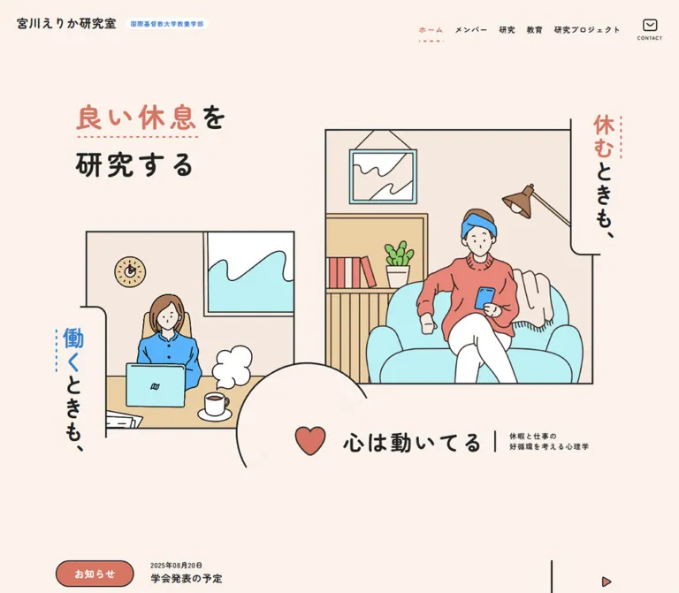
This is a public-facing university laboratory website. Its information architecture introduces the research, publishes updates, and provides routes to members, research, education, projects, academic profiles, and contact information. The visual character makes the subject of psychological recovery approachable: one person rests on a sofa while another works at a desk, with the phrases “休むときも、” and “働くときも、” placed vertically beside their rooms.
Warm cream and charcoal establish the page; coral and blue distinguish key words and illustration details. Rounded display lettering carries the short questions and identity, while a separate Gothic family handles substantial research explanations. Thin outlines connect rectangular illustrations, large rounded panels, circular portraits, and open arcs. These repeated shapes supply continuity across a long page without a shadow-based elevation system.
The responsive design changes the composition itself. Desktop places the two rooms diagonally across a wide opening scene. Mobile places the resting scene above the working scene and turns the heart statement into another vertical element. Farther down, the profile changes from a horizontal arrangement to a centered portrait and heading, while the footer retains two compact columns.
How to Read This Reference
- Measured means a value explicitly present in the supplied rendered DOM or computed-style record. Measurements are CSS pixels unless stated otherwise.
- Calculated means arithmetic using those recorded values, such as the gap between successive research panels.
- Estimated means a visual approximation from the original-page screenshots. Illustration colors, some nested text sizes, and unsampled strokes belong in this category.
- Recommended means an implementation choice for a new website. The CSS starter, breakpoint, accessible states, and interpolation rules are recommendations rather than recovered source code.
- Token names are descriptive implementation aliases. The only supplied original custom property is
--glid: 4.34vw. - Computed font-family stacks identify the declared families. Font files, loading requests, and glyph-level fallback were not separately inspected.
- An element appearing in the DOM, even with a nonzero bounding rectangle, does not establish that it was visible or interactive in the captured state.
Tokens — Colors
Default Palette
| Name | Value | Evidence | Suggested token | Role |
|---|---|---|---|---|
| Warm Paper | #faf2eb |
Measured body background and hero callout backgrounds | --paper |
Page canvas, spaces around illustrations, profile, and footer |
| Charcoal Ink | #222222 |
Measured body text and footer button backgrounds | --ink |
Text and primary action fills; visually also the dominant outline color |
| White Surface | #ffffff |
Measured research-panel backgrounds and reversed link text | --surface |
Large research panels and text inside filled controls |
| Rest Coral | #d57563 |
Measured active home-link text and news-category backgrounds | --rest |
Active navigation and news categories; related coral accents appear in the artwork and hero |
The measured coral comes from interface elements. Similar colors appear in the heart, clothing, and highlighted headline words, but their exact fills were not supplied. Do not assume all coral-looking pixels share one declaration.
Illustration and Section Palette
These are visual estimates, suitable as starting values for new artwork or supporting surfaces. They are not sampled source colors.
| Name | Approximation | Suggested token | Observed use |
|---|---|---|---|
| Pale Peach | #f5e8dd |
--section |
Broad background behind the white research panels and warm room interiors |
| Pale Aqua | #bceef2 |
--sky |
Sofa, laptop, window shapes, and travel-scene sky |
| Work Blue | #2e8bd4 |
--work |
Blue hero emphasis, affiliation text, and mobile menu strokes |
| Clothing Blue | #50b0f2 |
--art-blue |
Shirts and other stronger blue illustration details |
| Leaf Green | #90cb62 |
--art-green |
Plant leaves and travel clothing |
| Light Wood | #ead0a5 |
--art-wood |
Desk, shelves, chair, and luggage-related details |
Keep the interface palette narrower than the illustration palette. The footer actions are charcoal, the news categories are coral, and the academic links remain simple ink text. Illustration greens and wood tones do not become additional button categories.
Tokens — Typography
Rounded Display and Interface Type
Measured stack: "Zen Maru Gothic", sans-serif.
The body defaults to this family at weight 700. Navigation, short headings, hero statements, news links, and action labels inherit or explicitly use it. Rounded terminals and open spacing make the research questions feel conversational.
The large hero heading combines short lines, generous line height, and substantial tracking. Preserve the deliberate break in “良い休息を / 研究する” instead of allowing an arbitrary desktop line length to determine the composition.
Research Prose
Measured stack: "Zen Kaku Gothic Antique", sans-serif.
Introductory and research paragraphs use weight 500, with 1.75 line height at both inspected widths. This is an important distinction from the bold rounded interface family. The prose remains substantial and readable even within highly illustrated sections.
Footer paragraphs use the same family, with smaller sizes and a tighter mobile line height.
Type Scale
| Role | Desktop size / line height | Mobile size / line height | Weight | Tracking | Evidence |
|---|---|---|---|---|---|
| Body UI default | 20 / 30px |
14 / 21px |
700 | 1px / 0.7px |
Measured |
| Primary navigation | 16 / 16px |
16 / 16px |
700 | 1px / 0.7px |
Measured; mobile links were not visible in the closed capture |
| Header contact caption | 10 / 10px |
16 / 30px in the mobile navigation DOM |
700 | 1px / 0.7px |
Measured; these are different presentations |
| Opening headline | 57.024 / 99.792px |
29.991 / 52.484px |
700 | 0.15em |
Measured |
| Rest/work captions | 45.36 / 68.04px |
24.999 / 37.499px |
700 | 0.08em |
Measured |
| Introductory heading | 59 / 88.5px |
29 / 50.75px |
700 | 0.08em |
Measured |
| Research-theme heading | 54.144 / 64.973px |
20 / 24px |
700 | 0.08em |
Measured |
| Main paragraphs | 20 / 35px |
14 / 24.5px |
500 | 0.05em |
Measured |
| News-category label | 20 / 30px |
11 / 16.5px |
700 | 1px / 0.7px |
Measured |
| Academic profile links | 13 / 19.5px |
12 / 18px |
700 | 1px / 0.7px |
Measured |
| Member-detail link | 16 / 24px |
12 / 18px |
700 | 1.6px / 1.28px |
Measured |
| Footer headings | 20 / 30px |
16 / 24px |
700 | 0.08em |
Measured |
| Footer paragraphs | 16 / 28px |
11 / 16.5px |
500 | 0.05em |
Measured |
| Footer action labels | 13 / 19.5px |
12 / 18px |
700 | 1px / 0.7px |
Measured |
Nested Text and Measurement Limits
The visible laboratory name in the desktop header looks approximately 24px; the prominent profile name looks approximately 32px on desktop and 20px on mobile. These are visual estimates. The supplied H1/H2 styles describe their containers and do not expose every nested text element.
Likewise, the main “心は動いてる” lettering appears approximately 44px on desktop and 25px on mobile. Its sampled H3 reports inherited 20px and 16px values, respectively, which should not be mistaken for the size of every child within the combined heart-and-caption group.
The HTML element uses a measured 10px root size. Its reported Times family is overridden by the visible body and content styles. If copying source-relative units into another project, account for that root size; the Quick Start below uses explicit tokens and leaves the document root conventional.
Tokens — Spacing & Shapes
Grid Reference
The recorded custom property is:
--glid: 4.34vw;
That evaluates to 62.496px at 1440px and 16.926px at 390px. Several measured desktop paddings instead report 62.5968px, and mobile components use other clear proportions such as 23.4px and 19.5px. The available record therefore does not justify reconstructing every spacing formula from this property alone.
Use the measured endpoints as references. Treat any unified fluid scale as a new implementation decision.
Spacing Scale
| Use | Desktop | Mobile | Evidence |
|---|---|---|---|
| Header padding | 25px 30px |
21.45px |
Measured |
| Main mobile text gutter | — | 23.4px, or 6% of viewport width |
Measured; percentage calculated |
| Mobile research-panel outside gutter | — | Approximately 15.6px, or 4% |
Measured; percentage calculated |
| Research-panel top and side padding | 187.79px |
23.4px |
Measured |
| Research-panel bottom padding | 125.194px |
23.4px |
Measured |
| Paragraph bottom padding within panels | 62.597px |
31.2px |
Measured |
| Gap between research panels | 62.594px |
23.391px |
Calculated from successive panel rectangles |
| Gap between desktop news rows | 40px |
Approximately 20.6px between article-link boxes |
Calculated |
| Academic-link horizontal gap | Approximately 21.6px |
Approximately 20.59px |
Calculated |
| Footer padding | 62.597px on all sides |
62.4px top; 19.5px sides and bottom |
Measured |
The desktop research sections are deliberately spacious: nearly 188px of inset surrounds their content. Mobile compresses the panel shell dramatically while retaining comfortable paragraph leading.
Border Radius and Linework
| Element | Desktop | Mobile | Evidence |
|---|---|---|---|
| Research panels | 80px radius |
31.2px radius |
Measured |
| Hero caption boxes | 20px radius |
10px radius |
Measured; visible geometry uses selected rounded corners |
| News and footer capsules | Computed radius 1440px |
Computed radius 844px |
Measured; effectively fully rounded |
| Profile illustration | Circular | Circular | Visually observed |
| Room and travel-image frames | Square corners | Square corners in the visible hero | Visually observed |
| Research-panel outline | Approximately 3px |
Approximately 2px |
Inferred from box/padding arithmetic; desktop stroke also visible |
| Hero frames and decorative rules | Approximately 2–3px |
Approximately 2px |
Visual estimates |
| Research-region lower corners | Approximately 100px |
Not visually established | Desktop visual estimate |
Use outlines and carefully placed background-colored cutouts to create the open frames and circular arcs. A generic rounded rectangle around every element would lose the contrast between square rooms, soft panels, and circular details.
Layout Measurements
| Element | Desktop at 1440 × 1000 | Mobile at 390 × 844 |
|---|---|---|
| Header | 1440 × 115px |
390 × 88.58px |
| Hero section box | 1064.14 × 763.64px, starting at x=187.92, y=177.59 |
390 × 658.69px, starting at y=88.58 |
| News section | 1189.33 × 148px, starting at y=1160.31 |
390 × 193.78px, starting at y=809.66 |
| Introductory paragraph width | 625.95px |
343.22px |
| Research-panel width | 1189.33px |
358.80px |
| Research text width | 807.77px |
308.02px |
| First and second panel heights | 1340.23px each |
744.67px each |
| Third panel height | 1270.23px |
695.67px |
| Profile text width | 625.95px |
343.22px |
| Footer action | 187.78 × 45.5px |
164.97 × 42px |
| Document height | 7116px |
4687px |
The hero section rectangle does not contain all its visible decoration: captions and arcs extend outside it. The mobile profile has a similar measurement caveat: its sampled parent is narrower than its visible text descendants. Use the measured 343.22px child width when reproducing the mobile text area, rather than treating the parent rectangle as a clipping boundary.
Components
Laboratory Header
Role: establish the laboratory identity and provide routes through the academic website.
Desktop uses a transparent, full-width flex header. The laboratory name sits at the left, followed by a compact white affiliation pill with blue lettering. Five navigation links run across the right: “ホーム”, “メンバー”, “研究”, “教育”, and “研究プロジェクト”. A small outlined envelope with a CONTACT caption completes the row.
The active home item is coral and has a dotted underline in the screenshot. Other navigation items remain charcoal. There is no large filled header action.
On mobile, the affiliation pill moves above the laboratory name. The right side shows two thin blue horizontal strokes and the small caption MENU. This control remains at the upper-right in the supplied scrolled mobile capture, consistent with persistent positioning. The available styles do not establish whether it is fixed or sticky, and they do not show an opened state.
The mobile DOM retains the navigation links with centered-column coordinates, but the opening screenshot does not display them. Do not reproduce these coordinates as a permanently visible overlay or claim that the menu was exercised.
Illustrated Hero
Role: express the relationship between recovery, work, and psychological activity before introducing detailed research.
The desktop composition has four interdependent parts:
- A two-line headline at upper-left, with coral emphasis and a dotted underline beneath “良い休息”.
- A large resting-room illustration at upper-right: a seated person, phone, pale aqua sofa, lamp, shelves, and wall picture.
- A smaller working-room illustration at lower-left: a person at a laptop, desk, coffee cup and steam, clock, and window.
- A coral heart and “心は動いてる” statement across the lower overlap, followed by smaller explanatory copy separated by a vertical ink rule.
Approximate visible scene bounds are 563 × 535px for the resting room and 438 × 416px for the working room. These are screenshot estimates, distinct from the measured section rectangle.
Keep the deliberate diagonal relationship and large areas of paper between elements. The two scenes are framed illustrations, while the surrounding typography and arcs extend beyond their edges.
Vertical Scene Captions
Role: label the paired everyday situations and participate in the illustration geometry.
The rest caption sits on the right of its frame; the work caption sits on the left. Both use a paper-colored backing that interrupts the frame, with a short outlined corner or return beneath the text. “休む” is coral and “働く” is blue; dotted emphasis follows the vertical direction.
Desktop captions form wider vertical arrangements, with the trailing “も、” occupying an adjacent column. Mobile fits each statement into a narrower single vertical run. This is Japanese vertical typesetting, not a horizontal phrase rotated as one image.
The measured caption corner radius changes from 20px to 10px. Maintain the small rounded return at the intersection of text and frame rather than turning the entire caption into a detached speech bubble.
Heart and Open Arc
Role: connect the two hero situations with a shared message.
A simple coral heart with an ink outline sits inside the lower composition. Behind it, a large paper-filled circular form overlaps the working room and leaves only part of its outline visible. The open arc makes a visual bridge between the two scenes.
On mobile, the circle moves into the right-side overlap between the rooms. The heart appears above the vertically set main statement, with a very small explanatory line beside it. The statement is not merely reduced to fit the desktop horizontal arrangement.
No heartbeat, rotating arc, or scroll-driven drawing effect was established by the supplied evidence.
News List
Role: provide current laboratory updates and access to the archive.
The DOM contains two entries. Each groups a rounded coral category link labeled “お知らせ” with a linked date and article title. The titles include a conference-presentation notice and a website-renewal notice.
On desktop, the category is 160 × 54px; the article link begins 30px after it. The archive link occupies a separate 149.23 × 148px area to the right of both rows. Its measured left padding is approximately 78.25px, making it a separate destination rather than another article row.
On mobile, category capsules shrink to 71.5 × 31.5px. Article links occupy approximately 260px of width to their right, and the archive link moves below the entries. The news section begins with a horizontal rule visible at the bottom of the opening capture.
These news details are principally DOM-derived; a complete original-page news screenshot was not supplied. Border embellishments and hover appearance should therefore not be asserted beyond the available measurements.
Introductory Research Statement
Role: explain the laboratory’s purpose before the individual themes.
The heading repeats the opening phrase “良い休息を / 研究する”. Desktop sets it in a left column of approximately 375.58px, with a 625.95px prose column to the right. The main text explains the study of effective rest and recovery through psychological theory and methods.
Mobile places the heading above the paragraph, both within the same approximately 343.22px text width. The paragraph remains left-aligned, weight 500, with 24.5px line height. Preserve the distinction between the expressive heading and the quieter reading texture beneath it.
Research-Theme Panel
Role: introduce a research question and support it with a substantial explanation.
The page contains three panels covering worker recovery, the psychological effects of travel, and savoring positive experiences. Each is a large white section with a charcoal outline and pronounced rounded corners. Desktop panels are approximately 1189px wide, with an interior text width of approximately 808px.
The repeated anatomy is an illustration region, a large two-line question, and a multi-line explanatory paragraph. The headings reserve space on the right: measured right padding is 184.09px on desktop and 52px on mobile. Preserve this open area if reproducing the composition; do not fill it with unrelated controls.
The supplied intermediate capture shows the travel illustration: a seated traveler in a straw hat, suitcase, blue sky, clouds, birds, and an open circular outline near the lower-right. A small vertical RESEARCH THEMES label sits beside the picture. The specific artwork in the other two panels was not visually supplied, even though their text and geometry are available.
A thin centered line connects successive panels through the peach background. The desktop gap is approximately 62.59px; the mobile gap is approximately 23.39px. This repeated spine makes the panels read as one connected sequence.
Researcher Profile
Role: connect the research to the laboratory and provide academic credentials and external profile links.
Desktop places a circular illustration at the left and a text group at the right. The portrait diameter is visually approximately 250px; it reuses the woman-at-laptop motif. The illustration functions as a profile image, but a photographic likeness was not established.
The text group contains:
- The laboratory name in the largest profile text.
- The university affiliation and associate-professor title.
- An inline “詳しくはこちら” link to
/members/, separated from the affiliation by an ink divider and accompanied by a small coral triangular cue. - Two label/value rows: “専門領域” and “研究テーマ”.
- Four academic links:
ICU研究者情報,Researchmap,Researchgate, andGoogle Scholar.
The profile’s academic information identifies industrial/organizational psychology, tourism psychology, positive psychology, worker recovery, travel effects, and savoring/well-being.
On mobile, the approximately 156px circular portrait sits above a centered name and affiliation. The member link becomes its own centered line. The label/value rows below return to left alignment, and the four academic links become a two-column grid.
Academic Link Row
Role: provide recognizable, restrained routes to external research profiles.
Desktop uses four individual text links, each with an ink underline spanning its own compact width. There are no platform logos or colorful badges in the supplied capture. Type is 13px, bold, with 1px tracking and 10.4px bottom padding.
Mobile uses two equal columns, each approximately 161.31px wide, with a 20.59px horizontal gap. The text is centered at 12px, and each underline spans its column. Measured row pitch is approximately 47.98px.
Contact and Access Footer
Role: offer practical contact and campus-access information at the end of the academic content.
Desktop keeps contact and access in two text columns toward the left, with copyright at the lower-right. A thin rule with a curved corner decorates the copyright area. The footer shares the page’s cream background rather than switching to a dark block.
Each information column contains a short rounded-font heading, a paragraph in the prose family, and a charcoal capsule link with white text. “お問い合わせ” links to the supplied Google Forms destination. “ICUへの交通アクセス” links to the university’s access page; the homepage does not contain an inspected map or embedded contact form.
Mobile preserves the two-column arrangement. Each column is approximately 164.97px wide; the gap is approximately 21.06px. The observed 42px buttons fill their columns, and the copyright moves to a centered row below. Small footer prose is measured at 11px, which is a useful candidate for improvement in a new implementation.
Tokens — Motion & Interaction
| Element or treatment | Supplied value or observation | What is established | What remains unverified |
|---|---|---|---|
| Navigation and other anchors | 0.2s ease-in-out |
Short transitions are declared on sampled links | Changed properties, hover colors, transforms, and visited states |
| Hero section | 0.4s ease-in-out |
A transition is declared | Its trigger and visual endpoints |
| Mobile heart/message group | 0.6s ease-in-out |
A longer transition is declared on this group | Entrance direction, opacity changes, and scroll coupling |
| Sampled main elements | animation: none |
No named animation was reported on these sampled elements | Animation on unsampled children, pseudo-elements, images, or scripts |
| Dotted emphasis and open arcs | Visible in static captures | Their final appearance | Whether either is animated |
| Mobile menu control | Closed control visible in opening and scrolled captures | Presence and persistent screen location in those captures | Open/close behavior, focus handling, backdrop, and dismissal |
| Links | Rendered destinations supplied | Navigation targets are present | Destination behavior and post-click states |
A transition value of all without a nonzero duration is not evidence of visible animation. Likewise, coffee steam and the heart are illustration features; their presence does not establish motion.
The capture process waited for load, visible-image decoding, and sampled layout/text stability. It also accounted for finite animations and temporarily paused perpetual animations during readiness checks. This improves confidence in the settled screenshots, but it does not supply a motion sequence or demonstrate every interaction.
Recommended motion: use restrained color or underline transitions around 150–200ms for newly implemented links. Keep the artwork static by default unless authorized animation assets and intended behavior are available. Any added motion should preserve text legibility and respect reduced-motion preferences.
Surfaces
| Layer | Appearance | Function |
|---|---|---|
| Page canvas | Solid warm paper #faf2eb |
Holds the header, opening, profile, and footer |
| Research region | Pale peach, visually estimated | Groups the extended research narrative |
| Research panels | White, ink outline, large radius | Creates generous reading surfaces |
| Illustration frames | Flat outlined rectangles | Defines rooms and travel scenes |
| Caption cutouts | Page-colored shapes covering portions of a frame | Integrates vertical text with the scene |
| Circular forms | Portrait crop and partially exposed arcs | Repeats the soft geometry across sections |
| News category | Coral capsule with white text | Identifies update type |
| Footer action | Charcoal capsule with white text | Provides practical external navigation |
The inspected captures show flat fills and crisp linework. No general drop-shadow, glossy gradient, or translucent-glass treatment is apparent.
Imagery
The illustrations use softly irregular charcoal contours and broad, flat pastel fills. Their subject matter is ordinary and specific: sitting on a sofa with a phone, working beside a cup of coffee, and traveling with a suitcase. The environments matter as much as the people. Shelves, lamps, clocks, windows, plants, luggage, and clouds make the research topics tangible.
Faces are minimally drawn. Clothing supplies stronger color accents, while backgrounds and furniture stay pale. The artwork has enough variation to feel drawn by hand, but its lines are clean rather than textured or pixelated. Preserve that balance; do not add rough-paper textures merely because the page feels warm.
Observed Asset References
No image src, CSS background URL, SVG source, native dimensions, or original filenames were included in the supplied evidence. The table therefore identifies visible assets by role rather than inventing paths.
| Visible asset | Location | Treatment | Availability limits |
|---|---|---|---|
| Resting-room scene | Desktop upper-right hero; mobile upper scene | Pastel room, seated person, aqua sofa, coral clothing | File format and source path unknown |
| Working-room scene | Desktop lower-left hero; mobile lower scene | Desk, laptop, coffee steam, clock, window | File format and source path unknown |
| Heart and open arc | Overlap between hero scenes | Coral outlined heart and paper-filled circular cutout | DOM/SVG/image construction not supplied |
| Travel scene | Intermediate research-panel capture | Traveler, suitcase, clouds, birds, pale aqua sky | Only this research illustration was visually available |
| Circular profile illustration | Researcher profile | Crop of the woman-at-laptop motif | Source asset and crop implementation unknown |
| Envelope and menu marks | Header | Small outline envelope; two blue menu strokes | Icon construction unknown |
For a new implementation, use authorized artwork or commission replacements with the same compositional roles. Keep full scenes intact and use circular cropping only where the profile calls for it. CSS can recreate the framing system, but the illustrative identity requires actual artwork.
Layout & Responsive Behavior
Desktop Composition
The header spans the viewport, while the page alternates between several narrower widths. The news and research panels are approximately 1189px wide, the hero’s measured section is approximately 1064px, and the profile group is approximately 939px. This nested structure produces broad side margins without making every section identical.
The hero’s opening headline begins around x=166px, while its measured section begins around x=188px. Positioned children intentionally extend beyond the nominal section. The research panels instead maintain clear outer boundaries and large internal padding.
The research sequence is long and spacious. At this viewport the first panel begins around document y=1985px, the profile around y=6374px, and the footer around y=6835px. These positions describe the supplied content and viewport, not universal section-height requirements.
Mobile Composition
The header ends at approximately 88.58px. The centered hero headline follows immediately, then the rest scene begins around screenshot y=234px, and the work scene around y=533px. These illustration positions are visual estimates. The hero content ends around 747px; the news divider appears around 810px.
The two scenes retain different widths and horizontal offsets. The rest illustration is approximately 250px wide, while the work illustration is approximately 214px wide. Caption strips and the heart statement occupy narrow side areas rather than being placed under each image as ordinary captions.
Below the hero:
- News moves its archive link below the two entries.
- The introduction changes from two columns to one.
- Research panels use approximately 4% outside gutters and 6% viewport-width internal padding.
- Theme headings reduce from approximately
54pxto20px; prose reduces from20pxto14pxwhile retaining1.75leading. - The profile stacks its portrait and identity, but preserves label/value rows for the research details.
- Academic links become a two-by-two arrangement.
- Contact and access remain side by side, followed by centered copyright.
The shorter mobile document is consistent with the substantially reduced typography, illustration dimensions, and padding. The supplied DOM still contains the same three research topics and profile information.
Breakpoint and Intermediate-Width Limits
Only two viewport sizes were supplied. The actual media-query breakpoint, tablet layout, landscape-phone behavior, maximum container widths, and browser zoom behavior were not established. Do not present an interpolated size or a conventional breakpoint as recovered source CSS.
The Quick Start uses a recommended 60rem breakpoint and explicit layout changes. Its intermediate sizes should be reviewed with real content and replacement artwork.
Do’s and Don’ts
Do
- Build the identity around warm paper, charcoal linework, white research surfaces, and restrained coral/blue emphasis.
- Use Zen Maru Gothic for short expressive text and Zen Kaku Gothic Antique for longer explanations when those fonts are available.
- Preserve the distinction between resting and working scenes through their position, captions, and color emphasis.
- Keep Japanese vertical text upright and deliberately control its column breaks.
- Repeat square illustration frames, large rounded panels, circular crops, and partial arcs in their observed roles.
- Connect research panels with a thin centered line through the gaps.
- Maintain substantial paragraph content and generous leading within the academic homepage.
- Recompose the hero for mobile and retain the two-column mobile footer.
- Keep academic destinations as quiet, underlined text links.
- Use charcoal for footer actions and coral for news-category capsules.
Don’t
- Don’t replace the laboratory’s information architecture with a generic sales funnel.
- Don’t flatten the hero into one screenshot or shrink the entire desktop composition to phone width.
- Don’t rotate whole Japanese sentences sideways to imitate vertical typesetting.
- Don’t set the long research paragraphs in the bold rounded display treatment.
- Don’t make every section a small rounded card; the research panels are unusually large reading surfaces.
- Don’t introduce stock photographs, glossy 3D people, heavy textures, or unrelated icon families as substitutes for the observed illustration language.
- Don’t infer original asset formats or filenames from the clean linework.
- Don’t add heartbeat, parallax, line-drawing, or menu animations as if they were verified behavior.
- Don’t treat hidden mobile navigation geometry as a screenshot of an opened menu.
- Don’t hardcode observed panel heights; their content should determine their final height.
Recommended Implementation Additions
These are recommendations for a new implementation, not verified features of the original page:
- Give the mobile menu a native button, an accessible name,
aria-expanded, and a controlled navigation region. Verify keyboard operation, focus restoration, and dismissal in the implemented state. - Preserve a logical DOM reading order: headline, resting scene, working scene, shared statement, then the main content. Use CSS positioning without duplicating meaningful text for each viewport.
- Mark decorative hearts, frame fragments, and arcs as decorative. Provide useful alternatives for illustrations where they add information beyond adjacent text.
- Keep visible Japanese copy as text where practical. If an illustrated section label carries the only heading, provide an equivalent accessible heading.
- Increase the observed mobile footer’s
11pxprose for comfortable reading. The starter uses14px; allow the footer to grow vertically. - Increase the observed
42pxmobile action height to at least44px, and ensure small menu strokes sit inside a larger target. - Add clear keyboard focus outlines and verify contrast for small white-on-coral and blue-on-paper text.
- Reserve image space before assets load and preserve original proportions to prevent shifts in the carefully aligned hero.
- Load authorized font files with appropriate fallback behavior, and test Japanese line breaks after fonts resolve.
- Limit added transitions to specific properties and provide a reduced-motion override.
Agent Prompt Guide
Quick Color Reference
- Canvas: measured
#faf2eb. - Text and primary action fill: measured
#222222. - Research panels and reversed labels: measured
#ffffff. - Active home link and news categories: measured
#d57563. - Research-region peach: estimated
#f5e8dd. - Illustration aqua: estimated
#bceef2. - Blue emphasis: estimated
#2e8bd4. - Separation: ink outlines, dotted emphasis, and open arcs; no general shadow system.
Overall Prompt
“Create an academic psychology laboratory homepage inspired by the current Erika Miyakawa Laboratory website. Use warm cream #faf2eb, charcoal #222222, white research panels, restrained coral #d57563, and pale aqua illustration details. Pair bold Zen Maru Gothic headings with medium-weight Zen Kaku Gothic Antique prose. Compose an illustrated opening with a resting room at upper-right, a working room at lower-left, vertical Japanese captions, dotted word emphasis, and a coral heart inside an overlapping open arc. Follow with laboratory news, an introductory statement, three large outlined research panels connected by a thin vertical line, a circular researcher illustration, underlined academic links, and contact/access columns. On mobile, place the resting scene above the working scene, move the heart statement into a vertical side strip, stack the profile, and retain two footer columns. Keep the result warm, legible, and appropriate for substantive academic information.”
Example Component Prompts
- Hero: “Compose two flat pastel room illustrations on warm paper, with thin charcoal frames. Place the larger resting scene on the desktop right and the smaller working scene lower-left. Use upright vertical captions with coral emphasis for rest and blue emphasis for work. Interrupt the frames with paper-colored caption cutouts and connect the scenes with a coral heart and partial circular outline.”
- Research panel: “Create a large white academic reading panel with an approximately 3px charcoal outline and 80px desktop corners. Place a framed illustration above a two-line rounded-font research question and medium-weight Japanese prose with 1.75 line height. Leave generous internal space and connect successive panels through the background with a narrow centered line. At phone width use approximately 31px corners, 23px padding, 20px headings, and 14px prose.”
- Researcher profile: “Use a circular crop of an illustrated researcher at a laptop beside the laboratory identity. Add affiliation, a small member-detail link with a coral triangular cue, two label/value rows, and four understated underlined academic links. On mobile center the portrait and identity, then use a two-column grid for the links.”
- Footer: “Keep the footer on the warm page background. Present contact and campus access as two compact columns with rounded-font headings, plain prose, and charcoal pill links with white labels. Keep both columns on a 390px phone layout, allow readable text to wrap, and place copyright beneath them.”
- Responsive adaptation: “Recompose the illustrated hero rather than scaling a desktop screenshot. Keep both scenes, their full artwork, vertical captions, and the shared heart statement. Maintain a logical text order and avoid clipping decorative overlaps or focus indicators. Treat tablet placement and the menu’s open behavior as new design decisions requiring verification.”
Quick Start
CSS Custom Properties
This is a recommended adaptation, not extracted source CSS. It uses the measured palette and type families, approximate illustration colors, and rounded versions of selected dimensions. Fluid interpolation, width caps, and the 60rem breakpoint are implementation choices. The root font size is left unchanged.
The hero example below supplies its class structure. For the remaining components, use a .content-shell around news or research content, .research-card sections inside .research-band, a .profile with portrait and details children, and a .lab-footer with two information sections and a copyright element. Keep panel heights content-driven.
:root {
  /* Measured interface colors */
  --paper: #faf2eb;
  --ink: #222222;
  --surface: #ffffff;
  --rest: #d57563;

  /* Visual estimates, not recovered source colors */
  --section: #f5e8dd;
  --sky: #bceef2;
  --work: #2e8bd4;

  /* Measured family names */
  --font-heading: 'Zen Maru Gothic', sans-serif;
  --font-body: 'Zen Kaku Gothic Antique', sans-serif;
  --text-body: 20px;
  --text-hero: clamp(36px, 3.96vw, 57.024px);
  --text-theme: clamp(32px, 3.76vw, 54.144px);
  --leading-body: 1.75;
  --tracking-body: 0.05em;
  --tracking-heading: 0.08em;

  /* Recommended interpolation calibrated to desktop measurements */
  --module: clamp(24px, 4.347vw, 62.5968px);
  --card-inset: clamp(32px, 13.041vw, 187.79px);
  --card-radius: 80px;
  --rule: 3px;
  --motion-link: 200ms ease-in-out;
}

* { box-sizing: border-box; }
body {
  margin: 0;
  color: var(--ink);
  background: var(--paper);
  font: 700 var(--text-body)/1.5 var(--font-heading);
  letter-spacing: var(--tracking-body);
}
img { display: block; max-width: 100%; }
a { color: inherit; }
button { font: inherit; }
p {
  font-family: var(--font-body);
  font-weight: 500;
  line-height: var(--leading-body);
}
h1, h2, h3 { font-family: var(--font-heading); }
a, button {
  transition: color var(--motion-link),
    background-color var(--motion-link),
    border-color var(--motion-link);
}
:where(a, button, summary):focus-visible {
  outline: 3px solid var(--ink);
  outline-offset: 5px;
}
.content-shell {
  width: min(82.592%, 1190px);
  margin-inline: auto;
}

.lab-header {
  min-height: 115px;
  display: flex;
  align-items: flex-start;
  justify-content: space-between;
  gap: 24px;
  padding: 25px 30px;
}
.lab-identity { display: flex; align-items: center; gap: 20px; }
.lab-name { margin: 0; font-size: 24px; letter-spacing: 0.08em; }
.lab-affiliation {
  padding: 3px 12px;
  border-radius: 999px;
  color: var(--work);
  background: var(--surface);
  font-size: 12px;
}
.lab-nav { display: flex; align-items: center; gap: 20px; }
.lab-nav a { font-size: 16px; text-decoration: none; }
.lab-nav a[aria-current='page'] {
  color: var(--rest);
  text-decoration: underline dotted;
  text-underline-offset: 14px;
}

/* Desktop composition, calibrated to the 1440px capture */
.hero {
  position: relative;
  isolation: isolate;
  width: min(100%, 1440px);
  aspect-ratio: 1440 / 885;
  margin-inline: auto;
}
.hero-title {
  position: absolute;
  left: 11.55%;
  top: 7.1%;
  margin: 0;
  font-size: var(--text-hero);
  line-height: 1.75;
  letter-spacing: 0.15em;
}
.hero-title em {
  color: var(--rest);
  font-style: normal;
  border-bottom: 2px dotted currentColor;
}
.scene {
  position: absolute;
  margin: 0;
  aspect-ratio: 1.05;
  border: var(--rule) solid var(--ink);
}
.scene img { width: 100%; height: 100%; object-fit: contain; }
.scene--rest { left: 47.85%; top: 15.93%; width: 39.1%; }
.scene--work { left: 13.05%; top: 40%; width: 30.4%; }
.scene-label {
  position: absolute;
  z-index: 2;
  padding: 0.6em 0.45em;
  background: var(--paper);
  writing-mode: vertical-rl;
  text-orientation: upright;
  font-size: clamp(28px, 3.15vw, 45.36px);
  line-height: 1.5;
  letter-spacing: 0.08em;
}
.scene--rest .scene-label {
  right: -1.6em;
  top: -0.65em;
  border-left: var(--rule) solid var(--ink);
  border-bottom: var(--rule) solid var(--ink);
  border-bottom-left-radius: 20px;
}
.scene--work .scene-label {
  left: -2em;
  top: 38%;
  border-top: var(--rule) solid var(--ink);
  border-right: var(--rule) solid var(--ink);
  border-top-right-radius: 20px;
}
.scene-label .accent {
  text-decoration: underline dotted;
  text-underline-offset: 0.2em;
}
.scene--rest .accent { color: var(--rest); }
.scene--work .accent { color: var(--work); }
.label-tail { display: block; }
.hero-message {
  position: absolute;
  z-index: 3;
  isolation: isolate;
  left: 43.5%;
  top: 86.3%;
  display: flex;
  align-items: center;
  gap: 28px;
  font-size: clamp(28px, 3.06vw, 44px);
}
.hero-message::before {
  content: '';
  position: absolute;
  z-index: -1;
  width: 280px;
  aspect-ratio: 1;
  left: -125px;
  top: -135px;
  border: var(--rule) solid var(--ink);
  border-right-color: transparent;
  border-bottom-color: transparent;
  border-radius: 50%;
  background: var(--paper);
  transform: rotate(-15deg);
}
.heart { width: 70px; flex: none; fill: var(--rest); stroke: var(--ink); stroke-width: 3; }
.hero-message strong { white-space: nowrap; }
.hero-message small {
  padding-left: 28px;
  border-left: var(--rule) solid var(--ink);
  font-size: 15px;
  line-height: 1.5;
}

.news {
  display: grid;
  grid-template-columns: minmax(0, 1fr) 149px;
  margin-top: 160px;
}
.news-list { display: grid; gap: 40px; }
.news-row {
  display: grid;
  grid-template-columns: 160px minmax(0, 1fr);
  align-items: center;
  gap: 30px;
}
.news-tag {
  display: grid;
  place-items: center;
  min-height: 54px;
  border-radius: 999px;
  color: var(--surface);
  background: var(--rest);
  text-decoration: none;
}
.news-article { text-decoration: none; }
.news-article time { display: block; font-size: 0.7em; }
.news-all { align-self: center; justify-self: end; font-size: 16px; }
.intro {
  display: grid;
  grid-template-columns: 3fr 5fr;
  gap: var(--module);
  width: min(73.9%, 1064px);
  margin: 250px auto 125px;
}
.intro h2 { margin: 0; font-size: 59px; line-height: 1.5; letter-spacing: 0.08em; }
.intro p { margin: 0; }
.research-band {
  padding-block: 40px 156px;
  border-radius: 0 0 100px 100px;
  background: var(--section);
}
.research-card {
  position: relative;
  padding: var(--card-inset) var(--card-inset) 125.194px;
  border: var(--rule) solid var(--ink);
  border-radius: var(--card-radius);
  background: var(--surface);
}
.research-card + .research-card { margin-top: var(--module); }
.research-card + .research-card::before {
  content: '';
  position: absolute;
  left: 50%;
  top: calc(-1 * (var(--module) + var(--rule)));
  height: var(--module);
  border-left: var(--rule) solid var(--ink);
}
.research-art {
  width: calc(100% - 2 * var(--module));
  margin: 0 auto 80px;
}
.research-art img { width: 100%; height: auto; }
.research-card h3 {
  margin: 0 0 var(--module);
  padding-right: 3.4em;
  font-size: var(--text-theme);
  line-height: 1.2;
  letter-spacing: var(--tracking-heading);
}
.research-card p { margin: 0; padding-bottom: var(--module); }
.profile {
  display: grid;
  grid-template-columns: minmax(150px, 250px) minmax(0, 1fr);
  gap: var(--module);
  width: min(82.6%, 939px);
  margin: 156px auto 187.79px;
}
.profile-portrait { width: 100%; aspect-ratio: 1; object-fit: cover; border: var(--rule) solid var(--ink); border-radius: 50%; }
.profile-details { min-width: 0; }
.profile-details h2 { margin: 0; font-size: 32px; }
.profile-facts { display: grid; grid-template-columns: 112px minmax(0, 1fr); gap: 12px 0; }
.profile-facts dd { margin: 0; font-family: var(--font-body); font-weight: 500; }
.academic-links { display: flex; flex-wrap: wrap; gap: 22px; margin-top: 40px; }
.academic-links a { padding-bottom: 10.4px; border-bottom: 2px solid var(--ink); font-size: 13px; text-decoration: none; }
.lab-footer {
  display: grid;
  grid-template-columns: minmax(0, 375.58px) minmax(0, 375.58px) minmax(0, 1fr);
  gap: var(--module);
  padding: var(--module);
}
.lab-footer h2 { margin: 0 0 5px; font-size: 20px; }
.lab-footer p { margin: 0 0 20px; font-size: 16px; }
.pill-link {
  display: inline-flex;
  align-items: center;
  justify-content: center;
  width: min(100%, 187.78px);
  min-height: 45.5px;
  padding: 13px;
  border-radius: 999px;
  color: var(--surface);
  background: var(--ink);
  font-size: 13px;
  line-height: 1.5;
  text-align: center;
  text-decoration: none;
}
.copyright { align-self: end; justify-self: end; font-size: 11px; }

/* Recommended breakpoint; the original breakpoint was not supplied. */
@media (max-width: 60rem) {
  :root {
    --text-body: 14px;
    --text-theme: 20px;
    --module: 6vw;
    --card-inset: 6vw;
    --card-radius: 8vw;
    --rule: 2px;
  }
  .content-shell { width: 92%; }
  .lab-header { min-height: 88.58px; padding: 5.5vw; }
  .lab-identity { align-items: flex-start; flex-direction: column-reverse; gap: 8px; }
  .lab-name { font-size: 16px; }
  .lab-affiliation { font-size: 10px; }
  /* Keep navigation usable until an accessible menu controller is added. */
  .lab-nav { flex-wrap: wrap; justify-content: flex-end; gap: 12px; }
  .lab-nav a { font-size: 14px; }
  .hero { width: min(100%, 520px); aspect-ratio: 390 / 721; }
  .hero-title { left: 15%; top: 1.08%; width: 70%; text-align: center; font-size: clamp(26px, 7.69vw, 40px); }
  .scene--rest { left: 18%; top: 20.11%; width: 64%; }
  .scene--work { left: 15%; top: 61.58%; width: 55%; }
  .scene-label { font-size: clamp(22px, 6.41vw, 33px); }
  .scene--rest .scene-label { right: -1.7em; top: -0.7em; border-bottom-left-radius: 10px; }
  .scene--work .scene-label { left: -1.65em; top: -0.6em; border-top-right-radius: 10px; }
  .label-tail { display: inline; }
  .hero-message {
    left: 80%; top: 57%;
    display: grid;
    grid-template-columns: 26px 10px;
    gap: 24px 8px;
    font-size: 25px;
  }
  .hero-message::before { width: 160px; left: -66px; top: -60px; }
  .heart { grid-column: 1 / -1; width: 36px; }
  .hero-message strong { writing-mode: vertical-rl; text-orientation: upright; }
  .hero-message small { writing-mode: vertical-rl; text-orientation: upright; border: 0; padding: 0; font-size: 8px; }
  .news { width: 100%; display: block; margin-top: 0; padding: 12vw 6vw 0; border-top: 2px solid var(--ink); }
  .news-list { gap: 21px; }
  .news-row { grid-template-columns: 71.5px minmax(0, 1fr); gap: 12px; }
  .news-tag { min-height: 31.5px; font-size: 11px; }
  .news-all { display: block; margin-top: 30px; font-size: 12px; text-align: right; }
  .intro { width: 88%; grid-template-columns: 1fr; gap: 22px; margin: 24vw auto 12vw; }
  .intro h2 { font-size: 29px; line-height: 1.75; }
  .research-band { padding-block: 24px 12vw; border-radius: 0 0 8vw 8vw; }
  .research-card { padding: var(--card-inset); }
  .research-art { width: 100%; margin-bottom: 32px; }
  .research-card h3 { padding-right: 2.6em; margin-bottom: 19.5px; }
  .research-card p { padding-bottom: 8vw; }
  .profile { width: 88%; grid-template-columns: 1fr; gap: 32px; margin: 24vw auto 13vw; }
  .profile-portrait { width: 156px; justify-self: center; }
  .profile-details h2 { font-size: 20px; text-align: center; }
  .profile-facts { grid-template-columns: 85px minmax(0, 1fr); margin-top: 32px; }
  .academic-links { display: grid; grid-template-columns: repeat(2, minmax(0, 1fr)); gap: 16px 21px; }
  .academic-links a { padding-bottom: 14.4px; font-size: 12px; text-align: center; }
  .lab-footer { grid-template-columns: repeat(2, minmax(0, 1fr)); gap: 32px 5.4vw; padding: 16vw 5vw 5vw; }
  .lab-footer h2 { font-size: 16px; }
  /* Recommended readability increase from the observed 11px. */
  .lab-footer p { font-size: 14px; line-height: 1.6; }
  .pill-link { width: 100%; min-height: 44px; padding: 12px; font-size: 12px; }
  .copyright { grid-column: 1 / -1; justify-self: center; text-align: center; }
}

@media (prefers-reduced-motion: reduce) {
  a, button { transition: none; }
}
The starter leaves mobile navigation in normal flow until a working menu is implemented. This intentionally differs from the captured closed header. Once an accessible controller is present, replace that fallback with the compact menu control and verify the resulting header and hero alignment.
Hero Markup Example
The image identifiers below are explicit replacement placeholders, not observed original asset URLs. Use authorized scene artwork. This example draws a new simple heart; it does not reproduce an extracted original asset. If supplied scene artwork already includes its frame, remove the corresponding CSS border to avoid doubling it.
<section class='hero' aria-labelledby='hero-title'>
  <h2 class='hero-title' id='hero-title'>
    <em>良い休息</em>を<br>研究する
  </h2>

  <figure class='scene scene--rest'>
    <img src='REPLACE_WITH_AUTHORIZED_REST_ART'
         alt='A person resting on a sofa with a phone'>
    <figcaption class='scene-label'>
      <span class='accent'>休む</span>とき<span class='label-tail'>も、</span>
    </figcaption>
  </figure>

  <figure class='scene scene--work'>
    <img src='REPLACE_WITH_AUTHORIZED_WORK_ART'
         alt='A person working at a laptop beside a cup of coffee'>
    <figcaption class='scene-label'>
      <span class='accent'>働く</span>とき<span class='label-tail'>も、</span>
    </figcaption>
  </figure>

  <div class='hero-message'>
    <svg class='heart' viewBox='0 0 80 80' aria-hidden='true'>
      <path d='M40 69C32 65 8 44 8 25C8 10 27 7 40 20C53 7 72 10 72 25C72 44 48 65 40 69Z'/>
    </svg>
    <strong>心は動いてる</strong>
    <small>休暇と仕事の<br>好循環を考える心理学</small>
  </div>
</section>
The geometric hero coordinates approximate the two supplied compositions. They require visual adjustment for the chosen artwork and any additional header height. This starter was not executed or browser-tested as part of the supplied-evidence analysis.
Tailwind v4 Token Mapping
Optional aliases for a project already using Tailwind v4. Define the custom properties above first. This is not evidence that the original website uses Tailwind.
@theme inline {
  --color-paper: var(--paper);
  --color-ink: var(--ink);
  --color-rest: var(--rest);
  --color-work: var(--work);
  --color-research-surface: var(--surface);
  --color-research-band: var(--section);
  --color-art-sky: var(--sky);

  --font-display: var(--font-heading);
  --font-prose: var(--font-body);

  --text-lab-body: var(--text-body);
  --text-lab-hero: var(--text-hero);
  --text-lab-theme: var(--text-theme);

  --spacing-lab-module: var(--module);
  --spacing-lab-card: var(--card-inset);
  --radius-research: var(--card-radius);
}
Sources & Evidence
- Erika Miyakawa Laboratory homepage: original and final URL supplied by the browser observation; HTTP status
200. This is the authority for current page identity, content, link destinations, and site-specific observations. - Capture context: September 12, 2026, retrieved at
2026-09-12T11:32:07.168Z. The record supplies one retrieval timestamp; separate timestamps for individual screenshots were not provided. - Desktop evidence: 1440 × 1000 CSS-pixel viewport, document height approximately 7116px; opening, intermediate research-panel, and profile/footer screenshots, plus rendered text, element rectangles, computed styles, and links.
- Mobile evidence: 390 × 844 CSS-pixel viewport, document height approximately 4687px; opening and profile/footer screenshots, plus the corresponding rendered DOM and computed styles.
- Observed behavior and limits: the record describes initial observation of at least five seconds, image and layout readiness checks, and scrolling through intermediate positions. It does not document menu activation, link-click outcomes, hover states, keyboard interaction, or a frame-by-frame motion sequence. Service workers and SharedWorkers were disabled during inspection.
- Analysis scope: no independent browsing, command execution, file inspection, or linked-page inspection was performed. Asset URLs, full stylesheets, media-query definitions, font binaries, and script behavior were not supplied.
This reference describes the current homepage evidenced by those captures. Measured values, visual estimates, and recommended implementation choices are explicitly separated; the CSS and markup are a reusable starting point rather than a verified reconstruction of the original implementation.
# Erika Miyakawa Laboratory — Style Reference

> A psychology research homepage drawn as connected rooms, with warm paper, rounded lettering, and space to breathe.

**Website:** [miyakawa-lab.com](https://miyakawa-lab.com/)
**Original URL:** https://miyakawa-lab.com/
**Final URL:** https://miyakawa-lab.com/
**Theme:** light, with a warm cream canvas and white research panels; no theme selector was evidenced.
**Inspected:** September 12, 2026. The supplied browser observation was retrieved at 11:32:07 UTC / 20:32:07 JST.
**Viewports:** desktop 1440 × 1000 and mobile 390 × 844 CSS pixels.
**Scope:** the current academic laboratory homepage: header, illustrated opening composition, news, introductory statement, three research themes, researcher profile, academic links, and contact/access footer. Visual evidence consists of desktop opening, intermediate, and footer captures, plus mobile opening and footer captures. Rendered DOM measurements cover additional sections between those images. Linked pages and an opened mobile menu were not inspected.

This is a public-facing university laboratory website. Its information architecture introduces the research, publishes updates, and provides routes to members, research, education, projects, academic profiles, and contact information. The visual character makes the subject of psychological recovery approachable: one person rests on a sofa while another works at a desk, with the phrases “休むときも、” and “働くときも、” placed vertically beside their rooms.

Warm cream and charcoal establish the page; coral and blue distinguish key words and illustration details. Rounded display lettering carries the short questions and identity, while a separate Gothic family handles substantial research explanations. Thin outlines connect rectangular illustrations, large rounded panels, circular portraits, and open arcs. These repeated shapes supply continuity across a long page without a shadow-based elevation system.

The responsive design changes the composition itself. Desktop places the two rooms diagonally across a wide opening scene. Mobile places the resting scene above the working scene and turns the heart statement into another vertical element. Farther down, the profile changes from a horizontal arrangement to a centered portrait and heading, while the footer retains two compact columns.

## How to Read This Reference

- **Measured** means a value explicitly present in the supplied rendered DOM or computed-style record. Measurements are CSS pixels unless stated otherwise.
- **Calculated** means arithmetic using those recorded values, such as the gap between successive research panels.
- **Estimated** means a visual approximation from the original-page screenshots. Illustration colors, some nested text sizes, and unsampled strokes belong in this category.
- **Recommended** means an implementation choice for a new website. The CSS starter, breakpoint, accessible states, and interpolation rules are recommendations rather than recovered source code.
- Token names are descriptive implementation aliases. The only supplied original custom property is `--glid: 4.34vw`.
- Computed font-family stacks identify the declared families. Font files, loading requests, and glyph-level fallback were not separately inspected.
- An element appearing in the DOM, even with a nonzero bounding rectangle, does not establish that it was visible or interactive in the captured state.

## Tokens — Colors

### Default Palette

| Name | Value | Evidence | Suggested token | Role |
| --- | --- | --- | --- | --- |
| Warm Paper | `#faf2eb` | Measured body background and hero callout backgrounds | `--paper` | Page canvas, spaces around illustrations, profile, and footer |
| Charcoal Ink | `#222222` | Measured body text and footer button backgrounds | `--ink` | Text and primary action fills; visually also the dominant outline color |
| White Surface | `#ffffff` | Measured research-panel backgrounds and reversed link text | `--surface` | Large research panels and text inside filled controls |
| Rest Coral | `#d57563` | Measured active home-link text and news-category backgrounds | `--rest` | Active navigation and news categories; related coral accents appear in the artwork and hero |

The measured coral comes from interface elements. Similar colors appear in the heart, clothing, and highlighted headline words, but their exact fills were not supplied. Do not assume all coral-looking pixels share one declaration.

### Illustration and Section Palette

These are **visual estimates**, suitable as starting values for new artwork or supporting surfaces. They are not sampled source colors.

| Name | Approximation | Suggested token | Observed use |
| --- | --- | --- | --- |
| Pale Peach | `#f5e8dd` | `--section` | Broad background behind the white research panels and warm room interiors |
| Pale Aqua | `#bceef2` | `--sky` | Sofa, laptop, window shapes, and travel-scene sky |
| Work Blue | `#2e8bd4` | `--work` | Blue hero emphasis, affiliation text, and mobile menu strokes |
| Clothing Blue | `#50b0f2` | `--art-blue` | Shirts and other stronger blue illustration details |
| Leaf Green | `#90cb62` | `--art-green` | Plant leaves and travel clothing |
| Light Wood | `#ead0a5` | `--art-wood` | Desk, shelves, chair, and luggage-related details |

Keep the interface palette narrower than the illustration palette. The footer actions are charcoal, the news categories are coral, and the academic links remain simple ink text. Illustration greens and wood tones do not become additional button categories.

## Tokens — Typography

### Rounded Display and Interface Type

**Measured stack:** `"Zen Maru Gothic", sans-serif`.

The body defaults to this family at weight `700`. Navigation, short headings, hero statements, news links, and action labels inherit or explicitly use it. Rounded terminals and open spacing make the research questions feel conversational.

The large hero heading combines short lines, generous line height, and substantial tracking. Preserve the deliberate break in “良い休息を / 研究する” instead of allowing an arbitrary desktop line length to determine the composition.

### Research Prose

**Measured stack:** `"Zen Kaku Gothic Antique", sans-serif`.

Introductory and research paragraphs use weight `500`, with `1.75` line height at both inspected widths. This is an important distinction from the bold rounded interface family. The prose remains substantial and readable even within highly illustrated sections.

Footer paragraphs use the same family, with smaller sizes and a tighter mobile line height.

### Type Scale

| Role | Desktop size / line height | Mobile size / line height | Weight | Tracking | Evidence |
| --- | --- | --- | --- | --- | --- |
| Body UI default | `20 / 30px` | `14 / 21px` | 700 | `1px` / `0.7px` | Measured |
| Primary navigation | `16 / 16px` | `16 / 16px` | 700 | `1px` / `0.7px` | Measured; mobile links were not visible in the closed capture |
| Header contact caption | `10 / 10px` | `16 / 30px` in the mobile navigation DOM | 700 | `1px` / `0.7px` | Measured; these are different presentations |
| Opening headline | `57.024 / 99.792px` | `29.991 / 52.484px` | 700 | `0.15em` | Measured |
| Rest/work captions | `45.36 / 68.04px` | `24.999 / 37.499px` | 700 | `0.08em` | Measured |
| Introductory heading | `59 / 88.5px` | `29 / 50.75px` | 700 | `0.08em` | Measured |
| Research-theme heading | `54.144 / 64.973px` | `20 / 24px` | 700 | `0.08em` | Measured |
| Main paragraphs | `20 / 35px` | `14 / 24.5px` | 500 | `0.05em` | Measured |
| News-category label | `20 / 30px` | `11 / 16.5px` | 700 | `1px` / `0.7px` | Measured |
| Academic profile links | `13 / 19.5px` | `12 / 18px` | 700 | `1px` / `0.7px` | Measured |
| Member-detail link | `16 / 24px` | `12 / 18px` | 700 | `1.6px` / `1.28px` | Measured |
| Footer headings | `20 / 30px` | `16 / 24px` | 700 | `0.08em` | Measured |
| Footer paragraphs | `16 / 28px` | `11 / 16.5px` | 500 | `0.05em` | Measured |
| Footer action labels | `13 / 19.5px` | `12 / 18px` | 700 | `1px` / `0.7px` | Measured |

### Nested Text and Measurement Limits

The visible laboratory name in the desktop header looks approximately `24px`; the prominent profile name looks approximately `32px` on desktop and `20px` on mobile. These are **visual estimates**. The supplied H1/H2 styles describe their containers and do not expose every nested text element.

Likewise, the main “心は動いてる” lettering appears approximately `44px` on desktop and `25px` on mobile. Its sampled H3 reports inherited `20px` and `16px` values, respectively, which should not be mistaken for the size of every child within the combined heart-and-caption group.

The HTML element uses a measured `10px` root size. Its reported Times family is overridden by the visible body and content styles. If copying source-relative units into another project, account for that root size; the Quick Start below uses explicit tokens and leaves the document root conventional.

## Tokens — Spacing & Shapes

### Grid Reference

The recorded custom property is:

```css
--glid: 4.34vw;
```

That evaluates to **62.496px at 1440px** and **16.926px at 390px**. Several measured desktop paddings instead report `62.5968px`, and mobile components use other clear proportions such as `23.4px` and `19.5px`. The available record therefore does not justify reconstructing every spacing formula from this property alone.

Use the measured endpoints as references. Treat any unified fluid scale as a new implementation decision.

### Spacing Scale

| Use | Desktop | Mobile | Evidence |
| --- | --- | --- | --- |
| Header padding | `25px 30px` | `21.45px` | Measured |
| Main mobile text gutter | — | `23.4px`, or 6% of viewport width | Measured; percentage calculated |
| Mobile research-panel outside gutter | — | Approximately `15.6px`, or 4% | Measured; percentage calculated |
| Research-panel top and side padding | `187.79px` | `23.4px` | Measured |
| Research-panel bottom padding | `125.194px` | `23.4px` | Measured |
| Paragraph bottom padding within panels | `62.597px` | `31.2px` | Measured |
| Gap between research panels | `62.594px` | `23.391px` | Calculated from successive panel rectangles |
| Gap between desktop news rows | `40px` | Approximately `20.6px` between article-link boxes | Calculated |
| Academic-link horizontal gap | Approximately `21.6px` | Approximately `20.59px` | Calculated |
| Footer padding | `62.597px` on all sides | `62.4px` top; `19.5px` sides and bottom | Measured |

The desktop research sections are deliberately spacious: nearly 188px of inset surrounds their content. Mobile compresses the panel shell dramatically while retaining comfortable paragraph leading.

### Border Radius and Linework

| Element | Desktop | Mobile | Evidence |
| --- | --- | --- | --- |
| Research panels | `80px` radius | `31.2px` radius | Measured |
| Hero caption boxes | `20px` radius | `10px` radius | Measured; visible geometry uses selected rounded corners |
| News and footer capsules | Computed radius `1440px` | Computed radius `844px` | Measured; effectively fully rounded |
| Profile illustration | Circular | Circular | Visually observed |
| Room and travel-image frames | Square corners | Square corners in the visible hero | Visually observed |
| Research-panel outline | Approximately `3px` | Approximately `2px` | Inferred from box/padding arithmetic; desktop stroke also visible |
| Hero frames and decorative rules | Approximately `2–3px` | Approximately `2px` | Visual estimates |
| Research-region lower corners | Approximately `100px` | Not visually established | Desktop visual estimate |

Use outlines and carefully placed background-colored cutouts to create the open frames and circular arcs. A generic rounded rectangle around every element would lose the contrast between square rooms, soft panels, and circular details.

### Layout Measurements

| Element | Desktop at 1440 × 1000 | Mobile at 390 × 844 |
| --- | --- | --- |
| Header | `1440 × 115px` | `390 × 88.58px` |
| Hero section box | `1064.14 × 763.64px`, starting at `x=187.92`, `y=177.59` | `390 × 658.69px`, starting at `y=88.58` |
| News section | `1189.33 × 148px`, starting at `y=1160.31` | `390 × 193.78px`, starting at `y=809.66` |
| Introductory paragraph width | `625.95px` | `343.22px` |
| Research-panel width | `1189.33px` | `358.80px` |
| Research text width | `807.77px` | `308.02px` |
| First and second panel heights | `1340.23px` each | `744.67px` each |
| Third panel height | `1270.23px` | `695.67px` |
| Profile text width | `625.95px` | `343.22px` |
| Footer action | `187.78 × 45.5px` | `164.97 × 42px` |
| Document height | `7116px` | `4687px` |

The hero section rectangle does not contain all its visible decoration: captions and arcs extend outside it. The mobile profile has a similar measurement caveat: its sampled parent is narrower than its visible text descendants. Use the measured `343.22px` child width when reproducing the mobile text area, rather than treating the parent rectangle as a clipping boundary.

## Components

### Laboratory Header

**Role:** establish the laboratory identity and provide routes through the academic website.

Desktop uses a transparent, full-width flex header. The laboratory name sits at the left, followed by a compact white affiliation pill with blue lettering. Five navigation links run across the right: “ホーム”, “メンバー”, “研究”, “教育”, and “研究プロジェクト”. A small outlined envelope with a `CONTACT` caption completes the row.

The active home item is coral and has a dotted underline in the screenshot. Other navigation items remain charcoal. There is no large filled header action.

On mobile, the affiliation pill moves above the laboratory name. The right side shows two thin blue horizontal strokes and the small caption `MENU`. This control remains at the upper-right in the supplied scrolled mobile capture, consistent with persistent positioning. The available styles do not establish whether it is fixed or sticky, and they do not show an opened state.

The mobile DOM retains the navigation links with centered-column coordinates, but the opening screenshot does not display them. Do not reproduce these coordinates as a permanently visible overlay or claim that the menu was exercised.

### Illustrated Hero

**Role:** express the relationship between recovery, work, and psychological activity before introducing detailed research.

The desktop composition has four interdependent parts:

1. A two-line headline at upper-left, with coral emphasis and a dotted underline beneath “良い休息”.
2. A large resting-room illustration at upper-right: a seated person, phone, pale aqua sofa, lamp, shelves, and wall picture.
3. A smaller working-room illustration at lower-left: a person at a laptop, desk, coffee cup and steam, clock, and window.
4. A coral heart and “心は動いてる” statement across the lower overlap, followed by smaller explanatory copy separated by a vertical ink rule.

Approximate visible scene bounds are `563 × 535px` for the resting room and `438 × 416px` for the working room. These are screenshot estimates, distinct from the measured section rectangle.

Keep the deliberate diagonal relationship and large areas of paper between elements. The two scenes are framed illustrations, while the surrounding typography and arcs extend beyond their edges.

### Vertical Scene Captions

**Role:** label the paired everyday situations and participate in the illustration geometry.

The rest caption sits on the right of its frame; the work caption sits on the left. Both use a paper-colored backing that interrupts the frame, with a short outlined corner or return beneath the text. “休む” is coral and “働く” is blue; dotted emphasis follows the vertical direction.

Desktop captions form wider vertical arrangements, with the trailing “も、” occupying an adjacent column. Mobile fits each statement into a narrower single vertical run. This is Japanese vertical typesetting, not a horizontal phrase rotated as one image.

The measured caption corner radius changes from `20px` to `10px`. Maintain the small rounded return at the intersection of text and frame rather than turning the entire caption into a detached speech bubble.

### Heart and Open Arc

**Role:** connect the two hero situations with a shared message.

A simple coral heart with an ink outline sits inside the lower composition. Behind it, a large paper-filled circular form overlaps the working room and leaves only part of its outline visible. The open arc makes a visual bridge between the two scenes.

On mobile, the circle moves into the right-side overlap between the rooms. The heart appears above the vertically set main statement, with a very small explanatory line beside it. The statement is not merely reduced to fit the desktop horizontal arrangement.

No heartbeat, rotating arc, or scroll-driven drawing effect was established by the supplied evidence.

### News List

**Role:** provide current laboratory updates and access to the archive.

The DOM contains two entries. Each groups a rounded coral category link labeled “お知らせ” with a linked date and article title. The titles include a conference-presentation notice and a website-renewal notice.

On desktop, the category is `160 × 54px`; the article link begins 30px after it. The archive link occupies a separate `149.23 × 148px` area to the right of both rows. Its measured left padding is approximately `78.25px`, making it a separate destination rather than another article row.

On mobile, category capsules shrink to `71.5 × 31.5px`. Article links occupy approximately `260px` of width to their right, and the archive link moves below the entries. The news section begins with a horizontal rule visible at the bottom of the opening capture.

These news details are principally DOM-derived; a complete original-page news screenshot was not supplied. Border embellishments and hover appearance should therefore not be asserted beyond the available measurements.

### Introductory Research Statement

**Role:** explain the laboratory’s purpose before the individual themes.

The heading repeats the opening phrase “良い休息を / 研究する”. Desktop sets it in a left column of approximately `375.58px`, with a `625.95px` prose column to the right. The main text explains the study of effective rest and recovery through psychological theory and methods.

Mobile places the heading above the paragraph, both within the same approximately `343.22px` text width. The paragraph remains left-aligned, weight `500`, with `24.5px` line height. Preserve the distinction between the expressive heading and the quieter reading texture beneath it.

### Research-Theme Panel

**Role:** introduce a research question and support it with a substantial explanation.

The page contains three panels covering worker recovery, the psychological effects of travel, and savoring positive experiences. Each is a large white section with a charcoal outline and pronounced rounded corners. Desktop panels are approximately `1189px` wide, with an interior text width of approximately `808px`.

The repeated anatomy is an illustration region, a large two-line question, and a multi-line explanatory paragraph. The headings reserve space on the right: measured right padding is `184.09px` on desktop and `52px` on mobile. Preserve this open area if reproducing the composition; do not fill it with unrelated controls.

The supplied intermediate capture shows the travel illustration: a seated traveler in a straw hat, suitcase, blue sky, clouds, birds, and an open circular outline near the lower-right. A small vertical `RESEARCH THEMES` label sits beside the picture. The specific artwork in the other two panels was not visually supplied, even though their text and geometry are available.

A thin centered line connects successive panels through the peach background. The desktop gap is approximately `62.59px`; the mobile gap is approximately `23.39px`. This repeated spine makes the panels read as one connected sequence.

### Researcher Profile

**Role:** connect the research to the laboratory and provide academic credentials and external profile links.

Desktop places a circular illustration at the left and a text group at the right. The portrait diameter is visually approximately `250px`; it reuses the woman-at-laptop motif. The illustration functions as a profile image, but a photographic likeness was not established.

The text group contains:

- The laboratory name in the largest profile text.
- The university affiliation and associate-professor title.
- An inline “詳しくはこちら” link to `/members/`, separated from the affiliation by an ink divider and accompanied by a small coral triangular cue.
- Two label/value rows: “専門領域” and “研究テーマ”.
- Four academic links: `ICU研究者情報`, `Researchmap`, `Researchgate`, and `Google Scholar`.

The profile’s academic information identifies industrial/organizational psychology, tourism psychology, positive psychology, worker recovery, travel effects, and savoring/well-being.

On mobile, the approximately `156px` circular portrait sits above a centered name and affiliation. The member link becomes its own centered line. The label/value rows below return to left alignment, and the four academic links become a two-column grid.

### Academic Link Row

**Role:** provide recognizable, restrained routes to external research profiles.

Desktop uses four individual text links, each with an ink underline spanning its own compact width. There are no platform logos or colorful badges in the supplied capture. Type is `13px`, bold, with `1px` tracking and `10.4px` bottom padding.

Mobile uses two equal columns, each approximately `161.31px` wide, with a `20.59px` horizontal gap. The text is centered at `12px`, and each underline spans its column. Measured row pitch is approximately `47.98px`.

### Contact and Access Footer

**Role:** offer practical contact and campus-access information at the end of the academic content.

Desktop keeps contact and access in two text columns toward the left, with copyright at the lower-right. A thin rule with a curved corner decorates the copyright area. The footer shares the page’s cream background rather than switching to a dark block.

Each information column contains a short rounded-font heading, a paragraph in the prose family, and a charcoal capsule link with white text. “お問い合わせ” links to the supplied Google Forms destination. “ICUへの交通アクセス” links to the university’s access page; the homepage does not contain an inspected map or embedded contact form.

Mobile preserves the two-column arrangement. Each column is approximately `164.97px` wide; the gap is approximately `21.06px`. The observed `42px` buttons fill their columns, and the copyright moves to a centered row below. Small footer prose is measured at `11px`, which is a useful candidate for improvement in a new implementation.

## Tokens — Motion & Interaction

| Element or treatment | Supplied value or observation | What is established | What remains unverified |
| --- | --- | --- | --- |
| Navigation and other anchors | `0.2s ease-in-out` | Short transitions are declared on sampled links | Changed properties, hover colors, transforms, and visited states |
| Hero section | `0.4s ease-in-out` | A transition is declared | Its trigger and visual endpoints |
| Mobile heart/message group | `0.6s ease-in-out` | A longer transition is declared on this group | Entrance direction, opacity changes, and scroll coupling |
| Sampled main elements | `animation: none` | No named animation was reported on these sampled elements | Animation on unsampled children, pseudo-elements, images, or scripts |
| Dotted emphasis and open arcs | Visible in static captures | Their final appearance | Whether either is animated |
| Mobile menu control | Closed control visible in opening and scrolled captures | Presence and persistent screen location in those captures | Open/close behavior, focus handling, backdrop, and dismissal |
| Links | Rendered destinations supplied | Navigation targets are present | Destination behavior and post-click states |

A transition value of `all` without a nonzero duration is not evidence of visible animation. Likewise, coffee steam and the heart are illustration features; their presence does not establish motion.

The capture process waited for load, visible-image decoding, and sampled layout/text stability. It also accounted for finite animations and temporarily paused perpetual animations during readiness checks. This improves confidence in the settled screenshots, but it does not supply a motion sequence or demonstrate every interaction.

**Recommended motion:** use restrained color or underline transitions around 150–200ms for newly implemented links. Keep the artwork static by default unless authorized animation assets and intended behavior are available. Any added motion should preserve text legibility and respect reduced-motion preferences.

## Surfaces

| Layer | Appearance | Function |
| --- | --- | --- |
| Page canvas | Solid warm paper `#faf2eb` | Holds the header, opening, profile, and footer |
| Research region | Pale peach, visually estimated | Groups the extended research narrative |
| Research panels | White, ink outline, large radius | Creates generous reading surfaces |
| Illustration frames | Flat outlined rectangles | Defines rooms and travel scenes |
| Caption cutouts | Page-colored shapes covering portions of a frame | Integrates vertical text with the scene |
| Circular forms | Portrait crop and partially exposed arcs | Repeats the soft geometry across sections |
| News category | Coral capsule with white text | Identifies update type |
| Footer action | Charcoal capsule with white text | Provides practical external navigation |

The inspected captures show flat fills and crisp linework. No general drop-shadow, glossy gradient, or translucent-glass treatment is apparent.

## Imagery

The illustrations use softly irregular charcoal contours and broad, flat pastel fills. Their subject matter is ordinary and specific: sitting on a sofa with a phone, working beside a cup of coffee, and traveling with a suitcase. The environments matter as much as the people. Shelves, lamps, clocks, windows, plants, luggage, and clouds make the research topics tangible.

Faces are minimally drawn. Clothing supplies stronger color accents, while backgrounds and furniture stay pale. The artwork has enough variation to feel drawn by hand, but its lines are clean rather than textured or pixelated. Preserve that balance; do not add rough-paper textures merely because the page feels warm.

### Observed Asset References

No image `src`, CSS background URL, SVG source, native dimensions, or original filenames were included in the supplied evidence. The table therefore identifies visible assets by role rather than inventing paths.

| Visible asset | Location | Treatment | Availability limits |
| --- | --- | --- | --- |
| Resting-room scene | Desktop upper-right hero; mobile upper scene | Pastel room, seated person, aqua sofa, coral clothing | File format and source path unknown |
| Working-room scene | Desktop lower-left hero; mobile lower scene | Desk, laptop, coffee steam, clock, window | File format and source path unknown |
| Heart and open arc | Overlap between hero scenes | Coral outlined heart and paper-filled circular cutout | DOM/SVG/image construction not supplied |
| Travel scene | Intermediate research-panel capture | Traveler, suitcase, clouds, birds, pale aqua sky | Only this research illustration was visually available |
| Circular profile illustration | Researcher profile | Crop of the woman-at-laptop motif | Source asset and crop implementation unknown |
| Envelope and menu marks | Header | Small outline envelope; two blue menu strokes | Icon construction unknown |

For a new implementation, use authorized artwork or commission replacements with the same compositional roles. Keep full scenes intact and use circular cropping only where the profile calls for it. CSS can recreate the framing system, but the illustrative identity requires actual artwork.

## Layout & Responsive Behavior

### Desktop Composition

The header spans the viewport, while the page alternates between several narrower widths. The news and research panels are approximately `1189px` wide, the hero’s measured section is approximately `1064px`, and the profile group is approximately `939px`. This nested structure produces broad side margins without making every section identical.

The hero’s opening headline begins around `x=166px`, while its measured section begins around `x=188px`. Positioned children intentionally extend beyond the nominal section. The research panels instead maintain clear outer boundaries and large internal padding.

The research sequence is long and spacious. At this viewport the first panel begins around document `y=1985px`, the profile around `y=6374px`, and the footer around `y=6835px`. These positions describe the supplied content and viewport, not universal section-height requirements.

### Mobile Composition

The header ends at approximately `88.58px`. The centered hero headline follows immediately, then the rest scene begins around screenshot `y=234px`, and the work scene around `y=533px`. These illustration positions are visual estimates. The hero content ends around `747px`; the news divider appears around `810px`.

The two scenes retain different widths and horizontal offsets. The rest illustration is approximately `250px` wide, while the work illustration is approximately `214px` wide. Caption strips and the heart statement occupy narrow side areas rather than being placed under each image as ordinary captions.

Below the hero:

- News moves its archive link below the two entries.
- The introduction changes from two columns to one.
- Research panels use approximately 4% outside gutters and 6% viewport-width internal padding.
- Theme headings reduce from approximately `54px` to `20px`; prose reduces from `20px` to `14px` while retaining `1.75` leading.
- The profile stacks its portrait and identity, but preserves label/value rows for the research details.
- Academic links become a two-by-two arrangement.
- Contact and access remain side by side, followed by centered copyright.

The shorter mobile document is consistent with the substantially reduced typography, illustration dimensions, and padding. The supplied DOM still contains the same three research topics and profile information.

### Breakpoint and Intermediate-Width Limits

Only two viewport sizes were supplied. The actual media-query breakpoint, tablet layout, landscape-phone behavior, maximum container widths, and browser zoom behavior were not established. Do not present an interpolated size or a conventional breakpoint as recovered source CSS.

The Quick Start uses a recommended `60rem` breakpoint and explicit layout changes. Its intermediate sizes should be reviewed with real content and replacement artwork.

## Do’s and Don’ts

### Do

- Build the identity around warm paper, charcoal linework, white research surfaces, and restrained coral/blue emphasis.
- Use Zen Maru Gothic for short expressive text and Zen Kaku Gothic Antique for longer explanations when those fonts are available.
- Preserve the distinction between resting and working scenes through their position, captions, and color emphasis.
- Keep Japanese vertical text upright and deliberately control its column breaks.
- Repeat square illustration frames, large rounded panels, circular crops, and partial arcs in their observed roles.
- Connect research panels with a thin centered line through the gaps.
- Maintain substantial paragraph content and generous leading within the academic homepage.
- Recompose the hero for mobile and retain the two-column mobile footer.
- Keep academic destinations as quiet, underlined text links.
- Use charcoal for footer actions and coral for news-category capsules.

### Don’t

- Don’t replace the laboratory’s information architecture with a generic sales funnel.
- Don’t flatten the hero into one screenshot or shrink the entire desktop composition to phone width.
- Don’t rotate whole Japanese sentences sideways to imitate vertical typesetting.
- Don’t set the long research paragraphs in the bold rounded display treatment.
- Don’t make every section a small rounded card; the research panels are unusually large reading surfaces.
- Don’t introduce stock photographs, glossy 3D people, heavy textures, or unrelated icon families as substitutes for the observed illustration language.
- Don’t infer original asset formats or filenames from the clean linework.
- Don’t add heartbeat, parallax, line-drawing, or menu animations as if they were verified behavior.
- Don’t treat hidden mobile navigation geometry as a screenshot of an opened menu.
- Don’t hardcode observed panel heights; their content should determine their final height.

## Recommended Implementation Additions

These are recommendations for a new implementation, not verified features of the original page:

- Give the mobile menu a native button, an accessible name, `aria-expanded`, and a controlled navigation region. Verify keyboard operation, focus restoration, and dismissal in the implemented state.
- Preserve a logical DOM reading order: headline, resting scene, working scene, shared statement, then the main content. Use CSS positioning without duplicating meaningful text for each viewport.
- Mark decorative hearts, frame fragments, and arcs as decorative. Provide useful alternatives for illustrations where they add information beyond adjacent text.
- Keep visible Japanese copy as text where practical. If an illustrated section label carries the only heading, provide an equivalent accessible heading.
- Increase the observed mobile footer’s `11px` prose for comfortable reading. The starter uses `14px`; allow the footer to grow vertically.
- Increase the observed `42px` mobile action height to at least `44px`, and ensure small menu strokes sit inside a larger target.
- Add clear keyboard focus outlines and verify contrast for small white-on-coral and blue-on-paper text.
- Reserve image space before assets load and preserve original proportions to prevent shifts in the carefully aligned hero.
- Load authorized font files with appropriate fallback behavior, and test Japanese line breaks after fonts resolve.
- Limit added transitions to specific properties and provide a reduced-motion override.

## Agent Prompt Guide

### Quick Color Reference

- Canvas: measured `#faf2eb`.
- Text and primary action fill: measured `#222222`.
- Research panels and reversed labels: measured `#ffffff`.
- Active home link and news categories: measured `#d57563`.
- Research-region peach: estimated `#f5e8dd`.
- Illustration aqua: estimated `#bceef2`.
- Blue emphasis: estimated `#2e8bd4`.
- Separation: ink outlines, dotted emphasis, and open arcs; no general shadow system.

### Overall Prompt

“Create an academic psychology laboratory homepage inspired by the current Erika Miyakawa Laboratory website. Use warm cream `#faf2eb`, charcoal `#222222`, white research panels, restrained coral `#d57563`, and pale aqua illustration details. Pair bold Zen Maru Gothic headings with medium-weight Zen Kaku Gothic Antique prose. Compose an illustrated opening with a resting room at upper-right, a working room at lower-left, vertical Japanese captions, dotted word emphasis, and a coral heart inside an overlapping open arc. Follow with laboratory news, an introductory statement, three large outlined research panels connected by a thin vertical line, a circular researcher illustration, underlined academic links, and contact/access columns. On mobile, place the resting scene above the working scene, move the heart statement into a vertical side strip, stack the profile, and retain two footer columns. Keep the result warm, legible, and appropriate for substantive academic information.”

### Example Component Prompts

1. **Hero:** “Compose two flat pastel room illustrations on warm paper, with thin charcoal frames. Place the larger resting scene on the desktop right and the smaller working scene lower-left. Use upright vertical captions with coral emphasis for rest and blue emphasis for work. Interrupt the frames with paper-colored caption cutouts and connect the scenes with a coral heart and partial circular outline.”
2. **Research panel:** “Create a large white academic reading panel with an approximately 3px charcoal outline and 80px desktop corners. Place a framed illustration above a two-line rounded-font research question and medium-weight Japanese prose with 1.75 line height. Leave generous internal space and connect successive panels through the background with a narrow centered line. At phone width use approximately 31px corners, 23px padding, 20px headings, and 14px prose.”
3. **Researcher profile:** “Use a circular crop of an illustrated researcher at a laptop beside the laboratory identity. Add affiliation, a small member-detail link with a coral triangular cue, two label/value rows, and four understated underlined academic links. On mobile center the portrait and identity, then use a two-column grid for the links.”
4. **Footer:** “Keep the footer on the warm page background. Present contact and campus access as two compact columns with rounded-font headings, plain prose, and charcoal pill links with white labels. Keep both columns on a 390px phone layout, allow readable text to wrap, and place copyright beneath them.”
5. **Responsive adaptation:** “Recompose the illustrated hero rather than scaling a desktop screenshot. Keep both scenes, their full artwork, vertical captions, and the shared heart statement. Maintain a logical text order and avoid clipping decorative overlaps or focus indicators. Treat tablet placement and the menu’s open behavior as new design decisions requiring verification.”

## Quick Start

### CSS Custom Properties

This is a **recommended adaptation**, not extracted source CSS. It uses the measured palette and type families, approximate illustration colors, and rounded versions of selected dimensions. Fluid interpolation, width caps, and the `60rem` breakpoint are implementation choices. The root font size is left unchanged.

The hero example below supplies its class structure. For the remaining components, use a `.content-shell` around news or research content, `.research-card` sections inside `.research-band`, a `.profile` with portrait and details children, and a `.lab-footer` with two information sections and a copyright element. Keep panel heights content-driven.

```css
:root {
  /* Measured interface colors */
  --paper: #faf2eb;
  --ink: #222222;
  --surface: #ffffff;
  --rest: #d57563;

  /* Visual estimates, not recovered source colors */
  --section: #f5e8dd;
  --sky: #bceef2;
  --work: #2e8bd4;

  /* Measured family names */
  --font-heading: 'Zen Maru Gothic', sans-serif;
  --font-body: 'Zen Kaku Gothic Antique', sans-serif;
  --text-body: 20px;
  --text-hero: clamp(36px, 3.96vw, 57.024px);
  --text-theme: clamp(32px, 3.76vw, 54.144px);
  --leading-body: 1.75;
  --tracking-body: 0.05em;
  --tracking-heading: 0.08em;

  /* Recommended interpolation calibrated to desktop measurements */
  --module: clamp(24px, 4.347vw, 62.5968px);
  --card-inset: clamp(32px, 13.041vw, 187.79px);
  --card-radius: 80px;
  --rule: 3px;
  --motion-link: 200ms ease-in-out;
}

* { box-sizing: border-box; }
body {
  margin: 0;
  color: var(--ink);
  background: var(--paper);
  font: 700 var(--text-body)/1.5 var(--font-heading);
  letter-spacing: var(--tracking-body);
}
img { display: block; max-width: 100%; }
a { color: inherit; }
button { font: inherit; }
p {
  font-family: var(--font-body);
  font-weight: 500;
  line-height: var(--leading-body);
}
h1, h2, h3 { font-family: var(--font-heading); }
a, button {
  transition: color var(--motion-link),
    background-color var(--motion-link),
    border-color var(--motion-link);
}
:where(a, button, summary):focus-visible {
  outline: 3px solid var(--ink);
  outline-offset: 5px;
}
.content-shell {
  width: min(82.592%, 1190px);
  margin-inline: auto;
}

.lab-header {
  min-height: 115px;
  display: flex;
  align-items: flex-start;
  justify-content: space-between;
  gap: 24px;
  padding: 25px 30px;
}
.lab-identity { display: flex; align-items: center; gap: 20px; }
.lab-name { margin: 0; font-size: 24px; letter-spacing: 0.08em; }
.lab-affiliation {
  padding: 3px 12px;
  border-radius: 999px;
  color: var(--work);
  background: var(--surface);
  font-size: 12px;
}
.lab-nav { display: flex; align-items: center; gap: 20px; }
.lab-nav a { font-size: 16px; text-decoration: none; }
.lab-nav a[aria-current='page'] {
  color: var(--rest);
  text-decoration: underline dotted;
  text-underline-offset: 14px;
}

/* Desktop composition, calibrated to the 1440px capture */
.hero {
  position: relative;
  isolation: isolate;
  width: min(100%, 1440px);
  aspect-ratio: 1440 / 885;
  margin-inline: auto;
}
.hero-title {
  position: absolute;
  left: 11.55%;
  top: 7.1%;
  margin: 0;
  font-size: var(--text-hero);
  line-height: 1.75;
  letter-spacing: 0.15em;
}
.hero-title em {
  color: var(--rest);
  font-style: normal;
  border-bottom: 2px dotted currentColor;
}
.scene {
  position: absolute;
  margin: 0;
  aspect-ratio: 1.05;
  border: var(--rule) solid var(--ink);
}
.scene img { width: 100%; height: 100%; object-fit: contain; }
.scene--rest { left: 47.85%; top: 15.93%; width: 39.1%; }
.scene--work { left: 13.05%; top: 40%; width: 30.4%; }
.scene-label {
  position: absolute;
  z-index: 2;
  padding: 0.6em 0.45em;
  background: var(--paper);
  writing-mode: vertical-rl;
  text-orientation: upright;
  font-size: clamp(28px, 3.15vw, 45.36px);
  line-height: 1.5;
  letter-spacing: 0.08em;
}
.scene--rest .scene-label {
  right: -1.6em;
  top: -0.65em;
  border-left: var(--rule) solid var(--ink);
  border-bottom: var(--rule) solid var(--ink);
  border-bottom-left-radius: 20px;
}
.scene--work .scene-label {
  left: -2em;
  top: 38%;
  border-top: var(--rule) solid var(--ink);
  border-right: var(--rule) solid var(--ink);
  border-top-right-radius: 20px;
}
.scene-label .accent {
  text-decoration: underline dotted;
  text-underline-offset: 0.2em;
}
.scene--rest .accent { color: var(--rest); }
.scene--work .accent { color: var(--work); }
.label-tail { display: block; }
.hero-message {
  position: absolute;
  z-index: 3;
  isolation: isolate;
  left: 43.5%;
  top: 86.3%;
  display: flex;
  align-items: center;
  gap: 28px;
  font-size: clamp(28px, 3.06vw, 44px);
}
.hero-message::before {
  content: '';
  position: absolute;
  z-index: -1;
  width: 280px;
  aspect-ratio: 1;
  left: -125px;
  top: -135px;
  border: var(--rule) solid var(--ink);
  border-right-color: transparent;
  border-bottom-color: transparent;
  border-radius: 50%;
  background: var(--paper);
  transform: rotate(-15deg);
}
.heart { width: 70px; flex: none; fill: var(--rest); stroke: var(--ink); stroke-width: 3; }
.hero-message strong { white-space: nowrap; }
.hero-message small {
  padding-left: 28px;
  border-left: var(--rule) solid var(--ink);
  font-size: 15px;
  line-height: 1.5;
}

.news {
  display: grid;
  grid-template-columns: minmax(0, 1fr) 149px;
  margin-top: 160px;
}
.news-list { display: grid; gap: 40px; }
.news-row {
  display: grid;
  grid-template-columns: 160px minmax(0, 1fr);
  align-items: center;
  gap: 30px;
}
.news-tag {
  display: grid;
  place-items: center;
  min-height: 54px;
  border-radius: 999px;
  color: var(--surface);
  background: var(--rest);
  text-decoration: none;
}
.news-article { text-decoration: none; }
.news-article time { display: block; font-size: 0.7em; }
.news-all { align-self: center; justify-self: end; font-size: 16px; }
.intro {
  display: grid;
  grid-template-columns: 3fr 5fr;
  gap: var(--module);
  width: min(73.9%, 1064px);
  margin: 250px auto 125px;
}
.intro h2 { margin: 0; font-size: 59px; line-height: 1.5; letter-spacing: 0.08em; }
.intro p { margin: 0; }
.research-band {
  padding-block: 40px 156px;
  border-radius: 0 0 100px 100px;
  background: var(--section);
}
.research-card {
  position: relative;
  padding: var(--card-inset) var(--card-inset) 125.194px;
  border: var(--rule) solid var(--ink);
  border-radius: var(--card-radius);
  background: var(--surface);
}
.research-card + .research-card { margin-top: var(--module); }
.research-card + .research-card::before {
  content: '';
  position: absolute;
  left: 50%;
  top: calc(-1 * (var(--module) + var(--rule)));
  height: var(--module);
  border-left: var(--rule) solid var(--ink);
}
.research-art {
  width: calc(100% - 2 * var(--module));
  margin: 0 auto 80px;
}
.research-art img { width: 100%; height: auto; }
.research-card h3 {
  margin: 0 0 var(--module);
  padding-right: 3.4em;
  font-size: var(--text-theme);
  line-height: 1.2;
  letter-spacing: var(--tracking-heading);
}
.research-card p { margin: 0; padding-bottom: var(--module); }
.profile {
  display: grid;
  grid-template-columns: minmax(150px, 250px) minmax(0, 1fr);
  gap: var(--module);
  width: min(82.6%, 939px);
  margin: 156px auto 187.79px;
}
.profile-portrait { width: 100%; aspect-ratio: 1; object-fit: cover; border: var(--rule) solid var(--ink); border-radius: 50%; }
.profile-details { min-width: 0; }
.profile-details h2 { margin: 0; font-size: 32px; }
.profile-facts { display: grid; grid-template-columns: 112px minmax(0, 1fr); gap: 12px 0; }
.profile-facts dd { margin: 0; font-family: var(--font-body); font-weight: 500; }
.academic-links { display: flex; flex-wrap: wrap; gap: 22px; margin-top: 40px; }
.academic-links a { padding-bottom: 10.4px; border-bottom: 2px solid var(--ink); font-size: 13px; text-decoration: none; }
.lab-footer {
  display: grid;
  grid-template-columns: minmax(0, 375.58px) minmax(0, 375.58px) minmax(0, 1fr);
  gap: var(--module);
  padding: var(--module);
}
.lab-footer h2 { margin: 0 0 5px; font-size: 20px; }
.lab-footer p { margin: 0 0 20px; font-size: 16px; }
.pill-link {
  display: inline-flex;
  align-items: center;
  justify-content: center;
  width: min(100%, 187.78px);
  min-height: 45.5px;
  padding: 13px;
  border-radius: 999px;
  color: var(--surface);
  background: var(--ink);
  font-size: 13px;
  line-height: 1.5;
  text-align: center;
  text-decoration: none;
}
.copyright { align-self: end; justify-self: end; font-size: 11px; }

/* Recommended breakpoint; the original breakpoint was not supplied. */
@media (max-width: 60rem) {
  :root {
    --text-body: 14px;
    --text-theme: 20px;
    --module: 6vw;
    --card-inset: 6vw;
    --card-radius: 8vw;
    --rule: 2px;
  }
  .content-shell { width: 92%; }
  .lab-header { min-height: 88.58px; padding: 5.5vw; }
  .lab-identity { align-items: flex-start; flex-direction: column-reverse; gap: 8px; }
  .lab-name { font-size: 16px; }
  .lab-affiliation { font-size: 10px; }
  /* Keep navigation usable until an accessible menu controller is added. */
  .lab-nav { flex-wrap: wrap; justify-content: flex-end; gap: 12px; }
  .lab-nav a { font-size: 14px; }
  .hero { width: min(100%, 520px); aspect-ratio: 390 / 721; }
  .hero-title { left: 15%; top: 1.08%; width: 70%; text-align: center; font-size: clamp(26px, 7.69vw, 40px); }
  .scene--rest { left: 18%; top: 20.11%; width: 64%; }
  .scene--work { left: 15%; top: 61.58%; width: 55%; }
  .scene-label { font-size: clamp(22px, 6.41vw, 33px); }
  .scene--rest .scene-label { right: -1.7em; top: -0.7em; border-bottom-left-radius: 10px; }
  .scene--work .scene-label { left: -1.65em; top: -0.6em; border-top-right-radius: 10px; }
  .label-tail { display: inline; }
  .hero-message {
    left: 80%; top: 57%;
    display: grid;
    grid-template-columns: 26px 10px;
    gap: 24px 8px;
    font-size: 25px;
  }
  .hero-message::before { width: 160px; left: -66px; top: -60px; }
  .heart { grid-column: 1 / -1; width: 36px; }
  .hero-message strong { writing-mode: vertical-rl; text-orientation: upright; }
  .hero-message small { writing-mode: vertical-rl; text-orientation: upright; border: 0; padding: 0; font-size: 8px; }
  .news { width: 100%; display: block; margin-top: 0; padding: 12vw 6vw 0; border-top: 2px solid var(--ink); }
  .news-list { gap: 21px; }
  .news-row { grid-template-columns: 71.5px minmax(0, 1fr); gap: 12px; }
  .news-tag { min-height: 31.5px; font-size: 11px; }
  .news-all { display: block; margin-top: 30px; font-size: 12px; text-align: right; }
  .intro { width: 88%; grid-template-columns: 1fr; gap: 22px; margin: 24vw auto 12vw; }
  .intro h2 { font-size: 29px; line-height: 1.75; }
  .research-band { padding-block: 24px 12vw; border-radius: 0 0 8vw 8vw; }
  .research-card { padding: var(--card-inset); }
  .research-art { width: 100%; margin-bottom: 32px; }
  .research-card h3 { padding-right: 2.6em; margin-bottom: 19.5px; }
  .research-card p { padding-bottom: 8vw; }
  .profile { width: 88%; grid-template-columns: 1fr; gap: 32px; margin: 24vw auto 13vw; }
  .profile-portrait { width: 156px; justify-self: center; }
  .profile-details h2 { font-size: 20px; text-align: center; }
  .profile-facts { grid-template-columns: 85px minmax(0, 1fr); margin-top: 32px; }
  .academic-links { display: grid; grid-template-columns: repeat(2, minmax(0, 1fr)); gap: 16px 21px; }
  .academic-links a { padding-bottom: 14.4px; font-size: 12px; text-align: center; }
  .lab-footer { grid-template-columns: repeat(2, minmax(0, 1fr)); gap: 32px 5.4vw; padding: 16vw 5vw 5vw; }
  .lab-footer h2 { font-size: 16px; }
  /* Recommended readability increase from the observed 11px. */
  .lab-footer p { font-size: 14px; line-height: 1.6; }
  .pill-link { width: 100%; min-height: 44px; padding: 12px; font-size: 12px; }
  .copyright { grid-column: 1 / -1; justify-self: center; text-align: center; }
}

@media (prefers-reduced-motion: reduce) {
  a, button { transition: none; }
}
```

The starter leaves mobile navigation in normal flow until a working menu is implemented. This intentionally differs from the captured closed header. Once an accessible controller is present, replace that fallback with the compact menu control and verify the resulting header and hero alignment.

### Hero Markup Example

The image identifiers below are explicit replacement placeholders, not observed original asset URLs. Use authorized scene artwork. This example draws a new simple heart; it does not reproduce an extracted original asset. If supplied scene artwork already includes its frame, remove the corresponding CSS border to avoid doubling it.

```html
<section class='hero' aria-labelledby='hero-title'>
  <h2 class='hero-title' id='hero-title'>
    <em>良い休息</em>を<br>研究する
  </h2>

  <figure class='scene scene--rest'>
    <img src='REPLACE_WITH_AUTHORIZED_REST_ART'
         alt='A person resting on a sofa with a phone'>
    <figcaption class='scene-label'>
      <span class='accent'>休む</span>とき<span class='label-tail'>も、</span>
    </figcaption>
  </figure>

  <figure class='scene scene--work'>
    <img src='REPLACE_WITH_AUTHORIZED_WORK_ART'
         alt='A person working at a laptop beside a cup of coffee'>
    <figcaption class='scene-label'>
      <span class='accent'>働く</span>とき<span class='label-tail'>も、</span>
    </figcaption>
  </figure>

  <div class='hero-message'>
    <svg class='heart' viewBox='0 0 80 80' aria-hidden='true'>
      <path d='M40 69C32 65 8 44 8 25C8 10 27 7 40 20C53 7 72 10 72 25C72 44 48 65 40 69Z'/>
    </svg>
    <strong>心は動いてる</strong>
    <small>休暇と仕事の<br>好循環を考える心理学</small>
  </div>
</section>
```

The geometric hero coordinates approximate the two supplied compositions. They require visual adjustment for the chosen artwork and any additional header height. This starter was not executed or browser-tested as part of the supplied-evidence analysis.

### Tailwind v4 Token Mapping

Optional aliases for a project already using Tailwind v4. Define the custom properties above first. This is not evidence that the original website uses Tailwind.

```css
@theme inline {
  --color-paper: var(--paper);
  --color-ink: var(--ink);
  --color-rest: var(--rest);
  --color-work: var(--work);
  --color-research-surface: var(--surface);
  --color-research-band: var(--section);
  --color-art-sky: var(--sky);

  --font-display: var(--font-heading);
  --font-prose: var(--font-body);

  --text-lab-body: var(--text-body);
  --text-lab-hero: var(--text-hero);
  --text-lab-theme: var(--text-theme);

  --spacing-lab-module: var(--module);
  --spacing-lab-card: var(--card-inset);
  --radius-research: var(--card-radius);
}
```

## Sources & Evidence

- [Erika Miyakawa Laboratory homepage](https://miyakawa-lab.com/): original and final URL supplied by the browser observation; HTTP status `200`. This is the authority for current page identity, content, link destinations, and site-specific observations.
- **Capture context:** September 12, 2026, retrieved at `2026-09-12T11:32:07.168Z`. The record supplies one retrieval timestamp; separate timestamps for individual screenshots were not provided.
- **Desktop evidence:** 1440 × 1000 CSS-pixel viewport, document height approximately 7116px; opening, intermediate research-panel, and profile/footer screenshots, plus rendered text, element rectangles, computed styles, and links.
- **Mobile evidence:** 390 × 844 CSS-pixel viewport, document height approximately 4687px; opening and profile/footer screenshots, plus the corresponding rendered DOM and computed styles.
- **Observed behavior and limits:** the record describes initial observation of at least five seconds, image and layout readiness checks, and scrolling through intermediate positions. It does not document menu activation, link-click outcomes, hover states, keyboard interaction, or a frame-by-frame motion sequence. Service workers and SharedWorkers were disabled during inspection.
- **Analysis scope:** no independent browsing, command execution, file inspection, or linked-page inspection was performed. Asset URLs, full stylesheets, media-query definitions, font binaries, and script behavior were not supplied.

This reference describes the current homepage evidenced by those captures. Measured values, visual estimates, and recommended implementation choices are explicitly separated; the CSS and markup are a reusable starting point rather than a verified reconstruction of the original implementation.