
DESIGN REFERENCE
ロペピクニック × ピノ|赤と映画的な写真で魅せるコラボ特設サイト
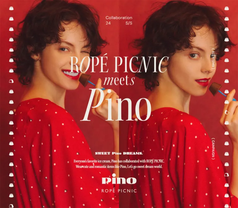
深い赤とクリーム色、映画をテーマにしたファッション写真、繊細なセリフ体が特徴。ピノ型の縁飾りと余白のある商品一覧を組み合わせたコラボレーションサイト。
オリジナルサイトを見るROPÉ PICNIC meets Pino — Style Reference
A fashion editorial staged against red curtains, framed with tiny cream chocolates, and organized into cinematic scenes.
Original URL: junonline.jp/special/ropepicnic_pino_collaboration
Final URL: Same collaboration page
Theme: red photographic and editorial sections, cream lettering, and a white corporate footer. No theme selector is evidenced.
Inspected: September 17, 2026 at 05:31:26.867 JST; September 16, 2026 at 20:31:26.867 UTC.
Viewports: 1440 × 1000 desktop and 390 × 844 mobile, in CSS pixels.
Scope: supplied current-page screenshots and rendered DOM/computed-style records covering the opening composition, four fashion scenes, ten linked products, campaign content, brand links, production credits, and JUN footer. Visual captures directly show the desktop hero, one intermediate photographic sequence, the closing credits/footer, and the mobile hero/footer. Other sections are documented primarily through DOM evidence.
The page is a long collaboration lookbook with shopping links and promotional content. Its strongest contrast is between theatrical photography and restrained interface text: saturated red curtains, chocolate-brown and red garments, warm skin tones, and cream display lettering sit beside small, lightly tracked sans-serif labels. Tiny Pino silhouettes repeat down both edges, giving the photography a recognizable branded frame without surrounding it with interface boxes.
The desktop opening is a two-image composition with a centered collaboration wordmark crossing the seam. Mobile uses a single full-height portrait and repositions the wordmark over the model’s torso. The editorial body then changes pace through large red intervals, offset portrait photography, scene titles, and quiet product captions. A numbered catalog makes the collection scannable before campaign content and a spacious corporate footer.
The current page still presents its 2024 S/S collaboration and a filter promotion ending July 31, 2024. Those dates describe the content currently served; they do not establish that the promotion remains active.
How to Read This Reference
- Measured values come from the supplied computed styles and element rectangles. Unless stated otherwise, dimensions are CSS pixels.
- Calculated values are arithmetic derived from those measurements, such as column gaps and viewport percentages.
- Visual estimates describe screenshot geometry where an element’s computed rectangle was not supplied.
- Recommendations are implementation choices for reuse. They are not claims about the original source code.
- Token names below are descriptive aliases. The supplied custom-property inventories were empty.
- Computed font stacks identify declared families, not a complete audit of which font rendered every glyph.
- Several empty-text heading elements visibly contain graphic lettering. Their computed 10px or 10.4px font size is not the size of the visible wordmark.
- Intermediate widths, hover states, keyboard behavior, and external destinations were not tested. The supplied still images do not establish a hero slideshow or its timing.
Tokens — Colors
Default Palette
| Name | Value | Suggested token | Evidence and role |
|---|---|---|---|
| Editorial Red | #b9231c |
--color-editorial-red |
Measured rgb(185, 35, 28) on the long lookbook section; the flat red surrounding editorial photographs |
| Campaign Cream | #edece5 |
--color-cream |
Measured hero, scene-caption, credit, and desktop navigation text color; visually consistent with the edge motifs |
| White | #ffffff |
--color-white |
Measured root and corporate-footer background; also the filter CTA fill and campaign-panel text |
| Charcoal | #333333 |
--color-ink |
Measured default text, catalog labels, and footer links |
| Filter Accent Red | #d32d26 |
--color-action-red |
Measured text color of the white GET HERE link |
| Muted Gray | #959595 |
--color-muted |
Measured footer group headings such as Share On |
Photography contributes brighter scarlet, dark burgundy, chocolate brown, peach, and beige. These are image colors rather than verified interface tokens. In particular, the red curtain is not a flat reproduction of #b9231c; its folds, highlights, and shadows create much of the depth.
Keep cream and white separate. The cream lettering belongs to the editorial world, while the corporate footer is explicitly white. Catalog and campaign section nodes have transparent computed backgrounds and dark default text; their complete underlying surface treatment was not independently photographed in the supplied captures.
Color Relationships
- Use red as a large environmental field, rather than only as a button accent.
- Place cream lettering directly over photography and flat red areas.
- Let photographs introduce brown and peach without adding extra interface accent colors.
- Use charcoal and muted gray for the corporate information system.
- Reserve the measured brighter action red for the filter CTA treatment; it is not evidence of a universal primary-button color.
Tokens — Typography
Light Sans Serif — Utility and Commerce
Measured stack: "DM Sans", "Hiragino Kaku Gothic ProN", "Hiragino Sans", "Helvetica Neue", Arial, Meiryo, sans-serif.
Most utility text uses weight 300: the season label, film references, product descriptions, credits, and footer links. Weight 400 appears in the catalog introduction and filter CTA; the desktop side-navigation labels use 500.
Tracking is commonly 0.03em: 0.45px at 15px, 0.36px at 12px, and approximately 0.3432px at 11.44px. This restrained spacing gives small labels clarity without turning everything into widely spaced uppercase typography.
Condensed Display Serif — Editorial Copy
Measured family: kepler-std-condensed-display, serif.
This family is directly evidenced on the hero’s English copy, scene-number labels, and NOVELTY BAG PRESENT! heading. It uses weight 400 and normal letter spacing. Its narrow proportions connect small supporting copy with the larger fashion-editorial language.
Do not extend this identification to every visible logo. The collaboration title has an empty text extraction and is presented as graphic artwork; the exact lettering font is not established.
Japanese Copy
Japanese campaign and catalog paragraphs use the measured stack "Hiragino Kaku Gothic ProN", "Hiragino Sans", "Helvetica Neue", Arial, Meiryo, sans-serif, without DM Sans at its beginning.
The observed campaign paragraphs use generous line spacing near 1.71, while the mobile catalog introduction uses approximately 1.82. Preserve comfortable Japanese line breaks instead of forcing them to follow the much tighter English display text.
Graphic Lettering
The main ROPÉ PICNIC meets Pino lockup combines tall, high-contrast serif capitals, a smaller connecting word, and a very large italicized treatment within Pino. The lower hero includes a compact SWEET Pino DREAMS. graphic and separate brand marks.
These are artwork components. Preserve their proportions with authorized assets. Recreating them with an arbitrary serif font will change the hierarchy and spacing even if the approximate text size is correct.
Type Scale
| Role | Desktop measurement | Mobile measurement | Weight / tracking |
|---|---|---|---|
| Root font size | 10px | 10.4px | 300; normal tracking |
| Opening season label | 18px / 18px | 13.52px / 13.52px | 300; 0.03em |
| Hero English copy | 20px / 24px | 11.44px / 13.728px | 400; normal tracking; Kepler |
| Scene number | 20px / 20px | approximately 20.8px / 20.8px | 400; normal tracking; Kepler |
| Film reference | 12px / 12px | 10.4px / 10.4px | 300; 0.03em |
| Lookbook product caption | 15px / 25.95px | 11.44px / 18.7616px | 300; 0.03em |
| Selected mobile paired-look captions | — | 11.44px / 16.588px | 300; 0.03em |
| Catalog item metadata | 12px / 12px | 10.4px / 10.4px | 300; 0.03em |
| Catalog name and price | 12px / 20.04px | 10.4px / 13.52px | 300; 0.03em |
Catalog BUY label |
13px / 13px | 10.4px / 10.4px | 300; 0.03em |
| Catalog Japanese introduction | 14px / 14px | 11.44px / 20.8207px | 300; 0.03em |
| Filter introduction | 14px / 23.94px | 12.48px / 21.3407px | 300; 0.03em |
| Novelty heading | 74px / 63.64px | approximately 49.92px / 43.9295px | 400; Kepler |
| Novelty explanatory copy | 14px / 23.94px | 14.56px / 24.8975px | 300; 0.03em |
| Production credits | 11px / 18.04px | 10.4px / 18.72px | 300; 0.03em |
| Desktop side navigation | 14px / 14px | Not present in supplied mobile evidence | 500; 0.03em |
| Footer group heading | 12px / 12px | 12.48px / 12.48px | 300; 0.03em |
| Footer text link | 12px / 12px | 11.44px / 11.44px | 300; 0.03em |
The mobile hierarchy is selective rather than a uniformly scaled desktop page. Scene numbers remain approximately 20px, and novelty explanatory copy becomes slightly larger, while hero supporting copy becomes much smaller.
Tokens — Spacing & Shapes
Spacing Scale
There is no verified universal spacing variable or source formula. Repeated measured values suggest a fine utility scale combined with much larger editorial intervals.
| Use | Desktop | Mobile | Status |
|---|---|---|---|
| Footer link padding | 10px | 10.4px | Measured |
| Hero graphic-to-copy gap | 17px | approximately 12.47px | Calculated from rectangles |
| Catalog card top padding | 15px | approximately 31.19px | Measured |
| Catalog horizontal gap | 57.75px | approximately 63.44px | Calculated between anchor boxes |
| Catalog row gap | approximately 30px | approximately 10.39px | Calculated from consecutive rows |
| Lookbook top padding | 244px | approximately 83.2px | Measured |
| Lookbook bottom padding | 207px | 143.52px | Measured |
| Catalog section padding, top / bottom | 50px / 242px | 93.6px / 83.2px | Measured |
| Campaign section padding, top / bottom | 42px / 240px | 83.2px / 0px | Measured |
| Corporate-footer padding, top / bottom | 137px / 58px | 104px / approximately 39.52px | Measured |
Large empty red areas are part of the composition. They isolate each look, allow small captions to remain quiet, and make the transition back to photography feel deliberate.
Border Radius
| Element | Observed treatment |
|---|---|
| Photographic panels | Visually square corners |
| Catalog anchor boxes | Measured radius 0 |
| Footer links and information groups | Measured radius 0 |
| Filter CTA | Measured radius 100px desktop and 104px mobile; pill treatment |
| Brand social links | Measured radius 50%; circular boxes |
There is no general rounded-card or shadow system in the supplied visual evidence. The pill and circles are specific control treatments, not a reason to round every content block.
Layout Measurements
| Element | Desktop at 1440 × 1000 | Mobile at 390 × 844 |
|---|---|---|
| Reported document height | 16,589px | 13,970px |
| Hero section rectangle | 1440 × 2000px | 390 × 1688px |
| Beginning of red lookbook section | Document y = 1000px | Document y = 844px |
| Opening season label | x 661.59, y 85.41; 116.81 × 42px | x 151.03, y 39.56; 87.92 × 33.27px |
| Main title artwork box | x 468.80, y 257.83; 502.41 × 331.94px | x 52, y 339.47; 285.98 × 188.95px |
| Small slogan artwork box | 210 × 11px | approximately 109.19 × 5.72px |
| Hero English copy box | approximately 399.75 × 48px | approximately 228.45 × 27.44px |
| Catalog anchor width | 167.25px | approximately 121.67px |
| Catalog columns | Four | Two |
| Representative catalog anchor height | approximately 328.53–329.56px | approximately 263.45px |
| Brand social-link boxes | 55 × 55px | approximately 33.27 × 33.27px |
| Corporate footer | 620px tall | approximately 919.78px tall |
| Corporate identity link | 340 × 26px | 286 × approximately 21.86px |
The hero’s element rectangle is two viewport heights, but the next section begins after one viewport. This is evidence of an overlapping layout arrangement; the supplied records do not reveal whether its implementation uses sticky positioning, negative spacing, or another mechanism. Do not reproduce it as an ordinary two-screen hero followed by another section.
Components
Opening Photographic Composition
Role: establish the collaboration through fashion imagery before introducing shopping information.
The desktop capture fills the first 1440 × 1000 viewport with two photographs meeting at x ≈ 720px. The left photograph is an intimate sideways close-up in a brown dotted garment; the right photograph shows a standing model against red curtains. Both crops reach the outer edges.
The centered title crosses the image seam. Above it, a small two-line season label reads Collaboration, then 24 and S/S. Below it, the composition stacks a small slogan graphic, two lines of condensed serif English copy, and the Pino/ROPÉ PICNIC brand marks.
There is no conventional horizontal header visible in this opening capture. The composition gives priority to the collaboration artwork and imagery.
Mobile adaptation: the supplied 390 × 844 capture uses one portrait of a model in a red dotted garment holding a chocolate. The title occupies approximately 73.33% of the viewport width and begins around 40.22% of the viewport height. The season label sits near the top, and the supporting copy and logos sit near the bottom.
The photographs differ between desktop and mobile captures. Their asset-selection logic and any temporal cycling are unverified.
Pino Edge Motifs
Role: frame the editorial content with a small, repeated product silhouette.
Both visible edges carry cream Pino-shaped marks. Most are solid, with occasional outlined or partially open variants. They are decorative in the supplied evidence; no navigation or progress semantics are established.
Visual estimates: desktop motif centers lie around x = 50px and x = 1390px, with marks approximately 20 × 16px and a vertical pitch near 46px. Mobile centers lie around x = 27.5px and x = 362.5px, with marks approximately 13 × 11px and a pitch near 31.5px.
The rails recur in the desktop hero and intermediate red lookbook capture. They are absent from the visible white footer. Exact positioning, animation, and section visibility rules were not supplied.
Desktop Section Navigation
Role: provide direct access to collection and campaign content during the editorial sequence.
Two narrow vertical links sit inside the right motif rail:
( ALL ITEMS )links to#p-items.( CAMPAIGN )links to#p-campaign.
At the desktop viewport, their measured boxes begin at x = 1324px, with top positions of 255px and approximately 650px. They use cream DM Sans at 14px, weight 500, and 0.03em tracking.
Their consistent screen placement across the supplied desktop captures supports a persistent navigation treatment. The precise CSS positioning and any color changes over light sections are unverified. Neither link appears in the supplied mobile link inventory or hero capture.
Film Scene Marker
Role: divide the lookbook into editorial chapters.
The rendered text identifies four scenes:
| Scene | Film reference shown on the page |
|---|---|
| 1 | 『Paris,Texas』 Wim Wenders |
| 2 | 『My Blueberry Nights』 Wong Kar Wai |
| 3 | 『Mary Poppins Returns』 Rob Marshall |
| 4 | 『Amélie』 Jean-Pierre Jeunet |
The component combines a condensed serif scene number, a graphic title region, and a small sans-serif film/director line. Preserve the difference between graphic display lettering and live metadata.
Desktop alignment changes with the scene: the third scene’s number is centered near x = 600px, while the fourth is centered near x = 937.5px. Mobile centers both near x = 195px. This is a compositional reflow, not just narrower margins.
Editorial Photo Sequence
Role: let garment styling and mood carry the story.
The supplied intermediate desktop capture shows two portrait photographs stacked on the flat red field. The upper image includes an adult and child with umbrellas; the lower image continues the same styling story. Beige walls and warm floor tones contrast with the surrounding red.
The visible column is approximately 422px wide, starts near x = 599px, and has an approximately 26px gap between images. Its center is around x = 810px, about 90px right of the viewport center. These are screenshot estimates, not evidence of a universal image-width rule.
Use square image boundaries, natural photographic proportions, and substantial surrounding space. The current evidence does not support turning every scene into the same centered image stack; captions and headings move among different horizontal alignments.
Lookbook Product Caption
Role: connect an editorial photograph with shoppable garments and accessories.
Each caption combines the product name, yen price, and BUY within a text link. A styled outfit can have several stacked links, followed by a small Japanese reference-item note. Paired looks use Left : and Right : labels.
Desktop text is 15px with a 25.95px line height, weight 300, and cream color. Mobile usually uses 11.44px with approximately 18.76px line height; some paired-look captions use a tighter 16.588px line height.
One observed mobile dress caption wraps the product name and price onto separate lines. Preserve natural wrapping and the connection between each product name and its price. Do not make the price or BUY a separate nested interactive element when the whole caption is already an anchor.
The links point to JUN product pages. Their current stock, purchase availability, and destination rendering were not checked.
Numbered Product Catalog
Role: summarize the collaboration in a practical shopping index after the editorial sequence.
The introduction repeats Collaboration and 24 S/S, includes a graphic heading, and adds Japanese explanatory copy. Ten anchor components follow in document order.
Anatomy: item identifier → category label → product imagery region → product name and price → BUY label. The product imagery itself was not separately captured in the supplied screenshots, so exact image layering, alternate views, and hover behavior remain unverified.
| Group | Item numbers | Products |
|---|---|---|
| WOMEN | 01–04 | One-piece, blouse, T-shirt, hat |
| GOODS | 05–07 | Umbrella, cooler bag, cold bottle case |
| KIDS | 08–10 | Kids one-piece, kids T-shirt, kids umbrella |
Desktop uses four columns. The first row’s anchors begin at x = 298.875, 523.875, 748.875, and 973.875px. Their 167.25px width and 225px horizontal pitch produce a calculated 57.75px gap. The last row retains the first two column positions.
Mobile uses two columns at x ≈ 41.59px and 226.70px. The anchors are approximately 121.67px wide, leaving a calculated 63.44px gap. This unusually generous gap is part of the measured composition; it is not a dense mobile shop grid.
The BUY text is a paragraph inside each product anchor. Its measured width does not establish the shape or border of a standalone button.
Instagram Filter Campaign
Role: present the collaboration’s social promotion.
The DOM includes introductory Japanese copy, #ピノピク, Instagram Filter - Present!, a limited-period date, smartphone instructions, and a GET HERE link to an Instagram AR URL. The supplied copy explicitly states July 31, 2024 as the end date.
The CTA has a white fill, red text #d32d26, regular sans-serif type, and a large pill radius. On mobile, its measured box is approximately 218.39 × 39.52px.
Measurement limitation: several desktop campaign rectangles are compressed relative to their computed text sizes. The CTA is recorded as only 78 × 14.7px, while its text remains declared at 14px. This is consistent with a transformed container, but the transform and triggering behavior are absent from the evidence. Do not treat the compressed rectangle as an intended desktop target size.
The external filter’s availability and behavior were not tested. Treat the dated copy as current-page content, not a verified live offer.
Novelty Bag Feature
Role: explain an additional collaboration purchase benefit.
A large condensed serif heading reads NOVELTY BAG PRESENT!. It uses 74px type with a tight 63.64px line height on desktop and approximately 49.92px / 43.93px on mobile.
Japanese explanatory copy describes a printed shopping bag for qualifying purchases of at least ¥10,000 including a collaboration item, while supplies last, at physical stores. The mobile text has deliberate shorter lines and a measured 14.56px size with approximately 24.9px line height.
The supplied evidence establishes the heading, copy, and reveal transitions. It does not show enough of the feature’s imagery to specify its complete visual composition.
Brand Links and Closing Credits
Role: return the reader to the brand and acknowledge the production team.
The DOM contains a ROPÉ PICNIC brand link and three circular social links for LINE, Instagram, and X/Twitter. Their measured boxes shrink from 55px on desktop to approximately 33.27px on mobile.
The closing desktop capture returns to split red-curtain photography, oversized collaboration lettering, and a centered block of cream credits. The credits use 11px text with approximately 18px line spacing. Mobile credit text is 10.4px with 18.72px spacing.
The inspected original page explicitly credits:
| Role | Displayed name |
|---|---|
| Photo | SAKAI DE JUN |
| Styling | Natsumi Sato |
| Hair & Make | Yuka Toyama (mod’s hair) |
| Model | Daria B (Tokyo Rebels), Fox Lugo (Sugar&Spice) |
| Web Design | eieio |
| Development | Yusuke Fukunaga |
| Edit | Yue Morozumi (euphoria factory) |
These names are supported by the current page’s rendered text; creator portfolio URLs were not supplied.
JUN Corporate Footer
Role: transition from the collaboration into the wider retail and corporate network.
The footer is a large white region with small charcoal links and gray group headings. Desktop groups cover social profiles, JUN group stores, help, and legal/company information. The YOU ARE CULTURE. JUN identity occupies the upper right; the J’aDoRe JUN ONLINE wordmark sits lower left. Copyright and an understated PAGE TOP link complete the bottom row.
The visible desktop content extends approximately from x = 258px to x = 1182px, a 924px span. Group starts occur near x = 258, 390, 671, and 842px. There are no boxed footer panels or heavy separators.
On mobile, the corporate identity moves above the social/store columns. The commerce wordmark appears below those columns in a two-line treatment, followed by help and legal links in another two-column area. Copyright and the page-top control sit near the bottom, after a large white interval.
The footer’s social entries link to profile URLs; their heading Share On does not by itself prove share-dialog behavior. PAGE TOP points to the page’s # fragment. Its scrolling animation was not tested.
The footer displays ©JUN CO.,LTD. ALL RIGHTS RESERVED. and includes a corporate-logo link to https://www.jun.co.jp/. A narrow alternating red/dark-red strip is visible at the bottom of the supplied footer captures; its source implementation is unknown.
Tokens — Motion & Interaction
Measured Motion Declarations
| Element | Supplied declaration | What it establishes |
|---|---|---|
| Opening season label | opacity 2s 0.35s |
A delayed, slow opacity transition |
| Opening title artwork | opacity 2s 0.5s |
A slightly later opacity transition |
| Mobile lookbook introduction graphic | Opacity 1.8s with cubic-bezier(0.215, 0.61, 0.355, 1); mask-position 1.8s with cubic-bezier(0.25, 0.46, 0.45, 0.94) |
Opacity and mask movement are declared; mask artwork and direction are not supplied |
| Mobile supporting lookbook graphic | opacity 1.5s 0.25s |
Delayed graphic reveal |
| Three mobile interval graphics | Opacity 2.6s with delays 0s, 0.6s, and 1.2s | A staggered opacity sequence |
| Interval graphic animations | 2.7s, 2.4s, and 2.1s; delays 0s, 0.25s, and 0.5s; cubic-bezier(0.455, 0.03, 0.515, 0.955) |
Named animations p_look_interval_text_1 and p_look_interval_text_2 exist; their keyframes are not supplied |
| Mobile catalog anchors | opacity 1.4s 0.35s |
Product-entry opacity transitions |
| Mobile novelty heading | Opacity 1.15s; transform 1.15s with cubic-bezier(0.215, 0.61, 0.355, 1) |
A combined opacity/transform reveal |
| Mobile filter fine print | opacity 1s 0.5s |
Delayed supporting text |
| Mobile novelty paragraph | opacity 1s 0.45s |
Delayed explanatory copy |
The declared timing is leisurely and editorial. It supports gradual reveals rather than fast application-style state changes.
A computed transition reported only as all is not enough to establish a visible animation or its duration. Likewise, differences between still photographs do not prove automatic cycling, and motif variations do not prove an animated progress indicator.
Evidenced Interaction Structure
- Product captions and catalog entries are links to product pages.
- Desktop utility links target the catalog and campaign anchors.
- The filter CTA targets an external Instagram AR URL.
- Brand and footer social controls are links to profile destinations.
- The footer exposes a page-top fragment link.
The capture process waited for visible image decoding and finite animation readiness, traversed intermediate scroll positions, and temporarily paused perpetual animations during readiness checks before resuming them. This improves capture stability but does not provide a complete interaction recording. Hover effects, focus treatments, replay behavior, scroll-trigger thresholds, image cycling, and reduced-motion support remain unverified.
Surfaces
| Layer | Appearance | Function and confidence |
|---|---|---|
| Opening hero | Full-bleed red fashion photography with cream artwork | Directly visible on desktop and mobile |
| Lookbook canvas | Flat #b9231c with cream captions |
Measured and visible |
| Editorial photographs | Warm photographic color, square boundaries | Directly visible; individual dimensions vary |
| Catalog | Dark labels and transparent anchor surfaces | Measured; full visual surface not separately captured |
| Filter promotion | White text and a white pill CTA with red label | Computed styles; complete panel background not independently shown |
| Closing credits | Cream text over red-curtain photography | Directly visible in desktop capture |
| Corporate footer | White field, charcoal links, muted headings | Measured and visible at both sizes |
Depth comes primarily from the photography, scale changes, and empty space. The visible shell does not rely on general-purpose gradients, glass effects, or elevation shadows.
Imagery
The art direction combines fashion portraiture with a theatrical red setting. Curtain folds, warm lighting, lipstick, small garment motifs, and the chocolate prop connect the clothing and confectionery identities. The opening uses contrasting distances: a close face crop next to a fuller view of the garment. The intermediate umbrella sequence shifts to a quieter beige environment while retaining the surrounding red page.
Use warm, detailed photographic assets. Preserve skin texture and fabric character; do not apply pixelation or replace the imagery with generic cutout product cards throughout the editorial sections.
The mobile portrait is composed differently from the desktop diptych. A useful adaptation needs a mobile crop or separate art-directed image that preserves the face, hand, chocolate, and garment beneath the title.
Observed Asset References
The supplied evidence contains no original image URLs, SVG paths, or font-file URLs. The following is an asset-role inventory, not a file manifest.
| Asset role | Evidence | Implementation guidance |
|---|---|---|
| Desktop opening photographs | Two adjacent red-curtain photographs | Prepare coordinated crops with a clean center seam |
| Mobile opening photograph | Single portrait with chocolate prop | Supply a portrait crop or dedicated mobile source |
| Collaboration title | Graphic within the empty-text H1 | Preserve artwork aspect ratio; provide an accessible name |
| Small slogan and brand marks | Visible lower-hero artwork | Use approved graphic assets rather than guessed fonts |
| Pino silhouettes | Repeated cream edge decoration | Keep their recognizable shape and small scale |
| Scene lettering | Graphic regions alongside live scene and film text | Separate artwork from accessible textual labels |
| Umbrella editorial photographs | Portrait sequence on beige set | Keep natural image proportions and square corners |
| Product imagery | Catalog structure indicates image regions | Exact imagery and alternate-image behavior require further evidence |
| JUN identities | Corporate and commerce wordmarks in footer | Preserve the observed desktop/mobile arrangements |
Layout & Responsive Behavior
Page Sequence
The current document follows this order: photographic opening → long four-scene lookbook → ten-item catalog → filter and novelty promotions → brand/social links and photographic credits → corporate footer.
| Region | Desktop document start / height | Mobile document start / height |
|---|---|---|
| Red lookbook | 1000px / approximately 9982.19px | 844px / approximately 7602.48px |
| Catalog | approximately 11102.19px / 1483.66px | approximately 8446.48px / 1674.25px |
| Campaign content | approximately 12585.84px / 2182.88px | approximately 10120.73px / 1603.48px |
| Brand and closing section | approximately 14768.72px / 1190.75px | approximately 11724.22px / 1315.59px |
| Corporate footer | approximately 15959.47px / 620px | approximately 13039.81px / 919.78px |
These coordinates describe the captured layout state, not a specification for fixed section heights. Content wrapping and animation-related geometry can change them.
Desktop to Mobile Changes
| Feature | Desktop | Mobile |
|---|---|---|
| Hero photography | Two side-by-side crops | Single portrait composition |
| Hero title | Approximately 34.89vw wide; top near 25.78vh | Approximately 73.33vw wide; top near 40.22vh |
| Season label | Top near 8.54vh | Top near 4.69vh |
| Hero supporting content | Slogan starts near 73.66vh | Slogan starts near 81.70vh |
| Side section navigation | Two vertical links | Absent from supplied mobile evidence |
| Scene headings | Varying horizontal centers | Centered near the viewport midpoint |
| Product captions | Mostly longer single-line labels | Smaller type and additional wrapping |
| Catalog | Four columns, three rows | Two columns, five rows |
| Footer | Broad horizontal grouping | Reordered identity and paired link groups |
No exact source breakpoint was supplied. A breakpoint around 768px is a reasonable starting recommendation for a new implementation, but it must be tested at tablet widths. Do not present that recommendation as recovered CSS.
The measured root sizes are 10px on desktop and 10.4px on mobile. These two observations do not prove a fluid-root formula. The Quick Start uses ordinary CSS pixel values and explicit responsive rules to avoid inventing one.
Do’s and Don’ts
Do
- Build the editorial world around the measured red
#b9231cand cream#edece5. - Preserve the combination of close portrait crops, fuller garment views, and large areas of red.
- Keep the collaboration lockup as proportionally scaled artwork.
- Pair light DM Sans utility text with the verified condensed display serif for live editorial copy.
- Use Pino silhouettes as a small repeated frame, with clear separation from interactive controls.
- Let scene headings and photo columns vary their desktop alignment.
- Keep shopping captions attached to their corresponding look.
- Preserve the catalog’s numbered WOMEN, GOODS, and KIDS sequence.
- Recompose the mobile hero and footer instead of shrinking the desktop layout wholesale.
- Treat slow reveal timings as supported declarations, while keeping unverified animation behavior clearly labeled.
Don’t
- Don’t turn the lookbook into a uniform collection of rounded feature cards.
- Don’t replace the graphic title with a guessed font and call it a measured match.
- Don’t infer a slideshow interval or parallax system from different still images.
- Don’t treat the hero’s two-viewport rectangle as two ordinary screens of empty document flow.
- Don’t copy the compressed desktop campaign bounds as intended control dimensions.
- Don’t make the edge motifs into progress controls without additional evidence.
- Don’t force every mobile type size to be proportionally smaller; the observed scale is selective.
- Don’t describe the 2024 filter promotion or product stock as currently available without verification.
- Don’t attribute the entire design to a particular framework; none is established by the supplied evidence.
Recommended Implementation Additions
These recommendations are for a new implementation and are not verified original-page features.
- Give the graphic H1 an accessible collaboration name. Keep decorative duplicated lettering and motif rails out of the accessibility tree.
- Provide meaningful alternatives for editorial photographs and product imagery, based on their role in the surrounding content.
- Keep links usable when animation scripts fail. Apply initial hidden states only after progressive enhancement has initialized.
- Respect
prefers-reduced-motion; reveal all content without masks, transforms, or long delays in that mode. - Increase essential mobile explanatory text where the measured 10–11px sizes would impair reading. Preserve tiny artwork only when it is supplementary.
- Expand the mobile filter CTA and social-link hit areas to at least 44px where practical; their measured visible boxes are smaller.
- Use visible keyboard focus and make same-page destinations easy to identify after navigation.
- Keep expired promotion dates explicit. If republishing the design, distinguish archived promotional content from currently actionable offers.
- Supply art-directed image sources and reserve intrinsic image dimensions to reduce layout shifts.
- Make sticky decorative layers non-interactive so they cannot intercept product or navigation links.
Agent Prompt Guide
Quick Color Reference
- Editorial field:
#b9231c. - Editorial lettering and decorative motifs:
#edece5. - Corporate footer:
#ffffff. - Commerce and footer text:
#333333. - Footer group headings:
#959595. - Filter CTA: white pill with
#d32d26label. - Brown, peach, beige, and brighter reds belong primarily to photography.
Overall Prompt
“Create a long fashion collaboration lookbook inspired by the observed ROPÉ PICNIC meets Pino page. Use a deep red #b9231c editorial field, cream #edece5 graphic lettering, warm red-curtain fashion photography, and tiny repeated Pino-shaped edge motifs. Open with a desktop photographic diptych and centered oversized collaboration artwork; use a separately composed single portrait on mobile. Combine light DM Sans utility labels with condensed display-serif editorial copy. Organize the body into four film-referenced scenes with varied photo alignment, generous red space, and small linked product captions. Follow with a numbered ten-item catalog using four desktop columns and two mobile columns, then campaign content, photographic credits, and a spacious white corporate footer. Keep image corners square and controls understated.”
Example Component Prompts
- Hero: “Build a full-viewport fashion composition from two desktop photographs that meet at the center. Overlay an approved cream collaboration lockup, a small season label above, and condensed supporting copy below. At mobile width, switch to one portrait and place the lockup over the torso. Do not invent a slideshow.”
- Edge decoration: “Frame the red editorial region with narrow vertical rails of small cream chocolate silhouettes. Use approximately 20px-wide motifs on desktop and 13px on mobile, with ample vertical separation. Treat the rails as decorative and prevent them from intercepting input.”
- Lookbook scene: “Arrange a portrait photo sequence slightly right of center on desktop, with warm beige photography against a deep red field. Add a compact scene label, graphic heading, film/director reference, and cream text links for the pictured outfit. Reflow the title toward the center on mobile.”
- Catalog: “Create ten unboxed product anchors numbered 01–10, each containing category, image region, name, yen price, and BUY label. Use four narrow columns on desktop and two generously separated columns on mobile. Preserve document order and avoid nested buttons.”
- Footer: “Create a white retail-group footer with small charcoal links, muted group headings, a corporate wordmark, and a separate commerce wordmark. On mobile, place the corporate identity first, social/store columns next, the commerce identity below, then help/legal columns and a quiet bottom copyright row.”
- Motion: “Use the documented 2-second hero opacity reveals and 1.4-second product reveals only after enhancement initializes. Keep content visible by default and remove reveal delays in reduced-motion mode. Do not fabricate unavailable mask keyframes or hero image timing.”
Quick Start
CSS Custom Properties
This is a recommended implementation scaffold, not recovered source CSS. It reproduces the measured palette, representative hero geometry, catalog spacing, and footer hierarchy while allowing content to reflow. The 768px breakpoint is a recommendation. Approved photographs, title artwork, wordmarks, and motif images must be supplied separately; no original asset paths were provided.
Use .pino-page as the outer wrapper. Place .campaign-chrome first inside a .campaign-stage containing the editorial sections that need the decorative rails. Give each .pino-rail enough repeated motif images to cover the viewport. The sticky chrome is a proposed way to reproduce the observed placement; it is not a claim about the original positioning code. Keep the corporate footer outside that stage.
For the footer, .footer-links wraps .footer-share and .footer-stores; the remaining named groups are direct children of .footer-grid. Use responsive artwork for the commerce wordmark if its mobile version needs two lines.
:root {
  /* Measured colors, exposed as implementation aliases. */
  --color-editorial-red: #b9231c;
  --color-cream: #edece5;
  --color-white: #ffffff;
  --color-ink: #333333;
  --color-action-red: #d32d26;
  --color-muted: #959595;

  --font-utility: 'DM Sans', 'Hiragino Kaku Gothic ProN',
    'Hiragino Sans', 'Helvetica Neue', Arial, Meiryo, sans-serif;
  --font-japanese: 'Hiragino Kaku Gothic ProN', 'Hiragino Sans',
    'Helvetica Neue', Arial, Meiryo, sans-serif;
  --font-editorial: kepler-std-condensed-display, serif;

  --weight-light: 300;
  --weight-regular: 400;
  --weight-navigation: 500;
  --tracking-utility: 0.03em;
  --radius-square: 0;
  --radius-pill: 100px;
  --motion-hero: 2s;
  --motion-product: 1.4s;
}

.pino-page,
.pino-page * {
  box-sizing: border-box;
}

.pino-page {
  margin: 0;
  color: var(--color-ink);
  background: var(--color-white);
  font-family: var(--font-utility);
  font-weight: var(--weight-light);
  letter-spacing: var(--tracking-utility);
}

.pino-page img {
  display: block;
  max-width: 100%;
}

.pino-page a {
  color: inherit;
}

.campaign-stage {
  position: relative;
  isolation: isolate;
  color: var(--color-cream);
  background: var(--color-editorial-red);
}

/* Recommended scoped chrome; the original mechanism is unverified. */
.campaign-chrome {
  position: sticky;
  top: 0;
  z-index: 5;
  height: 100svh;
  margin-bottom: -100svh;
  overflow: hidden;
  pointer-events: none;
}

.pino-rail {
  position: absolute;
  inset-block: 0;
  display: flex;
  flex-direction: column;
  gap: 30px;
  width: 20px;
  padding-block: 24px;
  overflow: hidden;
}

.pino-rail--left { left: 40px; }
.pino-rail--right { right: 40px; }

.pino-rail img {
  flex: none;
  width: 20px;
  height: 16px;
  object-fit: contain;
}

.section-nav a {
  position: absolute;
  right: 102px;
  writing-mode: vertical-rl;
  font-size: 14px;
  line-height: 1;
  font-weight: var(--weight-navigation);
  text-decoration: none;
  pointer-events: auto;
}

.section-nav a:first-child { top: 25.5%; }
.section-nav a:last-child { top: 65%; }

.pino-hero {
  position: relative;
  height: 100svh;
  min-height: 620px;
  overflow: hidden;
}

.hero-media {
  position: absolute;
  inset: 0;
  display: grid;
  grid-template-columns: repeat(2, minmax(0, 1fr));
}

.hero-media picture,
.hero-media img {
  width: 100%;
  height: 100%;
  min-width: 0;
}

.hero-media img {
  object-fit: cover;
}

.hero-season,
.hero-title,
.hero-caption {
  position: absolute;
  left: 50%;
  transform: translateX(-50%);
  margin: 0;
  text-align: center;
}

.hero-season {
  top: 8.54%;
  width: 116.81px;
  font-size: 18px;
  line-height: 1;
}

.hero-season__row {
  display: flex;
  justify-content: space-between;
  margin-top: 6px;
}

.hero-title {
  top: 25.783%;
  width: min(34.89vw, 502.41px);
}

.hero-title img {
  width: 100%;
  height: auto;
}

.hero-caption {
  top: 73.6625%;
  width: min(400px, 80vw);
}

.hero-slogan {
  width: 210px;
  height: auto;
  margin-inline: auto;
}

.hero-copy {
  margin: 17px 0 18px;
  font-family: var(--font-editorial);
  font-size: 20px;
  font-weight: var(--weight-regular);
  line-height: 1.2;
  letter-spacing: normal;
}

/* Approximate logo width; replace with the approved asset proportions. */
.hero-brands {
  width: 160px;
  margin-inline: auto;
}

.lookbook {
  padding-block: 244px 207px;
}

.scene-label {
  margin: 0;
  font-family: var(--font-editorial);
  font-size: 20px;
  line-height: 1;
  letter-spacing: normal;
}

.scene-film {
  font-size: 12px;
  line-height: 1;
}

/* Representative photo treatment, not a rule for every original scene. */
.scene-photo {
  width: min(422.4px, 73.333vw);
  margin: 26px auto 0;
}

.scene-photo img {
  width: 100%;
  height: auto;
  border-radius: var(--radius-square);
}

.look-caption {
  font-size: 15px;
  line-height: 1.73;
}

.look-caption p {
  margin: 0;
}

.look-caption a,
.item-link {
  text-decoration: none;
}

.items-section {
  padding-block: 50px 242px;
  scroll-margin-top: 24px;
}

.items-intro {
  max-width: 400px;
  margin-inline: auto;
  text-align: center;
}

.items-intro p[lang='ja'] {
  font-family: var(--font-japanese);
  font-size: 14px;
  line-height: 1.7;
}

.item-grid {
  display: grid;
  grid-template-columns: repeat(4, minmax(0, 1fr));
  gap: 30px 57.75px;
  width: min(842.25px, calc(100% - 104px));
  margin: 50px auto 0;
}

.item-link {
  display: flex;
  flex-direction: column;
  min-width: 0;
  min-height: 329px;
  padding-top: 15px;
  border-radius: 0;
  color: var(--color-ink);
}

.item-meta {
  display: flex;
  justify-content: space-between;
  gap: 8px;
  margin: 0;
  font-size: 12px;
  line-height: 1;
}

/* Recommended image slot; exact original asset geometry was not supplied. */
.item-media {
  display: grid;
  flex: 1;
  place-items: center;
  min-height: 190px;
}

.item-media img {
  width: 100%;
  max-height: 190px;
  object-fit: contain;
}

.item-name {
  margin: 12px 0 0;
  text-align: center;
  font-size: 12px;
  line-height: 1.67;
}

.item-buy {
  display: block;
  width: 89px;
  margin: 22px auto 12px;
  text-align: center;
  font-size: 13px;
  line-height: 1;
}

.filter-cta {
  display: flex;
  align-items: center;
  justify-content: center;
  width: min(260px, 80vw);
  min-height: 49px;
  margin-inline: auto;
  border-radius: var(--radius-pill);
  color: var(--color-action-red);
  background: var(--color-white);
  font-size: 14px;
  font-weight: var(--weight-regular);
  text-decoration: none;
}

.novelty-title {
  font-family: var(--font-editorial);
  font-size: 74px;
  font-weight: var(--weight-regular);
  line-height: 0.86;
  letter-spacing: normal;
}

.production-credits {
  font-size: 11px;
  line-height: 1.64;
  text-align: center;
}

.production-credits p {
  margin: 0;
}

.jun-footer {
  position: relative;
  padding-block: 137px 58px;
  color: var(--color-ink);
  background: var(--color-white);
}

.footer-grid {
  display: grid;
  grid-template-columns: 108px 257px 147px 340px;
  grid-template-areas:
    'share stores help culture'
    'share stores help legal'
    'shop shop copyright copyright';
  gap: 32px 24px;
  width: 924px;
  max-width: calc(100% - 104px);
  margin-inline: auto;
}

.footer-links { display: contents; }
.footer-share { grid-area: share; }
.footer-stores { grid-area: stores; }
.footer-help { grid-area: help; }
.footer-culture { grid-area: culture; }
.footer-legal { grid-area: legal; }
.footer-shop { grid-area: shop; }
.footer-copyright { grid-area: copyright; }

.footer-group-title {
  margin: 0 0 22px;
  color: var(--color-muted);
  font-size: 12px;
  font-weight: var(--weight-light);
}

.footer-list {
  margin: 0;
  padding: 0;
  list-style: none;
}

.footer-list a {
  display: inline-block;
  margin-inline: -10px;
  padding: 9px 10px;
  font-size: 12px;
  line-height: 1;
  text-decoration: none;
}

.footer-shop,
.footer-copyright {
  align-self: end;
  margin-top: 120px;
}

.footer-shop img { width: 286px; }
.footer-copyright { font-size: 11px; text-align: right; }

.page-top {
  position: absolute;
  right: 64px;
  bottom: 58px;
  padding-top: 22px;
  font-size: 11px;
  text-decoration: none;
}

/* Content is visible by default; enhancement may opt into these transitions. */
.hero-season { transition: opacity var(--motion-hero) 0.35s; }
.hero-title { transition: opacity var(--motion-hero) 0.5s; }
.item-link { transition: opacity var(--motion-product) 0.35s; }

.pino-page :focus-visible {
  outline: 2px solid currentColor;
  outline-offset: 5px;
}

@media (hover: hover) {
  /* Recommended feedback, not an observed original hover state. */
  .look-caption a:hover,
  .footer-list a:hover {
    text-decoration: underline;
    text-underline-offset: 3px;
  }
}

@media (min-width: 768px) {
  .scene-photo--offset {
    transform: translateX(90px);
  }
}

@media (min-width: 768px) and (max-width: 1100px) {
  /* Recommended intermediate layout; this width was not inspected. */
  .footer-grid {
    grid-template-columns: 1fr 2fr 1fr 2.4fr;
  }
}

@media (max-width: 767px) {
  .pino-rail {
    width: 13px;
    gap: 20.5px;
    padding-block: 4px;
  }
  .pino-rail--left { left: 5.38vw; }
  .pino-rail--right { right: 5.38vw; }
  .pino-rail img { width: 13px; height: 11px; }
  .section-nav { display: none; }

  .pino-hero { min-height: 720px; }
  .hero-media { grid-template-columns: 1fr; }
  .hero-media > :nth-child(2) { display: none; }
  /* The first picture should provide the art-directed mobile source. */

  .hero-season {
    top: 4.6875%;
    width: 87.92px;
    font-size: 13.52px;
  }
  .hero-title {
    top: 40.2214%;
    width: 73.3333%;
  }
  .hero-caption {
    top: 81.7%;
    width: 58.578vw;
  }
  .hero-slogan { width: 109.19px; }
  .hero-copy {
    margin-block: 12.47px 13.52px;
    font-size: 11.44px;
    line-height: 1.2;
  }
  .hero-brands { width: 100px; }

  .lookbook { padding-block: 83.2px 143.52px; }
  .scene-label { font-size: 20.8px; text-align: center; }
  .scene-film { font-size: 10.4px; text-align: center; }
  .look-caption { font-size: 11.44px; line-height: 1.64; }

  .items-section { padding-block: 93.6px 83.2px; }
  .items-intro { width: 73.6%; }
  .items-intro p[lang='ja'] { font-size: 11.44px; line-height: 1.82; }
  .item-grid {
    grid-template-columns: repeat(2, minmax(0, 1fr));
    width: 78.6667%;
    gap: 10.4px 16.2667vw;
    margin-top: 36px;
  }
  .item-link { min-height: 263.45px; padding-top: 31.19px; }
  .item-meta { font-size: 10.4px; flex-wrap: wrap; }
  .item-media { min-height: 145px; }
  .item-media img { max-height: 145px; }
  .item-name { font-size: 10.4px; line-height: 1.3; }
  .item-buy { width: 63.52px; font-size: 10.4px; }

  .filter-cta {
    width: min(218.39px, 80vw);
    min-height: 44px;
    font-size: 12.48px;
  }
  .novelty-title { font-size: 49.92px; line-height: 0.88; }
  .production-credits { font-size: 10.4px; line-height: 1.8; }

  .jun-footer { padding-block: 104px 39.52px; }
  .footer-grid {
    width: 73.3333%;
    max-width: none;
    grid-template-columns: repeat(2, minmax(0, 1fr));
    grid-template-areas:
      'culture culture'
      'links links'
      'shop shop'
      'help legal'
      'copyright copyright';
    gap: 32px 20px;
  }
  .footer-links {
    display: grid;
    grid-area: links;
    grid-template-columns: minmax(0, 0.39fr) minmax(0, 1fr);
    gap: 24px;
  }
  .footer-links > * { grid-area: auto; }
  .footer-group-title { font-size: 12.48px; }
  .footer-list a { font-size: 11.44px; }
  .footer-shop { margin-top: 44px; }
  .footer-shop img { width: 180px; }
  .footer-copyright {
    margin-top: 130px;
    font-size: 10px;
    text-align: left;
  }
  .page-top { right: 13.333vw; bottom: 68px; }
}

@media (prefers-reduced-motion: reduce) {
  .pino-page *,
  .pino-page *::before,
  .pino-page *::after {
    animation: none !important;
    transition: none !important;
    scroll-behavior: auto !important;
  }
  .pino-page [data-reveal] {
    opacity: 1 !important;
    transform: none !important;
    mask-image: none !important;
    -webkit-mask-image: none !important;
  }
}
The image-slot heights, minimum hero heights, footer adaptation, focus styling, and 44px mobile CTA minimum are recommended choices. Test them with real assets, text zoom, short landscape viewports, and intermediate widths. The scaffold does not attempt to reproduce unavailable animation keyframes or the original overlapping hero mechanism.
Tailwind v4 Token Mapping
Optional mapping for a project already using Tailwind v4. This does not imply that the original page uses Tailwind. Load any licensed fonts separately.
@theme {
  --color-editorial-red: #b9231c;
  --color-campaign-cream: #edece5;
  --color-campaign-white: #ffffff;
  --color-campaign-ink: #333333;
  --color-action-red: #d32d26;
  --color-footer-muted: #959595;

  --font-campaign-utility: 'DM Sans', 'Hiragino Kaku Gothic ProN',
    'Hiragino Sans', 'Helvetica Neue', Arial, Meiryo, sans-serif;
  --font-campaign-editorial: kepler-std-condensed-display, serif;

  --text-campaign-caption: 15px;
  --text-campaign-caption--line-height: 1.73;
  --text-campaign-small: 12px;
  --text-campaign-scene: 20px;
  --text-campaign-novelty: 74px;
  --text-campaign-novelty--line-height: 0.86;

  --tracking-campaign: 0.03em;
  --radius-campaign-pill: 100px;
  --spacing-catalog-column: 167.25px;
  --spacing-catalog-gap: 57.75px;
}
Sources & Evidence
- Original and final page: ROPÉ PICNIC / Pino collaboration. The supplied browser record reports HTTP 200 with the original and final URLs identical.
- Capture time: September 16, 2026, 20:31:26.867 UTC; September 17, 2026, 05:31:26.867 JST.
- Desktop evidence: 1440 × 1000 viewport, reported document height 16,589px; screenshots of the opening, an intermediate umbrella-photo sequence, and closing credits/footer, plus rendered text, links, element bounds, and computed styles.
- Mobile evidence: 390 × 844 viewport, reported document height 13,970px; screenshots of the opening and footer, plus corresponding rendered text, links, element bounds, and computed styles.
- Original-page attribution evidence: visible production credits and the footer copyright/company link. Only those current-page observations support attribution statements in this document.
- Inspection limits: the supplied records do not include original asset URLs, complete stylesheet rules, animation keyframes, hover/focus captures, a time-resolved interaction recording, or tested destination pages. Some desktop campaign geometry appears transformed. Readiness checks do not prove that every delayed effect or interaction was exercised.
This reference describes the page currently served in the supplied inspection. Measurements are kept separate from screenshot estimates and proposed implementation choices.
# ROPÉ PICNIC meets Pino — Style Reference

> A fashion editorial staged against red curtains, framed with tiny cream chocolates, and organized into cinematic scenes.

**Original URL:** [junonline.jp/special/ropepicnic_pino_collaboration](https://www.junonline.jp/special/ropepicnic_pino_collaboration/)

**Final URL:** [Same collaboration page](https://www.junonline.jp/special/ropepicnic_pino_collaboration/)

**Theme:** red photographic and editorial sections, cream lettering, and a white corporate footer. No theme selector is evidenced.

**Inspected:** September 17, 2026 at 05:31:26.867 JST; September 16, 2026 at 20:31:26.867 UTC.

**Viewports:** 1440 × 1000 desktop and 390 × 844 mobile, in CSS pixels.

**Scope:** supplied current-page screenshots and rendered DOM/computed-style records covering the opening composition, four fashion scenes, ten linked products, campaign content, brand links, production credits, and JUN footer. Visual captures directly show the desktop hero, one intermediate photographic sequence, the closing credits/footer, and the mobile hero/footer. Other sections are documented primarily through DOM evidence.

The page is a long collaboration lookbook with shopping links and promotional content. Its strongest contrast is between theatrical photography and restrained interface text: saturated red curtains, chocolate-brown and red garments, warm skin tones, and cream display lettering sit beside small, lightly tracked sans-serif labels. Tiny Pino silhouettes repeat down both edges, giving the photography a recognizable branded frame without surrounding it with interface boxes.

The desktop opening is a two-image composition with a centered collaboration wordmark crossing the seam. Mobile uses a single full-height portrait and repositions the wordmark over the model’s torso. The editorial body then changes pace through large red intervals, offset portrait photography, scene titles, and quiet product captions. A numbered catalog makes the collection scannable before campaign content and a spacious corporate footer.

The current page still presents its 2024 S/S collaboration and a filter promotion ending July 31, 2024. Those dates describe the content currently served; they do not establish that the promotion remains active.

## How to Read This Reference

- **Measured** values come from the supplied computed styles and element rectangles. Unless stated otherwise, dimensions are CSS pixels.
- **Calculated** values are arithmetic derived from those measurements, such as column gaps and viewport percentages.
- **Visual estimates** describe screenshot geometry where an element’s computed rectangle was not supplied.
- **Recommendations** are implementation choices for reuse. They are not claims about the original source code.
- Token names below are descriptive aliases. The supplied custom-property inventories were empty.
- Computed font stacks identify declared families, not a complete audit of which font rendered every glyph.
- Several empty-text heading elements visibly contain graphic lettering. Their computed 10px or 10.4px font size is not the size of the visible wordmark.
- Intermediate widths, hover states, keyboard behavior, and external destinations were not tested. The supplied still images do not establish a hero slideshow or its timing.

## Tokens — Colors

### Default Palette

| Name | Value | Suggested token | Evidence and role |
| --- | --- | --- | --- |
| Editorial Red | `#b9231c` | `--color-editorial-red` | Measured `rgb(185, 35, 28)` on the long lookbook section; the flat red surrounding editorial photographs |
| Campaign Cream | `#edece5` | `--color-cream` | Measured hero, scene-caption, credit, and desktop navigation text color; visually consistent with the edge motifs |
| White | `#ffffff` | `--color-white` | Measured root and corporate-footer background; also the filter CTA fill and campaign-panel text |
| Charcoal | `#333333` | `--color-ink` | Measured default text, catalog labels, and footer links |
| Filter Accent Red | `#d32d26` | `--color-action-red` | Measured text color of the white `GET HERE` link |
| Muted Gray | `#959595` | `--color-muted` | Measured footer group headings such as `Share On` |

Photography contributes brighter scarlet, dark burgundy, chocolate brown, peach, and beige. These are image colors rather than verified interface tokens. In particular, the red curtain is not a flat reproduction of `#b9231c`; its folds, highlights, and shadows create much of the depth.

Keep cream and white separate. The cream lettering belongs to the editorial world, while the corporate footer is explicitly white. Catalog and campaign section nodes have transparent computed backgrounds and dark default text; their complete underlying surface treatment was not independently photographed in the supplied captures.

### Color Relationships

- Use red as a large environmental field, rather than only as a button accent.
- Place cream lettering directly over photography and flat red areas.
- Let photographs introduce brown and peach without adding extra interface accent colors.
- Use charcoal and muted gray for the corporate information system.
- Reserve the measured brighter action red for the filter CTA treatment; it is not evidence of a universal primary-button color.

## Tokens — Typography

### Light Sans Serif — Utility and Commerce

**Measured stack:** `"DM Sans", "Hiragino Kaku Gothic ProN", "Hiragino Sans", "Helvetica Neue", Arial, Meiryo, sans-serif`.

Most utility text uses weight `300`: the season label, film references, product descriptions, credits, and footer links. Weight `400` appears in the catalog introduction and filter CTA; the desktop side-navigation labels use `500`.

Tracking is commonly `0.03em`: 0.45px at 15px, 0.36px at 12px, and approximately 0.3432px at 11.44px. This restrained spacing gives small labels clarity without turning everything into widely spaced uppercase typography.

### Condensed Display Serif — Editorial Copy

**Measured family:** `kepler-std-condensed-display, serif`.

This family is directly evidenced on the hero’s English copy, scene-number labels, and `NOVELTY BAG PRESENT!` heading. It uses weight `400` and normal letter spacing. Its narrow proportions connect small supporting copy with the larger fashion-editorial language.

Do not extend this identification to every visible logo. The collaboration title has an empty text extraction and is presented as graphic artwork; the exact lettering font is not established.

### Japanese Copy

Japanese campaign and catalog paragraphs use the measured stack `"Hiragino Kaku Gothic ProN", "Hiragino Sans", "Helvetica Neue", Arial, Meiryo, sans-serif`, without DM Sans at its beginning.

The observed campaign paragraphs use generous line spacing near `1.71`, while the mobile catalog introduction uses approximately `1.82`. Preserve comfortable Japanese line breaks instead of forcing them to follow the much tighter English display text.

### Graphic Lettering

The main `ROPÉ PICNIC meets Pino` lockup combines tall, high-contrast serif capitals, a smaller connecting word, and a very large italicized treatment within `Pino`. The lower hero includes a compact `SWEET Pino DREAMS.` graphic and separate brand marks.

These are artwork components. Preserve their proportions with authorized assets. Recreating them with an arbitrary serif font will change the hierarchy and spacing even if the approximate text size is correct.

### Type Scale

| Role | Desktop measurement | Mobile measurement | Weight / tracking |
| --- | --- | --- | --- |
| Root font size | 10px | 10.4px | 300; normal tracking |
| Opening season label | 18px / 18px | 13.52px / 13.52px | 300; `0.03em` |
| Hero English copy | 20px / 24px | 11.44px / 13.728px | 400; normal tracking; Kepler |
| Scene number | 20px / 20px | approximately 20.8px / 20.8px | 400; normal tracking; Kepler |
| Film reference | 12px / 12px | 10.4px / 10.4px | 300; `0.03em` |
| Lookbook product caption | 15px / 25.95px | 11.44px / 18.7616px | 300; `0.03em` |
| Selected mobile paired-look captions | — | 11.44px / 16.588px | 300; `0.03em` |
| Catalog item metadata | 12px / 12px | 10.4px / 10.4px | 300; `0.03em` |
| Catalog name and price | 12px / 20.04px | 10.4px / 13.52px | 300; `0.03em` |
| Catalog `BUY` label | 13px / 13px | 10.4px / 10.4px | 300; `0.03em` |
| Catalog Japanese introduction | 14px / 14px | 11.44px / 20.8207px | 300; `0.03em` |
| Filter introduction | 14px / 23.94px | 12.48px / 21.3407px | 300; `0.03em` |
| Novelty heading | 74px / 63.64px | approximately 49.92px / 43.9295px | 400; Kepler |
| Novelty explanatory copy | 14px / 23.94px | 14.56px / 24.8975px | 300; `0.03em` |
| Production credits | 11px / 18.04px | 10.4px / 18.72px | 300; `0.03em` |
| Desktop side navigation | 14px / 14px | Not present in supplied mobile evidence | 500; `0.03em` |
| Footer group heading | 12px / 12px | 12.48px / 12.48px | 300; `0.03em` |
| Footer text link | 12px / 12px | 11.44px / 11.44px | 300; `0.03em` |

The mobile hierarchy is selective rather than a uniformly scaled desktop page. Scene numbers remain approximately 20px, and novelty explanatory copy becomes slightly larger, while hero supporting copy becomes much smaller.

## Tokens — Spacing & Shapes

### Spacing Scale

There is no verified universal spacing variable or source formula. Repeated measured values suggest a fine utility scale combined with much larger editorial intervals.

| Use | Desktop | Mobile | Status |
| --- | --- | --- | --- |
| Footer link padding | 10px | 10.4px | Measured |
| Hero graphic-to-copy gap | 17px | approximately 12.47px | Calculated from rectangles |
| Catalog card top padding | 15px | approximately 31.19px | Measured |
| Catalog horizontal gap | 57.75px | approximately 63.44px | Calculated between anchor boxes |
| Catalog row gap | approximately 30px | approximately 10.39px | Calculated from consecutive rows |
| Lookbook top padding | 244px | approximately 83.2px | Measured |
| Lookbook bottom padding | 207px | 143.52px | Measured |
| Catalog section padding, top / bottom | 50px / 242px | 93.6px / 83.2px | Measured |
| Campaign section padding, top / bottom | 42px / 240px | 83.2px / 0px | Measured |
| Corporate-footer padding, top / bottom | 137px / 58px | 104px / approximately 39.52px | Measured |

Large empty red areas are part of the composition. They isolate each look, allow small captions to remain quiet, and make the transition back to photography feel deliberate.

### Border Radius

| Element | Observed treatment |
| --- | --- |
| Photographic panels | Visually square corners |
| Catalog anchor boxes | Measured radius 0 |
| Footer links and information groups | Measured radius 0 |
| Filter CTA | Measured radius 100px desktop and 104px mobile; pill treatment |
| Brand social links | Measured radius 50%; circular boxes |

There is no general rounded-card or shadow system in the supplied visual evidence. The pill and circles are specific control treatments, not a reason to round every content block.

### Layout Measurements

| Element | Desktop at 1440 × 1000 | Mobile at 390 × 844 |
| --- | --- | --- |
| Reported document height | 16,589px | 13,970px |
| Hero section rectangle | 1440 × 2000px | 390 × 1688px |
| Beginning of red lookbook section | Document y = 1000px | Document y = 844px |
| Opening season label | x 661.59, y 85.41; 116.81 × 42px | x 151.03, y 39.56; 87.92 × 33.27px |
| Main title artwork box | x 468.80, y 257.83; 502.41 × 331.94px | x 52, y 339.47; 285.98 × 188.95px |
| Small slogan artwork box | 210 × 11px | approximately 109.19 × 5.72px |
| Hero English copy box | approximately 399.75 × 48px | approximately 228.45 × 27.44px |
| Catalog anchor width | 167.25px | approximately 121.67px |
| Catalog columns | Four | Two |
| Representative catalog anchor height | approximately 328.53–329.56px | approximately 263.45px |
| Brand social-link boxes | 55 × 55px | approximately 33.27 × 33.27px |
| Corporate footer | 620px tall | approximately 919.78px tall |
| Corporate identity link | 340 × 26px | 286 × approximately 21.86px |

The hero’s element rectangle is two viewport heights, but the next section begins after one viewport. This is evidence of an overlapping layout arrangement; the supplied records do not reveal whether its implementation uses sticky positioning, negative spacing, or another mechanism. Do not reproduce it as an ordinary two-screen hero followed by another section.

## Components

### Opening Photographic Composition

**Role:** establish the collaboration through fashion imagery before introducing shopping information.

The desktop capture fills the first 1440 × 1000 viewport with two photographs meeting at x ≈ 720px. The left photograph is an intimate sideways close-up in a brown dotted garment; the right photograph shows a standing model against red curtains. Both crops reach the outer edges.

The centered title crosses the image seam. Above it, a small two-line season label reads `Collaboration`, then `24` and `S/S`. Below it, the composition stacks a small slogan graphic, two lines of condensed serif English copy, and the Pino/ROPÉ PICNIC brand marks.

There is no conventional horizontal header visible in this opening capture. The composition gives priority to the collaboration artwork and imagery.

**Mobile adaptation:** the supplied 390 × 844 capture uses one portrait of a model in a red dotted garment holding a chocolate. The title occupies approximately 73.33% of the viewport width and begins around 40.22% of the viewport height. The season label sits near the top, and the supporting copy and logos sit near the bottom.

The photographs differ between desktop and mobile captures. Their asset-selection logic and any temporal cycling are unverified.

### Pino Edge Motifs

**Role:** frame the editorial content with a small, repeated product silhouette.

Both visible edges carry cream Pino-shaped marks. Most are solid, with occasional outlined or partially open variants. They are decorative in the supplied evidence; no navigation or progress semantics are established.

**Visual estimates:** desktop motif centers lie around x = 50px and x = 1390px, with marks approximately 20 × 16px and a vertical pitch near 46px. Mobile centers lie around x = 27.5px and x = 362.5px, with marks approximately 13 × 11px and a pitch near 31.5px.

The rails recur in the desktop hero and intermediate red lookbook capture. They are absent from the visible white footer. Exact positioning, animation, and section visibility rules were not supplied.

### Desktop Section Navigation

**Role:** provide direct access to collection and campaign content during the editorial sequence.

Two narrow vertical links sit inside the right motif rail:

- `( ALL ITEMS )` links to `#p-items`.
- `( CAMPAIGN )` links to `#p-campaign`.

At the desktop viewport, their measured boxes begin at x = 1324px, with top positions of 255px and approximately 650px. They use cream DM Sans at 14px, weight 500, and 0.03em tracking.

Their consistent screen placement across the supplied desktop captures supports a persistent navigation treatment. The precise CSS positioning and any color changes over light sections are unverified. Neither link appears in the supplied mobile link inventory or hero capture.

### Film Scene Marker

**Role:** divide the lookbook into editorial chapters.

The rendered text identifies four scenes:

| Scene | Film reference shown on the page |
| --- | --- |
| 1 | `『Paris,Texas』 Wim Wenders` |
| 2 | `『My Blueberry Nights』 Wong Kar Wai` |
| 3 | `『Mary Poppins Returns』 Rob Marshall` |
| 4 | `『Amélie』 Jean-Pierre Jeunet` |

The component combines a condensed serif scene number, a graphic title region, and a small sans-serif film/director line. Preserve the difference between graphic display lettering and live metadata.

Desktop alignment changes with the scene: the third scene’s number is centered near x = 600px, while the fourth is centered near x = 937.5px. Mobile centers both near x = 195px. This is a compositional reflow, not just narrower margins.

### Editorial Photo Sequence

**Role:** let garment styling and mood carry the story.

The supplied intermediate desktop capture shows two portrait photographs stacked on the flat red field. The upper image includes an adult and child with umbrellas; the lower image continues the same styling story. Beige walls and warm floor tones contrast with the surrounding red.

The visible column is approximately 422px wide, starts near x = 599px, and has an approximately 26px gap between images. Its center is around x = 810px, about 90px right of the viewport center. These are screenshot estimates, not evidence of a universal image-width rule.

Use square image boundaries, natural photographic proportions, and substantial surrounding space. The current evidence does not support turning every scene into the same centered image stack; captions and headings move among different horizontal alignments.

### Lookbook Product Caption

**Role:** connect an editorial photograph with shoppable garments and accessories.

Each caption combines the product name, yen price, and `BUY` within a text link. A styled outfit can have several stacked links, followed by a small Japanese reference-item note. Paired looks use `Left :` and `Right :` labels.

Desktop text is 15px with a 25.95px line height, weight 300, and cream color. Mobile usually uses 11.44px with approximately 18.76px line height; some paired-look captions use a tighter 16.588px line height.

One observed mobile dress caption wraps the product name and price onto separate lines. Preserve natural wrapping and the connection between each product name and its price. Do not make the price or `BUY` a separate nested interactive element when the whole caption is already an anchor.

The links point to JUN product pages. Their current stock, purchase availability, and destination rendering were not checked.

### Numbered Product Catalog

**Role:** summarize the collaboration in a practical shopping index after the editorial sequence.

The introduction repeats `Collaboration` and `24 S/S`, includes a graphic heading, and adds Japanese explanatory copy. Ten anchor components follow in document order.

**Anatomy:** item identifier → category label → product imagery region → product name and price → `BUY` label. The product imagery itself was not separately captured in the supplied screenshots, so exact image layering, alternate views, and hover behavior remain unverified.

| Group | Item numbers | Products |
| --- | --- | --- |
| WOMEN | 01–04 | One-piece, blouse, T-shirt, hat |
| GOODS | 05–07 | Umbrella, cooler bag, cold bottle case |
| KIDS | 08–10 | Kids one-piece, kids T-shirt, kids umbrella |

Desktop uses four columns. The first row’s anchors begin at x = 298.875, 523.875, 748.875, and 973.875px. Their 167.25px width and 225px horizontal pitch produce a calculated 57.75px gap. The last row retains the first two column positions.

Mobile uses two columns at x ≈ 41.59px and 226.70px. The anchors are approximately 121.67px wide, leaving a calculated 63.44px gap. This unusually generous gap is part of the measured composition; it is not a dense mobile shop grid.

The `BUY` text is a paragraph inside each product anchor. Its measured width does not establish the shape or border of a standalone button.

### Instagram Filter Campaign

**Role:** present the collaboration’s social promotion.

The DOM includes introductory Japanese copy, `#ピノピク`, `Instagram Filter - Present!`, a limited-period date, smartphone instructions, and a `GET HERE` link to an Instagram AR URL. The supplied copy explicitly states July 31, 2024 as the end date.

The CTA has a white fill, red text `#d32d26`, regular sans-serif type, and a large pill radius. On mobile, its measured box is approximately 218.39 × 39.52px.

**Measurement limitation:** several desktop campaign rectangles are compressed relative to their computed text sizes. The CTA is recorded as only 78 × 14.7px, while its text remains declared at 14px. This is consistent with a transformed container, but the transform and triggering behavior are absent from the evidence. Do not treat the compressed rectangle as an intended desktop target size.

The external filter’s availability and behavior were not tested. Treat the dated copy as current-page content, not a verified live offer.

### Novelty Bag Feature

**Role:** explain an additional collaboration purchase benefit.

A large condensed serif heading reads `NOVELTY BAG PRESENT!`. It uses 74px type with a tight 63.64px line height on desktop and approximately 49.92px / 43.93px on mobile.

Japanese explanatory copy describes a printed shopping bag for qualifying purchases of at least ¥10,000 including a collaboration item, while supplies last, at physical stores. The mobile text has deliberate shorter lines and a measured 14.56px size with approximately 24.9px line height.

The supplied evidence establishes the heading, copy, and reveal transitions. It does not show enough of the feature’s imagery to specify its complete visual composition.

### Brand Links and Closing Credits

**Role:** return the reader to the brand and acknowledge the production team.

The DOM contains a ROPÉ PICNIC brand link and three circular social links for LINE, Instagram, and X/Twitter. Their measured boxes shrink from 55px on desktop to approximately 33.27px on mobile.

The closing desktop capture returns to split red-curtain photography, oversized collaboration lettering, and a centered block of cream credits. The credits use 11px text with approximately 18px line spacing. Mobile credit text is 10.4px with 18.72px spacing.

The inspected original page explicitly credits:

| Role | Displayed name |
| --- | --- |
| Photo | SAKAI DE JUN |
| Styling | Natsumi Sato |
| Hair & Make | Yuka Toyama (mod’s hair) |
| Model | Daria B (Tokyo Rebels), Fox Lugo (Sugar&Spice) |
| Web Design | eieio |
| Development | Yusuke Fukunaga |
| Edit | Yue Morozumi (euphoria factory) |

These names are supported by the current page’s rendered text; creator portfolio URLs were not supplied.

### JUN Corporate Footer

**Role:** transition from the collaboration into the wider retail and corporate network.

The footer is a large white region with small charcoal links and gray group headings. Desktop groups cover social profiles, JUN group stores, help, and legal/company information. The `YOU ARE CULTURE. JUN` identity occupies the upper right; the `J’aDoRe JUN ONLINE` wordmark sits lower left. Copyright and an understated `PAGE TOP` link complete the bottom row.

The visible desktop content extends approximately from x = 258px to x = 1182px, a 924px span. Group starts occur near x = 258, 390, 671, and 842px. There are no boxed footer panels or heavy separators.

On mobile, the corporate identity moves above the social/store columns. The commerce wordmark appears below those columns in a two-line treatment, followed by help and legal links in another two-column area. Copyright and the page-top control sit near the bottom, after a large white interval.

The footer’s social entries link to profile URLs; their heading `Share On` does not by itself prove share-dialog behavior. `PAGE TOP` points to the page’s `#` fragment. Its scrolling animation was not tested.

The footer displays `©JUN CO.,LTD. ALL RIGHTS RESERVED.` and includes a corporate-logo link to `https://www.jun.co.jp/`. A narrow alternating red/dark-red strip is visible at the bottom of the supplied footer captures; its source implementation is unknown.

## Tokens — Motion & Interaction

### Measured Motion Declarations

| Element | Supplied declaration | What it establishes |
| --- | --- | --- |
| Opening season label | `opacity 2s 0.35s` | A delayed, slow opacity transition |
| Opening title artwork | `opacity 2s 0.5s` | A slightly later opacity transition |
| Mobile lookbook introduction graphic | Opacity 1.8s with `cubic-bezier(0.215, 0.61, 0.355, 1)`; mask-position 1.8s with `cubic-bezier(0.25, 0.46, 0.45, 0.94)` | Opacity and mask movement are declared; mask artwork and direction are not supplied |
| Mobile supporting lookbook graphic | `opacity 1.5s 0.25s` | Delayed graphic reveal |
| Three mobile interval graphics | Opacity 2.6s with delays 0s, 0.6s, and 1.2s | A staggered opacity sequence |
| Interval graphic animations | 2.7s, 2.4s, and 2.1s; delays 0s, 0.25s, and 0.5s; `cubic-bezier(0.455, 0.03, 0.515, 0.955)` | Named animations `p_look_interval_text_1` and `p_look_interval_text_2` exist; their keyframes are not supplied |
| Mobile catalog anchors | `opacity 1.4s 0.35s` | Product-entry opacity transitions |
| Mobile novelty heading | Opacity 1.15s; transform 1.15s with `cubic-bezier(0.215, 0.61, 0.355, 1)` | A combined opacity/transform reveal |
| Mobile filter fine print | `opacity 1s 0.5s` | Delayed supporting text |
| Mobile novelty paragraph | `opacity 1s 0.45s` | Delayed explanatory copy |

The declared timing is leisurely and editorial. It supports gradual reveals rather than fast application-style state changes.

A computed transition reported only as `all` is not enough to establish a visible animation or its duration. Likewise, differences between still photographs do not prove automatic cycling, and motif variations do not prove an animated progress indicator.

### Evidenced Interaction Structure

- Product captions and catalog entries are links to product pages.
- Desktop utility links target the catalog and campaign anchors.
- The filter CTA targets an external Instagram AR URL.
- Brand and footer social controls are links to profile destinations.
- The footer exposes a page-top fragment link.

The capture process waited for visible image decoding and finite animation readiness, traversed intermediate scroll positions, and temporarily paused perpetual animations during readiness checks before resuming them. This improves capture stability but does not provide a complete interaction recording. Hover effects, focus treatments, replay behavior, scroll-trigger thresholds, image cycling, and reduced-motion support remain unverified.

## Surfaces

| Layer | Appearance | Function and confidence |
| --- | --- | --- |
| Opening hero | Full-bleed red fashion photography with cream artwork | Directly visible on desktop and mobile |
| Lookbook canvas | Flat `#b9231c` with cream captions | Measured and visible |
| Editorial photographs | Warm photographic color, square boundaries | Directly visible; individual dimensions vary |
| Catalog | Dark labels and transparent anchor surfaces | Measured; full visual surface not separately captured |
| Filter promotion | White text and a white pill CTA with red label | Computed styles; complete panel background not independently shown |
| Closing credits | Cream text over red-curtain photography | Directly visible in desktop capture |
| Corporate footer | White field, charcoal links, muted headings | Measured and visible at both sizes |

Depth comes primarily from the photography, scale changes, and empty space. The visible shell does not rely on general-purpose gradients, glass effects, or elevation shadows.

## Imagery

The art direction combines fashion portraiture with a theatrical red setting. Curtain folds, warm lighting, lipstick, small garment motifs, and the chocolate prop connect the clothing and confectionery identities. The opening uses contrasting distances: a close face crop next to a fuller view of the garment. The intermediate umbrella sequence shifts to a quieter beige environment while retaining the surrounding red page.

Use warm, detailed photographic assets. Preserve skin texture and fabric character; do not apply pixelation or replace the imagery with generic cutout product cards throughout the editorial sections.

The mobile portrait is composed differently from the desktop diptych. A useful adaptation needs a mobile crop or separate art-directed image that preserves the face, hand, chocolate, and garment beneath the title.

### Observed Asset References

The supplied evidence contains no original image URLs, SVG paths, or font-file URLs. The following is an asset-role inventory, not a file manifest.

| Asset role | Evidence | Implementation guidance |
| --- | --- | --- |
| Desktop opening photographs | Two adjacent red-curtain photographs | Prepare coordinated crops with a clean center seam |
| Mobile opening photograph | Single portrait with chocolate prop | Supply a portrait crop or dedicated mobile source |
| Collaboration title | Graphic within the empty-text H1 | Preserve artwork aspect ratio; provide an accessible name |
| Small slogan and brand marks | Visible lower-hero artwork | Use approved graphic assets rather than guessed fonts |
| Pino silhouettes | Repeated cream edge decoration | Keep their recognizable shape and small scale |
| Scene lettering | Graphic regions alongside live scene and film text | Separate artwork from accessible textual labels |
| Umbrella editorial photographs | Portrait sequence on beige set | Keep natural image proportions and square corners |
| Product imagery | Catalog structure indicates image regions | Exact imagery and alternate-image behavior require further evidence |
| JUN identities | Corporate and commerce wordmarks in footer | Preserve the observed desktop/mobile arrangements |

## Layout & Responsive Behavior

### Page Sequence

The current document follows this order: photographic opening → long four-scene lookbook → ten-item catalog → filter and novelty promotions → brand/social links and photographic credits → corporate footer.

| Region | Desktop document start / height | Mobile document start / height |
| --- | --- | --- |
| Red lookbook | 1000px / approximately 9982.19px | 844px / approximately 7602.48px |
| Catalog | approximately 11102.19px / 1483.66px | approximately 8446.48px / 1674.25px |
| Campaign content | approximately 12585.84px / 2182.88px | approximately 10120.73px / 1603.48px |
| Brand and closing section | approximately 14768.72px / 1190.75px | approximately 11724.22px / 1315.59px |
| Corporate footer | approximately 15959.47px / 620px | approximately 13039.81px / 919.78px |

These coordinates describe the captured layout state, not a specification for fixed section heights. Content wrapping and animation-related geometry can change them.

### Desktop to Mobile Changes

| Feature | Desktop | Mobile |
| --- | --- | --- |
| Hero photography | Two side-by-side crops | Single portrait composition |
| Hero title | Approximately 34.89vw wide; top near 25.78vh | Approximately 73.33vw wide; top near 40.22vh |
| Season label | Top near 8.54vh | Top near 4.69vh |
| Hero supporting content | Slogan starts near 73.66vh | Slogan starts near 81.70vh |
| Side section navigation | Two vertical links | Absent from supplied mobile evidence |
| Scene headings | Varying horizontal centers | Centered near the viewport midpoint |
| Product captions | Mostly longer single-line labels | Smaller type and additional wrapping |
| Catalog | Four columns, three rows | Two columns, five rows |
| Footer | Broad horizontal grouping | Reordered identity and paired link groups |

No exact source breakpoint was supplied. A breakpoint around 768px is a reasonable starting recommendation for a new implementation, but it must be tested at tablet widths. Do not present that recommendation as recovered CSS.

The measured root sizes are 10px on desktop and 10.4px on mobile. These two observations do not prove a fluid-root formula. The Quick Start uses ordinary CSS pixel values and explicit responsive rules to avoid inventing one.

## Do’s and Don’ts

### Do

- Build the editorial world around the measured red `#b9231c` and cream `#edece5`.
- Preserve the combination of close portrait crops, fuller garment views, and large areas of red.
- Keep the collaboration lockup as proportionally scaled artwork.
- Pair light DM Sans utility text with the verified condensed display serif for live editorial copy.
- Use Pino silhouettes as a small repeated frame, with clear separation from interactive controls.
- Let scene headings and photo columns vary their desktop alignment.
- Keep shopping captions attached to their corresponding look.
- Preserve the catalog’s numbered WOMEN, GOODS, and KIDS sequence.
- Recompose the mobile hero and footer instead of shrinking the desktop layout wholesale.
- Treat slow reveal timings as supported declarations, while keeping unverified animation behavior clearly labeled.

### Don’t

- Don’t turn the lookbook into a uniform collection of rounded feature cards.
- Don’t replace the graphic title with a guessed font and call it a measured match.
- Don’t infer a slideshow interval or parallax system from different still images.
- Don’t treat the hero’s two-viewport rectangle as two ordinary screens of empty document flow.
- Don’t copy the compressed desktop campaign bounds as intended control dimensions.
- Don’t make the edge motifs into progress controls without additional evidence.
- Don’t force every mobile type size to be proportionally smaller; the observed scale is selective.
- Don’t describe the 2024 filter promotion or product stock as currently available without verification.
- Don’t attribute the entire design to a particular framework; none is established by the supplied evidence.

## Recommended Implementation Additions

These recommendations are for a new implementation and are not verified original-page features.

- Give the graphic H1 an accessible collaboration name. Keep decorative duplicated lettering and motif rails out of the accessibility tree.
- Provide meaningful alternatives for editorial photographs and product imagery, based on their role in the surrounding content.
- Keep links usable when animation scripts fail. Apply initial hidden states only after progressive enhancement has initialized.
- Respect `prefers-reduced-motion`; reveal all content without masks, transforms, or long delays in that mode.
- Increase essential mobile explanatory text where the measured 10–11px sizes would impair reading. Preserve tiny artwork only when it is supplementary.
- Expand the mobile filter CTA and social-link hit areas to at least 44px where practical; their measured visible boxes are smaller.
- Use visible keyboard focus and make same-page destinations easy to identify after navigation.
- Keep expired promotion dates explicit. If republishing the design, distinguish archived promotional content from currently actionable offers.
- Supply art-directed image sources and reserve intrinsic image dimensions to reduce layout shifts.
- Make sticky decorative layers non-interactive so they cannot intercept product or navigation links.

## Agent Prompt Guide

### Quick Color Reference

- Editorial field: `#b9231c`.
- Editorial lettering and decorative motifs: `#edece5`.
- Corporate footer: `#ffffff`.
- Commerce and footer text: `#333333`.
- Footer group headings: `#959595`.
- Filter CTA: white pill with `#d32d26` label.
- Brown, peach, beige, and brighter reds belong primarily to photography.

### Overall Prompt

“Create a long fashion collaboration lookbook inspired by the observed ROPÉ PICNIC meets Pino page. Use a deep red `#b9231c` editorial field, cream `#edece5` graphic lettering, warm red-curtain fashion photography, and tiny repeated Pino-shaped edge motifs. Open with a desktop photographic diptych and centered oversized collaboration artwork; use a separately composed single portrait on mobile. Combine light DM Sans utility labels with condensed display-serif editorial copy. Organize the body into four film-referenced scenes with varied photo alignment, generous red space, and small linked product captions. Follow with a numbered ten-item catalog using four desktop columns and two mobile columns, then campaign content, photographic credits, and a spacious white corporate footer. Keep image corners square and controls understated.”

### Example Component Prompts

1. **Hero:** “Build a full-viewport fashion composition from two desktop photographs that meet at the center. Overlay an approved cream collaboration lockup, a small season label above, and condensed supporting copy below. At mobile width, switch to one portrait and place the lockup over the torso. Do not invent a slideshow.”
2. **Edge decoration:** “Frame the red editorial region with narrow vertical rails of small cream chocolate silhouettes. Use approximately 20px-wide motifs on desktop and 13px on mobile, with ample vertical separation. Treat the rails as decorative and prevent them from intercepting input.”
3. **Lookbook scene:** “Arrange a portrait photo sequence slightly right of center on desktop, with warm beige photography against a deep red field. Add a compact scene label, graphic heading, film/director reference, and cream text links for the pictured outfit. Reflow the title toward the center on mobile.”
4. **Catalog:** “Create ten unboxed product anchors numbered 01–10, each containing category, image region, name, yen price, and BUY label. Use four narrow columns on desktop and two generously separated columns on mobile. Preserve document order and avoid nested buttons.”
5. **Footer:** “Create a white retail-group footer with small charcoal links, muted group headings, a corporate wordmark, and a separate commerce wordmark. On mobile, place the corporate identity first, social/store columns next, the commerce identity below, then help/legal columns and a quiet bottom copyright row.”
6. **Motion:** “Use the documented 2-second hero opacity reveals and 1.4-second product reveals only after enhancement initializes. Keep content visible by default and remove reveal delays in reduced-motion mode. Do not fabricate unavailable mask keyframes or hero image timing.”

## Quick Start

### CSS Custom Properties

This is a recommended implementation scaffold, not recovered source CSS. It reproduces the measured palette, representative hero geometry, catalog spacing, and footer hierarchy while allowing content to reflow. The 768px breakpoint is a recommendation. Approved photographs, title artwork, wordmarks, and motif images must be supplied separately; no original asset paths were provided.

Use `.pino-page` as the outer wrapper. Place `.campaign-chrome` first inside a `.campaign-stage` containing the editorial sections that need the decorative rails. Give each `.pino-rail` enough repeated motif images to cover the viewport. The sticky chrome is a proposed way to reproduce the observed placement; it is not a claim about the original positioning code. Keep the corporate footer outside that stage.

For the footer, `.footer-links` wraps `.footer-share` and `.footer-stores`; the remaining named groups are direct children of `.footer-grid`. Use responsive artwork for the commerce wordmark if its mobile version needs two lines.

```css
:root {
  /* Measured colors, exposed as implementation aliases. */
  --color-editorial-red: #b9231c;
  --color-cream: #edece5;
  --color-white: #ffffff;
  --color-ink: #333333;
  --color-action-red: #d32d26;
  --color-muted: #959595;

  --font-utility: 'DM Sans', 'Hiragino Kaku Gothic ProN',
    'Hiragino Sans', 'Helvetica Neue', Arial, Meiryo, sans-serif;
  --font-japanese: 'Hiragino Kaku Gothic ProN', 'Hiragino Sans',
    'Helvetica Neue', Arial, Meiryo, sans-serif;
  --font-editorial: kepler-std-condensed-display, serif;

  --weight-light: 300;
  --weight-regular: 400;
  --weight-navigation: 500;
  --tracking-utility: 0.03em;
  --radius-square: 0;
  --radius-pill: 100px;
  --motion-hero: 2s;
  --motion-product: 1.4s;
}

.pino-page,
.pino-page * {
  box-sizing: border-box;
}

.pino-page {
  margin: 0;
  color: var(--color-ink);
  background: var(--color-white);
  font-family: var(--font-utility);
  font-weight: var(--weight-light);
  letter-spacing: var(--tracking-utility);
}

.pino-page img {
  display: block;
  max-width: 100%;
}

.pino-page a {
  color: inherit;
}

.campaign-stage {
  position: relative;
  isolation: isolate;
  color: var(--color-cream);
  background: var(--color-editorial-red);
}

/* Recommended scoped chrome; the original mechanism is unverified. */
.campaign-chrome {
  position: sticky;
  top: 0;
  z-index: 5;
  height: 100svh;
  margin-bottom: -100svh;
  overflow: hidden;
  pointer-events: none;
}

.pino-rail {
  position: absolute;
  inset-block: 0;
  display: flex;
  flex-direction: column;
  gap: 30px;
  width: 20px;
  padding-block: 24px;
  overflow: hidden;
}

.pino-rail--left { left: 40px; }
.pino-rail--right { right: 40px; }

.pino-rail img {
  flex: none;
  width: 20px;
  height: 16px;
  object-fit: contain;
}

.section-nav a {
  position: absolute;
  right: 102px;
  writing-mode: vertical-rl;
  font-size: 14px;
  line-height: 1;
  font-weight: var(--weight-navigation);
  text-decoration: none;
  pointer-events: auto;
}

.section-nav a:first-child { top: 25.5%; }
.section-nav a:last-child { top: 65%; }

.pino-hero {
  position: relative;
  height: 100svh;
  min-height: 620px;
  overflow: hidden;
}

.hero-media {
  position: absolute;
  inset: 0;
  display: grid;
  grid-template-columns: repeat(2, minmax(0, 1fr));
}

.hero-media picture,
.hero-media img {
  width: 100%;
  height: 100%;
  min-width: 0;
}

.hero-media img {
  object-fit: cover;
}

.hero-season,
.hero-title,
.hero-caption {
  position: absolute;
  left: 50%;
  transform: translateX(-50%);
  margin: 0;
  text-align: center;
}

.hero-season {
  top: 8.54%;
  width: 116.81px;
  font-size: 18px;
  line-height: 1;
}

.hero-season__row {
  display: flex;
  justify-content: space-between;
  margin-top: 6px;
}

.hero-title {
  top: 25.783%;
  width: min(34.89vw, 502.41px);
}

.hero-title img {
  width: 100%;
  height: auto;
}

.hero-caption {
  top: 73.6625%;
  width: min(400px, 80vw);
}

.hero-slogan {
  width: 210px;
  height: auto;
  margin-inline: auto;
}

.hero-copy {
  margin: 17px 0 18px;
  font-family: var(--font-editorial);
  font-size: 20px;
  font-weight: var(--weight-regular);
  line-height: 1.2;
  letter-spacing: normal;
}

/* Approximate logo width; replace with the approved asset proportions. */
.hero-brands {
  width: 160px;
  margin-inline: auto;
}

.lookbook {
  padding-block: 244px 207px;
}

.scene-label {
  margin: 0;
  font-family: var(--font-editorial);
  font-size: 20px;
  line-height: 1;
  letter-spacing: normal;
}

.scene-film {
  font-size: 12px;
  line-height: 1;
}

/* Representative photo treatment, not a rule for every original scene. */
.scene-photo {
  width: min(422.4px, 73.333vw);
  margin: 26px auto 0;
}

.scene-photo img {
  width: 100%;
  height: auto;
  border-radius: var(--radius-square);
}

.look-caption {
  font-size: 15px;
  line-height: 1.73;
}

.look-caption p {
  margin: 0;
}

.look-caption a,
.item-link {
  text-decoration: none;
}

.items-section {
  padding-block: 50px 242px;
  scroll-margin-top: 24px;
}

.items-intro {
  max-width: 400px;
  margin-inline: auto;
  text-align: center;
}

.items-intro p[lang='ja'] {
  font-family: var(--font-japanese);
  font-size: 14px;
  line-height: 1.7;
}

.item-grid {
  display: grid;
  grid-template-columns: repeat(4, minmax(0, 1fr));
  gap: 30px 57.75px;
  width: min(842.25px, calc(100% - 104px));
  margin: 50px auto 0;
}

.item-link {
  display: flex;
  flex-direction: column;
  min-width: 0;
  min-height: 329px;
  padding-top: 15px;
  border-radius: 0;
  color: var(--color-ink);
}

.item-meta {
  display: flex;
  justify-content: space-between;
  gap: 8px;
  margin: 0;
  font-size: 12px;
  line-height: 1;
}

/* Recommended image slot; exact original asset geometry was not supplied. */
.item-media {
  display: grid;
  flex: 1;
  place-items: center;
  min-height: 190px;
}

.item-media img {
  width: 100%;
  max-height: 190px;
  object-fit: contain;
}

.item-name {
  margin: 12px 0 0;
  text-align: center;
  font-size: 12px;
  line-height: 1.67;
}

.item-buy {
  display: block;
  width: 89px;
  margin: 22px auto 12px;
  text-align: center;
  font-size: 13px;
  line-height: 1;
}

.filter-cta {
  display: flex;
  align-items: center;
  justify-content: center;
  width: min(260px, 80vw);
  min-height: 49px;
  margin-inline: auto;
  border-radius: var(--radius-pill);
  color: var(--color-action-red);
  background: var(--color-white);
  font-size: 14px;
  font-weight: var(--weight-regular);
  text-decoration: none;
}

.novelty-title {
  font-family: var(--font-editorial);
  font-size: 74px;
  font-weight: var(--weight-regular);
  line-height: 0.86;
  letter-spacing: normal;
}

.production-credits {
  font-size: 11px;
  line-height: 1.64;
  text-align: center;
}

.production-credits p {
  margin: 0;
}

.jun-footer {
  position: relative;
  padding-block: 137px 58px;
  color: var(--color-ink);
  background: var(--color-white);
}

.footer-grid {
  display: grid;
  grid-template-columns: 108px 257px 147px 340px;
  grid-template-areas:
    'share stores help culture'
    'share stores help legal'
    'shop shop copyright copyright';
  gap: 32px 24px;
  width: 924px;
  max-width: calc(100% - 104px);
  margin-inline: auto;
}

.footer-links { display: contents; }
.footer-share { grid-area: share; }
.footer-stores { grid-area: stores; }
.footer-help { grid-area: help; }
.footer-culture { grid-area: culture; }
.footer-legal { grid-area: legal; }
.footer-shop { grid-area: shop; }
.footer-copyright { grid-area: copyright; }

.footer-group-title {
  margin: 0 0 22px;
  color: var(--color-muted);
  font-size: 12px;
  font-weight: var(--weight-light);
}

.footer-list {
  margin: 0;
  padding: 0;
  list-style: none;
}

.footer-list a {
  display: inline-block;
  margin-inline: -10px;
  padding: 9px 10px;
  font-size: 12px;
  line-height: 1;
  text-decoration: none;
}

.footer-shop,
.footer-copyright {
  align-self: end;
  margin-top: 120px;
}

.footer-shop img { width: 286px; }
.footer-copyright { font-size: 11px; text-align: right; }

.page-top {
  position: absolute;
  right: 64px;
  bottom: 58px;
  padding-top: 22px;
  font-size: 11px;
  text-decoration: none;
}

/* Content is visible by default; enhancement may opt into these transitions. */
.hero-season { transition: opacity var(--motion-hero) 0.35s; }
.hero-title { transition: opacity var(--motion-hero) 0.5s; }
.item-link { transition: opacity var(--motion-product) 0.35s; }

.pino-page :focus-visible {
  outline: 2px solid currentColor;
  outline-offset: 5px;
}

@media (hover: hover) {
  /* Recommended feedback, not an observed original hover state. */
  .look-caption a:hover,
  .footer-list a:hover {
    text-decoration: underline;
    text-underline-offset: 3px;
  }
}

@media (min-width: 768px) {
  .scene-photo--offset {
    transform: translateX(90px);
  }
}

@media (min-width: 768px) and (max-width: 1100px) {
  /* Recommended intermediate layout; this width was not inspected. */
  .footer-grid {
    grid-template-columns: 1fr 2fr 1fr 2.4fr;
  }
}

@media (max-width: 767px) {
  .pino-rail {
    width: 13px;
    gap: 20.5px;
    padding-block: 4px;
  }
  .pino-rail--left { left: 5.38vw; }
  .pino-rail--right { right: 5.38vw; }
  .pino-rail img { width: 13px; height: 11px; }
  .section-nav { display: none; }

  .pino-hero { min-height: 720px; }
  .hero-media { grid-template-columns: 1fr; }
  .hero-media > :nth-child(2) { display: none; }
  /* The first picture should provide the art-directed mobile source. */

  .hero-season {
    top: 4.6875%;
    width: 87.92px;
    font-size: 13.52px;
  }
  .hero-title {
    top: 40.2214%;
    width: 73.3333%;
  }
  .hero-caption {
    top: 81.7%;
    width: 58.578vw;
  }
  .hero-slogan { width: 109.19px; }
  .hero-copy {
    margin-block: 12.47px 13.52px;
    font-size: 11.44px;
    line-height: 1.2;
  }
  .hero-brands { width: 100px; }

  .lookbook { padding-block: 83.2px 143.52px; }
  .scene-label { font-size: 20.8px; text-align: center; }
  .scene-film { font-size: 10.4px; text-align: center; }
  .look-caption { font-size: 11.44px; line-height: 1.64; }

  .items-section { padding-block: 93.6px 83.2px; }
  .items-intro { width: 73.6%; }
  .items-intro p[lang='ja'] { font-size: 11.44px; line-height: 1.82; }
  .item-grid {
    grid-template-columns: repeat(2, minmax(0, 1fr));
    width: 78.6667%;
    gap: 10.4px 16.2667vw;
    margin-top: 36px;
  }
  .item-link { min-height: 263.45px; padding-top: 31.19px; }
  .item-meta { font-size: 10.4px; flex-wrap: wrap; }
  .item-media { min-height: 145px; }
  .item-media img { max-height: 145px; }
  .item-name { font-size: 10.4px; line-height: 1.3; }
  .item-buy { width: 63.52px; font-size: 10.4px; }

  .filter-cta {
    width: min(218.39px, 80vw);
    min-height: 44px;
    font-size: 12.48px;
  }
  .novelty-title { font-size: 49.92px; line-height: 0.88; }
  .production-credits { font-size: 10.4px; line-height: 1.8; }

  .jun-footer { padding-block: 104px 39.52px; }
  .footer-grid {
    width: 73.3333%;
    max-width: none;
    grid-template-columns: repeat(2, minmax(0, 1fr));
    grid-template-areas:
      'culture culture'
      'links links'
      'shop shop'
      'help legal'
      'copyright copyright';
    gap: 32px 20px;
  }
  .footer-links {
    display: grid;
    grid-area: links;
    grid-template-columns: minmax(0, 0.39fr) minmax(0, 1fr);
    gap: 24px;
  }
  .footer-links > * { grid-area: auto; }
  .footer-group-title { font-size: 12.48px; }
  .footer-list a { font-size: 11.44px; }
  .footer-shop { margin-top: 44px; }
  .footer-shop img { width: 180px; }
  .footer-copyright {
    margin-top: 130px;
    font-size: 10px;
    text-align: left;
  }
  .page-top { right: 13.333vw; bottom: 68px; }
}

@media (prefers-reduced-motion: reduce) {
  .pino-page *,
  .pino-page *::before,
  .pino-page *::after {
    animation: none !important;
    transition: none !important;
    scroll-behavior: auto !important;
  }
  .pino-page [data-reveal] {
    opacity: 1 !important;
    transform: none !important;
    mask-image: none !important;
    -webkit-mask-image: none !important;
  }
}
```

The image-slot heights, minimum hero heights, footer adaptation, focus styling, and 44px mobile CTA minimum are recommended choices. Test them with real assets, text zoom, short landscape viewports, and intermediate widths. The scaffold does not attempt to reproduce unavailable animation keyframes or the original overlapping hero mechanism.

### Tailwind v4 Token Mapping

Optional mapping for a project already using Tailwind v4. This does not imply that the original page uses Tailwind. Load any licensed fonts separately.

```css
@theme {
  --color-editorial-red: #b9231c;
  --color-campaign-cream: #edece5;
  --color-campaign-white: #ffffff;
  --color-campaign-ink: #333333;
  --color-action-red: #d32d26;
  --color-footer-muted: #959595;

  --font-campaign-utility: 'DM Sans', 'Hiragino Kaku Gothic ProN',
    'Hiragino Sans', 'Helvetica Neue', Arial, Meiryo, sans-serif;
  --font-campaign-editorial: kepler-std-condensed-display, serif;

  --text-campaign-caption: 15px;
  --text-campaign-caption--line-height: 1.73;
  --text-campaign-small: 12px;
  --text-campaign-scene: 20px;
  --text-campaign-novelty: 74px;
  --text-campaign-novelty--line-height: 0.86;

  --tracking-campaign: 0.03em;
  --radius-campaign-pill: 100px;
  --spacing-catalog-column: 167.25px;
  --spacing-catalog-gap: 57.75px;
}
```

## Sources & Evidence

- **Original and final page:** [ROPÉ PICNIC / Pino collaboration](https://www.junonline.jp/special/ropepicnic_pino_collaboration/). The supplied browser record reports HTTP 200 with the original and final URLs identical.
- **Capture time:** September 16, 2026, 20:31:26.867 UTC; September 17, 2026, 05:31:26.867 JST.
- **Desktop evidence:** 1440 × 1000 viewport, reported document height 16,589px; screenshots of the opening, an intermediate umbrella-photo sequence, and closing credits/footer, plus rendered text, links, element bounds, and computed styles.
- **Mobile evidence:** 390 × 844 viewport, reported document height 13,970px; screenshots of the opening and footer, plus corresponding rendered text, links, element bounds, and computed styles.
- **Original-page attribution evidence:** visible production credits and the footer copyright/company link. Only those current-page observations support attribution statements in this document.
- **Inspection limits:** the supplied records do not include original asset URLs, complete stylesheet rules, animation keyframes, hover/focus captures, a time-resolved interaction recording, or tested destination pages. Some desktop campaign geometry appears transformed. Readiness checks do not prove that every delayed effect or interaction was exercised.

This reference describes the page currently served in the supplied inspection. Measurements are kept separate from screenshot estimates and proposed implementation choices.