
DESIGN REFERENCE
スピッカート|StudioでのWebサイト制作代行
鮮やかなピンクと水色の人物イラストが彩るStudio制作サービスページ。編集画面を思わせる選択枠、傾いた料金カード、モバイルの縦書き見出しが特徴です。
オリジナルサイトを見るStudio by spicato inc. — Style Reference
A cheerful design workshop built from textured pink shapes, tiny collaborators, and the selection handles of a graphics editor.
Website: spicato.com/studio Original URL: https://spicato.com/studio/ Final URL: https://spicato.com/studio/ Theme: light surfaces with vivid pink illustration fields, aqua accents, black text, and navy details; no theme selector was verified. Inspected: September 17, 2026, 04:57 JST. The supplied retrieval timestamp is September 16, 2026, 19:57:56.843 UTC. Viewports: desktop 1440 × 1000 CSS pixels; mobile 390 × 844 CSS pixels. Scope: the current Studio website-production service page. Visual evidence covers the desktop hero, pricing composition, and illustrated footer, plus the mobile hero and form-to-footer transition. Rendered text and sampled computed styles cover the longer service explanation, capabilities, project links, pricing, process, FAQ, company information, and inquiry form. Gallery opening, FAQ activation, hover states, and form submission were not exercised.
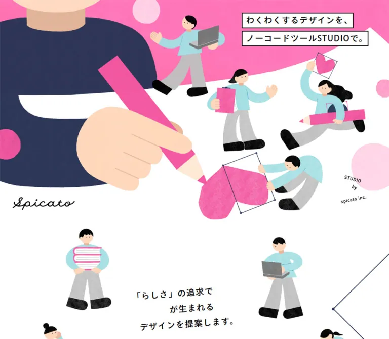
The page presents spicato’s production service as a collaborative act of making. A huge hand draws with a pink pencil while smaller figures carry laptops, clipboards, hearts, and drawing tools. Thin selection rectangles, corner nodes, and oversized cursor illustrations connect this handmade world to a digital design workspace. The result is friendly and energetic without relying on oversized sales typography.
The composition alternates expansive illustration scenes with practical information. White and pale gray provide breathing room; pink identifies expressive artwork and pricing details; navy anchors the drawing and submission control. Mobile receives a distinct composition: the opening copy becomes two vertical strips, the people and pencil are rearranged, and project entries retain an alternating alignment instead of becoming a uniform centered list.
How to Read This Reference
- Measured values come from the supplied rendered DOM, computed styles, custom properties, and element rectangles. They are identified as measured or computed below.
- Visual observations describe the five current-page screenshots. Screenshot dimensions and proportions described as approximate are estimates, not pixel samples.
- Named tokens are reusable aliases unless explicitly identified as source custom properties.
- Calculated values derive from the supplied measurements. They do not establish an unseen source CSS declaration.
- Recommendations describe a new implementation. Breakpoints, accessibility behavior, and the Quick Start’s artwork integration are not verified original features.
- Some extracted headings contain duplicate strings, and some offscreen elements have overlapping or displaced rectangles. These are DOM observations, not instructions to repeat visible text or reproduce an intermediate layout. Use the settled pricing screenshot for the visible card arrangement.
Tokens — Colors
Default Palette
| Name | Value | Evidence / token | Role |
|---|---|---|---|
| Paper White | #ffffff |
Source --c-white; alias --paper |
Hero canvas, headline strips, pricing sheets, and visible form surface |
| Ink Black | #000000 |
Source --c-black; alias --ink |
Main text, logo, heading borders, and character details |
| Studio Pink | #f357a0 |
Source --c-pink; alias --pink |
Computed pricing titles and summary-band backgrounds; central expressive accent |
| Pale Gray | #eeeeee |
Computed contact and footer backgrounds; alias --mist |
Quiet canvas around the inquiry form and footer; the pricing screenshot has a visually matching gray field |
| Deep Navy | #293659 |
Computed submit-button background; alias --navy |
Submission control; illustration outlines and clothing are visually related but not individually color-measured |
| Aqua | #a4dfe4 |
Source --c-light-blue; alias --aqua |
Palette reference for the characters’ light blue clothing; texture introduces local variation |
| Clear Blue | #40a0c2 |
Source --c-blue; alias --blue |
Computed FAQ answer text color |
| Light Pink | #ffa8d0 |
Source --c-light-pink; alias --pink-light |
Secondary decorative pink; visible circles also include lighter and darker textured variants |
The illustrations contain additional peach, gray, and near-black tones. Their exact asset colors were not supplied as tokens. Treat them as artwork colors rather than expanding the interface palette into many competing accents.
Declared Gradient
The source exposes this exact token:
--g-studio: linear-gradient(234deg, #ff99e1 7.6%, #ff5990 92.4%);
It belongs to the observed pink color system. The supplied element samples do not identify every surface to which it is applied. Retain it as an available expressive field, without assuming every pink heart, circle, or background uses this CSS gradient.
Rendered appearance takes precedence over an ancestor’s text color. The pricing summaries visibly use white lettering on pink, while sampled paragraph containers report black text. The mobile submit control similarly displays white text and an arrow despite its parent’s computed black color. Descendant styling or artwork can determine the final appearance.
Tokens — Typography
Main Japanese Sans Serif
- Computed family:
ryo-gothic-plusn, sans-serif. - Computed weight:
500throughout the sampled headings, body text, links, and buttons. - Character: clear Japanese Gothic with open spacing and an approachable, medium-weight voice.
- Hierarchy: established primarily through size, line spacing, position, framing, and color rather than frequent changes of weight.
- Implementation alias:
--font-body: 'ryo-gothic-plusn', sans-serif.
The family declaration is verified; font-file loading and the final selected font face were not separately audited. A new implementation needs its own authorized font configuration. The Quick Start retains the declared family with a generic fallback.
The handwritten spicato wordmark is a distinct graphic. No font name is established for it. Preserve an authorized logo asset instead of substituting a script font across the interface.
Type Scale
Values below are measured computed styles unless marked as estimates. Sizes and line heights are in CSS pixels.
| Role | Desktop size / line height | Mobile size / line height | Tracking |
|---|---|---|---|
| Body element’s inherited base | 15.238 / normal |
16 / normal |
Normal |
| General explanatory paragraph | 15.238 / 30.476 |
14 / 25.2 in the Studio explanation |
0.02em |
| Capability paragraph | 15.238 / 30.476 |
15 / 27 |
0.02em |
| Introductory statement | 30.476 / 57.905 |
27 / 48.6 |
0.1em |
| Introductory paragraph | 17.143 / 41.143 |
14 / 30.8 |
0.06em |
| Framed section heading | 28.571 / 57.143 |
Usually 28 / 33.6 |
0.08em |
| Capability heading | 30.476 / 45.714 |
24 / 36 |
0.05em |
| Benefit heading | 22.857 / 34.286 |
22 / 33 |
0.04em |
| Pricing plan title | 20.952 / 41.905 |
20 / 40 |
0.04em |
| Pricing feature text | 14.286 / 25.714 |
14 / 22.4 |
0.02em |
| Process stage label | 19.048 / 38.095 |
18 / 36 |
Desktop 0.04em; mobile 0.02em |
| Project caption | 15.238 / 15.238 |
15 / 15 |
0.02em |
| Form privacy notice | 13.333 / 26.667 |
13 / 23.4 |
0.04em |
The company introduction is an exception to a simple shrinking type scale: its heading computes to 30.476px on desktop and 31px on mobile, with different line spacing and tracking.
Artwork-Adjacent Type
The hero’s visible letters are larger than the sampled H2 wrapper’s inherited font size. Its individual text-run styles were not supplied. Visually, the desktop strips use approximately 30–32px lettering and the mobile vertical strips approximately 20–22px. Treat these as estimates.
Pricing numerals appear approximately 40–44px in the desktop screenshot, with smaller black currency units beside them. Their computed styles were not included. The footer copyright appears approximately 12–13px, with noticeable tracking; its text implementation is unverified.
Tokens — Spacing & Shapes
Responsive Unit
The page uses a very small root font size. Here, 1u means the measured size of one source rem, not a conventional 16px rem.
| Measurement | Desktop | Mobile |
|---|---|---|
| Viewport width | 1440px |
390px |
Source --base-vw |
1512 |
390 |
Source --vw |
1440px |
390px |
| Computed root font size | 0.952381px |
1px |
| Computed body size | 15.2381px |
16px |
At the inspected widths, the arithmetic is consistent with 1u = viewport width / --base-vw pixels. The full source formula, its breakpoint, and any limits were not supplied. Do not extrapolate unrestricted scaling to every screen size.
Spacing Scale
The unit equivalents below are calculated from measurements, not copied source declarations.
| Use | Desktop | Mobile | Interpretation |
|---|---|---|---|
| Gap between hero headline strips | 9.524px |
10px |
Approximately 10u |
| Hero top inset | 47.609px |
20px |
Desktop approximately 50u; phone uses a different composition |
| Hero logo left inset | 47.609px |
20px |
Matches the local hero margin |
| Common body-text side inset | Varies by section | 32px |
Produces a 326px reading width on the phone |
| Framed-heading side inset | Section-dependent | Often 30px |
Typical heading frame width is 330px |
| Capability paragraph-to-button gap | About 24.75px |
22px |
Calculated from sampled rectangles |
| Desktop project column gap | About 49.52px |
Not applicable | Two measured project columns |
| Desktop project row gap | About 68.56px |
Usually 40px between consecutive entries |
Mobile has an additional interruption after the second project |
| Footer top padding | 96.1905px |
36px |
Computed padding |
Shapes and Edges
| Element | Observed treatment | Reuse guidance |
|---|---|---|
| Hero copy strips | White rectangles with thin black borders | Keep each sentence independently framed |
| Section heading | Selection-style rectangle with visible corner dots | Use a thin outline and small solid nodes |
| Pricing sheet | White, square corners, slightly rotated | No conventional shadow or rounded-card treatment |
| Pricing separators | Fine solid and dashed navy rules | Separate title, summary, and inclusions |
| Submit control | Navy strip with subtly irregular top and bottom edges | Use a restrained mask or SVG edge |
| Decorative circles and hearts | Textured, imperfect silhouettes | Avoid mathematically pristine replacements |
| Character forms | Rounded hands, simple faces, large black shoes | Preserve the illustration’s soft proportions |
Sampled element border radii are 0px. Circular motifs are separate graphics or controls, not evidence of a general rounded-surface system.
Layout Measurements
| Element | Desktop 1440 × 1000 | Mobile 390 × 844 |
|---|---|---|
| Hero section | 1440 × 806.656px |
390 × 734px |
| Hero headline wrapper | 451.484 × 121.109px, at approximately (912.33, 47.61) |
89.594 × 399.688px, at approximately (280.41, 20) |
| Logo link | 228.563 × 46.656px, at approximately (47.61, 731.44) |
149 × 32px, at (20, 698) |
| Repeated wide content span | Approximately 1047.625px, from x 196.188 to 1243.813 |
Common prose width 326px |
| Capability example button | Approximately 407.609 × 55.234px |
Approximately 327.609 × 58px |
| FAQ question target width | 857.156px |
326px |
| Submit button | 406.656 × 77.141px |
326 × 58px |
| Footer section height | 1143.797px |
509px |
| Document height | Approximately 18053.859px |
Approximately 19957.281px |
Document and section heights describe the captured state. They are not fixed heights to impose on a new page.
Components
Illustrated Hero
Role: introduce the service through the act of designing together.
The desktop hero is a full-width illustration stage. A cropped, oversized navy-clad figure fills the upper-left region, with a large peach hand and diagonal pink pencil reaching toward a heart near the lower center. Smaller collaborators carry a laptop, hold a clipboard, ride a pencil, and manipulate a heart within a selection frame. Pink and white divide the background in broad, irregular shapes.
Place two separately bordered white headline strips near the upper right. The actual copy is “わくわくするデザインを、” and “ノーコードツールStudioで。” The black script logo sits near the lower left, and a small angled service signature occupies the lower-right region.
The header element has zero measured height and the page H1 occupies a hidden 1 × 1px box. The supplied hero does not show a conventional navigation bar. Do not add a large header that competes with the illustration.
On mobile, the headline becomes two vertical strips on the right, with the first sentence in the rightmost strip. Latin letters in Studio are visibly arranged upright within the vertical copy. The large hand remains cropped at the left; the supporting figures move into a vertical arrangement. The heart frame is partially cropped at the right. This requires alternate artwork composition or individually positioned layers, not a desktop image indiscriminately cropped with object-fit: cover.
Selection-Frame Section Heading
Role: label practical sections using the page’s design-editor motif.
The pricing capture shows black medium-weight text centered in a thin rectangular outline, with a solid dot at each corner. The frame is approximately 350 × 80px on desktop. Its line has a slightly handmade quality, while its geometry remains legible and restrained.
The sampled pricing H2 box is 355.234 × 83.797px; mobile framed headings commonly use 330 × 78px. Longer mobile headings become taller rather than simply scaling down.
Use one readable text label and separate decorative frame elements. The duplicated strings in extracted headings should not become duplicate visible headings or duplicate accessible names. Selection handles are decoration; dragging was not verified.
Introductory Statement
Role: articulate the studio’s emphasis on individuality and attachment.
The main statement uses generous tracking and unusually loose leading. On desktop, its measured box is centered around a relatively narrow column, while the supporting paragraph occupies a much wider region. On mobile, the statement fits within approximately 362px, followed by 14px prose inside 32px side insets.
The section’s measured mobile height is about 934px, larger than its desktop height of about 731px. Preserve space for the surrounding composition instead of treating it as a compact text-only introduction. The supplied screenshots do not fully show this section’s artwork.
Studio Explanation and Benefits
Role: explain the tool and the practical value of the service.
Rendered content introduces Studio, links to the provider’s expert profile, presents an award notice, and explains three benefits: straightforward updates, immediate revisions, and managed system maintenance.
The desktop benefit headings share a common y-position and start near x 202, 578, and 953, establishing three parallel columns. Each sampled paragraph is approximately 267px wide. Mobile presents the benefits sequentially within a 326px text column.
The Studio explanation and benefit text compute to white. The corresponding middle-page background artwork is not included in the supplied screenshots, so its exact appearance cannot be established from transparent ancestor backgrounds alone. Preserve the measured type relationships, while treating the complete background composition as an evidence gap.
Capability Feature
Role: present illustration and animation, copywriting, and photo/video production as distinct capabilities.
Each feature contains a two-line H3, descriptive prose, and a wide example button. Desktop text positions alternate right, left, and right, leaving a complementary region for media. Text columns are approximately 408–426px wide.
Mobile headings and paragraphs align near x 32. There are substantial gaps between each heading and its paragraph—about 310–342px in the samples—consistent with an intervening media region. The actual media elements were not included in the element extract, so their exact contents and dimensions remain unverified.
Buttons labeled “イラストの事例を見る”, “コピーの事例を見る”, and “写真の事例を見る” are present. The DOM also contains corresponding example-list labels and previous/next copy controls. This establishes gallery-related UI, but does not establish the open panel’s appearance, transition, keyboard behavior, or image order.
Project Entry
Role: link to six completed Studio projects.
Desktop uses two columns. Each sampled link box is approximately 499.05 × 571.41px, with its caption at the bottom. The repeated content span is approximately 1047.63px, and the gap between columns is approximately 49.52px.
Mobile is deliberately staggered. Odd entries begin at x 0 with width 358px, while their captions begin at x 32. Even entries begin at x 80 with width 310px, ending at the right viewport edge. The sampled link boxes are 295px high. This alternating alignment is a stronger identity cue than a generic centered stack.
The six links include YELLOW, Charlie’s Bed, the cat-rescue organization, Ito Farm, NSIT, and Classia. Their destinations are evidenced as links; navigation outcomes and full preview imagery were not inspected. Do not infer screenshot treatments from those destination sites.
Pricing Sheet
Role: make reference pricing concrete without abandoning the illustrated atmosphere.
Three white sheets sit on a pale gray field. Each sheet is approximately 296px wide and 490px tall in the desktop screenshot. The first tilts about −3°, the middle about −2°, and the last about +3°; these angles are visual estimates. The middle sheet is raised by roughly 50px. A clipboard-carrying character emerges behind the first sheet.
The anatomy is consistent:
- A centered pink plan title.
- A thin navy rule across the sheet.
- A large pink price numeral beside a smaller black currency suffix.
- A pink summary band with white text.
- A dashed navy separator.
- A compact inclusion list with small pale pink bullets.
- A small rewrite-related footnote.
| Source plan label | Displayed starting price | Summary content |
|---|---|---|
| “小規模コーポレートサイト” | “120 万円〜” | Top page, five lower-level pages, and news/CMS |
| “採用サイト” | “180 万円〜” | Top page, at least ten lower-level pages, and news/CMS |
| “特設サイト” | “50 万円〜” | A single-page special-purpose site |
The first two plans list direction, page design, implementation, CMS, and an inquiry form. The third has a shorter inclusion list. These are reference-price presentations, not evidenced checkout or plan-selection controls.
The note above explains that Studio subscription and domain costs are separate. Keep commercial qualifications close to the pricing rather than hiding them below the form.
Mobile DOM positions place the plans one after another, with approximately 470px between their heading positions. Their text retains the rotated geometry. The desktop DOM sample places several card elements near overlapping x-coordinates, unlike the settled screenshot; those initial rectangles must not be used as the final three-column arrangement.
Options and Production Process
Role: explain additional services and the sequence of delivery.
The options content lists headline copywriting, an illustration package, photography, and video production. These are subordinate to the three main pricing sheets. A pink cross appears below the cards in the desktop capture; no interaction is established for it.
The process contains seven stages: consultation, requirements and estimate, contract, structure submission, design, Studio implementation, and publication. Desktop stage labels are distributed across a broad two-dimensional area. On mobile, their sampled y-positions advance by roughly 200px per stage, establishing a vertical sequence.
A separate initial-proposal section lists purpose, sitemap, estimated cost, content, proposal, and provisional schedule. Connector artwork and detailed process surfaces were not captured; do not invent a specific arrow path or timeline animation.
FAQ Question and Answer
Role: address costs, updates, maintenance, and included settings.
Five questions are represented by actual button elements. Their desktop width is about 857px; mobile width is 326px. The answer text computes to blue #40a0c2, with 15.238px / 30.476px desktop typography and 14px / 25.2px mobile typography.
Mobile answer text starts at x 86, inset 54px from the question’s left edge, and occupies 260px. This creates room for a leading marker or other separation, although the exact visual marker is not shown.
The extract contains answer text and rectangles that overlap following question regions. It does not prove that all answers are visibly expanded. Opening rules, animation, and whether multiple answers can remain open are unverified. For a new implementation, use a heading containing a button with explicit expanded state and a controlled answer panel.
Company Information
Role: establish the service provider and offer company context before the inquiry form.
The original page identifies “株式会社スピッカート/spicato inc.” in its company information. The section includes locations, telephone, representative, founding information, and awards. These are ordinary content details, not production credits for individual contributors.
Desktop separates the section labels from the longer information area. Mobile centers the company and awards subheadings, while detail text uses the common 32px side inset. Keep this information readable and quieter than the opening illustration.
Inquiry Form
Role: collect a project inquiry at the end of the service explanation.
The form sits on computed #eeeeee. Its text identifies nine mandatory items: consultation type, company/store name, contact name, phonetic name, email, telephone, budget, requested timing, and detailed consultation content. The rendered text indicates three selection controls, five short text fields, and one long response field; individual input-element styles and validation behavior were not supplied.
The mobile tail capture shows a broad white text-entry surface, a two-line privacy notice with an underlined policy link, and a navy submit strip labeled “送信する”. The button has white lettering, a white right arrow, square overall geometry, and gently uneven edges.
The button measures approximately 407 × 77px on desktop and 326 × 58px on mobile. On the phone it fills the reading column. Keep its label centered and the arrow visually separate at the right. No confirmation screen, error state, or submission result was inspected.
Floating Contact Illustration
Role: provide an additional route to the contact section.
In the desktop pricing screenshot, a laptop-carrying figure enters from the lower-right edge beneath a pink envelope symbol. A small “お問い合わせ” label and black circular arrow complete the composition. The actual link destination is https://spicato.com/studio/#contact.
The sampled initial link rectangle lies outside the viewport, and its computed transition concerns transforms. This supports state-dependent placement, but does not establish an exact reveal threshold or fixed-position rule. Its mobile visibility and destination scrolling behavior were not exercised.
Illustrated Footer
Role: close the page with the same collaborative theme as the hero.
A giant laptop displays a pink heart, surrounded by five small collaborators. Two figures high-five in front of the screen. Floating hearts, circles, selection rectangles, and a pink cursor fill the surrounding space. A pink lower field meets the pale gray upper field while the illustration overlaps both.
The desktop footer is expansive, with a centered laptop and broad peripheral decoration. The mobile version compresses the team near the bottom and carries floating shapes up toward the submit control. It is not simply the desktop scene reduced until every detail fits.
The visible copyright is centered near the bottom. Its rendering as live text or artwork is not established by the supplied footer element, which reports no text content.
Tokens — Motion & Interaction
Verified Definitions and Limits
| Evidence | Exact value or observation | What it establishes |
|---|---|---|
| Selected text links | opacity 0.4s cubic-bezier(0.39, 0.575, 0.565, 1) |
A defined opacity transition; the trigger and target opacity were not exercised |
| Contact illustration link | transform 0.4s cubic-bezier(0.39, 0.575, 0.565, 1) |
A transform transition exists; reveal choreography is unverified |
| An unnamed offscreen button | transform 0.48s steps(3) |
A stepped transform definition on that element only |
Source --e-out-sine |
cubic-bezier(.39, .575, .565, 1) |
Reusable source easing |
Source --e-out-expo |
cubic-bezier(.19, 1, .22, 1) |
Declared easing; use on a particular visible animation was not established |
| Many sampled elements | animation: none |
No CSS animation on those sampled nodes at that moment; descendants and script-driven motion remain possible |
The page text explicitly mentions illustration and animation, but static captures do not establish how the hero’s people, hearts, or pencil move. Repeated heading strings and displaced rectangles are also insufficient to identify an animation timeline.
Recommended adaptation: retain short opacity changes for links and restrained positional changes for illustrated utility controls. If decorative motion is added, keep it independent of text readability and provide a static reduced-motion presentation. Do not make perpetual bouncing, parallax, or draggable selection frames a claimed feature of the original.
Surfaces
| Layer | Appearance | Purpose |
|---|---|---|
| Opening canvas | White with broad pink artwork fields | Gives large illustrations room to breathe |
| Practical-information canvas | Pale gray in the pricing capture and computed contact/footer sections | Separates reading and comparison areas from the exuberant opening |
| Pricing paper | Flat white, square edges, small rotation | Makes packages feel like loose sheets laid out for discussion |
| Text strip / heading frame | White or underlying canvas with a fine black outline | Echoes editing and selection tools |
| Pricing summary | Solid source pink with visibly white lettering | Groups included page types |
| Submit surface | Deep navy with a subtly irregular outline | Provides a strong, readable final action |
| Decorative layer | Grainy hearts, circles, figures, and thin navy frames | Carries personality without adding interface chrome |
No general shadow-based elevation system is visible in the supplied captures.
The source exposes layer names --z-base: 100, --z-fixed-frame: 101, --z-side: 102, --z-popup: 103, and --z-white: 104. These are useful evidence of a layered implementation, but their names alone do not establish the appearance or behavior of an open overlay.
Imagery
The illustration language is textured cut paper with simple human figures. Shapes have gentle irregularities, grain, and slightly uneven color. People wear aqua tops and gray trousers, with small peach faces, black hair, minimal facial features, and oversized black shoes. Computers stay mostly gray so that hearts, pencils, and decorative circles can carry the pink.
Scale contrast is essential. One enormous hand and pencil coexist with much smaller people. In the footer, the laptop becomes a stage around which the team gathers. This visual metaphor communicates collaboration more specifically than generic office illustrations.
Selection rectangles are thin, sometimes dashed, and often tilted. Small circular nodes mark their corners. Pink cursors and hearts interact compositionally with these outlines. They are representations of design tools, not verified interactive handles.
Keep the grain inside artwork. Body text, form labels, and most structural rules remain crisp. Do not apply a noisy overlay across the entire page, and do not use pixelated image rendering for this soft-textured style.
Observed Asset References
No original image URLs, asset filenames, or media manifest were included in the evidence. The following is an inventory, not a list of downloadable paths.
| Observed artwork | Location | Important traits |
|---|---|---|
| Large hand and diagonal pencil | Desktop and mobile hero | Extreme scale, peach hand, vivid pink pencil, navy clothing |
| Small collaborating people | Hero, pricing, contact decoration, footer | Aqua/gray clothing, tiny faces, black shoes |
| Script spicato wordmark | Lower-left hero | Thin black handwritten identity graphic |
| Hearts and selection frames | Hero and footer | Grainy pink shapes inside thin rotated outlines |
| Envelope and laptop figure | Desktop pricing edge | Illustrated contact affordance |
| Laptop and high-five team | Desktop and mobile footer | Oversized central screen with heart, overlapping foreground figures |
Use authorized artwork when available. CSS can recreate the paper, typography, frames, and pricing structure; the distinctive human figures require actual illustration assets.
Layout & Responsive Behavior
Observed Changes
| Region | Desktop | Mobile | Evidence |
|---|---|---|---|
| Hero copy | Two horizontal strips at upper right | Two vertical strips at right | Screenshots and wrapper measurements |
| Hero illustration | Wide composition with a large left figure and scattered collaborators | Repositioned figures, cropped hand and heart frame | Screenshots |
| Main prose | Multiple section-specific widths | Usually 326px inside 32px gutters |
DOM measurements |
| Benefits | Three parallel columns | Sequential vertical groups | DOM positions |
| Capabilities | Alternating left/right text | Heading, media-sized interval, prose, button | DOM positions; intervening media details unverified |
| Projects | Two equal-width columns | Alternating left- and right-aligned entries | DOM positions |
| Pricing | Three tilted sheets, middle raised | Vertically ordered sheets with retained tilt | Desktop screenshot and mobile DOM |
| Process | Spatially distributed labels | Stages about 200px apart vertically |
DOM positions |
| Submit button | Centered, about 407px wide |
Full 326px reading-column width |
DOM and mobile screenshot |
| Footer | Large panoramic scene | Shorter, vertically recomposed scene | Screenshots and DOM |
The change from a 1512 design-width token to 390 shows a separate mobile sizing regime. The switch point itself is unknown. Do not label a chosen 767px or 768px breakpoint as measured.
Retain horizontal breathing room without forcing all content into one identical container. Mobile hero margins are 20px, prose margins are usually 32px, heading-frame margins are often 30px, and projects intentionally approach the viewport edges.
Decorative overflow is part of the composition. Clip illustration layers locally, while keeping form fields, text, focus outlines, and project captions reachable. The long document should remain a normal reading flow; its observed height is not a reason to construct a fixed-height canvas.
Do’s and Don’ts
Do
- Preserve the relationship between pink, aqua, white, pale gray, navy, and black.
- Keep textured illustration and crisp typography visually distinct.
- Use a dramatic size difference between the large tools and small people.
- Frame hero sentences separately and use vertical copy in the mobile composition.
- Retain selection rectangles, corner nodes, and the restrained editor-tool motif.
- Present pricing as flat, slightly tilted sheets with clear internal hierarchy.
- Preserve the alternating project alignment on mobile.
- Use medium-weight Japanese Gothic text, generous leading, and deliberate tracking.
- Keep the final navy action readable within the quieter gray form area.
- Design mobile artwork composition explicitly.
Don’t
- Don’t replace the opening scene with a generic centered headline and a stock illustration.
- Don’t add a conventional navigation bar based on assumptions about service pages.
- Don’t turn every section into rounded cards with drop shadows.
- Don’t substitute emoji hearts, pristine geometric people, or an arbitrary script font for the artwork.
- Don’t make decorative cursors, crosses, or selection nodes interactive without a real function.
- Don’t copy duplicate DOM strings as duplicate visible text.
- Don’t treat offscreen gallery rectangles or initial pricing overlap as settled layout.
- Don’t assume that FAQ answers are all expanded because their text is extractable.
- Don’t apply the source’s tiny rem values to a normal 16px root unchanged.
- Don’t invent asset filenames, animation timings, gallery states, or a verified source breakpoint.
Recommended Implementation Additions
These are implementation recommendations, not verified original features:
- Give decorative characters, frames, and cursor shapes empty alternatives or
aria-hidden; provide meaningful alternatives where an illustration conveys content. - Keep the hero copy as selectable text with one logical reading order, even when visual orientation changes.
- Give the logo link an accessible name and avoid exposing duplicate decorative heading layers.
- Provide visible keyboard focus for project links, example buttons, FAQ controls, privacy links, and submission.
- Implement FAQ state with
aria-expandedand controlled answer regions. If example galleries open dialogs, support focus containment, Escape, and return focus. - Associate every form field with a label and required-state text; provide clear field errors and a submission result.
- Check contrast for small pink and blue text and white-on-pink summaries. Preserve the decorative palette while strengthening small-text colors where needed.
- Keep form inputs at a comfortable reading size; the Quick Start recommends
16pxfor editable controls. - Use responsive image sources and reserve illustration dimensions to prevent late layout shifts.
- Make reduced-motion mode preserve the complete composition without requiring an animation to reveal essential text.
Agent Prompt Guide
Quick Color Reference
- Main paper:
#ffffff. - Quiet information/form field:
#eeeeee. - Main text:
#000000. - Expressive pink and pricing accent:
#f357a0. - Secondary pink:
#ffa8d0. - Character-clothing palette reference:
#a4dfe4. - FAQ answer source color:
#40a0c2. - Final action:
#293659with white label and arrow. - Available source gradient:
linear-gradient(234deg, #ff99e1 7.6%, #ff5990 92.4%).
Overall Prompt
“Create an illustration-led Japanese design-service page inspired by Studio by spicato inc. Use white and pale gray reading surfaces, vivid pink hearts and pencils, aqua-clad collaborators, gray laptops, black typography, and navy structural details. Build the opening as an asymmetric scene with an oversized drawing hand and smaller people, with two independently outlined headline strips at the upper right. On mobile, recompose the artwork and turn the headline into two vertical strips. Use medium-weight Japanese Gothic type, generous line spacing, thin selection frames with corner nodes, alternating project placements, and three gently tilted white pricing sheets. Finish with a gray inquiry form, an irregular navy submit strip, and a large collaborative laptop illustration. Keep essential content readable without animation.”
Example Component Prompts
- Hero: “Compose a wide white-and-pink design workspace with one huge peach hand holding a pink pencil, a navy torso cropped at the left, and small aqua-clad figures carrying design tools. Put black Japanese copy in two white outlined strips at the upper right. Create a separate tall-phone composition with upright vertical lettering.”
- Section heading: “Create a medium-weight Japanese heading inside a thin black selection rectangle. Add four small solid corner nodes, square corners, ample horizontal padding, and no shadow. Keep the frame decorative.”
- Pricing: “Arrange three white paper sheets on pale gray. Tilt them approximately −3°, −2°, and +3°, raising the center sheet slightly. Use pink titles and large prices, a fine navy title rule, white text on a pink scope band, a dashed divider, and pale pink list bullets. Stack them on mobile.”
- Project list: “Use two equal project columns on desktop. On a 390px phone, alternate a 358px left-aligned entry and a 310px right-aligned entry, keeping captions readable and allowing long titles to wrap. Do not normalize the stagger into a centered card list.”
- Form ending: “Place a two-line privacy notice above a full-column navy submit strip with a centered white label and a right arrow. Make the edge subtly irregular. Continue into a textured scene of people gathered around a laptop displaying a pink heart, with selection frames and circles floating above.”
Quick Start
CSS Custom Properties
This is a reusable adaptation, not recovered source code. It keeps the surrounding document’s normal root size and uses --u for proportional artwork-related dimensions. At the supplied desktop width, the unit matches the measured 0.952381px; at the supplied mobile width it is 1px.
The 767px switch, desktop unit limits, estimated hero lettering, card angles, and irregular button polygon are recommendations. Artwork must be supplied separately. The CSS does not implement gallery behavior, FAQ state, form delivery, or unverified illustration animation.
:root {
  /* Verified palette, exposed through reusable aliases. */
  --paper: #fff;
  --ink: #000;
  --pink: #f357a0;
  --pink-light: #ffa8d0;
  --mist: #eee;
  --navy: #293659;
  --aqua: #a4dfe4;
  --blue: #40a0c2;
  --studio-gradient: linear-gradient(
    234deg, #ff99e1 7.6%, #ff5990 92.4%
  );

  --font-body: 'ryo-gothic-plusn', sans-serif;
  --weight-body: 500;

  /* Recommended limits around the measured desktop scale. */
  --u: clamp(0.8px, 0.066137566vw, 1px);
  --content-width: calc(1100 * var(--u));
  --body-size: calc(16 * var(--u));
  --feature-body-size: var(--body-size);
  --section-size: calc(30 * var(--u));
  --feature-size: calc(32 * var(--u));
  --plan-size: calc(22 * var(--u));
  --small-size: calc(15 * var(--u));
  --body-leading: 2;

  --ease-out-sine: cubic-bezier(.39, .575, .565, 1);
  --ease-out-expo: cubic-bezier(.19, 1, .22, 1);
  --link-duration: 400ms;
}

*,
*::before,
*::after {
  box-sizing: border-box;
}

.studio-page {
  margin: 0;
  color: var(--ink);
  background: var(--paper);
  font-family: var(--font-body);
  font-size: calc(16 * var(--u));
  font-weight: var(--weight-body);
}

.studio-container {
  width: min(calc(100% - 64px), var(--content-width));
  margin-inline: auto;
}

.prose {
  font-size: var(--body-size);
  line-height: var(--body-leading);
  letter-spacing: .02em;
}

.feature-title {
  margin: 0;
  font-size: var(--feature-size);
  font-weight: inherit;
  line-height: 1.5;
  letter-spacing: .05em;
}

.feature-copy {
  font-size: var(--feature-body-size);
  line-height: var(--body-leading);
  letter-spacing: .02em;
}

/* Supply separate artwork compositions through picture or layers. */
.hero {
  position: relative;
  min-height: calc(847 * var(--u));
  isolation: isolate;
}

.hero__art {
  position: absolute;
  inset: 0;
  z-index: -1;
  overflow: clip;
  pointer-events: none;
}

.hero__art img {
  display: block;
  width: 100%;
  height: auto;
}

.hero__headline {
  position: absolute;
  top: calc(50 * var(--u));
  right: calc(80 * var(--u));
  display: flex;
  flex-direction: column;
  align-items: flex-start;
  gap: calc(10 * var(--u));
  margin: 0;
  font-weight: inherit;
}

.hero__headline > span {
  display: block;
  padding: 4px 12px;
  border: 2px solid var(--ink);
  background: var(--paper);
  font-size: calc(32 * var(--u));
  line-height: 1.3;
  letter-spacing: .06em;
}

.hero__logo {
  position: absolute;
  left: calc(50 * var(--u));
  bottom: calc(30 * var(--u));
  width: calc(240 * var(--u));
}

.hero__logo img {
  display: block;
  width: 100%;
  height: auto;
}

/* Add four aria-hidden corner spans to the heading. */
.section-title {
  position: relative;
  width: fit-content;
  margin: 0;
  padding: calc(12 * var(--u)) calc(58 * var(--u));
  border: 1px solid currentColor;
  font-size: var(--section-size);
  font-weight: inherit;
  line-height: 2;
  letter-spacing: .08em;
}

.section-title .corner {
  position: absolute;
  width: 7px;
  height: 7px;
  border-radius: 50%;
  background: currentColor;
}

.corner--tl { top: -4px; left: -4px; }
.corner--tr { top: -4px; right: -4px; }
.corner--bl { bottom: -4px; left: -4px; }
.corner--br { bottom: -4px; right: -4px; }

/* Dimensions and rotations approximate the settled pricing capture. */
.pricing {
  background: var(--mist);
  padding-block: 80px;
}

.price-grid {
  display: grid;
  grid-template-columns: repeat(3, minmax(0, 1fr));
  gap: calc(54 * var(--u));
  max-width: calc(1038 * var(--u));
  margin-top: 100px;
}

.price-card {
  min-width: 0;
  min-height: calc(514 * var(--u));
  background: var(--paper);
  transform: rotate(-3deg);
}

.price-card:nth-child(2) {
  transform: translateY(-50px) rotate(-2deg);
}

.price-card:nth-child(3) {
  transform: rotate(3deg);
}

.price-card__title {
  margin: 0;
  padding: 14px 8px 10px;
  border-bottom: 1px solid var(--navy);
  color: var(--pink);
  text-align: center;
  font-size: var(--plan-size);
  font-weight: inherit;
  line-height: 2;
  letter-spacing: .04em;
}

.price-card__body {
  padding: 14px calc(20 * var(--u)) 28px;
}

.price-card__amount {
  display: flex;
  align-items: baseline;
  justify-content: center;
  gap: 8px;
  margin: 0 0 18px;
  font-size: 22px;
}

.price-card__amount strong {
  color: var(--pink);
  font-size: calc(46 * var(--u));
  font-weight: inherit;
  letter-spacing: .04em;
}

.price-card__summary {
  margin: 0;
  padding: 12px 16px;
  color: var(--paper);
  background: var(--pink);
  font-size: var(--body-size);
  line-height: 1.7;
}

.price-card__features {
  margin: 20px 0 0;
  padding: 16px 0 0 20px;
  border-top: 2px dashed var(--navy);
  font-size: var(--small-size);
  line-height: 1.8;
}

.price-card__features li::marker {
  color: var(--pink-light);
}

.price-card__note {
  margin: 8px 0 0;
  font-size: var(--small-size);
  line-height: 1.7;
}

.works {
  display: grid;
  grid-template-columns: repeat(2, minmax(0, 1fr));
  gap: calc(72 * var(--u)) calc(52 * var(--u));
}

.work {
  min-width: 0;
  color: inherit;
  text-decoration: none;
}

.work img {
  display: block;
  width: 100%;
  height: auto;
}

.work__caption {
  font-size: var(--small-size);
  line-height: 1.5;
  letter-spacing: .02em;
  overflow-wrap: anywhere;
}

.contact {
  background: var(--mist);
}

/* Recommended field styling; only the form tail was captured. */
.contact input,
.contact select,
.contact textarea {
  display: block;
  width: 100%;
  padding: 14px 16px;
  border: 1px solid transparent;
  border-radius: 0;
  color: var(--ink);
  background: var(--paper);
  font: 500 16px/1.6 var(--font-body);
}

.contact textarea {
  min-height: 180px;
  resize: vertical;
}

.submit {
  position: relative;
  isolation: isolate;
  display: flex;
  align-items: center;
  justify-content: center;
  width: min(100%, calc(427 * var(--u)));
  min-height: calc(81 * var(--u));
  margin-inline: auto;
  padding: 14px 60px;
  border: 0;
  color: var(--paper);
  background: transparent;
  font: inherit;
  cursor: pointer;
}

.submit::before {
  content: '';
  position: absolute;
  inset: 0;
  z-index: -1;
  background: var(--navy);
  clip-path: polygon(
    0 4%, 12% 1%, 28% 3%, 48% 1%, 70% 3%, 88% 0,
    100% 3%, 100% 97%, 86% 99%, 66% 97%, 45% 100%,
    24% 98%, 0 97%
  );
}

.submit__arrow {
  position: absolute;
  right: 34px;
  font-size: 24px;
  line-height: 1;
}

.text-link {
  color: inherit;
  text-underline-offset: .15em;
  transition: opacity var(--link-duration) var(--ease-out-sine);
}

/* The opacity endpoint is a recommendation. */
@media (hover: hover) {
  .text-link:hover { opacity: .7; }
}

.studio-footer {
  padding-top: calc(101 * var(--u));
  background: var(--mist);
}

.studio-footer picture,
.studio-footer img {
  display: block;
  width: 100%;
  height: auto;
}

.studio-page :focus-visible {
  outline: 3px solid var(--navy);
  outline-offset: 5px;
}

/* Recommended breakpoint; the original switch was not supplied. */
@media (max-width: 767px) {
  :root {
    --u: 1px;
    --body-size: 14px;
    --feature-body-size: 15px;
    --section-size: 28px;
    --feature-size: 24px;
    --plan-size: 20px;
    --small-size: 14px;
    --body-leading: 1.8;
  }

  .hero { min-height: 734px; }

  .hero__headline {
    top: 20px;
    right: 20px;
    flex-direction: row-reverse;
    gap: 10px;
  }

  .hero__headline > span {
    writing-mode: vertical-rl;
    text-orientation: upright;
    padding: 10px 5px;
    font-size: 22px;
    line-height: 1.25;
    letter-spacing: .08em;
  }

  .hero__logo {
    left: 20px;
    bottom: 4px;
    width: 149px;
  }

  .section-title {
    width: 100%;
    padding: 22px 12px;
    text-align: center;
    line-height: 1.2;
  }

  .price-grid {
    grid-template-columns: 1fr;
    gap: 36px;
    width: min(310px, 100%);
    margin: 50px auto 0;
  }

  .price-card { min-height: 440px; }

  .price-card:nth-child(2) {
    transform: rotate(-2deg);
  }

  .price-card__features { line-height: 1.6; }

  .works.studio-container {
    width: 100%;
    grid-template-columns: 1fr;
    gap: 40px;
  }

  .work:nth-child(odd) {
    width: calc(100% - 32px);
    justify-self: start;
  }

  .work:nth-child(even) {
    width: calc(100% - 80px);
    justify-self: end;
  }

  .work:nth-child(odd) .work__caption {
    padding-left: 32px;
  }

  .work__caption { font-size: 15px; }

  .submit {
    width: 100%;
    min-height: 58px;
  }

  .studio-footer { padding-top: 36px; }
}

@media (prefers-reduced-motion: reduce) {
  .text-link,
  .contact-illustration {
    transition: none;
  }

  .decorative-motion {
    animation: none !important;
  }
}
Minimal Component Markup
This example shows the intended semantic structure for a selection heading and one pricing sheet. Decorative nodes are excluded from the accessible heading name.
<h2 class="section-title">
  制作料金について
  <span class="corner corner--tl" aria-hidden="true"></span>
  <span class="corner corner--tr" aria-hidden="true"></span>
  <span class="corner corner--bl" aria-hidden="true"></span>
  <span class="corner corner--br" aria-hidden="true"></span>
</h2>

<article class="price-card">
  <h3 class="price-card__title">小規模コーポレートサイト</h3>
  <div class="price-card__body">
    <p class="price-card__amount"><strong>120</strong> 万円〜</p>
    <p class="price-card__summary">
      トップページ<br>
      + 下層5ページ<br>
      + ニュースなど(CMS)
    </p>
    <ul class="price-card__features">
      <li>構成、画面設計、ディレクション</li>
      <li>ページデザイン</li>
      <li>ページ実装</li>
      <li>ニュース(CMS)</li>
      <li>お問い合わせフォーム</li>
    </ul>
    <p class="price-card__note">※提供文章のリライト含みます</p>
  </div>
</article>

<button class="submit" type="submit">
  <span>送信する</span>
  <span class="submit__arrow" aria-hidden="true">→</span>
</button>
Tailwind v4 Token Mapping
Optional aliases for a project already using Tailwind v4. Define the custom properties above first. This is not evidence that the original page uses Tailwind.
@theme inline {
  --color-paper: var(--paper);
  --color-ink: var(--ink);
  --color-studio-pink: var(--pink);
  --color-studio-pink-light: var(--pink-light);
  --color-mist: var(--mist);
  --color-navy: var(--navy);
  --color-aqua: var(--aqua);
  --color-answer-blue: var(--blue);

  --font-studio: var(--font-body);
  --text-body: var(--body-size);
  --text-feature: var(--feature-size);
  --text-section: var(--section-size);
  --text-plan: var(--plan-size);

  --spacing-art-unit: var(--u);
  --spacing-content: var(--content-width);
  --radius-paper: 0px;
}
Sources & Evidence
- Current original page: original and final URLs are identical; the supplied response status is HTTP 200. Page identity, company information, content order, link destinations, and source UI labels come from its rendered evidence.
- Capture record: September 16, 2026, 19:57:56.843 UTC, equivalent to September 17, 2026, 04:57:56.843 JST. Viewports were 1440 × 1000 and 390 × 844 CSS pixels.
- Visual scope: three desktop captures show the hero, pricing, and footer; two mobile captures show the hero and the form-to-footer transition. These establish visible composition, artwork, texture, and selected responsive changes.
- DOM and computed styles: supplied samples establish family declarations, font weights, sizes, line heights, tracking, colors, custom properties, element rectangles, and selected transition definitions. No complete stylesheet or asset manifest was supplied.
- Inspection method: the supplied browser record describes an initial observation of at least five seconds, bounded readiness checks for layout and images, and scrolling through intermediate positions. These checks do not prove that all delayed content or animation states were captured.
- Interaction limits: no supplied action trace demonstrates gallery opening, FAQ toggling, hover endpoints, external-link navigation, form validation, successful submission, or reduced-motion behavior. Static frames and sampled transition declarations are kept distinct from verified interactions.
This reference describes the current supplied page evidence. Estimated geometry and the reusable CSS are explicitly marked adaptations, and unshown middle-page artwork is not reconstructed.
# Studio by spicato inc. — Style Reference

> A cheerful design workshop built from textured pink shapes, tiny collaborators, and the selection handles of a graphics editor.

**Website:** [spicato.com/studio](https://spicato.com/studio/)
**Original URL:** https://spicato.com/studio/
**Final URL:** https://spicato.com/studio/
**Theme:** light surfaces with vivid pink illustration fields, aqua accents, black text, and navy details; no theme selector was verified.
**Inspected:** September 17, 2026, 04:57 JST. The supplied retrieval timestamp is September 16, 2026, 19:57:56.843 UTC.
**Viewports:** desktop 1440 × 1000 CSS pixels; mobile 390 × 844 CSS pixels.
**Scope:** the current Studio website-production service page. Visual evidence covers the desktop hero, pricing composition, and illustrated footer, plus the mobile hero and form-to-footer transition. Rendered text and sampled computed styles cover the longer service explanation, capabilities, project links, pricing, process, FAQ, company information, and inquiry form. Gallery opening, FAQ activation, hover states, and form submission were not exercised.

The page presents spicato’s production service as a collaborative act of making. A huge hand draws with a pink pencil while smaller figures carry laptops, clipboards, hearts, and drawing tools. Thin selection rectangles, corner nodes, and oversized cursor illustrations connect this handmade world to a digital design workspace. The result is friendly and energetic without relying on oversized sales typography.

The composition alternates expansive illustration scenes with practical information. White and pale gray provide breathing room; pink identifies expressive artwork and pricing details; navy anchors the drawing and submission control. Mobile receives a distinct composition: the opening copy becomes two vertical strips, the people and pencil are rearranged, and project entries retain an alternating alignment instead of becoming a uniform centered list.

## How to Read This Reference

- **Measured values** come from the supplied rendered DOM, computed styles, custom properties, and element rectangles. They are identified as measured or computed below.
- **Visual observations** describe the five current-page screenshots. Screenshot dimensions and proportions described as approximate are estimates, not pixel samples.
- **Named tokens** are reusable aliases unless explicitly identified as source custom properties.
- **Calculated values** derive from the supplied measurements. They do not establish an unseen source CSS declaration.
- **Recommendations** describe a new implementation. Breakpoints, accessibility behavior, and the Quick Start’s artwork integration are not verified original features.
- Some extracted headings contain duplicate strings, and some offscreen elements have overlapping or displaced rectangles. These are DOM observations, not instructions to repeat visible text or reproduce an intermediate layout. Use the settled pricing screenshot for the visible card arrangement.

## Tokens — Colors

### Default Palette

| Name | Value | Evidence / token | Role |
| --- | --- | --- | --- |
| Paper White | `#ffffff` | Source `--c-white`; alias `--paper` | Hero canvas, headline strips, pricing sheets, and visible form surface |
| Ink Black | `#000000` | Source `--c-black`; alias `--ink` | Main text, logo, heading borders, and character details |
| Studio Pink | `#f357a0` | Source `--c-pink`; alias `--pink` | Computed pricing titles and summary-band backgrounds; central expressive accent |
| Pale Gray | `#eeeeee` | Computed contact and footer backgrounds; alias `--mist` | Quiet canvas around the inquiry form and footer; the pricing screenshot has a visually matching gray field |
| Deep Navy | `#293659` | Computed submit-button background; alias `--navy` | Submission control; illustration outlines and clothing are visually related but not individually color-measured |
| Aqua | `#a4dfe4` | Source `--c-light-blue`; alias `--aqua` | Palette reference for the characters’ light blue clothing; texture introduces local variation |
| Clear Blue | `#40a0c2` | Source `--c-blue`; alias `--blue` | Computed FAQ answer text color |
| Light Pink | `#ffa8d0` | Source `--c-light-pink`; alias `--pink-light` | Secondary decorative pink; visible circles also include lighter and darker textured variants |

The illustrations contain additional peach, gray, and near-black tones. Their exact asset colors were not supplied as tokens. Treat them as artwork colors rather than expanding the interface palette into many competing accents.

### Declared Gradient

The source exposes this exact token:

```css
--g-studio: linear-gradient(234deg, #ff99e1 7.6%, #ff5990 92.4%);
```

It belongs to the observed pink color system. The supplied element samples do not identify every surface to which it is applied. Retain it as an available expressive field, without assuming every pink heart, circle, or background uses this CSS gradient.

**Rendered appearance takes precedence over an ancestor’s text color.** The pricing summaries visibly use white lettering on pink, while sampled paragraph containers report black text. The mobile submit control similarly displays white text and an arrow despite its parent’s computed black color. Descendant styling or artwork can determine the final appearance.

## Tokens — Typography

### Main Japanese Sans Serif

- **Computed family:** `ryo-gothic-plusn, sans-serif`.
- **Computed weight:** `500` throughout the sampled headings, body text, links, and buttons.
- **Character:** clear Japanese Gothic with open spacing and an approachable, medium-weight voice.
- **Hierarchy:** established primarily through size, line spacing, position, framing, and color rather than frequent changes of weight.
- **Implementation alias:** `--font-body: 'ryo-gothic-plusn', sans-serif`.

The family declaration is verified; font-file loading and the final selected font face were not separately audited. A new implementation needs its own authorized font configuration. The Quick Start retains the declared family with a generic fallback.

The handwritten spicato wordmark is a distinct graphic. No font name is established for it. Preserve an authorized logo asset instead of substituting a script font across the interface.

### Type Scale

Values below are measured computed styles unless marked as estimates. Sizes and line heights are in CSS pixels.

| Role | Desktop size / line height | Mobile size / line height | Tracking |
| --- | --- | --- | --- |
| Body element’s inherited base | `15.238 / normal` | `16 / normal` | Normal |
| General explanatory paragraph | `15.238 / 30.476` | `14 / 25.2` in the Studio explanation | `0.02em` |
| Capability paragraph | `15.238 / 30.476` | `15 / 27` | `0.02em` |
| Introductory statement | `30.476 / 57.905` | `27 / 48.6` | `0.1em` |
| Introductory paragraph | `17.143 / 41.143` | `14 / 30.8` | `0.06em` |
| Framed section heading | `28.571 / 57.143` | Usually `28 / 33.6` | `0.08em` |
| Capability heading | `30.476 / 45.714` | `24 / 36` | `0.05em` |
| Benefit heading | `22.857 / 34.286` | `22 / 33` | `0.04em` |
| Pricing plan title | `20.952 / 41.905` | `20 / 40` | `0.04em` |
| Pricing feature text | `14.286 / 25.714` | `14 / 22.4` | `0.02em` |
| Process stage label | `19.048 / 38.095` | `18 / 36` | Desktop `0.04em`; mobile `0.02em` |
| Project caption | `15.238 / 15.238` | `15 / 15` | `0.02em` |
| Form privacy notice | `13.333 / 26.667` | `13 / 23.4` | `0.04em` |

The company introduction is an exception to a simple shrinking type scale: its heading computes to `30.476px` on desktop and `31px` on mobile, with different line spacing and tracking.

### Artwork-Adjacent Type

The hero’s visible letters are larger than the sampled H2 wrapper’s inherited font size. Its individual text-run styles were not supplied. Visually, the desktop strips use approximately `30–32px` lettering and the mobile vertical strips approximately `20–22px`. Treat these as estimates.

Pricing numerals appear approximately `40–44px` in the desktop screenshot, with smaller black currency units beside them. Their computed styles were not included. The footer copyright appears approximately `12–13px`, with noticeable tracking; its text implementation is unverified.

## Tokens — Spacing & Shapes

### Responsive Unit

The page uses a very small root font size. Here, **1u means the measured size of one source rem**, not a conventional 16px rem.

| Measurement | Desktop | Mobile |
| --- | --- | --- |
| Viewport width | `1440px` | `390px` |
| Source `--base-vw` | `1512` | `390` |
| Source `--vw` | `1440px` | `390px` |
| Computed root font size | `0.952381px` | `1px` |
| Computed body size | `15.2381px` | `16px` |

At the inspected widths, the arithmetic is consistent with `1u = viewport width / --base-vw` pixels. The full source formula, its breakpoint, and any limits were not supplied. Do not extrapolate unrestricted scaling to every screen size.

### Spacing Scale

The unit equivalents below are calculated from measurements, not copied source declarations.

| Use | Desktop | Mobile | Interpretation |
| --- | --- | --- | --- |
| Gap between hero headline strips | `9.524px` | `10px` | Approximately `10u` |
| Hero top inset | `47.609px` | `20px` | Desktop approximately `50u`; phone uses a different composition |
| Hero logo left inset | `47.609px` | `20px` | Matches the local hero margin |
| Common body-text side inset | Varies by section | `32px` | Produces a `326px` reading width on the phone |
| Framed-heading side inset | Section-dependent | Often `30px` | Typical heading frame width is `330px` |
| Capability paragraph-to-button gap | About `24.75px` | `22px` | Calculated from sampled rectangles |
| Desktop project column gap | About `49.52px` | Not applicable | Two measured project columns |
| Desktop project row gap | About `68.56px` | Usually `40px` between consecutive entries | Mobile has an additional interruption after the second project |
| Footer top padding | `96.1905px` | `36px` | Computed padding |

### Shapes and Edges

| Element | Observed treatment | Reuse guidance |
| --- | --- | --- |
| Hero copy strips | White rectangles with thin black borders | Keep each sentence independently framed |
| Section heading | Selection-style rectangle with visible corner dots | Use a thin outline and small solid nodes |
| Pricing sheet | White, square corners, slightly rotated | No conventional shadow or rounded-card treatment |
| Pricing separators | Fine solid and dashed navy rules | Separate title, summary, and inclusions |
| Submit control | Navy strip with subtly irregular top and bottom edges | Use a restrained mask or SVG edge |
| Decorative circles and hearts | Textured, imperfect silhouettes | Avoid mathematically pristine replacements |
| Character forms | Rounded hands, simple faces, large black shoes | Preserve the illustration’s soft proportions |

Sampled element border radii are `0px`. Circular motifs are separate graphics or controls, not evidence of a general rounded-surface system.

### Layout Measurements

| Element | Desktop 1440 × 1000 | Mobile 390 × 844 |
| --- | --- | --- |
| Hero section | `1440 × 806.656px` | `390 × 734px` |
| Hero headline wrapper | `451.484 × 121.109px`, at approximately `(912.33, 47.61)` | `89.594 × 399.688px`, at approximately `(280.41, 20)` |
| Logo link | `228.563 × 46.656px`, at approximately `(47.61, 731.44)` | `149 × 32px`, at `(20, 698)` |
| Repeated wide content span | Approximately `1047.625px`, from x `196.188` to `1243.813` | Common prose width `326px` |
| Capability example button | Approximately `407.609 × 55.234px` | Approximately `327.609 × 58px` |
| FAQ question target width | `857.156px` | `326px` |
| Submit button | `406.656 × 77.141px` | `326 × 58px` |
| Footer section height | `1143.797px` | `509px` |
| Document height | Approximately `18053.859px` | Approximately `19957.281px` |

Document and section heights describe the captured state. They are not fixed heights to impose on a new page.

## Components

### Illustrated Hero

**Role:** introduce the service through the act of designing together.

The desktop hero is a full-width illustration stage. A cropped, oversized navy-clad figure fills the upper-left region, with a large peach hand and diagonal pink pencil reaching toward a heart near the lower center. Smaller collaborators carry a laptop, hold a clipboard, ride a pencil, and manipulate a heart within a selection frame. Pink and white divide the background in broad, irregular shapes.

Place two separately bordered white headline strips near the upper right. The actual copy is “わくわくするデザインを、” and “ノーコードツールStudioで。” The black script logo sits near the lower left, and a small angled service signature occupies the lower-right region.

The header element has zero measured height and the page H1 occupies a hidden `1 × 1px` box. The supplied hero does not show a conventional navigation bar. Do not add a large header that competes with the illustration.

On mobile, the headline becomes two vertical strips on the right, with the first sentence in the rightmost strip. Latin letters in Studio are visibly arranged upright within the vertical copy. The large hand remains cropped at the left; the supporting figures move into a vertical arrangement. The heart frame is partially cropped at the right. This requires alternate artwork composition or individually positioned layers, not a desktop image indiscriminately cropped with `object-fit: cover`.

### Selection-Frame Section Heading

**Role:** label practical sections using the page’s design-editor motif.

The pricing capture shows black medium-weight text centered in a thin rectangular outline, with a solid dot at each corner. The frame is approximately `350 × 80px` on desktop. Its line has a slightly handmade quality, while its geometry remains legible and restrained.

The sampled pricing H2 box is `355.234 × 83.797px`; mobile framed headings commonly use `330 × 78px`. Longer mobile headings become taller rather than simply scaling down.

Use one readable text label and separate decorative frame elements. The duplicated strings in extracted headings should not become duplicate visible headings or duplicate accessible names. Selection handles are decoration; dragging was not verified.

### Introductory Statement

**Role:** articulate the studio’s emphasis on individuality and attachment.

The main statement uses generous tracking and unusually loose leading. On desktop, its measured box is centered around a relatively narrow column, while the supporting paragraph occupies a much wider region. On mobile, the statement fits within approximately `362px`, followed by `14px` prose inside `32px` side insets.

The section’s measured mobile height is about `934px`, larger than its desktop height of about `731px`. Preserve space for the surrounding composition instead of treating it as a compact text-only introduction. The supplied screenshots do not fully show this section’s artwork.

### Studio Explanation and Benefits

**Role:** explain the tool and the practical value of the service.

Rendered content introduces Studio, links to the provider’s expert profile, presents an award notice, and explains three benefits: straightforward updates, immediate revisions, and managed system maintenance.

The desktop benefit headings share a common y-position and start near x `202`, `578`, and `953`, establishing three parallel columns. Each sampled paragraph is approximately `267px` wide. Mobile presents the benefits sequentially within a `326px` text column.

The Studio explanation and benefit text compute to white. The corresponding middle-page background artwork is not included in the supplied screenshots, so its exact appearance cannot be established from transparent ancestor backgrounds alone. Preserve the measured type relationships, while treating the complete background composition as an evidence gap.

### Capability Feature

**Role:** present illustration and animation, copywriting, and photo/video production as distinct capabilities.

Each feature contains a two-line H3, descriptive prose, and a wide example button. Desktop text positions alternate right, left, and right, leaving a complementary region for media. Text columns are approximately `408–426px` wide.

Mobile headings and paragraphs align near x `32`. There are substantial gaps between each heading and its paragraph—about `310–342px` in the samples—consistent with an intervening media region. The actual media elements were not included in the element extract, so their exact contents and dimensions remain unverified.

Buttons labeled “イラストの事例を見る”, “コピーの事例を見る”, and “写真の事例を見る” are present. The DOM also contains corresponding example-list labels and previous/next copy controls. This establishes gallery-related UI, but does not establish the open panel’s appearance, transition, keyboard behavior, or image order.

### Project Entry

**Role:** link to six completed Studio projects.

Desktop uses two columns. Each sampled link box is approximately `499.05 × 571.41px`, with its caption at the bottom. The repeated content span is approximately `1047.63px`, and the gap between columns is approximately `49.52px`.

Mobile is deliberately staggered. Odd entries begin at x `0` with width `358px`, while their captions begin at x `32`. Even entries begin at x `80` with width `310px`, ending at the right viewport edge. The sampled link boxes are `295px` high. This alternating alignment is a stronger identity cue than a generic centered stack.

The six links include YELLOW, Charlie’s Bed, the cat-rescue organization, Ito Farm, NSIT, and Classia. Their destinations are evidenced as links; navigation outcomes and full preview imagery were not inspected. Do not infer screenshot treatments from those destination sites.

### Pricing Sheet

**Role:** make reference pricing concrete without abandoning the illustrated atmosphere.

Three white sheets sit on a pale gray field. Each sheet is approximately `296px` wide and `490px` tall in the desktop screenshot. The first tilts about `−3°`, the middle about `−2°`, and the last about `+3°`; these angles are visual estimates. The middle sheet is raised by roughly `50px`. A clipboard-carrying character emerges behind the first sheet.

The anatomy is consistent:

1. A centered pink plan title.
2. A thin navy rule across the sheet.
3. A large pink price numeral beside a smaller black currency suffix.
4. A pink summary band with white text.
5. A dashed navy separator.
6. A compact inclusion list with small pale pink bullets.
7. A small rewrite-related footnote.

| Source plan label | Displayed starting price | Summary content |
| --- | --- | --- |
| “小規模コーポレートサイト” | “120 万円〜” | Top page, five lower-level pages, and news/CMS |
| “採用サイト” | “180 万円〜” | Top page, at least ten lower-level pages, and news/CMS |
| “特設サイト” | “50 万円〜” | A single-page special-purpose site |

The first two plans list direction, page design, implementation, CMS, and an inquiry form. The third has a shorter inclusion list. These are reference-price presentations, not evidenced checkout or plan-selection controls.

The note above explains that Studio subscription and domain costs are separate. Keep commercial qualifications close to the pricing rather than hiding them below the form.

Mobile DOM positions place the plans one after another, with approximately `470px` between their heading positions. Their text retains the rotated geometry. The desktop DOM sample places several card elements near overlapping x-coordinates, unlike the settled screenshot; those initial rectangles must not be used as the final three-column arrangement.

### Options and Production Process

**Role:** explain additional services and the sequence of delivery.

The options content lists headline copywriting, an illustration package, photography, and video production. These are subordinate to the three main pricing sheets. A pink cross appears below the cards in the desktop capture; no interaction is established for it.

The process contains seven stages: consultation, requirements and estimate, contract, structure submission, design, Studio implementation, and publication. Desktop stage labels are distributed across a broad two-dimensional area. On mobile, their sampled y-positions advance by roughly `200px` per stage, establishing a vertical sequence.

A separate initial-proposal section lists purpose, sitemap, estimated cost, content, proposal, and provisional schedule. Connector artwork and detailed process surfaces were not captured; do not invent a specific arrow path or timeline animation.

### FAQ Question and Answer

**Role:** address costs, updates, maintenance, and included settings.

Five questions are represented by actual button elements. Their desktop width is about `857px`; mobile width is `326px`. The answer text computes to blue `#40a0c2`, with `15.238px / 30.476px` desktop typography and `14px / 25.2px` mobile typography.

Mobile answer text starts at x `86`, inset `54px` from the question’s left edge, and occupies `260px`. This creates room for a leading marker or other separation, although the exact visual marker is not shown.

The extract contains answer text and rectangles that overlap following question regions. It does not prove that all answers are visibly expanded. Opening rules, animation, and whether multiple answers can remain open are unverified. For a new implementation, use a heading containing a button with explicit expanded state and a controlled answer panel.

### Company Information

**Role:** establish the service provider and offer company context before the inquiry form.

The original page identifies “株式会社スピッカート/spicato inc.” in its company information. The section includes locations, telephone, representative, founding information, and awards. These are ordinary content details, not production credits for individual contributors.

Desktop separates the section labels from the longer information area. Mobile centers the company and awards subheadings, while detail text uses the common `32px` side inset. Keep this information readable and quieter than the opening illustration.

### Inquiry Form

**Role:** collect a project inquiry at the end of the service explanation.

The form sits on computed `#eeeeee`. Its text identifies nine mandatory items: consultation type, company/store name, contact name, phonetic name, email, telephone, budget, requested timing, and detailed consultation content. The rendered text indicates three selection controls, five short text fields, and one long response field; individual input-element styles and validation behavior were not supplied.

The mobile tail capture shows a broad white text-entry surface, a two-line privacy notice with an underlined policy link, and a navy submit strip labeled “送信する”. The button has white lettering, a white right arrow, square overall geometry, and gently uneven edges.

The button measures approximately `407 × 77px` on desktop and `326 × 58px` on mobile. On the phone it fills the reading column. Keep its label centered and the arrow visually separate at the right. No confirmation screen, error state, or submission result was inspected.

### Floating Contact Illustration

**Role:** provide an additional route to the contact section.

In the desktop pricing screenshot, a laptop-carrying figure enters from the lower-right edge beneath a pink envelope symbol. A small “お問い合わせ” label and black circular arrow complete the composition. The actual link destination is `https://spicato.com/studio/#contact`.

The sampled initial link rectangle lies outside the viewport, and its computed transition concerns transforms. This supports state-dependent placement, but does not establish an exact reveal threshold or fixed-position rule. Its mobile visibility and destination scrolling behavior were not exercised.

### Illustrated Footer

**Role:** close the page with the same collaborative theme as the hero.

A giant laptop displays a pink heart, surrounded by five small collaborators. Two figures high-five in front of the screen. Floating hearts, circles, selection rectangles, and a pink cursor fill the surrounding space. A pink lower field meets the pale gray upper field while the illustration overlaps both.

The desktop footer is expansive, with a centered laptop and broad peripheral decoration. The mobile version compresses the team near the bottom and carries floating shapes up toward the submit control. It is not simply the desktop scene reduced until every detail fits.

The visible copyright is centered near the bottom. Its rendering as live text or artwork is not established by the supplied footer element, which reports no text content.

## Tokens — Motion & Interaction

### Verified Definitions and Limits

| Evidence | Exact value or observation | What it establishes |
| --- | --- | --- |
| Selected text links | `opacity 0.4s cubic-bezier(0.39, 0.575, 0.565, 1)` | A defined opacity transition; the trigger and target opacity were not exercised |
| Contact illustration link | `transform 0.4s cubic-bezier(0.39, 0.575, 0.565, 1)` | A transform transition exists; reveal choreography is unverified |
| An unnamed offscreen button | `transform 0.48s steps(3)` | A stepped transform definition on that element only |
| Source `--e-out-sine` | `cubic-bezier(.39, .575, .565, 1)` | Reusable source easing |
| Source `--e-out-expo` | `cubic-bezier(.19, 1, .22, 1)` | Declared easing; use on a particular visible animation was not established |
| Many sampled elements | `animation: none` | No CSS animation on those sampled nodes at that moment; descendants and script-driven motion remain possible |

The page text explicitly mentions illustration and animation, but static captures do not establish how the hero’s people, hearts, or pencil move. Repeated heading strings and displaced rectangles are also insufficient to identify an animation timeline.

**Recommended adaptation:** retain short opacity changes for links and restrained positional changes for illustrated utility controls. If decorative motion is added, keep it independent of text readability and provide a static reduced-motion presentation. Do not make perpetual bouncing, parallax, or draggable selection frames a claimed feature of the original.

## Surfaces

| Layer | Appearance | Purpose |
| --- | --- | --- |
| Opening canvas | White with broad pink artwork fields | Gives large illustrations room to breathe |
| Practical-information canvas | Pale gray in the pricing capture and computed contact/footer sections | Separates reading and comparison areas from the exuberant opening |
| Pricing paper | Flat white, square edges, small rotation | Makes packages feel like loose sheets laid out for discussion |
| Text strip / heading frame | White or underlying canvas with a fine black outline | Echoes editing and selection tools |
| Pricing summary | Solid source pink with visibly white lettering | Groups included page types |
| Submit surface | Deep navy with a subtly irregular outline | Provides a strong, readable final action |
| Decorative layer | Grainy hearts, circles, figures, and thin navy frames | Carries personality without adding interface chrome |

No general shadow-based elevation system is visible in the supplied captures.

The source exposes layer names `--z-base: 100`, `--z-fixed-frame: 101`, `--z-side: 102`, `--z-popup: 103`, and `--z-white: 104`. These are useful evidence of a layered implementation, but their names alone do not establish the appearance or behavior of an open overlay.

## Imagery

The illustration language is textured cut paper with simple human figures. Shapes have gentle irregularities, grain, and slightly uneven color. People wear aqua tops and gray trousers, with small peach faces, black hair, minimal facial features, and oversized black shoes. Computers stay mostly gray so that hearts, pencils, and decorative circles can carry the pink.

Scale contrast is essential. One enormous hand and pencil coexist with much smaller people. In the footer, the laptop becomes a stage around which the team gathers. This visual metaphor communicates collaboration more specifically than generic office illustrations.

Selection rectangles are thin, sometimes dashed, and often tilted. Small circular nodes mark their corners. Pink cursors and hearts interact compositionally with these outlines. They are representations of design tools, not verified interactive handles.

Keep the grain inside artwork. Body text, form labels, and most structural rules remain crisp. Do not apply a noisy overlay across the entire page, and do not use pixelated image rendering for this soft-textured style.

### Observed Asset References

No original image URLs, asset filenames, or media manifest were included in the evidence. The following is an inventory, not a list of downloadable paths.

| Observed artwork | Location | Important traits |
| --- | --- | --- |
| Large hand and diagonal pencil | Desktop and mobile hero | Extreme scale, peach hand, vivid pink pencil, navy clothing |
| Small collaborating people | Hero, pricing, contact decoration, footer | Aqua/gray clothing, tiny faces, black shoes |
| Script spicato wordmark | Lower-left hero | Thin black handwritten identity graphic |
| Hearts and selection frames | Hero and footer | Grainy pink shapes inside thin rotated outlines |
| Envelope and laptop figure | Desktop pricing edge | Illustrated contact affordance |
| Laptop and high-five team | Desktop and mobile footer | Oversized central screen with heart, overlapping foreground figures |

Use authorized artwork when available. CSS can recreate the paper, typography, frames, and pricing structure; the distinctive human figures require actual illustration assets.

## Layout & Responsive Behavior

### Observed Changes

| Region | Desktop | Mobile | Evidence |
| --- | --- | --- | --- |
| Hero copy | Two horizontal strips at upper right | Two vertical strips at right | Screenshots and wrapper measurements |
| Hero illustration | Wide composition with a large left figure and scattered collaborators | Repositioned figures, cropped hand and heart frame | Screenshots |
| Main prose | Multiple section-specific widths | Usually `326px` inside `32px` gutters | DOM measurements |
| Benefits | Three parallel columns | Sequential vertical groups | DOM positions |
| Capabilities | Alternating left/right text | Heading, media-sized interval, prose, button | DOM positions; intervening media details unverified |
| Projects | Two equal-width columns | Alternating left- and right-aligned entries | DOM positions |
| Pricing | Three tilted sheets, middle raised | Vertically ordered sheets with retained tilt | Desktop screenshot and mobile DOM |
| Process | Spatially distributed labels | Stages about `200px` apart vertically | DOM positions |
| Submit button | Centered, about `407px` wide | Full `326px` reading-column width | DOM and mobile screenshot |
| Footer | Large panoramic scene | Shorter, vertically recomposed scene | Screenshots and DOM |

The change from a `1512` design-width token to `390` shows a separate mobile sizing regime. The switch point itself is unknown. Do not label a chosen `767px` or `768px` breakpoint as measured.

Retain horizontal breathing room without forcing all content into one identical container. Mobile hero margins are `20px`, prose margins are usually `32px`, heading-frame margins are often `30px`, and projects intentionally approach the viewport edges.

Decorative overflow is part of the composition. Clip illustration layers locally, while keeping form fields, text, focus outlines, and project captions reachable. The long document should remain a normal reading flow; its observed height is not a reason to construct a fixed-height canvas.

## Do’s and Don’ts

### Do

- Preserve the relationship between pink, aqua, white, pale gray, navy, and black.
- Keep textured illustration and crisp typography visually distinct.
- Use a dramatic size difference between the large tools and small people.
- Frame hero sentences separately and use vertical copy in the mobile composition.
- Retain selection rectangles, corner nodes, and the restrained editor-tool motif.
- Present pricing as flat, slightly tilted sheets with clear internal hierarchy.
- Preserve the alternating project alignment on mobile.
- Use medium-weight Japanese Gothic text, generous leading, and deliberate tracking.
- Keep the final navy action readable within the quieter gray form area.
- Design mobile artwork composition explicitly.

### Don’t

- Don’t replace the opening scene with a generic centered headline and a stock illustration.
- Don’t add a conventional navigation bar based on assumptions about service pages.
- Don’t turn every section into rounded cards with drop shadows.
- Don’t substitute emoji hearts, pristine geometric people, or an arbitrary script font for the artwork.
- Don’t make decorative cursors, crosses, or selection nodes interactive without a real function.
- Don’t copy duplicate DOM strings as duplicate visible text.
- Don’t treat offscreen gallery rectangles or initial pricing overlap as settled layout.
- Don’t assume that FAQ answers are all expanded because their text is extractable.
- Don’t apply the source’s tiny rem values to a normal 16px root unchanged.
- Don’t invent asset filenames, animation timings, gallery states, or a verified source breakpoint.

## Recommended Implementation Additions

These are implementation recommendations, not verified original features:

- Give decorative characters, frames, and cursor shapes empty alternatives or `aria-hidden`; provide meaningful alternatives where an illustration conveys content.
- Keep the hero copy as selectable text with one logical reading order, even when visual orientation changes.
- Give the logo link an accessible name and avoid exposing duplicate decorative heading layers.
- Provide visible keyboard focus for project links, example buttons, FAQ controls, privacy links, and submission.
- Implement FAQ state with `aria-expanded` and controlled answer regions. If example galleries open dialogs, support focus containment, Escape, and return focus.
- Associate every form field with a label and required-state text; provide clear field errors and a submission result.
- Check contrast for small pink and blue text and white-on-pink summaries. Preserve the decorative palette while strengthening small-text colors where needed.
- Keep form inputs at a comfortable reading size; the Quick Start recommends `16px` for editable controls.
- Use responsive image sources and reserve illustration dimensions to prevent late layout shifts.
- Make reduced-motion mode preserve the complete composition without requiring an animation to reveal essential text.

## Agent Prompt Guide

### Quick Color Reference

- Main paper: `#ffffff`.
- Quiet information/form field: `#eeeeee`.
- Main text: `#000000`.
- Expressive pink and pricing accent: `#f357a0`.
- Secondary pink: `#ffa8d0`.
- Character-clothing palette reference: `#a4dfe4`.
- FAQ answer source color: `#40a0c2`.
- Final action: `#293659` with white label and arrow.
- Available source gradient: `linear-gradient(234deg, #ff99e1 7.6%, #ff5990 92.4%)`.

### Overall Prompt

“Create an illustration-led Japanese design-service page inspired by Studio by spicato inc. Use white and pale gray reading surfaces, vivid pink hearts and pencils, aqua-clad collaborators, gray laptops, black typography, and navy structural details. Build the opening as an asymmetric scene with an oversized drawing hand and smaller people, with two independently outlined headline strips at the upper right. On mobile, recompose the artwork and turn the headline into two vertical strips. Use medium-weight Japanese Gothic type, generous line spacing, thin selection frames with corner nodes, alternating project placements, and three gently tilted white pricing sheets. Finish with a gray inquiry form, an irregular navy submit strip, and a large collaborative laptop illustration. Keep essential content readable without animation.”

### Example Component Prompts

1. **Hero:** “Compose a wide white-and-pink design workspace with one huge peach hand holding a pink pencil, a navy torso cropped at the left, and small aqua-clad figures carrying design tools. Put black Japanese copy in two white outlined strips at the upper right. Create a separate tall-phone composition with upright vertical lettering.”
2. **Section heading:** “Create a medium-weight Japanese heading inside a thin black selection rectangle. Add four small solid corner nodes, square corners, ample horizontal padding, and no shadow. Keep the frame decorative.”
3. **Pricing:** “Arrange three white paper sheets on pale gray. Tilt them approximately −3°, −2°, and +3°, raising the center sheet slightly. Use pink titles and large prices, a fine navy title rule, white text on a pink scope band, a dashed divider, and pale pink list bullets. Stack them on mobile.”
4. **Project list:** “Use two equal project columns on desktop. On a 390px phone, alternate a 358px left-aligned entry and a 310px right-aligned entry, keeping captions readable and allowing long titles to wrap. Do not normalize the stagger into a centered card list.”
5. **Form ending:** “Place a two-line privacy notice above a full-column navy submit strip with a centered white label and a right arrow. Make the edge subtly irregular. Continue into a textured scene of people gathered around a laptop displaying a pink heart, with selection frames and circles floating above.”

## Quick Start

### CSS Custom Properties

This is a reusable adaptation, not recovered source code. It keeps the surrounding document’s normal root size and uses `--u` for proportional artwork-related dimensions. At the supplied desktop width, the unit matches the measured `0.952381px`; at the supplied mobile width it is `1px`.

The `767px` switch, desktop unit limits, estimated hero lettering, card angles, and irregular button polygon are recommendations. Artwork must be supplied separately. The CSS does not implement gallery behavior, FAQ state, form delivery, or unverified illustration animation.

```css
:root {
  /* Verified palette, exposed through reusable aliases. */
  --paper: #fff;
  --ink: #000;
  --pink: #f357a0;
  --pink-light: #ffa8d0;
  --mist: #eee;
  --navy: #293659;
  --aqua: #a4dfe4;
  --blue: #40a0c2;
  --studio-gradient: linear-gradient(
    234deg, #ff99e1 7.6%, #ff5990 92.4%
  );

  --font-body: 'ryo-gothic-plusn', sans-serif;
  --weight-body: 500;

  /* Recommended limits around the measured desktop scale. */
  --u: clamp(0.8px, 0.066137566vw, 1px);
  --content-width: calc(1100 * var(--u));
  --body-size: calc(16 * var(--u));
  --feature-body-size: var(--body-size);
  --section-size: calc(30 * var(--u));
  --feature-size: calc(32 * var(--u));
  --plan-size: calc(22 * var(--u));
  --small-size: calc(15 * var(--u));
  --body-leading: 2;

  --ease-out-sine: cubic-bezier(.39, .575, .565, 1);
  --ease-out-expo: cubic-bezier(.19, 1, .22, 1);
  --link-duration: 400ms;
}

*,
*::before,
*::after {
  box-sizing: border-box;
}

.studio-page {
  margin: 0;
  color: var(--ink);
  background: var(--paper);
  font-family: var(--font-body);
  font-size: calc(16 * var(--u));
  font-weight: var(--weight-body);
}

.studio-container {
  width: min(calc(100% - 64px), var(--content-width));
  margin-inline: auto;
}

.prose {
  font-size: var(--body-size);
  line-height: var(--body-leading);
  letter-spacing: .02em;
}

.feature-title {
  margin: 0;
  font-size: var(--feature-size);
  font-weight: inherit;
  line-height: 1.5;
  letter-spacing: .05em;
}

.feature-copy {
  font-size: var(--feature-body-size);
  line-height: var(--body-leading);
  letter-spacing: .02em;
}

/* Supply separate artwork compositions through picture or layers. */
.hero {
  position: relative;
  min-height: calc(847 * var(--u));
  isolation: isolate;
}

.hero__art {
  position: absolute;
  inset: 0;
  z-index: -1;
  overflow: clip;
  pointer-events: none;
}

.hero__art img {
  display: block;
  width: 100%;
  height: auto;
}

.hero__headline {
  position: absolute;
  top: calc(50 * var(--u));
  right: calc(80 * var(--u));
  display: flex;
  flex-direction: column;
  align-items: flex-start;
  gap: calc(10 * var(--u));
  margin: 0;
  font-weight: inherit;
}

.hero__headline > span {
  display: block;
  padding: 4px 12px;
  border: 2px solid var(--ink);
  background: var(--paper);
  font-size: calc(32 * var(--u));
  line-height: 1.3;
  letter-spacing: .06em;
}

.hero__logo {
  position: absolute;
  left: calc(50 * var(--u));
  bottom: calc(30 * var(--u));
  width: calc(240 * var(--u));
}

.hero__logo img {
  display: block;
  width: 100%;
  height: auto;
}

/* Add four aria-hidden corner spans to the heading. */
.section-title {
  position: relative;
  width: fit-content;
  margin: 0;
  padding: calc(12 * var(--u)) calc(58 * var(--u));
  border: 1px solid currentColor;
  font-size: var(--section-size);
  font-weight: inherit;
  line-height: 2;
  letter-spacing: .08em;
}

.section-title .corner {
  position: absolute;
  width: 7px;
  height: 7px;
  border-radius: 50%;
  background: currentColor;
}

.corner--tl { top: -4px; left: -4px; }
.corner--tr { top: -4px; right: -4px; }
.corner--bl { bottom: -4px; left: -4px; }
.corner--br { bottom: -4px; right: -4px; }

/* Dimensions and rotations approximate the settled pricing capture. */
.pricing {
  background: var(--mist);
  padding-block: 80px;
}

.price-grid {
  display: grid;
  grid-template-columns: repeat(3, minmax(0, 1fr));
  gap: calc(54 * var(--u));
  max-width: calc(1038 * var(--u));
  margin-top: 100px;
}

.price-card {
  min-width: 0;
  min-height: calc(514 * var(--u));
  background: var(--paper);
  transform: rotate(-3deg);
}

.price-card:nth-child(2) {
  transform: translateY(-50px) rotate(-2deg);
}

.price-card:nth-child(3) {
  transform: rotate(3deg);
}

.price-card__title {
  margin: 0;
  padding: 14px 8px 10px;
  border-bottom: 1px solid var(--navy);
  color: var(--pink);
  text-align: center;
  font-size: var(--plan-size);
  font-weight: inherit;
  line-height: 2;
  letter-spacing: .04em;
}

.price-card__body {
  padding: 14px calc(20 * var(--u)) 28px;
}

.price-card__amount {
  display: flex;
  align-items: baseline;
  justify-content: center;
  gap: 8px;
  margin: 0 0 18px;
  font-size: 22px;
}

.price-card__amount strong {
  color: var(--pink);
  font-size: calc(46 * var(--u));
  font-weight: inherit;
  letter-spacing: .04em;
}

.price-card__summary {
  margin: 0;
  padding: 12px 16px;
  color: var(--paper);
  background: var(--pink);
  font-size: var(--body-size);
  line-height: 1.7;
}

.price-card__features {
  margin: 20px 0 0;
  padding: 16px 0 0 20px;
  border-top: 2px dashed var(--navy);
  font-size: var(--small-size);
  line-height: 1.8;
}

.price-card__features li::marker {
  color: var(--pink-light);
}

.price-card__note {
  margin: 8px 0 0;
  font-size: var(--small-size);
  line-height: 1.7;
}

.works {
  display: grid;
  grid-template-columns: repeat(2, minmax(0, 1fr));
  gap: calc(72 * var(--u)) calc(52 * var(--u));
}

.work {
  min-width: 0;
  color: inherit;
  text-decoration: none;
}

.work img {
  display: block;
  width: 100%;
  height: auto;
}

.work__caption {
  font-size: var(--small-size);
  line-height: 1.5;
  letter-spacing: .02em;
  overflow-wrap: anywhere;
}

.contact {
  background: var(--mist);
}

/* Recommended field styling; only the form tail was captured. */
.contact input,
.contact select,
.contact textarea {
  display: block;
  width: 100%;
  padding: 14px 16px;
  border: 1px solid transparent;
  border-radius: 0;
  color: var(--ink);
  background: var(--paper);
  font: 500 16px/1.6 var(--font-body);
}

.contact textarea {
  min-height: 180px;
  resize: vertical;
}

.submit {
  position: relative;
  isolation: isolate;
  display: flex;
  align-items: center;
  justify-content: center;
  width: min(100%, calc(427 * var(--u)));
  min-height: calc(81 * var(--u));
  margin-inline: auto;
  padding: 14px 60px;
  border: 0;
  color: var(--paper);
  background: transparent;
  font: inherit;
  cursor: pointer;
}

.submit::before {
  content: '';
  position: absolute;
  inset: 0;
  z-index: -1;
  background: var(--navy);
  clip-path: polygon(
    0 4%, 12% 1%, 28% 3%, 48% 1%, 70% 3%, 88% 0,
    100% 3%, 100% 97%, 86% 99%, 66% 97%, 45% 100%,
    24% 98%, 0 97%
  );
}

.submit__arrow {
  position: absolute;
  right: 34px;
  font-size: 24px;
  line-height: 1;
}

.text-link {
  color: inherit;
  text-underline-offset: .15em;
  transition: opacity var(--link-duration) var(--ease-out-sine);
}

/* The opacity endpoint is a recommendation. */
@media (hover: hover) {
  .text-link:hover { opacity: .7; }
}

.studio-footer {
  padding-top: calc(101 * var(--u));
  background: var(--mist);
}

.studio-footer picture,
.studio-footer img {
  display: block;
  width: 100%;
  height: auto;
}

.studio-page :focus-visible {
  outline: 3px solid var(--navy);
  outline-offset: 5px;
}

/* Recommended breakpoint; the original switch was not supplied. */
@media (max-width: 767px) {
  :root {
    --u: 1px;
    --body-size: 14px;
    --feature-body-size: 15px;
    --section-size: 28px;
    --feature-size: 24px;
    --plan-size: 20px;
    --small-size: 14px;
    --body-leading: 1.8;
  }

  .hero { min-height: 734px; }

  .hero__headline {
    top: 20px;
    right: 20px;
    flex-direction: row-reverse;
    gap: 10px;
  }

  .hero__headline > span {
    writing-mode: vertical-rl;
    text-orientation: upright;
    padding: 10px 5px;
    font-size: 22px;
    line-height: 1.25;
    letter-spacing: .08em;
  }

  .hero__logo {
    left: 20px;
    bottom: 4px;
    width: 149px;
  }

  .section-title {
    width: 100%;
    padding: 22px 12px;
    text-align: center;
    line-height: 1.2;
  }

  .price-grid {
    grid-template-columns: 1fr;
    gap: 36px;
    width: min(310px, 100%);
    margin: 50px auto 0;
  }

  .price-card { min-height: 440px; }

  .price-card:nth-child(2) {
    transform: rotate(-2deg);
  }

  .price-card__features { line-height: 1.6; }

  .works.studio-container {
    width: 100%;
    grid-template-columns: 1fr;
    gap: 40px;
  }

  .work:nth-child(odd) {
    width: calc(100% - 32px);
    justify-self: start;
  }

  .work:nth-child(even) {
    width: calc(100% - 80px);
    justify-self: end;
  }

  .work:nth-child(odd) .work__caption {
    padding-left: 32px;
  }

  .work__caption { font-size: 15px; }

  .submit {
    width: 100%;
    min-height: 58px;
  }

  .studio-footer { padding-top: 36px; }
}

@media (prefers-reduced-motion: reduce) {
  .text-link,
  .contact-illustration {
    transition: none;
  }

  .decorative-motion {
    animation: none !important;
  }
}
```

### Minimal Component Markup

This example shows the intended semantic structure for a selection heading and one pricing sheet. Decorative nodes are excluded from the accessible heading name.

```html
<h2 class="section-title">
  制作料金について
  <span class="corner corner--tl" aria-hidden="true"></span>
  <span class="corner corner--tr" aria-hidden="true"></span>
  <span class="corner corner--bl" aria-hidden="true"></span>
  <span class="corner corner--br" aria-hidden="true"></span>
</h2>

<article class="price-card">
  <h3 class="price-card__title">小規模コーポレートサイト</h3>
  <div class="price-card__body">
    <p class="price-card__amount"><strong>120</strong> 万円〜</p>
    <p class="price-card__summary">
      トップページ<br>
      + 下層5ページ<br>
      + ニュースなど(CMS)
    </p>
    <ul class="price-card__features">
      <li>構成、画面設計、ディレクション</li>
      <li>ページデザイン</li>
      <li>ページ実装</li>
      <li>ニュース(CMS)</li>
      <li>お問い合わせフォーム</li>
    </ul>
    <p class="price-card__note">※提供文章のリライト含みます</p>
  </div>
</article>

<button class="submit" type="submit">
  <span>送信する</span>
  <span class="submit__arrow" aria-hidden="true">→</span>
</button>
```

### Tailwind v4 Token Mapping

Optional aliases for a project already using Tailwind v4. Define the custom properties above first. This is not evidence that the original page uses Tailwind.

```css
@theme inline {
  --color-paper: var(--paper);
  --color-ink: var(--ink);
  --color-studio-pink: var(--pink);
  --color-studio-pink-light: var(--pink-light);
  --color-mist: var(--mist);
  --color-navy: var(--navy);
  --color-aqua: var(--aqua);
  --color-answer-blue: var(--blue);

  --font-studio: var(--font-body);
  --text-body: var(--body-size);
  --text-feature: var(--feature-size);
  --text-section: var(--section-size);
  --text-plan: var(--plan-size);

  --spacing-art-unit: var(--u);
  --spacing-content: var(--content-width);
  --radius-paper: 0px;
}
```

## Sources & Evidence

- [Current original page](https://spicato.com/studio/): original and final URLs are identical; the supplied response status is HTTP 200. Page identity, company information, content order, link destinations, and source UI labels come from its rendered evidence.
- **Capture record:** September 16, 2026, 19:57:56.843 UTC, equivalent to September 17, 2026, 04:57:56.843 JST. Viewports were 1440 × 1000 and 390 × 844 CSS pixels.
- **Visual scope:** three desktop captures show the hero, pricing, and footer; two mobile captures show the hero and the form-to-footer transition. These establish visible composition, artwork, texture, and selected responsive changes.
- **DOM and computed styles:** supplied samples establish family declarations, font weights, sizes, line heights, tracking, colors, custom properties, element rectangles, and selected transition definitions. No complete stylesheet or asset manifest was supplied.
- **Inspection method:** the supplied browser record describes an initial observation of at least five seconds, bounded readiness checks for layout and images, and scrolling through intermediate positions. These checks do not prove that all delayed content or animation states were captured.
- **Interaction limits:** no supplied action trace demonstrates gallery opening, FAQ toggling, hover endpoints, external-link navigation, form validation, successful submission, or reduced-motion behavior. Static frames and sampled transition declarations are kept distinct from verified interactions.

This reference describes the current supplied page evidence. Estimated geometry and the reusable CSS are explicitly marked adaptations, and unshown middle-page artwork is not reconstructed.