
DESIGN REFERENCE
niko and ... BASE|水色の質感と手描きイラストの複合施設サイト
木造施設や自然の写真、水彩調の人物イラスト、水色の背景を組み合わせた施設サイト。緑の予約導線と英日併記の見出しで、サウナ・カフェ・屋外アクティビティを案内しています。
オリジナルサイトを見るniko and ... BASE — Style Reference
A park outing told through timber, blue paper, hand-painted people, and bright green signposts.
Website: niko and ... BASE
Original URL: https://www.nikoand.jp/base/
Final URL: https://www.nikoand.jp/base/
Theme: light, with a textured pale-blue content canvas and white utility surfaces; no theme switch was demonstrated.
Inspected: September 12, 2026. Supplied browser evidence was retrieved at 08:08:43.650 UTC / 17:08:43.650 JST.
Viewports: desktop 1440 × 1000 and mobile 390 × 844 CSS pixels.
Scope: the current facility homepage: photographic opening, introduction, Information, six activity links, Reservation, Access, photo strip, footer, and the closed/offscreen navigation structure. Linked detail pages and external booking services were not inspected.
niko and ... BASE presents a place to spend time, eat, exercise, and unwind. A large photographic opening establishes the real setting. Below it, pale-blue paper texture becomes a continuous outdoor world populated by loosely drawn people, food, equipment, and greenery. Black lettering supplies clarity; bright green consistently marks navigation and booking actions.
The defining component is the illustrated activity scene. Sauna, Cafe, BBQ, Pickle Ball, Running Station, and Souvenir appear as irregular compositions of artwork, handwritten category lettering, a small arrow, and compact Japanese copy. They float across the blue background without enclosing cards. The more practical Reservation and Access sections use large white rounded panels, and the page ends with rectangular photographs and a white directory-style footer.
This is a facility website with several onward journeys. Its design should support exploration, practical visit information, and reservations together.
How to Read This Reference
- Measured values come from the supplied rendered DOM, computed styles, custom properties, and element rectangles. They describe the two recorded viewport states.
- Visual estimates describe screenshot appearance where the underlying declaration was not supplied, including the blue background color, section-title size, photo spacing, and shadow softness.
- Calculated values are derived from recorded measurements or colors and are labeled accordingly.
- Recommendations describe a reusable implementation. They are not claims about existing accessibility, breakpoints, state logic, or interactions.
- Desktop screenshots cover the hero, Contents, and the photo strip/footer. Mobile screenshots cover the hero and footer. The introduction, utility-panel internals, and mobile activity layout have DOM evidence but incomplete visual coverage.
- Some initial rectangles include hidden controls or apparent reveal offsets. Do not turn every sampled coordinate into a permanent positioning rule.
- All token names below are implementation aliases unless explicitly identified as source custom properties.
Tokens — Colors
Default Palette
| Name | Value | Evidence | Role |
|---|---|---|---|
| Park Green | #27ab38 |
Measured source --green; repeated computed backgrounds and text colors |
Menu button, booking tab, pill links, footer navigation, circular arrow controls |
| Blue Paper | approximately #b1ddea |
Visual estimate, not a sampled source declaration | Flat fallback for the pale-blue textured content background |
| Black Ink | #000000 |
Measured source --text-color and computed text |
Body copy, brand graphics, illustrated outlines, social icons, decorative rules |
| White Surface | #ffffff |
Measured component backgrounds and foregrounds | Information card, Reservation and Access panels, footer, reversed hero and action text |
| Declared Orange | #d96b0d |
Recorded source --orange |
Available source token; its application was not established by the supplied element sample |
The blue background is visibly mottled and fibrous. A flat hexadecimal color captures only its average impression. Preserve a subtle paper or painted wash texture across the main content field; do not substitute a strong digital gradient.
Warm orange and brown are prominent in the building photography and illustrations. Those image colors do not establish that the declared orange token controls a particular component.
Palette Boundaries
The recorded --swiper-theme-color: #007aff is not evidence of a visible blue action system. No corresponding pagination or control was demonstrated. Exclude it from the primary design palette.
Green is the recurring navigational signal. Yellow, red, navy, tan, and grass green mainly belong to artwork and photographs. They should remain content colors rather than becoming a new collection of category badges.
Calculated accessibility consideration: white against #27ab38 has approximately 3.0:1 contrast. The observed small button labels and green footer links therefore warrant a stronger-contrast treatment in a new implementation. An optional darker action color is included in the Quick Start as a recommendation.
Tokens — Typography
Japanese Body and Supporting Copy
Measured family: "Zen Kaku Gothic New", sans-serif.
The body inherits weight 700, giving short Japanese descriptions a sturdy, friendly presence. Access directions use weight 500, distinguishing longer practical prose from labels and activity descriptions.
The introductory statement has unusually generous leading: 21px / 43.5px on desktop and 14px / 29.25px on mobile. This creates an unhurried, line-by-line reading rhythm. Activity descriptions are much tighter at 14.4px / 20.7px and 12px / 17.25px respectively.
English Navigation and Utility Text
Measured family: itc-avant-garde-gothic-pro, sans-serif.
This family is explicitly recorded on Menu, the opening announcement, date/location/weather text, footer navigation, Share, and copyright. Most of these elements use weight 600; the opening announcement uses 700.
Measured tracking is consistently -0.02em: for example, -0.3px at 15px and -0.36px at 18px. The compact geometric English lettering balances the more irregular illustrations.
Use the recorded font when properly available. The supplied evidence contains no font-file URLs, loading configuration, or license details. A generic sans-serif fallback is appropriate until those assets are supplied.
Graphic Wordmarks and Category Lettering
The main wordmark and activity headings appear as graphic lettering. Their sampled heading elements contain no text. The 10px inherited font size reported on those wrappers is not the visible size of the logo or handwritten lettering.
Preserve the brand lockup as artwork, including the small Japanese tagline. Likewise, keep the lumpy black category marks as supplied graphics rather than inventing a handwriting font. Running Station is a two-line mark; other categories use shorter single-line compositions.
Type Scale
All values below are computed measurements except rows explicitly marked as estimates.
| Role | Desktop size / line height | Mobile size / line height | Weight | Tracking / interpretation |
|---|---|---|---|---|
| Opening announcement | 27 / 27px |
14 / 14px |
700 |
English family; -0.02em |
| Date, location, temperature | 18 / 18px |
12 / 12px |
600 |
English family; -0.02em |
| Menu label | 15 / 15px |
15 / 15px |
600 |
Fixed across inspected widths |
| Introductory statement | 21 / 43.5px |
14 / 29.25px |
700 |
Japanese family; normal tracking |
| Activity description | 14.4 / 20.7px |
12 / 17.25px |
700 |
Short, deliberately broken lines |
| Reservation explanation | 14.4 / 21.6px |
12 / 18px |
700 |
Compact practical copy |
| Access directions | 14.4 / 21.6px |
12 / 18px |
500 |
Longer prose |
| Information headline | 15.6 / 24px |
13 / 20px |
700 |
Approximately two displayed lines |
| Information date | 12.5 / 12.5px |
10.5 / 10.5px |
700 |
Japanese body family |
| Pill-link label | 16.8 / 16.8px |
14 / 14px |
700 |
0.01em tracking |
| Vertical booking label | 14 / 14px |
14 / 14px |
700 |
Fixed-size vertical Japanese text |
| Footer English navigation | 18 / 18px |
15 / 15px |
600 |
Smaller Japanese labels sit alongside |
| Share heading | 20 / 20px |
20 / 20px |
600 |
Fixed across inspected widths |
| Social handle | 10 / 10px |
10 / 10px |
600 |
English family |
| Copyright | 12 / 12px |
10 / 10px |
600 |
English family |
| Main English section title | approximately 36–38px visually |
Child text size not supplied | Not independently measured | Use 36px desktop and 30px mobile as an adaptation |
The complete bilingual section-heading wrapper measures 59px high on desktop and 50px on mobile. Its inherited 10px font size does not reveal the sizes of its child spans.
The original root is 10px at both inspected widths. Many content sizes change between layouts while the root remains constant. The Quick Start uses explicit sizes with a conventional root instead of assuming a universal viewport-scaled unit.
Tokens — Spacing & Shapes
The page combines large section breathing room with compact labels and controls. It has no single verified spacing formula. Several desktop dimensions are 1.2× their mobile counterparts, but the Menu button, booking tab, and panel radii remain unchanged.
Spacing Scale
| Use | Desktop | Mobile | Evidence / interpretation |
|---|---|---|---|
| Header horizontal insets | 30px left, 29px right |
20px left, 15px right |
Measured padding |
| Intro section top padding | 159.5px |
93px |
Measured |
| Information top padding | 111px |
52.5px |
Measured |
| Contents top padding | 115.5px |
36px |
Measured; illustrations can occupy the heading's vertical neighborhood |
| Information card horizontal content inset | 24px |
20px |
Calculated from element bounds |
| Information card top padding | 22px |
18px |
Measured |
| Information card to list CTA | 41.5px |
20px |
Calculated from sampled bounds |
| Stacked reservation-button gap | 10px |
10px |
Calculated |
| Reservation-to-Access panel gap | 16px |
40px |
Calculated |
| Access copy inset from panel edge | 122.5px |
26px |
Calculated; not a universal panel padding |
| Footer top / bottom padding | 81.5 / 91px |
30 / 32.5px |
Measured |
| Footer navigation row pitch | 36px |
33px |
Calculated from repeated link positions |
| Booking tab bottom clearance | 85px |
85px |
Calculated in both viewport states |
Border Radius
| Element | Measured source value | Appearance |
|---|---|---|
| Menu and Close buttons | 40px on a 40px-high box |
Full pill |
| Main action links | 30px |
Full pill at 36px desktop / 30px mobile height |
| Information card | 10px |
Modest rounded card |
| Reservation and Access panels | 20px |
Large soft white containers |
| Booking side tab | 0 10px 10px 0 |
Flush to the left viewport edge |
| Return arrow | 50% |
40px circle |
| Photo strip | Visually square corners | Straight-edged photography |
Dotted diamonds around sharing icons and thin wavy footer dividers add handmade character. Their appearance should be recreated as decorative shapes, not treated as ordinary rounded rectangles.
Layout Measurements
| Element | Desktop | Mobile | Status |
|---|---|---|---|
| Document height | 5286.69px |
5895.16px |
Measured; reported integer heights are 5287 and 5895 |
| Hero extent before introduction | 1000px |
1000px |
Measured in both DOM states |
| Hero graphic lockup | 543 × 94px |
281.5 × 48.72px |
Measured |
| Hero lockup top coordinate | 381px |
43.67px |
Measured |
| Header brand link | 204 × 35.28px |
157.5 × 27.23px |
Measured |
| Menu button | 99 × 40px |
99 × 40px |
Measured |
| Booking tab | 42.5 × 144.5px |
42.5 × 144.5px |
Measured |
| Standard pill link | 252 × 36px |
210 × 30px |
Measured; reservation desktop links are 252.5px wide |
| Information card | 330 × 418.97px |
275 × 355px |
Measured for the current item |
| Contents section height | 770.55px |
1195.69px |
Measured |
| Reservation panel | 1072 × 342.69px |
358.80 × 506.56px |
Measured |
| Access panel | 1072 × 732.64px |
358.80 × 812.16px |
Measured |
| Photo-strip section height | 235.17px |
130px |
Measured; individual mobile images were not supplied |
| Footer height | 529.88px |
905.92px |
Measured |
| Footer graphic lockup | 264 × 45.66px |
220 × 38.05px |
Measured |
| Share-link box | 53 × 53px |
60 × 60px |
Measured |
The mobile utility panels occupy approximately 92% of the viewport, leaving about 15.6px on either side. Desktop panels sit at x = 184px, giving the measured 1072px width generous side margins.
Components
Photographic Hero
Role: establish the facility's identity and outdoor setting before practical navigation.
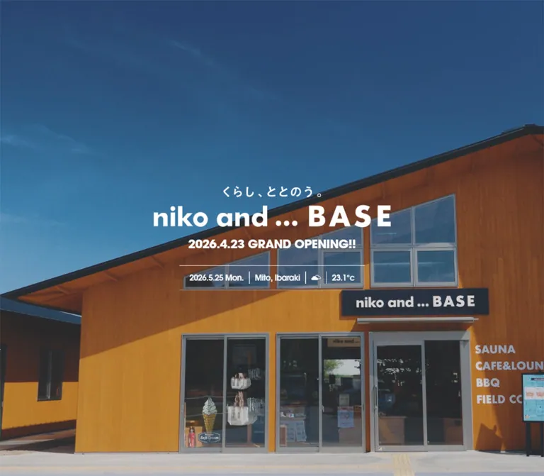
The desktop capture shows a close view of the timber building entrance. The mobile capture shows branches and green leaves against blue sky. Both carry a white graphic lockup, the announcement 2026.4.23 GRAND OPENING!!, and a narrow date/location/weather strip.
The desktop lockup is horizontally centered and begins at y = 381px. The announcement follows 25px below the lockup's bottom. The complete composition sits around the viewport center. On mobile, the graphic begins near 44px from the top; the announcement follows after 14px. This is a deliberate positional change, not just a uniformly reduced desktop center alignment.
The weather strip has fine white top and bottom rules, with vertical separators between the date, Mito, Ibaraki, weather icon, and temperature. Its visible overall size is approximately 424 × 57px on desktop and 282 × 37px on mobile; these are screenshot estimates. Individual text sizes are measured in the typography table.
The capture still displays the April opening announcement in September. Preserve that observation when documenting the current page; do not silently rewrite it as a future launch.
The changing photographic subjects do not establish whether the hero uses video, a still sequence, or responsive assets. Playback, sound, looping, and media controls were not verified. The date/weather data source and refresh behavior are also unknown.
Persistent Header and Menu Control
Role: provide a compact identity anchor and site-wide navigation entry.
The header places a black graphic logo at the upper left and a green Menu pill at the upper right. The button contains a white English label and a small three-line menu symbol. It remains 99 × 40px on both inspected widths.
In the initial DOM state the header sits above the viewport: y = -55px desktop and -65px mobile. It is absent from the hero screenshots and visible in the later captures, at approximately 25px from the desktop top and 15px from the mobile top. These observations support state-dependent visibility; the exact scroll threshold or trigger was not supplied.
The header floats directly over the current background without a full-width solid bar in the shown scrolled states.
Vertical Reservation Tab
Role: keep booking access available while browsing the long page.
A narrow green tab attaches to the left edge, with a small white reservation icon above vertically set ご予約はこちら. Its right corners are rounded. The recorded dimensions are fixed across desktop and mobile: 42.5 × 144.5px, with an 85px bottom gap.
Initially its measured left edge is -44.5px, placing it outside the viewport. Later screenshots show it at the visible left edge. It links to /base/reservation/; it is not itself an embedded booking form.
Because it remains physically large relative to the phone width, keep nearby copy clear of its occupied edge in an adaptation.
Introductory Statement
Role: translate the brand into an inviting sequence of everyday activities.
The DOM contains short lines about running around the lake, playing with friends, family BBQ, pickleball, and refreshing in the sauna. A graphic heading precedes the text, and a centered green pill labeled 施設の詳細はこちら leads to the About page.
The text is centered and spacious. Desktop uses 21px bold Japanese type with 43.5px leading; mobile uses 14px with 29.25px leading. Preserve the intentional line rhythm instead of turning it into one wide prose paragraph.
The heading wrapper changes from 642 × 49.30px with flex display on desktop to approximately 191.36 × 129.05px with block display on mobile. This supports a substantial recomposition of the graphic heading, but its exact artwork was not shown in the supplied screenshots.
Bilingual Section Heading
Role: organize the page using a large English heading and a smaller Japanese explanation.
Information, Contents, Reservation, and Access follow this hierarchy. The visible Contents heading uses compact geometric black English lettering, centered above コンテンツ. Its complete wrapper is 59px high on desktop and 50px on mobile.
Keep the English and Japanese lines closely paired. Avoid a detached eyebrow label or a much larger advertising headline. Reservation places its heading within a left-side desktop zone; mobile returns it to a centered position above the panel content.
Information Card
Role: surface a current announcement with a path to the full news archive.
One news item is present in the supplied homepage evidence. It appears as a centered white card with a 10px radius and a soft shadow visible against the blue texture. The visible part of its image uses a bright yellow product background.
Anatomy:
- Inset announcement image.
- Bold Japanese headline, displayed in about two lines with visual truncation.
- Small publication date,
2026.3.19in the recorded item. - A small green circular arrow near the lower-right corner.
- A separate centered
お知らせ一覧pill below the card.
Desktop card content is 282px wide inside a 330px box; mobile content is 235px inside 275px. Headline leading is 24px and 20px respectively. The exact truncation mechanism and shadow declaration were not supplied.
The whole recorded card is a link. Its article URL ends in /information/20260326/, while the displayed date is March 19. Do not infer the displayed date from the URL slug.
Illustrated Activity Scene
Role: make each facility offering recognizable through a small human scene.
Each item combines an irregular illustration, a black hand-lettered category mark, a small white circular arrow with a dark glyph, and two or three compact lines of Japanese copy. There is no enclosing colored surface or card border.
| Activity | Visible imagery | Desktop composition | Mobile geometry from DOM |
|---|---|---|---|
| Sauna | Reclining and seated visitors, tree, grass, small sun | Large scene at upper left; description below toward the left | Artwork area toward the upper right; broad heading/copy below |
| Cafe | Visitor holding a cup at a table, food and drink motifs | Lower central scene; copy to its right | Illustration left, copy right |
| BBQ | Visitors with food and drinks, floating food motif | Upper-right illustration with text to its left | Illustration right, copy left |
| Pickle Ball | Paddle, ball, player, colored court | Lower-left group with text left of the player | Illustration left, copy right |
| Running Station | Runner in blue sportswear | Slender figure beside a two-line title and copy | Figure right, copy left |
| Souvenir | Two visitors carrying shopping bags | Lower-right scene with copy to its left | Illustration left, copy right |
The desktop layout resembles a loosely organized park map. Sauna and BBQ imagery flank the Contents heading's vertical area, while Cafe sits lower in the middle. The second row continues the uneven rhythm.
On mobile, the same material becomes a vertical sequence of alternating illustration/text relationships. It does not simply shrink into three narrow columns. The measured Contents section grows from about 771px to 1196px high.
Some link rectangles follow an illustration-sized box while their associated text extends beyond that rectangle. Treat the entire visible scene as a composition, and verify actual interactive bounds when implementing it. A single measured rectangle is not sufficient evidence of the complete hit area.
Reservation Panel
Role: distinguish two booking paths and explain when advance reservations are recommended.
A white 20px-radius panel measures 1072px wide on desktop. Its heading occupies a 293px-wide zone, while the right-hand explanation and buttons occupy approximately 252.5px. The supplied element sample does not identify the intervening visual asset.
The right column contains a short paragraph, then two green pills separated by 10px:
BBQの予約はこちらlinks to a TableCheck booking URL.コートの予約はこちらlinks to a STORES reservation URL.
On mobile the panel switches from flex to block layout and grows to approximately 507px high. The explanatory paragraph spans about 302px; the buttons are centered and remain 210px wide. A substantial region separates the heading from the paragraph, but its exact imagery was not supplied.
Keep the two booking purposes explicit. The evidence establishes outbound links, not booking-form behavior, availability, or successful reservation completion.
Access Panel
Role: provide the details needed to reach and navigate the facility.
Verified anatomy includes a bilingual heading; linked postal address with a small Google Map label; a phone-number line; transport subheadings and directions; and the 施設内マップはこちら pill.
The recorded address is 〒310-0851 茨城県水戸市千波町3081-1. Desktop direction text occupies a 360px column at x = 306.5px. Mobile uses approximately 306.8px at x = 41.6px. Main directions use weight 500, while transport headings and contact details use stronger type.
The panel's white background and 20px corners are measured. The supplied screenshots do not establish its complete internal map or illustration composition. An external Google Maps link is not proof of an embedded interactive map.
The facility-map CTA points to /base/about/#areamap. The footer Access link instead points to /base/about/#map. Preserve these distinct destinations if reproducing the site's link structure.
Photo Strip
Role: return from illustration to tangible views of the visit.
The desktop capture shows a horizontal strip of photographs: food on a BBQ grill, the sauna entrance, a café meal, and a runner on a tree-lined path. Images have square corners and generous crops. Fully visible tiles are approximately 353 × 235px, close to 3:2, separated by roughly 18px.
The strip extends toward and beyond the viewport edges rather than sitting inside the white panel width. No arrows or pagination are visible in the supplied strip. Scrolling, swiping, autoplay, looping, and slide count were not demonstrated.
Only its 130px section height is measured on mobile; mobile tile crops were not visually supplied.
Footer Directory and Social Area
Role: make the whole facility directory available after the main content.
Desktop uses a broad white footer with identity/address/social content on the left and navigation on the right. A thin vertical wavy rule separates the main regions. The right side includes two navigation groups, a small watercolor building illustration, a circular upward arrow, and copyright text.
English link names are green at 18px; smaller Japanese translations are black. The Contents children are indented about 19px from the parent navigation line and accompanied by a thin green vertical rule. Preserve the visible source spelling Runniing Station only when reproducing source UI exactly; it is not a font or component name.
The social block uses a large black Instagram symbol, the handle @nikoand_base, a Share heading, and X, LINE, and Facebook symbols inside dotted diamond outlines. Desktop share-link boxes measure 53px; mobile increases them to 60px.
On mobile, identity, directory, Instagram, sharing, and copyright stack vertically. Wavy dividers become horizontal around the directory region, and the building illustration sits near its upper-right area. The supplied footer screenshot is a scrolled crop: the footer logo is partially above the viewport while the persistent header remains visible. Do not copy that overlap as the footer's normal starting layout.
The original footer displays Copyright © Adastria Co., Ltd. All rights reserved. This is observed rights text, not a website production credit.
Closed Navigation Structure
The DOM includes a Close button and another copy of the directory, address, Instagram, and sharing content. At desktop these nodes are positioned above the visible viewport; on mobile they are positioned to its right.
This establishes an offscreen navigation structure. It does not establish its fully open appearance, movement direction, backdrop, scroll locking, keyboard behavior, or focus management. The mobile footer screenshot is not an opened-menu screenshot.
Tokens — Motion & Interaction
| Element / treatment | Recorded transition | What the evidence supports | Limitation |
|---|---|---|---|
| Header | 0.5s |
A transition is declared; initial and later captures have different visibility states | Trigger and animated properties not supplied |
| Menu / Close buttons | 0.5s |
Declared transition on both controls | Hover and activation appearance untested |
| Reservation side tab | 0.5s |
Hidden initial position and visible scrolled capture | Exact reveal threshold unverified |
| Hero graphic lockup | 1s 1s |
One-second duration with one-second delay | No demonstrated property or complete entrance sequence |
| Opening announcement | 1s 1.8s |
One-second duration with 1.8-second delay | A staged entrance is suggested, not visually traced |
| Main pill links | 0.6s desktop; 0.5s mobile |
Recorded transition timing | Hover color, transform, and easing not established |
| Many mobile section elements | 0.5s |
Transition declarations appear on headings, links, and other blocks | Scroll-reveal mechanism not supplied |
| Upward return link | 0.3s |
Declared transition and #content destination |
Smooth scrolling and endpoint behavior untested |
| Instagram handle | 0.3s |
Declared text transition | Final hover state untested |
The sampled elements report animation: none. This does not establish that the whole site is static: CSS transitions, media, scripts, descendants, and unsampled elements may still move. Entries reported simply as transition: all provide no useful nonzero timing evidence.
Capture readiness included waiting for finite motion and temporarily pausing perpetual animations during checks. Consequently, the screenshots are strong layout evidence but cannot establish normal animation cadence or continuity.
For an adaptation, restrained opacity and short positional changes fit the calm outdoor tone. Treat those choices as recommendations. Do not add dramatic parallax, springy card motion, automatic gallery behavior, or audible hero media and describe them as observed features.
Surfaces
| Surface | Appearance | Purpose | Evidence |
|---|---|---|---|
| Hero | Full-bleed outdoor photography with white graphic/text overlay | Immediate sense of place | Desktop and mobile screenshots |
| Main content canvas | Pale-blue mottled paper or painted wash | Connect the illustrated activity world | Desktop screenshot; exact asset/color unavailable |
| Activity scene | Transparent background with artwork and black copy | Direct exploration of each offering | Desktop screenshot and DOM |
| Information card | White, 10px corners, soft shadow |
Isolate the announcement | Computed background/radius; visual shadow |
| Reservation / Access | White, 20px corners |
Group practical tasks and directions | Measured DOM; incomplete internal visual coverage |
| Navigation actions | Saturated green with white labels or arrows | Consistent action language | Computed styles and screenshots |
| Footer | Flat white with black illustrations, green links, wavy dividers | Directory, identity, sharing | Desktop and mobile screenshots |
There is no demonstrated global elevation system. The news card has a visible shadow, but that does not justify shadows under every illustration, button, or utility panel.
Imagery
The illustrations have uneven dark outlines, patchy watercolor or colored-pencil fills, visible grain, and casual proportions. People look like visitors having ordinary leisure experiences. Their clothes introduce strong red, green, blue, and tan accents, while grass and trees connect the scenes to a park.
Use transparent or cleanly cut-out illustrations so the blue paper remains visible around and between figures. Preserve their irregular silhouettes. Avoid boxing every figure into a uniform thumbnail, smoothing the linework into corporate vector icons, or applying pixelated image rendering.
Photography supplies material credibility: timber, glass, grilled food, café packaging, sauna interiors, foliage, and paths. It is naturalistic and warm. The hero can crop assertively; the photo strip uses consistent rectangular frames. The illustration system and the photography should remain visibly different media that describe the same place.
Observed Asset References
No image, video, SVG, texture, or font-file URLs were included in the supplied evidence. These references identify visible assets by role; they are not invented filenames.
| Asset role | Original-page evidence | Reuse treatment |
|---|---|---|
| Brand lockup with tagline | Hero, persistent header, footer | Preserve aspect ratio; use white and black presentations appropriate to the background |
| Blue paper texture | Contents background and space around utility areas | Use an unobtrusive continuous texture with a pale-blue fallback |
| Six activity scenes | Desktop Contents screenshot; mobile positions in DOM | Keep organic silhouettes and distinct per-activity compositions |
| Hand-lettered category marks | Desktop Contents screenshot; empty text in heading wrappers | Use supplied artwork; provide accessible text separately |
| News artwork | Cropped Information card above Contents | Preserve the actual announcement image and its intrinsic composition |
| Photo-strip images | Desktop gallery/footer screenshot | Consistent landscape crops with square corners |
| Building illustration | Desktop and mobile footer | Decorative local identity marker, not a second primary logo |
| Social and navigation symbols | Header, activity arrows, footer | Keep small functional symbols simpler than the illustrated scenes |
The CSS shell can reproduce spacing, hierarchy, and surfaces. It cannot reproduce the identity of the page without suitable artwork and photography.
Layout & Responsive Behavior
The page order remains consistent across the two DOM snapshots: hero, introduction, Information, Contents, Reservation, Access, photo strip, footer. The mobile document is longer despite smaller text, principally because illustrated scenes and utility content stack.
Hero height requires special care. The introduction begins at y = 1000px in both snapshots, and source --disp-height is 1000px in both. On desktop this matches the viewport. On the 390 × 844 mobile viewport it exceeds the visible screen by 156px. The supplied evidence cannot determine whether this comes from fixed sizing or a viewport-height variable retained during resizing. Record it as observed; do not claim the source uses 100svh. The Quick Start recommends 100svh for a new implementation.
The hero's typography follows more than one scale. The mobile lockup is about 52% of its desktop width, the weather type is 67% of its desktop size, and Menu stays unchanged. Scaling the entire hero group uniformly would miss those relationships.
The activity area makes the largest compositional change. Desktop distributes six scenes across approximately two loose rows. Mobile alternates image and text sides in a vertical sequence, with the Sauna scene using a broader description below its illustration. These mobile relationships come from DOM coordinates, not a supplied full mobile Contents screenshot.
White panels use a centered 1072px desktop width and approximately 92vw on mobile. Reservation changes from flex to block; Access copy narrows and sits after a substantial upper content region. The exact intermediate breakpoint is unavailable.
The footer changes from a side-by-side directory composition to a tall stack. English links reduce from 18px to 15px, while social targets grow. Decorative waves rotate from a vertical separator to horizontal dividers.
Only two widths were inspected. Tablet behavior, landscape phones, text zoom, long translated labels, and browser safe-area handling remain unverified. The 900px breakpoint in the Quick Start is an implementation recommendation, not a recovered source value.
Do’s and Don’ts
Do
- Build around the relationship between blue paper, black illustration outlines, white utility surfaces, and
#27ab38navigation. - Pair natural facility photography with handmade illustrations of actual visitor activities.
- Keep activity scenes open on the background, with different compositions and scales.
- Preserve the separate typography roles: Japanese body text, compact geometric English utilities, and graphic handwritten category marks.
- Keep the centered news card distinct from the unboxed activity area.
- Use two explicit booking actions for BBQ and court reservations.
- Recompose the hero and activity scenes for mobile instead of applying one global scale factor.
- Retain the small location/weather strip, rounded green controls, wavy footer rules, and dotted sharing diamonds.
- Keep essential practical information available in ordinary text and links.
- Label estimated texture colors, unverified motion, and recommended breakpoints honestly.
Don’t
- Don’t convert the six activities into identical elevated feature cards.
- Don’t replace the illustrations with a uniform stock icon family or generic handwriting font.
- Don’t introduce the recorded library blue as a second action color without visible evidence.
- Don’t treat the orange source token as the measured color of the building photography.
- Don’t reproduce the mobile
1000pxhero height without checking its cause and intended behavior. - Don’t use empty graphic-heading wrappers as a model for accessible naming.
- Don’t infer video, autoplay, swiping, menu animation, live weather, or working share dialogs from still captures and link presence.
- Don’t use the footer crop as proof of an opened navigation drawer.
- Don’t stretch the illustration assets or crop people into standardized rectangles.
- Don’t copy small low-contrast text without considering readability in the new implementation.
Recommended Implementation Additions
These are recommendations for a new implementation, not verified original-site features:
- Give the graphic H1 and every activity link a meaningful accessible name. An image-only heading should still expose its text equivalent.
- Use real buttons for menu state and anchors for navigation. If a menu is implemented, manage
aria-expanded, focus return, Escape, and background interactivity. - Remove concealed header and booking controls from keyboard interaction while they are hidden.
- Increase important mobile body copy toward
14–16pxwhere feasible. Preserve composition through layout changes instead of retaining12pxtext at all costs. - Offer at least
44pxinteractive height for small action links, or provide an equivalently generous target around their visual pill. - Improve contrast for small white-on-green labels and green-on-white links. A darker action variant such as
#187d2ais an option; it is not an observed source color. - Use a real viewport-height strategy and test resize/orientation behavior before adopting the recorded mobile hero height.
- If hero media moves, provide reduced-motion behavior, a suitable still fallback, and pause controls when required by its duration and presentation.
- Keep decorative texture, scenery flourishes, waves, and redundant arrow graphics out of the accessibility tree.
- Verify outbound booking links and implement sharing explicitly. The supplied share anchors point to the homepage, so their intended script behavior cannot be recovered from the hrefs alone.
Agent Prompt Guide
Quick Color Reference
- Primary navigation green: measured
#27ab38. - Main content background: textured pale blue; approximate flat fallback
#b1ddea. - Copy, linework, and dark brand artwork:
#000000. - Utility panels, news card, footer, and reversed labels:
#ffffff. - Orange
#d96b0d: recorded source token with unverified component use. - Strong red, yellow, tan, and blue accents belong primarily to imagery.
Overall Prompt
“Create a Japanese leisure-facility homepage inspired by niko and ... BASE. Begin with a full-bleed photograph of a timber facility or leafy park, a white graphic brand lockup, a compact opening announcement, and a thin ruled date/location/weather strip. Continue onto pale-blue textured paper with black Japanese copy, compact geometric English section headings, and six hand-painted activity scenes. Keep these scenes unboxed and irregularly arranged, with handwritten category graphics and small circular arrows. Use bright green #27ab38 for navigation pills, a small Menu control, and a vertical booking tab. Add white rounded Reservation and Access panels, a landscape photo strip, and a white directory footer with wavy rules and dotted diamond sharing icons. On mobile, move the hero identity near the top and alternate artwork with text in a vertical activity sequence. Treat motion and menu mechanics as separate implementation requirements.”
Example Component Prompts
- Activity scene: “Design a café scene on pale-blue textured paper: an unevenly outlined visitor holding a cup at a small table, with patchy watercolor colors. Place a supplied black handwritten Cafe mark, a small white circular arrow, and three short lines of bold Japanese copy to the right. No enclosing card, border, or shadow.”
- Information card: “Create one centered white announcement card, 330px wide on desktop and 275px on mobile, with 10px corners and a restrained shadow. Use an inset image, a two-line bold Japanese title, a small date, and a green circular arrow at the lower right. Put a separate green archive pill below it.”
- Booking panel: “Create a white 20px-radius panel with a bilingual Reservation heading and a short practical explanation. Provide two separate green pill links labeled
BBQの予約はこちらandコートの予約はこちら, separated by 10px. Stack the content on mobile. Use only supplied imagery in any illustration region.” - Footer: “Create a white facility directory with a black graphic logo, centered address, green English navigation paired with smaller black Japanese labels, nested activity links, Instagram, and sharing icons inside dotted diamonds. Use a thin wavy divider and a small hand-painted building. Stack identity, navigation, and social content on mobile.”
- Hero: “Create a photographic facility hero with a white graphic lockup 543px wide on desktop and approximately 282px on a 390px phone. Center the desktop group vertically; place the mobile group about 44px from the top. Add compact white announcement text and a fine ruled weather strip. Do not assume video or autoplay without supplied media requirements.”
Quick Start
CSS Custom Properties
This is a reusable CSS adaptation, not recovered source code. It preserves measured colors, type roles, controls, and panel proportions. The blue fallback, news shadow, section-title sizes, 900px breakpoint, activity grid, and 100svh hero are explicitly implementation choices.
Provide the actual logo, category lettering, illustrations, photographs, and paper texture separately. --paper-texture defaults to none; no asset paths are assumed. Font loading, menu state, header visibility triggers, sharing, and media playback require their own implementation.
:root {
  /* Measured colors and an estimated texture fallback. */
  --color-green: #27ab38;
  --color-ink: #000;
  --color-white: #fff;
  --color-sky: #b1ddea;
  --color-orange-source: #d96b0d;
  --color-action: var(--color-green);
  --paper-texture: none;

  /* Recorded font stacks; load font assets separately. */
  --font-jp: 'Zen Kaku Gothic New', sans-serif;
  --font-en: itc-avant-garde-gothic-pro, sans-serif;
  --text-body: 14.4px;
  --text-activity: 14.4px;
  --leading-activity: 20.7px;
  --text-section: 36px; /* Visual approximation. */
  --text-action: 16.8px;
  --text-nav: 18px;

  --panel-width: 1072px;
  --radius-card: 10px;
  --radius-panel: 20px;
  --action-width: 252px;
  --action-height: 36px;
  --brand-hero-width: 543px;
  --brand-header-width: 204px;
  --brand-footer-width: 264px;

  /* Durations are source-derived; easing is recommended. */
  --motion-ui: 500ms ease;
  --motion-action: 600ms ease;
}

* { box-sizing: border-box; }
html { font-size: 100%; }
body {
  margin: 0;
  color: var(--color-ink);
  font-family: var(--font-jp);
  font-size: var(--text-body);
  font-weight: 700;
  line-height: 1.5;
}
img { display: block; max-inline-size: 100%; }
button, a { -webkit-tap-highlight-color: transparent; }
button { font: inherit; }

.base-page {
  background-color: var(--color-sky);
  background-image: var(--paper-texture);
}

/* Optional contrast improvement, not the original palette. */
[data-contrast='enhanced'] {
  --color-action: #187d2a;
}

.base-header {
  position: fixed;
  z-index: 30;
  inset-block-start: 25px;
  inset-inline: 0;
  display: flex;
  align-items: center;
  justify-content: space-between;
  padding-inline: 30px 29px;
  transition: transform var(--motion-ui);
}
.base-header__brand { inline-size: var(--brand-header-width); }
.base-menu {
  display: inline-flex;
  align-items: center;
  justify-content: center;
  gap: 12px;
  inline-size: 99px;
  min-block-size: 40px;
  padding: 0;
  border: 0;
  border-radius: 40px;
  background: var(--color-action);
  color: var(--color-white);
  font: 600 15px/1 var(--font-en);
  letter-spacing: -0.02em;
  cursor: pointer;
}

/* State must also manage focusability in the application. */
.base-header[data-concealed='true'] {
  transform: translateY(-80px);
  visibility: hidden;
  pointer-events: none;
}

.base-reservation-tab {
  position: fixed;
  z-index: 30;
  inset-inline-start: 0;
  inset-block-end: calc(85px + env(safe-area-inset-bottom, 0px));
  display: flex;
  flex-direction: column;
  align-items: center;
  justify-content: center;
  gap: 8px;
  inline-size: 42.5px;
  block-size: 144.5px;
  border-radius: 0 10px 10px 0;
  background: var(--color-action);
  color: var(--color-white);
  text-decoration: none;
}
.base-reservation-tab__label {
  writing-mode: vertical-rl;
  font-size: 14px;
  line-height: 1;
}

/* Recommended viewport sizing; mobile source measured 1000px. */
.base-hero {
  position: relative;
  isolation: isolate;
  min-block-size: 100svh;
  overflow: hidden;
  background: #333;
  color: var(--color-white);
}
.base-hero__media {
  position: absolute;
  inset: 0;
  inline-size: 100%;
  block-size: 100%;
  object-fit: cover;
}
.base-hero::after {
  content: '';
  position: absolute;
  inset: 0;
  background: rgb(0 0 0 / 18%); /* Recommended readability veil. */
}
.base-hero__copy {
  position: absolute;
  z-index: 1;
  inset-block-start: 50%;
  inset-inline: 0;
  inline-size: min(var(--brand-hero-width), calc(100% - 40px));
  margin-inline: auto;
  transform: translateY(-50%);
  text-align: center;
}
.base-hero__brand { inline-size: 100%; block-size: auto; }
.base-hero__opening {
  margin: 25px 0 35px;
  font: 700 27px/1 var(--font-en);
  letter-spacing: -0.02em;
}
.base-weather {
  display: flex;
  align-items: center;
  justify-content: center;
  inline-size: min(424px, 100%);
  min-block-size: 57px;
  margin-inline: auto;
  border-block: 1px solid currentColor;
  font: 600 18px/1 var(--font-en);
  letter-spacing: -0.02em;
}
.base-weather > * {
  margin: 0;
  padding-inline: 12px;
  white-space: nowrap;
}
.base-weather > * + * { border-inline-start: 1px solid currentColor; }

.base-section-title {
  display: grid;
  justify-items: center;
  gap: 6px;
  margin: 0;
  font: 600 var(--text-section)/1 var(--font-en);
  letter-spacing: -0.02em;
  text-align: center;
}
.base-section-title small {
  font: 700 16.8px/1 var(--font-jp);
  letter-spacing: normal;
}
.base-intro {
  padding-block: 159.5px 80px;
  text-align: center;
}
.base-intro__text {
  margin: 70px 20px 36px;
  font-size: 21px;
  line-height: 43.5px;
}

.base-pill {
  position: relative;
  display: flex;
  align-items: center;
  justify-content: center;
  inline-size: min(var(--action-width), 100%);
  min-block-size: var(--action-height);
  margin-inline: auto;
  padding: 4px 28px;
  border: 0;
  border-radius: 30px;
  background: var(--color-action);
  color: var(--color-white);
  font: 700 var(--text-action)/1 var(--font-jp);
  letter-spacing: 0.01em;
  text-align: center;
  text-decoration: none;
  transition: filter var(--motion-action);
}
.base-pill::after {
  content: '→';
  position: absolute;
  inset-inline-end: 16px;
}

.base-information { padding-block: 111px 0; }
.base-news-card {
  position: relative;
  display: block;
  inline-size: min(330px, calc(100% - 40px));
  margin: 36px auto 0;
  padding: 22px 24px 32px;
  border-radius: var(--radius-card);
  background: var(--color-white);
  color: var(--color-ink);
  text-decoration: none;
  box-shadow: 0 5px 10px rgb(0 0 0 / 16%); /* Estimated. */
}
.base-news-card__image { inline-size: 100%; block-size: auto; }
.base-news-card__title {
  display: -webkit-box;
  overflow: hidden;
  -webkit-box-orient: vertical;
  -webkit-line-clamp: 2;
  margin: 18px 0 5px;
  font-size: 15.6px;
  line-height: 24px;
}
.base-news-card__date { margin: 0; font-size: 12.5px; line-height: 1; }
.base-information > .base-pill { margin-block-start: 41.5px; }
.base-circle-arrow {
  display: inline-grid;
  flex: none;
  place-items: center;
  inline-size: 20px;
  block-size: 20px;
  border-radius: 50%;
  background: var(--color-white);
  color: var(--color-ink);
}
.base-news-card__arrow {
  position: absolute;
  inset-inline-end: 15px;
  inset-block-end: 12px;
  background: var(--color-action);
  color: var(--color-white);
}

/* Approximate scenic arrangement, not recovered coordinates. */
.base-contents { padding-block: 115.5px 70px; }
.base-activities {
  display: grid;
  grid-template-columns: repeat(3, minmax(0, 1fr));
  gap: 32px;
  inline-size: min(1280px, 96%);
  margin: -42px auto 0;
}
.base-activity {
  display: grid;
  grid-template-columns: 1.15fr 1fr;
  align-items: center;
  gap: 10px;
  min-block-size: 320px;
  color: inherit;
  text-decoration: none;
}
.base-activity__art { grid-area: 1 / 1; inline-size: 100%; block-size: auto; }
.base-activity__copy { grid-area: 1 / 2; }
.base-activity__title {
  display: flex;
  align-items: center;
  gap: 8px;
  margin: 0 0 10px;
}
.base-activity__title img { min-inline-size: 0; block-size: auto; }
.base-activity__copy p {
  margin: 0;
  font-size: var(--text-activity);
  line-height: var(--leading-activity);
}
.base-activity:first-child { grid-template-columns: 1fr; }
.base-activity:first-child .base-activity__copy { grid-area: 2 / 1; }
.base-activity:nth-child(2) { transform: translateY(100px); }
.base-activity:nth-child(n + 3) .base-activity__art { grid-column: 2; }
.base-activity:nth-child(n + 3) .base-activity__copy { grid-column: 1; }

.base-panel {
  inline-size: min(var(--panel-width), 92%);
  margin-inline: auto;
  border-radius: var(--radius-panel);
  background: var(--color-white);
}
.base-reservation {
  display: grid;
  grid-template-columns: 293px minmax(0, 1fr) 252.5px;
  align-items: center;
  gap: 24px;
  padding: 30px 59px 24px 0;
}
.base-reservation__actions { display: grid; gap: 10px; }
.base-reservation__actions p { margin: 0 0 8px; }
.base-access { margin-block-start: 16px; padding: 43px 8.5% 60px; }
.base-access__body {
  display: grid;
  grid-template-columns: minmax(0, 360px) minmax(0, 1fr);
  gap: 48px;
  margin-block-start: 57px;
}
.base-access__directions p { font-weight: 500; }
.base-access__directions h3 { font-size: inherit; }

.base-photo-rail {
  display: flex;
  gap: 18px;
  overflow: hidden;
  margin-block: 101px 40px;
}
.base-photo-rail img {
  flex: 0 0 auto;
  inline-size: 353px;
  block-size: 235px;
  object-fit: cover;
  border-radius: 0;
}

.base-footer { padding-block: 81.5px 91px; background: var(--color-white); }
.base-footer__inner {
  display: grid;
  grid-template-columns: 428.5px minmax(0, 1fr);
  grid-template-areas: 'identity nav' 'social nav';
  gap: 60px 96.5px;
  inline-size: min(1170px, 92%);
  margin-inline: auto;
}
.base-footer__identity { grid-area: identity; text-align: center; }
.base-footer__brand { inline-size: var(--brand-footer-width); margin-inline: auto; }
.base-footer__social { grid-area: social; text-align: center; }
.base-footer__nav {
  grid-area: nav;
  display: grid;
  grid-template-columns: 1fr 1fr;
  align-content: start;
  gap: 20px;
}
.base-footer__nav a {
  color: var(--color-action);
  font: 600 var(--text-nav)/1 var(--font-en);
  letter-spacing: -0.02em;
  text-decoration: none;
}
.base-footer__nav li { margin-block-end: 18px; }
.base-footer__nav small {
  margin-inline-start: 10px;
  color: var(--color-ink);
  font: 700 11px/1.4 var(--font-jp); /* Approximation. */
}
.base-footer__nav ul { margin: 0; padding: 0; list-style: none; }
.base-footer__nav ul ul {
  margin-block-start: 16px;
  margin-inline-start: 9px;
  padding-inline-start: 9px;
  border-inline-start: 1px solid var(--color-action);
}

/* Recommended feedback; original hover appearance was untested. */
@media (hover: hover) {
  .base-pill:hover { filter: brightness(0.94); }
}
.base-page :focus-visible {
  outline: 2px solid var(--color-ink);
  outline-offset: 4px;
}
[data-touch-comfort='true'] .base-pill { min-block-size: 44px; }

/* Recommended breakpoint; only 1440px and 390px were inspected. */
@media (max-width: 900px) {
  :root {
    --text-body: 12px;
    --text-activity: 12px;
    --leading-activity: 17.25px;
    --text-section: 30px;
    --text-action: 14px;
    --text-nav: 15px;
    --action-width: 210px;
    --action-height: 30px;
    --brand-hero-width: 281.5px;
    --brand-header-width: 157.5px;
    --brand-footer-width: 220px;
    --motion-action: 500ms ease;
  }
  .base-header { inset-block-start: 15px; padding-inline: 20px 15px; }
  .base-hero__copy { inset-block-start: 44px; transform: none; }
  .base-hero__opening { margin: 14px 0; font-size: 14px; }
  .base-weather { min-block-size: 37px; font-size: 12px; }
  .base-weather > * { padding-inline: 7px; }
  .base-section-title small { font-size: 14px; }
  .base-intro { padding-block: 93px 80px; }
  .base-intro__text { margin-block: 28px; font-size: 14px; line-height: 29.25px; }
  .base-information { padding-block-start: 52.5px; }
  .base-news-card { inline-size: min(275px, calc(100% - 40px)); padding: 18px 20px 32px; }
  .base-news-card__title { font-size: 13px; line-height: 20px; }
  .base-news-card__date { font-size: 10.5px; }
  .base-information > .base-pill { margin-block-start: 20px; }
  .base-contents { padding-block: 36px 35px; }
  .base-activities { grid-template-columns: 1fr; gap: 12px; margin-block-start: 20px; }
  .base-activity { min-block-size: 180px; transform: none; }
  .base-activity:nth-child(2) { transform: none; }
  .base-activity:nth-child(n) .base-activity__art { grid-area: 1 / 1; }
  .base-activity:nth-child(n) .base-activity__copy { grid-area: 1 / 2; }
  .base-activity:nth-child(odd) .base-activity__art { grid-column: 2; }
  .base-activity:nth-child(odd) .base-activity__copy { grid-column: 1; }
  .base-activity:first-child .base-activity__art {
    grid-area: 1 / 1;
    justify-self: end;
    inline-size: 72%;
  }
  .base-activity:first-child .base-activity__copy { grid-area: 2 / 1; padding-inline: 20px; }
  .base-reservation { grid-template-columns: 1fr; padding: 30px 28px 24px; }
  .base-access { margin-block-start: 40px; padding: 30px 26px; }
  .base-access__body { grid-template-columns: 1fr; gap: 28px; margin-block-start: 30px; }
  .base-access__visual { order: -1; }
  .base-photo-rail { margin-block: 40px 30px; }
  .base-photo-rail img { inline-size: 195px; block-size: 130px; }
  .base-footer { padding-block: 30px 32.5px; }
  .base-footer__inner {
    grid-template-columns: 1fr;
    grid-template-areas: 'identity' 'nav' 'social';
    gap: 36px;
    inline-size: 80%;
  }
  .base-footer__nav { grid-template-columns: 1fr; }
  .base-footer__nav small { font-size: 9px; }
}

@media (prefers-reduced-motion: reduce) {
  .base-page *, .base-page *::before, .base-page *::after {
    transition: none !important;
    animation: none !important;
  }
  /* Video playback needs a separate reduced-motion policy. */
}
For the panel markup, the recommended desktop Reservation children are heading, an optional supplied visual, and the explanation/actions group. Access uses a heading followed by a body containing directions and an optional supplied visual. Those visual slots support adaptation; their precise original assets were not established.
The activity CSS provides the general alternation and desktop stagger. Individual artwork proportions still need adjustment against the actual assets. Wavy rules, building artwork, social symbols, and dotted sharing diamonds should be supplied or drawn separately. The mobile photo width in this CSS is a calculated 3:2 adaptation to the measured 130px strip height, not a measured original tile width.
Tailwind v4 Token Mapping
Optional aliases for a project already using Tailwind v4. This does not imply the original website uses Tailwind. Define the custom properties above first.
@theme inline {
  --color-park-green: var(--color-green);
  --color-park-action: var(--color-action);
  --color-blue-paper: var(--color-sky);
  --color-park-ink: var(--color-ink);
  --color-park-surface: var(--color-white);

  --font-body: var(--font-jp);
  --font-display: var(--font-en);

  --text-park-body: var(--text-body);
  --text-park-section: var(--text-section);
  --text-park-action: var(--text-action);
  --text-park-nav: var(--text-nav);

  --radius-news: var(--radius-card);
  --radius-utility: var(--radius-panel);
  --spacing-booking-width: var(--action-width);
  --spacing-booking-height: var(--action-height);
}
Sources & Evidence
- Original and final page: https://www.nikoand.jp/base/. The supplied browser record reports HTTP
200, unchanged final URL, and page titleniko and ... BASE. - Capture date: September 12, 2026, with page evidence retrieved at
2026-09-12T08:08:43.650Z. - Desktop inspection:
1440 × 1000CSS pixels. Supplied visual evidence covers the hero, Contents, and gallery/footer. The rendered DOM supplies computed typography, colors, dimensions, links, section geometry, and transition declarations across the homepage. - Mobile inspection:
390 × 844CSS pixels. Supplied visual evidence covers the hero and a scrolled footer. DOM measurements provide the mobile intermediate-section geometry and offscreen navigation positions. - Observed navigation evidence: links to facility detail pages, the news article/archive, reservation destinations, Google Maps, facility-map anchors, Instagram, and the homepage
#contentanchor. Their destinations were recorded but not opened as part of this analysis. - Inspection procedure limits: the supplied browser process waited for document load, finite visible or potentially revealing animations, sampled layout/text stability, and visible image decoding within its stated time limits. It traversed intermediate scroll positions. Perpetual animations were temporarily paused during readiness checks and resumed afterward. SharedWorkers and service workers were disabled.
- Unverified areas: complete opened-menu appearance, keyboard behavior, hover states, sharing scripts, booking completion, hero media type/playback, live weather behavior, gallery interaction, exact texture and asset URLs, intermediate breakpoints, and layouts under text zoom.
This reference describes the current homepage represented by those captures and measurements. Source values, visual approximations, and implementation recommendations are distinguished throughout.
# niko and ... BASE — Style Reference

> A park outing told through timber, blue paper, hand-painted people, and bright green signposts.

**Website:** [niko and ... BASE](https://www.nikoand.jp/base/)
**Original URL:** https://www.nikoand.jp/base/
**Final URL:** https://www.nikoand.jp/base/
**Theme:** light, with a textured pale-blue content canvas and white utility surfaces; no theme switch was demonstrated.
**Inspected:** September 12, 2026. Supplied browser evidence was retrieved at 08:08:43.650 UTC / 17:08:43.650 JST.
**Viewports:** desktop `1440 × 1000` and mobile `390 × 844` CSS pixels.
**Scope:** the current facility homepage: photographic opening, introduction, Information, six activity links, Reservation, Access, photo strip, footer, and the closed/offscreen navigation structure. Linked detail pages and external booking services were not inspected.

niko and ... BASE presents a place to spend time, eat, exercise, and unwind. A large photographic opening establishes the real setting. Below it, pale-blue paper texture becomes a continuous outdoor world populated by loosely drawn people, food, equipment, and greenery. Black lettering supplies clarity; bright green consistently marks navigation and booking actions.

The defining component is the illustrated activity scene. Sauna, Cafe, BBQ, Pickle Ball, Running Station, and Souvenir appear as irregular compositions of artwork, handwritten category lettering, a small arrow, and compact Japanese copy. They float across the blue background without enclosing cards. The more practical Reservation and Access sections use large white rounded panels, and the page ends with rectangular photographs and a white directory-style footer.

This is a facility website with several onward journeys. Its design should support exploration, practical visit information, and reservations together.

## How to Read This Reference

- **Measured** values come from the supplied rendered DOM, computed styles, custom properties, and element rectangles. They describe the two recorded viewport states.
- **Visual estimates** describe screenshot appearance where the underlying declaration was not supplied, including the blue background color, section-title size, photo spacing, and shadow softness.
- **Calculated** values are derived from recorded measurements or colors and are labeled accordingly.
- **Recommendations** describe a reusable implementation. They are not claims about existing accessibility, breakpoints, state logic, or interactions.
- Desktop screenshots cover the hero, Contents, and the photo strip/footer. Mobile screenshots cover the hero and footer. The introduction, utility-panel internals, and mobile activity layout have DOM evidence but incomplete visual coverage.
- Some initial rectangles include hidden controls or apparent reveal offsets. Do not turn every sampled coordinate into a permanent positioning rule.
- All token names below are implementation aliases unless explicitly identified as source custom properties.

## Tokens — Colors

### Default Palette

| Name | Value | Evidence | Role |
| --- | --- | --- | --- |
| Park Green | `#27ab38` | Measured source `--green`; repeated computed backgrounds and text colors | Menu button, booking tab, pill links, footer navigation, circular arrow controls |
| Blue Paper | approximately `#b1ddea` | Visual estimate, not a sampled source declaration | Flat fallback for the pale-blue textured content background |
| Black Ink | `#000000` | Measured source `--text-color` and computed text | Body copy, brand graphics, illustrated outlines, social icons, decorative rules |
| White Surface | `#ffffff` | Measured component backgrounds and foregrounds | Information card, Reservation and Access panels, footer, reversed hero and action text |
| Declared Orange | `#d96b0d` | Recorded source `--orange` | Available source token; its application was not established by the supplied element sample |

The blue background is visibly mottled and fibrous. A flat hexadecimal color captures only its average impression. Preserve a subtle paper or painted wash texture across the main content field; do not substitute a strong digital gradient.

Warm orange and brown are prominent in the building photography and illustrations. Those image colors do not establish that the declared orange token controls a particular component.

### Palette Boundaries

The recorded `--swiper-theme-color: #007aff` is not evidence of a visible blue action system. No corresponding pagination or control was demonstrated. Exclude it from the primary design palette.

Green is the recurring navigational signal. Yellow, red, navy, tan, and grass green mainly belong to artwork and photographs. They should remain content colors rather than becoming a new collection of category badges.

**Calculated accessibility consideration:** white against `#27ab38` has approximately `3.0:1` contrast. The observed small button labels and green footer links therefore warrant a stronger-contrast treatment in a new implementation. An optional darker action color is included in the Quick Start as a recommendation.

## Tokens — Typography

### Japanese Body and Supporting Copy

**Measured family:** `"Zen Kaku Gothic New", sans-serif`.

The body inherits weight `700`, giving short Japanese descriptions a sturdy, friendly presence. Access directions use weight `500`, distinguishing longer practical prose from labels and activity descriptions.

The introductory statement has unusually generous leading: `21px / 43.5px` on desktop and `14px / 29.25px` on mobile. This creates an unhurried, line-by-line reading rhythm. Activity descriptions are much tighter at `14.4px / 20.7px` and `12px / 17.25px` respectively.

### English Navigation and Utility Text

**Measured family:** `itc-avant-garde-gothic-pro, sans-serif`.

This family is explicitly recorded on Menu, the opening announcement, date/location/weather text, footer navigation, Share, and copyright. Most of these elements use weight `600`; the opening announcement uses `700`.

Measured tracking is consistently `-0.02em`: for example, `-0.3px` at `15px` and `-0.36px` at `18px`. The compact geometric English lettering balances the more irregular illustrations.

Use the recorded font when properly available. The supplied evidence contains no font-file URLs, loading configuration, or license details. A generic sans-serif fallback is appropriate until those assets are supplied.

### Graphic Wordmarks and Category Lettering

The main wordmark and activity headings appear as graphic lettering. Their sampled heading elements contain no text. The `10px` inherited font size reported on those wrappers is not the visible size of the logo or handwritten lettering.

Preserve the brand lockup as artwork, including the small Japanese tagline. Likewise, keep the lumpy black category marks as supplied graphics rather than inventing a handwriting font. Running Station is a two-line mark; other categories use shorter single-line compositions.

### Type Scale

All values below are computed measurements except rows explicitly marked as estimates.

| Role | Desktop size / line height | Mobile size / line height | Weight | Tracking / interpretation |
| --- | --- | --- | --- | --- |
| Opening announcement | `27 / 27px` | `14 / 14px` | `700` | English family; `-0.02em` |
| Date, location, temperature | `18 / 18px` | `12 / 12px` | `600` | English family; `-0.02em` |
| Menu label | `15 / 15px` | `15 / 15px` | `600` | Fixed across inspected widths |
| Introductory statement | `21 / 43.5px` | `14 / 29.25px` | `700` | Japanese family; normal tracking |
| Activity description | `14.4 / 20.7px` | `12 / 17.25px` | `700` | Short, deliberately broken lines |
| Reservation explanation | `14.4 / 21.6px` | `12 / 18px` | `700` | Compact practical copy |
| Access directions | `14.4 / 21.6px` | `12 / 18px` | `500` | Longer prose |
| Information headline | `15.6 / 24px` | `13 / 20px` | `700` | Approximately two displayed lines |
| Information date | `12.5 / 12.5px` | `10.5 / 10.5px` | `700` | Japanese body family |
| Pill-link label | `16.8 / 16.8px` | `14 / 14px` | `700` | `0.01em` tracking |
| Vertical booking label | `14 / 14px` | `14 / 14px` | `700` | Fixed-size vertical Japanese text |
| Footer English navigation | `18 / 18px` | `15 / 15px` | `600` | Smaller Japanese labels sit alongside |
| Share heading | `20 / 20px` | `20 / 20px` | `600` | Fixed across inspected widths |
| Social handle | `10 / 10px` | `10 / 10px` | `600` | English family |
| Copyright | `12 / 12px` | `10 / 10px` | `600` | English family |
| Main English section title | approximately `36–38px` visually | Child text size not supplied | Not independently measured | Use `36px` desktop and `30px` mobile as an adaptation |

The complete bilingual section-heading wrapper measures `59px` high on desktop and `50px` on mobile. Its inherited `10px` font size does not reveal the sizes of its child spans.

The original root is `10px` at both inspected widths. Many content sizes change between layouts while the root remains constant. The Quick Start uses explicit sizes with a conventional root instead of assuming a universal viewport-scaled unit.

## Tokens — Spacing & Shapes

The page combines large section breathing room with compact labels and controls. It has no single verified spacing formula. Several desktop dimensions are `1.2×` their mobile counterparts, but the Menu button, booking tab, and panel radii remain unchanged.

### Spacing Scale

| Use | Desktop | Mobile | Evidence / interpretation |
| --- | --- | --- | --- |
| Header horizontal insets | `30px` left, `29px` right | `20px` left, `15px` right | Measured padding |
| Intro section top padding | `159.5px` | `93px` | Measured |
| Information top padding | `111px` | `52.5px` | Measured |
| Contents top padding | `115.5px` | `36px` | Measured; illustrations can occupy the heading's vertical neighborhood |
| Information card horizontal content inset | `24px` | `20px` | Calculated from element bounds |
| Information card top padding | `22px` | `18px` | Measured |
| Information card to list CTA | `41.5px` | `20px` | Calculated from sampled bounds |
| Stacked reservation-button gap | `10px` | `10px` | Calculated |
| Reservation-to-Access panel gap | `16px` | `40px` | Calculated |
| Access copy inset from panel edge | `122.5px` | `26px` | Calculated; not a universal panel padding |
| Footer top / bottom padding | `81.5 / 91px` | `30 / 32.5px` | Measured |
| Footer navigation row pitch | `36px` | `33px` | Calculated from repeated link positions |
| Booking tab bottom clearance | `85px` | `85px` | Calculated in both viewport states |

### Border Radius

| Element | Measured source value | Appearance |
| --- | --- | --- |
| Menu and Close buttons | `40px` on a `40px`-high box | Full pill |
| Main action links | `30px` | Full pill at `36px` desktop / `30px` mobile height |
| Information card | `10px` | Modest rounded card |
| Reservation and Access panels | `20px` | Large soft white containers |
| Booking side tab | `0 10px 10px 0` | Flush to the left viewport edge |
| Return arrow | `50%` | `40px` circle |
| Photo strip | Visually square corners | Straight-edged photography |

Dotted diamonds around sharing icons and thin wavy footer dividers add handmade character. Their appearance should be recreated as decorative shapes, not treated as ordinary rounded rectangles.

### Layout Measurements

| Element | Desktop | Mobile | Status |
| --- | --- | --- | --- |
| Document height | `5286.69px` | `5895.16px` | Measured; reported integer heights are 5287 and 5895 |
| Hero extent before introduction | `1000px` | `1000px` | Measured in both DOM states |
| Hero graphic lockup | `543 × 94px` | `281.5 × 48.72px` | Measured |
| Hero lockup top coordinate | `381px` | `43.67px` | Measured |
| Header brand link | `204 × 35.28px` | `157.5 × 27.23px` | Measured |
| Menu button | `99 × 40px` | `99 × 40px` | Measured |
| Booking tab | `42.5 × 144.5px` | `42.5 × 144.5px` | Measured |
| Standard pill link | `252 × 36px` | `210 × 30px` | Measured; reservation desktop links are `252.5px` wide |
| Information card | `330 × 418.97px` | `275 × 355px` | Measured for the current item |
| Contents section height | `770.55px` | `1195.69px` | Measured |
| Reservation panel | `1072 × 342.69px` | `358.80 × 506.56px` | Measured |
| Access panel | `1072 × 732.64px` | `358.80 × 812.16px` | Measured |
| Photo-strip section height | `235.17px` | `130px` | Measured; individual mobile images were not supplied |
| Footer height | `529.88px` | `905.92px` | Measured |
| Footer graphic lockup | `264 × 45.66px` | `220 × 38.05px` | Measured |
| Share-link box | `53 × 53px` | `60 × 60px` | Measured |

The mobile utility panels occupy approximately `92%` of the viewport, leaving about `15.6px` on either side. Desktop panels sit at `x = 184px`, giving the measured `1072px` width generous side margins.

## Components

### Photographic Hero

**Role:** establish the facility's identity and outdoor setting before practical navigation.

The desktop capture shows a close view of the timber building entrance. The mobile capture shows branches and green leaves against blue sky. Both carry a white graphic lockup, the announcement `2026.4.23 GRAND OPENING!!`, and a narrow date/location/weather strip.

The desktop lockup is horizontally centered and begins at `y = 381px`. The announcement follows `25px` below the lockup's bottom. The complete composition sits around the viewport center. On mobile, the graphic begins near `44px` from the top; the announcement follows after `14px`. This is a deliberate positional change, not just a uniformly reduced desktop center alignment.

The weather strip has fine white top and bottom rules, with vertical separators between the date, `Mito, Ibaraki`, weather icon, and temperature. Its visible overall size is approximately `424 × 57px` on desktop and `282 × 37px` on mobile; these are screenshot estimates. Individual text sizes are measured in the typography table.

The capture still displays the April opening announcement in September. Preserve that observation when documenting the current page; do not silently rewrite it as a future launch.

The changing photographic subjects do not establish whether the hero uses video, a still sequence, or responsive assets. Playback, sound, looping, and media controls were not verified. The date/weather data source and refresh behavior are also unknown.

### Persistent Header and Menu Control

**Role:** provide a compact identity anchor and site-wide navigation entry.

The header places a black graphic logo at the upper left and a green Menu pill at the upper right. The button contains a white English label and a small three-line menu symbol. It remains `99 × 40px` on both inspected widths.

In the initial DOM state the header sits above the viewport: `y = -55px` desktop and `-65px` mobile. It is absent from the hero screenshots and visible in the later captures, at approximately `25px` from the desktop top and `15px` from the mobile top. These observations support state-dependent visibility; the exact scroll threshold or trigger was not supplied.

The header floats directly over the current background without a full-width solid bar in the shown scrolled states.

### Vertical Reservation Tab

**Role:** keep booking access available while browsing the long page.

A narrow green tab attaches to the left edge, with a small white reservation icon above vertically set `ご予約はこちら`. Its right corners are rounded. The recorded dimensions are fixed across desktop and mobile: `42.5 × 144.5px`, with an `85px` bottom gap.

Initially its measured left edge is `-44.5px`, placing it outside the viewport. Later screenshots show it at the visible left edge. It links to `/base/reservation/`; it is not itself an embedded booking form.

Because it remains physically large relative to the phone width, keep nearby copy clear of its occupied edge in an adaptation.

### Introductory Statement

**Role:** translate the brand into an inviting sequence of everyday activities.

The DOM contains short lines about running around the lake, playing with friends, family BBQ, pickleball, and refreshing in the sauna. A graphic heading precedes the text, and a centered green pill labeled `施設の詳細はこちら` leads to the About page.

The text is centered and spacious. Desktop uses `21px` bold Japanese type with `43.5px` leading; mobile uses `14px` with `29.25px` leading. Preserve the intentional line rhythm instead of turning it into one wide prose paragraph.

The heading wrapper changes from `642 × 49.30px` with flex display on desktop to approximately `191.36 × 129.05px` with block display on mobile. This supports a substantial recomposition of the graphic heading, but its exact artwork was not shown in the supplied screenshots.

### Bilingual Section Heading

**Role:** organize the page using a large English heading and a smaller Japanese explanation.

Information, Contents, Reservation, and Access follow this hierarchy. The visible Contents heading uses compact geometric black English lettering, centered above `コンテンツ`. Its complete wrapper is `59px` high on desktop and `50px` on mobile.

Keep the English and Japanese lines closely paired. Avoid a detached eyebrow label or a much larger advertising headline. Reservation places its heading within a left-side desktop zone; mobile returns it to a centered position above the panel content.

### Information Card

**Role:** surface a current announcement with a path to the full news archive.

One news item is present in the supplied homepage evidence. It appears as a centered white card with a `10px` radius and a soft shadow visible against the blue texture. The visible part of its image uses a bright yellow product background.

Anatomy:

1. Inset announcement image.
2. Bold Japanese headline, displayed in about two lines with visual truncation.
3. Small publication date, `2026.3.19` in the recorded item.
4. A small green circular arrow near the lower-right corner.
5. A separate centered `お知らせ一覧` pill below the card.

Desktop card content is `282px` wide inside a `330px` box; mobile content is `235px` inside `275px`. Headline leading is `24px` and `20px` respectively. The exact truncation mechanism and shadow declaration were not supplied.

The whole recorded card is a link. Its article URL ends in `/information/20260326/`, while the displayed date is March 19. Do not infer the displayed date from the URL slug.

### Illustrated Activity Scene

**Role:** make each facility offering recognizable through a small human scene.

Each item combines an irregular illustration, a black hand-lettered category mark, a small white circular arrow with a dark glyph, and two or three compact lines of Japanese copy. There is no enclosing colored surface or card border.

| Activity | Visible imagery | Desktop composition | Mobile geometry from DOM |
| --- | --- | --- | --- |
| Sauna | Reclining and seated visitors, tree, grass, small sun | Large scene at upper left; description below toward the left | Artwork area toward the upper right; broad heading/copy below |
| Cafe | Visitor holding a cup at a table, food and drink motifs | Lower central scene; copy to its right | Illustration left, copy right |
| BBQ | Visitors with food and drinks, floating food motif | Upper-right illustration with text to its left | Illustration right, copy left |
| Pickle Ball | Paddle, ball, player, colored court | Lower-left group with text left of the player | Illustration left, copy right |
| Running Station | Runner in blue sportswear | Slender figure beside a two-line title and copy | Figure right, copy left |
| Souvenir | Two visitors carrying shopping bags | Lower-right scene with copy to its left | Illustration left, copy right |

The desktop layout resembles a loosely organized park map. Sauna and BBQ imagery flank the Contents heading's vertical area, while Cafe sits lower in the middle. The second row continues the uneven rhythm.

On mobile, the same material becomes a vertical sequence of alternating illustration/text relationships. It does not simply shrink into three narrow columns. The measured Contents section grows from about `771px` to `1196px` high.

Some link rectangles follow an illustration-sized box while their associated text extends beyond that rectangle. Treat the entire visible scene as a composition, and verify actual interactive bounds when implementing it. A single measured rectangle is not sufficient evidence of the complete hit area.

### Reservation Panel

**Role:** distinguish two booking paths and explain when advance reservations are recommended.

A white `20px`-radius panel measures `1072px` wide on desktop. Its heading occupies a `293px`-wide zone, while the right-hand explanation and buttons occupy approximately `252.5px`. The supplied element sample does not identify the intervening visual asset.

The right column contains a short paragraph, then two green pills separated by `10px`:

- `BBQの予約はこちら` links to a TableCheck booking URL.
- `コートの予約はこちら` links to a STORES reservation URL.

On mobile the panel switches from flex to block layout and grows to approximately `507px` high. The explanatory paragraph spans about `302px`; the buttons are centered and remain `210px` wide. A substantial region separates the heading from the paragraph, but its exact imagery was not supplied.

Keep the two booking purposes explicit. The evidence establishes outbound links, not booking-form behavior, availability, or successful reservation completion.

### Access Panel

**Role:** provide the details needed to reach and navigate the facility.

Verified anatomy includes a bilingual heading; linked postal address with a small Google Map label; a phone-number line; transport subheadings and directions; and the `施設内マップはこちら` pill.

The recorded address is `〒310-0851 茨城県水戸市千波町3081-1`. Desktop direction text occupies a `360px` column at `x = 306.5px`. Mobile uses approximately `306.8px` at `x = 41.6px`. Main directions use weight `500`, while transport headings and contact details use stronger type.

The panel's white background and `20px` corners are measured. The supplied screenshots do not establish its complete internal map or illustration composition. An external Google Maps link is not proof of an embedded interactive map.

The facility-map CTA points to `/base/about/#areamap`. The footer Access link instead points to `/base/about/#map`. Preserve these distinct destinations if reproducing the site's link structure.

### Photo Strip

**Role:** return from illustration to tangible views of the visit.

The desktop capture shows a horizontal strip of photographs: food on a BBQ grill, the sauna entrance, a café meal, and a runner on a tree-lined path. Images have square corners and generous crops. Fully visible tiles are approximately `353 × 235px`, close to `3:2`, separated by roughly `18px`.

The strip extends toward and beyond the viewport edges rather than sitting inside the white panel width. No arrows or pagination are visible in the supplied strip. Scrolling, swiping, autoplay, looping, and slide count were not demonstrated.

Only its `130px` section height is measured on mobile; mobile tile crops were not visually supplied.

### Footer Directory and Social Area

**Role:** make the whole facility directory available after the main content.

Desktop uses a broad white footer with identity/address/social content on the left and navigation on the right. A thin vertical wavy rule separates the main regions. The right side includes two navigation groups, a small watercolor building illustration, a circular upward arrow, and copyright text.

English link names are green at `18px`; smaller Japanese translations are black. The Contents children are indented about `19px` from the parent navigation line and accompanied by a thin green vertical rule. Preserve the visible source spelling `Runniing Station` only when reproducing source UI exactly; it is not a font or component name.

The social block uses a large black Instagram symbol, the handle `@nikoand_base`, a Share heading, and X, LINE, and Facebook symbols inside dotted diamond outlines. Desktop share-link boxes measure `53px`; mobile increases them to `60px`.

On mobile, identity, directory, Instagram, sharing, and copyright stack vertically. Wavy dividers become horizontal around the directory region, and the building illustration sits near its upper-right area. The supplied footer screenshot is a scrolled crop: the footer logo is partially above the viewport while the persistent header remains visible. Do not copy that overlap as the footer's normal starting layout.

The original footer displays `Copyright © Adastria Co., Ltd. All rights reserved.` This is observed rights text, not a website production credit.

### Closed Navigation Structure

The DOM includes a Close button and another copy of the directory, address, Instagram, and sharing content. At desktop these nodes are positioned above the visible viewport; on mobile they are positioned to its right.

This establishes an offscreen navigation structure. It does not establish its fully open appearance, movement direction, backdrop, scroll locking, keyboard behavior, or focus management. The mobile footer screenshot is not an opened-menu screenshot.

## Tokens — Motion & Interaction

| Element / treatment | Recorded transition | What the evidence supports | Limitation |
| --- | --- | --- | --- |
| Header | `0.5s` | A transition is declared; initial and later captures have different visibility states | Trigger and animated properties not supplied |
| Menu / Close buttons | `0.5s` | Declared transition on both controls | Hover and activation appearance untested |
| Reservation side tab | `0.5s` | Hidden initial position and visible scrolled capture | Exact reveal threshold unverified |
| Hero graphic lockup | `1s 1s` | One-second duration with one-second delay | No demonstrated property or complete entrance sequence |
| Opening announcement | `1s 1.8s` | One-second duration with 1.8-second delay | A staged entrance is suggested, not visually traced |
| Main pill links | `0.6s` desktop; `0.5s` mobile | Recorded transition timing | Hover color, transform, and easing not established |
| Many mobile section elements | `0.5s` | Transition declarations appear on headings, links, and other blocks | Scroll-reveal mechanism not supplied |
| Upward return link | `0.3s` | Declared transition and `#content` destination | Smooth scrolling and endpoint behavior untested |
| Instagram handle | `0.3s` | Declared text transition | Final hover state untested |

The sampled elements report `animation: none`. This does not establish that the whole site is static: CSS transitions, media, scripts, descendants, and unsampled elements may still move. Entries reported simply as `transition: all` provide no useful nonzero timing evidence.

Capture readiness included waiting for finite motion and temporarily pausing perpetual animations during checks. Consequently, the screenshots are strong layout evidence but cannot establish normal animation cadence or continuity.

For an adaptation, restrained opacity and short positional changes fit the calm outdoor tone. Treat those choices as recommendations. Do not add dramatic parallax, springy card motion, automatic gallery behavior, or audible hero media and describe them as observed features.

## Surfaces

| Surface | Appearance | Purpose | Evidence |
| --- | --- | --- | --- |
| Hero | Full-bleed outdoor photography with white graphic/text overlay | Immediate sense of place | Desktop and mobile screenshots |
| Main content canvas | Pale-blue mottled paper or painted wash | Connect the illustrated activity world | Desktop screenshot; exact asset/color unavailable |
| Activity scene | Transparent background with artwork and black copy | Direct exploration of each offering | Desktop screenshot and DOM |
| Information card | White, `10px` corners, soft shadow | Isolate the announcement | Computed background/radius; visual shadow |
| Reservation / Access | White, `20px` corners | Group practical tasks and directions | Measured DOM; incomplete internal visual coverage |
| Navigation actions | Saturated green with white labels or arrows | Consistent action language | Computed styles and screenshots |
| Footer | Flat white with black illustrations, green links, wavy dividers | Directory, identity, sharing | Desktop and mobile screenshots |

There is no demonstrated global elevation system. The news card has a visible shadow, but that does not justify shadows under every illustration, button, or utility panel.

## Imagery

The illustrations have uneven dark outlines, patchy watercolor or colored-pencil fills, visible grain, and casual proportions. People look like visitors having ordinary leisure experiences. Their clothes introduce strong red, green, blue, and tan accents, while grass and trees connect the scenes to a park.

Use transparent or cleanly cut-out illustrations so the blue paper remains visible around and between figures. Preserve their irregular silhouettes. Avoid boxing every figure into a uniform thumbnail, smoothing the linework into corporate vector icons, or applying pixelated image rendering.

Photography supplies material credibility: timber, glass, grilled food, café packaging, sauna interiors, foliage, and paths. It is naturalistic and warm. The hero can crop assertively; the photo strip uses consistent rectangular frames. The illustration system and the photography should remain visibly different media that describe the same place.

### Observed Asset References

No image, video, SVG, texture, or font-file URLs were included in the supplied evidence. These references identify visible assets by role; they are not invented filenames.

| Asset role | Original-page evidence | Reuse treatment |
| --- | --- | --- |
| Brand lockup with tagline | Hero, persistent header, footer | Preserve aspect ratio; use white and black presentations appropriate to the background |
| Blue paper texture | Contents background and space around utility areas | Use an unobtrusive continuous texture with a pale-blue fallback |
| Six activity scenes | Desktop Contents screenshot; mobile positions in DOM | Keep organic silhouettes and distinct per-activity compositions |
| Hand-lettered category marks | Desktop Contents screenshot; empty text in heading wrappers | Use supplied artwork; provide accessible text separately |
| News artwork | Cropped Information card above Contents | Preserve the actual announcement image and its intrinsic composition |
| Photo-strip images | Desktop gallery/footer screenshot | Consistent landscape crops with square corners |
| Building illustration | Desktop and mobile footer | Decorative local identity marker, not a second primary logo |
| Social and navigation symbols | Header, activity arrows, footer | Keep small functional symbols simpler than the illustrated scenes |

The CSS shell can reproduce spacing, hierarchy, and surfaces. It cannot reproduce the identity of the page without suitable artwork and photography.

## Layout & Responsive Behavior

The page order remains consistent across the two DOM snapshots: hero, introduction, Information, Contents, Reservation, Access, photo strip, footer. The mobile document is longer despite smaller text, principally because illustrated scenes and utility content stack.

**Hero height requires special care.** The introduction begins at `y = 1000px` in both snapshots, and source `--disp-height` is `1000px` in both. On desktop this matches the viewport. On the `390 × 844` mobile viewport it exceeds the visible screen by `156px`. The supplied evidence cannot determine whether this comes from fixed sizing or a viewport-height variable retained during resizing. Record it as observed; do not claim the source uses `100svh`. The Quick Start recommends `100svh` for a new implementation.

The hero's typography follows more than one scale. The mobile lockup is about `52%` of its desktop width, the weather type is `67%` of its desktop size, and Menu stays unchanged. Scaling the entire hero group uniformly would miss those relationships.

The activity area makes the largest compositional change. Desktop distributes six scenes across approximately two loose rows. Mobile alternates image and text sides in a vertical sequence, with the Sauna scene using a broader description below its illustration. These mobile relationships come from DOM coordinates, not a supplied full mobile Contents screenshot.

White panels use a centered `1072px` desktop width and approximately `92vw` on mobile. Reservation changes from flex to block; Access copy narrows and sits after a substantial upper content region. The exact intermediate breakpoint is unavailable.

The footer changes from a side-by-side directory composition to a tall stack. English links reduce from `18px` to `15px`, while social targets grow. Decorative waves rotate from a vertical separator to horizontal dividers.

Only two widths were inspected. Tablet behavior, landscape phones, text zoom, long translated labels, and browser safe-area handling remain unverified. The `900px` breakpoint in the Quick Start is an implementation recommendation, not a recovered source value.

## Do’s and Don’ts

### Do

- Build around the relationship between blue paper, black illustration outlines, white utility surfaces, and `#27ab38` navigation.
- Pair natural facility photography with handmade illustrations of actual visitor activities.
- Keep activity scenes open on the background, with different compositions and scales.
- Preserve the separate typography roles: Japanese body text, compact geometric English utilities, and graphic handwritten category marks.
- Keep the centered news card distinct from the unboxed activity area.
- Use two explicit booking actions for BBQ and court reservations.
- Recompose the hero and activity scenes for mobile instead of applying one global scale factor.
- Retain the small location/weather strip, rounded green controls, wavy footer rules, and dotted sharing diamonds.
- Keep essential practical information available in ordinary text and links.
- Label estimated texture colors, unverified motion, and recommended breakpoints honestly.

### Don’t

- Don’t convert the six activities into identical elevated feature cards.
- Don’t replace the illustrations with a uniform stock icon family or generic handwriting font.
- Don’t introduce the recorded library blue as a second action color without visible evidence.
- Don’t treat the orange source token as the measured color of the building photography.
- Don’t reproduce the mobile `1000px` hero height without checking its cause and intended behavior.
- Don’t use empty graphic-heading wrappers as a model for accessible naming.
- Don’t infer video, autoplay, swiping, menu animation, live weather, or working share dialogs from still captures and link presence.
- Don’t use the footer crop as proof of an opened navigation drawer.
- Don’t stretch the illustration assets or crop people into standardized rectangles.
- Don’t copy small low-contrast text without considering readability in the new implementation.

## Recommended Implementation Additions

These are recommendations for a new implementation, not verified original-site features:

- Give the graphic H1 and every activity link a meaningful accessible name. An image-only heading should still expose its text equivalent.
- Use real buttons for menu state and anchors for navigation. If a menu is implemented, manage `aria-expanded`, focus return, Escape, and background interactivity.
- Remove concealed header and booking controls from keyboard interaction while they are hidden.
- Increase important mobile body copy toward `14–16px` where feasible. Preserve composition through layout changes instead of retaining `12px` text at all costs.
- Offer at least `44px` interactive height for small action links, or provide an equivalently generous target around their visual pill.
- Improve contrast for small white-on-green labels and green-on-white links. A darker action variant such as `#187d2a` is an option; it is not an observed source color.
- Use a real viewport-height strategy and test resize/orientation behavior before adopting the recorded mobile hero height.
- If hero media moves, provide reduced-motion behavior, a suitable still fallback, and pause controls when required by its duration and presentation.
- Keep decorative texture, scenery flourishes, waves, and redundant arrow graphics out of the accessibility tree.
- Verify outbound booking links and implement sharing explicitly. The supplied share anchors point to the homepage, so their intended script behavior cannot be recovered from the hrefs alone.

## Agent Prompt Guide

### Quick Color Reference

- Primary navigation green: measured `#27ab38`.
- Main content background: textured pale blue; approximate flat fallback `#b1ddea`.
- Copy, linework, and dark brand artwork: `#000000`.
- Utility panels, news card, footer, and reversed labels: `#ffffff`.
- Orange `#d96b0d`: recorded source token with unverified component use.
- Strong red, yellow, tan, and blue accents belong primarily to imagery.

### Overall Prompt

“Create a Japanese leisure-facility homepage inspired by niko and ... BASE. Begin with a full-bleed photograph of a timber facility or leafy park, a white graphic brand lockup, a compact opening announcement, and a thin ruled date/location/weather strip. Continue onto pale-blue textured paper with black Japanese copy, compact geometric English section headings, and six hand-painted activity scenes. Keep these scenes unboxed and irregularly arranged, with handwritten category graphics and small circular arrows. Use bright green `#27ab38` for navigation pills, a small Menu control, and a vertical booking tab. Add white rounded Reservation and Access panels, a landscape photo strip, and a white directory footer with wavy rules and dotted diamond sharing icons. On mobile, move the hero identity near the top and alternate artwork with text in a vertical activity sequence. Treat motion and menu mechanics as separate implementation requirements.”

### Example Component Prompts

1. **Activity scene:** “Design a café scene on pale-blue textured paper: an unevenly outlined visitor holding a cup at a small table, with patchy watercolor colors. Place a supplied black handwritten Cafe mark, a small white circular arrow, and three short lines of bold Japanese copy to the right. No enclosing card, border, or shadow.”
2. **Information card:** “Create one centered white announcement card, 330px wide on desktop and 275px on mobile, with 10px corners and a restrained shadow. Use an inset image, a two-line bold Japanese title, a small date, and a green circular arrow at the lower right. Put a separate green archive pill below it.”
3. **Booking panel:** “Create a white 20px-radius panel with a bilingual Reservation heading and a short practical explanation. Provide two separate green pill links labeled `BBQの予約はこちら` and `コートの予約はこちら`, separated by 10px. Stack the content on mobile. Use only supplied imagery in any illustration region.”
4. **Footer:** “Create a white facility directory with a black graphic logo, centered address, green English navigation paired with smaller black Japanese labels, nested activity links, Instagram, and sharing icons inside dotted diamonds. Use a thin wavy divider and a small hand-painted building. Stack identity, navigation, and social content on mobile.”
5. **Hero:** “Create a photographic facility hero with a white graphic lockup 543px wide on desktop and approximately 282px on a 390px phone. Center the desktop group vertically; place the mobile group about 44px from the top. Add compact white announcement text and a fine ruled weather strip. Do not assume video or autoplay without supplied media requirements.”

## Quick Start

### CSS Custom Properties

This is a reusable CSS adaptation, not recovered source code. It preserves measured colors, type roles, controls, and panel proportions. The blue fallback, news shadow, section-title sizes, `900px` breakpoint, activity grid, and `100svh` hero are explicitly implementation choices.

Provide the actual logo, category lettering, illustrations, photographs, and paper texture separately. `--paper-texture` defaults to `none`; no asset paths are assumed. Font loading, menu state, header visibility triggers, sharing, and media playback require their own implementation.

```css
:root {
  /* Measured colors and an estimated texture fallback. */
  --color-green: #27ab38;
  --color-ink: #000;
  --color-white: #fff;
  --color-sky: #b1ddea;
  --color-orange-source: #d96b0d;
  --color-action: var(--color-green);
  --paper-texture: none;

  /* Recorded font stacks; load font assets separately. */
  --font-jp: 'Zen Kaku Gothic New', sans-serif;
  --font-en: itc-avant-garde-gothic-pro, sans-serif;
  --text-body: 14.4px;
  --text-activity: 14.4px;
  --leading-activity: 20.7px;
  --text-section: 36px; /* Visual approximation. */
  --text-action: 16.8px;
  --text-nav: 18px;

  --panel-width: 1072px;
  --radius-card: 10px;
  --radius-panel: 20px;
  --action-width: 252px;
  --action-height: 36px;
  --brand-hero-width: 543px;
  --brand-header-width: 204px;
  --brand-footer-width: 264px;

  /* Durations are source-derived; easing is recommended. */
  --motion-ui: 500ms ease;
  --motion-action: 600ms ease;
}

* { box-sizing: border-box; }
html { font-size: 100%; }
body {
  margin: 0;
  color: var(--color-ink);
  font-family: var(--font-jp);
  font-size: var(--text-body);
  font-weight: 700;
  line-height: 1.5;
}
img { display: block; max-inline-size: 100%; }
button, a { -webkit-tap-highlight-color: transparent; }
button { font: inherit; }

.base-page {
  background-color: var(--color-sky);
  background-image: var(--paper-texture);
}

/* Optional contrast improvement, not the original palette. */
[data-contrast='enhanced'] {
  --color-action: #187d2a;
}

.base-header {
  position: fixed;
  z-index: 30;
  inset-block-start: 25px;
  inset-inline: 0;
  display: flex;
  align-items: center;
  justify-content: space-between;
  padding-inline: 30px 29px;
  transition: transform var(--motion-ui);
}
.base-header__brand { inline-size: var(--brand-header-width); }
.base-menu {
  display: inline-flex;
  align-items: center;
  justify-content: center;
  gap: 12px;
  inline-size: 99px;
  min-block-size: 40px;
  padding: 0;
  border: 0;
  border-radius: 40px;
  background: var(--color-action);
  color: var(--color-white);
  font: 600 15px/1 var(--font-en);
  letter-spacing: -0.02em;
  cursor: pointer;
}

/* State must also manage focusability in the application. */
.base-header[data-concealed='true'] {
  transform: translateY(-80px);
  visibility: hidden;
  pointer-events: none;
}

.base-reservation-tab {
  position: fixed;
  z-index: 30;
  inset-inline-start: 0;
  inset-block-end: calc(85px + env(safe-area-inset-bottom, 0px));
  display: flex;
  flex-direction: column;
  align-items: center;
  justify-content: center;
  gap: 8px;
  inline-size: 42.5px;
  block-size: 144.5px;
  border-radius: 0 10px 10px 0;
  background: var(--color-action);
  color: var(--color-white);
  text-decoration: none;
}
.base-reservation-tab__label {
  writing-mode: vertical-rl;
  font-size: 14px;
  line-height: 1;
}

/* Recommended viewport sizing; mobile source measured 1000px. */
.base-hero {
  position: relative;
  isolation: isolate;
  min-block-size: 100svh;
  overflow: hidden;
  background: #333;
  color: var(--color-white);
}
.base-hero__media {
  position: absolute;
  inset: 0;
  inline-size: 100%;
  block-size: 100%;
  object-fit: cover;
}
.base-hero::after {
  content: '';
  position: absolute;
  inset: 0;
  background: rgb(0 0 0 / 18%); /* Recommended readability veil. */
}
.base-hero__copy {
  position: absolute;
  z-index: 1;
  inset-block-start: 50%;
  inset-inline: 0;
  inline-size: min(var(--brand-hero-width), calc(100% - 40px));
  margin-inline: auto;
  transform: translateY(-50%);
  text-align: center;
}
.base-hero__brand { inline-size: 100%; block-size: auto; }
.base-hero__opening {
  margin: 25px 0 35px;
  font: 700 27px/1 var(--font-en);
  letter-spacing: -0.02em;
}
.base-weather {
  display: flex;
  align-items: center;
  justify-content: center;
  inline-size: min(424px, 100%);
  min-block-size: 57px;
  margin-inline: auto;
  border-block: 1px solid currentColor;
  font: 600 18px/1 var(--font-en);
  letter-spacing: -0.02em;
}
.base-weather > * {
  margin: 0;
  padding-inline: 12px;
  white-space: nowrap;
}
.base-weather > * + * { border-inline-start: 1px solid currentColor; }

.base-section-title {
  display: grid;
  justify-items: center;
  gap: 6px;
  margin: 0;
  font: 600 var(--text-section)/1 var(--font-en);
  letter-spacing: -0.02em;
  text-align: center;
}
.base-section-title small {
  font: 700 16.8px/1 var(--font-jp);
  letter-spacing: normal;
}
.base-intro {
  padding-block: 159.5px 80px;
  text-align: center;
}
.base-intro__text {
  margin: 70px 20px 36px;
  font-size: 21px;
  line-height: 43.5px;
}

.base-pill {
  position: relative;
  display: flex;
  align-items: center;
  justify-content: center;
  inline-size: min(var(--action-width), 100%);
  min-block-size: var(--action-height);
  margin-inline: auto;
  padding: 4px 28px;
  border: 0;
  border-radius: 30px;
  background: var(--color-action);
  color: var(--color-white);
  font: 700 var(--text-action)/1 var(--font-jp);
  letter-spacing: 0.01em;
  text-align: center;
  text-decoration: none;
  transition: filter var(--motion-action);
}
.base-pill::after {
  content: '→';
  position: absolute;
  inset-inline-end: 16px;
}

.base-information { padding-block: 111px 0; }
.base-news-card {
  position: relative;
  display: block;
  inline-size: min(330px, calc(100% - 40px));
  margin: 36px auto 0;
  padding: 22px 24px 32px;
  border-radius: var(--radius-card);
  background: var(--color-white);
  color: var(--color-ink);
  text-decoration: none;
  box-shadow: 0 5px 10px rgb(0 0 0 / 16%); /* Estimated. */
}
.base-news-card__image { inline-size: 100%; block-size: auto; }
.base-news-card__title {
  display: -webkit-box;
  overflow: hidden;
  -webkit-box-orient: vertical;
  -webkit-line-clamp: 2;
  margin: 18px 0 5px;
  font-size: 15.6px;
  line-height: 24px;
}
.base-news-card__date { margin: 0; font-size: 12.5px; line-height: 1; }
.base-information > .base-pill { margin-block-start: 41.5px; }
.base-circle-arrow {
  display: inline-grid;
  flex: none;
  place-items: center;
  inline-size: 20px;
  block-size: 20px;
  border-radius: 50%;
  background: var(--color-white);
  color: var(--color-ink);
}
.base-news-card__arrow {
  position: absolute;
  inset-inline-end: 15px;
  inset-block-end: 12px;
  background: var(--color-action);
  color: var(--color-white);
}

/* Approximate scenic arrangement, not recovered coordinates. */
.base-contents { padding-block: 115.5px 70px; }
.base-activities {
  display: grid;
  grid-template-columns: repeat(3, minmax(0, 1fr));
  gap: 32px;
  inline-size: min(1280px, 96%);
  margin: -42px auto 0;
}
.base-activity {
  display: grid;
  grid-template-columns: 1.15fr 1fr;
  align-items: center;
  gap: 10px;
  min-block-size: 320px;
  color: inherit;
  text-decoration: none;
}
.base-activity__art { grid-area: 1 / 1; inline-size: 100%; block-size: auto; }
.base-activity__copy { grid-area: 1 / 2; }
.base-activity__title {
  display: flex;
  align-items: center;
  gap: 8px;
  margin: 0 0 10px;
}
.base-activity__title img { min-inline-size: 0; block-size: auto; }
.base-activity__copy p {
  margin: 0;
  font-size: var(--text-activity);
  line-height: var(--leading-activity);
}
.base-activity:first-child { grid-template-columns: 1fr; }
.base-activity:first-child .base-activity__copy { grid-area: 2 / 1; }
.base-activity:nth-child(2) { transform: translateY(100px); }
.base-activity:nth-child(n + 3) .base-activity__art { grid-column: 2; }
.base-activity:nth-child(n + 3) .base-activity__copy { grid-column: 1; }

.base-panel {
  inline-size: min(var(--panel-width), 92%);
  margin-inline: auto;
  border-radius: var(--radius-panel);
  background: var(--color-white);
}
.base-reservation {
  display: grid;
  grid-template-columns: 293px minmax(0, 1fr) 252.5px;
  align-items: center;
  gap: 24px;
  padding: 30px 59px 24px 0;
}
.base-reservation__actions { display: grid; gap: 10px; }
.base-reservation__actions p { margin: 0 0 8px; }
.base-access { margin-block-start: 16px; padding: 43px 8.5% 60px; }
.base-access__body {
  display: grid;
  grid-template-columns: minmax(0, 360px) minmax(0, 1fr);
  gap: 48px;
  margin-block-start: 57px;
}
.base-access__directions p { font-weight: 500; }
.base-access__directions h3 { font-size: inherit; }

.base-photo-rail {
  display: flex;
  gap: 18px;
  overflow: hidden;
  margin-block: 101px 40px;
}
.base-photo-rail img {
  flex: 0 0 auto;
  inline-size: 353px;
  block-size: 235px;
  object-fit: cover;
  border-radius: 0;
}

.base-footer { padding-block: 81.5px 91px; background: var(--color-white); }
.base-footer__inner {
  display: grid;
  grid-template-columns: 428.5px minmax(0, 1fr);
  grid-template-areas: 'identity nav' 'social nav';
  gap: 60px 96.5px;
  inline-size: min(1170px, 92%);
  margin-inline: auto;
}
.base-footer__identity { grid-area: identity; text-align: center; }
.base-footer__brand { inline-size: var(--brand-footer-width); margin-inline: auto; }
.base-footer__social { grid-area: social; text-align: center; }
.base-footer__nav {
  grid-area: nav;
  display: grid;
  grid-template-columns: 1fr 1fr;
  align-content: start;
  gap: 20px;
}
.base-footer__nav a {
  color: var(--color-action);
  font: 600 var(--text-nav)/1 var(--font-en);
  letter-spacing: -0.02em;
  text-decoration: none;
}
.base-footer__nav li { margin-block-end: 18px; }
.base-footer__nav small {
  margin-inline-start: 10px;
  color: var(--color-ink);
  font: 700 11px/1.4 var(--font-jp); /* Approximation. */
}
.base-footer__nav ul { margin: 0; padding: 0; list-style: none; }
.base-footer__nav ul ul {
  margin-block-start: 16px;
  margin-inline-start: 9px;
  padding-inline-start: 9px;
  border-inline-start: 1px solid var(--color-action);
}

/* Recommended feedback; original hover appearance was untested. */
@media (hover: hover) {
  .base-pill:hover { filter: brightness(0.94); }
}
.base-page :focus-visible {
  outline: 2px solid var(--color-ink);
  outline-offset: 4px;
}
[data-touch-comfort='true'] .base-pill { min-block-size: 44px; }

/* Recommended breakpoint; only 1440px and 390px were inspected. */
@media (max-width: 900px) {
  :root {
    --text-body: 12px;
    --text-activity: 12px;
    --leading-activity: 17.25px;
    --text-section: 30px;
    --text-action: 14px;
    --text-nav: 15px;
    --action-width: 210px;
    --action-height: 30px;
    --brand-hero-width: 281.5px;
    --brand-header-width: 157.5px;
    --brand-footer-width: 220px;
    --motion-action: 500ms ease;
  }
  .base-header { inset-block-start: 15px; padding-inline: 20px 15px; }
  .base-hero__copy { inset-block-start: 44px; transform: none; }
  .base-hero__opening { margin: 14px 0; font-size: 14px; }
  .base-weather { min-block-size: 37px; font-size: 12px; }
  .base-weather > * { padding-inline: 7px; }
  .base-section-title small { font-size: 14px; }
  .base-intro { padding-block: 93px 80px; }
  .base-intro__text { margin-block: 28px; font-size: 14px; line-height: 29.25px; }
  .base-information { padding-block-start: 52.5px; }
  .base-news-card { inline-size: min(275px, calc(100% - 40px)); padding: 18px 20px 32px; }
  .base-news-card__title { font-size: 13px; line-height: 20px; }
  .base-news-card__date { font-size: 10.5px; }
  .base-information > .base-pill { margin-block-start: 20px; }
  .base-contents { padding-block: 36px 35px; }
  .base-activities { grid-template-columns: 1fr; gap: 12px; margin-block-start: 20px; }
  .base-activity { min-block-size: 180px; transform: none; }
  .base-activity:nth-child(2) { transform: none; }
  .base-activity:nth-child(n) .base-activity__art { grid-area: 1 / 1; }
  .base-activity:nth-child(n) .base-activity__copy { grid-area: 1 / 2; }
  .base-activity:nth-child(odd) .base-activity__art { grid-column: 2; }
  .base-activity:nth-child(odd) .base-activity__copy { grid-column: 1; }
  .base-activity:first-child .base-activity__art {
    grid-area: 1 / 1;
    justify-self: end;
    inline-size: 72%;
  }
  .base-activity:first-child .base-activity__copy { grid-area: 2 / 1; padding-inline: 20px; }
  .base-reservation { grid-template-columns: 1fr; padding: 30px 28px 24px; }
  .base-access { margin-block-start: 40px; padding: 30px 26px; }
  .base-access__body { grid-template-columns: 1fr; gap: 28px; margin-block-start: 30px; }
  .base-access__visual { order: -1; }
  .base-photo-rail { margin-block: 40px 30px; }
  .base-photo-rail img { inline-size: 195px; block-size: 130px; }
  .base-footer { padding-block: 30px 32.5px; }
  .base-footer__inner {
    grid-template-columns: 1fr;
    grid-template-areas: 'identity' 'nav' 'social';
    gap: 36px;
    inline-size: 80%;
  }
  .base-footer__nav { grid-template-columns: 1fr; }
  .base-footer__nav small { font-size: 9px; }
}

@media (prefers-reduced-motion: reduce) {
  .base-page *, .base-page *::before, .base-page *::after {
    transition: none !important;
    animation: none !important;
  }
  /* Video playback needs a separate reduced-motion policy. */
}
```

For the panel markup, the recommended desktop Reservation children are heading, an optional supplied visual, and the explanation/actions group. Access uses a heading followed by a body containing directions and an optional supplied visual. Those visual slots support adaptation; their precise original assets were not established.

The activity CSS provides the general alternation and desktop stagger. Individual artwork proportions still need adjustment against the actual assets. Wavy rules, building artwork, social symbols, and dotted sharing diamonds should be supplied or drawn separately. The mobile photo width in this CSS is a calculated `3:2` adaptation to the measured `130px` strip height, not a measured original tile width.

### Tailwind v4 Token Mapping

Optional aliases for a project already using Tailwind v4. This does not imply the original website uses Tailwind. Define the custom properties above first.

```css
@theme inline {
  --color-park-green: var(--color-green);
  --color-park-action: var(--color-action);
  --color-blue-paper: var(--color-sky);
  --color-park-ink: var(--color-ink);
  --color-park-surface: var(--color-white);

  --font-body: var(--font-jp);
  --font-display: var(--font-en);

  --text-park-body: var(--text-body);
  --text-park-section: var(--text-section);
  --text-park-action: var(--text-action);
  --text-park-nav: var(--text-nav);

  --radius-news: var(--radius-card);
  --radius-utility: var(--radius-panel);
  --spacing-booking-width: var(--action-width);
  --spacing-booking-height: var(--action-height);
}
```

## Sources & Evidence

- **Original and final page:** [https://www.nikoand.jp/base/](https://www.nikoand.jp/base/). The supplied browser record reports HTTP `200`, unchanged final URL, and page title `niko and ... BASE`.
- **Capture date:** September 12, 2026, with page evidence retrieved at `2026-09-12T08:08:43.650Z`.
- **Desktop inspection:** `1440 × 1000` CSS pixels. Supplied visual evidence covers the hero, Contents, and gallery/footer. The rendered DOM supplies computed typography, colors, dimensions, links, section geometry, and transition declarations across the homepage.
- **Mobile inspection:** `390 × 844` CSS pixels. Supplied visual evidence covers the hero and a scrolled footer. DOM measurements provide the mobile intermediate-section geometry and offscreen navigation positions.
- **Observed navigation evidence:** links to facility detail pages, the news article/archive, reservation destinations, Google Maps, facility-map anchors, Instagram, and the homepage `#content` anchor. Their destinations were recorded but not opened as part of this analysis.
- **Inspection procedure limits:** the supplied browser process waited for document load, finite visible or potentially revealing animations, sampled layout/text stability, and visible image decoding within its stated time limits. It traversed intermediate scroll positions. Perpetual animations were temporarily paused during readiness checks and resumed afterward. SharedWorkers and service workers were disabled.
- **Unverified areas:** complete opened-menu appearance, keyboard behavior, hover states, sharing scripts, booking completion, hero media type/playback, live weather behavior, gallery interaction, exact texture and asset URLs, intermediate breakpoints, and layouts under text zoom.

This reference describes the current homepage represented by those captures and measurements. Source values, visual approximations, and implementation recommendations are distinguished throughout.