DESIGN REFERENCE
Apple Base「子ども第三の居場所」|柔らかな図形と多彩なセクション
白と生成りを基調に、大きなアーチ、立体的な三角形、パステルカラーの角丸パネルを組み合わせた施設紹介ページ。和文書体と大きな連番で、利用案内や年間行事を親しみやすく整理しています。
オリジナルサイトを見るApple Base / Children’s Third Place — Style Reference
A welcoming community guide built from soft arches, colorful shapes, and generously spaced Japanese text.
Website: applebase.org/daisan
Original URL: https://applebase.org/daisan
Final URL: https://applebase.org/daisan
Theme: light; white and warm cream with multiple section accents
Inspected: September 12, 2026, at 12:13:21 UTC / 21:13:21 JST, using the supplied browser evidence
Viewports: 1440 × 1000 desktop and 390 × 844 mobile, in CSS pixels
Scope: the current service information page: opening identity, introduction, eight numbered sections, social links, contact area, and footer. Visual captures cover the desktop opening, routine/annual-event area, desktop contact/footer, mobile opening, and mobile footer. Rendered text and selected computed styles extend across the longer page.
Apple Base presents a children’s community space through a combination of warmth and clear organization. Dark brown Japanese lettering sits on white or cream. Oversized section numbers, small English subtitles, rounded panels, and colorful geometric artwork create an approachable rhythm around practical information about facilities, membership, daily activities, staff, and family experiences.
The strongest visual relationship is between a large, soft architectural shape and small, carefully arranged information. The mobile opening shows a coral arch with a white doorway and cropped colorful forms around it. Farther down, a lavender annual-event panel surrounds a narrow white schedule, while its heading occupies a separate side area. The contact section returns to white, framed by a broad multicolor edge, and the footer repeats the arch motif at a much larger scale than the logo.
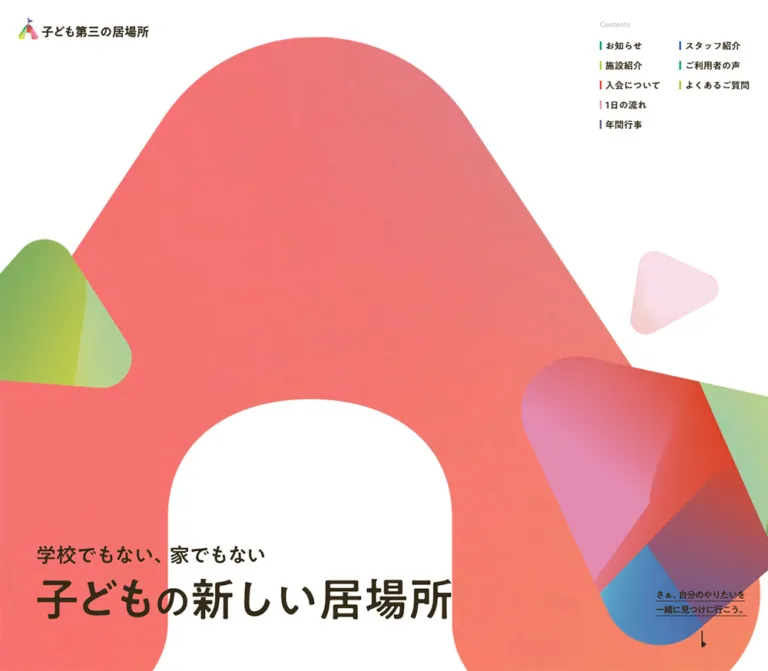
The supplied desktop opening is unusually sparse: its central artwork area is white, with identity at the upper left, contents at the upper right, and the headline near the bottom. The reason that artwork is absent in this capture is unverified. Preserve this distinction when using the evidence; the mobile artwork does not establish its desktop placement or animation sequence.
How to Read This Reference
- Measured means a value appears in the supplied rendered DOM or computed styles. Measurements describe the captured state, including any transforms affecting element rectangles.
- Derived means arithmetic from those measurements, such as a column gap or row pitch.
- Estimated means a visual approximation from the original-page captures. Estimated hexadecimal colors are not pixel samples.
- Recommended means a reusable implementation choice, including the CSS adaptation below. It is not a claim about the original source code.
- Token names beginning with
--ab-are new descriptive aliases. The original evidence exposes font variables, but it does not provide a complete semantic color or spacing system. - Parent heading styles sometimes differ from the visible child lettering. An empty logo heading or a heading composed of separate character elements should not be interpreted using its wrapper font alone.
Tokens — Colors
Default Palette
| Name | Value | Suggested token | Evidence and role |
|---|---|---|---|
| White | #ffffff |
--ab-white |
Measured body background and reversed text; visually used for schedule interiors, contact interior, and footer |
| Warm Cream | #f6f2ec |
--ab-cream |
Measured backgrounds of the numbered section wrappers |
| Brown Ink | #342a18 |
--ab-ink |
Measured navigation labels, body copy, facility titles, and membership text |
| Warm Secondary Ink | #56524b |
--ab-secondary |
Measured activity and event descriptions inside schedules |
| Muted Gray | #aaa69f |
--ab-muted |
Measured location captions beneath parent testimonials |
| Quiet Utility | rgba(0,0,0,.2) |
--ab-quiet |
Measured Contents text; appears approximately #cccccc over white |
| Fine Divider | approximately #d8d5d0 |
--ab-rule |
Estimated schedule, contact, and mobile-footer rules |
Brown Ink is the main reading color. The browser’s default black and the #333333 values on several wrappers do not describe the dominant visible typography.
Section and Action Accents
| Name | Value | Suggested token | Evidence and role |
|---|---|---|---|
| Annual Purple | #443180 |
--ab-purple |
Measured month labels; the annual schedule header visually belongs to the same dark-purple family |
| Routine Rose | #d9558e |
--ab-rose |
Measured time labels in the daily routine |
| Community Green | #07a273 |
--ab-green |
Measured parent attribution labels; the contact telephone appears in a similar green |
| Staff Blue | #2967ce |
--ab-blue |
Measured names in two staff profiles |
| Lavender Field | approximately #a394ce |
--ab-lavender |
Estimated large annual-event panel fill |
| Pink Field | approximately #fbc1df |
--ab-pink |
Estimated routine-panel fill in the desktop middle capture |
| Hero Coral | approximately #f47c78 |
--ab-coral |
Estimated mobile arch color; the artwork varies across its surface |
| Footer Coral | approximately #e98f8d |
--ab-footer-coral |
Estimated large footer arch |
| Contact Orange-Red | approximately #ef4b32 |
--ab-action |
Estimated Instagram contact-button fill |
The navigation introduces green, lime, coral, pink, purple, and blue through short vertical markers. These are small orientation accents, not large filled navigation buttons. Exact marker colors were not supplied.
Color behavior: broad panels use restrained flat fills, while the geometric artwork contains gradients and overlapping color facets. Keep those treatments distinct. The numerous transparent --g-color-* properties in the evidence do not establish a page-wide recoloring system or selectable themes.
Tokens — Typography
Japanese Reading Text
The source uses separate A1 Gothic families for regular and medium appearances:
| Source variable | Declared family | Verified use |
|---|---|---|
--s-font-d7908676 |
A1ゴシック R JIS2004 |
Facility descriptions, staff biographies, notes, and parent testimonials |
--s-font-1d9ccf82 |
A1ゴシック M JIS2004 |
Navigation, introductory copy, component titles, schedule entries, and selected labels |
--s-font-4fa81897 |
A1ゴシック B JIS2004 |
Registered in the page; a specific visible use is not established by the selected samples |
--s-font-5f8c2387 |
Zen Kaku Gothic New |
Registered in the page; a specific visible use is not established by the selected samples |
Most measured A1 Regular and Medium elements use CSS font-weight: 400. Their visual weight comes partly from the selected family. Some membership and testimonial labels explicitly use 700.
The lettering feels substantial and friendly without becoming a novelty children’s font. Preserve its clear Japanese shapes, broad counters, and comfortable paragraph spacing. Do not infer that the page uses Times merely because the root and body report that browser default.
English Labels and Numbers
Verified family: Poppins, exposed through --s-font-bc910232.
- Section subtitles use weight
600and0.05emtracking. - Large section numbers use weight
500, with strongly negative tracking that varies by numeral pair. - Membership step numbers use
18px / 27px, weight400, and0.9pxtracking at both sampled widths. - Schedule times and months use A1 Medium in the supplied samples, not Poppins.
Type Scale
Values are measured unless explicitly marked estimated.
| Role | Desktop | Mobile | Notes |
|---|---|---|---|
| Main hero headline | approximately 70–72px |
approximately 36px |
Visual estimate; exact family and computed size were not supplied |
| Hero supporting line | approximately 32px |
approximately 18px |
Visual estimate |
| Hero continuation cue | 15px / 24px |
14px / 22.4px |
A1 Medium; most fragments use -0.1em tracking |
| Desktop contents label | 12px / 16.8px |
Not displayed in the mobile opening | A1 Medium, weight 400 |
| Desktop navigation | 15px / 30px |
Replaced by menu control at the top | A1 Medium, weight 400 |
| Introduction paragraph | 19px / 34.01px |
15px / 27.15px |
A1 Medium; white text |
| Facility introduction | 16px / 30.08px |
15px / 27.15px |
A1 Medium |
| Facility and staff titles | 30px / 48px |
22px / 30.8px |
A1 Medium; tracking -0.02em |
| Standard detail paragraph | 15px / 28.05px |
14px / 24.08px |
A1 Regular |
| Schedule time/month | 24px / 28.08px |
18px / 28.08px |
A1 Medium; rose or purple |
| Schedule description | 24px / 28.08px |
18px / 21.06px |
A1 Medium; secondary ink |
| Schedule heading | 30px / 48px |
22px / 48.18px |
White A1 Medium |
| English section subtitle | 14px / 21.14px |
10px / 15.1px |
Poppins, weight 600, tracking 0.05em |
| Decorative section number | 200px / 302px |
100px / 151px |
Poppins, weight 500 |
| Membership fact | typically 17px / 28.05px |
typically 16px / 20.16px |
Price line has separate local line-height values |
| Membership qualification note | 13px / 28.08px |
12px / 20.04px |
A1 Regular |
| Parent testimonial | 15px / 28.05px |
15px / 25.8px |
Mobile retains the text size |
| Parent attribution | 20px / 28.2px |
15px / 21.15px |
A1 Medium, weight 700, green |
| Parent location | 15px / 28.05px |
13px / 24.31px |
Muted gray |
| FAQ question | Not included in selected desktop samples | 14px / 28px |
A1 Medium, weight 700 |
| FAQ answer | Not included in selected desktop samples | 13px / 22.1px |
A1 Medium, tracking -0.01em |
The visible Japanese section titles are approximately 40px on desktop and 26px on mobile. These are estimates from the lettering and character-group widths. Their wrappers report 24px or 32px, while their rendered height stays near 48px; copying those parent declarations alone would be unreliable.
Tracking Details
The annual number 05 uses -14px desktop tracking and -5px mobile tracking. The routine number 04 uses -26px and -13px. This is optical adjustment, not a single tracking value applied to every large number.
The continuation cue is also assembled with local punctuation spacing. A reusable implementation should start with a normal text string and modest tracking; reproduce fragment-level spacing only when matching the exact Japanese lockup.
Tokens — Spacing & Shapes
Density: broad decorative space around compact information groups.
Primary geometry: large rounded rectangles, capsule links, softened triangular forms, and an arch with a rounded doorway.
Spacing system: repeated local values are visible, but a global source scale was not supplied.
Spacing Scale
| Use | Value | Status |
|---|---|---|
| Logo child gap | 5px |
Measured |
| Navigation marker-to-label gap | 6px |
Measured |
| Desktop navigation row gap | 2px |
Derived from 30px rows on a 32px pitch |
| Desktop contents-column gap | 30px |
Derived from column coordinates |
| News-row internal gap | 12px desktop / 9px mobile |
Measured |
| News-row bottom padding | 25px desktop / 18px mobile |
Measured |
| Schedule horizontal inset | approximately 30px desktop / 20px mobile |
Derived from the card and text positions |
| Routine label-to-description gap | 30px desktop / 20px mobile |
Derived |
| Separation between visible large panels | approximately 14–15px |
Estimated from the middle capture |
| Mobile narrative side clearance | approximately 46px |
Measured recurring text coordinates |
| Mobile nested detail side clearance | approximately 66px |
Measured recurring text coordinates |
Border Radius
| Element | Value | Status |
|---|---|---|
| Large desktop routine/annual panel | approximately 50px |
Visual estimate |
| Desktop schedule interior | approximately 40px |
Visual estimate |
| Contact outer/inner corners | approximately 50px / 40px |
Visual estimate |
| News archive link | 30px |
Measured; 150 × 40px element |
| Instagram contact button | approximately 35px |
Estimated from its 300 × 70px appearance |
| Mobile footer navigation cells | Square | Visually observed |
| Mobile menu silhouette | Rounded triangle | Asset-shaped; the button itself reports border-radius: 0 |
The menu demonstrates why asset geometry and CSS box geometry must be separated. A zero-radius button can still display a visibly rounded triangular background image.
Layout Measurements
| Element | Desktop | Mobile | Evidence |
|---|---|---|---|
| Document height | 13013.72px |
15475.92px |
Measured; not a target fixed height |
| Header logo link | 212 × 34.97px at (30,29) |
210 × 34.64px at (20,25) |
Measured |
| Menu button | Not shown in opening | 54 × 42px at (328,26) |
Measured |
| Contents columns | 98.41px and 114px, with 30px gap |
Not shown in opening | Derived |
| Annual colored panel | approximately 1200px wide, starting at x=120 |
Outer surface not measured | Desktop visual estimate |
| Schedule card | approximately 527px wide, starting at x=456.48 |
approximately 298px, starting at x=46 |
Derived from content and inset measurements |
| Schedule content width | 467px |
257.94px |
Measured text extents |
| Routine time column | 96px |
72px |
Measured |
| Annual month column | Usually 96px; first row 90px |
60px |
Measured |
| Regular schedule row pitch | 68.08px |
approximately 54.08px |
Derived; longer entries expand |
| Contact reading column | approximately 618px |
Not visually captured | Desktop estimate |
| Contact frame thickness | approximately 20px |
Not visually captured | Desktop estimate |
| Mobile footer navigation | — | Two equal columns, four rows of approximately 51px |
Visual estimate |
Components
Header Identity and Contents
Role: establish the service identity and provide direct access to the long page.
The desktop logo is a small multicolor arch-and-flag mark beside 子ども第三の居場所. It occupies only about 212px of a 1440px viewport. On mobile it remains almost the same size, making the identity relatively more prominent.
The desktop contents block sits 30px from the right edge. A faint Contents caption appears above two columns. The first holds five links and the second three. Every link has a short colored vertical marker and dark Japanese text; there is no surrounding navigation bar or filled tab background.
The destinations are #infomation, #facilities, #join, #routine, #annual, #staff, #voice, and #faq. Preserve the actual infomation spelling when linking to the original page.
Mobile Menu Control
Role: compact access to navigation on a narrow screen.
The original button rectangle is 54 × 42px, positioned 8px from the right edge and 26px from the top. Its dark-brown rounded triangle contains three fine light horizontal strokes. The same control is visible at the same screen position in the mobile footer capture, supporting a persistent-control appearance; its exact positioning rule was not supplied.
No opened menu state or click result is included. The lower mobile capture shows the footer’s link grid and brand information; it does not establish the appearance of an expanded navigation drawer.
Opening Hero
Role: communicate a place outside the familiar home/school pair.
The visible copy reads 学校でもない、家でもない above 子どもの新しい居場所. On desktop the two lines sit near the lower left, about 60px from the edge. A much smaller underlined continuation cue sits separately at the lower right with a narrow downward arrow beneath it.
On mobile the artwork dominates approximately the upper 670px of the opening. A coral arch runs beyond the sides of the viewport, with a large white opening and portions of colorful shapes entering at the edges. The headline appears below the main colored mass, keeping a clear white reading area.
The continuation text becomes one horizontal line near the lower right: its measured extent runs from approximately x=87.27 to x=361, at y=793.61. On desktop it occupies two 24px lines. Its destination or click behavior is not established by the supplied link list.
The headline is visible in the images but absent from the selected ordinary-text samples. Its rendering method is unverified. A new implementation should keep the headline available as semantic text even if an artwork lockup supplies the visible lettering.
Introduction
Role: explain the service before the numbered information sections.
The desktop introduction is a full-width section beginning at document y=1163, with a measured height of 613px. Its white paragraph occupies about 697px on the right side. The paragraph element includes 94px of top padding, so its full rectangle should not be treated as text height.
On mobile the introduction begins immediately after the 844px opening viewport. Its paragraph becomes a centered 297.97px column at x=46, using 15px / 27.15px text. A background-image reference is present, but its complete appearance is not shown in the supplied captures. The exact background composition should remain unspecified.
Numbered Section Heading
Role: create memorable wayfinding through eight substantial topics.
Each heading combines a very large two-digit number, Japanese title, and small uppercase English subtitle. In the annual-event capture, 05 is pale and fades into the lavender field behind the white title. The number is decorative; the Japanese title carries the readable hierarchy.
Heading position varies with the section. Facilities and annual events place their heading on the right. Information, membership, routine, staff, testimonials, and FAQ use left-side heading positions in the supplied measurements. This is a composed sequence rather than strict left/right alternation.
On mobile the number falls from 200px to 100px, and the English subtitle from 14px to 10px. Right-aligned sections retain their right-side identity above the content.
News Row and Archive Link
Role: provide current updates within the service guide.
The observed row contains a category label, date, and article title. Its desktop rectangle is approximately 774 × 76px, with a 12px internal gap and 25px bottom padding. The article title uses 15px / 22.05px A1 Medium.
On mobile the row occupies the recurring 298px reading column and becomes approximately 102px high. The title changes to 14px / 24.08px and wraps over two lines.
The separate 一覧はこちら link is a 150 × 40px capsule with 30px radius, 20px left padding, and 13px / 26px white text. Its computed background includes a translucent black layer and an image reference, so the final fill should not be inferred from the translucent value alone.
The archive link points to /infomation, and the observed article points to /infomation/n42AT8bI. These destinations were recorded, not separately inspected.
Facility Description Group
Role: explain the study room, kitchen, and toilet facilities.
Each group contains a facility title and a short descriptive paragraph. Desktop text positions alternate: the study-room and toilet descriptions begin around x=603, while the kitchen description begins around x=273. Their headings sit 58px farther right than their paragraph starts.
On mobile, all three descriptions align to a common 257.94px column at x=66.02; headings start 40px farther right. Titles become 22px / 30.8px, while descriptions use 14px / 24.08px.
The provided evidence does not establish the precise photographs, image crops, or full background shapes associated with these groups. Do not invent a carousel or prescribe a photographic treatment as an observed feature.
A location block follows the facilities. Its external map target is recorded, and the map-link rectangle changes from 84 × 84px desktop to 44 × 44px mobile.
Membership Facts and Four-Step Process
Role: separate eligibility, opening arrangements, pricing, and the joining process.
The facts use substantial 30px desktop / 22px mobile headings, followed by a medium-weight fact line and smaller regular notes. The price is integrated into the information hierarchy rather than presented as a large purchase card.
The four steps are 面談申し込み, 面談, 入会審査, and 入会. Step numbers use Poppins at 18px on both widths. Desktop positions place them in one horizontal sequence. Their rotated-looking rectangles indicate transformed layout geometry, but the exact transform is not provided.
Mobile steps share the same left coordinate and run vertically. The first step occupies more vertical space than later short steps, consistent with its additional application content. A QR-code instruction is present, but its destination and scan behavior were not verified.
Daily Routine Schedule
Role: make a child’s possible afternoon concrete and easy to scan.
The schedule sits inside a large pink rounded panel. A stronger colored header carries 過ごし方の例 in white, and a rounded white interior holds seven time/activity rows.
Desktop anatomy is a 96px time column, 30px gap, and 341px activity column. Both use 24px A1 Medium; time is rose and activity text is warm gray. Fine horizontal dividers span the content width. A regular row advances approximately 68px, while the longer experiment description occupies two text lines and increases the row height.
Mobile retains the two-column relationship. Time becomes 72px, the gap 20px, and the activity column approximately 166px. Text reduces to 18px; activities wrap while the time label remains intact. This is a readable schedule, not a row of independent cards.
Annual Event Schedule
Role: pair a calm information table with a playful section identity.
This is the clearest fully visible component in the evidence. A lavender rounded rectangle spans approximately 1200px. A small faceted pink/orange triangular form sits in the left area. The white Japanese heading, English subtitle, and pale 05 occupy the right area. The schedule is centered between them, approximately 527px wide.
The dark-purple cap contains 行事例 at the left and a small change-of-schedule note at the right. The white body has strongly rounded upper corners that visibly overlap the lower part of the header field. Month labels are purple, event descriptions are warm gray, and rules are thin and quiet.
Seven rows list seasonal activities, followed by a smaller paragraph about additional activities. The paragraph remains inside the white schedule surface. The first desktop month cell is 90px wide, while subsequent cells are 96px; a reusable component may normalize this minor difference.
Mobile moves the heading above the schedule while keeping it right aligned. The schedule content has a 60px month column and approximately 198px for the event. The header’s small note wraps within an approximately 110px width at 12px / 17.04px.
Staff Profiles
Role: build trust through names, professional roles, and biographies.
Four profiles are present. Verified typography uses A1 Medium for names and role labels, with A1 Regular biographies. Two names are blue; the other two use white text, as do their associated biographies. The background surfaces behind these white profiles are not fully specified by the selected evidence.
Desktop profile rectangles are transformed and staggered. Mobile profile names share a consistent left coordinate around 107px, and biographies use a approximately 255px column around x=67px. This supports a stacked mobile treatment but does not establish an exact desktop rotation angle.
An occupational-therapy explanation follows the profiles. Its mobile body retains 15px / 28.05px, slightly larger and more open than the ordinary 14px biography text.
Parent Testimonials
Role: present family experiences as readable accounts.
The four parent statements form two text columns on desktop: paragraph starts are approximately x=220 and x=772, each 447.88px wide. Under each account, a green relationship/grade label is followed by a muted location caption.
Mobile stacks the accounts in one approximately 250px text column at x=70. The body remains 15px, with 25.8px line height. Attribution falls from 20px to 15px, and the location from 15px to 13px.
Use the rendered parent statements as the content evidence. Additional placeholder-like text in a parent DOM excerpt is not sufficient to establish another visible testimonial group. Card outlines, speech-bubble shapes, and carousel behavior are not verified by the supplied captures.
FAQ Controls
Role: organize practical questions without expanding the main navigation.
The rendered text contains seven topics. Mobile computed samples establish real button elements for the first four questions. Each measured button is approximately 326 × 60px, with successive starts 80px apart. Questions use bold 14px / 28px A1 Medium; sampled answer text uses 13px / 22.1px.
Question text appears twice in the extracted element data, and answer rectangles overlap the vertical range of subsequent controls. These facts do not prove that all answers are visibly open or that duplicate question text appears to the visitor. Clipping, state layers, and transitions were not fully captured.
Treat the section as a disclosure-style interface with unverified open-state behavior. Do not claim a tested accordion, exclusive expansion, or a particular icon rotation.
Contact Panel
Role: offer an approachable path to conversation after the detailed guide.
The desktop capture shows a white interior inside a thick multicolor frame. The panel occupies approximately 1200px, with a frame around 20px thick and large rounded corners. The inner reading column is approximately 618px wide.
Thin horizontal rules separate explanatory copy from a telephone group. A green phone outline precedes the large telephone number; operating hours sit beside it in smaller dark text. Beneath another rule, a short reassurance line introduces the orange-red Instagram capsule, approximately 300 × 70px, with a white Instagram icon and text.
The rendered links verify a tel: action and an Instagram profile destination. They do not establish an embedded form, live chat, or a direct-message composer. The preceding FOLLOW US link targets the same profile.
Footer
Role: close with organizational identity and repeat the eight section links.
Desktop places the full Apple Base logo, organization name, address, phone, and copyright on the left. An enormous coral arch fills the right background; the small navigation links and Instagram icon sit over that area. The logo is approximately 215px wide in this capture, while the arch extends beyond the viewport edges.
The footer independently identifies 一般社団法人AppleBase on the original page.
On mobile, the arch becomes an upper decorative band. A full-width two-column link grid follows it, with thin dividers and approximately 30px text insets. Instagram, the centered full logo, left-aligned contact details, and centered copyright follow in that order. The full logo appears approximately 170px wide.
This footer is a substantial responsive composition, not a small copyright strip.
Tokens — Motion & Interaction
Measured Transition Definitions
| Target | Supplied value | What the evidence establishes |
|---|---|---|
| Body background | 0.5s cubic-bezier(0.4, 0.4, 0, 1) |
A background transition is defined; its triggering state is unverified |
| Many text and wrapper elements | 0.3s cubic-bezier(0.4, 0.4, 0, 1) |
Common transition vocabulary, including generated gradient properties |
| News archive and map links | 0.4s cubic-bezier(0.14, 0.56, 0.29, 1) |
Action transition definition; hover endpoints were not supplied |
| FAQ buttons | 0.4s cubic-bezier(0.14, 0.56, 0.29, 1) |
Button transition definition; expansion behavior was not exercised |
| Decorative section numbers | 0.8s cubic-bezier(0.14, 0.56, 0.29, 1) 0.4s |
Slower transition with a delay; trigger and animated properties are not fully established |
| News article row | 0.8s cubic-bezier(0.4, 0.4, 0, 1) |
Defined transition; no before/after interaction capture |
Selected elements report animation: none. This does not rule out JavaScript animation, ancestor transforms, animated images, or effects outside the sampled elements.
Observed Affordances and Limits
- Page navigation uses recorded fragment links. Smooth scrolling and active-section tracking were not verified.
- The mobile menu is a button, but its opened appearance, focus behavior, and dismissal rules are unknown.
- FAQ question buttons and answer content exist, but no click sequence is supplied.
- The telephone and social links have recorded destinations; no external action was performed for this analysis.
- The mobile hero contains dimensional-looking artwork. Its movement, looping period, rendering technology, and pointer response are unverified.
- The desktop blank artwork region should not be labeled a loading state or an animation frame without additional evidence.
For a new implementation, the measured easing curves are appropriate for short opacity or transform transitions. Keep content visible without motion. Any floating shapes, scroll reveals, or menu choreography should be explicitly treated as new design decisions.
Surfaces
| Layer | Appearance | Function |
|---|---|---|
| Opening and footer canvas | White | Gives the identity and large artwork space |
| Numbered-section wrapper | Exact warm cream #f6f2ec |
Connects the long sequence |
| Routine and annual fields | Estimated pastel pink and lavender | Identifies large information regions |
| Schedule interior | White with fine rules and large corners | Protects dense content from surrounding decoration |
| Schedule cap | Stronger section accent with white text | Labels the example content |
| Contact interior | White | Keeps contact options clear |
| Contact perimeter | Broad multicolor band | Reintroduces the full brand palette |
| Footer navigation | Unboxed desktop links; ruled mobile cells | Adapts wayfinding to available space |
The visible schedule panels do not use a general drop-shadow elevation system. Depth mainly comes from the artwork’s facets, overlapping rounded surfaces, and scale differences.
Imagery
The verified graphic vocabulary includes an arch, a rounded doorway, a small flag, and softened triangular forms. The full logo combines these into a compact multicolor mark. The mobile hero enlarges the arch until it becomes an environment; the footer repeats a simplified coral version at architectural scale.
The annual panel’s small triangular object has a pink face and warmer orange-red lower facet. Its corners are soft and its shading gives it volume. This supports using carefully shaded brand objects, but does not establish that the site renders live 3D.
Keep graphics smooth and clean at display size. There is no observed pixel-art or halftone treatment. Do not add pixelated image rendering. Avoid substituting unrelated educational clip art for the recurring arch and triangle vocabulary.
No facility or staff photographs are visible in the attached original-page crops. The corresponding content and layout exist in the DOM, but photographic lighting, subjects, aspect ratios, and crops remain unverified.
Observed Asset References
The following complete filenames occur in original-page background declarations. Their common URL prefix is:
https://storage.googleapis.com/studio-design-asset-files/projects/4BqNlNo2Wr/
| Filename | Recorded association | Limitation |
|---|---|---|
s-410x410_1c8b7648-1aad-4bf1-b928-103fb6957087.svg |
Facilities section background declaration | Individual asset appearance was not inspected |
s-410x410_10e37ad7-d415-4586-9594-1faea8c0eec5.svg |
Membership section background declaration | Individual asset appearance was not inspected |
s-410x410_6d77f774-71f5-44da-aeb5-4c42c1b58e36.svg |
Staff section background declaration | Individual asset appearance was not inspected |
s-30x30_9cda3bac-ad5b-44ba-9757-b7e6e2ea6385.svg |
Mobile map-link background declaration | Exact icon artwork was not inspected separately |
Other snippets include incomplete WebP and menu-asset URLs. Do not complete those paths by guessing. No full hero or logo asset URL is established here.
Use authorized brand assets where available. CSS can reproduce the reading surfaces and layout, but the exact logo, arch contour, and faceted artwork require their own assets.
Layout & Responsive Behavior
The page remains a long service guide at both widths. Mobile preserves the content order while changing the arrangement of information within each section.
Verified Reflow
| Region | Desktop | Mobile |
|---|---|---|
| Header | Compact logo plus eight visible contents links | Nearly unchanged logo size plus triangular menu button |
| Opening | Bottom-left headline and separate two-line cue; central artwork absent in capture | Cropped arch artwork above headline; cue fits on one line |
| Introduction | Broad paragraph on the right | Centered paragraph around 298px wide |
| News | Heading and article occupy separate horizontal areas | Heading and archive link share the upper area; article follows below |
| Facilities | Alternating description positions | Shared centered text column |
| Joining process | Four horizontal steps | Four vertical steps |
| Schedules | Narrow center card with side heading/decorative space | Heading above card; internal label/value columns retained |
| Staff | Staggered, transformed desktop rectangles | Consistent stacked profile text |
| Testimonials | Two columns | One column with body size retained |
| Footer | Identity left, navigation over large arch right | Arch band, full-width link grid, then identity stack |
Section Height Evidence
These measured heights describe the captured content and states. They should not become fixed CSS heights.
| Section | Desktop height | Mobile height |
|---|---|---|
| Facilities | 2203.23px |
2239.13px |
| Membership | 1236.84px |
1715.63px |
| Routine | 658.63px |
827px |
| Annual events | 699.64px |
868.20px |
| Staff | 2078.66px |
3096.20px |
| Parent testimonials | 1128.94px |
1775.48px |
| FAQ | 998.55px |
874.25px |
The staff and testimonial sections grow substantially as columns collapse. The FAQ becomes shorter in its captured mobile layout, so a universal proportional scaling rule would be inaccurate.
A 1160px media query is visible in a source excerpt controlling explicit line-break visibility. This proves that breakpoint exists for those rules, but does not identify the menu or panel-layout breakpoint. The 760px breakpoint in the Quick Start is a recommendation.
Allow height to follow content and Japanese wrapping. The mobile schedule measurements demonstrate that time/month labels can stay in a narrow column while activity text wraps. Do not shrink the entire desktop composition to fit a phone.
Do’s and Don’ts
Do
- Keep exact Brown Ink
#342a18and Warm Cream#f6f2ecas the reading foundation. - Give each large information region a clear accent and readable title.
- Pair oversized decorative numbers with small Poppins English subtitles.
- Preserve the distinction between A1 Regular paragraphs and A1 Medium labels.
- Use broad rounded containers around schedules, with a narrower white reading surface inside.
- Retain the schedule’s label/value columns on mobile.
- Use the arch and soft triangle as recurring brand forms at different scales.
- Keep gradients concentrated in artwork and the multicolor contact frame.
- Maintain clear separation between the green telephone option and orange-red Instagram option.
- Recompose the footer into a ruled two-column navigation grid on mobile.
Don’t
- Don’t treat the sparse desktop opening as proof that the entire current design is minimal or monochrome.
- Don’t invent a desktop hero-art arrangement from the mobile crop.
- Don’t turn every section into the same generic card grid.
- Don’t use
#333333or browser-default Times as the main design tokens just because wrappers report them. - Don’t assign Poppins to Japanese schedule text or claim registered fonts are verified everywhere.
- Don’t interpret decorative number rectangles as required section heights.
- Don’t add heavy shadows, glass effects, or gradients behind every paragraph.
- Don’t hardcode schedule rows to a height that clips longer activities.
- Don’t reproduce duplicate FAQ text or placeholder content as visible UI without confirmation.
- Don’t claim tested accordions, parallax, 3D rendering, or continuous animation from static captures.
Recommended Implementation Additions
These are improvements for a new implementation, not verified features of the original page:
- Provide a semantic main heading and useful alternative text for logo artwork. Hide purely decorative arches and numbers from assistive technology.
- Keep the triangular menu artwork at its visual size while making the interactive target at least
44pxhigh. Give it an accessible name and an accurate expanded state. - Implement FAQ disclosures with keyboard-operable controls, associated answer regions, and explicit expanded states. Ensure closed answers leave the reading and focus order appropriately.
- Use a consistent heading hierarchy even when individual title characters animate separately.
- Check small white subtitles, muted captions, and white contact-button text for contrast. Darken colors where required in the adaptation.
- Provide a text link alongside QR-based application instructions so a visitor using one phone can still proceed.
- Add visible focus indicators and suitable anchor offsets beneath persistent controls.
- Offer a static artwork fallback and reduced-motion behavior. Essential content should not depend on completing a reveal animation.
- Test at narrower widths and increased text size, particularly the one-line hero headline, contact number, schedule notes, and nested mobile text columns.
Agent Prompt Guide
Quick Color Reference
- Reading canvas: white
#ffffffand warm cream#f6f2ec. - Main Japanese text: brown
#342a18. - Schedule descriptions: warm gray
#56524b. - Annual month labels: purple
#443180. - Routine time labels: rose
#d9558e. - Parent attribution: green
#07a273. - Selected staff names: blue
#2967ce. - Approximate large fills: lavender
#a394ce, pink#fbc1df, coral#f47c78. - Approximate Instagram contact fill: orange-red
#ef4b32.
Overall Prompt
“Create a Japanese community-service information page inspired by Apple Base’s current children’s third-place page. Use white and warm cream #f6f2ec, dark brown text #342a18, substantial Japanese Gothic lettering, and small tracked Poppins section subtitles. Organize the information into eight numbered sections with oversized pale numerals and varied heading placement. Use large pastel rounded panels containing narrower white schedule surfaces, fine dividers, and colored time/month labels. Repeat a soft arch and rounded triangular artwork as the graphic identity. On mobile, stack information groups, retain two-column schedules, show a compact triangular menu control, and turn footer navigation into a full-width ruled grid. Treat any added animation as a new implementation choice.”
Example Component Prompts
- Annual schedule: “Build a lavender panel around a centered white schedule approximately 527px wide on desktop. Place a small faceted triangular ornament left and a white Japanese section title with pale oversized 05 right. Use a purple cap, 24px month/event text, fine gray rules, and a small explanatory paragraph inside the white body. On mobile, move the heading above the card and use an approximately 60px month column with 18px entries.”
- Mobile opening: “Compose a 390px-wide opening with a small logo at the upper left and a dark rounded-triangle menu at the upper right. Fill the upper area with an oversized coral arch and white doorway, allowing the artwork to crop beyond the edges. Keep the Japanese headline on a white area below it and place a small underlined continuation line near the lower right.”
- Contact panel: “Create a broad white consultation panel with a thick multicolor perimeter and large rounded corners. Center a reading column around 618px wide. Separate a large green telephone link from supporting copy with thin rules, then place a 300 × 70px orange-red Instagram capsule below a short reassuring sentence.”
- Responsive footer: “On desktop, place the full logo and organization details left and small navigation links over a giant coral arch right. On mobile, place the arch above a two-column, four-row navigation grid, followed by Instagram, a centered logo, left-aligned contact details, and centered copyright.”
- Evidence-conscious extension: “Extend the design using its measured brown/cream palette, A1 Regular/Medium typography roles, Poppins numerals, rounded schedule surfaces, and responsive text columns. Mark all new hover, disclosure, and motion behavior as recommendations. Do not invent missing asset paths or reconstruct unseen desktop artwork.”
Quick Start
CSS Custom Properties
This is a reusable adaptation, not extracted source CSS. Exact measured colors and typography values are mixed with clearly marked visual estimates. Fallback fonts, the 760px breakpoint, focus states, and layout formulas are recommendations. Load appropriately licensed font files separately; font URLs were not supplied.
The CSS covers the opening shell, contents links, annual/routine schedules, contact treatment, and footer navigation. It does not recreate the full page, supply brand artwork, or implement menu/FAQ state management. It has not been browser-tested as part of this evidence-only analysis.
:root {
  /* Measured colors */
  --ab-white: #ffffff;
  --ab-cream: #f6f2ec;
  --ab-ink: #342a18;
  --ab-secondary: #56524b;
  --ab-muted: #aaa69f;
  --ab-purple: #443180;
  --ab-rose: #d9558e;
  --ab-green: #07a273;
  --ab-blue: #2967ce;

  /* Visual estimates */
  --ab-lavender: #a394ce;
  --ab-pink: #fbc1df;
  --ab-coral: #f47c78;
  --ab-action: #ef4b32;
  --ab-rule: #d8d5d0;

  /* Verified primary families; recommended fallback stack */
  --ab-font-body: 'A1ゴシック R JIS2004',
    'Hiragino Kaku Gothic ProN', 'Yu Gothic', sans-serif;
  --ab-font-ui: 'A1ゴシック M JIS2004',
    'Hiragino Kaku Gothic ProN', 'Yu Gothic', sans-serif;
  --ab-font-latin: Poppins, sans-serif;

  /* Recommended aliases based on observed proportions */
  --ab-panel-max: 1200px;
  --ab-schedule-max: 527px;
  --ab-radius-panel: 50px;
  --ab-radius-card: 40px;
  --ab-card-inset: 30px;
  --ab-body-size: 15px;
  --ab-body-leading: 1.87;
  --ab-entry-size: 24px;
  --ab-entry-leading: 28.08px;
  --ab-number-size: 200px;
  --ab-caption-size: 14px;
  --ab-ease-ui: cubic-bezier(0.4, 0.4, 0, 1);
  --ab-ease-action: cubic-bezier(0.14, 0.56, 0.29, 1);
}

.ab-site,
.ab-site *,
.ab-site *::before,
.ab-site *::after {
  box-sizing: border-box;
}

.ab-site {
  margin: 0;
  color: var(--ab-ink);
  background: var(--ab-white);
  font: 400 var(--ab-body-size) / var(--ab-body-leading)
    var(--ab-font-body);
}

.ab-site :where(h1, h2, h3, p, dl, dd) { margin: 0; }
.ab-site a { color: inherit; }
.ab-site img { display: block; max-width: 100%; height: auto; }
.ab-site [id] { scroll-margin-top: 90px; }

.ab-hero {
  position: relative;
  isolation: isolate;
  display: flex;
  align-items: flex-end;
  min-height: 100svh;
  padding: 130px 60px 72px;
  background: var(--ab-white);
}

.ab-header {
  position: absolute;
  z-index: 2;
  inset: 29px 30px auto;
  display: flex;
  align-items: flex-start;
  justify-content: space-between;
}

.ab-brand { display: block; width: 212px; }
.ab-contents { font-family: var(--ab-font-ui); }
.ab-contents-label {
  margin-bottom: 11px;
  color: rgb(0 0 0 / 20%);
  font-size: 12px;
  line-height: 1.4;
}

/* Supply separate lists of five and three links. */
.ab-contents-columns {
  display: grid;
  grid-template-columns: 98.4px 114px;
  gap: 30px;
}
.ab-contents-column { display: grid; gap: 2px; }
.ab-contents a {
  display: flex;
  align-items: center;
  gap: 6px;
  min-height: 30px;
  font-size: 15px;
  line-height: 30px;
  text-decoration: none;
}
.ab-contents a::before {
  content: '';
  flex: 0 0 3px;
  height: 14px;
  background: var(--marker, var(--ab-green));
}

.ab-menu { display: none; }
.ab-hero-copy { position: relative; z-index: 1; }
.ab-hero-kicker {
  margin-bottom: 8px;
  font: 400 32px / 1.4 var(--ab-font-ui);
}
.ab-hero-title {
  font: 700 70px / 1.25 var(--ab-font-ui);
}
.ab-hero-cue {
  position: absolute;
  right: 34px;
  bottom: 82px;
  width: 148px;
  font: 400 15px / 24px var(--ab-font-ui);
  letter-spacing: -0.1em;
  text-decoration: underline;
  text-underline-offset: 5px;
}

/* The supplied desktop opening shows no large artwork.
   Mobile artwork must be supplied as an authorized asset. */
.ab-hero-art { display: none; }

.ab-section-stack {
  padding-block: 14px;
  background: var(--ab-cream);
}
.ab-panel {
  width: min(var(--ab-panel-max), calc(100% - 48px));
  margin: 0 auto 14px;
  border-radius: var(--ab-radius-panel);
}
.ab-schedule-panel {
  display: grid;
  grid-template-columns:
    minmax(0, 1fr) minmax(0, var(--ab-schedule-max)) minmax(0, 1fr);
  align-items: start;
  padding: 20px;
  background: var(--ab-lavender);
}
.ab-schedule-panel--routine {
  background: var(--ab-pink);
}

.ab-section-heading {
  position: relative;
  grid-column: 3;
  grid-row: 1;
  justify-self: end;
  margin: 90px 34px 0 0;
  color: var(--ab-white);
  text-align: right;
}
.ab-section-heading h2 {
  position: relative;
  font: 700 40px / 1.2 var(--ab-font-ui);
}
.ab-section-heading .ab-subtitle {
  position: relative;
  margin-top: 7px;
  font: 600 var(--ab-caption-size) / 1.51 var(--ab-font-latin);
  letter-spacing: 0.05em;
}
.ab-section-number {
  position: absolute;
  top: -141px;
  right: -30px;
  color: transparent;
  background: linear-gradient(rgb(255 255 255 / 55%), transparent 75%);
  background-clip: text;
  -webkit-background-clip: text;
  font: 500 var(--ab-number-size) / 1.51 var(--ab-font-latin);
  letter-spacing: -0.07em;
  pointer-events: none;
}

.ab-schedule {
  grid-column: 2;
  grid-row: 1;
  min-width: 0;
  border-radius: var(--ab-radius-card);
  background: var(--ab-purple);
}
.ab-schedule--routine { background: var(--ab-rose); }
.ab-schedule-header {
  display: flex;
  align-items: center;
  justify-content: space-between;
  gap: 20px;
  min-height: 80px;
  padding: 14px var(--ab-card-inset);
  color: var(--ab-white);
}
.ab-schedule-header h3 {
  font: 400 30px / 48px var(--ab-font-ui);
  letter-spacing: -0.02em;
}
.ab-schedule-header small {
  max-width: 235px;
  font: 400 13px / 1.5 var(--ab-font-body);
}
.ab-schedule-body {
  padding: 16px var(--ab-card-inset) 20px;
  border-radius: var(--ab-radius-card);
  background: var(--ab-white);
}
.ab-schedule-row {
  display: grid;
  grid-template-columns: 96px minmax(0, 1fr);
  align-items: center;
  padding-block: 19.5px;
  font: 400 var(--ab-entry-size) / var(--ab-entry-leading)
    var(--ab-font-ui);
}
.ab-schedule-row + .ab-schedule-row {
  border-top: 1px solid var(--ab-rule);
}
.ab-schedule-row dt { color: var(--ab-purple); }
.ab-schedule-row dd {
  min-width: 0;
  color: var(--ab-secondary);
  overflow-wrap: anywhere;
}
.ab-schedule--routine .ab-schedule-row { column-gap: 30px; }
.ab-schedule--routine dt { color: var(--ab-rose); }
.ab-schedule-note { margin-top: 2px; }

/* Simplified contact frame; original perimeter artwork is not supplied. */
.ab-contact {
  padding: 20px;
  background: linear-gradient(115deg,
    var(--ab-coral), var(--ab-blue), var(--ab-purple), var(--ab-green));
}
.ab-contact-inner {
  padding: 70px 24px 100px;
  border-radius: 40px;
  background: var(--ab-white);
}
.ab-contact-copy { width: min(618px, 100%); margin-inline: auto; }
.ab-phone-group {
  display: flex;
  flex-wrap: wrap;
  align-items: baseline;
  gap: 12px;
  margin-block: 32px;
  padding-block: 28px;
  border-block: 1px solid var(--ab-rule);
}
.ab-phone {
  color: var(--ab-green) !important;
  font: 600 clamp(28px, 4vw, 50px) / 1.3 var(--ab-font-ui);
  text-decoration: none;
}
.ab-contact-social { text-align: center; }
.ab-contact-social p { margin-bottom: 16px; }
.ab-contact-button {
  display: inline-flex;
  align-items: center;
  justify-content: center;
  gap: 8px;
  width: min(300px, 100%);
  min-height: 70px;
  padding: 14px 20px;
  border-radius: 999px;
  color: var(--ab-white) !important;
  background: var(--ab-action);
  font: 700 18px / 1.5 var(--ab-font-ui);
  text-decoration: none;
  transition: filter 400ms var(--ab-ease-action);
}

.ab-footer-nav {
  display: flex;
  flex-wrap: wrap;
  gap: 8px 20px;
  font-family: var(--ab-font-ui);
}
.ab-footer-nav a { text-decoration: none; }

/* Recommended focus and hover feedback */
.ab-site :focus-visible {
  outline: 3px solid var(--ab-ink);
  outline-offset: 5px;
}
@media (hover: hover) {
  .ab-contact-button:hover { filter: brightness(0.92); }
  .ab-contents a:hover,
  .ab-footer-nav a:hover { text-decoration: underline; }
}

/* Recommended breakpoint; not a verified source breakpoint */
@media (max-width: 760px) {
  :root {
    --ab-body-size: 14px;
    --ab-body-leading: 1.72;
    --ab-entry-size: 18px;
    --ab-entry-leading: 21.06px;
    --ab-card-inset: 20px;
    --ab-number-size: 100px;
    --ab-caption-size: 10px;
    --ab-radius-panel: 30px;
    --ab-radius-card: 28px;
  }
  .ab-header { inset: 25px 20px auto; }
  .ab-brand { width: 210px; }
  .ab-contents { display: none; }
  .ab-menu {
    position: fixed;
    z-index: 20;
    top: 25px;
    right: 8px;
    display: grid;
    place-items: center;
    width: 54px;
    height: 44px;
    padding: 0;
    border: 0;
    background: transparent;
    cursor: pointer;
  }
  /* Supply the rounded-triangle artwork inside this button. */
  .ab-menu svg { width: 54px; height: 42px; }
  .ab-hero { padding: 100px 16px 72px; }
  .ab-hero-kicker { font-size: 18px; }
  .ab-hero-title { font-size: clamp(28px, 9.23vw, 36px); }
  .ab-hero-cue {
    right: 29px;
    bottom: 28px;
    width: auto;
    max-width: calc(100% - 45px);
    font-size: 14px;
    line-height: 22.4px;
  }
  .ab-hero-art {
    position: absolute;
    z-index: 0;
    inset: 0 0 177px;
    display: block;
    overflow: hidden;
    pointer-events: none;
  }
  .ab-hero-art img {
    width: 100%;
    height: 100%;
    object-fit: cover;
  }
  .ab-panel { width: calc(100% - 32px); }
  .ab-schedule-panel { display: block; padding: 30px; }
  .ab-section-heading { margin: 23px 0 35px; }
  .ab-section-heading h2 { font-size: 26px; }
  .ab-section-number { top: -63px; right: -16px; }
  .ab-section-heading .ab-subtitle { margin-top: 3px; }
  .ab-schedule-header { gap: 12px; min-height: 72px; }
  .ab-schedule-header h3 { font-size: 22px; }
  .ab-schedule-header small {
    max-width: 110px;
    font-size: 12px;
    line-height: 17.04px;
  }
  .ab-schedule-row {
    grid-template-columns: 60px minmax(0, 1fr);
    padding-block: 12.5px;
  }
  .ab-schedule-row dt { line-height: 28.08px; }
  .ab-schedule--routine .ab-schedule-row {
    grid-template-columns: 72px minmax(0, 1fr);
    column-gap: 20px;
  }
  .ab-contact { padding: 12px; }
  .ab-contact-inner { padding: 40px 20px; border-radius: 22px; }
  .ab-phone-group { display: block; }
  .ab-contact-button { font-size: 16px; }
  .ab-footer-nav {
    display: grid;
    grid-template-columns: repeat(2, minmax(0, 1fr));
    gap: 0;
    border-top: 1px solid var(--ab-rule);
  }
  .ab-footer-nav a {
    display: flex;
    align-items: center;
    min-height: 51px;
    padding: 12px 30px;
    border-bottom: 1px solid var(--ab-rule);
  }
  .ab-footer-nav a:nth-child(odd) {
    border-right: 1px solid var(--ab-rule);
  }
}

@media (prefers-reduced-motion: reduce) {
  .ab-site *,
  .ab-site *::before,
  .ab-site *::after {
    animation: none !important;
    transition: none !important;
    scroll-behavior: auto !important;
  }
}
Example Schedule Markup
This example supplies the central annual component. Add an authorized decorative asset in the unused desktop side area if needed. The full page should provide its own main heading and surrounding section hierarchy.
<div class="ab-site">
  <main class="ab-section-stack">
    <section class="ab-panel ab-schedule-panel"
      id="annual" aria-labelledby="annual-title">
      <header class="ab-section-heading">
        <span class="ab-section-number" aria-hidden="true">05</span>
        <h2 id="annual-title" lang="ja">年間行事</h2>
        <p class="ab-subtitle">ANNUAL EVENT</p>
      </header>

      <div class="ab-schedule" lang="ja">
        <div class="ab-schedule-header">
          <h3>行事例</h3>
          <small>※ 行事は変更になる可能性があります。</small>
        </div>
        <div class="ab-schedule-body">
          <dl>
            <div class="ab-schedule-row"><dt>4月</dt><dd>お花見</dd></div>
            <div class="ab-schedule-row"><dt>8月</dt><dd>夏祭り</dd></div>
            <div class="ab-schedule-row"><dt>9月</dt><dd>BBQ</dd></div>
            <div class="ab-schedule-row"><dt>10月</dt><dd>ハロウィンパーティー</dd></div>
            <div class="ab-schedule-row"><dt>12月</dt><dd>クリスマスパーティー</dd></div>
            <div class="ab-schedule-row"><dt>2月</dt><dd>節分</dd></div>
            <div class="ab-schedule-row"><dt>3月</dt><dd>卒業生を祝う会 など</dd></div>
          </dl>
        </div>
      </div>
    </section>
  </main>
</div>
Tailwind v4 Token Mapping
Optional aliases for a project already using Tailwind v4. This does not identify the original site’s framework. Define the properties above first.
@theme inline {
  --color-ab-cream: var(--ab-cream);
  --color-ab-ink: var(--ab-ink);
  --color-ab-secondary: var(--ab-secondary);
  --color-ab-purple: var(--ab-purple);
  --color-ab-rose: var(--ab-rose);
  --color-ab-green: var(--ab-green);
  --color-ab-blue: var(--ab-blue);
  --color-ab-lavender: var(--ab-lavender);
  --color-ab-pink: var(--ab-pink);
  --color-ab-action: var(--ab-action);
  --font-ab-body: var(--ab-font-body);
  --font-ab-ui: var(--ab-font-ui);
  --font-ab-latin: var(--ab-font-latin);
  --text-ab-entry: var(--ab-entry-size);
  --text-ab-caption: var(--ab-caption-size);
  --radius-ab-panel: var(--ab-radius-panel);
  --radius-ab-card: var(--ab-radius-card);
}
Sources & Evidence
- Apple Base — current children’s third-place page: original and final URL, HTTP 200, page identity, rendered content, recorded link destinations, and selected computed styles.
- Capture date: September 12, 2026. Supplied retrieval timestamp:
2026-09-12T12:13:21.476Z, equivalent to2026-09-12 21:13:21.476 JST. - Desktop evidence:
1440 × 1000CSS-pixel viewport; opening, routine/annual-event area, and contact/footer captures; document height approximately13013.72px. - Mobile evidence:
390 × 844CSS-pixel viewport; opening and footer captures; document height approximately15475.92px. - Computed evidence: font-family declarations, selected sizes and line heights, colors, rectangles, gaps, padding, radii, transitions, section positions, and background-asset references supplied with the captures.
- Inspection limits: the capture process waited for document readiness, relevant finite motion, layout/text stability, and visible image decoding within stated time limits. Those checks do not prove completeness. Perpetual animations were temporarily paused during readiness checks; shared and service workers were disabled. No menu-open sequence, FAQ interaction, hover sequence, continuous-motion recording, or additional viewport was supplied.
- Analysis boundary: this reference uses the supplied original-page evidence. No additional browsing, command execution, asset retrieval, or file inspection was performed. Missing artwork states, exact image crops, unmeasured colors, and unexercised interactions remain explicitly qualified.
# Apple Base / Children’s Third Place — Style Reference

> A welcoming community guide built from soft arches, colorful shapes, and generously spaced Japanese text.

**Website:** [applebase.org/daisan](https://applebase.org/daisan)
**Original URL:** https://applebase.org/daisan
**Final URL:** https://applebase.org/daisan
**Theme:** light; white and warm cream with multiple section accents
**Inspected:** September 12, 2026, at 12:13:21 UTC / 21:13:21 JST, using the supplied browser evidence
**Viewports:** 1440 × 1000 desktop and 390 × 844 mobile, in CSS pixels
**Scope:** the current service information page: opening identity, introduction, eight numbered sections, social links, contact area, and footer. Visual captures cover the desktop opening, routine/annual-event area, desktop contact/footer, mobile opening, and mobile footer. Rendered text and selected computed styles extend across the longer page.

Apple Base presents a children’s community space through a combination of warmth and clear organization. Dark brown Japanese lettering sits on white or cream. Oversized section numbers, small English subtitles, rounded panels, and colorful geometric artwork create an approachable rhythm around practical information about facilities, membership, daily activities, staff, and family experiences.

The strongest visual relationship is between a large, soft architectural shape and small, carefully arranged information. The mobile opening shows a coral arch with a white doorway and cropped colorful forms around it. Farther down, a lavender annual-event panel surrounds a narrow white schedule, while its heading occupies a separate side area. The contact section returns to white, framed by a broad multicolor edge, and the footer repeats the arch motif at a much larger scale than the logo.

The supplied desktop opening is unusually sparse: its central artwork area is white, with identity at the upper left, contents at the upper right, and the headline near the bottom. The reason that artwork is absent in this capture is unverified. Preserve this distinction when using the evidence; the mobile artwork does not establish its desktop placement or animation sequence.

## How to Read This Reference

- **Measured** means a value appears in the supplied rendered DOM or computed styles. Measurements describe the captured state, including any transforms affecting element rectangles.
- **Derived** means arithmetic from those measurements, such as a column gap or row pitch.
- **Estimated** means a visual approximation from the original-page captures. Estimated hexadecimal colors are not pixel samples.
- **Recommended** means a reusable implementation choice, including the CSS adaptation below. It is not a claim about the original source code.
- Token names beginning with `--ab-` are new descriptive aliases. The original evidence exposes font variables, but it does not provide a complete semantic color or spacing system.
- Parent heading styles sometimes differ from the visible child lettering. An empty logo heading or a heading composed of separate character elements should not be interpreted using its wrapper font alone.

## Tokens — Colors

### Default Palette

| Name | Value | Suggested token | Evidence and role |
| --- | --- | --- | --- |
| White | `#ffffff` | `--ab-white` | Measured body background and reversed text; visually used for schedule interiors, contact interior, and footer |
| Warm Cream | `#f6f2ec` | `--ab-cream` | Measured backgrounds of the numbered section wrappers |
| Brown Ink | `#342a18` | `--ab-ink` | Measured navigation labels, body copy, facility titles, and membership text |
| Warm Secondary Ink | `#56524b` | `--ab-secondary` | Measured activity and event descriptions inside schedules |
| Muted Gray | `#aaa69f` | `--ab-muted` | Measured location captions beneath parent testimonials |
| Quiet Utility | `rgba(0,0,0,.2)` | `--ab-quiet` | Measured `Contents` text; appears approximately `#cccccc` over white |
| Fine Divider | approximately `#d8d5d0` | `--ab-rule` | Estimated schedule, contact, and mobile-footer rules |

Brown Ink is the main reading color. The browser’s default black and the `#333333` values on several wrappers do not describe the dominant visible typography.

### Section and Action Accents

| Name | Value | Suggested token | Evidence and role |
| --- | --- | --- | --- |
| Annual Purple | `#443180` | `--ab-purple` | Measured month labels; the annual schedule header visually belongs to the same dark-purple family |
| Routine Rose | `#d9558e` | `--ab-rose` | Measured time labels in the daily routine |
| Community Green | `#07a273` | `--ab-green` | Measured parent attribution labels; the contact telephone appears in a similar green |
| Staff Blue | `#2967ce` | `--ab-blue` | Measured names in two staff profiles |
| Lavender Field | approximately `#a394ce` | `--ab-lavender` | Estimated large annual-event panel fill |
| Pink Field | approximately `#fbc1df` | `--ab-pink` | Estimated routine-panel fill in the desktop middle capture |
| Hero Coral | approximately `#f47c78` | `--ab-coral` | Estimated mobile arch color; the artwork varies across its surface |
| Footer Coral | approximately `#e98f8d` | `--ab-footer-coral` | Estimated large footer arch |
| Contact Orange-Red | approximately `#ef4b32` | `--ab-action` | Estimated Instagram contact-button fill |

The navigation introduces green, lime, coral, pink, purple, and blue through short vertical markers. These are small orientation accents, not large filled navigation buttons. Exact marker colors were not supplied.

**Color behavior:** broad panels use restrained flat fills, while the geometric artwork contains gradients and overlapping color facets. Keep those treatments distinct. The numerous transparent `--g-color-*` properties in the evidence do not establish a page-wide recoloring system or selectable themes.

## Tokens — Typography

### Japanese Reading Text

The source uses separate A1 Gothic families for regular and medium appearances:

| Source variable | Declared family | Verified use |
| --- | --- | --- |
| `--s-font-d7908676` | `A1ゴシック R JIS2004` | Facility descriptions, staff biographies, notes, and parent testimonials |
| `--s-font-1d9ccf82` | `A1ゴシック M JIS2004` | Navigation, introductory copy, component titles, schedule entries, and selected labels |
| `--s-font-4fa81897` | `A1ゴシック B JIS2004` | Registered in the page; a specific visible use is not established by the selected samples |
| `--s-font-5f8c2387` | `Zen Kaku Gothic New` | Registered in the page; a specific visible use is not established by the selected samples |

Most measured A1 Regular and Medium elements use CSS `font-weight: 400`. Their visual weight comes partly from the selected family. Some membership and testimonial labels explicitly use `700`.

The lettering feels substantial and friendly without becoming a novelty children’s font. Preserve its clear Japanese shapes, broad counters, and comfortable paragraph spacing. Do not infer that the page uses Times merely because the root and body report that browser default.

### English Labels and Numbers

**Verified family:** `Poppins`, exposed through `--s-font-bc910232`.

- Section subtitles use weight `600` and `0.05em` tracking.
- Large section numbers use weight `500`, with strongly negative tracking that varies by numeral pair.
- Membership step numbers use `18px / 27px`, weight `400`, and `0.9px` tracking at both sampled widths.
- Schedule times and months use A1 Medium in the supplied samples, not Poppins.

### Type Scale

Values are measured unless explicitly marked estimated.

| Role | Desktop | Mobile | Notes |
| --- | --- | --- | --- |
| Main hero headline | approximately `70–72px` | approximately `36px` | Visual estimate; exact family and computed size were not supplied |
| Hero supporting line | approximately `32px` | approximately `18px` | Visual estimate |
| Hero continuation cue | `15px / 24px` | `14px / 22.4px` | A1 Medium; most fragments use `-0.1em` tracking |
| Desktop contents label | `12px / 16.8px` | Not displayed in the mobile opening | A1 Medium, weight `400` |
| Desktop navigation | `15px / 30px` | Replaced by menu control at the top | A1 Medium, weight `400` |
| Introduction paragraph | `19px / 34.01px` | `15px / 27.15px` | A1 Medium; white text |
| Facility introduction | `16px / 30.08px` | `15px / 27.15px` | A1 Medium |
| Facility and staff titles | `30px / 48px` | `22px / 30.8px` | A1 Medium; tracking `-0.02em` |
| Standard detail paragraph | `15px / 28.05px` | `14px / 24.08px` | A1 Regular |
| Schedule time/month | `24px / 28.08px` | `18px / 28.08px` | A1 Medium; rose or purple |
| Schedule description | `24px / 28.08px` | `18px / 21.06px` | A1 Medium; secondary ink |
| Schedule heading | `30px / 48px` | `22px / 48.18px` | White A1 Medium |
| English section subtitle | `14px / 21.14px` | `10px / 15.1px` | Poppins, weight `600`, tracking `0.05em` |
| Decorative section number | `200px / 302px` | `100px / 151px` | Poppins, weight `500` |
| Membership fact | typically `17px / 28.05px` | typically `16px / 20.16px` | Price line has separate local line-height values |
| Membership qualification note | `13px / 28.08px` | `12px / 20.04px` | A1 Regular |
| Parent testimonial | `15px / 28.05px` | `15px / 25.8px` | Mobile retains the text size |
| Parent attribution | `20px / 28.2px` | `15px / 21.15px` | A1 Medium, weight `700`, green |
| Parent location | `15px / 28.05px` | `13px / 24.31px` | Muted gray |
| FAQ question | Not included in selected desktop samples | `14px / 28px` | A1 Medium, weight `700` |
| FAQ answer | Not included in selected desktop samples | `13px / 22.1px` | A1 Medium, tracking `-0.01em` |

The visible Japanese section titles are approximately `40px` on desktop and `26px` on mobile. These are estimates from the lettering and character-group widths. Their wrappers report `24px` or `32px`, while their rendered height stays near `48px`; copying those parent declarations alone would be unreliable.

### Tracking Details

The annual number `05` uses `-14px` desktop tracking and `-5px` mobile tracking. The routine number `04` uses `-26px` and `-13px`. This is optical adjustment, not a single tracking value applied to every large number.

The continuation cue is also assembled with local punctuation spacing. A reusable implementation should start with a normal text string and modest tracking; reproduce fragment-level spacing only when matching the exact Japanese lockup.

## Tokens — Spacing & Shapes

**Density:** broad decorative space around compact information groups.
**Primary geometry:** large rounded rectangles, capsule links, softened triangular forms, and an arch with a rounded doorway.
**Spacing system:** repeated local values are visible, but a global source scale was not supplied.

### Spacing Scale

| Use | Value | Status |
| --- | --- | --- |
| Logo child gap | `5px` | Measured |
| Navigation marker-to-label gap | `6px` | Measured |
| Desktop navigation row gap | `2px` | Derived from `30px` rows on a `32px` pitch |
| Desktop contents-column gap | `30px` | Derived from column coordinates |
| News-row internal gap | `12px` desktop / `9px` mobile | Measured |
| News-row bottom padding | `25px` desktop / `18px` mobile | Measured |
| Schedule horizontal inset | approximately `30px` desktop / `20px` mobile | Derived from the card and text positions |
| Routine label-to-description gap | `30px` desktop / `20px` mobile | Derived |
| Separation between visible large panels | approximately `14–15px` | Estimated from the middle capture |
| Mobile narrative side clearance | approximately `46px` | Measured recurring text coordinates |
| Mobile nested detail side clearance | approximately `66px` | Measured recurring text coordinates |

### Border Radius

| Element | Value | Status |
| --- | --- | --- |
| Large desktop routine/annual panel | approximately `50px` | Visual estimate |
| Desktop schedule interior | approximately `40px` | Visual estimate |
| Contact outer/inner corners | approximately `50px` / `40px` | Visual estimate |
| News archive link | `30px` | Measured; `150 × 40px` element |
| Instagram contact button | approximately `35px` | Estimated from its `300 × 70px` appearance |
| Mobile footer navigation cells | Square | Visually observed |
| Mobile menu silhouette | Rounded triangle | Asset-shaped; the button itself reports `border-radius: 0` |

The menu demonstrates why asset geometry and CSS box geometry must be separated. A zero-radius button can still display a visibly rounded triangular background image.

### Layout Measurements

| Element | Desktop | Mobile | Evidence |
| --- | --- | --- | --- |
| Document height | `13013.72px` | `15475.92px` | Measured; not a target fixed height |
| Header logo link | `212 × 34.97px` at `(30,29)` | `210 × 34.64px` at `(20,25)` | Measured |
| Menu button | Not shown in opening | `54 × 42px` at `(328,26)` | Measured |
| Contents columns | `98.41px` and `114px`, with `30px` gap | Not shown in opening | Derived |
| Annual colored panel | approximately `1200px` wide, starting at `x=120` | Outer surface not measured | Desktop visual estimate |
| Schedule card | approximately `527px` wide, starting at `x=456.48` | approximately `298px`, starting at `x=46` | Derived from content and inset measurements |
| Schedule content width | `467px` | `257.94px` | Measured text extents |
| Routine time column | `96px` | `72px` | Measured |
| Annual month column | Usually `96px`; first row `90px` | `60px` | Measured |
| Regular schedule row pitch | `68.08px` | approximately `54.08px` | Derived; longer entries expand |
| Contact reading column | approximately `618px` | Not visually captured | Desktop estimate |
| Contact frame thickness | approximately `20px` | Not visually captured | Desktop estimate |
| Mobile footer navigation | — | Two equal columns, four rows of approximately `51px` | Visual estimate |

## Components

### Header Identity and Contents

**Role:** establish the service identity and provide direct access to the long page.

The desktop logo is a small multicolor arch-and-flag mark beside `子ども第三の居場所`. It occupies only about `212px` of a `1440px` viewport. On mobile it remains almost the same size, making the identity relatively more prominent.

The desktop contents block sits `30px` from the right edge. A faint `Contents` caption appears above two columns. The first holds five links and the second three. Every link has a short colored vertical marker and dark Japanese text; there is no surrounding navigation bar or filled tab background.

The destinations are `#infomation`, `#facilities`, `#join`, `#routine`, `#annual`, `#staff`, `#voice`, and `#faq`. Preserve the actual `infomation` spelling when linking to the original page.

### Mobile Menu Control

**Role:** compact access to navigation on a narrow screen.

The original button rectangle is `54 × 42px`, positioned `8px` from the right edge and `26px` from the top. Its dark-brown rounded triangle contains three fine light horizontal strokes. The same control is visible at the same screen position in the mobile footer capture, supporting a persistent-control appearance; its exact positioning rule was not supplied.

No opened menu state or click result is included. The lower mobile capture shows the footer’s link grid and brand information; it does not establish the appearance of an expanded navigation drawer.

### Opening Hero

**Role:** communicate a place outside the familiar home/school pair.

The visible copy reads `学校でもない、家でもない` above `子どもの新しい居場所`. On desktop the two lines sit near the lower left, about `60px` from the edge. A much smaller underlined continuation cue sits separately at the lower right with a narrow downward arrow beneath it.

On mobile the artwork dominates approximately the upper `670px` of the opening. A coral arch runs beyond the sides of the viewport, with a large white opening and portions of colorful shapes entering at the edges. The headline appears below the main colored mass, keeping a clear white reading area.

The continuation text becomes one horizontal line near the lower right: its measured extent runs from approximately `x=87.27` to `x=361`, at `y=793.61`. On desktop it occupies two `24px` lines. Its destination or click behavior is not established by the supplied link list.

The headline is visible in the images but absent from the selected ordinary-text samples. Its rendering method is unverified. A new implementation should keep the headline available as semantic text even if an artwork lockup supplies the visible lettering.

### Introduction

**Role:** explain the service before the numbered information sections.

The desktop introduction is a full-width section beginning at document `y=1163`, with a measured height of `613px`. Its white paragraph occupies about `697px` on the right side. The paragraph element includes `94px` of top padding, so its full rectangle should not be treated as text height.

On mobile the introduction begins immediately after the `844px` opening viewport. Its paragraph becomes a centered `297.97px` column at `x=46`, using `15px / 27.15px` text. A background-image reference is present, but its complete appearance is not shown in the supplied captures. The exact background composition should remain unspecified.

### Numbered Section Heading

**Role:** create memorable wayfinding through eight substantial topics.

Each heading combines a very large two-digit number, Japanese title, and small uppercase English subtitle. In the annual-event capture, `05` is pale and fades into the lavender field behind the white title. The number is decorative; the Japanese title carries the readable hierarchy.

Heading position varies with the section. Facilities and annual events place their heading on the right. Information, membership, routine, staff, testimonials, and FAQ use left-side heading positions in the supplied measurements. This is a composed sequence rather than strict left/right alternation.

On mobile the number falls from `200px` to `100px`, and the English subtitle from `14px` to `10px`. Right-aligned sections retain their right-side identity above the content.

### News Row and Archive Link

**Role:** provide current updates within the service guide.

The observed row contains a category label, date, and article title. Its desktop rectangle is approximately `774 × 76px`, with a `12px` internal gap and `25px` bottom padding. The article title uses `15px / 22.05px` A1 Medium.

On mobile the row occupies the recurring `298px` reading column and becomes approximately `102px` high. The title changes to `14px / 24.08px` and wraps over two lines.

The separate `一覧はこちら` link is a `150 × 40px` capsule with `30px` radius, `20px` left padding, and `13px / 26px` white text. Its computed background includes a translucent black layer and an image reference, so the final fill should not be inferred from the translucent value alone.

The archive link points to `/infomation`, and the observed article points to `/infomation/n42AT8bI`. These destinations were recorded, not separately inspected.

### Facility Description Group

**Role:** explain the study room, kitchen, and toilet facilities.

Each group contains a facility title and a short descriptive paragraph. Desktop text positions alternate: the study-room and toilet descriptions begin around `x=603`, while the kitchen description begins around `x=273`. Their headings sit `58px` farther right than their paragraph starts.

On mobile, all three descriptions align to a common `257.94px` column at `x=66.02`; headings start `40px` farther right. Titles become `22px / 30.8px`, while descriptions use `14px / 24.08px`.

The provided evidence does not establish the precise photographs, image crops, or full background shapes associated with these groups. Do not invent a carousel or prescribe a photographic treatment as an observed feature.

A location block follows the facilities. Its external map target is recorded, and the map-link rectangle changes from `84 × 84px` desktop to `44 × 44px` mobile.

### Membership Facts and Four-Step Process

**Role:** separate eligibility, opening arrangements, pricing, and the joining process.

The facts use substantial `30px` desktop / `22px` mobile headings, followed by a medium-weight fact line and smaller regular notes. The price is integrated into the information hierarchy rather than presented as a large purchase card.

The four steps are `面談申し込み`, `面談`, `入会審査`, and `入会`. Step numbers use Poppins at `18px` on both widths. Desktop positions place them in one horizontal sequence. Their rotated-looking rectangles indicate transformed layout geometry, but the exact transform is not provided.

Mobile steps share the same left coordinate and run vertically. The first step occupies more vertical space than later short steps, consistent with its additional application content. A QR-code instruction is present, but its destination and scan behavior were not verified.

### Daily Routine Schedule

**Role:** make a child’s possible afternoon concrete and easy to scan.

The schedule sits inside a large pink rounded panel. A stronger colored header carries `過ごし方の例` in white, and a rounded white interior holds seven time/activity rows.

Desktop anatomy is a `96px` time column, `30px` gap, and `341px` activity column. Both use `24px` A1 Medium; time is rose and activity text is warm gray. Fine horizontal dividers span the content width. A regular row advances approximately `68px`, while the longer experiment description occupies two text lines and increases the row height.

Mobile retains the two-column relationship. Time becomes `72px`, the gap `20px`, and the activity column approximately `166px`. Text reduces to `18px`; activities wrap while the time label remains intact. This is a readable schedule, not a row of independent cards.

### Annual Event Schedule

**Role:** pair a calm information table with a playful section identity.

This is the clearest fully visible component in the evidence. A lavender rounded rectangle spans approximately `1200px`. A small faceted pink/orange triangular form sits in the left area. The white Japanese heading, English subtitle, and pale `05` occupy the right area. The schedule is centered between them, approximately `527px` wide.

The dark-purple cap contains `行事例` at the left and a small change-of-schedule note at the right. The white body has strongly rounded upper corners that visibly overlap the lower part of the header field. Month labels are purple, event descriptions are warm gray, and rules are thin and quiet.

Seven rows list seasonal activities, followed by a smaller paragraph about additional activities. The paragraph remains inside the white schedule surface. The first desktop month cell is `90px` wide, while subsequent cells are `96px`; a reusable component may normalize this minor difference.

Mobile moves the heading above the schedule while keeping it right aligned. The schedule content has a `60px` month column and approximately `198px` for the event. The header’s small note wraps within an approximately `110px` width at `12px / 17.04px`.

### Staff Profiles

**Role:** build trust through names, professional roles, and biographies.

Four profiles are present. Verified typography uses A1 Medium for names and role labels, with A1 Regular biographies. Two names are blue; the other two use white text, as do their associated biographies. The background surfaces behind these white profiles are not fully specified by the selected evidence.

Desktop profile rectangles are transformed and staggered. Mobile profile names share a consistent left coordinate around `107px`, and biographies use a approximately `255px` column around `x=67px`. This supports a stacked mobile treatment but does not establish an exact desktop rotation angle.

An occupational-therapy explanation follows the profiles. Its mobile body retains `15px / 28.05px`, slightly larger and more open than the ordinary `14px` biography text.

### Parent Testimonials

**Role:** present family experiences as readable accounts.

The four parent statements form two text columns on desktop: paragraph starts are approximately `x=220` and `x=772`, each `447.88px` wide. Under each account, a green relationship/grade label is followed by a muted location caption.

Mobile stacks the accounts in one approximately `250px` text column at `x=70`. The body remains `15px`, with `25.8px` line height. Attribution falls from `20px` to `15px`, and the location from `15px` to `13px`.

Use the rendered parent statements as the content evidence. Additional placeholder-like text in a parent DOM excerpt is not sufficient to establish another visible testimonial group. Card outlines, speech-bubble shapes, and carousel behavior are not verified by the supplied captures.

### FAQ Controls

**Role:** organize practical questions without expanding the main navigation.

The rendered text contains seven topics. Mobile computed samples establish real button elements for the first four questions. Each measured button is approximately `326 × 60px`, with successive starts `80px` apart. Questions use bold `14px / 28px` A1 Medium; sampled answer text uses `13px / 22.1px`.

Question text appears twice in the extracted element data, and answer rectangles overlap the vertical range of subsequent controls. These facts do not prove that all answers are visibly open or that duplicate question text appears to the visitor. Clipping, state layers, and transitions were not fully captured.

Treat the section as a disclosure-style interface with unverified open-state behavior. Do not claim a tested accordion, exclusive expansion, or a particular icon rotation.

### Contact Panel

**Role:** offer an approachable path to conversation after the detailed guide.

The desktop capture shows a white interior inside a thick multicolor frame. The panel occupies approximately `1200px`, with a frame around `20px` thick and large rounded corners. The inner reading column is approximately `618px` wide.

Thin horizontal rules separate explanatory copy from a telephone group. A green phone outline precedes the large telephone number; operating hours sit beside it in smaller dark text. Beneath another rule, a short reassurance line introduces the orange-red Instagram capsule, approximately `300 × 70px`, with a white Instagram icon and text.

The rendered links verify a `tel:` action and an Instagram profile destination. They do not establish an embedded form, live chat, or a direct-message composer. The preceding `FOLLOW US` link targets the same profile.

### Footer

**Role:** close with organizational identity and repeat the eight section links.

Desktop places the full Apple Base logo, organization name, address, phone, and copyright on the left. An enormous coral arch fills the right background; the small navigation links and Instagram icon sit over that area. The logo is approximately `215px` wide in this capture, while the arch extends beyond the viewport edges.

The footer independently identifies `一般社団法人AppleBase` on the original page.

On mobile, the arch becomes an upper decorative band. A full-width two-column link grid follows it, with thin dividers and approximately `30px` text insets. Instagram, the centered full logo, left-aligned contact details, and centered copyright follow in that order. The full logo appears approximately `170px` wide.

This footer is a substantial responsive composition, not a small copyright strip.

## Tokens — Motion & Interaction

### Measured Transition Definitions

| Target | Supplied value | What the evidence establishes |
| --- | --- | --- |
| Body background | `0.5s cubic-bezier(0.4, 0.4, 0, 1)` | A background transition is defined; its triggering state is unverified |
| Many text and wrapper elements | `0.3s cubic-bezier(0.4, 0.4, 0, 1)` | Common transition vocabulary, including generated gradient properties |
| News archive and map links | `0.4s cubic-bezier(0.14, 0.56, 0.29, 1)` | Action transition definition; hover endpoints were not supplied |
| FAQ buttons | `0.4s cubic-bezier(0.14, 0.56, 0.29, 1)` | Button transition definition; expansion behavior was not exercised |
| Decorative section numbers | `0.8s cubic-bezier(0.14, 0.56, 0.29, 1) 0.4s` | Slower transition with a delay; trigger and animated properties are not fully established |
| News article row | `0.8s cubic-bezier(0.4, 0.4, 0, 1)` | Defined transition; no before/after interaction capture |

Selected elements report `animation: none`. This does not rule out JavaScript animation, ancestor transforms, animated images, or effects outside the sampled elements.

### Observed Affordances and Limits

- Page navigation uses recorded fragment links. Smooth scrolling and active-section tracking were not verified.
- The mobile menu is a button, but its opened appearance, focus behavior, and dismissal rules are unknown.
- FAQ question buttons and answer content exist, but no click sequence is supplied.
- The telephone and social links have recorded destinations; no external action was performed for this analysis.
- The mobile hero contains dimensional-looking artwork. Its movement, looping period, rendering technology, and pointer response are unverified.
- The desktop blank artwork region should not be labeled a loading state or an animation frame without additional evidence.

For a new implementation, the measured easing curves are appropriate for short opacity or transform transitions. Keep content visible without motion. Any floating shapes, scroll reveals, or menu choreography should be explicitly treated as new design decisions.

## Surfaces

| Layer | Appearance | Function |
| --- | --- | --- |
| Opening and footer canvas | White | Gives the identity and large artwork space |
| Numbered-section wrapper | Exact warm cream `#f6f2ec` | Connects the long sequence |
| Routine and annual fields | Estimated pastel pink and lavender | Identifies large information regions |
| Schedule interior | White with fine rules and large corners | Protects dense content from surrounding decoration |
| Schedule cap | Stronger section accent with white text | Labels the example content |
| Contact interior | White | Keeps contact options clear |
| Contact perimeter | Broad multicolor band | Reintroduces the full brand palette |
| Footer navigation | Unboxed desktop links; ruled mobile cells | Adapts wayfinding to available space |

The visible schedule panels do not use a general drop-shadow elevation system. Depth mainly comes from the artwork’s facets, overlapping rounded surfaces, and scale differences.

## Imagery

The verified graphic vocabulary includes an arch, a rounded doorway, a small flag, and softened triangular forms. The full logo combines these into a compact multicolor mark. The mobile hero enlarges the arch until it becomes an environment; the footer repeats a simplified coral version at architectural scale.

The annual panel’s small triangular object has a pink face and warmer orange-red lower facet. Its corners are soft and its shading gives it volume. This supports using carefully shaded brand objects, but does not establish that the site renders live 3D.

Keep graphics smooth and clean at display size. There is no observed pixel-art or halftone treatment. Do not add pixelated image rendering. Avoid substituting unrelated educational clip art for the recurring arch and triangle vocabulary.

No facility or staff photographs are visible in the attached original-page crops. The corresponding content and layout exist in the DOM, but photographic lighting, subjects, aspect ratios, and crops remain unverified.

### Observed Asset References

The following complete filenames occur in original-page background declarations. Their common URL prefix is:

`https://storage.googleapis.com/studio-design-asset-files/projects/4BqNlNo2Wr/`

| Filename | Recorded association | Limitation |
| --- | --- | --- |
| `s-410x410_1c8b7648-1aad-4bf1-b928-103fb6957087.svg` | Facilities section background declaration | Individual asset appearance was not inspected |
| `s-410x410_10e37ad7-d415-4586-9594-1faea8c0eec5.svg` | Membership section background declaration | Individual asset appearance was not inspected |
| `s-410x410_6d77f774-71f5-44da-aeb5-4c42c1b58e36.svg` | Staff section background declaration | Individual asset appearance was not inspected |
| `s-30x30_9cda3bac-ad5b-44ba-9757-b7e6e2ea6385.svg` | Mobile map-link background declaration | Exact icon artwork was not inspected separately |

Other snippets include incomplete WebP and menu-asset URLs. Do not complete those paths by guessing. No full hero or logo asset URL is established here.

Use authorized brand assets where available. CSS can reproduce the reading surfaces and layout, but the exact logo, arch contour, and faceted artwork require their own assets.

## Layout & Responsive Behavior

The page remains a long service guide at both widths. Mobile preserves the content order while changing the arrangement of information within each section.

### Verified Reflow

| Region | Desktop | Mobile |
| --- | --- | --- |
| Header | Compact logo plus eight visible contents links | Nearly unchanged logo size plus triangular menu button |
| Opening | Bottom-left headline and separate two-line cue; central artwork absent in capture | Cropped arch artwork above headline; cue fits on one line |
| Introduction | Broad paragraph on the right | Centered paragraph around `298px` wide |
| News | Heading and article occupy separate horizontal areas | Heading and archive link share the upper area; article follows below |
| Facilities | Alternating description positions | Shared centered text column |
| Joining process | Four horizontal steps | Four vertical steps |
| Schedules | Narrow center card with side heading/decorative space | Heading above card; internal label/value columns retained |
| Staff | Staggered, transformed desktop rectangles | Consistent stacked profile text |
| Testimonials | Two columns | One column with body size retained |
| Footer | Identity left, navigation over large arch right | Arch band, full-width link grid, then identity stack |

### Section Height Evidence

These measured heights describe the captured content and states. They should not become fixed CSS heights.

| Section | Desktop height | Mobile height |
| --- | --- | --- |
| Facilities | `2203.23px` | `2239.13px` |
| Membership | `1236.84px` | `1715.63px` |
| Routine | `658.63px` | `827px` |
| Annual events | `699.64px` | `868.20px` |
| Staff | `2078.66px` | `3096.20px` |
| Parent testimonials | `1128.94px` | `1775.48px` |
| FAQ | `998.55px` | `874.25px` |

The staff and testimonial sections grow substantially as columns collapse. The FAQ becomes shorter in its captured mobile layout, so a universal proportional scaling rule would be inaccurate.

A `1160px` media query is visible in a source excerpt controlling explicit line-break visibility. This proves that breakpoint exists for those rules, but does not identify the menu or panel-layout breakpoint. The `760px` breakpoint in the Quick Start is a recommendation.

Allow height to follow content and Japanese wrapping. The mobile schedule measurements demonstrate that time/month labels can stay in a narrow column while activity text wraps. Do not shrink the entire desktop composition to fit a phone.

## Do’s and Don’ts

### Do

- Keep exact Brown Ink `#342a18` and Warm Cream `#f6f2ec` as the reading foundation.
- Give each large information region a clear accent and readable title.
- Pair oversized decorative numbers with small Poppins English subtitles.
- Preserve the distinction between A1 Regular paragraphs and A1 Medium labels.
- Use broad rounded containers around schedules, with a narrower white reading surface inside.
- Retain the schedule’s label/value columns on mobile.
- Use the arch and soft triangle as recurring brand forms at different scales.
- Keep gradients concentrated in artwork and the multicolor contact frame.
- Maintain clear separation between the green telephone option and orange-red Instagram option.
- Recompose the footer into a ruled two-column navigation grid on mobile.

### Don’t

- Don’t treat the sparse desktop opening as proof that the entire current design is minimal or monochrome.
- Don’t invent a desktop hero-art arrangement from the mobile crop.
- Don’t turn every section into the same generic card grid.
- Don’t use `#333333` or browser-default Times as the main design tokens just because wrappers report them.
- Don’t assign Poppins to Japanese schedule text or claim registered fonts are verified everywhere.
- Don’t interpret decorative number rectangles as required section heights.
- Don’t add heavy shadows, glass effects, or gradients behind every paragraph.
- Don’t hardcode schedule rows to a height that clips longer activities.
- Don’t reproduce duplicate FAQ text or placeholder content as visible UI without confirmation.
- Don’t claim tested accordions, parallax, 3D rendering, or continuous animation from static captures.

## Recommended Implementation Additions

These are improvements for a new implementation, not verified features of the original page:

- Provide a semantic main heading and useful alternative text for logo artwork. Hide purely decorative arches and numbers from assistive technology.
- Keep the triangular menu artwork at its visual size while making the interactive target at least `44px` high. Give it an accessible name and an accurate expanded state.
- Implement FAQ disclosures with keyboard-operable controls, associated answer regions, and explicit expanded states. Ensure closed answers leave the reading and focus order appropriately.
- Use a consistent heading hierarchy even when individual title characters animate separately.
- Check small white subtitles, muted captions, and white contact-button text for contrast. Darken colors where required in the adaptation.
- Provide a text link alongside QR-based application instructions so a visitor using one phone can still proceed.
- Add visible focus indicators and suitable anchor offsets beneath persistent controls.
- Offer a static artwork fallback and reduced-motion behavior. Essential content should not depend on completing a reveal animation.
- Test at narrower widths and increased text size, particularly the one-line hero headline, contact number, schedule notes, and nested mobile text columns.

## Agent Prompt Guide

### Quick Color Reference

- Reading canvas: white `#ffffff` and warm cream `#f6f2ec`.
- Main Japanese text: brown `#342a18`.
- Schedule descriptions: warm gray `#56524b`.
- Annual month labels: purple `#443180`.
- Routine time labels: rose `#d9558e`.
- Parent attribution: green `#07a273`.
- Selected staff names: blue `#2967ce`.
- Approximate large fills: lavender `#a394ce`, pink `#fbc1df`, coral `#f47c78`.
- Approximate Instagram contact fill: orange-red `#ef4b32`.

### Overall Prompt

“Create a Japanese community-service information page inspired by Apple Base’s current children’s third-place page. Use white and warm cream `#f6f2ec`, dark brown text `#342a18`, substantial Japanese Gothic lettering, and small tracked Poppins section subtitles. Organize the information into eight numbered sections with oversized pale numerals and varied heading placement. Use large pastel rounded panels containing narrower white schedule surfaces, fine dividers, and colored time/month labels. Repeat a soft arch and rounded triangular artwork as the graphic identity. On mobile, stack information groups, retain two-column schedules, show a compact triangular menu control, and turn footer navigation into a full-width ruled grid. Treat any added animation as a new implementation choice.”

### Example Component Prompts

1. **Annual schedule:** “Build a lavender panel around a centered white schedule approximately 527px wide on desktop. Place a small faceted triangular ornament left and a white Japanese section title with pale oversized 05 right. Use a purple cap, 24px month/event text, fine gray rules, and a small explanatory paragraph inside the white body. On mobile, move the heading above the card and use an approximately 60px month column with 18px entries.”
2. **Mobile opening:** “Compose a 390px-wide opening with a small logo at the upper left and a dark rounded-triangle menu at the upper right. Fill the upper area with an oversized coral arch and white doorway, allowing the artwork to crop beyond the edges. Keep the Japanese headline on a white area below it and place a small underlined continuation line near the lower right.”
3. **Contact panel:** “Create a broad white consultation panel with a thick multicolor perimeter and large rounded corners. Center a reading column around 618px wide. Separate a large green telephone link from supporting copy with thin rules, then place a 300 × 70px orange-red Instagram capsule below a short reassuring sentence.”
4. **Responsive footer:** “On desktop, place the full logo and organization details left and small navigation links over a giant coral arch right. On mobile, place the arch above a two-column, four-row navigation grid, followed by Instagram, a centered logo, left-aligned contact details, and centered copyright.”
5. **Evidence-conscious extension:** “Extend the design using its measured brown/cream palette, A1 Regular/Medium typography roles, Poppins numerals, rounded schedule surfaces, and responsive text columns. Mark all new hover, disclosure, and motion behavior as recommendations. Do not invent missing asset paths or reconstruct unseen desktop artwork.”

## Quick Start

### CSS Custom Properties

This is a reusable adaptation, not extracted source CSS. Exact measured colors and typography values are mixed with clearly marked visual estimates. Fallback fonts, the `760px` breakpoint, focus states, and layout formulas are recommendations. Load appropriately licensed font files separately; font URLs were not supplied.

The CSS covers the opening shell, contents links, annual/routine schedules, contact treatment, and footer navigation. It does not recreate the full page, supply brand artwork, or implement menu/FAQ state management. It has not been browser-tested as part of this evidence-only analysis.

```css
:root {
  /* Measured colors */
  --ab-white: #ffffff;
  --ab-cream: #f6f2ec;
  --ab-ink: #342a18;
  --ab-secondary: #56524b;
  --ab-muted: #aaa69f;
  --ab-purple: #443180;
  --ab-rose: #d9558e;
  --ab-green: #07a273;
  --ab-blue: #2967ce;

  /* Visual estimates */
  --ab-lavender: #a394ce;
  --ab-pink: #fbc1df;
  --ab-coral: #f47c78;
  --ab-action: #ef4b32;
  --ab-rule: #d8d5d0;

  /* Verified primary families; recommended fallback stack */
  --ab-font-body: 'A1ゴシック R JIS2004',
    'Hiragino Kaku Gothic ProN', 'Yu Gothic', sans-serif;
  --ab-font-ui: 'A1ゴシック M JIS2004',
    'Hiragino Kaku Gothic ProN', 'Yu Gothic', sans-serif;
  --ab-font-latin: Poppins, sans-serif;

  /* Recommended aliases based on observed proportions */
  --ab-panel-max: 1200px;
  --ab-schedule-max: 527px;
  --ab-radius-panel: 50px;
  --ab-radius-card: 40px;
  --ab-card-inset: 30px;
  --ab-body-size: 15px;
  --ab-body-leading: 1.87;
  --ab-entry-size: 24px;
  --ab-entry-leading: 28.08px;
  --ab-number-size: 200px;
  --ab-caption-size: 14px;
  --ab-ease-ui: cubic-bezier(0.4, 0.4, 0, 1);
  --ab-ease-action: cubic-bezier(0.14, 0.56, 0.29, 1);
}

.ab-site,
.ab-site *,
.ab-site *::before,
.ab-site *::after {
  box-sizing: border-box;
}

.ab-site {
  margin: 0;
  color: var(--ab-ink);
  background: var(--ab-white);
  font: 400 var(--ab-body-size) / var(--ab-body-leading)
    var(--ab-font-body);
}

.ab-site :where(h1, h2, h3, p, dl, dd) { margin: 0; }
.ab-site a { color: inherit; }
.ab-site img { display: block; max-width: 100%; height: auto; }
.ab-site [id] { scroll-margin-top: 90px; }

.ab-hero {
  position: relative;
  isolation: isolate;
  display: flex;
  align-items: flex-end;
  min-height: 100svh;
  padding: 130px 60px 72px;
  background: var(--ab-white);
}

.ab-header {
  position: absolute;
  z-index: 2;
  inset: 29px 30px auto;
  display: flex;
  align-items: flex-start;
  justify-content: space-between;
}

.ab-brand { display: block; width: 212px; }
.ab-contents { font-family: var(--ab-font-ui); }
.ab-contents-label {
  margin-bottom: 11px;
  color: rgb(0 0 0 / 20%);
  font-size: 12px;
  line-height: 1.4;
}

/* Supply separate lists of five and three links. */
.ab-contents-columns {
  display: grid;
  grid-template-columns: 98.4px 114px;
  gap: 30px;
}
.ab-contents-column { display: grid; gap: 2px; }
.ab-contents a {
  display: flex;
  align-items: center;
  gap: 6px;
  min-height: 30px;
  font-size: 15px;
  line-height: 30px;
  text-decoration: none;
}
.ab-contents a::before {
  content: '';
  flex: 0 0 3px;
  height: 14px;
  background: var(--marker, var(--ab-green));
}

.ab-menu { display: none; }
.ab-hero-copy { position: relative; z-index: 1; }
.ab-hero-kicker {
  margin-bottom: 8px;
  font: 400 32px / 1.4 var(--ab-font-ui);
}
.ab-hero-title {
  font: 700 70px / 1.25 var(--ab-font-ui);
}
.ab-hero-cue {
  position: absolute;
  right: 34px;
  bottom: 82px;
  width: 148px;
  font: 400 15px / 24px var(--ab-font-ui);
  letter-spacing: -0.1em;
  text-decoration: underline;
  text-underline-offset: 5px;
}

/* The supplied desktop opening shows no large artwork.
   Mobile artwork must be supplied as an authorized asset. */
.ab-hero-art { display: none; }

.ab-section-stack {
  padding-block: 14px;
  background: var(--ab-cream);
}
.ab-panel {
  width: min(var(--ab-panel-max), calc(100% - 48px));
  margin: 0 auto 14px;
  border-radius: var(--ab-radius-panel);
}
.ab-schedule-panel {
  display: grid;
  grid-template-columns:
    minmax(0, 1fr) minmax(0, var(--ab-schedule-max)) minmax(0, 1fr);
  align-items: start;
  padding: 20px;
  background: var(--ab-lavender);
}
.ab-schedule-panel--routine {
  background: var(--ab-pink);
}

.ab-section-heading {
  position: relative;
  grid-column: 3;
  grid-row: 1;
  justify-self: end;
  margin: 90px 34px 0 0;
  color: var(--ab-white);
  text-align: right;
}
.ab-section-heading h2 {
  position: relative;
  font: 700 40px / 1.2 var(--ab-font-ui);
}
.ab-section-heading .ab-subtitle {
  position: relative;
  margin-top: 7px;
  font: 600 var(--ab-caption-size) / 1.51 var(--ab-font-latin);
  letter-spacing: 0.05em;
}
.ab-section-number {
  position: absolute;
  top: -141px;
  right: -30px;
  color: transparent;
  background: linear-gradient(rgb(255 255 255 / 55%), transparent 75%);
  background-clip: text;
  -webkit-background-clip: text;
  font: 500 var(--ab-number-size) / 1.51 var(--ab-font-latin);
  letter-spacing: -0.07em;
  pointer-events: none;
}

.ab-schedule {
  grid-column: 2;
  grid-row: 1;
  min-width: 0;
  border-radius: var(--ab-radius-card);
  background: var(--ab-purple);
}
.ab-schedule--routine { background: var(--ab-rose); }
.ab-schedule-header {
  display: flex;
  align-items: center;
  justify-content: space-between;
  gap: 20px;
  min-height: 80px;
  padding: 14px var(--ab-card-inset);
  color: var(--ab-white);
}
.ab-schedule-header h3 {
  font: 400 30px / 48px var(--ab-font-ui);
  letter-spacing: -0.02em;
}
.ab-schedule-header small {
  max-width: 235px;
  font: 400 13px / 1.5 var(--ab-font-body);
}
.ab-schedule-body {
  padding: 16px var(--ab-card-inset) 20px;
  border-radius: var(--ab-radius-card);
  background: var(--ab-white);
}
.ab-schedule-row {
  display: grid;
  grid-template-columns: 96px minmax(0, 1fr);
  align-items: center;
  padding-block: 19.5px;
  font: 400 var(--ab-entry-size) / var(--ab-entry-leading)
    var(--ab-font-ui);
}
.ab-schedule-row + .ab-schedule-row {
  border-top: 1px solid var(--ab-rule);
}
.ab-schedule-row dt { color: var(--ab-purple); }
.ab-schedule-row dd {
  min-width: 0;
  color: var(--ab-secondary);
  overflow-wrap: anywhere;
}
.ab-schedule--routine .ab-schedule-row { column-gap: 30px; }
.ab-schedule--routine dt { color: var(--ab-rose); }
.ab-schedule-note { margin-top: 2px; }

/* Simplified contact frame; original perimeter artwork is not supplied. */
.ab-contact {
  padding: 20px;
  background: linear-gradient(115deg,
    var(--ab-coral), var(--ab-blue), var(--ab-purple), var(--ab-green));
}
.ab-contact-inner {
  padding: 70px 24px 100px;
  border-radius: 40px;
  background: var(--ab-white);
}
.ab-contact-copy { width: min(618px, 100%); margin-inline: auto; }
.ab-phone-group {
  display: flex;
  flex-wrap: wrap;
  align-items: baseline;
  gap: 12px;
  margin-block: 32px;
  padding-block: 28px;
  border-block: 1px solid var(--ab-rule);
}
.ab-phone {
  color: var(--ab-green) !important;
  font: 600 clamp(28px, 4vw, 50px) / 1.3 var(--ab-font-ui);
  text-decoration: none;
}
.ab-contact-social { text-align: center; }
.ab-contact-social p { margin-bottom: 16px; }
.ab-contact-button {
  display: inline-flex;
  align-items: center;
  justify-content: center;
  gap: 8px;
  width: min(300px, 100%);
  min-height: 70px;
  padding: 14px 20px;
  border-radius: 999px;
  color: var(--ab-white) !important;
  background: var(--ab-action);
  font: 700 18px / 1.5 var(--ab-font-ui);
  text-decoration: none;
  transition: filter 400ms var(--ab-ease-action);
}

.ab-footer-nav {
  display: flex;
  flex-wrap: wrap;
  gap: 8px 20px;
  font-family: var(--ab-font-ui);
}
.ab-footer-nav a { text-decoration: none; }

/* Recommended focus and hover feedback */
.ab-site :focus-visible {
  outline: 3px solid var(--ab-ink);
  outline-offset: 5px;
}
@media (hover: hover) {
  .ab-contact-button:hover { filter: brightness(0.92); }
  .ab-contents a:hover,
  .ab-footer-nav a:hover { text-decoration: underline; }
}

/* Recommended breakpoint; not a verified source breakpoint */
@media (max-width: 760px) {
  :root {
    --ab-body-size: 14px;
    --ab-body-leading: 1.72;
    --ab-entry-size: 18px;
    --ab-entry-leading: 21.06px;
    --ab-card-inset: 20px;
    --ab-number-size: 100px;
    --ab-caption-size: 10px;
    --ab-radius-panel: 30px;
    --ab-radius-card: 28px;
  }
  .ab-header { inset: 25px 20px auto; }
  .ab-brand { width: 210px; }
  .ab-contents { display: none; }
  .ab-menu {
    position: fixed;
    z-index: 20;
    top: 25px;
    right: 8px;
    display: grid;
    place-items: center;
    width: 54px;
    height: 44px;
    padding: 0;
    border: 0;
    background: transparent;
    cursor: pointer;
  }
  /* Supply the rounded-triangle artwork inside this button. */
  .ab-menu svg { width: 54px; height: 42px; }
  .ab-hero { padding: 100px 16px 72px; }
  .ab-hero-kicker { font-size: 18px; }
  .ab-hero-title { font-size: clamp(28px, 9.23vw, 36px); }
  .ab-hero-cue {
    right: 29px;
    bottom: 28px;
    width: auto;
    max-width: calc(100% - 45px);
    font-size: 14px;
    line-height: 22.4px;
  }
  .ab-hero-art {
    position: absolute;
    z-index: 0;
    inset: 0 0 177px;
    display: block;
    overflow: hidden;
    pointer-events: none;
  }
  .ab-hero-art img {
    width: 100%;
    height: 100%;
    object-fit: cover;
  }
  .ab-panel { width: calc(100% - 32px); }
  .ab-schedule-panel { display: block; padding: 30px; }
  .ab-section-heading { margin: 23px 0 35px; }
  .ab-section-heading h2 { font-size: 26px; }
  .ab-section-number { top: -63px; right: -16px; }
  .ab-section-heading .ab-subtitle { margin-top: 3px; }
  .ab-schedule-header { gap: 12px; min-height: 72px; }
  .ab-schedule-header h3 { font-size: 22px; }
  .ab-schedule-header small {
    max-width: 110px;
    font-size: 12px;
    line-height: 17.04px;
  }
  .ab-schedule-row {
    grid-template-columns: 60px minmax(0, 1fr);
    padding-block: 12.5px;
  }
  .ab-schedule-row dt { line-height: 28.08px; }
  .ab-schedule--routine .ab-schedule-row {
    grid-template-columns: 72px minmax(0, 1fr);
    column-gap: 20px;
  }
  .ab-contact { padding: 12px; }
  .ab-contact-inner { padding: 40px 20px; border-radius: 22px; }
  .ab-phone-group { display: block; }
  .ab-contact-button { font-size: 16px; }
  .ab-footer-nav {
    display: grid;
    grid-template-columns: repeat(2, minmax(0, 1fr));
    gap: 0;
    border-top: 1px solid var(--ab-rule);
  }
  .ab-footer-nav a {
    display: flex;
    align-items: center;
    min-height: 51px;
    padding: 12px 30px;
    border-bottom: 1px solid var(--ab-rule);
  }
  .ab-footer-nav a:nth-child(odd) {
    border-right: 1px solid var(--ab-rule);
  }
}

@media (prefers-reduced-motion: reduce) {
  .ab-site *,
  .ab-site *::before,
  .ab-site *::after {
    animation: none !important;
    transition: none !important;
    scroll-behavior: auto !important;
  }
}
```

### Example Schedule Markup

This example supplies the central annual component. Add an authorized decorative asset in the unused desktop side area if needed. The full page should provide its own main heading and surrounding section hierarchy.

```html
<div class="ab-site">
  <main class="ab-section-stack">
    <section class="ab-panel ab-schedule-panel"
      id="annual" aria-labelledby="annual-title">
      <header class="ab-section-heading">
        <span class="ab-section-number" aria-hidden="true">05</span>
        <h2 id="annual-title" lang="ja">年間行事</h2>
        <p class="ab-subtitle">ANNUAL EVENT</p>
      </header>

      <div class="ab-schedule" lang="ja">
        <div class="ab-schedule-header">
          <h3>行事例</h3>
          <small>※ 行事は変更になる可能性があります。</small>
        </div>
        <div class="ab-schedule-body">
          <dl>
            <div class="ab-schedule-row"><dt>4月</dt><dd>お花見</dd></div>
            <div class="ab-schedule-row"><dt>8月</dt><dd>夏祭り</dd></div>
            <div class="ab-schedule-row"><dt>9月</dt><dd>BBQ</dd></div>
            <div class="ab-schedule-row"><dt>10月</dt><dd>ハロウィンパーティー</dd></div>
            <div class="ab-schedule-row"><dt>12月</dt><dd>クリスマスパーティー</dd></div>
            <div class="ab-schedule-row"><dt>2月</dt><dd>節分</dd></div>
            <div class="ab-schedule-row"><dt>3月</dt><dd>卒業生を祝う会 など</dd></div>
          </dl>
        </div>
      </div>
    </section>
  </main>
</div>
```

### Tailwind v4 Token Mapping

Optional aliases for a project already using Tailwind v4. This does not identify the original site’s framework. Define the properties above first.

```css
@theme inline {
  --color-ab-cream: var(--ab-cream);
  --color-ab-ink: var(--ab-ink);
  --color-ab-secondary: var(--ab-secondary);
  --color-ab-purple: var(--ab-purple);
  --color-ab-rose: var(--ab-rose);
  --color-ab-green: var(--ab-green);
  --color-ab-blue: var(--ab-blue);
  --color-ab-lavender: var(--ab-lavender);
  --color-ab-pink: var(--ab-pink);
  --color-ab-action: var(--ab-action);
  --font-ab-body: var(--ab-font-body);
  --font-ab-ui: var(--ab-font-ui);
  --font-ab-latin: var(--ab-font-latin);
  --text-ab-entry: var(--ab-entry-size);
  --text-ab-caption: var(--ab-caption-size);
  --radius-ab-panel: var(--ab-radius-panel);
  --radius-ab-card: var(--ab-radius-card);
}
```

## Sources & Evidence

- [Apple Base — current children’s third-place page](https://applebase.org/daisan): original and final URL, HTTP 200, page identity, rendered content, recorded link destinations, and selected computed styles.
- **Capture date:** September 12, 2026. Supplied retrieval timestamp: `2026-09-12T12:13:21.476Z`, equivalent to `2026-09-12 21:13:21.476 JST`.
- **Desktop evidence:** `1440 × 1000` CSS-pixel viewport; opening, routine/annual-event area, and contact/footer captures; document height approximately `13013.72px`.
- **Mobile evidence:** `390 × 844` CSS-pixel viewport; opening and footer captures; document height approximately `15475.92px`.
- **Computed evidence:** font-family declarations, selected sizes and line heights, colors, rectangles, gaps, padding, radii, transitions, section positions, and background-asset references supplied with the captures.
- **Inspection limits:** the capture process waited for document readiness, relevant finite motion, layout/text stability, and visible image decoding within stated time limits. Those checks do not prove completeness. Perpetual animations were temporarily paused during readiness checks; shared and service workers were disabled. No menu-open sequence, FAQ interaction, hover sequence, continuous-motion recording, or additional viewport was supplied.
- **Analysis boundary:** this reference uses the supplied original-page evidence. No additional browsing, command execution, asset retrieval, or file inspection was performed. Missing artwork states, exact image crops, unmeasured colors, and unexercised interactions remain explicitly qualified.