DESIGN REFERENCE
富士酢醸造元 飯尾醸造
白と淡いベージュを基調に、縦書きの見出し、明朝体、商品写真と版画調の富士山モチーフを組み合わせた醸造元の公式サイト。大きな余白と丁寧な情報階層で、商品・酢造り・食文化を紹介。
オリジナルサイトを見るIio Jozo / Fuji Vinegar — Style Reference
An established vinegar maker presented through white space, vertical Japanese lettering, honest photography, and a bold mountain silhouette.
Website: iio-jozo.co.jp Original URL: https://iio-jozo.co.jp/ Final URL: https://iio-jozo.co.jp/ Theme: light; white content areas with pale beige controls and footer Inspected: September 13, 2026, at 04:48 JST; supplied retrieval timestamp: September 12, 2026, 19:48:47.129 UTC Viewports: desktop 1440 × 1000 CSS pixels; mobile 390 × 844 CSS pixels Scope: the current homepage, including its opening composition, news, product features, company introduction, editorial links, rice and vinegar-making story, community links, restaurant notice, and footer. Visual evidence comprises three desktop captures and two mobile captures, supplemented by rendered text, link destinations, element rectangles, and selected computed styles. Linked pages and open-menu states were not inspected.
Iio Jozo combines a restrained editorial layout with a distinctive Japanese identity. The brush-like wordmark and vertically arranged navigation establish the brand before any explanatory copy appears. White space surrounds the products and company photographs. Pale beige supplies a gentle functional accent, appearing on the circular menu control, broad destination links, small arrow discs, and the full footer.
This is a substantial corporate and product homepage with routes into recipes, production methods, company information, shopping, and customer resources. Its hierarchy accommodates browsing across those subjects. The opening screen is almost entirely imagery and identity; the information density increases through the page and culminates in a comprehensive desktop sitemap.
How to Read This Reference
- Measured values come from the supplied rendered DOM and computed-style records. Coordinates are document coordinates unless a screenshot position is explicitly identified.
- Visual estimates describe the supplied original-page captures. They are not pixel samples or recovered CSS declarations.
- Derived values are calculations from measured rectangles, such as the 54px gap between two 573px links within a 1200px content area.
- Recommendations describe a reusable implementation. The CSS breakpoint, semantic markup, accessibility behavior, and several type sizes belong to this category.
- Token names are implementation aliases. The supplied page exposes no meaningful brand-token system; its two exported custom properties concern Swiper defaults.
- Typography needs caution: many sampled wrappers report 9px on desktop and 10px on mobile even where their rendered text occupies much larger boxes. Those numbers do not establish the visible glyph size of every descendant.
- Motion evidence is partial: declared transitions and layered product geometry are available, but no click, swipe, hover, or menu-opening sequence was supplied.
Tokens — Colors
Default Palette
| Name | Value | Suggested token | Evidence and role |
|---|---|---|---|
| White Canvas | #FFFFFF |
--iio-white |
Measured body and section background; dominant content surface |
| Black Ink | #000000 |
--iio-ink |
Measured text color; visually shared by navigation, wordmark, icons, and mountain artwork |
| Warm Beige | #F5E6D2 |
--iio-beige |
Measured rgb(245, 230, 210) on the menu, filled destination links, and footer |
| Warm Rule | approximately #DFBE98 |
--iio-rule |
Visual estimate for the fine tan separators in thumbnail links and footer actions |
| Muted Text | approximately #7B756C |
--iio-muted |
Visual estimate for subordinate desktop sitemap links and copyright |
| Cool Image White | approximately #F7F8FC |
--iio-image-white |
Visual estimate of the pale photographic/artwork field in the opening captures; not an established section background declaration |
| LINE Green | approximately #06C755 |
asset color | Visible within the LINE service mark; keep confined to that mark |
The exact reusable core is white, black, and warm beige. Color in the bottle photograph comes from amber vinegar, gold caps, and blue/red packaging. Those image colors do not establish a blue or red interface theme.
The exported --swiper-theme-color: #007aff is a library-named default, not evidence of a visible blue brand accent. Likewise, --swiper-navigation-size: 44px does not prove that 44px navigation controls were visible in these captures.
Color Relationships
White supports the long editorial body. Beige identifies destinations and the closing information area without making every link look like a primary sales button. Black supplies the strongest visual structure through lettering and illustration. Fine tan rules divide related content with much less emphasis than a black border would introduce.
No dark mode, theme selector, or alternative palette was observed.
Tokens — Typography
Editorial Japanese
The company-introduction and rice-story paragraphs explicitly report:
font-family: YakuHanMP, "Zen Old Mincho", serif;
font-weight: 600;
This is direct evidence for those paragraphs. Their visible character is a refined Japanese serif with strong stroke contrast. The photographs, traditional wordmark, and restrained serif copy work together to convey an established maker.
Other visible labels also appear serif in the supplied captures, but their text-bearing descendants were not individually exported. Do not attribute every heading or footer label to Zen Old Mincho solely from appearance.
Underlying UI Stack
Many sampled anchors, headings, and wrappers report:
font-family: YakuHanJP, "Noto Sans JP", sans-serif;
font-weight: 400;
The HTML element reports Times at 10px. Body wrappers report 9px on desktop and 10px on mobile. These are useful implementation observations, but they do not explain the final appearance of every text run. Descendant styling, text replacement, and transforms are not fully represented in the supplied export.
The reusable CSS below uses the confirmed serif stack for editorial copy and the recorded sans-serif stack as an available utility option. It retains a conventional root size instead of reproducing the wrapper values.
Brand Lettering
The two-tier identity reads 富士酢醸造元 above 飯尾醸造. Its irregular, forceful strokes are essential to the design. Treat it as supplied brand artwork, with accessible text accompanying the asset.
The measured brand-link box is 240 × 77.91px on desktop and 160 × 51.94px on mobile, preserving an approximately 3.08:1 proportion. The export does not identify its image format or asset URL. Do not substitute an invented calligraphy font and claim equivalence.
Small Utility Labels
MENU, SCROLL, and PAGE TOP provide a small amount of English interface text. They are visually secondary to the Japanese lettering. On desktop, SCROLL and PAGE TOP use vertical placement; on mobile, SCROLL becomes a centered horizontal label.
The exact font family of these visible utility glyphs was not established. A conventional serif is a reasonable adaptation.
Type Scale
| Role | Measured or visible evidence | Practical starting size | Status |
|---|---|---|---|
| Brand | 240 × 77.91px desktop; 160 × 51.94px mobile | Size the artwork, not a replacement font | Measured boxes |
| Desktop navigation | Vertical link columns approximately 37.78px wide, including padding | Approximately 22px | Visual estimate |
| Standard vertical heading | お知らせ occupies 51.84 × 129.61px desktop and 24 × 96px mobile |
Approximately 32.4px desktop; 24px mobile | Derived character advance, not a recovered font-size declaration |
| Two-column rice heading | 103.69 × 194.41px desktop; 88 × 168px mobile | Approximately 32.4px desktop; 28px mobile | Derived approximation |
| Product title | Title box approximately 57.84px high desktop and 45px mobile | 36px / 1.6 desktop; 30px / 1.5 mobile | Recommendation informed by box height |
| Thumbnail-link title | Approximately 24px in the desktop company capture | 24px desktop; 18px mobile | Desktop visual estimate; mobile recommendation |
| Company body | Four lines occupy 128px desktop and 112px mobile | Approximately 16px / 32px desktop; 14px / 28px mobile | Measured block height; estimated glyph size |
| News title | Single-line box 28.80px desktop and 25.59px mobile | 18px / 1.6 desktop; 16px / 1.6 mobile | Box-informed recommendation |
| News metadata | Line box 17.55px desktop and 16.5px mobile | 12px / 1.5 | Recommended readable approximation |
| Footer primary links | Link boxes 28.81px desktop and 28px mobile | Approximately 14–16px | Visual estimate |
| Footer secondary links | Desktop inline boxes approximately 13px high | 12px minimum in an adaptation | Measured boxes; recommended minimum |
| Copyright | Small, muted, right aligned | 11–12px | Visual estimate |
Keep the hierarchy quiet. Large image areas, vertical headings, and spacing supply emphasis without requiring oversized promotional text. Preserve intentional Japanese line breaks in short editorial statements while allowing news titles and long navigation labels to wrap naturally.
Tokens — Spacing & Shapes
Density: spacious main content, compact navigation details, and a denser desktop footer.
Geometry: square photographic edges and rectangular destination blocks, with circles reserved for menu and arrow controls.
Spacing Scale
| Use | Desktop | Mobile | Evidence |
|---|---|---|---|
| Main content side margin | 120px | 24px | Measured at the two supplied widths |
| Main content width | 1200px | 342px | Measured across repeated links and footer content |
| Two-column content gap | 54px | 24px vertical gap for stacked pairs | Derived from measured link positions |
| Thumbnail-to-label gap | 24px | 16px | Computed flex gap |
| Standard news-row padding | 30px top, 34px bottom | 20px top and bottom | Computed padding |
| News title-to-metadata gap | 15px | 15px | Derived from text rectangles |
| Date-to-category gap | 25px | 17px | Derived from first-row rectangles |
| Footer top padding | 80px | 64px | Computed padding |
| Footer bottom padding | 98px | 24px | Computed padding |
| Mobile footer primary-link pitch | — | 35px | 28px link height plus 7px separation |
| Resource-tile vertical gap | Approximately 40px | 40px | Derived from measured rectangles |
The 120px desktop margin equals 8.33% of the 1440px viewport. That does not prove a percentage-based source rule. A centered 1200px maximum-width container with 24px minimum gutters reproduces both supplied endpoints and is used in the starter.
Border Radius
| Element | Treatment | Evidence |
|---|---|---|
| Menu anchor | 50% |
Computed |
| Company/interview thumbnail | Square corners | Visible |
| Filled destination link | 0 |
Computed |
| Small arrow disc | Circle, approximately 36px desktop | Visual estimate |
| Footer service rows | Square, separated by fine horizontal rules | Visible |
No general rounded-card or shadow system is visible. The soft shadow beneath the vinegar bottles belongs to the photograph.
Layout Measurements
| Element | Desktop 1440 × 1000 | Mobile 390 × 844 |
|---|---|---|
| Document height | 7576.39px | 7977.80px |
| Opening section | 1440 × 1000px | 390 × 844px |
| Header wrapper | 1440 × 244px | 390 × 84px |
| Brand position | x 600, y 48 | x 24, y 33.39 |
| Menu anchor | x 40, y 48; 80 × 80px | x 310, y 20; 64 × 64px |
| First news link | x 232; 1088 × 125.34px | x 24; 342 × 97.09px |
| Main store/LINE links | 573 × 140px each | 342 × 90px each |
| Product feature, representative box | Approximately 1106 × 573px | 390 × 619px |
| All-products link | 1200 × 86px | 342 × 70px |
| Company/interview links | 573 × 160px each | 342 × 100px each |
| Main recipe link | 573 × 624px | 342 × 383px |
| Knowledge and Q&A links | 573 × 292px each | 342 × 184px each |
| Community destination blocks | 364 × 140px each | 342 × 90px each |
| Footer | 1440 × 773.45px | 390 × 1049px |
| Footer store/LINE rows | 364 × 100px each | 342 × 70px each |
Product rectangles include overlapping and slightly transformed entries. They describe the captured state and should not become fixed document-height requirements for all products.
Components
Persistent Brand Header
Role: keeps identity and primary destinations available while the long homepage scrolls.
The desktop arrangement has three independent visual anchors: a beige menu circle at the far left, a centered wordmark, and five vertical navigation columns at the far right. The header is transparent and overlays the opening imagery. In the company capture, the wordmark overlays the staff photograph directly.
The main desktop destinations are 商品紹介, 飯尾醸造について, 酢料理レシピ, お知らせ, and オンラインストア. The first four link columns start at approximately x 1209, 1247, 1285, and 1323. Their common width is about 37.78px. The store column begins around x 1370 and places a cart symbol above its label.
On mobile, the logo moves to x 24 and the menu circle to the upper right. The desktop navigation columns are absent from the visible mobile link set. This is a genuine composition change, not uniform desktop scaling.
The menu and navigation remain visible in the desktop footer capture. The centered desktop logo is not discernible there. On mobile, the logo and menu remain over the footer content. These captures support persistent overlay behavior, but the export does not establish the exact positioning rule or logo-visibility logic.
Circular Menu Control
Role: compact access to broader navigation.
The measured anchor is 80px square on desktop and 64px square on mobile, with a beige fill and 50% radius. Three horizontal black strokes sit above a small MENU caption. The visible strokes are approximately 32px wide on desktop and 22px on mobile.
The supplied control uses a javascript:void(0) anchor and has no exported text. Its visible caption may be supplied through descendants or decoration. No open state was captured, so panel dimensions, entrance direction, close icon, focus handling, and expanded navigation styling remain unverified.
For an adaptation, use a real button with an accessible name, aria-expanded, and aria-controls. Keep the circular appearance while implementing the actual menu separately.
Full-Viewport Opening Composition
Role: introduces the product and its visual identity before presenting detailed information.
The desktop capture shows two upright vinegar bottles against a very pale field. Their combined visible footprint is approximately x 506–919 and y 246–890. This is an image-content estimate, not an image-element rectangle. The composition gives the packaging room to be recognized: amber liquid, gold caps, and contrasting blue and red labels.
There is no large promotional headline or filled sales button in this captured opening state. The centered wordmark, right-hand navigation, and small lower-left scroll cue frame the photograph.
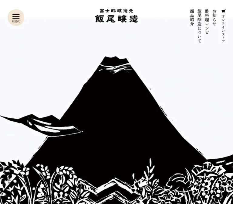
The mobile opening capture instead shows a large black mountain silhouette with white cuts, birds, plants, and wave-like forms. The artwork reaches both horizontal edges and is cropped by the narrow viewport. Its visible lower edge is near y 766, leaving roughly 78px for the white area containing SCROLL.
The desktop SCROLL text box sits at x 42, y 823.70 and is arranged vertically, with a fine line continuing below it. The mobile label is horizontal, centered at approximately x 169.68, y 803.
The two opening captures establish different visible image states. They do not establish whether the difference comes from timing, a responsive source change, an opening sequence, or another mechanism. Do not invent autoplay intervals, a crossfade, or a loading-screen interpretation.
Vertical Section Heading
Role: marks editorial chapters without consuming a wide horizontal title row.
On desktop, headings occupy a narrow left-hand rail inside the main container. お知らせ and 商品紹介 have measured boxes approximately 51.84px wide and 129.61px high. 飯尾醸造について extends to approximately 259.20px high.
On mobile, these headings remain vertical but move to the center. The standard column is 24px wide. The news heading sits at x 183, y 879, between the opening screen and the first news row.
The rice statement uses two vertical columns and a larger mobile treatment: its box is 88 × 168px. Preserve this deliberate distinction rather than forcing every vertical heading into one identical width.
Use CSS writing modes with ordinary accessible text. Avoid encoding line breaks between every Japanese character.
News List
Role: gives current announcements a prominent, browsable position immediately after the opening screen.
The desktop layout places the vertical section heading at x 120 and the list at x 232. Each entry is one link containing a title, followed by a date and category on a shared metadata row. Five entries are present in the supplied evidence, followed by もっと読む.
Standard desktop rows measure about 125.34px high. Their positions advance by approximately 126.34px, indicating a 1px separation between rows. The exact rule color is not provided. A fine warm divider is a suitable adaptation.
On mobile, the list takes the 342px content width. Standard rows are about 97.09px high. The longest announcement grows to 148.28px with a three-line title; it is not visibly constrained to a uniform row height. Preserve natural wrapping.
The final text link is right aligned: approximately 100 × 28.81px on desktop and 98 × 28px on mobile. This small utility link contrasts in scale with the broad store and LINE destinations below.
Store and LINE Destination Blocks
Role: offers clear routes to shopping and the official messaging account.
Below the news list, two large beige rectangles sit side by side on desktop. Each measures 573 × 140px, with a 54px gap. Their content is an icon followed by a centered label. The store uses a black cart; LINE retains its green service mark.
On mobile, the blocks stack at 342 × 90px with a 24px gap. Their icon-to-text gaps also reduce: the store gap changes from 16.2px to 8px, and the LINE gap from 20px to 12px.
These are square destination panels, with no observed shadow or pill shape. Their labels identify the destination explicitly rather than using a generic action such as “Learn more.”
Product Feature Region
Role: introduces selected products through imagery, a product name, a short promise, and supporting copy.
The rendered evidence contains three linked entries: 純米富士酢, 富士酢プレミアム, and 富士ピクル酢. They occupy substantially the same vertical region with small horizontal offsets. This supports a layered or slider-like feature, but does not establish its controls or movement model.
A representative desktop feature box is 1106 × 573px, starting at x 214. Its text column starts at x 840 and measures 480px wide. The geometry is consistent with a broad image region on the left and a narrower copy column on the right.
On mobile, the representative link spans the full 390px viewport width. Its text returns to x 24 with a 342px width. The title begins 430px below the feature's top, consistent with an image-first arrangement and space before the copy. Image dimensions themselves were not exported.
The all-products destination below spans the normal container: 1200 × 86px desktop and 342 × 70px mobile. Keep it visually separate from individual product names.
The three DOM entries are not evidence for three simultaneous desktop cards. If rebuilding the feature as a carousel, provide explicit controls and ensure inactive entries are removed from keyboard navigation.
Company Introduction
Role: connects the brand to its people, location, and longevity.
The desktop capture pairs a narrow left column of copy with a large staff group photograph on the right. The visible photograph spans approximately x 537–1320, or 783px, while the introductory paragraph is only about 235px wide at x 120.
The photograph is partly cropped by the top of the supplied scrolled capture. Its native aspect ratio and full displayed height cannot be recovered from that crop. The text is set with intentional short lines and substantial leading. It states that the company was founded in Miyazu, Kyoto, in 1893 and has continued making vinegar for more than 130 years.
On mobile, the heading begins approximately 309px after the section starts, followed by the introductory paragraph and then the destination links. This is consistent with an image region preceding the heading, but the image box was not included in the DOM sample.
Thumbnail Destination Link
Role: turns secondary company and production destinations into recognizable editorial entries.
The company and interview links use a repeated anatomy:
- A square photograph at the left.
- A horizontal gap.
- A flexible label area bounded by fine tan rules above and below.
- A small beige circular arrow at the right edge of that label area.
The desktop anchor measures 573 × 160px. Its visible thumbnail is approximately 160px square, followed by a measured 24px gap. The remaining label region is approximately 389px wide. The title is vertically centered; the interview title wraps onto two lines.
The two links sit side by side with 54px between them. Mobile anchors become 342 × 100px and stack 24px apart, with a measured 16px internal gap. A 100px square thumbnail is a reasonable reconstruction of this geometry, although the mobile image element was not separately measured.
The same measured anchor pattern recurs for the vinegar-making and brewery-tour destinations. Keep the whole row clickable instead of making only the small arrow interactive.
Recipe and Knowledge Links
Role: expands the homepage into useful cooking and vinegar information.
The desktop geometry forms an asymmetric group: the recipe destination is 573 × 624px on the left; the knowledge and Q&A destinations are each 573 × 292px, stacked on the right with approximately 40px between them.
On mobile, the entries become one column. The recipe destination is 342 × 383px, followed by two 342 × 184px destinations with 40px gaps.
These are measured link bounds, not image dimensions. The supplied screenshot crops do not reveal the imagery or label placement inside this group. Preserve the demonstrated hierarchy and proportions, and treat any new image treatment as a design choice rather than an observed detail.
Rice and Vinegar-Making Story
Role: explains the relationship between local rice and the product.
The vertical statement reads いいお酢は いいお米から. Its accompanying serif paragraph describes rice grown without agricultural chemicals in local Miyazu terraced fields and the use of that new rice in vinegar production.
Desktop copy occupies a narrow 224px-wide, 128px-high block. On mobile, the measured paragraph wrapper spans the viewport and contains three lines over 84px. The heading and text therefore retain an editorial rhythm while allowing fewer forced line breaks.
The section ends with the same thumbnail-link pattern used in the company introduction, directing visitors to production methods and brewery tours. Imagery in this section is not visible in the supplied crops, so its subject and treatment should not be invented from the paragraph alone.
Community Links and Restaurant Notice
Role: connects products to customers, media coverage, places to eat, and related company activity.
Three beige destination blocks form a desktop row: customer voices, media coverage, and a restaurant map. Each is 364 × 140px, with 54px gaps. On mobile, they become 342 × 90px blocks with 24px vertical separation.
The following restaurant feature has a square linked region measuring 364px on desktop and 342px on mobile. Its desktop copy is alongside it; mobile copy follows below.
The current page explicitly states that aceto closed at the end of December 2025. Preserve that notice when reusing current content. This is a notice about the restaurant, not evidence that the company website is discontinued.
Illustrated Footer Transition
Role: reconnects the closing page to the strong graphic identity of the opening.
The desktop footer capture shows a black mountain, white birds, and dense plant forms immediately above the beige footer. The artwork is centered and partly clipped by the top of the capture. It creates a graphic conclusion to the white content area without a gradient or shadow.
The measured distance between the main element's bottom and the footer's start is 288px on desktop and 166px on mobile. These are structural gaps, not verified artwork dimensions. An implementation may reserve these spaces for decoration, but should size the actual asset according to its own composition.
A vertical PAGE TOP link points to #wrapper. Its destination is verified; click behavior and scrolling duration are not.
Footer Sitemap and Contact Area
Role: consolidates the site's full information architecture and official contact routes.
The desktop footer is a beige field with a centered 1200px content region. Four sitemap columns begin at x 120, 324, 528, and 732. Each primary column measures 180px, with 24px between columns. A 364px service area starts at x 956, leaving 44px after the sitemap group.
Primary headings are black and more prominent. Smaller secondary links are visually muted. The product column lists individual vinegars; recipe and knowledge columns expose subcategories. This deliberately dense region gives the otherwise spacious page a practical index.
The right-hand area contains two 100px-high service rows separated by tan rules, a blog link with an external-link symbol, and a row of Instagram, Facebook, note, and YouTube marks. These icons retain their recognizable brand shapes; the icon library or file format is unknown.
Contact information is set near the lower right on desktop. The original footer identifies the operator as 株式会社 飯尾醸造 and supplies an address in Miyazu, telephone, fax, map, and contact links. The copyright is small and right aligned.
On mobile, the footer becomes one 342px-wide column. Thirteen primary navigation links remain visible, while the desktop sublists are absent from the rendered mobile text. This does not establish accordion behavior. The primary links have small leading chevrons and a 23px left inset. Store and LINE rows shrink to 70px high. Social icons remain in one horizontal row, followed by left-aligned contact information and a right-aligned copyright.
The mobile footer capture also shows the persistent logo overlapping upper navigation entries. Record that overlap as an observation; a new implementation should maintain sufficient contrast and access to the links beneath persistent controls.
Tokens — Motion & Interaction
| Treatment | Evidence | What can be concluded |
|---|---|---|
| Desktop primary links | transition: opacity 0.2s |
A short opacity transition is declared; trigger and destination opacity were not supplied |
| Filled destination links and selected text links | background-color 0.3s cubic-bezier(0.215, 0.61, 0.355, 1) |
Background-color feedback is declared; the resulting hover color is unknown |
| Section headings | opacity 1s, transform 1s, -webkit-transform 1s |
One-second reveal-related transitions are declared; starting offset and activation mechanism are unknown |
| Page-top link | Same one-second opacity/transform declaration | A reveal treatment is declared; scrolling motion is not established |
| Product region | Entries overlap vertically and have small horizontal offsets; Swiper-named properties exist | A layered feature is supported; autoplay, swipe, pagination, and transition duration remain unverified |
| Opening image | Product photograph on desktop; mountain illustration on mobile | Different visible states are established; their relationship over time is unknown |
| Persistent navigation | Controls remain visible in scrolled captures | Overlay persistence is visually supported; exact positioning implementation is not exported |
| Menu | Closed control visible; no opening sequence | Menu interaction and expanded styling remain unverified |
Many other exported elements report transition: all without a duration in the supplied representation. That alone is not useful evidence of visible motion. Sampled elements report animation: none, but the sample does not cover every descendant, pseudo-element, or JavaScript-driven effect.
For a new implementation, retain restrained feedback: short opacity or background changes, and optional one-second heading reveals. Avoid adding sweeping parallax, springy card motion, or a timed opening sequence without a separate design decision. Reduced-motion behavior is recommended, not verified on the original.
Surfaces
| Surface | Appearance | Purpose |
|---|---|---|
| Main page | White, open, largely unboxed | Gives photography and vertical headings room |
| Opening media | Very pale image field with product color or black artwork | Carries first-screen identity |
| Header | Transparent overlay | Keeps the composition visually open |
| Destination panel | Flat warm beige rectangle | Makes major destinations easy to locate |
| Thumbnail-link label area | White with fine tan rules | Groups image, title, and arrow without a card shell |
| Arrow control | Small beige disc with black chevron | Adds a consistent directional cue |
| Footer | Full-width warm beige | Establishes a distinct closing information area |
There is no observed system of floating cards, glass blur, decorative CSS gradients, or drop-shadow elevation. Separation comes from spacing, rules, color fields, and the boundaries of photographs.
Imagery
The visible imagery operates in two complementary modes.
Photography is direct and descriptive. The opening bottles stand upright with readable labels, realistic amber liquid, and soft grounding shadows. The company photograph shows a group of staff in an actual interior. Smaller destination photographs depict the premises and people. Their rectangular crops and natural detail give the brand a tangible setting.
Illustration is boldly reduced. The mountain is a large black mass interrupted by white cut-like marks. Birds cross the composition, while plants and wave-like shapes build a dense lower edge. Its visual character resembles a woodcut or cut-paper print; the actual production technique is not established.
The wordmark belongs to this strong black graphic language. Preserve its irregular strokes and original proportions. Do not recreate it as ordinary text or replace the mountain with a generic outline icon.
Observed Asset References
The supplied evidence contains no usable original image URLs or filenames. The references below identify visible subjects only.
| Asset subject | Original-page evidence | Reuse guidance |
|---|---|---|
| Two-tier Iio Jozo wordmark | Desktop opening/company captures and mobile opening/footer captures | Use authorized brand artwork; preserve approximately 3.08:1 proportions |
| Pair of Fuji Vinegar bottles | Desktop opening capture | Keep both products upright, uncropped, and clearly separated |
| Mountain, birds, plants, and waves | Mobile opening and desktop footer-transition captures | Preserve the black mass, white cuts, and dense lower edge; crop deliberately for each placement |
| Staff group photograph | Desktop company capture | Keep documentary character; determine the real source ratio before implementation |
| Premises thumbnail | Desktop company link | Square crop with no rounding |
| Interview thumbnail | Desktop interview link | Square portrait/environment crop with no rounding |
| Cart, LINE, and social marks | Desktop/mobile footer captures | Retain recognizable marks; provide accessible link names |
Use actual image assets when authorized and available. Neither source paths nor photographers can be recovered from these original-page captures alone. The source does not establish video, image-loading strategy, or native image dimensions.
Layout & Responsive Behavior
Page Sequence
The rendered homepage follows this order:
- Full-viewport opening composition.
- News list and store/LINE destinations.
- Selected product feature and all-products link.
- Company introduction and company/interview links.
- Recipe, knowledge, and Q&A destinations.
- Rice story and production/tour links.
- Customer, media, and restaurant-map destinations.
- Restaurant feature with its closure notice.
- Illustrated transition and footer.
The desktop main element ends around y 6514.94 and the footer begins around y 6802.94. On mobile those positions are approximately y 6762.80 and y 6928.80. The mobile document becomes about 401px longer overall despite its shorter opening screen, as horizontal groups stack.
Observed Responsive Changes
| Pattern | Desktop | Mobile |
|---|---|---|
| Brand position | Centered | Upper left |
| Menu position | Upper left | Upper right |
| Primary navigation | Five vertical columns | Not visible outside the menu control |
| Opening scroll cue | Vertical, lower left | Horizontal, bottom center |
| Standard section heading | Left rail | Centered vertical column |
| Store/LINE pair | Two columns | Stacked |
| Product feature | Broad image beside copy | Full-width feature with inset copy below |
| Company/interview pair | Two columns | Stacked |
| Resource links | Tall left tile, two shorter right tiles | Single column |
| Community destinations | Three columns | Single column |
| Footer | Four sitemap columns plus service area | Primary links, services, social icons, contact |
| Footer subnavigation | Visible | Absent from rendered mobile text |
| Contact block | Lower right | Left aligned |
Only the two stated viewport widths were inspected. Tablet layouts, landscape phones, exact breakpoint thresholds, and browser zoom behavior remain unverified.
The starter uses a 64rem breakpoint as a practical recommendation. It is not a recovered source media query. Preserve comfortable intermediate widths and test navigation overlap before choosing a production threshold.
Do’s and Don’ts
Do
- Keep the measured core palette: white
#FFFFFF, black#000000, and beige#F5E6D2. - Preserve the distinction between expressive brand artwork and readable editorial text.
- Use vertical Japanese headings as navigational chapter markers.
- Maintain the 1200px desktop content rhythm and 24px mobile gutters as reference endpoints.
- Give bottle photography enough room for both silhouettes and labels to remain legible.
- Keep small photographs square and use fine rules around their accompanying label areas.
- Repeat beige destination panels consistently across shopping, messaging, and community routes.
- Let long news titles increase row height on mobile.
- Keep the footer useful as an information index, with a simpler primary-link presentation on mobile.
- Retain current operational notices, including the restaurant closure text.
- Separate confirmed transition declarations from unverified playback and interaction behavior.
Don’t
- Don’t compress the site into a single sales funnel; retain its corporate, product, recipe, and educational routes.
- Don’t replace the opening composition with an oversized headline and multiple competing buttons.
- Don’t turn every destination into a rounded, elevated card.
- Don’t use the exported Swiper blue as a brand color.
- Don’t assign a calligraphy font to the logo without evidence.
- Don’t reproduce every sampled wrapper's 9px or 10px value as the final reading size.
- Don’t infer an autoplay duration or opening animation from different desktop and mobile images.
- Don’t render all overlapping product entries as simultaneously visible cards.
- Don’t infer mobile accordions merely because desktop footer sublists are absent.
- Don’t crop product labels or flatten the mountain illustration into a generic icon.
- Don’t copy persistent-header collisions without reviewing readability and keyboard access.
Recommended Implementation Additions
These are improvements for a new implementation, not verified original-site features:
- Use a semantic menu button with an explicit name, expanded state, and controlled panel. If the panel is modal, manage focus, Escape, background interaction, and focus return.
- Add visible keyboard focus indicators to navigation, whole-row links, service panels, and social destinations.
- Preserve accessible text for the logo and meaningful alternatives for product and documentary photographs. Mark purely decorative mountain repetitions as decorative.
- Ensure vertical headings use a sensible DOM reading order; do not split each character into an independent accessible node.
- If implementing a product carousel, expose previous/next controls and current position, pause automatic movement, and prevent hidden slides from receiving focus.
- Keep content visible if reveal JavaScript fails. Enable entrance effects progressively and honor reduced motion.
- Review the contrast of muted footer text. A darker adaptation such as
#6B6259is preferable when small text would otherwise be difficult to read. - Provide comfortable touch targets around small arrows and social marks. The whole thumbnail row should remain the main link target.
- Protect content beneath persistent controls through spacing, contrast treatment, or context-aware header behavior.
- Reserve image dimensions to reduce layout shifts, load the opening image promptly, and defer lower-page imagery where appropriate.
- Preserve visible email/contact labels accurately: the observed
メールお問い合わせdestination is a web form, not amailto:link.
Agent Prompt Guide
Quick Color Reference
- Main page:
#FFFFFF. - Text, brand artwork, and ordinary icons:
#000000. - Menu circle, destination panels, arrow discs, and footer:
#F5E6D2. - Fine warm dividers: approximately
#DFBE98, a visual adaptation. - Secondary text: approximately
#7B756C; consider#6B6259for improved readability. - Green is confined to the LINE mark. Amber, blue, and red belong primarily to product photography.
Overall Prompt
“Create a Japanese vinegar maker's corporate and product homepage with a quiet editorial structure. Use white content areas, black lettering, and pale beige #F5E6D2 for circular menu controls, broad destination panels, and the footer. Place an authorized two-tier brand wordmark at the desktop center, a beige menu circle at the left, and vertical Japanese navigation at the right. Build a full-viewport opening image, then news, selected products, company and production stories, recipe resources, and a useful sitemap footer. Use vertical Japanese section headings, generous white space, serif editorial copy, square documentary photographs, thin tan rules, and small beige arrow discs. At 390px, move the logo left and menu right, use 24px content gutters, center vertical section headings, and stack destination groups. Treat hero sequencing and carousel behavior as separate requirements because their timing was not established.”
Example Component Prompts
- Header: “Create a transparent desktop header with a 240px-wide supplied wordmark centered 48px from the top, an 80px beige circular MENU control at x 40, and five vertical Japanese navigation columns at the upper right. On mobile, use a 160px wordmark at the left and a 64px menu circle at the right. Keep menu panel behavior independently configurable.”
- News list: “Place a vertical
お知らせheading in a narrow left rail beside a wide list. Each whole-row link contains a title, then a small date and category with a 15px top gap. Use generous vertical padding and fine separators. At 390px, center the vertical heading above a 342px list and allow long titles to create taller rows.” - Thumbnail link: “Design a square-cornered editorial destination row: a 160px square documentary photo, a 24px gap, then a serif title area bounded by thin tan top and bottom rules. Place a small beige circular chevron at the right. Make the whole 573 × 160px row clickable. Stack rows and reduce their height to approximately 100px on mobile.”
- Product feature: “Present a vinegar product with a large image on the left and a 480px copy column on the right. Stack the product name, a short Japanese promise, and restrained supporting copy. On mobile, place the image first and inset the copy by 24px. Do not assume autoplay or invent a transition sequence.”
- Footer: “Create a full-width pale beige footer. Inside a 1200px desktop container, place four 180px sitemap columns with 24px gaps, followed by a 364px service area. Use black primary links, smaller muted sublinks, ruled store and LINE rows, recognizable social marks, and a compact contact block. On mobile, expose primary links in one column, followed by services, social icons, and left-aligned contact details.”
- Illustration placement: “Use authorized black mountain artwork with white cut-like marks, birds, plants, and waves. Let it dominate a narrow mobile opening crop and recur as a centered graphic above the beige footer. Preserve the artwork's irregular edges and keep its composition separate from CSS-generated decoration.”
Quick Start
CSS Custom Properties
This is an implementation scaffold, not recovered source CSS. It preserves measured colors and key endpoint dimensions, uses a conventional root size, and labels estimated or recommended values in comments. Load authorized fonts and image assets through the project; asset URLs were not supplied.
Use .site-header with .brand, a real .menu-toggle button, and .primary-nav. A .story-link contains an image and .story-link__body; the latter contains the label and .arrow-disc. Product and story wrappers use the corresponding image and copy classes below. Menu state, image selection, and any carousel require separate behavior.
:root {
  /* Measured core colors */
  --iio-white: #ffffff;
  --iio-ink: #000000;
  --iio-beige: #f5e6d2;

  /* Visual approximation and recommended readable secondary text */
  --iio-rule: #dfbe98;
  --iio-muted: #6b6259;

  /* Families recorded in the supplied computed styles */
  --iio-font-editorial: YakuHanMP, 'Zen Old Mincho', serif;
  --iio-font-ui: YakuHanJP, 'Noto Sans JP', sans-serif;
  --iio-font-utility: serif;

  /* Measured endpoint geometry */
  --iio-content: 1200px;
  --iio-gutter: 24px;
  --iio-column-gap: 54px;
  --iio-thumb: 160px;
  --iio-menu-size: 80px;
  --iio-brand-width: 240px;

  /* Recommended visible type sizes; not wrapper font sizes */
  --iio-text-body: 1rem;
  --iio-text-small: 0.75rem;
  --iio-text-label: 1.5rem;
  --iio-text-heading: 2.025rem;
  --iio-text-product: 2.25rem;

  /* Declared source transition timings */
  --iio-motion-link: 200ms;
  --iio-motion-fill: 300ms;
  --iio-motion-reveal: 1s;
  --iio-ease-fill: cubic-bezier(0.215, 0.61, 0.355, 1);
}

* { box-sizing: border-box; }

body {
  margin: 0;
  color: var(--iio-ink);
  background: var(--iio-white);
  font-family: var(--iio-font-editorial);
  font-size: var(--iio-text-body);
  line-height: 2;
}

img { display: block; max-width: 100%; }
button, input { font: inherit; }
a { color: inherit; }

.container {
  width: min(var(--iio-content), calc(100% - 2 * var(--iio-gutter)));
  margin-inline: auto;
}

/* Fixed placement is an adaptation of observed persistent overlays. */
.site-header {
  position: fixed;
  inset: 0 0 auto;
  z-index: 30;
  height: 244px;
  pointer-events: none;
}

.site-header a,
.site-header button { pointer-events: auto; }

.brand {
  position: absolute;
  top: 48px;
  left: 50%;
  width: var(--iio-brand-width);
  transform: translateX(-50%);
}

.brand img { width: 100%; height: auto; }

.menu-toggle {
  position: absolute;
  top: 48px;
  left: 40px;
  display: grid;
  place-content: center;
  justify-items: center;
  gap: 5px;
  width: var(--iio-menu-size);
  height: var(--iio-menu-size);
  padding: 0;
  border: 0;
  border-radius: 50%;
  color: var(--iio-ink);
  background: var(--iio-beige);
  font: 12px / 1 var(--iio-font-utility);
  cursor: pointer;
}

.menu-bars {
  width: 32px;
  height: 22px;
  background: linear-gradient(
    to bottom,
    currentColor 0 3px,
    transparent 3px 9px,
    currentColor 9px 12px,
    transparent 12px 19px,
    currentColor 19px 22px
  );
}

.primary-nav {
  position: absolute;
  top: 48px;
  right: 36px;
  display: flex;
  align-items: flex-start;
}

.primary-nav a {
  padding: 2px 8px 0;
  font-size: 22px;
  line-height: 1;
  text-decoration: none;
  transition: opacity var(--iio-motion-link);
}

.primary-nav .nav-label { writing-mode: vertical-rl; }

.primary-nav .nav-store {
  display: grid;
  justify-items: center;
  gap: 10px;
  margin-left: 10px;
  font-size: 18px;
}

.hero {
  position: relative;
  min-height: 100vh;
  min-height: 100svh;
  overflow: hidden;
  background: var(--iio-white);
}

.hero__media { position: absolute; inset: 0; }
.hero__media picture { display: block; width: 100%; height: 100%; }

.hero__media img {
  width: 100%;
  height: 100%;
  object-fit: contain;
}

.scroll-cue {
  position: absolute;
  left: 42px;
  bottom: 110px;
  margin: 0;
  writing-mode: vertical-rl;
  font: 16px / 1 var(--iio-font-utility);
}

.scroll-cue::after {
  content: '';
  position: absolute;
  top: calc(100% + 8px);
  left: 50%;
  width: 1px;
  height: 104px;
  background: currentColor;
}

.vertical-heading {
  width: max-content;
  margin: 0;
  writing-mode: vertical-rl;
  font-size: var(--iio-text-heading);
  font-weight: 600;
  line-height: 1.6;
}

.news { padding-block: 133px 150px; }

.news-layout {
  display: grid;
  grid-template-columns: 88px minmax(0, 1fr);
  gap: 24px;
}

.news-layout > .vertical-heading { margin-top: 24px; }
.news-list { margin: 0; padding: 0; list-style: none; }
.news-list > li { border-bottom: 1px solid var(--iio-rule); }

.news-row {
  display: block;
  padding: 30px 0 34px;
  text-decoration: none;
}

.news-row__title {
  margin: 0;
  font-size: 18px;
  line-height: 1.6;
  overflow-wrap: anywhere;
}

.news-row__meta {
  display: flex;
  flex-wrap: wrap;
  gap: 8px 25px;
  margin-top: 15px;
  font-size: var(--iio-text-small);
  line-height: 1.5;
}

.more-link {
  display: flex;
  align-items: center;
  justify-content: flex-end;
  gap: 4px;
  min-height: 29px;
  text-decoration: none;
}

.destination-grid,
.story-links {
  display: grid;
  grid-template-columns: repeat(2, minmax(0, 1fr));
  gap: var(--iio-column-gap);
}

.news-actions { margin-top: 130px; }

.destination {
  display: flex;
  align-items: center;
  justify-content: center;
  gap: 16px;
  min-height: 140px;
  padding: 20px;
  background: var(--iio-beige);
  font-size: 18px;
  line-height: 1.6;
  text-decoration: none;
  transition: background-color var(--iio-motion-fill) var(--iio-ease-fill);
}

.destination img { width: 42px; height: auto; flex: 0 0 auto; }

.product-feature {
  display: grid;
  grid-template-columns: minmax(0, 573fr) minmax(0, 480fr);
  align-items: center;
  gap: 53px;
  width: calc(100% - 94px);
  margin-left: 94px;
  text-decoration: none;
}

.product-feature__media { width: 100%; aspect-ratio: 1; object-fit: contain; }
.product-feature__copy { min-width: 0; }

.product-feature__title {
  margin: 0 0 20px;
  font-size: var(--iio-text-product);
  font-weight: 600;
  line-height: 1.6;
}

.product-feature__copy p { margin: 0 0 20px; }

.all-products {
  display: flex;
  align-items: center;
  justify-content: center;
  gap: 8px;
  min-height: 86px;
  margin-top: 80px;
  border-block: 1px solid var(--iio-rule);
  text-decoration: none;
}

.story {
  display: grid;
  grid-template-columns: minmax(0, 363px) minmax(0, 783px);
  gap: 54px;
  align-items: start;
}

.story__image { width: 100%; height: auto; }
.story__copy { max-width: 235px; }
.story__copy p { margin: 48px 0 0; font-weight: 600; }
.story-links { margin-top: 80px; }

.story-link {
  display: flex;
  align-items: stretch;
  gap: 24px;
  min-height: var(--iio-thumb);
  text-decoration: none;
}

.story-link > img {
  flex: 0 0 var(--iio-thumb);
  width: var(--iio-thumb);
  height: var(--iio-thumb);
  object-fit: cover;
}

.story-link__body {
  display: flex;
  flex: 1;
  align-items: center;
  justify-content: space-between;
  gap: 16px;
  min-width: 0;
  padding-block: 16px;
  border-block: 1px solid var(--iio-rule);
  font-size: var(--iio-text-label);
  line-height: 1.5;
}

.arrow-disc {
  display: grid;
  flex: 0 0 36px;
  place-items: center;
  width: 36px;
  height: 36px;
  border-radius: 50%;
  background: var(--iio-beige);
  font: 16px / 1 var(--iio-font-utility);
}

.resource-grid {
  display: grid;
  grid-template-columns: repeat(2, minmax(0, 1fr));
  gap: 40px 54px;
}

.resource-link { min-height: 292px; }
.resource-link--primary { grid-row: span 2; min-height: 624px; }
.community-grid { grid-template-columns: repeat(3, minmax(0, 1fr)); }

/* Reserved decoration area; actual image box was not measured. */
.footer-art {
  height: 288px;
  overflow: hidden;
  display: flex;
  justify-content: center;
  align-items: flex-end;
}

.footer-art img { max-height: 100%; width: auto; }

.site-footer {
  padding-block: 80px 98px;
  background: var(--iio-beige);
  font-size: 14px;
  line-height: 1.6;
}

.footer-layout {
  display: grid;
  grid-template-columns: minmax(0, 1fr) 364px;
  gap: 44px;
}

.footer-sitemap {
  display: grid;
  grid-template-columns: repeat(4, minmax(0, 1fr));
  gap: 24px;
}

.footer-group { min-width: 0; }
.footer-primary { display: block; margin-bottom: 16px; text-decoration: none; }
.footer-sublist { margin: 0 0 32px; padding: 0; list-style: none; }
.footer-sublist li { margin-bottom: 5px; }
.footer-sublist a { color: var(--iio-muted); font-size: 12px; text-decoration: none; }
.footer-services { border-top: 1px solid var(--iio-rule); }

.footer-service {
  display: flex;
  align-items: center;
  justify-content: center;
  gap: 12px;
  min-height: 100px;
  border-bottom: 1px solid var(--iio-rule);
  font-size: 18px;
  text-decoration: none;
}

.footer-service img { width: 42px; height: auto; }
.footer-blog { display: block; margin-top: 36px; }
.footer-social { display: flex; align-items: center; gap: 16px; margin-top: 28px; }
.footer-social a { display: inline-flex; align-items: center; min-height: 44px; }
.footer-contact { margin-top: 96px; text-align: right; font-style: normal; }
.footer-copyright { margin: 32px 0 0; color: var(--iio-muted); text-align: right; font-size: 12px; }

/* Recommended states; endpoint colors and opacity were not supplied. */
@media (hover: hover) {
  .primary-nav a:hover { opacity: 0.65; }
  .destination:hover { background: #edd7ba; }
  .news-row:hover .news-row__title,
  .story-link:hover .story-link__label { text-decoration: underline; }
}

:where(a, button):focus-visible {
  outline: 2px solid currentColor;
  outline-offset: 5px;
}

/* Progressive enhancement: content remains visible without scripting. */
.reveal { opacity: 1; transform: none; }

@media (prefers-reduced-motion: no-preference) {
  .motion-ready .reveal {
    transition: opacity var(--iio-motion-reveal), transform var(--iio-motion-reveal);
  }
  .motion-ready .reveal[data-pending='true'] {
    opacity: 0;
    transform: translateY(16px);
  }
}

/* Recommended breakpoint, not a recovered source media query. */
@media (max-width: 64rem) {
  :root {
    --iio-column-gap: 24px;
    --iio-thumb: 100px;
    --iio-menu-size: 64px;
    --iio-brand-width: 160px;
    --iio-text-label: 1.125rem;
    --iio-text-heading: 1.5rem;
    --iio-text-product: 1.875rem;
  }

  .site-header { height: 84px; }
  .brand { top: 33.4px; left: 24px; transform: none; }
  .menu-toggle { top: 20px; left: auto; right: 16px; font-size: 9px; }
  .menu-bars { width: 22px; height: 16px; background-size: 100% 16px; }
  .primary-nav { display: none; }

  /* Use deliberately selected mobile artwork; source switching is unverified. */
  .hero__media { bottom: 80px; }
  .hero__media img { object-fit: cover; object-position: center bottom; }
  .scroll-cue {
    left: 50%;
    bottom: 30px;
    writing-mode: horizontal-tb;
    transform: translateX(-50%);
    font-size: 13px;
  }
  .scroll-cue::after { display: none; }

  .vertical-heading { margin-inline: auto; line-height: 1; }
  .vertical-heading--statement { font-size: 28px; line-height: 44px; }
  .news { padding-block: 35px 80px; }
  .news-layout { display: block; }
  .news-layout > .vertical-heading { margin: 0 auto 20px; }
  .news-row { padding-block: 20px; }
  .news-row__title { font-size: 16px; }
  .news-row__meta { column-gap: 17px; }
  .news-actions { margin-top: 50px; }
  .destination-grid, .story-links { grid-template-columns: 1fr; }
  .destination { min-height: 90px; gap: 12px; }

  .product-feature {
    display: block;
    width: calc(100% + 48px);
    margin-left: -24px;
  }
  .product-feature__copy { padding: 40px 24px 0; }
  .product-feature__title { line-height: 1.5; }
  .all-products { min-height: 70px; margin-top: 64px; }

  .story { display: flex; flex-direction: column; gap: 40px; }
  .story__image { order: -1; }
  .story__copy { max-width: none; width: 100%; text-align: center; }
  .story__copy p { margin-top: 30px; font-size: 14px; line-height: 2; }
  .story-links { margin-top: 28px; }
  .story-link { gap: 16px; }
  .story-link__body { gap: 8px; padding-block: 12px; }
  .arrow-disc { width: 28px; height: 28px; flex-basis: 28px; }

  .resource-grid { grid-template-columns: 1fr; gap: 40px; }
  .resource-link { min-height: 184px; }
  .resource-link--primary { grid-row: auto; min-height: 383px; }
  .footer-art { height: 166px; }
  .site-footer { padding-block: 64px 24px; }
  .footer-layout, .footer-sitemap { display: block; }
  .footer-sublist { display: none; }
  .footer-primary {
    position: relative;
    min-height: 28px;
    margin-bottom: 7px;
    padding-left: 23px;
    line-height: 28px;
  }
  .footer-primary::before {
    content: '';
    position: absolute;
    top: 10px;
    left: 7px;
    width: 6px;
    height: 6px;
    border-top: 1px solid var(--iio-rule);
    border-right: 1px solid var(--iio-rule);
    transform: rotate(45deg);
  }
  .footer-services { margin-top: 36px; }
  .footer-service { min-height: 70px; }
  .footer-blog { margin-top: 24px; }
  .footer-social { margin-top: 32px; }
  .footer-contact { margin-top: 64px; text-align: left; }
}

@media (prefers-reduced-motion: reduce) {
  .primary-nav a, .destination, .reveal { transition: none; }
  .reveal { opacity: 1; transform: none; }
}
The source's gradient-free surface language is preserved; the gradient in .menu-bars is only a compact way to draw three flat strokes. For production, an accessible icon asset or three decorative spans is equally suitable. Set explicit image dimensions in markup and test longer labels at intermediate widths. The starter intentionally leaves unverified menu and product sequencing behavior unimplemented.
Tailwind v4 Token Mapping
Optional aliases for a project already using Tailwind v4. Define the custom properties above first. This mapping does not imply that the original site uses Tailwind.
@theme inline {
  --color-paper: var(--iio-white);
  --color-ink: var(--iio-ink);
  --color-sand: var(--iio-beige);
  --color-rule: var(--iio-rule);
  --color-muted: var(--iio-muted);

  --font-editorial: var(--iio-font-editorial);
  --font-ui: var(--iio-font-ui);
  --font-utility: var(--iio-font-utility);

  --text-body: var(--iio-text-body);
  --text-small: var(--iio-text-small);
  --text-label: var(--iio-text-label);
  --text-section: var(--iio-text-heading);
  --text-product: var(--iio-text-product);

  --spacing-gutter: var(--iio-gutter);
  --spacing-column-gap: var(--iio-column-gap);
  --spacing-thumbnail: var(--iio-thumb);
  --spacing-menu: var(--iio-menu-size);
  --radius-control: 9999px;
}
Sources & Evidence
- Inspected original and final page: 富士酢醸造元 飯尾醸造. Both URLs are identical; the supplied browser observation reports HTTP 200 and the title
富士酢醸造元 飯尾醸造. - Capture timing: supplied retrieval timestamp
2026-09-12T19:48:47.129Z, equivalent to September 13, 2026, 04:48:47.129 JST. Separate timestamps for individual screenshot frames were not supplied. - Desktop evidence: 1440 × 1000 CSS-pixel viewport; opening product photograph, scrolled company area, and footer captures. DOM document height approximately 7576.39px.
- Mobile evidence: 390 × 844 CSS-pixel viewport; opening mountain artwork and footer captures. DOM document height approximately 7977.80px.
- Rendered-page evidence: visible text, original link destinations, selected element rectangles, computed foreground/background colors, font-family declarations, wrapper font sizes, padding, gaps, border radius, and transition strings.
- Link scope: destinations such as
/product,/about,/recipe,/process, and#wrapperwere observed as links on the homepage. Their target pages and click results were not inspected. - Observation procedure: the supplied browser process waited for document load, sampled layout/text stability, visible image decoding, and finite animation readiness within stated time limits. It traversed intermediate scroll positions. Perpetual animations were temporarily paused during readiness checks and resumed afterward; service workers and SharedWorkers were disabled.
- Limits: no additional browsing or file inspection was performed for this reference. No original image URLs, font files, complete stylesheet, interaction recording, menu-open capture, carousel-control test, hover endpoint, or intermediate-width capture was supplied. Delayed content and unexercised behavior remain unverified.
This reference describes the current homepage represented by the supplied original-page evidence. Its CSS and prompts are reusable adaptations; estimated type sizes, chosen breakpoints, accessibility additions, and proposed states are not claims about unobserved source behavior.
# Iio Jozo / Fuji Vinegar — Style Reference

> An established vinegar maker presented through white space, vertical Japanese lettering, honest photography, and a bold mountain silhouette.

**Website:** [iio-jozo.co.jp](https://iio-jozo.co.jp/)
**Original URL:** https://iio-jozo.co.jp/
**Final URL:** https://iio-jozo.co.jp/
**Theme:** light; white content areas with pale beige controls and footer
**Inspected:** September 13, 2026, at 04:48 JST; supplied retrieval timestamp: September 12, 2026, 19:48:47.129 UTC
**Viewports:** desktop 1440 × 1000 CSS pixels; mobile 390 × 844 CSS pixels
**Scope:** the current homepage, including its opening composition, news, product features, company introduction, editorial links, rice and vinegar-making story, community links, restaurant notice, and footer. Visual evidence comprises three desktop captures and two mobile captures, supplemented by rendered text, link destinations, element rectangles, and selected computed styles. Linked pages and open-menu states were not inspected.

Iio Jozo combines a restrained editorial layout with a distinctive Japanese identity. The brush-like wordmark and vertically arranged navigation establish the brand before any explanatory copy appears. White space surrounds the products and company photographs. Pale beige supplies a gentle functional accent, appearing on the circular menu control, broad destination links, small arrow discs, and the full footer.

This is a substantial corporate and product homepage with routes into recipes, production methods, company information, shopping, and customer resources. Its hierarchy accommodates browsing across those subjects. The opening screen is almost entirely imagery and identity; the information density increases through the page and culminates in a comprehensive desktop sitemap.

## How to Read This Reference

- **Measured** values come from the supplied rendered DOM and computed-style records. Coordinates are document coordinates unless a screenshot position is explicitly identified.
- **Visual estimates** describe the supplied original-page captures. They are not pixel samples or recovered CSS declarations.
- **Derived** values are calculations from measured rectangles, such as the 54px gap between two 573px links within a 1200px content area.
- **Recommendations** describe a reusable implementation. The CSS breakpoint, semantic markup, accessibility behavior, and several type sizes belong to this category.
- **Token names** are implementation aliases. The supplied page exposes no meaningful brand-token system; its two exported custom properties concern Swiper defaults.
- **Typography needs caution:** many sampled wrappers report 9px on desktop and 10px on mobile even where their rendered text occupies much larger boxes. Those numbers do not establish the visible glyph size of every descendant.
- **Motion evidence is partial:** declared transitions and layered product geometry are available, but no click, swipe, hover, or menu-opening sequence was supplied.

## Tokens — Colors

### Default Palette

| Name | Value | Suggested token | Evidence and role |
| --- | --- | --- | --- |
| White Canvas | `#FFFFFF` | `--iio-white` | Measured body and section background; dominant content surface |
| Black Ink | `#000000` | `--iio-ink` | Measured text color; visually shared by navigation, wordmark, icons, and mountain artwork |
| Warm Beige | `#F5E6D2` | `--iio-beige` | Measured `rgb(245, 230, 210)` on the menu, filled destination links, and footer |
| Warm Rule | approximately `#DFBE98` | `--iio-rule` | Visual estimate for the fine tan separators in thumbnail links and footer actions |
| Muted Text | approximately `#7B756C` | `--iio-muted` | Visual estimate for subordinate desktop sitemap links and copyright |
| Cool Image White | approximately `#F7F8FC` | `--iio-image-white` | Visual estimate of the pale photographic/artwork field in the opening captures; not an established section background declaration |
| LINE Green | approximately `#06C755` | asset color | Visible within the LINE service mark; keep confined to that mark |

The exact reusable core is white, black, and warm beige. Color in the bottle photograph comes from amber vinegar, gold caps, and blue/red packaging. Those image colors do not establish a blue or red interface theme.

The exported `--swiper-theme-color: #007aff` is a library-named default, not evidence of a visible blue brand accent. Likewise, `--swiper-navigation-size: 44px` does not prove that 44px navigation controls were visible in these captures.

### Color Relationships

White supports the long editorial body. Beige identifies destinations and the closing information area without making every link look like a primary sales button. Black supplies the strongest visual structure through lettering and illustration. Fine tan rules divide related content with much less emphasis than a black border would introduce.

No dark mode, theme selector, or alternative palette was observed.

## Tokens — Typography

### Editorial Japanese

The company-introduction and rice-story paragraphs explicitly report:

```css
font-family: YakuHanMP, "Zen Old Mincho", serif;
font-weight: 600;
```

This is direct evidence for those paragraphs. Their visible character is a refined Japanese serif with strong stroke contrast. The photographs, traditional wordmark, and restrained serif copy work together to convey an established maker.

Other visible labels also appear serif in the supplied captures, but their text-bearing descendants were not individually exported. Do not attribute every heading or footer label to Zen Old Mincho solely from appearance.

### Underlying UI Stack

Many sampled anchors, headings, and wrappers report:

```css
font-family: YakuHanJP, "Noto Sans JP", sans-serif;
font-weight: 400;
```

The HTML element reports `Times` at 10px. Body wrappers report 9px on desktop and 10px on mobile. These are useful implementation observations, but they do not explain the final appearance of every text run. Descendant styling, text replacement, and transforms are not fully represented in the supplied export.

The reusable CSS below uses the confirmed serif stack for editorial copy and the recorded sans-serif stack as an available utility option. It retains a conventional root size instead of reproducing the wrapper values.

### Brand Lettering

The two-tier identity reads `富士酢醸造元` above `飯尾醸造`. Its irregular, forceful strokes are essential to the design. Treat it as supplied brand artwork, with accessible text accompanying the asset.

The measured brand-link box is 240 × 77.91px on desktop and 160 × 51.94px on mobile, preserving an approximately 3.08:1 proportion. The export does not identify its image format or asset URL. Do not substitute an invented calligraphy font and claim equivalence.

### Small Utility Labels

`MENU`, `SCROLL`, and `PAGE TOP` provide a small amount of English interface text. They are visually secondary to the Japanese lettering. On desktop, `SCROLL` and `PAGE TOP` use vertical placement; on mobile, `SCROLL` becomes a centered horizontal label.

The exact font family of these visible utility glyphs was not established. A conventional serif is a reasonable adaptation.

### Type Scale

| Role | Measured or visible evidence | Practical starting size | Status |
| --- | --- | --- | --- |
| Brand | 240 × 77.91px desktop; 160 × 51.94px mobile | Size the artwork, not a replacement font | Measured boxes |
| Desktop navigation | Vertical link columns approximately 37.78px wide, including padding | Approximately 22px | Visual estimate |
| Standard vertical heading | `お知らせ` occupies 51.84 × 129.61px desktop and 24 × 96px mobile | Approximately 32.4px desktop; 24px mobile | Derived character advance, not a recovered font-size declaration |
| Two-column rice heading | 103.69 × 194.41px desktop; 88 × 168px mobile | Approximately 32.4px desktop; 28px mobile | Derived approximation |
| Product title | Title box approximately 57.84px high desktop and 45px mobile | 36px / 1.6 desktop; 30px / 1.5 mobile | Recommendation informed by box height |
| Thumbnail-link title | Approximately 24px in the desktop company capture | 24px desktop; 18px mobile | Desktop visual estimate; mobile recommendation |
| Company body | Four lines occupy 128px desktop and 112px mobile | Approximately 16px / 32px desktop; 14px / 28px mobile | Measured block height; estimated glyph size |
| News title | Single-line box 28.80px desktop and 25.59px mobile | 18px / 1.6 desktop; 16px / 1.6 mobile | Box-informed recommendation |
| News metadata | Line box 17.55px desktop and 16.5px mobile | 12px / 1.5 | Recommended readable approximation |
| Footer primary links | Link boxes 28.81px desktop and 28px mobile | Approximately 14–16px | Visual estimate |
| Footer secondary links | Desktop inline boxes approximately 13px high | 12px minimum in an adaptation | Measured boxes; recommended minimum |
| Copyright | Small, muted, right aligned | 11–12px | Visual estimate |

Keep the hierarchy quiet. Large image areas, vertical headings, and spacing supply emphasis without requiring oversized promotional text. Preserve intentional Japanese line breaks in short editorial statements while allowing news titles and long navigation labels to wrap naturally.

## Tokens — Spacing & Shapes

**Density:** spacious main content, compact navigation details, and a denser desktop footer.

**Geometry:** square photographic edges and rectangular destination blocks, with circles reserved for menu and arrow controls.

### Spacing Scale

| Use | Desktop | Mobile | Evidence |
| --- | --- | --- | --- |
| Main content side margin | 120px | 24px | Measured at the two supplied widths |
| Main content width | 1200px | 342px | Measured across repeated links and footer content |
| Two-column content gap | 54px | 24px vertical gap for stacked pairs | Derived from measured link positions |
| Thumbnail-to-label gap | 24px | 16px | Computed flex gap |
| Standard news-row padding | 30px top, 34px bottom | 20px top and bottom | Computed padding |
| News title-to-metadata gap | 15px | 15px | Derived from text rectangles |
| Date-to-category gap | 25px | 17px | Derived from first-row rectangles |
| Footer top padding | 80px | 64px | Computed padding |
| Footer bottom padding | 98px | 24px | Computed padding |
| Mobile footer primary-link pitch | — | 35px | 28px link height plus 7px separation |
| Resource-tile vertical gap | Approximately 40px | 40px | Derived from measured rectangles |

The 120px desktop margin equals 8.33% of the 1440px viewport. That does not prove a percentage-based source rule. A centered 1200px maximum-width container with 24px minimum gutters reproduces both supplied endpoints and is used in the starter.

### Border Radius

| Element | Treatment | Evidence |
| --- | --- | --- |
| Menu anchor | `50%` | Computed |
| Company/interview thumbnail | Square corners | Visible |
| Filled destination link | `0` | Computed |
| Small arrow disc | Circle, approximately 36px desktop | Visual estimate |
| Footer service rows | Square, separated by fine horizontal rules | Visible |

No general rounded-card or shadow system is visible. The soft shadow beneath the vinegar bottles belongs to the photograph.

### Layout Measurements

| Element | Desktop 1440 × 1000 | Mobile 390 × 844 |
| --- | --- | --- |
| Document height | 7576.39px | 7977.80px |
| Opening section | 1440 × 1000px | 390 × 844px |
| Header wrapper | 1440 × 244px | 390 × 84px |
| Brand position | x 600, y 48 | x 24, y 33.39 |
| Menu anchor | x 40, y 48; 80 × 80px | x 310, y 20; 64 × 64px |
| First news link | x 232; 1088 × 125.34px | x 24; 342 × 97.09px |
| Main store/LINE links | 573 × 140px each | 342 × 90px each |
| Product feature, representative box | Approximately 1106 × 573px | 390 × 619px |
| All-products link | 1200 × 86px | 342 × 70px |
| Company/interview links | 573 × 160px each | 342 × 100px each |
| Main recipe link | 573 × 624px | 342 × 383px |
| Knowledge and Q&A links | 573 × 292px each | 342 × 184px each |
| Community destination blocks | 364 × 140px each | 342 × 90px each |
| Footer | 1440 × 773.45px | 390 × 1049px |
| Footer store/LINE rows | 364 × 100px each | 342 × 70px each |

Product rectangles include overlapping and slightly transformed entries. They describe the captured state and should not become fixed document-height requirements for all products.

## Components

### Persistent Brand Header

**Role:** keeps identity and primary destinations available while the long homepage scrolls.

The desktop arrangement has three independent visual anchors: a beige menu circle at the far left, a centered wordmark, and five vertical navigation columns at the far right. The header is transparent and overlays the opening imagery. In the company capture, the wordmark overlays the staff photograph directly.

The main desktop destinations are `商品紹介`, `飯尾醸造について`, `酢料理レシピ`, `お知らせ`, and `オンラインストア`. The first four link columns start at approximately x 1209, 1247, 1285, and 1323. Their common width is about 37.78px. The store column begins around x 1370 and places a cart symbol above its label.

On mobile, the logo moves to x 24 and the menu circle to the upper right. The desktop navigation columns are absent from the visible mobile link set. This is a genuine composition change, not uniform desktop scaling.

The menu and navigation remain visible in the desktop footer capture. The centered desktop logo is not discernible there. On mobile, the logo and menu remain over the footer content. These captures support persistent overlay behavior, but the export does not establish the exact positioning rule or logo-visibility logic.

### Circular Menu Control

**Role:** compact access to broader navigation.

The measured anchor is 80px square on desktop and 64px square on mobile, with a beige fill and 50% radius. Three horizontal black strokes sit above a small `MENU` caption. The visible strokes are approximately 32px wide on desktop and 22px on mobile.

The supplied control uses a `javascript:void(0)` anchor and has no exported text. Its visible caption may be supplied through descendants or decoration. No open state was captured, so panel dimensions, entrance direction, close icon, focus handling, and expanded navigation styling remain unverified.

For an adaptation, use a real button with an accessible name, `aria-expanded`, and `aria-controls`. Keep the circular appearance while implementing the actual menu separately.

### Full-Viewport Opening Composition

**Role:** introduces the product and its visual identity before presenting detailed information.

The desktop capture shows two upright vinegar bottles against a very pale field. Their combined visible footprint is approximately x 506–919 and y 246–890. This is an image-content estimate, not an image-element rectangle. The composition gives the packaging room to be recognized: amber liquid, gold caps, and contrasting blue and red labels.

There is no large promotional headline or filled sales button in this captured opening state. The centered wordmark, right-hand navigation, and small lower-left scroll cue frame the photograph.

The mobile opening capture instead shows a large black mountain silhouette with white cuts, birds, plants, and wave-like forms. The artwork reaches both horizontal edges and is cropped by the narrow viewport. Its visible lower edge is near y 766, leaving roughly 78px for the white area containing `SCROLL`.

The desktop `SCROLL` text box sits at x 42, y 823.70 and is arranged vertically, with a fine line continuing below it. The mobile label is horizontal, centered at approximately x 169.68, y 803.

The two opening captures establish different visible image states. They do not establish whether the difference comes from timing, a responsive source change, an opening sequence, or another mechanism. Do not invent autoplay intervals, a crossfade, or a loading-screen interpretation.

### Vertical Section Heading

**Role:** marks editorial chapters without consuming a wide horizontal title row.

On desktop, headings occupy a narrow left-hand rail inside the main container. `お知らせ` and `商品紹介` have measured boxes approximately 51.84px wide and 129.61px high. `飯尾醸造について` extends to approximately 259.20px high.

On mobile, these headings remain vertical but move to the center. The standard column is 24px wide. The news heading sits at x 183, y 879, between the opening screen and the first news row.

The rice statement uses two vertical columns and a larger mobile treatment: its box is 88 × 168px. Preserve this deliberate distinction rather than forcing every vertical heading into one identical width.

Use CSS writing modes with ordinary accessible text. Avoid encoding line breaks between every Japanese character.

### News List

**Role:** gives current announcements a prominent, browsable position immediately after the opening screen.

The desktop layout places the vertical section heading at x 120 and the list at x 232. Each entry is one link containing a title, followed by a date and category on a shared metadata row. Five entries are present in the supplied evidence, followed by `もっと読む`.

Standard desktop rows measure about 125.34px high. Their positions advance by approximately 126.34px, indicating a 1px separation between rows. The exact rule color is not provided. A fine warm divider is a suitable adaptation.

On mobile, the list takes the 342px content width. Standard rows are about 97.09px high. The longest announcement grows to 148.28px with a three-line title; it is not visibly constrained to a uniform row height. Preserve natural wrapping.

The final text link is right aligned: approximately 100 × 28.81px on desktop and 98 × 28px on mobile. This small utility link contrasts in scale with the broad store and LINE destinations below.

### Store and LINE Destination Blocks

**Role:** offers clear routes to shopping and the official messaging account.

Below the news list, two large beige rectangles sit side by side on desktop. Each measures 573 × 140px, with a 54px gap. Their content is an icon followed by a centered label. The store uses a black cart; LINE retains its green service mark.

On mobile, the blocks stack at 342 × 90px with a 24px gap. Their icon-to-text gaps also reduce: the store gap changes from 16.2px to 8px, and the LINE gap from 20px to 12px.

These are square destination panels, with no observed shadow or pill shape. Their labels identify the destination explicitly rather than using a generic action such as “Learn more.”

### Product Feature Region

**Role:** introduces selected products through imagery, a product name, a short promise, and supporting copy.

The rendered evidence contains three linked entries: `純米富士酢`, `富士酢プレミアム`, and `富士ピクル酢`. They occupy substantially the same vertical region with small horizontal offsets. This supports a layered or slider-like feature, but does not establish its controls or movement model.

A representative desktop feature box is 1106 × 573px, starting at x 214. Its text column starts at x 840 and measures 480px wide. The geometry is consistent with a broad image region on the left and a narrower copy column on the right.

On mobile, the representative link spans the full 390px viewport width. Its text returns to x 24 with a 342px width. The title begins 430px below the feature's top, consistent with an image-first arrangement and space before the copy. Image dimensions themselves were not exported.

The all-products destination below spans the normal container: 1200 × 86px desktop and 342 × 70px mobile. Keep it visually separate from individual product names.

The three DOM entries are not evidence for three simultaneous desktop cards. If rebuilding the feature as a carousel, provide explicit controls and ensure inactive entries are removed from keyboard navigation.

### Company Introduction

**Role:** connects the brand to its people, location, and longevity.

The desktop capture pairs a narrow left column of copy with a large staff group photograph on the right. The visible photograph spans approximately x 537–1320, or 783px, while the introductory paragraph is only about 235px wide at x 120.

The photograph is partly cropped by the top of the supplied scrolled capture. Its native aspect ratio and full displayed height cannot be recovered from that crop. The text is set with intentional short lines and substantial leading. It states that the company was founded in Miyazu, Kyoto, in 1893 and has continued making vinegar for more than 130 years.

On mobile, the heading begins approximately 309px after the section starts, followed by the introductory paragraph and then the destination links. This is consistent with an image region preceding the heading, but the image box was not included in the DOM sample.

### Thumbnail Destination Link

**Role:** turns secondary company and production destinations into recognizable editorial entries.

The company and interview links use a repeated anatomy:

1. A square photograph at the left.
2. A horizontal gap.
3. A flexible label area bounded by fine tan rules above and below.
4. A small beige circular arrow at the right edge of that label area.

The desktop anchor measures 573 × 160px. Its visible thumbnail is approximately 160px square, followed by a measured 24px gap. The remaining label region is approximately 389px wide. The title is vertically centered; the interview title wraps onto two lines.

The two links sit side by side with 54px between them. Mobile anchors become 342 × 100px and stack 24px apart, with a measured 16px internal gap. A 100px square thumbnail is a reasonable reconstruction of this geometry, although the mobile image element was not separately measured.

The same measured anchor pattern recurs for the vinegar-making and brewery-tour destinations. Keep the whole row clickable instead of making only the small arrow interactive.

### Recipe and Knowledge Links

**Role:** expands the homepage into useful cooking and vinegar information.

The desktop geometry forms an asymmetric group: the recipe destination is 573 × 624px on the left; the knowledge and Q&A destinations are each 573 × 292px, stacked on the right with approximately 40px between them.

On mobile, the entries become one column. The recipe destination is 342 × 383px, followed by two 342 × 184px destinations with 40px gaps.

These are measured link bounds, not image dimensions. The supplied screenshot crops do not reveal the imagery or label placement inside this group. Preserve the demonstrated hierarchy and proportions, and treat any new image treatment as a design choice rather than an observed detail.

### Rice and Vinegar-Making Story

**Role:** explains the relationship between local rice and the product.

The vertical statement reads `いいお酢は いいお米から`. Its accompanying serif paragraph describes rice grown without agricultural chemicals in local Miyazu terraced fields and the use of that new rice in vinegar production.

Desktop copy occupies a narrow 224px-wide, 128px-high block. On mobile, the measured paragraph wrapper spans the viewport and contains three lines over 84px. The heading and text therefore retain an editorial rhythm while allowing fewer forced line breaks.

The section ends with the same thumbnail-link pattern used in the company introduction, directing visitors to production methods and brewery tours. Imagery in this section is not visible in the supplied crops, so its subject and treatment should not be invented from the paragraph alone.

### Community Links and Restaurant Notice

**Role:** connects products to customers, media coverage, places to eat, and related company activity.

Three beige destination blocks form a desktop row: customer voices, media coverage, and a restaurant map. Each is 364 × 140px, with 54px gaps. On mobile, they become 342 × 90px blocks with 24px vertical separation.

The following restaurant feature has a square linked region measuring 364px on desktop and 342px on mobile. Its desktop copy is alongside it; mobile copy follows below.

The current page explicitly states that `aceto` closed at the end of December 2025. Preserve that notice when reusing current content. This is a notice about the restaurant, not evidence that the company website is discontinued.

### Illustrated Footer Transition

**Role:** reconnects the closing page to the strong graphic identity of the opening.

The desktop footer capture shows a black mountain, white birds, and dense plant forms immediately above the beige footer. The artwork is centered and partly clipped by the top of the capture. It creates a graphic conclusion to the white content area without a gradient or shadow.

The measured distance between the main element's bottom and the footer's start is 288px on desktop and 166px on mobile. These are structural gaps, not verified artwork dimensions. An implementation may reserve these spaces for decoration, but should size the actual asset according to its own composition.

A vertical `PAGE TOP` link points to `#wrapper`. Its destination is verified; click behavior and scrolling duration are not.

### Footer Sitemap and Contact Area

**Role:** consolidates the site's full information architecture and official contact routes.

The desktop footer is a beige field with a centered 1200px content region. Four sitemap columns begin at x 120, 324, 528, and 732. Each primary column measures 180px, with 24px between columns. A 364px service area starts at x 956, leaving 44px after the sitemap group.

Primary headings are black and more prominent. Smaller secondary links are visually muted. The product column lists individual vinegars; recipe and knowledge columns expose subcategories. This deliberately dense region gives the otherwise spacious page a practical index.

The right-hand area contains two 100px-high service rows separated by tan rules, a blog link with an external-link symbol, and a row of Instagram, Facebook, note, and YouTube marks. These icons retain their recognizable brand shapes; the icon library or file format is unknown.

Contact information is set near the lower right on desktop. The original footer identifies the operator as `株式会社 飯尾醸造` and supplies an address in Miyazu, telephone, fax, map, and contact links. The copyright is small and right aligned.

On mobile, the footer becomes one 342px-wide column. Thirteen primary navigation links remain visible, while the desktop sublists are absent from the rendered mobile text. This does not establish accordion behavior. The primary links have small leading chevrons and a 23px left inset. Store and LINE rows shrink to 70px high. Social icons remain in one horizontal row, followed by left-aligned contact information and a right-aligned copyright.

The mobile footer capture also shows the persistent logo overlapping upper navigation entries. Record that overlap as an observation; a new implementation should maintain sufficient contrast and access to the links beneath persistent controls.

## Tokens — Motion & Interaction

| Treatment | Evidence | What can be concluded |
| --- | --- | --- |
| Desktop primary links | `transition: opacity 0.2s` | A short opacity transition is declared; trigger and destination opacity were not supplied |
| Filled destination links and selected text links | `background-color 0.3s cubic-bezier(0.215, 0.61, 0.355, 1)` | Background-color feedback is declared; the resulting hover color is unknown |
| Section headings | `opacity 1s, transform 1s, -webkit-transform 1s` | One-second reveal-related transitions are declared; starting offset and activation mechanism are unknown |
| Page-top link | Same one-second opacity/transform declaration | A reveal treatment is declared; scrolling motion is not established |
| Product region | Entries overlap vertically and have small horizontal offsets; Swiper-named properties exist | A layered feature is supported; autoplay, swipe, pagination, and transition duration remain unverified |
| Opening image | Product photograph on desktop; mountain illustration on mobile | Different visible states are established; their relationship over time is unknown |
| Persistent navigation | Controls remain visible in scrolled captures | Overlay persistence is visually supported; exact positioning implementation is not exported |
| Menu | Closed control visible; no opening sequence | Menu interaction and expanded styling remain unverified |

Many other exported elements report `transition: all` without a duration in the supplied representation. That alone is not useful evidence of visible motion. Sampled elements report `animation: none`, but the sample does not cover every descendant, pseudo-element, or JavaScript-driven effect.

For a new implementation, retain restrained feedback: short opacity or background changes, and optional one-second heading reveals. Avoid adding sweeping parallax, springy card motion, or a timed opening sequence without a separate design decision. Reduced-motion behavior is recommended, not verified on the original.

## Surfaces

| Surface | Appearance | Purpose |
| --- | --- | --- |
| Main page | White, open, largely unboxed | Gives photography and vertical headings room |
| Opening media | Very pale image field with product color or black artwork | Carries first-screen identity |
| Header | Transparent overlay | Keeps the composition visually open |
| Destination panel | Flat warm beige rectangle | Makes major destinations easy to locate |
| Thumbnail-link label area | White with fine tan rules | Groups image, title, and arrow without a card shell |
| Arrow control | Small beige disc with black chevron | Adds a consistent directional cue |
| Footer | Full-width warm beige | Establishes a distinct closing information area |

There is no observed system of floating cards, glass blur, decorative CSS gradients, or drop-shadow elevation. Separation comes from spacing, rules, color fields, and the boundaries of photographs.

## Imagery

The visible imagery operates in two complementary modes.

**Photography** is direct and descriptive. The opening bottles stand upright with readable labels, realistic amber liquid, and soft grounding shadows. The company photograph shows a group of staff in an actual interior. Smaller destination photographs depict the premises and people. Their rectangular crops and natural detail give the brand a tangible setting.

**Illustration** is boldly reduced. The mountain is a large black mass interrupted by white cut-like marks. Birds cross the composition, while plants and wave-like shapes build a dense lower edge. Its visual character resembles a woodcut or cut-paper print; the actual production technique is not established.

The wordmark belongs to this strong black graphic language. Preserve its irregular strokes and original proportions. Do not recreate it as ordinary text or replace the mountain with a generic outline icon.

### Observed Asset References

The supplied evidence contains no usable original image URLs or filenames. The references below identify visible subjects only.

| Asset subject | Original-page evidence | Reuse guidance |
| --- | --- | --- |
| Two-tier Iio Jozo wordmark | Desktop opening/company captures and mobile opening/footer captures | Use authorized brand artwork; preserve approximately 3.08:1 proportions |
| Pair of Fuji Vinegar bottles | Desktop opening capture | Keep both products upright, uncropped, and clearly separated |
| Mountain, birds, plants, and waves | Mobile opening and desktop footer-transition captures | Preserve the black mass, white cuts, and dense lower edge; crop deliberately for each placement |
| Staff group photograph | Desktop company capture | Keep documentary character; determine the real source ratio before implementation |
| Premises thumbnail | Desktop company link | Square crop with no rounding |
| Interview thumbnail | Desktop interview link | Square portrait/environment crop with no rounding |
| Cart, LINE, and social marks | Desktop/mobile footer captures | Retain recognizable marks; provide accessible link names |

Use actual image assets when authorized and available. Neither source paths nor photographers can be recovered from these original-page captures alone. The source does not establish video, image-loading strategy, or native image dimensions.

## Layout & Responsive Behavior

### Page Sequence

The rendered homepage follows this order:

1. Full-viewport opening composition.
2. News list and store/LINE destinations.
3. Selected product feature and all-products link.
4. Company introduction and company/interview links.
5. Recipe, knowledge, and Q&A destinations.
6. Rice story and production/tour links.
7. Customer, media, and restaurant-map destinations.
8. Restaurant feature with its closure notice.
9. Illustrated transition and footer.

The desktop main element ends around y 6514.94 and the footer begins around y 6802.94. On mobile those positions are approximately y 6762.80 and y 6928.80. The mobile document becomes about 401px longer overall despite its shorter opening screen, as horizontal groups stack.

### Observed Responsive Changes

| Pattern | Desktop | Mobile |
| --- | --- | --- |
| Brand position | Centered | Upper left |
| Menu position | Upper left | Upper right |
| Primary navigation | Five vertical columns | Not visible outside the menu control |
| Opening scroll cue | Vertical, lower left | Horizontal, bottom center |
| Standard section heading | Left rail | Centered vertical column |
| Store/LINE pair | Two columns | Stacked |
| Product feature | Broad image beside copy | Full-width feature with inset copy below |
| Company/interview pair | Two columns | Stacked |
| Resource links | Tall left tile, two shorter right tiles | Single column |
| Community destinations | Three columns | Single column |
| Footer | Four sitemap columns plus service area | Primary links, services, social icons, contact |
| Footer subnavigation | Visible | Absent from rendered mobile text |
| Contact block | Lower right | Left aligned |

Only the two stated viewport widths were inspected. Tablet layouts, landscape phones, exact breakpoint thresholds, and browser zoom behavior remain unverified.

The starter uses a 64rem breakpoint as a practical recommendation. It is not a recovered source media query. Preserve comfortable intermediate widths and test navigation overlap before choosing a production threshold.

## Do’s and Don’ts

### Do

- Keep the measured core palette: white `#FFFFFF`, black `#000000`, and beige `#F5E6D2`.
- Preserve the distinction between expressive brand artwork and readable editorial text.
- Use vertical Japanese headings as navigational chapter markers.
- Maintain the 1200px desktop content rhythm and 24px mobile gutters as reference endpoints.
- Give bottle photography enough room for both silhouettes and labels to remain legible.
- Keep small photographs square and use fine rules around their accompanying label areas.
- Repeat beige destination panels consistently across shopping, messaging, and community routes.
- Let long news titles increase row height on mobile.
- Keep the footer useful as an information index, with a simpler primary-link presentation on mobile.
- Retain current operational notices, including the restaurant closure text.
- Separate confirmed transition declarations from unverified playback and interaction behavior.

### Don’t

- Don’t compress the site into a single sales funnel; retain its corporate, product, recipe, and educational routes.
- Don’t replace the opening composition with an oversized headline and multiple competing buttons.
- Don’t turn every destination into a rounded, elevated card.
- Don’t use the exported Swiper blue as a brand color.
- Don’t assign a calligraphy font to the logo without evidence.
- Don’t reproduce every sampled wrapper's 9px or 10px value as the final reading size.
- Don’t infer an autoplay duration or opening animation from different desktop and mobile images.
- Don’t render all overlapping product entries as simultaneously visible cards.
- Don’t infer mobile accordions merely because desktop footer sublists are absent.
- Don’t crop product labels or flatten the mountain illustration into a generic icon.
- Don’t copy persistent-header collisions without reviewing readability and keyboard access.

## Recommended Implementation Additions

These are improvements for a new implementation, not verified original-site features:

- Use a semantic menu button with an explicit name, expanded state, and controlled panel. If the panel is modal, manage focus, Escape, background interaction, and focus return.
- Add visible keyboard focus indicators to navigation, whole-row links, service panels, and social destinations.
- Preserve accessible text for the logo and meaningful alternatives for product and documentary photographs. Mark purely decorative mountain repetitions as decorative.
- Ensure vertical headings use a sensible DOM reading order; do not split each character into an independent accessible node.
- If implementing a product carousel, expose previous/next controls and current position, pause automatic movement, and prevent hidden slides from receiving focus.
- Keep content visible if reveal JavaScript fails. Enable entrance effects progressively and honor reduced motion.
- Review the contrast of muted footer text. A darker adaptation such as `#6B6259` is preferable when small text would otherwise be difficult to read.
- Provide comfortable touch targets around small arrows and social marks. The whole thumbnail row should remain the main link target.
- Protect content beneath persistent controls through spacing, contrast treatment, or context-aware header behavior.
- Reserve image dimensions to reduce layout shifts, load the opening image promptly, and defer lower-page imagery where appropriate.
- Preserve visible email/contact labels accurately: the observed `メールお問い合わせ` destination is a web form, not a `mailto:` link.

## Agent Prompt Guide

### Quick Color Reference

- Main page: `#FFFFFF`.
- Text, brand artwork, and ordinary icons: `#000000`.
- Menu circle, destination panels, arrow discs, and footer: `#F5E6D2`.
- Fine warm dividers: approximately `#DFBE98`, a visual adaptation.
- Secondary text: approximately `#7B756C`; consider `#6B6259` for improved readability.
- Green is confined to the LINE mark. Amber, blue, and red belong primarily to product photography.

### Overall Prompt

“Create a Japanese vinegar maker's corporate and product homepage with a quiet editorial structure. Use white content areas, black lettering, and pale beige `#F5E6D2` for circular menu controls, broad destination panels, and the footer. Place an authorized two-tier brand wordmark at the desktop center, a beige menu circle at the left, and vertical Japanese navigation at the right. Build a full-viewport opening image, then news, selected products, company and production stories, recipe resources, and a useful sitemap footer. Use vertical Japanese section headings, generous white space, serif editorial copy, square documentary photographs, thin tan rules, and small beige arrow discs. At 390px, move the logo left and menu right, use 24px content gutters, center vertical section headings, and stack destination groups. Treat hero sequencing and carousel behavior as separate requirements because their timing was not established.”

### Example Component Prompts

1. **Header:** “Create a transparent desktop header with a 240px-wide supplied wordmark centered 48px from the top, an 80px beige circular MENU control at x 40, and five vertical Japanese navigation columns at the upper right. On mobile, use a 160px wordmark at the left and a 64px menu circle at the right. Keep menu panel behavior independently configurable.”
2. **News list:** “Place a vertical `お知らせ` heading in a narrow left rail beside a wide list. Each whole-row link contains a title, then a small date and category with a 15px top gap. Use generous vertical padding and fine separators. At 390px, center the vertical heading above a 342px list and allow long titles to create taller rows.”
3. **Thumbnail link:** “Design a square-cornered editorial destination row: a 160px square documentary photo, a 24px gap, then a serif title area bounded by thin tan top and bottom rules. Place a small beige circular chevron at the right. Make the whole 573 × 160px row clickable. Stack rows and reduce their height to approximately 100px on mobile.”
4. **Product feature:** “Present a vinegar product with a large image on the left and a 480px copy column on the right. Stack the product name, a short Japanese promise, and restrained supporting copy. On mobile, place the image first and inset the copy by 24px. Do not assume autoplay or invent a transition sequence.”
5. **Footer:** “Create a full-width pale beige footer. Inside a 1200px desktop container, place four 180px sitemap columns with 24px gaps, followed by a 364px service area. Use black primary links, smaller muted sublinks, ruled store and LINE rows, recognizable social marks, and a compact contact block. On mobile, expose primary links in one column, followed by services, social icons, and left-aligned contact details.”
6. **Illustration placement:** “Use authorized black mountain artwork with white cut-like marks, birds, plants, and waves. Let it dominate a narrow mobile opening crop and recur as a centered graphic above the beige footer. Preserve the artwork's irregular edges and keep its composition separate from CSS-generated decoration.”

## Quick Start

### CSS Custom Properties

This is an implementation scaffold, not recovered source CSS. It preserves measured colors and key endpoint dimensions, uses a conventional root size, and labels estimated or recommended values in comments. Load authorized fonts and image assets through the project; asset URLs were not supplied.

Use `.site-header` with `.brand`, a real `.menu-toggle` button, and `.primary-nav`. A `.story-link` contains an image and `.story-link__body`; the latter contains the label and `.arrow-disc`. Product and story wrappers use the corresponding image and copy classes below. Menu state, image selection, and any carousel require separate behavior.

```css
:root {
  /* Measured core colors */
  --iio-white: #ffffff;
  --iio-ink: #000000;
  --iio-beige: #f5e6d2;

  /* Visual approximation and recommended readable secondary text */
  --iio-rule: #dfbe98;
  --iio-muted: #6b6259;

  /* Families recorded in the supplied computed styles */
  --iio-font-editorial: YakuHanMP, 'Zen Old Mincho', serif;
  --iio-font-ui: YakuHanJP, 'Noto Sans JP', sans-serif;
  --iio-font-utility: serif;

  /* Measured endpoint geometry */
  --iio-content: 1200px;
  --iio-gutter: 24px;
  --iio-column-gap: 54px;
  --iio-thumb: 160px;
  --iio-menu-size: 80px;
  --iio-brand-width: 240px;

  /* Recommended visible type sizes; not wrapper font sizes */
  --iio-text-body: 1rem;
  --iio-text-small: 0.75rem;
  --iio-text-label: 1.5rem;
  --iio-text-heading: 2.025rem;
  --iio-text-product: 2.25rem;

  /* Declared source transition timings */
  --iio-motion-link: 200ms;
  --iio-motion-fill: 300ms;
  --iio-motion-reveal: 1s;
  --iio-ease-fill: cubic-bezier(0.215, 0.61, 0.355, 1);
}

* { box-sizing: border-box; }

body {
  margin: 0;
  color: var(--iio-ink);
  background: var(--iio-white);
  font-family: var(--iio-font-editorial);
  font-size: var(--iio-text-body);
  line-height: 2;
}

img { display: block; max-width: 100%; }
button, input { font: inherit; }
a { color: inherit; }

.container {
  width: min(var(--iio-content), calc(100% - 2 * var(--iio-gutter)));
  margin-inline: auto;
}

/* Fixed placement is an adaptation of observed persistent overlays. */
.site-header {
  position: fixed;
  inset: 0 0 auto;
  z-index: 30;
  height: 244px;
  pointer-events: none;
}

.site-header a,
.site-header button { pointer-events: auto; }

.brand {
  position: absolute;
  top: 48px;
  left: 50%;
  width: var(--iio-brand-width);
  transform: translateX(-50%);
}

.brand img { width: 100%; height: auto; }

.menu-toggle {
  position: absolute;
  top: 48px;
  left: 40px;
  display: grid;
  place-content: center;
  justify-items: center;
  gap: 5px;
  width: var(--iio-menu-size);
  height: var(--iio-menu-size);
  padding: 0;
  border: 0;
  border-radius: 50%;
  color: var(--iio-ink);
  background: var(--iio-beige);
  font: 12px / 1 var(--iio-font-utility);
  cursor: pointer;
}

.menu-bars {
  width: 32px;
  height: 22px;
  background: linear-gradient(
    to bottom,
    currentColor 0 3px,
    transparent 3px 9px,
    currentColor 9px 12px,
    transparent 12px 19px,
    currentColor 19px 22px
  );
}

.primary-nav {
  position: absolute;
  top: 48px;
  right: 36px;
  display: flex;
  align-items: flex-start;
}

.primary-nav a {
  padding: 2px 8px 0;
  font-size: 22px;
  line-height: 1;
  text-decoration: none;
  transition: opacity var(--iio-motion-link);
}

.primary-nav .nav-label { writing-mode: vertical-rl; }

.primary-nav .nav-store {
  display: grid;
  justify-items: center;
  gap: 10px;
  margin-left: 10px;
  font-size: 18px;
}

.hero {
  position: relative;
  min-height: 100vh;
  min-height: 100svh;
  overflow: hidden;
  background: var(--iio-white);
}

.hero__media { position: absolute; inset: 0; }
.hero__media picture { display: block; width: 100%; height: 100%; }

.hero__media img {
  width: 100%;
  height: 100%;
  object-fit: contain;
}

.scroll-cue {
  position: absolute;
  left: 42px;
  bottom: 110px;
  margin: 0;
  writing-mode: vertical-rl;
  font: 16px / 1 var(--iio-font-utility);
}

.scroll-cue::after {
  content: '';
  position: absolute;
  top: calc(100% + 8px);
  left: 50%;
  width: 1px;
  height: 104px;
  background: currentColor;
}

.vertical-heading {
  width: max-content;
  margin: 0;
  writing-mode: vertical-rl;
  font-size: var(--iio-text-heading);
  font-weight: 600;
  line-height: 1.6;
}

.news { padding-block: 133px 150px; }

.news-layout {
  display: grid;
  grid-template-columns: 88px minmax(0, 1fr);
  gap: 24px;
}

.news-layout > .vertical-heading { margin-top: 24px; }
.news-list { margin: 0; padding: 0; list-style: none; }
.news-list > li { border-bottom: 1px solid var(--iio-rule); }

.news-row {
  display: block;
  padding: 30px 0 34px;
  text-decoration: none;
}

.news-row__title {
  margin: 0;
  font-size: 18px;
  line-height: 1.6;
  overflow-wrap: anywhere;
}

.news-row__meta {
  display: flex;
  flex-wrap: wrap;
  gap: 8px 25px;
  margin-top: 15px;
  font-size: var(--iio-text-small);
  line-height: 1.5;
}

.more-link {
  display: flex;
  align-items: center;
  justify-content: flex-end;
  gap: 4px;
  min-height: 29px;
  text-decoration: none;
}

.destination-grid,
.story-links {
  display: grid;
  grid-template-columns: repeat(2, minmax(0, 1fr));
  gap: var(--iio-column-gap);
}

.news-actions { margin-top: 130px; }

.destination {
  display: flex;
  align-items: center;
  justify-content: center;
  gap: 16px;
  min-height: 140px;
  padding: 20px;
  background: var(--iio-beige);
  font-size: 18px;
  line-height: 1.6;
  text-decoration: none;
  transition: background-color var(--iio-motion-fill) var(--iio-ease-fill);
}

.destination img { width: 42px; height: auto; flex: 0 0 auto; }

.product-feature {
  display: grid;
  grid-template-columns: minmax(0, 573fr) minmax(0, 480fr);
  align-items: center;
  gap: 53px;
  width: calc(100% - 94px);
  margin-left: 94px;
  text-decoration: none;
}

.product-feature__media { width: 100%; aspect-ratio: 1; object-fit: contain; }
.product-feature__copy { min-width: 0; }

.product-feature__title {
  margin: 0 0 20px;
  font-size: var(--iio-text-product);
  font-weight: 600;
  line-height: 1.6;
}

.product-feature__copy p { margin: 0 0 20px; }

.all-products {
  display: flex;
  align-items: center;
  justify-content: center;
  gap: 8px;
  min-height: 86px;
  margin-top: 80px;
  border-block: 1px solid var(--iio-rule);
  text-decoration: none;
}

.story {
  display: grid;
  grid-template-columns: minmax(0, 363px) minmax(0, 783px);
  gap: 54px;
  align-items: start;
}

.story__image { width: 100%; height: auto; }
.story__copy { max-width: 235px; }
.story__copy p { margin: 48px 0 0; font-weight: 600; }
.story-links { margin-top: 80px; }

.story-link {
  display: flex;
  align-items: stretch;
  gap: 24px;
  min-height: var(--iio-thumb);
  text-decoration: none;
}

.story-link > img {
  flex: 0 0 var(--iio-thumb);
  width: var(--iio-thumb);
  height: var(--iio-thumb);
  object-fit: cover;
}

.story-link__body {
  display: flex;
  flex: 1;
  align-items: center;
  justify-content: space-between;
  gap: 16px;
  min-width: 0;
  padding-block: 16px;
  border-block: 1px solid var(--iio-rule);
  font-size: var(--iio-text-label);
  line-height: 1.5;
}

.arrow-disc {
  display: grid;
  flex: 0 0 36px;
  place-items: center;
  width: 36px;
  height: 36px;
  border-radius: 50%;
  background: var(--iio-beige);
  font: 16px / 1 var(--iio-font-utility);
}

.resource-grid {
  display: grid;
  grid-template-columns: repeat(2, minmax(0, 1fr));
  gap: 40px 54px;
}

.resource-link { min-height: 292px; }
.resource-link--primary { grid-row: span 2; min-height: 624px; }
.community-grid { grid-template-columns: repeat(3, minmax(0, 1fr)); }

/* Reserved decoration area; actual image box was not measured. */
.footer-art {
  height: 288px;
  overflow: hidden;
  display: flex;
  justify-content: center;
  align-items: flex-end;
}

.footer-art img { max-height: 100%; width: auto; }

.site-footer {
  padding-block: 80px 98px;
  background: var(--iio-beige);
  font-size: 14px;
  line-height: 1.6;
}

.footer-layout {
  display: grid;
  grid-template-columns: minmax(0, 1fr) 364px;
  gap: 44px;
}

.footer-sitemap {
  display: grid;
  grid-template-columns: repeat(4, minmax(0, 1fr));
  gap: 24px;
}

.footer-group { min-width: 0; }
.footer-primary { display: block; margin-bottom: 16px; text-decoration: none; }
.footer-sublist { margin: 0 0 32px; padding: 0; list-style: none; }
.footer-sublist li { margin-bottom: 5px; }
.footer-sublist a { color: var(--iio-muted); font-size: 12px; text-decoration: none; }
.footer-services { border-top: 1px solid var(--iio-rule); }

.footer-service {
  display: flex;
  align-items: center;
  justify-content: center;
  gap: 12px;
  min-height: 100px;
  border-bottom: 1px solid var(--iio-rule);
  font-size: 18px;
  text-decoration: none;
}

.footer-service img { width: 42px; height: auto; }
.footer-blog { display: block; margin-top: 36px; }
.footer-social { display: flex; align-items: center; gap: 16px; margin-top: 28px; }
.footer-social a { display: inline-flex; align-items: center; min-height: 44px; }
.footer-contact { margin-top: 96px; text-align: right; font-style: normal; }
.footer-copyright { margin: 32px 0 0; color: var(--iio-muted); text-align: right; font-size: 12px; }

/* Recommended states; endpoint colors and opacity were not supplied. */
@media (hover: hover) {
  .primary-nav a:hover { opacity: 0.65; }
  .destination:hover { background: #edd7ba; }
  .news-row:hover .news-row__title,
  .story-link:hover .story-link__label { text-decoration: underline; }
}

:where(a, button):focus-visible {
  outline: 2px solid currentColor;
  outline-offset: 5px;
}

/* Progressive enhancement: content remains visible without scripting. */
.reveal { opacity: 1; transform: none; }

@media (prefers-reduced-motion: no-preference) {
  .motion-ready .reveal {
    transition: opacity var(--iio-motion-reveal), transform var(--iio-motion-reveal);
  }
  .motion-ready .reveal[data-pending='true'] {
    opacity: 0;
    transform: translateY(16px);
  }
}

/* Recommended breakpoint, not a recovered source media query. */
@media (max-width: 64rem) {
  :root {
    --iio-column-gap: 24px;
    --iio-thumb: 100px;
    --iio-menu-size: 64px;
    --iio-brand-width: 160px;
    --iio-text-label: 1.125rem;
    --iio-text-heading: 1.5rem;
    --iio-text-product: 1.875rem;
  }

  .site-header { height: 84px; }
  .brand { top: 33.4px; left: 24px; transform: none; }
  .menu-toggle { top: 20px; left: auto; right: 16px; font-size: 9px; }
  .menu-bars { width: 22px; height: 16px; background-size: 100% 16px; }
  .primary-nav { display: none; }

  /* Use deliberately selected mobile artwork; source switching is unverified. */
  .hero__media { bottom: 80px; }
  .hero__media img { object-fit: cover; object-position: center bottom; }
  .scroll-cue {
    left: 50%;
    bottom: 30px;
    writing-mode: horizontal-tb;
    transform: translateX(-50%);
    font-size: 13px;
  }
  .scroll-cue::after { display: none; }

  .vertical-heading { margin-inline: auto; line-height: 1; }
  .vertical-heading--statement { font-size: 28px; line-height: 44px; }
  .news { padding-block: 35px 80px; }
  .news-layout { display: block; }
  .news-layout > .vertical-heading { margin: 0 auto 20px; }
  .news-row { padding-block: 20px; }
  .news-row__title { font-size: 16px; }
  .news-row__meta { column-gap: 17px; }
  .news-actions { margin-top: 50px; }
  .destination-grid, .story-links { grid-template-columns: 1fr; }
  .destination { min-height: 90px; gap: 12px; }

  .product-feature {
    display: block;
    width: calc(100% + 48px);
    margin-left: -24px;
  }
  .product-feature__copy { padding: 40px 24px 0; }
  .product-feature__title { line-height: 1.5; }
  .all-products { min-height: 70px; margin-top: 64px; }

  .story { display: flex; flex-direction: column; gap: 40px; }
  .story__image { order: -1; }
  .story__copy { max-width: none; width: 100%; text-align: center; }
  .story__copy p { margin-top: 30px; font-size: 14px; line-height: 2; }
  .story-links { margin-top: 28px; }
  .story-link { gap: 16px; }
  .story-link__body { gap: 8px; padding-block: 12px; }
  .arrow-disc { width: 28px; height: 28px; flex-basis: 28px; }

  .resource-grid { grid-template-columns: 1fr; gap: 40px; }
  .resource-link { min-height: 184px; }
  .resource-link--primary { grid-row: auto; min-height: 383px; }
  .footer-art { height: 166px; }
  .site-footer { padding-block: 64px 24px; }
  .footer-layout, .footer-sitemap { display: block; }
  .footer-sublist { display: none; }
  .footer-primary {
    position: relative;
    min-height: 28px;
    margin-bottom: 7px;
    padding-left: 23px;
    line-height: 28px;
  }
  .footer-primary::before {
    content: '';
    position: absolute;
    top: 10px;
    left: 7px;
    width: 6px;
    height: 6px;
    border-top: 1px solid var(--iio-rule);
    border-right: 1px solid var(--iio-rule);
    transform: rotate(45deg);
  }
  .footer-services { margin-top: 36px; }
  .footer-service { min-height: 70px; }
  .footer-blog { margin-top: 24px; }
  .footer-social { margin-top: 32px; }
  .footer-contact { margin-top: 64px; text-align: left; }
}

@media (prefers-reduced-motion: reduce) {
  .primary-nav a, .destination, .reveal { transition: none; }
  .reveal { opacity: 1; transform: none; }
}
```

The source's gradient-free surface language is preserved; the gradient in `.menu-bars` is only a compact way to draw three flat strokes. For production, an accessible icon asset or three decorative spans is equally suitable. Set explicit image dimensions in markup and test longer labels at intermediate widths. The starter intentionally leaves unverified menu and product sequencing behavior unimplemented.

### Tailwind v4 Token Mapping

Optional aliases for a project already using Tailwind v4. Define the custom properties above first. This mapping does not imply that the original site uses Tailwind.

```css
@theme inline {
  --color-paper: var(--iio-white);
  --color-ink: var(--iio-ink);
  --color-sand: var(--iio-beige);
  --color-rule: var(--iio-rule);
  --color-muted: var(--iio-muted);

  --font-editorial: var(--iio-font-editorial);
  --font-ui: var(--iio-font-ui);
  --font-utility: var(--iio-font-utility);

  --text-body: var(--iio-text-body);
  --text-small: var(--iio-text-small);
  --text-label: var(--iio-text-label);
  --text-section: var(--iio-text-heading);
  --text-product: var(--iio-text-product);

  --spacing-gutter: var(--iio-gutter);
  --spacing-column-gap: var(--iio-column-gap);
  --spacing-thumbnail: var(--iio-thumb);
  --spacing-menu: var(--iio-menu-size);
  --radius-control: 9999px;
}
```

## Sources & Evidence

- **Inspected original and final page:** [富士酢醸造元 飯尾醸造](https://iio-jozo.co.jp/). Both URLs are identical; the supplied browser observation reports HTTP 200 and the title `富士酢醸造元 飯尾醸造`.
- **Capture timing:** supplied retrieval timestamp `2026-09-12T19:48:47.129Z`, equivalent to September 13, 2026, 04:48:47.129 JST. Separate timestamps for individual screenshot frames were not supplied.
- **Desktop evidence:** 1440 × 1000 CSS-pixel viewport; opening product photograph, scrolled company area, and footer captures. DOM document height approximately 7576.39px.
- **Mobile evidence:** 390 × 844 CSS-pixel viewport; opening mountain artwork and footer captures. DOM document height approximately 7977.80px.
- **Rendered-page evidence:** visible text, original link destinations, selected element rectangles, computed foreground/background colors, font-family declarations, wrapper font sizes, padding, gaps, border radius, and transition strings.
- **Link scope:** destinations such as `/product`, `/about`, `/recipe`, `/process`, and `#wrapper` were observed as links on the homepage. Their target pages and click results were not inspected.
- **Observation procedure:** the supplied browser process waited for document load, sampled layout/text stability, visible image decoding, and finite animation readiness within stated time limits. It traversed intermediate scroll positions. Perpetual animations were temporarily paused during readiness checks and resumed afterward; service workers and SharedWorkers were disabled.
- **Limits:** no additional browsing or file inspection was performed for this reference. No original image URLs, font files, complete stylesheet, interaction recording, menu-open capture, carousel-control test, hover endpoint, or intermediate-width capture was supplied. Delayed content and unexercised behavior remain unverified.

This reference describes the current homepage represented by the supplied original-page evidence. Its CSS and prompts are reusable adaptations; estimated type sizes, chosen breakpoints, accessibility additions, and proposed states are not claims about unobserved source behavior.