
DESIGN REFERENCE
トヨタバッテリー株式会社 採用総合サイト
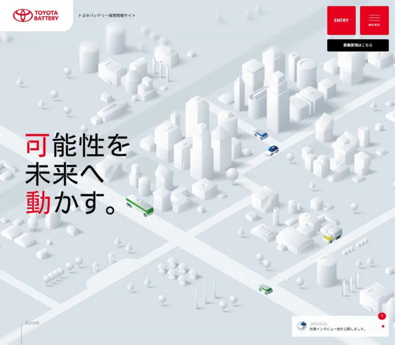
白いミニチュア都市と淡いブルーグレーを背景に、赤い採用ボタンと大きな日本語コピーを配置。社員や職場の写真カルーセルと採用区分別の導線を備える採用サイト。
オリジナルサイトを見るTOYOTA BATTERY Recruitment — Style Reference
A white miniature city punctuated by red recruitment signals.
Website: TOYOTA BATTERY Recruitment Original URL: https://www.toyota-battery.com/saiyo/ Final URL: https://www.toyota-battery.com/saiyo/ Theme: light, with a pale blue-gray canvas and red primary controls Inspected: September 13, 2026, 02:16:32 JST; supplied retrieval timestamp September 12, 2026, 17:16:32.488 UTC Viewports: desktop 1440 × 1000; mobile 390 × 844 CSS pixels Scope: the current recruitment homepage: opening city scene, company introduction, recommended-content carousel, recruitment directory, closing entry scene, and footer. Three desktop captures and two mobile captures provide visual evidence. Both viewport exports provide rendered DOM and selected computed styles. Menu and recruitment-overlay contents are documented only to the extent supported by the DOM; their opened appearance was not captured.
This is a corporate recruitment hub with multiple content and application routes. A miniature city makes battery technology tangible through cars, buses, factories, houses, charging equipment, and civic infrastructure. Most of that world is white, with soft shadows against a blue-gray ground. A few colored vehicles supply detail while red typography and controls establish the interface hierarchy.
The composition alternates between expansive illustration, human photography, and a dense gray navigation directory. The white logo tab and red entry/menu cluster remain at the upper corners across the supplied scroll captures. The closing section returns to the city, creating a visual connection between the opening message and the application controls.
How to Read This Reference
- Measured means reported by the supplied rendered DOM, computed styles, or custom properties. Measurements are rounded for readability.
- Observed means directly visible in an original-page screenshot. Screenshot-based dimensions and unmeasured type sizes are marked as estimates.
- Calculated values convert measured dimensions or compare the two inspected viewports. They do not establish an unseen stylesheet formula.
- Recommended values describe a reusable implementation. Breakpoints, accessibility improvements, asset handling, and unverified interaction endpoints fall into this category.
- Named tokens are implementation aliases unless a source custom property is explicitly identified.
- The exported DOM includes menu, modal, duplicate-label, and loading content that is not visible in the settled screenshots. DOM presence alone does not establish an opened overlay or an active loading state.
- Measurements can reflect transformed elements and carousel phases. Use widths, padding, and typography as stronger references than a single translated x/y coordinate.
Tokens — Colors
Default Palette
| Name | Value | Source / implementation token | Role and evidence |
|---|---|---|---|
| City Ground | #d7e1e7 |
Source --c-back-gray; alias --color-city |
Measured body background at both viewports; the continuous ground behind the city and content sections |
| Battery Red | #e60020 |
Source --c-red; alias --color-red |
Measured entry and menu fills; visually repeated in the logo, highlighted headline characters, category labels, and small square markers |
| White | #ffffff |
Source --c-white; alias --color-white |
Logo tab, content labels, controls, and reversed button text; illustrated buildings contain additional lighting tones |
| Black | #000000 |
Source --c-black; alias --color-ink |
Body text, headline lettering, requirements-button fill, and small interface symbols |
| Directory Gray | #636363 |
Source --c-dark-gray; alias --color-directory |
Measured background of internal recruitment and environment tiles |
| External Directory Gray | #595959 |
Computed rgb(89, 89, 89); alias --color-directory-external |
Measured background of career, temporary, and technical recruitment tiles |
| Utility Gray | #767676 |
Source --c-gray; alias --color-muted |
Declared supporting gray; exact assignment to every visible date and annotation was not sampled |
| Translucent White | rgba(255,255,255,.9) |
Computed on the company-introduction link | Light action surface over the illustrated background |
The palette is deliberately restrained. The red and black buttons supply strong edges against a low-contrast world. Greens, blues, and yellow appear in vehicles and photographs; they are image content rather than a second set of general interface accents.
The computed color on several button containers is black even though the screenshot clearly shows white labels. Child elements or graphics determine the visible label color. Reproduce the visible white lettering when implementing these controls.
Supporting State Colors
| Value | Evidence | Safe interpretation |
|---|---|---|
#c3001b |
Source --c-dark-red |
Available darker red; a specific active or hover assignment was not demonstrated |
rgba(41,41,41,.9) |
Source --c-hover-black |
Declared interaction color; the final appearance of a hovered component was not captured |
#e7e7e7 |
Desktop menu-link computed background | Supporting surface in menu DOM; opened menu appearance remains unverified |
#d7d7d7 |
Close-button computed background | Overlay-related control color from DOM evidence |
The source also exposes --swiper-theme-color: #007aff. That library-style default is not a visible brand color in the supplied captures and should not be added to the design palette.
Tokens — Typography
Japanese Body — Noto Sans JP
- Declared source:
--f-base: 'Noto Sans JP', sans-serif. - Computed body: 15.2381px at desktop and 16px at mobile, weight 400.
- Role: Japanese explanatory text, navigation, news, and utility content.
- Introduction copy: line height 1.8 and tracking 0.05em at both inspected sizes.
- Character: clear and restrained, leaving the illustration and display lettering to provide personality.
Japanese Headings — Kosugi
- Declared source:
--f-head: 'Kosugi', sans-serif. - Directly measured: company-introduction H2, recommended-section Japanese heading, card H3 elements, and menu links.
- Weight: 400 in the supplied measurements.
- Typical heading line height: 1.3.
- Card and menu tracking: −0.03em; the recommended-section Japanese heading uses −0.02em.
The hierarchy comes largely from scale and placement. Increasing every Japanese heading to a heavy weight would change the balance.
English Labels — Poppins
- Declared source:
--f-en: 'Poppins', sans-serif. - Directly computed example: the news-count button, weight 500.
- Visible roles: English section displays, category labels, and short recruitment terminology have a rounded geometric sans-serif appearance consistent with this declared family.
- Limitation: the individual weights and sizes of all English child elements were not exported. Treat the large English-heading sizes below as visual estimates.
These declarations identify family stacks, not font-file versions or confirmed font-binary delivery.
Hero Lettering
The headline reads 可能性を未来へ動かす。 over three visible lines:
可能性を未来へ動かす。
The characters 可 and 動 are red; the remaining lettering is black. The visible treatment has unusually large characters and deliberate internal spacing.
Do not use the H1 container's computed font size as the headline size. The H1 reports the body-size font while its measured box is approximately 609.52 × 528.56px on desktop and 374 × 324px on mobile. The visible lettering occupies only part of that box. Its child implementation and asset format were not supplied, so the precise headline face cannot be established from the container.
For a live-text adaptation, approximately 90–100px on desktop and 54–60px on mobile are reasonable visual starting points. These are estimates, and they will not reproduce custom lettering exactly.
Type Scale
| Role | Desktop | Mobile | Line height / tracking | Evidence |
|---|---|---|---|---|
| Body default | 15.2381px | 16px | Normal | Computed |
| Introduction H2 | 41.9048px | 34px | 1.3 | Computed, Kosugi 400 |
| Introduction copy | 15.2381px | 13px | 1.8; 0.05em | Computed, Noto Sans JP 400 |
| Recommended-section Japanese heading | 17.1429px | 16px | Normal; −0.02em | Computed, Kosugi 400 |
| Card H3 | 22.8571px | 16px | 1.3; −0.03em | Computed, Kosugi 400 |
| News message | 12.381px | 13px | 1.05 | Computed |
| News count | 11.4286px | 12px | Normal | Computed, Poppins 500 |
| Menu content link | 15.2381px | 16px | 1.3; −0.03em | Computed; opened menu not captured |
| English Recommended Contents display | About 34px | Not visually captured | Mixed emphasis within one line | Desktop visual estimate |
| Closing ENTRY label | About 28–30px | About 24px | Compact | Visual estimate; child type not sampled |
| Visible hero characters | About 90–100px | About 54–60px | Three composed lines | Visual estimate, not H1 font-size measurement |
Tokens — Spacing & Shapes
Responsive Unit
The source uses a tiny root unit:
| Property | Desktop | Mobile |
|---|---|---|
--vw |
1440px |
390px |
--base-vw |
1512 |
390 |
| Computed root font size | 0.952381px |
1px |
At these two widths, the root size matches the viewport width divided by the declared base width. This is a calculated relationship; the exact media queries, clamps, and behavior between these widths were not supplied.
In this reference, 1u means the measured source root unit: approximately 0.952381px on desktop and 1px on mobile. Equivalent u values help explain proportions without requiring a new application to adopt a 1px root.
Spacing Scale
| Use | Desktop | Mobile | Status |
|---|---|---|---|
| Primary corner-control top inset | 22.84px | 20px | Measured |
| Primary corner-control right inset | 22.84px | 15px | Measured |
| Gap between entry and menu buttons | 15.23px | 12px | Calculated from measured rectangles |
| Main desktop content inset | About 91.42px | Section-dependent | Measured on introduction link and recommended heading |
| Mobile introduction inset | — | 35px | Measured |
| Mobile recommended-heading inset | — | 20px | Measured |
| Carousel item gap | About 7.61px | About 7.98px | Calculated from adjacent card rectangles |
| Introduction copy-to-link gap | About 31.42px | 26px | Calculated from measured rectangles |
| Recommended-section top padding | 141.905px | 73px | Computed |
| Recommended-section bottom padding | 102.857px | 80px | Computed |
| Closing entry-to-requirements gap | 15.23px | 16px | Calculated |
| Directory horizontal padding | 45.7143px | 20px | Computed |
The spacing system uses very small gaps within control clusters and much larger intervals between illustrated and editorial sections. A uniform spacing rhythm would lose this contrast in density.
Border Radius
| Element | Desktop | Mobile | Evidence |
|---|---|---|---|
| Entry, menu, and requirements controls | 4.7619px | 5px | Computed |
| Introduction action | 3.80952px | 4px | Computed |
| Directory tiles | 0 | 0 | Computed |
| Visible logo tab, lower-right corner | About 38–40px | About 40px | Screenshot estimate; the sampled link itself reports zero radius |
| Card labels and image corners | About 4px | Not visually inspected | Desktop estimate |
| News count | Circular appearance | Circular appearance | Visible; animated bounding box can vary |
Most shapes are almost rectangular. The large single rounded corner of the logo tab is a distinctive exception.
Layout Measurements
| Element | Desktop 1440 × 1000 | Mobile 390 × 844 |
|---|---|---|
| Document height | 4374.92px | 4038.34px |
| Header bounding height | 187.28px | 115.78px |
| Logo-link box | 266.66 × 113.78px | 175 × 80px |
| Header ENTRY | 104.75 × 104.75px | 110 × 50px |
| Menu button | 104.75 × 104.75px | 50 × 50px |
| Header requirements button | 224.73 × 44.45px | 172 × 28.59px |
| H1 composition box | 609.52 × 528.56px | 374 × 324px |
| Introduction link | 323.80 × 55.98px | 320 × 49.64px |
| Recommended card | 388.98 × 590.47px | 284.64 × 434px |
| Three-part carousel-control group | About 252.34 × 57.14px | 271 × 50px |
| Closing ENTRY | 388.56 × 114.28px | 320 × 70px |
| Closing requirements button | 388.56 × 47.61px | 320 × 40px |
| Closing city region | About 809.52px high | 577px high |
The closing-region heights are calculated from the directory's final edge and the document end. The logo artwork is smaller than its padded tab: its calculated content area is approximately 167.61 × 47.11px on desktop and 128 × 36px on mobile.
Components
Persistent Brand Tab
Role: maintain company identity without placing the entire header on an opaque bar.
A white panel attaches to the top-left viewport corner. Its upper and left edges are flush with the browser; only the lower-right corner is generously rounded. Center the red Toyota symbol and TOYOTA BATTERY wordmark within generous padding.
At desktop, the recruitment-site descriptor sits immediately to the right of the tab on the transparent header. At mobile, it moves below the tab and wraps into two small lines. The background illustration remains visible around these independently positioned elements.
The logo links to the recruitment homepage. The same upper-corner placement appears in the initial, middle, and bottom desktop captures and both mobile captures, supporting persistent viewport positioning.
Entry and Menu Cluster
Role: provide continuous access to application choices and site navigation.
Desktop anatomy:
- Two red squares, each approximately 105px, separated by approximately 15px.
- ENTRY centered in the left square.
- Three thin white horizontal lines and a small tracked MENU caption in the right square.
- A black requirements button below, spanning the combined width of both red squares and their gap.
- Approximately 5px corner radii throughout.
Mobile keeps the group at the upper right but changes its proportions. ENTRY becomes a 110 × 50px rectangle; the menu is a 50px square; the MENU caption disappears. The black button remains underneath both, at 172 × 28.59px.
The source uses buttons for ENTRY and 募集要項はこちら, rather than direct anchor links. Recruitment-choice content exists in the DOM, but the click-to-overlay sequence was not exercised. Preserve separate application and requirements actions when implementing the component.
City Hero and Headline
Role: express the company's relationship to future mobility and everyday infrastructure.
The city fills the opening view behind the transparent header. Roads run diagonally through an elevated oblique view. White factories, cylindrical tanks, towers, houses, small trees, charging structures, and solar installations share one low-contrast material language. Blue cars, green buses, and small yellow or red vehicle details create scattered points of activity.
The large three-line Japanese headline sits toward the left on desktop. Its red first character in the first and third lines connects the message to the red control cluster across the screen. On mobile, the visible lettering moves into the central-left area, beginning at approximately x76 and y244 in the screenshot; the city is tightly cropped around it.
A fine Scroll annotation appears near the lower-left edge on desktop. On mobile it rotates into a vertical cue at the right edge beside the headline. This is a small orientation aid, not a large button.
Preserve the full headline as accessible text even if using a composed graphic. The visible scene does not establish whether the implementation uses a raster image, video, layered vectors, or a real-time renderer.
News Notice
Role: provide a lightweight update without competing with the hero message.
The notice is a shallow translucent-white rectangle. It contains a small circular vehicle thumbnail at left, a muted date above a single-line Japanese message, and a tiny red square near the right edge. A red circular count button overlaps its upper-right boundary.
The visible update is dated 2025.03.31 and reads 社員インタビュー他を公開しました。. The DOM also contains a second update dated 2024.10.16. The count is 2.
Desktop places the notice at the hero's lower right, approximately 352 × 77px by visual estimation. Mobile gives it nearly the whole width: approximately 370 × 82px, with 10px side margins, below the main lettering. It is not present in the supplied bottom captures, so it should not be treated as a page-wide persistent bottom overlay.
The count has an explicit repeating CSS animation. The notice's expansion, item-change behavior, and exact count-button action were not tested.
Company Introduction
Role: connect the city metaphor to company information.
The section combines a large English display, What we do / TOYOTA BATTERY, with white line drawings of rounded vehicles and a solid pale battery illustration. A thin technical annotation line with square endpoints labels Li-Ion BATTERY.
The text block contains a two-line Kosugi heading, short Japanese explanatory copy, and one wide white action labeled トヨタバッテリーを知る. The action uses a small red square at its right end rather than a large arrow or pictogram.
On desktop, the measured heading is approximately 42px and the text column approximately 343px wide. The action begins slightly to the right of the heading box. On mobile, the heading, copy, and action align within a 320px column with 35px outer margins; the heading reduces to 34px and the copy to 13px.
The mobile opening capture shows the beginning of the red English display near the bottom of the viewport. The remainder of the mobile introduction is supported by DOM measurements rather than a supplied middle screenshot.
Recommended Contents Header and Controls
Role: introduce a horizontally browsable set of recruiting stories and practical resources.
The English display uses a visibly heavier Recommended followed by a lighter Contents on the same line. A smaller Japanese heading sits immediately below. On desktop, a white control group sits alongside the heading with previous, pause, and next symbols. Two thin vertical separators divide the three buttons.
The measured desktop button widths are approximately 82.84, 86.66, and 82.84px, all 57.14px high. Mobile places the controls beneath the heading, centered in a 271 × 50px group.
The pause symbol and varying slide positions support an intended playback-style carousel interface. Automatic timing, swipe support, and pause-state persistence were not demonstrated.
Recommended Content Card
Role: turn five major content areas into visual destinations.
Each item is a whole-card anchor with this hierarchy:
- A parenthesized number,
(01)through(05), overlapping the upper image edge. - A tall image or photo montage with only slight corner rounding.
- A smaller white information panel inset over the lower image region.
- A red English category, a secondary English subject, a Japanese H3, and
詳細を見る.
The five destinations are job introduction, employee interviews, cross talk, education, and workplace. The visible desktop phase shows cross talk, education, workplace, and part of the job illustration. Preserve each item's number as part of its identity when the track moves.
The card is approximately 389 × 590px on desktop. Its white panel is about 80% of the image width by visual estimation. Narrow gaps allow several cards and a cropped continuation to occupy the viewport. On mobile, the measured card is approximately 285 × 434px, so the horizontal presentation retains a partial neighboring item instead of becoming a full-width vertical list.
The current visual content mixes conversation portraits, a presenter addressing a classroom, a bright communal workplace with plants, and miniature illustrated people. The interview destination is confirmed in the DOM, but its image is not clearly exposed in the supplied middle capture.
Recruitment and Environment Directory
Role: make application routes and practical employment information easy to scan near the end of the page.
This is a flush rectangular grid with white text, fine dividing edges, and two close gray fills. It contains eight linked tiles.
Desktop divides the directory into equal 720px halves. The left half has one full-width graduate-recruitment tile above a two-column grid of FAQ, welfare, education, and workplace. The right half has three full-width rows for career, temporary, and technical recruitment. Rows are approximately 189–191px high; the smaller left tiles are 360px wide.
Tile content combines a compact English category/description, a larger Japanese label, and a thin underlined action with a small red square or external-link symbol. Internal destinations use 詳細を見る; external recruitment destinations use 専用サイトを見る.
Mobile places all eight tiles in a single column. Graduate recruitment and the three external recruitment tiles are approximately 198px high. FAQ and the three environment tiles are approximately 120px high. Horizontal padding reduces from 45.71px to 20px.
The darker right-side desktop fill becomes the fill of the later external-recruitment rows on mobile. Preserve this grouping even after the two-column layout disappears.
Closing Entry Scene and Footer
Role: finish with a clear application action while returning to the opening visual world.
A broad city illustration sits directly below the gray directory. Desktop places a large red ENTRY button toward the right, with a narrower-height black requirements button underneath. The pair is approximately 389px wide, with 114px and 48px heights.
Mobile centers the pair in a 320px column, 35px from each edge. The red button is 70px high; the black button is 40px high; their gap is 16px. The measured red-button position is 85px below the start of the closing city region.
The city provides substantial open space around and below the controls. Near the desktop bottom, a smaller red logo, policy links, X icon, and YouTube icon form a horizontal row; copyright sits toward the right. Mobile omits the repeated footer logo, keeps the policy and social links on one compact row, and centers copyright below.
The visible copyright reads ©2024 TOYOTA BATTERY Co., Ltd. All Rights Reserved. Its year is page content, not the inspection date.
Menu and Recruitment Overlays — DOM Evidence Only
The DOM includes navigation grouped under About TOYOTA BATTERY, Work & People, Culture, and Environment, followed by ENTRY & RECRUITING DATA. It also includes graduate, career, technical, and temporary recruitment choices and close controls.
Desktop measurements place navigation groups and recruitment choices across multiple columns. Mobile measurements place content navigation in a vertical sequence, with recruitment choices in two narrower columns farther down. This supports responsive content restructuring, but does not establish the visible opened panel's backdrop, entrance, scroll containment, or focus behavior.
The menu button includes the text alternative メニューをひらく, and close-related text includes ポップアップをとじる. Duplicate link labels in the export should not become duplicate visible links in a recreation.
Tokens — Motion & Interaction
Measured Timing and Layer Tokens
| Element or token | Supplied value | Supported interpretation |
|---|---|---|
| Header and menu-button transition | Opacity and transform, 0.6s, cubic-bezier(.165,.84,.44,1) |
A declared reveal/movement treatment; trigger and travel distance unverified |
| H1 composition transition | Transform, 0.8s, cubic-bezier(.165,.84,.44,1) |
Headline movement is supported by CSS; exact choreography unverified |
| Desktop entry and requirements buttons | Background color, 0.4s sine-out; transform, 0.4s bounce | Color and transform feedback are declared; hover endpoints were not captured |
| Desktop recommended-card links | Transform, 0.4s, cubic-bezier(.37,.13,0,1.38) |
A transform response with overshoot-capable easing |
| Desktop directory tiles | Background color, 0.4s, cubic-bezier(.39,.575,.565,1) |
Background-color interaction treatment |
| Mobile recommended section | Opacity and transform, 0.6s sine-out | A section transition is declared |
| News count | 2.6s cubic-bezier(.39,.575,.565,1) infinite newsBatch |
Explicit repeating animation; keyframe geometry unavailable |
| Menu home link | Opacity and transform, 0.24s | Compact link feedback declared in DOM styles |
| Source layer order | Base 0; header 100; menu 101; menu button 102; modal 103; opening 104 | Named stacking levels; opening-state appearance was not captured |
Additional declared easing tokens are --ease-inout-sine: cubic-bezier(.445,.05,.55,.95) and --ease-bounce-sine: cubic-bezier(.37,.13,.17,1.3). Their presence does not prove use on a particular visible component.
Observed Behavior and Limits
The header remains in the same upper-corner positions through the supplied scroll captures. The page is vertically navigable, and the recommended-content track exposes different horizontal phases. A pause control is visible. No control-click, hover, keyboard, menu-open, modal-open, or media-playback sequence was provided.
The capture process temporarily paused perpetual animations during readiness checks, then resumed them. As a result, individual frames can represent different phases. Vehicle motion, city parallax, exact carousel timing, and the news animation's deformation cannot be reconstructed from these stills.
Several mobile elements export only transition: all. This does not provide a meaningful duration and should not be interpreted as evidence that desktop hover motion operates identically on touch devices.
Surfaces
| Layer | Appearance | Purpose |
|---|---|---|
| Page canvas | Solid pale blue-gray | Connects illustration and editorial sections |
| City illustration | Matte white objects, pale roads, soft directional shadows | Main visual identity and spatial depth |
| Logo tab | Opaque white with one large rounded corner | Reliable brand contrast over the scene |
| Primary controls | Solid red, white labels, approximately 5px corners | Entry and menu emphasis |
| Requirements controls | Solid black with white text | Secondary recruitment action |
| News and introduction action | White or translucent white | Local readability over imagery |
| Card information panels | White rectangles over photographs | Clear category and destination hierarchy |
| Directory | Adjacent #636363 and #595959 fields |
Dense navigation and recruitment grouping |
There is no broad floating-card elevation system in the visible page. Depth comes primarily from the illustration and photography. Interface separation relies on solid fills, modest radii, overlaps, and fine rules.
Imagery
The city resembles a carefully lit architectural model. Buildings use simplified geometry, matte white materials, and low-contrast shadows. The scene is viewed from above at an oblique angle, with broad diagonal roads creating a repeated structure. Soft focus near the upper and lower scene regions reinforces the miniature effect while the central architecture remains clearer.
Preserve white surfaces without flattening them into pure silhouettes: lighting must retain roofs, cylinders, recesses, and building edges. Use sparse vehicle colors to make mobility legible. Avoid a global dark overlay, which would remove the airy relationship between the illustration and black headline.
The introduction shifts toward white vehicle contours and a battery annotation, bringing a technical explanatory language into the same pale world. The carousel shifts again into natural photography: faces, learning situations, workplace architecture, wood, plants, and daylight. These photographic textures make the recruiting content feel grounded in actual work.
Observed Asset References
Asset filenames and direct media URLs were not supplied. The following are visual references, not downloadable asset paths.
| Visual | Evidence location | Treatment to preserve |
|---|---|---|
| Red company logo | Header at both sizes; desktop footer | Original symbol/wordmark proportions and clear white surrounding space |
| Miniature city | Opening and closing captures | White architecture, diagonal roads, soft focus, isolated colored vehicles |
| Hero lettering | Opening captures | Three-line composition with 可 and 動 in red |
| Vehicle and battery diagram | Desktop introduction boundary | White contour drawing, pale solid battery, fine annotation rule with square endpoints |
| News thumbnail | Opening captures | Small vehicle image inside a circular crop |
| Cross-talk imagery | Desktop recommended-content capture | Conversation portraits arranged as a tall photographic composition |
| Education imagery | Desktop recommended-content capture | Presenter and seated participants in a real learning environment |
| Workplace imagery | Desktop recommended-content capture | Bright communal interior, plants, timber furniture, and architectural imagery |
| Job illustration | Partial desktop recommended card | Small people integrated with white miniature structures |
| Utility symbols | Header, carousel, links, footer | Thin hamburger lines, simple transport controls, tiny red squares, external-link marks, and recognizable social logos |
Use authorized original assets when available. The CSS shell can reproduce placement and hierarchy, but the city composition and distinctive lettering require suitable artwork. Do not infer a rendering technology from their appearance alone.
Layout & Responsive Behavior
Desktop Composition
At 1440 × 1000, the opening view is dominated by the city, a left-positioned headline, and independently anchored corner controls. The news panel occupies a small area at the lower right. Wide negative space separates the opening experience from the company and recommended-content sections.
The recommended heading aligns to an approximately 91px left inset, while the image track extends to the viewport edges. Several approximately 389px cards are visible at once. Their cropped continuation is part of the browsing presentation.
The directory uses the two-half structure described above, followed by an approximately 810px closing city region. The final entry pair is right aligned while legal and social navigation runs near the bottom edge.
Mobile Composition
At 390 × 844, the header is reorganized rather than uniformly reduced. The logo tab is 175px wide, ENTRY becomes a horizontal rectangle, the menu remains square, and the site descriptor sits below the logo.
The city is cropped to a portrait scene, with the visible three-line message around the middle-left. The Scroll cue moves to the right edge. The news notice spans almost the full width below the lettering, and the next section begins at document y765px.
DOM measurements show a 320px introduction column, carousel controls below the heading, approximately 285px cards, and a single-column directory. The mobile directory occupies approximately 1273px before the final 577px city region. The page height remains close to desktop because shorter opening/editorial sections are balanced by the stacked navigation tiles.
Responsive Implementation Boundaries
Only these two viewport sizes were inspected. The exact breakpoint, tablet layout, maximum desktop scale, landscape behavior, and safe-area rules were not provided. The CSS below uses an explicitly recommended 767px breakpoint and bounded scaling.
Some section rectangles overlap or shift relative to neighboring measured boxes, consistent with transformed layout or capture phase. Do not reproduce the whole page by absolutely positioning sections at exported document coordinates. Use normal document flow for content and local positioning for the hero, card overlays, fixed controls, and closing scene.
Do’s and Don’ts
Do
- Keep
#d7e1e7, white, black, and#e60020as the dominant visual system. - Preserve the matte white city and sparse colored vehicles.
- Maintain the logo tab's single large rounded corner.
- Keep application access visible at the top right across the page.
- Preserve the three-line headline and the red
可and動emphasis when using the source copy. - Use Noto Sans JP for body text and the measured Kosugi heading hierarchy.
- Pair large English displays with smaller Japanese explanations.
- Keep carousel images tall, with narrow track gaps and inset white information panels.
- Retain the directory's two gray groupings when stacking it on mobile.
- Return to the city artwork for the closing entry section.
- Separate measured transition timing from unverified movement endpoints.
Don’t
- Don’t replace the white city with a generic car photograph or dark technology background.
- Don’t recolor every vehicle or illustrated object red.
- Don’t treat the H1's body-size computed font as the visible headline size.
- Don’t make every control pill-shaped or introduce large rounded photo cards.
- Don’t add strong drop shadows or glass effects throughout the interface.
- Don’t turn the recommended-content track into a static desktop grid if matching this composition.
- Don’t shrink the entire desktop header proportionally for mobile.
- Don’t copy hidden duplicate labels into visible navigation.
- Don’t assume the menu, recruitment overlays, or carousel controls were interaction-tested.
- Don’t invent city animation, parallax distances, or precise autoplay intervals from still images.
- Don’t hardcode the old news dates or copyright year as the current date.
Recommended Implementation Additions
These are recommendations for a new implementation, not verified features of the inspected site:
- Give carousel controls and social links explicit accessible names. The supplied export does not establish their full accessibility attributes.
- Preserve a visible focus ring against red, black, white, and gray surfaces.
- Keep the complete hero message available to assistive technology when using artwork. Hide duplicate decorative text from the accessibility tree.
- Expand small utility hit areas, particularly the approximately 29px-high mobile requirements control, toward a 44px target without overlapping adjacent controls.
- Implement menu and recruitment dialogs with managed focus, Escape dismissal, focus restoration, and appropriate background scroll handling.
- If the carousel advances automatically, provide a working pause control, keyboard navigation, and a static reduced-motion mode.
- Respect reduced-motion preferences for the news count, section transforms, and any separately implemented city animation.
- Ensure fixed header elements do not obscure focused links or anchor destinations. Use scroll offsets appropriate to each viewport.
- Test narrow phones, text enlargement, and landscape independently; the two supplied sizes do not establish those layouts.
- Supply responsive city crops and appropriately sized photographs. Keep critical lettering and controls readable while media loads.
- Treat the footer directory as ordinary semantic links so recruitment routes remain available without animation.
Agent Prompt Guide
Quick Color Reference
- Main ground:
#d7e1e7. - Architecture and information surfaces: white.
- Primary entry/menu controls and small markers:
#e60020. - Main text and requirements controls: black.
- Internal directory tiles:
#636363. - External recruitment tiles:
#595959. - Supporting gray:
#767676; check contrast for small text. - Imagery: isolated blue, green, yellow, and red vehicle details; natural workplace photography.
Overall Prompt
“Create a Japanese corporate recruitment homepage with a pale blue-gray #d7e1e7 canvas and a matte white miniature city seen from an elevated oblique angle. Show diagonal roads, simplified factories, houses, tanks, charging equipment, and a few colored vehicles. Place a red company logo inside a white top-left tab with one large rounded lower-right corner. Keep a red ENTRY control, red hamburger control, and black requirements control at the top right. Use the three-line message 可能性を / 未来へ / 動かす。, emphasizing 可 and 動 in red. Follow the opening scene with a company introduction, a horizontal photo carousel with overlapping white labels, a flush gray recruitment directory, and a closing city scene with a large entry pair. Use Noto Sans JP body text, Kosugi Japanese headings, and Poppins English labels. Adapt the header and directory structurally for mobile.”
Example Component Prompts
- Corner controls: “At desktop, create two approximately 105px red squares with a 15px gap and a full-width black requirements button beneath. At 390px mobile width, change ENTRY to 110 × 50px and the menu to 50 × 50px, with a 12px gap. Keep approximately 5px corner radii. Hide the MENU caption on mobile.”
- News notice: “Create a shallow white notice with a circular vehicle thumbnail, a muted date, one short Japanese update, a small red square, and a red count circle overlapping its upper-right edge. Place it at the hero's lower right on desktop and within 10px mobile side margins.”
- Recommended card: “Create a tall recruiting-content link, approximately 389 × 590px on desktop, with a photographic montage, an overlapping parenthesized number, and a white information panel about 80% of the image width. Stack a red English category, English subject, Japanese Kosugi heading, and a detail link. Keep gaps between cards around 8px.”
- Recruitment directory: “Create an edge-to-edge gray directory. On desktop, use two equal halves: graduate recruitment above a two-column practical-information grid on the left, and three external recruitment rows on the right. Use
#636363and#595959, white text, fine rules, and tiny red markers. Stack all eight links on mobile.” - Closing scene: “Reuse the white city visual language behind a red ENTRY button and a black requirements button. Place the pair toward the right on desktop; center a 320px-wide pair on mobile. Leave substantial illustrated space before a compact legal and social footer.”
Quick Start
CSS Custom Properties
This is a reusable adaptation, not extracted production CSS. It retains a conventional browser root size and uses --u for source-like geometry. At the two inspected widths, --u matches the measured root unit. The clamps, 767px breakpoint, focus treatment, scroll snapping, and hover endpoints are recommendations.
Load the declared fonts through your project's approved font setup. Supply authorized city images through --city-hero-image and --city-footer-image; both default to none because original asset URLs were not available. The live-text hero uses estimated typography. Menu, dialog, and carousel behavior require application code.
:root {
  /* Measured palette */
  --color-city: #d7e1e7;
  --color-red: #e60020;
  --color-red-dark: #c3001b;
  --color-white: #fff;
  --color-ink: #000;
  --color-muted: #767676;
  --color-directory: #636363;
  --color-directory-external: #595959;

  /* Declared source families */
  --font-base: 'Noto Sans JP', sans-serif;
  --font-head: 'Kosugi', sans-serif;
  --font-en: 'Poppins', sans-serif;

  /* Recommended bounded adaptation of the measured unit */
  --u: clamp(.85px, calc(100vw / 1512), 1.1px);
  --page-inset: calc(96 * var(--u));
  --radius-control: calc(5 * var(--u));
  --radius-panel: calc(4 * var(--u));
  --type-section: calc(44 * var(--u));
  --type-card: calc(24 * var(--u));
  --card-width: calc(408.43 * var(--u));
  --card-height: calc(620 * var(--u));

  /* Measured source easing and layer values */
  --ease-out: cubic-bezier(.39, .575, .565, 1);
  --ease-reveal: cubic-bezier(.165, .84, .44, 1);
  --ease-bounce: cubic-bezier(.37, .13, 0, 1.38);
  --z-header: 100;
  --z-menu: 101;
  --z-menu-button: 102;
  --z-modal: 103;
  --z-opening: 104;

  /* Populate with authorized image resources */
  --city-hero-image: none;
  --city-footer-image: none;
}

* { box-sizing: border-box; }
body {
  margin: 0;
  color: var(--color-ink);
  background: var(--color-city);
  font-family: var(--font-base);
  font-size: 1rem;
}
button, a { -webkit-tap-highlight-color: transparent; }
button { font: inherit; cursor: pointer; }
img { display: block; max-width: 100%; }
a { color: inherit; }

.brand-tab {
  position: fixed;
  inset: 0 auto auto 0;
  z-index: var(--z-header);
  width: calc(280 * var(--u));
  height: calc(119.47 * var(--u));
  padding: calc(35 * var(--u)) calc(55 * var(--u))
    calc(35 * var(--u)) calc(49 * var(--u));
  border-radius: 0 0 calc(40 * var(--u)) 0;
  background: var(--color-white);
}
.brand-tab img { width: 100%; height: 100%; object-fit: contain; }
.brand-caption {
  position: fixed;
  z-index: var(--z-header);
  left: calc(302 * var(--u));
  top: calc(52 * var(--u));
  margin: 0;
  font-size: calc(14 * var(--u));
}
.header-actions {
  position: fixed;
  z-index: var(--z-menu-button);
  top: calc(24 * var(--u));
  right: calc(24 * var(--u));
  display: grid;
  grid-template-columns: repeat(2, calc(110 * var(--u)));
  gap: calc(16 * var(--u));
}
.action {
  display: flex;
  align-items: center;
  justify-content: center;
  min-width: 0;
  height: calc(110 * var(--u));
  padding: 0;
  border: 0;
  border-radius: var(--radius-control);
  color: var(--color-white);
  background: var(--color-red);
  font-family: var(--font-en);
  font-size: calc(16 * var(--u));
  font-weight: 600;
  text-decoration: none;
  transition: background-color .4s var(--ease-out),
    transform .4s var(--ease-bounce);
}
.action--requirements {
  grid-column: 1 / -1;
  height: calc(46.68 * var(--u));
  background: var(--color-ink);
  font-family: var(--font-base);
  font-size: calc(14 * var(--u));
  font-weight: 400;
}
.menu-button { flex-direction: column; gap: calc(8 * var(--u)); }
.menu-bars { display: grid; gap: calc(8 * var(--u)); }
.menu-bars i {
  display: block;
  width: calc(40 * var(--u));
  height: calc(2 * var(--u));
  background: currentColor;
}
.menu-caption { font-size: calc(10 * var(--u)); letter-spacing: .2em; }

.city-hero {
  position: relative;
  min-height: 100svh;
  background-image: var(--city-hero-image);
  background-size: cover;
  background-position: center;
}
.hero-headline {
  /* Live-text approximation; source lettering was not measured as text */
  position: absolute;
  top: 35%;
  left: var(--page-inset);
  margin: 0;
  font-family: var(--font-head);
  font-size: calc(96 * var(--u));
  font-weight: 400;
  line-height: 1.14;
  letter-spacing: -.03em;
}
.hero-headline > span { display: block; }
.hero-headline em { color: var(--color-red); font-style: normal; }
.news-notice {
  position: absolute;
  right: calc(24 * var(--u));
  bottom: calc(32 * var(--u));
  display: grid;
  grid-template-columns: calc(40 * var(--u)) minmax(0, 1fr);
  align-items: center;
  gap: calc(12 * var(--u));
  width: calc(370 * var(--u));
  min-height: calc(81 * var(--u));
  padding: calc(18 * var(--u));
  border-radius: var(--radius-panel);
  background: rgba(255, 255, 255, .9);
}
.news-notice img { width: 100%; aspect-ratio: 1; border-radius: 50%; }
.news-notice time { color: var(--color-muted); font-size: calc(12 * var(--u)); }
.news-message { margin: calc(4 * var(--u)) 0 0; font-size: calc(13 * var(--u)); line-height: 1.05; }
.news-count {
  position: absolute;
  top: calc(-15 * var(--u));
  right: calc(10 * var(--u));
  display: grid;
  place-items: center;
  width: calc(30 * var(--u));
  aspect-ratio: 1;
  border: 0;
  border-radius: 50%;
  color: var(--color-white);
  background: var(--color-red);
  font: 500 calc(12 * var(--u)) var(--font-en);
}

.company-intro {
  display: grid;
  grid-template-columns: calc(360 * var(--u)) minmax(0, 1fr);
  align-items: center;
  gap: calc(48 * var(--u));
  padding: calc(100 * var(--u)) var(--page-inset);
}
.company-intro h2 {
  margin: 0;
  font: 400 var(--type-section)/1.3 var(--font-head);
}
.intro-copy {
  margin: calc(20 * var(--u)) 0 calc(32 * var(--u));
  font-size: calc(16 * var(--u));
  line-height: 1.8;
  letter-spacing: .05em;
}
.intro-link {
  display: flex;
  align-items: center;
  justify-content: space-between;
  min-height: calc(58.8 * var(--u));
  padding: calc(20 * var(--u)) calc(16 * var(--u));
  border-radius: var(--radius-panel);
  background: rgba(255, 255, 255, .9);
  text-decoration: none;
}
.intro-link::after {
  content: '';
  flex: 0 0 calc(8 * var(--u));
  height: calc(8 * var(--u));
  background: var(--color-red);
}

.recommended { padding: calc(149 * var(--u)) 0 calc(108 * var(--u)); }
.recommended-header {
  display: flex;
  align-items: center;
  gap: calc(44 * var(--u));
  margin: 0 var(--page-inset) calc(64 * var(--u));
}
.recommended-display { margin: 0; font: 400 calc(36 * var(--u))/1.2 var(--font-en); }
.recommended-display strong { font-weight: 600; }
.recommended-header h2 { margin: 0; font: 400 calc(18 * var(--u))/1.3 var(--font-head); }
.slider-controls {
  display: grid;
  grid-template-columns: calc(87 * var(--u)) calc(91 * var(--u)) calc(87 * var(--u));
  flex: none;
  border-radius: var(--radius-panel);
  background: var(--color-white);
}
.slider-controls button {
  position: relative;
  height: calc(60 * var(--u));
  border: 0;
  color: var(--color-ink);
  background: transparent;
}
.slider-controls button + button::before {
  content: '';
  position: absolute;
  left: 0;
  top: 28%;
  bottom: 28%;
  width: 1px;
  background: #ddd;
}
.content-track {
  /* Recommended native-scroll baseline; original carousel logic is separate */
  display: flex;
  gap: calc(8 * var(--u));
  overflow-x: auto;
  padding: calc(16 * var(--u)) calc(8 * var(--u));
  scroll-snap-type: x proximity;
}
.content-card {
  position: relative;
  flex: 0 0 var(--card-width);
  height: var(--card-height);
  scroll-snap-align: center;
  text-decoration: none;
  transition: transform .4s var(--ease-bounce);
}
.content-card > img { width: 100%; height: 100%; object-fit: cover; border-radius: var(--radius-panel); }
.card-number { position: absolute; top: calc(-14 * var(--u)); left: calc(16 * var(--u)); font: 400 calc(24 * var(--u))/1 var(--font-en); }
.card-panel {
  position: absolute;
  top: 55%;
  left: 10%;
  width: 80%;
  padding: calc(28 * var(--u)) calc(32 * var(--u));
  border-radius: var(--radius-panel);
  background: var(--color-white);
}
.card-category { color: var(--color-red); font-family: var(--font-en); font-weight: 600; }
.card-panel h3 { font: 400 var(--type-card)/1.3 var(--font-head); letter-spacing: -.03em; }

.recruitment-directory { display: grid; grid-template-columns: 1fr 1fr; }
.directory-primary { display: grid; grid-template-columns: repeat(2, minmax(0, 1fr)); }
.directory-primary > :first-child { grid-column: 1 / -1; }
.directory-external { display: grid; grid-template-rows: repeat(3, 1fr); }
.directory-tile {
  display: flex;
  flex-direction: column;
  justify-content: space-between;
  min-height: calc(200 * var(--u));
  padding: calc(30 * var(--u)) calc(48 * var(--u)) calc(39 * var(--u));
  border: 1px solid rgba(255, 255, 255, .12);
  color: var(--color-white);
  background: var(--color-directory);
  text-decoration: none;
  transition: background-color .4s var(--ease-out);
}
.directory-tile--wide {
  flex-direction: row;
  align-items: center;
  gap: calc(36 * var(--u));
  padding-block: calc(63 * var(--u)) calc(61 * var(--u));
}
.directory-external .directory-tile { background: var(--color-directory-external); }
.directory-action { width: fit-content; padding-bottom: .65em; border-bottom: 1px solid currentColor; }

.closing-scene {
  position: relative;
  min-height: calc(850 * var(--u));
  padding: calc(292 * var(--u)) var(--page-inset) calc(150 * var(--u));
  background-image: var(--city-footer-image);
  background-position: center;
  background-size: cover;
}
.closing-actions { display: grid; gap: calc(16 * var(--u)); width: calc(408 * var(--u)); margin-left: auto; }
.closing-actions .action { height: calc(120 * var(--u)); font-size: calc(30 * var(--u)); }
.closing-actions .action--requirements { height: calc(50 * var(--u)); font-size: calc(14 * var(--u)); }
.footer-links {
  position: absolute;
  left: calc(48 * var(--u));
  bottom: calc(36 * var(--u));
  display: flex;
  align-items: center;
  gap: calc(32 * var(--u));
  font-size: calc(13 * var(--u));
}
.footer-logo { width: calc(151 * var(--u)); }
.footer-copyright { position: absolute; right: calc(48 * var(--u)); bottom: calc(48 * var(--u)); margin: 0; font-size: calc(12 * var(--u)); }

/* Recommended interaction endpoints; original endpoints were not captured */
@media (hover: hover) {
  .action:not(.action--requirements):hover { background: var(--color-red-dark); }
  .content-card:hover { transform: translateY(-3px); }
}
:where(a, button):focus-visible { outline: 3px solid #000; outline-offset: 4px; }
.directory-tile:focus-visible { outline-color: #fff; outline-offset: -5px; }

/* Recommended breakpoint; only 390px and 1440px were inspected */
@media (max-width: 767px) {
  :root {
    --u: clamp(.82px, calc(100vw / 390), 1.15px);
    --page-inset: calc(35 * var(--u));
    --type-section: calc(34 * var(--u));
    --type-card: calc(16 * var(--u));
    --card-width: calc(284.64 * var(--u));
    --card-height: calc(434 * var(--u));
  }
  .brand-tab { width: calc(175 * var(--u)); height: calc(80 * var(--u)); padding: calc(20 * var(--u)) calc(28 * var(--u)) calc(24 * var(--u)) calc(19 * var(--u)); }
  .brand-caption { left: calc(20 * var(--u)); top: calc(86 * var(--u)); width: calc(145 * var(--u)); font-size: calc(11 * var(--u)); line-height: 1.4; }
  .header-actions { top: calc(20 * var(--u)); right: calc(15 * var(--u)); grid-template-columns: calc(110 * var(--u)) calc(50 * var(--u)); gap: calc(12 * var(--u)); }
  .header-actions .action { height: calc(50 * var(--u)); }
  .header-actions .action--requirements { height: calc(28.6 * var(--u)); font-size: calc(11 * var(--u)); }
  .menu-caption { display: none; }
  .menu-bars { gap: calc(4 * var(--u)); }
  .menu-bars i { width: calc(24 * var(--u)); }
  .city-hero { min-height: calc(765 * var(--u)); }
  .hero-headline { top: calc(240 * var(--u)); left: calc(75 * var(--u)); font-size: calc(60 * var(--u)); line-height: 1.08; }
  .news-notice { right: calc(10 * var(--u)); bottom: calc(45 * var(--u)); width: calc(100% - 20 * var(--u)); min-height: calc(82 * var(--u)); }
  .company-intro { grid-template-columns: 1fr; padding: calc(26 * var(--u)) var(--page-inset) 0; }
  .intro-art { grid-row: 1; }
  .intro-copy { font-size: calc(13 * var(--u)); }
  .intro-link { min-height: calc(49.64 * var(--u)); padding: calc(18 * var(--u)) calc(16 * var(--u)); }
  .recommended { padding-block: calc(73 * var(--u)) calc(80 * var(--u)); }
  .recommended-header { flex-direction: column; align-items: stretch; gap: calc(30 * var(--u)); margin-inline: calc(20 * var(--u)); margin-bottom: calc(31 * var(--u)); }
  .recommended-display { font-size: calc(28 * var(--u)); }
  .recommended-header h2 { font-size: calc(16 * var(--u)); }
  .slider-controls { align-self: center; grid-template-columns: calc(89 * var(--u)) calc(93 * var(--u)) calc(89 * var(--u)); }
  .slider-controls button { height: calc(50 * var(--u)); }
  .card-panel { padding: calc(20 * var(--u)) calc(22 * var(--u)); }
  .recruitment-directory, .directory-primary { grid-template-columns: 1fr; }
  .directory-tile { min-height: calc(120 * var(--u)); padding: calc(29 * var(--u)) calc(20 * var(--u)) calc(31 * var(--u)); flex-direction: row; align-items: center; }
  .directory-tile--wide { min-height: calc(198.23 * var(--u)); flex-direction: column; align-items: stretch; gap: calc(49 * var(--u)); }
  .directory-tile--wide .directory-action { align-self: flex-end; }
  .closing-scene { min-height: calc(577 * var(--u)); padding: calc(85 * var(--u)) var(--page-inset) 0; }
  .closing-actions { width: 100%; margin: 0; }
  .closing-actions .action { height: calc(70 * var(--u)); font-size: calc(24 * var(--u)); }
  .closing-actions .action--requirements { height: calc(40 * var(--u)); font-size: calc(12 * var(--u)); }
  .footer-logo { display: none; }
  .footer-links { left: calc(20 * var(--u)); right: calc(20 * var(--u)); bottom: calc(85 * var(--u)); justify-content: space-between; gap: calc(10 * var(--u)); font-size: calc(11 * var(--u)); }
  .footer-copyright { left: 0; right: 0; bottom: calc(40 * var(--u)); text-align: center; font-size: calc(10 * var(--u)); }
}

/* Recommended CSS fallback; pause scripted motion separately */
@media (prefers-reduced-motion: reduce) {
  .action, .content-card, .directory-tile { transition: none; }
  .content-card:hover { transform: none; }
  .news-count { animation: none; }
  .content-track { scroll-behavior: auto; }
}
Use .directory-primary and .directory-external as the two children of .recruitment-directory. Apply .directory-tile--wide to graduate recruitment and each external recruitment tile. In the hero, place each headline line in a direct child span and wrap only 可 and 動 in emphasis elements. Supply semantic text and actual destinations independently of decorative markers.
This baseline intentionally leaves the original news keyframes and city choreography undefined because their geometry was not supplied. The introduction's complete display-art composition also requires its own responsive artwork layout.
Tailwind v4 Token Mapping
Optional aliases for a project already using Tailwind v4. These do not identify the original site's framework. Define the custom properties above first.
@theme inline {
  --color-city: #d7e1e7;
  --color-battery-red: #e60020;
  --color-directory: #636363;
  --color-directory-external: #595959;
  --color-ink: #000;
  --font-sans: var(--font-base);
  --font-heading: var(--font-head);
  --font-english: var(--font-en);
  --text-section: var(--type-section);
  --text-card: var(--type-card);
  --spacing-unit: var(--u);
  --spacing-page: var(--page-inset);
  --radius-control: calc(5 * var(--u));
  --radius-panel: calc(4 * var(--u));
}
Sources & Evidence
- Original and final page: TOYOTA BATTERY Recruitment. The supplied observation reports HTTP 200 and an unchanged final URL.
- Capture timestamp:
2026-09-12T17:16:32.488Z, equivalent to September 13, 2026, 02:16:32.488 JST. This identifies the supplied evidence batch; separate per-frame timestamps were not provided. - Desktop visual evidence: three 1440 × 1000 captures showing the opening hero, introduction/recommended-content boundary, and closing city/footer.
- Mobile visual evidence: two 390 × 844 captures showing the opening and closing portions. Mobile middle-section geometry comes from the DOM export.
- Rendered evidence: page title, text, link destinations, selected element rectangles, computed font stacks, sizes, padding, colors, radii, transitions, animations, and root custom properties at both viewports.
- Capture preparation: initial observation lasted at least five seconds. The supplied routine waited for load, finite motion, sampled layout/text stability, and visible image decoding within bounded timeouts. Perpetual animations were temporarily paused for readiness checks and resumed afterward. Scrolling traversed intermediate positions. SharedWorkers and service workers were disabled.
- Inspection limits: no additional browsing or file access was performed for this reference. No full stylesheet, script source, direct asset URLs, hover tests, menu/modal opening sequences, keyboard tests, or verified carousel-control interactions were supplied. The DOM's loading strings do not establish a visible loading overlay in the settled captures.
All design observations describe the current original page represented by this evidence. Estimates and implementation recommendations are identified separately from measured values.
# TOYOTA BATTERY Recruitment — Style Reference

> A white miniature city punctuated by red recruitment signals.

**Website:** [TOYOTA BATTERY Recruitment](https://www.toyota-battery.com/saiyo/)
**Original URL:** https://www.toyota-battery.com/saiyo/
**Final URL:** https://www.toyota-battery.com/saiyo/
**Theme:** light, with a pale blue-gray canvas and red primary controls
**Inspected:** September 13, 2026, 02:16:32 JST; supplied retrieval timestamp September 12, 2026, 17:16:32.488 UTC
**Viewports:** desktop 1440 × 1000; mobile 390 × 844 CSS pixels
**Scope:** the current recruitment homepage: opening city scene, company introduction, recommended-content carousel, recruitment directory, closing entry scene, and footer. Three desktop captures and two mobile captures provide visual evidence. Both viewport exports provide rendered DOM and selected computed styles. Menu and recruitment-overlay contents are documented only to the extent supported by the DOM; their opened appearance was not captured.

This is a corporate recruitment hub with multiple content and application routes. A miniature city makes battery technology tangible through cars, buses, factories, houses, charging equipment, and civic infrastructure. Most of that world is white, with soft shadows against a blue-gray ground. A few colored vehicles supply detail while red typography and controls establish the interface hierarchy.

The composition alternates between expansive illustration, human photography, and a dense gray navigation directory. The white logo tab and red entry/menu cluster remain at the upper corners across the supplied scroll captures. The closing section returns to the city, creating a visual connection between the opening message and the application controls.

## How to Read This Reference

- **Measured** means reported by the supplied rendered DOM, computed styles, or custom properties. Measurements are rounded for readability.
- **Observed** means directly visible in an original-page screenshot. Screenshot-based dimensions and unmeasured type sizes are marked as estimates.
- **Calculated** values convert measured dimensions or compare the two inspected viewports. They do not establish an unseen stylesheet formula.
- **Recommended** values describe a reusable implementation. Breakpoints, accessibility improvements, asset handling, and unverified interaction endpoints fall into this category.
- **Named tokens** are implementation aliases unless a source custom property is explicitly identified.
- The exported DOM includes menu, modal, duplicate-label, and loading content that is not visible in the settled screenshots. DOM presence alone does not establish an opened overlay or an active loading state.
- Measurements can reflect transformed elements and carousel phases. Use widths, padding, and typography as stronger references than a single translated x/y coordinate.

## Tokens — Colors

### Default Palette

| Name | Value | Source / implementation token | Role and evidence |
| --- | --- | --- | --- |
| City Ground | `#d7e1e7` | Source `--c-back-gray`; alias `--color-city` | Measured body background at both viewports; the continuous ground behind the city and content sections |
| Battery Red | `#e60020` | Source `--c-red`; alias `--color-red` | Measured entry and menu fills; visually repeated in the logo, highlighted headline characters, category labels, and small square markers |
| White | `#ffffff` | Source `--c-white`; alias `--color-white` | Logo tab, content labels, controls, and reversed button text; illustrated buildings contain additional lighting tones |
| Black | `#000000` | Source `--c-black`; alias `--color-ink` | Body text, headline lettering, requirements-button fill, and small interface symbols |
| Directory Gray | `#636363` | Source `--c-dark-gray`; alias `--color-directory` | Measured background of internal recruitment and environment tiles |
| External Directory Gray | `#595959` | Computed `rgb(89, 89, 89)`; alias `--color-directory-external` | Measured background of career, temporary, and technical recruitment tiles |
| Utility Gray | `#767676` | Source `--c-gray`; alias `--color-muted` | Declared supporting gray; exact assignment to every visible date and annotation was not sampled |
| Translucent White | `rgba(255,255,255,.9)` | Computed on the company-introduction link | Light action surface over the illustrated background |

The palette is deliberately restrained. The red and black buttons supply strong edges against a low-contrast world. Greens, blues, and yellow appear in vehicles and photographs; they are image content rather than a second set of general interface accents.

The computed color on several button containers is black even though the screenshot clearly shows white labels. Child elements or graphics determine the visible label color. Reproduce the visible white lettering when implementing these controls.

### Supporting State Colors

| Value | Evidence | Safe interpretation |
| --- | --- | --- |
| `#c3001b` | Source `--c-dark-red` | Available darker red; a specific active or hover assignment was not demonstrated |
| `rgba(41,41,41,.9)` | Source `--c-hover-black` | Declared interaction color; the final appearance of a hovered component was not captured |
| `#e7e7e7` | Desktop menu-link computed background | Supporting surface in menu DOM; opened menu appearance remains unverified |
| `#d7d7d7` | Close-button computed background | Overlay-related control color from DOM evidence |

The source also exposes `--swiper-theme-color: #007aff`. That library-style default is not a visible brand color in the supplied captures and should not be added to the design palette.

## Tokens — Typography

### Japanese Body — Noto Sans JP

- **Declared source:** `--f-base: 'Noto Sans JP', sans-serif`.
- **Computed body:** 15.2381px at desktop and 16px at mobile, weight 400.
- **Role:** Japanese explanatory text, navigation, news, and utility content.
- **Introduction copy:** line height 1.8 and tracking 0.05em at both inspected sizes.
- **Character:** clear and restrained, leaving the illustration and display lettering to provide personality.

### Japanese Headings — Kosugi

- **Declared source:** `--f-head: 'Kosugi', sans-serif`.
- **Directly measured:** company-introduction H2, recommended-section Japanese heading, card H3 elements, and menu links.
- **Weight:** 400 in the supplied measurements.
- **Typical heading line height:** 1.3.
- **Card and menu tracking:** −0.03em; the recommended-section Japanese heading uses −0.02em.

The hierarchy comes largely from scale and placement. Increasing every Japanese heading to a heavy weight would change the balance.

### English Labels — Poppins

- **Declared source:** `--f-en: 'Poppins', sans-serif`.
- **Directly computed example:** the news-count button, weight 500.
- **Visible roles:** English section displays, category labels, and short recruitment terminology have a rounded geometric sans-serif appearance consistent with this declared family.
- **Limitation:** the individual weights and sizes of all English child elements were not exported. Treat the large English-heading sizes below as visual estimates.

These declarations identify family stacks, not font-file versions or confirmed font-binary delivery.

### Hero Lettering

The headline reads `可能性を未来へ動かす。` over three visible lines:

1. `可能性を`
2. `未来へ`
3. `動かす。`

The characters `可` and `動` are red; the remaining lettering is black. The visible treatment has unusually large characters and deliberate internal spacing.

**Do not use the H1 container's computed font size as the headline size.** The H1 reports the body-size font while its measured box is approximately 609.52 × 528.56px on desktop and 374 × 324px on mobile. The visible lettering occupies only part of that box. Its child implementation and asset format were not supplied, so the precise headline face cannot be established from the container.

For a live-text adaptation, approximately 90–100px on desktop and 54–60px on mobile are reasonable visual starting points. These are estimates, and they will not reproduce custom lettering exactly.

### Type Scale

| Role | Desktop | Mobile | Line height / tracking | Evidence |
| --- | --- | --- | --- | --- |
| Body default | 15.2381px | 16px | Normal | Computed |
| Introduction H2 | 41.9048px | 34px | 1.3 | Computed, Kosugi 400 |
| Introduction copy | 15.2381px | 13px | 1.8; 0.05em | Computed, Noto Sans JP 400 |
| Recommended-section Japanese heading | 17.1429px | 16px | Normal; −0.02em | Computed, Kosugi 400 |
| Card H3 | 22.8571px | 16px | 1.3; −0.03em | Computed, Kosugi 400 |
| News message | 12.381px | 13px | 1.05 | Computed |
| News count | 11.4286px | 12px | Normal | Computed, Poppins 500 |
| Menu content link | 15.2381px | 16px | 1.3; −0.03em | Computed; opened menu not captured |
| English Recommended Contents display | About 34px | Not visually captured | Mixed emphasis within one line | Desktop visual estimate |
| Closing ENTRY label | About 28–30px | About 24px | Compact | Visual estimate; child type not sampled |
| Visible hero characters | About 90–100px | About 54–60px | Three composed lines | Visual estimate, not H1 font-size measurement |

## Tokens — Spacing & Shapes

### Responsive Unit

The source uses a tiny root unit:

| Property | Desktop | Mobile |
| --- | --- | --- |
| `--vw` | `1440px` | `390px` |
| `--base-vw` | `1512` | `390` |
| Computed root font size | `0.952381px` | `1px` |

At these two widths, the root size matches the viewport width divided by the declared base width. This is a calculated relationship; the exact media queries, clamps, and behavior between these widths were not supplied.

In this reference, **1u means the measured source root unit**: approximately 0.952381px on desktop and 1px on mobile. Equivalent u values help explain proportions without requiring a new application to adopt a 1px root.

### Spacing Scale

| Use | Desktop | Mobile | Status |
| --- | --- | --- | --- |
| Primary corner-control top inset | 22.84px | 20px | Measured |
| Primary corner-control right inset | 22.84px | 15px | Measured |
| Gap between entry and menu buttons | 15.23px | 12px | Calculated from measured rectangles |
| Main desktop content inset | About 91.42px | Section-dependent | Measured on introduction link and recommended heading |
| Mobile introduction inset | — | 35px | Measured |
| Mobile recommended-heading inset | — | 20px | Measured |
| Carousel item gap | About 7.61px | About 7.98px | Calculated from adjacent card rectangles |
| Introduction copy-to-link gap | About 31.42px | 26px | Calculated from measured rectangles |
| Recommended-section top padding | 141.905px | 73px | Computed |
| Recommended-section bottom padding | 102.857px | 80px | Computed |
| Closing entry-to-requirements gap | 15.23px | 16px | Calculated |
| Directory horizontal padding | 45.7143px | 20px | Computed |

The spacing system uses very small gaps within control clusters and much larger intervals between illustrated and editorial sections. A uniform spacing rhythm would lose this contrast in density.

### Border Radius

| Element | Desktop | Mobile | Evidence |
| --- | --- | --- | --- |
| Entry, menu, and requirements controls | 4.7619px | 5px | Computed |
| Introduction action | 3.80952px | 4px | Computed |
| Directory tiles | 0 | 0 | Computed |
| Visible logo tab, lower-right corner | About 38–40px | About 40px | Screenshot estimate; the sampled link itself reports zero radius |
| Card labels and image corners | About 4px | Not visually inspected | Desktop estimate |
| News count | Circular appearance | Circular appearance | Visible; animated bounding box can vary |

Most shapes are almost rectangular. The large single rounded corner of the logo tab is a distinctive exception.

### Layout Measurements

| Element | Desktop 1440 × 1000 | Mobile 390 × 844 |
| --- | --- | --- |
| Document height | 4374.92px | 4038.34px |
| Header bounding height | 187.28px | 115.78px |
| Logo-link box | 266.66 × 113.78px | 175 × 80px |
| Header ENTRY | 104.75 × 104.75px | 110 × 50px |
| Menu button | 104.75 × 104.75px | 50 × 50px |
| Header requirements button | 224.73 × 44.45px | 172 × 28.59px |
| H1 composition box | 609.52 × 528.56px | 374 × 324px |
| Introduction link | 323.80 × 55.98px | 320 × 49.64px |
| Recommended card | 388.98 × 590.47px | 284.64 × 434px |
| Three-part carousel-control group | About 252.34 × 57.14px | 271 × 50px |
| Closing ENTRY | 388.56 × 114.28px | 320 × 70px |
| Closing requirements button | 388.56 × 47.61px | 320 × 40px |
| Closing city region | About 809.52px high | 577px high |

The closing-region heights are calculated from the directory's final edge and the document end. The logo artwork is smaller than its padded tab: its calculated content area is approximately 167.61 × 47.11px on desktop and 128 × 36px on mobile.

## Components

### Persistent Brand Tab

**Role:** maintain company identity without placing the entire header on an opaque bar.

A white panel attaches to the top-left viewport corner. Its upper and left edges are flush with the browser; only the lower-right corner is generously rounded. Center the red Toyota symbol and TOYOTA BATTERY wordmark within generous padding.

At desktop, the recruitment-site descriptor sits immediately to the right of the tab on the transparent header. At mobile, it moves below the tab and wraps into two small lines. The background illustration remains visible around these independently positioned elements.

The logo links to the recruitment homepage. The same upper-corner placement appears in the initial, middle, and bottom desktop captures and both mobile captures, supporting persistent viewport positioning.

### Entry and Menu Cluster

**Role:** provide continuous access to application choices and site navigation.

Desktop anatomy:

- Two red squares, each approximately 105px, separated by approximately 15px.
- ENTRY centered in the left square.
- Three thin white horizontal lines and a small tracked MENU caption in the right square.
- A black requirements button below, spanning the combined width of both red squares and their gap.
- Approximately 5px corner radii throughout.

Mobile keeps the group at the upper right but changes its proportions. ENTRY becomes a 110 × 50px rectangle; the menu is a 50px square; the MENU caption disappears. The black button remains underneath both, at 172 × 28.59px.

The source uses buttons for ENTRY and `募集要項はこちら`, rather than direct anchor links. Recruitment-choice content exists in the DOM, but the click-to-overlay sequence was not exercised. Preserve separate application and requirements actions when implementing the component.

### City Hero and Headline

**Role:** express the company's relationship to future mobility and everyday infrastructure.

The city fills the opening view behind the transparent header. Roads run diagonally through an elevated oblique view. White factories, cylindrical tanks, towers, houses, small trees, charging structures, and solar installations share one low-contrast material language. Blue cars, green buses, and small yellow or red vehicle details create scattered points of activity.

The large three-line Japanese headline sits toward the left on desktop. Its red first character in the first and third lines connects the message to the red control cluster across the screen. On mobile, the visible lettering moves into the central-left area, beginning at approximately x76 and y244 in the screenshot; the city is tightly cropped around it.

A fine Scroll annotation appears near the lower-left edge on desktop. On mobile it rotates into a vertical cue at the right edge beside the headline. This is a small orientation aid, not a large button.

Preserve the full headline as accessible text even if using a composed graphic. The visible scene does not establish whether the implementation uses a raster image, video, layered vectors, or a real-time renderer.

### News Notice

**Role:** provide a lightweight update without competing with the hero message.

The notice is a shallow translucent-white rectangle. It contains a small circular vehicle thumbnail at left, a muted date above a single-line Japanese message, and a tiny red square near the right edge. A red circular count button overlaps its upper-right boundary.

The visible update is dated `2025.03.31` and reads `社員インタビュー他を公開しました。`. The DOM also contains a second update dated `2024.10.16`. The count is 2.

Desktop places the notice at the hero's lower right, approximately 352 × 77px by visual estimation. Mobile gives it nearly the whole width: approximately 370 × 82px, with 10px side margins, below the main lettering. It is not present in the supplied bottom captures, so it should not be treated as a page-wide persistent bottom overlay.

The count has an explicit repeating CSS animation. The notice's expansion, item-change behavior, and exact count-button action were not tested.

### Company Introduction

**Role:** connect the city metaphor to company information.

The section combines a large English display, What we do / TOYOTA BATTERY, with white line drawings of rounded vehicles and a solid pale battery illustration. A thin technical annotation line with square endpoints labels `Li-Ion BATTERY`.

The text block contains a two-line Kosugi heading, short Japanese explanatory copy, and one wide white action labeled `トヨタバッテリーを知る`. The action uses a small red square at its right end rather than a large arrow or pictogram.

On desktop, the measured heading is approximately 42px and the text column approximately 343px wide. The action begins slightly to the right of the heading box. On mobile, the heading, copy, and action align within a 320px column with 35px outer margins; the heading reduces to 34px and the copy to 13px.

The mobile opening capture shows the beginning of the red English display near the bottom of the viewport. The remainder of the mobile introduction is supported by DOM measurements rather than a supplied middle screenshot.

### Recommended Contents Header and Controls

**Role:** introduce a horizontally browsable set of recruiting stories and practical resources.

The English display uses a visibly heavier Recommended followed by a lighter Contents on the same line. A smaller Japanese heading sits immediately below. On desktop, a white control group sits alongside the heading with previous, pause, and next symbols. Two thin vertical separators divide the three buttons.

The measured desktop button widths are approximately 82.84, 86.66, and 82.84px, all 57.14px high. Mobile places the controls beneath the heading, centered in a 271 × 50px group.

The pause symbol and varying slide positions support an intended playback-style carousel interface. Automatic timing, swipe support, and pause-state persistence were not demonstrated.

### Recommended Content Card

**Role:** turn five major content areas into visual destinations.

Each item is a whole-card anchor with this hierarchy:

1. A parenthesized number, `(01)` through `(05)`, overlapping the upper image edge.
2. A tall image or photo montage with only slight corner rounding.
3. A smaller white information panel inset over the lower image region.
4. A red English category, a secondary English subject, a Japanese H3, and `詳細を見る`.

The five destinations are job introduction, employee interviews, cross talk, education, and workplace. The visible desktop phase shows cross talk, education, workplace, and part of the job illustration. Preserve each item's number as part of its identity when the track moves.

The card is approximately 389 × 590px on desktop. Its white panel is about 80% of the image width by visual estimation. Narrow gaps allow several cards and a cropped continuation to occupy the viewport. On mobile, the measured card is approximately 285 × 434px, so the horizontal presentation retains a partial neighboring item instead of becoming a full-width vertical list.

The current visual content mixes conversation portraits, a presenter addressing a classroom, a bright communal workplace with plants, and miniature illustrated people. The interview destination is confirmed in the DOM, but its image is not clearly exposed in the supplied middle capture.

### Recruitment and Environment Directory

**Role:** make application routes and practical employment information easy to scan near the end of the page.

This is a flush rectangular grid with white text, fine dividing edges, and two close gray fills. It contains eight linked tiles.

Desktop divides the directory into equal 720px halves. The left half has one full-width graduate-recruitment tile above a two-column grid of FAQ, welfare, education, and workplace. The right half has three full-width rows for career, temporary, and technical recruitment. Rows are approximately 189–191px high; the smaller left tiles are 360px wide.

Tile content combines a compact English category/description, a larger Japanese label, and a thin underlined action with a small red square or external-link symbol. Internal destinations use `詳細を見る`; external recruitment destinations use `専用サイトを見る`.

Mobile places all eight tiles in a single column. Graduate recruitment and the three external recruitment tiles are approximately 198px high. FAQ and the three environment tiles are approximately 120px high. Horizontal padding reduces from 45.71px to 20px.

The darker right-side desktop fill becomes the fill of the later external-recruitment rows on mobile. Preserve this grouping even after the two-column layout disappears.

### Closing Entry Scene and Footer

**Role:** finish with a clear application action while returning to the opening visual world.

A broad city illustration sits directly below the gray directory. Desktop places a large red ENTRY button toward the right, with a narrower-height black requirements button underneath. The pair is approximately 389px wide, with 114px and 48px heights.

Mobile centers the pair in a 320px column, 35px from each edge. The red button is 70px high; the black button is 40px high; their gap is 16px. The measured red-button position is 85px below the start of the closing city region.

The city provides substantial open space around and below the controls. Near the desktop bottom, a smaller red logo, policy links, X icon, and YouTube icon form a horizontal row; copyright sits toward the right. Mobile omits the repeated footer logo, keeps the policy and social links on one compact row, and centers copyright below.

The visible copyright reads `©2024 TOYOTA BATTERY Co., Ltd. All Rights Reserved.` Its year is page content, not the inspection date.

### Menu and Recruitment Overlays — DOM Evidence Only

The DOM includes navigation grouped under About TOYOTA BATTERY, Work & People, Culture, and Environment, followed by ENTRY & RECRUITING DATA. It also includes graduate, career, technical, and temporary recruitment choices and close controls.

Desktop measurements place navigation groups and recruitment choices across multiple columns. Mobile measurements place content navigation in a vertical sequence, with recruitment choices in two narrower columns farther down. This supports responsive content restructuring, but does not establish the visible opened panel's backdrop, entrance, scroll containment, or focus behavior.

The menu button includes the text alternative `メニューをひらく`, and close-related text includes `ポップアップをとじる`. Duplicate link labels in the export should not become duplicate visible links in a recreation.

## Tokens — Motion & Interaction

### Measured Timing and Layer Tokens

| Element or token | Supplied value | Supported interpretation |
| --- | --- | --- |
| Header and menu-button transition | Opacity and transform, 0.6s, `cubic-bezier(.165,.84,.44,1)` | A declared reveal/movement treatment; trigger and travel distance unverified |
| H1 composition transition | Transform, 0.8s, `cubic-bezier(.165,.84,.44,1)` | Headline movement is supported by CSS; exact choreography unverified |
| Desktop entry and requirements buttons | Background color, 0.4s sine-out; transform, 0.4s bounce | Color and transform feedback are declared; hover endpoints were not captured |
| Desktop recommended-card links | Transform, 0.4s, `cubic-bezier(.37,.13,0,1.38)` | A transform response with overshoot-capable easing |
| Desktop directory tiles | Background color, 0.4s, `cubic-bezier(.39,.575,.565,1)` | Background-color interaction treatment |
| Mobile recommended section | Opacity and transform, 0.6s sine-out | A section transition is declared |
| News count | `2.6s cubic-bezier(.39,.575,.565,1) infinite newsBatch` | Explicit repeating animation; keyframe geometry unavailable |
| Menu home link | Opacity and transform, 0.24s | Compact link feedback declared in DOM styles |
| Source layer order | Base 0; header 100; menu 101; menu button 102; modal 103; opening 104 | Named stacking levels; opening-state appearance was not captured |

Additional declared easing tokens are `--ease-inout-sine: cubic-bezier(.445,.05,.55,.95)` and `--ease-bounce-sine: cubic-bezier(.37,.13,.17,1.3)`. Their presence does not prove use on a particular visible component.

### Observed Behavior and Limits

The header remains in the same upper-corner positions through the supplied scroll captures. The page is vertically navigable, and the recommended-content track exposes different horizontal phases. A pause control is visible. No control-click, hover, keyboard, menu-open, modal-open, or media-playback sequence was provided.

The capture process temporarily paused perpetual animations during readiness checks, then resumed them. As a result, individual frames can represent different phases. Vehicle motion, city parallax, exact carousel timing, and the news animation's deformation cannot be reconstructed from these stills.

Several mobile elements export only `transition: all`. This does not provide a meaningful duration and should not be interpreted as evidence that desktop hover motion operates identically on touch devices.

## Surfaces

| Layer | Appearance | Purpose |
| --- | --- | --- |
| Page canvas | Solid pale blue-gray | Connects illustration and editorial sections |
| City illustration | Matte white objects, pale roads, soft directional shadows | Main visual identity and spatial depth |
| Logo tab | Opaque white with one large rounded corner | Reliable brand contrast over the scene |
| Primary controls | Solid red, white labels, approximately 5px corners | Entry and menu emphasis |
| Requirements controls | Solid black with white text | Secondary recruitment action |
| News and introduction action | White or translucent white | Local readability over imagery |
| Card information panels | White rectangles over photographs | Clear category and destination hierarchy |
| Directory | Adjacent `#636363` and `#595959` fields | Dense navigation and recruitment grouping |

There is no broad floating-card elevation system in the visible page. Depth comes primarily from the illustration and photography. Interface separation relies on solid fills, modest radii, overlaps, and fine rules.

## Imagery

The city resembles a carefully lit architectural model. Buildings use simplified geometry, matte white materials, and low-contrast shadows. The scene is viewed from above at an oblique angle, with broad diagonal roads creating a repeated structure. Soft focus near the upper and lower scene regions reinforces the miniature effect while the central architecture remains clearer.

Preserve white surfaces without flattening them into pure silhouettes: lighting must retain roofs, cylinders, recesses, and building edges. Use sparse vehicle colors to make mobility legible. Avoid a global dark overlay, which would remove the airy relationship between the illustration and black headline.

The introduction shifts toward white vehicle contours and a battery annotation, bringing a technical explanatory language into the same pale world. The carousel shifts again into natural photography: faces, learning situations, workplace architecture, wood, plants, and daylight. These photographic textures make the recruiting content feel grounded in actual work.

### Observed Asset References

Asset filenames and direct media URLs were not supplied. The following are visual references, not downloadable asset paths.

| Visual | Evidence location | Treatment to preserve |
| --- | --- | --- |
| Red company logo | Header at both sizes; desktop footer | Original symbol/wordmark proportions and clear white surrounding space |
| Miniature city | Opening and closing captures | White architecture, diagonal roads, soft focus, isolated colored vehicles |
| Hero lettering | Opening captures | Three-line composition with `可` and `動` in red |
| Vehicle and battery diagram | Desktop introduction boundary | White contour drawing, pale solid battery, fine annotation rule with square endpoints |
| News thumbnail | Opening captures | Small vehicle image inside a circular crop |
| Cross-talk imagery | Desktop recommended-content capture | Conversation portraits arranged as a tall photographic composition |
| Education imagery | Desktop recommended-content capture | Presenter and seated participants in a real learning environment |
| Workplace imagery | Desktop recommended-content capture | Bright communal interior, plants, timber furniture, and architectural imagery |
| Job illustration | Partial desktop recommended card | Small people integrated with white miniature structures |
| Utility symbols | Header, carousel, links, footer | Thin hamburger lines, simple transport controls, tiny red squares, external-link marks, and recognizable social logos |

Use authorized original assets when available. The CSS shell can reproduce placement and hierarchy, but the city composition and distinctive lettering require suitable artwork. Do not infer a rendering technology from their appearance alone.

## Layout & Responsive Behavior

### Desktop Composition

At 1440 × 1000, the opening view is dominated by the city, a left-positioned headline, and independently anchored corner controls. The news panel occupies a small area at the lower right. Wide negative space separates the opening experience from the company and recommended-content sections.

The recommended heading aligns to an approximately 91px left inset, while the image track extends to the viewport edges. Several approximately 389px cards are visible at once. Their cropped continuation is part of the browsing presentation.

The directory uses the two-half structure described above, followed by an approximately 810px closing city region. The final entry pair is right aligned while legal and social navigation runs near the bottom edge.

### Mobile Composition

At 390 × 844, the header is reorganized rather than uniformly reduced. The logo tab is 175px wide, ENTRY becomes a horizontal rectangle, the menu remains square, and the site descriptor sits below the logo.

The city is cropped to a portrait scene, with the visible three-line message around the middle-left. The Scroll cue moves to the right edge. The news notice spans almost the full width below the lettering, and the next section begins at document y765px.

DOM measurements show a 320px introduction column, carousel controls below the heading, approximately 285px cards, and a single-column directory. The mobile directory occupies approximately 1273px before the final 577px city region. The page height remains close to desktop because shorter opening/editorial sections are balanced by the stacked navigation tiles.

### Responsive Implementation Boundaries

Only these two viewport sizes were inspected. The exact breakpoint, tablet layout, maximum desktop scale, landscape behavior, and safe-area rules were not provided. The CSS below uses an explicitly recommended 767px breakpoint and bounded scaling.

Some section rectangles overlap or shift relative to neighboring measured boxes, consistent with transformed layout or capture phase. Do not reproduce the whole page by absolutely positioning sections at exported document coordinates. Use normal document flow for content and local positioning for the hero, card overlays, fixed controls, and closing scene.

## Do’s and Don’ts

### Do

- Keep `#d7e1e7`, white, black, and `#e60020` as the dominant visual system.
- Preserve the matte white city and sparse colored vehicles.
- Maintain the logo tab's single large rounded corner.
- Keep application access visible at the top right across the page.
- Preserve the three-line headline and the red `可` and `動` emphasis when using the source copy.
- Use Noto Sans JP for body text and the measured Kosugi heading hierarchy.
- Pair large English displays with smaller Japanese explanations.
- Keep carousel images tall, with narrow track gaps and inset white information panels.
- Retain the directory's two gray groupings when stacking it on mobile.
- Return to the city artwork for the closing entry section.
- Separate measured transition timing from unverified movement endpoints.

### Don’t

- Don’t replace the white city with a generic car photograph or dark technology background.
- Don’t recolor every vehicle or illustrated object red.
- Don’t treat the H1's body-size computed font as the visible headline size.
- Don’t make every control pill-shaped or introduce large rounded photo cards.
- Don’t add strong drop shadows or glass effects throughout the interface.
- Don’t turn the recommended-content track into a static desktop grid if matching this composition.
- Don’t shrink the entire desktop header proportionally for mobile.
- Don’t copy hidden duplicate labels into visible navigation.
- Don’t assume the menu, recruitment overlays, or carousel controls were interaction-tested.
- Don’t invent city animation, parallax distances, or precise autoplay intervals from still images.
- Don’t hardcode the old news dates or copyright year as the current date.

## Recommended Implementation Additions

These are recommendations for a new implementation, not verified features of the inspected site:

- Give carousel controls and social links explicit accessible names. The supplied export does not establish their full accessibility attributes.
- Preserve a visible focus ring against red, black, white, and gray surfaces.
- Keep the complete hero message available to assistive technology when using artwork. Hide duplicate decorative text from the accessibility tree.
- Expand small utility hit areas, particularly the approximately 29px-high mobile requirements control, toward a 44px target without overlapping adjacent controls.
- Implement menu and recruitment dialogs with managed focus, Escape dismissal, focus restoration, and appropriate background scroll handling.
- If the carousel advances automatically, provide a working pause control, keyboard navigation, and a static reduced-motion mode.
- Respect reduced-motion preferences for the news count, section transforms, and any separately implemented city animation.
- Ensure fixed header elements do not obscure focused links or anchor destinations. Use scroll offsets appropriate to each viewport.
- Test narrow phones, text enlargement, and landscape independently; the two supplied sizes do not establish those layouts.
- Supply responsive city crops and appropriately sized photographs. Keep critical lettering and controls readable while media loads.
- Treat the footer directory as ordinary semantic links so recruitment routes remain available without animation.

## Agent Prompt Guide

### Quick Color Reference

- Main ground: `#d7e1e7`.
- Architecture and information surfaces: white.
- Primary entry/menu controls and small markers: `#e60020`.
- Main text and requirements controls: black.
- Internal directory tiles: `#636363`.
- External recruitment tiles: `#595959`.
- Supporting gray: `#767676`; check contrast for small text.
- Imagery: isolated blue, green, yellow, and red vehicle details; natural workplace photography.

### Overall Prompt

“Create a Japanese corporate recruitment homepage with a pale blue-gray `#d7e1e7` canvas and a matte white miniature city seen from an elevated oblique angle. Show diagonal roads, simplified factories, houses, tanks, charging equipment, and a few colored vehicles. Place a red company logo inside a white top-left tab with one large rounded lower-right corner. Keep a red ENTRY control, red hamburger control, and black requirements control at the top right. Use the three-line message `可能性を / 未来へ / 動かす。`, emphasizing `可` and `動` in red. Follow the opening scene with a company introduction, a horizontal photo carousel with overlapping white labels, a flush gray recruitment directory, and a closing city scene with a large entry pair. Use Noto Sans JP body text, Kosugi Japanese headings, and Poppins English labels. Adapt the header and directory structurally for mobile.”

### Example Component Prompts

1. **Corner controls:** “At desktop, create two approximately 105px red squares with a 15px gap and a full-width black requirements button beneath. At 390px mobile width, change ENTRY to 110 × 50px and the menu to 50 × 50px, with a 12px gap. Keep approximately 5px corner radii. Hide the MENU caption on mobile.”
2. **News notice:** “Create a shallow white notice with a circular vehicle thumbnail, a muted date, one short Japanese update, a small red square, and a red count circle overlapping its upper-right edge. Place it at the hero's lower right on desktop and within 10px mobile side margins.”
3. **Recommended card:** “Create a tall recruiting-content link, approximately 389 × 590px on desktop, with a photographic montage, an overlapping parenthesized number, and a white information panel about 80% of the image width. Stack a red English category, English subject, Japanese Kosugi heading, and a detail link. Keep gaps between cards around 8px.”
4. **Recruitment directory:** “Create an edge-to-edge gray directory. On desktop, use two equal halves: graduate recruitment above a two-column practical-information grid on the left, and three external recruitment rows on the right. Use `#636363` and `#595959`, white text, fine rules, and tiny red markers. Stack all eight links on mobile.”
5. **Closing scene:** “Reuse the white city visual language behind a red ENTRY button and a black requirements button. Place the pair toward the right on desktop; center a 320px-wide pair on mobile. Leave substantial illustrated space before a compact legal and social footer.”

## Quick Start

### CSS Custom Properties

This is a reusable adaptation, not extracted production CSS. It retains a conventional browser root size and uses `--u` for source-like geometry. At the two inspected widths, `--u` matches the measured root unit. The clamps, 767px breakpoint, focus treatment, scroll snapping, and hover endpoints are recommendations.

Load the declared fonts through your project's approved font setup. Supply authorized city images through `--city-hero-image` and `--city-footer-image`; both default to `none` because original asset URLs were not available. The live-text hero uses estimated typography. Menu, dialog, and carousel behavior require application code.

```css
:root {
  /* Measured palette */
  --color-city: #d7e1e7;
  --color-red: #e60020;
  --color-red-dark: #c3001b;
  --color-white: #fff;
  --color-ink: #000;
  --color-muted: #767676;
  --color-directory: #636363;
  --color-directory-external: #595959;

  /* Declared source families */
  --font-base: 'Noto Sans JP', sans-serif;
  --font-head: 'Kosugi', sans-serif;
  --font-en: 'Poppins', sans-serif;

  /* Recommended bounded adaptation of the measured unit */
  --u: clamp(.85px, calc(100vw / 1512), 1.1px);
  --page-inset: calc(96 * var(--u));
  --radius-control: calc(5 * var(--u));
  --radius-panel: calc(4 * var(--u));
  --type-section: calc(44 * var(--u));
  --type-card: calc(24 * var(--u));
  --card-width: calc(408.43 * var(--u));
  --card-height: calc(620 * var(--u));

  /* Measured source easing and layer values */
  --ease-out: cubic-bezier(.39, .575, .565, 1);
  --ease-reveal: cubic-bezier(.165, .84, .44, 1);
  --ease-bounce: cubic-bezier(.37, .13, 0, 1.38);
  --z-header: 100;
  --z-menu: 101;
  --z-menu-button: 102;
  --z-modal: 103;
  --z-opening: 104;

  /* Populate with authorized image resources */
  --city-hero-image: none;
  --city-footer-image: none;
}

* { box-sizing: border-box; }
body {
  margin: 0;
  color: var(--color-ink);
  background: var(--color-city);
  font-family: var(--font-base);
  font-size: 1rem;
}
button, a { -webkit-tap-highlight-color: transparent; }
button { font: inherit; cursor: pointer; }
img { display: block; max-width: 100%; }
a { color: inherit; }

.brand-tab {
  position: fixed;
  inset: 0 auto auto 0;
  z-index: var(--z-header);
  width: calc(280 * var(--u));
  height: calc(119.47 * var(--u));
  padding: calc(35 * var(--u)) calc(55 * var(--u))
    calc(35 * var(--u)) calc(49 * var(--u));
  border-radius: 0 0 calc(40 * var(--u)) 0;
  background: var(--color-white);
}
.brand-tab img { width: 100%; height: 100%; object-fit: contain; }
.brand-caption {
  position: fixed;
  z-index: var(--z-header);
  left: calc(302 * var(--u));
  top: calc(52 * var(--u));
  margin: 0;
  font-size: calc(14 * var(--u));
}
.header-actions {
  position: fixed;
  z-index: var(--z-menu-button);
  top: calc(24 * var(--u));
  right: calc(24 * var(--u));
  display: grid;
  grid-template-columns: repeat(2, calc(110 * var(--u)));
  gap: calc(16 * var(--u));
}
.action {
  display: flex;
  align-items: center;
  justify-content: center;
  min-width: 0;
  height: calc(110 * var(--u));
  padding: 0;
  border: 0;
  border-radius: var(--radius-control);
  color: var(--color-white);
  background: var(--color-red);
  font-family: var(--font-en);
  font-size: calc(16 * var(--u));
  font-weight: 600;
  text-decoration: none;
  transition: background-color .4s var(--ease-out),
    transform .4s var(--ease-bounce);
}
.action--requirements {
  grid-column: 1 / -1;
  height: calc(46.68 * var(--u));
  background: var(--color-ink);
  font-family: var(--font-base);
  font-size: calc(14 * var(--u));
  font-weight: 400;
}
.menu-button { flex-direction: column; gap: calc(8 * var(--u)); }
.menu-bars { display: grid; gap: calc(8 * var(--u)); }
.menu-bars i {
  display: block;
  width: calc(40 * var(--u));
  height: calc(2 * var(--u));
  background: currentColor;
}
.menu-caption { font-size: calc(10 * var(--u)); letter-spacing: .2em; }

.city-hero {
  position: relative;
  min-height: 100svh;
  background-image: var(--city-hero-image);
  background-size: cover;
  background-position: center;
}
.hero-headline {
  /* Live-text approximation; source lettering was not measured as text */
  position: absolute;
  top: 35%;
  left: var(--page-inset);
  margin: 0;
  font-family: var(--font-head);
  font-size: calc(96 * var(--u));
  font-weight: 400;
  line-height: 1.14;
  letter-spacing: -.03em;
}
.hero-headline > span { display: block; }
.hero-headline em { color: var(--color-red); font-style: normal; }
.news-notice {
  position: absolute;
  right: calc(24 * var(--u));
  bottom: calc(32 * var(--u));
  display: grid;
  grid-template-columns: calc(40 * var(--u)) minmax(0, 1fr);
  align-items: center;
  gap: calc(12 * var(--u));
  width: calc(370 * var(--u));
  min-height: calc(81 * var(--u));
  padding: calc(18 * var(--u));
  border-radius: var(--radius-panel);
  background: rgba(255, 255, 255, .9);
}
.news-notice img { width: 100%; aspect-ratio: 1; border-radius: 50%; }
.news-notice time { color: var(--color-muted); font-size: calc(12 * var(--u)); }
.news-message { margin: calc(4 * var(--u)) 0 0; font-size: calc(13 * var(--u)); line-height: 1.05; }
.news-count {
  position: absolute;
  top: calc(-15 * var(--u));
  right: calc(10 * var(--u));
  display: grid;
  place-items: center;
  width: calc(30 * var(--u));
  aspect-ratio: 1;
  border: 0;
  border-radius: 50%;
  color: var(--color-white);
  background: var(--color-red);
  font: 500 calc(12 * var(--u)) var(--font-en);
}

.company-intro {
  display: grid;
  grid-template-columns: calc(360 * var(--u)) minmax(0, 1fr);
  align-items: center;
  gap: calc(48 * var(--u));
  padding: calc(100 * var(--u)) var(--page-inset);
}
.company-intro h2 {
  margin: 0;
  font: 400 var(--type-section)/1.3 var(--font-head);
}
.intro-copy {
  margin: calc(20 * var(--u)) 0 calc(32 * var(--u));
  font-size: calc(16 * var(--u));
  line-height: 1.8;
  letter-spacing: .05em;
}
.intro-link {
  display: flex;
  align-items: center;
  justify-content: space-between;
  min-height: calc(58.8 * var(--u));
  padding: calc(20 * var(--u)) calc(16 * var(--u));
  border-radius: var(--radius-panel);
  background: rgba(255, 255, 255, .9);
  text-decoration: none;
}
.intro-link::after {
  content: '';
  flex: 0 0 calc(8 * var(--u));
  height: calc(8 * var(--u));
  background: var(--color-red);
}

.recommended { padding: calc(149 * var(--u)) 0 calc(108 * var(--u)); }
.recommended-header {
  display: flex;
  align-items: center;
  gap: calc(44 * var(--u));
  margin: 0 var(--page-inset) calc(64 * var(--u));
}
.recommended-display { margin: 0; font: 400 calc(36 * var(--u))/1.2 var(--font-en); }
.recommended-display strong { font-weight: 600; }
.recommended-header h2 { margin: 0; font: 400 calc(18 * var(--u))/1.3 var(--font-head); }
.slider-controls {
  display: grid;
  grid-template-columns: calc(87 * var(--u)) calc(91 * var(--u)) calc(87 * var(--u));
  flex: none;
  border-radius: var(--radius-panel);
  background: var(--color-white);
}
.slider-controls button {
  position: relative;
  height: calc(60 * var(--u));
  border: 0;
  color: var(--color-ink);
  background: transparent;
}
.slider-controls button + button::before {
  content: '';
  position: absolute;
  left: 0;
  top: 28%;
  bottom: 28%;
  width: 1px;
  background: #ddd;
}
.content-track {
  /* Recommended native-scroll baseline; original carousel logic is separate */
  display: flex;
  gap: calc(8 * var(--u));
  overflow-x: auto;
  padding: calc(16 * var(--u)) calc(8 * var(--u));
  scroll-snap-type: x proximity;
}
.content-card {
  position: relative;
  flex: 0 0 var(--card-width);
  height: var(--card-height);
  scroll-snap-align: center;
  text-decoration: none;
  transition: transform .4s var(--ease-bounce);
}
.content-card > img { width: 100%; height: 100%; object-fit: cover; border-radius: var(--radius-panel); }
.card-number { position: absolute; top: calc(-14 * var(--u)); left: calc(16 * var(--u)); font: 400 calc(24 * var(--u))/1 var(--font-en); }
.card-panel {
  position: absolute;
  top: 55%;
  left: 10%;
  width: 80%;
  padding: calc(28 * var(--u)) calc(32 * var(--u));
  border-radius: var(--radius-panel);
  background: var(--color-white);
}
.card-category { color: var(--color-red); font-family: var(--font-en); font-weight: 600; }
.card-panel h3 { font: 400 var(--type-card)/1.3 var(--font-head); letter-spacing: -.03em; }

.recruitment-directory { display: grid; grid-template-columns: 1fr 1fr; }
.directory-primary { display: grid; grid-template-columns: repeat(2, minmax(0, 1fr)); }
.directory-primary > :first-child { grid-column: 1 / -1; }
.directory-external { display: grid; grid-template-rows: repeat(3, 1fr); }
.directory-tile {
  display: flex;
  flex-direction: column;
  justify-content: space-between;
  min-height: calc(200 * var(--u));
  padding: calc(30 * var(--u)) calc(48 * var(--u)) calc(39 * var(--u));
  border: 1px solid rgba(255, 255, 255, .12);
  color: var(--color-white);
  background: var(--color-directory);
  text-decoration: none;
  transition: background-color .4s var(--ease-out);
}
.directory-tile--wide {
  flex-direction: row;
  align-items: center;
  gap: calc(36 * var(--u));
  padding-block: calc(63 * var(--u)) calc(61 * var(--u));
}
.directory-external .directory-tile { background: var(--color-directory-external); }
.directory-action { width: fit-content; padding-bottom: .65em; border-bottom: 1px solid currentColor; }

.closing-scene {
  position: relative;
  min-height: calc(850 * var(--u));
  padding: calc(292 * var(--u)) var(--page-inset) calc(150 * var(--u));
  background-image: var(--city-footer-image);
  background-position: center;
  background-size: cover;
}
.closing-actions { display: grid; gap: calc(16 * var(--u)); width: calc(408 * var(--u)); margin-left: auto; }
.closing-actions .action { height: calc(120 * var(--u)); font-size: calc(30 * var(--u)); }
.closing-actions .action--requirements { height: calc(50 * var(--u)); font-size: calc(14 * var(--u)); }
.footer-links {
  position: absolute;
  left: calc(48 * var(--u));
  bottom: calc(36 * var(--u));
  display: flex;
  align-items: center;
  gap: calc(32 * var(--u));
  font-size: calc(13 * var(--u));
}
.footer-logo { width: calc(151 * var(--u)); }
.footer-copyright { position: absolute; right: calc(48 * var(--u)); bottom: calc(48 * var(--u)); margin: 0; font-size: calc(12 * var(--u)); }

/* Recommended interaction endpoints; original endpoints were not captured */
@media (hover: hover) {
  .action:not(.action--requirements):hover { background: var(--color-red-dark); }
  .content-card:hover { transform: translateY(-3px); }
}
:where(a, button):focus-visible { outline: 3px solid #000; outline-offset: 4px; }
.directory-tile:focus-visible { outline-color: #fff; outline-offset: -5px; }

/* Recommended breakpoint; only 390px and 1440px were inspected */
@media (max-width: 767px) {
  :root {
    --u: clamp(.82px, calc(100vw / 390), 1.15px);
    --page-inset: calc(35 * var(--u));
    --type-section: calc(34 * var(--u));
    --type-card: calc(16 * var(--u));
    --card-width: calc(284.64 * var(--u));
    --card-height: calc(434 * var(--u));
  }
  .brand-tab { width: calc(175 * var(--u)); height: calc(80 * var(--u)); padding: calc(20 * var(--u)) calc(28 * var(--u)) calc(24 * var(--u)) calc(19 * var(--u)); }
  .brand-caption { left: calc(20 * var(--u)); top: calc(86 * var(--u)); width: calc(145 * var(--u)); font-size: calc(11 * var(--u)); line-height: 1.4; }
  .header-actions { top: calc(20 * var(--u)); right: calc(15 * var(--u)); grid-template-columns: calc(110 * var(--u)) calc(50 * var(--u)); gap: calc(12 * var(--u)); }
  .header-actions .action { height: calc(50 * var(--u)); }
  .header-actions .action--requirements { height: calc(28.6 * var(--u)); font-size: calc(11 * var(--u)); }
  .menu-caption { display: none; }
  .menu-bars { gap: calc(4 * var(--u)); }
  .menu-bars i { width: calc(24 * var(--u)); }
  .city-hero { min-height: calc(765 * var(--u)); }
  .hero-headline { top: calc(240 * var(--u)); left: calc(75 * var(--u)); font-size: calc(60 * var(--u)); line-height: 1.08; }
  .news-notice { right: calc(10 * var(--u)); bottom: calc(45 * var(--u)); width: calc(100% - 20 * var(--u)); min-height: calc(82 * var(--u)); }
  .company-intro { grid-template-columns: 1fr; padding: calc(26 * var(--u)) var(--page-inset) 0; }
  .intro-art { grid-row: 1; }
  .intro-copy { font-size: calc(13 * var(--u)); }
  .intro-link { min-height: calc(49.64 * var(--u)); padding: calc(18 * var(--u)) calc(16 * var(--u)); }
  .recommended { padding-block: calc(73 * var(--u)) calc(80 * var(--u)); }
  .recommended-header { flex-direction: column; align-items: stretch; gap: calc(30 * var(--u)); margin-inline: calc(20 * var(--u)); margin-bottom: calc(31 * var(--u)); }
  .recommended-display { font-size: calc(28 * var(--u)); }
  .recommended-header h2 { font-size: calc(16 * var(--u)); }
  .slider-controls { align-self: center; grid-template-columns: calc(89 * var(--u)) calc(93 * var(--u)) calc(89 * var(--u)); }
  .slider-controls button { height: calc(50 * var(--u)); }
  .card-panel { padding: calc(20 * var(--u)) calc(22 * var(--u)); }
  .recruitment-directory, .directory-primary { grid-template-columns: 1fr; }
  .directory-tile { min-height: calc(120 * var(--u)); padding: calc(29 * var(--u)) calc(20 * var(--u)) calc(31 * var(--u)); flex-direction: row; align-items: center; }
  .directory-tile--wide { min-height: calc(198.23 * var(--u)); flex-direction: column; align-items: stretch; gap: calc(49 * var(--u)); }
  .directory-tile--wide .directory-action { align-self: flex-end; }
  .closing-scene { min-height: calc(577 * var(--u)); padding: calc(85 * var(--u)) var(--page-inset) 0; }
  .closing-actions { width: 100%; margin: 0; }
  .closing-actions .action { height: calc(70 * var(--u)); font-size: calc(24 * var(--u)); }
  .closing-actions .action--requirements { height: calc(40 * var(--u)); font-size: calc(12 * var(--u)); }
  .footer-logo { display: none; }
  .footer-links { left: calc(20 * var(--u)); right: calc(20 * var(--u)); bottom: calc(85 * var(--u)); justify-content: space-between; gap: calc(10 * var(--u)); font-size: calc(11 * var(--u)); }
  .footer-copyright { left: 0; right: 0; bottom: calc(40 * var(--u)); text-align: center; font-size: calc(10 * var(--u)); }
}

/* Recommended CSS fallback; pause scripted motion separately */
@media (prefers-reduced-motion: reduce) {
  .action, .content-card, .directory-tile { transition: none; }
  .content-card:hover { transform: none; }
  .news-count { animation: none; }
  .content-track { scroll-behavior: auto; }
}
```

Use `.directory-primary` and `.directory-external` as the two children of `.recruitment-directory`. Apply `.directory-tile--wide` to graduate recruitment and each external recruitment tile. In the hero, place each headline line in a direct child span and wrap only `可` and `動` in emphasis elements. Supply semantic text and actual destinations independently of decorative markers.

This baseline intentionally leaves the original news keyframes and city choreography undefined because their geometry was not supplied. The introduction's complete display-art composition also requires its own responsive artwork layout.

### Tailwind v4 Token Mapping

Optional aliases for a project already using Tailwind v4. These do not identify the original site's framework. Define the custom properties above first.

```css
@theme inline {
  --color-city: #d7e1e7;
  --color-battery-red: #e60020;
  --color-directory: #636363;
  --color-directory-external: #595959;
  --color-ink: #000;
  --font-sans: var(--font-base);
  --font-heading: var(--font-head);
  --font-english: var(--font-en);
  --text-section: var(--type-section);
  --text-card: var(--type-card);
  --spacing-unit: var(--u);
  --spacing-page: var(--page-inset);
  --radius-control: calc(5 * var(--u));
  --radius-panel: calc(4 * var(--u));
}
```

## Sources & Evidence

- **Original and final page:** [TOYOTA BATTERY Recruitment](https://www.toyota-battery.com/saiyo/). The supplied observation reports HTTP 200 and an unchanged final URL.
- **Capture timestamp:** `2026-09-12T17:16:32.488Z`, equivalent to September 13, 2026, 02:16:32.488 JST. This identifies the supplied evidence batch; separate per-frame timestamps were not provided.
- **Desktop visual evidence:** three 1440 × 1000 captures showing the opening hero, introduction/recommended-content boundary, and closing city/footer.
- **Mobile visual evidence:** two 390 × 844 captures showing the opening and closing portions. Mobile middle-section geometry comes from the DOM export.
- **Rendered evidence:** page title, text, link destinations, selected element rectangles, computed font stacks, sizes, padding, colors, radii, transitions, animations, and root custom properties at both viewports.
- **Capture preparation:** initial observation lasted at least five seconds. The supplied routine waited for load, finite motion, sampled layout/text stability, and visible image decoding within bounded timeouts. Perpetual animations were temporarily paused for readiness checks and resumed afterward. Scrolling traversed intermediate positions. SharedWorkers and service workers were disabled.
- **Inspection limits:** no additional browsing or file access was performed for this reference. No full stylesheet, script source, direct asset URLs, hover tests, menu/modal opening sequences, keyboard tests, or verified carousel-control interactions were supplied. The DOM's loading strings do not establish a visible loading overlay in the settled captures.

All design observations describe the current original page represented by this evidence. Estimates and implementation recommendations are identified separately from measured values.