DESIGN REFERENCE
アトレチコ鈴鹿クラブ オフィシャルホームページ
青と緑の選手イラストを大胆なモザイクで構成したサッカークラブ公式サイト。極太の英字、ニュースカード、濃色の動画セクションを組み合わせ、スマートフォンでは構図を縦長に再編しています。
オリジナルサイトを見るATLETICO SUZUKA CLUB — Style Reference
A football club homepage with the impact of a manga team poster and the depth of a community noticeboard.
Website: atletico-suzuka.com Original URL: https://atletico-suzuka.com/ Final URL: https://atletico-suzuka.com/ Theme: white canvas, blue and green illustrated identity, charcoal media panels, and a black footer. Inspected: September 13, 2026, at 03:08 JST; the supplied retrieval timestamp is September 12, 2026, at 18:08 UTC. Viewports: desktop 1440 × 1000 CSS pixels; mobile 390 × 844 CSS pixels. Scope: the current club homepage. Supplied screenshots show the desktop opening, news-to-video transition, desktop footer, mobile opening, and mobile footer. Rendered DOM and computed measurements additionally cover schedules, campaign links, community activities, news, videos, social links, and part of the merchandise area. Academy, guide, and partner content is represented in the extracted page text; detailed geometry is not available for every lower section. Linked pages and external purchase destinations were not inspected.
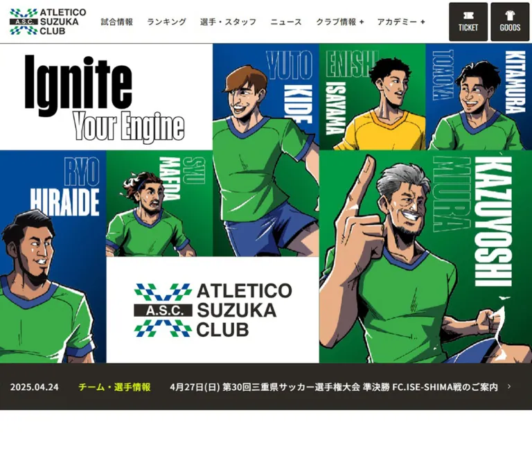
The opening is a seamless composition of illustrated players, vertically arranged names, blue and green rectangles, a white brand tile, and the slogan “Ignite Your Engine.” Heavy black contours and exaggerated expressions make the athletes feel like a cast of characters. Extremely condensed English lettering supplies much of the visual force, while Japanese navigation and editorial content remain comparatively small and orderly.
Below this poster, the page becomes a substantial club information hub: current announcements, promotional banners, fixtures, community activity, news, video, ticketing, merchandise, youth development, volunteering, facilities, and partners. Small pill links connect these areas. Broad white intervals and large colored panels prevent the long document from becoming one continuous grid of equally weighted cards.
The responsive design changes composition, not just scale. Desktop uses a five-column opening mosaic; mobile reorganizes it into three columns with a full-width slogan band in the middle. News, video, commerce, social navigation, and footer links each have their own reflow behavior.
How to Read This Reference
- Measured means a supplied computed value or rendered element rectangle. Measurements use CSS pixels and describe the captured state.
- Derived means arithmetic from those measurements, such as the opening height or the width of a news group.
- Visual estimate means a proportion, edge treatment, or appearance read from the supplied current-page screenshots. It is not a stylesheet value or a sampled image color.
- Recommendation means guidance for a new implementation. The Quick Start is an adaptation, not recovered source code.
- Source variables retain their original names when shown. Other token names are descriptive aliases.
- Visibility matters: extracted text includes duplicated navigation labels, offscreen carousel entries, and mobile menu content outside the viewport. Their DOM presence does not establish that they were visible or usable in the captured state.
The original HTML root computes to 10px, while body text computes to 16px. The Quick Start uses explicit pixel values and a conventional root size so that source measurements are not accidentally multiplied by a different rem system.
Tokens — Colors
Default Palette
| Name | Value | Source / implementation token | Role and evidence |
|---|---|---|---|
| Club Green | #009845 |
Source --color-green; alias --club-green |
Measured campaign-panel fill and TOPICS lettering; also central to the illustrated identity |
| Club Blue | #004A98 |
Source --color-blue; alias --club-blue |
Measured category badges and schedule-list action; visually echoed by the hero backgrounds |
| Electric Yellow | #E1FF00 |
Source --color-yellow; alias --club-yellow |
Measured announcement categories, channel introduction, and product callout text on dark surfaces |
| Warm Charcoal | #2D2A26 |
Source --color-txt; alias --club-ink |
Measured body text, desktop utility buttons, and channel surface; footer panels visually use the same family |
| Warm Gray | #F1F0EE |
Source --color-gray; alias --club-gray |
Measured fixture-section background |
| White | #FFFFFF |
Alias --club-white |
Measured header and news-card surfaces; reversed text and white hero tiles |
| Black | #000000 |
Alias --club-black |
Measured social-strip surface; visually present across the footer background and illustration contours |
These colors have distinct jobs. Green and blue establish club identity; yellow highlights short information on dark surfaces; charcoal supports reading and media; white separates dense imagery. Yellow is not the default fill of every action.
Supporting Colors and Limits
| Value | Evidence | Interpretation |
|---|---|---|
#929E36 |
Computed mobile community-section background: rgb(146,158,54) |
A local olive surface. Do not replace the main club green with it. |
#303030 |
Computed merchandise callout background | A local dark speech-label treatment, close to but distinct from the main charcoal. |
#3B3B3B |
Computed utility-button background inside the offscreen mobile menu | A hidden-state value; the opened menu was not visually inspected. |
The hero artwork contains lighter jersey greens, skin tones, white highlights, black outlines, and darkening blue areas. Those belong to the image palette and should not be reduced to seven flat CSS colors. No exact image-color sampling or background-gradient declaration was supplied.
Numerous editor and calendar variables also appear in the DOM export. Their presence does not establish a visible theme, a public color switcher, or use of those presets on the homepage. They are excluded from the core palette.
Tokens — Typography
Japanese Interface and Editorial Text
Computed primary family: Noto Sans JP, followed by Japanese system sans-serif fallbacks including Hiragino, Yu Gothic, and Meiryo.
Measured body: 16px, weight 500, line height 27.2px, letter spacing 0.64px. This is equivalent to a 1.7 line height and 0.04em tracking. The same base size remains on mobile; individual compact components reduce their type separately.
News titles use weight 700. Desktop navigation uses weight 500. The offscreen mobile navigation computes to weight 700. These distinctions create hierarchy without making every Japanese label exceptionally heavy.
A computed family stack establishes the declared choice, not independent proof of which font file supplied every rendered glyph.
English Utility Text
Source variable: --font-family-en: "Roboto Condensed", serif.
This stack is measured on TOPICS labels and news dates. Its narrow proportions allow dates and small English labels to sit comfortably beside Japanese text. TOPICS is visibly slanted in the screenshot; a corresponding font-style value was not included in the export.
Ticket and Goods Labels
Computed family: Oswald, serif.
The header’s TICKET and GOODS captions use 16px, weight 400, a 24px line height, and normal tracking. Each caption sits below a white pictogram inside a dark utility tile.
Poster Lettering and Graphic Headings
“Ignite,” “Your Engine,” the player names, and the large A.S.C. CHANNEL lettering are much more condensed than the Japanese interface. Filled and outline-only letters alternate, and some names run vertically or rotate through the composition.
The actual font family and DOM mechanism for this display lettering were not supplied. Treat it as graphic artwork unless the original editable assets establish otherwise. The measured font on a surrounding H2 describes its text label, not necessarily the large English graphic above it.
Recommended extension: Oswald can provide a coherent starting point for new English utility or display text because it is evidenced elsewhere on the page. It is an approximation for new work, not an identification of the existing poster lettering.
Type Scale
| Role | Desktop | Mobile | Family / weight | Evidence |
|---|---|---|---|---|
| Body | 16 / 27.2px |
16 / 27.2px |
Japanese sans, 500 | Measured |
| Primary navigation | 16 / 27.2px |
16 / 27.2px in offscreen menu |
Japanese sans, 500 desktop / 700 menu | Measured; menu opening unverified |
| TICKET / GOODS | 16 / 24px |
16 / 24px in offscreen menu |
Oswald, 400 | Measured |
| TOPICS | 28 / 47.6px |
14 / 23.8px |
Roboto Condensed, 700 | Measured |
| Announcement text | 18 / 30.6px |
12 / 20.4px |
Japanese sans, 500 | Measured |
| Common Japanese section label | 20 / 30px |
16 / 24px |
Japanese sans, 400 | Measured on sampled headings |
| Featured news title | 16 / 27.2px |
14 / 23.8px |
Japanese sans, 700 | Measured |
| Secondary news title | 14 / 23.8px |
12 / 20.4px |
Japanese sans, 700 | Measured |
| News date | 12 / 20.4px |
12 / 20.4px |
Roboto Condensed, 700 | Measured |
| Category badge | 12 / 20.4px |
12 / 20.4px |
Japanese sans, 500 | Measured |
| Pill action | 14 / 21px |
14 / 21px |
Japanese sans, 500 | Measured |
| Channel introduction | 16 / 27.2px |
16 / 27.2px |
Japanese sans, 500 | Measured |
| Video caption | 16 / 27.2px |
14 / 23.8px |
Japanese sans, 500 | Measured |
| Main social-link caption | 15 / 25.5px |
12 / 20.4px |
Japanese sans, 500 | Measured |
| Product callout | 12 / 15.96px |
12 / 15.96px |
Japanese sans, 500 | Measured |
Visual scale reference: the desktop Ignite letters occupy roughly 145px of visible height, while the outlined phrase occupies about 75px. On mobile, the slogan fits within a 130px-high white band. These are visual dimensions, not CSS font sizes.
Tokens — Spacing & Shapes
Density: expansive section spacing around compact controls and metadata.
System character: several useful recurring values, rather than evidence of one universal spacing multiplier.
Spacing Scale
| Use | Desktop | Mobile | Evidence |
|---|---|---|---|
| Header left inset | 20px |
10px |
Measured |
| Outer panel inset | 32px |
10px |
Measured on multiple sections |
| Regular content left edge at inspected width | 72px |
20px |
Measured |
| Regular inner width | 1296px |
350px |
Measured |
| News-card gutter | 24px |
20px |
Derived from rectangles |
| News text inset from outer card edge | 21px |
15px |
Measured; includes the border relationship |
| Promotional-slide gutter | 30px |
10px |
Derived from consecutive positions |
| CTA icon gap | 10px |
10px |
Measured |
| CTA padding | 7px 28px 9px |
Same | Measured |
| Badge padding | 1px 13px |
1px 10px |
Measured |
| Fixture panel top / bottom padding | 100px / 80px |
60px / 55px |
Measured |
| Channel top / bottom padding | 100px / 65px |
65px / 65px |
Measured |
| Video-caption gap | About 15px |
About 10px |
Derived from thumbnail proportions and caption positions |
| Video-list vertical gap | Not applicable to one desktop row | 24px |
Derived |
The regular 1296px inner container and the 1376px outer panel serve different purposes. At 1440px, the former begins at x=72 and the latter at x=32. The channel uses another useful inset: its content begins at x=64, creating a 1312px-wide media row inside the outer panel.
Border Radius and Edges
| Element | Value | Evidence / use |
|---|---|---|
| Hero cells | 0 |
Visually square, with no gutters |
| Category badges | 3px |
Measured; source --border-radius02 |
| Header utility tiles | 4px |
Measured |
| News cards | 8px |
Measured |
| Fixture and campaign panels | 8px |
Measured |
| Campaign banner links | 10px |
Measured |
| Fixture image link | 14px |
Measured |
| Pill links | 100px |
Measured |
| Carousel indicators | 50% |
Measured circular buttons |
| Footer panels and sponsor tiles | Approximately 8px |
Visual estimate |
News cards have a thin blue outline in the screenshot and a faint shadow. Two shadow variables are declared: 2px 2px 4px 0 rgba(0,0,0,.15) and the same geometry at .05 opacity. Their exact assignment to individual cards was not supplied. Keep elevation restrained rather than applying either shadow indiscriminately.
The channel SECTION computes to a zero radius, although the visible outer top corners appear softened. A containing element may provide the clipping. Do not treat the SECTION value as proof that the entire visible assembly has square corners.
Layout Measurements
| Element | Desktop at 1440 × 1000 | Mobile at 390 × 844 |
|---|---|---|
| Persistent header | 1440 × 90px |
390 × 45px |
| Header logo link | 158.56 × 53.83px |
80 × 27.16px |
| Opening artwork region | 1440 × 864px, derived |
390 × 650px, derived |
| Opening modular cell | Approximately 288 × 288px |
Approximately 130 × 130px |
| Main-content start | Document y=954px |
Document y=695px |
| Promotional slide | Approximately 632 × 332px |
Approximately 330 × 173.31px |
| Carousel indicator | 11 × 11px |
8 × 8px |
| Fixture panel | 1376 × 676.66px |
370 × 559.33px |
| Fixture image link | 745 × 496.66px |
350 × 233.33px |
| Featured news card | 416 × 405.47px |
350px wide; observed heights 344.56px and 320.77px |
| Secondary news card | 196 × 444.19px |
165px wide; row heights vary with content |
| Video link including caption | About 421.33 × 306.36px |
350 × 254.47px |
| Ticket feature | Approximately 634.53px square |
350px square |
| Document height | Approximately 10094px |
Approximately 15749px |
The document heights describe the supplied content and state. They are not recommended fixed heights.
Components
Persistent Club Header
Role: identity, primary site navigation, ticketing, and merchandise access.
A white strip spans the viewport with a fine dark lower rule. The full club lockup sits at the left. On desktop, navigation is pushed toward the right, followed by two 80px-square utility links. TICKET and GOODS use white pictograms over narrow uppercase captions, a charcoal fill, 4px corners, and a roughly 6px gap between tiles.
The measured desktop header has padding: 0 5px 0 20px and a 30px flex gap. The first visible navigation link begins around x=519. Navigation includes “試合情報,” “ランキング,” “選手・スタッフ,” “ニュース,” “クラブ情報,” “アカデミー,” and “地域貢献活動.” Plus signs accompany the club and academy labels.
On mobile, the bar is 45px high. The logo is 80px wide, with a three-line menu icon at the right. Desktop links and purchase tiles are absent from the visible bar. The supplied DOM positions mobile navigation links beyond the right edge at x=410; this supports an offscreen-menu structure, but the opened appearance and transition were not captured.
The header remains at the top in scrolled screenshots. A pinned presentation is observed; the export does not distinguish fixed positioning from sticky positioning.
Illustrated Opening Mosaic
Role: immediate club identity and emotional energy.
The desktop composition can be described as five equal columns and three equal rows. At 1440px, the base module is 288px. There are no card gaps, borders around individual tiles, or rounded cell corners.
The observed arrangement is:
SLOGAN   SLOGAN   PLAYER A   PLAYER B   PLAYER C
PLAYER D PLAYER E PLAYER A   PLAYER F   PLAYER F
PLAYER D BRAND    BRAND      PLAYER F   PLAYER F
The slogan occupies a white two-column tile at the upper left. A central portrait spans two rows. Two smaller portraits sit at the upper right. Another tall player anchors the left edge, and a large two-by-two portrait dominates the lower right. The full club lockup occupies the lower middle white tile.
Portraits are cropped at the composition edges and interact with adjacent color blocks. Some silhouettes visually cross a modular seam. Keep the entire composition controlled while allowing selected artwork layers to extend beyond an individual cell.
Names combine filled white lettering, thin white outlines, and vertical orientation. The white slogan tile combines solid black Ignite with outlined Your Engine. This positive/negative lettering relationship is more distinctive than simply selecting a very large font.
The mobile composition uses three columns and five rows:
PLAYER A BRAND    PLAYER B
PLAYER A PLAYER C PLAYER B
SLOGAN   SLOGAN   SLOGAN
PLAYER D PLAYER F PLAYER F
PLAYER E PLAYER F PLAYER F
At 390px, its rows are approximately 130px high. The upper illustrated group is 260px tall, the central slogan band is 130px tall, and the lower illustrated group is 260px tall. The brand tile uses the compact A.S.C. mark rather than the large desktop lockup.
Different players appear in the supplied desktop and mobile states. The evidence does not establish whether this results from responsive asset selection, timing, randomization, or rotation. Reproduce the observed composition without inventing an autoplay sequence.
TOPICS Announcement Strip
Role: immediate access to recent club updates.
A charcoal strip follows the hero. Each entry combines a green megaphone/TOPICS label, a white date, a yellow category, a white headline, and a small directional mark. The content stays on one line and is clipped at the viewport edges.
Desktop announcement links are flex rows with a 40px internal gap, 18px type, and 25px right padding. Mobile reduces this to a 20px gap, 12px type, and 15px right padding. TOPICS itself reduces from 28px to 14px. The mobile strip is approximately 50px high visually.
Repeated entries and offscreen positions support a repeating horizontal track. Duration, direction, pause behavior, and keyboard treatment were not observed. Keep the announcement links available even when a moving presentation is paused or replaced with a static fallback.
Promotional Banner Carousel
Role: promote academy recruitment and other current club offers.
The measured desktop center slide is about 632 × 332px, with neighboring slides visible beyond either side. Mobile uses a 330 × 173px center slide at x=30, leaving a glimpse of neighbors. The image proportion stays approximately 1.90:1.
Five small circular button elements appear beneath the track. Their visible sizes are 11px on desktop and 8px on mobile. One has a white background while the others are charcoal in each sampled state; the exact selection semantics were not tested.
These are image banners with linked destinations, not text-only feature cards. Preserve their aspect ratio and give the track a dedicated overflow boundary. Swipe, drag, autoplay, and indicator activation remain unverified.
Fixture Panel
Role: connect the homepage to match information and ticket access.
A warm-gray, 8px-radius panel sits inside the outer page inset. The desktop layout has a heading/graphic area and two small actions on the left side of a large 3:2 image link. The media link measures 745 × 496.66px.
On mobile, the heading is centered above a 350 × 233.33px image. The actions sit below it, stacked with a 16px gap and aligned toward the right. Both retain their approximately 205 × 39px size.
“試合日程一覧を見る” uses a blue pill with white text. The adjacent ticket-information action uses charcoal. The supplied evidence shows an image-led fixture presentation; it does not establish an interactive calendar or a particular score-card anatomy.
Green Campaign Panel
Role: provide a prominent area for current campaign material.
This measured green section is 1376px wide on desktop and 370px wide on mobile, with 8px corners. Two image-only banner links lead to a crowdfunding destination and a form destination. The banners measure 864 × 121.5px on desktop and 351 × 49.36px on mobile.
The source text does not expose the full campaign artwork. Preserve the evidenced green enclosure and wide banner proportions; do not invent a heading, form fields, or a campaign illustration from the destination alone.
Community Activity Feature
Role: introduce the club’s local contribution work.
The content contains a section heading, a short introduction, and the white pill “地域貢献活動紹介を見る.” Desktop places the main text at x=72 in a 372px-wide area, with a separate graphic heading element toward the right. Mobile places the main text and action in a centered group approximately 232px wide beneath an upper graphic area.
The mobile section has a measured olive background, white text, 8px corners, and 42px/40px top/bottom padding. Its introduction reduces to 14px with a 23.8px line height. The desktop SECTION itself reports a transparent background; its complete background composition cannot be identified from that value alone.
News Composition
Role: show current editorial information with clear priority.
The desktop news area reserves substantial space on the left for a large football illustration. The supplied middle screenshot shows the lower part of this artwork, including a leg, ball, and green motion-like strokes. The articles occupy an 856px-wide group from x=512 to x=1368.
Two featured cards form the first row, each 416px wide. Four secondary cards form the second row, each 196px wide. Both rows use 24px gutters. This hierarchy is deliberate: two leading stories, then four narrower items.
Each article is one linked card with:
- An upper image region.
- A bold Japanese headline.
- A small condensed date.
- One or more blue category labels.
The white cards have 8px corners and a fine blue outline. Featured titles are 16px on desktop; secondary titles are 14px. Metadata remains compact at 12px. Multiple tags stack vertically in the narrow cards, and their total height influences the row layout.
On mobile, the leading cards become two separate full-width 350px rows. The four secondary cards become a two-column grid of 165px cards with 20px gutters. Leading titles reduce to 14px and secondary titles to 12px. Card heights vary by content and row; do not hardcode the captured heights.
The mobile news section has a measured 290px top inset before its Japanese heading, compared with 95px on desktop. This reserves a large upper region, but its precise mobile artwork composition is not shown in the attached screenshots.
The “ニュース一覧” pill is right-aligned on desktop and centered on mobile. Large paragraph rectangles in the export can include stretched grid space; they should not be interpreted as enormous line heights or deliberately blank copy.
Category Badge
Role: compact article classification.
A blue rectangle with white text, 3px corners, 12px type, and a 20.4px line height. Desktop padding is 1px 13px; mobile padding is 1px 10px. The resulting height is approximately 22.39px.
All observed news categories share the blue treatment. Category count and wording vary, including “大会情報,” “練習試合情報,” “イベント,” and community-related labels. Do not create a different bright color for every category.
Pill Link
Role: a recurring low-profile route into deeper content.
The standard pill uses 14px text, a 21px line height, 7px 28px 9px padding, a 10px text-to-arrow gap, and a 100px radius. Bordered examples are 39px high; borderless examples are 37px high.
Observed variants include blue with white text, charcoal with white text, white with dark text, and transparent with a thin white outline. The channel action is approximately 190px wide; the news-list action is approximately 161px wide.
Where the entire feature is already an anchor, the pill-like label is an internal visual element. It should not become a second nested link or button in a new implementation.
A.S.C. CHANNEL
Role: a distinct media destination within the long homepage.
A large charcoal enclosure combines oversized white condensed lettering, a Japanese subtitle, a small red video-platform mark, yellow explanatory copy, and a white outlined pill. The desktop heading group begins at x=64 and is 389px wide; the copy begins at x=523, leaving a 70px gap between groups.
Three video links sit below, with 24px gutters. Each desktop thumbnail is approximately 421 × 237px, preserving 16:9. Captions sit about 15px below, centered in white. The imagery includes interviews, local activity, and match highlights, with the original video artwork’s embedded captions retained.
On mobile, heading, explanation, and action stack above three full-width 350px video links. The introduction has a narrower 320px text measure. Thumbnail captions reduce to 14px and sit about 10px below the images. The video links have 24px vertical gaps.
The supplied links point to a channel and individual video pages. Inline playback, modal playback, and autoplay were not established.
Social Follow Strip
Role: direct supporters to the club’s official social channels.
A black section follows the charcoal channel area. On desktop it is 260px high, with 75px vertical padding. A graphic heading slot, a short follow message, and four 110px-square social links share the horizontal space.
Mobile stacks the introductory material above a two-by-two social grid. Link boxes measure 100px square, with approximately 55px horizontal and 15px vertical gaps. The section grows to 578.5px high with 65px vertical padding.
Keep the main social strip distinct from the footer’s social controls. The footer screenshot shows outlined icon tiles; the sampled main-strip link elements compute to zero border radius and do not independently establish that same enclosing border treatment.
Tickets and Merchandise
Role: connect club participation with ticket purchase and branded goods.
Desktop places a large square ticket feature beside a two-column merchandise group. The ticket link is approximately 634.53px square with 8px corners and 50px padding. On mobile it becomes a 350px square with 50px 40px padding.
The merchandise anatomy is a short promotional callout, product image region, product name, tax-inclusive price, and “購入する” pill-like label inside one outer link. The first sampled desktop product links are approximately 306.73px wide. On mobile, sampled product links stack and measure 310px wide within wider visual wrappers.
The promotional callouts use yellow 12px text on #303030, a tight 1.33 line height, 7px 15px padding, and a 100px radius. Their measured bounds extend outside the normal card area. The exact transform or decorative shape is not available, so no rotation angle is prescribed.
The extracted inventory includes a shirt, towel scarf, autograph board, and mini banner. These are captured content examples, not permanent catalog requirements. The supplied screenshots do not show this area in detail, so product-image cropping and decorative layers should be checked against actual assets before reproduction.
Academy and Guide Links
Role: make the club’s development and community programs discoverable.
The rendered text establishes an academy introduction followed by U-15, U-12, and soccer-school entries. Each entry combines an age range, program name, description, and detail action. The guide area contains volunteering and a futsal-court introduction with detail links.
These are substantive homepage destinations, not optional footer-only links. Detailed visual composition for these sections is outside the supplied screenshot and element-measurement coverage. Reuse the confirmed typography, section spacing, and pill vocabulary for an extension, while treating any proposed card grid or image treatment as a recommendation.
Partner and Navigation Footer
Role: recognize partners and provide a comprehensive second navigation surface.
The desktop footer has a black foundation with two broad charcoal panels separated by approximately 24px. Each visible panel is about 676px wide and begins within the 32px outer inset. The left panel contains partner groups; the right contains social controls and a sitemap.
Partner logos sit on white tiles that protect each mark’s original colors. The visible larger tiles are approximately 258 × 128px, arranged in two columns with 20px gaps. Smaller ROYAL PARTNER tiles are approximately 165 × 88px. These are screenshot estimates, not computed source dimensions. Keep logos contained with generous internal whitespace rather than cropping them to fill.
The sitemap uses white text with bolder category headings. Primary destinations form one group; club information and academy links form additional columns. On mobile, the visible navigation panel is 370px wide at x=10. The club and academy groups remain side by side, while the primary links above them are centered.
Below the panels, desktop legal links sit in one centered row. Mobile stacks “お問い合わせ,” “このサイトについて,” and “プライバシーポリシー.” A huge low-contrast ATLETICO SUZUKA CLUB wordmark anchors the black background: one expansive line on desktop, three stacked words on mobile. A small white copyright line remains in the foreground.
The footer copyright identifies ATLETICO SUZUKA CLUB. No separate legal operating-company identity or website production credit is established by the inspected homepage evidence.
Tokens — Motion & Interaction
| Treatment | Supplied evidence | What can safely be concluded |
|---|---|---|
| Logo, navigation, card, and CTA links | Computed 0.3s ease-out transition |
A 300ms transition is declared on many links; changed properties and endpoint styles were not supplied. |
| Promotional indicator buttons | Computed 0.1s ease-out transition |
Short indicator feedback is declared; activation was not exercised. |
| TOPICS track | Repeated announcements and negative/offscreen x positions | A horizontal repeating structure is strongly supported; speed and pause behavior are unknown. |
| Promotional carousel | Repeated linked banners, partial neighbors, and five buttons | Carousel structure is supported; autoplay, drag, swipe, and control behavior are unverified. |
| Desktop navigation labels | Duplicate label text in DOM, single visible label in screenshot | Layered text may support an effect; a rollover animation cannot be identified from duplication alone. |
| Mobile navigation | Links positioned beyond the right viewport edge | An offscreen closed state is evidenced; opening direction, backdrop, focus handling, and timing are unverified. |
| Hero player changes | Different desktop and mobile captured rosters | Does not prove an animated player rotation or establish its sequence. |
Isolated 100 text node |
14px Roboto Condensed and a 0.6s transition |
Its purpose is unverified; it is not visibly established as a permanent page element. |
| Header while scrolling | Header stays at the top of supplied scrolled captures | Persistent navigation is observed; exact positioning CSS was not included. |
Many sampled elements report animation: none. This does not exclude animation on ancestors, pseudo-elements, image assets, or JavaScript-driven tracks.
Recommended motion language: retain quick, restrained link feedback and keep the illustrated opening visually strong without requiring motion. If reproducing a ticker or carousel, measure the real behavior first. A paused, scrollable fallback is preferable to inventing a detailed animation system and presenting it as observed.
Surfaces
| Layer | Appearance | Purpose |
|---|---|---|
| Header | White with fine dark lower rule | Persistent wayfinding |
| Opening mosaic | Edge-to-edge colored rectangles and white graphic tiles | Club identity and visual impact |
| General canvas | White | Separation between dense areas |
| Fixture panel | Warm gray with 8px corners | Functional match information |
| Campaign enclosure | Saturated green | A distinct promotional area |
| News cards | White, blue outline, small radius, faint shadow | Readable editorial units |
| Video area | Warm charcoal with white and yellow content | A strong media chapter |
| Social area | Black with white content | A compact follow destination |
| Footer panels | Charcoal on black | Partners and extensive navigation |
| Sponsor tile | White with contained logo | Preserve recognition across varied partner identities |
This is not a uniform elevation system. Background changes, scale, composition, and imagery do most of the grouping. Small card shadows support edges without making the whole page feel like a floating dashboard.
Imagery
The identity imagery uses contemporary sports manga conventions: thick black contours, angular anatomy, expressive faces, hard-edged shadows, white highlights, and energetic crops. Green uniforms and blue backgrounds make the players legible at very different scales. Some players occupy compact portrait cells; others are enlarged until their bodies dominate several modules.
Use crisp, high-resolution assets with ordinary image rendering. The artwork is not presented as pixel art, so image-rendering: pixelated would be inappropriate.
The page mixes this illustration system with practical media: recruitment banners, editorial imagery, colorful video thumbnails, merchandise imagery, and sponsor logos. Do not force all photography and third-party marks into the illustrated palette. The consistent shell provides cohesion around varied content.
Observed Asset References
Exact image URLs, SVG sources, and image manifests were not included in the supplied evidence. The following identifies observed assets by placement without inventing file paths.
| Asset group | Observed placement | Reuse guidance |
|---|---|---|
| Full club lockup | Desktop/mobile header and desktop hero brand tile | Preserve original proportions and clear space. |
| Compact A.S.C. mark | Mobile hero center-top tile | Use an alternate approved asset or picture source. |
| Player portraits and names | Opening mosaic at both viewports | Preserve the deliberate face, body, and lettering crops. |
| Ignite / Your Engine graphic | White hero tile or central mobile band | Retain the filled/outlined contrast; verify whether supplied artwork includes the lettering. |
| Football action illustration | Left side of desktop news area | Allow controlled bleed beyond the content column. |
| Promotional banners | Horizontal track beneath TOPICS | Preserve the approximately 1.90:1 format. |
| Video thumbnails | Three channel links | Keep their 16:9 shape and embedded editorial graphics. |
| Partner marks | White footer tiles | Use contain fitting and individual logo clear space. |
Authorized original artwork is necessary for a faithful result. CSS can recreate the modular shell and content system, but cannot reproduce the identity carried by the illustrations and graphic lettering.
Layout & Responsive Behavior
Page Organization
The extracted sequence is: illustrated opening, announcements, promotional banners, fixtures, campaign material, community activity, news, channel, social follow area, ticketing and goods, academy, guide, partners, and footer navigation.
The homepage supports several user intentions at once. Preserve direct routes to match information, the team, news, tickets, programs, and community participation. Its information architecture should remain visible through both the header and the lower navigation.
Observed Reflow
| Area | Desktop | Mobile |
|---|---|---|
| Header | Full navigation and two square utility tiles | Small logo and menu icon |
| Hero | Five columns × three rows | Three columns × five rows, with central slogan band |
| Promotional track | 632px center banner with neighboring previews | 330px center banner with narrower gaps |
| Fixtures | Side-by-side heading/actions and media | Centered heading, image, then stacked actions |
| News | Illustration beside two featured and four secondary cards | Full-width featured cards, then two-column secondary grid |
| Channel | Two-part introduction and three video columns | Stacked introduction and one video column |
| Social links | Four boxes in a row | Two-by-two grid |
| Ticketing and goods | Large ticket tile beside merchandise grid | Ticket tile followed by stacked sampled products |
| Footer | Two major panels with multi-column contents | Stacked major content; two visible sitemap subcolumns |
| Legal links | Centered horizontal row | Centered vertical list |
| Footer wordmark | Oversized single line | Three stacked words |
Width Rules and Breakpoint Limits
The source exposes --inner-width: 1296px. Its --inner-padding changes from 32px on desktop to 20px on mobile, while individual panel margins use their own 32px/10px pattern. Do not collapse every container to one universal padding token.
The desktop snapshot includes --body-min-width: 1000px; the mobile snapshot does not. The actual mobile body measures 390px wide. Copying the desktop minimum width globally would therefore contradict the observed responsive result.
Only two viewport widths were inspected. The full breakpoint system and tablet layout are unknown. The Quick Start recommends an earlier compact-header breakpoint to avoid crowding navigation and a 767px content-reflow breakpoint; these are implementation choices, not recovered site-wide rules.
Use document scrolling for this long homepage. Do not convert it into a fixed-height application shell. Keep clipping local to the opening artwork, decorative footer wordmark, and horizontal tracks so meaningful content remains reachable.
Do’s and Don’ts
Do
- Build the opening around a seamless modular poster with strong differences in player scale.
- Recompose the hero on mobile, including its central full-width slogan band.
- Preserve the distinction between the full lockup and compact A.S.C. mark.
- Keep club green
#009845, club blue#004A98, charcoal#2D2A26, and yellow#E1FF00in their evidenced roles. - Pair expressive English graphic lettering with readable Japanese sans-serif content.
- Keep the two-leading-story news hierarchy before the smaller article grid.
- Use compact blue tags and restrained pill links consistently.
- Give the channel its own dark surface, yellow introduction, and three clear video destinations.
- Preserve multiple participation routes, including academy, community, volunteering, ticketing, and merchandise.
- Contain partner logos within white tiles and retain their original colors.
- Use content-driven heights for cards with different title lengths and tag counts.
Don’t
- Don’t shrink the desktop poster into a narrow mobile image without recomposing it.
- Don’t put gutters, rounded corners, or card shadows between hero cells.
- Don’t identify the poster font from resemblance alone.
- Don’t turn all sections into identical cards or make every link a large conversion button.
- Don’t recolor every category badge or use electric yellow as a universal action fill.
- Don’t pixelate or soften the illustrated linework.
- Don’t infer autoplay, parallax, hover rolls, or menu transitions from a static frame.
- Don’t treat offscreen navigation text as a captured opened menu.
- Don’t apply the desktop 1000px minimum width to phones.
- Don’t hardcode document heights, article heights, current products, or captured dates.
- Don’t crop sponsor marks or imitate the background wordmark’s low contrast for essential text.
Recommended Implementation Additions
These are recommendations for a new implementation, not verified features of the original page:
- Give the mobile menu an explicit accessible name, expanded state, keyboard support, and appropriate focus management. Closed offscreen content should not remain an accidental tab destination.
- Keep carousel dots visually small while providing larger invisible hit areas. Add meaningful labels and a clear selected state.
- Provide pause controls or a static alternative for any automatically moving announcement or banner track. Remove duplicate track copies from the accessibility tree and tab order.
- Retain normal text alternatives for image-based headings and identity graphics. Decorative duplicate lettering and the footer watermark should not be announced twice.
- Provide visible focus outlines that remain readable on both white and dark surfaces.
- Verify contrast for small green lettering on charcoal and for local olive-section text. Preserve the palette while adjusting essential text treatment if needed.
- Keep purchase features as one coherent link each; avoid nested interactive elements inside the visual pill.
- Validate ticket destinations before reuse. The sampled schedule-area “チケット情報を見る” link points to the homepage, while the header and large ticket feature point to the external ticket seller. This establishes a routing difference, not proof of a broken destination.
- Keep the opening’s image dimensions reserved to limit layout shifts. Prioritize the initially visible artwork and defer lower-page media appropriately.
- Test intermediate widths, long Japanese titles, additional category tags, zoom, reduced motion, and menu navigation. Those states were not covered by the supplied captures.
Agent Prompt Guide
Quick Color Reference
- Main canvas and content cards:
#FFFFFF. - Body text and channel surface:
#2D2A26. - Club identity and promotional enclosure:
#009845. - Badges and selected functional actions:
#004A98. - Short emphasis on dark surfaces:
#E1FF00. - Fixture surface:
#F1F0EE. - Social and footer foundation:
#000000. - Borders and shadows: thin and restrained; no general glossy elevation.
Overall Prompt
“Create a Japanese football club homepage with a seamless illustrated player mosaic, club blue #004A98, club green #009845, and white slogan and logo tiles. Use expressive sports-manga portraits with heavy black outlines, exaggerated crops, and tall filled/outlined English name lettering. On desktop, compose the opening as five columns and three rows; on mobile, recompose it into three columns and five rows with a central full-width slogan band. Continue into a substantial club information site with announcements, promotional banners, fixtures, community activity, prioritized news, videos, social links, tickets, goods, academy programs, and partner navigation. Use Noto Sans JP for Japanese content, Roboto Condensed for dates and TOPICS, and evidenced Oswald utility labels. Keep standard actions compact and pill-shaped. Reserve charcoal and black panels for strong media and footer chapters. Use approved graphic assets for the hero lettering rather than claiming an unidentified display font.”
Example Component Prompts
- Opening mosaic: “Build a gapless five-by-three desktop grid with one two-column slogan tile, one two-column brand tile, tall illustrated portraits, and one large two-by-two portrait. Alternate blue and green image fields. Recompose to a three-by-five phone layout with a white slogan row through the center. Keep the artwork crisp and the cells square-cornered.”
- News area: “Place an oversized football illustration beside an 856px editorial group inside a 1296px desktop container. Use two featured cards above four smaller cards, with 24px gaps, white fills, fine blue outlines, 8px corners, condensed dates, and small blue category tags. On mobile, stack the leading stories and retain two columns for the smaller stories.”
- Channel panel: “Create a charcoal club-video section with a large white condensed graphic heading, Japanese subtitle, yellow two-line introduction, and a white outlined pill. Place three 16:9 thumbnails below with centered white captions. Stack the complete composition on mobile with a narrower introduction and full-width videos.”
- Footer: “Use two broad charcoal panels on a black foundation: partner logos in contained white tiles on the left, social links and a clear sitemap on the right. Stack the panels for mobile while retaining two columns for club and academy links. Place a huge low-contrast club wordmark behind the legal area, with readable white links and copyright above it.”
- Action system: “Use 14px Japanese pill links with a 21px line height, 7px 28px 9px padding, a 10px arrow gap, and a fully rounded edge. Support blue, charcoal, white, and reversed-outline variants. Where a card is already a link, render its pill as a non-interactive child.”
Evidence-Constrained Extension Prompt
“Extend this homepage using the confirmed palette, typography, spacing, and component hierarchy. Mark any new tablet breakpoint, hover endpoint, carousel timing, menu animation, academy layout, or product decoration as a recommendation. Do not infer missing image paths, production credits, or interaction behavior. Keep all explanatory prose in English and preserve Japanese only for actual UI labels, proper names, or example Japanese copy.”
Quick Start
CSS Custom Properties
This starter recreates the confirmed shell and useful component proportions. Class names are implementation aliases. Supply authorized images separately; no original asset paths were available. The hero expects a slogan tile, a brand tile, and six player tiles named A–F. Mobile asset selection can use picture elements.
The compact-header breakpoint, static scrollable tracks, hover opacity, focus treatment, and simplified footer sizing are recommendations. The stylesheet does not implement the unverified original menu or autoplay behavior.
:root {
  /* Measured core palette */
  --club-green: #009845;
  --club-blue: #004a98;
  --club-yellow: #e1ff00;
  --club-ink: #2d2a26;
  --club-gray: #f1f0ee;
  --club-white: #fff;
  --club-black: #000;

  /* Shortened adaptation of the observed fallback stack */
  --font-body: 'Noto Sans JP', 'Hiragino Kaku Gothic ProN',
    'Hiragino Sans', 'Yu Gothic', YuGothic, Meiryo, sans-serif;
  --font-utility: 'Roboto Condensed', serif;
  --font-action: Oswald, serif;
  --text-body: 16px;
  --text-small: 14px;
  --text-meta: 12px;
  --leading-body: 1.7;
  --tracking-body: 0.04em;

  /* Measured desktop geometry */
  --header-size: 90px;
  --inner-max: 1296px;
  --inner-pad: 32px;
  --panel-inset: 32px;
  --grid-gap: 24px;
  --radius-tag: 3px;
  --radius-control: 4px;
  --radius-card: 8px;
  --radius-pill: 100px;

  /* Source-declared shadow; assignment below is recommended */
  --shadow-subtle: 2px 2px 4px 0 rgb(0 0 0 / 5%);
  --motion-link: 300ms ease-out;
}

* { box-sizing: border-box; }

body {
  margin: 0;
  padding-top: var(--header-size);
  color: var(--club-ink);
  background: var(--club-white);
  font: 500 var(--text-body) / var(--leading-body) var(--font-body);
  letter-spacing: var(--tracking-body);
}

img { display: block; max-width: 100%; }
button { font: inherit; }
a { color: inherit; }

.inner {
  width: min(
    var(--inner-max),
    calc(100% - var(--inner-pad) - var(--inner-pad))
  );
  margin-inline: auto;
}

.panel {
  margin-inline: var(--panel-inset);
  border-radius: var(--radius-card);
}

/* Fixed positioning is the recommended pinned-header implementation. */
.site-header {
  position: fixed;
  z-index: 100;
  inset: 0 0 auto;
  display: flex;
  align-items: center;
  gap: 30px;
  height: var(--header-size);
  padding: 0 5px 0 20px;
  border-bottom: 1px solid var(--club-ink);
  background: var(--club-white);
}

.site-logo { flex: 0 0 158.56px; }
.site-logo img { width: 100%; height: auto; }

.desktop-nav {
  display: flex;
  align-items: center;
  gap: 12px;
  margin-left: auto;
  white-space: nowrap;
}

.desktop-nav a {
  padding-block: 3px;
  text-decoration: none;
  letter-spacing: normal;
}

.header-actions { display: flex; gap: 6px; }

.utility-link {
  display: grid;
  align-content: start;
  justify-items: center;
  width: 80px;
  height: 80px;
  padding-top: 15px;
  border-radius: var(--radius-control);
  color: var(--club-white);
  background: var(--club-ink);
  font: 400 16px / 24px var(--font-action);
  letter-spacing: normal;
  text-decoration: none;
}

.menu-toggle {
  display: none;
  width: 45px;
  height: 44px;
  padding: 10px;
  border: 0;
  color: inherit;
  background: transparent;
}

/* Artwork supplies the player details and unidentified display lettering. */
.hero {
  display: grid;
  grid-template-columns: repeat(5, minmax(0, 1fr));
  grid-template-rows: repeat(3, minmax(0, 1fr));
  grid-template-areas:
    'slogan slogan a b c'
    'd e a f f'
    'd brand brand f f';
  aspect-ratio: 5 / 3;
  overflow: hidden;
  background: var(--club-blue);
}

.hero > * { min-width: 0; min-height: 0; }
.hero__slogan { grid-area: slogan; }
.hero__brand { grid-area: brand; }
.hero__player--a { grid-area: a; }
.hero__player--b { grid-area: b; }
.hero__player--c { grid-area: c; }
.hero__player--d { grid-area: d; }
.hero__player--e { grid-area: e; }
.hero__player--f { grid-area: f; }

.hero__slogan,
.hero__brand {
  display: grid;
  place-items: center;
  background: var(--club-white);
}

.hero__slogan img,
.hero__brand img {
  width: 86%;
  height: 84%;
  object-fit: contain;
}

.hero__player { position: relative; }
.hero__player--b,
.hero__player--e { background: var(--club-green); }

.hero__player img {
  width: 100%;
  height: 100%;
  object-fit: cover;
  object-position: var(--portrait-position, center);
}

/* Static, horizontally accessible fallback for an unmeasured ticker. */
.topics {
  overflow-x: auto;
  color: var(--club-white);
  background: var(--club-ink);
}

.topics__track {
  display: flex;
  align-items: center;
  gap: 40px;
  width: max-content;
  padding: 25px 30px;
}

.topics__label {
  color: var(--club-green);
  font: 700 28px / 1.7 var(--font-utility);
}

.topics__item {
  display: flex;
  align-items: center;
  gap: 40px;
  padding-right: 25px;
  font-size: 18px;
  white-space: nowrap;
  text-decoration: none;
}

.topics__category { color: var(--club-yellow); }

/* Scroll snapping is a recommended fallback, not a verified source rule. */
.promo-track {
  display: flex;
  gap: 30px;
  overflow-x: auto;
  scroll-snap-type: x mandatory;
  padding-inline: max(30px, calc((100% - 632px) / 2));
}

.promo-slide {
  flex: 0 0 632px;
  scroll-snap-align: center;
}

.promo-slide img { width: 100%; aspect-ratio: 632 / 332; }

.pill {
  display: inline-flex;
  align-items: center;
  justify-content: center;
  gap: 10px;
  width: fit-content;
  min-height: 39px;
  padding: 7px 28px 9px;
  border: 1px solid currentColor;
  border-radius: var(--radius-pill);
  color: var(--club-ink);
  background: var(--club-white);
  font-size: 14px;
  line-height: 21px;
  text-decoration: none;
}

.pill--blue {
  color: var(--club-white);
  background: var(--club-blue);
  border-color: var(--club-blue);
}

.pill--dark {
  color: var(--club-white);
  background: var(--club-ink);
  border-color: var(--club-ink);
}

.pill--inverse {
  color: var(--club-white);
  background: transparent;
}

.fixture-panel {
  padding-block: 100px 80px;
  background: var(--club-gray);
}

.news-layout {
  display: grid;
  grid-template-columns: minmax(0, 1fr) minmax(0, 2.058fr);
  gap: var(--grid-gap);
}

.news-grid {
  display: grid;
  grid-template-columns: repeat(4, minmax(0, 1fr));
  gap: var(--grid-gap);
}

.news-card {
  display: flex;
  flex-direction: column;
  min-width: 0;
  overflow: hidden;
  border: 1px solid var(--club-blue);
  border-radius: var(--radius-card);
  background: var(--club-white);
  box-shadow: var(--shadow-subtle);
  text-decoration: none;
}

.news-card--featured { grid-column: span 2; }

/* The media ratio is an adaptation; exact news image bounds were absent. */
.news-card__image { width: 100%; aspect-ratio: 3 / 2; object-fit: cover; }

.news-card__body {
  display: flex;
  flex: 1;
  flex-direction: column;
  gap: 16px;
  padding: 16px 20px 20px;
}

.news-card__title {
  margin: 0;
  font-size: 14px;
  font-weight: 700;
  line-height: 1.7;
  overflow-wrap: anywhere;
}

.news-card--featured .news-card__title { font-size: 16px; }

.news-card__meta {
  display: flex;
  flex-wrap: wrap;
  align-items: center;
  justify-content: space-between;
  gap: 5px;
  margin-top: auto;
}

.news-card:not(.news-card--featured) .news-card__meta {
  flex-direction: column;
  align-items: flex-start;
}

.news-date { font: 700 12px / 1.7 var(--font-utility); }
.news-tags { display: flex; flex-wrap: wrap; gap: 5px; }

.news-card:not(.news-card--featured) .news-tags {
  flex-direction: column;
  align-items: flex-start;
}

.news-tag {
  padding: 1px 13px;
  border-radius: var(--radius-tag);
  color: var(--club-white);
  background: var(--club-blue);
  font-size: 12px;
  line-height: 1.7;
}

.channel {
  padding: 100px 32px 65px;
  color: var(--club-white);
  background: var(--club-ink);
}

.channel__intro {
  display: grid;
  grid-template-columns: 389px minmax(0, 1fr);
  gap: 70px;
}

.channel__description { color: var(--club-yellow); }

.channel__videos {
  display: grid;
  grid-template-columns: repeat(3, minmax(0, 1fr));
  gap: 24px;
  margin-top: 70px;
}

.video-link { text-decoration: none; }
.video-link img {
  width: 100%;
  aspect-ratio: 16 / 9;
  object-fit: cover;
  border-radius: var(--radius-card);
}
.video-link p { margin: 15px 0 0; text-align: center; }

.social-grid {
  display: grid;
  grid-template-columns: repeat(4, 110px);
  justify-content: center;
  gap: 24px;
}

.social-link {
  display: flex;
  flex-direction: column;
  align-items: center;
  justify-content: center;
  width: 110px;
  height: 110px;
  font-size: 15px;
  text-decoration: none;
}

.site-footer { color: var(--club-white); background: var(--club-black); }

.footer-panels {
  display: grid;
  grid-template-columns: repeat(2, minmax(0, 1fr));
  gap: 24px;
  margin-inline: var(--panel-inset);
}

.footer-panel {
  padding: 70px;
  border-radius: var(--radius-card);
  background: var(--club-ink);
}

.partner-grid { display: grid; grid-template-columns: repeat(2, minmax(0, 1fr)); gap: 20px; }
.partner-tile {
  display: grid;
  place-items: center;
  min-height: 128px;
  padding: 20px;
  border-radius: var(--radius-card);
  background: var(--club-white);
}
.partner-tile img { width: 100%; max-height: 88px; object-fit: contain; }

.footer-bottom { position: relative; overflow: hidden; padding: 60px 20px 50px; }
.footer-legal,
.footer-copyright { position: relative; z-index: 1; text-align: center; }
.footer-legal { display: flex; justify-content: center; gap: 32px; }
.footer-copyright { margin-top: 100px; font-size: 12px; }

/* Decorative only: apply aria-hidden in the markup. */
.footer-watermark {
  position: absolute;
  inset: auto 0 0;
  margin: 0;
  color: var(--club-ink);
  font: 700 clamp(80px, 7.6vw, 120px) / 0.85 sans-serif;
  letter-spacing: -0.03em;
  pointer-events: none;
}

/* Recommended feedback endpoints; the source endpoints were not supplied. */
a { transition: opacity var(--motion-link); }
@media (hover: hover) { a:hover { opacity: 0.8; } }

:where(a, button):focus-visible {
  outline: 3px solid var(--club-blue);
  outline-offset: 4px;
}
:where(.channel, .site-footer) :where(a, button):focus-visible {
  outline-color: var(--club-yellow);
}

/* Recommended early header collapse for uninspected intermediate widths. */
@media (max-width: 1100px) {
  :root { --header-size: 45px; }
  .site-header { padding: 0 0 0 10px; }
  .site-logo { flex-basis: 80px; }
  .desktop-nav, .header-actions { display: none; }
  .menu-toggle { display: grid; place-items: center; margin-left: auto; }
  .channel__intro { grid-template-columns: minmax(0, 1fr) minmax(0, 1fr); gap: 30px; }
  .footer-panel { padding: 30px; }
}

/* Recommended content breakpoint, reproducing the observed phone structure. */
@media (max-width: 767px) {
  :root { --inner-pad: 20px; --panel-inset: 10px; --grid-gap: 20px; }

  .hero {
    grid-template-columns: repeat(3, minmax(0, 1fr));
    grid-template-rows: repeat(5, minmax(0, 1fr));
    grid-template-areas:
      'a brand b'
      'a c b'
      'slogan slogan slogan'
      'd f f'
      'e f f';
    aspect-ratio: 3 / 5;
  }

  .topics__track { gap: 20px; padding: 13px 20px; }
  .topics__label { font-size: 14px; }
  .topics__item { gap: 20px; padding-right: 15px; font-size: 12px; }
  .promo-track { gap: 10px; padding-inline: 30px; }
  .promo-slide { flex-basis: calc(100vw - 60px); }
  .fixture-panel { padding-block: 60px 55px; }

  .news-layout { display: block; }
  .news-grid { grid-template-columns: repeat(2, minmax(0, 1fr)); }
  .news-card__body { padding: 12px 14px 14px; }
  .news-card__title { font-size: 12px; }
  .news-card--featured .news-card__title { font-size: 14px; }
  .news-tag { padding-inline: 10px; }

  .channel { padding: 65px 10px; }
  .channel__intro { grid-template-columns: 1fr; gap: 30px; padding-inline: 15px; }
  .channel__intro .pill { margin-inline: auto; }
  .channel__videos { grid-template-columns: 1fr; }
  .video-link p { margin-top: 10px; font-size: 14px; }

  .social-grid { grid-template-columns: repeat(2, 100px); gap: 15px 55px; }
  .social-link { width: 100px; height: 100px; font-size: 12px; }
  .footer-panels { grid-template-columns: 1fr; }
  .footer-panel { padding: 20px; }
  .partner-tile { min-height: 88px; padding: 12px; }
  .footer-legal { flex-direction: column; gap: 24px; }
  .footer-watermark span { display: block; }
}

@media (prefers-reduced-motion: reduce) {
  a { transition: none; }
  .promo-track { scroll-snap-type: none; }
}
The starter leaves artwork-specific overflow, the operational mobile menu, fixture composition, and lower-page program layouts to their own components. Implement menu state and accessibility before exposing the menu button in a production interface. Do not assume CSS alone recreates the original interactive experience.
Tailwind v4 Token Mapping
Optional aliases for a project already using Tailwind v4. This does not identify the original website’s CSS framework. Define the custom properties above first.
@theme inline {
  --color-club-green: var(--club-green);
  --color-club-blue: var(--club-blue);
  --color-club-yellow: var(--club-yellow);
  --color-club-ink: var(--club-ink);
  --color-club-gray: var(--club-gray);
  --font-club-body: var(--font-body);
  --font-club-utility: var(--font-utility);
  --font-club-action: var(--font-action);
  --text-club-body: 16px;
  --text-club-small: 14px;
  --text-club-meta: 12px;
  --spacing-club-gap: var(--grid-gap);
  --spacing-club-panel: var(--panel-inset);
  --radius-club-card: 8px;
  --radius-club-tag: 3px;
  --radius-club-pill: 100px;
}
Sources & Evidence
- Original and final website: ATLETICO SUZUKA CLUB. Both supplied URLs are identical, and the supplied response status is HTTP 200.
- Capture timestamp:
2026-09-12T18:08:28.872Z, equivalent to September 13, 2026, 03:08:28.872 JST. This document analyzes those supplied captures; it does not claim a separate browser visit. - Desktop evidence: 1440 × 1000 CSS-pixel viewport; opening, news/channel transition, and footer screenshots; rendered page text, link destinations, custom properties, and sampled computed element rectangles/styles. Document height was approximately 10094px.
- Mobile evidence: 390 × 844 CSS-pixel viewport; opening and footer screenshots plus corresponding DOM/style evidence. Document height was approximately 15749px.
- Interaction scope: initial viewing and scrolling are represented. No explicit menu-open, hover, carousel-button, swipe, purchase, or video-playback test is supplied. Link destinations establish intended routes, not the behavior or appearance of their destination pages.
- Capture limitations: the initial observation lasted at least five seconds. Readiness checks awaited document load, sampled layout/text stability, finite animation settling, and visible image decoding within bounded deadlines. Perpetual animations were temporarily paused during checks and resumed. These procedures do not prove that every delayed or hidden state was revealed.
- Style limitations: the export contains selected computed properties rather than complete stylesheets, pseudo-element rules, image manifests, or animation scripts. Some later content is available only as rendered text. Transparent element backgrounds, inherited font declarations, and offscreen rectangles require the visibility distinctions used throughout this document.
All site-specific observations describe the current homepage represented by this evidence. Exact measured values, derived proportions, visual estimates, and recommended adaptations are identified separately.
# ATLETICO SUZUKA CLUB — Style Reference

> A football club homepage with the impact of a manga team poster and the depth of a community noticeboard.

**Website:** [atletico-suzuka.com](https://atletico-suzuka.com/)
**Original URL:** https://atletico-suzuka.com/
**Final URL:** https://atletico-suzuka.com/
**Theme:** white canvas, blue and green illustrated identity, charcoal media panels, and a black footer.
**Inspected:** September 13, 2026, at 03:08 JST; the supplied retrieval timestamp is September 12, 2026, at 18:08 UTC.
**Viewports:** desktop 1440 × 1000 CSS pixels; mobile 390 × 844 CSS pixels.
**Scope:** the current club homepage. Supplied screenshots show the desktop opening, news-to-video transition, desktop footer, mobile opening, and mobile footer. Rendered DOM and computed measurements additionally cover schedules, campaign links, community activities, news, videos, social links, and part of the merchandise area. Academy, guide, and partner content is represented in the extracted page text; detailed geometry is not available for every lower section. Linked pages and external purchase destinations were not inspected.

The opening is a seamless composition of illustrated players, vertically arranged names, blue and green rectangles, a white brand tile, and the slogan “Ignite Your Engine.” Heavy black contours and exaggerated expressions make the athletes feel like a cast of characters. Extremely condensed English lettering supplies much of the visual force, while Japanese navigation and editorial content remain comparatively small and orderly.

Below this poster, the page becomes a substantial club information hub: current announcements, promotional banners, fixtures, community activity, news, video, ticketing, merchandise, youth development, volunteering, facilities, and partners. Small pill links connect these areas. Broad white intervals and large colored panels prevent the long document from becoming one continuous grid of equally weighted cards.

The responsive design changes composition, not just scale. Desktop uses a five-column opening mosaic; mobile reorganizes it into three columns with a full-width slogan band in the middle. News, video, commerce, social navigation, and footer links each have their own reflow behavior.

## How to Read This Reference

- **Measured** means a supplied computed value or rendered element rectangle. Measurements use CSS pixels and describe the captured state.
- **Derived** means arithmetic from those measurements, such as the opening height or the width of a news group.
- **Visual estimate** means a proportion, edge treatment, or appearance read from the supplied current-page screenshots. It is not a stylesheet value or a sampled image color.
- **Recommendation** means guidance for a new implementation. The Quick Start is an adaptation, not recovered source code.
- **Source variables** retain their original names when shown. Other token names are descriptive aliases.
- **Visibility matters:** extracted text includes duplicated navigation labels, offscreen carousel entries, and mobile menu content outside the viewport. Their DOM presence does not establish that they were visible or usable in the captured state.

The original HTML root computes to 10px, while body text computes to 16px. The Quick Start uses explicit pixel values and a conventional root size so that source measurements are not accidentally multiplied by a different rem system.

## Tokens — Colors

### Default Palette

| Name | Value | Source / implementation token | Role and evidence |
| --- | --- | --- | --- |
| Club Green | `#009845` | Source `--color-green`; alias `--club-green` | Measured campaign-panel fill and TOPICS lettering; also central to the illustrated identity |
| Club Blue | `#004A98` | Source `--color-blue`; alias `--club-blue` | Measured category badges and schedule-list action; visually echoed by the hero backgrounds |
| Electric Yellow | `#E1FF00` | Source `--color-yellow`; alias `--club-yellow` | Measured announcement categories, channel introduction, and product callout text on dark surfaces |
| Warm Charcoal | `#2D2A26` | Source `--color-txt`; alias `--club-ink` | Measured body text, desktop utility buttons, and channel surface; footer panels visually use the same family |
| Warm Gray | `#F1F0EE` | Source `--color-gray`; alias `--club-gray` | Measured fixture-section background |
| White | `#FFFFFF` | Alias `--club-white` | Measured header and news-card surfaces; reversed text and white hero tiles |
| Black | `#000000` | Alias `--club-black` | Measured social-strip surface; visually present across the footer background and illustration contours |

These colors have distinct jobs. Green and blue establish club identity; yellow highlights short information on dark surfaces; charcoal supports reading and media; white separates dense imagery. Yellow is not the default fill of every action.

### Supporting Colors and Limits

| Value | Evidence | Interpretation |
| --- | --- | --- |
| `#929E36` | Computed mobile community-section background: `rgb(146,158,54)` | A local olive surface. Do not replace the main club green with it. |
| `#303030` | Computed merchandise callout background | A local dark speech-label treatment, close to but distinct from the main charcoal. |
| `#3B3B3B` | Computed utility-button background inside the offscreen mobile menu | A hidden-state value; the opened menu was not visually inspected. |

The hero artwork contains lighter jersey greens, skin tones, white highlights, black outlines, and darkening blue areas. Those belong to the image palette and should not be reduced to seven flat CSS colors. No exact image-color sampling or background-gradient declaration was supplied.

Numerous editor and calendar variables also appear in the DOM export. Their presence does not establish a visible theme, a public color switcher, or use of those presets on the homepage. They are excluded from the core palette.

## Tokens — Typography

### Japanese Interface and Editorial Text

**Computed primary family:** `Noto Sans JP`, followed by Japanese system sans-serif fallbacks including Hiragino, Yu Gothic, and Meiryo.

**Measured body:** 16px, weight 500, line height 27.2px, letter spacing 0.64px. This is equivalent to a 1.7 line height and 0.04em tracking. The same base size remains on mobile; individual compact components reduce their type separately.

News titles use weight 700. Desktop navigation uses weight 500. The offscreen mobile navigation computes to weight 700. These distinctions create hierarchy without making every Japanese label exceptionally heavy.

A computed family stack establishes the declared choice, not independent proof of which font file supplied every rendered glyph.

### English Utility Text

**Source variable:** `--font-family-en: "Roboto Condensed", serif`.

This stack is measured on TOPICS labels and news dates. Its narrow proportions allow dates and small English labels to sit comfortably beside Japanese text. TOPICS is visibly slanted in the screenshot; a corresponding font-style value was not included in the export.

### Ticket and Goods Labels

**Computed family:** `Oswald, serif`.

The header’s TICKET and GOODS captions use 16px, weight 400, a 24px line height, and normal tracking. Each caption sits below a white pictogram inside a dark utility tile.

### Poster Lettering and Graphic Headings

“Ignite,” “Your Engine,” the player names, and the large A.S.C. CHANNEL lettering are much more condensed than the Japanese interface. Filled and outline-only letters alternate, and some names run vertically or rotate through the composition.

The actual font family and DOM mechanism for this display lettering were not supplied. Treat it as graphic artwork unless the original editable assets establish otherwise. The measured font on a surrounding H2 describes its text label, not necessarily the large English graphic above it.

**Recommended extension:** Oswald can provide a coherent starting point for new English utility or display text because it is evidenced elsewhere on the page. It is an approximation for new work, not an identification of the existing poster lettering.

### Type Scale

| Role | Desktop | Mobile | Family / weight | Evidence |
| --- | --- | --- | --- | --- |
| Body | `16 / 27.2px` | `16 / 27.2px` | Japanese sans, 500 | Measured |
| Primary navigation | `16 / 27.2px` | `16 / 27.2px` in offscreen menu | Japanese sans, 500 desktop / 700 menu | Measured; menu opening unverified |
| TICKET / GOODS | `16 / 24px` | `16 / 24px` in offscreen menu | Oswald, 400 | Measured |
| TOPICS | `28 / 47.6px` | `14 / 23.8px` | Roboto Condensed, 700 | Measured |
| Announcement text | `18 / 30.6px` | `12 / 20.4px` | Japanese sans, 500 | Measured |
| Common Japanese section label | `20 / 30px` | `16 / 24px` | Japanese sans, 400 | Measured on sampled headings |
| Featured news title | `16 / 27.2px` | `14 / 23.8px` | Japanese sans, 700 | Measured |
| Secondary news title | `14 / 23.8px` | `12 / 20.4px` | Japanese sans, 700 | Measured |
| News date | `12 / 20.4px` | `12 / 20.4px` | Roboto Condensed, 700 | Measured |
| Category badge | `12 / 20.4px` | `12 / 20.4px` | Japanese sans, 500 | Measured |
| Pill action | `14 / 21px` | `14 / 21px` | Japanese sans, 500 | Measured |
| Channel introduction | `16 / 27.2px` | `16 / 27.2px` | Japanese sans, 500 | Measured |
| Video caption | `16 / 27.2px` | `14 / 23.8px` | Japanese sans, 500 | Measured |
| Main social-link caption | `15 / 25.5px` | `12 / 20.4px` | Japanese sans, 500 | Measured |
| Product callout | `12 / 15.96px` | `12 / 15.96px` | Japanese sans, 500 | Measured |

**Visual scale reference:** the desktop Ignite letters occupy roughly 145px of visible height, while the outlined phrase occupies about 75px. On mobile, the slogan fits within a 130px-high white band. These are visual dimensions, not CSS font sizes.

## Tokens — Spacing & Shapes

**Density:** expansive section spacing around compact controls and metadata.

**System character:** several useful recurring values, rather than evidence of one universal spacing multiplier.

### Spacing Scale

| Use | Desktop | Mobile | Evidence |
| --- | --- | --- | --- |
| Header left inset | `20px` | `10px` | Measured |
| Outer panel inset | `32px` | `10px` | Measured on multiple sections |
| Regular content left edge at inspected width | `72px` | `20px` | Measured |
| Regular inner width | `1296px` | `350px` | Measured |
| News-card gutter | `24px` | `20px` | Derived from rectangles |
| News text inset from outer card edge | `21px` | `15px` | Measured; includes the border relationship |
| Promotional-slide gutter | `30px` | `10px` | Derived from consecutive positions |
| CTA icon gap | `10px` | `10px` | Measured |
| CTA padding | `7px 28px 9px` | Same | Measured |
| Badge padding | `1px 13px` | `1px 10px` | Measured |
| Fixture panel top / bottom padding | `100px / 80px` | `60px / 55px` | Measured |
| Channel top / bottom padding | `100px / 65px` | `65px / 65px` | Measured |
| Video-caption gap | About `15px` | About `10px` | Derived from thumbnail proportions and caption positions |
| Video-list vertical gap | Not applicable to one desktop row | `24px` | Derived |

The regular 1296px inner container and the 1376px outer panel serve different purposes. At 1440px, the former begins at x=72 and the latter at x=32. The channel uses another useful inset: its content begins at x=64, creating a 1312px-wide media row inside the outer panel.

### Border Radius and Edges

| Element | Value | Evidence / use |
| --- | --- | --- |
| Hero cells | `0` | Visually square, with no gutters |
| Category badges | `3px` | Measured; source `--border-radius02` |
| Header utility tiles | `4px` | Measured |
| News cards | `8px` | Measured |
| Fixture and campaign panels | `8px` | Measured |
| Campaign banner links | `10px` | Measured |
| Fixture image link | `14px` | Measured |
| Pill links | `100px` | Measured |
| Carousel indicators | `50%` | Measured circular buttons |
| Footer panels and sponsor tiles | Approximately `8px` | Visual estimate |

News cards have a thin blue outline in the screenshot and a faint shadow. Two shadow variables are declared: `2px 2px 4px 0 rgba(0,0,0,.15)` and the same geometry at `.05` opacity. Their exact assignment to individual cards was not supplied. Keep elevation restrained rather than applying either shadow indiscriminately.

The channel SECTION computes to a zero radius, although the visible outer top corners appear softened. A containing element may provide the clipping. Do not treat the SECTION value as proof that the entire visible assembly has square corners.

### Layout Measurements

| Element | Desktop at 1440 × 1000 | Mobile at 390 × 844 |
| --- | --- | --- |
| Persistent header | `1440 × 90px` | `390 × 45px` |
| Header logo link | `158.56 × 53.83px` | `80 × 27.16px` |
| Opening artwork region | `1440 × 864px`, derived | `390 × 650px`, derived |
| Opening modular cell | Approximately `288 × 288px` | Approximately `130 × 130px` |
| Main-content start | Document y=`954px` | Document y=`695px` |
| Promotional slide | Approximately `632 × 332px` | Approximately `330 × 173.31px` |
| Carousel indicator | `11 × 11px` | `8 × 8px` |
| Fixture panel | `1376 × 676.66px` | `370 × 559.33px` |
| Fixture image link | `745 × 496.66px` | `350 × 233.33px` |
| Featured news card | `416 × 405.47px` | `350px` wide; observed heights `344.56px` and `320.77px` |
| Secondary news card | `196 × 444.19px` | `165px` wide; row heights vary with content |
| Video link including caption | About `421.33 × 306.36px` | `350 × 254.47px` |
| Ticket feature | Approximately `634.53px` square | `350px` square |
| Document height | Approximately `10094px` | Approximately `15749px` |

The document heights describe the supplied content and state. They are not recommended fixed heights.

## Components

### Persistent Club Header

**Role:** identity, primary site navigation, ticketing, and merchandise access.

A white strip spans the viewport with a fine dark lower rule. The full club lockup sits at the left. On desktop, navigation is pushed toward the right, followed by two 80px-square utility links. TICKET and GOODS use white pictograms over narrow uppercase captions, a charcoal fill, 4px corners, and a roughly 6px gap between tiles.

The measured desktop header has `padding: 0 5px 0 20px` and a 30px flex gap. The first visible navigation link begins around x=519. Navigation includes “試合情報,” “ランキング,” “選手・スタッフ,” “ニュース,” “クラブ情報,” “アカデミー,” and “地域貢献活動.” Plus signs accompany the club and academy labels.

On mobile, the bar is 45px high. The logo is 80px wide, with a three-line menu icon at the right. Desktop links and purchase tiles are absent from the visible bar. The supplied DOM positions mobile navigation links beyond the right edge at x=410; this supports an offscreen-menu structure, but the opened appearance and transition were not captured.

The header remains at the top in scrolled screenshots. A pinned presentation is observed; the export does not distinguish fixed positioning from sticky positioning.

### Illustrated Opening Mosaic

**Role:** immediate club identity and emotional energy.

The desktop composition can be described as five equal columns and three equal rows. At 1440px, the base module is 288px. There are no card gaps, borders around individual tiles, or rounded cell corners.

The observed arrangement is:

```text
SLOGAN   SLOGAN   PLAYER A   PLAYER B   PLAYER C
PLAYER D PLAYER E PLAYER A   PLAYER F   PLAYER F
PLAYER D BRAND    BRAND      PLAYER F   PLAYER F
```

The slogan occupies a white two-column tile at the upper left. A central portrait spans two rows. Two smaller portraits sit at the upper right. Another tall player anchors the left edge, and a large two-by-two portrait dominates the lower right. The full club lockup occupies the lower middle white tile.

Portraits are cropped at the composition edges and interact with adjacent color blocks. Some silhouettes visually cross a modular seam. Keep the entire composition controlled while allowing selected artwork layers to extend beyond an individual cell.

Names combine filled white lettering, thin white outlines, and vertical orientation. The white slogan tile combines solid black Ignite with outlined Your Engine. This positive/negative lettering relationship is more distinctive than simply selecting a very large font.

The mobile composition uses three columns and five rows:

```text
PLAYER A BRAND    PLAYER B
PLAYER A PLAYER C PLAYER B
SLOGAN   SLOGAN   SLOGAN
PLAYER D PLAYER F PLAYER F
PLAYER E PLAYER F PLAYER F
```

At 390px, its rows are approximately 130px high. The upper illustrated group is 260px tall, the central slogan band is 130px tall, and the lower illustrated group is 260px tall. The brand tile uses the compact A.S.C. mark rather than the large desktop lockup.

Different players appear in the supplied desktop and mobile states. The evidence does not establish whether this results from responsive asset selection, timing, randomization, or rotation. Reproduce the observed composition without inventing an autoplay sequence.

### TOPICS Announcement Strip

**Role:** immediate access to recent club updates.

A charcoal strip follows the hero. Each entry combines a green megaphone/TOPICS label, a white date, a yellow category, a white headline, and a small directional mark. The content stays on one line and is clipped at the viewport edges.

Desktop announcement links are flex rows with a 40px internal gap, 18px type, and 25px right padding. Mobile reduces this to a 20px gap, 12px type, and 15px right padding. TOPICS itself reduces from 28px to 14px. The mobile strip is approximately 50px high visually.

Repeated entries and offscreen positions support a repeating horizontal track. Duration, direction, pause behavior, and keyboard treatment were not observed. Keep the announcement links available even when a moving presentation is paused or replaced with a static fallback.

### Promotional Banner Carousel

**Role:** promote academy recruitment and other current club offers.

The measured desktop center slide is about 632 × 332px, with neighboring slides visible beyond either side. Mobile uses a 330 × 173px center slide at x=30, leaving a glimpse of neighbors. The image proportion stays approximately 1.90:1.

Five small circular button elements appear beneath the track. Their visible sizes are 11px on desktop and 8px on mobile. One has a white background while the others are charcoal in each sampled state; the exact selection semantics were not tested.

These are image banners with linked destinations, not text-only feature cards. Preserve their aspect ratio and give the track a dedicated overflow boundary. Swipe, drag, autoplay, and indicator activation remain unverified.

### Fixture Panel

**Role:** connect the homepage to match information and ticket access.

A warm-gray, 8px-radius panel sits inside the outer page inset. The desktop layout has a heading/graphic area and two small actions on the left side of a large 3:2 image link. The media link measures 745 × 496.66px.

On mobile, the heading is centered above a 350 × 233.33px image. The actions sit below it, stacked with a 16px gap and aligned toward the right. Both retain their approximately 205 × 39px size.

“試合日程一覧を見る” uses a blue pill with white text. The adjacent ticket-information action uses charcoal. The supplied evidence shows an image-led fixture presentation; it does not establish an interactive calendar or a particular score-card anatomy.

### Green Campaign Panel

**Role:** provide a prominent area for current campaign material.

This measured green section is 1376px wide on desktop and 370px wide on mobile, with 8px corners. Two image-only banner links lead to a crowdfunding destination and a form destination. The banners measure 864 × 121.5px on desktop and 351 × 49.36px on mobile.

The source text does not expose the full campaign artwork. Preserve the evidenced green enclosure and wide banner proportions; do not invent a heading, form fields, or a campaign illustration from the destination alone.

### Community Activity Feature

**Role:** introduce the club’s local contribution work.

The content contains a section heading, a short introduction, and the white pill “地域貢献活動紹介を見る.” Desktop places the main text at x=72 in a 372px-wide area, with a separate graphic heading element toward the right. Mobile places the main text and action in a centered group approximately 232px wide beneath an upper graphic area.

The mobile section has a measured olive background, white text, 8px corners, and 42px/40px top/bottom padding. Its introduction reduces to 14px with a 23.8px line height. The desktop SECTION itself reports a transparent background; its complete background composition cannot be identified from that value alone.

### News Composition

**Role:** show current editorial information with clear priority.

The desktop news area reserves substantial space on the left for a large football illustration. The supplied middle screenshot shows the lower part of this artwork, including a leg, ball, and green motion-like strokes. The articles occupy an 856px-wide group from x=512 to x=1368.

Two featured cards form the first row, each 416px wide. Four secondary cards form the second row, each 196px wide. Both rows use 24px gutters. This hierarchy is deliberate: two leading stories, then four narrower items.

Each article is one linked card with:

1. An upper image region.
2. A bold Japanese headline.
3. A small condensed date.
4. One or more blue category labels.

The white cards have 8px corners and a fine blue outline. Featured titles are 16px on desktop; secondary titles are 14px. Metadata remains compact at 12px. Multiple tags stack vertically in the narrow cards, and their total height influences the row layout.

On mobile, the leading cards become two separate full-width 350px rows. The four secondary cards become a two-column grid of 165px cards with 20px gutters. Leading titles reduce to 14px and secondary titles to 12px. Card heights vary by content and row; do not hardcode the captured heights.

The mobile news section has a measured 290px top inset before its Japanese heading, compared with 95px on desktop. This reserves a large upper region, but its precise mobile artwork composition is not shown in the attached screenshots.

The “ニュース一覧” pill is right-aligned on desktop and centered on mobile. Large paragraph rectangles in the export can include stretched grid space; they should not be interpreted as enormous line heights or deliberately blank copy.

### Category Badge

**Role:** compact article classification.

A blue rectangle with white text, 3px corners, 12px type, and a 20.4px line height. Desktop padding is `1px 13px`; mobile padding is `1px 10px`. The resulting height is approximately 22.39px.

All observed news categories share the blue treatment. Category count and wording vary, including “大会情報,” “練習試合情報,” “イベント,” and community-related labels. Do not create a different bright color for every category.

### Pill Link

**Role:** a recurring low-profile route into deeper content.

The standard pill uses 14px text, a 21px line height, `7px 28px 9px` padding, a 10px text-to-arrow gap, and a 100px radius. Bordered examples are 39px high; borderless examples are 37px high.

Observed variants include blue with white text, charcoal with white text, white with dark text, and transparent with a thin white outline. The channel action is approximately 190px wide; the news-list action is approximately 161px wide.

Where the entire feature is already an anchor, the pill-like label is an internal visual element. It should not become a second nested link or button in a new implementation.

### A.S.C. CHANNEL

**Role:** a distinct media destination within the long homepage.

A large charcoal enclosure combines oversized white condensed lettering, a Japanese subtitle, a small red video-platform mark, yellow explanatory copy, and a white outlined pill. The desktop heading group begins at x=64 and is 389px wide; the copy begins at x=523, leaving a 70px gap between groups.

Three video links sit below, with 24px gutters. Each desktop thumbnail is approximately 421 × 237px, preserving 16:9. Captions sit about 15px below, centered in white. The imagery includes interviews, local activity, and match highlights, with the original video artwork’s embedded captions retained.

On mobile, heading, explanation, and action stack above three full-width 350px video links. The introduction has a narrower 320px text measure. Thumbnail captions reduce to 14px and sit about 10px below the images. The video links have 24px vertical gaps.

The supplied links point to a channel and individual video pages. Inline playback, modal playback, and autoplay were not established.

### Social Follow Strip

**Role:** direct supporters to the club’s official social channels.

A black section follows the charcoal channel area. On desktop it is 260px high, with 75px vertical padding. A graphic heading slot, a short follow message, and four 110px-square social links share the horizontal space.

Mobile stacks the introductory material above a two-by-two social grid. Link boxes measure 100px square, with approximately 55px horizontal and 15px vertical gaps. The section grows to 578.5px high with 65px vertical padding.

Keep the main social strip distinct from the footer’s social controls. The footer screenshot shows outlined icon tiles; the sampled main-strip link elements compute to zero border radius and do not independently establish that same enclosing border treatment.

### Tickets and Merchandise

**Role:** connect club participation with ticket purchase and branded goods.

Desktop places a large square ticket feature beside a two-column merchandise group. The ticket link is approximately 634.53px square with 8px corners and 50px padding. On mobile it becomes a 350px square with `50px 40px` padding.

The merchandise anatomy is a short promotional callout, product image region, product name, tax-inclusive price, and “購入する” pill-like label inside one outer link. The first sampled desktop product links are approximately 306.73px wide. On mobile, sampled product links stack and measure 310px wide within wider visual wrappers.

The promotional callouts use yellow 12px text on `#303030`, a tight 1.33 line height, `7px 15px` padding, and a 100px radius. Their measured bounds extend outside the normal card area. The exact transform or decorative shape is not available, so no rotation angle is prescribed.

The extracted inventory includes a shirt, towel scarf, autograph board, and mini banner. These are captured content examples, not permanent catalog requirements. The supplied screenshots do not show this area in detail, so product-image cropping and decorative layers should be checked against actual assets before reproduction.

### Academy and Guide Links

**Role:** make the club’s development and community programs discoverable.

The rendered text establishes an academy introduction followed by U-15, U-12, and soccer-school entries. Each entry combines an age range, program name, description, and detail action. The guide area contains volunteering and a futsal-court introduction with detail links.

These are substantive homepage destinations, not optional footer-only links. Detailed visual composition for these sections is outside the supplied screenshot and element-measurement coverage. Reuse the confirmed typography, section spacing, and pill vocabulary for an extension, while treating any proposed card grid or image treatment as a recommendation.

### Partner and Navigation Footer

**Role:** recognize partners and provide a comprehensive second navigation surface.

The desktop footer has a black foundation with two broad charcoal panels separated by approximately 24px. Each visible panel is about 676px wide and begins within the 32px outer inset. The left panel contains partner groups; the right contains social controls and a sitemap.

Partner logos sit on white tiles that protect each mark’s original colors. The visible larger tiles are approximately 258 × 128px, arranged in two columns with 20px gaps. Smaller ROYAL PARTNER tiles are approximately 165 × 88px. These are screenshot estimates, not computed source dimensions. Keep logos contained with generous internal whitespace rather than cropping them to fill.

The sitemap uses white text with bolder category headings. Primary destinations form one group; club information and academy links form additional columns. On mobile, the visible navigation panel is 370px wide at x=10. The club and academy groups remain side by side, while the primary links above them are centered.

Below the panels, desktop legal links sit in one centered row. Mobile stacks “お問い合わせ,” “このサイトについて,” and “プライバシーポリシー.” A huge low-contrast ATLETICO SUZUKA CLUB wordmark anchors the black background: one expansive line on desktop, three stacked words on mobile. A small white copyright line remains in the foreground.

The footer copyright identifies ATLETICO SUZUKA CLUB. No separate legal operating-company identity or website production credit is established by the inspected homepage evidence.

## Tokens — Motion & Interaction

| Treatment | Supplied evidence | What can safely be concluded |
| --- | --- | --- |
| Logo, navigation, card, and CTA links | Computed `0.3s ease-out` transition | A 300ms transition is declared on many links; changed properties and endpoint styles were not supplied. |
| Promotional indicator buttons | Computed `0.1s ease-out` transition | Short indicator feedback is declared; activation was not exercised. |
| TOPICS track | Repeated announcements and negative/offscreen x positions | A horizontal repeating structure is strongly supported; speed and pause behavior are unknown. |
| Promotional carousel | Repeated linked banners, partial neighbors, and five buttons | Carousel structure is supported; autoplay, drag, swipe, and control behavior are unverified. |
| Desktop navigation labels | Duplicate label text in DOM, single visible label in screenshot | Layered text may support an effect; a rollover animation cannot be identified from duplication alone. |
| Mobile navigation | Links positioned beyond the right viewport edge | An offscreen closed state is evidenced; opening direction, backdrop, focus handling, and timing are unverified. |
| Hero player changes | Different desktop and mobile captured rosters | Does not prove an animated player rotation or establish its sequence. |
| Isolated `100` text node | 14px Roboto Condensed and a `0.6s` transition | Its purpose is unverified; it is not visibly established as a permanent page element. |
| Header while scrolling | Header stays at the top of supplied scrolled captures | Persistent navigation is observed; exact positioning CSS was not included. |

Many sampled elements report `animation: none`. This does not exclude animation on ancestors, pseudo-elements, image assets, or JavaScript-driven tracks.

**Recommended motion language:** retain quick, restrained link feedback and keep the illustrated opening visually strong without requiring motion. If reproducing a ticker or carousel, measure the real behavior first. A paused, scrollable fallback is preferable to inventing a detailed animation system and presenting it as observed.

## Surfaces

| Layer | Appearance | Purpose |
| --- | --- | --- |
| Header | White with fine dark lower rule | Persistent wayfinding |
| Opening mosaic | Edge-to-edge colored rectangles and white graphic tiles | Club identity and visual impact |
| General canvas | White | Separation between dense areas |
| Fixture panel | Warm gray with 8px corners | Functional match information |
| Campaign enclosure | Saturated green | A distinct promotional area |
| News cards | White, blue outline, small radius, faint shadow | Readable editorial units |
| Video area | Warm charcoal with white and yellow content | A strong media chapter |
| Social area | Black with white content | A compact follow destination |
| Footer panels | Charcoal on black | Partners and extensive navigation |
| Sponsor tile | White with contained logo | Preserve recognition across varied partner identities |

This is not a uniform elevation system. Background changes, scale, composition, and imagery do most of the grouping. Small card shadows support edges without making the whole page feel like a floating dashboard.

## Imagery

The identity imagery uses contemporary sports manga conventions: thick black contours, angular anatomy, expressive faces, hard-edged shadows, white highlights, and energetic crops. Green uniforms and blue backgrounds make the players legible at very different scales. Some players occupy compact portrait cells; others are enlarged until their bodies dominate several modules.

Use crisp, high-resolution assets with ordinary image rendering. The artwork is not presented as pixel art, so `image-rendering: pixelated` would be inappropriate.

The page mixes this illustration system with practical media: recruitment banners, editorial imagery, colorful video thumbnails, merchandise imagery, and sponsor logos. Do not force all photography and third-party marks into the illustrated palette. The consistent shell provides cohesion around varied content.

### Observed Asset References

Exact image URLs, SVG sources, and image manifests were not included in the supplied evidence. The following identifies observed assets by placement without inventing file paths.

| Asset group | Observed placement | Reuse guidance |
| --- | --- | --- |
| Full club lockup | Desktop/mobile header and desktop hero brand tile | Preserve original proportions and clear space. |
| Compact A.S.C. mark | Mobile hero center-top tile | Use an alternate approved asset or picture source. |
| Player portraits and names | Opening mosaic at both viewports | Preserve the deliberate face, body, and lettering crops. |
| Ignite / Your Engine graphic | White hero tile or central mobile band | Retain the filled/outlined contrast; verify whether supplied artwork includes the lettering. |
| Football action illustration | Left side of desktop news area | Allow controlled bleed beyond the content column. |
| Promotional banners | Horizontal track beneath TOPICS | Preserve the approximately 1.90:1 format. |
| Video thumbnails | Three channel links | Keep their 16:9 shape and embedded editorial graphics. |
| Partner marks | White footer tiles | Use contain fitting and individual logo clear space. |

Authorized original artwork is necessary for a faithful result. CSS can recreate the modular shell and content system, but cannot reproduce the identity carried by the illustrations and graphic lettering.

## Layout & Responsive Behavior

### Page Organization

The extracted sequence is: illustrated opening, announcements, promotional banners, fixtures, campaign material, community activity, news, channel, social follow area, ticketing and goods, academy, guide, partners, and footer navigation.

The homepage supports several user intentions at once. Preserve direct routes to match information, the team, news, tickets, programs, and community participation. Its information architecture should remain visible through both the header and the lower navigation.

### Observed Reflow

| Area | Desktop | Mobile |
| --- | --- | --- |
| Header | Full navigation and two square utility tiles | Small logo and menu icon |
| Hero | Five columns × three rows | Three columns × five rows, with central slogan band |
| Promotional track | 632px center banner with neighboring previews | 330px center banner with narrower gaps |
| Fixtures | Side-by-side heading/actions and media | Centered heading, image, then stacked actions |
| News | Illustration beside two featured and four secondary cards | Full-width featured cards, then two-column secondary grid |
| Channel | Two-part introduction and three video columns | Stacked introduction and one video column |
| Social links | Four boxes in a row | Two-by-two grid |
| Ticketing and goods | Large ticket tile beside merchandise grid | Ticket tile followed by stacked sampled products |
| Footer | Two major panels with multi-column contents | Stacked major content; two visible sitemap subcolumns |
| Legal links | Centered horizontal row | Centered vertical list |
| Footer wordmark | Oversized single line | Three stacked words |

### Width Rules and Breakpoint Limits

The source exposes `--inner-width: 1296px`. Its `--inner-padding` changes from 32px on desktop to 20px on mobile, while individual panel margins use their own 32px/10px pattern. Do not collapse every container to one universal padding token.

The desktop snapshot includes `--body-min-width: 1000px`; the mobile snapshot does not. The actual mobile body measures 390px wide. Copying the desktop minimum width globally would therefore contradict the observed responsive result.

Only two viewport widths were inspected. The full breakpoint system and tablet layout are unknown. The Quick Start recommends an earlier compact-header breakpoint to avoid crowding navigation and a 767px content-reflow breakpoint; these are implementation choices, not recovered site-wide rules.

Use document scrolling for this long homepage. Do not convert it into a fixed-height application shell. Keep clipping local to the opening artwork, decorative footer wordmark, and horizontal tracks so meaningful content remains reachable.

## Do’s and Don’ts

### Do

- Build the opening around a seamless modular poster with strong differences in player scale.
- Recompose the hero on mobile, including its central full-width slogan band.
- Preserve the distinction between the full lockup and compact A.S.C. mark.
- Keep club green `#009845`, club blue `#004A98`, charcoal `#2D2A26`, and yellow `#E1FF00` in their evidenced roles.
- Pair expressive English graphic lettering with readable Japanese sans-serif content.
- Keep the two-leading-story news hierarchy before the smaller article grid.
- Use compact blue tags and restrained pill links consistently.
- Give the channel its own dark surface, yellow introduction, and three clear video destinations.
- Preserve multiple participation routes, including academy, community, volunteering, ticketing, and merchandise.
- Contain partner logos within white tiles and retain their original colors.
- Use content-driven heights for cards with different title lengths and tag counts.

### Don’t

- Don’t shrink the desktop poster into a narrow mobile image without recomposing it.
- Don’t put gutters, rounded corners, or card shadows between hero cells.
- Don’t identify the poster font from resemblance alone.
- Don’t turn all sections into identical cards or make every link a large conversion button.
- Don’t recolor every category badge or use electric yellow as a universal action fill.
- Don’t pixelate or soften the illustrated linework.
- Don’t infer autoplay, parallax, hover rolls, or menu transitions from a static frame.
- Don’t treat offscreen navigation text as a captured opened menu.
- Don’t apply the desktop 1000px minimum width to phones.
- Don’t hardcode document heights, article heights, current products, or captured dates.
- Don’t crop sponsor marks or imitate the background wordmark’s low contrast for essential text.

## Recommended Implementation Additions

These are recommendations for a new implementation, not verified features of the original page:

- Give the mobile menu an explicit accessible name, expanded state, keyboard support, and appropriate focus management. Closed offscreen content should not remain an accidental tab destination.
- Keep carousel dots visually small while providing larger invisible hit areas. Add meaningful labels and a clear selected state.
- Provide pause controls or a static alternative for any automatically moving announcement or banner track. Remove duplicate track copies from the accessibility tree and tab order.
- Retain normal text alternatives for image-based headings and identity graphics. Decorative duplicate lettering and the footer watermark should not be announced twice.
- Provide visible focus outlines that remain readable on both white and dark surfaces.
- Verify contrast for small green lettering on charcoal and for local olive-section text. Preserve the palette while adjusting essential text treatment if needed.
- Keep purchase features as one coherent link each; avoid nested interactive elements inside the visual pill.
- Validate ticket destinations before reuse. The sampled schedule-area “チケット情報を見る” link points to the homepage, while the header and large ticket feature point to the external ticket seller. This establishes a routing difference, not proof of a broken destination.
- Keep the opening’s image dimensions reserved to limit layout shifts. Prioritize the initially visible artwork and defer lower-page media appropriately.
- Test intermediate widths, long Japanese titles, additional category tags, zoom, reduced motion, and menu navigation. Those states were not covered by the supplied captures.

## Agent Prompt Guide

### Quick Color Reference

- Main canvas and content cards: `#FFFFFF`.
- Body text and channel surface: `#2D2A26`.
- Club identity and promotional enclosure: `#009845`.
- Badges and selected functional actions: `#004A98`.
- Short emphasis on dark surfaces: `#E1FF00`.
- Fixture surface: `#F1F0EE`.
- Social and footer foundation: `#000000`.
- Borders and shadows: thin and restrained; no general glossy elevation.

### Overall Prompt

“Create a Japanese football club homepage with a seamless illustrated player mosaic, club blue #004A98, club green #009845, and white slogan and logo tiles. Use expressive sports-manga portraits with heavy black outlines, exaggerated crops, and tall filled/outlined English name lettering. On desktop, compose the opening as five columns and three rows; on mobile, recompose it into three columns and five rows with a central full-width slogan band. Continue into a substantial club information site with announcements, promotional banners, fixtures, community activity, prioritized news, videos, social links, tickets, goods, academy programs, and partner navigation. Use Noto Sans JP for Japanese content, Roboto Condensed for dates and TOPICS, and evidenced Oswald utility labels. Keep standard actions compact and pill-shaped. Reserve charcoal and black panels for strong media and footer chapters. Use approved graphic assets for the hero lettering rather than claiming an unidentified display font.”

### Example Component Prompts

1. **Opening mosaic:** “Build a gapless five-by-three desktop grid with one two-column slogan tile, one two-column brand tile, tall illustrated portraits, and one large two-by-two portrait. Alternate blue and green image fields. Recompose to a three-by-five phone layout with a white slogan row through the center. Keep the artwork crisp and the cells square-cornered.”
2. **News area:** “Place an oversized football illustration beside an 856px editorial group inside a 1296px desktop container. Use two featured cards above four smaller cards, with 24px gaps, white fills, fine blue outlines, 8px corners, condensed dates, and small blue category tags. On mobile, stack the leading stories and retain two columns for the smaller stories.”
3. **Channel panel:** “Create a charcoal club-video section with a large white condensed graphic heading, Japanese subtitle, yellow two-line introduction, and a white outlined pill. Place three 16:9 thumbnails below with centered white captions. Stack the complete composition on mobile with a narrower introduction and full-width videos.”
4. **Footer:** “Use two broad charcoal panels on a black foundation: partner logos in contained white tiles on the left, social links and a clear sitemap on the right. Stack the panels for mobile while retaining two columns for club and academy links. Place a huge low-contrast club wordmark behind the legal area, with readable white links and copyright above it.”
5. **Action system:** “Use 14px Japanese pill links with a 21px line height, 7px 28px 9px padding, a 10px arrow gap, and a fully rounded edge. Support blue, charcoal, white, and reversed-outline variants. Where a card is already a link, render its pill as a non-interactive child.”

### Evidence-Constrained Extension Prompt

“Extend this homepage using the confirmed palette, typography, spacing, and component hierarchy. Mark any new tablet breakpoint, hover endpoint, carousel timing, menu animation, academy layout, or product decoration as a recommendation. Do not infer missing image paths, production credits, or interaction behavior. Keep all explanatory prose in English and preserve Japanese only for actual UI labels, proper names, or example Japanese copy.”

## Quick Start

### CSS Custom Properties

This starter recreates the confirmed shell and useful component proportions. Class names are implementation aliases. Supply authorized images separately; no original asset paths were available. The hero expects a slogan tile, a brand tile, and six player tiles named A–F. Mobile asset selection can use picture elements.

The compact-header breakpoint, static scrollable tracks, hover opacity, focus treatment, and simplified footer sizing are recommendations. The stylesheet does not implement the unverified original menu or autoplay behavior.

```css
:root {
  /* Measured core palette */
  --club-green: #009845;
  --club-blue: #004a98;
  --club-yellow: #e1ff00;
  --club-ink: #2d2a26;
  --club-gray: #f1f0ee;
  --club-white: #fff;
  --club-black: #000;

  /* Shortened adaptation of the observed fallback stack */
  --font-body: 'Noto Sans JP', 'Hiragino Kaku Gothic ProN',
    'Hiragino Sans', 'Yu Gothic', YuGothic, Meiryo, sans-serif;
  --font-utility: 'Roboto Condensed', serif;
  --font-action: Oswald, serif;
  --text-body: 16px;
  --text-small: 14px;
  --text-meta: 12px;
  --leading-body: 1.7;
  --tracking-body: 0.04em;

  /* Measured desktop geometry */
  --header-size: 90px;
  --inner-max: 1296px;
  --inner-pad: 32px;
  --panel-inset: 32px;
  --grid-gap: 24px;
  --radius-tag: 3px;
  --radius-control: 4px;
  --radius-card: 8px;
  --radius-pill: 100px;

  /* Source-declared shadow; assignment below is recommended */
  --shadow-subtle: 2px 2px 4px 0 rgb(0 0 0 / 5%);
  --motion-link: 300ms ease-out;
}

* { box-sizing: border-box; }

body {
  margin: 0;
  padding-top: var(--header-size);
  color: var(--club-ink);
  background: var(--club-white);
  font: 500 var(--text-body) / var(--leading-body) var(--font-body);
  letter-spacing: var(--tracking-body);
}

img { display: block; max-width: 100%; }
button { font: inherit; }
a { color: inherit; }

.inner {
  width: min(
    var(--inner-max),
    calc(100% - var(--inner-pad) - var(--inner-pad))
  );
  margin-inline: auto;
}

.panel {
  margin-inline: var(--panel-inset);
  border-radius: var(--radius-card);
}

/* Fixed positioning is the recommended pinned-header implementation. */
.site-header {
  position: fixed;
  z-index: 100;
  inset: 0 0 auto;
  display: flex;
  align-items: center;
  gap: 30px;
  height: var(--header-size);
  padding: 0 5px 0 20px;
  border-bottom: 1px solid var(--club-ink);
  background: var(--club-white);
}

.site-logo { flex: 0 0 158.56px; }
.site-logo img { width: 100%; height: auto; }

.desktop-nav {
  display: flex;
  align-items: center;
  gap: 12px;
  margin-left: auto;
  white-space: nowrap;
}

.desktop-nav a {
  padding-block: 3px;
  text-decoration: none;
  letter-spacing: normal;
}

.header-actions { display: flex; gap: 6px; }

.utility-link {
  display: grid;
  align-content: start;
  justify-items: center;
  width: 80px;
  height: 80px;
  padding-top: 15px;
  border-radius: var(--radius-control);
  color: var(--club-white);
  background: var(--club-ink);
  font: 400 16px / 24px var(--font-action);
  letter-spacing: normal;
  text-decoration: none;
}

.menu-toggle {
  display: none;
  width: 45px;
  height: 44px;
  padding: 10px;
  border: 0;
  color: inherit;
  background: transparent;
}

/* Artwork supplies the player details and unidentified display lettering. */
.hero {
  display: grid;
  grid-template-columns: repeat(5, minmax(0, 1fr));
  grid-template-rows: repeat(3, minmax(0, 1fr));
  grid-template-areas:
    'slogan slogan a b c'
    'd e a f f'
    'd brand brand f f';
  aspect-ratio: 5 / 3;
  overflow: hidden;
  background: var(--club-blue);
}

.hero > * { min-width: 0; min-height: 0; }
.hero__slogan { grid-area: slogan; }
.hero__brand { grid-area: brand; }
.hero__player--a { grid-area: a; }
.hero__player--b { grid-area: b; }
.hero__player--c { grid-area: c; }
.hero__player--d { grid-area: d; }
.hero__player--e { grid-area: e; }
.hero__player--f { grid-area: f; }

.hero__slogan,
.hero__brand {
  display: grid;
  place-items: center;
  background: var(--club-white);
}

.hero__slogan img,
.hero__brand img {
  width: 86%;
  height: 84%;
  object-fit: contain;
}

.hero__player { position: relative; }
.hero__player--b,
.hero__player--e { background: var(--club-green); }

.hero__player img {
  width: 100%;
  height: 100%;
  object-fit: cover;
  object-position: var(--portrait-position, center);
}

/* Static, horizontally accessible fallback for an unmeasured ticker. */
.topics {
  overflow-x: auto;
  color: var(--club-white);
  background: var(--club-ink);
}

.topics__track {
  display: flex;
  align-items: center;
  gap: 40px;
  width: max-content;
  padding: 25px 30px;
}

.topics__label {
  color: var(--club-green);
  font: 700 28px / 1.7 var(--font-utility);
}

.topics__item {
  display: flex;
  align-items: center;
  gap: 40px;
  padding-right: 25px;
  font-size: 18px;
  white-space: nowrap;
  text-decoration: none;
}

.topics__category { color: var(--club-yellow); }

/* Scroll snapping is a recommended fallback, not a verified source rule. */
.promo-track {
  display: flex;
  gap: 30px;
  overflow-x: auto;
  scroll-snap-type: x mandatory;
  padding-inline: max(30px, calc((100% - 632px) / 2));
}

.promo-slide {
  flex: 0 0 632px;
  scroll-snap-align: center;
}

.promo-slide img { width: 100%; aspect-ratio: 632 / 332; }

.pill {
  display: inline-flex;
  align-items: center;
  justify-content: center;
  gap: 10px;
  width: fit-content;
  min-height: 39px;
  padding: 7px 28px 9px;
  border: 1px solid currentColor;
  border-radius: var(--radius-pill);
  color: var(--club-ink);
  background: var(--club-white);
  font-size: 14px;
  line-height: 21px;
  text-decoration: none;
}

.pill--blue {
  color: var(--club-white);
  background: var(--club-blue);
  border-color: var(--club-blue);
}

.pill--dark {
  color: var(--club-white);
  background: var(--club-ink);
  border-color: var(--club-ink);
}

.pill--inverse {
  color: var(--club-white);
  background: transparent;
}

.fixture-panel {
  padding-block: 100px 80px;
  background: var(--club-gray);
}

.news-layout {
  display: grid;
  grid-template-columns: minmax(0, 1fr) minmax(0, 2.058fr);
  gap: var(--grid-gap);
}

.news-grid {
  display: grid;
  grid-template-columns: repeat(4, minmax(0, 1fr));
  gap: var(--grid-gap);
}

.news-card {
  display: flex;
  flex-direction: column;
  min-width: 0;
  overflow: hidden;
  border: 1px solid var(--club-blue);
  border-radius: var(--radius-card);
  background: var(--club-white);
  box-shadow: var(--shadow-subtle);
  text-decoration: none;
}

.news-card--featured { grid-column: span 2; }

/* The media ratio is an adaptation; exact news image bounds were absent. */
.news-card__image { width: 100%; aspect-ratio: 3 / 2; object-fit: cover; }

.news-card__body {
  display: flex;
  flex: 1;
  flex-direction: column;
  gap: 16px;
  padding: 16px 20px 20px;
}

.news-card__title {
  margin: 0;
  font-size: 14px;
  font-weight: 700;
  line-height: 1.7;
  overflow-wrap: anywhere;
}

.news-card--featured .news-card__title { font-size: 16px; }

.news-card__meta {
  display: flex;
  flex-wrap: wrap;
  align-items: center;
  justify-content: space-between;
  gap: 5px;
  margin-top: auto;
}

.news-card:not(.news-card--featured) .news-card__meta {
  flex-direction: column;
  align-items: flex-start;
}

.news-date { font: 700 12px / 1.7 var(--font-utility); }
.news-tags { display: flex; flex-wrap: wrap; gap: 5px; }

.news-card:not(.news-card--featured) .news-tags {
  flex-direction: column;
  align-items: flex-start;
}

.news-tag {
  padding: 1px 13px;
  border-radius: var(--radius-tag);
  color: var(--club-white);
  background: var(--club-blue);
  font-size: 12px;
  line-height: 1.7;
}

.channel {
  padding: 100px 32px 65px;
  color: var(--club-white);
  background: var(--club-ink);
}

.channel__intro {
  display: grid;
  grid-template-columns: 389px minmax(0, 1fr);
  gap: 70px;
}

.channel__description { color: var(--club-yellow); }

.channel__videos {
  display: grid;
  grid-template-columns: repeat(3, minmax(0, 1fr));
  gap: 24px;
  margin-top: 70px;
}

.video-link { text-decoration: none; }
.video-link img {
  width: 100%;
  aspect-ratio: 16 / 9;
  object-fit: cover;
  border-radius: var(--radius-card);
}
.video-link p { margin: 15px 0 0; text-align: center; }

.social-grid {
  display: grid;
  grid-template-columns: repeat(4, 110px);
  justify-content: center;
  gap: 24px;
}

.social-link {
  display: flex;
  flex-direction: column;
  align-items: center;
  justify-content: center;
  width: 110px;
  height: 110px;
  font-size: 15px;
  text-decoration: none;
}

.site-footer { color: var(--club-white); background: var(--club-black); }

.footer-panels {
  display: grid;
  grid-template-columns: repeat(2, minmax(0, 1fr));
  gap: 24px;
  margin-inline: var(--panel-inset);
}

.footer-panel {
  padding: 70px;
  border-radius: var(--radius-card);
  background: var(--club-ink);
}

.partner-grid { display: grid; grid-template-columns: repeat(2, minmax(0, 1fr)); gap: 20px; }
.partner-tile {
  display: grid;
  place-items: center;
  min-height: 128px;
  padding: 20px;
  border-radius: var(--radius-card);
  background: var(--club-white);
}
.partner-tile img { width: 100%; max-height: 88px; object-fit: contain; }

.footer-bottom { position: relative; overflow: hidden; padding: 60px 20px 50px; }
.footer-legal,
.footer-copyright { position: relative; z-index: 1; text-align: center; }
.footer-legal { display: flex; justify-content: center; gap: 32px; }
.footer-copyright { margin-top: 100px; font-size: 12px; }

/* Decorative only: apply aria-hidden in the markup. */
.footer-watermark {
  position: absolute;
  inset: auto 0 0;
  margin: 0;
  color: var(--club-ink);
  font: 700 clamp(80px, 7.6vw, 120px) / 0.85 sans-serif;
  letter-spacing: -0.03em;
  pointer-events: none;
}

/* Recommended feedback endpoints; the source endpoints were not supplied. */
a { transition: opacity var(--motion-link); }
@media (hover: hover) { a:hover { opacity: 0.8; } }

:where(a, button):focus-visible {
  outline: 3px solid var(--club-blue);
  outline-offset: 4px;
}
:where(.channel, .site-footer) :where(a, button):focus-visible {
  outline-color: var(--club-yellow);
}

/* Recommended early header collapse for uninspected intermediate widths. */
@media (max-width: 1100px) {
  :root { --header-size: 45px; }
  .site-header { padding: 0 0 0 10px; }
  .site-logo { flex-basis: 80px; }
  .desktop-nav, .header-actions { display: none; }
  .menu-toggle { display: grid; place-items: center; margin-left: auto; }
  .channel__intro { grid-template-columns: minmax(0, 1fr) minmax(0, 1fr); gap: 30px; }
  .footer-panel { padding: 30px; }
}

/* Recommended content breakpoint, reproducing the observed phone structure. */
@media (max-width: 767px) {
  :root { --inner-pad: 20px; --panel-inset: 10px; --grid-gap: 20px; }

  .hero {
    grid-template-columns: repeat(3, minmax(0, 1fr));
    grid-template-rows: repeat(5, minmax(0, 1fr));
    grid-template-areas:
      'a brand b'
      'a c b'
      'slogan slogan slogan'
      'd f f'
      'e f f';
    aspect-ratio: 3 / 5;
  }

  .topics__track { gap: 20px; padding: 13px 20px; }
  .topics__label { font-size: 14px; }
  .topics__item { gap: 20px; padding-right: 15px; font-size: 12px; }
  .promo-track { gap: 10px; padding-inline: 30px; }
  .promo-slide { flex-basis: calc(100vw - 60px); }
  .fixture-panel { padding-block: 60px 55px; }

  .news-layout { display: block; }
  .news-grid { grid-template-columns: repeat(2, minmax(0, 1fr)); }
  .news-card__body { padding: 12px 14px 14px; }
  .news-card__title { font-size: 12px; }
  .news-card--featured .news-card__title { font-size: 14px; }
  .news-tag { padding-inline: 10px; }

  .channel { padding: 65px 10px; }
  .channel__intro { grid-template-columns: 1fr; gap: 30px; padding-inline: 15px; }
  .channel__intro .pill { margin-inline: auto; }
  .channel__videos { grid-template-columns: 1fr; }
  .video-link p { margin-top: 10px; font-size: 14px; }

  .social-grid { grid-template-columns: repeat(2, 100px); gap: 15px 55px; }
  .social-link { width: 100px; height: 100px; font-size: 12px; }
  .footer-panels { grid-template-columns: 1fr; }
  .footer-panel { padding: 20px; }
  .partner-tile { min-height: 88px; padding: 12px; }
  .footer-legal { flex-direction: column; gap: 24px; }
  .footer-watermark span { display: block; }
}

@media (prefers-reduced-motion: reduce) {
  a { transition: none; }
  .promo-track { scroll-snap-type: none; }
}
```

The starter leaves artwork-specific overflow, the operational mobile menu, fixture composition, and lower-page program layouts to their own components. Implement menu state and accessibility before exposing the menu button in a production interface. Do not assume CSS alone recreates the original interactive experience.

### Tailwind v4 Token Mapping

Optional aliases for a project already using Tailwind v4. This does not identify the original website’s CSS framework. Define the custom properties above first.

```css
@theme inline {
  --color-club-green: var(--club-green);
  --color-club-blue: var(--club-blue);
  --color-club-yellow: var(--club-yellow);
  --color-club-ink: var(--club-ink);
  --color-club-gray: var(--club-gray);
  --font-club-body: var(--font-body);
  --font-club-utility: var(--font-utility);
  --font-club-action: var(--font-action);
  --text-club-body: 16px;
  --text-club-small: 14px;
  --text-club-meta: 12px;
  --spacing-club-gap: var(--grid-gap);
  --spacing-club-panel: var(--panel-inset);
  --radius-club-card: 8px;
  --radius-club-tag: 3px;
  --radius-club-pill: 100px;
}
```

## Sources & Evidence

- **Original and final website:** [ATLETICO SUZUKA CLUB](https://atletico-suzuka.com/). Both supplied URLs are identical, and the supplied response status is HTTP 200.
- **Capture timestamp:** `2026-09-12T18:08:28.872Z`, equivalent to September 13, 2026, 03:08:28.872 JST. This document analyzes those supplied captures; it does not claim a separate browser visit.
- **Desktop evidence:** 1440 × 1000 CSS-pixel viewport; opening, news/channel transition, and footer screenshots; rendered page text, link destinations, custom properties, and sampled computed element rectangles/styles. Document height was approximately 10094px.
- **Mobile evidence:** 390 × 844 CSS-pixel viewport; opening and footer screenshots plus corresponding DOM/style evidence. Document height was approximately 15749px.
- **Interaction scope:** initial viewing and scrolling are represented. No explicit menu-open, hover, carousel-button, swipe, purchase, or video-playback test is supplied. Link destinations establish intended routes, not the behavior or appearance of their destination pages.
- **Capture limitations:** the initial observation lasted at least five seconds. Readiness checks awaited document load, sampled layout/text stability, finite animation settling, and visible image decoding within bounded deadlines. Perpetual animations were temporarily paused during checks and resumed. These procedures do not prove that every delayed or hidden state was revealed.
- **Style limitations:** the export contains selected computed properties rather than complete stylesheets, pseudo-element rules, image manifests, or animation scripts. Some later content is available only as rendered text. Transparent element backgrounds, inherited font declarations, and offscreen rectangles require the visibility distinctions used throughout this document.

All site-specific observations describe the current homepage represented by this evidence. Exact measured values, derived proportions, visual estimates, and recommended adaptations are identified separately.