
DESIGN REFERENCE
AFURI BREWING/阿夫利ブルーイング
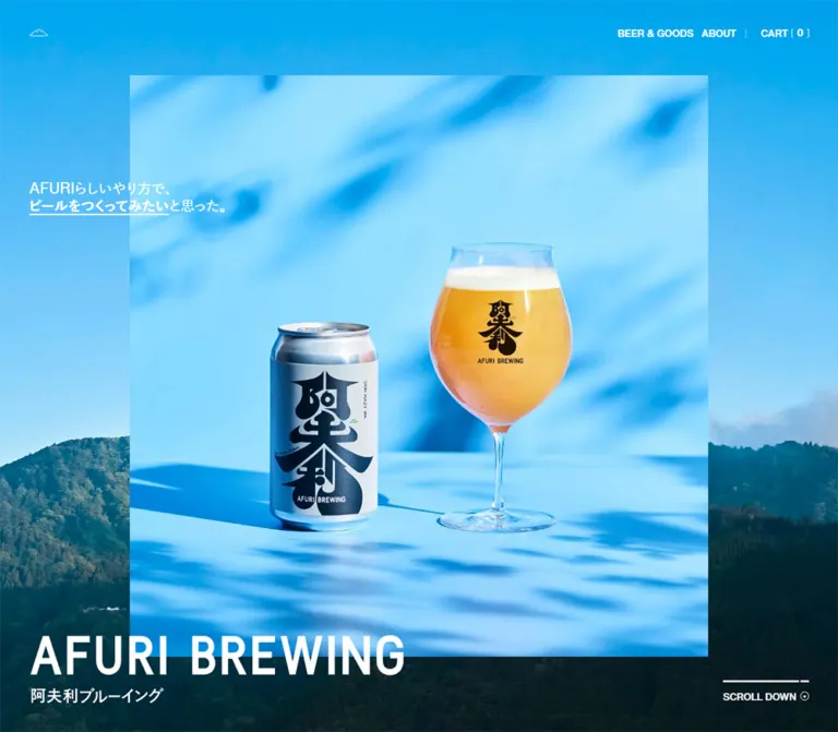
鮮やかな青の商品写真と山の風景を重ねたクラフトビールのブランド・ECサイト。大胆なロゴ、広い余白、細い罫線、非対称グリッドを組み合わせ、商品と醸造の物語を紹介する。
オリジナルサイトを見るAFURI BREWING / 阿夫利ブルーイング — Style Reference
A vivid blue beer still life above a spacious white editorial storefront.
Website: afuribrewing.com
Original URL: https://afuribrewing.com/
Final URL: https://afuribrewing.com/ — HTTP 200; unchanged destination.
Theme: white and near-black interface, with a photographic blue opening and reversed white lettering.
Inspected: September 12, 2026, 06:05 JST. Supplied retrieval timestamp: 2026-09-11T21:05:54.318Z.
Viewports: desktop 1440 × 1000 CSS pixels; mobile 390 × 844 CSS pixels.
Scope: the current homepage, including its opening composition, beer previews, collection link, taproom and brewer features, brand narrative, news previews, closing section, and footer. Visual evidence comprises three desktop crops and two mobile crops; rendered DOM and computed styles cover additional homepage content. Destination pages, an opened mobile menu, cart operations, and checkout were not inspected.
AFURI BREWING combines an expressive photographic opening with a disciplined editorial shop. A rectangular blue still life floats over a mountain landscape. White Japanese copy crosses the picture boundary, while a large English wordmark sits low in the viewport. The product is immediately recognizable through silver packaging, black calligraphy, golden beer, and directional foliage shadows.
Below the opening, white space becomes the dominant material. Four desktop columns organize products and news, but larger stories deliberately occupy uneven spans. The taproom feature begins in the second column and stretches across two columns; the brewer feature occupies the fourth. Fine gray rules and tiny triangular marks provide structure without enclosing everything in cards. The footer repeats the same contrast in scale: small practical links surround a large isolated can, followed by a nearly full-width wordmark.
This is a brand homepage with shopping and editorial destinations. Its reusable character comes from the relationship between photography, oversized identity, narrow text columns, and unusually generous gaps.
How to Read This Reference
- Measured means a value appears in the supplied rendered DOM, computed styles, or element rectangles. Measurements are in CSS pixels unless stated otherwise.
- Calculated means arithmetic based on those measurements, such as the gap between adjacent columns.
- Visual estimate means a proportion, color, or detail read from the supplied screenshots. These are not pixel-sampled colors or recovered CSS declarations.
- Recommended means implementation guidance for a new build. Breakpoints, accessible target sizes, and unrecorded media ratios in the Quick Start are recommendations.
- Named tokens are descriptive aliases unless explicitly identified as original custom properties.
- Element rectangles can include transformed or currently concealed content. A nonzero rectangle does not establish that an element was visible in the supplied screenshot. In particular, the opening contains additional heading and identity elements in the DOM that should not all be displayed simultaneously based on this record.
- The screenshots and DOM snapshots are complementary evidence, not a synchronized frame-by-frame recording. Use measured dimensions for structure and screenshots for visible composition.
Tokens — Colors
Default Palette
| Name | Value | Suggested token | Role and evidence |
|---|---|---|---|
| Page White | #FFFFFF |
--color-paper |
Measured: HTML/body background; the dominant content and footer canvas |
| Ink | #1D1D1D |
--color-ink |
Measured: normal page text, product headings, descriptions, and footer links |
| Reversed White | #FFFFFF |
--color-reverse |
Measured: opening header, hero copy, and scroll label |
| Fine Gray | approximately #C4C4C4 |
--color-rule |
Visual estimate: quiet dividers, triangular ticks, and some marginal branding |
| Sky Blue | approximately #00A5E5 |
--color-sky-reference |
Visual estimate: a representative saturated blue from the opening imagery; not a verified UI fill |
| Forest Teal | approximately #063F4A |
--color-forest-reference |
Visual estimate: dark mountain foliage supporting the white hero wordmark |
| Beer Gold | approximately #E5B335 |
--color-beer-reference |
Visual estimate: the drink's warm focal color; not an observed action color |
The measured interface palette is extremely restrained. Blue, green, and gold come primarily from imagery. Preserve that distinction: turning every link blue or every purchase affordance gold would introduce a color system that the evidence does not show.
Color Behavior
The opening header has a transparent background and white foreground. The main content and footer use dark text on white. The blue scene contains natural tonal variation, bright highlights, and shadows; a flat cyan rectangle cannot reproduce it.
No selectable theme or dark-mode control was observed. The dark mountains within the hero are photographic content, not evidence of a separate dark interface theme.
Tokens — Typography
English Navigation and Utilities
Measured medium stack:
font-family: HelveticaNowText-Medium, -apple-system, 'system-ui',
  HelveticaNowFallback, sans-serif;
font-weight: 500;
This stack appears on BEER & GOODS, ABOUT, CART, and the primary footer navigation. It gives small English labels a compact, direct presence without decorative tracking.
Measured bold stack:
font-family: HelveticaNowText-Bold, -apple-system, 'system-ui',
  HelveticaNowFallback, sans-serif;
font-weight: 700;
The bold stack appears on social links and the mobile scroll label. These are declared computed stacks; the supplied evidence does not independently identify which font file rendered every glyph.
Japanese Statements and Supporting Copy
Measured medium stack:
font-family: MFW-YuGoPr6N-Medium, YuGoFallbackM,
  'Yu Gothic Medium', '游ゴシック Medium', YuGothic, '游ゴシック体',
  'Hiragino Kaku Gothic Pro', 'メイリオ', sans-serif;
font-weight: 400;
Used for the opening statement, the additional brand heading present in the DOM, the closing statement, and newsletter explanatory text. The family name includes Medium, but the computed CSS weight on these samples is 400.
Measured bold stack:
font-family: MFW-YuGoPr6N-Bold, YuGoFallbackB,
  'Yu Gothic Medium', '游ゴシック Medium', YuGothic, '游ゴシック体',
  'Hiragino Kaku Gothic Pro', 'メイリオ', sans-serif;
font-weight: 700;
Used for product names, editorial headings, beer descriptions, news excerpts, and practical footer links. The sampled English product titles also use this stack; do not automatically assign them the navigation family.
Wordmarks and Structural Wrappers
The large English wordmark is visually bold and tightly fitted to its available width. Its actual child font or artwork implementation is not exposed by the supplied element samples. The hero H1 reports an inherited 18px sans-serif style, but that wrapper value clearly does not describe the visible large lettering.
Use authorized wordmark artwork when available. A bold sans-serif text fallback is an approximation, not an identified original display font. Likewise, the HTML element's Times family and the body's 18px / 18px defaults do not describe the typography of the fully styled content.
Type Scale
Values below are measured font size / line height, except the final two rows.
| Role | Desktop | Mobile | Weight and behavior |
|---|---|---|---|
| Header navigation / cart | 17 / 22px |
Cart 16.252 / 21.032px |
English medium, 500 |
| Opening statement | 24 / 30px |
17.208 / 23.9px |
Japanese medium, 400 |
| Additional opening brand heading in DOM | 36 / 45px |
21.988 / 28.68px |
Its complete visible state was not captured |
| First three product titles | 26 / 30px |
26.768 / 28.68px |
Bold; mobile titles are not uniformly smaller |
| Fourth product title | 26 / 30px |
19.12 / 21.988px |
Mobile card is narrower |
| Editorial and news headings | 26 / 30px |
19.12 / 21.988px |
Bold; title space depends on content |
| Product tagline | 12 / 15px |
11.472 / 14.34px |
Bold, compact |
| Descriptions and narrative paragraphs | 15 / 27px |
14.34 / 25.812px |
Bold, with 1.8 line-height ratio |
| Editorial category label | 15 / 22px |
14.34 / 21.032px |
Bold |
| Primary footer navigation | 17 / 22px |
23.9 / 30.592px |
Mobile becomes a larger vertical list |
| Practical footer links | 15 / 22px |
11.472 / 14.34px |
Bold |
| Newsletter explanation | 12 / 19px |
11.472 / 18.164px |
Regular |
| Social links | 15 / 25px |
11.472 / 14.34px |
English bold |
| Scroll label | 17 / 22px |
11.472 / 14.34px |
Medium desktop; bold mobile |
| Hero English wordmark | Approximately 650 × 70px visible artwork |
Approximately 344 × 37px |
Visual estimate: artwork bounds, not font size |
| Footer English wordmark | Approximately 1340px wide |
344.125 × 37.484px link rectangle |
Desktop width is visual; mobile rectangle is measured |
Sampled letter spacing is normal. The hierarchy comes from size, weight, line length, and placement rather than widely tracked uppercase text.
Tokens — Spacing & Shapes
Original Scaling Properties
The supplied root properties reveal separate horizontal, vertical, and viewport-related scales. Their complete definitions and breakpoints were not supplied.
| Original property | Desktop | Mobile |
|---|---|---|
--x-s, --o-s, --a-s, --cn-s |
1px |
0.956px |
--y-s, --cv-s |
1.302px |
1.008px |
--aspect, --aspect-high |
1.302 |
1.055 |
--aspect-low |
1 |
1 |
--vw |
14.4px |
3.9px |
--vh, --vh-max, --vh-variable |
10px |
8.44px |
--headerH |
113px |
54px |
For example, 15 × 0.956 = 14.34px, matching mobile body copy. The mobile large product title instead matches 28 × 0.956 = 26.768px, while secondary headings match 20 × 0.956 = 19.12px. These relationships support role-specific scaling; they do not establish a universal formula for the entire page.
Spacing Scale
| Use | Desktop | Mobile | Evidence |
|---|---|---|---|
| Main content side inset | 50px |
Approximately 22.944px |
Measured rectangles and footer padding |
| Header side inset | 50px |
Approximately 23.9px |
Measured control positions |
| Main content width | 1340px |
Approximately 344.15px |
Measured |
| Desktop column gap | 44px |
Not a universal mobile gap | Calculated from column origins; also measured on collection feature |
| Large section gap | 243px |
129.06px |
Measured computed gap; repeated in section positions |
| Card top inset | 17px |
14.34px |
Measured on product, story, and news links |
| Heading end clearance | 25px |
23.9px |
Measured on editorial headings |
| Hero identity stack gap | 20px |
12.428px |
Measured H1 gap |
| Footer top padding | 300px |
129.06px |
Measured |
| Footer bottom padding | 30px |
25.812px |
Measured |
| Newsletter content gap | 10px |
14.34px |
Measured link grid gap |
| Cart internal gap | 6px |
5.736px |
Measured |
These are not the steps of a generic eight-pixel spacing system. The dominant rhythm alternates dense information inside a column with long pauses between groups.
Border Radius and Linework
| Element | Treatment | Evidence |
|---|---|---|
| Product and editorial link containers | 0px radius |
Measured |
| Hero photograph | Square corners | Visible in both opening captures |
| Content and footer dividers | Approximately 1px gray line |
Visual estimate |
| Footer action rules | Approximately 1px dark line |
Visual estimate |
| Small circular link symbols | Approximately 14–15px |
Visual estimate; action grid reserves 15px desktop and about 14.33px mobile |
| Mountain marks | Fine outline artwork | Visible; exact path data unavailable |
| Rule endpoint decorations | Tiny triangular ticks | Visible, especially in the footer |
There is no general rounded-card or elevation system. The isolated footer can has a conspicuous soft shadow, but the evidence does not identify whether that shadow is embedded in the asset or generated separately.
Layout Measurements
| Element | Desktop | Mobile |
|---|---|---|
| Header rectangle | 1440 × 113px |
390 × 54.453px |
| Mountain home link / menu mark box | 34 × 13px |
Menu button 33.453 × 13.375px |
| Hero photo frame | Approximately 995 × 740px, at (223, 130) |
Approximately 295 × 444px, starting near (47, 261) |
| Hero heading group | (50, 834), 1340 × 117px |
(22.938, 675.781), 344.156 × 64.984px |
| First product start | Document Y 2063.484px |
Document Y 1625.625px |
| First three product cards | Each 302 × 797.172px in one row |
Each about 344.156px wide, stacked |
| Fourth product card | 302 × 797.172px |
160.594 × 630.313px |
| Collection feature columns | 993px 302px, with 44px gap |
One 344.125px column |
| Taproom feature width | 648px |
344.156px |
| Brewer feature width | 302px |
344.156px |
| Footer can link | 297 × 565px |
119.5 × 229.438px |
| Footer total height | 947.641px |
1144.094px |
| Document height | 9528.203px |
11743.828px |
Hero photo dimensions are visual estimates. Other entries are measured DOM rectangles. Document coordinates are inspection snapshots, not recommended fixed offsets for a new implementation.
Components
Transparent Header
Role: provide identity, catalog access, brand information, and a persistent shopping destination within the opening composition.
On desktop, a small white mountain outline sits at approximately (50, 50). The right-hand group contains BEER & GOODS, ABOUT, and CART with a bracketed count. Typography is 17px / 22px English medium. Small dotted vertical separators and ample empty space keep the controls lightweight.
The measured destinations are /collections/all, /pages/about, and /cart. The screenshot shows a count of zero; it is content, not a decorative constant to hardcode.
On mobile, the mountain-shaped control is a real button whose DOM contains MENU and CLOSE. Its visible mark occupies about 33 × 13px, while the cart remains at the upper right. The desktop category links are absent from the captured mobile header. No opened menu state was supplied, so its panel layout, focus behavior, animation, and navigation order remain unverified.
An additional centered identity link has a measured desktop rectangle and a transform transition in the DOM, but is not visibly established in the opening screenshot. Do not add a permanently visible centered wordmark merely because that rectangle exists.
Layered Photographic Hero
Role: establish the product, environment, and brand voice in the first viewport.
The opening consists of five visible layers:
- A full-viewport mountain landscape, with bright blue sky above dark forested ridges.
- An inset rectangular photograph of a silver can and a stemmed glass of golden beer on a saturated blue surface.
- A short Japanese statement aligned to the page gutter and crossing the photograph boundary.
- A large English wordmark with a smaller Japanese identity beneath it, positioned low and left.
- A bottom-right scroll cue with a horizontal white rule and a small circular symbol.
The photographed shadows are part of the image's spatial effect. The frame itself has no visible border, rounding, or interface shadow.
The source statement reads AFURIらしいやり方で、ビールをつくってみたいと思った。 A bold, underlined phrase creates emphasis inside otherwise lighter Japanese copy. Keep the statement short and preserve intentional line breaks rather than filling the whole horizontal text rectangle.
Desktop framing leaves the can and glass relatively small within the blue scene. Mobile makes the can prominent at the lower left and the glass prominent at the upper right. The available evidence establishes different framing, but does not establish whether the source uses separate photographs, alternate crops, or another media treatment.
Recommended: use an art-directed <picture> when a simple center crop cannot preserve both objects. Keep the landscape and still life as separate media layers.
Scroll Cue and Opening Continuation
Role: indicate the long page's continuation while retaining the photographic composition.
The desktop cue is approximately 148px wide, including its rule and circular mark. Its text is 17px / 22px. Mobile reduces the text to 11.472px / 14.34px and the overall visual width to roughly 96px.
The sampled label is a paragraph, not a recorded link. Its click behavior and any progress semantics are unverified. Do not automatically treat the line as a timed progress bar.
The DOM also contains the additional statement バランスと、驚きを。 followed by a description of AFURI's craft beer. The first product begins well beyond the first viewport at both measured sizes. This supports a substantial opening sequence, but the intermediate visual choreography was not supplied. Do not display all opening statements on top of one another or fill the entire continuation with arbitrary blank space.
Beer Preview Card
Role: introduce a beer and link to its product page.
The DOM confirms this information hierarchy: product name, short poetic tagline, release/status text, flavor dimensions, descriptive paragraph, price, and pack quantity. The labels 香り, 苦味, and ボディ are present, but their precise graphical representation is not included in the supplied visual crops. Do not invent a particular star count, bar scale, or rating interaction.
Four cards occupy equal desktop columns at X positions 50, 396, 742, and 1088px. Each is 302px wide. Their titles share a 60px measured height, their descriptions begin at the same Y position, and their price rows align even when descriptions have different line counts. The result is an ordered product index with substantial media space.
Observed content includes:
| Product | Status text | Price and pack at inspection |
|---|---|---|
YUZU MEXICAN LAGER |
NEW |
¥ 6,180, 6本 |
DDH HAZY IPA4.0 |
NEW |
¥ 6,780, 6本 |
阿夫利のひみつS |
限定コラボ |
¥ 7,140, 6本 |
YUZU PEACH NE IPA |
数量限定 |
¥ 7,140, 6本 |
These are captured content values, not permanent product specifications. The whole preview is an anchor to a product detail page. No add-to-cart control was established inside these homepage cards.
On mobile, the first three cards expand to about 344px and retain large titles. The fourth is only 160.594px wide and uses a smaller title. Preserve this observed exception when reproducing this capture; the evidence does not explain the underlying merchandising rule or establish the appearance of every possible catalog length.
Collection Feature
Role: offer the complete beer and goods catalog after the featured products.
The desktop link uses an approximately 993px main column, a 44px gap, and a 302px copy column. The copy contains a two-line heading, BEER & GOODS, and a short description mentioning all beers and original glasses. It links to /collections/all.
The mobile grid becomes one column. The heading's measured position is roughly 302px below the link's top edge, consistent with a media region preceding the copy. Preserve that sequence on mobile instead of squeezing the desktop copy column beside a miniature image.
The supplied screenshots do not show this feature's complete media. Its exact image subject and crop cannot be documented from the DOM alone.
Taproom and Brewer Features
Role: connect products with place and people.
On desktop, the taproom link starts in column two and spans two columns: 648px wide. The brewer link occupies the final 302px column. The first column is left open. Both links begin at the same measured Y coordinate and share a total height of approximately 687px.
Each feature contains a bold heading, an About category line, a large image, descriptive text, and quiet separation from the next group. The taproom links to /pages/about#taproom; the brewer links to /pages/about#brewer.
The visible taproom illustration uses crisp black outlines, light green grounds, trees, vehicles, people, and a building shown from an elevated viewpoint. The adjacent photograph's visible portion shows two people wearing dark and light shirts with large calligraphic graphics. Their faces are outside the supplied screenshot crop; that does not prove the original photograph excludes faces.
The taproom copy describes a planned opening in 2027. Treat this as time-sensitive source content. The brewer copy identifies the Inoue brothers; it is not a website production credit.
Mobile stacks these features at full content width, with approximately 129px between major entries. Their headlines reduce to 19.12px / 21.988px, while descriptions retain comfortable 14.34px / 25.812px leading.
Landscape and Brand Narrative
Role: provide a pause between informational groups and connect the brand to outdoor experience.
The desktop middle capture shows a large ocean photograph aligned to the left gutter, approximately 994px wide. Sunlight reflects vertically across the water. A light gray vertical AFURI BREWING label sits near the far-right page edge. The image begins approximately 244px below the preceding visible rule, matching the measured 243px section rhythm.
Elsewhere in the same narrative section, the DOM places a long Japanese paragraph in a 302px desktop column at approximately X 1087px. It uses bold 15px / 27px text. On mobile, that paragraph becomes about 344px wide with 14.34px / 25.812px text.
The narrow desktop prose and expansive landscape are complementary. Preserve the contrast between short line lengths and large imagery. The supplied record does not reveal the complete continuous sequence or any scroll-linked image behavior.
News Preview
Role: extend product discovery through stories and announcements.
Four desktop links use the same 302px columns as the beer previews. Each contains a bold title, the category お知らせ, a media region, and an excerpt. The measured title regions are 90px high, allowing longer bilingual titles to align across the row. The group begins near document Y 6594.609px.
Mobile changes these entries into full-width stacked links with smaller 19.12px headings and approximately 129px gaps. Use text length to determine card height rather than forcing the desktop row height onto phones.
The recorded destinations are individual /blogs/news/... pages. Their page designs and reading interactions were not inspected. Exact news-image appearance is also outside the supplied visual crops.
Closing Statement Section
Role: conclude the editorial content before the footer.
The DOM records the statement まっすぐにつくろう。遊ぶようにつくろう。 in white medium-weight Japanese text. Its containing section measures 1340 × 973px on desktop and approximately 344 × 433px on mobile.
Desktop text is 24px / 30px, starting 60px inside the content gutter. Mobile text is 17.208px / 28.68px and occupies a much narrower block near the center. The closing section's full image or background is not visible in the supplied crops, so its imagery and motion should remain unspecified.
Footer Navigation and Product Object
Role: combine practical navigation with one final product-led brand impression.
Desktop footer anatomy:
- A full-width fine rule and a horizontal
HOME,BEER & GOODS,ABOUTnavigation group, with cart at the far right. - A large isolated can centered across the empty middle of the footer. Its link rectangle is
297 × 565px, and it links to the collection with the accessible text商品一覧. - Six practical links grouped at left, including news, contact, FAQ, privacy, legal notice, and login.
- Newsletter and official-site links in a
302pxright column. - A ruled social/identity strip, then a very large English wordmark and centered copyright text.
The can is functional collection navigation, not merely an ornament. Its visible packaging reads 阿夫利のひみつ and includes character artwork. Do not assume it is the same product variant as the separately listed 阿夫利のひみつS.
The can's shadow supplies depth while the surrounding interface stays flat. Retain the generous empty center rather than filling it with extra promotional copy.
Footer Action Rows
Role: provide quiet secondary destinations without filled buttons.
The newsletter row contains a bold title, two lines of smaller explanatory text, and a circular mark at the right. The desktop grid is 287px 15px, with 14px top padding and 33px bottom padding. The official-site row shares the same general construction. Each has a thin dark top rule.
On mobile, the action grid becomes approximately 329.8px 14.33px. The official-site row is visually placed before the newsletter row, reversing their desktop order. The newsletter destination is /pages/newsletter; no inline subscription form is shown in this homepage footer.
Mobile Footer
The mobile footer is a recomposed vertical sequence:
- Large stacked primary navigation links, above the supplied final footer crop.
- Compact practical links.
- Official-site row, then newsletter row and explanatory copy.
- A centered can approximately
119.5pxwide. - A social strip.
- A separate mountain-mark and Japanese-identity strip.
- The full-width English wordmark and small centered copyright.
The final mobile screenshot starts below the primary navigation. Its absence from that crop does not mean the navigation was removed: the DOM measures all three links at 23.9px / 30.592px.
Tokens — Motion & Interaction
Recorded Transition Declarations
| Element | Measured declaration | What can be concluded |
|---|---|---|
| Header | transform 0.25s cubic-bezier(0.165, 0.84, 0.44, 1) |
A transform transition is configured; its trigger and displacement were not recorded |
| Mobile header | Same transform transition plus background at the same duration/easing |
Background changes can transition; an alternate header state was not supplied |
| Additional desktop identity link | transform 0.43s cubic-bezier(0.77, 0, 0.175, 1) |
The element supports a transform transition; its full visibility sequence is unverified |
| Main content section | opacity 0.85s cubic-bezier(0.77, 0, 0.175, 1) |
An opacity transition is configured; the reveal trigger and initial opacity are unavailable |
| Footer Japanese identity link | opacity 0.3s cubic-bezier(0.77, 0, 0.175, 1) |
An opacity transition exists; a specific hover state was not exercised |
Many other samples report only transition: all, with no positive duration supplied. Those entries do not establish an animated interaction.
Observed Behavior and Limits
The inspection process loaded the page and scrolled through intermediate positions before taking settled captures. Links and a mobile menu button are present in the rendered DOM. No click-through flow, menu opening, cart update, keyboard interaction, hover effect, or form submission is recorded.
The sampled elements report animation: none. This does not rule out animation on unsampled children, pseudo-elements, media, or JavaScript-controlled transforms. There is insufficient evidence to assert parallax, a looping slideshow, can rotation, or scroll-scrubbed animation.
For a new implementation, reuse the recorded timing curves where relevant, but keep content visible by default. Any added reveal, header behavior, or hover feedback should be documented as an implementation choice.
Surfaces
| Layer | Appearance | Purpose |
|---|---|---|
| Opening landscape | Full-viewport photographic sky and forest | Establishes place and supports reversed identity |
| Product still life | Sharp rectangular blue photographic plane | Gives the beer a distinct foreground stage |
| Main canvas | Solid white | Supports long editorial pacing |
| Product and story containers | Transparent/white, square, no enclosing elevation | Organizes content through alignment and spacing |
| Dividers | Fine gray lines with occasional tiny triangular ticks | Marks boundaries without heavy framing |
| Footer actions | White surface with a dark top rule and small circular symbol | Signals secondary navigation |
| Footer product | Isolated can with a visible soft shadow | Adds dimensional contrast to the otherwise flat footer |
Avoid treating every tonal difference in the photographs as a separate interface surface. There is no evidence of glass blur, pill-shaped controls, or a general gradient button system.
Imagery
The opening depends on a particular combination of photographic qualities: saturated cyan surroundings, a metallic can, black calligraphic graphics, translucent golden beer, white foam, and soft branch shadows. The image feels outdoors through light and shadow even though its blue plane is highly controlled.
The surrounding mountain landscape and later ocean photograph broaden the visual story. Their greens and dark teals remain natural and subdued beside the opening blue. The taproom illustration adds a different register: clear outlines, friendly figures, and a green site plan. Photography and illustration coexist without being forced into one filter.
The footer uses a product cutout as a large object in white space. Preserve the actual packaging lettering as part of the asset. Do not reconstruct it with unrelated fonts or replace the product silhouette with a generic can icon.
Observed Asset References
The supplied evidence does not include image source URLs, filenames, native dimensions, or MIME types. The following are identifiable visual slots, not recovered asset paths.
| Visual slot | Recorded appearance | Implementation guidance |
|---|---|---|
| Opening background | Blue sky and forested mountain ridges | Use a landscape asset with enough sky for the upper controls |
| Desktop still life | Can and stemmed glass within a wide blue frame | Preserve breathing room and directional shadows |
| Mobile still life | Larger can at lower left and glass at upper right | Use an intentional portrait crop or alternate authorized image |
| Taproom illustration | Building, people, trees, vehicles, light green ground | Retain clean linework and the illustration's original proportions |
| Brewer photograph | Visible torsos in branded dark and light shirts | Preserve the source crop; do not infer unseen boundaries from the screenshot |
| Landscape interlude | Sun reflected across an ocean | Keep its expansive horizontal role on desktop |
| Footer can | Isolated illustrated label and soft shadow | Use containment and preserve the whole can |
| Identity marks | Mountain outline, Japanese name, English wordmark | Prefer authorized original artwork; exact file format is unverified |
Product-grid, collection-feature, news, and closing-section imagery are not sufficiently visible in the supplied crops for detailed art-direction claims.
Layout & Responsive Behavior
Desktop Structure
At 1440px, the principal content area is 1340px wide, with 50px margins. Four 302px columns and three 44px gaps account for that width exactly:
302 + 44 + 302 + 44 + 302 + 44 + 302 = 1340
This grid is reused with different spans. Products and news use all four columns equally. The collection feature combines a roughly three-column media area with a one-column text area. The taproom uses columns two and three; the brewer uses column four. The landscape image occupies roughly three columns from the left.
The grid is therefore an alignment system, not a requirement to fill every slot. The empty first column beside the taproom feature is a defining part of the layout.
Mobile Structure
At 390px, the main content width is about 344px, with approximately 23px side margins. The transformation is selective:
| Area | Observed mobile change |
|---|---|
| Header | Desktop category links give way to the mountain menu button; cart remains |
| Opening photograph | Wide frame becomes a tall, narrower portrait composition |
| Opening statement | Moves above and slightly across the photo's top edge |
| Hero identity | Fits nearly the full content width and remains near the image's lower edge |
| Product previews | First three are full width; fourth is approximately 160.6px wide |
| Collection feature | Media and copy become vertical |
| Taproom and brewer | Stack as full-width features |
| News | Becomes a full-width vertical sequence |
| Primary footer navigation | Grows to 23.9px and stacks vertically |
| Footer actions | Official-site link moves above newsletter |
| Footer product | Shrinks from 297px to 119.5px wide and moves into the vertical sequence |
| Social and identity strip | Splits into two stacked rows |
A hypothetical two-slot mobile grid with two 160.594px tracks inside 344.156px would leave approximately 22.968px between tracks. This is a calculated implementation possibility, not a recovered source grid declaration.
Only the two listed viewport sizes were inspected. Exact breakpoints, tablet behavior, landscape-phone behavior, and browser zoom behavior remain unverified. The Quick Start uses a recommended 48rem breakpoint and should be checked at intermediate widths before adoption.
Do’s and Don’ts
Do
- Preserve the separate mountain background and blue product photograph in the opening.
- Let short white copy and the large identity cross image boundaries deliberately.
- Use measured white and near-black for the interface; let photography supply most color.
- Reuse the four-column desktop alignment system with intentional empty spans.
- Retain bold Japanese descriptions with generous line height.
- Keep square image boundaries, fine rules, and small geometric details.
- Preserve the large section gaps that separate product discovery from brand stories.
- Recompose the footer for mobile, including its action order and smaller centered can.
- Treat the footer can as a collection link with an accessible name.
- Separate verified transition declarations from unverified interaction choreography.
Don’t
- Don’t replace the opening imagery with a flat blue background and generic product mockup.
- Don’t turn the page into uniformly rounded cards with shadows.
- Don’t fill every empty desktop grid column.
- Don’t assign bright blue or gold to every CTA simply because those colors appear in the photographs.
- Don’t shrink every font by the same mobile ratio; several roles change independently.
- Don’t describe the mobile product layout as four identical full-width cards.
- Don’t use the hero
H1wrapper's18pxvalue as the visible wordmark size. - Don’t invent flavor charts, menu panels, cart behavior, parallax, or hover animations.
- Don’t assume the footer's illustrated can matches the currently featured collaboration variant.
- Don’t infer a source filename, asset format, or exact display font from appearance alone.
Recommended Implementation Additions
These are recommendations for a new implementation, not verified original behavior:
- Give the mobile menu button a minimum
44 × 44pxinteraction area while retaining the small mountain mark visually. Supportaria-expanded, keyboard operation, and focus return when implementing its panel. - Preserve the existing skip-link concept and make its focused state visibly accessible. The supplied resting-state link is clipped to a
1 × 1pxrectangle. - Add a clear focus outline to product links, footer actions, and image-only collection links.
- Check white text contrast against every responsive image crop. Use a localized treatment only where the selected photograph requires it.
- Keep decorative mountain backgrounds separate from meaningful product-image alternatives. Avoid repeated accessible brand announcements when several visual wordmarks are adjacent.
- Provide reduced-motion behavior for any new reveal or header movement. Essential navigation and content should remain usable without animation.
- Respect logical reading order when reproducing the footer's visual reordering. Avoid placing the product link unexpectedly early in the keyboard sequence simply to achieve a desktop overlap.
- Keep product titles, prices, quantities, availability labels, and dated taproom information driven by current content.
- Reserve media dimensions to limit layout shifts, load the opening image deliberately, and defer lower-page images as appropriate.
- Check compact mobile footer text and narrow product descriptions at increased text size; allow content to grow rather than clipping to recorded heights.
Agent Prompt Guide
Quick Color Reference
- Canvas and footer: measured
#FFFFFF. - Main text: measured
#1D1D1D. - Opening text and icons: measured
#FFFFFF. - Hairline dividers: approximately
#C4C4C4, a visual estimate. - Photographic reference colors: sky blue approximately
#00A5E5, forest teal approximately#063F4A, beer gold approximately#E5B335. - Action treatment: text links, thin top rules, and small circular marks; no verified filled primary-button color.
Overall Prompt
“Create a Japanese craft-beer brand homepage with shopping and editorial content, inspired by the supplied AFURI BREWING captures. Open with a full-viewport mountain landscape and a separate inset blue still-life photograph containing a silver can and a stemmed glass of golden beer. Overlay short white Japanese copy at the left and a large English wordmark near the bottom. Follow with a white page using near-black text, bold Japanese headings and descriptions, four desktop columns, fine gray rules, and large vertical gaps. Let larger stories span uneven numbers of columns and retain deliberate empty space. Finish with a spacious footer containing practical links, ruled newsletter and official-site links, a large isolated product can, small social links, and an oversized wordmark. Recompose the opening and footer for a 390px phone. Treat unknown menu and scroll effects as separate implementation decisions.”
Example Component Prompts
- Opening: “At 1440 × 1000, place a roughly 995 × 740 blue beer photograph at x223/y130 over a mountain landscape. Use 50px outer text gutters, white Japanese copy near y309, and a large low-left identity group. At 390 × 844, use a roughly 295px-wide portrait composition around x47/y261, keeping both the can and glass readable.”
- Beer previews: “Build four 302px desktop columns with 44px gaps. Each link contains a bold product title, compact tagline, product media, recorded flavor/status information, a readable Japanese description, and price/pack metadata. Align desktop description and price rows. In the captured phone layout, make the first three entries full width and the fourth about 160.6px wide.”
- About features: “Use a white four-column editorial grid. Leave column one empty, span a taproom illustration and its text across columns two and three, and place a brewer feature in column four. Use 26px bold headings, 15px text with 27px leading, quiet bottom rules, and approximately 243px before the next major section.”
- Footer: “Create a white footer with small horizontal primary navigation, practical links at left, ruled secondary destinations at right, and a 297px-wide isolated can centered between them. Add a thin ruled social strip and an almost full-width English wordmark. On phone, stack the content, place official-site access before newsletter, reduce the can to about 119.5px, and separate social and Japanese identity into two rows.”
- Interaction extension: “Use the recorded 250ms header transform curve and 850ms content-opacity curve only where a specified state change needs them. Keep all essential content visible without JavaScript. Add clear keyboard focus and reduced-motion support; do not invent scroll-driven product rotation or a carousel.”
Quick Start
CSS Custom Properties
This is a recommended adaptation, not recovered source CSS. It keeps a conventional root font size, uses measured desktop/mobile tokens, and approximates the photographed hero's geometry. Class names are implementation aliases. The 48rem breakpoint, product-media ratio, focus treatment, and hover underlines are recommendations.
Supply authorized media through image elements: .hero-landscape for the background, .hero-photo for a picture/image wrapper, .brand-wordmark for identity artwork, and .footer-product for the collection link containing the can image. No original image URLs or font files were supplied. Load licensed font files separately if available; the fallback stacks work without them.
The opening continuation and any scroll choreography require additional implementation. Do not reproduce their measured document length with empty fixed-height spacers.
:root {
  /* Measured interface colors; gray and blue are visual approximations. */
  --color-paper: #ffffff;
  --color-ink: #1d1d1d;
  --color-reverse: #ffffff;
  --color-rule: #c4c4c4;
  --color-sky-reference: #00a5e5;

  --font-nav: HelveticaNowText-Medium, -apple-system, system-ui,
    HelveticaNowFallback, sans-serif;
  --font-nav-bold: HelveticaNowText-Bold, -apple-system, system-ui,
    HelveticaNowFallback, sans-serif;
  --font-jp: MFW-YuGoPr6N-Medium, YuGoFallbackM,
    'Yu Gothic Medium', '游ゴシック Medium', YuGothic, '游ゴシック体',
    'Hiragino Kaku Gothic Pro', 'メイリオ', sans-serif;
  --font-jp-bold: MFW-YuGoPr6N-Bold, YuGoFallbackB,
    'Yu Gothic Medium', '游ゴシック Medium', YuGothic, '游ゴシック体',
    'Hiragino Kaku Gothic Pro', 'メイリオ', sans-serif;

  --page-gutter: 50px;
  --grid-gap: 44px;
  --section-gap: 243px;
  --card-top: 17px;
  --header-height: 113px;
  --text-nav: 17px;
  --leading-nav: 22px;
  --text-heading: 26px;
  --leading-heading: 30px;
  --text-product-heading: 26px;
  --leading-product-heading: 30px;
  --text-body: 15px;
  --leading-body: 27px;
  --text-small: 12px;
  --leading-small: 15px;

  --ease-header: cubic-bezier(0.165, 0.84, 0.44, 1);
  --ease-editorial: cubic-bezier(0.77, 0, 0.175, 1);
  --motion-header: 250ms var(--ease-header);
  --motion-identity: 430ms var(--ease-editorial);
  --motion-reveal: 850ms var(--ease-editorial);
}

.brew-page,
.brew-page * {
  box-sizing: border-box;
}

.brew-page {
  margin: 0;
  color: var(--color-ink);
  background: var(--color-paper);
  font-family: var(--font-jp);
}

.brew-page img {
  display: block;
  max-inline-size: 100%;
}

.brew-page a {
  color: inherit;
}

.brew-page :focus-visible {
  outline: 2px solid currentColor;
  outline-offset: 5px;
}

.hero {
  position: relative;
  isolation: isolate;
  block-size: 100svh;
  color: var(--color-reverse);
  background: var(--color-sky-reference);
}

.hero-landscape {
  position: absolute;
  inset: 0;
  z-index: -2;
  inline-size: 100%;
  block-size: 100%;
  object-fit: cover;
}

.hero-photo {
  position: absolute;
  z-index: -1;
  inset-block-start: 13%;
  inset-inline-start: 50%;
  inline-size: 69.1%;
  block-size: 74%;
  transform: translateX(-50%);
}

.hero-photo img {
  inline-size: 100%;
  block-size: 100%;
  object-fit: cover;
}

.site-header {
  position: absolute;
  z-index: 5;
  inset: 0 0 auto;
  display: flex;
  justify-content: space-between;
  align-items: flex-start;
  min-block-size: var(--header-height);
  padding: 46px var(--page-gutter) 0;
  color: var(--color-reverse);
  background: transparent;
  transition: transform var(--motion-header),
    background var(--motion-header);
}

.header-home {
  inline-size: 34px;
  block-size: 13px;
  margin-block-start: 4px;
}

.header-nav {
  display: flex;
  align-items: center;
  gap: 14px;
  font: 500 var(--text-nav) / var(--leading-nav) var(--font-nav);
}

.header-nav a {
  text-decoration: none;
}

.cart-link {
  display: flex;
  align-items: center;
  gap: 6px;
}

.menu-button {
  display: none;
  border: 0;
  padding: 0;
  color: inherit;
  background: transparent;
}

.hero-copy {
  position: absolute;
  inset-block-start: 30.889%;
  inset-inline: var(--page-gutter);
  margin: 0;
  font: 400 24px / 30px var(--font-jp);
}

.hero-copy strong {
  font-family: var(--font-jp-bold);
  font-weight: 700;
  text-decoration: underline;
  text-underline-offset: 5px;
}

.hero-title {
  position: absolute;
  inset-inline: var(--page-gutter);
  inset-block-end: 49px;
  display: grid;
  gap: 20px;
  margin: 0;
}

.hero-title .brand-wordmark {
  inline-size: min(650px, 100%);
  block-size: auto;
}

.hero-title .brand-jp {
  /* Approximation: the original child type size was not supplied. */
  font: 700 26px / 27px var(--font-jp-bold);
}

.scroll-cue {
  position: absolute;
  inset-inline-end: var(--page-gutter);
  inset-block-end: 49px;
  inline-size: 148px;
  padding-block-start: 14px;
  border-block-start: 3px solid currentColor;
  font: 500 17px / 22px var(--font-nav);
}

.content-stack {
  display: grid;
  row-gap: var(--section-gap);
  margin-inline: var(--page-gutter);
}

.product-grid,
.story-grid,
.news-grid {
  display: grid;
  grid-template-columns: repeat(4, minmax(0, 1fr));
  gap: var(--grid-gap);
}

.product-card,
.story-card,
.news-card {
  display: grid;
  align-content: start;
  gap: 20px;
  min-inline-size: 0;
  padding-block-start: var(--card-top);
  border-radius: 0;
  text-decoration: none;
}

.product-title,
.story-title,
.news-title {
  margin: 0;
  padding-inline-end: 25px;
  font: 700 var(--text-heading) / var(--leading-heading)
    var(--font-jp-bold);
}

.product-title {
  min-block-size: 60px;
  font-size: var(--text-product-heading);
  line-height: var(--leading-product-heading);
}

.news-title {
  min-block-size: 90px;
}

.product-tagline {
  margin: 0;
  font: 700 var(--text-small) / var(--leading-small)
    var(--font-jp-bold);
}

.body-copy {
  margin: 0;
  font: 700 var(--text-body) / var(--leading-body)
    var(--font-jp-bold);
}

.product-media {
  /* Recommended placeholder ratio; replace after measuring supplied assets. */
  inline-size: 100%;
  aspect-ratio: 3 / 4;
  object-fit: contain;
}

.price-row {
  display: flex;
  justify-content: space-between;
  gap: 12px;
}

.collection-feature {
  display: grid;
  grid-template-columns: minmax(0, 1fr) calc((100% - 132px) / 4);
  gap: var(--grid-gap);
  color: inherit;
  text-decoration: none;
}

.collection-copy {
  display: grid;
  align-content: start;
  gap: 28px;
}

.story-card--taproom {
  grid-column: 2 / span 2;
}

.story-card--brewer {
  grid-column: 4;
}

.story-card {
  padding-block-end: 48px;
  border-block-end: 1px solid var(--color-rule);
}

.landscape-panel {
  inline-size: calc(75% - var(--grid-gap) / 4);
  margin: 0;
}

.landscape-panel img {
  inline-size: 100%;
  block-size: auto;
}

.site-footer {
  padding: 300px var(--page-gutter) 30px;
  background: var(--color-paper);
}

.footer-nav {
  display: flex;
  align-items: center;
  gap: 32px;
  padding-block-start: 24px;
  border-block-start: 1px solid var(--color-rule);
  font: 500 17px / 22px var(--font-nav);
}

.footer-nav .cart-link {
  margin-inline-start: auto;
}

.footer-body {
  position: relative;
  display: grid;
  grid-template-columns: repeat(4, minmax(0, 1fr));
  gap: var(--grid-gap);
  margin-block-start: 224px;
}

.footer-utilities {
  grid-column: 1;
  display: grid;
  align-content: start;
  gap: 6px;
  font: 700 15px / 22px var(--font-jp-bold);
}

.footer-actions {
  grid-column: 4;
  display: flex;
  flex-direction: column;
}

.footer-action {
  display: grid;
  grid-template-columns: minmax(0, 1fr) 15px;
  gap: 10px 0;
  padding-block: 14px 33px;
  border-block-start: 1px solid currentColor;
  text-decoration: none;
}

.footer-action-title {
  margin: 0;
  font: 700 15px / 22px var(--font-jp-bold);
}

.footer-action-description {
  grid-column: 1;
  margin: 0;
  font: 400 12px / 19px var(--font-jp);
}

.footer-product {
  position: absolute;
  z-index: 1;
  inset-inline-start: 50%;
  inset-block-start: -312px;
  inline-size: 297px;
  transform: translateX(-50%);
}

.footer-product img {
  inline-size: 100%;
  block-size: auto;
  /* Preserve the asset shadow; do not automatically add another. */
}

.footer-social-brand {
  display: grid;
  grid-template-columns: 1fr auto;
  align-items: center;
  min-block-size: 72px;
  margin-block-start: 25px;
  border-block: 1px solid var(--color-rule);
}

.footer-socials,
.footer-brand-row {
  display: flex;
  align-items: center;
  gap: 24px;
}

.footer-socials {
  font: 700 15px / 25px var(--font-nav-bold);
}

.footer-wordmark {
  inline-size: 100%;
  block-size: auto;
  margin-block-start: 28px;
}

.footer-copyright {
  margin: 28px 0 0;
  text-align: center;
  font: 400 12px / 1.5 var(--font-nav);
}

@media (hover: hover) {
  /* Recommended feedback; original hover appearance was not recorded. */
  .text-link:hover,
  .product-card:hover .product-title,
  .story-card:hover .story-title,
  .news-card:hover .news-title {
    text-decoration: underline;
    text-underline-offset: 4px;
  }
}

@media (max-width: 48rem) {
  :root {
    --page-gutter: 22.944px;
    --grid-gap: 22.944px;
    --section-gap: 129.06px;
    --card-top: 14.34px;
    --header-height: 54.453px;
    --text-nav: 16.252px;
    --leading-nav: 21.032px;
    --text-heading: 19.12px;
    --leading-heading: 21.988px;
    --text-product-heading: 26.768px;
    --leading-product-heading: 28.68px;
    --text-body: 14.34px;
    --leading-body: 25.812px;
    --text-small: 11.472px;
    --leading-small: 14.34px;
  }

  .site-header {
    padding: 22.531px 23.9px 0;
  }

  .header-home,
  .header-nav .primary-nav-item {
    display: none;
  }

  .menu-button {
    /* Recommended hit area surrounding the observed small mark. */
    display: grid;
    place-items: center;
    inline-size: 44px;
    block-size: 44px;
    margin: -12px 0 0 -5px;
  }

  .menu-icon {
    inline-size: 33.453px;
    block-size: 13.375px;
  }

  .cart-link {
    gap: 5.736px;
  }

  .hero-photo {
    inset-block-start: 30.9%;
    inline-size: 75.64%;
    block-size: 52.6%;
  }

  .hero-copy {
    inset-block-start: 26.59%;
    inset-inline: 23.9px;
    font-size: 17.208px;
    line-height: 23.9px;
  }

  .hero-title {
    inset-block-end: 12.23%;
    gap: 12.428px;
  }

  .hero-title .brand-wordmark {
    inline-size: 100%;
  }

  .hero-title .brand-jp {
    font-size: 14px;
    line-height: 15px;
  }

  .scroll-cue {
    inset-block-end: 32px;
    inline-size: 96px;
    padding-block-start: 7px;
    font: 700 11.472px / 14.34px var(--font-nav-bold);
  }

  .product-grid {
    grid-template-columns: repeat(2, minmax(0, 1fr));
    gap: var(--section-gap) var(--grid-gap);
  }

  .product-card {
    grid-column: 1 / -1;
  }

  .product-card--compact {
    grid-column: 1;
    --text-product-heading: 19.12px;
    --leading-product-heading: 21.988px;
  }

  .product-title,
  .news-title {
    min-block-size: 0;
  }

  .product-title,
  .story-title,
  .news-title {
    padding-inline-end: 23.9px;
  }

  .story-grid,
  .news-grid,
  .collection-feature {
    grid-template-columns: minmax(0, 1fr);
    gap: var(--section-gap);
  }

  .collection-feature {
    gap: 28px;
  }

  .story-card--taproom,
  .story-card--brewer {
    grid-column: 1;
  }

  .landscape-panel {
    inline-size: 100%;
  }

  .site-footer {
    padding: 129.06px var(--page-gutter) 25.812px;
  }

  .footer-nav {
    flex-direction: column;
    align-items: stretch;
    gap: 17.488px;
    font-size: 23.9px;
    line-height: 30.592px;
  }

  .footer-nav .cart-link {
    display: none;
  }

  .footer-body {
    grid-template-columns: minmax(0, 1fr);
    gap: 48px;
    margin-block-start: 56px;
  }

  .footer-utilities {
    grid-column: 1;
    grid-row: 1;
    gap: 10px;
    font-size: 11.472px;
    line-height: 14.34px;
  }

  .footer-actions {
    grid-column: 1;
    grid-row: 2;
  }

  .footer-action {
    grid-template-columns: minmax(0, 1fr) 14.34px;
    gap: 14.34px 0;
    padding-block: 14.34px;
  }

  .footer-action--official {
    order: -1;
  }

  .footer-action-title {
    font-size: 14.34px;
    line-height: 21.032px;
  }

  .footer-action-description {
    font-size: 11.472px;
    line-height: 18.164px;
  }

  .footer-product {
    position: relative;
    inset: auto;
    grid-column: 1;
    grid-row: 3;
    justify-self: center;
    inline-size: 119.5px;
    margin-block-start: -16px;
    transform: none;
  }

  .footer-social-brand {
    grid-template-columns: minmax(0, 1fr);
    margin-block-start: -15px;
  }

  .footer-socials {
    min-block-size: 64px;
    gap: 24px;
    font-size: 11.472px;
    line-height: 14.34px;
  }

  .footer-brand-row {
    min-block-size: 72px;
    border-block-start: 1px solid var(--color-rule);
  }

  .footer-copyright {
    font-size: 11px;
  }
}

@media (prefers-reduced-motion: reduce) {
  .brew-page *,
  .brew-page *::before,
  .brew-page *::after {
    animation: none !important;
    transition: none !important;
    scroll-behavior: auto !important;
  }
}
Use .product-card--compact on the fourth card when matching the supplied mobile state. This explicit modifier avoids implying that an undocumented source rule applies to every fourth product in a larger catalog.
The CSS intentionally leaves menu-panel behavior, product flavor graphics, and opening choreography unspecified. Original assets and additional state evidence are needed to reproduce those accurately. Intermediate widths need layout checks; the two inspected endpoints do not establish a complete responsive specification.
Tailwind v4 Token Mapping
Optional aliases for a project already using Tailwind v4. This is not evidence that the original website uses Tailwind. Define the properties above first.
@theme inline {
  --color-paper: #ffffff;
  --color-ink: #1d1d1d;
  --color-rule: #c4c4c4;

  --font-navigation: var(--font-nav);
  --font-japanese: var(--font-jp);
  --font-japanese-bold: var(--font-jp-bold);

  --text-navigation: var(--text-nav);
  --text-editorial: var(--text-heading);
  --text-copy: var(--text-body);
  --text-caption: var(--text-small);

  --spacing-page: var(--page-gutter);
  --spacing-column: var(--grid-gap);
  --spacing-section: var(--section-gap);
  --radius-card: 0px;
}
Sources & Evidence
- AFURI BREWING — current homepage: original and final inspected URL, HTTP 200. Page title:
AFURI BREWING / 阿夫利ブルーイング. - Capture date: supplied retrieval timestamp
2026-09-11T21:05:54.318Z, corresponding to September 12, 2026, 06:05:54 JST. - Desktop evidence:
1440 × 1000CSS-pixel viewport; opening, middle editorial/landscape, and footer screenshots; rendered text, link destinations, element rectangles, computed font stacks, colors, spacing, and transition declarations. - Mobile evidence:
390 × 844CSS-pixel viewport; opening and lower-footer screenshots; rendered DOM and computed styles for the broader homepage, including the product-width exception and footer reordering. - Observation process: the supplied inspection reports an initial observation of at least five seconds, image-decoding and layout-stability checks, waits for finite motion where applicable, and scrolling through intermediate positions. Perpetual animations were temporarily paused during readiness checks and then resumed. These procedures do not establish the meaning or completeness of unrecorded interactions.
- Limitations: no additional browsing or file access was performed for this reference. Image source URLs, original stylesheet rules, exact media breakpoints, wordmark child rendering, opened navigation, purchase flows, hover states, and complete animation sequences were not supplied. Some sections are documented from DOM evidence without a corresponding visual crop.
This reference describes the current homepage represented by the supplied captures. Measured values, visual estimates, calculated relationships, and recommended implementation choices are identified separately throughout.
# AFURI BREWING / 阿夫利ブルーイング — Style Reference

> A vivid blue beer still life above a spacious white editorial storefront.

**Website:** [afuribrewing.com](https://afuribrewing.com/)
**Original URL:** https://afuribrewing.com/
**Final URL:** https://afuribrewing.com/ — HTTP 200; unchanged destination.
**Theme:** white and near-black interface, with a photographic blue opening and reversed white lettering.
**Inspected:** September 12, 2026, 06:05 JST. Supplied retrieval timestamp: `2026-09-11T21:05:54.318Z`.
**Viewports:** desktop `1440 × 1000` CSS pixels; mobile `390 × 844` CSS pixels.
**Scope:** the current homepage, including its opening composition, beer previews, collection link, taproom and brewer features, brand narrative, news previews, closing section, and footer. Visual evidence comprises three desktop crops and two mobile crops; rendered DOM and computed styles cover additional homepage content. Destination pages, an opened mobile menu, cart operations, and checkout were not inspected.

AFURI BREWING combines an expressive photographic opening with a disciplined editorial shop. A rectangular blue still life floats over a mountain landscape. White Japanese copy crosses the picture boundary, while a large English wordmark sits low in the viewport. The product is immediately recognizable through silver packaging, black calligraphy, golden beer, and directional foliage shadows.

Below the opening, white space becomes the dominant material. Four desktop columns organize products and news, but larger stories deliberately occupy uneven spans. The taproom feature begins in the second column and stretches across two columns; the brewer feature occupies the fourth. Fine gray rules and tiny triangular marks provide structure without enclosing everything in cards. The footer repeats the same contrast in scale: small practical links surround a large isolated can, followed by a nearly full-width wordmark.

This is a brand homepage with shopping and editorial destinations. Its reusable character comes from the relationship between photography, oversized identity, narrow text columns, and unusually generous gaps.

## How to Read This Reference

- **Measured** means a value appears in the supplied rendered DOM, computed styles, or element rectangles. Measurements are in CSS pixels unless stated otherwise.
- **Calculated** means arithmetic based on those measurements, such as the gap between adjacent columns.
- **Visual estimate** means a proportion, color, or detail read from the supplied screenshots. These are not pixel-sampled colors or recovered CSS declarations.
- **Recommended** means implementation guidance for a new build. Breakpoints, accessible target sizes, and unrecorded media ratios in the Quick Start are recommendations.
- **Named tokens** are descriptive aliases unless explicitly identified as original custom properties.
- Element rectangles can include transformed or currently concealed content. A nonzero rectangle does not establish that an element was visible in the supplied screenshot. In particular, the opening contains additional heading and identity elements in the DOM that should not all be displayed simultaneously based on this record.
- The screenshots and DOM snapshots are complementary evidence, not a synchronized frame-by-frame recording. Use measured dimensions for structure and screenshots for visible composition.

## Tokens — Colors

### Default Palette

| Name | Value | Suggested token | Role and evidence |
| --- | --- | --- | --- |
| Page White | `#FFFFFF` | `--color-paper` | **Measured:** HTML/body background; the dominant content and footer canvas |
| Ink | `#1D1D1D` | `--color-ink` | **Measured:** normal page text, product headings, descriptions, and footer links |
| Reversed White | `#FFFFFF` | `--color-reverse` | **Measured:** opening header, hero copy, and scroll label |
| Fine Gray | approximately `#C4C4C4` | `--color-rule` | **Visual estimate:** quiet dividers, triangular ticks, and some marginal branding |
| Sky Blue | approximately `#00A5E5` | `--color-sky-reference` | **Visual estimate:** a representative saturated blue from the opening imagery; not a verified UI fill |
| Forest Teal | approximately `#063F4A` | `--color-forest-reference` | **Visual estimate:** dark mountain foliage supporting the white hero wordmark |
| Beer Gold | approximately `#E5B335` | `--color-beer-reference` | **Visual estimate:** the drink's warm focal color; not an observed action color |

The measured interface palette is extremely restrained. Blue, green, and gold come primarily from imagery. Preserve that distinction: turning every link blue or every purchase affordance gold would introduce a color system that the evidence does not show.

### Color Behavior

The opening header has a transparent background and white foreground. The main content and footer use dark text on white. The blue scene contains natural tonal variation, bright highlights, and shadows; a flat cyan rectangle cannot reproduce it.

No selectable theme or dark-mode control was observed. The dark mountains within the hero are photographic content, not evidence of a separate dark interface theme.

## Tokens — Typography

### English Navigation and Utilities

**Measured medium stack:**

```css
font-family: HelveticaNowText-Medium, -apple-system, 'system-ui',
  HelveticaNowFallback, sans-serif;
font-weight: 500;
```

This stack appears on `BEER & GOODS`, `ABOUT`, `CART`, and the primary footer navigation. It gives small English labels a compact, direct presence without decorative tracking.

**Measured bold stack:**

```css
font-family: HelveticaNowText-Bold, -apple-system, 'system-ui',
  HelveticaNowFallback, sans-serif;
font-weight: 700;
```

The bold stack appears on social links and the mobile scroll label. These are declared computed stacks; the supplied evidence does not independently identify which font file rendered every glyph.

### Japanese Statements and Supporting Copy

**Measured medium stack:**

```css
font-family: MFW-YuGoPr6N-Medium, YuGoFallbackM,
  'Yu Gothic Medium', '游ゴシック Medium', YuGothic, '游ゴシック体',
  'Hiragino Kaku Gothic Pro', 'メイリオ', sans-serif;
font-weight: 400;
```

Used for the opening statement, the additional brand heading present in the DOM, the closing statement, and newsletter explanatory text. The family name includes Medium, but the computed CSS weight on these samples is `400`.

**Measured bold stack:**

```css
font-family: MFW-YuGoPr6N-Bold, YuGoFallbackB,
  'Yu Gothic Medium', '游ゴシック Medium', YuGothic, '游ゴシック体',
  'Hiragino Kaku Gothic Pro', 'メイリオ', sans-serif;
font-weight: 700;
```

Used for product names, editorial headings, beer descriptions, news excerpts, and practical footer links. The sampled English product titles also use this stack; do not automatically assign them the navigation family.

### Wordmarks and Structural Wrappers

The large English wordmark is visually bold and tightly fitted to its available width. Its actual child font or artwork implementation is not exposed by the supplied element samples. The hero `H1` reports an inherited `18px` sans-serif style, but that wrapper value clearly does not describe the visible large lettering.

Use authorized wordmark artwork when available. A bold sans-serif text fallback is an approximation, not an identified original display font. Likewise, the HTML element's `Times` family and the body's `18px / 18px` defaults do not describe the typography of the fully styled content.

### Type Scale

Values below are **measured font size / line height**, except the final two rows.

| Role | Desktop | Mobile | Weight and behavior |
| --- | --- | --- | --- |
| Header navigation / cart | `17 / 22px` | Cart `16.252 / 21.032px` | English medium, `500` |
| Opening statement | `24 / 30px` | `17.208 / 23.9px` | Japanese medium, `400` |
| Additional opening brand heading in DOM | `36 / 45px` | `21.988 / 28.68px` | Its complete visible state was not captured |
| First three product titles | `26 / 30px` | `26.768 / 28.68px` | Bold; mobile titles are not uniformly smaller |
| Fourth product title | `26 / 30px` | `19.12 / 21.988px` | Mobile card is narrower |
| Editorial and news headings | `26 / 30px` | `19.12 / 21.988px` | Bold; title space depends on content |
| Product tagline | `12 / 15px` | `11.472 / 14.34px` | Bold, compact |
| Descriptions and narrative paragraphs | `15 / 27px` | `14.34 / 25.812px` | Bold, with `1.8` line-height ratio |
| Editorial category label | `15 / 22px` | `14.34 / 21.032px` | Bold |
| Primary footer navigation | `17 / 22px` | `23.9 / 30.592px` | Mobile becomes a larger vertical list |
| Practical footer links | `15 / 22px` | `11.472 / 14.34px` | Bold |
| Newsletter explanation | `12 / 19px` | `11.472 / 18.164px` | Regular |
| Social links | `15 / 25px` | `11.472 / 14.34px` | English bold |
| Scroll label | `17 / 22px` | `11.472 / 14.34px` | Medium desktop; bold mobile |
| Hero English wordmark | Approximately `650 × 70px` visible artwork | Approximately `344 × 37px` | **Visual estimate:** artwork bounds, not font size |
| Footer English wordmark | Approximately `1340px` wide | `344.125 × 37.484px` link rectangle | Desktop width is visual; mobile rectangle is measured |

Sampled letter spacing is `normal`. The hierarchy comes from size, weight, line length, and placement rather than widely tracked uppercase text.

## Tokens — Spacing & Shapes

### Original Scaling Properties

The supplied root properties reveal separate horizontal, vertical, and viewport-related scales. Their complete definitions and breakpoints were not supplied.

| Original property | Desktop | Mobile |
| --- | --- | --- |
| `--x-s`, `--o-s`, `--a-s`, `--cn-s` | `1px` | `0.956px` |
| `--y-s`, `--cv-s` | `1.302px` | `1.008px` |
| `--aspect`, `--aspect-high` | `1.302` | `1.055` |
| `--aspect-low` | `1` | `1` |
| `--vw` | `14.4px` | `3.9px` |
| `--vh`, `--vh-max`, `--vh-variable` | `10px` | `8.44px` |
| `--headerH` | `113px` | `54px` |

For example, `15 × 0.956 = 14.34px`, matching mobile body copy. The mobile large product title instead matches `28 × 0.956 = 26.768px`, while secondary headings match `20 × 0.956 = 19.12px`. These relationships support role-specific scaling; they do not establish a universal formula for the entire page.

### Spacing Scale

| Use | Desktop | Mobile | Evidence |
| --- | --- | --- | --- |
| Main content side inset | `50px` | Approximately `22.944px` | Measured rectangles and footer padding |
| Header side inset | `50px` | Approximately `23.9px` | Measured control positions |
| Main content width | `1340px` | Approximately `344.15px` | Measured |
| Desktop column gap | `44px` | Not a universal mobile gap | Calculated from column origins; also measured on collection feature |
| Large section gap | `243px` | `129.06px` | Measured computed gap; repeated in section positions |
| Card top inset | `17px` | `14.34px` | Measured on product, story, and news links |
| Heading end clearance | `25px` | `23.9px` | Measured on editorial headings |
| Hero identity stack gap | `20px` | `12.428px` | Measured `H1` gap |
| Footer top padding | `300px` | `129.06px` | Measured |
| Footer bottom padding | `30px` | `25.812px` | Measured |
| Newsletter content gap | `10px` | `14.34px` | Measured link grid gap |
| Cart internal gap | `6px` | `5.736px` | Measured |

These are not the steps of a generic eight-pixel spacing system. The dominant rhythm alternates dense information inside a column with long pauses between groups.

### Border Radius and Linework

| Element | Treatment | Evidence |
| --- | --- | --- |
| Product and editorial link containers | `0px` radius | Measured |
| Hero photograph | Square corners | Visible in both opening captures |
| Content and footer dividers | Approximately `1px` gray line | Visual estimate |
| Footer action rules | Approximately `1px` dark line | Visual estimate |
| Small circular link symbols | Approximately `14–15px` | Visual estimate; action grid reserves `15px` desktop and about `14.33px` mobile |
| Mountain marks | Fine outline artwork | Visible; exact path data unavailable |
| Rule endpoint decorations | Tiny triangular ticks | Visible, especially in the footer |

There is no general rounded-card or elevation system. The isolated footer can has a conspicuous soft shadow, but the evidence does not identify whether that shadow is embedded in the asset or generated separately.

### Layout Measurements

| Element | Desktop | Mobile |
| --- | --- | --- |
| Header rectangle | `1440 × 113px` | `390 × 54.453px` |
| Mountain home link / menu mark box | `34 × 13px` | Menu button `33.453 × 13.375px` |
| Hero photo frame | Approximately `995 × 740px`, at `(223, 130)` | Approximately `295 × 444px`, starting near `(47, 261)` |
| Hero heading group | `(50, 834)`, `1340 × 117px` | `(22.938, 675.781)`, `344.156 × 64.984px` |
| First product start | Document Y `2063.484px` | Document Y `1625.625px` |
| First three product cards | Each `302 × 797.172px` in one row | Each about `344.156px` wide, stacked |
| Fourth product card | `302 × 797.172px` | `160.594 × 630.313px` |
| Collection feature columns | `993px 302px`, with `44px` gap | One `344.125px` column |
| Taproom feature width | `648px` | `344.156px` |
| Brewer feature width | `302px` | `344.156px` |
| Footer can link | `297 × 565px` | `119.5 × 229.438px` |
| Footer total height | `947.641px` | `1144.094px` |
| Document height | `9528.203px` | `11743.828px` |

Hero photo dimensions are visual estimates. Other entries are measured DOM rectangles. Document coordinates are inspection snapshots, not recommended fixed offsets for a new implementation.

## Components

### Transparent Header

**Role:** provide identity, catalog access, brand information, and a persistent shopping destination within the opening composition.

On desktop, a small white mountain outline sits at approximately `(50, 50)`. The right-hand group contains `BEER & GOODS`, `ABOUT`, and `CART` with a bracketed count. Typography is `17px / 22px` English medium. Small dotted vertical separators and ample empty space keep the controls lightweight.

The measured destinations are `/collections/all`, `/pages/about`, and `/cart`. The screenshot shows a count of zero; it is content, not a decorative constant to hardcode.

On mobile, the mountain-shaped control is a real button whose DOM contains `MENU` and `CLOSE`. Its visible mark occupies about `33 × 13px`, while the cart remains at the upper right. The desktop category links are absent from the captured mobile header. No opened menu state was supplied, so its panel layout, focus behavior, animation, and navigation order remain unverified.

An additional centered identity link has a measured desktop rectangle and a transform transition in the DOM, but is not visibly established in the opening screenshot. Do not add a permanently visible centered wordmark merely because that rectangle exists.

### Layered Photographic Hero

**Role:** establish the product, environment, and brand voice in the first viewport.

The opening consists of five visible layers:

1. A full-viewport mountain landscape, with bright blue sky above dark forested ridges.
2. An inset rectangular photograph of a silver can and a stemmed glass of golden beer on a saturated blue surface.
3. A short Japanese statement aligned to the page gutter and crossing the photograph boundary.
4. A large English wordmark with a smaller Japanese identity beneath it, positioned low and left.
5. A bottom-right scroll cue with a horizontal white rule and a small circular symbol.

The photographed shadows are part of the image's spatial effect. The frame itself has no visible border, rounding, or interface shadow.

The source statement reads `AFURIらしいやり方で、ビールをつくってみたいと思った。` A bold, underlined phrase creates emphasis inside otherwise lighter Japanese copy. Keep the statement short and preserve intentional line breaks rather than filling the whole horizontal text rectangle.

Desktop framing leaves the can and glass relatively small within the blue scene. Mobile makes the can prominent at the lower left and the glass prominent at the upper right. The available evidence establishes different framing, but does not establish whether the source uses separate photographs, alternate crops, or another media treatment.

**Recommended:** use an art-directed `<picture>` when a simple center crop cannot preserve both objects. Keep the landscape and still life as separate media layers.

### Scroll Cue and Opening Continuation

**Role:** indicate the long page's continuation while retaining the photographic composition.

The desktop cue is approximately `148px` wide, including its rule and circular mark. Its text is `17px / 22px`. Mobile reduces the text to `11.472px / 14.34px` and the overall visual width to roughly `96px`.

The sampled label is a paragraph, not a recorded link. Its click behavior and any progress semantics are unverified. Do not automatically treat the line as a timed progress bar.

The DOM also contains the additional statement `バランスと、驚きを。` followed by a description of AFURI's craft beer. The first product begins well beyond the first viewport at both measured sizes. This supports a substantial opening sequence, but the intermediate visual choreography was not supplied. Do not display all opening statements on top of one another or fill the entire continuation with arbitrary blank space.

### Beer Preview Card

**Role:** introduce a beer and link to its product page.

The DOM confirms this information hierarchy: product name, short poetic tagline, release/status text, flavor dimensions, descriptive paragraph, price, and pack quantity. The labels `香り`, `苦味`, and `ボディ` are present, but their precise graphical representation is not included in the supplied visual crops. Do not invent a particular star count, bar scale, or rating interaction.

Four cards occupy equal desktop columns at X positions `50`, `396`, `742`, and `1088px`. Each is `302px` wide. Their titles share a `60px` measured height, their descriptions begin at the same Y position, and their price rows align even when descriptions have different line counts. The result is an ordered product index with substantial media space.

Observed content includes:

| Product | Status text | Price and pack at inspection |
| --- | --- | --- |
| `YUZU MEXICAN LAGER` | `NEW` | `¥ 6,180`, `6本` |
| `DDH HAZY IPA4.0` | `NEW` | `¥ 6,780`, `6本` |
| `阿夫利のひみつS` | `限定コラボ` | `¥ 7,140`, `6本` |
| `YUZU PEACH NE IPA` | `数量限定` | `¥ 7,140`, `6本` |

These are captured content values, not permanent product specifications. The whole preview is an anchor to a product detail page. No add-to-cart control was established inside these homepage cards.

On mobile, the first three cards expand to about `344px` and retain large titles. The fourth is only `160.594px` wide and uses a smaller title. Preserve this observed exception when reproducing this capture; the evidence does not explain the underlying merchandising rule or establish the appearance of every possible catalog length.

### Collection Feature

**Role:** offer the complete beer and goods catalog after the featured products.

The desktop link uses an approximately `993px` main column, a `44px` gap, and a `302px` copy column. The copy contains a two-line heading, `BEER & GOODS`, and a short description mentioning all beers and original glasses. It links to `/collections/all`.

The mobile grid becomes one column. The heading's measured position is roughly `302px` below the link's top edge, consistent with a media region preceding the copy. Preserve that sequence on mobile instead of squeezing the desktop copy column beside a miniature image.

The supplied screenshots do not show this feature's complete media. Its exact image subject and crop cannot be documented from the DOM alone.

### Taproom and Brewer Features

**Role:** connect products with place and people.

On desktop, the taproom link starts in column two and spans two columns: `648px` wide. The brewer link occupies the final `302px` column. The first column is left open. Both links begin at the same measured Y coordinate and share a total height of approximately `687px`.

Each feature contains a bold heading, an About category line, a large image, descriptive text, and quiet separation from the next group. The taproom links to `/pages/about#taproom`; the brewer links to `/pages/about#brewer`.

The visible taproom illustration uses crisp black outlines, light green grounds, trees, vehicles, people, and a building shown from an elevated viewpoint. The adjacent photograph's visible portion shows two people wearing dark and light shirts with large calligraphic graphics. Their faces are outside the supplied screenshot crop; that does not prove the original photograph excludes faces.

The taproom copy describes a planned opening in 2027. Treat this as time-sensitive source content. The brewer copy identifies the Inoue brothers; it is not a website production credit.

Mobile stacks these features at full content width, with approximately `129px` between major entries. Their headlines reduce to `19.12px / 21.988px`, while descriptions retain comfortable `14.34px / 25.812px` leading.

### Landscape and Brand Narrative

**Role:** provide a pause between informational groups and connect the brand to outdoor experience.

The desktop middle capture shows a large ocean photograph aligned to the left gutter, approximately `994px` wide. Sunlight reflects vertically across the water. A light gray vertical `AFURI BREWING` label sits near the far-right page edge. The image begins approximately `244px` below the preceding visible rule, matching the measured `243px` section rhythm.

Elsewhere in the same narrative section, the DOM places a long Japanese paragraph in a `302px` desktop column at approximately X `1087px`. It uses bold `15px / 27px` text. On mobile, that paragraph becomes about `344px` wide with `14.34px / 25.812px` text.

The narrow desktop prose and expansive landscape are complementary. Preserve the contrast between short line lengths and large imagery. The supplied record does not reveal the complete continuous sequence or any scroll-linked image behavior.

### News Preview

**Role:** extend product discovery through stories and announcements.

Four desktop links use the same `302px` columns as the beer previews. Each contains a bold title, the category `お知らせ`, a media region, and an excerpt. The measured title regions are `90px` high, allowing longer bilingual titles to align across the row. The group begins near document Y `6594.609px`.

Mobile changes these entries into full-width stacked links with smaller `19.12px` headings and approximately `129px` gaps. Use text length to determine card height rather than forcing the desktop row height onto phones.

The recorded destinations are individual `/blogs/news/...` pages. Their page designs and reading interactions were not inspected. Exact news-image appearance is also outside the supplied visual crops.

### Closing Statement Section

**Role:** conclude the editorial content before the footer.

The DOM records the statement `まっすぐにつくろう。遊ぶようにつくろう。` in white medium-weight Japanese text. Its containing section measures `1340 × 973px` on desktop and approximately `344 × 433px` on mobile.

Desktop text is `24px / 30px`, starting `60px` inside the content gutter. Mobile text is `17.208px / 28.68px` and occupies a much narrower block near the center. The closing section's full image or background is not visible in the supplied crops, so its imagery and motion should remain unspecified.

### Footer Navigation and Product Object

**Role:** combine practical navigation with one final product-led brand impression.

Desktop footer anatomy:

- A full-width fine rule and a horizontal `HOME`, `BEER & GOODS`, `ABOUT` navigation group, with cart at the far right.
- A large isolated can centered across the empty middle of the footer. Its link rectangle is `297 × 565px`, and it links to the collection with the accessible text `商品一覧`.
- Six practical links grouped at left, including news, contact, FAQ, privacy, legal notice, and login.
- Newsletter and official-site links in a `302px` right column.
- A ruled social/identity strip, then a very large English wordmark and centered copyright text.

The can is functional collection navigation, not merely an ornament. Its visible packaging reads `阿夫利のひみつ` and includes character artwork. Do not assume it is the same product variant as the separately listed `阿夫利のひみつS`.

The can's shadow supplies depth while the surrounding interface stays flat. Retain the generous empty center rather than filling it with extra promotional copy.

### Footer Action Rows

**Role:** provide quiet secondary destinations without filled buttons.

The newsletter row contains a bold title, two lines of smaller explanatory text, and a circular mark at the right. The desktop grid is `287px 15px`, with `14px` top padding and `33px` bottom padding. The official-site row shares the same general construction. Each has a thin dark top rule.

On mobile, the action grid becomes approximately `329.8px 14.33px`. The official-site row is visually placed before the newsletter row, reversing their desktop order. The newsletter destination is `/pages/newsletter`; no inline subscription form is shown in this homepage footer.

### Mobile Footer

The mobile footer is a recomposed vertical sequence:

1. Large stacked primary navigation links, above the supplied final footer crop.
2. Compact practical links.
3. Official-site row, then newsletter row and explanatory copy.
4. A centered can approximately `119.5px` wide.
5. A social strip.
6. A separate mountain-mark and Japanese-identity strip.
7. The full-width English wordmark and small centered copyright.

The final mobile screenshot starts below the primary navigation. Its absence from that crop does not mean the navigation was removed: the DOM measures all three links at `23.9px / 30.592px`.

## Tokens — Motion & Interaction

### Recorded Transition Declarations

| Element | Measured declaration | What can be concluded |
| --- | --- | --- |
| Header | `transform 0.25s cubic-bezier(0.165, 0.84, 0.44, 1)` | A transform transition is configured; its trigger and displacement were not recorded |
| Mobile header | Same transform transition plus `background` at the same duration/easing | Background changes can transition; an alternate header state was not supplied |
| Additional desktop identity link | `transform 0.43s cubic-bezier(0.77, 0, 0.175, 1)` | The element supports a transform transition; its full visibility sequence is unverified |
| Main content section | `opacity 0.85s cubic-bezier(0.77, 0, 0.175, 1)` | An opacity transition is configured; the reveal trigger and initial opacity are unavailable |
| Footer Japanese identity link | `opacity 0.3s cubic-bezier(0.77, 0, 0.175, 1)` | An opacity transition exists; a specific hover state was not exercised |

Many other samples report only `transition: all`, with no positive duration supplied. Those entries do not establish an animated interaction.

### Observed Behavior and Limits

The inspection process loaded the page and scrolled through intermediate positions before taking settled captures. Links and a mobile menu button are present in the rendered DOM. No click-through flow, menu opening, cart update, keyboard interaction, hover effect, or form submission is recorded.

The sampled elements report `animation: none`. This does not rule out animation on unsampled children, pseudo-elements, media, or JavaScript-controlled transforms. There is insufficient evidence to assert parallax, a looping slideshow, can rotation, or scroll-scrubbed animation.

For a new implementation, reuse the recorded timing curves where relevant, but keep content visible by default. Any added reveal, header behavior, or hover feedback should be documented as an implementation choice.

## Surfaces

| Layer | Appearance | Purpose |
| --- | --- | --- |
| Opening landscape | Full-viewport photographic sky and forest | Establishes place and supports reversed identity |
| Product still life | Sharp rectangular blue photographic plane | Gives the beer a distinct foreground stage |
| Main canvas | Solid white | Supports long editorial pacing |
| Product and story containers | Transparent/white, square, no enclosing elevation | Organizes content through alignment and spacing |
| Dividers | Fine gray lines with occasional tiny triangular ticks | Marks boundaries without heavy framing |
| Footer actions | White surface with a dark top rule and small circular symbol | Signals secondary navigation |
| Footer product | Isolated can with a visible soft shadow | Adds dimensional contrast to the otherwise flat footer |

Avoid treating every tonal difference in the photographs as a separate interface surface. There is no evidence of glass blur, pill-shaped controls, or a general gradient button system.

## Imagery

The opening depends on a particular combination of photographic qualities: saturated cyan surroundings, a metallic can, black calligraphic graphics, translucent golden beer, white foam, and soft branch shadows. The image feels outdoors through light and shadow even though its blue plane is highly controlled.

The surrounding mountain landscape and later ocean photograph broaden the visual story. Their greens and dark teals remain natural and subdued beside the opening blue. The taproom illustration adds a different register: clear outlines, friendly figures, and a green site plan. Photography and illustration coexist without being forced into one filter.

The footer uses a product cutout as a large object in white space. Preserve the actual packaging lettering as part of the asset. Do not reconstruct it with unrelated fonts or replace the product silhouette with a generic can icon.

### Observed Asset References

The supplied evidence does not include image source URLs, filenames, native dimensions, or MIME types. The following are identifiable visual slots, not recovered asset paths.

| Visual slot | Recorded appearance | Implementation guidance |
| --- | --- | --- |
| Opening background | Blue sky and forested mountain ridges | Use a landscape asset with enough sky for the upper controls |
| Desktop still life | Can and stemmed glass within a wide blue frame | Preserve breathing room and directional shadows |
| Mobile still life | Larger can at lower left and glass at upper right | Use an intentional portrait crop or alternate authorized image |
| Taproom illustration | Building, people, trees, vehicles, light green ground | Retain clean linework and the illustration's original proportions |
| Brewer photograph | Visible torsos in branded dark and light shirts | Preserve the source crop; do not infer unseen boundaries from the screenshot |
| Landscape interlude | Sun reflected across an ocean | Keep its expansive horizontal role on desktop |
| Footer can | Isolated illustrated label and soft shadow | Use containment and preserve the whole can |
| Identity marks | Mountain outline, Japanese name, English wordmark | Prefer authorized original artwork; exact file format is unverified |

Product-grid, collection-feature, news, and closing-section imagery are not sufficiently visible in the supplied crops for detailed art-direction claims.

## Layout & Responsive Behavior

### Desktop Structure

At `1440px`, the principal content area is `1340px` wide, with `50px` margins. Four `302px` columns and three `44px` gaps account for that width exactly:

```text
302 + 44 + 302 + 44 + 302 + 44 + 302 = 1340
```

This grid is reused with different spans. Products and news use all four columns equally. The collection feature combines a roughly three-column media area with a one-column text area. The taproom uses columns two and three; the brewer uses column four. The landscape image occupies roughly three columns from the left.

The grid is therefore an alignment system, not a requirement to fill every slot. The empty first column beside the taproom feature is a defining part of the layout.

### Mobile Structure

At `390px`, the main content width is about `344px`, with approximately `23px` side margins. The transformation is selective:

| Area | Observed mobile change |
| --- | --- |
| Header | Desktop category links give way to the mountain menu button; cart remains |
| Opening photograph | Wide frame becomes a tall, narrower portrait composition |
| Opening statement | Moves above and slightly across the photo's top edge |
| Hero identity | Fits nearly the full content width and remains near the image's lower edge |
| Product previews | First three are full width; fourth is approximately `160.6px` wide |
| Collection feature | Media and copy become vertical |
| Taproom and brewer | Stack as full-width features |
| News | Becomes a full-width vertical sequence |
| Primary footer navigation | Grows to `23.9px` and stacks vertically |
| Footer actions | Official-site link moves above newsletter |
| Footer product | Shrinks from `297px` to `119.5px` wide and moves into the vertical sequence |
| Social and identity strip | Splits into two stacked rows |

A hypothetical two-slot mobile grid with two `160.594px` tracks inside `344.156px` would leave approximately `22.968px` between tracks. This is a **calculated implementation possibility**, not a recovered source grid declaration.

Only the two listed viewport sizes were inspected. Exact breakpoints, tablet behavior, landscape-phone behavior, and browser zoom behavior remain unverified. The Quick Start uses a recommended `48rem` breakpoint and should be checked at intermediate widths before adoption.

## Do’s and Don’ts

### Do

- Preserve the separate mountain background and blue product photograph in the opening.
- Let short white copy and the large identity cross image boundaries deliberately.
- Use measured white and near-black for the interface; let photography supply most color.
- Reuse the four-column desktop alignment system with intentional empty spans.
- Retain bold Japanese descriptions with generous line height.
- Keep square image boundaries, fine rules, and small geometric details.
- Preserve the large section gaps that separate product discovery from brand stories.
- Recompose the footer for mobile, including its action order and smaller centered can.
- Treat the footer can as a collection link with an accessible name.
- Separate verified transition declarations from unverified interaction choreography.

### Don’t

- Don’t replace the opening imagery with a flat blue background and generic product mockup.
- Don’t turn the page into uniformly rounded cards with shadows.
- Don’t fill every empty desktop grid column.
- Don’t assign bright blue or gold to every CTA simply because those colors appear in the photographs.
- Don’t shrink every font by the same mobile ratio; several roles change independently.
- Don’t describe the mobile product layout as four identical full-width cards.
- Don’t use the hero `H1` wrapper's `18px` value as the visible wordmark size.
- Don’t invent flavor charts, menu panels, cart behavior, parallax, or hover animations.
- Don’t assume the footer's illustrated can matches the currently featured collaboration variant.
- Don’t infer a source filename, asset format, or exact display font from appearance alone.

## Recommended Implementation Additions

These are recommendations for a new implementation, not verified original behavior:

- Give the mobile menu button a minimum `44 × 44px` interaction area while retaining the small mountain mark visually. Support `aria-expanded`, keyboard operation, and focus return when implementing its panel.
- Preserve the existing skip-link concept and make its focused state visibly accessible. The supplied resting-state link is clipped to a `1 × 1px` rectangle.
- Add a clear focus outline to product links, footer actions, and image-only collection links.
- Check white text contrast against every responsive image crop. Use a localized treatment only where the selected photograph requires it.
- Keep decorative mountain backgrounds separate from meaningful product-image alternatives. Avoid repeated accessible brand announcements when several visual wordmarks are adjacent.
- Provide reduced-motion behavior for any new reveal or header movement. Essential navigation and content should remain usable without animation.
- Respect logical reading order when reproducing the footer's visual reordering. Avoid placing the product link unexpectedly early in the keyboard sequence simply to achieve a desktop overlap.
- Keep product titles, prices, quantities, availability labels, and dated taproom information driven by current content.
- Reserve media dimensions to limit layout shifts, load the opening image deliberately, and defer lower-page images as appropriate.
- Check compact mobile footer text and narrow product descriptions at increased text size; allow content to grow rather than clipping to recorded heights.

## Agent Prompt Guide

### Quick Color Reference

- Canvas and footer: measured `#FFFFFF`.
- Main text: measured `#1D1D1D`.
- Opening text and icons: measured `#FFFFFF`.
- Hairline dividers: approximately `#C4C4C4`, a visual estimate.
- Photographic reference colors: sky blue approximately `#00A5E5`, forest teal approximately `#063F4A`, beer gold approximately `#E5B335`.
- Action treatment: text links, thin top rules, and small circular marks; no verified filled primary-button color.

### Overall Prompt

“Create a Japanese craft-beer brand homepage with shopping and editorial content, inspired by the supplied AFURI BREWING captures. Open with a full-viewport mountain landscape and a separate inset blue still-life photograph containing a silver can and a stemmed glass of golden beer. Overlay short white Japanese copy at the left and a large English wordmark near the bottom. Follow with a white page using near-black text, bold Japanese headings and descriptions, four desktop columns, fine gray rules, and large vertical gaps. Let larger stories span uneven numbers of columns and retain deliberate empty space. Finish with a spacious footer containing practical links, ruled newsletter and official-site links, a large isolated product can, small social links, and an oversized wordmark. Recompose the opening and footer for a 390px phone. Treat unknown menu and scroll effects as separate implementation decisions.”

### Example Component Prompts

1. **Opening:** “At 1440 × 1000, place a roughly 995 × 740 blue beer photograph at x223/y130 over a mountain landscape. Use 50px outer text gutters, white Japanese copy near y309, and a large low-left identity group. At 390 × 844, use a roughly 295px-wide portrait composition around x47/y261, keeping both the can and glass readable.”
2. **Beer previews:** “Build four 302px desktop columns with 44px gaps. Each link contains a bold product title, compact tagline, product media, recorded flavor/status information, a readable Japanese description, and price/pack metadata. Align desktop description and price rows. In the captured phone layout, make the first three entries full width and the fourth about 160.6px wide.”
3. **About features:** “Use a white four-column editorial grid. Leave column one empty, span a taproom illustration and its text across columns two and three, and place a brewer feature in column four. Use 26px bold headings, 15px text with 27px leading, quiet bottom rules, and approximately 243px before the next major section.”
4. **Footer:** “Create a white footer with small horizontal primary navigation, practical links at left, ruled secondary destinations at right, and a 297px-wide isolated can centered between them. Add a thin ruled social strip and an almost full-width English wordmark. On phone, stack the content, place official-site access before newsletter, reduce the can to about 119.5px, and separate social and Japanese identity into two rows.”
5. **Interaction extension:** “Use the recorded 250ms header transform curve and 850ms content-opacity curve only where a specified state change needs them. Keep all essential content visible without JavaScript. Add clear keyboard focus and reduced-motion support; do not invent scroll-driven product rotation or a carousel.”

## Quick Start

### CSS Custom Properties

This is a **recommended adaptation**, not recovered source CSS. It keeps a conventional root font size, uses measured desktop/mobile tokens, and approximates the photographed hero's geometry. Class names are implementation aliases. The `48rem` breakpoint, product-media ratio, focus treatment, and hover underlines are recommendations.

Supply authorized media through image elements: `.hero-landscape` for the background, `.hero-photo` for a picture/image wrapper, `.brand-wordmark` for identity artwork, and `.footer-product` for the collection link containing the can image. No original image URLs or font files were supplied. Load licensed font files separately if available; the fallback stacks work without them.

The opening continuation and any scroll choreography require additional implementation. Do not reproduce their measured document length with empty fixed-height spacers.

```css
:root {
  /* Measured interface colors; gray and blue are visual approximations. */
  --color-paper: #ffffff;
  --color-ink: #1d1d1d;
  --color-reverse: #ffffff;
  --color-rule: #c4c4c4;
  --color-sky-reference: #00a5e5;

  --font-nav: HelveticaNowText-Medium, -apple-system, system-ui,
    HelveticaNowFallback, sans-serif;
  --font-nav-bold: HelveticaNowText-Bold, -apple-system, system-ui,
    HelveticaNowFallback, sans-serif;
  --font-jp: MFW-YuGoPr6N-Medium, YuGoFallbackM,
    'Yu Gothic Medium', '游ゴシック Medium', YuGothic, '游ゴシック体',
    'Hiragino Kaku Gothic Pro', 'メイリオ', sans-serif;
  --font-jp-bold: MFW-YuGoPr6N-Bold, YuGoFallbackB,
    'Yu Gothic Medium', '游ゴシック Medium', YuGothic, '游ゴシック体',
    'Hiragino Kaku Gothic Pro', 'メイリオ', sans-serif;

  --page-gutter: 50px;
  --grid-gap: 44px;
  --section-gap: 243px;
  --card-top: 17px;
  --header-height: 113px;
  --text-nav: 17px;
  --leading-nav: 22px;
  --text-heading: 26px;
  --leading-heading: 30px;
  --text-product-heading: 26px;
  --leading-product-heading: 30px;
  --text-body: 15px;
  --leading-body: 27px;
  --text-small: 12px;
  --leading-small: 15px;

  --ease-header: cubic-bezier(0.165, 0.84, 0.44, 1);
  --ease-editorial: cubic-bezier(0.77, 0, 0.175, 1);
  --motion-header: 250ms var(--ease-header);
  --motion-identity: 430ms var(--ease-editorial);
  --motion-reveal: 850ms var(--ease-editorial);
}

.brew-page,
.brew-page * {
  box-sizing: border-box;
}

.brew-page {
  margin: 0;
  color: var(--color-ink);
  background: var(--color-paper);
  font-family: var(--font-jp);
}

.brew-page img {
  display: block;
  max-inline-size: 100%;
}

.brew-page a {
  color: inherit;
}

.brew-page :focus-visible {
  outline: 2px solid currentColor;
  outline-offset: 5px;
}

.hero {
  position: relative;
  isolation: isolate;
  block-size: 100svh;
  color: var(--color-reverse);
  background: var(--color-sky-reference);
}

.hero-landscape {
  position: absolute;
  inset: 0;
  z-index: -2;
  inline-size: 100%;
  block-size: 100%;
  object-fit: cover;
}

.hero-photo {
  position: absolute;
  z-index: -1;
  inset-block-start: 13%;
  inset-inline-start: 50%;
  inline-size: 69.1%;
  block-size: 74%;
  transform: translateX(-50%);
}

.hero-photo img {
  inline-size: 100%;
  block-size: 100%;
  object-fit: cover;
}

.site-header {
  position: absolute;
  z-index: 5;
  inset: 0 0 auto;
  display: flex;
  justify-content: space-between;
  align-items: flex-start;
  min-block-size: var(--header-height);
  padding: 46px var(--page-gutter) 0;
  color: var(--color-reverse);
  background: transparent;
  transition: transform var(--motion-header),
    background var(--motion-header);
}

.header-home {
  inline-size: 34px;
  block-size: 13px;
  margin-block-start: 4px;
}

.header-nav {
  display: flex;
  align-items: center;
  gap: 14px;
  font: 500 var(--text-nav) / var(--leading-nav) var(--font-nav);
}

.header-nav a {
  text-decoration: none;
}

.cart-link {
  display: flex;
  align-items: center;
  gap: 6px;
}

.menu-button {
  display: none;
  border: 0;
  padding: 0;
  color: inherit;
  background: transparent;
}

.hero-copy {
  position: absolute;
  inset-block-start: 30.889%;
  inset-inline: var(--page-gutter);
  margin: 0;
  font: 400 24px / 30px var(--font-jp);
}

.hero-copy strong {
  font-family: var(--font-jp-bold);
  font-weight: 700;
  text-decoration: underline;
  text-underline-offset: 5px;
}

.hero-title {
  position: absolute;
  inset-inline: var(--page-gutter);
  inset-block-end: 49px;
  display: grid;
  gap: 20px;
  margin: 0;
}

.hero-title .brand-wordmark {
  inline-size: min(650px, 100%);
  block-size: auto;
}

.hero-title .brand-jp {
  /* Approximation: the original child type size was not supplied. */
  font: 700 26px / 27px var(--font-jp-bold);
}

.scroll-cue {
  position: absolute;
  inset-inline-end: var(--page-gutter);
  inset-block-end: 49px;
  inline-size: 148px;
  padding-block-start: 14px;
  border-block-start: 3px solid currentColor;
  font: 500 17px / 22px var(--font-nav);
}

.content-stack {
  display: grid;
  row-gap: var(--section-gap);
  margin-inline: var(--page-gutter);
}

.product-grid,
.story-grid,
.news-grid {
  display: grid;
  grid-template-columns: repeat(4, minmax(0, 1fr));
  gap: var(--grid-gap);
}

.product-card,
.story-card,
.news-card {
  display: grid;
  align-content: start;
  gap: 20px;
  min-inline-size: 0;
  padding-block-start: var(--card-top);
  border-radius: 0;
  text-decoration: none;
}

.product-title,
.story-title,
.news-title {
  margin: 0;
  padding-inline-end: 25px;
  font: 700 var(--text-heading) / var(--leading-heading)
    var(--font-jp-bold);
}

.product-title {
  min-block-size: 60px;
  font-size: var(--text-product-heading);
  line-height: var(--leading-product-heading);
}

.news-title {
  min-block-size: 90px;
}

.product-tagline {
  margin: 0;
  font: 700 var(--text-small) / var(--leading-small)
    var(--font-jp-bold);
}

.body-copy {
  margin: 0;
  font: 700 var(--text-body) / var(--leading-body)
    var(--font-jp-bold);
}

.product-media {
  /* Recommended placeholder ratio; replace after measuring supplied assets. */
  inline-size: 100%;
  aspect-ratio: 3 / 4;
  object-fit: contain;
}

.price-row {
  display: flex;
  justify-content: space-between;
  gap: 12px;
}

.collection-feature {
  display: grid;
  grid-template-columns: minmax(0, 1fr) calc((100% - 132px) / 4);
  gap: var(--grid-gap);
  color: inherit;
  text-decoration: none;
}

.collection-copy {
  display: grid;
  align-content: start;
  gap: 28px;
}

.story-card--taproom {
  grid-column: 2 / span 2;
}

.story-card--brewer {
  grid-column: 4;
}

.story-card {
  padding-block-end: 48px;
  border-block-end: 1px solid var(--color-rule);
}

.landscape-panel {
  inline-size: calc(75% - var(--grid-gap) / 4);
  margin: 0;
}

.landscape-panel img {
  inline-size: 100%;
  block-size: auto;
}

.site-footer {
  padding: 300px var(--page-gutter) 30px;
  background: var(--color-paper);
}

.footer-nav {
  display: flex;
  align-items: center;
  gap: 32px;
  padding-block-start: 24px;
  border-block-start: 1px solid var(--color-rule);
  font: 500 17px / 22px var(--font-nav);
}

.footer-nav .cart-link {
  margin-inline-start: auto;
}

.footer-body {
  position: relative;
  display: grid;
  grid-template-columns: repeat(4, minmax(0, 1fr));
  gap: var(--grid-gap);
  margin-block-start: 224px;
}

.footer-utilities {
  grid-column: 1;
  display: grid;
  align-content: start;
  gap: 6px;
  font: 700 15px / 22px var(--font-jp-bold);
}

.footer-actions {
  grid-column: 4;
  display: flex;
  flex-direction: column;
}

.footer-action {
  display: grid;
  grid-template-columns: minmax(0, 1fr) 15px;
  gap: 10px 0;
  padding-block: 14px 33px;
  border-block-start: 1px solid currentColor;
  text-decoration: none;
}

.footer-action-title {
  margin: 0;
  font: 700 15px / 22px var(--font-jp-bold);
}

.footer-action-description {
  grid-column: 1;
  margin: 0;
  font: 400 12px / 19px var(--font-jp);
}

.footer-product {
  position: absolute;
  z-index: 1;
  inset-inline-start: 50%;
  inset-block-start: -312px;
  inline-size: 297px;
  transform: translateX(-50%);
}

.footer-product img {
  inline-size: 100%;
  block-size: auto;
  /* Preserve the asset shadow; do not automatically add another. */
}

.footer-social-brand {
  display: grid;
  grid-template-columns: 1fr auto;
  align-items: center;
  min-block-size: 72px;
  margin-block-start: 25px;
  border-block: 1px solid var(--color-rule);
}

.footer-socials,
.footer-brand-row {
  display: flex;
  align-items: center;
  gap: 24px;
}

.footer-socials {
  font: 700 15px / 25px var(--font-nav-bold);
}

.footer-wordmark {
  inline-size: 100%;
  block-size: auto;
  margin-block-start: 28px;
}

.footer-copyright {
  margin: 28px 0 0;
  text-align: center;
  font: 400 12px / 1.5 var(--font-nav);
}

@media (hover: hover) {
  /* Recommended feedback; original hover appearance was not recorded. */
  .text-link:hover,
  .product-card:hover .product-title,
  .story-card:hover .story-title,
  .news-card:hover .news-title {
    text-decoration: underline;
    text-underline-offset: 4px;
  }
}

@media (max-width: 48rem) {
  :root {
    --page-gutter: 22.944px;
    --grid-gap: 22.944px;
    --section-gap: 129.06px;
    --card-top: 14.34px;
    --header-height: 54.453px;
    --text-nav: 16.252px;
    --leading-nav: 21.032px;
    --text-heading: 19.12px;
    --leading-heading: 21.988px;
    --text-product-heading: 26.768px;
    --leading-product-heading: 28.68px;
    --text-body: 14.34px;
    --leading-body: 25.812px;
    --text-small: 11.472px;
    --leading-small: 14.34px;
  }

  .site-header {
    padding: 22.531px 23.9px 0;
  }

  .header-home,
  .header-nav .primary-nav-item {
    display: none;
  }

  .menu-button {
    /* Recommended hit area surrounding the observed small mark. */
    display: grid;
    place-items: center;
    inline-size: 44px;
    block-size: 44px;
    margin: -12px 0 0 -5px;
  }

  .menu-icon {
    inline-size: 33.453px;
    block-size: 13.375px;
  }

  .cart-link {
    gap: 5.736px;
  }

  .hero-photo {
    inset-block-start: 30.9%;
    inline-size: 75.64%;
    block-size: 52.6%;
  }

  .hero-copy {
    inset-block-start: 26.59%;
    inset-inline: 23.9px;
    font-size: 17.208px;
    line-height: 23.9px;
  }

  .hero-title {
    inset-block-end: 12.23%;
    gap: 12.428px;
  }

  .hero-title .brand-wordmark {
    inline-size: 100%;
  }

  .hero-title .brand-jp {
    font-size: 14px;
    line-height: 15px;
  }

  .scroll-cue {
    inset-block-end: 32px;
    inline-size: 96px;
    padding-block-start: 7px;
    font: 700 11.472px / 14.34px var(--font-nav-bold);
  }

  .product-grid {
    grid-template-columns: repeat(2, minmax(0, 1fr));
    gap: var(--section-gap) var(--grid-gap);
  }

  .product-card {
    grid-column: 1 / -1;
  }

  .product-card--compact {
    grid-column: 1;
    --text-product-heading: 19.12px;
    --leading-product-heading: 21.988px;
  }

  .product-title,
  .news-title {
    min-block-size: 0;
  }

  .product-title,
  .story-title,
  .news-title {
    padding-inline-end: 23.9px;
  }

  .story-grid,
  .news-grid,
  .collection-feature {
    grid-template-columns: minmax(0, 1fr);
    gap: var(--section-gap);
  }

  .collection-feature {
    gap: 28px;
  }

  .story-card--taproom,
  .story-card--brewer {
    grid-column: 1;
  }

  .landscape-panel {
    inline-size: 100%;
  }

  .site-footer {
    padding: 129.06px var(--page-gutter) 25.812px;
  }

  .footer-nav {
    flex-direction: column;
    align-items: stretch;
    gap: 17.488px;
    font-size: 23.9px;
    line-height: 30.592px;
  }

  .footer-nav .cart-link {
    display: none;
  }

  .footer-body {
    grid-template-columns: minmax(0, 1fr);
    gap: 48px;
    margin-block-start: 56px;
  }

  .footer-utilities {
    grid-column: 1;
    grid-row: 1;
    gap: 10px;
    font-size: 11.472px;
    line-height: 14.34px;
  }

  .footer-actions {
    grid-column: 1;
    grid-row: 2;
  }

  .footer-action {
    grid-template-columns: minmax(0, 1fr) 14.34px;
    gap: 14.34px 0;
    padding-block: 14.34px;
  }

  .footer-action--official {
    order: -1;
  }

  .footer-action-title {
    font-size: 14.34px;
    line-height: 21.032px;
  }

  .footer-action-description {
    font-size: 11.472px;
    line-height: 18.164px;
  }

  .footer-product {
    position: relative;
    inset: auto;
    grid-column: 1;
    grid-row: 3;
    justify-self: center;
    inline-size: 119.5px;
    margin-block-start: -16px;
    transform: none;
  }

  .footer-social-brand {
    grid-template-columns: minmax(0, 1fr);
    margin-block-start: -15px;
  }

  .footer-socials {
    min-block-size: 64px;
    gap: 24px;
    font-size: 11.472px;
    line-height: 14.34px;
  }

  .footer-brand-row {
    min-block-size: 72px;
    border-block-start: 1px solid var(--color-rule);
  }

  .footer-copyright {
    font-size: 11px;
  }
}

@media (prefers-reduced-motion: reduce) {
  .brew-page *,
  .brew-page *::before,
  .brew-page *::after {
    animation: none !important;
    transition: none !important;
    scroll-behavior: auto !important;
  }
}
```

Use `.product-card--compact` on the fourth card when matching the supplied mobile state. This explicit modifier avoids implying that an undocumented source rule applies to every fourth product in a larger catalog.

The CSS intentionally leaves menu-panel behavior, product flavor graphics, and opening choreography unspecified. Original assets and additional state evidence are needed to reproduce those accurately. Intermediate widths need layout checks; the two inspected endpoints do not establish a complete responsive specification.

### Tailwind v4 Token Mapping

Optional aliases for a project already using Tailwind v4. This is not evidence that the original website uses Tailwind. Define the properties above first.

```css
@theme inline {
  --color-paper: #ffffff;
  --color-ink: #1d1d1d;
  --color-rule: #c4c4c4;

  --font-navigation: var(--font-nav);
  --font-japanese: var(--font-jp);
  --font-japanese-bold: var(--font-jp-bold);

  --text-navigation: var(--text-nav);
  --text-editorial: var(--text-heading);
  --text-copy: var(--text-body);
  --text-caption: var(--text-small);

  --spacing-page: var(--page-gutter);
  --spacing-column: var(--grid-gap);
  --spacing-section: var(--section-gap);
  --radius-card: 0px;
}
```

## Sources & Evidence

- [AFURI BREWING — current homepage](https://afuribrewing.com/): original and final inspected URL, HTTP 200. Page title: `AFURI BREWING / 阿夫利ブルーイング`.
- **Capture date:** supplied retrieval timestamp `2026-09-11T21:05:54.318Z`, corresponding to September 12, 2026, 06:05:54 JST.
- **Desktop evidence:** `1440 × 1000` CSS-pixel viewport; opening, middle editorial/landscape, and footer screenshots; rendered text, link destinations, element rectangles, computed font stacks, colors, spacing, and transition declarations.
- **Mobile evidence:** `390 × 844` CSS-pixel viewport; opening and lower-footer screenshots; rendered DOM and computed styles for the broader homepage, including the product-width exception and footer reordering.
- **Observation process:** the supplied inspection reports an initial observation of at least five seconds, image-decoding and layout-stability checks, waits for finite motion where applicable, and scrolling through intermediate positions. Perpetual animations were temporarily paused during readiness checks and then resumed. These procedures do not establish the meaning or completeness of unrecorded interactions.
- **Limitations:** no additional browsing or file access was performed for this reference. Image source URLs, original stylesheet rules, exact media breakpoints, wordmark child rendering, opened navigation, purchase flows, hover states, and complete animation sequences were not supplied. Some sections are documented from DOM evidence without a corresponding visual crop.

This reference describes the current homepage represented by the supplied captures. Measured values, visual estimates, calculated relationships, and recommended implementation choices are identified separately throughout.