DESIGN REFERENCE
GLOBAL WORK|ウツクシルエット 爽快物語 湘南・江ノ島旅編
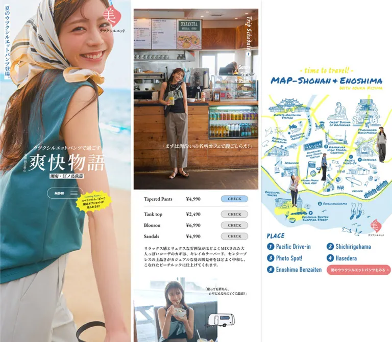
人物写真・コーディネート記事・手描きの旅マップを3カラムで構成したファッション特集。海を感じるブルーと白にピンクを添え、モバイルでは縦一列に展開します。
オリジナルサイトを見るGLOBAL WORK / Soukai Story — Style Reference
A seaside fashion story framed by a portrait and a hand-drawn travel map.
Website: GLOBAL WORK — Soukai Story Original URL: https://www.globalwork.jp/women/utsuku-silhouette/soukai-story/ Final URL: https://www.globalwork.jp/women/utsuku-silhouette/soukai-story/ Response: HTTP 200; original and final URLs are identical. Theme: light, with white editorial surfaces, coastal blue, soft pink, and yellow graphic accents. Inspected: September 13, 2026, Japan Standard Time. The supplied observation was retrieved at September 12, 2026, 17:15:22.255 UTC, equivalent to September 13 at 02:15:22.255 JST. Viewports: 1440 × 1000 and 390 × 844 CSS pixels. Scope: the current fashion feature: portrait introduction, illustrated destination map, five outfit stories, item lineup, special-movie section, scenic footer, and the open movie announcement dialog. Three desktop and two mobile page captures support the visual analysis.
The page presents GLOBAL WORK's summer pants through a trip around Shonan and Enoshima. Its Japanese graphic identity includes “ウツクシルエット,” “爽快物語,” and “湘南・江ノ島旅編.” The inspected state combines Japanese artwork lettering with English rendered copy and a visible ENGLISH selector. The mechanism responsible for this language state was not established.
On desktop, a large portrait occupies the left side, a narrow editorial story runs down the center, and an illustrated map occupies the right. The side compositions remain in place across the supplied scroll captures. On mobile, the portrait, map, and stories enter a single vertical flow. Photography establishes the atmosphere; the map adds a travel-guide character; small product rows connect each outfit to shopping destinations.
Every current screenshot also contains a centered movie announcement. Its dark translucent backdrop visibly dims the entire underlying composition. That gray veil is an overlay state, not the page's base palette.
How to Read This Reference
- Measured means a value appears in the supplied rendered element rectangles, computed styles, or custom properties. Measurements are rounded for readability.
- Derived means a relationship was calculated from those measurements. The reconstructed scaling unit below is not a recovered stylesheet formula.
- Estimated means a visual approximation from the current screenshots. Dialog measurements, its yellow accents, and backdrop opacity fall into this category.
- Recommended means an implementation choice for a new page. The CSS breakpoint, accessibility additions, and untested interaction endpoints are recommendations.
- Declared font families identify computed CSS stacks. They do not prove that every requested web font loaded or identify the font inside an image.
- The announcement obscures substantial portions of the page. DOM evidence supports the underlying content and selected geometry, but it does not reveal every hidden visual detail.
Tokens — Colors
Default Palette
| Name | Value | Token / evidence | Role |
|---|---|---|---|
| Coastal Blue | #1E66A4 |
Measured source --colorBlue |
Map identity, selected weather labels, and the visual family of blue controls |
| Summer Pink | #E97B7D |
Measured source --colorPink |
Map shopping CTA, lineup buttons, and section labels; echoed by the campaign seal |
| Text Ink | #151515 |
Measured source --colorText |
Editorial text, product names, and prices |
| Featured Blue | #A8D3F7 |
Measured rgb(168, 211, 247) |
CHECK pill for the featured pants in outfit lists |
| Companion Gray | #E2E2E2 |
Measured rgb(226, 226, 226) |
CHECK pills for accompanying garments and accessories |
| Movie Surface | #F2F2F2 |
Measured rgb(242, 242, 242) |
In-document special-movie section |
| White | #FFFFFF |
Measured control text; visually observed page and dialog surfaces | Open editorial canvas, reversed labels, and announcement panel |
| Announcement Yellow | Approximately #FFF500 |
Visual estimate; no source color supplied | UPDATE! label and irregular promotional stickers |
| Backdrop | Approximately rgb(0 0 0 / 30%) |
Visual estimate | Dims the page while leaving the announcement clear |
The blue and pink values are authoritative source tokens. Yellow is an approximation for implementation planning; it was not sampled with a pixel-reading tool. Yellow within the map artwork may differ from the announcement yellow.
The HTML and body backgrounds were reported as transparent. White is therefore the visible canvas, rather than a confirmed explicit body background declaration. The reusable CSS makes this canvas explicit.
The map also contains pale blue land/water shapes, yellow routes, and blue linework. These belong to the illustration's palette. Do not generate extra interface tokens from the dimmed appearance of those assets.
Theme Behavior
Only the light presentation is evidenced. No theme switch or alternate palette was inspected. The supplied --swiper-theme-color: #007aff is a library variable, not evidence that this brighter blue is a primary visible brand color.
Tokens — Typography
Source Font Families
| Source variable | Declared family | Verified application |
|---|---|---|
--font_ja |
Noto Sans JP, Japanese system sans-serif fallbacks, sans-serif |
Body inheritance and map shopping CTA |
--font_serif |
Noto Serif JP, followed by Yu Gothic, Hiragino Kaku Gothic Pro, Meiryo, and sans-serif fallbacks |
Outfit descriptions and item-lineup introduction |
--font_garamond |
eb-garamond, serif |
Outfit product names, prices, and their CHECK labels |
--font_en |
din-condensed, sans-serif |
Weather, temperature, and time overlays |
--font_futura |
futura-pt, sans-serif |
MENU, lineup metadata, and section labels |
The source serif stack has sans-serif fallbacks. Preserve awareness of that fallback behavior when comparing renders. The CSS adaptation below retains its English-named family equivalents without supplying font files.
Graphic Lettering
The campaign title, vertical Japanese introduction, map heading, and several chapter captions are visually graphic elements. Their heading containers have empty extracted text. Their visible lettering should not be reconstructed from the inherited heading font size alone.
The map heading mixes energetic brush lettering with smaller handwritten text. The portrait title uses large white Japanese lettering with smaller supporting lines. These treatments coexist with restrained live type in the product lists.
The announcement heading and paragraph look like bold serif text. Their computed font declarations were not included, so no named font is assigned to them here.
Type Scale
Values below are computed unless marked estimated. Line-height ratios are derived from the supplied pixel values.
| Role | Desktop size | Mobile size | Weight | Line height / tracking |
|---|---|---|---|---|
| Body inheritance | 14.758px |
12.757px |
500 |
1.66 |
| Outfit product name and price | 17.921px |
15.491px |
600 |
1.2 |
Outfit CHECK label |
13.704px |
11.846px |
600 |
Approximately 1.66 |
| Outfit description | 13.704px |
11.846px |
600 |
1.46; 0.019em tracking |
| Weather / temperature / time | 21.083px |
18.224px |
400 |
1.2; -0.02em tracking |
MENU |
12.650px |
10.935px |
700 |
Approximately 1.66 |
ITEM LINEUP |
14.758px |
12.757px |
700 |
Approximately 1.66 |
SPECIAL MOVIE |
14.758px |
12.757px |
700 |
1 |
| Lineup price | 15.813px |
13.668px |
700 |
Approximately 1.66 |
| Map shopping CTA | 10px |
9.112px |
500 |
1.66 |
| Announcement heading | About 18px |
About 16px |
Visually bold | About 22px / 19px; estimated |
The distinction between serif commerce details, condensed travel annotations, and small sans-serif utilities is central to the design. A single font across every component would flatten that hierarchy.
Tokens — Spacing & Shapes
Responsive Unit
The measured custom property --designwidth changes from 1366 on desktop to 428 on mobile. Many dimensions fit this reconstructed unit:
/* Derived relationship, not a retrieved source rule */
--u: calc(100vw / var(--designwidth));
At the inspected desktop size, 1u ≈ 1.05417px. At the inspected mobile size, 1u ≈ 0.911215px.
For example, a 14u body size produces the observed 14.758px and 12.757px. A 35u story inset produces approximately 36.896px and 31.893px.
The HTML root remains 16px; this is not a tiny-root-rem system. Some elements also cap their dimensions: the map heading is essentially 350px wide at both viewports, and the desktop map CTA measures 190px rather than scaling to approximately 200px. Treat the unit as a strong recurring relationship, not a universal rule.
Spacing Scale
| Use | Derived nominal value | Desktop | Mobile | Evidence |
|---|---|---|---|---|
| Product metadata-to-pill gap | 10u |
10.542px |
9.112px |
Computed grid gap |
| Ordinary product-row separation | About 14u |
14.75px |
12.75px |
Derived from consecutive row rectangles |
| Portrait's vertical strip top/left inset | 15u |
15.813px |
13.656px |
Measured position |
| Map section top padding | 25u |
26.354px |
22.780px |
Computed padding |
| Story start / common section padding | 30u |
31.625px |
27.336px |
Measured and computed |
| Product and paragraph horizontal inset | 35u |
36.891px |
31.891px |
Derived from section and child rectangles |
| Special-movie horizontal/bottom padding | 50u |
52.709px |
45.561px |
Computed padding |
Chapter spacing is content-dependent. Measured desktop gaps between successive story sections include approximately 52.70px, 57.97px, and 105.41px. Do not impose identical spacing on every photographic transition.
Border Radius
| Element | Value | Status |
|---|---|---|
| Story sections and media panels | 0 |
Computed section geometry and visual observation |
MENU, outfit pills, map CTA |
50px |
Computed |
Lineup CHECK pills |
100px |
Computed |
| Announcement panel | About 10px |
Visual estimate |
| Map number markers | Rough circular shapes | Artwork appearance; no CSS geometry established |
There is no general rounded-card or soft-shadow system. Pills mark controls; the announcement is the prominent rounded container.
Layout Measurements
| Element | Desktop: 1440 × 1000 | Mobile: 390 × 844 |
|---|---|---|
| Portrait region | Approximately 484 × 1000px, estimated from capture |
390 × 674.30px; height derived from following section's position |
| Right map section | 483.875 × 1000px, beginning at x = 956.125 |
390 × 691.906px, beginning at y = 674.297 |
| Story section width | 451.203px, beginning at x = 494.391 |
390px, beginning at x = 0 |
| First story start | y = 31.625px |
y = 1393.531px |
| Inner product/copy width | 377.422px |
326.219px |
| Portrait title artwork box | 303.594 × 120.312px |
262.422 × 104px |
| Map heading artwork box | 350 × 71.328px |
349.906 × 71.312px |
MENU |
130.703 × 41.109px |
112.984 × 35.531px |
Outfit CHECK |
98.031 × 25.297px |
84.734 × 21.859px |
| Map shopping CTA | 190 × 30px |
173.125 × 27.328px |
| Announcement panel | Approximately 467 × 476px |
Approximately 350 × 416px |
| Document height | 12,997.05px |
12,601.50px |
Announcement dimensions are estimates from screenshots; its own computed rectangle was not supplied.
Components
Portrait Introduction
Role: persistent campaign identity on desktop and the opening section on mobile.
A tightly cropped seaside portrait fills the region. Current desktop captures show both a black sleeveless outfit and a teal sleeveless outfit with a patterned head scarf. The sequence proves that different hero images were rendered, but it does not establish whether a timer, scrolling, or another trigger changes them.
Layer the composition as follows:
- Full-region portrait photograph.
- A narrow vertical Japanese promotional strip near the upper-left edge.
- A pink emblem with the white “美” character near the upper-right area.
- Centered campaign title artwork with smaller supporting text.
- A white outlined
MENUcapsule beneath the title, containing a label and thin hamburger lines. - An irregular yellow movie sticker near the menu area.
The title and menu form a vertically centered group. The measured title-to-menu separation is approximately 30u at both viewports. Keep the portrait's face, clothing, and title in deliberate relationship; a generic centered cover crop may place lettering over the face.
The menu's expanded contents and dismissal behavior were not inspected.
Language Utility
Role: visible access to language selection.
A small white ENGLISH tab with a downward triangle sits at the viewport's upper-right corner in the initial desktop and mobile captures. It uses plain, compact dark text and remains visually subordinate to the campaign artwork.
No open selector or language-switch result is supplied. Do not infer the available languages, persistence behavior, or translation provider.
Illustrated Travel Map
Role: geographic overview and a parallel index to the outfit stories.
The heading stacks a yellow handwritten travel phrase, a larger blue Shonan/Enoshima title, and a smaller yellow model credit. Beneath it, a dense illustration combines landmark drawings, route lines, railway imagery, marine motifs, and small photographic outfit cutouts.
The visual vocabulary includes temples, the Great Buddha, stations, trains, birds, dolphins, footwear, and coastline shapes. Blue linework does most of the drawing; yellow routes guide the eye through pale blue areas and white space.
Below the illustration, a blue PLACE graphic introduces five numbered destinations. The desktop layout pairs entries in two columns: 1/2, 3/4, then 5 and the pink shopping CTA. Long destination names wrap. The visible locations are Pacific Drive-in, Shichirigahama, Photo Spot!, Hasedera Temple, and Enoshima Benzaiten Shopping Street.
The place markers appear to correspond to the story sequence. Their exact click targets and scrolling behavior were not exercised. The shopping CTA is a rendered button, so its label alone is not evidence of an external destination.
Outfit Story Chapter
Role: combine travel narrative, outfit photography, and purchase references.
Each of five chapters uses a narrow editorial column. Its anatomy consists of a leading photographic composition, a vertical trip-schedule graphic, a stacked weather/time annotation, a caption treatment, a product list, descriptive copy, and additional imagery.
Visible fragments include a café interior, paired denim outfit details, green foliage, and the closing coastal scene. Some imagery and captions remain hidden behind the announcement. Preserve the alternation between large photographs, inset text, and smaller paired images without claiming unseen image layouts.
The five weather/time groups progress from 9:05 a.m. through 2:45 p.m. One chapter uses Light Rain; the others use Sunny. This turns the clothing feature into a day-long travel sequence rather than a uniform product catalog.
Weather and Schedule Annotation
Role: connect clothing choices to time and conditions.
A narrow vertical schedule graphic sits near the photograph's right edge. Beneath it, three compact lines show weather, temperature, and time in din-condensed.
The measured type is 21.083px / 25.300px on desktop and 18.224px / 21.869px on mobile, with slightly negative tracking. White is used on some photographs and source blue on others. This variation is evidenced by computed colors; it should follow the photograph's composition and contrast rather than a single global rule.
Outfit Product Row
Role: provide a direct shopping link without interrupting the editorial rhythm.
The whole row is an anchor. Its outer grid contains a flexible metadata region and a fixed-width CHECK capsule. At desktop, the measured columns are approximately 268.859px 98.031px with a 10.542px gap. On mobile they are 232.375px 84.734px with a 9.112px gap.
Inside the metadata region, the product name sits left and the price follows to its right. Both use eb-garamond, weight 600. The first, featured pants row receives a pale-blue pill; accompanying items receive gray pills. A fine separator and additional space distinguish the featured item from the remaining outfit.
Long product names are allowed to wrap. The premium-pants row reaches approximately 43px high on desktop and 37.156px on mobile while its pill remains the usual compact size and is vertically centered.
Observed anchors lead to product-specific www.dot-st.com/globalwork/disp/item/ URLs, including color query parameters. These destinations were not opened during this analysis. Preserve real anchor semantics and avoid nesting a second interactive button inside the row.
Editorial Description
Role: explain the silhouette and its relationship to the location, weather, and styling.
Descriptions share the product list's inset width. They use the declared Noto Serif JP stack, weight 600, 1.46 line height, and slight positive tracking. Paragraphs are compact, generally spanning four to six measured lines in the English DOM state.
The paragraph begins about 21px after the last standard product row on desktop and 18px on mobile. Its visual weight is greater than a light caption, but it remains secondary to photography.
The measured mobile size is under 12px. A new implementation should assess readability separately from visual fidelity.
Item Lineup
Role: collect the three pants categories after the travel stories.
A small pink ITEM LINEUP label precedes a two-line benefit introduction and a horizontally arranged product presentation. Metadata changes to the futura-pt family, and the lineup's CHECK pills use pink with white text.
The DOM contains three distinct categories—premium tapered, tapered, and wide-leg pants—plus repeated entries. It also contains a 1 / 3 indicator. Product metadata rectangles extend beyond the central column and, on mobile, beyond the viewport. These are consistent with a carousel track; they do not by themselves prove looping, autoplay, drag support, or a page overflow defect.
The observed lineup links use dot-st.to/m/premiumtapered, /tapered, and /wide. Image crops, navigation controls, and slide transitions are not clearly exposed in the supplied screenshots.
Special-Movie Section
Role: provide a permanent location for the video promotion within the document.
This is a square-cornered light-gray section in the story column. Computed padding is approximately 30u 50u 50u. A small pink SPECIAL MOVIE heading introduces a centered promotional headline, supporting copy, and a rectangular movie thumbnail.
The supplied links identify the video destination as the linked YouTube video. This is a destination reference, not an inspected video player. No inline playback, autoplay, or audio behavior was demonstrated.
Movie Announcement Dialog
Role: foreground the movie update over the current page.
The announcement is the most prominent component in all supplied screenshots. Its anatomy is unusually specific:
- A full-viewport translucent dark backdrop.
- A white rounded panel with a thin dark border and no conspicuous shadow.
- A blue
CLOSEcapsule centered over the panel's top border, with a white X at its right. - A small yellow
UPDATE!rectangle inside the upper-right corner. - A centered three-line serif headline and a separate supporting paragraph.
- A roughly 16:9 photographic movie thumbnail.
- A jagged yellow sticker overlapping the thumbnail's lower-left corner.
At desktop, the panel is approximately 467px wide and centered near (720, 500). Its thumbnail is about 406 × 229px. On mobile, the panel is approximately 350px wide with 20px side clearances and is centered near (195, 422). The thumbnail is about 298 × 167px.
The desktop supporting copy occupies approximately two lines; mobile uses approximately four. The panel therefore adapts through both width and text wrapping. It does not simply scale as one raster composition.
The same announcement remains centered while the background advances from the opening region to the footer. Its initial display delay, close action, backdrop-click response, keyboard handling, and reopening policy were not verified.
Coastal Footer and Credits
Role: close the travel story with the destination and brand.
A tall scenic photograph gives substantial space to sky and sea, with Enoshima near the lower portion. A small white GLOBAL WORK mark and copyright line sit toward the bottom. On desktop this closing scene stays in the central story column while the side portrait and map remain visible. On mobile it fills the reading width.
The rendered DOM lists Asuka Kijima for model, Hiroya Nishizaki for photography, Yoko Sakano for styling, Yusuke Hashimoto for hair and makeup, Ryoko Sekishiro for text, and Hayato Miura for web development. It also names Adastria Co., Ltd. in the copyright notice. The precise visual arrangement of the credit block is not established because the announcement obscures it.
The page includes a link to the GLOBAL WORK women's section. Its destination was not inspected.
Tokens — Motion & Interaction
| Treatment | Supplied evidence | Supported conclusion / limitation |
|---|---|---|
| Desktop menu feedback | background-color 0.3s |
A background-color transition is declared; its activated colors were not captured |
| Desktop outfit pills | transition: 0.3s |
A transition duration is present; the changed property and endpoint are not established |
| Desktop map CTA | opacity 0.3s |
Opacity feedback is declared; hover result not inspected |
| Lineup pills | opacity 0.3s at both viewports |
Short opacity feedback is declared |
| Global timing variable | --transition_speed: 1s |
Variable exists; no specific animation can be assigned to it from this evidence |
| Portrait image variation | Two different portraits across current desktop captures | Multiple rendered states; trigger, interval, easing, and sequence unknown |
| Side-panel persistence | Same side compositions across different story positions | Viewport-persistent desktop behavior; fixed versus sticky implementation not exposed |
| Announcement persistence | Same panel location over different background positions | Viewport-centered overlay behavior; scroll locking and dismissal unverified |
| Item lineup | Repeated entries, offscreen rectangles, 1 / 3, Swiper variables |
Carousel-like structure; interaction details unverified |
| Sampled element animations | animation: none |
No animation on those sampled elements at capture time; not proof that the whole site is static |
The mobile menu and several mobile product controls report only transition: all, without a meaningful supplied duration. Do not copy desktop timing onto them as an observed fact.
For a new implementation, restrained 300ms color or opacity feedback fits the evidenced controls. Any image crossfade, scrolling animation, or dialog entrance should be explicitly treated as a new choice. Still captures cannot establish motion choreography.
Surfaces
| Layer | Appearance | Function |
|---|---|---|
| Main canvas | Visually white | Unifies portrait, story, and map |
| Editorial content | White, square-cornered, largely unboxed | Lets photography and typography establish sections |
| Product controls | Small blue or gray capsules | Distinguishes featured pants from companion items |
| Lineup controls | Small pink capsules | Connects the concluding product selection to the campaign accent |
| Movie section | Measured #F2F2F2 |
Separates the permanent video promotion from outfit content |
| Announcement backdrop | Estimated 30% black veil | Subordinates the entire page |
| Announcement panel | White with a thin dark edge and modest rounding | Keeps promotional text and imagery legible |
The darker-looking map and gray-looking white space in the screenshots are consequences of the open overlay. Do not bake that dimming into source photographs or the page background.
Imagery
Photography is naturalistic and location-specific: sunlight, sea, casual clothing, denim details, café interiors, and greenery. Skin tones, fabric texture, and environmental color remain central. There is no evidence of a global duotone or stylized raster filter.
The portrait is an editorial cover composition. Story photography is a sequence of outfits and travel moments. The footer returns to the coastal setting. These images need different crop strategies; a universal object-fit: cover rule should not be applied indiscriminately to every asset.
The illustrated map is a dense piece of artwork with fine blue linework, irregular handwritten labels, yellow routes, and photographic figure cutouts. Preserve the entire map composition and its readable landmarks. Its internal drawings should not become a generic map-widget skin.
The video thumbnail has a deliberately louder visual language: a photographic presenter, large Japanese text with thick outlines, red emphasis, and an irregular yellow sticker. Keep that expressive treatment localized to the movie promotion.
Observed Asset References
Original image src URLs and file formats were not included in the evidence. The references below identify visual roles, not fabricated asset paths.
| Asset role | Current observation | Reuse guidance |
|---|---|---|
| Portrait variants | Black sleeveless outfit; teal outfit with patterned scarf | Use dedicated crops that preserve face, clothing, and graphic placement |
| Campaign title and seal | White Japanese title; pink emblem containing “美” | Retain authorized artwork and provide text alternatives |
| Travel-map composition | Landmarks, routes, marine motifs, outfit cutouts | Preserve full composition and sufficient resolution for fine lines |
| Story imagery | Café fragment, denim detail pairs, foliage, travel scenes | Mix large frames with smaller details; retain square image boundaries |
| Movie thumbnail | Presenter and bold Japanese promotional lettering | Keep approximately 16:9; avoid cropping the embedded lettering |
| Yellow sticker | Jagged promotional shape over the thumbnail | Use the actual graphic when available; exact outline is not a standard CSS shape |
| Footer photograph | Enoshima, open sky, and blue sea | Preserve the destination and space for the small white brand mark |
Hamburger lines, a close X, tiny chevrons, and numbered map markers are visible. No icon-library identity was established.
Layout & Responsive Behavior
Desktop
At 1440px wide, the composition behaves like three editorial panels. The center's actual story content is approximately 451.20px wide. Roughly 10.54px gutters separate it from the side regions, which are each about 484px wide.
The portrait and map remain visible through the later document captures. The story column carries the long page, including the closing footer. This keeps campaign identity and geographic context available while individual outfits change.
The map's contents are vertically composed within a 1000px region. Its heading begins around y = 126px, leaving substantially more breathing room than the section's own top padding. Preserve this composed alignment rather than automatically attaching all map content to the top edge.
Mobile
At 390px wide, the order is portrait → map → five stories → lineup → special movie → footer. The portrait ends at approximately 674.30px. The map then occupies approximately 691.91px, followed by a 27.33px gap before the first story.
The hero height is consistent with approximately 740u at this viewport, but its original height declaration was not supplied. It should not be described as a verified 80vh rule.
Story media becomes 390px wide. Product lists and descriptions retain approximately 31.89px side insets. Product metadata and pills remain side by side, with long names wrapping as needed.
The map heading is approximately 350px wide on both desktop and mobile. This is a notable exception to proportional shrinking: the heading retains its presence on the phone.
The announcement remains centered in the viewport while the underlying mobile document changes position. Its width becomes approximately 100vw - 40px, and its copy reflows independently from the media.
Unverified Widths and Conditions
Only 1440px and 390px layouts are directly evidenced. The actual breakpoint, tablet layout, landscape behavior, wide-screen caps, safe-area handling, and browser-zoom behavior are unknown.
The Quick Start uses a recommended 900px breakpoint and a centered intermediate reading width. These are practical adaptation choices, not original-site measurements. Validate them with actual content and translated text.
Do’s and Don’ts
Do
- Preserve the desktop relationship between portrait, narrow story column, and illustrated map.
- Stack those regions in their observed mobile order.
- Use source blue
#1E66A4and pink#E97B7Dconsistently. - Keep photography and custom lettering responsible for the largest visual statements.
- Separate serif product details, condensed travel annotations, and sans-serif utility labels.
- Keep the featured pants pill blue and companion-item pills gray.
- Allow product names and translated copy to wrap without displacing their controls.
- Retain the map's fine linework, yellow routes, and photographic cutouts.
- Treat the movie section and announcement as related but separate components.
- Preserve the announcement's overlapping close capsule and lower-left sticker.
- Keep the overlay dimming separate from the underlying page's colors.
Don’t
- Don't replace the three-panel editorial structure with a conventional full-width hero and card grid.
- Don't infer hidden page details from an unobscured image of another capture state.
- Don't turn every photograph into a rounded card with a shadow.
- Don't treat image-based lettering as proof of a particular font family.
- Don't use the library's default bright blue as the campaign blue.
- Don't assume the hero changes on a timer or that the lineup autoplays.
- Don't describe menu navigation, language switching, or modal dismissal as tested behavior.
- Don't make the video thumbnail fill an arbitrary aspect ratio that cuts off its lettering.
- Don't shrink a complete desktop screenshot to create the mobile page.
- Don't let the visible size of a tiny capsule dictate the only available touch target.
Recommended Implementation Additions
These are recommendations for a new implementation, not verified original features:
- Use semantic headings with accessible text for graphic campaign titles and section labels. Empty extracted heading text does not establish whether the original images have adequate alternatives.
- Give image-only movie and brand links meaningful accessible names. Empty extracted link text alone is insufficient to assess their existing accessible names.
- Implement the announcement with an accessible dialog, clear labeling, keyboard dismissal, focus containment, and focus restoration. Keep the close control reachable in short viewports.
- Prevent accidental background interaction while a modal is active. The supplied captures do not establish the original scroll-lock policy.
- Retain compact visual pills while providing approximately 44px interaction areas where practical, particularly on mobile.
- Consider a 14–16px reading size for mobile descriptions. The observed value is approximately 11.85px, so this will intentionally alter line wrapping and document height.
- Verify small white text on pink and text placed over photography. Use measured contrast and actual crops when adjusting colors or adding local text support.
- Give interactive map destinations real links or buttons with matching text labels; distinguish these from decorative landmarks.
- Provide reduced-motion behavior for any implemented portrait changes, carousel motion, or smooth scrolling. Use stable, visible media when motion is disabled.
- Supply responsive image sizes and explicit dimensions. Load the opening portrait promptly and defer lower story imagery without shifting captions or product rows.
Agent Prompt Guide
Quick Color Reference
- Main canvas and announcement: white.
- Text:
#151515. - Coastal blue:
#1E66A4. - Campaign pink:
#E97B7D. - Featured outfit pill:
#A8D3F7. - Companion outfit pill:
#E2E2E2. - In-document movie surface:
#F2F2F2. - Announcement yellow: approximately
#FFF500; verify against authorized artwork. - Modal separation: a translucent dark veil, with no demonstrated blur.
Overall Prompt
“Create an editorial fashion feature for a summer coastal trip. On desktop, place a full-height portrait at left, a narrow scrolling outfit story in the center, and a detailed illustrated destination map at right. Keep the two side compositions visible as the story advances. Use white surfaces, coastal blue #1E66A4, soft pink #E97B7D, natural seaside photography, Japanese campaign artwork, and small yellow promotional accents. Combine serif outfit names and prices, condensed weather/time annotations, and compact sans-serif utilities. Product links are understated rows with pale-blue pills for featured pants and gray pills for companion items. On mobile, stack portrait, map, stories, lineup, movie, and scenic footer. Treat all unverified motion and breakpoint behavior as implementation choices.”
Example Component Prompts
- Portrait: “Build a seaside portrait introduction with a vertical Japanese text strip near the upper-left corner, a pink campaign seal at upper right, centered white title artwork, and a small outlined MENU capsule below. Keep the title/menu group centered as a unit and preserve the subject's face in the crop.”
- Travel map: “Create a white travel-guide panel with blue hand-drawn landmark artwork, pale-blue geographic shapes, yellow routes, and small outfit cutouts. Place a brush-lettered heading above and five numbered destinations below in two columns. Use supplied illustration assets rather than substituting a generic interactive map.”
- Product list: “Create a narrow, unboxed outfit list. Each entire row is a link with serif product name and price on the left and a small rounded CHECK label on the right. Use #A8D3F7 for the featured pants and #E2E2E2 for companion items. Keep long names wrappable and the label vertically centered.”
- Announcement: “Create a viewport-centered white announcement with a thin dark border, approximately 10px corners, a blue close capsule overlapping the top edge, and a small yellow UPDATE! label at upper right. Stack a bold serif headline, supporting copy, a 16:9 video thumbnail, and a jagged yellow sticker overlapping its lower-left corner. Use approximately 20px mobile side clearance.”
- Responsive story: “At wide sizes, keep the reading column around one third of the composition with persistent visual context on both sides. At phone sizes, move the portrait and map into document flow before the story. Preserve inset product typography and full-width photographs; allow translated copy to change component height.”
Quick Start
CSS Custom Properties
This is a reusable adaptation, not copied source CSS. It reproduces the recurring scale at the two inspected viewports. The 900px breakpoint, unit caps, intermediate maximum width, hover endpoints, and dialog styles are recommendations. Dialog geometry and yellow are visual approximations.
Expected structure: .soukai-page contains .hero, .travel-map, and .stories. The story container holds the outfit sections and lower-page content. A .product-row is one anchor containing .product-meta and .check. Use authorized images for the artwork classes. The independent .update-dialog is a native dialog; opening it modally and managing application state require JavaScript.
:root {
  /* Exact source colors and measured component fills */
  --color-blue: #1e66a4;
  --color-pink: #e97b7d;
  --color-ink: #151515;
  --color-featured: #a8d3f7;
  --color-companion: #e2e2e2;
  --color-movie: #f2f2f2;
  --color-paper: #fff;

  /* Visual approximations */
  --color-yellow: #fff500;
  --color-rule: #b8b8b8;
  --color-backdrop: rgb(0 0 0 / 30%);
  --radius-dialog: 10px;

  /* Source-declared families; font files are not supplied */
  --font-ja: 'Noto Sans JP', 'Yu Gothic',
    'Hiragino Kaku Gothic Pro', Meiryo, sans-serif;
  --font-editorial: 'Noto Serif JP', 'Yu Gothic',
    'Hiragino Kaku Gothic Pro', Meiryo, sans-serif;
  --font-product: 'eb-garamond', serif;
  --font-weather: 'din-condensed', sans-serif;
  --font-utility: 'futura-pt', sans-serif;

  /* Derived scaling with a recommended intermediate-width cap */
  --u: min(1px, calc(100vw / 428));
  --text-base: calc(14 * var(--u));
  --text-product: calc(17 * var(--u));
  --text-copy: calc(13 * var(--u));
  --text-weather: calc(20 * var(--u));
  --story-inset: calc(35 * var(--u));
  --check-width: calc(93 * var(--u));
  --check-height: calc(24 * var(--u));
  --radius-pill: 50px;
  --feedback-duration: 300ms;
}

* { box-sizing: border-box; }

body {
  margin: 0;
  color: var(--color-ink);
  background: var(--color-paper);
  font: 500 var(--text-base)/1.66 var(--font-ja);
}

img { display: block; max-width: 100%; }
button, a { -webkit-tap-highlight-color: transparent; }
button { cursor: pointer; }

.soukai-page {
  width: 100%;
  max-width: 428px;
  margin-inline: auto;
}

.hero {
  position: relative;
  height: calc(740 * var(--u));
  overflow: hidden;
}

.hero__photo {
  width: 100%;
  height: 100%;
  object-fit: cover;
  /* Tune this against each authorized portrait crop. */
  object-position: center;
}

.hero__strip {
  position: absolute;
  top: calc(15 * var(--u));
  left: calc(15 * var(--u));
  width: calc(20 * var(--u));
}

.hero__seal {
  position: absolute;
  top: calc(15 * var(--u));
  right: calc(20 * var(--u));
  width: calc(90 * var(--u));
}

.hero__lockup {
  position: absolute;
  top: 50%;
  left: 50%;
  width: calc(288 * var(--u));
  transform: translate(-50%, -50%);
}

.hero__title { margin: 0; }
.hero__title img { width: 100%; height: auto; }

.hero__menu {
  display: flex;
  align-items: center;
  justify-content: center;
  gap: calc(20 * var(--u));
  width: calc(124 * var(--u));
  height: calc(39 * var(--u));
  margin: calc(30 * var(--u)) auto 0;
  padding: 0;
  border: 1px solid white;
  border-radius: var(--radius-pill);
  color: white;
  background: transparent;
  font: 700 calc(12 * var(--u))/1 var(--font-utility);
  transition: background-color var(--feedback-duration);
}

.travel-map {
  padding-block: calc(25 * var(--u)) calc(30 * var(--u));
  background: var(--color-paper);
}

.travel-map__heading {
  width: min(350px, calc(100% - 44 * var(--u)));
  margin: 0 auto calc(15 * var(--u));
}

.travel-map__heading img,
.travel-map__art { width: 100%; height: auto; }

.places {
  display: grid;
  grid-template-columns: repeat(2, minmax(0, 1fr));
  gap: calc(8 * var(--u));
  padding-inline: calc(20 * var(--u));
  color: var(--color-blue);
}

.places__heading { grid-column: 1 / -1; }

.pink-cta {
  display: inline-flex;
  align-items: center;
  justify-content: center;
  max-width: 100%;
  padding: 3px 12px;
  border: 0;
  border-radius: var(--radius-pill);
  color: white;
  background: var(--color-pink);
  text-decoration: none;
  transition: opacity var(--feedback-duration);
}

.stories {
  min-width: 0;
  padding-top: calc(30 * var(--u));
}

.story { scroll-margin-top: 24px; }
.story + .story { margin-top: calc(50 * var(--u)); }
.story.story--spacious { margin-top: calc(100 * var(--u)); }
.story__media { position: relative; }
.story__media > img { width: 100%; height: auto; }

.weather {
  position: absolute;
  top: calc(190 * var(--u));
  right: calc(28 * var(--u));
  margin: 0;
  color: white;
  font: 400 var(--text-weather)/1.2 var(--font-weather);
  letter-spacing: -0.02em;
}
.weather--blue { color: var(--color-blue); }

.story__details { margin-inline: var(--story-inset); }
.product-list { display: grid; gap: calc(14 * var(--u)); }

.product-row {
  position: relative;
  display: grid;
  grid-template-columns: minmax(0, 1fr) var(--check-width);
  align-items: center;
  gap: calc(10 * var(--u));
  color: var(--color-ink);
  text-decoration: none;
}

.product-meta {
  display: grid;
  grid-template-columns: minmax(0, 1fr) auto;
  gap: calc(17 * var(--u));
  font: 600 var(--text-product)/1.2 var(--font-product);
}
.product-meta p { margin: 0; }
.product-price { white-space: nowrap; }

.check {
  display: flex;
  align-items: center;
  justify-content: center;
  width: var(--check-width);
  height: var(--check-height);
  border: 1px solid var(--color-rule);
  border-radius: var(--radius-pill);
  background: var(--color-companion);
  font: 600 var(--text-copy)/1 var(--font-product);
  transition: background-color var(--feedback-duration),
    color var(--feedback-duration);
}

.product-row--featured { margin-bottom: calc(15 * var(--u)); }
.product-row--featured .check { background: var(--color-featured); }
.product-row--featured::after {
  content: '';
  position: absolute;
  right: 0;
  bottom: calc(-15 * var(--u));
  left: 0;
  height: 1px;
  background: var(--color-rule);
}

.story__copy {
  margin: calc(20 * var(--u)) 0 0;
  font: 600 var(--text-copy)/1.46 var(--font-editorial);
  letter-spacing: 0.019em;
}

.section-label {
  color: var(--color-pink);
  font: 700 var(--text-base)/1 var(--font-utility);
  text-align: center;
}

.special-movie {
  margin-top: calc(35 * var(--u));
  padding: calc(30 * var(--u)) calc(50 * var(--u))
    calc(50 * var(--u));
  background: var(--color-movie);
  text-align: center;
}

.movie-thumbnail { position: relative; display: block; }
.movie-thumbnail__image {
  width: 100%;
  height: auto;
  aspect-ratio: 16 / 9;
  object-fit: contain;
}

/* Approximate announcement geometry; native dialog behavior is separate. */
.update-dialog {
  position: fixed;
  inset: 0;
  width: min(468px, calc(100vw - 40px));
  max-width: none;
  max-height: calc(100dvh - 64px);
  margin: auto;
  padding: 0;
  overflow: visible;
  border: 1px solid var(--color-ink);
  border-radius: var(--radius-dialog);
  color: var(--color-ink);
  background: white;
}

.update-dialog::backdrop { background: var(--color-backdrop); }

.update-dialog__content {
  max-height: calc(100dvh - 66px);
  overflow-y: auto;
  padding: 44px 25px;
  border-radius: inherit;
  text-align: center;
}

.update-dialog__close {
  position: absolute;
  z-index: 2;
  top: 0;
  left: 50%;
  display: flex;
  align-items: center;
  justify-content: center;
  gap: 24px;
  width: calc(124 * var(--u));
  height: calc(39 * var(--u));
  transform: translate(-50%, -50%);
  border: 1px solid white;
  border-radius: var(--radius-pill);
  color: white;
  background: var(--color-blue);
  font: 700 12px/1 var(--font-utility);
}

.update-dialog__flag {
  position: absolute;
  top: 14px;
  right: 13px;
  padding: 1px 12px;
  color: var(--color-blue);
  background: var(--color-yellow);
  font: 700 12px/1.4 var(--font-utility);
}

.update-dialog__title {
  margin: 0;
  font: 700 16px/19px serif;
}

.update-dialog__copy {
  margin: 12px 0 0;
  font: 700 15px/17px serif;
}

.update-dialog .movie-thumbnail { margin-top: 22px; }

.movie-thumbnail__sticker {
  position: absolute;
  bottom: -36px;
  left: -20px;
  width: calc(160 * var(--u));
  height: auto;
}

/* Recommended desktop adaptation; original breakpoint is unknown. */
@media (min-width: 900px) {
  :root { --u: min(1.25px, calc(100vw / 1366)); }

  .soukai-page {
    display: grid;
    grid-template-columns:
      minmax(0, 1fr) calc(428 * var(--u)) minmax(0, 1fr);
    column-gap: calc(10 * var(--u));
    align-items: start;
    max-width: none;
  }

  .hero {
    position: sticky;
    top: 0;
    grid-column: 1;
    grid-row: 1;
    height: 100svh;
  }

  .travel-map {
    position: sticky;
    top: 0;
    grid-column: 3;
    grid-row: 1;
    display: flex;
    flex-direction: column;
    justify-content: center;
    height: 100svh;
    overflow-y: auto;
  }

  .stories { grid-column: 2; grid-row: 1; }

  .update-dialog__content { padding: 48px 30px 50px; }
  .update-dialog__title { font-size: 18px; line-height: 22px; }
  .update-dialog__copy {
    margin-top: 14px;
    font-size: 17px;
    line-height: 20px;
  }
  .update-dialog .movie-thumbnail { margin-top: 26px; }
}

/* Recommended feedback endpoints, not captured original states. */
@media (hover: hover) {
  .hero__menu:hover { background: rgb(255 255 255 / 15%); }
  .pink-cta:hover { opacity: 0.75; }
  .product-row:hover .check {
    color: white;
    background: var(--color-blue);
  }
}

:where(a, button, select):focus-visible {
  outline: 2px solid var(--color-blue);
  outline-offset: 4px;
}

@media (prefers-reduced-motion: reduce) {
  .soukai-page *, .update-dialog * {
    animation: none !important;
    transition: none !important;
  }
}
This shell does not implement carousel state, menu contents, language selection, portrait changes, or map navigation. Those behaviors need explicit requirements and testing. The native dialog must be opened with modal semantics for its backdrop and focus behavior to apply.
The typography intentionally preserves the observed small text scale. Apply the recommended readability and touch-target adjustments deliberately rather than assuming the measured sizes are accessibility targets.
Tailwind v4 Token Mapping
Optional aliases for a project already using Tailwind v4. These do not imply that the original page uses Tailwind. Define the custom properties above first.
@theme inline {
  --color-coast: var(--color-blue);
  --color-summer: var(--color-pink);
  --color-editorial-ink: var(--color-ink);
  --color-pants-pill: var(--color-featured);
  --color-outfit-pill: var(--color-companion);
  --color-movie-panel: var(--color-movie);

  --font-story: var(--font-editorial);
  --font-commerce: var(--font-product);
  --font-travel: var(--font-weather);
  --font-label: var(--font-utility);

  --spacing-story-inset: var(--story-inset);
  --spacing-product-gap: calc(10 * var(--u));
  --radius-announcement: var(--radius-dialog);
  --radius-capsule: var(--radius-pill);
}
Sources & Evidence
- Current GLOBAL WORK Soukai Story page: authority for the supplied page captures, rendered text, link destinations, computed styles, custom properties, and current-page credits. The original and final URLs are identical and returned HTTP 200.
- Supplied observation timestamp:
2026-09-12T17:15:22.255Z, corresponding to September 13, 2026 in Japan. Separate per-image capture timestamps were not supplied. - Actual inspected viewports:
1440 × 1000and390 × 844CSS pixels. The visual set contains three desktop and two mobile page captures at different document positions. - Measured evidence includes font stacks, text colors, control fills, selected transitions, section rectangles, product grids, padding, and the
1366/428design-width variables. - The capture process reports an initial observation of at least five seconds and waits for image decoding, finite motion, and sampled layout/text stability under time limits. Perpetual animations were temporarily paused during readiness checks and then resumed. These procedures do not establish complete animation behavior or exclude delayed content.
- Every supplied current screenshot shows the movie announcement open. Underlying visual coverage is consequently partial, even where the DOM provides complete text and geometry.
- No click-result evidence was supplied for the menu, close control, language selector, map destinations, carousel, shopping links, or movie. Their unexercised states remain unverified.
- Original image paths, font-file load verification, full stylesheets, exact breakpoints, and dialog computed styles were not supplied. Asset URLs, motion timings, and implementation details have not been invented to fill those gaps.
This reference describes the current served page using the supplied inspection evidence. Derived geometry and implementation recommendations are identified separately from measured original values.
# GLOBAL WORK / Soukai Story — Style Reference

> A seaside fashion story framed by a portrait and a hand-drawn travel map.

**Website:** [GLOBAL WORK — Soukai Story](https://www.globalwork.jp/women/utsuku-silhouette/soukai-story/)
**Original URL:** https://www.globalwork.jp/women/utsuku-silhouette/soukai-story/
**Final URL:** https://www.globalwork.jp/women/utsuku-silhouette/soukai-story/
**Response:** HTTP 200; original and final URLs are identical.
**Theme:** light, with white editorial surfaces, coastal blue, soft pink, and yellow graphic accents.
**Inspected:** September 13, 2026, Japan Standard Time. The supplied observation was retrieved at September 12, 2026, 17:15:22.255 UTC, equivalent to September 13 at 02:15:22.255 JST.
**Viewports:** 1440 × 1000 and 390 × 844 CSS pixels.
**Scope:** the current fashion feature: portrait introduction, illustrated destination map, five outfit stories, item lineup, special-movie section, scenic footer, and the open movie announcement dialog. Three desktop and two mobile page captures support the visual analysis.

The page presents GLOBAL WORK's summer pants through a trip around Shonan and Enoshima. Its Japanese graphic identity includes “ウツクシルエット,” “爽快物語,” and “湘南・江ノ島旅編.” The inspected state combines Japanese artwork lettering with English rendered copy and a visible `ENGLISH` selector. The mechanism responsible for this language state was not established.

On desktop, a large portrait occupies the left side, a narrow editorial story runs down the center, and an illustrated map occupies the right. The side compositions remain in place across the supplied scroll captures. On mobile, the portrait, map, and stories enter a single vertical flow. Photography establishes the atmosphere; the map adds a travel-guide character; small product rows connect each outfit to shopping destinations.

Every current screenshot also contains a centered movie announcement. Its dark translucent backdrop visibly dims the entire underlying composition. That gray veil is an overlay state, not the page's base palette.

## How to Read This Reference

- **Measured** means a value appears in the supplied rendered element rectangles, computed styles, or custom properties. Measurements are rounded for readability.
- **Derived** means a relationship was calculated from those measurements. The reconstructed scaling unit below is not a recovered stylesheet formula.
- **Estimated** means a visual approximation from the current screenshots. Dialog measurements, its yellow accents, and backdrop opacity fall into this category.
- **Recommended** means an implementation choice for a new page. The CSS breakpoint, accessibility additions, and untested interaction endpoints are recommendations.
- **Declared font families** identify computed CSS stacks. They do not prove that every requested web font loaded or identify the font inside an image.
- The announcement obscures substantial portions of the page. DOM evidence supports the underlying content and selected geometry, but it does not reveal every hidden visual detail.

## Tokens — Colors

### Default Palette

| Name | Value | Token / evidence | Role |
| --- | --- | --- | --- |
| Coastal Blue | `#1E66A4` | Measured source `--colorBlue` | Map identity, selected weather labels, and the visual family of blue controls |
| Summer Pink | `#E97B7D` | Measured source `--colorPink` | Map shopping CTA, lineup buttons, and section labels; echoed by the campaign seal |
| Text Ink | `#151515` | Measured source `--colorText` | Editorial text, product names, and prices |
| Featured Blue | `#A8D3F7` | Measured `rgb(168, 211, 247)` | `CHECK` pill for the featured pants in outfit lists |
| Companion Gray | `#E2E2E2` | Measured `rgb(226, 226, 226)` | `CHECK` pills for accompanying garments and accessories |
| Movie Surface | `#F2F2F2` | Measured `rgb(242, 242, 242)` | In-document special-movie section |
| White | `#FFFFFF` | Measured control text; visually observed page and dialog surfaces | Open editorial canvas, reversed labels, and announcement panel |
| Announcement Yellow | Approximately `#FFF500` | Visual estimate; no source color supplied | `UPDATE!` label and irregular promotional stickers |
| Backdrop | Approximately `rgb(0 0 0 / 30%)` | Visual estimate | Dims the page while leaving the announcement clear |

The blue and pink values are authoritative source tokens. Yellow is an approximation for implementation planning; it was not sampled with a pixel-reading tool. Yellow within the map artwork may differ from the announcement yellow.

The HTML and body backgrounds were reported as transparent. White is therefore the visible canvas, rather than a confirmed explicit body background declaration. The reusable CSS makes this canvas explicit.

The map also contains pale blue land/water shapes, yellow routes, and blue linework. These belong to the illustration's palette. Do not generate extra interface tokens from the dimmed appearance of those assets.

### Theme Behavior

Only the light presentation is evidenced. No theme switch or alternate palette was inspected. The supplied `--swiper-theme-color: #007aff` is a library variable, not evidence that this brighter blue is a primary visible brand color.

## Tokens — Typography

### Source Font Families

| Source variable | Declared family | Verified application |
| --- | --- | --- |
| `--font_ja` | `Noto Sans JP`, Japanese system sans-serif fallbacks, `sans-serif` | Body inheritance and map shopping CTA |
| `--font_serif` | `Noto Serif JP`, followed by Yu Gothic, Hiragino Kaku Gothic Pro, Meiryo, and `sans-serif` fallbacks | Outfit descriptions and item-lineup introduction |
| `--font_garamond` | `eb-garamond`, `serif` | Outfit product names, prices, and their `CHECK` labels |
| `--font_en` | `din-condensed`, `sans-serif` | Weather, temperature, and time overlays |
| `--font_futura` | `futura-pt`, `sans-serif` | `MENU`, lineup metadata, and section labels |

The source serif stack has sans-serif fallbacks. Preserve awareness of that fallback behavior when comparing renders. The CSS adaptation below retains its English-named family equivalents without supplying font files.

### Graphic Lettering

The campaign title, vertical Japanese introduction, map heading, and several chapter captions are visually graphic elements. Their heading containers have empty extracted text. Their visible lettering should not be reconstructed from the inherited heading font size alone.

The map heading mixes energetic brush lettering with smaller handwritten text. The portrait title uses large white Japanese lettering with smaller supporting lines. These treatments coexist with restrained live type in the product lists.

The announcement heading and paragraph look like bold serif text. Their computed font declarations were not included, so no named font is assigned to them here.

### Type Scale

Values below are computed unless marked estimated. Line-height ratios are derived from the supplied pixel values.

| Role | Desktop size | Mobile size | Weight | Line height / tracking |
| --- | --- | --- | --- | --- |
| Body inheritance | `14.758px` | `12.757px` | `500` | `1.66` |
| Outfit product name and price | `17.921px` | `15.491px` | `600` | `1.2` |
| Outfit `CHECK` label | `13.704px` | `11.846px` | `600` | Approximately `1.66` |
| Outfit description | `13.704px` | `11.846px` | `600` | `1.46`; `0.019em` tracking |
| Weather / temperature / time | `21.083px` | `18.224px` | `400` | `1.2`; `-0.02em` tracking |
| `MENU` | `12.650px` | `10.935px` | `700` | Approximately `1.66` |
| `ITEM LINEUP` | `14.758px` | `12.757px` | `700` | Approximately `1.66` |
| `SPECIAL MOVIE` | `14.758px` | `12.757px` | `700` | `1` |
| Lineup price | `15.813px` | `13.668px` | `700` | Approximately `1.66` |
| Map shopping CTA | `10px` | `9.112px` | `500` | `1.66` |
| Announcement heading | About `18px` | About `16px` | Visually bold | About `22px` / `19px`; estimated |

The distinction between serif commerce details, condensed travel annotations, and small sans-serif utilities is central to the design. A single font across every component would flatten that hierarchy.

## Tokens — Spacing & Shapes

### Responsive Unit

The measured custom property `--designwidth` changes from `1366` on desktop to `428` on mobile. Many dimensions fit this reconstructed unit:

```css
/* Derived relationship, not a retrieved source rule */
--u: calc(100vw / var(--designwidth));
```

At the inspected desktop size, `1u ≈ 1.05417px`. At the inspected mobile size, `1u ≈ 0.911215px`.

For example, a `14u` body size produces the observed `14.758px` and `12.757px`. A `35u` story inset produces approximately `36.896px` and `31.893px`.

The HTML root remains `16px`; this is not a tiny-root-rem system. Some elements also cap their dimensions: the map heading is essentially 350px wide at both viewports, and the desktop map CTA measures 190px rather than scaling to approximately 200px. Treat the unit as a strong recurring relationship, not a universal rule.

### Spacing Scale

| Use | Derived nominal value | Desktop | Mobile | Evidence |
| --- | --- | --- | --- | --- |
| Product metadata-to-pill gap | `10u` | `10.542px` | `9.112px` | Computed grid gap |
| Ordinary product-row separation | About `14u` | `14.75px` | `12.75px` | Derived from consecutive row rectangles |
| Portrait's vertical strip top/left inset | `15u` | `15.813px` | `13.656px` | Measured position |
| Map section top padding | `25u` | `26.354px` | `22.780px` | Computed padding |
| Story start / common section padding | `30u` | `31.625px` | `27.336px` | Measured and computed |
| Product and paragraph horizontal inset | `35u` | `36.891px` | `31.891px` | Derived from section and child rectangles |
| Special-movie horizontal/bottom padding | `50u` | `52.709px` | `45.561px` | Computed padding |

Chapter spacing is content-dependent. Measured desktop gaps between successive story sections include approximately 52.70px, 57.97px, and 105.41px. Do not impose identical spacing on every photographic transition.

### Border Radius

| Element | Value | Status |
| --- | --- | --- |
| Story sections and media panels | `0` | Computed section geometry and visual observation |
| `MENU`, outfit pills, map CTA | `50px` | Computed |
| Lineup `CHECK` pills | `100px` | Computed |
| Announcement panel | About `10px` | Visual estimate |
| Map number markers | Rough circular shapes | Artwork appearance; no CSS geometry established |

There is no general rounded-card or soft-shadow system. Pills mark controls; the announcement is the prominent rounded container.

### Layout Measurements

| Element | Desktop: 1440 × 1000 | Mobile: 390 × 844 |
| --- | --- | --- |
| Portrait region | Approximately `484 × 1000px`, estimated from capture | `390 × 674.30px`; height derived from following section's position |
| Right map section | `483.875 × 1000px`, beginning at `x = 956.125` | `390 × 691.906px`, beginning at `y = 674.297` |
| Story section width | `451.203px`, beginning at `x = 494.391` | `390px`, beginning at `x = 0` |
| First story start | `y = 31.625px` | `y = 1393.531px` |
| Inner product/copy width | `377.422px` | `326.219px` |
| Portrait title artwork box | `303.594 × 120.312px` | `262.422 × 104px` |
| Map heading artwork box | `350 × 71.328px` | `349.906 × 71.312px` |
| `MENU` | `130.703 × 41.109px` | `112.984 × 35.531px` |
| Outfit `CHECK` | `98.031 × 25.297px` | `84.734 × 21.859px` |
| Map shopping CTA | `190 × 30px` | `173.125 × 27.328px` |
| Announcement panel | Approximately `467 × 476px` | Approximately `350 × 416px` |
| Document height | `12,997.05px` | `12,601.50px` |

Announcement dimensions are estimates from screenshots; its own computed rectangle was not supplied.

## Components

### Portrait Introduction

**Role:** persistent campaign identity on desktop and the opening section on mobile.

A tightly cropped seaside portrait fills the region. Current desktop captures show both a black sleeveless outfit and a teal sleeveless outfit with a patterned head scarf. The sequence proves that different hero images were rendered, but it does not establish whether a timer, scrolling, or another trigger changes them.

Layer the composition as follows:

1. Full-region portrait photograph.
2. A narrow vertical Japanese promotional strip near the upper-left edge.
3. A pink emblem with the white “美” character near the upper-right area.
4. Centered campaign title artwork with smaller supporting text.
5. A white outlined `MENU` capsule beneath the title, containing a label and thin hamburger lines.
6. An irregular yellow movie sticker near the menu area.

The title and menu form a vertically centered group. The measured title-to-menu separation is approximately `30u` at both viewports. Keep the portrait's face, clothing, and title in deliberate relationship; a generic centered cover crop may place lettering over the face.

The menu's expanded contents and dismissal behavior were not inspected.

### Language Utility

**Role:** visible access to language selection.

A small white `ENGLISH` tab with a downward triangle sits at the viewport's upper-right corner in the initial desktop and mobile captures. It uses plain, compact dark text and remains visually subordinate to the campaign artwork.

No open selector or language-switch result is supplied. Do not infer the available languages, persistence behavior, or translation provider.

### Illustrated Travel Map

**Role:** geographic overview and a parallel index to the outfit stories.

The heading stacks a yellow handwritten travel phrase, a larger blue Shonan/Enoshima title, and a smaller yellow model credit. Beneath it, a dense illustration combines landmark drawings, route lines, railway imagery, marine motifs, and small photographic outfit cutouts.

The visual vocabulary includes temples, the Great Buddha, stations, trains, birds, dolphins, footwear, and coastline shapes. Blue linework does most of the drawing; yellow routes guide the eye through pale blue areas and white space.

Below the illustration, a blue `PLACE` graphic introduces five numbered destinations. The desktop layout pairs entries in two columns: 1/2, 3/4, then 5 and the pink shopping CTA. Long destination names wrap. The visible locations are Pacific Drive-in, Shichirigahama, Photo Spot!, Hasedera Temple, and Enoshima Benzaiten Shopping Street.

The place markers appear to correspond to the story sequence. Their exact click targets and scrolling behavior were not exercised. The shopping CTA is a rendered button, so its label alone is not evidence of an external destination.

### Outfit Story Chapter

**Role:** combine travel narrative, outfit photography, and purchase references.

Each of five chapters uses a narrow editorial column. Its anatomy consists of a leading photographic composition, a vertical trip-schedule graphic, a stacked weather/time annotation, a caption treatment, a product list, descriptive copy, and additional imagery.

Visible fragments include a café interior, paired denim outfit details, green foliage, and the closing coastal scene. Some imagery and captions remain hidden behind the announcement. Preserve the alternation between large photographs, inset text, and smaller paired images without claiming unseen image layouts.

The five weather/time groups progress from 9:05 a.m. through 2:45 p.m. One chapter uses `Light Rain`; the others use `Sunny`. This turns the clothing feature into a day-long travel sequence rather than a uniform product catalog.

### Weather and Schedule Annotation

**Role:** connect clothing choices to time and conditions.

A narrow vertical schedule graphic sits near the photograph's right edge. Beneath it, three compact lines show weather, temperature, and time in `din-condensed`.

The measured type is `21.083px / 25.300px` on desktop and `18.224px / 21.869px` on mobile, with slightly negative tracking. White is used on some photographs and source blue on others. This variation is evidenced by computed colors; it should follow the photograph's composition and contrast rather than a single global rule.

### Outfit Product Row

**Role:** provide a direct shopping link without interrupting the editorial rhythm.

The whole row is an anchor. Its outer grid contains a flexible metadata region and a fixed-width `CHECK` capsule. At desktop, the measured columns are approximately `268.859px 98.031px` with a `10.542px` gap. On mobile they are `232.375px 84.734px` with a `9.112px` gap.

Inside the metadata region, the product name sits left and the price follows to its right. Both use `eb-garamond`, weight 600. The first, featured pants row receives a pale-blue pill; accompanying items receive gray pills. A fine separator and additional space distinguish the featured item from the remaining outfit.

Long product names are allowed to wrap. The premium-pants row reaches approximately 43px high on desktop and 37.156px on mobile while its pill remains the usual compact size and is vertically centered.

Observed anchors lead to product-specific `www.dot-st.com/globalwork/disp/item/` URLs, including color query parameters. These destinations were not opened during this analysis. Preserve real anchor semantics and avoid nesting a second interactive button inside the row.

### Editorial Description

**Role:** explain the silhouette and its relationship to the location, weather, and styling.

Descriptions share the product list's inset width. They use the declared `Noto Serif JP` stack, weight 600, `1.46` line height, and slight positive tracking. Paragraphs are compact, generally spanning four to six measured lines in the English DOM state.

The paragraph begins about 21px after the last standard product row on desktop and 18px on mobile. Its visual weight is greater than a light caption, but it remains secondary to photography.

The measured mobile size is under 12px. A new implementation should assess readability separately from visual fidelity.

### Item Lineup

**Role:** collect the three pants categories after the travel stories.

A small pink `ITEM LINEUP` label precedes a two-line benefit introduction and a horizontally arranged product presentation. Metadata changes to the `futura-pt` family, and the lineup's `CHECK` pills use pink with white text.

The DOM contains three distinct categories—premium tapered, tapered, and wide-leg pants—plus repeated entries. It also contains a `1 / 3` indicator. Product metadata rectangles extend beyond the central column and, on mobile, beyond the viewport. These are consistent with a carousel track; they do not by themselves prove looping, autoplay, drag support, or a page overflow defect.

The observed lineup links use `dot-st.to/m/premiumtapered`, `/tapered`, and `/wide`. Image crops, navigation controls, and slide transitions are not clearly exposed in the supplied screenshots.

### Special-Movie Section

**Role:** provide a permanent location for the video promotion within the document.

This is a square-cornered light-gray section in the story column. Computed padding is approximately `30u 50u 50u`. A small pink `SPECIAL MOVIE` heading introduces a centered promotional headline, supporting copy, and a rectangular movie thumbnail.

The supplied links identify the video destination as [the linked YouTube video](https://www.youtube.com/watch?v=f05nkwc7k5c). This is a destination reference, not an inspected video player. No inline playback, autoplay, or audio behavior was demonstrated.

### Movie Announcement Dialog

**Role:** foreground the movie update over the current page.

The announcement is the most prominent component in all supplied screenshots. Its anatomy is unusually specific:

1. A full-viewport translucent dark backdrop.
2. A white rounded panel with a thin dark border and no conspicuous shadow.
3. A blue `CLOSE` capsule centered over the panel's top border, with a white X at its right.
4. A small yellow `UPDATE!` rectangle inside the upper-right corner.
5. A centered three-line serif headline and a separate supporting paragraph.
6. A roughly 16:9 photographic movie thumbnail.
7. A jagged yellow sticker overlapping the thumbnail's lower-left corner.

At desktop, the panel is approximately 467px wide and centered near `(720, 500)`. Its thumbnail is about 406 × 229px. On mobile, the panel is approximately 350px wide with 20px side clearances and is centered near `(195, 422)`. The thumbnail is about 298 × 167px.

The desktop supporting copy occupies approximately two lines; mobile uses approximately four. The panel therefore adapts through both width and text wrapping. It does not simply scale as one raster composition.

The same announcement remains centered while the background advances from the opening region to the footer. Its initial display delay, close action, backdrop-click response, keyboard handling, and reopening policy were not verified.

### Coastal Footer and Credits

**Role:** close the travel story with the destination and brand.

A tall scenic photograph gives substantial space to sky and sea, with Enoshima near the lower portion. A small white GLOBAL WORK mark and copyright line sit toward the bottom. On desktop this closing scene stays in the central story column while the side portrait and map remain visible. On mobile it fills the reading width.

The rendered DOM lists Asuka Kijima for model, Hiroya Nishizaki for photography, Yoko Sakano for styling, Yusuke Hashimoto for hair and makeup, Ryoko Sekishiro for text, and Hayato Miura for web development. It also names Adastria Co., Ltd. in the copyright notice. The precise visual arrangement of the credit block is not established because the announcement obscures it.

The page includes a link to the [GLOBAL WORK women's section](https://www.globalwork.jp/women/). Its destination was not inspected.

## Tokens — Motion & Interaction

| Treatment | Supplied evidence | Supported conclusion / limitation |
| --- | --- | --- |
| Desktop menu feedback | `background-color 0.3s` | A background-color transition is declared; its activated colors were not captured |
| Desktop outfit pills | `transition: 0.3s` | A transition duration is present; the changed property and endpoint are not established |
| Desktop map CTA | `opacity 0.3s` | Opacity feedback is declared; hover result not inspected |
| Lineup pills | `opacity 0.3s` at both viewports | Short opacity feedback is declared |
| Global timing variable | `--transition_speed: 1s` | Variable exists; no specific animation can be assigned to it from this evidence |
| Portrait image variation | Two different portraits across current desktop captures | Multiple rendered states; trigger, interval, easing, and sequence unknown |
| Side-panel persistence | Same side compositions across different story positions | Viewport-persistent desktop behavior; fixed versus sticky implementation not exposed |
| Announcement persistence | Same panel location over different background positions | Viewport-centered overlay behavior; scroll locking and dismissal unverified |
| Item lineup | Repeated entries, offscreen rectangles, `1 / 3`, Swiper variables | Carousel-like structure; interaction details unverified |
| Sampled element animations | `animation: none` | No animation on those sampled elements at capture time; not proof that the whole site is static |

The mobile menu and several mobile product controls report only `transition: all`, without a meaningful supplied duration. Do not copy desktop timing onto them as an observed fact.

For a new implementation, restrained 300ms color or opacity feedback fits the evidenced controls. Any image crossfade, scrolling animation, or dialog entrance should be explicitly treated as a new choice. Still captures cannot establish motion choreography.

## Surfaces

| Layer | Appearance | Function |
| --- | --- | --- |
| Main canvas | Visually white | Unifies portrait, story, and map |
| Editorial content | White, square-cornered, largely unboxed | Lets photography and typography establish sections |
| Product controls | Small blue or gray capsules | Distinguishes featured pants from companion items |
| Lineup controls | Small pink capsules | Connects the concluding product selection to the campaign accent |
| Movie section | Measured `#F2F2F2` | Separates the permanent video promotion from outfit content |
| Announcement backdrop | Estimated 30% black veil | Subordinates the entire page |
| Announcement panel | White with a thin dark edge and modest rounding | Keeps promotional text and imagery legible |

The darker-looking map and gray-looking white space in the screenshots are consequences of the open overlay. Do not bake that dimming into source photographs or the page background.

## Imagery

Photography is naturalistic and location-specific: sunlight, sea, casual clothing, denim details, café interiors, and greenery. Skin tones, fabric texture, and environmental color remain central. There is no evidence of a global duotone or stylized raster filter.

The portrait is an editorial cover composition. Story photography is a sequence of outfits and travel moments. The footer returns to the coastal setting. These images need different crop strategies; a universal `object-fit: cover` rule should not be applied indiscriminately to every asset.

The illustrated map is a dense piece of artwork with fine blue linework, irregular handwritten labels, yellow routes, and photographic figure cutouts. Preserve the entire map composition and its readable landmarks. Its internal drawings should not become a generic map-widget skin.

The video thumbnail has a deliberately louder visual language: a photographic presenter, large Japanese text with thick outlines, red emphasis, and an irregular yellow sticker. Keep that expressive treatment localized to the movie promotion.

### Observed Asset References

Original image `src` URLs and file formats were not included in the evidence. The references below identify visual roles, not fabricated asset paths.

| Asset role | Current observation | Reuse guidance |
| --- | --- | --- |
| Portrait variants | Black sleeveless outfit; teal outfit with patterned scarf | Use dedicated crops that preserve face, clothing, and graphic placement |
| Campaign title and seal | White Japanese title; pink emblem containing “美” | Retain authorized artwork and provide text alternatives |
| Travel-map composition | Landmarks, routes, marine motifs, outfit cutouts | Preserve full composition and sufficient resolution for fine lines |
| Story imagery | Café fragment, denim detail pairs, foliage, travel scenes | Mix large frames with smaller details; retain square image boundaries |
| Movie thumbnail | Presenter and bold Japanese promotional lettering | Keep approximately 16:9; avoid cropping the embedded lettering |
| Yellow sticker | Jagged promotional shape over the thumbnail | Use the actual graphic when available; exact outline is not a standard CSS shape |
| Footer photograph | Enoshima, open sky, and blue sea | Preserve the destination and space for the small white brand mark |

Hamburger lines, a close X, tiny chevrons, and numbered map markers are visible. No icon-library identity was established.

## Layout & Responsive Behavior

### Desktop

At 1440px wide, the composition behaves like three editorial panels. The center's actual story content is approximately 451.20px wide. Roughly 10.54px gutters separate it from the side regions, which are each about 484px wide.

The portrait and map remain visible through the later document captures. The story column carries the long page, including the closing footer. This keeps campaign identity and geographic context available while individual outfits change.

The map's contents are vertically composed within a 1000px region. Its heading begins around `y = 126px`, leaving substantially more breathing room than the section's own top padding. Preserve this composed alignment rather than automatically attaching all map content to the top edge.

### Mobile

At 390px wide, the order is portrait → map → five stories → lineup → special movie → footer. The portrait ends at approximately 674.30px. The map then occupies approximately 691.91px, followed by a 27.33px gap before the first story.

The hero height is consistent with approximately `740u` at this viewport, but its original height declaration was not supplied. It should not be described as a verified `80vh` rule.

Story media becomes 390px wide. Product lists and descriptions retain approximately 31.89px side insets. Product metadata and pills remain side by side, with long names wrapping as needed.

The map heading is approximately 350px wide on both desktop and mobile. This is a notable exception to proportional shrinking: the heading retains its presence on the phone.

The announcement remains centered in the viewport while the underlying mobile document changes position. Its width becomes approximately `100vw - 40px`, and its copy reflows independently from the media.

### Unverified Widths and Conditions

Only 1440px and 390px layouts are directly evidenced. The actual breakpoint, tablet layout, landscape behavior, wide-screen caps, safe-area handling, and browser-zoom behavior are unknown.

The Quick Start uses a recommended 900px breakpoint and a centered intermediate reading width. These are practical adaptation choices, not original-site measurements. Validate them with actual content and translated text.

## Do’s and Don’ts

### Do

- Preserve the desktop relationship between portrait, narrow story column, and illustrated map.
- Stack those regions in their observed mobile order.
- Use source blue `#1E66A4` and pink `#E97B7D` consistently.
- Keep photography and custom lettering responsible for the largest visual statements.
- Separate serif product details, condensed travel annotations, and sans-serif utility labels.
- Keep the featured pants pill blue and companion-item pills gray.
- Allow product names and translated copy to wrap without displacing their controls.
- Retain the map's fine linework, yellow routes, and photographic cutouts.
- Treat the movie section and announcement as related but separate components.
- Preserve the announcement's overlapping close capsule and lower-left sticker.
- Keep the overlay dimming separate from the underlying page's colors.

### Don’t

- Don't replace the three-panel editorial structure with a conventional full-width hero and card grid.
- Don't infer hidden page details from an unobscured image of another capture state.
- Don't turn every photograph into a rounded card with a shadow.
- Don't treat image-based lettering as proof of a particular font family.
- Don't use the library's default bright blue as the campaign blue.
- Don't assume the hero changes on a timer or that the lineup autoplays.
- Don't describe menu navigation, language switching, or modal dismissal as tested behavior.
- Don't make the video thumbnail fill an arbitrary aspect ratio that cuts off its lettering.
- Don't shrink a complete desktop screenshot to create the mobile page.
- Don't let the visible size of a tiny capsule dictate the only available touch target.

## Recommended Implementation Additions

These are recommendations for a new implementation, not verified original features:

- Use semantic headings with accessible text for graphic campaign titles and section labels. Empty extracted heading text does not establish whether the original images have adequate alternatives.
- Give image-only movie and brand links meaningful accessible names. Empty extracted link text alone is insufficient to assess their existing accessible names.
- Implement the announcement with an accessible dialog, clear labeling, keyboard dismissal, focus containment, and focus restoration. Keep the close control reachable in short viewports.
- Prevent accidental background interaction while a modal is active. The supplied captures do not establish the original scroll-lock policy.
- Retain compact visual pills while providing approximately 44px interaction areas where practical, particularly on mobile.
- Consider a 14–16px reading size for mobile descriptions. The observed value is approximately 11.85px, so this will intentionally alter line wrapping and document height.
- Verify small white text on pink and text placed over photography. Use measured contrast and actual crops when adjusting colors or adding local text support.
- Give interactive map destinations real links or buttons with matching text labels; distinguish these from decorative landmarks.
- Provide reduced-motion behavior for any implemented portrait changes, carousel motion, or smooth scrolling. Use stable, visible media when motion is disabled.
- Supply responsive image sizes and explicit dimensions. Load the opening portrait promptly and defer lower story imagery without shifting captions or product rows.

## Agent Prompt Guide

### Quick Color Reference

- Main canvas and announcement: white.
- Text: `#151515`.
- Coastal blue: `#1E66A4`.
- Campaign pink: `#E97B7D`.
- Featured outfit pill: `#A8D3F7`.
- Companion outfit pill: `#E2E2E2`.
- In-document movie surface: `#F2F2F2`.
- Announcement yellow: approximately `#FFF500`; verify against authorized artwork.
- Modal separation: a translucent dark veil, with no demonstrated blur.

### Overall Prompt

“Create an editorial fashion feature for a summer coastal trip. On desktop, place a full-height portrait at left, a narrow scrolling outfit story in the center, and a detailed illustrated destination map at right. Keep the two side compositions visible as the story advances. Use white surfaces, coastal blue #1E66A4, soft pink #E97B7D, natural seaside photography, Japanese campaign artwork, and small yellow promotional accents. Combine serif outfit names and prices, condensed weather/time annotations, and compact sans-serif utilities. Product links are understated rows with pale-blue pills for featured pants and gray pills for companion items. On mobile, stack portrait, map, stories, lineup, movie, and scenic footer. Treat all unverified motion and breakpoint behavior as implementation choices.”

### Example Component Prompts

1. **Portrait:** “Build a seaside portrait introduction with a vertical Japanese text strip near the upper-left corner, a pink campaign seal at upper right, centered white title artwork, and a small outlined MENU capsule below. Keep the title/menu group centered as a unit and preserve the subject's face in the crop.”
2. **Travel map:** “Create a white travel-guide panel with blue hand-drawn landmark artwork, pale-blue geographic shapes, yellow routes, and small outfit cutouts. Place a brush-lettered heading above and five numbered destinations below in two columns. Use supplied illustration assets rather than substituting a generic interactive map.”
3. **Product list:** “Create a narrow, unboxed outfit list. Each entire row is a link with serif product name and price on the left and a small rounded CHECK label on the right. Use #A8D3F7 for the featured pants and #E2E2E2 for companion items. Keep long names wrappable and the label vertically centered.”
4. **Announcement:** “Create a viewport-centered white announcement with a thin dark border, approximately 10px corners, a blue close capsule overlapping the top edge, and a small yellow UPDATE! label at upper right. Stack a bold serif headline, supporting copy, a 16:9 video thumbnail, and a jagged yellow sticker overlapping its lower-left corner. Use approximately 20px mobile side clearance.”
5. **Responsive story:** “At wide sizes, keep the reading column around one third of the composition with persistent visual context on both sides. At phone sizes, move the portrait and map into document flow before the story. Preserve inset product typography and full-width photographs; allow translated copy to change component height.”

## Quick Start

### CSS Custom Properties

This is a reusable adaptation, not copied source CSS. It reproduces the recurring scale at the two inspected viewports. The 900px breakpoint, unit caps, intermediate maximum width, hover endpoints, and dialog styles are recommendations. Dialog geometry and yellow are visual approximations.

Expected structure: `.soukai-page` contains `.hero`, `.travel-map`, and `.stories`. The story container holds the outfit sections and lower-page content. A `.product-row` is one anchor containing `.product-meta` and `.check`. Use authorized images for the artwork classes. The independent `.update-dialog` is a native `dialog`; opening it modally and managing application state require JavaScript.

```css
:root {
  /* Exact source colors and measured component fills */
  --color-blue: #1e66a4;
  --color-pink: #e97b7d;
  --color-ink: #151515;
  --color-featured: #a8d3f7;
  --color-companion: #e2e2e2;
  --color-movie: #f2f2f2;
  --color-paper: #fff;

  /* Visual approximations */
  --color-yellow: #fff500;
  --color-rule: #b8b8b8;
  --color-backdrop: rgb(0 0 0 / 30%);
  --radius-dialog: 10px;

  /* Source-declared families; font files are not supplied */
  --font-ja: 'Noto Sans JP', 'Yu Gothic',
    'Hiragino Kaku Gothic Pro', Meiryo, sans-serif;
  --font-editorial: 'Noto Serif JP', 'Yu Gothic',
    'Hiragino Kaku Gothic Pro', Meiryo, sans-serif;
  --font-product: 'eb-garamond', serif;
  --font-weather: 'din-condensed', sans-serif;
  --font-utility: 'futura-pt', sans-serif;

  /* Derived scaling with a recommended intermediate-width cap */
  --u: min(1px, calc(100vw / 428));
  --text-base: calc(14 * var(--u));
  --text-product: calc(17 * var(--u));
  --text-copy: calc(13 * var(--u));
  --text-weather: calc(20 * var(--u));
  --story-inset: calc(35 * var(--u));
  --check-width: calc(93 * var(--u));
  --check-height: calc(24 * var(--u));
  --radius-pill: 50px;
  --feedback-duration: 300ms;
}

* { box-sizing: border-box; }

body {
  margin: 0;
  color: var(--color-ink);
  background: var(--color-paper);
  font: 500 var(--text-base)/1.66 var(--font-ja);
}

img { display: block; max-width: 100%; }
button, a { -webkit-tap-highlight-color: transparent; }
button { cursor: pointer; }

.soukai-page {
  width: 100%;
  max-width: 428px;
  margin-inline: auto;
}

.hero {
  position: relative;
  height: calc(740 * var(--u));
  overflow: hidden;
}

.hero__photo {
  width: 100%;
  height: 100%;
  object-fit: cover;
  /* Tune this against each authorized portrait crop. */
  object-position: center;
}

.hero__strip {
  position: absolute;
  top: calc(15 * var(--u));
  left: calc(15 * var(--u));
  width: calc(20 * var(--u));
}

.hero__seal {
  position: absolute;
  top: calc(15 * var(--u));
  right: calc(20 * var(--u));
  width: calc(90 * var(--u));
}

.hero__lockup {
  position: absolute;
  top: 50%;
  left: 50%;
  width: calc(288 * var(--u));
  transform: translate(-50%, -50%);
}

.hero__title { margin: 0; }
.hero__title img { width: 100%; height: auto; }

.hero__menu {
  display: flex;
  align-items: center;
  justify-content: center;
  gap: calc(20 * var(--u));
  width: calc(124 * var(--u));
  height: calc(39 * var(--u));
  margin: calc(30 * var(--u)) auto 0;
  padding: 0;
  border: 1px solid white;
  border-radius: var(--radius-pill);
  color: white;
  background: transparent;
  font: 700 calc(12 * var(--u))/1 var(--font-utility);
  transition: background-color var(--feedback-duration);
}

.travel-map {
  padding-block: calc(25 * var(--u)) calc(30 * var(--u));
  background: var(--color-paper);
}

.travel-map__heading {
  width: min(350px, calc(100% - 44 * var(--u)));
  margin: 0 auto calc(15 * var(--u));
}

.travel-map__heading img,
.travel-map__art { width: 100%; height: auto; }

.places {
  display: grid;
  grid-template-columns: repeat(2, minmax(0, 1fr));
  gap: calc(8 * var(--u));
  padding-inline: calc(20 * var(--u));
  color: var(--color-blue);
}

.places__heading { grid-column: 1 / -1; }

.pink-cta {
  display: inline-flex;
  align-items: center;
  justify-content: center;
  max-width: 100%;
  padding: 3px 12px;
  border: 0;
  border-radius: var(--radius-pill);
  color: white;
  background: var(--color-pink);
  text-decoration: none;
  transition: opacity var(--feedback-duration);
}

.stories {
  min-width: 0;
  padding-top: calc(30 * var(--u));
}

.story { scroll-margin-top: 24px; }
.story + .story { margin-top: calc(50 * var(--u)); }
.story.story--spacious { margin-top: calc(100 * var(--u)); }
.story__media { position: relative; }
.story__media > img { width: 100%; height: auto; }

.weather {
  position: absolute;
  top: calc(190 * var(--u));
  right: calc(28 * var(--u));
  margin: 0;
  color: white;
  font: 400 var(--text-weather)/1.2 var(--font-weather);
  letter-spacing: -0.02em;
}
.weather--blue { color: var(--color-blue); }

.story__details { margin-inline: var(--story-inset); }
.product-list { display: grid; gap: calc(14 * var(--u)); }

.product-row {
  position: relative;
  display: grid;
  grid-template-columns: minmax(0, 1fr) var(--check-width);
  align-items: center;
  gap: calc(10 * var(--u));
  color: var(--color-ink);
  text-decoration: none;
}

.product-meta {
  display: grid;
  grid-template-columns: minmax(0, 1fr) auto;
  gap: calc(17 * var(--u));
  font: 600 var(--text-product)/1.2 var(--font-product);
}
.product-meta p { margin: 0; }
.product-price { white-space: nowrap; }

.check {
  display: flex;
  align-items: center;
  justify-content: center;
  width: var(--check-width);
  height: var(--check-height);
  border: 1px solid var(--color-rule);
  border-radius: var(--radius-pill);
  background: var(--color-companion);
  font: 600 var(--text-copy)/1 var(--font-product);
  transition: background-color var(--feedback-duration),
    color var(--feedback-duration);
}

.product-row--featured { margin-bottom: calc(15 * var(--u)); }
.product-row--featured .check { background: var(--color-featured); }
.product-row--featured::after {
  content: '';
  position: absolute;
  right: 0;
  bottom: calc(-15 * var(--u));
  left: 0;
  height: 1px;
  background: var(--color-rule);
}

.story__copy {
  margin: calc(20 * var(--u)) 0 0;
  font: 600 var(--text-copy)/1.46 var(--font-editorial);
  letter-spacing: 0.019em;
}

.section-label {
  color: var(--color-pink);
  font: 700 var(--text-base)/1 var(--font-utility);
  text-align: center;
}

.special-movie {
  margin-top: calc(35 * var(--u));
  padding: calc(30 * var(--u)) calc(50 * var(--u))
    calc(50 * var(--u));
  background: var(--color-movie);
  text-align: center;
}

.movie-thumbnail { position: relative; display: block; }
.movie-thumbnail__image {
  width: 100%;
  height: auto;
  aspect-ratio: 16 / 9;
  object-fit: contain;
}

/* Approximate announcement geometry; native dialog behavior is separate. */
.update-dialog {
  position: fixed;
  inset: 0;
  width: min(468px, calc(100vw - 40px));
  max-width: none;
  max-height: calc(100dvh - 64px);
  margin: auto;
  padding: 0;
  overflow: visible;
  border: 1px solid var(--color-ink);
  border-radius: var(--radius-dialog);
  color: var(--color-ink);
  background: white;
}

.update-dialog::backdrop { background: var(--color-backdrop); }

.update-dialog__content {
  max-height: calc(100dvh - 66px);
  overflow-y: auto;
  padding: 44px 25px;
  border-radius: inherit;
  text-align: center;
}

.update-dialog__close {
  position: absolute;
  z-index: 2;
  top: 0;
  left: 50%;
  display: flex;
  align-items: center;
  justify-content: center;
  gap: 24px;
  width: calc(124 * var(--u));
  height: calc(39 * var(--u));
  transform: translate(-50%, -50%);
  border: 1px solid white;
  border-radius: var(--radius-pill);
  color: white;
  background: var(--color-blue);
  font: 700 12px/1 var(--font-utility);
}

.update-dialog__flag {
  position: absolute;
  top: 14px;
  right: 13px;
  padding: 1px 12px;
  color: var(--color-blue);
  background: var(--color-yellow);
  font: 700 12px/1.4 var(--font-utility);
}

.update-dialog__title {
  margin: 0;
  font: 700 16px/19px serif;
}

.update-dialog__copy {
  margin: 12px 0 0;
  font: 700 15px/17px serif;
}

.update-dialog .movie-thumbnail { margin-top: 22px; }

.movie-thumbnail__sticker {
  position: absolute;
  bottom: -36px;
  left: -20px;
  width: calc(160 * var(--u));
  height: auto;
}

/* Recommended desktop adaptation; original breakpoint is unknown. */
@media (min-width: 900px) {
  :root { --u: min(1.25px, calc(100vw / 1366)); }

  .soukai-page {
    display: grid;
    grid-template-columns:
      minmax(0, 1fr) calc(428 * var(--u)) minmax(0, 1fr);
    column-gap: calc(10 * var(--u));
    align-items: start;
    max-width: none;
  }

  .hero {
    position: sticky;
    top: 0;
    grid-column: 1;
    grid-row: 1;
    height: 100svh;
  }

  .travel-map {
    position: sticky;
    top: 0;
    grid-column: 3;
    grid-row: 1;
    display: flex;
    flex-direction: column;
    justify-content: center;
    height: 100svh;
    overflow-y: auto;
  }

  .stories { grid-column: 2; grid-row: 1; }

  .update-dialog__content { padding: 48px 30px 50px; }
  .update-dialog__title { font-size: 18px; line-height: 22px; }
  .update-dialog__copy {
    margin-top: 14px;
    font-size: 17px;
    line-height: 20px;
  }
  .update-dialog .movie-thumbnail { margin-top: 26px; }
}

/* Recommended feedback endpoints, not captured original states. */
@media (hover: hover) {
  .hero__menu:hover { background: rgb(255 255 255 / 15%); }
  .pink-cta:hover { opacity: 0.75; }
  .product-row:hover .check {
    color: white;
    background: var(--color-blue);
  }
}

:where(a, button, select):focus-visible {
  outline: 2px solid var(--color-blue);
  outline-offset: 4px;
}

@media (prefers-reduced-motion: reduce) {
  .soukai-page *, .update-dialog * {
    animation: none !important;
    transition: none !important;
  }
}
```

This shell does not implement carousel state, menu contents, language selection, portrait changes, or map navigation. Those behaviors need explicit requirements and testing. The native dialog must be opened with modal semantics for its backdrop and focus behavior to apply.

The typography intentionally preserves the observed small text scale. Apply the recommended readability and touch-target adjustments deliberately rather than assuming the measured sizes are accessibility targets.

### Tailwind v4 Token Mapping

Optional aliases for a project already using Tailwind v4. These do not imply that the original page uses Tailwind. Define the custom properties above first.

```css
@theme inline {
  --color-coast: var(--color-blue);
  --color-summer: var(--color-pink);
  --color-editorial-ink: var(--color-ink);
  --color-pants-pill: var(--color-featured);
  --color-outfit-pill: var(--color-companion);
  --color-movie-panel: var(--color-movie);

  --font-story: var(--font-editorial);
  --font-commerce: var(--font-product);
  --font-travel: var(--font-weather);
  --font-label: var(--font-utility);

  --spacing-story-inset: var(--story-inset);
  --spacing-product-gap: calc(10 * var(--u));
  --radius-announcement: var(--radius-dialog);
  --radius-capsule: var(--radius-pill);
}
```

## Sources & Evidence

- [Current GLOBAL WORK Soukai Story page](https://www.globalwork.jp/women/utsuku-silhouette/soukai-story/): authority for the supplied page captures, rendered text, link destinations, computed styles, custom properties, and current-page credits. The original and final URLs are identical and returned HTTP 200.
- Supplied observation timestamp: `2026-09-12T17:15:22.255Z`, corresponding to September 13, 2026 in Japan. Separate per-image capture timestamps were not supplied.
- Actual inspected viewports: `1440 × 1000` and `390 × 844` CSS pixels. The visual set contains three desktop and two mobile page captures at different document positions.
- Measured evidence includes font stacks, text colors, control fills, selected transitions, section rectangles, product grids, padding, and the `1366` / `428` design-width variables.
- The capture process reports an initial observation of at least five seconds and waits for image decoding, finite motion, and sampled layout/text stability under time limits. Perpetual animations were temporarily paused during readiness checks and then resumed. These procedures do not establish complete animation behavior or exclude delayed content.
- Every supplied current screenshot shows the movie announcement open. Underlying visual coverage is consequently partial, even where the DOM provides complete text and geometry.
- No click-result evidence was supplied for the menu, close control, language selector, map destinations, carousel, shopping links, or movie. Their unexercised states remain unverified.
- Original image paths, font-file load verification, full stylesheets, exact breakpoints, and dialog computed styles were not supplied. Asset URLs, motion timings, and implementation details have not been invented to fill those gaps.

This reference describes the current served page using the supplied inspection evidence. Derived geometry and implementation recommendations are identified separately from measured original values.