DESIGN REFERENCE
大阪ホテル・ウェディング&製菓調理専門学校
学生の写真と曲線リボンを主役に、深緑とゴールドで上品にまとめた専門学校サイト。分野別カラーのコース紹介、大きな角丸パネル、スマートフォンの追従導線が特徴。
オリジナルサイトを見るJSH / Osaka Hospitality & Culinary School — Style Reference
Smiling professional portraits, flowing gold ribbons, and forest-green institutional confidence.
Website: culinary.ac.jp Original URL: https://www.culinary.ac.jp/ Final URL: https://www.culinary.ac.jp/ Theme: light main content, green institutional storytelling, and a charcoal footer; no theme switch was evidenced. Inspected: September 12, 2026, at 06:52:38.211 UTC / 15:52:38.211 JST, using the supplied browser observation. Viewports: 1440 × 1000 and 390 × 844 CSS pixels. Scope: the current school homepage, including desktop and mobile opening views, a desktop course presentation, both footer layouts, and supplied rendered text, links, element geometry, computed styles, and custom properties. Five screenshots were supplied: three desktop and two mobile. Linked destination pages and application forms were not inspected.
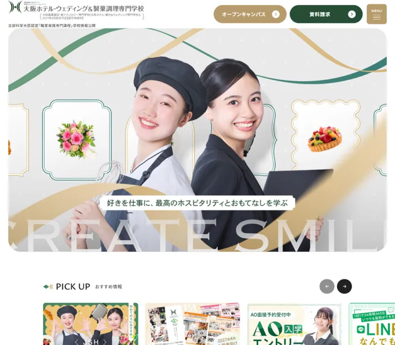
The homepage presents the public identity of 大阪ホテル・ウェディング&製菓調理専門学校 through an expansive photographic introduction and a substantial school information architecture. White space, deep green, muted gold, broad rounded corners, and fine ornamental lines establish an approachable but formal atmosphere. The hero places two smiling subjects in culinary and hospitality uniforms at the center of an illustrated photographic composition. Gold ribbons sweep across the foreground; finer green curves and framed occupational objects establish a shared visual world.
The page supports several journeys: discovering courses, checking admissions, booking an open-campus event, requesting a brochure, and exploring school life or career support. Its hierarchy accommodates operational news alongside aspirational imagery. A large green section announces a planned April 2027 school integration, while eight color-coded course panels provide the main academic navigation. The current page describes that integration as forthcoming; the notice is not evidence that the website has closed.
The most reusable relationship is between expressive artwork and orderly navigation. Preserve the photographic scale and flowing ornament, then make course lists, dates, qualifications, and conversion controls straightforward to scan.
How to Read This Reference
- Measured means a value appears in the supplied rendered DOM, computed styles, or custom properties. Tables round geometry to two decimal places where helpful.
- Calculated means a value is derived from those measurements or an explicitly supplied CSS formula.
- Visual estimate means a dimension or treatment was judged from a supplied screenshot without a corresponding property measurement.
- Recommended means implementation guidance for a new project. The CSS Quick Start contains adaptations, not recovered original source code.
- Declared font or token does not establish that every element uses it. Element-level evidence is identified separately.
- The screenshot viewport widths are 1440px and 390px, while the measured document boxes are 1425px and 375px. The 15px differences are consistent with reserved scrollbar space. Do not relabel the mobile inspection as a 375px viewport.
- Navigation text occurs more than once in the rendered evidence. Early navigation measurements include a menu-related copy that is not visible over the opening hero. Its presence does not establish that the menu was opened.
- The desktop course screenshot contains overlapping, partially transparent course states. It supports the panel anatomy and the existence of different presentation states, but does not establish the intended appearance of a fully settled transition.
Tokens — Colors
Default Palette
All hexadecimal values in this table are supplied source custom properties. Usage is distinguished from mere declaration.
| Name | Value | Source token | Role and evidence |
|---|---|---|---|
| White | #ffffff |
--color-white |
Measured header background and reversed action text; visually the main page canvas |
| Deep Green | #274d36 |
--color-green-120 |
Measured desktop brochure button fill and secondary action text |
| Campus Green | #468560 |
--color-green-100 |
Measured institutional introduction background and sampled brochure promotional tile |
| Muted Green | #78a78b |
--color-green-70 |
Declared supporting green; exact component assignment not established |
| Pale Green | #a7c6b7 |
--color-green-50 |
Declared supporting tint |
| Green Wash | #daeae2 |
--color-green-30 |
Declared light supporting surface |
| Main Gold | #b79b6c |
--color-gold-100 |
Measured desktop open-campus button and menu button fill; visually the mobile brochure dock fill |
| Light Gold | #d3b175 |
--color-gold-50 |
Measured sampled open-campus promotional tile fill; related to the warm ribbon palette |
| Dark Gold | #99825c |
--color-gold-120 |
Declared darker gold; no specific hover endpoint verified |
| Pale Gold | #e7d4b4 |
--color-gold-30 |
Declared supporting tint |
| Gold Wash | #f8edda |
--color-gold-10 |
Declared supporting tint |
| Charcoal | #202120 |
--color-black-100 |
Measured body text and carousel controls; visually the footer field |
| Secondary Charcoal | #4f5451 |
--color-black-80 |
Declared supporting neutral; visually similar to footer arrow disks |
| Panel Gray | #f7f7f7 |
--color-gray-20 |
Measured course-panel background |
| Image Placeholder Gray | #f1f1f1 |
--color-gray-60 |
Measured pickup link background beneath its image content |
| Light Gray | #dddddd |
--color-gray-80 |
Declared neutral; inactive index buttons separately compute to #dedede |
| Fine Line | #d8cdd1 |
--color-line |
Declared divider color, consistent with the subtle course-list rules |
| Admissions Red | #dd3d3d |
--color-red-100 |
Measured admissions-notice text; the screenshot also shows a red outline and arrow disk |
The green and gold actions change assignments by location. On desktop, open campus is gold and brochure request is deep green. In the mobile bottom dock, brochure request is gold and open campus is medium green. Preserve these observed variants when documenting this site; do not assume a single global action-to-color mapping.
Gold in the hero includes shaded photographic or illustrated ribbon material. A flat #b79b6c rectangle reproduces a button, not the ribbon artwork.
Course Palette
Course colors provide navigation identity within the otherwise restrained institutional palette.
| Course family | Primary source value | Supplied supporting values | Source token |
|---|---|---|---|
| Bridal | #e95f79 |
#f0d5da |
--color-course-bridal |
| Hotel | #eab84d |
#edd7a7, #f4ead3 |
--color-course-hotel |
| Airline | #43c3b2 |
#d9f3f0 |
--color-course-airline |
| Tourism | #ad87ce |
#e6d4f4 |
--color-course-tourism |
| Sweets and bread | #e9785f |
#fbe4df |
--color-course-sweets-bread |
| Cafe | Primary value not captured | #e7d6d4 |
Supporting token: --color-course-cafe-50 |
| Cooking | #f16459 |
#f8dfdd |
--color-course-cooking |
| Food and health | #65be55 |
No supporting tint captured | --color-course-healthy |
The desktop screenshot shows coral for the sweets-and-bread state and lavender for an overlapping tourism state. Use the source colors for solid UI accents. The faded colors in that capture should not become permanent low-opacity text or buttons.
Additional pink tokens are declared, but their component assignments are not established by the supplied captures. They are unnecessary for reproducing the main shell.
Tokens — Typography
Japanese Interface — Noto Sans JP
- Declared family:
"Noto Sans JP", sans-serifthrough--font-ja. - Measured body family: a generated Noto Sans JP family name with a generated Arial fallback, followed by sans-serif.
- Measured weights:
400for body copy and smaller navigation links;700for major Japanese headings, course names, and primary action labels. - Character: clean, upright, moderately dense Japanese typography with generous tracking on headings and navigation.
- Implementation guidance: use the public family name when supplying the font in a new project. The generated family suffixes are implementation-specific and are not portable font names.
English Utilities — Ysabeau SC
- Declared family:
"Ysabeau SC", sans-serifthrough--font-en2. - Element-level confirmation: the menu button and desktop course-number buttons use a generated Ysabeau SC family.
- Measured course-number weight:
600. - Role: small English control lettering and distinctive index numerals.
Additional Declared English Family — Fustat
--font-en declares "Fustat", sans-serif. No supplied element record independently confirms its use on a particular visible heading. It may be retained as an available English-family token, but assigning it to every English title would exceed the evidence.
Logo and Hero Lettering
The school wordmark is graphical. Its proportions and subordinate integration notice should be preserved as an authorized identity asset rather than re-created with ordinary body text.
The hero's large CREATE SMILE lettering has a serif appearance and is partially cropped within the composition. Its actual font family was not captured. The slogan also appears inside an image-bearing heading whose text extraction is empty. The heading's inherited body font size does not measure the lettering inside that artwork.
Empty extracted text does not establish that an image lacks alt text or an accessible name; those attributes were not provided.
Type Scale
| Role | Desktop | Mobile | Weight / leading / tracking | Evidence |
|---|---|---|---|---|
| Root size | 16px |
16px |
400; 24px line height |
Measured HTML styles |
| Body | 15.74px |
14.02px |
400; 1.5; normal tracking |
Measured |
| Navigation group heading | 19.46px |
15.88px |
700; 1.6; 0.075em |
Measured navigation copy |
| Navigation child link | 13.88px |
13.09px |
400; 1.6; 0.075em |
Measured navigation copy |
| Small Japanese section caption | 13.88px |
13.09px |
400; 1.4; 0.075em |
Measured pickup, news, and course captions |
| Primary Japanese action | 15.74px |
14.02px |
700; 1.6; 0.075em |
Desktop header and mobile news-list action |
| Admissions-notice heading | 19.46px |
15.88px |
700; 1.4; 0.075em |
Measured |
| Institutional and course heading | 38.04px |
25.18px |
700; 1.4; 0.075em |
Measured |
| Institutional introduction body | 17.60px |
14.95px |
400; 2; normal tracking |
Measured |
| Course-list item | 18.94px |
15.88px |
700; 1.4; 0.075em |
Measured |
| Desktop index number | 20px |
Not rendered in sampled mobile controls | 600; 20px line height |
Measured |
| Small policy link | 13.61px |
11.04px |
400; 1.4; 0.075em |
Measured navigation copy; footer looks consistent |
| Hero slogan lettering | Approximately 24–26px |
Approximately 11–12px |
Green lettering on a white plaque | Visual estimate; artwork text |
The typography does not scale uniformly. Body copy changes modestly between the two viewports, while prominent Japanese headings change much more. The mobile logo and hero composition also receive distinct treatment.
Tokens — Spacing & Shapes
Density: compact utility navigation, spacious editorial sections, large photographic course panels.
Source spacing primitive: --spacing: .0625rem, equivalent to 1px at the measured root size. This is a declared utility increment, not proof that the visual design uses a rigid 1px rhythm. Many computed dimensions are fractional and fluid.
Source Formulas
The supplied header token is:
--header-height: min(2.44898vw + 58.8163px, 98px);
It calculates to approximately 94.08px at 1440px and 68.37px at 390px, agreeing with measured header heights after browser rounding.
Other supplied tokens include:
--container-min-size: 91.4667vw;
--container-min-size2: 94.6667vw;
--container-min-padding: calc((100vw - 91.4667vw) * .5);
--drawer-button-size: min(.408163vw + 48.4694px, 55px);
At 390px, the two width tokens calculate to approximately 356.72px and 369.20px. These closely match the mobile notice width and course-panel width respectively. They are not universal page-container widths: the hero measures 342.69px, and desktop panels use other sizing rules.
The menu button's rendered bounds are larger than the declared drawer-size token calculates. Use the measured button geometry when matching the visible control; the intervening sizing rules were not supplied.
Layout Measurements
| Element | Desktop | Mobile | Status |
|---|---|---|---|
| Document width | 1425px |
375px |
Measured within the stated viewports |
| Document height | 22979.27px |
16261.56px |
Measured; content- and state-dependent |
| Header height | 94.08px |
68.36px |
Measured |
| Header horizontal padding | 28.17px |
16.17px |
Measured |
| Header identity box | 460.83 × 66.09px |
282.55 × 40.52px |
Measured H1 bounds |
| Menu button | 65.91 × 65.91px |
52.19 × 52.19px |
Measured |
| Desktop header action | 230 × 58.64px |
Hidden in opening header | Measured / visually confirmed |
| Hero | 1368.69 × 748.94px |
342.69 × 512.38px |
Measured |
| Hero aspect ratio | Approximately 1.83:1 |
Approximately 0.67:1 |
Calculated |
| Hero slogan plaque | 683.73 × 51.81px |
321.66 × 24.38px |
Measured H2 bounds |
| Hero-to-notice gap | 93.78px |
53.08px |
Calculated from bounds |
| Admissions notice | 747.75 × 139.92px |
356.72 × 118.58px |
Measured |
| Pickup image link | 312.45 × 209.91px |
243.23 × 163.41px |
Measured |
| Pickup horizontal gap | 22.95px |
16.09px |
Calculated from adjacent links |
| Pickup arrow button | 47.34px square |
43.05px square |
Measured |
| News section vertical padding | 112.38px |
62.38px |
Measured |
| News row | 802.50 × 77.47px |
356.72 × 79.81px |
Measured |
| Course-panel width | 1331.48px |
369.19px |
Measured |
| First course-panel height | 661.30px |
863.42px |
Measured |
| Course grid columns | 605.56px + 542.06px |
One 334.13px column |
Measured |
| Course horizontal column gap | 73.38px |
No second column | Measured |
| Mobile course-to-course gap | Not a simple uniform desktop stack | Approximately 36.33px |
Calculated between sampled mobile panels |
Do not use the complete document height as an implementation target. The desktop course section occupies approximately 10693px of document height despite much shorter individual cards, while the mobile version occupies approximately 7033px. Those differences are consistent with the distinct desktop staged presentation and mobile stacked layout.
Border Radius and Shape Vocabulary
| Element | Value | Evidence |
|---|---|---|
| Menu button | 8px |
Measured at both viewports |
| Pickup image links | 8px |
Measured |
| Admissions notice | 12px |
Measured |
| Course panel | 30.61px desktop; 21.46px mobile |
Measured |
| News section upper corners | 45.47px desktop; 28.90px mobile |
Measured; the transparent wrapper may not expose the curve visibly |
| Primary actions | Full pill | Measured effectively unlimited radius |
| Active course-index upper corners | 8px 8px 0 0 |
Measured |
| Hero outer corners | Approximately 45px desktop; 30px mobile |
Visual estimate |
| Course photograph corners | Approximately 14–16px |
Visual estimate |
| Primary action arrow disk | 24px |
Measured grid track; visually circular |
The page uses different shapes for different jobs. Large rounds frame imagery, pills mark actions, small rounds finish utilities, and thin diamonds or curves provide ornament. Avoid applying the same radius to every component.
Components
Persistent School Header
Role: maintain identity and direct access to the two main conversion paths.
A white strip spans the document width. The graphical school identity sits on the left; a small 学校情報公開 link follows on desktop. Two equal-width pills occupy the right side, followed by a separate gold menu square.
The desktop pills measure 230 × 58.64px. Each uses a two-column grid: a flexible label track and a 24px arrow track. Measured padding is approximately 15.74px 21.31px, with a 15.74px internal gap. White circular disks contain small right-facing chevrons.
The menu control places MENU above three horizontal lines. Its actual box is 65.91px square on desktop and 52.19px square on mobile, with an 8px radius. Its generated English font family is Ysabeau SC; the visible caption inside the button may have additional child styling that was not captured.
On mobile, the opening header retains only the reduced identity asset and menu square. The conversion actions move to the bottom dock. The header remains at the top in the scrolled screenshots, establishing persistent presentation. Its precise fixed-versus-sticky implementation was not included in the evidence.
Opening and closing the menu, focus handling, backdrop behavior, and scroll locking remain unverified.
Pill Actions and Circular Arrows
Role: provide a consistent visual destination cue across header, panels, and promotional blocks.
The basic anatomy is label, generous horizontal space, and a small right-arrow disk. Strong actions have colored backgrounds with white text; secondary examples use white backgrounds with green text. The observed news-list action retains the same 24px arrow track and pill geometry at both widths.
Mobile bottom-dock actions use a different text arrangement: a Japanese label above a smaller English caption, left aligned inside a broad pill. The supplied opening screenshot shows no separate arrow disk inside those two dock buttons.
The mobile dock is approximately 55px high, with two roughly equal 172px pills, a 10–12px gap, and about 20px bottom clearance in the capture. These are visual estimates. It overlaps the start of the pickup region. It is absent from the supplied footer capture; the condition that removes it was not recorded.
Photographic Hero
Role: communicate the school's combined hospitality and culinary identity before presenting detailed choices.
The desktop hero starts immediately below the header, inset approximately 28px. It occupies almost the entire content width and approximately three quarters of the viewport height. Its composition contains:
- A very light gray patterned background.
- Thin green and gold curves crossing the upper field.
- Decorative double-line frames containing flowers, plated food, a fruit tart, and coffee.
- Two large uniformed subjects posed back to back: one with culinary tools, the other holding a folder.
- Broad gold ribbons crossing the foreground.
- A white slogan plaque with green lettering.
- Oversized, pale
CREATE SMILElettering cropped by the lower boundary.
The plaque reads 好きを仕事に、最高のホスピタリティとおもてなしを学ぶ. Its top sits approximately 74% down the desktop hero and 70% down the mobile hero, calculated relative to the measured hero box. Its width changes from approximately half the desktop hero to approximately 94% of the mobile hero.
The mobile version is a tall composition. Both faces remain prominent, outer objects are clipped, and the large English phrase occupies two lines at the bottom. This is more than shrinking a wide banner. Use a dedicated portrait composition or individually controlled layers to preserve the subjects and the slogan.
The rounded clipping boundary is important. Foreground ribbon material and oversized lettering terminate at that edge. The photographic arrangement alone does not prove parallax, auto-rotation, or video playback.
Admissions Status Notice
Role: surface practical, current recruitment information directly below the hero.
A centered white or transparent panel has a red outline, a 12px radius, a bold heading, two lines of supporting text, and a red circular arrow toward the right. The source link points to /admissions/introduction/.
The desktop component measures approximately 748 × 140px; mobile measures approximately 357 × 119px. The measured grid has three tracks with a centered text column and approximately balanced side columns. This arrangement keeps the copy centered even though the arrow occupies the right side.
Use the actual source hierarchy: ○入学をお考えの方へ○ above the current-status message. The heading scales from 19.46px to 15.88px. The border appears approximately 2px thick in the screenshots; its width was not independently captured.
Treat the entire panel as the link. The arrow is a visual cue within that target.
Pickup Image Rail
Role: provide prominent shortcuts to timely events, admissions information, facilities, and other featured destinations.
The rendered DOM contains nine image links arranged horizontally. Their positions extend beyond the viewport, establishing a rail rather than a wrapping card grid. A bilingual heading pairs PICK UP with the smaller Japanese section caption. Two dark circular controls sit toward the right of the heading row.
Desktop links measure approximately 312 × 210px; mobile links measure 243 × 163px. Both are close to a 1.49:1 ratio. Their neutral backing color is #f1f1f1, with an 8px radius. The image-link text extraction is empty; individual artwork and accessible names were not provided in the element records.
The DOM establishes controls and horizontal geometry. It does not establish autoplay, infinite looping, drag support, or how many items advance per button activation.
News List
Role: make current school and admissions updates easy to scan.
Desktop places the section title and archive action to the left of a three-row list. Each link is an explicit grid with date, category, headline, and a final 32px track. The first measured row uses columns of approximately 67.66px 120px 537.23px 32px, with 15.22px horizontal gaps.
On mobile the list spans approximately 357px, and the grid changes to three columns: approximately 64px, a flexible middle track, and 32px. The supplied record does not include every child placement, so the exact line arrangement should not be inferred solely from the track count. Rows remain close to 80px tall. The archive pill moves below the list toward the right.
The source includes three dated updates, demonstrating that this component serves operational content rather than decorative testimonials. Keep dates, categories, and headlines as independently structured content.
Green Institutional Introduction
Role: explain the school's direction and connect hospitality learning with food and agricultural learning.
A full-width #468560 field carries a small white announcement pill, a bold white Japanese statement, and spacious white body copy. The measured heading changes from 38.04px / 53.26px on desktop to 25.18px / 35.26px on mobile. Body copy uses double leading: approximately 35.19px desktop and 29.91px mobile.
The mobile copy introduces deliberate additional line breaks. The block becomes a narrow, centered reading area, approximately 306px wide. Desktop copy occupies approximately 772px.
Five learning-feature links follow, covering projects, qualification structure, cross-disciplinary study, overseas learning, and career support. In the supplied sample these links share the same coordinates, which indicates layered or state-dependent geometry. No screenshot of their fully settled arrangement was supplied. Do not turn those coordinates into a claim that five overlapping cards are the intended resting layout.
The actual copy contains a future integration announcement. Reuse the announcement-pill pattern, but keep its date and message content-driven.
Course Index
Role: identify the current desktop course stage and expose eight numbered choices.
The desktop index shows 01 through 08. A selected button is 47px high, while inactive buttons are 34px high. Widths are approximately 44–45px. All align to the same bottom edge, so the active item rises 13px above the row. The active item receives its course color, white numerals, and rounded upper corners.
The DOM sample marks 01 active, while the course screenshot shows 05 active. These are different captured states. No click sequence was supplied, so do not attribute the change specifically to a button press.
Number controls do not appear in the mobile visible-text extraction or sampled mobile button records. The mobile course cards instead appear sequentially in document geometry. Their middle-page visual presentation was not separately captured.
The section caption says 7つの分野から選べるコース・専攻, while eight course families and eight desktop index controls are present. This is a source-content discrepancy. For a new implementation, derive the displayed count from the actual content data.
Course World Panel
Role: combine aspirational occupational photography with a concrete list of study options.
The desktop wrapper is itself a link to the relevant course-world page. It measures approximately 1331 × 661px, has a #f7f7f7 background and a 30.61px radius, and uses two measured grid columns: approximately 606px for imagery and 542px for information, separated by 73px.
Its asymmetrical measured padding is approximately 27px top and bottom, 26px left, and 82px right. This creates additional room for a vertical English sector label and the colored outer-edge treatment visible in the screenshot.
The panel anatomy is:
- A large, approximately square occupational photograph with rounded corners.
- A broad course-colored ribbon across the photograph, carrying large English lettering.
- A small course-colored decorative stroke near the title.
- A bold Japanese world title at
38.04pxon desktop. - A short introductory sentence at the body size.
- A list of course names with colored diamond markers and fine horizontal rules.
- Small pill badges such as
3年制,4年制, and高度専門士where applicable. - A wide, course-colored destination pill near the bottom.
- A vertical English sector label near the right boundary.
The screenshot's sweets-and-bread panel includes four course rows. Other worlds have different counts. Preserve content-driven height and spacing rather than adding empty rows to equalize lists.
On mobile the wrapper changes to one 334.13px content column. The image region precedes the text. Measured padding becomes approximately 49px top, 16–17px sides, and 33px bottom, with a 27.73px row gap. The radius becomes 21.46px. Sample panel heights range from approximately 731px to 898px, depending on course content. Several exceed the inspected viewport height.
Long mobile course names and qualification badges wrap into taller rows. A fixed-height card or a single-line course-name constraint would conflict with the measured layout.
Because the outer panel is an anchor, the internal destination pill should be a styled noninteractive element when reproducing that anatomy. Do not nest an anchor or button inside it.
Open-Campus Event Discovery
Role: connect course interest with a practical visit or experience.
The supplied text and links establish two groups of browsing destinations: event categories and occupational fields. They are links to category pages, not demonstrated in-place filter controls. Preserve navigation semantics unless a new filtering behavior is intentionally implemented.
The homepage includes six event entries. Desktop text exposes event titles, descriptive paragraphs, dates, a details link, and a separate reservation link. Mobile visible text primarily exposes titles and dates, while linked card records retain fuller content. This supports a condensed mobile presentation; it does not mean the source content has been deleted.
Exact event-card image crops, grid counts, colors, and hover states are not established by the supplied screenshots. Reuse the evidence-backed content hierarchy without inventing a visual arrangement.
School Life, Blog, and Social Links
Role: provide evidence of everyday school activity and support additional information journeys.
The text establishes three school-life destinations for campus life, career support, and admissions, followed by a cross-disciplinary curriculum link. The blog section contains three dated entries with categories and an archive link. Social links are grouped into hospitality and food/agriculture accounts.
These sections are part of the current homepage's information architecture. Their detailed image compositions and card geometry were not included in the supplied visual captures, so they should remain lower-confidence visual references.
Large Conversion Tiles
Role: repeat open-campus and brochure destinations near secondary navigation or the end of the page.
Sampled mobile promotional links measure approximately 356.72 × 174px with a 14.02px radius. The open-campus example uses #d3b175; the brochure example uses #468560. They combine a large Japanese label, promotional imagery, and a prominent white inner action.
The mobile footer screenshot includes the lower portion of a green brochure tile: overlapping printed materials above a white outlined pill, an arrow at the right, and large low-contrast English lettering behind it. The white inner action nearly fills the tile width.
Some measured promotional links belong to a duplicated navigation region. Their styling is evidence for the component family, not independent proof of the exact footer tile's height.
Footer and Site Directory
Role: close the page with a comprehensive directory and institutional contact information.
The desktop footer is a broad charcoal field with four columns per directory row. Each visible group begins below a fine horizontal rule, with a bold white heading and a muted circular arrow. Smaller child links form compact vertical lists. The visible screenshot contains the lower directory groups, an occupational-experience banner, a white school identity asset, contact information, and policy links.
The mobile footer removes the long child-link lists from its visible directory. Eight top-level destinations wrap into three rows of bold, underlined text. The small promotional banner follows, then a centered white identity asset, address, telephone and email, a vertical policy-link list, and the copyright line.
The footer shows © 2026 JIKEI SCHOOL OF HOSPITALITY. This is a displayed institutional copyright line, not a production credit. No independently evidenced design or development credit appears in the supplied original-page material.
Use generous separation between the directory, identity, contact details, and copyright. The dark surface and white logo provide the page's strongest visual closing contrast.
Tokens — Motion & Interaction
| Treatment | Supplied value or observation | What it establishes |
|---|---|---|
| Menu button | background-color 0.2s |
A short background transition is defined; target state not captured |
| Desktop header pills | text-decoration-color 0.2s |
Decoration-color feedback is defined; no scale or lift is established |
| Admissions notice | color 0.2s, background-color 0.2s |
Foreground and surface transitions are defined; endpoints unverified |
| Pickup controls | background-color 0.2s, opacity 0.2s |
Color and availability-style opacity transitions are defined |
| Course index | Background 0.2s; block size and radius 0.4s cubic-bezier(.23, 1, .32, 1) |
Selected index geometry changes with a quick ease-out |
| Integration announcement pill | Opacity 0.3s; translate 1.2s cubic-bezier(.23, 1, .32, 1) |
A slower positional reveal with faster opacity is defined |
| Integration heading | Same durations with 0.1s delay |
Staggered entrance is defined |
| Integration body | Same durations with 0.3s delay |
Later reveal within the same content group is defined |
| Learning-feature label | Opacity 0.2s; translate 0.4s cubic-bezier(.215, .61, .355, 1) |
A shorter supporting reveal is defined |
| Sampled mobile conversion tiles | Opacity 0.6s; translate 1.2s cubic-bezier(.165, .84, .44, 1) |
Reveal transitions are defined; second example has 0.1s delay |
| Header during scrolling | Remains at the top in opening, course, and footer captures | Persistent presentation is visually established |
| Desktop course stages | Different active indices and overlapping panels appear in supplied evidence | State changes are established; exact trigger and timeline are not |
The supplied records support restrained, smooth UI feedback and longer editorial reveals. They do not establish spring physics, scroll-scrub timing, a particular animation library, or a hero parallax system.
Several sampled wrappers report animation: none. This does not rule out transitions, descendant animations, pseudo-element motion, or script-driven transforms. Likewise, a generic transition: all entry without a duration is insufficient to assign an animation timing.
The course screenshot should be read as an unsettled or composited state of uncertain cause. Keep one course panel's text fully readable in a new resting state. Do not reproduce duplicate titles, transparent bodies, or overlapping photographs as permanent styling.
The browser observation waited for document readiness, image decoding, and sampled stability, and traversed intermediate scroll positions. Those checks improve capture reliability but do not establish complete interaction coverage. Menu activation, index clicks, carousel clicks, keyboard navigation, form submission, reduced-motion behavior, and touch gestures were not documented.
Surfaces
| Layer | Appearance | Purpose |
|---|---|---|
| Header and general canvas | White, little visible ornament | Calm framework around dense information and expressive images |
| Hero background | Light gray, faint diamonds, framed objects, flowing curves | Shared hospitality and culinary atmosphere |
| Institutional introduction | Solid campus green with white text | A strong narrative interval between practical news and courses |
| Course surroundings | Very pale diagonal lattice visible in the desktop capture | Subtle continuity with the ornamental hero |
| Course panel | Near-white gray, large rounded boundary, course-colored edge | Organizes a large image and an academic information block |
| Primary action | Solid green, gold, or course color with a circular arrow | Clear destination cue |
| Admissions notice | White field, red outline and red text | Distinct practical priority |
| Footer | Charcoal with white identity and text | Dense directory and institutional closure |
No general drop-shadow elevation system is apparent in the supplied captures. Separation comes from background color, space, fine rules, colored edges, and clipping. Hero ribbons contain their own shading; that should not be generalized into shadows on every UI card.
Imagery
The central image language is polished, welcoming occupational photography combined with decorative graphic framing. The uniformed subjects face the viewer, while tools, food, flowers, coffee, and travel-related objects provide field-specific context. Broad gold ribbons create depth and visual movement without covering the faces.
The hero's desktop and mobile compositions preserve the same two-subject idea but change the framing substantially. Maintain adequate resolution for large faces, clean cutout edges, natural skin tones, visible uniform details, and enough background separation to keep the composition readable.
Course imagery carries its own visual identity through a colored ribbon and oversized English field lettering. The photograph should remain the dominant left-side element on desktop and the opening element of each mobile panel. Course badges and descriptions belong to the HTML information region rather than being flattened into the photograph.
Observed Asset References
No image src, srcset, downloadable asset URL, or font-file URL was included in the supplied evidence. The following is an inventory of visible asset roles, not a list of recovered files.
| Asset role | Observed treatment | Implementation guidance |
|---|---|---|
| Header identity | Green emblem, gray Japanese wordmark, small subordinate notice | Use an authorized identity asset and preserve its internal proportions |
| Footer identity | White version of the same identity | Supply the reversed asset rather than applying an indiscriminate image filter |
| Hero composition | Two uniformed subjects, ornamental frames, gold and green ribbons | Prepare separately art-directed desktop and mobile compositions |
| Hero slogan | Green Japanese lettering inside a white plaque | If baked into artwork, provide an equivalent accessible text alternative |
| Course photography | Occupational portrait or activity image with a broad field ribbon | Match the image crop to the panel's square media region |
| Brochure promotion | Overlapping printed materials on a green field | Preserve the product-like arrangement and clear inner action |
| Footer promotion | Small occupational-experience banner | Treat as a distinct promotional asset; do not enlarge it into a hero |
| Utility icons | Simple chevrons, hamburger lines, telephone and envelope symbols | No specific icon library was established |
Use authorized assets when available. CSS can reproduce the structural system, but it cannot replace the identity carried by the school photography and ribbon compositions. Do not apply pixelated image rendering to these photographs.
Layout & Responsive Behavior
The responsive system changes composition, hierarchy, and interaction density rather than merely reducing all dimensions.
| Region | Desktop observation | Mobile observation |
|---|---|---|
| Header | Large identity, disclosure link, two pills, menu | Smaller identity and menu; desktop actions absent |
| Hero | Wide two-subject composition with surrounding framed objects | Tall crop with prominent faces and two-line decorative English lettering |
| Hero slogan | Approximately half the hero width | Nearly the entire hero width |
| Conversion access | Persistent header actions | Floating two-pill bottom dock in the opening view |
| Pickup | Multiple cards visible in a horizontal rail | One full card and part of the following card fit the measured geometry |
| News | Heading/archive region beside the list | Heading above full-width rows, archive action below |
| Institutional copy | Wide text block with fewer line breaks | Narrow centered copy with deliberate line breaks |
| Courses | Two-column panels within a long staged section and visible number index | Single-column panels in sequence; measured heights expand with content |
| Event summaries | Description, date, details, and reservation text exposed | Visible text condenses primarily to titles and dates |
| Footer | Expanded multi-column directory and horizontal contact/policy area | Wrapped top-level directory, centered identity/contact block, vertical policies |
Exact breakpoint values were not supplied. Only the two captured endpoints are verified. Tablet widths, landscape phones, zoom behavior, and alternative scrollbar configurations remain untested.
For a new implementation, choose breakpoints according to content fit. The large desktop header needs more width than a simple two-column content panel. It is reasonable to switch the header later than the course layout; that is a recommendation, not an observed source rule.
Keep course cards height-driven by content on mobile. The first measured card is already taller than the viewport. Preserve ordinary document scrolling and do not force every card into a viewport-height container.
Reserve safe-area-aware space for any mobile dock. The capture shows the dock overlapping subsequent content, but it does not establish the source safe-area or footer-hiding logic. A robust adaptation should ensure that focused links and final content remain reachable.
Do’s and Don’ts
Do
- Keep white, campus green, deep green, and muted gold as the institutional foundation.
- Let professional portrait photography carry the opening emotional impact.
- Preserve both faces when art-directing the mobile hero.
- Use broad ribbons and fine ornamental curves at different scales.
- Keep the Japanese interface in Noto Sans JP with measured bold headings and approximately
0.075emheading tracking. - Use course colors consistently across each world's index state, ribbon, markers, edge, and destination cue.
- Preserve the course panel's large image, clear title, course list, qualification badges, and destination hierarchy.
- Allow mobile course names and badges to wrap.
- Keep current admissions and news information prominent near the top.
- Retain the reduced mobile footer directory and the expanded desktop directory.
- Treat duplicated menu content and transitional screenshots cautiously when interpreting layout.
- Keep the planned integration notice and course count driven by current content.
Don’t
- Don't flatten this institutional homepage into a short single-offer page with only one conversion path.
- Don't use the hero's inherited heading font size as a measurement of lettering inside its image.
- Don't assign an invented font family to the logo or
CREATE SMILEartwork. - Don't turn every surface into a floating shadow card.
- Don't replace the mobile hero with an indiscriminate center crop that loses a subject or the slogan.
- Don't use faded transition colors as permanent body-text colors.
- Don't freeze the course screenshot's overlapping states into the final composition.
- Don't force mobile course panels to share a fixed height.
- Don't assume the event category links are client-side filters.
- Don't nest interactive elements inside the linked course panel.
- Don't infer a production studio from a form host, external link, or copyright line.
- Don't reproduce long desktop scroll staging without verifying keyboard access and a readable fallback.
Recommended Implementation Additions
These are recommendations for a new implementation, not verified original-site features:
- Give menu, carousel, and course-index controls explicit accessible names. Numeric controls should identify their associated course world, not only their number.
- If a menu opens as an overlay, define focus entry, focus restoration, Escape handling, and background interaction behavior explicitly.
- Keep essential content visible by default. Apply reveal effects only after enhancement is active, and show a readable static layout under reduced motion.
- Preserve all course destinations in ordinary document order so that desktop staging does not become the only route to them.
- Check contrast for white text on gold and brighter course colors, including disabled controls and small badges. The source palette is not itself evidence that every pairing meets a contrast target.
- Consider a
16pxminimum for extended mobile reading copy where content becomes dense. The observed body size is approximately14px; increasing it is an intentional accessibility adaptation. - Provide visible focus indicators and adequately sized targets around small footer text and decorative arrow cues.
- Reserve bottom clearance and safe-area padding for mobile fixed actions. If hiding them near the footer, use a predictable rule and avoid moving focus with the visual change.
- Use responsive image sources with explicit dimensions. Prioritize the opening image and defer below-the-fold photography appropriately.
- Supply meaningful alternatives for the graphical identity and slogan. Avoid repeating decorative ribbon text in the accessibility tree when it adds no new information.
- Derive course counts, event dates, and admission notices from content data rather than embedding them in decorative assets.
Agent Prompt Guide
Quick Color Reference
- Canvas and header:
#ffffff. - Primary text and footer:
#202120. - Deep institutional green:
#274d36. - Large green narrative field:
#468560. - Main utility gold:
#b79b6c. - Lighter promotional gold:
#d3b175. - Course-panel surface:
#f7f7f7. - Fine divider:
#d8cdd1. - Admissions notice:
#dd3d3d. - Sweets-and-bread accent:
#e9785f; tourism accent:#ad87ce. - Desktop action mapping: gold open campus, deep-green brochure request.
- Mobile dock mapping: gold brochure request, medium-green open campus.
Overall Prompt
“Create a Japanese vocational-school homepage inspired by the current JSH hospitality and culinary site. Use a white canvas, deep green #274d36, campus green #468560, muted gold #b79b6c, and charcoal text. Lead with a large rounded photographic composition featuring two welcoming uniformed subjects, flowing gold ribbons, fine green curves, and framed occupational objects. Place a compact Japanese slogan in a white plaque and oversized decorative English lettering near the lower edge. Use Noto Sans JP for Japanese interface text, generous whitespace, pill actions with circular arrow cues, a red outlined admissions notice, news rows, a full-width green institutional introduction, and large color-coded course panels. Each course panel combines a square occupational image, a bold title, a short description, course names, qualification badges, and one destination. On mobile use a tall art-directed hero, stacked course panels, a compact header, and two bottom conversion pills. Finish with a charcoal directory footer. Keep the resting state fully readable and distinguish optional motion from the core layout.”
Example Component Prompts
- Header: “Build a persistent white school header with a wide graphical identity on the left, a small disclosure link, two equal 230px pills, and a separate gold menu square. Use gold for open campus and deep green for brochure request. Each pill has a white 24px arrow disk. On mobile retain the identity and menu, moving conversions to a bottom dock.”
- Hero: “Art-direct a welcoming hospitality-and-culinary hero with two uniformed subjects posed back to back, natural skin tones, occupational tools, pale ornamental frames, thin green curves, and broad shaded gold ribbons. Clip the composition to a large rounded rectangle. Make separate wide and portrait arrangements that preserve both faces and the Japanese slogan.”
- Course panel: “Create a near-white course panel with a roughly 606px square image at left and a 542px information region at right at a 1440px viewport. Use a coral field ribbon over the image, a bold 38px Japanese title, thin list dividers, small qualification pills, and a coral destination cue. Use one outer link with no nested interactive controls. Stack the image and content on mobile and let long names wrap.”
- Admissions notice: “Create a red outlined rounded panel with centered Japanese recruitment-status copy and a red circular arrow on the right. Keep the text visually centered independently of the arrow. Target approximately 748px width on desktop and nearly full width on mobile, with a 12px radius.”
- Footer: “Create a charcoal school directory with white text, fine rules, bold group links, and small circular arrow cues. Use expanded four-column directory rows on desktop. On mobile show only the eight top-level links in a wrapped underlined group, followed by a small banner, centered reversed identity, contact details, vertically stacked policies, and a small copyright line.”
- Motion: “Use 200ms color feedback for utility controls and restrained ease-out reveals for editorial text. An optional course index can increase the current item's height from 34px to 47px over 400ms. Keep content readable without motion and never leave two transparent course titles overlapping in a resting state.”
Quick Start
CSS Custom Properties
This is a practical adaptation using the supplied colors, measured typography, and component proportions. It uses a normal 16px root. The body and heading fluid formulas are fitted to the two supplied measurements; they are not recovered source declarations. The header-height formula is supplied source evidence.
The 60rem content breakpoint and 72rem header breakpoint are recommended choices. The course list remains a readable static stack; desktop scroll staging, menu behavior, carousel advancement, and footer-based dock visibility require separately specified interaction logic.
Supply authorized desktop/mobile hero artwork, identity assets, and course photography. If a hero asset already contains its slogan or decorative lettering, do not add duplicate overlays.
:root {
  /* Source palette, with portable implementation aliases. */
  --white: #ffffff;
  --ink: #202120;
  --ink-soft: #4f5451;
  --green: #468560;
  --green-deep: #274d36;
  --gold: #b79b6c;
  --gold-light: #d3b175;
  --surface: #f7f7f7;
  --placeholder: #f1f1f1;
  --line: #d8cdd1;
  --notice-red: #dd3d3d;
  --course-bridal: #e95f79;
  --course-hotel: #eab84d;
  --course-airline: #43c3b2;
  --course-tourism: #ad87ce;
  --course-sweets: #e9785f;
  --course-cooking: #f16459;
  --course-healthy: #65be55;

  /* Fonts must be supplied by the implementing project. */
  --font-ja: 'Noto Sans JP', sans-serif;
  --font-utility: 'Ysabeau SC', sans-serif;
  --font-en-declared: 'Fustat', sans-serif;
  --text-body: clamp(14px, calc(13.3878px + .163265vw), 16px);
  --text-heading: clamp(25px, calc(20.4082px + 1.22449vw), 40px);
  --text-small: clamp(13px, calc(12.8028px + .07483vw), 14px);
  --tracking-heading: .075em;

  /* Source header formula; other dimensions are adaptations. */
  --header-height: min(2.44898vw + 58.8163px, 98px);
  --edge: clamp(16px, calc(11.7143px + 1.142857vw), 30px);
  --content-max: 1114px;
  --radius-small: 8px;
  --radius-notice: 12px;
  --radius-hero: clamp(29px, 3.16vw, 46px);
  --radius-course: 21.46px;
  --safe-bottom: env(safe-area-inset-bottom, 0px);
  --ease-out-quint: cubic-bezier(.23, 1, .32, 1);
  --motion-fast: 200ms;
}

* { box-sizing: border-box; }
html {
  font-size: 16px;
  scroll-padding-top: calc(var(--header-height) + 16px);
}
body {
  margin: 0;
  color: var(--ink);
  background: var(--white);
  font: 400 var(--text-body) / 1.5 var(--font-ja);
}
img { display: block; max-width: 100%; }
button { font: inherit; cursor: pointer; }
a { color: inherit; }
[hidden] { display: none !important; }
.content {
  width: min(calc(100% - 18px), var(--content-max));
  margin-inline: auto;
}

/* Persistent presentation; sticky is an implementation choice. */
.site-header {
  position: sticky;
  top: 0;
  z-index: 50;
  display: flex;
  align-items: center;
  gap: 10px;
  height: var(--header-height);
  padding-inline: var(--edge);
  background: var(--white);
}
.site-brand {
  flex: 1 1 auto;
  min-width: 0;
  max-width: 283px;
  margin: 0;
}
.site-brand img { width: 100%; height: auto; }
.header-utility, .header-actions { display: none; }
.menu-button {
  flex: 0 0 auto;
  display: grid;
  place-content: center;
  gap: 5px;
  width: 52.19px;
  height: 52.19px;
  border: 0;
  border-radius: var(--radius-small);
  color: var(--white);
  background: var(--gold);
  transition: background-color var(--motion-fast);
}
.menu-button__label {
  font: 400 11px / 1 var(--font-utility);
}
.menu-button__lines {
  display: grid;
  gap: 4px;
  width: 22px;
  margin-inline: auto;
}
.menu-button__lines span { height: 1px; background: currentColor; }

.pill {
  --action-fill: var(--green-deep);
  display: grid;
  grid-template-columns: minmax(0, 1fr) 24px;
  align-items: center;
  gap: 1em;
  min-height: 54px;
  padding: 1em 1.35em;
  border: 1px solid transparent;
  border-radius: 999px;
  color: var(--white);
  background: var(--action-fill);
  font-weight: 700;
  line-height: 1.6;
  letter-spacing: var(--tracking-heading);
  text-decoration: none;
}
.pill--gold { --action-fill: var(--gold); }
.pill__arrow {
  display: grid;
  place-items: center;
  width: 24px;
  height: 24px;
  border-radius: 50%;
  color: var(--action-fill);
  background: var(--white);
  line-height: 1;
}

.hero {
  position: relative;
  isolation: isolate;
  overflow: hidden;
  margin-inline: var(--edge);
  aspect-ratio: 342.6875 / 512.375;
  border-radius: var(--radius-hero);
  background: var(--placeholder);
}
.hero__picture, .hero__picture img {
  position: absolute;
  inset: 0;
  width: 100%;
  height: 100%;
}
.hero__picture img { object-fit: cover; object-position: center; }
.hero__tagline {
  position: absolute;
  top: 70.4%;
  left: 50%;
  transform: translateX(-50%);
  width: max-content;
  max-width: calc(100% - 20px);
  margin: 0;
  padding: 6px 12px;
  color: var(--green-deep);
  background: var(--white);
  font-size: 12px;
  font-weight: 700;
  text-align: center;
}

.admissions-notice {
  display: grid;
  grid-template-columns: 1fr auto 1fr;
  align-items: center;
  gap: 12px 16px;
  width: min(calc(100% - 18px), 748px);
  min-height: 119px;
  margin: 53px auto 44px;
  padding: 18px 16px;
  border: 2px solid var(--notice-red);
  border-radius: var(--radius-notice);
  color: var(--notice-red);
  text-decoration: none;
  transition: color 200ms, background-color 200ms;
}
.admissions-notice__copy {
  grid-column: 2;
  text-align: center;
  font-weight: 700;
}
.admissions-notice__title {
  margin: 0 0 12px;
  font-size: clamp(16px, 1.35vw, 20px);
  letter-spacing: var(--tracking-heading);
}
.admissions-notice__copy p:last-child { margin: 0; }
.admissions-notice__arrow {
  grid-column: 3;
  display: grid;
  place-items: center;
  width: 30px;
  height: 30px;
  border-radius: 50%;
  color: var(--white);
  background: var(--notice-red);
}

/* Native overflow is a recommended fallback for the image rail. */
.pickup-rail {
  display: grid;
  grid-auto-flow: column;
  grid-auto-columns: 243px;
  gap: 16px;
  overflow-x: auto;
  padding: 4px 9px 12px;
  scroll-snap-type: x proximity;
}
.pickup-card {
  overflow: hidden;
  aspect-ratio: 1.489;
  border-radius: 8px;
  background: var(--placeholder);
  scroll-snap-align: start;
}
.pickup-card img { width: 100%; height: 100%; object-fit: cover; }

.institutional-intro {
  padding: clamp(62px, 7.8vw, 112px) var(--edge);
  color: var(--white);
  background: var(--green);
  text-align: center;
}
.institutional-intro__copy { max-width: 772px; margin-inline: auto; }
.institutional-intro h2 {
  font-size: var(--text-heading);
  line-height: 1.4;
  letter-spacing: var(--tracking-heading);
}
.institutional-intro p { line-height: 2; }

/* All course content remains available without scripting. */
.course-list { display: grid; gap: 36px; margin-inline: 3px; }
.course {
  --course-accent: var(--course-sweets);
  display: grid;
  gap: 28px;
  padding: 49px 17px 33px;
  border: 1px solid var(--course-accent);
  border-radius: var(--radius-course);
  color: var(--ink);
  background: var(--surface);
  text-decoration: none;
}
.course__image {
  width: 100%;
  aspect-ratio: 1;
  border-radius: 15px;
  object-fit: cover;
}
.course__info { min-width: 0; align-self: center; }
.course__title {
  margin: 0;
  font-size: var(--text-heading);
  font-weight: 700;
  line-height: 1.4;
  letter-spacing: var(--tracking-heading);
}
.course__lead { margin: 16px 0 28px; }
.course__options { margin: 0; padding: 0; list-style: none; }
.course__row {
  display: flex;
  flex-wrap: wrap;
  align-items: baseline;
  gap: 8px 10px;
  padding-block: 16px;
  border-bottom: 1px solid var(--line);
  font-size: clamp(16px, 1.315vw, 19px);
  font-weight: 700;
  line-height: 1.4;
}
.course__row::before {
  content: '';
  flex: 0 0 7px;
  width: 7px;
  height: 7px;
  transform: rotate(45deg);
  background: var(--course-accent);
}
.badge {
  display: inline-block;
  padding: 2px 10px;
  border: 1px solid var(--line);
  border-radius: 999px;
  color: var(--green-deep);
  background: var(--white);
  font-size: 12px;
  font-weight: 400;
  white-space: nowrap;
}
.course__destination {
  --action-fill: var(--course-accent);
  max-width: 376px;
  margin-top: 32px;
}
.course-index { display: none; }

.site-footer {
  margin-top: 44px;
  padding: 46px 9px 36px;
  color: var(--white);
  background: var(--ink);
}
.footer-directory { display: flex; flex-wrap: wrap; gap: 18px 28px; }
.footer-directory__heading { font-size: 16px; font-weight: 700; }
.footer-directory__children { display: none; }
.footer-identity { max-width: 283px; margin: 40px auto 28px; }
.footer-contact, .footer-policies, .footer-copyright { text-align: center; }
.footer-policies { display: grid; gap: 12px; margin-block: 28px 48px; }
.footer-copyright { font-size: 11px; }

/* Recommended dock clearance and safe-area handling. */
body.has-mobile-actions { padding-bottom: calc(88px + var(--safe-bottom)); }
.mobile-actions {
  position: fixed;
  z-index: 40;
  inset-inline: 10px;
  bottom: calc(20px + var(--safe-bottom));
  display: grid;
  grid-template-columns: repeat(2, minmax(0, 1fr));
  gap: 11px;
}
.mobile-actions a {
  display: grid;
  align-content: center;
  min-height: 55px;
  padding: 9px 24px;
  border-radius: 999px;
  color: var(--white);
  text-decoration: none;
}
.mobile-actions__brochure { background: var(--gold); }
.mobile-actions__campus { background: var(--green); }
.mobile-actions small {
  font: 400 11px / 1.3 var(--font-utility);
  letter-spacing: .075em;
}

@media (min-width: 60rem) {
  :root { --radius-course: 30.61px; }
  .hero { aspect-ratio: 1368.6875 / 748.9375; }
  .hero__tagline { top: 73.6%; padding: 13px 26px; font-size: 25px; }
  .admissions-notice {
    min-height: 140px;
    margin-block: 94px 75px;
    padding: 23px 28px;
  }
  .pickup-rail { grid-auto-columns: 312px; gap: 23px; }
  .course-list { margin-inline: 47px; }
  .course {
    grid-template-columns: minmax(0, 1.117fr) minmax(0, 1fr);
    gap: 73px;
    padding: 27px 82px 27px 26px;
    border-inline-end-width: 4px;
  }
  .course__lead { margin-bottom: 48px; }
  .course-index { display: flex; align-items: end; margin-left: 73px; }
  .course-index button {
    width: 45px;
    height: 34px;
    padding: 0 0 5px;
    border: 0;
    color: #acacac;
    background: #dedede;
    font: 600 20px / 1 var(--font-utility);
    transition: background-color 200ms,
      height 400ms var(--ease-out-quint),
      border-radius 400ms var(--ease-out-quint);
  }
  .course-index button[aria-current='true'] {
    height: 47px;
    border-radius: 8px 8px 0 0;
    color: var(--white);
    background: var(--course-accent, var(--course-sweets));
  }
  .site-footer { padding: 80px 47px 56px; }
  .footer-directory { display: grid; grid-template-columns: repeat(4, 1fr); }
  .footer-directory__group { padding-top: 24px; border-top: 1px solid var(--ink-soft); }
  .footer-directory__heading { font-size: 20px; text-decoration: none; }
  .footer-directory__children { display: grid; gap: 10px; margin-top: 24px; }
  .footer-identity { max-width: 461px; margin-inline: 0; }
  .footer-contact { text-align: left; }
  .footer-policies { display: flex; justify-content: flex-end; gap: 30px; }
}

@media (min-width: 72rem) {
  .site-header { gap: 13.5px; }
  .site-brand { max-width: 461px; }
  .header-utility { display: block; margin-left: 9px; font-size: 12px; }
  .header-actions { display: flex; gap: 10px; margin-left: auto; }
  .header-actions .pill { width: 230px; }
  .menu-button { width: 65.91px; height: 65.91px; }
  .mobile-actions { display: none; }
  body.has-mobile-actions { padding-bottom: 0; }
}

/* Recommended interaction additions, not measured hover endpoints. */
a:focus-visible, button:focus-visible {
  outline: 3px solid var(--green-deep);
  outline-offset: 4px;
}
.site-footer a:focus-visible { outline-color: var(--white); }
@media (hover: hover) {
  .course:hover .course__title { text-decoration: underline; }
  .pill:hover { text-decoration: underline; text-underline-offset: 4px; }
}
@media (prefers-reduced-motion: reduce) {
  html { scroll-behavior: auto; }
  .menu-button, .admissions-notice, .course-index button { transition: none; }
}
Minimal Course Markup
This example demonstrates the linked-panel anatomy without nested interactive elements. COURSE_IMAGE_URL is an explicit replacement placeholder, not an observed asset path. Decorative course ribbons should be supplied within the authorized artwork or as a separate noninteractive visual layer.
<a class='course' href='/course/sweets-bread/'
aria-labelledby='sweets-title'>
<img class='course__image'
src='COURSE_IMAGE_URL'
width='606' height='606'
alt='A pastry student preparing food in a training kitchen'>
<div class='course__info'>
<h3 class='course__title' id='sweets-title'>製菓・製パンワールド</h3>
<p class='course__lead'>
ゼロから商品を生み出せるパティシエ・ブーランジェになる
</p>
<ul class='course__options'>
<li class='course__row'>
<span>パティシエ&ショコラティエコース</span>
<span class='badge'>3年制</span>
</li>
<li class='course__row'>
<span>ブライダルパティシエコース</span>
<span class='badge'>3年制</span>
</li>
</ul>
<span class='pill course__destination'>
<span>製菓・製パンワールドについて</span>
<span class='pill__arrow' aria-hidden='true'>›</span>
</span>
</div>
</a>
Replace the example alt text to describe the actual selected photograph. The shortened list demonstrates structure; the inspected sweets-and-bread panel contains four course rows.
Tailwind v4 Token Mapping
Optional mapping for a project already using Tailwind v4. This is an implementation convenience and does not establish the original site's framework version. Define the custom properties above first.
@theme inline {
  --color-campus: var(--green);
  --color-campus-deep: var(--green-deep);
  --color-school-gold: var(--gold);
  --color-school-ink: var(--ink);
  --color-course-surface: var(--surface);
  --color-school-line: var(--line);
  --color-admissions: var(--notice-red);
  --color-sweets: var(--course-sweets);
  --color-tourism: var(--course-tourism);

  --font-japanese: var(--font-ja);
  --font-school-utility: var(--font-utility);

  --text-school-body: var(--text-body);
  --text-school-heading: var(--text-heading);
  --text-school-small: var(--text-small);

  --radius-school-small: var(--radius-small);
  --radius-school-notice: var(--radius-notice);
  --radius-school-hero: var(--radius-hero);
  --radius-school-course: var(--radius-course);
}
Sources & Evidence
- Original and final website: https://www.culinary.ac.jp/. The supplied browser observation reports HTTP
200, with no URL change. - Capture timestamp: September 12, 2026,
06:52:38.211 UTC, equivalent to15:52:38.211 JST. Individual screenshot timestamps were not supplied separately. - Desktop scope: 1440 × 1000 CSS-pixel viewport; opening hero/header, a course-state capture, and lower footer. The measured document width is
1425pxand height approximately22979px. - Mobile scope: 390 × 844 CSS-pixel viewport; opening hero/header/dock and lower conversion/footer capture. The measured document width is
375pxand height approximately16262px. - Rendered evidence: page title, homepage text, destination links, custom properties, font-family declarations, computed colors, typography, padding, radii, grid tracks, element rectangles, and transition declarations. Detailed element samples extend through the beginning of the sweets-and-bread course content; later homepage regions are chiefly supported by text, links, and footer screenshots.
- Observed state evidence: persistent header placement, different active desktop course indices, overlapping course presentation states, a mobile opening conversion dock, and different desktop/mobile footer density. No control-activation trace or continuous motion recording was supplied.
- Capture preparation: the supplied browser process waited for document load, visible-image decoding, finite-motion readiness, and sampled layout/text stability within bounded waits. It traversed intermediate scroll positions. Perpetual animations were temporarily paused for readiness checks and resumed; service workers and SharedWorkers were disabled during inspection.
- Limitations: menu mechanics, hover endpoints, carousel advancement, course-index activation, touch gestures, form behavior, font-file URLs, image asset URLs, exact breakpoints, tablet layouts, and reduced-motion support were not verified. The course overlap cannot be assigned a precise cause or duration from this evidence.
This reference describes the current homepage served at the inspected URL. Measurements, visual estimates, and recommended adaptations are identified separately throughout.
# JSH / Osaka Hospitality & Culinary School — Style Reference
> Smiling professional portraits, flowing gold ribbons, and forest-green institutional confidence.
**Website:** [culinary.ac.jp](https://www.culinary.ac.jp/)
**Original URL:** https://www.culinary.ac.jp/
**Final URL:** https://www.culinary.ac.jp/
**Theme:** light main content, green institutional storytelling, and a charcoal footer; no theme switch was evidenced.
**Inspected:** September 12, 2026, at 06:52:38.211 UTC / 15:52:38.211 JST, using the supplied browser observation.
**Viewports:** 1440 × 1000 and 390 × 844 CSS pixels.
**Scope:** the current school homepage, including desktop and mobile opening views, a desktop course presentation, both footer layouts, and supplied rendered text, links, element geometry, computed styles, and custom properties. Five screenshots were supplied: three desktop and two mobile. Linked destination pages and application forms were not inspected.
The homepage presents the public identity of 大阪ホテル・ウェディング&製菓調理専門学校 through an expansive photographic introduction and a substantial school information architecture. White space, deep green, muted gold, broad rounded corners, and fine ornamental lines establish an approachable but formal atmosphere. The hero places two smiling subjects in culinary and hospitality uniforms at the center of an illustrated photographic composition. Gold ribbons sweep across the foreground; finer green curves and framed occupational objects establish a shared visual world.
The page supports several journeys: discovering courses, checking admissions, booking an open-campus event, requesting a brochure, and exploring school life or career support. Its hierarchy accommodates operational news alongside aspirational imagery. A large green section announces a planned April 2027 school integration, while eight color-coded course panels provide the main academic navigation. The current page describes that integration as forthcoming; the notice is not evidence that the website has closed.
The most reusable relationship is between expressive artwork and orderly navigation. Preserve the photographic scale and flowing ornament, then make course lists, dates, qualifications, and conversion controls straightforward to scan.
## How to Read This Reference
- **Measured** means a value appears in the supplied rendered DOM, computed styles, or custom properties. Tables round geometry to two decimal places where helpful.
- **Calculated** means a value is derived from those measurements or an explicitly supplied CSS formula.
- **Visual estimate** means a dimension or treatment was judged from a supplied screenshot without a corresponding property measurement.
- **Recommended** means implementation guidance for a new project. The CSS Quick Start contains adaptations, not recovered original source code.
- **Declared font or token** does not establish that every element uses it. Element-level evidence is identified separately.
- The screenshot viewport widths are 1440px and 390px, while the measured document boxes are 1425px and 375px. The 15px differences are consistent with reserved scrollbar space. Do not relabel the mobile inspection as a 375px viewport.
- Navigation text occurs more than once in the rendered evidence. Early navigation measurements include a menu-related copy that is not visible over the opening hero. Its presence does not establish that the menu was opened.
- The desktop course screenshot contains overlapping, partially transparent course states. It supports the panel anatomy and the existence of different presentation states, but does not establish the intended appearance of a fully settled transition.
## Tokens — Colors
### Default Palette
All hexadecimal values in this table are supplied source custom properties. Usage is distinguished from mere declaration.
| Name | Value | Source token | Role and evidence |
| --- | --- | --- | --- |
| White | `#ffffff` | `--color-white` | Measured header background and reversed action text; visually the main page canvas |
| Deep Green | `#274d36` | `--color-green-120` | Measured desktop brochure button fill and secondary action text |
| Campus Green | `#468560` | `--color-green-100` | Measured institutional introduction background and sampled brochure promotional tile |
| Muted Green | `#78a78b` | `--color-green-70` | Declared supporting green; exact component assignment not established |
| Pale Green | `#a7c6b7` | `--color-green-50` | Declared supporting tint |
| Green Wash | `#daeae2` | `--color-green-30` | Declared light supporting surface |
| Main Gold | `#b79b6c` | `--color-gold-100` | Measured desktop open-campus button and menu button fill; visually the mobile brochure dock fill |
| Light Gold | `#d3b175` | `--color-gold-50` | Measured sampled open-campus promotional tile fill; related to the warm ribbon palette |
| Dark Gold | `#99825c` | `--color-gold-120` | Declared darker gold; no specific hover endpoint verified |
| Pale Gold | `#e7d4b4` | `--color-gold-30` | Declared supporting tint |
| Gold Wash | `#f8edda` | `--color-gold-10` | Declared supporting tint |
| Charcoal | `#202120` | `--color-black-100` | Measured body text and carousel controls; visually the footer field |
| Secondary Charcoal | `#4f5451` | `--color-black-80` | Declared supporting neutral; visually similar to footer arrow disks |
| Panel Gray | `#f7f7f7` | `--color-gray-20` | Measured course-panel background |
| Image Placeholder Gray | `#f1f1f1` | `--color-gray-60` | Measured pickup link background beneath its image content |
| Light Gray | `#dddddd` | `--color-gray-80` | Declared neutral; inactive index buttons separately compute to `#dedede` |
| Fine Line | `#d8cdd1` | `--color-line` | Declared divider color, consistent with the subtle course-list rules |
| Admissions Red | `#dd3d3d` | `--color-red-100` | Measured admissions-notice text; the screenshot also shows a red outline and arrow disk |
The green and gold actions change assignments by location. On desktop, open campus is gold and brochure request is deep green. In the mobile bottom dock, brochure request is gold and open campus is medium green. Preserve these observed variants when documenting this site; do not assume a single global action-to-color mapping.
Gold in the hero includes shaded photographic or illustrated ribbon material. A flat `#b79b6c` rectangle reproduces a button, not the ribbon artwork.
### Course Palette
Course colors provide navigation identity within the otherwise restrained institutional palette.
| Course family | Primary source value | Supplied supporting values | Source token |
| --- | --- | --- | --- |
| Bridal | `#e95f79` | `#f0d5da` | `--color-course-bridal` |
| Hotel | `#eab84d` | `#edd7a7`, `#f4ead3` | `--color-course-hotel` |
| Airline | `#43c3b2` | `#d9f3f0` | `--color-course-airline` |
| Tourism | `#ad87ce` | `#e6d4f4` | `--color-course-tourism` |
| Sweets and bread | `#e9785f` | `#fbe4df` | `--color-course-sweets-bread` |
| Cafe | Primary value not captured | `#e7d6d4` | Supporting token: `--color-course-cafe-50` |
| Cooking | `#f16459` | `#f8dfdd` | `--color-course-cooking` |
| Food and health | `#65be55` | No supporting tint captured | `--color-course-healthy` |
The desktop screenshot shows coral for the sweets-and-bread state and lavender for an overlapping tourism state. Use the source colors for solid UI accents. The faded colors in that capture should not become permanent low-opacity text or buttons.
Additional pink tokens are declared, but their component assignments are not established by the supplied captures. They are unnecessary for reproducing the main shell.
## Tokens — Typography
### Japanese Interface — Noto Sans JP
- **Declared family:** `"Noto Sans JP", sans-serif` through `--font-ja`.
- **Measured body family:** a generated Noto Sans JP family name with a generated Arial fallback, followed by sans-serif.
- **Measured weights:** `400` for body copy and smaller navigation links; `700` for major Japanese headings, course names, and primary action labels.
- **Character:** clean, upright, moderately dense Japanese typography with generous tracking on headings and navigation.
- **Implementation guidance:** use the public family name when supplying the font in a new project. The generated family suffixes are implementation-specific and are not portable font names.
### English Utilities — Ysabeau SC
- **Declared family:** `"Ysabeau SC", sans-serif` through `--font-en2`.
- **Element-level confirmation:** the menu button and desktop course-number buttons use a generated Ysabeau SC family.
- **Measured course-number weight:** `600`.
- **Role:** small English control lettering and distinctive index numerals.
### Additional Declared English Family — Fustat
`--font-en` declares `"Fustat", sans-serif`. No supplied element record independently confirms its use on a particular visible heading. It may be retained as an available English-family token, but assigning it to every English title would exceed the evidence.
### Logo and Hero Lettering
The school wordmark is graphical. Its proportions and subordinate integration notice should be preserved as an authorized identity asset rather than re-created with ordinary body text.
The hero's large `CREATE SMILE` lettering has a serif appearance and is partially cropped within the composition. Its actual font family was not captured. The slogan also appears inside an image-bearing heading whose text extraction is empty. The heading's inherited body font size does not measure the lettering inside that artwork.
Empty extracted text does not establish that an image lacks alt text or an accessible name; those attributes were not provided.
### Type Scale
| Role | Desktop | Mobile | Weight / leading / tracking | Evidence |
| --- | --- | --- | --- | --- |
| Root size | `16px` | `16px` | `400`; `24px` line height | Measured HTML styles |
| Body | `15.74px` | `14.02px` | `400`; `1.5`; normal tracking | Measured |
| Navigation group heading | `19.46px` | `15.88px` | `700`; `1.6`; `0.075em` | Measured navigation copy |
| Navigation child link | `13.88px` | `13.09px` | `400`; `1.6`; `0.075em` | Measured navigation copy |
| Small Japanese section caption | `13.88px` | `13.09px` | `400`; `1.4`; `0.075em` | Measured pickup, news, and course captions |
| Primary Japanese action | `15.74px` | `14.02px` | `700`; `1.6`; `0.075em` | Desktop header and mobile news-list action |
| Admissions-notice heading | `19.46px` | `15.88px` | `700`; `1.4`; `0.075em` | Measured |
| Institutional and course heading | `38.04px` | `25.18px` | `700`; `1.4`; `0.075em` | Measured |
| Institutional introduction body | `17.60px` | `14.95px` | `400`; `2`; normal tracking | Measured |
| Course-list item | `18.94px` | `15.88px` | `700`; `1.4`; `0.075em` | Measured |
| Desktop index number | `20px` | Not rendered in sampled mobile controls | `600`; `20px` line height | Measured |
| Small policy link | `13.61px` | `11.04px` | `400`; `1.4`; `0.075em` | Measured navigation copy; footer looks consistent |
| Hero slogan lettering | Approximately `24–26px` | Approximately `11–12px` | Green lettering on a white plaque | Visual estimate; artwork text |
The typography does not scale uniformly. Body copy changes modestly between the two viewports, while prominent Japanese headings change much more. The mobile logo and hero composition also receive distinct treatment.
## Tokens — Spacing & Shapes
**Density:** compact utility navigation, spacious editorial sections, large photographic course panels.
**Source spacing primitive:** `--spacing: .0625rem`, equivalent to `1px` at the measured root size. This is a declared utility increment, not proof that the visual design uses a rigid 1px rhythm. Many computed dimensions are fractional and fluid.
### Source Formulas
The supplied header token is:
```css
--header-height: min(2.44898vw + 58.8163px, 98px);
```
It calculates to approximately `94.08px` at 1440px and `68.37px` at 390px, agreeing with measured header heights after browser rounding.
Other supplied tokens include:
```css
--container-min-size: 91.4667vw;
--container-min-size2: 94.6667vw;
--container-min-padding: calc((100vw - 91.4667vw) * .5);
--drawer-button-size: min(.408163vw + 48.4694px, 55px);
```
At 390px, the two width tokens calculate to approximately `356.72px` and `369.20px`. These closely match the mobile notice width and course-panel width respectively. They are not universal page-container widths: the hero measures `342.69px`, and desktop panels use other sizing rules.
The menu button's rendered bounds are larger than the declared drawer-size token calculates. Use the measured button geometry when matching the visible control; the intervening sizing rules were not supplied.
### Layout Measurements
| Element | Desktop | Mobile | Status |
| --- | --- | --- | --- |
| Document width | `1425px` | `375px` | Measured within the stated viewports |
| Document height | `22979.27px` | `16261.56px` | Measured; content- and state-dependent |
| Header height | `94.08px` | `68.36px` | Measured |
| Header horizontal padding | `28.17px` | `16.17px` | Measured |
| Header identity box | `460.83 × 66.09px` | `282.55 × 40.52px` | Measured H1 bounds |
| Menu button | `65.91 × 65.91px` | `52.19 × 52.19px` | Measured |
| Desktop header action | `230 × 58.64px` | Hidden in opening header | Measured / visually confirmed |
| Hero | `1368.69 × 748.94px` | `342.69 × 512.38px` | Measured |
| Hero aspect ratio | Approximately `1.83:1` | Approximately `0.67:1` | Calculated |
| Hero slogan plaque | `683.73 × 51.81px` | `321.66 × 24.38px` | Measured H2 bounds |
| Hero-to-notice gap | `93.78px` | `53.08px` | Calculated from bounds |
| Admissions notice | `747.75 × 139.92px` | `356.72 × 118.58px` | Measured |
| Pickup image link | `312.45 × 209.91px` | `243.23 × 163.41px` | Measured |
| Pickup horizontal gap | `22.95px` | `16.09px` | Calculated from adjacent links |
| Pickup arrow button | `47.34px` square | `43.05px` square | Measured |
| News section vertical padding | `112.38px` | `62.38px` | Measured |
| News row | `802.50 × 77.47px` | `356.72 × 79.81px` | Measured |
| Course-panel width | `1331.48px` | `369.19px` | Measured |
| First course-panel height | `661.30px` | `863.42px` | Measured |
| Course grid columns | `605.56px + 542.06px` | One `334.13px` column | Measured |
| Course horizontal column gap | `73.38px` | No second column | Measured |
| Mobile course-to-course gap | Not a simple uniform desktop stack | Approximately `36.33px` | Calculated between sampled mobile panels |
Do not use the complete document height as an implementation target. The desktop course section occupies approximately `10693px` of document height despite much shorter individual cards, while the mobile version occupies approximately `7033px`. Those differences are consistent with the distinct desktop staged presentation and mobile stacked layout.
### Border Radius and Shape Vocabulary
| Element | Value | Evidence |
| --- | --- | --- |
| Menu button | `8px` | Measured at both viewports |
| Pickup image links | `8px` | Measured |
| Admissions notice | `12px` | Measured |
| Course panel | `30.61px` desktop; `21.46px` mobile | Measured |
| News section upper corners | `45.47px` desktop; `28.90px` mobile | Measured; the transparent wrapper may not expose the curve visibly |
| Primary actions | Full pill | Measured effectively unlimited radius |
| Active course-index upper corners | `8px 8px 0 0` | Measured |
| Hero outer corners | Approximately `45px` desktop; `30px` mobile | Visual estimate |
| Course photograph corners | Approximately `14–16px` | Visual estimate |
| Primary action arrow disk | `24px` | Measured grid track; visually circular |
The page uses different shapes for different jobs. Large rounds frame imagery, pills mark actions, small rounds finish utilities, and thin diamonds or curves provide ornament. Avoid applying the same radius to every component.
## Components
### Persistent School Header
**Role:** maintain identity and direct access to the two main conversion paths.
A white strip spans the document width. The graphical school identity sits on the left; a small `学校情報公開` link follows on desktop. Two equal-width pills occupy the right side, followed by a separate gold menu square.
The desktop pills measure `230 × 58.64px`. Each uses a two-column grid: a flexible label track and a `24px` arrow track. Measured padding is approximately `15.74px 21.31px`, with a `15.74px` internal gap. White circular disks contain small right-facing chevrons.
The menu control places `MENU` above three horizontal lines. Its actual box is `65.91px` square on desktop and `52.19px` square on mobile, with an `8px` radius. Its generated English font family is Ysabeau SC; the visible caption inside the button may have additional child styling that was not captured.
On mobile, the opening header retains only the reduced identity asset and menu square. The conversion actions move to the bottom dock. The header remains at the top in the scrolled screenshots, establishing persistent presentation. Its precise fixed-versus-sticky implementation was not included in the evidence.
Opening and closing the menu, focus handling, backdrop behavior, and scroll locking remain unverified.
### Pill Actions and Circular Arrows
**Role:** provide a consistent visual destination cue across header, panels, and promotional blocks.
The basic anatomy is label, generous horizontal space, and a small right-arrow disk. Strong actions have colored backgrounds with white text; secondary examples use white backgrounds with green text. The observed news-list action retains the same `24px` arrow track and pill geometry at both widths.
Mobile bottom-dock actions use a different text arrangement: a Japanese label above a smaller English caption, left aligned inside a broad pill. The supplied opening screenshot shows no separate arrow disk inside those two dock buttons.
The mobile dock is approximately `55px` high, with two roughly equal `172px` pills, a `10–12px` gap, and about `20px` bottom clearance in the capture. These are visual estimates. It overlaps the start of the pickup region. It is absent from the supplied footer capture; the condition that removes it was not recorded.
### Photographic Hero
**Role:** communicate the school's combined hospitality and culinary identity before presenting detailed choices.
The desktop hero starts immediately below the header, inset approximately `28px`. It occupies almost the entire content width and approximately three quarters of the viewport height. Its composition contains:
1. A very light gray patterned background.
2. Thin green and gold curves crossing the upper field.
3. Decorative double-line frames containing flowers, plated food, a fruit tart, and coffee.
4. Two large uniformed subjects posed back to back: one with culinary tools, the other holding a folder.
5. Broad gold ribbons crossing the foreground.
6. A white slogan plaque with green lettering.
7. Oversized, pale `CREATE SMILE` lettering cropped by the lower boundary.
The plaque reads `好きを仕事に、最高のホスピタリティとおもてなしを学ぶ`. Its top sits approximately 74% down the desktop hero and 70% down the mobile hero, calculated relative to the measured hero box. Its width changes from approximately half the desktop hero to approximately 94% of the mobile hero.
The mobile version is a tall composition. Both faces remain prominent, outer objects are clipped, and the large English phrase occupies two lines at the bottom. This is more than shrinking a wide banner. Use a dedicated portrait composition or individually controlled layers to preserve the subjects and the slogan.
The rounded clipping boundary is important. Foreground ribbon material and oversized lettering terminate at that edge. The photographic arrangement alone does not prove parallax, auto-rotation, or video playback.
### Admissions Status Notice
**Role:** surface practical, current recruitment information directly below the hero.
A centered white or transparent panel has a red outline, a `12px` radius, a bold heading, two lines of supporting text, and a red circular arrow toward the right. The source link points to `/admissions/introduction/`.
The desktop component measures approximately `748 × 140px`; mobile measures approximately `357 × 119px`. The measured grid has three tracks with a centered text column and approximately balanced side columns. This arrangement keeps the copy centered even though the arrow occupies the right side.
Use the actual source hierarchy: `○入学をお考えの方へ○` above the current-status message. The heading scales from `19.46px` to `15.88px`. The border appears approximately `2px` thick in the screenshots; its width was not independently captured.
Treat the entire panel as the link. The arrow is a visual cue within that target.
### Pickup Image Rail
**Role:** provide prominent shortcuts to timely events, admissions information, facilities, and other featured destinations.
The rendered DOM contains nine image links arranged horizontally. Their positions extend beyond the viewport, establishing a rail rather than a wrapping card grid. A bilingual heading pairs `PICK UP` with the smaller Japanese section caption. Two dark circular controls sit toward the right of the heading row.
Desktop links measure approximately `312 × 210px`; mobile links measure `243 × 163px`. Both are close to a `1.49:1` ratio. Their neutral backing color is `#f1f1f1`, with an `8px` radius. The image-link text extraction is empty; individual artwork and accessible names were not provided in the element records.
The DOM establishes controls and horizontal geometry. It does not establish autoplay, infinite looping, drag support, or how many items advance per button activation.
### News List
**Role:** make current school and admissions updates easy to scan.
Desktop places the section title and archive action to the left of a three-row list. Each link is an explicit grid with date, category, headline, and a final `32px` track. The first measured row uses columns of approximately `67.66px 120px 537.23px 32px`, with `15.22px` horizontal gaps.
On mobile the list spans approximately `357px`, and the grid changes to three columns: approximately `64px`, a flexible middle track, and `32px`. The supplied record does not include every child placement, so the exact line arrangement should not be inferred solely from the track count. Rows remain close to `80px` tall. The archive pill moves below the list toward the right.
The source includes three dated updates, demonstrating that this component serves operational content rather than decorative testimonials. Keep dates, categories, and headlines as independently structured content.
### Green Institutional Introduction
**Role:** explain the school's direction and connect hospitality learning with food and agricultural learning.
A full-width `#468560` field carries a small white announcement pill, a bold white Japanese statement, and spacious white body copy. The measured heading changes from `38.04px / 53.26px` on desktop to `25.18px / 35.26px` on mobile. Body copy uses double leading: approximately `35.19px` desktop and `29.91px` mobile.
The mobile copy introduces deliberate additional line breaks. The block becomes a narrow, centered reading area, approximately `306px` wide. Desktop copy occupies approximately `772px`.
Five learning-feature links follow, covering projects, qualification structure, cross-disciplinary study, overseas learning, and career support. In the supplied sample these links share the same coordinates, which indicates layered or state-dependent geometry. No screenshot of their fully settled arrangement was supplied. Do not turn those coordinates into a claim that five overlapping cards are the intended resting layout.
The actual copy contains a future integration announcement. Reuse the announcement-pill pattern, but keep its date and message content-driven.
### Course Index
**Role:** identify the current desktop course stage and expose eight numbered choices.
The desktop index shows `01` through `08`. A selected button is `47px` high, while inactive buttons are `34px` high. Widths are approximately `44–45px`. All align to the same bottom edge, so the active item rises `13px` above the row. The active item receives its course color, white numerals, and rounded upper corners.
The DOM sample marks `01` active, while the course screenshot shows `05` active. These are different captured states. No click sequence was supplied, so do not attribute the change specifically to a button press.
Number controls do not appear in the mobile visible-text extraction or sampled mobile button records. The mobile course cards instead appear sequentially in document geometry. Their middle-page visual presentation was not separately captured.
The section caption says `7つの分野から選べるコース・専攻`, while eight course families and eight desktop index controls are present. This is a source-content discrepancy. For a new implementation, derive the displayed count from the actual content data.
### Course World Panel
**Role:** combine aspirational occupational photography with a concrete list of study options.
The desktop wrapper is itself a link to the relevant course-world page. It measures approximately `1331 × 661px`, has a `#f7f7f7` background and a `30.61px` radius, and uses two measured grid columns: approximately `606px` for imagery and `542px` for information, separated by `73px`.
Its asymmetrical measured padding is approximately `27px` top and bottom, `26px` left, and `82px` right. This creates additional room for a vertical English sector label and the colored outer-edge treatment visible in the screenshot.
The panel anatomy is:
- A large, approximately square occupational photograph with rounded corners.
- A broad course-colored ribbon across the photograph, carrying large English lettering.
- A small course-colored decorative stroke near the title.
- A bold Japanese world title at `38.04px` on desktop.
- A short introductory sentence at the body size.
- A list of course names with colored diamond markers and fine horizontal rules.
- Small pill badges such as `3年制`, `4年制`, and `高度専門士` where applicable.
- A wide, course-colored destination pill near the bottom.
- A vertical English sector label near the right boundary.
The screenshot's sweets-and-bread panel includes four course rows. Other worlds have different counts. Preserve content-driven height and spacing rather than adding empty rows to equalize lists.
On mobile the wrapper changes to one `334.13px` content column. The image region precedes the text. Measured padding becomes approximately `49px` top, `16–17px` sides, and `33px` bottom, with a `27.73px` row gap. The radius becomes `21.46px`. Sample panel heights range from approximately `731px` to `898px`, depending on course content. Several exceed the inspected viewport height.
Long mobile course names and qualification badges wrap into taller rows. A fixed-height card or a single-line course-name constraint would conflict with the measured layout.
Because the outer panel is an anchor, the internal destination pill should be a styled noninteractive element when reproducing that anatomy. Do not nest an anchor or button inside it.
### Open-Campus Event Discovery
**Role:** connect course interest with a practical visit or experience.
The supplied text and links establish two groups of browsing destinations: event categories and occupational fields. They are links to category pages, not demonstrated in-place filter controls. Preserve navigation semantics unless a new filtering behavior is intentionally implemented.
The homepage includes six event entries. Desktop text exposes event titles, descriptive paragraphs, dates, a details link, and a separate reservation link. Mobile visible text primarily exposes titles and dates, while linked card records retain fuller content. This supports a condensed mobile presentation; it does not mean the source content has been deleted.
Exact event-card image crops, grid counts, colors, and hover states are not established by the supplied screenshots. Reuse the evidence-backed content hierarchy without inventing a visual arrangement.
### School Life, Blog, and Social Links
**Role:** provide evidence of everyday school activity and support additional information journeys.
The text establishes three school-life destinations for campus life, career support, and admissions, followed by a cross-disciplinary curriculum link. The blog section contains three dated entries with categories and an archive link. Social links are grouped into hospitality and food/agriculture accounts.
These sections are part of the current homepage's information architecture. Their detailed image compositions and card geometry were not included in the supplied visual captures, so they should remain lower-confidence visual references.
### Large Conversion Tiles
**Role:** repeat open-campus and brochure destinations near secondary navigation or the end of the page.
Sampled mobile promotional links measure approximately `356.72 × 174px` with a `14.02px` radius. The open-campus example uses `#d3b175`; the brochure example uses `#468560`. They combine a large Japanese label, promotional imagery, and a prominent white inner action.
The mobile footer screenshot includes the lower portion of a green brochure tile: overlapping printed materials above a white outlined pill, an arrow at the right, and large low-contrast English lettering behind it. The white inner action nearly fills the tile width.
Some measured promotional links belong to a duplicated navigation region. Their styling is evidence for the component family, not independent proof of the exact footer tile's height.
### Footer and Site Directory
**Role:** close the page with a comprehensive directory and institutional contact information.
The desktop footer is a broad charcoal field with four columns per directory row. Each visible group begins below a fine horizontal rule, with a bold white heading and a muted circular arrow. Smaller child links form compact vertical lists. The visible screenshot contains the lower directory groups, an occupational-experience banner, a white school identity asset, contact information, and policy links.
The mobile footer removes the long child-link lists from its visible directory. Eight top-level destinations wrap into three rows of bold, underlined text. The small promotional banner follows, then a centered white identity asset, address, telephone and email, a vertical policy-link list, and the copyright line.
The footer shows `© 2026 JIKEI SCHOOL OF HOSPITALITY.` This is a displayed institutional copyright line, not a production credit. No independently evidenced design or development credit appears in the supplied original-page material.
Use generous separation between the directory, identity, contact details, and copyright. The dark surface and white logo provide the page's strongest visual closing contrast.
## Tokens — Motion & Interaction
| Treatment | Supplied value or observation | What it establishes |
| --- | --- | --- |
| Menu button | `background-color 0.2s` | A short background transition is defined; target state not captured |
| Desktop header pills | `text-decoration-color 0.2s` | Decoration-color feedback is defined; no scale or lift is established |
| Admissions notice | `color 0.2s, background-color 0.2s` | Foreground and surface transitions are defined; endpoints unverified |
| Pickup controls | `background-color 0.2s, opacity 0.2s` | Color and availability-style opacity transitions are defined |
| Course index | Background `0.2s`; block size and radius `0.4s cubic-bezier(.23, 1, .32, 1)` | Selected index geometry changes with a quick ease-out |
| Integration announcement pill | Opacity `0.3s`; translate `1.2s cubic-bezier(.23, 1, .32, 1)` | A slower positional reveal with faster opacity is defined |
| Integration heading | Same durations with `0.1s` delay | Staggered entrance is defined |
| Integration body | Same durations with `0.3s` delay | Later reveal within the same content group is defined |
| Learning-feature label | Opacity `0.2s`; translate `0.4s cubic-bezier(.215, .61, .355, 1)` | A shorter supporting reveal is defined |
| Sampled mobile conversion tiles | Opacity `0.6s`; translate `1.2s cubic-bezier(.165, .84, .44, 1)` | Reveal transitions are defined; second example has `0.1s` delay |
| Header during scrolling | Remains at the top in opening, course, and footer captures | Persistent presentation is visually established |
| Desktop course stages | Different active indices and overlapping panels appear in supplied evidence | State changes are established; exact trigger and timeline are not |
The supplied records support restrained, smooth UI feedback and longer editorial reveals. They do not establish spring physics, scroll-scrub timing, a particular animation library, or a hero parallax system.
Several sampled wrappers report `animation: none`. This does not rule out transitions, descendant animations, pseudo-element motion, or script-driven transforms. Likewise, a generic `transition: all` entry without a duration is insufficient to assign an animation timing.
The course screenshot should be read as an unsettled or composited state of uncertain cause. Keep one course panel's text fully readable in a new resting state. Do not reproduce duplicate titles, transparent bodies, or overlapping photographs as permanent styling.
The browser observation waited for document readiness, image decoding, and sampled stability, and traversed intermediate scroll positions. Those checks improve capture reliability but do not establish complete interaction coverage. Menu activation, index clicks, carousel clicks, keyboard navigation, form submission, reduced-motion behavior, and touch gestures were not documented.
## Surfaces
| Layer | Appearance | Purpose |
| --- | --- | --- |
| Header and general canvas | White, little visible ornament | Calm framework around dense information and expressive images |
| Hero background | Light gray, faint diamonds, framed objects, flowing curves | Shared hospitality and culinary atmosphere |
| Institutional introduction | Solid campus green with white text | A strong narrative interval between practical news and courses |
| Course surroundings | Very pale diagonal lattice visible in the desktop capture | Subtle continuity with the ornamental hero |
| Course panel | Near-white gray, large rounded boundary, course-colored edge | Organizes a large image and an academic information block |
| Primary action | Solid green, gold, or course color with a circular arrow | Clear destination cue |
| Admissions notice | White field, red outline and red text | Distinct practical priority |
| Footer | Charcoal with white identity and text | Dense directory and institutional closure |
No general drop-shadow elevation system is apparent in the supplied captures. Separation comes from background color, space, fine rules, colored edges, and clipping. Hero ribbons contain their own shading; that should not be generalized into shadows on every UI card.
## Imagery
The central image language is polished, welcoming occupational photography combined with decorative graphic framing. The uniformed subjects face the viewer, while tools, food, flowers, coffee, and travel-related objects provide field-specific context. Broad gold ribbons create depth and visual movement without covering the faces.
The hero's desktop and mobile compositions preserve the same two-subject idea but change the framing substantially. Maintain adequate resolution for large faces, clean cutout edges, natural skin tones, visible uniform details, and enough background separation to keep the composition readable.
Course imagery carries its own visual identity through a colored ribbon and oversized English field lettering. The photograph should remain the dominant left-side element on desktop and the opening element of each mobile panel. Course badges and descriptions belong to the HTML information region rather than being flattened into the photograph.
### Observed Asset References
No image `src`, `srcset`, downloadable asset URL, or font-file URL was included in the supplied evidence. The following is an inventory of visible asset roles, not a list of recovered files.
| Asset role | Observed treatment | Implementation guidance |
| --- | --- | --- |
| Header identity | Green emblem, gray Japanese wordmark, small subordinate notice | Use an authorized identity asset and preserve its internal proportions |
| Footer identity | White version of the same identity | Supply the reversed asset rather than applying an indiscriminate image filter |
| Hero composition | Two uniformed subjects, ornamental frames, gold and green ribbons | Prepare separately art-directed desktop and mobile compositions |
| Hero slogan | Green Japanese lettering inside a white plaque | If baked into artwork, provide an equivalent accessible text alternative |
| Course photography | Occupational portrait or activity image with a broad field ribbon | Match the image crop to the panel's square media region |
| Brochure promotion | Overlapping printed materials on a green field | Preserve the product-like arrangement and clear inner action |
| Footer promotion | Small occupational-experience banner | Treat as a distinct promotional asset; do not enlarge it into a hero |
| Utility icons | Simple chevrons, hamburger lines, telephone and envelope symbols | No specific icon library was established |
Use authorized assets when available. CSS can reproduce the structural system, but it cannot replace the identity carried by the school photography and ribbon compositions. Do not apply pixelated image rendering to these photographs.
## Layout & Responsive Behavior
The responsive system changes composition, hierarchy, and interaction density rather than merely reducing all dimensions.
| Region | Desktop observation | Mobile observation |
| --- | --- | --- |
| Header | Large identity, disclosure link, two pills, menu | Smaller identity and menu; desktop actions absent |
| Hero | Wide two-subject composition with surrounding framed objects | Tall crop with prominent faces and two-line decorative English lettering |
| Hero slogan | Approximately half the hero width | Nearly the entire hero width |
| Conversion access | Persistent header actions | Floating two-pill bottom dock in the opening view |
| Pickup | Multiple cards visible in a horizontal rail | One full card and part of the following card fit the measured geometry |
| News | Heading/archive region beside the list | Heading above full-width rows, archive action below |
| Institutional copy | Wide text block with fewer line breaks | Narrow centered copy with deliberate line breaks |
| Courses | Two-column panels within a long staged section and visible number index | Single-column panels in sequence; measured heights expand with content |
| Event summaries | Description, date, details, and reservation text exposed | Visible text condenses primarily to titles and dates |
| Footer | Expanded multi-column directory and horizontal contact/policy area | Wrapped top-level directory, centered identity/contact block, vertical policies |
Exact breakpoint values were not supplied. Only the two captured endpoints are verified. Tablet widths, landscape phones, zoom behavior, and alternative scrollbar configurations remain untested.
For a new implementation, choose breakpoints according to content fit. The large desktop header needs more width than a simple two-column content panel. It is reasonable to switch the header later than the course layout; that is a recommendation, not an observed source rule.
Keep course cards height-driven by content on mobile. The first measured card is already taller than the viewport. Preserve ordinary document scrolling and do not force every card into a viewport-height container.
Reserve safe-area-aware space for any mobile dock. The capture shows the dock overlapping subsequent content, but it does not establish the source safe-area or footer-hiding logic. A robust adaptation should ensure that focused links and final content remain reachable.
## Do’s and Don’ts
### Do
- Keep white, campus green, deep green, and muted gold as the institutional foundation.
- Let professional portrait photography carry the opening emotional impact.
- Preserve both faces when art-directing the mobile hero.
- Use broad ribbons and fine ornamental curves at different scales.
- Keep the Japanese interface in Noto Sans JP with measured bold headings and approximately `0.075em` heading tracking.
- Use course colors consistently across each world's index state, ribbon, markers, edge, and destination cue.
- Preserve the course panel's large image, clear title, course list, qualification badges, and destination hierarchy.
- Allow mobile course names and badges to wrap.
- Keep current admissions and news information prominent near the top.
- Retain the reduced mobile footer directory and the expanded desktop directory.
- Treat duplicated menu content and transitional screenshots cautiously when interpreting layout.
- Keep the planned integration notice and course count driven by current content.
### Don’t
- Don't flatten this institutional homepage into a short single-offer page with only one conversion path.
- Don't use the hero's inherited heading font size as a measurement of lettering inside its image.
- Don't assign an invented font family to the logo or `CREATE SMILE` artwork.
- Don't turn every surface into a floating shadow card.
- Don't replace the mobile hero with an indiscriminate center crop that loses a subject or the slogan.
- Don't use faded transition colors as permanent body-text colors.
- Don't freeze the course screenshot's overlapping states into the final composition.
- Don't force mobile course panels to share a fixed height.
- Don't assume the event category links are client-side filters.
- Don't nest interactive elements inside the linked course panel.
- Don't infer a production studio from a form host, external link, or copyright line.
- Don't reproduce long desktop scroll staging without verifying keyboard access and a readable fallback.
## Recommended Implementation Additions
These are recommendations for a new implementation, not verified original-site features:
- Give menu, carousel, and course-index controls explicit accessible names. Numeric controls should identify their associated course world, not only their number.
- If a menu opens as an overlay, define focus entry, focus restoration, Escape handling, and background interaction behavior explicitly.
- Keep essential content visible by default. Apply reveal effects only after enhancement is active, and show a readable static layout under reduced motion.
- Preserve all course destinations in ordinary document order so that desktop staging does not become the only route to them.
- Check contrast for white text on gold and brighter course colors, including disabled controls and small badges. The source palette is not itself evidence that every pairing meets a contrast target.
- Consider a `16px` minimum for extended mobile reading copy where content becomes dense. The observed body size is approximately `14px`; increasing it is an intentional accessibility adaptation.
- Provide visible focus indicators and adequately sized targets around small footer text and decorative arrow cues.
- Reserve bottom clearance and safe-area padding for mobile fixed actions. If hiding them near the footer, use a predictable rule and avoid moving focus with the visual change.
- Use responsive image sources with explicit dimensions. Prioritize the opening image and defer below-the-fold photography appropriately.
- Supply meaningful alternatives for the graphical identity and slogan. Avoid repeating decorative ribbon text in the accessibility tree when it adds no new information.
- Derive course counts, event dates, and admission notices from content data rather than embedding them in decorative assets.
## Agent Prompt Guide
### Quick Color Reference
- Canvas and header: `#ffffff`.
- Primary text and footer: `#202120`.
- Deep institutional green: `#274d36`.
- Large green narrative field: `#468560`.
- Main utility gold: `#b79b6c`.
- Lighter promotional gold: `#d3b175`.
- Course-panel surface: `#f7f7f7`.
- Fine divider: `#d8cdd1`.
- Admissions notice: `#dd3d3d`.
- Sweets-and-bread accent: `#e9785f`; tourism accent: `#ad87ce`.
- Desktop action mapping: gold open campus, deep-green brochure request.
- Mobile dock mapping: gold brochure request, medium-green open campus.
### Overall Prompt
“Create a Japanese vocational-school homepage inspired by the current JSH hospitality and culinary site. Use a white canvas, deep green `#274d36`, campus green `#468560`, muted gold `#b79b6c`, and charcoal text. Lead with a large rounded photographic composition featuring two welcoming uniformed subjects, flowing gold ribbons, fine green curves, and framed occupational objects. Place a compact Japanese slogan in a white plaque and oversized decorative English lettering near the lower edge. Use Noto Sans JP for Japanese interface text, generous whitespace, pill actions with circular arrow cues, a red outlined admissions notice, news rows, a full-width green institutional introduction, and large color-coded course panels. Each course panel combines a square occupational image, a bold title, a short description, course names, qualification badges, and one destination. On mobile use a tall art-directed hero, stacked course panels, a compact header, and two bottom conversion pills. Finish with a charcoal directory footer. Keep the resting state fully readable and distinguish optional motion from the core layout.”
### Example Component Prompts
1. **Header:** “Build a persistent white school header with a wide graphical identity on the left, a small disclosure link, two equal 230px pills, and a separate gold menu square. Use gold for open campus and deep green for brochure request. Each pill has a white 24px arrow disk. On mobile retain the identity and menu, moving conversions to a bottom dock.”
2. **Hero:** “Art-direct a welcoming hospitality-and-culinary hero with two uniformed subjects posed back to back, natural skin tones, occupational tools, pale ornamental frames, thin green curves, and broad shaded gold ribbons. Clip the composition to a large rounded rectangle. Make separate wide and portrait arrangements that preserve both faces and the Japanese slogan.”
3. **Course panel:** “Create a near-white course panel with a roughly 606px square image at left and a 542px information region at right at a 1440px viewport. Use a coral field ribbon over the image, a bold 38px Japanese title, thin list dividers, small qualification pills, and a coral destination cue. Use one outer link with no nested interactive controls. Stack the image and content on mobile and let long names wrap.”
4. **Admissions notice:** “Create a red outlined rounded panel with centered Japanese recruitment-status copy and a red circular arrow on the right. Keep the text visually centered independently of the arrow. Target approximately 748px width on desktop and nearly full width on mobile, with a 12px radius.”
5. **Footer:** “Create a charcoal school directory with white text, fine rules, bold group links, and small circular arrow cues. Use expanded four-column directory rows on desktop. On mobile show only the eight top-level links in a wrapped underlined group, followed by a small banner, centered reversed identity, contact details, vertically stacked policies, and a small copyright line.”
6. **Motion:** “Use 200ms color feedback for utility controls and restrained ease-out reveals for editorial text. An optional course index can increase the current item's height from 34px to 47px over 400ms. Keep content readable without motion and never leave two transparent course titles overlapping in a resting state.”
## Quick Start
### CSS Custom Properties
This is a practical adaptation using the supplied colors, measured typography, and component proportions. It uses a normal `16px` root. The body and heading fluid formulas are fitted to the two supplied measurements; they are not recovered source declarations. The header-height formula is supplied source evidence.
The `60rem` content breakpoint and `72rem` header breakpoint are recommended choices. The course list remains a readable static stack; desktop scroll staging, menu behavior, carousel advancement, and footer-based dock visibility require separately specified interaction logic.
Supply authorized desktop/mobile hero artwork, identity assets, and course photography. If a hero asset already contains its slogan or decorative lettering, do not add duplicate overlays.
```css
:root {
/* Source palette, with portable implementation aliases. */
--white: #ffffff;
--ink: #202120;
--ink-soft: #4f5451;
--green: #468560;
--green-deep: #274d36;
--gold: #b79b6c;
--gold-light: #d3b175;
--surface: #f7f7f7;
--placeholder: #f1f1f1;
--line: #d8cdd1;
--notice-red: #dd3d3d;
--course-bridal: #e95f79;
--course-hotel: #eab84d;
--course-airline: #43c3b2;
--course-tourism: #ad87ce;
--course-sweets: #e9785f;
--course-cooking: #f16459;
--course-healthy: #65be55;
/* Fonts must be supplied by the implementing project. */
--font-ja: 'Noto Sans JP', sans-serif;
--font-utility: 'Ysabeau SC', sans-serif;
--font-en-declared: 'Fustat', sans-serif;
--text-body: clamp(14px, calc(13.3878px + .163265vw), 16px);
--text-heading: clamp(25px, calc(20.4082px + 1.22449vw), 40px);
--text-small: clamp(13px, calc(12.8028px + .07483vw), 14px);
--tracking-heading: .075em;
/* Source header formula; other dimensions are adaptations. */
--header-height: min(2.44898vw + 58.8163px, 98px);
--edge: clamp(16px, calc(11.7143px + 1.142857vw), 30px);
--content-max: 1114px;
--radius-small: 8px;
--radius-notice: 12px;
--radius-hero: clamp(29px, 3.16vw, 46px);
--radius-course: 21.46px;
--safe-bottom: env(safe-area-inset-bottom, 0px);
--ease-out-quint: cubic-bezier(.23, 1, .32, 1);
--motion-fast: 200ms;
}
* { box-sizing: border-box; }
html {
font-size: 16px;
scroll-padding-top: calc(var(--header-height) + 16px);
}
body {
margin: 0;
color: var(--ink);
background: var(--white);
font: 400 var(--text-body) / 1.5 var(--font-ja);
}
img { display: block; max-width: 100%; }
button { font: inherit; cursor: pointer; }
a { color: inherit; }
[hidden] { display: none !important; }
.content {
width: min(calc(100% - 18px), var(--content-max));
margin-inline: auto;
}
/* Persistent presentation; sticky is an implementation choice. */
.site-header {
position: sticky;
top: 0;
z-index: 50;
display: flex;
align-items: center;
gap: 10px;
height: var(--header-height);
padding-inline: var(--edge);
background: var(--white);
}
.site-brand {
flex: 1 1 auto;
min-width: 0;
max-width: 283px;
margin: 0;
}
.site-brand img { width: 100%; height: auto; }
.header-utility, .header-actions { display: none; }
.menu-button {
flex: 0 0 auto;
display: grid;
place-content: center;
gap: 5px;
width: 52.19px;
height: 52.19px;
border: 0;
border-radius: var(--radius-small);
color: var(--white);
background: var(--gold);
transition: background-color var(--motion-fast);
}
.menu-button__label {
font: 400 11px / 1 var(--font-utility);
}
.menu-button__lines {
display: grid;
gap: 4px;
width: 22px;
margin-inline: auto;
}
.menu-button__lines span { height: 1px; background: currentColor; }
.pill {
--action-fill: var(--green-deep);
display: grid;
grid-template-columns: minmax(0, 1fr) 24px;
align-items: center;
gap: 1em;
min-height: 54px;
padding: 1em 1.35em;
border: 1px solid transparent;
border-radius: 999px;
color: var(--white);
background: var(--action-fill);
font-weight: 700;
line-height: 1.6;
letter-spacing: var(--tracking-heading);
text-decoration: none;
}
.pill--gold { --action-fill: var(--gold); }
.pill__arrow {
display: grid;
place-items: center;
width: 24px;
height: 24px;
border-radius: 50%;
color: var(--action-fill);
background: var(--white);
line-height: 1;
}
.hero {
position: relative;
isolation: isolate;
overflow: hidden;
margin-inline: var(--edge);
aspect-ratio: 342.6875 / 512.375;
border-radius: var(--radius-hero);
background: var(--placeholder);
}
.hero__picture, .hero__picture img {
position: absolute;
inset: 0;
width: 100%;
height: 100%;
}
.hero__picture img { object-fit: cover; object-position: center; }
.hero__tagline {
position: absolute;
top: 70.4%;
left: 50%;
transform: translateX(-50%);
width: max-content;
max-width: calc(100% - 20px);
margin: 0;
padding: 6px 12px;
color: var(--green-deep);
background: var(--white);
font-size: 12px;
font-weight: 700;
text-align: center;
}
.admissions-notice {
display: grid;
grid-template-columns: 1fr auto 1fr;
align-items: center;
gap: 12px 16px;
width: min(calc(100% - 18px), 748px);
min-height: 119px;
margin: 53px auto 44px;
padding: 18px 16px;
border: 2px solid var(--notice-red);
border-radius: var(--radius-notice);
color: var(--notice-red);
text-decoration: none;
transition: color 200ms, background-color 200ms;
}
.admissions-notice__copy {
grid-column: 2;
text-align: center;
font-weight: 700;
}
.admissions-notice__title {
margin: 0 0 12px;
font-size: clamp(16px, 1.35vw, 20px);
letter-spacing: var(--tracking-heading);
}
.admissions-notice__copy p:last-child { margin: 0; }
.admissions-notice__arrow {
grid-column: 3;
display: grid;
place-items: center;
width: 30px;
height: 30px;
border-radius: 50%;
color: var(--white);
background: var(--notice-red);
}
/* Native overflow is a recommended fallback for the image rail. */
.pickup-rail {
display: grid;
grid-auto-flow: column;
grid-auto-columns: 243px;
gap: 16px;
overflow-x: auto;
padding: 4px 9px 12px;
scroll-snap-type: x proximity;
}
.pickup-card {
overflow: hidden;
aspect-ratio: 1.489;
border-radius: 8px;
background: var(--placeholder);
scroll-snap-align: start;
}
.pickup-card img { width: 100%; height: 100%; object-fit: cover; }
.institutional-intro {
padding: clamp(62px, 7.8vw, 112px) var(--edge);
color: var(--white);
background: var(--green);
text-align: center;
}
.institutional-intro__copy { max-width: 772px; margin-inline: auto; }
.institutional-intro h2 {
font-size: var(--text-heading);
line-height: 1.4;
letter-spacing: var(--tracking-heading);
}
.institutional-intro p { line-height: 2; }
/* All course content remains available without scripting. */
.course-list { display: grid; gap: 36px; margin-inline: 3px; }
.course {
--course-accent: var(--course-sweets);
display: grid;
gap: 28px;
padding: 49px 17px 33px;
border: 1px solid var(--course-accent);
border-radius: var(--radius-course);
color: var(--ink);
background: var(--surface);
text-decoration: none;
}
.course__image {
width: 100%;
aspect-ratio: 1;
border-radius: 15px;
object-fit: cover;
}
.course__info { min-width: 0; align-self: center; }
.course__title {
margin: 0;
font-size: var(--text-heading);
font-weight: 700;
line-height: 1.4;
letter-spacing: var(--tracking-heading);
}
.course__lead { margin: 16px 0 28px; }
.course__options { margin: 0; padding: 0; list-style: none; }
.course__row {
display: flex;
flex-wrap: wrap;
align-items: baseline;
gap: 8px 10px;
padding-block: 16px;
border-bottom: 1px solid var(--line);
font-size: clamp(16px, 1.315vw, 19px);
font-weight: 700;
line-height: 1.4;
}
.course__row::before {
content: '';
flex: 0 0 7px;
width: 7px;
height: 7px;
transform: rotate(45deg);
background: var(--course-accent);
}
.badge {
display: inline-block;
padding: 2px 10px;
border: 1px solid var(--line);
border-radius: 999px;
color: var(--green-deep);
background: var(--white);
font-size: 12px;
font-weight: 400;
white-space: nowrap;
}
.course__destination {
--action-fill: var(--course-accent);
max-width: 376px;
margin-top: 32px;
}
.course-index { display: none; }
.site-footer {
margin-top: 44px;
padding: 46px 9px 36px;
color: var(--white);
background: var(--ink);
}
.footer-directory { display: flex; flex-wrap: wrap; gap: 18px 28px; }
.footer-directory__heading { font-size: 16px; font-weight: 700; }
.footer-directory__children { display: none; }
.footer-identity { max-width: 283px; margin: 40px auto 28px; }
.footer-contact, .footer-policies, .footer-copyright { text-align: center; }
.footer-policies { display: grid; gap: 12px; margin-block: 28px 48px; }
.footer-copyright { font-size: 11px; }
/* Recommended dock clearance and safe-area handling. */
body.has-mobile-actions { padding-bottom: calc(88px + var(--safe-bottom)); }
.mobile-actions {
position: fixed;
z-index: 40;
inset-inline: 10px;
bottom: calc(20px + var(--safe-bottom));
display: grid;
grid-template-columns: repeat(2, minmax(0, 1fr));
gap: 11px;
}
.mobile-actions a {
display: grid;
align-content: center;
min-height: 55px;
padding: 9px 24px;
border-radius: 999px;
color: var(--white);
text-decoration: none;
}
.mobile-actions__brochure { background: var(--gold); }
.mobile-actions__campus { background: var(--green); }
.mobile-actions small {
font: 400 11px / 1.3 var(--font-utility);
letter-spacing: .075em;
}
@media (min-width: 60rem) {
:root { --radius-course: 30.61px; }
.hero { aspect-ratio: 1368.6875 / 748.9375; }
.hero__tagline { top: 73.6%; padding: 13px 26px; font-size: 25px; }
.admissions-notice {
min-height: 140px;
margin-block: 94px 75px;
padding: 23px 28px;
}
.pickup-rail { grid-auto-columns: 312px; gap: 23px; }
.course-list { margin-inline: 47px; }
.course {
grid-template-columns: minmax(0, 1.117fr) minmax(0, 1fr);
gap: 73px;
padding: 27px 82px 27px 26px;
border-inline-end-width: 4px;
}
.course__lead { margin-bottom: 48px; }
.course-index { display: flex; align-items: end; margin-left: 73px; }
.course-index button {
width: 45px;
height: 34px;
padding: 0 0 5px;
border: 0;
color: #acacac;
background: #dedede;
font: 600 20px / 1 var(--font-utility);
transition: background-color 200ms,
height 400ms var(--ease-out-quint),
border-radius 400ms var(--ease-out-quint);
}
.course-index button[aria-current='true'] {
height: 47px;
border-radius: 8px 8px 0 0;
color: var(--white);
background: var(--course-accent, var(--course-sweets));
}
.site-footer { padding: 80px 47px 56px; }
.footer-directory { display: grid; grid-template-columns: repeat(4, 1fr); }
.footer-directory__group { padding-top: 24px; border-top: 1px solid var(--ink-soft); }
.footer-directory__heading { font-size: 20px; text-decoration: none; }
.footer-directory__children { display: grid; gap: 10px; margin-top: 24px; }
.footer-identity { max-width: 461px; margin-inline: 0; }
.footer-contact { text-align: left; }
.footer-policies { display: flex; justify-content: flex-end; gap: 30px; }
}
@media (min-width: 72rem) {
.site-header { gap: 13.5px; }
.site-brand { max-width: 461px; }
.header-utility { display: block; margin-left: 9px; font-size: 12px; }
.header-actions { display: flex; gap: 10px; margin-left: auto; }
.header-actions .pill { width: 230px; }
.menu-button { width: 65.91px; height: 65.91px; }
.mobile-actions { display: none; }
body.has-mobile-actions { padding-bottom: 0; }
}
/* Recommended interaction additions, not measured hover endpoints. */
a:focus-visible, button:focus-visible {
outline: 3px solid var(--green-deep);
outline-offset: 4px;
}
.site-footer a:focus-visible { outline-color: var(--white); }
@media (hover: hover) {
.course:hover .course__title { text-decoration: underline; }
.pill:hover { text-decoration: underline; text-underline-offset: 4px; }
}
@media (prefers-reduced-motion: reduce) {
html { scroll-behavior: auto; }
.menu-button, .admissions-notice, .course-index button { transition: none; }
}
```
### Minimal Course Markup
This example demonstrates the linked-panel anatomy without nested interactive elements. `COURSE_IMAGE_URL` is an explicit replacement placeholder, not an observed asset path. Decorative course ribbons should be supplied within the authorized artwork or as a separate noninteractive visual layer.
```html
<a class='course' href='/course/sweets-bread/'
aria-labelledby='sweets-title'>
<img class='course__image'
src='COURSE_IMAGE_URL'
width='606' height='606'
alt='A pastry student preparing food in a training kitchen'>
<div class='course__info'>
<h3 class='course__title' id='sweets-title'>製菓・製パンワールド</h3>
<p class='course__lead'>
ゼロから商品を生み出せるパティシエ・ブーランジェになる
</p>
<ul class='course__options'>
<li class='course__row'>
<span>パティシエ&ショコラティエコース</span>
<span class='badge'>3年制</span>
</li>
<li class='course__row'>
<span>ブライダルパティシエコース</span>
<span class='badge'>3年制</span>
</li>
</ul>
<span class='pill course__destination'>
<span>製菓・製パンワールドについて</span>
<span class='pill__arrow' aria-hidden='true'>›</span>
</span>
</div>
</a>
```
Replace the example alt text to describe the actual selected photograph. The shortened list demonstrates structure; the inspected sweets-and-bread panel contains four course rows.
### Tailwind v4 Token Mapping
Optional mapping for a project already using Tailwind v4. This is an implementation convenience and does not establish the original site's framework version. Define the custom properties above first.
```css
@theme inline {
--color-campus: var(--green);
--color-campus-deep: var(--green-deep);
--color-school-gold: var(--gold);
--color-school-ink: var(--ink);
--color-course-surface: var(--surface);
--color-school-line: var(--line);
--color-admissions: var(--notice-red);
--color-sweets: var(--course-sweets);
--color-tourism: var(--course-tourism);
--font-japanese: var(--font-ja);
--font-school-utility: var(--font-utility);
--text-school-body: var(--text-body);
--text-school-heading: var(--text-heading);
--text-school-small: var(--text-small);
--radius-school-small: var(--radius-small);
--radius-school-notice: var(--radius-notice);
--radius-school-hero: var(--radius-hero);
--radius-school-course: var(--radius-course);
}
```
## Sources & Evidence
- **Original and final website:** [https://www.culinary.ac.jp/](https://www.culinary.ac.jp/). The supplied browser observation reports HTTP `200`, with no URL change.
- **Capture timestamp:** September 12, 2026, `06:52:38.211 UTC`, equivalent to `15:52:38.211 JST`. Individual screenshot timestamps were not supplied separately.
- **Desktop scope:** 1440 × 1000 CSS-pixel viewport; opening hero/header, a course-state capture, and lower footer. The measured document width is `1425px` and height approximately `22979px`.
- **Mobile scope:** 390 × 844 CSS-pixel viewport; opening hero/header/dock and lower conversion/footer capture. The measured document width is `375px` and height approximately `16262px`.
- **Rendered evidence:** page title, homepage text, destination links, custom properties, font-family declarations, computed colors, typography, padding, radii, grid tracks, element rectangles, and transition declarations. Detailed element samples extend through the beginning of the sweets-and-bread course content; later homepage regions are chiefly supported by text, links, and footer screenshots.
- **Observed state evidence:** persistent header placement, different active desktop course indices, overlapping course presentation states, a mobile opening conversion dock, and different desktop/mobile footer density. No control-activation trace or continuous motion recording was supplied.
- **Capture preparation:** the supplied browser process waited for document load, visible-image decoding, finite-motion readiness, and sampled layout/text stability within bounded waits. It traversed intermediate scroll positions. Perpetual animations were temporarily paused for readiness checks and resumed; service workers and SharedWorkers were disabled during inspection.
- **Limitations:** menu mechanics, hover endpoints, carousel advancement, course-index activation, touch gestures, form behavior, font-file URLs, image asset URLs, exact breakpoints, tablet layouts, and reduced-motion support were not verified. The course overlap cannot be assigned a precise cause or duration from this evidence.
This reference describes the current homepage served at the inspected URL. Measurements, visual estimates, and recommended adaptations are identified separately throughout.