DESIGN REFERENCE
an sauna(アン サウナ)|海辺のサウナ&カフェ
海辺の写真を背景に、縦書きコピーと白枠の細長いコンテンツを組み合わせた施設サイト。明朝体、水面の質感、透明な泡が穏やかな滞在体験を伝えます。
オリジナルサイトを見るan sauna — Style Reference
A sea-facing window surrounds a slender coastal story in white, deep teal, and Japanese Mincho type.
Original URL: https://ansauna.the-panese.jp/
Final URL: https://ansauna.the-panese.jp/
Status: HTTP 200; original and final URLs are identical.
Theme: dark photographic desktop surroundings, alternating pale and blue-green content sections, and white reversed typography. No selectable visual theme was demonstrated.
Inspected: September 13, 2026, at 01:36 JST, through supplied browser evidence. Capture timestamp: 2026-09-12T16:36:06.961Z.
Viewports: desktop 1440 × 1000 and mobile 390 × 844 CSS pixels.
Scope: the current facility homepage, including its opening composition, introduction, news, experience narrative, three container spaces, café menu, location, facility information, reservation section, and footer. Visual captures cover the desktop opening, a container-detail position, and the bottom; mobile captures cover the opening and bottom. Rendered DOM evidence supplies additional content and measurements throughout the document. Linked pages and external destinations were not inspected.
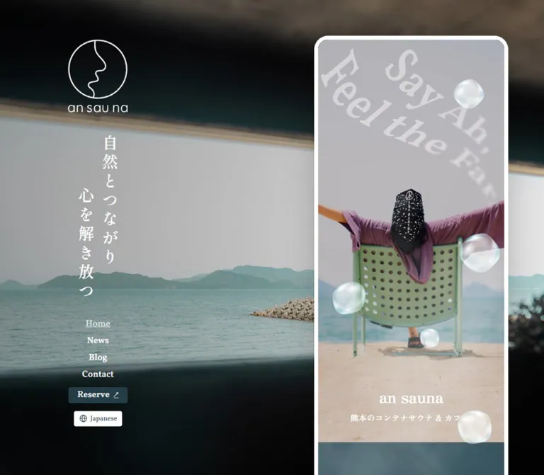
an sauna presents a seaside sauna and café through a calm but distinctive composition. A photograph looking out toward the sea fills the desktop viewport. Its dark architectural edges frame a pale horizon, white line-art identity, vertical Japanese copy, and a small navigation row. On the right, a white rounded outline contains a long, phone-width website. The broad landscape remains visually stable while different portions of that narrow story appear during scrolling.
The content column carries a second photographic world: a person reclining toward the sea, a perforated green chair, translucent bubbles, pale diagonal lettering, earthen interiors, water, and warm café materials. Japanese Mincho headings provide an expressive voice; Vollkorn supplies English section labels and navigation; compact Japanese sans-serif paragraphs handle practical information. On mobile, the surrounding desktop composition disappears and the story itself fills the screen.
This is a facility website with news, blog, contact, and reservation destinations. Preserve that information architecture alongside its atmospheric presentation.
How to Read This Reference
- Measured values are taken from the supplied rendered DOM and computed styles. Coordinates are CSS pixels and describe the sampled state.
- Calculated values are arithmetic derived from those measurements, such as navigation gaps or scale ratios.
- Visual estimates describe screenshot geometry or colors that lack a corresponding computed-style entry. They are approximations, not sampled source declarations.
- Recommendations describe a reusable implementation. Proposed breakpoints, scrolling controls, focus treatments, and feedback timings are not verified original behavior.
- Named tokens are descriptive aliases created for this reference. The evidence does not expose a reusable brand-token system.
- State-dependent geometry needs care: several desktop elements have bounding boxes consistent with
0.9×scaling while retaining larger computed font sizes. Do not convert those rectangles directly into smaller type tokens.
Tokens — Colors
Core Palette
| Name | Value | Suggested token | Evidence and role |
|---|---|---|---|
| Deep Sea Ink | #243d47 |
--color-ink |
Measured as rgb(36, 61, 71). Primary reservation fill, English headings on pale surfaces, and informational text. |
| White | #ffffff |
--color-white |
Measured text color and secondary-button background. Also visually matches the desktop frame and identity artwork. |
| Soft White | rgba(255, 255, 255, 0.8) |
--color-copy-on-dark |
Measured container-description text over the blue-green surface. |
| Current-Link White | rgba(255, 255, 255, 0.72) |
--color-current-link |
Measured Home link color; the screenshots also show an underline. |
| Quiet White | rgba(255, 255, 255, 0.5) |
--color-muted-on-dark |
Measured copyright color. |
| Water Blue | approximately #3c5862 |
--color-water |
Visual estimate for a fallback beneath the water-patterned sections. The visible texture varies in lightness and hue. |
| Warm Pale Surface | approximately #fff9f6 |
--color-paper |
Visual estimate from the pale content surface visible below the container section. |
| Window Shadow | approximately #080d0f |
--color-night |
Visual estimate for the darkest photographic surroundings; useful as an image-loading fallback. |
Palette Discipline
Deep Sea Ink is both a text color and an action color. Reservation links do not introduce an unrelated bright accent. White, muted white, and watery blue-green provide most of the interface hierarchy.
The lavender shirt, green chair, gray sky, sand, and warm interior wood belong to photography. They enrich the composition without becoming a collection of interface badge colors.
Some anchor wrappers report browser-default blue while their child labels explicitly render white or Deep Sea Ink. Similarly, the body reports a white background beneath the page composition. These raw wrapper values do not describe the visible action palette or the desktop photographic surround.
Tokens — Typography
Shippori Mincho B1 — Japanese Narrative
Measured family stack: "Shippori Mincho B1", "Shippori Mincho B1 Placeholder", serif.
This family carries the vertical desktop statement, large Japanese section headings, the three-container introduction, and reservation prose. Its fine strokes and generous heading leading make the text feel deliberate and spacious.
The desktop slogan is constructed from individually stacked character paragraphs in the supplied DOM. Its vertical character pitch is measured; a native vertical-writing declaration was not supplied.
Vollkorn — English Navigation and Section Labels
Measured family stack: Vollkorn, "Vollkorn Placeholder", serif.
Use Vollkorn at weight 600 for Home, News, Blog, Contact, Reserve, English section labels, dates, footer address text, and copyright. English labels remain compact: section titles are generally 32px, while ordinary navigation is 18px.
Zen Old Mincho — Hero Caption
Measured family stack: "Zen Old Mincho", "Zen Old Mincho Placeholder", serif.
The centered an sauna caption inside the photographic hero uses this family at 32px, weight 700. Its Japanese subtitle uses the same family at 16px, weight 700.
This caption is distinct from the rounded, monoline brand artwork in the desktop identity, mobile header, and footer. Do not replace those graphic marks with the hero-caption font.
Noto Sans JP — Practical Copy
Measured family stack: "Noto Sans JP", "Noto Sans JP Placeholder", sans-serif.
Container descriptions, address and route text, opening hours, and other facility information use this family. The main measured setting is 14px / 23.1px, weight 400, with 0.56px tracking.
The names above are computed family declarations. Font-file URLs and separate font-loading diagnostics were not supplied. The Quick Start retains the named families but requires appropriate font assets to reproduce their appearance.
Type Scale
| Role | Family | Size / line height | Weight | Tracking | Evidence |
|---|---|---|---|---|---|
| Desktop vertical slogan | Shippori Mincho B1 | 32px / 38.4px |
600 |
-1.6px, or -0.05em |
Measured per-character paragraphs |
| Main Japanese heading | Shippori Mincho B1 | 32px / 52.8px |
600 |
1.28px, or 0.04em |
Measured on both viewports |
| Three-container introduction | Shippori Mincho B1 | 24px / 39.6px |
700 |
-0.48px, or -0.02em |
Measured on both viewports |
| Reservation prose | Shippori Mincho B1 | 18px / 29.7px |
500 |
0.72px, or 0.04em |
Measured |
| Hero name | Zen Old Mincho | 32px / 35.2px |
700 |
Normal | Measured on both viewports |
| Hero subtitle | Zen Old Mincho | 16px / 19.2px |
700 |
0.64px, or 0.04em |
Measured on both viewports |
| English section label | Vollkorn | 32px / 32px |
600 |
Normal | Measured |
| Drink / Food subgroup label | Vollkorn | 24px / 24px |
600 |
-0.48px, or -0.02em |
Measured |
| Desktop navigation and large CTA label | Vollkorn | 18px / 18px |
600 |
Normal | Measured |
| Mobile header Reserve | Vollkorn | 14px / 14px |
600 |
Normal | Measured |
| News date and category | Vollkorn | 16px / 16px |
600 |
Normal | Measured |
| Container and information copy | Noto Sans JP | 14px / 23.1px |
400 |
0.56px, or 0.04em |
Measured |
| Information-table phone number | Noto Sans JP | 13px / 21.45px |
400 |
-0.26px, or -0.02em |
Measured |
| Footer postal address | Vollkorn | 15px / 18px |
600 |
Normal | Measured |
| Privacy and copyright text | Vollkorn | 18px / 27px |
600 |
Normal | Measured |
| Large footer telephone line | Serif appearance | approximately 24px |
Visually semibold | Unverified | Screenshot estimate; no matching computed entry |
The desktop introductory copy beside the sea appears approximately 18px with about 32px line spacing. Its exact computed typography was not included, so use that only as a visual estimate.
Tokens — Spacing & Shapes
Spacing Scale
The reusable rhythm is based on a small set of recurring distances, but no original global spacing scale was exposed.
| Distance | Observed use | Evidence |
|---|---|---|
8px |
Reservation label-to-icon gap; privacy link gap | Measured computed gap |
9px |
Internal news-entry stack gap | Measured computed gap |
16px |
Hero name-to-subtitle gap; news date-to-category gap; stacked reservation-button gap | Calculated from DOM rectangles |
24px |
Standard story text inset; mobile feature heading-to-media and media-to-copy gaps | Calculated from rectangles |
32px |
Desktop and footer navigation gaps; several footer utility intervals | Calculated from rectangles |
40px |
English News label to entry; news entry to News All button; hero caption bottom clearance | Calculated or corroborated by screenshots |
64px |
Copyright line box to footer logo link | Calculated on both viewports |
80px |
Mobile feature paragraph end to next feature heading | Calculated from the first and second feature groups |
160px |
News All button end to Experience label; last mobile feature copy to Cafe Menu label | Calculated section-boundary distance, not proof of a single padding declaration |
Shapes
| Element | Value | Evidence |
|---|---|---|
| Main action corners | 4px |
Measured border radius |
| Desktop story outline | approximately 8px white border |
Screenshot estimate consistent with inner-column geometry |
| Desktop story outer corners | approximately 28–32px |
Screenshot estimate |
| Gallery-photo corners | approximately 8–10px |
Screenshot estimate |
| Reservation panel corners | approximately 8px |
Screenshot estimate |
| Instagram link box | 40 × 40px |
Measured |
| Decorative bubbles | approximately 40–84px across |
Screenshot estimates; sizes and silhouettes vary |
Most content is arranged as open sections, text groups, and photographic strips. Small button radii and the larger enclosing frame provide enough shape hierarchy without a general card-elevation system.
Layout Measurements
| Element | Desktop 1440 × 1000 |
Mobile 390 × 844 |
Evidence |
|---|---|---|---|
| Document height | 14740.08px |
14715.95px |
Measured HTML rectangles |
| Story outer width | approximately 391px |
390px, full viewport |
Desktop screenshot estimate; mobile observed geometry |
| Story inner width | approximately 375px |
390px |
Desktop calculation consistent with measured text width and insets |
| Standard text width | 327px |
342px |
Measured on main heading and news elements |
| Constrained introduction width | 327px |
327px |
Measured Three Containers introduction |
| Story outer left edge | approximately 937px |
0px |
Screenshot geometry |
| Story right clearance | approximately 112px |
0px |
Screenshot geometry |
| Story top clearance | approximately 72px |
0px |
Screenshot geometry |
| Hero extent | approximately 810px inside the frame |
approximately 776.47px |
Visual boundary and caption/heading geometry |
| Header Reserve | 119 × 32px |
88 × 32px |
Measured |
| News All | 327 × 56px |
342 × 56px |
Measured |
| Mobile lower reservation buttons | — | 294 × 56px |
Measured |
| Footer logo link box | 362.84 × 45.97px |
381.30 × 48.31px |
Measured link rectangles; not native asset dimensions |
Components
Desktop Photographic Surround and Identity
Role: maintain place, identity, and primary navigation while the visitor reads the narrow content story.
The sea photograph fills the entire viewport. A broad, pale window opening cuts across dark structural surroundings, with distant mountains and a breakwater visible through it. The darkness may be present in the photograph, applied through overlays, or both; the supplied evidence does not separate those layers.
At the inspected desktop size, the white emblem begins around x = 176px, y = 210px. It combines a circular outline containing an organic profile-like line with a small rounded wordmark below. Its visible group is approximately 144px wide.
Two vertical Japanese lines sit to the right of the emblem. The right-hand line begins around y = 209px; the left-hand line begins approximately 106.56px lower. Their measured horizontal start positions are 446.40px and 398.40px, giving a 48px column pitch. The statement reads 自然とつながり、心を解き放つ。 across the composition.
Introductory copy sits lower in the identity area, followed by navigation near y = 799px. The same identity, copy, navigation, and sea view remain at the same visible positions across the supplied desktop scroll captures. This supports persistent positioning; the exact CSS mechanism was not included.
Desktop Navigation and Language Control
Role: provide site-level destinations without interrupting the landscape.
The row contains Home, News, Blog, Contact, Reserve, and a compact language control. Ordinary text links use white 18px Vollkorn at weight 600. Calculated gaps between the first navigation items are exactly 32px.
Home is underlined and uses white at 72% opacity in the captured current-page state. Reserve is a 119 × 32px Deep Sea Ink rectangle with 4px corners, a white label, and an external-arrow mark. The language control is a small white rectangle with a globe and Japanese as its visible selection.
The DOM exposes Japanese and English language options. Opening the selector and switching language were not demonstrated. Treat the visible control and available labels as evidence, without inventing its popup layout or translated-page behavior.
Mobile Header
Role: retain identity and reservation access after the desktop surround disappears.
The header overlays the top of the hero. It has a dark rounded wordmark at left, a Deep Sea Ink Reserve link toward the right, and a two-line menu icon at the far right. There is no opaque header strip in the opening capture.
The home-link box measures 192 × 48px at x = 0, y = 8. The visible logo is inset within it. Reserve measures 88 × 32px at x = 240, y = 16, with 14px Vollkorn text. The menu icon is visually about 20px wide; its interactive bounding box was not supplied.
The header is absent from the mobile bottom capture. Its exact scroll-persistence or hide behavior is unverified. The Quick Start places it over the hero without claiming a sticky-header implementation.
Photographic Hero
Role: express the feeling of outdoor rest before introducing practical information.
The portrait composition shows a person from behind, arms extended across a pale green perforated chair, facing the sea. A large gray sky area above the figure provides room for pale diagonal serif lettering. The lettering is partially cropped and softened toward one side; Say Ah, is legible, while the complete secondary phrase is not established by the captures.
Translucent, softly irregular bubbles overlap the photograph. Their bright rims, internal blur, and pale cyan highlights suggest refracted light. The asset structure is unknown: the photograph, lettering, and bubbles may be separate layers or partially combined artwork.
A centered caption sits near the bottom. The name uses 32px / 35.2px Zen Old Mincho; the subtitle 熊本のコンテナサウナ & カフェ uses 16px / 19.2px. There is a measured 16px gap between their line boxes and approximately 40px below the subtitle.
On mobile, the hero reaches about 776px down the page. On desktop, its approximately 810px inner height starts below the frame's top border. The figure and chair remain the focal point at both widths; crop the surrounding scene to fit while retaining the relationship between the raised arms, chair, horizon, and caption.
Introductory Narrative and Section Labels
Role: bridge the visual opening and the detailed facility story.
The first content heading repeats the core Japanese statement in horizontal lines on a blue-green surface. Its measured setting is 32px / 52.8px, weight 600, with 0.04em tracking. At mobile width it occupies a 342px text column with 24px side insets.
The DOM then supplies short Japanese paragraphs about connecting people and nature through sauna and sea. English labels such as News, Experience, Three Containers, Cafe Menu, Location, Information, and Reserve organize the long page. These labels use centered 32px / 32px Vollkorn.
There is substantial document distance between the opening statement and News: the mobile first heading begins at y = 856.47px, while News begins at y = 3180.50px. Intermediate visual composition is not fully shown in the supplied captures. This distance is not evidence for a single large blank spacer.
News Entry
Role: make updates available within the facility homepage.
The captured DOM contains one dated entry, with 2025/06/27, an Information category, and the title HPをリニューアルしました。. The entire entry links to the corresponding article.
Its anatomy is a metadata row above the Japanese title. The date and category use 16px / 16px Vollkorn with a calculated 16px horizontal gap. The linked entry uses a measured 9px internal gap and 16px bottom padding. Its total height is 65.75px at both inspected widths.
A full-width News All control follows after 40px. Its measured height is 56px, with an 18px white Vollkorn label and 4px corners. Detailed divider styling was not supplied; do not assume a particular rule pattern.
Experience and Three Containers
Role: explain the sauna, cold bath, and café as related material experiences.
Experience introduces the site's earth, fire, water, and light narrative. Three Containers then presents an introductory Japanese block at 24px / 39.6px, weight 700, in a 327px column on both viewports.
The three feature stories follow a shared sequence:
- An expressive two-line Japanese heading.
- A photographic strip.
- A compact explanatory paragraph.
The visible café feature includes oversized pale quotation marks around the heading, a warm interior photograph, a glimpse of the next image, and an angled 03. Cafe label across the photography. Text remains inset while the visible image strip reaches the story edges.
In the desktop middle capture, the first café image is approximately 244px wide and 280px tall, followed by an approximately 16px gap and a cropped next image. These are screenshot estimates. Mobile DOM media-section heights vary from 280px to approximately 293px, so one exact height should not be imposed on every original media group.
Feature paragraphs use Noto Sans JP at 14px / 23.1px, 0.04em tracking, and white at 80% opacity. The content names earthen walls and local herbs for the sauna, MORTEX for the white cold-bath space, and FRESCOLORI for the café walls. These are material references in the page copy.
Adjacent images establish an overflow-strip composition. Swiping, autoplay, arrows, pagination, and snapping were not exercised. Any interactive gallery behavior in a new implementation should be identified as an addition.
Café Menu
Role: present food and drink offerings and explain that the café also welcomes visitors who are not using the sauna.
The DOM establishes a Cafe Menu section followed by Drink Menu and Food Menu groups. The subgroup titles use 24px / 24px Vollkorn, -0.02em tracking, and separate hyphen marks on either side. Menu items include drinks, rice dishes, noodles, curry, and açaí bowls; some entries carry preparation-status text.
The supplied visual captures do not show this section's complete item arrangement. Product-photo crops, item columns, prices, and any card boundaries are therefore unverified. Preserve the measured heading system and grouping without inventing shopping-cart controls or an ecommerce product grid.
Location and Facility Information
Role: turn the atmosphere into usable visiting information.
Location combines a 32px English label with a large Japanese heading, descriptive prose, an address, and driving directions. The measured route/address text width is 287px, inset 40px within a 327px group. A map or its controls cannot be confirmed from the supplied captures and element sample.
Information lists the facility name, address, telephone number, Wednesday closure, four named daily sessions, pricing, and food/drink availability. Its measured value text width is 279px at both viewports. The body setting remains 14px / 23.1px; the phone-number value is a smaller 13px / 21.45px exception.
The captured price is 1人:4,000円(税込)/2時間半制. Treat this as observed page content at the capture date, not a permanent design token. Session names, hours, availability, and prices should remain editable content.
Reservation Panel
Role: explain the reservation requirement and offer two clear next steps.
A dark sauna-stone photograph fills the surrounding section. Inside it, a dark gray panel contains the English Reserve heading, short centered Japanese copy, and two stacked links. The panel has a dark-to-gray, translucent-looking appearance; its exact gradient, opacity, and any filtering are not established by the computed sample.
The primary Reserve link uses Deep Sea Ink with white text and an external-arrow mark. Contact uses white with Deep Sea Ink text and a fine dark outline. Both have measured 4px corners. On mobile they are 294 × 56px with a 16px gap and 24px panel-side insets.
Reserve points to https://lin.ee/NxUbXxP; Contact points to the site's /contact route. Destination URLs are observed anchor values. Neither a reservation flow nor a contact form was exercised.
Footer
Role: close the story with practical contact information and a large graphic signature.
The footer returns to a blue-green water-ripple surface. Its centered stack contains the postal address, a larger telephone line, Home / News / Blog / Contact, a white Instagram outline, Privacy Policy with an external arrow, the language control, copyright, and a nearly full-width rounded wordmark.
The address uses 15px / 18px Vollkorn. Navigation uses 18px / 18px with calculated 32px gaps. The Instagram anchor measures 40 × 40px. Several utility groups are separated by 32px, while the space between the copyright line box and the logo link is exactly 64px in both DOM samples.
The final wordmark sits close to the lower edge. On desktop, the white frame rounds around the end of the full story; on mobile, the frame is removed and the logo approaches the viewport edges. The desktop frame's top is absent in the middle capture, while its rounded bottom appears at the end. This is consistent with one long framed document rather than a permanently visible phone-shaped viewport.
Tokens — Motion & Interaction
| Treatment | Evidence | Limit of the observation |
|---|---|---|
| Persistent desktop identity | Background, logo, vertical copy, prose, and navigation retain their visible positions across desktop scroll captures | Fixed versus sticky positioning and the exact containing structure were not supplied |
| Story scrolling | Opening, middle, and bottom states show different portions of the right-hand document | Do not infer an independently scrolling iframe or nested scroll container |
| Scale-dependent content | Several desktop rectangles are consistent with 0.9× scale |
No transform declaration, trigger, duration, or easing was supplied |
| Hero bubbles | Bubbles are visible in opening compositions | Floating, cursor response, and perpetual animation are unverified |
| Water ripples | Ripple texture is visible in dark sections and footer | Static image versus moving media is unverified |
| Image strips | A full image and part of an adjacent image are visible | Swipe, autoplay, snapping, and controls are unverified |
| Home link state | Underline and 72% white are visible and measured |
This is a current-page state, not evidence of hover behavior |
| Reservation and navigation | Anchor destinations are supplied | Click outcomes and external flows were not tested |
| Mobile menu and language selector | Closed controls and language labels are present | Open states, focus behavior, and resulting navigation are unverified |
Interpreting the Scaled Rectangles
A sampled desktop feature width is 294.30px, exactly 0.9 × 327px. A media-section height is 252px, matching 0.9 × 280px. A two-line heading's rectangle is approximately 95.03px high while its unscaled line-box total is approximately 105.59px. A lower reservation button measures 50.4px high, matching 0.9 × 56px.
These relationships are consistent with a scale transform affecting a parent at sampling time. The later visual capture shows larger settled feature geometry, but the evidence does not establish a specific scroll-reveal implementation. Preserve the computed 32px heading and 14px paragraph settings; do not rewrite them as 28.8px and 12.6px merely to match one transformed rectangle.
The sampled text and link elements report animation: none; their transition field is reported as all without useful timing details. Neither field proves that the complete page has no animation. The capture process also pauses perpetual animations during readiness checks and resumes them afterward, which is a procedural limitation rather than evidence that a particular element animates.
Recommended adaptation: start with a fully readable static composition. If adding link feedback, use a brief 180ms opacity transition. If adding image-strip interaction, support touch and keyboard access. These choices are recommendations, not reconstructed source timings.
Surfaces
| Layer | Appearance | Purpose |
|---|---|---|
| Desktop surroundings | Full-viewport sea photograph with dark architectural framing | Establishes location and gives white identity elements a contrasting field |
| Story outline | Thick white edge with rounded outer corners | Makes the narrow document read as a distinct vertical object |
| Pale content surface | Warm, nearly white background with Deep Sea Ink text | Supports news, menu, location, and practical information |
| Water surface | Muted blue-green with visible ripples and white text | Connects the narrative, material stories, and footer |
| Photographic strips | Warm interiors, pale bath surfaces, and coastal imagery | Expresses each physical space through materials and light |
| Reservation enclosure | Dark gray panel over sauna stones | Separates booking copy and stacked actions from a detailed image |
| Action surfaces | Deep Sea Ink fill or white outlined alternative | Communicates priority without a new accent hue |
The translucent bubbles are imagery. They do not establish a general glass-interface style. Likewise, the reservation panel does not justify adding blur and floating cards throughout the page.
Imagery
The site relies on specific photographic relationships: a sea view through a dark opening, a relaxed figure facing away from the camera, the chair's perforations, muted shore colors, and tactile building materials. Preserve the ordinary details that make the place believable.
The hero image leaves generous sky above the figure. The arms extend toward the horizontal edges, the sea sits behind the chair, and the caption rests over the sandy lower area. A tighter face-focused crop would remove the sensation of looking outward with the subject.
The secondary photographs emphasize surfaces and light: pale bath walls and water, earthy sauna materials, and a warm café counter. The café strip includes a visible neighboring image rather than presenting each picture as an isolated centered card.
Observed Asset References
Asset URLs were not included in the evidence. The following table describes visible asset roles without inventing filenames or download paths.
| Asset role | Visible character | Reuse guidance |
|---|---|---|
| Desktop sea-window photograph | Dark interior edges, pale sea and sky, distant mountainous shoreline | Use a wide, high-resolution image and test its crop at the full desktop viewport |
| Hero portrait photograph | Rear-facing seated person, extended arms, green chair, sea, sand, large sky area | Preserve the subject's complete spatial relationship with the shoreline |
| Pale hero lettering | Large diagonal serif words, cropped and selectively softened | Use approved artwork; do not invent the obscured phrase |
| Bubble decoration | Softly irregular transparent forms with bright rims and cyan-white highlights | Prefer image assets with alpha transparency if supplied separately |
| Water-ripple texture | Low-contrast blue-green refracted lines | Keep contrast subordinate to overlaid text |
| Container photographs | Bath and café details are visible; sauna materials are described by the page | Use photography of the actual spaces when available |
| Sauna-stone photograph | Dark, rough stone texture around the reservation panel | Retain texture without overwhelming action labels |
| Identity graphics | White circular emblem and rounded wordmarks in white or Deep Sea Ink | Reuse approved vector or high-resolution artwork; no exact logo font was established |
Use normal photographic rendering rather than pixelation. Avoid making all photographs equally bright: the contrast between the dark desktop window and the pale hero is part of the composition. If artwork already includes lettering or bubbles, do not duplicate them as additional overlays.
Layout & Responsive Behavior
Desktop Composition
At 1440px wide, the story begins around x = 937px and leaves approximately 112px on the right. Its outer width is about 391px, including a visually estimated 8px frame on each side. This leaves a 375px interior and a measured 327px standard text column after 24px side insets.
The left identity is much wider than the story's reading area, but it remains sparse. The logo, staggered vertical slogan, short prose, and navigation form separate groups rather than a single dense block.
The page uses ordinary long-document geometry: the measured HTML height is over 14,700px. Preserve a single accessible reading sequence. An independently scrollable phone simulation is not required by the evidence.
Mobile Composition
At 390px, the desktop sea surround and left identity disappear. The white frame and desktop outer margins disappear as well. The story fills the viewport, and its ordinary text width increases from desktop 327px to mobile 342px because the inner canvas is 15px wider.
Most type sizes remain unchanged. The hero name is still 32px, its subtitle is still 16px, section labels are still 32px, and practical copy is still 14px. The clear measured type reduction is the header Reserve label, from desktop 18px to mobile 14px.
Some text blocks retain fixed narrower measures. The Three Containers introduction remains 327px wide and becomes centered with 31.5px margins. Location directions remain 287px wide within an inset group. Information values remain 279px wide. Responsive behavior therefore combines fluid section insets with selected constrained text groups.
Verified Positions
| Content landmark | Desktop document y | Mobile document y |
|---|---|---|
| First horizontal Japanese heading | 970.00px |
856.47px |
| News label | 3213.03px |
3180.50px |
| Experience label | 3606.78px |
3574.25px |
| Three Containers label | 5182.17px |
5149.64px |
| Cafe Menu label | 7870.45px |
7852.17px |
| Location label | 11177.67px |
11216.20px |
| Information label | 12332.14px |
12385.67px |
These positions describe the captured document, including its content, wrapping, media, and sampled states. They are reference landmarks, not coordinates to hardcode into a new page.
Unverified Responsive Rules
Only the two stated viewports were supplied. The exact breakpoint, tablet composition, intermediate navigation wrapping, landscape-phone behavior, and ultrawide limits are unknown.
The Quick Start proposes a 1280px desktop breakpoint and a narrow centered intermediate layout. Those are adaptation choices. It also uses a viewport-related mobile hero height to approximate the observed opening; the original hero-height formula was not provided.
Do’s and Don’ts
Do
- Keep Deep Sea Ink
#243d47as the main action and pale-surface text color. - Preserve the relationship between the wide desktop sea view and narrow framed story.
- Retain the staggered vertical Japanese slogan and its deliberate character spacing.
- Use Shippori Mincho B1, Vollkorn, Zen Old Mincho, and Noto Sans JP in their observed roles.
- Distinguish graphic wordmarks from the serif hero caption.
- Keep ordinary text inset by
24pxwhile allowing photography to reach the story edges. - Maintain generous section spacing and compact practical copy.
- Use the same booking color in the header and lower reservation panel.
- Preserve the warm interior photographs, muted coast, and dark stone texture.
- Keep important information available in the document even if optional reveals are added.
Don’t
- Don’t expand the story into a conventional wide desktop feature grid.
- Don’t reproduce the white phone frame around the mobile viewport.
- Don’t treat a transformed
0.9×rectangle as a smaller source font size. - Don’t replace the rounded brand graphics with an arbitrary sans-serif wordmark.
- Don’t turn photographic shirt and chair colors into unrelated UI accents.
- Don’t add a floating-card or glass-blur system throughout the page.
- Don’t invent bubble motion, gallery autoplay, menu states, or hover effects as original behavior.
- Don’t hardcode the full document height or large gaps between section coordinates.
- Don’t invent unobserved food photography, a shopping cart, or a map interface.
- Don’t make the narrow desktop story a trapped nested scroller without a functional reason.
Recommended Implementation Additions
These are recommendations for a new implementation, not verified features of the original page:
- Use one meaningful page-level heading and a logical section hierarchy. The supplied DOM includes several H1 elements and English labels rendered as paragraphs; visual fidelity does not require repeating that semantic structure.
- Give the vertical statement a coherent accessible reading order. Individual decorative character spans can be hidden from assistive technology when an equivalent complete sentence is provided.
- Give the mobile menu an accessible name, expanded state, keyboard behavior, and a clear way to close it.
- Provide a labeled language selector and expose its selected value programmatically.
- Enlarge the effective touch area of the visually
32pxheader reservation link without changing its compact appearance. - If galleries become interactive, support keyboard operation and provide discoverable controls or instructions; adjacent-image clipping alone is not sufficient guidance for every visitor.
- Add meaningful alternative text to informative photography and hide decorative bubbles, quotation marks, and repeated logos from redundant announcement.
- Check white text against the brightest parts of the water texture and dark-scene photography. A visual color estimate is not a contrast audit.
- Provide reduced-motion behavior for any added reveals or ambient animation. Content should remain visible when animation is disabled.
- Keep hours, prices, news, and preparation-status labels editable, and test long Japanese text and English translations within the narrow column.
Agent Prompt Guide
Quick Color Reference
- Exact primary ink and reservation fill:
#243d47. - Exact reversed text and secondary fill:
#ffffff. - Container paragraph text:
rgba(255,255,255,0.8). - Current Home link:
rgba(255,255,255,0.72)with underline. - Copyright:
rgba(255,255,255,0.5). - Approximate water fallback:
#3c5862. - Approximate pale surface:
#fff9f6. - Approximate dark photographic fallback:
#080d0f. - No separate bright conversion color.
Overall Prompt
“Create a coastal sauna and café homepage inspired by the observed an sauna composition. On wide desktop, place a persistent sea-window photograph behind a white circular identity mark, staggered vertical Japanese copy, short introductory prose, and a compact Vollkorn navigation row. Position a roughly 375px-wide content interior toward the right, enclosed by an approximately 8px white border with rounded outer corners. The story begins with a portrait photograph of a relaxed person facing the sea, pale diagonal lettering, translucent bubble artwork, and a small centered serif caption. Continue through narrative, news, three material-focused spaces, café offerings, location, facility details, reservation, and a water-textured footer. Use exact Deep Sea Ink #243d47, white, approximate warm pale surfaces, Shippori Mincho B1 Japanese headings, Vollkorn English labels, Zen Old Mincho hero captions, and Noto Sans JP practical copy. On mobile, remove the desktop surround and frame, use the full viewport width with 24px text insets, and overlay a compact logo, Reserve link, and menu icon on the hero. Keep unverified motion optional and the document readable without animation.”
Example Component Prompts
- Desktop identity: “Arrange a white circular line-art emblem at left, two 32px Mincho character columns beside it with a 48px column pitch and staggered top positions, then quiet Japanese prose and a horizontal serif navigation row below. Place everything over a dark-framed sea-window photograph.”
- Hero: “Create a portrait coastal hero with a rear-facing seated person, arms extended, a pale green perforated chair, a generous gray sky area, translucent bubble artwork, and partially cropped pale serif lettering. Place a 32px Zen Old Mincho name above a 16px subtitle, with 16px between them and about 40px below the caption.”
- Container feature: “On a muted water-blue surface, set a centered two-line Shippori Mincho B1 heading at 32px with 1.65 leading. Follow it with a photographic strip showing one warm interior image and part of the next, then 14px Noto Sans JP copy in 80% white. Keep text inset 24px and let imagery reach the story edges.”
- Reservation: “Place a restrained dark gray panel over sauna-stone photography. Stack a centered 32px Vollkorn label, 18px Mincho reservation copy, a 56px Deep Sea Ink booking link, and a matching white outlined contact link. Use 4px button corners and a 16px button gap.”
- Footer: “Build a centered blue-green water-textured footer with compact serif address text, a larger telephone line, four inline navigation links, a 40px Instagram mark, privacy and language controls, muted copyright, and a nearly edge-to-edge rounded wordmark at the bottom.”
Quick Start
CSS Custom Properties
This is an adaptation scaffold, not extracted source CSS. It preserves the measured type settings, standard insets, button geometry, and the desktop/mobile relationship. The 1280px breakpoint, intermediate 480px column cap, hero-height formula, gallery interaction, and feedback transition are recommendations. Water, paper, and night colors are visual estimates.
Load the four named font families through your project's approved font pipeline. Set the decorative image variables to available asset URLs. Hero photography and brand artwork should be supplied as image elements; no asset filenames are assumed here.
Suggested structure: a decorative .scene, a .desktop-aside, and a document-flow main.story. Inside the story, use .hero, ordinary .section blocks, .booking, and .site-footer. Classes below are new implementation aliases.
:root {
  /* Measured colors */
  --color-ink: #243d47;
  --color-white: #ffffff;
  --color-copy-on-dark: rgb(255 255 255 / 80%);
  --color-current-link: rgb(255 255 255 / 72%);
  --color-muted-on-dark: rgb(255 255 255 / 50%);

  /* Estimated visual fallbacks */
  --color-water: #3c5862;
  --color-paper: #fff9f6;
  --color-night: #080d0f;

  /* Observed family names; font files must be supplied separately */
  --font-jp-display: 'Shippori Mincho B1', serif;
  --font-en: 'Vollkorn', serif;
  --font-hero: 'Zen Old Mincho', serif;
  --font-body: 'Noto Sans JP', sans-serif;

  --text-section: 32px;
  --text-intro: 24px;
  --text-action: 18px;
  --text-copy: 14px;
  --leading-copy: 1.65;
  --tracking-copy: 0.04em;

  --space-8: 8px;
  --space-16: 16px;
  --space-24: 24px;
  --space-32: 32px;
  --space-40: 40px;
  --space-64: 64px;
  --space-80: 80px;

  --story-interior: 375px;
  --frame-width: 8px;
  --radius-frame: 28px;
  --radius-photo: 8px;
  --radius-button: 4px;

  /* Recommended feedback timing, not a measured original value */
  --motion-feedback: 180ms ease;

  /* Replacement slots for decorative assets */
  --image-coast: none;
  --image-water: none;
  --image-stones: none;
}

* {
  box-sizing: border-box;
}

body {
  margin: 0;
  color: var(--color-ink);
  background: var(--color-paper);
  font-family: var(--font-body);
  font-size: var(--text-copy);
  line-height: var(--leading-copy);
  letter-spacing: var(--tracking-copy);
}

img {
  display: block;
  max-inline-size: 100%;
}

button,
select {
  font: inherit;
}

a {
  color: inherit;
}

.scene,
.desktop-aside {
  display: none;
}

.story {
  position: relative;
  z-index: 2;
  inline-size: min(100%, 480px);
  margin-inline: auto;
  overflow: clip;
  background: var(--color-paper);
}

.hero {
  position: relative;
  isolation: isolate;
  display: flex;
  align-items: flex-end;
  justify-content: center;
  min-block-size: clamp(680px, 92svh, 900px);
  padding: 40px 24px;
  color: var(--color-white);
  background: var(--color-water);
}

.hero__photo {
  position: absolute;
  z-index: -1;
  inset: 0;
  inline-size: 100%;
  block-size: 100%;
  object-fit: cover;
  object-position: var(--hero-position, 50% 50%);
}

/* Use separate decoration only when it is not baked into the hero. */
.hero__decoration {
  position: absolute;
  inset: 0;
  overflow: hidden;
  pointer-events: none;
}

.bubble {
  position: absolute;
  inset-inline-start: var(--bubble-x, 75%);
  inset-block-start: var(--bubble-y, 12%);
  inline-size: var(--bubble-size, 64px);
}

.hero__caption {
  position: relative;
  z-index: 1;
  text-align: center;
}

.hero__title {
  margin: 0;
  font: 700 32px / 1.1 var(--font-hero);
  letter-spacing: normal;
}

.hero__subtitle {
  margin: 16px 0 0;
  font: 700 16px / 1.2 var(--font-hero);
  letter-spacing: 0.04em;
}

.mobile-header {
  position: absolute;
  z-index: 3;
  inset: 0 0 auto;
  display: grid;
  grid-template-columns: minmax(0, 1fr) 88px 40px;
  align-items: center;
  gap: 12px;
  block-size: 64px;
  padding-inline-end: 10px;
  color: var(--color-ink);
}

.mobile-brand {
  display: flex;
  align-items: center;
  inline-size: 192px;
  block-size: 48px;
  padding-inline: 24px;
}

.mobile-brand img {
  inline-size: 144px;
}

.button {
  position: relative;
  display: inline-flex;
  align-items: center;
  justify-content: center;
  gap: 8px;
  min-block-size: 56px;
  padding: 12px 18px;
  border: 0;
  border-radius: var(--radius-button);
  color: var(--color-white);
  background: var(--color-ink);
  font: 600 18px / 1 var(--font-en);
  letter-spacing: normal;
  text-decoration: none;
  transition: opacity var(--motion-feedback);
}

.button--outline {
  border: 2px solid var(--color-ink);
  color: var(--color-ink);
  background: var(--color-white);
}

.mobile-header .button {
  inline-size: 88px;
  min-block-size: 32px;
  padding: 0;
  font-size: 14px;
}

/* Recommended larger hit area around the compact visual button. */
.mobile-header .button::after {
  content: '';
  position: absolute;
  inset: -6px 0;
}

.menu-button {
  position: relative;
  inline-size: 40px;
  block-size: 44px;
  padding: 0;
  border: 0;
  color: inherit;
  background: transparent;
  cursor: pointer;
}

.menu-button::before,
.menu-button::after {
  content: '';
  position: absolute;
  inset-inline: 10px;
  block-size: 1.5px;
  background: currentColor;
}

.menu-button::before {
  inset-block-start: 18px;
}

.menu-button::after {
  inset-block-start: 24px;
}

.section {
  padding: 80px 24px;
}

.section--water,
.site-footer {
  color: var(--color-white);
  background-color: var(--color-water);
  background-image: var(--image-water);
  background-size: cover;
  background-position: center;
}

.section__label {
  margin: 0 0 40px;
  font: 600 32px / 1 var(--font-en);
  letter-spacing: normal;
  text-align: center;
}

.editorial-title {
  margin: 0 0 24px;
  font: 600 32px / 1.65 var(--font-jp-display);
  letter-spacing: 0.04em;
  text-wrap: balance;
}

.intro-statement {
  max-inline-size: 327px;
  margin-inline: auto;
  font: 700 24px / 1.65 var(--font-jp-display);
  letter-spacing: -0.02em;
}

.body-copy {
  margin: 0;
  font: 400 14px / 1.65 var(--font-body);
  letter-spacing: 0.04em;
}

.section--water .body-copy {
  color: var(--color-copy-on-dark);
}

.news-entry {
  display: flex;
  flex-direction: column;
  gap: 9px;
  padding-block-end: 16px;
  text-decoration: none;
}

.news-entry__meta {
  display: flex;
  flex-wrap: wrap;
  gap: 16px;
  font: 600 16px / 1 var(--font-en);
  letter-spacing: normal;
}

.news-action {
  inline-size: 100%;
  margin-block-start: 40px;
}

.feature + .feature {
  margin-block-start: 80px;
}

.feature .editorial-title {
  text-align: center;
}

/* Interactive overflow is an addition; original gestures are unverified. */
.feature__photos {
  display: flex;
  gap: 16px;
  margin: 24px -24px;
  overflow-x: auto;
  scroll-snap-type: x proximity;
}

.feature__photos figure {
  position: relative;
  flex: 0 0 244px;
  margin: 0;
  scroll-snap-align: start;
}

.feature__photos img {
  inline-size: 100%;
  block-size: 280px;
  border-radius: var(--radius-photo);
  object-fit: cover;
}

.menu-group__title {
  margin: 0 0 32px;
  font: 600 24px / 1 var(--font-en);
  letter-spacing: -0.02em;
  text-align: center;
}

.location-copy {
  max-inline-size: 327px;
  margin-inline: auto;
  padding-inline-start: 40px;
}

.info-list {
  inline-size: min(100%, 327px);
  margin: 0;
  padding: 24px;
}

.info-list dt {
  font-weight: 600;
}

.info-list dd {
  margin: 8px 0 32px;
}

.booking {
  padding: 120px 24px;
  color: var(--color-white);
  background-color: var(--color-night);
  background-image: var(--image-stones);
  background-position: center;
  background-size: cover;
}

.booking__panel {
  padding: 40px 24px;
  border-radius: 8px;
  background: linear-gradient(
    110deg,
    rgb(8 11 12 / 92%),
    rgb(77 77 77 / 88%)
  );
  text-align: center;
}

.booking__copy {
  max-inline-size: 279px;
  margin-inline: auto;
  font: 500 18px / 1.65 var(--font-jp-display);
  letter-spacing: 0.04em;
}

.booking__actions {
  display: grid;
  gap: 16px;
  margin-block-start: 24px;
}

.site-footer {
  padding-block-start: 80px;
  text-align: center;
}

.footer__address {
  margin: 0 40px;
  font: 600 15px / 1.2 var(--font-en);
  letter-spacing: normal;
}

.footer__phone {
  margin: 24px 0;
  font: 600 24px / 1 var(--font-en);
  letter-spacing: normal;
}

.primary-nav,
.footer-nav {
  display: flex;
  align-items: center;
  gap: 32px;
  font: 600 18px / 1 var(--font-en);
  letter-spacing: normal;
}

.footer-nav {
  flex-wrap: wrap;
  justify-content: center;
}

.primary-nav a,
.footer-nav a {
  text-decoration: none;
}

.primary-nav a[aria-current='page'],
.footer-nav a[aria-current='page'] {
  color: var(--color-current-link);
  text-decoration: underline;
  text-underline-offset: 2px;
}

.footer__social {
  display: block;
  inline-size: 40px;
  block-size: 40px;
  margin: 32px auto 0;
}

.footer__privacy {
  display: inline-flex;
  align-items: center;
  justify-content: center;
  gap: 8px;
  margin-block-start: 32px;
  font: 600 18px / 1.5 var(--font-en);
  letter-spacing: normal;
  text-decoration: none;
}

.language-control {
  display: inline-flex;
  align-items: center;
  gap: 8px;
  min-block-size: 32px;
  padding: 6px 10px;
  border: 0;
  border-radius: 3px;
  color: var(--color-ink);
  background: var(--color-white);
  font: 400 14px / 1.2 var(--font-en);
  letter-spacing: normal;
}

.footer__language {
  margin-block-start: 32px;
}

.footer__copyright {
  margin: 32px 24px 0;
  color: var(--color-muted-on-dark);
  font: 600 18px / 1.5 var(--font-en);
  letter-spacing: normal;
}

.footer__logo {
  display: block;
  inline-size: 98%;
  margin: 64px auto 0;
}

/* Recommended breakpoint; only 1440px and 390px were inspected. */
@media (min-width: 1280px) {
  .scene {
    position: fixed;
    z-index: 0;
    inset: 0;
    display: block;
    background-color: var(--color-night);
    background-image: var(--image-coast);
    background-position: center;
    background-size: cover;
    pointer-events: none;
  }

  .story {
    inline-size: calc(var(--story-interior) + 2 * var(--frame-width));
    margin-block: 72px;
    margin-inline: auto min(7.7778vw, 160px);
    border: var(--frame-width) solid var(--color-white);
    border-radius: var(--radius-frame);
  }

  .hero {
    min-block-size: 810px;
  }

  .mobile-header {
    display: none;
  }

  .desktop-aside {
    position: fixed;
    z-index: 1;
    inset-inline-start: 12.18vw;
    inset-block-start: clamp(24px, calc(50svh - 291px), 209px);
    display: block;
    inline-size: 572px;
    color: var(--color-white);
  }

  .desktop-aside__identity {
    position: relative;
    block-size: 338px;
  }

  .desktop-aside__logo {
    inline-size: 144px;
  }

  .desktop-aside__slogan {
    position: absolute;
    inset-block-start: 0;
    inset-inline-start: 223px;
    display: flex;
    align-items: flex-start;
    gap: 16px;
    font: 600 32px / 1.2 var(--font-jp-display);
    letter-spacing: -0.05em;
  }

  .slogan__line--lower {
    margin-block-start: 106.56px;
  }

  .slogan__character {
    display: block;
    inline-size: 32px;
    block-size: 38.4px;
  }

  /* Approximation: this paragraph's exact computed style was absent. */
  .desktop-aside__copy {
    margin-block: 40px;
    font: 500 18px / 1.8 var(--font-jp-display);
    letter-spacing: 0.04em;
  }

  .desktop-aside__copy p {
    margin: 0;
  }

  .desktop-aside__copy p + p {
    margin-block-start: 8px;
  }

  .primary-nav .button {
    inline-size: 119px;
    min-block-size: 32px;
    padding: 0;
  }
}

/* Recommended interaction and accessibility additions. */
@media (hover: hover) {
  .button:hover {
    opacity: 0.85;
  }
}

:where(a, button, select):focus-visible {
  outline: 2px solid var(--color-ink);
  outline-offset: 3px;
  box-shadow: 0 0 0 5px var(--color-white);
}

@media (prefers-reduced-motion: reduce) {
  .button {
    transition: none;
  }

  .feature__photos {
    scroll-behavior: auto;
  }
}
The scaffold keeps the story in document flow and its desktop identity outside that flow. It does not implement a mobile menu, translation, booking service, or animation controller. Those require separate behavior and testing. The gallery, menu items, intermediate editorial imagery, and exact photographic crops need content-specific markup rather than fabricated placeholders presented as source assets.
Tailwind v4 Token Mapping
Optional aliases for a project already using Tailwind v4. This is not evidence that the original page uses Tailwind. Define the properties above before using this mapping.
@theme inline {
  --color-sea-ink: var(--color-ink);
  --color-water-surface: var(--color-water);
  --color-warm-surface: var(--color-paper);
  --color-photo-shadow: var(--color-night);
  --color-copy-reversed: var(--color-copy-on-dark);

  --font-narrative: var(--font-jp-display);
  --font-english: var(--font-en);
  --font-hero-caption: var(--font-hero);
  --font-practical: var(--font-body);

  --text-section-label: 32px;
  --text-introduction: 24px;
  --text-action-label: 18px;
  --text-practical-copy: 14px;

  --spacing-story-inset: 24px;
  --spacing-section-inset: 80px;
  --spacing-photo-gap: 16px;

  --radius-story-frame: var(--radius-frame);
  --radius-action: var(--radius-button);
  --radius-photograph: var(--radius-photo);
}
Sources & Evidence
- an sauna — original and final homepage: authority for the current page identity, visible composition, rendered copy, link destinations, and supplied computed-style measurements. The response status was 200 and no URL change was recorded.
- Capture date:
2026-09-12T16:36:06.961Z, corresponding to September 13, 2026, 01:36 JST. - Desktop evidence:
1440 × 1000CSS pixels; supplied opening, container-detail, and bottom captures; rendered DOM and element measurements; document height approximately14740.08px. - Mobile evidence:
390 × 844CSS pixels; supplied opening and bottom captures; rendered DOM and element measurements; document height approximately14715.95px. - Inspection procedure: the supplied browser observation waited for initial loading, finite visible or potentially revealing motion, sampled layout/text stability, and visible-image decoding within bounded time limits. Scroll traversal included intermediate positions. Perpetual animations were paused during readiness checks and resumed afterward. SharedWorkers and service workers were disabled.
- Interaction scope: scroll-position captures and rendered anchor/control evidence were available. No menu opening, language change, gallery gesture, hover sequence, reservation completion, or linked-page inspection was supplied.
- Limits: exact asset URLs, complete stylesheets, breakpoint rules, transform declarations, animation timings, and some intermediate visual sections were unavailable. Visual estimates and implementation recommendations are labeled throughout. No commands, additional browsing, or local-file inspection were used to extend the supplied evidence.
This reference describes the current homepage represented by those captures and measurements. Its CSS and prompts are reusable adaptations, with unverified behavior kept separate from observed design.
# an sauna — Style Reference

> A sea-facing window surrounds a slender coastal story in white, deep teal, and Japanese Mincho type.

**Original URL:** [https://ansauna.the-panese.jp/](https://ansauna.the-panese.jp/)
**Final URL:** [https://ansauna.the-panese.jp/](https://ansauna.the-panese.jp/)
**Status:** HTTP 200; original and final URLs are identical.
**Theme:** dark photographic desktop surroundings, alternating pale and blue-green content sections, and white reversed typography. No selectable visual theme was demonstrated.
**Inspected:** September 13, 2026, at 01:36 JST, through supplied browser evidence. Capture timestamp: `2026-09-12T16:36:06.961Z`.
**Viewports:** desktop `1440 × 1000` and mobile `390 × 844` CSS pixels.
**Scope:** the current facility homepage, including its opening composition, introduction, news, experience narrative, three container spaces, café menu, location, facility information, reservation section, and footer. Visual captures cover the desktop opening, a container-detail position, and the bottom; mobile captures cover the opening and bottom. Rendered DOM evidence supplies additional content and measurements throughout the document. Linked pages and external destinations were not inspected.

an sauna presents a seaside sauna and café through a calm but distinctive composition. A photograph looking out toward the sea fills the desktop viewport. Its dark architectural edges frame a pale horizon, white line-art identity, vertical Japanese copy, and a small navigation row. On the right, a white rounded outline contains a long, phone-width website. The broad landscape remains visually stable while different portions of that narrow story appear during scrolling.

The content column carries a second photographic world: a person reclining toward the sea, a perforated green chair, translucent bubbles, pale diagonal lettering, earthen interiors, water, and warm café materials. Japanese Mincho headings provide an expressive voice; Vollkorn supplies English section labels and navigation; compact Japanese sans-serif paragraphs handle practical information. On mobile, the surrounding desktop composition disappears and the story itself fills the screen.

This is a facility website with news, blog, contact, and reservation destinations. Preserve that information architecture alongside its atmospheric presentation.

## How to Read This Reference

- **Measured values** are taken from the supplied rendered DOM and computed styles. Coordinates are CSS pixels and describe the sampled state.
- **Calculated values** are arithmetic derived from those measurements, such as navigation gaps or scale ratios.
- **Visual estimates** describe screenshot geometry or colors that lack a corresponding computed-style entry. They are approximations, not sampled source declarations.
- **Recommendations** describe a reusable implementation. Proposed breakpoints, scrolling controls, focus treatments, and feedback timings are not verified original behavior.
- **Named tokens** are descriptive aliases created for this reference. The evidence does not expose a reusable brand-token system.
- **State-dependent geometry needs care:** several desktop elements have bounding boxes consistent with `0.9×` scaling while retaining larger computed font sizes. Do not convert those rectangles directly into smaller type tokens.

## Tokens — Colors

### Core Palette

| Name | Value | Suggested token | Evidence and role |
| --- | --- | --- | --- |
| Deep Sea Ink | `#243d47` | `--color-ink` | Measured as `rgb(36, 61, 71)`. Primary reservation fill, English headings on pale surfaces, and informational text. |
| White | `#ffffff` | `--color-white` | Measured text color and secondary-button background. Also visually matches the desktop frame and identity artwork. |
| Soft White | `rgba(255, 255, 255, 0.8)` | `--color-copy-on-dark` | Measured container-description text over the blue-green surface. |
| Current-Link White | `rgba(255, 255, 255, 0.72)` | `--color-current-link` | Measured Home link color; the screenshots also show an underline. |
| Quiet White | `rgba(255, 255, 255, 0.5)` | `--color-muted-on-dark` | Measured copyright color. |
| Water Blue | approximately `#3c5862` | `--color-water` | Visual estimate for a fallback beneath the water-patterned sections. The visible texture varies in lightness and hue. |
| Warm Pale Surface | approximately `#fff9f6` | `--color-paper` | Visual estimate from the pale content surface visible below the container section. |
| Window Shadow | approximately `#080d0f` | `--color-night` | Visual estimate for the darkest photographic surroundings; useful as an image-loading fallback. |

### Palette Discipline

Deep Sea Ink is both a text color and an action color. Reservation links do not introduce an unrelated bright accent. White, muted white, and watery blue-green provide most of the interface hierarchy.

The lavender shirt, green chair, gray sky, sand, and warm interior wood belong to photography. They enrich the composition without becoming a collection of interface badge colors.

Some anchor wrappers report browser-default blue while their child labels explicitly render white or Deep Sea Ink. Similarly, the body reports a white background beneath the page composition. These raw wrapper values do not describe the visible action palette or the desktop photographic surround.

## Tokens — Typography

### Shippori Mincho B1 — Japanese Narrative

**Measured family stack:** `"Shippori Mincho B1", "Shippori Mincho B1 Placeholder", serif`.

This family carries the vertical desktop statement, large Japanese section headings, the three-container introduction, and reservation prose. Its fine strokes and generous heading leading make the text feel deliberate and spacious.

The desktop slogan is constructed from individually stacked character paragraphs in the supplied DOM. Its vertical character pitch is measured; a native vertical-writing declaration was not supplied.

### Vollkorn — English Navigation and Section Labels

**Measured family stack:** `Vollkorn, "Vollkorn Placeholder", serif`.

Use Vollkorn at weight `600` for Home, News, Blog, Contact, Reserve, English section labels, dates, footer address text, and copyright. English labels remain compact: section titles are generally `32px`, while ordinary navigation is `18px`.

### Zen Old Mincho — Hero Caption

**Measured family stack:** `"Zen Old Mincho", "Zen Old Mincho Placeholder", serif`.

The centered `an sauna` caption inside the photographic hero uses this family at `32px`, weight `700`. Its Japanese subtitle uses the same family at `16px`, weight `700`.

This caption is distinct from the rounded, monoline brand artwork in the desktop identity, mobile header, and footer. Do not replace those graphic marks with the hero-caption font.

### Noto Sans JP — Practical Copy

**Measured family stack:** `"Noto Sans JP", "Noto Sans JP Placeholder", sans-serif`.

Container descriptions, address and route text, opening hours, and other facility information use this family. The main measured setting is `14px / 23.1px`, weight `400`, with `0.56px` tracking.

The names above are computed family declarations. Font-file URLs and separate font-loading diagnostics were not supplied. The Quick Start retains the named families but requires appropriate font assets to reproduce their appearance.

### Type Scale

| Role | Family | Size / line height | Weight | Tracking | Evidence |
| --- | --- | --- | --- | --- | --- |
| Desktop vertical slogan | Shippori Mincho B1 | `32px / 38.4px` | `600` | `-1.6px`, or `-0.05em` | Measured per-character paragraphs |
| Main Japanese heading | Shippori Mincho B1 | `32px / 52.8px` | `600` | `1.28px`, or `0.04em` | Measured on both viewports |
| Three-container introduction | Shippori Mincho B1 | `24px / 39.6px` | `700` | `-0.48px`, or `-0.02em` | Measured on both viewports |
| Reservation prose | Shippori Mincho B1 | `18px / 29.7px` | `500` | `0.72px`, or `0.04em` | Measured |
| Hero name | Zen Old Mincho | `32px / 35.2px` | `700` | Normal | Measured on both viewports |
| Hero subtitle | Zen Old Mincho | `16px / 19.2px` | `700` | `0.64px`, or `0.04em` | Measured on both viewports |
| English section label | Vollkorn | `32px / 32px` | `600` | Normal | Measured |
| Drink / Food subgroup label | Vollkorn | `24px / 24px` | `600` | `-0.48px`, or `-0.02em` | Measured |
| Desktop navigation and large CTA label | Vollkorn | `18px / 18px` | `600` | Normal | Measured |
| Mobile header Reserve | Vollkorn | `14px / 14px` | `600` | Normal | Measured |
| News date and category | Vollkorn | `16px / 16px` | `600` | Normal | Measured |
| Container and information copy | Noto Sans JP | `14px / 23.1px` | `400` | `0.56px`, or `0.04em` | Measured |
| Information-table phone number | Noto Sans JP | `13px / 21.45px` | `400` | `-0.26px`, or `-0.02em` | Measured |
| Footer postal address | Vollkorn | `15px / 18px` | `600` | Normal | Measured |
| Privacy and copyright text | Vollkorn | `18px / 27px` | `600` | Normal | Measured |
| Large footer telephone line | Serif appearance | approximately `24px` | Visually semibold | Unverified | Screenshot estimate; no matching computed entry |

The desktop introductory copy beside the sea appears approximately `18px` with about `32px` line spacing. Its exact computed typography was not included, so use that only as a visual estimate.

## Tokens — Spacing & Shapes

### Spacing Scale

The reusable rhythm is based on a small set of recurring distances, but no original global spacing scale was exposed.

| Distance | Observed use | Evidence |
| --- | --- | --- |
| `8px` | Reservation label-to-icon gap; privacy link gap | Measured computed gap |
| `9px` | Internal news-entry stack gap | Measured computed gap |
| `16px` | Hero name-to-subtitle gap; news date-to-category gap; stacked reservation-button gap | Calculated from DOM rectangles |
| `24px` | Standard story text inset; mobile feature heading-to-media and media-to-copy gaps | Calculated from rectangles |
| `32px` | Desktop and footer navigation gaps; several footer utility intervals | Calculated from rectangles |
| `40px` | English News label to entry; news entry to News All button; hero caption bottom clearance | Calculated or corroborated by screenshots |
| `64px` | Copyright line box to footer logo link | Calculated on both viewports |
| `80px` | Mobile feature paragraph end to next feature heading | Calculated from the first and second feature groups |
| `160px` | News All button end to Experience label; last mobile feature copy to Cafe Menu label | Calculated section-boundary distance, not proof of a single padding declaration |

### Shapes

| Element | Value | Evidence |
| --- | --- | --- |
| Main action corners | `4px` | Measured border radius |
| Desktop story outline | approximately `8px` white border | Screenshot estimate consistent with inner-column geometry |
| Desktop story outer corners | approximately `28–32px` | Screenshot estimate |
| Gallery-photo corners | approximately `8–10px` | Screenshot estimate |
| Reservation panel corners | approximately `8px` | Screenshot estimate |
| Instagram link box | `40 × 40px` | Measured |
| Decorative bubbles | approximately `40–84px` across | Screenshot estimates; sizes and silhouettes vary |

Most content is arranged as open sections, text groups, and photographic strips. Small button radii and the larger enclosing frame provide enough shape hierarchy without a general card-elevation system.

### Layout Measurements

| Element | Desktop `1440 × 1000` | Mobile `390 × 844` | Evidence |
| --- | --- | --- | --- |
| Document height | `14740.08px` | `14715.95px` | Measured HTML rectangles |
| Story outer width | approximately `391px` | `390px`, full viewport | Desktop screenshot estimate; mobile observed geometry |
| Story inner width | approximately `375px` | `390px` | Desktop calculation consistent with measured text width and insets |
| Standard text width | `327px` | `342px` | Measured on main heading and news elements |
| Constrained introduction width | `327px` | `327px` | Measured Three Containers introduction |
| Story outer left edge | approximately `937px` | `0px` | Screenshot geometry |
| Story right clearance | approximately `112px` | `0px` | Screenshot geometry |
| Story top clearance | approximately `72px` | `0px` | Screenshot geometry |
| Hero extent | approximately `810px` inside the frame | approximately `776.47px` | Visual boundary and caption/heading geometry |
| Header Reserve | `119 × 32px` | `88 × 32px` | Measured |
| News All | `327 × 56px` | `342 × 56px` | Measured |
| Mobile lower reservation buttons | — | `294 × 56px` | Measured |
| Footer logo link box | `362.84 × 45.97px` | `381.30 × 48.31px` | Measured link rectangles; not native asset dimensions |

## Components

### Desktop Photographic Surround and Identity

**Role:** maintain place, identity, and primary navigation while the visitor reads the narrow content story.

The sea photograph fills the entire viewport. A broad, pale window opening cuts across dark structural surroundings, with distant mountains and a breakwater visible through it. The darkness may be present in the photograph, applied through overlays, or both; the supplied evidence does not separate those layers.

At the inspected desktop size, the white emblem begins around `x = 176px`, `y = 210px`. It combines a circular outline containing an organic profile-like line with a small rounded wordmark below. Its visible group is approximately `144px` wide.

Two vertical Japanese lines sit to the right of the emblem. The right-hand line begins around `y = 209px`; the left-hand line begins approximately `106.56px` lower. Their measured horizontal start positions are `446.40px` and `398.40px`, giving a `48px` column pitch. The statement reads `自然とつながり、心を解き放つ。` across the composition.

Introductory copy sits lower in the identity area, followed by navigation near `y = 799px`. The same identity, copy, navigation, and sea view remain at the same visible positions across the supplied desktop scroll captures. This supports persistent positioning; the exact CSS mechanism was not included.

### Desktop Navigation and Language Control

**Role:** provide site-level destinations without interrupting the landscape.

The row contains Home, News, Blog, Contact, Reserve, and a compact language control. Ordinary text links use white `18px` Vollkorn at weight `600`. Calculated gaps between the first navigation items are exactly `32px`.

Home is underlined and uses white at `72%` opacity in the captured current-page state. Reserve is a `119 × 32px` Deep Sea Ink rectangle with `4px` corners, a white label, and an external-arrow mark. The language control is a small white rectangle with a globe and Japanese as its visible selection.

The DOM exposes Japanese and English language options. Opening the selector and switching language were not demonstrated. Treat the visible control and available labels as evidence, without inventing its popup layout or translated-page behavior.

### Mobile Header

**Role:** retain identity and reservation access after the desktop surround disappears.

The header overlays the top of the hero. It has a dark rounded wordmark at left, a Deep Sea Ink Reserve link toward the right, and a two-line menu icon at the far right. There is no opaque header strip in the opening capture.

The home-link box measures `192 × 48px` at `x = 0`, `y = 8`. The visible logo is inset within it. Reserve measures `88 × 32px` at `x = 240`, `y = 16`, with `14px` Vollkorn text. The menu icon is visually about `20px` wide; its interactive bounding box was not supplied.

The header is absent from the mobile bottom capture. Its exact scroll-persistence or hide behavior is unverified. The Quick Start places it over the hero without claiming a sticky-header implementation.

### Photographic Hero

**Role:** express the feeling of outdoor rest before introducing practical information.

The portrait composition shows a person from behind, arms extended across a pale green perforated chair, facing the sea. A large gray sky area above the figure provides room for pale diagonal serif lettering. The lettering is partially cropped and softened toward one side; `Say Ah,` is legible, while the complete secondary phrase is not established by the captures.

Translucent, softly irregular bubbles overlap the photograph. Their bright rims, internal blur, and pale cyan highlights suggest refracted light. The asset structure is unknown: the photograph, lettering, and bubbles may be separate layers or partially combined artwork.

A centered caption sits near the bottom. The name uses `32px / 35.2px` Zen Old Mincho; the subtitle `熊本のコンテナサウナ & カフェ` uses `16px / 19.2px`. There is a measured `16px` gap between their line boxes and approximately `40px` below the subtitle.

On mobile, the hero reaches about `776px` down the page. On desktop, its approximately `810px` inner height starts below the frame's top border. The figure and chair remain the focal point at both widths; crop the surrounding scene to fit while retaining the relationship between the raised arms, chair, horizon, and caption.

### Introductory Narrative and Section Labels

**Role:** bridge the visual opening and the detailed facility story.

The first content heading repeats the core Japanese statement in horizontal lines on a blue-green surface. Its measured setting is `32px / 52.8px`, weight `600`, with `0.04em` tracking. At mobile width it occupies a `342px` text column with `24px` side insets.

The DOM then supplies short Japanese paragraphs about connecting people and nature through sauna and sea. English labels such as News, Experience, Three Containers, Cafe Menu, Location, Information, and Reserve organize the long page. These labels use centered `32px / 32px` Vollkorn.

There is substantial document distance between the opening statement and News: the mobile first heading begins at `y = 856.47px`, while News begins at `y = 3180.50px`. Intermediate visual composition is not fully shown in the supplied captures. This distance is not evidence for a single large blank spacer.

### News Entry

**Role:** make updates available within the facility homepage.

The captured DOM contains one dated entry, with `2025/06/27`, an Information category, and the title `HPをリニューアルしました。`. The entire entry links to the corresponding article.

Its anatomy is a metadata row above the Japanese title. The date and category use `16px / 16px` Vollkorn with a calculated `16px` horizontal gap. The linked entry uses a measured `9px` internal gap and `16px` bottom padding. Its total height is `65.75px` at both inspected widths.

A full-width News All control follows after `40px`. Its measured height is `56px`, with an `18px` white Vollkorn label and `4px` corners. Detailed divider styling was not supplied; do not assume a particular rule pattern.

### Experience and Three Containers

**Role:** explain the sauna, cold bath, and café as related material experiences.

Experience introduces the site's earth, fire, water, and light narrative. Three Containers then presents an introductory Japanese block at `24px / 39.6px`, weight `700`, in a `327px` column on both viewports.

The three feature stories follow a shared sequence:

1. An expressive two-line Japanese heading.
2. A photographic strip.
3. A compact explanatory paragraph.

The visible café feature includes oversized pale quotation marks around the heading, a warm interior photograph, a glimpse of the next image, and an angled `03. Cafe` label across the photography. Text remains inset while the visible image strip reaches the story edges.

In the desktop middle capture, the first café image is approximately `244px` wide and `280px` tall, followed by an approximately `16px` gap and a cropped next image. These are screenshot estimates. Mobile DOM media-section heights vary from `280px` to approximately `293px`, so one exact height should not be imposed on every original media group.

Feature paragraphs use Noto Sans JP at `14px / 23.1px`, `0.04em` tracking, and white at `80%` opacity. The content names earthen walls and local herbs for the sauna, MORTEX for the white cold-bath space, and FRESCOLORI for the café walls. These are material references in the page copy.

Adjacent images establish an overflow-strip composition. Swiping, autoplay, arrows, pagination, and snapping were not exercised. Any interactive gallery behavior in a new implementation should be identified as an addition.

### Café Menu

**Role:** present food and drink offerings and explain that the café also welcomes visitors who are not using the sauna.

The DOM establishes a Cafe Menu section followed by Drink Menu and Food Menu groups. The subgroup titles use `24px / 24px` Vollkorn, `-0.02em` tracking, and separate hyphen marks on either side. Menu items include drinks, rice dishes, noodles, curry, and açaí bowls; some entries carry preparation-status text.

The supplied visual captures do not show this section's complete item arrangement. Product-photo crops, item columns, prices, and any card boundaries are therefore unverified. Preserve the measured heading system and grouping without inventing shopping-cart controls or an ecommerce product grid.

### Location and Facility Information

**Role:** turn the atmosphere into usable visiting information.

Location combines a `32px` English label with a large Japanese heading, descriptive prose, an address, and driving directions. The measured route/address text width is `287px`, inset `40px` within a `327px` group. A map or its controls cannot be confirmed from the supplied captures and element sample.

Information lists the facility name, address, telephone number, Wednesday closure, four named daily sessions, pricing, and food/drink availability. Its measured value text width is `279px` at both viewports. The body setting remains `14px / 23.1px`; the phone-number value is a smaller `13px / 21.45px` exception.

The captured price is `1人:4,000円(税込)/2時間半制`. Treat this as observed page content at the capture date, not a permanent design token. Session names, hours, availability, and prices should remain editable content.

### Reservation Panel

**Role:** explain the reservation requirement and offer two clear next steps.

A dark sauna-stone photograph fills the surrounding section. Inside it, a dark gray panel contains the English Reserve heading, short centered Japanese copy, and two stacked links. The panel has a dark-to-gray, translucent-looking appearance; its exact gradient, opacity, and any filtering are not established by the computed sample.

The primary Reserve link uses Deep Sea Ink with white text and an external-arrow mark. Contact uses white with Deep Sea Ink text and a fine dark outline. Both have measured `4px` corners. On mobile they are `294 × 56px` with a `16px` gap and `24px` panel-side insets.

Reserve points to `https://lin.ee/NxUbXxP`; Contact points to the site's `/contact` route. Destination URLs are observed anchor values. Neither a reservation flow nor a contact form was exercised.

### Footer

**Role:** close the story with practical contact information and a large graphic signature.

The footer returns to a blue-green water-ripple surface. Its centered stack contains the postal address, a larger telephone line, Home / News / Blog / Contact, a white Instagram outline, Privacy Policy with an external arrow, the language control, copyright, and a nearly full-width rounded wordmark.

The address uses `15px / 18px` Vollkorn. Navigation uses `18px / 18px` with calculated `32px` gaps. The Instagram anchor measures `40 × 40px`. Several utility groups are separated by `32px`, while the space between the copyright line box and the logo link is exactly `64px` in both DOM samples.

The final wordmark sits close to the lower edge. On desktop, the white frame rounds around the end of the full story; on mobile, the frame is removed and the logo approaches the viewport edges. The desktop frame's top is absent in the middle capture, while its rounded bottom appears at the end. This is consistent with one long framed document rather than a permanently visible phone-shaped viewport.

## Tokens — Motion & Interaction

| Treatment | Evidence | Limit of the observation |
| --- | --- | --- |
| Persistent desktop identity | Background, logo, vertical copy, prose, and navigation retain their visible positions across desktop scroll captures | Fixed versus sticky positioning and the exact containing structure were not supplied |
| Story scrolling | Opening, middle, and bottom states show different portions of the right-hand document | Do not infer an independently scrolling iframe or nested scroll container |
| Scale-dependent content | Several desktop rectangles are consistent with `0.9×` scale | No transform declaration, trigger, duration, or easing was supplied |
| Hero bubbles | Bubbles are visible in opening compositions | Floating, cursor response, and perpetual animation are unverified |
| Water ripples | Ripple texture is visible in dark sections and footer | Static image versus moving media is unverified |
| Image strips | A full image and part of an adjacent image are visible | Swipe, autoplay, snapping, and controls are unverified |
| Home link state | Underline and `72%` white are visible and measured | This is a current-page state, not evidence of hover behavior |
| Reservation and navigation | Anchor destinations are supplied | Click outcomes and external flows were not tested |
| Mobile menu and language selector | Closed controls and language labels are present | Open states, focus behavior, and resulting navigation are unverified |

### Interpreting the Scaled Rectangles

A sampled desktop feature width is `294.30px`, exactly `0.9 × 327px`. A media-section height is `252px`, matching `0.9 × 280px`. A two-line heading's rectangle is approximately `95.03px` high while its unscaled line-box total is approximately `105.59px`. A lower reservation button measures `50.4px` high, matching `0.9 × 56px`.

These relationships are consistent with a scale transform affecting a parent at sampling time. The later visual capture shows larger settled feature geometry, but the evidence does not establish a specific scroll-reveal implementation. Preserve the computed `32px` heading and `14px` paragraph settings; do not rewrite them as `28.8px` and `12.6px` merely to match one transformed rectangle.

The sampled text and link elements report `animation: none`; their transition field is reported as `all` without useful timing details. Neither field proves that the complete page has no animation. The capture process also pauses perpetual animations during readiness checks and resumes them afterward, which is a procedural limitation rather than evidence that a particular element animates.

**Recommended adaptation:** start with a fully readable static composition. If adding link feedback, use a brief `180ms` opacity transition. If adding image-strip interaction, support touch and keyboard access. These choices are recommendations, not reconstructed source timings.

## Surfaces

| Layer | Appearance | Purpose |
| --- | --- | --- |
| Desktop surroundings | Full-viewport sea photograph with dark architectural framing | Establishes location and gives white identity elements a contrasting field |
| Story outline | Thick white edge with rounded outer corners | Makes the narrow document read as a distinct vertical object |
| Pale content surface | Warm, nearly white background with Deep Sea Ink text | Supports news, menu, location, and practical information |
| Water surface | Muted blue-green with visible ripples and white text | Connects the narrative, material stories, and footer |
| Photographic strips | Warm interiors, pale bath surfaces, and coastal imagery | Expresses each physical space through materials and light |
| Reservation enclosure | Dark gray panel over sauna stones | Separates booking copy and stacked actions from a detailed image |
| Action surfaces | Deep Sea Ink fill or white outlined alternative | Communicates priority without a new accent hue |

The translucent bubbles are imagery. They do not establish a general glass-interface style. Likewise, the reservation panel does not justify adding blur and floating cards throughout the page.

## Imagery

The site relies on specific photographic relationships: a sea view through a dark opening, a relaxed figure facing away from the camera, the chair's perforations, muted shore colors, and tactile building materials. Preserve the ordinary details that make the place believable.

The hero image leaves generous sky above the figure. The arms extend toward the horizontal edges, the sea sits behind the chair, and the caption rests over the sandy lower area. A tighter face-focused crop would remove the sensation of looking outward with the subject.

The secondary photographs emphasize surfaces and light: pale bath walls and water, earthy sauna materials, and a warm café counter. The café strip includes a visible neighboring image rather than presenting each picture as an isolated centered card.

### Observed Asset References

Asset URLs were not included in the evidence. The following table describes visible asset roles without inventing filenames or download paths.

| Asset role | Visible character | Reuse guidance |
| --- | --- | --- |
| Desktop sea-window photograph | Dark interior edges, pale sea and sky, distant mountainous shoreline | Use a wide, high-resolution image and test its crop at the full desktop viewport |
| Hero portrait photograph | Rear-facing seated person, extended arms, green chair, sea, sand, large sky area | Preserve the subject's complete spatial relationship with the shoreline |
| Pale hero lettering | Large diagonal serif words, cropped and selectively softened | Use approved artwork; do not invent the obscured phrase |
| Bubble decoration | Softly irregular transparent forms with bright rims and cyan-white highlights | Prefer image assets with alpha transparency if supplied separately |
| Water-ripple texture | Low-contrast blue-green refracted lines | Keep contrast subordinate to overlaid text |
| Container photographs | Bath and café details are visible; sauna materials are described by the page | Use photography of the actual spaces when available |
| Sauna-stone photograph | Dark, rough stone texture around the reservation panel | Retain texture without overwhelming action labels |
| Identity graphics | White circular emblem and rounded wordmarks in white or Deep Sea Ink | Reuse approved vector or high-resolution artwork; no exact logo font was established |

Use normal photographic rendering rather than pixelation. Avoid making all photographs equally bright: the contrast between the dark desktop window and the pale hero is part of the composition. If artwork already includes lettering or bubbles, do not duplicate them as additional overlays.

## Layout & Responsive Behavior

### Desktop Composition

At `1440px` wide, the story begins around `x = 937px` and leaves approximately `112px` on the right. Its outer width is about `391px`, including a visually estimated `8px` frame on each side. This leaves a `375px` interior and a measured `327px` standard text column after `24px` side insets.

The left identity is much wider than the story's reading area, but it remains sparse. The logo, staggered vertical slogan, short prose, and navigation form separate groups rather than a single dense block.

The page uses ordinary long-document geometry: the measured HTML height is over `14,700px`. Preserve a single accessible reading sequence. An independently scrollable phone simulation is not required by the evidence.

### Mobile Composition

At `390px`, the desktop sea surround and left identity disappear. The white frame and desktop outer margins disappear as well. The story fills the viewport, and its ordinary text width increases from desktop `327px` to mobile `342px` because the inner canvas is `15px` wider.

Most type sizes remain unchanged. The hero name is still `32px`, its subtitle is still `16px`, section labels are still `32px`, and practical copy is still `14px`. The clear measured type reduction is the header Reserve label, from desktop `18px` to mobile `14px`.

Some text blocks retain fixed narrower measures. The Three Containers introduction remains `327px` wide and becomes centered with `31.5px` margins. Location directions remain `287px` wide within an inset group. Information values remain `279px` wide. Responsive behavior therefore combines fluid section insets with selected constrained text groups.

### Verified Positions

| Content landmark | Desktop document y | Mobile document y |
| --- | --- | --- |
| First horizontal Japanese heading | `970.00px` | `856.47px` |
| News label | `3213.03px` | `3180.50px` |
| Experience label | `3606.78px` | `3574.25px` |
| Three Containers label | `5182.17px` | `5149.64px` |
| Cafe Menu label | `7870.45px` | `7852.17px` |
| Location label | `11177.67px` | `11216.20px` |
| Information label | `12332.14px` | `12385.67px` |

These positions describe the captured document, including its content, wrapping, media, and sampled states. They are reference landmarks, not coordinates to hardcode into a new page.

### Unverified Responsive Rules

Only the two stated viewports were supplied. The exact breakpoint, tablet composition, intermediate navigation wrapping, landscape-phone behavior, and ultrawide limits are unknown.

The Quick Start proposes a `1280px` desktop breakpoint and a narrow centered intermediate layout. Those are adaptation choices. It also uses a viewport-related mobile hero height to approximate the observed opening; the original hero-height formula was not provided.

## Do’s and Don’ts

### Do

- Keep Deep Sea Ink `#243d47` as the main action and pale-surface text color.
- Preserve the relationship between the wide desktop sea view and narrow framed story.
- Retain the staggered vertical Japanese slogan and its deliberate character spacing.
- Use Shippori Mincho B1, Vollkorn, Zen Old Mincho, and Noto Sans JP in their observed roles.
- Distinguish graphic wordmarks from the serif hero caption.
- Keep ordinary text inset by `24px` while allowing photography to reach the story edges.
- Maintain generous section spacing and compact practical copy.
- Use the same booking color in the header and lower reservation panel.
- Preserve the warm interior photographs, muted coast, and dark stone texture.
- Keep important information available in the document even if optional reveals are added.

### Don’t

- Don’t expand the story into a conventional wide desktop feature grid.
- Don’t reproduce the white phone frame around the mobile viewport.
- Don’t treat a transformed `0.9×` rectangle as a smaller source font size.
- Don’t replace the rounded brand graphics with an arbitrary sans-serif wordmark.
- Don’t turn photographic shirt and chair colors into unrelated UI accents.
- Don’t add a floating-card or glass-blur system throughout the page.
- Don’t invent bubble motion, gallery autoplay, menu states, or hover effects as original behavior.
- Don’t hardcode the full document height or large gaps between section coordinates.
- Don’t invent unobserved food photography, a shopping cart, or a map interface.
- Don’t make the narrow desktop story a trapped nested scroller without a functional reason.

## Recommended Implementation Additions

These are recommendations for a new implementation, not verified features of the original page:

- Use one meaningful page-level heading and a logical section hierarchy. The supplied DOM includes several H1 elements and English labels rendered as paragraphs; visual fidelity does not require repeating that semantic structure.
- Give the vertical statement a coherent accessible reading order. Individual decorative character spans can be hidden from assistive technology when an equivalent complete sentence is provided.
- Give the mobile menu an accessible name, expanded state, keyboard behavior, and a clear way to close it.
- Provide a labeled language selector and expose its selected value programmatically.
- Enlarge the effective touch area of the visually `32px` header reservation link without changing its compact appearance.
- If galleries become interactive, support keyboard operation and provide discoverable controls or instructions; adjacent-image clipping alone is not sufficient guidance for every visitor.
- Add meaningful alternative text to informative photography and hide decorative bubbles, quotation marks, and repeated logos from redundant announcement.
- Check white text against the brightest parts of the water texture and dark-scene photography. A visual color estimate is not a contrast audit.
- Provide reduced-motion behavior for any added reveals or ambient animation. Content should remain visible when animation is disabled.
- Keep hours, prices, news, and preparation-status labels editable, and test long Japanese text and English translations within the narrow column.

## Agent Prompt Guide

### Quick Color Reference

- Exact primary ink and reservation fill: `#243d47`.
- Exact reversed text and secondary fill: `#ffffff`.
- Container paragraph text: `rgba(255,255,255,0.8)`.
- Current Home link: `rgba(255,255,255,0.72)` with underline.
- Copyright: `rgba(255,255,255,0.5)`.
- Approximate water fallback: `#3c5862`.
- Approximate pale surface: `#fff9f6`.
- Approximate dark photographic fallback: `#080d0f`.
- No separate bright conversion color.

### Overall Prompt

“Create a coastal sauna and café homepage inspired by the observed an sauna composition. On wide desktop, place a persistent sea-window photograph behind a white circular identity mark, staggered vertical Japanese copy, short introductory prose, and a compact Vollkorn navigation row. Position a roughly 375px-wide content interior toward the right, enclosed by an approximately 8px white border with rounded outer corners. The story begins with a portrait photograph of a relaxed person facing the sea, pale diagonal lettering, translucent bubble artwork, and a small centered serif caption. Continue through narrative, news, three material-focused spaces, café offerings, location, facility details, reservation, and a water-textured footer. Use exact Deep Sea Ink #243d47, white, approximate warm pale surfaces, Shippori Mincho B1 Japanese headings, Vollkorn English labels, Zen Old Mincho hero captions, and Noto Sans JP practical copy. On mobile, remove the desktop surround and frame, use the full viewport width with 24px text insets, and overlay a compact logo, Reserve link, and menu icon on the hero. Keep unverified motion optional and the document readable without animation.”

### Example Component Prompts

1. **Desktop identity:** “Arrange a white circular line-art emblem at left, two 32px Mincho character columns beside it with a 48px column pitch and staggered top positions, then quiet Japanese prose and a horizontal serif navigation row below. Place everything over a dark-framed sea-window photograph.”
2. **Hero:** “Create a portrait coastal hero with a rear-facing seated person, arms extended, a pale green perforated chair, a generous gray sky area, translucent bubble artwork, and partially cropped pale serif lettering. Place a 32px Zen Old Mincho name above a 16px subtitle, with 16px between them and about 40px below the caption.”
3. **Container feature:** “On a muted water-blue surface, set a centered two-line Shippori Mincho B1 heading at 32px with 1.65 leading. Follow it with a photographic strip showing one warm interior image and part of the next, then 14px Noto Sans JP copy in 80% white. Keep text inset 24px and let imagery reach the story edges.”
4. **Reservation:** “Place a restrained dark gray panel over sauna-stone photography. Stack a centered 32px Vollkorn label, 18px Mincho reservation copy, a 56px Deep Sea Ink booking link, and a matching white outlined contact link. Use 4px button corners and a 16px button gap.”
5. **Footer:** “Build a centered blue-green water-textured footer with compact serif address text, a larger telephone line, four inline navigation links, a 40px Instagram mark, privacy and language controls, muted copyright, and a nearly edge-to-edge rounded wordmark at the bottom.”

## Quick Start

### CSS Custom Properties

This is an adaptation scaffold, not extracted source CSS. It preserves the measured type settings, standard insets, button geometry, and the desktop/mobile relationship. The `1280px` breakpoint, intermediate `480px` column cap, hero-height formula, gallery interaction, and feedback transition are recommendations. Water, paper, and night colors are visual estimates.

Load the four named font families through your project's approved font pipeline. Set the decorative image variables to available asset URLs. Hero photography and brand artwork should be supplied as image elements; no asset filenames are assumed here.

Suggested structure: a decorative `.scene`, a `.desktop-aside`, and a document-flow `main.story`. Inside the story, use `.hero`, ordinary `.section` blocks, `.booking`, and `.site-footer`. Classes below are new implementation aliases.

```css
:root {
  /* Measured colors */
  --color-ink: #243d47;
  --color-white: #ffffff;
  --color-copy-on-dark: rgb(255 255 255 / 80%);
  --color-current-link: rgb(255 255 255 / 72%);
  --color-muted-on-dark: rgb(255 255 255 / 50%);

  /* Estimated visual fallbacks */
  --color-water: #3c5862;
  --color-paper: #fff9f6;
  --color-night: #080d0f;

  /* Observed family names; font files must be supplied separately */
  --font-jp-display: 'Shippori Mincho B1', serif;
  --font-en: 'Vollkorn', serif;
  --font-hero: 'Zen Old Mincho', serif;
  --font-body: 'Noto Sans JP', sans-serif;

  --text-section: 32px;
  --text-intro: 24px;
  --text-action: 18px;
  --text-copy: 14px;
  --leading-copy: 1.65;
  --tracking-copy: 0.04em;

  --space-8: 8px;
  --space-16: 16px;
  --space-24: 24px;
  --space-32: 32px;
  --space-40: 40px;
  --space-64: 64px;
  --space-80: 80px;

  --story-interior: 375px;
  --frame-width: 8px;
  --radius-frame: 28px;
  --radius-photo: 8px;
  --radius-button: 4px;

  /* Recommended feedback timing, not a measured original value */
  --motion-feedback: 180ms ease;

  /* Replacement slots for decorative assets */
  --image-coast: none;
  --image-water: none;
  --image-stones: none;
}

* {
  box-sizing: border-box;
}

body {
  margin: 0;
  color: var(--color-ink);
  background: var(--color-paper);
  font-family: var(--font-body);
  font-size: var(--text-copy);
  line-height: var(--leading-copy);
  letter-spacing: var(--tracking-copy);
}

img {
  display: block;
  max-inline-size: 100%;
}

button,
select {
  font: inherit;
}

a {
  color: inherit;
}

.scene,
.desktop-aside {
  display: none;
}

.story {
  position: relative;
  z-index: 2;
  inline-size: min(100%, 480px);
  margin-inline: auto;
  overflow: clip;
  background: var(--color-paper);
}

.hero {
  position: relative;
  isolation: isolate;
  display: flex;
  align-items: flex-end;
  justify-content: center;
  min-block-size: clamp(680px, 92svh, 900px);
  padding: 40px 24px;
  color: var(--color-white);
  background: var(--color-water);
}

.hero__photo {
  position: absolute;
  z-index: -1;
  inset: 0;
  inline-size: 100%;
  block-size: 100%;
  object-fit: cover;
  object-position: var(--hero-position, 50% 50%);
}

/* Use separate decoration only when it is not baked into the hero. */
.hero__decoration {
  position: absolute;
  inset: 0;
  overflow: hidden;
  pointer-events: none;
}

.bubble {
  position: absolute;
  inset-inline-start: var(--bubble-x, 75%);
  inset-block-start: var(--bubble-y, 12%);
  inline-size: var(--bubble-size, 64px);
}

.hero__caption {
  position: relative;
  z-index: 1;
  text-align: center;
}

.hero__title {
  margin: 0;
  font: 700 32px / 1.1 var(--font-hero);
  letter-spacing: normal;
}

.hero__subtitle {
  margin: 16px 0 0;
  font: 700 16px / 1.2 var(--font-hero);
  letter-spacing: 0.04em;
}

.mobile-header {
  position: absolute;
  z-index: 3;
  inset: 0 0 auto;
  display: grid;
  grid-template-columns: minmax(0, 1fr) 88px 40px;
  align-items: center;
  gap: 12px;
  block-size: 64px;
  padding-inline-end: 10px;
  color: var(--color-ink);
}

.mobile-brand {
  display: flex;
  align-items: center;
  inline-size: 192px;
  block-size: 48px;
  padding-inline: 24px;
}

.mobile-brand img {
  inline-size: 144px;
}

.button {
  position: relative;
  display: inline-flex;
  align-items: center;
  justify-content: center;
  gap: 8px;
  min-block-size: 56px;
  padding: 12px 18px;
  border: 0;
  border-radius: var(--radius-button);
  color: var(--color-white);
  background: var(--color-ink);
  font: 600 18px / 1 var(--font-en);
  letter-spacing: normal;
  text-decoration: none;
  transition: opacity var(--motion-feedback);
}

.button--outline {
  border: 2px solid var(--color-ink);
  color: var(--color-ink);
  background: var(--color-white);
}

.mobile-header .button {
  inline-size: 88px;
  min-block-size: 32px;
  padding: 0;
  font-size: 14px;
}

/* Recommended larger hit area around the compact visual button. */
.mobile-header .button::after {
  content: '';
  position: absolute;
  inset: -6px 0;
}

.menu-button {
  position: relative;
  inline-size: 40px;
  block-size: 44px;
  padding: 0;
  border: 0;
  color: inherit;
  background: transparent;
  cursor: pointer;
}

.menu-button::before,
.menu-button::after {
  content: '';
  position: absolute;
  inset-inline: 10px;
  block-size: 1.5px;
  background: currentColor;
}

.menu-button::before {
  inset-block-start: 18px;
}

.menu-button::after {
  inset-block-start: 24px;
}

.section {
  padding: 80px 24px;
}

.section--water,
.site-footer {
  color: var(--color-white);
  background-color: var(--color-water);
  background-image: var(--image-water);
  background-size: cover;
  background-position: center;
}

.section__label {
  margin: 0 0 40px;
  font: 600 32px / 1 var(--font-en);
  letter-spacing: normal;
  text-align: center;
}

.editorial-title {
  margin: 0 0 24px;
  font: 600 32px / 1.65 var(--font-jp-display);
  letter-spacing: 0.04em;
  text-wrap: balance;
}

.intro-statement {
  max-inline-size: 327px;
  margin-inline: auto;
  font: 700 24px / 1.65 var(--font-jp-display);
  letter-spacing: -0.02em;
}

.body-copy {
  margin: 0;
  font: 400 14px / 1.65 var(--font-body);
  letter-spacing: 0.04em;
}

.section--water .body-copy {
  color: var(--color-copy-on-dark);
}

.news-entry {
  display: flex;
  flex-direction: column;
  gap: 9px;
  padding-block-end: 16px;
  text-decoration: none;
}

.news-entry__meta {
  display: flex;
  flex-wrap: wrap;
  gap: 16px;
  font: 600 16px / 1 var(--font-en);
  letter-spacing: normal;
}

.news-action {
  inline-size: 100%;
  margin-block-start: 40px;
}

.feature + .feature {
  margin-block-start: 80px;
}

.feature .editorial-title {
  text-align: center;
}

/* Interactive overflow is an addition; original gestures are unverified. */
.feature__photos {
  display: flex;
  gap: 16px;
  margin: 24px -24px;
  overflow-x: auto;
  scroll-snap-type: x proximity;
}

.feature__photos figure {
  position: relative;
  flex: 0 0 244px;
  margin: 0;
  scroll-snap-align: start;
}

.feature__photos img {
  inline-size: 100%;
  block-size: 280px;
  border-radius: var(--radius-photo);
  object-fit: cover;
}

.menu-group__title {
  margin: 0 0 32px;
  font: 600 24px / 1 var(--font-en);
  letter-spacing: -0.02em;
  text-align: center;
}

.location-copy {
  max-inline-size: 327px;
  margin-inline: auto;
  padding-inline-start: 40px;
}

.info-list {
  inline-size: min(100%, 327px);
  margin: 0;
  padding: 24px;
}

.info-list dt {
  font-weight: 600;
}

.info-list dd {
  margin: 8px 0 32px;
}

.booking {
  padding: 120px 24px;
  color: var(--color-white);
  background-color: var(--color-night);
  background-image: var(--image-stones);
  background-position: center;
  background-size: cover;
}

.booking__panel {
  padding: 40px 24px;
  border-radius: 8px;
  background: linear-gradient(
    110deg,
    rgb(8 11 12 / 92%),
    rgb(77 77 77 / 88%)
  );
  text-align: center;
}

.booking__copy {
  max-inline-size: 279px;
  margin-inline: auto;
  font: 500 18px / 1.65 var(--font-jp-display);
  letter-spacing: 0.04em;
}

.booking__actions {
  display: grid;
  gap: 16px;
  margin-block-start: 24px;
}

.site-footer {
  padding-block-start: 80px;
  text-align: center;
}

.footer__address {
  margin: 0 40px;
  font: 600 15px / 1.2 var(--font-en);
  letter-spacing: normal;
}

.footer__phone {
  margin: 24px 0;
  font: 600 24px / 1 var(--font-en);
  letter-spacing: normal;
}

.primary-nav,
.footer-nav {
  display: flex;
  align-items: center;
  gap: 32px;
  font: 600 18px / 1 var(--font-en);
  letter-spacing: normal;
}

.footer-nav {
  flex-wrap: wrap;
  justify-content: center;
}

.primary-nav a,
.footer-nav a {
  text-decoration: none;
}

.primary-nav a[aria-current='page'],
.footer-nav a[aria-current='page'] {
  color: var(--color-current-link);
  text-decoration: underline;
  text-underline-offset: 2px;
}

.footer__social {
  display: block;
  inline-size: 40px;
  block-size: 40px;
  margin: 32px auto 0;
}

.footer__privacy {
  display: inline-flex;
  align-items: center;
  justify-content: center;
  gap: 8px;
  margin-block-start: 32px;
  font: 600 18px / 1.5 var(--font-en);
  letter-spacing: normal;
  text-decoration: none;
}

.language-control {
  display: inline-flex;
  align-items: center;
  gap: 8px;
  min-block-size: 32px;
  padding: 6px 10px;
  border: 0;
  border-radius: 3px;
  color: var(--color-ink);
  background: var(--color-white);
  font: 400 14px / 1.2 var(--font-en);
  letter-spacing: normal;
}

.footer__language {
  margin-block-start: 32px;
}

.footer__copyright {
  margin: 32px 24px 0;
  color: var(--color-muted-on-dark);
  font: 600 18px / 1.5 var(--font-en);
  letter-spacing: normal;
}

.footer__logo {
  display: block;
  inline-size: 98%;
  margin: 64px auto 0;
}

/* Recommended breakpoint; only 1440px and 390px were inspected. */
@media (min-width: 1280px) {
  .scene {
    position: fixed;
    z-index: 0;
    inset: 0;
    display: block;
    background-color: var(--color-night);
    background-image: var(--image-coast);
    background-position: center;
    background-size: cover;
    pointer-events: none;
  }

  .story {
    inline-size: calc(var(--story-interior) + 2 * var(--frame-width));
    margin-block: 72px;
    margin-inline: auto min(7.7778vw, 160px);
    border: var(--frame-width) solid var(--color-white);
    border-radius: var(--radius-frame);
  }

  .hero {
    min-block-size: 810px;
  }

  .mobile-header {
    display: none;
  }

  .desktop-aside {
    position: fixed;
    z-index: 1;
    inset-inline-start: 12.18vw;
    inset-block-start: clamp(24px, calc(50svh - 291px), 209px);
    display: block;
    inline-size: 572px;
    color: var(--color-white);
  }

  .desktop-aside__identity {
    position: relative;
    block-size: 338px;
  }

  .desktop-aside__logo {
    inline-size: 144px;
  }

  .desktop-aside__slogan {
    position: absolute;
    inset-block-start: 0;
    inset-inline-start: 223px;
    display: flex;
    align-items: flex-start;
    gap: 16px;
    font: 600 32px / 1.2 var(--font-jp-display);
    letter-spacing: -0.05em;
  }

  .slogan__line--lower {
    margin-block-start: 106.56px;
  }

  .slogan__character {
    display: block;
    inline-size: 32px;
    block-size: 38.4px;
  }

  /* Approximation: this paragraph's exact computed style was absent. */
  .desktop-aside__copy {
    margin-block: 40px;
    font: 500 18px / 1.8 var(--font-jp-display);
    letter-spacing: 0.04em;
  }

  .desktop-aside__copy p {
    margin: 0;
  }

  .desktop-aside__copy p + p {
    margin-block-start: 8px;
  }

  .primary-nav .button {
    inline-size: 119px;
    min-block-size: 32px;
    padding: 0;
  }
}

/* Recommended interaction and accessibility additions. */
@media (hover: hover) {
  .button:hover {
    opacity: 0.85;
  }
}

:where(a, button, select):focus-visible {
  outline: 2px solid var(--color-ink);
  outline-offset: 3px;
  box-shadow: 0 0 0 5px var(--color-white);
}

@media (prefers-reduced-motion: reduce) {
  .button {
    transition: none;
  }

  .feature__photos {
    scroll-behavior: auto;
  }
}
```

The scaffold keeps the story in document flow and its desktop identity outside that flow. It does not implement a mobile menu, translation, booking service, or animation controller. Those require separate behavior and testing. The gallery, menu items, intermediate editorial imagery, and exact photographic crops need content-specific markup rather than fabricated placeholders presented as source assets.

### Tailwind v4 Token Mapping

Optional aliases for a project already using Tailwind v4. This is not evidence that the original page uses Tailwind. Define the properties above before using this mapping.

```css
@theme inline {
  --color-sea-ink: var(--color-ink);
  --color-water-surface: var(--color-water);
  --color-warm-surface: var(--color-paper);
  --color-photo-shadow: var(--color-night);
  --color-copy-reversed: var(--color-copy-on-dark);

  --font-narrative: var(--font-jp-display);
  --font-english: var(--font-en);
  --font-hero-caption: var(--font-hero);
  --font-practical: var(--font-body);

  --text-section-label: 32px;
  --text-introduction: 24px;
  --text-action-label: 18px;
  --text-practical-copy: 14px;

  --spacing-story-inset: 24px;
  --spacing-section-inset: 80px;
  --spacing-photo-gap: 16px;

  --radius-story-frame: var(--radius-frame);
  --radius-action: var(--radius-button);
  --radius-photograph: var(--radius-photo);
}
```

## Sources & Evidence

- [an sauna — original and final homepage](https://ansauna.the-panese.jp/): authority for the current page identity, visible composition, rendered copy, link destinations, and supplied computed-style measurements. The response status was 200 and no URL change was recorded.
- **Capture date:** `2026-09-12T16:36:06.961Z`, corresponding to September 13, 2026, 01:36 JST.
- **Desktop evidence:** `1440 × 1000` CSS pixels; supplied opening, container-detail, and bottom captures; rendered DOM and element measurements; document height approximately `14740.08px`.
- **Mobile evidence:** `390 × 844` CSS pixels; supplied opening and bottom captures; rendered DOM and element measurements; document height approximately `14715.95px`.
- **Inspection procedure:** the supplied browser observation waited for initial loading, finite visible or potentially revealing motion, sampled layout/text stability, and visible-image decoding within bounded time limits. Scroll traversal included intermediate positions. Perpetual animations were paused during readiness checks and resumed afterward. SharedWorkers and service workers were disabled.
- **Interaction scope:** scroll-position captures and rendered anchor/control evidence were available. No menu opening, language change, gallery gesture, hover sequence, reservation completion, or linked-page inspection was supplied.
- **Limits:** exact asset URLs, complete stylesheets, breakpoint rules, transform declarations, animation timings, and some intermediate visual sections were unavailable. Visual estimates and implementation recommendations are labeled throughout. No commands, additional browsing, or local-file inspection were used to extend the supplied evidence.

This reference describes the current homepage represented by those captures and measurements. Its CSS and prompts are reusable adaptations, with unverified behavior kept separate from observed design.