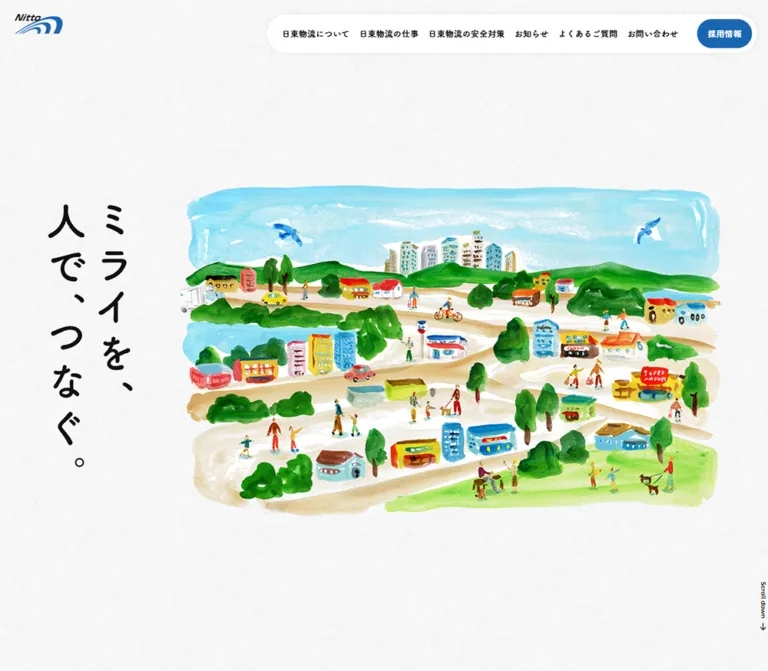
DESIGN REFERENCE
株式会社日東物流|水彩の街並みと余白を活かした企業サイト
水彩で描かれた街並みと紙の質感を軸に、丸みのある日本語書体と青いアクセントで親しみと信頼感を表現。縦書きのメッセージや、スマートフォンでの構成変更が特徴の物流企業サイト。
オリジナルサイトを見るNitto Butsuryu — Style Reference
Everyday logistics presented as a watercolor town on lightly textured paper.
Website: www.nittobutsuryu.co.jp Original URL: https://www.nittobutsuryu.co.jp/ Final URL: https://www.nittobutsuryu.co.jp/ Theme: light paper canvas, white content surfaces, blue accents, and a blue recruitment section. Inspected: September 12, 2026, at 08:14:04.509 UTC / 17:14:04.509 JST, according to the supplied browser record. Viewports: 1440 × 1000 and 390 × 844 CSS pixels. Scope: the current corporate homepage: hero, About, Works, Safety, News, Contact, Recruitment, and footer. Visual captures cover the desktop hero, Safety section, and footer, plus the mobile hero and footer. Rendered text and computed element measurements cover the homepage at both widths. Linked pages and documents were not inspected.
Nitto Butsuryu combines a conventional corporate information structure with an unusually gentle illustrated world. Delivery trucks share winding roads with pedestrians, shops, trees, cyclists, and homes. The artwork connects logistics to everyday community life. A lightly mottled paper background, rounded Japanese headings, and generous space carry that feeling into the interface.
The primary interface palette is restrained: near-black text, white surfaces, and a clear corporate blue. Greens, yellows, reds, and turquoise belong mainly to the paintings. A floating white navigation capsule and blue recruitment link provide consistent orientation, while large rounded sections organize the long homepage. This is a corporate website with multiple destinations, including services, safety, news, contact, and recruitment.
The strongest responsive change is compositional. Desktop places the slogan vertically beside a wide town illustration. Mobile crops the town into a broad opening scene, then presents the slogan horizontally beneath it. The footer similarly changes from a spacious desktop arrangement to a stacked composition while preserving two columns of navigation.
How to Read This Reference
- Measured means supplied computed styles or rendered element rectangles. Values are CSS pixels; tables generally round to two decimal places.
- Visually estimated means an approximation from the five original-page captures. These estimates are not pixel samples or recovered stylesheet declarations.
- Calculated means arithmetic applied to supplied measurements. Calculations do not establish the original CSS implementation.
- Recommended means guidance for a new implementation, including the CSS and optional Tailwind mapping below.
- Source tokens retain their supplied custom-property names. Other names are descriptive implementation aliases.
- Evidence limits: image URLs, complete stylesheets, pseudo-element styles, font-loading diagnostics, and interaction recordings were not supplied. A computed font-family stack establishes a declaration, not proof that its first family rendered every glyph.
Document coordinates in tables refer to the supplied element records. Positions visible in scrolled screenshots are viewport coordinates and should not be substituted for those document coordinates.
Tokens — Colors
Default Palette
| Name | Value | Source / alias | Role and evidence |
|---|---|---|---|
| Corporate Blue | #1866B2 |
Source --color-blue; alias --brand |
Measured recruitment-link fill, text-link color, and recruitment-section background. Also visually present in the logo and brochure frame. |
| Main Ink | #111111 |
Source --color-black, --color-base; alias --ink |
Measured body text, headings, and ordinary navigation text. |
| Surface White | #FFFFFF |
Source --color-white; alias --surface |
Measured header, About, Safety, Contact, and footer backgrounds; reversed recruitment text. |
| Light Blue | #B9D1E8 |
Source --color-l_blue; alias --accent-soft |
Declared token that visually corresponds to the pale circular CTA decoration. The decoration's own computed fill was not included. |
| Paper Approximation | Approximately #F7F7F7 |
Recommended alias --paper |
Starting color for the very light textured canvas. The original texture and its background-layer declaration were not supplied. |
The paper is not visibly a flat gray panel. Its subtle, uneven texture distinguishes the canvas from the clean white sections. Use a low-contrast texture over a very light base when authorized artwork is available.
Declared Supporting Colors
| Source property | Value | Interpretation |
|---|---|---|
--color-p_blue |
#E8EFF7 |
Declared pale blue; a specific visible application was not established. |
--color-l_grey |
#EFEFEF |
Declared light gray; do not automatically assign it to the paper texture. |
--color-grey |
#888888 |
Declared gray; no sampled component establishes its current role. |
--color-p_pink |
#E56A6A |
Declared pink; not demonstrated as a principal interface accent. |
The supplied properties also include general WordPress presets and Swiper defaults. Their presence does not establish visible gradients, extra theme colors, or specific carousel behavior. Base the reusable palette on the sampled components and captures.
Theme Presets
No alternate theme or theme selector was demonstrated. The blue recruitment section is a local surface change within the light page.
Tokens — Typography
Body and Editorial Copy
Declared primary family: dnp-shuei-gothic-gin-std.
The supplied stack continues through MyYuGothicM, Yu Gothic variants, Hiragino Kaku Gothic ProN variants, Meiryo, and sans-serif. The adaptation below condenses duplicate aliases and localized fallback spellings.
Body copy generally uses weight 500. Paragraphs have generous leading, commonly 2, and measured tracking equivalent to 0.05em. The About statement is larger than ordinary explanatory copy, giving the company's message an editorial rhythm without adding another display font.
Headings, Navigation, and Action Labels
Declared primary family: fot-tsukuardgothic-std.
Section headings, Works titles, primary navigation, recruitment links, and the circular-arrow links use this stack. The visible forms are rounded and approachable. Section headings and primary actions use weight 700; footer navigation uses 600.
Do not assume the font files are freely available. Use the declared families only with the required font access or license, and retain robust Japanese sans-serif fallbacks.
Hero and Footer Slogan
The visible slogan is ミライを、人で、つなぐ。 Its lettering has a loose, hand-drawn character distinct from ordinary UI text.
The sampled H1 contains no extracted text. Its inherited 18px desktop and 16.64px mobile font sizes do not measure the visible slogan lettering. The captures support a graphic treatment, but its underlying file type, rendering method, and accessible name were not established.
Desktop shows two vertical columns. Mobile and the footer show two horizontal lines. For a faithful adaptation, use appropriately composed graphic variants or independently verified lettering rather than assuming the ordinary heading font will reproduce this mark.
Type Scale
| Role | Desktop size / line height | Mobile size / line height | Weight | Tracking / notes |
|---|---|---|---|---|
| Root and body defaults | 18 / 18px |
16.64 / 16.64px |
500 |
Defaults only; paragraphs override leading. |
| Desktop primary navigation | 15.75 / 15.75px |
Hidden in the captured mobile state | 700 |
Normal tracking. |
| Recruitment link in header | 15.75 / 15.75px |
12.48 / 12.48px |
700 |
Normal tracking. |
| Main section heading | 56.25 / 56.25px |
31.20 / 31.20px |
700 |
Combined heading boxes also contain an English eyebrow. |
| Contact heading | 56.25 / 56.25px |
37.44 / 37.44px |
700 |
Larger than other section headings on mobile. |
| About statement | 24.75 / 49.50px |
18.72 / 37.44px |
500 |
0.05em; three separated text groups. |
| Standard explanatory paragraph | 18 / 36px |
14.56 / 29.12px |
500 |
0.05em. |
| Works item heading | 33.75 / 33.75px |
18.72 / 33.28px |
700 |
Tall, narrow desktop boxes become horizontal mobile boxes. |
| News title | 20.25 / 30.38px |
18.72 / 28.08px |
500 |
0.05em; longer titles wrap on mobile. |
| Circular-arrow link | 18px; 89.38px line box |
16.64px; 66.56px line box |
700 |
Large line box aligns text with the circular decoration. |
| Footer navigation | 18 / 18px |
14.56 / 14.56px |
600 |
Normal tracking. |
| Brochure-link copy | 13.50 / 20.25px |
12.48 / 18.72px |
500 |
Two lines beside a document icon. |
| Address link | 15.75 / 23.63px |
14.56 / 21.84px |
500 |
0.05em. |
Visually estimated utility sizes: English section eyebrows are approximately 18–20px on desktop and 12–13px on mobile. The scroll cue is approximately 11–13px. Their individual computed styles were not supplied.
Tokens — Spacing & Shapes
Density: spacious section composition, compact navigation, and large link targets with minimal visible chrome.
Spacing Scale
| Use | Desktop measurement | Mobile measurement | Interpretation |
|---|---|---|---|
| Header outer inset | 26.81px |
16.63px |
Top and right positions of the navigation capsule. |
| Header inner padding | 8.94px |
4.16px 8.32px |
Desktop uniform; mobile vertical and horizontal values differ. |
| Primary content gutter | 89.38px |
Approximately 16.64px |
Mobile rendered x-coordinate rounds to 16.625px. |
| Recruitment-link padding | 17.88px |
8.32px 16.64px |
Measured computed padding. |
| Adjacent desktop navigation gap | 17.88px |
Not applicable | Calculated from neighboring link rectangles. |
| Standard desktop text-block separation | 44.69px |
Often 24.96px |
For example, Safety paragraph to action. Not a universal margin rule. |
| About paragraph-group separation | 89.38px |
41.60px |
Calculated from paragraph bounds. |
| About vertical padding | 89.38px |
83.20px |
Measured section padding. |
| Works and News vertical padding | 223.44px |
124.80px |
Major breathing space on the textured canvas. |
| Safety vertical padding | 254.72px |
83.20px top, 41.60px bottom |
Desktop supports a vertically centered text-and-art composition. |
| Footer padding | 89.38px 89.38px 35.75px |
124.80px 16.64px 41.60px |
Mobile reserves substantial space before navigation. |
Border Radius
| Element | Desktop | Mobile | Evidence |
|---|---|---|---|
| Main rounded sections | 26.81px |
24.96px |
Measured on About, Safety, Contact, and Recruitment. |
| Footer | 26.81px 26.81px 0 0 |
24.96px 24.96px 0 0 |
Rounded upper corners only. |
| Navigation capsule | 111.72px |
104px |
Computed radius; visually a pill because the value exceeds half its height. |
| Header recruitment link | 44.69px |
41.60px |
Computed radius; also pill-shaped. |
| CTA decoration | Circle, approximately 89px diameter |
Individual decoration not measured | Desktop appearance matches the anchor's height. |
| Brochure panel | Approximately 18px |
Approximately 17px |
Visual estimates, not supplied computed values. |
Layout Measurements
| Element | Desktop | Mobile |
|---|---|---|
| Navigation capsule | 906.91 × 71.38px, at 506.28, 26.81 |
193.30 × 39.42px, at 180.08, 16.63 |
| Header recruitment link | 100.75 × 53.50px |
85.17 × 31.11px |
| Main content width | 1261.25px |
356.75px |
| H1 outer box | 156.41 × 522.39px, at 89.38, 238.80 |
291.19 × 692.17px, at 49.41, 0 |
| Typical detail-link box | 163.02 × 89.38px |
132.45 × 66.56px |
| News-list column | 765.27px, starting at x 585.36 |
356.75px, starting at x 16.63 |
| Footer navigation column starts | x 689.30 and 929.50 |
x 16.63 and 189.27 |
| Document height | 7910.02px |
6778.88px |
The mobile H1 box includes 496.08px top padding and 85.28px bottom padding. Subtracting these gives approximately 110.81px for its remaining vertical content area. Its tall rectangle is therefore not a 692px-tall block of lettering.
Calculated Scaling Fit
The desktop measurements fit two slightly different factors:
- Geometry:
(1440 − 10) / 1280 = 1.1171875. Multiplying by 80 gives the measured89.375pxgutter; multiplying by 24 gives the26.8125pxsection radius. - Typography:
1440 / 1280 = 1.125. Multiplying by 50 gives the measured56.25pxsection title. - Mobile:
390 / 375 = 1.04. This reproduces values such as16.64px,31.20px, and24.96pxfrom nominal 16, 30, and 24 units.
The supplied source property --pc-width: calc(100vw - 10px) supports the geometry distinction. These are calculated fits to the sampled endpoints, not recovered stylesheet formulas or proof of a breakpoint. The Quick Start uses separate geometry and type units with recommended caps.
Components
Persistent Brand and Navigation Capsule
Role: maintain identity and direct access to the principal company pages.
The logo sits independently at the upper left. The white navigation capsule sits at the upper right, leaving the paper visible between them. Both remain in the same screen area across the supplied scrolled captures. This supports persistent positioning; the exact position declaration was not supplied.
Desktop anatomy:
- A white, fully rounded wrapper with approximately 9px inner padding.
- Six unboxed black navigation links covering About, Works, Safety, News, FAQ, and Contact.
- A separated blue pill labeled
採用情報at the right end. - A subtle shadow visible around the white capsule; its blur and opacity are unmeasured.
The logo's measured desktop anchor is about 89px wide, but its 18px line box does not describe the full visible logo artwork. Visually, the mark occupies roughly 89 × 36px. Mobile reduces the visible mark to approximately 62 × 25px.
On mobile, the six desktop navigation links disappear from the captured visible state. The capsule retains recruitment on the left and a hamburger with メニュー on the right. The DOM also contains 閉じる, but no open-menu capture or tested state was supplied. Do not infer the panel layout, animation, focus behavior, or close mechanism from that hidden label.
Illustrated Hero
Role: express the relationship between the company and ordinary community life.
Desktop uses a full first viewport: About begins at document y 1000px. The vertical slogan sits near the left content gutter. The town painting occupies approximately x 350–1350px and y 220–830px, a visual estimate of about 1000 × 610px. Its irregular painted boundaries remain visible against the paper.
The scene includes small trucks, shops, houses, people, cyclists, dogs, roads, trees, and a blue sky. The roads organize the composition without becoming interface lines or a literal process diagram. There is no large conversion button inside the hero; navigation carries the recruitment emphasis.
On mobile, the illustration begins around y 71px, spans the screen width, and is cropped at its sides. The slogan follows around y 496px, using two horizontal lines. About begins at y 692.17px, so its heading is already visible in the 844px-tall opening capture.
Implementation guidance: preserve the illustration's aspect ratio. Use a dedicated crop window or an art-directed mobile asset. Do not shrink the complete desktop composition until its people and lettering become tiny.
Scroll Cue
A small Scroll down label and downward arrow accompany the hero. Desktop places the cue vertically near the lower right edge. Mobile centers it horizontally beneath the slogan.
The supplied link list does not establish a scroll-target anchor for this cue. Click behavior, smooth scrolling, and arrow animation remain unverified. A new implementation may make it an accessible link to the next section, but that is an addition.
Section Heading Pair
Role: introduce each major topic with a small English eyebrow and a larger Japanese heading.
Examples include About us with 日東物流について, and Safety measures with 日東物流の安全対策. The English label is blue on white or paper. The Japanese heading is near-black, rounded, and bold. Recruitment reverses the heading treatment to white.
The combined heading box is about 92.13px tall on desktop and 60.31px on mobile. Keep the eyebrow subordinate. Do not enlarge it into a competing headline or spread the Japanese heading with arbitrary tracking; the supplied heading tracking is normal.
About Statement
Role: introduce the company's attitude through spacious editorial copy.
A full-width white section with rounded corners follows the hero. On desktop, the heading begins at x 89.38px, while the statement begins much farther right at x 575.34px. Three paragraph groups use 24.75px text with 49.5px leading and approximately 89px between groups.
On mobile, all three groups use the main 16.64px gutter and 18.72 / 37.44px type. The supplied rendered text has more line breaks, making the message readable within a narrow column. The final detail link aligns to the right.
A small illustrated cluster involving a truck, people, and a shop is visible near the mobile section heading. Its complete desktop placement and asset dimensions were not supplied.
Circular-Arrow Detail Link
Role: provide a repeated, recognizable route into deeper content.
The component combines a blue text label such as 詳しく見る with an arrow centered over a large pale-blue disc. The label begins outside the disc and slightly overlaps its left region. It is not a filled rectangular button.
Measured desktop anatomy:
- Anchor approximately
163.02 × 89.38px. 18px, weight700, rounded heading-family text.- Transparent anchor background and approximately
73.73pxright padding. - A visually circular decoration about 89px across at the right end.
- A simple right-pointing arrow centered within that circle.
Mobile reduces the anchor to approximately 132.45 × 66.56px, with 16.64px text and 49.92px right padding. About, Works, Safety, News, and Recruitment place their links toward the right on mobile. The Contact link is centered and is wider because its label is 問い合わせる.
Recruitment changes the label and arrow to white. Hover movement, disc expansion, and other pseudo-element behavior were not inspected.
Works Sequence
Role: expose four routes: service details, facilities, company data, and FAQ.
The supplied DOM contains items numbered 01–04. Their heading boxes share a vertical position while progressing horizontally beyond the viewport. On desktop, successive headings start at x approximately 94.95, 1046.06, 1997.17, and 2948.28px, a pitch of about 951.11px.
Desktop heading boxes are only 33.75px wide and up to 357.38px tall. This strongly indicates a vertical title treatment, although the writing-mode property was not included. The first item's paragraph begins at x 173.16px; its detail link sits separately farther right. A large interval between the title area and explanatory copy leaves room for media, but the media itself was not supplied in a Works capture.
Mobile changes titles to horizontal boxes approximately 321.28 × 33.28px. Item starts are about 354.53px apart, with the second beginning near the right edge at x 371.16px. The first paragraph uses 14.56 / 29.12px type, and its action follows below it.
This evidence establishes a horizontal arrangement. It does not establish dragging, autoplay, looping, arrow controls, wheel handling, or vertical-scroll-linked movement. For a new implementation, native horizontal scrolling with keyboard-accessible links is a practical option, explicitly separate from claims about the original behavior.
Safety Feature Section
Role: connect operational safety with people and familiar places.
The desktop capture shows a large white section with rounded corners. The text group occupies the left side at the main gutter. A watercolor supermarket and pedestrians occupy the right side, roughly x 750–1350px in the screenshot.
Stack the English eyebrow, Japanese title, three lines of body copy, and circular-arrow link. The measured desktop section has about 254.72px vertical padding and is 888.31px tall. The painting has irregular edges and generous white around it; it is not contained in a card or a colored image frame.
Mobile DOM geometry places the heading near the top and the body substantially below it, followed by a right-aligned link. This supports reserving a separate media region between heading and copy. No mobile Safety screenshot was supplied, so the exact artwork crop and placement remain unverified.
News List
Role: show recent company updates and provide access to the archive.
Desktop uses a left heading-and-action area and a right list beginning at x 585.36px, approximately 765.27px wide. Three linked entries were supplied. Each includes a date, a title, and a category label such as ニュース or 社長ブログ.
Rows are generous rather than compact: the first anchor is about 155.69px tall, and the next two are about 202.38px. Subsequent rows have approximately 44.69px vertical padding. Titles use the body family at weight 500, preserving a distinction from the rounded section headings.
On mobile, the list follows the heading and spans the main content width. Longer titles wrap to two lines. The archive action moves beneath the list and aligns right. The supplied data establishes linked row structure and spacing; badge fills, separator styling, and hover opacity endpoints were not recorded.
Contact Section
Role: invite work inquiries and general questions.
This is another full-width rounded white surface. Its desktop text cluster begins 536.25px below the section top. The heading and short paragraph sit beside a circular-arrow link. On mobile, the content begins 380.64px below the section top, and the action is centered beneath it.
The large upper allocation is measured, but its complete visual content was not included in the captures. Preserve a deliberate upper composition when implementing verified media rather than inventing a particular illustration or animation. The mobile Contact heading is 37.44px, larger than the usual 31.2px section title.
Recruitment Section
Role: give recruitment greater visual emphasis near the end of the homepage.
A blue rounded section reverses the heading, paragraph, and detail link to white. Desktop padding is approximately 134.06px vertically and 89.38px horizontally. Its text continues the homepage's emphasis on everyday life and connection.
Mobile uses approximately 33.28px padding and places the heading about 312px below the section start, indicating a substantial preceding media region. Only a small fragment of the recruitment media is visible above the desktop footer capture; its full subject and treatment cannot be characterized reliably.
Footer and Company Identity
Role: close with the brand message while keeping practical company information easy to find.
The footer is white with rounded top corners. Desktop places a large horizontal slogan at left, two navigation columns in the middle-right, and a compact brochure panel at the far right. A watercolor truck and workers sit beneath the slogan. Social information and copyright occupy the lower left; a larger company logo and address block occupy the lower right.
The original page title and footer identify the company as 株式会社日東物流. The footer supplies an address, telephone and fax numbers, a map link, and an X account link.
Mobile retains two navigation columns but stacks the larger groups: slogan, navigation, brochure, company identity and address, then social information and copyright. The footer grows from approximately 653px to 920px tall. Do not compress it into a single dense line of links.
Brochure Panel
A small white panel has a blue outline, rounded corners, and a blue header labeled 会社案内オンライン閲覧. Its body places an outlined document icon beside the two-line download label.
Visual estimates place the panel near 205 × 140px on desktop and 191 × 132px on mobile. These are screenshot estimates, not the smaller measured rectangle of its inner link. The body link's typography is measured at 13.5 / 20.25px on desktop and 12.48 / 18.72px on mobile.
The original homepage links to /wp/wp-content/uploads/2025/11/nittobutsuryu_2025.pdf. The document was not opened, and neither a forced download nor an embedded viewer was tested.
Tokens — Motion & Interaction
| Treatment | Supplied evidence | What can be concluded |
|---|---|---|
| Section headings | transition: opacity 0.3s ease-in |
A 300ms opacity transition is declared. Trigger, starting opacity, and replay behavior are unknown. |
| Safety and Recruitment paragraphs | transition: opacity 0.3s ease-in |
The same timing is declared for sampled copy. No translation or stagger is established. |
| News anchors | transition: opacity 0.3s |
Opacity transition exists; its endpoint and triggering state were not supplied. |
| Brochure link | transition: opacity 0.3s |
Declared transition only. |
| Other sampled elements | Frequently transition: all |
This string alone supplies no nonzero duration and is not evidence of visible motion. |
| Sampled element animation values | animation: none |
No CSS animation was reported on those sampled nodes. This does not rule out animation elsewhere. |
| Header persistence | Same screen placement in multiple scroll captures | Persistent navigation is visually supported; fixed versus sticky implementation is unverified. |
| Works arrangement | Repeated horizontal positions beyond the viewport | Horizontal layout is supported; its navigation mechanics are not. |
| Mobile menu | Visible menu affordance and hidden close text | Open state and interaction behavior were not demonstrated. |
| Hero illustration and scroll arrow | Still captures only | Movement, timing, parallax, and looping remain unverified. |
The browser record reports an initial observation of at least five seconds. Readiness checks awaited relevant finite animation and layout stability within bounded time limits, temporarily paused perpetual animations, and resumed them afterward. This is capture preparation, not a recording of the page's motion design.
Recommended adaptation: use restrained 150–300ms color or opacity feedback, keep content visible by default, and support reduced motion. Any moving trucks, parallax, slide controls, or menu transitions require separate design and testing.
Surfaces
| Layer | Appearance | Function |
|---|---|---|
| Main canvas | Very light, visibly textured paper | Connects the hero and open sections into a continuous illustrated world. |
| About, Safety, Contact | Clean white with large rounded corners | Gives major subjects their own calm spaces. |
| Works and News | Transparent section backgrounds over the canvas | Alternates surface density without adding many cards. |
| Navigation | White capsule with subtle visual shadow | Maintains legibility above changing content. |
| Recruitment | Solid corporate blue with white text | Strongest sustained interface-color field. |
| Footer | White, rounded at the top | Separates practical company information from the preceding sections. |
| Brochure | Blue outline and header over white | Identifies a specific utility without competing with the main navigation. |
| Detail-link accent | Pale-blue circle behind the arrow | Repeated directional motif with very little surrounding chrome. |
There is no demonstrated general system of elevated cards. Most separation comes from large surface changes, whitespace, typography, and illustration placement.
Imagery
The dominant verified imagery is watercolor with opaque painted accents: visible brushwork, uneven edges, watery sky washes, saturated green vegetation, and small bright buildings. The figures are simplified but active. Delivery vehicles belong to the same scene as people shopping, walking, cycling, and spending time outdoors.
Keep these relationships intact:
- Broad, low-detail color fields support small narrative details.
- Roads curve through the composition and link otherwise separate scenes.
- White or transparent-looking edges allow vignettes to sit naturally on paper and white sections.
- Trucks are recognizable but do not become oversized isolated product renders.
- The artwork supplies most of the red, yellow, green, and cyan; the surrounding UI remains restrained.
The hero is a wide town scene, Safety uses a supermarket vignette, and the footer repeats a smaller truck-and-workers motif. The mobile About opening also includes a small illustrated cluster. The available evidence does not establish that every image elsewhere on the homepage uses the same medium.
Observed Asset References
No original image URLs, formats, native resolutions, or per-image accessibility attributes were supplied. The following is an asset-role inventory, not a filename list.
| Asset role | Observed appearance | Placement | URL status |
|---|---|---|---|
| Header identity | Black Nitto lettering with blue curved mark | Upper left at both widths | Not supplied |
| Main town scene | Watercolor community, roads, and delivery vehicles | Desktop hero and cropped mobile hero | Not supplied |
| Slogan graphic | Loose black lettering | Vertical desktop hero; horizontal mobile hero and footer | Not supplied |
| About vignette | Truck, small figures, and shop elements | Mobile About opening | Not supplied |
| Safety vignette | Yellow supermarket, trees, and pedestrians | Right side of desktop Safety section | Not supplied |
| Footer vignette | Truck and workers | Beneath or near the footer slogan | Not supplied |
| Footer identity | Larger company logo including Japanese name | Beside company address | Not supplied |
| Utility symbols | Arrow, document, X, and map marker | Links and footer utilities | Not supplied |
Use authorized original assets when available. A CSS shell can reproduce geometry and color, but it cannot replace the specific painted compositions or slogan lettering. Do not redraw the watercolor as uniformly clean vector icons or apply pixelated image rendering.
Layout & Responsive Behavior
Measured Page Sequence
| Region | Desktop top / height | Mobile top / height |
|---|---|---|
| Hero | 0 / 1000px |
0 / 692.17px |
| About | 1000 / 1257.44px |
692.17 / 971.27px |
| Works | 2257.44 / 1313.95px |
1663.44 / 849.72px |
| Safety | 3571.39 / 888.31px |
2513.16 / 786.22px |
| News | 4459.70 / 1007.31px |
3299.38 / 994.95px |
| Contact | 5467.02 / 843.25px |
4294.33 / 675.97px |
| Recruitment | 6444.33 / 647px |
5095.09 / 609.55px |
| Footer | 7256.77 / 653.25px |
5858.55 / 920.33px |
These heights describe this content at the captured widths. They are not recommended fixed heights. Gaps before Recruitment and before the footer are outside the listed section rectangles; the page also includes a home breadcrumb before the footer.
Structural Changes
| Feature | Desktop observation | Mobile observation |
|---|---|---|
| Header | Full navigation with recruitment at the far right | Recruitment plus menu affordance |
| Hero | Vertical slogan beside the town | Cropped town above a horizontal slogan |
| Opening height | Exactly one captured viewport before About | About begins within the initial viewport |
| Main gutter | Approximately 89px | Approximately 17px |
| About | Text offset into the right side | Full content-width text |
| Works headings | Tall, narrow boxes indicating vertical presentation | Horizontal heading boxes |
| Detail links | Positioned within desktop content groups | Mostly right-aligned below content |
| News | Heading left, list right | Heading, list, and archive link stacked |
| Recruitment | Text begins near the top padding | A substantial region precedes the heading |
| Footer | Slogan, navigation, brochure, and identity distributed across width | Major groups stack; navigation stays in two columns |
Only two viewport sizes were supplied. The breakpoint, tablet layout, landscape behavior, and scaling outside these endpoints are unknown. The recommended CSS breakpoint below is a practical implementation choice, not a recovered source value.
Confine any horizontal Works overflow to its own region. The supplied element positions extend beyond the screen, but the homepage itself should not require horizontal panning to reach ordinary content.
Do’s and Don’ts
Do
- Keep the verified interface colors anchored in
#1866B2,#111111, and#FFFFFF. - Preserve the difference between textured paper and clean white section surfaces.
- Use rounded Japanese headings with quieter body typography and generous paragraph leading.
- Let watercolor imagery introduce most of the additional color.
- Keep the logo separate from the floating navigation capsule.
- Preserve the vertical-to-horizontal change in slogan composition.
- Use broad rounded sections and substantial whitespace between subjects.
- Repeat the text-plus-circle-arrow link motif consistently.
- Retain the two-column footer navigation on mobile.
- Treat measured mobile changes as structural changes, not uniform desktop scaling.
Don't
- Don't replace the town scene with generic logistics stock photography and expect the same identity.
- Don't turn every section into a grid of small elevated cards.
- Don't introduce unrelated gradient buttons, glass effects, or a rainbow of interface accents.
- Don't use the inherited H1 font size as the size of the slogan artwork.
- Don't assume declared WordPress preset colors are used in the visible design.
- Don't stretch the hero painting to fill an arbitrary mobile rectangle.
- Don't impose desktop vertical titles on the captured mobile Works layout.
- Don't claim autoplay, parallax, hover expansion, or menu behavior without evidence.
- Don't assign unverified filenames, formats, or production authors to the artwork.
- Don't hardcode the measured total page or section heights into a content-driven implementation.
Recommended Implementation Additions
These are recommendations for a new implementation, not verified features of the original site:
- Give the slogan a meaningful text alternative containing the actual message. An empty extracted H1 alone is insufficient to determine the original accessibility implementation.
- Use semantic navigation and a real mobile menu button with
aria-expandedandaria-controls. Define keyboard behavior and Escape handling after choosing the panel pattern. - Keep focused links visible beneath persistent navigation with suitable scroll offsets.
- Increase the mobile recruitment target to at least 44px in effective height, while retaining the compact visual pill if desired. Its measured visible box is only about 31px high.
- Provide contextual accessible names for repeated
詳しく見るlinks, such as a name identifying the Safety destination. - Keep the Works items reachable with keyboard and touch input. If using a carousel, supply explicit controls and avoid autoplay as the default.
- Consider a 16px minimum for long mobile body copy; the supplied explanatory paragraphs use 14.56px.
- Give informative illustrations suitable alternatives and decorative fragments empty alternatives. Preserve the slogan's message independently of its artistic treatment.
- Supply image dimensions or aspect ratios to avoid layout movement, and keep essential hero assets available without delayed loading.
- Keep reveal content visible when scripts fail, and disable nonessential transitions under reduced-motion preferences.
- Identify the brochure as a PDF link and provide accessible names for the social and map icons.
Agent Prompt Guide
Quick Color Reference
- Primary text:
#111111. - White sections and header:
#FFFFFF. - Brand links, recruitment button, and recruitment section:
#1866B2. - Soft circular action accent:
#B9D1E8, corresponding visually to the supplied source token. - Paper base: approximately
#F7F7F7, with a subtle authorized texture; this hex is an adaptation estimate. - Painting colors: varied greens, cyan, yellow, and red within the artwork rather than a new interface palette.
Overall Prompt
“Create a Japanese logistics company homepage with a watercolor community scene on very light textured paper. Use near-black #111111 text, white rounded sections, and corporate blue #1866B2. Keep the logo at the upper left and a floating white navigation capsule at the upper right, with a blue recruitment pill. On desktop, place a vertical graphic slogan beside a wide illustrated town. On mobile, show a cropped town scene above a horizontal two-line slogan. Organize About, Works, Safety, News, Contact, Recruitment, and a substantial footer. Use rounded Japanese headings, generous body leading, small English eyebrows, and repeated text links with arrows over pale-blue circles. Use the supplied measured tokens as reference endpoints and label any new interaction behavior as an implementation choice.”
Example Component Prompts
- Header: “Build a separate upper-left logo and an upper-right white pill containing six text links plus a blue recruitment link. Match the desktop reference box of roughly 907 × 71px. At the chosen mobile breakpoint, retain recruitment and replace the links with a labeled menu affordance. The observed mobile shell is roughly 193 × 39px; enlarge effective touch targets without making the typography heavy.”
- Hero: “Compose a broad watercolor town to the right of a vertical black slogan on lightly textured paper. Preserve rough painted edges and small human scenes. At 390px width, crop the painting at its sides and move a horizontal slogan beneath it. Use dedicated slogan artwork rather than inferring its font from the H1.”
- Safety feature: “Create a full-width white section with approximately 27px rounded corners. Place a blue English eyebrow, a bold rounded Japanese heading, three spacious lines of copy, and a circular-arrow link at left. Balance them with a watercolor supermarket and pedestrians at right, without a card frame around the painting.”
- Detail link: “Make a transparent text link with blue 18px rounded bold text. Place a pale-blue circle about 89px wide at the right, allowing the label to overlap its left region slightly. Center a blue arrow on the disc. Use a compact mobile version near 133 × 67px and a visible keyboard focus outline.”
- Works sequence: “Arrange four numbered company-information items horizontally. Use narrow vertical title treatment on desktop and horizontal titles on mobile. At 390px, start with item content near 321px wide and approximately 33px between items. Native horizontal scrolling is a proposed implementation, not a verified source interaction.”
- Footer: “Build a spacious white footer with rounded upper corners, a large horizontal slogan, a truck-and-workers vignette, two navigation columns, and a small blue-framed brochure panel. Place company identity and address together. On mobile, stack the major groups but retain the two navigation columns and generous spacing.”
Quick Start
CSS Custom Properties
This is an implementation scaffold, not extracted source CSS. It reproduces key endpoint proportions with separate geometry and type units while keeping a conventional root font size. The 64rem breakpoint, scaling caps, shadow, native Works scrolling, and focus treatment are recommendations.
The hero expects authorized desktop and mobile slogan variants with appropriate intrinsic proportions. The painting, paper texture, and logos must be supplied separately; no original asset URLs are implied. A mobile menu requires its own functional panel and state handling.
:root {
  /* Measured interface colors; paper is an approximation. */
  --brand: #1866b2;
  --ink: #111111;
  --surface: #ffffff;
  --accent-soft: #b9d1e8;
  --paper: #f7f7f7;

  /* Declared families with condensed fallback stacks. */
  --font-body: 'dnp-shuei-gothic-gin-std', MyYuGothicM,
    'Yu Gothic', YuGothic, 'Hiragino Kaku Gothic ProN', Meiryo, sans-serif;
  --font-heading: 'fot-tsukuardgothic-std', MyYuGothicM,
    'Yu Gothic', YuGothic, 'Hiragino Kaku Gothic ProN', Meiryo, sans-serif;

  /* Calculated endpoint fits with recommended limits. */
  --layout-u: clamp(0.8px, calc((100vw - 10px) / 1280), 1.1171875px);
  --type-u: clamp(0.8px, calc(100vw / 1280), 1.125px);
  --gutter: calc(80 * var(--layout-u));
  --header-inset: calc(24 * var(--layout-u));
  --section-radius: calc(24 * var(--layout-u));
  --section-space: calc(200 * var(--layout-u));
  --block-gap: calc(40 * var(--layout-u));
  --disc-size: calc(80 * var(--layout-u));
  --link-end-space: calc(66 * var(--layout-u));

  --text-base: calc(16 * var(--type-u));
  --text-copy: calc(16 * var(--type-u));
  --text-statement: calc(22 * var(--type-u));
  --text-heading: calc(50 * var(--type-u));
  --text-contact: var(--text-heading);
  --text-nav: calc(14 * var(--type-u));
  --text-action: calc(16 * var(--type-u));
  --text-footer: calc(16 * var(--type-u));
  --leading-copy: 2;
  --tracking-copy: 0.05em;

  /* Recommended approximation; source shadow was not measured. */
  --header-shadow: 0 2px 14px rgb(17 17 17 / 6%);
}

* { box-sizing: border-box; }
body {
  margin: 0;
  color: var(--ink);
  background: var(--paper);
  font-family: var(--font-body);
  font-size: var(--text-base);
  font-weight: 500;
  line-height: 1.5;
}
img { display: block; max-inline-size: 100%; }
a { color: inherit; }
button { font: inherit; }
section { scroll-margin-top: 7rem; }

/* Add an authorized paper texture to the body when available. */
.site-brand {
  position: fixed;
  z-index: 60;
  inset-block-start: var(--header-inset);
  inset-inline-start: var(--header-inset);
  inline-size: calc(80 * var(--layout-u));
}
.site-brand img { inline-size: 100%; block-size: auto; }
.site-header {
  position: fixed;
  z-index: 50;
  inset-block-start: var(--header-inset);
  inset-inline-end: var(--header-inset);
  display: flex;
  align-items: center;
  padding: calc(8 * var(--layout-u));
  border-radius: 999px;
  background: var(--surface);
  box-shadow: var(--header-shadow);
}
.primary-nav {
  display: flex;
  align-items: center;
  gap: calc(16 * var(--layout-u));
  margin-inline: calc(16 * var(--layout-u)) calc(32 * var(--layout-u));
}
.primary-nav a,
.recruit-link {
  font-family: var(--font-heading);
  font-size: var(--text-nav);
  font-weight: 700;
  line-height: 1;
  text-decoration: none;
  white-space: nowrap;
}
.recruit-link {
  padding: calc(16 * var(--layout-u));
  border: 1px solid transparent;
  border-radius: 999px;
  color: var(--surface);
  background: var(--brand);
}
.menu-toggle { display: none; }

/* Use art-directed slogan variants through a picture element. */
.hero {
  position: relative;
  display: grid;
  grid-template-columns: calc(140 * var(--layout-u)) minmax(0, 1fr);
  align-items: center;
  gap: calc(94 * var(--layout-u));
  min-block-size: 100svh;
  padding-inline: var(--gutter);
}
.hero__slogan { margin: 0; }
.hero__slogan img { inline-size: 100%; block-size: auto; }
.hero__scene {
  aspect-ratio: 1000 / 610;
  transform: translateY(2.5vh);
}
.hero__scene img {
  inline-size: 100%;
  block-size: 100%;
  object-fit: contain;
}
.hero__cue {
  position: absolute;
  inset-inline-end: 0.5rem;
  inset-block-end: 4.5rem;
  font-size: calc(12 * var(--type-u));
  line-height: 1;
  writing-mode: vertical-rl;
  text-decoration: none;
}

.rounded-section {
  border-radius: var(--section-radius);
  background: var(--surface);
}
.section-heading {
  margin: 0;
  font-family: var(--font-heading);
  font-size: var(--text-heading);
  font-weight: 700;
  line-height: 1;
}
.section-heading__eyebrow {
  display: block;
  margin-block-end: calc(14 * var(--layout-u));
  color: var(--brand);
  font-family: var(--font-body);
  font-size: calc(18 * var(--type-u));
  line-height: 1;
}
.copy {
  margin: 0;
  font-size: var(--text-copy);
  line-height: var(--leading-copy);
  letter-spacing: var(--tracking-copy);
}
.statement {
  font-size: var(--text-statement);
  line-height: 2;
  letter-spacing: var(--tracking-copy);
}
.statement p { margin: 0; }
.statement p + p { margin-block-start: calc(80 * var(--layout-u)); }

/* Direct children: heading, artwork, paragraph, and detail link. */
.feature {
  display: grid;
  grid-template-columns: minmax(0, 1fr) minmax(0, 1fr);
  grid-template-areas: 'heading art' 'body art' 'action art';
  column-gap: calc(72 * var(--layout-u));
  row-gap: var(--block-gap);
  padding: calc(228 * var(--layout-u)) var(--gutter);
}
.feature > .section-heading { grid-area: heading; }
.feature__art { grid-area: art; align-self: center; inline-size: 100%; }
.feature__body { grid-area: body; }
.feature > .more-link { grid-area: action; justify-self: start; }

.more-link {
  position: relative;
  isolation: isolate;
  display: inline-flex;
  align-items: center;
  min-block-size: var(--disc-size);
  padding-inline-end: var(--link-end-space);
  color: var(--brand);
  font-family: var(--font-heading);
  font-size: var(--text-action);
  font-weight: 700;
  line-height: 1;
  text-decoration: none;
  white-space: nowrap;
}
.more-link::before {
  content: '';
  position: absolute;
  z-index: -1;
  inset-inline-end: 0;
  inset-block-start: 50%;
  inline-size: var(--disc-size);
  block-size: var(--disc-size);
  border-radius: 50%;
  background: var(--accent-soft);
  transform: translateY(-50%);
}
.more-link::after {
  content: '→';
  position: absolute;
  inset-inline-end: 0;
  inset-block: 0;
  display: grid;
  place-items: center;
  inline-size: var(--disc-size);
  font-family: sans-serif;
  font-size: 1.75em;
}
.recruit-section {
  margin-block-start: calc(120 * var(--layout-u));
  padding: calc(120 * var(--layout-u)) var(--gutter);
  border-radius: var(--section-radius);
  color: var(--surface);
  background: var(--brand);
}
.recruit-section .section-heading__eyebrow,
.recruit-section .more-link { color: inherit; }

/* Native scrolling is a recommended fallback, not verified source behavior. */
.works-rail {
  display: grid;
  grid-auto-flow: column;
  grid-auto-columns: min(60vw, 860px);
  gap: 4rem;
  overflow-x: auto;
  padding-inline: var(--gutter);
  padding-block-end: 1rem;
  scroll-snap-type: x proximity;
  scroll-padding-inline: var(--gutter);
}
.work-item { min-inline-size: 0; scroll-snap-align: start; }

.site-footer {
  padding: calc(80 * var(--layout-u)) var(--gutter)
    calc(32 * var(--layout-u));
  border-radius: var(--section-radius) var(--section-radius) 0 0;
  background: var(--surface);
}
.footer-top {
  display: grid;
  grid-template-columns: minmax(0, 1fr) minmax(20rem, 0.8fr) auto;
  align-items: start;
  gap: 4rem;
}
.footer-nav {
  display: grid;
  grid-template-columns: 1fr 1fr;
  gap: 3rem;
  font-family: var(--font-heading);
  font-size: var(--text-footer);
  font-weight: 600;
}
.footer-nav ul { margin: 0; padding: 0; list-style: none; }
.footer-nav li + li { margin-block-start: calc(24 * var(--layout-u)); }
.footer-nav a { text-decoration: none; }
.brochure {
  inline-size: calc(184 * var(--layout-u));
  overflow: hidden;
  border: 2px solid var(--brand);
  border-radius: calc(16 * var(--layout-u));
}
.brochure__title {
  margin: 0;
  padding: 0.75em 0.5em;
  color: var(--surface);
  background: var(--brand);
  font-size: calc(14 * var(--type-u));
  text-align: center;
}
.brochure__link {
  display: flex;
  align-items: center;
  gap: 0.75rem;
  min-block-size: calc(84 * var(--layout-u));
  padding: 1rem;
  font-size: calc(12 * var(--type-u));
  line-height: 1.5;
  text-decoration: none;
}
.footer-bottom {
  display: flex;
  align-items: end;
  justify-content: space-between;
  gap: 3rem;
  margin-block-start: calc(120 * var(--layout-u));
}
.company-identity { display: flex; align-items: center; gap: 2rem; }
.company-identity address { font-style: normal; }

/* Recommended interaction and accessibility additions. */
a:focus-visible,
button:focus-visible {
  outline: 2px solid currentColor;
  outline-offset: 5px;
}
@media (hover: hover) {
  .primary-nav a:hover,
  .footer-nav a:hover { text-decoration: underline; text-underline-offset: 0.3em; }
}

@media (max-width: 64rem) {
  :root {
    --layout-u: clamp(0.9px, calc(100vw / 375), 1.15px);
    --type-u: var(--layout-u);
    --gutter: calc(16 * var(--layout-u));
    --header-inset: var(--gutter);
    --section-space: calc(120 * var(--layout-u));
    --block-gap: calc(24 * var(--layout-u));
    --disc-size: calc(64 * var(--layout-u));
    --link-end-space: calc(48 * var(--layout-u));
    --text-copy: calc(14 * var(--type-u));
    --text-statement: calc(18 * var(--type-u));
    --text-heading: calc(30 * var(--type-u));
    --text-contact: calc(36 * var(--type-u));
    --text-nav: calc(12 * var(--type-u));
    --text-footer: calc(14 * var(--type-u));
  }
  .site-brand { inline-size: calc(60 * var(--layout-u)); }
  .site-header { padding: calc(4 * var(--layout-u)) calc(8 * var(--layout-u)); }
  .primary-nav { display: none; }
  .recruit-link { padding: calc(8 * var(--layout-u)) calc(16 * var(--layout-u)); }
  .menu-toggle {
    display: inline-flex;
    align-items: center;
    gap: calc(8 * var(--layout-u));
    padding: 0 0 0 calc(24 * var(--layout-u));
    border: 0;
    color: var(--ink);
    background: transparent;
    font-size: calc(10 * var(--type-u));
    cursor: pointer;
  }
  .hero {
    grid-template-columns: 1fr;
    grid-template-areas: 'scene' 'slogan' 'cue';
    gap: 0;
    min-block-size: 0;
    padding: calc(68 * var(--layout-u)) 0 calc(38 * var(--layout-u));
  }
  .hero__scene {
    grid-area: scene;
    block-size: calc(375 * var(--layout-u));
    aspect-ratio: auto;
    overflow: hidden;
    transform: none;
  }
  .hero__scene img { object-fit: cover; object-position: center; }
  .hero__slogan {
    grid-area: slogan;
    justify-self: center;
    inline-size: min(calc(280 * var(--layout-u)), calc(100% - 2rem));
    margin-block-start: calc(34 * var(--layout-u));
  }
  .hero__cue {
    grid-area: cue;
    position: static;
    justify-self: center;
    margin-block-start: calc(32 * var(--layout-u));
    writing-mode: horizontal-tb;
  }
  .section-heading__eyebrow {
    margin-block-end: calc(16 * var(--layout-u));
    font-size: calc(12 * var(--type-u));
  }
  .statement p + p { margin-block-start: calc(40 * var(--layout-u)); }
  .feature {
    grid-template-columns: 1fr;
    grid-template-areas: 'heading' 'art' 'body' 'action';
    padding: calc(80 * var(--layout-u)) var(--gutter)
      calc(40 * var(--layout-u));
  }
  .feature > .more-link { justify-self: end; }
  .recruit-section { padding: calc(32 * var(--layout-u)); }
  .works-rail {
    grid-auto-columns: 82.38vw;
    gap: calc(32 * var(--layout-u));
  }
  .site-footer {
    padding: calc(120 * var(--layout-u)) var(--gutter)
      calc(40 * var(--layout-u));
  }
  .footer-top { grid-template-columns: 1fr; gap: calc(40 * var(--layout-u)); }
  .footer-nav { gap: 1.5rem; }
  .footer-bottom { flex-direction: column; align-items: stretch; margin-block-start: 3rem; }
  .company-identity { gap: 1.5rem; }
}

@media (prefers-reduced-motion: reduce) {
  html { scroll-behavior: auto; }
  .works-rail { scroll-behavior: auto; }
  .section-heading,
  .copy,
  .more-link { transition: none; animation: none; }
}
A compact semantic example for the feature layout follows. The image path is an implementation placeholder that must be replaced with authorized artwork; it is not an observed website asset path.
<section class='feature rounded-section' aria-labelledby='safety-title'>
  <h2 class='section-heading' id='safety-title'>
    <span class='section-heading__eyebrow'>Safety measures</span>
    日東物流の安全対策
  </h2>
  <img class='feature__art' src='./authorized-safety-art.webp'
    alt='Watercolor shoppers and pedestrians outside a neighborhood supermarket'>
  <p class='feature__body copy'>
    交通の安全を守ることは、社会と企業の約束事。
  </p>
  <a class='more-link' href='/safety/' aria-label='Read more about safety measures'>
    詳しく見る
  </a>
</section>
This scaffold intentionally leaves content-specific illustration composition, the open menu, full Works item anatomy, and any reveal triggers to further implementation. It does not hide content in anticipation of an unimplemented animation.
Tailwind v4 Token Mapping
Optional mapping for projects already using Tailwind v4. This does not imply that the original website uses Tailwind. Define the properties above first.
@theme inline {
  --color-brand: var(--brand);
  --color-ink: var(--ink);
  --color-paper: var(--paper);
  --color-surface: var(--surface);
  --color-accent-soft: var(--accent-soft);

  --font-editorial: var(--font-body);
  --font-rounded: var(--font-heading);

  --text-body-copy: var(--text-copy);
  --text-statement-copy: var(--text-statement);
  --text-section-title: var(--text-heading);
  --text-action-label: var(--text-action);

  --spacing-page-gutter: var(--gutter);
  --spacing-section-gap: var(--section-space);
  --spacing-action-disc: var(--disc-size);
  --radius-section: var(--section-radius);
}
Sources & Evidence
- Inspected original homepage: 株式会社日東物流. Original and final URLs are identical, and the supplied browser record reports HTTP 200.
- Capture record: September 12, 2026, at
2026-09-12T08:14:04.509Z; viewports of 1440 × 1000 and 390 × 844 CSS pixels. - Visual evidence: supplied desktop hero, Safety, and footer captures; supplied mobile hero and footer captures. These establish artwork appearance, surface texture, visual hierarchy, and the visible responsive changes described above.
- Rendered DOM and computed styles: supplied homepage text, destination links, custom properties, element bounds, font stacks, type metrics, padding, radii, and transition strings at both viewports.
- Original-page identity evidence: the page title identifies
株式会社日東物流; the footer supplies the company logo, copyright, address, telephone and fax details, and social link. - Observed navigation destinations: About, Works and its anchors, Safety, News, FAQ, Contact, Recruitment, Privacy, a brochure document, X, and a map. Their links were supplied; their destination experiences were not inspected.
- Interaction scope: scrolled captures support navigation persistence. No mobile-menu opening, Works manipulation, hover state, keyboard traversal, form submission, document opening, or illustration animation was demonstrated.
No additional browsing or linked-resource inspection was performed for this reference. Values marked as estimates, calculated fits, or recommendations should be validated against implementation assets and additional viewport tests before being treated as production specifications.
# Nitto Butsuryu — Style Reference

> Everyday logistics presented as a watercolor town on lightly textured paper.

**Website:** [www.nittobutsuryu.co.jp](https://www.nittobutsuryu.co.jp/)
**Original URL:** https://www.nittobutsuryu.co.jp/
**Final URL:** https://www.nittobutsuryu.co.jp/
**Theme:** light paper canvas, white content surfaces, blue accents, and a blue recruitment section.
**Inspected:** September 12, 2026, at 08:14:04.509 UTC / 17:14:04.509 JST, according to the supplied browser record.
**Viewports:** 1440 × 1000 and 390 × 844 CSS pixels.
**Scope:** the current corporate homepage: hero, About, Works, Safety, News, Contact, Recruitment, and footer. Visual captures cover the desktop hero, Safety section, and footer, plus the mobile hero and footer. Rendered text and computed element measurements cover the homepage at both widths. Linked pages and documents were not inspected.

Nitto Butsuryu combines a conventional corporate information structure with an unusually gentle illustrated world. Delivery trucks share winding roads with pedestrians, shops, trees, cyclists, and homes. The artwork connects logistics to everyday community life. A lightly mottled paper background, rounded Japanese headings, and generous space carry that feeling into the interface.

The primary interface palette is restrained: near-black text, white surfaces, and a clear corporate blue. Greens, yellows, reds, and turquoise belong mainly to the paintings. A floating white navigation capsule and blue recruitment link provide consistent orientation, while large rounded sections organize the long homepage. This is a corporate website with multiple destinations, including services, safety, news, contact, and recruitment.

The strongest responsive change is compositional. Desktop places the slogan vertically beside a wide town illustration. Mobile crops the town into a broad opening scene, then presents the slogan horizontally beneath it. The footer similarly changes from a spacious desktop arrangement to a stacked composition while preserving two columns of navigation.

## How to Read This Reference

- **Measured** means supplied computed styles or rendered element rectangles. Values are CSS pixels; tables generally round to two decimal places.
- **Visually estimated** means an approximation from the five original-page captures. These estimates are not pixel samples or recovered stylesheet declarations.
- **Calculated** means arithmetic applied to supplied measurements. Calculations do not establish the original CSS implementation.
- **Recommended** means guidance for a new implementation, including the CSS and optional Tailwind mapping below.
- **Source tokens** retain their supplied custom-property names. Other names are descriptive implementation aliases.
- **Evidence limits:** image URLs, complete stylesheets, pseudo-element styles, font-loading diagnostics, and interaction recordings were not supplied. A computed font-family stack establishes a declaration, not proof that its first family rendered every glyph.

Document coordinates in tables refer to the supplied element records. Positions visible in scrolled screenshots are viewport coordinates and should not be substituted for those document coordinates.

## Tokens — Colors

### Default Palette

| Name | Value | Source / alias | Role and evidence |
| --- | --- | --- | --- |
| Corporate Blue | `#1866B2` | Source `--color-blue`; alias `--brand` | Measured recruitment-link fill, text-link color, and recruitment-section background. Also visually present in the logo and brochure frame. |
| Main Ink | `#111111` | Source `--color-black`, `--color-base`; alias `--ink` | Measured body text, headings, and ordinary navigation text. |
| Surface White | `#FFFFFF` | Source `--color-white`; alias `--surface` | Measured header, About, Safety, Contact, and footer backgrounds; reversed recruitment text. |
| Light Blue | `#B9D1E8` | Source `--color-l_blue`; alias `--accent-soft` | Declared token that visually corresponds to the pale circular CTA decoration. The decoration's own computed fill was not included. |
| Paper Approximation | Approximately `#F7F7F7` | Recommended alias `--paper` | Starting color for the very light textured canvas. The original texture and its background-layer declaration were not supplied. |

The paper is not visibly a flat gray panel. Its subtle, uneven texture distinguishes the canvas from the clean white sections. Use a low-contrast texture over a very light base when authorized artwork is available.

### Declared Supporting Colors

| Source property | Value | Interpretation |
| --- | --- | --- |
| `--color-p_blue` | `#E8EFF7` | Declared pale blue; a specific visible application was not established. |
| `--color-l_grey` | `#EFEFEF` | Declared light gray; do not automatically assign it to the paper texture. |
| `--color-grey` | `#888888` | Declared gray; no sampled component establishes its current role. |
| `--color-p_pink` | `#E56A6A` | Declared pink; not demonstrated as a principal interface accent. |

The supplied properties also include general WordPress presets and Swiper defaults. Their presence does not establish visible gradients, extra theme colors, or specific carousel behavior. Base the reusable palette on the sampled components and captures.

### Theme Presets

No alternate theme or theme selector was demonstrated. The blue recruitment section is a local surface change within the light page.

## Tokens — Typography

### Body and Editorial Copy

**Declared primary family:** `dnp-shuei-gothic-gin-std`.

The supplied stack continues through `MyYuGothicM`, Yu Gothic variants, Hiragino Kaku Gothic ProN variants, Meiryo, and `sans-serif`. The adaptation below condenses duplicate aliases and localized fallback spellings.

Body copy generally uses weight `500`. Paragraphs have generous leading, commonly `2`, and measured tracking equivalent to `0.05em`. The About statement is larger than ordinary explanatory copy, giving the company's message an editorial rhythm without adding another display font.

### Headings, Navigation, and Action Labels

**Declared primary family:** `fot-tsukuardgothic-std`.

Section headings, Works titles, primary navigation, recruitment links, and the circular-arrow links use this stack. The visible forms are rounded and approachable. Section headings and primary actions use weight `700`; footer navigation uses `600`.

Do not assume the font files are freely available. Use the declared families only with the required font access or license, and retain robust Japanese sans-serif fallbacks.

### Hero and Footer Slogan

The visible slogan is `ミライを、人で、つなぐ。` Its lettering has a loose, hand-drawn character distinct from ordinary UI text.

The sampled H1 contains no extracted text. Its inherited `18px` desktop and `16.64px` mobile font sizes do **not** measure the visible slogan lettering. The captures support a graphic treatment, but its underlying file type, rendering method, and accessible name were not established.

Desktop shows two vertical columns. Mobile and the footer show two horizontal lines. For a faithful adaptation, use appropriately composed graphic variants or independently verified lettering rather than assuming the ordinary heading font will reproduce this mark.

### Type Scale

| Role | Desktop size / line height | Mobile size / line height | Weight | Tracking / notes |
| --- | --- | --- | --- | --- |
| Root and body defaults | `18 / 18px` | `16.64 / 16.64px` | `500` | Defaults only; paragraphs override leading. |
| Desktop primary navigation | `15.75 / 15.75px` | Hidden in the captured mobile state | `700` | Normal tracking. |
| Recruitment link in header | `15.75 / 15.75px` | `12.48 / 12.48px` | `700` | Normal tracking. |
| Main section heading | `56.25 / 56.25px` | `31.20 / 31.20px` | `700` | Combined heading boxes also contain an English eyebrow. |
| Contact heading | `56.25 / 56.25px` | `37.44 / 37.44px` | `700` | Larger than other section headings on mobile. |
| About statement | `24.75 / 49.50px` | `18.72 / 37.44px` | `500` | `0.05em`; three separated text groups. |
| Standard explanatory paragraph | `18 / 36px` | `14.56 / 29.12px` | `500` | `0.05em`. |
| Works item heading | `33.75 / 33.75px` | `18.72 / 33.28px` | `700` | Tall, narrow desktop boxes become horizontal mobile boxes. |
| News title | `20.25 / 30.38px` | `18.72 / 28.08px` | `500` | `0.05em`; longer titles wrap on mobile. |
| Circular-arrow link | `18px`; `89.38px` line box | `16.64px`; `66.56px` line box | `700` | Large line box aligns text with the circular decoration. |
| Footer navigation | `18 / 18px` | `14.56 / 14.56px` | `600` | Normal tracking. |
| Brochure-link copy | `13.50 / 20.25px` | `12.48 / 18.72px` | `500` | Two lines beside a document icon. |
| Address link | `15.75 / 23.63px` | `14.56 / 21.84px` | `500` | `0.05em`. |

**Visually estimated utility sizes:** English section eyebrows are approximately 18–20px on desktop and 12–13px on mobile. The scroll cue is approximately 11–13px. Their individual computed styles were not supplied.

## Tokens — Spacing & Shapes

**Density:** spacious section composition, compact navigation, and large link targets with minimal visible chrome.

### Spacing Scale

| Use | Desktop measurement | Mobile measurement | Interpretation |
| --- | --- | --- | --- |
| Header outer inset | `26.81px` | `16.63px` | Top and right positions of the navigation capsule. |
| Header inner padding | `8.94px` | `4.16px 8.32px` | Desktop uniform; mobile vertical and horizontal values differ. |
| Primary content gutter | `89.38px` | Approximately `16.64px` | Mobile rendered x-coordinate rounds to `16.625px`. |
| Recruitment-link padding | `17.88px` | `8.32px 16.64px` | Measured computed padding. |
| Adjacent desktop navigation gap | `17.88px` | Not applicable | Calculated from neighboring link rectangles. |
| Standard desktop text-block separation | `44.69px` | Often `24.96px` | For example, Safety paragraph to action. Not a universal margin rule. |
| About paragraph-group separation | `89.38px` | `41.60px` | Calculated from paragraph bounds. |
| About vertical padding | `89.38px` | `83.20px` | Measured section padding. |
| Works and News vertical padding | `223.44px` | `124.80px` | Major breathing space on the textured canvas. |
| Safety vertical padding | `254.72px` | `83.20px` top, `41.60px` bottom | Desktop supports a vertically centered text-and-art composition. |
| Footer padding | `89.38px 89.38px 35.75px` | `124.80px 16.64px 41.60px` | Mobile reserves substantial space before navigation. |

### Border Radius

| Element | Desktop | Mobile | Evidence |
| --- | --- | --- | --- |
| Main rounded sections | `26.81px` | `24.96px` | Measured on About, Safety, Contact, and Recruitment. |
| Footer | `26.81px 26.81px 0 0` | `24.96px 24.96px 0 0` | Rounded upper corners only. |
| Navigation capsule | `111.72px` | `104px` | Computed radius; visually a pill because the value exceeds half its height. |
| Header recruitment link | `44.69px` | `41.60px` | Computed radius; also pill-shaped. |
| CTA decoration | Circle, approximately `89px` diameter | Individual decoration not measured | Desktop appearance matches the anchor's height. |
| Brochure panel | Approximately `18px` | Approximately `17px` | Visual estimates, not supplied computed values. |

### Layout Measurements

| Element | Desktop | Mobile |
| --- | --- | --- |
| Navigation capsule | `906.91 × 71.38px`, at `506.28, 26.81` | `193.30 × 39.42px`, at `180.08, 16.63` |
| Header recruitment link | `100.75 × 53.50px` | `85.17 × 31.11px` |
| Main content width | `1261.25px` | `356.75px` |
| H1 outer box | `156.41 × 522.39px`, at `89.38, 238.80` | `291.19 × 692.17px`, at `49.41, 0` |
| Typical detail-link box | `163.02 × 89.38px` | `132.45 × 66.56px` |
| News-list column | `765.27px`, starting at x `585.36` | `356.75px`, starting at x `16.63` |
| Footer navigation column starts | x `689.30` and `929.50` | x `16.63` and `189.27` |
| Document height | `7910.02px` | `6778.88px` |

The mobile H1 box includes `496.08px` top padding and `85.28px` bottom padding. Subtracting these gives approximately `110.81px` for its remaining vertical content area. Its tall rectangle is therefore not a 692px-tall block of lettering.

### Calculated Scaling Fit

The desktop measurements fit two slightly different factors:

- Geometry: `(1440 − 10) / 1280 = 1.1171875`. Multiplying by 80 gives the measured `89.375px` gutter; multiplying by 24 gives the `26.8125px` section radius.
- Typography: `1440 / 1280 = 1.125`. Multiplying by 50 gives the measured `56.25px` section title.
- Mobile: `390 / 375 = 1.04`. This reproduces values such as `16.64px`, `31.20px`, and `24.96px` from nominal 16, 30, and 24 units.

The supplied source property `--pc-width: calc(100vw - 10px)` supports the geometry distinction. These are calculated fits to the sampled endpoints, not recovered stylesheet formulas or proof of a breakpoint. The Quick Start uses separate geometry and type units with recommended caps.

## Components

### Persistent Brand and Navigation Capsule

**Role:** maintain identity and direct access to the principal company pages.

The logo sits independently at the upper left. The white navigation capsule sits at the upper right, leaving the paper visible between them. Both remain in the same screen area across the supplied scrolled captures. This supports persistent positioning; the exact `position` declaration was not supplied.

Desktop anatomy:

1. A white, fully rounded wrapper with approximately 9px inner padding.
2. Six unboxed black navigation links covering About, Works, Safety, News, FAQ, and Contact.
3. A separated blue pill labeled `採用情報` at the right end.
4. A subtle shadow visible around the white capsule; its blur and opacity are unmeasured.

The logo's measured desktop anchor is about 89px wide, but its 18px line box does not describe the full visible logo artwork. Visually, the mark occupies roughly 89 × 36px. Mobile reduces the visible mark to approximately 62 × 25px.

On mobile, the six desktop navigation links disappear from the captured visible state. The capsule retains recruitment on the left and a hamburger with `メニュー` on the right. The DOM also contains `閉じる`, but no open-menu capture or tested state was supplied. Do not infer the panel layout, animation, focus behavior, or close mechanism from that hidden label.

### Illustrated Hero

**Role:** express the relationship between the company and ordinary community life.

Desktop uses a full first viewport: About begins at document y `1000px`. The vertical slogan sits near the left content gutter. The town painting occupies approximately x `350–1350px` and y `220–830px`, a visual estimate of about 1000 × 610px. Its irregular painted boundaries remain visible against the paper.

The scene includes small trucks, shops, houses, people, cyclists, dogs, roads, trees, and a blue sky. The roads organize the composition without becoming interface lines or a literal process diagram. There is no large conversion button inside the hero; navigation carries the recruitment emphasis.

On mobile, the illustration begins around y `71px`, spans the screen width, and is cropped at its sides. The slogan follows around y `496px`, using two horizontal lines. About begins at y `692.17px`, so its heading is already visible in the 844px-tall opening capture.

**Implementation guidance:** preserve the illustration's aspect ratio. Use a dedicated crop window or an art-directed mobile asset. Do not shrink the complete desktop composition until its people and lettering become tiny.

### Scroll Cue

A small `Scroll down` label and downward arrow accompany the hero. Desktop places the cue vertically near the lower right edge. Mobile centers it horizontally beneath the slogan.

The supplied link list does not establish a scroll-target anchor for this cue. Click behavior, smooth scrolling, and arrow animation remain unverified. A new implementation may make it an accessible link to the next section, but that is an addition.

### Section Heading Pair

**Role:** introduce each major topic with a small English eyebrow and a larger Japanese heading.

Examples include `About us` with `日東物流について`, and `Safety measures` with `日東物流の安全対策`. The English label is blue on white or paper. The Japanese heading is near-black, rounded, and bold. Recruitment reverses the heading treatment to white.

The combined heading box is about `92.13px` tall on desktop and `60.31px` on mobile. Keep the eyebrow subordinate. Do not enlarge it into a competing headline or spread the Japanese heading with arbitrary tracking; the supplied heading tracking is normal.

### About Statement

**Role:** introduce the company's attitude through spacious editorial copy.

A full-width white section with rounded corners follows the hero. On desktop, the heading begins at x `89.38px`, while the statement begins much farther right at x `575.34px`. Three paragraph groups use `24.75px` text with `49.5px` leading and approximately 89px between groups.

On mobile, all three groups use the main 16.64px gutter and `18.72 / 37.44px` type. The supplied rendered text has more line breaks, making the message readable within a narrow column. The final detail link aligns to the right.

A small illustrated cluster involving a truck, people, and a shop is visible near the mobile section heading. Its complete desktop placement and asset dimensions were not supplied.

### Circular-Arrow Detail Link

**Role:** provide a repeated, recognizable route into deeper content.

The component combines a blue text label such as `詳しく見る` with an arrow centered over a large pale-blue disc. The label begins outside the disc and slightly overlaps its left region. It is not a filled rectangular button.

Measured desktop anatomy:

- Anchor approximately `163.02 × 89.38px`.
- `18px`, weight `700`, rounded heading-family text.
- Transparent anchor background and approximately `73.73px` right padding.
- A visually circular decoration about 89px across at the right end.
- A simple right-pointing arrow centered within that circle.

Mobile reduces the anchor to approximately `132.45 × 66.56px`, with `16.64px` text and `49.92px` right padding. About, Works, Safety, News, and Recruitment place their links toward the right on mobile. The Contact link is centered and is wider because its label is `問い合わせる`.

Recruitment changes the label and arrow to white. Hover movement, disc expansion, and other pseudo-element behavior were not inspected.

### Works Sequence

**Role:** expose four routes: service details, facilities, company data, and FAQ.

The supplied DOM contains items numbered `01–04`. Their heading boxes share a vertical position while progressing horizontally beyond the viewport. On desktop, successive headings start at x approximately `94.95`, `1046.06`, `1997.17`, and `2948.28px`, a pitch of about `951.11px`.

Desktop heading boxes are only `33.75px` wide and up to `357.38px` tall. This strongly indicates a vertical title treatment, although the `writing-mode` property was not included. The first item's paragraph begins at x `173.16px`; its detail link sits separately farther right. A large interval between the title area and explanatory copy leaves room for media, but the media itself was not supplied in a Works capture.

Mobile changes titles to horizontal boxes approximately `321.28 × 33.28px`. Item starts are about `354.53px` apart, with the second beginning near the right edge at x `371.16px`. The first paragraph uses `14.56 / 29.12px` type, and its action follows below it.

This evidence establishes a horizontal arrangement. It does not establish dragging, autoplay, looping, arrow controls, wheel handling, or vertical-scroll-linked movement. For a new implementation, native horizontal scrolling with keyboard-accessible links is a practical option, explicitly separate from claims about the original behavior.

### Safety Feature Section

**Role:** connect operational safety with people and familiar places.

The desktop capture shows a large white section with rounded corners. The text group occupies the left side at the main gutter. A watercolor supermarket and pedestrians occupy the right side, roughly x `750–1350px` in the screenshot.

Stack the English eyebrow, Japanese title, three lines of body copy, and circular-arrow link. The measured desktop section has about `254.72px` vertical padding and is `888.31px` tall. The painting has irregular edges and generous white around it; it is not contained in a card or a colored image frame.

Mobile DOM geometry places the heading near the top and the body substantially below it, followed by a right-aligned link. This supports reserving a separate media region between heading and copy. No mobile Safety screenshot was supplied, so the exact artwork crop and placement remain unverified.

### News List

**Role:** show recent company updates and provide access to the archive.

Desktop uses a left heading-and-action area and a right list beginning at x `585.36px`, approximately `765.27px` wide. Three linked entries were supplied. Each includes a date, a title, and a category label such as `ニュース` or `社長ブログ`.

Rows are generous rather than compact: the first anchor is about `155.69px` tall, and the next two are about `202.38px`. Subsequent rows have approximately `44.69px` vertical padding. Titles use the body family at weight `500`, preserving a distinction from the rounded section headings.

On mobile, the list follows the heading and spans the main content width. Longer titles wrap to two lines. The archive action moves beneath the list and aligns right. The supplied data establishes linked row structure and spacing; badge fills, separator styling, and hover opacity endpoints were not recorded.

### Contact Section

**Role:** invite work inquiries and general questions.

This is another full-width rounded white surface. Its desktop text cluster begins `536.25px` below the section top. The heading and short paragraph sit beside a circular-arrow link. On mobile, the content begins `380.64px` below the section top, and the action is centered beneath it.

The large upper allocation is measured, but its complete visual content was not included in the captures. Preserve a deliberate upper composition when implementing verified media rather than inventing a particular illustration or animation. The mobile Contact heading is `37.44px`, larger than the usual `31.2px` section title.

### Recruitment Section

**Role:** give recruitment greater visual emphasis near the end of the homepage.

A blue rounded section reverses the heading, paragraph, and detail link to white. Desktop padding is approximately `134.06px` vertically and `89.38px` horizontally. Its text continues the homepage's emphasis on everyday life and connection.

Mobile uses approximately `33.28px` padding and places the heading about `312px` below the section start, indicating a substantial preceding media region. Only a small fragment of the recruitment media is visible above the desktop footer capture; its full subject and treatment cannot be characterized reliably.

### Footer and Company Identity

**Role:** close with the brand message while keeping practical company information easy to find.

The footer is white with rounded top corners. Desktop places a large horizontal slogan at left, two navigation columns in the middle-right, and a compact brochure panel at the far right. A watercolor truck and workers sit beneath the slogan. Social information and copyright occupy the lower left; a larger company logo and address block occupy the lower right.

The original page title and footer identify the company as `株式会社日東物流`. The footer supplies an address, telephone and fax numbers, a map link, and an X account link.

Mobile retains two navigation columns but stacks the larger groups: slogan, navigation, brochure, company identity and address, then social information and copyright. The footer grows from approximately `653px` to `920px` tall. Do not compress it into a single dense line of links.

### Brochure Panel

A small white panel has a blue outline, rounded corners, and a blue header labeled `会社案内オンライン閲覧`. Its body places an outlined document icon beside the two-line download label.

Visual estimates place the panel near `205 × 140px` on desktop and `191 × 132px` on mobile. These are screenshot estimates, not the smaller measured rectangle of its inner link. The body link's typography is measured at `13.5 / 20.25px` on desktop and `12.48 / 18.72px` on mobile.

The original homepage links to `/wp/wp-content/uploads/2025/11/nittobutsuryu_2025.pdf`. The document was not opened, and neither a forced download nor an embedded viewer was tested.

## Tokens — Motion & Interaction

| Treatment | Supplied evidence | What can be concluded |
| --- | --- | --- |
| Section headings | `transition: opacity 0.3s ease-in` | A 300ms opacity transition is declared. Trigger, starting opacity, and replay behavior are unknown. |
| Safety and Recruitment paragraphs | `transition: opacity 0.3s ease-in` | The same timing is declared for sampled copy. No translation or stagger is established. |
| News anchors | `transition: opacity 0.3s` | Opacity transition exists; its endpoint and triggering state were not supplied. |
| Brochure link | `transition: opacity 0.3s` | Declared transition only. |
| Other sampled elements | Frequently `transition: all` | This string alone supplies no nonzero duration and is not evidence of visible motion. |
| Sampled element animation values | `animation: none` | No CSS animation was reported on those sampled nodes. This does not rule out animation elsewhere. |
| Header persistence | Same screen placement in multiple scroll captures | Persistent navigation is visually supported; fixed versus sticky implementation is unverified. |
| Works arrangement | Repeated horizontal positions beyond the viewport | Horizontal layout is supported; its navigation mechanics are not. |
| Mobile menu | Visible menu affordance and hidden close text | Open state and interaction behavior were not demonstrated. |
| Hero illustration and scroll arrow | Still captures only | Movement, timing, parallax, and looping remain unverified. |

The browser record reports an initial observation of at least five seconds. Readiness checks awaited relevant finite animation and layout stability within bounded time limits, temporarily paused perpetual animations, and resumed them afterward. This is capture preparation, not a recording of the page's motion design.

**Recommended adaptation:** use restrained 150–300ms color or opacity feedback, keep content visible by default, and support reduced motion. Any moving trucks, parallax, slide controls, or menu transitions require separate design and testing.

## Surfaces

| Layer | Appearance | Function |
| --- | --- | --- |
| Main canvas | Very light, visibly textured paper | Connects the hero and open sections into a continuous illustrated world. |
| About, Safety, Contact | Clean white with large rounded corners | Gives major subjects their own calm spaces. |
| Works and News | Transparent section backgrounds over the canvas | Alternates surface density without adding many cards. |
| Navigation | White capsule with subtle visual shadow | Maintains legibility above changing content. |
| Recruitment | Solid corporate blue with white text | Strongest sustained interface-color field. |
| Footer | White, rounded at the top | Separates practical company information from the preceding sections. |
| Brochure | Blue outline and header over white | Identifies a specific utility without competing with the main navigation. |
| Detail-link accent | Pale-blue circle behind the arrow | Repeated directional motif with very little surrounding chrome. |

There is no demonstrated general system of elevated cards. Most separation comes from large surface changes, whitespace, typography, and illustration placement.

## Imagery

The dominant verified imagery is watercolor with opaque painted accents: visible brushwork, uneven edges, watery sky washes, saturated green vegetation, and small bright buildings. The figures are simplified but active. Delivery vehicles belong to the same scene as people shopping, walking, cycling, and spending time outdoors.

Keep these relationships intact:

- Broad, low-detail color fields support small narrative details.
- Roads curve through the composition and link otherwise separate scenes.
- White or transparent-looking edges allow vignettes to sit naturally on paper and white sections.
- Trucks are recognizable but do not become oversized isolated product renders.
- The artwork supplies most of the red, yellow, green, and cyan; the surrounding UI remains restrained.

The hero is a wide town scene, Safety uses a supermarket vignette, and the footer repeats a smaller truck-and-workers motif. The mobile About opening also includes a small illustrated cluster. The available evidence does not establish that every image elsewhere on the homepage uses the same medium.

### Observed Asset References

No original image URLs, formats, native resolutions, or per-image accessibility attributes were supplied. The following is an asset-role inventory, not a filename list.

| Asset role | Observed appearance | Placement | URL status |
| --- | --- | --- | --- |
| Header identity | Black Nitto lettering with blue curved mark | Upper left at both widths | Not supplied |
| Main town scene | Watercolor community, roads, and delivery vehicles | Desktop hero and cropped mobile hero | Not supplied |
| Slogan graphic | Loose black lettering | Vertical desktop hero; horizontal mobile hero and footer | Not supplied |
| About vignette | Truck, small figures, and shop elements | Mobile About opening | Not supplied |
| Safety vignette | Yellow supermarket, trees, and pedestrians | Right side of desktop Safety section | Not supplied |
| Footer vignette | Truck and workers | Beneath or near the footer slogan | Not supplied |
| Footer identity | Larger company logo including Japanese name | Beside company address | Not supplied |
| Utility symbols | Arrow, document, X, and map marker | Links and footer utilities | Not supplied |

Use authorized original assets when available. A CSS shell can reproduce geometry and color, but it cannot replace the specific painted compositions or slogan lettering. Do not redraw the watercolor as uniformly clean vector icons or apply pixelated image rendering.

## Layout & Responsive Behavior

### Measured Page Sequence

| Region | Desktop top / height | Mobile top / height |
| --- | --- | --- |
| Hero | `0 / 1000px` | `0 / 692.17px` |
| About | `1000 / 1257.44px` | `692.17 / 971.27px` |
| Works | `2257.44 / 1313.95px` | `1663.44 / 849.72px` |
| Safety | `3571.39 / 888.31px` | `2513.16 / 786.22px` |
| News | `4459.70 / 1007.31px` | `3299.38 / 994.95px` |
| Contact | `5467.02 / 843.25px` | `4294.33 / 675.97px` |
| Recruitment | `6444.33 / 647px` | `5095.09 / 609.55px` |
| Footer | `7256.77 / 653.25px` | `5858.55 / 920.33px` |

These heights describe this content at the captured widths. They are not recommended fixed heights. Gaps before Recruitment and before the footer are outside the listed section rectangles; the page also includes a home breadcrumb before the footer.

### Structural Changes

| Feature | Desktop observation | Mobile observation |
| --- | --- | --- |
| Header | Full navigation with recruitment at the far right | Recruitment plus menu affordance |
| Hero | Vertical slogan beside the town | Cropped town above a horizontal slogan |
| Opening height | Exactly one captured viewport before About | About begins within the initial viewport |
| Main gutter | Approximately 89px | Approximately 17px |
| About | Text offset into the right side | Full content-width text |
| Works headings | Tall, narrow boxes indicating vertical presentation | Horizontal heading boxes |
| Detail links | Positioned within desktop content groups | Mostly right-aligned below content |
| News | Heading left, list right | Heading, list, and archive link stacked |
| Recruitment | Text begins near the top padding | A substantial region precedes the heading |
| Footer | Slogan, navigation, brochure, and identity distributed across width | Major groups stack; navigation stays in two columns |

Only two viewport sizes were supplied. The breakpoint, tablet layout, landscape behavior, and scaling outside these endpoints are unknown. The recommended CSS breakpoint below is a practical implementation choice, not a recovered source value.

Confine any horizontal Works overflow to its own region. The supplied element positions extend beyond the screen, but the homepage itself should not require horizontal panning to reach ordinary content.

## Do’s and Don’ts

### Do

- Keep the verified interface colors anchored in `#1866B2`, `#111111`, and `#FFFFFF`.
- Preserve the difference between textured paper and clean white section surfaces.
- Use rounded Japanese headings with quieter body typography and generous paragraph leading.
- Let watercolor imagery introduce most of the additional color.
- Keep the logo separate from the floating navigation capsule.
- Preserve the vertical-to-horizontal change in slogan composition.
- Use broad rounded sections and substantial whitespace between subjects.
- Repeat the text-plus-circle-arrow link motif consistently.
- Retain the two-column footer navigation on mobile.
- Treat measured mobile changes as structural changes, not uniform desktop scaling.

### Don't

- Don't replace the town scene with generic logistics stock photography and expect the same identity.
- Don't turn every section into a grid of small elevated cards.
- Don't introduce unrelated gradient buttons, glass effects, or a rainbow of interface accents.
- Don't use the inherited H1 font size as the size of the slogan artwork.
- Don't assume declared WordPress preset colors are used in the visible design.
- Don't stretch the hero painting to fill an arbitrary mobile rectangle.
- Don't impose desktop vertical titles on the captured mobile Works layout.
- Don't claim autoplay, parallax, hover expansion, or menu behavior without evidence.
- Don't assign unverified filenames, formats, or production authors to the artwork.
- Don't hardcode the measured total page or section heights into a content-driven implementation.

## Recommended Implementation Additions

These are recommendations for a new implementation, not verified features of the original site:

- Give the slogan a meaningful text alternative containing the actual message. An empty extracted H1 alone is insufficient to determine the original accessibility implementation.
- Use semantic navigation and a real mobile menu button with `aria-expanded` and `aria-controls`. Define keyboard behavior and Escape handling after choosing the panel pattern.
- Keep focused links visible beneath persistent navigation with suitable scroll offsets.
- Increase the mobile recruitment target to at least 44px in effective height, while retaining the compact visual pill if desired. Its measured visible box is only about 31px high.
- Provide contextual accessible names for repeated `詳しく見る` links, such as a name identifying the Safety destination.
- Keep the Works items reachable with keyboard and touch input. If using a carousel, supply explicit controls and avoid autoplay as the default.
- Consider a 16px minimum for long mobile body copy; the supplied explanatory paragraphs use 14.56px.
- Give informative illustrations suitable alternatives and decorative fragments empty alternatives. Preserve the slogan's message independently of its artistic treatment.
- Supply image dimensions or aspect ratios to avoid layout movement, and keep essential hero assets available without delayed loading.
- Keep reveal content visible when scripts fail, and disable nonessential transitions under reduced-motion preferences.
- Identify the brochure as a PDF link and provide accessible names for the social and map icons.

## Agent Prompt Guide

### Quick Color Reference

- Primary text: `#111111`.
- White sections and header: `#FFFFFF`.
- Brand links, recruitment button, and recruitment section: `#1866B2`.
- Soft circular action accent: `#B9D1E8`, corresponding visually to the supplied source token.
- Paper base: approximately `#F7F7F7`, with a subtle authorized texture; this hex is an adaptation estimate.
- Painting colors: varied greens, cyan, yellow, and red within the artwork rather than a new interface palette.

### Overall Prompt

“Create a Japanese logistics company homepage with a watercolor community scene on very light textured paper. Use near-black `#111111` text, white rounded sections, and corporate blue `#1866B2`. Keep the logo at the upper left and a floating white navigation capsule at the upper right, with a blue recruitment pill. On desktop, place a vertical graphic slogan beside a wide illustrated town. On mobile, show a cropped town scene above a horizontal two-line slogan. Organize About, Works, Safety, News, Contact, Recruitment, and a substantial footer. Use rounded Japanese headings, generous body leading, small English eyebrows, and repeated text links with arrows over pale-blue circles. Use the supplied measured tokens as reference endpoints and label any new interaction behavior as an implementation choice.”

### Example Component Prompts

1. **Header:** “Build a separate upper-left logo and an upper-right white pill containing six text links plus a blue recruitment link. Match the desktop reference box of roughly 907 × 71px. At the chosen mobile breakpoint, retain recruitment and replace the links with a labeled menu affordance. The observed mobile shell is roughly 193 × 39px; enlarge effective touch targets without making the typography heavy.”
2. **Hero:** “Compose a broad watercolor town to the right of a vertical black slogan on lightly textured paper. Preserve rough painted edges and small human scenes. At 390px width, crop the painting at its sides and move a horizontal slogan beneath it. Use dedicated slogan artwork rather than inferring its font from the H1.”
3. **Safety feature:** “Create a full-width white section with approximately 27px rounded corners. Place a blue English eyebrow, a bold rounded Japanese heading, three spacious lines of copy, and a circular-arrow link at left. Balance them with a watercolor supermarket and pedestrians at right, without a card frame around the painting.”
4. **Detail link:** “Make a transparent text link with blue 18px rounded bold text. Place a pale-blue circle about 89px wide at the right, allowing the label to overlap its left region slightly. Center a blue arrow on the disc. Use a compact mobile version near 133 × 67px and a visible keyboard focus outline.”
5. **Works sequence:** “Arrange four numbered company-information items horizontally. Use narrow vertical title treatment on desktop and horizontal titles on mobile. At 390px, start with item content near 321px wide and approximately 33px between items. Native horizontal scrolling is a proposed implementation, not a verified source interaction.”
6. **Footer:** “Build a spacious white footer with rounded upper corners, a large horizontal slogan, a truck-and-workers vignette, two navigation columns, and a small blue-framed brochure panel. Place company identity and address together. On mobile, stack the major groups but retain the two navigation columns and generous spacing.”

## Quick Start

### CSS Custom Properties

This is an implementation scaffold, not extracted source CSS. It reproduces key endpoint proportions with separate geometry and type units while keeping a conventional root font size. The `64rem` breakpoint, scaling caps, shadow, native Works scrolling, and focus treatment are recommendations.

The hero expects authorized desktop and mobile slogan variants with appropriate intrinsic proportions. The painting, paper texture, and logos must be supplied separately; no original asset URLs are implied. A mobile menu requires its own functional panel and state handling.

```css
:root {
  /* Measured interface colors; paper is an approximation. */
  --brand: #1866b2;
  --ink: #111111;
  --surface: #ffffff;
  --accent-soft: #b9d1e8;
  --paper: #f7f7f7;

  /* Declared families with condensed fallback stacks. */
  --font-body: 'dnp-shuei-gothic-gin-std', MyYuGothicM,
    'Yu Gothic', YuGothic, 'Hiragino Kaku Gothic ProN', Meiryo, sans-serif;
  --font-heading: 'fot-tsukuardgothic-std', MyYuGothicM,
    'Yu Gothic', YuGothic, 'Hiragino Kaku Gothic ProN', Meiryo, sans-serif;

  /* Calculated endpoint fits with recommended limits. */
  --layout-u: clamp(0.8px, calc((100vw - 10px) / 1280), 1.1171875px);
  --type-u: clamp(0.8px, calc(100vw / 1280), 1.125px);
  --gutter: calc(80 * var(--layout-u));
  --header-inset: calc(24 * var(--layout-u));
  --section-radius: calc(24 * var(--layout-u));
  --section-space: calc(200 * var(--layout-u));
  --block-gap: calc(40 * var(--layout-u));
  --disc-size: calc(80 * var(--layout-u));
  --link-end-space: calc(66 * var(--layout-u));

  --text-base: calc(16 * var(--type-u));
  --text-copy: calc(16 * var(--type-u));
  --text-statement: calc(22 * var(--type-u));
  --text-heading: calc(50 * var(--type-u));
  --text-contact: var(--text-heading);
  --text-nav: calc(14 * var(--type-u));
  --text-action: calc(16 * var(--type-u));
  --text-footer: calc(16 * var(--type-u));
  --leading-copy: 2;
  --tracking-copy: 0.05em;

  /* Recommended approximation; source shadow was not measured. */
  --header-shadow: 0 2px 14px rgb(17 17 17 / 6%);
}

* { box-sizing: border-box; }
body {
  margin: 0;
  color: var(--ink);
  background: var(--paper);
  font-family: var(--font-body);
  font-size: var(--text-base);
  font-weight: 500;
  line-height: 1.5;
}
img { display: block; max-inline-size: 100%; }
a { color: inherit; }
button { font: inherit; }
section { scroll-margin-top: 7rem; }

/* Add an authorized paper texture to the body when available. */
.site-brand {
  position: fixed;
  z-index: 60;
  inset-block-start: var(--header-inset);
  inset-inline-start: var(--header-inset);
  inline-size: calc(80 * var(--layout-u));
}
.site-brand img { inline-size: 100%; block-size: auto; }
.site-header {
  position: fixed;
  z-index: 50;
  inset-block-start: var(--header-inset);
  inset-inline-end: var(--header-inset);
  display: flex;
  align-items: center;
  padding: calc(8 * var(--layout-u));
  border-radius: 999px;
  background: var(--surface);
  box-shadow: var(--header-shadow);
}
.primary-nav {
  display: flex;
  align-items: center;
  gap: calc(16 * var(--layout-u));
  margin-inline: calc(16 * var(--layout-u)) calc(32 * var(--layout-u));
}
.primary-nav a,
.recruit-link {
  font-family: var(--font-heading);
  font-size: var(--text-nav);
  font-weight: 700;
  line-height: 1;
  text-decoration: none;
  white-space: nowrap;
}
.recruit-link {
  padding: calc(16 * var(--layout-u));
  border: 1px solid transparent;
  border-radius: 999px;
  color: var(--surface);
  background: var(--brand);
}
.menu-toggle { display: none; }

/* Use art-directed slogan variants through a picture element. */
.hero {
  position: relative;
  display: grid;
  grid-template-columns: calc(140 * var(--layout-u)) minmax(0, 1fr);
  align-items: center;
  gap: calc(94 * var(--layout-u));
  min-block-size: 100svh;
  padding-inline: var(--gutter);
}
.hero__slogan { margin: 0; }
.hero__slogan img { inline-size: 100%; block-size: auto; }
.hero__scene {
  aspect-ratio: 1000 / 610;
  transform: translateY(2.5vh);
}
.hero__scene img {
  inline-size: 100%;
  block-size: 100%;
  object-fit: contain;
}
.hero__cue {
  position: absolute;
  inset-inline-end: 0.5rem;
  inset-block-end: 4.5rem;
  font-size: calc(12 * var(--type-u));
  line-height: 1;
  writing-mode: vertical-rl;
  text-decoration: none;
}

.rounded-section {
  border-radius: var(--section-radius);
  background: var(--surface);
}
.section-heading {
  margin: 0;
  font-family: var(--font-heading);
  font-size: var(--text-heading);
  font-weight: 700;
  line-height: 1;
}
.section-heading__eyebrow {
  display: block;
  margin-block-end: calc(14 * var(--layout-u));
  color: var(--brand);
  font-family: var(--font-body);
  font-size: calc(18 * var(--type-u));
  line-height: 1;
}
.copy {
  margin: 0;
  font-size: var(--text-copy);
  line-height: var(--leading-copy);
  letter-spacing: var(--tracking-copy);
}
.statement {
  font-size: var(--text-statement);
  line-height: 2;
  letter-spacing: var(--tracking-copy);
}
.statement p { margin: 0; }
.statement p + p { margin-block-start: calc(80 * var(--layout-u)); }

/* Direct children: heading, artwork, paragraph, and detail link. */
.feature {
  display: grid;
  grid-template-columns: minmax(0, 1fr) minmax(0, 1fr);
  grid-template-areas: 'heading art' 'body art' 'action art';
  column-gap: calc(72 * var(--layout-u));
  row-gap: var(--block-gap);
  padding: calc(228 * var(--layout-u)) var(--gutter);
}
.feature > .section-heading { grid-area: heading; }
.feature__art { grid-area: art; align-self: center; inline-size: 100%; }
.feature__body { grid-area: body; }
.feature > .more-link { grid-area: action; justify-self: start; }

.more-link {
  position: relative;
  isolation: isolate;
  display: inline-flex;
  align-items: center;
  min-block-size: var(--disc-size);
  padding-inline-end: var(--link-end-space);
  color: var(--brand);
  font-family: var(--font-heading);
  font-size: var(--text-action);
  font-weight: 700;
  line-height: 1;
  text-decoration: none;
  white-space: nowrap;
}
.more-link::before {
  content: '';
  position: absolute;
  z-index: -1;
  inset-inline-end: 0;
  inset-block-start: 50%;
  inline-size: var(--disc-size);
  block-size: var(--disc-size);
  border-radius: 50%;
  background: var(--accent-soft);
  transform: translateY(-50%);
}
.more-link::after {
  content: '→';
  position: absolute;
  inset-inline-end: 0;
  inset-block: 0;
  display: grid;
  place-items: center;
  inline-size: var(--disc-size);
  font-family: sans-serif;
  font-size: 1.75em;
}
.recruit-section {
  margin-block-start: calc(120 * var(--layout-u));
  padding: calc(120 * var(--layout-u)) var(--gutter);
  border-radius: var(--section-radius);
  color: var(--surface);
  background: var(--brand);
}
.recruit-section .section-heading__eyebrow,
.recruit-section .more-link { color: inherit; }

/* Native scrolling is a recommended fallback, not verified source behavior. */
.works-rail {
  display: grid;
  grid-auto-flow: column;
  grid-auto-columns: min(60vw, 860px);
  gap: 4rem;
  overflow-x: auto;
  padding-inline: var(--gutter);
  padding-block-end: 1rem;
  scroll-snap-type: x proximity;
  scroll-padding-inline: var(--gutter);
}
.work-item { min-inline-size: 0; scroll-snap-align: start; }

.site-footer {
  padding: calc(80 * var(--layout-u)) var(--gutter)
    calc(32 * var(--layout-u));
  border-radius: var(--section-radius) var(--section-radius) 0 0;
  background: var(--surface);
}
.footer-top {
  display: grid;
  grid-template-columns: minmax(0, 1fr) minmax(20rem, 0.8fr) auto;
  align-items: start;
  gap: 4rem;
}
.footer-nav {
  display: grid;
  grid-template-columns: 1fr 1fr;
  gap: 3rem;
  font-family: var(--font-heading);
  font-size: var(--text-footer);
  font-weight: 600;
}
.footer-nav ul { margin: 0; padding: 0; list-style: none; }
.footer-nav li + li { margin-block-start: calc(24 * var(--layout-u)); }
.footer-nav a { text-decoration: none; }
.brochure {
  inline-size: calc(184 * var(--layout-u));
  overflow: hidden;
  border: 2px solid var(--brand);
  border-radius: calc(16 * var(--layout-u));
}
.brochure__title {
  margin: 0;
  padding: 0.75em 0.5em;
  color: var(--surface);
  background: var(--brand);
  font-size: calc(14 * var(--type-u));
  text-align: center;
}
.brochure__link {
  display: flex;
  align-items: center;
  gap: 0.75rem;
  min-block-size: calc(84 * var(--layout-u));
  padding: 1rem;
  font-size: calc(12 * var(--type-u));
  line-height: 1.5;
  text-decoration: none;
}
.footer-bottom {
  display: flex;
  align-items: end;
  justify-content: space-between;
  gap: 3rem;
  margin-block-start: calc(120 * var(--layout-u));
}
.company-identity { display: flex; align-items: center; gap: 2rem; }
.company-identity address { font-style: normal; }

/* Recommended interaction and accessibility additions. */
a:focus-visible,
button:focus-visible {
  outline: 2px solid currentColor;
  outline-offset: 5px;
}
@media (hover: hover) {
  .primary-nav a:hover,
  .footer-nav a:hover { text-decoration: underline; text-underline-offset: 0.3em; }
}

@media (max-width: 64rem) {
  :root {
    --layout-u: clamp(0.9px, calc(100vw / 375), 1.15px);
    --type-u: var(--layout-u);
    --gutter: calc(16 * var(--layout-u));
    --header-inset: var(--gutter);
    --section-space: calc(120 * var(--layout-u));
    --block-gap: calc(24 * var(--layout-u));
    --disc-size: calc(64 * var(--layout-u));
    --link-end-space: calc(48 * var(--layout-u));
    --text-copy: calc(14 * var(--type-u));
    --text-statement: calc(18 * var(--type-u));
    --text-heading: calc(30 * var(--type-u));
    --text-contact: calc(36 * var(--type-u));
    --text-nav: calc(12 * var(--type-u));
    --text-footer: calc(14 * var(--type-u));
  }
  .site-brand { inline-size: calc(60 * var(--layout-u)); }
  .site-header { padding: calc(4 * var(--layout-u)) calc(8 * var(--layout-u)); }
  .primary-nav { display: none; }
  .recruit-link { padding: calc(8 * var(--layout-u)) calc(16 * var(--layout-u)); }
  .menu-toggle {
    display: inline-flex;
    align-items: center;
    gap: calc(8 * var(--layout-u));
    padding: 0 0 0 calc(24 * var(--layout-u));
    border: 0;
    color: var(--ink);
    background: transparent;
    font-size: calc(10 * var(--type-u));
    cursor: pointer;
  }
  .hero {
    grid-template-columns: 1fr;
    grid-template-areas: 'scene' 'slogan' 'cue';
    gap: 0;
    min-block-size: 0;
    padding: calc(68 * var(--layout-u)) 0 calc(38 * var(--layout-u));
  }
  .hero__scene {
    grid-area: scene;
    block-size: calc(375 * var(--layout-u));
    aspect-ratio: auto;
    overflow: hidden;
    transform: none;
  }
  .hero__scene img { object-fit: cover; object-position: center; }
  .hero__slogan {
    grid-area: slogan;
    justify-self: center;
    inline-size: min(calc(280 * var(--layout-u)), calc(100% - 2rem));
    margin-block-start: calc(34 * var(--layout-u));
  }
  .hero__cue {
    grid-area: cue;
    position: static;
    justify-self: center;
    margin-block-start: calc(32 * var(--layout-u));
    writing-mode: horizontal-tb;
  }
  .section-heading__eyebrow {
    margin-block-end: calc(16 * var(--layout-u));
    font-size: calc(12 * var(--type-u));
  }
  .statement p + p { margin-block-start: calc(40 * var(--layout-u)); }
  .feature {
    grid-template-columns: 1fr;
    grid-template-areas: 'heading' 'art' 'body' 'action';
    padding: calc(80 * var(--layout-u)) var(--gutter)
      calc(40 * var(--layout-u));
  }
  .feature > .more-link { justify-self: end; }
  .recruit-section { padding: calc(32 * var(--layout-u)); }
  .works-rail {
    grid-auto-columns: 82.38vw;
    gap: calc(32 * var(--layout-u));
  }
  .site-footer {
    padding: calc(120 * var(--layout-u)) var(--gutter)
      calc(40 * var(--layout-u));
  }
  .footer-top { grid-template-columns: 1fr; gap: calc(40 * var(--layout-u)); }
  .footer-nav { gap: 1.5rem; }
  .footer-bottom { flex-direction: column; align-items: stretch; margin-block-start: 3rem; }
  .company-identity { gap: 1.5rem; }
}

@media (prefers-reduced-motion: reduce) {
  html { scroll-behavior: auto; }
  .works-rail { scroll-behavior: auto; }
  .section-heading,
  .copy,
  .more-link { transition: none; animation: none; }
}
```

A compact semantic example for the feature layout follows. The image path is an implementation placeholder that must be replaced with authorized artwork; it is not an observed website asset path.

```html
<section class='feature rounded-section' aria-labelledby='safety-title'>
  <h2 class='section-heading' id='safety-title'>
    <span class='section-heading__eyebrow'>Safety measures</span>
    日東物流の安全対策
  </h2>
  <img class='feature__art' src='./authorized-safety-art.webp'
    alt='Watercolor shoppers and pedestrians outside a neighborhood supermarket'>
  <p class='feature__body copy'>
    交通の安全を守ることは、社会と企業の約束事。
  </p>
  <a class='more-link' href='/safety/' aria-label='Read more about safety measures'>
    詳しく見る
  </a>
</section>
```

This scaffold intentionally leaves content-specific illustration composition, the open menu, full Works item anatomy, and any reveal triggers to further implementation. It does not hide content in anticipation of an unimplemented animation.

### Tailwind v4 Token Mapping

Optional mapping for projects already using Tailwind v4. This does not imply that the original website uses Tailwind. Define the properties above first.

```css
@theme inline {
  --color-brand: var(--brand);
  --color-ink: var(--ink);
  --color-paper: var(--paper);
  --color-surface: var(--surface);
  --color-accent-soft: var(--accent-soft);

  --font-editorial: var(--font-body);
  --font-rounded: var(--font-heading);

  --text-body-copy: var(--text-copy);
  --text-statement-copy: var(--text-statement);
  --text-section-title: var(--text-heading);
  --text-action-label: var(--text-action);

  --spacing-page-gutter: var(--gutter);
  --spacing-section-gap: var(--section-space);
  --spacing-action-disc: var(--disc-size);
  --radius-section: var(--section-radius);
}
```

## Sources & Evidence

- **Inspected original homepage:** [株式会社日東物流](https://www.nittobutsuryu.co.jp/). Original and final URLs are identical, and the supplied browser record reports HTTP 200.
- **Capture record:** September 12, 2026, at `2026-09-12T08:14:04.509Z`; viewports of 1440 × 1000 and 390 × 844 CSS pixels.
- **Visual evidence:** supplied desktop hero, Safety, and footer captures; supplied mobile hero and footer captures. These establish artwork appearance, surface texture, visual hierarchy, and the visible responsive changes described above.
- **Rendered DOM and computed styles:** supplied homepage text, destination links, custom properties, element bounds, font stacks, type metrics, padding, radii, and transition strings at both viewports.
- **Original-page identity evidence:** the page title identifies `株式会社日東物流`; the footer supplies the company logo, copyright, address, telephone and fax details, and social link.
- **Observed navigation destinations:** About, Works and its anchors, Safety, News, FAQ, Contact, Recruitment, Privacy, a brochure document, X, and a map. Their links were supplied; their destination experiences were not inspected.
- **Interaction scope:** scrolled captures support navigation persistence. No mobile-menu opening, Works manipulation, hover state, keyboard traversal, form submission, document opening, or illustration animation was demonstrated.

No additional browsing or linked-resource inspection was performed for this reference. Values marked as estimates, calculated fits, or recommendations should be validated against implementation assets and additional viewport tests before being treated as production specifications.