DESIGN REFERENCE
Zoff(ゾフ)採用サイト
社員の姿を大きく見せる写真、透過ヘッダー、鮮やかなブルーが印象的な採用サイト。働く魅力から募集区分へつなぐ構成と、端末に合わせた情報整理が特徴。
オリジナルサイトを見るZoff Recruitment Site / INTERMESTIC — Style Reference
An open, photographic recruitment experience framed by clear blue accents and a floating translucent navigation bar.
Website: recruit.zoff.com
Original URL: https://recruit.zoff.com/
Final URL: https://recruit.zoff.com/
Theme: light, with white and cool gray surfaces, blue accents, a blue statement section, and a charcoal legal footer.
Inspected: September 12, 2026. Supplied retrieval timestamp: 2026-09-12T06:50:15.915Z, equivalent to 15:50:15.915 JST.
Viewports: desktop 1440 × 1000 and mobile 390 × 844 CSS pixels.
Scope: the current recruitment homepage. Visual evidence includes the desktop opening view, a middle workplace-story view, the desktop footer, and mobile opening/footer views. Rendered text, links, element bounds, computed styles, and custom properties cover the longer homepage at both sizes. Linked pages and activated menus, players, and carousel controls were not inspected.
Zoff presents employment through people, workplaces, fashion, and company activity. Large photographs establish atmosphere while a compact bilingual hierarchy organizes the information: small blue English section labels, heavier Japanese titles, and short explanatory paragraphs. White, pale gray, and two distinct blues create a clean retail-brand setting. The photographs introduce individuality without requiring decorative typography or elaborate surface effects.
This is a recruitment homepage with several onward destinations. Four employment categories appear immediately after the opening image, followed by video content, a future-facing statement, six workplace stories, company figures, working conditions, interviews, and current initiatives. Preserve this relationship between practical job access and editorial exploration.
The most recognizable components are the floating translucent header, the full-height photographic opening, blue captions on separate white strips over workplace photographs, charcoal pill links with circular icon wells, and the spacious directory footer.
How to Read This Reference
- Measured means supplied computed styles or rendered element bounds. Decimal values are retained where useful; they describe the inspected viewport rather than a universal layout rule.
- Observed means directly visible in the supplied captures. Screenshot estimates are explicitly identified.
- Calculated means arithmetic from supplied measurements, such as the distance between adjacent cards.
- Recommended means guidance for a new implementation. The CSS and prompts below are adaptations, not recovered source code.
- Declared only means a source custom property exists, but its application to a particular visible component was not established.
- Desktop HTML and body bounds are
1425pxwide inside the configured1440pxviewport. Mobile bounds are375pxinside390px. The consistent15pxdifference is compatible with a reserved scrollbar gutter. Do not recreate it as a deliberate white sidebar. - The computed root size is
16px. Fractional spacing does not establish a special root-font scaling system; the original responsive formulas were not supplied. - An empty text field on a sampled element does not mean that the element is visually empty. The large Japanese opening statement is visible in the capture, although its sampled paragraph contains no extracted text.
Tokens — Colors
Default Palette
| Name | Value | Source or implementation token | Role and evidence |
|---|---|---|---|
| Zoff Blue | #009be4 |
Source --color-main-blue |
Measured recruitment-button fill and English section-label color; also visually central to the brand lockup |
| Statement Blue | #2299e1 |
Source --color-main |
Measured background of the future statement section; visually close to the blue workplace captions |
| White | #ffffff |
Source --color-white |
Measured body background and reversed statement text; visible footer surface and caption strips |
| Cool Gray | #edeff0 |
Source --color-light-gray |
Measured career-card fill, workplace-section background, initiatives background, and corporate-link surface |
| Charcoal | #202426 |
Source --color-black |
Measured pill-link and mobile menu-button fill; visible legal-footer treatment |
| Text Black | #000000 |
Implementation alias --color-text |
Actual computed body, navigation, and heading color in many sampled elements |
| Muted Gray | #999999 |
Source --color-gray |
Measured footer group-heading color |
| Secondary Gray | #666666 |
Source --color-dark-gray |
Declared neutral; resembles the visible article-date treatment, whose own computed color was not sampled |
| Silver | #dddddd |
Source --color-silver |
Declared divider color; a suitable approximation for the fine visible neutral borders |
Keep Zoff Blue and Statement Blue separate. The recruitment control and the large statement panel have different measured fills, even though both belong to the same blue family.
Also distinguish Text Black from the source variable named --color-black: the variable is charcoal, while much ordinary text actually computes to pure black.
Supporting Source Colors
| Source token | Value | Evidence status |
|---|---|---|
--color-deep-blue |
#0079d5 |
Declared; no specific activated state established |
--color-light-blue |
#ebf2f7 |
Declared; visible application not established in supplied captures |
--color-soft-blue |
#b2e1f7 |
Declared; visible application not established in supplied captures |
These colors may support an extension, but should not be promoted into additional dominant surfaces without a design reason. Numerous generic editor gradient and shadow presets also appear in the custom properties; their presence does not demonstrate that the photographed interface uses those effects.
Transparency and Image Treatment
The header visibly admits the color and shapes of content behind it. Its appearance is frosted and pale, with a fine white boundary and small rounded corners. The sampled HEADER itself is transparent; the inner panel's opacity and blur were not supplied.
Recommended approximation: rgba(255,255,255,0.80) with a subtle white border and optional backdrop-filter: blur(12px). Treat both numbers as implementation choices.
The opening image has cool, subdued highlights and a pale haze near the bottom. The evidence does not separate footage grading from image overlays. Do not describe a specific gradient, blend mode, or filter as measured source behavior.
Some sampled button and heading parents compute to black while their visible child labels are white or blue. Use the screenshot to describe the rendered label; do not reproduce black text on charcoal merely because the parent record reports black.
Tokens — Typography
Japanese Interface — Noto Sans JP Stack
Measured stack: "Noto Sans JP", "Hiragino Kaku Gothic ProN", "Yu Gothic", "YuGothic", "游ゴシック体", "メイリオ", sans-serif.
The source exposes this as --font-noto, and sampled body text, Japanese headings, navigation, article titles, and footer links use it. Computed family declarations establish the stack, not the exact font file used for every rendered glyph.
Weights are restrained: 400 for explanatory copy, 500 for navigation and directory links, and 600 for most Japanese headings and editorial titles. Many Japanese headings use 0.06em tracking, creating slightly more open text without a highly stylized display face.
English Labels — Montserrat
Measured stack: Montserrat, sans-serif, exposed through --font-mont.
English section labels such as Careers, Movie, and Working at Zoff use 14px, weight 500, and a tight 14px line box at both inspected sizes. Their size remains stable while the surrounding layout changes.
The English opening sentence also uses Montserrat at weight 500: 15px / 16.5px on desktop and 12px / 12px on mobile.
Brand and Graphic Headlines
The paired Zoff and INTERMESTIC wordmarks are graphic identities. Their lettering should not be approximated by selecting a vaguely similar text font.
The visible Japanese opening statement is メガネが主役の時代をつくる. Its sampled paragraph has no extracted text and measures 781.875 × 60.047px on desktop and 244.719 × 85.844px on mobile. The artwork is one line on desktop and two lines on mobile.
These are graphic bounds, not font sizes. The paragraph's computed 16px does not describe the large visible lettering. A live-text substitute around 60px desktop and 34px mobile is a visual starting estimate only; use approved artwork when exact identity is required.
Type Scale
| Role | Desktop | Mobile | Weight / tracking | Evidence |
|---|---|---|---|---|
| Body default | 16 / 24px |
16 / 24px |
400, normal |
Computed body |
| Header navigation | 14 / 22.4px |
Replaced by compact controls | 500, normal |
Computed desktop links |
| English section label | 14 / 14px |
14 / 14px |
500, normal |
Computed Montserrat |
| Careers / Movie Japanese title | 22 / 33px |
22 / 33px |
600, 0.06em |
Computed |
| Workplace section title | 24 / 36px |
22 / 33px |
600, 0.06em |
Computed |
| Data / environment / interview / initiatives title | 28 / 42px |
24 / 36px |
600, 0.06em |
Computed |
| Career-card Japanese title | 18 / 25.2px |
17 / 23.8px |
600, 0.06em |
Computed |
| Introductory copy, early sections | 15 / 24px |
14 / 22.4px |
400 |
Computed |
| Introductory copy, later sections | 14 / 22.4px |
14 / 22.4px |
400, often 0.06em |
Computed |
| Workplace photo caption | 24 / 36px |
18 / 27px |
600, 0.06em |
Computed heading; visible child text is blue |
| Interview quotation | 18 / 27px |
18 / 27px |
600, 0.06em |
Computed |
| Initiatives article title | 18 / 28.8px |
18 / 28.8px |
600, 0.06em |
Computed |
| Statement-section body | 16 / 32px |
15 / 30px |
400, 0.06em |
Computed |
| Footer group heading | 14 / 22.4px |
14 / 22.4px |
500, 0.06em |
Computed |
| Footer directory link | 15 / 24px |
14 / 22.4px |
500, 0.06em |
Computed |
| Legal link | 11 / 17.6px |
11 / 17.6px |
400, 0.06em |
Computed |
Interview and news titles retain their desktop size on mobile. Responsive behavior relies substantially on reflow, not on shrinking all typography.
Tokens — Spacing & Shapes
Density: broad section spacing around compact headings and controls. Media receives the largest areas; decoration occupies little space.
Spacing Scale
The following is a selection of recurring measurements, not a recovered global spacing formula.
| Use | Desktop measurement | Mobile measurement |
|---|---|---|
| Header outside horizontal inset | 22.5px |
9.75px |
| Header top offset | 18px |
9.75px |
| Opening-copy left inset | 67.5px |
19.5px |
| Standard content gutter | 90px |
Approximately 23.4px |
| Career-card gap | 18px horizontally |
9.75px vertically |
| Career-card padding | 33.75px 22.5px 22.5px |
7.8px 19.5px 7.8px 11.7px |
| Desktop navigation-link gap | 22.5px, calculated |
Not applicable |
| Interview-card gap | 56.25px, calculated |
46.8px, calculated between cards |
| Initiatives-card gap | 56.25px, calculated |
19.5px, calculated |
| Movie section top / bottom padding | 112.5 / 157.5px |
46.8 / 70.2px |
| Interview section top / bottom padding | 112.5 / 135px |
60.45 / 70.2px |
| Workplace photo-card gap | Approximately 45px |
Caption positions repeat at approximately 234.66px; image bounds were not sampled |
Typical desktop sections begin about 110–155px below their section boundary. Mobile introductions commonly begin about 47–70px below it. Keep enough space to distinguish chapters without giving every small internal group the same large gap.
Border Radius
| Element | Desktop | Mobile | Evidence |
|---|---|---|---|
| Recruitment header button | 3.375px |
5.85px |
Computed |
| Mobile menu button | Not visible | 5.85px |
Computed |
| Career card | 5.625px |
3.9px |
Computed |
| Main pill link | 67.5px |
58.5px |
Computed; both render fully rounded |
| Corporate footer link | 5.625px |
4.875px |
Computed |
| Initiatives arrow buttons | 50% |
Not established | Computed desktop |
| Header panel and workplace photographs | Approximately 5–6px |
Header approximately 6px |
Visual estimate |
| White photo-caption strips | Square | Not visually captured | Observed desktop |
The mix matters: lightly rounded photographs and rectangular recruitment controls coexist with fully rounded editorial links. There is no single large-radius card treatment applied everywhere.
Layout Measurements
| Element | Desktop | Mobile |
|---|---|---|
| Document height | 10674.97px |
9686.86px |
| Rendered body width | 1425px |
375px |
| Opening section | 1425 × 1000px |
375 × 844px |
| Header panel width, calculated | 1380px |
355.5px |
| Header height | 78.53px |
85.81px |
| Header home-link box | 250 × 50.53px |
185.27 × 37.91px |
| Recruitment button | 110.38 × 44px |
70.77 × 55.56px |
| Menu button | Not visible | 48.75 × 42.89px |
| Standard inner content width | 1245px |
328.22px |
| Career card | 226.88 × 261.20px |
328.22 × 77.98px |
| Movie button | 265 × 469.27px |
156.31 × 277.27px |
| Main pill link | 235 × 58px |
224.25 × 56.55px |
| Interview card width | 377.5px |
328.22px |
| Initiatives card width | 382.5px |
320px |
| Complete footer | 505.02px high |
736.92px high |
Components
Floating Site Header
Role: persistent identity, editorial navigation, and direct access to recruitment categories.
A translucent white panel floats inside the viewport edges. It remains at the same visible top position in opening, middle, and footer captures. The panel is visually quiet: a thin white edge, small corners, and no prominent drop shadow.
On desktop, place the paired wordmarks and blue Recruitment Site descriptor on the left. Six Japanese navigation links occupy the right-hand portion, followed by the blue 採用情報 button. The brand group is not a centered title. The first navigation link begins at approximately x = 554px, leaving substantial flexible space after the 250px brand block.
On mobile, retain the paired wordmarks and descriptor, followed by the blue recruitment control and a charcoal menu button with two white horizontal strokes. The recruitment label wraps within its narrower control. The mobile header is slightly taller than the desktop header despite carrying fewer items.
The source declares --z-header: 10. The captures establish the persistent visual layer; the supplied style sample does not include the exact positioning declaration.
Recruitment Menus — Evidence Boundary
The desktop DOM includes four recruitment links in a menu-sized region approximately 270px wide. Their sampled text is white at 15.75px, weight 500, with 0.06em tracking. These links are not visible in the supplied closed-header capture.
The mobile DOM also contains an offscreen navigation structure with a second brand block, a close-sized button, recruitment links, editorial links, social links, and a corporate link. Negative vertical coordinates establish its offscreen state during sampling.
Do not treat either structure as an observed open menu. Click versus hover activation, entry direction, animation duration, focus handling, and dismissal behavior remain unverified.
Full-Height Opening
Role: communicate a people-centered employment identity before the recruitment directory.
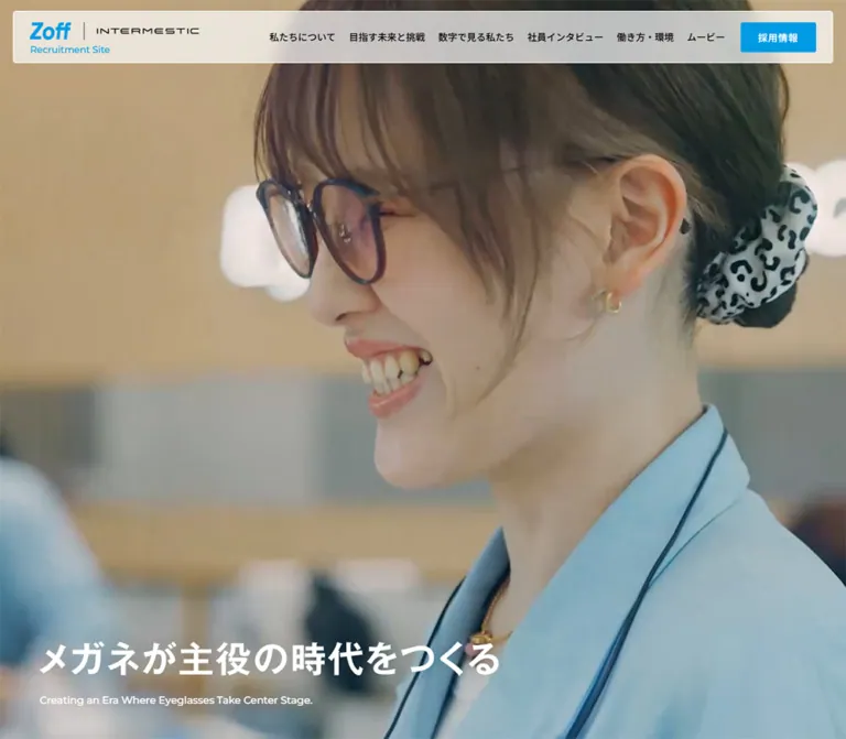
The opening fills the measured viewport height at both sizes. Desktop imagery features a glasses-wearing employee in a pale blue uniform, framed at close range in a bright interior. Mobile shows a different scene with people and a fashion-oriented eyewear setting. A pale, cool image treatment lets white copy sit near the lower left.
The Japanese statement appears on one line on desktop and two lines on mobile. Its graphic bounds begin at x = 67.5px, y = 835.70px on desktop and x = 19.5px, y = 698.39px on mobile. The English sentence appears beneath it, ending approximately 56.25px above the desktop bottom and 24.38px above the mobile bottom.
The opening contains no large centered conversion button in the supplied view. Recruitment access is already available in the header and the following section.
Different captured scenes are compatible with time-varying media or different responsive assets. They do not establish a video sequence, autoplay, loop timing, audio state, or a deliberate mobile-only scene. Preserve the composition while keeping those implementation decisions explicit.
Bilingual Section Introduction
Role: provide a repeatable hierarchy across different content types.
Stack a small Montserrat English label, a heavier Japanese title, and a concise explanatory paragraph. English labels are generally Zoff Blue on light surfaces; the environment section uses white labels. The Japanese title grows from 22px in the early utility sections to 28px in later desktop editorial sections.
For Careers, the measured gap between the English label's bottom and the Japanese title's top is 11.25px desktop and approximately 6.81px mobile. Later sections use somewhat different spacing. Avoid imposing one exact gap on every introduction.
The English label is an actual H2 in the sampled DOM, while the larger Japanese title is often a paragraph. For a new build, preserve the visual hierarchy while choosing a coherent semantic heading structure.
Career Destination Card
Role: route candidates to the appropriate employment category.
The four categories are new graduates, store part-time work, store careers, and headquarters careers. Each combines a Japanese title with an English category label.
Desktop places a narrow introductory column beside four equal cool-gray cards. The introduction is approximately 226.13px wide; the card group begins at x = 373.5px. Cards measure 226.88 × 261.20px, with 18px gaps and small rounded corners.
Mobile changes these into four horizontal rows beneath the introduction. Each row measures 328.22 × 77.98px, separated by 9.75px. The Japanese title begins approximately 113.08px from the row's left edge, leaving a leading visual area. The evidence does not identify that area's image or graphic, so do not invent an illustration set.
The destination split is functional: new graduates and headquarters careers link within the recruitment site, while store part-time and store-career links point to separate recruitment URLs. Preserve the source's external-link cues when appropriate; link targets were recorded but not opened.
Editorial Pill Link
Role: provide a consistent onward action beneath or beside editorial content.
The standard desktop link is 235 × 58px, charcoal, fully rounded, and padded 27px on the left and 18px on the right. Mobile changes it modestly to 224.25 × 56.55px with 23.4px and 15.6px side padding.
The visible label is white. A white circular icon well sits near the right edge; its approximately 29px diameter is a screenshot estimate. The glyph changes with the destination, including an external-link symbol in the initiatives link.
Some buttons are left-aligned beside explanatory copy, while the data, interview, and initiatives links are centered. The environment link sits at the lower right. Preserve these contextual placements rather than centering every action.
Movie Preview Group
Role: introduce work-related video content and the official recruitment Instagram account.
Desktop has an introductory column on the left and three measured portrait buttons on the right. Each button is approximately 265 × 469.27px, close to a 9:16 presentation. The two onward pill links stack below the desktop introduction.
Mobile measurements show two portrait buttons, each approximately 156.31 × 277.27px, separated by 15.59px. The onward links move below the previews and are centered.
The preview elements are buttons, but no activated player, modal, playback controls, captions, or accessible names were included in the evidence. The third desktop item's mobile availability is also unverified. A new implementation should retain access to all intended content without assuming that a particular swipe or modal interaction already exists.
Blue Future Statement
Role: interrupt the light editorial rhythm with a concentrated brand message.
The section uses measured Statement Blue #2299e1 and white text. Its desktop height is approximately 746.22px; mobile is 644.03px.
A small Japanese heading introduces the section. A larger graphic heading region and a long paragraph sit in a narrow central column: 483.75px wide desktop and approximately 292.16px mobile. The graphic region's wording is not available in extracted text, so its contents should not be reconstructed from assumptions.
The paragraph uses unusually generous leading: 16 / 32px desktop and 15 / 30px mobile, both with 0.06em tracking. A simple white onward link sits toward the lower right.
The sampled heading, graphic-heading container, and paragraph define opacity 0.5s, transform 0.5s transitions. Their initial state, translation distance, and trigger were not recorded.
Workplace Story Composition
Role: show six distinct reasons to work at Zoff through workplace and culture photography.
The desktop capture uses an asymmetric split. A large office photograph fills the left side, showing an employee working on a laptop beneath a bright open-office background. Its visible width is approximately 608px, or 43% of the rendered page. The section introduction is placed over the upper portion of this image.
The right side uses a cool-gray background and a vertical series of wide photo cards. The captured cards begin near x = 698px and end at x = 1335px, giving an approximately 637px image width. A fully visible card is about 400px high, close to 8:5. Cards have small rounded corners and about 45px between them.
This creates a pin-like desktop composition: a tall contextual image beside a longer sequence. The section's sampled box is 1000px high while child headings extend much farther down the document. That geometry suggests a more involved scrolling arrangement, but does not prove a particular sticky or scroll-animation implementation.
Mobile DOM measurements establish a single vertical sequence below the introduction, with 18 / 27px captions. The section occupies approximately 1678.81px. Its middle was not visually captured, so the mobile treatment of the large left photograph is unverified.
Numbered Photo Story
Role: pair an employment theme with a specific human scene.
Each of the six stories has a two-digit ordinal and total, such as 05 | 06. In the desktop capture, the marker is a blue rectangle near the photograph's upper-left corner, with white digits and a narrow vertical separator. The current number is visually larger than the total; approximately 24px and 18px are suitable visual estimates.
The caption sits near the lower left in two lines. Each line has its own square white backing, so the background ends with the text rather than forming a single large rectangular caption panel. The text is blue and bold, measured at 24 / 36px, weight 600, with 0.06em tracking.
The visible fourth story shows coworkers in conversation. The fifth shows a person wearing decorative glasses and elaborate fashion accessories. These images connect careers with individual expression, fashion, and culture.
Use inline backgrounds with box-decoration-break: clone, or explicitly separated line spans, to reproduce the stepped caption edges. This is a recommended technique; the source's exact markup was not supplied. No story-card destination or click action was established.
Company Data Summary
Role: provide concrete evidence about the organization and its work.
The rendered content includes headquarters and store employee counts, domestic stores, average age, five-year growth, and school outreach. Examples visible in the supplied text are 358, 3089, 332, 30.4, 168%, and 184. The employee figures include a December 2025 date note. These are captured content values, not permanent design tokens.
The measured data region is 1245 × 742.5px desktop and 328.22 × 866.89px mobile. Desktop places values across multiple horizontal regions; mobile places the store-count and average-age wrappers beside one another below the employment content.
The supplied screenshots do not show this section, and individual number spans or illustrations were not sampled. Do not infer a 60px font merely from a 60px wrapper height, or invent chart types, pictograms, or counter animations. For reuse, maintain clear label/value/unit relationships and retain each statistic's date context.
Work Style and Environment Feature
Role: introduce working conditions and benefits through a large feature section.
The section measures approximately 592.92px high desktop and 444.75px mobile. White introductory text sits toward the upper left. The text region is 427.5px wide at x = 90px desktop and approximately 279.81px wide at x = 25.34px mobile.
A charcoal pill link sits toward the lower right at both sizes. The supplied element records establish the white text and geometry, but do not identify the background asset. If adapting this component with an environment photograph, select and grade that image deliberately rather than treating an invented photograph as observed evidence.
Employee Interview Card
Role: introduce individual experiences and link to full interviews.
Each card contains employment-entry metadata, a department or team, a substantial quotation, and a person's initials. Three entries are measured on desktop in a row, with 377.5px widths and 56.25px gaps. Heights vary with quotation length.
The quotation begins 400px below the top of each desktop link box. Mobile cards stack at 328.22px wide, and their quotations begin approximately 343.81px below the top. These offsets establish a substantial upper media/metadata region; the exact image bounds were not provided.
Desktop quotations align with the card's outer edge. Mobile quotations gain 19.5px of inner padding on both sides, producing a 289.22px text width. Their 18 / 27px typography remains unchanged.
The sampled card background is transparent. Avoid adding a heavy white panel, outline, or shadow to every interview solely because it is described as a card.
Initiatives Article Rail
Role: connect recruitment with current company activity.
A cool-gray section holds landscape article imagery, a category pill and date, and a substantial Japanese title. The desktop capture shows three articles and a small portion of the next, indicating continuation beyond the visible page edge.
Desktop cards are 382.5px wide with 56.25px gaps. Mobile cards remain a substantial 320px wide, with 19.5px gaps. The mobile next-card position begins at approximately x = 362.89px, leaving a narrow visible continuation inside the 375px body.
Category pills are white with fine neutral borders. Dates appear small and gray. Those details are visual observations; exact category/date child styles were not sampled. Article titles are measured at 18 / 28.8px, weight 600, and 0.06em tracking at both sizes.
Two 45 × 45px circular control buttons are present in the desktop DOM. The repeated article records appear in three sets with offscreen horizontal positions, consistent with carousel duplication. They should not be interpreted as eighteen unique editorial entries.
No arrow activation, swipe, drag, autoplay, looping behavior, or travel duration was recorded. A centered charcoal link leads to the complete initiatives index.
Directory Footer
Role: close the homepage with a complete, readable navigation directory.
The footer returns to white. Desktop uses a large brand block at the left, then recruitment links, editorial links, and social/corporate links across the remaining width. Group headings are muted gray; links are black. The home-link box measures 326.25 × 73.73px and begins 91px below the footer boundary.
On mobile, the brand moves to its own upper row. Recruitment and editorial groups remain two-column link grids, rather than turning into accordions. Social links stack on the left of the final group while the cool-gray corporate link sits to their right. The home-link box is 328.22 × 61.30px; its visible wordmark is narrower than that link box.
A charcoal legal strip completes the page. Desktop policy links sit along the left with copyright at the right. Mobile policies form two rows and two columns, followed by copyright beneath. The legal text is 11px, with underlined policy links.
The copyright names INTERMESTIC INC. on the inspected page. The evidence does not establish a production studio or individual design credit.
Tokens — Motion & Interaction
| Treatment | Supplied evidence | What can safely be reused |
|---|---|---|
| Desktop brand link | opacity 0.3s transition |
A short opacity transition; exact hover opacity unknown |
| Desktop navigation links | color 0.3s transition |
A restrained color transition; destination color unknown |
| Desktop recruitment button | background-color 0.3s transition |
A short fill transition; open-state behavior unknown |
| Desktop editorial pill links | background-color 0.3s transition |
Consistent 300ms fill feedback |
| Career and editorial titles | Selected desktop titles have color 0.3s |
Text-color feedback; no established scale or elevation |
| Future statement content | opacity 0.5s, transform 0.5s |
A possible 500ms reveal; trigger and transform values unknown |
| Corporate footer link | Background, color, and border-color transitions of 0.3s |
Coordinated color feedback |
| Persistent header | Same top placement across supplied scroll captures | Persistent navigation layer |
| Workplace storytelling | Tall split composition and extended child geometry | Preserve the visual sequence; exact pinning mechanics unknown |
| Initiatives rail | Duplicate groups, offscreen cards, two desktop buttons | Carousel-like structure; movement behavior untested |
| Opening media | Different desktop/mobile scenes | Media variability is possible; playback characteristics unknown |
Source easing variables include --ease-out-cubic: cubic-bezier(.33, 1, .68, 1), --ease-out-quint: cubic-bezier(.22, 1, .36, 1), and --ease-out-expo: cubic-bezier(.16, 1, .3, 1). Their existence does not show which component uses them.
Many sampled elements report animation: none, and several transitions serialize simply as all without a nonzero duration. Neither proves the absence of video, JavaScript animation, or animations on unsampled descendants.
For an adaptation, prefer short color changes and restrained reveals. Keep reading possible without waiting for animation. Reduced-motion behavior, media pause controls, keyboard operation, and focus management are recommended additions, not verified source features.
Surfaces
| Layer | Appearance | Purpose |
|---|---|---|
| Main canvas | White | Clear editorial and recruitment content |
| Secondary sections | Cool Gray #edeff0 |
Group workplace stories and current initiatives |
| Recruitment destinations | Cool-gray rectangles with small corners | Compact category selection |
| Floating header | Pale translucent panel, thin white edge | Persistent navigation over changing content |
| Statement chapter | Solid #2299e1 with white content |
Concentrated brand message |
| Photo captions | Separate square white strips with blue text | Readable themes without obscuring the whole image |
| Editorial action | Charcoal pill with a white circular icon well | Repeated onward-navigation pattern |
| Corporate footer link | Light-gray rounded rectangle | A distinct external destination |
| Legal footer | Charcoal with small white text | Quiet utility closure |
Visible structure comes from spacing, image boundaries, color fields, and limited borders. A general shadow-elevation system is not established by the captures.
Imagery
The strongest imagery is observational and human: employees in glasses, pale blue uniforms, coworkers talking, someone using a laptop in an open office, and expressive eyewear in a fashion setting. Faces and glasses remain important focal points. Interiors are bright, with glass, pale surfaces, and softly blurred backgrounds.
The cool overall appearance comes partly from photographed environments and clothing. Keep natural skin tones and image-specific color variation. Applying one strong blue filter to every photograph would erase the differences between work, fashion, and outreach stories.
The opening uses an immersive crop. Workplace story images use wide compositions with room for an upper-left number marker and a lower-left caption. The initiatives capture contains documentary school/community imagery, visually distinct from the more polished workplace photographs.
Observed Asset References
No image, video, SVG, or font-file URLs were included in the supplied evidence. The following identifies observed asset roles without inventing paths.
| Asset role | Observed content | Reuse guidance |
|---|---|---|
| Header/footer identity | Zoff and INTERMESTIC wordmarks with Recruitment Site |
Use approved brand artwork; retain the divider and relative hierarchy |
| Opening media | Employee close-up on desktop; different people/fashion scene on mobile | Preserve subject visibility and lower-left copy space; exact playback and asset selection unknown |
| Opening statement | Large white Japanese graphic, with responsive line arrangement | Keep approved graphic proportions and provide an accessible text equivalent |
| Workplace context image | Person with laptop in a bright open office | Preserve the large vertical environmental composition |
| Fourth workplace story | Coworkers in conversation | Favor interaction and individual expression |
| Fifth workplace story | Decorative glasses and expressive fashion styling | Retain cultural specificity and the eyewear focal point |
| Initiatives thumbnails | School/community outreach scenes | Keep documentary context instead of substituting generic office imagery |
| Utility symbols | Menu strokes, social marks, external-link glyphs | Use clear simple icons; no source icon library was identified |
Photographs should scale smoothly. There is no pixel-art or intentionally low-resolution interface treatment to reproduce. Some softness in the opening capture may belong to moving media or the capture frame, rather than the original asset's intended resolution.
Layout & Responsive Behavior
Page Sequence
The observed sequence is opening → Careers → Movie → future statement → Working at Zoff → Company Data → Work Style and Environment → Interview → Initiatives → footer. It combines direct recruitment routing with progressively richer evidence about the employer.
Desktop Composition
Most ordinary content aligns between x = 90px and x = 1335px, creating a 1245px inner width. The opening copy uses a smaller 67.5px left inset, and the floating header sits closer to the edges at 22.5px.
Careers combines an introduction and four cards. Movie combines an introduction and three portrait previews. Interviews use three equal columns. Initiatives extend beyond the content edge as a rail. Workplace storytelling deliberately breaks the standard centered-container pattern with a full-height left image and right-hand sequence.
Mobile Recomposition
| Area | Observed mobile change |
|---|---|
| Header | Text navigation is replaced by a compact menu button; recruitment remains visible |
| Opening | Full viewport height retained; Japanese statement becomes two lines; English copy drops to 12px |
| Careers | Four tall desktop cards become four full-width horizontal rows |
| Movie | Two portrait-button measurements are present; onward links move below the previews |
| Statement | Central text column narrows to about 292px; body keeps a generous 2 line-height ratio |
| Workplace stories | Introduction precedes one vertical sequence; captions reduce to 18px |
| Company data | Content becomes taller and narrower, with some smaller metrics sharing a row |
| Interviews | Three columns become a vertical list; quotations gain inner horizontal padding |
| Initiatives | Wide 320px cards retain horizontal continuation instead of becoming a dense grid |
| Footer | Directory groups stack; their links remain in two columns; legal content wraps below |
The desktop document is approximately 10675px high and the mobile document approximately 9687px. The shorter mobile total should not be interpreted as missing content: some large desktop storytelling geometry contracts while other sections grow through stacking.
Breakpoints and Unverified Sizes
Source properties declare 400, 768, 1024, 1280, 1440, and 1920 screen values. The corresponding media-query rules were not supplied. Only the two specified viewports were inspected, so the exact menu-switch threshold and tablet layout remain unknown.
The Quick Start uses 1024px for larger content layouts and 1280px for full navigation as recommended implementation breakpoints. Test intermediate widths with real Japanese labels. The six-link desktop header needs considerably more horizontal room than a simple three-link navigation bar.
Do’s and Don’ts
Do
- Keep the two measured blues distinct:
#009be4for core accents and#2299e1for the statement field. - Use the declared Noto Sans JP stack for Japanese UI and Montserrat for measured English labels.
- Make photographs of people, eyewear, and actual working environments carry the visual identity.
- Preserve the floating inset header and its compact mobile recruitment/menu controls.
- Keep job-category access near the beginning of the homepage.
- Pair small English labels with stronger Japanese titles and concise explanatory copy.
- Use separate white strips behind the blue workplace-caption lines.
- Retain the distinction between small-cornered cards and fully rounded editorial links.
- Recompose mobile layouts: horizontal career rows, stacked interviews, and two-column footer directories.
- Keep article and interview titles readable instead of scaling every text role down.
- Preserve date qualifiers and units with company statistics.
- Label inferred or newly designed interactions as implementation choices.
Don’t
- Don’t reduce the site to a single recruitment CTA and a generic sequence of feature cards.
- Don’t replace workplace and fashion specificity with interchangeable stock-office photographs.
- Don’t collapse every blue into one token or use declared editor gradients as the visible palette.
- Don’t typeset the paired logos with substitute fonts.
- Don’t use the sampled paragraph's
16pxvalue as the size of the graphic opening headline. - Don’t add heavy shadows, oversized corner radii, or frosted surfaces to every card.
- Don’t turn the stepped photo captions into one oversized white box.
- Don’t hardcode the capture's
15pxright-side gutter into the page layout. - Don’t assume the opening is an autoplaying muted loop or that the article rail advances automatically.
- Don’t treat offscreen menus as visually inspected open states.
- Don’t duplicate carousel clones as unique accessible articles.
- Don’t fabricate missing asset paths, illustrated data treatments, or production credits.
Recommended Implementation Additions
These recommendations apply to a new implementation; they are not verified features of the original page.
- Give the graphic opening statement a meaningful heading equivalent. Preserve one accessible reading of the copy when using responsive artwork.
- Audit white text over every opening-media scene. Adjust crop or a localized scrim when faces, uniforms, or bright walls move behind the copy.
- Check small blue-on-white and white-on-blue labels for contrast. Keep the measured brand colors in the reference, and document any darker accessible text variant separately.
- Make the mobile menu control at least
44pxhigh; its sampled height is approximately42.89px. Add explicit accessible names and expanded-state information. - When a menu is closed, remove its links from keyboard navigation. Manage focus and dismissal when it opens.
- Add a skip link and sufficient scroll offset so the persistent header does not cover linked headings.
- If using moving opening media, provide an appropriate paused/static alternative and reduced-motion handling. Keep audible playback dependent on a deliberate user action.
- Give portrait video buttons meaningful names and make captions or transcripts available where appropriate.
- Make all initiative articles reachable with keyboard controls or native horizontal scrolling. Prevent cloned slides from introducing duplicate focus stops.
- Keep the desktop workplace sequence readable with ordinary scrolling before adding any pinning enhancement.
- Allow footer links and the corporate destination label to wrap naturally. Avoid a narrow fixed text box that leaves a single Japanese character on a separate line when space can be redistributed.
- Reserve image dimensions and prioritize opening imagery without eagerly downloading every offscreen photograph or video.
Agent Prompt Guide
Quick Color Reference
- Main canvas:
#ffffff. - Secondary sections and recruitment cards:
#edeff0. - Recruitment controls and English section labels:
#009be4. - Full-width statement section:
#2299e1with white content. - Main text:
#000000. - Editorial pill links and legal footer:
#202426. - Footer group labels:
#999999. - Photo captions: blue text on separate white strips.
- Header: translucent white; exact opacity and blur are unmeasured.
Overall Prompt
“Create a Japanese eyewear recruitment homepage inspired by the observed Zoff structure. Use a light white and cool-gray canvas, Zoff Blue #009be4 for core accents, and a separate #2299e1 statement chapter. Combine the Noto Sans JP stack with small Montserrat English labels. Begin with full-height human photography and lower-left white Japanese copy, beneath a floating translucent navigation panel. Follow with four employment destinations, portrait video previews, a narrow-column brand statement, six numbered workplace photo stories, company data, a working-environment feature, employee interviews, current initiatives, and a spacious directory footer. On desktop, use broad margins and a large left workplace photograph beside wide story cards. On mobile, keep recruitment and menu controls visible, convert employment cards to horizontal rows, stack interviews, and retain two-column footer links. Use charcoal pill links with white circular icon wells. Treat unverified menus, playback, and scrolling behavior as explicit new implementation decisions.”
Example Component Prompts
- Header: “Build an inset translucent white header with paired brand artwork at left, six compact Japanese links, and a small blue recruitment control at right. At narrow widths retain the brand, a compact blue recruitment button, and a charcoal two-stroke menu control. Match the observed small corners and thin white boundary; do not invent an activated menu design.”
- Career destinations: “Create four cool-gray recruitment cards with Japanese titles and English subtitles. Use a desktop row of four tall cards beside an introduction. Recompose them as four compact horizontal rows on mobile, retaining a leading area for approved visual assets.”
- Workplace story: “Place a wide documentary workplace photograph on a cool-gray canvas. Add a blue
05 | 06marker at the upper left and a bold blue two-line caption at the lower left. Each caption line must have its own square white backing. Use lightly rounded image corners, generous gaps, and no card shadow.” - Interview list: “Create three desktop editorial interview links with a substantial upper media region, entry and department metadata, an 18px Japanese quotation, and initials. Stack them on mobile while retaining the quotation size and adding modest inner padding to the text.”
- Initiatives rail: “Create landscape news cards on
#edeff0, with white category pills, gray dates, and 18px Japanese headlines. Show three cards and a partial continuation on desktop; use approximately 320px cards on mobile. Implement accessible browsing explicitly, without assuming autoplay.” - Footer: “Build a white recruitment directory with a large paired brand lockup, muted-gray group labels, black links, Instagram and X marks, and a pale-gray corporate destination. Stack groups on mobile but retain two-column link lists. Finish with a charcoal legal strip and small underlined policy links.”
Quick Start
CSS Custom Properties
This is an implementation starter for the visible design language. Exact source colors and selected measured dimensions are retained. Responsive formulas, component classes, hover colors, blur, media crops, and layout breakpoints are recommendations.
The stylesheet expects approved imagery and brand artwork supplied by the implementing project. It does not contain recovered asset paths, JavaScript menus, video playback, or the original workplace scrolling system. The workplace layout uses native sticky positioning as an optional approximation; the article rail uses native horizontal scrolling without cloned items.
:root {
  /* Measured source palette */
  --color-brand: #009be4;
  --color-statement: #2299e1;
  --color-white: #ffffff;
  --color-surface: #edeff0;
  --color-charcoal: #202426;
  --color-text: #000000;
  --color-muted: #999999;
  --color-secondary: #666666;
  --color-rule: #dddddd;
  --color-deep-blue: #0079d5;

  /* Observed family declarations */
  --font-jp: 'Noto Sans JP', 'Hiragino Kaku Gothic ProN',
    'Yu Gothic', 'YuGothic', '游ゴシック体', 'メイリオ', sans-serif;
  --font-en: 'Montserrat', sans-serif;
  --weight-body: 400;
  --weight-label: 500;
  --weight-heading: 600;
  --tracking-jp: 0.06em;

  /* Mobile baseline; fluid formulas are recommended */
  --page-gutter: clamp(20px, 6vw, 36px);
  --header-inset: 9.75px;
  --header-top: 9.75px;
  --hero-inset: 19.5px;
  --section-space: 70.2px;
  --text-section: 24px;
  --text-story: 18px;
  --radius-card: 3.9px;
  --radius-panel: 6px;
  --pill-width: 224.25px;
  --pill-height: 56.55px;
  --rail-width: 320px;
  --rail-gap: 19.5px;
  --z-header: 10;

  /* Header material and hover color are adaptations */
  --header-surface: rgb(255 255 255 / 80%);
  --header-blur: 12px;
  --motion-color: 300ms ease;
}

* { box-sizing: border-box; }
html { scroll-padding-top: 112px; }
body {
  margin: 0;
  color: var(--color-text);
  background: var(--color-white);
  font: 400 16px/1.5 var(--font-jp);
}
img, video { display: block; max-width: 100%; }
button, input, select, textarea { font: inherit; }
button { cursor: pointer; }
a { color: inherit; }
button, a { -webkit-tap-highlight-color: transparent; }
:focus-visible {
  outline: 3px solid var(--color-deep-blue);
  outline-offset: 4px;
}
[hidden] { display: none !important; }

.container { margin-inline: var(--page-gutter); }
.section { padding-block: var(--section-space); }
.section--gray { background: var(--color-surface); }
.section-label {
  margin: 0 0 9.75px;
  color: var(--color-brand);
  font: 500 14px/1 var(--font-en);
}
.section-title {
  margin: 0;
  font-size: var(--text-section);
  font-weight: var(--weight-heading);
  line-height: 1.5;
  letter-spacing: var(--tracking-jp);
}
.section-title--compact { font-size: 22px; }
.section-copy {
  margin: 15.6px 0 0;
  font-size: 14px;
  line-height: 1.6;
  letter-spacing: var(--tracking-jp);
}

/* Persistent header; artwork is supplied by the project */
.site-header {
  position: fixed;
  z-index: var(--z-header);
  inset: var(--header-top) var(--header-inset) auto;
}
.header-panel {
  display: flex;
  align-items: center;
  gap: 9.75px;
  min-height: 85.81px;
  padding: 12px 11.7px 12px 15.6px;
  border: 1px solid rgb(255 255 255 / 95%);
  border-radius: var(--radius-panel);
  background: var(--header-surface);
  -webkit-backdrop-filter: blur(var(--header-blur));
  backdrop-filter: blur(var(--header-blur));
}
.brand-lockup {
  display: grid;
  gap: 4.875px;
  flex: 1 1 auto;
  min-width: 0;
  max-width: 185.27px;
  text-decoration: none;
}
.brand-lockup img { width: 100%; height: auto; }
.brand-descriptor {
  color: var(--color-brand);
  font: 500 13px/1.1 var(--font-en);
}
.header-nav { display: none; }
.header-careers, .menu-toggle {
  display: inline-flex;
  flex: 0 0 auto;
  align-items: center;
  justify-content: center;
  border: 0;
  border-radius: 5.85px;
  color: var(--color-white);
}
.header-careers {
  width: 70.77px;
  min-height: 55.56px;
  padding: 10px;
  background: var(--color-brand);
  font-size: 14px;
  line-height: 1;
}
.header-careers span { max-width: 3em; }
.menu-toggle {
  width: 48.75px;
  min-height: 44px; /* Recommended minimum target height */
  background: var(--color-charcoal);
}
.menu-strokes { display: grid; gap: 5px; }
.menu-strokes::before, .menu-strokes::after {
  content: '';
  width: 24px;
  height: 2px;
  background: currentColor;
}

/* Full-height opening; the scrim is a recommended treatment */
.hero {
  position: relative;
  isolation: isolate;
  min-height: 100vh;
  min-height: 100svh;
  overflow: hidden;
  color: var(--color-white);
}
.hero-media, .hero::after {
  position: absolute;
  inset: 0;
  width: 100%;
  height: 100%;
}
.hero-media { z-index: -2; object-fit: cover; }
.hero::after {
  content: '';
  z-index: -1;
  pointer-events: none;
  background: linear-gradient(
    to bottom,
    rgb(32 36 38 / 10%) 45%,
    rgb(32 36 38 / 30%) 100%
  );
}
.hero-copy {
  position: absolute;
  inset-inline: var(--hero-inset);
  bottom: 24.38px;
}
.hero-title { margin: 0; }
.hero-title img { width: 244.72px; height: auto; }
.hero-title-text {
  display: block;
  max-width: 7.3em;
  font-size: 34px; /* Visual fallback estimate, not a source font size */
  font-weight: 700;
  line-height: 1.45;
}
.hero-subtitle {
  margin: 23.4px 0 0;
  font: 500 12px/1.25 var(--font-en);
}

/* Four recruitment destinations */
.careers-layout { display: grid; gap: 31.2px; }
.career-grid { display: grid; gap: 9.75px; }
.career-card {
  display: flex;
  align-items: center;
  gap: 15.6px;
  min-height: 77.98px;
  padding: 7.8px 19.5px 7.8px 11.7px;
  border-radius: var(--radius-card);
  background: var(--color-surface);
  text-decoration: none;
}
.career-media {
  flex: 0 0 85.78px;
  width: 85.78px;
  height: 62.38px;
  object-fit: contain;
}
.career-info { min-width: 0; }
.career-title {
  margin: 0;
  font-size: 17px;
  font-weight: 600;
  line-height: 1.4;
  letter-spacing: var(--tracking-jp);
}
.career-subtitle {
  margin: 5px 0 0;
  font: 500 11px/1.4 var(--font-en); /* Recommended subtitle scale */
}

/* Repeated editorial action */
.pill-link {
  display: inline-flex;
  align-items: center;
  justify-content: space-between;
  gap: 11.7px;
  width: min(100%, var(--pill-width));
  min-height: var(--pill-height);
  padding: 10px 15.6px 10px 23.4px;
  border-radius: 999px;
  color: var(--color-white);
  background: var(--color-charcoal);
  font-size: 14px;
  font-weight: 500;
  text-decoration: none;
  transition: background-color var(--motion-color);
}
.pill-icon {
  display: grid;
  flex: 0 0 29px;
  width: 29px;
  height: 29px;
  place-items: center;
  border-radius: 50%;
  color: var(--color-charcoal);
  background: var(--color-white);
}
.pill-icon svg { width: 12px; height: 12px; }
.section-action { margin-top: 39px; text-align: center; }

/* Statement chapter */
.statement {
  padding: 38px var(--page-gutter) 62.4px;
  color: var(--color-white);
  background: var(--color-statement);
}
.statement-label {
  margin: 0;
  font-size: 16px;
  font-weight: 600;
  letter-spacing: var(--tracking-jp);
}
.statement-content {
  max-width: 292.16px;
  margin: 62.4px auto 0;
}
.statement-copy {
  margin-top: 23.4px;
  font-size: 15px;
  line-height: 2;
  letter-spacing: var(--tracking-jp);
}
.statement-action { margin-top: 44px; text-align: right; }

/* Native scrolling approximation of workplace storytelling */
.work-layout { background: var(--color-surface); }
.work-context {
  position: relative;
  padding: 70.2px var(--page-gutter) 39px;
}
.work-context-photo { display: none; }
.work-stories {
  display: grid;
  gap: 29.25px;
  margin: 0;
  padding: 0 var(--page-gutter) 70.2px;
  list-style: none;
}
.story-card {
  position: relative;
  overflow: hidden;
  border-radius: 6px;
  aspect-ratio: 8 / 5; /* Visual approximation */
}
.story-card > img { width: 100%; height: 100%; object-fit: cover; }
.story-counter {
  position: absolute;
  top: 12px;
  left: 12px;
  display: flex;
  align-items: baseline;
  gap: 10px;
  padding: 5px 9px;
  color: var(--color-white);
  background: var(--color-brand);
  font: 500 20px/1.2 var(--font-en);
}
.story-counter small {
  padding-left: 10px;
  border-left: 1px dotted currentColor;
  font-size: 14px;
}
.story-title {
  position: absolute;
  right: 10px;
  bottom: 15px;
  left: 9.75px;
  margin: 0;
  color: var(--color-statement);
  font-size: var(--text-story);
  font-weight: 600;
  line-height: 1.5;
  letter-spacing: var(--tracking-jp);
}
.story-title span {
  padding: 2px 10px 4px;
  background: var(--color-white);
  -webkit-box-decoration-break: clone;
  box-decoration-break: clone;
}

/* Interview structure; square media is a recommended approximation */
.interview-grid { display: grid; gap: 46.8px; }
.interview-card { display: block; text-decoration: none; }
.interview-media { width: 100%; aspect-ratio: 1; object-fit: cover; }
.interview-body { padding: 15.6px 19.5px 0; }
.interview-quote {
  margin: 0;
  font-size: 18px;
  font-weight: 600;
  line-height: 1.5;
  letter-spacing: var(--tracking-jp);
}

/* Accessible native article rail, without duplicate slides */
.initiatives-rail {
  display: grid;
  grid-auto-flow: column;
  grid-auto-columns: min(var(--rail-width), calc(100% - 32px));
  gap: var(--rail-gap);
  overflow-x: auto;
  padding-inline: var(--page-gutter);
  padding-bottom: 12px;
  scroll-snap-type: x proximity;
  scroll-padding-inline: var(--page-gutter);
}
.initiative-card { scroll-snap-align: start; text-decoration: none; }
.initiative-image {
  width: 100%;
  aspect-ratio: 16 / 9; /* Recommended landscape ratio */
  object-fit: cover;
  border-radius: 5px;
}
.initiative-meta {
  display: flex;
  align-items: center;
  gap: 12px;
  margin-top: 18px;
  color: var(--color-secondary);
  font-size: 13px;
}
.category-pill {
  padding: 3px 17px;
  border: 1px solid var(--color-rule);
  border-radius: 999px;
  color: var(--color-text);
  background: var(--color-white);
}
.initiative-title {
  margin: 14px 0 0;
  font-size: 18px;
  font-weight: 600;
  line-height: 1.6;
  letter-spacing: var(--tracking-jp);
}

/* Directory footer */
.footer-main {
  display: grid;
  gap: 39px;
  padding: 59.5px var(--page-gutter) 46.8px;
}
.footer-heading {
  margin: 0 0 15.6px;
  color: var(--color-muted);
  font-size: 14px;
  font-weight: 500;
  line-height: 1.6;
  letter-spacing: var(--tracking-jp);
}
.footer-links {
  display: grid;
  grid-template-columns: repeat(2, minmax(0, 1fr));
  gap: 9.75px 16px;
  margin: 0;
  padding: 0;
  list-style: none;
}
.footer-links a {
  font-size: 14px;
  font-weight: 500;
  line-height: 1.6;
  text-decoration: none;
}
.footer-social-layout {
  display: grid;
  grid-template-columns: 1fr 1.15fr;
  align-items: start;
  gap: 16px;
}
.corporate-link {
  display: flex;
  align-items: center;
  justify-content: space-between;
  gap: 10px;
  min-height: 64px;
  padding: 16px 12px;
  border: 1px solid var(--color-rule);
  border-radius: 5px;
  background: var(--color-surface);
  font-size: 13px;
  text-decoration: none;
}
.footer-legal {
  display: grid;
  gap: 20px;
  padding: 26px var(--page-gutter) 22px;
  color: var(--color-white);
  background: var(--color-charcoal);
  font-size: 11px;
  line-height: 1.6;
}
.legal-links { display: flex; flex-wrap: wrap; gap: 12px 19.5px; }
.legal-links a { text-underline-offset: 3px; }
.footer-copyright { margin: 0; font-family: var(--font-en); }

/* Recommended content breakpoint; original media queries are unknown */
@media (min-width: 64rem) {
  :root {
    --page-gutter: clamp(48px, 6.25vw, 90px);
    --hero-inset: 67.5px;
    --section-space: 112.5px;
    --text-section: 28px;
    --text-story: 24px;
    --radius-card: 5.625px;
    --pill-width: 235px;
    --pill-height: 58px;
    --rail-width: 382.5px;
    --rail-gap: 56.25px;
  }
  .hero-copy { bottom: 56.25px; }
  .hero-title img { width: 781.875px; }
  .hero-title-text { max-width: none; font-size: 60px; line-height: 1.2; }
  .hero-subtitle { margin-top: 31.5px; font-size: 15px; line-height: 1.1; }
  .career-grid { grid-template-columns: repeat(4, minmax(0, 1fr)); gap: 18px; }
  .career-card {
    flex-direction: column;
    align-items: flex-start;
    min-height: 261.2px;
    padding: 33.75px 22.5px 22.5px;
  }
  .career-media { flex-basis: auto; }
  .career-title { font-size: 18px; }
  .pill-link { gap: 13.5px; padding-inline: 27px 18px; }
  .statement { padding-block: 65px 90px; }
  .statement-content { max-width: 483.75px; }
  .statement-copy { margin-top: 36px; font-size: 16px; }
  .work-layout { display: grid; grid-template-columns: 42.67% minmax(0, 1fr); }
  .work-context {
    position: sticky;
    top: 0;
    align-self: start;
    min-height: 100vh;
    min-height: 100svh;
    padding: 177.5px var(--page-gutter) 60px;
  }
  .work-context-photo {
    position: absolute;
    inset: 0;
    display: block;
    width: 100%;
    height: 100%;
    object-fit: cover;
  }
  .work-context-copy { position: relative; }
  .work-stories { gap: 45px; padding: 110px var(--page-gutter); }
  .story-counter { top: 18px; left: 18px; font-size: 24px; }
  .story-counter small { font-size: 18px; }
  .story-title { bottom: 22px; left: 15px; }
  .interview-grid { grid-template-columns: repeat(3, minmax(0, 1fr)); gap: 56.25px; }
  .interview-body { padding: 22.5px 0 0; }
  .footer-main {
    grid-template-columns: 1.6fr 1fr 1.3fr 1fr;
    gap: 48px;
    min-height: 437px;
    padding-block: 91px 90px;
  }
  .footer-links--careers { grid-template-columns: 1fr; }
  .footer-links { row-gap: 20.25px; }
  .footer-links a { font-size: 15px; }
  .footer-social-layout { grid-template-columns: 1fr; gap: 36px; }
  .footer-legal { grid-template-columns: 1fr auto; align-items: center; }
}

/* Recommended full-navigation breakpoint */
@media (min-width: 80rem) {
  :root { --header-inset: 22.5px; --header-top: 18px; }
  .header-panel { min-height: 78.53px; gap: 27px; padding: 10px 24px; }
  .brand-lockup { flex: 0 0 250px; max-width: 250px; gap: 9px; }
  .brand-descriptor { font-size: 15px; }
  .header-nav { display: flex; align-items: center; gap: 22.5px; margin-left: auto; }
  .header-nav a {
    white-space: nowrap;
    font-size: 14px;
    font-weight: 500;
    line-height: 1.6;
    text-decoration: none;
    transition: color var(--motion-color);
  }
  .header-careers { width: 110.38px; min-height: 44px; border-radius: 3.375px; }
  .header-careers span { max-width: none; }
  .menu-toggle { display: none; }
  .careers-layout { grid-template-columns: 226.125px minmax(0, 1fr); gap: 57.375px; }
}

/* Suggested feedback colors; activated source colors were not supplied */
@media (hover: hover) {
  .header-nav a:hover { color: var(--color-brand); }
  .pill-link:hover { background: var(--color-deep-blue); }
}

@media (prefers-reduced-motion: reduce) {
  .header-nav a, .pill-link { transition: none; }
  .initiatives-rail { scroll-snap-type: none; }
  /* Pause time-varying media separately in application code. */
}
Use .hero-title img for responsive approved artwork, or .hero-title-text for a live-text approximation; they are alternative treatments. Supply meaningful text equivalents without announcing the same heading twice.
The CSS intentionally leaves the movie player, data illustration system, and environment background to the implementation because their detailed visual or behavioral evidence is incomplete. Provide semantic metadata and real content before extending those components.
Tailwind v4 Token Mapping
Optional aliases for an implementation already using Tailwind v4. This is not evidence that the original website uses Tailwind. Define the preceding custom properties first.
@theme inline {
  --color-zoff-blue: var(--color-brand);
  --color-zoff-statement: var(--color-statement);
  --color-zoff-surface: var(--color-surface);
  --color-zoff-charcoal: var(--color-charcoal);
  --color-zoff-muted: var(--color-muted);
  --color-zoff-rule: var(--color-rule);

  --font-japanese: var(--font-jp);
  --font-english: var(--font-en);

  --text-section-label: 14px;
  --text-section-title: var(--text-section);
  --text-story-caption: var(--text-story);
  --text-editorial-title: 18px;
  --text-legal: 11px;

  --spacing-page: var(--page-gutter);
  --spacing-section: var(--section-space);
  --spacing-rail-gap: var(--rail-gap);

  --radius-editorial-card: var(--radius-card);
  --radius-navigation-panel: var(--radius-panel);
  --radius-editorial-action: 999px;
}
Sources & Evidence
- Inspected original and final page: Zoff Recruitment Site. The supplied browser observation reports HTTP
200, the unchanged final URL, and the titleZoff Recruitment Site | INTERMESTIC INC.. - Capture date: September 12, 2026, using the supplied retrieval timestamp
2026-09-12T06:50:15.915Z. Separate timestamps for each individual image were not provided. - Desktop evidence: configured viewport
1440 × 1000; supplied opening, workplace-story, and footer captures; full-page rendered text and selected element/computed-style records. Body bounds measure1425pxwide and approximately10674.97pxhigh. - Mobile evidence: configured viewport
390 × 844; supplied opening and footer captures; full-page rendered text and selected element/computed-style records. Body bounds measure375pxwide and approximately9686.86pxhigh. - Style evidence: supplied custom properties, font stacks, colors, element dimensions, typography, spacing, radii, and selected transitions. Asset URLs, complete selectors, positioning rules, and original responsive formulas were not supplied.
- Observed navigation evidence: homepage links identify recruitment categories, editorial routes, social destinations, the initiatives index, corporate site, and policy pages. These destinations were not independently opened or analyzed.
- Interaction evidence: supplied captures cover initial and scrolled states. No activated recruitment menu, mobile drawer, video player, carousel control, hover state, or keyboard interaction was provided.
- Capture limitations: the collection process waited for document readiness, sampled layout/text stability, image decoding, and qualifying finite motion within stated time limits. Perpetual animations were temporarily paused during readiness checks and resumed. These checks do not prove that all delayed content or interaction states were captured. SharedWorkers and service workers were disabled during collection.
This reference describes the current homepage visible in the supplied evidence. Measurements apply to the inspected states; image-derived estimates and implementation recommendations are labeled separately.
# Zoff Recruitment Site / INTERMESTIC — Style Reference

> An open, photographic recruitment experience framed by clear blue accents and a floating translucent navigation bar.

**Website:** [recruit.zoff.com](https://recruit.zoff.com/)
**Original URL:** https://recruit.zoff.com/
**Final URL:** https://recruit.zoff.com/
**Theme:** light, with white and cool gray surfaces, blue accents, a blue statement section, and a charcoal legal footer.
**Inspected:** September 12, 2026. Supplied retrieval timestamp: `2026-09-12T06:50:15.915Z`, equivalent to 15:50:15.915 JST.
**Viewports:** desktop `1440 × 1000` and mobile `390 × 844` CSS pixels.
**Scope:** the current recruitment homepage. Visual evidence includes the desktop opening view, a middle workplace-story view, the desktop footer, and mobile opening/footer views. Rendered text, links, element bounds, computed styles, and custom properties cover the longer homepage at both sizes. Linked pages and activated menus, players, and carousel controls were not inspected.

Zoff presents employment through people, workplaces, fashion, and company activity. Large photographs establish atmosphere while a compact bilingual hierarchy organizes the information: small blue English section labels, heavier Japanese titles, and short explanatory paragraphs. White, pale gray, and two distinct blues create a clean retail-brand setting. The photographs introduce individuality without requiring decorative typography or elaborate surface effects.

This is a recruitment homepage with several onward destinations. Four employment categories appear immediately after the opening image, followed by video content, a future-facing statement, six workplace stories, company figures, working conditions, interviews, and current initiatives. Preserve this relationship between practical job access and editorial exploration.

The most recognizable components are the floating translucent header, the full-height photographic opening, blue captions on separate white strips over workplace photographs, charcoal pill links with circular icon wells, and the spacious directory footer.

## How to Read This Reference

- **Measured** means supplied computed styles or rendered element bounds. Decimal values are retained where useful; they describe the inspected viewport rather than a universal layout rule.
- **Observed** means directly visible in the supplied captures. Screenshot estimates are explicitly identified.
- **Calculated** means arithmetic from supplied measurements, such as the distance between adjacent cards.
- **Recommended** means guidance for a new implementation. The CSS and prompts below are adaptations, not recovered source code.
- **Declared only** means a source custom property exists, but its application to a particular visible component was not established.
- Desktop HTML and body bounds are `1425px` wide inside the configured `1440px` viewport. Mobile bounds are `375px` inside `390px`. The consistent `15px` difference is compatible with a reserved scrollbar gutter. Do not recreate it as a deliberate white sidebar.
- The computed root size is `16px`. Fractional spacing does not establish a special root-font scaling system; the original responsive formulas were not supplied.
- An empty text field on a sampled element does not mean that the element is visually empty. The large Japanese opening statement is visible in the capture, although its sampled paragraph contains no extracted text.

## Tokens — Colors

### Default Palette

| Name | Value | Source or implementation token | Role and evidence |
| --- | --- | --- | --- |
| Zoff Blue | `#009be4` | Source `--color-main-blue` | Measured recruitment-button fill and English section-label color; also visually central to the brand lockup |
| Statement Blue | `#2299e1` | Source `--color-main` | Measured background of the future statement section; visually close to the blue workplace captions |
| White | `#ffffff` | Source `--color-white` | Measured body background and reversed statement text; visible footer surface and caption strips |
| Cool Gray | `#edeff0` | Source `--color-light-gray` | Measured career-card fill, workplace-section background, initiatives background, and corporate-link surface |
| Charcoal | `#202426` | Source `--color-black` | Measured pill-link and mobile menu-button fill; visible legal-footer treatment |
| Text Black | `#000000` | Implementation alias `--color-text` | Actual computed body, navigation, and heading color in many sampled elements |
| Muted Gray | `#999999` | Source `--color-gray` | Measured footer group-heading color |
| Secondary Gray | `#666666` | Source `--color-dark-gray` | Declared neutral; resembles the visible article-date treatment, whose own computed color was not sampled |
| Silver | `#dddddd` | Source `--color-silver` | Declared divider color; a suitable approximation for the fine visible neutral borders |

Keep Zoff Blue and Statement Blue separate. The recruitment control and the large statement panel have different measured fills, even though both belong to the same blue family.

Also distinguish Text Black from the source variable named `--color-black`: the variable is charcoal, while much ordinary text actually computes to pure black.

### Supporting Source Colors

| Source token | Value | Evidence status |
| --- | --- | --- |
| `--color-deep-blue` | `#0079d5` | Declared; no specific activated state established |
| `--color-light-blue` | `#ebf2f7` | Declared; visible application not established in supplied captures |
| `--color-soft-blue` | `#b2e1f7` | Declared; visible application not established in supplied captures |

These colors may support an extension, but should not be promoted into additional dominant surfaces without a design reason. Numerous generic editor gradient and shadow presets also appear in the custom properties; their presence does not demonstrate that the photographed interface uses those effects.

### Transparency and Image Treatment

The header visibly admits the color and shapes of content behind it. Its appearance is frosted and pale, with a fine white boundary and small rounded corners. The sampled `HEADER` itself is transparent; the inner panel's opacity and blur were not supplied.

**Recommended approximation:** `rgba(255,255,255,0.80)` with a subtle white border and optional `backdrop-filter: blur(12px)`. Treat both numbers as implementation choices.

The opening image has cool, subdued highlights and a pale haze near the bottom. The evidence does not separate footage grading from image overlays. Do not describe a specific gradient, blend mode, or filter as measured source behavior.

Some sampled button and heading parents compute to black while their visible child labels are white or blue. Use the screenshot to describe the rendered label; do not reproduce black text on charcoal merely because the parent record reports black.

## Tokens — Typography

### Japanese Interface — Noto Sans JP Stack

**Measured stack:** `"Noto Sans JP", "Hiragino Kaku Gothic ProN", "Yu Gothic", "YuGothic", "游ゴシック体", "メイリオ", sans-serif`.

The source exposes this as `--font-noto`, and sampled body text, Japanese headings, navigation, article titles, and footer links use it. Computed family declarations establish the stack, not the exact font file used for every rendered glyph.

Weights are restrained: `400` for explanatory copy, `500` for navigation and directory links, and `600` for most Japanese headings and editorial titles. Many Japanese headings use `0.06em` tracking, creating slightly more open text without a highly stylized display face.

### English Labels — Montserrat

**Measured stack:** `Montserrat, sans-serif`, exposed through `--font-mont`.

English section labels such as `Careers`, `Movie`, and `Working at Zoff` use `14px`, weight `500`, and a tight `14px` line box at both inspected sizes. Their size remains stable while the surrounding layout changes.

The English opening sentence also uses Montserrat at weight `500`: `15px / 16.5px` on desktop and `12px / 12px` on mobile.

### Brand and Graphic Headlines

The paired Zoff and INTERMESTIC wordmarks are graphic identities. Their lettering should not be approximated by selecting a vaguely similar text font.

The visible Japanese opening statement is `メガネが主役の時代をつくる`. Its sampled paragraph has no extracted text and measures `781.875 × 60.047px` on desktop and `244.719 × 85.844px` on mobile. The artwork is one line on desktop and two lines on mobile.

These are **graphic bounds**, not font sizes. The paragraph's computed `16px` does not describe the large visible lettering. A live-text substitute around `60px` desktop and `34px` mobile is a visual starting estimate only; use approved artwork when exact identity is required.

### Type Scale

| Role | Desktop | Mobile | Weight / tracking | Evidence |
| --- | --- | --- | --- | --- |
| Body default | `16 / 24px` | `16 / 24px` | `400`, normal | Computed body |
| Header navigation | `14 / 22.4px` | Replaced by compact controls | `500`, normal | Computed desktop links |
| English section label | `14 / 14px` | `14 / 14px` | `500`, normal | Computed Montserrat |
| Careers / Movie Japanese title | `22 / 33px` | `22 / 33px` | `600`, `0.06em` | Computed |
| Workplace section title | `24 / 36px` | `22 / 33px` | `600`, `0.06em` | Computed |
| Data / environment / interview / initiatives title | `28 / 42px` | `24 / 36px` | `600`, `0.06em` | Computed |
| Career-card Japanese title | `18 / 25.2px` | `17 / 23.8px` | `600`, `0.06em` | Computed |
| Introductory copy, early sections | `15 / 24px` | `14 / 22.4px` | `400` | Computed |
| Introductory copy, later sections | `14 / 22.4px` | `14 / 22.4px` | `400`, often `0.06em` | Computed |
| Workplace photo caption | `24 / 36px` | `18 / 27px` | `600`, `0.06em` | Computed heading; visible child text is blue |
| Interview quotation | `18 / 27px` | `18 / 27px` | `600`, `0.06em` | Computed |
| Initiatives article title | `18 / 28.8px` | `18 / 28.8px` | `600`, `0.06em` | Computed |
| Statement-section body | `16 / 32px` | `15 / 30px` | `400`, `0.06em` | Computed |
| Footer group heading | `14 / 22.4px` | `14 / 22.4px` | `500`, `0.06em` | Computed |
| Footer directory link | `15 / 24px` | `14 / 22.4px` | `500`, `0.06em` | Computed |
| Legal link | `11 / 17.6px` | `11 / 17.6px` | `400`, `0.06em` | Computed |

Interview and news titles retain their desktop size on mobile. Responsive behavior relies substantially on reflow, not on shrinking all typography.

## Tokens — Spacing & Shapes

**Density:** broad section spacing around compact headings and controls. Media receives the largest areas; decoration occupies little space.

### Spacing Scale

The following is a selection of recurring measurements, not a recovered global spacing formula.

| Use | Desktop measurement | Mobile measurement |
| --- | --- | --- |
| Header outside horizontal inset | `22.5px` | `9.75px` |
| Header top offset | `18px` | `9.75px` |
| Opening-copy left inset | `67.5px` | `19.5px` |
| Standard content gutter | `90px` | Approximately `23.4px` |
| Career-card gap | `18px` horizontally | `9.75px` vertically |
| Career-card padding | `33.75px 22.5px 22.5px` | `7.8px 19.5px 7.8px 11.7px` |
| Desktop navigation-link gap | `22.5px`, calculated | Not applicable |
| Interview-card gap | `56.25px`, calculated | `46.8px`, calculated between cards |
| Initiatives-card gap | `56.25px`, calculated | `19.5px`, calculated |
| Movie section top / bottom padding | `112.5 / 157.5px` | `46.8 / 70.2px` |
| Interview section top / bottom padding | `112.5 / 135px` | `60.45 / 70.2px` |
| Workplace photo-card gap | Approximately `45px` | Caption positions repeat at approximately `234.66px`; image bounds were not sampled |

Typical desktop sections begin about `110–155px` below their section boundary. Mobile introductions commonly begin about `47–70px` below it. Keep enough space to distinguish chapters without giving every small internal group the same large gap.

### Border Radius

| Element | Desktop | Mobile | Evidence |
| --- | --- | --- | --- |
| Recruitment header button | `3.375px` | `5.85px` | Computed |
| Mobile menu button | Not visible | `5.85px` | Computed |
| Career card | `5.625px` | `3.9px` | Computed |
| Main pill link | `67.5px` | `58.5px` | Computed; both render fully rounded |
| Corporate footer link | `5.625px` | `4.875px` | Computed |
| Initiatives arrow buttons | `50%` | Not established | Computed desktop |
| Header panel and workplace photographs | Approximately `5–6px` | Header approximately `6px` | Visual estimate |
| White photo-caption strips | Square | Not visually captured | Observed desktop |

The mix matters: lightly rounded photographs and rectangular recruitment controls coexist with fully rounded editorial links. There is no single large-radius card treatment applied everywhere.

### Layout Measurements

| Element | Desktop | Mobile |
| --- | --- | --- |
| Document height | `10674.97px` | `9686.86px` |
| Rendered body width | `1425px` | `375px` |
| Opening section | `1425 × 1000px` | `375 × 844px` |
| Header panel width, calculated | `1380px` | `355.5px` |
| Header height | `78.53px` | `85.81px` |
| Header home-link box | `250 × 50.53px` | `185.27 × 37.91px` |
| Recruitment button | `110.38 × 44px` | `70.77 × 55.56px` |
| Menu button | Not visible | `48.75 × 42.89px` |
| Standard inner content width | `1245px` | `328.22px` |
| Career card | `226.88 × 261.20px` | `328.22 × 77.98px` |
| Movie button | `265 × 469.27px` | `156.31 × 277.27px` |
| Main pill link | `235 × 58px` | `224.25 × 56.55px` |
| Interview card width | `377.5px` | `328.22px` |
| Initiatives card width | `382.5px` | `320px` |
| Complete footer | `505.02px` high | `736.92px` high |

## Components

### Floating Site Header

**Role:** persistent identity, editorial navigation, and direct access to recruitment categories.

A translucent white panel floats inside the viewport edges. It remains at the same visible top position in opening, middle, and footer captures. The panel is visually quiet: a thin white edge, small corners, and no prominent drop shadow.

On desktop, place the paired wordmarks and blue `Recruitment Site` descriptor on the left. Six Japanese navigation links occupy the right-hand portion, followed by the blue `採用情報` button. The brand group is not a centered title. The first navigation link begins at approximately `x = 554px`, leaving substantial flexible space after the `250px` brand block.

On mobile, retain the paired wordmarks and descriptor, followed by the blue recruitment control and a charcoal menu button with two white horizontal strokes. The recruitment label wraps within its narrower control. The mobile header is slightly taller than the desktop header despite carrying fewer items.

The source declares `--z-header: 10`. The captures establish the persistent visual layer; the supplied style sample does not include the exact positioning declaration.

### Recruitment Menus — Evidence Boundary

The desktop DOM includes four recruitment links in a menu-sized region approximately `270px` wide. Their sampled text is white at `15.75px`, weight `500`, with `0.06em` tracking. These links are not visible in the supplied closed-header capture.

The mobile DOM also contains an offscreen navigation structure with a second brand block, a close-sized button, recruitment links, editorial links, social links, and a corporate link. Negative vertical coordinates establish its offscreen state during sampling.

Do not treat either structure as an observed open menu. Click versus hover activation, entry direction, animation duration, focus handling, and dismissal behavior remain unverified.

### Full-Height Opening

**Role:** communicate a people-centered employment identity before the recruitment directory.

The opening fills the measured viewport height at both sizes. Desktop imagery features a glasses-wearing employee in a pale blue uniform, framed at close range in a bright interior. Mobile shows a different scene with people and a fashion-oriented eyewear setting. A pale, cool image treatment lets white copy sit near the lower left.

The Japanese statement appears on one line on desktop and two lines on mobile. Its graphic bounds begin at `x = 67.5px, y = 835.70px` on desktop and `x = 19.5px, y = 698.39px` on mobile. The English sentence appears beneath it, ending approximately `56.25px` above the desktop bottom and `24.38px` above the mobile bottom.

The opening contains no large centered conversion button in the supplied view. Recruitment access is already available in the header and the following section.

Different captured scenes are compatible with time-varying media or different responsive assets. They do not establish a video sequence, autoplay, loop timing, audio state, or a deliberate mobile-only scene. Preserve the composition while keeping those implementation decisions explicit.

### Bilingual Section Introduction

**Role:** provide a repeatable hierarchy across different content types.

Stack a small Montserrat English label, a heavier Japanese title, and a concise explanatory paragraph. English labels are generally Zoff Blue on light surfaces; the environment section uses white labels. The Japanese title grows from `22px` in the early utility sections to `28px` in later desktop editorial sections.

For Careers, the measured gap between the English label's bottom and the Japanese title's top is `11.25px` desktop and approximately `6.81px` mobile. Later sections use somewhat different spacing. Avoid imposing one exact gap on every introduction.

The English label is an actual `H2` in the sampled DOM, while the larger Japanese title is often a paragraph. For a new build, preserve the visual hierarchy while choosing a coherent semantic heading structure.

### Career Destination Card

**Role:** route candidates to the appropriate employment category.

The four categories are new graduates, store part-time work, store careers, and headquarters careers. Each combines a Japanese title with an English category label.

Desktop places a narrow introductory column beside four equal cool-gray cards. The introduction is approximately `226.13px` wide; the card group begins at `x = 373.5px`. Cards measure `226.88 × 261.20px`, with `18px` gaps and small rounded corners.

Mobile changes these into four horizontal rows beneath the introduction. Each row measures `328.22 × 77.98px`, separated by `9.75px`. The Japanese title begins approximately `113.08px` from the row's left edge, leaving a leading visual area. The evidence does not identify that area's image or graphic, so do not invent an illustration set.

The destination split is functional: new graduates and headquarters careers link within the recruitment site, while store part-time and store-career links point to separate recruitment URLs. Preserve the source's external-link cues when appropriate; link targets were recorded but not opened.

### Editorial Pill Link

**Role:** provide a consistent onward action beneath or beside editorial content.

The standard desktop link is `235 × 58px`, charcoal, fully rounded, and padded `27px` on the left and `18px` on the right. Mobile changes it modestly to `224.25 × 56.55px` with `23.4px` and `15.6px` side padding.

The visible label is white. A white circular icon well sits near the right edge; its approximately `29px` diameter is a screenshot estimate. The glyph changes with the destination, including an external-link symbol in the initiatives link.

Some buttons are left-aligned beside explanatory copy, while the data, interview, and initiatives links are centered. The environment link sits at the lower right. Preserve these contextual placements rather than centering every action.

### Movie Preview Group

**Role:** introduce work-related video content and the official recruitment Instagram account.

Desktop has an introductory column on the left and three measured portrait buttons on the right. Each button is approximately `265 × 469.27px`, close to a `9:16` presentation. The two onward pill links stack below the desktop introduction.

Mobile measurements show two portrait buttons, each approximately `156.31 × 277.27px`, separated by `15.59px`. The onward links move below the previews and are centered.

The preview elements are buttons, but no activated player, modal, playback controls, captions, or accessible names were included in the evidence. The third desktop item's mobile availability is also unverified. A new implementation should retain access to all intended content without assuming that a particular swipe or modal interaction already exists.

### Blue Future Statement

**Role:** interrupt the light editorial rhythm with a concentrated brand message.

The section uses measured Statement Blue `#2299e1` and white text. Its desktop height is approximately `746.22px`; mobile is `644.03px`.

A small Japanese heading introduces the section. A larger graphic heading region and a long paragraph sit in a narrow central column: `483.75px` wide desktop and approximately `292.16px` mobile. The graphic region's wording is not available in extracted text, so its contents should not be reconstructed from assumptions.

The paragraph uses unusually generous leading: `16 / 32px` desktop and `15 / 30px` mobile, both with `0.06em` tracking. A simple white onward link sits toward the lower right.

The sampled heading, graphic-heading container, and paragraph define `opacity 0.5s, transform 0.5s` transitions. Their initial state, translation distance, and trigger were not recorded.

### Workplace Story Composition

**Role:** show six distinct reasons to work at Zoff through workplace and culture photography.

The desktop capture uses an asymmetric split. A large office photograph fills the left side, showing an employee working on a laptop beneath a bright open-office background. Its visible width is approximately `608px`, or `43%` of the rendered page. The section introduction is placed over the upper portion of this image.

The right side uses a cool-gray background and a vertical series of wide photo cards. The captured cards begin near `x = 698px` and end at `x = 1335px`, giving an approximately `637px` image width. A fully visible card is about `400px` high, close to `8:5`. Cards have small rounded corners and about `45px` between them.

This creates a pin-like desktop composition: a tall contextual image beside a longer sequence. The section's sampled box is `1000px` high while child headings extend much farther down the document. That geometry suggests a more involved scrolling arrangement, but does not prove a particular sticky or scroll-animation implementation.

Mobile DOM measurements establish a single vertical sequence below the introduction, with `18 / 27px` captions. The section occupies approximately `1678.81px`. Its middle was not visually captured, so the mobile treatment of the large left photograph is unverified.

### Numbered Photo Story

**Role:** pair an employment theme with a specific human scene.

Each of the six stories has a two-digit ordinal and total, such as `05 | 06`. In the desktop capture, the marker is a blue rectangle near the photograph's upper-left corner, with white digits and a narrow vertical separator. The current number is visually larger than the total; approximately `24px` and `18px` are suitable visual estimates.

The caption sits near the lower left in two lines. Each line has its own square white backing, so the background ends with the text rather than forming a single large rectangular caption panel. The text is blue and bold, measured at `24 / 36px`, weight `600`, with `0.06em` tracking.

The visible fourth story shows coworkers in conversation. The fifth shows a person wearing decorative glasses and elaborate fashion accessories. These images connect careers with individual expression, fashion, and culture.

Use inline backgrounds with `box-decoration-break: clone`, or explicitly separated line spans, to reproduce the stepped caption edges. This is a recommended technique; the source's exact markup was not supplied. No story-card destination or click action was established.

### Company Data Summary

**Role:** provide concrete evidence about the organization and its work.

The rendered content includes headquarters and store employee counts, domestic stores, average age, five-year growth, and school outreach. Examples visible in the supplied text are `358`, `3089`, `332`, `30.4`, `168%`, and `184`. The employee figures include a December 2025 date note. These are captured content values, not permanent design tokens.

The measured data region is `1245 × 742.5px` desktop and `328.22 × 866.89px` mobile. Desktop places values across multiple horizontal regions; mobile places the store-count and average-age wrappers beside one another below the employment content.

The supplied screenshots do not show this section, and individual number spans or illustrations were not sampled. Do not infer a `60px` font merely from a `60px` wrapper height, or invent chart types, pictograms, or counter animations. For reuse, maintain clear label/value/unit relationships and retain each statistic's date context.

### Work Style and Environment Feature

**Role:** introduce working conditions and benefits through a large feature section.

The section measures approximately `592.92px` high desktop and `444.75px` mobile. White introductory text sits toward the upper left. The text region is `427.5px` wide at `x = 90px` desktop and approximately `279.81px` wide at `x = 25.34px` mobile.

A charcoal pill link sits toward the lower right at both sizes. The supplied element records establish the white text and geometry, but do not identify the background asset. If adapting this component with an environment photograph, select and grade that image deliberately rather than treating an invented photograph as observed evidence.

### Employee Interview Card

**Role:** introduce individual experiences and link to full interviews.

Each card contains employment-entry metadata, a department or team, a substantial quotation, and a person's initials. Three entries are measured on desktop in a row, with `377.5px` widths and `56.25px` gaps. Heights vary with quotation length.

The quotation begins `400px` below the top of each desktop link box. Mobile cards stack at `328.22px` wide, and their quotations begin approximately `343.81px` below the top. These offsets establish a substantial upper media/metadata region; the exact image bounds were not provided.

Desktop quotations align with the card's outer edge. Mobile quotations gain `19.5px` of inner padding on both sides, producing a `289.22px` text width. Their `18 / 27px` typography remains unchanged.

The sampled card background is transparent. Avoid adding a heavy white panel, outline, or shadow to every interview solely because it is described as a card.

### Initiatives Article Rail

**Role:** connect recruitment with current company activity.

A cool-gray section holds landscape article imagery, a category pill and date, and a substantial Japanese title. The desktop capture shows three articles and a small portion of the next, indicating continuation beyond the visible page edge.

Desktop cards are `382.5px` wide with `56.25px` gaps. Mobile cards remain a substantial `320px` wide, with `19.5px` gaps. The mobile next-card position begins at approximately `x = 362.89px`, leaving a narrow visible continuation inside the `375px` body.

Category pills are white with fine neutral borders. Dates appear small and gray. Those details are visual observations; exact category/date child styles were not sampled. Article titles are measured at `18 / 28.8px`, weight `600`, and `0.06em` tracking at both sizes.

Two `45 × 45px` circular control buttons are present in the desktop DOM. The repeated article records appear in three sets with offscreen horizontal positions, consistent with carousel duplication. They should not be interpreted as eighteen unique editorial entries.

No arrow activation, swipe, drag, autoplay, looping behavior, or travel duration was recorded. A centered charcoal link leads to the complete initiatives index.

### Directory Footer

**Role:** close the homepage with a complete, readable navigation directory.

The footer returns to white. Desktop uses a large brand block at the left, then recruitment links, editorial links, and social/corporate links across the remaining width. Group headings are muted gray; links are black. The home-link box measures `326.25 × 73.73px` and begins `91px` below the footer boundary.

On mobile, the brand moves to its own upper row. Recruitment and editorial groups remain two-column link grids, rather than turning into accordions. Social links stack on the left of the final group while the cool-gray corporate link sits to their right. The home-link box is `328.22 × 61.30px`; its visible wordmark is narrower than that link box.

A charcoal legal strip completes the page. Desktop policy links sit along the left with copyright at the right. Mobile policies form two rows and two columns, followed by copyright beneath. The legal text is `11px`, with underlined policy links.

The copyright names `INTERMESTIC INC.` on the inspected page. The evidence does not establish a production studio or individual design credit.

## Tokens — Motion & Interaction

| Treatment | Supplied evidence | What can safely be reused |
| --- | --- | --- |
| Desktop brand link | `opacity 0.3s` transition | A short opacity transition; exact hover opacity unknown |
| Desktop navigation links | `color 0.3s` transition | A restrained color transition; destination color unknown |
| Desktop recruitment button | `background-color 0.3s` transition | A short fill transition; open-state behavior unknown |
| Desktop editorial pill links | `background-color 0.3s` transition | Consistent 300ms fill feedback |
| Career and editorial titles | Selected desktop titles have `color 0.3s` | Text-color feedback; no established scale or elevation |
| Future statement content | `opacity 0.5s, transform 0.5s` | A possible 500ms reveal; trigger and transform values unknown |
| Corporate footer link | Background, color, and border-color transitions of `0.3s` | Coordinated color feedback |
| Persistent header | Same top placement across supplied scroll captures | Persistent navigation layer |
| Workplace storytelling | Tall split composition and extended child geometry | Preserve the visual sequence; exact pinning mechanics unknown |
| Initiatives rail | Duplicate groups, offscreen cards, two desktop buttons | Carousel-like structure; movement behavior untested |
| Opening media | Different desktop/mobile scenes | Media variability is possible; playback characteristics unknown |

Source easing variables include `--ease-out-cubic: cubic-bezier(.33, 1, .68, 1)`, `--ease-out-quint: cubic-bezier(.22, 1, .36, 1)`, and `--ease-out-expo: cubic-bezier(.16, 1, .3, 1)`. Their existence does not show which component uses them.

Many sampled elements report `animation: none`, and several transitions serialize simply as `all` without a nonzero duration. Neither proves the absence of video, JavaScript animation, or animations on unsampled descendants.

For an adaptation, prefer short color changes and restrained reveals. Keep reading possible without waiting for animation. Reduced-motion behavior, media pause controls, keyboard operation, and focus management are recommended additions, not verified source features.

## Surfaces

| Layer | Appearance | Purpose |
| --- | --- | --- |
| Main canvas | White | Clear editorial and recruitment content |
| Secondary sections | Cool Gray `#edeff0` | Group workplace stories and current initiatives |
| Recruitment destinations | Cool-gray rectangles with small corners | Compact category selection |
| Floating header | Pale translucent panel, thin white edge | Persistent navigation over changing content |
| Statement chapter | Solid `#2299e1` with white content | Concentrated brand message |
| Photo captions | Separate square white strips with blue text | Readable themes without obscuring the whole image |
| Editorial action | Charcoal pill with a white circular icon well | Repeated onward-navigation pattern |
| Corporate footer link | Light-gray rounded rectangle | A distinct external destination |
| Legal footer | Charcoal with small white text | Quiet utility closure |

Visible structure comes from spacing, image boundaries, color fields, and limited borders. A general shadow-elevation system is not established by the captures.

## Imagery

The strongest imagery is observational and human: employees in glasses, pale blue uniforms, coworkers talking, someone using a laptop in an open office, and expressive eyewear in a fashion setting. Faces and glasses remain important focal points. Interiors are bright, with glass, pale surfaces, and softly blurred backgrounds.

The cool overall appearance comes partly from photographed environments and clothing. Keep natural skin tones and image-specific color variation. Applying one strong blue filter to every photograph would erase the differences between work, fashion, and outreach stories.

The opening uses an immersive crop. Workplace story images use wide compositions with room for an upper-left number marker and a lower-left caption. The initiatives capture contains documentary school/community imagery, visually distinct from the more polished workplace photographs.

### Observed Asset References

No image, video, SVG, or font-file URLs were included in the supplied evidence. The following identifies observed asset roles without inventing paths.

| Asset role | Observed content | Reuse guidance |
| --- | --- | --- |
| Header/footer identity | Zoff and INTERMESTIC wordmarks with `Recruitment Site` | Use approved brand artwork; retain the divider and relative hierarchy |
| Opening media | Employee close-up on desktop; different people/fashion scene on mobile | Preserve subject visibility and lower-left copy space; exact playback and asset selection unknown |
| Opening statement | Large white Japanese graphic, with responsive line arrangement | Keep approved graphic proportions and provide an accessible text equivalent |
| Workplace context image | Person with laptop in a bright open office | Preserve the large vertical environmental composition |
| Fourth workplace story | Coworkers in conversation | Favor interaction and individual expression |
| Fifth workplace story | Decorative glasses and expressive fashion styling | Retain cultural specificity and the eyewear focal point |
| Initiatives thumbnails | School/community outreach scenes | Keep documentary context instead of substituting generic office imagery |
| Utility symbols | Menu strokes, social marks, external-link glyphs | Use clear simple icons; no source icon library was identified |

Photographs should scale smoothly. There is no pixel-art or intentionally low-resolution interface treatment to reproduce. Some softness in the opening capture may belong to moving media or the capture frame, rather than the original asset's intended resolution.

## Layout & Responsive Behavior

### Page Sequence

The observed sequence is opening → Careers → Movie → future statement → Working at Zoff → Company Data → Work Style and Environment → Interview → Initiatives → footer. It combines direct recruitment routing with progressively richer evidence about the employer.

### Desktop Composition

Most ordinary content aligns between `x = 90px` and `x = 1335px`, creating a `1245px` inner width. The opening copy uses a smaller `67.5px` left inset, and the floating header sits closer to the edges at `22.5px`.

Careers combines an introduction and four cards. Movie combines an introduction and three portrait previews. Interviews use three equal columns. Initiatives extend beyond the content edge as a rail. Workplace storytelling deliberately breaks the standard centered-container pattern with a full-height left image and right-hand sequence.

### Mobile Recomposition

| Area | Observed mobile change |
| --- | --- |
| Header | Text navigation is replaced by a compact menu button; recruitment remains visible |
| Opening | Full viewport height retained; Japanese statement becomes two lines; English copy drops to `12px` |
| Careers | Four tall desktop cards become four full-width horizontal rows |
| Movie | Two portrait-button measurements are present; onward links move below the previews |
| Statement | Central text column narrows to about `292px`; body keeps a generous `2` line-height ratio |
| Workplace stories | Introduction precedes one vertical sequence; captions reduce to `18px` |
| Company data | Content becomes taller and narrower, with some smaller metrics sharing a row |
| Interviews | Three columns become a vertical list; quotations gain inner horizontal padding |
| Initiatives | Wide `320px` cards retain horizontal continuation instead of becoming a dense grid |
| Footer | Directory groups stack; their links remain in two columns; legal content wraps below |

The desktop document is approximately `10675px` high and the mobile document approximately `9687px`. The shorter mobile total should not be interpreted as missing content: some large desktop storytelling geometry contracts while other sections grow through stacking.

### Breakpoints and Unverified Sizes

Source properties declare `400`, `768`, `1024`, `1280`, `1440`, and `1920` screen values. The corresponding media-query rules were not supplied. Only the two specified viewports were inspected, so the exact menu-switch threshold and tablet layout remain unknown.

The Quick Start uses `1024px` for larger content layouts and `1280px` for full navigation as **recommended implementation breakpoints**. Test intermediate widths with real Japanese labels. The six-link desktop header needs considerably more horizontal room than a simple three-link navigation bar.

## Do’s and Don’ts

### Do

- Keep the two measured blues distinct: `#009be4` for core accents and `#2299e1` for the statement field.
- Use the declared Noto Sans JP stack for Japanese UI and Montserrat for measured English labels.
- Make photographs of people, eyewear, and actual working environments carry the visual identity.
- Preserve the floating inset header and its compact mobile recruitment/menu controls.
- Keep job-category access near the beginning of the homepage.
- Pair small English labels with stronger Japanese titles and concise explanatory copy.
- Use separate white strips behind the blue workplace-caption lines.
- Retain the distinction between small-cornered cards and fully rounded editorial links.
- Recompose mobile layouts: horizontal career rows, stacked interviews, and two-column footer directories.
- Keep article and interview titles readable instead of scaling every text role down.
- Preserve date qualifiers and units with company statistics.
- Label inferred or newly designed interactions as implementation choices.

### Don’t

- Don’t reduce the site to a single recruitment CTA and a generic sequence of feature cards.
- Don’t replace workplace and fashion specificity with interchangeable stock-office photographs.
- Don’t collapse every blue into one token or use declared editor gradients as the visible palette.
- Don’t typeset the paired logos with substitute fonts.
- Don’t use the sampled paragraph's `16px` value as the size of the graphic opening headline.
- Don’t add heavy shadows, oversized corner radii, or frosted surfaces to every card.
- Don’t turn the stepped photo captions into one oversized white box.
- Don’t hardcode the capture's `15px` right-side gutter into the page layout.
- Don’t assume the opening is an autoplaying muted loop or that the article rail advances automatically.
- Don’t treat offscreen menus as visually inspected open states.
- Don’t duplicate carousel clones as unique accessible articles.
- Don’t fabricate missing asset paths, illustrated data treatments, or production credits.

## Recommended Implementation Additions

These recommendations apply to a new implementation; they are not verified features of the original page.

- Give the graphic opening statement a meaningful heading equivalent. Preserve one accessible reading of the copy when using responsive artwork.
- Audit white text over every opening-media scene. Adjust crop or a localized scrim when faces, uniforms, or bright walls move behind the copy.
- Check small blue-on-white and white-on-blue labels for contrast. Keep the measured brand colors in the reference, and document any darker accessible text variant separately.
- Make the mobile menu control at least `44px` high; its sampled height is approximately `42.89px`. Add explicit accessible names and expanded-state information.
- When a menu is closed, remove its links from keyboard navigation. Manage focus and dismissal when it opens.
- Add a skip link and sufficient scroll offset so the persistent header does not cover linked headings.
- If using moving opening media, provide an appropriate paused/static alternative and reduced-motion handling. Keep audible playback dependent on a deliberate user action.
- Give portrait video buttons meaningful names and make captions or transcripts available where appropriate.
- Make all initiative articles reachable with keyboard controls or native horizontal scrolling. Prevent cloned slides from introducing duplicate focus stops.
- Keep the desktop workplace sequence readable with ordinary scrolling before adding any pinning enhancement.
- Allow footer links and the corporate destination label to wrap naturally. Avoid a narrow fixed text box that leaves a single Japanese character on a separate line when space can be redistributed.
- Reserve image dimensions and prioritize opening imagery without eagerly downloading every offscreen photograph or video.

## Agent Prompt Guide

### Quick Color Reference

- Main canvas: `#ffffff`.
- Secondary sections and recruitment cards: `#edeff0`.
- Recruitment controls and English section labels: `#009be4`.
- Full-width statement section: `#2299e1` with white content.
- Main text: `#000000`.
- Editorial pill links and legal footer: `#202426`.
- Footer group labels: `#999999`.
- Photo captions: blue text on separate white strips.
- Header: translucent white; exact opacity and blur are unmeasured.

### Overall Prompt

“Create a Japanese eyewear recruitment homepage inspired by the observed Zoff structure. Use a light white and cool-gray canvas, Zoff Blue `#009be4` for core accents, and a separate `#2299e1` statement chapter. Combine the Noto Sans JP stack with small Montserrat English labels. Begin with full-height human photography and lower-left white Japanese copy, beneath a floating translucent navigation panel. Follow with four employment destinations, portrait video previews, a narrow-column brand statement, six numbered workplace photo stories, company data, a working-environment feature, employee interviews, current initiatives, and a spacious directory footer. On desktop, use broad margins and a large left workplace photograph beside wide story cards. On mobile, keep recruitment and menu controls visible, convert employment cards to horizontal rows, stack interviews, and retain two-column footer links. Use charcoal pill links with white circular icon wells. Treat unverified menus, playback, and scrolling behavior as explicit new implementation decisions.”

### Example Component Prompts

1. **Header:** “Build an inset translucent white header with paired brand artwork at left, six compact Japanese links, and a small blue recruitment control at right. At narrow widths retain the brand, a compact blue recruitment button, and a charcoal two-stroke menu control. Match the observed small corners and thin white boundary; do not invent an activated menu design.”
2. **Career destinations:** “Create four cool-gray recruitment cards with Japanese titles and English subtitles. Use a desktop row of four tall cards beside an introduction. Recompose them as four compact horizontal rows on mobile, retaining a leading area for approved visual assets.”
3. **Workplace story:** “Place a wide documentary workplace photograph on a cool-gray canvas. Add a blue `05 | 06` marker at the upper left and a bold blue two-line caption at the lower left. Each caption line must have its own square white backing. Use lightly rounded image corners, generous gaps, and no card shadow.”
4. **Interview list:** “Create three desktop editorial interview links with a substantial upper media region, entry and department metadata, an 18px Japanese quotation, and initials. Stack them on mobile while retaining the quotation size and adding modest inner padding to the text.”
5. **Initiatives rail:** “Create landscape news cards on `#edeff0`, with white category pills, gray dates, and 18px Japanese headlines. Show three cards and a partial continuation on desktop; use approximately 320px cards on mobile. Implement accessible browsing explicitly, without assuming autoplay.”
6. **Footer:** “Build a white recruitment directory with a large paired brand lockup, muted-gray group labels, black links, Instagram and X marks, and a pale-gray corporate destination. Stack groups on mobile but retain two-column link lists. Finish with a charcoal legal strip and small underlined policy links.”

## Quick Start

### CSS Custom Properties

This is an implementation starter for the visible design language. Exact source colors and selected measured dimensions are retained. Responsive formulas, component classes, hover colors, blur, media crops, and layout breakpoints are recommendations.

The stylesheet expects approved imagery and brand artwork supplied by the implementing project. It does not contain recovered asset paths, JavaScript menus, video playback, or the original workplace scrolling system. The workplace layout uses native sticky positioning as an optional approximation; the article rail uses native horizontal scrolling without cloned items.

```css
:root {
  /* Measured source palette */
  --color-brand: #009be4;
  --color-statement: #2299e1;
  --color-white: #ffffff;
  --color-surface: #edeff0;
  --color-charcoal: #202426;
  --color-text: #000000;
  --color-muted: #999999;
  --color-secondary: #666666;
  --color-rule: #dddddd;
  --color-deep-blue: #0079d5;

  /* Observed family declarations */
  --font-jp: 'Noto Sans JP', 'Hiragino Kaku Gothic ProN',
    'Yu Gothic', 'YuGothic', '游ゴシック体', 'メイリオ', sans-serif;
  --font-en: 'Montserrat', sans-serif;
  --weight-body: 400;
  --weight-label: 500;
  --weight-heading: 600;
  --tracking-jp: 0.06em;

  /* Mobile baseline; fluid formulas are recommended */
  --page-gutter: clamp(20px, 6vw, 36px);
  --header-inset: 9.75px;
  --header-top: 9.75px;
  --hero-inset: 19.5px;
  --section-space: 70.2px;
  --text-section: 24px;
  --text-story: 18px;
  --radius-card: 3.9px;
  --radius-panel: 6px;
  --pill-width: 224.25px;
  --pill-height: 56.55px;
  --rail-width: 320px;
  --rail-gap: 19.5px;
  --z-header: 10;

  /* Header material and hover color are adaptations */
  --header-surface: rgb(255 255 255 / 80%);
  --header-blur: 12px;
  --motion-color: 300ms ease;
}

* { box-sizing: border-box; }
html { scroll-padding-top: 112px; }
body {
  margin: 0;
  color: var(--color-text);
  background: var(--color-white);
  font: 400 16px/1.5 var(--font-jp);
}
img, video { display: block; max-width: 100%; }
button, input, select, textarea { font: inherit; }
button { cursor: pointer; }
a { color: inherit; }
button, a { -webkit-tap-highlight-color: transparent; }
:focus-visible {
  outline: 3px solid var(--color-deep-blue);
  outline-offset: 4px;
}
[hidden] { display: none !important; }

.container { margin-inline: var(--page-gutter); }
.section { padding-block: var(--section-space); }
.section--gray { background: var(--color-surface); }
.section-label {
  margin: 0 0 9.75px;
  color: var(--color-brand);
  font: 500 14px/1 var(--font-en);
}
.section-title {
  margin: 0;
  font-size: var(--text-section);
  font-weight: var(--weight-heading);
  line-height: 1.5;
  letter-spacing: var(--tracking-jp);
}
.section-title--compact { font-size: 22px; }
.section-copy {
  margin: 15.6px 0 0;
  font-size: 14px;
  line-height: 1.6;
  letter-spacing: var(--tracking-jp);
}

/* Persistent header; artwork is supplied by the project */
.site-header {
  position: fixed;
  z-index: var(--z-header);
  inset: var(--header-top) var(--header-inset) auto;
}
.header-panel {
  display: flex;
  align-items: center;
  gap: 9.75px;
  min-height: 85.81px;
  padding: 12px 11.7px 12px 15.6px;
  border: 1px solid rgb(255 255 255 / 95%);
  border-radius: var(--radius-panel);
  background: var(--header-surface);
  -webkit-backdrop-filter: blur(var(--header-blur));
  backdrop-filter: blur(var(--header-blur));
}
.brand-lockup {
  display: grid;
  gap: 4.875px;
  flex: 1 1 auto;
  min-width: 0;
  max-width: 185.27px;
  text-decoration: none;
}
.brand-lockup img { width: 100%; height: auto; }
.brand-descriptor {
  color: var(--color-brand);
  font: 500 13px/1.1 var(--font-en);
}
.header-nav { display: none; }
.header-careers, .menu-toggle {
  display: inline-flex;
  flex: 0 0 auto;
  align-items: center;
  justify-content: center;
  border: 0;
  border-radius: 5.85px;
  color: var(--color-white);
}
.header-careers {
  width: 70.77px;
  min-height: 55.56px;
  padding: 10px;
  background: var(--color-brand);
  font-size: 14px;
  line-height: 1;
}
.header-careers span { max-width: 3em; }
.menu-toggle {
  width: 48.75px;
  min-height: 44px; /* Recommended minimum target height */
  background: var(--color-charcoal);
}
.menu-strokes { display: grid; gap: 5px; }
.menu-strokes::before, .menu-strokes::after {
  content: '';
  width: 24px;
  height: 2px;
  background: currentColor;
}

/* Full-height opening; the scrim is a recommended treatment */
.hero {
  position: relative;
  isolation: isolate;
  min-height: 100vh;
  min-height: 100svh;
  overflow: hidden;
  color: var(--color-white);
}
.hero-media, .hero::after {
  position: absolute;
  inset: 0;
  width: 100%;
  height: 100%;
}
.hero-media { z-index: -2; object-fit: cover; }
.hero::after {
  content: '';
  z-index: -1;
  pointer-events: none;
  background: linear-gradient(
    to bottom,
    rgb(32 36 38 / 10%) 45%,
    rgb(32 36 38 / 30%) 100%
  );
}
.hero-copy {
  position: absolute;
  inset-inline: var(--hero-inset);
  bottom: 24.38px;
}
.hero-title { margin: 0; }
.hero-title img { width: 244.72px; height: auto; }
.hero-title-text {
  display: block;
  max-width: 7.3em;
  font-size: 34px; /* Visual fallback estimate, not a source font size */
  font-weight: 700;
  line-height: 1.45;
}
.hero-subtitle {
  margin: 23.4px 0 0;
  font: 500 12px/1.25 var(--font-en);
}

/* Four recruitment destinations */
.careers-layout { display: grid; gap: 31.2px; }
.career-grid { display: grid; gap: 9.75px; }
.career-card {
  display: flex;
  align-items: center;
  gap: 15.6px;
  min-height: 77.98px;
  padding: 7.8px 19.5px 7.8px 11.7px;
  border-radius: var(--radius-card);
  background: var(--color-surface);
  text-decoration: none;
}
.career-media {
  flex: 0 0 85.78px;
  width: 85.78px;
  height: 62.38px;
  object-fit: contain;
}
.career-info { min-width: 0; }
.career-title {
  margin: 0;
  font-size: 17px;
  font-weight: 600;
  line-height: 1.4;
  letter-spacing: var(--tracking-jp);
}
.career-subtitle {
  margin: 5px 0 0;
  font: 500 11px/1.4 var(--font-en); /* Recommended subtitle scale */
}

/* Repeated editorial action */
.pill-link {
  display: inline-flex;
  align-items: center;
  justify-content: space-between;
  gap: 11.7px;
  width: min(100%, var(--pill-width));
  min-height: var(--pill-height);
  padding: 10px 15.6px 10px 23.4px;
  border-radius: 999px;
  color: var(--color-white);
  background: var(--color-charcoal);
  font-size: 14px;
  font-weight: 500;
  text-decoration: none;
  transition: background-color var(--motion-color);
}
.pill-icon {
  display: grid;
  flex: 0 0 29px;
  width: 29px;
  height: 29px;
  place-items: center;
  border-radius: 50%;
  color: var(--color-charcoal);
  background: var(--color-white);
}
.pill-icon svg { width: 12px; height: 12px; }
.section-action { margin-top: 39px; text-align: center; }

/* Statement chapter */
.statement {
  padding: 38px var(--page-gutter) 62.4px;
  color: var(--color-white);
  background: var(--color-statement);
}
.statement-label {
  margin: 0;
  font-size: 16px;
  font-weight: 600;
  letter-spacing: var(--tracking-jp);
}
.statement-content {
  max-width: 292.16px;
  margin: 62.4px auto 0;
}
.statement-copy {
  margin-top: 23.4px;
  font-size: 15px;
  line-height: 2;
  letter-spacing: var(--tracking-jp);
}
.statement-action { margin-top: 44px; text-align: right; }

/* Native scrolling approximation of workplace storytelling */
.work-layout { background: var(--color-surface); }
.work-context {
  position: relative;
  padding: 70.2px var(--page-gutter) 39px;
}
.work-context-photo { display: none; }
.work-stories {
  display: grid;
  gap: 29.25px;
  margin: 0;
  padding: 0 var(--page-gutter) 70.2px;
  list-style: none;
}
.story-card {
  position: relative;
  overflow: hidden;
  border-radius: 6px;
  aspect-ratio: 8 / 5; /* Visual approximation */
}
.story-card > img { width: 100%; height: 100%; object-fit: cover; }
.story-counter {
  position: absolute;
  top: 12px;
  left: 12px;
  display: flex;
  align-items: baseline;
  gap: 10px;
  padding: 5px 9px;
  color: var(--color-white);
  background: var(--color-brand);
  font: 500 20px/1.2 var(--font-en);
}
.story-counter small {
  padding-left: 10px;
  border-left: 1px dotted currentColor;
  font-size: 14px;
}
.story-title {
  position: absolute;
  right: 10px;
  bottom: 15px;
  left: 9.75px;
  margin: 0;
  color: var(--color-statement);
  font-size: var(--text-story);
  font-weight: 600;
  line-height: 1.5;
  letter-spacing: var(--tracking-jp);
}
.story-title span {
  padding: 2px 10px 4px;
  background: var(--color-white);
  -webkit-box-decoration-break: clone;
  box-decoration-break: clone;
}

/* Interview structure; square media is a recommended approximation */
.interview-grid { display: grid; gap: 46.8px; }
.interview-card { display: block; text-decoration: none; }
.interview-media { width: 100%; aspect-ratio: 1; object-fit: cover; }
.interview-body { padding: 15.6px 19.5px 0; }
.interview-quote {
  margin: 0;
  font-size: 18px;
  font-weight: 600;
  line-height: 1.5;
  letter-spacing: var(--tracking-jp);
}

/* Accessible native article rail, without duplicate slides */
.initiatives-rail {
  display: grid;
  grid-auto-flow: column;
  grid-auto-columns: min(var(--rail-width), calc(100% - 32px));
  gap: var(--rail-gap);
  overflow-x: auto;
  padding-inline: var(--page-gutter);
  padding-bottom: 12px;
  scroll-snap-type: x proximity;
  scroll-padding-inline: var(--page-gutter);
}
.initiative-card { scroll-snap-align: start; text-decoration: none; }
.initiative-image {
  width: 100%;
  aspect-ratio: 16 / 9; /* Recommended landscape ratio */
  object-fit: cover;
  border-radius: 5px;
}
.initiative-meta {
  display: flex;
  align-items: center;
  gap: 12px;
  margin-top: 18px;
  color: var(--color-secondary);
  font-size: 13px;
}
.category-pill {
  padding: 3px 17px;
  border: 1px solid var(--color-rule);
  border-radius: 999px;
  color: var(--color-text);
  background: var(--color-white);
}
.initiative-title {
  margin: 14px 0 0;
  font-size: 18px;
  font-weight: 600;
  line-height: 1.6;
  letter-spacing: var(--tracking-jp);
}

/* Directory footer */
.footer-main {
  display: grid;
  gap: 39px;
  padding: 59.5px var(--page-gutter) 46.8px;
}
.footer-heading {
  margin: 0 0 15.6px;
  color: var(--color-muted);
  font-size: 14px;
  font-weight: 500;
  line-height: 1.6;
  letter-spacing: var(--tracking-jp);
}
.footer-links {
  display: grid;
  grid-template-columns: repeat(2, minmax(0, 1fr));
  gap: 9.75px 16px;
  margin: 0;
  padding: 0;
  list-style: none;
}
.footer-links a {
  font-size: 14px;
  font-weight: 500;
  line-height: 1.6;
  text-decoration: none;
}
.footer-social-layout {
  display: grid;
  grid-template-columns: 1fr 1.15fr;
  align-items: start;
  gap: 16px;
}
.corporate-link {
  display: flex;
  align-items: center;
  justify-content: space-between;
  gap: 10px;
  min-height: 64px;
  padding: 16px 12px;
  border: 1px solid var(--color-rule);
  border-radius: 5px;
  background: var(--color-surface);
  font-size: 13px;
  text-decoration: none;
}
.footer-legal {
  display: grid;
  gap: 20px;
  padding: 26px var(--page-gutter) 22px;
  color: var(--color-white);
  background: var(--color-charcoal);
  font-size: 11px;
  line-height: 1.6;
}
.legal-links { display: flex; flex-wrap: wrap; gap: 12px 19.5px; }
.legal-links a { text-underline-offset: 3px; }
.footer-copyright { margin: 0; font-family: var(--font-en); }

/* Recommended content breakpoint; original media queries are unknown */
@media (min-width: 64rem) {
  :root {
    --page-gutter: clamp(48px, 6.25vw, 90px);
    --hero-inset: 67.5px;
    --section-space: 112.5px;
    --text-section: 28px;
    --text-story: 24px;
    --radius-card: 5.625px;
    --pill-width: 235px;
    --pill-height: 58px;
    --rail-width: 382.5px;
    --rail-gap: 56.25px;
  }
  .hero-copy { bottom: 56.25px; }
  .hero-title img { width: 781.875px; }
  .hero-title-text { max-width: none; font-size: 60px; line-height: 1.2; }
  .hero-subtitle { margin-top: 31.5px; font-size: 15px; line-height: 1.1; }
  .career-grid { grid-template-columns: repeat(4, minmax(0, 1fr)); gap: 18px; }
  .career-card {
    flex-direction: column;
    align-items: flex-start;
    min-height: 261.2px;
    padding: 33.75px 22.5px 22.5px;
  }
  .career-media { flex-basis: auto; }
  .career-title { font-size: 18px; }
  .pill-link { gap: 13.5px; padding-inline: 27px 18px; }
  .statement { padding-block: 65px 90px; }
  .statement-content { max-width: 483.75px; }
  .statement-copy { margin-top: 36px; font-size: 16px; }
  .work-layout { display: grid; grid-template-columns: 42.67% minmax(0, 1fr); }
  .work-context {
    position: sticky;
    top: 0;
    align-self: start;
    min-height: 100vh;
    min-height: 100svh;
    padding: 177.5px var(--page-gutter) 60px;
  }
  .work-context-photo {
    position: absolute;
    inset: 0;
    display: block;
    width: 100%;
    height: 100%;
    object-fit: cover;
  }
  .work-context-copy { position: relative; }
  .work-stories { gap: 45px; padding: 110px var(--page-gutter); }
  .story-counter { top: 18px; left: 18px; font-size: 24px; }
  .story-counter small { font-size: 18px; }
  .story-title { bottom: 22px; left: 15px; }
  .interview-grid { grid-template-columns: repeat(3, minmax(0, 1fr)); gap: 56.25px; }
  .interview-body { padding: 22.5px 0 0; }
  .footer-main {
    grid-template-columns: 1.6fr 1fr 1.3fr 1fr;
    gap: 48px;
    min-height: 437px;
    padding-block: 91px 90px;
  }
  .footer-links--careers { grid-template-columns: 1fr; }
  .footer-links { row-gap: 20.25px; }
  .footer-links a { font-size: 15px; }
  .footer-social-layout { grid-template-columns: 1fr; gap: 36px; }
  .footer-legal { grid-template-columns: 1fr auto; align-items: center; }
}

/* Recommended full-navigation breakpoint */
@media (min-width: 80rem) {
  :root { --header-inset: 22.5px; --header-top: 18px; }
  .header-panel { min-height: 78.53px; gap: 27px; padding: 10px 24px; }
  .brand-lockup { flex: 0 0 250px; max-width: 250px; gap: 9px; }
  .brand-descriptor { font-size: 15px; }
  .header-nav { display: flex; align-items: center; gap: 22.5px; margin-left: auto; }
  .header-nav a {
    white-space: nowrap;
    font-size: 14px;
    font-weight: 500;
    line-height: 1.6;
    text-decoration: none;
    transition: color var(--motion-color);
  }
  .header-careers { width: 110.38px; min-height: 44px; border-radius: 3.375px; }
  .header-careers span { max-width: none; }
  .menu-toggle { display: none; }
  .careers-layout { grid-template-columns: 226.125px minmax(0, 1fr); gap: 57.375px; }
}

/* Suggested feedback colors; activated source colors were not supplied */
@media (hover: hover) {
  .header-nav a:hover { color: var(--color-brand); }
  .pill-link:hover { background: var(--color-deep-blue); }
}

@media (prefers-reduced-motion: reduce) {
  .header-nav a, .pill-link { transition: none; }
  .initiatives-rail { scroll-snap-type: none; }
  /* Pause time-varying media separately in application code. */
}
```

Use `.hero-title img` for responsive approved artwork, or `.hero-title-text` for a live-text approximation; they are alternative treatments. Supply meaningful text equivalents without announcing the same heading twice.

The CSS intentionally leaves the movie player, data illustration system, and environment background to the implementation because their detailed visual or behavioral evidence is incomplete. Provide semantic metadata and real content before extending those components.

### Tailwind v4 Token Mapping

Optional aliases for an implementation already using Tailwind v4. This is not evidence that the original website uses Tailwind. Define the preceding custom properties first.

```css
@theme inline {
  --color-zoff-blue: var(--color-brand);
  --color-zoff-statement: var(--color-statement);
  --color-zoff-surface: var(--color-surface);
  --color-zoff-charcoal: var(--color-charcoal);
  --color-zoff-muted: var(--color-muted);
  --color-zoff-rule: var(--color-rule);

  --font-japanese: var(--font-jp);
  --font-english: var(--font-en);

  --text-section-label: 14px;
  --text-section-title: var(--text-section);
  --text-story-caption: var(--text-story);
  --text-editorial-title: 18px;
  --text-legal: 11px;

  --spacing-page: var(--page-gutter);
  --spacing-section: var(--section-space);
  --spacing-rail-gap: var(--rail-gap);

  --radius-editorial-card: var(--radius-card);
  --radius-navigation-panel: var(--radius-panel);
  --radius-editorial-action: 999px;
}
```

## Sources & Evidence

- **Inspected original and final page:** [Zoff Recruitment Site](https://recruit.zoff.com/). The supplied browser observation reports HTTP `200`, the unchanged final URL, and the title `Zoff Recruitment Site | INTERMESTIC INC.`.
- **Capture date:** September 12, 2026, using the supplied retrieval timestamp `2026-09-12T06:50:15.915Z`. Separate timestamps for each individual image were not provided.
- **Desktop evidence:** configured viewport `1440 × 1000`; supplied opening, workplace-story, and footer captures; full-page rendered text and selected element/computed-style records. Body bounds measure `1425px` wide and approximately `10674.97px` high.
- **Mobile evidence:** configured viewport `390 × 844`; supplied opening and footer captures; full-page rendered text and selected element/computed-style records. Body bounds measure `375px` wide and approximately `9686.86px` high.
- **Style evidence:** supplied custom properties, font stacks, colors, element dimensions, typography, spacing, radii, and selected transitions. Asset URLs, complete selectors, positioning rules, and original responsive formulas were not supplied.
- **Observed navigation evidence:** homepage links identify recruitment categories, editorial routes, social destinations, the initiatives index, corporate site, and policy pages. These destinations were not independently opened or analyzed.
- **Interaction evidence:** supplied captures cover initial and scrolled states. No activated recruitment menu, mobile drawer, video player, carousel control, hover state, or keyboard interaction was provided.
- **Capture limitations:** the collection process waited for document readiness, sampled layout/text stability, image decoding, and qualifying finite motion within stated time limits. Perpetual animations were temporarily paused during readiness checks and resumed. These checks do not prove that all delayed content or interaction states were captured. SharedWorkers and service workers were disabled during collection.

This reference describes the current homepage visible in the supplied evidence. Measurements apply to the inspected states; image-derived estimates and implementation recommendations are labeled separately.