DESIGN REFERENCE
Allright|作品が重なるコラージュ型ポートフォリオ
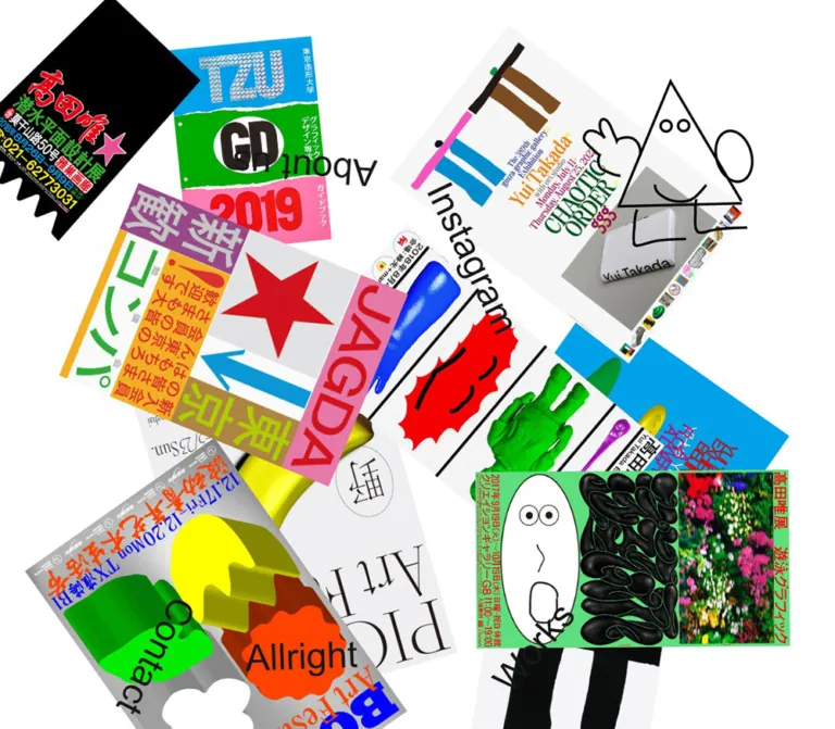
白い全画面に鮮やかなポスターや冊子の画像を大胆に重ねたポートフォリオ。回転したナビゲーションと線画キャラクターが、自由で実験的な印象をつくります。
オリジナルサイトを見るAllright — Style Reference
A white tabletop scattered with vivid printed work, sideways navigation, and a wandering outline character.
Original URL: https://www.allright-inc.jp/
Final URL: https://www.allright-inc.jp/
Theme: white canvas, near-black interface text, full-color artwork; no theme control was observed.
Inspected: September 12, 2026, from browser evidence recorded at 11:31:48 UTC / 20:31:48 JST.
Viewports: desktop 1440 × 1000 and mobile 390 × 844 CSS pixels.
Scope: the current homepage, represented by three desktop captures, two mobile captures, and rendered DOM/computed-style samples at both sizes. Linked About, Works, Contact, Instagram, and individual project pages were not inspected.
Allright presents its homepage as a crowded arrangement of graphic work. Posters, a magazine cover, photographs embedded in printed layouts, and sculptural-looking illustrations overlap at different angles. The white canvas remains visible between clusters. Five plain navigation labels sit inside this composition, rotated like additional pieces of paper rather than aligned in a conventional navigation bar.
The artwork carries almost all the color and typographic expression. The interface itself uses regular Helvetica, near-black text, transparent surfaces, and very little chrome. A thin outlined triangular character changes position across the desktop captures. On mobile, the collage remains dense and overlapping: the visible arrangement changes substantially, without becoming a vertical list or introducing a visible hamburger menu.
This is a portfolio homepage and visual navigation scene. Its defining relationship is between a restrained interface and expressive project imagery.
How to Read This Reference
- Measured values come directly from the supplied DOM, computed styles, document dimensions, and capture metadata.
- Calculated values are simple conversions or normalized positions derived from those measurements.
- Visual observations describe the supplied original-page captures. Artwork colors and rotation angles identified as estimates were not sampled or extracted from a stylesheet.
- Implementation aliases are descriptive names introduced here, except where a source custom property is explicitly identified.
- Recommendations describe a new implementation. They do not establish existing accessibility features, interaction behavior, breakpoints, or animation logic.
- Geometry limitation: the reported rectangles belong to the queried anchors. They do not establish the native image dimensions, child transforms, or exact painted outlines of the rotated artwork. Treat them as measurements of a captured state, not a complete layout specification.
Tokens — Colors
Measured Interface Palette
| Name | Value | Source evidence | Role |
|---|---|---|---|
| Canvas White | #ffffff |
Body background rgb(255, 255, 255); source --background: #fff |
Full-page canvas and negative space between artwork |
| Interface Ink | #171717 |
Body and navigation color rgb(23, 23, 23); source --foreground: #171717 |
All five navigation labels |
| Transparent Layer | rgba(0, 0, 0, 0) |
Header, main, and sampled anchor backgrounds | Allows navigation and artwork to share the same visible canvas |
The source also declares --color-white: #fff. The HTML element reports black text, but the body and visible navigation resolve to #171717; use the latter for the interface.
Artwork Palette — Visual Estimates
These values are approximate reuse colors, not measured source tokens. They describe recurring colors inside the project images and should not become an application-wide button or category-color system.
| Descriptive color | Approximate value | Visible use |
|---|---|---|
| Poster Cyan | #00a7df |
Large lower-left artwork field and bright typography |
| Hot Pink | #fa64c4 |
Graphic face, poster blocks, and accent strokes |
| Vivid Green | #00c52b |
Graphic blocks, floral poster edging, and illustrated objects |
| Electric Yellow | #f4f500 |
Banana, flower head, lettering, and face details |
| Poster Red | #ec0017 |
Exhibition lettering and large numerals |
The artwork also includes deep black, pale gray, peach, orange, brown, and photographic tones. Preserve those differences within individual assets. Applying a global tint would remove an essential part of the composition.
Color Hierarchy
White is the organizing field. Near-black identifies navigation. Saturated color belongs predominantly to the work itself. There is no observed primary CTA color, selected-tab fill, or semantic status palette.
Tokens — Typography
Interface Family
- Measured body and link stack:
Helvetica, sans-serif. - Measured weight:
400. - Measured tracking:
normal. - Character: plain, familiar, and deliberately neutral beside the artwork.
- Implementation alias:
--font-interface: Helvetica, sans-serif.
The HTML element reports a system sans-serif stack, but the body overrides it with Helvetica. No custom display font is established for the navigation.
Type Scale
| Role | Desktop | Mobile | Weight | Source relationship |
|---|---|---|---|---|
| Body baseline | 16px / 24px |
16px / 24px |
400 |
Measured on body and main; no body paragraphs are visible on the homepage |
| Home label: Allright | 30px / 36px |
24px / 32px |
400 |
Measured on the home anchor |
| About, Works, Contact, Instagram | 30px / 36px |
24px / 32px |
400 |
Same measured scale as the home label |
The declared source tokens --text-3xl: 1.875rem and --text-2xl: 1.5rem equal 30px and 24px at the measured 16px root. Their declared line-height ratios also correspond to 36px and 32px. This correspondence does not establish the exact classes used.
Computed size and apparent size are different measurements here. The rotated labels occupy much larger rectangles than their line boxes, and the screenshots suggest additional visual scaling. The complete transform chain was not supplied. Preserve the measured font values as typography tokens and treat any display-scale multiplier as a separate approximation.
Artwork Lettering
Oversized serif titles, brush-like Japanese lettering, condensed numerals, colorful editorial text, and distorted display lettering belong to the project images. They are not evidence of additional website heading families.
Keep this separation when extending the site: neutral interface text, highly individual lettering inside the work. Do not rebuild every poster headline as live navigation typography.
Tokens — Spacing & Shapes
Measured Foundation
| Property | Value | Interpretation |
|---|---|---|
| Root font size | 16px |
Conventional CSS root size |
Source --spacing |
.25rem = 4px |
Available source unit; does not prove a regular collage gutter |
| Body padding | 0px |
Canvas begins at the viewport edges |
| Header/main padding | 0px |
No measured outer content inset |
| Navigation padding | 0px |
Labels have no measured button-like padding |
| Sampled border radius | 0px |
Square interface geometry |
| Sampled display | block |
No grid columns are reported on header or main |
| Sampled gap | normal |
No measured recurring layout gap |
Scene Dimensions
| Element | Desktop | Mobile |
|---|---|---|
| Body | 1440 × 1000px |
390 × 844px |
| Header | 1440 × 1000px |
390 × 844px |
| Main | 1440 × 1000px |
390 × 844px |
| Document height | 1000px |
844px |
The header is a full-scene navigation layer, not a short strip above the work. Both captured documents are exactly one viewport high, while portions of artwork extend outside the visible frame. This establishes the visible viewport composition; it does not identify the original position or overflow declarations.
Spacing Character
There is no consistent grid gutter. Separation varies from open white areas to substantial overlaps. Desktop provides a broad white opening near the upper center, with dense artwork clusters toward the left, center-right, and lower edge. Mobile has much less uninterrupted white space.
For a new implementation, use a small conventional spacing scale only for focus indicators and alternative navigation. Recommended utility values are 4px, 8px, 12px, and 24px; they should not regularize the artwork into evenly spaced cards.
Shape Rules
- Preserve the original aspect ratio and edge treatment of each work.
- Most visible pieces read as rectangular printed sheets with square corners.
- Irregular silhouettes and dimensional shading belong to particular images.
- No general rounded-card, border, or soft-shadow system is visible.
- Depth comes primarily from overlap, rotation, relative size, and occlusion.
Components
Viewport Collage Scene
Role: introduces the work and provides entry points into the portfolio.
The scene combines a white base, eleven project-image links, five distributed text links, and the visible desktop outline character. It has no observed introductory paragraph, conventional hero heading, card captions, pagination, or footer strip.
A practical implementation anatomy is:
- A viewport-sized scene wrapper with clipped visual overflow.
- A project layer containing independently positioned image anchors.
- A transparent navigation layer with independently positioned text anchors.
- An optional decorative character layer that does not intercept input.
This anatomy is a recommended implementation model. The measured DOM establishes full-size header and main elements, but not their complete positioning and stacking rules.
Distributed Primary Navigation
Role: persistent access to identity, information, the work index, contact, and the social account.
| Visible label | Observed destination |
|---|---|
| Allright | https://www.allright-inc.jp/ |
| About us | https://www.allright-inc.jp/about |
| Works | https://www.allright-inc.jp/works |
| Contact | https://www.allright-inc.jp/contact |
https://www.instagram.com/allright.tokyo |
Each label is regular near-black Helvetica on a transparent background. Allright receives the same computed type size and weight as the other links. Its identity role comes from the wording and destination, rather than a larger or bolder wordmark treatment.
On desktop, Allright sits near the upper left, About us near the middle left, Works farther down the left side, Contact near the lower right of center, and Instagram toward the upper right. Some labels are upside down; Works is steeply angled, while Contact tilts upward to the right.
On mobile, the same five links appear in different places and orientations. Allright and About us overlap the large banana poster in the lower half. Contact runs almost vertically through the central dark artwork. Instagram follows a steep angle near the right edge.
Navigation Geometry
Reported anchor rectangles, rounded to the nearest pixel. Each entry is (x, y), width × height relative to the viewport origin.
| Label | Desktop rectangle | Mobile rectangle |
|---|---|---|
| Allright | (279, 29), 166 × 95 |
(206, 534), 86 × 128 |
| About us | (268, 497), 204 × 73 |
(64, 567), 76 × 158 |
| Works | (206, 607), 118 × 156 |
(125, 206), 118 × 105 |
| Contact | (837, 840), 186 × 117 |
(231, 292), 52 × 133 |
(1130, 223), 230 × 75 |
(280, 381), 88 × 178 |
These rectangles document the supplied states. Do not use their heights as line-height tokens or assume the positions are invariant between visits.
Project Image Link
Role: makes a piece of work the navigation target.
The DOM contains eleven project anchors in both viewport samples. Their extracted text is empty, and the visible scene does not add separate title or metadata blocks beside the images. The images supply their own titles, dates, typography, and visual hierarchy where those are part of the original artwork.
The visual anatomy is an image-bearing link, its intrinsic image proportions, an individual position, rotation, relative scale, and stacking relationship. Avoid adding a uniform white card wrapper, caption footer, category chip, or hover button.
The evidence does not include image alt attributes, anchor accessible names, complete image markup, or tested hit regions. Empty extracted text alone does not prove that the links lack accessible names.
Overlapping Artwork Clusters
Role: creates hierarchy through composition instead of a formal reading order.
The desktop left cluster combines the banana poster, partially covered colorful posters, and the magazine cover with a seated portrait. The large pink-and-peach face and cyan flower image pull attention toward the lower left. On the right, a black exhibition poster, a white multicolor exhibition sheet, and the black/white/green/blue graphic create a second concentration. A floral work extends beyond the lower-right edge.
The magazine cover and the white exhibition sheet remain particularly legible because their boundaries sit prominently over adjacent pieces. The overlap conceals substantial portions of other work; this is part of the observed visual composition, not evidence that every project image is fully readable or independently reachable.
Outline Character
Role: adds a playful moving presence above the dense artwork.
The desktop captures show a thin black outlined figure with a triangular body, circular eyes, curved smile, and simple limb shapes. Its open areas allow the artwork beneath to remain visible. Its position and visible pose differ across the three desktop captures while the surrounding composition remains largely consistent.
The evidence does not establish the character's asset format, animation mechanism, loop duration, pointer relationship, or interaction target. A separate instance cannot be confidently identified in the supplied mobile captures. Characters printed inside individual posters should not be confused with this floating element.
For a new implementation, keep a decorative character independent of the project links and use pointer-events: none. That is a recommendation, not a verified source declaration.
Tokens — Motion & Interaction
| Treatment | Evidence | What can be concluded |
|---|---|---|
| Character movement | Different position/pose across desktop captures | A changing visual state is supported; trigger, speed, path, and duration are unknown |
| Artwork arrangement | Largely consistent across the supplied desktop frames | Does not establish dragging, physics, randomization, or a continuous animation |
| Mobile arrangement | Two supplied mobile frames show substantially the same composition | No distinct mobile interaction or character movement was demonstrated |
| Link navigation | Rendered anchors with concrete destinations | Navigation intent is established; destination behavior was not exercised |
| Hover and focus | No supplied before/after interaction states | Treatments are unverified |
| Sampled CSS animation | animation: none on queried elements |
Applies to those samples only; child elements, scripts, and other animation mechanisms are not covered |
| Source transition defaults | .15s, cubic-bezier(.4,0,.2,1) |
Declared defaults exist; no specific visible transition is established by their presence |
The sampled transition field reports all, but does not provide enough information to assign an observed duration to an interaction. Do not describe a 150ms hover, smooth spring, drag gesture, cursor follower, or scroll-linked effect as a source feature.
Recommended Motion Direction
Keep the composition usable as a static scene. If adding character motion, keep it separate from link hit targets and provide a reduced-motion state. Do not make essential navigation depend on catching a moving label or dragging a poster.
A production implementation should define its own documented motion parameters after testing. The Quick Start intentionally supplies static composition only.
Surfaces
| Layer | Appearance | Function |
|---|---|---|
| Canvas | Solid white | Holds the collage together and creates negative space |
| Printed artwork | Original full-color imagery | Supplies color, typography, texture, and project identity |
| Navigation | Near-black text on transparency | Sits directly inside the image composition |
| Character | Thin dark outline with open interior | Adds movement without becoming a large opaque panel |
| Scene boundary | Artwork visibly cut by viewport edges | Makes the composition feel larger than the screen |
There is no observed modal, sheet, toast, tab bar, or elevated application panel. Dimensional highlights and shadows visible in the banana, flower, and other graphics belong to the imagery; they should not be copied into a global CSS elevation system.
Imagery
The imagery is deliberately heterogeneous: editorial covers, exhibition posters, abstract blocks, flowers, a photographic portrait, a glossy banana, sculptural-looking objects, hand-drawn figures, and densely composed lettering. The coherence comes from juxtaposition and the surrounding white canvas, not a common color filter or uniform crop.
Preserve the distinction between the interface and the work. Photographs can appear inside a magazine cover without becoming a full-screen photographic background. Printed lettering remains part of the image. Flat colors and glossy rendered objects can coexist without giving the website itself a glossy surface treatment.
Observed Asset References
The table records project destinations present in the original-page DOM. These are page links, not image-file URLs. Descriptions use legible artwork and visible motifs; the evidence does not include img source paths or native image dimensions.
| Project reference | Observed path | Visible association |
|---|---|---|
| Idea / Yui Takada | /works/idea-yui-takada-figure-and-attitude-2019 |
Magazine cover with colorful graphic header and a seated portrait |
| Chaotic Order | /works/chaotic-order-2022 |
Tall white exhibition sheet, colored strokes, multicolor lettering, and a small object photograph |
| Niniwowo | /works/niniwowo-2022 |
Project link confirmed; the precise exposed image boundary is uncertain within the overlapping center |
| BOOOM Art Festival | /works/booom-art-festival-2021 |
Bright blue lettering with orange and white forms on gray |
| Picnic Art Festival | /works/picnic-art-festival-2021 |
Large yellow banana, pale background, and prominent black serif lettering |
| Neighbor X | /works/neighbor-x-2020 |
Apparent association with the large black/white graphic containing green and blue blocks; identification is visual |
| Tokyo Zokei Graphic Design | /works/tokyo-zokei-graphic-design-2019 |
Cyan, green, and pink sections with large lettering and 2019 numerals |
| A Flower a Day | /works/a-flower-a-day-2019 |
Cyan field, yellow flower, green stem, and red lettering |
| Diving Graphic Design Exhibition | /works/diving-graphic-design-exhibition-2018-poster |
Black poster with red Japanese lettering, bright supporting text, and an irregular lower silhouette |
| Iroha | /works/iroha-2018 |
Apparent association with the large pink-and-peach abstract face composition |
| Swimming Graphic | /works/swimming-graphic-2017 |
Green-bordered composition containing flowers and glossy black forms |
The years in these destinations describe project references. They do not date the homepage implementation.
Asset Handling Recommendations
- Use authorized project images at their intrinsic proportions.
- Preserve distinctive silhouettes and any transparency supplied by the asset.
- Avoid
object-fit: coverin a forced common ratio. - Use normal image interpolation; the captures do not establish a deliberately pixelated rendering treatment.
- Supply intrinsic
widthandheightattributes when the real files are available to prevent layout shifts. - Choose image resolution for the painted size after scaling and rotation, not just the untransformed layout width.
- Give each image link a useful accessible name based on the project destination.
Layout & Responsive Behavior
Desktop: Broad, Distributed Composition
At 1440 × 1000, artwork spreads across the entire viewport. Several large pieces run beyond the top or bottom boundary. The navigation labels are spatially distributed, with the central upper white opening helping separate the left and right artwork groups.
No conventional maximum-width content container is visible. The source declares container-related custom properties, but their presence alone does not establish their use on this homepage.
Mobile: Dense Recomposition
At 390 × 844, the same five navigation links and eleven project destinations remain in the DOM. The graphic face reaches beyond the top edge. A broad black/white/green/blue piece dominates the middle. The banana poster spans much of the lower portion, with rotated labels over it. Other pieces are partly covered or clipped at the frame.
The navigation changes from 30px / 36px to 24px / 32px, a measured 20% decrease in font size. Artwork sizes do not follow one common reduction factor.
Measured Project-Link Size Comparison
These are reported anchor dimensions, rounded to one decimal place, not confirmed native image dimensions.
| Project link | Desktop | Mobile | Mobile/desktop width, calculated |
|---|---|---|---|
| Idea | 258.3 × 341.8px |
103.6 × 137.1px |
0.40× |
| Picnic Art Festival | 329.9 × 453.1px |
259.2 × 356.0px |
0.79× |
| Neighbor X | 184.2 × 404.8px |
243.7 × 535.7px |
1.32× |
| Tokyo Zokei Graphic Design | 182.6 × 257.8px |
261.2 × 368.7px |
1.43× |
| Diving Graphic Design Exhibition | 404.8 × 618.7px |
146.3 × 223.6px |
0.36× |
| Swimming Graphic | 284.8 × 505.4px |
107.0 × 189.9px |
0.38× |
Some link boxes become larger on mobile even though the viewport is much narrower. The captured mobile state is therefore not a uniformly scaled desktop scene.
The evidence cannot distinguish breakpoint-specific composition, viewport-derived placement, or independently initialized scene states. Only two widths were supplied. Intermediate widths, landscape phones, resize behavior, safe-area handling, zoom, and repeat-visit determinism remain unverified.
Responsive Implementation Recommendation
Author desktop and mobile compositions independently, keeping the same semantic project list. Use normalized coordinates as a starting point, then inspect the actual painted images at each target size. Test intermediate widths instead of assuming interpolation between the two captures will remain legible.
Preserve the collage as the visual entrance while making the Works destination easy to reach. On the supplied mobile screen, near-black Contact text crosses a dark image region; text size alone does not guarantee readable navigation over arbitrary artwork.
Do’s and Don’ts
Do
- Keep the page canvas white and the interface text near-black.
- Use regular Helvetica for the five navigation labels.
- Let the project imagery supply the strong color and display typography.
- Preserve varied image proportions, rotations, scales, and overlapping edges.
- Leave deliberate white openings in the desktop composition.
- Retain the dense collage character on mobile while recomposing it for the narrower frame.
- Separate text styling from image transforms and scene positioning.
- Preserve the outlined character's light, open visual treatment.
- Treat the measured font sizes and reported rectangles as different kinds of evidence.
- Provide practical access to projects that are visually obscured by the collage.
Don’t
- Don’t replace the homepage with a marketing hero, feature grid, or oversized conversion button.
- Don’t turn all projects into evenly spaced, rounded cards.
- Don’t align the five labels into a conventional visible top navigation bar when reproducing the captured composition.
- Don’t add a global rainbow UI palette merely because the artwork is colorful.
- Don’t use a heavy display typeface for navigation to imitate lettering inside the posters.
- Don’t crop all artwork to a common thumbnail ratio.
- Don’t add generic drop shadows behind every image.
- Don’t assume the mobile page is a reduced desktop screenshot.
- Don’t infer dragging, physics, cursor following, hover effects, or animation timing from static captures.
- Don’t treat older project dates as evidence of an older website version.
Recommended Implementation Additions
These are proposed improvements, not verified features of the inspected homepage:
- Give every project anchor an accessible name and preserve a logical DOM order independent of visual placement.
- Provide a keyboard-visible shortcut to an upright Works index so clipped or occluded posters are not the only route into the portfolio.
- Use a high-contrast focus treatment that remains visible over both light and dark artwork.
- Check touch targets after rotation, overlap, and clipping. A large element rectangle can still have a small exposed clickable area.
- Keep decorative character graphics out of the accessibility tree and prevent them from intercepting pointer events.
- Respect reduced-motion preferences in both CSS and any JavaScript animation controller.
- Test enlarged text, browser zoom, narrow landscape screens, and safe areas. The supplied snapshots do not cover those states.
- Reserve image dimensions before loading and ensure the scene remains navigable if an artwork fails to load.
Agent Prompt Guide
Quick Color Reference
- Canvas: measured
#ffffff. - Navigation: measured
#171717. - Navigation surfaces: transparent.
- Artwork accents: approximately cyan
#00a7df, pink#fa64c4, green#00c52b, yellow#f4f500, and red#ec0017. - Artwork colors remain local to the images; no observed colored CTA treatment exists.
Overall Prompt
“Create a full-viewport portfolio homepage inspired by Allright's current collage composition. Use a pure white canvas and eleven independently placed project images with varied original proportions, bold rotations, overlapping layers, and deliberate cropping at the viewport edges. Distribute five plain near-black Helvetica links—Allright, About us, Works, Contact, Instagram—through the scene, including sideways and upside-down orientations. Use regular 30px type with a 36px line height on desktop and 24px with a 32px line height on mobile, keeping any visual scale transform separate. Let the artwork provide saturated color and expressive lettering. Recompose the scene densely for mobile rather than uniformly shrinking desktop. Include an optional thin outlined triangular character as a separate decorative layer. Keep the base implementation static until motion requirements are explicitly defined.”
Example Component Prompts
- Project scene: “Build a white viewport canvas containing overlapping portrait posters, one nearly square graphic face, a magazine cover, and full-color illustrated work. Preserve intrinsic image ratios and vary rotation and scale per image. Use image boundaries and overlap for depth; add no card wrappers or global shadows.”
- Distributed navigation: “Place five regular Helvetica text links at independent positions over the artwork. Match 30px/36px desktop and 24px/32px mobile computed typography. Keep labels transparent and near-black. Add an accessible focus treatment without changing the default unboxed appearance.”
- Mobile composition: “Create a narrow, dense collage for a 390 × 844 viewport. Let a graphic face clip at the top, a broad black-and-white work cross the middle, and a large banana poster occupy the lower area. Keep all five navigation destinations and all project links in the semantic document.”
- Decorative character: “Add a thin black outline figure with a triangular body, circular eyes, a curved smile, and simple limbs. Keep its interior visually open and prevent it from intercepting input. Supply a static state and reduced-motion support; do not assume cursor-following or physics behavior.”
Quick Start
CSS Custom Properties
This is a static approximation, not extracted source CSS. White, near-black, the font stack, and computed type sizes follow measured evidence. Project centers and widths are seeded from normalized anchor measurements. Rotation angles, stacking order, label scale multipliers, the 48rem breakpoint, and focus behavior are implementation estimates or recommendations.
Use actual project images at their intrinsic ratios. Painted results will depend on those files. The optional character is hidden at the sample mobile breakpoint to approximate the supplied mobile frames; the original visibility rule is unknown.
:root {
  /* Measured interface values */
  --scene-paper: #ffffff;
  --scene-ink: #171717;
  --font-interface: Helvetica, sans-serif;
  --body-size: 16px;
  --body-leading: 24px;
  --nav-size: 30px;
  --nav-leading: 36px;
  --space-unit: 4px;

  /* Recommended approximation, not a measured transform */
  --nav-display-scale: 1.6;
  --focus-width: 2px;
}

* {
  box-sizing: border-box;
}

body {
  margin: 0;
  color: var(--scene-ink);
  background: var(--scene-paper);
  font-family: var(--font-interface);
  font-size: var(--body-size);
  font-weight: 400;
  line-height: var(--body-leading);
}

.portfolio-scene {
  position: relative;
  isolation: isolate;
  width: 100%;
  height: 100vh;
  height: 100dvh;
  overflow: hidden;
  background: var(--scene-paper);
}

.project-field,
.collage-header {
  position: absolute;
  inset: 0;
}

.project-field {
  z-index: 0;
}

.collage-header {
  z-index: 20;
  pointer-events: none;
}

.project-link {
  position: absolute;
  left: var(--x);
  top: var(--y);
  width: var(--w);
  z-index: var(--layer, 1);
  display: block;
  transform: translate(-50%, -50%) rotate(var(--turn, 0deg));
  transform-origin: center;
  color: inherit;
  text-decoration: none;
  border-radius: 0;
}

.project-link img {
  display: block;
  width: 100%;
  height: auto;
  border-radius: 0;
}

.scene-nav-link {
  position: absolute;
  left: var(--x);
  top: var(--y);
  display: block;
  padding: 0;
  color: var(--scene-ink);
  background: transparent;
  font-family: var(--font-interface);
  font-size: var(--nav-size);
  font-weight: 400;
  line-height: var(--nav-leading);
  letter-spacing: normal;
  white-space: nowrap;
  text-decoration: none;
  pointer-events: auto;
  transform:
    translate(-50%, -50%)
    rotate(var(--turn, 0deg))
    scale(var(--nav-display-scale));
}

/* Coordinates derive from captured anchor centers.
   Rotation and stacking values are visual approximations. */
.project--idea {
  --x: 38.8%; --y: 45.8%; --w: 17.94%;
  --turn: -15deg; --layer: 6;
}
.project--chaotic {
  --x: 67.7%; --y: 68.1%; --w: 19.72%;
  --turn: 18deg; --layer: 7;
}
.project--niniwowo {
  --x: 54.1%; --y: 60.2%; --w: 22.23%;
  --turn: 27deg; --layer: 2;
}
.project--booom {
  --x: 14.6%; --y: 37.8%; --w: 15.35%;
  --turn: 135deg; --layer: 3;
}
.project--picnic {
  --x: 15.6%; --y: 20.7%; --w: 22.91%;
  --turn: 60deg; --layer: 4;
}
.project--neighbor {
  --x: 71.8%; --y: 20.8%; --w: 12.79%;
  --turn: -60deg; --layer: 5;
}
.project--zokei {
  --x: 35.4%; --y: 19.6%; --w: 12.68%;
  --turn: 44deg; --layer: 2;
}
.project--flower {
  --x: 34.5%; --y: 89.3%; --w: 23.21%;
  --turn: -63deg; --layer: 1;
}
.project--diving {
  --x: 64.7%; --y: 39.0%; --w: 28.11%;
  --turn: 26deg; --layer: 4;
}
.project--iroha {
  --x: 34.0%; --y: 64.5%; --w: 21.85%;
  --turn: 43deg; --layer: 2;
}
.project--swimming {
  --x: 84.6%; --y: 95.3%; --w: 19.78%;
  --turn: -6deg; --layer: 8;
}

.nav--home {
  --x: 25.1%; --y: 7.6%; --turn: -165deg;
}
.nav--about {
  --x: 25.7%; --y: 53.3%; --turn: 180deg;
}
.nav--works {
  --x: 18.4%; --y: 68.5%; --turn: 63deg;
}
.nav--contact {
  --x: 64.6%; --y: 89.9%; --turn: -18deg;
}
.nav--instagram {
  --x: 86.4%; --y: 26.0%; --turn: 180deg;
}

.scene-character {
  position: absolute;
  left: 62%;
  top: 61%;
  z-index: 30;
  width: clamp(140px, 15vw, 220px);
  height: auto;
  transform: translate(-50%, -50%);
  pointer-events: none;
}

/* Recommended keyboard access and focus treatment */
.portfolio-scene a:focus-visible {
  outline: var(--focus-width) solid var(--scene-ink);
  outline-offset: 6px;
  box-shadow: 0 0 0 8px var(--scene-paper);
}

.scene-nav-link:focus-visible {
  background: var(--scene-paper);
}

.index-access {
  position: absolute;
  left: 12px;
  top: 12px;
  z-index: 50;
  padding: 8px 12px;
  color: var(--scene-ink);
  background: var(--scene-paper);
  transform: translateY(calc(-100% - 24px));
}

.index-access:focus {
  transform: none;
}

/* Recommended breakpoint; the original breakpoint is unknown. */
@media (max-width: 48rem) {
  :root {
    --nav-size: 24px;
    --nav-leading: 32px;
    --nav-display-scale: 1.5;
  }

  .project--idea {
    --x: 37.2%; --y: 21.3%; --w: 26.56%;
    --turn: -88deg; --layer: 5;
  }
  .project--chaotic {
    --x: 52.4%; --y: 86.1%; --w: 56.27%;
    --turn: 45deg; --layer: 7;
  }
  .project--niniwowo {
    --x: 42.2%; --y: 28.1%; --w: 66.00%;
    --turn: -28deg; --layer: 3;
  }
  .project--booom {
    --x: 37.7%; --y: 37.5%; --w: 60.01%;
    --turn: -36deg; --layer: 2;
  }
  .project--picnic {
    --x: 41.1%; --y: 78.8%; --w: 66.46%;
    --turn: 88deg; --layer: 9;
  }
  .project--neighbor {
    --x: 49.1%; --y: 33.1%; --w: 62.48%;
    --turn: 96deg; --layer: 8;
  }
  .project--zokei {
    --x: 53.3%; --y: 64.5%; --w: 66.96%;
    --turn: -22deg; --layer: 6;
  }
  .project--flower {
    --x: 27.9%; --y: 24.6%; --w: 56.07%;
    --turn: -52deg; --layer: 1;
  }
  .project--diving {
    --x: 52.9%; --y: 50.5%; --w: 37.51%;
    --turn: 26deg; --layer: 4;
  }
  .project--iroha {
    --x: 44.7%; --y: 8.8%; --w: 61.63%;
    --turn: 40deg; --layer: 4;
  }
  .project--swimming {
    --x: 40.3%; --y: 25.9%; --w: 27.44%;
    --turn: 98deg; --layer: 10;
  }

  .nav--home {
    --x: 63.9%; --y: 70.8%; --turn: 78deg;
  }
  .nav--about {
    --x: 26.2%; --y: 76.5%; --turn: 82deg;
  }
  .nav--works {
    --x: 47.1%; --y: 30.7%; --turn: -135deg;
  }
  .nav--contact {
    --x: 65.9%; --y: 42.5%; --turn: 90deg;
  }
  .nav--instagram {
    --x: 83.0%; --y: 55.6%; --turn: -78deg;
  }

  .scene-character {
    display: none;
  }
}

/* Guard for future CSS motion additions.
   JavaScript motion must respect this preference separately. */
@media (prefers-reduced-motion: reduce) {
  .portfolio-scene *,
  .portfolio-scene *::before,
  .portfolio-scene *::after {
    animation: none !important;
    transition: none !important;
  }
}
Minimal Markup Assembly
This example wires the five navigation links and three representative projects. Add the remaining eight project anchors using the corresponding classes and observed destinations above. All /assets/ paths below are proposed local placeholders, not original-site asset URLs.
<div class="portfolio-scene">
  <a class="index-access" href="/works">Open works index</a>

  <header class="collage-header">
    <nav aria-label="Primary">
      <a class="scene-nav-link nav--home" href="/">Allright</a>
      <a class="scene-nav-link nav--about" href="/about">About us</a>
      <a class="scene-nav-link nav--works" href="/works">Works</a>
      <a class="scene-nav-link nav--contact" href="/contact">Contact</a>
      <a class="scene-nav-link nav--instagram"
         href="https://www.instagram.com/allright.tokyo">Instagram</a>
    </nav>
  </header>

  <main class="project-field" aria-label="Selected projects">
    <a class="project-link project--idea"
       href="/works/idea-yui-takada-figure-and-attitude-2019"
       aria-label="View Idea: Yui Takada, Figure and Attitude, 2019">
      <img src="/assets/idea-cover.webp" alt="" decoding="async">
    </a>

    <a class="project-link project--picnic"
       href="/works/picnic-art-festival-2021"
       aria-label="View Picnic Art Festival, 2021">
      <img src="/assets/picnic-poster.webp" alt="" decoding="async">
    </a>

    <a class="project-link project--chaotic"
       href="/works/chaotic-order-2022"
       aria-label="View Chaotic Order, 2022">
      <img src="/assets/chaotic-order-poster.webp" alt="" decoding="async">
    </a>
  </main>

  <img class="scene-character"
       src="/assets/outline-character.png"
       alt="" aria-hidden="true">
</div>
The focus halo and Works shortcut are recommended additions. They do not by themselves solve every occlusion issue: verify keyboard traversal and ensure the linked work index is usable. Replace the placeholder assets and add their real intrinsic dimensions before evaluating layout stability.
Tailwind v4 Token Mapping
Optional mapping for an implementation already using Tailwind v4. This is not a claim about the original site's framework version. Define the properties above first and keep per-project geometry in the component styles.
@theme inline {
  --color-canvas: var(--scene-paper);
  --color-ink: var(--scene-ink);
  --font-sans: var(--font-interface);
  --text-navigation: var(--nav-size);
  --text-navigation--line-height: var(--nav-leading);
  --spacing-scene-unit: var(--space-unit);
  --radius-artwork: 0px;
}
Sources & Evidence
- Inspected original and final website: Allright. Both supplied URL fields are identical; the recorded HTTP status is
200, and the rendered page title is Allright. - Capture record: September 12, 2026 at
2026-09-12T11:31:48.295Z; desktop1440 × 1000and mobile390 × 844CSS pixels. Three desktop and two mobile original-page captures were supplied. - Rendered evidence: five named navigation anchors, eleven project anchors, body/header/main dimensions, source custom properties, computed font and color values, and sampled element rectangles at both viewports.
- Identity evidence: the supplied original-page DOM includes an Organization entry named Allright with the homepage URL. This supports the displayed identity without establishing a fuller legal entity name or website production credits.
- Motion evidence: the outline character changes position/pose between desktop captures. No explicit click, hover, drag, keyboard, or pointer-following test result was supplied.
- Capture limitations: readiness checks awaited document loading, visible image decoding, finite animation settling, and sampled layout/text stability within stated time limits. Perpetual animations were temporarily paused during readiness checks and resumed. Those procedures do not establish semantic completeness or exact motion timing.
- Inspection boundaries: no additional browsing or file access was performed for this reference. Destination pages, image source files, complete transform rules, complete stylesheets, accessible names, intermediate viewport sizes, and delayed states remain unverified. SharedWorkers and service workers were disabled during the supplied browser inspection.
This reference describes the current homepage evidence. Measured tokens are distinguished from visual estimates, and the CSS is a practical static adaptation that requires authorized artwork and viewport testing.
# Allright — Style Reference

> A white tabletop scattered with vivid printed work, sideways navigation, and a wandering outline character.

**Original URL:** [https://www.allright-inc.jp/](https://www.allright-inc.jp/)
**Final URL:** [https://www.allright-inc.jp/](https://www.allright-inc.jp/)
**Theme:** white canvas, near-black interface text, full-color artwork; no theme control was observed.
**Inspected:** September 12, 2026, from browser evidence recorded at 11:31:48 UTC / 20:31:48 JST.
**Viewports:** desktop `1440 × 1000` and mobile `390 × 844` CSS pixels.
**Scope:** the current homepage, represented by three desktop captures, two mobile captures, and rendered DOM/computed-style samples at both sizes. Linked About, Works, Contact, Instagram, and individual project pages were not inspected.

Allright presents its homepage as a crowded arrangement of graphic work. Posters, a magazine cover, photographs embedded in printed layouts, and sculptural-looking illustrations overlap at different angles. The white canvas remains visible between clusters. Five plain navigation labels sit inside this composition, rotated like additional pieces of paper rather than aligned in a conventional navigation bar.

The artwork carries almost all the color and typographic expression. The interface itself uses regular Helvetica, near-black text, transparent surfaces, and very little chrome. A thin outlined triangular character changes position across the desktop captures. On mobile, the collage remains dense and overlapping: the visible arrangement changes substantially, without becoming a vertical list or introducing a visible hamburger menu.

This is a portfolio homepage and visual navigation scene. Its defining relationship is between a restrained interface and expressive project imagery.

## How to Read This Reference

- **Measured** values come directly from the supplied DOM, computed styles, document dimensions, and capture metadata.
- **Calculated** values are simple conversions or normalized positions derived from those measurements.
- **Visual observations** describe the supplied original-page captures. Artwork colors and rotation angles identified as estimates were not sampled or extracted from a stylesheet.
- **Implementation aliases** are descriptive names introduced here, except where a source custom property is explicitly identified.
- **Recommendations** describe a new implementation. They do not establish existing accessibility features, interaction behavior, breakpoints, or animation logic.
- **Geometry limitation:** the reported rectangles belong to the queried anchors. They do not establish the native image dimensions, child transforms, or exact painted outlines of the rotated artwork. Treat them as measurements of a captured state, not a complete layout specification.

## Tokens — Colors

### Measured Interface Palette

| Name | Value | Source evidence | Role |
| --- | --- | --- | --- |
| Canvas White | `#ffffff` | Body background `rgb(255, 255, 255)`; source `--background: #fff` | Full-page canvas and negative space between artwork |
| Interface Ink | `#171717` | Body and navigation color `rgb(23, 23, 23)`; source `--foreground: #171717` | All five navigation labels |
| Transparent Layer | `rgba(0, 0, 0, 0)` | Header, main, and sampled anchor backgrounds | Allows navigation and artwork to share the same visible canvas |

The source also declares `--color-white: #fff`. The HTML element reports black text, but the body and visible navigation resolve to `#171717`; use the latter for the interface.

### Artwork Palette — Visual Estimates

These values are approximate reuse colors, not measured source tokens. They describe recurring colors inside the project images and should not become an application-wide button or category-color system.

| Descriptive color | Approximate value | Visible use |
| --- | --- | --- |
| Poster Cyan | `#00a7df` | Large lower-left artwork field and bright typography |
| Hot Pink | `#fa64c4` | Graphic face, poster blocks, and accent strokes |
| Vivid Green | `#00c52b` | Graphic blocks, floral poster edging, and illustrated objects |
| Electric Yellow | `#f4f500` | Banana, flower head, lettering, and face details |
| Poster Red | `#ec0017` | Exhibition lettering and large numerals |

The artwork also includes deep black, pale gray, peach, orange, brown, and photographic tones. Preserve those differences within individual assets. Applying a global tint would remove an essential part of the composition.

### Color Hierarchy

White is the organizing field. Near-black identifies navigation. Saturated color belongs predominantly to the work itself. There is no observed primary CTA color, selected-tab fill, or semantic status palette.

## Tokens — Typography

### Interface Family

- **Measured body and link stack:** `Helvetica, sans-serif`.
- **Measured weight:** `400`.
- **Measured tracking:** `normal`.
- **Character:** plain, familiar, and deliberately neutral beside the artwork.
- **Implementation alias:** `--font-interface: Helvetica, sans-serif`.

The HTML element reports a system sans-serif stack, but the body overrides it with Helvetica. No custom display font is established for the navigation.

### Type Scale

| Role | Desktop | Mobile | Weight | Source relationship |
| --- | --- | --- | --- | --- |
| Body baseline | `16px / 24px` | `16px / 24px` | `400` | Measured on body and main; no body paragraphs are visible on the homepage |
| Home label: Allright | `30px / 36px` | `24px / 32px` | `400` | Measured on the home anchor |
| About, Works, Contact, Instagram | `30px / 36px` | `24px / 32px` | `400` | Same measured scale as the home label |

The declared source tokens `--text-3xl: 1.875rem` and `--text-2xl: 1.5rem` equal 30px and 24px at the measured 16px root. Their declared line-height ratios also correspond to 36px and 32px. This correspondence does not establish the exact classes used.

**Computed size and apparent size are different measurements here.** The rotated labels occupy much larger rectangles than their line boxes, and the screenshots suggest additional visual scaling. The complete transform chain was not supplied. Preserve the measured font values as typography tokens and treat any display-scale multiplier as a separate approximation.

### Artwork Lettering

Oversized serif titles, brush-like Japanese lettering, condensed numerals, colorful editorial text, and distorted display lettering belong to the project images. They are not evidence of additional website heading families.

Keep this separation when extending the site: neutral interface text, highly individual lettering inside the work. Do not rebuild every poster headline as live navigation typography.

## Tokens — Spacing & Shapes

### Measured Foundation

| Property | Value | Interpretation |
| --- | --- | --- |
| Root font size | `16px` | Conventional CSS root size |
| Source `--spacing` | `.25rem` = `4px` | Available source unit; does not prove a regular collage gutter |
| Body padding | `0px` | Canvas begins at the viewport edges |
| Header/main padding | `0px` | No measured outer content inset |
| Navigation padding | `0px` | Labels have no measured button-like padding |
| Sampled border radius | `0px` | Square interface geometry |
| Sampled display | `block` | No grid columns are reported on header or main |
| Sampled gap | `normal` | No measured recurring layout gap |

### Scene Dimensions

| Element | Desktop | Mobile |
| --- | --- | --- |
| Body | `1440 × 1000px` | `390 × 844px` |
| Header | `1440 × 1000px` | `390 × 844px` |
| Main | `1440 × 1000px` | `390 × 844px` |
| Document height | `1000px` | `844px` |

The header is a full-scene navigation layer, not a short strip above the work. Both captured documents are exactly one viewport high, while portions of artwork extend outside the visible frame. This establishes the visible viewport composition; it does not identify the original `position` or `overflow` declarations.

### Spacing Character

There is no consistent grid gutter. Separation varies from open white areas to substantial overlaps. Desktop provides a broad white opening near the upper center, with dense artwork clusters toward the left, center-right, and lower edge. Mobile has much less uninterrupted white space.

For a new implementation, use a small conventional spacing scale only for focus indicators and alternative navigation. Recommended utility values are `4px`, `8px`, `12px`, and `24px`; they should not regularize the artwork into evenly spaced cards.

### Shape Rules

- Preserve the original aspect ratio and edge treatment of each work.
- Most visible pieces read as rectangular printed sheets with square corners.
- Irregular silhouettes and dimensional shading belong to particular images.
- No general rounded-card, border, or soft-shadow system is visible.
- Depth comes primarily from overlap, rotation, relative size, and occlusion.

## Components

### Viewport Collage Scene

**Role:** introduces the work and provides entry points into the portfolio.

The scene combines a white base, eleven project-image links, five distributed text links, and the visible desktop outline character. It has no observed introductory paragraph, conventional hero heading, card captions, pagination, or footer strip.

A practical implementation anatomy is:

1. A viewport-sized scene wrapper with clipped visual overflow.
2. A project layer containing independently positioned image anchors.
3. A transparent navigation layer with independently positioned text anchors.
4. An optional decorative character layer that does not intercept input.

This anatomy is a recommended implementation model. The measured DOM establishes full-size header and main elements, but not their complete positioning and stacking rules.

### Distributed Primary Navigation

**Role:** persistent access to identity, information, the work index, contact, and the social account.

| Visible label | Observed destination |
| --- | --- |
| Allright | `https://www.allright-inc.jp/` |
| About us | `https://www.allright-inc.jp/about` |
| Works | `https://www.allright-inc.jp/works` |
| Contact | `https://www.allright-inc.jp/contact` |
| Instagram | `https://www.instagram.com/allright.tokyo` |

Each label is regular near-black Helvetica on a transparent background. Allright receives the same computed type size and weight as the other links. Its identity role comes from the wording and destination, rather than a larger or bolder wordmark treatment.

On desktop, Allright sits near the upper left, About us near the middle left, Works farther down the left side, Contact near the lower right of center, and Instagram toward the upper right. Some labels are upside down; Works is steeply angled, while Contact tilts upward to the right.

On mobile, the same five links appear in different places and orientations. Allright and About us overlap the large banana poster in the lower half. Contact runs almost vertically through the central dark artwork. Instagram follows a steep angle near the right edge.

### Navigation Geometry

Reported anchor rectangles, rounded to the nearest pixel. Each entry is `(x, y), width × height` relative to the viewport origin.

| Label | Desktop rectangle | Mobile rectangle |
| --- | --- | --- |
| Allright | `(279, 29), 166 × 95` | `(206, 534), 86 × 128` |
| About us | `(268, 497), 204 × 73` | `(64, 567), 76 × 158` |
| Works | `(206, 607), 118 × 156` | `(125, 206), 118 × 105` |
| Contact | `(837, 840), 186 × 117` | `(231, 292), 52 × 133` |
| Instagram | `(1130, 223), 230 × 75` | `(280, 381), 88 × 178` |

These rectangles document the supplied states. Do not use their heights as line-height tokens or assume the positions are invariant between visits.

### Project Image Link

**Role:** makes a piece of work the navigation target.

The DOM contains eleven project anchors in both viewport samples. Their extracted text is empty, and the visible scene does not add separate title or metadata blocks beside the images. The images supply their own titles, dates, typography, and visual hierarchy where those are part of the original artwork.

The visual anatomy is an image-bearing link, its intrinsic image proportions, an individual position, rotation, relative scale, and stacking relationship. Avoid adding a uniform white card wrapper, caption footer, category chip, or hover button.

The evidence does not include image `alt` attributes, anchor accessible names, complete image markup, or tested hit regions. Empty extracted text alone does not prove that the links lack accessible names.

### Overlapping Artwork Clusters

**Role:** creates hierarchy through composition instead of a formal reading order.

The desktop left cluster combines the banana poster, partially covered colorful posters, and the magazine cover with a seated portrait. The large pink-and-peach face and cyan flower image pull attention toward the lower left. On the right, a black exhibition poster, a white multicolor exhibition sheet, and the black/white/green/blue graphic create a second concentration. A floral work extends beyond the lower-right edge.

The magazine cover and the white exhibition sheet remain particularly legible because their boundaries sit prominently over adjacent pieces. The overlap conceals substantial portions of other work; this is part of the observed visual composition, not evidence that every project image is fully readable or independently reachable.

### Outline Character

**Role:** adds a playful moving presence above the dense artwork.

The desktop captures show a thin black outlined figure with a triangular body, circular eyes, curved smile, and simple limb shapes. Its open areas allow the artwork beneath to remain visible. Its position and visible pose differ across the three desktop captures while the surrounding composition remains largely consistent.

The evidence does not establish the character's asset format, animation mechanism, loop duration, pointer relationship, or interaction target. A separate instance cannot be confidently identified in the supplied mobile captures. Characters printed inside individual posters should not be confused with this floating element.

For a new implementation, keep a decorative character independent of the project links and use `pointer-events: none`. That is a recommendation, not a verified source declaration.

## Tokens — Motion & Interaction

| Treatment | Evidence | What can be concluded |
| --- | --- | --- |
| Character movement | Different position/pose across desktop captures | A changing visual state is supported; trigger, speed, path, and duration are unknown |
| Artwork arrangement | Largely consistent across the supplied desktop frames | Does not establish dragging, physics, randomization, or a continuous animation |
| Mobile arrangement | Two supplied mobile frames show substantially the same composition | No distinct mobile interaction or character movement was demonstrated |
| Link navigation | Rendered anchors with concrete destinations | Navigation intent is established; destination behavior was not exercised |
| Hover and focus | No supplied before/after interaction states | Treatments are unverified |
| Sampled CSS animation | `animation: none` on queried elements | Applies to those samples only; child elements, scripts, and other animation mechanisms are not covered |
| Source transition defaults | `.15s`, `cubic-bezier(.4,0,.2,1)` | Declared defaults exist; no specific visible transition is established by their presence |

The sampled transition field reports `all`, but does not provide enough information to assign an observed duration to an interaction. Do not describe a 150ms hover, smooth spring, drag gesture, cursor follower, or scroll-linked effect as a source feature.

### Recommended Motion Direction

Keep the composition usable as a static scene. If adding character motion, keep it separate from link hit targets and provide a reduced-motion state. Do not make essential navigation depend on catching a moving label or dragging a poster.

A production implementation should define its own documented motion parameters after testing. The Quick Start intentionally supplies static composition only.

## Surfaces

| Layer | Appearance | Function |
| --- | --- | --- |
| Canvas | Solid white | Holds the collage together and creates negative space |
| Printed artwork | Original full-color imagery | Supplies color, typography, texture, and project identity |
| Navigation | Near-black text on transparency | Sits directly inside the image composition |
| Character | Thin dark outline with open interior | Adds movement without becoming a large opaque panel |
| Scene boundary | Artwork visibly cut by viewport edges | Makes the composition feel larger than the screen |

There is no observed modal, sheet, toast, tab bar, or elevated application panel. Dimensional highlights and shadows visible in the banana, flower, and other graphics belong to the imagery; they should not be copied into a global CSS elevation system.

## Imagery

The imagery is deliberately heterogeneous: editorial covers, exhibition posters, abstract blocks, flowers, a photographic portrait, a glossy banana, sculptural-looking objects, hand-drawn figures, and densely composed lettering. The coherence comes from juxtaposition and the surrounding white canvas, not a common color filter or uniform crop.

Preserve the distinction between the interface and the work. Photographs can appear inside a magazine cover without becoming a full-screen photographic background. Printed lettering remains part of the image. Flat colors and glossy rendered objects can coexist without giving the website itself a glossy surface treatment.

### Observed Asset References

The table records project destinations present in the original-page DOM. These are page links, not image-file URLs. Descriptions use legible artwork and visible motifs; the evidence does not include `img` source paths or native image dimensions.

| Project reference | Observed path | Visible association |
| --- | --- | --- |
| Idea / Yui Takada | `/works/idea-yui-takada-figure-and-attitude-2019` | Magazine cover with colorful graphic header and a seated portrait |
| Chaotic Order | `/works/chaotic-order-2022` | Tall white exhibition sheet, colored strokes, multicolor lettering, and a small object photograph |
| Niniwowo | `/works/niniwowo-2022` | Project link confirmed; the precise exposed image boundary is uncertain within the overlapping center |
| BOOOM Art Festival | `/works/booom-art-festival-2021` | Bright blue lettering with orange and white forms on gray |
| Picnic Art Festival | `/works/picnic-art-festival-2021` | Large yellow banana, pale background, and prominent black serif lettering |
| Neighbor X | `/works/neighbor-x-2020` | Apparent association with the large black/white graphic containing green and blue blocks; identification is visual |
| Tokyo Zokei Graphic Design | `/works/tokyo-zokei-graphic-design-2019` | Cyan, green, and pink sections with large lettering and 2019 numerals |
| A Flower a Day | `/works/a-flower-a-day-2019` | Cyan field, yellow flower, green stem, and red lettering |
| Diving Graphic Design Exhibition | `/works/diving-graphic-design-exhibition-2018-poster` | Black poster with red Japanese lettering, bright supporting text, and an irregular lower silhouette |
| Iroha | `/works/iroha-2018` | Apparent association with the large pink-and-peach abstract face composition |
| Swimming Graphic | `/works/swimming-graphic-2017` | Green-bordered composition containing flowers and glossy black forms |

The years in these destinations describe project references. They do not date the homepage implementation.

### Asset Handling Recommendations

- Use authorized project images at their intrinsic proportions.
- Preserve distinctive silhouettes and any transparency supplied by the asset.
- Avoid `object-fit: cover` in a forced common ratio.
- Use normal image interpolation; the captures do not establish a deliberately pixelated rendering treatment.
- Supply intrinsic `width` and `height` attributes when the real files are available to prevent layout shifts.
- Choose image resolution for the painted size after scaling and rotation, not just the untransformed layout width.
- Give each image link a useful accessible name based on the project destination.

## Layout & Responsive Behavior

### Desktop: Broad, Distributed Composition

At `1440 × 1000`, artwork spreads across the entire viewport. Several large pieces run beyond the top or bottom boundary. The navigation labels are spatially distributed, with the central upper white opening helping separate the left and right artwork groups.

No conventional maximum-width content container is visible. The source declares container-related custom properties, but their presence alone does not establish their use on this homepage.

### Mobile: Dense Recomposition

At `390 × 844`, the same five navigation links and eleven project destinations remain in the DOM. The graphic face reaches beyond the top edge. A broad black/white/green/blue piece dominates the middle. The banana poster spans much of the lower portion, with rotated labels over it. Other pieces are partly covered or clipped at the frame.

The navigation changes from `30px / 36px` to `24px / 32px`, a measured 20% decrease in font size. Artwork sizes do not follow one common reduction factor.

### Measured Project-Link Size Comparison

These are reported anchor dimensions, rounded to one decimal place, not confirmed native image dimensions.

| Project link | Desktop | Mobile | Mobile/desktop width, calculated |
| --- | --- | --- | --- |
| Idea | `258.3 × 341.8px` | `103.6 × 137.1px` | `0.40×` |
| Picnic Art Festival | `329.9 × 453.1px` | `259.2 × 356.0px` | `0.79×` |
| Neighbor X | `184.2 × 404.8px` | `243.7 × 535.7px` | `1.32×` |
| Tokyo Zokei Graphic Design | `182.6 × 257.8px` | `261.2 × 368.7px` | `1.43×` |
| Diving Graphic Design Exhibition | `404.8 × 618.7px` | `146.3 × 223.6px` | `0.36×` |
| Swimming Graphic | `284.8 × 505.4px` | `107.0 × 189.9px` | `0.38×` |

Some link boxes become larger on mobile even though the viewport is much narrower. The captured mobile state is therefore not a uniformly scaled desktop scene.

The evidence cannot distinguish breakpoint-specific composition, viewport-derived placement, or independently initialized scene states. Only two widths were supplied. Intermediate widths, landscape phones, resize behavior, safe-area handling, zoom, and repeat-visit determinism remain unverified.

### Responsive Implementation Recommendation

Author desktop and mobile compositions independently, keeping the same semantic project list. Use normalized coordinates as a starting point, then inspect the actual painted images at each target size. Test intermediate widths instead of assuming interpolation between the two captures will remain legible.

Preserve the collage as the visual entrance while making the Works destination easy to reach. On the supplied mobile screen, near-black Contact text crosses a dark image region; text size alone does not guarantee readable navigation over arbitrary artwork.

## Do’s and Don’ts

### Do

- Keep the page canvas white and the interface text near-black.
- Use regular Helvetica for the five navigation labels.
- Let the project imagery supply the strong color and display typography.
- Preserve varied image proportions, rotations, scales, and overlapping edges.
- Leave deliberate white openings in the desktop composition.
- Retain the dense collage character on mobile while recomposing it for the narrower frame.
- Separate text styling from image transforms and scene positioning.
- Preserve the outlined character's light, open visual treatment.
- Treat the measured font sizes and reported rectangles as different kinds of evidence.
- Provide practical access to projects that are visually obscured by the collage.

### Don’t

- Don’t replace the homepage with a marketing hero, feature grid, or oversized conversion button.
- Don’t turn all projects into evenly spaced, rounded cards.
- Don’t align the five labels into a conventional visible top navigation bar when reproducing the captured composition.
- Don’t add a global rainbow UI palette merely because the artwork is colorful.
- Don’t use a heavy display typeface for navigation to imitate lettering inside the posters.
- Don’t crop all artwork to a common thumbnail ratio.
- Don’t add generic drop shadows behind every image.
- Don’t assume the mobile page is a reduced desktop screenshot.
- Don’t infer dragging, physics, cursor following, hover effects, or animation timing from static captures.
- Don’t treat older project dates as evidence of an older website version.

## Recommended Implementation Additions

These are proposed improvements, not verified features of the inspected homepage:

- Give every project anchor an accessible name and preserve a logical DOM order independent of visual placement.
- Provide a keyboard-visible shortcut to an upright Works index so clipped or occluded posters are not the only route into the portfolio.
- Use a high-contrast focus treatment that remains visible over both light and dark artwork.
- Check touch targets after rotation, overlap, and clipping. A large element rectangle can still have a small exposed clickable area.
- Keep decorative character graphics out of the accessibility tree and prevent them from intercepting pointer events.
- Respect reduced-motion preferences in both CSS and any JavaScript animation controller.
- Test enlarged text, browser zoom, narrow landscape screens, and safe areas. The supplied snapshots do not cover those states.
- Reserve image dimensions before loading and ensure the scene remains navigable if an artwork fails to load.

## Agent Prompt Guide

### Quick Color Reference

- Canvas: measured `#ffffff`.
- Navigation: measured `#171717`.
- Navigation surfaces: transparent.
- Artwork accents: approximately cyan `#00a7df`, pink `#fa64c4`, green `#00c52b`, yellow `#f4f500`, and red `#ec0017`.
- Artwork colors remain local to the images; no observed colored CTA treatment exists.

### Overall Prompt

“Create a full-viewport portfolio homepage inspired by Allright's current collage composition. Use a pure white canvas and eleven independently placed project images with varied original proportions, bold rotations, overlapping layers, and deliberate cropping at the viewport edges. Distribute five plain near-black Helvetica links—Allright, About us, Works, Contact, Instagram—through the scene, including sideways and upside-down orientations. Use regular 30px type with a 36px line height on desktop and 24px with a 32px line height on mobile, keeping any visual scale transform separate. Let the artwork provide saturated color and expressive lettering. Recompose the scene densely for mobile rather than uniformly shrinking desktop. Include an optional thin outlined triangular character as a separate decorative layer. Keep the base implementation static until motion requirements are explicitly defined.”

### Example Component Prompts

1. **Project scene:** “Build a white viewport canvas containing overlapping portrait posters, one nearly square graphic face, a magazine cover, and full-color illustrated work. Preserve intrinsic image ratios and vary rotation and scale per image. Use image boundaries and overlap for depth; add no card wrappers or global shadows.”
2. **Distributed navigation:** “Place five regular Helvetica text links at independent positions over the artwork. Match 30px/36px desktop and 24px/32px mobile computed typography. Keep labels transparent and near-black. Add an accessible focus treatment without changing the default unboxed appearance.”
3. **Mobile composition:** “Create a narrow, dense collage for a 390 × 844 viewport. Let a graphic face clip at the top, a broad black-and-white work cross the middle, and a large banana poster occupy the lower area. Keep all five navigation destinations and all project links in the semantic document.”
4. **Decorative character:** “Add a thin black outline figure with a triangular body, circular eyes, a curved smile, and simple limbs. Keep its interior visually open and prevent it from intercepting input. Supply a static state and reduced-motion support; do not assume cursor-following or physics behavior.”

## Quick Start

### CSS Custom Properties

This is a static approximation, not extracted source CSS. White, near-black, the font stack, and computed type sizes follow measured evidence. Project centers and widths are seeded from normalized anchor measurements. Rotation angles, stacking order, label scale multipliers, the `48rem` breakpoint, and focus behavior are implementation estimates or recommendations.

Use actual project images at their intrinsic ratios. Painted results will depend on those files. The optional character is hidden at the sample mobile breakpoint to approximate the supplied mobile frames; the original visibility rule is unknown.

```css
:root {
  /* Measured interface values */
  --scene-paper: #ffffff;
  --scene-ink: #171717;
  --font-interface: Helvetica, sans-serif;
  --body-size: 16px;
  --body-leading: 24px;
  --nav-size: 30px;
  --nav-leading: 36px;
  --space-unit: 4px;

  /* Recommended approximation, not a measured transform */
  --nav-display-scale: 1.6;
  --focus-width: 2px;
}

* {
  box-sizing: border-box;
}

body {
  margin: 0;
  color: var(--scene-ink);
  background: var(--scene-paper);
  font-family: var(--font-interface);
  font-size: var(--body-size);
  font-weight: 400;
  line-height: var(--body-leading);
}

.portfolio-scene {
  position: relative;
  isolation: isolate;
  width: 100%;
  height: 100vh;
  height: 100dvh;
  overflow: hidden;
  background: var(--scene-paper);
}

.project-field,
.collage-header {
  position: absolute;
  inset: 0;
}

.project-field {
  z-index: 0;
}

.collage-header {
  z-index: 20;
  pointer-events: none;
}

.project-link {
  position: absolute;
  left: var(--x);
  top: var(--y);
  width: var(--w);
  z-index: var(--layer, 1);
  display: block;
  transform: translate(-50%, -50%) rotate(var(--turn, 0deg));
  transform-origin: center;
  color: inherit;
  text-decoration: none;
  border-radius: 0;
}

.project-link img {
  display: block;
  width: 100%;
  height: auto;
  border-radius: 0;
}

.scene-nav-link {
  position: absolute;
  left: var(--x);
  top: var(--y);
  display: block;
  padding: 0;
  color: var(--scene-ink);
  background: transparent;
  font-family: var(--font-interface);
  font-size: var(--nav-size);
  font-weight: 400;
  line-height: var(--nav-leading);
  letter-spacing: normal;
  white-space: nowrap;
  text-decoration: none;
  pointer-events: auto;
  transform:
    translate(-50%, -50%)
    rotate(var(--turn, 0deg))
    scale(var(--nav-display-scale));
}

/* Coordinates derive from captured anchor centers.
   Rotation and stacking values are visual approximations. */
.project--idea {
  --x: 38.8%; --y: 45.8%; --w: 17.94%;
  --turn: -15deg; --layer: 6;
}
.project--chaotic {
  --x: 67.7%; --y: 68.1%; --w: 19.72%;
  --turn: 18deg; --layer: 7;
}
.project--niniwowo {
  --x: 54.1%; --y: 60.2%; --w: 22.23%;
  --turn: 27deg; --layer: 2;
}
.project--booom {
  --x: 14.6%; --y: 37.8%; --w: 15.35%;
  --turn: 135deg; --layer: 3;
}
.project--picnic {
  --x: 15.6%; --y: 20.7%; --w: 22.91%;
  --turn: 60deg; --layer: 4;
}
.project--neighbor {
  --x: 71.8%; --y: 20.8%; --w: 12.79%;
  --turn: -60deg; --layer: 5;
}
.project--zokei {
  --x: 35.4%; --y: 19.6%; --w: 12.68%;
  --turn: 44deg; --layer: 2;
}
.project--flower {
  --x: 34.5%; --y: 89.3%; --w: 23.21%;
  --turn: -63deg; --layer: 1;
}
.project--diving {
  --x: 64.7%; --y: 39.0%; --w: 28.11%;
  --turn: 26deg; --layer: 4;
}
.project--iroha {
  --x: 34.0%; --y: 64.5%; --w: 21.85%;
  --turn: 43deg; --layer: 2;
}
.project--swimming {
  --x: 84.6%; --y: 95.3%; --w: 19.78%;
  --turn: -6deg; --layer: 8;
}

.nav--home {
  --x: 25.1%; --y: 7.6%; --turn: -165deg;
}
.nav--about {
  --x: 25.7%; --y: 53.3%; --turn: 180deg;
}
.nav--works {
  --x: 18.4%; --y: 68.5%; --turn: 63deg;
}
.nav--contact {
  --x: 64.6%; --y: 89.9%; --turn: -18deg;
}
.nav--instagram {
  --x: 86.4%; --y: 26.0%; --turn: 180deg;
}

.scene-character {
  position: absolute;
  left: 62%;
  top: 61%;
  z-index: 30;
  width: clamp(140px, 15vw, 220px);
  height: auto;
  transform: translate(-50%, -50%);
  pointer-events: none;
}

/* Recommended keyboard access and focus treatment */
.portfolio-scene a:focus-visible {
  outline: var(--focus-width) solid var(--scene-ink);
  outline-offset: 6px;
  box-shadow: 0 0 0 8px var(--scene-paper);
}

.scene-nav-link:focus-visible {
  background: var(--scene-paper);
}

.index-access {
  position: absolute;
  left: 12px;
  top: 12px;
  z-index: 50;
  padding: 8px 12px;
  color: var(--scene-ink);
  background: var(--scene-paper);
  transform: translateY(calc(-100% - 24px));
}

.index-access:focus {
  transform: none;
}

/* Recommended breakpoint; the original breakpoint is unknown. */
@media (max-width: 48rem) {
  :root {
    --nav-size: 24px;
    --nav-leading: 32px;
    --nav-display-scale: 1.5;
  }

  .project--idea {
    --x: 37.2%; --y: 21.3%; --w: 26.56%;
    --turn: -88deg; --layer: 5;
  }
  .project--chaotic {
    --x: 52.4%; --y: 86.1%; --w: 56.27%;
    --turn: 45deg; --layer: 7;
  }
  .project--niniwowo {
    --x: 42.2%; --y: 28.1%; --w: 66.00%;
    --turn: -28deg; --layer: 3;
  }
  .project--booom {
    --x: 37.7%; --y: 37.5%; --w: 60.01%;
    --turn: -36deg; --layer: 2;
  }
  .project--picnic {
    --x: 41.1%; --y: 78.8%; --w: 66.46%;
    --turn: 88deg; --layer: 9;
  }
  .project--neighbor {
    --x: 49.1%; --y: 33.1%; --w: 62.48%;
    --turn: 96deg; --layer: 8;
  }
  .project--zokei {
    --x: 53.3%; --y: 64.5%; --w: 66.96%;
    --turn: -22deg; --layer: 6;
  }
  .project--flower {
    --x: 27.9%; --y: 24.6%; --w: 56.07%;
    --turn: -52deg; --layer: 1;
  }
  .project--diving {
    --x: 52.9%; --y: 50.5%; --w: 37.51%;
    --turn: 26deg; --layer: 4;
  }
  .project--iroha {
    --x: 44.7%; --y: 8.8%; --w: 61.63%;
    --turn: 40deg; --layer: 4;
  }
  .project--swimming {
    --x: 40.3%; --y: 25.9%; --w: 27.44%;
    --turn: 98deg; --layer: 10;
  }

  .nav--home {
    --x: 63.9%; --y: 70.8%; --turn: 78deg;
  }
  .nav--about {
    --x: 26.2%; --y: 76.5%; --turn: 82deg;
  }
  .nav--works {
    --x: 47.1%; --y: 30.7%; --turn: -135deg;
  }
  .nav--contact {
    --x: 65.9%; --y: 42.5%; --turn: 90deg;
  }
  .nav--instagram {
    --x: 83.0%; --y: 55.6%; --turn: -78deg;
  }

  .scene-character {
    display: none;
  }
}

/* Guard for future CSS motion additions.
   JavaScript motion must respect this preference separately. */
@media (prefers-reduced-motion: reduce) {
  .portfolio-scene *,
  .portfolio-scene *::before,
  .portfolio-scene *::after {
    animation: none !important;
    transition: none !important;
  }
}
```

### Minimal Markup Assembly

This example wires the five navigation links and three representative projects. Add the remaining eight project anchors using the corresponding classes and observed destinations above. All `/assets/` paths below are proposed local placeholders, not original-site asset URLs.

```html
<div class="portfolio-scene">
  <a class="index-access" href="/works">Open works index</a>

  <header class="collage-header">
    <nav aria-label="Primary">
      <a class="scene-nav-link nav--home" href="/">Allright</a>
      <a class="scene-nav-link nav--about" href="/about">About us</a>
      <a class="scene-nav-link nav--works" href="/works">Works</a>
      <a class="scene-nav-link nav--contact" href="/contact">Contact</a>
      <a class="scene-nav-link nav--instagram"
         href="https://www.instagram.com/allright.tokyo">Instagram</a>
    </nav>
  </header>

  <main class="project-field" aria-label="Selected projects">
    <a class="project-link project--idea"
       href="/works/idea-yui-takada-figure-and-attitude-2019"
       aria-label="View Idea: Yui Takada, Figure and Attitude, 2019">
      <img src="/assets/idea-cover.webp" alt="" decoding="async">
    </a>

    <a class="project-link project--picnic"
       href="/works/picnic-art-festival-2021"
       aria-label="View Picnic Art Festival, 2021">
      <img src="/assets/picnic-poster.webp" alt="" decoding="async">
    </a>

    <a class="project-link project--chaotic"
       href="/works/chaotic-order-2022"
       aria-label="View Chaotic Order, 2022">
      <img src="/assets/chaotic-order-poster.webp" alt="" decoding="async">
    </a>
  </main>

  <img class="scene-character"
       src="/assets/outline-character.png"
       alt="" aria-hidden="true">
</div>
```

The focus halo and Works shortcut are recommended additions. They do not by themselves solve every occlusion issue: verify keyboard traversal and ensure the linked work index is usable. Replace the placeholder assets and add their real intrinsic dimensions before evaluating layout stability.

### Tailwind v4 Token Mapping

Optional mapping for an implementation already using Tailwind v4. This is not a claim about the original site's framework version. Define the properties above first and keep per-project geometry in the component styles.

```css
@theme inline {
  --color-canvas: var(--scene-paper);
  --color-ink: var(--scene-ink);
  --font-sans: var(--font-interface);
  --text-navigation: var(--nav-size);
  --text-navigation--line-height: var(--nav-leading);
  --spacing-scene-unit: var(--space-unit);
  --radius-artwork: 0px;
}
```

## Sources & Evidence

- **Inspected original and final website:** [Allright](https://www.allright-inc.jp/). Both supplied URL fields are identical; the recorded HTTP status is `200`, and the rendered page title is Allright.
- **Capture record:** September 12, 2026 at `2026-09-12T11:31:48.295Z`; desktop `1440 × 1000` and mobile `390 × 844` CSS pixels. Three desktop and two mobile original-page captures were supplied.
- **Rendered evidence:** five named navigation anchors, eleven project anchors, body/header/main dimensions, source custom properties, computed font and color values, and sampled element rectangles at both viewports.
- **Identity evidence:** the supplied original-page DOM includes an Organization entry named Allright with the homepage URL. This supports the displayed identity without establishing a fuller legal entity name or website production credits.
- **Motion evidence:** the outline character changes position/pose between desktop captures. No explicit click, hover, drag, keyboard, or pointer-following test result was supplied.
- **Capture limitations:** readiness checks awaited document loading, visible image decoding, finite animation settling, and sampled layout/text stability within stated time limits. Perpetual animations were temporarily paused during readiness checks and resumed. Those procedures do not establish semantic completeness or exact motion timing.
- **Inspection boundaries:** no additional browsing or file access was performed for this reference. Destination pages, image source files, complete transform rules, complete stylesheets, accessible names, intermediate viewport sizes, and delayed states remain unverified. SharedWorkers and service workers were disabled during the supplied browser inspection.

This reference describes the current homepage evidence. Measured tokens are distinguished from visual estimates, and the CSS is a practical static adaptation that requires authorized artwork and viewport testing.