
DESIGN REFERENCE
unium(ユニウム)|描く想いを価値にする
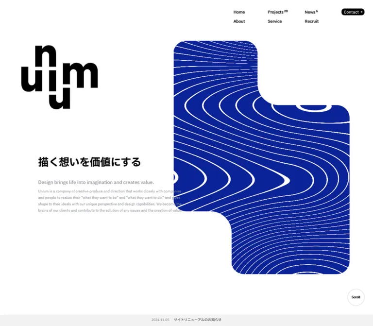
白い余白と濃青の等高線グラフィックが印象的な制作会社サイト。組み替えたロゴ、日英の階層的な文字組み、非対称の実績グリッド、円形の問い合わせ導線が特徴です。
オリジナルサイトを見るunium — Style Reference
An expansive white canvas punctuated by an assembled black wordmark, deep-blue contour fields, and carefully offset bilingual typography.
Original URL: https://unium.jp/ Final URL: https://unium.jp/ Theme: predominantly white, with black typography, deep-blue graphic fields, muted English copy, and pale neutral surfaces. Inspected: September 17, 2026, at 03:49 JST. The supplied observation package records September 16, 2026, at 18:49:23.078 UTC. Viewports: desktop 1440 × 1000 CSS pixels; mobile 390 × 844 CSS pixels. Scope: the current corporate homepage, including its opening composition, company introduction, selected projects, services, editorial introduction, recruitment, news, contact panel, and footer. Three desktop frames and two mobile frames provide visual evidence; rendered DOM measurements cover the longer page. Destination pages and open-menu interactions were not inspected.
unium presents a creative company through an unusually spacious editorial composition. Its main identifiers are a compact arrangement of oversized black letterforms, a deep-blue field crossed by white contour lines, and a repeated distinction between confident Japanese statements and smaller gray English explanations. Text is rarely centered across the whole page. Instead, headings, paragraphs, and links occupy different offsets within a larger alignment system.
The homepage combines company information, portfolio navigation, services, recruitment, and news. Its opening is only one part of a long browsing experience. The design alternates between broad graphic areas, asymmetric project blocks, restrained text sections, and a rounded contact surface. On mobile, the supplied opening frame retains a large white area above a low-positioned logo and headline; the supplied footer frame places the identity and navigation over a blue contour graphic.
How to Read This Reference
- Measured values come from the supplied rendered DOM and computed styles. Numbers are rounded for readability unless additional precision helps reproduce an alignment.
- Visually observed descriptions refer to the supplied original-page captures. Screenshot dimensions and graphic bounds are approximate unless corroborated by DOM measurements.
- Calculated values, such as relationships between root size and text size, are derived from the measurements. They are not recovered CSS declarations.
- Recommended values and behaviors are implementation guidance for a new adaptation. They do not establish how the original was built.
- Named tokens are descriptive aliases created for this reference. The supplied custom-property list primarily contains WordPress presets, which are not evidence that those preset colors, shadows, or gradients appear in the design.
- Computed and visible colors sometimes differ. Some navigation and headline elements report white text while their captured appearance is black. The supplied properties do not establish the compositing mechanism. Match the visible result without assuming a particular blend mode.
- DOM presence does not prove visibility. The mobile menu and several duplicate text layers have measurable elements, but their open or alternate states were not visually demonstrated.
Tokens — Colors
Default Palette
| Name | Value | Suggested token | Evidence and role |
|---|---|---|---|
| Canvas White | #ffffff |
--color-canvas |
Measured body background; dominant visible page surface; desktop circular contact button background |
| Editorial Black | #000000 |
--color-ink |
Measured body, service headings, footer text, and visible black identity |
| Deep Blue | #0a2396 |
--color-blue |
Measured link color and mobile contact-button fill; useful semantic basis for the blue graphic system |
| Secondary Gray | #94969d |
--color-muted |
Measured English explanations and project-client captions |
| News Strip Gray | #f2f2f2 |
--color-news |
Measured background of the opening news strip |
| Contact Panel Gray | approximately #edeef2 |
--color-panel |
Visual estimate of the pale contact surface; this exact hex is also measured on alternate contact-layer text, which does not independently establish the panel fill |
| Fine Divider Gray | approximately #d9d9d9 |
--color-rule |
Visual estimate of the thin service dividers; border color was not supplied |
The blue artwork is visually related to the measured accent color, but its fill was not separately exposed in the element sample. The service graphic appears somewhat darker than the opening contour field. Do not claim an exact shared graphic fill from the anchor color alone.
A small yellow-looking logo appears against the blue service panel in the desktop capture. Its color treatment is localized and its mechanism is unverified. It does not establish a second general accent palette.
Color Application
Use white for the main reading canvas and black for the primary Japanese copy, English section labels, and identity. Gray English paragraphs form a quieter layer beneath Japanese text. Deep blue supplies large graphic areas and small action markers rather than coloring every heading or link.
The contact button changes treatment across the inspected viewports: white with black text on desktop, blue with white text on mobile. This is a measured responsive difference, not a demonstrated theme selector.
The mobile footer visibly combines black lettering with a saturated blue and white background. Preserve that observation when documenting the source, but evaluate contrast separately when implementing it.
Tokens — Typography
Primary Family
- Computed family:
"IBM Plex Sans JP", sans-serif. - Weights:
400for ordinary navigation and English explanatory paragraphs;500for Japanese body text, utility links, and several captions;600for section headings and principal statements. - Tracking:
normalthroughout the sampled text. There is no evidence for broadly tracked uppercase labels. - Character: clean sans-serif typography with relatively compact English labels and generously spaced Japanese paragraphs.
- Verification limit: the computed family is directly supported; font-file requests and per-glyph fallback behavior were not supplied.
Identity Versus Text
The large stacked wordmark is artwork. Its geometry should not be approximated by setting the company name in the body font. The visible letters form a compact, interlocking block with deliberate vertical displacement.
The homepage's measured H1 wraps the linked identity asset. The Japanese opening statement, 描く想いを価値にする, is a paragraph in the supplied DOM. An adaptation may improve the heading hierarchy, but that is a semantic recommendation rather than a description of the original markup.
Root Sizing
The computed root size is 11.0769px on desktop and 10px on mobile. Many text and spacing values correspond to multiples of these roots. For example, body text is equivalent to 1.4 source rem at both viewports.
The original viewport formula and breakpoint declarations were not supplied. Do not extrapolate an exact scaling rule from two samples. The Quick Start uses an explicitly recommended scaling approximation while retaining a conventional application root.
Type Scale
| Role | Desktop size / line height | Mobile size / line height | Weight | Notes |
|---|---|---|---|---|
| Japanese body | 15.51 / 31.02px |
14 / 28px |
500 | Consistent two-times line height |
| Navigation | 15.51px |
14px in footer and menu trigger |
400; trigger 500 | Compact visible labels; measured link line boxes vary |
| Opening Japanese statement | 39.88 / 53.17px |
28 / 37.33px |
600 | One line in both supplied opening frames |
| Company-introduction statement | 39.88 / 53.17px |
28 / 37.33px |
600 | Explicit multiline composition |
| Service and Exploring statements | 39.88 / 53.17px |
30 / 40px |
600 | Slightly larger than the mobile opening statement |
| Standard section label | 22.15 / 33.23px |
18 / 27px |
600 | Who We Are, Our Projects, Our Service, Exploring, News |
| Service-item heading | 19.94 / 19.94px |
18 / 18px |
600 | Actual element bounds are slightly taller than the nominal line height |
| English opening summary | 17.72 / 19.94px |
14 / 22.12px |
500 | Gray; unusually compact on desktop |
| English section summary | 17.72 / 31.02px |
14 / 24.50px |
500 | Longer English introductory statements |
| English explanatory paragraph | 13.29 / 24.37px |
12 / 22px |
400 | Secondary reading layer |
| Project-client caption | 13.29 / 13.29px |
11 / 15.40px |
500 | Gray; wraps on narrow project tiles |
| Project title | 15.51 / 15.51px |
12 / 15.60px |
500 | Title follows client caption |
| Recruitment statement | 26.58 / 39.88px |
20 / 30px |
600 | Smaller than the major service statement |
| Contact statement | 26.58 / 39.88px |
18 / 27px |
600 | Two desktop lines; four explicit mobile lines |
| Contact and Recruit section labels | 22.15 / 33.23px |
20 / 30px |
600 | Mobile exceptions to the standard 18px section label |
| Circular contact label | 17.72px |
16px |
500 | Centered in the circle |
| Mobile menu links | Not applicable | 24 / 24px |
400 | DOM-supported; open presentation not visually verified |
| Company name and copyright | 13.29 / 15.51px |
12 / 14px |
500 | Small footer information |
Use font size, weight, placement, and language to establish hierarchy. Additional fonts or elaborate tracking would weaken the consistency of the observed system.
Tokens — Spacing & Shapes
Spacing Scale
The recurring desktop values below correspond mathematically to multiples of the measured root. The ratios are useful for adaptation, but do not prove the original authoring syntax.
| Use | Desktop | Mobile | Evidence |
|---|---|---|---|
| Small inset | 8.86px |
8px |
News-row padding; several compact details |
| Project caption inset | 17.72px |
8px |
Difference between card and caption x positions |
| Opening English paragraph separation | 17.72px |
8px |
Measured top padding |
| Japanese-to-English service separation | approximately 26.58px |
24px |
Measured adjacent paragraph positions |
| Supporting text after a heading | approximately 39.88px |
36px |
Service-item heading-to-body rhythm |
| Common larger text separation | 53.17px |
48px |
Section statements, explanatory groups, and links |
| Spacious internal offset | 88.62px |
Context dependent | Desktop service statement padding and contact-panel composition |
| Major section interval | 265.85px |
120px |
News/contact top padding and several inter-section gaps |
| Footer top padding | 177.23px |
80px |
Measured footer padding |
| Footer bottom padding | 88.62px |
34px |
Measured footer padding |
Border Radius
| Element | Observed or estimated value | Interpretation |
|---|---|---|
| Desktop header Contact | 8px, measured |
Compact rounded rectangle, not a full capsule |
| Desktop project link container | 44.31px 44.31px 44.31px 0 |
Three rounded corners and a square lower-left corner |
| Mobile project link container | 0, measured |
Parent links lose the desktop radius; descendant image clipping was not separately measured |
| Desktop contact panel | Approximately 40–45px, visual estimate |
Broad rounded surface |
| Mobile contact panel lower corners | Approximately 20px, visual estimate |
Visible where the panel meets the footer graphic |
| Circular contact button | 50%, measured |
132.92px desktop diameter; 120px mobile |
| Scroll control | Circle, visually observed | Approximately 65px desktop; 50px mobile |
| Service-pattern tiles | Approximately 5–6px, visual estimate |
Small softened rectangles within a regular lattice |
Layout Measurements
| Element | Desktop at 1440 × 1000 | Mobile at 390 × 844 |
|---|---|---|
| Main content side margins | 60px |
24px |
| Usable content width | 1320px |
342px |
| Header bounds | x 24, y 24, width 1392px |
x 24, y 16, width 342px |
| Opening identity bounds | x 60, y 136.17, 294.61 × 244.49px |
x 28, y 553.88, 160.50 × 133.16px |
| Opening statement box | x 127, y 525.69, width 516px |
x 24, y 719, width 342px |
| Opening English column | x 127, width 576px |
x 24, width 342px |
| Opening blue artwork | Approximately x 664, y 125, 690 × 716px |
Not visible in the supplied opening frame |
| First-fold news strip | y 955.70, height 44.30px |
y 804, height 40px |
| Service heading column | x 797, width 583px |
x 24, width 342px |
| Service explanatory column | x 931, width 449px |
x 67.75, width 298.25px |
| Footer identity | 258.08 × 199.92px |
180 × 139.44px |
| Footer total height | 564.06px |
682.11px |
| Recorded document height | 16609.34px |
14533.41px |
The desktop service paragraphs are inset 134px from their headings. Mobile retains a smaller 43.75px inset. This relationship is a strong reusable characteristic: responsive collapse does not eliminate every secondary alignment.
Components
Persistent Navigation and Menu Trigger
Role: provide company-wide navigation without a large header surface.
The desktop navigation sits in the upper-right corner over the page. Its main links occupy three columns and two rows: Home, Projects, and News across the first row; About, Service, and Recruit beneath. Projects and News carry small raised counts, observed as 28 and 7. Contact is a separate compact filled control at the far right with a small trailing dot.
The same upper-right navigation position appears in the opening and service captures. This supports persistent placement across those states; the evidence does not distinguish fixed positioning from the exact original implementation.
The Contact control measures 88.61 × 26.58px. It appears black with white lettering in the screenshot, although the sampled element reports a white background and blue text. Treat the screenshot as the authority for this visible state.
On mobile, the desktop navigation is replaced by a Menu label with a small blue dot, near x 311, y 23. Its measured button box is only 55.13 × 14px; that is not evidence of a larger invisible touch target.
The DOM includes Menu and Close letter spans, a 24px mobile link list, and a 160 × 42px blue Contact control with a 12px radius. These establish available menu content, not a verified opening animation, panel background, focus behavior, or menu-open screenshot.
Opening Identity and Statement
Role: establish the company identity and its central proposition.
Desktop places the stacked black wordmark near the upper-left, then locates the Japanese statement much lower and slightly farther right. The statement begins at x 127, compared with x 60 for the identity. The English summary and explanation continue along the x 127 alignment.
The Japanese line uses approximately 40px semibold type. Beneath it, the English summary is approximately 18px medium and the explanatory paragraph approximately 13px regular. Both English layers use the measured secondary gray.
The first mobile frame changes the composition substantially. The wordmark begins around y 554, the Japanese statement around y 719, and the top of the viewport remains mostly white. The desktop blue hero form is not visible in this captured frame. Its absence does not prove that graphics are permanently disabled throughout the mobile experience.
The English summary remains in the mobile DOM at y 804.33; it is not simply removed. Its position coincides with the opening news strip at y 804, and the longer English explanation begins below the viewport. Do not describe that content as absent merely because the screenshot does not show it.
Contour Graphic
Role: provide the dominant visual identity without conventional hero photography.
The desktop graphic is a large deep-blue form with rounded exterior corners and opposing concave cutouts. Its outline resembles connected, offset blocks rather than a regular rounded rectangle. It occupies approximately 48% of the viewport width and extends from near the top of the composition to well below the English summary.
Thin white lines flow across the blue field like distorted contours. Spacing expands and contracts, and several turns broaden into thicker white ribbons. The lines continue within a clipped outer silhouette. Preserve the relationship between the irregular mask and the internal flowing pattern.
The supplied evidence does not identify its rendering technology, source path, shader, animation duration, or response to pointer movement. A prepared SVG or other suitable graphic is a reasonable implementation choice, but is not an observed technology claim.
Opening News Strip and Scroll Cue
Role: introduce recent activity and signal that the page continues.
A full-width pale-gray strip sits at the bottom of the opening viewport. It contains the date 2025.04.17 followed by the linked announcement Web Designing 2025年6月号に事例掲載. Desktop content is centered in the strip; the mobile frame also keeps the date and title on one compact line.
The strip is 44.30px tall on desktop and 40px on mobile. Its background is measured as #f2f2f2, with content gaps of 17.72px and 16px respectively.
A separate outlined circular Scroll cue sits above the strip at the right. Its approximate diameter is 65px on desktop and 50px on mobile. Clicking it was not demonstrated; neither a particular destination nor smooth-scroll timing is established.
Bilingual Editorial Section
Role: explain the company through a repeatable hierarchy of label, proposition, detail, translation, and link.
The Who We Are section supplies the clearest measured anatomy:
- A small English section label starts on the outer x
60desktop alignment. - The large Japanese statement begins at x
127, with53.17pxof top padding after the label. - Japanese explanatory copy uses the same x
127offset and a wider576pxcolumn. - A medium English summary introduces the translation layer.
- A smaller gray English paragraph follows.
- A restrained View More link closes the group.
On mobile, the section label, statement, and body return to x 24. The View More link is aligned to the right edge. The design therefore preserves the reading hierarchy while simplifying this particular section's desktop indentation.
Underlined Action Link
Role: connect overview sections to deeper pages.
View More and View All are compact text links with a thin underline and a separated blue dot. View More measures approximately 97.86 × 21.03px on desktop and 88.38 × 19px on mobile. The measured label-to-decoration gap is 14.4px and 13px; bottom padding is approximately 5.54px and 5px.
The underline has a measured background-size transition. Duplicate labels exist in the DOM, but their movement was not exercised. Do not infer a specific rolling-text direction from duplication alone.
The links are intentionally modest. Broad filled buttons are reserved for a few contact contexts rather than repeated under every paragraph.
Selected Project Grid
Role: make portfolio work the main visual evidence of the company's capabilities.
Five homepage projects are present in the supplied DOM. Their linked containers form one large lead item followed by two asymmetric desktop rows:
| Row | Desktop linked-container measurements | Mobile linked-container measurements |
|---|---|---|
| Lead project | 1320 × 708.92px |
342 × 239.98px |
| Second and third projects | 875.06px and 444.94px wide; both 620.30px high |
Two 159px columns, 24px gap; both approximately 313.97px high |
| Fourth and fifth projects | 444.94px and 875.06px wide; both 620.30px high |
Two 159px columns, 24px gap; both approximately 298.58px high |
Desktop linked containers meet at their measured boundaries; this does not prove that the artwork inside them has no internal gutter. Mobile rows have a measured 28px vertical separation.
Each project pairs a visual area with a small gray client name and a darker project title. Captions begin approximately 17.72px inside desktop containers and 8px inside mobile containers. The lead project spans the available width at both sizes. The remaining mobile projects stay in two columns; they do not become a conventional single-column card list.
The desktop containers use three rounded corners and a square lower-left corner. Mobile parent containers report zero radius. Project imagery is supported by asset references and DOM geometry, but no dedicated project-grid screenshot was supplied, so precise crops, image colors, and hover states remain unverified.
Service Graphic and Text Column
Role: connect the company's abstract creative language with concrete capabilities.
The desktop service capture has a blue graphic area covering approximately the left 710px of the 1440px viewport. White rectangles form a regular lattice with varied spans: small individual cells, long horizontal bars, tall vertical bars, and larger blocks. Small cells appear approximately 22 × 26px, with softened corners. These dimensions are visual estimates.
The right side starts its heading and divider system at x 797, leaving substantial separation from the graphic. Paragraphs begin at x 931, producing a second level of indentation. The visible panel fills the captured height; exact pinning or scroll attachment was not supplied.
The service introduction includes the labels Concept Making, Creative Strategy, Creative Direction, Design, and Develop. Their full visual construction is not established by the provided service frame.
Below the introduction, service items use a fine horizontal rule, an English heading, a Japanese paragraph, and a smaller gray English paragraph. Observed headings are Brand Design / Art Direction, Web Design / Web Direction, and Service Design / Development.
Heading positions for the first two items are about 348px apart on desktop. On mobile, the right-side content becomes a page-width section, while explanatory paragraphs retain the x 67.75 inset. The exact mobile presentation of the blue service artwork was not visually captured.
Exploring and Recruitment
Role: extend the company presentation into ideas and hiring.
Exploring follows the bilingual editorial pattern and carries a small count of 1. On desktop, its section label and large Japanese statement start at x 60, while explanatory paragraphs begin at x 194 in a 449px column. Its recorded section height is exactly 1000px at the inspected desktop viewport.
The mobile Exploring measurements include unusual bounds: a heading box 684px wide at x -303, while its computed text size remains approximately 18px. Several neighboring bounds are also twice the usual mobile width. This is consistent with transformed content, but the supplied evidence does not identify the transform or its intended settled appearance. Do not adopt 684px as a normal mobile content width or reproduce negative offsets as a responsive rule.
Recruitment centers a narrower copy group: approximately 343.38px wide on desktop and 266px on mobile. Its statement uses a smaller scale than the major company and service statements. The recorded section heights are 2000px on desktop and 2187px on mobile, but no complete visual sequence was supplied. These measurements should not be converted into arbitrary empty spacers in a new implementation.
News List
Role: provide a compact record of company activity.
The section title and total count sit at the left on desktop; five linked entries occupy a 918px column beginning at x 462. Each entry combines a date with a Japanese title. Rows measure approximately 76.30px high, with the final row one pixel taller.
On mobile, the title begins at x 24, while the entries use the inset x 67.75, width 298.25px. Rows expand from approximately 82.8px to 106.6px as titles wrap. This reinforces the same secondary alignment used in service copy.
Measured row padding is 8.86px 8.86px 26.58px on desktop and 8px 8px 24px on mobile. Background-color transitions are declared, but the target hover color was not supplied.
Contact Panel
Role: end the main content with a clear invitation to start a conversation.
The desktop panel is a broad pale-gray rounded surface within 60px page margins. Contact Us appears near its upper-left. The Japanese statement is indented farther right, followed by two lines of smaller English copy. A white circular Let’s Talk link sits to the right, with a small blue dot below the label.
The circle is measured at 132.92 × 132.92px. A separate transparent contact link has a larger 398.77px square bounding box in the desktop DOM. It is not a second visible button; its exact interaction role was not exercised.
The contact text occurs twice at identical positions in the DOM, with black/gray and white/light-gray colors. These are overlapping presentation layers, not evidence of two sequential contact panels. Their trigger and transition mechanism remain unverified.
On mobile, the section is more vertical. Contact Us uses 20px type, the Japanese invitation uses 18px type across four explicit lines, and English copy uses 12px. The circular button is 120px wide, centered horizontally, and reverses to a blue fill with white text. The supplied bottom capture shows only the panel's lower portion and button; upper mobile panel details come from DOM measurements.
Footer
Role: repeat the identity and provide complete secondary navigation.
Desktop uses a spacious white footer. The large black logo sits on the left with the embedded English phrase Uniqueness Designs Social Good. Primary navigation occupies three compact columns at the upper right. Contact Us, Exploring, and Privacy Policy form a separate lower row. The company name and Instagram/X icons sit near the lower left; copyright sits at the lower right.
The original footer identifies the company as 株式会社ユニウム and displays ©2024 unium Inc.. These are current-page observations; the copyright year is not the inspection date.
Mobile reorganizes the footer around a 180px-wide logo at the left and a right-aligned vertical navigation list. Links appear in the order Home, About, Service, Projects, News, Recruit, then Contact Us, Exploring, and Privacy Policy. Primary link boxes are approximately 41.8px tall. Company information and social icons sit near the bottom-left, opposite the copyright.
In the supplied mobile frame, blue contour artwork fills the footer behind the black identity and links. On desktop, the supplied footer frame is white. The evidence does not establish whether this difference is solely breakpoint-driven or also depends on a graphic's scroll state.
Tokens — Motion & Interaction
Measured Transition Declarations
| Element or treatment | Measured declaration | What is established |
|---|---|---|
| Header opacity | 0.3s cubic-bezier(0.82, 0.02, 0.83, 0.86) |
Opacity transition is available; triggering state was not exercised |
| Mobile menu-trigger opacity | 0.3s cubic-bezier(0.82, 0.02, 0.83, 0.86) |
Same timing family as header |
| View More / View All underline | background-size 0.3s cubic-bezier(0.4, 1.07, 1, 1) |
Underline-related transition; exact before/after sizes unknown |
| News-row background | background-color 0.3s cubic-bezier(0.82, 0.02, 0.83, 0.86) |
Background change is declared; destination color unknown |
| Opening news-strip background | background-color 0.5s cubic-bezier(0.4, 1.07, 1, 1) |
Slower background transition |
| News section filter | filter 0.5s cubic-bezier(0.4, 1.07, 1, 1) |
Filter transition exists; effect and trigger unknown |
| Circular contact colors | color and background-color, 0.3s cubic-bezier(0.4, 1.07, 1, 1) |
Color transitions available |
| Circular contact transform | 0.2s cubic-bezier(0.4, 1.07, 1, 1) |
Transform transition available; no verified scale or displacement |
| Mobile-menu Contact visibility | opacity 0s 0.5s |
Delayed state change in the sampled menu DOM |
| Mobile-menu social icons | scale 0s 0.5s, opacity 0s 0.5s |
Delayed properties exist; sequence was not observed |
Many sampled elements report animation: none. That does not establish a motion-free page: JavaScript transforms, canvas rendering, ancestor effects, and unsampled pseudo-elements are outside that narrow measurement.
Motion Evidence and Limits
The long opening and service sections, changing graphic contexts, repeated label layers, and transformed mobile Exploring bounds support treating motion as a material implementation concern. They do not provide enough evidence to specify an exact scroll timeline.
The opening section is measured at approximately 2744.80px on desktop and 2268.55px on mobile. The service section is approximately 4028.42px and 4148.52px respectively. These heights may include staging for visual behavior, but pinning intervals, scroll speeds, and animation dependencies were not provided.
The supplied collection process waited for initial stability, visible image decoding, and finite animations within stated limits; perpetual animations were temporarily paused during readiness checks and resumed. Those checks improve capture consistency without proving that every delayed state was shown.
For an adaptation, keep controls responsive and use the measured short transition families where suitable. Any new graphic animation, menu entrance, pointer response, or scroll sequence must be labeled and designed as an addition.
Surfaces
| Layer | Appearance | Role |
|---|---|---|
| Main canvas | White, visually flat | Spacious editorial reading environment |
| Identity | Heavy black artwork | Brand anchor at opening and footer |
| Large graphic field | Deep blue with white contour lines or geometric tiles | Visual energy and continuity between sections |
| Editorial content | Black Japanese text with smaller gray English text | Information hierarchy without cards |
| Project containers | Image-led blocks, asymmetric desktop geometry | Portfolio browsing |
| Service separators | Fine neutral rules | Structure long capability descriptions |
| Opening news strip | Solid #f2f2f2 |
Compact current activity |
| Contact panel | Pale neutral, broad rounded corners | Distinct invitation near the page end |
| Contact controls | Small filled rectangle or large flat circle | Primary action emphasis |
There is no visible general-purpose shadow or elevation system in the supplied captures. Do not adopt the WordPress shadow and gradient presets as design tokens merely because they appear in the custom-property dump.
Imagery
The original-page captures are led by abstract graphics and identity artwork. The contour field feels fluid and continuous; the service field feels modular and grid-based. Their common language is a strong blue ground, white shapes, crisp edges, and carefully controlled negative space.
The opening artwork is clipped into an irregular silhouette. The mobile footer shows the contour pattern at a much larger apparent scale, extending beyond the screen. These are different compositions of a related visual vocabulary, not interchangeable background thumbnails.
Project imagery introduces actual client work. The supplied DOM includes image references with declared 1300 × 650 dimensions for several projects. These dimensions establish asset proportions, not their final crop inside every container. No specific photographic subject, color treatment, or autoplay behavior should be invented for project assets that are not shown in the supplied frames.
Observed Asset References
Paths are relative to https://unium.jp/. They identify original-page resources; they are not bundled with this reference.
| Asset | Observed path | Evidence and use |
|---|---|---|
| Header identity resource | /unium_cms/wp-content/themes/unium/assets/imgs/common/logo-w.svg |
Linked H1 resource; declared attributes 464 × 72; rendered identity bounds are tall, so the declared ratio does not describe the final assembled composition |
| Footer identity | /unium_cms/wp-content/themes/unium/assets/imgs/common/logo-l.png |
Declared 466 × 361; rendered approximately 258 × 200px desktop and 180 × 139px mobile |
| Mobile-menu identity resource | /unium_cms/wp-content/themes/unium/assets/imgs/common/logo.svg |
Present in mobile-menu DOM; visible open-menu composition unverified |
| TAKE and GIVE NEEDS project | /unium_cms/wp-content/uploads/2023/11/tgn_M.jpg |
Declared 1300 × 650; linked portfolio preview |
| POTLUCK YAESU project | /unium_cms/wp-content/uploads/2023/03/potluckyaesu_L.jpg |
Declared 1300 × 650; linked portfolio preview |
| Space BD project | /unium_cms/wp-content/uploads/2024/11/spacebd_L.png |
Declared 1300 × 650; linked portfolio preview |
No direct resource path for the contour field or service lattice was supplied. Do not invent filenames or assume those graphics are static raster images. Use authorized original assets when available, or create new artwork that preserves the compositional principles without pretending it is the original resource.
Layout & Responsive Behavior
Desktop Structure
The page uses a broad 1320px content area at 1440px viewport width. Outer labels commonly align to x 60; text groups may start at x 127, 194, 797, or 931. These repeated offsets create hierarchy through placement rather than through many different containers.
The opening pairs a relatively small information group with a dominant graphic. The service area shifts the large graphic to the left and concentrates text on the right. Projects use a full-width lead tile followed by alternating wide/narrow pairs. The footer returns to a large left identity and a compact right navigation system.
The large vertical intervals are a material part of the captured design, but the full document height is not a reusable spacing token. Preserve spaciousness without hardcoding 16,609px of content height.
Mobile Structure
At 390px, the standard content width is 342px with 24px side margins. The root text scale becomes smaller, but several relationships remain intentionally asymmetric:
- The opening identity and Japanese statement sit near the bottom of the initial viewport.
- Desktop navigation becomes the small Menu trigger.
- The project lead item spans the content width; the next four items remain a two-column grid with 159px columns and a 24px gap.
- Service descriptions and news rows keep a 43.75px inset from their section headings.
- Contact copy becomes a vertical stack with a centered 120px circular action.
- Footer navigation becomes a right-aligned vertical list beside and below the logo.
The mobile footer's blue background is directly visible. The mobile opening's lack of visible blue artwork is also directly visible. Do not resolve these two facts by assuming the site removes all blue graphics on phones.
Unverified Ranges
Only the two stated viewport sizes were measured. Tablet behavior, landscape phones, intermediate breakpoints, browser zoom, and safe-area handling were not provided. The Quick Start's 760px breakpoint is a recommendation, not a recovered source breakpoint.
The mobile Exploring bounds should be treated as state-dependent evidence. Recheck that section in a full interactive implementation before adopting any transformed position or scale.
Do’s and Don’ts
Do
- Build the page around white space, black identity, and a small deep-blue palette.
- Use the measured IBM Plex Sans JP stack and its 400/500/600 hierarchy.
- Preserve the stacked wordmark as artwork with its own proportions.
- Separate Japanese propositions from quieter English explanations through size, weight, and color.
- Keep meaningful secondary alignments, especially in service descriptions and mobile news rows.
- Use an irregular rounded mask for the opening contour graphic.
- Retain the alternating wide/narrow desktop portfolio structure and the two-column mobile project rows.
- Distinguish the compact header Contact control from the large circular contact action.
- Use thin rules and small dot markers instead of adding heavy component chrome.
- Treat the supplied mobile opening and footer as distinct observed states.
- Keep content counts data-driven; 28, 7, and 1 are captured values, not permanent design constants.
Don’t
- Don’t reduce the homepage to an opening banner followed by generic feature cards.
- Don’t turn the blue contour field into a regular rectangle or an ordinary linear gradient.
- Don’t apply the body font to approximate the interlocking logo.
- Don’t make every English paragraph the same size and weight as the Japanese text.
- Don’t flatten every mobile section to the same left alignment.
- Don’t collapse all mobile portfolio items into a single column.
- Don’t introduce general drop shadows, glass blur, or unrelated accent colors from unused CMS presets.
- Don’t interpret duplicated DOM labels as text that should appear twice to the reader.
- Don’t implement white-on-white text merely because an intermediate computed layer reports white.
- Don’t copy the negative mobile Exploring offsets as ordinary layout rules.
- Don’t invent menu choreography, contour animation speeds, cursor effects, or hover transformations.
- Don’t hide English copy merely because it falls below or behind the captured opening strip.
Recommended Implementation Additions
These are recommendations for a new implementation, not verified original-site features:
- Give the Menu trigger an explicit expanded state, connect it to the navigation panel, and implement keyboard opening, Escape dismissal, and appropriate focus management.
- Expand small utility-link and menu-trigger hit areas to at least 44px without enlarging their visible labels unnecessarily.
- Use one accessible text label per action. Mark purely decorative duplicate animation layers and dots as hidden from assistive technology.
- Preserve a meaningful text heading for the main proposition and useful alternative text for the brand artwork.
- Darken secondary body text when accessibility is required. The measured
#94969dis approximately 3:1 against white, which is insufficient for ordinary small text under a 4.5:1 target. - Give the mobile footer a stable readable treatment. A white backing for black navigation and identity, or a suitable reversed asset over a controlled blue area, is safer than letting white contours pass behind every label.
- Reserve space for the first-fold news strip so that introductory English copy remains readable when scrolling or zooming.
- Provide a static graphic state and a reduced-motion path. Essential copy and navigation should not depend on a scroll animation completing.
- Keep project image loading dimensions explicit to prevent layout shifts, while verifying the actual crops at both measured widths.
- Avoid reproducing long blank section heights until a specific interaction requires them. A static fallback should remain coherent and complete.
Agent Prompt Guide
Quick Color Reference
- Canvas:
#ffffff. - Main text and identity:
#000000. - Verified accent and mobile contact fill:
#0a2396. - Measured secondary text:
#94969d; use a darker alternative where required for readable small text. - Opening news strip:
#f2f2f2. - Contact panel approximation:
#edeef2. - Dividers: approximately
#d9d9d9. - Major visual contrast: blue/white graphics against extensive white space, not a multicolor UI.
Overall Prompt
“Create a Japanese creative-company homepage inspired by the current unium composition. Use a white canvas, black stacked identity artwork, IBM Plex Sans JP, deep-blue abstract graphics, and smaller gray English explanations beneath Japanese copy. At desktop, keep 60px outer margins, a compact three-column two-row navigation group at the upper right, a low-positioned 40px Japanese opening statement on the left, and a large irregular rounded contour graphic on the right. Continue with offset bilingual editorial sections, a full-width lead project followed by alternating wide/narrow project pairs, a blue modular service graphic beside an indented text column, news, a pale rounded contact panel, and a spacious footer. At 390px, use 24px margins, a small Menu trigger, a 28px opening statement, two-column project rows after the lead item, and inset service descriptions. Treat motion as a separately specified enhancement and preserve a complete static reading path.”
Example Component Prompts
- Opening composition: “Build a 1440px desktop opening with a stacked black logo near x 60/y 136, Japanese statement near x 127/y 526, and a 576px English text column. Place an approximately 690 × 716px deep-blue contour artwork at the right inside an irregular shape with rounded corners and opposing concave cutouts. Keep the white margins broad and use a pale 44px news strip at the first fold.”
- Service section: “Place a blue field of white rounded lattice tiles on the left half of the desktop viewport. Start service headings at x 797 and bilingual descriptions at x 931. Separate capabilities with fine neutral rules. On mobile, keep headings at the 24px page margin and inset descriptions by roughly 44px.”
- Project grid: “Use a large lead portfolio link across the content width, followed by a wide/narrow pair and a narrow/wide pair. Give desktop parent containers three large rounded corners and a square lower-left corner. Use gray client captions above restrained dark titles. At 390px, keep the lead full-width and the following projects in two 159px columns separated by 24px.”
- Editorial action link: “Create a compact View More label with a fine underline, about 13–14px of separation before a small blue dot, and no surrounding card or shadow. Use a 300ms background-size transition as a recommended hover implementation, while retaining a visible keyboard focus state.”
- Contact panel: “Create a pale-gray panel with broad rounded corners, a small Contact Us heading, a two-line Japanese invitation, and subdued English copy. On desktop, place a white 133px circular Let’s Talk action to the right. On mobile, stack the copy and center a blue 120px circle with white text and a small lower dot.”
- Mobile footer: “Arrange a 180px stacked logo on the left and a right-aligned vertical navigation list on the right, above company details and social icons. Use a large blue contour field as the visual background. Add a deliberate readable backing or a verified reversed identity treatment so the text remains legible as contours cross the composition.”
Quick Start
CSS Custom Properties
This is a static adaptation, not extracted source CSS. It reproduces the measured typography endpoints, major alignments, project-grid relationships, and contact geometry. The fluid unit and 760px breakpoint are recommended implementation choices.
Load IBM Plex Sans JP through the project's normal font pipeline. Supply prepared identity and graphic assets separately. In particular, the header SVG's declared wide dimensions do not by themselves reproduce the observed stacked logo; use artwork prepared for that composition rather than stretching a wide asset.
The example intentionally does not reproduce unverified scroll staging. Its mobile opening keeps the captured low logo and statement placement, but reserves additional room after the news strip before showing English copy. Project media crops in this CSS are recommendations because the supplied project images were not visually inspected in their containers.
:root {
  /* Measured colors, except the estimated panel and divider. */
  --color-canvas: #ffffff;
  --color-ink: #000000;
  --color-blue: #0a2396;
  --color-muted: #94969d;
  --color-news: #f2f2f2;
  --color-panel: #edeef2;
  --color-rule: #d9d9d9;

  /* Recommended alternative for readable secondary body text. */
  --color-muted-readable: #686b73;

  --font-body: 'IBM Plex Sans JP', sans-serif;
  --weight-regular: 400;
  --weight-medium: 500;
  --weight-semibold: 600;

  /* Recommended fit to the two measured root-size endpoints. */
  --u: clamp(10px, 0.76923vw, 11.0769px);
  --gutter: clamp(24px, 4.16667vw, 60px);
  --text-body: calc(1.4 * var(--u));
  --text-small: calc(1.2 * var(--u));
  --text-summary: calc(1.6 * var(--u));
  --text-section: calc(2 * var(--u));
  --text-display: calc(3.6 * var(--u));
  --text-service: calc(1.8 * var(--u));
  --text-contact: calc(2.4 * var(--u));
  --text-project: calc(1.4 * var(--u));

  --space-small: calc(1.6 * var(--u));
  --space-copy: calc(2.4 * var(--u));
  --space-group: calc(4.8 * var(--u));
  --space-section: calc(24 * var(--u));
  --radius-panel: calc(4 * var(--u));
  --contact-size: calc(12 * var(--u));
  --news-height: calc(4 * var(--u));

  /* Timing declarations supported by the supplied measurements. */
  --ease-graphic: cubic-bezier(0.4, 1.07, 1, 1);
  --ease-quiet: cubic-bezier(0.82, 0.02, 0.83, 0.86);
  --motion-color: 300ms var(--ease-graphic);
  --motion-small: 200ms var(--ease-graphic);
}

* { box-sizing: border-box; }

body {
  margin: 0;
  color: var(--color-ink);
  background: var(--color-canvas);
  font-family: var(--font-body);
  font-size: var(--text-body);
  font-weight: var(--weight-medium);
  line-height: 2;
}

img, svg { max-width: 100%; }
button, input, textarea { font: inherit; }
a { color: inherit; }

.page-wrap { margin-inline: var(--gutter); }
.section { padding-block: var(--space-section); }
.section-title {
  margin: 0;
  font-size: var(--text-section);
  font-weight: var(--weight-semibold);
  line-height: 1.5;
}
.display-copy {
  margin: 0;
  font-size: var(--text-display);
  font-weight: var(--weight-semibold);
  line-height: 1.3333;
}
.copy-en {
  color: var(--color-muted);
  font-size: var(--text-small);
  font-weight: var(--weight-regular);
  line-height: 1.8333;
}
.copy-readable { --color-muted: var(--color-muted-readable); }
.count {
  margin-inline-start: 0.15em;
  font-size: 0.65em;
  vertical-align: super;
}

/* Main navigation contains two rows of three links. */
.site-header {
  position: fixed;
  z-index: 50;
  inset: 24px 24px auto;
  display: flex;
  justify-content: flex-end;
  pointer-events: none;
}
.site-header a, .site-header button { pointer-events: auto; }
.desktop-nav {
  display: flex;
  align-items: flex-start;
  gap: 72px;
}
.nav-main {
  display: grid;
  grid-template-columns: repeat(3, max-content);
  gap: 18px 58px;
}
.nav-main a {
  font-weight: var(--weight-regular);
  line-height: 1.2;
  text-decoration: none;
}
.header-contact {
  display: inline-flex;
  align-items: center;
  gap: 9px;
  padding: 3px 9px;
  border-radius: 8px;
  color: white;
  background: black;
  line-height: 1.3;
  text-decoration: none;
}
.header-contact::after {
  content: '';
  width: 4px;
  height: 4px;
  border-radius: 50%;
  background: currentColor;
}
.menu-trigger { display: none; }

/* Prepared stacked identity and masked artwork belong here. */
.hero {
  position: relative;
  min-height: 100svh;
  padding-bottom: 120px;
}
.hero-brand {
  position: absolute;
  top: 13.617svh;
  left: var(--gutter);
  width: min(20.46vw, 294.61px);
  aspect-ratio: 294.61 / 244.49;
}
.hero-brand > img, .hero-brand > svg {
  display: block;
  width: 100%;
  height: 100%;
  object-fit: contain;
}
.hero-graphic {
  position: absolute;
  top: 12.5svh;
  left: 46.1111%;
  width: 47.9167%;
  aspect-ratio: 690 / 716;
  pointer-events: none;
}
.hero-graphic > img, .hero-graphic > svg {
  display: block;
  width: 100%;
  height: 100%;
  object-fit: contain;
}
.hero-content {
  position: relative;
  z-index: 1;
  width: 40vw;
  margin-left: calc(var(--gutter) + 4.65vw);
  padding-top: 52.569svh;
}
.hero-summary {
  margin: calc(3.6 * var(--u)) 0 0;
  color: var(--color-muted);
  font-size: var(--text-summary);
  line-height: 1.125;
}
.hero-description { margin-top: var(--space-small); }
.hero-news {
  position: absolute;
  z-index: 3;
  top: calc(100svh - var(--news-height));
  inset-inline: 0;
  display: flex;
  align-items: center;
  justify-content: center;
  gap: var(--space-small);
  height: var(--news-height);
  padding-inline: var(--gutter);
  background: var(--color-news);
  font-size: var(--text-small);
  text-decoration: none;
}
.hero-news time { flex-shrink: 0; color: var(--color-muted); }
.hero-news span {
  overflow: hidden;
  white-space: nowrap;
  text-overflow: ellipsis;
}
.scroll-cue {
  position: absolute;
  top: calc(100svh - 134px);
  right: 24px;
  display: grid;
  place-items: center;
  width: 65px;
  aspect-ratio: 1;
  border: 1px solid #cccccc;
  border-radius: 50%;
  background: white;
  font-size: 12px;
  text-decoration: none;
}

.text-link {
  display: inline-flex;
  align-items: center;
  gap: calc(1.3 * var(--u));
  width: fit-content;
  padding-bottom: calc(0.5 * var(--u));
  background-image: linear-gradient(currentColor, currentColor);
  background-position: left bottom;
  background-repeat: no-repeat;
  background-size: 100% 1px;
  line-height: 1;
  text-decoration: none;
  transition: background-size 300ms var(--ease-graphic);
}
.text-link::after {
  content: '';
  width: 4px;
  height: 4px;
  border-radius: 50%;
  background: var(--color-blue);
}
.text-link.is-end { margin-left: auto; }

/* Static approximation of the measured wide/narrow project pairs. */
.projects-grid {
  display: grid;
  grid-template-columns: repeat(6, minmax(0, 1fr));
}
.project-card {
  grid-column: span 2;
  min-width: 0;
  overflow: hidden;
  border-radius: var(--radius-panel) var(--radius-panel)
    var(--radius-panel) 0;
  text-decoration: none;
}
.project-card:first-child { grid-column: 1 / -1; }
.project-card:nth-child(2),
.project-card:nth-child(5) { grid-column: span 4; }
.project-media { height: clamp(280px, 38vw, 550px); }
.project-card:first-child .project-media {
  height: auto;
  aspect-ratio: 2 / 1;
}
.project-media img {
  display: block;
  width: 100%;
  height: 100%;
  object-fit: cover;
}
.project-caption { padding: var(--space-small); }
.project-client {
  margin: 0;
  color: var(--color-muted);
  font-size: var(--text-small);
  line-height: 1.4;
}
.project-title {
  margin: var(--u) 0 0;
  font-size: var(--text-project);
  font-weight: var(--weight-medium);
  line-height: 1.3;
}

.service-layout {
  display: grid;
  grid-template-columns: calc(50% - 10px) minmax(0, 1fr);
  gap: 87px;
}
.service-art {
  overflow: hidden;
  background: var(--color-blue);
}
.service-art > img, .service-art > svg {
  display: block;
  width: 100%;
  height: auto;
}
.service-content { padding-right: var(--gutter); }
.service-item {
  padding-block: var(--space-group);
  border-top: 1px solid var(--color-rule);
}
.service-item h3 {
  margin: 0;
  font-size: var(--text-service);
  font-weight: var(--weight-semibold);
  line-height: 1.15;
}
.service-body { margin: 36px 0 0 23%; }
.service-body p { margin: 0; }
.service-body .copy-en { margin-top: var(--space-copy); }

.news-layout {
  display: grid;
  grid-template-columns: minmax(0, 1fr) minmax(0, 2.2836fr);
}
.news-row {
  display: block;
  padding: calc(0.8 * var(--u)) calc(0.8 * var(--u))
    var(--space-copy);
  border-bottom: 1px solid var(--color-rule);
  text-decoration: none;
  transition: background-color 300ms var(--ease-quiet);
}
.news-row time {
  display: block;
  color: var(--color-muted);
  font-size: var(--text-small);
}

.contact-panel {
  display: grid;
  grid-template-columns: minmax(0, 1fr) auto;
  align-items: center;
  gap: clamp(40px, 8vw, 120px);
  margin-inline: var(--gutter);
  padding: calc(8 * var(--u));
  border-radius: var(--radius-panel);
  background: var(--color-panel);
}
.contact-copy { max-width: 760px; }
.contact-statement {
  margin: calc(3.6 * var(--u)) 0 0 40px;
  font-size: var(--text-contact);
  font-weight: var(--weight-semibold);
  line-height: 1.5;
}
.contact-copy .copy-en {
  margin: var(--space-copy) 0 0 40px;
}
.talk-link {
  position: relative;
  display: grid;
  place-items: center;
  width: var(--contact-size);
  aspect-ratio: 1;
  border-radius: 50%;
  color: var(--color-ink);
  background: white;
  font-size: var(--text-summary);
  text-decoration: none;
  transition: color var(--motion-color),
    background-color var(--motion-color),
    transform var(--motion-small);
}
.talk-link::after {
  content: '';
  position: absolute;
  bottom: 18px;
  width: 4px;
  height: 4px;
  border-radius: 50%;
  background: var(--color-blue);
}

.site-footer {
  position: relative;
  isolation: isolate;
  display: grid;
  grid-template-columns: minmax(0, 1fr) auto;
  gap: 60px;
  padding: calc(16 * var(--u)) var(--gutter) calc(8 * var(--u));
  background: white;
}
.footer-brand { width: 258.08px; }
.footer-brand img { display: block; width: 100%; height: auto; }
.footer-primary {
  display: grid;
  grid-template-columns: repeat(3, max-content);
  gap: 18px 56px;
}
.footer-nav a { font-weight: 400; text-decoration: none; }
.footer-secondary {
  display: flex;
  justify-content: flex-end;
  gap: 40px;
  margin-top: 140px;
}
.footer-meta {
  grid-column: 1 / -1;
  display: flex;
  justify-content: space-between;
  gap: 24px;
  font-size: var(--text-small);
  line-height: 1.4;
}
.footer-graphic { display: none; }

/* Recommended feedback; exact original hover targets are unverified. */
@media (hover: hover) {
  .text-link:hover { background-size: 0 1px; }
  .news-row:hover { background: var(--color-news); }
}
:where(a, button):focus-visible {
  outline: 2px solid var(--color-blue);
  outline-offset: 5px;
}

/* Recommended breakpoint; only 390px and 1440px were measured. */
@media (max-width: 760px) {
  :root {
    --u: 10px;
    --gutter: 24px;
    --text-summary: 14px;
    --text-section: 18px;
    --text-display: 28px;
    --text-contact: 18px;
    --text-project: 12px;
    --space-section: 120px;
    --radius-panel: 20px;
    --contact-size: 120px;
    --news-height: 40px;
  }

  .site-header { inset: 16px 24px auto; }
  .desktop-nav { display: none; }
  .menu-trigger {
    display: inline-flex;
    align-items: center;
    gap: 14px;
    min-height: 44px;
    padding: 0;
    border: 0;
    color: var(--color-ink);
    background: transparent;
  }
  .menu-trigger::after {
    content: '';
    width: 4px;
    height: 4px;
    border-radius: 50%;
    background: var(--color-blue);
  }

  .hero-brand {
    top: calc(100svh - 290.12px);
    left: 28px;
    width: 160.5px;
  }
  /* Approximate the supplied opening frame, not all mobile states. */
  .hero-graphic { display: none; }
  .hero-content {
    width: auto;
    margin-inline: var(--gutter);
    padding-top: calc(100svh - 125px);
  }
  .hero-summary {
    /* Added strip clearance keeps English copy readable. */
    margin-top: calc(48px + var(--news-height));
    line-height: 1.58;
  }
  .hero-description { margin-top: 8px; }
  .scroll-cue {
    top: calc(100svh - 105px);
    right: 16px;
    width: 50px;
    font-size: 10px;
  }

  .projects-grid {
    grid-template-columns: repeat(2, minmax(0, 1fr));
    gap: 28px 24px;
  }
  .project-card,
  .project-card:nth-child(2),
  .project-card:nth-child(5) {
    grid-column: auto;
    border-radius: 0;
  }
  .project-card:first-child { grid-column: 1 / -1; }
  .project-media { height: auto; aspect-ratio: 2 / 3; }
  .project-caption { padding: 8px; }
  .project-client { font-size: 11px; }
  .project-title { margin-top: 4px; }

  .service-layout { display: block; }
  .service-content { padding: 120px var(--gutter) 0; }
  .service-content .display-copy { font-size: 30px; }
  .service-body { margin-left: 43.75px; }

  .news-layout { display: block; }
  .news-list { margin: 48px 0 0 43.75px; }

  .contact-panel {
    display: block;
    margin-inline: 0;
    padding: 64px var(--gutter);
  }
  .contact-panel .section-title { font-size: 20px; }
  .contact-statement { margin: 48px 0 0; }
  .contact-copy .copy-en { margin: 24px 0 0; }
  .talk-link {
    margin: 32px auto 0;
    color: white;
    background: var(--color-blue);
    font-size: 16px;
  }
  .talk-link::after { background: white; }

  .site-footer {
    grid-template-columns: minmax(0, 1fr) auto;
    gap: 24px;
    padding: 80px var(--gutter) 34px;
    background: var(--color-blue);
  }
  .footer-brand { width: 180px; }
  .footer-nav { padding-top: 83px; }
  .footer-primary, .footer-secondary {
    display: flex;
    flex-direction: column;
    align-items: flex-end;
    gap: 0;
  }
  .footer-primary a, .footer-secondary a {
    display: flex;
    align-items: center;
    min-height: 44px;
  }
  .footer-secondary { margin-top: 36px; }
  .footer-graphic {
    position: absolute;
    z-index: -1;
    inset: 0;
    display: block;
    width: 100%;
    height: 100%;
    object-fit: cover;
    pointer-events: none;
  }

  /* Optional readable backing; an addition to the captured design. */
  .footer-readable .footer-nav,
  .footer-readable .footer-meta,
  .footer-readable .footer-brand {
    background: white;
  }
  .footer-readable .footer-nav,
  .footer-readable .footer-meta { padding: 12px; }
}

/* Recommended reduced-motion treatment for this adaptation. */
@media (prefers-reduced-motion: reduce) {
  .text-link, .news-row, .talk-link, .site-header {
    transition: none;
  }
}
The navigation panel still requires application behavior. The CSS does not implement menu state, focus handling, animated graphic generation, or scroll-controlled scenes. Connect the supported destinations through ordinary links and add those behaviors only when their requirements are explicit.
Tailwind v4 Token Mapping
Optional aliases for a project already using Tailwind v4. Define the custom properties above first. This mapping does not imply that the original uses Tailwind.
@theme inline {
  --color-canvas: #ffffff;
  --color-ink: #000000;
  --color-blue: #0a2396;
  --color-muted: #94969d;
  --color-muted-readable: #686b73;
  --color-news: #f2f2f2;
  --color-panel: #edeef2;
  --color-rule: #d9d9d9;

  --font-body: 'IBM Plex Sans JP', sans-serif;
  --text-copy: calc(1.4 * var(--u));
  --text-caption: calc(1.2 * var(--u));
  --text-section-label: var(--text-section);
  --text-statement: var(--text-display);

  --spacing-page: var(--gutter);
  --spacing-section: var(--space-section);
  --spacing-contact-circle: var(--contact-size);
  --radius-contact-panel: var(--radius-panel);
}
Sources & Evidence
- Original and final page: https://unium.jp/. The supplied collector reports HTTP 200 with the same original and final URL and the page title
unium - 描く想いを価値にする. - Observation timestamp:
2026-09-16T18:49:23.078Z, equivalent to September 17, 2026, at 03:49:23.078 JST. This is the supplied package timestamp; individual screenshot timestamps were not separately provided. - Desktop visual evidence: three supplied 1440 × 1000 frames showing the opening, a service-section position, and the contact/footer area.
- Mobile visual evidence: two supplied 390 × 844 frames showing the opening and the lower contact/footer area.
- Rendered evidence: page text, link destinations, asset references, element rectangles, computed font properties, colors, padding, radii, and transition declarations for both viewport sizes.
- Verified destination references in the homepage DOM: Projects, About, Service at
/about/#service, Recruit, News, Contact, Exploring, Privacy Policy, individual project entries, and individual news entries. Their presence is established; their destination-page designs were not inspected. - Interaction scope: supplied collection involved initial waiting and scrolling through intermediate positions. No click, hover, keyboard, menu-open, form, or destination-page behavior was demonstrated in the evidence available for this reference.
- Inspection limitations: the full stylesheet, graphic rendering code, complete asset inventory, exact breakpoints, hover endpoints, and motion timelines were not supplied. Some measured elements are duplicated, transformed, or potentially hidden. The collector's waiting process does not prove semantic completeness, and shared/service workers were disabled during collection.
This reference describes the current supplied homepage evidence. Measured properties, visual estimates, and recommended implementation choices are identified separately throughout.
# unium — Style Reference

> An expansive white canvas punctuated by an assembled black wordmark, deep-blue contour fields, and carefully offset bilingual typography.

**Original URL:** [https://unium.jp/](https://unium.jp/)
**Final URL:** [https://unium.jp/](https://unium.jp/)
**Theme:** predominantly white, with black typography, deep-blue graphic fields, muted English copy, and pale neutral surfaces.
**Inspected:** September 17, 2026, at 03:49 JST. The supplied observation package records September 16, 2026, at 18:49:23.078 UTC.
**Viewports:** desktop 1440 × 1000 CSS pixels; mobile 390 × 844 CSS pixels.
**Scope:** the current corporate homepage, including its opening composition, company introduction, selected projects, services, editorial introduction, recruitment, news, contact panel, and footer. Three desktop frames and two mobile frames provide visual evidence; rendered DOM measurements cover the longer page. Destination pages and open-menu interactions were not inspected.

unium presents a creative company through an unusually spacious editorial composition. Its main identifiers are a compact arrangement of oversized black letterforms, a deep-blue field crossed by white contour lines, and a repeated distinction between confident Japanese statements and smaller gray English explanations. Text is rarely centered across the whole page. Instead, headings, paragraphs, and links occupy different offsets within a larger alignment system.

The homepage combines company information, portfolio navigation, services, recruitment, and news. Its opening is only one part of a long browsing experience. The design alternates between broad graphic areas, asymmetric project blocks, restrained text sections, and a rounded contact surface. On mobile, the supplied opening frame retains a large white area above a low-positioned logo and headline; the supplied footer frame places the identity and navigation over a blue contour graphic.

## How to Read This Reference

- **Measured** values come from the supplied rendered DOM and computed styles. Numbers are rounded for readability unless additional precision helps reproduce an alignment.
- **Visually observed** descriptions refer to the supplied original-page captures. Screenshot dimensions and graphic bounds are approximate unless corroborated by DOM measurements.
- **Calculated** values, such as relationships between root size and text size, are derived from the measurements. They are not recovered CSS declarations.
- **Recommended** values and behaviors are implementation guidance for a new adaptation. They do not establish how the original was built.
- **Named tokens** are descriptive aliases created for this reference. The supplied custom-property list primarily contains WordPress presets, which are not evidence that those preset colors, shadows, or gradients appear in the design.
- **Computed and visible colors sometimes differ.** Some navigation and headline elements report white text while their captured appearance is black. The supplied properties do not establish the compositing mechanism. Match the visible result without assuming a particular blend mode.
- **DOM presence does not prove visibility.** The mobile menu and several duplicate text layers have measurable elements, but their open or alternate states were not visually demonstrated.

## Tokens — Colors

### Default Palette

| Name | Value | Suggested token | Evidence and role |
| --- | --- | --- | --- |
| Canvas White | `#ffffff` | `--color-canvas` | Measured body background; dominant visible page surface; desktop circular contact button background |
| Editorial Black | `#000000` | `--color-ink` | Measured body, service headings, footer text, and visible black identity |
| Deep Blue | `#0a2396` | `--color-blue` | Measured link color and mobile contact-button fill; useful semantic basis for the blue graphic system |
| Secondary Gray | `#94969d` | `--color-muted` | Measured English explanations and project-client captions |
| News Strip Gray | `#f2f2f2` | `--color-news` | Measured background of the opening news strip |
| Contact Panel Gray | approximately `#edeef2` | `--color-panel` | Visual estimate of the pale contact surface; this exact hex is also measured on alternate contact-layer text, which does not independently establish the panel fill |
| Fine Divider Gray | approximately `#d9d9d9` | `--color-rule` | Visual estimate of the thin service dividers; border color was not supplied |

The blue artwork is visually related to the measured accent color, but its fill was not separately exposed in the element sample. The service graphic appears somewhat darker than the opening contour field. Do not claim an exact shared graphic fill from the anchor color alone.

A small yellow-looking logo appears against the blue service panel in the desktop capture. Its color treatment is localized and its mechanism is unverified. It does not establish a second general accent palette.

### Color Application

Use white for the main reading canvas and black for the primary Japanese copy, English section labels, and identity. Gray English paragraphs form a quieter layer beneath Japanese text. Deep blue supplies large graphic areas and small action markers rather than coloring every heading or link.

The contact button changes treatment across the inspected viewports: white with black text on desktop, blue with white text on mobile. This is a measured responsive difference, not a demonstrated theme selector.

The mobile footer visibly combines black lettering with a saturated blue and white background. Preserve that observation when documenting the source, but evaluate contrast separately when implementing it.

## Tokens — Typography

### Primary Family

- **Computed family:** `"IBM Plex Sans JP", sans-serif`.
- **Weights:** `400` for ordinary navigation and English explanatory paragraphs; `500` for Japanese body text, utility links, and several captions; `600` for section headings and principal statements.
- **Tracking:** `normal` throughout the sampled text. There is no evidence for broadly tracked uppercase labels.
- **Character:** clean sans-serif typography with relatively compact English labels and generously spaced Japanese paragraphs.
- **Verification limit:** the computed family is directly supported; font-file requests and per-glyph fallback behavior were not supplied.

### Identity Versus Text

The large stacked wordmark is artwork. Its geometry should not be approximated by setting the company name in the body font. The visible letters form a compact, interlocking block with deliberate vertical displacement.

The homepage's measured `H1` wraps the linked identity asset. The Japanese opening statement, `描く想いを価値にする`, is a paragraph in the supplied DOM. An adaptation may improve the heading hierarchy, but that is a semantic recommendation rather than a description of the original markup.

### Root Sizing

The computed root size is **11.0769px on desktop** and **10px on mobile**. Many text and spacing values correspond to multiples of these roots. For example, body text is equivalent to 1.4 source rem at both viewports.

The original viewport formula and breakpoint declarations were not supplied. Do not extrapolate an exact scaling rule from two samples. The Quick Start uses an explicitly recommended scaling approximation while retaining a conventional application root.

### Type Scale

| Role | Desktop size / line height | Mobile size / line height | Weight | Notes |
| --- | --- | --- | --- | --- |
| Japanese body | `15.51 / 31.02px` | `14 / 28px` | 500 | Consistent two-times line height |
| Navigation | `15.51px` | `14px` in footer and menu trigger | 400; trigger 500 | Compact visible labels; measured link line boxes vary |
| Opening Japanese statement | `39.88 / 53.17px` | `28 / 37.33px` | 600 | One line in both supplied opening frames |
| Company-introduction statement | `39.88 / 53.17px` | `28 / 37.33px` | 600 | Explicit multiline composition |
| Service and Exploring statements | `39.88 / 53.17px` | `30 / 40px` | 600 | Slightly larger than the mobile opening statement |
| Standard section label | `22.15 / 33.23px` | `18 / 27px` | 600 | Who We Are, Our Projects, Our Service, Exploring, News |
| Service-item heading | `19.94 / 19.94px` | `18 / 18px` | 600 | Actual element bounds are slightly taller than the nominal line height |
| English opening summary | `17.72 / 19.94px` | `14 / 22.12px` | 500 | Gray; unusually compact on desktop |
| English section summary | `17.72 / 31.02px` | `14 / 24.50px` | 500 | Longer English introductory statements |
| English explanatory paragraph | `13.29 / 24.37px` | `12 / 22px` | 400 | Secondary reading layer |
| Project-client caption | `13.29 / 13.29px` | `11 / 15.40px` | 500 | Gray; wraps on narrow project tiles |
| Project title | `15.51 / 15.51px` | `12 / 15.60px` | 500 | Title follows client caption |
| Recruitment statement | `26.58 / 39.88px` | `20 / 30px` | 600 | Smaller than the major service statement |
| Contact statement | `26.58 / 39.88px` | `18 / 27px` | 600 | Two desktop lines; four explicit mobile lines |
| Contact and Recruit section labels | `22.15 / 33.23px` | `20 / 30px` | 600 | Mobile exceptions to the standard 18px section label |
| Circular contact label | `17.72px` | `16px` | 500 | Centered in the circle |
| Mobile menu links | Not applicable | `24 / 24px` | 400 | DOM-supported; open presentation not visually verified |
| Company name and copyright | `13.29 / 15.51px` | `12 / 14px` | 500 | Small footer information |

Use font size, weight, placement, and language to establish hierarchy. Additional fonts or elaborate tracking would weaken the consistency of the observed system.

## Tokens — Spacing & Shapes

### Spacing Scale

The recurring desktop values below correspond mathematically to multiples of the measured root. The ratios are useful for adaptation, but do not prove the original authoring syntax.

| Use | Desktop | Mobile | Evidence |
| --- | --- | --- | --- |
| Small inset | `8.86px` | `8px` | News-row padding; several compact details |
| Project caption inset | `17.72px` | `8px` | Difference between card and caption x positions |
| Opening English paragraph separation | `17.72px` | `8px` | Measured top padding |
| Japanese-to-English service separation | approximately `26.58px` | `24px` | Measured adjacent paragraph positions |
| Supporting text after a heading | approximately `39.88px` | `36px` | Service-item heading-to-body rhythm |
| Common larger text separation | `53.17px` | `48px` | Section statements, explanatory groups, and links |
| Spacious internal offset | `88.62px` | Context dependent | Desktop service statement padding and contact-panel composition |
| Major section interval | `265.85px` | `120px` | News/contact top padding and several inter-section gaps |
| Footer top padding | `177.23px` | `80px` | Measured footer padding |
| Footer bottom padding | `88.62px` | `34px` | Measured footer padding |

### Border Radius

| Element | Observed or estimated value | Interpretation |
| --- | --- | --- |
| Desktop header Contact | `8px`, measured | Compact rounded rectangle, not a full capsule |
| Desktop project link container | `44.31px 44.31px 44.31px 0` | Three rounded corners and a square lower-left corner |
| Mobile project link container | `0`, measured | Parent links lose the desktop radius; descendant image clipping was not separately measured |
| Desktop contact panel | Approximately `40–45px`, visual estimate | Broad rounded surface |
| Mobile contact panel lower corners | Approximately `20px`, visual estimate | Visible where the panel meets the footer graphic |
| Circular contact button | `50%`, measured | `132.92px` desktop diameter; `120px` mobile |
| Scroll control | Circle, visually observed | Approximately `65px` desktop; `50px` mobile |
| Service-pattern tiles | Approximately `5–6px`, visual estimate | Small softened rectangles within a regular lattice |

### Layout Measurements

| Element | Desktop at 1440 × 1000 | Mobile at 390 × 844 |
| --- | --- | --- |
| Main content side margins | `60px` | `24px` |
| Usable content width | `1320px` | `342px` |
| Header bounds | x `24`, y `24`, width `1392px` | x `24`, y `16`, width `342px` |
| Opening identity bounds | x `60`, y `136.17`, `294.61 × 244.49px` | x `28`, y `553.88`, `160.50 × 133.16px` |
| Opening statement box | x `127`, y `525.69`, width `516px` | x `24`, y `719`, width `342px` |
| Opening English column | x `127`, width `576px` | x `24`, width `342px` |
| Opening blue artwork | Approximately x `664`, y `125`, `690 × 716px` | Not visible in the supplied opening frame |
| First-fold news strip | y `955.70`, height `44.30px` | y `804`, height `40px` |
| Service heading column | x `797`, width `583px` | x `24`, width `342px` |
| Service explanatory column | x `931`, width `449px` | x `67.75`, width `298.25px` |
| Footer identity | `258.08 × 199.92px` | `180 × 139.44px` |
| Footer total height | `564.06px` | `682.11px` |
| Recorded document height | `16609.34px` | `14533.41px` |

The desktop service paragraphs are inset **134px** from their headings. Mobile retains a smaller **43.75px** inset. This relationship is a strong reusable characteristic: responsive collapse does not eliminate every secondary alignment.

## Components

### Persistent Navigation and Menu Trigger

**Role:** provide company-wide navigation without a large header surface.

The desktop navigation sits in the upper-right corner over the page. Its main links occupy three columns and two rows: Home, Projects, and News across the first row; About, Service, and Recruit beneath. Projects and News carry small raised counts, observed as 28 and 7. Contact is a separate compact filled control at the far right with a small trailing dot.

The same upper-right navigation position appears in the opening and service captures. This supports persistent placement across those states; the evidence does not distinguish fixed positioning from the exact original implementation.

The Contact control measures `88.61 × 26.58px`. It appears black with white lettering in the screenshot, although the sampled element reports a white background and blue text. Treat the screenshot as the authority for this visible state.

On mobile, the desktop navigation is replaced by a `Menu` label with a small blue dot, near x `311`, y `23`. Its measured button box is only `55.13 × 14px`; that is not evidence of a larger invisible touch target.

The DOM includes Menu and Close letter spans, a 24px mobile link list, and a `160 × 42px` blue Contact control with a 12px radius. These establish available menu content, not a verified opening animation, panel background, focus behavior, or menu-open screenshot.

### Opening Identity and Statement

**Role:** establish the company identity and its central proposition.

Desktop places the stacked black wordmark near the upper-left, then locates the Japanese statement much lower and slightly farther right. The statement begins at x `127`, compared with x `60` for the identity. The English summary and explanation continue along the x `127` alignment.

The Japanese line uses approximately 40px semibold type. Beneath it, the English summary is approximately 18px medium and the explanatory paragraph approximately 13px regular. Both English layers use the measured secondary gray.

The first mobile frame changes the composition substantially. The wordmark begins around y `554`, the Japanese statement around y `719`, and the top of the viewport remains mostly white. The desktop blue hero form is not visible in this captured frame. Its absence does not prove that graphics are permanently disabled throughout the mobile experience.

The English summary remains in the mobile DOM at y `804.33`; it is not simply removed. Its position coincides with the opening news strip at y `804`, and the longer English explanation begins below the viewport. Do not describe that content as absent merely because the screenshot does not show it.

### Contour Graphic

**Role:** provide the dominant visual identity without conventional hero photography.

The desktop graphic is a large deep-blue form with rounded exterior corners and opposing concave cutouts. Its outline resembles connected, offset blocks rather than a regular rounded rectangle. It occupies approximately 48% of the viewport width and extends from near the top of the composition to well below the English summary.

Thin white lines flow across the blue field like distorted contours. Spacing expands and contracts, and several turns broaden into thicker white ribbons. The lines continue within a clipped outer silhouette. Preserve the relationship between the irregular mask and the internal flowing pattern.

The supplied evidence does not identify its rendering technology, source path, shader, animation duration, or response to pointer movement. A prepared SVG or other suitable graphic is a reasonable implementation choice, but is not an observed technology claim.

### Opening News Strip and Scroll Cue

**Role:** introduce recent activity and signal that the page continues.

A full-width pale-gray strip sits at the bottom of the opening viewport. It contains the date `2025.04.17` followed by the linked announcement `Web Designing 2025年6月号に事例掲載`. Desktop content is centered in the strip; the mobile frame also keeps the date and title on one compact line.

The strip is `44.30px` tall on desktop and `40px` on mobile. Its background is measured as `#f2f2f2`, with content gaps of `17.72px` and `16px` respectively.

A separate outlined circular Scroll cue sits above the strip at the right. Its approximate diameter is 65px on desktop and 50px on mobile. Clicking it was not demonstrated; neither a particular destination nor smooth-scroll timing is established.

### Bilingual Editorial Section

**Role:** explain the company through a repeatable hierarchy of label, proposition, detail, translation, and link.

The Who We Are section supplies the clearest measured anatomy:

1. A small English section label starts on the outer x `60` desktop alignment.
2. The large Japanese statement begins at x `127`, with `53.17px` of top padding after the label.
3. Japanese explanatory copy uses the same x `127` offset and a wider `576px` column.
4. A medium English summary introduces the translation layer.
5. A smaller gray English paragraph follows.
6. A restrained View More link closes the group.

On mobile, the section label, statement, and body return to x `24`. The View More link is aligned to the right edge. The design therefore preserves the reading hierarchy while simplifying this particular section's desktop indentation.

### Underlined Action Link

**Role:** connect overview sections to deeper pages.

View More and View All are compact text links with a thin underline and a separated blue dot. View More measures approximately `97.86 × 21.03px` on desktop and `88.38 × 19px` on mobile. The measured label-to-decoration gap is `14.4px` and `13px`; bottom padding is approximately `5.54px` and `5px`.

The underline has a measured background-size transition. Duplicate labels exist in the DOM, but their movement was not exercised. Do not infer a specific rolling-text direction from duplication alone.

The links are intentionally modest. Broad filled buttons are reserved for a few contact contexts rather than repeated under every paragraph.

### Selected Project Grid

**Role:** make portfolio work the main visual evidence of the company's capabilities.

Five homepage projects are present in the supplied DOM. Their linked containers form one large lead item followed by two asymmetric desktop rows:

| Row | Desktop linked-container measurements | Mobile linked-container measurements |
| --- | --- | --- |
| Lead project | `1320 × 708.92px` | `342 × 239.98px` |
| Second and third projects | `875.06px` and `444.94px` wide; both `620.30px` high | Two `159px` columns, `24px` gap; both approximately `313.97px` high |
| Fourth and fifth projects | `444.94px` and `875.06px` wide; both `620.30px` high | Two `159px` columns, `24px` gap; both approximately `298.58px` high |

Desktop linked containers meet at their measured boundaries; this does not prove that the artwork inside them has no internal gutter. Mobile rows have a measured 28px vertical separation.

Each project pairs a visual area with a small gray client name and a darker project title. Captions begin approximately 17.72px inside desktop containers and 8px inside mobile containers. The lead project spans the available width at both sizes. The remaining mobile projects stay in two columns; they do not become a conventional single-column card list.

The desktop containers use three rounded corners and a square lower-left corner. Mobile parent containers report zero radius. Project imagery is supported by asset references and DOM geometry, but no dedicated project-grid screenshot was supplied, so precise crops, image colors, and hover states remain unverified.

### Service Graphic and Text Column

**Role:** connect the company's abstract creative language with concrete capabilities.

The desktop service capture has a blue graphic area covering approximately the left 710px of the 1440px viewport. White rectangles form a regular lattice with varied spans: small individual cells, long horizontal bars, tall vertical bars, and larger blocks. Small cells appear approximately 22 × 26px, with softened corners. These dimensions are visual estimates.

The right side starts its heading and divider system at x `797`, leaving substantial separation from the graphic. Paragraphs begin at x `931`, producing a second level of indentation. The visible panel fills the captured height; exact pinning or scroll attachment was not supplied.

The service introduction includes the labels Concept Making, Creative Strategy, Creative Direction, Design, and Develop. Their full visual construction is not established by the provided service frame.

Below the introduction, service items use a fine horizontal rule, an English heading, a Japanese paragraph, and a smaller gray English paragraph. Observed headings are Brand Design / Art Direction, Web Design / Web Direction, and Service Design / Development.

Heading positions for the first two items are about 348px apart on desktop. On mobile, the right-side content becomes a page-width section, while explanatory paragraphs retain the x `67.75` inset. The exact mobile presentation of the blue service artwork was not visually captured.

### Exploring and Recruitment

**Role:** extend the company presentation into ideas and hiring.

Exploring follows the bilingual editorial pattern and carries a small count of 1. On desktop, its section label and large Japanese statement start at x `60`, while explanatory paragraphs begin at x `194` in a `449px` column. Its recorded section height is exactly 1000px at the inspected desktop viewport.

The mobile Exploring measurements include unusual bounds: a heading box 684px wide at x `-303`, while its computed text size remains approximately 18px. Several neighboring bounds are also twice the usual mobile width. This is consistent with transformed content, but the supplied evidence does not identify the transform or its intended settled appearance. Do not adopt 684px as a normal mobile content width or reproduce negative offsets as a responsive rule.

Recruitment centers a narrower copy group: approximately `343.38px` wide on desktop and `266px` on mobile. Its statement uses a smaller scale than the major company and service statements. The recorded section heights are 2000px on desktop and 2187px on mobile, but no complete visual sequence was supplied. These measurements should not be converted into arbitrary empty spacers in a new implementation.

### News List

**Role:** provide a compact record of company activity.

The section title and total count sit at the left on desktop; five linked entries occupy a `918px` column beginning at x `462`. Each entry combines a date with a Japanese title. Rows measure approximately `76.30px` high, with the final row one pixel taller.

On mobile, the title begins at x `24`, while the entries use the inset x `67.75`, width `298.25px`. Rows expand from approximately 82.8px to 106.6px as titles wrap. This reinforces the same secondary alignment used in service copy.

Measured row padding is `8.86px 8.86px 26.58px` on desktop and `8px 8px 24px` on mobile. Background-color transitions are declared, but the target hover color was not supplied.

### Contact Panel

**Role:** end the main content with a clear invitation to start a conversation.

The desktop panel is a broad pale-gray rounded surface within 60px page margins. Contact Us appears near its upper-left. The Japanese statement is indented farther right, followed by two lines of smaller English copy. A white circular Let’s Talk link sits to the right, with a small blue dot below the label.

The circle is measured at `132.92 × 132.92px`. A separate transparent contact link has a larger `398.77px` square bounding box in the desktop DOM. It is not a second visible button; its exact interaction role was not exercised.

The contact text occurs twice at identical positions in the DOM, with black/gray and white/light-gray colors. These are overlapping presentation layers, not evidence of two sequential contact panels. Their trigger and transition mechanism remain unverified.

On mobile, the section is more vertical. Contact Us uses 20px type, the Japanese invitation uses 18px type across four explicit lines, and English copy uses 12px. The circular button is 120px wide, centered horizontally, and reverses to a blue fill with white text. The supplied bottom capture shows only the panel's lower portion and button; upper mobile panel details come from DOM measurements.

### Footer

**Role:** repeat the identity and provide complete secondary navigation.

Desktop uses a spacious white footer. The large black logo sits on the left with the embedded English phrase Uniqueness Designs Social Good. Primary navigation occupies three compact columns at the upper right. Contact Us, Exploring, and Privacy Policy form a separate lower row. The company name and Instagram/X icons sit near the lower left; copyright sits at the lower right.

The original footer identifies the company as `株式会社ユニウム` and displays `©2024 unium Inc.`. These are current-page observations; the copyright year is not the inspection date.

Mobile reorganizes the footer around a 180px-wide logo at the left and a right-aligned vertical navigation list. Links appear in the order Home, About, Service, Projects, News, Recruit, then Contact Us, Exploring, and Privacy Policy. Primary link boxes are approximately 41.8px tall. Company information and social icons sit near the bottom-left, opposite the copyright.

In the supplied mobile frame, blue contour artwork fills the footer behind the black identity and links. On desktop, the supplied footer frame is white. The evidence does not establish whether this difference is solely breakpoint-driven or also depends on a graphic's scroll state.

## Tokens — Motion & Interaction

### Measured Transition Declarations

| Element or treatment | Measured declaration | What is established |
| --- | --- | --- |
| Header opacity | `0.3s cubic-bezier(0.82, 0.02, 0.83, 0.86)` | Opacity transition is available; triggering state was not exercised |
| Mobile menu-trigger opacity | `0.3s cubic-bezier(0.82, 0.02, 0.83, 0.86)` | Same timing family as header |
| View More / View All underline | `background-size 0.3s cubic-bezier(0.4, 1.07, 1, 1)` | Underline-related transition; exact before/after sizes unknown |
| News-row background | `background-color 0.3s cubic-bezier(0.82, 0.02, 0.83, 0.86)` | Background change is declared; destination color unknown |
| Opening news-strip background | `background-color 0.5s cubic-bezier(0.4, 1.07, 1, 1)` | Slower background transition |
| News section filter | `filter 0.5s cubic-bezier(0.4, 1.07, 1, 1)` | Filter transition exists; effect and trigger unknown |
| Circular contact colors | `color` and `background-color`, `0.3s cubic-bezier(0.4, 1.07, 1, 1)` | Color transitions available |
| Circular contact transform | `0.2s cubic-bezier(0.4, 1.07, 1, 1)` | Transform transition available; no verified scale or displacement |
| Mobile-menu Contact visibility | `opacity 0s 0.5s` | Delayed state change in the sampled menu DOM |
| Mobile-menu social icons | `scale 0s 0.5s, opacity 0s 0.5s` | Delayed properties exist; sequence was not observed |

Many sampled elements report `animation: none`. That does not establish a motion-free page: JavaScript transforms, canvas rendering, ancestor effects, and unsampled pseudo-elements are outside that narrow measurement.

### Motion Evidence and Limits

The long opening and service sections, changing graphic contexts, repeated label layers, and transformed mobile Exploring bounds support treating motion as a material implementation concern. They do not provide enough evidence to specify an exact scroll timeline.

The opening section is measured at approximately 2744.80px on desktop and 2268.55px on mobile. The service section is approximately 4028.42px and 4148.52px respectively. These heights may include staging for visual behavior, but pinning intervals, scroll speeds, and animation dependencies were not provided.

The supplied collection process waited for initial stability, visible image decoding, and finite animations within stated limits; perpetual animations were temporarily paused during readiness checks and resumed. Those checks improve capture consistency without proving that every delayed state was shown.

For an adaptation, keep controls responsive and use the measured short transition families where suitable. Any new graphic animation, menu entrance, pointer response, or scroll sequence must be labeled and designed as an addition.

## Surfaces

| Layer | Appearance | Role |
| --- | --- | --- |
| Main canvas | White, visually flat | Spacious editorial reading environment |
| Identity | Heavy black artwork | Brand anchor at opening and footer |
| Large graphic field | Deep blue with white contour lines or geometric tiles | Visual energy and continuity between sections |
| Editorial content | Black Japanese text with smaller gray English text | Information hierarchy without cards |
| Project containers | Image-led blocks, asymmetric desktop geometry | Portfolio browsing |
| Service separators | Fine neutral rules | Structure long capability descriptions |
| Opening news strip | Solid `#f2f2f2` | Compact current activity |
| Contact panel | Pale neutral, broad rounded corners | Distinct invitation near the page end |
| Contact controls | Small filled rectangle or large flat circle | Primary action emphasis |

There is no visible general-purpose shadow or elevation system in the supplied captures. Do not adopt the WordPress shadow and gradient presets as design tokens merely because they appear in the custom-property dump.

## Imagery

The original-page captures are led by abstract graphics and identity artwork. The contour field feels fluid and continuous; the service field feels modular and grid-based. Their common language is a strong blue ground, white shapes, crisp edges, and carefully controlled negative space.

The opening artwork is clipped into an irregular silhouette. The mobile footer shows the contour pattern at a much larger apparent scale, extending beyond the screen. These are different compositions of a related visual vocabulary, not interchangeable background thumbnails.

Project imagery introduces actual client work. The supplied DOM includes image references with declared 1300 × 650 dimensions for several projects. These dimensions establish asset proportions, not their final crop inside every container. No specific photographic subject, color treatment, or autoplay behavior should be invented for project assets that are not shown in the supplied frames.

### Observed Asset References

Paths are relative to `https://unium.jp/`. They identify original-page resources; they are not bundled with this reference.

| Asset | Observed path | Evidence and use |
| --- | --- | --- |
| Header identity resource | `/unium_cms/wp-content/themes/unium/assets/imgs/common/logo-w.svg` | Linked H1 resource; declared attributes `464 × 72`; rendered identity bounds are tall, so the declared ratio does not describe the final assembled composition |
| Footer identity | `/unium_cms/wp-content/themes/unium/assets/imgs/common/logo-l.png` | Declared `466 × 361`; rendered approximately `258 × 200px` desktop and `180 × 139px` mobile |
| Mobile-menu identity resource | `/unium_cms/wp-content/themes/unium/assets/imgs/common/logo.svg` | Present in mobile-menu DOM; visible open-menu composition unverified |
| TAKE and GIVE NEEDS project | `/unium_cms/wp-content/uploads/2023/11/tgn_M.jpg` | Declared `1300 × 650`; linked portfolio preview |
| POTLUCK YAESU project | `/unium_cms/wp-content/uploads/2023/03/potluckyaesu_L.jpg` | Declared `1300 × 650`; linked portfolio preview |
| Space BD project | `/unium_cms/wp-content/uploads/2024/11/spacebd_L.png` | Declared `1300 × 650`; linked portfolio preview |

No direct resource path for the contour field or service lattice was supplied. Do not invent filenames or assume those graphics are static raster images. Use authorized original assets when available, or create new artwork that preserves the compositional principles without pretending it is the original resource.

## Layout & Responsive Behavior

### Desktop Structure

The page uses a broad 1320px content area at 1440px viewport width. Outer labels commonly align to x `60`; text groups may start at x `127`, `194`, `797`, or `931`. These repeated offsets create hierarchy through placement rather than through many different containers.

The opening pairs a relatively small information group with a dominant graphic. The service area shifts the large graphic to the left and concentrates text on the right. Projects use a full-width lead tile followed by alternating wide/narrow pairs. The footer returns to a large left identity and a compact right navigation system.

The large vertical intervals are a material part of the captured design, but the full document height is not a reusable spacing token. Preserve spaciousness without hardcoding 16,609px of content height.

### Mobile Structure

At 390px, the standard content width is 342px with 24px side margins. The root text scale becomes smaller, but several relationships remain intentionally asymmetric:

- The opening identity and Japanese statement sit near the bottom of the initial viewport.
- Desktop navigation becomes the small Menu trigger.
- The project lead item spans the content width; the next four items remain a two-column grid with 159px columns and a 24px gap.
- Service descriptions and news rows keep a 43.75px inset from their section headings.
- Contact copy becomes a vertical stack with a centered 120px circular action.
- Footer navigation becomes a right-aligned vertical list beside and below the logo.

The mobile footer's blue background is directly visible. The mobile opening's lack of visible blue artwork is also directly visible. Do not resolve these two facts by assuming the site removes all blue graphics on phones.

### Unverified Ranges

Only the two stated viewport sizes were measured. Tablet behavior, landscape phones, intermediate breakpoints, browser zoom, and safe-area handling were not provided. The Quick Start's 760px breakpoint is a recommendation, not a recovered source breakpoint.

The mobile Exploring bounds should be treated as state-dependent evidence. Recheck that section in a full interactive implementation before adopting any transformed position or scale.

## Do’s and Don’ts

### Do

- Build the page around white space, black identity, and a small deep-blue palette.
- Use the measured IBM Plex Sans JP stack and its 400/500/600 hierarchy.
- Preserve the stacked wordmark as artwork with its own proportions.
- Separate Japanese propositions from quieter English explanations through size, weight, and color.
- Keep meaningful secondary alignments, especially in service descriptions and mobile news rows.
- Use an irregular rounded mask for the opening contour graphic.
- Retain the alternating wide/narrow desktop portfolio structure and the two-column mobile project rows.
- Distinguish the compact header Contact control from the large circular contact action.
- Use thin rules and small dot markers instead of adding heavy component chrome.
- Treat the supplied mobile opening and footer as distinct observed states.
- Keep content counts data-driven; 28, 7, and 1 are captured values, not permanent design constants.

### Don’t

- Don’t reduce the homepage to an opening banner followed by generic feature cards.
- Don’t turn the blue contour field into a regular rectangle or an ordinary linear gradient.
- Don’t apply the body font to approximate the interlocking logo.
- Don’t make every English paragraph the same size and weight as the Japanese text.
- Don’t flatten every mobile section to the same left alignment.
- Don’t collapse all mobile portfolio items into a single column.
- Don’t introduce general drop shadows, glass blur, or unrelated accent colors from unused CMS presets.
- Don’t interpret duplicated DOM labels as text that should appear twice to the reader.
- Don’t implement white-on-white text merely because an intermediate computed layer reports white.
- Don’t copy the negative mobile Exploring offsets as ordinary layout rules.
- Don’t invent menu choreography, contour animation speeds, cursor effects, or hover transformations.
- Don’t hide English copy merely because it falls below or behind the captured opening strip.

## Recommended Implementation Additions

These are recommendations for a new implementation, not verified original-site features:

- Give the Menu trigger an explicit expanded state, connect it to the navigation panel, and implement keyboard opening, Escape dismissal, and appropriate focus management.
- Expand small utility-link and menu-trigger hit areas to at least 44px without enlarging their visible labels unnecessarily.
- Use one accessible text label per action. Mark purely decorative duplicate animation layers and dots as hidden from assistive technology.
- Preserve a meaningful text heading for the main proposition and useful alternative text for the brand artwork.
- Darken secondary body text when accessibility is required. The measured `#94969d` is approximately 3:1 against white, which is insufficient for ordinary small text under a 4.5:1 target.
- Give the mobile footer a stable readable treatment. A white backing for black navigation and identity, or a suitable reversed asset over a controlled blue area, is safer than letting white contours pass behind every label.
- Reserve space for the first-fold news strip so that introductory English copy remains readable when scrolling or zooming.
- Provide a static graphic state and a reduced-motion path. Essential copy and navigation should not depend on a scroll animation completing.
- Keep project image loading dimensions explicit to prevent layout shifts, while verifying the actual crops at both measured widths.
- Avoid reproducing long blank section heights until a specific interaction requires them. A static fallback should remain coherent and complete.

## Agent Prompt Guide

### Quick Color Reference

- Canvas: `#ffffff`.
- Main text and identity: `#000000`.
- Verified accent and mobile contact fill: `#0a2396`.
- Measured secondary text: `#94969d`; use a darker alternative where required for readable small text.
- Opening news strip: `#f2f2f2`.
- Contact panel approximation: `#edeef2`.
- Dividers: approximately `#d9d9d9`.
- Major visual contrast: blue/white graphics against extensive white space, not a multicolor UI.

### Overall Prompt

“Create a Japanese creative-company homepage inspired by the current unium composition. Use a white canvas, black stacked identity artwork, IBM Plex Sans JP, deep-blue abstract graphics, and smaller gray English explanations beneath Japanese copy. At desktop, keep 60px outer margins, a compact three-column two-row navigation group at the upper right, a low-positioned 40px Japanese opening statement on the left, and a large irregular rounded contour graphic on the right. Continue with offset bilingual editorial sections, a full-width lead project followed by alternating wide/narrow project pairs, a blue modular service graphic beside an indented text column, news, a pale rounded contact panel, and a spacious footer. At 390px, use 24px margins, a small Menu trigger, a 28px opening statement, two-column project rows after the lead item, and inset service descriptions. Treat motion as a separately specified enhancement and preserve a complete static reading path.”

### Example Component Prompts

1. **Opening composition:** “Build a 1440px desktop opening with a stacked black logo near x 60/y 136, Japanese statement near x 127/y 526, and a 576px English text column. Place an approximately 690 × 716px deep-blue contour artwork at the right inside an irregular shape with rounded corners and opposing concave cutouts. Keep the white margins broad and use a pale 44px news strip at the first fold.”
2. **Service section:** “Place a blue field of white rounded lattice tiles on the left half of the desktop viewport. Start service headings at x 797 and bilingual descriptions at x 931. Separate capabilities with fine neutral rules. On mobile, keep headings at the 24px page margin and inset descriptions by roughly 44px.”
3. **Project grid:** “Use a large lead portfolio link across the content width, followed by a wide/narrow pair and a narrow/wide pair. Give desktop parent containers three large rounded corners and a square lower-left corner. Use gray client captions above restrained dark titles. At 390px, keep the lead full-width and the following projects in two 159px columns separated by 24px.”
4. **Editorial action link:** “Create a compact View More label with a fine underline, about 13–14px of separation before a small blue dot, and no surrounding card or shadow. Use a 300ms background-size transition as a recommended hover implementation, while retaining a visible keyboard focus state.”
5. **Contact panel:** “Create a pale-gray panel with broad rounded corners, a small Contact Us heading, a two-line Japanese invitation, and subdued English copy. On desktop, place a white 133px circular Let’s Talk action to the right. On mobile, stack the copy and center a blue 120px circle with white text and a small lower dot.”
6. **Mobile footer:** “Arrange a 180px stacked logo on the left and a right-aligned vertical navigation list on the right, above company details and social icons. Use a large blue contour field as the visual background. Add a deliberate readable backing or a verified reversed identity treatment so the text remains legible as contours cross the composition.”

## Quick Start

### CSS Custom Properties

This is a **static adaptation**, not extracted source CSS. It reproduces the measured typography endpoints, major alignments, project-grid relationships, and contact geometry. The fluid unit and 760px breakpoint are recommended implementation choices.

Load IBM Plex Sans JP through the project's normal font pipeline. Supply prepared identity and graphic assets separately. In particular, the header SVG's declared wide dimensions do not by themselves reproduce the observed stacked logo; use artwork prepared for that composition rather than stretching a wide asset.

The example intentionally does not reproduce unverified scroll staging. Its mobile opening keeps the captured low logo and statement placement, but reserves additional room after the news strip before showing English copy. Project media crops in this CSS are recommendations because the supplied project images were not visually inspected in their containers.

```css
:root {
  /* Measured colors, except the estimated panel and divider. */
  --color-canvas: #ffffff;
  --color-ink: #000000;
  --color-blue: #0a2396;
  --color-muted: #94969d;
  --color-news: #f2f2f2;
  --color-panel: #edeef2;
  --color-rule: #d9d9d9;

  /* Recommended alternative for readable secondary body text. */
  --color-muted-readable: #686b73;

  --font-body: 'IBM Plex Sans JP', sans-serif;
  --weight-regular: 400;
  --weight-medium: 500;
  --weight-semibold: 600;

  /* Recommended fit to the two measured root-size endpoints. */
  --u: clamp(10px, 0.76923vw, 11.0769px);
  --gutter: clamp(24px, 4.16667vw, 60px);
  --text-body: calc(1.4 * var(--u));
  --text-small: calc(1.2 * var(--u));
  --text-summary: calc(1.6 * var(--u));
  --text-section: calc(2 * var(--u));
  --text-display: calc(3.6 * var(--u));
  --text-service: calc(1.8 * var(--u));
  --text-contact: calc(2.4 * var(--u));
  --text-project: calc(1.4 * var(--u));

  --space-small: calc(1.6 * var(--u));
  --space-copy: calc(2.4 * var(--u));
  --space-group: calc(4.8 * var(--u));
  --space-section: calc(24 * var(--u));
  --radius-panel: calc(4 * var(--u));
  --contact-size: calc(12 * var(--u));
  --news-height: calc(4 * var(--u));

  /* Timing declarations supported by the supplied measurements. */
  --ease-graphic: cubic-bezier(0.4, 1.07, 1, 1);
  --ease-quiet: cubic-bezier(0.82, 0.02, 0.83, 0.86);
  --motion-color: 300ms var(--ease-graphic);
  --motion-small: 200ms var(--ease-graphic);
}

* { box-sizing: border-box; }

body {
  margin: 0;
  color: var(--color-ink);
  background: var(--color-canvas);
  font-family: var(--font-body);
  font-size: var(--text-body);
  font-weight: var(--weight-medium);
  line-height: 2;
}

img, svg { max-width: 100%; }
button, input, textarea { font: inherit; }
a { color: inherit; }

.page-wrap { margin-inline: var(--gutter); }
.section { padding-block: var(--space-section); }
.section-title {
  margin: 0;
  font-size: var(--text-section);
  font-weight: var(--weight-semibold);
  line-height: 1.5;
}
.display-copy {
  margin: 0;
  font-size: var(--text-display);
  font-weight: var(--weight-semibold);
  line-height: 1.3333;
}
.copy-en {
  color: var(--color-muted);
  font-size: var(--text-small);
  font-weight: var(--weight-regular);
  line-height: 1.8333;
}
.copy-readable { --color-muted: var(--color-muted-readable); }
.count {
  margin-inline-start: 0.15em;
  font-size: 0.65em;
  vertical-align: super;
}

/* Main navigation contains two rows of three links. */
.site-header {
  position: fixed;
  z-index: 50;
  inset: 24px 24px auto;
  display: flex;
  justify-content: flex-end;
  pointer-events: none;
}
.site-header a, .site-header button { pointer-events: auto; }
.desktop-nav {
  display: flex;
  align-items: flex-start;
  gap: 72px;
}
.nav-main {
  display: grid;
  grid-template-columns: repeat(3, max-content);
  gap: 18px 58px;
}
.nav-main a {
  font-weight: var(--weight-regular);
  line-height: 1.2;
  text-decoration: none;
}
.header-contact {
  display: inline-flex;
  align-items: center;
  gap: 9px;
  padding: 3px 9px;
  border-radius: 8px;
  color: white;
  background: black;
  line-height: 1.3;
  text-decoration: none;
}
.header-contact::after {
  content: '';
  width: 4px;
  height: 4px;
  border-radius: 50%;
  background: currentColor;
}
.menu-trigger { display: none; }

/* Prepared stacked identity and masked artwork belong here. */
.hero {
  position: relative;
  min-height: 100svh;
  padding-bottom: 120px;
}
.hero-brand {
  position: absolute;
  top: 13.617svh;
  left: var(--gutter);
  width: min(20.46vw, 294.61px);
  aspect-ratio: 294.61 / 244.49;
}
.hero-brand > img, .hero-brand > svg {
  display: block;
  width: 100%;
  height: 100%;
  object-fit: contain;
}
.hero-graphic {
  position: absolute;
  top: 12.5svh;
  left: 46.1111%;
  width: 47.9167%;
  aspect-ratio: 690 / 716;
  pointer-events: none;
}
.hero-graphic > img, .hero-graphic > svg {
  display: block;
  width: 100%;
  height: 100%;
  object-fit: contain;
}
.hero-content {
  position: relative;
  z-index: 1;
  width: 40vw;
  margin-left: calc(var(--gutter) + 4.65vw);
  padding-top: 52.569svh;
}
.hero-summary {
  margin: calc(3.6 * var(--u)) 0 0;
  color: var(--color-muted);
  font-size: var(--text-summary);
  line-height: 1.125;
}
.hero-description { margin-top: var(--space-small); }
.hero-news {
  position: absolute;
  z-index: 3;
  top: calc(100svh - var(--news-height));
  inset-inline: 0;
  display: flex;
  align-items: center;
  justify-content: center;
  gap: var(--space-small);
  height: var(--news-height);
  padding-inline: var(--gutter);
  background: var(--color-news);
  font-size: var(--text-small);
  text-decoration: none;
}
.hero-news time { flex-shrink: 0; color: var(--color-muted); }
.hero-news span {
  overflow: hidden;
  white-space: nowrap;
  text-overflow: ellipsis;
}
.scroll-cue {
  position: absolute;
  top: calc(100svh - 134px);
  right: 24px;
  display: grid;
  place-items: center;
  width: 65px;
  aspect-ratio: 1;
  border: 1px solid #cccccc;
  border-radius: 50%;
  background: white;
  font-size: 12px;
  text-decoration: none;
}

.text-link {
  display: inline-flex;
  align-items: center;
  gap: calc(1.3 * var(--u));
  width: fit-content;
  padding-bottom: calc(0.5 * var(--u));
  background-image: linear-gradient(currentColor, currentColor);
  background-position: left bottom;
  background-repeat: no-repeat;
  background-size: 100% 1px;
  line-height: 1;
  text-decoration: none;
  transition: background-size 300ms var(--ease-graphic);
}
.text-link::after {
  content: '';
  width: 4px;
  height: 4px;
  border-radius: 50%;
  background: var(--color-blue);
}
.text-link.is-end { margin-left: auto; }

/* Static approximation of the measured wide/narrow project pairs. */
.projects-grid {
  display: grid;
  grid-template-columns: repeat(6, minmax(0, 1fr));
}
.project-card {
  grid-column: span 2;
  min-width: 0;
  overflow: hidden;
  border-radius: var(--radius-panel) var(--radius-panel)
    var(--radius-panel) 0;
  text-decoration: none;
}
.project-card:first-child { grid-column: 1 / -1; }
.project-card:nth-child(2),
.project-card:nth-child(5) { grid-column: span 4; }
.project-media { height: clamp(280px, 38vw, 550px); }
.project-card:first-child .project-media {
  height: auto;
  aspect-ratio: 2 / 1;
}
.project-media img {
  display: block;
  width: 100%;
  height: 100%;
  object-fit: cover;
}
.project-caption { padding: var(--space-small); }
.project-client {
  margin: 0;
  color: var(--color-muted);
  font-size: var(--text-small);
  line-height: 1.4;
}
.project-title {
  margin: var(--u) 0 0;
  font-size: var(--text-project);
  font-weight: var(--weight-medium);
  line-height: 1.3;
}

.service-layout {
  display: grid;
  grid-template-columns: calc(50% - 10px) minmax(0, 1fr);
  gap: 87px;
}
.service-art {
  overflow: hidden;
  background: var(--color-blue);
}
.service-art > img, .service-art > svg {
  display: block;
  width: 100%;
  height: auto;
}
.service-content { padding-right: var(--gutter); }
.service-item {
  padding-block: var(--space-group);
  border-top: 1px solid var(--color-rule);
}
.service-item h3 {
  margin: 0;
  font-size: var(--text-service);
  font-weight: var(--weight-semibold);
  line-height: 1.15;
}
.service-body { margin: 36px 0 0 23%; }
.service-body p { margin: 0; }
.service-body .copy-en { margin-top: var(--space-copy); }

.news-layout {
  display: grid;
  grid-template-columns: minmax(0, 1fr) minmax(0, 2.2836fr);
}
.news-row {
  display: block;
  padding: calc(0.8 * var(--u)) calc(0.8 * var(--u))
    var(--space-copy);
  border-bottom: 1px solid var(--color-rule);
  text-decoration: none;
  transition: background-color 300ms var(--ease-quiet);
}
.news-row time {
  display: block;
  color: var(--color-muted);
  font-size: var(--text-small);
}

.contact-panel {
  display: grid;
  grid-template-columns: minmax(0, 1fr) auto;
  align-items: center;
  gap: clamp(40px, 8vw, 120px);
  margin-inline: var(--gutter);
  padding: calc(8 * var(--u));
  border-radius: var(--radius-panel);
  background: var(--color-panel);
}
.contact-copy { max-width: 760px; }
.contact-statement {
  margin: calc(3.6 * var(--u)) 0 0 40px;
  font-size: var(--text-contact);
  font-weight: var(--weight-semibold);
  line-height: 1.5;
}
.contact-copy .copy-en {
  margin: var(--space-copy) 0 0 40px;
}
.talk-link {
  position: relative;
  display: grid;
  place-items: center;
  width: var(--contact-size);
  aspect-ratio: 1;
  border-radius: 50%;
  color: var(--color-ink);
  background: white;
  font-size: var(--text-summary);
  text-decoration: none;
  transition: color var(--motion-color),
    background-color var(--motion-color),
    transform var(--motion-small);
}
.talk-link::after {
  content: '';
  position: absolute;
  bottom: 18px;
  width: 4px;
  height: 4px;
  border-radius: 50%;
  background: var(--color-blue);
}

.site-footer {
  position: relative;
  isolation: isolate;
  display: grid;
  grid-template-columns: minmax(0, 1fr) auto;
  gap: 60px;
  padding: calc(16 * var(--u)) var(--gutter) calc(8 * var(--u));
  background: white;
}
.footer-brand { width: 258.08px; }
.footer-brand img { display: block; width: 100%; height: auto; }
.footer-primary {
  display: grid;
  grid-template-columns: repeat(3, max-content);
  gap: 18px 56px;
}
.footer-nav a { font-weight: 400; text-decoration: none; }
.footer-secondary {
  display: flex;
  justify-content: flex-end;
  gap: 40px;
  margin-top: 140px;
}
.footer-meta {
  grid-column: 1 / -1;
  display: flex;
  justify-content: space-between;
  gap: 24px;
  font-size: var(--text-small);
  line-height: 1.4;
}
.footer-graphic { display: none; }

/* Recommended feedback; exact original hover targets are unverified. */
@media (hover: hover) {
  .text-link:hover { background-size: 0 1px; }
  .news-row:hover { background: var(--color-news); }
}
:where(a, button):focus-visible {
  outline: 2px solid var(--color-blue);
  outline-offset: 5px;
}

/* Recommended breakpoint; only 390px and 1440px were measured. */
@media (max-width: 760px) {
  :root {
    --u: 10px;
    --gutter: 24px;
    --text-summary: 14px;
    --text-section: 18px;
    --text-display: 28px;
    --text-contact: 18px;
    --text-project: 12px;
    --space-section: 120px;
    --radius-panel: 20px;
    --contact-size: 120px;
    --news-height: 40px;
  }

  .site-header { inset: 16px 24px auto; }
  .desktop-nav { display: none; }
  .menu-trigger {
    display: inline-flex;
    align-items: center;
    gap: 14px;
    min-height: 44px;
    padding: 0;
    border: 0;
    color: var(--color-ink);
    background: transparent;
  }
  .menu-trigger::after {
    content: '';
    width: 4px;
    height: 4px;
    border-radius: 50%;
    background: var(--color-blue);
  }

  .hero-brand {
    top: calc(100svh - 290.12px);
    left: 28px;
    width: 160.5px;
  }
  /* Approximate the supplied opening frame, not all mobile states. */
  .hero-graphic { display: none; }
  .hero-content {
    width: auto;
    margin-inline: var(--gutter);
    padding-top: calc(100svh - 125px);
  }
  .hero-summary {
    /* Added strip clearance keeps English copy readable. */
    margin-top: calc(48px + var(--news-height));
    line-height: 1.58;
  }
  .hero-description { margin-top: 8px; }
  .scroll-cue {
    top: calc(100svh - 105px);
    right: 16px;
    width: 50px;
    font-size: 10px;
  }

  .projects-grid {
    grid-template-columns: repeat(2, minmax(0, 1fr));
    gap: 28px 24px;
  }
  .project-card,
  .project-card:nth-child(2),
  .project-card:nth-child(5) {
    grid-column: auto;
    border-radius: 0;
  }
  .project-card:first-child { grid-column: 1 / -1; }
  .project-media { height: auto; aspect-ratio: 2 / 3; }
  .project-caption { padding: 8px; }
  .project-client { font-size: 11px; }
  .project-title { margin-top: 4px; }

  .service-layout { display: block; }
  .service-content { padding: 120px var(--gutter) 0; }
  .service-content .display-copy { font-size: 30px; }
  .service-body { margin-left: 43.75px; }

  .news-layout { display: block; }
  .news-list { margin: 48px 0 0 43.75px; }

  .contact-panel {
    display: block;
    margin-inline: 0;
    padding: 64px var(--gutter);
  }
  .contact-panel .section-title { font-size: 20px; }
  .contact-statement { margin: 48px 0 0; }
  .contact-copy .copy-en { margin: 24px 0 0; }
  .talk-link {
    margin: 32px auto 0;
    color: white;
    background: var(--color-blue);
    font-size: 16px;
  }
  .talk-link::after { background: white; }

  .site-footer {
    grid-template-columns: minmax(0, 1fr) auto;
    gap: 24px;
    padding: 80px var(--gutter) 34px;
    background: var(--color-blue);
  }
  .footer-brand { width: 180px; }
  .footer-nav { padding-top: 83px; }
  .footer-primary, .footer-secondary {
    display: flex;
    flex-direction: column;
    align-items: flex-end;
    gap: 0;
  }
  .footer-primary a, .footer-secondary a {
    display: flex;
    align-items: center;
    min-height: 44px;
  }
  .footer-secondary { margin-top: 36px; }
  .footer-graphic {
    position: absolute;
    z-index: -1;
    inset: 0;
    display: block;
    width: 100%;
    height: 100%;
    object-fit: cover;
    pointer-events: none;
  }

  /* Optional readable backing; an addition to the captured design. */
  .footer-readable .footer-nav,
  .footer-readable .footer-meta,
  .footer-readable .footer-brand {
    background: white;
  }
  .footer-readable .footer-nav,
  .footer-readable .footer-meta { padding: 12px; }
}

/* Recommended reduced-motion treatment for this adaptation. */
@media (prefers-reduced-motion: reduce) {
  .text-link, .news-row, .talk-link, .site-header {
    transition: none;
  }
}
```

The navigation panel still requires application behavior. The CSS does not implement menu state, focus handling, animated graphic generation, or scroll-controlled scenes. Connect the supported destinations through ordinary links and add those behaviors only when their requirements are explicit.

### Tailwind v4 Token Mapping

Optional aliases for a project already using Tailwind v4. Define the custom properties above first. This mapping does not imply that the original uses Tailwind.

```css
@theme inline {
  --color-canvas: #ffffff;
  --color-ink: #000000;
  --color-blue: #0a2396;
  --color-muted: #94969d;
  --color-muted-readable: #686b73;
  --color-news: #f2f2f2;
  --color-panel: #edeef2;
  --color-rule: #d9d9d9;

  --font-body: 'IBM Plex Sans JP', sans-serif;
  --text-copy: calc(1.4 * var(--u));
  --text-caption: calc(1.2 * var(--u));
  --text-section-label: var(--text-section);
  --text-statement: var(--text-display);

  --spacing-page: var(--gutter);
  --spacing-section: var(--space-section);
  --spacing-contact-circle: var(--contact-size);
  --radius-contact-panel: var(--radius-panel);
}
```

## Sources & Evidence

- **Original and final page:** [https://unium.jp/](https://unium.jp/). The supplied collector reports HTTP 200 with the same original and final URL and the page title `unium - 描く想いを価値にする`.
- **Observation timestamp:** `2026-09-16T18:49:23.078Z`, equivalent to September 17, 2026, at 03:49:23.078 JST. This is the supplied package timestamp; individual screenshot timestamps were not separately provided.
- **Desktop visual evidence:** three supplied 1440 × 1000 frames showing the opening, a service-section position, and the contact/footer area.
- **Mobile visual evidence:** two supplied 390 × 844 frames showing the opening and the lower contact/footer area.
- **Rendered evidence:** page text, link destinations, asset references, element rectangles, computed font properties, colors, padding, radii, and transition declarations for both viewport sizes.
- **Verified destination references in the homepage DOM:** Projects, About, Service at `/about/#service`, Recruit, News, Contact, Exploring, Privacy Policy, individual project entries, and individual news entries. Their presence is established; their destination-page designs were not inspected.
- **Interaction scope:** supplied collection involved initial waiting and scrolling through intermediate positions. No click, hover, keyboard, menu-open, form, or destination-page behavior was demonstrated in the evidence available for this reference.
- **Inspection limitations:** the full stylesheet, graphic rendering code, complete asset inventory, exact breakpoints, hover endpoints, and motion timelines were not supplied. Some measured elements are duplicated, transformed, or potentially hidden. The collector's waiting process does not prove semantic completeness, and shared/service workers were disabled during collection.

This reference describes the current supplied homepage evidence. Measured properties, visual estimates, and recommended implementation choices are identified separately throughout.