
DESIGN REFERENCE
invisible choices|創作の選択をたどるポッドキャスト
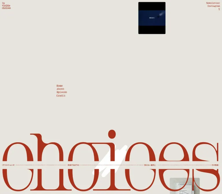
温かなベージュに赤茶色の文字を配したポッドキャストサイト。巨大なセリフ体ロゴ、点線、余白の大きい非対称レイアウトが、創作の試行錯誤を静かに表現しています。
オリジナルサイトを見るinvisible choices — Style Reference
An expansive podcast editorial, set in rust-colored lettering on warm paper and interrupted by traces of erasure.
Original URL: invisible-choices.audio Final URL: invisible-choices.audio Theme: one observed light palette Inspected: September 13, 2026, 03:02:20 JST; supplied retrieval timestamp: September 12, 2026, 18:02:20.283 UTC Viewports: 1440 × 1000 desktop and 390 × 844 mobile, in CSS pixels Scope: supplied current-page desktop opening, guest-section, and footer captures; mobile opening and final episode/footer captures; rendered text, links, element bounds, and computed styles at both widths. The document contains six guest profiles and eleven observed pairs of Spotify and Apple Podcasts episode links.
invisible choices is the editorial home and listening index for a Japanese interview podcast about the decisions behind creative work. Its visual identity combines an enormous lowercase wordmark with unusually small navigation, narrow Japanese text columns, isolated artwork, and extensive uninterrupted space. The opening and ending repeat the same monumental lettering, giving the long document a recognizable frame.
The defining device is the word “choices,” crossed by a paper-colored horizontal strip containing tiny Japanese phrases and dotted connections. A white brush-like gesture introduces the visual idea of writing, erasing, and reconsidering. Guest sections translate this identity into an editorial system: portrait artwork, right-aligned names, descriptive copy, work images, large part numerals, and thin listening links connected with dots.
How to Read This Reference
- Measured means a value explicitly supplied in the rendered DOM or computed-style evidence.
- Calculated means arithmetic based on those measurements. A numerical relationship does not establish the original CSS formula.
- Estimated means an approximate visual reading of an original-page screenshot. Image boundaries and graphic lettering were not supplied as measured DOM elements.
- Recommended means an implementation choice for a new project. The Quick Start uses proposed selectors and layout rules, not recovered source code.
- Positions in DOM tables refer to the document-top snapshot. Positions described within the middle and footer screenshots refer to those individual captures.
- The visible Latin lettering cannot be identified from the generic font properties of its enclosing links. Preserve this distinction when choosing replacement fonts.
Tokens — Colors
Default Palette
| Name | Value | Evidence | Suggested token | Role |
|---|---|---|---|---|
| Warm Paper | #e7e4dd |
Measured: body background rgb(231, 228, 221) at both widths |
--color-paper |
Continuous page canvas, open space, and the apparent wordmark interruption strip |
| Japanese Text Rust | #a9321c |
Measured: paragraph and guest-name color rgb(169, 50, 28) |
--color-ink |
Manifesto, guest names, honorifics, and descriptions |
| Graphic Rust | Approximately #b1321b |
Visual estimate; graphic fill values were not supplied | --color-display |
Large wordmark, small Latin lettering, dotted leaders, and platform symbols appear in this rust-red family |
| Portrait Orange | Approximately #c75c36 |
Visual estimate from the desktop guest portrait artwork | --color-portrait |
The square artwork accompanying 小藥 元; an asset-specific field, not a global surface color |
| Erasure White | Approximately #ffffff |
Visual estimate | --color-erasure |
Broad white gesture crossing the large lettering |
| Artwork Black | Approximately #000000 |
Visual estimate | --color-art-mat |
Dark frames and letterboxing around several work images |
The interface is mostly a paper-and-rust composition. Photography, posters, book covers, and portrait artwork retain their own colors. The orange portrait field belongs to the artwork; it does not establish an orange button or section-background system.
Computed wrapper colors require interpretation. Many links report color: rgb(51, 51, 51) and a transparent background, while their visible contents are rust-colored graphic lettering. The root also reports black text. Neither value should replace the visible rust palette in a recreation.
The supplied custom properties include transparent gradient stops and loading colors #222 and #e5e5e5. These declarations do not establish visible gradients or a specific loading-screen design. No such treatment is resolved in the supplied settled captures.
Theme Presets
Only the warm light appearance is evidenced. No theme selector, alternative palette, or dark-mode state was supplied. Keep additional themes outside the observed specification.
Tokens — Typography
Japanese Body and Guest Names
- Measured family:
"こぶりなゴシック W6 JIS2004". - Source custom property:
--s-font-7c9f3425contains that family name. - Measured CSS weight:
400, including guest names. TheW6designation is part of the family name; do not automatically change the CSS weight to600or700. - Character: compact, substantial Japanese gothic lettering, with generous leading and modest tracking in prose.
- Roles: manifesto, guest names, the smaller “さん” honorific, and episode descriptions.
Guest names align toward the right edge of their text column. The honorific follows at body size, with a measured 10px horizontal gap in the sampled name rows.
Latin Display Lettering
The enormous wordmark has extreme stroke contrast, fine hairlines, broad rounded counters, and long serif details. Its visual width and distinctive outlines carry more identity than an ordinary font-size token could reproduce.
The small Latin navigation, listening labels, credits, and part labels also have a distinctive serif appearance. Their exact typeface is unidentified. The supplied link records contain empty extracted text and generic sans-serif properties; these records do not establish the typography of the visible lettering inside them. The implementation mechanism—outlined artwork, images, or another nested representation—was not included.
Recommended: use approved wordmark artwork for fidelity. Use a licensed serif with suitable proportions for replacement utility text, and identify it as an adaptation. Do not present Times, Lato, or a guessed display family as the original Latin face.
Declared Families Without Confirmed Visible Roles
--s-font-868d9c24 declares Lato, but none of the supplied sampled text elements establishes its visible role. The HTML and body report Times at 16px as a default. These declarations are not evidence that the wordmark or navigation uses either family.
Type Scale
| Role | Desktop measurement | Mobile measurement | Leading and tracking | Status |
|---|---|---|---|---|
| Manifesto | 16.992px |
11.7px |
2.2; tracking 0.06em |
Measured |
| Guest description | 16.992px |
11.7px |
Desktop 2; mobile 1.7; tracking 0.05em |
Measured |
| Guest name | 33.696px |
21.45px |
1; normal tracking |
Measured |
| Honorific | 16.992px |
11.7px |
Approximately 1.17; normal tracking |
Measured |
| Link wrapper | 16px |
16px |
16px line height |
Measured wrapper only; not a reliable visible-label size |
| Small navigation lettering | Approximately 14–18px apparent size | Approximately 12–15px apparent size | Compact vertical stacking | Visual estimate; actual font size unknown |
| Part labels and listening lettering | Approximately 14–16px apparent size | Approximately 10–12px apparent size | Mostly one line | Visual estimate |
| Large part numeral | Approximately 100px visible height | Approximately 54px visible height | Baseline aligned with a much smaller part label | Visual estimate; not a measured font size |
| Main wordmark | Approximately 400px artwork height | Approximately 104px artwork height | Single full-width graphic | Visual estimate; not ordinary live-text sizing |
Calculated relationships: desktop body size equals 1.18vw at 1440px, and the guest name equals 2.34vw. At 390px, the corresponding values equal 3vw and 5.5vw. These are endpoint equivalences, not verified source formulas.
The hierarchy depends on a large jump between graphic lettering and reading text. Preserve that jump without copying the original mobile body size uncritically: 11.7px is a measured characteristic, while a larger reading minimum is a recommended improvement.
Tokens — Spacing & Shapes
Density: extremely sparse at page scale, compact within navigation and listening controls. Underlying rhythm: narrow edge insets, carefully offset columns, long vertical pauses, and repeated horizontal alignments.
Spacing Scale
| Use | Desktop | Mobile | Evidence |
|---|---|---|---|
| Header outer inset | 10px |
10px |
Measured link positions |
| Gap between desktop section-navigation link boxes | 5px |
Section navigation absent | Calculated from measured bounds |
| Gap between header social-link boxes | 5px |
Approximately 7px |
Calculated from measured bounds |
| Name-to-honorific gap | 10px |
10px |
Calculated from measured bounds |
| Guest name row to description | 40px |
30px |
Calculated from sampled bounds |
| Listening-link vertical padding | 10px 0 |
Usually 10px 0 |
Measured; some mobile Apple rows omit bottom padding |
| Episode artwork outer inset | Approximately 30px |
Approximately 10px |
Desktop screenshot estimate; mobile screenshot and text/link bounds |
| Gap between stacked work frames in the desktop guest capture | Approximately 14px |
Varies by part grouping | Visual estimate |
Do not force every gap onto a conventional 8px scale. The observed 5px, 10px, 30px, and 40px values coexist with much larger composition-driven distances.
Border Radius
| Element | Appearance | Evidence |
|---|---|---|
| Page and text sections | Square, unboxed | Screenshots; sampled text/link radius is 0px |
| Square portrait artwork | Square corners | Desktop screenshot |
| Small opening work frame | Approximately 5–6px desktop radius; nearly square on mobile | Visual estimate |
| Larger desktop work frame | Approximately 10px radius | Visual estimate |
| Mobile work frames | Approximately 1–3px radius | Visual estimate |
| White erasure gesture | Broad rounded stroke ends | Visual observation; asset geometry unknown |
The soft corners belong to selected artwork frames. There is no general rounded-card language.
Layout Measurements
| Element | Desktop, 1440 × 1000 | Mobile, 390 × 844 | Evidence |
|---|---|---|---|
| Document height | 12158.34px |
6758.64px, reported rounded as 6759px |
Measured |
| Home-logo anchor | (10, 10), 710 × 44.95px |
(10, 10), 185 × 39.53px |
Measured anchor; visible logo is much narrower |
| Newsletter anchor | (1330.61, 10), 99.39 × 12.72px |
(296.75, 10), 83.25 × 11.58px |
Measured |
| Opening section navigation | Starts at (365, 407.56); link width 106.5px |
Not in the supplied rendered link list or capture | Measured/observed |
| First manifesto block | (664.38, 1817.36), 271.63px wide |
(54.73, 693.34), 187.06px wide |
Measured |
| Second manifesto block | (936, 2285.67), 286.88px wide |
(159.91, 1032.16), 197.55px wide |
Measured |
| Center-lane guest description | x: 361.20, width 496.80px |
x: 10, width 204.23px |
Measured |
| Right-lane guest description | x: 916.66, width 493.34px |
x: 175.77, width 204.23px |
Measured |
| Listening-link lane | x: 361.20 or 913.20, width 496.80px |
x: 10, width 370px |
Measured |
| Spotify link height | 36.80px |
32.52px |
Measured |
| Apple Podcasts link height | 41.05px |
Usually 35.67px; some 25.67px |
Measured |
| Main wordmark width | Approximately 1420px |
Approximately 370px |
Visual estimate, consistent with 10px edge insets |
| Portrait artwork in the desktop guest capture | Approximately 483 × 483px, at x: 927px |
No corresponding detailed portrait capture supplied | Visual estimate |
| Work frame in the desktop guest capture | Approximately 276 × 324px, at x: 30px |
Final book frame approximately 74 × 88px |
Visual estimate |
Components
Corner Identity and External Links
Role: identify the program and provide newsletter/social destinations without a conventional navigation bar.
The tiny stacked identity reads visually as “in / visible / choices” in the upper-left corner. Newsletter, Instagram, and X form a right-aligned stack in the opposite corner. Both groups sit about 10px from the top and outside edges. They share the paper background with the rest of the page; there is no enclosing header surface, bottom border, or filled button.
The measured home anchor spans half the inset desktop canvas, although the visible logo occupies only a small part of it. Keep visible artwork size separate from clickable-element dimensions.
Observed destinations are the site root, its Substack profile, Instagram profile, and X profile. Their presence is verified through hrefs. Click outcomes, new-tab behavior, and hover feedback were not exercised. The top-corner controls are not visible in the supplied middle and footer captures, so persistent fixed positioning is not established.
Desktop Section Navigation
Role: navigate the long page through Home, About, Episode, and Credit anchors.
A small four-line stack sits at the quarter-width alignment rather than beside the corner logo. On desktop it begins at x: 365px, around y: 408px in the opening. The footer repeats the stack at the same horizontal alignment.
Each item is a transparent flex link with a measured 5px vertical gap to the next item. There are no button boxes or active-state badges in the captured appearance. The hrefs point to #home, #about, #episode, and #credit.
Both stacks are absent from the supplied mobile capture and rendered link list. No replacement hamburger menu is visible. Anchor scrolling behavior, focus movement, and active-section tracking remain unverified.
Opening Composition
Role: introduce the program through visual atmosphere before the explanatory text begins.
The desktop opening leaves a very large paper field between the corner controls and the oversized wordmark. A small, black-framed work image sits high toward the right, approximately (898, 10) with a 177 × 208px frame. Another work image enters at the lower-right edge of the capture.
On mobile, the opening retains the empty upper field and the small high image, now approximately 56 × 65px at (195, 10). The main wordmark begins around y: 307px. Below it, several small works form an irregular sequence: a film image at right, a warm light photograph at left, a narrow dark image near the right, and a small cover image closer to the center. They have different sizes and are not arranged as a gallery grid.
Treat these as positioned visual references to creative work. The captures do not establish drag behavior, clickable image targets, automatic floating, or parallax.
Interrupted Wordmark
Role: the dominant identity device, repeated at the opening and near the end.
The lowercase “choices” nearly fills the inset viewport width. Its outer proportions are approximately 3.55:1: about 1420 × 400px on desktop and 370 × 104px on mobile. A paper-colored horizontal band interrupts the letters near their middle.
The band contains four small Japanese phrases: “(クリエイションが)”, “(完成するまでの)”, “(見えない選択と)”, and “(その物語)”. Fine dotted lines connect the phrases across the width. In the desktop opening capture, the band occupies roughly y: 789–840px; on mobile, it occupies roughly y: 359–373px. These are screenshot estimates.
A broad white gesture crosses the central area in the desktop opening and footer, and in the mobile footer. Its form is visible, but its animation mechanism and timing are unknown. It is not clearly resolved in the sampled mobile opening state.
Recommended anatomy: one accessible identity label, scalable lettering artwork, a paper interruption strip with decorative leaders, and an independently decorative gesture if separate assets are available. A supplied composite artwork can also preserve the whole composition. Avoid rendering both a baked-in strip and a second CSS strip over it.
Manifesto
Role: explain the podcast through the rhythm of creative revision.
Two narrow Japanese blocks proceed diagonally down the page. The first begins with “書いては、消して。” and develops through short, deliberately broken lines. The second addresses the listener and describes tracing the choices behind finished work.
These are not a centered full-width introduction. Desktop positions move from x: 664.38px to 936px; mobile positions move from 54.73px to 159.91px. The first mobile block is only about 187px wide. Short lines align toward the right side of their narrow region in the supplied opening capture.
Use the measured 2.2 leading and 0.06em tracking to preserve its slow pace. The gap between the first block's measured bottom and the second block's top is 20px on desktop and 30px on mobile. Much of the apparent spaciousness comes from line height and page positioning, rather than enormous paragraph margins alone.
Guest Editorial Section
Role: connect a creator, a particular work, and the available conversations about its process.
The supplied document contains, in order, profiles for 大橋 謙譲, 河井 冬穂, 小藥 元, 常盤 司郎, 相楽 賢太郎, and 三島 邦彦. Each has a name, small honorific, Japanese description, and external listening links. Part counts vary; the supplied links show one pair for 河井 冬穂 and two pairs for each other profile.
In the desktop capture of 小藥 元, a large square portrait artwork occupies the right side. The Japanese name and description occupy the middle lane, aligned near the bottom of that square. Work imagery starts in the far-left lane below the introductory row, while listening information remains in the middle lane.
The description is about 497px wide, uses approximately 17px type with 34px leading, and begins 40px below the name row. The name and honorific align right; the prose reads as a conventional left-aligned block.
DOM measurements confirm that subsequent text and listening lanes alternate between the middle and right side. The opposite portrait arrangement is not shown in the supplied detailed screenshot, so a fully mirrored image layout should be treated as an implementation proposal.
Portrait Artwork
Role: introduce the guest as part of the program's graphic identity.
The resolved example is a square orange composition. A photograph of 小藥 元 appears through several overlapping, slanted, rounded brush-like openings. Pale serif lettering identifies “Gen Kogusuri” with a smaller “Copywriter” label. A miniature stacked program logo sits toward the lower-left.
The mask creates a connection to the white erasure gesture without turning the portrait into a circular avatar. Preserve the artwork's square proportions, internal lettering, crop, and flat color field. The source evidence does not reveal whether the clipping is baked into an image or assembled in the browser.
Work Image Frame
Role: show the creation being discussed.
Work imagery includes posters, covers, film imagery, and photographic fragments. Several items sit within black frames that retain visible margins or letterboxing. In the desktop guest capture, the Michael Jackson poster appears inside a tall frame approximately 276px wide, with slight corner rounding.
The mobile final section shows a small book cover within a black frame approximately 74px wide. The frame keeps the book recognizable as an object even at that scale.
Retain each work's intended crop and internal typography. Do not normalize every image to a square or enlarge all media to the width of its surrounding listening row.
Episode Part Heading
Role: distinguish the conversations within a guest section.
A small parenthesized label such as “(Part One)” sits at the left of the listening lane. A large thin-serif numeral sits at the far right. Their baselines are approximately aligned, producing a strong size contrast with almost no chrome.
On mobile, the numbered heading spans the full 370px inner width beneath its small work image. The numeral remains conspicuous even though the image and labels shrink. The visible “1” and “2” are part divisions; do not automatically equate them with the podcast's global episode numbers.
Platform Listening Row
Role: take the listener to a particular episode on an external service.
The row has three visual parts: a platform silhouette at left, a flexible dotted leader, and an underlined label at right. Observed labels are “Listen on Spotify” and “Listen on Apple Podcasts.” Both rows use the site's rust color instead of adopting each platform's full brand-color palette.
The leader is a line of separated, tiny round dots. It connects the symbol and label along their horizontal center region; it is not a full-width divider beneath a card. The outer anchor covers the whole measured lane, with 10px vertical padding.
Desktop rows are approximately 497px wide. Mobile rows expand to 370px despite the adjacent descriptions remaining only about 204px wide. This is a key responsive distinction.
No embedded player, seek track, playback state, or in-page audio control appears in the supplied evidence. Treat these rows as external links. Do not infer autoplay or inline playback from the presence of platform symbols.
Credits and Closing Composition
Role: finish the editorial sequence with attribution and a return to the program identity.
Two fine credit rows place roles at left, names at right, and dotted leaders between them. The current original-page footer visibly lists:
| Visible role | Visible name |
|---|---|
| Produce / Creative Direction / Interview | Kamada |
| Art Direction / Design | Katsuaki Utsunomiya |
These are the roles printed by the page. They do not independently identify a legal operator or a separate website developer.
On desktop, the credit rows occupy the top of the supplied final capture, followed by a broad empty field, the repeated section navigation, and the enormous wordmark. On mobile, the credits are followed by roughly 90px of space before the visible wordmark begins; the desktop section-navigation stack is absent.
The final utility row places X and Instagram at left, Newsletter near the quarter-width alignment, and a copyright statement at right. The measured newsletter x-position is 365px on desktop and 102.5px on mobile. The closing surface remains the same paper color as the document.
Tokens — Motion & Interaction
| Treatment | Supplied evidence | What can be concluded |
|---|---|---|
| Body background transition | background 0.5s cubic-bezier(0.4, 0.4, 0, 1) |
A 500ms background transition is declared; no actual palette change was demonstrated |
| Common link and text transitions | 0.3s cubic-bezier(0.4, 0.4, 0, 1), plus transitions on gradient-related custom properties |
A common 300ms easing vocabulary is declared; the properties changed by a user action are not established |
| Sampled CSS animations | animation: none on supplied elements |
Those sampled elements do not report a CSS animation; this does not exclude motion in artwork, descendants, pseudo-elements, or scripts |
| White gesture | Different visible forms across separate original-page locations | Its appearance is evidenced; a temporal sequence, morph duration, or pointer response is not |
| Work-image positioning | Isolated images at different positions and scales | Asymmetric composition is established; floating, dragging, and parallax are unverified |
| Internal navigation | Desktop hash-link destinations supplied | Anchor targets are established; smooth scrolling and active-state logic are unverified |
| Listening and social links | External hrefs supplied | Destinations are established; click outcomes and hover states are unverified |
The capture process waited for document loading, visible image decoding, and sampled layout/text stability. Initial observation lasted at least five seconds. Perpetual animations were paused during readiness checks and then resumed. This procedure supports analysis of the settled composition, but it is not a recording of the complete motion design.
Recommended motion vocabulary: retain the supplied cubic Bézier curve for restrained feedback where needed. Begin with a static, readable composition. Add gesture animation or image movement only as an explicitly designed enhancement, with reduced-motion behavior and no dependency on animation for accessing content.
Surfaces
| Layer | Appearance | Purpose |
|---|---|---|
| Page canvas | Solid warm paper | Holds the entire editorial sequence together |
| Text and listening areas | Transparent, rust-colored content | Establish structure through alignment and typography |
| Wordmark band | Paper-colored interruption with tiny text and dots | Cuts through the large lettering without adding a new panel color |
| Work frame | Flat black, subtly rounded in some examples | Preserves artwork proportions and creates small dense visual anchors |
| Portrait artwork | Flat orange field in the resolved example | Introduces guest identity through a designed image |
| Erasure gesture | Opaque white stroke | Adds a handmade interruption to precise lettering |
No general elevation, shadow, glass, or outlined-card system is visible. Depth comes from overlap and contrast. Keep content sections on the same canvas instead of assigning each one a separate surface.
Imagery
The imagery represents creative artifacts and their makers. Dark posters, a turquoise-and-white book cover, film imagery, portrait photography, and small fragments of light and color punctuate the paper field. Most of the screen remains empty; the images act as carefully placed points of attention.
There are two different treatments to preserve. Work images retain their own visual identity and often sit within dark frames. Guest artwork combines photography with the program's graphic treatment, including a colored field, irregular clipping, and serif lettering.
The white gesture and portrait cutout share broad, rounded, diagonal forms. This repetition provides a visual relationship between the main identity and individual guests. It does not justify applying the same clipping effect to every poster or book cover.
Observed Asset References
No image URLs, filenames, intrinsic dimensions, or SVG markup were supplied. The references below identify visible assets without inventing paths.
| Asset | Original-page evidence | Reuse guidance |
|---|---|---|
| Stacked program identity | Desktop and mobile opening captures | Preserve its three-line proportions; provide an accessible name |
| Large “choices” composition | Opening and footer captures at both widths | Use scalable approved artwork; retain the interruption strip |
| White gesture | Desktop opening/footer and mobile footer | Treat as decorative; exact path and motion remain unknown |
| Dark blue work image in a black frame | Desktop and mobile opening captures | Preserve its small scale and letterboxing |
| Orange guest portrait composition | Desktop capture featuring 小藥 元 | Keep the square canvas, clipped photograph, and internal lettering |
| Michael Jackson poster | Desktop guest capture | Preserve the poster's typography and portrait proportion |
| Film artwork and photographic fragments | Mobile opening capture | Maintain varied sizes and irregular placement |
| Book cover within a black frame | Mobile final episode capture | Retain the small object scale and black surrounding field |
| Spotify and Apple silhouettes | Guest listening rows | Use approved platform assets with accessible link text |
Use authorized original assets where available. CSS can reproduce spacing, leaders, alignment, and surface treatment, but it cannot reproduce the distinctive lettering or guest artwork through a generic font substitution alone.
Layout & Responsive Behavior
Desktop Composition
The page uses the whole viewport width with very small perimeter insets. It is not organized inside one centered article container. Major alignments recur around the quarter-width position and farther toward the right.
The supplied guest capture can be approximated by a 1380px-wide composition between 30px side margins: a 276px work lane, 55.2px gap, 496.8px text lane, 69px gap, and 483px portrait lane. These dimensions correspond to a calculated 20 : 4 : 36 : 5 : 35 division. This is a useful reconstruction grid, not an observed CSS Grid declaration; the supplied sampled elements are mostly flex containers.
The introductory manifesto begins far below the initial desktop viewport. The first measured guest name starts around document y=3526px. Large empty spaces are integral to the page's pacing.
Mobile Composition
The 390px version preserves an unusually editorial arrangement rather than making every element full width:
- The header retains 10px side insets and opposite-corner placement.
- Desktop section-navigation stacks disappear from the supplied rendered state.
- The oversized wordmark scales down to the 370px inner width while retaining its proportions.
- The scattered work imagery is recomposed below the wordmark.
- Manifesto blocks remain narrow and staggered horizontally.
- Guest descriptions alternate between left and right alignment zones, each about 204.23px wide—approximately 55.2% of the inner width.
- Listening rows expand to the entire 370px inner width.
- Work images can remain as small as approximately 74px wide above their associated part information.
- The closing wordmark and three utility groups remain present.
The document is about 6.76k pixels tall on mobile versus 12.16k pixels on desktop. This reduction is not simple uniform scaling: reading sizes, leading, navigation visibility, whitespace, and action widths change independently.
Breakpoint Evidence and Limits
The supplied HTML excerpt includes a max-width: 840px media query controlling responsive line-break visibility. It does not establish that every layout change occurs at 840px. No tablet screenshot or complete stylesheet was supplied.
The Quick Start uses 840px as a recommended consolidation breakpoint, with additional readable fallbacks. Intermediate widths, landscape layouts, browser zoom, safe-area behavior, and text expansion were not visually tested.
Do’s and Don’ts
Do
- Preserve the measured paper
#e7e4ddand Japanese text rust#a9321c. - Let the oversized lettering and broad empty areas establish the identity.
- Repeat the wordmark near the beginning and end of the document.
- Keep Japanese prose narrow, deliberate, and generously spaced.
- Preserve the small honorific beside the larger guest name.
- Use dotted leaders to connect platform symbols, labels, and credit pairs.
- Keep listening links full width on mobile while retaining offset descriptive columns where readable.
- Preserve the distinct proportions of portraits, posters, book covers, and opening fragments.
- Separate measured wrapper properties from the appearance of graphic lettering.
- Keep episode-part counts and destinations driven by actual content.
Don’t
- Do not replace the editorial sequence with a generic feature grid or conversion-button hierarchy.
- Do not turn every guest or episode into a filled rounded card.
- Do not use platform brand colors as competing interface accents.
- Do not identify the Latin typeface from the root Times default or the unused Lato declaration.
- Do not equate a 710px logo anchor with a 710px visible logo.
- Do not crop all artwork into uniform squares.
- Do not remove the long pauses that give the desktop layout its character.
- Do not infer hover effects, parallax, audio playback, or animation timing from static captures.
- Do not treat the portrait's orange field as a global alternate theme.
- Do not shrink essential reading text indefinitely to preserve one screenshot's line breaks.
Recommended Implementation Additions
These are recommendations for a new implementation, not verified original features:
- Use semantic headings for the program, guest profiles, and episode parts. The supplied guest-name samples are paragraph elements.
- Give graphic identity links and platform links reliable accessible names. Empty extracted link text alone does not establish whether the original accessible names are missing.
- Include the guest and part in each listening link's accessible context so repeated platform labels remain distinguishable.
- Keep dotted leaders and white gestures out of the accessibility tree.
- Raise mobile reading text from the observed 11.7px to a practical minimum, such as 14px, and allow section heights to grow.
- Increase mobile listening targets to at least 44px high. The observed rows are approximately 26–36px high.
- Provide a visible rust-colored focus outline and a keyboard-accessible route to the episode index.
- Preserve real text for navigation and credits where practical, even if the principal wordmark remains artwork.
- Offer text equivalents or transcripts for podcast material when available.
- Reserve image dimensions to avoid layout shifts; load lower-page artwork progressively while keeping the opening identity available promptly.
- Maintain a static alternative for any subsequently implemented decorative motion.
Agent Prompt Guide
Quick Color Reference
- Page canvas: measured
#e7e4dd. - Japanese reading text and names: measured
#a9321c. - Graphic lettering: rust red, approximately
#b1321b; exact asset fill unverified. - White gesture: approximately
#ffffff. - Work-image surrounds: approximately black.
- Orange portrait field: approximately
#c75c36, confined to the resolved portrait artwork. - Actions: underlined rust lettering with dotted leaders, without a filled CTA surface.
Overall Prompt
“Create an editorial website for a Japanese interview podcast about creative decisions, inspired by invisible choices. Use warm paper #e7e4dd and rust-colored text #a9321c. Place a tiny stacked identity at the upper left and a compact right-aligned newsletter/social stack at the upper right. Build a spacious opening around an enormous high-contrast lowercase serif wordmark, interrupted by a paper strip of tiny phrases and dotted leaders. Add a white brush-like gesture and a few isolated work images at different sizes. Follow with narrow, staggered Japanese manifesto blocks and alternating guest sections containing portrait artwork, right-aligned names, descriptive copy, small work images, oversized part numerals, and dotted Spotify/Apple listening rows. Repeat the wordmark before the final social and copyright row. Keep mobile descriptions offset while expanding listening rows to the inner width. Use approved identity assets and distinguish proposed motion from observed behavior.”
Example Component Prompts
- Opening: “A warm paper canvas with tiny rust corner links, extensive empty space, and a viewport-wide lowercase serif identity near the lower portion. Cross the letters with a narrow paper strip and dotted microcopy. Place a small dark framed work image high toward the right. No enclosing navigation bar or card surfaces.”
- Guest section: “An asymmetric podcast profile with a square designed portrait toward the right, a roughly 500px Japanese text lane in the middle, and a smaller work-image lane at the far left. Right-align the guest name and small honorific, then use rust body text with double leading. Keep the canvas continuous.”
- Listening row: “An unboxed rust-colored external episode link: platform silhouette at left, a flexible line of tiny separated dots, and an underlined serif platform label at right. Pair Spotify and Apple rows. Use the full inner width on mobile and provide accessible context for the guest and episode part.”
- Part heading: “Place a small parenthesized part label at the left and a very large fine-serif numeral at the right, approximately sharing a baseline. Keep the heading on the paper background, above two dotted listening rows.”
- Footer: “Two small credit rows joined by dotted leaders, followed by generous paper space and a repeated oversized interrupted wordmark. End with social links at left, newsletter near the quarter-width alignment, and copyright at right. Omit the desktop section-navigation stack in the compact layout.”
Quick Start
CSS Custom Properties
This is a proposed CSS scaffold. It preserves measured colors and desktop reading sizes, uses a reconstruction grid derived from the supplied coordinates, and introduces a recommended 14px mobile reading minimum and 44px listening targets. The original mobile readings remain documented in the tables above.
The opening positions are fitted approximations for the two supplied compositions, not recovered source formulas. Artwork must be supplied separately. .choices-art expects a composite wordmark that already contains its interruption strip; no fictitious asset paths are included.
Suggested structure: an .opening contains .site-header, .section-nav, .opening-wordmark, and optional .floating-work figures. Each .episode contains .episode-head and repeated .episode-part sections. Each part contains .part-work and .part-content; the latter contains .part-heading and .listen-links. Each .listen-link contains a platform icon, decorative leader, and visible label in that order.
:root {
  /* Measured colors */
  --color-paper: #e7e4dd;
  --color-ink: #a9321c;

  /* Visual approximations for artwork-related colors */
  --color-display: #b1321b;
  --color-erasure: #ffffff;
  --color-art-mat: #000000;

  /* Source family; requires an appropriate licensed font setup */
  --font-japanese: 'こぶりなゴシック W6 JIS2004', sans-serif;

  /* Adaptation only: the original Latin face is unidentified */
  --font-editorial: serif;
  --text-body: 16.992px;
  --text-name: 33.696px;
  --text-utility: 16px;
  --text-credit: 14px;
  --text-number: 110px;
  --leading-body: 2;
  --leading-manifesto: 2.2;
  --tracking-body: 0.05em;
  --tracking-manifesto: 0.06em;

  --inset: 10px;
  --episode-inset: 20px;
  --space-small: 5px;
  --space-medium: 10px;
  --space-section-row: 30px;
  --space-name-copy: 40px;
  --radius-work: 10px;
  --rule-dot: 1px;

  /* Observed easing; application to focus/hover is recommended */
  --ease-editorial: cubic-bezier(0.4, 0.4, 0, 1);
  --motion-feedback: 300ms;
}

* {
  box-sizing: border-box;
}

body {
  margin: 0;
  color: var(--color-ink);
  background: var(--color-paper);
  font-family: var(--font-japanese);
  font-size: var(--text-body);
  font-weight: 400;
}

a {
  color: inherit;
}

img {
  display: block;
  max-width: 100%;
}

figure {
  margin: 0;
}

.page {
  padding-inline: var(--inset);
}

/* Fitted opening geometry; validate against the chosen artwork */
.opening {
  position: relative;
  min-height: 126vw;
}

.site-header {
  position: absolute;
  inset: 10px 0 auto;
  display: flex;
  align-items: flex-start;
  justify-content: space-between;
  z-index: 2;
}

.brand-link {
  display: block;
  width: 50%;
}

.brand-art {
  width: 57px;
  height: auto;
}

.external-nav,
.section-nav {
  display: flex;
  flex-direction: column;
  gap: var(--space-small);
  font-family: var(--font-editorial);
  font-size: var(--text-utility);
  line-height: 1;
}

.external-nav {
  align-items: flex-end;
  text-align: right;
}

.section-nav {
  position: absolute;
  top: 28.3vw;
  left: 25%;
  align-items: flex-start;
}

.opening-wordmark {
  position: absolute;
  top: 40.6vw;
  inset-inline: 0;
}

.choices-art {
  width: 100%;
  height: auto;
}

/* Set these variables per image; no motion is implied */
.floating-work {
  position: absolute;
  left: var(--work-x, 62.5%);
  top: var(--work-y, 10px);
  width: var(--work-width, 12.5%);
}

.work-frame {
  overflow: hidden;
  background: var(--color-art-mat);
  border-radius: var(--radius-work);
}

.work-frame img {
  width: 100%;
  height: auto;
}

.manifesto {
  padding-bottom: clamp(140px, 25vw, 360px);
}

.manifesto p {
  width: min(100%, 17em);
  margin: 0;
  line-height: var(--leading-manifesto);
  letter-spacing: var(--tracking-manifesto);
  text-align: right;
}

.manifesto p:first-child {
  margin-left: 46%;
}

.manifesto p + p {
  margin-top: 20px;
  margin-left: 65%;
}

/* Calculated desktop reconstruction, not a source grid declaration */
.episode {
  --episode-columns: 20fr 4fr 36fr 5fr 35fr;
  --copy-column: 3;
  --portrait-column: 5;
  margin-inline: var(--episode-inset);
  margin-bottom: clamp(130px, 16vw, 230px);
}

.episode--right {
  --episode-columns: 20fr 4fr 35fr 5fr 36fr;
  --copy-column: 5;
  --portrait-column: 3;
}

.episode-head,
.episode-part {
  display: grid;
  grid-template-columns: var(--episode-columns);
}

.episode-intro {
  grid-column: var(--copy-column);
  grid-row: 1;
  align-self: end;
  min-width: 0;
}

.guest-name {
  display: flex;
  align-items: baseline;
  justify-content: flex-end;
  gap: 10px;
  margin: 0 0 var(--space-name-copy);
  font-size: var(--text-name);
  font-weight: 400;
  line-height: 1;
}

.guest-honorific {
  font-size: var(--text-body);
  line-height: 1.17;
}

.guest-description {
  margin: 0;
  line-height: var(--leading-body);
  letter-spacing: var(--tracking-body);
  overflow-wrap: anywhere;
}

.portrait-art {
  grid-column: var(--portrait-column);
  grid-row: 1;
  align-self: start;
}

.portrait-art img {
  width: 100%;
  height: auto;
}

.episode-part {
  margin-top: var(--space-section-row);
  align-items: start;
}

.episode-part + .episode-part {
  margin-top: 14px;
}

.part-work {
  grid-column: 1;
  display: grid;
  gap: 14px;
}

.part-content {
  grid-column: var(--copy-column);
  min-width: 0;
  padding-top: 120px;
}

.part-heading {
  display: flex;
  align-items: baseline;
  justify-content: space-between;
  gap: 20px;
  font-family: var(--font-editorial);
}

.part-label {
  font-size: 14px;
}

.part-number {
  font-size: var(--text-number);
  font-weight: 400;
  line-height: 1;
}

.listen-links {
  margin-top: 20px;
}

.listen-link {
  display: flex;
  align-items: center;
  gap: 10px;
  width: 100%;
  padding-block: 10px;
  font-family: var(--font-editorial);
  font-size: var(--text-utility);
  line-height: 1;
  text-decoration: none;
}

.platform-icon {
  flex: 0 0 16.8px;
  width: 16.8px;
  height: 16.8px;
  object-fit: contain;
}

.platform-icon--apple {
  height: 21.05px;
}

.dot-leader {
  flex: 1 1 auto;
  min-width: 12px;
  height: 2px;
  background-image: radial-gradient(
    circle,
    currentColor var(--rule-dot),
    transparent var(--rule-dot)
  );
  background-size: 8px 2px;
  background-repeat: repeat-x;
}

.listen-label {
  flex: 0 1 auto;
  text-align: right;
  text-decoration: underline;
  text-underline-offset: 2px;
}

.credits {
  display: grid;
  gap: 10px;
  font-family: var(--font-editorial);
  font-size: var(--text-credit);
}

.credit-row {
  display: flex;
  align-items: baseline;
  gap: 10px;
}

.credit-name {
  text-align: right;
}

.footer-stage {
  position: relative;
  padding-top: clamp(100px, 34vw, 490px);
}

.footer-stage .section-nav {
  top: auto;
  bottom: 92%;
}

.footer-links {
  display: grid;
  grid-template-columns: repeat(4, minmax(0, 1fr));
  align-items: end;
  gap: 10px;
  padding-bottom: max(20px, env(safe-area-inset-bottom));
  font-family: var(--font-editorial);
  font-size: var(--text-utility);
}

.footer-social {
  display: grid;
  justify-items: start;
  gap: 5px;
}

.footer-copyright {
  grid-column: 3 / -1;
  margin: 0;
  text-align: right;
}

/* Recommended focus and restrained feedback */
a:focus-visible {
  outline: 2px solid var(--color-ink);
  outline-offset: 4px;
}

.listen-label {
  transition: text-underline-offset
    var(--motion-feedback) var(--ease-editorial);
}

@media (hover: hover) {
  .listen-link:hover .listen-label {
    text-underline-offset: 4px;
  }
}

/* Proposed breakpoint; only two viewport states were supplied */
@media (max-width: 840px) {
  :root {
    --text-body: 14px; /* Recommended; observed value was 11.7px */
    --text-name: 21.45px;
    --text-utility: 12px;
    --text-credit: 12px;
    --text-number: 74px;
    --leading-body: 1.7;
    --episode-inset: 0px;
    --space-name-copy: 30px;
    --radius-work: 2px;
  }

  .opening {
    min-height: 178vw;
  }

  .brand-art {
    width: 50px;
  }

  .external-nav {
    gap: 7px;
    font-size: 14px;
  }

  .section-nav {
    display: none;
  }

  .opening-wordmark {
    top: 78.7vw;
  }

  .floating-work {
    left: var(--work-x-mobile, 50%);
    top: var(--work-y-mobile, 10px);
    width: var(--work-width-mobile, 15%);
  }

  .manifesto {
    padding-bottom: 150px;
  }

  .manifesto p:first-child {
    width: 64%;
    margin-left: 8%;
  }

  .manifesto p + p {
    width: 68%;
    margin-top: 30px;
    margin-left: auto;
  }

  /* Proposed portrait arrangement; mobile portrait bounds are unknown */
  .episode {
    --episode-columns: 55.2fr 4.8fr 40fr;
    --copy-column: 1;
    --portrait-column: 3;
    margin-bottom: 130px;
  }

  .episode--right {
    --episode-columns: 40fr 4.8fr 55.2fr;
    --copy-column: 3;
    --portrait-column: 1;
  }

  .episode-part {
    display: block;
  }

  .episode-part + .episode-part {
    margin-top: 40px;
  }

  .part-work {
    width: 20%;
  }

  .part-content {
    padding-top: 0;
  }

  .part-label {
    font-size: 12px;
  }

  .listen-link {
    min-height: 44px; /* Recommended touch target */
  }

  .platform-icon {
    flex-basis: 13px;
    width: 13px;
    height: 13px;
  }

  .platform-icon--apple {
    height: 16px;
  }

  .footer-stage {
    padding-top: 90px;
  }

  .footer-links {
    font-size: 11px;
  }
}

/* Recommended reading fallback for narrower or enlarged layouts */
@media (max-width: 360px) {
  .episode-head {
    display: flex;
    flex-direction: column;
    gap: 30px;
  }

  .episode-intro {
    width: 100%;
  }

  .portrait-art {
    width: 55%;
    align-self: flex-end;
  }

  .manifesto p:first-child,
  .manifesto p + p {
    width: 85%;
    margin-left: auto;
  }

  .credit-row {
    flex-wrap: wrap;
  }

  .credit-row .dot-leader {
    display: none;
  }
}

@media (prefers-reduced-motion: reduce) {
  .listen-label {
    transition: none;
  }
}
Keep the work frames' internal mats in their supplied imagery when already present. If a raw image needs separate letterboxing, add an explicitly sized media wrapper and object-fit: contain; do not invent a universal crop for all works.
Tailwind v4 Token Mapping
Optional aliases for a project already using Tailwind v4. This does not identify the original site's styling framework. The typography aliases inherit the responsive values defined above.
@theme inline {
  --color-paper: #e7e4dd;
  --color-ink: #a9321c;
  --color-display-rust: #b1321b;
  --color-erasure: #ffffff;
  --color-art-mat: #000000;

  --font-jp: var(--font-japanese);
  --font-editorial-fallback: var(--font-editorial);

  --text-reading: var(--text-body);
  --text-guest: var(--text-name);
  --text-navigation: var(--text-utility);
  --text-part-numeral: var(--text-number);

  --spacing-page-inset: 10px;
  --spacing-name-copy: var(--space-name-copy);
  --radius-artwork: var(--radius-work);
  --ease-editorial: cubic-bezier(0.4, 0.4, 0, 1);
}
Sources & Evidence
- Original and final page: invisible choices. The supplied browser record reports HTTP 200 and no URL change.
- Capture time:
2026-09-12T18:02:20.283Z, equivalent to September 13, 2026, 03:02:20.283 JST. - Desktop evidence: 1440 × 1000 opening, guest-section, and footer captures; rendered document height approximately 12158.34px; computed styles and bounds for the two manifesto blocks, six guest profiles, navigation, and external listening links.
- Mobile evidence: 390 × 844 opening and final episode/footer captures; rendered document height approximately 6758.64px; computed text sizes, alternating description positions, and full-width listening-link bounds.
- Current-page attribution evidence: the visible credit rows in the original-page desktop and mobile footer captures. Their printed roles are transcribed without inferring an operator or additional development credits.
- Interaction scope: supplied loading and scrolling observations, plus href inspection. No independently demonstrated clicks, hover states, audio playback, gesture sequence, or animation timings beyond computed transition declarations.
- Limitations: only two viewport widths were supplied. Full stylesheets, image source paths, internal artwork structure, accessibility-tree output, and detailed mobile portrait captures were not included. SharedWorkers and service workers were disabled during the supplied inspection. No additional browsing or file access was performed for this reference.
This reference describes the current page evidenced by those captures and measurements. Estimated visual values and recommended implementation choices are identified separately from measured source values.
# invisible choices — Style Reference

> An expansive podcast editorial, set in rust-colored lettering on warm paper and interrupted by traces of erasure.

**Original URL:** [invisible-choices.audio](https://invisible-choices.audio/)
**Final URL:** [invisible-choices.audio](https://invisible-choices.audio/)
**Theme:** one observed light palette
**Inspected:** September 13, 2026, 03:02:20 JST; supplied retrieval timestamp: September 12, 2026, 18:02:20.283 UTC
**Viewports:** 1440 × 1000 desktop and 390 × 844 mobile, in CSS pixels
**Scope:** supplied current-page desktop opening, guest-section, and footer captures; mobile opening and final episode/footer captures; rendered text, links, element bounds, and computed styles at both widths. The document contains six guest profiles and eleven observed pairs of Spotify and Apple Podcasts episode links.

invisible choices is the editorial home and listening index for a Japanese interview podcast about the decisions behind creative work. Its visual identity combines an enormous lowercase wordmark with unusually small navigation, narrow Japanese text columns, isolated artwork, and extensive uninterrupted space. The opening and ending repeat the same monumental lettering, giving the long document a recognizable frame.

The defining device is the word “choices,” crossed by a paper-colored horizontal strip containing tiny Japanese phrases and dotted connections. A white brush-like gesture introduces the visual idea of writing, erasing, and reconsidering. Guest sections translate this identity into an editorial system: portrait artwork, right-aligned names, descriptive copy, work images, large part numerals, and thin listening links connected with dots.

## How to Read This Reference

- **Measured** means a value explicitly supplied in the rendered DOM or computed-style evidence.
- **Calculated** means arithmetic based on those measurements. A numerical relationship does not establish the original CSS formula.
- **Estimated** means an approximate visual reading of an original-page screenshot. Image boundaries and graphic lettering were not supplied as measured DOM elements.
- **Recommended** means an implementation choice for a new project. The Quick Start uses proposed selectors and layout rules, not recovered source code.
- Positions in DOM tables refer to the document-top snapshot. Positions described within the middle and footer screenshots refer to those individual captures.
- The visible Latin lettering cannot be identified from the generic font properties of its enclosing links. Preserve this distinction when choosing replacement fonts.

## Tokens — Colors

### Default Palette

| Name | Value | Evidence | Suggested token | Role |
| --- | --- | --- | --- | --- |
| Warm Paper | `#e7e4dd` | Measured: body background `rgb(231, 228, 221)` at both widths | `--color-paper` | Continuous page canvas, open space, and the apparent wordmark interruption strip |
| Japanese Text Rust | `#a9321c` | Measured: paragraph and guest-name color `rgb(169, 50, 28)` | `--color-ink` | Manifesto, guest names, honorifics, and descriptions |
| Graphic Rust | Approximately `#b1321b` | Visual estimate; graphic fill values were not supplied | `--color-display` | Large wordmark, small Latin lettering, dotted leaders, and platform symbols appear in this rust-red family |
| Portrait Orange | Approximately `#c75c36` | Visual estimate from the desktop guest portrait artwork | `--color-portrait` | The square artwork accompanying 小藥 元; an asset-specific field, not a global surface color |
| Erasure White | Approximately `#ffffff` | Visual estimate | `--color-erasure` | Broad white gesture crossing the large lettering |
| Artwork Black | Approximately `#000000` | Visual estimate | `--color-art-mat` | Dark frames and letterboxing around several work images |

The interface is mostly a paper-and-rust composition. Photography, posters, book covers, and portrait artwork retain their own colors. The orange portrait field belongs to the artwork; it does not establish an orange button or section-background system.

**Computed wrapper colors require interpretation.** Many links report `color: rgb(51, 51, 51)` and a transparent background, while their visible contents are rust-colored graphic lettering. The root also reports black text. Neither value should replace the visible rust palette in a recreation.

The supplied custom properties include transparent gradient stops and loading colors `#222` and `#e5e5e5`. These declarations do not establish visible gradients or a specific loading-screen design. No such treatment is resolved in the supplied settled captures.

### Theme Presets

Only the warm light appearance is evidenced. No theme selector, alternative palette, or dark-mode state was supplied. Keep additional themes outside the observed specification.

## Tokens — Typography

### Japanese Body and Guest Names

- **Measured family:** `"こぶりなゴシック W6 JIS2004"`.
- **Source custom property:** `--s-font-7c9f3425` contains that family name.
- **Measured CSS weight:** `400`, including guest names. The `W6` designation is part of the family name; do not automatically change the CSS weight to `600` or `700`.
- **Character:** compact, substantial Japanese gothic lettering, with generous leading and modest tracking in prose.
- **Roles:** manifesto, guest names, the smaller “さん” honorific, and episode descriptions.

Guest names align toward the right edge of their text column. The honorific follows at body size, with a measured 10px horizontal gap in the sampled name rows.

### Latin Display Lettering

The enormous wordmark has extreme stroke contrast, fine hairlines, broad rounded counters, and long serif details. Its visual width and distinctive outlines carry more identity than an ordinary font-size token could reproduce.

The small Latin navigation, listening labels, credits, and part labels also have a distinctive serif appearance. Their exact typeface is **unidentified**. The supplied link records contain empty extracted text and generic `sans-serif` properties; these records do not establish the typography of the visible lettering inside them. The implementation mechanism—outlined artwork, images, or another nested representation—was not included.

**Recommended:** use approved wordmark artwork for fidelity. Use a licensed serif with suitable proportions for replacement utility text, and identify it as an adaptation. Do not present Times, Lato, or a guessed display family as the original Latin face.

### Declared Families Without Confirmed Visible Roles

`--s-font-868d9c24` declares `Lato`, but none of the supplied sampled text elements establishes its visible role. The HTML and body report `Times` at 16px as a default. These declarations are not evidence that the wordmark or navigation uses either family.

### Type Scale

| Role | Desktop measurement | Mobile measurement | Leading and tracking | Status |
| --- | --- | --- | --- | --- |
| Manifesto | `16.992px` | `11.7px` | `2.2`; tracking `0.06em` | Measured |
| Guest description | `16.992px` | `11.7px` | Desktop `2`; mobile `1.7`; tracking `0.05em` | Measured |
| Guest name | `33.696px` | `21.45px` | `1`; normal tracking | Measured |
| Honorific | `16.992px` | `11.7px` | Approximately `1.17`; normal tracking | Measured |
| Link wrapper | `16px` | `16px` | `16px` line height | Measured wrapper only; not a reliable visible-label size |
| Small navigation lettering | Approximately 14–18px apparent size | Approximately 12–15px apparent size | Compact vertical stacking | Visual estimate; actual font size unknown |
| Part labels and listening lettering | Approximately 14–16px apparent size | Approximately 10–12px apparent size | Mostly one line | Visual estimate |
| Large part numeral | Approximately 100px visible height | Approximately 54px visible height | Baseline aligned with a much smaller part label | Visual estimate; not a measured font size |
| Main wordmark | Approximately 400px artwork height | Approximately 104px artwork height | Single full-width graphic | Visual estimate; not ordinary live-text sizing |

**Calculated relationships:** desktop body size equals `1.18vw` at 1440px, and the guest name equals `2.34vw`. At 390px, the corresponding values equal `3vw` and `5.5vw`. These are endpoint equivalences, not verified source formulas.

The hierarchy depends on a large jump between graphic lettering and reading text. Preserve that jump without copying the original mobile body size uncritically: 11.7px is a measured characteristic, while a larger reading minimum is a recommended improvement.

## Tokens — Spacing & Shapes

**Density:** extremely sparse at page scale, compact within navigation and listening controls.
**Underlying rhythm:** narrow edge insets, carefully offset columns, long vertical pauses, and repeated horizontal alignments.

### Spacing Scale

| Use | Desktop | Mobile | Evidence |
| --- | --- | --- | --- |
| Header outer inset | `10px` | `10px` | Measured link positions |
| Gap between desktop section-navigation link boxes | `5px` | Section navigation absent | Calculated from measured bounds |
| Gap between header social-link boxes | `5px` | Approximately `7px` | Calculated from measured bounds |
| Name-to-honorific gap | `10px` | `10px` | Calculated from measured bounds |
| Guest name row to description | `40px` | `30px` | Calculated from sampled bounds |
| Listening-link vertical padding | `10px 0` | Usually `10px 0` | Measured; some mobile Apple rows omit bottom padding |
| Episode artwork outer inset | Approximately `30px` | Approximately `10px` | Desktop screenshot estimate; mobile screenshot and text/link bounds |
| Gap between stacked work frames in the desktop guest capture | Approximately `14px` | Varies by part grouping | Visual estimate |

Do not force every gap onto a conventional 8px scale. The observed 5px, 10px, 30px, and 40px values coexist with much larger composition-driven distances.

### Border Radius

| Element | Appearance | Evidence |
| --- | --- | --- |
| Page and text sections | Square, unboxed | Screenshots; sampled text/link radius is `0px` |
| Square portrait artwork | Square corners | Desktop screenshot |
| Small opening work frame | Approximately 5–6px desktop radius; nearly square on mobile | Visual estimate |
| Larger desktop work frame | Approximately 10px radius | Visual estimate |
| Mobile work frames | Approximately 1–3px radius | Visual estimate |
| White erasure gesture | Broad rounded stroke ends | Visual observation; asset geometry unknown |

The soft corners belong to selected artwork frames. There is no general rounded-card language.

### Layout Measurements

| Element | Desktop, 1440 × 1000 | Mobile, 390 × 844 | Evidence |
| --- | --- | --- | --- |
| Document height | `12158.34px` | `6758.64px`, reported rounded as 6759px | Measured |
| Home-logo anchor | `(10, 10)`, `710 × 44.95px` | `(10, 10)`, `185 × 39.53px` | Measured anchor; visible logo is much narrower |
| Newsletter anchor | `(1330.61, 10)`, `99.39 × 12.72px` | `(296.75, 10)`, `83.25 × 11.58px` | Measured |
| Opening section navigation | Starts at `(365, 407.56)`; link width `106.5px` | Not in the supplied rendered link list or capture | Measured/observed |
| First manifesto block | `(664.38, 1817.36)`, `271.63px` wide | `(54.73, 693.34)`, `187.06px` wide | Measured |
| Second manifesto block | `(936, 2285.67)`, `286.88px` wide | `(159.91, 1032.16)`, `197.55px` wide | Measured |
| Center-lane guest description | `x: 361.20`, width `496.80px` | `x: 10`, width `204.23px` | Measured |
| Right-lane guest description | `x: 916.66`, width `493.34px` | `x: 175.77`, width `204.23px` | Measured |
| Listening-link lane | `x: 361.20` or `913.20`, width `496.80px` | `x: 10`, width `370px` | Measured |
| Spotify link height | `36.80px` | `32.52px` | Measured |
| Apple Podcasts link height | `41.05px` | Usually `35.67px`; some `25.67px` | Measured |
| Main wordmark width | Approximately `1420px` | Approximately `370px` | Visual estimate, consistent with 10px edge insets |
| Portrait artwork in the desktop guest capture | Approximately `483 × 483px`, at `x: 927px` | No corresponding detailed portrait capture supplied | Visual estimate |
| Work frame in the desktop guest capture | Approximately `276 × 324px`, at `x: 30px` | Final book frame approximately `74 × 88px` | Visual estimate |

## Components

### Corner Identity and External Links

**Role:** identify the program and provide newsletter/social destinations without a conventional navigation bar.

The tiny stacked identity reads visually as “in / visible / choices” in the upper-left corner. Newsletter, Instagram, and X form a right-aligned stack in the opposite corner. Both groups sit about 10px from the top and outside edges. They share the paper background with the rest of the page; there is no enclosing header surface, bottom border, or filled button.

The measured home anchor spans half the inset desktop canvas, although the visible logo occupies only a small part of it. Keep visible artwork size separate from clickable-element dimensions.

Observed destinations are the site root, its Substack profile, Instagram profile, and X profile. Their presence is verified through hrefs. Click outcomes, new-tab behavior, and hover feedback were not exercised. The top-corner controls are not visible in the supplied middle and footer captures, so persistent fixed positioning is not established.

### Desktop Section Navigation

**Role:** navigate the long page through Home, About, Episode, and Credit anchors.

A small four-line stack sits at the quarter-width alignment rather than beside the corner logo. On desktop it begins at `x: 365px`, around `y: 408px` in the opening. The footer repeats the stack at the same horizontal alignment.

Each item is a transparent flex link with a measured 5px vertical gap to the next item. There are no button boxes or active-state badges in the captured appearance. The hrefs point to `#home`, `#about`, `#episode`, and `#credit`.

Both stacks are absent from the supplied mobile capture and rendered link list. No replacement hamburger menu is visible. Anchor scrolling behavior, focus movement, and active-section tracking remain unverified.

### Opening Composition

**Role:** introduce the program through visual atmosphere before the explanatory text begins.

The desktop opening leaves a very large paper field between the corner controls and the oversized wordmark. A small, black-framed work image sits high toward the right, approximately `(898, 10)` with a `177 × 208px` frame. Another work image enters at the lower-right edge of the capture.

On mobile, the opening retains the empty upper field and the small high image, now approximately `56 × 65px` at `(195, 10)`. The main wordmark begins around `y: 307px`. Below it, several small works form an irregular sequence: a film image at right, a warm light photograph at left, a narrow dark image near the right, and a small cover image closer to the center. They have different sizes and are not arranged as a gallery grid.

Treat these as positioned visual references to creative work. The captures do not establish drag behavior, clickable image targets, automatic floating, or parallax.

### Interrupted Wordmark

**Role:** the dominant identity device, repeated at the opening and near the end.

The lowercase “choices” nearly fills the inset viewport width. Its outer proportions are approximately `3.55:1`: about `1420 × 400px` on desktop and `370 × 104px` on mobile. A paper-colored horizontal band interrupts the letters near their middle.

The band contains four small Japanese phrases: “(クリエイションが)”, “(完成するまでの)”, “(見えない選択と)”, and “(その物語)”. Fine dotted lines connect the phrases across the width. In the desktop opening capture, the band occupies roughly `y: 789–840px`; on mobile, it occupies roughly `y: 359–373px`. These are screenshot estimates.

A broad white gesture crosses the central area in the desktop opening and footer, and in the mobile footer. Its form is visible, but its animation mechanism and timing are unknown. It is not clearly resolved in the sampled mobile opening state.

**Recommended anatomy:** one accessible identity label, scalable lettering artwork, a paper interruption strip with decorative leaders, and an independently decorative gesture if separate assets are available. A supplied composite artwork can also preserve the whole composition. Avoid rendering both a baked-in strip and a second CSS strip over it.

### Manifesto

**Role:** explain the podcast through the rhythm of creative revision.

Two narrow Japanese blocks proceed diagonally down the page. The first begins with “書いては、消して。” and develops through short, deliberately broken lines. The second addresses the listener and describes tracing the choices behind finished work.

These are not a centered full-width introduction. Desktop positions move from `x: 664.38px` to `936px`; mobile positions move from `54.73px` to `159.91px`. The first mobile block is only about 187px wide. Short lines align toward the right side of their narrow region in the supplied opening capture.

Use the measured `2.2` leading and `0.06em` tracking to preserve its slow pace. The gap between the first block's measured bottom and the second block's top is 20px on desktop and 30px on mobile. Much of the apparent spaciousness comes from line height and page positioning, rather than enormous paragraph margins alone.

### Guest Editorial Section

**Role:** connect a creator, a particular work, and the available conversations about its process.

The supplied document contains, in order, profiles for 大橋 謙譲, 河井 冬穂, 小藥 元, 常盤 司郎, 相楽 賢太郎, and 三島 邦彦. Each has a name, small honorific, Japanese description, and external listening links. Part counts vary; the supplied links show one pair for 河井 冬穂 and two pairs for each other profile.

In the desktop capture of 小藥 元, a large square portrait artwork occupies the right side. The Japanese name and description occupy the middle lane, aligned near the bottom of that square. Work imagery starts in the far-left lane below the introductory row, while listening information remains in the middle lane.

The description is about 497px wide, uses approximately 17px type with 34px leading, and begins 40px below the name row. The name and honorific align right; the prose reads as a conventional left-aligned block.

DOM measurements confirm that subsequent text and listening lanes alternate between the middle and right side. The opposite portrait arrangement is not shown in the supplied detailed screenshot, so a fully mirrored image layout should be treated as an implementation proposal.

### Portrait Artwork

**Role:** introduce the guest as part of the program's graphic identity.

The resolved example is a square orange composition. A photograph of 小藥 元 appears through several overlapping, slanted, rounded brush-like openings. Pale serif lettering identifies “Gen Kogusuri” with a smaller “Copywriter” label. A miniature stacked program logo sits toward the lower-left.

The mask creates a connection to the white erasure gesture without turning the portrait into a circular avatar. Preserve the artwork's square proportions, internal lettering, crop, and flat color field. The source evidence does not reveal whether the clipping is baked into an image or assembled in the browser.

### Work Image Frame

**Role:** show the creation being discussed.

Work imagery includes posters, covers, film imagery, and photographic fragments. Several items sit within black frames that retain visible margins or letterboxing. In the desktop guest capture, the Michael Jackson poster appears inside a tall frame approximately 276px wide, with slight corner rounding.

The mobile final section shows a small book cover within a black frame approximately 74px wide. The frame keeps the book recognizable as an object even at that scale.

Retain each work's intended crop and internal typography. Do not normalize every image to a square or enlarge all media to the width of its surrounding listening row.

### Episode Part Heading

**Role:** distinguish the conversations within a guest section.

A small parenthesized label such as “(Part One)” sits at the left of the listening lane. A large thin-serif numeral sits at the far right. Their baselines are approximately aligned, producing a strong size contrast with almost no chrome.

On mobile, the numbered heading spans the full 370px inner width beneath its small work image. The numeral remains conspicuous even though the image and labels shrink. The visible “1” and “2” are part divisions; do not automatically equate them with the podcast's global episode numbers.

### Platform Listening Row

**Role:** take the listener to a particular episode on an external service.

The row has three visual parts: a platform silhouette at left, a flexible dotted leader, and an underlined label at right. Observed labels are “Listen on Spotify” and “Listen on Apple Podcasts.” Both rows use the site's rust color instead of adopting each platform's full brand-color palette.

The leader is a line of separated, tiny round dots. It connects the symbol and label along their horizontal center region; it is not a full-width divider beneath a card. The outer anchor covers the whole measured lane, with 10px vertical padding.

Desktop rows are approximately 497px wide. Mobile rows expand to 370px despite the adjacent descriptions remaining only about 204px wide. This is a key responsive distinction.

No embedded player, seek track, playback state, or in-page audio control appears in the supplied evidence. Treat these rows as external links. Do not infer autoplay or inline playback from the presence of platform symbols.

### Credits and Closing Composition

**Role:** finish the editorial sequence with attribution and a return to the program identity.

Two fine credit rows place roles at left, names at right, and dotted leaders between them. The current original-page footer visibly lists:

| Visible role | Visible name |
| --- | --- |
| Produce / Creative Direction / Interview | Kamada |
| Art Direction / Design | Katsuaki Utsunomiya |

These are the roles printed by the page. They do not independently identify a legal operator or a separate website developer.

On desktop, the credit rows occupy the top of the supplied final capture, followed by a broad empty field, the repeated section navigation, and the enormous wordmark. On mobile, the credits are followed by roughly 90px of space before the visible wordmark begins; the desktop section-navigation stack is absent.

The final utility row places X and Instagram at left, Newsletter near the quarter-width alignment, and a copyright statement at right. The measured newsletter x-position is 365px on desktop and 102.5px on mobile. The closing surface remains the same paper color as the document.

## Tokens — Motion & Interaction

| Treatment | Supplied evidence | What can be concluded |
| --- | --- | --- |
| Body background transition | `background 0.5s cubic-bezier(0.4, 0.4, 0, 1)` | A 500ms background transition is declared; no actual palette change was demonstrated |
| Common link and text transitions | `0.3s cubic-bezier(0.4, 0.4, 0, 1)`, plus transitions on gradient-related custom properties | A common 300ms easing vocabulary is declared; the properties changed by a user action are not established |
| Sampled CSS animations | `animation: none` on supplied elements | Those sampled elements do not report a CSS animation; this does not exclude motion in artwork, descendants, pseudo-elements, or scripts |
| White gesture | Different visible forms across separate original-page locations | Its appearance is evidenced; a temporal sequence, morph duration, or pointer response is not |
| Work-image positioning | Isolated images at different positions and scales | Asymmetric composition is established; floating, dragging, and parallax are unverified |
| Internal navigation | Desktop hash-link destinations supplied | Anchor targets are established; smooth scrolling and active-state logic are unverified |
| Listening and social links | External hrefs supplied | Destinations are established; click outcomes and hover states are unverified |

The capture process waited for document loading, visible image decoding, and sampled layout/text stability. Initial observation lasted at least five seconds. Perpetual animations were paused during readiness checks and then resumed. This procedure supports analysis of the settled composition, but it is not a recording of the complete motion design.

**Recommended motion vocabulary:** retain the supplied cubic Bézier curve for restrained feedback where needed. Begin with a static, readable composition. Add gesture animation or image movement only as an explicitly designed enhancement, with reduced-motion behavior and no dependency on animation for accessing content.

## Surfaces

| Layer | Appearance | Purpose |
| --- | --- | --- |
| Page canvas | Solid warm paper | Holds the entire editorial sequence together |
| Text and listening areas | Transparent, rust-colored content | Establish structure through alignment and typography |
| Wordmark band | Paper-colored interruption with tiny text and dots | Cuts through the large lettering without adding a new panel color |
| Work frame | Flat black, subtly rounded in some examples | Preserves artwork proportions and creates small dense visual anchors |
| Portrait artwork | Flat orange field in the resolved example | Introduces guest identity through a designed image |
| Erasure gesture | Opaque white stroke | Adds a handmade interruption to precise lettering |

No general elevation, shadow, glass, or outlined-card system is visible. Depth comes from overlap and contrast. Keep content sections on the same canvas instead of assigning each one a separate surface.

## Imagery

The imagery represents creative artifacts and their makers. Dark posters, a turquoise-and-white book cover, film imagery, portrait photography, and small fragments of light and color punctuate the paper field. Most of the screen remains empty; the images act as carefully placed points of attention.

There are two different treatments to preserve. **Work images** retain their own visual identity and often sit within dark frames. **Guest artwork** combines photography with the program's graphic treatment, including a colored field, irregular clipping, and serif lettering.

The white gesture and portrait cutout share broad, rounded, diagonal forms. This repetition provides a visual relationship between the main identity and individual guests. It does not justify applying the same clipping effect to every poster or book cover.

### Observed Asset References

No image URLs, filenames, intrinsic dimensions, or SVG markup were supplied. The references below identify visible assets without inventing paths.

| Asset | Original-page evidence | Reuse guidance |
| --- | --- | --- |
| Stacked program identity | Desktop and mobile opening captures | Preserve its three-line proportions; provide an accessible name |
| Large “choices” composition | Opening and footer captures at both widths | Use scalable approved artwork; retain the interruption strip |
| White gesture | Desktop opening/footer and mobile footer | Treat as decorative; exact path and motion remain unknown |
| Dark blue work image in a black frame | Desktop and mobile opening captures | Preserve its small scale and letterboxing |
| Orange guest portrait composition | Desktop capture featuring 小藥 元 | Keep the square canvas, clipped photograph, and internal lettering |
| Michael Jackson poster | Desktop guest capture | Preserve the poster's typography and portrait proportion |
| Film artwork and photographic fragments | Mobile opening capture | Maintain varied sizes and irregular placement |
| Book cover within a black frame | Mobile final episode capture | Retain the small object scale and black surrounding field |
| Spotify and Apple silhouettes | Guest listening rows | Use approved platform assets with accessible link text |

Use authorized original assets where available. CSS can reproduce spacing, leaders, alignment, and surface treatment, but it cannot reproduce the distinctive lettering or guest artwork through a generic font substitution alone.

## Layout & Responsive Behavior

### Desktop Composition

The page uses the whole viewport width with very small perimeter insets. It is not organized inside one centered article container. Major alignments recur around the quarter-width position and farther toward the right.

The supplied guest capture can be approximated by a 1380px-wide composition between 30px side margins: a 276px work lane, 55.2px gap, 496.8px text lane, 69px gap, and 483px portrait lane. These dimensions correspond to a calculated `20 : 4 : 36 : 5 : 35` division. This is a useful reconstruction grid, **not an observed CSS Grid declaration**; the supplied sampled elements are mostly flex containers.

The introductory manifesto begins far below the initial desktop viewport. The first measured guest name starts around document y=3526px. Large empty spaces are integral to the page's pacing.

### Mobile Composition

The 390px version preserves an unusually editorial arrangement rather than making every element full width:

- The header retains 10px side insets and opposite-corner placement.
- Desktop section-navigation stacks disappear from the supplied rendered state.
- The oversized wordmark scales down to the 370px inner width while retaining its proportions.
- The scattered work imagery is recomposed below the wordmark.
- Manifesto blocks remain narrow and staggered horizontally.
- Guest descriptions alternate between left and right alignment zones, each about 204.23px wide—approximately 55.2% of the inner width.
- Listening rows expand to the entire 370px inner width.
- Work images can remain as small as approximately 74px wide above their associated part information.
- The closing wordmark and three utility groups remain present.

The document is about 6.76k pixels tall on mobile versus 12.16k pixels on desktop. This reduction is not simple uniform scaling: reading sizes, leading, navigation visibility, whitespace, and action widths change independently.

### Breakpoint Evidence and Limits

The supplied HTML excerpt includes a `max-width: 840px` media query controlling responsive line-break visibility. It does not establish that every layout change occurs at 840px. No tablet screenshot or complete stylesheet was supplied.

The Quick Start uses 840px as a **recommended consolidation breakpoint**, with additional readable fallbacks. Intermediate widths, landscape layouts, browser zoom, safe-area behavior, and text expansion were not visually tested.

## Do’s and Don’ts

### Do

- Preserve the measured paper `#e7e4dd` and Japanese text rust `#a9321c`.
- Let the oversized lettering and broad empty areas establish the identity.
- Repeat the wordmark near the beginning and end of the document.
- Keep Japanese prose narrow, deliberate, and generously spaced.
- Preserve the small honorific beside the larger guest name.
- Use dotted leaders to connect platform symbols, labels, and credit pairs.
- Keep listening links full width on mobile while retaining offset descriptive columns where readable.
- Preserve the distinct proportions of portraits, posters, book covers, and opening fragments.
- Separate measured wrapper properties from the appearance of graphic lettering.
- Keep episode-part counts and destinations driven by actual content.

### Don’t

- Do not replace the editorial sequence with a generic feature grid or conversion-button hierarchy.
- Do not turn every guest or episode into a filled rounded card.
- Do not use platform brand colors as competing interface accents.
- Do not identify the Latin typeface from the root Times default or the unused Lato declaration.
- Do not equate a 710px logo anchor with a 710px visible logo.
- Do not crop all artwork into uniform squares.
- Do not remove the long pauses that give the desktop layout its character.
- Do not infer hover effects, parallax, audio playback, or animation timing from static captures.
- Do not treat the portrait's orange field as a global alternate theme.
- Do not shrink essential reading text indefinitely to preserve one screenshot's line breaks.

## Recommended Implementation Additions

These are recommendations for a new implementation, not verified original features:

- Use semantic headings for the program, guest profiles, and episode parts. The supplied guest-name samples are paragraph elements.
- Give graphic identity links and platform links reliable accessible names. Empty extracted link text alone does not establish whether the original accessible names are missing.
- Include the guest and part in each listening link's accessible context so repeated platform labels remain distinguishable.
- Keep dotted leaders and white gestures out of the accessibility tree.
- Raise mobile reading text from the observed 11.7px to a practical minimum, such as 14px, and allow section heights to grow.
- Increase mobile listening targets to at least 44px high. The observed rows are approximately 26–36px high.
- Provide a visible rust-colored focus outline and a keyboard-accessible route to the episode index.
- Preserve real text for navigation and credits where practical, even if the principal wordmark remains artwork.
- Offer text equivalents or transcripts for podcast material when available.
- Reserve image dimensions to avoid layout shifts; load lower-page artwork progressively while keeping the opening identity available promptly.
- Maintain a static alternative for any subsequently implemented decorative motion.

## Agent Prompt Guide

### Quick Color Reference

- Page canvas: measured `#e7e4dd`.
- Japanese reading text and names: measured `#a9321c`.
- Graphic lettering: rust red, approximately `#b1321b`; exact asset fill unverified.
- White gesture: approximately `#ffffff`.
- Work-image surrounds: approximately black.
- Orange portrait field: approximately `#c75c36`, confined to the resolved portrait artwork.
- Actions: underlined rust lettering with dotted leaders, without a filled CTA surface.

### Overall Prompt

“Create an editorial website for a Japanese interview podcast about creative decisions, inspired by invisible choices. Use warm paper `#e7e4dd` and rust-colored text `#a9321c`. Place a tiny stacked identity at the upper left and a compact right-aligned newsletter/social stack at the upper right. Build a spacious opening around an enormous high-contrast lowercase serif wordmark, interrupted by a paper strip of tiny phrases and dotted leaders. Add a white brush-like gesture and a few isolated work images at different sizes. Follow with narrow, staggered Japanese manifesto blocks and alternating guest sections containing portrait artwork, right-aligned names, descriptive copy, small work images, oversized part numerals, and dotted Spotify/Apple listening rows. Repeat the wordmark before the final social and copyright row. Keep mobile descriptions offset while expanding listening rows to the inner width. Use approved identity assets and distinguish proposed motion from observed behavior.”

### Example Component Prompts

1. **Opening:** “A warm paper canvas with tiny rust corner links, extensive empty space, and a viewport-wide lowercase serif identity near the lower portion. Cross the letters with a narrow paper strip and dotted microcopy. Place a small dark framed work image high toward the right. No enclosing navigation bar or card surfaces.”
2. **Guest section:** “An asymmetric podcast profile with a square designed portrait toward the right, a roughly 500px Japanese text lane in the middle, and a smaller work-image lane at the far left. Right-align the guest name and small honorific, then use rust body text with double leading. Keep the canvas continuous.”
3. **Listening row:** “An unboxed rust-colored external episode link: platform silhouette at left, a flexible line of tiny separated dots, and an underlined serif platform label at right. Pair Spotify and Apple rows. Use the full inner width on mobile and provide accessible context for the guest and episode part.”
4. **Part heading:** “Place a small parenthesized part label at the left and a very large fine-serif numeral at the right, approximately sharing a baseline. Keep the heading on the paper background, above two dotted listening rows.”
5. **Footer:** “Two small credit rows joined by dotted leaders, followed by generous paper space and a repeated oversized interrupted wordmark. End with social links at left, newsletter near the quarter-width alignment, and copyright at right. Omit the desktop section-navigation stack in the compact layout.”

## Quick Start

### CSS Custom Properties

This is a proposed CSS scaffold. It preserves measured colors and desktop reading sizes, uses a reconstruction grid derived from the supplied coordinates, and introduces a recommended 14px mobile reading minimum and 44px listening targets. The original mobile readings remain documented in the tables above.

The opening positions are fitted approximations for the two supplied compositions, not recovered source formulas. Artwork must be supplied separately. `.choices-art` expects a composite wordmark that already contains its interruption strip; no fictitious asset paths are included.

Suggested structure: an `.opening` contains `.site-header`, `.section-nav`, `.opening-wordmark`, and optional `.floating-work` figures. Each `.episode` contains `.episode-head` and repeated `.episode-part` sections. Each part contains `.part-work` and `.part-content`; the latter contains `.part-heading` and `.listen-links`. Each `.listen-link` contains a platform icon, decorative leader, and visible label in that order.

```css
:root {
  /* Measured colors */
  --color-paper: #e7e4dd;
  --color-ink: #a9321c;

  /* Visual approximations for artwork-related colors */
  --color-display: #b1321b;
  --color-erasure: #ffffff;
  --color-art-mat: #000000;

  /* Source family; requires an appropriate licensed font setup */
  --font-japanese: 'こぶりなゴシック W6 JIS2004', sans-serif;

  /* Adaptation only: the original Latin face is unidentified */
  --font-editorial: serif;
  --text-body: 16.992px;
  --text-name: 33.696px;
  --text-utility: 16px;
  --text-credit: 14px;
  --text-number: 110px;
  --leading-body: 2;
  --leading-manifesto: 2.2;
  --tracking-body: 0.05em;
  --tracking-manifesto: 0.06em;

  --inset: 10px;
  --episode-inset: 20px;
  --space-small: 5px;
  --space-medium: 10px;
  --space-section-row: 30px;
  --space-name-copy: 40px;
  --radius-work: 10px;
  --rule-dot: 1px;

  /* Observed easing; application to focus/hover is recommended */
  --ease-editorial: cubic-bezier(0.4, 0.4, 0, 1);
  --motion-feedback: 300ms;
}

* {
  box-sizing: border-box;
}

body {
  margin: 0;
  color: var(--color-ink);
  background: var(--color-paper);
  font-family: var(--font-japanese);
  font-size: var(--text-body);
  font-weight: 400;
}

a {
  color: inherit;
}

img {
  display: block;
  max-width: 100%;
}

figure {
  margin: 0;
}

.page {
  padding-inline: var(--inset);
}

/* Fitted opening geometry; validate against the chosen artwork */
.opening {
  position: relative;
  min-height: 126vw;
}

.site-header {
  position: absolute;
  inset: 10px 0 auto;
  display: flex;
  align-items: flex-start;
  justify-content: space-between;
  z-index: 2;
}

.brand-link {
  display: block;
  width: 50%;
}

.brand-art {
  width: 57px;
  height: auto;
}

.external-nav,
.section-nav {
  display: flex;
  flex-direction: column;
  gap: var(--space-small);
  font-family: var(--font-editorial);
  font-size: var(--text-utility);
  line-height: 1;
}

.external-nav {
  align-items: flex-end;
  text-align: right;
}

.section-nav {
  position: absolute;
  top: 28.3vw;
  left: 25%;
  align-items: flex-start;
}

.opening-wordmark {
  position: absolute;
  top: 40.6vw;
  inset-inline: 0;
}

.choices-art {
  width: 100%;
  height: auto;
}

/* Set these variables per image; no motion is implied */
.floating-work {
  position: absolute;
  left: var(--work-x, 62.5%);
  top: var(--work-y, 10px);
  width: var(--work-width, 12.5%);
}

.work-frame {
  overflow: hidden;
  background: var(--color-art-mat);
  border-radius: var(--radius-work);
}

.work-frame img {
  width: 100%;
  height: auto;
}

.manifesto {
  padding-bottom: clamp(140px, 25vw, 360px);
}

.manifesto p {
  width: min(100%, 17em);
  margin: 0;
  line-height: var(--leading-manifesto);
  letter-spacing: var(--tracking-manifesto);
  text-align: right;
}

.manifesto p:first-child {
  margin-left: 46%;
}

.manifesto p + p {
  margin-top: 20px;
  margin-left: 65%;
}

/* Calculated desktop reconstruction, not a source grid declaration */
.episode {
  --episode-columns: 20fr 4fr 36fr 5fr 35fr;
  --copy-column: 3;
  --portrait-column: 5;
  margin-inline: var(--episode-inset);
  margin-bottom: clamp(130px, 16vw, 230px);
}

.episode--right {
  --episode-columns: 20fr 4fr 35fr 5fr 36fr;
  --copy-column: 5;
  --portrait-column: 3;
}

.episode-head,
.episode-part {
  display: grid;
  grid-template-columns: var(--episode-columns);
}

.episode-intro {
  grid-column: var(--copy-column);
  grid-row: 1;
  align-self: end;
  min-width: 0;
}

.guest-name {
  display: flex;
  align-items: baseline;
  justify-content: flex-end;
  gap: 10px;
  margin: 0 0 var(--space-name-copy);
  font-size: var(--text-name);
  font-weight: 400;
  line-height: 1;
}

.guest-honorific {
  font-size: var(--text-body);
  line-height: 1.17;
}

.guest-description {
  margin: 0;
  line-height: var(--leading-body);
  letter-spacing: var(--tracking-body);
  overflow-wrap: anywhere;
}

.portrait-art {
  grid-column: var(--portrait-column);
  grid-row: 1;
  align-self: start;
}

.portrait-art img {
  width: 100%;
  height: auto;
}

.episode-part {
  margin-top: var(--space-section-row);
  align-items: start;
}

.episode-part + .episode-part {
  margin-top: 14px;
}

.part-work {
  grid-column: 1;
  display: grid;
  gap: 14px;
}

.part-content {
  grid-column: var(--copy-column);
  min-width: 0;
  padding-top: 120px;
}

.part-heading {
  display: flex;
  align-items: baseline;
  justify-content: space-between;
  gap: 20px;
  font-family: var(--font-editorial);
}

.part-label {
  font-size: 14px;
}

.part-number {
  font-size: var(--text-number);
  font-weight: 400;
  line-height: 1;
}

.listen-links {
  margin-top: 20px;
}

.listen-link {
  display: flex;
  align-items: center;
  gap: 10px;
  width: 100%;
  padding-block: 10px;
  font-family: var(--font-editorial);
  font-size: var(--text-utility);
  line-height: 1;
  text-decoration: none;
}

.platform-icon {
  flex: 0 0 16.8px;
  width: 16.8px;
  height: 16.8px;
  object-fit: contain;
}

.platform-icon--apple {
  height: 21.05px;
}

.dot-leader {
  flex: 1 1 auto;
  min-width: 12px;
  height: 2px;
  background-image: radial-gradient(
    circle,
    currentColor var(--rule-dot),
    transparent var(--rule-dot)
  );
  background-size: 8px 2px;
  background-repeat: repeat-x;
}

.listen-label {
  flex: 0 1 auto;
  text-align: right;
  text-decoration: underline;
  text-underline-offset: 2px;
}

.credits {
  display: grid;
  gap: 10px;
  font-family: var(--font-editorial);
  font-size: var(--text-credit);
}

.credit-row {
  display: flex;
  align-items: baseline;
  gap: 10px;
}

.credit-name {
  text-align: right;
}

.footer-stage {
  position: relative;
  padding-top: clamp(100px, 34vw, 490px);
}

.footer-stage .section-nav {
  top: auto;
  bottom: 92%;
}

.footer-links {
  display: grid;
  grid-template-columns: repeat(4, minmax(0, 1fr));
  align-items: end;
  gap: 10px;
  padding-bottom: max(20px, env(safe-area-inset-bottom));
  font-family: var(--font-editorial);
  font-size: var(--text-utility);
}

.footer-social {
  display: grid;
  justify-items: start;
  gap: 5px;
}

.footer-copyright {
  grid-column: 3 / -1;
  margin: 0;
  text-align: right;
}

/* Recommended focus and restrained feedback */
a:focus-visible {
  outline: 2px solid var(--color-ink);
  outline-offset: 4px;
}

.listen-label {
  transition: text-underline-offset
    var(--motion-feedback) var(--ease-editorial);
}

@media (hover: hover) {
  .listen-link:hover .listen-label {
    text-underline-offset: 4px;
  }
}

/* Proposed breakpoint; only two viewport states were supplied */
@media (max-width: 840px) {
  :root {
    --text-body: 14px; /* Recommended; observed value was 11.7px */
    --text-name: 21.45px;
    --text-utility: 12px;
    --text-credit: 12px;
    --text-number: 74px;
    --leading-body: 1.7;
    --episode-inset: 0px;
    --space-name-copy: 30px;
    --radius-work: 2px;
  }

  .opening {
    min-height: 178vw;
  }

  .brand-art {
    width: 50px;
  }

  .external-nav {
    gap: 7px;
    font-size: 14px;
  }

  .section-nav {
    display: none;
  }

  .opening-wordmark {
    top: 78.7vw;
  }

  .floating-work {
    left: var(--work-x-mobile, 50%);
    top: var(--work-y-mobile, 10px);
    width: var(--work-width-mobile, 15%);
  }

  .manifesto {
    padding-bottom: 150px;
  }

  .manifesto p:first-child {
    width: 64%;
    margin-left: 8%;
  }

  .manifesto p + p {
    width: 68%;
    margin-top: 30px;
    margin-left: auto;
  }

  /* Proposed portrait arrangement; mobile portrait bounds are unknown */
  .episode {
    --episode-columns: 55.2fr 4.8fr 40fr;
    --copy-column: 1;
    --portrait-column: 3;
    margin-bottom: 130px;
  }

  .episode--right {
    --episode-columns: 40fr 4.8fr 55.2fr;
    --copy-column: 3;
    --portrait-column: 1;
  }

  .episode-part {
    display: block;
  }

  .episode-part + .episode-part {
    margin-top: 40px;
  }

  .part-work {
    width: 20%;
  }

  .part-content {
    padding-top: 0;
  }

  .part-label {
    font-size: 12px;
  }

  .listen-link {
    min-height: 44px; /* Recommended touch target */
  }

  .platform-icon {
    flex-basis: 13px;
    width: 13px;
    height: 13px;
  }

  .platform-icon--apple {
    height: 16px;
  }

  .footer-stage {
    padding-top: 90px;
  }

  .footer-links {
    font-size: 11px;
  }
}

/* Recommended reading fallback for narrower or enlarged layouts */
@media (max-width: 360px) {
  .episode-head {
    display: flex;
    flex-direction: column;
    gap: 30px;
  }

  .episode-intro {
    width: 100%;
  }

  .portrait-art {
    width: 55%;
    align-self: flex-end;
  }

  .manifesto p:first-child,
  .manifesto p + p {
    width: 85%;
    margin-left: auto;
  }

  .credit-row {
    flex-wrap: wrap;
  }

  .credit-row .dot-leader {
    display: none;
  }
}

@media (prefers-reduced-motion: reduce) {
  .listen-label {
    transition: none;
  }
}
```

Keep the work frames' internal mats in their supplied imagery when already present. If a raw image needs separate letterboxing, add an explicitly sized media wrapper and `object-fit: contain`; do not invent a universal crop for all works.

### Tailwind v4 Token Mapping

Optional aliases for a project already using Tailwind v4. This does not identify the original site's styling framework. The typography aliases inherit the responsive values defined above.

```css
@theme inline {
  --color-paper: #e7e4dd;
  --color-ink: #a9321c;
  --color-display-rust: #b1321b;
  --color-erasure: #ffffff;
  --color-art-mat: #000000;

  --font-jp: var(--font-japanese);
  --font-editorial-fallback: var(--font-editorial);

  --text-reading: var(--text-body);
  --text-guest: var(--text-name);
  --text-navigation: var(--text-utility);
  --text-part-numeral: var(--text-number);

  --spacing-page-inset: 10px;
  --spacing-name-copy: var(--space-name-copy);
  --radius-artwork: var(--radius-work);
  --ease-editorial: cubic-bezier(0.4, 0.4, 0, 1);
}
```

## Sources & Evidence

- **Original and final page:** [invisible choices](https://invisible-choices.audio/). The supplied browser record reports HTTP 200 and no URL change.
- **Capture time:** `2026-09-12T18:02:20.283Z`, equivalent to September 13, 2026, 03:02:20.283 JST.
- **Desktop evidence:** 1440 × 1000 opening, guest-section, and footer captures; rendered document height approximately 12158.34px; computed styles and bounds for the two manifesto blocks, six guest profiles, navigation, and external listening links.
- **Mobile evidence:** 390 × 844 opening and final episode/footer captures; rendered document height approximately 6758.64px; computed text sizes, alternating description positions, and full-width listening-link bounds.
- **Current-page attribution evidence:** the visible credit rows in the original-page desktop and mobile footer captures. Their printed roles are transcribed without inferring an operator or additional development credits.
- **Interaction scope:** supplied loading and scrolling observations, plus href inspection. No independently demonstrated clicks, hover states, audio playback, gesture sequence, or animation timings beyond computed transition declarations.
- **Limitations:** only two viewport widths were supplied. Full stylesheets, image source paths, internal artwork structure, accessibility-tree output, and detailed mobile portrait captures were not included. SharedWorkers and service workers were disabled during the supplied inspection. No additional browsing or file access was performed for this reference.

This reference describes the current page evidenced by those captures and measurements. Estimated visual values and recommended implementation choices are identified separately from measured source values.