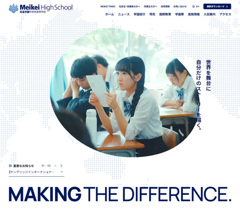
DESIGN REFERENCE
茗溪学園中学校高等学校|公式サイトのデザイン
紺と白を基調に、ドットの世界地図、有機的な写真の切り抜き、縦書きコピーと大きな英字を組み合わせた学校サイト。入試・行事・教育プログラム・ニュースを多層的に案内しています。
オリジナルサイトを見るMeikei High School — Style Reference
A school identity expressed through navy ink, dotted continents, everyday school imagery, and expansive bilingual typography.
Website: meikei.ac.jp Original URL: https://meikei.ac.jp/ Final URL: https://meikei.ac.jp/ Theme: white and navy section treatments with supporting blue; no selectable theme was demonstrated. Inspected: September 12, 2026. Supplied retrieval timestamp: 08:16:26.915 UTC / 17:16:26.915 JST. Viewports: 1440 × 1000 desktop and 390 × 844 mobile, in CSS pixels. Scope: the current institutional homepage: opening composition, a scrolled media transition, admissions and event information, education programs, news, editorial content, closing admissions/materials links, and footer. Visual coverage consists of three desktop and two mobile captures; rendered text and sampled computed styles provide additional evidence for sections between them.
Meikei High School combines a restrained institutional palette with an unusually expressive opening composition. A pale dotted world map fills the white canvas. School-life imagery occupies a large, irregular rounded opening, while two vertical Japanese text columns sit toward the right. The English statement MAKING THE DIFFERENCE. stretches across the bottom, with a much heavier MAKING establishing the first beat.
The homepage also serves a substantial information architecture. Audience-specific navigation, admissions shortcuts, dated announcements, an event schedule, educational pathways, and school stories coexist with the visual narrative. Desktop layouts alternate broad fields with narrower reading columns. On mobile, the design preserves its distinctive vertical copy and organic image shape while reorganizing information into stacked sections and compact horizontal navigation.
How to Read This Reference
- Measured means supplied computed styles or rendered element rectangles. Values are usually rounded to two decimal places for readability.
- Visual estimate means a proportion or dimension judged from a supplied current-page capture. These estimates are not original CSS declarations.
- Derived means arithmetic applied to measured values, such as calculating the gap between adjacent buttons.
- Recommended means an implementation choice for a new project. The Quick Start uses descriptive aliases and explicitly chosen breakpoints, not recovered source code.
- Computed font-family declarations identify the requested stacks. The evidence does not include a font-file inventory or verification of every rendered glyph.
- A rectangle can belong to transformed, clipped, obscured, or offscreen content. Screenshots establish visible composition; DOM coordinates alone do not establish visibility.
The desktop viewport is 1440px wide, while the sampled document and body boxes are 1425px wide. This 15px difference is consistent with scrollbar space. Use the actual content width when comparing horizontal measurements.
Tokens — Colors
Default Palette
| Name | Value | Evidence / suggested alias | Role |
|---|---|---|---|
| Institutional Navy | #00175C |
Source --wp--preset--color--main; measured navigation, headings, and mobile admissions buttons / --color-ink |
Primary identity, headings, filled actions, and the visually dominant dark fields |
| School Blue | #6194D3 |
Source --wp--preset--color--sub; measured category links / --color-blue |
Secondary information, supporting graphics, and the visible sitemap band |
| White | #FFFFFF |
Source white preset; measured body and section backgrounds / --color-paper |
Opening canvas, information sections, footer, and reversed lettering |
| Body Charcoal | #1C1C1C |
Source --wp--preset--color--text; measured body copy / --color-body |
Reading text and the important-notice heading |
| Schedule Ice | #F2F8FF |
Measured event-section background / --color-ice |
Quiet separation for the extensive event schedule |
| Caption Blue | #5887B0 |
Source --wp--preset--color--caption; measured notice arrows / --color-caption |
Small directional and supporting controls |
| Alternate Link Navy | #00125E |
Measured logo-link and curriculum-link color | A small source variation; retain the main navy as the general semantic token |
Pattern and Rule Treatments
The opening map is much lighter than the main text. The closing map appears as subdued blue dots on navy. Neither map's actual fill/opacity combination is exposed in the supplied element sample.
| Treatment | Evidence | Recommended approximation |
|---|---|---|
| Map on white | Visually pale blue, with strong white negative space | Secondary-blue artwork at about 30% opacity |
| Map on navy | Visually low-contrast blue continents | Secondary-blue artwork at about 20–25% opacity |
| Footer separators | Visually fine, pale blue rules | rgb(97 148 211 / 0.3) at 1px |
| Closing-panel separator | Visually faint vertical line | White at about 20% opacity, 1px |
A 30% mixture of School Blue over white produces approximately #D0DFF2. This is a calculated implementation approximation, not a sampled original map color.
The source also declares #F54615 as an annotation color, plus numerous standard CMS gradients, shadows, and generic palette presets. Their presence does not establish their use in this homepage's visible design. The observed identity does not require a rainbow palette, gradient button system, or shadow-based elevation scale.
Tokens — Typography
Japanese Interface and Reading Text
- Measured stack:
YakuHanJP, 'Noto Sans JP', sans-serif. - Measured weights:
400for paragraphs and many supporting links;700for navigation, section headings, program headings, and action labels. - Character: clear, compact Japanese sans-serif, with weight and position doing most of the hierarchy work.
- Suggested alias:
--font-jp.
The actual paragraph scale is substantially larger than the body element's inherited base. Desktop content paragraphs commonly use 16.75px; mobile paragraphs commonly use 13px. Do not reproduce the page by applying its approximately 10px root size to every text element.
English Section Headings
- Measured stack:
Manrope, sans-serifonPick up Newsand the event-schedule heading. - Measured weight:
400for these headings. - Tracking: slightly negative, approximately
-0.02emto-0.03em. - Role: large, light English headings create contrast with bold Japanese labels.
- Suggested alias:
--font-en.
English text does not universally use Manrope. The desktop MEIKEI TIMES utility link, for example, carries the Japanese interface stack in the supplied computed styles.
Identity and Slogan Artwork
The school crest and wordmark should be treated as identity artwork. Their containing link's inherited font does not identify the lettering inside the logo.
The English hero slogan appears in sampled paragraphs with no extracted text. The screenshots establish its lettering, weight contrast, and responsive composition, but the asset format and exact typeface are unknown. For faithful work, use authorized identity artwork. A live-text substitute is an approximation.
Type Scale
All desktop/mobile values below are measured unless identified as estimates.
| Role | Desktop size / line height | Mobile size / line height | Weight / tracking |
|---|---|---|---|
| Root and body base | 10.4667px / 18.3168px on body |
10px / 17.5px on body |
400; this is not the main paragraph scale |
| Primary desktop navigation | 16.75px / 16.75px |
Full navigation absent from opening header | 700 |
| Desktop utility links | 12.56px / 12.56px |
Replaced by compact navigation access | 700 |
| Standard paragraphs | 16.75px / 29.31px |
13px / 22.75px |
400; approximately 1.75 leading |
| Important-notice title | 16.75px / 16.75px |
13px / 13px |
400; section label uses 700 |
| Category links | 12.56px / 18.84px |
12px / 18px |
400 |
| Japanese section heading | 41.87px / 52.33px |
26px / 38px |
700; 0.01em tracking |
| Program / admissions subsection heading | 25.12px / 37.68px |
16px / 21px |
700 |
| Hero vertical statement | 31.02px / 31.02px |
16px / 16px |
700; 0.02em tracking |
| Pick up News | 41.87px / 30.35px |
26px / 19px |
Manrope 400; -0.03em / -0.02em |
| Event-schedule English heading | 50.24px / 36.63px |
28px / 20px |
Manrope 400; -0.02em |
| Education introduction paragraph | 18.84px / 41.45px |
13px / 22.75px |
400; 0.03em |
| Education introduction heading | 41.87px / 41.87px |
22px / 22px |
700; tall measured heading composition |
| Curriculum footnote | 14.65px / 25.64px |
11px / 19.25px |
400 |
| Mobile news headline | Not included in the desktop sample | 13px / 20px |
700 |
| Closing English titles | Approximately 50–52px, visual estimate | Approximately 38–40px, visual estimate | Visually regular; family not independently measured here |
Some display headings have computed line heights shorter than their font size. One mobile event subtitle even reports an anomalously small line height. These isolated values are not a general reading-text recipe. Use normal, unclipped line boxes for new content unless the complete original heading treatment is available.
Tokens — Spacing & Shapes
The page has several spacing systems: broad identity margins, narrower information containers, and deeper insets for narrative copy. A universal 8px grid is not established by the evidence.
Spacing Scale
| Use | Desktop | Mobile | Status |
|---|---|---|---|
| Header / hero outer inset | 50.23px |
13px |
Measured |
| Main information-container inset | 132.64px |
26px |
Measured at the supplied widths |
| Narrative-copy left inset within the page | Varies with alternating columns | About 51px |
Measured |
| Admissions button gap | About 8.37px |
8px |
Derived from rectangles |
| Primary-navigation padding | 10.47px on each side |
Not applicable | Measured |
| Text-to-arrow gap on detail links | 12.56px |
12px |
Measured |
| Admissions button horizontal padding | 25.12px |
14px |
Measured |
| News-section vertical padding | 167.47px |
100px |
Measured |
| Admissions-section top / bottom padding | 177.93px / 73.27px |
104px / 44px |
Measured |
| Schedule top / bottom padding | 94.20px / 33.49px |
90px / 56px |
Measured |
Border Radius
| Element | Desktop | Mobile | Interpretation |
|---|---|---|---|
| Admissions buttons | 6.28px |
6px |
Small rounded rectangles |
| Notice / carousel button boxes | 6.28px |
6px |
The icon itself remains unboxed visually |
| Curriculum links | 0px on sampled anchors |
3px |
Shallow rounding, not card-like softness |
| Event expansion button | Not sampled as a desktop control | 844px computed radius |
Effectively a capsule on its 168 × 42px box |
| Hero media opening | Not exposed | Not exposed | Large asymmetric rounded silhouette, visually estimated |
Keep the organic hero opening distinct from ordinary controls. Applying its large curved geometry to every content block would weaken the hierarchy.
Layout Measurements
| Element | Desktop | Mobile |
|---|---|---|
| Sampled header height | 120.33px |
66px |
| Header logo link | 360.05 × 54.27px |
233 × 35.11px |
| Logo-link position | x 50.23, y 20.92 |
x 13, y 15.44 |
| Broad hero content width | 1324.52px |
364px |
| Main information container | 1159.70px |
338px |
| Hero slogan carrier corresponding to visible artwork | 1324.52 × 90.13px |
364 × 84.86px |
| Hero media opening | Approximately 715 × 613px |
Approximately 350 × 300px |
| Important-notice link box | 332.30 × 53.30px |
338 × 30px |
| Notice arrow button | 33.48 × 33.48px |
20 × 26px |
| Admissions shortcut | 209.33 × 58.61px |
165 × 42px |
| Admissions news row link | 667.77 × 94.11px |
338 × 103px |
| Education introduction column | 569.38px |
289px |
| Curriculum row | 528.05px wide; height depends on school group |
338 × 52px |
| Sitemap band | Approximately 115px high |
Approximately 52px high |
The media-opening and sitemap measurements are visual estimates. The source property --spt changes from 120px to 66px, corresponding closely to the header scales, but its consuming CSS was not supplied.
Components
Institutional Header
Role: identify the school and expose its substantial navigation structure.
The desktop opening header places a large crest-and-wordmark lockup at the upper left. Two navigation tiers occupy the right: a smaller utility row above a larger primary row. The primary row contains nine destinations, from ホーム through アクセス. The utility row includes audience links, recruitment, contact, English access, and a compact navy materials action.
Primary links use 16.75px bold type with about 10.47px padding. Utility links use approximately 12.56px bold type. The header is visually transparent over the pale map; it does not require a separate shadowed bar.
On mobile, the logo remains 233px wide and a navy メニュー button sits at the right. Its visible rectangle is approximately 91 × 32px. In scrolled desktop captures, the large two-tier navigation is also replaced by a compact logo/menu presentation. The compact identity remains at the viewport top in the supplied lower-page captures, with white lettering over dark content.
The precise fixed/sticky mechanism and scroll threshold were not exposed. The sampled desktop logo wrapper declares translate and scale transitions, supporting a changing header presentation without proving its exact trigger.
Hero Composition
Role: communicate international ambition through a distinctive school-life image and statement.
Build the composition from five separate layers:
- A white full-width canvas.
- A large pale dotted world map extending beyond the viewport edges.
- A broad, irregular rounded media opening containing candid school imagery.
- Two vertical Japanese copy columns, using
世界を舞台にand自分だけのストーリーを描く。. - Oversized English slogan artwork and a compact important-notice module.
In the desktop capture, the media opening occupies roughly the central half of the page width and sits above the slogan. The Japanese statement stands to its right. The important notice occupies a small lower-left area, leaving the media and typography dominant.
On mobile, the image opening becomes nearly full width and shifts left. The vertical statement stays near the upper right, partially sharing the media region rather than becoming a conventional horizontal headline. The slogan changes to two lines: MAKING above THE DIFFERENCE.. The notice moves below it into a full-width bottom strip.
Use vertical writing for each Japanese phrase, with the first phrase on the right. Rotating an entire horizontal sentence would produce different punctuation and character orientation.
Important-Notice Module
Role: surface urgent information without overwhelming the opening identity.
The module combines a small blue information symbol, a bold charcoal heading, previous/next chevrons, a single-line linked announcement, and a small right arrow. A fine navy rule closes the desktop module. The visible announcement is truncated; its complete title is available in the supplied rendered text.
Desktop width is about 332px. Mobile content width is 338px inside 26px side insets, with 13px heading and announcement text. The arrow controls shrink to measured 20 × 26px boxes on mobile.
Previous/next controls are present, but their results, wrapping behavior, and any automatic rotation were not tested. Keep the full announcement available to assistive technology even if the visible text uses ellipsis.
Pick up News Rail
Role: highlight a small set of current announcements before the larger information sections.
The DOM contains four distinct announcement titles repeated across a horizontal sequence. Sampled item widths are 468.91px on desktop and 338px on mobile. Adjacent item positions imply a pitch of about 594.50px on desktop and 390px on mobile, equivalent to approximately 125.59px and 52px between sampled item boxes.
The English heading uses regular Manrope. Announcement headings are bold Japanese sans-serif, with white computed text. Two directional buttons are also present. Repetition and offscreen positions are consistent with a looping rail, but autoplay, drag behavior, active-index handling, and loop timing remain unverified.
No supplied screenshot clearly exposes the complete settled rail. Treat these as structural and typographic measurements, not proof of every card's visible crop or spacing during playback.
Media and Halftone Transition
Role: visually connect the spacious opening to the darker page narrative.
One scrolled desktop capture shows a muted sky-toned media field above a navy area. A broad horizontal halftone edge bridges the two: dots become larger and denser toward the solid navy field. The compact white wordmark and menu remain at the top.
This capture contains little readable foreground content. It establishes the halftone treatment and captured state, not an intentionally empty permanent section. The full reveal sequence, media element type, and relationship to scroll position were not demonstrated.
Admissions Information Block
Role: provide practical access to admissions information, applications, results, and related announcements.
A navy Japanese section heading introduces a desktop two-column block. The left column contains explanatory text and eight shortcuts arranged in two columns and four rows. The right column contains a subsection heading and three dated admissions-news entries, followed by an archive link.
The measured desktop text column is 471px wide; the news column is 667.77px wide, with approximately 20.92px between them. Each shortcut is about 209 × 59px, with small corner rounding, bold type, and a directional mark. The mobile sample directly confirms navy button backgrounds and white text.
On mobile, the explanatory copy and shortcuts precede the news block. The shortcut grid retains two columns: 165px buttons separated by 8px. The news subsection begins approximately 64px below the grid's last row.
Destinations distinguish different tasks: school information pages, external application services, external results services, transfer admissions, and career results. Preserve these distinctions in link labels and semantics.
Event Schedule
Role: organize school visits and overseas information sessions by date.
The section uses a measured #F2F8FF background, a large centered English schedule heading, and a smaller Japanese heading. Two groups organize domestic school events and overseas sessions. Dates, weekdays, event names, and locations appear in the rendered text.
Desktop element positions place the groups beside one another. Mobile positions stack them, with 287px-wide event text regions starting around x = 50px. Mobile event links have 20px top and bottom padding and 13px text with 22.75px leading.
Mobile evidence includes one もっと見る button per group, each 168 × 42px with capsule geometry. Additional event rectangles persist beyond the apparent excerpt region, so their presence in the DOM does not prove that every event was visible simultaneously. Expansion behavior and the exact initial cutoff were not tested.
Education Program Narrative
Role: explain the school's educational approach and distinguish its pathways.
The rendered structure begins with an introduction, followed by MG, AC, and IB program descriptions, a middle/high-school pathway comparison, and SSH and international-education features. Sampled narrative text is white, establishing a reversed-text presentation; the complete background artwork of these sections is not available in the screenshots.
The introduction has a relatively narrow centered paragraph column: approximately 569px desktop and 289px mobile. Desktop introductory prose has especially generous 2.2 line spacing. Mobile prose returns to 1.75.
Program text alternates horizontally on desktop: MG and IB samples begin near x = 723px, while AC begins near x = 185px. Mobile program text consistently begins near x = 51px in 288px-wide columns. Each unit combines a bold heading, a paragraph, and an unboxed 詳しくはこちら link.
These text positions establish an alternating-to-stacked structure. They do not establish the dimensions or subjects of neighboring media assets.
Curriculum Comparison
Role: show the relationship between middle-school and high-school pathways.
Desktop school groups occupy two approximately 528px-wide columns. The middle-school group contains two taller rows; the high-school group contains three shorter rows. Mobile groups stack, using white 338 × 52px rows with 3px radii and 20px horizontal padding.
Labels identify the pathways and, where supplied, class counts. A small explanatory footnote clarifies access to the IB pathway. Treat the rows as structured information and links, not promotional pricing cards.
News Index
Role: connect visitors to recent school activity and topic archives.
The desktop category navigation forms a vertical list approximately 274px wide, with sampled items about 40.81px tall. On mobile, categories occupy one horizontal row with 52px-high link boxes and approximately 16px spacing between neighboring items. Later categories have x coordinates beyond the viewport, confirming horizontal overflow in the layout; swipe behavior was not tested.
Categories are anchors to archive URLs. The evidence does not establish client-side filtering, so do not assume that selecting a category updates the current list without navigation.
News entries combine a date, headline, and one or more category links. Mobile headlines use 13px bold text with 20px leading; category links use 12px blue text. Sampled article-link boxes are 338px wide and grow from 103px to 121px when category content wraps.
Large article-link boxes and separate category links represent distinct destinations. A new implementation should preserve both without nesting interactive anchors.
MEIKEI TIMES and School Gateways
Role: add individual stories and thematic routes beyond administrative information.
The rendered page introduces MEIKEI TIMES as school editorial content and includes topical hashtag links, story titles, participant descriptions, and article links. Five distinct story titles repeat in the extracted sequence. This is consistent with repeated presentation items; it should not be interpreted as fifteen unique stories.
Later gateways link to school introduction, educational features, and dormitory life, each with explanatory copy. These establish another layer of browsing before the closing actions.
The supplied captures and sampled elements do not expose reliable card geometry for these areas. Their information anatomy is supported; exact image ratios, background treatments, and motion are not.
Closing Admissions and Request Panels
Role: provide two clear next steps at the end of the homepage.
The desktop closing area has two equal navy panels separated by a faint vertical rule. A darker dotted world map spans the background. Each panel centers a large English title, a bold Japanese label, a short explanatory paragraph, and a white action button.
The left panel is Admissions / 入試案内; the right is Request / 資料請求. White buttons are visually about 220 × 42px with approximately 6px corners. Keep the arrow and download symbols small and aligned toward the right edge.
The mobile bottom capture shows the Request panel with a roughly 185 × 40px button. Both panels remain in the mobile rendered text, but the preceding Admissions panel is outside this bottom crop. A stacked arrangement is consistent with the available evidence; its full mobile geometry was not captured.
The materials action links to /materials/. Its label communicates downloading, but the inspected destination is a page URL, not a demonstrated direct file download.
Sitemap Band and Contact Footer
Role: expose comprehensive navigation and finish with practical school information.
A full-width School Blue strip separates the navy closing area from the white footer. It contains a small menu symbol and centered サイトマップをみる text. It is approximately 115px high on desktop and 52px on mobile.
The rendered text includes a complete sitemap and a close label, but only the closed band is visible in the supplied screenshots. The expanded panel's layout and animation remain unverified.
The desktop white footer places the logo, address, telephone, fax, and Page Top control across one row. A pale horizontal rule separates that row from centered copyright text. On mobile, the logo and address occupy separate full-width rows, telephone and fax sit side by side, and copyright sits opposite Page Top below a long rule.
The footer visibly identifies Meikei High School and includes its Tsukuba address, telephone 029-851-6611, and fax 029-851-5455. The Page Top control uses a thin upward chevron above its English label. Its return-scroll behavior was not exercised.
Tokens — Motion & Interaction
The strongest motion evidence is in computed transition declarations. These establish properties, durations, and easing, but not every trigger or endpoint.
| Treatment | Measured declaration | Evidence boundary |
|---|---|---|
| Navigation and detail-link color | 250ms cubic-bezier(0.3, 0.015, 0.12, 1) |
Color transition defined; hover/focus endpoint not supplied |
| Desktop logo wrapper | Translate and scale, 333ms with the same easing |
Compatible with compact header states; exact threshold unknown |
| English access / header materials link | Opacity 333ms, color 250ms |
Defined transition only |
| Pick up News controls | Opacity and translate, 300ms |
Control movement defined; carousel timing not established |
| Category-link decoration | Background-size, 200ms |
May animate a background decoration; exact artwork not supplied |
| Mobile program headings and paragraphs | Opacity, 850ms |
Reveal-related declaration; trigger not observed directly |
| Mobile curriculum rows | Clip-path and opacity, 700ms; delays 50–150ms |
Staggered reveal configuration is present; clip geometry unavailable |
| Mobile schedule expansion control | Opacity, 800ms, delay 400ms |
Does not establish the duration of expanding the event list |
The shared easing produces a quick start and a long settling phase. A reusable alias is --ease-meikei: cubic-bezier(0.3, 0.015, 0.12, 1).
School imagery differs between the desktop and mobile captures. Moving media is plausible, but responsive asset selection could also account for differences. The evidence does not establish video markup, autoplay, looping, sound, frame rate, or mask morphing.
Repeated rail content and Swiper-related custom properties support the presence of carousel infrastructure. They do not prove a particular interaction configuration. Likewise, sampled animation: none values do not rule out JavaScript, ancestor, pseudo-element, or media animation.
Surfaces
| Surface | Appearance | Function |
|---|---|---|
| Opening canvas | White with pale dotted continents | Establishes breadth and international identity |
| Information sections | White with navy headings and charcoal copy | Supports practical reading and navigation |
| Event schedule | Very pale blue | Separates a dense date-based information block |
| Reversed narrative | White measured text within the darker page sequence | Gives educational storytelling a distinct rhythm |
| Closing action area | Navy, subdued dotted map, white buttons | Concentrates the two final destinations |
| Sitemap band | Solid School Blue with white text | Creates a clear transition into navigation and contact details |
| Contact footer | White, navy information, pale rules | Finishes with institutional clarity |
The visible system relies on field changes, spacing, typography, and fine rules. No general soft-shadow elevation system is established.
Imagery
The opening image shows ordinary school life rather than a formal building portrait. In the desktop capture, students descend a bright staircase; the mobile capture shows a corridor and lockers. Soft daylight, pale walls, cool green/cyan tones, navy uniforms, and warmer architectural details give the media a natural, lived-in character.
These photographic colors belong to the imagery. They should not become additional interface accents. Preserve natural image detail and use a carefully chosen focal point when cropping into the irregular opening.
The dotted world map supplies the main graphic motif. Its recognizable continental silhouette matters: a uniform dot pattern cannot substitute for it. The same idea returns in the closing navy field, while a density-changing halftone edge appears in the scrolled media capture.
Observed Asset References
No original image, video, SVG, mask, or font-file paths were supplied. The following are observed asset roles, not invented URLs.
| Asset role | Direct evidence | Reuse guidance |
|---|---|---|
| Crest and school wordmark | Opening and footer screenshots | Use authorized artwork; preserve crest detail and lockup proportions |
| Light and reversed wordmark presentations | White opening/footer and dark scrolled headers | Supply the appropriate lettering version without indiscriminately inverting the crest |
| Dotted world map | Opening and closing captures | Preserve geography, dot spacing, and transparent negative space |
| School-life media | Desktop staircase and mobile corridor captures | Use an appropriate crop and a stable fallback image |
| Hero slogan | Single-line desktop and two-line mobile composition | Use responsive artwork or an explicitly approximate text treatment |
| Halftone edge | Scrolled desktop media capture | Reproduce density progression with a suitable mask or asset |
| Utility symbols | Menu, globe, information, chevrons, arrows, download, Page Top | Use small, consistent line icons; no specific icon library was established |
Layout & Responsive Behavior
The measured document heights are 17,134px on desktop and 14,741px on mobile. These are capture-specific outcomes of content, layout, and state, not implementation height targets. This is a long scrolling homepage; only the opening composition behaves visually like a first-view stage.
| Area | Desktop observation | Mobile observation |
|---|---|---|
| Opening header | Large logo and two navigation tiers | Compact logo and menu button |
| Scrolled header | Compact identity/menu remains at viewport top | Compact identity/menu visible at the bottom capture |
| Hero statement | About 31px vertical copy at the right | 16px vertical copy remains at the upper right |
| Hero media | Central irregular opening around half the page width | Opening nearly fills the width and shifts left |
| English slogan | One broad line | Two intentionally composed lines |
| Important notice | Small lower-left module above the slogan | Full-width strip below the slogan |
| Admissions | Intro/shortcuts beside announcements | Intro/shortcuts followed by announcements |
| Shortcut grid | Two columns | Two columns retained |
| Event groups | Separate horizontal positions | Stacked groups with expansion controls |
| Program text | Alternating left/right positions | Consistent single-column reading position |
| Curriculum groups | Two school columns | School groups stacked |
| News categories | Vertical category list | Horizontal overflowing row |
| Closing actions | Equal side-by-side panels | Request fills the visible width; full two-panel arrangement not captured |
| Footer | Horizontal contact row | Logo/address rows, paired phone/fax, split legal/navigation row |
The mobile DOM places some Pick up News rectangles within the opening hero's coordinate range, although the opening screenshot shows the hero. Event descendants also extend beyond their apparent excerpt regions. These are reasons to inspect clipping and stacking when implementing; they are not instructions to place unrelated text on top of the hero.
No tablet viewport, intermediate breakpoint, landscape mobile state, zoom test, or safe-area behavior was supplied. The Quick Start's 1200px header breakpoint and 768px content breakpoint are recommendations for adaptation.
Do’s and Don’ts
Do
- Preserve the navy, white, and supporting-blue hierarchy.
- Keep the world map recognizable and quiet enough to support text.
- Give the opening media one large asymmetric rounded shape.
- Retain the two vertical Japanese phrases on mobile.
- Preserve the heavy/light contrast within the English slogan.
- Separate wide identity margins from narrower information and narrative columns.
- Keep admissions shortcuts in a compact two-column grid at the inspected phone width.
- Use bold Japanese headings with lighter English section headings.
- Keep dates, category links, and editorial destinations distinct.
- Let the footer simplify into clear contact groups on mobile.
- Use the measured easing and short control transitions as motion references.
Don't
- Don't reduce the homepage to a single-purpose campaign funnel.
- Don't replace the map with arbitrary dots covering the entire page uniformly.
- Don't make the hero opening a perfect circle or a generic rounded rectangle.
- Don't assign the logo or slogan a font based on an empty wrapper's computed style.
- Don't introduce bright orange actions merely because an annotation token exists.
- Don't treat every declared CMS shadow or gradient as part of the design.
- Don't use 10px as the general reading size because the source root is about 10px.
- Don't infer visible rows, cards, or menu panels solely from extracted text.
- Don't describe carousel autoplay, media sound, or scroll scrubbing as verified behavior.
- Don't reproduce a sparsely captured transition state as an intentionally empty section.
- Don't hardcode the measured document height or every captured y coordinate.
Recommended Implementation Additions
These are recommendations for a new implementation, not verified features of the original page.
- Provide at least 44 × 44px interaction areas for compact arrows and menu controls while retaining small visual icons.
- Consider 15–16px mobile reading text instead of the observed 13px, allowing paragraphs and sections to grow naturally.
- Give menus, sitemap panels, and event expansion controls explicit expanded states, keyboard operation, and appropriate focus behavior.
- Keep menu and sitemap content available through ordinary navigation if enhancement scripts fail.
- Give truncated announcements their complete accessible names and reachable full articles.
- Use meaningful article links alongside independent category links; avoid nested anchors and unnamed overlay links.
- Give decorative maps empty alternatives and exclude them from the accessibility tree. Describe informative photography appropriately.
- If media plays automatically, provide a pause mechanism and a static reduced-motion alternative. Do not start audible playback without a deliberate user action.
- Ensure all narrative text remains visible when reveal animation is disabled or unavailable.
- Verify the contrast of small blue category text and the white sitemap label; use stronger text color or another affordance where needed.
- Implement Page Top as a reachable anchor, with reduced-motion-aware scrolling.
Agent Prompt Guide
Quick Color Reference
- Primary identity and action fill:
#00175C. - Main canvas and footer:
#FFFFFF. - Reading text:
#1C1C1C. - Secondary information and sitemap band:
#6194D3. - Event background:
#F2F8FF. - Small notice controls:
#5887B0. - Pale map and rules: low-opacity supporting blue; exact source opacity is unknown.
- Closing buttons: white with navy text and a small directional symbol.
Overall Prompt
“Create a substantial Japanese school homepage inspired by the inspected Meikei High School design. Use navy #00175C, white, supporting blue #6194D3, and pale-blue event sections. Build an expansive opening with a dotted world map, candid school-life imagery inside a large irregular rounded opening, two vertical Japanese phrases at the upper right, and an oversized English slogan with strong weight contrast. Use a two-tier desktop navigation that becomes a compact identity/menu presentation on smaller screens. Continue with practical admissions shortcuts, dated announcements, event groups, educational pathways, school news, and editorial stories. Close with equal navy Admissions and Request panels, a blue sitemap band, and a restrained white contact footer. Use YakuHanJP with Noto Sans JP for Japanese UI and Manrope for the supported English section-heading treatment. Keep unverified media and carousel behavior configurable.”
Example Component Prompts
- Hero: “A white school homepage opening with pale blue dotted continents, a broad asymmetric rounded school-photo crop, and two navy vertical Japanese text columns. Place a very large heavy/light English slogan along the bottom. On a 390px phone, retain vertical copy and compose the slogan in two lines.”
- Admissions: “A navy Japanese section heading above explanatory copy and eight small-radius navy shortcuts in two columns. On desktop place three dated admissions announcements beside the shortcuts; on mobile stack the announcements below while retaining two shortcut columns. Use 8px mobile gaps and 165 × 42px reference buttons.”
- News navigation: “A restrained school news index with dated headlines and small blue category links. Use a vertical category list on desktop and a single horizontal overflow row on mobile. Category controls are real archive links; do not assume in-place filtering.”
- Closing panels: “Two equal navy panels over a subdued dotted world map. Center a large light English heading, a bold Japanese label, a short paragraph, and a white rectangular action with a small arrow or download icon. Use a faint divider and no card shadow.”
- Footer: “A white school footer with crest-and-wordmark artwork, address, phone, fax, a thin pale blue separator, copyright, and an upward-chevron Page Top control. On mobile stack logo and address, pair phone and fax, then align copyright opposite Page Top.”
Quick Start
CSS Custom Properties
This is an implementation starter, not extracted source CSS. It keeps a conventional browser root size and uses rem values corresponding to the measured type sizes at a 16px default. The organic crop is approximate. The header breakpoint, content breakpoint, and intermediate sizing rules are recommendations.
Supply authorized logo, slogan, world-map, and school-media assets. No original asset filenames are known. The map rules below expect transparent, secondary-blue dotted-map artwork. Use a responsive picture element for the single-line/two-line slogan. The .is-compact and .on-dark header classes are integration hooks; scroll-state detection and interactive controls require separate implementation.
:root {
  /* Measured palette */
  --color-ink: #00175c;
  --color-blue: #6194d3;
  --color-paper: #ffffff;
  --color-body: #1c1c1c;
  --color-ice: #f2f8ff;
  --color-caption: #5887b0;

  /* Recommended rule approximation */
  --color-rule: rgb(97 148 211 / 0.3);

  /* Measured family declarations; load fonts separately */
  --font-jp: YakuHanJP, 'Noto Sans JP', sans-serif;
  --font-en: Manrope, sans-serif;
  --text-body: 1.046675rem;
  --text-small: 0.785rem;
  --text-section: 2.61668rem;
  --text-subsection: 1.570006rem;
  --text-display: 3.14002rem;

  /* Desktop reference geometry */
  --content-width: 1159.7px;
  --wide-gutter: clamp(26px, 3.525vw, 50.234px);
  --header-height: 120.33px;
  --section-space: 167.47px;
  --control-height: 58.61px;
  --radius-control: 6.28px;

  /* Measured transition timings */
  --ease-meikei: cubic-bezier(0.3, 0.015, 0.12, 1);
  --motion-link: 250ms;
  --motion-header: 333ms;
  --motion-reveal: 850ms;
}

* { box-sizing: border-box; }
html { scroll-padding-top: var(--header-height); }
body {
  margin: 0;
  color: var(--color-body);
  background: var(--color-paper);
  font: 400 var(--text-body) / 1.75 var(--font-jp);
}
button, input, select, textarea { font: inherit; }
button, a { -webkit-tap-highlight-color: transparent; }
a { color: inherit; }
img, video { max-width: 100%; }

.content {
  width: min(calc(100% - 52px), var(--content-width));
  margin-inline: auto;
}
.section { padding-block: var(--section-space); }
.section-title {
  margin: 0;
  color: var(--color-ink);
  font-size: var(--text-section);
  font-weight: 700;
  line-height: 1.25;
  letter-spacing: 0.01em;
}
.english-title {
  font-family: var(--font-en);
  font-size: var(--text-display);
  font-weight: 400;
  line-height: 1.1;
  letter-spacing: -0.02em;
}

/* Opening header; compact state is controlled by integration code. */
.site-header {
  position: absolute;
  inset: 0 0 auto;
  z-index: 30;
  display: flex;
  align-items: flex-start;
  justify-content: space-between;
  gap: 24px;
  min-height: var(--header-height);
  padding: 20.92px var(--wide-gutter);
  color: var(--color-ink);
}
.site-logo { flex: 0 0 auto; }
.site-logo img {
  display: block;
  width: 360.05px;
  height: auto;
}
.header-nav {
  display: grid;
  justify-items: end;
  gap: 9.4px;
}
.header-nav__utility,
.header-nav__primary {
  display: flex;
  align-items: center;
}
.header-nav a {
  padding-inline: 10.47px;
  font-weight: 700;
  text-decoration: none;
  transition: color var(--motion-link) var(--ease-meikei);
}
.header-nav__utility { font-size: var(--text-small); }
.header-nav__primary a {
  padding-block: 10.47px;
  line-height: 1;
}
.menu-button {
  display: none;
  align-items: center;
  justify-content: center;
  gap: 12px;
  min-width: 138px;
  min-height: 50px;
  border: 0;
  border-radius: var(--radius-control);
  color: white;
  background: var(--color-ink);
  font-weight: 700;
  cursor: pointer;
}
.site-header.is-compact {
  position: fixed;
  min-height: 84px;
  align-items: center;
  padding: 17px 20px;
}
.site-header.is-compact .site-logo img { width: 233px; }
.site-header.is-compact .header-nav { display: none; }
.site-header.is-compact .menu-button { display: inline-flex; }
.site-header.on-dark { color: white; }

/* Assets provide the map silhouette and the responsive slogan. */
.hero {
  position: relative;
  isolation: isolate;
  min-height: 100svh;
  overflow: hidden;
  color: var(--color-ink);
  background: white;
}
.hero__map,
.closing__map {
  position: absolute;
  inset: 0;
  z-index: -1;
  width: 100%;
  height: 100%;
  object-fit: cover;
  pointer-events: none;
}
.hero__map { opacity: 0.3; }
.hero__media {
  position: absolute;
  top: 13.8%;
  left: 26.6%;
  width: 50.2%;
  aspect-ratio: 715 / 613;
  overflow: hidden;
  /* Approximation of the observed asymmetric opening */
  border-radius: 44% 56% 45% 55% / 49% 58% 42% 51%;
}
.hero__media > img,
.hero__media > video {
  display: block;
  width: 100%;
  height: 100%;
  object-fit: cover;
  object-position: var(--media-focus, 50% 50%);
}
.hero__statement {
  position: absolute;
  top: 22.9%;
  right: 12%;
  display: flex;
  flex-direction: row-reverse;
  gap: 26.17px;
  margin: 0;
  font-size: 31.02px;
  font-weight: 700;
  line-height: 1;
  letter-spacing: 0.02em;
}
.hero__statement > span {
  writing-mode: vertical-rl;
  white-space: nowrap;
}
.hero__slogan {
  position: absolute;
  left: var(--wide-gutter);
  bottom: 4.18%;
  width: calc(100% - 2 * var(--wide-gutter));
}
.hero__slogan img {
  display: block;
  width: 100%;
  height: auto;
}
.notice {
  position: absolute;
  left: var(--wide-gutter);
  bottom: 19.25%;
  width: 332.3px;
  border-bottom: 1px solid var(--color-ink);
}
.notice__head,
.notice__link,
.notice__controls { display: flex; align-items: center; }
.notice__head { justify-content: space-between; }
.notice__head h2 {
  margin: 0;
  color: var(--color-body);
  font-size: var(--text-body);
  line-height: 1;
}
.notice__link {
  gap: 10px;
  padding-block: 10.47px;
  text-decoration: none;
}
.notice__title {
  flex: 1;
  min-width: 0;
  overflow: hidden;
  white-space: nowrap;
  text-overflow: ellipsis;
}
.notice__controls button {
  display: grid;
  place-items: center;
  width: 33.48px;
  height: 33.48px;
  padding: 0;
  border: 0;
  color: var(--color-caption);
  background: transparent;
  cursor: pointer;
}

/* Practical information components */
.action {
  display: inline-flex;
  align-items: center;
  justify-content: space-between;
  gap: 12px;
  min-height: var(--control-height);
  padding-inline: 25.12px;
  border: 0;
  border-radius: var(--radius-control);
  color: white;
  background: var(--color-ink);
  font-weight: 700;
  text-decoration: none;
  transition: color var(--motion-link) var(--ease-meikei);
}
.action__icon { flex: 0 0 auto; }
.admissions-layout {
  display: grid;
  grid-template-columns: minmax(0, 41fr) minmax(0, 58fr);
  gap: 21px;
  margin-top: 68px;
}
.admissions-shortcuts {
  display: grid;
  grid-template-columns: repeat(2, minmax(0, 1fr));
  gap: 8.37px;
  width: min(100%, 427.03px);
  margin-top: 48px;
}
.subsection-title {
  color: var(--color-ink);
  font-size: var(--text-subsection);
  line-height: 1.5;
}
.news-row {
  display: grid;
  grid-template-columns: auto minmax(0, 1fr);
  gap: 20px;
  padding-block: 20px;
  border-bottom: 1px solid var(--color-rule);
}
.news-row__title {
  margin: 0;
  color: var(--color-ink);
  font-size: var(--text-body);
  line-height: 1.55;
}
.news-row__categories {
  display: flex;
  flex-wrap: wrap;
  gap: 4px 10px;
  margin-top: 10px;
  color: var(--color-blue);
  font-size: 0.75rem;
}
.schedule {
  padding-block: 94px 56px;
  background: var(--color-ice);
}
.schedule__heading { text-align: center; }
.schedule__groups {
  display: grid;
  grid-template-columns: repeat(2, minmax(0, 1fr));
  gap: 80px;
  margin-top: 64px;
}
.schedule__event { padding-block: 20px; }
.schedule__more {
  min-width: 168px;
  min-height: 42px;
  border: 1px solid var(--color-rule);
  border-radius: 999px;
  color: var(--color-ink);
  background: transparent;
  font-weight: 700;
}

/* Safe defaults keep all content readable before enhancement. */
.programmes { color: white; background: var(--color-ink); }
.programme-intro {
  width: min(100%, 569.38px);
  margin-inline: auto;
}
.programme-intro p {
  font-size: 1.1775rem;
  line-height: 2.2;
  letter-spacing: 0.03em;
}
.programme-row {
  display: grid;
  grid-template-columns: repeat(2, minmax(0, 1fr));
  gap: 49px;
  padding-block: 80px;
}
.curriculum-groups {
  display: grid;
  grid-template-columns: repeat(2, minmax(0, 1fr));
  gap: 104px;
}
.curriculum-link {
  display: flex;
  align-items: center;
  justify-content: space-between;
  gap: 12px;
  min-height: 72px;
  margin-bottom: 2px;
  padding: 16px 31px;
  color: var(--color-ink);
  background: white;
  text-decoration: none;
}
.news-layout {
  display: grid;
  grid-template-columns: 274px minmax(0, 1fr);
  gap: 52px;
  margin-top: 72px;
}
.news-categories { display: grid; align-content: start; }
.news-categories a {
  padding-block: 8px;
  text-decoration: none;
}

/* Closing navigation and contact information */
.closing {
  position: relative;
  isolation: isolate;
  overflow: hidden;
  color: white;
  background: var(--color-ink);
}
.closing__map { opacity: 0.24; }
.closing__grid {
  display: grid;
  grid-template-columns: repeat(2, minmax(0, 1fr));
}
.closing__panel {
  padding: 120px 52px;
  text-align: center;
}
.closing__panel + .closing__panel {
  border-left: 1px solid rgb(255 255 255 / 0.2);
}
.closing__panel h2 { margin: 0; }
.closing__panel p {
  max-width: 430px;
  margin: 42px auto 30px;
}
.action--light {
  min-width: 220px;
  min-height: 42px;
  color: var(--color-ink);
  background: white;
}
.sitemap-toggle {
  display: flex;
  align-items: center;
  justify-content: center;
  gap: 16px;
  width: 100%;
  min-height: 115px;
  border: 0;
  color: white;
  background: var(--color-blue);
  font-weight: 700;
  cursor: pointer;
}
.site-footer {
  padding: 50px var(--wide-gutter) 40px;
  color: var(--color-ink);
  background: white;
}
.footer-grid {
  display: grid;
  grid-template-columns: 304px minmax(0, 1fr) auto auto 86px;
  align-items: center;
  gap: 27px 40px;
}
.footer__logo img { display: block; width: 304px; }
.footer__label { display: block; font-size: 0.875rem; }
.footer__top {
  grid-column: 5;
  grid-row: 1;
  padding-inline: 16px;
  border-left: 1px solid var(--color-rule);
  text-align: center;
  text-decoration: none;
}
.footer__copyright {
  grid-column: 1 / -1;
  margin: 0;
  padding-top: 24px;
  border-top: 1px solid var(--color-rule);
  font-size: 0.875rem;
  text-align: center;
}

/* Recommended compact-header breakpoint, not source CSS. */
@media (max-width: 75rem) {
  :root { --header-height: 66px; }
  .site-header,
  .site-header.is-compact {
    min-height: 66px;
    align-items: center;
    padding: 0 13px;
  }
  .site-logo img { width: 233px; }
  .header-nav { display: none; }
  .menu-button {
    display: inline-flex;
    min-width: 91px;
    min-height: 32px;
    font-size: 0.6875rem;
  }
  .footer-grid { grid-template-columns: repeat(2, minmax(0, 1fr)); }
  .footer__logo,
  .footer__address { grid-column: 1 / -1; }
  .footer__copyright {
    grid-row: 4;
    padding-block: 36px;
    text-align: left;
  }
  .footer__top {
    grid-column: 2;
    grid-row: 4;
    justify-self: end;
    z-index: 1;
  }
}

/* Recommended content breakpoint with measured phone endpoints. */
@media (max-width: 48rem) {
  :root {
    --text-body: 0.8125rem;
    --text-small: 0.75rem;
    --text-section: 1.625rem;
    --text-subsection: 1rem;
    --text-display: 1.75rem;
    --wide-gutter: 13px;
    --section-space: 100px;
    --control-height: 42px;
    --radius-control: 6px;
  }
  .section-title { line-height: 1.46; }
  .hero__media { top: 32.8%; left: 2.56%; width: 89.75%; }
  .hero__statement { top: 13.94%; right: 9.55%; gap: 14px; font-size: 16px; }
  .hero__slogan { bottom: 96px; }
  .notice {
    left: 0;
    bottom: 0;
    width: 100%;
    min-height: 80px;
    padding: 10px 26px 12px;
    border-top: 1px solid var(--color-rule);
    border-bottom: 0;
    background: white;
  }
  .notice__link { padding-block: 5px 0; }
  .notice__controls button { width: 20px; height: 26px; }
  .action { padding-inline: 14px; }
  .admissions-layout { grid-template-columns: 1fr; gap: 64px; margin-top: 54px; }
  .admissions-shortcuts { width: 100%; gap: 8px; margin-top: 40px; }
  .schedule__groups { grid-template-columns: 1fr; gap: 80px; padding-inline: 24px; }
  .programme-intro { width: min(100%, 289px); }
  .programme-intro p { font-size: var(--text-body); line-height: 1.75; }
  .programme-row { grid-template-columns: 1fr; gap: 32px; padding-inline: 25px; }
  .curriculum-groups { grid-template-columns: 1fr; gap: 64px; }
  .curriculum-link { min-height: 52px; padding: 12px 20px; border-radius: 3px; }
  .news-layout { grid-template-columns: 1fr; gap: 40px; margin-top: 40px; }
  .news-categories {
    display: flex;
    gap: 16px;
    overflow-x: auto;
    overscroll-behavior-inline: contain;
  }
  .news-categories a {
    display: flex;
    flex: 0 0 auto;
    align-items: center;
    min-height: 52px;
    white-space: nowrap;
  }
  .closing__grid { grid-template-columns: 1fr; }
  .closing__panel { padding: 64px 52px; }
  .closing__panel + .closing__panel {
    border-left: 0;
    border-top: 1px solid rgb(255 255 255 / 0.2);
  }
  .closing__panel .english-title { font-size: 2.5rem; }
  .closing__panel p { text-align: left; }
  .action--light { min-width: 185px; min-height: 40px; }
  .sitemap-toggle { min-height: 52px; }
  .site-footer { padding: 65px 25px 40px; }
  .footer__logo img { width: 233px; }
  .footer__label,
  .footer__copyright { font-size: 0.6875rem; }
}

/* Recommended accessibility additions */
:focus-visible { outline: 2px solid currentColor; outline-offset: 4px; }
@media (hover: hover) {
  .header-nav a:hover,
  .news-categories a:hover { text-decoration: underline; text-underline-offset: 4px; }
}
@media (prefers-reduced-motion: reduce) {
  html { scroll-behavior: auto; }
  .site-header *, .action, .reveal {
    transition: none !important;
    animation: none !important;
  }
  .reveal { opacity: 1 !important; clip-path: none !important; }
}
The compact controls above retain observed visual dimensions for comparison. Enlarge their interaction areas as recommended before production. The reduced-motion CSS does not pause video or JavaScript-driven carousels; those require explicit integration.
Tailwind v4 Token Mapping
Optional aliases for a project already using Tailwind v4. This does not imply that the original website uses Tailwind. Define the properties above first.
@theme inline {
  --color-school-navy: var(--color-ink);
  --color-school-blue: var(--color-blue);
  --color-school-paper: var(--color-paper);
  --color-school-text: var(--color-body);
  --color-school-ice: var(--color-ice);
  --color-school-rule: var(--color-rule);

  --font-japanese: var(--font-jp);
  --font-latin: var(--font-en);

  --text-reading: var(--text-body);
  --text-category: var(--text-small);
  --text-section-heading: var(--text-section);
  --text-subsection-heading: var(--text-subsection);
  --text-english-heading: var(--text-display);

  --spacing-page-gutter: var(--wide-gutter);
  --spacing-section-block: var(--section-space);
  --radius-school-control: var(--radius-control);
  --ease-school: var(--ease-meikei);
}
Sources & Evidence
- Original and final page: Meikei High School homepage. The supplied observation reports HTTP 200 with no URL change.
- Capture date: September 12, 2026; retrieval timestamp
2026-09-12T08:16:26.915Z. - Desktop evidence: 1440 × 1000 CSS-pixel viewport, 1425px sampled document width, 17,134px recorded document height; opening, scrolled media-transition, and closing/footer captures.
- Mobile evidence: 390 × 844 CSS-pixel viewport, 14,741px recorded document height; opening and closing/footer captures.
- Rendered DOM and computed styles: supplied text, link destinations, custom properties, element rectangles, font declarations, colors, padding, radii, and transition values. These support the measured tables and the structural descriptions of intermediate sections.
- Observed original-page destinations: admissions links point to Admissions, materials actions to Materials, news links to News, and editorial links to MEIKEI TIMES. These are recorded homepage destinations, not separately inspected pages.
- Capture procedure: the supplied process waited for document load, relevant finite animations, sampled layout/text stability, and image decoding within stated limits. Perpetual animation was paused during readiness checks and resumed. SharedWorkers and service workers were disabled.
- Limits: no direct menu opening, sitemap expansion, event expansion, carousel operation, category navigation, media control, download, or Page Top interaction was provided. Exact asset paths, original selectors, breakpoint formulas, pseudo-element styling, and media attributes were not supplied. Readiness checks do not prove that every delayed reveal completed.
This reference describes the current homepage supported by those captures and measurements. Uncaptured component details remain explicitly limited; CSS geometry, accessibility additions, and intermediate responsive rules are implementation recommendations.
# Meikei High School — Style Reference

> A school identity expressed through navy ink, dotted continents, everyday school imagery, and expansive bilingual typography.

**Website:** [meikei.ac.jp](https://meikei.ac.jp/)
**Original URL:** https://meikei.ac.jp/
**Final URL:** https://meikei.ac.jp/
**Theme:** white and navy section treatments with supporting blue; no selectable theme was demonstrated.
**Inspected:** September 12, 2026. Supplied retrieval timestamp: 08:16:26.915 UTC / 17:16:26.915 JST.
**Viewports:** 1440 × 1000 desktop and 390 × 844 mobile, in CSS pixels.
**Scope:** the current institutional homepage: opening composition, a scrolled media transition, admissions and event information, education programs, news, editorial content, closing admissions/materials links, and footer. Visual coverage consists of three desktop and two mobile captures; rendered text and sampled computed styles provide additional evidence for sections between them.

Meikei High School combines a restrained institutional palette with an unusually expressive opening composition. A pale dotted world map fills the white canvas. School-life imagery occupies a large, irregular rounded opening, while two vertical Japanese text columns sit toward the right. The English statement `MAKING THE DIFFERENCE.` stretches across the bottom, with a much heavier `MAKING` establishing the first beat.

The homepage also serves a substantial information architecture. Audience-specific navigation, admissions shortcuts, dated announcements, an event schedule, educational pathways, and school stories coexist with the visual narrative. Desktop layouts alternate broad fields with narrower reading columns. On mobile, the design preserves its distinctive vertical copy and organic image shape while reorganizing information into stacked sections and compact horizontal navigation.

## How to Read This Reference

- **Measured** means supplied computed styles or rendered element rectangles. Values are usually rounded to two decimal places for readability.
- **Visual estimate** means a proportion or dimension judged from a supplied current-page capture. These estimates are not original CSS declarations.
- **Derived** means arithmetic applied to measured values, such as calculating the gap between adjacent buttons.
- **Recommended** means an implementation choice for a new project. The Quick Start uses descriptive aliases and explicitly chosen breakpoints, not recovered source code.
- Computed font-family declarations identify the requested stacks. The evidence does not include a font-file inventory or verification of every rendered glyph.
- A rectangle can belong to transformed, clipped, obscured, or offscreen content. Screenshots establish visible composition; DOM coordinates alone do not establish visibility.

The desktop viewport is 1440px wide, while the sampled document and body boxes are 1425px wide. This 15px difference is consistent with scrollbar space. Use the actual content width when comparing horizontal measurements.

## Tokens — Colors

### Default Palette

| Name | Value | Evidence / suggested alias | Role |
| --- | --- | --- | --- |
| Institutional Navy | `#00175C` | Source `--wp--preset--color--main`; measured navigation, headings, and mobile admissions buttons / `--color-ink` | Primary identity, headings, filled actions, and the visually dominant dark fields |
| School Blue | `#6194D3` | Source `--wp--preset--color--sub`; measured category links / `--color-blue` | Secondary information, supporting graphics, and the visible sitemap band |
| White | `#FFFFFF` | Source white preset; measured body and section backgrounds / `--color-paper` | Opening canvas, information sections, footer, and reversed lettering |
| Body Charcoal | `#1C1C1C` | Source `--wp--preset--color--text`; measured body copy / `--color-body` | Reading text and the important-notice heading |
| Schedule Ice | `#F2F8FF` | Measured event-section background / `--color-ice` | Quiet separation for the extensive event schedule |
| Caption Blue | `#5887B0` | Source `--wp--preset--color--caption`; measured notice arrows / `--color-caption` | Small directional and supporting controls |
| Alternate Link Navy | `#00125E` | Measured logo-link and curriculum-link color | A small source variation; retain the main navy as the general semantic token |

### Pattern and Rule Treatments

The opening map is much lighter than the main text. The closing map appears as subdued blue dots on navy. Neither map's actual fill/opacity combination is exposed in the supplied element sample.

| Treatment | Evidence | Recommended approximation |
| --- | --- | --- |
| Map on white | Visually pale blue, with strong white negative space | Secondary-blue artwork at about 30% opacity |
| Map on navy | Visually low-contrast blue continents | Secondary-blue artwork at about 20–25% opacity |
| Footer separators | Visually fine, pale blue rules | `rgb(97 148 211 / 0.3)` at 1px |
| Closing-panel separator | Visually faint vertical line | White at about 20% opacity, 1px |

A 30% mixture of School Blue over white produces approximately `#D0DFF2`. This is a calculated implementation approximation, not a sampled original map color.

The source also declares `#F54615` as an annotation color, plus numerous standard CMS gradients, shadows, and generic palette presets. Their presence does not establish their use in this homepage's visible design. The observed identity does not require a rainbow palette, gradient button system, or shadow-based elevation scale.

## Tokens — Typography

### Japanese Interface and Reading Text

- **Measured stack:** `YakuHanJP, 'Noto Sans JP', sans-serif`.
- **Measured weights:** `400` for paragraphs and many supporting links; `700` for navigation, section headings, program headings, and action labels.
- **Character:** clear, compact Japanese sans-serif, with weight and position doing most of the hierarchy work.
- **Suggested alias:** `--font-jp`.

The actual paragraph scale is substantially larger than the body element's inherited base. Desktop content paragraphs commonly use 16.75px; mobile paragraphs commonly use 13px. Do not reproduce the page by applying its approximately 10px root size to every text element.

### English Section Headings

- **Measured stack:** `Manrope, sans-serif` on `Pick up News` and the event-schedule heading.
- **Measured weight:** `400` for these headings.
- **Tracking:** slightly negative, approximately `-0.02em` to `-0.03em`.
- **Role:** large, light English headings create contrast with bold Japanese labels.
- **Suggested alias:** `--font-en`.

English text does not universally use Manrope. The desktop `MEIKEI TIMES` utility link, for example, carries the Japanese interface stack in the supplied computed styles.

### Identity and Slogan Artwork

The school crest and wordmark should be treated as identity artwork. Their containing link's inherited font does not identify the lettering inside the logo.

The English hero slogan appears in sampled paragraphs with no extracted text. The screenshots establish its lettering, weight contrast, and responsive composition, but the asset format and exact typeface are unknown. For faithful work, use authorized identity artwork. A live-text substitute is an approximation.

### Type Scale

All desktop/mobile values below are measured unless identified as estimates.

| Role | Desktop size / line height | Mobile size / line height | Weight / tracking |
| --- | --- | --- | --- |
| Root and body base | `10.4667px / 18.3168px` on body | `10px / 17.5px` on body | 400; this is not the main paragraph scale |
| Primary desktop navigation | `16.75px / 16.75px` | Full navigation absent from opening header | 700 |
| Desktop utility links | `12.56px / 12.56px` | Replaced by compact navigation access | 700 |
| Standard paragraphs | `16.75px / 29.31px` | `13px / 22.75px` | 400; approximately 1.75 leading |
| Important-notice title | `16.75px / 16.75px` | `13px / 13px` | 400; section label uses 700 |
| Category links | `12.56px / 18.84px` | `12px / 18px` | 400 |
| Japanese section heading | `41.87px / 52.33px` | `26px / 38px` | 700; `0.01em` tracking |
| Program / admissions subsection heading | `25.12px / 37.68px` | `16px / 21px` | 700 |
| Hero vertical statement | `31.02px / 31.02px` | `16px / 16px` | 700; `0.02em` tracking |
| Pick up News | `41.87px / 30.35px` | `26px / 19px` | Manrope 400; `-0.03em` / `-0.02em` |
| Event-schedule English heading | `50.24px / 36.63px` | `28px / 20px` | Manrope 400; `-0.02em` |
| Education introduction paragraph | `18.84px / 41.45px` | `13px / 22.75px` | 400; `0.03em` |
| Education introduction heading | `41.87px / 41.87px` | `22px / 22px` | 700; tall measured heading composition |
| Curriculum footnote | `14.65px / 25.64px` | `11px / 19.25px` | 400 |
| Mobile news headline | Not included in the desktop sample | `13px / 20px` | 700 |
| Closing English titles | Approximately 50–52px, visual estimate | Approximately 38–40px, visual estimate | Visually regular; family not independently measured here |

Some display headings have computed line heights shorter than their font size. One mobile event subtitle even reports an anomalously small line height. These isolated values are not a general reading-text recipe. Use normal, unclipped line boxes for new content unless the complete original heading treatment is available.

## Tokens — Spacing & Shapes

The page has several spacing systems: broad identity margins, narrower information containers, and deeper insets for narrative copy. A universal 8px grid is not established by the evidence.

### Spacing Scale

| Use | Desktop | Mobile | Status |
| --- | --- | --- | --- |
| Header / hero outer inset | `50.23px` | `13px` | Measured |
| Main information-container inset | `132.64px` | `26px` | Measured at the supplied widths |
| Narrative-copy left inset within the page | Varies with alternating columns | About `51px` | Measured |
| Admissions button gap | About `8.37px` | `8px` | Derived from rectangles |
| Primary-navigation padding | `10.47px` on each side | Not applicable | Measured |
| Text-to-arrow gap on detail links | `12.56px` | `12px` | Measured |
| Admissions button horizontal padding | `25.12px` | `14px` | Measured |
| News-section vertical padding | `167.47px` | `100px` | Measured |
| Admissions-section top / bottom padding | `177.93px / 73.27px` | `104px / 44px` | Measured |
| Schedule top / bottom padding | `94.20px / 33.49px` | `90px / 56px` | Measured |

### Border Radius

| Element | Desktop | Mobile | Interpretation |
| --- | --- | --- | --- |
| Admissions buttons | `6.28px` | `6px` | Small rounded rectangles |
| Notice / carousel button boxes | `6.28px` | `6px` | The icon itself remains unboxed visually |
| Curriculum links | `0px` on sampled anchors | `3px` | Shallow rounding, not card-like softness |
| Event expansion button | Not sampled as a desktop control | `844px` computed radius | Effectively a capsule on its 168 × 42px box |
| Hero media opening | Not exposed | Not exposed | Large asymmetric rounded silhouette, visually estimated |

Keep the organic hero opening distinct from ordinary controls. Applying its large curved geometry to every content block would weaken the hierarchy.

### Layout Measurements

| Element | Desktop | Mobile |
| --- | --- | --- |
| Sampled header height | `120.33px` | `66px` |
| Header logo link | `360.05 × 54.27px` | `233 × 35.11px` |
| Logo-link position | `x 50.23, y 20.92` | `x 13, y 15.44` |
| Broad hero content width | `1324.52px` | `364px` |
| Main information container | `1159.70px` | `338px` |
| Hero slogan carrier corresponding to visible artwork | `1324.52 × 90.13px` | `364 × 84.86px` |
| Hero media opening | Approximately `715 × 613px` | Approximately `350 × 300px` |
| Important-notice link box | `332.30 × 53.30px` | `338 × 30px` |
| Notice arrow button | `33.48 × 33.48px` | `20 × 26px` |
| Admissions shortcut | `209.33 × 58.61px` | `165 × 42px` |
| Admissions news row link | `667.77 × 94.11px` | `338 × 103px` |
| Education introduction column | `569.38px` | `289px` |
| Curriculum row | `528.05px` wide; height depends on school group | `338 × 52px` |
| Sitemap band | Approximately `115px` high | Approximately `52px` high |

The media-opening and sitemap measurements are visual estimates. The source property `--spt` changes from `120px` to `66px`, corresponding closely to the header scales, but its consuming CSS was not supplied.

## Components

### Institutional Header

**Role:** identify the school and expose its substantial navigation structure.

The desktop opening header places a large crest-and-wordmark lockup at the upper left. Two navigation tiers occupy the right: a smaller utility row above a larger primary row. The primary row contains nine destinations, from `ホーム` through `アクセス`. The utility row includes audience links, recruitment, contact, English access, and a compact navy materials action.

Primary links use 16.75px bold type with about 10.47px padding. Utility links use approximately 12.56px bold type. The header is visually transparent over the pale map; it does not require a separate shadowed bar.

On mobile, the logo remains 233px wide and a navy `メニュー` button sits at the right. Its visible rectangle is approximately 91 × 32px. In scrolled desktop captures, the large two-tier navigation is also replaced by a compact logo/menu presentation. The compact identity remains at the viewport top in the supplied lower-page captures, with white lettering over dark content.

The precise fixed/sticky mechanism and scroll threshold were not exposed. The sampled desktop logo wrapper declares translate and scale transitions, supporting a changing header presentation without proving its exact trigger.

### Hero Composition

**Role:** communicate international ambition through a distinctive school-life image and statement.

Build the composition from five separate layers:

1. A white full-width canvas.
2. A large pale dotted world map extending beyond the viewport edges.
3. A broad, irregular rounded media opening containing candid school imagery.
4. Two vertical Japanese copy columns, using `世界を舞台に` and `自分だけのストーリーを描く。`.
5. Oversized English slogan artwork and a compact important-notice module.

In the desktop capture, the media opening occupies roughly the central half of the page width and sits above the slogan. The Japanese statement stands to its right. The important notice occupies a small lower-left area, leaving the media and typography dominant.

On mobile, the image opening becomes nearly full width and shifts left. The vertical statement stays near the upper right, partially sharing the media region rather than becoming a conventional horizontal headline. The slogan changes to two lines: `MAKING` above `THE DIFFERENCE.`. The notice moves below it into a full-width bottom strip.

Use vertical writing for each Japanese phrase, with the first phrase on the right. Rotating an entire horizontal sentence would produce different punctuation and character orientation.

### Important-Notice Module

**Role:** surface urgent information without overwhelming the opening identity.

The module combines a small blue information symbol, a bold charcoal heading, previous/next chevrons, a single-line linked announcement, and a small right arrow. A fine navy rule closes the desktop module. The visible announcement is truncated; its complete title is available in the supplied rendered text.

Desktop width is about 332px. Mobile content width is 338px inside 26px side insets, with 13px heading and announcement text. The arrow controls shrink to measured 20 × 26px boxes on mobile.

Previous/next controls are present, but their results, wrapping behavior, and any automatic rotation were not tested. Keep the full announcement available to assistive technology even if the visible text uses ellipsis.

### Pick up News Rail

**Role:** highlight a small set of current announcements before the larger information sections.

The DOM contains four distinct announcement titles repeated across a horizontal sequence. Sampled item widths are 468.91px on desktop and 338px on mobile. Adjacent item positions imply a pitch of about 594.50px on desktop and 390px on mobile, equivalent to approximately 125.59px and 52px between sampled item boxes.

The English heading uses regular Manrope. Announcement headings are bold Japanese sans-serif, with white computed text. Two directional buttons are also present. Repetition and offscreen positions are consistent with a looping rail, but autoplay, drag behavior, active-index handling, and loop timing remain unverified.

No supplied screenshot clearly exposes the complete settled rail. Treat these as structural and typographic measurements, not proof of every card's visible crop or spacing during playback.

### Media and Halftone Transition

**Role:** visually connect the spacious opening to the darker page narrative.

One scrolled desktop capture shows a muted sky-toned media field above a navy area. A broad horizontal halftone edge bridges the two: dots become larger and denser toward the solid navy field. The compact white wordmark and menu remain at the top.

This capture contains little readable foreground content. It establishes the halftone treatment and captured state, not an intentionally empty permanent section. The full reveal sequence, media element type, and relationship to scroll position were not demonstrated.

### Admissions Information Block

**Role:** provide practical access to admissions information, applications, results, and related announcements.

A navy Japanese section heading introduces a desktop two-column block. The left column contains explanatory text and eight shortcuts arranged in two columns and four rows. The right column contains a subsection heading and three dated admissions-news entries, followed by an archive link.

The measured desktop text column is 471px wide; the news column is 667.77px wide, with approximately 20.92px between them. Each shortcut is about 209 × 59px, with small corner rounding, bold type, and a directional mark. The mobile sample directly confirms navy button backgrounds and white text.

On mobile, the explanatory copy and shortcuts precede the news block. The shortcut grid retains two columns: 165px buttons separated by 8px. The news subsection begins approximately 64px below the grid's last row.

Destinations distinguish different tasks: school information pages, external application services, external results services, transfer admissions, and career results. Preserve these distinctions in link labels and semantics.

### Event Schedule

**Role:** organize school visits and overseas information sessions by date.

The section uses a measured `#F2F8FF` background, a large centered English schedule heading, and a smaller Japanese heading. Two groups organize domestic school events and overseas sessions. Dates, weekdays, event names, and locations appear in the rendered text.

Desktop element positions place the groups beside one another. Mobile positions stack them, with 287px-wide event text regions starting around x = 50px. Mobile event links have 20px top and bottom padding and 13px text with 22.75px leading.

Mobile evidence includes one `もっと見る` button per group, each 168 × 42px with capsule geometry. Additional event rectangles persist beyond the apparent excerpt region, so their presence in the DOM does not prove that every event was visible simultaneously. Expansion behavior and the exact initial cutoff were not tested.

### Education Program Narrative

**Role:** explain the school's educational approach and distinguish its pathways.

The rendered structure begins with an introduction, followed by MG, AC, and IB program descriptions, a middle/high-school pathway comparison, and SSH and international-education features. Sampled narrative text is white, establishing a reversed-text presentation; the complete background artwork of these sections is not available in the screenshots.

The introduction has a relatively narrow centered paragraph column: approximately 569px desktop and 289px mobile. Desktop introductory prose has especially generous 2.2 line spacing. Mobile prose returns to 1.75.

Program text alternates horizontally on desktop: MG and IB samples begin near x = 723px, while AC begins near x = 185px. Mobile program text consistently begins near x = 51px in 288px-wide columns. Each unit combines a bold heading, a paragraph, and an unboxed `詳しくはこちら` link.

These text positions establish an alternating-to-stacked structure. They do not establish the dimensions or subjects of neighboring media assets.

### Curriculum Comparison

**Role:** show the relationship between middle-school and high-school pathways.

Desktop school groups occupy two approximately 528px-wide columns. The middle-school group contains two taller rows; the high-school group contains three shorter rows. Mobile groups stack, using white 338 × 52px rows with 3px radii and 20px horizontal padding.

Labels identify the pathways and, where supplied, class counts. A small explanatory footnote clarifies access to the IB pathway. Treat the rows as structured information and links, not promotional pricing cards.

### News Index

**Role:** connect visitors to recent school activity and topic archives.

The desktop category navigation forms a vertical list approximately 274px wide, with sampled items about 40.81px tall. On mobile, categories occupy one horizontal row with 52px-high link boxes and approximately 16px spacing between neighboring items. Later categories have x coordinates beyond the viewport, confirming horizontal overflow in the layout; swipe behavior was not tested.

Categories are anchors to archive URLs. The evidence does not establish client-side filtering, so do not assume that selecting a category updates the current list without navigation.

News entries combine a date, headline, and one or more category links. Mobile headlines use 13px bold text with 20px leading; category links use 12px blue text. Sampled article-link boxes are 338px wide and grow from 103px to 121px when category content wraps.

Large article-link boxes and separate category links represent distinct destinations. A new implementation should preserve both without nesting interactive anchors.

### MEIKEI TIMES and School Gateways

**Role:** add individual stories and thematic routes beyond administrative information.

The rendered page introduces `MEIKEI TIMES` as school editorial content and includes topical hashtag links, story titles, participant descriptions, and article links. Five distinct story titles repeat in the extracted sequence. This is consistent with repeated presentation items; it should not be interpreted as fifteen unique stories.

Later gateways link to school introduction, educational features, and dormitory life, each with explanatory copy. These establish another layer of browsing before the closing actions.

The supplied captures and sampled elements do not expose reliable card geometry for these areas. Their information anatomy is supported; exact image ratios, background treatments, and motion are not.

### Closing Admissions and Request Panels

**Role:** provide two clear next steps at the end of the homepage.

The desktop closing area has two equal navy panels separated by a faint vertical rule. A darker dotted world map spans the background. Each panel centers a large English title, a bold Japanese label, a short explanatory paragraph, and a white action button.

The left panel is `Admissions` / `入試案内`; the right is `Request` / `資料請求`. White buttons are visually about 220 × 42px with approximately 6px corners. Keep the arrow and download symbols small and aligned toward the right edge.

The mobile bottom capture shows the Request panel with a roughly 185 × 40px button. Both panels remain in the mobile rendered text, but the preceding Admissions panel is outside this bottom crop. A stacked arrangement is consistent with the available evidence; its full mobile geometry was not captured.

The materials action links to `/materials/`. Its label communicates downloading, but the inspected destination is a page URL, not a demonstrated direct file download.

### Sitemap Band and Contact Footer

**Role:** expose comprehensive navigation and finish with practical school information.

A full-width School Blue strip separates the navy closing area from the white footer. It contains a small menu symbol and centered `サイトマップをみる` text. It is approximately 115px high on desktop and 52px on mobile.

The rendered text includes a complete sitemap and a close label, but only the closed band is visible in the supplied screenshots. The expanded panel's layout and animation remain unverified.

The desktop white footer places the logo, address, telephone, fax, and Page Top control across one row. A pale horizontal rule separates that row from centered copyright text. On mobile, the logo and address occupy separate full-width rows, telephone and fax sit side by side, and copyright sits opposite Page Top below a long rule.

The footer visibly identifies Meikei High School and includes its Tsukuba address, telephone `029-851-6611`, and fax `029-851-5455`. The Page Top control uses a thin upward chevron above its English label. Its return-scroll behavior was not exercised.

## Tokens — Motion & Interaction

The strongest motion evidence is in computed transition declarations. These establish properties, durations, and easing, but not every trigger or endpoint.

| Treatment | Measured declaration | Evidence boundary |
| --- | --- | --- |
| Navigation and detail-link color | `250ms cubic-bezier(0.3, 0.015, 0.12, 1)` | Color transition defined; hover/focus endpoint not supplied |
| Desktop logo wrapper | Translate and scale, `333ms` with the same easing | Compatible with compact header states; exact threshold unknown |
| English access / header materials link | Opacity `333ms`, color `250ms` | Defined transition only |
| Pick up News controls | Opacity and translate, `300ms` | Control movement defined; carousel timing not established |
| Category-link decoration | Background-size, `200ms` | May animate a background decoration; exact artwork not supplied |
| Mobile program headings and paragraphs | Opacity, `850ms` | Reveal-related declaration; trigger not observed directly |
| Mobile curriculum rows | Clip-path and opacity, `700ms`; delays `50–150ms` | Staggered reveal configuration is present; clip geometry unavailable |
| Mobile schedule expansion control | Opacity, `800ms`, delay `400ms` | Does not establish the duration of expanding the event list |

The shared easing produces a quick start and a long settling phase. A reusable alias is `--ease-meikei: cubic-bezier(0.3, 0.015, 0.12, 1)`.

School imagery differs between the desktop and mobile captures. Moving media is plausible, but responsive asset selection could also account for differences. The evidence does not establish video markup, autoplay, looping, sound, frame rate, or mask morphing.

Repeated rail content and Swiper-related custom properties support the presence of carousel infrastructure. They do not prove a particular interaction configuration. Likewise, sampled `animation: none` values do not rule out JavaScript, ancestor, pseudo-element, or media animation.

## Surfaces

| Surface | Appearance | Function |
| --- | --- | --- |
| Opening canvas | White with pale dotted continents | Establishes breadth and international identity |
| Information sections | White with navy headings and charcoal copy | Supports practical reading and navigation |
| Event schedule | Very pale blue | Separates a dense date-based information block |
| Reversed narrative | White measured text within the darker page sequence | Gives educational storytelling a distinct rhythm |
| Closing action area | Navy, subdued dotted map, white buttons | Concentrates the two final destinations |
| Sitemap band | Solid School Blue with white text | Creates a clear transition into navigation and contact details |
| Contact footer | White, navy information, pale rules | Finishes with institutional clarity |

The visible system relies on field changes, spacing, typography, and fine rules. No general soft-shadow elevation system is established.

## Imagery

The opening image shows ordinary school life rather than a formal building portrait. In the desktop capture, students descend a bright staircase; the mobile capture shows a corridor and lockers. Soft daylight, pale walls, cool green/cyan tones, navy uniforms, and warmer architectural details give the media a natural, lived-in character.

These photographic colors belong to the imagery. They should not become additional interface accents. Preserve natural image detail and use a carefully chosen focal point when cropping into the irregular opening.

The dotted world map supplies the main graphic motif. Its recognizable continental silhouette matters: a uniform dot pattern cannot substitute for it. The same idea returns in the closing navy field, while a density-changing halftone edge appears in the scrolled media capture.

### Observed Asset References

No original image, video, SVG, mask, or font-file paths were supplied. The following are observed asset roles, not invented URLs.

| Asset role | Direct evidence | Reuse guidance |
| --- | --- | --- |
| Crest and school wordmark | Opening and footer screenshots | Use authorized artwork; preserve crest detail and lockup proportions |
| Light and reversed wordmark presentations | White opening/footer and dark scrolled headers | Supply the appropriate lettering version without indiscriminately inverting the crest |
| Dotted world map | Opening and closing captures | Preserve geography, dot spacing, and transparent negative space |
| School-life media | Desktop staircase and mobile corridor captures | Use an appropriate crop and a stable fallback image |
| Hero slogan | Single-line desktop and two-line mobile composition | Use responsive artwork or an explicitly approximate text treatment |
| Halftone edge | Scrolled desktop media capture | Reproduce density progression with a suitable mask or asset |
| Utility symbols | Menu, globe, information, chevrons, arrows, download, Page Top | Use small, consistent line icons; no specific icon library was established |

## Layout & Responsive Behavior

The measured document heights are 17,134px on desktop and 14,741px on mobile. These are capture-specific outcomes of content, layout, and state, not implementation height targets. This is a long scrolling homepage; only the opening composition behaves visually like a first-view stage.

| Area | Desktop observation | Mobile observation |
| --- | --- | --- |
| Opening header | Large logo and two navigation tiers | Compact logo and menu button |
| Scrolled header | Compact identity/menu remains at viewport top | Compact identity/menu visible at the bottom capture |
| Hero statement | About 31px vertical copy at the right | 16px vertical copy remains at the upper right |
| Hero media | Central irregular opening around half the page width | Opening nearly fills the width and shifts left |
| English slogan | One broad line | Two intentionally composed lines |
| Important notice | Small lower-left module above the slogan | Full-width strip below the slogan |
| Admissions | Intro/shortcuts beside announcements | Intro/shortcuts followed by announcements |
| Shortcut grid | Two columns | Two columns retained |
| Event groups | Separate horizontal positions | Stacked groups with expansion controls |
| Program text | Alternating left/right positions | Consistent single-column reading position |
| Curriculum groups | Two school columns | School groups stacked |
| News categories | Vertical category list | Horizontal overflowing row |
| Closing actions | Equal side-by-side panels | Request fills the visible width; full two-panel arrangement not captured |
| Footer | Horizontal contact row | Logo/address rows, paired phone/fax, split legal/navigation row |

The mobile DOM places some Pick up News rectangles within the opening hero's coordinate range, although the opening screenshot shows the hero. Event descendants also extend beyond their apparent excerpt regions. These are reasons to inspect clipping and stacking when implementing; they are not instructions to place unrelated text on top of the hero.

No tablet viewport, intermediate breakpoint, landscape mobile state, zoom test, or safe-area behavior was supplied. The Quick Start's 1200px header breakpoint and 768px content breakpoint are recommendations for adaptation.

## Do’s and Don’ts

### Do

- Preserve the navy, white, and supporting-blue hierarchy.
- Keep the world map recognizable and quiet enough to support text.
- Give the opening media one large asymmetric rounded shape.
- Retain the two vertical Japanese phrases on mobile.
- Preserve the heavy/light contrast within the English slogan.
- Separate wide identity margins from narrower information and narrative columns.
- Keep admissions shortcuts in a compact two-column grid at the inspected phone width.
- Use bold Japanese headings with lighter English section headings.
- Keep dates, category links, and editorial destinations distinct.
- Let the footer simplify into clear contact groups on mobile.
- Use the measured easing and short control transitions as motion references.

### Don't

- Don't reduce the homepage to a single-purpose campaign funnel.
- Don't replace the map with arbitrary dots covering the entire page uniformly.
- Don't make the hero opening a perfect circle or a generic rounded rectangle.
- Don't assign the logo or slogan a font based on an empty wrapper's computed style.
- Don't introduce bright orange actions merely because an annotation token exists.
- Don't treat every declared CMS shadow or gradient as part of the design.
- Don't use 10px as the general reading size because the source root is about 10px.
- Don't infer visible rows, cards, or menu panels solely from extracted text.
- Don't describe carousel autoplay, media sound, or scroll scrubbing as verified behavior.
- Don't reproduce a sparsely captured transition state as an intentionally empty section.
- Don't hardcode the measured document height or every captured y coordinate.

## Recommended Implementation Additions

These are recommendations for a new implementation, not verified features of the original page.

- Provide at least 44 × 44px interaction areas for compact arrows and menu controls while retaining small visual icons.
- Consider 15–16px mobile reading text instead of the observed 13px, allowing paragraphs and sections to grow naturally.
- Give menus, sitemap panels, and event expansion controls explicit expanded states, keyboard operation, and appropriate focus behavior.
- Keep menu and sitemap content available through ordinary navigation if enhancement scripts fail.
- Give truncated announcements their complete accessible names and reachable full articles.
- Use meaningful article links alongside independent category links; avoid nested anchors and unnamed overlay links.
- Give decorative maps empty alternatives and exclude them from the accessibility tree. Describe informative photography appropriately.
- If media plays automatically, provide a pause mechanism and a static reduced-motion alternative. Do not start audible playback without a deliberate user action.
- Ensure all narrative text remains visible when reveal animation is disabled or unavailable.
- Verify the contrast of small blue category text and the white sitemap label; use stronger text color or another affordance where needed.
- Implement Page Top as a reachable anchor, with reduced-motion-aware scrolling.

## Agent Prompt Guide

### Quick Color Reference

- Primary identity and action fill: `#00175C`.
- Main canvas and footer: `#FFFFFF`.
- Reading text: `#1C1C1C`.
- Secondary information and sitemap band: `#6194D3`.
- Event background: `#F2F8FF`.
- Small notice controls: `#5887B0`.
- Pale map and rules: low-opacity supporting blue; exact source opacity is unknown.
- Closing buttons: white with navy text and a small directional symbol.

### Overall Prompt

“Create a substantial Japanese school homepage inspired by the inspected Meikei High School design. Use navy #00175C, white, supporting blue #6194D3, and pale-blue event sections. Build an expansive opening with a dotted world map, candid school-life imagery inside a large irregular rounded opening, two vertical Japanese phrases at the upper right, and an oversized English slogan with strong weight contrast. Use a two-tier desktop navigation that becomes a compact identity/menu presentation on smaller screens. Continue with practical admissions shortcuts, dated announcements, event groups, educational pathways, school news, and editorial stories. Close with equal navy Admissions and Request panels, a blue sitemap band, and a restrained white contact footer. Use YakuHanJP with Noto Sans JP for Japanese UI and Manrope for the supported English section-heading treatment. Keep unverified media and carousel behavior configurable.”

### Example Component Prompts

1. **Hero:** “A white school homepage opening with pale blue dotted continents, a broad asymmetric rounded school-photo crop, and two navy vertical Japanese text columns. Place a very large heavy/light English slogan along the bottom. On a 390px phone, retain vertical copy and compose the slogan in two lines.”
2. **Admissions:** “A navy Japanese section heading above explanatory copy and eight small-radius navy shortcuts in two columns. On desktop place three dated admissions announcements beside the shortcuts; on mobile stack the announcements below while retaining two shortcut columns. Use 8px mobile gaps and 165 × 42px reference buttons.”
3. **News navigation:** “A restrained school news index with dated headlines and small blue category links. Use a vertical category list on desktop and a single horizontal overflow row on mobile. Category controls are real archive links; do not assume in-place filtering.”
4. **Closing panels:** “Two equal navy panels over a subdued dotted world map. Center a large light English heading, a bold Japanese label, a short paragraph, and a white rectangular action with a small arrow or download icon. Use a faint divider and no card shadow.”
5. **Footer:** “A white school footer with crest-and-wordmark artwork, address, phone, fax, a thin pale blue separator, copyright, and an upward-chevron Page Top control. On mobile stack logo and address, pair phone and fax, then align copyright opposite Page Top.”

## Quick Start

### CSS Custom Properties

This is an implementation starter, not extracted source CSS. It keeps a conventional browser root size and uses rem values corresponding to the measured type sizes at a 16px default. The organic crop is approximate. The header breakpoint, content breakpoint, and intermediate sizing rules are recommendations.

Supply authorized logo, slogan, world-map, and school-media assets. No original asset filenames are known. The map rules below expect transparent, secondary-blue dotted-map artwork. Use a responsive picture element for the single-line/two-line slogan. The `.is-compact` and `.on-dark` header classes are integration hooks; scroll-state detection and interactive controls require separate implementation.

```css
:root {
  /* Measured palette */
  --color-ink: #00175c;
  --color-blue: #6194d3;
  --color-paper: #ffffff;
  --color-body: #1c1c1c;
  --color-ice: #f2f8ff;
  --color-caption: #5887b0;

  /* Recommended rule approximation */
  --color-rule: rgb(97 148 211 / 0.3);

  /* Measured family declarations; load fonts separately */
  --font-jp: YakuHanJP, 'Noto Sans JP', sans-serif;
  --font-en: Manrope, sans-serif;
  --text-body: 1.046675rem;
  --text-small: 0.785rem;
  --text-section: 2.61668rem;
  --text-subsection: 1.570006rem;
  --text-display: 3.14002rem;

  /* Desktop reference geometry */
  --content-width: 1159.7px;
  --wide-gutter: clamp(26px, 3.525vw, 50.234px);
  --header-height: 120.33px;
  --section-space: 167.47px;
  --control-height: 58.61px;
  --radius-control: 6.28px;

  /* Measured transition timings */
  --ease-meikei: cubic-bezier(0.3, 0.015, 0.12, 1);
  --motion-link: 250ms;
  --motion-header: 333ms;
  --motion-reveal: 850ms;
}

* { box-sizing: border-box; }
html { scroll-padding-top: var(--header-height); }
body {
  margin: 0;
  color: var(--color-body);
  background: var(--color-paper);
  font: 400 var(--text-body) / 1.75 var(--font-jp);
}
button, input, select, textarea { font: inherit; }
button, a { -webkit-tap-highlight-color: transparent; }
a { color: inherit; }
img, video { max-width: 100%; }

.content {
  width: min(calc(100% - 52px), var(--content-width));
  margin-inline: auto;
}
.section { padding-block: var(--section-space); }
.section-title {
  margin: 0;
  color: var(--color-ink);
  font-size: var(--text-section);
  font-weight: 700;
  line-height: 1.25;
  letter-spacing: 0.01em;
}
.english-title {
  font-family: var(--font-en);
  font-size: var(--text-display);
  font-weight: 400;
  line-height: 1.1;
  letter-spacing: -0.02em;
}

/* Opening header; compact state is controlled by integration code. */
.site-header {
  position: absolute;
  inset: 0 0 auto;
  z-index: 30;
  display: flex;
  align-items: flex-start;
  justify-content: space-between;
  gap: 24px;
  min-height: var(--header-height);
  padding: 20.92px var(--wide-gutter);
  color: var(--color-ink);
}
.site-logo { flex: 0 0 auto; }
.site-logo img {
  display: block;
  width: 360.05px;
  height: auto;
}
.header-nav {
  display: grid;
  justify-items: end;
  gap: 9.4px;
}
.header-nav__utility,
.header-nav__primary {
  display: flex;
  align-items: center;
}
.header-nav a {
  padding-inline: 10.47px;
  font-weight: 700;
  text-decoration: none;
  transition: color var(--motion-link) var(--ease-meikei);
}
.header-nav__utility { font-size: var(--text-small); }
.header-nav__primary a {
  padding-block: 10.47px;
  line-height: 1;
}
.menu-button {
  display: none;
  align-items: center;
  justify-content: center;
  gap: 12px;
  min-width: 138px;
  min-height: 50px;
  border: 0;
  border-radius: var(--radius-control);
  color: white;
  background: var(--color-ink);
  font-weight: 700;
  cursor: pointer;
}
.site-header.is-compact {
  position: fixed;
  min-height: 84px;
  align-items: center;
  padding: 17px 20px;
}
.site-header.is-compact .site-logo img { width: 233px; }
.site-header.is-compact .header-nav { display: none; }
.site-header.is-compact .menu-button { display: inline-flex; }
.site-header.on-dark { color: white; }

/* Assets provide the map silhouette and the responsive slogan. */
.hero {
  position: relative;
  isolation: isolate;
  min-height: 100svh;
  overflow: hidden;
  color: var(--color-ink);
  background: white;
}
.hero__map,
.closing__map {
  position: absolute;
  inset: 0;
  z-index: -1;
  width: 100%;
  height: 100%;
  object-fit: cover;
  pointer-events: none;
}
.hero__map { opacity: 0.3; }
.hero__media {
  position: absolute;
  top: 13.8%;
  left: 26.6%;
  width: 50.2%;
  aspect-ratio: 715 / 613;
  overflow: hidden;
  /* Approximation of the observed asymmetric opening */
  border-radius: 44% 56% 45% 55% / 49% 58% 42% 51%;
}
.hero__media > img,
.hero__media > video {
  display: block;
  width: 100%;
  height: 100%;
  object-fit: cover;
  object-position: var(--media-focus, 50% 50%);
}
.hero__statement {
  position: absolute;
  top: 22.9%;
  right: 12%;
  display: flex;
  flex-direction: row-reverse;
  gap: 26.17px;
  margin: 0;
  font-size: 31.02px;
  font-weight: 700;
  line-height: 1;
  letter-spacing: 0.02em;
}
.hero__statement > span {
  writing-mode: vertical-rl;
  white-space: nowrap;
}
.hero__slogan {
  position: absolute;
  left: var(--wide-gutter);
  bottom: 4.18%;
  width: calc(100% - 2 * var(--wide-gutter));
}
.hero__slogan img {
  display: block;
  width: 100%;
  height: auto;
}
.notice {
  position: absolute;
  left: var(--wide-gutter);
  bottom: 19.25%;
  width: 332.3px;
  border-bottom: 1px solid var(--color-ink);
}
.notice__head,
.notice__link,
.notice__controls { display: flex; align-items: center; }
.notice__head { justify-content: space-between; }
.notice__head h2 {
  margin: 0;
  color: var(--color-body);
  font-size: var(--text-body);
  line-height: 1;
}
.notice__link {
  gap: 10px;
  padding-block: 10.47px;
  text-decoration: none;
}
.notice__title {
  flex: 1;
  min-width: 0;
  overflow: hidden;
  white-space: nowrap;
  text-overflow: ellipsis;
}
.notice__controls button {
  display: grid;
  place-items: center;
  width: 33.48px;
  height: 33.48px;
  padding: 0;
  border: 0;
  color: var(--color-caption);
  background: transparent;
  cursor: pointer;
}

/* Practical information components */
.action {
  display: inline-flex;
  align-items: center;
  justify-content: space-between;
  gap: 12px;
  min-height: var(--control-height);
  padding-inline: 25.12px;
  border: 0;
  border-radius: var(--radius-control);
  color: white;
  background: var(--color-ink);
  font-weight: 700;
  text-decoration: none;
  transition: color var(--motion-link) var(--ease-meikei);
}
.action__icon { flex: 0 0 auto; }
.admissions-layout {
  display: grid;
  grid-template-columns: minmax(0, 41fr) minmax(0, 58fr);
  gap: 21px;
  margin-top: 68px;
}
.admissions-shortcuts {
  display: grid;
  grid-template-columns: repeat(2, minmax(0, 1fr));
  gap: 8.37px;
  width: min(100%, 427.03px);
  margin-top: 48px;
}
.subsection-title {
  color: var(--color-ink);
  font-size: var(--text-subsection);
  line-height: 1.5;
}
.news-row {
  display: grid;
  grid-template-columns: auto minmax(0, 1fr);
  gap: 20px;
  padding-block: 20px;
  border-bottom: 1px solid var(--color-rule);
}
.news-row__title {
  margin: 0;
  color: var(--color-ink);
  font-size: var(--text-body);
  line-height: 1.55;
}
.news-row__categories {
  display: flex;
  flex-wrap: wrap;
  gap: 4px 10px;
  margin-top: 10px;
  color: var(--color-blue);
  font-size: 0.75rem;
}
.schedule {
  padding-block: 94px 56px;
  background: var(--color-ice);
}
.schedule__heading { text-align: center; }
.schedule__groups {
  display: grid;
  grid-template-columns: repeat(2, minmax(0, 1fr));
  gap: 80px;
  margin-top: 64px;
}
.schedule__event { padding-block: 20px; }
.schedule__more {
  min-width: 168px;
  min-height: 42px;
  border: 1px solid var(--color-rule);
  border-radius: 999px;
  color: var(--color-ink);
  background: transparent;
  font-weight: 700;
}

/* Safe defaults keep all content readable before enhancement. */
.programmes { color: white; background: var(--color-ink); }
.programme-intro {
  width: min(100%, 569.38px);
  margin-inline: auto;
}
.programme-intro p {
  font-size: 1.1775rem;
  line-height: 2.2;
  letter-spacing: 0.03em;
}
.programme-row {
  display: grid;
  grid-template-columns: repeat(2, minmax(0, 1fr));
  gap: 49px;
  padding-block: 80px;
}
.curriculum-groups {
  display: grid;
  grid-template-columns: repeat(2, minmax(0, 1fr));
  gap: 104px;
}
.curriculum-link {
  display: flex;
  align-items: center;
  justify-content: space-between;
  gap: 12px;
  min-height: 72px;
  margin-bottom: 2px;
  padding: 16px 31px;
  color: var(--color-ink);
  background: white;
  text-decoration: none;
}
.news-layout {
  display: grid;
  grid-template-columns: 274px minmax(0, 1fr);
  gap: 52px;
  margin-top: 72px;
}
.news-categories { display: grid; align-content: start; }
.news-categories a {
  padding-block: 8px;
  text-decoration: none;
}

/* Closing navigation and contact information */
.closing {
  position: relative;
  isolation: isolate;
  overflow: hidden;
  color: white;
  background: var(--color-ink);
}
.closing__map { opacity: 0.24; }
.closing__grid {
  display: grid;
  grid-template-columns: repeat(2, minmax(0, 1fr));
}
.closing__panel {
  padding: 120px 52px;
  text-align: center;
}
.closing__panel + .closing__panel {
  border-left: 1px solid rgb(255 255 255 / 0.2);
}
.closing__panel h2 { margin: 0; }
.closing__panel p {
  max-width: 430px;
  margin: 42px auto 30px;
}
.action--light {
  min-width: 220px;
  min-height: 42px;
  color: var(--color-ink);
  background: white;
}
.sitemap-toggle {
  display: flex;
  align-items: center;
  justify-content: center;
  gap: 16px;
  width: 100%;
  min-height: 115px;
  border: 0;
  color: white;
  background: var(--color-blue);
  font-weight: 700;
  cursor: pointer;
}
.site-footer {
  padding: 50px var(--wide-gutter) 40px;
  color: var(--color-ink);
  background: white;
}
.footer-grid {
  display: grid;
  grid-template-columns: 304px minmax(0, 1fr) auto auto 86px;
  align-items: center;
  gap: 27px 40px;
}
.footer__logo img { display: block; width: 304px; }
.footer__label { display: block; font-size: 0.875rem; }
.footer__top {
  grid-column: 5;
  grid-row: 1;
  padding-inline: 16px;
  border-left: 1px solid var(--color-rule);
  text-align: center;
  text-decoration: none;
}
.footer__copyright {
  grid-column: 1 / -1;
  margin: 0;
  padding-top: 24px;
  border-top: 1px solid var(--color-rule);
  font-size: 0.875rem;
  text-align: center;
}

/* Recommended compact-header breakpoint, not source CSS. */
@media (max-width: 75rem) {
  :root { --header-height: 66px; }
  .site-header,
  .site-header.is-compact {
    min-height: 66px;
    align-items: center;
    padding: 0 13px;
  }
  .site-logo img { width: 233px; }
  .header-nav { display: none; }
  .menu-button {
    display: inline-flex;
    min-width: 91px;
    min-height: 32px;
    font-size: 0.6875rem;
  }
  .footer-grid { grid-template-columns: repeat(2, minmax(0, 1fr)); }
  .footer__logo,
  .footer__address { grid-column: 1 / -1; }
  .footer__copyright {
    grid-row: 4;
    padding-block: 36px;
    text-align: left;
  }
  .footer__top {
    grid-column: 2;
    grid-row: 4;
    justify-self: end;
    z-index: 1;
  }
}

/* Recommended content breakpoint with measured phone endpoints. */
@media (max-width: 48rem) {
  :root {
    --text-body: 0.8125rem;
    --text-small: 0.75rem;
    --text-section: 1.625rem;
    --text-subsection: 1rem;
    --text-display: 1.75rem;
    --wide-gutter: 13px;
    --section-space: 100px;
    --control-height: 42px;
    --radius-control: 6px;
  }
  .section-title { line-height: 1.46; }
  .hero__media { top: 32.8%; left: 2.56%; width: 89.75%; }
  .hero__statement { top: 13.94%; right: 9.55%; gap: 14px; font-size: 16px; }
  .hero__slogan { bottom: 96px; }
  .notice {
    left: 0;
    bottom: 0;
    width: 100%;
    min-height: 80px;
    padding: 10px 26px 12px;
    border-top: 1px solid var(--color-rule);
    border-bottom: 0;
    background: white;
  }
  .notice__link { padding-block: 5px 0; }
  .notice__controls button { width: 20px; height: 26px; }
  .action { padding-inline: 14px; }
  .admissions-layout { grid-template-columns: 1fr; gap: 64px; margin-top: 54px; }
  .admissions-shortcuts { width: 100%; gap: 8px; margin-top: 40px; }
  .schedule__groups { grid-template-columns: 1fr; gap: 80px; padding-inline: 24px; }
  .programme-intro { width: min(100%, 289px); }
  .programme-intro p { font-size: var(--text-body); line-height: 1.75; }
  .programme-row { grid-template-columns: 1fr; gap: 32px; padding-inline: 25px; }
  .curriculum-groups { grid-template-columns: 1fr; gap: 64px; }
  .curriculum-link { min-height: 52px; padding: 12px 20px; border-radius: 3px; }
  .news-layout { grid-template-columns: 1fr; gap: 40px; margin-top: 40px; }
  .news-categories {
    display: flex;
    gap: 16px;
    overflow-x: auto;
    overscroll-behavior-inline: contain;
  }
  .news-categories a {
    display: flex;
    flex: 0 0 auto;
    align-items: center;
    min-height: 52px;
    white-space: nowrap;
  }
  .closing__grid { grid-template-columns: 1fr; }
  .closing__panel { padding: 64px 52px; }
  .closing__panel + .closing__panel {
    border-left: 0;
    border-top: 1px solid rgb(255 255 255 / 0.2);
  }
  .closing__panel .english-title { font-size: 2.5rem; }
  .closing__panel p { text-align: left; }
  .action--light { min-width: 185px; min-height: 40px; }
  .sitemap-toggle { min-height: 52px; }
  .site-footer { padding: 65px 25px 40px; }
  .footer__logo img { width: 233px; }
  .footer__label,
  .footer__copyright { font-size: 0.6875rem; }
}

/* Recommended accessibility additions */
:focus-visible { outline: 2px solid currentColor; outline-offset: 4px; }
@media (hover: hover) {
  .header-nav a:hover,
  .news-categories a:hover { text-decoration: underline; text-underline-offset: 4px; }
}
@media (prefers-reduced-motion: reduce) {
  html { scroll-behavior: auto; }
  .site-header *, .action, .reveal {
    transition: none !important;
    animation: none !important;
  }
  .reveal { opacity: 1 !important; clip-path: none !important; }
}
```

The compact controls above retain observed visual dimensions for comparison. Enlarge their interaction areas as recommended before production. The reduced-motion CSS does not pause video or JavaScript-driven carousels; those require explicit integration.

### Tailwind v4 Token Mapping

Optional aliases for a project already using Tailwind v4. This does not imply that the original website uses Tailwind. Define the properties above first.

```css
@theme inline {
  --color-school-navy: var(--color-ink);
  --color-school-blue: var(--color-blue);
  --color-school-paper: var(--color-paper);
  --color-school-text: var(--color-body);
  --color-school-ice: var(--color-ice);
  --color-school-rule: var(--color-rule);

  --font-japanese: var(--font-jp);
  --font-latin: var(--font-en);

  --text-reading: var(--text-body);
  --text-category: var(--text-small);
  --text-section-heading: var(--text-section);
  --text-subsection-heading: var(--text-subsection);
  --text-english-heading: var(--text-display);

  --spacing-page-gutter: var(--wide-gutter);
  --spacing-section-block: var(--section-space);
  --radius-school-control: var(--radius-control);
  --ease-school: var(--ease-meikei);
}
```

## Sources & Evidence

- **Original and final page:** [Meikei High School homepage](https://meikei.ac.jp/). The supplied observation reports HTTP 200 with no URL change.
- **Capture date:** September 12, 2026; retrieval timestamp `2026-09-12T08:16:26.915Z`.
- **Desktop evidence:** 1440 × 1000 CSS-pixel viewport, 1425px sampled document width, 17,134px recorded document height; opening, scrolled media-transition, and closing/footer captures.
- **Mobile evidence:** 390 × 844 CSS-pixel viewport, 14,741px recorded document height; opening and closing/footer captures.
- **Rendered DOM and computed styles:** supplied text, link destinations, custom properties, element rectangles, font declarations, colors, padding, radii, and transition values. These support the measured tables and the structural descriptions of intermediate sections.
- **Observed original-page destinations:** admissions links point to [Admissions](https://meikei.ac.jp/admissions/), materials actions to [Materials](https://meikei.ac.jp/materials/), news links to [News](https://meikei.ac.jp/post/), and editorial links to [MEIKEI TIMES](https://meikei.ac.jp/meikei-times/). These are recorded homepage destinations, not separately inspected pages.
- **Capture procedure:** the supplied process waited for document load, relevant finite animations, sampled layout/text stability, and image decoding within stated limits. Perpetual animation was paused during readiness checks and resumed. SharedWorkers and service workers were disabled.
- **Limits:** no direct menu opening, sitemap expansion, event expansion, carousel operation, category navigation, media control, download, or Page Top interaction was provided. Exact asset paths, original selectors, breakpoint formulas, pseudo-element styling, and media attributes were not supplied. Readiness checks do not prove that every delayed reveal completed.

This reference describes the current homepage supported by those captures and measurements. Uncaptured component details remain explicitly limited; CSS geometry, accessibility additions, and intermediate responsive rules are implementation recommendations.