DESIGN REFERENCE
Melt Interface Technologies|コーポレートサイト
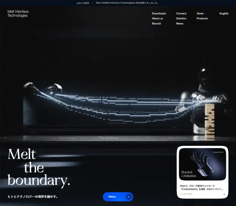
黒い背景の製品ビジュアル、大きなセリフ体のコピー、青いメニューボタンが印象的なインターフェース技術企業の公式サイト。ニュースカードや見出しの配置をスマートフォン向けに組み替えています。
オリジナルサイトを見るMelt Interface Technologies — Style Reference
A dark stage for human–machine interfaces, framed by quiet navigation and an expressive serif statement.
Website: melt-interface-technologies.com Original URL: https://melt-interface-technologies.com/ Final URL: https://melt-interface-technologies.com/ Response: HTTP 200; no redirect recorded. Theme: a dark opening composition with white information sections and a dark product section documented in the DOM; no theme switch was verified. Inspected evidence: September 13, 2026, 04:19:46 JST — September 12, 2026, 19:19:46 UTC. Viewports: 1440 × 1000 and 390 × 844 CSS pixels. Scope: the current Japanese corporate homepage. Visual inspection covers the supplied opening desktop and mobile captures. Rendered DOM evidence additionally covers company information, product sections, recruitment, contact, and navigation structures. Their complete visual states and interactions were not captured.
Melt Interface Technologies places a pale, particle-like product visualization against an almost black field. A small two-line wordmark occupies the upper left, while compact English navigation spreads across the upper right. The large white statement, “Melt / the / boundary.”, sits near the lower left on desktop. Its high-contrast serif lettering provides the main typographic expression; the surrounding interface uses restrained sans-serif text.
Two compact objects complete the opening composition: a white news card at the lower right and an electric-blue Menu capsule at the bottom center. The news card introduces current business activity without becoming the central message. On mobile, the headline moves beneath the header, the news becomes a horizontal strip, and the Menu remains centered near the bottom. The supplied mobile captures show a largely empty dark media field; they do not establish why the desktop visualization is absent.
This is a corporate homepage with company, product, recruitment, contact, documentation, and store destinations. Its design reference should preserve that information architecture alongside the dramatic opening view.
How to Read This Reference
- Measured means supplied computed styles, element rectangles, or custom-property values. Measurements are CSS pixels unless stated otherwise.
- Visually observed means visible in the original-page desktop or mobile captures. Small geometry estimates are labeled explicitly.
- DOM-only means an element exists in the rendered evidence but its complete presentation is not visible in the supplied captures. A rectangle alone does not prove visibility.
- Calculated means arithmetic derived from measured values, such as line-height ratios or reconstructed grid tracks.
- Recommended means guidance for a new implementation. CSS aliases, breakpoints, fallback behavior, and accessibility additions below are adaptations unless identified as source declarations.
- The original root font size is 10px at both inspected viewports. The Quick Start uses explicit pixel tokens so it can coexist with a conventional application root.
- The three desktop captures repeat the opening composition; the two mobile captures repeat their corresponding opening composition. They do not supply a verified sequence of animation or navigation states.
Tokens — Colors
Default Palette
| Name | Value | Evidence | Role |
|---|---|---|---|
| Interface Navy | #060F1B |
Source --diver-x-color-black; computed body and news text |
Main dark text on white surfaces; useful dark-shell reconstruction color |
| Product Night | #05070C |
Computed Contact™ section background | Deep, nearly black product surface |
| White | #FFFFFF |
Computed hero text and company/contact section backgrounds; visible news surface | Reversed text and primary light surfaces |
| Interface Blue | #012CF5 |
Source --diver-x-color-blue; computed Recruit button fill |
Verified action color; the Menu is visibly vivid blue, but its exact painted fill was not included in the sampled elements |
| Metadata Gray | #A7A7A7 |
Source --diver-x-color-gray; computed announcement and business subtitles |
Quiet secondary information |
| Contact Copy Gray | #5A5A64 |
Computed contact paragraph | Supporting text on white |
| Shell Charcoal | #23232D |
Computed body background; source --diver-x-color-blue-dark |
Underlying page surface, frequently covered by other layers |
| Deep Media Black | Approximately #000000 |
Visual estimate | Large empty areas within the opening media composition |
| Pale Particle Green | Pale mint-white; exact value unmeasured | Desktop capture only | Highlight color inside the product imagery, not a general interface accent |
The opening field is not a flat rendering of the body background. Its visible darkness comes from the media and other painted layers. Likewise, the news link itself computes to a transparent background and zero border radius, while the screenshot clearly shows a rounded white surface. The sampled anchor does not expose the layer responsible for that shape.
Declared Supporting Colors
| Source token | Value | Interpretation |
|---|---|---|
--diver-x-color-gray-light |
#DCDCDC |
Declared supporting gray; a specific visible application was not established |
--diver-x-color-gray-light-30 |
#F5F5F5 |
Declared pale surface option; not the measured white company-section fill |
--diver-x-color-gray-text |
#5C5C5C |
Declared text gray; the sampled contact paragraph instead uses #5A5A64 |
--diver-x-color-white-a20 |
rgba(255,255,255,.2) |
Also measured on DOM-only index links |
| White opacity variants | .3, .4, .5, .9 |
Declared overlay/text ingredients; their complete rendered uses are unverified |
| Navy opacity variants | .1, .2, .4, .5, .9 |
Declared dark overlay ingredients |
--diver-x-color-orange |
#F53E01 |
Declared, but no use was verified in the supplied visible composition |
Do not turn every declared color into a visible palette requirement. Generic platform gradients, shadows, and control variables appear in the property inventory, but they do not establish the appearance of this homepage.
Tokens — Typography
Display Serif — Brand Statement
Source stack: "KT Flux 2", "Times New Roman", serif.
This stack is explicitly present in the computed H1 and Contact™ product name. The H1 uses weight 400, tracking -0.01em, and unusually tight leading. Its three deliberate lines read “Melt”, “the”, and “boundary.” The middle line is indented, creating a small sideways movement within an otherwise left-anchored block.
The wordmark is a separate visual element. Its parent link’s sans-serif declaration does not prove that the logo lettering is ordinary live text.
English Interface Sans
Source variable: --diver-x-font-family-en.
Declared stack: "area-variable", "Hiragino Kaku Gothic ProN", "Hiragino Sans", "BIZ UDPGothic", Meiryo, -apple-system, BlinkMacSystemFont, sans-serif.
Header links use a shorter computed stack beginning with area-variable. Section headings such as Who We Are and Products also use this family. Most sampled English interface text is weight 400, with little or no added tracking.
Japanese Text
Computed body stack: source-han-sans-japanese, YakuHanJPs, area-variable, "Hiragino Kaku Gothic ProN", "Hiragino Sans", "BIZ UDPGothic", Meiryo, -apple-system, system-ui, sans-serif.
Japanese product descriptions use regular weight; mission statements and news titles use weight 500. The provided HTML evidence includes a YakuHanJPs font-face declaration. The computed family lists establish the requested stacks, not an independent verification that every glyph used the first named face.
Type Scale
| Role | Desktop measured size / line height | Mobile measured size / line height | Weight and tracking |
|---|---|---|---|
| Announcement | 11 / 15.4px |
Same | 500; 0.22px tracking |
| Header utilities | 13 / 13px |
Approximately 12.901 / 12.901px |
400; normal tracking |
| Main H1 | 86.4 / 82.08px |
53.586 / 48.227px |
400; -0.01em |
| Japanese hero subtitle | 16 / 24px |
13 / 16.25px |
400 |
| News title | 11 / 16.5px |
Same | 500 |
| Who We Are / Products | 39 / 39px |
31 / 31px |
400 |
| Mission lines | 20 / 20px, plus 12px row gaps |
15 / 15px, plus 12px row gaps |
500 |
| Business Japanese headings | 20px, normal line height |
Approximately 11.363px, normal line height |
500; DOM-only |
| Business English subtitles | 13px |
Approximately 5.458px |
400; DOM-only |
| Product description | 13 / 22.75px |
Same | 400 |
| Contact™ display name | 100.8 / 100.8px |
40.6 / 40.6px |
400; -0.01em |
| Recruit heading | 31 / 31px |
Same | 400 |
| Get in touch | 61 / 61px |
39 / 39px |
400 |
| Contact paragraph | 15 / 26.25px |
Same | 400 |
Calculated leading: the H1 uses 0.95 on desktop and 0.9 on mobile. Product descriptions and contact copy use 1.75.
The mission paragraphs are measured as flex layouts with separate line boxes and 12px gaps. Their computed line-height: 20px or 15px is not a recommendation for tightly setting an ordinary multiline Japanese paragraph. For reusable prose, use a readable line height instead of copying the split-line mechanics.
Source Scale Caveat
Several source variables resemble fluid formulas but have equal minimum and maximum bounds. For example:
--diver-x-font-size-s-en: clamp(1.3rem, 1 / 1440 * 100 * 13vw, 1.3rem);
With the measured 10px root, those equal bounds resolve to 13px. They do not explain every responsive font change: actual elements receive additional rules or scaling. Reproduce the measured endpoints before attempting to infer a universal viewport formula.
Tokens — Spacing & Shapes
Spacing Scale
| Source or use | Measured value | Notes |
|---|---|---|
| Source spacing S | 2rem = 20px |
Declared at the measured root |
| Source spacing M | 3rem = 30px |
Also matches the desktop H1-to-subtitle gap |
| Source spacing L | 4rem = 40px |
Matches desktop page edges |
| Source spacing XL | 5rem = 50px |
Declared spacing token |
| Source spacing 3XL | 8rem = 80px |
Also matches the desktop company-heading-to-mission gap |
| Source spacing 5XL | 12rem = 120px |
Declared spacing token |
| Horizontal page inset | Desktop 40px; mobile 16px |
Source --diver-x-var-grid-h-pad and measured anchors |
| Grid row-gap variable | Desktop 20px; mobile 10px |
Source declaration |
| Utility link padding | Desktop 6.5px; mobile approximately 6.45px |
Sampled utility anchors |
| Mission line separation | 12px |
Flex row gap |
| Hero subtitle separation | Desktop 30px; mobile 19px |
Calculated from element rectangles |
| News title horizontal inset | Desktop 18px from outer link edge |
Calculated from rectangles |
| Mobile news title top inset | 13px |
Calculated from rectangles |
Border Radius
| Element or token | Value | Evidence status |
|---|---|---|
| Menu capsule | Fully rounded; approximately 24px effective radius at 48px height |
Visual estimate |
| Menu icon disc | Approximately 30px diameter |
Visual estimate |
| Desktop news outer surface | Approximately 35–40px corner radius |
Visual estimate; painted layer not sampled |
| Desktop news artwork | Approximately 25–30px corners |
Visual estimate |
| Mobile news surface | Approximately 10–12px corners |
Visual estimate |
| Recruit button | 999px |
Computed |
| Source radius XS / M / L / XL | Maximum values 10 / 30 / 50 / 80px |
Conditional source formulas, not universal applied radii |
The source medium-radius formula is:
max(0px, min(30px, calc((100vw - 15px - 100%) * 9999)))
It can collapse toward zero when the relevant width approaches the viewport. The containing context was not supplied for every use, so a radius token cannot be assigned to the news surface with certainty.
Layout Measurements
| Element | Desktop: 1440 × 1000 | Mobile: 390 × 844 |
|---|---|---|
| Announcement | 1440 × 30px, at the top |
390 × 25.313px, at the top |
| Header rectangle | y: 30px, height 70px |
y: 25.313px, height 70px |
| Wordmark link | x: 40px, y: 50px, 111.61 × 39px |
x: 16px, y: 40.969px, 110.719 × 38.688px |
| H1 | x: 40px, y: 659.766px, 381.172 × 246.234px |
x: 16px, y: 147px, 236.406 × 144.703px |
| Hero subtitle | x: 40px, y: 936px, height 24px |
x: 16px, y: 310.703px, height 16.25px |
| News link | x: 1084.078px, y: 651.313px, 315.922 × 308.688px |
x: 39px, y: 666px, 312 × 98px |
| News title | 279.922 × 33px |
142 × 49.5px |
| Menu silhouette | Approximately x: 640px, y: 926px, 160 × 48px |
Approximately x: 115px, y: 785px, 160 × 48px |
The Menu dimensions are taken from the visible silhouette. The DOM includes a separate Back link at the same general control location; its 100px width should not be mistaken for the full Menu capsule width.
Components
Announcement Strip
Role: communicates the corporate name change without displacing the main composition.
A shallow strip spans the viewport above the header. It combines the date July 1, 2026, a thin vertical divider, and the source announcement, “Diver-XはMelt Interface Technologiesに社名変更いたしました。” Text is gray, 11px, weight 500, with 0.02em tracking.
The source height is 3vh, producing 30px on desktop and approximately 25.32px on mobile. Desktop content is visually centered. On mobile, it runs beyond the right edge, and the DOM contains a repeated copy. This supports an overflow or ticker-like structure, but no travel direction, duration, or repeat behavior was verified.
Recommended: keep the announcement accessible as one readable text item. If a moving duplicate is added, hide the duplicate from assistive technology and provide a static reduced-motion state.
Corporate Header
Role: provides identity and direct access to the main corporate destinations.
The wordmark sits at the left edge of the shared content inset and remains approximately 111px wide on both viewports. The desktop navigation forms four loose columns:
| Column | Visible labels |
|---|---|
| First | Downloads, About us, Recruit |
| Second | Contact, Solution, News |
| Third | Store, Products |
| Fourth | English |
Text is white, regular sans-serif, approximately 13px. The first column begins around x: 927px; subsequent primary columns begin around 1078px and 1209px. Rows advance by approximately 27px.
The header element itself is only 70px tall, but the lowest desktop links extend to approximately y: 130px, below its nominal bottom at y: 100px. Do not clip navigation to that measured header rectangle.
On mobile, the visible utilities are Documents, Store, and EN. This includes a real destination change: Documents points to https://docs.diver-x.jp/, while desktop Downloads points to the original site’s /download route. Store points to the store subdomain in both cases. Small outward arrows appear beside the external utilities.
The DOM contains both Japanese and English variants at overlapping coordinates. The captures establish the visible English/EN option, not a verified dropdown interaction.
Hero Media Field
Role: makes the interface technology tangible through one large visual subject.
The desktop capture shows a dark glove-like device or hand interface surrounded by pale green-white particles. Its brightest area sits near the center of the viewport, while the background merges into deep black. The composition leaves the navigation clear above and allows the headline to occupy the lower left.
The subject is softly rendered, with luminous points and atmospheric falloff. It does not sit inside a bordered image card. Its visual boundary dissolves into the surrounding field.
The evidence does not identify whether the image is produced by video, a canvas renderer, a still asset, or another layer. No rendering library, shader technique, model format, or media duration is established.
The same subject is not visible in either supplied mobile capture. Preserve this observation as a limitation; do not claim that mobile deliberately disables video or 3D.
Three-Line Brand Statement
Role: presents the central brand proposition.
The H1 is a single semantic statement with three controlled visual lines. Use separate spans inside one H1 to retain the staggered arrangement while keeping a coherent accessible heading.
- First line: Melt.
- Second line: the, indented by approximately
1.1–1.2em, estimated visually. - Third line: boundary.
Only the final line carries the period in the source copy: “Melt the boundary.” The list above describes line placement, not replacement punctuation.
On desktop, the full copy group terminates 40px above the viewport bottom. The heading occupies approximately 381px of width, followed by a 30px gap and the Japanese subtitle “ヒトとテクノロジーの境界を融かす。”
On mobile, the H1 starts at y: 147px, beneath the header, instead of remaining bottom anchored. Its width reduces to approximately 236px. The subtitle sits 19px below the heading box. Keep the intentional line breaks when extending the design; automatic wrapping will usually lose its distinctive silhouette.
Featured News Card
Role: offers one current news item from within the opening view.
The entire measured card is an anchor to /news/422/. Its content concerns the collaboration between Melt Interface Technologies and ugo, with the date Sep 09, 2026. The partner names inside its artwork describe the article; they are not website-production credits.
Desktop anatomy:
- A rounded white outer surface, approximately
316 × 309px. - A large inset artwork panel, visually about
291 × 201px, with rounded corners. - A Japanese title at 11px/16.5px, weight 500, restricted to two visible lines.
- A small gray date near the lower left.
- A small blue right arrow near the lower right.
The outer card ends at x: 1400px and y: 960px, matching the 40px desktop margins.
Mobile anatomy: the card becomes a 312 × 98px horizontal strip, centered at x: 39px. Its width is exactly 80% of the measured viewport. The artwork occupies approximately 138px at the left. The title starts at x: 197px, consistent with an approximately 20px image-to-copy gap. The title uses three visible lines, followed by the date. No separate arrow is clearly visible in the mobile captures.
Keep the artwork intact where practical. Its white background, partner logos, and compact Japanese announcement are part of the supplied article graphic. Rebuilding that text as decorative CSS would lose fidelity and could introduce incorrect content.
Bottom Menu Capsule
Role: a prominent navigation entry point that remains easy to locate within the opening composition.
A blue capsule approximately 160 × 48px is centered horizontally. The word Menu sits toward the left; a darker blue circular well at the right contains a small two-line glyph. The disc is about 30px across with approximately 9px of surrounding inset.
The observed bottom clearance is approximately 26px on desktop and 11px relative to the measured mobile viewport. On mobile, the news card ends at y: 764px, leaving a 21px gap before the Menu begins at y: 785px.
The capture establishes placement and appearance. It does not establish whether the control remains fixed during scrolling, how it opens, or whether its icon morphs. Fixed positioning in the Quick Start is a reconstruction choice for the opening view.
Company Introduction — DOM-Only Layout
Role: explains the company mission and its three business areas.
The Who We Are section has a measured white background and dark navy text. On desktop, its rectangle starts at y: 1100px and is 1000px tall. The heading starts 190px into that section. A left text column is approximately 473px wide, followed by an About us link.
The three business text groups are staggered rather than sharing a common horizontal baseline. Their source labels identify general-purpose interfaces, industrial interfaces, and solutions, with the English subtitles From everyday life, In the field, and At the core. The industrial group is higher than the other two in both viewport records.
On mobile, the section starts at y: 844px and is approximately 962px tall. The mission copy sits above the three business groups. The extremely small measured English subtitles, approximately 5.46px, belong to this DOM-only composition. Their final readability and surrounding graphics cannot be evaluated from the hero captures.
Recommended: retain the three-part meaning and staggered visual idea, but reflow the groups or increase text size when adapting them for a readable phone interface.
Product Presentations — DOM-Only Layout
Role: separates general interface products from the Contact™ product family.
Both product presentations use a small English section heading, a large central presentation area, descriptive Japanese copy, and a More Detail link. The Contact™ presentation additionally includes a large serif product name and a measured #05070C background with white text.
On desktop, descriptions are approximately 374px wide at the lower left; More Detail sits near the lower right. On mobile, descriptions expand to 358px between the 16px page edges, and More Detail follows below at the left. Body typography remains 13px/22.75px.
The desktop rectangles for both product sections overlap at y: 2100px, each measuring 1000px high. On mobile, they occupy sequential positions: approximately y: 1806px and 2481px. This supports different desktop and mobile layout mechanics, but does not prove a particular pinning or scroll-transition implementation.
The provided links target /products#melt and /products#contact. Those destination pages were not independently inspected.
Recruitment and Contact — DOM-Only Layout
Role: provides hiring and inquiry paths after the company and product material.
The recruitment section has a white outer container and a centered internal text group. Its RECRUIT heading is 31px, with a short Japanese invitation and a blue Recruit pill. The button is measured at approximately 107 × 31px, with 999px radius, 13px type, and #012CF5 fill. The supplied element sample does not reveal the full visual background behind its white heading.
Get in touch returns to a large left-aligned sans-serif heading: 61px on desktop and 39px on mobile. Its support paragraph is 15px/26.25px in #5A5A64. Desktop copy occupies a right-side column beginning near x: 927px; mobile copy aligns to x: 16px and spans the available content width.
The contact section uses generous vertical spacing: measured padding is 140px 40px on desktop and 80px 16px 140px on mobile. Keep these spacious section transitions separate from the much tighter header and news typography.
Extended Navigation Structures — DOM-Only
The rendered text includes a large-title navigation structure containing Better Control, About us, Solutions, Products, Recruit, and News; Click to Dive labels; an index row; and Scroll / Drag or Swipe guidance. Several headings are positioned outside the viewport.
Another navigation structure includes Top, company/product routes, Story, Downloads, Contact, social links, language options, Site Policy, and Online Store. Its sampled link positions form three groups on desktop and two main groups on mobile.
These elements are not visible in the supplied opening captures. Do not combine them with the H1 into one crowded hero or invent an expanded-menu screenshot from their rectangles. The evidence establishes labels, routes, some typography, and transition declarations; opening, dragging, swiping, and closing remain unverified.
Tokens — Motion & Interaction
| Element | Supplied declaration | What is established |
|---|---|---|
| Header | top 0.7s cubic-bezier(0.19, 1, 0.22, 1) |
A timed top-position transition is declared; its trigger and travel distance are unknown |
| Header utility links | opacity 0.25s cubic-bezier(0.104, 0.204, 0.492, 1) |
Opacity is a defined transition property; endpoint values were not supplied |
| Language links | color 0.35s cubic-bezier(0.104, 0.204, 0.492, 1) |
Color transition timing is known; selection behavior is untested |
| Featured news anchor | translate 0.3s and filter 0.3s, with the same utility easing |
Translation/filter transitions are declared; displacement and filter targets are unknown |
| About us and sampled detail links | color 0.25s with the utility easing |
Short color response is declared |
| Extended navigation links | opacity 0.15s with the utility easing |
Short opacity response exists in a DOM-only state |
| DOM-only Back link | translate 0.5s cubic-bezier(0.472, 0.04, 0.526, 1); opacity and visibility 0.25s |
Transition properties are known for this separate control |
| Hero imagery | No media timing or renderer supplied | Motion technique, duration, autoplay, and looping are unverified |
| Mobile announcement | Repeated text in an overflowing strip | Duplication is established; marquee timing is unverified |
The computed animation: none on sampled text elements does not establish that the entire page is static. Media, canvas rendering, parent transforms, and JavaScript-driven behavior are outside that conclusion.
The capture process waited for document load, sampled stability, finite animation readiness, and visible image decoding within bounded limits. It paused perpetual animations during readiness checks and resumed them afterward. This is not a recording of animation behavior.
For a new implementation, reuse the measured short easing curves where appropriate. Choose and label hover endpoints independently. Do not present an invented spring, parallax distance, orbit, menu morph, or scroll-scrubbing sequence as an observed feature.
Surfaces
| Layer | Appearance | Evidence and purpose |
|---|---|---|
| Body foundation | #23232D |
Computed base; largely covered in the opening view |
| Opening media field | Almost black with soft luminous product detail | Visually observed desktop stage |
| Announcement band | Dark navy appearance, gray text | Visually observed; text color measured, exact band fill not isolated |
| Header | Transparent with white identity and utilities | Computed and visually observed |
| Featured news | Solid white, strongly rounded | Visually observed; inner paint mechanism unverified |
| Menu | Vivid blue capsule with a darker circular icon well | Visually observed |
| Company section | White with navy text | DOM measured; complete screenshot unavailable |
| Contact™ section | #05070C with white text |
DOM measured; complete screenshot unavailable |
| Contact section | White with navy heading and gray copy | DOM measured; complete screenshot unavailable |
The visible opening interface uses contrast and placement for separation. There is no evidence of a general glass panel treatment or a broad card-elevation system. Platform shadow presets should not be applied merely because they appear in the custom-property inventory.
Imagery
The desktop hero’s language is technological but atmospheric: dark hardware, a recognizable hand-related form, pale point-like illumination, and a black environment without a visible frame. The visual subject dominates through light and scale rather than saturated color.
Preserve the softness of the luminous particles and the low-key background. A flat vector hand, a generic dashboard illustration, or a brightly lit stock photograph would change the balance between the tactile product and the restrained interface.
The news artwork is deliberately different: a white information graphic containing the two partner wordmarks and compact announcement text. Its role is documentary. It should stay legible and contained within the card instead of inheriting the hero’s atmospheric treatment.
Observed Asset References
| Asset | Available evidence | Implementation limit |
|---|---|---|
| Two-line corporate wordmark | Visible in desktop and mobile captures; link bounds measured | No original image or vector asset URL was supplied |
| Glove-like hero visualization | Visible in the original desktop captures | No image, video, model, or canvas asset URL was supplied |
| Partnership news graphic | Visible within the card linked to /news/422/ |
The article href identifies its destination, not the raw artwork file |
| External-link marks and Menu glyph | Visible small interface symbols | Exact symbol definitions were not included in the sampled elements |
| Lower-section media | Content references and section rectangles only | Subject matter and crop cannot be reconstructed reliably |
Use supplied project assets when implementing this reference. The CSS below reproduces the interface arrangement; it cannot recreate the product visualization or company wordmark from the evidence alone.
Layout & Responsive Behavior
Reconstructed Grid
The source declares 14 columns and four rows on desktop, then six columns and six rows on mobile. Several measured widths are consistent with the following reconstruction:
| Calculation | Desktop | Mobile |
|---|---|---|
| Available width after page edges | 1440 − 80 = 1360px |
390 − 32 = 358px |
| Assumed horizontal gap consistent with measurements | 20px |
10px |
| Calculated track width | (1360 − 13 × 20) / 14 ≈ 78.571px |
(358 − 5 × 10) / 6 ≈ 51.333px |
| Calculated four-column span | Approximately 374.286px |
Approximately 235.333px |
| Calculated five-column span | Approximately 472.857px |
Approximately 296.667px |
The desktop four- and five-column calculations match the sampled product and company text widths closely. The horizontal gaps are a reconstruction supported by those dimensions; the supplied variable explicitly names a row gap rather than exposing a complete active grid declaration.
Observed Changes
| Relationship | Desktop | Mobile |
|---|---|---|
| Main page edges | 40px | 16px |
| Header navigation | Several rows across four loose columns | Documents, Store, EN in one compact row |
| H1 placement | Lower left | Upper left beneath the header |
| Hero media | Product and particle visualization visible | Visualization not visible in supplied frames |
| News format | Vertical card at lower right | Horizontal strip centered near the bottom |
| News title | Two visible lines | Three visible lines |
| Menu | Bottom center | Bottom center, below the news strip |
| Product details | Copy left, action right | Copy full width, action below left |
| Contact copy | Right-side column | Full content width |
The exact breakpoint between these layouts is not supplied. A 767px breakpoint in the Quick Start is a recommendation, not recovered source CSS. Test intermediate widths, landscape phones, text zoom, and safe-area devices before treating it as a complete responsive system.
Scroll and Visibility Limitations
The reported document height equals the viewport at both sizes: 1000px and 844px. Meanwhile, MAIN measures approximately 6120.75px on desktop and 5165.59px on mobile. Some content extends beyond the viewport, and some desktop section rectangles overlap.
These measurements suggest a constrained or transformed presentation, but they do not identify the exact scrolling mechanism. The supplied frames do not show successful navigation through the lower sections. Avoid equating MAIN height with a verified native page-scroll length.
For an adaptation, begin with accessible document flow and enhance it only after the intended navigation states can be tested. Keep critical destinations reachable if media or scripted presentation fails.
Do’s and Don’ts
Do
- Preserve the relationship between the dark media stage, white typography, white news surface, and concentrated blue action color.
- Use the source serif stack for the main statement and the source sans-serif stacks for utilities and explanatory copy.
- Keep the three H1 lines and the indented middle line intentional.
- Align desktop copy and card edges to the measured 40px margins; use 16px for ordinary mobile content edges.
- Treat the mobile news strip as a component reconfiguration with its own geometry.
- Keep the wordmark compact and almost unchanged in width across the two observed layouts.
- Maintain company, product, recruitment, contact, documentation, language, and store routes as part of the corporate information architecture.
- Separate DOM-only observations from screenshot-confirmed appearance.
- Provide a coherent dark static media fallback while retaining all essential text and links.
Don’t
- Don’t fill the opening space with extra feature cards, badges, or competing primary buttons.
- Don’t use the media’s pale green as a general action color.
- Don’t assume the source blue token is the exact sampled Menu gradient or fill.
- Don’t replace the display serif with a bold geometric sans-serif throughout.
- Don’t shrink the desktop arrangement uniformly to fit a phone; the headline and news card actually move and restructure.
- Don’t convert latent large navigation headings into additional visible hero copy.
- Don’t infer a renderer, autoplay sequence, menu-opening animation, or working swipe interaction from labels alone.
- Don’t copy the approximately 5.46px DOM-only mobile subtitles into ordinary readable content.
- Don’t interpret transparent anchor backgrounds or zero anchor radii as proof that the visible news card has no white surface or rounding.
- Don’t invent asset paths, production credits, or lower-section imagery.
Recommended Implementation Additions
These recommendations are not verified features of the original site:
- Implement Menu as a keyboard-operable button with an accurate expanded state. Connect it to a tested navigation panel and return focus when that panel closes.
- Keep hidden navigation states out of the tab order and accessibility tree. Present one accessible copy of duplicated labels.
- Enlarge compact navigation and recruitment hit targets toward 44px without changing their visual text scale unnecessarily.
- Provide visible focus indicators on both white and dark surfaces.
- Keep the complete news title in the accessible link text even when the visual text is clamped.
- Increase tiny secondary text in adaptations where it conveys essential information; reflow the business groups instead of shrinking them indefinitely.
- If hero media moves automatically, provide appropriate pause and reduced-motion behavior. Use a meaningful poster or static composition when playback is unavailable.
- Add safe-area clearance below the floating Menu and reserve space so it cannot cover content.
- Preserve readable announcement text without requiring users to follow an endlessly moving strip.
- Verify mobile media behavior directly before deciding that the empty captured field is the intended permanent design.
Agent Prompt Guide
Quick Color Reference
- Main dark text:
#060F1B. - Verified dark product surface:
#05070C. - Reversed text and light sections:
#FFFFFF. - Verified brand action token:
#012CF5. - Secondary labels:
#A7A7A7. - Contact body copy:
#5A5A64. - Underlying body:
#23232D. - Hero highlights: pale green-white inside the imagery; no exact color token established.
Overall Prompt
“Create a Japanese interface-technology corporate homepage using a near-black opening media stage, a compact two-line wordmark at the upper left, and small white English utility links at the upper right. Set ‘Melt the boundary.’ as a large regular-weight display serif on three deliberately staggered lines, with a short Japanese subtitle beneath it. Anchor that copy near the lower left on desktop. Add one rounded white news card at the lower right and a 160 × 48px vivid-blue Menu capsule at the bottom center. On a 390px-wide phone, move the headline beneath the header, show Documents, Store, and EN as utilities, and convert the news into a centered 312 × 98px horizontal strip. Use supplied product media and brand assets. Keep unavailable imagery and unverified navigation motion as explicit implementation tasks.”
Example Component Prompts
- Header: “A transparent corporate header over a black stage. Use a roughly 111px-wide two-line wordmark, 40px desktop side insets, and four loose columns of regular 13px white English links. On mobile, use 16px edges and a single Documents / Store / EN utility row. Preserve the different documentation destinations.”
- Brand statement: “One semantic H1 with the lines Melt, the, and boundary. Use KT Flux 2 when supplied, with Times New Roman and serif fallbacks. Set 86.4px type, 0.95 leading, and −0.01em tracking on the reference desktop. Indent the second line by about 1.15em. At the reference phone width, use approximately 53.586px and 0.9 leading.”
- News card: “One whole-card article link with a white rounded surface. Desktop is approximately 316 × 309px, with inset partnership artwork, two lines of 11px Japanese title text, a small gray date, and a small blue arrow. Mobile is 312 × 98px, with artwork at left, three title lines at right, and a date beneath.”
- Menu control: “A centered 160 × 48px blue pill labeled Menu, with a darker 30px circular well containing a tiny two-line glyph. Implement accessible open and close behavior separately; no original opening animation has been verified.”
- Company section adaptation: “A white company-information section with a restrained English heading and Japanese mission copy. Use a five-column desktop text span within a reconstructed fourteen-column grid, then place three business-area groups in a staggered composition. On mobile, place mission text first and keep all business labels readable instead of scaling them to miniature text.”
Quick Start
CSS Custom Properties
This is a static reconstruction of the verified opening arrangement, with a few reusable section primitives. It does not reproduce the original scrolling system, latent menu states, or media renderer. Desktop and mobile endpoint dimensions come from the evidence; the breakpoint, painted Menu approximation, corner radii, and focus treatment are recommendations.
Font files and original media URLs were not supplied. The named stacks fall back until a project provides the corresponding assets. All sizes below use explicit pixels rather than requiring the source’s 10px root.
:root {
  /* Source colors and explicit reconstruction aliases */
  --color-ink: #060f1b;
  --color-product-night: #05070c;
  --color-shell: #23232d;
  --color-white: #fff;
  --color-action: #012cf5;
  --color-muted: #a7a7a7;
  --color-contact-copy: #5a5a64;
  --color-media-fallback: #000;

  --font-display: 'KT Flux 2', 'Times New Roman', serif;
  --font-en: 'area-variable', 'Hiragino Kaku Gothic ProN',
    'Hiragino Sans', 'BIZ UDPGothic', Meiryo, system-ui, sans-serif;
  --font-ja: 'source-han-sans-japanese', YakuHanJPs,
    'area-variable', 'Hiragino Kaku Gothic ProN', 'Hiragino Sans',
    'BIZ UDPGothic', Meiryo, system-ui, sans-serif;

  --page-inset: 40px;
  --grid-columns: 14;
  --grid-gap: 20px;
  --announcement-height: 3vh;
  --header-height: 70px;
  --space-s: 20px;
  --space-m: 30px;
  --space-l: 40px;
  --space-xl: 50px;
  --space-3xl: 80px;
  --space-5xl: 120px;

  --text-hero: 86.4px;
  --leading-hero: 0.95;
  --text-section: 39px;
  --text-utility: 13px;
  --text-news: 11px;
  --hero-copy-bottom: 40px;
  --news-width: 315.922px;
  --news-bottom: 40px;
  --menu-bottom: 26px;

  /* Visual approximations; not sampled applied radii */
  --radius-news: 38px;
  --radius-news-art: 28px;
  --radius-pill: 999px;

  --ease-interface: cubic-bezier(0.104, 0.204, 0.492, 1);
  --ease-header: cubic-bezier(0.19, 1, 0.22, 1);
  --safe-bottom: env(safe-area-inset-bottom, 0px);
}

* {
  box-sizing: border-box;
}

body {
  margin: 0;
  color: var(--color-ink);
  background: var(--color-shell);
  font-family: var(--font-ja);
}

button,
a {
  -webkit-tap-highlight-color: transparent;
}

.melt-hero {
  position: relative;
  isolation: isolate;
  min-height: 100vh;
  min-height: 100svh;
  color: var(--color-white);
  background: var(--color-media-fallback);
}

.hero-media {
  position: absolute;
  inset: 0;
  z-index: -1;
  overflow: hidden;
  background: linear-gradient(#050b12, #000 65%, #03080e);
}

.hero-media :is(img, video, canvas) {
  display: block;
  width: 100%;
  height: 100%;
  object-fit: cover;
}

.announcement {
  position: absolute;
  inset: 0 0 auto;
  display: flex;
  align-items: center;
  justify-content: center;
  height: var(--announcement-height);
  margin: 0;
  padding-inline: var(--page-inset);
  overflow: hidden;
  white-space: nowrap;
  color: var(--color-muted);
  background: var(--color-ink);
  font: 500 11px/1.4 var(--font-en);
  letter-spacing: 0.02em;
}

.announcement time {
  margin-right: 18px;
  padding-right: 18px;
  border-right: 1px solid rgb(255 255 255 / 25%);
}

.site-header {
  position: absolute;
  top: var(--announcement-height);
  left: 0;
  z-index: 2;
  display: flex;
  justify-content: space-between;
  width: 100%;
  min-height: var(--header-height);
  padding: 20px var(--page-inset) 0;
  transition: top 700ms var(--ease-header);
}

.brand {
  display: block;
  flex: none;
  width: 111.61px;
  height: 39px;
  color: inherit;
}

.brand :is(img, svg) {
  display: block;
  width: 100%;
  height: 100%;
  object-fit: contain;
}

.desktop-nav {
  display: grid;
  grid-template-columns: 86px 66px 63px 63px;
  column-gap: 65px;
  padding-top: 13px;
}

.nav-column {
  display: flex;
  flex-direction: column;
  align-items: flex-start;
  gap: 14px;
}

.site-header a:not(.brand) {
  color: inherit;
  font: 400 var(--text-utility)/1 var(--font-en);
  text-decoration: none;
  transition: opacity 250ms var(--ease-interface);
}

.mobile-nav {
  display: none;
}

.hero-copy {
  position: absolute;
  left: var(--page-inset);
  bottom: var(--hero-copy-bottom);
  width: max-content;
  max-width: calc(100% - 2 * var(--page-inset));
}

.hero-title {
  margin: 0;
  font: 400 var(--text-hero)/var(--leading-hero) var(--font-display);
  letter-spacing: -0.01em;
}

.hero-title span {
  display: block;
}

.hero-title .middle-line {
  padding-left: 1.15em;
}

.hero-subtitle {
  margin: 30px 0 0;
  font: 400 16px/24px var(--font-ja);
}

.news-card {
  position: absolute;
  right: var(--page-inset);
  bottom: var(--news-bottom);
  display: block;
  width: var(--news-width);
  height: 308.688px;
  padding: 12px;
  overflow: hidden;
  border-radius: var(--radius-news);
  color: var(--color-ink);
  background: var(--color-white);
  text-decoration: none;
  transition: translate 300ms var(--ease-interface),
    filter 300ms var(--ease-interface);
}

.news-art {
  height: 201px;
  overflow: hidden;
  border-radius: var(--radius-news-art);
  background: var(--color-white);
}

.news-art img {
  display: block;
  width: 100%;
  height: 100%;
  object-fit: contain;
}

.news-meta {
  min-width: 0;
  padding: 20px 6px 6px;
}

.news-title {
  display: -webkit-box;
  margin: 0;
  overflow: hidden;
  -webkit-box-orient: vertical;
  -webkit-line-clamp: 2;
  font: 500 var(--text-news)/16.5px var(--font-ja);
}

.news-date {
  display: block;
  margin-top: 8px;
  color: var(--color-muted);
  font: 400 11px/1.4 var(--font-en);
}

.news-arrow {
  position: absolute;
  right: 18px;
  bottom: 15px;
  color: var(--color-action);
}

.menu-toggle {
  position: fixed;
  left: 50%;
  bottom: max(var(--menu-bottom), var(--safe-bottom));
  z-index: 10;
  display: grid;
  grid-template-columns: 1fr 30px;
  align-items: center;
  width: 160px;
  height: 48px;
  padding: 9px 9px 9px 30px;
  translate: -50% 0;
  border: 0;
  border-radius: var(--radius-pill);
  color: var(--color-white);
  background: var(--color-action);
  font: 400 13px/1 var(--font-en);
  text-align: left;
  cursor: pointer;
}

.menu-disc {
  display: grid;
  place-content: center;
  gap: 3px;
  width: 30px;
  height: 30px;
  border-radius: 50%;
  background: rgb(6 15 27 / 30%);
}

.menu-disc::before,
.menu-disc::after {
  content: '';
  width: 10px;
  height: 1px;
  background: currentColor;
}

/* Reusable section primitives, not the original scroll system. */
.content-grid {
  display: grid;
  grid-template-columns: repeat(var(--grid-columns), minmax(0, 1fr));
  gap: var(--grid-gap);
  margin-inline: var(--page-inset);
}

.section-light {
  color: var(--color-ink);
  background: var(--color-white);
}

.section-dark {
  color: var(--color-white);
  background: var(--color-product-night);
}

.section-title {
  margin: 0;
  font: 400 var(--text-section)/1 var(--font-en);
}

.product-copy {
  max-width: 374.286px;
  font: 400 13px/1.75 var(--font-ja);
}

/* Recommended focus treatment and hover endpoint. */
:where(a, button):focus-visible {
  outline: 2px solid white;
  outline-offset: 3px;
  box-shadow: 0 0 0 5px var(--color-ink);
}

@media (hover: hover) {
  .site-header a:not(.brand):hover {
    opacity: 0.7;
  }
}

/* Recommended breakpoint; only the endpoint layouts were inspected. */
@media (max-width: 767px) {
  :root {
    --page-inset: 16px;
    --grid-columns: 6;
    --grid-gap: 10px;
    --text-hero: 53.586px;
    --leading-hero: 0.9;
    --text-section: 31px;
    --text-utility: 12.9008px;
    --news-width: 80vw;
    --news-bottom: 80px;
    --menu-bottom: 11px;
    --radius-news: 12px;
    --radius-news-art: 12px;
  }

  .announcement {
    justify-content: flex-start;
    padding-inline: 0;
  }

  .site-header {
    padding-top: 16px;
  }

  .brand {
    width: 110.719px;
    height: 38.688px;
  }

  .desktop-nav {
    display: none;
  }

  .mobile-nav {
    display: flex;
    align-items: flex-start;
    gap: 7px;
    padding-top: 6px;
  }

  .mobile-nav a {
    padding: 6.45px;
  }

  .mobile-nav a:last-child {
    padding-inline: 0;
  }

  .hero-copy {
    top: 147px;
    bottom: auto;
  }

  .hero-subtitle {
    margin-top: 19px;
    font-size: 13px;
    line-height: 16.25px;
  }

  .news-card {
    right: auto;
    left: 50%;
    display: grid;
    grid-template-columns: 138px minmax(0, 1fr);
    gap: 20px;
    height: 98px;
    padding: 0 12px 0 0;
    transform: translateX(-50%);
  }

  .news-art {
    height: 98px;
  }

  .news-meta {
    padding: 13px 0 0;
  }

  .news-title {
    -webkit-line-clamp: 3;
  }

  .news-date {
    margin-top: 4px;
  }

  .news-arrow {
    display: none;
  }

  .product-copy {
    max-width: none;
  }
}

/* Recommended safeguard beyond the measured 390px endpoint. */
@media (max-width: 359px) {
  .news-card {
    width: calc(100% - 32px);
    grid-template-columns: 40% minmax(0, 1fr);
    gap: 12px;
  }

  .hero-title {
    font-size: clamp(44px, 13.74vw, 53.586px);
  }
}

@media (prefers-reduced-motion: reduce) {
  .site-header,
  .site-header a,
  .news-card {
    transition: none;
  }
  /* Pause media and scripted motion in the application as well. */
}
Component Markup Contract
Use .hero-media for supplied imagery, .hero-copy for the statement, .news-card for the whole article link, and .menu-toggle for the navigation button. The two key text components can begin as follows:
<div class='hero-copy'>
  <h1 class='hero-title'>
    <span>Melt</span>
    <span class='middle-line'>the</span>
    <span>boundary.</span>
  </h1>
  <p class='hero-subtitle' lang='ja'>
    ヒトとテクノロジーの境界を融かす。
  </p>
</div>

<a class='news-card' href='https://melt-interface-technologies.com/news/422/'>
  <div class='news-art'>
    <!-- Insert the supplied article artwork here. -->
  </div>
  <div class='news-meta'>
    <p class='news-title' lang='ja'>
      Melt Interface Technologiesとugoが業務提携、ヒューマノイド向けデータ収集デバイスを共同開発
    </p>
    <time class='news-date' datetime='2026-09-09'>Sep 09, 2026</time>
  </div>
  <span class='news-arrow' aria-hidden='true'>→</span>
</a>
The markup intentionally leaves artwork insertion explicit. Connect the Menu button to a real navigation implementation before presenting it as functional. The original expanded state is outside this reference’s visually verified scope.
Tailwind v4 Token Mapping
Optional mapping for a project already using Tailwind v4. This is an implementation convenience, not evidence that the original site uses Tailwind. Define the custom properties above first.
@theme inline {
  --color-interface-ink: var(--color-ink);
  --color-interface-night: var(--color-product-night);
  --color-interface-action: var(--color-action);
  --color-interface-muted: var(--color-muted);
  --color-interface-white: var(--color-white);

  --font-interface-display: var(--font-display);
  --font-interface-en: var(--font-en);
  --font-interface-ja: var(--font-ja);

  --text-interface-hero: var(--text-hero);
  --text-interface-section: var(--text-section);
  --text-interface-utility: var(--text-utility);
  --text-interface-news: var(--text-news);

  --spacing-page-inset: var(--page-inset);
  --spacing-interface-gap: var(--grid-gap);
  --radius-interface-news: var(--radius-news);
  --radius-interface-pill: var(--radius-pill);
}
Sources & Evidence
- Inspected original and final website: Melt Interface Technologies. Both supplied URLs are identical, with HTTP 200. The page title is Melt Interface Technologies Inc.; the rendered copyright names Melt Interface Technologies.
- Capture record:
2026-09-12T19:19:46.398Z, equivalent to September 13, 2026, 04:19:46.398 JST. Recorded browser viewports are 1440 × 1000 and 390 × 844 CSS pixels. - Visual evidence: three supplied desktop frames and two supplied mobile frames of the original homepage opening view. These establish the visible composition, responsive rearrangement, media appearance, wordmark, news artwork, and Menu silhouette.
- Rendered evidence: supplied text, link destinations, custom properties, and computed element styles and rectangles. These establish exact colors where measured, font stacks, type sizes, section geometry, and declared transition properties.
- News destination: the featured original-site article is present as the card href. Its destination page was not independently opened, and the href is not a raw image URL.
- Inspection limits: no independently exercised Menu, language, hover, drag, swipe, media playback, or lower-page traversal result is supplied. Several DOM elements occupy latent, overlapping, or offscreen states. Bounded readiness checks do not establish semantic completeness or explain the absent mobile visualization. SharedWorkers and service workers were disabled during capture.
This reference describes the current homepage evidence supplied for this inspection. Estimates, reconstructed layout rules, and implementation additions are labeled separately from measured source values.
# Melt Interface Technologies — Style Reference

> A dark stage for human–machine interfaces, framed by quiet navigation and an expressive serif statement.

**Website:** [melt-interface-technologies.com](https://melt-interface-technologies.com/)
**Original URL:** https://melt-interface-technologies.com/
**Final URL:** https://melt-interface-technologies.com/
**Response:** HTTP 200; no redirect recorded.
**Theme:** a dark opening composition with white information sections and a dark product section documented in the DOM; no theme switch was verified.
**Inspected evidence:** September 13, 2026, 04:19:46 JST — September 12, 2026, 19:19:46 UTC.
**Viewports:** 1440 × 1000 and 390 × 844 CSS pixels.
**Scope:** the current Japanese corporate homepage. Visual inspection covers the supplied opening desktop and mobile captures. Rendered DOM evidence additionally covers company information, product sections, recruitment, contact, and navigation structures. Their complete visual states and interactions were not captured.

Melt Interface Technologies places a pale, particle-like product visualization against an almost black field. A small two-line wordmark occupies the upper left, while compact English navigation spreads across the upper right. The large white statement, “Melt / the / boundary.”, sits near the lower left on desktop. Its high-contrast serif lettering provides the main typographic expression; the surrounding interface uses restrained sans-serif text.

Two compact objects complete the opening composition: a white news card at the lower right and an electric-blue Menu capsule at the bottom center. The news card introduces current business activity without becoming the central message. On mobile, the headline moves beneath the header, the news becomes a horizontal strip, and the Menu remains centered near the bottom. The supplied mobile captures show a largely empty dark media field; they do not establish why the desktop visualization is absent.

This is a corporate homepage with company, product, recruitment, contact, documentation, and store destinations. Its design reference should preserve that information architecture alongside the dramatic opening view.

## How to Read This Reference

- **Measured** means supplied computed styles, element rectangles, or custom-property values. Measurements are CSS pixels unless stated otherwise.
- **Visually observed** means visible in the original-page desktop or mobile captures. Small geometry estimates are labeled explicitly.
- **DOM-only** means an element exists in the rendered evidence but its complete presentation is not visible in the supplied captures. A rectangle alone does not prove visibility.
- **Calculated** means arithmetic derived from measured values, such as line-height ratios or reconstructed grid tracks.
- **Recommended** means guidance for a new implementation. CSS aliases, breakpoints, fallback behavior, and accessibility additions below are adaptations unless identified as source declarations.
- The original root font size is **10px at both inspected viewports**. The Quick Start uses explicit pixel tokens so it can coexist with a conventional application root.
- The three desktop captures repeat the opening composition; the two mobile captures repeat their corresponding opening composition. They do not supply a verified sequence of animation or navigation states.

## Tokens — Colors

### Default Palette

| Name | Value | Evidence | Role |
| --- | --- | --- | --- |
| Interface Navy | `#060F1B` | Source `--diver-x-color-black`; computed body and news text | Main dark text on white surfaces; useful dark-shell reconstruction color |
| Product Night | `#05070C` | Computed Contact™ section background | Deep, nearly black product surface |
| White | `#FFFFFF` | Computed hero text and company/contact section backgrounds; visible news surface | Reversed text and primary light surfaces |
| Interface Blue | `#012CF5` | Source `--diver-x-color-blue`; computed Recruit button fill | Verified action color; the Menu is visibly vivid blue, but its exact painted fill was not included in the sampled elements |
| Metadata Gray | `#A7A7A7` | Source `--diver-x-color-gray`; computed announcement and business subtitles | Quiet secondary information |
| Contact Copy Gray | `#5A5A64` | Computed contact paragraph | Supporting text on white |
| Shell Charcoal | `#23232D` | Computed body background; source `--diver-x-color-blue-dark` | Underlying page surface, frequently covered by other layers |
| Deep Media Black | Approximately `#000000` | Visual estimate | Large empty areas within the opening media composition |
| Pale Particle Green | Pale mint-white; exact value unmeasured | Desktop capture only | Highlight color inside the product imagery, not a general interface accent |

The opening field is not a flat rendering of the body background. Its visible darkness comes from the media and other painted layers. Likewise, the news link itself computes to a transparent background and zero border radius, while the screenshot clearly shows a rounded white surface. The sampled anchor does not expose the layer responsible for that shape.

### Declared Supporting Colors

| Source token | Value | Interpretation |
| --- | --- | --- |
| `--diver-x-color-gray-light` | `#DCDCDC` | Declared supporting gray; a specific visible application was not established |
| `--diver-x-color-gray-light-30` | `#F5F5F5` | Declared pale surface option; not the measured white company-section fill |
| `--diver-x-color-gray-text` | `#5C5C5C` | Declared text gray; the sampled contact paragraph instead uses `#5A5A64` |
| `--diver-x-color-white-a20` | `rgba(255,255,255,.2)` | Also measured on DOM-only index links |
| White opacity variants | `.3`, `.4`, `.5`, `.9` | Declared overlay/text ingredients; their complete rendered uses are unverified |
| Navy opacity variants | `.1`, `.2`, `.4`, `.5`, `.9` | Declared dark overlay ingredients |
| `--diver-x-color-orange` | `#F53E01` | Declared, but no use was verified in the supplied visible composition |

Do not turn every declared color into a visible palette requirement. Generic platform gradients, shadows, and control variables appear in the property inventory, but they do not establish the appearance of this homepage.

## Tokens — Typography

### Display Serif — Brand Statement

**Source stack:** `"KT Flux 2", "Times New Roman", serif`.

This stack is explicitly present in the computed H1 and Contact™ product name. The H1 uses weight `400`, tracking `-0.01em`, and unusually tight leading. Its three deliberate lines read “Melt”, “the”, and “boundary.” The middle line is indented, creating a small sideways movement within an otherwise left-anchored block.

The wordmark is a separate visual element. Its parent link’s sans-serif declaration does not prove that the logo lettering is ordinary live text.

### English Interface Sans

**Source variable:** `--diver-x-font-family-en`.

**Declared stack:** `"area-variable", "Hiragino Kaku Gothic ProN", "Hiragino Sans", "BIZ UDPGothic", Meiryo, -apple-system, BlinkMacSystemFont, sans-serif`.

Header links use a shorter computed stack beginning with `area-variable`. Section headings such as Who We Are and Products also use this family. Most sampled English interface text is weight `400`, with little or no added tracking.

### Japanese Text

**Computed body stack:** `source-han-sans-japanese, YakuHanJPs, area-variable, "Hiragino Kaku Gothic ProN", "Hiragino Sans", "BIZ UDPGothic", Meiryo, -apple-system, system-ui, sans-serif`.

Japanese product descriptions use regular weight; mission statements and news titles use weight `500`. The provided HTML evidence includes a YakuHanJPs font-face declaration. The computed family lists establish the requested stacks, not an independent verification that every glyph used the first named face.

### Type Scale

| Role | Desktop measured size / line height | Mobile measured size / line height | Weight and tracking |
| --- | --- | --- | --- |
| Announcement | `11 / 15.4px` | Same | `500`; `0.22px` tracking |
| Header utilities | `13 / 13px` | Approximately `12.901 / 12.901px` | `400`; normal tracking |
| Main H1 | `86.4 / 82.08px` | `53.586 / 48.227px` | `400`; `-0.01em` |
| Japanese hero subtitle | `16 / 24px` | `13 / 16.25px` | `400` |
| News title | `11 / 16.5px` | Same | `500` |
| Who We Are / Products | `39 / 39px` | `31 / 31px` | `400` |
| Mission lines | `20 / 20px`, plus `12px` row gaps | `15 / 15px`, plus `12px` row gaps | `500` |
| Business Japanese headings | `20px`, normal line height | Approximately `11.363px`, normal line height | `500`; DOM-only |
| Business English subtitles | `13px` | Approximately `5.458px` | `400`; DOM-only |
| Product description | `13 / 22.75px` | Same | `400` |
| Contact™ display name | `100.8 / 100.8px` | `40.6 / 40.6px` | `400`; `-0.01em` |
| Recruit heading | `31 / 31px` | Same | `400` |
| Get in touch | `61 / 61px` | `39 / 39px` | `400` |
| Contact paragraph | `15 / 26.25px` | Same | `400` |

**Calculated leading:** the H1 uses `0.95` on desktop and `0.9` on mobile. Product descriptions and contact copy use `1.75`.

The mission paragraphs are measured as flex layouts with separate line boxes and `12px` gaps. Their computed `line-height: 20px` or `15px` is not a recommendation for tightly setting an ordinary multiline Japanese paragraph. For reusable prose, use a readable line height instead of copying the split-line mechanics.

### Source Scale Caveat

Several source variables resemble fluid formulas but have equal minimum and maximum bounds. For example:

```css
--diver-x-font-size-s-en: clamp(1.3rem, 1 / 1440 * 100 * 13vw, 1.3rem);
```

With the measured 10px root, those equal bounds resolve to 13px. They do not explain every responsive font change: actual elements receive additional rules or scaling. Reproduce the measured endpoints before attempting to infer a universal viewport formula.

## Tokens — Spacing & Shapes

### Spacing Scale

| Source or use | Measured value | Notes |
| --- | --- | --- |
| Source spacing S | `2rem = 20px` | Declared at the measured root |
| Source spacing M | `3rem = 30px` | Also matches the desktop H1-to-subtitle gap |
| Source spacing L | `4rem = 40px` | Matches desktop page edges |
| Source spacing XL | `5rem = 50px` | Declared spacing token |
| Source spacing 3XL | `8rem = 80px` | Also matches the desktop company-heading-to-mission gap |
| Source spacing 5XL | `12rem = 120px` | Declared spacing token |
| Horizontal page inset | Desktop `40px`; mobile `16px` | Source `--diver-x-var-grid-h-pad` and measured anchors |
| Grid row-gap variable | Desktop `20px`; mobile `10px` | Source declaration |
| Utility link padding | Desktop `6.5px`; mobile approximately `6.45px` | Sampled utility anchors |
| Mission line separation | `12px` | Flex row gap |
| Hero subtitle separation | Desktop `30px`; mobile `19px` | Calculated from element rectangles |
| News title horizontal inset | Desktop `18px` from outer link edge | Calculated from rectangles |
| Mobile news title top inset | `13px` | Calculated from rectangles |

### Border Radius

| Element or token | Value | Evidence status |
| --- | --- | --- |
| Menu capsule | Fully rounded; approximately `24px` effective radius at `48px` height | Visual estimate |
| Menu icon disc | Approximately `30px` diameter | Visual estimate |
| Desktop news outer surface | Approximately `35–40px` corner radius | Visual estimate; painted layer not sampled |
| Desktop news artwork | Approximately `25–30px` corners | Visual estimate |
| Mobile news surface | Approximately `10–12px` corners | Visual estimate |
| Recruit button | `999px` | Computed |
| Source radius XS / M / L / XL | Maximum values `10 / 30 / 50 / 80px` | Conditional source formulas, not universal applied radii |

The source medium-radius formula is:

```css
max(0px, min(30px, calc((100vw - 15px - 100%) * 9999)))
```

It can collapse toward zero when the relevant width approaches the viewport. The containing context was not supplied for every use, so a radius token cannot be assigned to the news surface with certainty.

### Layout Measurements

| Element | Desktop: 1440 × 1000 | Mobile: 390 × 844 |
| --- | --- | --- |
| Announcement | `1440 × 30px`, at the top | `390 × 25.313px`, at the top |
| Header rectangle | `y: 30px`, height `70px` | `y: 25.313px`, height `70px` |
| Wordmark link | `x: 40px`, `y: 50px`, `111.61 × 39px` | `x: 16px`, `y: 40.969px`, `110.719 × 38.688px` |
| H1 | `x: 40px`, `y: 659.766px`, `381.172 × 246.234px` | `x: 16px`, `y: 147px`, `236.406 × 144.703px` |
| Hero subtitle | `x: 40px`, `y: 936px`, height `24px` | `x: 16px`, `y: 310.703px`, height `16.25px` |
| News link | `x: 1084.078px`, `y: 651.313px`, `315.922 × 308.688px` | `x: 39px`, `y: 666px`, `312 × 98px` |
| News title | `279.922 × 33px` | `142 × 49.5px` |
| Menu silhouette | Approximately `x: 640px`, `y: 926px`, `160 × 48px` | Approximately `x: 115px`, `y: 785px`, `160 × 48px` |

The Menu dimensions are taken from the visible silhouette. The DOM includes a separate Back link at the same general control location; its `100px` width should not be mistaken for the full Menu capsule width.

## Components

### Announcement Strip

**Role:** communicates the corporate name change without displacing the main composition.

A shallow strip spans the viewport above the header. It combines the date July 1, 2026, a thin vertical divider, and the source announcement, “Diver-XはMelt Interface Technologiesに社名変更いたしました。” Text is gray, 11px, weight 500, with `0.02em` tracking.

The source height is `3vh`, producing 30px on desktop and approximately 25.32px on mobile. Desktop content is visually centered. On mobile, it runs beyond the right edge, and the DOM contains a repeated copy. This supports an overflow or ticker-like structure, but no travel direction, duration, or repeat behavior was verified.

**Recommended:** keep the announcement accessible as one readable text item. If a moving duplicate is added, hide the duplicate from assistive technology and provide a static reduced-motion state.

### Corporate Header

**Role:** provides identity and direct access to the main corporate destinations.

The wordmark sits at the left edge of the shared content inset and remains approximately 111px wide on both viewports. The desktop navigation forms four loose columns:

| Column | Visible labels |
| --- | --- |
| First | Downloads, About us, Recruit |
| Second | Contact, Solution, News |
| Third | Store, Products |
| Fourth | English |

Text is white, regular sans-serif, approximately 13px. The first column begins around `x: 927px`; subsequent primary columns begin around `1078px` and `1209px`. Rows advance by approximately 27px.

The header element itself is only 70px tall, but the lowest desktop links extend to approximately `y: 130px`, below its nominal bottom at `y: 100px`. Do not clip navigation to that measured header rectangle.

On mobile, the visible utilities are Documents, Store, and EN. This includes a real destination change: Documents points to `https://docs.diver-x.jp/`, while desktop Downloads points to the original site’s `/download` route. Store points to the store subdomain in both cases. Small outward arrows appear beside the external utilities.

The DOM contains both Japanese and English variants at overlapping coordinates. The captures establish the visible English/EN option, not a verified dropdown interaction.

### Hero Media Field

**Role:** makes the interface technology tangible through one large visual subject.

The desktop capture shows a dark glove-like device or hand interface surrounded by pale green-white particles. Its brightest area sits near the center of the viewport, while the background merges into deep black. The composition leaves the navigation clear above and allows the headline to occupy the lower left.

The subject is softly rendered, with luminous points and atmospheric falloff. It does not sit inside a bordered image card. Its visual boundary dissolves into the surrounding field.

The evidence does not identify whether the image is produced by video, a canvas renderer, a still asset, or another layer. No rendering library, shader technique, model format, or media duration is established.

The same subject is not visible in either supplied mobile capture. Preserve this observation as a limitation; do not claim that mobile deliberately disables video or 3D.

### Three-Line Brand Statement

**Role:** presents the central brand proposition.

The H1 is a single semantic statement with three controlled visual lines. Use separate spans inside one H1 to retain the staggered arrangement while keeping a coherent accessible heading.

- First line: Melt.
- Second line: the, indented by approximately `1.1–1.2em`, estimated visually.
- Third line: boundary.

Only the final line carries the period in the source copy: “Melt the boundary.” The list above describes line placement, not replacement punctuation.

On desktop, the full copy group terminates 40px above the viewport bottom. The heading occupies approximately 381px of width, followed by a 30px gap and the Japanese subtitle “ヒトとテクノロジーの境界を融かす。”

On mobile, the H1 starts at `y: 147px`, beneath the header, instead of remaining bottom anchored. Its width reduces to approximately 236px. The subtitle sits 19px below the heading box. Keep the intentional line breaks when extending the design; automatic wrapping will usually lose its distinctive silhouette.

### Featured News Card

**Role:** offers one current news item from within the opening view.

The entire measured card is an anchor to `/news/422/`. Its content concerns the collaboration between Melt Interface Technologies and ugo, with the date Sep 09, 2026. The partner names inside its artwork describe the article; they are not website-production credits.

**Desktop anatomy:**

1. A rounded white outer surface, approximately `316 × 309px`.
2. A large inset artwork panel, visually about `291 × 201px`, with rounded corners.
3. A Japanese title at 11px/16.5px, weight 500, restricted to two visible lines.
4. A small gray date near the lower left.
5. A small blue right arrow near the lower right.

The outer card ends at `x: 1400px` and `y: 960px`, matching the 40px desktop margins.

**Mobile anatomy:** the card becomes a `312 × 98px` horizontal strip, centered at `x: 39px`. Its width is exactly 80% of the measured viewport. The artwork occupies approximately 138px at the left. The title starts at `x: 197px`, consistent with an approximately 20px image-to-copy gap. The title uses three visible lines, followed by the date. No separate arrow is clearly visible in the mobile captures.

Keep the artwork intact where practical. Its white background, partner logos, and compact Japanese announcement are part of the supplied article graphic. Rebuilding that text as decorative CSS would lose fidelity and could introduce incorrect content.

### Bottom Menu Capsule

**Role:** a prominent navigation entry point that remains easy to locate within the opening composition.

A blue capsule approximately `160 × 48px` is centered horizontally. The word Menu sits toward the left; a darker blue circular well at the right contains a small two-line glyph. The disc is about 30px across with approximately 9px of surrounding inset.

The observed bottom clearance is approximately 26px on desktop and 11px relative to the measured mobile viewport. On mobile, the news card ends at `y: 764px`, leaving a 21px gap before the Menu begins at `y: 785px`.

The capture establishes placement and appearance. It does not establish whether the control remains fixed during scrolling, how it opens, or whether its icon morphs. Fixed positioning in the Quick Start is a reconstruction choice for the opening view.

### Company Introduction — DOM-Only Layout

**Role:** explains the company mission and its three business areas.

The Who We Are section has a measured white background and dark navy text. On desktop, its rectangle starts at `y: 1100px` and is 1000px tall. The heading starts 190px into that section. A left text column is approximately 473px wide, followed by an About us link.

The three business text groups are staggered rather than sharing a common horizontal baseline. Their source labels identify general-purpose interfaces, industrial interfaces, and solutions, with the English subtitles From everyday life, In the field, and At the core. The industrial group is higher than the other two in both viewport records.

On mobile, the section starts at `y: 844px` and is approximately 962px tall. The mission copy sits above the three business groups. The extremely small measured English subtitles, approximately 5.46px, belong to this DOM-only composition. Their final readability and surrounding graphics cannot be evaluated from the hero captures.

**Recommended:** retain the three-part meaning and staggered visual idea, but reflow the groups or increase text size when adapting them for a readable phone interface.

### Product Presentations — DOM-Only Layout

**Role:** separates general interface products from the Contact™ product family.

Both product presentations use a small English section heading, a large central presentation area, descriptive Japanese copy, and a More Detail link. The Contact™ presentation additionally includes a large serif product name and a measured `#05070C` background with white text.

On desktop, descriptions are approximately 374px wide at the lower left; More Detail sits near the lower right. On mobile, descriptions expand to 358px between the 16px page edges, and More Detail follows below at the left. Body typography remains 13px/22.75px.

The desktop rectangles for both product sections overlap at `y: 2100px`, each measuring 1000px high. On mobile, they occupy sequential positions: approximately `y: 1806px` and `2481px`. This supports different desktop and mobile layout mechanics, but does not prove a particular pinning or scroll-transition implementation.

The provided links target `/products#melt` and `/products#contact`. Those destination pages were not independently inspected.

### Recruitment and Contact — DOM-Only Layout

**Role:** provides hiring and inquiry paths after the company and product material.

The recruitment section has a white outer container and a centered internal text group. Its RECRUIT heading is 31px, with a short Japanese invitation and a blue Recruit pill. The button is measured at approximately `107 × 31px`, with `999px` radius, 13px type, and `#012CF5` fill. The supplied element sample does not reveal the full visual background behind its white heading.

Get in touch returns to a large left-aligned sans-serif heading: 61px on desktop and 39px on mobile. Its support paragraph is 15px/26.25px in `#5A5A64`. Desktop copy occupies a right-side column beginning near `x: 927px`; mobile copy aligns to `x: 16px` and spans the available content width.

The contact section uses generous vertical spacing: measured padding is `140px 40px` on desktop and `80px 16px 140px` on mobile. Keep these spacious section transitions separate from the much tighter header and news typography.

### Extended Navigation Structures — DOM-Only

The rendered text includes a large-title navigation structure containing Better Control, About us, Solutions, Products, Recruit, and News; Click to Dive labels; an index row; and Scroll / Drag or Swipe guidance. Several headings are positioned outside the viewport.

Another navigation structure includes Top, company/product routes, Story, Downloads, Contact, social links, language options, Site Policy, and Online Store. Its sampled link positions form three groups on desktop and two main groups on mobile.

These elements are not visible in the supplied opening captures. Do not combine them with the H1 into one crowded hero or invent an expanded-menu screenshot from their rectangles. The evidence establishes labels, routes, some typography, and transition declarations; opening, dragging, swiping, and closing remain unverified.

## Tokens — Motion & Interaction

| Element | Supplied declaration | What is established |
| --- | --- | --- |
| Header | `top 0.7s cubic-bezier(0.19, 1, 0.22, 1)` | A timed top-position transition is declared; its trigger and travel distance are unknown |
| Header utility links | `opacity 0.25s cubic-bezier(0.104, 0.204, 0.492, 1)` | Opacity is a defined transition property; endpoint values were not supplied |
| Language links | `color 0.35s cubic-bezier(0.104, 0.204, 0.492, 1)` | Color transition timing is known; selection behavior is untested |
| Featured news anchor | `translate 0.3s` and `filter 0.3s`, with the same utility easing | Translation/filter transitions are declared; displacement and filter targets are unknown |
| About us and sampled detail links | `color 0.25s` with the utility easing | Short color response is declared |
| Extended navigation links | `opacity 0.15s` with the utility easing | Short opacity response exists in a DOM-only state |
| DOM-only Back link | `translate 0.5s cubic-bezier(0.472, 0.04, 0.526, 1)`; opacity and visibility `0.25s` | Transition properties are known for this separate control |
| Hero imagery | No media timing or renderer supplied | Motion technique, duration, autoplay, and looping are unverified |
| Mobile announcement | Repeated text in an overflowing strip | Duplication is established; marquee timing is unverified |

The computed `animation: none` on sampled text elements does not establish that the entire page is static. Media, canvas rendering, parent transforms, and JavaScript-driven behavior are outside that conclusion.

The capture process waited for document load, sampled stability, finite animation readiness, and visible image decoding within bounded limits. It paused perpetual animations during readiness checks and resumed them afterward. This is not a recording of animation behavior.

For a new implementation, reuse the measured short easing curves where appropriate. Choose and label hover endpoints independently. Do not present an invented spring, parallax distance, orbit, menu morph, or scroll-scrubbing sequence as an observed feature.

## Surfaces

| Layer | Appearance | Evidence and purpose |
| --- | --- | --- |
| Body foundation | `#23232D` | Computed base; largely covered in the opening view |
| Opening media field | Almost black with soft luminous product detail | Visually observed desktop stage |
| Announcement band | Dark navy appearance, gray text | Visually observed; text color measured, exact band fill not isolated |
| Header | Transparent with white identity and utilities | Computed and visually observed |
| Featured news | Solid white, strongly rounded | Visually observed; inner paint mechanism unverified |
| Menu | Vivid blue capsule with a darker circular icon well | Visually observed |
| Company section | White with navy text | DOM measured; complete screenshot unavailable |
| Contact™ section | `#05070C` with white text | DOM measured; complete screenshot unavailable |
| Contact section | White with navy heading and gray copy | DOM measured; complete screenshot unavailable |

The visible opening interface uses contrast and placement for separation. There is no evidence of a general glass panel treatment or a broad card-elevation system. Platform shadow presets should not be applied merely because they appear in the custom-property inventory.

## Imagery

The desktop hero’s language is technological but atmospheric: dark hardware, a recognizable hand-related form, pale point-like illumination, and a black environment without a visible frame. The visual subject dominates through light and scale rather than saturated color.

Preserve the softness of the luminous particles and the low-key background. A flat vector hand, a generic dashboard illustration, or a brightly lit stock photograph would change the balance between the tactile product and the restrained interface.

The news artwork is deliberately different: a white information graphic containing the two partner wordmarks and compact announcement text. Its role is documentary. It should stay legible and contained within the card instead of inheriting the hero’s atmospheric treatment.

### Observed Asset References

| Asset | Available evidence | Implementation limit |
| --- | --- | --- |
| Two-line corporate wordmark | Visible in desktop and mobile captures; link bounds measured | No original image or vector asset URL was supplied |
| Glove-like hero visualization | Visible in the original desktop captures | No image, video, model, or canvas asset URL was supplied |
| Partnership news graphic | Visible within the card linked to `/news/422/` | The article href identifies its destination, not the raw artwork file |
| External-link marks and Menu glyph | Visible small interface symbols | Exact symbol definitions were not included in the sampled elements |
| Lower-section media | Content references and section rectangles only | Subject matter and crop cannot be reconstructed reliably |

Use supplied project assets when implementing this reference. The CSS below reproduces the interface arrangement; it cannot recreate the product visualization or company wordmark from the evidence alone.

## Layout & Responsive Behavior

### Reconstructed Grid

The source declares 14 columns and four rows on desktop, then six columns and six rows on mobile. Several measured widths are consistent with the following reconstruction:

| Calculation | Desktop | Mobile |
| --- | --- | --- |
| Available width after page edges | `1440 − 80 = 1360px` | `390 − 32 = 358px` |
| Assumed horizontal gap consistent with measurements | `20px` | `10px` |
| Calculated track width | `(1360 − 13 × 20) / 14 ≈ 78.571px` | `(358 − 5 × 10) / 6 ≈ 51.333px` |
| Calculated four-column span | Approximately `374.286px` | Approximately `235.333px` |
| Calculated five-column span | Approximately `472.857px` | Approximately `296.667px` |

The desktop four- and five-column calculations match the sampled product and company text widths closely. The horizontal gaps are a reconstruction supported by those dimensions; the supplied variable explicitly names a row gap rather than exposing a complete active grid declaration.

### Observed Changes

| Relationship | Desktop | Mobile |
| --- | --- | --- |
| Main page edges | 40px | 16px |
| Header navigation | Several rows across four loose columns | Documents, Store, EN in one compact row |
| H1 placement | Lower left | Upper left beneath the header |
| Hero media | Product and particle visualization visible | Visualization not visible in supplied frames |
| News format | Vertical card at lower right | Horizontal strip centered near the bottom |
| News title | Two visible lines | Three visible lines |
| Menu | Bottom center | Bottom center, below the news strip |
| Product details | Copy left, action right | Copy full width, action below left |
| Contact copy | Right-side column | Full content width |

The exact breakpoint between these layouts is not supplied. A `767px` breakpoint in the Quick Start is a recommendation, not recovered source CSS. Test intermediate widths, landscape phones, text zoom, and safe-area devices before treating it as a complete responsive system.

### Scroll and Visibility Limitations

The reported document height equals the viewport at both sizes: 1000px and 844px. Meanwhile, MAIN measures approximately 6120.75px on desktop and 5165.59px on mobile. Some content extends beyond the viewport, and some desktop section rectangles overlap.

These measurements suggest a constrained or transformed presentation, but they do not identify the exact scrolling mechanism. The supplied frames do not show successful navigation through the lower sections. Avoid equating MAIN height with a verified native page-scroll length.

For an adaptation, begin with accessible document flow and enhance it only after the intended navigation states can be tested. Keep critical destinations reachable if media or scripted presentation fails.

## Do’s and Don’ts

### Do

- Preserve the relationship between the dark media stage, white typography, white news surface, and concentrated blue action color.
- Use the source serif stack for the main statement and the source sans-serif stacks for utilities and explanatory copy.
- Keep the three H1 lines and the indented middle line intentional.
- Align desktop copy and card edges to the measured 40px margins; use 16px for ordinary mobile content edges.
- Treat the mobile news strip as a component reconfiguration with its own geometry.
- Keep the wordmark compact and almost unchanged in width across the two observed layouts.
- Maintain company, product, recruitment, contact, documentation, language, and store routes as part of the corporate information architecture.
- Separate DOM-only observations from screenshot-confirmed appearance.
- Provide a coherent dark static media fallback while retaining all essential text and links.

### Don’t

- Don’t fill the opening space with extra feature cards, badges, or competing primary buttons.
- Don’t use the media’s pale green as a general action color.
- Don’t assume the source blue token is the exact sampled Menu gradient or fill.
- Don’t replace the display serif with a bold geometric sans-serif throughout.
- Don’t shrink the desktop arrangement uniformly to fit a phone; the headline and news card actually move and restructure.
- Don’t convert latent large navigation headings into additional visible hero copy.
- Don’t infer a renderer, autoplay sequence, menu-opening animation, or working swipe interaction from labels alone.
- Don’t copy the approximately 5.46px DOM-only mobile subtitles into ordinary readable content.
- Don’t interpret transparent anchor backgrounds or zero anchor radii as proof that the visible news card has no white surface or rounding.
- Don’t invent asset paths, production credits, or lower-section imagery.

## Recommended Implementation Additions

These recommendations are not verified features of the original site:

- Implement Menu as a keyboard-operable button with an accurate expanded state. Connect it to a tested navigation panel and return focus when that panel closes.
- Keep hidden navigation states out of the tab order and accessibility tree. Present one accessible copy of duplicated labels.
- Enlarge compact navigation and recruitment hit targets toward 44px without changing their visual text scale unnecessarily.
- Provide visible focus indicators on both white and dark surfaces.
- Keep the complete news title in the accessible link text even when the visual text is clamped.
- Increase tiny secondary text in adaptations where it conveys essential information; reflow the business groups instead of shrinking them indefinitely.
- If hero media moves automatically, provide appropriate pause and reduced-motion behavior. Use a meaningful poster or static composition when playback is unavailable.
- Add safe-area clearance below the floating Menu and reserve space so it cannot cover content.
- Preserve readable announcement text without requiring users to follow an endlessly moving strip.
- Verify mobile media behavior directly before deciding that the empty captured field is the intended permanent design.

## Agent Prompt Guide

### Quick Color Reference

- Main dark text: `#060F1B`.
- Verified dark product surface: `#05070C`.
- Reversed text and light sections: `#FFFFFF`.
- Verified brand action token: `#012CF5`.
- Secondary labels: `#A7A7A7`.
- Contact body copy: `#5A5A64`.
- Underlying body: `#23232D`.
- Hero highlights: pale green-white inside the imagery; no exact color token established.

### Overall Prompt

“Create a Japanese interface-technology corporate homepage using a near-black opening media stage, a compact two-line wordmark at the upper left, and small white English utility links at the upper right. Set ‘Melt the boundary.’ as a large regular-weight display serif on three deliberately staggered lines, with a short Japanese subtitle beneath it. Anchor that copy near the lower left on desktop. Add one rounded white news card at the lower right and a 160 × 48px vivid-blue Menu capsule at the bottom center. On a 390px-wide phone, move the headline beneath the header, show Documents, Store, and EN as utilities, and convert the news into a centered 312 × 98px horizontal strip. Use supplied product media and brand assets. Keep unavailable imagery and unverified navigation motion as explicit implementation tasks.”

### Example Component Prompts

1. **Header:** “A transparent corporate header over a black stage. Use a roughly 111px-wide two-line wordmark, 40px desktop side insets, and four loose columns of regular 13px white English links. On mobile, use 16px edges and a single Documents / Store / EN utility row. Preserve the different documentation destinations.”
2. **Brand statement:** “One semantic H1 with the lines Melt, the, and boundary. Use KT Flux 2 when supplied, with Times New Roman and serif fallbacks. Set 86.4px type, 0.95 leading, and −0.01em tracking on the reference desktop. Indent the second line by about 1.15em. At the reference phone width, use approximately 53.586px and 0.9 leading.”
3. **News card:** “One whole-card article link with a white rounded surface. Desktop is approximately 316 × 309px, with inset partnership artwork, two lines of 11px Japanese title text, a small gray date, and a small blue arrow. Mobile is 312 × 98px, with artwork at left, three title lines at right, and a date beneath.”
4. **Menu control:** “A centered 160 × 48px blue pill labeled Menu, with a darker 30px circular well containing a tiny two-line glyph. Implement accessible open and close behavior separately; no original opening animation has been verified.”
5. **Company section adaptation:** “A white company-information section with a restrained English heading and Japanese mission copy. Use a five-column desktop text span within a reconstructed fourteen-column grid, then place three business-area groups in a staggered composition. On mobile, place mission text first and keep all business labels readable instead of scaling them to miniature text.”

## Quick Start

### CSS Custom Properties

This is a static reconstruction of the verified opening arrangement, with a few reusable section primitives. It does not reproduce the original scrolling system, latent menu states, or media renderer. Desktop and mobile endpoint dimensions come from the evidence; the breakpoint, painted Menu approximation, corner radii, and focus treatment are recommendations.

Font files and original media URLs were not supplied. The named stacks fall back until a project provides the corresponding assets. All sizes below use explicit pixels rather than requiring the source’s 10px root.

```css
:root {
  /* Source colors and explicit reconstruction aliases */
  --color-ink: #060f1b;
  --color-product-night: #05070c;
  --color-shell: #23232d;
  --color-white: #fff;
  --color-action: #012cf5;
  --color-muted: #a7a7a7;
  --color-contact-copy: #5a5a64;
  --color-media-fallback: #000;

  --font-display: 'KT Flux 2', 'Times New Roman', serif;
  --font-en: 'area-variable', 'Hiragino Kaku Gothic ProN',
    'Hiragino Sans', 'BIZ UDPGothic', Meiryo, system-ui, sans-serif;
  --font-ja: 'source-han-sans-japanese', YakuHanJPs,
    'area-variable', 'Hiragino Kaku Gothic ProN', 'Hiragino Sans',
    'BIZ UDPGothic', Meiryo, system-ui, sans-serif;

  --page-inset: 40px;
  --grid-columns: 14;
  --grid-gap: 20px;
  --announcement-height: 3vh;
  --header-height: 70px;
  --space-s: 20px;
  --space-m: 30px;
  --space-l: 40px;
  --space-xl: 50px;
  --space-3xl: 80px;
  --space-5xl: 120px;

  --text-hero: 86.4px;
  --leading-hero: 0.95;
  --text-section: 39px;
  --text-utility: 13px;
  --text-news: 11px;
  --hero-copy-bottom: 40px;
  --news-width: 315.922px;
  --news-bottom: 40px;
  --menu-bottom: 26px;

  /* Visual approximations; not sampled applied radii */
  --radius-news: 38px;
  --radius-news-art: 28px;
  --radius-pill: 999px;

  --ease-interface: cubic-bezier(0.104, 0.204, 0.492, 1);
  --ease-header: cubic-bezier(0.19, 1, 0.22, 1);
  --safe-bottom: env(safe-area-inset-bottom, 0px);
}

* {
  box-sizing: border-box;
}

body {
  margin: 0;
  color: var(--color-ink);
  background: var(--color-shell);
  font-family: var(--font-ja);
}

button,
a {
  -webkit-tap-highlight-color: transparent;
}

.melt-hero {
  position: relative;
  isolation: isolate;
  min-height: 100vh;
  min-height: 100svh;
  color: var(--color-white);
  background: var(--color-media-fallback);
}

.hero-media {
  position: absolute;
  inset: 0;
  z-index: -1;
  overflow: hidden;
  background: linear-gradient(#050b12, #000 65%, #03080e);
}

.hero-media :is(img, video, canvas) {
  display: block;
  width: 100%;
  height: 100%;
  object-fit: cover;
}

.announcement {
  position: absolute;
  inset: 0 0 auto;
  display: flex;
  align-items: center;
  justify-content: center;
  height: var(--announcement-height);
  margin: 0;
  padding-inline: var(--page-inset);
  overflow: hidden;
  white-space: nowrap;
  color: var(--color-muted);
  background: var(--color-ink);
  font: 500 11px/1.4 var(--font-en);
  letter-spacing: 0.02em;
}

.announcement time {
  margin-right: 18px;
  padding-right: 18px;
  border-right: 1px solid rgb(255 255 255 / 25%);
}

.site-header {
  position: absolute;
  top: var(--announcement-height);
  left: 0;
  z-index: 2;
  display: flex;
  justify-content: space-between;
  width: 100%;
  min-height: var(--header-height);
  padding: 20px var(--page-inset) 0;
  transition: top 700ms var(--ease-header);
}

.brand {
  display: block;
  flex: none;
  width: 111.61px;
  height: 39px;
  color: inherit;
}

.brand :is(img, svg) {
  display: block;
  width: 100%;
  height: 100%;
  object-fit: contain;
}

.desktop-nav {
  display: grid;
  grid-template-columns: 86px 66px 63px 63px;
  column-gap: 65px;
  padding-top: 13px;
}

.nav-column {
  display: flex;
  flex-direction: column;
  align-items: flex-start;
  gap: 14px;
}

.site-header a:not(.brand) {
  color: inherit;
  font: 400 var(--text-utility)/1 var(--font-en);
  text-decoration: none;
  transition: opacity 250ms var(--ease-interface);
}

.mobile-nav {
  display: none;
}

.hero-copy {
  position: absolute;
  left: var(--page-inset);
  bottom: var(--hero-copy-bottom);
  width: max-content;
  max-width: calc(100% - 2 * var(--page-inset));
}

.hero-title {
  margin: 0;
  font: 400 var(--text-hero)/var(--leading-hero) var(--font-display);
  letter-spacing: -0.01em;
}

.hero-title span {
  display: block;
}

.hero-title .middle-line {
  padding-left: 1.15em;
}

.hero-subtitle {
  margin: 30px 0 0;
  font: 400 16px/24px var(--font-ja);
}

.news-card {
  position: absolute;
  right: var(--page-inset);
  bottom: var(--news-bottom);
  display: block;
  width: var(--news-width);
  height: 308.688px;
  padding: 12px;
  overflow: hidden;
  border-radius: var(--radius-news);
  color: var(--color-ink);
  background: var(--color-white);
  text-decoration: none;
  transition: translate 300ms var(--ease-interface),
    filter 300ms var(--ease-interface);
}

.news-art {
  height: 201px;
  overflow: hidden;
  border-radius: var(--radius-news-art);
  background: var(--color-white);
}

.news-art img {
  display: block;
  width: 100%;
  height: 100%;
  object-fit: contain;
}

.news-meta {
  min-width: 0;
  padding: 20px 6px 6px;
}

.news-title {
  display: -webkit-box;
  margin: 0;
  overflow: hidden;
  -webkit-box-orient: vertical;
  -webkit-line-clamp: 2;
  font: 500 var(--text-news)/16.5px var(--font-ja);
}

.news-date {
  display: block;
  margin-top: 8px;
  color: var(--color-muted);
  font: 400 11px/1.4 var(--font-en);
}

.news-arrow {
  position: absolute;
  right: 18px;
  bottom: 15px;
  color: var(--color-action);
}

.menu-toggle {
  position: fixed;
  left: 50%;
  bottom: max(var(--menu-bottom), var(--safe-bottom));
  z-index: 10;
  display: grid;
  grid-template-columns: 1fr 30px;
  align-items: center;
  width: 160px;
  height: 48px;
  padding: 9px 9px 9px 30px;
  translate: -50% 0;
  border: 0;
  border-radius: var(--radius-pill);
  color: var(--color-white);
  background: var(--color-action);
  font: 400 13px/1 var(--font-en);
  text-align: left;
  cursor: pointer;
}

.menu-disc {
  display: grid;
  place-content: center;
  gap: 3px;
  width: 30px;
  height: 30px;
  border-radius: 50%;
  background: rgb(6 15 27 / 30%);
}

.menu-disc::before,
.menu-disc::after {
  content: '';
  width: 10px;
  height: 1px;
  background: currentColor;
}

/* Reusable section primitives, not the original scroll system. */
.content-grid {
  display: grid;
  grid-template-columns: repeat(var(--grid-columns), minmax(0, 1fr));
  gap: var(--grid-gap);
  margin-inline: var(--page-inset);
}

.section-light {
  color: var(--color-ink);
  background: var(--color-white);
}

.section-dark {
  color: var(--color-white);
  background: var(--color-product-night);
}

.section-title {
  margin: 0;
  font: 400 var(--text-section)/1 var(--font-en);
}

.product-copy {
  max-width: 374.286px;
  font: 400 13px/1.75 var(--font-ja);
}

/* Recommended focus treatment and hover endpoint. */
:where(a, button):focus-visible {
  outline: 2px solid white;
  outline-offset: 3px;
  box-shadow: 0 0 0 5px var(--color-ink);
}

@media (hover: hover) {
  .site-header a:not(.brand):hover {
    opacity: 0.7;
  }
}

/* Recommended breakpoint; only the endpoint layouts were inspected. */
@media (max-width: 767px) {
  :root {
    --page-inset: 16px;
    --grid-columns: 6;
    --grid-gap: 10px;
    --text-hero: 53.586px;
    --leading-hero: 0.9;
    --text-section: 31px;
    --text-utility: 12.9008px;
    --news-width: 80vw;
    --news-bottom: 80px;
    --menu-bottom: 11px;
    --radius-news: 12px;
    --radius-news-art: 12px;
  }

  .announcement {
    justify-content: flex-start;
    padding-inline: 0;
  }

  .site-header {
    padding-top: 16px;
  }

  .brand {
    width: 110.719px;
    height: 38.688px;
  }

  .desktop-nav {
    display: none;
  }

  .mobile-nav {
    display: flex;
    align-items: flex-start;
    gap: 7px;
    padding-top: 6px;
  }

  .mobile-nav a {
    padding: 6.45px;
  }

  .mobile-nav a:last-child {
    padding-inline: 0;
  }

  .hero-copy {
    top: 147px;
    bottom: auto;
  }

  .hero-subtitle {
    margin-top: 19px;
    font-size: 13px;
    line-height: 16.25px;
  }

  .news-card {
    right: auto;
    left: 50%;
    display: grid;
    grid-template-columns: 138px minmax(0, 1fr);
    gap: 20px;
    height: 98px;
    padding: 0 12px 0 0;
    transform: translateX(-50%);
  }

  .news-art {
    height: 98px;
  }

  .news-meta {
    padding: 13px 0 0;
  }

  .news-title {
    -webkit-line-clamp: 3;
  }

  .news-date {
    margin-top: 4px;
  }

  .news-arrow {
    display: none;
  }

  .product-copy {
    max-width: none;
  }
}

/* Recommended safeguard beyond the measured 390px endpoint. */
@media (max-width: 359px) {
  .news-card {
    width: calc(100% - 32px);
    grid-template-columns: 40% minmax(0, 1fr);
    gap: 12px;
  }

  .hero-title {
    font-size: clamp(44px, 13.74vw, 53.586px);
  }
}

@media (prefers-reduced-motion: reduce) {
  .site-header,
  .site-header a,
  .news-card {
    transition: none;
  }
  /* Pause media and scripted motion in the application as well. */
}
```

### Component Markup Contract

Use `.hero-media` for supplied imagery, `.hero-copy` for the statement, `.news-card` for the whole article link, and `.menu-toggle` for the navigation button. The two key text components can begin as follows:

```html
<div class='hero-copy'>
  <h1 class='hero-title'>
    <span>Melt</span>
    <span class='middle-line'>the</span>
    <span>boundary.</span>
  </h1>
  <p class='hero-subtitle' lang='ja'>
    ヒトとテクノロジーの境界を融かす。
  </p>
</div>

<a class='news-card' href='https://melt-interface-technologies.com/news/422/'>
  <div class='news-art'>
    <!-- Insert the supplied article artwork here. -->
  </div>
  <div class='news-meta'>
    <p class='news-title' lang='ja'>
      Melt Interface Technologiesとugoが業務提携、ヒューマノイド向けデータ収集デバイスを共同開発
    </p>
    <time class='news-date' datetime='2026-09-09'>Sep 09, 2026</time>
  </div>
  <span class='news-arrow' aria-hidden='true'>→</span>
</a>
```

The markup intentionally leaves artwork insertion explicit. Connect the Menu button to a real navigation implementation before presenting it as functional. The original expanded state is outside this reference’s visually verified scope.

### Tailwind v4 Token Mapping

Optional mapping for a project already using Tailwind v4. This is an implementation convenience, not evidence that the original site uses Tailwind. Define the custom properties above first.

```css
@theme inline {
  --color-interface-ink: var(--color-ink);
  --color-interface-night: var(--color-product-night);
  --color-interface-action: var(--color-action);
  --color-interface-muted: var(--color-muted);
  --color-interface-white: var(--color-white);

  --font-interface-display: var(--font-display);
  --font-interface-en: var(--font-en);
  --font-interface-ja: var(--font-ja);

  --text-interface-hero: var(--text-hero);
  --text-interface-section: var(--text-section);
  --text-interface-utility: var(--text-utility);
  --text-interface-news: var(--text-news);

  --spacing-page-inset: var(--page-inset);
  --spacing-interface-gap: var(--grid-gap);
  --radius-interface-news: var(--radius-news);
  --radius-interface-pill: var(--radius-pill);
}
```

## Sources & Evidence

- **Inspected original and final website:** [Melt Interface Technologies](https://melt-interface-technologies.com/). Both supplied URLs are identical, with HTTP 200. The page title is Melt Interface Technologies Inc.; the rendered copyright names Melt Interface Technologies.
- **Capture record:** `2026-09-12T19:19:46.398Z`, equivalent to September 13, 2026, 04:19:46.398 JST. Recorded browser viewports are 1440 × 1000 and 390 × 844 CSS pixels.
- **Visual evidence:** three supplied desktop frames and two supplied mobile frames of the original homepage opening view. These establish the visible composition, responsive rearrangement, media appearance, wordmark, news artwork, and Menu silhouette.
- **Rendered evidence:** supplied text, link destinations, custom properties, and computed element styles and rectangles. These establish exact colors where measured, font stacks, type sizes, section geometry, and declared transition properties.
- **News destination:** [the featured original-site article](https://melt-interface-technologies.com/news/422/) is present as the card href. Its destination page was not independently opened, and the href is not a raw image URL.
- **Inspection limits:** no independently exercised Menu, language, hover, drag, swipe, media playback, or lower-page traversal result is supplied. Several DOM elements occupy latent, overlapping, or offscreen states. Bounded readiness checks do not establish semantic completeness or explain the absent mobile visualization. SharedWorkers and service workers were disabled during capture.

This reference describes the current homepage evidence supplied for this inspection. Estimates, reconstructed layout rules, and implementation additions are labeled separately from measured source values.