DESIGN REFERENCE
クラモ|東急プロデュースのレンタル収納
深緑とライム色を軸に、収納施設の写真、立体的な箱のイラスト、英字と日本語の見出しを組み合わせたサービスサイト。角形の情報ブロックと広い余白で、安心感と親しみやすさを表現しています。
オリジナルサイトを見るKuramo — Style Reference
Bright storage corridors, green signage, and illustrated boxes that make extra space tangible.
Website: tokyukuramo.jp Original URL: https://www.tokyukuramo.jp/ Final URL: https://www.tokyukuramo.jp/ Theme: light canvas with substantial green section fields and white content surfaces. Inspected: September 12, 2026; supplied browser retrieval at 07:46:12.830 UTC, or 16:46 JST. Viewports: desktop 1440 × 1000 and mobile 390 × 844 CSS pixels. Scope: the current rental-storage service homepage: header, hero, news, service introduction, six features, use cases, customer voices, application flow, facility directory, FAQ excerpts, contact links, and footer. Visual evidence comprises three desktop captures and two mobile captures, supported by rendered text, link destinations, and sampled computed styles.
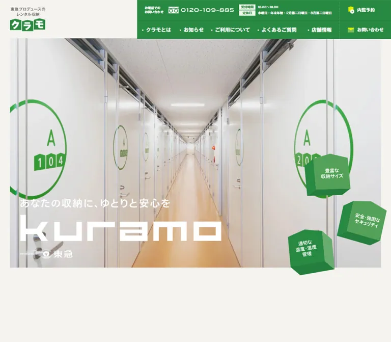
Kuramo uses an orderly service-site structure with a distinctive storage-box vocabulary. Forest green provides identity and navigation; brighter green fills larger sections; lime accents mark small icons and labels. A warm off-white canvas and large white panels keep the extensive information approachable. The desktop opening photograph looks straight down a clean storage corridor, with repeating doors and green room numbers reinforcing the promise of organized, secure space.
The personality comes from geometry: the blocky wordmark, three suspended box illustrations beside the hero, small box-like heading markers, storage-size badges, and an open carton at the end of the footer. Most interface surfaces remain rectangular and flat. Large English section names pair with smaller Japanese labels, while compact links end in generous outlined arrow circles.
This is a multi-page service homepage with several browsing paths. Its design supports understanding the service, comparing facilities, reading practical guidance, and arranging a viewing.
How to Read This Reference
- Measured means a value appears in the supplied DOM rectangles or computed styles. Measurements describe the recorded state, including elements outside the initial viewport.
- Declared means a custom property is present. A declaration alone does not establish where it is used or whether a font actually rendered.
- Visual estimate means an approximate reading of the supplied screenshots. No independent pixel sampling was performed.
- Recommended means guidance for a new implementation. The CSS starter uses semantic classes and includes explicitly identified accessibility changes.
- Source identifiers are retained where useful; readable token names are aliases introduced by this reference.
- Desktop screenshots show the opening, the use-case/Voice area, and the footer. Mobile screenshots show the opening and footer. Other component details rely primarily on DOM evidence.
- The mobile hero photograph is absent in the supplied capture. Its cause is unknown. The resulting white-on-cream lockup is a captured limitation, not a recommended visual treatment.
Tokens — Colors
Default Palette
Eight-digit source colors ending in ff are shown below as equivalent opaque six-digit hex values.
| Name | Value | Source / suggested alias | Role and evidence |
|---|---|---|---|
| Brand Green | #288942 |
--s-color-eabbf293 / --color-green |
Measured navigation backgrounds, section headings, detail-link text, and arrows |
| Field Green | #159f3a |
--s-color-e1bb6c65 / --color-field |
Declared; visually consistent with the large bright-green field around the use-case grid and Voice panel; that field's computed fill was not supplied |
| Lime | #d9f100 |
--s-color-0ca276e8 / --color-lime |
Declared; visually consistent with heading markers, envelope flaps, and selected illustration details; individual asset colors were not sampled |
| Warm Canvas | #f5f3ef |
--s-color-66b6746d / --color-canvas |
Measured body background at both viewports |
| White | #ffffff |
--s-color-109ce314 / --color-surface |
Measured facility-card backgrounds and reversed text; visible Voice surface |
| Deep Green | #247139 |
--s-color-26ad6d62 / --color-green-deep |
Measured small introductory labels; useful darker member of the green family |
| Leaf Green | #7ebf5c |
Computed rgb(126,191,92) / --color-leaf |
Measured mobile FAQ answer marker; footer contact buttons appear similar, but their exact fill was not separately measured |
| Text Ink | #22272a |
--s-color-e3a0fc4b / --color-ink |
Measured news text, feature descriptions, testimonial titles, and facility names |
Supporting Neutrals and Greens
| Value | Evidence | Application |
|---|---|---|
#60747a |
Source --s-color-91b50f7d; computed on descriptions and customer identifiers |
Secondary copy |
#526368 |
Source --s-color-84ae2a6d; computed on flow descriptions |
Practical explanatory text |
#a7b6b9 |
Computed station-access text | Very light metadata; improve contrast in a new implementation |
#9fa0a0 |
Source --s-color-5e81bc70 |
Neutral available for fine rules; exact footer rule color is unverified |
#cbd4d6, #e3e9ea |
Declared source tokens | Pale supporting neutrals; specific surface assignments are not established |
#66b32c |
Source --s-color-e5818286 |
Additional declared green; do not substitute it automatically for the lighter contact-button fill |
Approximately #519f56 and #237e3b |
Visual estimates | Lit and shaded faces of the box illustrations |
Keep the hierarchy between greens. Brand Green is the principal interface color; Field Green creates section-scale emphasis; lime is a small, sharp accent. The warm wooden floor belongs to the photographic palette and does not establish an orange interface token.
The footer appears closer to white than the initial canvas. Its wrapper background was not included in the computed sample, so no exact footer-surface color is asserted.
Tokens — Typography
Japanese Text — Gothic MB101
Three distinct family names are directly present in computed styles:
- Regular:
'ゴシックMB101 R JIS2004'for news, explanatory paragraphs, flow descriptions, and FAQ answers. - Demi-bold face:
'ゴシックMB101 DB JIS2004'for navigation, short statements, feature copy, and many labels. - Medium face:
'ゴシックMB101 M JIS2004'for flow-step titles.
The family and numeric weight must be considered together. Many visually heavy DB labels compute to font-weight: 400; Japanese section headings and testimonial headings using that family compute to 700. Flow titles use the M family at 600. Applying 700 indiscriminately would change the observed hierarchy.
These are observed family declarations, not font files supplied with this reference. Load appropriately licensed fonts when available. The system sans-serif fallbacks in the starter are recommended substitutes with different metrics.
English Headings and Numbers — Kanit
Measured family: Kanit.
Section titles use weight 500 and a tight line height of 1. Feature numbers, size badges, and STEP labels also use Kanit. It provides a compact, substantial Latin counterpart to the Japanese Gothic text.
Desktop English section names generally have normal tracking. Mobile names generally add 0.05em; the two-line introductory label is an exception. Small numeric labels also commonly use 0.05em.
Wordmarks and Icons
The hero H1 has no extracted text, although the screenshot visibly contains the slogan, geometric Kuramo wordmark, and producer lockup. Treat its appearance as artwork or composed branding. The H1's inherited 32px size is not evidence that the large wordmark is ordinary 32px text.
Syncopate is declared in --s-font-7cb12745, but no supplied computed text sample confirms its use. Do not identify it as the wordmark font.
Icomoon is measured on directional glyphs. The pictorial luggage, furniture, document, fan, and megaphone illustrations are visually separate from those text glyphs. The outer HTML/body reporting Times does not describe the explicitly styled interface typography.
Type Scale
Values below are measured unless marked otherwise. Sizes and line heights are in CSS pixels.
| Role | Desktop size / line height | Mobile size / line height | Family and weight |
|---|---|---|---|
| Header telephone captions | 10 / 13 |
Hidden from compact header | DB, 400 |
| Opening hours | 10 / 10 |
Hidden from compact header | Kanit, 600, 0.05em tracking |
| Primary navigation | 16 / 22.4 |
Replaced by menu control | DB, 400 |
| Header action labels | 14 / 22.4 |
10 / 13 |
DB, 400 |
| English section title | 48 / 48 |
32 / 32 |
Kanit, 500; mobile 0.05em tracking |
| Two-line introductory English label | 48 / 48 |
28 / 28 |
Kanit, 500; normal tracking |
| Japanese section label | 20 / 26 |
18 / 23.4 |
DB, 700 |
| Introductory Japanese section label | 20 / 26 |
14 / 18.2 |
DB, 700 |
| Introductory producer line | 24 / 31.2 |
15 / 19.5 |
DB, 400 |
| Main service statement | 48 / 62.4 |
28 / 36.4 |
DB, 400 |
| Feature/use-case statement | 40 / 52 |
24 / 31.2 |
DB, 400 |
| Introductory paragraph | 18 / 36 |
13 / 24.7 |
DB, 400 |
| News and standard explanatory copy | 16 / 25.6 |
Commonly 14 / 22.4 |
R, 400; flow introduction stays 16 / 25.6 |
| Feature number | 40 / 40 |
24 / 24 |
Kanit, 500, 0.05em tracking |
| Feature description | 20 / 26 |
14 / 18.2 |
DB, 400 |
| Use-case description | 20 / 26 |
14.04 / 18.252 |
DB, 400; mobile sizing formula unavailable |
| Detail-link label | 16 / 25.6 |
14 / 22.4 |
DB, 400 |
| Testimonial title | 20 / 26 |
16 / 20.8 |
DB, 700 |
| Customer identifier | 14 / 22.4 |
12 / 19.2 |
DB, 400 |
| Storage-size letters | 24 / 24 |
24 / 24 |
Kanit, 500, 0.05em tracking |
| SIZE and size number | 12 / 12 |
12 / 12 |
Kanit, 500, 0.05em tracking |
| STEP caption / number | 16 / 16, 32 / 32 |
12 / 12, 24 / 24 |
Kanit, 500, 0.05em tracking |
| Flow-step title | 20 / 26 |
20 / 26 |
M, 600 |
| Facility name | 20 / 26 |
16 / 20.8 |
DB, 400 |
| Station-access metadata | 14 / 22.4 |
12 / 19.2 |
DB, 400 |
| FAQ Q/A letter | Not supplied | 28 / 28 |
Kanit, 500 |
| FAQ question / answer | Not supplied | 18 / 23.4, 14 / 22.4 |
DB 700 / R 400 |
Normal letter spacing is common in Japanese text. Preserve the source's deliberate phrase grouping, but allow practical information to wrap when fonts, zoom, or content length change.
Tokens — Spacing & Shapes
Spacing Scale
The page uses a conventional 16px root in the supplied samples. There is no evidence of an unusual global scaling unit.
| Value | Evidence | Typical use |
|---|---|---|
4px |
Measured | Mobile header icon-to-label gap; compact text spacing |
8px |
Measured | Header icon/text gap on desktop; English-to-Japanese heading separation; mobile facility-card gap |
12px |
Measured or derived from rectangles | Desktop navigation horizontal padding; mobile facility text inset |
16px |
Measured | Mobile outer gutter; label-to-arrow-circle gap; smaller content separation |
24px |
Measured | Desktop news-row vertical padding; desktop facility text inset |
32px |
Measured | Desktop header left padding; mobile flow-description x-position includes outer and inner 16px insets |
48px |
Derived from measured rectangles | Space between the desktop news list's bottom and its detail link |
62px |
Visual estimate supported by inner text positions | Desktop Voice panel side inset |
112px |
Measured | Main flex container gap at both viewports; not the total gap between every visible section |
Approximately 200px |
Visual estimate | Green breathing room between the use-case grid and the white Voice panel in the middle capture |
An 8px-based implementation scale fits much of the page, but values such as 33px news gaps and approximately 62px panel insets show that the source is not a strict eight-point system.
Border Radius and Shape Vocabulary
| Element | Appearance | Evidence |
|---|---|---|
| Header links and controls | Square corners | Computed border-radius: 0px |
| Facility cards | Square corners | Computed border-radius: 0px |
| Use-case cells and Voice panel | Rectangular, flat | Screenshot |
| Footer contact buttons | Wide rectangles without rounding | Screenshot |
| Detail arrow | Circular outline, approximately 56px diameter | Screenshot plus measured 56px link height and available width |
| Heading marker | Small lime square or box-like shape | Screenshot; approximately 8–10px |
| Storage-size badge | Upright shape with a shallow peaked top | Screenshot; approximately 78px wide |
| Hero boxes | Irregular perspective polygons with differently colored faces | Screenshot |
Depth is concentrated in illustrations. Interface panels do not use the same perspective treatment and show no general shadow-based elevation system.
Layout Measurements
| Element | Desktop | Mobile | Status |
|---|---|---|---|
| Document height | 12964.48px |
13014.61px |
Measured; state-dependent |
| Header height | 122px |
64px |
Measured |
| Header logo | 112 × 77px, x 32, y 22.5 |
70 × 48.125px, x 16, y 7.94 |
Measured |
| Desktop green navigation start | x 630.81px |
Not applicable | Measured |
| Header action column | 164px wide |
Two compact action links plus a menu | Measured |
| Menu button | Not visible in desktop capture | 64 × 64px, x 326 |
Measured |
| Hero photographic area | Approximately x 32, y 122, width 1408, height 730 |
Photograph not visible | Visual estimate |
| Hero H1 wrapper | x 65, y 631.91, 640 × 192.09px |
x 36, y 571.625, 354 × 137.56px |
Measured wrapper, not artwork bounds |
| Repeated outer content alignment | x 108 to approximately 1332, width 1224px |
x 16 to 374, width 358px |
Desktop screenshot/DOM alignment; mobile measured |
| News list | x 420, width 808px |
x 16, width 358px |
Measured |
| Voice inner heading | x 170 |
x 40 |
Measured |
| Testimonial text width | Approximately 318.28px |
310px |
Measured |
| First facility card | 391.58 × 142.39px |
358 × 116.17px |
Measured |
| Footer action buttons | Approximately 288 × 55px |
Approximately 358 × 55px |
Visual estimate |
| Footer carton illustration | Approximately 180 × 190px |
Approximately 180 × 190px |
Visual estimate |
The repeated desktop width equals 85% of 1440px. This is an observed proportion, not proof of a source width: 85% declaration or a particular maximum width.
Components
Desktop Header
Role: establish identity and provide immediate access to practical navigation and contact.
The logo occupies a small area at the far left of a broad warm canvas. The green utility region is pushed to the right, beginning at approximately x 631. Its upper row contains a compact two-line telephone caption, a prominent telephone number graphic, and opening-hours information. The lower row contains five primary navigation entries.
A separate 164px column at the far right stacks 内覧予約 above お問い合わせ. Both combine a lime/green pictogram with white Japanese text. Fine dividers organize this dense region without rounding or shadows.
The measured header is 122px high, while some controls extend to y 124. Treat that small overhang as a recorded implementation detail rather than forcing every child into an assumed identical height.
The DOM identifies the service overview, usage guidance, and facility navigation as buttons, with associated submenu links. Sampled submenu entries include white 280 × 64px surfaces and a wider 576 × 64px facility-list entry. These links are not visibly open in the screenshot. Their presence and rectangles do not establish whether hover, click, or keyboard focus opens them.
Mobile Header
Role: retain the most useful actions while reducing navigation density.
The header becomes a 64px strip. The logo reduces to 70px wide at a 16px left inset. The right-hand green region begins at x 185 and contains icon-over-label viewing and inquiry links followed by a 64px menu button.
The menu graphic resembles a small storage-building silhouette: a peaked upper block above horizontal white bars. Preserve this relationship to the brand's box geometry. The telephone information and full desktop navigation are absent from the compact header's visible text.
An open menu state, its contents, focus behavior, and scroll locking were not captured. Header persistence during scrolling is also unverified; no fixed or sticky position value was supplied.
Hero and Brand Lockup
Role: communicate cleanliness, space, and reassurance before the detailed service information.
The desktop photograph is a wide corridor viewed almost symmetrically toward a distant vanishing point. White storage doors, green circular numbering, a pale ceiling, and a warm floor create a clean, believable environment. The photograph extends close to the right viewport edge, with a narrow canvas strip at the left.
The white lockup sits low and left. It combines the source slogan あなたの収納に、ゆとりと安心を, a large geometric Kuramo wordmark, and a smaller Tokyu producer mark. The measured H1 wrapper is 640px wide and ends around 28px above the visible photograph's bottom.
Three green box illustrations cluster at the lower right. Their labels communicate storage-size variety, security, and temperature/humidity management. The boxes vary in angle and vertical position, and one extends below the photograph into the canvas. They are visually suspended; continuous floating animation is not established.
On mobile, the slogan becomes two lines and the visible wordmark is approximately 244px wide. The lockup begins around x 36 and y 572. The three boxes form a narrow vertical cluster against the right edge, with partial clipping. The large background area is cream in the supplied capture, leaving the white branding difficult to read. Do not infer that the intended mobile design deliberately removes photography.
Bilingual Section Heading
Role: provide a consistent orientation marker through a long page.
Place a large Kanit English title above a smaller Japanese label. The Japanese line is indented to make room for a small lime marker: 18px on the usual desktop examples and 16px on the usual mobile examples. The two text lines are separated by 8px.
Examples include News, Feature, Use Case, Voice, Flow, Information, and Q&A. The introductory English label occupies two lines and uses a smaller mobile scale than the standard heading.
The group often occupies a left column, with a statement or content region to its right. Inside Voice, the heading shares a horizontal row with a detail link. Keep this component adaptable to a light surface or a green section with reversed text.
News List
Role: present current operational information near the beginning of the page.
Desktop layout separates the heading at x 108 from an 808px list beginning at x 420. Each linked row contains a date, regular Japanese text, and a small green directional glyph. The measured row gap is 33px; ordinary rows have 24px vertical padding. A larger label-and-circle link sits below, aligned to the list's right edge.
At 390px, the heading precedes a full-width 358px list. Text reduces to 14px, internal gaps to 16px, and row padding to approximately 11px. The sampled long headline occupies a one-line-height box despite its length. The excerpt does not identify the overflow technique; do not claim a particular ellipsis or clamp implementation.
The current items include a September 1 management-transfer notice and an August 23 full-occupancy notice. This makes the news area practically useful, rather than merely decorative. These are dated source statements, not independent verification of availability.
Service Introduction and Supporting Information
Role: explain the service and provide supporting reassurance.
Desktop computed text positions form an asymmetric composition: the bilingual heading sits at x 108, a large two-line statement starts at x 532, and a narrow explanatory block returns to x 108 below. White text supplies contrast against the introduction's colored presentation.
The mobile introduction stacks these elements at x 16. Its body retains a notably narrow 221px measure, with 13px text and 24.7px line height. This compact column should not become the default measure for every mobile paragraph.
Two subsequent information modules explain the rental-storage recommendation mark and the compact storage-shed service. On desktop their text appears in parallel groups; on mobile the modules follow one another, with text approximately 282px wide and deeper left insets around 72–76px. Their complete illustration and surface treatments are not shown in the supplied screenshots.
Six-Feature Collection
Role: make the service's practical benefits easy to scan.
The desktop heading pairs with a large statement and supporting sentence on the right. Six numbered entries form three columns and two rows, established by their measured positions. Each caption places a green Kanit numeral beside a short, heavy Japanese description.
Numbers are 40px on desktop and 24px on mobile. Caption copy reduces from 20px to 14px. The measured number-to-copy gap is approximately 49px on desktop and 25px on mobile. Caption wrappers are 112px high on desktop and 84px on mobile; those dimensions are not their text line heights.
Mobile uses two columns and three rows, with column starts at x 16 and x 203. Preserve the numeric sequence across rows. Associated image content above these captions is not sufficiently shown to describe specific photographs or illustrations.
Use-Case Grid
Role: connect storage to recognizable household, team, business, and community needs.
The desktop screenshot shows a single bordered rectangle divided into three columns and two rows. Cells use a darker green than the surrounding bright-green field, with thin internal separators. Each cell places a substantial pictogram to the left of a two-line white description. Rows are approximately 136px high.
The visible pictograms are a suitcase, sports shirt and football, chair and floor lamp, electric fan, documents, and a megaphone. They use crisp flat shapes, a limited green/lime/white palette, and occasional darker details.
Mobile text positions establish two columns and three rows. The copy is centered within each column rather than aligned to the desktop text starts. An icon-over-copy arrangement is a reasonable implementation recommendation, but mobile icon rectangles were not supplied. Measured row-to-row text positions differ by approximately 151.5px.
Voice Panel and Testimonials
Role: show concrete examples of storage use.
A broad white panel sits within the green page field. In the desktop capture it spans approximately x 108–1332. Its heading begins at x 170, with a detail link ending around x 1270. The panel has square edges and a generous top inset, approximately 96px to the visible heading ink.
Three testimonial groups align across the panel. Their DOM content combines a storage-size badge, a short title, and a muted customer identifier. Mobile stacks the groups at x 40 with 310px text widths. Titles reduce from 20px to 16px; customer identifiers reduce from 14px to 12px.
The middle desktop capture contains a large unpainted area between the heading and the badge tops. The evidence does not establish whether this is intentional spacing, absent media, or unrevealed content. Do not invent customer portraits, and do not hardcode the empty region as an essential permanent spacer.
The detail link visibly shortens to 詳細 on mobile while retaining the same destination in the supplied link evidence.
Storage-Size Badge
Role: associate a customer story with a specific amount of space.
Use an upright, shallow-peaked badge rather than a rounded pill. The visible examples contain LL, SS, and M, followed by SIZE and a numeric area with the source unit 畳. The current values are 6.06, 0.98, and 2.65.
The LL and SS examples show white text on green; M shows green text on lime. The large letters remain 24px at both inspected widths, and the SIZE/numeric text remains 12px. This badge is an exception to the page's general mobile type reduction.
No selected-state or pricing-tier meaning is established by the color variation.
Detail Link with Circular Arrow
Role: lead from a homepage summary to its detailed page.
The component combines a short green text label with a dotted underline, a 16px gap, and an outlined arrow circle approximately 56px across. Labels reduce from 16px to 14px on mobile, while the overall 56px control height remains.
The full link width follows its label: the news example is 168px on desktop and 156px on mobile; the Voice example contracts from 200px to 100px when the visible label shortens.
The arrow is a directional affordance. Its triangular appearance does not establish video playback. Green-section variants use reversed light text. Hover and focus colors were not visually exercised.
Application Flow
Role: explain the sequence from viewing to use.
Desktop places an introduction in a 288px column beginning at x 160, with three horizontally composed steps to its right. Each step contains a stacked STEP/number marker, a title, and a short description. The measured step-number groups repeat at 124px vertical intervals.
Mobile moves the introduction above the steps. Each step begins with the number and title on one row; explanatory text follows underneath and spans approximately 326px. The flow detail link moves below the sequence in the rendered text order.
Titles remain 20px on mobile. Smaller STEP labels and numbers absorb much of the scale reduction, preserving the importance of the actual task names.
Facility Card
Role: route visitors to location-specific information.
Each whole card is an anchor with a square white surface. Its content combines the facility name, station walking-time information, a right-aligned green arrow, and a lower railway-line label.
The first desktop card measures approximately 392 × 142px, with the name inset 24px horizontally and 16px vertically. On mobile, the cards form a single 358px-wide list with 8px gaps and approximately 116px card heights. The name inset reduces to 12px horizontally; the first title remains 16px below the top.
Names reduce from 20px to 16px, access text from 14px to 12px, and the arrow glyph from 16px to 12px. The pale access text is visually subordinate but has limited contrast; the starter recommends a darker neutral.
The homepage still lists five facilities, including the compact-storage location named in the management-transfer notice. Preserve that distinction when reusing the information architecture: a directory entry alone does not prove unchanged management or current availability.
FAQ Excerpts
Role: answer a few common questions before the contact section.
The rendered page includes three complete question-and-answer pairs. Mobile measured examples place a 28px Kanit Q or A in a narrow left column and text around x 60–61. Questions use green DB text at 18px; answers use regular 14px Japanese text with 22.4px line height. The A marker uses Leaf Green.
An answer includes inline links to the viewing form and telephone number. The recorded state contains answer text; no accordion operation is documented. Use expanded pairs for a faithful static adaptation, and treat collapsible behavior as a separate design decision.
Contact Area and Footer
Role: make inquiry and viewing routes easy to find, then provide comprehensive navigation and ownership information.
The rendered lower page contains distinct contact and viewing-application blocks, with a telephone number, hours, explanatory copy, and links to forms. The destination links are known; the forms themselves were not inspected.
The visible desktop footer begins with a wide white facility strip: a left label separated from the location links by a fine vertical rule. Below it, three navigation groups sit beside a fourth column containing two stacked rectangular buttons. The lighter inquiry button is above the darker viewing button, separated by approximately 8px.
A dotted horizontal divider precedes the organization row. The inspected footer identifies Tokyu as 事業主 and Tokyu Lifia as 貸主 / 運営管理, using their logos and links. The body separately names Tokyu Corporation as the service producer. These are business roles shown by the original page, not website production credits; the dated transfer notice limits assumptions about individual facilities.
Mobile retains two columns for the initial navigation groups, then stacks the utility links and full-width buttons. The organization row becomes two label/logo rows with aligned vertical separators. Copyright remains centered. A small green open carton with a white outlined suitcase is centered beneath it, with substantial empty space around it. Its apparent size remains approximately 180px wide on both viewports. No click action or animation for this illustration was verified.
Tokens — Motion & Interaction
The supplied computed styles provide transition declarations, but no hover, menu-opening, or per-element animation trace. All sampled elements report animation: none. This does not rule out transitions, pseudo-element motion, animated image assets, or script-controlled movement.
| Element or treatment | Supplied declaration | What it establishes |
|---|---|---|
| Body background | 0.5s cubic-bezier(0.4, 0.4, 0, 1) |
A background transition is defined; its trigger and color sequence are unknown |
| Header | opacity 0.3s |
Opacity can transition; no confirmed sticky or hide-on-scroll behavior |
| Common links and text | Usually 0.3s cubic-bezier(0.4, 0.4, 0, 1) |
Shared transition timing; no confirmed hover endpoint |
| Desktop navigation buttons | 0.4s cubic-bezier(0.4, 0.4, 0, 1) |
Button-state timing declaration |
| Sampled submenu links | 0.6s cubic-bezier(0.4, 0.4, 0, 1) |
Defined link transition; opening interaction unverified |
| English section headings | 0.3s duration with 0.3s delay |
Delayed transition configuration; reveal direction and trigger unknown |
| Introductory statements | Desktop 0.4s ease-in-out 0.2s; mobile often the shared cubic-bezier with the same duration/delay |
Responsive timing differences in declarations |
| Use-case copy | Desktop 2s ease-in-out; mobile 0.3s shared cubic-bezier |
A substantial duration difference; not evidence that the text continuously animates |
| Facility arrow | Commonly 0.2s ease-in 0.1s |
Short delayed transition configuration |
| Hero boxes and footer carton | No complete motion definition supplied | Static appearance only is documented |
The repeated --g-angle, --g-color-*, and --g-position-* entries are generated transition plumbing. Their presence does not establish a visible gradient effect or a need to reproduce every property in a new implementation.
Recommended motion: use restrained 200–300ms color or opacity feedback for links, with the observed shared cubic-bezier when appropriate. Keep content visible by default. If adding entrance effects, make them optional and ensure reduced-motion users receive the completed state. Do not invent a floating-box loop, parallax corridor, carousel, or rotating footer illustration as an observed feature.
Surfaces
| Surface | Appearance | Function |
|---|---|---|
| Main canvas | Warm off-white | Comfortable reading space and separation between modules |
| Header utilities | Solid Brand Green with white labels and lime icons | Dense practical navigation |
| Hero | Bright architectural photograph with white branding | Immediate service identity |
| Large section field | Bright green | Strong changes of pace through the long page |
| Use-case cells | Darker green with thin light separators | Group six parallel situations |
| Voice panel | Large square white inset | Separate customer evidence from the green surroundings |
| Facility cards | Flat square white blocks | Repeated location navigation |
| Footer buttons | Light and dark green rectangles | Distinguish inquiry and viewing actions |
| Footer navigation | Near-white open space with dotted and vertical rules | Organize a dense sitemap without card clutter |
| Box artwork | Flat polygon faces with different green values | Illustrative depth and continuity |
There is no visible general-purpose glass, blur, gradient-card, or soft-shadow system. Broad color areas, fine rules, alignment, and whitespace do most of the structural work.
Imagery
Photography
The confirmed desktop hero is architectural and functional. Its strongest qualities are the repeated door rhythm, central perspective, clean surfaces, visible numbering, and warm floor. Retain enough width to communicate the corridor's depth and enough foreground to make the storage doors recognizable.
For an adaptation, use an actual well-lit storage interior with orderly signage. A random warehouse, moving truck, or lifestyle portrait would change the message. Mobile art direction should be tested independently; the supplied mobile capture does not establish a working crop.
Illustration and Icons
Use crisp geometric drawings with flat fills. The hero boxes achieve depth through separate faces, not realistic lighting. The use-case illustrations simplify everyday objects into a small number of recognizable shapes. The footer combines a filled carton with a finer outlined suitcase, creating a gentle final visual note.
Lime highlights should occupy small areas: shirt panels, luggage details, envelope flaps, document marks, and heading markers. Keep icons understandable through silhouette and context, not color alone.
Observed Asset References
| Asset | Evidence available | Reuse guidance |
|---|---|---|
| Header logo | Desktop and mobile screenshots; measured home-link rectangles | Use an approved logo asset and preserve its proportions |
| Hero photograph | Desktop screenshot; truncated pseudo-element background-image reference beginning s-2752x1464_v-frms_webp_4262249e… |
The fragment is not a complete downloadable URL; do not reconstruct its missing suffix |
| Hero branding | Visible slogan, Kuramo wordmark, and producer lockup inside the H1 region | Preserve branding as artwork; provide an accessible textual equivalent |
| Three hero boxes | Desktop and mobile screenshots | Match flat face colors, small labels, and irregular angles |
| Six use-case pictograms | Desktop middle screenshot | Reuse approved assets or create a coherent equivalent set |
| Storage-size badges | Desktop screenshot and desktop/mobile text measurements | Keep labels as live text when practical |
| Footer carton and suitcase | Both footer screenshots | Preserve the small centered scale and surrounding whitespace |
No complete asset manifest or full original image URLs were supplied. No imagery is bundled by the CSS starter. Other media slots, including the unpainted area inside Voice, remain unidentified.
Layout & Responsive Behavior
Desktop Composition
The page is a long document, approximately 12,964px high in the recorded state. Repeated content aligns around a 1224px-wide region, with 108px margins at 1440px. The header and hero follow wider, asymmetric rules.
Section headers often use two broad columns, but their proportions vary. The feature statement starts at x 732, while the service-introduction statement starts at x 532. News uses a narrower right-hand list ending at x 1228. Preserve these variations instead of forcing every section into one identical grid.
The use-case grid uses three columns, and the testimonials appear in three parallel groups. The footer spreads navigation across a wide horizontal arrangement. Large gaps and generous panel padding coexist with compact text and controls.
Mobile Composition
At 390px, most modules use 16px outer gutters. The header becomes 64px tall, with viewing and inquiry actions remaining immediately visible.
| Component | Observed change |
|---|---|
| Section headings | English titles generally reduce from 48px to 32px; Japanese labels from 20px to 18px |
| Introduction | Asymmetric desktop composition becomes a stack; its paragraph remains a narrow 221px column |
| Features | Three columns become two |
| Use cases | Three columns become two; text is centered within cells |
| Testimonials | Three groups become a single vertical sequence with 310px text width |
| Voice detail link | Visible label shortens to 詳細; control height stays 56px |
| Flow | Intro moves above steps; each description moves beneath its number/title row |
| Facilities | Single-column list of 358px cards with 8px gaps |
| Footer navigation | Initial paired columns followed by full-width utilities and actions |
| Business logos | Horizontal desktop grouping becomes two aligned rows |
| Footer illustration | Approximately the same absolute width as desktop |
The mobile document is approximately 13,015px high, close to the desktop total. Smaller type, shorter visual regions, and additional stacked content balance one another; do not use either document height as a fixed layout target.
Breakpoints and Rendering Limits
A supplied style fragment explicitly includes a max-width: 1280px rule for responsive line breaks. It does not identify the complete breakpoint system or prove the exact width at which the header collapses. No tablet or intermediate viewport was captured.
The starter uses 800px for content rearrangement and 1100px for header simplification as recommended implementation breakpoints, not recovered source values.
The mobile hero is visually incomplete in the supplied state. The initial desktop Voice capture also contains unpainted space. Capture readiness checks reduce timing uncertainty but do not prove that all intended media or delayed effects appeared. Keep these limitations separate from the confirmed responsive typography and layout measurements.
Do’s and Don’ts
Do
- Preserve the relationship between Brand Green, brighter section green, warm canvas, white panels, and sparse lime details.
- Pair Kanit English headings with substantial Japanese Gothic labels.
- Distinguish font-family faces from numeric font weights.
- Keep interface rectangles square and reserve perspective for box illustrations.
- Use a real storage-interior photograph to communicate the service directly.
- Retain the three-box hero motif and the small carton illustration at the footer.
- Use the label-plus-circle detail link consistently, including its 16px gap and 56px control height.
- Reflow features and use cases into two columns on mobile, while stacking testimonials and facilities.
- Keep viewing and inquiry actions accessible in the compact header and footer.
- Allow news, facility details, and practical guidance to remain meaningful browsing routes.
Don’t
- Don't turn every section into an interchangeable rounded card.
- Don't replace the lime accent with unrelated action colors or spread it across large text surfaces.
- Don't apply generic bold sans-serif styling to all Japanese text and lose the measured face hierarchy.
- Don't identify the wordmark font from an unused or unassigned font variable.
- Don't treat the missing mobile photograph and low-contrast white lockup as the intended finished state.
- Don't fill unidentified media regions with invented customer photography.
- Don't add a carousel, accordion, parallax effect, or floating animation and describe it as observed.
- Don't shrink the 24px storage-size letters merely because other text becomes smaller on mobile.
- Don't force every desktop module to share the same column split.
- Don't infer current capacity or unchanged facility management from directory links alone.
Recommended Implementation Additions
These are recommendations for a new implementation, not verified features of the original page:
- Provide a dark green hero fallback so white branding stays readable while imagery is unavailable. Supply a tested mobile image crop.
- Give the image-based H1 a meaningful accessible name. Empty extracted text alone is not enough to determine the original accessible name because image alternatives were not supplied.
- Use explicit accessible names and
aria-expandedfor menu and submenu buttons. Support keyboard activation, dismissal, and visible focus. - Increase contrast for station-access metadata. Use Text Ink on a light-green contact button, or choose a darker fill if retaining white text.
- Keep long news headlines available without hover. Prefer wrapping or a clearly accessible full-title link over unexplained clipping.
- Preserve meaningful Japanese phrase breaks without imposing fixed text heights that fail with zoom or font substitution.
- Use at least 44px touch targets for compact text actions. Preserve the existing larger 56px detail-link and 64px menu proportions where practical.
- Keep testimonial and explanatory text visible without entrance-animation JavaScript. Reserve image space with real aspect ratios once the media is known.
- Use expanded FAQ content by default unless a separately specified interaction requires disclosure controls.
- Verify that all controls remain usable with reduced motion and failed image/font loading.
Agent Prompt Guide
Quick Color Reference
- Main identity and links:
#288942. - Large green fields: declared
#159f3a. - Canvas:
#f5f3ef. - Content panels:
#ffffff. - Small highlights: declared
#d9f100. - Main text:
#22272a. - Secondary copy:
#60747aor#526368. - Light supporting green: measured FAQ accent
#7ebf5c; suitable as a recommended contact-surface approximation. - Box depth: multiple flat green faces, with no interface elevation shadow.
Overall Prompt
“Create a Japanese rental-storage service homepage inspired by the current Kuramo reference. Use forest green #288942, brighter green section fields, warm off-white #f5f3ef, square white panels, and sparse lime #d9f100 accents. Pair Kanit English section headings with substantial Japanese Gothic labels and regular explanatory copy. Open with a clean storage-corridor photograph, a low-left white brand lockup, and three differently angled green box illustrations at the lower right. Organize news, service information, six numbered features, six illustrated use cases, customer stories, application steps, facility links, FAQ excerpts, and contact routes. Use dotted-underlined detail labels beside 56px outlined arrow circles. On mobile retain inquiry and viewing actions in a 64px header, switch features and use cases to two columns, and stack testimonials and facilities. Provide readable image-failure states and keep unverified motion out of the baseline implementation.”
Example Component Prompts
- Header: “Create a spacious warm-canvas header with a small green Japanese logo at left and a dense green utility area at right. Use an upper telephone/hours row, a lower navigation row, and a separate stacked viewing/inquiry column. At narrow widths show the logo, two icon-over-label actions, and a square menu control with a peaked building-like symbol.”
- Section heading: “Build a two-line heading with a 48px Kanit English title above a 20px Japanese Gothic label, indented by 18px for a tiny lime box marker. Reduce the standard mobile scale to 32px and 18px, with 0.05em tracking on the English line.”
- Use-case grid: “Create one square-cornered green rectangle divided into six cells, three columns on desktop and two on mobile. Use flat luggage, sports, furniture, appliance, document, and community-event pictograms in green, lime, and white. Pair each with short Japanese copy. Use fine separators and no shadows.”
- Detail link: “Combine the label お知らせ一覧 with a dotted underline, a 16px gap, and a 56px green outlined circle containing a small right-pointing triangle. Make the complete combination one link and add visible keyboard focus.”
- Customer story: “Place a shallow-peaked storage badge above a concise Japanese testimonial heading and a muted location/customer line. Use 24px Kanit size letters, 12px size information, and square white surroundings. Arrange three stories across desktop and stack them on mobile. Do not invent portrait imagery.”
- Footer: “Create a broad near-white footer with a facility-link strip, grouped navigation, two stacked rectangular green actions, dotted separation, and two clearly labeled business-logo roles. Center a small flat green carton with an outlined white suitcase beneath the copyright.”
Quick Start
CSS Custom Properties
This starter implements the main visual vocabulary with conventional CSS. It is an adaptation, not a recovered stylesheet. Exact source colors and measured type sizes are combined with recommended layout rules, estimated illustration geometry, and simplified component markup.
The following departures are intentional recommendations: a dark hero fallback, darker travel metadata, dark text on the light-green contact action, explicit focus feedback, and reduced-motion handling. The source's mobile blank hero is not reproduced.
Load authorized font and image assets separately. Use the logo and wordmark as images with appropriate text alternatives. The hero expects an optional .hero-media image, a .hero-copy group, and a .hero-cubes group containing three .cube elements. The standard heading uses .section-title-en and .section-title-ja; a detail link contains .more-label and an aria-hidden .more-circle.
:root {
  /* Source colors and measured computed colors */
  --color-green: #288942;
  --color-field: #159f3a;
  --color-green-deep: #247139;
  --color-lime: #d9f100;
  --color-canvas: #f5f3ef;
  --color-surface: #ffffff;
  --color-ink: #22272a;
  --color-muted: #60747a;
  --color-secondary: #526368;
  --color-leaf: #7ebf5c;
  --color-rule: #9fa0a0;

  /* Observed family names; system fallbacks are recommendations */
  --font-ja: 'ゴシックMB101 R JIS2004', system-ui, sans-serif;
  --font-ja-strong: 'ゴシックMB101 DB JIS2004', system-ui, sans-serif;
  --font-ja-medium: 'ゴシックMB101 M JIS2004', system-ui, sans-serif;
  --font-latin: 'Kanit', system-ui, sans-serif;

  --text-body: 16px;
  --text-small: 14px;
  --text-section-en: 48px;
  --text-section-ja: 20px;
  --text-statement: 40px;
  --tracking-section: normal;
  --leading-body: 1.6;
  --leading-heading: 1.3;

  --space-1: 4px;
  --space-2: 8px;
  --space-3: 12px;
  --space-4: 16px;
  --space-6: 24px;
  --space-8: 32px;
  --space-12: 48px;
  --section-gap: 112px;
  --detail-size: 56px;

  /* Recommended layout cap, based on the recorded desktop width */
  --content-max: 1224px;
  --header-height: 122px;
  --ease-brand: cubic-bezier(0.4, 0.4, 0, 1);
  --duration-ui: 300ms;

  /* Estimated illustration-face colors */
  --cube-light: #519f56;
  --cube-shadow: #237e3b;
}

.kuramo,
.kuramo *,
.kuramo *::before,
.kuramo *::after {
  box-sizing: border-box;
}

.kuramo {
  margin: 0;
  color: var(--color-ink);
  background: var(--color-canvas);
  font-family: var(--font-ja);
  font-size: var(--text-body);
  line-height: var(--leading-body);
}

.kuramo img {
  max-inline-size: 100%;
}

.kuramo button {
  font: inherit;
  cursor: pointer;
}

.container {
  inline-size: min(85%, var(--content-max));
  margin-inline: auto;
}

.page-main {
  display: flex;
  flex-direction: column;
  gap: var(--section-gap);
}

.site-header {
  display: flex;
  align-items: center;
  justify-content: space-between;
  min-block-size: var(--header-height);
  padding-inline-start: 32px;
}

.site-logo {
  display: block;
  inline-size: 112px;
  block-size: auto;
}

.header-desktop {
  display: grid;
  grid-template-columns: minmax(0, 644px) 164px;
  grid-template-rows: 66px 56px;
  color: white;
  background: var(--color-green);
}

.header-phone {
  grid-area: 1 / 1;
  display: flex;
  align-items: center;
  gap: 16px;
  padding-inline: 24px;
}

.header-nav {
  grid-area: 2 / 1;
  display: flex;
  align-items: stretch;
}

.header-nav > :is(a, button) {
  display: inline-flex;
  align-items: center;
  gap: 8px;
  padding-inline: 12px;
  border: 0;
  border-radius: 0;
  color: white;
  background: transparent;
  font-family: var(--font-ja-strong);
  font-size: 16px;
  text-decoration: none;
}

.header-actions {
  grid-area: 1 / 2 / 3 / 3;
  display: grid;
  grid-template-rows: 66px 56px;
  border-inline-start: 1px dotted rgb(255 255 255 / 35%);
}

.header-mobile {
  display: none;
}

.hero {
  position: relative;
  isolation: isolate;
  display: grid;
  align-items: end;
  min-block-size: 730px;
  margin-inline-start: 32px;
  padding: 32px;
  color: white;
  background: var(--color-green-deep);
}

.hero-media {
  position: absolute;
  z-index: -1;
  inset: 0;
  inline-size: 100%;
  block-size: 100%;
  object-fit: cover;
  object-position: center;
}

.hero-copy {
  position: relative;
  z-index: 1;
  inline-size: min(640px, 100%);
  margin: 0;
}

.hero-wordmark {
  display: block;
  inline-size: 100%;
  block-size: auto;
}

/* Estimated composition; labels remain real text */
.hero-cubes {
  position: absolute;
  inset-inline-end: 16px;
  inset-block-end: -28px;
  inline-size: 320px;
  block-size: 390px;
  pointer-events: none;
}

.cube {
  position: absolute;
  inline-size: 154px;
  aspect-ratio: 1.08;
  color: white;
  background: var(--color-green);
  clip-path: polygon(18% 12%, 55% 0, 89% 6%, 100% 74%, 83% 93%, 12% 100%, 0 32%);
}

.cube::before,
.cube::after {
  content: '';
  position: absolute;
  inset: 0;
}

.cube::before {
  background: var(--cube-light);
  clip-path: polygon(18% 12%, 55% 0, 89% 6%, 100% 74%, 29% 82%);
}

.cube::after {
  background: var(--cube-shadow);
  clip-path: polygon(12% 100%, 29% 82%, 100% 74%, 83% 93%);
}

.cube > span {
  position: relative;
  z-index: 1;
  display: grid;
  place-content: center;
  block-size: 100%;
  padding: 12% 10% 18% 26%;
  font-family: var(--font-ja-strong);
  font-size: 14px;
  line-height: 1.3;
  text-align: center;
}

.hero-cubes .cube:nth-child(1) { top: 0; right: 110px; }
.hero-cubes .cube:nth-child(2) { top: 152px; right: 0; transform: rotate(8deg); }
.hero-cubes .cube:nth-child(3) { bottom: 0; left: 0; transform: rotate(-8deg); }

.section-head {
  display: flex;
  align-items: center;
  justify-content: space-between;
  gap: 24px;
}

.section-title-en {
  margin: 0;
  color: var(--color-green);
  font: 500 var(--text-section-en) / 1 var(--font-latin);
  letter-spacing: var(--tracking-section);
}

.section-title-ja {
  position: relative;
  margin: 8px 0 0;
  padding-inline-start: 18px;
  color: var(--color-green);
  font-family: var(--font-ja-strong);
  font-size: var(--text-section-ja);
  font-weight: 700;
  line-height: 1.3;
}

.section-title-ja::before {
  content: '';
  position: absolute;
  inset-inline-start: 0;
  inset-block-start: 0.45em;
  inline-size: 10px;
  block-size: 10px;
  background: var(--color-lime);
}

.section-intro {
  display: grid;
  grid-template-columns: repeat(2, minmax(0, 1fr));
  gap: 24px;
}

.statement {
  margin: 0;
  color: var(--color-green);
  font-family: var(--font-ja-strong);
  font-size: var(--text-statement);
  font-weight: 400;
  line-height: 1.3;
}

.more {
  display: inline-flex;
  align-items: center;
  gap: 16px;
  min-block-size: var(--detail-size);
  color: var(--color-green);
  font-family: var(--font-ja-strong);
  font-size: 16px;
  text-decoration: none;
}

.more-label {
  padding-block-end: 6px;
  border-block-end: 1px dotted currentColor;
}

.more-circle {
  display: grid;
  place-items: center;
  flex: 0 0 var(--detail-size);
  inline-size: var(--detail-size);
  block-size: var(--detail-size);
  border: 2px solid currentColor;
  border-radius: 50%;
  transition: background-color var(--duration-ui) var(--ease-brand),
    color var(--duration-ui) var(--ease-brand);
}

.more-circle::before {
  content: '';
  inline-size: 8px;
  block-size: 12px;
  background: currentColor;
  clip-path: polygon(0 0, 100% 50%, 0 100%);
}

.feature-grid,
.use-case-grid,
.voice-grid {
  display: grid;
  grid-template-columns: repeat(3, minmax(0, 1fr));
  gap: 24px;
}

.feature-caption {
  display: flex;
  align-items: start;
  gap: 49px;
  font-family: var(--font-ja-strong);
  font-size: 20px;
  line-height: 1.3;
}

.feature-number {
  color: var(--color-green);
  font: 500 40px / 1 var(--font-latin);
  letter-spacing: 0.05em;
}

.green-field {
  background: var(--color-field);
}

.use-case-grid {
  gap: 1px;
  padding: 1px;
  background: rgb(255 255 255 / 40%);
}

.use-case-item {
  display: flex;
  align-items: center;
  gap: 28px;
  min-block-size: 136px;
  padding: 24px;
  color: white;
  background: var(--color-green);
  font-family: var(--font-ja-strong);
  font-size: 20px;
  line-height: 1.3;
}

.use-case-icon {
  flex: 0 0 80px;
  inline-size: 80px;
  block-size: 80px;
  object-fit: contain;
}

.voice-panel {
  padding: 88px 62px 64px;
  background: var(--color-surface);
}

.voice-grid {
  margin-block-start: 48px;
}

.voice-card {
  min-inline-size: 0;
  padding: 16px;
}

.voice-title {
  margin: 16px 0;
  font-family: var(--font-ja-strong);
  font-size: 20px;
  line-height: 1.3;
}

.voice-person {
  color: var(--color-muted);
  font-size: 14px;
}

/* Approximate badge silhouette; height is an adaptation */
.size-badge {
  display: grid;
  align-content: center;
  justify-items: center;
  inline-size: 78px;
  min-block-size: 88px;
  padding: 14px 6px 8px;
  color: white;
  background: var(--color-field);
  clip-path: polygon(50% 0, 100% 12%, 100% 100%, 0 100%, 0 12%);
  font: 500 12px / 1 var(--font-latin);
  letter-spacing: 0.05em;
}

.size-badge strong {
  font-size: 24px;
  font-weight: 500;
}

.size-badge--lime {
  color: var(--color-green);
  background: var(--color-lime);
}

.facility-card {
  display: block;
  padding: 16px 24px;
  color: var(--color-ink);
  background: white;
  border-radius: 0;
  text-decoration: none;
}

.facility-name {
  font-family: var(--font-ja-strong);
  font-size: 20px;
  line-height: 1.3;
}

.facility-access {
  color: var(--color-secondary);
  font-size: 14px;
}

.facility-railway {
  margin-block-start: 24px;
  color: var(--color-green);
  font-size: 12px;
}

.action {
  display: inline-flex;
  align-items: center;
  justify-content: center;
  gap: 12px;
  min-block-size: 56px;
  padding: 12px 24px;
  border: 0;
  border-radius: 0;
  color: white;
  background: var(--color-green);
  font-family: var(--font-ja-strong);
  text-decoration: none;
  transition: background-color var(--duration-ui) var(--ease-brand),
    color var(--duration-ui) var(--ease-brand);
}

.action--contact {
  color: var(--color-ink);
  background: var(--color-leaf);
}

.footer-nav {
  display: grid;
  grid-template-columns: repeat(3, minmax(0, 1fr)) 288px;
  gap: 24px;
}

.footer-actions {
  display: grid;
  align-content: start;
  gap: 8px;
}

.footer-businesses {
  display: flex;
  flex-wrap: wrap;
  gap: 32px;
  margin-block-start: 64px;
  padding-block-start: 40px;
  border-block-start: 1px dashed var(--color-rule);
}

.footer-business {
  display: flex;
  align-items: center;
  gap: 16px;
}

.footer-business-label {
  padding-inline-end: 16px;
  border-inline-end: 1px solid var(--color-rule);
  color: var(--color-secondary);
  font-size: 12px;
}

.footer-copyright {
  margin-block-start: 80px;
  color: var(--color-green);
  font-family: var(--font-latin);
  font-size: 12px;
  text-align: center;
}

.footer-illustration {
  display: block;
  inline-size: 180px;
  block-size: auto;
  margin: 64px auto 160px;
}

/* Recommended hover states; original endpoints were not verified */
@media (hover: hover) {
  .more:hover .more-circle,
  .action:hover {
    color: white;
    background: var(--color-green-deep);
  }
}

.kuramo :is(a, button):focus-visible {
  outline: 3px solid var(--color-green-deep);
  outline-offset: 4px;
  box-shadow: 0 0 0 6px white;
}

/* Recommended header breakpoint */
@media (max-width: 1100px) {
  .site-header {
    min-block-size: 64px;
    padding-inline-start: 16px;
  }
  .site-logo { inline-size: 70px; }
  .header-desktop { display: none; }
  .header-mobile {
    display: flex;
    align-items: stretch;
    color: white;
    background: var(--color-green);
  }
  .header-mobile .action {
    flex-direction: column;
    gap: 4px;
    min-block-size: 64px;
    padding: 8px;
    font-size: 10px;
    line-height: 1.3;
  }
  .menu-button {
    inline-size: 64px;
    block-size: 64px;
    border: 0;
    border-inline-start: 1px dotted rgb(255 255 255 / 40%);
    color: white;
    background: transparent;
  }
}

/* Recommended content breakpoint; endpoint values follow mobile evidence */
@media (max-width: 800px) {
  :root {
    --text-section-en: 32px;
    --text-section-ja: 18px;
    --text-statement: 24px;
    --tracking-section: 0.05em;
  }
  .container { inline-size: calc(100% - 32px); }
  .hero {
    min-block-size: calc(100svh - 64px);
    margin-inline-start: 0;
    padding: 32px 36px 134px;
  }
  .hero-copy { inline-size: min(244px, 100%); }
  .hero-cubes {
    right: 0;
    bottom: 55px;
    inline-size: 104px;
    block-size: 322px;
    overflow: hidden;
  }
  .cube { inline-size: 96px; }
  .cube > span { font-size: 10px; }
  .hero-cubes .cube:nth-child(1) { top: 0; left: 3px; right: auto; }
  .hero-cubes .cube:nth-child(2) { top: 116px; left: 17px; right: auto; }
  .hero-cubes .cube:nth-child(3) { bottom: 0; left: 9px; }
  .section-intro { grid-template-columns: 1fr; }
  .section-head { flex-wrap: wrap; gap: 16px; }
  .section-title-ja { padding-inline-start: 16px; }
  .section-title-ja::before { inline-size: 8px; block-size: 8px; }
  .more { font-size: 14px; }
  .feature-grid,
  .use-case-grid { grid-template-columns: repeat(2, minmax(0, 1fr)); }
  .feature-grid { gap: 16px; }
  .feature-caption { gap: 25px; font-size: 14px; }
  .feature-number { font-size: 24px; }
  .use-case-item {
    flex-direction: column;
    justify-content: center;
    gap: 14px;
    min-block-size: 152px;
    padding: 16px 8px;
    font-size: 14px;
    text-align: center;
  }
  .use-case-icon {
    flex-basis: auto;
    inline-size: 56px;
    block-size: 56px;
  }
  .voice-panel { padding: 48px 24px; }
  .voice-grid { grid-template-columns: 1fr; gap: 40px; }
  .voice-card { padding: 0; }
  .voice-title { font-size: 16px; }
  .voice-person { font-size: 12px; }
  .facility-card { padding: 16px 12px; }
  .facility-name { font-size: 16px; }
  .facility-access { font-size: 12px; }
  .footer-nav { grid-template-columns: repeat(2, minmax(0, 1fr)); }
  .footer-utilities,
  .footer-actions { grid-column: 1 / -1; }
  .footer-businesses { display: grid; gap: 16px; }
  .footer-business-label { min-inline-size: 106px; }
  .footer-illustration { margin-block-end: 100px; }
}

@media (prefers-reduced-motion: reduce) {
  .kuramo *,
  .kuramo *::before,
  .kuramo *::after {
    animation: none !important;
    transition: none !important;
    scroll-behavior: auto !important;
  }
}
The starter deliberately does not allocate unidentified image regions or fix total page height. The hero's minimum-height formula and cube coordinates approximate the recorded composition; they are not measured source formulas. Test the hero lockup and boxes together at small widths and increased text zoom. Menu behavior, submenu state, and form handling require separate semantic implementation.
Tailwind v4 Token Mapping
Optional aliases for a project already using Tailwind v4. These do not imply that the original website uses Tailwind. Define the custom properties above first.
@theme inline {
  --color-storage-green: var(--color-green);
  --color-storage-field: var(--color-field);
  --color-storage-deep: var(--color-green-deep);
  --color-storage-lime: var(--color-lime);
  --color-storage-canvas: var(--color-canvas);
  --color-storage-surface: var(--color-surface);
  --color-storage-ink: var(--color-ink);
  --color-storage-muted: var(--color-muted);

  --font-storage-body: var(--font-ja);
  --font-storage-strong: var(--font-ja-strong);
  --font-storage-latin: var(--font-latin);

  --text-storage-section: var(--text-section-en);
  --text-storage-label: var(--text-section-ja);
  --text-storage-statement: var(--text-statement);

  --spacing-storage-section: var(--section-gap);
  --spacing-storage-control: var(--detail-size);
  --radius-storage-panel: 0px;
}
Sources & Evidence
- Inspected original and final page: Kuramo homepage. The supplied browser record reports HTTP 200 and the same original/final URL.
- Capture date: September 12, 2026; retrieval timestamp
2026-09-12T07:46:12.830Z. Separate timestamps for individual images were not supplied. - Desktop evidence: 1440 × 1000 CSS-pixel viewport; opening, use-case/Voice, and footer screenshots; rendered page text, destinations, custom properties, and computed element samples. Recorded document height approximately 12,964px.
- Mobile evidence: 390 × 844 CSS-pixel viewport; opening and footer screenshots, plus rendered text and computed element samples covering the page. Recorded document height approximately 13,015px.
- Inspection procedure: the supplied browser process observed the initial page for at least five seconds, waited for document/image/layout readiness within finite limits, and traversed intermediate scroll positions. SharedWorkers and service workers were disabled. These checks do not establish semantic completeness.
- Interaction scope: page scrolling and settled captures are documented. No clicked navigation, opened menu, hover endpoint, keyboard sequence, form submission, or complete animation cycle was supplied. Link destinations establish routes only; destination pages and external forms were not inspected here.
- Limitations: no tablet capture, complete stylesheet, complete asset manifest, image alternative-text inventory, or independent font-file verification. Mobile hero photography is absent in the captured state, and part of the desktop Voice region is unpainted. Their causes remain unknown.
This reference describes the current page represented by the supplied inspection. Measured values, screenshot estimates, and implementation recommendations are distinguished throughout.
# Kuramo — Style Reference

> Bright storage corridors, green signage, and illustrated boxes that make extra space tangible.

**Website:** [tokyukuramo.jp](https://www.tokyukuramo.jp/)
**Original URL:** https://www.tokyukuramo.jp/
**Final URL:** https://www.tokyukuramo.jp/
**Theme:** light canvas with substantial green section fields and white content surfaces.
**Inspected:** September 12, 2026; supplied browser retrieval at 07:46:12.830 UTC, or 16:46 JST.
**Viewports:** desktop 1440 × 1000 and mobile 390 × 844 CSS pixels.
**Scope:** the current rental-storage service homepage: header, hero, news, service introduction, six features, use cases, customer voices, application flow, facility directory, FAQ excerpts, contact links, and footer. Visual evidence comprises three desktop captures and two mobile captures, supported by rendered text, link destinations, and sampled computed styles.

Kuramo uses an orderly service-site structure with a distinctive storage-box vocabulary. Forest green provides identity and navigation; brighter green fills larger sections; lime accents mark small icons and labels. A warm off-white canvas and large white panels keep the extensive information approachable. The desktop opening photograph looks straight down a clean storage corridor, with repeating doors and green room numbers reinforcing the promise of organized, secure space.

The personality comes from geometry: the blocky wordmark, three suspended box illustrations beside the hero, small box-like heading markers, storage-size badges, and an open carton at the end of the footer. Most interface surfaces remain rectangular and flat. Large English section names pair with smaller Japanese labels, while compact links end in generous outlined arrow circles.

This is a multi-page service homepage with several browsing paths. Its design supports understanding the service, comparing facilities, reading practical guidance, and arranging a viewing.

## How to Read This Reference

- **Measured** means a value appears in the supplied DOM rectangles or computed styles. Measurements describe the recorded state, including elements outside the initial viewport.
- **Declared** means a custom property is present. A declaration alone does not establish where it is used or whether a font actually rendered.
- **Visual estimate** means an approximate reading of the supplied screenshots. No independent pixel sampling was performed.
- **Recommended** means guidance for a new implementation. The CSS starter uses semantic classes and includes explicitly identified accessibility changes.
- Source identifiers are retained where useful; readable token names are aliases introduced by this reference.
- Desktop screenshots show the opening, the use-case/Voice area, and the footer. Mobile screenshots show the opening and footer. Other component details rely primarily on DOM evidence.
- The mobile hero photograph is absent in the supplied capture. Its cause is unknown. The resulting white-on-cream lockup is a captured limitation, not a recommended visual treatment.

## Tokens — Colors

### Default Palette

Eight-digit source colors ending in `ff` are shown below as equivalent opaque six-digit hex values.

| Name | Value | Source / suggested alias | Role and evidence |
| --- | --- | --- | --- |
| Brand Green | `#288942` | `--s-color-eabbf293` / `--color-green` | Measured navigation backgrounds, section headings, detail-link text, and arrows |
| Field Green | `#159f3a` | `--s-color-e1bb6c65` / `--color-field` | Declared; visually consistent with the large bright-green field around the use-case grid and Voice panel; that field's computed fill was not supplied |
| Lime | `#d9f100` | `--s-color-0ca276e8` / `--color-lime` | Declared; visually consistent with heading markers, envelope flaps, and selected illustration details; individual asset colors were not sampled |
| Warm Canvas | `#f5f3ef` | `--s-color-66b6746d` / `--color-canvas` | Measured body background at both viewports |
| White | `#ffffff` | `--s-color-109ce314` / `--color-surface` | Measured facility-card backgrounds and reversed text; visible Voice surface |
| Deep Green | `#247139` | `--s-color-26ad6d62` / `--color-green-deep` | Measured small introductory labels; useful darker member of the green family |
| Leaf Green | `#7ebf5c` | Computed `rgb(126,191,92)` / `--color-leaf` | Measured mobile FAQ answer marker; footer contact buttons appear similar, but their exact fill was not separately measured |
| Text Ink | `#22272a` | `--s-color-e3a0fc4b` / `--color-ink` | Measured news text, feature descriptions, testimonial titles, and facility names |

### Supporting Neutrals and Greens

| Value | Evidence | Application |
| --- | --- | --- |
| `#60747a` | Source `--s-color-91b50f7d`; computed on descriptions and customer identifiers | Secondary copy |
| `#526368` | Source `--s-color-84ae2a6d`; computed on flow descriptions | Practical explanatory text |
| `#a7b6b9` | Computed station-access text | Very light metadata; improve contrast in a new implementation |
| `#9fa0a0` | Source `--s-color-5e81bc70` | Neutral available for fine rules; exact footer rule color is unverified |
| `#cbd4d6`, `#e3e9ea` | Declared source tokens | Pale supporting neutrals; specific surface assignments are not established |
| `#66b32c` | Source `--s-color-e5818286` | Additional declared green; do not substitute it automatically for the lighter contact-button fill |
| Approximately `#519f56` and `#237e3b` | Visual estimates | Lit and shaded faces of the box illustrations |

Keep the hierarchy between greens. Brand Green is the principal interface color; Field Green creates section-scale emphasis; lime is a small, sharp accent. The warm wooden floor belongs to the photographic palette and does not establish an orange interface token.

The footer appears closer to white than the initial canvas. Its wrapper background was not included in the computed sample, so no exact footer-surface color is asserted.

## Tokens — Typography

### Japanese Text — Gothic MB101

Three distinct family names are directly present in computed styles:

- **Regular:** `'ゴシックMB101 R JIS2004'` for news, explanatory paragraphs, flow descriptions, and FAQ answers.
- **Demi-bold face:** `'ゴシックMB101 DB JIS2004'` for navigation, short statements, feature copy, and many labels.
- **Medium face:** `'ゴシックMB101 M JIS2004'` for flow-step titles.

The family and numeric weight must be considered together. Many visually heavy DB labels compute to `font-weight: 400`; Japanese section headings and testimonial headings using that family compute to `700`. Flow titles use the M family at `600`. Applying `700` indiscriminately would change the observed hierarchy.

These are observed family declarations, not font files supplied with this reference. Load appropriately licensed fonts when available. The system sans-serif fallbacks in the starter are recommended substitutes with different metrics.

### English Headings and Numbers — Kanit

**Measured family:** `Kanit`.

Section titles use weight `500` and a tight line height of `1`. Feature numbers, size badges, and STEP labels also use Kanit. It provides a compact, substantial Latin counterpart to the Japanese Gothic text.

Desktop English section names generally have normal tracking. Mobile names generally add `0.05em`; the two-line introductory label is an exception. Small numeric labels also commonly use `0.05em`.

### Wordmarks and Icons

The hero H1 has no extracted text, although the screenshot visibly contains the slogan, geometric Kuramo wordmark, and producer lockup. Treat its appearance as artwork or composed branding. The H1's inherited `32px` size is not evidence that the large wordmark is ordinary 32px text.

`Syncopate` is declared in `--s-font-7cb12745`, but no supplied computed text sample confirms its use. Do not identify it as the wordmark font.

`Icomoon` is measured on directional glyphs. The pictorial luggage, furniture, document, fan, and megaphone illustrations are visually separate from those text glyphs. The outer HTML/body reporting `Times` does not describe the explicitly styled interface typography.

### Type Scale

Values below are measured unless marked otherwise. Sizes and line heights are in CSS pixels.

| Role | Desktop size / line height | Mobile size / line height | Family and weight |
| --- | --- | --- | --- |
| Header telephone captions | `10 / 13` | Hidden from compact header | DB, `400` |
| Opening hours | `10 / 10` | Hidden from compact header | Kanit, `600`, `0.05em` tracking |
| Primary navigation | `16 / 22.4` | Replaced by menu control | DB, `400` |
| Header action labels | `14 / 22.4` | `10 / 13` | DB, `400` |
| English section title | `48 / 48` | `32 / 32` | Kanit, `500`; mobile `0.05em` tracking |
| Two-line introductory English label | `48 / 48` | `28 / 28` | Kanit, `500`; normal tracking |
| Japanese section label | `20 / 26` | `18 / 23.4` | DB, `700` |
| Introductory Japanese section label | `20 / 26` | `14 / 18.2` | DB, `700` |
| Introductory producer line | `24 / 31.2` | `15 / 19.5` | DB, `400` |
| Main service statement | `48 / 62.4` | `28 / 36.4` | DB, `400` |
| Feature/use-case statement | `40 / 52` | `24 / 31.2` | DB, `400` |
| Introductory paragraph | `18 / 36` | `13 / 24.7` | DB, `400` |
| News and standard explanatory copy | `16 / 25.6` | Commonly `14 / 22.4` | R, `400`; flow introduction stays `16 / 25.6` |
| Feature number | `40 / 40` | `24 / 24` | Kanit, `500`, `0.05em` tracking |
| Feature description | `20 / 26` | `14 / 18.2` | DB, `400` |
| Use-case description | `20 / 26` | `14.04 / 18.252` | DB, `400`; mobile sizing formula unavailable |
| Detail-link label | `16 / 25.6` | `14 / 22.4` | DB, `400` |
| Testimonial title | `20 / 26` | `16 / 20.8` | DB, `700` |
| Customer identifier | `14 / 22.4` | `12 / 19.2` | DB, `400` |
| Storage-size letters | `24 / 24` | `24 / 24` | Kanit, `500`, `0.05em` tracking |
| SIZE and size number | `12 / 12` | `12 / 12` | Kanit, `500`, `0.05em` tracking |
| STEP caption / number | `16 / 16`, `32 / 32` | `12 / 12`, `24 / 24` | Kanit, `500`, `0.05em` tracking |
| Flow-step title | `20 / 26` | `20 / 26` | M, `600` |
| Facility name | `20 / 26` | `16 / 20.8` | DB, `400` |
| Station-access metadata | `14 / 22.4` | `12 / 19.2` | DB, `400` |
| FAQ Q/A letter | Not supplied | `28 / 28` | Kanit, `500` |
| FAQ question / answer | Not supplied | `18 / 23.4`, `14 / 22.4` | DB `700` / R `400` |

Normal letter spacing is common in Japanese text. Preserve the source's deliberate phrase grouping, but allow practical information to wrap when fonts, zoom, or content length change.

## Tokens — Spacing & Shapes

### Spacing Scale

The page uses a conventional 16px root in the supplied samples. There is no evidence of an unusual global scaling unit.

| Value | Evidence | Typical use |
| --- | --- | --- |
| `4px` | Measured | Mobile header icon-to-label gap; compact text spacing |
| `8px` | Measured | Header icon/text gap on desktop; English-to-Japanese heading separation; mobile facility-card gap |
| `12px` | Measured or derived from rectangles | Desktop navigation horizontal padding; mobile facility text inset |
| `16px` | Measured | Mobile outer gutter; label-to-arrow-circle gap; smaller content separation |
| `24px` | Measured | Desktop news-row vertical padding; desktop facility text inset |
| `32px` | Measured | Desktop header left padding; mobile flow-description x-position includes outer and inner 16px insets |
| `48px` | Derived from measured rectangles | Space between the desktop news list's bottom and its detail link |
| `62px` | Visual estimate supported by inner text positions | Desktop Voice panel side inset |
| `112px` | Measured | Main flex container gap at both viewports; not the total gap between every visible section |
| Approximately `200px` | Visual estimate | Green breathing room between the use-case grid and the white Voice panel in the middle capture |

An 8px-based implementation scale fits much of the page, but values such as 33px news gaps and approximately 62px panel insets show that the source is not a strict eight-point system.

### Border Radius and Shape Vocabulary

| Element | Appearance | Evidence |
| --- | --- | --- |
| Header links and controls | Square corners | Computed `border-radius: 0px` |
| Facility cards | Square corners | Computed `border-radius: 0px` |
| Use-case cells and Voice panel | Rectangular, flat | Screenshot |
| Footer contact buttons | Wide rectangles without rounding | Screenshot |
| Detail arrow | Circular outline, approximately 56px diameter | Screenshot plus measured 56px link height and available width |
| Heading marker | Small lime square or box-like shape | Screenshot; approximately 8–10px |
| Storage-size badge | Upright shape with a shallow peaked top | Screenshot; approximately 78px wide |
| Hero boxes | Irregular perspective polygons with differently colored faces | Screenshot |

Depth is concentrated in illustrations. Interface panels do not use the same perspective treatment and show no general shadow-based elevation system.

### Layout Measurements

| Element | Desktop | Mobile | Status |
| --- | --- | --- | --- |
| Document height | `12964.48px` | `13014.61px` | Measured; state-dependent |
| Header height | `122px` | `64px` | Measured |
| Header logo | `112 × 77px`, x `32`, y `22.5` | `70 × 48.125px`, x `16`, y `7.94` | Measured |
| Desktop green navigation start | x `630.81px` | Not applicable | Measured |
| Header action column | `164px` wide | Two compact action links plus a menu | Measured |
| Menu button | Not visible in desktop capture | `64 × 64px`, x `326` | Measured |
| Hero photographic area | Approximately x `32`, y `122`, width `1408`, height `730` | Photograph not visible | Visual estimate |
| Hero H1 wrapper | x `65`, y `631.91`, `640 × 192.09px` | x `36`, y `571.625`, `354 × 137.56px` | Measured wrapper, not artwork bounds |
| Repeated outer content alignment | x `108` to approximately `1332`, width `1224px` | x `16` to `374`, width `358px` | Desktop screenshot/DOM alignment; mobile measured |
| News list | x `420`, width `808px` | x `16`, width `358px` | Measured |
| Voice inner heading | x `170` | x `40` | Measured |
| Testimonial text width | Approximately `318.28px` | `310px` | Measured |
| First facility card | `391.58 × 142.39px` | `358 × 116.17px` | Measured |
| Footer action buttons | Approximately `288 × 55px` | Approximately `358 × 55px` | Visual estimate |
| Footer carton illustration | Approximately `180 × 190px` | Approximately `180 × 190px` | Visual estimate |

The repeated desktop width equals 85% of 1440px. This is an observed proportion, not proof of a source `width: 85%` declaration or a particular maximum width.

## Components

### Desktop Header

**Role:** establish identity and provide immediate access to practical navigation and contact.

The logo occupies a small area at the far left of a broad warm canvas. The green utility region is pushed to the right, beginning at approximately x 631. Its upper row contains a compact two-line telephone caption, a prominent telephone number graphic, and opening-hours information. The lower row contains five primary navigation entries.

A separate 164px column at the far right stacks `内覧予約` above `お問い合わせ`. Both combine a lime/green pictogram with white Japanese text. Fine dividers organize this dense region without rounding or shadows.

The measured header is 122px high, while some controls extend to y 124. Treat that small overhang as a recorded implementation detail rather than forcing every child into an assumed identical height.

The DOM identifies the service overview, usage guidance, and facility navigation as buttons, with associated submenu links. Sampled submenu entries include white `280 × 64px` surfaces and a wider `576 × 64px` facility-list entry. These links are not visibly open in the screenshot. Their presence and rectangles do not establish whether hover, click, or keyboard focus opens them.

### Mobile Header

**Role:** retain the most useful actions while reducing navigation density.

The header becomes a 64px strip. The logo reduces to 70px wide at a 16px left inset. The right-hand green region begins at x 185 and contains icon-over-label viewing and inquiry links followed by a 64px menu button.

The menu graphic resembles a small storage-building silhouette: a peaked upper block above horizontal white bars. Preserve this relationship to the brand's box geometry. The telephone information and full desktop navigation are absent from the compact header's visible text.

An open menu state, its contents, focus behavior, and scroll locking were not captured. Header persistence during scrolling is also unverified; no fixed or sticky position value was supplied.

### Hero and Brand Lockup

**Role:** communicate cleanliness, space, and reassurance before the detailed service information.

The desktop photograph is a wide corridor viewed almost symmetrically toward a distant vanishing point. White storage doors, green circular numbering, a pale ceiling, and a warm floor create a clean, believable environment. The photograph extends close to the right viewport edge, with a narrow canvas strip at the left.

The white lockup sits low and left. It combines the source slogan `あなたの収納に、ゆとりと安心を`, a large geometric Kuramo wordmark, and a smaller Tokyu producer mark. The measured H1 wrapper is 640px wide and ends around 28px above the visible photograph's bottom.

Three green box illustrations cluster at the lower right. Their labels communicate storage-size variety, security, and temperature/humidity management. The boxes vary in angle and vertical position, and one extends below the photograph into the canvas. They are visually suspended; continuous floating animation is not established.

On mobile, the slogan becomes two lines and the visible wordmark is approximately 244px wide. The lockup begins around x 36 and y 572. The three boxes form a narrow vertical cluster against the right edge, with partial clipping. The large background area is cream in the supplied capture, leaving the white branding difficult to read. Do not infer that the intended mobile design deliberately removes photography.

### Bilingual Section Heading

**Role:** provide a consistent orientation marker through a long page.

Place a large Kanit English title above a smaller Japanese label. The Japanese line is indented to make room for a small lime marker: 18px on the usual desktop examples and 16px on the usual mobile examples. The two text lines are separated by 8px.

Examples include News, Feature, Use Case, Voice, Flow, Information, and Q&A. The introductory English label occupies two lines and uses a smaller mobile scale than the standard heading.

The group often occupies a left column, with a statement or content region to its right. Inside Voice, the heading shares a horizontal row with a detail link. Keep this component adaptable to a light surface or a green section with reversed text.

### News List

**Role:** present current operational information near the beginning of the page.

Desktop layout separates the heading at x 108 from an 808px list beginning at x 420. Each linked row contains a date, regular Japanese text, and a small green directional glyph. The measured row gap is 33px; ordinary rows have 24px vertical padding. A larger label-and-circle link sits below, aligned to the list's right edge.

At 390px, the heading precedes a full-width 358px list. Text reduces to 14px, internal gaps to 16px, and row padding to approximately 11px. The sampled long headline occupies a one-line-height box despite its length. The excerpt does not identify the overflow technique; do not claim a particular ellipsis or clamp implementation.

The current items include a September 1 management-transfer notice and an August 23 full-occupancy notice. This makes the news area practically useful, rather than merely decorative. These are dated source statements, not independent verification of availability.

### Service Introduction and Supporting Information

**Role:** explain the service and provide supporting reassurance.

Desktop computed text positions form an asymmetric composition: the bilingual heading sits at x 108, a large two-line statement starts at x 532, and a narrow explanatory block returns to x 108 below. White text supplies contrast against the introduction's colored presentation.

The mobile introduction stacks these elements at x 16. Its body retains a notably narrow 221px measure, with 13px text and 24.7px line height. This compact column should not become the default measure for every mobile paragraph.

Two subsequent information modules explain the rental-storage recommendation mark and the compact storage-shed service. On desktop their text appears in parallel groups; on mobile the modules follow one another, with text approximately 282px wide and deeper left insets around 72–76px. Their complete illustration and surface treatments are not shown in the supplied screenshots.

### Six-Feature Collection

**Role:** make the service's practical benefits easy to scan.

The desktop heading pairs with a large statement and supporting sentence on the right. Six numbered entries form three columns and two rows, established by their measured positions. Each caption places a green Kanit numeral beside a short, heavy Japanese description.

Numbers are 40px on desktop and 24px on mobile. Caption copy reduces from 20px to 14px. The measured number-to-copy gap is approximately 49px on desktop and 25px on mobile. Caption wrappers are 112px high on desktop and 84px on mobile; those dimensions are not their text line heights.

Mobile uses two columns and three rows, with column starts at x 16 and x 203. Preserve the numeric sequence across rows. Associated image content above these captions is not sufficiently shown to describe specific photographs or illustrations.

### Use-Case Grid

**Role:** connect storage to recognizable household, team, business, and community needs.

The desktop screenshot shows a single bordered rectangle divided into three columns and two rows. Cells use a darker green than the surrounding bright-green field, with thin internal separators. Each cell places a substantial pictogram to the left of a two-line white description. Rows are approximately 136px high.

The visible pictograms are a suitcase, sports shirt and football, chair and floor lamp, electric fan, documents, and a megaphone. They use crisp flat shapes, a limited green/lime/white palette, and occasional darker details.

Mobile text positions establish two columns and three rows. The copy is centered within each column rather than aligned to the desktop text starts. An icon-over-copy arrangement is a reasonable implementation recommendation, but mobile icon rectangles were not supplied. Measured row-to-row text positions differ by approximately 151.5px.

### Voice Panel and Testimonials

**Role:** show concrete examples of storage use.

A broad white panel sits within the green page field. In the desktop capture it spans approximately x 108–1332. Its heading begins at x 170, with a detail link ending around x 1270. The panel has square edges and a generous top inset, approximately 96px to the visible heading ink.

Three testimonial groups align across the panel. Their DOM content combines a storage-size badge, a short title, and a muted customer identifier. Mobile stacks the groups at x 40 with 310px text widths. Titles reduce from 20px to 16px; customer identifiers reduce from 14px to 12px.

The middle desktop capture contains a large unpainted area between the heading and the badge tops. The evidence does not establish whether this is intentional spacing, absent media, or unrevealed content. Do not invent customer portraits, and do not hardcode the empty region as an essential permanent spacer.

The detail link visibly shortens to `詳細` on mobile while retaining the same destination in the supplied link evidence.

### Storage-Size Badge

**Role:** associate a customer story with a specific amount of space.

Use an upright, shallow-peaked badge rather than a rounded pill. The visible examples contain LL, SS, and M, followed by SIZE and a numeric area with the source unit `畳`. The current values are 6.06, 0.98, and 2.65.

The LL and SS examples show white text on green; M shows green text on lime. The large letters remain 24px at both inspected widths, and the SIZE/numeric text remains 12px. This badge is an exception to the page's general mobile type reduction.

No selected-state or pricing-tier meaning is established by the color variation.

### Detail Link with Circular Arrow

**Role:** lead from a homepage summary to its detailed page.

The component combines a short green text label with a dotted underline, a 16px gap, and an outlined arrow circle approximately 56px across. Labels reduce from 16px to 14px on mobile, while the overall 56px control height remains.

The full link width follows its label: the news example is 168px on desktop and 156px on mobile; the Voice example contracts from 200px to 100px when the visible label shortens.

The arrow is a directional affordance. Its triangular appearance does not establish video playback. Green-section variants use reversed light text. Hover and focus colors were not visually exercised.

### Application Flow

**Role:** explain the sequence from viewing to use.

Desktop places an introduction in a 288px column beginning at x 160, with three horizontally composed steps to its right. Each step contains a stacked STEP/number marker, a title, and a short description. The measured step-number groups repeat at 124px vertical intervals.

Mobile moves the introduction above the steps. Each step begins with the number and title on one row; explanatory text follows underneath and spans approximately 326px. The flow detail link moves below the sequence in the rendered text order.

Titles remain 20px on mobile. Smaller STEP labels and numbers absorb much of the scale reduction, preserving the importance of the actual task names.

### Facility Card

**Role:** route visitors to location-specific information.

Each whole card is an anchor with a square white surface. Its content combines the facility name, station walking-time information, a right-aligned green arrow, and a lower railway-line label.

The first desktop card measures approximately 392 × 142px, with the name inset 24px horizontally and 16px vertically. On mobile, the cards form a single 358px-wide list with 8px gaps and approximately 116px card heights. The name inset reduces to 12px horizontally; the first title remains 16px below the top.

Names reduce from 20px to 16px, access text from 14px to 12px, and the arrow glyph from 16px to 12px. The pale access text is visually subordinate but has limited contrast; the starter recommends a darker neutral.

The homepage still lists five facilities, including the compact-storage location named in the management-transfer notice. Preserve that distinction when reusing the information architecture: a directory entry alone does not prove unchanged management or current availability.

### FAQ Excerpts

**Role:** answer a few common questions before the contact section.

The rendered page includes three complete question-and-answer pairs. Mobile measured examples place a 28px Kanit Q or A in a narrow left column and text around x 60–61. Questions use green DB text at 18px; answers use regular 14px Japanese text with 22.4px line height. The A marker uses Leaf Green.

An answer includes inline links to the viewing form and telephone number. The recorded state contains answer text; no accordion operation is documented. Use expanded pairs for a faithful static adaptation, and treat collapsible behavior as a separate design decision.

### Contact Area and Footer

**Role:** make inquiry and viewing routes easy to find, then provide comprehensive navigation and ownership information.

The rendered lower page contains distinct contact and viewing-application blocks, with a telephone number, hours, explanatory copy, and links to forms. The destination links are known; the forms themselves were not inspected.

The visible desktop footer begins with a wide white facility strip: a left label separated from the location links by a fine vertical rule. Below it, three navigation groups sit beside a fourth column containing two stacked rectangular buttons. The lighter inquiry button is above the darker viewing button, separated by approximately 8px.

A dotted horizontal divider precedes the organization row. The inspected footer identifies Tokyu as `事業主` and Tokyu Lifia as `貸主 / 運営管理`, using their logos and links. The body separately names Tokyu Corporation as the service producer. These are business roles shown by the original page, not website production credits; the dated transfer notice limits assumptions about individual facilities.

Mobile retains two columns for the initial navigation groups, then stacks the utility links and full-width buttons. The organization row becomes two label/logo rows with aligned vertical separators. Copyright remains centered. A small green open carton with a white outlined suitcase is centered beneath it, with substantial empty space around it. Its apparent size remains approximately 180px wide on both viewports. No click action or animation for this illustration was verified.

## Tokens — Motion & Interaction

The supplied computed styles provide transition declarations, but no hover, menu-opening, or per-element animation trace. All sampled elements report `animation: none`. This does not rule out transitions, pseudo-element motion, animated image assets, or script-controlled movement.

| Element or treatment | Supplied declaration | What it establishes |
| --- | --- | --- |
| Body background | `0.5s cubic-bezier(0.4, 0.4, 0, 1)` | A background transition is defined; its trigger and color sequence are unknown |
| Header | `opacity 0.3s` | Opacity can transition; no confirmed sticky or hide-on-scroll behavior |
| Common links and text | Usually `0.3s cubic-bezier(0.4, 0.4, 0, 1)` | Shared transition timing; no confirmed hover endpoint |
| Desktop navigation buttons | `0.4s cubic-bezier(0.4, 0.4, 0, 1)` | Button-state timing declaration |
| Sampled submenu links | `0.6s cubic-bezier(0.4, 0.4, 0, 1)` | Defined link transition; opening interaction unverified |
| English section headings | `0.3s` duration with `0.3s` delay | Delayed transition configuration; reveal direction and trigger unknown |
| Introductory statements | Desktop `0.4s ease-in-out 0.2s`; mobile often the shared cubic-bezier with the same duration/delay | Responsive timing differences in declarations |
| Use-case copy | Desktop `2s ease-in-out`; mobile `0.3s` shared cubic-bezier | A substantial duration difference; not evidence that the text continuously animates |
| Facility arrow | Commonly `0.2s ease-in 0.1s` | Short delayed transition configuration |
| Hero boxes and footer carton | No complete motion definition supplied | Static appearance only is documented |

The repeated `--g-angle`, `--g-color-*`, and `--g-position-*` entries are generated transition plumbing. Their presence does not establish a visible gradient effect or a need to reproduce every property in a new implementation.

**Recommended motion:** use restrained 200–300ms color or opacity feedback for links, with the observed shared cubic-bezier when appropriate. Keep content visible by default. If adding entrance effects, make them optional and ensure reduced-motion users receive the completed state. Do not invent a floating-box loop, parallax corridor, carousel, or rotating footer illustration as an observed feature.

## Surfaces

| Surface | Appearance | Function |
| --- | --- | --- |
| Main canvas | Warm off-white | Comfortable reading space and separation between modules |
| Header utilities | Solid Brand Green with white labels and lime icons | Dense practical navigation |
| Hero | Bright architectural photograph with white branding | Immediate service identity |
| Large section field | Bright green | Strong changes of pace through the long page |
| Use-case cells | Darker green with thin light separators | Group six parallel situations |
| Voice panel | Large square white inset | Separate customer evidence from the green surroundings |
| Facility cards | Flat square white blocks | Repeated location navigation |
| Footer buttons | Light and dark green rectangles | Distinguish inquiry and viewing actions |
| Footer navigation | Near-white open space with dotted and vertical rules | Organize a dense sitemap without card clutter |
| Box artwork | Flat polygon faces with different green values | Illustrative depth and continuity |

There is no visible general-purpose glass, blur, gradient-card, or soft-shadow system. Broad color areas, fine rules, alignment, and whitespace do most of the structural work.

## Imagery

### Photography

The confirmed desktop hero is architectural and functional. Its strongest qualities are the repeated door rhythm, central perspective, clean surfaces, visible numbering, and warm floor. Retain enough width to communicate the corridor's depth and enough foreground to make the storage doors recognizable.

For an adaptation, use an actual well-lit storage interior with orderly signage. A random warehouse, moving truck, or lifestyle portrait would change the message. Mobile art direction should be tested independently; the supplied mobile capture does not establish a working crop.

### Illustration and Icons

Use crisp geometric drawings with flat fills. The hero boxes achieve depth through separate faces, not realistic lighting. The use-case illustrations simplify everyday objects into a small number of recognizable shapes. The footer combines a filled carton with a finer outlined suitcase, creating a gentle final visual note.

Lime highlights should occupy small areas: shirt panels, luggage details, envelope flaps, document marks, and heading markers. Keep icons understandable through silhouette and context, not color alone.

### Observed Asset References

| Asset | Evidence available | Reuse guidance |
| --- | --- | --- |
| Header logo | Desktop and mobile screenshots; measured home-link rectangles | Use an approved logo asset and preserve its proportions |
| Hero photograph | Desktop screenshot; truncated pseudo-element background-image reference beginning `s-2752x1464_v-frms_webp_4262249e…` | The fragment is not a complete downloadable URL; do not reconstruct its missing suffix |
| Hero branding | Visible slogan, Kuramo wordmark, and producer lockup inside the H1 region | Preserve branding as artwork; provide an accessible textual equivalent |
| Three hero boxes | Desktop and mobile screenshots | Match flat face colors, small labels, and irregular angles |
| Six use-case pictograms | Desktop middle screenshot | Reuse approved assets or create a coherent equivalent set |
| Storage-size badges | Desktop screenshot and desktop/mobile text measurements | Keep labels as live text when practical |
| Footer carton and suitcase | Both footer screenshots | Preserve the small centered scale and surrounding whitespace |

No complete asset manifest or full original image URLs were supplied. No imagery is bundled by the CSS starter. Other media slots, including the unpainted area inside Voice, remain unidentified.

## Layout & Responsive Behavior

### Desktop Composition

The page is a long document, approximately 12,964px high in the recorded state. Repeated content aligns around a 1224px-wide region, with 108px margins at 1440px. The header and hero follow wider, asymmetric rules.

Section headers often use two broad columns, but their proportions vary. The feature statement starts at x 732, while the service-introduction statement starts at x 532. News uses a narrower right-hand list ending at x 1228. Preserve these variations instead of forcing every section into one identical grid.

The use-case grid uses three columns, and the testimonials appear in three parallel groups. The footer spreads navigation across a wide horizontal arrangement. Large gaps and generous panel padding coexist with compact text and controls.

### Mobile Composition

At 390px, most modules use 16px outer gutters. The header becomes 64px tall, with viewing and inquiry actions remaining immediately visible.

| Component | Observed change |
| --- | --- |
| Section headings | English titles generally reduce from 48px to 32px; Japanese labels from 20px to 18px |
| Introduction | Asymmetric desktop composition becomes a stack; its paragraph remains a narrow 221px column |
| Features | Three columns become two |
| Use cases | Three columns become two; text is centered within cells |
| Testimonials | Three groups become a single vertical sequence with 310px text width |
| Voice detail link | Visible label shortens to `詳細`; control height stays 56px |
| Flow | Intro moves above steps; each description moves beneath its number/title row |
| Facilities | Single-column list of 358px cards with 8px gaps |
| Footer navigation | Initial paired columns followed by full-width utilities and actions |
| Business logos | Horizontal desktop grouping becomes two aligned rows |
| Footer illustration | Approximately the same absolute width as desktop |

The mobile document is approximately 13,015px high, close to the desktop total. Smaller type, shorter visual regions, and additional stacked content balance one another; do not use either document height as a fixed layout target.

### Breakpoints and Rendering Limits

A supplied style fragment explicitly includes a `max-width: 1280px` rule for responsive line breaks. It does not identify the complete breakpoint system or prove the exact width at which the header collapses. No tablet or intermediate viewport was captured.

The starter uses 800px for content rearrangement and 1100px for header simplification as **recommended implementation breakpoints**, not recovered source values.

The mobile hero is visually incomplete in the supplied state. The initial desktop Voice capture also contains unpainted space. Capture readiness checks reduce timing uncertainty but do not prove that all intended media or delayed effects appeared. Keep these limitations separate from the confirmed responsive typography and layout measurements.

## Do’s and Don’ts

### Do

- Preserve the relationship between Brand Green, brighter section green, warm canvas, white panels, and sparse lime details.
- Pair Kanit English headings with substantial Japanese Gothic labels.
- Distinguish font-family faces from numeric font weights.
- Keep interface rectangles square and reserve perspective for box illustrations.
- Use a real storage-interior photograph to communicate the service directly.
- Retain the three-box hero motif and the small carton illustration at the footer.
- Use the label-plus-circle detail link consistently, including its 16px gap and 56px control height.
- Reflow features and use cases into two columns on mobile, while stacking testimonials and facilities.
- Keep viewing and inquiry actions accessible in the compact header and footer.
- Allow news, facility details, and practical guidance to remain meaningful browsing routes.

### Don’t

- Don't turn every section into an interchangeable rounded card.
- Don't replace the lime accent with unrelated action colors or spread it across large text surfaces.
- Don't apply generic bold sans-serif styling to all Japanese text and lose the measured face hierarchy.
- Don't identify the wordmark font from an unused or unassigned font variable.
- Don't treat the missing mobile photograph and low-contrast white lockup as the intended finished state.
- Don't fill unidentified media regions with invented customer photography.
- Don't add a carousel, accordion, parallax effect, or floating animation and describe it as observed.
- Don't shrink the 24px storage-size letters merely because other text becomes smaller on mobile.
- Don't force every desktop module to share the same column split.
- Don't infer current capacity or unchanged facility management from directory links alone.

## Recommended Implementation Additions

These are recommendations for a new implementation, not verified features of the original page:

- Provide a dark green hero fallback so white branding stays readable while imagery is unavailable. Supply a tested mobile image crop.
- Give the image-based H1 a meaningful accessible name. Empty extracted text alone is not enough to determine the original accessible name because image alternatives were not supplied.
- Use explicit accessible names and `aria-expanded` for menu and submenu buttons. Support keyboard activation, dismissal, and visible focus.
- Increase contrast for station-access metadata. Use Text Ink on a light-green contact button, or choose a darker fill if retaining white text.
- Keep long news headlines available without hover. Prefer wrapping or a clearly accessible full-title link over unexplained clipping.
- Preserve meaningful Japanese phrase breaks without imposing fixed text heights that fail with zoom or font substitution.
- Use at least 44px touch targets for compact text actions. Preserve the existing larger 56px detail-link and 64px menu proportions where practical.
- Keep testimonial and explanatory text visible without entrance-animation JavaScript. Reserve image space with real aspect ratios once the media is known.
- Use expanded FAQ content by default unless a separately specified interaction requires disclosure controls.
- Verify that all controls remain usable with reduced motion and failed image/font loading.

## Agent Prompt Guide

### Quick Color Reference

- Main identity and links: `#288942`.
- Large green fields: declared `#159f3a`.
- Canvas: `#f5f3ef`.
- Content panels: `#ffffff`.
- Small highlights: declared `#d9f100`.
- Main text: `#22272a`.
- Secondary copy: `#60747a` or `#526368`.
- Light supporting green: measured FAQ accent `#7ebf5c`; suitable as a recommended contact-surface approximation.
- Box depth: multiple flat green faces, with no interface elevation shadow.

### Overall Prompt

“Create a Japanese rental-storage service homepage inspired by the current Kuramo reference. Use forest green #288942, brighter green section fields, warm off-white #f5f3ef, square white panels, and sparse lime #d9f100 accents. Pair Kanit English section headings with substantial Japanese Gothic labels and regular explanatory copy. Open with a clean storage-corridor photograph, a low-left white brand lockup, and three differently angled green box illustrations at the lower right. Organize news, service information, six numbered features, six illustrated use cases, customer stories, application steps, facility links, FAQ excerpts, and contact routes. Use dotted-underlined detail labels beside 56px outlined arrow circles. On mobile retain inquiry and viewing actions in a 64px header, switch features and use cases to two columns, and stack testimonials and facilities. Provide readable image-failure states and keep unverified motion out of the baseline implementation.”

### Example Component Prompts

1. **Header:** “Create a spacious warm-canvas header with a small green Japanese logo at left and a dense green utility area at right. Use an upper telephone/hours row, a lower navigation row, and a separate stacked viewing/inquiry column. At narrow widths show the logo, two icon-over-label actions, and a square menu control with a peaked building-like symbol.”
2. **Section heading:** “Build a two-line heading with a 48px Kanit English title above a 20px Japanese Gothic label, indented by 18px for a tiny lime box marker. Reduce the standard mobile scale to 32px and 18px, with 0.05em tracking on the English line.”
3. **Use-case grid:** “Create one square-cornered green rectangle divided into six cells, three columns on desktop and two on mobile. Use flat luggage, sports, furniture, appliance, document, and community-event pictograms in green, lime, and white. Pair each with short Japanese copy. Use fine separators and no shadows.”
4. **Detail link:** “Combine the label お知らせ一覧 with a dotted underline, a 16px gap, and a 56px green outlined circle containing a small right-pointing triangle. Make the complete combination one link and add visible keyboard focus.”
5. **Customer story:** “Place a shallow-peaked storage badge above a concise Japanese testimonial heading and a muted location/customer line. Use 24px Kanit size letters, 12px size information, and square white surroundings. Arrange three stories across desktop and stack them on mobile. Do not invent portrait imagery.”
6. **Footer:** “Create a broad near-white footer with a facility-link strip, grouped navigation, two stacked rectangular green actions, dotted separation, and two clearly labeled business-logo roles. Center a small flat green carton with an outlined white suitcase beneath the copyright.”

## Quick Start

### CSS Custom Properties

This starter implements the main visual vocabulary with conventional CSS. It is an adaptation, not a recovered stylesheet. Exact source colors and measured type sizes are combined with recommended layout rules, estimated illustration geometry, and simplified component markup.

The following departures are intentional recommendations: a dark hero fallback, darker travel metadata, dark text on the light-green contact action, explicit focus feedback, and reduced-motion handling. The source's mobile blank hero is not reproduced.

Load authorized font and image assets separately. Use the logo and wordmark as images with appropriate text alternatives. The hero expects an optional `.hero-media` image, a `.hero-copy` group, and a `.hero-cubes` group containing three `.cube` elements. The standard heading uses `.section-title-en` and `.section-title-ja`; a detail link contains `.more-label` and an `aria-hidden` `.more-circle`.

```css
:root {
  /* Source colors and measured computed colors */
  --color-green: #288942;
  --color-field: #159f3a;
  --color-green-deep: #247139;
  --color-lime: #d9f100;
  --color-canvas: #f5f3ef;
  --color-surface: #ffffff;
  --color-ink: #22272a;
  --color-muted: #60747a;
  --color-secondary: #526368;
  --color-leaf: #7ebf5c;
  --color-rule: #9fa0a0;

  /* Observed family names; system fallbacks are recommendations */
  --font-ja: 'ゴシックMB101 R JIS2004', system-ui, sans-serif;
  --font-ja-strong: 'ゴシックMB101 DB JIS2004', system-ui, sans-serif;
  --font-ja-medium: 'ゴシックMB101 M JIS2004', system-ui, sans-serif;
  --font-latin: 'Kanit', system-ui, sans-serif;

  --text-body: 16px;
  --text-small: 14px;
  --text-section-en: 48px;
  --text-section-ja: 20px;
  --text-statement: 40px;
  --tracking-section: normal;
  --leading-body: 1.6;
  --leading-heading: 1.3;

  --space-1: 4px;
  --space-2: 8px;
  --space-3: 12px;
  --space-4: 16px;
  --space-6: 24px;
  --space-8: 32px;
  --space-12: 48px;
  --section-gap: 112px;
  --detail-size: 56px;

  /* Recommended layout cap, based on the recorded desktop width */
  --content-max: 1224px;
  --header-height: 122px;
  --ease-brand: cubic-bezier(0.4, 0.4, 0, 1);
  --duration-ui: 300ms;

  /* Estimated illustration-face colors */
  --cube-light: #519f56;
  --cube-shadow: #237e3b;
}

.kuramo,
.kuramo *,
.kuramo *::before,
.kuramo *::after {
  box-sizing: border-box;
}

.kuramo {
  margin: 0;
  color: var(--color-ink);
  background: var(--color-canvas);
  font-family: var(--font-ja);
  font-size: var(--text-body);
  line-height: var(--leading-body);
}

.kuramo img {
  max-inline-size: 100%;
}

.kuramo button {
  font: inherit;
  cursor: pointer;
}

.container {
  inline-size: min(85%, var(--content-max));
  margin-inline: auto;
}

.page-main {
  display: flex;
  flex-direction: column;
  gap: var(--section-gap);
}

.site-header {
  display: flex;
  align-items: center;
  justify-content: space-between;
  min-block-size: var(--header-height);
  padding-inline-start: 32px;
}

.site-logo {
  display: block;
  inline-size: 112px;
  block-size: auto;
}

.header-desktop {
  display: grid;
  grid-template-columns: minmax(0, 644px) 164px;
  grid-template-rows: 66px 56px;
  color: white;
  background: var(--color-green);
}

.header-phone {
  grid-area: 1 / 1;
  display: flex;
  align-items: center;
  gap: 16px;
  padding-inline: 24px;
}

.header-nav {
  grid-area: 2 / 1;
  display: flex;
  align-items: stretch;
}

.header-nav > :is(a, button) {
  display: inline-flex;
  align-items: center;
  gap: 8px;
  padding-inline: 12px;
  border: 0;
  border-radius: 0;
  color: white;
  background: transparent;
  font-family: var(--font-ja-strong);
  font-size: 16px;
  text-decoration: none;
}

.header-actions {
  grid-area: 1 / 2 / 3 / 3;
  display: grid;
  grid-template-rows: 66px 56px;
  border-inline-start: 1px dotted rgb(255 255 255 / 35%);
}

.header-mobile {
  display: none;
}

.hero {
  position: relative;
  isolation: isolate;
  display: grid;
  align-items: end;
  min-block-size: 730px;
  margin-inline-start: 32px;
  padding: 32px;
  color: white;
  background: var(--color-green-deep);
}

.hero-media {
  position: absolute;
  z-index: -1;
  inset: 0;
  inline-size: 100%;
  block-size: 100%;
  object-fit: cover;
  object-position: center;
}

.hero-copy {
  position: relative;
  z-index: 1;
  inline-size: min(640px, 100%);
  margin: 0;
}

.hero-wordmark {
  display: block;
  inline-size: 100%;
  block-size: auto;
}

/* Estimated composition; labels remain real text */
.hero-cubes {
  position: absolute;
  inset-inline-end: 16px;
  inset-block-end: -28px;
  inline-size: 320px;
  block-size: 390px;
  pointer-events: none;
}

.cube {
  position: absolute;
  inline-size: 154px;
  aspect-ratio: 1.08;
  color: white;
  background: var(--color-green);
  clip-path: polygon(18% 12%, 55% 0, 89% 6%, 100% 74%, 83% 93%, 12% 100%, 0 32%);
}

.cube::before,
.cube::after {
  content: '';
  position: absolute;
  inset: 0;
}

.cube::before {
  background: var(--cube-light);
  clip-path: polygon(18% 12%, 55% 0, 89% 6%, 100% 74%, 29% 82%);
}

.cube::after {
  background: var(--cube-shadow);
  clip-path: polygon(12% 100%, 29% 82%, 100% 74%, 83% 93%);
}

.cube > span {
  position: relative;
  z-index: 1;
  display: grid;
  place-content: center;
  block-size: 100%;
  padding: 12% 10% 18% 26%;
  font-family: var(--font-ja-strong);
  font-size: 14px;
  line-height: 1.3;
  text-align: center;
}

.hero-cubes .cube:nth-child(1) { top: 0; right: 110px; }
.hero-cubes .cube:nth-child(2) { top: 152px; right: 0; transform: rotate(8deg); }
.hero-cubes .cube:nth-child(3) { bottom: 0; left: 0; transform: rotate(-8deg); }

.section-head {
  display: flex;
  align-items: center;
  justify-content: space-between;
  gap: 24px;
}

.section-title-en {
  margin: 0;
  color: var(--color-green);
  font: 500 var(--text-section-en) / 1 var(--font-latin);
  letter-spacing: var(--tracking-section);
}

.section-title-ja {
  position: relative;
  margin: 8px 0 0;
  padding-inline-start: 18px;
  color: var(--color-green);
  font-family: var(--font-ja-strong);
  font-size: var(--text-section-ja);
  font-weight: 700;
  line-height: 1.3;
}

.section-title-ja::before {
  content: '';
  position: absolute;
  inset-inline-start: 0;
  inset-block-start: 0.45em;
  inline-size: 10px;
  block-size: 10px;
  background: var(--color-lime);
}

.section-intro {
  display: grid;
  grid-template-columns: repeat(2, minmax(0, 1fr));
  gap: 24px;
}

.statement {
  margin: 0;
  color: var(--color-green);
  font-family: var(--font-ja-strong);
  font-size: var(--text-statement);
  font-weight: 400;
  line-height: 1.3;
}

.more {
  display: inline-flex;
  align-items: center;
  gap: 16px;
  min-block-size: var(--detail-size);
  color: var(--color-green);
  font-family: var(--font-ja-strong);
  font-size: 16px;
  text-decoration: none;
}

.more-label {
  padding-block-end: 6px;
  border-block-end: 1px dotted currentColor;
}

.more-circle {
  display: grid;
  place-items: center;
  flex: 0 0 var(--detail-size);
  inline-size: var(--detail-size);
  block-size: var(--detail-size);
  border: 2px solid currentColor;
  border-radius: 50%;
  transition: background-color var(--duration-ui) var(--ease-brand),
    color var(--duration-ui) var(--ease-brand);
}

.more-circle::before {
  content: '';
  inline-size: 8px;
  block-size: 12px;
  background: currentColor;
  clip-path: polygon(0 0, 100% 50%, 0 100%);
}

.feature-grid,
.use-case-grid,
.voice-grid {
  display: grid;
  grid-template-columns: repeat(3, minmax(0, 1fr));
  gap: 24px;
}

.feature-caption {
  display: flex;
  align-items: start;
  gap: 49px;
  font-family: var(--font-ja-strong);
  font-size: 20px;
  line-height: 1.3;
}

.feature-number {
  color: var(--color-green);
  font: 500 40px / 1 var(--font-latin);
  letter-spacing: 0.05em;
}

.green-field {
  background: var(--color-field);
}

.use-case-grid {
  gap: 1px;
  padding: 1px;
  background: rgb(255 255 255 / 40%);
}

.use-case-item {
  display: flex;
  align-items: center;
  gap: 28px;
  min-block-size: 136px;
  padding: 24px;
  color: white;
  background: var(--color-green);
  font-family: var(--font-ja-strong);
  font-size: 20px;
  line-height: 1.3;
}

.use-case-icon {
  flex: 0 0 80px;
  inline-size: 80px;
  block-size: 80px;
  object-fit: contain;
}

.voice-panel {
  padding: 88px 62px 64px;
  background: var(--color-surface);
}

.voice-grid {
  margin-block-start: 48px;
}

.voice-card {
  min-inline-size: 0;
  padding: 16px;
}

.voice-title {
  margin: 16px 0;
  font-family: var(--font-ja-strong);
  font-size: 20px;
  line-height: 1.3;
}

.voice-person {
  color: var(--color-muted);
  font-size: 14px;
}

/* Approximate badge silhouette; height is an adaptation */
.size-badge {
  display: grid;
  align-content: center;
  justify-items: center;
  inline-size: 78px;
  min-block-size: 88px;
  padding: 14px 6px 8px;
  color: white;
  background: var(--color-field);
  clip-path: polygon(50% 0, 100% 12%, 100% 100%, 0 100%, 0 12%);
  font: 500 12px / 1 var(--font-latin);
  letter-spacing: 0.05em;
}

.size-badge strong {
  font-size: 24px;
  font-weight: 500;
}

.size-badge--lime {
  color: var(--color-green);
  background: var(--color-lime);
}

.facility-card {
  display: block;
  padding: 16px 24px;
  color: var(--color-ink);
  background: white;
  border-radius: 0;
  text-decoration: none;
}

.facility-name {
  font-family: var(--font-ja-strong);
  font-size: 20px;
  line-height: 1.3;
}

.facility-access {
  color: var(--color-secondary);
  font-size: 14px;
}

.facility-railway {
  margin-block-start: 24px;
  color: var(--color-green);
  font-size: 12px;
}

.action {
  display: inline-flex;
  align-items: center;
  justify-content: center;
  gap: 12px;
  min-block-size: 56px;
  padding: 12px 24px;
  border: 0;
  border-radius: 0;
  color: white;
  background: var(--color-green);
  font-family: var(--font-ja-strong);
  text-decoration: none;
  transition: background-color var(--duration-ui) var(--ease-brand),
    color var(--duration-ui) var(--ease-brand);
}

.action--contact {
  color: var(--color-ink);
  background: var(--color-leaf);
}

.footer-nav {
  display: grid;
  grid-template-columns: repeat(3, minmax(0, 1fr)) 288px;
  gap: 24px;
}

.footer-actions {
  display: grid;
  align-content: start;
  gap: 8px;
}

.footer-businesses {
  display: flex;
  flex-wrap: wrap;
  gap: 32px;
  margin-block-start: 64px;
  padding-block-start: 40px;
  border-block-start: 1px dashed var(--color-rule);
}

.footer-business {
  display: flex;
  align-items: center;
  gap: 16px;
}

.footer-business-label {
  padding-inline-end: 16px;
  border-inline-end: 1px solid var(--color-rule);
  color: var(--color-secondary);
  font-size: 12px;
}

.footer-copyright {
  margin-block-start: 80px;
  color: var(--color-green);
  font-family: var(--font-latin);
  font-size: 12px;
  text-align: center;
}

.footer-illustration {
  display: block;
  inline-size: 180px;
  block-size: auto;
  margin: 64px auto 160px;
}

/* Recommended hover states; original endpoints were not verified */
@media (hover: hover) {
  .more:hover .more-circle,
  .action:hover {
    color: white;
    background: var(--color-green-deep);
  }
}

.kuramo :is(a, button):focus-visible {
  outline: 3px solid var(--color-green-deep);
  outline-offset: 4px;
  box-shadow: 0 0 0 6px white;
}

/* Recommended header breakpoint */
@media (max-width: 1100px) {
  .site-header {
    min-block-size: 64px;
    padding-inline-start: 16px;
  }
  .site-logo { inline-size: 70px; }
  .header-desktop { display: none; }
  .header-mobile {
    display: flex;
    align-items: stretch;
    color: white;
    background: var(--color-green);
  }
  .header-mobile .action {
    flex-direction: column;
    gap: 4px;
    min-block-size: 64px;
    padding: 8px;
    font-size: 10px;
    line-height: 1.3;
  }
  .menu-button {
    inline-size: 64px;
    block-size: 64px;
    border: 0;
    border-inline-start: 1px dotted rgb(255 255 255 / 40%);
    color: white;
    background: transparent;
  }
}

/* Recommended content breakpoint; endpoint values follow mobile evidence */
@media (max-width: 800px) {
  :root {
    --text-section-en: 32px;
    --text-section-ja: 18px;
    --text-statement: 24px;
    --tracking-section: 0.05em;
  }
  .container { inline-size: calc(100% - 32px); }
  .hero {
    min-block-size: calc(100svh - 64px);
    margin-inline-start: 0;
    padding: 32px 36px 134px;
  }
  .hero-copy { inline-size: min(244px, 100%); }
  .hero-cubes {
    right: 0;
    bottom: 55px;
    inline-size: 104px;
    block-size: 322px;
    overflow: hidden;
  }
  .cube { inline-size: 96px; }
  .cube > span { font-size: 10px; }
  .hero-cubes .cube:nth-child(1) { top: 0; left: 3px; right: auto; }
  .hero-cubes .cube:nth-child(2) { top: 116px; left: 17px; right: auto; }
  .hero-cubes .cube:nth-child(3) { bottom: 0; left: 9px; }
  .section-intro { grid-template-columns: 1fr; }
  .section-head { flex-wrap: wrap; gap: 16px; }
  .section-title-ja { padding-inline-start: 16px; }
  .section-title-ja::before { inline-size: 8px; block-size: 8px; }
  .more { font-size: 14px; }
  .feature-grid,
  .use-case-grid { grid-template-columns: repeat(2, minmax(0, 1fr)); }
  .feature-grid { gap: 16px; }
  .feature-caption { gap: 25px; font-size: 14px; }
  .feature-number { font-size: 24px; }
  .use-case-item {
    flex-direction: column;
    justify-content: center;
    gap: 14px;
    min-block-size: 152px;
    padding: 16px 8px;
    font-size: 14px;
    text-align: center;
  }
  .use-case-icon {
    flex-basis: auto;
    inline-size: 56px;
    block-size: 56px;
  }
  .voice-panel { padding: 48px 24px; }
  .voice-grid { grid-template-columns: 1fr; gap: 40px; }
  .voice-card { padding: 0; }
  .voice-title { font-size: 16px; }
  .voice-person { font-size: 12px; }
  .facility-card { padding: 16px 12px; }
  .facility-name { font-size: 16px; }
  .facility-access { font-size: 12px; }
  .footer-nav { grid-template-columns: repeat(2, minmax(0, 1fr)); }
  .footer-utilities,
  .footer-actions { grid-column: 1 / -1; }
  .footer-businesses { display: grid; gap: 16px; }
  .footer-business-label { min-inline-size: 106px; }
  .footer-illustration { margin-block-end: 100px; }
}

@media (prefers-reduced-motion: reduce) {
  .kuramo *,
  .kuramo *::before,
  .kuramo *::after {
    animation: none !important;
    transition: none !important;
    scroll-behavior: auto !important;
  }
}
```

The starter deliberately does not allocate unidentified image regions or fix total page height. The hero's minimum-height formula and cube coordinates approximate the recorded composition; they are not measured source formulas. Test the hero lockup and boxes together at small widths and increased text zoom. Menu behavior, submenu state, and form handling require separate semantic implementation.

### Tailwind v4 Token Mapping

Optional aliases for a project already using Tailwind v4. These do not imply that the original website uses Tailwind. Define the custom properties above first.

```css
@theme inline {
  --color-storage-green: var(--color-green);
  --color-storage-field: var(--color-field);
  --color-storage-deep: var(--color-green-deep);
  --color-storage-lime: var(--color-lime);
  --color-storage-canvas: var(--color-canvas);
  --color-storage-surface: var(--color-surface);
  --color-storage-ink: var(--color-ink);
  --color-storage-muted: var(--color-muted);

  --font-storage-body: var(--font-ja);
  --font-storage-strong: var(--font-ja-strong);
  --font-storage-latin: var(--font-latin);

  --text-storage-section: var(--text-section-en);
  --text-storage-label: var(--text-section-ja);
  --text-storage-statement: var(--text-statement);

  --spacing-storage-section: var(--section-gap);
  --spacing-storage-control: var(--detail-size);
  --radius-storage-panel: 0px;
}
```

## Sources & Evidence

- **Inspected original and final page:** [Kuramo homepage](https://www.tokyukuramo.jp/). The supplied browser record reports HTTP 200 and the same original/final URL.
- **Capture date:** September 12, 2026; retrieval timestamp `2026-09-12T07:46:12.830Z`. Separate timestamps for individual images were not supplied.
- **Desktop evidence:** 1440 × 1000 CSS-pixel viewport; opening, use-case/Voice, and footer screenshots; rendered page text, destinations, custom properties, and computed element samples. Recorded document height approximately 12,964px.
- **Mobile evidence:** 390 × 844 CSS-pixel viewport; opening and footer screenshots, plus rendered text and computed element samples covering the page. Recorded document height approximately 13,015px.
- **Inspection procedure:** the supplied browser process observed the initial page for at least five seconds, waited for document/image/layout readiness within finite limits, and traversed intermediate scroll positions. SharedWorkers and service workers were disabled. These checks do not establish semantic completeness.
- **Interaction scope:** page scrolling and settled captures are documented. No clicked navigation, opened menu, hover endpoint, keyboard sequence, form submission, or complete animation cycle was supplied. Link destinations establish routes only; destination pages and external forms were not inspected here.
- **Limitations:** no tablet capture, complete stylesheet, complete asset manifest, image alternative-text inventory, or independent font-file verification. Mobile hero photography is absent in the captured state, and part of the desktop Voice region is unpainted. Their causes remain unknown.

This reference describes the current page represented by the supplied inspection. Measured values, screenshot estimates, and implementation recommendations are distinguished throughout.