DESIGN REFERENCE
MeUMU|イベントの企画・制作・運営・進行
紙を囲む手と文具のイラストで、協同してイベントを創る姿勢を表現。温かなアイボリーと深いブラウン、手描き文字、大きな余白が特徴の企業サイト。
オリジナルサイトを見るMeUMU — Style Reference
A shared sheet of paper, surrounded by the hands that make an event happen.
Website: meumu.jp Original URL: https://meumu.jp/ Final URL: https://meumu.jp/ — HTTP 200, unchanged destination. Theme: warm light paper with deep brown text; illustrated scenes also contain extensive brown tabletop areas. Inspected: September 13, 2026, 03:59 JST. Supplied retrieval timestamp: September 12, 2026, 18:59:42.161 UTC. Viewports: desktop 1440 × 1000 and mobile 390 × 844 CSS pixels. Scope: the current corporate homepage, including the illustrated opening, an intermediate desktop view, alternate full-tabletop captures, and rendered DOM evidence for About, Services, Works, Company, Contact, privacy text, and navigation. Menu expansion and precise illustration choreography were not exercised in the supplied evidence.
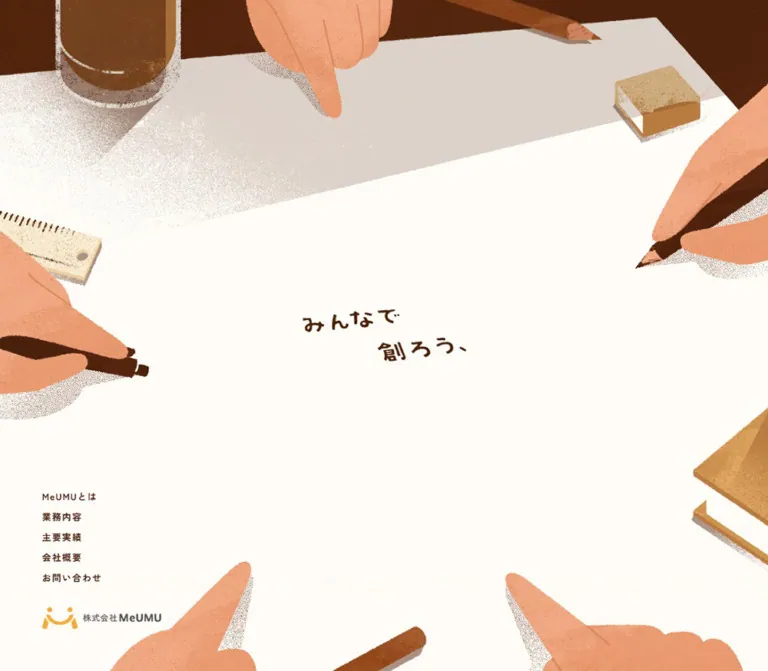
MeUMU presents event planning and production through the image of people working around a shared table. A large, nearly empty sheet occupies the opening screen. Peach-colored hands enter from the edges holding pencils or pointing inward. Rulers, books, glasses, and an eraser establish a practical working environment. The small central message, “みんなで 創ろう、”, gives the surrounding activity a clear purpose.
The composition combines expansive illustration with restrained interface typography. Warm paper #FFFCF7 and brown ink #4A200C connect the artwork, navigation, and informational sections. Grain, irregular edges, and drawn shadows supply the visual richness. Navigation sits near the lower-left corner on desktop; mobile pairs a smaller logo with a lower-right MENU control.
This is a long corporate narrative with five section destinations. Its distinctive structure includes centered introductory statements, narrow service and achievement columns, a wider company profile, and direct contact links. Preserve these changes in reading rhythm when adapting the design.
How to Read This Reference
- Measured values come from the supplied rendered DOM and computed-style records at the two stated viewports.
- Calculated values are arithmetic derived from those measurements, such as column proportions or space between text boxes.
- Estimated values describe visual bounds or colors judged from the original-page captures. They were not obtained through pixel sampling.
- Recommended values and code are implementation guidance. They do not establish how the original site was built.
- All token names introduced here are descriptive implementation aliases unless explicitly identified as source custom properties.
- The first five supplied images support visual observations. Lower-page typography and geometry are primarily DOM-backed; complete screenshots of those sections were not supplied.
- Recorded positions describe the inspected state. They are not instructions to hardcode document coordinates or reproduce unexplained empty scroll distance.
Tokens — Colors
Default Palette
| Name | Value | Suggested token | Evidence | Role |
|---|---|---|---|---|
| Warm Paper | #FFFCF7 |
--color-paper |
Measured: body background rgb(255, 252, 247) at both viewports |
Main page canvas and the visual foundation of the paper composition |
| Brown Ink | #4A200C |
--color-ink |
Measured: Japanese copy, navigation, and contact text | Primary text and the closest confirmed UI equivalent to the dark illustration linework |
| Table Brown | Approximately #713710 |
--color-table |
Visual estimate | Broad tabletop areas; the artwork contains several darker and lighter browns |
| Hand Peach | Approximately #F4A173 |
--color-peach |
Visual estimate | Hands and warm skin-colored illustration shapes |
| Pencil Ochre | Approximately #C48B42 |
--color-ochre |
Visual estimate | Pencils, book covers, rulers, and other wooden or paper objects |
| Logo Orange | Approximately #FFAD32 |
--color-brand-accent |
Visual estimate | Small orange symbol in the lower navigation identity |
| Wordmark Gray | Approximately #606060 |
--color-wordmark |
Visual estimate | Gray portion of the company logo |
Only Warm Paper and Brown Ink are confirmed flat design colors. The remaining values are convenient approximations for coordinating new artwork or supporting elements. They should not replace the tonal variation already present in supplied illustrations.
Color Behavior
The light opening and the darker tabletop captures share the same warm visual world. A brown illustration filling the screen does not establish a selectable dark theme. No theme switcher is evidenced.
The extracted root styles include black default text, transparent gradient stops, and loading-related variables. The visible Japanese paragraphs and navigation override the default black with Brown Ink. Likewise, contact-link wrappers report #333333, while their nested visible labels report #4A200C. Use the visible label color when reproducing the contact treatment.
Repeated transparent --g-color-* properties do not establish a visible multicolor gradient system. The prominent shading belongs to the illustration. Keep interface surfaces comparatively quiet.
Tokens — Typography
Zen Kaku Gothic New — Japanese Content
Computed family: Zen Kaku Gothic New.
This family is reported on the introductory statements, service descriptions, achievement lists, company information, privacy text, copyright, and desktop navigation. The source custom property --s-font-91850cc9 contains this family name.
Three weights organize the information:
900gives the centered introductory statements a deliberate, emphatic voice.700carries navigation, services, achievements, and company facts.500softens the much denser privacy text.
The prose remains compact in size but generous in vertical spacing. Services use a line height of 2; company facts use 1.6; privacy text uses 1.7. These differences distinguish narrative, reference information, and legal reading without adding elaborate containers.
Work Sans — Contact Labels
Computed family: Work Sans, corresponding to source variable --s-font-ea8c694b.
The telephone and email labels use weight 700, approximately 20px, and a one-em line box. Their surrounding parentheses are part of the actual UI labels. This produces a small but clearly stronger contact treatment within the otherwise modest type scale.
Hand-Lettered Hero
The opening message has uneven strokes, irregular character angles, and a gently staggered two-line arrangement. The second phrase starts farther to the right, creating a conversational diagonal across the blank paper.
The hero lettering is visible in the captures but is not represented as ordinary text in the supplied element sample. Its exact font, asset format, and rendering mechanism are unknown. Do not assign it one of the declared UI families without further evidence.
For an adaptation, use authorized lettering artwork or commission a short custom title. Keep a semantic heading and an accessible text equivalent. A standard font can provide a functional fallback, but it will not reproduce the observed stroke character.
Type Scale
Values below are measured unless marked otherwise. Desktop and mobile columns show font size / line height.
| Role | Family | Weight | Desktop | Mobile | Tracking |
|---|---|---|---|---|---|
| Introductory statement | Zen Kaku Gothic New | 900 |
17 / 17px |
14.82 / 14.82px |
Normal |
| Service description | Zen Kaku Gothic New | 700 |
15 / 30px |
13 / 26px |
-0.02em |
| Achievement item | Zen Kaku Gothic New | 700 |
15 / 23.25px |
13 / 20.15px |
-0.01em |
| Company label and value | Zen Kaku Gothic New | 700 |
15 / 24px |
13 / 20.8px |
0.03em |
| Telephone and email | Work Sans | 700 |
20 / 20px |
20.241 / 20.241px |
Normal |
| Privacy text | Zen Kaku Gothic New | 500 |
13 / 22.1px |
13 / 22.1px |
Normal |
| Copyright | Zen Kaku Gothic New | 700 |
13 / 13px |
11 / 11px |
0.1em |
| Desktop section link | Zen Kaku Gothic New | 700 |
13 / 13px |
Hidden in the sampled mobile state | 0.1em |
| Hero lettering | Unverified | Unverified | Approximately 34–38px visible character height |
Approximately 23–26px visible character height |
Irregular; visual estimate |
The one-em line height on the introduction belongs to separate short statement elements. Their generous reading rhythm comes from space between elements, not from a large paragraph line-height declaration.
Additional font variables name Zen Kaku Gothic Antique, Lato, and another mixed family stack. Their use on visible components is not established by the provided sample. The root's reported Times family is also not the family of the measured Japanese interface.
Tokens — Spacing & Shapes
Density: very open at the scene scale; compact inside navigation and information blocks. Geometry: unboxed UI, rectangular text regions, and irregular shapes within the artwork. Base unit: no universal spacing unit is established. Several measured distances coexist.
Spacing Scale
| Use | Desktop | Mobile | Evidence and interpretation |
|---|---|---|---|
| Logo left inset | 60px |
45px |
Measured |
| Logo bottom clearance | 60px |
45px |
Calculated from viewport and logo bounds |
| Navigation item pitch | 29px |
Not applicable in closed mobile state | Calculated between link tops |
| Space between desktop link boxes | 16px |
Not applicable | 29px pitch minus 13px line box |
| Last navigation link to logo | 36px |
Not applicable | Calculated between element bounds |
| Introductory line pitch within a group | Approximately 49.02px |
Approximately 42.28px |
Calculated between statement tops |
| Clear space between introductory line boxes | Approximately 32.02px |
Approximately 27.47px |
Calculated |
| Clear space between introductory groups | Approximately 78.08px |
Approximately 313.34px |
Calculated; mobile groups are substantially farther apart |
| Company cell vertical padding | 20px each side |
20px each side |
Measured |
| Interval after a company row's tallest cell | 2px |
2px |
Calculated; this does not identify a border style |
| Privacy paragraph spacing | 20px |
20px |
Calculated from adjacent paragraph bounds |
| Achievement text inset relative to service column | 16px |
16px |
Calculated from respective left edges |
The mobile introduction is not merely a scaled desktop paragraph. It uses additional line divisions and much larger separation between statement groups. This is a major responsive change in narrative pacing.
Border Radius
| Element | Observed treatment |
|---|---|
| Sampled text and link boxes | Computed 0px radius and transparent background |
| Desktop navigation | Plain text without a visible enclosing card |
| Mobile menu button | Transparent rectangular interaction box; computed 0px radius |
| Company information | Paired rectangular text regions; no rounded-card treatment established |
| Paper, hands, books, and tools | Their contours belong to the illustration, not a reusable CSS radius system |
There is no evidenced general elevation scale. Large shadows are drawn into the scene; they should not be copied into a generic card-shadow token.
Layout Measurements
| Element | Desktop 1440 × 1000 | Mobile 390 × 844 |
|---|---|---|
| Document height | 21,207.70px |
19,402.59px |
| Logo link | 170 × 31.125px, at 60, 908.875 |
130 × 23.797px, at 45, 775.203 |
| Desktop navigation group | Approximately 85.81 × 129px, starting at 60, 743.875 |
Section links absent from the sampled visible link list |
| Mobile menu button | Not present in supplied desktop sample | 125 × 93.891px, at 265, 750.109 |
| Hero lettering group | Approximately 275 × 85px, centered near 720, 500 |
Approximately 190 × 57px, centered near 195, 397 |
| Service paragraph | 260px wide, left edge 959.188px |
270px wide, left edge 60px |
| Company profile combined columns | 1019.188px, centered |
264.594px, centered |
| Company label column | 353.594px |
91.797px |
| Company value column | 665.594px |
172.797px |
| Privacy column | 750px, left edge 345px |
270px, left edge 60px |
Hero measurements are visual estimates. Other entries derive from the supplied DOM rectangles. The company columns retain approximately a 34.7% / 65.3% split at both inspected widths.
Components
Illustrated Opening
Role: establishes the shared-making concept before detailed company information.
The opening fills the captured viewport. Its anatomy is a warm paper field, surrounding tabletop and stationery, hands entering from multiple edges, a small central message, and navigation near the bottom. Most of the center remains unoccupied.
On desktop, a dark table band and broad illustrated shadow cross the upper part of the screen. A glass appears at the upper left, an eraser near the upper right, a ruler enters from the left, and books are cropped on the right. Hands point or draw toward the paper from above, both sides, and below.
The title is intentionally modest relative to the scene. Its combined width is approximately 19% of the desktop viewport. Avoid enlarging it until it competes with the gestures around it. The message depends on the available paper and the direction of the hands.
The artwork's exact DOM layering is unknown. A practical implementation can separate the scene, lettering, and controls into independent layers, provided that mobile receives its own composition and the controls remain operable.
Desktop Navigation and Identity Dock
Role: gives direct access to five sections while keeping the central illustration clear.
Five unboxed text links stack above the company logo:
| Source label | Confirmed destination | Content role |
|---|---|---|
MeUMUとは |
#about |
Company name and collaborative philosophy |
業務内容 |
#services |
Event planning, production, operation, and progress management |
主要実績 |
#works |
Examples of event and project experience |
会社概要 |
#company |
Company facts |
お問い合わせ |
#contact |
Telephone and email contact |
At the inspected desktop width, links start 60px from the left. Each uses 13px bold Japanese type, 0.1em tracking, and a 13px line box. The 16px space between boxes produces a tidy 29px pitch. A 36px gap separates the last link from the 170px logo.
This dock occupies the same lower-left position in the opening and intermediate desktop captures, supporting persistent placement across those observed states. It is absent from the full-tabletop capture. The conditions controlling that visibility are unverified.
The logo is a home link. Its orange symbol and gray wordmark provide a small identity accent within the brown interface. Its internal lettering should be treated as a logo asset rather than recreated from an assumed font.
Mobile Identity and Menu Control
Role: retains identity and a navigation entry point without displaying the desktop link stack.
The logo becomes 130px wide and sits 45px from the left and bottom. The visible MENU label sits near the lower-right corner. Its containing button is much larger than the lettering: 125 × 93.891px, extending to the right and bottom edges of the viewport.
The measured button padding is 30px 45px 52px 30px. This explains how a small visual label can have a generous interaction area. The label has a slightly irregular drawn appearance, but its exact typeface and asset mechanism are not verified.
No expanded menu state is supplied. Panel placement, dismissal, focus handling, link styling, and animation must therefore remain unspecified as original-site behavior. An adaptation should explicitly implement those details and retain the five confirmed section destinations.
Introductory Statement Sequence
Role: explains the company name and the idea that events require shared effort.
The introduction uses individually centered statements with weight 900. Their positions center on x = 720px on desktop and x = 195px on mobile. The longest sampled desktop line spans 425px; the longest mobile line spans approximately 311.23px.
The opening group contains the company name, the phrase “「Me(私)とYou(あなた)で生み出す」”, and a short explanation. Subsequent groups describe the participants in an event and the positive experience the company wants to create.
Desktop presents eleven sampled statement elements across four groups. Mobile presents fourteen, splitting several sentences more finely. The first-to-last text extent grows from approximately 645px on desktop to 1422px on mobile, even though the mobile type is smaller.
For implementation, preserve semantic paragraphs or groups and use short line elements only where the writing benefits from controlled phrasing. Keep the substantial gaps between groups distinct from ordinary line spacing. Do not apply the source's line-height: 1 to unrestricted long prose.
Service Description Sequence
Role: explains four stages of event work.
The supplied text covers planning and resource arrangement; production of content, programs, tools, and video; on-site operational preparation; and management of the event's overall progress.
Desktop paragraphs occupy a narrow right-side column at x = 959.188px, width 260px. Their type is 15px / 30px, weight 700, with slightly tightened tracking. The four measured paragraph heights are 150, 180, 120, and 180px.
Their top positions are approximately 505, 550, and 490px apart. These are distances between paragraph tops, not proven section heights. They indicate a widely spaced sequence with substantial room beyond the text.
Mobile paragraphs move to a centered 270px column with 60px side margins. Type becomes 13px / 26px. Their heights become 130, 104, 104, and 130px, while top-to-top intervals are approximately 635–661px.
An intermediate desktop capture shows the end of a service paragraph near the upper-right edge while the hands continue to frame a broad paper field. The exact artwork associated with every service is not supplied. Preserve the spacious relationship, but do not invent a verified four-card layout or a specific illustration for each service.
Achievement Lists
Role: establishes practical experience through short named examples.
The DOM groups examples into exhibition-related entries, corporate or public event formats, and a vaccination project entry. Listed examples include FOODEX JAPAN, 営業支援 EXPO, and 表彰式典.
Achievement text begins 16px farther right than the service paragraphs: at 975.188px on desktop and 76px on mobile. Use the same bold Japanese family with a tighter 1.55 line height and -0.01em tracking.
Desktop single-line entries advance by 29.25px; the first mobile list advances by 28px. Longer descriptions wrap within the narrow column. The evidence supports compact text lists. Thumbnail galleries, category filters, project-detail links, and card interactions are not established.
Company Profile
Role: provides factual company information in paired labels and values.
The original page identifies the operator as 株式会社MeUMU in this section. Its layout spans approximately 1019px on desktop and retains two columns on mobile. Labels occupy approximately 34.7% of the available width; values occupy the remainder.
Both sides use bold Japanese type with 0.03em tracking. Desktop cells have a 24px line height and 20px vertical padding, producing a 64px single-line box. A two-line value becomes 88px; a three-line value becomes 112px.
Mobile uses a 20.8px line height with the same padding. Single-line boxes are approximately 60.8px tall. Narrow values wrap naturally, and one longer label also wraps. Each row must accommodate the taller of its two cells.
A definition list or a semantic table is a suitable implementation recommendation. Keep the paired structure and consistent padding. Exact divider color and styling are not available in the supplied evidence; the measured 2px interval alone does not prove a drawn rule.
Contact Links
Role: offers two direct ways to initiate contact.
The confirmed link protocols are tel: and mailto:. Visible labels are enclosed in parentheses and use bold Work Sans at approximately 20px in Brown Ink.
On desktop, both anchor boxes are 300px wide and share nearly the same vertical position. Their horizontal centers are approximately 438px and 1002px, giving them broad separation across the page.
On mobile, the links are centered and stacked. The telephone anchor is approximately 177.44px wide; the email anchor is approximately 229.77px. Their top positions are about 392px apart. This is a spacious arrangement rather than a tight pair of stacked buttons.
The sampled anchor heights are approximately 30–32px. A new implementation should increase the usable target height while preserving the small visual label. Exact supplementary contact artwork is not available. A contact form is not evidenced.
Privacy Text and Copyright
Role: provides detailed policy information and a small corporate signature.
The DOM includes the full privacy policy with a modest heading, paragraphs, and a publication date. The text uses 13px / 22.1px, weight 500, at both viewports. Its column changes from 750px on desktop to 270px on mobile, with approximately 20px between paragraphs.
Copyright uses stronger weight and tracked text: 13px on desktop and 11px on mobile. The sampled copyright rectangle falls within the privacy text's vertical coordinate range, especially on mobile. Without a corresponding lower-page screenshot or visibility-state data, its actual visual relationship to the policy cannot be resolved.
Do not infer an accordion or modal from the presence of policy text alone. For an adaptation, keep policy content in a readable flow and give copyright its own clear space.
Full-Tabletop Illustration State
Role: supplies a second observed composition within the site's visual world; its precise place in the experience is unverified.
The desktop capture fills the screen with a brown table. Overlapping sheets at the center contain an illustration of five people. Pencils cross the composition, triangular rulers sit above, glasses catch pale highlights, books enter from the right, and a dark tablet is cropped at the lower left.
The mobile capture preserves the group drawing as the focal point while arranging the surrounding objects vertically. The navigation dock and central opening message are absent in these supplied frames.
These captures establish the existence and appearance of this state. They do not establish whether it is an entrance, a closing scene, a timed transition, or a particular scroll position. Avoid naming it a loading splash or assigning a duration without additional evidence.
Tokens — Motion & Interaction
Recorded Motion Values
| Target | Recorded value | What is supported |
|---|---|---|
| Body background | 0.5s cubic-bezier(0.4, 0.4, 0, 1) |
A background transition is declared; its trigger and endpoint colors are not supplied |
| Desktop introductory statements | 1.2s cubic-bezier(0.15, 0.5, 0.05, 1) |
A relatively long eased transition is declared |
| Desktop statement delays | 0.30s through 0.50s, in 0.02s increments |
Eleven sampled statements have staggered delays |
| Mobile introductory statements | No nonzero duration shown in the supplied transition serialization | The desktop timing cannot be assumed to apply unchanged |
| Company and privacy elements | 0.3s cubic-bezier(0.4, 0.4, 0, 1) |
Generic transitions are declared; this does not identify a hover or reveal effect |
| Logo, contact anchors, mobile button | 0.3s cubic-bezier(0.4, 0.4, 0, 1) |
Control wrappers have transition declarations; resulting visual states were not tested |
| Sampled element animations | animation: none |
No keyframe animation was reported on those sampled elements at inspection time |
The long serialized transition lists include custom gradient properties. They do not reveal which properties visibly change in each interaction. Source timing can be reused as a token, but displacement, opacity endpoints, masks, and triggers would be new implementation decisions.
Observed Interactions and Limits
- Desktop navigation contains real same-page anchor destinations. Click behavior, scrolling duration, and active-section indicators were not tested.
- Telephone and email destinations are established by rendered link attributes. No telephone call or email action was performed.
- A mobile button is present and visually labeled
MENU. Its expanded state is unverified. - The captures show materially different illustration arrangements. Static images do not reveal the path, speed, or mechanism between them.
- An intermediate capture retains the surrounding hands and lower-left dock while other content occupies the paper. This supports a recurring visual frame but does not prove a particular parallax implementation.
animation: noneon sampled text does not rule out JavaScript motion, ancestor transforms, image animation, or other unsampled layers.
For a new implementation, retain a readable static state and add motion progressively. If a reveal is desired, the recorded 1200ms easing and 20ms stagger provide a useful starting point. Exact visual endpoints must be chosen and documented separately.
Surfaces
| Layer | Appearance | Design purpose |
|---|---|---|
| Main canvas | Flat warm paper | Gives text and drawings a common background |
| Illustrated paper | Irregular pale sheets, grain, and drawn shading | Turns the blank space into a physical working surface |
| Tabletop | Multiple brown tones with directional shading | Adds enclosure and a grounded setting |
| Hands and tools | Peach, ochre, cream, and dark brown illustration | Frames the message and expresses shared work |
| Desktop navigation | Brown text and a small logo over the light field | Provides orientation with little visual enclosure |
| Mobile controls | Small visual labels within larger transparent boxes | Keeps the scene open while retaining touch access |
| Information blocks | Brown type on transparent backgrounds | Allows text to belong to the paper rather than to a separate card system |
The apparent depth comes from overlapping objects and illustrated shadows. No frosted-glass surface, floating rounded-card system, or general-purpose CSS shadow hierarchy is established.
Imagery
The illustration style is tactile and editorial: broad flat shapes, grainy color coverage, thin expressive linework, imperfect edges, and textured shadows. Glasses are described with pale contours and translucent-looking tonal areas. Pencils, rulers, books, and the eraser retain simple recognizable silhouettes.
Hands are especially important. They reach toward a common center from different directions, making cooperation visible before the company explanation is read. Their cropping suggests people continuing beyond the screen. Preserve that sense of a larger shared workspace.
The alternate tabletop composition places the human group inside a drawing on paper. This connects the surrounding tools to an imagined result. Its focal drawing should remain readable in portrait compositions even when peripheral objects are cropped.
The artwork is grainy rather than pixel-art styled. Use normal image interpolation and adequately resolved assets; image-rendering: pixelated would change the observed texture.
Observed Asset References
No original image URLs, filenames, intrinsic dimensions, or asset manifest were included in the supplied evidence. The following inventory identifies visual assets without inventing paths.
| Visual asset | Original-page evidence | Recommended handling |
|---|---|---|
| Hands and stationery around blank paper | Desktop and mobile opening captures | Use art-directed scene variants or separately composed layers |
| Central two-line lettering | Desktop and mobile opening captures | Keep as distinct lettering where possible, with accessible text |
| Orange-and-gray MeUMU logo | Opening captures and measured home-link bounds | Preserve aspect ratio; use the authentic identity asset |
| Full tabletop with group drawing | Desktop and mobile full-tabletop captures | Protect the central drawing through mobile art direction |
| Peripheral hand frame around content | Intermediate desktop capture | Use only where it leaves sufficient space for the current text |
A scene may be supplied as a precomposed image or assembled from individual pieces. The evidence does not identify which approach the original uses. In either case, avoid cropping a screenshot that already contains navigation and then adding duplicate live controls on top.
Layout & Responsive Behavior
Desktop Composition
At 1440 × 1000, the opening is dominated by the illustrated paper. The title sits near the viewport center, and the navigation group occupies a small lower-left region. The scene does not require a top navigation bar.
Later content uses several alignments. Introductory statements are centered. Service and achievement text sit near the right third. Company information expands across approximately 1019px, and privacy text returns to a centered 750px column. These width changes give each kind of information an appropriate reading shape.
The document measures approximately 21.2 desktop viewport heights. The large gaps and illustrated states are therefore part of an extended page experience, not evidence that every content block should have a uniform section height.
Mobile Composition
At 390 × 844, the title remains close to the visual center, slightly above the geometric midpoint. Its estimated 190px width occupies approximately 49% of the viewport, compared with 19% on desktop. This is a recomposed hierarchy, not proportional scaling of the whole desktop screen.
Hands and stationery enter at different positions. The ruler appears around the middle-left edge, lower hands extend toward the bottom navigation area, and the top paper scene uses different object placement. The mobile full-tabletop capture likewise changes the spatial relationships among glasses, pencils, the tablet, and the drawing. A single unchanged desktop background scaled with cover should not be assumed to reproduce these results.
The desktop link stack gives way to the bottom logo and MENU. Service text becomes centered at 270px wide. Achievement text retains a 16px internal inset. The company profile preserves two columns instead of stacking every label above its value. Contact links become vertically separated.
The mobile document measures about 23 viewport heights. Its absolute height is shorter than desktop, but the number of screens required to traverse it is slightly greater.
Responsive Evidence Boundaries
A 1280px media-query fragment is visible in the extracted source text for conditional line breaks. It does not establish the navigation breakpoint or the full responsive system. Only 1440px and 390px widths are directly documented here.
Similarly, the mobile introductory size of 14.82px equals 3.8vw at 390px, but that equality alone does not prove the original CSS formula. Any fluid interpolation between the two measured widths is a recommendation.
Safe-area support, landscape layouts, tablet states, browser zoom, and expanded mobile navigation remain unverified. The Quick Start includes safe-area handling and a proposed breakpoint as implementation additions.
Do’s and Don’ts
Do
- Keep the confirmed paper and ink pair:
#FFFCF7and#4A200C. - Give the opening message a large quiet area surrounded by purposeful gestures.
- Preserve grain, irregular contours, overlapping sheets, and drawn shadows.
- Keep the hero lettering small relative to the desktop illustration.
- Use Zen Kaku Gothic New for the measured Japanese content roles and Work Sans for contact labels.
- Maintain the distinction between heavy centered statements and smaller informational paragraphs.
- Preserve the lower-left desktop navigation anatomy and the compact mobile identity arrangement.
- Recompose the illustration for portrait screens.
- Retain narrow service copy, indented achievement lists, and a two-column company profile.
- Separate measured transition timing from unverified animation behavior.
Don't
- Don't replace the shared workspace with unrelated stock event photography.
- Don't fill the central paper with badges, decorative icons, or oversized conversion buttons.
- Don't turn every information group into a rounded card.
- Don't flatten the illustration into perfectly smooth geometric shapes.
- Don't apply pixelated image rendering to the grainy artwork.
- Don't use the root's default Times or black text as the primary UI specification.
- Don't assume every declared font variable is visibly used.
- Don't infer a dark-mode switch from the brown tabletop captures.
- Don't label the full-tabletop state as a loader or finale without interaction evidence.
- Don't hardcode a 21,000px page or several screens of empty space merely to match a document-height measurement.
- Don't invent filters, galleries, a contact form, or a verified menu animation.
Recommended Implementation Additions
These are recommendations for a new implementation, not verified features of the inspected page:
- Provide a semantic heading for the illustrated opening message, either as live text or through an appropriately labeled image.
- Mark decorative hands, tools, and textures as decorative. Give meaningful content illustrations concise alternatives where they communicate information.
- Give the logo link and mobile menu button explicit accessible names. Empty extracted text does not by itself establish whether accessible names already exist.
- Implement the menu with
aria-expanded, a defined controlled region, keyboard access, and appropriate dismissal behavior. - Expand small visible link labels into comfortable targets. Keep their visual size separate from their clickable area.
- Preserve visible focus indicators in Brown Ink and test them over every illustrated background where controls appear.
- Offer reduced-motion behavior and keep all section destinations usable without animated reveals.
- Keep essential copy visible if JavaScript or a decorative asset fails to load.
- Test the small mobile body text at zoom. Increase type size or reduce side margins when accessibility needs outweigh exact screenshot proportions.
- Load only the font weights actually used, reserve image dimensions, and defer noncritical artwork without destabilizing the opening composition.
- Keep privacy text and copyright in a clear reading order; verify their relationship with an actual lower-page capture before attempting close reproduction.
Agent Prompt Guide
Quick Color Reference
- Main paper: confirmed
#FFFCF7. - Main text and navigation: confirmed
#4A200C. - Tabletop coordination color: estimated
#713710. - Hands: estimated
#F4A173. - Wood and stationery: estimated
#C48B42. - Small logo accent: estimated
#FFAD32. - Depth: textured illustration and overlapping objects.
- Interface surfaces: mostly transparent over paper.
Overall Prompt
“Create an illustration-led corporate website for an event planning and production company, inspired by MeUMU's shared-workspace composition. Use warm paper #FFFCF7, deep brown text #4A200C, grainy peach hands, ochre stationery, and overlapping sheets on a brown table. Leave a large quiet central area for a small, irregular two-line Japanese message. Place five compact section links above a small logo at the lower left on desktop. On mobile, recompose the illustration and pair a smaller bottom-left logo with a bottom-right MENU control. Build the content as centered heavy introductory statements, a narrow right-side desktop service column, compact achievement lists, a wider two-column company profile, and direct telephone and email links. Use Zen Kaku Gothic New for Japanese copy and Work Sans for contact labels. Keep artwork texture and open space central to the design. Treat illustration motion and menu expansion as separately specified features.”
Example Component Prompts
- Opening scene: “Compose a viewport-sized sheet of warm paper surrounded by cropped hands pointing and drawing inward. Include a pencil, eraser, ruler, glass, and partial books. Use visible print-like grain and brown linework. Keep the center mostly empty, with a small staggered message such as ‘みんなで 創ろう、’. Provide separate desktop and portrait compositions.”
- Desktop navigation: “Create five unboxed brown links in 13px bold Zen Kaku Gothic New with 0.1em tracking. Use a 29px row pitch and a 36px gap before a 170px-wide logo. Anchor the group 60px from the left and bottom in the opening state.”
- Introductory statements: “Create four centered groups of short Japanese statements. Use weight 900, 17px text on desktop, and approximately 14.82px at a 390px mobile width. Separate line boxes by about 32px on desktop. On mobile, preserve intentional phrase breaks and substantially increase the pauses between groups.”
- Service and achievements: “Place 260px-wide service descriptions toward the right on desktop, using 15px type with 30px line height. Center a 270px column on a 390px phone, using 13px type with 26px line height. Give achievement lists a 16px inset and a tighter 1.55 line height. Keep backgrounds unboxed.”
- Company profile: “Build a warm-paper definition list with brown bold text. Retain approximately 34.7% label and 65.3% value columns at both desktop and mobile widths. Use 20px vertical cell padding and allow the taller cell to determine each row's height. Avoid rounded containers and arbitrary icons.”
- Tabletop illustration: “Create a textured brown working table with overlapping paper containing a small group drawing, pencils at varied angles, triangular rulers, translucent-looking glasses, a cropped tablet, and books. Preserve the drawing as the central subject when recomposing for portrait. Do not include interface text or controls inside the image.”
Quick Start
CSS Custom Properties
This is a reusable CSS foundation, not the original stylesheet. It carries over confirmed colors, type roles, navigation spacing, and principal column measurements. Illustration assets and font files must be supplied separately. No original asset paths were available.
The proposed 767px breakpoint, intermediate-width rules, ordinary-flow section spacing, enlarged contact targets, and hover/focus treatments are recommendations. The code does not implement the original illustration sequence or an expanded mobile menu.
Expected structure: an .opening-scene containing a decorative .scene-art picture and a .hero-message heading; a .site-dock containing .site-nav and .brand-link; a separate .mobile-menu button; and content blocks using the classes below. Place .privacy-copy directly within the page rather than inside the already inset .content-shell.
:root {
  /* Confirmed interface colors */
  --color-paper: #fffcf7;
  --color-ink: #4a200c;

  /* Estimated artwork coordination colors */
  --color-table: #713710;
  --color-peach: #f4a173;
  --color-ochre: #c48b42;
  --color-brand-accent: #ffad32;

  /* Confirmed computed families; load fonts separately */
  --font-japanese: 'Zen Kaku Gothic New', sans-serif;
  --font-latin: 'Work Sans', sans-serif;
  --size-nav: 13px;
  --size-body: 15px;
  --size-manifesto: 17px;
  --size-contact: 20px;
  --size-legal: 13px;
  --size-copyright: 13px;

  --leading-service: 2;
  --leading-works: 1.55;
  --leading-profile: 1.6;
  --leading-legal: 1.7;
  --tracking-nav: 0.1em;
  --tracking-service: -0.02em;
  --tracking-works: -0.01em;
  --tracking-profile: 0.03em;

  /* Measured sizes and rounded calculated spacing */
  --dock-inset: 60px;
  --brand-width: 170px;
  --nav-gap: 16px;
  --brand-gap: 36px;
  --content-inset: 60px;
  --content-wide: 1019.1875px;
  --service-width: 260px;
  --profile-label-share: 34.7%;
  --statement-gap: 32.02px;
  --stanza-gap: 78.08px;
  --cell-padding: 20px;

  /* Recorded timing, without assumed motion endpoints */
  --ease-ui: cubic-bezier(0.4, 0.4, 0, 1);
  --ease-reveal: cubic-bezier(0.15, 0.5, 0.05, 1);
  --duration-ui: 300ms;
  --duration-background: 500ms;
  --duration-reveal: 1200ms;
  --reveal-delay: 300ms;
  --reveal-stagger: 20ms;

  /* Recommended device accommodation */
  --safe-bottom: env(safe-area-inset-bottom, 0px);
}

* {
  box-sizing: border-box;
}

body {
  margin: 0;
}

.meumu-site {
  color: var(--color-ink);
  background: var(--color-paper);
  font-family: var(--font-japanese);
  font-weight: 700;
  transition: background var(--duration-background) var(--ease-ui);
}

.meumu-site a {
  color: inherit;
}

.opening-scene {
  position: relative;
  isolation: isolate;
  display: grid;
  place-items: center;
  min-block-size: 100vh;
  min-block-size: 100svh;
  overflow: clip;
  background: var(--color-paper);
}

/* Supply art-directed desktop and mobile images in this picture. */
.scene-art {
  position: absolute;
  inset: 0;
  z-index: 0;
  pointer-events: none;
}

.scene-art img {
  display: block;
  inline-size: 100%;
  block-size: 100%;
  object-fit: cover;
  image-rendering: auto;
}

/* The size follows estimated visible lettering bounds. */
.hero-message {
  position: relative;
  z-index: 1;
  inline-size: min(275px, calc(100% - 48px));
  margin: 0;
  color: var(--color-ink);
  text-align: center;
}

.hero-message img {
  display: block;
  inline-size: 100%;
  block-size: auto;
}

.site-dock {
  position: fixed;
  z-index: 10;
  inset-inline-start: var(--dock-inset);
  inset-block-end: calc(var(--dock-inset) + var(--safe-bottom));
  display: flex;
  flex-direction: column;
  align-items: flex-start;
  gap: var(--brand-gap);
}

.site-nav {
  display: grid;
  gap: var(--nav-gap);
}

.site-nav a {
  width: fit-content;
  font-size: var(--size-nav);
  line-height: 1;
  letter-spacing: var(--tracking-nav);
  text-decoration: none;
}

.brand-link {
  display: block;
  inline-size: var(--brand-width);
}

.brand-link img {
  display: block;
  inline-size: 100%;
  block-size: auto;
}

.mobile-menu {
  display: none;
}

.content-shell {
  inline-size: min(
    calc(100% - 2 * var(--content-inset)),
    var(--content-wide)
  );
  margin-inline: auto;
}

/* Ordinary-flow spacing is an adaptation, not a scroll timeline. */
.content-section {
  margin-block: clamp(120px, 20vh, 240px);
  scroll-margin-block-start: 32px;
}

.manifesto {
  display: grid;
  gap: var(--stanza-gap);
  inline-size: min(calc(100% - 48px), 600px);
  margin-inline: auto;
  text-align: center;
}

.manifesto-stanza {
  display: grid;
  gap: var(--statement-gap);
}

/* Use these for deliberately short statement lines. */
.manifesto-line {
  margin: 0;
  font-size: var(--size-manifesto);
  font-weight: 900;
  line-height: 1;
}

/* A proposed layout preserving the measured right-side copy. */
.service-row {
  display: grid;
  grid-template-columns: minmax(0, 1fr) var(--service-width);
  align-items: center;
  gap: 40px;
  min-block-size: 500px;
  padding-inline-end: 10.40625px;
}

.service-copy {
  grid-column: 2;
  min-inline-size: 0;
  margin: 0;
  font-size: var(--size-body);
  line-height: var(--leading-service);
  letter-spacing: var(--tracking-service);
}

.work-list {
  margin: 0;
  padding-inline-start: 16px;
  list-style: none;
  font-size: var(--size-body);
  line-height: var(--leading-works);
  letter-spacing: var(--tracking-works);
}

.work-list li + li {
  margin-block-start: 6px;
}

.company-profile {
  margin: 0;
  font-size: var(--size-body);
  line-height: var(--leading-profile);
  letter-spacing: var(--tracking-profile);
}

.profile-row {
  display: grid;
  grid-template-columns:
    var(--profile-label-share)
    minmax(0, 1fr);
  align-items: start;
}

.profile-row + .profile-row {
  margin-block-start: 2px;
}

.profile-row dt,
.profile-row dd {
  min-inline-size: 0;
  margin: 0;
  padding-block: var(--cell-padding);
  overflow-wrap: anywhere;
}

.contact-links {
  display: flex;
  justify-content: space-between;
  gap: 40px;
  max-inline-size: 864.78125px;
  margin-inline: auto;
}

.contact-link {
  display: grid;
  place-items: center;
  inline-size: 300px;
  max-inline-size: 100%;
  min-block-size: 44px;
  font-family: var(--font-latin);
  font-size: var(--size-contact);
  font-weight: 700;
  line-height: 1;
  text-align: center;
  text-decoration: none;
  overflow-wrap: anywhere;
}

.privacy-copy {
  inline-size: min(
    calc(100% - 2 * var(--content-inset)),
    750px
  );
  margin-inline: auto;
  font-size: var(--size-legal);
  font-weight: 500;
  line-height: var(--leading-legal);
}

.privacy-copy p {
  margin: 0;
}

.privacy-copy p + p {
  margin-block-start: 20px;
}

.copyright {
  margin-block: 60px;
  font-size: var(--size-copyright);
  line-height: 1;
  letter-spacing: 0.1em;
  text-align: center;
}

/* Recommended interaction feedback; original states were untested. */
.meumu-site :focus-visible {
  outline: 2px solid var(--color-ink);
  outline-offset: 4px;
}

@media (hover: hover) {
  .site-nav a:hover,
  .contact-link:hover {
    text-decoration: underline;
    text-underline-offset: 0.3em;
  }
}

/* Proposed breakpoint; only the 390px endpoint was inspected. */
@media (max-width: 767px) {
  :root {
    --dock-inset: 45px;
    --brand-width: 130px;
    --content-inset: clamp(24px, 15.3846vw, 60px);
    --size-body: 13px;
    --size-manifesto: clamp(14px, 3.8vw, 17px);
    --size-contact: 20.241px;
    --size-copyright: 11px;
    --statement-gap: 27.47px;
    --stanza-gap: 313.34px;
  }

  .hero-message {
    inline-size: min(190px, calc(100% - 48px));
    transform: translateY(-3svh);
  }

  .site-nav {
    display: none;
  }

  /* Wire this button to an accessible menu in application code. */
  .mobile-menu {
    position: fixed;
    z-index: 11;
    inset-inline-end: 0;
    inset-block-end: 0;
    display: flex;
    align-items: flex-start;
    inline-size: 125px;
    block-size: calc(93.891px + var(--safe-bottom));
    padding: 30px 45px calc(52px + var(--safe-bottom)) 30px;
    border: 0;
    border-radius: 0;
    color: var(--color-ink);
    background: transparent;
    font-family: var(--font-japanese);
    font-size: 12px;
    font-weight: 700;
    line-height: 1;
    letter-spacing: 0.12em;
    cursor: pointer;
  }

  .service-row {
    grid-template-columns: minmax(0, 1fr);
    gap: 40px;
    min-block-size: auto;
    padding: 0;
    margin-block: 120px;
  }

  .service-copy {
    grid-column: 1;
  }

  .work-list li + li {
    margin-block-start: 7.85px;
  }

  .company-profile {
    inline-size: 98%;
    margin-inline: auto;
  }

  /* Compact fallback spacing; original contact artwork is unknown. */
  .contact-links {
    flex-direction: column;
    align-items: center;
    gap: 80px;
  }
}

/* Recommended fallback for wrapped short-screen statements. */
@media (max-width: 360px) {
  .manifesto-line {
    line-height: 1.6;
  }
}

@media (prefers-reduced-motion: reduce) {
  .meumu-site,
  .meumu-site *,
  .meumu-site *::before,
  .meumu-site *::after {
    animation: none !important;
    transition: none !important;
    scroll-behavior: auto !important;
  }
}
This foundation leaves text visible by default. If JavaScript reveals or an illustration timeline are added, provide their own reduced-motion branch and an immediately readable fallback. The dock's visibility during alternate illustration states also requires an explicit design decision; the original conditions are unknown.
Tailwind v4 Token Mapping
Optional aliases for a project already using Tailwind v4. This does not imply that the inspected website uses Tailwind. Define the preceding custom properties first.
@theme inline {
  --color-paper: #fffcf7;
  --color-ink: #4a200c;

  /* Estimated artwork coordination colors */
  --color-table: #713710;
  --color-peach: #f4a173;
  --color-ochre: #c48b42;

  --font-body: var(--font-japanese);
  --font-contact: var(--font-latin);

  --text-copy: var(--size-body);
  --text-copy--line-height: 2;
  --text-statement: var(--size-manifesto);
  --text-statement--line-height: 1;
  --text-contact: var(--size-contact);
  --text-legal: var(--size-legal);
  --text-legal--line-height: 1.7;

  --spacing-dock: var(--dock-inset);
  --spacing-brand: var(--brand-width);
  --spacing-cell: 20px;
  --spacing-service: 260px;
}
Sources & Evidence
- MeUMU — current homepage: original and final URL, supplied HTTP 200 response, page title, and current rendered page evidence.
- Inspection timestamp:
2026-09-12T18:59:42.161Z, corresponding to September 13, 2026, 03:59 JST. - Desktop inspection:
1440 × 1000CSS pixels; original-page opening, intermediate, and full-tabletop captures; computed styles, text, link destinations, and element rectangles. Recorded document height:21,207.703125px. - Mobile inspection:
390 × 844CSS pixels; original-page opening and full-tabletop captures; computed styles, text, link destinations, and element rectangles. Recorded document height:19,402.59375px. - Confirmed same-page destinations: About, Services, Works, Company, and Contact.
- Capture procedure: the supplied browser process observed the initial page for at least five seconds and checked document load, finite animation readiness, sampled layout/text stability, and image decoding within bounded waits. Its scrolling procedure traversed intermediate positions. These checks do not prove that every delayed or interaction-dependent state was revealed.
- Inspection limitations: no additional browsing or command execution was performed for this reference. Raw asset URLs, complete stylesheets, font-loading verification, precise scroll offsets for the image-only states, menu expansion, hover states, keyboard behavior, illustration timing, and lower-page screenshot coverage were not supplied. SharedWorkers and service workers were disabled during the provided inspection.
This reference describes the current page represented by the supplied evidence. Exact UI measurements, visual estimates, and recommended implementation decisions are identified separately throughout.
# MeUMU — Style Reference

> A shared sheet of paper, surrounded by the hands that make an event happen.

**Website:** [meumu.jp](https://meumu.jp/)
**Original URL:** https://meumu.jp/
**Final URL:** https://meumu.jp/ — HTTP 200, unchanged destination.
**Theme:** warm light paper with deep brown text; illustrated scenes also contain extensive brown tabletop areas.
**Inspected:** September 13, 2026, 03:59 JST. Supplied retrieval timestamp: September 12, 2026, 18:59:42.161 UTC.
**Viewports:** desktop 1440 × 1000 and mobile 390 × 844 CSS pixels.
**Scope:** the current corporate homepage, including the illustrated opening, an intermediate desktop view, alternate full-tabletop captures, and rendered DOM evidence for About, Services, Works, Company, Contact, privacy text, and navigation. Menu expansion and precise illustration choreography were not exercised in the supplied evidence.

MeUMU presents event planning and production through the image of people working around a shared table. A large, nearly empty sheet occupies the opening screen. Peach-colored hands enter from the edges holding pencils or pointing inward. Rulers, books, glasses, and an eraser establish a practical working environment. The small central message, “みんなで 創ろう、”, gives the surrounding activity a clear purpose.

The composition combines expansive illustration with restrained interface typography. Warm paper `#FFFCF7` and brown ink `#4A200C` connect the artwork, navigation, and informational sections. Grain, irregular edges, and drawn shadows supply the visual richness. Navigation sits near the lower-left corner on desktop; mobile pairs a smaller logo with a lower-right `MENU` control.

This is a long corporate narrative with five section destinations. Its distinctive structure includes centered introductory statements, narrow service and achievement columns, a wider company profile, and direct contact links. Preserve these changes in reading rhythm when adapting the design.

## How to Read This Reference

- **Measured** values come from the supplied rendered DOM and computed-style records at the two stated viewports.
- **Calculated** values are arithmetic derived from those measurements, such as column proportions or space between text boxes.
- **Estimated** values describe visual bounds or colors judged from the original-page captures. They were not obtained through pixel sampling.
- **Recommended** values and code are implementation guidance. They do not establish how the original site was built.
- All token names introduced here are descriptive implementation aliases unless explicitly identified as source custom properties.
- The first five supplied images support visual observations. Lower-page typography and geometry are primarily DOM-backed; complete screenshots of those sections were not supplied.
- Recorded positions describe the inspected state. They are not instructions to hardcode document coordinates or reproduce unexplained empty scroll distance.

## Tokens — Colors

### Default Palette

| Name | Value | Suggested token | Evidence | Role |
| --- | --- | --- | --- | --- |
| Warm Paper | `#FFFCF7` | `--color-paper` | Measured: body background `rgb(255, 252, 247)` at both viewports | Main page canvas and the visual foundation of the paper composition |
| Brown Ink | `#4A200C` | `--color-ink` | Measured: Japanese copy, navigation, and contact text | Primary text and the closest confirmed UI equivalent to the dark illustration linework |
| Table Brown | Approximately `#713710` | `--color-table` | Visual estimate | Broad tabletop areas; the artwork contains several darker and lighter browns |
| Hand Peach | Approximately `#F4A173` | `--color-peach` | Visual estimate | Hands and warm skin-colored illustration shapes |
| Pencil Ochre | Approximately `#C48B42` | `--color-ochre` | Visual estimate | Pencils, book covers, rulers, and other wooden or paper objects |
| Logo Orange | Approximately `#FFAD32` | `--color-brand-accent` | Visual estimate | Small orange symbol in the lower navigation identity |
| Wordmark Gray | Approximately `#606060` | `--color-wordmark` | Visual estimate | Gray portion of the company logo |

Only Warm Paper and Brown Ink are confirmed flat design colors. The remaining values are convenient approximations for coordinating new artwork or supporting elements. They should not replace the tonal variation already present in supplied illustrations.

### Color Behavior

The light opening and the darker tabletop captures share the same warm visual world. A brown illustration filling the screen does not establish a selectable dark theme. No theme switcher is evidenced.

The extracted root styles include black default text, transparent gradient stops, and loading-related variables. The visible Japanese paragraphs and navigation override the default black with Brown Ink. Likewise, contact-link wrappers report `#333333`, while their nested visible labels report `#4A200C`. Use the visible label color when reproducing the contact treatment.

Repeated transparent `--g-color-*` properties do not establish a visible multicolor gradient system. The prominent shading belongs to the illustration. Keep interface surfaces comparatively quiet.

## Tokens — Typography

### Zen Kaku Gothic New — Japanese Content

**Computed family:** `Zen Kaku Gothic New`.

This family is reported on the introductory statements, service descriptions, achievement lists, company information, privacy text, copyright, and desktop navigation. The source custom property `--s-font-91850cc9` contains this family name.

Three weights organize the information:

- `900` gives the centered introductory statements a deliberate, emphatic voice.
- `700` carries navigation, services, achievements, and company facts.
- `500` softens the much denser privacy text.

The prose remains compact in size but generous in vertical spacing. Services use a line height of `2`; company facts use `1.6`; privacy text uses `1.7`. These differences distinguish narrative, reference information, and legal reading without adding elaborate containers.

### Work Sans — Contact Labels

**Computed family:** `Work Sans`, corresponding to source variable `--s-font-ea8c694b`.

The telephone and email labels use weight `700`, approximately `20px`, and a one-em line box. Their surrounding parentheses are part of the actual UI labels. This produces a small but clearly stronger contact treatment within the otherwise modest type scale.

### Hand-Lettered Hero

The opening message has uneven strokes, irregular character angles, and a gently staggered two-line arrangement. The second phrase starts farther to the right, creating a conversational diagonal across the blank paper.

The hero lettering is visible in the captures but is not represented as ordinary text in the supplied element sample. Its exact font, asset format, and rendering mechanism are unknown. Do not assign it one of the declared UI families without further evidence.

For an adaptation, use authorized lettering artwork or commission a short custom title. Keep a semantic heading and an accessible text equivalent. A standard font can provide a functional fallback, but it will not reproduce the observed stroke character.

### Type Scale

Values below are measured unless marked otherwise. Desktop and mobile columns show font size / line height.

| Role | Family | Weight | Desktop | Mobile | Tracking |
| --- | --- | --- | --- | --- | --- |
| Introductory statement | Zen Kaku Gothic New | `900` | `17 / 17px` | `14.82 / 14.82px` | Normal |
| Service description | Zen Kaku Gothic New | `700` | `15 / 30px` | `13 / 26px` | `-0.02em` |
| Achievement item | Zen Kaku Gothic New | `700` | `15 / 23.25px` | `13 / 20.15px` | `-0.01em` |
| Company label and value | Zen Kaku Gothic New | `700` | `15 / 24px` | `13 / 20.8px` | `0.03em` |
| Telephone and email | Work Sans | `700` | `20 / 20px` | `20.241 / 20.241px` | Normal |
| Privacy text | Zen Kaku Gothic New | `500` | `13 / 22.1px` | `13 / 22.1px` | Normal |
| Copyright | Zen Kaku Gothic New | `700` | `13 / 13px` | `11 / 11px` | `0.1em` |
| Desktop section link | Zen Kaku Gothic New | `700` | `13 / 13px` | Hidden in the sampled mobile state | `0.1em` |
| Hero lettering | Unverified | Unverified | Approximately `34–38px` visible character height | Approximately `23–26px` visible character height | Irregular; visual estimate |

The one-em line height on the introduction belongs to separate short statement elements. Their generous reading rhythm comes from space between elements, not from a large paragraph line-height declaration.

Additional font variables name Zen Kaku Gothic Antique, Lato, and another mixed family stack. Their use on visible components is not established by the provided sample. The root's reported Times family is also not the family of the measured Japanese interface.

## Tokens — Spacing & Shapes

**Density:** very open at the scene scale; compact inside navigation and information blocks.
**Geometry:** unboxed UI, rectangular text regions, and irregular shapes within the artwork.
**Base unit:** no universal spacing unit is established. Several measured distances coexist.

### Spacing Scale

| Use | Desktop | Mobile | Evidence and interpretation |
| --- | --- | --- | --- |
| Logo left inset | `60px` | `45px` | Measured |
| Logo bottom clearance | `60px` | `45px` | Calculated from viewport and logo bounds |
| Navigation item pitch | `29px` | Not applicable in closed mobile state | Calculated between link tops |
| Space between desktop link boxes | `16px` | Not applicable | `29px` pitch minus `13px` line box |
| Last navigation link to logo | `36px` | Not applicable | Calculated between element bounds |
| Introductory line pitch within a group | Approximately `49.02px` | Approximately `42.28px` | Calculated between statement tops |
| Clear space between introductory line boxes | Approximately `32.02px` | Approximately `27.47px` | Calculated |
| Clear space between introductory groups | Approximately `78.08px` | Approximately `313.34px` | Calculated; mobile groups are substantially farther apart |
| Company cell vertical padding | `20px` each side | `20px` each side | Measured |
| Interval after a company row's tallest cell | `2px` | `2px` | Calculated; this does not identify a border style |
| Privacy paragraph spacing | `20px` | `20px` | Calculated from adjacent paragraph bounds |
| Achievement text inset relative to service column | `16px` | `16px` | Calculated from respective left edges |

The mobile introduction is not merely a scaled desktop paragraph. It uses additional line divisions and much larger separation between statement groups. This is a major responsive change in narrative pacing.

### Border Radius

| Element | Observed treatment |
| --- | --- |
| Sampled text and link boxes | Computed `0px` radius and transparent background |
| Desktop navigation | Plain text without a visible enclosing card |
| Mobile menu button | Transparent rectangular interaction box; computed `0px` radius |
| Company information | Paired rectangular text regions; no rounded-card treatment established |
| Paper, hands, books, and tools | Their contours belong to the illustration, not a reusable CSS radius system |

There is no evidenced general elevation scale. Large shadows are drawn into the scene; they should not be copied into a generic card-shadow token.

### Layout Measurements

| Element | Desktop 1440 × 1000 | Mobile 390 × 844 |
| --- | --- | --- |
| Document height | `21,207.70px` | `19,402.59px` |
| Logo link | `170 × 31.125px`, at `60, 908.875` | `130 × 23.797px`, at `45, 775.203` |
| Desktop navigation group | Approximately `85.81 × 129px`, starting at `60, 743.875` | Section links absent from the sampled visible link list |
| Mobile menu button | Not present in supplied desktop sample | `125 × 93.891px`, at `265, 750.109` |
| Hero lettering group | Approximately `275 × 85px`, centered near `720, 500` | Approximately `190 × 57px`, centered near `195, 397` |
| Service paragraph | `260px` wide, left edge `959.188px` | `270px` wide, left edge `60px` |
| Company profile combined columns | `1019.188px`, centered | `264.594px`, centered |
| Company label column | `353.594px` | `91.797px` |
| Company value column | `665.594px` | `172.797px` |
| Privacy column | `750px`, left edge `345px` | `270px`, left edge `60px` |

Hero measurements are visual estimates. Other entries derive from the supplied DOM rectangles. The company columns retain approximately a **34.7% / 65.3%** split at both inspected widths.

## Components

### Illustrated Opening

**Role:** establishes the shared-making concept before detailed company information.

The opening fills the captured viewport. Its anatomy is a warm paper field, surrounding tabletop and stationery, hands entering from multiple edges, a small central message, and navigation near the bottom. Most of the center remains unoccupied.

On desktop, a dark table band and broad illustrated shadow cross the upper part of the screen. A glass appears at the upper left, an eraser near the upper right, a ruler enters from the left, and books are cropped on the right. Hands point or draw toward the paper from above, both sides, and below.

The title is intentionally modest relative to the scene. Its combined width is approximately 19% of the desktop viewport. Avoid enlarging it until it competes with the gestures around it. The message depends on the available paper and the direction of the hands.

The artwork's exact DOM layering is unknown. A practical implementation can separate the scene, lettering, and controls into independent layers, provided that mobile receives its own composition and the controls remain operable.

### Desktop Navigation and Identity Dock

**Role:** gives direct access to five sections while keeping the central illustration clear.

Five unboxed text links stack above the company logo:

| Source label | Confirmed destination | Content role |
| --- | --- | --- |
| `MeUMUとは` | `#about` | Company name and collaborative philosophy |
| `業務内容` | `#services` | Event planning, production, operation, and progress management |
| `主要実績` | `#works` | Examples of event and project experience |
| `会社概要` | `#company` | Company facts |
| `お問い合わせ` | `#contact` | Telephone and email contact |

At the inspected desktop width, links start `60px` from the left. Each uses `13px` bold Japanese type, `0.1em` tracking, and a `13px` line box. The `16px` space between boxes produces a tidy `29px` pitch. A `36px` gap separates the last link from the `170px` logo.

This dock occupies the same lower-left position in the opening and intermediate desktop captures, supporting persistent placement across those observed states. It is absent from the full-tabletop capture. The conditions controlling that visibility are unverified.

The logo is a home link. Its orange symbol and gray wordmark provide a small identity accent within the brown interface. Its internal lettering should be treated as a logo asset rather than recreated from an assumed font.

### Mobile Identity and Menu Control

**Role:** retains identity and a navigation entry point without displaying the desktop link stack.

The logo becomes `130px` wide and sits `45px` from the left and bottom. The visible `MENU` label sits near the lower-right corner. Its containing button is much larger than the lettering: `125 × 93.891px`, extending to the right and bottom edges of the viewport.

The measured button padding is `30px 45px 52px 30px`. This explains how a small visual label can have a generous interaction area. The label has a slightly irregular drawn appearance, but its exact typeface and asset mechanism are not verified.

No expanded menu state is supplied. Panel placement, dismissal, focus handling, link styling, and animation must therefore remain unspecified as original-site behavior. An adaptation should explicitly implement those details and retain the five confirmed section destinations.

### Introductory Statement Sequence

**Role:** explains the company name and the idea that events require shared effort.

The introduction uses individually centered statements with weight `900`. Their positions center on `x = 720px` on desktop and `x = 195px` on mobile. The longest sampled desktop line spans `425px`; the longest mobile line spans approximately `311.23px`.

The opening group contains the company name, the phrase “「Me(私)とYou(あなた)で生み出す」”, and a short explanation. Subsequent groups describe the participants in an event and the positive experience the company wants to create.

Desktop presents eleven sampled statement elements across four groups. Mobile presents fourteen, splitting several sentences more finely. The first-to-last text extent grows from approximately `645px` on desktop to `1422px` on mobile, even though the mobile type is smaller.

For implementation, preserve semantic paragraphs or groups and use short line elements only where the writing benefits from controlled phrasing. Keep the substantial gaps between groups distinct from ordinary line spacing. Do not apply the source's `line-height: 1` to unrestricted long prose.

### Service Description Sequence

**Role:** explains four stages of event work.

The supplied text covers planning and resource arrangement; production of content, programs, tools, and video; on-site operational preparation; and management of the event's overall progress.

Desktop paragraphs occupy a narrow right-side column at `x = 959.188px`, width `260px`. Their type is `15px / 30px`, weight `700`, with slightly tightened tracking. The four measured paragraph heights are `150`, `180`, `120`, and `180px`.

Their top positions are approximately `505`, `550`, and `490px` apart. These are distances between paragraph tops, not proven section heights. They indicate a widely spaced sequence with substantial room beyond the text.

Mobile paragraphs move to a centered `270px` column with `60px` side margins. Type becomes `13px / 26px`. Their heights become `130`, `104`, `104`, and `130px`, while top-to-top intervals are approximately `635–661px`.

An intermediate desktop capture shows the end of a service paragraph near the upper-right edge while the hands continue to frame a broad paper field. The exact artwork associated with every service is not supplied. Preserve the spacious relationship, but do not invent a verified four-card layout or a specific illustration for each service.

### Achievement Lists

**Role:** establishes practical experience through short named examples.

The DOM groups examples into exhibition-related entries, corporate or public event formats, and a vaccination project entry. Listed examples include `FOODEX JAPAN`, `営業支援 EXPO`, and `表彰式典`.

Achievement text begins `16px` farther right than the service paragraphs: at `975.188px` on desktop and `76px` on mobile. Use the same bold Japanese family with a tighter `1.55` line height and `-0.01em` tracking.

Desktop single-line entries advance by `29.25px`; the first mobile list advances by `28px`. Longer descriptions wrap within the narrow column. The evidence supports compact text lists. Thumbnail galleries, category filters, project-detail links, and card interactions are not established.

### Company Profile

**Role:** provides factual company information in paired labels and values.

The original page identifies the operator as `株式会社MeUMU` in this section. Its layout spans approximately `1019px` on desktop and retains two columns on mobile. Labels occupy approximately 34.7% of the available width; values occupy the remainder.

Both sides use bold Japanese type with `0.03em` tracking. Desktop cells have a `24px` line height and `20px` vertical padding, producing a `64px` single-line box. A two-line value becomes `88px`; a three-line value becomes `112px`.

Mobile uses a `20.8px` line height with the same padding. Single-line boxes are approximately `60.8px` tall. Narrow values wrap naturally, and one longer label also wraps. Each row must accommodate the taller of its two cells.

A definition list or a semantic table is a suitable implementation recommendation. Keep the paired structure and consistent padding. Exact divider color and styling are not available in the supplied evidence; the measured `2px` interval alone does not prove a drawn rule.

### Contact Links

**Role:** offers two direct ways to initiate contact.

The confirmed link protocols are `tel:` and `mailto:`. Visible labels are enclosed in parentheses and use bold Work Sans at approximately `20px` in Brown Ink.

On desktop, both anchor boxes are `300px` wide and share nearly the same vertical position. Their horizontal centers are approximately `438px` and `1002px`, giving them broad separation across the page.

On mobile, the links are centered and stacked. The telephone anchor is approximately `177.44px` wide; the email anchor is approximately `229.77px`. Their top positions are about `392px` apart. This is a spacious arrangement rather than a tight pair of stacked buttons.

The sampled anchor heights are approximately `30–32px`. A new implementation should increase the usable target height while preserving the small visual label. Exact supplementary contact artwork is not available. A contact form is not evidenced.

### Privacy Text and Copyright

**Role:** provides detailed policy information and a small corporate signature.

The DOM includes the full privacy policy with a modest heading, paragraphs, and a publication date. The text uses `13px / 22.1px`, weight `500`, at both viewports. Its column changes from `750px` on desktop to `270px` on mobile, with approximately `20px` between paragraphs.

Copyright uses stronger weight and tracked text: `13px` on desktop and `11px` on mobile. The sampled copyright rectangle falls within the privacy text's vertical coordinate range, especially on mobile. Without a corresponding lower-page screenshot or visibility-state data, its actual visual relationship to the policy cannot be resolved.

Do not infer an accordion or modal from the presence of policy text alone. For an adaptation, keep policy content in a readable flow and give copyright its own clear space.

### Full-Tabletop Illustration State

**Role:** supplies a second observed composition within the site's visual world; its precise place in the experience is unverified.

The desktop capture fills the screen with a brown table. Overlapping sheets at the center contain an illustration of five people. Pencils cross the composition, triangular rulers sit above, glasses catch pale highlights, books enter from the right, and a dark tablet is cropped at the lower left.

The mobile capture preserves the group drawing as the focal point while arranging the surrounding objects vertically. The navigation dock and central opening message are absent in these supplied frames.

These captures establish the existence and appearance of this state. They do not establish whether it is an entrance, a closing scene, a timed transition, or a particular scroll position. Avoid naming it a loading splash or assigning a duration without additional evidence.

## Tokens — Motion & Interaction

### Recorded Motion Values

| Target | Recorded value | What is supported |
| --- | --- | --- |
| Body background | `0.5s cubic-bezier(0.4, 0.4, 0, 1)` | A background transition is declared; its trigger and endpoint colors are not supplied |
| Desktop introductory statements | `1.2s cubic-bezier(0.15, 0.5, 0.05, 1)` | A relatively long eased transition is declared |
| Desktop statement delays | `0.30s` through `0.50s`, in `0.02s` increments | Eleven sampled statements have staggered delays |
| Mobile introductory statements | No nonzero duration shown in the supplied transition serialization | The desktop timing cannot be assumed to apply unchanged |
| Company and privacy elements | `0.3s cubic-bezier(0.4, 0.4, 0, 1)` | Generic transitions are declared; this does not identify a hover or reveal effect |
| Logo, contact anchors, mobile button | `0.3s cubic-bezier(0.4, 0.4, 0, 1)` | Control wrappers have transition declarations; resulting visual states were not tested |
| Sampled element animations | `animation: none` | No keyframe animation was reported on those sampled elements at inspection time |

The long serialized transition lists include custom gradient properties. They do not reveal which properties visibly change in each interaction. Source timing can be reused as a token, but displacement, opacity endpoints, masks, and triggers would be new implementation decisions.

### Observed Interactions and Limits

- Desktop navigation contains real same-page anchor destinations. Click behavior, scrolling duration, and active-section indicators were not tested.
- Telephone and email destinations are established by rendered link attributes. No telephone call or email action was performed.
- A mobile button is present and visually labeled `MENU`. Its expanded state is unverified.
- The captures show materially different illustration arrangements. Static images do not reveal the path, speed, or mechanism between them.
- An intermediate capture retains the surrounding hands and lower-left dock while other content occupies the paper. This supports a recurring visual frame but does not prove a particular parallax implementation.
- `animation: none` on sampled text does not rule out JavaScript motion, ancestor transforms, image animation, or other unsampled layers.

For a new implementation, retain a readable static state and add motion progressively. If a reveal is desired, the recorded `1200ms` easing and `20ms` stagger provide a useful starting point. Exact visual endpoints must be chosen and documented separately.

## Surfaces

| Layer | Appearance | Design purpose |
| --- | --- | --- |
| Main canvas | Flat warm paper | Gives text and drawings a common background |
| Illustrated paper | Irregular pale sheets, grain, and drawn shading | Turns the blank space into a physical working surface |
| Tabletop | Multiple brown tones with directional shading | Adds enclosure and a grounded setting |
| Hands and tools | Peach, ochre, cream, and dark brown illustration | Frames the message and expresses shared work |
| Desktop navigation | Brown text and a small logo over the light field | Provides orientation with little visual enclosure |
| Mobile controls | Small visual labels within larger transparent boxes | Keeps the scene open while retaining touch access |
| Information blocks | Brown type on transparent backgrounds | Allows text to belong to the paper rather than to a separate card system |

The apparent depth comes from overlapping objects and illustrated shadows. No frosted-glass surface, floating rounded-card system, or general-purpose CSS shadow hierarchy is established.

## Imagery

The illustration style is tactile and editorial: broad flat shapes, grainy color coverage, thin expressive linework, imperfect edges, and textured shadows. Glasses are described with pale contours and translucent-looking tonal areas. Pencils, rulers, books, and the eraser retain simple recognizable silhouettes.

Hands are especially important. They reach toward a common center from different directions, making cooperation visible before the company explanation is read. Their cropping suggests people continuing beyond the screen. Preserve that sense of a larger shared workspace.

The alternate tabletop composition places the human group inside a drawing on paper. This connects the surrounding tools to an imagined result. Its focal drawing should remain readable in portrait compositions even when peripheral objects are cropped.

The artwork is grainy rather than pixel-art styled. Use normal image interpolation and adequately resolved assets; `image-rendering: pixelated` would change the observed texture.

### Observed Asset References

No original image URLs, filenames, intrinsic dimensions, or asset manifest were included in the supplied evidence. The following inventory identifies visual assets without inventing paths.

| Visual asset | Original-page evidence | Recommended handling |
| --- | --- | --- |
| Hands and stationery around blank paper | Desktop and mobile opening captures | Use art-directed scene variants or separately composed layers |
| Central two-line lettering | Desktop and mobile opening captures | Keep as distinct lettering where possible, with accessible text |
| Orange-and-gray MeUMU logo | Opening captures and measured home-link bounds | Preserve aspect ratio; use the authentic identity asset |
| Full tabletop with group drawing | Desktop and mobile full-tabletop captures | Protect the central drawing through mobile art direction |
| Peripheral hand frame around content | Intermediate desktop capture | Use only where it leaves sufficient space for the current text |

A scene may be supplied as a precomposed image or assembled from individual pieces. The evidence does not identify which approach the original uses. In either case, avoid cropping a screenshot that already contains navigation and then adding duplicate live controls on top.

## Layout & Responsive Behavior

### Desktop Composition

At 1440 × 1000, the opening is dominated by the illustrated paper. The title sits near the viewport center, and the navigation group occupies a small lower-left region. The scene does not require a top navigation bar.

Later content uses several alignments. Introductory statements are centered. Service and achievement text sit near the right third. Company information expands across approximately `1019px`, and privacy text returns to a centered `750px` column. These width changes give each kind of information an appropriate reading shape.

The document measures approximately 21.2 desktop viewport heights. The large gaps and illustrated states are therefore part of an extended page experience, not evidence that every content block should have a uniform section height.

### Mobile Composition

At 390 × 844, the title remains close to the visual center, slightly above the geometric midpoint. Its estimated `190px` width occupies approximately 49% of the viewport, compared with 19% on desktop. This is a recomposed hierarchy, not proportional scaling of the whole desktop screen.

Hands and stationery enter at different positions. The ruler appears around the middle-left edge, lower hands extend toward the bottom navigation area, and the top paper scene uses different object placement. The mobile full-tabletop capture likewise changes the spatial relationships among glasses, pencils, the tablet, and the drawing. A single unchanged desktop background scaled with `cover` should not be assumed to reproduce these results.

The desktop link stack gives way to the bottom logo and `MENU`. Service text becomes centered at `270px` wide. Achievement text retains a `16px` internal inset. The company profile preserves two columns instead of stacking every label above its value. Contact links become vertically separated.

The mobile document measures about 23 viewport heights. Its absolute height is shorter than desktop, but the number of screens required to traverse it is slightly greater.

### Responsive Evidence Boundaries

A `1280px` media-query fragment is visible in the extracted source text for conditional line breaks. It does not establish the navigation breakpoint or the full responsive system. Only 1440px and 390px widths are directly documented here.

Similarly, the mobile introductory size of `14.82px` equals `3.8vw` at 390px, but that equality alone does not prove the original CSS formula. Any fluid interpolation between the two measured widths is a recommendation.

Safe-area support, landscape layouts, tablet states, browser zoom, and expanded mobile navigation remain unverified. The Quick Start includes safe-area handling and a proposed breakpoint as implementation additions.

## Do’s and Don’ts

### Do

- Keep the confirmed paper and ink pair: `#FFFCF7` and `#4A200C`.
- Give the opening message a large quiet area surrounded by purposeful gestures.
- Preserve grain, irregular contours, overlapping sheets, and drawn shadows.
- Keep the hero lettering small relative to the desktop illustration.
- Use Zen Kaku Gothic New for the measured Japanese content roles and Work Sans for contact labels.
- Maintain the distinction between heavy centered statements and smaller informational paragraphs.
- Preserve the lower-left desktop navigation anatomy and the compact mobile identity arrangement.
- Recompose the illustration for portrait screens.
- Retain narrow service copy, indented achievement lists, and a two-column company profile.
- Separate measured transition timing from unverified animation behavior.

### Don't

- Don't replace the shared workspace with unrelated stock event photography.
- Don't fill the central paper with badges, decorative icons, or oversized conversion buttons.
- Don't turn every information group into a rounded card.
- Don't flatten the illustration into perfectly smooth geometric shapes.
- Don't apply pixelated image rendering to the grainy artwork.
- Don't use the root's default Times or black text as the primary UI specification.
- Don't assume every declared font variable is visibly used.
- Don't infer a dark-mode switch from the brown tabletop captures.
- Don't label the full-tabletop state as a loader or finale without interaction evidence.
- Don't hardcode a 21,000px page or several screens of empty space merely to match a document-height measurement.
- Don't invent filters, galleries, a contact form, or a verified menu animation.

## Recommended Implementation Additions

These are recommendations for a new implementation, not verified features of the inspected page:

- Provide a semantic heading for the illustrated opening message, either as live text or through an appropriately labeled image.
- Mark decorative hands, tools, and textures as decorative. Give meaningful content illustrations concise alternatives where they communicate information.
- Give the logo link and mobile menu button explicit accessible names. Empty extracted text does not by itself establish whether accessible names already exist.
- Implement the menu with `aria-expanded`, a defined controlled region, keyboard access, and appropriate dismissal behavior.
- Expand small visible link labels into comfortable targets. Keep their visual size separate from their clickable area.
- Preserve visible focus indicators in Brown Ink and test them over every illustrated background where controls appear.
- Offer reduced-motion behavior and keep all section destinations usable without animated reveals.
- Keep essential copy visible if JavaScript or a decorative asset fails to load.
- Test the small mobile body text at zoom. Increase type size or reduce side margins when accessibility needs outweigh exact screenshot proportions.
- Load only the font weights actually used, reserve image dimensions, and defer noncritical artwork without destabilizing the opening composition.
- Keep privacy text and copyright in a clear reading order; verify their relationship with an actual lower-page capture before attempting close reproduction.

## Agent Prompt Guide

### Quick Color Reference

- Main paper: confirmed `#FFFCF7`.
- Main text and navigation: confirmed `#4A200C`.
- Tabletop coordination color: estimated `#713710`.
- Hands: estimated `#F4A173`.
- Wood and stationery: estimated `#C48B42`.
- Small logo accent: estimated `#FFAD32`.
- Depth: textured illustration and overlapping objects.
- Interface surfaces: mostly transparent over paper.

### Overall Prompt

“Create an illustration-led corporate website for an event planning and production company, inspired by MeUMU's shared-workspace composition. Use warm paper `#FFFCF7`, deep brown text `#4A200C`, grainy peach hands, ochre stationery, and overlapping sheets on a brown table. Leave a large quiet central area for a small, irregular two-line Japanese message. Place five compact section links above a small logo at the lower left on desktop. On mobile, recompose the illustration and pair a smaller bottom-left logo with a bottom-right MENU control. Build the content as centered heavy introductory statements, a narrow right-side desktop service column, compact achievement lists, a wider two-column company profile, and direct telephone and email links. Use Zen Kaku Gothic New for Japanese copy and Work Sans for contact labels. Keep artwork texture and open space central to the design. Treat illustration motion and menu expansion as separately specified features.”

### Example Component Prompts

1. **Opening scene:** “Compose a viewport-sized sheet of warm paper surrounded by cropped hands pointing and drawing inward. Include a pencil, eraser, ruler, glass, and partial books. Use visible print-like grain and brown linework. Keep the center mostly empty, with a small staggered message such as ‘みんなで 創ろう、’. Provide separate desktop and portrait compositions.”
2. **Desktop navigation:** “Create five unboxed brown links in 13px bold Zen Kaku Gothic New with 0.1em tracking. Use a 29px row pitch and a 36px gap before a 170px-wide logo. Anchor the group 60px from the left and bottom in the opening state.”
3. **Introductory statements:** “Create four centered groups of short Japanese statements. Use weight 900, 17px text on desktop, and approximately 14.82px at a 390px mobile width. Separate line boxes by about 32px on desktop. On mobile, preserve intentional phrase breaks and substantially increase the pauses between groups.”
4. **Service and achievements:** “Place 260px-wide service descriptions toward the right on desktop, using 15px type with 30px line height. Center a 270px column on a 390px phone, using 13px type with 26px line height. Give achievement lists a 16px inset and a tighter 1.55 line height. Keep backgrounds unboxed.”
5. **Company profile:** “Build a warm-paper definition list with brown bold text. Retain approximately 34.7% label and 65.3% value columns at both desktop and mobile widths. Use 20px vertical cell padding and allow the taller cell to determine each row's height. Avoid rounded containers and arbitrary icons.”
6. **Tabletop illustration:** “Create a textured brown working table with overlapping paper containing a small group drawing, pencils at varied angles, triangular rulers, translucent-looking glasses, a cropped tablet, and books. Preserve the drawing as the central subject when recomposing for portrait. Do not include interface text or controls inside the image.”

## Quick Start

### CSS Custom Properties

This is a reusable CSS foundation, not the original stylesheet. It carries over confirmed colors, type roles, navigation spacing, and principal column measurements. Illustration assets and font files must be supplied separately. No original asset paths were available.

The proposed `767px` breakpoint, intermediate-width rules, ordinary-flow section spacing, enlarged contact targets, and hover/focus treatments are recommendations. The code does not implement the original illustration sequence or an expanded mobile menu.

Expected structure: an `.opening-scene` containing a decorative `.scene-art` picture and a `.hero-message` heading; a `.site-dock` containing `.site-nav` and `.brand-link`; a separate `.mobile-menu` button; and content blocks using the classes below. Place `.privacy-copy` directly within the page rather than inside the already inset `.content-shell`.

```css
:root {
  /* Confirmed interface colors */
  --color-paper: #fffcf7;
  --color-ink: #4a200c;

  /* Estimated artwork coordination colors */
  --color-table: #713710;
  --color-peach: #f4a173;
  --color-ochre: #c48b42;
  --color-brand-accent: #ffad32;

  /* Confirmed computed families; load fonts separately */
  --font-japanese: 'Zen Kaku Gothic New', sans-serif;
  --font-latin: 'Work Sans', sans-serif;
  --size-nav: 13px;
  --size-body: 15px;
  --size-manifesto: 17px;
  --size-contact: 20px;
  --size-legal: 13px;
  --size-copyright: 13px;

  --leading-service: 2;
  --leading-works: 1.55;
  --leading-profile: 1.6;
  --leading-legal: 1.7;
  --tracking-nav: 0.1em;
  --tracking-service: -0.02em;
  --tracking-works: -0.01em;
  --tracking-profile: 0.03em;

  /* Measured sizes and rounded calculated spacing */
  --dock-inset: 60px;
  --brand-width: 170px;
  --nav-gap: 16px;
  --brand-gap: 36px;
  --content-inset: 60px;
  --content-wide: 1019.1875px;
  --service-width: 260px;
  --profile-label-share: 34.7%;
  --statement-gap: 32.02px;
  --stanza-gap: 78.08px;
  --cell-padding: 20px;

  /* Recorded timing, without assumed motion endpoints */
  --ease-ui: cubic-bezier(0.4, 0.4, 0, 1);
  --ease-reveal: cubic-bezier(0.15, 0.5, 0.05, 1);
  --duration-ui: 300ms;
  --duration-background: 500ms;
  --duration-reveal: 1200ms;
  --reveal-delay: 300ms;
  --reveal-stagger: 20ms;

  /* Recommended device accommodation */
  --safe-bottom: env(safe-area-inset-bottom, 0px);
}

* {
  box-sizing: border-box;
}

body {
  margin: 0;
}

.meumu-site {
  color: var(--color-ink);
  background: var(--color-paper);
  font-family: var(--font-japanese);
  font-weight: 700;
  transition: background var(--duration-background) var(--ease-ui);
}

.meumu-site a {
  color: inherit;
}

.opening-scene {
  position: relative;
  isolation: isolate;
  display: grid;
  place-items: center;
  min-block-size: 100vh;
  min-block-size: 100svh;
  overflow: clip;
  background: var(--color-paper);
}

/* Supply art-directed desktop and mobile images in this picture. */
.scene-art {
  position: absolute;
  inset: 0;
  z-index: 0;
  pointer-events: none;
}

.scene-art img {
  display: block;
  inline-size: 100%;
  block-size: 100%;
  object-fit: cover;
  image-rendering: auto;
}

/* The size follows estimated visible lettering bounds. */
.hero-message {
  position: relative;
  z-index: 1;
  inline-size: min(275px, calc(100% - 48px));
  margin: 0;
  color: var(--color-ink);
  text-align: center;
}

.hero-message img {
  display: block;
  inline-size: 100%;
  block-size: auto;
}

.site-dock {
  position: fixed;
  z-index: 10;
  inset-inline-start: var(--dock-inset);
  inset-block-end: calc(var(--dock-inset) + var(--safe-bottom));
  display: flex;
  flex-direction: column;
  align-items: flex-start;
  gap: var(--brand-gap);
}

.site-nav {
  display: grid;
  gap: var(--nav-gap);
}

.site-nav a {
  width: fit-content;
  font-size: var(--size-nav);
  line-height: 1;
  letter-spacing: var(--tracking-nav);
  text-decoration: none;
}

.brand-link {
  display: block;
  inline-size: var(--brand-width);
}

.brand-link img {
  display: block;
  inline-size: 100%;
  block-size: auto;
}

.mobile-menu {
  display: none;
}

.content-shell {
  inline-size: min(
    calc(100% - 2 * var(--content-inset)),
    var(--content-wide)
  );
  margin-inline: auto;
}

/* Ordinary-flow spacing is an adaptation, not a scroll timeline. */
.content-section {
  margin-block: clamp(120px, 20vh, 240px);
  scroll-margin-block-start: 32px;
}

.manifesto {
  display: grid;
  gap: var(--stanza-gap);
  inline-size: min(calc(100% - 48px), 600px);
  margin-inline: auto;
  text-align: center;
}

.manifesto-stanza {
  display: grid;
  gap: var(--statement-gap);
}

/* Use these for deliberately short statement lines. */
.manifesto-line {
  margin: 0;
  font-size: var(--size-manifesto);
  font-weight: 900;
  line-height: 1;
}

/* A proposed layout preserving the measured right-side copy. */
.service-row {
  display: grid;
  grid-template-columns: minmax(0, 1fr) var(--service-width);
  align-items: center;
  gap: 40px;
  min-block-size: 500px;
  padding-inline-end: 10.40625px;
}

.service-copy {
  grid-column: 2;
  min-inline-size: 0;
  margin: 0;
  font-size: var(--size-body);
  line-height: var(--leading-service);
  letter-spacing: var(--tracking-service);
}

.work-list {
  margin: 0;
  padding-inline-start: 16px;
  list-style: none;
  font-size: var(--size-body);
  line-height: var(--leading-works);
  letter-spacing: var(--tracking-works);
}

.work-list li + li {
  margin-block-start: 6px;
}

.company-profile {
  margin: 0;
  font-size: var(--size-body);
  line-height: var(--leading-profile);
  letter-spacing: var(--tracking-profile);
}

.profile-row {
  display: grid;
  grid-template-columns:
    var(--profile-label-share)
    minmax(0, 1fr);
  align-items: start;
}

.profile-row + .profile-row {
  margin-block-start: 2px;
}

.profile-row dt,
.profile-row dd {
  min-inline-size: 0;
  margin: 0;
  padding-block: var(--cell-padding);
  overflow-wrap: anywhere;
}

.contact-links {
  display: flex;
  justify-content: space-between;
  gap: 40px;
  max-inline-size: 864.78125px;
  margin-inline: auto;
}

.contact-link {
  display: grid;
  place-items: center;
  inline-size: 300px;
  max-inline-size: 100%;
  min-block-size: 44px;
  font-family: var(--font-latin);
  font-size: var(--size-contact);
  font-weight: 700;
  line-height: 1;
  text-align: center;
  text-decoration: none;
  overflow-wrap: anywhere;
}

.privacy-copy {
  inline-size: min(
    calc(100% - 2 * var(--content-inset)),
    750px
  );
  margin-inline: auto;
  font-size: var(--size-legal);
  font-weight: 500;
  line-height: var(--leading-legal);
}

.privacy-copy p {
  margin: 0;
}

.privacy-copy p + p {
  margin-block-start: 20px;
}

.copyright {
  margin-block: 60px;
  font-size: var(--size-copyright);
  line-height: 1;
  letter-spacing: 0.1em;
  text-align: center;
}

/* Recommended interaction feedback; original states were untested. */
.meumu-site :focus-visible {
  outline: 2px solid var(--color-ink);
  outline-offset: 4px;
}

@media (hover: hover) {
  .site-nav a:hover,
  .contact-link:hover {
    text-decoration: underline;
    text-underline-offset: 0.3em;
  }
}

/* Proposed breakpoint; only the 390px endpoint was inspected. */
@media (max-width: 767px) {
  :root {
    --dock-inset: 45px;
    --brand-width: 130px;
    --content-inset: clamp(24px, 15.3846vw, 60px);
    --size-body: 13px;
    --size-manifesto: clamp(14px, 3.8vw, 17px);
    --size-contact: 20.241px;
    --size-copyright: 11px;
    --statement-gap: 27.47px;
    --stanza-gap: 313.34px;
  }

  .hero-message {
    inline-size: min(190px, calc(100% - 48px));
    transform: translateY(-3svh);
  }

  .site-nav {
    display: none;
  }

  /* Wire this button to an accessible menu in application code. */
  .mobile-menu {
    position: fixed;
    z-index: 11;
    inset-inline-end: 0;
    inset-block-end: 0;
    display: flex;
    align-items: flex-start;
    inline-size: 125px;
    block-size: calc(93.891px + var(--safe-bottom));
    padding: 30px 45px calc(52px + var(--safe-bottom)) 30px;
    border: 0;
    border-radius: 0;
    color: var(--color-ink);
    background: transparent;
    font-family: var(--font-japanese);
    font-size: 12px;
    font-weight: 700;
    line-height: 1;
    letter-spacing: 0.12em;
    cursor: pointer;
  }

  .service-row {
    grid-template-columns: minmax(0, 1fr);
    gap: 40px;
    min-block-size: auto;
    padding: 0;
    margin-block: 120px;
  }

  .service-copy {
    grid-column: 1;
  }

  .work-list li + li {
    margin-block-start: 7.85px;
  }

  .company-profile {
    inline-size: 98%;
    margin-inline: auto;
  }

  /* Compact fallback spacing; original contact artwork is unknown. */
  .contact-links {
    flex-direction: column;
    align-items: center;
    gap: 80px;
  }
}

/* Recommended fallback for wrapped short-screen statements. */
@media (max-width: 360px) {
  .manifesto-line {
    line-height: 1.6;
  }
}

@media (prefers-reduced-motion: reduce) {
  .meumu-site,
  .meumu-site *,
  .meumu-site *::before,
  .meumu-site *::after {
    animation: none !important;
    transition: none !important;
    scroll-behavior: auto !important;
  }
}
```

This foundation leaves text visible by default. If JavaScript reveals or an illustration timeline are added, provide their own reduced-motion branch and an immediately readable fallback. The dock's visibility during alternate illustration states also requires an explicit design decision; the original conditions are unknown.

### Tailwind v4 Token Mapping

Optional aliases for a project already using Tailwind v4. This does not imply that the inspected website uses Tailwind. Define the preceding custom properties first.

```css
@theme inline {
  --color-paper: #fffcf7;
  --color-ink: #4a200c;

  /* Estimated artwork coordination colors */
  --color-table: #713710;
  --color-peach: #f4a173;
  --color-ochre: #c48b42;

  --font-body: var(--font-japanese);
  --font-contact: var(--font-latin);

  --text-copy: var(--size-body);
  --text-copy--line-height: 2;
  --text-statement: var(--size-manifesto);
  --text-statement--line-height: 1;
  --text-contact: var(--size-contact);
  --text-legal: var(--size-legal);
  --text-legal--line-height: 1.7;

  --spacing-dock: var(--dock-inset);
  --spacing-brand: var(--brand-width);
  --spacing-cell: 20px;
  --spacing-service: 260px;
}
```

## Sources & Evidence

- [MeUMU — current homepage](https://meumu.jp/): original and final URL, supplied HTTP 200 response, page title, and current rendered page evidence.
- Inspection timestamp: `2026-09-12T18:59:42.161Z`, corresponding to September 13, 2026, 03:59 JST.
- Desktop inspection: `1440 × 1000` CSS pixels; original-page opening, intermediate, and full-tabletop captures; computed styles, text, link destinations, and element rectangles. Recorded document height: `21,207.703125px`.
- Mobile inspection: `390 × 844` CSS pixels; original-page opening and full-tabletop captures; computed styles, text, link destinations, and element rectangles. Recorded document height: `19,402.59375px`.
- Confirmed same-page destinations: [About](https://meumu.jp/#about), [Services](https://meumu.jp/#services), [Works](https://meumu.jp/#works), [Company](https://meumu.jp/#company), and [Contact](https://meumu.jp/#contact).
- Capture procedure: the supplied browser process observed the initial page for at least five seconds and checked document load, finite animation readiness, sampled layout/text stability, and image decoding within bounded waits. Its scrolling procedure traversed intermediate positions. These checks do not prove that every delayed or interaction-dependent state was revealed.
- Inspection limitations: no additional browsing or command execution was performed for this reference. Raw asset URLs, complete stylesheets, font-loading verification, precise scroll offsets for the image-only states, menu expansion, hover states, keyboard behavior, illustration timing, and lower-page screenshot coverage were not supplied. SharedWorkers and service workers were disabled during the provided inspection.

This reference describes the current page represented by the supplied evidence. Exact UI measurements, visual estimates, and recommended implementation decisions are identified separately throughout.