DESIGN REFERENCE
GA technologies 中途採用 特設サイト
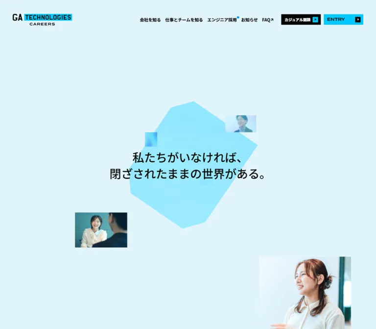
淡いブルーの余白に多角形と人物写真を配置し、シアンのアクセント、太い日英タイポグラフィ、角形ボタンで構成した中途採用サイト。
オリジナルサイトを見るGA technologies Careers — Style Reference
An expansive pale-blue recruitment site framed by cyan geometry, workplace portraits, and crisp black controls.
Website: midcareer-recruit.ga-tech.co.jp Original URL: https://midcareer-recruit.ga-tech.co.jp/ Final URL: https://midcareer-recruit.ga-tech.co.jp/ Theme: light; pale blue, white, cyan, and black Inspected: September 12, 2026, at 08:15:40.273 UTC / 17:15:40.273 JST, according to the supplied capture record Viewports: 1440 × 1000 desktop and 390 × 844 mobile, in CSS pixels Scope: the current midcareer recruitment homepage, including its opening composition, business and company summaries, job-family navigation, engineering recruitment feature, news, application links, and footer. Visual captures cover the desktop opening, job grid, and footer, plus the mobile opening and footer. Other sections are documented through supplied rendered DOM and computed styles.
GA technologies presents recruitment as a combination of technological ambition and approachable working life. The opening places a short Japanese statement over a large irregular cyan polygon. Small rectangular portraits occupy the surrounding pale-blue space. The composition has considerable breathing room: the headline is prominent without becoming an oversized English slogan, and the photographs remain separate fragments rather than one full-bleed background.
The rest of the homepage acts as an entrance to a larger recruitment website. Wide English chapter headings introduce Japanese explanations, company information, five job families, editorial updates, and two recruitment routes. Square photographs, unboxed labels, and black arrow tiles provide a consistent navigation language. A persistent header and a substantial bilingual footer make this a navigable corporate recruitment site with multiple destinations.
How to Read This Reference
- Measured values come from supplied computed styles or element rectangles. Decimal precision records the captured state; it does not establish the original CSS formula.
- Visual estimates describe screenshot geometry or styling that was not isolated in the element sample. These are explicitly marked.
- Implementation aliases are proposed token and class names, not recovered source identifiers. Original custom-property names are identified separately.
- Recommendations cover reusable implementation choices, accessibility improvements, and behavior that was not tested.
- DOM rectangles and screenshots were sampled separately. Some positions differ, and elements present in the DOM are not necessarily painted in a capture. Do not turn document coordinates into fixed layout specifications or animation timings.
- No additional pages, files, or resources were accessed for this reference.
Tokens — Colors
Default Palette
| Name | Value | Implementation alias / source | Role and evidence |
|---|---|---|---|
| Page Blue | #e1f4fb |
--color-page; computed body background |
Main pale-blue canvas at both viewports. Converted directly from rgb(225, 244, 251). |
| Light Surface Blue | #e5f9ff |
--color-surface-blue; source --light-blue-LB_01 |
Lighter blue available in the source palette. Its exact application is not isolated in the sampled wrappers. |
| Electric Cyan | #01c8ff |
--color-cyan; source --light-blue |
Measured desktop header ENTRY fill; also visually echoed in the logo, small arrow tiles, and English labels. |
| Accent Blue | #0392ff |
--color-blue; source --blue-B_04 |
Source accent token. A small blue dot appears beside engineering navigation; the dot itself was not separately sampled. |
| Black | #000000 |
--color-ink; source --black |
Main text, filled controls, and job-card arrow tiles. |
| White | #ffffff |
--color-white; source --white |
Footer surface, several button variants, and computed English chapter-heading text. |
| Muted Gray | #666666 |
--color-muted; source --grey02 |
Measured footer disclosure and copyright text. |
| Secondary Gray | #999999 |
source --grey03 |
Declared supporting token; no specific visible use established. |
| Light Gray | #cccccc |
source --grey04 |
Declared supporting token; no specific visible use established. |
Keep the two pale blues distinct. The body is #e1f4fb, not the declared #e5f9ff surface token. Substituting the latter everywhere changes the opening's overall tint.
The source also declares this exact gradient:
--gradation: linear-gradient(
  135deg,
  #00c7ff 0%,
  #168ce0 60.14%,
  #00b3e5 100%
);
The screenshots show cyan-to-blue variation in prominent English footer links, tinted section fields, and the opening graphic. The supplied evidence does not map this gradient to every such element. Treat it as an observed brand resource, not proof that every blue treatment shares one background declaration.
The polygon appears substantially lighter than the saturated action cyan. Its exact gradient, opacity, and compositing mechanism were not supplied. Likewise, the opening headline visibly includes dark blue variation, while its sampled parent reports black. Preserve that distinction between parent styles and final appearance.
Theme Presets
Only the light presentation is evidenced. No theme selector, dark-mode state, or alternate palette was inspected. The black, white, and cyan button variants belong to this one visual system.
Tokens — Typography
Japanese Text — Source Han Sans Japanese
- Measured family:
source-han-sans-japanese, sans-serif. - Observed weights:
500for explanatory paragraphs and700for navigation and Japanese section headings. Root and many structural wrappers report400. - Character: clear Japanese sans-serif with strong headings and unusually generous narrative leading.
- Role: carries the recruitment message, explanations, job names, and utility navigation.
- Implementation alias:
--font-japanese.
English Display — Termina
- Measured family:
termina, sans-serif. - Observed weights:
600for large chapter and recruitment headings,700for PICK UP, and500for copyright. - Character: broad geometric letterforms that make short English labels occupy substantial horizontal space.
- Role: chapter identification and English display hierarchy, paired with smaller Japanese descriptions.
- Implementation alias:
--font-display.
The font-family declarations are directly evidenced. Font file URLs and licensing information were not supplied. A new implementation must load authorized fonts or accept the proportions of its chosen fallback.
Wordmark and Icons
Treat the GA TECHNOLOGIES CAREERS wordmark as a brand asset. Its cyan rectangle, condensed lettering, and smaller CAREERS line should not be recreated by setting ordinary text in the page's display family.
Arrows are compact, bold, and directional. Job cards use a right arrow within a black square; external destinations commonly use a northeast arrow. Social icons retain their recognizable platform shapes and colors.
Type Scale
All values below are measured unless labeled as estimates.
| Role | Desktop size / line height | Mobile size / line height | Weight and tracking |
|---|---|---|---|
| Header navigation | 16.128px / 25.8048px |
Replaced visually by menu control | 700; -0.01em |
| Opening headline | Approximately 42–44px / 62px |
Approximately 22–24px / 35px |
Visual estimate; child typography was not sampled |
| Opening narrative | 20.16px / 48.384px |
15.561px / 37.3464px |
500; 0.01em |
| WHAT WE DO and NEWS | 80.496px / 80.496px |
45.63px / 45.63px |
Termina 600; desktop tracking 0.8px |
| ABOUT US and WORK and TEAM | 80.496px / 80.496px |
41.496px / 41.496px |
Termina 600 |
| Standard Japanese section heading | 32.112px / 32.112px |
24.882px / 34.8348px |
700; generally 0.01–0.02em |
| Business eyebrow | 18.144px / 18.144px |
13.494px / 13.494px |
700 |
| Business statement | 32.112px / 44.9568px |
22.815px / 31.941px |
700; 0.01em |
| Standard explanatory body | 16.128px / 32.256px |
14.508px / 27.5652px |
500; commonly 0.01em |
| ENGINEERS WANTED! | 48.24px / 67.536px |
35.256px / 38.7816px |
Termina 600 |
| JOIN OUR TEAM | 60.336px / 60.336px |
37.323px / 41.0553px |
Termina 600; desktop -0.01em |
| Recruitment supporting copy | 22.176px / 44.352px |
16.614px / 26.5824px |
700; 0.01em |
| PICK UP | 13.104px / 13.104px |
12.441px / 12.441px |
Termina 700 |
| Footer English navigation | Approximately 28px |
Approximately 21px |
Visual estimate; broad geometric display |
| Footer disclosure | 10.08px / 10.08px |
10.374px / 10.374px |
Japanese family, 500 |
| Copyright | 10.08px / 10.08px |
10.374px / 14.5236px |
Termina 500 |
The source root is 10px at both viewports. This is not the visible body-copy size. Many anchor and headline wrappers inherit 10px while their children establish the actual appearance; copying the wrapper size would produce a materially incorrect hierarchy.
Tokens — Spacing & Shapes
Density: spacious chapter transitions, readable paragraph leading, and tightly assembled navigation controls.
Geometry: rectangles, square corners, small square arrow containers, and a few large angular decorative shapes. There is no general rounded-card system.
Spacing Scale
These are observed instances, not a recovered universal spacing formula.
| Use | Desktop | Mobile | Evidence |
|---|---|---|---|
| Initial logo left inset | 48.23px |
24.91px |
Logo anchor rectangles |
| Standard mobile text inset | — | About 29.05px |
Repeated content and CTA positions |
| Header action gap | 12.09px |
— | Difference between adjacent action rectangles |
| Company contents horizontal gap | About 12.09px |
About 8.30px |
Calculated between link rectangles |
| Job-grid column gap | 48.23px |
20.73px |
Calculated from adjacent card bounds |
| Job-grid row gap | 60.33px |
29.05px |
Calculated between card bounds |
| Main recruitment action gap | 28.22px horizontally |
12.44px vertically |
Calculated between action bounds |
| Footer external-link gap | 8.06px |
6.23px |
Calculated between button bounds |
| Footer vertical padding | 100.512px top and bottom |
49.803px top; 62.244px bottom |
Computed footer padding |
The gap from the WHAT WE DO section's sampled end to ABOUT US is approximately 495.78px on desktop and 414.88px on mobile. This demonstrates the long-form pacing. It does not establish a reusable margin or a required amount of empty space around arbitrary content.
Border Radius
| Element | Treatment | Evidence |
|---|---|---|
| Header and recruitment actions | 0 |
Computed anchor radius |
| Job cards and image corners | Square | Anchor radius plus screenshot appearance |
| Footer external links | 0 |
Computed anchor radius |
| Job-card arrow tiles | Square | Screenshot |
| Desktop footer outer surface | Cut upper corners, approximately 40px |
Visual estimate; not ordinary rounding |
| Opening polygon | Irregular straight-edged silhouette | Screenshot; exact source path unavailable |
| Social icons | Platform-specific silhouettes | Screenshot; not a shared radius token |
Layout Measurements
| Element | Desktop | Mobile | Qualification |
|---|---|---|---|
| Initial header element | 1440 × 108.56px |
390 × 71.53px |
Measured outer element |
| Initial logo anchor | 224.20 × 48.23px |
134.81 × 29.03px |
Measured |
| Header recruitment action | 148.89 × 40.17px |
Menu DOM actions: 161.80 × 45.63px |
Mobile actions are not visible in the supplied opening capture |
| Mobile menu button | — | 41.48 × 41.48px |
Measured button; visible black backing appears wider |
| Opening headline wrapper | 613.44 × 123.78px |
352.67 × 95.58px |
Mobile height includes 25.935px bottom padding |
| Opening polygon | Approximately 652 × 643px |
Approximately 350 × 333px |
Visual estimate of each captured silhouette |
| Standard view-more action | 288.56 × 64.36px |
248.93 × 58.06px |
Measured |
| Job-card link | 345.88 × 260.56px |
155.57 × 199.13px |
Whole link, not just its photograph |
| Company contents link | 191.08 × 45.20px |
158.69 × 38.38px |
Measured |
| Company data feature | 603.36 × 241.34px |
330.88 × 181.14px |
Measured link bounds |
| Final recruitment action | 394.13 × 112.59px |
331.92 × 87.13px |
Measured |
| Footer external action | 249.41 × 48.23px |
257.23 × 49.80px |
Measured |
| Social link boxes | Approximately 30.09px square |
Approximately 27–31px wide, 31.11px high |
Measured |
Components
Persistent Site Header
Role: maintain company identity and access to recruitment destinations throughout the long page.
The desktop opening has an unboxed header over the pale-blue canvas. The logo sits about 48px from the left, while five text links and two filled actions occupy the right side. Navigation includes company information, jobs and teams, engineering recruitment, news, and FAQ. A small blue dot accents the engineering link.
The two actions share a 149 × 40px footprint but use different fills: black for “カジュアル面談” and cyan for ENTRY. Each includes a small contrasting northeast-arrow tile at the right.
In the supplied scrolled desktop captures, the header becomes a compact white strip inset approximately 12px from the viewport edges. Its visible height is about 65px, and its logo is smaller. A faint soft shadow separates it from photographs beneath. These are screenshot estimates; the exact opacity, shadow, positioning property, and scroll threshold were not supplied.
On mobile, the visible header contains the logo and a black menu control with two cyan horizontal strokes. The initial view keeps the pale-blue backdrop; the footer capture shows the compact white header surface.
Navigation Inventory and Mobile Menu
Role: expose the site's deeper information architecture.
The mobile DOM contains two recruitment actions, bilingual top-level links, and an indented list of five job families. The desktop DOM also includes those job-family links near the header.
These links establish available destinations and grouping, but the menu was not visibly opened in the supplied captures. Do not infer an overlay animation, dropdown trigger, expanded background, focus behavior, or close icon from their DOM presence. The supplied mobile bottom capture shows the footer, not an opened menu.
Opening Composition
Role: introduce the recruitment message through space, people, and a distinctive geometric field.
The composition has four layers: pale-blue canvas, irregular cyan polygon, separate portrait rectangles, and a centered two-line Japanese statement:
“私たちがいなければ、閉ざされたままの世界がある。”
On desktop, the headline wrapper begins near y = 440px in the 1000px-high viewport. The polygon extends above and below it, while larger portraits sit toward the upper left and lower right. Smaller translucent image fragments appear closer to the center.
On mobile, the polygon occupies much of the available width and the statement begins around y = 318px. The captured mobile opening contains much fainter imagery and substantial empty space below. This is a captured visual state, not proof that mobile removes all portraits.
Keep the text separate from the decorative graphic. Do not clip the entire headline to the polygon: parts of the text visibly extend beyond its edge.
Opening Narrative
Role: develop the initial statement before introducing the business.
The DOM contains several short paragraphs about changing an inefficient industry through AI and data, followed by an invitation to join. They use medium-weight Japanese text with 2.4 line height at both viewports. This is a deliberately slower reading rhythm than the standard section body.
Mobile text uses an approximately 338px column with explicit changes in line wrapping. Several paragraphs have measurable positions within the first viewport's document range but are not painted in the opening screenshot. Their exact reveal conditions are unverified. A reusable implementation should keep the narrative available without relying on an assumed animation sequence.
Chapter Heading and Business Summary
Role: divide the long homepage into recognizable destinations.
The main English headings are Termina at about 80.5px on desktop. They are measured as white text, with transparent sampled element backgrounds. The supplied screenshots do not show these chapter-heading sections, so their complete backing layers are not established.
The business module follows WHAT WE DO with a smaller Japanese eyebrow, a bold Japanese statement, explanatory text, and a black view-more action. At desktop, the explanatory content spans a wide inner area; on mobile it becomes an approximately 332px column and the statement wraps to two lines.
For reuse, preserve the sequence of English chapter marker, Japanese heading, paragraph, and directional link. If using white chapter text, supply an appropriately contrasting background; do not place it on white merely because the sampled heading wrapper is transparent.
Company Information and Contents Grid
Role: give candidates several ways into company information without requiring them to read everything sequentially.
Desktop geometry places a compact introduction and view-more action on the left. On the right, nine contents links form three columns and three rows, followed by a wider data feature associated with PICK UP. The contents cover purpose, values, leadership, business, culture, offices, data, benefits, and company information.
The individual contents links use flex layout, approximately 10px internal gap, and about 12px bottom padding on desktop. Their sampled wrappers do not establish the complete child typography or border treatment.
Mobile changes the contents to two columns, leaving the ninth item in the final row. The data feature follows underneath, with the view-more action centered after it. Preserve this sequence instead of compressing the desktop sidebar arrangement into narrow columns.
Job-Family Card
Role: link a candidate directly to a relevant profession.
Each card is one anchor containing a workplace photograph and a caption area. The caption has a bold Japanese job name, a smaller cyan English label, and a black right-arrow square aligned at the right. Cards have square corners, no surrounding border, and no individual shadow.
The desktop screenshot shows five cards in a three-column grid: engineering, business, corporate, then creative and assistant. The empty sixth position remains open. Images are approximately 346 × 196px, close to 16:9; this image measurement is a visual estimate. The measured complete card is 345.88 × 260.56px.
The field behind the cards is pale cyan and extends toward the right viewport edge. The card grid is inset more deeply than the background field, producing a layered, offset composition.
Mobile retains a grid, changing to two columns and three rows. Complete cards measure about 155.57 × 199.13px. Mobile image bounds were not supplied, so this taller card proportion cannot be converted into a verified image aspect ratio.
Engineering Recruitment Feature
Role: give engineering hiring a larger dedicated presence within the general recruitment homepage.
The DOM contains ENGINEERS WANTED!, a Japanese hiring label, explanatory copy, seven contents links, and a view-more action. The sampled section is exactly one viewport high at each tested size: 1000px desktop and 844px mobile.
Two overlapping heading elements report black and white text at nearly identical coordinates. Supporting text also reports white. This indicates layered content in the sampled structure, but does not establish its visual transition or complete background.
Desktop contents occupy three columns; mobile contents use two. Some child rectangles extend beyond the sampled section bounds. Do not treat the section's measured height as a safe hard cap for its complete content, or infer pinning behavior from this geometry alone.
News and Official Publication Feature
Role: connect recruitment information to ongoing company activity.
The news module pairs a Japanese introduction and view-more action with four linked editorial items. Each item includes a title, category, and date in the rendered text. Desktop item bounds form a two-by-two group to the right of the introduction, with links approximately 343.86 × 262.39px.
On mobile, the items remain two columns at approximately 155.57px each. Heights vary with content, around 178–185px. The introduction precedes the grid and the view-more action follows it.
The desktop DOM exposes a separate visit official note action. On mobile, the publication feature itself is a larger anchor containing the explanatory copy. Preserve the appropriate linked region for each layout instead of assuming the same small button exists at every viewport.
The screenshots do not isolate this section's cards or publication artwork. Exact thumbnail crops, metadata styling, and backing imagery remain unverified.
Recruitment Action Pair
Role: offer both direct application and an introductory conversation.
The final recruitment section uses JOIN OUR TEAM, a short Japanese description, and two large rectangular anchors. Each contains a primary label and supporting explanation. ENTRY links to the job listing service; the conversation action links to a specific external recruitment destination.
Desktop actions sit side by side at about 394 × 113px, separated by 28px. Mobile actions stack at approximately 332 × 87px, separated by 12.4px.
The final ENTRY action is black and the conversation action is white. This differs from the cyan ENTRY button in the header. Preserve the context-dependent variants rather than making every occurrence of the same label use one fill.
Repeated label text appears inside many action anchors in the DOM, while screenshots show one visible label. This may support a layered implementation, but it does not prove a particular hover effect.
Footer and Closing Photography
Role: close the visual narrative while providing a complete secondary navigation surface.
The desktop footer follows large workplace photographs on the pale-blue field. A white panel overlaps that imagery and has visibly cut upper corners. Inside it, a large logo and three black external-link buttons occupy the left; broad cyan English navigation occupies the center; news, FAQ, and social icons occupy the right.
Each navigation entry stacks its English heading over a smaller black Japanese label. ENGINEERING RECRUITMENT intentionally occupies two lines. The three external buttons use white Japanese text and cyan northeast-arrow tiles.
Mobile reorganizes this into one vertical sequence: centered logo, main navigation, news and FAQ, social icons, external buttons, disclosure, and copyright. Content aligns near x = 43.6px, while the white surface leaves a narrow cyan surround. This is a reordered composition, not a uniformly scaled desktop footer.
A source disclosure states: “※ 一部の写真で画像生成AIを使用しています。” It establishes that some photographs use image-generation AI. It does not identify which images were generated or establish the identities of the pictured people.
Tokens — Motion & Interaction
| Treatment | Evidence | What can safely be reused |
|---|---|---|
| Desktop navigation color transition | Computed color 0.3s |
A 300ms color transition; endpoint colors and trigger were not exercised |
| Header job-family links | Computed opacity 0.6s |
A 600ms opacity transition on those anchors; menu behavior remains unverified |
| Company data feature | Computed opacity 0.3s |
A 300ms opacity transition |
| Footer navigation and social links | Computed opacity 0.3s |
A 300ms opacity transition |
| Mobile publication feature | Computed opacity 0.5s |
A 500ms opacity transition |
| Header compaction | Different opening and scrolled screenshots | Transparent spacious state and compact white state; threshold and duration unknown |
| Opening polygon and portraits | Static captures with decorative layers | Appearance can be reproduced; trajectory, morphing, parallax, timing, and repetition are unverified |
| Repeated action labels | Duplicate text inside anchors | Layered text exists; do not assume rolling or sliding interaction |
| General anchor transitions | Many summaries report only all |
Insufficient information for a duration or meaningful animation specification |
Most sampled elements report animation: none. This does not rule out animation on descendants, pseudo-elements, or through JavaScript. The supplied readiness procedure temporarily pauses perpetual animations, awaits certain finite animations, and later resumes motion; it is not an interaction recording.
No hover, keyboard, menu-opening, application-flow, or reduced-motion test was supplied. Scrolling produced the additional captures, but a specific scroll-linked animation system was not established.
Recommended motion language: keep feedback restrained and directional, using the evidenced 300ms link-transition scale. If decorative motion is added, keep text stable and provide a static reduced-motion state. These are implementation recommendations, not recovered hero timings.
Surfaces
| Layer | Appearance | Function |
|---|---|---|
| Page canvas | Flat #e1f4fb |
Continuous light atmosphere around opening and closing imagery |
| Opening decoration | Large translucent-looking cyan polygon | Concentrates attention without a conventional content card |
| Job-family field | Pale cyan variation, offset from the left edge | Groups the cards while retaining an open layout |
| Persistent header after scrolling | White strip with subtle separation | Keeps navigation readable above mixed backgrounds |
| Job cards | Photograph and labels directly on the shared field | Uses image boundaries and typography instead of containers |
| Action surfaces | Black, white, or cyan rectangles | Establishes clear recruitment and external-link targets |
| Footer | Large white panel with angular upper corners | Provides a stable final navigation area |
The slight header shadow is a local separation device. The evidence does not support a general elevation system or widespread translucent glass surfaces.
Imagery
Photography emphasizes work, conversation, and collaboration: people beside office windows, colleagues gathered around laptops, an interview-like conversation, and individuals working in bright interiors. Cool window light, dark clothing, teal furnishings, and occasional greenery connect the images to the blue interface.
The opening uses detached image rectangles at different sizes. Job cards use consistent rectangular crops. Closing photographs are much larger and can extend to the viewport edges before meeting the white footer. These three scales give the same broad subject matter different compositional roles.
Avoid assuming every person is an employee or describing every image as documentary photography. The current footer explicitly discloses some use of image-generation AI.
Observed Asset References
Original image, logo, and icon asset URLs were not included in the supplied evidence. No filenames or asset paths are inferred below.
| Asset group | Observed content | Reference |
|---|---|---|
| Careers wordmark | Black lettering, cyan TECHNOLOGIES block, smaller CAREERS line | Desktop and mobile opening and footer captures |
| Opening portrait fragments | Individual workplace portraits with different crop sizes and visibility | Opening captures |
| Engineering image | Colleagues working in an open office | Desktop job-grid capture |
| Business image | Individual using a laptop beside a large window | Desktop job-grid capture |
| Corporate image | Conversation across a table | Desktop job-grid capture |
| Creative image | Three people gathered around a laptop | Desktop job-grid capture |
| Assistant image | Individual working on a laptop in a lounge-like interior | Desktop job-grid capture |
| Closing photographs | Large cropped workplace and collaboration scenes | Desktop footer capture |
| Social symbols | X, Facebook, and LinkedIn | Desktop and mobile footer captures |
Use authorized assets when available. For replacement imagery, preserve crop discipline, cool daylight, and believable work contexts. Avoid applying cyan so heavily that faces and clothing lose useful tonal detail.
Layout & Responsive Behavior
The reported document heights are approximately 12,630px desktop and 11,172px mobile. Both versions remain long-form pages. The sampled body bounds are slightly shorter than those totals, so the values should be treated as capture measurements rather than fixed implementation targets.
| Area | Desktop observation | Mobile observation |
|---|---|---|
| Header | Full navigation and two recruitment actions | Logo and menu control visible |
| Opening statement | Centered near the vertical midpoint | Positioned above the viewport midpoint |
| Chapter typography | Large single-line English headings | WHAT WE DO, WORK and TEAM, and JOIN OUR TEAM break across lines |
| Company contents | Three columns | Two columns |
| Company data feature | Wide feature beside the introduction | Feature below contents; CTA follows |
| Job families | Three columns, two rows | Two columns, three rows |
| News | Introduction beside a two-column item group | Introduction above a two-column item group |
| Recruitment actions | Side-by-side pair | Stacked pair |
| Footer | Identity and external links left; navigation center and right | Logo, navigation, social links, external links, then legal text |
The desktop job-card group spans approximately 1134px, while its background field begins farther left and continues toward the right viewport edge. On mobile, repeated content widths around 332px correspond to approximately 29px side insets.
Only the two stated viewports were tested. Exact media-query thresholds, intermediate tablet layouts, landscape behavior, and source viewport-scaling formulas are unknown. The Quick Start uses explicit recommended breakpoints, not recovered ones.
The persistent header remains visible in lower-page captures. Its exact implementation could involve fixed or sticky positioning and additional wrappers; the evidence establishes the visual result, not the complete positioning mechanism.
Do’s and Don’ts
Do
- Keep the measured page blue distinct from the lighter surface-blue token.
- Pair broad Termina English headings with readable Japanese sans-serif text.
- Preserve generous leading in the opening narrative.
- Keep the opening polygon, headline, and photographs as separate layers.
- Use square image crops and compact, bold arrow tiles.
- Retain five job families and the open final grid position.
- Preserve the mobile two-column job and news grids at the inspected width.
- Use the correct black, white, and cyan action variants for each context.
- Reorder footer groups for mobile instead of shrinking the desktop arrangement.
- Keep the visible image-generation disclosure when reusing the corresponding content.
Don’t
- Do not turn every content group into a rounded, shadowed card.
- Do not replace the spacious opening with one full-bleed stock photograph.
- Do not treat inherited
10pxwrapper text as the visible type scale. - Do not make the opening headline part of the decorative image.
- Do not apply the saturated source gradient indiscriminately to every pale-blue surface.
- Do not assume the mobile footer is an expanded menu.
- Do not invent hero rotation, morphing, parallax, or button-roll timings.
- Do not infer generated-image identities or photographic authenticity.
- Do not impose one fixed height on sections whose children extend beyond their sampled bounds.
Recommended Implementation Additions
These are recommendations for a new implementation, not verified features of the current site:
- Use a semantic heading for the opening statement and a coherent heading hierarchy throughout the homepage.
- Give the menu button an accessible name,
aria-expanded, and a controlled navigation region. Keep a closed menu out of keyboard navigation. - Increase icon-only hit areas to at least
44 × 44px; several measured visual controls are smaller. - Give each linked card one clear accessible name and hide duplicated decorative text from assistive technology.
- Provide visible keyboard focus and retain legible text if gradient clipping is unavailable.
- Check cyan text on white and white text on cyan. Use darker text where needed for contrast, while retaining cyan as a decorative accent.
- Keep narrative content readable without JavaScript and when decorative motion is disabled.
- Reserve image space before loading, use responsive image sources, and defer below-the-fold photography where appropriate.
- Consider increasing approximately
10pxlegal text in a new implementation without changing its secondary role.
Agent Prompt Guide
Quick Color Reference
- Main canvas:
#e1f4fb. - Alternate light surface token:
#e5f9ff. - Primary cyan:
#01c8ff. - Supporting blue token:
#0392ff. - Text and strong controls:
#000000. - Footer and inverse surfaces:
#ffffff. - Legal text:
#666666. - Brand gradient:
135deg,#00c7ffto#168ce0at60.14%, then#00b3e5.
Overall Prompt
“Create a long-form corporate recruitment homepage inspired by GA technologies Careers. Use a pale-blue #e1f4fb canvas, electric-cyan #01c8ff accents, black rectangular controls, and white content surfaces. Pair wide geometric English headings with Japanese sans-serif explanations. Open with a centered two-line Japanese statement over an irregular cyan polygon, with separate workplace portrait rectangles and extensive empty space. Include persistent navigation, business and company summaries, a five-category photographic job grid, an engineering feature, editorial news, paired recruitment actions, and an angular white footer. Use three job columns on desktop and two on a 390px phone. Keep all unverified motion optional.”
Example Component Prompts
- Opening: “Compose a pale-blue recruitment opening with the statement ‘私たちがいなければ、閉ざされたままの世界がある。’ in two centered lines. Place an irregular translucent-looking cyan polygon behind it and separate rectangular workplace portraits around the composition. Keep text readable independently of imagery. Do not introduce an assumed animation sequence.”
- Header: “Build a desktop careers header with a logo at left, bold Japanese navigation at right, a black conversation action, and a cyan ENTRY action. Use small contrasting northeast-arrow tiles. Provide a compact white scrolled-state style and a mobile logo/menu layout; treat the state threshold as a new implementation choice.”
- Job card: “Create one unboxed recruitment link with a square-cornered landscape workplace photograph, a bold Japanese job label, a smaller cyan English label, and a black square right-arrow tile. Arrange five items in a three-column desktop grid and a two-column mobile grid.”
- Recruitment pair: “Place two large rectangular recruitment links beneath a geometric JOIN OUR TEAM heading. Use a black ENTRY action and a white conversation action, each with primary and supporting text. Keep them side by side on desktop and stacked with a narrow gap on mobile.”
- Footer: “Create a large white careers footer with cut upper corners, a prominent wordmark, cyan English navigation above small black Japanese labels, platform-colored social icons, and three black external-link buttons. On mobile, place navigation and social links before the external buttons and retain the legal disclosure.”
Quick Start
CSS Custom Properties
This is a reusable adaptation, not an extracted source stylesheet. It keeps a conventional 16px root and uses explicit pixel tokens. Font declarations and many endpoint sizes come from the evidence; the breakpoints, polygon path, opacity mixtures, focus treatment, and state-class mechanism are recommendations.
Apply .ga-careers to the page container. Each .job-card is an anchor containing an image and .job-card__meta; the metadata contains .job-card__labels and .arrow-tile. Each .action contains .action__copy and an arrow tile. Supply real authorized assets separately.
The starter intentionally uses solid black opening text instead of reconstructing the unmeasured text-color effect. It retains the visually evidenced desktop image ratio on mobile until an actual mobile image crop is specified.
:root {
  /* Observed palette, exposed through implementation aliases. */
  --color-page: #e1f4fb;
  --color-surface-blue: #e5f9ff;
  --color-cyan: #01c8ff;
  --color-blue: #0392ff;
  --color-ink: #000000;
  --color-white: #ffffff;
  --color-muted: #666666;
  --gradient-brand: linear-gradient(
    135deg, #00c7ff 0%, #168ce0 60.14%, #00b3e5 100%
  );

  /* Authorized font loading must be configured separately. */
  --font-japanese: source-han-sans-japanese, sans-serif;
  --font-display: termina, sans-serif;
  --text-body: 16.128px;
  --leading-body: 2;
  --text-heading: 32.112px;
  --text-chapter: 80.496px;
  --text-footer-en: 28px;

  /* Recommended interpolation between observed proportions. */
  --page-inset: clamp(29.055px, 6.98vw, 100.512px);
  --job-column-gap: 48.234px;
  --job-row-gap: 60.328px;
  --motion-link: 300ms;
}

.ga-careers,
.ga-careers * {
  box-sizing: border-box;
}

.ga-careers {
  margin: 0;
  color: var(--color-ink);
  background: var(--color-page);
  font-family: var(--font-japanese);
  font-size: var(--text-body);
  font-weight: 500;
  line-height: var(--leading-body);
}

.ga-careers img {
  display: block;
  max-width: 100%;
}

.site-header {
  position: fixed;
  z-index: 50;
  inset: 0 0 auto;
  display: flex;
  align-items: center;
  justify-content: space-between;
  gap: 28px;
  padding: 50.25px 48.234px 10.08px;
}

.site-logo {
  display: block;
  flex: none;
  width: 224.203px;
}

.primary-nav,
.header-actions {
  display: flex;
  align-items: center;
}

.primary-nav {
  gap: 16.128px;
}

.primary-nav > a {
  color: var(--color-ink);
  font-size: 16.128px;
  font-weight: 700;
  line-height: 1.6;
  letter-spacing: -0.01em;
  text-decoration: none;
  white-space: nowrap;
  transition: color var(--motion-link);
}

.header-actions {
  gap: 12.096px;
  margin-inline-start: 12px;
}

/* A supplied state class, not a recovered scroll threshold. */
.site-header.is-scrolled {
  inset: 12px 12px auto;
  min-height: 65px;
  padding: 10px 16px;
  background: rgb(255 255 255 / 96%);
  box-shadow: 0 3px 18px rgb(0 70 100 / 6%);
}

.site-header.is-scrolled .site-logo {
  width: 160px;
}

.mobile-menu-button {
  display: none;
  width: 44px;
  height: 44px;
  padding: 11px;
  border: 0;
  border-radius: 0;
  color: var(--color-cyan);
  background: var(--color-ink);
}

.mobile-menu-button span {
  display: block;
  height: 3px;
  background: currentColor;
}

.mobile-menu-button span + span {
  margin-top: 7px;
}

.recruit-hero {
  position: relative;
  isolation: isolate;
  min-height: 100svh;
  overflow: clip;
  background: var(--color-page);
}

/* Static approximation of the captured decorative geometry. */
.hero-shape {
  position: absolute;
  z-index: -1;
  top: 53%;
  left: 50%;
  width: min(45.3vw, 652px);
  aspect-ratio: 652 / 643;
  transform: translate(-50%, -50%);
  clip-path: polygon(
    43.4% 0, 89% 21.8%, 100% 46%, 75% 100%,
    11% 69.5%, 0 45.3%, 17.8% 6.8%
  );
  background: linear-gradient(
    125deg,
    rgb(1 200 255 / 60%),
    rgb(1 200 255 / 25%) 58%,
    rgb(1 200 255 / 45%)
  );
}

.hero-copy {
  position: absolute;
  top: 50%;
  left: 50%;
  width: min(614px, calc(100% - 48px));
  margin: 0;
  transform: translate(-50%, -50%);
  color: var(--color-ink);
  font-size: 42px;
  font-weight: 700;
  line-height: 1.48;
  text-align: center;
}

.hero-portrait {
  position: absolute;
  width: var(--portrait-width, 180px);
  inset: var(--portrait-top, auto) auto auto var(--portrait-left, auto);
  object-fit: cover;
  pointer-events: none;
}

.opening-narrative {
  max-width: 1000px;
  margin-inline: auto;
  padding-inline: 26px;
  font-size: 20.16px;
  line-height: 2.4;
  letter-spacing: 0.01em;
  text-align: center;
}

.section-title {
  margin: 0;
  font-family: var(--font-display);
  font-size: var(--text-chapter);
  font-weight: 600;
  line-height: 1;
  letter-spacing: 0.01em;
  text-align: center;
}

/* Use only over a sufficiently contrasting section background. */
.section-title.on-color {
  color: var(--color-white);
}

.section-heading {
  margin: 0 0 20px;
  font-size: var(--text-heading);
  font-weight: 700;
  line-height: 1.4;
}

.section-copy {
  margin: 0;
  font-size: var(--text-body);
  line-height: var(--leading-body);
  letter-spacing: 0.01em;
}

.work-panel {
  margin-inline-start: var(--page-inset);
  padding: 80px var(--page-inset);
  background: linear-gradient(
    120deg, #c9f4fc, var(--color-surface-blue)
  );
}

.work-grid {
  display: grid;
  grid-template-columns: repeat(3, minmax(0, 1fr));
  gap: var(--job-row-gap) var(--job-column-gap);
  max-width: 1134.1px;
  margin-inline: auto;
}

.job-card {
  display: block;
  min-width: 0;
  color: var(--color-ink);
  text-decoration: none;
}

.job-card > img {
  width: 100%;
  aspect-ratio: 16 / 9;
  object-fit: cover;
  border-radius: 0;
}

.job-card__meta {
  display: flex;
  justify-content: space-between;
  align-items: center;
  gap: 12px;
  padding: 20px 4px 0;
}

.job-card__title {
  display: block;
  font-size: 22px;
  font-weight: 700;
  line-height: 1.35;
}

.job-card__en {
  display: block;
  color: var(--color-cyan);
  font-family: var(--font-display);
  font-size: 13px;
  font-weight: 600;
  line-height: 1.4;
}

.arrow-tile {
  display: grid;
  flex: none;
  place-items: center;
  width: 40px;
  height: 40px;
  color: var(--color-white);
  background: var(--color-ink);
  font-size: 24px;
  line-height: 1;
}

.action {
  display: inline-flex;
  align-items: center;
  justify-content: space-between;
  gap: 16px;
  width: 288.562px;
  min-height: 64.359px;
  padding: 10px 12px 10px 20px;
  border: 0;
  border-radius: 0;
  color: var(--color-white);
  background: var(--color-ink);
  font-weight: 700;
  line-height: 1.4;
  text-decoration: none;
}

.action .arrow-tile {
  width: 30px;
  height: 30px;
  color: var(--color-ink);
  background: var(--color-cyan);
  font-size: 18px;
}

.action--cyan {
  color: var(--color-ink);
  background: var(--color-cyan);
}

.action--white {
  color: var(--color-ink);
  background: var(--color-white);
}

.action--cyan .arrow-tile {
  color: var(--color-white);
  background: var(--color-ink);
}

.action--header {
  width: 148.891px;
  min-height: 40.172px;
  padding: 8px 10px 8px 12px;
  font-size: 14px;
}

.action--header .arrow-tile {
  width: 20px;
  height: 20px;
  font-size: 13px;
}

.join-actions {
  display: flex;
  justify-content: center;
  gap: 28.219px;
}

.join-actions .action {
  width: 394.125px;
  min-height: 112.594px;
}

.action__caption {
  display: block;
  margin-top: 6px;
  font-size: 13px;
  font-weight: 500;
}

.site-footer {
  position: relative;
  isolation: isolate;
  margin-inline: 32px;
  padding: 100.512px 32px;
}

/* Cut only the decorative surface, preserving focus outlines. */
.site-footer::before {
  position: absolute;
  z-index: -1;
  inset: 0;
  content: '';
  background: var(--color-white);
  clip-path: polygon(
    40px 0, calc(100% - 40px) 0, 100% 40px,
    100% 100%, 0 100%, 0 40px
  );
}

.footer-inner {
  display: grid;
  grid-template-columns: 420px minmax(0, 1fr) 157px;
  grid-template-areas:
    'brand main utility'
    'external main utility'
    '. legal legal';
  gap: 40px 108px;
  max-width: 1090px;
  margin-inline: auto;
}

.footer-brand { grid-area: brand; }
.footer-main { grid-area: main; }
.footer-utility { grid-area: utility; }
.footer-external { grid-area: external; }
.footer-legal { grid-area: legal; }

.footer-brand img {
  width: 318px;
}

.footer-main,
.footer-utility,
.footer-external {
  display: flex;
  flex-direction: column;
  align-items: flex-start;
  gap: 31px;
}

.footer-link {
  display: grid;
  gap: 8px;
  color: var(--color-ink);
  text-decoration: none;
  transition: opacity var(--motion-link);
}

.footer-link__en {
  color: #087cbb;
  font-family: var(--font-display);
  font-size: var(--text-footer-en);
  font-weight: 600;
  line-height: 1;
}

/* Recommended use of the observed gradient; solid fallback above. */
@supports (background-clip: text) {
  .footer-link__en {
    color: transparent;
    background: var(--gradient-brand);
    background-clip: text;
  }
}

.footer-link__ja {
  font-size: 14px;
  font-weight: 700;
  line-height: 1.4;
}

.footer-external {
  gap: 8.064px;
}

.footer-external .action {
  width: 249.406px;
  min-height: 48.234px;
  font-size: 14px;
}

.footer-legal {
  color: var(--color-muted);
  font-size: 12px;
  line-height: 1.5;
}

/* Recommended feedback endpoints; original endpoints were not tested. */
@media (hover: hover) {
  .primary-nav > a:hover {
    color: #087cbb;
  }
  .footer-link:hover {
    opacity: 0.7;
  }
}

.ga-careers :focus-visible {
  outline: 3px solid #075e91;
  outline-offset: 4px;
}

/* Recommended navigation breakpoint, not a recovered source query. */
@media (max-width: 1100px) {
  .site-header {
    padding: 16.6px 24.9px 13.4px;
  }
  .site-logo,
  .site-header.is-scrolled .site-logo {
    width: 134.813px;
  }
  .primary-nav {
    display: none;
  }
  .mobile-menu-button {
    display: block;
  }
  .site-header.is-scrolled {
    inset: 8.307px 8.307px auto;
    min-height: 58px;
    padding: 8px 16.6px;
  }
  .footer-inner {
    grid-template-columns: 1fr 1fr;
    grid-template-areas:
      'brand main'
      'external utility'
      'legal legal';
    column-gap: 40px;
  }
}

/* Recommended content breakpoint; measured mobile endpoint is 390px. */
@media (max-width: 700px) {
  :root {
    --text-body: 14.508px;
    --leading-body: 1.9;
    --text-heading: 24.882px;
    --text-chapter: 41.496px;
    --text-footer-en: 20.748px;
    --job-column-gap: 20.734px;
    --job-row-gap: 29.047px;
  }
  .hero-copy {
    top: 38svh;
    width: calc(100% - 40px);
    transform: translateX(-50%);
    font-size: 22.815px;
    line-height: 1.55;
  }
  .hero-shape {
    top: 23.7svh;
    width: min(90vw, 350px);
    aspect-ratio: 350 / 333;
    transform: translateX(-50%);
    clip-path: polygon(
      48% 0, 64% 4%, 100% 63%, 50% 100%,
      34% 96%, 0 49%, 6% 31%
    );
  }
  .opening-narrative {
    font-size: 15.561px;
  }
  .section-title--what,
  .section-title--news {
    font-size: 45.63px;
  }
  .work-panel {
    margin-inline-start: 0;
    padding: 50px 29.055px;
  }
  .work-grid {
    grid-template-columns: repeat(2, minmax(0, 1fr));
  }
  .job-card__meta {
    gap: 6px;
    padding: 12px 0 0;
  }
  .job-card__title {
    font-size: 15px;
  }
  .job-card__en {
    font-size: 10px;
  }
  .job-card .arrow-tile {
    width: 26px;
    height: 26px;
    font-size: 18px;
  }
  .action {
    width: min(100%, 248.927px);
    min-height: 58.063px;
  }
  .join-actions {
    flex-direction: column;
    align-items: center;
    gap: 12.438px;
    padding-inline: 29.04px;
  }
  .join-actions .action {
    width: 100%;
    min-height: 87.125px;
  }
  .site-footer {
    margin-inline: 12px;
    padding: 49.803px 31.5px 62.244px;
  }
  .site-footer::before {
    clip-path: none;
  }
  .footer-inner {
    grid-template-columns: minmax(0, 1fr);
    grid-template-areas:
      'brand' 'main' 'utility' 'external' 'legal';
    gap: 24px;
  }
  .footer-brand img {
    width: 207.5px;
    margin-inline: auto;
  }
  .footer-main,
  .footer-utility {
    gap: 20.734px;
  }
  .footer-link__ja {
    font-size: 12.441px;
    line-height: 1.2;
  }
  .footer-external {
    gap: 6.234px;
  }
  .footer-external .action {
    width: min(100%, 257.234px);
    min-height: 49.797px;
  }
}

@media (prefers-reduced-motion: reduce) {
  .primary-nav > a,
  .footer-link {
    transition: none;
  }
}
The CSS does not implement menu expansion, scroll-state detection, or portrait animation. Add those behaviors separately with accessible state management. The initial hero portrait positions should be art-directed per viewport; no continuous source positioning formula was available.
The work-panel gradient, fallback link blue, footer display sizes, and small mobile card-label sizes in this starter are recommended approximations. They are not additional measured source tokens. The 12px legal type deliberately increases the measured source size for readability.
Tailwind v4 Token Mapping
Optional mapping for a project already using Tailwind v4. This is an implementation convenience, not evidence that the original uses Tailwind. Define the properties above first.
@theme inline {
  --color-page: #e1f4fb;
  --color-surface-blue: #e5f9ff;
  --color-cyan: #01c8ff;
  --color-accent-blue: #0392ff;
  --color-ink: #000000;
  --color-paper: #ffffff;
  --color-muted: #666666;

  --font-japanese: source-han-sans-japanese, sans-serif;
  --font-display: termina, sans-serif;

  --text-copy: var(--text-body);
  --text-section: var(--text-heading);
  --text-display: var(--text-chapter);

  --spacing-page: var(--page-inset);
  --spacing-job-column: var(--job-column-gap);
  --spacing-job-row: var(--job-row-gap);
  --radius-square: 0px;
}
Sources & Evidence
- Current GA technologies midcareer recruitment homepage: original and final URL are identical; supplied response status is HTTP 200. The document title identifies the page as “中途採用 特設サイト | 株式会社GA technologies”.
- Capture record: September 12, 2026,
08:15:40.273Z; desktop1440 × 1000, mobile390 × 844. Reported document heights are12630pxand11172px, respectively. - Visual evidence: three desktop captures showing the opening, job-family grid, and footer; two mobile captures showing the opening and footer. Visual estimates in this document come from those current-page captures.
- Rendered evidence: supplied page text, anchor destinations, element rectangles, computed font families and sizes, weights, line heights, spacing, backgrounds, radii, transition summaries, and custom properties at both viewports.
- Identity evidence: the current document title and the rendered corporate-site link support the company identity. The linked corporate page itself was not inspected.
- Inspection limits: only supplied evidence was analyzed. No linked pages were opened. Menu expansion, hover endpoints, keyboard behavior, application flows, actual hero keyframes, font files, and original image asset URLs were not inspected.
- Capture limitations: the supplied procedure observes an initial period of at least five seconds and performs bounded checks for load, images, finite animation, and layout stability. Perpetual animations are temporarily paused during readiness checks and resumed afterward. These checks do not establish semantic completeness or prove that every DOM element was visible. SharedWorkers and service workers were disabled during inspection.
This document describes the current homepage at the inspected URL. Exact measured values, screenshot estimates, and implementation recommendations are separated throughout; no historical design is reconstructed.
# GA technologies Careers — Style Reference

> An expansive pale-blue recruitment site framed by cyan geometry, workplace portraits, and crisp black controls.

**Website:** [midcareer-recruit.ga-tech.co.jp](https://midcareer-recruit.ga-tech.co.jp/)
**Original URL:** https://midcareer-recruit.ga-tech.co.jp/
**Final URL:** https://midcareer-recruit.ga-tech.co.jp/
**Theme:** light; pale blue, white, cyan, and black
**Inspected:** September 12, 2026, at 08:15:40.273 UTC / 17:15:40.273 JST, according to the supplied capture record
**Viewports:** 1440 × 1000 desktop and 390 × 844 mobile, in CSS pixels
**Scope:** the current midcareer recruitment homepage, including its opening composition, business and company summaries, job-family navigation, engineering recruitment feature, news, application links, and footer. Visual captures cover the desktop opening, job grid, and footer, plus the mobile opening and footer. Other sections are documented through supplied rendered DOM and computed styles.

GA technologies presents recruitment as a combination of technological ambition and approachable working life. The opening places a short Japanese statement over a large irregular cyan polygon. Small rectangular portraits occupy the surrounding pale-blue space. The composition has considerable breathing room: the headline is prominent without becoming an oversized English slogan, and the photographs remain separate fragments rather than one full-bleed background.

The rest of the homepage acts as an entrance to a larger recruitment website. Wide English chapter headings introduce Japanese explanations, company information, five job families, editorial updates, and two recruitment routes. Square photographs, unboxed labels, and black arrow tiles provide a consistent navigation language. A persistent header and a substantial bilingual footer make this a navigable corporate recruitment site with multiple destinations.

## How to Read This Reference

- **Measured** values come from supplied computed styles or element rectangles. Decimal precision records the captured state; it does not establish the original CSS formula.
- **Visual estimates** describe screenshot geometry or styling that was not isolated in the element sample. These are explicitly marked.
- **Implementation aliases** are proposed token and class names, not recovered source identifiers. Original custom-property names are identified separately.
- **Recommendations** cover reusable implementation choices, accessibility improvements, and behavior that was not tested.
- DOM rectangles and screenshots were sampled separately. Some positions differ, and elements present in the DOM are not necessarily painted in a capture. Do not turn document coordinates into fixed layout specifications or animation timings.
- No additional pages, files, or resources were accessed for this reference.

## Tokens — Colors

### Default Palette

| Name | Value | Implementation alias / source | Role and evidence |
| --- | --- | --- | --- |
| Page Blue | `#e1f4fb` | `--color-page`; computed body background | Main pale-blue canvas at both viewports. Converted directly from `rgb(225, 244, 251)`. |
| Light Surface Blue | `#e5f9ff` | `--color-surface-blue`; source `--light-blue-LB_01` | Lighter blue available in the source palette. Its exact application is not isolated in the sampled wrappers. |
| Electric Cyan | `#01c8ff` | `--color-cyan`; source `--light-blue` | Measured desktop header ENTRY fill; also visually echoed in the logo, small arrow tiles, and English labels. |
| Accent Blue | `#0392ff` | `--color-blue`; source `--blue-B_04` | Source accent token. A small blue dot appears beside engineering navigation; the dot itself was not separately sampled. |
| Black | `#000000` | `--color-ink`; source `--black` | Main text, filled controls, and job-card arrow tiles. |
| White | `#ffffff` | `--color-white`; source `--white` | Footer surface, several button variants, and computed English chapter-heading text. |
| Muted Gray | `#666666` | `--color-muted`; source `--grey02` | Measured footer disclosure and copyright text. |
| Secondary Gray | `#999999` | source `--grey03` | Declared supporting token; no specific visible use established. |
| Light Gray | `#cccccc` | source `--grey04` | Declared supporting token; no specific visible use established. |

**Keep the two pale blues distinct.** The body is `#e1f4fb`, not the declared `#e5f9ff` surface token. Substituting the latter everywhere changes the opening's overall tint.

The source also declares this exact gradient:

```css
--gradation: linear-gradient(
  135deg,
  #00c7ff 0%,
  #168ce0 60.14%,
  #00b3e5 100%
);
```

The screenshots show cyan-to-blue variation in prominent English footer links, tinted section fields, and the opening graphic. The supplied evidence does not map this gradient to every such element. Treat it as an observed brand resource, not proof that every blue treatment shares one background declaration.

The polygon appears substantially lighter than the saturated action cyan. Its exact gradient, opacity, and compositing mechanism were not supplied. Likewise, the opening headline visibly includes dark blue variation, while its sampled parent reports black. Preserve that distinction between parent styles and final appearance.

### Theme Presets

Only the light presentation is evidenced. No theme selector, dark-mode state, or alternate palette was inspected. The black, white, and cyan button variants belong to this one visual system.

## Tokens — Typography

### Japanese Text — Source Han Sans Japanese

- **Measured family:** `source-han-sans-japanese, sans-serif`.
- **Observed weights:** `500` for explanatory paragraphs and `700` for navigation and Japanese section headings. Root and many structural wrappers report `400`.
- **Character:** clear Japanese sans-serif with strong headings and unusually generous narrative leading.
- **Role:** carries the recruitment message, explanations, job names, and utility navigation.
- **Implementation alias:** `--font-japanese`.

### English Display — Termina

- **Measured family:** `termina, sans-serif`.
- **Observed weights:** `600` for large chapter and recruitment headings, `700` for PICK UP, and `500` for copyright.
- **Character:** broad geometric letterforms that make short English labels occupy substantial horizontal space.
- **Role:** chapter identification and English display hierarchy, paired with smaller Japanese descriptions.
- **Implementation alias:** `--font-display`.

The font-family declarations are directly evidenced. Font file URLs and licensing information were not supplied. A new implementation must load authorized fonts or accept the proportions of its chosen fallback.

### Wordmark and Icons

Treat the GA TECHNOLOGIES CAREERS wordmark as a brand asset. Its cyan rectangle, condensed lettering, and smaller CAREERS line should not be recreated by setting ordinary text in the page's display family.

Arrows are compact, bold, and directional. Job cards use a right arrow within a black square; external destinations commonly use a northeast arrow. Social icons retain their recognizable platform shapes and colors.

### Type Scale

All values below are measured unless labeled as estimates.

| Role | Desktop size / line height | Mobile size / line height | Weight and tracking |
| --- | --- | --- | --- |
| Header navigation | `16.128px / 25.8048px` | Replaced visually by menu control | `700`; `-0.01em` |
| Opening headline | Approximately `42–44px / 62px` | Approximately `22–24px / 35px` | Visual estimate; child typography was not sampled |
| Opening narrative | `20.16px / 48.384px` | `15.561px / 37.3464px` | `500`; `0.01em` |
| WHAT WE DO and NEWS | `80.496px / 80.496px` | `45.63px / 45.63px` | Termina `600`; desktop tracking `0.8px` |
| ABOUT US and WORK and TEAM | `80.496px / 80.496px` | `41.496px / 41.496px` | Termina `600` |
| Standard Japanese section heading | `32.112px / 32.112px` | `24.882px / 34.8348px` | `700`; generally `0.01–0.02em` |
| Business eyebrow | `18.144px / 18.144px` | `13.494px / 13.494px` | `700` |
| Business statement | `32.112px / 44.9568px` | `22.815px / 31.941px` | `700`; `0.01em` |
| Standard explanatory body | `16.128px / 32.256px` | `14.508px / 27.5652px` | `500`; commonly `0.01em` |
| ENGINEERS WANTED! | `48.24px / 67.536px` | `35.256px / 38.7816px` | Termina `600` |
| JOIN OUR TEAM | `60.336px / 60.336px` | `37.323px / 41.0553px` | Termina `600`; desktop `-0.01em` |
| Recruitment supporting copy | `22.176px / 44.352px` | `16.614px / 26.5824px` | `700`; `0.01em` |
| PICK UP | `13.104px / 13.104px` | `12.441px / 12.441px` | Termina `700` |
| Footer English navigation | Approximately `28px` | Approximately `21px` | Visual estimate; broad geometric display |
| Footer disclosure | `10.08px / 10.08px` | `10.374px / 10.374px` | Japanese family, `500` |
| Copyright | `10.08px / 10.08px` | `10.374px / 14.5236px` | Termina `500` |

The source root is `10px` at both viewports. This is not the visible body-copy size. Many anchor and headline wrappers inherit `10px` while their children establish the actual appearance; copying the wrapper size would produce a materially incorrect hierarchy.

## Tokens — Spacing & Shapes

**Density:** spacious chapter transitions, readable paragraph leading, and tightly assembled navigation controls.

**Geometry:** rectangles, square corners, small square arrow containers, and a few large angular decorative shapes. There is no general rounded-card system.

### Spacing Scale

These are observed instances, not a recovered universal spacing formula.

| Use | Desktop | Mobile | Evidence |
| --- | --- | --- | --- |
| Initial logo left inset | `48.23px` | `24.91px` | Logo anchor rectangles |
| Standard mobile text inset | — | About `29.05px` | Repeated content and CTA positions |
| Header action gap | `12.09px` | — | Difference between adjacent action rectangles |
| Company contents horizontal gap | About `12.09px` | About `8.30px` | Calculated between link rectangles |
| Job-grid column gap | `48.23px` | `20.73px` | Calculated from adjacent card bounds |
| Job-grid row gap | `60.33px` | `29.05px` | Calculated between card bounds |
| Main recruitment action gap | `28.22px` horizontally | `12.44px` vertically | Calculated between action bounds |
| Footer external-link gap | `8.06px` | `6.23px` | Calculated between button bounds |
| Footer vertical padding | `100.512px` top and bottom | `49.803px` top; `62.244px` bottom | Computed footer padding |

The gap from the WHAT WE DO section's sampled end to ABOUT US is approximately `495.78px` on desktop and `414.88px` on mobile. This demonstrates the long-form pacing. It does not establish a reusable margin or a required amount of empty space around arbitrary content.

### Border Radius

| Element | Treatment | Evidence |
| --- | --- | --- |
| Header and recruitment actions | `0` | Computed anchor radius |
| Job cards and image corners | Square | Anchor radius plus screenshot appearance |
| Footer external links | `0` | Computed anchor radius |
| Job-card arrow tiles | Square | Screenshot |
| Desktop footer outer surface | Cut upper corners, approximately `40px` | Visual estimate; not ordinary rounding |
| Opening polygon | Irregular straight-edged silhouette | Screenshot; exact source path unavailable |
| Social icons | Platform-specific silhouettes | Screenshot; not a shared radius token |

### Layout Measurements

| Element | Desktop | Mobile | Qualification |
| --- | --- | --- | --- |
| Initial header element | `1440 × 108.56px` | `390 × 71.53px` | Measured outer element |
| Initial logo anchor | `224.20 × 48.23px` | `134.81 × 29.03px` | Measured |
| Header recruitment action | `148.89 × 40.17px` | Menu DOM actions: `161.80 × 45.63px` | Mobile actions are not visible in the supplied opening capture |
| Mobile menu button | — | `41.48 × 41.48px` | Measured button; visible black backing appears wider |
| Opening headline wrapper | `613.44 × 123.78px` | `352.67 × 95.58px` | Mobile height includes `25.935px` bottom padding |
| Opening polygon | Approximately `652 × 643px` | Approximately `350 × 333px` | Visual estimate of each captured silhouette |
| Standard view-more action | `288.56 × 64.36px` | `248.93 × 58.06px` | Measured |
| Job-card link | `345.88 × 260.56px` | `155.57 × 199.13px` | Whole link, not just its photograph |
| Company contents link | `191.08 × 45.20px` | `158.69 × 38.38px` | Measured |
| Company data feature | `603.36 × 241.34px` | `330.88 × 181.14px` | Measured link bounds |
| Final recruitment action | `394.13 × 112.59px` | `331.92 × 87.13px` | Measured |
| Footer external action | `249.41 × 48.23px` | `257.23 × 49.80px` | Measured |
| Social link boxes | Approximately `30.09px` square | Approximately `27–31px` wide, `31.11px` high | Measured |

## Components

### Persistent Site Header

**Role:** maintain company identity and access to recruitment destinations throughout the long page.

The desktop opening has an unboxed header over the pale-blue canvas. The logo sits about `48px` from the left, while five text links and two filled actions occupy the right side. Navigation includes company information, jobs and teams, engineering recruitment, news, and FAQ. A small blue dot accents the engineering link.

The two actions share a `149 × 40px` footprint but use different fills: black for “カジュアル面談” and cyan for ENTRY. Each includes a small contrasting northeast-arrow tile at the right.

In the supplied scrolled desktop captures, the header becomes a compact white strip inset approximately `12px` from the viewport edges. Its visible height is about `65px`, and its logo is smaller. A faint soft shadow separates it from photographs beneath. These are screenshot estimates; the exact opacity, shadow, positioning property, and scroll threshold were not supplied.

On mobile, the visible header contains the logo and a black menu control with two cyan horizontal strokes. The initial view keeps the pale-blue backdrop; the footer capture shows the compact white header surface.

### Navigation Inventory and Mobile Menu

**Role:** expose the site's deeper information architecture.

The mobile DOM contains two recruitment actions, bilingual top-level links, and an indented list of five job families. The desktop DOM also includes those job-family links near the header.

These links establish available destinations and grouping, but the menu was not visibly opened in the supplied captures. Do not infer an overlay animation, dropdown trigger, expanded background, focus behavior, or close icon from their DOM presence. The supplied mobile bottom capture shows the footer, not an opened menu.

### Opening Composition

**Role:** introduce the recruitment message through space, people, and a distinctive geometric field.

The composition has four layers: pale-blue canvas, irregular cyan polygon, separate portrait rectangles, and a centered two-line Japanese statement:

“私たちがいなければ、閉ざされたままの世界がある。”

On desktop, the headline wrapper begins near `y = 440px` in the 1000px-high viewport. The polygon extends above and below it, while larger portraits sit toward the upper left and lower right. Smaller translucent image fragments appear closer to the center.

On mobile, the polygon occupies much of the available width and the statement begins around `y = 318px`. The captured mobile opening contains much fainter imagery and substantial empty space below. This is a captured visual state, not proof that mobile removes all portraits.

Keep the text separate from the decorative graphic. Do not clip the entire headline to the polygon: parts of the text visibly extend beyond its edge.

### Opening Narrative

**Role:** develop the initial statement before introducing the business.

The DOM contains several short paragraphs about changing an inefficient industry through AI and data, followed by an invitation to join. They use medium-weight Japanese text with `2.4` line height at both viewports. This is a deliberately slower reading rhythm than the standard section body.

Mobile text uses an approximately `338px` column with explicit changes in line wrapping. Several paragraphs have measurable positions within the first viewport's document range but are not painted in the opening screenshot. Their exact reveal conditions are unverified. A reusable implementation should keep the narrative available without relying on an assumed animation sequence.

### Chapter Heading and Business Summary

**Role:** divide the long homepage into recognizable destinations.

The main English headings are Termina at about `80.5px` on desktop. They are measured as white text, with transparent sampled element backgrounds. The supplied screenshots do not show these chapter-heading sections, so their complete backing layers are not established.

The business module follows WHAT WE DO with a smaller Japanese eyebrow, a bold Japanese statement, explanatory text, and a black view-more action. At desktop, the explanatory content spans a wide inner area; on mobile it becomes an approximately `332px` column and the statement wraps to two lines.

For reuse, preserve the sequence of English chapter marker, Japanese heading, paragraph, and directional link. If using white chapter text, supply an appropriately contrasting background; do not place it on white merely because the sampled heading wrapper is transparent.

### Company Information and Contents Grid

**Role:** give candidates several ways into company information without requiring them to read everything sequentially.

Desktop geometry places a compact introduction and view-more action on the left. On the right, nine contents links form three columns and three rows, followed by a wider data feature associated with PICK UP. The contents cover purpose, values, leadership, business, culture, offices, data, benefits, and company information.

The individual contents links use flex layout, approximately `10px` internal gap, and about `12px` bottom padding on desktop. Their sampled wrappers do not establish the complete child typography or border treatment.

Mobile changes the contents to two columns, leaving the ninth item in the final row. The data feature follows underneath, with the view-more action centered after it. Preserve this sequence instead of compressing the desktop sidebar arrangement into narrow columns.

### Job-Family Card

**Role:** link a candidate directly to a relevant profession.

Each card is one anchor containing a workplace photograph and a caption area. The caption has a bold Japanese job name, a smaller cyan English label, and a black right-arrow square aligned at the right. Cards have square corners, no surrounding border, and no individual shadow.

The desktop screenshot shows five cards in a three-column grid: engineering, business, corporate, then creative and assistant. The empty sixth position remains open. Images are approximately `346 × 196px`, close to `16:9`; this image measurement is a visual estimate. The measured complete card is `345.88 × 260.56px`.

The field behind the cards is pale cyan and extends toward the right viewport edge. The card grid is inset more deeply than the background field, producing a layered, offset composition.

Mobile retains a grid, changing to two columns and three rows. Complete cards measure about `155.57 × 199.13px`. Mobile image bounds were not supplied, so this taller card proportion cannot be converted into a verified image aspect ratio.

### Engineering Recruitment Feature

**Role:** give engineering hiring a larger dedicated presence within the general recruitment homepage.

The DOM contains ENGINEERS WANTED!, a Japanese hiring label, explanatory copy, seven contents links, and a view-more action. The sampled section is exactly one viewport high at each tested size: `1000px` desktop and `844px` mobile.

Two overlapping heading elements report black and white text at nearly identical coordinates. Supporting text also reports white. This indicates layered content in the sampled structure, but does not establish its visual transition or complete background.

Desktop contents occupy three columns; mobile contents use two. Some child rectangles extend beyond the sampled section bounds. Do not treat the section's measured height as a safe hard cap for its complete content, or infer pinning behavior from this geometry alone.

### News and Official Publication Feature

**Role:** connect recruitment information to ongoing company activity.

The news module pairs a Japanese introduction and view-more action with four linked editorial items. Each item includes a title, category, and date in the rendered text. Desktop item bounds form a two-by-two group to the right of the introduction, with links approximately `343.86 × 262.39px`.

On mobile, the items remain two columns at approximately `155.57px` each. Heights vary with content, around `178–185px`. The introduction precedes the grid and the view-more action follows it.

The desktop DOM exposes a separate visit official note action. On mobile, the publication feature itself is a larger anchor containing the explanatory copy. Preserve the appropriate linked region for each layout instead of assuming the same small button exists at every viewport.

The screenshots do not isolate this section's cards or publication artwork. Exact thumbnail crops, metadata styling, and backing imagery remain unverified.

### Recruitment Action Pair

**Role:** offer both direct application and an introductory conversation.

The final recruitment section uses JOIN OUR TEAM, a short Japanese description, and two large rectangular anchors. Each contains a primary label and supporting explanation. ENTRY links to the job listing service; the conversation action links to a specific external recruitment destination.

Desktop actions sit side by side at about `394 × 113px`, separated by `28px`. Mobile actions stack at approximately `332 × 87px`, separated by `12.4px`.

The final ENTRY action is black and the conversation action is white. This differs from the cyan ENTRY button in the header. Preserve the context-dependent variants rather than making every occurrence of the same label use one fill.

Repeated label text appears inside many action anchors in the DOM, while screenshots show one visible label. This may support a layered implementation, but it does not prove a particular hover effect.

### Footer and Closing Photography

**Role:** close the visual narrative while providing a complete secondary navigation surface.

The desktop footer follows large workplace photographs on the pale-blue field. A white panel overlaps that imagery and has visibly cut upper corners. Inside it, a large logo and three black external-link buttons occupy the left; broad cyan English navigation occupies the center; news, FAQ, and social icons occupy the right.

Each navigation entry stacks its English heading over a smaller black Japanese label. ENGINEERING RECRUITMENT intentionally occupies two lines. The three external buttons use white Japanese text and cyan northeast-arrow tiles.

Mobile reorganizes this into one vertical sequence: centered logo, main navigation, news and FAQ, social icons, external buttons, disclosure, and copyright. Content aligns near `x = 43.6px`, while the white surface leaves a narrow cyan surround. This is a reordered composition, not a uniformly scaled desktop footer.

A source disclosure states: “※ 一部の写真で画像生成AIを使用しています。” It establishes that some photographs use image-generation AI. It does not identify which images were generated or establish the identities of the pictured people.

## Tokens — Motion & Interaction

| Treatment | Evidence | What can safely be reused |
| --- | --- | --- |
| Desktop navigation color transition | Computed `color 0.3s` | A 300ms color transition; endpoint colors and trigger were not exercised |
| Header job-family links | Computed `opacity 0.6s` | A 600ms opacity transition on those anchors; menu behavior remains unverified |
| Company data feature | Computed `opacity 0.3s` | A 300ms opacity transition |
| Footer navigation and social links | Computed `opacity 0.3s` | A 300ms opacity transition |
| Mobile publication feature | Computed `opacity 0.5s` | A 500ms opacity transition |
| Header compaction | Different opening and scrolled screenshots | Transparent spacious state and compact white state; threshold and duration unknown |
| Opening polygon and portraits | Static captures with decorative layers | Appearance can be reproduced; trajectory, morphing, parallax, timing, and repetition are unverified |
| Repeated action labels | Duplicate text inside anchors | Layered text exists; do not assume rolling or sliding interaction |
| General anchor transitions | Many summaries report only `all` | Insufficient information for a duration or meaningful animation specification |

Most sampled elements report `animation: none`. This does not rule out animation on descendants, pseudo-elements, or through JavaScript. The supplied readiness procedure temporarily pauses perpetual animations, awaits certain finite animations, and later resumes motion; it is not an interaction recording.

No hover, keyboard, menu-opening, application-flow, or reduced-motion test was supplied. Scrolling produced the additional captures, but a specific scroll-linked animation system was not established.

**Recommended motion language:** keep feedback restrained and directional, using the evidenced 300ms link-transition scale. If decorative motion is added, keep text stable and provide a static reduced-motion state. These are implementation recommendations, not recovered hero timings.

## Surfaces

| Layer | Appearance | Function |
| --- | --- | --- |
| Page canvas | Flat `#e1f4fb` | Continuous light atmosphere around opening and closing imagery |
| Opening decoration | Large translucent-looking cyan polygon | Concentrates attention without a conventional content card |
| Job-family field | Pale cyan variation, offset from the left edge | Groups the cards while retaining an open layout |
| Persistent header after scrolling | White strip with subtle separation | Keeps navigation readable above mixed backgrounds |
| Job cards | Photograph and labels directly on the shared field | Uses image boundaries and typography instead of containers |
| Action surfaces | Black, white, or cyan rectangles | Establishes clear recruitment and external-link targets |
| Footer | Large white panel with angular upper corners | Provides a stable final navigation area |

The slight header shadow is a local separation device. The evidence does not support a general elevation system or widespread translucent glass surfaces.

## Imagery

Photography emphasizes work, conversation, and collaboration: people beside office windows, colleagues gathered around laptops, an interview-like conversation, and individuals working in bright interiors. Cool window light, dark clothing, teal furnishings, and occasional greenery connect the images to the blue interface.

The opening uses detached image rectangles at different sizes. Job cards use consistent rectangular crops. Closing photographs are much larger and can extend to the viewport edges before meeting the white footer. These three scales give the same broad subject matter different compositional roles.

Avoid assuming every person is an employee or describing every image as documentary photography. The current footer explicitly discloses some use of image-generation AI.

### Observed Asset References

Original image, logo, and icon asset URLs were not included in the supplied evidence. No filenames or asset paths are inferred below.

| Asset group | Observed content | Reference |
| --- | --- | --- |
| Careers wordmark | Black lettering, cyan TECHNOLOGIES block, smaller CAREERS line | Desktop and mobile opening and footer captures |
| Opening portrait fragments | Individual workplace portraits with different crop sizes and visibility | Opening captures |
| Engineering image | Colleagues working in an open office | Desktop job-grid capture |
| Business image | Individual using a laptop beside a large window | Desktop job-grid capture |
| Corporate image | Conversation across a table | Desktop job-grid capture |
| Creative image | Three people gathered around a laptop | Desktop job-grid capture |
| Assistant image | Individual working on a laptop in a lounge-like interior | Desktop job-grid capture |
| Closing photographs | Large cropped workplace and collaboration scenes | Desktop footer capture |
| Social symbols | X, Facebook, and LinkedIn | Desktop and mobile footer captures |

Use authorized assets when available. For replacement imagery, preserve crop discipline, cool daylight, and believable work contexts. Avoid applying cyan so heavily that faces and clothing lose useful tonal detail.

## Layout & Responsive Behavior

The reported document heights are approximately `12,630px` desktop and `11,172px` mobile. Both versions remain long-form pages. The sampled body bounds are slightly shorter than those totals, so the values should be treated as capture measurements rather than fixed implementation targets.

| Area | Desktop observation | Mobile observation |
| --- | --- | --- |
| Header | Full navigation and two recruitment actions | Logo and menu control visible |
| Opening statement | Centered near the vertical midpoint | Positioned above the viewport midpoint |
| Chapter typography | Large single-line English headings | WHAT WE DO, WORK and TEAM, and JOIN OUR TEAM break across lines |
| Company contents | Three columns | Two columns |
| Company data feature | Wide feature beside the introduction | Feature below contents; CTA follows |
| Job families | Three columns, two rows | Two columns, three rows |
| News | Introduction beside a two-column item group | Introduction above a two-column item group |
| Recruitment actions | Side-by-side pair | Stacked pair |
| Footer | Identity and external links left; navigation center and right | Logo, navigation, social links, external links, then legal text |

The desktop job-card group spans approximately `1134px`, while its background field begins farther left and continues toward the right viewport edge. On mobile, repeated content widths around `332px` correspond to approximately `29px` side insets.

Only the two stated viewports were tested. Exact media-query thresholds, intermediate tablet layouts, landscape behavior, and source viewport-scaling formulas are unknown. The Quick Start uses explicit recommended breakpoints, not recovered ones.

The persistent header remains visible in lower-page captures. Its exact implementation could involve fixed or sticky positioning and additional wrappers; the evidence establishes the visual result, not the complete positioning mechanism.

## Do’s and Don’ts

### Do

- Keep the measured page blue distinct from the lighter surface-blue token.
- Pair broad Termina English headings with readable Japanese sans-serif text.
- Preserve generous leading in the opening narrative.
- Keep the opening polygon, headline, and photographs as separate layers.
- Use square image crops and compact, bold arrow tiles.
- Retain five job families and the open final grid position.
- Preserve the mobile two-column job and news grids at the inspected width.
- Use the correct black, white, and cyan action variants for each context.
- Reorder footer groups for mobile instead of shrinking the desktop arrangement.
- Keep the visible image-generation disclosure when reusing the corresponding content.

### Don’t

- Do not turn every content group into a rounded, shadowed card.
- Do not replace the spacious opening with one full-bleed stock photograph.
- Do not treat inherited `10px` wrapper text as the visible type scale.
- Do not make the opening headline part of the decorative image.
- Do not apply the saturated source gradient indiscriminately to every pale-blue surface.
- Do not assume the mobile footer is an expanded menu.
- Do not invent hero rotation, morphing, parallax, or button-roll timings.
- Do not infer generated-image identities or photographic authenticity.
- Do not impose one fixed height on sections whose children extend beyond their sampled bounds.

## Recommended Implementation Additions

These are recommendations for a new implementation, not verified features of the current site:

- Use a semantic heading for the opening statement and a coherent heading hierarchy throughout the homepage.
- Give the menu button an accessible name, `aria-expanded`, and a controlled navigation region. Keep a closed menu out of keyboard navigation.
- Increase icon-only hit areas to at least `44 × 44px`; several measured visual controls are smaller.
- Give each linked card one clear accessible name and hide duplicated decorative text from assistive technology.
- Provide visible keyboard focus and retain legible text if gradient clipping is unavailable.
- Check cyan text on white and white text on cyan. Use darker text where needed for contrast, while retaining cyan as a decorative accent.
- Keep narrative content readable without JavaScript and when decorative motion is disabled.
- Reserve image space before loading, use responsive image sources, and defer below-the-fold photography where appropriate.
- Consider increasing approximately `10px` legal text in a new implementation without changing its secondary role.

## Agent Prompt Guide

### Quick Color Reference

- Main canvas: `#e1f4fb`.
- Alternate light surface token: `#e5f9ff`.
- Primary cyan: `#01c8ff`.
- Supporting blue token: `#0392ff`.
- Text and strong controls: `#000000`.
- Footer and inverse surfaces: `#ffffff`.
- Legal text: `#666666`.
- Brand gradient: `135deg`, `#00c7ff` to `#168ce0` at `60.14%`, then `#00b3e5`.

### Overall Prompt

“Create a long-form corporate recruitment homepage inspired by GA technologies Careers. Use a pale-blue `#e1f4fb` canvas, electric-cyan `#01c8ff` accents, black rectangular controls, and white content surfaces. Pair wide geometric English headings with Japanese sans-serif explanations. Open with a centered two-line Japanese statement over an irregular cyan polygon, with separate workplace portrait rectangles and extensive empty space. Include persistent navigation, business and company summaries, a five-category photographic job grid, an engineering feature, editorial news, paired recruitment actions, and an angular white footer. Use three job columns on desktop and two on a 390px phone. Keep all unverified motion optional.”

### Example Component Prompts

1. **Opening:** “Compose a pale-blue recruitment opening with the statement ‘私たちがいなければ、閉ざされたままの世界がある。’ in two centered lines. Place an irregular translucent-looking cyan polygon behind it and separate rectangular workplace portraits around the composition. Keep text readable independently of imagery. Do not introduce an assumed animation sequence.”
2. **Header:** “Build a desktop careers header with a logo at left, bold Japanese navigation at right, a black conversation action, and a cyan ENTRY action. Use small contrasting northeast-arrow tiles. Provide a compact white scrolled-state style and a mobile logo/menu layout; treat the state threshold as a new implementation choice.”
3. **Job card:** “Create one unboxed recruitment link with a square-cornered landscape workplace photograph, a bold Japanese job label, a smaller cyan English label, and a black square right-arrow tile. Arrange five items in a three-column desktop grid and a two-column mobile grid.”
4. **Recruitment pair:** “Place two large rectangular recruitment links beneath a geometric JOIN OUR TEAM heading. Use a black ENTRY action and a white conversation action, each with primary and supporting text. Keep them side by side on desktop and stacked with a narrow gap on mobile.”
5. **Footer:** “Create a large white careers footer with cut upper corners, a prominent wordmark, cyan English navigation above small black Japanese labels, platform-colored social icons, and three black external-link buttons. On mobile, place navigation and social links before the external buttons and retain the legal disclosure.”

## Quick Start

### CSS Custom Properties

This is a reusable adaptation, not an extracted source stylesheet. It keeps a conventional `16px` root and uses explicit pixel tokens. Font declarations and many endpoint sizes come from the evidence; the breakpoints, polygon path, opacity mixtures, focus treatment, and state-class mechanism are recommendations.

Apply `.ga-careers` to the page container. Each `.job-card` is an anchor containing an image and `.job-card__meta`; the metadata contains `.job-card__labels` and `.arrow-tile`. Each `.action` contains `.action__copy` and an arrow tile. Supply real authorized assets separately.

The starter intentionally uses solid black opening text instead of reconstructing the unmeasured text-color effect. It retains the visually evidenced desktop image ratio on mobile until an actual mobile image crop is specified.

```css
:root {
  /* Observed palette, exposed through implementation aliases. */
  --color-page: #e1f4fb;
  --color-surface-blue: #e5f9ff;
  --color-cyan: #01c8ff;
  --color-blue: #0392ff;
  --color-ink: #000000;
  --color-white: #ffffff;
  --color-muted: #666666;
  --gradient-brand: linear-gradient(
    135deg, #00c7ff 0%, #168ce0 60.14%, #00b3e5 100%
  );

  /* Authorized font loading must be configured separately. */
  --font-japanese: source-han-sans-japanese, sans-serif;
  --font-display: termina, sans-serif;
  --text-body: 16.128px;
  --leading-body: 2;
  --text-heading: 32.112px;
  --text-chapter: 80.496px;
  --text-footer-en: 28px;

  /* Recommended interpolation between observed proportions. */
  --page-inset: clamp(29.055px, 6.98vw, 100.512px);
  --job-column-gap: 48.234px;
  --job-row-gap: 60.328px;
  --motion-link: 300ms;
}

.ga-careers,
.ga-careers * {
  box-sizing: border-box;
}

.ga-careers {
  margin: 0;
  color: var(--color-ink);
  background: var(--color-page);
  font-family: var(--font-japanese);
  font-size: var(--text-body);
  font-weight: 500;
  line-height: var(--leading-body);
}

.ga-careers img {
  display: block;
  max-width: 100%;
}

.site-header {
  position: fixed;
  z-index: 50;
  inset: 0 0 auto;
  display: flex;
  align-items: center;
  justify-content: space-between;
  gap: 28px;
  padding: 50.25px 48.234px 10.08px;
}

.site-logo {
  display: block;
  flex: none;
  width: 224.203px;
}

.primary-nav,
.header-actions {
  display: flex;
  align-items: center;
}

.primary-nav {
  gap: 16.128px;
}

.primary-nav > a {
  color: var(--color-ink);
  font-size: 16.128px;
  font-weight: 700;
  line-height: 1.6;
  letter-spacing: -0.01em;
  text-decoration: none;
  white-space: nowrap;
  transition: color var(--motion-link);
}

.header-actions {
  gap: 12.096px;
  margin-inline-start: 12px;
}

/* A supplied state class, not a recovered scroll threshold. */
.site-header.is-scrolled {
  inset: 12px 12px auto;
  min-height: 65px;
  padding: 10px 16px;
  background: rgb(255 255 255 / 96%);
  box-shadow: 0 3px 18px rgb(0 70 100 / 6%);
}

.site-header.is-scrolled .site-logo {
  width: 160px;
}

.mobile-menu-button {
  display: none;
  width: 44px;
  height: 44px;
  padding: 11px;
  border: 0;
  border-radius: 0;
  color: var(--color-cyan);
  background: var(--color-ink);
}

.mobile-menu-button span {
  display: block;
  height: 3px;
  background: currentColor;
}

.mobile-menu-button span + span {
  margin-top: 7px;
}

.recruit-hero {
  position: relative;
  isolation: isolate;
  min-height: 100svh;
  overflow: clip;
  background: var(--color-page);
}

/* Static approximation of the captured decorative geometry. */
.hero-shape {
  position: absolute;
  z-index: -1;
  top: 53%;
  left: 50%;
  width: min(45.3vw, 652px);
  aspect-ratio: 652 / 643;
  transform: translate(-50%, -50%);
  clip-path: polygon(
    43.4% 0, 89% 21.8%, 100% 46%, 75% 100%,
    11% 69.5%, 0 45.3%, 17.8% 6.8%
  );
  background: linear-gradient(
    125deg,
    rgb(1 200 255 / 60%),
    rgb(1 200 255 / 25%) 58%,
    rgb(1 200 255 / 45%)
  );
}

.hero-copy {
  position: absolute;
  top: 50%;
  left: 50%;
  width: min(614px, calc(100% - 48px));
  margin: 0;
  transform: translate(-50%, -50%);
  color: var(--color-ink);
  font-size: 42px;
  font-weight: 700;
  line-height: 1.48;
  text-align: center;
}

.hero-portrait {
  position: absolute;
  width: var(--portrait-width, 180px);
  inset: var(--portrait-top, auto) auto auto var(--portrait-left, auto);
  object-fit: cover;
  pointer-events: none;
}

.opening-narrative {
  max-width: 1000px;
  margin-inline: auto;
  padding-inline: 26px;
  font-size: 20.16px;
  line-height: 2.4;
  letter-spacing: 0.01em;
  text-align: center;
}

.section-title {
  margin: 0;
  font-family: var(--font-display);
  font-size: var(--text-chapter);
  font-weight: 600;
  line-height: 1;
  letter-spacing: 0.01em;
  text-align: center;
}

/* Use only over a sufficiently contrasting section background. */
.section-title.on-color {
  color: var(--color-white);
}

.section-heading {
  margin: 0 0 20px;
  font-size: var(--text-heading);
  font-weight: 700;
  line-height: 1.4;
}

.section-copy {
  margin: 0;
  font-size: var(--text-body);
  line-height: var(--leading-body);
  letter-spacing: 0.01em;
}

.work-panel {
  margin-inline-start: var(--page-inset);
  padding: 80px var(--page-inset);
  background: linear-gradient(
    120deg, #c9f4fc, var(--color-surface-blue)
  );
}

.work-grid {
  display: grid;
  grid-template-columns: repeat(3, minmax(0, 1fr));
  gap: var(--job-row-gap) var(--job-column-gap);
  max-width: 1134.1px;
  margin-inline: auto;
}

.job-card {
  display: block;
  min-width: 0;
  color: var(--color-ink);
  text-decoration: none;
}

.job-card > img {
  width: 100%;
  aspect-ratio: 16 / 9;
  object-fit: cover;
  border-radius: 0;
}

.job-card__meta {
  display: flex;
  justify-content: space-between;
  align-items: center;
  gap: 12px;
  padding: 20px 4px 0;
}

.job-card__title {
  display: block;
  font-size: 22px;
  font-weight: 700;
  line-height: 1.35;
}

.job-card__en {
  display: block;
  color: var(--color-cyan);
  font-family: var(--font-display);
  font-size: 13px;
  font-weight: 600;
  line-height: 1.4;
}

.arrow-tile {
  display: grid;
  flex: none;
  place-items: center;
  width: 40px;
  height: 40px;
  color: var(--color-white);
  background: var(--color-ink);
  font-size: 24px;
  line-height: 1;
}

.action {
  display: inline-flex;
  align-items: center;
  justify-content: space-between;
  gap: 16px;
  width: 288.562px;
  min-height: 64.359px;
  padding: 10px 12px 10px 20px;
  border: 0;
  border-radius: 0;
  color: var(--color-white);
  background: var(--color-ink);
  font-weight: 700;
  line-height: 1.4;
  text-decoration: none;
}

.action .arrow-tile {
  width: 30px;
  height: 30px;
  color: var(--color-ink);
  background: var(--color-cyan);
  font-size: 18px;
}

.action--cyan {
  color: var(--color-ink);
  background: var(--color-cyan);
}

.action--white {
  color: var(--color-ink);
  background: var(--color-white);
}

.action--cyan .arrow-tile {
  color: var(--color-white);
  background: var(--color-ink);
}

.action--header {
  width: 148.891px;
  min-height: 40.172px;
  padding: 8px 10px 8px 12px;
  font-size: 14px;
}

.action--header .arrow-tile {
  width: 20px;
  height: 20px;
  font-size: 13px;
}

.join-actions {
  display: flex;
  justify-content: center;
  gap: 28.219px;
}

.join-actions .action {
  width: 394.125px;
  min-height: 112.594px;
}

.action__caption {
  display: block;
  margin-top: 6px;
  font-size: 13px;
  font-weight: 500;
}

.site-footer {
  position: relative;
  isolation: isolate;
  margin-inline: 32px;
  padding: 100.512px 32px;
}

/* Cut only the decorative surface, preserving focus outlines. */
.site-footer::before {
  position: absolute;
  z-index: -1;
  inset: 0;
  content: '';
  background: var(--color-white);
  clip-path: polygon(
    40px 0, calc(100% - 40px) 0, 100% 40px,
    100% 100%, 0 100%, 0 40px
  );
}

.footer-inner {
  display: grid;
  grid-template-columns: 420px minmax(0, 1fr) 157px;
  grid-template-areas:
    'brand main utility'
    'external main utility'
    '. legal legal';
  gap: 40px 108px;
  max-width: 1090px;
  margin-inline: auto;
}

.footer-brand { grid-area: brand; }
.footer-main { grid-area: main; }
.footer-utility { grid-area: utility; }
.footer-external { grid-area: external; }
.footer-legal { grid-area: legal; }

.footer-brand img {
  width: 318px;
}

.footer-main,
.footer-utility,
.footer-external {
  display: flex;
  flex-direction: column;
  align-items: flex-start;
  gap: 31px;
}

.footer-link {
  display: grid;
  gap: 8px;
  color: var(--color-ink);
  text-decoration: none;
  transition: opacity var(--motion-link);
}

.footer-link__en {
  color: #087cbb;
  font-family: var(--font-display);
  font-size: var(--text-footer-en);
  font-weight: 600;
  line-height: 1;
}

/* Recommended use of the observed gradient; solid fallback above. */
@supports (background-clip: text) {
  .footer-link__en {
    color: transparent;
    background: var(--gradient-brand);
    background-clip: text;
  }
}

.footer-link__ja {
  font-size: 14px;
  font-weight: 700;
  line-height: 1.4;
}

.footer-external {
  gap: 8.064px;
}

.footer-external .action {
  width: 249.406px;
  min-height: 48.234px;
  font-size: 14px;
}

.footer-legal {
  color: var(--color-muted);
  font-size: 12px;
  line-height: 1.5;
}

/* Recommended feedback endpoints; original endpoints were not tested. */
@media (hover: hover) {
  .primary-nav > a:hover {
    color: #087cbb;
  }
  .footer-link:hover {
    opacity: 0.7;
  }
}

.ga-careers :focus-visible {
  outline: 3px solid #075e91;
  outline-offset: 4px;
}

/* Recommended navigation breakpoint, not a recovered source query. */
@media (max-width: 1100px) {
  .site-header {
    padding: 16.6px 24.9px 13.4px;
  }
  .site-logo,
  .site-header.is-scrolled .site-logo {
    width: 134.813px;
  }
  .primary-nav {
    display: none;
  }
  .mobile-menu-button {
    display: block;
  }
  .site-header.is-scrolled {
    inset: 8.307px 8.307px auto;
    min-height: 58px;
    padding: 8px 16.6px;
  }
  .footer-inner {
    grid-template-columns: 1fr 1fr;
    grid-template-areas:
      'brand main'
      'external utility'
      'legal legal';
    column-gap: 40px;
  }
}

/* Recommended content breakpoint; measured mobile endpoint is 390px. */
@media (max-width: 700px) {
  :root {
    --text-body: 14.508px;
    --leading-body: 1.9;
    --text-heading: 24.882px;
    --text-chapter: 41.496px;
    --text-footer-en: 20.748px;
    --job-column-gap: 20.734px;
    --job-row-gap: 29.047px;
  }
  .hero-copy {
    top: 38svh;
    width: calc(100% - 40px);
    transform: translateX(-50%);
    font-size: 22.815px;
    line-height: 1.55;
  }
  .hero-shape {
    top: 23.7svh;
    width: min(90vw, 350px);
    aspect-ratio: 350 / 333;
    transform: translateX(-50%);
    clip-path: polygon(
      48% 0, 64% 4%, 100% 63%, 50% 100%,
      34% 96%, 0 49%, 6% 31%
    );
  }
  .opening-narrative {
    font-size: 15.561px;
  }
  .section-title--what,
  .section-title--news {
    font-size: 45.63px;
  }
  .work-panel {
    margin-inline-start: 0;
    padding: 50px 29.055px;
  }
  .work-grid {
    grid-template-columns: repeat(2, minmax(0, 1fr));
  }
  .job-card__meta {
    gap: 6px;
    padding: 12px 0 0;
  }
  .job-card__title {
    font-size: 15px;
  }
  .job-card__en {
    font-size: 10px;
  }
  .job-card .arrow-tile {
    width: 26px;
    height: 26px;
    font-size: 18px;
  }
  .action {
    width: min(100%, 248.927px);
    min-height: 58.063px;
  }
  .join-actions {
    flex-direction: column;
    align-items: center;
    gap: 12.438px;
    padding-inline: 29.04px;
  }
  .join-actions .action {
    width: 100%;
    min-height: 87.125px;
  }
  .site-footer {
    margin-inline: 12px;
    padding: 49.803px 31.5px 62.244px;
  }
  .site-footer::before {
    clip-path: none;
  }
  .footer-inner {
    grid-template-columns: minmax(0, 1fr);
    grid-template-areas:
      'brand' 'main' 'utility' 'external' 'legal';
    gap: 24px;
  }
  .footer-brand img {
    width: 207.5px;
    margin-inline: auto;
  }
  .footer-main,
  .footer-utility {
    gap: 20.734px;
  }
  .footer-link__ja {
    font-size: 12.441px;
    line-height: 1.2;
  }
  .footer-external {
    gap: 6.234px;
  }
  .footer-external .action {
    width: min(100%, 257.234px);
    min-height: 49.797px;
  }
}

@media (prefers-reduced-motion: reduce) {
  .primary-nav > a,
  .footer-link {
    transition: none;
  }
}
```

The CSS does not implement menu expansion, scroll-state detection, or portrait animation. Add those behaviors separately with accessible state management. The initial hero portrait positions should be art-directed per viewport; no continuous source positioning formula was available.

The work-panel gradient, fallback link blue, footer display sizes, and small mobile card-label sizes in this starter are recommended approximations. They are not additional measured source tokens. The `12px` legal type deliberately increases the measured source size for readability.

### Tailwind v4 Token Mapping

Optional mapping for a project already using Tailwind v4. This is an implementation convenience, not evidence that the original uses Tailwind. Define the properties above first.

```css
@theme inline {
  --color-page: #e1f4fb;
  --color-surface-blue: #e5f9ff;
  --color-cyan: #01c8ff;
  --color-accent-blue: #0392ff;
  --color-ink: #000000;
  --color-paper: #ffffff;
  --color-muted: #666666;

  --font-japanese: source-han-sans-japanese, sans-serif;
  --font-display: termina, sans-serif;

  --text-copy: var(--text-body);
  --text-section: var(--text-heading);
  --text-display: var(--text-chapter);

  --spacing-page: var(--page-inset);
  --spacing-job-column: var(--job-column-gap);
  --spacing-job-row: var(--job-row-gap);
  --radius-square: 0px;
}
```

## Sources & Evidence

- [Current GA technologies midcareer recruitment homepage](https://midcareer-recruit.ga-tech.co.jp/): original and final URL are identical; supplied response status is HTTP 200. The document title identifies the page as “中途採用 特設サイト | 株式会社GA technologies”.
- **Capture record:** September 12, 2026, `08:15:40.273Z`; desktop `1440 × 1000`, mobile `390 × 844`. Reported document heights are `12630px` and `11172px`, respectively.
- **Visual evidence:** three desktop captures showing the opening, job-family grid, and footer; two mobile captures showing the opening and footer. Visual estimates in this document come from those current-page captures.
- **Rendered evidence:** supplied page text, anchor destinations, element rectangles, computed font families and sizes, weights, line heights, spacing, backgrounds, radii, transition summaries, and custom properties at both viewports.
- **Identity evidence:** the current document title and the rendered [corporate-site link](https://www.ga-tech.co.jp/) support the company identity. The linked corporate page itself was not inspected.
- **Inspection limits:** only supplied evidence was analyzed. No linked pages were opened. Menu expansion, hover endpoints, keyboard behavior, application flows, actual hero keyframes, font files, and original image asset URLs were not inspected.
- **Capture limitations:** the supplied procedure observes an initial period of at least five seconds and performs bounded checks for load, images, finite animation, and layout stability. Perpetual animations are temporarily paused during readiness checks and resumed afterward. These checks do not establish semantic completeness or prove that every DOM element was visible. SharedWorkers and service workers were disabled during inspection.

This document describes the current homepage at the inspected URL. Exact measured values, screenshot estimates, and implementation recommendations are separated throughout; no historical design is reconstructed.