
DESIGN REFERENCE
カワタテック採用サイト|濃紺と仕事風景で伝える挑戦と成長
青くトーンを統一した仕事風景、大きな日本語コピー、英字見出しが印象的な製造業の採用サイト。会社紹介や社員インタビューへ導く構成と、スマートフォンでの明確な情報整理が特徴です。
オリジナルサイトを見るKAWATATEC Recruitment Guide — Style Reference
A manufacturing recruitment guide built from deep blue, working people, and a typographic equation for growth.
Website: kawatatec.co.jp/recruit
Original URL: https://kawatatec.co.jp/recruit
Final URL: https://kawatatec.co.jp/recruit
Theme: predominantly dark blue recruitment storytelling, with a white condensed header and a light gray corporate footer; no selectable theme was evidenced.
Inspected: September 13, 2026, at 00:00:37 JST, according to the supplied retrieval record: 2026-09-12T15:00:37.251Z.
Viewports: desktop 1440 × 1000 and mobile 390 × 844 CSS pixels.
Scope: the current recruitment homepage. Visual evidence covers the desktop hero, company-introduction chapter 04, desktop footer, mobile hero, and mobile footer. Rendered DOM and computed styles additionally cover the message, news, four company-introduction topics, president interview, requirements, employee interviews, entry choices, and auxiliary interface content. Linked destination pages were not inspected.
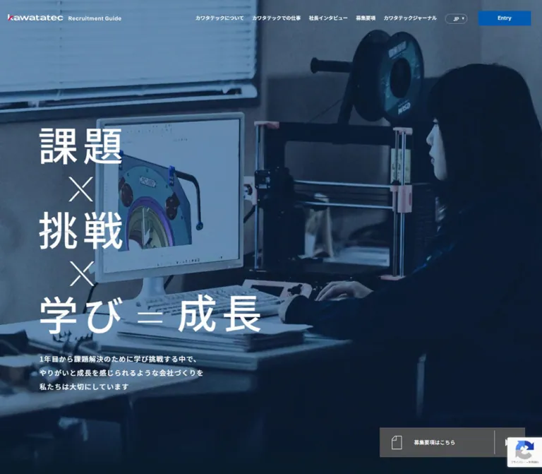
KAWATATEC presents recruitment through the scale and atmosphere of its workplace. Factory architecture, machinery, engineering screens, and people collaborating provide the visual substance. A strong blue treatment unifies these scenes, while white Japanese lettering creates an immediately legible foreground. The opening equation, 課題 × 挑戦 × 学び = 成長, gives the page a memorable composition without requiring decorative illustration.
The page is a substantial recruitment portal within a corporate website. Its story moves through company culture, products, contributions, leadership, work, and application information. Large editorial sections sit alongside practical navigation and a detailed corporate footer. Rectangular links with separated arrow compartments provide a consistent route through this material.
How to Read This Reference
- Measured means a value appears in the supplied computed styles, custom properties, or element rectangles. Measurements are CSS pixels unless stated otherwise.
- Estimated means a visual approximation from the current-page screenshots. Estimated colors are useful implementation starting points, not sampled source declarations.
- Calculated means arithmetic derived from measured values, such as widths, proportions, or differences between rectangles.
- Recommended means guidance for a new implementation. The CSS Quick Start uses this category unless an individual token is identified as measured.
- Computed rectangles can include transforms, offscreen carousel items, or interface layers that are not visibly open. Their presence does not establish visibility or interaction behavior.
- The supplied evidence contains five current-page screenshots. The other attached image is excluded from all design observations in this document.
- Font families below are supported by computed declarations. Font-file loading, individual glyph fallback, and the construction of the graphic wordmark were not separately verified.
Tokens — Colors
Default Palette
| Name | Value | Source or implementation alias | Evidence and role |
|---|---|---|---|
| Kawatatec Blue | #005aaf |
Source --c-kawatatec-blue1 |
Measured variable and initial Entry-button fill; also measured on selected Japanese section labels |
| Corporate Blue | #002f7c |
Source --c-kawatatec-blue2 |
Measured footer text and contact-button fill; blue wordmark treatment on light surfaces |
| Recruitment Stage | approximately #052454 |
Recommended --surface-stage |
Estimated dark blue field in chapter 04 and the recruitment section above the mobile footer |
| Hero Depth | approximately #081b2d |
Recommended --surface-hero |
Estimated near-black blue at the lower edge of the mobile hero |
| White | #ffffff |
Source --c-white |
Measured hero text and selected button surfaces; visible condensed-header background |
| Pale Steel | #ccd3dd |
Recommended --surface-action |
Measured rgb(204, 211, 221) on message and company-introduction links |
| Action Ink | #042966 |
Recommended --ink-action |
Measured text color on pale recruitment links |
| Alternate Action Ink | #022257 |
Descriptive alias | Measured president-interview link text on white |
| Graphite Action | #4f5051 |
Recommended --surface-jobs |
Measured hero recruitment-link fill on both viewports |
| Footer Gray | approximately #f0f0f0 |
Recommended --surface-footer |
Estimated from the light gray footer screenshots; the sampled footer element itself reports a transparent background |
| Body Gray | #333333 |
Source --c-font-color |
Measured body default and requirements empty-state text |
| Neutral Rule | #dddddd |
Source --c-line-gray |
Measured variable; the footer has visibly fine gray separators, but their own computed color was not supplied |
| Header Hover Blue | #9ad3ff |
Source --c-header-hover |
Declared token; its applied hover state was not captured |
| Brand Red | #e5002d |
Source --c-kawatatec-red |
Declared brand token; the wordmark visibly contains a small red accent |
Color Relationships
Blue has several distinct responsibilities. #005aaf identifies the Entry control and selected section labels. #002f7c supplies the corporate text and contact-button color. A darker, visually estimated navy fills the broad recruitment stages. Pale steel links sit within those stages, while the hero uses a separate graphite link.
Keep the red accent confined to the brand artwork unless new content explicitly requires another use. The visible page does not establish red as an application-action color.
The photographic blue appearance is a composite result. The evidence does not identify whether grading is embedded in the images, applied through overlays, or combined with other layers. A dark blue overlay and a lower-edge gradient are reasonable approximations, but their opacity values must be treated as recommendations.
Transparent computed backgrounds on section containers do not describe the entire visible surface. Underlying imagery and other layers remain significant. Likewise, the numerous generic color and gradient presets in the custom-property inventory are not evidence that those colors appear in this page's design.
Tokens — Typography
Japanese Interface — Noto Sans JP
Computed family: "Noto Sans JP", sans-serif.
The body uses weight 400; most inspected Japanese navigation, section labels, quotations, and article headings use 500. This restrained weight supports the practical industrial tone. Large text gains emphasis from size, contrast, and spacing rather than uniformly heavy bold styling.
Japanese section labels commonly use 0.05em tracking. The company-introduction topic headings use 0.04em, and the hero paragraph uses 0.08em. Preserve these differences instead of applying one global tracking value.
English Editorial Labels — Schibsted Grotesk
Computed family: "Schibsted Grotesk", sans-serif.
The measured Message heading uses weight 600, a 1.2 line height, and normal tracking. Footer language and social links use the same family at 15px, weight 500, with 0.03em tracking.
English labels such as About Kawatatec, From Our President, Requirement Information, and Work at Kawatatec are present in the rendered text. Their individual display sizes were not included in the sample, so the exact Message measurements should not automatically be assigned to every English title.
Graphic Headline and Wordmark
The hero equation reads as a designed composition: two short Japanese words stacked vertically, thin multiplication signs between them, and a wider final line combining learning and growth. Its individual text or graphic nodes were not measured. The visible glyph height is approximately 76–84px on desktop and 50–54px on mobile; these are visual estimates, not verified font sizes.
The recruitment wordmark also has a dedicated composition. Its desktop link measures 328 × 20px; mobile uses a 162 × 35px arrangement with Recruitment Guide beneath the company name. These are graphic-link dimensions, not a font-size specification. Preserve authorized wordmark artwork rather than approximating it with ordinary text.
The page includes an H1 named カワタテック 採用サイト in an offscreen 1 × 1px rectangle, consistent with a visually hidden heading. Its accessibility-tree behavior was not inspected.
Type Scale
| Role | Desktop | Mobile | Weight / tracking | Evidence |
|---|---|---|---|---|
| Body default | 15.2381px |
16px |
400, normal tracking |
Computed |
| Desktop navigation | 14px / 16.8px |
Full navigation absent from visible header | 500, normal tracking |
Computed and screenshot |
| Hero paragraph | 14px / 28px |
14.6012px / 29.2024px |
500, 0.08em |
Computed |
| Message display heading | 90px / 108px |
51px / 61.2px |
600, normal tracking |
Computed |
| Message quotation | 24px / 43.2px |
20px / 36px |
500, 0.04em |
Computed |
| News section label | 24px / 36px |
20px / 30px |
500, 0.05em |
Computed |
| News article title | 15px / 22.5px |
14px / 21px |
500, normal tracking |
Computed |
| Company topic heading | 47.1px / 65.94px |
31.3124px / 43.8374px |
500, 0.04em |
Computed |
| Standard Japanese section label | 24px / 24px |
18px / 18px |
500, 0.05em |
Computed for About, President, Requirements, and Work |
| Requirements empty state | 18px, normal line height |
15px, normal line height |
500 |
Computed |
| Employee interview title | 15.2381px / 25.9048px before possible scaling |
20px / 30px |
500; desktop -0.03em, mobile normal |
Computed; desktop rendered size may be transformed |
| Entry-row title | 20px / 20px |
16px / 16px |
500, 0.05em |
Computed |
| Entry availability label | 14px / 14px |
13px / 13px |
500, 0.05em |
Computed |
| Footer company details | 15px / 24px |
13px / 20.8px |
500, 0.03em |
Computed |
| Footer explanatory paragraph | 15px / 28.5px |
12px / 22.8px |
500, 0.03em |
Computed |
| Footer language and social links | 15px / 28.5px |
15px / 28.5px |
Schibsted Grotesk 500, 0.03em |
Computed |
The auxiliary cookie interface declares Nunito, sans-serif, primarily at 14px / 18px, weight 700. It is not visibly presented in the supplied screenshots and should not become the font reference for the recruitment interface.
Tokens — Spacing & Shapes
Responsive Unit
The source uses a very small root font size:
- Desktop HTML:
0.952381px, with--base-vw: 1512. - Mobile HTML:
1px, with--base-vw: 390. - Desktop body:
15.2381px, consistent with sixteen source rem units. - Mobile body:
16px, consistent with sixteen source rem units.
At the sampled widths, the root values are compatible with viewport/design-width scaling: 1440 / 1512 ≈ 0.952381 and 390 / 390 = 1. The complete root-size formula, breakpoint, and any minimum or maximum caps were not supplied.
The mobile --recruit-header-height: 80rem therefore resolves to 80px in this record. Copying that declaration into a conventional 16px-root project would produce a very different result. The Quick Start uses ordinary pixel and rem values instead.
Desktop custom properties also declare --grid-columns: 24 and --grid-margin: min(64px, 64rem). The latter resolves to approximately 60.95px at the sampled root size. The measured main-content inset is 117.75px, so the outer grid margin is not the same as the content alignment line.
Spacing Scale
| Use | Desktop | Mobile | Status |
|---|---|---|---|
| Main editorial inset | 117.75px |
20px |
Measured |
| Hero content inset | 80px |
22.53px |
Measured from paragraph bounds |
| Header brand inset | 30.47px |
31px |
Measured |
| Footer content inset | 117.75px |
30px |
Measured |
| Standard recruitment-link left padding | 20px |
20px |
Measured |
| Standard recruitment-link vertical padding | 6px |
6px |
Measured |
| Hero-link vertical padding | 6px |
10px |
Measured |
| Gap between Message links | 24px |
24px |
Calculated from rectangles |
| Footer product-group indentation | 24px |
Product directory absent | Measured alignment difference |
| Footer details-to-paragraph gap | 48px |
32px |
Calculated |
| Footer paragraph-to-contact gap | 48px |
32px |
Calculated |
| Mobile footer top clearance | — | 80px |
Calculated from footer and logo positions |
| Mobile social-link gap | — | 24px |
Calculated from link rectangles |
Border Radius
| Element | Radius | Status |
|---|---|---|
| Initial Entry button | 0 |
Measured |
| Hero recruitment link | 0 |
Measured |
| Standard pale recruitment links | 2px |
Measured |
| Desktop employee-card link | 4px |
Computed; rendered radius may scale |
| Mobile employee-card link | 0 |
Measured |
| Interview navigation buttons | 4px |
Measured |
| Footer contact button | 8px |
Measured |
| Language trigger | Capsule, approximately 14–15px radius |
Screenshot estimate |
| Chapter-04 photograph | One oversized curved upper-left boundary | Visually observed; exact radius and masking method unknown |
Layout Measurements
| Element | Desktop | Mobile |
|---|---|---|
| Document height | 12386.25px |
10191.33px |
| Initial header | 1440 × 106px |
390 × 80px |
| Header in scrolled captures | Approximately 66px high, agreeing with the source recruitment-header token |
80px high |
| Recruitment wordmark link | 328 × 20px |
162 × 35px |
| Initial Entry button | 152 × 42px, at (1256, 32) |
Absent from visible header |
| Mobile menu control | Not visible in desktop header | 54 × 54px, at (323, 13) |
| Main editorial width | Approximately 1204.48px |
350px |
| Hero paragraph | 332.64 × 84px |
344.94 × 116.75px |
| Hero recruitment link | 294 × 60px |
344.94 × 68px |
| Company-topic link | 352.08 × 60px |
350 × 60px |
| Message link | 370 × 60px |
350 × 60px |
| Footer contact link | 238.09 × 55.80px |
250 × 57.80px |
| Footer height | 1193.73px |
618.08px |
Components
Recruitment Header
Role: persistent company identity, recruitment navigation, language access, and entry access.
The initial desktop header is transparent over the hero photograph. The white recruitment wordmark sits at the left; five Japanese navigation links run across the middle; a small outlined JP capsule precedes the blue Entry button. Navigation links use 14px medium-weight text and 4px 12px padding.
In the scrolled desktop screenshots, the header becomes a white 66px strip with blue identity and navigation. The Entry area reaches the upper-right edge and appears approximately 216 × 66px, compared with the measured inset 152 × 42px opening-state button. This creates a more compact persistent navigation bar after the opening composition.
Mobile retains an 80px header. The brand switches to a two-line lockup, the full navigation and separate Entry button disappear, and a two-line menu symbol appears inside a measured 54px control. The language capsule remains alongside it. The mobile footer capture shows the same header on white.
The screenshots establish these different states. Their exact switching threshold and whether the implementation uses fixed or sticky positioning were not supplied.
Hero Equation and Workplace Scene
Role: express the recruitment proposition through a visual relationship between challenge, learning, and growth.
A workplace image fills the opening width. On desktop, the current capture shows a worker from behind within a large factory, with overhead beams, machinery, and another worker providing depth. White copy occupies the left side. The large equation begins around x=80px, y=273px; its final line reaches farther right than the two earlier words.
Preserve the five-row composition:
課題- A thin multiplication sign
挑戦- A second thin multiplication sign
学び = 成長
The supporting paragraph is substantially smaller: 14px / 28px, tracked at 0.08em. Its measured desktop position is (80, 744.59). This scale difference makes the equation dominant while retaining readable context.
On mobile, the current image shows a collaborative discussion beside a whiteboard. The composition uses a tighter portrait crop and a strong dark fade behind the lower copy. The equation starts around x=23px, y=185px. The final equation line remains intact across the content width. Supporting copy starts at y=488.17px and wraps to approximately four line boxes, including a short continuation line.
The desktop hero ends at y=1000px. On mobile, the next section begins at y=787.70px, with blue rectangular fragments visible at the lower edge of the screenshot. Do not force the mobile opening into exactly one viewport if its content requires a different height.
Segmented Recruitment Link
Role: provide a recognizable navigation pattern throughout the recruitment story.
The shared anatomy is a horizontal rectangle containing a left-aligned label and a right-hand arrow compartment, separated by a fine vertical rule. The arrow is a solid right-facing triangle. The hero variant adds a thin outlined document symbol before the text.
The hero link uses graphite #4f5051, white content, and square corners. On desktop it sits near the lower-right corner, approximately 35.3px from the right and bottom edges of the opening viewport. On mobile it moves below the paragraph, with about 45px clearance, spanning the 344.94px hero content width.
Standard content links use pale steel #ccd3dd, dark ink #042966, 2px corners, and a 60px height. In the chapter-04 screenshot, the arrow compartment is approximately 55px wide with an inset divider; that compartment width is a visual estimate.
The sampled anchor font is inherited at 15.2381px on desktop or 16px on mobile. Individual inner label spans were not measured, and some visible labels appear smaller. Do not confuse the anchor's computed font with a verified final glyph size.
Repeated link labels in the rendered text may belong to layered visual treatments. They do not represent a requirement to display each label twice. Hover movement of these layers was not exercised.
Editorial Section Heading and Message
Role: organize the page into large, recognizable chapters while explaining company culture.
Message pairs a large Schibsted Grotesk title with a medium-weight Japanese quotation and a longer paragraph. The observed quotation is 「新しい挑戦に必要なものは、経験よりも新鮮な視点。」.
On desktop, the English heading begins 304.75px below the section's start and aligns to the 117.75px editorial inset. On mobile it begins 289px below the section's start and aligns to a 20px inset. These measured offsets establish substantial breathing room, although the complete visual composition of this section is not shown in the supplied screenshots.
Two pale links follow: 入社後のプランを知る and インターンシップを見る. They remain vertically stacked, with a 24px gap, at both sampled widths. Their destinations are the work page's #plan and #internship anchors.
Recruitment News Row
Role: connect the recruitment story to a dated company update.
The DOM contains a recruitment-news category, the date 2024.06.02, and an article about an international internship initiative. Desktop places the section label at x=117.75px and the article link at x=481.56px, with an 840.67px link width. The article title starts farther inside that region at x=581.56px.
Mobile moves the content onto the shared 350px column. Its article title becomes 14px / 21px and occupies three measured lines. The article is one linked content unit; duplicate extracted title text should not be reproduced as separate news items.
The article date is content, not evidence that the present website is discontinued or that its design dates from that year.
Four Company-Introduction Chapters
Role: answer four practical questions about the employer and its work.
The rendered topics cover the company, its products, where those products contribute, and company statistics. Their links point to the About page and its #products, #place, and #number anchors.
The desktop chapter-04 screenshot provides the strongest visual evidence for this component. A navy text field occupies approximately the left 43.7% of the screen, ending near x=629px. The right side is a large photograph of a person working at engineering monitors. Its upper-left boundary forms a broad curve that softens the otherwise rectangular composition.
Within the left field, a muted blue 04 appears above the two-line heading 数字で分かる カワタテック. The heading uses measured 47.1px / 65.94px Japanese type. A pale segmented link sits below it at the same left alignment. The screenshot places this link near (118, 599) with a width of about 352px.
Several chapter headings have overlapping DOM coordinates, and the entire About section spans roughly 4562px on desktop. This is consistent with staged or pinned presentation, but the exact scroll choreography, change points, and transition mechanism were not captured. Do not interpret the overlapping rectangles as four headings intended to be visible simultaneously.
Mobile topic headings measure 31.3124px / 43.8374px, and their links expand to 350px. No mobile screenshot of this stage was supplied, so the photo placement and curved boundary at that width remain unverified.
President Interview and Requirements
Role: provide leadership context and a clear statement of current opportunities.
The president section includes From Our President, the Japanese label 社長インタビュー, a statement about mutual teaching, and a link to the full interview. The Japanese section label is measured in #005aaf; the interview link has a white fill, #022257 text, a 60px height, and 2px corners.
The requirements section contains Requirement Information, 応募要項, and the current message 現在、募集要項はありません。. The empty-state sentence is 18px on desktop and 15px on mobile, both at weight 500.
These sections are supported by DOM measurements rather than dedicated screenshots. Their full imagery, large English-title sizing, and background layers cannot be specified precisely from this evidence.
Employee Interview Carousel
Role: let visitors explore individual experiences in machining, assembly, and sales.
Each linked item includes the category 先輩インタビュー, an editorial title, a department, an abbreviated employee name, and この記事を読む. Three unique stories are repeated in the DOM. The repetition, horizontal item positions, and two adjacent navigation buttons support a carousel structure; autoplay and drag behavior were not verified.
At the sampled desktop state, the centered card has a bounding rectangle of approximately 888.33 × 466.36px. Other cards measure 535.14 × 280.94px and sit partly or entirely outside the viewport. The ratio is approximately 1.66, consistent with a scaled active item. The actual transform declaration was not included, so the smaller card dimensions should not be treated as the active card's final visual scale.
Desktop card links use display: flex and a computed 4px radius. The measured text bounds occupy the left portion of the centered card. The sample does not independently identify the complete image placement or surface fill.
On mobile, cards use display: block, measure 340 × 645px, and have square corners. The first card begins at x=25px; subsequent cards begin at x=415px and 805px, a 390px pitch. Titles have 32px horizontal inset, 20px / 30px type, and a 276px text width. Navigation buttons measure 40 × 40px, compared with about 76.19px square on desktop.
Entry Choices and Availability
Role: distinguish application pathways and communicate their present availability.
The Entry section contains three choices: new-graduate and mid-career recruitment, internships, and company information sessions. Every choice currently includes 現在は募集していません.
Desktop separates the section identity on the left from a right-hand stack of approximately 693 × 121px rows. Each row has a 20px title and a smaller availability label alongside it. Mobile stacks the title and status within a 350 × 148px row, with 48px 24px padding and a measured 20px gap.
The DOM still supplies anchor destinations for these choices. The evidence does not prove whether the original interface blocks activation. A new implementation should express availability explicitly and should not imply that a closed application is currently open.
Corporate Footer
Role: reconnect the recruitment experience to company information and the broader product website.
The footer changes the atmosphere to a light gray field with corporate-blue text. The inspected original page identifies the organization as 株式会社カワタテック, gives its Nara address and telephone number, and displays © Kawatatec Corp..
Desktop has three major regions: company identity and contact details at the left, a hierarchical product directory in the middle, and corporate links at the right. Product groups use fine vertical separators and a 24px text indentation. Language links sit toward the lower right; social links and copyright occupy the bottom line.
The contact button is visually distinct from the recruitment links: corporate-blue fill, white text, a small right-pointing triangle, 8px corners, and no prominent segmented arrow cell. Its desktop dimensions are approximately 238 × 56px.
Mobile removes the long product and corporate directories from the visible footer. It retains a 177 × 22px wordmark, company details, a compact explanatory paragraph, a centered 250 × 58px contact button, centered language links, a social-link row, and left-aligned copyright. The company block uses 30px side insets. The whole footer measures approximately 618px high.
The observed language labels are Japanese and English, with Japanese underlined in the screenshots. The Japanese link points to the corporate homepage, while English points to /en/recruit; neither destination was opened during this analysis.
Auxiliary Menus and Consent Interface
Role: support mobile navigation, entry access, and site-level utilities.
The rendered DOM contains a mobile-menu structure and a desktop entry-menu structure. Their text establishes available content, but neither open state is shown. Menu animation, focus trapping, dismissal behavior, and language-dropdown activation remain unverified.
Cookie text and an agreement control also appear in the DOM without a visible banner in the supplied captures. Do not reconstruct its placement from offscreen element rectangles.
A reCAPTCHA badge is visible at the lower right of the desktop screenshots and partly overlaps the hero link's arrow area. This is an external utility overlay, not a brand component or a bot-challenge page.
Tokens — Motion & Interaction
| Treatment | Evidence | What can be stated |
|---|---|---|
| Desktop header transformation | transform 0.4s cubic-bezier(0.19, 1, 0.22, 1), height 0.4s cubic-bezier(0.19, 1, 0.22, 1) |
Measured transition declaration; initial and condensed states appear in screenshots |
| Mobile header transformation | transform 0.4s cubic-bezier(0.19, 1, 0.22, 1), opacity 0.4s cubic-bezier(0.19, 1, 0.22, 1) |
Measured declaration; exact trigger and intermediate frames unknown |
| Desktop navigation color | color 0.4s cubic-bezier(0.19, 1, 0.22, 1) |
Measured; hovered destination color was not sampled |
| Initial Entry-button background | background-color 0.4s cubic-bezier(0.19, 1, 0.22, 1) |
Measured declaration; activation behavior untested |
| Language-option colors | Background and color, 0.4s, same easing |
Measured on option links; dropdown not opened |
| Desktop footer contact link | Color and background, 0.4s, same easing |
Measured declaration |
| Other sampled footer links | Color, 0.4s, same easing |
Measured declaration |
| About chapter progression | Shared coordinates, long section, chapter 04 visible after scrolling | Staged presentation supported; pinning implementation and timing unknown |
| Interview carousel | Repeated stories, horizontal offscreen items, active-size difference, paired controls | Carousel structure supported; autoplay, swiping, and transition timing unknown |
| Hero imagery | Different workplace scenes in desktop and mobile captures | Different scene selections are visible; video, slideshow, timing, and device-specific selection are unverified |
| Repeated button-label layers | Duplicate text in link extraction | Layered content exists; a rolling-text hover effect is not established |
The source includes an extensive easing-token library, including spring definitions. Token availability does not prove use. The most consistently evidenced motion is a 400ms transition with the source --e-out-expo curve.
Many elements report transition: all without a nonzero duration in the supplied shorthand. That is not sufficient evidence for an animated effect. Likewise, animation: none on sampled elements does not rule out JavaScript motion, media playback, or animation on unsampled layers.
For an adaptation, begin with the measured 400ms color and header transitions. Add chapter choreography or carousel motion only when their behavior can be implemented and tested independently.
Surfaces
| Layer | Appearance | Structural purpose |
|---|---|---|
| Opening scene | Full-width workplace photograph with dark blue treatment | Establishes people, place, and industrial scale |
| Hero lower region | Near-black navy fade | Maintains contrast behind body copy and the mobile recruitment link |
| Company chapter | Broad navy text field beside a large photograph | Gives each question a clear editorial stage |
| Recruitment link | Pale steel rectangle, dark label, divided arrow compartment | Repeated navigation affordance |
| Hero recruitment link | Graphite rectangle with white document icon and arrow | Distinct access to requirements |
| Condensed header | White strip with blue identity and navigation | Persistent orientation while scrolling |
| Corporate footer | Light gray field, blue text, fine separators | Dense corporate navigation without heavy visual weight |
| Interview controls | White buttons with small corner radius | Measured navigation affordances; card surfaces are not fully evidenced |
The supplied screenshots do not establish a general shadow-based elevation system. Hierarchy comes from large color fields, photographic boundaries, typography, rules, and changes in scale. The chapter photograph's broad curve is a focal shape, while most everyday controls remain nearly square.
Imagery
Use real workplace context: machine tools, factory interiors, engineering screens, discussions, and people engaged in tasks. The visible scenes give substantial space to the environment instead of isolating every person against a clean backdrop.
The desktop hero places a worker's back near the center and lets the factory architecture extend across the frame. The chapter-04 photograph similarly shows the back of an engineer at monitors. The mobile hero gives more attention to a smiling participant explaining something at a whiteboard. Together these scenes communicate both technical work and shared learning.
The blue treatment reduces color competition with the white equation and connects photography to the navy sections. Keep enough midtone detail to recognize tools, faces, and work surfaces. Applying an excessively opaque navy layer would remove the very workplace evidence that makes this design specific.
Observed Asset References
No image, video, logo, or font-file URLs were included in the supplied evidence. The following are descriptive asset roles, not filenames or verified source paths.
| Asset role | Current visual evidence | Reuse guidance |
|---|---|---|
| Desktop recruitment wordmark | White horizontal lockup over the hero; blue version in scrolled header | Preserve the original proportions with authorized artwork |
| Mobile recruitment wordmark | Two-line company name and Recruitment Guide lockup | Use the mobile composition rather than shrinking the desktop lockup |
| Corporate footer wordmark | Blue logo with a small red accent | Keep its distinct desktop and mobile sizes |
| Desktop hero scene | Worker inside a factory | Maintain environmental depth and sufficient contrast behind left-hand copy |
| Mobile hero scene | Discussion at a whiteboard | Use an intentional portrait crop with the key participant still readable |
| Chapter-04 photograph | Engineer at monitors, seen from behind | Preserve a large crop and the curved upper-left boundary |
| Document and arrow symbols | Thin document outline; solid directional triangle | Small SVGs or CSS shapes are appropriate adaptation choices |
| Mobile menu symbol | Two horizontal strokes | Keep the visible mark simple while retaining the full control target |
The evidence does not establish the media format or an automatic scene sequence. A static-image implementation is a defensible foundation; a video or slideshow requires separate evidence and behavior decisions.
Layout & Responsive Behavior
The page retains its editorial sequence at both sampled widths. The major adaptation is a redistribution of space and navigation density, rather than a uniform scale reduction.
| Area | Desktop observation | Mobile observation |
|---|---|---|
| Header | Horizontal brand, five links, language capsule, Entry button | Two-line brand, language capsule, menu button |
| Hero text | Left-aligned equation with a narrow three-line paragraph | Smaller equation; wider relative paragraph with additional wrapping |
| Hero recruitment link | Lower-right placement | In normal reading order below the paragraph |
| Editorial content | Approximately 1204px available width with 117.75px insets |
350px width with 20px insets |
| Message links | Two stacked 370px links |
Two stacked full-column links |
| About topics | Large left text panel and right photograph visible in chapter 04 | Smaller measured headings and full-column links; photo layout not pictured |
| Interviews | Large central item with smaller neighboring items | 340px card, vertical internal flow, one main item within the viewport |
| Entry rows | Titles and availability labels arranged across the row | Availability label beneath each title |
| Footer | Company details, product directory, corporate directory, utilities | Company details and utilities; directories absent |
Measured Section Extents
These values describe the supplied DOM snapshot, including any layout space reserved for staged presentation. They are not recommended fixed heights.
| Section | Desktop height | Mobile height |
|---|---|---|
| Opening region, derived from Message start | 1000px |
787.70px |
| Message | 1018.92px |
1288.09px |
| Recruitment news | 253.56px |
336px |
| About | 4561.81px |
3723.66px |
| President interview | 1450.06px |
751.66px |
| Requirements | 600.11px |
438.66px |
| Work and interviews | 1684.33px |
1550.66px |
| Entry | 685.61px |
720.83px |
| Footer | 1193.73px |
618.08px |
Requirements and Work rectangles overlap by approximately 61.89px on desktop and 24px on mobile. Together with the overlapping About-item coordinates, this makes a simple sum of section heights an unreliable reconstruction method.
The exact responsive breakpoint was not supplied. The Quick Start uses 1100px as a recommended navigation-collapse point, not a claim about the source. Intermediate tablet sizes, landscape phones, browser zoom, and safe-area behavior were not visually tested.
Do’s and Don’ts
Do
- Preserve the relationship between deep blue surfaces, real working environments, and white Japanese copy.
- Keep the equation's five-row rhythm and the wider final line.
- Use Noto Sans JP for Japanese interface text and Schibsted Grotesk for evidenced English editorial and utility roles.
- Retain medium-weight Japanese headings and generous line spacing in explanatory text.
- Distinguish the bright blue Entry control, graphite hero link, pale editorial links, and rounded corporate contact button.
- Align repeated section content to the measured editorial inset while allowing the hero and footer their own mobile margins.
- Give the company-introduction photograph substantial scale and one oversized curved boundary.
- Keep the mobile recruitment link after the hero paragraph in reading order.
- Preserve company information, language access, and social links when simplifying the mobile footer.
- Treat current hiring availability as actual content in the implementation.
Don't
- Don't replace workplace context with generic office stock imagery unrelated to manufacturing.
- Don't turn all section links into bright blue pills or add a broad rounded-card system.
- Don't use the brand's small red accent as a general action color.
- Don't apply a conventional 16px root while copying numeric source rem values unchanged.
- Don't assign a font name or exact font size to the graphic equation without further evidence.
- Don't reproduce duplicate DOM labels and carousel clones as duplicate visible content.
- Don't assume that every declared easing, gradient, or color token is actively used.
- Don't claim video playback, autoplay, drag gestures, parallax, or menu transitions from still captures alone.
- Don't use transformed carousel bounds as ordinary untransformed component dimensions.
- Don't copy the desktop badge overlap into a new implementation.
- Don't treat the absence of open positions as the absence of a functioning website.
Recommended Implementation Additions
These are improvements for a new implementation, not verified features of the original page:
- Give the menu, language trigger, and interview navigation buttons explicit accessible names and visible focus indicators.
- Preserve a meaningful text equivalent for the equation, including the relationship expressed by its mathematical signs. Avoid announcing a separate duplicate heading unnecessarily.
- Keep animated or cloned text layers out of the accessibility tree when they repeat the same label.
- Use explicit availability states for closed application choices. If activation is unavailable, ensure keyboard and pointer behavior agree with that state.
- For a carousel, provide keyboard-operable controls, an understandable current-item state, and a usable non-animated layout. Confirm that offscreen clones cannot receive accidental focus.
- If menus behave as dialogs, implement focus entry, Escape dismissal, focus return, and background interaction management.
- Check text contrast against every chosen photographic frame and crop, not only a single poster image.
- Reserve clearance around external overlays so they do not obscure an arrow or application control.
- Honor reduced-motion preferences. If video is later introduced, handle playback preferences in JavaScript as well as CSS.
- Keep paragraph and section heights content-driven. Recheck the mobile hero with longer translations and larger text settings.
- Preserve accessible routes to corporate information when hiding the desktop footer directories.
Agent Prompt Guide
Quick Color Reference
- Bright brand action: measured
#005aaf. - Corporate ink and contact action: measured
#002f7c. - Broad recruitment stage: estimated
#052454. - Hero lower depth: estimated
#081b2d. - Editorial link fill and text: measured
#ccd3ddand#042966. - Hero recruitment link: measured
#4f5051with white content. - Footer surface: estimated
#f0f0f0. - Brand accent: source token
#e5002d, used sparingly within the identity.
Overall Prompt
“Create a Japanese manufacturing recruitment homepage with a deep navy visual identity and large documentary workplace photography. Build the opening around the five-row equation ‘課題 × 挑戦 × 学び = 成長’, with white lettering, thin mathematical signs, and a small generously spaced supporting paragraph. Use a transparent desktop recruitment header that has a compact white state for scrolled content. Pair medium-weight Noto Sans JP with Schibsted Grotesk editorial labels. Continue through company culture, four company-introduction topics, leadership, current requirements, employee stories, and clearly stated application availability. Use pale steel rectangular links with separated triangle-arrow compartments, a graphite hero recruitment link, and a light gray corporate footer. On mobile, use a two-line brand lockup, a menu control, full-column editorial links, and a simplified footer. Treat unspecified animation as a separate implementation decision.”
Example Component Prompts
- Hero: “Compose a 1440px-wide recruitment opening with a full-height factory photograph, blue tonal treatment, and white copy beginning 80px from the left. Stack two Japanese concepts with thin multiplication signs, then place ‘学び = 成長’ on a wider final line. Set supporting text near 14px with 28px leading. Place a 294 × 60px graphite requirements link at the lower right.”
- Company chapter: “Build a large navy company-introduction stage. At a 1440px viewport, let the text field occupy roughly 629px and fill the remainder with an engineer-at-work photograph. Give the photograph one oversized curved upper-left boundary. Align a muted chapter number, a two-line 47px Japanese heading, and a 352 × 60px pale steel arrow link to a 118px left inset.”
- Segmented link: “Create a nearly square-cornered 60px-high recruitment link in #ccd3dd with #042966 text. Use 20px left padding and a narrow right arrow compartment separated by an inset vertical rule. Keep the arrow a small solid triangle. Provide one accessible label even if decorative text layers are used.”
- Mobile header and hero: “At 390px width, use an 80px header with a 162 × 35px two-line recruitment wordmark, a JP capsule, and a two-line menu symbol inside a 54px control. Crop a workplace discussion scene vertically. Keep approximately 23px hero side margins and place the 68px-high graphite requirements link below the paragraph.”
- Mobile footer: “Use a light gray footer with 30px side margins, a 177px-wide company wordmark, compact blue company details, a short explanatory paragraph, and a centered 250px contact button with 8px corners. Follow with centered language links, a 24px-gap social row, and left-aligned copyright.”
Quick Start
CSS Custom Properties
This is a usable adaptation of the evidenced shell and components, not recovered source CSS. It keeps a conventional root font size. Palette declarations identified earlier as measured remain exact; stage colors, photographic overlay strengths, graphic headline sizing, the photo curve, and the breakpoint are recommendations.
Use .is-solid on the header when the application selects its condensed light state. The evidence does not specify the original trigger. Supply authorized wordmark and photographic assets separately; no asset paths are assumed here. The About CSS below renders an ordinary section and does not simulate unverified scroll pinning.
:root {
  /* Measured colors */
  --blue-primary: #005aaf;
  --blue-ink: #002f7c;
  --brand-red: #e5002d;
  --white: #fff;
  --surface-action: #ccd3dd;
  --ink-action: #042966;
  --surface-jobs: #4f5051;
  --ink-body: #333;
  --line-neutral: #ddd;

  /* Visual approximations */
  --surface-stage: #052454;
  --surface-hero: #081b2d;
  --surface-footer: #f0f0f0;
  --ink-chapter-number: #7194d5;

  /* Computed font families; load licensed font files separately */
  --font-jp: 'Noto Sans JP', sans-serif;
  --font-en: 'Schibsted Grotesk', sans-serif;
  --weight-body: 400;
  --weight-label: 500;
  --weight-display: 600;

  /* Adaptation values matching the sampled desktop proportions */
  --page-inset: clamp(20px, 8.1771vw, 132px);
  --hero-inset: 5.5556vw;
  --header-open: 106px;
  --header-solid: 66px;
  --text-display: clamp(51px, 6.25vw, 96px);
  --text-topic: clamp(31.3124px, 3.2708vw, 50px);
  --radius-action: 2px;
  --radius-contact: 8px;

  /* Measured header easing and duration */
  --ease-out-expo: cubic-bezier(0.19, 1, 0.22, 1);
  --motion-ui: 400ms var(--ease-out-expo);
}

.recruit-site,
.recruit-site * {
  box-sizing: border-box;
}

.recruit-site {
  margin: 0;
  color: var(--ink-body);
  font: var(--weight-body) 1rem/1.8 var(--font-jp);
}

.recruit-site img {
  display: block;
  max-width: 100%;
}

.recruit-site button,
.recruit-site a {
  -webkit-tap-highlight-color: transparent;
}

.recruit-site button {
  font: inherit;
}

.recruit-site :focus-visible {
  outline: 3px solid currentColor;
  outline-offset: 5px;
}

.recruit-container {
  margin-inline: var(--page-inset);
}

/* Application code supplies the header state. */
.recruit-header {
  position: fixed;
  inset: 0 0 auto;
  z-index: 205;
  display: flex;
  align-items: center;
  gap: 20px;
  height: var(--header-open);
  padding-inline: 30px 32px;
  color: var(--white);
  background: transparent;
  transition:
    height var(--motion-ui),
    transform var(--motion-ui),
    background-color var(--motion-ui),
    color var(--motion-ui);
}

.recruit-brand {
  display: block;
  flex: 0 0 328px;
  width: 328px;
  height: 20px;
  color: inherit;
}

.recruit-brand img {
  width: 100%;
  height: 100%;
  object-fit: contain;
  object-position: left center;
}

.recruit-nav {
  display: flex;
  margin-inline-start: auto;
  white-space: nowrap;
}

.recruit-nav a {
  padding: 4px 12px;
  color: inherit;
  font-size: 14px;
  font-weight: 500;
  line-height: 1.2;
  text-decoration: none;
  transition: color var(--motion-ui);
}

.language-trigger {
  flex: 0 0 64px;
  min-height: 29px;
  padding: 2px 10px;
  border: 1px solid currentColor;
  border-radius: 999px;
  color: inherit;
  background: transparent;
  font-size: 14px;
}

.header-entry {
  display: grid;
  flex: 0 0 152px;
  place-items: center;
  height: 42px;
  border: 0;
  color: var(--white);
  background: var(--blue-primary);
  font-size: 14px;
  text-decoration: none;
  transition: background-color var(--motion-ui);
}

.menu-trigger {
  display: none;
}

.recruit-header.is-solid {
  height: var(--header-solid);
  padding-inline-end: 0;
  color: var(--blue-ink);
  background: var(--white);
}

.recruit-header.is-solid .header-entry {
  flex-basis: 216px;
  height: 66px;
}

/* Overlay values are recommendations, not measured source values. */
.recruit-hero {
  position: relative;
  isolation: isolate;
  min-height: 100svh;
  color: var(--white);
  background: var(--surface-hero);
}

.hero-media,
.hero-media img,
.hero-media::after {
  position: absolute;
  inset: 0;
  width: 100%;
  height: 100%;
}

.hero-media {
  z-index: -1;
}

.hero-media img {
  object-fit: cover;
  object-position: center;
}

.hero-media::after {
  content: '';
  background:
    linear-gradient(to bottom, transparent 40%, var(--surface-hero)),
    rgb(0 35 65 / 44%);
}

.hero-copy {
  width: min(500px, calc(100% - 2 * var(--hero-inset)));
  margin-inline-start: var(--hero-inset);
  padding-block-start: 27svh;
}

/* Text approximation for the unmeasured graphic equation. */
.hero-equation {
  display: grid;
  gap: 8px;
  margin: 0;
  font-size: 84px;
  font-weight: 500;
  line-height: 1.12;
  letter-spacing: 0.04em;
}

.hero-equation__symbol {
  width: 2.8em;
  font-size: 0.72em;
  font-weight: 300;
  line-height: 1;
  text-align: center;
}

.hero-equation__result {
  white-space: nowrap;
}

.hero-summary {
  max-width: 333px;
  margin: 32px 0 0;
  font-size: 14px;
  font-weight: 500;
  line-height: 2;
  letter-spacing: 0.08em;
}

.segment-link {
  display: grid;
  grid-template-columns: minmax(0, 1fr) 55px;
  align-items: center;
  width: min(352px, 100%);
  min-height: 60px;
  padding: 6px 0 6px 20px;
  border-radius: var(--radius-action);
  color: var(--ink-action);
  background: var(--surface-action);
  font-size: 14px;
  font-weight: 500;
  line-height: 1.5;
  text-decoration: none;
}

.segment-link__label {
  min-width: 0;
  padding-inline-end: 12px;
}

.segment-link__arrow {
  display: grid;
  align-self: stretch;
  place-items: center;
  border-inline-start: 1px solid rgb(4 41 102 / 30%);
}

.segment-link__arrow::before {
  content: '';
  width: 0;
  height: 0;
  border-block: 7px solid transparent;
  border-inline-start: 12px solid currentColor;
}

.hero-jobs {
  position: absolute;
  inset: auto 35.3px 35.3px auto;
  grid-template-columns: 28px minmax(0, 1fr) 55px;
  gap: 12px;
  width: 294px;
  border-radius: 0;
  color: var(--white);
  background: var(--surface-jobs);
}

.hero-jobs .segment-link__arrow {
  border-color: rgb(255 255 255 / 40%);
}

.document-symbol {
  width: 20px;
  height: 28px;
  fill: none;
  stroke: currentColor;
  stroke-width: 1;
}

.section-display {
  margin: 0;
  font-family: var(--font-en);
  font-size: var(--text-display);
  font-weight: 600;
  line-height: 1.2;
}

.section-label {
  margin: 24px 0 0;
  font-size: 24px;
  font-weight: 500;
  line-height: 1;
  letter-spacing: 0.05em;
}

.message-links {
  display: grid;
  gap: 24px;
}

.message-links .segment-link {
  width: min(370px, 100%);
}

.company-chapter {
  display: grid;
  grid-template-columns: 43.6944% minmax(0, 1fr);
  min-height: calc(100svh - var(--header-solid));
  color: var(--white);
  background: var(--surface-stage);
}

.chapter-copy {
  align-self: center;
  padding: 80px 44px 80px var(--page-inset);
}

.chapter-number {
  margin: 0 0 40px;
  color: var(--ink-chapter-number);
  font: 600 26px/1.2 var(--font-en);
}

.chapter-title {
  margin: 0 0 56px;
  font-size: var(--text-topic);
  font-weight: 500;
  line-height: 1.4;
  letter-spacing: 0.04em;
}

.chapter-media {
  position: relative;
  min-height: 600px;
  overflow: hidden;
  border-start-start-radius: 280px 340px;
}

.chapter-media img {
  width: 100%;
  height: 100%;
  object-fit: cover;
}

.entry-options {
  color: var(--white);
  background: var(--surface-stage);
}

.entry-row {
  display: flex;
  align-items: center;
  gap: 20px;
  min-height: 121px;
  padding: 48px 24px;
}

.entry-row__title {
  margin: 0;
  font-size: 20px;
  font-weight: 500;
  line-height: 1;
  letter-spacing: 0.05em;
}

/* Recommended readable status treatment for unavailable choices. */
.entry-row__status {
  margin: 0;
  color: var(--surface-action);
  font-size: 14px;
  line-height: 1.4;
}

.corporate-footer {
  padding: 200px var(--page-inset) 56px;
  color: var(--blue-ink);
  background: var(--surface-footer);
}

.footer-grid {
  display: grid;
  grid-template-columns: minmax(0, 1fr) 280px 193px;
  gap: clamp(48px, 11.3vw, 163px);
}

.footer-logo {
  width: 271px;
  margin-block-end: 12px;
}

.footer-details {
  font-size: 15px;
  font-weight: 500;
  line-height: 1.6;
  letter-spacing: 0.03em;
}

.footer-details p {
  margin: 0;
}

.footer-summary {
  max-width: 309px;
  margin: 48px 0;
  font-size: 15px;
  font-weight: 500;
  line-height: 1.9;
  letter-spacing: 0.03em;
}

.contact-link {
  display: flex;
  align-items: center;
  justify-content: center;
  gap: 32px;
  width: 238px;
  min-height: 56px;
  padding: 16px 8px;
  border-radius: var(--radius-contact);
  color: var(--white);
  background: var(--blue-ink);
  font-size: 14px;
  font-weight: 500;
  text-decoration: none;
}

.footer-product-group {
  margin-block: 0 32px;
  padding-inline-start: 24px;
  border-inline-start: 1px solid var(--line-neutral);
}

.footer-languages,
.footer-socials {
  display: flex;
  align-items: center;
  font: 500 15px/1.9 var(--font-en);
  letter-spacing: 0.03em;
}

.footer-languages {
  justify-content: flex-end;
  gap: 40px;
  margin-block-start: 32px;
}

.footer-socials {
  flex-wrap: wrap;
  gap: 48px;
}

.corporate-footer a:not(.contact-link) {
  color: inherit;
  text-decoration: none;
}

.footer-languages a[aria-current] {
  border-block-end: 1px solid currentColor;
}

.footer-bottom {
  display: flex;
  justify-content: space-between;
  gap: 24px;
  margin-block-start: 100px;
}

/* Recommended breakpoint; the original breakpoint is unknown. */
@media (max-width: 1100px) {
  :root {
    --page-inset: 20px;
    --hero-inset: 5.7772vw;
    --header-open: 80px;
    --header-solid: 80px;
    --text-display: 51px;
    --text-topic: 31.3124px;
  }

  .recruit-header,
  .recruit-header.is-solid {
    gap: 8px;
    height: 80px;
    padding-inline: 31px 13px;
  }

  .recruit-brand {
    flex-basis: 162px;
    width: 162px;
    height: 35px;
  }

  .recruit-nav,
  .header-entry {
    display: none;
  }

  .language-trigger {
    margin-inline-start: auto;
  }

  .menu-trigger {
    display: grid;
    flex: 0 0 54px;
    align-content: center;
    justify-items: center;
    gap: 6px;
    height: 54px;
    padding: 0;
    border: 0;
    color: inherit;
    background: transparent;
  }

  .menu-trigger::before,
  .menu-trigger::after {
    content: '';
    width: 32px;
    height: 2px;
    background: currentColor;
  }

  .recruit-hero {
    min-height: calc(100svh - 56px);
    padding-block-end: 70px;
  }

  .hero-copy {
    padding-block-start: 180px;
  }

  .hero-equation {
    gap: 4px;
    font-size: clamp(42px, 13.8462vw, 54px);
  }

  .hero-summary {
    max-width: none;
    font-size: 14.6012px;
  }

  .hero-jobs {
    position: static;
    width: calc(100% - 2 * var(--hero-inset));
    min-height: 68px;
    margin: 45px var(--hero-inset) 0;
    padding-block: 10px;
  }

  .segment-link:not(.hero-jobs),
  .message-links .segment-link {
    width: 100%;
  }

  .section-label {
    font-size: 18px;
  }

  /* Recommended stacked fallback; mobile chapter imagery is unverified. */
  .company-chapter {
    grid-template-columns: 1fr;
  }

  .chapter-copy {
    padding: 80px 20px 40px;
  }

  .chapter-title {
    margin-block-end: 24px;
  }

  .chapter-media {
    min-height: 320px;
    border-start-start-radius: 120px 150px;
  }

  .entry-row {
    align-items: flex-start;
    flex-direction: column;
    min-height: 148px;
  }

  .entry-row__title {
    font-size: 16px;
  }

  .entry-row__status {
    font-size: 13px;
  }

  .corporate-footer {
    padding: 80px 30px 56px;
  }

  .footer-grid {
    display: block;
  }

  .footer-sitemap,
  .footer-corporate-links {
    display: none;
  }

  .footer-logo {
    width: 177px;
    margin-block-end: 10px;
  }

  .footer-details {
    font-size: 13px;
  }

  .footer-summary {
    max-width: none;
    margin-block: 32px;
    font-size: 12px;
  }

  .contact-link {
    width: min(250px, 100%);
    min-height: 58px;
    margin-inline: auto;
  }

  .footer-languages {
    justify-content: center;
    margin-block-start: 30px;
  }

  .footer-bottom {
    flex-direction: column;
    gap: 24px;
    margin-block-start: 64px;
  }

  .footer-socials {
    gap: 24px;
  }
}

/* Recommended accessible motion fallback. */
@media (prefers-reduced-motion: reduce) {
  .recruit-site *,
  .recruit-site *::before,
  .recruit-site *::after {
    animation: none !important;
    transition: none !important;
    scroll-behavior: auto !important;
  }
}
Minimal markup for the hero link illustrates the component anatomy. Place it after .hero-copy inside .recruit-hero; the CSS moves it to the desktop corner and restores its mobile reading-order placement.
<a class="segment-link hero-jobs"
   href="https://kawatatec.co.jp/recruit/job-description/">
  <svg class="document-symbol" viewBox="0 0 20 28"
       aria-hidden="true" focusable="false">
    <path d="M1 9 8 1h11v26H1Z M1 9h7V1" />
  </svg>
  <span class="segment-link__label">募集要項はこちら</span>
  <span class="segment-link__arrow" aria-hidden="true"></span>
</a>
Font loading, responsive wordmark selection, menu behavior, carousel logic, header-state selection, and any media playback require separate implementation. The CSS intentionally supplies no unverified interaction sequence. Test its intermediate widths and content wrapping before production use.
Tailwind v4 Token Mapping
Optional aliases for a project already using Tailwind v4. This is not evidence that the original site uses Tailwind. Define the custom properties above first.
@theme inline {
  --color-brand: var(--blue-primary);
  --color-corporate: var(--blue-ink);
  --color-stage: var(--surface-stage);
  --color-hero-depth: var(--surface-hero);
  --color-action: var(--surface-action);
  --color-action-ink: var(--ink-action);
  --color-jobs: var(--surface-jobs);
  --color-footer: var(--surface-footer);
  --font-sans: var(--font-jp);
  --font-display: var(--font-en);
  --text-editorial: var(--text-display);
  --text-topic: var(--text-topic);
  --spacing-editorial-inset: var(--page-inset);
  --radius-recruitment: var(--radius-action);
  --radius-contact-button: var(--radius-contact);
}
Sources & Evidence
- Inspected original and final page: KAWATATEC Recruitment Guide. The supplied browser record reports HTTP
200and identical original and final URLs. - Capture date:
2026-09-12T15:00:37.251Z, corresponding to September 13, 2026, at 00:00:37 JST. Separate timestamps for individual screenshots were not supplied. - Desktop evidence:
1440 × 1000CSS pixels; opening hero, company-introduction chapter 04, footer, rendered document text, links, custom properties, and computed element measurements. - Mobile evidence:
390 × 844CSS pixels; opening hero, footer, rendered document text, links, custom properties, and computed element measurements. - Observed state differences: transparent versus white header, desktop versus mobile wordmark composition, relocation of the hero recruitment link, reduced footer navigation, and a visible fourth company-introduction stage after scrolling.
- Inspection procedure supplied with the captures: at least five seconds of initial observation, document and image readiness checks, finite-animation and layout-stability checks, and traversal through intermediate scroll positions. Perpetual animations were temporarily paused during readiness checking and then resumed. SharedWorkers and service workers were disabled.
- Limitations: only the supplied material was analyzed; no commands, additional browsing, asset retrieval, or destination-page inspection was performed. No menu, Entry panel, language dropdown, carousel control, cookie action, or form was exercised. Exact media format, animation timelines, scroll triggers, breakpoint rules, asset URLs, and unsampled visual sections remain unverified.
This reference describes the current page documented by those captures. Measured declarations, screenshot estimates, derived dimensions, and implementation recommendations are identified separately throughout.
# KAWATATEC Recruitment Guide — Style Reference

> A manufacturing recruitment guide built from deep blue, working people, and a typographic equation for growth.

**Website:** [kawatatec.co.jp/recruit](https://kawatatec.co.jp/recruit)
**Original URL:** https://kawatatec.co.jp/recruit
**Final URL:** https://kawatatec.co.jp/recruit
**Theme:** predominantly dark blue recruitment storytelling, with a white condensed header and a light gray corporate footer; no selectable theme was evidenced.
**Inspected:** September 13, 2026, at 00:00:37 JST, according to the supplied retrieval record: `2026-09-12T15:00:37.251Z`.
**Viewports:** desktop `1440 × 1000` and mobile `390 × 844` CSS pixels.
**Scope:** the current recruitment homepage. Visual evidence covers the desktop hero, company-introduction chapter 04, desktop footer, mobile hero, and mobile footer. Rendered DOM and computed styles additionally cover the message, news, four company-introduction topics, president interview, requirements, employee interviews, entry choices, and auxiliary interface content. Linked destination pages were not inspected.

KAWATATEC presents recruitment through the scale and atmosphere of its workplace. Factory architecture, machinery, engineering screens, and people collaborating provide the visual substance. A strong blue treatment unifies these scenes, while white Japanese lettering creates an immediately legible foreground. The opening equation, `課題 × 挑戦 × 学び = 成長`, gives the page a memorable composition without requiring decorative illustration.

The page is a substantial recruitment portal within a corporate website. Its story moves through company culture, products, contributions, leadership, work, and application information. Large editorial sections sit alongside practical navigation and a detailed corporate footer. Rectangular links with separated arrow compartments provide a consistent route through this material.

## How to Read This Reference

- **Measured** means a value appears in the supplied computed styles, custom properties, or element rectangles. Measurements are CSS pixels unless stated otherwise.
- **Estimated** means a visual approximation from the current-page screenshots. Estimated colors are useful implementation starting points, not sampled source declarations.
- **Calculated** means arithmetic derived from measured values, such as widths, proportions, or differences between rectangles.
- **Recommended** means guidance for a new implementation. The CSS Quick Start uses this category unless an individual token is identified as measured.
- Computed rectangles can include transforms, offscreen carousel items, or interface layers that are not visibly open. Their presence does not establish visibility or interaction behavior.
- The supplied evidence contains five current-page screenshots. The other attached image is excluded from all design observations in this document.
- Font families below are supported by computed declarations. Font-file loading, individual glyph fallback, and the construction of the graphic wordmark were not separately verified.

## Tokens — Colors

### Default Palette

| Name | Value | Source or implementation alias | Evidence and role |
| --- | --- | --- | --- |
| Kawatatec Blue | `#005aaf` | Source `--c-kawatatec-blue1` | Measured variable and initial Entry-button fill; also measured on selected Japanese section labels |
| Corporate Blue | `#002f7c` | Source `--c-kawatatec-blue2` | Measured footer text and contact-button fill; blue wordmark treatment on light surfaces |
| Recruitment Stage | approximately `#052454` | Recommended `--surface-stage` | Estimated dark blue field in chapter 04 and the recruitment section above the mobile footer |
| Hero Depth | approximately `#081b2d` | Recommended `--surface-hero` | Estimated near-black blue at the lower edge of the mobile hero |
| White | `#ffffff` | Source `--c-white` | Measured hero text and selected button surfaces; visible condensed-header background |
| Pale Steel | `#ccd3dd` | Recommended `--surface-action` | Measured `rgb(204, 211, 221)` on message and company-introduction links |
| Action Ink | `#042966` | Recommended `--ink-action` | Measured text color on pale recruitment links |
| Alternate Action Ink | `#022257` | Descriptive alias | Measured president-interview link text on white |
| Graphite Action | `#4f5051` | Recommended `--surface-jobs` | Measured hero recruitment-link fill on both viewports |
| Footer Gray | approximately `#f0f0f0` | Recommended `--surface-footer` | Estimated from the light gray footer screenshots; the sampled footer element itself reports a transparent background |
| Body Gray | `#333333` | Source `--c-font-color` | Measured body default and requirements empty-state text |
| Neutral Rule | `#dddddd` | Source `--c-line-gray` | Measured variable; the footer has visibly fine gray separators, but their own computed color was not supplied |
| Header Hover Blue | `#9ad3ff` | Source `--c-header-hover` | Declared token; its applied hover state was not captured |
| Brand Red | `#e5002d` | Source `--c-kawatatec-red` | Declared brand token; the wordmark visibly contains a small red accent |

### Color Relationships

Blue has several distinct responsibilities. `#005aaf` identifies the Entry control and selected section labels. `#002f7c` supplies the corporate text and contact-button color. A darker, visually estimated navy fills the broad recruitment stages. Pale steel links sit within those stages, while the hero uses a separate graphite link.

Keep the red accent confined to the brand artwork unless new content explicitly requires another use. The visible page does not establish red as an application-action color.

The photographic blue appearance is a composite result. The evidence does not identify whether grading is embedded in the images, applied through overlays, or combined with other layers. A dark blue overlay and a lower-edge gradient are reasonable approximations, but their opacity values must be treated as recommendations.

Transparent computed backgrounds on section containers do not describe the entire visible surface. Underlying imagery and other layers remain significant. Likewise, the numerous generic color and gradient presets in the custom-property inventory are not evidence that those colors appear in this page's design.

## Tokens — Typography

### Japanese Interface — Noto Sans JP

**Computed family:** `"Noto Sans JP", sans-serif`.

The body uses weight `400`; most inspected Japanese navigation, section labels, quotations, and article headings use `500`. This restrained weight supports the practical industrial tone. Large text gains emphasis from size, contrast, and spacing rather than uniformly heavy bold styling.

Japanese section labels commonly use `0.05em` tracking. The company-introduction topic headings use `0.04em`, and the hero paragraph uses `0.08em`. Preserve these differences instead of applying one global tracking value.

### English Editorial Labels — Schibsted Grotesk

**Computed family:** `"Schibsted Grotesk", sans-serif`.

The measured `Message` heading uses weight `600`, a `1.2` line height, and normal tracking. Footer language and social links use the same family at `15px`, weight `500`, with `0.03em` tracking.

English labels such as `About Kawatatec`, `From Our President`, `Requirement Information`, and `Work at Kawatatec` are present in the rendered text. Their individual display sizes were not included in the sample, so the exact `Message` measurements should not automatically be assigned to every English title.

### Graphic Headline and Wordmark

The hero equation reads as a designed composition: two short Japanese words stacked vertically, thin multiplication signs between them, and a wider final line combining learning and growth. Its individual text or graphic nodes were not measured. The visible glyph height is approximately `76–84px` on desktop and `50–54px` on mobile; these are visual estimates, not verified font sizes.

The recruitment wordmark also has a dedicated composition. Its desktop link measures `328 × 20px`; mobile uses a `162 × 35px` arrangement with `Recruitment Guide` beneath the company name. These are graphic-link dimensions, not a font-size specification. Preserve authorized wordmark artwork rather than approximating it with ordinary text.

The page includes an H1 named `カワタテック 採用サイト` in an offscreen `1 × 1px` rectangle, consistent with a visually hidden heading. Its accessibility-tree behavior was not inspected.

### Type Scale

| Role | Desktop | Mobile | Weight / tracking | Evidence |
| --- | --- | --- | --- | --- |
| Body default | `15.2381px` | `16px` | `400`, normal tracking | Computed |
| Desktop navigation | `14px / 16.8px` | Full navigation absent from visible header | `500`, normal tracking | Computed and screenshot |
| Hero paragraph | `14px / 28px` | `14.6012px / 29.2024px` | `500`, `0.08em` | Computed |
| Message display heading | `90px / 108px` | `51px / 61.2px` | `600`, normal tracking | Computed |
| Message quotation | `24px / 43.2px` | `20px / 36px` | `500`, `0.04em` | Computed |
| News section label | `24px / 36px` | `20px / 30px` | `500`, `0.05em` | Computed |
| News article title | `15px / 22.5px` | `14px / 21px` | `500`, normal tracking | Computed |
| Company topic heading | `47.1px / 65.94px` | `31.3124px / 43.8374px` | `500`, `0.04em` | Computed |
| Standard Japanese section label | `24px / 24px` | `18px / 18px` | `500`, `0.05em` | Computed for About, President, Requirements, and Work |
| Requirements empty state | `18px`, normal line height | `15px`, normal line height | `500` | Computed |
| Employee interview title | `15.2381px / 25.9048px` before possible scaling | `20px / 30px` | `500`; desktop `-0.03em`, mobile normal | Computed; desktop rendered size may be transformed |
| Entry-row title | `20px / 20px` | `16px / 16px` | `500`, `0.05em` | Computed |
| Entry availability label | `14px / 14px` | `13px / 13px` | `500`, `0.05em` | Computed |
| Footer company details | `15px / 24px` | `13px / 20.8px` | `500`, `0.03em` | Computed |
| Footer explanatory paragraph | `15px / 28.5px` | `12px / 22.8px` | `500`, `0.03em` | Computed |
| Footer language and social links | `15px / 28.5px` | `15px / 28.5px` | Schibsted Grotesk `500`, `0.03em` | Computed |

The auxiliary cookie interface declares `Nunito, sans-serif`, primarily at `14px / 18px`, weight `700`. It is not visibly presented in the supplied screenshots and should not become the font reference for the recruitment interface.

## Tokens — Spacing & Shapes

### Responsive Unit

The source uses a very small root font size:

- Desktop HTML: `0.952381px`, with `--base-vw: 1512`.
- Mobile HTML: `1px`, with `--base-vw: 390`.
- Desktop body: `15.2381px`, consistent with sixteen source rem units.
- Mobile body: `16px`, consistent with sixteen source rem units.

At the sampled widths, the root values are compatible with viewport/design-width scaling: `1440 / 1512 ≈ 0.952381` and `390 / 390 = 1`. The complete root-size formula, breakpoint, and any minimum or maximum caps were not supplied.

The mobile `--recruit-header-height: 80rem` therefore resolves to `80px` in this record. Copying that declaration into a conventional 16px-root project would produce a very different result. The Quick Start uses ordinary pixel and rem values instead.

Desktop custom properties also declare `--grid-columns: 24` and `--grid-margin: min(64px, 64rem)`. The latter resolves to approximately `60.95px` at the sampled root size. The measured main-content inset is `117.75px`, so the outer grid margin is not the same as the content alignment line.

### Spacing Scale

| Use | Desktop | Mobile | Status |
| --- | --- | --- | --- |
| Main editorial inset | `117.75px` | `20px` | Measured |
| Hero content inset | `80px` | `22.53px` | Measured from paragraph bounds |
| Header brand inset | `30.47px` | `31px` | Measured |
| Footer content inset | `117.75px` | `30px` | Measured |
| Standard recruitment-link left padding | `20px` | `20px` | Measured |
| Standard recruitment-link vertical padding | `6px` | `6px` | Measured |
| Hero-link vertical padding | `6px` | `10px` | Measured |
| Gap between Message links | `24px` | `24px` | Calculated from rectangles |
| Footer product-group indentation | `24px` | Product directory absent | Measured alignment difference |
| Footer details-to-paragraph gap | `48px` | `32px` | Calculated |
| Footer paragraph-to-contact gap | `48px` | `32px` | Calculated |
| Mobile footer top clearance | — | `80px` | Calculated from footer and logo positions |
| Mobile social-link gap | — | `24px` | Calculated from link rectangles |

### Border Radius

| Element | Radius | Status |
| --- | --- | --- |
| Initial Entry button | `0` | Measured |
| Hero recruitment link | `0` | Measured |
| Standard pale recruitment links | `2px` | Measured |
| Desktop employee-card link | `4px` | Computed; rendered radius may scale |
| Mobile employee-card link | `0` | Measured |
| Interview navigation buttons | `4px` | Measured |
| Footer contact button | `8px` | Measured |
| Language trigger | Capsule, approximately `14–15px` radius | Screenshot estimate |
| Chapter-04 photograph | One oversized curved upper-left boundary | Visually observed; exact radius and masking method unknown |

### Layout Measurements

| Element | Desktop | Mobile |
| --- | --- | --- |
| Document height | `12386.25px` | `10191.33px` |
| Initial header | `1440 × 106px` | `390 × 80px` |
| Header in scrolled captures | Approximately `66px` high, agreeing with the source recruitment-header token | `80px` high |
| Recruitment wordmark link | `328 × 20px` | `162 × 35px` |
| Initial Entry button | `152 × 42px`, at `(1256, 32)` | Absent from visible header |
| Mobile menu control | Not visible in desktop header | `54 × 54px`, at `(323, 13)` |
| Main editorial width | Approximately `1204.48px` | `350px` |
| Hero paragraph | `332.64 × 84px` | `344.94 × 116.75px` |
| Hero recruitment link | `294 × 60px` | `344.94 × 68px` |
| Company-topic link | `352.08 × 60px` | `350 × 60px` |
| Message link | `370 × 60px` | `350 × 60px` |
| Footer contact link | `238.09 × 55.80px` | `250 × 57.80px` |
| Footer height | `1193.73px` | `618.08px` |

## Components

### Recruitment Header

**Role:** persistent company identity, recruitment navigation, language access, and entry access.

The initial desktop header is transparent over the hero photograph. The white recruitment wordmark sits at the left; five Japanese navigation links run across the middle; a small outlined `JP` capsule precedes the blue `Entry` button. Navigation links use `14px` medium-weight text and `4px 12px` padding.

In the scrolled desktop screenshots, the header becomes a white `66px` strip with blue identity and navigation. The Entry area reaches the upper-right edge and appears approximately `216 × 66px`, compared with the measured inset `152 × 42px` opening-state button. This creates a more compact persistent navigation bar after the opening composition.

Mobile retains an `80px` header. The brand switches to a two-line lockup, the full navigation and separate Entry button disappear, and a two-line menu symbol appears inside a measured `54px` control. The language capsule remains alongside it. The mobile footer capture shows the same header on white.

The screenshots establish these different states. Their exact switching threshold and whether the implementation uses fixed or sticky positioning were not supplied.

### Hero Equation and Workplace Scene

**Role:** express the recruitment proposition through a visual relationship between challenge, learning, and growth.

A workplace image fills the opening width. On desktop, the current capture shows a worker from behind within a large factory, with overhead beams, machinery, and another worker providing depth. White copy occupies the left side. The large equation begins around `x=80px`, `y=273px`; its final line reaches farther right than the two earlier words.

Preserve the five-row composition:

1. `課題`
2. A thin multiplication sign
3. `挑戦`
4. A second thin multiplication sign
5. `学び = 成長`

The supporting paragraph is substantially smaller: `14px / 28px`, tracked at `0.08em`. Its measured desktop position is `(80, 744.59)`. This scale difference makes the equation dominant while retaining readable context.

On mobile, the current image shows a collaborative discussion beside a whiteboard. The composition uses a tighter portrait crop and a strong dark fade behind the lower copy. The equation starts around `x=23px`, `y=185px`. The final equation line remains intact across the content width. Supporting copy starts at `y=488.17px` and wraps to approximately four line boxes, including a short continuation line.

The desktop hero ends at `y=1000px`. On mobile, the next section begins at `y=787.70px`, with blue rectangular fragments visible at the lower edge of the screenshot. Do not force the mobile opening into exactly one viewport if its content requires a different height.

### Segmented Recruitment Link

**Role:** provide a recognizable navigation pattern throughout the recruitment story.

The shared anatomy is a horizontal rectangle containing a left-aligned label and a right-hand arrow compartment, separated by a fine vertical rule. The arrow is a solid right-facing triangle. The hero variant adds a thin outlined document symbol before the text.

The hero link uses graphite `#4f5051`, white content, and square corners. On desktop it sits near the lower-right corner, approximately `35.3px` from the right and bottom edges of the opening viewport. On mobile it moves below the paragraph, with about `45px` clearance, spanning the `344.94px` hero content width.

Standard content links use pale steel `#ccd3dd`, dark ink `#042966`, `2px` corners, and a `60px` height. In the chapter-04 screenshot, the arrow compartment is approximately `55px` wide with an inset divider; that compartment width is a visual estimate.

The sampled anchor font is inherited at `15.2381px` on desktop or `16px` on mobile. Individual inner label spans were not measured, and some visible labels appear smaller. Do not confuse the anchor's computed font with a verified final glyph size.

Repeated link labels in the rendered text may belong to layered visual treatments. They do not represent a requirement to display each label twice. Hover movement of these layers was not exercised.

### Editorial Section Heading and Message

**Role:** organize the page into large, recognizable chapters while explaining company culture.

`Message` pairs a large Schibsted Grotesk title with a medium-weight Japanese quotation and a longer paragraph. The observed quotation is `「新しい挑戦に必要なものは、経験よりも新鮮な視点。」`.

On desktop, the English heading begins `304.75px` below the section's start and aligns to the `117.75px` editorial inset. On mobile it begins `289px` below the section's start and aligns to a `20px` inset. These measured offsets establish substantial breathing room, although the complete visual composition of this section is not shown in the supplied screenshots.

Two pale links follow: `入社後のプランを知る` and `インターンシップを見る`. They remain vertically stacked, with a `24px` gap, at both sampled widths. Their destinations are the work page's `#plan` and `#internship` anchors.

### Recruitment News Row

**Role:** connect the recruitment story to a dated company update.

The DOM contains a recruitment-news category, the date `2024.06.02`, and an article about an international internship initiative. Desktop places the section label at `x=117.75px` and the article link at `x=481.56px`, with an `840.67px` link width. The article title starts farther inside that region at `x=581.56px`.

Mobile moves the content onto the shared `350px` column. Its article title becomes `14px / 21px` and occupies three measured lines. The article is one linked content unit; duplicate extracted title text should not be reproduced as separate news items.

The article date is content, not evidence that the present website is discontinued or that its design dates from that year.

### Four Company-Introduction Chapters

**Role:** answer four practical questions about the employer and its work.

The rendered topics cover the company, its products, where those products contribute, and company statistics. Their links point to the About page and its `#products`, `#place`, and `#number` anchors.

The desktop chapter-04 screenshot provides the strongest visual evidence for this component. A navy text field occupies approximately the left `43.7%` of the screen, ending near `x=629px`. The right side is a large photograph of a person working at engineering monitors. Its upper-left boundary forms a broad curve that softens the otherwise rectangular composition.

Within the left field, a muted blue `04` appears above the two-line heading `数字で分かる カワタテック`. The heading uses measured `47.1px / 65.94px` Japanese type. A pale segmented link sits below it at the same left alignment. The screenshot places this link near `(118, 599)` with a width of about `352px`.

Several chapter headings have overlapping DOM coordinates, and the entire About section spans roughly `4562px` on desktop. This is consistent with staged or pinned presentation, but the exact scroll choreography, change points, and transition mechanism were not captured. Do not interpret the overlapping rectangles as four headings intended to be visible simultaneously.

Mobile topic headings measure `31.3124px / 43.8374px`, and their links expand to `350px`. No mobile screenshot of this stage was supplied, so the photo placement and curved boundary at that width remain unverified.

### President Interview and Requirements

**Role:** provide leadership context and a clear statement of current opportunities.

The president section includes `From Our President`, the Japanese label `社長インタビュー`, a statement about mutual teaching, and a link to the full interview. The Japanese section label is measured in `#005aaf`; the interview link has a white fill, `#022257` text, a `60px` height, and `2px` corners.

The requirements section contains `Requirement Information`, `応募要項`, and the current message `現在、募集要項はありません。`. The empty-state sentence is `18px` on desktop and `15px` on mobile, both at weight `500`.

These sections are supported by DOM measurements rather than dedicated screenshots. Their full imagery, large English-title sizing, and background layers cannot be specified precisely from this evidence.

### Employee Interview Carousel

**Role:** let visitors explore individual experiences in machining, assembly, and sales.

Each linked item includes the category `先輩インタビュー`, an editorial title, a department, an abbreviated employee name, and `この記事を読む`. Three unique stories are repeated in the DOM. The repetition, horizontal item positions, and two adjacent navigation buttons support a carousel structure; autoplay and drag behavior were not verified.

At the sampled desktop state, the centered card has a bounding rectangle of approximately `888.33 × 466.36px`. Other cards measure `535.14 × 280.94px` and sit partly or entirely outside the viewport. The ratio is approximately `1.66`, consistent with a scaled active item. The actual transform declaration was not included, so the smaller card dimensions should not be treated as the active card's final visual scale.

Desktop card links use `display: flex` and a computed `4px` radius. The measured text bounds occupy the left portion of the centered card. The sample does not independently identify the complete image placement or surface fill.

On mobile, cards use `display: block`, measure `340 × 645px`, and have square corners. The first card begins at `x=25px`; subsequent cards begin at `x=415px` and `805px`, a `390px` pitch. Titles have `32px` horizontal inset, `20px / 30px` type, and a `276px` text width. Navigation buttons measure `40 × 40px`, compared with about `76.19px` square on desktop.

### Entry Choices and Availability

**Role:** distinguish application pathways and communicate their present availability.

The Entry section contains three choices: new-graduate and mid-career recruitment, internships, and company information sessions. Every choice currently includes `現在は募集していません`.

Desktop separates the section identity on the left from a right-hand stack of approximately `693 × 121px` rows. Each row has a `20px` title and a smaller availability label alongside it. Mobile stacks the title and status within a `350 × 148px` row, with `48px 24px` padding and a measured `20px` gap.

The DOM still supplies anchor destinations for these choices. The evidence does not prove whether the original interface blocks activation. A new implementation should express availability explicitly and should not imply that a closed application is currently open.

### Corporate Footer

**Role:** reconnect the recruitment experience to company information and the broader product website.

The footer changes the atmosphere to a light gray field with corporate-blue text. The inspected original page identifies the organization as `株式会社カワタテック`, gives its Nara address and telephone number, and displays `© Kawatatec Corp.`.

Desktop has three major regions: company identity and contact details at the left, a hierarchical product directory in the middle, and corporate links at the right. Product groups use fine vertical separators and a `24px` text indentation. Language links sit toward the lower right; social links and copyright occupy the bottom line.

The contact button is visually distinct from the recruitment links: corporate-blue fill, white text, a small right-pointing triangle, `8px` corners, and no prominent segmented arrow cell. Its desktop dimensions are approximately `238 × 56px`.

Mobile removes the long product and corporate directories from the visible footer. It retains a `177 × 22px` wordmark, company details, a compact explanatory paragraph, a centered `250 × 58px` contact button, centered language links, a social-link row, and left-aligned copyright. The company block uses `30px` side insets. The whole footer measures approximately `618px` high.

The observed language labels are `Japanese` and `English`, with Japanese underlined in the screenshots. The Japanese link points to the corporate homepage, while English points to `/en/recruit`; neither destination was opened during this analysis.

### Auxiliary Menus and Consent Interface

**Role:** support mobile navigation, entry access, and site-level utilities.

The rendered DOM contains a mobile-menu structure and a desktop entry-menu structure. Their text establishes available content, but neither open state is shown. Menu animation, focus trapping, dismissal behavior, and language-dropdown activation remain unverified.

Cookie text and an agreement control also appear in the DOM without a visible banner in the supplied captures. Do not reconstruct its placement from offscreen element rectangles.

A reCAPTCHA badge is visible at the lower right of the desktop screenshots and partly overlaps the hero link's arrow area. This is an external utility overlay, not a brand component or a bot-challenge page.

## Tokens — Motion & Interaction

| Treatment | Evidence | What can be stated |
| --- | --- | --- |
| Desktop header transformation | `transform 0.4s cubic-bezier(0.19, 1, 0.22, 1), height 0.4s cubic-bezier(0.19, 1, 0.22, 1)` | Measured transition declaration; initial and condensed states appear in screenshots |
| Mobile header transformation | `transform 0.4s cubic-bezier(0.19, 1, 0.22, 1), opacity 0.4s cubic-bezier(0.19, 1, 0.22, 1)` | Measured declaration; exact trigger and intermediate frames unknown |
| Desktop navigation color | `color 0.4s cubic-bezier(0.19, 1, 0.22, 1)` | Measured; hovered destination color was not sampled |
| Initial Entry-button background | `background-color 0.4s cubic-bezier(0.19, 1, 0.22, 1)` | Measured declaration; activation behavior untested |
| Language-option colors | Background and color, `0.4s`, same easing | Measured on option links; dropdown not opened |
| Desktop footer contact link | Color and background, `0.4s`, same easing | Measured declaration |
| Other sampled footer links | Color, `0.4s`, same easing | Measured declaration |
| About chapter progression | Shared coordinates, long section, chapter 04 visible after scrolling | Staged presentation supported; pinning implementation and timing unknown |
| Interview carousel | Repeated stories, horizontal offscreen items, active-size difference, paired controls | Carousel structure supported; autoplay, swiping, and transition timing unknown |
| Hero imagery | Different workplace scenes in desktop and mobile captures | Different scene selections are visible; video, slideshow, timing, and device-specific selection are unverified |
| Repeated button-label layers | Duplicate text in link extraction | Layered content exists; a rolling-text hover effect is not established |

The source includes an extensive easing-token library, including spring definitions. Token availability does not prove use. The most consistently evidenced motion is a `400ms` transition with the source `--e-out-expo` curve.

Many elements report `transition: all` without a nonzero duration in the supplied shorthand. That is not sufficient evidence for an animated effect. Likewise, `animation: none` on sampled elements does not rule out JavaScript motion, media playback, or animation on unsampled layers.

For an adaptation, begin with the measured `400ms` color and header transitions. Add chapter choreography or carousel motion only when their behavior can be implemented and tested independently.

## Surfaces

| Layer | Appearance | Structural purpose |
| --- | --- | --- |
| Opening scene | Full-width workplace photograph with dark blue treatment | Establishes people, place, and industrial scale |
| Hero lower region | Near-black navy fade | Maintains contrast behind body copy and the mobile recruitment link |
| Company chapter | Broad navy text field beside a large photograph | Gives each question a clear editorial stage |
| Recruitment link | Pale steel rectangle, dark label, divided arrow compartment | Repeated navigation affordance |
| Hero recruitment link | Graphite rectangle with white document icon and arrow | Distinct access to requirements |
| Condensed header | White strip with blue identity and navigation | Persistent orientation while scrolling |
| Corporate footer | Light gray field, blue text, fine separators | Dense corporate navigation without heavy visual weight |
| Interview controls | White buttons with small corner radius | Measured navigation affordances; card surfaces are not fully evidenced |

The supplied screenshots do not establish a general shadow-based elevation system. Hierarchy comes from large color fields, photographic boundaries, typography, rules, and changes in scale. The chapter photograph's broad curve is a focal shape, while most everyday controls remain nearly square.

## Imagery

Use real workplace context: machine tools, factory interiors, engineering screens, discussions, and people engaged in tasks. The visible scenes give substantial space to the environment instead of isolating every person against a clean backdrop.

The desktop hero places a worker's back near the center and lets the factory architecture extend across the frame. The chapter-04 photograph similarly shows the back of an engineer at monitors. The mobile hero gives more attention to a smiling participant explaining something at a whiteboard. Together these scenes communicate both technical work and shared learning.

The blue treatment reduces color competition with the white equation and connects photography to the navy sections. Keep enough midtone detail to recognize tools, faces, and work surfaces. Applying an excessively opaque navy layer would remove the very workplace evidence that makes this design specific.

### Observed Asset References

No image, video, logo, or font-file URLs were included in the supplied evidence. The following are descriptive asset roles, not filenames or verified source paths.

| Asset role | Current visual evidence | Reuse guidance |
| --- | --- | --- |
| Desktop recruitment wordmark | White horizontal lockup over the hero; blue version in scrolled header | Preserve the original proportions with authorized artwork |
| Mobile recruitment wordmark | Two-line company name and Recruitment Guide lockup | Use the mobile composition rather than shrinking the desktop lockup |
| Corporate footer wordmark | Blue logo with a small red accent | Keep its distinct desktop and mobile sizes |
| Desktop hero scene | Worker inside a factory | Maintain environmental depth and sufficient contrast behind left-hand copy |
| Mobile hero scene | Discussion at a whiteboard | Use an intentional portrait crop with the key participant still readable |
| Chapter-04 photograph | Engineer at monitors, seen from behind | Preserve a large crop and the curved upper-left boundary |
| Document and arrow symbols | Thin document outline; solid directional triangle | Small SVGs or CSS shapes are appropriate adaptation choices |
| Mobile menu symbol | Two horizontal strokes | Keep the visible mark simple while retaining the full control target |

The evidence does not establish the media format or an automatic scene sequence. A static-image implementation is a defensible foundation; a video or slideshow requires separate evidence and behavior decisions.

## Layout & Responsive Behavior

The page retains its editorial sequence at both sampled widths. The major adaptation is a redistribution of space and navigation density, rather than a uniform scale reduction.

| Area | Desktop observation | Mobile observation |
| --- | --- | --- |
| Header | Horizontal brand, five links, language capsule, Entry button | Two-line brand, language capsule, menu button |
| Hero text | Left-aligned equation with a narrow three-line paragraph | Smaller equation; wider relative paragraph with additional wrapping |
| Hero recruitment link | Lower-right placement | In normal reading order below the paragraph |
| Editorial content | Approximately `1204px` available width with `117.75px` insets | `350px` width with `20px` insets |
| Message links | Two stacked `370px` links | Two stacked full-column links |
| About topics | Large left text panel and right photograph visible in chapter 04 | Smaller measured headings and full-column links; photo layout not pictured |
| Interviews | Large central item with smaller neighboring items | `340px` card, vertical internal flow, one main item within the viewport |
| Entry rows | Titles and availability labels arranged across the row | Availability label beneath each title |
| Footer | Company details, product directory, corporate directory, utilities | Company details and utilities; directories absent |

### Measured Section Extents

These values describe the supplied DOM snapshot, including any layout space reserved for staged presentation. They are not recommended fixed heights.

| Section | Desktop height | Mobile height |
| --- | --- | --- |
| Opening region, derived from Message start | `1000px` | `787.70px` |
| Message | `1018.92px` | `1288.09px` |
| Recruitment news | `253.56px` | `336px` |
| About | `4561.81px` | `3723.66px` |
| President interview | `1450.06px` | `751.66px` |
| Requirements | `600.11px` | `438.66px` |
| Work and interviews | `1684.33px` | `1550.66px` |
| Entry | `685.61px` | `720.83px` |
| Footer | `1193.73px` | `618.08px` |

Requirements and Work rectangles overlap by approximately `61.89px` on desktop and `24px` on mobile. Together with the overlapping About-item coordinates, this makes a simple sum of section heights an unreliable reconstruction method.

The exact responsive breakpoint was not supplied. The Quick Start uses `1100px` as a recommended navigation-collapse point, not a claim about the source. Intermediate tablet sizes, landscape phones, browser zoom, and safe-area behavior were not visually tested.

## Do’s and Don’ts

### Do

- Preserve the relationship between deep blue surfaces, real working environments, and white Japanese copy.
- Keep the equation's five-row rhythm and the wider final line.
- Use Noto Sans JP for Japanese interface text and Schibsted Grotesk for evidenced English editorial and utility roles.
- Retain medium-weight Japanese headings and generous line spacing in explanatory text.
- Distinguish the bright blue Entry control, graphite hero link, pale editorial links, and rounded corporate contact button.
- Align repeated section content to the measured editorial inset while allowing the hero and footer their own mobile margins.
- Give the company-introduction photograph substantial scale and one oversized curved boundary.
- Keep the mobile recruitment link after the hero paragraph in reading order.
- Preserve company information, language access, and social links when simplifying the mobile footer.
- Treat current hiring availability as actual content in the implementation.

### Don't

- Don't replace workplace context with generic office stock imagery unrelated to manufacturing.
- Don't turn all section links into bright blue pills or add a broad rounded-card system.
- Don't use the brand's small red accent as a general action color.
- Don't apply a conventional 16px root while copying numeric source rem values unchanged.
- Don't assign a font name or exact font size to the graphic equation without further evidence.
- Don't reproduce duplicate DOM labels and carousel clones as duplicate visible content.
- Don't assume that every declared easing, gradient, or color token is actively used.
- Don't claim video playback, autoplay, drag gestures, parallax, or menu transitions from still captures alone.
- Don't use transformed carousel bounds as ordinary untransformed component dimensions.
- Don't copy the desktop badge overlap into a new implementation.
- Don't treat the absence of open positions as the absence of a functioning website.

## Recommended Implementation Additions

These are improvements for a new implementation, not verified features of the original page:

- Give the menu, language trigger, and interview navigation buttons explicit accessible names and visible focus indicators.
- Preserve a meaningful text equivalent for the equation, including the relationship expressed by its mathematical signs. Avoid announcing a separate duplicate heading unnecessarily.
- Keep animated or cloned text layers out of the accessibility tree when they repeat the same label.
- Use explicit availability states for closed application choices. If activation is unavailable, ensure keyboard and pointer behavior agree with that state.
- For a carousel, provide keyboard-operable controls, an understandable current-item state, and a usable non-animated layout. Confirm that offscreen clones cannot receive accidental focus.
- If menus behave as dialogs, implement focus entry, Escape dismissal, focus return, and background interaction management.
- Check text contrast against every chosen photographic frame and crop, not only a single poster image.
- Reserve clearance around external overlays so they do not obscure an arrow or application control.
- Honor reduced-motion preferences. If video is later introduced, handle playback preferences in JavaScript as well as CSS.
- Keep paragraph and section heights content-driven. Recheck the mobile hero with longer translations and larger text settings.
- Preserve accessible routes to corporate information when hiding the desktop footer directories.

## Agent Prompt Guide

### Quick Color Reference

- Bright brand action: measured `#005aaf`.
- Corporate ink and contact action: measured `#002f7c`.
- Broad recruitment stage: estimated `#052454`.
- Hero lower depth: estimated `#081b2d`.
- Editorial link fill and text: measured `#ccd3dd` and `#042966`.
- Hero recruitment link: measured `#4f5051` with white content.
- Footer surface: estimated `#f0f0f0`.
- Brand accent: source token `#e5002d`, used sparingly within the identity.

### Overall Prompt

“Create a Japanese manufacturing recruitment homepage with a deep navy visual identity and large documentary workplace photography. Build the opening around the five-row equation ‘課題 × 挑戦 × 学び = 成長’, with white lettering, thin mathematical signs, and a small generously spaced supporting paragraph. Use a transparent desktop recruitment header that has a compact white state for scrolled content. Pair medium-weight Noto Sans JP with Schibsted Grotesk editorial labels. Continue through company culture, four company-introduction topics, leadership, current requirements, employee stories, and clearly stated application availability. Use pale steel rectangular links with separated triangle-arrow compartments, a graphite hero recruitment link, and a light gray corporate footer. On mobile, use a two-line brand lockup, a menu control, full-column editorial links, and a simplified footer. Treat unspecified animation as a separate implementation decision.”

### Example Component Prompts

1. **Hero:** “Compose a 1440px-wide recruitment opening with a full-height factory photograph, blue tonal treatment, and white copy beginning 80px from the left. Stack two Japanese concepts with thin multiplication signs, then place ‘学び = 成長’ on a wider final line. Set supporting text near 14px with 28px leading. Place a 294 × 60px graphite requirements link at the lower right.”
2. **Company chapter:** “Build a large navy company-introduction stage. At a 1440px viewport, let the text field occupy roughly 629px and fill the remainder with an engineer-at-work photograph. Give the photograph one oversized curved upper-left boundary. Align a muted chapter number, a two-line 47px Japanese heading, and a 352 × 60px pale steel arrow link to a 118px left inset.”
3. **Segmented link:** “Create a nearly square-cornered 60px-high recruitment link in #ccd3dd with #042966 text. Use 20px left padding and a narrow right arrow compartment separated by an inset vertical rule. Keep the arrow a small solid triangle. Provide one accessible label even if decorative text layers are used.”
4. **Mobile header and hero:** “At 390px width, use an 80px header with a 162 × 35px two-line recruitment wordmark, a JP capsule, and a two-line menu symbol inside a 54px control. Crop a workplace discussion scene vertically. Keep approximately 23px hero side margins and place the 68px-high graphite requirements link below the paragraph.”
5. **Mobile footer:** “Use a light gray footer with 30px side margins, a 177px-wide company wordmark, compact blue company details, a short explanatory paragraph, and a centered 250px contact button with 8px corners. Follow with centered language links, a 24px-gap social row, and left-aligned copyright.”

## Quick Start

### CSS Custom Properties

This is a usable adaptation of the evidenced shell and components, not recovered source CSS. It keeps a conventional root font size. Palette declarations identified earlier as measured remain exact; stage colors, photographic overlay strengths, graphic headline sizing, the photo curve, and the breakpoint are recommendations.

Use `.is-solid` on the header when the application selects its condensed light state. The evidence does not specify the original trigger. Supply authorized wordmark and photographic assets separately; no asset paths are assumed here. The About CSS below renders an ordinary section and does not simulate unverified scroll pinning.

```css
:root {
  /* Measured colors */
  --blue-primary: #005aaf;
  --blue-ink: #002f7c;
  --brand-red: #e5002d;
  --white: #fff;
  --surface-action: #ccd3dd;
  --ink-action: #042966;
  --surface-jobs: #4f5051;
  --ink-body: #333;
  --line-neutral: #ddd;

  /* Visual approximations */
  --surface-stage: #052454;
  --surface-hero: #081b2d;
  --surface-footer: #f0f0f0;
  --ink-chapter-number: #7194d5;

  /* Computed font families; load licensed font files separately */
  --font-jp: 'Noto Sans JP', sans-serif;
  --font-en: 'Schibsted Grotesk', sans-serif;
  --weight-body: 400;
  --weight-label: 500;
  --weight-display: 600;

  /* Adaptation values matching the sampled desktop proportions */
  --page-inset: clamp(20px, 8.1771vw, 132px);
  --hero-inset: 5.5556vw;
  --header-open: 106px;
  --header-solid: 66px;
  --text-display: clamp(51px, 6.25vw, 96px);
  --text-topic: clamp(31.3124px, 3.2708vw, 50px);
  --radius-action: 2px;
  --radius-contact: 8px;

  /* Measured header easing and duration */
  --ease-out-expo: cubic-bezier(0.19, 1, 0.22, 1);
  --motion-ui: 400ms var(--ease-out-expo);
}

.recruit-site,
.recruit-site * {
  box-sizing: border-box;
}

.recruit-site {
  margin: 0;
  color: var(--ink-body);
  font: var(--weight-body) 1rem/1.8 var(--font-jp);
}

.recruit-site img {
  display: block;
  max-width: 100%;
}

.recruit-site button,
.recruit-site a {
  -webkit-tap-highlight-color: transparent;
}

.recruit-site button {
  font: inherit;
}

.recruit-site :focus-visible {
  outline: 3px solid currentColor;
  outline-offset: 5px;
}

.recruit-container {
  margin-inline: var(--page-inset);
}

/* Application code supplies the header state. */
.recruit-header {
  position: fixed;
  inset: 0 0 auto;
  z-index: 205;
  display: flex;
  align-items: center;
  gap: 20px;
  height: var(--header-open);
  padding-inline: 30px 32px;
  color: var(--white);
  background: transparent;
  transition:
    height var(--motion-ui),
    transform var(--motion-ui),
    background-color var(--motion-ui),
    color var(--motion-ui);
}

.recruit-brand {
  display: block;
  flex: 0 0 328px;
  width: 328px;
  height: 20px;
  color: inherit;
}

.recruit-brand img {
  width: 100%;
  height: 100%;
  object-fit: contain;
  object-position: left center;
}

.recruit-nav {
  display: flex;
  margin-inline-start: auto;
  white-space: nowrap;
}

.recruit-nav a {
  padding: 4px 12px;
  color: inherit;
  font-size: 14px;
  font-weight: 500;
  line-height: 1.2;
  text-decoration: none;
  transition: color var(--motion-ui);
}

.language-trigger {
  flex: 0 0 64px;
  min-height: 29px;
  padding: 2px 10px;
  border: 1px solid currentColor;
  border-radius: 999px;
  color: inherit;
  background: transparent;
  font-size: 14px;
}

.header-entry {
  display: grid;
  flex: 0 0 152px;
  place-items: center;
  height: 42px;
  border: 0;
  color: var(--white);
  background: var(--blue-primary);
  font-size: 14px;
  text-decoration: none;
  transition: background-color var(--motion-ui);
}

.menu-trigger {
  display: none;
}

.recruit-header.is-solid {
  height: var(--header-solid);
  padding-inline-end: 0;
  color: var(--blue-ink);
  background: var(--white);
}

.recruit-header.is-solid .header-entry {
  flex-basis: 216px;
  height: 66px;
}

/* Overlay values are recommendations, not measured source values. */
.recruit-hero {
  position: relative;
  isolation: isolate;
  min-height: 100svh;
  color: var(--white);
  background: var(--surface-hero);
}

.hero-media,
.hero-media img,
.hero-media::after {
  position: absolute;
  inset: 0;
  width: 100%;
  height: 100%;
}

.hero-media {
  z-index: -1;
}

.hero-media img {
  object-fit: cover;
  object-position: center;
}

.hero-media::after {
  content: '';
  background:
    linear-gradient(to bottom, transparent 40%, var(--surface-hero)),
    rgb(0 35 65 / 44%);
}

.hero-copy {
  width: min(500px, calc(100% - 2 * var(--hero-inset)));
  margin-inline-start: var(--hero-inset);
  padding-block-start: 27svh;
}

/* Text approximation for the unmeasured graphic equation. */
.hero-equation {
  display: grid;
  gap: 8px;
  margin: 0;
  font-size: 84px;
  font-weight: 500;
  line-height: 1.12;
  letter-spacing: 0.04em;
}

.hero-equation__symbol {
  width: 2.8em;
  font-size: 0.72em;
  font-weight: 300;
  line-height: 1;
  text-align: center;
}

.hero-equation__result {
  white-space: nowrap;
}

.hero-summary {
  max-width: 333px;
  margin: 32px 0 0;
  font-size: 14px;
  font-weight: 500;
  line-height: 2;
  letter-spacing: 0.08em;
}

.segment-link {
  display: grid;
  grid-template-columns: minmax(0, 1fr) 55px;
  align-items: center;
  width: min(352px, 100%);
  min-height: 60px;
  padding: 6px 0 6px 20px;
  border-radius: var(--radius-action);
  color: var(--ink-action);
  background: var(--surface-action);
  font-size: 14px;
  font-weight: 500;
  line-height: 1.5;
  text-decoration: none;
}

.segment-link__label {
  min-width: 0;
  padding-inline-end: 12px;
}

.segment-link__arrow {
  display: grid;
  align-self: stretch;
  place-items: center;
  border-inline-start: 1px solid rgb(4 41 102 / 30%);
}

.segment-link__arrow::before {
  content: '';
  width: 0;
  height: 0;
  border-block: 7px solid transparent;
  border-inline-start: 12px solid currentColor;
}

.hero-jobs {
  position: absolute;
  inset: auto 35.3px 35.3px auto;
  grid-template-columns: 28px minmax(0, 1fr) 55px;
  gap: 12px;
  width: 294px;
  border-radius: 0;
  color: var(--white);
  background: var(--surface-jobs);
}

.hero-jobs .segment-link__arrow {
  border-color: rgb(255 255 255 / 40%);
}

.document-symbol {
  width: 20px;
  height: 28px;
  fill: none;
  stroke: currentColor;
  stroke-width: 1;
}

.section-display {
  margin: 0;
  font-family: var(--font-en);
  font-size: var(--text-display);
  font-weight: 600;
  line-height: 1.2;
}

.section-label {
  margin: 24px 0 0;
  font-size: 24px;
  font-weight: 500;
  line-height: 1;
  letter-spacing: 0.05em;
}

.message-links {
  display: grid;
  gap: 24px;
}

.message-links .segment-link {
  width: min(370px, 100%);
}

.company-chapter {
  display: grid;
  grid-template-columns: 43.6944% minmax(0, 1fr);
  min-height: calc(100svh - var(--header-solid));
  color: var(--white);
  background: var(--surface-stage);
}

.chapter-copy {
  align-self: center;
  padding: 80px 44px 80px var(--page-inset);
}

.chapter-number {
  margin: 0 0 40px;
  color: var(--ink-chapter-number);
  font: 600 26px/1.2 var(--font-en);
}

.chapter-title {
  margin: 0 0 56px;
  font-size: var(--text-topic);
  font-weight: 500;
  line-height: 1.4;
  letter-spacing: 0.04em;
}

.chapter-media {
  position: relative;
  min-height: 600px;
  overflow: hidden;
  border-start-start-radius: 280px 340px;
}

.chapter-media img {
  width: 100%;
  height: 100%;
  object-fit: cover;
}

.entry-options {
  color: var(--white);
  background: var(--surface-stage);
}

.entry-row {
  display: flex;
  align-items: center;
  gap: 20px;
  min-height: 121px;
  padding: 48px 24px;
}

.entry-row__title {
  margin: 0;
  font-size: 20px;
  font-weight: 500;
  line-height: 1;
  letter-spacing: 0.05em;
}

/* Recommended readable status treatment for unavailable choices. */
.entry-row__status {
  margin: 0;
  color: var(--surface-action);
  font-size: 14px;
  line-height: 1.4;
}

.corporate-footer {
  padding: 200px var(--page-inset) 56px;
  color: var(--blue-ink);
  background: var(--surface-footer);
}

.footer-grid {
  display: grid;
  grid-template-columns: minmax(0, 1fr) 280px 193px;
  gap: clamp(48px, 11.3vw, 163px);
}

.footer-logo {
  width: 271px;
  margin-block-end: 12px;
}

.footer-details {
  font-size: 15px;
  font-weight: 500;
  line-height: 1.6;
  letter-spacing: 0.03em;
}

.footer-details p {
  margin: 0;
}

.footer-summary {
  max-width: 309px;
  margin: 48px 0;
  font-size: 15px;
  font-weight: 500;
  line-height: 1.9;
  letter-spacing: 0.03em;
}

.contact-link {
  display: flex;
  align-items: center;
  justify-content: center;
  gap: 32px;
  width: 238px;
  min-height: 56px;
  padding: 16px 8px;
  border-radius: var(--radius-contact);
  color: var(--white);
  background: var(--blue-ink);
  font-size: 14px;
  font-weight: 500;
  text-decoration: none;
}

.footer-product-group {
  margin-block: 0 32px;
  padding-inline-start: 24px;
  border-inline-start: 1px solid var(--line-neutral);
}

.footer-languages,
.footer-socials {
  display: flex;
  align-items: center;
  font: 500 15px/1.9 var(--font-en);
  letter-spacing: 0.03em;
}

.footer-languages {
  justify-content: flex-end;
  gap: 40px;
  margin-block-start: 32px;
}

.footer-socials {
  flex-wrap: wrap;
  gap: 48px;
}

.corporate-footer a:not(.contact-link) {
  color: inherit;
  text-decoration: none;
}

.footer-languages a[aria-current] {
  border-block-end: 1px solid currentColor;
}

.footer-bottom {
  display: flex;
  justify-content: space-between;
  gap: 24px;
  margin-block-start: 100px;
}

/* Recommended breakpoint; the original breakpoint is unknown. */
@media (max-width: 1100px) {
  :root {
    --page-inset: 20px;
    --hero-inset: 5.7772vw;
    --header-open: 80px;
    --header-solid: 80px;
    --text-display: 51px;
    --text-topic: 31.3124px;
  }

  .recruit-header,
  .recruit-header.is-solid {
    gap: 8px;
    height: 80px;
    padding-inline: 31px 13px;
  }

  .recruit-brand {
    flex-basis: 162px;
    width: 162px;
    height: 35px;
  }

  .recruit-nav,
  .header-entry {
    display: none;
  }

  .language-trigger {
    margin-inline-start: auto;
  }

  .menu-trigger {
    display: grid;
    flex: 0 0 54px;
    align-content: center;
    justify-items: center;
    gap: 6px;
    height: 54px;
    padding: 0;
    border: 0;
    color: inherit;
    background: transparent;
  }

  .menu-trigger::before,
  .menu-trigger::after {
    content: '';
    width: 32px;
    height: 2px;
    background: currentColor;
  }

  .recruit-hero {
    min-height: calc(100svh - 56px);
    padding-block-end: 70px;
  }

  .hero-copy {
    padding-block-start: 180px;
  }

  .hero-equation {
    gap: 4px;
    font-size: clamp(42px, 13.8462vw, 54px);
  }

  .hero-summary {
    max-width: none;
    font-size: 14.6012px;
  }

  .hero-jobs {
    position: static;
    width: calc(100% - 2 * var(--hero-inset));
    min-height: 68px;
    margin: 45px var(--hero-inset) 0;
    padding-block: 10px;
  }

  .segment-link:not(.hero-jobs),
  .message-links .segment-link {
    width: 100%;
  }

  .section-label {
    font-size: 18px;
  }

  /* Recommended stacked fallback; mobile chapter imagery is unverified. */
  .company-chapter {
    grid-template-columns: 1fr;
  }

  .chapter-copy {
    padding: 80px 20px 40px;
  }

  .chapter-title {
    margin-block-end: 24px;
  }

  .chapter-media {
    min-height: 320px;
    border-start-start-radius: 120px 150px;
  }

  .entry-row {
    align-items: flex-start;
    flex-direction: column;
    min-height: 148px;
  }

  .entry-row__title {
    font-size: 16px;
  }

  .entry-row__status {
    font-size: 13px;
  }

  .corporate-footer {
    padding: 80px 30px 56px;
  }

  .footer-grid {
    display: block;
  }

  .footer-sitemap,
  .footer-corporate-links {
    display: none;
  }

  .footer-logo {
    width: 177px;
    margin-block-end: 10px;
  }

  .footer-details {
    font-size: 13px;
  }

  .footer-summary {
    max-width: none;
    margin-block: 32px;
    font-size: 12px;
  }

  .contact-link {
    width: min(250px, 100%);
    min-height: 58px;
    margin-inline: auto;
  }

  .footer-languages {
    justify-content: center;
    margin-block-start: 30px;
  }

  .footer-bottom {
    flex-direction: column;
    gap: 24px;
    margin-block-start: 64px;
  }

  .footer-socials {
    gap: 24px;
  }
}

/* Recommended accessible motion fallback. */
@media (prefers-reduced-motion: reduce) {
  .recruit-site *,
  .recruit-site *::before,
  .recruit-site *::after {
    animation: none !important;
    transition: none !important;
    scroll-behavior: auto !important;
  }
}
```

Minimal markup for the hero link illustrates the component anatomy. Place it after `.hero-copy` inside `.recruit-hero`; the CSS moves it to the desktop corner and restores its mobile reading-order placement.

```html
<a class="segment-link hero-jobs"
   href="https://kawatatec.co.jp/recruit/job-description/">
  <svg class="document-symbol" viewBox="0 0 20 28"
       aria-hidden="true" focusable="false">
    <path d="M1 9 8 1h11v26H1Z M1 9h7V1" />
  </svg>
  <span class="segment-link__label">募集要項はこちら</span>
  <span class="segment-link__arrow" aria-hidden="true"></span>
</a>
```

Font loading, responsive wordmark selection, menu behavior, carousel logic, header-state selection, and any media playback require separate implementation. The CSS intentionally supplies no unverified interaction sequence. Test its intermediate widths and content wrapping before production use.

### Tailwind v4 Token Mapping

Optional aliases for a project already using Tailwind v4. This is not evidence that the original site uses Tailwind. Define the custom properties above first.

```css
@theme inline {
  --color-brand: var(--blue-primary);
  --color-corporate: var(--blue-ink);
  --color-stage: var(--surface-stage);
  --color-hero-depth: var(--surface-hero);
  --color-action: var(--surface-action);
  --color-action-ink: var(--ink-action);
  --color-jobs: var(--surface-jobs);
  --color-footer: var(--surface-footer);
  --font-sans: var(--font-jp);
  --font-display: var(--font-en);
  --text-editorial: var(--text-display);
  --text-topic: var(--text-topic);
  --spacing-editorial-inset: var(--page-inset);
  --radius-recruitment: var(--radius-action);
  --radius-contact-button: var(--radius-contact);
}
```

## Sources & Evidence

- **Inspected original and final page:** [KAWATATEC Recruitment Guide](https://kawatatec.co.jp/recruit). The supplied browser record reports HTTP `200` and identical original and final URLs.
- **Capture date:** `2026-09-12T15:00:37.251Z`, corresponding to September 13, 2026, at 00:00:37 JST. Separate timestamps for individual screenshots were not supplied.
- **Desktop evidence:** `1440 × 1000` CSS pixels; opening hero, company-introduction chapter 04, footer, rendered document text, links, custom properties, and computed element measurements.
- **Mobile evidence:** `390 × 844` CSS pixels; opening hero, footer, rendered document text, links, custom properties, and computed element measurements.
- **Observed state differences:** transparent versus white header, desktop versus mobile wordmark composition, relocation of the hero recruitment link, reduced footer navigation, and a visible fourth company-introduction stage after scrolling.
- **Inspection procedure supplied with the captures:** at least five seconds of initial observation, document and image readiness checks, finite-animation and layout-stability checks, and traversal through intermediate scroll positions. Perpetual animations were temporarily paused during readiness checking and then resumed. SharedWorkers and service workers were disabled.
- **Limitations:** only the supplied material was analyzed; no commands, additional browsing, asset retrieval, or destination-page inspection was performed. No menu, Entry panel, language dropdown, carousel control, cookie action, or form was exercised. Exact media format, animation timelines, scroll triggers, breakpoint rules, asset URLs, and unsampled visual sections remain unverified.

This reference describes the current page documented by those captures. Measured declarations, screenshot estimates, derived dimensions, and implementation recommendations are identified separately throughout.