DESIGN REFERENCE
ニコアンド「今夜も餃子とブギーバック」
鮮やかな赤とマスタード色に、餃子と人物の写真コラージュ、丸みの強い英字見出し、明朝体を組み合わせたコラボ特設ページ。アパレルの着用写真から生活雑貨、音楽企画へと展開し、小さな購入リンクを添えて紹介しています。
オリジナルサイトを見るniko and ... × 今夜も餃子とブギーバック — Style Reference
A giant gyoza platter becomes a dance floor for clothes, home goods, and playful editorial photography.
Website: niko and ... — 今夜も餃子とブギーバック Original URL: https://www.nikoand.jp/gyoza_boogieback/ Final URL: https://www.nikoand.jp/gyoza_boogieback/ Theme: saturated red with white typography; mustard yellow introduces the goods chapter and returns in the closing editorial content. Inspected: September 13, 2026, at 04:14 JST. Supplied retrieval timestamp: September 12, 2026, at 19:14:08.638 UTC. Viewports: desktop 1440 × 1000 CSS pixels; mobile 390 × 844 CSS pixels. Scope: the current collaboration feature, including the opening composition, introduction, collaborator profile, category links, apparel lookbook, product references, goods track, shop-list text, playlist feature, and footer. Visual coverage consists of three desktop captures and two mobile captures; rendered DOM evidence covers additional content between them.
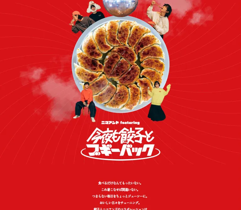
This is an editorial shopping feature built around the collision of food, fashion, and music. An enormous overhead photograph of browned gyoza occupies the opening scene. Cutout people gather around it, a mirror ball hangs above it, and fine curved lines spread across a red field. The white illustrated title completes the composition like a record sleeve or event poster.
The rest of the page alternates expressive photography with restrained shopping information. Rounded, heavy English lettering supplies the loud voice; tightly spaced Japanese Mincho text supplies the explanatory voice. Prices and small white store links sit close to the photographs. Broad areas of red separate scenes, while a mustard goods chapter changes the rhythm. The mobile layout actively recomposes the material, most visibly in a closing photograph that expands to the full screen width and carries the credits over the image.
How to Read This Reference
- Measured means a value supplied by the rendered DOM or computed-style records. These include colors, font declarations, element bounds, and selected animation declarations.
- Estimated means a visual measurement from an original-page capture. Image dimensions and visible border thicknesses fall into this category when corresponding image elements were not included in the DOM excerpt.
- Calculated means arithmetic based on those measurements, such as a width expressed as a percentage of its inspected viewport. Such ratios do not establish the original CSS formula.
- Recommended means an implementation choice for reuse. The CSS classes, breakpoint, accessible interaction states, and fallback scrolling behavior below are recommendations.
- The supplied computed-property collection contains no custom properties. All named tokens in this document are descriptive aliases.
- Computed font families establish the declared stack. Font files, loading outcomes, licensing details, and the identity behind the family name
eightwere not supplied. - Some measured elements lie outside the viewport or have bounds affected by their current presentation state. Treat their coordinates as snapshot evidence rather than permanent layout constraints.
The opening desktop capture does not visibly show the introduction or compact header, although both have DOM bounds. The introduction is recorded at approximately y = 873.83px. Visibility timing is therefore not fully reconciled between the image and DOM records. Preserve the content without turning that discrepancy into a permanent empty region.
Tokens — Colors
Default Palette
| Name | Value | Suggested token | Evidence and role |
|---|---|---|---|
| Campaign Red | #d71318 |
--color-campaign |
Measured HTML background, store-link text, and goods-section text; the dominant page field |
| Deep Red | #aa0f13 |
--color-nav |
Measured desktop and mobile navigation-link background |
| Mustard Gold | #e2c358 |
--color-gold |
Measured goods-section background, playlist copy, and closing headline |
| White | #ffffff |
--color-white |
Measured default body text, English display text, and store-link surfaces |
The color system is small and decisive. Red continues behind the opening, apparel photography, playlist feature, and desktop footer. Mustard is a substantial chapter surface for goods, then becomes typography on red near the end. White creates both the graphic title and the compact shopping controls.
Natural colors inside photographs are part of the imagery rather than additional interface tokens. These include warm timber, golden food, pale garments, dark clothing, and the metallic mirror ball.
Section Color Roles
| Context | Surface | Foreground | Control treatment |
|---|---|---|---|
| Opening and apparel | Campaign Red | White | Small white pills with red labels |
| Desktop utility navigation | Deep Red | White | Thin white outline visible in captures |
| Goods chapter | Mustard Gold | Campaign Red | White store pills with red labels |
| Playlist feature | Campaign Red | Mustard Gold | White Check pill with red text |
| Desktop closing area | Campaign Red | Gold headline; white credits | Photography sits directly on the canvas |
| Mobile closing area | Full-width photograph | Gold headline; white credits | Text overlaps the photograph |
These are section treatments. The evidence does not establish a user-selectable theme system.
Tokens — Typography
Japanese Editorial Text — Zen Old Mincho
- Computed family:
"Zen Old Mincho", serif. - Typical weight:
600for body copy, apparel prices, navigation, and credits. - Goods-price weight:
400in the sampled goods references. - Character: traditional Japanese serif forms, narrow English labels, and unusually tight spacing.
- Role: explanatory copy, profile information, product names and prices, navigation, and credits.
- Suggested alias:
--font-editorial.
The desktop body uses 14px text with -0.98px tracking. On mobile it becomes 14.56px with -1.0192px tracking. Both body ratios equal approximately -0.07em, but smaller descendants often inherit the same absolute spacing. Do not apply -0.07em indiscriminately to every text size and expect an exact match.
English Display Lettering — eight
- Computed family:
eight, sans-serif. - Computed weight:
400, despite the visually heavy letterforms. - Character: rounded, chunky retro lettering with tight joins and compact counters.
- Tracking: normal in the sampled display elements.
- Role: chapter headings, short remarks around photographs, and the closing statement.
- Suggested alias:
--font-display.
The family name is directly evidenced; its foundry, font-file path, and distribution name are unknown. Preserve the contrast between this display face and Mincho copy. A generic bold sans-serif can serve as a temporary fallback, but it will change the proportions and personality.
Illustrated Title and Brand Marks
The main H1 has no extracted text and occupies a graphic-shaped rectangle. Its inherited 14px font size does not describe the visible title lettering. Treat the angular Japanese wordmark, oval underline, and small endorsement line as artwork.
The available evidence does not include the image alternative text. For a new implementation, supply an accessible title while retaining the visual lettering as an image or authorized vector asset.
Type Scale
Values below are measured computed styles unless otherwise noted. Size and line height are expressed in pixels.
| Role | Desktop size / line height | Mobile size / line height | Weight and notes |
|---|---|---|---|
| General body | 14 / 14 |
14.56 / 14.56 |
600; individual paragraphs override leading |
| Opening introduction | 16 / 30 |
14.56 / 28.08 |
600; centered, deliberately separated lines |
| Profile and chapter explanation | 14 / 23 |
12.48 / 19.76 |
600 |
| Main chapter heading | 42 / 42 |
27.04 / 27.04 |
Display family, 400 |
| English photo remarks | Approximately 22.14–49.02 / 28.46–63.02 |
16.64 / 19.76 |
Display family; desktop sizes differ by composition |
| Apparel recap heading | 23 / 29.57 |
16.64 / 19.76 |
One desktop line becomes three mobile lines |
| Product name and price | 12 / 12 |
12.48 / 12.48 |
Apparel 600; sampled goods 400 |
Web Store label |
12 / 12 |
12.48 / 12.48 |
Tracking -0.6px / -0.624px |
| Header navigation | 14 / 38 |
14.56 / 38 |
Vertically aligned within a 40px control |
| Playlist selector | 18 / 26 |
12.48 / 19.76 |
Mincho, 600 |
| Playlist paragraph | 14 / 23 |
11.44 / 17.16 |
Tracking -1.68px / -1.144px |
Check label |
20 / 36 |
20.8 / 36 |
Mincho, 600 |
| Closing headline | 46 / 46 |
27.04 / 27.04 |
Gold display lettering |
| Credits | 12 / 22 |
12.48 / 22.88 |
White Mincho, 600 |
| Copyright | 10 / 10 |
10.4 / 10.4 |
White Mincho, 600 |
The All Items anchor itself computes to 14px on desktop and 14.56px on mobile. Its visible inner lettering appears larger in the desktop capture; nested-label styles were not supplied. Keep the anchor measurement separate from an estimate of its painted label.
Tokens — Spacing & Shapes
Density: tiny shopping details inside a large photographic composition. Geometry: square photographs, circular category artwork, and fully rounded links. Page rhythm: wide red intervals between scenes, with a more regular three-column recap near the end of the apparel chapter.
Spacing Measurements
| Use | Desktop | Mobile | Status |
|---|---|---|---|
| Compact logo position | 20px from left, 15px from top |
12px from left and top |
Measured bounds |
| Standard centered copy width | 1296px, or 90% of viewport |
351px, or 90% of viewport |
Measured; percentage calculated |
| Header navigation gap | 15px |
Bottom-positioned pair has 69px between boxes |
Calculated from bounds |
| Price-to-link gap | Commonly about 8–10px |
Commonly about 8–10px |
Calculated from representative rows |
| Stacked product-reference pitch | About 32.03px |
About 32.70px |
Calculated vertical difference |
| Apparel section padding | 40px 0 90px |
30px 0 40px |
Measured |
| Goods heading top padding | 37px |
37px |
Measured |
| Playlist section padding | 90px 0 105px |
40px 0 85px |
Measured |
| Copyright vertical padding | 55px top, 25px bottom |
20px top and bottom |
Measured |
A useful implementation spacing vocabulary is 8, 15, 20, 30, 40, 50, 80, 90, 105px. This is a recommended consolidation of observed relationships, not a recovered source scale.
Border Radius and Edges
| Element | Observed treatment | Evidence |
|---|---|---|
| Editorial and product photographs | Square corners | Original-page captures |
| Header navigation | 28px desktop; 29.12px mobile radius |
Computed styles |
Web Store pill |
24px desktop; 24.96px mobile radius |
Computed styles |
All Items pill |
28px desktop; 29.12px mobile radius |
Computed styles |
Check pill |
40px desktop; 41.6px mobile radius |
Computed styles |
| Category image links | 50% radius with 3px padding |
Computed styles |
| Header-link outline | Approximately 1px, white |
Visual estimate; border width was not recorded |
The large radius values create capsules because the controls are only 17–40px tall. A reusable 999px radius produces the same capsule geometry, although it is not the original numeric declaration.
Key Layout Measurements
| Element | Desktop | Mobile | Evidence |
|---|---|---|---|
| Compact brand mark | 122 × 51.08px |
80.5 × 33.70px |
Measured |
| Main title artwork box | 381.98 × 159.94px |
286.16 × 119.81px |
Measured H1 bounds |
| Small endorsement artwork box | 183.45 × 18.39px |
137.42 × 13.77px |
Measured wrapper bounds |
| Main title horizontal position | x = 529px |
x = 51.92px |
Measured |
| Main title top | y = 612.81px |
y = 438.83px |
Measured |
| Header links | 110 × 40px |
110 × 40px |
Measured |
Web Store pill |
56.25 × 17.03px |
58.5 × 17.70px |
Measured |
All Items link |
320 × 40px |
320 × 40px |
Measured |
Check link |
143.10 × 40px |
143.10 × 40px |
Measured |
| Apparel recap image group | About 1070px wide |
Reconfigured composition | Desktop visual estimate |
| Apparel recap photographs | About 335 × 419px each |
Image bounds not supplied | Desktop visual estimate |
| Closing photograph | About 250 × 333px |
About 390 × 520px |
Visual estimates |
The title width is approximately 26.53% of the desktop viewport and 73.37% of the mobile viewport. That difference is a key responsive decision: the mobile title retains substantial visual presence instead of shrinking in direct proportion to the desktop canvas.
Components
Opening Gyoza Composition
Role: establishes the collaboration through a single memorable image.
The scene has four visible layers:
- A solid red field with thin curved lines radiating around the central subject.
- Soft photographic steam drifting across parts of that field.
- A large overhead plate of gyoza, a mirror ball cropped by the top edge, and five cutout people arranged around the plate.
- A small white endorsement line followed by the illustrated Japanese title.
On desktop, the plate is approximately 470px wide and centered at x = 720px. The people and mirror ball extend beyond its outline while broad red margins remain on both sides. The title sits beneath the plate, rather than across the food.
On mobile, the plate occupies nearly the entire screen width. The people cluster against the edges, the mirror ball remains cropped at the top, and the title spans roughly 286px. The curved-line field ends around the 600px mark in the supplied opening capture, followed by centered introductory copy.
Implementation recommendation: prepare separate desktop and mobile scene compositions, or art-direct their individual layers. Keep the food, faces, and title as separately controllable focal areas. Preserve sharp photographic edges and natural food texture.
Compact Brand and Category Navigation
Role: provides identity and shortcuts through a very long feature.
In both scrolled desktop captures, the small white title mark sits at the upper left and three capsules sit at the upper right: アパレル, グッズ, and 商品一覧. The header has no visible full-width panel; its elements float over the page imagery and red field.
The sampled desktop header is a flex container with 20px horizontal padding. Each link is 110 × 40px, with a deep-red fill, white label, and a fine white outline visible in the images. Its 38px line height centers the label within the outlined control.
The hrefs establish the destinations:
- Brand mark:
#m_visual. アパレル:#apparel.グッズ:#goods.商品一覧: an external product-category URL onwww.dot-st.com.
The mobile DOM places the compact logo at (12, 12) and the two category links at y = 789px, leaving 15px beneath their 40px boxes in an 844px viewport. The general product-list link is absent from the mobile link collection. The supplied mobile images do not visibly show the bottom pair, so its visibility conditions remain unverified.
Desktop persistence is visually supported; the precise fixed-position CSS and appearance thresholds were not supplied. The brighter apparel pill in one scrolled frame also does not establish whether its state is selected, hovered, or otherwise contextual.
Introduction and Collaborator Profile
Role: connects the food motif to the clothing and introduces オガサワラガク.
The opening copy is centered and arranged in short, deliberate lines. Its desktop 16px / 30px setting and mobile 14.56px / 28.08px setting create generous vertical rhythm without a large text size. Preserve the separation around the emphatic line 今夜は餃子とブギーバック!.
The profile begins with the display heading WHAT’S ABOUT, followed by graphic content, the collaborator’s name, and compact biography text. Desktop biography bounds are substantially wider than the mobile column. Mobile uses a 351px text area with 12.48px / 19.76px text.
The profile contains the actual @kebab Instagram link. Image details for this intervening section are not shown in the supplied captures, so portrait treatment and exact image cropping cannot be specified from visual evidence.
Circular Category Entrances
Role: marks the transition from introduction to merchandise.
LET’S PLAY GYOZA sits above two circular image links, each paired with a separate text capsule for アパレル or グッズ. Desktop image-link bounds are approximately 358.80 × 358.80px, with about 20.80px between them.
The mobile records show animated, transformed bounds extending partly outside the viewport. Those bounds are unsuitable as the untransformed circle diameter. Both anchors have 50% radius and 3px padding.
The mobile animation declarations name rotate_disc1, with an 8-second linear infinite cycle; the second starts with a 4-second delay. The actual keyframes were not supplied. For an adaptation, keep the text labels stable and let decorative artwork carry any rotation.
Apparel Editorial Scene
Role: presents the collaboration as a sequence of styled moments.
The chapter starts with the two-line heading EAT GYOZA, / WEAR GYOZA! and a short Japanese explanation. Its subsequent scenes mix rectangular photography, isolated people, and English remarks placed in the surrounding red space.
The partial scene visible above the desktop recap includes photographs at the left and right edges, a cutout figure near the center, and the statement GYOZA makes / that night / enjoyable!. This establishes an irregular editorial composition rather than a uniform arrangement of product cards.
The DOM contains additional remarks such as How lovely are / the burnt marks / on the GYOZA. and Hey DJ, / play that song / again tonight. Their desktop font sizes vary with their scenes. On mobile, the sampled remarks converge on 16.64px / 19.76px and receive different line breaks and positions.
Reusable anatomy: scene wrapper → one or more photographs → optional cutout figure → short display remark → associated product-reference group. Keep the price group visually attached to the relevant photograph when rearranging the scene.
Product Reference and Store Pill
Role: makes individual photographed items discoverable in the external store.
Each reference combines a compact Japanese item name and yen price with a white Web Store capsule. The apparel recap places these groups beneath the photographs, aligned toward the right edge. Multiple items form additional rows under the same photograph.
Measured desktop pill anatomy:
12pxMincho label with12pxline height.-0.6pxtracking.- Padding:
2.04px 3.6px 3px. - White background and Campaign Red text.
24pxradius.- Resulting box: approximately
56.25 × 17.03px.
Mobile uses 12.48px type and proportionally larger padding, producing approximately 58.5 × 17.70px. Apparel references use weight 600; sampled goods references use 400.
The links point directly to item URLs, often with a COLOR_CD query parameter. Preserve each photograph’s item and color association. External destination behavior, inventory, and purchasing availability were not inspected.
Recommended accessible anatomy: use a meaningful product-specific link name, even when the visible label remains Web Store. Expand the interactive area and adjust row spacing so neighboring links do not overlap.
Apparel Recap
Role: gathers several key products into a clearer shopping moment after the freer lookbook scenes.
On desktop, the centered heading With whatever you like at all times. sits above two lines of Japanese copy. Three equal portrait photographs then form a row approximately 1070px wide, with roughly 32–33px gaps:
- Tote bags arranged on a timber surface.
- A cap and long-sleeve shirt photographed against a warm wall.
- Sweatshirts and small gyoza-shaped props on a wooden surface.
The images are approximately 335 × 419px, close to a 4:5 ratio. Their edges are square, and their prices and store pills sit directly on the red background beneath them. A centered 320 × 40px All Items capsule follows.
The mobile DOM establishes a more staggered arrangement. The heading becomes three lines and moves left; the bag reference appears on the right; cap and shirt references appear on the left; the explanatory copy occurs between product positions; the sweatshirt reference returns to the right. A mobile screenshot of this section was not supplied, so image sizes and overlaps remain unspecified.
Mustard Goods Track
Role: changes the chapter color and extends the collaboration into home and everyday objects.
The section switches to Mustard Gold with red text. Its heading is Decorate my home / with GYOZA!, followed by short explanatory copy. Product stories include cushions, a mat, an eye mask, a key holder, a towel, bags, tableware, glasses, a curtain, an umbrella, and a backpack.
The DOM establishes a horizontal arrangement: twelve story descriptions share the same vertical coordinate while their x positions advance by approximately 380px on desktop and 350.48px on mobile. Desktop description boxes are 315px wide; mobile boxes are approximately 301.39px wide.
At the recorded desktop state, the first description is already beyond the right viewport edge. In the mobile state, the first description begins near x = 32.34px, and the next begins near x = 382.82px. These are track-state measurements, not proof of a particular initial slide.
The exact reveal mechanism is unverified. The evidence does not establish dragging, autoplay, arrow controls, or vertical-scroll-driven pinning. A native horizontal scroller is a practical recommended fallback. If recreating the original behavior more closely, first obtain the relevant interaction evidence.
Keep each story’s description and potentially multiple product links together. The goods All Items destination is distinct from the apparel category destination.
Category Links and Shop List
Role: gives broader shopping access beyond individual product references.
Both All Items links measure 320 × 40px, retaining their width at the inspected mobile viewport. Their white capsule surfaces provide a stronger pause in the page than the miniature product pills.
The DOM also contains Shop List, an official web-store link, and a note that store assortments or content may vary. Shop-list text has a centered 288px-wide content region in both viewport records. Its coordinates are consistent with a viewport-centered presentation, but the supplied images do not show an opened shop-list surface.
Its trigger, container styling, close control, and dismissal behavior remain unverified. Treat it as evidenced content with incomplete interaction anatomy.
Playlist Feature
Role: reconnects the merchandise story to music and introduces related editorial content.
The desktop section is a measured 910px-wide flex region centered on the page. The visible artwork resembles a record sleeve: mustard texture, a black vinyl disc, a monochrome portrait, and embedded Japanese lettering. An approximately 375px square artwork area sits to the left of the copy in the closing desktop capture.
The text uses Mustard Gold on red, with a selector line naming オガサワラガク, a compact paragraph, and a white Check capsule. The link points to the original site’s /column/vol12_ogasawara/ article.
Mobile becomes a vertical sequence. The DOM places the small feature mark and selector before the artwork, then the paragraph and centered button. The paragraph is approximately 299.52px wide, using 11.44px / 17.16px type. The Check button retains its approximately 143.10 × 40px dimensions.
Closing Photograph and Credits
Role: ends the feature with a humorous lifestyle image and a compact production signature.
The desktop closing headline, GYOZA in your life., is centered in gold at 46px. Below it, a roughly 250 × 333px photograph shows a reclining person with a gyoza-shaped cushion, cap, clothing, and tableware. Wide red space surrounds the photograph. White credits appear beneath it in short centered lines.
Mobile changes the hierarchy. The photograph expands to approximately 390 × 520px, spanning the viewport. The 27.04px gold heading overlaps its upper edge. Credits appear over the lower part of the photograph in five individual production lines, followed by special thanks and copyright. This is a deliberate composition change, not simply a narrower desktop footer.
The inspected original footer names Naoto Date for Photo, Ryosuke Ito for Styling, Keisuke Kimura for Edit & Writing, Konomi Kawamoto for Development, and Hiroaki Takatori for Direction & Design. The source spells Development as Develoment. Special thanks name loom HATAGAYA and Sayuri Otobe. The copyright line reads Copyright © Adastria Co., Ltd. All rights reserved.
Tokens — Motion & Interaction
| Treatment | Supplied evidence | Interpretation and limitation |
|---|---|---|
| Navigation links | transition: 0.2s |
Short state transitions are declared; changed properties and final states were not supplied |
Web Store, All Items, and Check |
transition: 0.2s |
Consistent control timing; no clicked or hovered sequence was provided |
| Mobile introduction and section headings | transition: 0.5s |
Reveal-related transitions are plausible, but trigger and transformed properties are unverified |
| Mobile English photo remarks | 0.5s cubic-bezier(0.06, 1.22, 0.69, 1.43) |
The easing has an overshooting character; translation or scale amplitude is unknown |
| First mobile category image link | 8s linear infinite rotate_disc1 |
A perpetual animation is declared; keyframes were not supplied |
| Second mobile category image link | 8s linear 4s infinite rotate_disc1 |
Same named animation with a half-cycle delay |
| Desktop category image links | animation: none in sampled records |
Desktop and mobile snapshots differ; do not assume identical activation rules |
| Desktop compact navigation | Appears in the same upper corners in two scrolled captures | Persistent presentation is supported; exact positioning and visibility code are absent |
| Goods track | Horizontally distributed DOM bounds | Horizontal structure is supported; its navigation mechanism is not |
| Hero mirror ball, steam, and radial lines | Static original-page captures | Their presence does not prove animation |
The supplied inspection process waited for loading and finite layout motion, and temporarily paused perpetual animations during readiness checks. It does not establish every reveal state or demonstrate a complete animation cycle.
For reuse, keep control transitions short and reserve expressive motion for category artwork and editorial remarks. Any reduced-motion behavior in a new implementation should leave text, products, and links fully available. The source’s reduced-motion handling was not supplied.
Surfaces
| Layer | Appearance | Structural purpose |
|---|---|---|
| Main canvas | Flat Campaign Red | Connects the opening, apparel story, and closing material |
| Navigation capsules | Deep Red with white text and a thin visible outline | Separates small controls from photography and red surroundings |
| Product links | White capsules with red labels | Makes commerce legible without dominating the images |
| Goods chapter | Flat Mustard Gold with red text | Introduces a clear chapter change |
| Editorial photographs | Warm natural color; square edges | Provides material texture and narrative detail |
| Hero cutouts | Clean silhouettes against red | Turns people and food into a poster composition |
| Mobile footer | Full-width photograph behind credits | Compresses the ending into an immersive final scene |
There is no visible general-purpose card or elevation system in the supplied captures. Separation comes from color fields, image edges, scale changes, and empty space. The steam and metallic mirror ball belong to the illustration; they are not interface gradients or glass effects.
Imagery
The imagery combines appetizing food detail with lightly absurd fashion styling. Browned dumpling surfaces are shown at an exaggerated scale. People eat, pose, or recline around the merchandise. Timber tables, warm wall surfaces, glasses, and tableware give the fashion photographs a casual restaurant setting.
Three image modes do different jobs:
- Poster collage: isolated food, people, mirror ball, steam, and fine linework in the opening.
- Editorial photography: garments and people in warm interiors, sometimes combined with separate cutouts and display remarks.
- Product arrangements: bags, caps, shirts, sweatshirts, and props presented in square-edged photographic frames.
Use natural photographic sharpness. The images are not pixel art, and no pixelated rendering treatment is evidenced. Preserve the food’s uneven browning, fabric texture, and ambient warmth. Reserve strong interface red for the surrounding canvas rather than tinting every photograph red.
Observed Asset References
Original image URLs, native dimensions, and file formats were not included in the supplied DOM excerpt. The following references identify visible material without inventing asset paths.
| Visual reference | Original-page evidence | Use |
|---|---|---|
| Gyoza plate, five people, mirror ball, steam, curved lines | Desktop opening and mobile opening captures | Primary composition |
| White illustrated collaboration title | Opening and scrolled captures | Main title and compact identity |
| Tote bags on timber | Desktop apparel recap | Product arrangement |
| Cap above hanging long-sleeve shirt | Desktop apparel recap | Product arrangement |
| Sweatshirts with small food props | Desktop apparel recap | Product arrangement |
| Record-sleeve artwork with vinyl and portrait | Desktop and mobile closing captures | Related playlist feature |
| Reclining person with gyoza cushion and tableware | Desktop and mobile closing captures | Footer photograph |
Use authorized source artwork where available. If creating a related design, commission original photography and lettering that preserve these relationships of scale, warmth, and humor.
Layout & Responsive Behavior
The page is a long continuous feature. The recorded document height is approximately 15,818px on desktop and 13,605px on mobile. These measurements include the current document’s layout and any interaction-related spacing; they are not target heights for a rebuild.
Observed Responsive Changes
| Area | Desktop at 1440 × 1000 | Mobile at 390 × 844 |
|---|---|---|
| Opening | Central composition with broad red margins | Food and people occupy most of the width |
| Main title | Approximately 382px wide | Approximately 286px wide, a much larger viewport proportion |
| Compact identity | 122px-wide mark at upper left | 80.5px-wide mark at upper left |
| Category navigation | Three upper-right links | Two bottom-positioned links in DOM; visibility unverified |
| Chapter headings | 42px display type | 27.04px display type |
| Photo remarks | Different sizes and positions by scene | Mostly 16.64px with mobile-specific line breaks |
| Product references | Frequently stacked beneath imagery | Some references share a row; others stack or separate label and pill |
| Apparel recap | Three equal portrait photographs | Staggered placement indicated by DOM positions |
| Goods stories | Horizontal coordinate sequence | Horizontal coordinate sequence with narrower pitch |
| Playlist | Side-by-side artwork and copy | Mark, selector, artwork, paragraph, and button arranged vertically |
| Footer | Small centered photograph with credits below | Full-width photograph with credits overlaid |
Many mobile text measurements are 1.04 times a round nominal size: 12 → 12.48, 14 → 14.56, and 20 → 20.8. This is consistent with scaling relative to a 375px reference width because 390 / 375 = 1.04. It is an inference, not a recovered stylesheet formula. Several controls remain fixed at 110 × 40px, 320 × 40px, or 143.10 × 40px, so a single global scale cannot describe the whole interface.
The section coordinates also show substantial space between the sampled goods region and the later playlist feature. Combined with the horizontal track, this may reflect interaction scaffolding or content not represented by the selected elements. Do not reproduce that interval as an unexplained blank block.
Only two widths were inspected. The breakpoint, intermediate tablet arrangements, landscape behavior, and safe-area rules are unknown. The Quick Start uses a recommended 767px breakpoint to express the observed desktop/mobile distinction.
Do’s and Don’ts
Do
- Keep Campaign Red
#d71318as the dominant connecting surface. - Use Mustard Gold
#e2c358as a chapter color and a closing typographic accent. - Pair the declared
eightdisplay family with Zen Old Mincho editorial text when the fonts are available and authorized. - Preserve the oversized gyoza plate, smaller people, cropped mirror ball, and separate title area in the opening composition.
- Leave substantial red space around editorial scenes.
- Keep product names, prices, and store links closely associated with their photographs.
- Use square photographic edges and capsule-shaped controls.
- Preserve the apparel recap’s clear desktop three-column rhythm.
- Recompose mobile imagery, captions, and footer credits deliberately.
- Keep category and item destinations distinct, including product color parameters where relevant.
Don’t
- Don’t shrink the whole desktop canvas into a phone-sized image.
- Don’t replace the illustrated Japanese title with ordinary typed text.
- Don’t wrap every photograph in a padded, rounded, shadowed card.
- Don’t make all English remarks the same desktop size or align every scene to one rigid grid.
- Don’t turn the mustard goods chapter into another red section.
- Don’t apply global color filters that flatten the warm photography.
- Don’t promote the source’s 17px-high store-pill geometry as an adequate standalone touch target.
- Don’t infer autoplay, dragging, scroll pinning, or a complete rotation path from static images and animation names alone.
- Don’t hardcode offscreen snapshot coordinates as normal content positions.
- Don’t carry the desktop footer’s small photograph into mobile when the observed design uses a full-width image.
Recommended Implementation Additions
These are recommendations for a new implementation, not verified original-site features:
- Give the illustrated title an accessible text equivalent, and distinguish decorative cutouts from informative product photographs in image alternatives.
- Give each repeated
Web Storelink a product-specific accessible name. - Increase product-link hit areas and row spacing together. For touch use, a 44px-high interactive area is a practical target even when the visible capsule remains compact.
- Add a clear keyboard focus outline and ensure fixed navigation does not obscure anchor destinations or focused content.
- Make all twelve goods stories reachable without requiring a specific pointer gesture. A native horizontal scroller with keyboard access is a useful baseline.
- Provide reduced-motion styles and make revealed content visible when animation is disabled or scripting fails.
- Check the small gold/red playlist text for contrast and the mobile credits for readability across the photograph. Adjust text color or provide localized backing when necessary.
- Allow Japanese text and prices to wrap safely under browser zoom or font substitution; the source’s tight tracking is especially sensitive to font changes.
- Reserve image dimensions, load the opening composition promptly, and defer later editorial photography to reduce layout movement on this long page.
- Treat the captured prices as source examples. A production adaptation should obtain current product data from its own content source.
Agent Prompt Guide
Quick Color Reference
- Main page field:
#d71318. - Default editorial text and opening title:
#ffffff. - Utility navigation fill:
#aa0f13, with white text and a thin white outline. - Goods chapter:
#e2c358surface with#d71318text. - Playlist copy and closing heading:
#e2c358on red. - Store actions: white capsules with red Mincho labels.
- Photographs: warm natural color, square edges, no general card shadow.
Overall Prompt
“Create an editorial collaboration feature for apparel and home goods using a saturated red #d71318 canvas, white lettering, and a mustard #e2c358 goods chapter. Open with an oversized overhead food platter surrounded by smaller cutout people, a cropped mirror ball, delicate curved lines, and an illustrated title below the food. Pair chunky rounded retro English display lettering with tightly spaced Japanese Mincho copy. Build a long sequence of warm interior photographs, isolated figures, and short English remarks, attaching small product-price rows and white store pills to the relevant images. Include a three-column desktop apparel recap, a horizontal goods presentation, a record-sleeve editorial feature, and a closing lifestyle photograph. Recompose the mobile layout so the title stays prominent and the final photograph fills the width behind the credits.”
Example Component Prompts
- Opening composition: “A full-width red poster scene with a large realistic gyoza platter centered above an illustrated white title. Five smaller people gather around the platter; a mirror ball is cropped at the top. Add fine sweeping radial lines and restrained photographic steam. Keep the title clear of the food and faces.”
- Product reference: “A compact Mincho row beneath a square-edged fashion photograph: Japanese item name, yen price, and a small white capsule labeled
Web Storein red. Align the group toward the photo’s right edge. Support several products under one photograph and provide a larger accessible hit area.” - Apparel recap: “Three warm portrait photographs across a 1070px desktop region on red: tote bags on timber, a hanging shirt with cap, and folded sweatshirts with small props. Place a rounded retro English sentence and two lines of Japanese copy above them, product references below, and a centered 320px white
All Itemscapsule.” - Goods chapter: “A mustard-yellow chapter with red display headings and red Mincho descriptions. Arrange twelve photo-and-caption stories horizontally, keeping every item’s store links with its caption. Use native scrolling as the baseline; any animated presentation must preserve keyboard access.”
- Responsive footer: “On desktop, center a small 3:4 lifestyle photograph beneath a large gold closing sentence, with white Mincho credits below on red. On mobile, expand the same photo to the full width, overlap the gold heading across its upper edge, and place individually stacked credits over the lower image.”
Quick Start
CSS Custom Properties
This is an implementation scaffold using measured colors, typography, and control dimensions. It keeps a conventional root font size. The hero ratios and footer spacing are calculated approximations from the supplied captures; the breakpoint and class names are recommendations.
Provide authorized artwork for the image slots. The hero scene slot should contain the food, people, mirror ball, steam, and linework; the endorsement and title are separate image slots. The scaffold keeps navigation visible as a stable fallback because the original visibility triggers are unknown. The goods track uses native scrolling rather than assuming an unverified interaction mechanism.
:root {
  --color-campaign: #d71318;
  --color-nav: #aa0f13;
  --color-gold: #e2c358;
  --color-white: #ffffff;

  /* Family declarations observed in the rendered page. */
  --font-editorial: 'Zen Old Mincho', serif;
  --font-display: eight, sans-serif;
  --weight-body: 600;
  --weight-goods-price: 400;

  --text-body: 14px;
  --text-small: 12px;
  --text-section: 42px;
  --text-remark: 31.6252px;
  --text-recap: 23px;
  --text-footer: 46px;
  --tracking-body: -0.98px;
  --tracking-store: -0.05em;
  --leading-copy: 23px;

  --space-tight: 8px;
  --space-control: 15px;
  --space-inset: 20px;
  --space-section: 40px;
  --radius-pill: 999px;
  --content-wide: 1070px;
  --motion-control: 200ms;
  --motion-reveal: 500ms;
  --ease-remark: cubic-bezier(0.06, 1.22, 0.69, 1.43);
}

* { box-sizing: border-box; }

body {
  margin: 0;
  color: var(--color-white);
  background: var(--color-campaign);
  font-family: var(--font-editorial);
  font-size: var(--text-body);
  font-weight: var(--weight-body);
  letter-spacing: var(--tracking-body);
}

img { display: block; max-width: 100%; }
figure, h1 { margin: 0; }
a { color: inherit; }

.display-heading,
.editorial-remark {
  font-family: var(--font-display);
  font-weight: 400;
  letter-spacing: normal;
}

.display-heading {
  margin: 0;
  font-size: var(--text-section);
  line-height: 1;
  text-align: center;
}

.editorial-remark {
  font-size: var(--text-remark);
  line-height: 1.2857;
}

.section-copy {
  width: 90%;
  margin: 20px auto 0;
  line-height: var(--leading-copy);
  text-align: center;
}

/* Stable navigation fallback; source reveal thresholds are unknown. */
.campaign-header {
  position: fixed;
  z-index: 20;
  inset: 15px 0 auto;
  display: flex;
  align-items: center;
  justify-content: space-between;
  padding-inline: 20px;
  pointer-events: none;
}

.campaign-header a { pointer-events: auto; }
.campaign-brand { display: block; width: 122px; }
.campaign-brand img { width: 100%; height: auto; }
.campaign-nav { display: flex; gap: 15px; }

.nav-pill,
.cta-pill {
  display: inline-flex;
  align-items: center;
  justify-content: center;
  height: 40px;
  border-radius: var(--radius-pill);
  text-decoration: none;
  transition:
    color var(--motion-control),
    background-color var(--motion-control);
}

.nav-pill {
  width: 110px;
  border: 1px solid var(--color-white);
  background: var(--color-nav);
  color: var(--color-white);
  line-height: 38px;
}

.cta-pill {
  background: var(--color-white);
  color: var(--color-campaign);
}

.cta-pill--all {
  display: flex;
  width: min(320px, 90%);
  margin: 50px auto 0;
}

.cta-pill--check { width: 143.1px; font-size: 20px; }

/* Recommended art-directed frame based on the opening captures. */
.hero-stage {
  position: relative;
  aspect-ratio: 1440 / 794;
  overflow: hidden;
}

.hero-scene,
.hero-scene img {
  display: block;
  width: 100%;
  height: 100%;
}

.hero-scene img { object-fit: contain; }

.hero-identity {
  position: absolute;
  top: 73.282%;
  left: 50%;
  width: 26.5267%;
  transform: translateX(-50%);
}

.hero-endorsement {
  width: 48.03%;
  margin: 0 auto 3.287%;
}

.hero-title img { width: 100%; height: auto; }

.intro-copy {
  width: 90%;
  margin: 80px auto 0;
  font-size: 16px;
  line-height: 30px;
  text-align: center;
}

.apparel-section { padding: 40px 0 90px; }

/* Scene-specific image placement belongs to each editorial module. */
.editorial-scene { position: relative; }
.editorial-photo { width: 100%; height: auto; border-radius: 0; }

.purchase-stack {
  display: grid;
  justify-items: end;
  gap: 15px;
  margin-top: 15px;
}

.purchase {
  display: flex;
  flex-wrap: wrap;
  align-items: center;
  justify-content: flex-end;
  gap: 8px;
  font-size: var(--text-small);
  line-height: 1;
}

.purchase-label { margin: 0; }

.store-pill {
  display: inline-block;
  padding: 0.17em 0.3em 0.25em;
  border-radius: var(--radius-pill);
  color: var(--color-campaign);
  background: var(--color-white);
  font-size: var(--text-small);
  line-height: 1;
  letter-spacing: var(--tracking-store);
  text-decoration: none;
  transition: background-color var(--motion-control);
}

.product-summary {
  display: grid;
  grid-template-columns: repeat(3, minmax(0, 1fr));
  gap: 32.5px;
  width: min(90%, var(--content-wide));
  margin-inline: auto;
}

.summary-heading,
.summary-copy { grid-column: 1 / -1; text-align: center; }

.summary-heading {
  margin: 0;
  font-family: var(--font-display);
  font-size: var(--text-recap);
  font-weight: 400;
  line-height: 1.2857;
  letter-spacing: normal;
}

.summary-copy { margin: 0; line-height: 20px; }
.product-summary > figure { min-width: 0; }

.product-summary > figure > img {
  width: 100%;
  aspect-ratio: 4 / 5;
  object-fit: cover;
  border-radius: 0;
}

.goods-section {
  padding: 37px 0;
  color: var(--color-campaign);
  background: var(--color-gold);
}

/* Recommended native scrolling baseline, not recovered source behavior. */
.goods-track {
  display: flex;
  gap: 65px;
  overflow-x: auto;
  padding: 40px 24px 24px;
  scroll-snap-type: x proximity;
}

.goods-card {
  flex: 0 0 315px;
  min-width: 0;
  scroll-snap-align: start;
}

.goods-card img { width: 100%; height: auto; }
.goods-description { line-height: 20px; }
.goods-card .purchase { font-weight: var(--weight-goods-price); }

.playlist {
  display: grid;
  grid-template-columns: minmax(0, 375px) minmax(0, 1fr);
  column-gap: 80px;
  align-items: center;
  width: min(90%, 910px);
  margin-inline: auto;
  padding: 90px 40px 105px;
  color: var(--color-gold);
}

.playlist-art { grid-column: 1; grid-row: 1 / span 2; }
.playlist-intro { grid-column: 2; grid-row: 1; }
.playlist-body { grid-column: 2; grid-row: 2; }
.playlist-body p { line-height: 23px; letter-spacing: -1.68px; }

/* Desktop footer proportions approximate the supplied closing capture. */
.campaign-footer { position: relative; padding-top: 131px; }

.footer-heading {
  position: absolute;
  inset: 0 0 auto;
  color: var(--color-gold);
  font-size: var(--text-footer);
}

.footer-photo { width: 250px; margin-inline: auto; }
.footer-photo img { width: 100%; aspect-ratio: 3 / 4; object-fit: cover; }

.footer-credits {
  width: 90%;
  margin: 50px auto 0;
  font-size: var(--text-small);
  line-height: 22px;
  text-align: center;
}

.footer-copyright {
  width: 90%;
  margin: 0 auto;
  padding: 55px 0 25px;
  font-size: 10px;
  line-height: 10px;
  text-align: center;
}

/* Recommended interaction and focus states. */
@media (hover: hover) {
  .nav-pill:hover { background: var(--color-campaign); }
  .store-pill:hover { background: var(--color-gold); }
}

a:focus-visible,
[tabindex]:focus-visible {
  outline: 3px solid currentColor;
  outline-offset: 4px;
}

#apparel, #goods, #m_visual { scroll-margin-top: 90px; }

@media (max-width: 767px) {
  :root {
    /* Recommended interpolation matching the inspected 390px endpoint. */
    --text-body: clamp(14px, 3.7333vw, 16px);
    --text-small: clamp(12px, 3.2vw, 14px);
    --text-section: clamp(26px, 6.9333vw, 34px);
    --text-remark: clamp(16px, 4.2667vw, 22px);
    --text-recap: var(--text-remark);
    --text-footer: var(--text-section);
    --tracking-body: -1.0192px;
    --leading-copy: 19.76px;
  }

  .campaign-header {
    inset: 12px auto auto 12px;
    display: block;
    padding: 0;
  }

  .campaign-brand { width: 80.5px; }

  .campaign-nav {
    position: fixed;
    bottom: calc(15px + env(safe-area-inset-bottom, 0px));
    left: 50%;
    width: min(289px, calc(100% - 32px));
    justify-content: space-between;
    gap: 0;
    transform: translateX(-50%);
  }

  .nav-pill--catalog { display: none; }
  .hero-stage { aspect-ratio: 390 / 600; }
  .hero-identity { top: 69.276%; width: 73.3734%; }

  .intro-copy {
    margin-top: 23.67px;
    font-size: var(--text-body);
    line-height: 28.08px;
  }

  .section-copy { margin-top: 8px; font-size: var(--text-small); }
  .editorial-remark { line-height: 1.1875; }
  .apparel-section { padding: 30px 0 40px; }
  .cta-pill--check { font-size: 20.8px; }

  /* Recommended staggered recap; exact mobile image bounds are unknown. */
  .product-summary {
    grid-template-columns: repeat(2, minmax(0, 1fr));
    gap: 24px 16px;
    align-items: start;
  }

  .summary-heading { grid-column: 1; grid-row: 1; text-align: left; }
  .product--bags { grid-column: 2; grid-row: 1; }
  .product--shirt { grid-column: 1; grid-row: 2; }
  .summary-copy { grid-column: 1; grid-row: 3; text-align: left; }
  .product--sweat { grid-column: 2; grid-row: 3; }

  .goods-track { gap: 49.09px; padding-inline: 32.34px; }
  .goods-card { flex-basis: min(301.39px, 82vw); }
  .goods-description { line-height: 20.8px; }

  .playlist {
    width: 100%;
    grid-template-columns: 1fr;
    gap: 18px;
    padding: 40px 0 85px;
  }

  .playlist-intro,
  .playlist-art,
  .playlist-body { grid-column: 1; grid-row: auto; }

  .playlist-intro { order: 0; text-align: center; }
  .playlist-art { order: 1; width: 77%; margin-inline: auto; }
  .playlist-body { order: 2; width: 76.8%; margin-inline: auto; }

  .playlist-body p {
    font-size: 11.44px;
    line-height: 17.16px;
    letter-spacing: -1.144px;
  }

  .playlist-body .cta-pill { display: flex; margin-inline: auto; }

  .campaign-footer { padding-top: 13.53px; }
  .footer-photo { width: 100%; }

  .footer-credits {
    position: absolute;
    top: 60.54%;
    inset-inline: 5%;
    width: auto;
    margin: 0;
    line-height: 22.88px;
  }

  .footer-credits .credit-line { display: block; }

  .footer-copyright {
    position: absolute;
    bottom: 0;
    left: 5%;
    padding: 20px 0;
    font-size: 10.4px;
    line-height: 10.4px;
  }
}

/* Recommended larger touch areas; allow the surrounding layout to grow. */
@media (pointer: coarse) {
  .store-pill {
    display: inline-flex;
    align-items: center;
    min-height: 44px;
    padding-inline: 10px;
  }

  .purchase-stack { gap: 8px; }
}

/* Apply this hook to any optional scripted reveal implementation. */
@media (prefers-reduced-motion: reduce) {
  .category-disc-art { animation: none !important; transform: none !important; }
  [data-reveal] { opacity: 1 !important; transform: none !important; }
  .nav-pill, .cta-pill, .store-pill { transition: none; }
}
For the apparel recap, use direct children named .summary-heading, .summary-copy, and three figures with .product--bags, .product--shirt, and .product--sweat. Each figure contains its image and .purchase-stack. For the playlist, keep .playlist-intro, .playlist-art, and .playlist-body separate so their mobile order can change without duplicating text.
The footer overlay proportions assume approximately the observed amount of credit text. Reflow it into normal document flow when text enlargement or longer credits would collide with the copyright. Larger touch targets also change the source’s compact vertical spacing; allow the page to grow naturally.
Tailwind v4 Token Mapping
Optional aliases for a project already using Tailwind v4. This does not imply that the original website uses Tailwind. Define the custom properties above first.
@theme inline {
  --color-campaign: #d71318;
  --color-navigation: #aa0f13;
  --color-mustard: #e2c358;
  --color-paper: #ffffff;

  --font-editorial: 'Zen Old Mincho', serif;
  --font-display: eight, sans-serif;

  --text-caption: var(--text-small);
  --text-chapter: var(--text-section);
  --text-comment: var(--text-remark);
  --text-closing: var(--text-footer);

  --spacing-control: 15px;
  --spacing-page-inset: 20px;
  --spacing-chapter: 40px;
  --radius-capsule: 999px;
}
Sources & Evidence
- Original and final page: niko and ... — 今夜も餃子とブギーバック. The supplied observation reports HTTP
200and identical original/final URLs. - Capture timestamp:
2026-09-12T19:14:08.638Z, equivalent to September 13, 2026, at 04:14:08.638 JST. A separate timestamp for each screenshot was not supplied. - Desktop visual evidence: three original-page captures at
1440 × 1000, showing the opening composition, apparel recap with part of the preceding scene, and the playlist/footer area. - Mobile visual evidence: two original-page captures at
390 × 844, showing the opening with introduction and the playlist/footer ending. - Rendered DOM and computed styles: both viewport records include page text, link destinations, element bounds, colors, font stacks, type sizes, weights, tracking, padding, radii, display modes, and selected transition/animation declarations. Image source paths, full stylesheets, keyframes, and position/visibility properties were not included.
- Interaction evidence: supplied scroll captures support the desktop navigation’s persistent placement and reveal different page regions. Hrefs establish section, item, category, and editorial destinations. No click outcomes, hover sequence, goods-navigation sequence, or shop-list opening sequence was supplied.
- Inspection conditions: the supplied browser process waited at least five seconds initially, checked loading, layout stability, finite motion, and visible image decoding, and temporarily paused perpetual animations during readiness checks. SharedWorkers and service workers were disabled. These checks do not establish delayed semantic completeness or unexercised states.
This reference describes the current page shown by those records. Exact responsive breakpoints, intermediate layouts, font-resource loading, navigation visibility triggers, goods-track controls, and complete motion paths remain unverified. All implementation aliases and additions above are explicitly adaptations of the supplied evidence.
# niko and ... × 今夜も餃子とブギーバック — Style Reference

> A giant gyoza platter becomes a dance floor for clothes, home goods, and playful editorial photography.

**Website:** [niko and ... — 今夜も餃子とブギーバック](https://www.nikoand.jp/gyoza_boogieback/)
**Original URL:** https://www.nikoand.jp/gyoza_boogieback/
**Final URL:** https://www.nikoand.jp/gyoza_boogieback/
**Theme:** saturated red with white typography; mustard yellow introduces the goods chapter and returns in the closing editorial content.
**Inspected:** September 13, 2026, at 04:14 JST. Supplied retrieval timestamp: September 12, 2026, at 19:14:08.638 UTC.
**Viewports:** desktop 1440 × 1000 CSS pixels; mobile 390 × 844 CSS pixels.
**Scope:** the current collaboration feature, including the opening composition, introduction, collaborator profile, category links, apparel lookbook, product references, goods track, shop-list text, playlist feature, and footer. Visual coverage consists of three desktop captures and two mobile captures; rendered DOM evidence covers additional content between them.

This is an editorial shopping feature built around the collision of food, fashion, and music. An enormous overhead photograph of browned gyoza occupies the opening scene. Cutout people gather around it, a mirror ball hangs above it, and fine curved lines spread across a red field. The white illustrated title completes the composition like a record sleeve or event poster.

The rest of the page alternates expressive photography with restrained shopping information. Rounded, heavy English lettering supplies the loud voice; tightly spaced Japanese Mincho text supplies the explanatory voice. Prices and small white store links sit close to the photographs. Broad areas of red separate scenes, while a mustard goods chapter changes the rhythm. The mobile layout actively recomposes the material, most visibly in a closing photograph that expands to the full screen width and carries the credits over the image.

## How to Read This Reference

- **Measured** means a value supplied by the rendered DOM or computed-style records. These include colors, font declarations, element bounds, and selected animation declarations.
- **Estimated** means a visual measurement from an original-page capture. Image dimensions and visible border thicknesses fall into this category when corresponding image elements were not included in the DOM excerpt.
- **Calculated** means arithmetic based on those measurements, such as a width expressed as a percentage of its inspected viewport. Such ratios do not establish the original CSS formula.
- **Recommended** means an implementation choice for reuse. The CSS classes, breakpoint, accessible interaction states, and fallback scrolling behavior below are recommendations.
- The supplied computed-property collection contains no custom properties. All named tokens in this document are descriptive aliases.
- Computed font families establish the declared stack. Font files, loading outcomes, licensing details, and the identity behind the family name `eight` were not supplied.
- Some measured elements lie outside the viewport or have bounds affected by their current presentation state. Treat their coordinates as snapshot evidence rather than permanent layout constraints.

The opening desktop capture does not visibly show the introduction or compact header, although both have DOM bounds. The introduction is recorded at approximately `y = 873.83px`. Visibility timing is therefore not fully reconciled between the image and DOM records. Preserve the content without turning that discrepancy into a permanent empty region.

## Tokens — Colors

### Default Palette

| Name | Value | Suggested token | Evidence and role |
| --- | --- | --- | --- |
| Campaign Red | `#d71318` | `--color-campaign` | Measured HTML background, store-link text, and goods-section text; the dominant page field |
| Deep Red | `#aa0f13` | `--color-nav` | Measured desktop and mobile navigation-link background |
| Mustard Gold | `#e2c358` | `--color-gold` | Measured goods-section background, playlist copy, and closing headline |
| White | `#ffffff` | `--color-white` | Measured default body text, English display text, and store-link surfaces |

The color system is small and decisive. Red continues behind the opening, apparel photography, playlist feature, and desktop footer. Mustard is a substantial chapter surface for goods, then becomes typography on red near the end. White creates both the graphic title and the compact shopping controls.

Natural colors inside photographs are part of the imagery rather than additional interface tokens. These include warm timber, golden food, pale garments, dark clothing, and the metallic mirror ball.

### Section Color Roles

| Context | Surface | Foreground | Control treatment |
| --- | --- | --- | --- |
| Opening and apparel | Campaign Red | White | Small white pills with red labels |
| Desktop utility navigation | Deep Red | White | Thin white outline visible in captures |
| Goods chapter | Mustard Gold | Campaign Red | White store pills with red labels |
| Playlist feature | Campaign Red | Mustard Gold | White `Check` pill with red text |
| Desktop closing area | Campaign Red | Gold headline; white credits | Photography sits directly on the canvas |
| Mobile closing area | Full-width photograph | Gold headline; white credits | Text overlaps the photograph |

These are section treatments. The evidence does not establish a user-selectable theme system.

## Tokens — Typography

### Japanese Editorial Text — Zen Old Mincho

- **Computed family:** `"Zen Old Mincho", serif`.
- **Typical weight:** `600` for body copy, apparel prices, navigation, and credits.
- **Goods-price weight:** `400` in the sampled goods references.
- **Character:** traditional Japanese serif forms, narrow English labels, and unusually tight spacing.
- **Role:** explanatory copy, profile information, product names and prices, navigation, and credits.
- **Suggested alias:** `--font-editorial`.

The desktop body uses `14px` text with `-0.98px` tracking. On mobile it becomes `14.56px` with `-1.0192px` tracking. Both body ratios equal approximately `-0.07em`, but smaller descendants often inherit the same absolute spacing. Do not apply `-0.07em` indiscriminately to every text size and expect an exact match.

### English Display Lettering — eight

- **Computed family:** `eight, sans-serif`.
- **Computed weight:** `400`, despite the visually heavy letterforms.
- **Character:** rounded, chunky retro lettering with tight joins and compact counters.
- **Tracking:** normal in the sampled display elements.
- **Role:** chapter headings, short remarks around photographs, and the closing statement.
- **Suggested alias:** `--font-display`.

The family name is directly evidenced; its foundry, font-file path, and distribution name are unknown. Preserve the contrast between this display face and Mincho copy. A generic bold sans-serif can serve as a temporary fallback, but it will change the proportions and personality.

### Illustrated Title and Brand Marks

The main H1 has no extracted text and occupies a graphic-shaped rectangle. Its inherited `14px` font size does not describe the visible title lettering. Treat the angular Japanese wordmark, oval underline, and small endorsement line as artwork.

The available evidence does not include the image alternative text. For a new implementation, supply an accessible title while retaining the visual lettering as an image or authorized vector asset.

### Type Scale

Values below are measured computed styles unless otherwise noted. Size and line height are expressed in pixels.

| Role | Desktop size / line height | Mobile size / line height | Weight and notes |
| --- | --- | --- | --- |
| General body | `14 / 14` | `14.56 / 14.56` | `600`; individual paragraphs override leading |
| Opening introduction | `16 / 30` | `14.56 / 28.08` | `600`; centered, deliberately separated lines |
| Profile and chapter explanation | `14 / 23` | `12.48 / 19.76` | `600` |
| Main chapter heading | `42 / 42` | `27.04 / 27.04` | Display family, `400` |
| English photo remarks | Approximately `22.14–49.02 / 28.46–63.02` | `16.64 / 19.76` | Display family; desktop sizes differ by composition |
| Apparel recap heading | `23 / 29.57` | `16.64 / 19.76` | One desktop line becomes three mobile lines |
| Product name and price | `12 / 12` | `12.48 / 12.48` | Apparel `600`; sampled goods `400` |
| `Web Store` label | `12 / 12` | `12.48 / 12.48` | Tracking `-0.6px` / `-0.624px` |
| Header navigation | `14 / 38` | `14.56 / 38` | Vertically aligned within a 40px control |
| Playlist selector | `18 / 26` | `12.48 / 19.76` | Mincho, `600` |
| Playlist paragraph | `14 / 23` | `11.44 / 17.16` | Tracking `-1.68px` / `-1.144px` |
| `Check` label | `20 / 36` | `20.8 / 36` | Mincho, `600` |
| Closing headline | `46 / 46` | `27.04 / 27.04` | Gold display lettering |
| Credits | `12 / 22` | `12.48 / 22.88` | White Mincho, `600` |
| Copyright | `10 / 10` | `10.4 / 10.4` | White Mincho, `600` |

The `All Items` anchor itself computes to `14px` on desktop and `14.56px` on mobile. Its visible inner lettering appears larger in the desktop capture; nested-label styles were not supplied. Keep the anchor measurement separate from an estimate of its painted label.

## Tokens — Spacing & Shapes

**Density:** tiny shopping details inside a large photographic composition.
**Geometry:** square photographs, circular category artwork, and fully rounded links.
**Page rhythm:** wide red intervals between scenes, with a more regular three-column recap near the end of the apparel chapter.

### Spacing Measurements

| Use | Desktop | Mobile | Status |
| --- | --- | --- | --- |
| Compact logo position | `20px` from left, `15px` from top | `12px` from left and top | Measured bounds |
| Standard centered copy width | `1296px`, or 90% of viewport | `351px`, or 90% of viewport | Measured; percentage calculated |
| Header navigation gap | `15px` | Bottom-positioned pair has `69px` between boxes | Calculated from bounds |
| Price-to-link gap | Commonly about `8–10px` | Commonly about `8–10px` | Calculated from representative rows |
| Stacked product-reference pitch | About `32.03px` | About `32.70px` | Calculated vertical difference |
| Apparel section padding | `40px 0 90px` | `30px 0 40px` | Measured |
| Goods heading top padding | `37px` | `37px` | Measured |
| Playlist section padding | `90px 0 105px` | `40px 0 85px` | Measured |
| Copyright vertical padding | `55px` top, `25px` bottom | `20px` top and bottom | Measured |

A useful implementation spacing vocabulary is `8, 15, 20, 30, 40, 50, 80, 90, 105px`. This is a recommended consolidation of observed relationships, not a recovered source scale.

### Border Radius and Edges

| Element | Observed treatment | Evidence |
| --- | --- | --- |
| Editorial and product photographs | Square corners | Original-page captures |
| Header navigation | `28px` desktop; `29.12px` mobile radius | Computed styles |
| `Web Store` pill | `24px` desktop; `24.96px` mobile radius | Computed styles |
| `All Items` pill | `28px` desktop; `29.12px` mobile radius | Computed styles |
| `Check` pill | `40px` desktop; `41.6px` mobile radius | Computed styles |
| Category image links | `50%` radius with `3px` padding | Computed styles |
| Header-link outline | Approximately `1px`, white | Visual estimate; border width was not recorded |

The large radius values create capsules because the controls are only 17–40px tall. A reusable `999px` radius produces the same capsule geometry, although it is not the original numeric declaration.

### Key Layout Measurements

| Element | Desktop | Mobile | Evidence |
| --- | --- | --- | --- |
| Compact brand mark | `122 × 51.08px` | `80.5 × 33.70px` | Measured |
| Main title artwork box | `381.98 × 159.94px` | `286.16 × 119.81px` | Measured H1 bounds |
| Small endorsement artwork box | `183.45 × 18.39px` | `137.42 × 13.77px` | Measured wrapper bounds |
| Main title horizontal position | `x = 529px` | `x = 51.92px` | Measured |
| Main title top | `y = 612.81px` | `y = 438.83px` | Measured |
| Header links | `110 × 40px` | `110 × 40px` | Measured |
| `Web Store` pill | `56.25 × 17.03px` | `58.5 × 17.70px` | Measured |
| `All Items` link | `320 × 40px` | `320 × 40px` | Measured |
| `Check` link | `143.10 × 40px` | `143.10 × 40px` | Measured |
| Apparel recap image group | About `1070px` wide | Reconfigured composition | Desktop visual estimate |
| Apparel recap photographs | About `335 × 419px` each | Image bounds not supplied | Desktop visual estimate |
| Closing photograph | About `250 × 333px` | About `390 × 520px` | Visual estimates |

The title width is approximately 26.53% of the desktop viewport and 73.37% of the mobile viewport. That difference is a key responsive decision: the mobile title retains substantial visual presence instead of shrinking in direct proportion to the desktop canvas.

## Components

### Opening Gyoza Composition

**Role:** establishes the collaboration through a single memorable image.

The scene has four visible layers:

1. A solid red field with thin curved lines radiating around the central subject.
2. Soft photographic steam drifting across parts of that field.
3. A large overhead plate of gyoza, a mirror ball cropped by the top edge, and five cutout people arranged around the plate.
4. A small white endorsement line followed by the illustrated Japanese title.

On desktop, the plate is approximately 470px wide and centered at `x = 720px`. The people and mirror ball extend beyond its outline while broad red margins remain on both sides. The title sits beneath the plate, rather than across the food.

On mobile, the plate occupies nearly the entire screen width. The people cluster against the edges, the mirror ball remains cropped at the top, and the title spans roughly 286px. The curved-line field ends around the 600px mark in the supplied opening capture, followed by centered introductory copy.

**Implementation recommendation:** prepare separate desktop and mobile scene compositions, or art-direct their individual layers. Keep the food, faces, and title as separately controllable focal areas. Preserve sharp photographic edges and natural food texture.

### Compact Brand and Category Navigation

**Role:** provides identity and shortcuts through a very long feature.

In both scrolled desktop captures, the small white title mark sits at the upper left and three capsules sit at the upper right: `アパレル`, `グッズ`, and `商品一覧`. The header has no visible full-width panel; its elements float over the page imagery and red field.

The sampled desktop header is a flex container with `20px` horizontal padding. Each link is `110 × 40px`, with a deep-red fill, white label, and a fine white outline visible in the images. Its `38px` line height centers the label within the outlined control.

The hrefs establish the destinations:

- Brand mark: `#m_visual`.
- `アパレル`: `#apparel`.
- `グッズ`: `#goods`.
- `商品一覧`: an external product-category URL on `www.dot-st.com`.

The mobile DOM places the compact logo at `(12, 12)` and the two category links at `y = 789px`, leaving 15px beneath their 40px boxes in an 844px viewport. The general product-list link is absent from the mobile link collection. The supplied mobile images do not visibly show the bottom pair, so its visibility conditions remain unverified.

Desktop persistence is visually supported; the precise fixed-position CSS and appearance thresholds were not supplied. The brighter apparel pill in one scrolled frame also does not establish whether its state is selected, hovered, or otherwise contextual.

### Introduction and Collaborator Profile

**Role:** connects the food motif to the clothing and introduces オガサワラガク.

The opening copy is centered and arranged in short, deliberate lines. Its desktop `16px / 30px` setting and mobile `14.56px / 28.08px` setting create generous vertical rhythm without a large text size. Preserve the separation around the emphatic line `今夜は餃子とブギーバック!`.

The profile begins with the display heading `WHAT’S ABOUT`, followed by graphic content, the collaborator’s name, and compact biography text. Desktop biography bounds are substantially wider than the mobile column. Mobile uses a 351px text area with `12.48px / 19.76px` text.

The profile contains the actual `@kebab` Instagram link. Image details for this intervening section are not shown in the supplied captures, so portrait treatment and exact image cropping cannot be specified from visual evidence.

### Circular Category Entrances

**Role:** marks the transition from introduction to merchandise.

`LET’S PLAY GYOZA` sits above two circular image links, each paired with a separate text capsule for `アパレル` or `グッズ`. Desktop image-link bounds are approximately `358.80 × 358.80px`, with about `20.80px` between them.

The mobile records show animated, transformed bounds extending partly outside the viewport. Those bounds are unsuitable as the untransformed circle diameter. Both anchors have `50%` radius and `3px` padding.

The mobile animation declarations name `rotate_disc1`, with an 8-second linear infinite cycle; the second starts with a 4-second delay. The actual keyframes were not supplied. For an adaptation, keep the text labels stable and let decorative artwork carry any rotation.

### Apparel Editorial Scene

**Role:** presents the collaboration as a sequence of styled moments.

The chapter starts with the two-line heading `EAT GYOZA, / WEAR GYOZA!` and a short Japanese explanation. Its subsequent scenes mix rectangular photography, isolated people, and English remarks placed in the surrounding red space.

The partial scene visible above the desktop recap includes photographs at the left and right edges, a cutout figure near the center, and the statement `GYOZA makes / that night / enjoyable!`. This establishes an irregular editorial composition rather than a uniform arrangement of product cards.

The DOM contains additional remarks such as `How lovely are / the burnt marks / on the GYOZA.` and `Hey DJ, / play that song / again tonight.` Their desktop font sizes vary with their scenes. On mobile, the sampled remarks converge on `16.64px / 19.76px` and receive different line breaks and positions.

**Reusable anatomy:** scene wrapper → one or more photographs → optional cutout figure → short display remark → associated product-reference group. Keep the price group visually attached to the relevant photograph when rearranging the scene.

### Product Reference and Store Pill

**Role:** makes individual photographed items discoverable in the external store.

Each reference combines a compact Japanese item name and yen price with a white `Web Store` capsule. The apparel recap places these groups beneath the photographs, aligned toward the right edge. Multiple items form additional rows under the same photograph.

Measured desktop pill anatomy:

- `12px` Mincho label with `12px` line height.
- `-0.6px` tracking.
- Padding: `2.04px 3.6px 3px`.
- White background and Campaign Red text.
- `24px` radius.
- Resulting box: approximately `56.25 × 17.03px`.

Mobile uses `12.48px` type and proportionally larger padding, producing approximately `58.5 × 17.70px`. Apparel references use weight `600`; sampled goods references use `400`.

The links point directly to item URLs, often with a `COLOR_CD` query parameter. Preserve each photograph’s item and color association. External destination behavior, inventory, and purchasing availability were not inspected.

**Recommended accessible anatomy:** use a meaningful product-specific link name, even when the visible label remains `Web Store`. Expand the interactive area and adjust row spacing so neighboring links do not overlap.

### Apparel Recap

**Role:** gathers several key products into a clearer shopping moment after the freer lookbook scenes.

On desktop, the centered heading `With whatever you like at all times.` sits above two lines of Japanese copy. Three equal portrait photographs then form a row approximately 1070px wide, with roughly 32–33px gaps:

- Tote bags arranged on a timber surface.
- A cap and long-sleeve shirt photographed against a warm wall.
- Sweatshirts and small gyoza-shaped props on a wooden surface.

The images are approximately `335 × 419px`, close to a `4:5` ratio. Their edges are square, and their prices and store pills sit directly on the red background beneath them. A centered `320 × 40px` `All Items` capsule follows.

The mobile DOM establishes a more staggered arrangement. The heading becomes three lines and moves left; the bag reference appears on the right; cap and shirt references appear on the left; the explanatory copy occurs between product positions; the sweatshirt reference returns to the right. A mobile screenshot of this section was not supplied, so image sizes and overlaps remain unspecified.

### Mustard Goods Track

**Role:** changes the chapter color and extends the collaboration into home and everyday objects.

The section switches to Mustard Gold with red text. Its heading is `Decorate my home / with GYOZA!`, followed by short explanatory copy. Product stories include cushions, a mat, an eye mask, a key holder, a towel, bags, tableware, glasses, a curtain, an umbrella, and a backpack.

The DOM establishes a horizontal arrangement: twelve story descriptions share the same vertical coordinate while their x positions advance by approximately `380px` on desktop and `350.48px` on mobile. Desktop description boxes are `315px` wide; mobile boxes are approximately `301.39px` wide.

At the recorded desktop state, the first description is already beyond the right viewport edge. In the mobile state, the first description begins near `x = 32.34px`, and the next begins near `x = 382.82px`. These are track-state measurements, not proof of a particular initial slide.

The exact reveal mechanism is unverified. The evidence does not establish dragging, autoplay, arrow controls, or vertical-scroll-driven pinning. A native horizontal scroller is a practical recommended fallback. If recreating the original behavior more closely, first obtain the relevant interaction evidence.

Keep each story’s description and potentially multiple product links together. The goods `All Items` destination is distinct from the apparel category destination.

### Category Links and Shop List

**Role:** gives broader shopping access beyond individual product references.

Both `All Items` links measure `320 × 40px`, retaining their width at the inspected mobile viewport. Their white capsule surfaces provide a stronger pause in the page than the miniature product pills.

The DOM also contains `Shop List`, an official web-store link, and a note that store assortments or content may vary. Shop-list text has a centered 288px-wide content region in both viewport records. Its coordinates are consistent with a viewport-centered presentation, but the supplied images do not show an opened shop-list surface.

Its trigger, container styling, close control, and dismissal behavior remain unverified. Treat it as evidenced content with incomplete interaction anatomy.

### Playlist Feature

**Role:** reconnects the merchandise story to music and introduces related editorial content.

The desktop section is a measured 910px-wide flex region centered on the page. The visible artwork resembles a record sleeve: mustard texture, a black vinyl disc, a monochrome portrait, and embedded Japanese lettering. An approximately 375px square artwork area sits to the left of the copy in the closing desktop capture.

The text uses Mustard Gold on red, with a selector line naming オガサワラガク, a compact paragraph, and a white `Check` capsule. The link points to the original site’s `/column/vol12_ogasawara/` article.

Mobile becomes a vertical sequence. The DOM places the small feature mark and selector before the artwork, then the paragraph and centered button. The paragraph is approximately 299.52px wide, using `11.44px / 17.16px` type. The `Check` button retains its approximately `143.10 × 40px` dimensions.

### Closing Photograph and Credits

**Role:** ends the feature with a humorous lifestyle image and a compact production signature.

The desktop closing headline, `GYOZA in your life.`, is centered in gold at `46px`. Below it, a roughly `250 × 333px` photograph shows a reclining person with a gyoza-shaped cushion, cap, clothing, and tableware. Wide red space surrounds the photograph. White credits appear beneath it in short centered lines.

Mobile changes the hierarchy. The photograph expands to approximately `390 × 520px`, spanning the viewport. The `27.04px` gold heading overlaps its upper edge. Credits appear over the lower part of the photograph in five individual production lines, followed by special thanks and copyright. This is a deliberate composition change, not simply a narrower desktop footer.

The inspected original footer names Naoto Date for Photo, Ryosuke Ito for Styling, Keisuke Kimura for Edit & Writing, Konomi Kawamoto for Development, and Hiroaki Takatori for Direction & Design. The source spells Development as `Develoment`. Special thanks name loom HATAGAYA and Sayuri Otobe. The copyright line reads `Copyright © Adastria Co., Ltd. All rights reserved.`

## Tokens — Motion & Interaction

| Treatment | Supplied evidence | Interpretation and limitation |
| --- | --- | --- |
| Navigation links | `transition: 0.2s` | Short state transitions are declared; changed properties and final states were not supplied |
| `Web Store`, `All Items`, and `Check` | `transition: 0.2s` | Consistent control timing; no clicked or hovered sequence was provided |
| Mobile introduction and section headings | `transition: 0.5s` | Reveal-related transitions are plausible, but trigger and transformed properties are unverified |
| Mobile English photo remarks | `0.5s cubic-bezier(0.06, 1.22, 0.69, 1.43)` | The easing has an overshooting character; translation or scale amplitude is unknown |
| First mobile category image link | `8s linear infinite rotate_disc1` | A perpetual animation is declared; keyframes were not supplied |
| Second mobile category image link | `8s linear 4s infinite rotate_disc1` | Same named animation with a half-cycle delay |
| Desktop category image links | `animation: none` in sampled records | Desktop and mobile snapshots differ; do not assume identical activation rules |
| Desktop compact navigation | Appears in the same upper corners in two scrolled captures | Persistent presentation is supported; exact positioning and visibility code are absent |
| Goods track | Horizontally distributed DOM bounds | Horizontal structure is supported; its navigation mechanism is not |
| Hero mirror ball, steam, and radial lines | Static original-page captures | Their presence does not prove animation |

The supplied inspection process waited for loading and finite layout motion, and temporarily paused perpetual animations during readiness checks. It does not establish every reveal state or demonstrate a complete animation cycle.

For reuse, keep control transitions short and reserve expressive motion for category artwork and editorial remarks. Any reduced-motion behavior in a new implementation should leave text, products, and links fully available. The source’s reduced-motion handling was not supplied.

## Surfaces

| Layer | Appearance | Structural purpose |
| --- | --- | --- |
| Main canvas | Flat Campaign Red | Connects the opening, apparel story, and closing material |
| Navigation capsules | Deep Red with white text and a thin visible outline | Separates small controls from photography and red surroundings |
| Product links | White capsules with red labels | Makes commerce legible without dominating the images |
| Goods chapter | Flat Mustard Gold with red text | Introduces a clear chapter change |
| Editorial photographs | Warm natural color; square edges | Provides material texture and narrative detail |
| Hero cutouts | Clean silhouettes against red | Turns people and food into a poster composition |
| Mobile footer | Full-width photograph behind credits | Compresses the ending into an immersive final scene |

There is no visible general-purpose card or elevation system in the supplied captures. Separation comes from color fields, image edges, scale changes, and empty space. The steam and metallic mirror ball belong to the illustration; they are not interface gradients or glass effects.

## Imagery

The imagery combines appetizing food detail with lightly absurd fashion styling. Browned dumpling surfaces are shown at an exaggerated scale. People eat, pose, or recline around the merchandise. Timber tables, warm wall surfaces, glasses, and tableware give the fashion photographs a casual restaurant setting.

Three image modes do different jobs:

- **Poster collage:** isolated food, people, mirror ball, steam, and fine linework in the opening.
- **Editorial photography:** garments and people in warm interiors, sometimes combined with separate cutouts and display remarks.
- **Product arrangements:** bags, caps, shirts, sweatshirts, and props presented in square-edged photographic frames.

Use natural photographic sharpness. The images are not pixel art, and no pixelated rendering treatment is evidenced. Preserve the food’s uneven browning, fabric texture, and ambient warmth. Reserve strong interface red for the surrounding canvas rather than tinting every photograph red.

### Observed Asset References

Original image URLs, native dimensions, and file formats were not included in the supplied DOM excerpt. The following references identify visible material without inventing asset paths.

| Visual reference | Original-page evidence | Use |
| --- | --- | --- |
| Gyoza plate, five people, mirror ball, steam, curved lines | Desktop opening and mobile opening captures | Primary composition |
| White illustrated collaboration title | Opening and scrolled captures | Main title and compact identity |
| Tote bags on timber | Desktop apparel recap | Product arrangement |
| Cap above hanging long-sleeve shirt | Desktop apparel recap | Product arrangement |
| Sweatshirts with small food props | Desktop apparel recap | Product arrangement |
| Record-sleeve artwork with vinyl and portrait | Desktop and mobile closing captures | Related playlist feature |
| Reclining person with gyoza cushion and tableware | Desktop and mobile closing captures | Footer photograph |

Use authorized source artwork where available. If creating a related design, commission original photography and lettering that preserve these relationships of scale, warmth, and humor.

## Layout & Responsive Behavior

The page is a long continuous feature. The recorded document height is approximately `15,818px` on desktop and `13,605px` on mobile. These measurements include the current document’s layout and any interaction-related spacing; they are not target heights for a rebuild.

### Observed Responsive Changes

| Area | Desktop at 1440 × 1000 | Mobile at 390 × 844 |
| --- | --- | --- |
| Opening | Central composition with broad red margins | Food and people occupy most of the width |
| Main title | Approximately 382px wide | Approximately 286px wide, a much larger viewport proportion |
| Compact identity | 122px-wide mark at upper left | 80.5px-wide mark at upper left |
| Category navigation | Three upper-right links | Two bottom-positioned links in DOM; visibility unverified |
| Chapter headings | 42px display type | 27.04px display type |
| Photo remarks | Different sizes and positions by scene | Mostly 16.64px with mobile-specific line breaks |
| Product references | Frequently stacked beneath imagery | Some references share a row; others stack or separate label and pill |
| Apparel recap | Three equal portrait photographs | Staggered placement indicated by DOM positions |
| Goods stories | Horizontal coordinate sequence | Horizontal coordinate sequence with narrower pitch |
| Playlist | Side-by-side artwork and copy | Mark, selector, artwork, paragraph, and button arranged vertically |
| Footer | Small centered photograph with credits below | Full-width photograph with credits overlaid |

Many mobile text measurements are 1.04 times a round nominal size: `12 → 12.48`, `14 → 14.56`, and `20 → 20.8`. This is consistent with scaling relative to a 375px reference width because `390 / 375 = 1.04`. It is an inference, not a recovered stylesheet formula. Several controls remain fixed at `110 × 40px`, `320 × 40px`, or `143.10 × 40px`, so a single global scale cannot describe the whole interface.

The section coordinates also show substantial space between the sampled goods region and the later playlist feature. Combined with the horizontal track, this may reflect interaction scaffolding or content not represented by the selected elements. Do not reproduce that interval as an unexplained blank block.

Only two widths were inspected. The breakpoint, intermediate tablet arrangements, landscape behavior, and safe-area rules are unknown. The Quick Start uses a recommended 767px breakpoint to express the observed desktop/mobile distinction.

## Do’s and Don’ts

### Do

- Keep Campaign Red `#d71318` as the dominant connecting surface.
- Use Mustard Gold `#e2c358` as a chapter color and a closing typographic accent.
- Pair the declared `eight` display family with Zen Old Mincho editorial text when the fonts are available and authorized.
- Preserve the oversized gyoza plate, smaller people, cropped mirror ball, and separate title area in the opening composition.
- Leave substantial red space around editorial scenes.
- Keep product names, prices, and store links closely associated with their photographs.
- Use square photographic edges and capsule-shaped controls.
- Preserve the apparel recap’s clear desktop three-column rhythm.
- Recompose mobile imagery, captions, and footer credits deliberately.
- Keep category and item destinations distinct, including product color parameters where relevant.

### Don’t

- Don’t shrink the whole desktop canvas into a phone-sized image.
- Don’t replace the illustrated Japanese title with ordinary typed text.
- Don’t wrap every photograph in a padded, rounded, shadowed card.
- Don’t make all English remarks the same desktop size or align every scene to one rigid grid.
- Don’t turn the mustard goods chapter into another red section.
- Don’t apply global color filters that flatten the warm photography.
- Don’t promote the source’s 17px-high store-pill geometry as an adequate standalone touch target.
- Don’t infer autoplay, dragging, scroll pinning, or a complete rotation path from static images and animation names alone.
- Don’t hardcode offscreen snapshot coordinates as normal content positions.
- Don’t carry the desktop footer’s small photograph into mobile when the observed design uses a full-width image.

## Recommended Implementation Additions

These are recommendations for a new implementation, not verified original-site features:

- Give the illustrated title an accessible text equivalent, and distinguish decorative cutouts from informative product photographs in image alternatives.
- Give each repeated `Web Store` link a product-specific accessible name.
- Increase product-link hit areas and row spacing together. For touch use, a 44px-high interactive area is a practical target even when the visible capsule remains compact.
- Add a clear keyboard focus outline and ensure fixed navigation does not obscure anchor destinations or focused content.
- Make all twelve goods stories reachable without requiring a specific pointer gesture. A native horizontal scroller with keyboard access is a useful baseline.
- Provide reduced-motion styles and make revealed content visible when animation is disabled or scripting fails.
- Check the small gold/red playlist text for contrast and the mobile credits for readability across the photograph. Adjust text color or provide localized backing when necessary.
- Allow Japanese text and prices to wrap safely under browser zoom or font substitution; the source’s tight tracking is especially sensitive to font changes.
- Reserve image dimensions, load the opening composition promptly, and defer later editorial photography to reduce layout movement on this long page.
- Treat the captured prices as source examples. A production adaptation should obtain current product data from its own content source.

## Agent Prompt Guide

### Quick Color Reference

- Main page field: `#d71318`.
- Default editorial text and opening title: `#ffffff`.
- Utility navigation fill: `#aa0f13`, with white text and a thin white outline.
- Goods chapter: `#e2c358` surface with `#d71318` text.
- Playlist copy and closing heading: `#e2c358` on red.
- Store actions: white capsules with red Mincho labels.
- Photographs: warm natural color, square edges, no general card shadow.

### Overall Prompt

“Create an editorial collaboration feature for apparel and home goods using a saturated red `#d71318` canvas, white lettering, and a mustard `#e2c358` goods chapter. Open with an oversized overhead food platter surrounded by smaller cutout people, a cropped mirror ball, delicate curved lines, and an illustrated title below the food. Pair chunky rounded retro English display lettering with tightly spaced Japanese Mincho copy. Build a long sequence of warm interior photographs, isolated figures, and short English remarks, attaching small product-price rows and white store pills to the relevant images. Include a three-column desktop apparel recap, a horizontal goods presentation, a record-sleeve editorial feature, and a closing lifestyle photograph. Recompose the mobile layout so the title stays prominent and the final photograph fills the width behind the credits.”

### Example Component Prompts

1. **Opening composition:** “A full-width red poster scene with a large realistic gyoza platter centered above an illustrated white title. Five smaller people gather around the platter; a mirror ball is cropped at the top. Add fine sweeping radial lines and restrained photographic steam. Keep the title clear of the food and faces.”
2. **Product reference:** “A compact Mincho row beneath a square-edged fashion photograph: Japanese item name, yen price, and a small white capsule labeled `Web Store` in red. Align the group toward the photo’s right edge. Support several products under one photograph and provide a larger accessible hit area.”
3. **Apparel recap:** “Three warm portrait photographs across a 1070px desktop region on red: tote bags on timber, a hanging shirt with cap, and folded sweatshirts with small props. Place a rounded retro English sentence and two lines of Japanese copy above them, product references below, and a centered 320px white `All Items` capsule.”
4. **Goods chapter:** “A mustard-yellow chapter with red display headings and red Mincho descriptions. Arrange twelve photo-and-caption stories horizontally, keeping every item’s store links with its caption. Use native scrolling as the baseline; any animated presentation must preserve keyboard access.”
5. **Responsive footer:** “On desktop, center a small 3:4 lifestyle photograph beneath a large gold closing sentence, with white Mincho credits below on red. On mobile, expand the same photo to the full width, overlap the gold heading across its upper edge, and place individually stacked credits over the lower image.”

## Quick Start

### CSS Custom Properties

This is an implementation scaffold using measured colors, typography, and control dimensions. It keeps a conventional root font size. The hero ratios and footer spacing are calculated approximations from the supplied captures; the breakpoint and class names are recommendations.

Provide authorized artwork for the image slots. The hero scene slot should contain the food, people, mirror ball, steam, and linework; the endorsement and title are separate image slots. The scaffold keeps navigation visible as a stable fallback because the original visibility triggers are unknown. The goods track uses native scrolling rather than assuming an unverified interaction mechanism.

```css
:root {
  --color-campaign: #d71318;
  --color-nav: #aa0f13;
  --color-gold: #e2c358;
  --color-white: #ffffff;

  /* Family declarations observed in the rendered page. */
  --font-editorial: 'Zen Old Mincho', serif;
  --font-display: eight, sans-serif;
  --weight-body: 600;
  --weight-goods-price: 400;

  --text-body: 14px;
  --text-small: 12px;
  --text-section: 42px;
  --text-remark: 31.6252px;
  --text-recap: 23px;
  --text-footer: 46px;
  --tracking-body: -0.98px;
  --tracking-store: -0.05em;
  --leading-copy: 23px;

  --space-tight: 8px;
  --space-control: 15px;
  --space-inset: 20px;
  --space-section: 40px;
  --radius-pill: 999px;
  --content-wide: 1070px;
  --motion-control: 200ms;
  --motion-reveal: 500ms;
  --ease-remark: cubic-bezier(0.06, 1.22, 0.69, 1.43);
}

* { box-sizing: border-box; }

body {
  margin: 0;
  color: var(--color-white);
  background: var(--color-campaign);
  font-family: var(--font-editorial);
  font-size: var(--text-body);
  font-weight: var(--weight-body);
  letter-spacing: var(--tracking-body);
}

img { display: block; max-width: 100%; }
figure, h1 { margin: 0; }
a { color: inherit; }

.display-heading,
.editorial-remark {
  font-family: var(--font-display);
  font-weight: 400;
  letter-spacing: normal;
}

.display-heading {
  margin: 0;
  font-size: var(--text-section);
  line-height: 1;
  text-align: center;
}

.editorial-remark {
  font-size: var(--text-remark);
  line-height: 1.2857;
}

.section-copy {
  width: 90%;
  margin: 20px auto 0;
  line-height: var(--leading-copy);
  text-align: center;
}

/* Stable navigation fallback; source reveal thresholds are unknown. */
.campaign-header {
  position: fixed;
  z-index: 20;
  inset: 15px 0 auto;
  display: flex;
  align-items: center;
  justify-content: space-between;
  padding-inline: 20px;
  pointer-events: none;
}

.campaign-header a { pointer-events: auto; }
.campaign-brand { display: block; width: 122px; }
.campaign-brand img { width: 100%; height: auto; }
.campaign-nav { display: flex; gap: 15px; }

.nav-pill,
.cta-pill {
  display: inline-flex;
  align-items: center;
  justify-content: center;
  height: 40px;
  border-radius: var(--radius-pill);
  text-decoration: none;
  transition:
    color var(--motion-control),
    background-color var(--motion-control);
}

.nav-pill {
  width: 110px;
  border: 1px solid var(--color-white);
  background: var(--color-nav);
  color: var(--color-white);
  line-height: 38px;
}

.cta-pill {
  background: var(--color-white);
  color: var(--color-campaign);
}

.cta-pill--all {
  display: flex;
  width: min(320px, 90%);
  margin: 50px auto 0;
}

.cta-pill--check { width: 143.1px; font-size: 20px; }

/* Recommended art-directed frame based on the opening captures. */
.hero-stage {
  position: relative;
  aspect-ratio: 1440 / 794;
  overflow: hidden;
}

.hero-scene,
.hero-scene img {
  display: block;
  width: 100%;
  height: 100%;
}

.hero-scene img { object-fit: contain; }

.hero-identity {
  position: absolute;
  top: 73.282%;
  left: 50%;
  width: 26.5267%;
  transform: translateX(-50%);
}

.hero-endorsement {
  width: 48.03%;
  margin: 0 auto 3.287%;
}

.hero-title img { width: 100%; height: auto; }

.intro-copy {
  width: 90%;
  margin: 80px auto 0;
  font-size: 16px;
  line-height: 30px;
  text-align: center;
}

.apparel-section { padding: 40px 0 90px; }

/* Scene-specific image placement belongs to each editorial module. */
.editorial-scene { position: relative; }
.editorial-photo { width: 100%; height: auto; border-radius: 0; }

.purchase-stack {
  display: grid;
  justify-items: end;
  gap: 15px;
  margin-top: 15px;
}

.purchase {
  display: flex;
  flex-wrap: wrap;
  align-items: center;
  justify-content: flex-end;
  gap: 8px;
  font-size: var(--text-small);
  line-height: 1;
}

.purchase-label { margin: 0; }

.store-pill {
  display: inline-block;
  padding: 0.17em 0.3em 0.25em;
  border-radius: var(--radius-pill);
  color: var(--color-campaign);
  background: var(--color-white);
  font-size: var(--text-small);
  line-height: 1;
  letter-spacing: var(--tracking-store);
  text-decoration: none;
  transition: background-color var(--motion-control);
}

.product-summary {
  display: grid;
  grid-template-columns: repeat(3, minmax(0, 1fr));
  gap: 32.5px;
  width: min(90%, var(--content-wide));
  margin-inline: auto;
}

.summary-heading,
.summary-copy { grid-column: 1 / -1; text-align: center; }

.summary-heading {
  margin: 0;
  font-family: var(--font-display);
  font-size: var(--text-recap);
  font-weight: 400;
  line-height: 1.2857;
  letter-spacing: normal;
}

.summary-copy { margin: 0; line-height: 20px; }
.product-summary > figure { min-width: 0; }

.product-summary > figure > img {
  width: 100%;
  aspect-ratio: 4 / 5;
  object-fit: cover;
  border-radius: 0;
}

.goods-section {
  padding: 37px 0;
  color: var(--color-campaign);
  background: var(--color-gold);
}

/* Recommended native scrolling baseline, not recovered source behavior. */
.goods-track {
  display: flex;
  gap: 65px;
  overflow-x: auto;
  padding: 40px 24px 24px;
  scroll-snap-type: x proximity;
}

.goods-card {
  flex: 0 0 315px;
  min-width: 0;
  scroll-snap-align: start;
}

.goods-card img { width: 100%; height: auto; }
.goods-description { line-height: 20px; }
.goods-card .purchase { font-weight: var(--weight-goods-price); }

.playlist {
  display: grid;
  grid-template-columns: minmax(0, 375px) minmax(0, 1fr);
  column-gap: 80px;
  align-items: center;
  width: min(90%, 910px);
  margin-inline: auto;
  padding: 90px 40px 105px;
  color: var(--color-gold);
}

.playlist-art { grid-column: 1; grid-row: 1 / span 2; }
.playlist-intro { grid-column: 2; grid-row: 1; }
.playlist-body { grid-column: 2; grid-row: 2; }
.playlist-body p { line-height: 23px; letter-spacing: -1.68px; }

/* Desktop footer proportions approximate the supplied closing capture. */
.campaign-footer { position: relative; padding-top: 131px; }

.footer-heading {
  position: absolute;
  inset: 0 0 auto;
  color: var(--color-gold);
  font-size: var(--text-footer);
}

.footer-photo { width: 250px; margin-inline: auto; }
.footer-photo img { width: 100%; aspect-ratio: 3 / 4; object-fit: cover; }

.footer-credits {
  width: 90%;
  margin: 50px auto 0;
  font-size: var(--text-small);
  line-height: 22px;
  text-align: center;
}

.footer-copyright {
  width: 90%;
  margin: 0 auto;
  padding: 55px 0 25px;
  font-size: 10px;
  line-height: 10px;
  text-align: center;
}

/* Recommended interaction and focus states. */
@media (hover: hover) {
  .nav-pill:hover { background: var(--color-campaign); }
  .store-pill:hover { background: var(--color-gold); }
}

a:focus-visible,
[tabindex]:focus-visible {
  outline: 3px solid currentColor;
  outline-offset: 4px;
}

#apparel, #goods, #m_visual { scroll-margin-top: 90px; }

@media (max-width: 767px) {
  :root {
    /* Recommended interpolation matching the inspected 390px endpoint. */
    --text-body: clamp(14px, 3.7333vw, 16px);
    --text-small: clamp(12px, 3.2vw, 14px);
    --text-section: clamp(26px, 6.9333vw, 34px);
    --text-remark: clamp(16px, 4.2667vw, 22px);
    --text-recap: var(--text-remark);
    --text-footer: var(--text-section);
    --tracking-body: -1.0192px;
    --leading-copy: 19.76px;
  }

  .campaign-header {
    inset: 12px auto auto 12px;
    display: block;
    padding: 0;
  }

  .campaign-brand { width: 80.5px; }

  .campaign-nav {
    position: fixed;
    bottom: calc(15px + env(safe-area-inset-bottom, 0px));
    left: 50%;
    width: min(289px, calc(100% - 32px));
    justify-content: space-between;
    gap: 0;
    transform: translateX(-50%);
  }

  .nav-pill--catalog { display: none; }
  .hero-stage { aspect-ratio: 390 / 600; }
  .hero-identity { top: 69.276%; width: 73.3734%; }

  .intro-copy {
    margin-top: 23.67px;
    font-size: var(--text-body);
    line-height: 28.08px;
  }

  .section-copy { margin-top: 8px; font-size: var(--text-small); }
  .editorial-remark { line-height: 1.1875; }
  .apparel-section { padding: 30px 0 40px; }
  .cta-pill--check { font-size: 20.8px; }

  /* Recommended staggered recap; exact mobile image bounds are unknown. */
  .product-summary {
    grid-template-columns: repeat(2, minmax(0, 1fr));
    gap: 24px 16px;
    align-items: start;
  }

  .summary-heading { grid-column: 1; grid-row: 1; text-align: left; }
  .product--bags { grid-column: 2; grid-row: 1; }
  .product--shirt { grid-column: 1; grid-row: 2; }
  .summary-copy { grid-column: 1; grid-row: 3; text-align: left; }
  .product--sweat { grid-column: 2; grid-row: 3; }

  .goods-track { gap: 49.09px; padding-inline: 32.34px; }
  .goods-card { flex-basis: min(301.39px, 82vw); }
  .goods-description { line-height: 20.8px; }

  .playlist {
    width: 100%;
    grid-template-columns: 1fr;
    gap: 18px;
    padding: 40px 0 85px;
  }

  .playlist-intro,
  .playlist-art,
  .playlist-body { grid-column: 1; grid-row: auto; }

  .playlist-intro { order: 0; text-align: center; }
  .playlist-art { order: 1; width: 77%; margin-inline: auto; }
  .playlist-body { order: 2; width: 76.8%; margin-inline: auto; }

  .playlist-body p {
    font-size: 11.44px;
    line-height: 17.16px;
    letter-spacing: -1.144px;
  }

  .playlist-body .cta-pill { display: flex; margin-inline: auto; }

  .campaign-footer { padding-top: 13.53px; }
  .footer-photo { width: 100%; }

  .footer-credits {
    position: absolute;
    top: 60.54%;
    inset-inline: 5%;
    width: auto;
    margin: 0;
    line-height: 22.88px;
  }

  .footer-credits .credit-line { display: block; }

  .footer-copyright {
    position: absolute;
    bottom: 0;
    left: 5%;
    padding: 20px 0;
    font-size: 10.4px;
    line-height: 10.4px;
  }
}

/* Recommended larger touch areas; allow the surrounding layout to grow. */
@media (pointer: coarse) {
  .store-pill {
    display: inline-flex;
    align-items: center;
    min-height: 44px;
    padding-inline: 10px;
  }

  .purchase-stack { gap: 8px; }
}

/* Apply this hook to any optional scripted reveal implementation. */
@media (prefers-reduced-motion: reduce) {
  .category-disc-art { animation: none !important; transform: none !important; }
  [data-reveal] { opacity: 1 !important; transform: none !important; }
  .nav-pill, .cta-pill, .store-pill { transition: none; }
}
```

For the apparel recap, use direct children named `.summary-heading`, `.summary-copy`, and three figures with `.product--bags`, `.product--shirt`, and `.product--sweat`. Each figure contains its image and `.purchase-stack`. For the playlist, keep `.playlist-intro`, `.playlist-art`, and `.playlist-body` separate so their mobile order can change without duplicating text.

The footer overlay proportions assume approximately the observed amount of credit text. Reflow it into normal document flow when text enlargement or longer credits would collide with the copyright. Larger touch targets also change the source’s compact vertical spacing; allow the page to grow naturally.

### Tailwind v4 Token Mapping

Optional aliases for a project already using Tailwind v4. This does not imply that the original website uses Tailwind. Define the custom properties above first.

```css
@theme inline {
  --color-campaign: #d71318;
  --color-navigation: #aa0f13;
  --color-mustard: #e2c358;
  --color-paper: #ffffff;

  --font-editorial: 'Zen Old Mincho', serif;
  --font-display: eight, sans-serif;

  --text-caption: var(--text-small);
  --text-chapter: var(--text-section);
  --text-comment: var(--text-remark);
  --text-closing: var(--text-footer);

  --spacing-control: 15px;
  --spacing-page-inset: 20px;
  --spacing-chapter: 40px;
  --radius-capsule: 999px;
}
```

## Sources & Evidence

- **Original and final page:** [niko and ... — 今夜も餃子とブギーバック](https://www.nikoand.jp/gyoza_boogieback/). The supplied observation reports HTTP `200` and identical original/final URLs.
- **Capture timestamp:** `2026-09-12T19:14:08.638Z`, equivalent to September 13, 2026, at 04:14:08.638 JST. A separate timestamp for each screenshot was not supplied.
- **Desktop visual evidence:** three original-page captures at `1440 × 1000`, showing the opening composition, apparel recap with part of the preceding scene, and the playlist/footer area.
- **Mobile visual evidence:** two original-page captures at `390 × 844`, showing the opening with introduction and the playlist/footer ending.
- **Rendered DOM and computed styles:** both viewport records include page text, link destinations, element bounds, colors, font stacks, type sizes, weights, tracking, padding, radii, display modes, and selected transition/animation declarations. Image source paths, full stylesheets, keyframes, and position/visibility properties were not included.
- **Interaction evidence:** supplied scroll captures support the desktop navigation’s persistent placement and reveal different page regions. Hrefs establish section, item, category, and editorial destinations. No click outcomes, hover sequence, goods-navigation sequence, or shop-list opening sequence was supplied.
- **Inspection conditions:** the supplied browser process waited at least five seconds initially, checked loading, layout stability, finite motion, and visible image decoding, and temporarily paused perpetual animations during readiness checks. SharedWorkers and service workers were disabled. These checks do not establish delayed semantic completeness or unexercised states.

This reference describes the current page shown by those records. Exact responsive breakpoints, intermediate layouts, font-resource loading, navigation visibility triggers, goods-track controls, and complete motion paths remain unverified. All implementation aliases and additions above are explicitly adaptations of the supplied evidence.