
DESIGN REFERENCE
福尾誠オフィシャルサイト
水色とオレンジを軸に、切り抜き写真、ユニークなキャラクター、丸い文字、粒状のテクスチャを組み合わせた、遊び心あふれる公式サイト。
オリジナルサイトを見るMakoto Fukuo Official Website — Style Reference
A cheerful illustrated playground built around expressive photography and oversized orange lettering.
Website: fukuomakoto.coseiro.co.jp
Original URL: https://fukuomakoto.coseiro.co.jp/
Final URL: https://fukuomakoto.coseiro.co.jp/
Theme: light, with different colored environments throughout the page; no theme selector was established.
Inspected: September 17, 2026, 04:03 JST / September 16, 2026, 19:03 UTC. Supplied retrieval timestamp: 2026-09-16T19:03:00.710Z.
Viewports: desktop 1440 × 1000 and mobile 390 × 844 CSS pixels.
Scope: the current official artist website. Visual evidence covers the desktop and mobile opening composition, desktop work/news panels, and desktop and mobile closing navigation scenes. Rendered DOM additionally establishes profile, gallery, contact, and other intervening sections, but does not provide complete visual coverage of them.
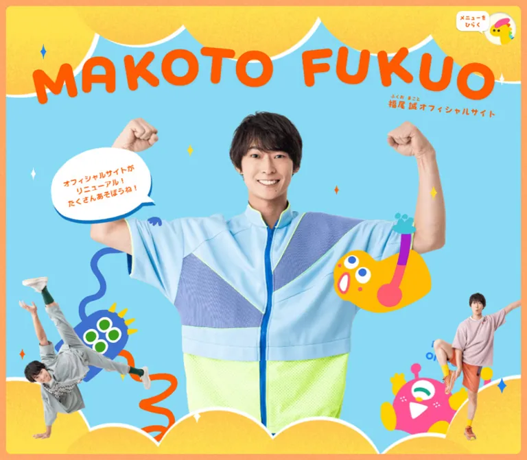
This is a long official website with several destinations and practical information. Its distinctive feature is the combination of a friendly human presence with an invented cartoon world. A large cutout photograph dominates the opening screen; smaller photographs, elastic monster limbs, stars, speech bubbles, and scalloped yellow borders surround it. The photography remains natural and detailed while the illustrations use simple, saturated shapes.
The page alternates spacious visual scenes with compact information. Work announcements sit in blue panels against a textured orange field. The closing scene becomes quieter: an expansive cream surface carries centered branding and navigation, with characters peeking over a broad curved boundary into a blue footer. Rounded shapes, small pronunciation guides, and informal lettering connect these different densities.
How to Read This Reference
- Measured means a value supplied by the rendered DOM or computed-style evidence. Measurements are CSS pixels unless stated otherwise.
- Calculated means arithmetic based on those measurements, such as converting tracking to
emor comparing row positions. - Estimated means a visual approximation from the current-page screenshots. Estimated hex colors were not obtained with a pixel-sampling tool.
- Recommended means guidance for a new implementation. The CSS, breakpoint, accessibility additions, and fallback shapes below are adaptations, not recovered source code.
- Token names such as
--color-hero-skyare descriptive aliases. Actual source custom properties are identified explicitly. - A computed font declaration on an empty heading does not identify the lettering inside its artwork. Graphic headings and live text are treated separately.
- DOM text can include content outside a clipped list or inactive form step. Its presence does not prove that every item or step was simultaneously visible.
Tokens — Colors
Default Palette
| Name | Value | Evidence | Suggested token | Role |
|---|---|---|---|---|
| Hero Sky | #88daf4 |
Measured: hero section background at both viewports | --color-hero-sky |
Main opening field behind the portrait and illustrations |
| Identity Orange | #ff5a00 |
Measured: greeting and category-label text | --color-orange |
Live accent text; the graphic wordmark visually uses a closely matching orange |
| Contact Blue | #62c7ff |
Measured: contact section background | --color-contact-blue |
Contact environment; also a useful approximation for the blue closing scene |
| White | #ffffff |
Measured: category backgrounds and announcement text | --color-white |
Labels, news links, speech bubble, and bright contour accents |
| Policy Ink | #000000 |
Measured: privacy-policy paragraph | --color-ink |
Dense legal text; not the dominant color of the decorative scenes |
| Peach Orange | Approximately #ffad61 |
Estimated | --color-peach |
Grainy outer frame and work/news environment |
| Lemon Yellow | Approximately #ffe34c |
Estimated | --color-lemon |
Large scalloped borders and cheerful highlights |
| News Blue | Approximately #2e98f8 |
Estimated | --color-news-blue |
Large work/news panels and cropped side shapes |
| Warm Cream | Approximately #fffbe6 |
Estimated | --color-cream |
Spacious closing navigation surface |
| Character Pink | Approximately #ff4a9c |
Estimated | --color-pink |
One-eyed character and small illustration accents |
| Character Royal Blue | Approximately #4378d8 |
Estimated | --color-royal |
Four-eyed character, winding limbs, and illustration details |
| Character Gold | Approximately #ffbf00 |
Estimated | --color-gold |
Yellow character and selected small accents |
The opening sky and contact blue are different measured colors. Keep that distinction when defining scene backgrounds. The cream footer adds a low-intensity resting area without abandoning the orange identity color.
The vivid green in the main outfit belongs to the photograph. It is not evidence of a green interface state. Similarly, mascot colors should remain part of the illustration palette rather than becoming an arbitrary category-color system.
The exported custom properties contain many CMS color, gradient, and shadow presets. Their existence does not establish their use in the visible composition. In particular, the measured accent is #ff5a00, not the unrelated preset orange #ff6900.
Theme Presets
No selectable theme presets were established. The observed blue, orange, yellow, and cream fields distinguish page scenes. Preserve their sequence and relationships rather than presenting them as alternate user-selectable themes.
Tokens — Typography
Live Japanese Text
Measured family stack: "M PLUS 1p", "Helvetica Neue", Arial, "Hiragino Kaku Gothic ProN", "Hiragino Sans", Meiryo, sans-serif.
The sampled greeting, announcements, category labels, and privacy text all report weight 400. Their friendly appearance should not be used to invent a heavier source weight. The evidence supplies a computed family stack, not font files, a font version, or a glyph-by-glyph rendering audit.
Both viewports retain a 16px root and body font size. The smaller mobile labels are component-specific changes, not a uniformly reduced root scale.
Graphic Identity and Section Labels
The large MAKOTO FUKUO identity has very thick, rounded strokes, irregular rotations, and a buoyant baseline. Desktop places it across the upper width; mobile uses two lines. Smaller Japanese identification text and pronunciation guides accompany it.
The sampled h1 has empty extracted text and a default-looking 16px computed font size, while its visible artwork occupies a much larger box. Treat the wordmark as artwork. No display font name, file format, or original asset URL can be established from the supplied evidence.
The work-section heading, panel headings, and footer navigation also have a rounded, informal visual character. Several heading elements have no extracted text. Do not assume that the live body family generated every visible heading.
Type Scale
| Role | Desktop | Mobile | Leading / tracking | Evidence |
|---|---|---|---|---|
| Root and body default | 16px |
16px |
18.4px default line height |
Measured; not a recommendation for long prose |
| Hero greeting | 16.3332px |
10px |
Approximately 1.4; 0.04em |
Measured; tracking converted from pixels |
| Announcement link | 14px |
13px |
1.5; 0.04em |
Measured |
| Category label | 11px |
10px |
1.5; 0.04em |
Measured |
| Privacy paragraph | 12px |
10px |
1.7; normal tracking |
Measured |
| Contact service notice | 12px |
11px |
1.5; 0.04em |
Measured |
| News-panel heading | Approximately 26–28px apparent lettering height |
Not visually covered | Not established | Screenshot estimate; not a source font size |
| Footer navigation | Approximately 16–18px apparent lettering height |
Approximately 14–16px |
Generous separation between destinations | Screenshot estimate |
| Copyright | Approximately 12px |
Approximately 10px |
Compact | Screenshot estimate |
Graphic Bounds
| Element | Desktop | Mobile | Interpretation |
|---|---|---|---|
Main identity h1 |
1274.97 × 208.13px |
360.86 × 159.31px |
Measured artwork container, not typographic cap height |
Work-section heading h3 |
288 × 57px |
223 × 44.13px |
Measured box associated with the work section |
First post-hero h3 |
519 × 99px |
334.84 × 63.86px |
Measured graphic-heading box; detailed artwork not visually covered |
Pronunciation guides are part of the approachable presentation. Where recreated as live text, use semantic ruby and rt rather than manually positioned text that loses its relationship to the word.
Tokens — Spacing & Shapes
Overall density: expansive illustrated scenes surrounding small, tightly organized text regions.
There is no verified site-wide spacing scale for the custom composition. The exported framework variables are insufficient to explain the bespoke artwork placement. The following measurements are more useful implementation anchors.
Spacing Scale
| Use | Value | Evidence |
|---|---|---|
| Category horizontal padding | 6px |
Measured |
| Category top / bottom padding | 2px / 3px |
Measured |
| Gap after a three-line past-work link | 20px desktop; 15px mobile |
Calculated from successive link rectangles |
| Category-column start to link-column start | 107px desktop; 92px mobile |
Calculated from measured x positions |
| Visible outer hero inset | Approximately 12px desktop; 11–12px mobile |
Screenshot estimate |
| Gap between desktop news panels | Approximately 30px |
Screenshot estimate |
| Desktop news-panel horizontal padding | Approximately 30px |
Screenshot estimate, consistent with item positions |
| Desktop menu top / right offset | 24px / 21px |
Measured and calculated from button bounds |
| Mobile menu top / right offset | 19px / 15px |
Measured and calculated from button bounds |
A practical adaptation can use 6, 12, 20, 30, 60px as small-to-large spacing anchors. This is a recommended working scale, not a claim about source variables.
Border Radius
| Element | Shape | Evidence |
|---|---|---|
| Category label | 3px radius |
Measured |
| Hero inner frame | Approximately 12px radius |
Screenshot estimate |
| Menu artwork | Circular visual enclosure | Observed; the button element itself reports 0px radius |
| News panels | Very large rounded corners, approximately 100–115px on desktop |
Screenshot estimate |
| Speech bubble | Uneven oval with a pointed tail | Observed artwork-like shape |
| Hero edges | Broad unequal scallops with a white contour | Observed; not a repeated small-radius card treatment |
| Closing cream surface | Large lower corner curves and a broad, flatter center | Observed; not a simple semicircle |
Layout Measurements
| Element | Desktop 1440 × 1000 |
Mobile 390 × 844 |
Status |
|---|---|---|---|
| Hero section | 1440 × 1000px |
390 × 844px |
Measured; fills the inspected viewport |
| Main identity position | x 82.52, y 97.39px |
x 14.56, y 75.95px |
Measured |
| Menu button | 66 × 66px |
53 × 53px |
Measured |
| First post-hero scene | 980 × 1000px, centered at x 230px |
390 × 844px |
Measured |
| Work/news section start | y 7000px |
y 5908px |
Measured document coordinates |
| Work/news section box | 1440 × 572px |
390 × 965.28px |
Measured; surrounding decorative area is larger |
| Desktop news panel | Approximately 430 × 440px |
Not directly measured | Screenshot estimate |
| Announcement link column | 240px |
207.09px |
Measured |
| Contact section height | 2006.92px |
1654.19px |
Measured |
| Document height | 14991.05px |
14050.58px |
Measured rendered HTML bounds |
The work/news section starts at seven times the inspected viewport height in both snapshots: 7000 = 7 × 1000, and 5908 = 7 × 844. This establishes substantial scene pacing. It does not establish scroll pinning, snapping, or a specific animation framework.
Components
Opening Scene and Frame
Role: establish the artist's identity and the site's playful world immediately.
The desktop opening consists of a thin textured peach surround, a rounded inner sky-blue field, yellow scalloped edges at the top and bottom, and a large central portrait. White contour lines separate the yellow shapes from the sky. The contours are broad and irregular, with different lobe sizes; a uniform row of small semicircles would lose the composition's character.
The main portrait shows raised arms and a smiling face. The torso reaches toward the lower scalloped boundary. Smaller full-body photographs occupy the lower corners, while characters weave through the remaining space. Small four-point sparkles provide punctuation without becoming a dense pattern.
A useful recommended layer order is: sky, background accents, main portrait, overlapping characters, foreground scallops, corner photographs, identity and greeting, then persistent menu. Adjust individual overlaps to the artwork rather than forcing every decoration onto one shared layer.
Main Identity Artwork
Role: the primary visual heading.
Desktop uses an almost full-width MAKOTO FUKUO wordmark with independently tilted letters. The Japanese site identifier sits beneath its right side. Mobile changes the arrangement to two lines, bringing the lettering close to both sides of the inner frame.
The measured identity width is approximately 88.5% of the desktop viewport and 92.5% of the mobile viewport. Its height changes much less than its width because the mobile arrangement is re-composed.
Use separate wide and narrow artwork compositions when assets are available. A plain text heading with an automatic line break will not reproduce the irregular lettering or subtitle placement. Keep an accessible site name associated with the graphic.
Welcome Speech Bubble
Role: a personal greeting within the opening scene.
A white, uneven oval sits to the left of the main figure. It has a lower-right tail, a blue offset edge underneath, and slightly tilted orange text. The current message is “あそびにきてくれて ありがとう!”.
The desktop bubble occupies approximately 235 × 175px, including its tail and offset edge. The mobile version is approximately 140 × 105px and sits higher relative to the figure, beneath the wordmark. These are visual estimates.
The greeting itself is live text with measured orange, 0.04em tracking, and 1.4 leading. Preserve the distinction between live copy and the decorative bubble. A hard blue offset works better here than a large diffuse gray shadow.
Persistent Menu Launcher
Role: access to site navigation while moving through a long page.
The control combines a circular character illustration with a small white speech label reading “メニューをひらく”. It stays in the upper-right area across the supplied opening, news, and closing captures. Its measured button size changes from 66px to 53px on mobile.
The speech label extends left beyond the circular button's bounds. Its artwork should therefore not be clipped to the button rectangle. The circle has a restrained dimensional rim, while the label uses orange text and a small tail.
Only the closed launcher is evidenced. The open menu's layout, animation, focus handling, and dismissal behavior are unverified. The large cream navigation scene shown near the copyright is the closing footer scene, not evidence of an opened menu.
Work/News Environment
Role: organize the artist's activity without leaving the illustrated world.
The desktop scene places the heading “誠お兄さんのお仕事” above two large blue panels on a textured peach-orange background. The left panel is labeled “これまで”; the right is labeled “これから”. Cropped blue shapes continue beyond both edges of the viewport, with characters partially emerging from them.
Each central panel is approximately 430px wide and 440px tall, separated by about 30px. The upper corners are deeply rounded. A subtle darker blue edge near the top gives the panel a soft dimensional quality without turning it into a floating dashboard card.
Small shaded cloud illustrations overlap parts of the panels. Below them, the orange field remains spacious, with a small yellow character and a full-body photograph balancing a foot on an illustrated ball. The empty area is part of the scene's rhythm.
The cropped side shapes do not establish a carousel. No horizontal paging interaction was supplied.
Announcement Panel and Scroll Region
Role: present many updates in a compact, bounded reading area.
A centered white heading sits above an inset list. The desktop screenshot shows a narrow white vertical rail with a yellow thumb on the right side of each list. Several rows are visible while later rows continue beyond the viewport of the panel.
The visible list window is approximately 250–260px tall. The many additional link rectangles in the DOM are consistent with overflow content; they should not be interpreted as a panel several thousand pixels tall.
The screenshot establishes scroll affordances and clipping. Independent scrolling by pointer, touch, or keyboard was not demonstrated. For a new implementation, use an explicitly named overflow region and ensure keyboard focus is never trapped inside it.
Announcement Row
Role: pair a compact category with a readable linked announcement.
Use two columns: metadata at the left and the linked title at the right. The category is orange text on a small white rectangle with 3px corners and 2px 6px 3px padding. Categories include “イベント”, “アンバサダー”, and “その他”. Upcoming entries also display a small date below the category.
Desktop link text is 14px / 21px, white, with 0.56px tracking. Mobile uses 13px / 19.5px with 0.52px tracking. Underlines are visible in the desktop screenshot. The link column narrows from 240px to approximately 207px on mobile.
Keep rows content-driven. Two- and three-line titles are common; a supplied mobile announcement reaches four lines. Do not truncate all updates to a uniform single-line title. Category badges are labels inside the row, not evidenced filter buttons.
Profile and Gallery Destinations
Role: provide the site's broader artist content.
The original page exposes anchors for #profile and #gallery, and rendered measurements show substantial intervening sections with graphic headings. The first scene after the hero has a centered 980px desktop container and expands to the full 390px mobile width.
The supplied screenshots do not show enough of these destinations to document their complete contents, gallery arrangement, or interactions. A gallery grid, lightbox, slideshow, biography layout, and scroll-triggered transitions would all require further evidence. Preserve their place in the information architecture without inventing their detailed appearance.
Contact Section
Role: collect professional inquiries.
The rendered DOM establishes a dedicated section with measured background #62c7ff. Its fields include company, department/position, name, phonetic name, email, email confirmation, phone number, and request details. A privacy policy, consent statement, and service-protection notice follow.
The DOM includes entry, confirmation, and completion step labels. It does not demonstrate progression through those steps, validation behavior, or successful submission. Repeated current-screen text in the extraction should not be read as proof that all three steps are active.
Desktop privacy copy uses 12px / 20.4px in a 486px text box. Mobile uses 10px / 17px in a 261px box. The contact section also contains a large textless button rectangle measuring 521 × 249px desktop and approximately 355 × 169.66px mobile. Its artwork and relationship to the visible hit area cannot be established from these captures.
Field borders, required markers, error states, and precise form-control styling are therefore outside the verified visual scope. The measured legal text and section color are useful; a complete form design should not be inferred from them.
Closing Navigation Scene
Role: repeat the main destinations and give the long page a friendly ending.
A large cream field holds the orange identity, a smaller Japanese identifier, and four destinations: “プロフィール”, “誠お兄さんのお仕事”, “ギャラリー”, and “お問い合わせ”. Desktop arranges them in one centered row. Mobile stacks them vertically.
Characters enter from the lower sides, while an expressive portrait with raised open hands emerges near the right side on desktop and nearer the center on mobile. The cream surface curves downward into a textured blue field. Its middle remains broad enough to frame the content without turning the whole scene into a circular card.
The desktop image has substantial cream whitespace above the identity and around the navigation. On mobile, the navigation receives more vertical space, while the decorative figures overlap the curved boundary below it. The mobile closing capture reaches both horizontal edges, unlike the inset mobile hero.
The closing capture is only the terminal portion of the footer. The mobile footer element measures approximately 2491.67px overall, and the DOM also contains mailing and external-link content outside this final scene.
Return-to-Top and Copyright
Role: provide a final navigation action in the same photographic language.
A small full-body photograph appears in the blue area beside the white label “TOPにもどる”. Copyright text sits centered near the bottom. The figure is approximately 175px tall on desktop and 145px tall on mobile, based on the screenshots.
The label indicates a return-to-top action, but activation and scroll timing were not supplied. A native link to the top of the document is a suitable recommended implementation. Preserve a clear accessible name instead of relying on the figure alone.
Tokens — Motion & Interaction
| Feature | Evidence | What can be claimed |
|---|---|---|
| Long-page traversal | Opening, intermediate, and closing captures plus document measurements | Content is distributed over a long page |
| Upper-right menu | Same viewport-relative placement across multiple captures | A persistent launcher is visually established; its open state is not |
| News overflow | Visible scroll rails and clipped rows | Bounded overflow presentation is established; input behavior was not tested |
| Section destinations | Original-page links to #profile, #news, #gallery, and #contact |
Anchor destinations exist; smooth scrolling and focus transfer are unverified |
| Return to top | Visible “TOPにもどる” label | Intended action is apparent; actual behavior and timing are unverified |
| Contact progression | Entry, confirmation, and completion labels in DOM | Multi-step structure is suggested; transitions and submission are unverified |
| Global transition token | Source custom property --_global--transition-duration: .2s |
A 200ms default is declared; application to the custom components is not established |
| Sampled elements | Most report animation: none; transition field commonly reports all |
No component-specific animation sequence or duration can be recovered from these samples |
| Illustration and portrait motion | Static captures without a same-viewport time sequence | Looping, parallax, pose changes, and trigger behavior remain unverified |
The capture procedure allowed initial settling and temporarily paused perpetual animations during readiness checks when present. That procedure does not prove that a particular mascot had a loop. Nor does a static animation: none value exclude JavaScript-driven or image-based motion elsewhere.
Recommended adaptation: begin with the complete static composition. Add restrained feedback to actual controls, and introduce decorative motion only with an explicit design decision and a reduced-motion alternative. No spring, bounce duration, autoplay interval, or scroll timeline is specified as original behavior here.
Surfaces
| Layer | Appearance | Function |
|---|---|---|
| Outer opening surround | Peach-orange with fine speckling | Frames the illustrated opening |
| Hero field | Flat pale cyan | Keeps the portrait and orange lettering prominent |
| Hero edge artwork | Yellow scallops, visible grain, white contour | Creates a playful foreground and background boundary |
| Work environment | Broad orange grain | Separates the information scene from the sky opening |
| News panels | Saturated blue, extreme rounding, restrained top shading | Holds dense announcements within the illustration |
| Small labels | White fill, orange text, tiny radius | Makes categories recognizable without extra colors |
| Closing navigation | Warm cream | Provides visual rest and clear destinations |
| Closing lower field | Bright blue with white speckling | Supports the return action and copyright |
Texture is selective. The sky and character bodies remain comparatively clean, while peach, yellow, and lower blue areas visibly carry grain. Photography retains its own natural detail. A single heavy noise overlay across every layer would obscure these differences.
Shadows are also selective: a hard blue offset beneath the speech bubble, subtle dimensional treatment on clouds and the menu, and restrained panel-edge shading. There is no evidence of a universal elevated-card system.
Imagery
Photography is the main identity carrier. The current opening features a large, smiling central cutout wearing a pale blue outfit with a bright green lower section. Smaller cutouts show other clothing and poses. The final scene uses a surprised, welcoming expression and open hands. The subject is always part of the illustrated environment rather than placed in a conventional rectangular portrait card.
The characters have deliberately unusual anatomy: a blue four-eyed figure with winding limbs, a pink one-eyed figure with antennae, and a yellow figure with an irregular body. White eye shapes, saturated pupils, long colored arms, and broad mouths keep them legible at different sizes. Their limbs create compositional lines around the photographs.
Use smooth image rendering for the photographs and clean illustration edges. Grain should remain a surface texture, not a reason to pixelate the whole site. The visual contrast comes from detailed human photography against simple cartoon silhouettes.
Observed Asset References
No original image src values, background-image URLs, or font-file URLs were supplied. The following inventory records observed asset roles without inventing filenames or formats.
| Asset role | Current-page evidence | Implementation handling |
|---|---|---|
| Wide main identity | Desktop opening | Preserve lettering, rotation, and attached site identifier |
| Narrow main identity | Mobile opening | Use a separately composed two-line arrangement |
| Large central portrait | Desktop and mobile opening | Preserve transparency and responsive crop; keep the face clear |
| Small alternate portraits | Lower opening corners | Position independently from the main portrait |
| Character illustrations | Opening, work scene, and closing scene | Preserve recognizable anatomy and intentional overlaps |
| Scalloped edges and sparkles | Opening | Use scalable authorized artwork or carefully drawn equivalents |
| Clouds and ball | Desktop work scene | Keep their limited shading and cartoon proportions |
| Closing expressive portrait | Desktop and mobile footer | Anchor to the curved cream/blue boundary |
| Return-to-top figure | Desktop and mobile footer | Pair with a readable action label |
| Grain textures | Peach, yellow, and lower blue surfaces | Apply to selected surfaces, behind text and photography |
Use authorized original assets when available. For a new brand, commission coherent replacement characters and photography. CSS can establish the layout, but generic emoji or unrelated stock illustrations will not reproduce the relationships among these assets.
Layout & Responsive Behavior
The mobile composition is deliberately rearranged. It retains the face, identity, greeting, and surrounding characters instead of shrinking the entire desktop scene as one image.
| Feature | Desktop observation | Mobile observation |
|---|---|---|
| Hero height | 1000px, equal to viewport height |
844px, equal to viewport height |
| Identity | One broad line with subtitle toward the right | Two lines, nearly the full inner width |
| Main portrait | Arms and torso spread across the central field | Arms extend beyond the narrow scene; face and torso remain central |
| Small portraits | Gray outfit at lower left; pink outfit at lower right | Pink outfit at lower left; gray outfit at lower right |
| Greeting | Large bubble left of the upper body | Smaller bubble beneath the left side of the identity |
| Characters | Spread across a wide composition | Repositioned and more strongly cropped at the sides |
| Menu button | 66px, right offset 21px |
53px, right offset 15px |
| Announcement text | 14px, 240px column |
13px, approximately 207px column |
| News arrangement | Past work left, upcoming work right | DOM positions place upcoming work above past work |
| Closing destinations | One centered horizontal row | Four centered vertical destinations |
| Closing frame | Visible peach inset surround | Final mobile capture is edge-to-edge |
The news order is particularly important. On desktop, the first upcoming and past links both begin at document y 7231px. On mobile, the first upcoming link begins around y 6133.02px, while the first past link begins around y 6550.44px. This supports a stacked mobile arrangement with upcoming information first. The exact mobile panel shape is not visually covered.
The document remains very long at both widths. Its height is approximately fifteen desktop viewports and more than sixteen mobile viewports. Do not use those totals as hardcoded layout targets; content, internal overflow, and viewport-sized scenes contribute differently.
No breakpoint values were supplied. The 767px breakpoint in the Quick Start is a recommendation. Test intermediate widths, landscape screens, browser zoom, and changing mobile browser chrome separately. Favor content-driven heights for practical content and viewport proportions only where the illustrated scene requires them.
Do’s and Don’ts
Do
- Preserve the relationship between pale cyan, orange lettering, yellow scallops, and natural photography.
- Keep the human face as the opening's focal point.
- Use artwork for the irregular identity rather than assigning an invented display font.
- Re-compose the mobile scene, including the swapped positions of the small portraits.
- Apply grain selectively to the surfaces that need it.
- Keep announcements as compact category-and-title rows with visible link underlines.
- Place upcoming information before past work on mobile.
- Give the cream closing scene enough open space to feel like a pause.
- Keep large decorative shapes separate from readable text and hit areas.
- Preserve the measured
400weight for sampled live text unless intentionally designing an adaptation.
Don’t
- Do not reduce the official site to an opening image and a generic conversion button.
- Do not replace the scene structure with a repeated grid of identical cards.
- Do not turn character colors into an unsupported status or category system.
- Do not stretch or pixelate the photographic cutouts.
- Do not scale the desktop hero down as one flattened composition on mobile.
- Do not mistake empty extracted heading text for an absent visible heading.
- Do not treat the closing cream navigation scene as an observed open menu.
- Do not infer a carousel from cropped blue side shapes or a library-related custom property.
- Do not invent animation timings, hover behaviors, or successful form states.
- Do not present estimated colors, artwork dimensions, or the recommended breakpoint as source CSS.
Recommended Implementation Additions
These are recommendations for a new implementation, not verified features of the original site.
- Give the graphic identity a meaningful accessible name and mark purely decorative stars, limbs, and duplicated portraits as decorative.
- Implement the menu as a real button with an accessible label and an accurate expanded state. If its panel is modal, add deliberate focus management and keyboard dismissal.
- Use semantic links for destinations and announcements. Give the return action an explicit text label and a valid top-of-page target.
- Make each bounded news region keyboard reachable and visibly focused. Test touch scrolling and escape into normal page scrolling.
- Check contrast for small orange-on-white labels and white-on-blue links. Adjust text or panel colors in an accessible variant while retaining the original artwork colors.
- Consider larger live text for reading-heavy mobile sections, especially the
10pxpolicy copy. Allow those sections to grow instead of preserving a fixed scene height. - Keep the mobile visual order and assistive reading order aligned. An upcoming-first source order with desktop grid placement is a practical approach.
- Provide associated labels, suitable input types, meaningful errors, and a clear current-step announcement in the contact form.
- Supply reduced-motion behavior for any added loops, and keep essential content available before animation starts.
- Reserve image dimensions, prioritize the main hero portrait, and defer lower-page artwork where appropriate to limit layout shifts and unnecessary initial loading.
Agent Prompt Guide
Quick Color Reference
- Measured hero background:
#88daf4. - Measured orange live accent:
#ff5a00. - Measured contact background:
#62c7ff. - Measured white labels and announcement text:
#ffffff. - Estimated environmental colors: peach
#ffad61, lemon#ffe34c, news blue#2e98f8, cream#fffbe6. - Use pink, royal blue, gold, and turquoise mainly inside coherent character artwork.
- Keep the lower blue scene visibly textured and the opening sky comparatively flat.
Overall Prompt
“Create a long official performer website inspired by the current Makoto Fukuo site. Build an illustrated opening around a large transparent photographic portrait, a pale cyan field, oversized irregular orange identity artwork, yellow scalloped edges with white contours, a tilted white greeting bubble, and a small group of expressive cartoon characters. Use M PLUS 1p with the supplied fallback stack for live Japanese text. Place compact announcements inside two deeply rounded blue panels on a grainy peach background. Finish with a spacious cream navigation scene, characters emerging over a curved boundary, and a blue textured return-to-top area. Re-compose the hero for mobile, stack the identity into two lines, and place upcoming announcements before past work. Treat menu animation and other motion as design decisions requiring separate specification.”
Example Component Prompts
- Opening scene: “Compose a full-viewport pale cyan scene with a central cutout portrait, oversized orange lettering above, broad yellow scallops along the upper and lower edges, and white contour lines. Place smaller full-body portraits near the lower corners and let a few character limbs cross behind and in front of the main figure. Preserve clear space around the face.”
- Greeting: “Build an uneven white speech bubble with a lower-right tail, a hard blue offset underneath, and slightly tilted orange Japanese greeting text. Use
1.4leading and0.04emtracking. Keep the text live and the decoration separate.” - News panels: “Create two approximately 430px-wide blue panels with very large rounded corners on a textured peach field. Add centered white headings, compact white category labels with orange text, underlined white announcement links, and a bounded list with a slim white rail and yellow thumb. Use 14px links and 11px category labels on desktop.”
- Mobile composition: “At a 390px-wide viewport, use a two-line identity, preserve the portrait's face at a useful scale, crop the outer arms, move the small pink-outfit portrait to the lower left and the gray-outfit portrait to the lower right, and reposition the characters independently. Do not shrink one desktop composite.”
- Closing scene: “Place centered orange branding and four destinations on a large cream surface. Use a horizontal navigation row on desktop and a vertical list on mobile. Let expressive photo and character cutouts emerge from the lower curved edge into a grainy blue field with a photographic return-to-top control.”
- Contact extension: “Design an accessible inquiry form within the measured bright-blue contact environment. Include company, department, name, phonetic name, email confirmation, phone, request details, policy consent, and a clear step indicator. Treat field styling and validation as new work because the supplied visual evidence does not establish them.”
Quick Start
CSS Custom Properties
This CSS is an implementation scaffold. It combines measured text tokens with explicitly estimated colors and recommended geometry. It does not recover the original stylesheet. The synthetic grain and gradient scallops are fallback approximations; replace them with authorized artwork for closer correspondence.
The hero expects separate wordmark, portrait, character, and small-portrait elements. Give the wordmark a wide and narrow composition through picture when available. Asset URLs are intentionally unspecified because none were supplied. Load the declared font separately if it is available to the project.
:root {
  /* Measured colors */
  --color-hero-sky: #88daf4;
  --color-orange: #ff5a00;
  --color-contact-blue: #62c7ff;
  --color-white: #ffffff;
  --color-ink: #000000;

  /* Visual estimates */
  --color-peach: #ffad61;
  --color-lemon: #ffe34c;
  --color-news-blue: #2e98f8;
  --color-cream: #fffbe6;
  --color-pink: #ff4a9c;
  --color-royal: #4378d8;
  --color-gold: #ffbf00;
  --color-bubble-edge: #087dbd;

  /* Measured family and live-text values */
  --font-body: 'M PLUS 1p', 'Helvetica Neue', Arial,
    'Hiragino Kaku Gothic ProN', 'Hiragino Sans', Meiryo, sans-serif;
  --weight-body: 400;
  --text-news: 14px;
  --text-category: 11px;
  --text-greeting: 16.3332px;
  --text-policy: 12px;
  --leading-news: 1.5;
  --leading-greeting: 1.4;
  --leading-policy: 1.7;
  --tracking-ui: 0.04em;
  --radius-category: 3px;

  /* Recommended geometry based on the captures */
  --frame-inset: 12px;
  --radius-frame: 12px;
  --radius-panel: 110px;
  --news-grid-width: 890px;
  --news-panel-gap: 30px;
  --news-row-gap: 20px;
  --menu-size: 66px;
}

* { box-sizing: border-box; }
body { margin: 0; }

.site {
  color: var(--color-ink);
  font-family: var(--font-body);
  font-weight: var(--weight-body);
  background: var(--color-peach);
}

.site img {
  display: block;
  max-inline-size: 100%;
  image-rendering: auto;
}

/* Synthetic texture fallback, not the original texture asset. */
.textured {
  position: relative;
  isolation: isolate;
}

.textured::before {
  content: '';
  position: absolute;
  inset: 0;
  z-index: -1;
  pointer-events: none;
  opacity: 0.24;
  background-image: url('data:image/svg+xml,%3Csvg xmlns=%22http://www.w3.org/2000/svg%22 width=%22160%22 height=%22160%22%3E%3Cfilter id=%22n%22%3E%3CfeTurbulence type=%22fractalNoise%22 baseFrequency=%22.85%22 numOctaves=%223%22 stitchTiles=%22stitch%22/%3E%3CfeColorMatrix type=%22saturate%22 values=%220%22/%3E%3C/filter%3E%3Crect width=%22100%25%22 height=%22100%25%22 filter=%22url(%23n)%22/%3E%3C/svg%3E');
}

.hero {
  block-size: 100vh;
  block-size: 100svh;
  min-block-size: 640px;
  padding: var(--frame-inset);
  background-color: var(--color-peach);
}

.hero__scene {
  position: relative;
  isolation: isolate;
  block-size: 100%;
  overflow: hidden;
  border-radius: var(--radius-frame);
  background: var(--color-hero-sky);
}

/* Approximate scallops. Use authored contours for a faithful result. */
.hero__scene::before,
.hero__scene::after {
  content: '';
  position: absolute;
  inset-inline: -2%;
  block-size: 25%;
  z-index: 4;
  pointer-events: none;
  background:
    radial-gradient(ellipse 25% 95% at 5% 0%,
      var(--color-lemon) 95%, white 96% 99%, transparent 100%),
    radial-gradient(ellipse 26% 72% at 32% 0%,
      var(--color-lemon) 95%, white 96% 99%, transparent 100%),
    radial-gradient(ellipse 27% 95% at 67% 0%,
      var(--color-lemon) 95%, white 96% 99%, transparent 100%),
    radial-gradient(ellipse 22% 85% at 100% 0%,
      var(--color-lemon) 95%, white 96% 99%, transparent 100%);
}

.hero__scene::before { inset-block-start: 0; }
.hero__scene::after {
  inset-block-end: 0;
  block-size: 21%;
  transform: rotate(180deg);
}

.hero__wordmark {
  position: absolute;
  z-index: 5;
  inset-block-start: 8.75%;
  inset-inline-start: 5%;
  inline-size: 90%;
  margin: 0;
}

.hero__wordmark img { inline-size: 100%; }

.hero__portrait {
  position: absolute;
  z-index: 2;
  inset-block-end: 5%;
  inset-inline-start: 50%;
  inline-size: 62%;
  block-size: 72%;
  object-fit: contain;
  object-position: center bottom;
  transform: translateX(-50%);
}

.hero__character,
.hero__small-portrait {
  position: absolute;
  pointer-events: none;
}

.hero__character { z-index: 3; }
.hero__small-portrait {
  z-index: 5;
  inset-block-end: 2%;
  inline-size: 15%;
  max-block-size: 32%;
  object-fit: contain;
}

.hero__small-portrait--gray { inset-inline-start: 3%; }
.hero__small-portrait--pink { inset-inline-end: 3%; }

.hero__greeting {
  position: absolute;
  z-index: 5;
  inset-block-start: 31%;
  inset-inline-start: 9%;
  display: grid;
  place-items: center;
  inline-size: 17%;
  aspect-ratio: 1.4;
  padding: 20px;
  border-radius: 54% 48% 51% 45%;
  color: var(--color-orange);
  background: white;
  box-shadow: 0 8px 0 var(--color-bubble-edge);
  text-align: center;
  font-size: var(--text-greeting);
  line-height: var(--leading-greeting);
  letter-spacing: var(--tracking-ui);
  transform: rotate(-10deg);
}

.hero__greeting::after {
  content: '';
  position: absolute;
  inset-inline-end: -9px;
  inset-block-end: 13px;
  inline-size: 30px;
  block-size: 28px;
  background: white;
  clip-path: polygon(0 0, 100% 100%, 0 78%);
}

.menu-button {
  position: fixed;
  z-index: 100;
  inset-block-start: max(24px, env(safe-area-inset-top, 0px));
  inset-inline-end: max(21px, env(safe-area-inset-right, 0px));
  inline-size: var(--menu-size);
  block-size: var(--menu-size);
  padding: 0;
  border: 0;
  background: transparent;
  cursor: pointer;
}

.menu-button__hint {
  position: absolute;
  inset-inline-end: calc(100% - 12px);
  inset-block-start: -2px;
  inline-size: 66px;
  padding: 8px 5px;
  border-radius: 12px;
  color: var(--color-orange);
  background: white;
  font: 400 10px/1.2 var(--font-body);
  text-align: center;
}

.works {
  padding: 80px 20px 100px;
  background-color: var(--color-peach);
}

.works__heading {
  margin: 0 0 50px;
  color: white;
  text-align: center;
}

.news-grid {
  display: grid;
  grid-template-columns: repeat(2, minmax(0, 1fr));
  grid-template-areas: 'past upcoming';
  gap: var(--news-panel-gap);
  inline-size: min(var(--news-grid-width), 100%);
  margin-inline: auto;
}

.news-panel--past { grid-area: past; }
.news-panel--upcoming { grid-area: upcoming; }

.news-panel {
  min-inline-size: 0;
  min-block-size: 440px;
  padding: 40px 30px 64px;
  overflow: hidden;
  border-radius: var(--radius-panel);
  color: white;
  background: var(--color-news-blue);
  box-shadow: inset 0 4px 4px rgb(0 54 108 / 20%);
}

/* Text fallback for a heading whose original lettering is artwork. */
.news-panel__heading {
  margin: 0 0 34px;
  font-size: 28px;
  font-weight: 700;
  line-height: 1.3;
  text-align: center;
}

.news-scroll {
  block-size: 255px;
  overflow-y: auto;
  padding-inline-end: 22px;
  scrollbar-width: thin;
  scrollbar-color: var(--color-lemon) white;
}

.news-scroll::-webkit-scrollbar { width: 6px; }
.news-scroll::-webkit-scrollbar-track {
  background: white;
  border-radius: 99px;
}
.news-scroll::-webkit-scrollbar-thumb {
  background: var(--color-lemon);
  border-radius: 99px;
}

.news-list {
  display: grid;
  gap: var(--news-row-gap);
  margin: 0;
  padding: 0;
  list-style: none;
}

.news-item {
  display: grid;
  grid-template-columns: 81px minmax(0, 1fr);
  column-gap: 26px;
  align-items: start;
}

.news-item__category {
  display: inline-block;
  margin-block-start: 5px;
  padding: 2px 6px 3px;
  border-radius: var(--radius-category);
  color: var(--color-orange);
  background: white;
  font-size: var(--text-category);
  line-height: 1.5;
  letter-spacing: var(--tracking-ui);
}

/* Date size is an adaptation based on its visual prominence. */
.news-item__date {
  display: block;
  margin-block-start: 5px;
  font-size: 10px;
  line-height: 1.5;
  letter-spacing: var(--tracking-ui);
}

.news-item__link {
  min-inline-size: 0;
  color: white;
  font-size: var(--text-news);
  font-weight: 400;
  line-height: var(--leading-news);
  letter-spacing: var(--tracking-ui);
  text-decoration: underline;
  text-underline-offset: 3px;
  overflow-wrap: anywhere;
}

.contact {
  background: var(--color-contact-blue);
}

.contact__policy {
  font-size: var(--text-policy);
  line-height: var(--leading-policy);
}

.footer-world {
  background: var(--color-contact-blue);
}

.footer-scene {
  position: relative;
  min-block-size: 700px;
  margin-inline: var(--frame-inset);
  padding: 200px 24px 310px;
  overflow: hidden;
  border-radius: 12px 12px 28% 28% / 12px 12px 42% 42%;
  color: var(--color-orange);
  background: var(--color-cream);
  text-align: center;
}

.footer-brand {
  inline-size: min(300px, 80%);
  margin-inline: auto;
}

.footer-nav {
  position: relative;
  z-index: 2;
  display: flex;
  flex-wrap: wrap;
  justify-content: center;
  gap: 16px 30px;
  margin-block-start: 48px;
}

.footer-nav a {
  display: inline-flex;
  align-items: center;
  justify-content: center;
  min-block-size: 44px;
  color: inherit;
  text-decoration: none;
  letter-spacing: var(--tracking-ui);
}

.footer-scene__cast {
  position: absolute;
  inset-inline: 0;
  inset-block-end: 0;
  block-size: 300px;
  pointer-events: none;
}

.footer-return {
  padding: 36px 24px 30px;
  color: white;
  text-align: center;
}

.back-to-top {
  display: inline-flex;
  align-items: center;
  gap: 28px;
  min-block-size: 44px;
  color: inherit;
  text-decoration: none;
}

.back-to-top img {
  inline-size: 54px;
  block-size: 175px;
  object-fit: contain;
}

.footer-copyright {
  margin: 20px 0 0;
  font-size: 12px;
}

/* Recommended focus treatment; not an observed source state. */
.site :focus-visible {
  outline: 3px solid var(--color-ink);
  outline-offset: 4px;
}

/* Recommended breakpoint; the original breakpoint was not supplied. */
@media (max-width: 767px) {
  :root {
    --text-news: 13px;
    --text-category: 10px;
    --text-greeting: 10px;
    --text-policy: 10px;
    --news-row-gap: 15px;
    --menu-size: 53px;
    --radius-panel: 74px;
  }

  .hero { min-block-size: 720px; }
  .hero__scene::before { block-size: 17%; }
  .hero__scene::after { block-size: 18%; }
  .hero__wordmark {
    inset-block-start: 7.8%;
    inset-inline-start: 1%;
    inline-size: 98%;
  }
  .hero__portrait {
    inline-size: 150%;
    max-inline-size: none;
    block-size: 64%;
    inset-block-end: 9%;
  }
  .hero__greeting {
    inset-block-start: 23%;
    inset-inline-start: -1%;
    inline-size: 36%;
    padding: 12px;
    box-shadow: 0 5px 0 var(--color-bubble-edge);
  }
  .hero__small-portrait {
    inline-size: 28%;
    max-block-size: 24%;
    inset-block-end: 1%;
  }
  .hero__small-portrait--pink {
    inset-inline-start: 7%;
    inset-inline-end: auto;
  }
  .hero__small-portrait--gray {
    inset-inline-start: auto;
    inset-inline-end: 6%;
  }
  .menu-button {
    inset-block-start: max(19px, env(safe-area-inset-top, 0px));
    inset-inline-end: max(15px, env(safe-area-inset-right, 0px));
  }
  .menu-button__hint { inline-size: 50px; font-size: 8px; }
  .works { padding: 68px 15px 80px; }
  .news-grid {
    grid-template-columns: minmax(0, 1fr);
    grid-template-areas: 'upcoming' 'past';
    max-inline-size: 360px;
    gap: 28px;
  }
  .news-panel { padding: 32px 22.5px 45px; min-block-size: 0; }
  .news-panel__heading { font-size: 24px; margin-block-end: 28px; }
  .news-scroll { block-size: 280px; padding-inline-end: 16px; }
  .news-item { grid-template-columns: 75px minmax(0, 1fr); gap: 17px; }
  .footer-scene {
    margin-inline: 0;
    padding: 150px 24px 210px;
    border-radius: 0 0 48% 48% / 0 0 20% 20%;
  }
  .footer-nav { flex-direction: column; gap: 0; margin-block-start: 32px; }
  .footer-scene__cast { block-size: 200px; }
  .back-to-top { gap: 24px; }
  .back-to-top img { inline-size: 46px; block-size: 145px; }
  .footer-copyright { font-size: 10px; }
}

/* Protect future decorative motion while leaving content available. */
@media (prefers-reduced-motion: reduce) {
  .site [data-decorative-motion] {
    animation: none !important;
    transition: none !important;
  }
}
The minimum hero heights in this adaptation protect the artwork on short screens and intentionally permit scrolling there. They are not measured source values. Character positions and photographic crops still require adjustment against the actual replacement assets.
For the news region, use an upcoming-first document order and let the grid create the observed desktop arrangement. A minimal panel structure is:
<section class='news-panel news-panel--upcoming' aria-labelledby='upcoming-title'>
  <h3 class='news-panel__heading' id='upcoming-title'>これから</h3>
  <div class='news-scroll' role='region' aria-labelledby='upcoming-title' tabindex='0'>
    <ul class='news-list'>
      <li class='news-item'>
        <div class='news-item__meta'>
          <span class='news-item__category'>イベント</span>
          <time class='news-item__date' datetime='2026-08-10'>2026/08/10</time>
        </div>
        <a class='news-item__link' href='https://www.omochaoukoku.com/tojoko/event/'>
          9/22 (火・祝)東条湖おもちゃ王国(兵庫)ステージ出演決定!
        </a>
      </li>
    </ul>
  </div>
</section>
This example uses one announcement and destination present in the supplied original-page evidence. It does not verify that destination's current contents. Menu disclosure, contact submission, and other application behavior require their own implementation.
Tailwind v4 Token Mapping
Optional aliases for a project already using Tailwind v4. This is not evidence that the original site uses Tailwind. Define the custom properties above first.
@theme inline {
  --color-hero-sky: #88daf4;
  --color-brand-orange: #ff5a00;
  --color-contact-blue: #62c7ff;

  /* Estimated surface colors */
  --color-peach: #ffad61;
  --color-lemon: #ffe34c;
  --color-news-blue: #2e98f8;
  --color-cream: #fffbe6;

  --font-site: var(--font-body);
  --text-announcement: var(--text-news);
  --text-badge: var(--text-category);
  --text-greeting: var(--text-greeting);
  --radius-badge: 3px;
  --radius-scene: 12px;
  --radius-news: var(--radius-panel);
  --spacing-frame: 12px;
  --spacing-news-gap: 30px;
}
Sources & Evidence
- Current official website: original and final URL; supplied HTTP status
200. The page title identifies the current official Makoto Fukuo website. - Capture date:
2026-09-16T19:03:00.710Z, equivalent to September 17, 2026, 04:03 JST. This document analyzes the supplied browser inspection and does not claim a separate live visit. - Desktop evidence:
1440 × 1000CSS pixels; opening, work/news scene, and terminal footer screenshots; rendered DOM, computed styles, element rectangles, and extracted links. - Mobile evidence:
390 × 844CSS pixels; opening and terminal footer screenshots; rendered DOM and computed styles covering additional page sections. - Original-page destinations: Profile, Work/news, Gallery, and Contact. Their presence is established by supplied links; detailed interaction outcomes are not.
- Inspection limitations: the capture procedure waited for initial loading, visible-image decoding, and layout settling within bounded time limits, then traversed intermediate scroll positions. Static captures do not establish animation trajectories, hover states, menu disclosure, independent panel scrolling, form validation, or submission outcomes. Full visual coverage of profile, gallery, and contact was not supplied.
- Asset limitations: no original image paths, font files, complete stylesheets, or relevant JavaScript were supplied. Graphic formats, exact texture construction, breakpoints, and custom motion remain unverified.
This reference describes the current page evidenced by the supplied original-site captures. Measured values, screenshot estimates, and implementation recommendations are kept separate throughout.
# Makoto Fukuo Official Website — Style Reference

> A cheerful illustrated playground built around expressive photography and oversized orange lettering.

**Website:** [fukuomakoto.coseiro.co.jp](https://fukuomakoto.coseiro.co.jp/)
**Original URL:** https://fukuomakoto.coseiro.co.jp/
**Final URL:** https://fukuomakoto.coseiro.co.jp/
**Theme:** light, with different colored environments throughout the page; no theme selector was established.
**Inspected:** September 17, 2026, 04:03 JST / September 16, 2026, 19:03 UTC. Supplied retrieval timestamp: `2026-09-16T19:03:00.710Z`.
**Viewports:** desktop `1440 × 1000` and mobile `390 × 844` CSS pixels.
**Scope:** the current official artist website. Visual evidence covers the desktop and mobile opening composition, desktop work/news panels, and desktop and mobile closing navigation scenes. Rendered DOM additionally establishes profile, gallery, contact, and other intervening sections, but does not provide complete visual coverage of them.

This is a long official website with several destinations and practical information. Its distinctive feature is the combination of a friendly human presence with an invented cartoon world. A large cutout photograph dominates the opening screen; smaller photographs, elastic monster limbs, stars, speech bubbles, and scalloped yellow borders surround it. The photography remains natural and detailed while the illustrations use simple, saturated shapes.

The page alternates spacious visual scenes with compact information. Work announcements sit in blue panels against a textured orange field. The closing scene becomes quieter: an expansive cream surface carries centered branding and navigation, with characters peeking over a broad curved boundary into a blue footer. Rounded shapes, small pronunciation guides, and informal lettering connect these different densities.

## How to Read This Reference

- **Measured** means a value supplied by the rendered DOM or computed-style evidence. Measurements are CSS pixels unless stated otherwise.
- **Calculated** means arithmetic based on those measurements, such as converting tracking to `em` or comparing row positions.
- **Estimated** means a visual approximation from the current-page screenshots. Estimated hex colors were not obtained with a pixel-sampling tool.
- **Recommended** means guidance for a new implementation. The CSS, breakpoint, accessibility additions, and fallback shapes below are adaptations, not recovered source code.
- Token names such as `--color-hero-sky` are descriptive aliases. Actual source custom properties are identified explicitly.
- A computed font declaration on an empty heading does not identify the lettering inside its artwork. Graphic headings and live text are treated separately.
- DOM text can include content outside a clipped list or inactive form step. Its presence does not prove that every item or step was simultaneously visible.

## Tokens — Colors

### Default Palette

| Name | Value | Evidence | Suggested token | Role |
| --- | --- | --- | --- | --- |
| Hero Sky | `#88daf4` | Measured: hero section background at both viewports | `--color-hero-sky` | Main opening field behind the portrait and illustrations |
| Identity Orange | `#ff5a00` | Measured: greeting and category-label text | `--color-orange` | Live accent text; the graphic wordmark visually uses a closely matching orange |
| Contact Blue | `#62c7ff` | Measured: contact section background | `--color-contact-blue` | Contact environment; also a useful approximation for the blue closing scene |
| White | `#ffffff` | Measured: category backgrounds and announcement text | `--color-white` | Labels, news links, speech bubble, and bright contour accents |
| Policy Ink | `#000000` | Measured: privacy-policy paragraph | `--color-ink` | Dense legal text; not the dominant color of the decorative scenes |
| Peach Orange | Approximately `#ffad61` | Estimated | `--color-peach` | Grainy outer frame and work/news environment |
| Lemon Yellow | Approximately `#ffe34c` | Estimated | `--color-lemon` | Large scalloped borders and cheerful highlights |
| News Blue | Approximately `#2e98f8` | Estimated | `--color-news-blue` | Large work/news panels and cropped side shapes |
| Warm Cream | Approximately `#fffbe6` | Estimated | `--color-cream` | Spacious closing navigation surface |
| Character Pink | Approximately `#ff4a9c` | Estimated | `--color-pink` | One-eyed character and small illustration accents |
| Character Royal Blue | Approximately `#4378d8` | Estimated | `--color-royal` | Four-eyed character, winding limbs, and illustration details |
| Character Gold | Approximately `#ffbf00` | Estimated | `--color-gold` | Yellow character and selected small accents |

The opening sky and contact blue are different measured colors. Keep that distinction when defining scene backgrounds. The cream footer adds a low-intensity resting area without abandoning the orange identity color.

The vivid green in the main outfit belongs to the photograph. It is not evidence of a green interface state. Similarly, mascot colors should remain part of the illustration palette rather than becoming an arbitrary category-color system.

The exported custom properties contain many CMS color, gradient, and shadow presets. Their existence does not establish their use in the visible composition. In particular, the measured accent is `#ff5a00`, not the unrelated preset orange `#ff6900`.

### Theme Presets

No selectable theme presets were established. The observed blue, orange, yellow, and cream fields distinguish page scenes. Preserve their sequence and relationships rather than presenting them as alternate user-selectable themes.

## Tokens — Typography

### Live Japanese Text

**Measured family stack:** `"M PLUS 1p", "Helvetica Neue", Arial, "Hiragino Kaku Gothic ProN", "Hiragino Sans", Meiryo, sans-serif`.

The sampled greeting, announcements, category labels, and privacy text all report weight `400`. Their friendly appearance should not be used to invent a heavier source weight. The evidence supplies a computed family stack, not font files, a font version, or a glyph-by-glyph rendering audit.

Both viewports retain a `16px` root and body font size. The smaller mobile labels are component-specific changes, not a uniformly reduced root scale.

### Graphic Identity and Section Labels

The large `MAKOTO FUKUO` identity has very thick, rounded strokes, irregular rotations, and a buoyant baseline. Desktop places it across the upper width; mobile uses two lines. Smaller Japanese identification text and pronunciation guides accompany it.

The sampled `h1` has empty extracted text and a default-looking `16px` computed font size, while its visible artwork occupies a much larger box. Treat the wordmark as artwork. No display font name, file format, or original asset URL can be established from the supplied evidence.

The work-section heading, panel headings, and footer navigation also have a rounded, informal visual character. Several heading elements have no extracted text. Do not assume that the live body family generated every visible heading.

### Type Scale

| Role | Desktop | Mobile | Leading / tracking | Evidence |
| --- | --- | --- | --- | --- |
| Root and body default | `16px` | `16px` | `18.4px` default line height | Measured; not a recommendation for long prose |
| Hero greeting | `16.3332px` | `10px` | Approximately `1.4`; `0.04em` | Measured; tracking converted from pixels |
| Announcement link | `14px` | `13px` | `1.5`; `0.04em` | Measured |
| Category label | `11px` | `10px` | `1.5`; `0.04em` | Measured |
| Privacy paragraph | `12px` | `10px` | `1.7`; normal tracking | Measured |
| Contact service notice | `12px` | `11px` | `1.5`; `0.04em` | Measured |
| News-panel heading | Approximately `26–28px` apparent lettering height | Not visually covered | Not established | Screenshot estimate; not a source font size |
| Footer navigation | Approximately `16–18px` apparent lettering height | Approximately `14–16px` | Generous separation between destinations | Screenshot estimate |
| Copyright | Approximately `12px` | Approximately `10px` | Compact | Screenshot estimate |

### Graphic Bounds

| Element | Desktop | Mobile | Interpretation |
| --- | --- | --- | --- |
| Main identity `h1` | `1274.97 × 208.13px` | `360.86 × 159.31px` | Measured artwork container, not typographic cap height |
| Work-section heading `h3` | `288 × 57px` | `223 × 44.13px` | Measured box associated with the work section |
| First post-hero `h3` | `519 × 99px` | `334.84 × 63.86px` | Measured graphic-heading box; detailed artwork not visually covered |

Pronunciation guides are part of the approachable presentation. Where recreated as live text, use semantic `ruby` and `rt` rather than manually positioned text that loses its relationship to the word.

## Tokens — Spacing & Shapes

**Overall density:** expansive illustrated scenes surrounding small, tightly organized text regions.

There is no verified site-wide spacing scale for the custom composition. The exported framework variables are insufficient to explain the bespoke artwork placement. The following measurements are more useful implementation anchors.

### Spacing Scale

| Use | Value | Evidence |
| --- | --- | --- |
| Category horizontal padding | `6px` | Measured |
| Category top / bottom padding | `2px / 3px` | Measured |
| Gap after a three-line past-work link | `20px` desktop; `15px` mobile | Calculated from successive link rectangles |
| Category-column start to link-column start | `107px` desktop; `92px` mobile | Calculated from measured x positions |
| Visible outer hero inset | Approximately `12px` desktop; `11–12px` mobile | Screenshot estimate |
| Gap between desktop news panels | Approximately `30px` | Screenshot estimate |
| Desktop news-panel horizontal padding | Approximately `30px` | Screenshot estimate, consistent with item positions |
| Desktop menu top / right offset | `24px / 21px` | Measured and calculated from button bounds |
| Mobile menu top / right offset | `19px / 15px` | Measured and calculated from button bounds |

A practical adaptation can use `6, 12, 20, 30, 60px` as small-to-large spacing anchors. This is a recommended working scale, not a claim about source variables.

### Border Radius

| Element | Shape | Evidence |
| --- | --- | --- |
| Category label | `3px` radius | Measured |
| Hero inner frame | Approximately `12px` radius | Screenshot estimate |
| Menu artwork | Circular visual enclosure | Observed; the button element itself reports `0px` radius |
| News panels | Very large rounded corners, approximately `100–115px` on desktop | Screenshot estimate |
| Speech bubble | Uneven oval with a pointed tail | Observed artwork-like shape |
| Hero edges | Broad unequal scallops with a white contour | Observed; not a repeated small-radius card treatment |
| Closing cream surface | Large lower corner curves and a broad, flatter center | Observed; not a simple semicircle |

### Layout Measurements

| Element | Desktop `1440 × 1000` | Mobile `390 × 844` | Status |
| --- | --- | --- | --- |
| Hero section | `1440 × 1000px` | `390 × 844px` | Measured; fills the inspected viewport |
| Main identity position | `x 82.52, y 97.39px` | `x 14.56, y 75.95px` | Measured |
| Menu button | `66 × 66px` | `53 × 53px` | Measured |
| First post-hero scene | `980 × 1000px`, centered at `x 230px` | `390 × 844px` | Measured |
| Work/news section start | `y 7000px` | `y 5908px` | Measured document coordinates |
| Work/news section box | `1440 × 572px` | `390 × 965.28px` | Measured; surrounding decorative area is larger |
| Desktop news panel | Approximately `430 × 440px` | Not directly measured | Screenshot estimate |
| Announcement link column | `240px` | `207.09px` | Measured |
| Contact section height | `2006.92px` | `1654.19px` | Measured |
| Document height | `14991.05px` | `14050.58px` | Measured rendered HTML bounds |

The work/news section starts at seven times the inspected viewport height in both snapshots: `7000 = 7 × 1000`, and `5908 = 7 × 844`. This establishes substantial scene pacing. It does not establish scroll pinning, snapping, or a specific animation framework.

## Components

### Opening Scene and Frame

**Role:** establish the artist's identity and the site's playful world immediately.

The desktop opening consists of a thin textured peach surround, a rounded inner sky-blue field, yellow scalloped edges at the top and bottom, and a large central portrait. White contour lines separate the yellow shapes from the sky. The contours are broad and irregular, with different lobe sizes; a uniform row of small semicircles would lose the composition's character.

The main portrait shows raised arms and a smiling face. The torso reaches toward the lower scalloped boundary. Smaller full-body photographs occupy the lower corners, while characters weave through the remaining space. Small four-point sparkles provide punctuation without becoming a dense pattern.

A useful recommended layer order is: sky, background accents, main portrait, overlapping characters, foreground scallops, corner photographs, identity and greeting, then persistent menu. Adjust individual overlaps to the artwork rather than forcing every decoration onto one shared layer.

### Main Identity Artwork

**Role:** the primary visual heading.

Desktop uses an almost full-width `MAKOTO FUKUO` wordmark with independently tilted letters. The Japanese site identifier sits beneath its right side. Mobile changes the arrangement to two lines, bringing the lettering close to both sides of the inner frame.

The measured identity width is approximately `88.5%` of the desktop viewport and `92.5%` of the mobile viewport. Its height changes much less than its width because the mobile arrangement is re-composed.

Use separate wide and narrow artwork compositions when assets are available. A plain text heading with an automatic line break will not reproduce the irregular lettering or subtitle placement. Keep an accessible site name associated with the graphic.

### Welcome Speech Bubble

**Role:** a personal greeting within the opening scene.

A white, uneven oval sits to the left of the main figure. It has a lower-right tail, a blue offset edge underneath, and slightly tilted orange text. The current message is “あそびにきてくれて ありがとう!”.

The desktop bubble occupies approximately `235 × 175px`, including its tail and offset edge. The mobile version is approximately `140 × 105px` and sits higher relative to the figure, beneath the wordmark. These are visual estimates.

The greeting itself is live text with measured orange, `0.04em` tracking, and `1.4` leading. Preserve the distinction between live copy and the decorative bubble. A hard blue offset works better here than a large diffuse gray shadow.

### Persistent Menu Launcher

**Role:** access to site navigation while moving through a long page.

The control combines a circular character illustration with a small white speech label reading “メニューをひらく”. It stays in the upper-right area across the supplied opening, news, and closing captures. Its measured button size changes from `66px` to `53px` on mobile.

The speech label extends left beyond the circular button's bounds. Its artwork should therefore not be clipped to the button rectangle. The circle has a restrained dimensional rim, while the label uses orange text and a small tail.

Only the closed launcher is evidenced. The open menu's layout, animation, focus handling, and dismissal behavior are unverified. The large cream navigation scene shown near the copyright is the closing footer scene, not evidence of an opened menu.

### Work/News Environment

**Role:** organize the artist's activity without leaving the illustrated world.

The desktop scene places the heading “誠お兄さんのお仕事” above two large blue panels on a textured peach-orange background. The left panel is labeled “これまで”; the right is labeled “これから”. Cropped blue shapes continue beyond both edges of the viewport, with characters partially emerging from them.

Each central panel is approximately `430px` wide and `440px` tall, separated by about `30px`. The upper corners are deeply rounded. A subtle darker blue edge near the top gives the panel a soft dimensional quality without turning it into a floating dashboard card.

Small shaded cloud illustrations overlap parts of the panels. Below them, the orange field remains spacious, with a small yellow character and a full-body photograph balancing a foot on an illustrated ball. The empty area is part of the scene's rhythm.

The cropped side shapes do not establish a carousel. No horizontal paging interaction was supplied.

### Announcement Panel and Scroll Region

**Role:** present many updates in a compact, bounded reading area.

A centered white heading sits above an inset list. The desktop screenshot shows a narrow white vertical rail with a yellow thumb on the right side of each list. Several rows are visible while later rows continue beyond the viewport of the panel.

The visible list window is approximately `250–260px` tall. The many additional link rectangles in the DOM are consistent with overflow content; they should not be interpreted as a panel several thousand pixels tall.

The screenshot establishes scroll affordances and clipping. Independent scrolling by pointer, touch, or keyboard was not demonstrated. For a new implementation, use an explicitly named overflow region and ensure keyboard focus is never trapped inside it.

### Announcement Row

**Role:** pair a compact category with a readable linked announcement.

Use two columns: metadata at the left and the linked title at the right. The category is orange text on a small white rectangle with `3px` corners and `2px 6px 3px` padding. Categories include “イベント”, “アンバサダー”, and “その他”. Upcoming entries also display a small date below the category.

Desktop link text is `14px / 21px`, white, with `0.56px` tracking. Mobile uses `13px / 19.5px` with `0.52px` tracking. Underlines are visible in the desktop screenshot. The link column narrows from `240px` to approximately `207px` on mobile.

Keep rows content-driven. Two- and three-line titles are common; a supplied mobile announcement reaches four lines. Do not truncate all updates to a uniform single-line title. Category badges are labels inside the row, not evidenced filter buttons.

### Profile and Gallery Destinations

**Role:** provide the site's broader artist content.

The original page exposes anchors for `#profile` and `#gallery`, and rendered measurements show substantial intervening sections with graphic headings. The first scene after the hero has a centered `980px` desktop container and expands to the full `390px` mobile width.

The supplied screenshots do not show enough of these destinations to document their complete contents, gallery arrangement, or interactions. A gallery grid, lightbox, slideshow, biography layout, and scroll-triggered transitions would all require further evidence. Preserve their place in the information architecture without inventing their detailed appearance.

### Contact Section

**Role:** collect professional inquiries.

The rendered DOM establishes a dedicated section with measured background `#62c7ff`. Its fields include company, department/position, name, phonetic name, email, email confirmation, phone number, and request details. A privacy policy, consent statement, and service-protection notice follow.

The DOM includes entry, confirmation, and completion step labels. It does not demonstrate progression through those steps, validation behavior, or successful submission. Repeated current-screen text in the extraction should not be read as proof that all three steps are active.

Desktop privacy copy uses `12px / 20.4px` in a `486px` text box. Mobile uses `10px / 17px` in a `261px` box. The contact section also contains a large textless button rectangle measuring `521 × 249px` desktop and approximately `355 × 169.66px` mobile. Its artwork and relationship to the visible hit area cannot be established from these captures.

Field borders, required markers, error states, and precise form-control styling are therefore outside the verified visual scope. The measured legal text and section color are useful; a complete form design should not be inferred from them.

### Closing Navigation Scene

**Role:** repeat the main destinations and give the long page a friendly ending.

A large cream field holds the orange identity, a smaller Japanese identifier, and four destinations: “プロフィール”, “誠お兄さんのお仕事”, “ギャラリー”, and “お問い合わせ”. Desktop arranges them in one centered row. Mobile stacks them vertically.

Characters enter from the lower sides, while an expressive portrait with raised open hands emerges near the right side on desktop and nearer the center on mobile. The cream surface curves downward into a textured blue field. Its middle remains broad enough to frame the content without turning the whole scene into a circular card.

The desktop image has substantial cream whitespace above the identity and around the navigation. On mobile, the navigation receives more vertical space, while the decorative figures overlap the curved boundary below it. The mobile closing capture reaches both horizontal edges, unlike the inset mobile hero.

The closing capture is only the terminal portion of the footer. The mobile footer element measures approximately `2491.67px` overall, and the DOM also contains mailing and external-link content outside this final scene.

### Return-to-Top and Copyright

**Role:** provide a final navigation action in the same photographic language.

A small full-body photograph appears in the blue area beside the white label “TOPにもどる”. Copyright text sits centered near the bottom. The figure is approximately `175px` tall on desktop and `145px` tall on mobile, based on the screenshots.

The label indicates a return-to-top action, but activation and scroll timing were not supplied. A native link to the top of the document is a suitable recommended implementation. Preserve a clear accessible name instead of relying on the figure alone.

## Tokens — Motion & Interaction

| Feature | Evidence | What can be claimed |
| --- | --- | --- |
| Long-page traversal | Opening, intermediate, and closing captures plus document measurements | Content is distributed over a long page |
| Upper-right menu | Same viewport-relative placement across multiple captures | A persistent launcher is visually established; its open state is not |
| News overflow | Visible scroll rails and clipped rows | Bounded overflow presentation is established; input behavior was not tested |
| Section destinations | Original-page links to `#profile`, `#news`, `#gallery`, and `#contact` | Anchor destinations exist; smooth scrolling and focus transfer are unverified |
| Return to top | Visible “TOPにもどる” label | Intended action is apparent; actual behavior and timing are unverified |
| Contact progression | Entry, confirmation, and completion labels in DOM | Multi-step structure is suggested; transitions and submission are unverified |
| Global transition token | Source custom property `--_global--transition-duration: .2s` | A `200ms` default is declared; application to the custom components is not established |
| Sampled elements | Most report `animation: none`; transition field commonly reports `all` | No component-specific animation sequence or duration can be recovered from these samples |
| Illustration and portrait motion | Static captures without a same-viewport time sequence | Looping, parallax, pose changes, and trigger behavior remain unverified |

The capture procedure allowed initial settling and temporarily paused perpetual animations during readiness checks when present. That procedure does not prove that a particular mascot had a loop. Nor does a static `animation: none` value exclude JavaScript-driven or image-based motion elsewhere.

**Recommended adaptation:** begin with the complete static composition. Add restrained feedback to actual controls, and introduce decorative motion only with an explicit design decision and a reduced-motion alternative. No spring, bounce duration, autoplay interval, or scroll timeline is specified as original behavior here.

## Surfaces

| Layer | Appearance | Function |
| --- | --- | --- |
| Outer opening surround | Peach-orange with fine speckling | Frames the illustrated opening |
| Hero field | Flat pale cyan | Keeps the portrait and orange lettering prominent |
| Hero edge artwork | Yellow scallops, visible grain, white contour | Creates a playful foreground and background boundary |
| Work environment | Broad orange grain | Separates the information scene from the sky opening |
| News panels | Saturated blue, extreme rounding, restrained top shading | Holds dense announcements within the illustration |
| Small labels | White fill, orange text, tiny radius | Makes categories recognizable without extra colors |
| Closing navigation | Warm cream | Provides visual rest and clear destinations |
| Closing lower field | Bright blue with white speckling | Supports the return action and copyright |

Texture is selective. The sky and character bodies remain comparatively clean, while peach, yellow, and lower blue areas visibly carry grain. Photography retains its own natural detail. A single heavy noise overlay across every layer would obscure these differences.

Shadows are also selective: a hard blue offset beneath the speech bubble, subtle dimensional treatment on clouds and the menu, and restrained panel-edge shading. There is no evidence of a universal elevated-card system.

## Imagery

Photography is the main identity carrier. The current opening features a large, smiling central cutout wearing a pale blue outfit with a bright green lower section. Smaller cutouts show other clothing and poses. The final scene uses a surprised, welcoming expression and open hands. The subject is always part of the illustrated environment rather than placed in a conventional rectangular portrait card.

The characters have deliberately unusual anatomy: a blue four-eyed figure with winding limbs, a pink one-eyed figure with antennae, and a yellow figure with an irregular body. White eye shapes, saturated pupils, long colored arms, and broad mouths keep them legible at different sizes. Their limbs create compositional lines around the photographs.

Use smooth image rendering for the photographs and clean illustration edges. Grain should remain a surface texture, not a reason to pixelate the whole site. The visual contrast comes from detailed human photography against simple cartoon silhouettes.

### Observed Asset References

No original image `src` values, background-image URLs, or font-file URLs were supplied. The following inventory records observed asset roles without inventing filenames or formats.

| Asset role | Current-page evidence | Implementation handling |
| --- | --- | --- |
| Wide main identity | Desktop opening | Preserve lettering, rotation, and attached site identifier |
| Narrow main identity | Mobile opening | Use a separately composed two-line arrangement |
| Large central portrait | Desktop and mobile opening | Preserve transparency and responsive crop; keep the face clear |
| Small alternate portraits | Lower opening corners | Position independently from the main portrait |
| Character illustrations | Opening, work scene, and closing scene | Preserve recognizable anatomy and intentional overlaps |
| Scalloped edges and sparkles | Opening | Use scalable authorized artwork or carefully drawn equivalents |
| Clouds and ball | Desktop work scene | Keep their limited shading and cartoon proportions |
| Closing expressive portrait | Desktop and mobile footer | Anchor to the curved cream/blue boundary |
| Return-to-top figure | Desktop and mobile footer | Pair with a readable action label |
| Grain textures | Peach, yellow, and lower blue surfaces | Apply to selected surfaces, behind text and photography |

Use authorized original assets when available. For a new brand, commission coherent replacement characters and photography. CSS can establish the layout, but generic emoji or unrelated stock illustrations will not reproduce the relationships among these assets.

## Layout & Responsive Behavior

The mobile composition is deliberately rearranged. It retains the face, identity, greeting, and surrounding characters instead of shrinking the entire desktop scene as one image.

| Feature | Desktop observation | Mobile observation |
| --- | --- | --- |
| Hero height | `1000px`, equal to viewport height | `844px`, equal to viewport height |
| Identity | One broad line with subtitle toward the right | Two lines, nearly the full inner width |
| Main portrait | Arms and torso spread across the central field | Arms extend beyond the narrow scene; face and torso remain central |
| Small portraits | Gray outfit at lower left; pink outfit at lower right | Pink outfit at lower left; gray outfit at lower right |
| Greeting | Large bubble left of the upper body | Smaller bubble beneath the left side of the identity |
| Characters | Spread across a wide composition | Repositioned and more strongly cropped at the sides |
| Menu button | `66px`, right offset `21px` | `53px`, right offset `15px` |
| Announcement text | `14px`, `240px` column | `13px`, approximately `207px` column |
| News arrangement | Past work left, upcoming work right | DOM positions place upcoming work above past work |
| Closing destinations | One centered horizontal row | Four centered vertical destinations |
| Closing frame | Visible peach inset surround | Final mobile capture is edge-to-edge |

The news order is particularly important. On desktop, the first upcoming and past links both begin at document `y 7231px`. On mobile, the first upcoming link begins around `y 6133.02px`, while the first past link begins around `y 6550.44px`. This supports a stacked mobile arrangement with upcoming information first. The exact mobile panel shape is not visually covered.

The document remains very long at both widths. Its height is approximately fifteen desktop viewports and more than sixteen mobile viewports. Do not use those totals as hardcoded layout targets; content, internal overflow, and viewport-sized scenes contribute differently.

No breakpoint values were supplied. The `767px` breakpoint in the Quick Start is a recommendation. Test intermediate widths, landscape screens, browser zoom, and changing mobile browser chrome separately. Favor content-driven heights for practical content and viewport proportions only where the illustrated scene requires them.

## Do’s and Don’ts

### Do

- Preserve the relationship between pale cyan, orange lettering, yellow scallops, and natural photography.
- Keep the human face as the opening's focal point.
- Use artwork for the irregular identity rather than assigning an invented display font.
- Re-compose the mobile scene, including the swapped positions of the small portraits.
- Apply grain selectively to the surfaces that need it.
- Keep announcements as compact category-and-title rows with visible link underlines.
- Place upcoming information before past work on mobile.
- Give the cream closing scene enough open space to feel like a pause.
- Keep large decorative shapes separate from readable text and hit areas.
- Preserve the measured `400` weight for sampled live text unless intentionally designing an adaptation.

### Don’t

- Do not reduce the official site to an opening image and a generic conversion button.
- Do not replace the scene structure with a repeated grid of identical cards.
- Do not turn character colors into an unsupported status or category system.
- Do not stretch or pixelate the photographic cutouts.
- Do not scale the desktop hero down as one flattened composition on mobile.
- Do not mistake empty extracted heading text for an absent visible heading.
- Do not treat the closing cream navigation scene as an observed open menu.
- Do not infer a carousel from cropped blue side shapes or a library-related custom property.
- Do not invent animation timings, hover behaviors, or successful form states.
- Do not present estimated colors, artwork dimensions, or the recommended breakpoint as source CSS.

## Recommended Implementation Additions

These are recommendations for a new implementation, not verified features of the original site.

- Give the graphic identity a meaningful accessible name and mark purely decorative stars, limbs, and duplicated portraits as decorative.
- Implement the menu as a real button with an accessible label and an accurate expanded state. If its panel is modal, add deliberate focus management and keyboard dismissal.
- Use semantic links for destinations and announcements. Give the return action an explicit text label and a valid top-of-page target.
- Make each bounded news region keyboard reachable and visibly focused. Test touch scrolling and escape into normal page scrolling.
- Check contrast for small orange-on-white labels and white-on-blue links. Adjust text or panel colors in an accessible variant while retaining the original artwork colors.
- Consider larger live text for reading-heavy mobile sections, especially the `10px` policy copy. Allow those sections to grow instead of preserving a fixed scene height.
- Keep the mobile visual order and assistive reading order aligned. An upcoming-first source order with desktop grid placement is a practical approach.
- Provide associated labels, suitable input types, meaningful errors, and a clear current-step announcement in the contact form.
- Supply reduced-motion behavior for any added loops, and keep essential content available before animation starts.
- Reserve image dimensions, prioritize the main hero portrait, and defer lower-page artwork where appropriate to limit layout shifts and unnecessary initial loading.

## Agent Prompt Guide

### Quick Color Reference

- Measured hero background: `#88daf4`.
- Measured orange live accent: `#ff5a00`.
- Measured contact background: `#62c7ff`.
- Measured white labels and announcement text: `#ffffff`.
- Estimated environmental colors: peach `#ffad61`, lemon `#ffe34c`, news blue `#2e98f8`, cream `#fffbe6`.
- Use pink, royal blue, gold, and turquoise mainly inside coherent character artwork.
- Keep the lower blue scene visibly textured and the opening sky comparatively flat.

### Overall Prompt

“Create a long official performer website inspired by the current Makoto Fukuo site. Build an illustrated opening around a large transparent photographic portrait, a pale cyan field, oversized irregular orange identity artwork, yellow scalloped edges with white contours, a tilted white greeting bubble, and a small group of expressive cartoon characters. Use M PLUS 1p with the supplied fallback stack for live Japanese text. Place compact announcements inside two deeply rounded blue panels on a grainy peach background. Finish with a spacious cream navigation scene, characters emerging over a curved boundary, and a blue textured return-to-top area. Re-compose the hero for mobile, stack the identity into two lines, and place upcoming announcements before past work. Treat menu animation and other motion as design decisions requiring separate specification.”

### Example Component Prompts

1. **Opening scene:** “Compose a full-viewport pale cyan scene with a central cutout portrait, oversized orange lettering above, broad yellow scallops along the upper and lower edges, and white contour lines. Place smaller full-body portraits near the lower corners and let a few character limbs cross behind and in front of the main figure. Preserve clear space around the face.”
2. **Greeting:** “Build an uneven white speech bubble with a lower-right tail, a hard blue offset underneath, and slightly tilted orange Japanese greeting text. Use `1.4` leading and `0.04em` tracking. Keep the text live and the decoration separate.”
3. **News panels:** “Create two approximately 430px-wide blue panels with very large rounded corners on a textured peach field. Add centered white headings, compact white category labels with orange text, underlined white announcement links, and a bounded list with a slim white rail and yellow thumb. Use 14px links and 11px category labels on desktop.”
4. **Mobile composition:** “At a 390px-wide viewport, use a two-line identity, preserve the portrait's face at a useful scale, crop the outer arms, move the small pink-outfit portrait to the lower left and the gray-outfit portrait to the lower right, and reposition the characters independently. Do not shrink one desktop composite.”
5. **Closing scene:** “Place centered orange branding and four destinations on a large cream surface. Use a horizontal navigation row on desktop and a vertical list on mobile. Let expressive photo and character cutouts emerge from the lower curved edge into a grainy blue field with a photographic return-to-top control.”
6. **Contact extension:** “Design an accessible inquiry form within the measured bright-blue contact environment. Include company, department, name, phonetic name, email confirmation, phone, request details, policy consent, and a clear step indicator. Treat field styling and validation as new work because the supplied visual evidence does not establish them.”

## Quick Start

### CSS Custom Properties

This CSS is an implementation scaffold. It combines measured text tokens with explicitly estimated colors and recommended geometry. It does not recover the original stylesheet. The synthetic grain and gradient scallops are fallback approximations; replace them with authorized artwork for closer correspondence.

The hero expects separate wordmark, portrait, character, and small-portrait elements. Give the wordmark a wide and narrow composition through `picture` when available. Asset URLs are intentionally unspecified because none were supplied. Load the declared font separately if it is available to the project.

```css
:root {
  /* Measured colors */
  --color-hero-sky: #88daf4;
  --color-orange: #ff5a00;
  --color-contact-blue: #62c7ff;
  --color-white: #ffffff;
  --color-ink: #000000;

  /* Visual estimates */
  --color-peach: #ffad61;
  --color-lemon: #ffe34c;
  --color-news-blue: #2e98f8;
  --color-cream: #fffbe6;
  --color-pink: #ff4a9c;
  --color-royal: #4378d8;
  --color-gold: #ffbf00;
  --color-bubble-edge: #087dbd;

  /* Measured family and live-text values */
  --font-body: 'M PLUS 1p', 'Helvetica Neue', Arial,
    'Hiragino Kaku Gothic ProN', 'Hiragino Sans', Meiryo, sans-serif;
  --weight-body: 400;
  --text-news: 14px;
  --text-category: 11px;
  --text-greeting: 16.3332px;
  --text-policy: 12px;
  --leading-news: 1.5;
  --leading-greeting: 1.4;
  --leading-policy: 1.7;
  --tracking-ui: 0.04em;
  --radius-category: 3px;

  /* Recommended geometry based on the captures */
  --frame-inset: 12px;
  --radius-frame: 12px;
  --radius-panel: 110px;
  --news-grid-width: 890px;
  --news-panel-gap: 30px;
  --news-row-gap: 20px;
  --menu-size: 66px;
}

* { box-sizing: border-box; }
body { margin: 0; }

.site {
  color: var(--color-ink);
  font-family: var(--font-body);
  font-weight: var(--weight-body);
  background: var(--color-peach);
}

.site img {
  display: block;
  max-inline-size: 100%;
  image-rendering: auto;
}

/* Synthetic texture fallback, not the original texture asset. */
.textured {
  position: relative;
  isolation: isolate;
}

.textured::before {
  content: '';
  position: absolute;
  inset: 0;
  z-index: -1;
  pointer-events: none;
  opacity: 0.24;
  background-image: url('data:image/svg+xml,%3Csvg xmlns=%22http://www.w3.org/2000/svg%22 width=%22160%22 height=%22160%22%3E%3Cfilter id=%22n%22%3E%3CfeTurbulence type=%22fractalNoise%22 baseFrequency=%22.85%22 numOctaves=%223%22 stitchTiles=%22stitch%22/%3E%3CfeColorMatrix type=%22saturate%22 values=%220%22/%3E%3C/filter%3E%3Crect width=%22100%25%22 height=%22100%25%22 filter=%22url(%23n)%22/%3E%3C/svg%3E');
}

.hero {
  block-size: 100vh;
  block-size: 100svh;
  min-block-size: 640px;
  padding: var(--frame-inset);
  background-color: var(--color-peach);
}

.hero__scene {
  position: relative;
  isolation: isolate;
  block-size: 100%;
  overflow: hidden;
  border-radius: var(--radius-frame);
  background: var(--color-hero-sky);
}

/* Approximate scallops. Use authored contours for a faithful result. */
.hero__scene::before,
.hero__scene::after {
  content: '';
  position: absolute;
  inset-inline: -2%;
  block-size: 25%;
  z-index: 4;
  pointer-events: none;
  background:
    radial-gradient(ellipse 25% 95% at 5% 0%,
      var(--color-lemon) 95%, white 96% 99%, transparent 100%),
    radial-gradient(ellipse 26% 72% at 32% 0%,
      var(--color-lemon) 95%, white 96% 99%, transparent 100%),
    radial-gradient(ellipse 27% 95% at 67% 0%,
      var(--color-lemon) 95%, white 96% 99%, transparent 100%),
    radial-gradient(ellipse 22% 85% at 100% 0%,
      var(--color-lemon) 95%, white 96% 99%, transparent 100%);
}

.hero__scene::before { inset-block-start: 0; }
.hero__scene::after {
  inset-block-end: 0;
  block-size: 21%;
  transform: rotate(180deg);
}

.hero__wordmark {
  position: absolute;
  z-index: 5;
  inset-block-start: 8.75%;
  inset-inline-start: 5%;
  inline-size: 90%;
  margin: 0;
}

.hero__wordmark img { inline-size: 100%; }

.hero__portrait {
  position: absolute;
  z-index: 2;
  inset-block-end: 5%;
  inset-inline-start: 50%;
  inline-size: 62%;
  block-size: 72%;
  object-fit: contain;
  object-position: center bottom;
  transform: translateX(-50%);
}

.hero__character,
.hero__small-portrait {
  position: absolute;
  pointer-events: none;
}

.hero__character { z-index: 3; }
.hero__small-portrait {
  z-index: 5;
  inset-block-end: 2%;
  inline-size: 15%;
  max-block-size: 32%;
  object-fit: contain;
}

.hero__small-portrait--gray { inset-inline-start: 3%; }
.hero__small-portrait--pink { inset-inline-end: 3%; }

.hero__greeting {
  position: absolute;
  z-index: 5;
  inset-block-start: 31%;
  inset-inline-start: 9%;
  display: grid;
  place-items: center;
  inline-size: 17%;
  aspect-ratio: 1.4;
  padding: 20px;
  border-radius: 54% 48% 51% 45%;
  color: var(--color-orange);
  background: white;
  box-shadow: 0 8px 0 var(--color-bubble-edge);
  text-align: center;
  font-size: var(--text-greeting);
  line-height: var(--leading-greeting);
  letter-spacing: var(--tracking-ui);
  transform: rotate(-10deg);
}

.hero__greeting::after {
  content: '';
  position: absolute;
  inset-inline-end: -9px;
  inset-block-end: 13px;
  inline-size: 30px;
  block-size: 28px;
  background: white;
  clip-path: polygon(0 0, 100% 100%, 0 78%);
}

.menu-button {
  position: fixed;
  z-index: 100;
  inset-block-start: max(24px, env(safe-area-inset-top, 0px));
  inset-inline-end: max(21px, env(safe-area-inset-right, 0px));
  inline-size: var(--menu-size);
  block-size: var(--menu-size);
  padding: 0;
  border: 0;
  background: transparent;
  cursor: pointer;
}

.menu-button__hint {
  position: absolute;
  inset-inline-end: calc(100% - 12px);
  inset-block-start: -2px;
  inline-size: 66px;
  padding: 8px 5px;
  border-radius: 12px;
  color: var(--color-orange);
  background: white;
  font: 400 10px/1.2 var(--font-body);
  text-align: center;
}

.works {
  padding: 80px 20px 100px;
  background-color: var(--color-peach);
}

.works__heading {
  margin: 0 0 50px;
  color: white;
  text-align: center;
}

.news-grid {
  display: grid;
  grid-template-columns: repeat(2, minmax(0, 1fr));
  grid-template-areas: 'past upcoming';
  gap: var(--news-panel-gap);
  inline-size: min(var(--news-grid-width), 100%);
  margin-inline: auto;
}

.news-panel--past { grid-area: past; }
.news-panel--upcoming { grid-area: upcoming; }

.news-panel {
  min-inline-size: 0;
  min-block-size: 440px;
  padding: 40px 30px 64px;
  overflow: hidden;
  border-radius: var(--radius-panel);
  color: white;
  background: var(--color-news-blue);
  box-shadow: inset 0 4px 4px rgb(0 54 108 / 20%);
}

/* Text fallback for a heading whose original lettering is artwork. */
.news-panel__heading {
  margin: 0 0 34px;
  font-size: 28px;
  font-weight: 700;
  line-height: 1.3;
  text-align: center;
}

.news-scroll {
  block-size: 255px;
  overflow-y: auto;
  padding-inline-end: 22px;
  scrollbar-width: thin;
  scrollbar-color: var(--color-lemon) white;
}

.news-scroll::-webkit-scrollbar { width: 6px; }
.news-scroll::-webkit-scrollbar-track {
  background: white;
  border-radius: 99px;
}
.news-scroll::-webkit-scrollbar-thumb {
  background: var(--color-lemon);
  border-radius: 99px;
}

.news-list {
  display: grid;
  gap: var(--news-row-gap);
  margin: 0;
  padding: 0;
  list-style: none;
}

.news-item {
  display: grid;
  grid-template-columns: 81px minmax(0, 1fr);
  column-gap: 26px;
  align-items: start;
}

.news-item__category {
  display: inline-block;
  margin-block-start: 5px;
  padding: 2px 6px 3px;
  border-radius: var(--radius-category);
  color: var(--color-orange);
  background: white;
  font-size: var(--text-category);
  line-height: 1.5;
  letter-spacing: var(--tracking-ui);
}

/* Date size is an adaptation based on its visual prominence. */
.news-item__date {
  display: block;
  margin-block-start: 5px;
  font-size: 10px;
  line-height: 1.5;
  letter-spacing: var(--tracking-ui);
}

.news-item__link {
  min-inline-size: 0;
  color: white;
  font-size: var(--text-news);
  font-weight: 400;
  line-height: var(--leading-news);
  letter-spacing: var(--tracking-ui);
  text-decoration: underline;
  text-underline-offset: 3px;
  overflow-wrap: anywhere;
}

.contact {
  background: var(--color-contact-blue);
}

.contact__policy {
  font-size: var(--text-policy);
  line-height: var(--leading-policy);
}

.footer-world {
  background: var(--color-contact-blue);
}

.footer-scene {
  position: relative;
  min-block-size: 700px;
  margin-inline: var(--frame-inset);
  padding: 200px 24px 310px;
  overflow: hidden;
  border-radius: 12px 12px 28% 28% / 12px 12px 42% 42%;
  color: var(--color-orange);
  background: var(--color-cream);
  text-align: center;
}

.footer-brand {
  inline-size: min(300px, 80%);
  margin-inline: auto;
}

.footer-nav {
  position: relative;
  z-index: 2;
  display: flex;
  flex-wrap: wrap;
  justify-content: center;
  gap: 16px 30px;
  margin-block-start: 48px;
}

.footer-nav a {
  display: inline-flex;
  align-items: center;
  justify-content: center;
  min-block-size: 44px;
  color: inherit;
  text-decoration: none;
  letter-spacing: var(--tracking-ui);
}

.footer-scene__cast {
  position: absolute;
  inset-inline: 0;
  inset-block-end: 0;
  block-size: 300px;
  pointer-events: none;
}

.footer-return {
  padding: 36px 24px 30px;
  color: white;
  text-align: center;
}

.back-to-top {
  display: inline-flex;
  align-items: center;
  gap: 28px;
  min-block-size: 44px;
  color: inherit;
  text-decoration: none;
}

.back-to-top img {
  inline-size: 54px;
  block-size: 175px;
  object-fit: contain;
}

.footer-copyright {
  margin: 20px 0 0;
  font-size: 12px;
}

/* Recommended focus treatment; not an observed source state. */
.site :focus-visible {
  outline: 3px solid var(--color-ink);
  outline-offset: 4px;
}

/* Recommended breakpoint; the original breakpoint was not supplied. */
@media (max-width: 767px) {
  :root {
    --text-news: 13px;
    --text-category: 10px;
    --text-greeting: 10px;
    --text-policy: 10px;
    --news-row-gap: 15px;
    --menu-size: 53px;
    --radius-panel: 74px;
  }

  .hero { min-block-size: 720px; }
  .hero__scene::before { block-size: 17%; }
  .hero__scene::after { block-size: 18%; }
  .hero__wordmark {
    inset-block-start: 7.8%;
    inset-inline-start: 1%;
    inline-size: 98%;
  }
  .hero__portrait {
    inline-size: 150%;
    max-inline-size: none;
    block-size: 64%;
    inset-block-end: 9%;
  }
  .hero__greeting {
    inset-block-start: 23%;
    inset-inline-start: -1%;
    inline-size: 36%;
    padding: 12px;
    box-shadow: 0 5px 0 var(--color-bubble-edge);
  }
  .hero__small-portrait {
    inline-size: 28%;
    max-block-size: 24%;
    inset-block-end: 1%;
  }
  .hero__small-portrait--pink {
    inset-inline-start: 7%;
    inset-inline-end: auto;
  }
  .hero__small-portrait--gray {
    inset-inline-start: auto;
    inset-inline-end: 6%;
  }
  .menu-button {
    inset-block-start: max(19px, env(safe-area-inset-top, 0px));
    inset-inline-end: max(15px, env(safe-area-inset-right, 0px));
  }
  .menu-button__hint { inline-size: 50px; font-size: 8px; }
  .works { padding: 68px 15px 80px; }
  .news-grid {
    grid-template-columns: minmax(0, 1fr);
    grid-template-areas: 'upcoming' 'past';
    max-inline-size: 360px;
    gap: 28px;
  }
  .news-panel { padding: 32px 22.5px 45px; min-block-size: 0; }
  .news-panel__heading { font-size: 24px; margin-block-end: 28px; }
  .news-scroll { block-size: 280px; padding-inline-end: 16px; }
  .news-item { grid-template-columns: 75px minmax(0, 1fr); gap: 17px; }
  .footer-scene {
    margin-inline: 0;
    padding: 150px 24px 210px;
    border-radius: 0 0 48% 48% / 0 0 20% 20%;
  }
  .footer-nav { flex-direction: column; gap: 0; margin-block-start: 32px; }
  .footer-scene__cast { block-size: 200px; }
  .back-to-top { gap: 24px; }
  .back-to-top img { inline-size: 46px; block-size: 145px; }
  .footer-copyright { font-size: 10px; }
}

/* Protect future decorative motion while leaving content available. */
@media (prefers-reduced-motion: reduce) {
  .site [data-decorative-motion] {
    animation: none !important;
    transition: none !important;
  }
}
```

The minimum hero heights in this adaptation protect the artwork on short screens and intentionally permit scrolling there. They are not measured source values. Character positions and photographic crops still require adjustment against the actual replacement assets.

For the news region, use an upcoming-first document order and let the grid create the observed desktop arrangement. A minimal panel structure is:

```html
<section class='news-panel news-panel--upcoming' aria-labelledby='upcoming-title'>
  <h3 class='news-panel__heading' id='upcoming-title'>これから</h3>
  <div class='news-scroll' role='region' aria-labelledby='upcoming-title' tabindex='0'>
    <ul class='news-list'>
      <li class='news-item'>
        <div class='news-item__meta'>
          <span class='news-item__category'>イベント</span>
          <time class='news-item__date' datetime='2026-08-10'>2026/08/10</time>
        </div>
        <a class='news-item__link' href='https://www.omochaoukoku.com/tojoko/event/'>
          9/22 (火・祝)東条湖おもちゃ王国(兵庫)ステージ出演決定!
        </a>
      </li>
    </ul>
  </div>
</section>
```

This example uses one announcement and destination present in the supplied original-page evidence. It does not verify that destination's current contents. Menu disclosure, contact submission, and other application behavior require their own implementation.

### Tailwind v4 Token Mapping

Optional aliases for a project already using Tailwind v4. This is not evidence that the original site uses Tailwind. Define the custom properties above first.

```css
@theme inline {
  --color-hero-sky: #88daf4;
  --color-brand-orange: #ff5a00;
  --color-contact-blue: #62c7ff;

  /* Estimated surface colors */
  --color-peach: #ffad61;
  --color-lemon: #ffe34c;
  --color-news-blue: #2e98f8;
  --color-cream: #fffbe6;

  --font-site: var(--font-body);
  --text-announcement: var(--text-news);
  --text-badge: var(--text-category);
  --text-greeting: var(--text-greeting);
  --radius-badge: 3px;
  --radius-scene: 12px;
  --radius-news: var(--radius-panel);
  --spacing-frame: 12px;
  --spacing-news-gap: 30px;
}
```

## Sources & Evidence

- [Current official website](https://fukuomakoto.coseiro.co.jp/): original and final URL; supplied HTTP status `200`. The page title identifies the current official Makoto Fukuo website.
- **Capture date:** `2026-09-16T19:03:00.710Z`, equivalent to September 17, 2026, 04:03 JST. This document analyzes the supplied browser inspection and does not claim a separate live visit.
- **Desktop evidence:** `1440 × 1000` CSS pixels; opening, work/news scene, and terminal footer screenshots; rendered DOM, computed styles, element rectangles, and extracted links.
- **Mobile evidence:** `390 × 844` CSS pixels; opening and terminal footer screenshots; rendered DOM and computed styles covering additional page sections.
- **Original-page destinations:** [Profile](https://fukuomakoto.coseiro.co.jp/#profile), [Work/news](https://fukuomakoto.coseiro.co.jp/#news), [Gallery](https://fukuomakoto.coseiro.co.jp/#gallery), and [Contact](https://fukuomakoto.coseiro.co.jp/#contact). Their presence is established by supplied links; detailed interaction outcomes are not.
- **Inspection limitations:** the capture procedure waited for initial loading, visible-image decoding, and layout settling within bounded time limits, then traversed intermediate scroll positions. Static captures do not establish animation trajectories, hover states, menu disclosure, independent panel scrolling, form validation, or submission outcomes. Full visual coverage of profile, gallery, and contact was not supplied.
- **Asset limitations:** no original image paths, font files, complete stylesheets, or relevant JavaScript were supplied. Graphic formats, exact texture construction, breakpoints, and custom motion remain unverified.

This reference describes the current page evidenced by the supplied original-site captures. Measured values, screenshot estimates, and implementation recommendations are kept separate throughout.