DESIGN REFERENCE
西開地 平 オフィシャルWEBサイト
街を歩く人物の全画面ビジュアルと大胆な明朝体を軸に、経歴・口コミ・制作実績への導線をつなぐデザイナーの個人サイト。
オリジナルサイトを見るTaira Nishikaichi — Style Reference
A cinematic personal portrait told through immense Mincho lettering, quiet city scenes, and colorful circles of conversation.
Website / Original URL: lea-lea.site
Final URL: https://lea-lea.site/
Theme: predominantly white editorial sections, photographic opening and closing scenes, a pale blue capabilities section, and a black interview section confirmed in the mobile DOM.
Inspected: September 12, 2026. Supplied retrieval timestamp: 2026-09-12T07:31:51.865Z, equivalent to 16:31:51.865 JST.
Viewports: desktop 1440 × 1000 and mobile 390 × 844 CSS pixels.
Scope: the current homepage, using three desktop captures, two mobile captures, rendered page text, link destinations, element geometry, computed styles, and embedded CSS excerpts supplied with the inspection. Linked pages and expanded controls were not inspected.
This is the official personal website of designer Taira Nishikaichi, identified by its page title, self-introduction, profile, and copyright line. Its content introduces his personality, life history, professional capabilities, relationships, work, and contact options. The design gives that personal narrative considerable space: the recorded document is approximately 17,216px tall on desktop and 11,784px on mobile.
The main visual relationship is between very large, delicate serif lettering and photographic scenes that extend to the screen edges. A small English identity sits in the upper left; a three-line menu sits opposite. White sections then alternate oversized statements with compact factual information. Desktop testimonials introduce saturated violet and orange circles surrounded by expansive white space. The closing portrait returns to the opening visual language, pairing a personal message with a large English signature.
How to Read This Reference
- Measured means recorded in the supplied rendered DOM, computed styles, or element rectangles. These measurements belong to the sampled state and viewport.
- Visual estimate means inferred from an attached screenshot without pixel-sampling tools. Estimated hexadecimal colors are reusable approximations, not extracted source tokens.
- Calculated means arithmetic based on measured values. A value equivalent to a viewport unit does not prove that the source uses that CSS declaration.
- Recommended means guidance for a new implementation. The Quick Start, its breakpoint, accessibility treatments, gradients, and media behavior are adaptations.
- Evidence coverage varies: desktop screenshots show the opening, a photographic/testimonial transition, and the closing. Mobile screenshots show the opening and closing. Other component details come from DOM evidence.
- Geometry can include transforms: some desktop testimonial rectangles are approximately 80% of their nominal text dimensions. The movie-control caption also has a much smaller rectangle than its computed font size suggests. Do not treat every rectangle as an untransformed layout box.
- Repeated text is not automatically repeated content: the desktop introduction includes coincident black and gray copies, and the large English ribbon has multiple horizontal copies. Preserve one semantic reading order when adapting these effects.
Tokens — Colors
Default Palette
Token names below are implementation aliases unless a source variable is explicitly identified.
| Name | Value | Alias / source | Evidence and role |
|---|---|---|---|
| White | #ffffff |
--color-paper |
Measured body and main background; also measured reversed text in the hero and desktop testimonials |
| Black | #000000 |
--color-ink; source --s-color-8796228b: #000000ff |
Measured editorial text, review CTA fill, carousel-control fill, and mobile interview background |
| Utility charcoal | #333333 |
--color-utility |
Measured menu-button foreground, several container defaults, and mobile review invitation text; nested text often overrides it |
| Introduction underlay | #dddddd |
--color-reveal-underlay |
Measured gray copy behind coincident black desktop introduction text |
| Pale blue | #e9eff7 |
--color-capabilities |
Measured capabilities-section and slide background at both viewports |
| Translucent black | rgba(0, 0, 0, 0.8) |
--color-work-disc |
Measured mobile circular link to the work page |
| Electric violet | approximately #5232ff |
--color-voice-violet |
Visual estimate of the saturated interior of the left testimonial circle |
| Violet perimeter | approximately #8066ff |
--color-voice-violet-edge |
Visual estimate of its lighter perimeter |
| Warm orange | approximately #ed9a31 |
--color-voice-orange |
Visual estimate of the right testimonial circle |
| Orange perimeter | approximately #f3b56c |
--color-voice-orange-edge |
Visual estimate of its lighter perimeter |
The green foliage, gray pavement, blue-gray buildings, and dark clothing belong to the photographic material. They create the opening atmosphere but are not established interface-color tokens.
The testimonial circles have luminous, radial-looking edges. Their appearance supports a radial-gradient approximation; the supplied styles do not establish whether the original uses gradients, inset shading, or image assets.
Two additional source variables describe loading chrome: --rebranding-loading-bg: #e5e5e5 and --rebranding-loading-bar: #222. Their declarations were supplied, but a visible loading composition was not captured. Keep them separate from the settled page palette.
Theme Presets
No selectable theme presets are evidenced. The different backgrounds belong to page sections. Desktop testimonial text is white, while the mobile testimonial text is measured black; this is a responsive presentation difference, not evidence of a theme switch.
The many transparent --g-color-* properties in the DOM excerpt do not establish an additional visible gradient palette.
Tokens — Typography
Japanese Display — Ryumin Light Cut
Measured family: "リュウミン L-KL JIS2004".
Source variable: --s-font-07a1272c.
This family carries the opening statement, the enormous life-history heading, the gratitude heading, and the capabilities-slide words. Its fine horizontal strokes and pronounced thick/thin contrast make large text feel editorial and cinematic.
The hero and capabilities words declare weight 400. The life-history and gratitude headings declare 700, despite using the same L-named family. Record the family and CSS weight separately; the suffix alone is not a CSS weight specification.
Japanese Reading — Ryumin Regular Cut
Measured family: "リュウミン R-KL JIS2004".
Source variable: --s-font-4ea72116.
Used for the introductory narrative, name-fragment annotations, history links and numbers, testimonial affiliations and names, and the review CTA. Most sampled elements use weight 400.
Reading rhythm changes by role. The desktop introduction uses exceptionally open 2.1 leading; mobile uses 2.2. Small history links use 1.4. These are distinct text treatments, not one universal paragraph style.
Japanese Detail — Ryumin Medium Cut
Measured family: "リュウミン M-KL JIS2004".
Source variable: --s-font-afa83361.
Used for profile values, testimonial quotations, the capabilities heading, and movie-control text. Profile values and quotations generally declare weight 400; the capabilities heading declares 700.
Latin Identity — Cormorant Garamond
Measured family: "Cormorant Garamond".
Source variable: --s-font-db98c5d8.
The upper-left identity uses 18px / 18px, weight 500, at both inspected widths. Its subtitle uses 12px / 12px. Profile labels also use this family. The repeated Taira Nishikaichi:Then & Now. ribbon uses weight 300.
The large closing signature is visually consistent with this family, but its computed font sample was not supplied. Treat that footer assignment as an informed implementation choice.
Declared Families and Utility Icons
Zen Old Mincho and Lato appear in source custom properties, but the supplied element samples do not establish their visible roles. Do not substitute them for the measured Ryumin and Cormorant pairing while describing the original.
A Material Symbols Sharp font-face declaration appears in the rendered evidence, alongside keyboard_arrow_left and keyboard_arrow_right carousel labels. The association is plausible, but the actual arrow glyph elements were not sampled. A thin inline SVG is a practical adaptation when that icon font is unavailable.
The root's computed Times family and several containers' sans-serif defaults do not describe the dominant visible typography.
Type Scale
Values are measured unless marked as estimates. Sizes precede line heights.
| Role | Desktop | Mobile | Weight / tracking |
|---|---|---|---|
| Hero statement | 144 / 144px |
79.95 / 79.95px |
400; 0.02em |
| Masthead identity | 18 / 18px |
18 / 18px |
500; normal tracking |
| Masthead subtitle | 12 / 12px |
12 / 12px |
500 |
| Parenthesized name fragment | 14 / 19.6px |
14 / 19.6px |
400; 0.03em |
| Personality annotation | 20 / 28px |
14 / 19.6px |
Desktop 0.03em; mobile mostly 0.1em, one sample 0.08em |
| Introduction | 43.2 / 90.72px |
18 / 39.6px |
400; desktop normal or 0.05em, mobile 0.1em |
| Profile heading | 20 / 20px |
24 / 24px |
Latin 500 |
| Profile field label | 20 / 20px |
Usually 14.43 / 14.43px |
Latin 500; mobile job is 15.6px |
| Profile value | 16px; multiline 28.8px leading |
14.43px; multiline 25.974px leading |
400; 0.05em |
| English history ribbon | 112.32 / 112.32px |
78 / 78px |
Latin 300 |
| Life-history display | 640 / 640px |
226.2 / 226.2px |
700 |
| History number | 12 / 16.8px |
12 / 16.8px |
400 |
| History link text | 16 / 22.4px |
16 / 22.4px |
400 |
| Gratitude heading | 86.4 / 138.24px |
39.78 / 71.604px |
700; 0.1em |
| Gratitude explanation | 15.84 / 42.768px |
14.43 / 30.303px |
400; 0.1em |
| Testimonial quotation | 20 / 28px nominal |
13.65 / 19.11px |
400; 0.05em |
| Testimonial affiliation | 12 / 16.8px nominal |
12 / 16.8px |
400 |
| Testimonial name | 16 / 16px nominal |
16 / 16px |
400; smaller 12px honorific |
| Review CTA | 20 / 28px |
15.6 / 21.84px |
400 |
| Capabilities heading | 20 / 28px |
16 / 25.6px |
700 |
| Capabilities slide word | 288 / 288px |
78 / 78px |
Display family, 400 |
| Work-gateway flanking characters | Not supplied | 78 / 109.2px |
Display family, 400 |
| Closing body | Approximately 16 / 35px |
Approximately 16 / 35px |
Visual estimate |
| Closing signature | Approximately 110–120px |
Approximately 30–32px |
Visual estimate |
Several sizes have straightforward viewport equivalents: desktop hero 144px = 10vw, mobile hero 79.95px = 20.5vw, and capabilities words 288px and 78px both equal 20vw at their respective widths. These are calculated relationships, not recovered source formulas.
Tokens — Spacing & Shapes
Density: very sparse at the section level, precise and compact inside factual groups. Geometry: square section boundaries and rectangular actions, with circles reserved for distinctive testimonials and controls. Base system: no single spacing unit is established by the supplied evidence.
Spacing Scale
| Use | Desktop | Mobile | Evidence |
|---|---|---|---|
| Masthead top / left inset | 30px / 30px |
30px / 30px |
Measured |
| Subtitle separation below identity line | 6px |
6px |
Calculated from rectangles |
| Menu top / right inset | 35px / 40px |
35px / 30px |
Measured rectangle and calculated right clearance |
| Menu internal gap | 8px |
8px |
Measured |
| Introduction vertical padding | 150px |
70px |
Measured |
| Introduction section declared gap | 80px |
56px |
Measured; desktop paragraph rectangles themselves are separated by 60px |
| Profile label-column width | 150px |
100px |
Measured |
| Mobile profile label-to-value gap | — | 10px |
Calculated: labels begin at 24px, values at 134px |
| Simple profile-row start interval | 50px |
Approximately 39–41px |
Calculated from successive rows |
| Mobile history item separation | — | 30px horizontally between sampled items |
Calculated |
| Quote-to-affiliation gap | State-dependent | 18px |
Calculated mobile value |
| Mobile testimonial separation | — | Usually 40px after the author line; one group boundary 30px |
Calculated |
| Review invitation-to-button gap | 24px |
24px |
Calculated |
| Review CTA padding | 20px 40px |
20px 40px |
Measured |
| Carousel arrow separation | 16px |
16px |
Calculated |
| Capabilities section top padding | 200px |
30px |
Measured |
Do not apply one centered max-width container to every section. The hero approaches the left edge, the introduction starts around 88px on desktop, the profile information occupies the right half, and testimonials spread toward opposing edges.
Border Radius
| Element | Radius | Evidence |
|---|---|---|
| Review CTA | 0 |
Measured |
| Capabilities slides | 0 |
Measured |
| Sampled section boxes | 0 |
Measured |
| Movie button | 50% |
Measured |
| Carousel arrow buttons | 50% |
Measured |
| Mobile work link | 50% |
Measured |
| Desktop testimonial shapes | Circle | Screenshot observation; wrapper radius was not supplied |
There is no visible general-purpose rounded-card or shadow-elevation system in the attached captures.
Layout Measurements
| Element | Desktop | Mobile | Qualification |
|---|---|---|---|
| Document height | 17,215.89px |
11,783.78px |
Measured root rectangles |
| Opening narrative section | 3468.89px high |
2440.22px high |
Includes material beyond the opening screen |
| Hero text rectangle | 1258.57 × 288px at approximately (18.12, 722) |
370.5 × 319.81px at (9.75, 474.19) |
Measured |
| Menu button rectangle | 40 × 19px |
40 × 19px |
Measured; surrounding hit area not established |
| Movie button | 198 × 198px |
90 × 90px |
Measured |
| Introduction section | 1780.78px high |
1043.88px high |
Measured |
| Life-history section | 1280px wide, starting at x=80px |
390px wide |
Measured |
| Gratitude/testimonial section | 4403px high |
3004.86px high |
Measured; includes more than quotation content |
| Desktop testimonial circle | Approximately 320px diameter |
Not visually established | Screenshot estimate |
| Review CTA | 400 × 68px |
331.5 × 61.83px |
Measured |
| Capabilities section | 1088px high |
351.19px high |
Measured |
| Capabilities panel | 1353.6 × 800px |
366.6 × 236.75px |
Measured; width equals 94vw in both samples |
| Carousel arrow | 60 × 60px |
50 × 50px |
Measured |
| Work-page circular link | Not supplied | 200 × 200px |
Measured |
| Region remaining after main content | 1000px |
844px |
Calculated; consistent with the full-screen closing captures |
Components
Masthead Identity
Role: a quiet signature over the opening portrait.
The first line combines Designer, a thin horizontal separator, and Taira Nishikaichi. The second line reads official website. Both lines are white, unboxed, and left aligned.
At both viewports, the first line starts at (30, 30). The Designer rectangle is approximately 62.27px wide; the name begins at x=105.27px, leaving a 13px interval for the separator treatment. The subtitle starts at y=54px.
Keep this identity small even when the headline becomes monumental. On mobile it retains the desktop font sizes and insets, creating a stable point of reference.
The source marks Designer alone as an H1. For an adaptation, give the page a meaningful primary heading that includes the person's identity or central statement; visual styling need not follow the original tag choices.
Persistent Menu Affordance
Role: access to site navigation.
Three fine horizontal lines form a 40 × 19px silhouette. Three approximately 1px strokes with two 8px gaps reproduce that geometry. The control has no visible enclosing surface.
It remains near the upper-right corner in the opening, middle, and closing screenshots. Its appearance supports a persistent control, although the supplied properties do not establish the positioning mechanism. It appears dark in the opening and testimonial captures, white in the desktop closing capture, and dark in the mobile closing capture. The color-switching mechanism is unknown.
Opening behavior, menu contents, focus handling, and close animation were not supplied. A new implementation should retain the small graphic while providing a larger invisible interaction area and an accessible name.
Cinematic Opening
Role: establish personality and the central design proposition.
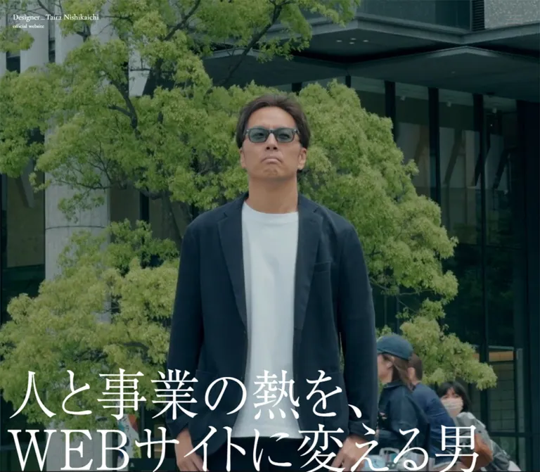
A full-screen photographic scene shows a person walking through a modern urban space with trees, paving, and glass-and-metal architecture. The restrained color treatment lets white serif text dominate the lower part of the frame.
The statement is 人と事業の熱を、WEBサイトに変える男. Desktop presents two large lines. The mobile capture presents four lines: 人と事業の, 熱を、, WEBサイト, and に変える男.
On desktop, the measured text line box extends to y=1010px, ten pixels beyond the captured viewport. On mobile it ends at approximately 794px, leaving 50px below. This is a real difference in composition. A reusable implementation should keep the text reachable under zoom and alternative font metrics.
The mobile scene uses a much tighter portrait composition. The two captures may represent different media frames; their differences cannot be attributed solely to object-position or responsive art direction.
Name-Fragments and Personality Vignettes
Role: turn a name introduction into a sequence of personal observations.
Four parenthesized fragments—Nishi, kai, chi, and Taira—are paired with Japanese personality statements. Desktop annotations alternate between left and right positions with broad vertical separation.
On mobile, the annotation rectangles become approximately 19.6px wide and 139–166px tall. This strongly suggests vertical text presentation. The exact writing-mode was not included in the sampled properties, so writing-mode: vertical-rl is a recommended implementation rather than a recovered declaration.
Maintain the separation between a small horizontal name fragment and its accompanying statement. This sequence belongs to the extended opening section, not an ordinary four-card feature grid.
Circular Movie Control
Role: invite playback of the personal film.
The button is centered horizontally, measuring 198px across on desktop and 90px on mobile. Its source text includes シネマティック西開地を再生する. A desktop decorative label also reads トレンディ.
An embedded CSS rule assigns 50s linear infinite rotation to #movie_role, with a complete 0deg to 360deg rotation. This confirms a rotating element associated with the control. It does not establish that the entire button or its center label rotates.
Some inner text is transformed to a fraction of its computed size. Reconstruct the button's visual layers before reusing raw font sizes. The opened player, playback destination, audio behavior, and dismissal controls are unverified.
Editorial Introduction
Role: explain the person behind the site in a conversational voice.
Three generous blocks introduce the designer, explain the purpose of the website, and invite a conversation. Desktop uses 43.2px Ryumin Regular with 90.72px leading. The first text block is approximately 1058px wide and begins around x=88px.
Coincident black and #dddddd copies are present in the desktop DOM. The black copies declare a 1s transition with a 1s delay. This supports a layered reveal construction, but the actual reveal property and trigger were not supplied.
Mobile uses single measured black reading blocks at 18px / 39.6px, 0.1em tracking, and a 351px width, giving 19.5px side margins. It also contains wording differences: the desktop introduction refers to no-code and AI website work, while the visible mobile version refers to print and web design. Treat these as supplied responsive content differences. A new site should preferably maintain one content source.
Profile Table
Role: offer a compact factual counterpoint to the large personal narrative.
The desktop composition places Profile near x=702px, field labels near 845px, and values near 995px. Labels have a measured 150px column. Short rows start 50px apart; multiline values expand naturally.
The fields include Name, Age, Blood type, H/W, Adress, Hobby, Personality, and Job. The observed spelling Adress is source UI text.
On mobile, Profile becomes a 24px heading spanning a 342px region with 24px side margins. Labels and values remain paired in two columns: 100px for labels, a 10px gap, then flexible values. This component does not collapse every label onto its own line.
Use a definition list or equivalent semantic pairs. Keep the Latin labels and Japanese values typographically distinct. The supplied evidence does not reveal the entire desktop area to the left of this table.
Life-History Display and Chapter Links
Role: make the designer's biography an exploratory part of the homepage.
The heading 人生 declares 640px type on desktop. Nine compact numbered links occupy staggered positions within the same broad vertical region. Their labels lead to specific history_01 through history_09 fragments on the history page.
The desktop text positions support a deliberately distributed composition rather than a uniform timeline list. Exact overlap and occlusion at a settled scroll position are not visually documented by the supplied screenshots.
On mobile, the display heading is 226.2px, with a recorded width of approximately 464px starting at x=-37px. The chapter links sit below it and wrap into groups of three, two, two, and two in the measured layout. They retain 16px link text and 12px number labels.
A large repeated English ribbon, Taira Nishikaichi:Then & Now., accompanies this region. Multiple horizontally offset copies support a marquee-like structure. Its speed and trigger are unknown.
Gratitude Introduction
Role: introduce testimonials as personal relationships.
The desktop heading beginning ありがとう。 uses 86.4px display type, 1.6 leading, and 0.1em tracking. A separate explanation occupies a narrow approximately 325px column toward the right, using 15.84px type with unusually open 2.7 leading.
Mobile stacks these elements. The heading becomes 39.78px / 71.604px, and the explanation follows after approximately 40px, using 14.43px / 30.303px.
Keep the personal tone and large difference in scale between headline and explanation. The component's impact comes from those proportions and the space between them.
Monochrome Photographic Interlude
Role: connect the individual portrait to the surrounding community.
The middle desktop screenshot contains a broad monochrome image with a sharply defined central person and blurred passing figures. The visible photographic portion occupies the upper approximately 554px of that capture. This is a cropped visible segment, not a verified asset height.
A clean horizontal boundary leads into white space and colored testimonial circles. Avoid adding a decorative frame around the image. Its grayscale treatment and movement blur already distinguish it from the color opening.
The evidence does not establish whether this material is a photograph, processed video frame, or another media treatment.
Desktop Testimonial Circles
Role: present individual voices as expressive objects across a spacious field.
The visible violet circle is approximately 320px in diameter, beginning near x=72px. The orange circle sits near the opposite edge and approximately 154px lower. Their large central separation is a defining compositional feature.
Each circle contains a left-aligned quotation, an affiliation line, and a name with a smaller honorific. In the visible violet example, the text begins roughly 45px inside the left edge and about 80px below the top. The quotation uses white Mincho lettering, followed by much smaller attribution details.
Twelve quotations appear in the supplied DOM. Desktop coordinates distribute six toward each side, with varying horizontal offsets. Some recorded text rectangles reflect approximately 0.8× scaling, whereas the screenshot shows a larger settled-looking presentation. Do not infer a fixed circle size or animation trajectory from that difference alone.
The speaker affiliations belong to testimonials. They do not establish website-production roles.
Mobile Testimonial Reading Rows
Role: keep all quotations readable in a narrow document.
The mobile DOM records each quotation as black text across 331.5px, beginning at x=29.25px. Quotes use 13.65px / 19.11px, followed by an 18px gap, a 12px affiliation, and a 16px name.
Successive rows usually leave 40px after the author's line. This establishes a stacked reading arrangement substantially different from the desktop coordinates.
No mobile middle screenshot or complete testimonial-wrapper background styles were supplied. The original treatment of the colored circle surfaces on mobile remains visually unverified. The Quick Start recommends a plain mobile list based on the measured text arrangement.
Review Invitation and Rectangular CTA
Role: invite another contribution after the existing testimonials.
A short invitation sits above the link 口コミを投稿する(お願いします), which points to /reviews.
The desktop link is a square-cornered black rectangle measuring 400 × 68px, with white 20px / 28px serif text and 20px 40px padding. It is centered below a 560px-wide invitation.
Mobile uses a 331.5px-wide rectangle with the same padding and 15.6px / 21.84px type. Its measured height is approximately 61.83px. The invitation-to-button gap remains 24px.
The black rectangle offers a clear action shape within a section otherwise dominated by circular testimonials. Its hover appearance and the destination form were not inspected.
Capabilities Carousel
Role: mix professional skills with personable, informal capabilities.
A pale blue #e9eff7 section contains a modest heading, an exceptionally large word or short phrase, and two black circular arrow controls at the lower right.
Measured desktop panels are 1353.6px wide and 800px high. Mobile panels are 366.6px wide and 236.75px high. Both widths equal 94vw, with the centered panel beginning at 3vw.
Slide words use the Japanese display family even for Latin labels such as Graphic, Logo, Studio, and AI. Other labels refer to drinking together, listening carefully, and developing ideas or expressions. Preserve this mixture of professional and personal content when adapting the concept.
The sampled centered item is AI on desktop and 一緒にお酒を飲む on mobile. Different sampled items do not prove device-exclusive content. The DOM may represent a moving or windowed track.
Arrow buttons measure 60px on desktop and 50px on mobile, with a 16px gap. Panel-click results, arrow activation, swipe behavior, looping, and automatic advance remain unverified.
Work-Page Gateway
Role: lead from capabilities into selected work.
The mobile DOM establishes a central 200px circular link with an rgba(0, 0, 0, 0.8) fill. Its white heading reads 制作実績を見る at 16px / 22.4px, weight 700, and links to /works.
The large white characters 作 and 例 flank the circle, each using 78px display type. Supporting text below uses white 16px / 35.2px type and 0.1em tracking.
The backdrop and complete desktop geometry are not documented in the supplied samples. Keep this component's measured mobile anatomy separate from assumptions about the work imagery or linked portfolio layout.
Interview Teaser
Role: offer a longer account of the designer's approach and side practice.
The source label is Specail Interview. The teaser contains questions, explanatory copy, and the link インタビューを見る to /interview.
The mobile section is measured with a black background, 631.5px height, and 80px bottom padding. The supplied samples do not establish its detailed heading typography, imagery, or desktop composition.
For an extension, retain a distinct editorial teaser with a clear reading destination. Its source structure provides no basis for inventing an accordion or inline interview player.
Social and Contact Links
Role: provide separate routes for informal conversation and work inquiries.
The rendered homepage links to https://x.com/tanba_kun with follow/DM language and to /contact with 連絡してみる and a work-consultation caption.
Their purposes and destinations are verified through the supplied links. Their exact surface styling and expanded destination states were not captured. Preserve both intents in a new implementation and keep each destination clearly named.
Closing Portrait and Signature
Role: finish the introduction with a personal message and a memorable identity.
Both closing captures use full-screen color imagery with white text. Desktop shows a person walking away across paving, with the upper body leaving the frame. Mobile shows a closer side view. These are different photographic compositions; the evidence does not identify the source media sequence.
On desktop, the message begins around x=108px, in the lower half of the image. Beneath it, an enormous Designer—Taira Nishikaichi signature spans most of the width, with a small copyright line aligned toward the right.
Mobile places the message around 30px from the sides. It wraps into many more lines while retaining approximately the same reading size and generous leading. The signature reduces to roughly 30–32px, stays near the bottom, and is followed by the copyright.
The image is visibly subdued behind the closing text. Overlay color and opacity were not sampled. Choose the scrim per asset and verify contrast across every frame if motion is used.
Tokens — Motion & Interaction
The supplied record includes CSS declarations and a capture-readiness procedure, but no explicit click/hover test results. Distinguish a declared transition from a demonstrated interaction.
| Treatment | Supplied value or evidence | What is established |
|---|---|---|
| Common element transitions | 0.3s cubic-bezier(0.4, 0.4, 0, 1) |
Widely declared timing; does not identify a specific hover effect |
| Body background transition | 0.5s cubic-bezier(0.4, 0.4, 0, 1) |
Background changes can transition; trigger unknown |
| Desktop black introduction layer | 1s cubic-bezier(0.4, 0.4, 0, 1) 1s |
One-second duration and delay on the overlaid text |
| Desktop life-history heading | 2s cubic-bezier(0.4, 0.4, 0, 1) 0.5s |
Longer declared transition with half-second delay |
| Desktop gratitude heading | 1s cubic-bezier(0.4, 0.4, 0, 1) 0.5s |
Declared duration and delay |
| Mobile life and gratitude headings | Common 0.3s transition |
Desktop timing cannot be assumed on mobile |
| Movie-associated rotating element | 50s linear infinite rotation |
Embedded keyframes explicitly rotate through 360deg |
| Carousel arrow buttons | 0.4s cubic-bezier(0.4, 0.4, 0, 1) |
Button-transition timing; slide duration unknown |
| English history ribbon | Repeated, horizontally offset copies | Marquee-like construction; motion speed unverified |
| Photographic scenes | Different poses and compositions across captures; movie affordance present | Cinematic presentation; background playback format and behavior unverified |
| Navigation links | History fragments, reviews, work, interview, social, and contact destinations | Link targets recorded; destination behavior untested |
The many --g-angle, --g-color-*, and --g-position-* transition entries appear alongside general element transitions. Their presence alone does not demonstrate visible animated gradients.
No evidence establishes scroll scrubbing, parallax depth, magnetic cursors, draggable testimonials, a particular menu transition, or automatic audio. Likewise, animation: none on a sampled text element does not rule out movement caused by an ancestor, script, or media layer.
Recommended motion direction: use the recorded cubic-bezier curve for restrained state changes, reserve slow rotation for a decorative movie ring, and keep reading content visible without animation. If adding entrance effects, use short opacity/transform transitions rather than recreating unverified scroll choreography.
Surfaces
| Layer | Appearance | Purpose |
|---|---|---|
| Main canvas | Measured pure white | Quiet ground for large black typography and personal narrative |
| Opening and closing scenes | Edge-to-edge color imagery with overlaid white text | Establish and recall the portrait identity |
| Monochrome interlude | Grayscale imagery with blurred passersby | A visual pause before the testimonial field |
| Desktop testimonial objects | Saturated circles with lighter edges | Separate individual voices without a conventional card grid |
| Mobile testimonial text | Measured black reading rows | Compact, continuous quotation sequence; wrapper appearance unverified |
| Capabilities stage | Measured pale blue #e9eff7 |
Separate the oversized carousel words from the white narrative |
| Primary rectangular action | Black fill, white serif label, square corners | Review submission route |
| Circular controls | Black or translucent black discs | Carousel navigation and mobile work-page entry |
| Mobile interview section | Measured solid black | Distinct editorial chapter |
Section boundaries, large shifts in type scale, and photographic framing supply hierarchy. Avoid introducing a general shadow system that competes with these existing devices.
Imagery
The photographic direction is personal, urban, and lightly cinematic. Modern buildings and planted public space frame an individual in dark clothing. Soft daylight, cool neutral structures, and green foliage produce a restrained color environment.
The monochrome crowd scene adds a different kind of movement: a relatively sharp central figure surrounded by blurred people. The closing scene emphasizes walking, departure, and continuation. Together, these compositions make the page feel like an extended introduction to a person.
Use full-bleed media with intentional cropping. Keep faces and important gestures clear of critical text where possible. For mobile, prepare a useful portrait crop or alternate source rather than relying on an unchecked center crop.
A static image cannot establish playback. The supplied screenshots should guide composition and grading; they do not establish a video loop length, frame rate, sound track, poster strategy, or file format.
Observed Asset References
No complete direct image or movie asset URLs were supplied. The entries below identify visible material without inventing filenames.
| Material | Evidence | Asset URL status |
|---|---|---|
| Color urban walking scene | Desktop opening capture and mobile opening capture | Not supplied |
| Monochrome crowd composition | Middle desktop capture | Not supplied |
| Departure / side-view closing scene | Desktop and mobile closing captures | Not supplied |
| Three-line menu graphic | All supplied page captures | Could be reproduced with CSS; original construction unverified |
| Movie-associated artwork | Button text and rotating-element CSS | Complete artwork reference not supplied |
| Carousel arrows | Button labels and icon-font declaration | Exact glyph asset not independently sampled |
Use authorized portrait material and load suitable fonts separately. CSS can reproduce the composition, typography hierarchy, and shapes; the specific photographic direction carries much of the site's identity.
Layout & Responsive Behavior
The homepage is a long scrolling document with changing section rhythms. The extended opening precedes a large introduction, a compact profile, an oversized biography gateway, testimonials, capabilities, work and interview links, contact routes, and a full-screen closing portrait.
| Relationship | Desktop observation | Mobile observation |
|---|---|---|
| Identity | Small upper-left English lockup | Same measured size and inset |
| Main headline | Two lines at 144px |
Four lines at 79.95px |
| Headline edge clearance | Approximately 18px left |
9.75px, or 2.5vw, on both sides |
| Portrait composition | Broad urban context | Much tighter figure framing; frame changes may contribute |
| Personality statements | Horizontal, alternating positions | Narrow tall rectangles consistent with vertical text |
| Introduction | Large layered text, very open leading | 18px single reading blocks across 90vw |
| Profile | Information positioned toward the right | Heading above retained label/value columns |
| History | Huge heading and staggered link coordinates | Oversized heading above wrapping link groups |
| Testimonials | Widely separated white-text circles in the screenshot | Black text in stacked 85vw reading rows in the DOM |
| Capabilities | 800px-high panels, 288px words |
Approximately 237px-high panels, 78px words |
| Closing message | Broad lines in lower half | Narrow, substantially taller reading block |
| Closing signature | Approximately 110–120px |
Approximately 30–32px |
The mobile design does more than scale down the desktop. It changes information placement, annotation orientation, introduction presentation, quotation color, and the amount of vertical space dedicated to the carousel.
A supplied CSS excerpt confirms a max-width: 1280px rule controlling selected line breaks. It does not establish the breakpoint responsible for every responsive change. Only the two stated viewports were inspected; tablet, landscape-phone, browser zoom, and other widths remain unverified.
The Quick Start uses 48rem as a recommended adaptation breakpoint. Its fluid formulas match selected measured endpoints where practical, while allowing the content to grow. Do not hardcode the recorded full-document heights or reproduce the mobile history heading's overflow across the entire page.
Do’s and Don’ts
Do
- Pair Ryumin's Japanese serif character with the measured Cormorant Garamond identity treatment.
- Preserve the strong difference between the small masthead and the immense opening statement.
- Use white and black as the structural palette, with pale blue for the capabilities stage.
- Give portrait imagery full-screen space and plan its crop together with the text.
- Keep broad desktop asymmetry: a right-positioned profile and widely separated testimonial groups.
- Build each testimonial from quote, affiliation, name, and smaller honorific.
- Retain compact label/value profile rows on mobile.
- Treat mobile as an alternate composition with its own reading widths and spacing.
- Use circles selectively for voices, movie access, work access, and arrow controls.
- Preserve the personal, conversational quality of the content and the photographic closing signature.
Don’t
- Don't turn every narrative section into equal-sized cards.
- Don't shrink the masthead proportionally with the desktop layout; its measured mobile size is unchanged.
- Don't make the photographic greens a universal button or navigation color.
- Don't replace the large Japanese serif statements with heavy geometric sans-serif headlines.
- Don't distribute testimonial accents throughout every section.
- Don't force long mobile quotations into small circular masks.
- Don't copy coincident text layers into the accessible reading order multiple times.
- Don't infer animation trajectories from a single transformed rectangle.
- Don't assume that a visible movie button proves autoplaying background video or audible playback.
- Don't treat the work, interview, contact, or menu destinations as inspected interfaces.
Recommended Implementation Additions
These are recommendations for a new implementation, not verified features of the original:
- Expand the menu's interaction area to at least
44 × 44pxwhile retaining its40 × 19pxgraphic. Add an accessible name, expanded state, keyboard operation, and focus return. - Give the page one meaningful primary heading and use semantic sections, definition lists, quotations, and links.
- Keep only one accessible copy of animated text. Decorative duplicates should be hidden from assistive technology.
- Increase mobile quotation text from the observed
13.65pxto around16pxwhen readability is the priority, and let the section height grow. - Check text contrast against each photographic frame and against the lighter edges of testimonial circles. Adjust the media scrim or text placement per asset.
- If continuous video or rotation is implemented, provide a pause mechanism and a reduced-motion/static alternative. Keep audible playback behind an explicit user action.
- Keep inactive carousel panels out of the focus order, name both arrows, and expose the active item's position. Preserve ordinary vertical page scrolling during touch interaction.
- Share narrative content between breakpoints to prevent the wording drift visible in the supplied introduction.
- Test at intermediate widths and with enlarged text. Restrict artistic clipping to decorative regions while keeping links and essential words available.
- Supply portrait posters, useful image descriptions, and captions or transcripts when a film carries meaningful spoken content.
Agent Prompt Guide
Quick Color Reference
- Main canvas and reversed text: measured
#ffffff. - Editorial text and filled controls: measured
#000000. - Secondary utility foreground: measured
#333333. - Desktop introduction underlay: measured
#dddddd. - Capabilities stage: measured
#e9eff7. - Mobile work disc: measured
rgba(0, 0, 0, 0.8). - Desktop quotation accents: approximate violet
#5232ffand orange#ed9a31, with lighter perimeters. - Photographic scrims: choose and test per asset; original opacity was not supplied.
Overall Prompt
“Create a long personal designer website inspired by the current Taira Nishikaichi homepage. Use a full-screen urban portrait opening, a tiny white Cormorant Garamond identity at the upper left, and a fine three-line menu at the upper right. Place an immense white Japanese Mincho statement near the bottom, approximately 144px on a 1440px desktop and 80px on a 390px phone. Follow with spacious white editorial sections, a compact label/value profile, a monumental biography heading, and personal testimonials. On desktop, distribute white-text testimonial circles in violet and orange across opposing sides of a broad white field. Use a pale blue capabilities stage with exceptionally large serif words and black circular arrow controls. Finish with a subdued full-screen portrait, a personal message, and a large English signature. Compose the mobile layout separately, retaining readable rows and clear link destinations. Treat motion beyond the documented slow movie-ring rotation as a proposed enhancement.”
Example Component Prompts
- Opening portrait: “Build a full-screen portrait section with cool urban photography, a small two-line English identity at 30px from the top and left, and an oversized white Ryumin-style Japanese statement at the bottom. Use 1.0 heading leading and 0.02em tracking. At 390px wide, compose four headline lines and retain roughly 50px of bottom clearance.”
- Profile: “Create a compact personal profile with Cormorant Garamond field labels and Japanese Mincho values. Position the information toward the right on desktop. On mobile, put the 24px Profile heading above rows with a 100px label column, a 10px gap, and flexible values.”
- Testimonial field: “Create two loosely staggered desktop groups of circular testimonials, approximately 320px across. Use violet and orange interiors with gently lighter edges, white left-aligned quotations, and small affiliation/name details. Leave a broad empty center. For mobile, adapt the content to black-text reading rows with generous separation.”
- Capabilities stage: “Create a pale blue #e9eff7 carousel stage with a modest Japanese heading and enormous Mincho words. Use panels around 94% of the viewport width, 288px display type at 1440px, and 78px at 390px. Put two black circular arrow controls at the lower right, separated by 16px. Define keyboard and touch behavior explicitly.”
- Closing portrait: “Create a full-screen photographic closing section with a readable white personal message and an oversized Cormorant-style English signature near the bottom. Use a wider message column on desktop and approximately 30px side insets on mobile. Select a mobile crop and scrim that preserve both the portrait and every line of text.”
Quick Start
CSS Custom Properties
This CSS is an adaptation using a conventional 16px root. It includes the measured core palette and typography families, estimated testimonial colors, and recommended responsive and accessibility choices. Load authorized fonts and media separately; the declarations do not fetch assets.
The component structure is intentionally simple: a .scene contains an image or video with .scene__media and an ordinary .scene__content wrapper. A .voices region contains two .voices__column groups, each containing .voice quotations. The menu, media controls, and carousel arrows require application behavior in addition to these styles.
:root {
  /* Measured interface colors */
  --color-paper: #ffffff;
  --color-ink: #000000;
  --color-utility: #333333;
  --color-reveal-underlay: #dddddd;
  --color-capabilities: #e9eff7;
  --color-work-disc: rgb(0 0 0 / 0.8);

  /* Visual approximations of desktop testimonial circles */
  --color-voice-violet: #5232ff;
  --color-voice-violet-edge: #8066ff;
  --color-voice-orange: #ed9a31;
  --color-voice-orange-edge: #f3b56c;

  /* Measured families; generic serif fallbacks are recommended */
  --font-display: 'リュウミン L-KL JIS2004', serif;
  --font-reading: 'リュウミン R-KL JIS2004', serif;
  --font-detail: 'リュウミン M-KL JIS2004', serif;
  --font-latin: 'Cormorant Garamond', serif;

  /* Adapted formulas matching selected desktop measurements */
  --text-hero: clamp(4rem, 10vw, 9rem);
  --text-intro: clamp(1.125rem, 3vw, 2.7rem);
  --text-capability: clamp(4rem, 20vw, 18rem);
  --text-history: clamp(10rem, 44.444vw, 40rem);
  --text-signature: 8vw;
  --leading-intro: 2.1;
  --tracking-display: 0.02em;

  --space-section: 150px;
  --space-paragraph: 60px;
  --profile-label-width: 150px;
  --voice-size: 320px;
  --arrow-size: 60px;
  --arrow-gap: 16px;

  /* Recorded timing curve and durations */
  --ease-editorial: cubic-bezier(0.4, 0.4, 0, 1);
  --duration-ui: 300ms;
  --duration-arrow: 400ms;
  --duration-body: 500ms;
  --duration-movie-ring: 50s;

  /* Recommended media defaults; tune for each supplied asset */
  --scene-position: 50% 50%;
  --scene-scrim: rgb(0 0 0 / 0.3);
}

* {
  box-sizing: border-box;
}

body {
  margin: 0;
  color: var(--color-ink);
  background: var(--color-paper);
  font-family: var(--font-reading);
}

button,
a {
  -webkit-tap-highlight-color: transparent;
}

button {
  font: inherit;
}

a {
  color: inherit;
  text-underline-offset: 0.25em;
}

.scene {
  position: relative;
  isolation: isolate;
  min-height: 100vh;
  min-height: 100svh;
  color: var(--color-paper);
  background: var(--color-utility);
}

.scene__media {
  position: absolute;
  inset: 0;
  z-index: 0;
  display: block;
  width: 100%;
  height: 100%;
  object-fit: cover;
  object-position: var(--scene-position);
}

.scene::after {
  position: absolute;
  inset: 0;
  z-index: 1;
  content: '';
  background: var(--scene-scrim);
  pointer-events: none;
}

.scene__content {
  position: relative;
  z-index: 2;
}

.masthead {
  position: absolute;
  z-index: 3;
  top: max(30px, env(safe-area-inset-top));
  left: max(30px, env(safe-area-inset-left));
  color: #fff;
  font: 500 18px / 1 var(--font-latin);
}

.masthead__line {
  display: flex;
  align-items: baseline;
}

.masthead__rule {
  align-self: center;
  width: 13px;
  height: 1px;
  background: currentColor;
}

.masthead__subtitle {
  display: block;
  margin-top: 6px;
  font-size: 12px;
}

/* Recommended larger target around the observed menu silhouette */
.menu-toggle {
  position: fixed;
  z-index: 30;
  top: 22.5px;
  right: max(38px, env(safe-area-inset-right));
  display: grid;
  place-items: center;
  width: 44px;
  height: 44px;
  padding: 0;
  border: 0;
  color: var(--color-utility);
  background: transparent;
  cursor: pointer;
}

.menu-toggle[data-tone='light'] {
  color: #fff;
}

.menu-toggle__lines {
  display: flex;
  flex-direction: column;
  gap: 8px;
  width: 40px;
}

.menu-toggle__lines span {
  display: block;
  width: 100%;
  height: 1px;
  background: currentColor;
}

.hero .scene__content {
  display: grid;
  align-content: end;
  min-height: 100vh;
  min-height: 100svh;
  padding: 120px 1.25% 24px;
}

.hero__title {
  width: min(100%, 1258.6px);
  margin: 0;
  font: 400 var(--text-hero) / 1 var(--font-display);
  letter-spacing: var(--tracking-display);
  overflow-wrap: break-word;
}

.hero__line {
  display: block;
}

.introduction {
  padding: var(--space-section) 6.1%;
  background: var(--color-paper);
}

.introduction p {
  max-width: 1060px;
  margin: 0;
  font-size: var(--text-intro);
  line-height: var(--leading-intro);
}

.introduction p + p {
  margin-top: var(--space-paragraph);
  letter-spacing: 0.05em;
}

/* Text stays visible; any reveal is an optional enhancement */
.profile {
  padding: 152px 15% 30px;
}

.profile__info {
  display: grid;
  grid-template-columns: 52px minmax(0, 1fr);
  gap: 90px;
  width: min(100%, 522px);
  margin-left: auto;
}

.profile__heading {
  margin: 0;
  font: 500 20px / 1 var(--font-latin);
}

.profile dl {
  min-width: 0;
  margin: 0;
}

.profile__row {
  display: grid;
  grid-template-columns: var(--profile-label-width) minmax(0, 1fr);
  align-items: start;
}

.profile__row + .profile__row {
  margin-top: 30px;
}

.profile dt {
  font: 500 20px / 1 var(--font-latin);
}

.profile dd {
  margin: 0;
  font: 400 16px / 1 var(--font-detail);
  letter-spacing: 0.05em;
  overflow-wrap: anywhere;
}

.profile dd.is-multiline {
  line-height: 1.8;
}

.history {
  max-width: 1280px;
  margin-inline: auto;
  overflow: clip;
}

.history__display {
  margin: 0;
  font: 700 var(--text-history) / 1 var(--font-display);
  text-align: center;
  white-space: nowrap;
}

/* Recommended flexible link layout; desktop choreography is separate */
.history__links {
  display: flex;
  flex-wrap: wrap;
  gap: 30px;
  padding: 30px 25px 60px;
  list-style: none;
}

.history__number {
  display: block;
  margin-bottom: 5px;
  font-size: 12px;
  line-height: 1.4;
}

.history__links a {
  font-size: 16px;
  line-height: 1.4;
}

.voices {
  display: grid;
  grid-template-columns: repeat(2, minmax(320px, 500px));
  justify-content: space-between;
  gap: 40px;
  padding: 34px 5% 100px;
  background: #fff;
}

.voices__column {
  display: flex;
  flex-direction: column;
  gap: 40px;
}

.voices__column:last-child {
  padding-top: 154px;
}

.voice {
  display: flex;
  flex-direction: column;
  justify-content: center;
  width: var(--voice-size);
  min-height: var(--voice-size);
  margin: 0;
  padding: 55px 45px;
  border-radius: 50%;
  color: #fff;
  background: radial-gradient(
    circle,
    var(--color-voice-violet) 55%,
    var(--color-voice-violet-edge) 100%
  );
}

.voices__column:first-child .voice:nth-child(even),
.voices__column:last-child .voice:nth-child(odd) {
  align-self: flex-end;
}

.voice--orange {
  background: radial-gradient(
    circle,
    var(--color-voice-orange) 55%,
    var(--color-voice-orange-edge) 100%
  );
}

.voice__quote {
  margin: 0 0 18px;
  font: 400 20px / 1.4 var(--font-detail);
  letter-spacing: 0.05em;
}

.voice__affiliation {
  display: block;
  font: 400 12px / 1.4 var(--font-reading);
}

.voice__name {
  display: block;
  margin-top: 5px;
  font: 400 16px / 1 var(--font-reading);
}

.voice__honorific {
  font-size: 12px;
}

.review-invitation {
  width: min(85%, 560px);
  margin: 0 auto 100px;
}

.review-invitation p {
  margin: 0 0 24px;
  font: 400 20px / 1.6 var(--font-detail);
}

.review-link {
  display: flex;
  align-items: center;
  justify-content: center;
  width: min(100%, 400px);
  min-height: 68px;
  margin-inline: auto;
  padding: 20px 40px;
  border-radius: 0;
  color: #fff;
  background: #000;
  font-size: 20px;
  line-height: 1.4;
  text-align: center;
  text-decoration: none;
}

.capabilities {
  position: relative;
  padding: 200px 0 30px;
  background: var(--color-capabilities);
}

.capabilities__heading {
  margin: 0 30px 30px;
  font: 700 20px / 1.4 var(--font-detail);
  text-align: center;
}

/* Recommended native horizontal access; source behavior is unverified */
.capabilities__track {
  display: flex;
  gap: 6vw;
  overflow-x: auto;
  padding-inline: 3vw;
  scroll-snap-type: x proximity;
}

.capabilities__slide {
  display: grid;
  flex: 0 0 94vw;
  place-items: center;
  min-width: 0;
  min-height: 800px;
  padding: 30px 20px 100px;
  scroll-snap-align: center;
}

.capabilities__word {
  margin: 0;
  font: 400 var(--text-capability) / 1 var(--font-display);
  text-align: center;
  overflow-wrap: anywhere;
}

.capabilities__controls {
  display: flex;
  justify-content: flex-end;
  gap: var(--arrow-gap);
  margin: 16px 30px 0;
}

.arrow-button {
  display: grid;
  place-items: center;
  width: var(--arrow-size);
  height: var(--arrow-size);
  padding: 0;
  border: 0;
  border-radius: 50%;
  color: #fff;
  background: #000;
  cursor: pointer;
  transition: background-color var(--duration-arrow) var(--ease-editorial);
}

.arrow-button svg {
  width: 24px;
  height: 24px;
}

.work-disc {
  display: grid;
  place-items: center;
  width: 200px;
  min-height: 200px;
  padding: 24px;
  border-radius: 50%;
  color: #fff;
  background: var(--color-work-disc);
  font: 700 16px / 1.4 var(--font-reading);
  text-align: center;
}

.closing .scene__content {
  display: flex;
  flex-direction: column;
  justify-content: flex-end;
  min-height: 100vh;
  min-height: 100svh;
  padding: 120px 7.5% 80px;
}

.closing__message {
  max-width: 680px;
  margin: 0;
  font-size: 16px;
  line-height: 2.2;
}

.closing__signature {
  margin-top: 96px;
}

.closing__wordmark {
  margin: 0;
  font: 400 var(--text-signature) / 1 var(--font-latin);
}

.closing__copyright {
  margin: 8px 0 0;
  font: 400 14px / 1.2 var(--font-latin);
  text-align: right;
}

/* Apply only to a decorative ring, not the central playback label */
.movie-ring {
  animation: movie-ring-turn var(--duration-movie-ring) linear infinite;
}

@keyframes movie-ring-turn {
  to { transform: rotate(360deg); }
}

/* Recommended focus and hover feedback */
:where(a, button):focus-visible {
  outline: 2px solid currentColor;
  outline-offset: 5px;
}

@media (hover: hover) {
  .review-link:hover {
    text-decoration: underline;
  }
  .arrow-button:hover {
    background: #333;
  }
}

/* Recommended breakpoint; the original switching threshold is unknown */
@media (max-width: 48rem) {
  :root {
    --text-hero: clamp(3rem, 20.5vw, 6rem);
    --text-intro: 18px;
    --text-history: 58vw;
    --leading-intro: 2.2;
    --space-section: 70px;
    --space-paragraph: 56px;
    --profile-label-width: 100px;
    --arrow-size: 50px;
  }

  .menu-toggle {
    right: max(28px, env(safe-area-inset-right));
  }

  .hero .scene__content {
    padding-inline: 2.5%;
    padding-bottom: 50px;
  }

  .introduction {
    padding-inline: 5%;
  }

  .introduction p,
  .introduction p + p {
    letter-spacing: 0.1em;
  }

  .profile {
    padding: 70px 24px;
  }

  .profile__info {
    display: block;
    width: 100%;
  }

  .profile__heading {
    margin-bottom: 30px;
    font-size: 24px;
  }

  .profile__row {
    column-gap: 10px;
  }

  .profile__row + .profile__row {
    margin-top: 25px;
  }

  .profile dt,
  .profile dd {
    font-size: 14.43px;
    line-height: 1.5;
  }

  .voices {
    display: block;
    padding: 40px 7.5% 70px;
  }

  .voices__column,
  .voices__column:last-child {
    gap: 40px;
    padding-top: 0;
  }

  .voices__column + .voices__column {
    margin-top: 40px;
  }

  /* Recommended mobile surface and larger reading size */
  .voice {
    display: block;
    width: 100%;
    min-height: 0;
    padding: 0;
    border-radius: 0;
    color: #000;
    background: transparent;
  }

  .voice__quote {
    font-size: 16px;
    line-height: 1.6;
  }

  .review-invitation p {
    font: 400 16px / 1.6 var(--font-reading);
  }

  .review-link {
    min-height: 62px;
    padding-inline: 24px;
    font-size: 16px;
  }

  .capabilities {
    padding-top: 30px;
  }

  .capabilities__heading {
    margin-bottom: 0;
    font-size: 16px;
    line-height: 1.6;
  }

  .capabilities__slide {
    min-height: 236.75px;
    padding: 30px 16px;
  }

  .closing .scene__content {
    padding: 175px 30px 26px;
  }

  .closing__signature {
    margin-top: auto;
    padding-top: 60px;
  }

  .closing__wordmark {
    margin-inline: -6px;
  }

  .closing__copyright {
    font-size: 12px;
  }
}

@media (prefers-reduced-motion: reduce) {
  .movie-ring {
    animation: none;
  }
  .arrow-button {
    transition: none;
  }
  .capabilities__track {
    scroll-behavior: auto;
  }
}
The CSS keeps the hero line box inside its section, gives profile values extra mobile leading, enlarges mobile quotation text, and places carousel controls in normal flow. These are deliberate implementation recommendations. Tune headline wrapping after fonts load. For longer quotations, enlarge the desktop circle or use an unconstrained reading surface instead of clipping text.
Reduced-motion CSS does not pause a video element. If video is introduced, implement the preference and user pause control in the media logic. The menu's data-tone is an explicit application state; this snippet does not infer contrast automatically.
Tailwind v4 Token Mapping
Optional mapping for an existing Tailwind v4 project. This does not imply that the inspected page uses Tailwind. Define the properties above first.
@theme inline {
  --color-paper: var(--color-paper);
  --color-ink: var(--color-ink);
  --color-stage: var(--color-capabilities);
  --color-violet: var(--color-voice-violet);
  --color-orange: var(--color-voice-orange);

  --font-japanese-display: var(--font-display);
  --font-japanese-reading: var(--font-reading);
  --font-japanese-detail: var(--font-detail);
  --font-identity: var(--font-latin);

  --text-portrait: var(--text-hero);
  --text-narrative: var(--text-intro);
  --text-capability: var(--text-capability);
  --text-biography: var(--text-history);

  --spacing-section: var(--space-section);
  --spacing-paragraph: var(--space-paragraph);
  --spacing-voice: var(--voice-size);
  --spacing-arrow: var(--arrow-size);
}
For integration, avoid assigning a theme variable to itself if your build preserves these declarations directly. Use literal values for matching names such as --color-paper: #ffffff, --color-ink: #000000, and rename the capability mapping to --text-skill: var(--text-capability) when needed.
Sources & Evidence
- Original and final website: https://lea-lea.site/. The supplied browser observation reports HTTP
200, the same original/final URL, and the title西開地 平 オフィシャルWEBサイト. - Capture date: September 12, 2026, with supplied retrieval timestamp
2026-09-12T07:31:51.865Z. - Desktop evidence:
1440 × 1000viewport; opening capture, monochrome-image/testimonial capture, closing capture, full rendered text, link inventory, and sampled computed styles and rectangles. - Mobile evidence:
390 × 844viewport; opening and closing captures, full rendered text, link inventory, and sampled computed styles and rectangles. - Original-page CSS evidence: the three Ryumin families, Cormorant Garamond, source font/color custom properties, transition declarations, breakpoint-dependent line-break excerpt, and the
#movie_rolerotation rule. - Inspection procedure supplied with the captures: initial observation of at least five seconds; bounded waits for load, visible images, finite animations, and sampled layout/text stability; intermediate scrolling; perpetual animations paused during readiness checks and resumed afterward. These checks do not prove that every delayed state appeared.
- Limitations: no independent browsing or command execution was performed for this reference. No menu opening, movie playback, hover behavior, carousel activation, destination-page interaction, complete media URLs, or intermediate viewport tests were supplied. SharedWorkers and service workers were disabled during the recorded inspection.
This reference describes the currently supplied homepage evidence. Measured declarations, screenshot estimates, calculated relationships, and proposed implementation choices are distinguished throughout.
# Taira Nishikaichi — Style Reference

> A cinematic personal portrait told through immense Mincho lettering, quiet city scenes, and colorful circles of conversation.

**Website / Original URL:** [lea-lea.site](https://lea-lea.site/)
**Final URL:** [https://lea-lea.site/](https://lea-lea.site/)
**Theme:** predominantly white editorial sections, photographic opening and closing scenes, a pale blue capabilities section, and a black interview section confirmed in the mobile DOM.
**Inspected:** September 12, 2026. Supplied retrieval timestamp: `2026-09-12T07:31:51.865Z`, equivalent to 16:31:51.865 JST.
**Viewports:** desktop `1440 × 1000` and mobile `390 × 844` CSS pixels.
**Scope:** the current homepage, using three desktop captures, two mobile captures, rendered page text, link destinations, element geometry, computed styles, and embedded CSS excerpts supplied with the inspection. Linked pages and expanded controls were not inspected.

This is the official personal website of designer Taira Nishikaichi, identified by its page title, self-introduction, profile, and copyright line. Its content introduces his personality, life history, professional capabilities, relationships, work, and contact options. The design gives that personal narrative considerable space: the recorded document is approximately 17,216px tall on desktop and 11,784px on mobile.

The main visual relationship is between very large, delicate serif lettering and photographic scenes that extend to the screen edges. A small English identity sits in the upper left; a three-line menu sits opposite. White sections then alternate oversized statements with compact factual information. Desktop testimonials introduce saturated violet and orange circles surrounded by expansive white space. The closing portrait returns to the opening visual language, pairing a personal message with a large English signature.

## How to Read This Reference

- **Measured** means recorded in the supplied rendered DOM, computed styles, or element rectangles. These measurements belong to the sampled state and viewport.
- **Visual estimate** means inferred from an attached screenshot without pixel-sampling tools. Estimated hexadecimal colors are reusable approximations, not extracted source tokens.
- **Calculated** means arithmetic based on measured values. A value equivalent to a viewport unit does not prove that the source uses that CSS declaration.
- **Recommended** means guidance for a new implementation. The Quick Start, its breakpoint, accessibility treatments, gradients, and media behavior are adaptations.
- **Evidence coverage varies:** desktop screenshots show the opening, a photographic/testimonial transition, and the closing. Mobile screenshots show the opening and closing. Other component details come from DOM evidence.
- **Geometry can include transforms:** some desktop testimonial rectangles are approximately 80% of their nominal text dimensions. The movie-control caption also has a much smaller rectangle than its computed font size suggests. Do not treat every rectangle as an untransformed layout box.
- **Repeated text is not automatically repeated content:** the desktop introduction includes coincident black and gray copies, and the large English ribbon has multiple horizontal copies. Preserve one semantic reading order when adapting these effects.

## Tokens — Colors

### Default Palette

Token names below are implementation aliases unless a source variable is explicitly identified.

| Name | Value | Alias / source | Evidence and role |
| --- | --- | --- | --- |
| White | `#ffffff` | `--color-paper` | Measured body and main background; also measured reversed text in the hero and desktop testimonials |
| Black | `#000000` | `--color-ink`; source `--s-color-8796228b: #000000ff` | Measured editorial text, review CTA fill, carousel-control fill, and mobile interview background |
| Utility charcoal | `#333333` | `--color-utility` | Measured menu-button foreground, several container defaults, and mobile review invitation text; nested text often overrides it |
| Introduction underlay | `#dddddd` | `--color-reveal-underlay` | Measured gray copy behind coincident black desktop introduction text |
| Pale blue | `#e9eff7` | `--color-capabilities` | Measured capabilities-section and slide background at both viewports |
| Translucent black | `rgba(0, 0, 0, 0.8)` | `--color-work-disc` | Measured mobile circular link to the work page |
| Electric violet | approximately `#5232ff` | `--color-voice-violet` | Visual estimate of the saturated interior of the left testimonial circle |
| Violet perimeter | approximately `#8066ff` | `--color-voice-violet-edge` | Visual estimate of its lighter perimeter |
| Warm orange | approximately `#ed9a31` | `--color-voice-orange` | Visual estimate of the right testimonial circle |
| Orange perimeter | approximately `#f3b56c` | `--color-voice-orange-edge` | Visual estimate of its lighter perimeter |

The green foliage, gray pavement, blue-gray buildings, and dark clothing belong to the photographic material. They create the opening atmosphere but are not established interface-color tokens.

The testimonial circles have luminous, radial-looking edges. Their appearance supports a radial-gradient approximation; the supplied styles do not establish whether the original uses gradients, inset shading, or image assets.

Two additional source variables describe loading chrome: `--rebranding-loading-bg: #e5e5e5` and `--rebranding-loading-bar: #222`. Their declarations were supplied, but a visible loading composition was not captured. Keep them separate from the settled page palette.

### Theme Presets

No selectable theme presets are evidenced. The different backgrounds belong to page sections. Desktop testimonial text is white, while the mobile testimonial text is measured black; this is a responsive presentation difference, not evidence of a theme switch.

The many transparent `--g-color-*` properties in the DOM excerpt do not establish an additional visible gradient palette.

## Tokens — Typography

### Japanese Display — Ryumin Light Cut

**Measured family:** `"リュウミン L-KL JIS2004"`.
**Source variable:** `--s-font-07a1272c`.

This family carries the opening statement, the enormous life-history heading, the gratitude heading, and the capabilities-slide words. Its fine horizontal strokes and pronounced thick/thin contrast make large text feel editorial and cinematic.

The hero and capabilities words declare weight `400`. The life-history and gratitude headings declare `700`, despite using the same L-named family. Record the family and CSS weight separately; the suffix alone is not a CSS weight specification.

### Japanese Reading — Ryumin Regular Cut

**Measured family:** `"リュウミン R-KL JIS2004"`.
**Source variable:** `--s-font-4ea72116`.

Used for the introductory narrative, name-fragment annotations, history links and numbers, testimonial affiliations and names, and the review CTA. Most sampled elements use weight `400`.

Reading rhythm changes by role. The desktop introduction uses exceptionally open `2.1` leading; mobile uses `2.2`. Small history links use `1.4`. These are distinct text treatments, not one universal paragraph style.

### Japanese Detail — Ryumin Medium Cut

**Measured family:** `"リュウミン M-KL JIS2004"`.
**Source variable:** `--s-font-afa83361`.

Used for profile values, testimonial quotations, the capabilities heading, and movie-control text. Profile values and quotations generally declare weight `400`; the capabilities heading declares `700`.

### Latin Identity — Cormorant Garamond

**Measured family:** `"Cormorant Garamond"`.
**Source variable:** `--s-font-db98c5d8`.

The upper-left identity uses `18px / 18px`, weight `500`, at both inspected widths. Its subtitle uses `12px / 12px`. Profile labels also use this family. The repeated `Taira Nishikaichi:Then & Now.` ribbon uses weight `300`.

The large closing signature is visually consistent with this family, but its computed font sample was not supplied. Treat that footer assignment as an informed implementation choice.

### Declared Families and Utility Icons

`Zen Old Mincho` and `Lato` appear in source custom properties, but the supplied element samples do not establish their visible roles. Do not substitute them for the measured Ryumin and Cormorant pairing while describing the original.

A `Material Symbols Sharp` font-face declaration appears in the rendered evidence, alongside `keyboard_arrow_left` and `keyboard_arrow_right` carousel labels. The association is plausible, but the actual arrow glyph elements were not sampled. A thin inline SVG is a practical adaptation when that icon font is unavailable.

The root's computed `Times` family and several containers' `sans-serif` defaults do not describe the dominant visible typography.

### Type Scale

Values are measured unless marked as estimates. Sizes precede line heights.

| Role | Desktop | Mobile | Weight / tracking |
| --- | --- | --- | --- |
| Hero statement | `144 / 144px` | `79.95 / 79.95px` | `400`; `0.02em` |
| Masthead identity | `18 / 18px` | `18 / 18px` | `500`; normal tracking |
| Masthead subtitle | `12 / 12px` | `12 / 12px` | `500` |
| Parenthesized name fragment | `14 / 19.6px` | `14 / 19.6px` | `400`; `0.03em` |
| Personality annotation | `20 / 28px` | `14 / 19.6px` | Desktop `0.03em`; mobile mostly `0.1em`, one sample `0.08em` |
| Introduction | `43.2 / 90.72px` | `18 / 39.6px` | `400`; desktop normal or `0.05em`, mobile `0.1em` |
| Profile heading | `20 / 20px` | `24 / 24px` | Latin `500` |
| Profile field label | `20 / 20px` | Usually `14.43 / 14.43px` | Latin `500`; mobile `job` is `15.6px` |
| Profile value | `16px`; multiline `28.8px` leading | `14.43px`; multiline `25.974px` leading | `400`; `0.05em` |
| English history ribbon | `112.32 / 112.32px` | `78 / 78px` | Latin `300` |
| Life-history display | `640 / 640px` | `226.2 / 226.2px` | `700` |
| History number | `12 / 16.8px` | `12 / 16.8px` | `400` |
| History link text | `16 / 22.4px` | `16 / 22.4px` | `400` |
| Gratitude heading | `86.4 / 138.24px` | `39.78 / 71.604px` | `700`; `0.1em` |
| Gratitude explanation | `15.84 / 42.768px` | `14.43 / 30.303px` | `400`; `0.1em` |
| Testimonial quotation | `20 / 28px` nominal | `13.65 / 19.11px` | `400`; `0.05em` |
| Testimonial affiliation | `12 / 16.8px` nominal | `12 / 16.8px` | `400` |
| Testimonial name | `16 / 16px` nominal | `16 / 16px` | `400`; smaller `12px` honorific |
| Review CTA | `20 / 28px` | `15.6 / 21.84px` | `400` |
| Capabilities heading | `20 / 28px` | `16 / 25.6px` | `700` |
| Capabilities slide word | `288 / 288px` | `78 / 78px` | Display family, `400` |
| Work-gateway flanking characters | Not supplied | `78 / 109.2px` | Display family, `400` |
| Closing body | Approximately `16 / 35px` | Approximately `16 / 35px` | Visual estimate |
| Closing signature | Approximately `110–120px` | Approximately `30–32px` | Visual estimate |

Several sizes have straightforward viewport equivalents: desktop hero `144px = 10vw`, mobile hero `79.95px = 20.5vw`, and capabilities words `288px` and `78px` both equal `20vw` at their respective widths. These are calculated relationships, not recovered source formulas.

## Tokens — Spacing & Shapes

**Density:** very sparse at the section level, precise and compact inside factual groups.
**Geometry:** square section boundaries and rectangular actions, with circles reserved for distinctive testimonials and controls.
**Base system:** no single spacing unit is established by the supplied evidence.

### Spacing Scale

| Use | Desktop | Mobile | Evidence |
| --- | --- | --- | --- |
| Masthead top / left inset | `30px / 30px` | `30px / 30px` | Measured |
| Subtitle separation below identity line | `6px` | `6px` | Calculated from rectangles |
| Menu top / right inset | `35px / 40px` | `35px / 30px` | Measured rectangle and calculated right clearance |
| Menu internal gap | `8px` | `8px` | Measured |
| Introduction vertical padding | `150px` | `70px` | Measured |
| Introduction section declared gap | `80px` | `56px` | Measured; desktop paragraph rectangles themselves are separated by `60px` |
| Profile label-column width | `150px` | `100px` | Measured |
| Mobile profile label-to-value gap | — | `10px` | Calculated: labels begin at `24px`, values at `134px` |
| Simple profile-row start interval | `50px` | Approximately `39–41px` | Calculated from successive rows |
| Mobile history item separation | — | `30px` horizontally between sampled items | Calculated |
| Quote-to-affiliation gap | State-dependent | `18px` | Calculated mobile value |
| Mobile testimonial separation | — | Usually `40px` after the author line; one group boundary `30px` | Calculated |
| Review invitation-to-button gap | `24px` | `24px` | Calculated |
| Review CTA padding | `20px 40px` | `20px 40px` | Measured |
| Carousel arrow separation | `16px` | `16px` | Calculated |
| Capabilities section top padding | `200px` | `30px` | Measured |

Do not apply one centered max-width container to every section. The hero approaches the left edge, the introduction starts around `88px` on desktop, the profile information occupies the right half, and testimonials spread toward opposing edges.

### Border Radius

| Element | Radius | Evidence |
| --- | --- | --- |
| Review CTA | `0` | Measured |
| Capabilities slides | `0` | Measured |
| Sampled section boxes | `0` | Measured |
| Movie button | `50%` | Measured |
| Carousel arrow buttons | `50%` | Measured |
| Mobile work link | `50%` | Measured |
| Desktop testimonial shapes | Circle | Screenshot observation; wrapper radius was not supplied |

There is no visible general-purpose rounded-card or shadow-elevation system in the attached captures.

### Layout Measurements

| Element | Desktop | Mobile | Qualification |
| --- | --- | --- | --- |
| Document height | `17,215.89px` | `11,783.78px` | Measured root rectangles |
| Opening narrative section | `3468.89px` high | `2440.22px` high | Includes material beyond the opening screen |
| Hero text rectangle | `1258.57 × 288px` at approximately `(18.12, 722)` | `370.5 × 319.81px` at `(9.75, 474.19)` | Measured |
| Menu button rectangle | `40 × 19px` | `40 × 19px` | Measured; surrounding hit area not established |
| Movie button | `198 × 198px` | `90 × 90px` | Measured |
| Introduction section | `1780.78px` high | `1043.88px` high | Measured |
| Life-history section | `1280px` wide, starting at `x=80px` | `390px` wide | Measured |
| Gratitude/testimonial section | `4403px` high | `3004.86px` high | Measured; includes more than quotation content |
| Desktop testimonial circle | Approximately `320px` diameter | Not visually established | Screenshot estimate |
| Review CTA | `400 × 68px` | `331.5 × 61.83px` | Measured |
| Capabilities section | `1088px` high | `351.19px` high | Measured |
| Capabilities panel | `1353.6 × 800px` | `366.6 × 236.75px` | Measured; width equals `94vw` in both samples |
| Carousel arrow | `60 × 60px` | `50 × 50px` | Measured |
| Work-page circular link | Not supplied | `200 × 200px` | Measured |
| Region remaining after main content | `1000px` | `844px` | Calculated; consistent with the full-screen closing captures |

## Components

### Masthead Identity

**Role:** a quiet signature over the opening portrait.

The first line combines `Designer`, a thin horizontal separator, and `Taira Nishikaichi`. The second line reads `official website`. Both lines are white, unboxed, and left aligned.

At both viewports, the first line starts at `(30, 30)`. The `Designer` rectangle is approximately `62.27px` wide; the name begins at `x=105.27px`, leaving a `13px` interval for the separator treatment. The subtitle starts at `y=54px`.

Keep this identity small even when the headline becomes monumental. On mobile it retains the desktop font sizes and insets, creating a stable point of reference.

The source marks `Designer` alone as an H1. For an adaptation, give the page a meaningful primary heading that includes the person's identity or central statement; visual styling need not follow the original tag choices.

### Persistent Menu Affordance

**Role:** access to site navigation.

Three fine horizontal lines form a `40 × 19px` silhouette. Three approximately `1px` strokes with two `8px` gaps reproduce that geometry. The control has no visible enclosing surface.

It remains near the upper-right corner in the opening, middle, and closing screenshots. Its appearance supports a persistent control, although the supplied properties do not establish the positioning mechanism. It appears dark in the opening and testimonial captures, white in the desktop closing capture, and dark in the mobile closing capture. The color-switching mechanism is unknown.

Opening behavior, menu contents, focus handling, and close animation were not supplied. A new implementation should retain the small graphic while providing a larger invisible interaction area and an accessible name.

### Cinematic Opening

**Role:** establish personality and the central design proposition.

A full-screen photographic scene shows a person walking through a modern urban space with trees, paving, and glass-and-metal architecture. The restrained color treatment lets white serif text dominate the lower part of the frame.

The statement is `人と事業の熱を、WEBサイトに変える男`. Desktop presents two large lines. The mobile capture presents four lines: `人と事業の`, `熱を、`, `WEBサイト`, and `に変える男`.

On desktop, the measured text line box extends to `y=1010px`, ten pixels beyond the captured viewport. On mobile it ends at approximately `794px`, leaving `50px` below. This is a real difference in composition. A reusable implementation should keep the text reachable under zoom and alternative font metrics.

The mobile scene uses a much tighter portrait composition. The two captures may represent different media frames; their differences cannot be attributed solely to `object-position` or responsive art direction.

### Name-Fragments and Personality Vignettes

**Role:** turn a name introduction into a sequence of personal observations.

Four parenthesized fragments—`Nishi`, `kai`, `chi`, and `Taira`—are paired with Japanese personality statements. Desktop annotations alternate between left and right positions with broad vertical separation.

On mobile, the annotation rectangles become approximately `19.6px` wide and `139–166px` tall. This strongly suggests vertical text presentation. The exact `writing-mode` was not included in the sampled properties, so `writing-mode: vertical-rl` is a recommended implementation rather than a recovered declaration.

Maintain the separation between a small horizontal name fragment and its accompanying statement. This sequence belongs to the extended opening section, not an ordinary four-card feature grid.

### Circular Movie Control

**Role:** invite playback of the personal film.

The button is centered horizontally, measuring `198px` across on desktop and `90px` on mobile. Its source text includes `シネマティック西開地を再生する`. A desktop decorative label also reads `トレンディ`.

An embedded CSS rule assigns `50s linear infinite rotation` to `#movie_role`, with a complete `0deg` to `360deg` rotation. This confirms a rotating element associated with the control. It does not establish that the entire button or its center label rotates.

Some inner text is transformed to a fraction of its computed size. Reconstruct the button's visual layers before reusing raw font sizes. The opened player, playback destination, audio behavior, and dismissal controls are unverified.

### Editorial Introduction

**Role:** explain the person behind the site in a conversational voice.

Three generous blocks introduce the designer, explain the purpose of the website, and invite a conversation. Desktop uses `43.2px` Ryumin Regular with `90.72px` leading. The first text block is approximately `1058px` wide and begins around `x=88px`.

Coincident black and `#dddddd` copies are present in the desktop DOM. The black copies declare a `1s` transition with a `1s` delay. This supports a layered reveal construction, but the actual reveal property and trigger were not supplied.

Mobile uses single measured black reading blocks at `18px / 39.6px`, `0.1em` tracking, and a `351px` width, giving `19.5px` side margins. It also contains wording differences: the desktop introduction refers to no-code and AI website work, while the visible mobile version refers to print and web design. Treat these as supplied responsive content differences. A new site should preferably maintain one content source.

### Profile Table

**Role:** offer a compact factual counterpoint to the large personal narrative.

The desktop composition places `Profile` near `x=702px`, field labels near `845px`, and values near `995px`. Labels have a measured `150px` column. Short rows start `50px` apart; multiline values expand naturally.

The fields include `Name`, `Age`, `Blood type`, `H/W`, `Adress`, `Hobby`, `Personality`, and `Job`. The observed spelling `Adress` is source UI text.

On mobile, `Profile` becomes a `24px` heading spanning a `342px` region with `24px` side margins. Labels and values remain paired in two columns: `100px` for labels, a `10px` gap, then flexible values. This component does not collapse every label onto its own line.

Use a definition list or equivalent semantic pairs. Keep the Latin labels and Japanese values typographically distinct. The supplied evidence does not reveal the entire desktop area to the left of this table.

### Life-History Display and Chapter Links

**Role:** make the designer's biography an exploratory part of the homepage.

The heading `人生` declares `640px` type on desktop. Nine compact numbered links occupy staggered positions within the same broad vertical region. Their labels lead to specific `history_01` through `history_09` fragments on the history page.

The desktop text positions support a deliberately distributed composition rather than a uniform timeline list. Exact overlap and occlusion at a settled scroll position are not visually documented by the supplied screenshots.

On mobile, the display heading is `226.2px`, with a recorded width of approximately `464px` starting at `x=-37px`. The chapter links sit below it and wrap into groups of three, two, two, and two in the measured layout. They retain `16px` link text and `12px` number labels.

A large repeated English ribbon, `Taira Nishikaichi:Then & Now.`, accompanies this region. Multiple horizontally offset copies support a marquee-like structure. Its speed and trigger are unknown.

### Gratitude Introduction

**Role:** introduce testimonials as personal relationships.

The desktop heading beginning `ありがとう。` uses `86.4px` display type, `1.6` leading, and `0.1em` tracking. A separate explanation occupies a narrow approximately `325px` column toward the right, using `15.84px` type with unusually open `2.7` leading.

Mobile stacks these elements. The heading becomes `39.78px / 71.604px`, and the explanation follows after approximately `40px`, using `14.43px / 30.303px`.

Keep the personal tone and large difference in scale between headline and explanation. The component's impact comes from those proportions and the space between them.

### Monochrome Photographic Interlude

**Role:** connect the individual portrait to the surrounding community.

The middle desktop screenshot contains a broad monochrome image with a sharply defined central person and blurred passing figures. The visible photographic portion occupies the upper approximately `554px` of that capture. This is a cropped visible segment, not a verified asset height.

A clean horizontal boundary leads into white space and colored testimonial circles. Avoid adding a decorative frame around the image. Its grayscale treatment and movement blur already distinguish it from the color opening.

The evidence does not establish whether this material is a photograph, processed video frame, or another media treatment.

### Desktop Testimonial Circles

**Role:** present individual voices as expressive objects across a spacious field.

The visible violet circle is approximately `320px` in diameter, beginning near `x=72px`. The orange circle sits near the opposite edge and approximately `154px` lower. Their large central separation is a defining compositional feature.

Each circle contains a left-aligned quotation, an affiliation line, and a name with a smaller honorific. In the visible violet example, the text begins roughly `45px` inside the left edge and about `80px` below the top. The quotation uses white Mincho lettering, followed by much smaller attribution details.

Twelve quotations appear in the supplied DOM. Desktop coordinates distribute six toward each side, with varying horizontal offsets. Some recorded text rectangles reflect approximately `0.8×` scaling, whereas the screenshot shows a larger settled-looking presentation. Do not infer a fixed circle size or animation trajectory from that difference alone.

The speaker affiliations belong to testimonials. They do not establish website-production roles.

### Mobile Testimonial Reading Rows

**Role:** keep all quotations readable in a narrow document.

The mobile DOM records each quotation as black text across `331.5px`, beginning at `x=29.25px`. Quotes use `13.65px / 19.11px`, followed by an `18px` gap, a `12px` affiliation, and a `16px` name.

Successive rows usually leave `40px` after the author's line. This establishes a stacked reading arrangement substantially different from the desktop coordinates.

No mobile middle screenshot or complete testimonial-wrapper background styles were supplied. The original treatment of the colored circle surfaces on mobile remains visually unverified. The Quick Start recommends a plain mobile list based on the measured text arrangement.

### Review Invitation and Rectangular CTA

**Role:** invite another contribution after the existing testimonials.

A short invitation sits above the link `口コミを投稿する(お願いします)`, which points to `/reviews`.

The desktop link is a square-cornered black rectangle measuring `400 × 68px`, with white `20px / 28px` serif text and `20px 40px` padding. It is centered below a `560px`-wide invitation.

Mobile uses a `331.5px`-wide rectangle with the same padding and `15.6px / 21.84px` type. Its measured height is approximately `61.83px`. The invitation-to-button gap remains `24px`.

The black rectangle offers a clear action shape within a section otherwise dominated by circular testimonials. Its hover appearance and the destination form were not inspected.

### Capabilities Carousel

**Role:** mix professional skills with personable, informal capabilities.

A pale blue `#e9eff7` section contains a modest heading, an exceptionally large word or short phrase, and two black circular arrow controls at the lower right.

Measured desktop panels are `1353.6px` wide and `800px` high. Mobile panels are `366.6px` wide and `236.75px` high. Both widths equal `94vw`, with the centered panel beginning at `3vw`.

Slide words use the Japanese display family even for Latin labels such as `Graphic`, `Logo`, `Studio`, and `AI`. Other labels refer to drinking together, listening carefully, and developing ideas or expressions. Preserve this mixture of professional and personal content when adapting the concept.

The sampled centered item is `AI` on desktop and `一緒にお酒を飲む` on mobile. Different sampled items do not prove device-exclusive content. The DOM may represent a moving or windowed track.

Arrow buttons measure `60px` on desktop and `50px` on mobile, with a `16px` gap. Panel-click results, arrow activation, swipe behavior, looping, and automatic advance remain unverified.

### Work-Page Gateway

**Role:** lead from capabilities into selected work.

The mobile DOM establishes a central `200px` circular link with an `rgba(0, 0, 0, 0.8)` fill. Its white heading reads `制作実績を見る` at `16px / 22.4px`, weight `700`, and links to `/works`.

The large white characters `作` and `例` flank the circle, each using `78px` display type. Supporting text below uses white `16px / 35.2px` type and `0.1em` tracking.

The backdrop and complete desktop geometry are not documented in the supplied samples. Keep this component's measured mobile anatomy separate from assumptions about the work imagery or linked portfolio layout.

### Interview Teaser

**Role:** offer a longer account of the designer's approach and side practice.

The source label is `Specail Interview`. The teaser contains questions, explanatory copy, and the link `インタビューを見る` to `/interview`.

The mobile section is measured with a black background, `631.5px` height, and `80px` bottom padding. The supplied samples do not establish its detailed heading typography, imagery, or desktop composition.

For an extension, retain a distinct editorial teaser with a clear reading destination. Its source structure provides no basis for inventing an accordion or inline interview player.

### Social and Contact Links

**Role:** provide separate routes for informal conversation and work inquiries.

The rendered homepage links to `https://x.com/tanba_kun` with follow/DM language and to `/contact` with `連絡してみる` and a work-consultation caption.

Their purposes and destinations are verified through the supplied links. Their exact surface styling and expanded destination states were not captured. Preserve both intents in a new implementation and keep each destination clearly named.

### Closing Portrait and Signature

**Role:** finish the introduction with a personal message and a memorable identity.

Both closing captures use full-screen color imagery with white text. Desktop shows a person walking away across paving, with the upper body leaving the frame. Mobile shows a closer side view. These are different photographic compositions; the evidence does not identify the source media sequence.

On desktop, the message begins around `x=108px`, in the lower half of the image. Beneath it, an enormous `Designer—Taira Nishikaichi` signature spans most of the width, with a small copyright line aligned toward the right.

Mobile places the message around `30px` from the sides. It wraps into many more lines while retaining approximately the same reading size and generous leading. The signature reduces to roughly `30–32px`, stays near the bottom, and is followed by the copyright.

The image is visibly subdued behind the closing text. Overlay color and opacity were not sampled. Choose the scrim per asset and verify contrast across every frame if motion is used.

## Tokens — Motion & Interaction

The supplied record includes CSS declarations and a capture-readiness procedure, but no explicit click/hover test results. Distinguish a declared transition from a demonstrated interaction.

| Treatment | Supplied value or evidence | What is established |
| --- | --- | --- |
| Common element transitions | `0.3s cubic-bezier(0.4, 0.4, 0, 1)` | Widely declared timing; does not identify a specific hover effect |
| Body background transition | `0.5s cubic-bezier(0.4, 0.4, 0, 1)` | Background changes can transition; trigger unknown |
| Desktop black introduction layer | `1s cubic-bezier(0.4, 0.4, 0, 1) 1s` | One-second duration and delay on the overlaid text |
| Desktop life-history heading | `2s cubic-bezier(0.4, 0.4, 0, 1) 0.5s` | Longer declared transition with half-second delay |
| Desktop gratitude heading | `1s cubic-bezier(0.4, 0.4, 0, 1) 0.5s` | Declared duration and delay |
| Mobile life and gratitude headings | Common `0.3s` transition | Desktop timing cannot be assumed on mobile |
| Movie-associated rotating element | `50s linear infinite rotation` | Embedded keyframes explicitly rotate through `360deg` |
| Carousel arrow buttons | `0.4s cubic-bezier(0.4, 0.4, 0, 1)` | Button-transition timing; slide duration unknown |
| English history ribbon | Repeated, horizontally offset copies | Marquee-like construction; motion speed unverified |
| Photographic scenes | Different poses and compositions across captures; movie affordance present | Cinematic presentation; background playback format and behavior unverified |
| Navigation links | History fragments, reviews, work, interview, social, and contact destinations | Link targets recorded; destination behavior untested |

The many `--g-angle`, `--g-color-*`, and `--g-position-*` transition entries appear alongside general element transitions. Their presence alone does not demonstrate visible animated gradients.

No evidence establishes scroll scrubbing, parallax depth, magnetic cursors, draggable testimonials, a particular menu transition, or automatic audio. Likewise, `animation: none` on a sampled text element does not rule out movement caused by an ancestor, script, or media layer.

**Recommended motion direction:** use the recorded cubic-bezier curve for restrained state changes, reserve slow rotation for a decorative movie ring, and keep reading content visible without animation. If adding entrance effects, use short opacity/transform transitions rather than recreating unverified scroll choreography.

## Surfaces

| Layer | Appearance | Purpose |
| --- | --- | --- |
| Main canvas | Measured pure white | Quiet ground for large black typography and personal narrative |
| Opening and closing scenes | Edge-to-edge color imagery with overlaid white text | Establish and recall the portrait identity |
| Monochrome interlude | Grayscale imagery with blurred passersby | A visual pause before the testimonial field |
| Desktop testimonial objects | Saturated circles with lighter edges | Separate individual voices without a conventional card grid |
| Mobile testimonial text | Measured black reading rows | Compact, continuous quotation sequence; wrapper appearance unverified |
| Capabilities stage | Measured pale blue `#e9eff7` | Separate the oversized carousel words from the white narrative |
| Primary rectangular action | Black fill, white serif label, square corners | Review submission route |
| Circular controls | Black or translucent black discs | Carousel navigation and mobile work-page entry |
| Mobile interview section | Measured solid black | Distinct editorial chapter |

Section boundaries, large shifts in type scale, and photographic framing supply hierarchy. Avoid introducing a general shadow system that competes with these existing devices.

## Imagery

The photographic direction is personal, urban, and lightly cinematic. Modern buildings and planted public space frame an individual in dark clothing. Soft daylight, cool neutral structures, and green foliage produce a restrained color environment.

The monochrome crowd scene adds a different kind of movement: a relatively sharp central figure surrounded by blurred people. The closing scene emphasizes walking, departure, and continuation. Together, these compositions make the page feel like an extended introduction to a person.

Use full-bleed media with intentional cropping. Keep faces and important gestures clear of critical text where possible. For mobile, prepare a useful portrait crop or alternate source rather than relying on an unchecked center crop.

A static image cannot establish playback. The supplied screenshots should guide composition and grading; they do not establish a video loop length, frame rate, sound track, poster strategy, or file format.

### Observed Asset References

No complete direct image or movie asset URLs were supplied. The entries below identify visible material without inventing filenames.

| Material | Evidence | Asset URL status |
| --- | --- | --- |
| Color urban walking scene | Desktop opening capture and mobile opening capture | Not supplied |
| Monochrome crowd composition | Middle desktop capture | Not supplied |
| Departure / side-view closing scene | Desktop and mobile closing captures | Not supplied |
| Three-line menu graphic | All supplied page captures | Could be reproduced with CSS; original construction unverified |
| Movie-associated artwork | Button text and rotating-element CSS | Complete artwork reference not supplied |
| Carousel arrows | Button labels and icon-font declaration | Exact glyph asset not independently sampled |

Use authorized portrait material and load suitable fonts separately. CSS can reproduce the composition, typography hierarchy, and shapes; the specific photographic direction carries much of the site's identity.

## Layout & Responsive Behavior

The homepage is a long scrolling document with changing section rhythms. The extended opening precedes a large introduction, a compact profile, an oversized biography gateway, testimonials, capabilities, work and interview links, contact routes, and a full-screen closing portrait.

| Relationship | Desktop observation | Mobile observation |
| --- | --- | --- |
| Identity | Small upper-left English lockup | Same measured size and inset |
| Main headline | Two lines at `144px` | Four lines at `79.95px` |
| Headline edge clearance | Approximately `18px` left | `9.75px`, or `2.5vw`, on both sides |
| Portrait composition | Broad urban context | Much tighter figure framing; frame changes may contribute |
| Personality statements | Horizontal, alternating positions | Narrow tall rectangles consistent with vertical text |
| Introduction | Large layered text, very open leading | `18px` single reading blocks across `90vw` |
| Profile | Information positioned toward the right | Heading above retained label/value columns |
| History | Huge heading and staggered link coordinates | Oversized heading above wrapping link groups |
| Testimonials | Widely separated white-text circles in the screenshot | Black text in stacked `85vw` reading rows in the DOM |
| Capabilities | `800px`-high panels, `288px` words | Approximately `237px`-high panels, `78px` words |
| Closing message | Broad lines in lower half | Narrow, substantially taller reading block |
| Closing signature | Approximately `110–120px` | Approximately `30–32px` |

The mobile design does more than scale down the desktop. It changes information placement, annotation orientation, introduction presentation, quotation color, and the amount of vertical space dedicated to the carousel.

A supplied CSS excerpt confirms a `max-width: 1280px` rule controlling selected line breaks. It does not establish the breakpoint responsible for every responsive change. Only the two stated viewports were inspected; tablet, landscape-phone, browser zoom, and other widths remain unverified.

The Quick Start uses `48rem` as a recommended adaptation breakpoint. Its fluid formulas match selected measured endpoints where practical, while allowing the content to grow. Do not hardcode the recorded full-document heights or reproduce the mobile history heading's overflow across the entire page.

## Do’s and Don’ts

### Do

- Pair Ryumin's Japanese serif character with the measured Cormorant Garamond identity treatment.
- Preserve the strong difference between the small masthead and the immense opening statement.
- Use white and black as the structural palette, with pale blue for the capabilities stage.
- Give portrait imagery full-screen space and plan its crop together with the text.
- Keep broad desktop asymmetry: a right-positioned profile and widely separated testimonial groups.
- Build each testimonial from quote, affiliation, name, and smaller honorific.
- Retain compact label/value profile rows on mobile.
- Treat mobile as an alternate composition with its own reading widths and spacing.
- Use circles selectively for voices, movie access, work access, and arrow controls.
- Preserve the personal, conversational quality of the content and the photographic closing signature.

### Don’t

- Don't turn every narrative section into equal-sized cards.
- Don't shrink the masthead proportionally with the desktop layout; its measured mobile size is unchanged.
- Don't make the photographic greens a universal button or navigation color.
- Don't replace the large Japanese serif statements with heavy geometric sans-serif headlines.
- Don't distribute testimonial accents throughout every section.
- Don't force long mobile quotations into small circular masks.
- Don't copy coincident text layers into the accessible reading order multiple times.
- Don't infer animation trajectories from a single transformed rectangle.
- Don't assume that a visible movie button proves autoplaying background video or audible playback.
- Don't treat the work, interview, contact, or menu destinations as inspected interfaces.

## Recommended Implementation Additions

These are recommendations for a new implementation, not verified features of the original:

- Expand the menu's interaction area to at least `44 × 44px` while retaining its `40 × 19px` graphic. Add an accessible name, expanded state, keyboard operation, and focus return.
- Give the page one meaningful primary heading and use semantic sections, definition lists, quotations, and links.
- Keep only one accessible copy of animated text. Decorative duplicates should be hidden from assistive technology.
- Increase mobile quotation text from the observed `13.65px` to around `16px` when readability is the priority, and let the section height grow.
- Check text contrast against each photographic frame and against the lighter edges of testimonial circles. Adjust the media scrim or text placement per asset.
- If continuous video or rotation is implemented, provide a pause mechanism and a reduced-motion/static alternative. Keep audible playback behind an explicit user action.
- Keep inactive carousel panels out of the focus order, name both arrows, and expose the active item's position. Preserve ordinary vertical page scrolling during touch interaction.
- Share narrative content between breakpoints to prevent the wording drift visible in the supplied introduction.
- Test at intermediate widths and with enlarged text. Restrict artistic clipping to decorative regions while keeping links and essential words available.
- Supply portrait posters, useful image descriptions, and captions or transcripts when a film carries meaningful spoken content.

## Agent Prompt Guide

### Quick Color Reference

- Main canvas and reversed text: measured `#ffffff`.
- Editorial text and filled controls: measured `#000000`.
- Secondary utility foreground: measured `#333333`.
- Desktop introduction underlay: measured `#dddddd`.
- Capabilities stage: measured `#e9eff7`.
- Mobile work disc: measured `rgba(0, 0, 0, 0.8)`.
- Desktop quotation accents: approximate violet `#5232ff` and orange `#ed9a31`, with lighter perimeters.
- Photographic scrims: choose and test per asset; original opacity was not supplied.

### Overall Prompt

“Create a long personal designer website inspired by the current Taira Nishikaichi homepage. Use a full-screen urban portrait opening, a tiny white Cormorant Garamond identity at the upper left, and a fine three-line menu at the upper right. Place an immense white Japanese Mincho statement near the bottom, approximately 144px on a 1440px desktop and 80px on a 390px phone. Follow with spacious white editorial sections, a compact label/value profile, a monumental biography heading, and personal testimonials. On desktop, distribute white-text testimonial circles in violet and orange across opposing sides of a broad white field. Use a pale blue capabilities stage with exceptionally large serif words and black circular arrow controls. Finish with a subdued full-screen portrait, a personal message, and a large English signature. Compose the mobile layout separately, retaining readable rows and clear link destinations. Treat motion beyond the documented slow movie-ring rotation as a proposed enhancement.”

### Example Component Prompts

1. **Opening portrait:** “Build a full-screen portrait section with cool urban photography, a small two-line English identity at 30px from the top and left, and an oversized white Ryumin-style Japanese statement at the bottom. Use 1.0 heading leading and 0.02em tracking. At 390px wide, compose four headline lines and retain roughly 50px of bottom clearance.”
2. **Profile:** “Create a compact personal profile with Cormorant Garamond field labels and Japanese Mincho values. Position the information toward the right on desktop. On mobile, put the 24px Profile heading above rows with a 100px label column, a 10px gap, and flexible values.”
3. **Testimonial field:** “Create two loosely staggered desktop groups of circular testimonials, approximately 320px across. Use violet and orange interiors with gently lighter edges, white left-aligned quotations, and small affiliation/name details. Leave a broad empty center. For mobile, adapt the content to black-text reading rows with generous separation.”
4. **Capabilities stage:** “Create a pale blue #e9eff7 carousel stage with a modest Japanese heading and enormous Mincho words. Use panels around 94% of the viewport width, 288px display type at 1440px, and 78px at 390px. Put two black circular arrow controls at the lower right, separated by 16px. Define keyboard and touch behavior explicitly.”
5. **Closing portrait:** “Create a full-screen photographic closing section with a readable white personal message and an oversized Cormorant-style English signature near the bottom. Use a wider message column on desktop and approximately 30px side insets on mobile. Select a mobile crop and scrim that preserve both the portrait and every line of text.”

## Quick Start

### CSS Custom Properties

This CSS is an adaptation using a conventional `16px` root. It includes the measured core palette and typography families, estimated testimonial colors, and recommended responsive and accessibility choices. Load authorized fonts and media separately; the declarations do not fetch assets.

The component structure is intentionally simple: a `.scene` contains an image or video with `.scene__media` and an ordinary `.scene__content` wrapper. A `.voices` region contains two `.voices__column` groups, each containing `.voice` quotations. The menu, media controls, and carousel arrows require application behavior in addition to these styles.

```css
:root {
  /* Measured interface colors */
  --color-paper: #ffffff;
  --color-ink: #000000;
  --color-utility: #333333;
  --color-reveal-underlay: #dddddd;
  --color-capabilities: #e9eff7;
  --color-work-disc: rgb(0 0 0 / 0.8);

  /* Visual approximations of desktop testimonial circles */
  --color-voice-violet: #5232ff;
  --color-voice-violet-edge: #8066ff;
  --color-voice-orange: #ed9a31;
  --color-voice-orange-edge: #f3b56c;

  /* Measured families; generic serif fallbacks are recommended */
  --font-display: 'リュウミン L-KL JIS2004', serif;
  --font-reading: 'リュウミン R-KL JIS2004', serif;
  --font-detail: 'リュウミン M-KL JIS2004', serif;
  --font-latin: 'Cormorant Garamond', serif;

  /* Adapted formulas matching selected desktop measurements */
  --text-hero: clamp(4rem, 10vw, 9rem);
  --text-intro: clamp(1.125rem, 3vw, 2.7rem);
  --text-capability: clamp(4rem, 20vw, 18rem);
  --text-history: clamp(10rem, 44.444vw, 40rem);
  --text-signature: 8vw;
  --leading-intro: 2.1;
  --tracking-display: 0.02em;

  --space-section: 150px;
  --space-paragraph: 60px;
  --profile-label-width: 150px;
  --voice-size: 320px;
  --arrow-size: 60px;
  --arrow-gap: 16px;

  /* Recorded timing curve and durations */
  --ease-editorial: cubic-bezier(0.4, 0.4, 0, 1);
  --duration-ui: 300ms;
  --duration-arrow: 400ms;
  --duration-body: 500ms;
  --duration-movie-ring: 50s;

  /* Recommended media defaults; tune for each supplied asset */
  --scene-position: 50% 50%;
  --scene-scrim: rgb(0 0 0 / 0.3);
}

* {
  box-sizing: border-box;
}

body {
  margin: 0;
  color: var(--color-ink);
  background: var(--color-paper);
  font-family: var(--font-reading);
}

button,
a {
  -webkit-tap-highlight-color: transparent;
}

button {
  font: inherit;
}

a {
  color: inherit;
  text-underline-offset: 0.25em;
}

.scene {
  position: relative;
  isolation: isolate;
  min-height: 100vh;
  min-height: 100svh;
  color: var(--color-paper);
  background: var(--color-utility);
}

.scene__media {
  position: absolute;
  inset: 0;
  z-index: 0;
  display: block;
  width: 100%;
  height: 100%;
  object-fit: cover;
  object-position: var(--scene-position);
}

.scene::after {
  position: absolute;
  inset: 0;
  z-index: 1;
  content: '';
  background: var(--scene-scrim);
  pointer-events: none;
}

.scene__content {
  position: relative;
  z-index: 2;
}

.masthead {
  position: absolute;
  z-index: 3;
  top: max(30px, env(safe-area-inset-top));
  left: max(30px, env(safe-area-inset-left));
  color: #fff;
  font: 500 18px / 1 var(--font-latin);
}

.masthead__line {
  display: flex;
  align-items: baseline;
}

.masthead__rule {
  align-self: center;
  width: 13px;
  height: 1px;
  background: currentColor;
}

.masthead__subtitle {
  display: block;
  margin-top: 6px;
  font-size: 12px;
}

/* Recommended larger target around the observed menu silhouette */
.menu-toggle {
  position: fixed;
  z-index: 30;
  top: 22.5px;
  right: max(38px, env(safe-area-inset-right));
  display: grid;
  place-items: center;
  width: 44px;
  height: 44px;
  padding: 0;
  border: 0;
  color: var(--color-utility);
  background: transparent;
  cursor: pointer;
}

.menu-toggle[data-tone='light'] {
  color: #fff;
}

.menu-toggle__lines {
  display: flex;
  flex-direction: column;
  gap: 8px;
  width: 40px;
}

.menu-toggle__lines span {
  display: block;
  width: 100%;
  height: 1px;
  background: currentColor;
}

.hero .scene__content {
  display: grid;
  align-content: end;
  min-height: 100vh;
  min-height: 100svh;
  padding: 120px 1.25% 24px;
}

.hero__title {
  width: min(100%, 1258.6px);
  margin: 0;
  font: 400 var(--text-hero) / 1 var(--font-display);
  letter-spacing: var(--tracking-display);
  overflow-wrap: break-word;
}

.hero__line {
  display: block;
}

.introduction {
  padding: var(--space-section) 6.1%;
  background: var(--color-paper);
}

.introduction p {
  max-width: 1060px;
  margin: 0;
  font-size: var(--text-intro);
  line-height: var(--leading-intro);
}

.introduction p + p {
  margin-top: var(--space-paragraph);
  letter-spacing: 0.05em;
}

/* Text stays visible; any reveal is an optional enhancement */
.profile {
  padding: 152px 15% 30px;
}

.profile__info {
  display: grid;
  grid-template-columns: 52px minmax(0, 1fr);
  gap: 90px;
  width: min(100%, 522px);
  margin-left: auto;
}

.profile__heading {
  margin: 0;
  font: 500 20px / 1 var(--font-latin);
}

.profile dl {
  min-width: 0;
  margin: 0;
}

.profile__row {
  display: grid;
  grid-template-columns: var(--profile-label-width) minmax(0, 1fr);
  align-items: start;
}

.profile__row + .profile__row {
  margin-top: 30px;
}

.profile dt {
  font: 500 20px / 1 var(--font-latin);
}

.profile dd {
  margin: 0;
  font: 400 16px / 1 var(--font-detail);
  letter-spacing: 0.05em;
  overflow-wrap: anywhere;
}

.profile dd.is-multiline {
  line-height: 1.8;
}

.history {
  max-width: 1280px;
  margin-inline: auto;
  overflow: clip;
}

.history__display {
  margin: 0;
  font: 700 var(--text-history) / 1 var(--font-display);
  text-align: center;
  white-space: nowrap;
}

/* Recommended flexible link layout; desktop choreography is separate */
.history__links {
  display: flex;
  flex-wrap: wrap;
  gap: 30px;
  padding: 30px 25px 60px;
  list-style: none;
}

.history__number {
  display: block;
  margin-bottom: 5px;
  font-size: 12px;
  line-height: 1.4;
}

.history__links a {
  font-size: 16px;
  line-height: 1.4;
}

.voices {
  display: grid;
  grid-template-columns: repeat(2, minmax(320px, 500px));
  justify-content: space-between;
  gap: 40px;
  padding: 34px 5% 100px;
  background: #fff;
}

.voices__column {
  display: flex;
  flex-direction: column;
  gap: 40px;
}

.voices__column:last-child {
  padding-top: 154px;
}

.voice {
  display: flex;
  flex-direction: column;
  justify-content: center;
  width: var(--voice-size);
  min-height: var(--voice-size);
  margin: 0;
  padding: 55px 45px;
  border-radius: 50%;
  color: #fff;
  background: radial-gradient(
    circle,
    var(--color-voice-violet) 55%,
    var(--color-voice-violet-edge) 100%
  );
}

.voices__column:first-child .voice:nth-child(even),
.voices__column:last-child .voice:nth-child(odd) {
  align-self: flex-end;
}

.voice--orange {
  background: radial-gradient(
    circle,
    var(--color-voice-orange) 55%,
    var(--color-voice-orange-edge) 100%
  );
}

.voice__quote {
  margin: 0 0 18px;
  font: 400 20px / 1.4 var(--font-detail);
  letter-spacing: 0.05em;
}

.voice__affiliation {
  display: block;
  font: 400 12px / 1.4 var(--font-reading);
}

.voice__name {
  display: block;
  margin-top: 5px;
  font: 400 16px / 1 var(--font-reading);
}

.voice__honorific {
  font-size: 12px;
}

.review-invitation {
  width: min(85%, 560px);
  margin: 0 auto 100px;
}

.review-invitation p {
  margin: 0 0 24px;
  font: 400 20px / 1.6 var(--font-detail);
}

.review-link {
  display: flex;
  align-items: center;
  justify-content: center;
  width: min(100%, 400px);
  min-height: 68px;
  margin-inline: auto;
  padding: 20px 40px;
  border-radius: 0;
  color: #fff;
  background: #000;
  font-size: 20px;
  line-height: 1.4;
  text-align: center;
  text-decoration: none;
}

.capabilities {
  position: relative;
  padding: 200px 0 30px;
  background: var(--color-capabilities);
}

.capabilities__heading {
  margin: 0 30px 30px;
  font: 700 20px / 1.4 var(--font-detail);
  text-align: center;
}

/* Recommended native horizontal access; source behavior is unverified */
.capabilities__track {
  display: flex;
  gap: 6vw;
  overflow-x: auto;
  padding-inline: 3vw;
  scroll-snap-type: x proximity;
}

.capabilities__slide {
  display: grid;
  flex: 0 0 94vw;
  place-items: center;
  min-width: 0;
  min-height: 800px;
  padding: 30px 20px 100px;
  scroll-snap-align: center;
}

.capabilities__word {
  margin: 0;
  font: 400 var(--text-capability) / 1 var(--font-display);
  text-align: center;
  overflow-wrap: anywhere;
}

.capabilities__controls {
  display: flex;
  justify-content: flex-end;
  gap: var(--arrow-gap);
  margin: 16px 30px 0;
}

.arrow-button {
  display: grid;
  place-items: center;
  width: var(--arrow-size);
  height: var(--arrow-size);
  padding: 0;
  border: 0;
  border-radius: 50%;
  color: #fff;
  background: #000;
  cursor: pointer;
  transition: background-color var(--duration-arrow) var(--ease-editorial);
}

.arrow-button svg {
  width: 24px;
  height: 24px;
}

.work-disc {
  display: grid;
  place-items: center;
  width: 200px;
  min-height: 200px;
  padding: 24px;
  border-radius: 50%;
  color: #fff;
  background: var(--color-work-disc);
  font: 700 16px / 1.4 var(--font-reading);
  text-align: center;
}

.closing .scene__content {
  display: flex;
  flex-direction: column;
  justify-content: flex-end;
  min-height: 100vh;
  min-height: 100svh;
  padding: 120px 7.5% 80px;
}

.closing__message {
  max-width: 680px;
  margin: 0;
  font-size: 16px;
  line-height: 2.2;
}

.closing__signature {
  margin-top: 96px;
}

.closing__wordmark {
  margin: 0;
  font: 400 var(--text-signature) / 1 var(--font-latin);
}

.closing__copyright {
  margin: 8px 0 0;
  font: 400 14px / 1.2 var(--font-latin);
  text-align: right;
}

/* Apply only to a decorative ring, not the central playback label */
.movie-ring {
  animation: movie-ring-turn var(--duration-movie-ring) linear infinite;
}

@keyframes movie-ring-turn {
  to { transform: rotate(360deg); }
}

/* Recommended focus and hover feedback */
:where(a, button):focus-visible {
  outline: 2px solid currentColor;
  outline-offset: 5px;
}

@media (hover: hover) {
  .review-link:hover {
    text-decoration: underline;
  }
  .arrow-button:hover {
    background: #333;
  }
}

/* Recommended breakpoint; the original switching threshold is unknown */
@media (max-width: 48rem) {
  :root {
    --text-hero: clamp(3rem, 20.5vw, 6rem);
    --text-intro: 18px;
    --text-history: 58vw;
    --leading-intro: 2.2;
    --space-section: 70px;
    --space-paragraph: 56px;
    --profile-label-width: 100px;
    --arrow-size: 50px;
  }

  .menu-toggle {
    right: max(28px, env(safe-area-inset-right));
  }

  .hero .scene__content {
    padding-inline: 2.5%;
    padding-bottom: 50px;
  }

  .introduction {
    padding-inline: 5%;
  }

  .introduction p,
  .introduction p + p {
    letter-spacing: 0.1em;
  }

  .profile {
    padding: 70px 24px;
  }

  .profile__info {
    display: block;
    width: 100%;
  }

  .profile__heading {
    margin-bottom: 30px;
    font-size: 24px;
  }

  .profile__row {
    column-gap: 10px;
  }

  .profile__row + .profile__row {
    margin-top: 25px;
  }

  .profile dt,
  .profile dd {
    font-size: 14.43px;
    line-height: 1.5;
  }

  .voices {
    display: block;
    padding: 40px 7.5% 70px;
  }

  .voices__column,
  .voices__column:last-child {
    gap: 40px;
    padding-top: 0;
  }

  .voices__column + .voices__column {
    margin-top: 40px;
  }

  /* Recommended mobile surface and larger reading size */
  .voice {
    display: block;
    width: 100%;
    min-height: 0;
    padding: 0;
    border-radius: 0;
    color: #000;
    background: transparent;
  }

  .voice__quote {
    font-size: 16px;
    line-height: 1.6;
  }

  .review-invitation p {
    font: 400 16px / 1.6 var(--font-reading);
  }

  .review-link {
    min-height: 62px;
    padding-inline: 24px;
    font-size: 16px;
  }

  .capabilities {
    padding-top: 30px;
  }

  .capabilities__heading {
    margin-bottom: 0;
    font-size: 16px;
    line-height: 1.6;
  }

  .capabilities__slide {
    min-height: 236.75px;
    padding: 30px 16px;
  }

  .closing .scene__content {
    padding: 175px 30px 26px;
  }

  .closing__signature {
    margin-top: auto;
    padding-top: 60px;
  }

  .closing__wordmark {
    margin-inline: -6px;
  }

  .closing__copyright {
    font-size: 12px;
  }
}

@media (prefers-reduced-motion: reduce) {
  .movie-ring {
    animation: none;
  }
  .arrow-button {
    transition: none;
  }
  .capabilities__track {
    scroll-behavior: auto;
  }
}
```

The CSS keeps the hero line box inside its section, gives profile values extra mobile leading, enlarges mobile quotation text, and places carousel controls in normal flow. These are deliberate implementation recommendations. Tune headline wrapping after fonts load. For longer quotations, enlarge the desktop circle or use an unconstrained reading surface instead of clipping text.

Reduced-motion CSS does not pause a video element. If video is introduced, implement the preference and user pause control in the media logic. The menu's `data-tone` is an explicit application state; this snippet does not infer contrast automatically.

### Tailwind v4 Token Mapping

Optional mapping for an existing Tailwind v4 project. This does not imply that the inspected page uses Tailwind. Define the properties above first.

```css
@theme inline {
  --color-paper: var(--color-paper);
  --color-ink: var(--color-ink);
  --color-stage: var(--color-capabilities);
  --color-violet: var(--color-voice-violet);
  --color-orange: var(--color-voice-orange);

  --font-japanese-display: var(--font-display);
  --font-japanese-reading: var(--font-reading);
  --font-japanese-detail: var(--font-detail);
  --font-identity: var(--font-latin);

  --text-portrait: var(--text-hero);
  --text-narrative: var(--text-intro);
  --text-capability: var(--text-capability);
  --text-biography: var(--text-history);

  --spacing-section: var(--space-section);
  --spacing-paragraph: var(--space-paragraph);
  --spacing-voice: var(--voice-size);
  --spacing-arrow: var(--arrow-size);
}
```

For integration, avoid assigning a theme variable to itself if your build preserves these declarations directly. Use literal values for matching names such as `--color-paper: #ffffff`, `--color-ink: #000000`, and rename the capability mapping to `--text-skill: var(--text-capability)` when needed.

## Sources & Evidence

- **Original and final website:** [https://lea-lea.site/](https://lea-lea.site/). The supplied browser observation reports HTTP `200`, the same original/final URL, and the title `西開地 平 オフィシャルWEBサイト`.
- **Capture date:** September 12, 2026, with supplied retrieval timestamp `2026-09-12T07:31:51.865Z`.
- **Desktop evidence:** `1440 × 1000` viewport; opening capture, monochrome-image/testimonial capture, closing capture, full rendered text, link inventory, and sampled computed styles and rectangles.
- **Mobile evidence:** `390 × 844` viewport; opening and closing captures, full rendered text, link inventory, and sampled computed styles and rectangles.
- **Original-page CSS evidence:** the three Ryumin families, Cormorant Garamond, source font/color custom properties, transition declarations, breakpoint-dependent line-break excerpt, and the `#movie_role` rotation rule.
- **Inspection procedure supplied with the captures:** initial observation of at least five seconds; bounded waits for load, visible images, finite animations, and sampled layout/text stability; intermediate scrolling; perpetual animations paused during readiness checks and resumed afterward. These checks do not prove that every delayed state appeared.
- **Limitations:** no independent browsing or command execution was performed for this reference. No menu opening, movie playback, hover behavior, carousel activation, destination-page interaction, complete media URLs, or intermediate viewport tests were supplied. SharedWorkers and service workers were disabled during the recorded inspection.

This reference describes the currently supplied homepage evidence. Measured declarations, screenshot estimates, calculated relationships, and proposed implementation choices are distinguished throughout.