DESIGN REFERENCE
医療技術評価(HTA)教育プログラム
淡いグレーと鮮やかなブルーに、医療者の3Dキャラクターやジオラマ、力強い日本語のグラフィック見出しを組み合わせた3大学連携の教育プログラムサイト。
オリジナルサイトを見るHTA Educational Program — Style Reference
A spacious medical education website where vivid blue lettering and miniature 3D worlds make a technical subject approachable.
Website: hta-program.jp
Original URL: https://hta-program.jp/
Final URL: https://hta-program.jp/
Theme: light, with a cool gray canvas, navy text, bright blue graphics, and pale secondary surfaces.
Inspected: September 12, 2026. The supplied browser evidence records retrieval at 2026-09-12T07:14:44.035Z, or 16:14:44 JST. Individual screenshot timestamps were not supplied.
Viewports: 1440 × 1000 and 390 × 844 CSS pixels.
Scope: the current educational program homepage: opening composition, introductory HTA narrative, program explanation, three learning outcomes, educational system section, news list and category controls, enrollment link, and footer. Three desktop captures and two mobile captures provide visual evidence; the rendered DOM provides additional measurements across the page. Linked subpages and expanded interaction states were not inspected.
This is the homepage of a multi-page educational program website. It introduces HTA, explains postgraduate training, presents research and program updates, and directs visitors toward course information. The original page states that 立命館大学, 京都大学, and 北海道大学 jointly operate the program. Its structure supports both exploration and practical information retrieval.
The design places unusually large, expressive Japanese lettering against a restrained interface. Cool gray space surrounds smooth 3D medical characters, detailed miniature rooms, and a small city model. Navy text and compact capsule links keep navigation legible without competing with the artwork. Small English annotations, white outlines, oversized numerals, and deliberate asymmetry give the page a consistent graphic rhythm.
Responsive design changes the composition substantially. The desktop hero uses vertical Japanese strips; the phone uses horizontal strips. Three staggered learning cards become a vertical sequence. The footer makes the opposite typographic change: its horizontal desktop slogan becomes two vertical columns on mobile.
How to Read This Reference
- Measured means a value was supplied in rendered element geometry, computed styles, or CSS custom properties. Measurements are CSS pixels unless stated otherwise.
- Visually observed means the feature is visible in an attached current-page capture. Approximate dimensions inferred from an image are labeled estimates.
- Declared motion and design tokens establish available CSS values, but do not prove that every associated behavior was exercised.
- Recommended values and code are implementation guidance. They are not recovered source code.
- Several prominent headings have empty text wrappers in the extraction. Their visible lettering is graphic, but its asset format was not supplied. A wrapper’s computed
font-sizedoes not identify the size or font of that lettering. - Nonzero DOM bounds do not establish visibility. Hidden navigation, clipped layers, and unrevealed content can still have measurable rectangles.
- The mobile opening capture contains the headline, pale oversized English text, and scroll control, but no visible 3D characters. The reason is undetermined. This reference does not assume that the characters are permanently removed on phones.
Tokens — Colors
Default Palette
The aliases below are for reuse. Source names are included where available.
| Name | Value | Source evidence | Role |
|---|---|---|---|
| Cool canvas | #E8ECEF |
--color-bg; computed body background |
Main page field and exposed space around the illustrations |
| Medical blue | #0399E0 |
--color-hover, --color-current; computed MENU background and news dates |
Persistent menu control, interaction accent, and reference color for the blue graphic family |
| Deep navy | #001F2D |
--color-txt, --color-bg2; computed text and pill backgrounds |
Japanese text, navigation, icons, and compact destination links |
| Pale surface | #F5F6F7 |
--color-bg3, --color-txt4; computed card text panels, footer, and mobile scroll button |
Subtle separation from the main gray field |
| White | #FFFFFF |
--color-line, --color-bg4; computed reversed text |
Fine frames, reversed labels, enrollment lettering, and small icon details |
| Ghost lettering | #F0F2F3 |
--color-txt5; computed oversized English text |
Low-contrast background typography |
| Muted slate | #7F8E96 |
--color-txt3; computed captions and news excerpts |
Secondary information and inactive category labels |
| Soft navy shadow | rgba(0,31,45,0.10) |
--color-shadow |
Restrained elevation around small controls |
The blue Japanese display lettering visually belongs to the same family as Medical blue, but its internal graphic fill was not separately measured. Likewise, the enrollment anchor itself computes as transparent while its child layers visibly form a blue panel. Use #0399E0 as an adaptation color without claiming that every graphic pixel or internal panel layer uses that exact value.
The pale bands behind the opening Japanese copy appear close to the secondary surface color. Their individual fills were not included in the supplied computed styles.
Supporting Colors
| Source token | Value | Evidence boundary |
|---|---|---|
--color-main4 |
#68C2EC |
Declared supporting blue; component usage not established by the captures |
--color-bg8 |
#E6F5FC |
Declared pale blue surface |
--color-bg9 |
#CDEBF9 |
Declared stronger pale blue surface |
--color-bg7 |
#334C57 |
Declared secondary dark surface |
--color-line4 |
#CCD2D5 |
Declared gray rule color |
--color-line5 |
#E6E9EB |
Declared lighter rule color |
These secondary tokens should not become a rainbow of independent component colors. Orange, teal, purple, green, and warm brown are prominent inside the illustrations; the surrounding interface remains tightly controlled.
Theme Presets
Only the light presentation is documented. No theme selector or alternate user-selectable palette was observed. Reversed text in individual sections is a local surface treatment, not evidence of a dark mode.
Tokens — Typography
Japanese Body and Navigation
- Measured family:
CezannePro-M, corresponding to source--font-gothic. - Measured weight:
500on sampled Japanese body text and ordinary navigation. - Typical body tracking:
0.05em. - Typical paragraph leading:
1.8. - Character: clear, compact Japanese sans-serif text that remains subordinate to the display graphics.
Japanese Emphasis
- Measured family:
CezannePro-DB, corresponding to source--font-gothic-600. - Measured weight: still
500in the sampled computed styles. - Roles: explanatory headings, lesson headings, news titles, footer navigation, and navy pill labels.
The heavier appearance is associated with a different declared family. Do not translate the source token’s name into an unsupported claim that every emphasized element uses CSS font-weight: 600.
English Annotations and Background Text
- Measured family:
'Hanken Grotesk', sans-serif. - Utility weight:
400. - Background phrase weight:
800. - Utility tracking: usually
0.05em. - Background phrase tracking:
0.02em.
Small English text often appears with braces, as in { Lesson Introduction } and { Take the Course }. The oversized phrases use the same Latin family at a dramatically larger scale, creating a pale typographic layer behind foreground content.
Graphic Japanese Lettering
The opening message, oversized learning-section heading, enrollment heading, and footer slogan have visibly thick, expressive letterforms. The exact typeface or construction method is unverified. Their appearance must not be attributed to Cezanne merely because the surrounding element inherits that family.
For a faithful implementation, use authorized responsive lettering assets where available. If rebuilding with live text, treat the chosen display font and its metrics as a replacement, and preserve the original reading order and text alternatives.
Type Scale
| Role | Desktop measurement | Mobile measurement | Tracking / notes |
|---|---|---|---|
| English section annotation | 11px / 11px |
10px / 10px |
0.05em |
| Multiline English explanation | 11px / 15.4px |
10px / 14px |
0.05em |
| Visible desktop hero navigation | 16px / 16px |
Not visible in the mobile opening | 0.05em |
| Introductory narrative | 20px / 36px |
18px / 32.4px |
CezannePro-DB; 0.05em |
| Program and lesson headings | 26px / 36.4px |
22px / 30.8px |
CezannePro-DB; 0.06em |
| Main explanatory paragraphs | 16px / 28.8px |
15px / 27px |
CezannePro-M; 0.05em |
| News titles | 20px / 28px |
18px / 25.2px |
CezannePro-DB; 0.05em |
| News excerpts | 16px / 22.4px |
14px / 19.6px |
Muted slate |
| News dates | 14px / 14px |
12px / 12px |
Hanken Grotesk; blue |
| Standard destination pill | 17px / 17px |
17px / 17px in sampled main-content links |
0.05em |
| Contact pill | 17px / 17px |
15px / 15px |
Its geometry otherwise remains 40px tall |
| Footer primary navigation | 16px / 16px |
14px / 14px |
Heavier Japanese family |
| Footer external links | 14px / 19.6px |
12px / 16.8px |
Regular Japanese family |
| Hero English background phrase | 200px / 200px |
160px / 160px |
Weight 800; 0.02em |
| Lower English background phrase | 120px / 120px |
96px / 96px |
Weight 800; 0.02em |
The visible MENU label appears approximately 14px tall in the captures. The measured button wrapper inherits a 10px font; its inner label’s computed style was not supplied, so 10px should not be reported as the visible label size.
Graphic Dimensions Instead of Font Sizes
| Graphic wrapper | Desktop | Mobile | Interpretation |
|---|---|---|---|
| Opening Japanese copy group | 282 × 484px |
360 × 208px |
Mobile wrapper reaches the viewport edge; visible strips occupy less width |
| Learning-section display heading | Approximately 1280 × 117px |
Approximately 326 × 29.8px |
Nearly identical aspect ratio, consistent with proportional graphic scaling |
| Enrollment heading | 564 × 187.66px |
310 × 103.14px |
Same aspect ratio at both widths |
| Information heading | Approximately 195 × 201px |
Approximately 255 × 60px |
Different wrapper proportions; do not assume simple scaling |
Tokens — Spacing & Shapes
Responsive Unit
The root font size is 10px at both inspected viewports, making one source rem equal to 10px at those sizes. No complete root-scaling formula was supplied.
The source declares reference dimensions of 1440 × 960 on desktop and 390 × 662 on mobile. These are design-reference tokens, not the actual inspected viewport dimensions. The actual heights were 1000px and 844px respectively.
Breakpoint tokens identify 767 and 768 as the mobile/desktop boundary. The quick start uses a 767px maximum-width query as a practical adaptation; behavior exactly at the boundary and at intermediate widths was not visually tested.
Spacing Scale
| Use | Desktop | Mobile | Status |
|---|---|---|---|
| Header edge inset | 32px |
16px; logo top 15px |
Measured |
| Main content side inset | 80px |
Usually 32px |
Measured across sampled sections |
| Opening headline left inset | 48px |
30px |
Measured |
| Opening copy strip gap | 12px |
8px |
Measured |
| Learning-card column gap | 40px |
Cards stack | Derived from adjacent measured positions |
| Learning-card stagger | 0 / 40 / 80px |
No cross-column stagger | Derived from matching number and text positions |
| Lesson heading horizontal padding | 40px |
32px |
Measured |
| Lesson heading top padding | 30px |
25px |
Measured |
| Narrative paragraph separation | 75px |
75px |
Derived from successive paragraph bounds |
| Pill icon-to-text gap | 14px |
14px |
Measured |
| Footer top / bottom padding | 160px / 80px |
96px / 48px |
Measured |
Large section intervals are part of the composition. For example, the learning section starts 240px after the program explanation’s measured desktop end, versus 164px on mobile. Other section bounds overlap, so these examples should not be converted into one universal section-gap rule.
Border Radius and Rules
| Element / source token | Value | Interpretation |
|---|---|---|
Capsule controls / --radius-max |
1000px |
Fully rounded menu, destination links, filters, and scroll controls |
Lesson text panels / --radius-xxs |
1rem = 10px |
Measured top and stepped lower text surfaces |
--radius-xxxs |
0.5rem = 5px |
Declared small radius; visible use not established |
--radius-xs2 |
2rem = 20px |
Declared large radius; mobile enrollment anchor measures 20px |
--radius-xs |
Desktop 1.8em; mobile 1.35rem |
Desktop value is context-dependent; mobile equals 13.5px at the inspected root |
| Standard white rule | max(1px, 0.1rem) |
Resolves to 1px at the inspected root |
| Desktop scroll ring | White dashed circular outline | Visually observed |
| Footer divider | Fine white dashed rule | Visually observed |
Shadows
The source declares a small shadow of 0 4px 4px 0 rgba(0,31,45,0.10) and a hover variant of 0 8px 8px 0 rgba(0,31,45,0.10). The MENU control visibly carries a soft shadow and computes a shadow transition.
A larger 8px 8px 24px shadow is also declared, but its use is not established. Avoid applying it to every content block. Most depth comes from the rendered illustrations, not from elevated UI cards.
Layout Measurements
| Element | Desktop | Mobile |
|---|---|---|
| Document height | 8316.16px |
8951px |
| Header identity | 295 × 48px at (32,32) |
191 × 31.06px at (16,15) |
| MENU control | 101 × 30px at (1307,32) |
101 × 30px at (273,16) |
| Standard content frame | 1280px wide |
326px wide |
| Learning-card outer width | Approximately 400px |
Approximately 326px |
| Learning-card body width | 398px |
324px |
| Narrative text column | 420px wide at x=1020 |
295px wide at x=47.5 |
| News list | 682px wide at x=160 |
326px row width; 294px inner text width |
| Enrollment anchor | 1280 × 404px |
358 × 474.38px |
| Footer logo | 320 × 52.06px |
246 × 40.02px, centered at x=72 |
Components
Overlay Identity and MENU Control
Role: establish program identity while keeping navigation available throughout the long page.
The opening places a small blue square identity mark beside a two-line Japanese program lockup. It sits directly on the canvas without a full-width header bar. The supplied header container has zero layout height, consistent with independently positioned header content.
The MENU button remains at the same viewport corner across the supplied scrolled captures. Its visible footprint is 101 × 30px on both desktop and mobile; the edge inset changes from 32px to 16px. Use a blue capsule containing a white label and a pale circular plus compartment. Padding is 3px 3px 3px 17px; a 24px inner circle follows from the measured height and vertical padding.
The opening identity is not present in the supplied lower-page captures. Do not make the entire logo-and-menu group permanently visible just because the menu persists.
Desktop Hero Navigation
Role: expose the site’s main information architecture immediately on a wide screen.
A small gray English Navigation annotation sits above seven navy Japanese links at the upper right. The first link begins at approximately x=1258, y=189. Links use 16px text, 0.05em tracking, and a 31px vertical pitch.
The destinations are HTAについて, プログラム概要, 授業紹介, 教育体制, 更新情報, よくある質問, and 受講方法. They lead to separate pages. This group is absent from the mobile opening capture, where the MENU button supplies the visible navigation entry point.
Opening Hero
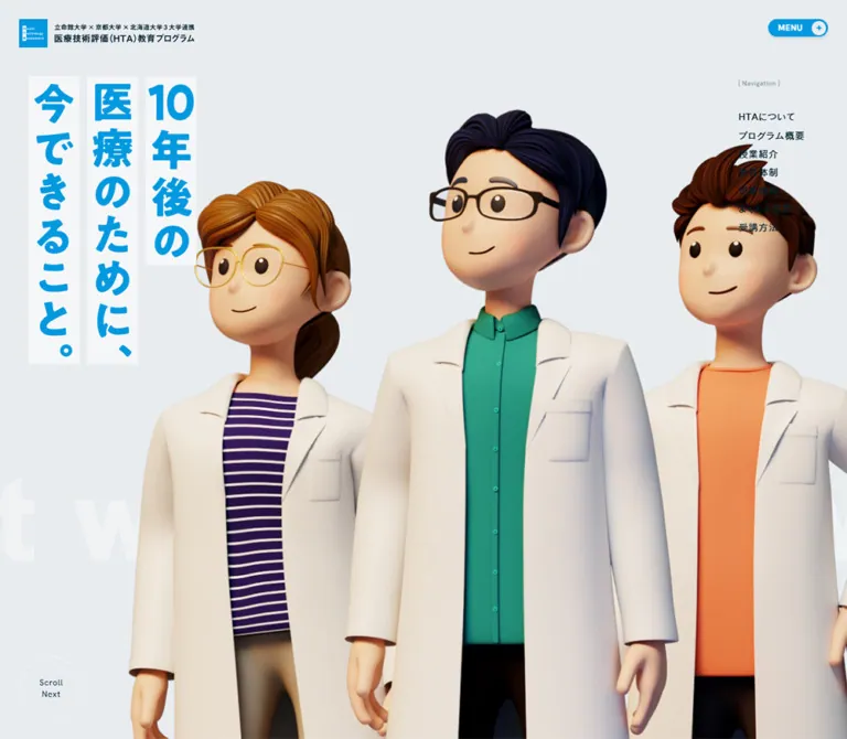
Role: introduce the future-facing medical theme through people and a memorable Japanese statement.
The desktop composition has four layers:
- A cool gray, viewport-sized opening field.
- Pale, oversized English text extending far beyond the viewport width.
- Three smooth 3D characters in white laboratory coats, filling the center and right and cropping at the lower edge.
- Bright blue Japanese lettering on three pale vertical strips at the left, with compact navigation in the upper-right area.
The quoted message is 10年後の医療のために、今できること。. Its vertical desktop reading order runs from the rightmost strip to the leftmost strip. The digits in 10 remain grouped. The characters have distinct clothing and silhouettes: a central figure with glasses and a teal shirt, a left figure with gold-colored glasses and a striped purple top, and a right figure with an orange top.
On mobile, the message changes to three horizontal strips near the top: 10年後の, 医療のために、, and 今できること。. Their measured group begins at (30,94) with 8px gaps. The visible bands have content-dependent widths rather than one uniform rectangle.
The phone capture contains a large empty middle region and pale English letters around the lower-middle area. No character artwork is visible. Preserve that observation as an unresolved state rather than inventing a phone crop of the desktop trio.
Scroll Next Control
Role: offer an explicit way to continue from the opening stage.
Desktop uses a transparent 108 × 108px circle at (32,860), with a fine white dashed perimeter and a two-line Scroll / Next label. Mobile uses a pale filled 106 × 30px capsule centered at (142,782), with Scroll Next on one line.
Both use Hanken Grotesk at 14px, 1.4 line height, and 0.05em tracking. The DOM identifies a button, but its click destination and scrolling behavior were not exercised.
Introductory HTA Narrative
Role: explain the need for evaluating medical technologies before introducing the training program.
Four short paragraph groups form a deliberately paced sequence. Desktop places them in a narrow 420px column toward the right; mobile centers a 295px column. Use the heavier Japanese family with generous 1.8 leading. The 75px gaps between groups remain unchanged in the supplied desktop and mobile measurements.
A navy HTAについて pill follows the prose and links to /about/.
Only DOM measurements are available for the full narrative composition. The mobile DOM places the first paragraph within the opening viewport’s coordinate range, but it is not visible in the opening image. Ancestor visibility or scene state therefore matters; those bounds are not proof of a visible text collision.
Compact Destination Pill
Role: provide a recognizable, repeated link treatment without oversized conversion buttons.
Anatomy: navy capsule, white Japanese label, 14px gap, and a pale circular icon compartment at the right. Measured padding is 4px 4px 4px 18px, and total height is 40px. The inner circle is approximately 32px, derived from the height minus vertical padding.
The プログラム概要 example measures approximately 187.86px wide. Width follows the label rather than a fixed button grid. Other examples lead to HTA information, the educational system, and the news index.
Arrow icons mark internal destination links. The footer contact pill uses a chain-style icon. Its supplied href is javascript:void(0);; no contact dialog, email reveal, or form result was observed.
Program Explanation Panel
Role: summarize the program’s audience and purpose in ordinary reading text.
The desktop DOM groups a 250px-wide heading area beside approximately 502px of explanatory copy. The heading uses 26px text and a small English annotation underneath. Mobile stacks these elements inside a 262px inner text column, reducing the heading to 22px and body to 15px.
The top of the desktop learning-section capture shows a fragment of the preceding white-outlined panel and a cropped photographic fragment with a rounded edge. The complete photograph and mask geometry are not available, so the panel should not be reconstructed from that fragment alone.
Learning-Section Heading
Role: announce the learning outcomes with a large graphic interruption in the page rhythm.
A tiny { Lesson Introduction } label sits at the upper left and a short English explanation sits at the upper right. Below them, the blue Japanese graphic プログラムで学べること spans almost the entire 1280px content width. The navy program-overview pill is right aligned beneath the graphic.
On mobile, the graphic wrapper scales to about 326 × 29.8px. The overview pill moves to the left on a lower row, while the English explanation wraps into two lines on the right. Do not impose one uniform text-heading component on these separate graphic and utility elements.
Numbered Learning Card
Role: connect each educational outcome to a memorable miniature scene.
The desktop layout contains three approximately 400px-wide cards separated by 40px gaps. Their positions step downward by 40px per column. Each card combines:
- A fine white rounded outline around an otherwise canvas-colored illustration area.
- A large pale numeral,
01,02, or03, interrupting the top border near the right side. The numeral wrapper is 80px tall, with canvas-colored backing and 10px horizontal padding. - A detailed isometric room illustration that occupies most of the upper area.
- A pale heading tab whose width follows the title content.
- A wider pale paragraph panel below, producing a stepped upper-right edge.
The scenes show a person studying at a wooden desk, a person reading in a room of books and storage, and a person presenting data on large screens. Keep the entire miniature base visible. These are independent scene objects, not rectangular photographs that should be cropped with cover.
Desktop headings use 26px type with 30px 40px 0 padding. Paragraphs use 16px text with 31px 40px padding. The measured paragraph starts 4px before the heading box ends, creating a seamless join between the two pale shapes.
Mobile stacks all three cards. The body panel becomes 324px wide inside the outline, headings become 22px, body becomes 15px, and horizontal padding becomes 32px. The DOM still contains all three outcomes; there is no evidence that they become a carousel.
Educational System Section
Role: describe the collaborating universities and research support available to participants.
The supplied DOM records a large graphic heading, small English annotations, white explanatory text, and a navy 教育体制 link. Desktop prose is 320px wide; mobile prose uses the 326px content frame. Section padding is unusually generous: 300px 0 373px on desktop and 164px 0 236px on mobile.
This section is not shown in a complete supplied screenshot. White computed text indicates a reversed-text composition, but its backing layers and full imagery cannot be specified confidently.
Mobile also exposes the text Touch Detail. It is evidence of an affordance, not proof of a particular gesture, tooltip, draggable scene, or carousel. Those behaviors remain unverified.
News List and Category Controls
Role: support repeat visits through recent teaching, research, and public-analysis updates.
Desktop places the news list on the left at x=160 with a width of 682px. The Information heading, category controls, and index link occupy a separate right-hand region. Four linked articles are present, with dates from April through September 2026.
Each row is a single anchor containing a heavier Japanese title, a muted excerpt, a compact category label, and a blue date. Desktop padding is 25px 0 32px. Titles use 20px / 28px; excerpt boxes are one line high in the supplied measurements. Long titles naturally create taller rows.
On mobile, the heading and filters appear above the list. The first three filter buttons share a row and the fourth wraps to a centered second row. Rows use 28px 16px 32px padding, 18px titles, and 14px excerpts with two-line-height boxes. The index link moves below the articles.
The four controls are labeled すべて, お知らせ, 研究紹介, and 公的分析. The default all-items control is navy while the others are muted. Desktop button height is approximately 38px; mobile height is approximately 29px. Filtering results, selected-state changes, and keyboard behavior were not tested.
Enrollment Banner
Role: provide a prominent route to eligibility, application, and registration information.
The desktop anchor occupies 1280 × 404px. Its blue composition reads as two adjacent rounded panels: a narrower left segment containing a circular English letter decoration and a right-pointing arrow, and a broad right segment containing the white heading プログラムの受講方法を見る. A fine dashed vertical seam separates the segments.
The left segment is approximately 280px wide by visual estimation. The right segment positions the heading 80px inward from the seam and 70px below the anchor’s top. A short Japanese explanation runs below, with a small { Take the Course } annotation near the right edge.
A detailed isometric city protrudes above and beyond the upper-right portion of the banner. Its external silhouette matters: clipping it to the rounded panel would remove a defining feature.
On mobile, the measured anchor becomes a 358 × 474.38px block with 20px radius and 48px 24px 47px padding. The heading measures 310 × 103.14px; the explanation becomes two lines at 15px / 21px. The supplied mobile footer capture shows only the banner’s lower portion, so the complete mobile city arrangement is unverified.
The whole banner links to /how/. It is an information gateway; no enrollment form was inspected.
Footer
Role: close the narrative while providing a complete secondary navigation route.
The footer switches to #F5F6F7. Desktop uses 160px of top padding and 80px at the bottom. The blue slogan 医療の未来がここから見えてくる。 occupies the left, while seven primary links are divided into two columns on the right. A third group contains privacy and related-institution links with small external-link marks.
A white dashed horizontal divider separates this navigation area from the lower brand row. The program identity is left aligned at 320 × 52px, and the contact pill sits at the lower right.
Mobile uses 96px top and 48px bottom padding. The slogan becomes two vertical columns at the left, while every primary link joins one right-hand column. External links and the contact pill continue beneath that column. The brand then centers below a full-width divider at 246 × 40px.
The mobile slogan’s extracted wrapper measures only 97 × 27px, while its visible lettering extends roughly 400px vertically. This is a clear case where the wrapper rectangle does not describe the complete visible graphic. Follow the screenshot’s vertical composition rather than that wrapper height.
Menu Content Defined in the DOM
Role: provide the expanded navigation structure associated with MENU.
The DOM contains another set of primary links, each paired with an English subtitle, plus external links and contact. Their measured arrangement is two columns. Japanese link sizes are 32px on desktop and 20px on mobile, with white computed text.
These values describe the underlying menu content, not a visually verified open-menu state. No expanded screenshot establishes the background, reveal shape, focus management, scroll locking, or close behavior. The button’s extracted text includes both MENU and CLOSE, but only MENU is visible in the supplied captures.
Tokens — Motion & Interaction
| Treatment | Supplied value | Evidence and limitation |
|---|---|---|
| Enrollment circular decoration | 60s linear infinite rotate360 |
Applied computed animation on desktop and mobile; direction and full cycle were not independently watched |
| Section reveal | 1100ms cubic-bezier(0.23,1,0.32,1) |
Applied opacity and transform transitions on sampled section elements |
| Reveal stagger | 140ms, 280ms, 420ms delays |
Measured on learning-section label, explanation, and overview link |
| Opening identity and headline visibility | 1400ms cubic-bezier(0.23,1,0.32,1) |
Applied opacity and visibility transitions |
| Scroll control appearance | Same 1400ms transition, with 2s delay |
Applied to its wrapper; exact trigger not exercised |
| Ordinary link hover | 290ms cubic-bezier(0.215,0.61,0.355,1) |
Applied color or opacity transitions; endpoint appearance not captured |
| MENU shadow | Same 290ms easing |
Applied box-shadow transition |
| MENU color change | 800ms cubic-bezier(0.23,1,0.32,1) |
Applied background and text-color transitions; open state not inspected |
| Menu link mask | 320ms cubic-bezier(0.215,0.61,0.355,1) |
Applied mask-position transition; visual mask effect unverified |
| News row feedback | 290ms with the ordinary hover easing |
Applied background-color and padding transitions; hover values not supplied |
| Scroll-change family | 1400ms, with image 500ms and video 300ms variants |
Declared custom properties; full scene choreography unverified |
| Sitemap transition | 800ms cubic-bezier(0.23,1,0.32,1) |
Declared token; completed menu transition not observed |
Other shared tokens include loading, ripple, scale-fade, accordion, carousel, and flick timings. Their presence does not prove that the inspected homepage exposes each corresponding feature. In particular, do not infer a lesson carousel from Swiper-related variables.
The English background phrases repeat six times in the extracted content and extend thousands of pixels horizontally. This establishes a repeating text track. Sampled paragraphs report animation: none; the evidence does not establish its movement mechanism, speed, or direction. A static cropped phrase is the safer starting point until its runtime behavior is verified.
For an adaptation, preserve the distinction between long, gently settling section entrances and short control feedback. Keep the rotating enrollment decoration slow. Avoid assigning dramatic movement to every illustration merely because shared animation variables exist.
Surfaces
| Layer | Appearance | Purpose |
|---|---|---|
| Main canvas | Cool gray #E8ECEF |
Provides continuity across long sections |
| Graphic headline bands | Pale rectangular strips | Separate the blue opening message from the gray field |
| Illustration frames | Canvas-colored interior with fine white perimeter | Organize miniature scenes without enclosing them in heavy boxes |
| Lesson text panels | Pale #F5F6F7, stepped outline, 10px corners |
Create readable bases beneath detailed images |
| Navigation pills | Navy fill, white text, pale circular end compartment | Provide compact, repeated destination cues |
| MENU | Blue fill and restrained shadow | Maintain a visible persistent utility |
| Enrollment region | Large blue field with white graphics | Give the route to course information greater prominence |
| Footer | Pale #F5F6F7 and a white dashed divider |
End the page with a quieter information area |
This is not a general elevation system. Broad flat fields and very fine outlines establish the interface; the 3D assets supply most of the dimensionality.
Imagery
The dominant assets are polished 3D illustrations with rounded character proportions, smooth skin and fabric shading, recognizable clothing, and carefully modeled environments. Human figures are friendly and simplified, while rooms, books, furniture, equipment, plants, and buildings carry considerable detail.
The three learning scenes share an isometric viewpoint and a visible floor or platform. Their materials vary meaningfully: warm wood for individual study, cool shelving and books for research, and blue screens and flooring for data presentation. Preserve the coherent camera angle, light direction, and scale when commissioning additional scenes.
The enrollment city expands the same miniature-world vocabulary from individual learning spaces to a larger medical and civic environment. It should read as a freestanding object with a visible base and an irregular skyline.
A partial photographic element is also visible above the desktop learning section. The page should therefore not be described as using illustration exclusively, although 3D artwork clearly dominates the supplied captures.
Observed Asset References
No original image URLs, file extensions, intrinsic image dimensions, or media manifest were supplied. Do not invent asset paths.
| Asset identified visually | Location | Reuse guidance |
|---|---|---|
| Blue square program mark and Japanese lockup | Opening header and footer | Use an authorized identity asset and provide an accessible home-link name |
| Three white-coated characters | Desktop opening | Preserve silhouettes, clothing colors, and foreground scale |
| Three Japanese headline strips | Desktop and mobile opening | Provide different writing-direction compositions while retaining the same message |
| Desk-study diorama | Learning outcome 01 | Keep the full room base and furniture silhouette |
| Library/research diorama | Learning outcome 02 | Retain shelves, books, storage, and the central figure |
| Data-presentation diorama | Learning outcome 03 | Preserve screens, presenter, plants, and blue platform |
| Isometric city | Enrollment banner | Allow intentional overlap outside the banner |
| Circular English letter decoration | Enrollment banner | Keep separate from the main heading so rotation does not affect readability |
| Closing Japanese slogan | Footer | Supply horizontal desktop and vertical mobile arrangements |
CSS can reproduce the layout and surface grammar. It cannot reproduce the identity carried by the custom lettering and 3D assets. Asset reuse requires appropriate authorization; rendering technology is not established by the screenshots alone.
Layout & Responsive Behavior
| Area | 1440 × 1000 observation | 390 × 844 observation |
|---|---|---|
| Header | 295px identity, 32px inset | 191px identity, 16px inset |
| MENU | 101 × 30px | Same size; does not shrink with the logo |
| Opening copy | Three vertical strips at left | Three horizontal strips across the upper area |
| Hero characters | Large trio across center and right | Not visible in the supplied state |
| Hero navigation | Seven links at upper right | Not visible |
| Scroll control | Lower-left dashed circle | Bottom-centered pale capsule |
| Program explanation | Heading and body in adjacent regions | Stacked in a narrower inner column |
| Learning outcomes | Three columns with 40px steps | Three stacked cards |
| Learning header utilities | Explanation and link toward right | Link left, wrapped English explanation right |
| News controls | Right of article list; vertical filter arrangement | Above article list; wrapping horizontal filters |
| News index link | In the right-hand control region | Centered below articles |
| Enrollment | Wide split composition | Taller block with 24px inner side padding |
| Footer slogan | Two horizontal lines | Two vertical columns |
| Footer navigation | Two primary columns plus external links | One right-hand column |
| Contact | Lower right beside the brand row | Under external links, above the brand divider |
| Footer identity | Left aligned | Centered |
Do not achieve the mobile version by scaling down the desktop page. The controls, reading columns, graphic orientations, and content order each follow different rules. Preserve normal document scrolling for the content sections, and isolate decorative horizontal overflow so the repeated English text does not create an unwanted page-wide horizontal scrollbar.
The exact behavior between the two supplied sizes remains unverified. Tablet layout, landscape phones, zoom, safe-area handling, and very narrow screens require additional testing. Document heights describe the captured content state, not targets to hardcode.
Do’s and Don’ts
Do
- Keep the main field cool gray, the ordinary text navy, and the interface accent blue.
- Maintain a strong scale contrast between tiny English annotations and large graphic Japanese headings.
- Treat the original display lettering as artwork with its own metrics.
- Preserve the hero’s right-to-left column reading order on desktop and horizontal reading order on mobile.
- Use miniature scenes with complete platform silhouettes and consistent isometric perspective.
- Keep learning-card outlines fine and white, with stepped pale text panels below.
- Retain the 40px desktop card stagger and remove the cross-column stagger when stacking.
- Use content-sized navy pills with a separate pale circular icon compartment.
- Let the enrollment city protrude beyond its blue panel.
- Preserve the footer’s distinctive vertical mobile slogan.
- Separate verified CSS timing from untested interactive behavior.
Don’t
- Don’t force this multi-page program homepage into a generic single-purpose sales-page template.
- Don’t replace the illustrated opening with unrelated medical stock photography.
- Don’t name a display font based on an empty heading wrapper’s inherited styles.
- Don’t crop the learning dioramas into generic rectangular thumbnails.
- Don’t add thick card borders, repeated heavy shadows, glass blur, or unrelated badge colors.
- Don’t make every action blue; the observed main-content link system is predominantly navy.
- Don’t shrink the 101px MENU control in proportion to the mobile logo.
- Don’t assume the absent mobile hero characters prove intentional permanent removal.
- Don’t report hidden menu geometry as a visually inspected expanded menu.
- Don’t invent filtering, contact, scene-dragging, or scroll-trigger results.
- Don’t copy source
remvalues into a conventional 16px-root project without conversion. - Don’t hardcode total page heights or infer visible collisions from offscreen DOM bounds.
Recommended Implementation Additions
These are recommendations for a new implementation, not verified features of the original:
- Provide accessible names for the logo link, graphic headings, and icon compartments. Repeated decorative English phrases should be hidden from assistive technology while their meaningful message remains available once.
- Use responsive image sources for lettering whose orientation changes. Preserve the Japanese text as an accessible equivalent rather than relying on filename-derived descriptions.
- Give MENU an expanded state and a controlled navigation region. When implementing an overlay, support Escape, focus return, and appropriate background interaction management.
- Expand the interactive hit areas around the 30px menu and scroll capsules and the small mobile filters. A 44px target can preserve the visible footprint while improving touch access.
- Use real links for destinations and buttons for local actions. Define the contact action explicitly instead of reproducing the observed inert href.
- Make news filters keyboard-operable and expose the current selection and updated result count.
- Check text contrast at actual sizes. Calculated from the solid supplied tokens, white against
#0399E0is approximately 3.16:1, and#0399E0against#E8ECEFis approximately 2.66:1. These token-pair calculations are not a complete audit of the rendered graphics. - Offer reduced-motion behavior for the rotating text, reveal transitions, and any later-verified moving background track. Content must remain visible if animation scripting fails.
- Reserve illustration space before assets load. Test the mobile hero separately to determine whether its empty illustrated area is the intended experience or an unresolved rendering state.
- Keep full article titles available. Any excerpt clamping should retain the complete article as the link destination.
Agent Prompt Guide
Quick Color Reference
- Main canvas:
#E8ECEF. - Main text and compact link fills:
#001F2D. - MENU and interaction accent:
#0399E0. - Lesson text panels and footer:
#F5F6F7. - Fine outlines and reversed details:
#FFFFFF. - Giant background phrases:
#F0F2F3. - Secondary text:
#7F8E96. - Illustration colors may be richer; keep those colors inside the artwork rather than spreading them across the interface.
Overall Prompt
“Create a Japanese educational program homepage inspired by the current HTA program site. Use a cool gray #E8ECEF canvas, navy #001F2D body text, bright blue graphic Japanese lettering, and pale #F5F6F7 text surfaces. Build a spacious opening with a small upper-left identity, a fixed 101 × 30px blue MENU capsule with a pale plus circle, vertical Japanese headline strips on desktop, and a large group of friendly white-coated 3D characters. Include tiny English annotations, an explanatory narrative, three staggered isometric learning scenes with white outlines and stepped text panels, a news list with category controls, a wide blue enrollment banner with a protruding miniature city, and a quiet footer. On mobile, change the hero lettering to horizontal strips, stack the learning cards, move news controls above the list, and make the footer slogan vertical. Keep display lettering assets distinct from live Cezanne-family body text. Treat unverified menu and scene behaviors as separate implementation work.”
Example Component Prompts
- Learning card: “Create an approximately 400px-wide medical education card with a 1px white outline on cool gray, a large pale
01numeral interrupting its top-right edge, and an uncropped isometric study-room scene. Add a content-width pale heading tab above a full-width pale paragraph panel, with 10px corners and a stepped upper-right outline. Use 26px Japanese heading text, 16px body text, and 40px horizontal padding. Stack the cards at phone widths and reduce text to 22px and 15px.” - Destination pill: “Create a compact 40px-tall navy capsule labeled
プログラム概要, with white 17px Japanese text, 18px left padding, a 14px gap, and a 32px pale circular compartment containing a navy right arrow. Let its width follow its content.” - Enrollment banner: “Create a 1280 × 404px desktop enrollment link formed from two adjoining blue rounded panels. Place a slow circular English letter decoration around a right arrow in the narrow left segment. Put a large white graphic Japanese heading and short supporting text in the wider segment. Allow an isometric city to overlap the upper-right edge. Recompose it as a tall 358px-wide block on a 390px phone.”
- Footer: “Create a pale gray footer with a blue Japanese slogan at left, two compact columns of navy primary links, related links at right, and a white dashed rule above the logo/contact row. On mobile, render the slogan in two vertical columns beside one navigation column, then place contact below the related links and center the logo beneath the divider.”
- News region: “Create a Japanese research-news list with navy 20px titles, muted single-line excerpts, category labels, and blue Hanken Grotesk dates. Put the Information heading and four capsule filters to its right on desktop. On mobile, move the heading and wrapping filters above 326px-wide rows, use 18px titles and two-line 14px excerpts, and place the index link below.”
Quick Start
CSS Custom Properties
This is an implementation scaffold, not the original stylesheet. It uses pixel values converted from the measured 10px source root so the host project can retain its normal root size. Intermediate-width formulas, the 350px/310px illustration stages, and fallback graphic approximations are recommendations. Font files and original artwork are not included.
Expected anatomy: a lesson contains number, illustration, heading, and paragraph siblings; the enrollment link contains a mark region, copy region, and optional overlapping city image. Graphic title elements contain responsive images. The hero’s desktop and mobile lettering require distinct compositions. This CSS does not implement the unknown hero-scene runtime, expanded menu, contact action, or news-filter logic.
:root {
  /* Measured palette, exposed through adaptation aliases. */
  --hta-bg: #e8ecef;
  --hta-surface: #f5f6f7;
  --hta-ink: #001f2d;
  --hta-blue: #0399e0;
  --hta-white: #ffffff;
  --hta-ghost: #f0f2f3;
  --hta-muted: #7f8e96;

  /* Declared source families; supply licensed font files separately. */
  --hta-jp: 'CezannePro-M', system-ui, sans-serif;
  --hta-jp-strong: 'CezannePro-DB', system-ui, sans-serif;
  --hta-latin: 'Hanken Grotesk', sans-serif;
  --hta-body-size: 16px;
  --hta-heading-size: 26px;
  --hta-caption-size: 11px;
  --hta-leading: 1.8;
  --hta-tracking: 0.05em;

  --hta-frame-max: 1280px;
  --hta-gutter: clamp(32px, 5.5556vw, 80px);
  --hta-card-radius: 10px;
  --hta-panel-radius: 20px;
  --hta-pill-radius: 1000px;
  --hta-shadow: 0 4px 4px rgb(0 31 45 / 10%);
  --hta-shadow-hover: 0 8px 8px rgb(0 31 45 / 10%);

  --hta-ease-out: cubic-bezier(0.215, 0.61, 0.355, 1);
  --hta-ease-reveal: cubic-bezier(0.23, 1, 0.32, 1);
  --hta-hover: 290ms var(--hta-ease-out);
  --hta-reveal: 1100ms var(--hta-ease-reveal);
}

.hta-site,
.hta-site *,
.hta-site *::before,
.hta-site *::after {
  box-sizing: border-box;
}

.hta-site {
  color: var(--hta-ink);
  background: var(--hta-bg);
  font-family: var(--hta-jp);
  font-size: var(--hta-body-size);
  font-weight: 500;
  line-height: var(--hta-leading);
  letter-spacing: var(--hta-tracking);
  overflow-x: clip;
}

.hta-frame {
  width: min(
    var(--hta-frame-max),
    calc(100% - 2 * var(--hta-gutter))
  );
  margin-inline: auto;
}

.hta-header-brand {
  position: absolute;
  z-index: 20;
  top: 32px;
  left: 32px;
  width: 295px;
}

.hta-header-brand img,
.hta-graphic-title img,
.hta-hero-copy img {
  display: block;
  width: 100%;
  height: auto;
}

.hta-menu {
  position: fixed;
  z-index: 100;
  top: 32px;
  right: 32px;
  display: flex;
  align-items: center;
  justify-content: space-between;
  width: 101px;
  height: 30px;
  padding: 3px 3px 3px 17px;
  border: 0;
  border-radius: var(--hta-pill-radius);
  color: var(--hta-white);
  background: var(--hta-blue);
  box-shadow: var(--hta-shadow);
  font: 600 14px / 1 var(--hta-latin);
  letter-spacing: 0.05em;
  cursor: pointer;
  transition: box-shadow var(--hta-hover);
}

.hta-menu .hta-circle {
  width: 24px;
  height: 24px;
  color: var(--hta-blue);
}

.hta-circle {
  display: grid;
  place-items: center;
  flex: none;
  width: 32px;
  height: 32px;
  border-radius: 50%;
  color: var(--hta-ink);
  background: var(--hta-bg);
}

.hta-hero {
  position: relative;
  min-height: 100svh;
  overflow: clip;
}

.hta-hero-copy {
  position: absolute;
  z-index: 2;
  top: 128px;
  left: 48px;
  width: 282px;
  margin: 0;
}

.hta-hero-nav {
  position: absolute;
  z-index: 3;
  top: 135px;
  right: 71px;
  font-size: 16px;
  line-height: 1;
}

.hta-hero-nav ul {
  display: grid;
  gap: 15px;
  margin: 43px 0 0;
  padding: 0;
  list-style: none;
}

.hta-hero-nav a,
.hta-footer a {
  color: inherit;
  text-decoration: none;
}

.hta-ticker {
  position: absolute;
  top: 60%;
  left: 0;
  margin: 0;
  color: var(--hta-ghost);
  font: 800 200px / 1 var(--hta-latin);
  letter-spacing: 0.02em;
  white-space: nowrap;
  pointer-events: none;
  /* Keep static until movement behavior has been verified. */
}

.hta-scroll {
  position: absolute;
  z-index: 3;
  left: 32px;
  bottom: 32px;
  display: grid;
  place-items: center;
  width: 108px;
  height: 108px;
  padding: 0;
  border: 1px dashed var(--hta-white);
  border-radius: 50%;
  color: var(--hta-ink);
  background: transparent;
  font: 400 14px / 1.4 var(--hta-latin);
  letter-spacing: 0.05em;
  cursor: pointer;
}

.hta-eyebrow {
  margin: 0;
  font: 400 var(--hta-caption-size) / 1 var(--hta-latin);
  letter-spacing: 0.05em;
}

.hta-graphic-title {
  margin: 0;
}

.hta-pill {
  display: inline-flex;
  align-items: center;
  gap: 14px;
  width: fit-content;
  min-height: 40px;
  padding: 4px 4px 4px 18px;
  border: 0;
  border-radius: var(--hta-pill-radius);
  color: var(--hta-white);
  background: var(--hta-ink);
  font: 500 17px / 1 var(--hta-jp-strong);
  letter-spacing: 0.05em;
  text-decoration: none;
  cursor: pointer;
}

.hta-lessons {
  display: grid;
  grid-template-columns: repeat(3, minmax(0, 1fr));
  align-items: start;
  gap: 40px;
}

.hta-lesson {
  position: relative;
  min-width: 0;
  border: 1px solid var(--hta-white);
  border-radius: var(--hta-card-radius);
}

.hta-lesson:nth-child(2) { margin-top: 40px; }
.hta-lesson:nth-child(3) { margin-top: 80px; }

.hta-lesson-number {
  position: absolute;
  z-index: 2;
  top: -40px;
  right: 28px;
  margin: 0;
  padding-inline: 10px;
  color: var(--hta-surface);
  background: var(--hta-bg);
  font: 800 80px / 1 var(--hta-latin);
  letter-spacing: -0.04em;
  -webkit-text-stroke: 1px var(--hta-white);
  /* Live-text approximation; original numeral glyph metrics are unknown. */
}

.hta-lesson-art {
  display: grid;
  place-items: center;
  height: 350px;
}

.hta-lesson-art img {
  display: block;
  width: min(100%, 324px);
  height: 100%;
  object-fit: contain;
}

.hta-lesson-title {
  position: relative;
  width: fit-content;
  max-width: 100%;
  margin: 0;
  padding: 30px 40px 0;
  border-radius: 10px 10px 0 0;
  background: var(--hta-surface);
  font: 500 var(--hta-heading-size) / 1.4 var(--hta-jp-strong);
  letter-spacing: 0.06em;
}

.hta-lesson-body {
  margin: -4px 0 0;
  padding: 31px 40px;
  border-radius: 0 10px 10px;
  background: var(--hta-surface);
}

.hta-information {
  display: grid;
  grid-template-columns: minmax(0, 682px) minmax(220px, 278px);
  justify-content: space-between;
  gap: 80px;
  max-width: 1120px;
  margin-inline: auto;
}

.hta-news-list {
  grid-column: 1;
  grid-row: 1;
}

.hta-information-head {
  grid-column: 2;
  grid-row: 1;
}

.hta-news-row {
  display: block;
  padding: 25px 0 32px;
  color: inherit;
  text-decoration: none;
  /* Separator choice is an adaptation; source news borders were not supplied. */
  border-bottom: 1px solid var(--hta-white);
}

.hta-news-title {
  margin: 0;
  font: 500 20px / 1.4 var(--hta-jp-strong);
}

.hta-news-excerpt {
  display: -webkit-box;
  margin: 12px 0 18px;
  overflow: hidden;
  color: var(--hta-muted);
  font-size: 16px;
  line-height: 1.4;
  -webkit-box-orient: vertical;
  -webkit-line-clamp: 1;
}

.hta-news-date {
  color: var(--hta-blue);
  font: 400 14px / 1 var(--hta-latin);
}

.hta-filters {
  display: flex;
  flex-direction: column;
  align-items: center;
  gap: 5px;
}

.hta-filter {
  padding: 11px 17px;
  border: 1px solid transparent;
  border-radius: var(--hta-pill-radius);
  color: var(--hta-muted);
  background: transparent;
  font: inherit;
  line-height: 1;
  cursor: pointer;
}

.hta-filter[aria-pressed='true'] {
  color: var(--hta-ink);
  border-color: currentColor;
  /* Explicit accessible state is a recommended implementation. */
}

.hta-course {
  position: relative;
  display: grid;
  grid-template-columns: 280px minmax(0, 1fr);
  min-height: 404px;
  color: var(--hta-white);
  text-decoration: none;
}

.hta-course-mark,
.hta-course-copy {
  border-radius: var(--hta-panel-radius);
  background: var(--hta-blue);
}

.hta-course-mark {
  display: grid;
  place-items: center;
  border-right: 1px dashed var(--hta-white);
}

.hta-course-ring {
  animation: hta-rotate 60s linear infinite;
}

.hta-course-copy {
  padding: 70px 80px;
}

.hta-course-title {
  display: block;
  width: min(100%, 564px);
  height: auto;
}

.hta-course-copy p {
  margin: 45px 0 0;
  font-size: 20px;
  line-height: 1.4;
}

.hta-course-city {
  position: absolute;
  top: -40px;
  right: -80px;
  width: min(39vw, 500px);
  height: auto;
  pointer-events: none;
  /* Approximate desktop placement; fit to the actual authorized asset. */
}

.hta-footer {
  padding: 160px 0 80px;
  background: var(--hta-surface);
}

.hta-footer-grid {
  display: grid;
  grid-template-columns: minmax(0, 1fr) 265px 262px;
  grid-template-areas:
    'message nav external'
    'bottom bottom bottom';
  column-gap: 60px;
}

.hta-footer-message { grid-area: message; width: 343px; }
.hta-footer-nav { grid-area: nav; }
.hta-footer-external { grid-area: external; }

.hta-footer-message img {
  display: block;
  width: 100%;
  height: auto;
}

.hta-footer-nav {
  display: grid;
  grid-template-columns: max-content max-content;
  gap: 60px;
  font: 500 16px / 1 var(--hta-jp-strong);
}

.hta-footer-nav ul {
  display: grid;
  align-content: start;
  gap: 20px;
  margin: 0;
  padding: 0;
  list-style: none;
}

.hta-footer-nav a { display: block; padding-block: 3px; }

.hta-footer-external {
  display: grid;
  align-content: start;
  gap: 21px;
  font-size: 14px;
  line-height: 1.4;
}

.hta-footer-bottom {
  grid-area: bottom;
  display: flex;
  align-items: center;
  justify-content: space-between;
  margin-top: 54px;
  padding-top: 62px;
  border-top: 1px dashed var(--hta-white);
}

.hta-footer-brand img {
  display: block;
  width: 320px;
  height: auto;
}

@keyframes hta-rotate {
  to { transform: rotate(360deg); }
}

@media (hover: hover) {
  .hta-menu:hover { box-shadow: var(--hta-shadow-hover); }
  .hta-hero-nav a:hover { color: var(--hta-blue); }
  .hta-news-row:hover .hta-news-title { color: var(--hta-blue); }
  /* These hover endpoints are adaptation choices. */
}

.hta-site :focus-visible {
  outline: 3px solid var(--hta-ink);
  outline-offset: 4px;
}

@media (max-width: 767px) {
  :root {
    --hta-gutter: 32px;
    --hta-body-size: 15px;
    --hta-heading-size: 22px;
    --hta-caption-size: 10px;
  }

  .hta-header-brand { top: 15px; left: 16px; width: 191px; }
  .hta-menu { top: 16px; right: 16px; }
  .hta-hero-nav { display: none; }

  .hta-hero-copy {
    top: 94px;
    left: 30px;
    width: min(326px, calc(100% - 60px));
    /* Supply horizontal mobile lettering, not the desktop vertical asset. */
  }

  .hta-ticker { top: 54.5%; font-size: 160px; }

  .hta-scroll {
    left: 50%;
    width: 106px;
    height: 30px;
    transform: translateX(-50%);
    border: 0;
    border-radius: var(--hta-pill-radius);
    background: var(--hta-surface);
  }

  .hta-lessons { grid-template-columns: 1fr; gap: 64px; }
  .hta-lesson:nth-child(n) { margin-top: 0; }
  .hta-lesson-number { right: 16px; }
  .hta-lesson-art { height: 310px; }
  .hta-lesson-title { padding: 25px 32px 0; }
  .hta-lesson-body { padding: 22px 32px 23px; }

  .hta-information { display: flex; flex-direction: column; gap: 64px; }
  .hta-information-head { order: -1; }
  .hta-news-row { padding: 28px 16px 32px; }
  .hta-news-title { font-size: 18px; }
  .hta-news-excerpt { font-size: 14px; -webkit-line-clamp: 2; }
  .hta-news-date { font-size: 12px; }
  .hta-filters { flex-direction: row; flex-wrap: wrap; justify-content: center; }
  .hta-filter { padding: 8px 13px; font-size: 13px; }

  .hta-course {
    display: block;
    width: calc(100% - 32px);
    min-height: 474px;
    margin-inline: auto;
    padding: 48px 24px 47px;
    border-radius: 20px;
    background: var(--hta-blue);
  }

  .hta-course-mark { min-height: 150px; border: 0; }
  .hta-course-copy { position: relative; padding: 20px 0 0; }
  .hta-course-title { width: 100%; }
  .hta-course-copy p { margin-top: 26px; font-size: 15px; }

  .hta-course-city {
    top: -24px;
    right: -16px;
    width: 48%;
    /* Mobile placement is provisional; the full mobile banner was not shown. */
  }

  .hta-footer { padding: 96px 0 48px; }
  .hta-footer-grid {
    grid-template-columns: minmax(0, 1fr) minmax(0, 161px);
    grid-template-areas:
      'message nav'
      'message external'
      'message contact'
      'brand brand';
    column-gap: 12px;
  }

  .hta-footer-message { width: 97px; margin-left: 16px; }
  .hta-footer-nav { grid-template-columns: 1fr; gap: 20px; font-size: 14px; }
  .hta-footer-nav a { padding: 0; }
  .hta-footer-external { margin-top: 42px; gap: 17px; font-size: 12px; }
  .hta-footer-bottom { display: contents; }
  .hta-footer-contact { grid-area: contact; margin-top: 44px; font-size: 15px; }

  .hta-footer-brand {
    grid-area: brand;
    display: flex;
    justify-content: center;
    margin-top: 46px;
    padding-top: 50px;
    border-top: 1px dashed var(--hta-white);
  }

  .hta-footer-brand img { width: min(246px, 100%); }
}

@media (prefers-reduced-motion: reduce) {
  .hta-site *,
  .hta-site *::before,
  .hta-site *::after {
    animation: none !important;
    transition: none !important;
    scroll-behavior: auto !important;
  }
}
Use a real button for .hta-menu and .hta-filter, and real anchors for .hta-pill, article rows, and the enrollment banner. Put the mobile news-index link after the list through the surrounding layout. For the footer scaffold, .hta-footer-bottom contains the brand and contact elements; its mobile display: contents lets those children occupy separate grid areas.
The starter intentionally keeps content visible by default. If adding reveal scripting, introduce hidden entrance states only after the script is ready, and restore visibility under reduced motion.
Tailwind v4 Token Mapping
Optional aliases for projects already using Tailwind v4. This does not imply that the original site uses Tailwind. Define the preceding custom properties first.
@theme inline {
  --color-hta-canvas: var(--hta-bg);
  --color-hta-panel: var(--hta-surface);
  --color-hta-navy: var(--hta-ink);
  --color-hta-accent: var(--hta-blue);
  --color-hta-ghost: var(--hta-ghost);
  --color-hta-muted: var(--hta-muted);

  --font-hta-body: var(--hta-jp);
  --font-hta-emphasis: var(--hta-jp-strong);
  --font-hta-utility: var(--hta-latin);

  --text-hta-body: var(--hta-body-size);
  --text-hta-heading: var(--hta-heading-size);
  --text-hta-caption: var(--hta-caption-size);

  --spacing-hta-gutter: var(--hta-gutter);
  --spacing-hta-card-gap: 40px;
  --radius-hta-card: var(--hta-card-radius);
  --radius-hta-panel: var(--hta-panel-radius);
  --radius-hta-pill: var(--hta-pill-radius);
  --shadow-hta-menu: var(--hta-shadow);
}
Sources & Evidence
- Current HTA Educational Program homepage: original and final URL; supplied HTTP status 200; source of the current-page screenshots, rendered text, link destinations, element rectangles, computed styles, and CSS custom properties used here.
- Evidence retrieval: September 12, 2026, at
2026-09-12T07:14:44.035Z. The supplied record does not provide separate timestamps for individual images. - Desktop: 1440 × 1000 CSS pixels; opening, learning-section, and enrollment/footer captures; measured document height approximately 8316px.
- Mobile: 390 × 844 CSS pixels; opening and footer captures; measured document height 8951px.
- Capture method reported by the supplied evidence: initial observation of at least five seconds, bounded checks for document load, visible-image decoding, finite animation completion, and sampled layout/text stability. Intermediate scroll positions were traversed. Perpetual animations were temporarily paused during readiness checks and then resumed. These checks do not establish semantic or visual completeness of every delayed layer.
- Interaction evidence: applied CSS transitions and the enrollment decoration’s computed rotation are available. No menu expansion, category selection, contact activation, Scroll Next click, or Touch Detail interaction result was supplied.
- Limitations: no additional browsing or file inspection was performed for this reference. Asset URLs, full media implementation, several middle-section visuals, actual expanded overlays, intermediate viewport behavior, and the cause of the absent mobile hero characters remain unverified. SharedWorkers and service workers were disabled in the supplied inspection environment.
This document describes the current supplied homepage evidence. Its responsive comparisons are observations at two actual viewports; the reusable CSS, accessibility additions, and explicitly provisional placements are recommendations rather than claims about recovered source implementation.
# HTA Educational Program — Style Reference

> A spacious medical education website where vivid blue lettering and miniature 3D worlds make a technical subject approachable.

**Website:** [hta-program.jp](https://hta-program.jp/)
**Original URL:** https://hta-program.jp/
**Final URL:** https://hta-program.jp/
**Theme:** light, with a cool gray canvas, navy text, bright blue graphics, and pale secondary surfaces.
**Inspected:** September 12, 2026. The supplied browser evidence records retrieval at `2026-09-12T07:14:44.035Z`, or 16:14:44 JST. Individual screenshot timestamps were not supplied.
**Viewports:** 1440 × 1000 and 390 × 844 CSS pixels.
**Scope:** the current educational program homepage: opening composition, introductory HTA narrative, program explanation, three learning outcomes, educational system section, news list and category controls, enrollment link, and footer. Three desktop captures and two mobile captures provide visual evidence; the rendered DOM provides additional measurements across the page. Linked subpages and expanded interaction states were not inspected.

This is the homepage of a multi-page educational program website. It introduces HTA, explains postgraduate training, presents research and program updates, and directs visitors toward course information. The original page states that 立命館大学, 京都大学, and 北海道大学 jointly operate the program. Its structure supports both exploration and practical information retrieval.

The design places unusually large, expressive Japanese lettering against a restrained interface. Cool gray space surrounds smooth 3D medical characters, detailed miniature rooms, and a small city model. Navy text and compact capsule links keep navigation legible without competing with the artwork. Small English annotations, white outlines, oversized numerals, and deliberate asymmetry give the page a consistent graphic rhythm.

Responsive design changes the composition substantially. The desktop hero uses vertical Japanese strips; the phone uses horizontal strips. Three staggered learning cards become a vertical sequence. The footer makes the opposite typographic change: its horizontal desktop slogan becomes two vertical columns on mobile.

## How to Read This Reference

- **Measured** means a value was supplied in rendered element geometry, computed styles, or CSS custom properties. Measurements are CSS pixels unless stated otherwise.
- **Visually observed** means the feature is visible in an attached current-page capture. Approximate dimensions inferred from an image are labeled estimates.
- **Declared** motion and design tokens establish available CSS values, but do not prove that every associated behavior was exercised.
- **Recommended** values and code are implementation guidance. They are not recovered source code.
- Several prominent headings have empty text wrappers in the extraction. Their visible lettering is graphic, but its asset format was not supplied. A wrapper’s computed `font-size` does not identify the size or font of that lettering.
- Nonzero DOM bounds do not establish visibility. Hidden navigation, clipped layers, and unrevealed content can still have measurable rectangles.
- The mobile opening capture contains the headline, pale oversized English text, and scroll control, but no visible 3D characters. The reason is undetermined. This reference does not assume that the characters are permanently removed on phones.

## Tokens — Colors

### Default Palette

The aliases below are for reuse. Source names are included where available.

| Name | Value | Source evidence | Role |
| --- | --- | --- | --- |
| Cool canvas | `#E8ECEF` | `--color-bg`; computed body background | Main page field and exposed space around the illustrations |
| Medical blue | `#0399E0` | `--color-hover`, `--color-current`; computed MENU background and news dates | Persistent menu control, interaction accent, and reference color for the blue graphic family |
| Deep navy | `#001F2D` | `--color-txt`, `--color-bg2`; computed text and pill backgrounds | Japanese text, navigation, icons, and compact destination links |
| Pale surface | `#F5F6F7` | `--color-bg3`, `--color-txt4`; computed card text panels, footer, and mobile scroll button | Subtle separation from the main gray field |
| White | `#FFFFFF` | `--color-line`, `--color-bg4`; computed reversed text | Fine frames, reversed labels, enrollment lettering, and small icon details |
| Ghost lettering | `#F0F2F3` | `--color-txt5`; computed oversized English text | Low-contrast background typography |
| Muted slate | `#7F8E96` | `--color-txt3`; computed captions and news excerpts | Secondary information and inactive category labels |
| Soft navy shadow | `rgba(0,31,45,0.10)` | `--color-shadow` | Restrained elevation around small controls |

The blue Japanese display lettering visually belongs to the same family as Medical blue, but its internal graphic fill was not separately measured. Likewise, the enrollment anchor itself computes as transparent while its child layers visibly form a blue panel. Use `#0399E0` as an adaptation color without claiming that every graphic pixel or internal panel layer uses that exact value.

The pale bands behind the opening Japanese copy appear close to the secondary surface color. Their individual fills were not included in the supplied computed styles.

### Supporting Colors

| Source token | Value | Evidence boundary |
| --- | --- | --- |
| `--color-main4` | `#68C2EC` | Declared supporting blue; component usage not established by the captures |
| `--color-bg8` | `#E6F5FC` | Declared pale blue surface |
| `--color-bg9` | `#CDEBF9` | Declared stronger pale blue surface |
| `--color-bg7` | `#334C57` | Declared secondary dark surface |
| `--color-line4` | `#CCD2D5` | Declared gray rule color |
| `--color-line5` | `#E6E9EB` | Declared lighter rule color |

These secondary tokens should not become a rainbow of independent component colors. Orange, teal, purple, green, and warm brown are prominent inside the illustrations; the surrounding interface remains tightly controlled.

### Theme Presets

Only the light presentation is documented. No theme selector or alternate user-selectable palette was observed. Reversed text in individual sections is a local surface treatment, not evidence of a dark mode.

## Tokens — Typography

### Japanese Body and Navigation

- **Measured family:** `CezannePro-M`, corresponding to source `--font-gothic`.
- **Measured weight:** `500` on sampled Japanese body text and ordinary navigation.
- **Typical body tracking:** `0.05em`.
- **Typical paragraph leading:** `1.8`.
- **Character:** clear, compact Japanese sans-serif text that remains subordinate to the display graphics.

### Japanese Emphasis

- **Measured family:** `CezannePro-DB`, corresponding to source `--font-gothic-600`.
- **Measured weight:** still `500` in the sampled computed styles.
- **Roles:** explanatory headings, lesson headings, news titles, footer navigation, and navy pill labels.

The heavier appearance is associated with a different declared family. Do not translate the source token’s name into an unsupported claim that every emphasized element uses CSS `font-weight: 600`.

### English Annotations and Background Text

- **Measured family:** `'Hanken Grotesk', sans-serif`.
- **Utility weight:** `400`.
- **Background phrase weight:** `800`.
- **Utility tracking:** usually `0.05em`.
- **Background phrase tracking:** `0.02em`.

Small English text often appears with braces, as in `{ Lesson Introduction }` and `{ Take the Course }`. The oversized phrases use the same Latin family at a dramatically larger scale, creating a pale typographic layer behind foreground content.

### Graphic Japanese Lettering

The opening message, oversized learning-section heading, enrollment heading, and footer slogan have visibly thick, expressive letterforms. The exact typeface or construction method is unverified. Their appearance must not be attributed to Cezanne merely because the surrounding element inherits that family.

For a faithful implementation, use authorized responsive lettering assets where available. If rebuilding with live text, treat the chosen display font and its metrics as a replacement, and preserve the original reading order and text alternatives.

### Type Scale

| Role | Desktop measurement | Mobile measurement | Tracking / notes |
| --- | --- | --- | --- |
| English section annotation | `11px / 11px` | `10px / 10px` | `0.05em` |
| Multiline English explanation | `11px / 15.4px` | `10px / 14px` | `0.05em` |
| Visible desktop hero navigation | `16px / 16px` | Not visible in the mobile opening | `0.05em` |
| Introductory narrative | `20px / 36px` | `18px / 32.4px` | CezannePro-DB; `0.05em` |
| Program and lesson headings | `26px / 36.4px` | `22px / 30.8px` | CezannePro-DB; `0.06em` |
| Main explanatory paragraphs | `16px / 28.8px` | `15px / 27px` | CezannePro-M; `0.05em` |
| News titles | `20px / 28px` | `18px / 25.2px` | CezannePro-DB; `0.05em` |
| News excerpts | `16px / 22.4px` | `14px / 19.6px` | Muted slate |
| News dates | `14px / 14px` | `12px / 12px` | Hanken Grotesk; blue |
| Standard destination pill | `17px / 17px` | `17px / 17px` in sampled main-content links | `0.05em` |
| Contact pill | `17px / 17px` | `15px / 15px` | Its geometry otherwise remains 40px tall |
| Footer primary navigation | `16px / 16px` | `14px / 14px` | Heavier Japanese family |
| Footer external links | `14px / 19.6px` | `12px / 16.8px` | Regular Japanese family |
| Hero English background phrase | `200px / 200px` | `160px / 160px` | Weight 800; `0.02em` |
| Lower English background phrase | `120px / 120px` | `96px / 96px` | Weight 800; `0.02em` |

The visible MENU label appears approximately 14px tall in the captures. The measured button wrapper inherits a 10px font; its inner label’s computed style was not supplied, so 10px should not be reported as the visible label size.

### Graphic Dimensions Instead of Font Sizes

| Graphic wrapper | Desktop | Mobile | Interpretation |
| --- | --- | --- | --- |
| Opening Japanese copy group | `282 × 484px` | `360 × 208px` | Mobile wrapper reaches the viewport edge; visible strips occupy less width |
| Learning-section display heading | Approximately `1280 × 117px` | Approximately `326 × 29.8px` | Nearly identical aspect ratio, consistent with proportional graphic scaling |
| Enrollment heading | `564 × 187.66px` | `310 × 103.14px` | Same aspect ratio at both widths |
| Information heading | Approximately `195 × 201px` | Approximately `255 × 60px` | Different wrapper proportions; do not assume simple scaling |

## Tokens — Spacing & Shapes

### Responsive Unit

The root font size is **10px at both inspected viewports**, making one source `rem` equal to 10px at those sizes. No complete root-scaling formula was supplied.

The source declares reference dimensions of `1440 × 960` on desktop and `390 × 662` on mobile. These are design-reference tokens, not the actual inspected viewport dimensions. The actual heights were 1000px and 844px respectively.

Breakpoint tokens identify `767` and `768` as the mobile/desktop boundary. The quick start uses a 767px maximum-width query as a practical adaptation; behavior exactly at the boundary and at intermediate widths was not visually tested.

### Spacing Scale

| Use | Desktop | Mobile | Status |
| --- | --- | --- | --- |
| Header edge inset | `32px` | `16px`; logo top `15px` | Measured |
| Main content side inset | `80px` | Usually `32px` | Measured across sampled sections |
| Opening headline left inset | `48px` | `30px` | Measured |
| Opening copy strip gap | `12px` | `8px` | Measured |
| Learning-card column gap | `40px` | Cards stack | Derived from adjacent measured positions |
| Learning-card stagger | `0 / 40 / 80px` | No cross-column stagger | Derived from matching number and text positions |
| Lesson heading horizontal padding | `40px` | `32px` | Measured |
| Lesson heading top padding | `30px` | `25px` | Measured |
| Narrative paragraph separation | `75px` | `75px` | Derived from successive paragraph bounds |
| Pill icon-to-text gap | `14px` | `14px` | Measured |
| Footer top / bottom padding | `160px / 80px` | `96px / 48px` | Measured |

Large section intervals are part of the composition. For example, the learning section starts 240px after the program explanation’s measured desktop end, versus 164px on mobile. Other section bounds overlap, so these examples should not be converted into one universal section-gap rule.

### Border Radius and Rules

| Element / source token | Value | Interpretation |
| --- | --- | --- |
| Capsule controls / `--radius-max` | `1000px` | Fully rounded menu, destination links, filters, and scroll controls |
| Lesson text panels / `--radius-xxs` | `1rem = 10px` | Measured top and stepped lower text surfaces |
| `--radius-xxxs` | `0.5rem = 5px` | Declared small radius; visible use not established |
| `--radius-xs2` | `2rem = 20px` | Declared large radius; mobile enrollment anchor measures 20px |
| `--radius-xs` | Desktop `1.8em`; mobile `1.35rem` | Desktop value is context-dependent; mobile equals 13.5px at the inspected root |
| Standard white rule | `max(1px, 0.1rem)` | Resolves to 1px at the inspected root |
| Desktop scroll ring | White dashed circular outline | Visually observed |
| Footer divider | Fine white dashed rule | Visually observed |

### Shadows

The source declares a small shadow of `0 4px 4px 0 rgba(0,31,45,0.10)` and a hover variant of `0 8px 8px 0 rgba(0,31,45,0.10)`. The MENU control visibly carries a soft shadow and computes a shadow transition.

A larger `8px 8px 24px` shadow is also declared, but its use is not established. Avoid applying it to every content block. Most depth comes from the rendered illustrations, not from elevated UI cards.

### Layout Measurements

| Element | Desktop | Mobile |
| --- | --- | --- |
| Document height | `8316.16px` | `8951px` |
| Header identity | `295 × 48px` at `(32,32)` | `191 × 31.06px` at `(16,15)` |
| MENU control | `101 × 30px` at `(1307,32)` | `101 × 30px` at `(273,16)` |
| Standard content frame | `1280px` wide | `326px` wide |
| Learning-card outer width | Approximately `400px` | Approximately `326px` |
| Learning-card body width | `398px` | `324px` |
| Narrative text column | `420px` wide at x=1020 | `295px` wide at x=47.5 |
| News list | `682px` wide at x=160 | `326px` row width; `294px` inner text width |
| Enrollment anchor | `1280 × 404px` | `358 × 474.38px` |
| Footer logo | `320 × 52.06px` | `246 × 40.02px`, centered at x=72 |

## Components

### Overlay Identity and MENU Control

**Role:** establish program identity while keeping navigation available throughout the long page.

The opening places a small blue square identity mark beside a two-line Japanese program lockup. It sits directly on the canvas without a full-width header bar. The supplied header container has zero layout height, consistent with independently positioned header content.

The MENU button remains at the same viewport corner across the supplied scrolled captures. Its visible footprint is 101 × 30px on both desktop and mobile; the edge inset changes from 32px to 16px. Use a blue capsule containing a white label and a pale circular plus compartment. Padding is `3px 3px 3px 17px`; a 24px inner circle follows from the measured height and vertical padding.

The opening identity is not present in the supplied lower-page captures. Do not make the entire logo-and-menu group permanently visible just because the menu persists.

### Desktop Hero Navigation

**Role:** expose the site’s main information architecture immediately on a wide screen.

A small gray English `Navigation` annotation sits above seven navy Japanese links at the upper right. The first link begins at approximately x=1258, y=189. Links use 16px text, 0.05em tracking, and a 31px vertical pitch.

The destinations are `HTAについて`, `プログラム概要`, `授業紹介`, `教育体制`, `更新情報`, `よくある質問`, and `受講方法`. They lead to separate pages. This group is absent from the mobile opening capture, where the MENU button supplies the visible navigation entry point.

### Opening Hero

**Role:** introduce the future-facing medical theme through people and a memorable Japanese statement.

The desktop composition has four layers:

1. A cool gray, viewport-sized opening field.
2. Pale, oversized English text extending far beyond the viewport width.
3. Three smooth 3D characters in white laboratory coats, filling the center and right and cropping at the lower edge.
4. Bright blue Japanese lettering on three pale vertical strips at the left, with compact navigation in the upper-right area.

The quoted message is `10年後の医療のために、今できること。`. Its vertical desktop reading order runs from the rightmost strip to the leftmost strip. The digits in `10` remain grouped. The characters have distinct clothing and silhouettes: a central figure with glasses and a teal shirt, a left figure with gold-colored glasses and a striped purple top, and a right figure with an orange top.

On mobile, the message changes to three horizontal strips near the top: `10年後の`, `医療のために、`, and `今できること。`. Their measured group begins at `(30,94)` with 8px gaps. The visible bands have content-dependent widths rather than one uniform rectangle.

The phone capture contains a large empty middle region and pale English letters around the lower-middle area. No character artwork is visible. Preserve that observation as an unresolved state rather than inventing a phone crop of the desktop trio.

### Scroll Next Control

**Role:** offer an explicit way to continue from the opening stage.

Desktop uses a transparent 108 × 108px circle at `(32,860)`, with a fine white dashed perimeter and a two-line `Scroll / Next` label. Mobile uses a pale filled 106 × 30px capsule centered at `(142,782)`, with `Scroll Next` on one line.

Both use Hanken Grotesk at 14px, 1.4 line height, and 0.05em tracking. The DOM identifies a button, but its click destination and scrolling behavior were not exercised.

### Introductory HTA Narrative

**Role:** explain the need for evaluating medical technologies before introducing the training program.

Four short paragraph groups form a deliberately paced sequence. Desktop places them in a narrow 420px column toward the right; mobile centers a 295px column. Use the heavier Japanese family with generous 1.8 leading. The 75px gaps between groups remain unchanged in the supplied desktop and mobile measurements.

A navy `HTAについて` pill follows the prose and links to `/about/`.

Only DOM measurements are available for the full narrative composition. The mobile DOM places the first paragraph within the opening viewport’s coordinate range, but it is not visible in the opening image. Ancestor visibility or scene state therefore matters; those bounds are not proof of a visible text collision.

### Compact Destination Pill

**Role:** provide a recognizable, repeated link treatment without oversized conversion buttons.

Anatomy: navy capsule, white Japanese label, 14px gap, and a pale circular icon compartment at the right. Measured padding is `4px 4px 4px 18px`, and total height is 40px. The inner circle is approximately 32px, derived from the height minus vertical padding.

The `プログラム概要` example measures approximately 187.86px wide. Width follows the label rather than a fixed button grid. Other examples lead to HTA information, the educational system, and the news index.

Arrow icons mark internal destination links. The footer contact pill uses a chain-style icon. Its supplied href is `javascript:void(0);`; no contact dialog, email reveal, or form result was observed.

### Program Explanation Panel

**Role:** summarize the program’s audience and purpose in ordinary reading text.

The desktop DOM groups a 250px-wide heading area beside approximately 502px of explanatory copy. The heading uses 26px text and a small English annotation underneath. Mobile stacks these elements inside a 262px inner text column, reducing the heading to 22px and body to 15px.

The top of the desktop learning-section capture shows a fragment of the preceding white-outlined panel and a cropped photographic fragment with a rounded edge. The complete photograph and mask geometry are not available, so the panel should not be reconstructed from that fragment alone.

### Learning-Section Heading

**Role:** announce the learning outcomes with a large graphic interruption in the page rhythm.

A tiny `{ Lesson Introduction }` label sits at the upper left and a short English explanation sits at the upper right. Below them, the blue Japanese graphic `プログラムで学べること` spans almost the entire 1280px content width. The navy program-overview pill is right aligned beneath the graphic.

On mobile, the graphic wrapper scales to about 326 × 29.8px. The overview pill moves to the left on a lower row, while the English explanation wraps into two lines on the right. Do not impose one uniform text-heading component on these separate graphic and utility elements.

### Numbered Learning Card

**Role:** connect each educational outcome to a memorable miniature scene.

The desktop layout contains three approximately 400px-wide cards separated by 40px gaps. Their positions step downward by 40px per column. Each card combines:

- A fine white rounded outline around an otherwise canvas-colored illustration area.
- A large pale numeral, `01`, `02`, or `03`, interrupting the top border near the right side. The numeral wrapper is 80px tall, with canvas-colored backing and 10px horizontal padding.
- A detailed isometric room illustration that occupies most of the upper area.
- A pale heading tab whose width follows the title content.
- A wider pale paragraph panel below, producing a stepped upper-right edge.

The scenes show a person studying at a wooden desk, a person reading in a room of books and storage, and a person presenting data on large screens. Keep the entire miniature base visible. These are independent scene objects, not rectangular photographs that should be cropped with `cover`.

Desktop headings use 26px type with `30px 40px 0` padding. Paragraphs use 16px text with `31px 40px` padding. The measured paragraph starts 4px before the heading box ends, creating a seamless join between the two pale shapes.

Mobile stacks all three cards. The body panel becomes 324px wide inside the outline, headings become 22px, body becomes 15px, and horizontal padding becomes 32px. The DOM still contains all three outcomes; there is no evidence that they become a carousel.

### Educational System Section

**Role:** describe the collaborating universities and research support available to participants.

The supplied DOM records a large graphic heading, small English annotations, white explanatory text, and a navy `教育体制` link. Desktop prose is 320px wide; mobile prose uses the 326px content frame. Section padding is unusually generous: `300px 0 373px` on desktop and `164px 0 236px` on mobile.

This section is not shown in a complete supplied screenshot. White computed text indicates a reversed-text composition, but its backing layers and full imagery cannot be specified confidently.

Mobile also exposes the text `Touch Detail`. It is evidence of an affordance, not proof of a particular gesture, tooltip, draggable scene, or carousel. Those behaviors remain unverified.

### News List and Category Controls

**Role:** support repeat visits through recent teaching, research, and public-analysis updates.

Desktop places the news list on the left at x=160 with a width of 682px. The Information heading, category controls, and index link occupy a separate right-hand region. Four linked articles are present, with dates from April through September 2026.

Each row is a single anchor containing a heavier Japanese title, a muted excerpt, a compact category label, and a blue date. Desktop padding is `25px 0 32px`. Titles use 20px / 28px; excerpt boxes are one line high in the supplied measurements. Long titles naturally create taller rows.

On mobile, the heading and filters appear above the list. The first three filter buttons share a row and the fourth wraps to a centered second row. Rows use `28px 16px 32px` padding, 18px titles, and 14px excerpts with two-line-height boxes. The index link moves below the articles.

The four controls are labeled `すべて`, `お知らせ`, `研究紹介`, and `公的分析`. The default all-items control is navy while the others are muted. Desktop button height is approximately 38px; mobile height is approximately 29px. Filtering results, selected-state changes, and keyboard behavior were not tested.

### Enrollment Banner

**Role:** provide a prominent route to eligibility, application, and registration information.

The desktop anchor occupies 1280 × 404px. Its blue composition reads as two adjacent rounded panels: a narrower left segment containing a circular English letter decoration and a right-pointing arrow, and a broad right segment containing the white heading `プログラムの受講方法を見る`. A fine dashed vertical seam separates the segments.

The left segment is approximately 280px wide by visual estimation. The right segment positions the heading 80px inward from the seam and 70px below the anchor’s top. A short Japanese explanation runs below, with a small `{ Take the Course }` annotation near the right edge.

A detailed isometric city protrudes above and beyond the upper-right portion of the banner. Its external silhouette matters: clipping it to the rounded panel would remove a defining feature.

On mobile, the measured anchor becomes a 358 × 474.38px block with 20px radius and `48px 24px 47px` padding. The heading measures 310 × 103.14px; the explanation becomes two lines at 15px / 21px. The supplied mobile footer capture shows only the banner’s lower portion, so the complete mobile city arrangement is unverified.

The whole banner links to `/how/`. It is an information gateway; no enrollment form was inspected.

### Footer

**Role:** close the narrative while providing a complete secondary navigation route.

The footer switches to `#F5F6F7`. Desktop uses 160px of top padding and 80px at the bottom. The blue slogan `医療の未来がここから見えてくる。` occupies the left, while seven primary links are divided into two columns on the right. A third group contains privacy and related-institution links with small external-link marks.

A white dashed horizontal divider separates this navigation area from the lower brand row. The program identity is left aligned at 320 × 52px, and the contact pill sits at the lower right.

Mobile uses 96px top and 48px bottom padding. The slogan becomes two vertical columns at the left, while every primary link joins one right-hand column. External links and the contact pill continue beneath that column. The brand then centers below a full-width divider at 246 × 40px.

The mobile slogan’s extracted wrapper measures only 97 × 27px, while its visible lettering extends roughly 400px vertically. This is a clear case where the wrapper rectangle does not describe the complete visible graphic. Follow the screenshot’s vertical composition rather than that wrapper height.

### Menu Content Defined in the DOM

**Role:** provide the expanded navigation structure associated with MENU.

The DOM contains another set of primary links, each paired with an English subtitle, plus external links and contact. Their measured arrangement is two columns. Japanese link sizes are 32px on desktop and 20px on mobile, with white computed text.

These values describe the underlying menu content, not a visually verified open-menu state. No expanded screenshot establishes the background, reveal shape, focus management, scroll locking, or close behavior. The button’s extracted text includes both MENU and CLOSE, but only MENU is visible in the supplied captures.

## Tokens — Motion & Interaction

| Treatment | Supplied value | Evidence and limitation |
| --- | --- | --- |
| Enrollment circular decoration | `60s linear infinite rotate360` | Applied computed animation on desktop and mobile; direction and full cycle were not independently watched |
| Section reveal | `1100ms cubic-bezier(0.23,1,0.32,1)` | Applied opacity and transform transitions on sampled section elements |
| Reveal stagger | `140ms`, `280ms`, `420ms` delays | Measured on learning-section label, explanation, and overview link |
| Opening identity and headline visibility | `1400ms cubic-bezier(0.23,1,0.32,1)` | Applied opacity and visibility transitions |
| Scroll control appearance | Same `1400ms` transition, with `2s` delay | Applied to its wrapper; exact trigger not exercised |
| Ordinary link hover | `290ms cubic-bezier(0.215,0.61,0.355,1)` | Applied color or opacity transitions; endpoint appearance not captured |
| MENU shadow | Same `290ms` easing | Applied box-shadow transition |
| MENU color change | `800ms cubic-bezier(0.23,1,0.32,1)` | Applied background and text-color transitions; open state not inspected |
| Menu link mask | `320ms cubic-bezier(0.215,0.61,0.355,1)` | Applied mask-position transition; visual mask effect unverified |
| News row feedback | `290ms` with the ordinary hover easing | Applied background-color and padding transitions; hover values not supplied |
| Scroll-change family | `1400ms`, with image `500ms` and video `300ms` variants | Declared custom properties; full scene choreography unverified |
| Sitemap transition | `800ms cubic-bezier(0.23,1,0.32,1)` | Declared token; completed menu transition not observed |

Other shared tokens include loading, ripple, scale-fade, accordion, carousel, and flick timings. Their presence does not prove that the inspected homepage exposes each corresponding feature. In particular, do not infer a lesson carousel from Swiper-related variables.

The English background phrases repeat six times in the extracted content and extend thousands of pixels horizontally. This establishes a repeating text track. Sampled paragraphs report `animation: none`; the evidence does not establish its movement mechanism, speed, or direction. A static cropped phrase is the safer starting point until its runtime behavior is verified.

For an adaptation, preserve the distinction between long, gently settling section entrances and short control feedback. Keep the rotating enrollment decoration slow. Avoid assigning dramatic movement to every illustration merely because shared animation variables exist.

## Surfaces

| Layer | Appearance | Purpose |
| --- | --- | --- |
| Main canvas | Cool gray `#E8ECEF` | Provides continuity across long sections |
| Graphic headline bands | Pale rectangular strips | Separate the blue opening message from the gray field |
| Illustration frames | Canvas-colored interior with fine white perimeter | Organize miniature scenes without enclosing them in heavy boxes |
| Lesson text panels | Pale `#F5F6F7`, stepped outline, 10px corners | Create readable bases beneath detailed images |
| Navigation pills | Navy fill, white text, pale circular end compartment | Provide compact, repeated destination cues |
| MENU | Blue fill and restrained shadow | Maintain a visible persistent utility |
| Enrollment region | Large blue field with white graphics | Give the route to course information greater prominence |
| Footer | Pale `#F5F6F7` and a white dashed divider | End the page with a quieter information area |

This is not a general elevation system. Broad flat fields and very fine outlines establish the interface; the 3D assets supply most of the dimensionality.

## Imagery

The dominant assets are polished 3D illustrations with rounded character proportions, smooth skin and fabric shading, recognizable clothing, and carefully modeled environments. Human figures are friendly and simplified, while rooms, books, furniture, equipment, plants, and buildings carry considerable detail.

The three learning scenes share an isometric viewpoint and a visible floor or platform. Their materials vary meaningfully: warm wood for individual study, cool shelving and books for research, and blue screens and flooring for data presentation. Preserve the coherent camera angle, light direction, and scale when commissioning additional scenes.

The enrollment city expands the same miniature-world vocabulary from individual learning spaces to a larger medical and civic environment. It should read as a freestanding object with a visible base and an irregular skyline.

A partial photographic element is also visible above the desktop learning section. The page should therefore not be described as using illustration exclusively, although 3D artwork clearly dominates the supplied captures.

### Observed Asset References

No original image URLs, file extensions, intrinsic image dimensions, or media manifest were supplied. Do not invent asset paths.

| Asset identified visually | Location | Reuse guidance |
| --- | --- | --- |
| Blue square program mark and Japanese lockup | Opening header and footer | Use an authorized identity asset and provide an accessible home-link name |
| Three white-coated characters | Desktop opening | Preserve silhouettes, clothing colors, and foreground scale |
| Three Japanese headline strips | Desktop and mobile opening | Provide different writing-direction compositions while retaining the same message |
| Desk-study diorama | Learning outcome 01 | Keep the full room base and furniture silhouette |
| Library/research diorama | Learning outcome 02 | Retain shelves, books, storage, and the central figure |
| Data-presentation diorama | Learning outcome 03 | Preserve screens, presenter, plants, and blue platform |
| Isometric city | Enrollment banner | Allow intentional overlap outside the banner |
| Circular English letter decoration | Enrollment banner | Keep separate from the main heading so rotation does not affect readability |
| Closing Japanese slogan | Footer | Supply horizontal desktop and vertical mobile arrangements |

CSS can reproduce the layout and surface grammar. It cannot reproduce the identity carried by the custom lettering and 3D assets. Asset reuse requires appropriate authorization; rendering technology is not established by the screenshots alone.

## Layout & Responsive Behavior

| Area | 1440 × 1000 observation | 390 × 844 observation |
| --- | --- | --- |
| Header | 295px identity, 32px inset | 191px identity, 16px inset |
| MENU | 101 × 30px | Same size; does not shrink with the logo |
| Opening copy | Three vertical strips at left | Three horizontal strips across the upper area |
| Hero characters | Large trio across center and right | Not visible in the supplied state |
| Hero navigation | Seven links at upper right | Not visible |
| Scroll control | Lower-left dashed circle | Bottom-centered pale capsule |
| Program explanation | Heading and body in adjacent regions | Stacked in a narrower inner column |
| Learning outcomes | Three columns with 40px steps | Three stacked cards |
| Learning header utilities | Explanation and link toward right | Link left, wrapped English explanation right |
| News controls | Right of article list; vertical filter arrangement | Above article list; wrapping horizontal filters |
| News index link | In the right-hand control region | Centered below articles |
| Enrollment | Wide split composition | Taller block with 24px inner side padding |
| Footer slogan | Two horizontal lines | Two vertical columns |
| Footer navigation | Two primary columns plus external links | One right-hand column |
| Contact | Lower right beside the brand row | Under external links, above the brand divider |
| Footer identity | Left aligned | Centered |

Do not achieve the mobile version by scaling down the desktop page. The controls, reading columns, graphic orientations, and content order each follow different rules. Preserve normal document scrolling for the content sections, and isolate decorative horizontal overflow so the repeated English text does not create an unwanted page-wide horizontal scrollbar.

The exact behavior between the two supplied sizes remains unverified. Tablet layout, landscape phones, zoom, safe-area handling, and very narrow screens require additional testing. Document heights describe the captured content state, not targets to hardcode.

## Do’s and Don’ts

### Do

- Keep the main field cool gray, the ordinary text navy, and the interface accent blue.
- Maintain a strong scale contrast between tiny English annotations and large graphic Japanese headings.
- Treat the original display lettering as artwork with its own metrics.
- Preserve the hero’s right-to-left column reading order on desktop and horizontal reading order on mobile.
- Use miniature scenes with complete platform silhouettes and consistent isometric perspective.
- Keep learning-card outlines fine and white, with stepped pale text panels below.
- Retain the 40px desktop card stagger and remove the cross-column stagger when stacking.
- Use content-sized navy pills with a separate pale circular icon compartment.
- Let the enrollment city protrude beyond its blue panel.
- Preserve the footer’s distinctive vertical mobile slogan.
- Separate verified CSS timing from untested interactive behavior.

### Don’t

- Don’t force this multi-page program homepage into a generic single-purpose sales-page template.
- Don’t replace the illustrated opening with unrelated medical stock photography.
- Don’t name a display font based on an empty heading wrapper’s inherited styles.
- Don’t crop the learning dioramas into generic rectangular thumbnails.
- Don’t add thick card borders, repeated heavy shadows, glass blur, or unrelated badge colors.
- Don’t make every action blue; the observed main-content link system is predominantly navy.
- Don’t shrink the 101px MENU control in proportion to the mobile logo.
- Don’t assume the absent mobile hero characters prove intentional permanent removal.
- Don’t report hidden menu geometry as a visually inspected expanded menu.
- Don’t invent filtering, contact, scene-dragging, or scroll-trigger results.
- Don’t copy source `rem` values into a conventional 16px-root project without conversion.
- Don’t hardcode total page heights or infer visible collisions from offscreen DOM bounds.

## Recommended Implementation Additions

These are recommendations for a new implementation, not verified features of the original:

- Provide accessible names for the logo link, graphic headings, and icon compartments. Repeated decorative English phrases should be hidden from assistive technology while their meaningful message remains available once.
- Use responsive image sources for lettering whose orientation changes. Preserve the Japanese text as an accessible equivalent rather than relying on filename-derived descriptions.
- Give MENU an expanded state and a controlled navigation region. When implementing an overlay, support Escape, focus return, and appropriate background interaction management.
- Expand the interactive hit areas around the 30px menu and scroll capsules and the small mobile filters. A 44px target can preserve the visible footprint while improving touch access.
- Use real links for destinations and buttons for local actions. Define the contact action explicitly instead of reproducing the observed inert href.
- Make news filters keyboard-operable and expose the current selection and updated result count.
- Check text contrast at actual sizes. Calculated from the solid supplied tokens, white against `#0399E0` is approximately 3.16:1, and `#0399E0` against `#E8ECEF` is approximately 2.66:1. These token-pair calculations are not a complete audit of the rendered graphics.
- Offer reduced-motion behavior for the rotating text, reveal transitions, and any later-verified moving background track. Content must remain visible if animation scripting fails.
- Reserve illustration space before assets load. Test the mobile hero separately to determine whether its empty illustrated area is the intended experience or an unresolved rendering state.
- Keep full article titles available. Any excerpt clamping should retain the complete article as the link destination.

## Agent Prompt Guide

### Quick Color Reference

- Main canvas: `#E8ECEF`.
- Main text and compact link fills: `#001F2D`.
- MENU and interaction accent: `#0399E0`.
- Lesson text panels and footer: `#F5F6F7`.
- Fine outlines and reversed details: `#FFFFFF`.
- Giant background phrases: `#F0F2F3`.
- Secondary text: `#7F8E96`.
- Illustration colors may be richer; keep those colors inside the artwork rather than spreading them across the interface.

### Overall Prompt

“Create a Japanese educational program homepage inspired by the current HTA program site. Use a cool gray `#E8ECEF` canvas, navy `#001F2D` body text, bright blue graphic Japanese lettering, and pale `#F5F6F7` text surfaces. Build a spacious opening with a small upper-left identity, a fixed 101 × 30px blue MENU capsule with a pale plus circle, vertical Japanese headline strips on desktop, and a large group of friendly white-coated 3D characters. Include tiny English annotations, an explanatory narrative, three staggered isometric learning scenes with white outlines and stepped text panels, a news list with category controls, a wide blue enrollment banner with a protruding miniature city, and a quiet footer. On mobile, change the hero lettering to horizontal strips, stack the learning cards, move news controls above the list, and make the footer slogan vertical. Keep display lettering assets distinct from live Cezanne-family body text. Treat unverified menu and scene behaviors as separate implementation work.”

### Example Component Prompts

1. **Learning card:** “Create an approximately 400px-wide medical education card with a 1px white outline on cool gray, a large pale `01` numeral interrupting its top-right edge, and an uncropped isometric study-room scene. Add a content-width pale heading tab above a full-width pale paragraph panel, with 10px corners and a stepped upper-right outline. Use 26px Japanese heading text, 16px body text, and 40px horizontal padding. Stack the cards at phone widths and reduce text to 22px and 15px.”
2. **Destination pill:** “Create a compact 40px-tall navy capsule labeled `プログラム概要`, with white 17px Japanese text, 18px left padding, a 14px gap, and a 32px pale circular compartment containing a navy right arrow. Let its width follow its content.”
3. **Enrollment banner:** “Create a 1280 × 404px desktop enrollment link formed from two adjoining blue rounded panels. Place a slow circular English letter decoration around a right arrow in the narrow left segment. Put a large white graphic Japanese heading and short supporting text in the wider segment. Allow an isometric city to overlap the upper-right edge. Recompose it as a tall 358px-wide block on a 390px phone.”
4. **Footer:** “Create a pale gray footer with a blue Japanese slogan at left, two compact columns of navy primary links, related links at right, and a white dashed rule above the logo/contact row. On mobile, render the slogan in two vertical columns beside one navigation column, then place contact below the related links and center the logo beneath the divider.”
5. **News region:** “Create a Japanese research-news list with navy 20px titles, muted single-line excerpts, category labels, and blue Hanken Grotesk dates. Put the Information heading and four capsule filters to its right on desktop. On mobile, move the heading and wrapping filters above 326px-wide rows, use 18px titles and two-line 14px excerpts, and place the index link below.”

## Quick Start

### CSS Custom Properties

This is an implementation scaffold, not the original stylesheet. It uses pixel values converted from the measured 10px source root so the host project can retain its normal root size. Intermediate-width formulas, the 350px/310px illustration stages, and fallback graphic approximations are recommendations. Font files and original artwork are not included.

Expected anatomy: a lesson contains number, illustration, heading, and paragraph siblings; the enrollment link contains a mark region, copy region, and optional overlapping city image. Graphic title elements contain responsive images. The hero’s desktop and mobile lettering require distinct compositions. This CSS does not implement the unknown hero-scene runtime, expanded menu, contact action, or news-filter logic.

```css
:root {
  /* Measured palette, exposed through adaptation aliases. */
  --hta-bg: #e8ecef;
  --hta-surface: #f5f6f7;
  --hta-ink: #001f2d;
  --hta-blue: #0399e0;
  --hta-white: #ffffff;
  --hta-ghost: #f0f2f3;
  --hta-muted: #7f8e96;

  /* Declared source families; supply licensed font files separately. */
  --hta-jp: 'CezannePro-M', system-ui, sans-serif;
  --hta-jp-strong: 'CezannePro-DB', system-ui, sans-serif;
  --hta-latin: 'Hanken Grotesk', sans-serif;
  --hta-body-size: 16px;
  --hta-heading-size: 26px;
  --hta-caption-size: 11px;
  --hta-leading: 1.8;
  --hta-tracking: 0.05em;

  --hta-frame-max: 1280px;
  --hta-gutter: clamp(32px, 5.5556vw, 80px);
  --hta-card-radius: 10px;
  --hta-panel-radius: 20px;
  --hta-pill-radius: 1000px;
  --hta-shadow: 0 4px 4px rgb(0 31 45 / 10%);
  --hta-shadow-hover: 0 8px 8px rgb(0 31 45 / 10%);

  --hta-ease-out: cubic-bezier(0.215, 0.61, 0.355, 1);
  --hta-ease-reveal: cubic-bezier(0.23, 1, 0.32, 1);
  --hta-hover: 290ms var(--hta-ease-out);
  --hta-reveal: 1100ms var(--hta-ease-reveal);
}

.hta-site,
.hta-site *,
.hta-site *::before,
.hta-site *::after {
  box-sizing: border-box;
}

.hta-site {
  color: var(--hta-ink);
  background: var(--hta-bg);
  font-family: var(--hta-jp);
  font-size: var(--hta-body-size);
  font-weight: 500;
  line-height: var(--hta-leading);
  letter-spacing: var(--hta-tracking);
  overflow-x: clip;
}

.hta-frame {
  width: min(
    var(--hta-frame-max),
    calc(100% - 2 * var(--hta-gutter))
  );
  margin-inline: auto;
}

.hta-header-brand {
  position: absolute;
  z-index: 20;
  top: 32px;
  left: 32px;
  width: 295px;
}

.hta-header-brand img,
.hta-graphic-title img,
.hta-hero-copy img {
  display: block;
  width: 100%;
  height: auto;
}

.hta-menu {
  position: fixed;
  z-index: 100;
  top: 32px;
  right: 32px;
  display: flex;
  align-items: center;
  justify-content: space-between;
  width: 101px;
  height: 30px;
  padding: 3px 3px 3px 17px;
  border: 0;
  border-radius: var(--hta-pill-radius);
  color: var(--hta-white);
  background: var(--hta-blue);
  box-shadow: var(--hta-shadow);
  font: 600 14px / 1 var(--hta-latin);
  letter-spacing: 0.05em;
  cursor: pointer;
  transition: box-shadow var(--hta-hover);
}

.hta-menu .hta-circle {
  width: 24px;
  height: 24px;
  color: var(--hta-blue);
}

.hta-circle {
  display: grid;
  place-items: center;
  flex: none;
  width: 32px;
  height: 32px;
  border-radius: 50%;
  color: var(--hta-ink);
  background: var(--hta-bg);
}

.hta-hero {
  position: relative;
  min-height: 100svh;
  overflow: clip;
}

.hta-hero-copy {
  position: absolute;
  z-index: 2;
  top: 128px;
  left: 48px;
  width: 282px;
  margin: 0;
}

.hta-hero-nav {
  position: absolute;
  z-index: 3;
  top: 135px;
  right: 71px;
  font-size: 16px;
  line-height: 1;
}

.hta-hero-nav ul {
  display: grid;
  gap: 15px;
  margin: 43px 0 0;
  padding: 0;
  list-style: none;
}

.hta-hero-nav a,
.hta-footer a {
  color: inherit;
  text-decoration: none;
}

.hta-ticker {
  position: absolute;
  top: 60%;
  left: 0;
  margin: 0;
  color: var(--hta-ghost);
  font: 800 200px / 1 var(--hta-latin);
  letter-spacing: 0.02em;
  white-space: nowrap;
  pointer-events: none;
  /* Keep static until movement behavior has been verified. */
}

.hta-scroll {
  position: absolute;
  z-index: 3;
  left: 32px;
  bottom: 32px;
  display: grid;
  place-items: center;
  width: 108px;
  height: 108px;
  padding: 0;
  border: 1px dashed var(--hta-white);
  border-radius: 50%;
  color: var(--hta-ink);
  background: transparent;
  font: 400 14px / 1.4 var(--hta-latin);
  letter-spacing: 0.05em;
  cursor: pointer;
}

.hta-eyebrow {
  margin: 0;
  font: 400 var(--hta-caption-size) / 1 var(--hta-latin);
  letter-spacing: 0.05em;
}

.hta-graphic-title {
  margin: 0;
}

.hta-pill {
  display: inline-flex;
  align-items: center;
  gap: 14px;
  width: fit-content;
  min-height: 40px;
  padding: 4px 4px 4px 18px;
  border: 0;
  border-radius: var(--hta-pill-radius);
  color: var(--hta-white);
  background: var(--hta-ink);
  font: 500 17px / 1 var(--hta-jp-strong);
  letter-spacing: 0.05em;
  text-decoration: none;
  cursor: pointer;
}

.hta-lessons {
  display: grid;
  grid-template-columns: repeat(3, minmax(0, 1fr));
  align-items: start;
  gap: 40px;
}

.hta-lesson {
  position: relative;
  min-width: 0;
  border: 1px solid var(--hta-white);
  border-radius: var(--hta-card-radius);
}

.hta-lesson:nth-child(2) { margin-top: 40px; }
.hta-lesson:nth-child(3) { margin-top: 80px; }

.hta-lesson-number {
  position: absolute;
  z-index: 2;
  top: -40px;
  right: 28px;
  margin: 0;
  padding-inline: 10px;
  color: var(--hta-surface);
  background: var(--hta-bg);
  font: 800 80px / 1 var(--hta-latin);
  letter-spacing: -0.04em;
  -webkit-text-stroke: 1px var(--hta-white);
  /* Live-text approximation; original numeral glyph metrics are unknown. */
}

.hta-lesson-art {
  display: grid;
  place-items: center;
  height: 350px;
}

.hta-lesson-art img {
  display: block;
  width: min(100%, 324px);
  height: 100%;
  object-fit: contain;
}

.hta-lesson-title {
  position: relative;
  width: fit-content;
  max-width: 100%;
  margin: 0;
  padding: 30px 40px 0;
  border-radius: 10px 10px 0 0;
  background: var(--hta-surface);
  font: 500 var(--hta-heading-size) / 1.4 var(--hta-jp-strong);
  letter-spacing: 0.06em;
}

.hta-lesson-body {
  margin: -4px 0 0;
  padding: 31px 40px;
  border-radius: 0 10px 10px;
  background: var(--hta-surface);
}

.hta-information {
  display: grid;
  grid-template-columns: minmax(0, 682px) minmax(220px, 278px);
  justify-content: space-between;
  gap: 80px;
  max-width: 1120px;
  margin-inline: auto;
}

.hta-news-list {
  grid-column: 1;
  grid-row: 1;
}

.hta-information-head {
  grid-column: 2;
  grid-row: 1;
}

.hta-news-row {
  display: block;
  padding: 25px 0 32px;
  color: inherit;
  text-decoration: none;
  /* Separator choice is an adaptation; source news borders were not supplied. */
  border-bottom: 1px solid var(--hta-white);
}

.hta-news-title {
  margin: 0;
  font: 500 20px / 1.4 var(--hta-jp-strong);
}

.hta-news-excerpt {
  display: -webkit-box;
  margin: 12px 0 18px;
  overflow: hidden;
  color: var(--hta-muted);
  font-size: 16px;
  line-height: 1.4;
  -webkit-box-orient: vertical;
  -webkit-line-clamp: 1;
}

.hta-news-date {
  color: var(--hta-blue);
  font: 400 14px / 1 var(--hta-latin);
}

.hta-filters {
  display: flex;
  flex-direction: column;
  align-items: center;
  gap: 5px;
}

.hta-filter {
  padding: 11px 17px;
  border: 1px solid transparent;
  border-radius: var(--hta-pill-radius);
  color: var(--hta-muted);
  background: transparent;
  font: inherit;
  line-height: 1;
  cursor: pointer;
}

.hta-filter[aria-pressed='true'] {
  color: var(--hta-ink);
  border-color: currentColor;
  /* Explicit accessible state is a recommended implementation. */
}

.hta-course {
  position: relative;
  display: grid;
  grid-template-columns: 280px minmax(0, 1fr);
  min-height: 404px;
  color: var(--hta-white);
  text-decoration: none;
}

.hta-course-mark,
.hta-course-copy {
  border-radius: var(--hta-panel-radius);
  background: var(--hta-blue);
}

.hta-course-mark {
  display: grid;
  place-items: center;
  border-right: 1px dashed var(--hta-white);
}

.hta-course-ring {
  animation: hta-rotate 60s linear infinite;
}

.hta-course-copy {
  padding: 70px 80px;
}

.hta-course-title {
  display: block;
  width: min(100%, 564px);
  height: auto;
}

.hta-course-copy p {
  margin: 45px 0 0;
  font-size: 20px;
  line-height: 1.4;
}

.hta-course-city {
  position: absolute;
  top: -40px;
  right: -80px;
  width: min(39vw, 500px);
  height: auto;
  pointer-events: none;
  /* Approximate desktop placement; fit to the actual authorized asset. */
}

.hta-footer {
  padding: 160px 0 80px;
  background: var(--hta-surface);
}

.hta-footer-grid {
  display: grid;
  grid-template-columns: minmax(0, 1fr) 265px 262px;
  grid-template-areas:
    'message nav external'
    'bottom bottom bottom';
  column-gap: 60px;
}

.hta-footer-message { grid-area: message; width: 343px; }
.hta-footer-nav { grid-area: nav; }
.hta-footer-external { grid-area: external; }

.hta-footer-message img {
  display: block;
  width: 100%;
  height: auto;
}

.hta-footer-nav {
  display: grid;
  grid-template-columns: max-content max-content;
  gap: 60px;
  font: 500 16px / 1 var(--hta-jp-strong);
}

.hta-footer-nav ul {
  display: grid;
  align-content: start;
  gap: 20px;
  margin: 0;
  padding: 0;
  list-style: none;
}

.hta-footer-nav a { display: block; padding-block: 3px; }

.hta-footer-external {
  display: grid;
  align-content: start;
  gap: 21px;
  font-size: 14px;
  line-height: 1.4;
}

.hta-footer-bottom {
  grid-area: bottom;
  display: flex;
  align-items: center;
  justify-content: space-between;
  margin-top: 54px;
  padding-top: 62px;
  border-top: 1px dashed var(--hta-white);
}

.hta-footer-brand img {
  display: block;
  width: 320px;
  height: auto;
}

@keyframes hta-rotate {
  to { transform: rotate(360deg); }
}

@media (hover: hover) {
  .hta-menu:hover { box-shadow: var(--hta-shadow-hover); }
  .hta-hero-nav a:hover { color: var(--hta-blue); }
  .hta-news-row:hover .hta-news-title { color: var(--hta-blue); }
  /* These hover endpoints are adaptation choices. */
}

.hta-site :focus-visible {
  outline: 3px solid var(--hta-ink);
  outline-offset: 4px;
}

@media (max-width: 767px) {
  :root {
    --hta-gutter: 32px;
    --hta-body-size: 15px;
    --hta-heading-size: 22px;
    --hta-caption-size: 10px;
  }

  .hta-header-brand { top: 15px; left: 16px; width: 191px; }
  .hta-menu { top: 16px; right: 16px; }
  .hta-hero-nav { display: none; }

  .hta-hero-copy {
    top: 94px;
    left: 30px;
    width: min(326px, calc(100% - 60px));
    /* Supply horizontal mobile lettering, not the desktop vertical asset. */
  }

  .hta-ticker { top: 54.5%; font-size: 160px; }

  .hta-scroll {
    left: 50%;
    width: 106px;
    height: 30px;
    transform: translateX(-50%);
    border: 0;
    border-radius: var(--hta-pill-radius);
    background: var(--hta-surface);
  }

  .hta-lessons { grid-template-columns: 1fr; gap: 64px; }
  .hta-lesson:nth-child(n) { margin-top: 0; }
  .hta-lesson-number { right: 16px; }
  .hta-lesson-art { height: 310px; }
  .hta-lesson-title { padding: 25px 32px 0; }
  .hta-lesson-body { padding: 22px 32px 23px; }

  .hta-information { display: flex; flex-direction: column; gap: 64px; }
  .hta-information-head { order: -1; }
  .hta-news-row { padding: 28px 16px 32px; }
  .hta-news-title { font-size: 18px; }
  .hta-news-excerpt { font-size: 14px; -webkit-line-clamp: 2; }
  .hta-news-date { font-size: 12px; }
  .hta-filters { flex-direction: row; flex-wrap: wrap; justify-content: center; }
  .hta-filter { padding: 8px 13px; font-size: 13px; }

  .hta-course {
    display: block;
    width: calc(100% - 32px);
    min-height: 474px;
    margin-inline: auto;
    padding: 48px 24px 47px;
    border-radius: 20px;
    background: var(--hta-blue);
  }

  .hta-course-mark { min-height: 150px; border: 0; }
  .hta-course-copy { position: relative; padding: 20px 0 0; }
  .hta-course-title { width: 100%; }
  .hta-course-copy p { margin-top: 26px; font-size: 15px; }

  .hta-course-city {
    top: -24px;
    right: -16px;
    width: 48%;
    /* Mobile placement is provisional; the full mobile banner was not shown. */
  }

  .hta-footer { padding: 96px 0 48px; }
  .hta-footer-grid {
    grid-template-columns: minmax(0, 1fr) minmax(0, 161px);
    grid-template-areas:
      'message nav'
      'message external'
      'message contact'
      'brand brand';
    column-gap: 12px;
  }

  .hta-footer-message { width: 97px; margin-left: 16px; }
  .hta-footer-nav { grid-template-columns: 1fr; gap: 20px; font-size: 14px; }
  .hta-footer-nav a { padding: 0; }
  .hta-footer-external { margin-top: 42px; gap: 17px; font-size: 12px; }
  .hta-footer-bottom { display: contents; }
  .hta-footer-contact { grid-area: contact; margin-top: 44px; font-size: 15px; }

  .hta-footer-brand {
    grid-area: brand;
    display: flex;
    justify-content: center;
    margin-top: 46px;
    padding-top: 50px;
    border-top: 1px dashed var(--hta-white);
  }

  .hta-footer-brand img { width: min(246px, 100%); }
}

@media (prefers-reduced-motion: reduce) {
  .hta-site *,
  .hta-site *::before,
  .hta-site *::after {
    animation: none !important;
    transition: none !important;
    scroll-behavior: auto !important;
  }
}
```

Use a real button for `.hta-menu` and `.hta-filter`, and real anchors for `.hta-pill`, article rows, and the enrollment banner. Put the mobile news-index link after the list through the surrounding layout. For the footer scaffold, `.hta-footer-bottom` contains the brand and contact elements; its mobile `display: contents` lets those children occupy separate grid areas.

The starter intentionally keeps content visible by default. If adding reveal scripting, introduce hidden entrance states only after the script is ready, and restore visibility under reduced motion.

### Tailwind v4 Token Mapping

Optional aliases for projects already using Tailwind v4. This does not imply that the original site uses Tailwind. Define the preceding custom properties first.

```css
@theme inline {
  --color-hta-canvas: var(--hta-bg);
  --color-hta-panel: var(--hta-surface);
  --color-hta-navy: var(--hta-ink);
  --color-hta-accent: var(--hta-blue);
  --color-hta-ghost: var(--hta-ghost);
  --color-hta-muted: var(--hta-muted);

  --font-hta-body: var(--hta-jp);
  --font-hta-emphasis: var(--hta-jp-strong);
  --font-hta-utility: var(--hta-latin);

  --text-hta-body: var(--hta-body-size);
  --text-hta-heading: var(--hta-heading-size);
  --text-hta-caption: var(--hta-caption-size);

  --spacing-hta-gutter: var(--hta-gutter);
  --spacing-hta-card-gap: 40px;
  --radius-hta-card: var(--hta-card-radius);
  --radius-hta-panel: var(--hta-panel-radius);
  --radius-hta-pill: var(--hta-pill-radius);
  --shadow-hta-menu: var(--hta-shadow);
}
```

## Sources & Evidence

- [Current HTA Educational Program homepage](https://hta-program.jp/): original and final URL; supplied HTTP status 200; source of the current-page screenshots, rendered text, link destinations, element rectangles, computed styles, and CSS custom properties used here.
- **Evidence retrieval:** September 12, 2026, at `2026-09-12T07:14:44.035Z`. The supplied record does not provide separate timestamps for individual images.
- **Desktop:** 1440 × 1000 CSS pixels; opening, learning-section, and enrollment/footer captures; measured document height approximately 8316px.
- **Mobile:** 390 × 844 CSS pixels; opening and footer captures; measured document height 8951px.
- **Capture method reported by the supplied evidence:** initial observation of at least five seconds, bounded checks for document load, visible-image decoding, finite animation completion, and sampled layout/text stability. Intermediate scroll positions were traversed. Perpetual animations were temporarily paused during readiness checks and then resumed. These checks do not establish semantic or visual completeness of every delayed layer.
- **Interaction evidence:** applied CSS transitions and the enrollment decoration’s computed rotation are available. No menu expansion, category selection, contact activation, Scroll Next click, or Touch Detail interaction result was supplied.
- **Limitations:** no additional browsing or file inspection was performed for this reference. Asset URLs, full media implementation, several middle-section visuals, actual expanded overlays, intermediate viewport behavior, and the cause of the absent mobile hero characters remain unverified. SharedWorkers and service workers were disabled in the supplied inspection environment.

This document describes the current supplied homepage evidence. Its responsive comparisons are observations at two actual viewports; the reusable CSS, accessibility additions, and explicitly provisional placements are recommendations rather than claims about recovered source implementation.