DESIGN REFERENCE
NUSET(ニュセ)|皮膚科専門医開発のスキンケアブランド
柔らかな自然光の写真、ベージュの質感、繊細な明朝体と縦書きが特徴のスキンケアブランド・ECサイト。余白を活かした商品紹介と控えめな購入導線を備えています。
オリジナルサイトを見るNUSET — Style Reference
Soft daylight, pale mineral surfaces, and vertical Japanese copy frame an editorial skincare store.
Website: nuset.jp Original URL: https://nuset.jp/ Final URL: https://nuset.jp/ Theme: light; warm cream, taupe, charcoal, and white photographic overlays. Inspected: September 13, 2026, 02:38 JST. The supplied retrieval timestamp is September 12, 2026, 17:38:49.220 UTC. Viewports: desktop 1440 × 1000 CSS px; mobile 390 × 844 CSS px. Scope: the current homepage, including its opening composition, brand narrative, three-product ReCell lineup, Doctor’s QA, User Voice, Topics, FAQ, closing photograph, and footer. Visual evidence comprises three desktop captures and two mobile captures; the supplied rendered DOM extends beyond those pictured sections. Linked pages and purchase flows were not inspected.
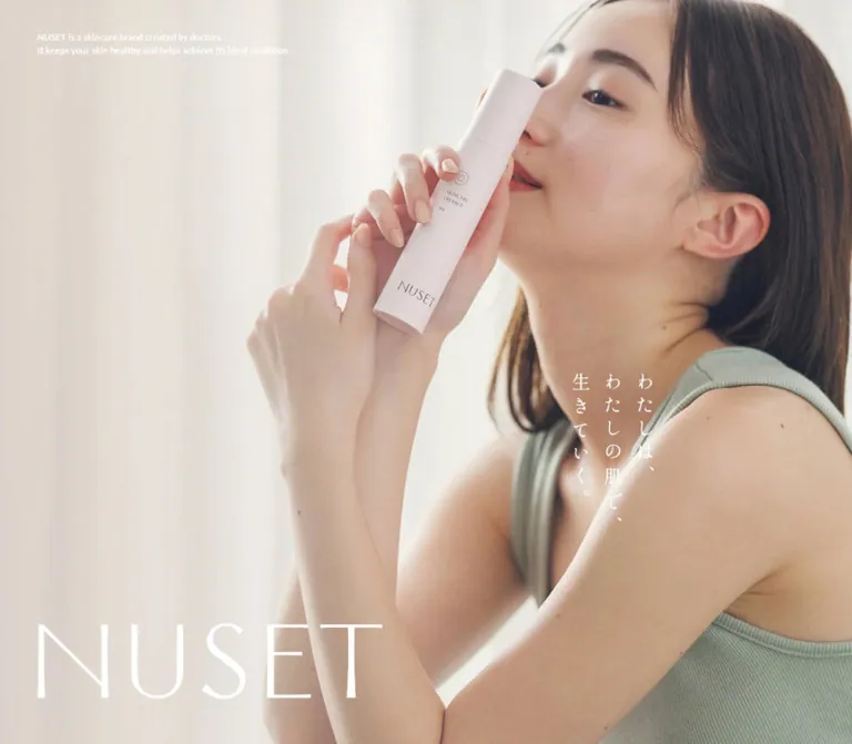
NUSET combines the intimacy of a skincare photograph with the structure of a carefully spaced product catalog. A woman holding a pale bottle fills the opening screen, with translucent curtains, natural skin tones, and muted green clothing supplying most of the color. A large, thin white wordmark anchors the lower left. Short Japanese copy runs vertically over the right side of the photograph, while a much smaller English description acts as a quiet caption.
The shopping experience continues through broad, lightly textured beige fields. Portrait product photographs sit beside modest product names, compact prices, readable ingredient descriptions, and underlined text links. Vertical recommendations occupy a separate narrow column. Lightweight English headings organize the long page; Japanese Mincho text carries its reflective voice. Fine rules, small arrows, and substantial empty space provide structure with little visible elevation.
This is a brand and commerce homepage with a complete navigation system, product destinations, educational content, customer voices, news, and shopping support. Its opening composition is one part of that larger structure.
How to Read This Reference
- Measured means reported by the supplied rendered DOM or computed-style export. Measurements apply to the recorded viewport and state.
- Calculated means arithmetic based on those measurements or exported CSS formulas.
- Estimated means visually judged from the original-page screenshots. Screenshot colors were not sampled with a pixel-reading tool.
- Recommended means a reusable implementation choice. Recommendations do not establish the original source code or behavior.
- Named tokens are implementation aliases unless explicitly identified as original custom properties.
- Visibility requires visual evidence. The export includes bounds for cart notifications, overlapping testimonial slides, and FAQ answers that are not necessarily visible. Their presence does not prove an interaction occurred.
- Capture states differ. The opening screenshots omit the small navigation header that appears in later captures, although header elements have measurable bounds in the DOM export. These observations should not be combined into a single simultaneous state.
Tokens — Colors
Default Palette
| Name | Value | Evidence | Role |
|---|---|---|---|
| Light Cream | #f7f4ee |
Measured main background; original --color-beige-light |
Base canvas beneath the homepage sections |
| Charcoal | #242423 |
Measured rgb(36, 36, 35) on headings, descriptions, links, and controls |
Primary interface ink |
| White | #ffffff |
Measured text and original --color-white |
Opening wordmark, photographic captions, desktop navigation in sampled states, and QA text |
| Taupe Layer | rgb(205 189 178 / 60%) |
Measured QA and FAQ section backgrounds | Translucent warm section treatment |
| Flattened Taupe | Approximately #ded3ca |
Calculated: Taupe Layer over Light Cream, rounded to 8-bit channels | Optional solid-color approximation when no other imagery or layers intervene |
| Footer Beige | Approximately #eae5dd |
Visual estimate from the footer captures | Broad, quiet footer surface |
| Soft Ink Rule | rgb(36 36 35 / 25%) |
Original --color-black-25; application to individual visible rules was not exported |
Recommended semantic divider color |
| Utility Gray | #777777 |
Original --color-gray-outline; also measured on a DOM-only checkout button |
Supporting utility treatment, not the homepage product-link color |
The product-section screenshot shows a fine granular beige texture. Its exact image, opacity, and underlying background declaration are not included in the export. Use the calculated taupe as an approximation only; it is not a measured flat color for that photographed section.
The raw body background is white, but the main element supplies Light Cream. A white body declaration therefore does not describe the visible page as a whole.
Palette Boundaries
The pale pink bottle, sage clothing, skin tones, and brown product backdrop belong to the photography. They are not verified interface accent tokens. Preserve their contribution through imagery rather than turning them into unrelated button fills.
The export also contains loading, warning, and other page-specific variables. Their existence does not establish that those colors appear in the supplied homepage views. No selectable theme or dark-mode interface was evidenced.
Tokens — Typography
Japanese Editorial Text
Measured family: 'Zen Old Mincho', serif.
This family appears on narrative paragraphs, product titles, product qualifiers, prices, vertical product recommendations, FAQ questions, and customer voices. The sampled weight is consistently 400. Its role is refined and conversational, with generous line spacing and little dependence on bold emphasis.
Narrative paragraphs use 2.4 line height and 0.08em tracking. Product titles and utility links use a tighter 1.7 line height. The vertical product notes increase tracking to 0.1em.
English Headings and Navigation
Measured family: Lato, sans-serif.
Large English section labels use weight 300, with 0.04em tracking and 1.5 line height. Desktop navigation uses weight 500. Small English captions use weight 400.
The original variable --font-type-en-serif contains 'Lato', sans-serif. Its name is misleading: the measured family and fallback are sans-serif.
Japanese Product Descriptions
Measured family: 'Noto Sans JP', sans-serif, weight 400.
Product descriptions switch to a compact sans-serif treatment: 13px / 26px on desktop and 12px / 24px on mobile, with 0.05em tracking. This separates practical product information from the more expressive Mincho headings and side copy.
Inherited Families and Graphic Lettering
The body computes to ten-mincho-text, serif, at 25.6px / 38.4px on desktop and 16px / 24px on mobile. Many visible descendants override that family and size. It should not be used to infer the typography of every component.
The NUSET wordmark has distinctive thin geometric letterforms. Its sampled heading has no extracted text, and the supplied evidence does not identify its asset format or a wordmark font. Treat it as brand artwork. The heading’s inherited font size is not the visible logo’s type size.
The opening vertical slogan also lacks a corresponding measured text-style record. Its Mincho-like appearance can be described visually, but assigning its exact font family would exceed the evidence.
Type Scale
Values below are measured unless explicitly marked as estimates. Sizes are CSS pixels; the document root is 16px at both inspected widths.
| Role | Family / weight | Desktop size / line height | Mobile size / line height | Tracking |
|---|---|---|---|---|
Line up |
Lato / 300 | 82 / 123px |
46 / 69px |
0.04em |
ReCell series |
Lato / 300 | 42 / 63px |
36 / 54px |
0.04em |
User Voice, Topics, FAQ |
Lato / 300 | 42 / 63px |
36 / 54px |
0.04em |
| Main QA heading | Zen Old Mincho / 400 | 32 / 54.4px |
24 / 40.8px |
Normal |
| Product title | Zen Old Mincho / 400 | 24 / 40.8px |
18 / 30.6px |
Normal |
| Vertical product recommendation | Zen Old Mincho / 400 | 24 / 40.8px |
18 / 30.6px |
0.1em |
| Individual QA heading | Zen Old Mincho / 400 | 20 / 34px |
18 / 30.6px |
Normal |
| Brand narrative | Zen Old Mincho / 400 | 18 / 43.2px |
16 / 38.4px |
0.08em |
| Product qualifier and price | Zen Old Mincho / 400 | 15 / 25.5px |
13 / 22.1px |
Normal |
| Product description | Noto Sans JP / 400 | 13 / 26px |
12 / 24px |
0.05em |
| Product link | Zen Old Mincho / 400 | 16 / 27.2px |
16 / 27.2px |
Normal |
| Testimonial body | Zen Old Mincho / 400 | 15 / 28.5px |
14 / 26.6px |
0.05em |
| FAQ question | Zen Old Mincho / 400 | 16 / 27.2px |
16 / 27.2px |
Normal |
| Topics article title | Zen Old Mincho / 400 | 16 / 27.2px |
16 / 27.2px |
Normal |
view all |
Lato / 400 | 15 / 22.5px |
13 / 19.5px |
0.04em |
| Desktop navigation | Lato / 500 | 15 / 22.5px |
Replaced by compact header utilities | 0.04em |
| Opening English caption | Lato / 400 | 11 / 16.5px |
10 / 15px |
0.04em |
| Ingredient footnote | Zen Old Mincho / 400 | 10 / 17px |
10 / 17px |
Measured 1.44px / 1.28px |
| Footer navigation | Family not separately exported | Approximately 20px |
Approximately 18px |
Visual estimate |
The mobile cart anchor computes to 20px, but its recorded box is only 19.5px high and its visible lettering appears smaller. Descendant styling or transforms are not included. Do not use the anchor’s inherited size as a verified measurement of the displayed cart label.
Tokens — Spacing & Shapes
Responsive Grid
The exported position and width variables describe a viewport-scaled grid.
| Grid property | Desktop source formula | At 1440px | Mobile source formula | At 390px |
|---|---|---|---|---|
| Outside margin | 100vw * 80 / 1440 |
80px |
100vw * 30 / 390 |
30px |
| Gutter | 100vw * 20 / 1440 |
20px |
100vw * 16 / 390 |
16px |
| Column count | 12 | 12 | 4 | 4 |
| Single column | Available width after margins and gutters, divided by count | 88.333px |
Same calculation | 70.5px |
| Column pitch | Column plus gutter | 108.333px |
Column plus gutter | 86.5px |
| Inner width | Viewport minus outside margins | 1280px |
Viewport minus outside margins | 330px |
Calculated desktop starting positions include 80px, 188.333px, 405px, and 513.333px. These align with the section headings, product photography, Topics cards, and narrative/footer columns respectively.
At mobile width, two columns span 157px and three span 243.5px. Those values appear in the User Voice heading allocation and Topics article widths. The grid is a meaningful organizing system, not a claim that every component uses a single universal CSS grid container.
Spacing Scale
The homepage mixes viewport-derived horizontal geometry with explicit component spacing. There is no evidence of one universal spacing multiplier.
| Use | Desktop | Mobile | Evidence |
|---|---|---|---|
| Opening caption left inset | 48px |
16px |
Measured |
| Opening caption top / bottom inset | Top 40px |
Bottom 50px |
Measured / calculated from viewport |
| Desktop navigation gap | 24px |
Not applicable | Calculated from link bounds |
| Product qualifier to title | 16px |
4px |
Calculated from bounds |
| Product title to price row | 16px |
12px |
Calculated from bounds |
| Price row to description | 38px |
32px |
Calculated from bounds |
| Description to product link | 36px |
30px |
Calculated from bounds |
| Product link padding | 16px 24px 16px 0 |
Same | Measured |
| Narrative paragraph separation | 24px in the explanatory section |
24px |
Calculated from bounds |
| Opening section to narrative section | 120px |
120px |
Calculated from section bounds |
| QA section vertical padding | 260px |
182px |
Measured |
| User Voice section padding | 160px top and bottom |
142px top, 100px bottom |
Measured |
| FAQ section padding | 160px top, 250px bottom |
100px top, 140px bottom |
Measured |
Border Radius
| Element | Value | Evidence |
|---|---|---|
| Product links and sampled content blocks | 0 |
Measured |
| Product photograph corners | Square | Visible screenshot |
| Testimonial pagination dots | 999px, producing a circle |
Measured on 4 × 4px buttons |
| Cart notification action buttons | 2px |
Measured DOM-only styling; open state not observed |
| Footer rule | Approximately 1px thick |
Visual estimate |
The visible design has no general soft-card or floating-shadow system. Exported button, collection-card, and text-box shadow settings also include zero opacity or disabled visibility. Small utility exceptions should not become a new elevation language for the homepage.
Layout Measurements
| Element | Desktop | Mobile | Interpretation |
|---|---|---|---|
| Document height | 14542.5px |
13513.125px |
Measured state, not a target page height |
| Opening section | 3500px high |
2785.188px high |
Approximately 3.5 and 3.3 viewport heights; source height rule not supplied |
| Hero wordmark heading wrapper | x48, y844, 1344 × 98px |
x16, y642, 358 × 98px |
Wrapper bounds, not visible logo width |
| Visible desktop hero wordmark | Approximately 444 × 98px |
Nearly the available 358px width |
Screenshot estimate |
| Product photograph | Approximately 414 × 620px, left edge 188px |
Not pictured in the supplied mobile captures | Desktop screenshot estimate; approximately 2:3 |
| Product description column | x661.656, width 451.672px |
x30, width approximately 330px |
Measured |
| Vertical product-note box | 122.391 × 608.781px |
91.781 × 403.391px |
Measured box; glyphs do not fill every part of it |
| Product link | 224 × 59.203px |
Same | Measured |
| Product-to-product pitch | 718.781px |
859.375px |
Calculated from repeated qualifier positions |
| QA section height | 1000px |
844px |
Equals the inspected viewport height |
| Testimonial text width | 441.672px |
290px |
Measured |
| Topics article width | 305px |
243.5px |
Measured |
| FAQ question width | 955px |
330px |
Measured |
| Footer height | 841px |
Approximately 925.406px |
Calculated as document height minus main height |
Components
Site Header
Role: persistent brand identity and access to shopping and supporting pages.
The desktop header places a small white NUSET mark near the upper-left corner and an unboxed navigation row at the upper right. The sampled logo-link box is 137 × 30px at x30, y30. Navigation starts near x803px, uses a 24px gap, and ends 30px from the right edge.
The visible labels are Top, About, Products, Shopping Guide, FAQ, Contact, My page, and Cart, with a small raised count. The current Top link has a small dot beneath it in the desktop captures. There are no button-shaped backgrounds around these links.
At mobile width, the sampled desktop navigation is absent from the rendered link inventory. The compact header retains the brand, Cart, and a 24 × 24px menu button at x341, y32, with a measured 4px internal gap. The screenshot shows a two-line menu symbol. Menu opening, closing, focus behavior, and its destination layout were not exercised.
The header stays at the top edge across later desktop screenshots, consistent with a persistent overlay. Its wrapper measures zero height. Exact positioning declarations and visibility thresholds were not provided. The opening screenshots show the large hero identity without the small navigation header; the later mobile footer screenshot shows dark header graphics on beige.
Opening Composition
Role: establish the brand through photography before presenting detailed shopping information.
The desktop photograph fills the full 1440 × 1000px view. A softly lit face and shoulder occupy the right side; hands and a pale bottle sit nearer the middle. Pale curtains provide a large, low-detail area on the left. The image has natural texture, gentle contrast, and no hard-edged graphic frame.
Three independent visual anchors organize it:
- A small, two-line English description at x48, y40, set in white Lato at 11px / 16.5px.
- A large white NUSET wordmark near the lower left. Its heading wrapper ends 58px above the viewport bottom.
- The vertical slogan
わたしは、わたしの肌で、生きていく。over the right-center of the image.
The vertical slogan appears around x1000, y500 on desktop and x264, y332 on mobile; these are visual estimates. Its approximately three-column structure matters more than an invented source font size.
Mobile uses a much tighter portrait crop. The bottle and hands remain prominent while the face is partly cut by the right edge. The wordmark spans almost the whole width near the bottom, and the English description moves beneath it to x16, y764. Its first visible line begins is a skincare brand created by doctors. because the nearby wordmark supplies the brand name visually.
There is no visible filled purchase CTA inside either opening screenshot. Preserve the hierarchy of photograph, brand, slogan, and caption.
Brand Narrative
Role: connect the personal opening imagery to the brand’s skincare explanation.
The DOM contains short reflective paragraphs followed by a longer explanatory section. The desktop reflective copy occupies a right-side region beginning near x810px, while the English line I live in my own skin. occupies the left. These elements share the opening section’s geometry but are not all visible in the first screenshot.
The following explanatory paragraphs begin near x513px on desktop, matching the fifth grid-column start. Their 18px / 43.2px Mincho setting produces a deliberately slow reading rhythm. Small English supporting copy provides a secondary register without competing with the Japanese text.
On mobile, paragraph breaks are actively adapted to the narrower composition. The text becomes 16px / 38.4px, usually within a 330px content width. The English supporting statement also moves within the content sequence: the mobile export places it between groups of Japanese paragraphs, while the desktop export positions it near the end of the section.
The explanatory link ヒト幹細胞培養上清液とは? measures 248 × 43.203px, with 208px and 14px grid columns, a 26px gap, and 16px bottom padding. It points to the About page. This compact text-and-arrow treatment is a useful secondary-link pattern.
Lineup Heading
Role: introduce the product collection without interrupting the editorial rhythm.
Line up is the largest measured text heading: 82px desktop and 46px mobile, both in Lato Light. It begins at the main outside margin. ReCell series is inset to x188.333px on desktop and returns to x30px on mobile.
The series subtitle follows in Mincho, at 18px / 34.2px desktop and 16px / 30.4px mobile. It wraps into two lines on the phone. Preserve the distinct hierarchy between the main section label, series name, and Japanese explanatory line.
Editorial Product Feature
Role: present a product as a considered part of a routine and provide a direct route to its detail page.
The homepage contains three repeated features: スキンケアエッセンス R, スキンケアクリーム R, and オールインワンセラム R.
The desktop cream capture establishes the visible anatomy:
- Portrait photograph: approximately 414 × 620px, beginning near x188px, with a pale cylindrical bottle centered against a warm brown studio backdrop. The photographed bottle retains its small branding and label details.
- Information column: starts at x661.656px, approximately 60px beyond the photograph’s right edge, and measures 451.672px wide.
- Product qualifier: a compact Mincho line above the title.
- Product title: regular Mincho, 24px, without a large weight jump.
- Size and price strip: a small pale rectangular backing groups quantity, price, and a much smaller
tax insuffix. It is informational rather than a promotional badge. - Description: compact Noto Sans JP with a generous double line height.
- Product link:
商品ページをみる, an approximately 224px-wide target with a fine bottom rule and small right-pointing arrow. - Vertical recommendation: a separate narrow Mincho column beginning near x1143px, around 30px beyond the information column.
The cream example displays 50g, ¥16,500, and tax in. Price and pack-size presentation stays quiet; the row’s visual emphasis comes from the photograph and the vertical recommendation.
On mobile, product information spans approximately 330px at x30px. The vertical recommendation remains upright at x268.203px, preceding the information block vertically. This supports a top image-and-note composition followed by a full-width details block. The mobile image dimensions themselves were not exported or pictured.
The product link retains its desktop size and 16px type on mobile. It does not become a full-width filled button. Preserve that consistency when adapting the row.
Doctor’s QA
Role: provide concise educational entry points connected to the About page.
The section occupies one inspected viewport height at both sizes, with white text over a measured translucent taupe background. A small introductory label precedes the main Japanese heading. Three numbered items use Doctor’s QA_01, Doctor’s QA_02, and Doctor’s QA_03, followed by a Japanese question, explanatory copy, and view detail link.
The items form a horizontal sequence in the measured layout. Desktop question text begins at x386, x1036, and x1686, a 650px pitch. Mobile begins at x50, x370, and x690, a 320px pitch. The third desktop item and later mobile items extend beyond the viewport.
These measurements establish horizontal arrangement, but not how the original exposes later items. Dragging, touch swiping, arrows, scroll linkage, and autoplay were not tested. The supplied screenshots also do not establish the complete imagery or container anatomy within this section.
Each detail link points to an explicit About anchor, such as /pages/about#about-qa-01. Preserve those individual destinations in a comparable implementation.
User Voice
Role: present individual customer accounts in a consistent reading area.
The export contains 15 testimonials and 15 pagination buttons. Multiple testimonial headings and paragraphs occupy identical bounds, which supports a presentation with overlapping slides rather than fifteen consecutive visible blocks.
Desktop title and text content sit inside a region beginning near x188px. The inner text begins at x228px, creating an approximately 40px inset, and measures 441.672px wide. Mobile text begins at x50px, giving a 20px inset within the 330px content region, and measures 290px wide.
Each entry contains a product name, a variable-length Mincho paragraph, and a location/age/gender line positioned beneath the reading area. The longest entry determines a substantial vertical reservation in the sampled layout. Do not collapse the container to the shortest quote and cause surrounding content to jump in an adaptation.
Pagination buttons measure 4 × 4px, with a 14px pitch, leaving 10px between visible dots. The text has measured one-second transitions; one sampled entry has an additional half-second delay. Actual switching behavior and autoplay remain unverified.
On mobile, the heading wraps as User and Voice in a 157px-wide allocation. That line break is a characteristic responsive detail.
Topics
Role: show three recent announcements with a route to the full archive.
Desktop uses four approximately equal visual allocations: the heading and view all occupy the first 305px column; three article links begin at x405, x730, and x1055, each 305px wide, with 20px gaps.
Each article has a Japanese headline and date/category metadata. The headline begins approximately 398.6px below the link’s top on desktop. That upper allocation is measured, but the supplied frames do not show its artwork, and the export does not identify individual image dimensions.
On mobile, Topics sits left and view all aligns right on the section-heading row. Articles measure 243.5px wide and begin at x30, x289.5, and x549, producing a 16px gap and an offscreen horizontal continuation. Scrolling or slider controls were not exercised.
Article titles remain 16px / 27.2px at both widths. Their wrapping changes naturally with the narrower article width.
FAQ Preview
Role: answer common purchase questions before the closing brand image.
The section pairs a heading and view all link with three question buttons and associated answer content. Desktop questions occupy a 955px region beginning at x405px. Mobile questions occupy 330px beneath the heading row.
The first question button measures approximately 103.2px high on desktop, with 37px top and 39px bottom padding. Mobile reduces it to approximately 71.2px, with 20px top and 24px bottom padding. The text remains 16px Mincho.
The button-and-answer structure is consistent with an accordion. Extracted answer bounds overlap later question positions in the mobile evidence, so the text export must not be read as proof that all answers are expanded. Toggle behavior, icons, focus handling, and expanded states were not recorded.
A new implementation can use fine row dividers and semantic disclosure controls; those are recommendations where the supplied visual evidence is incomplete.
Closing Photograph
Role: return from shopping support to the personal tone of the opening.
A full-width photograph precedes the footer, with the small white caption I will live with this skin / that is me.. The desktop footer capture shows the bottom portion of this image above the beige footer, including a close crop of clothing, an arm, and the product.
The mobile closing section measures 628.328px high. The desktop closing allocation is 800px, calculated from the FAQ end and main-element end. Its full crop and any motion were not captured.
Footer
Role: provide a complete site index, social destination, legal links, and operating-brand identification.
Desktop uses a large beige field with three upper anchors: a NUSET mark around x80, a vertical navigation list around x513, and a small portrait photograph around x1163. The photograph is approximately 197 × 250px and shows light curtains with a partly obscured person. Its exact asset and media type were not supplied.
The navigation includes Top, About, Products, Shopping Guide, Topics, FAQ, and Contact. Links are visually around 20px, with an approximately 50px row pitch. Instagram sits well below the main list, accompanied by a small outline icon.
A fine horizontal rule spans approximately x80–1360. Below it, the footer displays TAKEDA BEAUTY CLINIC branding, small legal links, and (c) 2025 NUSET. The original page’s 運営会社 link points to tsc-h.com. The copyright year is displayed content, not the inspection date.
The mobile bottom capture reorganizes navigation into two columns beginning around x30 and x203, matching the 157px two-column grid spans. Links have an approximately 43px row pitch. Instagram appears below, followed by a rule, two-column legal links, and a centered clinic lockup with its emblem above the name. The copyright is centered lower down.
This mobile capture is consistent with the page footer beneath the persistent header. It is not evidence of an opened menu. It also starts partway into the footer at the bottom of the document; absence of an element from that crop does not prove it is hidden at mobile widths.
Cart Notification Definitions
Evidence level: DOM styling only.
The export includes a notification heading, close button, cart link, checkout button, and continue-shopping control. Its main actions measure 358px wide on desktop and 291px on mobile, with 16px Mincho text and 2px corner radii. The checkout action has a gray fill.
No attached screenshot shows this notification open, and the visible cart count remains zero. These definitions can inform a future utility component, but they should not be presented as an observed add-to-cart interaction or as the homepage’s primary button style.
Tokens — Motion & Interaction
| Element | Measured declaration | Supported conclusion | Limitation |
|---|---|---|---|
| Desktop navigation links | 0.5s cubic-bezier(0.25, 0.88, 0.68, 1) across several properties |
Half-second transition styling is present | Hover endpoint and trigger not captured |
| Logo link | 0.5s cubic-bezier(0, 0, 0.2, 1) |
Logo supports animated property changes | Does not identify header reveal timing |
| Product detail links | 0.8s cubic-bezier(0.25, 0.88, 0.68, 1) |
Product links have a relatively slow transition declaration | Arrow travel, underline changes, and hover appearance unverified |
| QA detail links and Topics links | 0.6s cubic-bezier(0.34, -0.04, 0.32, 1.01) |
Shared interaction timing is present | Actual changing properties and endpoints vary or are unspecified |
| Testimonial text | 1s ease-in-out; one sampled entry adds 0.5s delay |
Slide text has transition styling and overlapping layout | Autoplay interval, controls, and transition result unverified |
| FAQ question button | opacity 0.6s cubic-bezier(0.34, -0.04, 0.32, 1.01) |
Question opacity can transition | This is not a measured answer-expansion duration |
| Original fade variable | fadeIn .6s cubic-bezier(0, 0, .3, 1) |
A fade animation token exists | Application to the pictured components was not established |
| Cart continue control | 0.4s cubic-bezier(0.4, 0, 0.2, 1) |
Utility transition definition exists | Notification was not visibly opened |
The multi-viewport opening section and differing header appearances suggest a staged presentation, but the supplied evidence does not establish its exact scroll mapping, animation technique, or reveal sequence. Do not invent a parallax speed, logo morph, video loop, or timed header entrance.
The capture process waited for load, image decoding, and sampled layout/text stability, and conservatively awaited finite animations within stated limits. Perpetual animations were temporarily paused during readiness checks and then resumed. Static captures and sampled animation: none declarations therefore do not establish a motion-free page.
Recommended adaptation: retain the measured timing curves for restrained color and opacity changes where appropriate. Keep essential content visible without animation, and implement reduced-motion behavior independently of any unverified source sequence.
Surfaces
| Layer | Appearance | Evidence and purpose |
|---|---|---|
| Main canvas | Light Cream #f7f4ee |
Measured; provides the shared warm base |
| Opening and closing image fields | Edge-to-edge photography with white details | Visible; imagery supplies depth and color |
| Product presentation | Fine beige grain with a separate brown portrait photograph | Visible desktop capture; exact texture recipe unavailable |
| QA region | White text and translucent taupe background | Computed styles; full visual composition not pictured |
| FAQ region | Charcoal text and translucent taupe background | Computed styles; disclosure states not tested |
| Footer | Flat pale beige, charcoal graphics, thin rule | Visible desktop and mobile captures |
| Product price strip | Small pale rectangular backing | Visible desktop cream feature; fill value not measured |
| Cart utility | White and gray rectangular actions | DOM-only evidence |
Depth comes from photographic lighting and material texture. Interface structure comes from spacing, alignment, and rules. Repeated shadows or glossy overlays would add a visual system absent from the supplied views.
Imagery
The photography is soft, tactile, and close to everyday skincare use. Pale curtains diffuse the light; natural skin texture and fabric remain visible. The person holds the product near the face instead of presenting it against a stark advertising background. Muted sage clothing adds a limited cool counterpoint to warm skin and cream surroundings.
Product photography uses a different but compatible setting: an upright, slender pale bottle against a warm brown studio background, with a gentle grounded shadow. Preserve the full package silhouette and subtle printed labeling. A tightly cropped bottle cutout would lose the generous photographic field that makes the product feel calm and considered.
The footer’s smaller curtain image repeats the opening’s domestic light at a much smaller scale. Its asymmetrical placement balances the navigation without becoming another large content section.
Observed Asset References
The supplied export does not expose usable original image URLs or logo filenames. The following are verified visual roles, not invented asset paths.
| Asset role | Evidence | Reuse guidance |
|---|---|---|
| Opening model-and-bottle photograph | Desktop and mobile opening captures | Prepare crops for both aspect ratios; preserve the bottle and hands |
| NUSET wordmark | Opening and footer/header captures | Use authorized brand artwork; do not infer a logo font |
| Cream product photograph | Desktop product capture | Approximately 2:3 portrait frame, complete bottle, warm studio backdrop |
| Fine beige surface texture | Desktop product capture | Use a subtle, low-contrast texture; original generation method unknown |
| Closing lifestyle photograph | Partial desktop capture and mobile section bounds | Keep its full-width placement; full crop unverified |
| Small footer curtain image | Desktop footer capture | Approximately 197:250 frame; original media type unknown |
| Clinic emblem and wordmark | Desktop and mobile footer captures | Preserve the different horizontal and stacked arrangements |
| Topics and QA imagery | Not visually established in the supplied frames | Do not invent subject matter from text or empty layout space |
Recommended asset preparation: supply high-resolution desktop and portrait mobile hero crops through <picture>, declare image dimensions to reduce layout shift, and provide meaningful alternative text where the image conveys content. Original asset loading strategy and source dimensions were not inspected.
Layout & Responsive Behavior
The most important responsive change is recomposition, not uniform shrinking.
| Area | Desktop observation | Mobile observation |
|---|---|---|
| Main grid | 12 columns, 80px margins, 20px gutters | 4 columns, 30px margins, 16px gutters |
| Opening image | Wide composition with substantial curtain space at left | Tight portrait crop emphasizing hands and bottle |
| Opening caption | Upper left | Beneath the large lower wordmark |
| Header | Full navigation row and account link | Cart and two-line menu control |
| Main English heading | Line up at 82px |
Reduced to 46px |
| Other English headings | Mostly 42px | Mostly 36px |
| Product structure | Photograph, information, and vertical note arranged across the page | Vertical note remains in the upper composition; details move below |
| Product description | 451.672px wide, 13px type | Approximately 330px wide, 12px type |
| Product link | 224px wide, 16px type | Retains the same dimensions |
| QA sequence | 650px horizontal pitch | 320px horizontal pitch |
| User Voice heading | One line | Two lines inside 157px width |
| Topics | Heading column plus three 305px articles | Heading row plus 243.5px articles extending horizontally |
| FAQ | Heading at left, question region at right | Heading row above full-width questions |
| Footer | Widely separated brand, navigation, image, and legal areas | Two-column links and a centered stacked clinic lockup |
The exact breakpoints are not included in the supplied evidence. The formulas show the two inspected configurations, but do not prove behavior at tablet widths or landscape phone heights.
The page is a long scrolling document. Its opening section occupies several viewport heights, while later modules alternate dense information and generous spacing. Preserve that pacing without hardcoding the measured total document height.
Some QA and Topics children extend beyond the viewport by design in the recorded geometry. A new implementation should keep such overflow inside reachable component regions, with touch and keyboard access. Do not hide page-wide overflow as a substitute for making those items reachable.
Do’s and Don’ts
Do
- Use
#f7f4eeas the main canvas and#242423as the primary text color. - Keep photography responsible for the skin, blush, sage, and brown tones.
- Pair lightweight Lato headings with regular Zen Old Mincho editorial text.
- Retain Noto Sans JP for the practical product descriptions.
- Preserve the opening’s four anchors: photograph, large wordmark, vertical slogan, and tiny English caption.
- Keep the product recommendation vertical when reorganizing the row for mobile.
- Give full product photographs generous rectangular space with square corners.
- Preserve the narrow, underlined product-link treatment and small arrow.
- Use the 12-column and four-column measurements as alignment references.
- Separate measured transition declarations from untested interaction behavior.
- Keep the footer complete, spacious, and visibly connected to the rest of the brand.
Don't
- Don't turn the homepage into a dense product-card grid or a sequence of repeated filled CTAs.
- Don't apply pink or sage to interface controls solely because those colors appear in the photograph.
- Don't replace the wordmark with arbitrary thin text and claim a matching font.
- Don't apply the body’s inherited 25.6px size to all desktop text.
- Don't shrink the entire desktop composition into a phone-width thumbnail.
- Don't rotate a horizontal text block to imitate Japanese vertical typesetting.
- Don't round the product photographs or add floating-card shadows.
- Don't render all 15 testimonial bodies simultaneously because they appear in the text export.
- Don't interpret extracted FAQ answers as verified expanded states.
- Don't describe the mobile footer capture as an opened navigation menu.
- Don't invent autoplay, scroll effects, hover endpoints, or image asset URLs.
Recommended Implementation Additions
These are improvements for a new implementation, not verified features of the original website:
- Give logo links and the menu button explicit accessible names. The text export alone does not establish the accessibility of graphic descendants.
- Retain a keyboard-accessible skip link to the main content. The original link
コンテンツに進むand its#MainContentdestination are present; focus behavior was not exercised. - Check white text against each actual hero crop. Keep necessary navigation and captions readable as the photograph changes across widths.
- Increase long-form mobile reading sizes where needed. The observed 12px product description is a reference measurement; a new implementation can use 14–16px and allow additional height.
- Provide a visible focus outline and approximately 44px touch targets for small menu and carousel controls without enlarging their visible symbols unnecessarily.
- Preserve the four-pixel pagination dots as visual indicators and consider separate accessible previous/next controls. Fifteen 44px-wide dot targets would not fit the measured mobile content width.
- Implement FAQ disclosures with semantic state, keyboard activation, and content that expands in normal flow.
- If testimonial autoplay is added, provide pause controls and reduced-motion handling. Autoplay is not established by this evidence.
- Make essential narrative and product content available when animation scripts fail or motion is reduced.
- Test intermediate widths, text zoom, and long product names; only two viewport configurations were supplied.
Agent Prompt Guide
Quick Color Reference
- Main canvas: measured
#f7f4ee. - Main text and graphics: measured
#242423. - Photographic overlays: measured white
#ffffff. - QA and FAQ background layer: measured
rgb(205 189 178 / 60%). - Solid taupe approximation: calculated
#ded3caover the cream canvas. - Footer surface: estimated
#eae5dd. - Texture: fine, low-contrast beige grain; exact source unavailable.
- Product action: charcoal text, a fine underline, and a small arrow.
Overall Prompt
“Create an editorial skincare brand and commerce homepage inspired by NUSET’s observed visual system. Use a warm cream canvas, charcoal text, soft daylight photography, and restrained beige texture. Set English section headings in lightweight Lato, Japanese editorial text in regular Zen Old Mincho, and compact product descriptions in Noto Sans JP. Open with a full-screen lifestyle photograph, a large thin white brand mark near the lower left, a short vertical Japanese slogan at the right, and a tiny English caption. Build spacious portrait product features with a separate vertical recommendation, modest price strip, and underlined detail link. Use a 12-column desktop grid with 80px margins at 1440px, and a four-column mobile grid with 30px margins at 390px. Recompose the hero caption and product details for mobile while retaining the vertical copy. Finish with educational entries, individual customer voices, news, FAQ, a closing image, and a generous footer. Treat unverified motion as an implementation choice.”
Example Component Prompts
- Opening: “Compose a wide, softly backlit skincare photograph with pale curtains on the left and a person holding a pale bottle near the face on the right. Place a large white brand mark low on the left, a three-column vertical Japanese slogan over the right-center, and an 11px English caption at the upper left. On a 390 × 844 phone, use a dedicated portrait crop and move the caption below the near-full-width wordmark.”
- Product feature: “Create a square-cornered 2:3 portrait product photograph on a warm brown background. At 1440px, place its left edge near 188px, the 452px information column near 662px, and a narrow vertical Mincho recommendation near 1143px. Use a 24px product title, 13px sans-serif description with double line height, and a 224px underlined detail link. On mobile, place the details below the image-and-note composition.”
- Topics: “Build a cream news section with a lightweight English heading, a small view-all link, and three unboxed article previews. Use 305px article widths and 20px gaps on desktop. On mobile, place the heading and view-all link on one row, then use 243.5px articles with 16px gaps in an accessible horizontal region. Keep Japanese headlines at 16px.”
- Footer: “Design a broad pale-beige footer with a thin brand mark at left, a vertical English site index near the center, and a small curtain photograph at right. Separate legal information with one fine charcoal rule. On mobile, arrange navigation in two columns, place social and legal links below, and center a clinic emblem above its wordmark. Keep the surface flat and the spacing generous.”
- Customer voice: “Create one stable-height testimonial reading region with a Mincho product title, a variable-length paragraph, and a customer descriptor below. Preserve a 290px mobile text width inside a 330px region. Add tiny four-pixel visual pagination dots and accessible navigation controls. Use the observed one-second ease-in-out timing only as a reference; do not assume an original autoplay interval.”
Quick Start
CSS Custom Properties
This is a recommended adaptation, not a recovered stylesheet. Exact desktop and mobile values are used where the evidence supports them. The 48rem content breakpoint and 64rem navigation breakpoint are recommendations; the original breakpoints were not supplied. Footer color, texture application, hero slogan placement, hover endpoints, and mobile image sizing are approximations.
Load authorized copies of the named fonts separately. Supply your own approved photography and brand artwork. The CSS intentionally does not recreate an unverified opening timeline, testimonial controller, or cart flow.
:root {
  /* Measured colors and explicitly identified approximations */
  --nuset-paper: #f7f4ee;
  --nuset-ink: #242423;
  --nuset-white: #fff;
  --nuset-taupe-layer: rgb(205 189 178 / 60%);
  --nuset-taupe-flat: #ded3ca;
  --nuset-footer: #eae5dd;
  --nuset-rule: rgb(36 36 35 / 25%);

  /* Measured font families; font files must be supplied separately */
  --font-editorial: 'Zen Old Mincho', serif;
  --font-english: 'Lato', sans-serif;
  --font-product-body: 'Noto Sans JP', sans-serif;

  --text-lineup: 82px;
  --text-section: 42px;
  --text-product: 24px;
  --text-story: 18px;
  --text-product-body: 13px;
  --text-product-meta: 15px;
  --text-caption: 11px;
  --text-side-note: 24px;

  --leading-editorial: 1.7;
  --leading-story: 2.4;
  --leading-product-body: 2;
  --tracking-english: 0.04em;
  --tracking-story: 0.08em;
  --tracking-body: 0.05em;
  --tracking-side-note: 0.1em;

  /* Exported desktop grid formulas */
  --grid-margin: calc(100vw * 80 / 1440);
  --grid-gap: calc(100vw * 20 / 1440);
  --grid-column: calc(
    (100vw - 2 * var(--grid-margin) - 11 * var(--grid-gap)) / 12
  );

  --product-link-width: 224px;
  --rule-width: 1px;
  --hero-inset: 48px;

  /* Measured timing declarations; endpoints below are recommendations */
  --ease-navigation: cubic-bezier(0.25, 0.88, 0.68, 1);
  --ease-detail: cubic-bezier(0.34, -0.04, 0.32, 1.01);
  --motion-navigation: 500ms var(--ease-navigation);
  --motion-product: 800ms var(--ease-navigation);
  --motion-detail: 600ms var(--ease-detail);

  /* Optional authorized texture; no original filename was supplied */
  --surface-texture: none;
}

.nuset,
.nuset * {
  box-sizing: border-box;
}

body.nuset {
  margin: 0;
  color: var(--nuset-ink);
  background: var(--nuset-paper);
  font-family: var(--font-editorial);
  font-size: 16px;
  font-weight: 400;
  line-height: var(--leading-editorial);
}

.nuset :where(h1, h2, h3, p, figure) {
  margin: 0;
}

.nuset :where(a, button) {
  color: inherit;
}

.nuset a {
  text-decoration: none;
}

.nuset button {
  font: inherit;
}

.nuset img {
  display: block;
  max-width: 100%;
}

.page-grid {
  display: grid;
  grid-template-columns: repeat(12, minmax(0, 1fr));
  column-gap: var(--grid-gap);
  margin-inline: var(--grid-margin);
}

.section-heading {
  font-family: var(--font-english);
  font-size: var(--text-section);
  font-weight: 300;
  line-height: 1.5;
  letter-spacing: var(--tracking-english);
}

.lineup-heading {
  font-size: var(--text-lineup);
}

.story-copy {
  font-size: var(--text-story);
  line-height: var(--leading-story);
  letter-spacing: var(--tracking-story);
}

.story-copy p + p {
  margin-top: 24px;
}

/* Persistent-header adaptation; opening visibility needs separate logic */
.site-header {
  position: fixed;
  z-index: 20;
  inset: 0 0 auto;
  display: flex;
  align-items: flex-start;
  justify-content: space-between;
  padding: 30px;
  color: var(--nuset-ink);
  pointer-events: none;
}

.site-header > * {
  pointer-events: auto;
}

.site-header[data-tone='light'] {
  color: var(--nuset-white);
}

.header-brand {
  display: block;
  width: 137px;
  height: 30px;
}

.header-brand :where(img, svg) {
  width: 100%;
  height: 100%;
  object-fit: contain;
}

.desktop-nav,
.header-tools {
  display: flex;
  align-items: center;
  gap: 24px;
  font-family: var(--font-english);
  font-size: 15px;
  font-weight: 500;
  line-height: 1.5;
  letter-spacing: var(--tracking-english);
}

.desktop-nav a {
  position: relative;
  transition: opacity var(--motion-navigation);
}

.desktop-nav a[aria-current='page']::after {
  content: '';
  position: absolute;
  left: 50%;
  bottom: -16px;
  width: 4px;
  height: 4px;
  border-radius: 50%;
  background: currentColor;
  transform: translateX(-50%);
}

.header-tools {
  display: none;
}

.menu-toggle {
  display: grid;
  place-content: center;
  gap: 4px;
  width: 44px;
  height: 44px;
  padding: 0;
  border: 0;
  background: transparent;
  cursor: pointer;
}

.menu-toggle::before,
.menu-toggle::after {
  content: '';
  width: 24px;
  height: 1px;
  background: currentColor;
}

/* Static opening composition with independently supplied image crops */
.hero {
  position: relative;
  isolation: isolate;
  height: 100svh;
  min-height: 520px;
  overflow: hidden;
  color: var(--nuset-white);
}

.hero-media {
  position: absolute;
  inset: 0;
  z-index: -1;
}

.hero-media img {
  width: 100%;
  height: 100%;
  object-fit: cover;
  object-position: center;
}

.hero-mark {
  position: absolute;
  left: var(--hero-inset);
  bottom: 58px;
  width: 444px;
  max-width: calc(100% - 2 * var(--hero-inset));
  height: 98px;
}

.hero-mark img {
  width: 100%;
  height: 100%;
  object-fit: contain;
  object-position: left bottom;
}

.hero-caption {
  position: absolute;
  top: 40px;
  left: var(--hero-inset);
  right: var(--hero-inset);
  font-family: var(--font-english);
  font-size: var(--text-caption);
  line-height: 1.5;
  letter-spacing: var(--tracking-english);
}

/* Estimated slogan placement; actual source typography was not exported */
.hero-tagline {
  position: absolute;
  top: 50%;
  right: 23%;
  writing-mode: vertical-rl;
  text-orientation: upright;
  font-family: var(--font-editorial);
  font-size: 24px;
  line-height: 1.5;
  letter-spacing: 0.1em;
}

/* Product row: use this element with the page-grid class */
.product-row {
  align-items: start;
  padding-block: 50px;
}

.product-photo {
  grid-column: 2 / span 4;
  grid-row: 1;
  width: 100%;
  aspect-ratio: 2 / 3;
  overflow: hidden;
}

.product-photo img {
  width: 100%;
  height: 100%;
  object-fit: cover;
}

.product-copy {
  grid-column: 6 / span 5;
  grid-row: 1;
  min-width: 0;
  align-self: end;
  padding-inline: 40px 30px;
  padding-bottom: 20px;
}

.product-qualifier,
.product-price {
  font-size: var(--text-product-meta);
  line-height: 1.7;
}

.product-title {
  margin-top: 16px;
  font-size: var(--text-product);
  font-weight: 400;
  line-height: 1.7;
}

.product-price {
  display: inline-flex;
  align-items: baseline;
  gap: 4px;
  margin-top: 16px;
  padding-inline: 4px;
  background: rgb(247 244 238 / 35%);
}

.product-price small {
  font-size: 10px;
}

.product-description {
  margin-top: 38px;
  font-family: var(--font-product-body);
  font-size: var(--text-product-body);
  line-height: var(--leading-product-body);
  letter-spacing: var(--tracking-body);
}

.product-link {
  display: flex;
  align-items: center;
  justify-content: space-between;
  width: min(var(--product-link-width), 100%);
  margin-top: 36px;
  padding: 16px 8px 16px 0;
  border-bottom: var(--rule-width) solid var(--nuset-rule);
  font-size: 16px;
  line-height: 1.7;
  transition: opacity var(--motion-product);
}

.product-link::after {
  content: '';
  width: 14px;
  height: 8px;
  background: currentColor;
  clip-path: polygon(0 0, 100% 50%, 0 100%, 18% 50%);
}

.product-note {
  grid-column: 11 / span 2;
  grid-row: 1;
  justify-self: start;
  margin-inline-start: calc(-1 * var(--grid-gap));
  writing-mode: vertical-rl;
  text-orientation: upright;
  font-size: var(--text-side-note);
  line-height: 1.7;
  letter-spacing: var(--tracking-side-note);
}

.textured-section {
  background-color: var(--nuset-taupe-flat);
  background-image: var(--surface-texture);
}

/* Reachable horizontal article region; interaction is an adaptation */
.topics-layout {
  display: grid;
  grid-template-columns: repeat(4, minmax(0, 1fr));
  gap: var(--grid-gap);
  margin-inline: var(--grid-margin);
}

.topics-heading {
  grid-column: 1;
}

.topics-track {
  grid-column: 2 / -1;
  display: grid;
  grid-template-columns: repeat(3, minmax(0, 1fr));
  gap: var(--grid-gap);
  min-width: 0;
}

.topic-title {
  margin-top: 20px;
  font-size: 16px;
  font-weight: 400;
  line-height: 1.7;
}

/* Native details elements provide a usable disclosure baseline */
.faq-section {
  padding-block: 160px 250px;
  background: var(--nuset-taupe-layer);
}

.faq-heading {
  grid-column: 1 / span 3;
}

.faq-list {
  grid-column: 4 / -1;
  min-width: 0;
}

.faq-item {
  border-top: 1px solid var(--nuset-rule);
}

.faq-item:last-child {
  border-bottom: 1px solid var(--nuset-rule);
}

.faq-item summary {
  padding-block: 37px 39px;
  cursor: pointer;
  font-size: 16px;
  line-height: 1.7;
}

.faq-answer {
  padding-bottom: 32px;
  font-size: 15px;
  line-height: 1.9;
  letter-spacing: 0.05em;
}

.site-footer {
  padding-block: 130px 100px;
  background: var(--nuset-footer);
}

.footer-brand {
  grid-column: 1 / span 3;
  width: 137px;
}

.footer-nav {
  grid-column: 5 / span 4;
  display: grid;
  gap: 20px;
  font-family: var(--font-english);
  font-size: 20px;
  font-weight: 300;
  line-height: 1.5;
  letter-spacing: 0.04em;
}

.footer-photo {
  grid-column: 11 / -1;
  width: 100%;
  aspect-ratio: 197 / 250;
  object-fit: cover;
}

.footer-social {
  grid-column: 5 / span 4;
  margin-top: 100px;
  font-family: var(--font-english);
  font-size: 20px;
  font-weight: 300;
}

.footer-bottom {
  grid-column: 1 / -1;
  display: flex;
  align-items: center;
  justify-content: space-between;
  flex-wrap: wrap;
  gap: 24px;
  margin-top: 72px;
  padding-top: 40px;
  border-top: 1px solid var(--nuset-rule);
}

.footer-legal {
  display: flex;
  flex-wrap: wrap;
  gap: 20px;
  font-size: 11px;
}

.clinic-lockup {
  display: flex;
  align-items: center;
  gap: 24px;
}

.clinic-emblem {
  width: 30px;
}

.clinic-name {
  width: min(286px, 100%);
}

.footer-copyright {
  font-family: var(--font-english);
  font-size: 11px;
}

/* Recommended hover endpoint, not a recorded source state */
@media (hover: hover) {
  .desktop-nav a:hover,
  .product-link:hover {
    opacity: 0.7;
  }
}

/* Recommended navigation breakpoint */
@media (max-width: 64rem) {
  .desktop-nav {
    display: none;
  }

  .header-tools {
    display: flex;
  }
}

/* Recommended content breakpoint with measured phone values */
@media (max-width: 48rem) {
  :root {
    --text-lineup: 46px;
    --text-section: 36px;
    --text-product: 18px;
    --text-story: 16px;
    --text-product-body: 12px;
    --text-product-meta: 13px;
    --text-caption: 10px;
    --text-side-note: 18px;
    --hero-inset: 16px;
    --grid-margin: calc(100vw * 30 / 390);
    --grid-gap: calc(100vw * 16 / 390);
    --grid-column: calc(
      (100vw - 2 * var(--grid-margin) - 3 * var(--grid-gap)) / 4
    );
  }

  .page-grid {
    grid-template-columns: repeat(4, minmax(0, 1fr));
  }

  .site-header {
    align-items: center;
    padding: 20px 15px 20px 25px;
  }

  .header-brand {
    width: 128px;
  }

  .header-tools {
    gap: 18px;
    font-size: 13px;
  }

  .hero-mark {
    bottom: 104px;
    width: calc(100% - 32px);
  }

  .hero-caption {
    top: auto;
    bottom: 50px;
  }

  .hero-tagline {
    top: 39.3%;
    right: 9.2%;
    font-size: 20px;
  }

  /* Mobile image width is an adaptation; only the note was measured */
  .product-row {
    grid-template-columns: minmax(0, 1fr) 91.8px;
    gap: 32px 16px;
  }

  .product-photo {
    grid-column: 1;
    grid-row: 1;
  }

  .product-note {
    grid-column: 2;
    grid-row: 1;
    justify-self: end;
    margin: 0;
  }

  .product-copy {
    grid-column: 1 / -1;
    grid-row: 2;
    padding: 0;
  }

  .product-title {
    margin-top: 4px;
  }

  .product-price {
    margin-top: 12px;
  }

  .product-description {
    margin-top: 32px;
  }

  .product-link {
    margin-top: 30px;
  }

  .topics-layout {
    display: block;
    margin: 0;
  }

  .topics-heading {
    display: flex;
    align-items: baseline;
    justify-content: space-between;
    margin-inline: var(--grid-margin);
    margin-bottom: 40px;
  }

  .topics-track {
    display: grid;
    grid-auto-flow: column;
    grid-template-columns: none;
    grid-auto-columns: calc(3 * var(--grid-column) + 2 * var(--grid-gap));
    gap: var(--grid-gap);
    overflow-x: auto;
    padding-inline: var(--grid-margin);
    padding-bottom: 16px;
    scroll-padding-inline: var(--grid-margin);
    scroll-snap-type: x proximity;
  }

  .topic-card {
    scroll-snap-align: start;
  }

  .faq-section {
    padding-block: 100px 140px;
  }

  .faq-heading,
  .faq-list {
    grid-column: 1 / -1;
  }

  .faq-list {
    margin-top: 40px;
  }

  .faq-item summary {
    padding-block: 20px 24px;
  }

  .faq-answer {
    font-size: 14px;
  }

  .site-footer {
    padding-block: 80px 100px;
  }

  .footer-brand,
  .footer-nav,
  .footer-social {
    grid-column: 1 / -1;
  }

  .footer-brand {
    margin-bottom: 48px;
  }

  .footer-nav {
    grid-template-columns: repeat(2, minmax(0, 1fr));
    gap: 16px;
    font-size: 18px;
  }

  /* Optional simplification; the mobile capture does not prove hiding */
  .footer-photo {
    display: none;
  }

  .footer-social {
    margin-top: 72px;
    font-size: 18px;
  }

  .footer-bottom {
    flex-direction: column;
    align-items: stretch;
    margin-top: 40px;
  }

  .footer-legal {
    order: 1;
    display: grid;
    grid-template-columns: repeat(2, minmax(0, 1fr));
    gap: 20px 16px;
  }

  .clinic-lockup {
    order: 2;
    flex-direction: column;
    gap: 18px;
    margin-top: 68px;
  }

  .footer-copyright {
    order: 3;
    margin-top: 32px;
    text-align: center;
  }
}

/* Recommended accessibility behavior */
.nuset :focus-visible {
  outline: 2px solid currentColor;
  outline-offset: 4px;
}

@media (prefers-reduced-motion: reduce) {
  .nuset *,
  .nuset *::before,
  .nuset *::after {
    animation: none !important;
    transition: none !important;
    scroll-behavior: auto !important;
  }
}
Component wiring: use product-row page-grid on the product wrapper, with product-photo, product-copy, and product-note children. Use real links for product destinations. Author vertical Japanese copy with deliberate line breaks inside a lang='ja' element. Use native <details> / <summary> for the recommended FAQ baseline. For header artwork that changes between white and charcoal, supply an inline graphic using currentColor or explicit light/dark assets.
The product-link CSS uses a flex layout with an 8px right inset to place the decorative arrow. This is an adaptation of the observed inline-block link, whose measured padding is 16px 24px 16px 0; its visible width and overall height are preserved approximately.
Tailwind v4 Token Mapping
Optional mapping for a project already using Tailwind v4. This does not establish the original framework version. Define the properties above first.
@theme inline {
  --color-nuset-paper: var(--nuset-paper);
  --color-nuset-ink: var(--nuset-ink);
  --color-nuset-white: var(--nuset-white);
  --color-nuset-taupe: var(--nuset-taupe-flat);
  --color-nuset-footer: var(--nuset-footer);
  --color-nuset-rule: var(--nuset-rule);

  --font-nuset-editorial: var(--font-editorial);
  --font-nuset-english: var(--font-english);
  --font-nuset-product: var(--font-product-body);

  --text-nuset-lineup: var(--text-lineup);
  --text-nuset-section: var(--text-section);
  --text-nuset-product: var(--text-product);
  --text-nuset-story: var(--text-story);
  --text-nuset-caption: var(--text-caption);

  --spacing-nuset-margin: var(--grid-margin);
  --spacing-nuset-gutter: var(--grid-gap);
  --spacing-nuset-product-link: var(--product-link-width);
}
Sources & Evidence
- Inspected original and final homepage: https://nuset.jp/. Both URLs are identical; the supplied browser record reports HTTP 200.
- Capture retrieval: September 12, 2026, 17:38:49.220 UTC, equivalent to September 13, 2026, 02:38:49.220 JST.
- Desktop evidence: 1440 × 1000 CSS px; opening photograph, cream product feature, and closing-image/footer captures, accompanied by rendered text, links, element bounds, custom properties, and computed styles.
- Mobile evidence: 390 × 844 CSS px; opening and bottom-of-page footer captures, accompanied by the corresponding rendered DOM and computed-style export.
- Observed link destinations: product detail pages, About anchors, shopping guide, FAQ, account, cart, Topics, legal policies, Instagram, and the footer’s operating-company link. These establish link targets only; their destination pages were not opened for this reference.
- Inspection process: the supplied browser traversed intermediate scroll positions and applied load, finite-motion, image-decoding, and layout/text-stability checks. Those checks had time limits and do not prove that every delayed state appeared.
- Unverified behavior: menu opening, navigation hover endpoints, cart actions, checkout, FAQ toggling, testimonial switching/autoplay, QA and Topics navigation mechanics, and exact opening/scroll animation behavior.
- Additional limits: the supplied element records do not include all ancestor visibility properties, media source URLs, border declarations, pseudo-elements, or rendering code. SharedWorkers and service workers were disabled during the supplied inspection. No additional browsing, file inspection, or command execution was performed for this reference.
Measured values describe the supplied current-page states. Estimated colors and geometry, responsive breakpoints, accessibility additions, interaction choices, and reusable CSS are labeled as adaptations rather than original implementation facts.
# NUSET — Style Reference

> Soft daylight, pale mineral surfaces, and vertical Japanese copy frame an editorial skincare store.

**Website:** [nuset.jp](https://nuset.jp/)
**Original URL:** https://nuset.jp/
**Final URL:** https://nuset.jp/
**Theme:** light; warm cream, taupe, charcoal, and white photographic overlays.
**Inspected:** September 13, 2026, 02:38 JST. The supplied retrieval timestamp is September 12, 2026, 17:38:49.220 UTC.
**Viewports:** desktop **1440 × 1000 CSS px**; mobile **390 × 844 CSS px**.
**Scope:** the current homepage, including its opening composition, brand narrative, three-product ReCell lineup, Doctor’s QA, User Voice, Topics, FAQ, closing photograph, and footer. Visual evidence comprises three desktop captures and two mobile captures; the supplied rendered DOM extends beyond those pictured sections. Linked pages and purchase flows were not inspected.

NUSET combines the intimacy of a skincare photograph with the structure of a carefully spaced product catalog. A woman holding a pale bottle fills the opening screen, with translucent curtains, natural skin tones, and muted green clothing supplying most of the color. A large, thin white wordmark anchors the lower left. Short Japanese copy runs vertically over the right side of the photograph, while a much smaller English description acts as a quiet caption.

The shopping experience continues through broad, lightly textured beige fields. Portrait product photographs sit beside modest product names, compact prices, readable ingredient descriptions, and underlined text links. Vertical recommendations occupy a separate narrow column. Lightweight English headings organize the long page; Japanese Mincho text carries its reflective voice. Fine rules, small arrows, and substantial empty space provide structure with little visible elevation.

This is a brand and commerce homepage with a complete navigation system, product destinations, educational content, customer voices, news, and shopping support. Its opening composition is one part of that larger structure.

## How to Read This Reference

- **Measured** means reported by the supplied rendered DOM or computed-style export. Measurements apply to the recorded viewport and state.
- **Calculated** means arithmetic based on those measurements or exported CSS formulas.
- **Estimated** means visually judged from the original-page screenshots. Screenshot colors were not sampled with a pixel-reading tool.
- **Recommended** means a reusable implementation choice. Recommendations do not establish the original source code or behavior.
- **Named tokens** are implementation aliases unless explicitly identified as original custom properties.
- **Visibility requires visual evidence.** The export includes bounds for cart notifications, overlapping testimonial slides, and FAQ answers that are not necessarily visible. Their presence does not prove an interaction occurred.
- **Capture states differ.** The opening screenshots omit the small navigation header that appears in later captures, although header elements have measurable bounds in the DOM export. These observations should not be combined into a single simultaneous state.

## Tokens — Colors

### Default Palette

| Name | Value | Evidence | Role |
| --- | --- | --- | --- |
| Light Cream | `#f7f4ee` | Measured main background; original `--color-beige-light` | Base canvas beneath the homepage sections |
| Charcoal | `#242423` | Measured `rgb(36, 36, 35)` on headings, descriptions, links, and controls | Primary interface ink |
| White | `#ffffff` | Measured text and original `--color-white` | Opening wordmark, photographic captions, desktop navigation in sampled states, and QA text |
| Taupe Layer | `rgb(205 189 178 / 60%)` | Measured QA and FAQ section backgrounds | Translucent warm section treatment |
| Flattened Taupe | Approximately `#ded3ca` | Calculated: Taupe Layer over Light Cream, rounded to 8-bit channels | Optional solid-color approximation when no other imagery or layers intervene |
| Footer Beige | Approximately `#eae5dd` | Visual estimate from the footer captures | Broad, quiet footer surface |
| Soft Ink Rule | `rgb(36 36 35 / 25%)` | Original `--color-black-25`; application to individual visible rules was not exported | Recommended semantic divider color |
| Utility Gray | `#777777` | Original `--color-gray-outline`; also measured on a DOM-only checkout button | Supporting utility treatment, not the homepage product-link color |

The product-section screenshot shows a fine granular beige texture. Its exact image, opacity, and underlying background declaration are not included in the export. Use the calculated taupe as an approximation only; it is not a measured flat color for that photographed section.

The raw body background is white, but the main element supplies Light Cream. A white body declaration therefore does not describe the visible page as a whole.

### Palette Boundaries

The pale pink bottle, sage clothing, skin tones, and brown product backdrop belong to the photography. They are not verified interface accent tokens. Preserve their contribution through imagery rather than turning them into unrelated button fills.

The export also contains loading, warning, and other page-specific variables. Their existence does not establish that those colors appear in the supplied homepage views. No selectable theme or dark-mode interface was evidenced.

## Tokens — Typography

### Japanese Editorial Text

**Measured family:** `'Zen Old Mincho', serif`.

This family appears on narrative paragraphs, product titles, product qualifiers, prices, vertical product recommendations, FAQ questions, and customer voices. The sampled weight is consistently **400**. Its role is refined and conversational, with generous line spacing and little dependence on bold emphasis.

Narrative paragraphs use **2.4 line height** and **0.08em tracking**. Product titles and utility links use a tighter **1.7 line height**. The vertical product notes increase tracking to **0.1em**.

### English Headings and Navigation

**Measured family:** `Lato, sans-serif`.

Large English section labels use weight **300**, with **0.04em tracking** and **1.5 line height**. Desktop navigation uses weight **500**. Small English captions use weight **400**.

The original variable `--font-type-en-serif` contains `'Lato', sans-serif`. Its name is misleading: the measured family and fallback are sans-serif.

### Japanese Product Descriptions

**Measured family:** `'Noto Sans JP', sans-serif`, weight **400**.

Product descriptions switch to a compact sans-serif treatment: **13px / 26px** on desktop and **12px / 24px** on mobile, with **0.05em tracking**. This separates practical product information from the more expressive Mincho headings and side copy.

### Inherited Families and Graphic Lettering

The body computes to `ten-mincho-text, serif`, at **25.6px / 38.4px** on desktop and **16px / 24px** on mobile. Many visible descendants override that family and size. It should not be used to infer the typography of every component.

The NUSET wordmark has distinctive thin geometric letterforms. Its sampled heading has no extracted text, and the supplied evidence does not identify its asset format or a wordmark font. Treat it as brand artwork. The heading’s inherited font size is not the visible logo’s type size.

The opening vertical slogan also lacks a corresponding measured text-style record. Its Mincho-like appearance can be described visually, but assigning its exact font family would exceed the evidence.

### Type Scale

Values below are measured unless explicitly marked as estimates. Sizes are CSS pixels; the document root is **16px** at both inspected widths.

| Role | Family / weight | Desktop size / line height | Mobile size / line height | Tracking |
| --- | --- | --- | --- | --- |
| `Line up` | Lato / 300 | `82 / 123px` | `46 / 69px` | `0.04em` |
| `ReCell series` | Lato / 300 | `42 / 63px` | `36 / 54px` | `0.04em` |
| `User Voice`, `Topics`, `FAQ` | Lato / 300 | `42 / 63px` | `36 / 54px` | `0.04em` |
| Main QA heading | Zen Old Mincho / 400 | `32 / 54.4px` | `24 / 40.8px` | Normal |
| Product title | Zen Old Mincho / 400 | `24 / 40.8px` | `18 / 30.6px` | Normal |
| Vertical product recommendation | Zen Old Mincho / 400 | `24 / 40.8px` | `18 / 30.6px` | `0.1em` |
| Individual QA heading | Zen Old Mincho / 400 | `20 / 34px` | `18 / 30.6px` | Normal |
| Brand narrative | Zen Old Mincho / 400 | `18 / 43.2px` | `16 / 38.4px` | `0.08em` |
| Product qualifier and price | Zen Old Mincho / 400 | `15 / 25.5px` | `13 / 22.1px` | Normal |
| Product description | Noto Sans JP / 400 | `13 / 26px` | `12 / 24px` | `0.05em` |
| Product link | Zen Old Mincho / 400 | `16 / 27.2px` | `16 / 27.2px` | Normal |
| Testimonial body | Zen Old Mincho / 400 | `15 / 28.5px` | `14 / 26.6px` | `0.05em` |
| FAQ question | Zen Old Mincho / 400 | `16 / 27.2px` | `16 / 27.2px` | Normal |
| Topics article title | Zen Old Mincho / 400 | `16 / 27.2px` | `16 / 27.2px` | Normal |
| `view all` | Lato / 400 | `15 / 22.5px` | `13 / 19.5px` | `0.04em` |
| Desktop navigation | Lato / 500 | `15 / 22.5px` | Replaced by compact header utilities | `0.04em` |
| Opening English caption | Lato / 400 | `11 / 16.5px` | `10 / 15px` | `0.04em` |
| Ingredient footnote | Zen Old Mincho / 400 | `10 / 17px` | `10 / 17px` | Measured `1.44px` / `1.28px` |
| Footer navigation | Family not separately exported | Approximately `20px` | Approximately `18px` | Visual estimate |

The mobile cart anchor computes to 20px, but its recorded box is only 19.5px high and its visible lettering appears smaller. Descendant styling or transforms are not included. Do not use the anchor’s inherited size as a verified measurement of the displayed cart label.

## Tokens — Spacing & Shapes

### Responsive Grid

The exported position and width variables describe a viewport-scaled grid.

| Grid property | Desktop source formula | At 1440px | Mobile source formula | At 390px |
| --- | --- | --- | --- | --- |
| Outside margin | `100vw * 80 / 1440` | `80px` | `100vw * 30 / 390` | `30px` |
| Gutter | `100vw * 20 / 1440` | `20px` | `100vw * 16 / 390` | `16px` |
| Column count | 12 | 12 | 4 | 4 |
| Single column | Available width after margins and gutters, divided by count | `88.333px` | Same calculation | `70.5px` |
| Column pitch | Column plus gutter | `108.333px` | Column plus gutter | `86.5px` |
| Inner width | Viewport minus outside margins | `1280px` | Viewport minus outside margins | `330px` |

Calculated desktop starting positions include **80px**, **188.333px**, **405px**, and **513.333px**. These align with the section headings, product photography, Topics cards, and narrative/footer columns respectively.

At mobile width, two columns span **157px** and three span **243.5px**. Those values appear in the User Voice heading allocation and Topics article widths. The grid is a meaningful organizing system, not a claim that every component uses a single universal CSS grid container.

### Spacing Scale

The homepage mixes viewport-derived horizontal geometry with explicit component spacing. There is no evidence of one universal spacing multiplier.

| Use | Desktop | Mobile | Evidence |
| --- | --- | --- | --- |
| Opening caption left inset | `48px` | `16px` | Measured |
| Opening caption top / bottom inset | Top `40px` | Bottom `50px` | Measured / calculated from viewport |
| Desktop navigation gap | `24px` | Not applicable | Calculated from link bounds |
| Product qualifier to title | `16px` | `4px` | Calculated from bounds |
| Product title to price row | `16px` | `12px` | Calculated from bounds |
| Price row to description | `38px` | `32px` | Calculated from bounds |
| Description to product link | `36px` | `30px` | Calculated from bounds |
| Product link padding | `16px 24px 16px 0` | Same | Measured |
| Narrative paragraph separation | `24px` in the explanatory section | `24px` | Calculated from bounds |
| Opening section to narrative section | `120px` | `120px` | Calculated from section bounds |
| QA section vertical padding | `260px` | `182px` | Measured |
| User Voice section padding | `160px` top and bottom | `142px` top, `100px` bottom | Measured |
| FAQ section padding | `160px` top, `250px` bottom | `100px` top, `140px` bottom | Measured |

### Border Radius

| Element | Value | Evidence |
| --- | --- | --- |
| Product links and sampled content blocks | `0` | Measured |
| Product photograph corners | Square | Visible screenshot |
| Testimonial pagination dots | `999px`, producing a circle | Measured on `4 × 4px` buttons |
| Cart notification action buttons | `2px` | Measured DOM-only styling; open state not observed |
| Footer rule | Approximately `1px` thick | Visual estimate |

The visible design has no general soft-card or floating-shadow system. Exported button, collection-card, and text-box shadow settings also include zero opacity or disabled visibility. Small utility exceptions should not become a new elevation language for the homepage.

### Layout Measurements

| Element | Desktop | Mobile | Interpretation |
| --- | --- | --- | --- |
| Document height | `14542.5px` | `13513.125px` | Measured state, not a target page height |
| Opening section | `3500px` high | `2785.188px` high | Approximately 3.5 and 3.3 viewport heights; source height rule not supplied |
| Hero wordmark heading wrapper | `x48, y844, 1344 × 98px` | `x16, y642, 358 × 98px` | Wrapper bounds, not visible logo width |
| Visible desktop hero wordmark | Approximately `444 × 98px` | Nearly the available `358px` width | Screenshot estimate |
| Product photograph | Approximately `414 × 620px`, left edge `188px` | Not pictured in the supplied mobile captures | Desktop screenshot estimate; approximately 2:3 |
| Product description column | `x661.656`, width `451.672px` | `x30`, width approximately `330px` | Measured |
| Vertical product-note box | `122.391 × 608.781px` | `91.781 × 403.391px` | Measured box; glyphs do not fill every part of it |
| Product link | `224 × 59.203px` | Same | Measured |
| Product-to-product pitch | `718.781px` | `859.375px` | Calculated from repeated qualifier positions |
| QA section height | `1000px` | `844px` | Equals the inspected viewport height |
| Testimonial text width | `441.672px` | `290px` | Measured |
| Topics article width | `305px` | `243.5px` | Measured |
| FAQ question width | `955px` | `330px` | Measured |
| Footer height | `841px` | Approximately `925.406px` | Calculated as document height minus main height |

## Components

### Site Header

**Role:** persistent brand identity and access to shopping and supporting pages.

The desktop header places a small white NUSET mark near the upper-left corner and an unboxed navigation row at the upper right. The sampled logo-link box is **137 × 30px at x30, y30**. Navigation starts near **x803px**, uses a **24px gap**, and ends 30px from the right edge.

The visible labels are `Top`, `About`, `Products`, `Shopping Guide`, `FAQ`, `Contact`, `My page`, and `Cart`, with a small raised count. The current `Top` link has a small dot beneath it in the desktop captures. There are no button-shaped backgrounds around these links.

At mobile width, the sampled desktop navigation is absent from the rendered link inventory. The compact header retains the brand, `Cart`, and a **24 × 24px** menu button at **x341, y32**, with a measured **4px internal gap**. The screenshot shows a two-line menu symbol. Menu opening, closing, focus behavior, and its destination layout were not exercised.

The header stays at the top edge across later desktop screenshots, consistent with a persistent overlay. Its wrapper measures zero height. Exact positioning declarations and visibility thresholds were not provided. The opening screenshots show the large hero identity without the small navigation header; the later mobile footer screenshot shows dark header graphics on beige.

### Opening Composition

**Role:** establish the brand through photography before presenting detailed shopping information.

The desktop photograph fills the full **1440 × 1000px** view. A softly lit face and shoulder occupy the right side; hands and a pale bottle sit nearer the middle. Pale curtains provide a large, low-detail area on the left. The image has natural texture, gentle contrast, and no hard-edged graphic frame.

Three independent visual anchors organize it:

1. A small, two-line English description at **x48, y40**, set in white Lato at **11px / 16.5px**.
2. A large white NUSET wordmark near the lower left. Its heading wrapper ends **58px above the viewport bottom**.
3. The vertical slogan `わたしは、わたしの肌で、生きていく。` over the right-center of the image.

The vertical slogan appears around **x1000, y500** on desktop and **x264, y332** on mobile; these are visual estimates. Its approximately three-column structure matters more than an invented source font size.

Mobile uses a much tighter portrait crop. The bottle and hands remain prominent while the face is partly cut by the right edge. The wordmark spans almost the whole width near the bottom, and the English description moves beneath it to **x16, y764**. Its first visible line begins `is a skincare brand created by doctors.` because the nearby wordmark supplies the brand name visually.

There is no visible filled purchase CTA inside either opening screenshot. Preserve the hierarchy of photograph, brand, slogan, and caption.

### Brand Narrative

**Role:** connect the personal opening imagery to the brand’s skincare explanation.

The DOM contains short reflective paragraphs followed by a longer explanatory section. The desktop reflective copy occupies a right-side region beginning near **x810px**, while the English line `I live in my own skin.` occupies the left. These elements share the opening section’s geometry but are not all visible in the first screenshot.

The following explanatory paragraphs begin near **x513px** on desktop, matching the fifth grid-column start. Their **18px / 43.2px** Mincho setting produces a deliberately slow reading rhythm. Small English supporting copy provides a secondary register without competing with the Japanese text.

On mobile, paragraph breaks are actively adapted to the narrower composition. The text becomes **16px / 38.4px**, usually within a 330px content width. The English supporting statement also moves within the content sequence: the mobile export places it between groups of Japanese paragraphs, while the desktop export positions it near the end of the section.

The explanatory link `ヒト幹細胞培養上清液とは?` measures **248 × 43.203px**, with **208px and 14px grid columns**, a **26px gap**, and **16px bottom padding**. It points to the About page. This compact text-and-arrow treatment is a useful secondary-link pattern.

### Lineup Heading

**Role:** introduce the product collection without interrupting the editorial rhythm.

`Line up` is the largest measured text heading: **82px** desktop and **46px** mobile, both in Lato Light. It begins at the main outside margin. `ReCell series` is inset to **x188.333px** on desktop and returns to **x30px** on mobile.

The series subtitle follows in Mincho, at **18px / 34.2px** desktop and **16px / 30.4px** mobile. It wraps into two lines on the phone. Preserve the distinct hierarchy between the main section label, series name, and Japanese explanatory line.

### Editorial Product Feature

**Role:** present a product as a considered part of a routine and provide a direct route to its detail page.

The homepage contains three repeated features: `スキンケアエッセンス R`, `スキンケアクリーム R`, and `オールインワンセラム R`.

The desktop cream capture establishes the visible anatomy:

- **Portrait photograph:** approximately **414 × 620px**, beginning near **x188px**, with a pale cylindrical bottle centered against a warm brown studio backdrop. The photographed bottle retains its small branding and label details.
- **Information column:** starts at **x661.656px**, approximately **60px beyond the photograph’s right edge**, and measures **451.672px** wide.
- **Product qualifier:** a compact Mincho line above the title.
- **Product title:** regular Mincho, 24px, without a large weight jump.
- **Size and price strip:** a small pale rectangular backing groups quantity, price, and a much smaller `tax in` suffix. It is informational rather than a promotional badge.
- **Description:** compact Noto Sans JP with a generous double line height.
- **Product link:** `商品ページをみる`, an approximately 224px-wide target with a fine bottom rule and small right-pointing arrow.
- **Vertical recommendation:** a separate narrow Mincho column beginning near **x1143px**, around 30px beyond the information column.

The cream example displays `50g`, `¥16,500`, and `tax in`. Price and pack-size presentation stays quiet; the row’s visual emphasis comes from the photograph and the vertical recommendation.

On mobile, product information spans approximately **330px** at **x30px**. The vertical recommendation remains upright at **x268.203px**, preceding the information block vertically. This supports a top image-and-note composition followed by a full-width details block. The mobile image dimensions themselves were not exported or pictured.

The product link retains its desktop size and 16px type on mobile. It does not become a full-width filled button. Preserve that consistency when adapting the row.

### Doctor’s QA

**Role:** provide concise educational entry points connected to the About page.

The section occupies one inspected viewport height at both sizes, with white text over a measured translucent taupe background. A small introductory label precedes the main Japanese heading. Three numbered items use `Doctor’s QA_01`, `Doctor’s QA_02`, and `Doctor’s QA_03`, followed by a Japanese question, explanatory copy, and `view detail` link.

The items form a horizontal sequence in the measured layout. Desktop question text begins at **x386**, **x1036**, and **x1686**, a **650px pitch**. Mobile begins at **x50**, **x370**, and **x690**, a **320px pitch**. The third desktop item and later mobile items extend beyond the viewport.

These measurements establish horizontal arrangement, but not how the original exposes later items. Dragging, touch swiping, arrows, scroll linkage, and autoplay were not tested. The supplied screenshots also do not establish the complete imagery or container anatomy within this section.

Each detail link points to an explicit About anchor, such as `/pages/about#about-qa-01`. Preserve those individual destinations in a comparable implementation.

### User Voice

**Role:** present individual customer accounts in a consistent reading area.

The export contains **15 testimonials** and **15 pagination buttons**. Multiple testimonial headings and paragraphs occupy identical bounds, which supports a presentation with overlapping slides rather than fifteen consecutive visible blocks.

Desktop title and text content sit inside a region beginning near **x188px**. The inner text begins at **x228px**, creating an approximately **40px inset**, and measures **441.672px** wide. Mobile text begins at **x50px**, giving a **20px inset** within the 330px content region, and measures **290px** wide.

Each entry contains a product name, a variable-length Mincho paragraph, and a location/age/gender line positioned beneath the reading area. The longest entry determines a substantial vertical reservation in the sampled layout. Do not collapse the container to the shortest quote and cause surrounding content to jump in an adaptation.

Pagination buttons measure **4 × 4px**, with a **14px pitch**, leaving **10px between visible dots**. The text has measured one-second transitions; one sampled entry has an additional half-second delay. Actual switching behavior and autoplay remain unverified.

On mobile, the heading wraps as `User` and `Voice` in a **157px-wide** allocation. That line break is a characteristic responsive detail.

### Topics

**Role:** show three recent announcements with a route to the full archive.

Desktop uses four approximately equal visual allocations: the heading and `view all` occupy the first **305px** column; three article links begin at **x405**, **x730**, and **x1055**, each **305px** wide, with **20px gaps**.

Each article has a Japanese headline and date/category metadata. The headline begins approximately **398.6px below the link’s top** on desktop. That upper allocation is measured, but the supplied frames do not show its artwork, and the export does not identify individual image dimensions.

On mobile, `Topics` sits left and `view all` aligns right on the section-heading row. Articles measure **243.5px** wide and begin at **x30**, **x289.5**, and **x549**, producing a **16px gap** and an offscreen horizontal continuation. Scrolling or slider controls were not exercised.

Article titles remain **16px / 27.2px** at both widths. Their wrapping changes naturally with the narrower article width.

### FAQ Preview

**Role:** answer common purchase questions before the closing brand image.

The section pairs a heading and `view all` link with three question buttons and associated answer content. Desktop questions occupy a **955px** region beginning at **x405px**. Mobile questions occupy **330px** beneath the heading row.

The first question button measures approximately **103.2px** high on desktop, with **37px top and 39px bottom padding**. Mobile reduces it to approximately **71.2px**, with **20px top and 24px bottom padding**. The text remains 16px Mincho.

The button-and-answer structure is consistent with an accordion. Extracted answer bounds overlap later question positions in the mobile evidence, so the text export must not be read as proof that all answers are expanded. Toggle behavior, icons, focus handling, and expanded states were not recorded.

A new implementation can use fine row dividers and semantic disclosure controls; those are recommendations where the supplied visual evidence is incomplete.

### Closing Photograph

**Role:** return from shopping support to the personal tone of the opening.

A full-width photograph precedes the footer, with the small white caption `I will live with this skin` / `that is me.`. The desktop footer capture shows the bottom portion of this image above the beige footer, including a close crop of clothing, an arm, and the product.

The mobile closing section measures **628.328px** high. The desktop closing allocation is **800px**, calculated from the FAQ end and main-element end. Its full crop and any motion were not captured.

### Footer

**Role:** provide a complete site index, social destination, legal links, and operating-brand identification.

Desktop uses a large beige field with three upper anchors: a NUSET mark around **x80**, a vertical navigation list around **x513**, and a small portrait photograph around **x1163**. The photograph is approximately **197 × 250px** and shows light curtains with a partly obscured person. Its exact asset and media type were not supplied.

The navigation includes `Top`, `About`, `Products`, `Shopping Guide`, `Topics`, `FAQ`, and `Contact`. Links are visually around 20px, with an approximately 50px row pitch. `Instagram` sits well below the main list, accompanied by a small outline icon.

A fine horizontal rule spans approximately **x80–1360**. Below it, the footer displays TAKEDA BEAUTY CLINIC branding, small legal links, and `(c) 2025 NUSET`. The original page’s `運営会社` link points to [tsc-h.com](https://tsc-h.com/). The copyright year is displayed content, not the inspection date.

The mobile bottom capture reorganizes navigation into two columns beginning around **x30** and **x203**, matching the 157px two-column grid spans. Links have an approximately **43px row pitch**. Instagram appears below, followed by a rule, two-column legal links, and a centered clinic lockup with its emblem above the name. The copyright is centered lower down.

This mobile capture is consistent with the page footer beneath the persistent header. It is not evidence of an opened menu. It also starts partway into the footer at the bottom of the document; absence of an element from that crop does not prove it is hidden at mobile widths.

### Cart Notification Definitions

**Evidence level:** DOM styling only.

The export includes a notification heading, close button, cart link, checkout button, and continue-shopping control. Its main actions measure **358px** wide on desktop and **291px** on mobile, with 16px Mincho text and 2px corner radii. The checkout action has a gray fill.

No attached screenshot shows this notification open, and the visible cart count remains zero. These definitions can inform a future utility component, but they should not be presented as an observed add-to-cart interaction or as the homepage’s primary button style.

## Tokens — Motion & Interaction

| Element | Measured declaration | Supported conclusion | Limitation |
| --- | --- | --- | --- |
| Desktop navigation links | `0.5s cubic-bezier(0.25, 0.88, 0.68, 1)` across several properties | Half-second transition styling is present | Hover endpoint and trigger not captured |
| Logo link | `0.5s cubic-bezier(0, 0, 0.2, 1)` | Logo supports animated property changes | Does not identify header reveal timing |
| Product detail links | `0.8s cubic-bezier(0.25, 0.88, 0.68, 1)` | Product links have a relatively slow transition declaration | Arrow travel, underline changes, and hover appearance unverified |
| QA detail links and Topics links | `0.6s cubic-bezier(0.34, -0.04, 0.32, 1.01)` | Shared interaction timing is present | Actual changing properties and endpoints vary or are unspecified |
| Testimonial text | `1s ease-in-out`; one sampled entry adds `0.5s` delay | Slide text has transition styling and overlapping layout | Autoplay interval, controls, and transition result unverified |
| FAQ question button | `opacity 0.6s cubic-bezier(0.34, -0.04, 0.32, 1.01)` | Question opacity can transition | This is not a measured answer-expansion duration |
| Original fade variable | `fadeIn .6s cubic-bezier(0, 0, .3, 1)` | A fade animation token exists | Application to the pictured components was not established |
| Cart continue control | `0.4s cubic-bezier(0.4, 0, 0.2, 1)` | Utility transition definition exists | Notification was not visibly opened |

The multi-viewport opening section and differing header appearances suggest a staged presentation, but the supplied evidence does not establish its exact scroll mapping, animation technique, or reveal sequence. Do not invent a parallax speed, logo morph, video loop, or timed header entrance.

The capture process waited for load, image decoding, and sampled layout/text stability, and conservatively awaited finite animations within stated limits. Perpetual animations were temporarily paused during readiness checks and then resumed. Static captures and sampled `animation: none` declarations therefore do not establish a motion-free page.

**Recommended adaptation:** retain the measured timing curves for restrained color and opacity changes where appropriate. Keep essential content visible without animation, and implement reduced-motion behavior independently of any unverified source sequence.

## Surfaces

| Layer | Appearance | Evidence and purpose |
| --- | --- | --- |
| Main canvas | Light Cream `#f7f4ee` | Measured; provides the shared warm base |
| Opening and closing image fields | Edge-to-edge photography with white details | Visible; imagery supplies depth and color |
| Product presentation | Fine beige grain with a separate brown portrait photograph | Visible desktop capture; exact texture recipe unavailable |
| QA region | White text and translucent taupe background | Computed styles; full visual composition not pictured |
| FAQ region | Charcoal text and translucent taupe background | Computed styles; disclosure states not tested |
| Footer | Flat pale beige, charcoal graphics, thin rule | Visible desktop and mobile captures |
| Product price strip | Small pale rectangular backing | Visible desktop cream feature; fill value not measured |
| Cart utility | White and gray rectangular actions | DOM-only evidence |

Depth comes from photographic lighting and material texture. Interface structure comes from spacing, alignment, and rules. Repeated shadows or glossy overlays would add a visual system absent from the supplied views.

## Imagery

The photography is soft, tactile, and close to everyday skincare use. Pale curtains diffuse the light; natural skin texture and fabric remain visible. The person holds the product near the face instead of presenting it against a stark advertising background. Muted sage clothing adds a limited cool counterpoint to warm skin and cream surroundings.

Product photography uses a different but compatible setting: an upright, slender pale bottle against a warm brown studio background, with a gentle grounded shadow. Preserve the full package silhouette and subtle printed labeling. A tightly cropped bottle cutout would lose the generous photographic field that makes the product feel calm and considered.

The footer’s smaller curtain image repeats the opening’s domestic light at a much smaller scale. Its asymmetrical placement balances the navigation without becoming another large content section.

### Observed Asset References

The supplied export does not expose usable original image URLs or logo filenames. The following are verified visual roles, not invented asset paths.

| Asset role | Evidence | Reuse guidance |
| --- | --- | --- |
| Opening model-and-bottle photograph | Desktop and mobile opening captures | Prepare crops for both aspect ratios; preserve the bottle and hands |
| NUSET wordmark | Opening and footer/header captures | Use authorized brand artwork; do not infer a logo font |
| Cream product photograph | Desktop product capture | Approximately 2:3 portrait frame, complete bottle, warm studio backdrop |
| Fine beige surface texture | Desktop product capture | Use a subtle, low-contrast texture; original generation method unknown |
| Closing lifestyle photograph | Partial desktop capture and mobile section bounds | Keep its full-width placement; full crop unverified |
| Small footer curtain image | Desktop footer capture | Approximately 197:250 frame; original media type unknown |
| Clinic emblem and wordmark | Desktop and mobile footer captures | Preserve the different horizontal and stacked arrangements |
| Topics and QA imagery | Not visually established in the supplied frames | Do not invent subject matter from text or empty layout space |

**Recommended asset preparation:** supply high-resolution desktop and portrait mobile hero crops through `<picture>`, declare image dimensions to reduce layout shift, and provide meaningful alternative text where the image conveys content. Original asset loading strategy and source dimensions were not inspected.

## Layout & Responsive Behavior

The most important responsive change is recomposition, not uniform shrinking.

| Area | Desktop observation | Mobile observation |
| --- | --- | --- |
| Main grid | 12 columns, 80px margins, 20px gutters | 4 columns, 30px margins, 16px gutters |
| Opening image | Wide composition with substantial curtain space at left | Tight portrait crop emphasizing hands and bottle |
| Opening caption | Upper left | Beneath the large lower wordmark |
| Header | Full navigation row and account link | Cart and two-line menu control |
| Main English heading | `Line up` at 82px | Reduced to 46px |
| Other English headings | Mostly 42px | Mostly 36px |
| Product structure | Photograph, information, and vertical note arranged across the page | Vertical note remains in the upper composition; details move below |
| Product description | 451.672px wide, 13px type | Approximately 330px wide, 12px type |
| Product link | 224px wide, 16px type | Retains the same dimensions |
| QA sequence | 650px horizontal pitch | 320px horizontal pitch |
| User Voice heading | One line | Two lines inside 157px width |
| Topics | Heading column plus three 305px articles | Heading row plus 243.5px articles extending horizontally |
| FAQ | Heading at left, question region at right | Heading row above full-width questions |
| Footer | Widely separated brand, navigation, image, and legal areas | Two-column links and a centered stacked clinic lockup |

The exact breakpoints are not included in the supplied evidence. The formulas show the two inspected configurations, but do not prove behavior at tablet widths or landscape phone heights.

The page is a long scrolling document. Its opening section occupies several viewport heights, while later modules alternate dense information and generous spacing. Preserve that pacing without hardcoding the measured total document height.

Some QA and Topics children extend beyond the viewport by design in the recorded geometry. A new implementation should keep such overflow inside reachable component regions, with touch and keyboard access. Do not hide page-wide overflow as a substitute for making those items reachable.

## Do’s and Don’ts

### Do

- Use `#f7f4ee` as the main canvas and `#242423` as the primary text color.
- Keep photography responsible for the skin, blush, sage, and brown tones.
- Pair lightweight Lato headings with regular Zen Old Mincho editorial text.
- Retain Noto Sans JP for the practical product descriptions.
- Preserve the opening’s four anchors: photograph, large wordmark, vertical slogan, and tiny English caption.
- Keep the product recommendation vertical when reorganizing the row for mobile.
- Give full product photographs generous rectangular space with square corners.
- Preserve the narrow, underlined product-link treatment and small arrow.
- Use the 12-column and four-column measurements as alignment references.
- Separate measured transition declarations from untested interaction behavior.
- Keep the footer complete, spacious, and visibly connected to the rest of the brand.

### Don't

- Don't turn the homepage into a dense product-card grid or a sequence of repeated filled CTAs.
- Don't apply pink or sage to interface controls solely because those colors appear in the photograph.
- Don't replace the wordmark with arbitrary thin text and claim a matching font.
- Don't apply the body’s inherited 25.6px size to all desktop text.
- Don't shrink the entire desktop composition into a phone-width thumbnail.
- Don't rotate a horizontal text block to imitate Japanese vertical typesetting.
- Don't round the product photographs or add floating-card shadows.
- Don't render all 15 testimonial bodies simultaneously because they appear in the text export.
- Don't interpret extracted FAQ answers as verified expanded states.
- Don't describe the mobile footer capture as an opened navigation menu.
- Don't invent autoplay, scroll effects, hover endpoints, or image asset URLs.

## Recommended Implementation Additions

These are improvements for a new implementation, not verified features of the original website:

- Give logo links and the menu button explicit accessible names. The text export alone does not establish the accessibility of graphic descendants.
- Retain a keyboard-accessible skip link to the main content. The original link `コンテンツに進む` and its `#MainContent` destination are present; focus behavior was not exercised.
- Check white text against each actual hero crop. Keep necessary navigation and captions readable as the photograph changes across widths.
- Increase long-form mobile reading sizes where needed. The observed 12px product description is a reference measurement; a new implementation can use 14–16px and allow additional height.
- Provide a visible focus outline and approximately 44px touch targets for small menu and carousel controls without enlarging their visible symbols unnecessarily.
- Preserve the four-pixel pagination dots as visual indicators and consider separate accessible previous/next controls. Fifteen 44px-wide dot targets would not fit the measured mobile content width.
- Implement FAQ disclosures with semantic state, keyboard activation, and content that expands in normal flow.
- If testimonial autoplay is added, provide pause controls and reduced-motion handling. Autoplay is not established by this evidence.
- Make essential narrative and product content available when animation scripts fail or motion is reduced.
- Test intermediate widths, text zoom, and long product names; only two viewport configurations were supplied.

## Agent Prompt Guide

### Quick Color Reference

- Main canvas: measured `#f7f4ee`.
- Main text and graphics: measured `#242423`.
- Photographic overlays: measured white `#ffffff`.
- QA and FAQ background layer: measured `rgb(205 189 178 / 60%)`.
- Solid taupe approximation: calculated `#ded3ca` over the cream canvas.
- Footer surface: estimated `#eae5dd`.
- Texture: fine, low-contrast beige grain; exact source unavailable.
- Product action: charcoal text, a fine underline, and a small arrow.

### Overall Prompt

“Create an editorial skincare brand and commerce homepage inspired by NUSET’s observed visual system. Use a warm cream canvas, charcoal text, soft daylight photography, and restrained beige texture. Set English section headings in lightweight Lato, Japanese editorial text in regular Zen Old Mincho, and compact product descriptions in Noto Sans JP. Open with a full-screen lifestyle photograph, a large thin white brand mark near the lower left, a short vertical Japanese slogan at the right, and a tiny English caption. Build spacious portrait product features with a separate vertical recommendation, modest price strip, and underlined detail link. Use a 12-column desktop grid with 80px margins at 1440px, and a four-column mobile grid with 30px margins at 390px. Recompose the hero caption and product details for mobile while retaining the vertical copy. Finish with educational entries, individual customer voices, news, FAQ, a closing image, and a generous footer. Treat unverified motion as an implementation choice.”

### Example Component Prompts

1. **Opening:** “Compose a wide, softly backlit skincare photograph with pale curtains on the left and a person holding a pale bottle near the face on the right. Place a large white brand mark low on the left, a three-column vertical Japanese slogan over the right-center, and an 11px English caption at the upper left. On a 390 × 844 phone, use a dedicated portrait crop and move the caption below the near-full-width wordmark.”
2. **Product feature:** “Create a square-cornered 2:3 portrait product photograph on a warm brown background. At 1440px, place its left edge near 188px, the 452px information column near 662px, and a narrow vertical Mincho recommendation near 1143px. Use a 24px product title, 13px sans-serif description with double line height, and a 224px underlined detail link. On mobile, place the details below the image-and-note composition.”
3. **Topics:** “Build a cream news section with a lightweight English heading, a small view-all link, and three unboxed article previews. Use 305px article widths and 20px gaps on desktop. On mobile, place the heading and view-all link on one row, then use 243.5px articles with 16px gaps in an accessible horizontal region. Keep Japanese headlines at 16px.”
4. **Footer:** “Design a broad pale-beige footer with a thin brand mark at left, a vertical English site index near the center, and a small curtain photograph at right. Separate legal information with one fine charcoal rule. On mobile, arrange navigation in two columns, place social and legal links below, and center a clinic emblem above its wordmark. Keep the surface flat and the spacing generous.”
5. **Customer voice:** “Create one stable-height testimonial reading region with a Mincho product title, a variable-length paragraph, and a customer descriptor below. Preserve a 290px mobile text width inside a 330px region. Add tiny four-pixel visual pagination dots and accessible navigation controls. Use the observed one-second ease-in-out timing only as a reference; do not assume an original autoplay interval.”

## Quick Start

### CSS Custom Properties

This is a **recommended adaptation**, not a recovered stylesheet. Exact desktop and mobile values are used where the evidence supports them. The **48rem content breakpoint** and **64rem navigation breakpoint** are recommendations; the original breakpoints were not supplied. Footer color, texture application, hero slogan placement, hover endpoints, and mobile image sizing are approximations.

Load authorized copies of the named fonts separately. Supply your own approved photography and brand artwork. The CSS intentionally does not recreate an unverified opening timeline, testimonial controller, or cart flow.

```css
:root {
  /* Measured colors and explicitly identified approximations */
  --nuset-paper: #f7f4ee;
  --nuset-ink: #242423;
  --nuset-white: #fff;
  --nuset-taupe-layer: rgb(205 189 178 / 60%);
  --nuset-taupe-flat: #ded3ca;
  --nuset-footer: #eae5dd;
  --nuset-rule: rgb(36 36 35 / 25%);

  /* Measured font families; font files must be supplied separately */
  --font-editorial: 'Zen Old Mincho', serif;
  --font-english: 'Lato', sans-serif;
  --font-product-body: 'Noto Sans JP', sans-serif;

  --text-lineup: 82px;
  --text-section: 42px;
  --text-product: 24px;
  --text-story: 18px;
  --text-product-body: 13px;
  --text-product-meta: 15px;
  --text-caption: 11px;
  --text-side-note: 24px;

  --leading-editorial: 1.7;
  --leading-story: 2.4;
  --leading-product-body: 2;
  --tracking-english: 0.04em;
  --tracking-story: 0.08em;
  --tracking-body: 0.05em;
  --tracking-side-note: 0.1em;

  /* Exported desktop grid formulas */
  --grid-margin: calc(100vw * 80 / 1440);
  --grid-gap: calc(100vw * 20 / 1440);
  --grid-column: calc(
    (100vw - 2 * var(--grid-margin) - 11 * var(--grid-gap)) / 12
  );

  --product-link-width: 224px;
  --rule-width: 1px;
  --hero-inset: 48px;

  /* Measured timing declarations; endpoints below are recommendations */
  --ease-navigation: cubic-bezier(0.25, 0.88, 0.68, 1);
  --ease-detail: cubic-bezier(0.34, -0.04, 0.32, 1.01);
  --motion-navigation: 500ms var(--ease-navigation);
  --motion-product: 800ms var(--ease-navigation);
  --motion-detail: 600ms var(--ease-detail);

  /* Optional authorized texture; no original filename was supplied */
  --surface-texture: none;
}

.nuset,
.nuset * {
  box-sizing: border-box;
}

body.nuset {
  margin: 0;
  color: var(--nuset-ink);
  background: var(--nuset-paper);
  font-family: var(--font-editorial);
  font-size: 16px;
  font-weight: 400;
  line-height: var(--leading-editorial);
}

.nuset :where(h1, h2, h3, p, figure) {
  margin: 0;
}

.nuset :where(a, button) {
  color: inherit;
}

.nuset a {
  text-decoration: none;
}

.nuset button {
  font: inherit;
}

.nuset img {
  display: block;
  max-width: 100%;
}

.page-grid {
  display: grid;
  grid-template-columns: repeat(12, minmax(0, 1fr));
  column-gap: var(--grid-gap);
  margin-inline: var(--grid-margin);
}

.section-heading {
  font-family: var(--font-english);
  font-size: var(--text-section);
  font-weight: 300;
  line-height: 1.5;
  letter-spacing: var(--tracking-english);
}

.lineup-heading {
  font-size: var(--text-lineup);
}

.story-copy {
  font-size: var(--text-story);
  line-height: var(--leading-story);
  letter-spacing: var(--tracking-story);
}

.story-copy p + p {
  margin-top: 24px;
}

/* Persistent-header adaptation; opening visibility needs separate logic */
.site-header {
  position: fixed;
  z-index: 20;
  inset: 0 0 auto;
  display: flex;
  align-items: flex-start;
  justify-content: space-between;
  padding: 30px;
  color: var(--nuset-ink);
  pointer-events: none;
}

.site-header > * {
  pointer-events: auto;
}

.site-header[data-tone='light'] {
  color: var(--nuset-white);
}

.header-brand {
  display: block;
  width: 137px;
  height: 30px;
}

.header-brand :where(img, svg) {
  width: 100%;
  height: 100%;
  object-fit: contain;
}

.desktop-nav,
.header-tools {
  display: flex;
  align-items: center;
  gap: 24px;
  font-family: var(--font-english);
  font-size: 15px;
  font-weight: 500;
  line-height: 1.5;
  letter-spacing: var(--tracking-english);
}

.desktop-nav a {
  position: relative;
  transition: opacity var(--motion-navigation);
}

.desktop-nav a[aria-current='page']::after {
  content: '';
  position: absolute;
  left: 50%;
  bottom: -16px;
  width: 4px;
  height: 4px;
  border-radius: 50%;
  background: currentColor;
  transform: translateX(-50%);
}

.header-tools {
  display: none;
}

.menu-toggle {
  display: grid;
  place-content: center;
  gap: 4px;
  width: 44px;
  height: 44px;
  padding: 0;
  border: 0;
  background: transparent;
  cursor: pointer;
}

.menu-toggle::before,
.menu-toggle::after {
  content: '';
  width: 24px;
  height: 1px;
  background: currentColor;
}

/* Static opening composition with independently supplied image crops */
.hero {
  position: relative;
  isolation: isolate;
  height: 100svh;
  min-height: 520px;
  overflow: hidden;
  color: var(--nuset-white);
}

.hero-media {
  position: absolute;
  inset: 0;
  z-index: -1;
}

.hero-media img {
  width: 100%;
  height: 100%;
  object-fit: cover;
  object-position: center;
}

.hero-mark {
  position: absolute;
  left: var(--hero-inset);
  bottom: 58px;
  width: 444px;
  max-width: calc(100% - 2 * var(--hero-inset));
  height: 98px;
}

.hero-mark img {
  width: 100%;
  height: 100%;
  object-fit: contain;
  object-position: left bottom;
}

.hero-caption {
  position: absolute;
  top: 40px;
  left: var(--hero-inset);
  right: var(--hero-inset);
  font-family: var(--font-english);
  font-size: var(--text-caption);
  line-height: 1.5;
  letter-spacing: var(--tracking-english);
}

/* Estimated slogan placement; actual source typography was not exported */
.hero-tagline {
  position: absolute;
  top: 50%;
  right: 23%;
  writing-mode: vertical-rl;
  text-orientation: upright;
  font-family: var(--font-editorial);
  font-size: 24px;
  line-height: 1.5;
  letter-spacing: 0.1em;
}

/* Product row: use this element with the page-grid class */
.product-row {
  align-items: start;
  padding-block: 50px;
}

.product-photo {
  grid-column: 2 / span 4;
  grid-row: 1;
  width: 100%;
  aspect-ratio: 2 / 3;
  overflow: hidden;
}

.product-photo img {
  width: 100%;
  height: 100%;
  object-fit: cover;
}

.product-copy {
  grid-column: 6 / span 5;
  grid-row: 1;
  min-width: 0;
  align-self: end;
  padding-inline: 40px 30px;
  padding-bottom: 20px;
}

.product-qualifier,
.product-price {
  font-size: var(--text-product-meta);
  line-height: 1.7;
}

.product-title {
  margin-top: 16px;
  font-size: var(--text-product);
  font-weight: 400;
  line-height: 1.7;
}

.product-price {
  display: inline-flex;
  align-items: baseline;
  gap: 4px;
  margin-top: 16px;
  padding-inline: 4px;
  background: rgb(247 244 238 / 35%);
}

.product-price small {
  font-size: 10px;
}

.product-description {
  margin-top: 38px;
  font-family: var(--font-product-body);
  font-size: var(--text-product-body);
  line-height: var(--leading-product-body);
  letter-spacing: var(--tracking-body);
}

.product-link {
  display: flex;
  align-items: center;
  justify-content: space-between;
  width: min(var(--product-link-width), 100%);
  margin-top: 36px;
  padding: 16px 8px 16px 0;
  border-bottom: var(--rule-width) solid var(--nuset-rule);
  font-size: 16px;
  line-height: 1.7;
  transition: opacity var(--motion-product);
}

.product-link::after {
  content: '';
  width: 14px;
  height: 8px;
  background: currentColor;
  clip-path: polygon(0 0, 100% 50%, 0 100%, 18% 50%);
}

.product-note {
  grid-column: 11 / span 2;
  grid-row: 1;
  justify-self: start;
  margin-inline-start: calc(-1 * var(--grid-gap));
  writing-mode: vertical-rl;
  text-orientation: upright;
  font-size: var(--text-side-note);
  line-height: 1.7;
  letter-spacing: var(--tracking-side-note);
}

.textured-section {
  background-color: var(--nuset-taupe-flat);
  background-image: var(--surface-texture);
}

/* Reachable horizontal article region; interaction is an adaptation */
.topics-layout {
  display: grid;
  grid-template-columns: repeat(4, minmax(0, 1fr));
  gap: var(--grid-gap);
  margin-inline: var(--grid-margin);
}

.topics-heading {
  grid-column: 1;
}

.topics-track {
  grid-column: 2 / -1;
  display: grid;
  grid-template-columns: repeat(3, minmax(0, 1fr));
  gap: var(--grid-gap);
  min-width: 0;
}

.topic-title {
  margin-top: 20px;
  font-size: 16px;
  font-weight: 400;
  line-height: 1.7;
}

/* Native details elements provide a usable disclosure baseline */
.faq-section {
  padding-block: 160px 250px;
  background: var(--nuset-taupe-layer);
}

.faq-heading {
  grid-column: 1 / span 3;
}

.faq-list {
  grid-column: 4 / -1;
  min-width: 0;
}

.faq-item {
  border-top: 1px solid var(--nuset-rule);
}

.faq-item:last-child {
  border-bottom: 1px solid var(--nuset-rule);
}

.faq-item summary {
  padding-block: 37px 39px;
  cursor: pointer;
  font-size: 16px;
  line-height: 1.7;
}

.faq-answer {
  padding-bottom: 32px;
  font-size: 15px;
  line-height: 1.9;
  letter-spacing: 0.05em;
}

.site-footer {
  padding-block: 130px 100px;
  background: var(--nuset-footer);
}

.footer-brand {
  grid-column: 1 / span 3;
  width: 137px;
}

.footer-nav {
  grid-column: 5 / span 4;
  display: grid;
  gap: 20px;
  font-family: var(--font-english);
  font-size: 20px;
  font-weight: 300;
  line-height: 1.5;
  letter-spacing: 0.04em;
}

.footer-photo {
  grid-column: 11 / -1;
  width: 100%;
  aspect-ratio: 197 / 250;
  object-fit: cover;
}

.footer-social {
  grid-column: 5 / span 4;
  margin-top: 100px;
  font-family: var(--font-english);
  font-size: 20px;
  font-weight: 300;
}

.footer-bottom {
  grid-column: 1 / -1;
  display: flex;
  align-items: center;
  justify-content: space-between;
  flex-wrap: wrap;
  gap: 24px;
  margin-top: 72px;
  padding-top: 40px;
  border-top: 1px solid var(--nuset-rule);
}

.footer-legal {
  display: flex;
  flex-wrap: wrap;
  gap: 20px;
  font-size: 11px;
}

.clinic-lockup {
  display: flex;
  align-items: center;
  gap: 24px;
}

.clinic-emblem {
  width: 30px;
}

.clinic-name {
  width: min(286px, 100%);
}

.footer-copyright {
  font-family: var(--font-english);
  font-size: 11px;
}

/* Recommended hover endpoint, not a recorded source state */
@media (hover: hover) {
  .desktop-nav a:hover,
  .product-link:hover {
    opacity: 0.7;
  }
}

/* Recommended navigation breakpoint */
@media (max-width: 64rem) {
  .desktop-nav {
    display: none;
  }

  .header-tools {
    display: flex;
  }
}

/* Recommended content breakpoint with measured phone values */
@media (max-width: 48rem) {
  :root {
    --text-lineup: 46px;
    --text-section: 36px;
    --text-product: 18px;
    --text-story: 16px;
    --text-product-body: 12px;
    --text-product-meta: 13px;
    --text-caption: 10px;
    --text-side-note: 18px;
    --hero-inset: 16px;
    --grid-margin: calc(100vw * 30 / 390);
    --grid-gap: calc(100vw * 16 / 390);
    --grid-column: calc(
      (100vw - 2 * var(--grid-margin) - 3 * var(--grid-gap)) / 4
    );
  }

  .page-grid {
    grid-template-columns: repeat(4, minmax(0, 1fr));
  }

  .site-header {
    align-items: center;
    padding: 20px 15px 20px 25px;
  }

  .header-brand {
    width: 128px;
  }

  .header-tools {
    gap: 18px;
    font-size: 13px;
  }

  .hero-mark {
    bottom: 104px;
    width: calc(100% - 32px);
  }

  .hero-caption {
    top: auto;
    bottom: 50px;
  }

  .hero-tagline {
    top: 39.3%;
    right: 9.2%;
    font-size: 20px;
  }

  /* Mobile image width is an adaptation; only the note was measured */
  .product-row {
    grid-template-columns: minmax(0, 1fr) 91.8px;
    gap: 32px 16px;
  }

  .product-photo {
    grid-column: 1;
    grid-row: 1;
  }

  .product-note {
    grid-column: 2;
    grid-row: 1;
    justify-self: end;
    margin: 0;
  }

  .product-copy {
    grid-column: 1 / -1;
    grid-row: 2;
    padding: 0;
  }

  .product-title {
    margin-top: 4px;
  }

  .product-price {
    margin-top: 12px;
  }

  .product-description {
    margin-top: 32px;
  }

  .product-link {
    margin-top: 30px;
  }

  .topics-layout {
    display: block;
    margin: 0;
  }

  .topics-heading {
    display: flex;
    align-items: baseline;
    justify-content: space-between;
    margin-inline: var(--grid-margin);
    margin-bottom: 40px;
  }

  .topics-track {
    display: grid;
    grid-auto-flow: column;
    grid-template-columns: none;
    grid-auto-columns: calc(3 * var(--grid-column) + 2 * var(--grid-gap));
    gap: var(--grid-gap);
    overflow-x: auto;
    padding-inline: var(--grid-margin);
    padding-bottom: 16px;
    scroll-padding-inline: var(--grid-margin);
    scroll-snap-type: x proximity;
  }

  .topic-card {
    scroll-snap-align: start;
  }

  .faq-section {
    padding-block: 100px 140px;
  }

  .faq-heading,
  .faq-list {
    grid-column: 1 / -1;
  }

  .faq-list {
    margin-top: 40px;
  }

  .faq-item summary {
    padding-block: 20px 24px;
  }

  .faq-answer {
    font-size: 14px;
  }

  .site-footer {
    padding-block: 80px 100px;
  }

  .footer-brand,
  .footer-nav,
  .footer-social {
    grid-column: 1 / -1;
  }

  .footer-brand {
    margin-bottom: 48px;
  }

  .footer-nav {
    grid-template-columns: repeat(2, minmax(0, 1fr));
    gap: 16px;
    font-size: 18px;
  }

  /* Optional simplification; the mobile capture does not prove hiding */
  .footer-photo {
    display: none;
  }

  .footer-social {
    margin-top: 72px;
    font-size: 18px;
  }

  .footer-bottom {
    flex-direction: column;
    align-items: stretch;
    margin-top: 40px;
  }

  .footer-legal {
    order: 1;
    display: grid;
    grid-template-columns: repeat(2, minmax(0, 1fr));
    gap: 20px 16px;
  }

  .clinic-lockup {
    order: 2;
    flex-direction: column;
    gap: 18px;
    margin-top: 68px;
  }

  .footer-copyright {
    order: 3;
    margin-top: 32px;
    text-align: center;
  }
}

/* Recommended accessibility behavior */
.nuset :focus-visible {
  outline: 2px solid currentColor;
  outline-offset: 4px;
}

@media (prefers-reduced-motion: reduce) {
  .nuset *,
  .nuset *::before,
  .nuset *::after {
    animation: none !important;
    transition: none !important;
    scroll-behavior: auto !important;
  }
}
```

**Component wiring:** use `product-row page-grid` on the product wrapper, with `product-photo`, `product-copy`, and `product-note` children. Use real links for product destinations. Author vertical Japanese copy with deliberate line breaks inside a `lang='ja'` element. Use native `<details>` / `<summary>` for the recommended FAQ baseline. For header artwork that changes between white and charcoal, supply an inline graphic using `currentColor` or explicit light/dark assets.

The product-link CSS uses a flex layout with an 8px right inset to place the decorative arrow. This is an adaptation of the observed inline-block link, whose measured padding is `16px 24px 16px 0`; its visible width and overall height are preserved approximately.

### Tailwind v4 Token Mapping

Optional mapping for a project already using Tailwind v4. This does not establish the original framework version. Define the properties above first.

```css
@theme inline {
  --color-nuset-paper: var(--nuset-paper);
  --color-nuset-ink: var(--nuset-ink);
  --color-nuset-white: var(--nuset-white);
  --color-nuset-taupe: var(--nuset-taupe-flat);
  --color-nuset-footer: var(--nuset-footer);
  --color-nuset-rule: var(--nuset-rule);

  --font-nuset-editorial: var(--font-editorial);
  --font-nuset-english: var(--font-english);
  --font-nuset-product: var(--font-product-body);

  --text-nuset-lineup: var(--text-lineup);
  --text-nuset-section: var(--text-section);
  --text-nuset-product: var(--text-product);
  --text-nuset-story: var(--text-story);
  --text-nuset-caption: var(--text-caption);

  --spacing-nuset-margin: var(--grid-margin);
  --spacing-nuset-gutter: var(--grid-gap);
  --spacing-nuset-product-link: var(--product-link-width);
}
```

## Sources & Evidence

- **Inspected original and final homepage:** [https://nuset.jp/](https://nuset.jp/). Both URLs are identical; the supplied browser record reports HTTP 200.
- **Capture retrieval:** September 12, 2026, 17:38:49.220 UTC, equivalent to September 13, 2026, 02:38:49.220 JST.
- **Desktop evidence:** 1440 × 1000 CSS px; opening photograph, cream product feature, and closing-image/footer captures, accompanied by rendered text, links, element bounds, custom properties, and computed styles.
- **Mobile evidence:** 390 × 844 CSS px; opening and bottom-of-page footer captures, accompanied by the corresponding rendered DOM and computed-style export.
- **Observed link destinations:** product detail pages, About anchors, shopping guide, FAQ, account, cart, Topics, legal policies, Instagram, and the footer’s operating-company link. These establish link targets only; their destination pages were not opened for this reference.
- **Inspection process:** the supplied browser traversed intermediate scroll positions and applied load, finite-motion, image-decoding, and layout/text-stability checks. Those checks had time limits and do not prove that every delayed state appeared.
- **Unverified behavior:** menu opening, navigation hover endpoints, cart actions, checkout, FAQ toggling, testimonial switching/autoplay, QA and Topics navigation mechanics, and exact opening/scroll animation behavior.
- **Additional limits:** the supplied element records do not include all ancestor visibility properties, media source URLs, border declarations, pseudo-elements, or rendering code. SharedWorkers and service workers were disabled during the supplied inspection. No additional browsing, file inspection, or command execution was performed for this reference.

Measured values describe the supplied current-page states. Estimated colors and geometry, responsive breakpoints, accessibility additions, interaction choices, and reusable CSS are labeled as adaptations rather than original implementation facts.