DESIGN REFERENCE
上田皮ふ科|医師の求人・採用情報
アイボリーと深緑を基調に、吹き出し型の人物写真と縦書きコピーで理念を伝える医師採用ページ。大小の写真と大胆な余白、端末ごとに組み替わる構成が特徴。
オリジナルサイトを見るUeda Hifuka / Physician Recruitment — Style Reference
A cream-and-green recruitment story told through staff portraits, speech bubbles, and vertical Japanese lettering.
Website: uedahifuka.com/recruit-doctor
Original URL: https://uedahifuka.com/recruit-doctor
Final URL: https://uedahifuka.com/recruit-doctor
Response: HTTP 200; unchanged URL.
Theme: light in both captured layouts; no theme selector evidenced.
Inspected: September 13, 2026, 03:22 JST, from the supplied browser inspection. Recorded timestamp: 2026-09-12T18:22:10.936Z.
Viewports: desktop 1440 × 1000 and mobile 390 × 844 CSS pixels.
Scope: the current physician-recruitment page within the clinic website. Visual evidence covers the opening composition, a middle photography section, and the desktop/mobile footer. Rendered DOM evidence additionally covers the director’s message, recruitment philosophy, career information, benefits, support for women physicians, staff voices, job details, FAQ, clinic visits, hiring process, and application form.
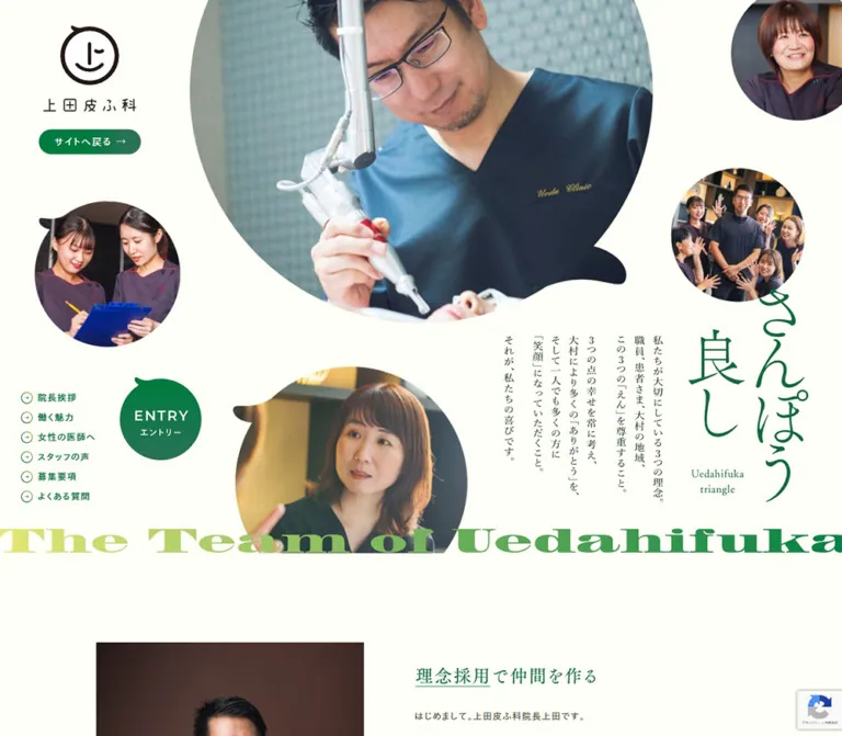
The page establishes warmth through a very pale cream canvas, dark green details, relaxed Japanese typography, and photographs of people working together. Its opening is an asymmetric photographic composition: one very large clinician image, four smaller staff images, a slim vertical statement, and the Japanese motto “さんぽう良し.” Speech-bubble silhouettes connect the portraits to the small protruding stroke of the clinic’s smiling emblem.
Scale supplies the drama. Small navigation links and generous empty areas sit beside large, partly cropped photographs. An oversized English line, “The Team of Uedahifuka,” stretches across the bottom of the opening in a yellow-green-to-green treatment. Below this expressive introduction, the page supports substantial reading and practical recruitment tasks. The shared clinic footer reconnects the recruitment content to locations, services, and organizational information.
How to Read This Reference
- Measured means supplied computed styles or element rectangles. Rectangles are rounded here where additional decimals would not help implementation.
- Observed means directly visible in a current-page capture. Photograph positions, display-lettering dimensions, and some footer spacing are visual estimates because corresponding image rectangles were not supplied.
- Declared means a source custom property exists. Declaration alone does not establish that a particular component uses it.
- Calculated means arithmetic from supplied measurements, such as converting a mobile width to a percentage. It does not establish the original CSS formula.
- Recommended means guidance for a new implementation. Breakpoints, accessible control improvements, fallback display typography, and the Quick Start’s mask are adaptations.
- A sampled DOM node can exist outside the viewport or inside a concealed region. Its rectangle and text do not prove that it was visible or interactive.
Tokens — Colors
Default Palette
| Name | Value | Evidence / source token | Role |
|---|---|---|---|
| Cream Canvas | #FEFFF6 |
Measured body background at both viewports | Main recruitment canvas and broad photographic margins |
| Clinic Green | #006F38 |
Measured navigation and section-heading text; source --color-green |
Identity, links, small headings, arrows, and action emphasis |
| General Text | #4F5451 |
Measured body foreground | Shared site and footer text |
| Recruitment Text | #51533B |
Measured recruitment paragraphs | Slightly olive text throughout the long-form recruitment content |
| Voice Brown | #5E422F |
Measured testimonial text and desktop interview links | Warmer treatment within staff-voice content |
| Quiet Gray | #F2F3F0 |
Source --color-bg; measured privacy panel and mobile footer |
Secondary informational surfaces |
| White Label | #FFFFFF |
Measured return and several supporting links | Reversed text over painted action surfaces |
| Pale Action Label | #FCFDEF |
Measured job-details CTA foreground | Text on the coral recruitment action |
| Desktop Coral | #FC9C95 |
Measured desktop job-details CTA background | Local emphasis in the women-physicians section |
| Mobile Coral | #FF7D7D |
Measured mobile job-details CTA background | More saturated mobile version of the same CTA |
| Branch Cyan | #5CC2CF |
Declared --color-blue; cyan branch identity visible |
Secondary clinic identity, especially the ZEROFULL logo |
| Brand Brown | #41210F |
Declared --color-brown; brown branch identity visible |
Supporting brand palette; exact assignment to individual logo pixels unverified |
| Secondary Green | #1D7651 |
Declared --color-green-dark |
Available brand color; individual application not established |
The actual recruitment body is #FEFFF6. Do not replace it globally with the similarly pale --color-bg value: the mobile footer and privacy panel use that grayer surface to create a subtle distinction.
Gradients and Supporting Tokens
| Treatment | Value | Evidence and use |
|---|---|---|
| Green action gradient | linear-gradient(90deg, #007C3F 48.68%, #297358 86.23%) |
Exact declared --gradient-green-color; visually consistent with the green return and entry treatments |
| Desktop green composite | linear-gradient(88.45deg, #007C3F 48.68%, #297358 86.23%), url(img/share/bg-pattern-noise.png) |
Exact desktop --gradient-green declaration |
| Mobile green composite | Same colors and stops, angle 90deg |
Exact mobile --gradient-green declaration |
| Pale green composite | linear-gradient(140deg, #EAEBE7 20%, #E1EDE2 100%), url(img/share/bg-pattern-noise.png) |
Declared --gradient-green-light; a pale mint region is visible above the middle photograph |
| Display-line lime | Approximately #DCE779 |
Visual estimate for the light end of the oversized English lettering; exact artwork colors were not measured |
| Neutral border | #A7A9A8 |
Declared --color-border-dark; component-specific assignment unverified |
| Brown border | #A09087 |
Declared --color-border-brown; component-specific assignment unverified |
The composite gradient declarations reference noise artwork. The supplied evidence does not expose their complete painting or blending setup, so those declarations alone do not prove a visible noise overlay. In an adaptation, keep any grain extremely subtle and verify the result visually.
Theme Presets
No alternate theme or palette-selection behavior was evidenced. Desktop/mobile coral differences and the mobile footer’s gray background are responsive component treatments, not selectable themes.
Tokens — Typography
Tazugane Gothic — Body and Navigation
The measured body and recruitment paragraphs use a computed stack beginning with TazuganeGothicStdN-Book. Navigation and several practical section headings begin with TazuganeGothicStdN-Regular.
The supplied fallback stack includes Yu Gothic Medium, YuGothic, Hiragino Sans, Hiragino Kaku Gothic ProN, Meiryo, and generic sans-serif. These are computed family declarations; actual per-glyph font resolution was not supplied.
Both sampled families report font-weight: 400. The Book/Regular distinction is expressed through the family name, so replacing every navigational label with synthetic bold text would change the texture.
Declared English Families
--font-gothic-r-en:AvenirNextLTPro-Regular, sans-serif.--font-serif-r-en:OptimaLTPro-Roman, serif.
These names are present in the source variables. No supplied element sample establishes their use on the large English hero line or its smaller caption. They should not be presented as verified display-font assignments.
Hero Lettering and Designed Headings
The main Japanese motto has slender, expressive strokes. Its adjacent statement is arranged vertically, while the large English line has heavy serif forms and a very wide composition. These three treatments create more contrast than an ordinary heading/body size hierarchy.
The exact fonts and asset formats for these elements are unverified. Several designed headings have empty plain-text samples despite visible or associated graphic content. Their wrapper’s computed font size is not a reliable measurement of the lettering inside them.
For a faithful extension, preserve authorized heading artwork where available. For a text-based adaptation, use real Japanese text with writing-mode: vertical-rl, and label any generic serif substitution as an approximation.
Type Scale
The measured root size is a conventional 16px at both viewports. Source variables such as --f14: 0.875rem and --f32: 2rem follow that root.
| Role | Desktop measured size / line height | Mobile measured size / line height | Tracking |
|---|---|---|---|
| Raw body inheritance | 14 / 14px |
14 / 14px |
Normal; content paragraphs override this |
| Return link | 15 / 15px |
Not shown in the mobile opening | 1.8px desktop |
| Recruitment navigation | 14 / 14px |
13 / 13px |
1.4px / 1.56px |
| Director’s message | 14 / 29.4px |
14 / 28.7px |
1.4px / 0.84px |
| Philosophy paragraphs | 15 / 31.5px |
13 / 24.7px |
2.1px / 0.78px |
| Career introduction | 16 / 30.4px |
13 / 24.7px |
2.24px / 1.04px |
| Statistics explanations | 14 / 25.2px |
12 / 19.2px |
0.84px / 0.36px |
| Statistics date notes | 12 / 24px |
10 / 20px |
Typically 0.96px / 0.2px |
| Benefit descriptions | 14 / 23.8px |
Description visibility not established | Usually 0.532px desktop |
| Women-physicians introduction | 16 / 35.2px |
14 / 29.4px |
1.6px / 0.56px |
| Job-details CTA | 20 / 20px |
16 / 16px |
2.8px / 1.28px |
| Sampled testimonial text | 13 / 24.05px |
12 / 20.4px |
0.26px / 0.24px |
| FAQ, hiring-flow, entry headings | 19 / 19px |
16 / 16px |
3.04px / 1.92px |
| Application instructions and labels | 15 / 31.5px |
13 / 26px |
1.2px / 0.78px |
| Privacy paragraphs | 13 / 27.3px |
13 / 26px |
0.78px at both sizes |
The reading character depends on generous paragraph leading, often around 1.9–2.2, paired with restrained weight. Do not copy the body’s 14px inherited line height onto prose.
Tokens — Spacing & Shapes
Spacing Scale
| Use | Desktop | Mobile | Status |
|---|---|---|---|
Source spacing variable --spa |
35px |
25px |
Declared; not a universal page gutter |
Source spacing variable --spa2 |
30px |
30px |
Declared |
| Director paragraph separation | About 16px |
About 14px |
Calculated from adjacent rectangles |
| Recruitment navigation row separation | 7px |
6px |
Calculated from link rectangles |
| Philosophy section padding | 120px 0 150px |
40px 0 |
Measured |
| Hiring-flow top padding | 60px |
60px |
Measured |
| Short application-control wrapper height | 64px |
50px |
Measured wrappers, not sampled input styles |
| Application row spacing | 25px between short wrappers |
Approximately 99px label-to-label pitch |
Calculated |
| Privacy outer padding | 15px |
5px |
Measured; nested content adds further inset |
| Footer padding | Full desktop padding not supplied | 90px 30px 25px 35px |
Measured mobile footer |
Border Radius and Silhouettes
| Element | Geometry | Evidence |
|---|---|---|
| Return action | 30px radius |
Computed |
| Comic and supporting action links | 100px radius |
Computed; pill result at their heights |
| Job-details CTA, desktop | 100px radius |
Computed |
| Job-details CTA, mobile | 5px radius |
Computed |
| Privacy surface | 6px radius |
Computed at both viewports |
| Hero portraits | Circles and rounded speech-bubble contours | Visible; original mask paths unavailable |
| Entry emblem | Near-circular green shape with a small projecting stroke | Visible; anchor box measured separately |
| Cosmetics photograph | Straight rectangular edges | Visible |
| Footer watermark | Very large, faint curved brand motif | Visible; exact path and opacity unavailable |
Speech-bubble tails are part of the identity. A universal border-radius: 50% produces only part of the effect. Preserve the direction and scale of each tail when original masks are available.
Layout Measurements
| Element | Desktop | Mobile | Interpretation |
|---|---|---|---|
| Document height | 20,429.39px |
17,886.33px |
Captured layout state; not an implementation target |
| Desktop brand link | 160.30 × 146.02px, at approximately (66.23, 43.05) |
A 40 × 41px emblem-link box at (22, 67) |
Mobile rectangle is not the width of the full visible wordmark |
| Return link | 160.30 × 39px, at approximately (66.23, 217.06) |
Absent from mobile opening | Computed |
| Entry link in opening | 128 × 132px, at approximately (191, 652.64) |
Separate flow anchor sampled at 102 × 49px, (268, 775) |
Mobile visual state and persistence unverified |
| Director text column | 520px wide, starting at x=710 |
327.59px wide, starting at x=31.20 |
Mobile width is approximately 84% of viewport |
| Philosophy text | 995px wide, starting at x=222.5 |
294.20px wide, starting at x=47.89 |
Mobile uses a notably narrower reading inset |
| Women-physicians section | 1120px wide, starting at x=160 |
351px wide, starting at x=19.5 |
Mobile width equals 90% of viewport |
| Practical FAQ/flow region | Approximately 965px wide |
Approximately 343.22px content width |
Mobile content corresponds to 88% of viewport |
| Entry section | 960px wide |
343.19px wide |
Form becomes a single column |
| Privacy surface | 570 × 390px |
343.19 × 370px |
Bounded informational region |
These measurements reveal several content widths rather than one universal container. Keep the opening expansive, editorial sections selectively inset, and practical form content consistently aligned.
Components
Brand and Return Block
Role: identify the clinic and provide a route back to its main website.
The desktop block sits in the upper-left opening. A dark emblem appears above widely spaced Japanese lettering; the green “サイトへ戻る” pill sits below. The return link uses white 15px text, 1.8px tracking, and padding 13px 46px 11px 24px. Its larger right inset accommodates the directional mark.
On mobile, the identity becomes a compact horizontal green lockup near the top-left. The desktop return pill is not visible. The entire visible wordmark is roughly 172px wide by visual estimation, while the supplied 40 × 41px link rectangle describes its emblem region.
No supplied positioning rule establishes that this block remains fixed while scrolling. Later captures do not show it.
Hero Photo Constellation
Role: make the people and working environment the first impression.
Five photographs have unequal visual weight: a clinician performing a procedure, two staff members working together, a speaking staff member, a small individual portrait, and a team portrait. Some are circular; others extend into speech-bubble tails. They float directly on cream with no borders, captions, or card surfaces in the opening.
Approximate visible placement in the desktop capture:
| Image | Visible footprint | Composition role |
|---|---|---|
| Main clinician | x≈329–1113, from above the viewport to y≈546 |
Dominant central image; intentionally cropped at the top |
| Staff pair | x≈59–307, y≈340–587 |
Balances the main image on the left |
| Speaking staff member | x≈400–798, beginning around y≈620 |
Lower anchor, continuing behind the English display band |
| Small individual portrait | Upper-right, approximately 206px across |
Small counterweight; clipped by the viewport edge |
| Team portrait | x≈1150–1376, y≈285–511 |
Connects the portrait field to the motto |
These are screenshot estimates, not original image dimensions. Preserve different scales, edge cropping, and the open spaces between photographs. Equal-sized circles arranged in a regular grid would lose the composition’s character.
Vertical Motto, Statement, and English Band
Role: communicate the recruitment philosophy through an editorial composition.
The right-hand motto reads “さんぽう良し,” with the small English caption “Uedahifuka triangle.” Narrow Japanese statement columns sit to its left. The relationship is spatial: the photographs establish people, while the vertical text introduces the organization’s values.
The large English line crosses the lower opening at approximately y=894–935 in the desktop capture. Its visible glyph height is roughly 40–55px; that is an artwork estimate, not a CSS font size. On mobile, part of the line appears around y=816 with much smaller visible lettering.
The line is cropped horizontally in both views. Static evidence does not establish whether it moves. Treat it as a wide decorative text treatment unless motion is independently verified.
Recruitment Navigation and Entry Emblem
Role: provide direct access to the long page’s practical sections.
Desktop navigation appears as six small green links near the lower-left of the opening, each with a fine circular arrow mark. Links have 24px measured height and 31px vertical pitch. The green entry emblem sits beside the list and displays “ENTRY” over “エントリー.”
The mobile navigation is below the opening, beginning at approximately document y=919.89. It uses two columns and three rows. Each link measures approximately 153.97 × 35px; the horizontal gap is approximately 19.69px.
| Visible label | Desktop fragment | Mobile fragment |
|---|---|---|
| “院長挨拶” | #recruit-message |
#recruit-message |
| “働く魅力” | #recruit-point |
#recruit-point |
| “女性の医師へ” | #recruit-women |
#recruit-doctor-woman |
| “スタッフの声” | #recruit-staff |
#recruit-staff |
| “募集要項” | #recruit-detail |
#recruit-detail |
| “よくある質問” | #recruit-faq |
#recruit-faq |
| Entry graphic | #recruit-flow |
#recruit-flow |
The women-physicians link uses different fragments between layouts. Target resolution was not tested, so this is a verification item rather than a confirmed broken link. The entry graphic points to the hiring process, which precedes the application form.
A mobile flow anchor has a lower-right rectangle, but the screenshot does not establish a clearly visible entry graphic there. Do not infer sticky behavior from that rectangle alone.
Director’s Message and Philosophy
Role: explain the organization’s approach before presenting conditions and benefits.
The desktop director’s message has a 520px text column on the right, with 14px text, 29.4px leading, and 1.4px tracking. Mobile text occupies approximately 84% of the viewport and retains a comfortable 28.7px line height.
The following philosophy section is much broader on desktop: 995px text rectangles sit within a full-width section with 120px top and 150px bottom padding. Paragraphs use 15px / 31.5px text and deliberate line breaks. On mobile, the text becomes 13px / 24.7px, narrows to about 294px, and reflows into longer paragraphs.
Preserve this change in reading rhythm. The page uses substantial prose as part of its recruitment identity, with graphical headings providing punctuation between sections.
Career Statistics and Benefit Content
Role: translate the organization’s philosophy into concrete working conditions.
The rendered content includes leave usage, average staff age, treatment mix, staff count, and annual holidays. Date notes remain close to their related statistics. The extracted evidence does not expose every displayed numerical value, so a reconstruction should not invent missing percentages or counts.
Desktop explanatory columns measure 238px, 238px, and 346px in one statistics row. This is an asymmetric information arrangement, not evidence for a uniform three-card system.
Six benefit topics follow, including education, workplace communication, study sessions, empowerment, and club activity. Their desktop paragraph columns are 290px wide at approximately x=194, 575, and 956. The middle column’s sampled paragraphs start 77px lower than the neighboring columns, indicating a staggered arrangement.
Mobile rendered text retains the benefit titles while omitting several desktop descriptions. The evidence does not identify an expansion mechanism. Preserve access to those descriptions in a new implementation instead of assuming an undocumented accordion.
A large graphic button is sampled at 880 × 134px on desktop and approximately 327.81 × 49.91px on mobile. Its action was not exercised; its dimensions do not establish a modal or video interaction.
Photography Break and Women-Physicians Section
Role: connect professional development and flexible working arrangements to the clinic’s everyday environment.
The middle desktop capture shows a large cosmetics photograph with straight edges, warm light, and pale pink product packaging. It begins around x=160, spans approximately 1120px, and is separated from the preceding pale mint region by broad cream space. The full image height and source asset URL were not supplied.
The women-physicians section also measures 1120px wide on desktop and 351px on mobile. Its desktop introduction occupies a 483px text column with 16px / 35.2px type. Mobile paragraphs use 14px / 29.4px with 10px horizontal inner padding.
Four supporting topics cover short or occasional shifts, support after maternity leave, cosmetic-treatment experience, and understanding family responsibilities. Mobile rendered text includes their titles; additional disclosure behavior is unverified.
The section ends with “募集要項はこちら.” This component changes substantially across layouts:
| Property | Desktop | Mobile |
|---|---|---|
| Size | 1120 × 68px |
351 × 46px |
| Background | #FC9C95 |
#FF7D7D |
| Text | 20px, tracking 2.8px |
16px, tracking 1.28px |
| Radius | 100px |
5px |
| Padding | 26px 5px 22px |
16px 5px 14px |
| Destination | #recruit-detail |
#recruit-detail |
Coral is a local accent here. It should not replace green as the page’s general navigation color.
Staff Voices and Interview Links
Role: introduce perspectives from existing and former staff.
Testimonial samples use warm brown #5E422F. Their text widths are 256px on desktop and 264px on mobile, with small, closely tracked type. Several sampled rectangles overlap or extend outside their containing viewport. The supplied captures do not show this section, so a simultaneously visible testimonial grid, hover balloon, or carousel cannot be established.
Two interview links are directly evidenced: “医療事務 古賀” and “看護師 山下.” Desktop samples use inline brown 15px text. Mobile samples become adjacent pill-shaped links, each approximately 163.48 × 44px, with white 14px labels and 100px radius. Their own background samples are transparent; complete background painting was not supplied.
Retain the distinction between on-page staff voices and links to longer interviews. A new implementation should make every testimonial reachable through an explicit, accessible interaction or ordinary reading flow.
Job Details and FAQ
Role: help a reader assess eligibility and resolve common concerns.
The job section includes an availability notice and a physician entry labeled “1.医師.” Additional employment information is present in the element text, but its expanded presentation was not captured.
The FAQ presents three questions concerning overtime, confidence with difficult procedures, and paid leave. Its heading uses Clinic Green, 19px type, and 3.04px tracking on desktop; mobile uses 16px and 1.92px tracking.
Question expansion, answer styling, icons, and open-state behavior are unverified. If an adaptation uses disclosure controls, implement them explicitly rather than treating hidden DOM text as proof of the original interaction.
Clinic Visit and Hiring Process
Role: make the application journey understandable before asking for personal information.
The visit section contains explanatory copy and repeated photography credits. The five hiring stages are entry, a Zoom meeting, interview plus clinic visit, practical experience, and a hiring decision.
The process container measures approximately 965px wide and 377.75px high on desktop, including 60px top padding. On mobile, its full-width section is 533.31px high with approximately 23.39px side padding and the same 60px top padding. The stage-item layout itself was not sampled.
Use an ordered list in a new implementation. Keep the source’s distinction that entry requires both the online form and résumé delivery; it is more informative than an unexplained single application button.
Application Form and Privacy Region
Role: collect application details within the same long page.
Desktop anatomy has three nested alignments:
- A
960pxentry section begins atx=240. - Instructions and the form begin at
x=430, leaving a190pxleading column for subsection information. - Field labels occupy
200px; short-control wrappers begin atx=630and measure570 × 64px.
The form includes nine short-field rows and a larger message region. Labels cover name, birth date, phone, email, email confirmation, current occupation, available working hours, work history, qualifications, and a message.
On mobile, labels stack above 343.19 × 50px short-control wrappers. Label line boxes are 26px high, with approximately 3px before the control wrapper and 20px before the next label. The message wrapper remains tall at approximately 369px.
These are wrapper measurements. Input borders, native control types, error styles, required-field semantics, and submit-button appearance were not supplied.
The privacy panel follows the field column. It uses #F2F3F0, 6px corners, and a bounded height of 390px on desktop or 370px on mobile. Its text extends far beyond that box in the DOM samples; those descendant coordinates do not imply that the whole policy is painted into the page. Internal scrolling is plausible but was not exercised. An agreement statement follows it.
Shared Clinic Footer
Role: reconnect recruitment content to the clinic’s locations and wider services.
Desktop starts with two location blocks arranged horizontally. Each combines a branch logo, postal address, parking information, and an underlined green destination link with a circular arrow. The PAAK identity uses brown; ZEROFULL introduces cyan.
Below, the left side contains social symbols and clinic information. The right side contains “Contents” and “Beauty Care plan,” each spread across two link columns. Small green chevrons mark the links. A very pale enlarged brand curve sits behind the lower content. The main clinic lockup appears near the lower-left, while the copyright runs vertically near the right edge.
Mobile reorganizes the footer into a sequence: two stacked branch blocks, centered social symbols, centered clinic lockup, aligned clinic-information rows, and a small horizontal copyright at the bottom. The extensive desktop sitemap is absent from the mobile rendered text and capture.
The mobile surface is measured #F2F3F0; the desktop capture visually continues the cream canvas. Mobile branch links use 13px text, 1.3px tracking, and 29px link boxes. The social circles are approximately 28–30px across by visual estimation.
The footer’s visible copyright identifies “Medical Corporation Palette.” This reference does not infer a Japanese legal name or a design/development credit from that line.
Tokens — Motion & Interaction
| Treatment | Evidence | Practical interpretation |
|---|---|---|
| Desktop link feedback | Computed transition: 0.15s ease-out on sampled links |
A short transition is defined; changed properties and hover appearance were not captured |
| Desktop graphic button | Same 0.15s ease-out transition |
Timing is known; action and feedback state are unverified |
| Mobile links | Samples serialize transition as all, without a positive duration |
No timed mobile transition is established by these samples |
| Sampled CSS animation | animation: none on supplied elements |
No active animation on those nodes at sampling; descendants, pseudo-elements, image animation, or scripts remain unverified |
| Easing library | Variables include --easeOutQuint and --easeOutBack |
Available curves do not establish their application to a component |
| Section navigation | Same-page fragment URLs are supplied | Destinations are evidenced; smooth-scroll behavior and timing were not exercised |
| English display band | Wide cropped lettering in static captures | Movement, direction, looping, and speed are unknown |
| Repeated photo credits | Repeated strings in the visit section | Does not prove the number of unique images or an autoplay carousel |
| FAQ and job detail reveal | Questions and additional DOM text exist | Expanded states and triggers are unverified |
| Form | Labels and agreement text exist | Validation, submission, confirmation, and delivery behavior were not tested |
The browser’s initial observation lasted at least five seconds and used animation, layout, text-stability, and image-decoding readiness checks. Perpetual animations were paused during readiness checks and resumed afterward. This procedure does not provide an animation inventory or prove that delayed content and unexercised states were fully observed.
Recommended motion: use the evidenced 150ms ease-out timing for restrained link feedback. Keep the hero composition fully legible when static. Add scrolling or floating effects only as separately specified behavior, with a reduced-motion alternative.
Surfaces
| Layer | Appearance | Purpose |
|---|---|---|
| Recruitment canvas | Nearly white cream #FEFFF6 |
Warm background for photographs and editorial text |
| Hero imagery | Full-color photographs with circular or speech-bubble edges | Human emphasis without card containers |
| Pale transition region | Very light mint appearance | Quiet separation between content areas |
| Green action | Restrained green gradient, white label | Return and recruitment navigation emphasis |
| Coral action | Local coral fill; radius changes by viewport | Job-details route within a specific content section |
| Privacy panel | Gray #F2F3F0, 6px corners |
Bounded legal information |
| Mobile footer | Gray canvas with pale brand watermark | Shared clinic information |
There is no visible general-purpose elevation system. The source includes framework shadow presets, but their existence does not make them part of this page’s design language.
The lower-right verification badge is third-party interface chrome. Its shadow and blue icon should not become reusable clinic design tokens. The page content remains accessible in the supplied captures; the badge is not evidence of a blocking challenge.
Imagery
Use documentary workplace photography: people concentrating on procedures, staff discussing work, natural expressions, and informal team groups. Dark navy and plum uniforms create contrast against the cream background. Skin tones, warm interior materials, and soft product pinks supply secondary color without adding more interface accents.
The opening mixes very large and small crops. The clinician image shows both a face and a tool; the staff-pair image communicates collaboration; the group photograph adds collective energy. Choose focal points deliberately when adapting crops to mobile. Avoid cutting the action out of the main photograph merely to center a face.
The cosmetics image uses a different visual mode: a large rectangular still life, shallow depth of field, pale packaging, and warm light. The bottom desktop capture also shows the lower portion of a wide team photograph above the footer. These rectangular photographs provide a useful counterpoint to the opening’s rounded masks.
The original page explicitly repeats “Photo by Toshihisa Ishii” in the clinic-visit section. That credit is supported for the associated section; attribution to every portrait or product image is not established.
Observed Asset References
| Asset or reference | Supplied path | Evidence boundary |
|---|---|---|
| Recruitment comic | /wp/wp-content/themes/uedahifuka2/img/recruit-information/recruit-comic.jpg |
Direct link on the original page; asset contents were not independently opened |
| Noise pattern | img/share/bg-pattern-noise.png |
CSS-relative reference in gradient variables; stylesheet base and complete painting setup unavailable |
| Green dotted line | img/share/line-dot-green.svg |
CSS-relative reference in --line-dot-green; component assignment unavailable |
| Hero portraits and masks | No asset URLs supplied | Appearance supported by current captures |
| Hero lettering and clinic logos | No asset URLs supplied | Format and original font construction unverified |
| Cosmetics and team photography | No asset URLs supplied | Visible current-page photography |
Use authorized photographs and brand artwork. The CSS shell can reproduce the relationships, but it cannot reproduce the identity carried by the actual people, logo, and designed lettering.
Layout & Responsive Behavior
The Opening Is Recomposed
Mobile uses a new arrangement rather than proportional desktop scaling. The clinician appears toward the upper-left with part of the circle beyond the edge. A small portrait sits above the speaking staff member on the right. The staff pair and team photograph occupy the next lower area. The vertical motto and statement then fill the space beneath the photographs.
At 390 × 844, approximate photographic landmarks are:
- Main clinician: begins around
y=123, with a visible right edge aroundx=213. - Small portrait: approximately
(242, 151), around88pxacross. - Speaking staff member: begins around
(225, 269), with the right side cropped. - Staff pair: begins around
(33, 387), approximately156pxacross. - Team portrait: begins around
(217, 468), approximately83pxacross. - Motto: begins around
y=547; narrow statement columns begin aroundy=576.
These are visual estimates for the captured composition. Original image bounding boxes and responsive positioning formulas were not supplied.
Measured Structural Changes
| Region | Desktop behavior | Mobile behavior |
|---|---|---|
| Branding | Tall emblem/wordmark stack with return pill | Compact horizontal green lockup |
| Recruitment navigation | Six-link vertical list beside entry emblem | Two-column list below the opening |
| Director’s message | Right-side 520px reading column |
Approximately 84vw reading column |
| Philosophy | Broad 995px paragraphs with generous spacing |
Narrower reading width and smaller tracking |
| Benefit callouts | Multiple columns with staggered starts | Sampled short callouts stack at approximately 304px width |
| Women-physicians section | 1120px outer width |
90vw outer width |
| Job-details action | Wide pale-coral pill | Stronger coral rectangle with 5px corners |
| Interview links | Inline brown links | Two adjacent pill-sized links |
| Application form | Nested side-label columns | Labels above full-width controls |
| Footer | Branches in a row, extensive sitemap, vertical copyright | Stacked branches, centered identity, reduced link density |
The desktop and mobile document heights should not be compared as simple scaling ratios. Text reflow, different spacing, omitted rendered descriptions, and reduced footer content all contribute to the captured result.
Some mobile statistics and testimonial rectangles extend beyond the viewport. The supplied evidence cannot distinguish intentional horizontal presentation, hidden states, transformed content, and accidental overflow. Verify these areas before adopting any clipping strategy.
Recommended breakpoint: the Quick Start uses 1024px as an implementation choice between the two evidenced layouts. No original breakpoint was supplied. Test intermediate tablet widths, text zoom, and narrow phones before finalizing it.
Do’s and Don’ts
Do
- Keep the measured cream canvas and Clinic Green as the dominant pair.
- Preserve unequal portrait sizes, speech-bubble tails, and intentional edge cropping.
- Recompose the mobile opening around the people and vertical text.
- Keep light-weight Japanese body text, generous leading, and section-specific tracking.
- Maintain different widths for expressive photography, editorial reading, and practical forms.
- Use coral locally and preserve its evidenced desktop/mobile differences when reproducing the captured design.
- Keep branch-specific brown and cyan identities in the footer.
- Retain plain, usable routes to job information, hiring steps, and the form.
- Keep source dates attached to statistics and avoid inventing numbers missing from evidence.
- Treat missing interaction states as implementation questions to verify.
Don’t
- Don’t regularize the hero into equal portrait cards.
- Don’t assign Optima or another declared family to the hero lettering without element-level evidence.
- Don’t mistake a graphic heading wrapper’s font size for the visible lettering size.
- Don’t apply the raw body’s
14pxline height to long paragraphs. - Don’t use pure white everywhere or flatten the gray secondary surfaces into the cream canvas.
- Don’t infer fixed navigation, autoplay, parallax, hover balloons, or smooth scrolling from static geometry.
- Don’t treat offscreen testimonial rectangles as proof of a visible overlapping layout.
- Don’t introduce general card shadows because framework shadow variables exist.
- Don’t infer original asset filenames from visual appearance.
- Don’t let decorative clipping make practical content unreachable.
Recommended Implementation Additions
These are recommendations for an adaptation, not verified features of the original page:
- Give the entry graphic, logo links, and social symbols explicit accessible names. Empty extracted link text does not establish whether alternative names already exist.
- Provide a semantic page heading and accessible equivalents for any headings rendered as artwork.
- Increase small link hit areas toward
44pxwhile retaining the compact visible marks. The measured desktop navigation boxes are only24pxhigh. - Verify text contrast on coral actions. The Quick Start uses dark brown action text as an accessible alternative to the observed pale label.
- Resolve and test the different women-physicians anchor fragments across breakpoints.
- Keep benefit explanations and staff voices available to keyboard and touch users. Use native disclosure controls if progressive disclosure is required.
- Supply field labels, suitable input types, autocomplete hints, visible errors, and a submission status. Use at least
16pxinput text on mobile; the original input typography was not sampled. - Make the bounded privacy text region keyboard-scrollable, with a clear label, and keep the agreement control outside its scrolling content.
- Reserve space for lower-right service chrome so it cannot obscure an entry action or focused control.
- Use intrinsic image dimensions and responsive sources. Prioritize the dominant opening photograph; defer lower-page photography where appropriate.
- Preserve a readable static composition for reduced-motion users and ensure decorative English lettering cannot create page-wide horizontal scrolling.
Agent Prompt Guide
Quick Color Reference
- Main canvas:
#FEFFF6. - Navigation and practical headings:
#006F38. - Recruitment prose:
#51533B. - General/footer text:
#4F5451. - Staff-voice text:
#5E422F. - Secondary panel and mobile footer:
#F2F3F0. - Green gradient:
#007C3Fto#297358. - Local job CTA:
#FC9C95desktop,#FF7D7Dmobile. - Secondary branch identity: cyan
#5CC2CF. - Decorative English lettering: estimated lime
#DCE779toward green; exact artwork colors unverified.
Overall Prompt
“Create a physician-recruitment content page for a community dermatology clinic. Use a nearly white cream canvas, deep green navigation, warm olive body text, and authentic workplace photography. Compose the opening from five differently sized portraits using circles and speech-bubble silhouettes. Place a slender vertical Japanese motto and narrow vertical statement beside the photographs, with a very wide serif English team line across the bottom. Keep the desktop navigation small and local to the opening. On mobile, rearrange the photo constellation and put the section navigation below it in two columns. Continue with spacious editorial messages, practical career information, staff voices, a hiring process, and a clearly labeled application form. Finish with two branch identities and a quiet clinic footer. Keep interaction behavior explicit and avoid adding undocumented animation.”
Example Component Prompts
- Opening composition: “Build a cream photographic opening with one dominant clinician-at-work image, four smaller staff photographs, varied circular and speech-bubble crops, and generous empty space. Preserve faces and working gestures when cropping. Use vertical Japanese text and a wide decorative English line. Create separate desktop and mobile compositions.”
- Section navigation: “Create six small green links with fine circular arrow marks. On desktop, use a vertical list with a green entry emblem beside it. On mobile, use two columns below the opening. Link entry to the hiring-process section and provide visible keyboard focus.”
- Editorial message: “Use a 520px desktop text column with light Japanese sans-serif text at 14px, approximately 29px leading, and restrained tracking. On mobile, use approximately 84% viewport width, retaining generous leading. Pair the text with approved clinic photography and a designed heading.”
- Job-details action: “Create a coral action labeled ‘募集要項はこちら’: a wide 68px-high pill on desktop and a 46px-high rounded rectangle on mobile. Use the measured coral colors and keep the action local to its content section. Verify label contrast.”
- Application form: “Use a restrained recruitment form with a 200px label column and flexible controls on desktop. Stack labels above controls on mobile. Include a tall message field, a bounded gray privacy region, and an agreement control. Add clear labels and error states without decorative card shadows.”
- Clinic footer: “Arrange two branch logo/address blocks horizontally on desktop and vertically on mobile. Use brown for one branch and cyan for the other, green links, quiet gray text, circular social symbols, and a faint oversized brand curve. Put the clinic wordmark above the information rows on mobile.”
Quick Start
CSS Custom Properties
This is a reusable adaptation, not recovered source CSS. Exact palette and typography measurements are retained where established. Hero placement is estimated from the captures; the 1024px breakpoint, input borders, focus treatment, mobile entry placement, and speech mask are recommendations. The code does not implement unverified animation or disclosure behavior.
The expected structure places .recruit-hero and .recruit-nav-shell inside .recruit-opening. The navigation shell overlays the opening on desktop and follows it in document flow on mobile. Use authorized logo and photograph assets; none are bundled here.
:root {
  /* Measured colors */
  --color-paper: #fefff6;
  --color-green: #006f38;
  --color-text: #51533b;
  --color-site-text: #4f5451;
  --color-voice: #5e422f;
  --color-panel: #f2f3f0;
  --color-coral: #fc9c95;
  --color-coral-mobile: #ff7d7d;
  --color-pale-label: #fcfdef;

  /* Declared supporting colors and gradient */
  --color-brown: #41210f;
  --color-blue: #5cc2cf;
  --color-border: #a7a9a8;
  --gradient-action: linear-gradient(
    90deg, #007c3f 48.68%, #297358 86.23%
  );

  /* Visual approximation for decorative lettering */
  --color-lime-approx: #dce779;

  /* Source-family aliases; font files require separate provision */
  --font-body: 'TazuganeGothicStdN-Book',
    'Yu Gothic Medium', 'Hiragino Sans', Meiryo, sans-serif;
  --font-label: 'TazuganeGothicStdN-Regular',
    'Yu Gothic Medium', 'Hiragino Sans', Meiryo, sans-serif;

  /* Generic approximation, not an identified hero font */
  --font-display-fallback: serif;

  --width-photo: 1120px;
  --width-editorial: 995px;
  --width-form: 960px;
  --radius-pill: 100px;
  --radius-panel: 6px;
  --motion-link: 150ms ease-out;
}

* { box-sizing: border-box; }

body {
  margin: 0;
  color: var(--color-text);
  background: var(--color-paper);
  font-family: var(--font-body);
  font-size: 14px;
  line-height: 1.8;
}

img { display: block; max-width: 100%; }
a { color: var(--color-green); }
button, input, textarea, select { font: inherit; }

:where(a, button, input, textarea, select, summary):focus-visible {
  outline: 2px solid var(--color-green);
  outline-offset: 4px;
}

/* Estimated desktop composition at the evidenced proportions */
.recruit-opening { position: relative; }
.recruit-hero {
  position: relative;
  height: 65vw;
  overflow: hidden;
}

.hero-brand {
  position: absolute;
  left: 4.6%;
  top: 2.99vw;
  width: 160.3px;
  z-index: 2;
}
.hero-brand__mobile { display: none; }

.return-link {
  display: inline-block;
  margin-top: 28px;
  padding: 13px 46px 11px 24px;
  border-radius: 30px;
  color: #fff;
  background: var(--gradient-action);
  font-size: 15px;
  line-height: 1;
  letter-spacing: 1.8px;
  text-decoration: none;
}

.hero-photo {
  position: absolute;
  margin: 0;
  aspect-ratio: 1;
  overflow: hidden;
  border-radius: 50%;
}
.hero-photo img {
  width: 100%;
  height: 100%;
  object-fit: cover;
}
.hero-photo--bubble {
  border-radius: 0;
  clip-path: url(#speech-crop);
}
.hero-photo--doctor {
  width: 54.5%; left: 22.8%; top: -16.5vw;
}
.hero-photo--pair {
  width: 17.2%; left: 4.1%; top: 23.6vw;
}
.hero-photo--speaker {
  width: 27.7%; left: 27.8%; top: 43.05vw;
}
.hero-photo--small {
  width: 14.3%; right: -1.3%; top: 0;
}
.hero-photo--team {
  width: 15.75%; right: 4.4%; top: 19.8vw;
}

/* Prefer approved lettering artwork for exact visual fidelity */
.hero-motto {
  position: absolute;
  right: 4%;
  top: 34vw;
  width: 14.5%;
  color: var(--color-green);
}
.hero-motto h1 {
  margin: 0;
  writing-mode: vertical-rl;
  font-family: var(--font-display-fallback);
  font-weight: 400;
  font-size: 6.3vw;
  line-height: 1.05;
}
.hero-motto p {
  font-family: var(--font-display-fallback);
  font-size: 16px;
  line-height: 1.5;
  text-align: center;
}
.hero-statement {
  position: absolute;
  right: 21%;
  top: 39.4vw;
  width: 19%;
  height: 20vw;
  margin: 0;
  writing-mode: vertical-rl;
  text-orientation: mixed;
  font-family: var(--font-display-fallback);
  font-size: 1.2vw;
  line-height: 1.8;
}
.hero-band {
  position: absolute;
  left: 0;
  top: 61.8vw;
  margin: 0;
  width: max-content;
  white-space: nowrap;
  font-family: var(--font-display-fallback);
  font-size: 5.5vw;
  font-weight: 900;
  line-height: 1;
  color: var(--color-green);
  pointer-events: none;
}
@supports (background-clip: text) {
  .hero-band {
    background: linear-gradient(
      90deg, var(--color-lime-approx), var(--color-green)
    );
    background-clip: text;
    color: transparent;
  }
}

.recruit-nav-shell {
  position: absolute;
  left: 2.5%;
  top: 45.32vw;
  display: flex;
  align-items: flex-start;
  gap: 18px;
  z-index: 3;
}
.anchor-nav {
  display: grid;
  gap: 7px;
  width: 137px;
  margin-top: 22px;
}
.anchor-nav a {
  position: relative;
  width: max-content;
  padding: 5px 20px 5px 26px;
  font-family: var(--font-label);
  font-size: 14px;
  line-height: 14px;
  letter-spacing: 1.4px;
  text-decoration: none;
}
.anchor-nav a::before {
  content: '→';
  position: absolute;
  left: 0;
  top: 3px;
  display: grid;
  place-items: center;
  width: 18px;
  height: 18px;
  border: 1px solid currentColor;
  border-radius: 50%;
  font-size: 10px;
  line-height: 1;
}
.entry-link {
  display: grid;
  place-content: center;
  width: 128px;
  height: 132px;
  border-radius: 50%;
  color: #fff;
  background: var(--gradient-action);
  text-align: center;
  text-decoration: none;
}
.entry-link strong {
  font-size: 22px;
  letter-spacing: 2px;
}
.entry-link span { font-size: 13px; }

.editorial {
  width: min(var(--width-editorial), 84%);
  margin-inline: auto;
}
.director-copy {
  max-width: 520px;
  font-size: 14px;
  line-height: 2.1;
  letter-spacing: 0.1em;
}
.director-copy p { margin: 0 0 16px; }
.philosophy { padding-block: 120px 150px; }
.philosophy p {
  font-size: 15px;
  line-height: 2.1;
  letter-spacing: 0.14em;
}
.photo-section {
  width: min(var(--width-photo), 90%);
  margin: 140px auto;
}
.photo-section > img { width: 100%; height: auto; }

.job-cta {
  display: block;
  padding: 26px 5px 22px;
  border-radius: 100px;
  background: var(--color-coral);
  /* Recommended contrast improvement over the pale source label */
  color: var(--color-brown);
  font-family: var(--font-label);
  font-size: 20px;
  line-height: 1;
  letter-spacing: 2.8px;
  text-align: center;
  text-decoration: none;
}

.entry-section {
  width: min(var(--width-form), 88%);
  margin: 120px auto;
}
.section-label {
  color: var(--color-green);
  font-family: var(--font-label);
  font-size: 19px;
  font-weight: 400;
  line-height: 1.3;
  letter-spacing: 0.16em;
}
.application-form { margin-left: 190px; }
.form-row {
  display: grid;
  grid-template-columns: 200px minmax(0, 1fr);
  align-items: start;
  margin-bottom: 25px;
}
.form-row label {
  padding-top: 18px;
  font-size: 15px;
  line-height: 2.1;
  letter-spacing: 0.08em;
}
.form-row :is(input, textarea, select) {
  width: 100%;
  min-width: 0;
  min-height: 64px;
  padding: 14px;
  /* Control border and fill are recommended, not sampled */
  border: 1px solid var(--color-border);
  border-radius: 5px;
  color: var(--color-text);
  background: var(--color-paper);
  font-size: 16px;
}
.form-row textarea {
  min-height: 370px;
  resize: vertical;
}
.privacy-panel {
  height: 390px;
  margin-left: 200px;
  padding: 15px;
  overflow-y: auto;
  border-radius: 6px;
  background: var(--color-panel);
}
.privacy-panel__content {
  padding: 25px;
  font-size: 13px;
  line-height: 2.1;
  letter-spacing: 0.06em;
}

.clinic-footer {
  padding: 150px 60px 40px;
  color: var(--color-site-text);
  background: var(--color-paper);
}
.clinic-locations {
  display: flex;
  flex-wrap: wrap;
  gap: 44px;
}
.clinic-location {
  display: grid;
  grid-template-columns: 120px minmax(0, 1fr);
  align-items: center;
  gap: 20px;
}
.clinic-location a {
  text-underline-offset: 3px;
  letter-spacing: 0.1em;
}

@media (hover: hover) {
  :where(.return-link, .anchor-nav a, .entry-link, .job-cta) {
    transition: opacity var(--motion-link);
  }
  /* Recommended feedback; original hover appearance is unverified */
  :where(.return-link, .anchor-nav a, .entry-link, .job-cta):hover {
    opacity: 0.82;
  }
}

/* Recommended breakpoint between the two evidenced layouts */
@media (max-width: 1023px) {
  .recruit-hero { height: 225vw; }
  .hero-brand {
    left: 5.64%; top: 17.18vw; width: 44.1%;
  }
  .hero-brand__desktop, .return-link { display: none; }
  .hero-brand__mobile { display: block; }
  .hero-photo--doctor {
    width: 62.8%; left: -8.2%; top: 31.5vw;
  }
  .hero-photo--pair {
    width: 40%; left: 8.5%; top: 99.2vw;
  }
  .hero-photo--speaker {
    width: 47%; left: 57.8%; top: 69vw;
  }
  .hero-photo--small {
    width: 22.56%; left: 62.05%; top: 38.7vw;
  }
  .hero-photo--team {
    width: 21.3%; left: 55.6%; top: 120vw;
  }
  .hero-motto {
    right: 4.3%; top: 140vw; width: 34%;
  }
  .hero-motto h1 { font-size: 14vw; }
  .hero-motto p { font-size: 12px; }
  .hero-statement {
    left: 8%; right: auto; top: 147.5vw;
    width: 48%; height: 52vw;
    font-size: 3.1vw;
    line-height: 1.75;
  }
  .hero-band { top: 209vw; font-size: 9vw; }

  .recruit-nav-shell {
    position: static;
    display: block;
    width: 84%;
    margin: 40px auto 0;
  }
  .anchor-nav {
    grid-template-columns: repeat(2, minmax(0, 1fr));
    gap: 6px 19.69px;
    width: 100%;
    margin-top: 0;
  }
  .anchor-nav a {
    width: 100%;
    padding: 11px 20px 11px 4px;
    font-size: 13px;
    line-height: 13px;
    letter-spacing: 1.56px;
  }
  .anchor-nav a::before { display: none; }
  .entry-link {
    /* Recommended visible placement below navigation */
    width: 100%; height: auto; min-height: 44px;
    margin-top: 24px; padding: 12px;
    border-radius: var(--radius-pill);
  }
  .director-copy {
    max-width: none;
    line-height: 2.05;
    letter-spacing: 0.06em;
  }
  .director-copy p { margin-bottom: 14px; }
  .philosophy { padding-block: 40px; }
  .philosophy .editorial { width: 75.44%; }
  .philosophy p {
    font-size: 13px;
    line-height: 1.9;
    letter-spacing: 0.06em;
  }
  .photo-section { margin-block: 60px; }
  .job-cta {
    padding: 16px 5px 14px;
    border-radius: 5px;
    background: var(--color-coral-mobile);
    font-size: 16px;
    letter-spacing: 1.28px;
  }
  .entry-section { margin-block: 60px; }
  .section-label {
    font-size: 16px;
    letter-spacing: 0.12em;
  }
  .application-form { margin-left: 0; }
  .form-row {
    grid-template-columns: minmax(0, 1fr);
    gap: 3px;
    margin-bottom: 20px;
  }
  .form-row label {
    padding: 0 0 0 2px;
    font-size: 13px;
    line-height: 26px;
    letter-spacing: 0.78px;
  }
  .form-row :is(input, select) { min-height: 50px; }
  .privacy-panel {
    height: 370px;
    margin-left: 0;
    padding: 5px;
  }
  .privacy-panel__content { line-height: 2; }
  .clinic-footer {
    padding: 90px 30px 25px 35px;
    background: var(--color-panel);
  }
  .clinic-locations { display: grid; gap: 35px; }
  .clinic-location {
    grid-template-columns: 100px minmax(0, 1fr);
    gap: 20px;
    font-size: 13px;
  }
}

@media (prefers-reduced-motion: reduce) {
  :where(.return-link, .anchor-nav a, .entry-link, .job-cta) {
    transition: none;
  }
}
Add this definition once inside the document when using .hero-photo--bubble. It is an original approximation for this Quick Start, not the inspected site’s mask. Exact reproduction requires separate approved paths for the different tail orientations.
<svg width='0' height='0' aria-hidden='true'
     focusable='false' style='position:absolute'>
  <defs>
    <clipPath id='speech-crop' clipPathUnits='objectBoundingBox'>
      <path d='M .49 0
        C .77 0 .97 .21 .97 .48
        C .97 .65 .91 .74 .84 .80
        C .95 .82 1 .88 .98 .94
        C .97 .99 .88 .92 .78 .93
        C .67 .96 .62 1 .49 1
        C .22 1 0 .78 0 .49
        C 0 .21 .22 0 .49 0 Z'/>
    </clipPath>
  </defs>
</svg>
Use lang='ja' on Japanese text. Mark duplicated decorative lettering as hidden from assistive technology only when an equivalent meaningful heading is available. Restrict clipping to the decorative hero; do not hide page-wide overflow to conceal inaccessible content.
Tailwind v4 Token Mapping
Optional aliases for a project already using Tailwind v4. This is not evidence that the original page uses Tailwind. Define the custom properties above first.
@theme inline {
  --color-paper: #fefff6;
  --color-clinic: #006f38;
  --color-recruitment-ink: #51533b;
  --color-site-ink: #4f5451;
  --color-voice: #5e422f;
  --color-panel: #f2f3f0;
  --color-coral: #fc9c95;
  --color-coral-mobile: #ff7d7d;
  --color-branch-blue: #5cc2cf;

  --font-body: var(--font-body);
  --font-label: var(--font-label);

  --text-note: 0.75rem;
  --text-body-small: 0.8125rem;
  --text-body: 0.875rem;
  --text-reading: 0.9375rem;
  --text-section: 1.1875rem;

  --radius-panel: 6px;
  --radius-pill: 100px;
  --spacing-section: 60px;
}
Sources & Evidence
- Current physician-recruitment page: supplied original-page response, final URL, rendered text, link destinations, custom properties, and computed element samples. Both original and final URL are identical.
- Capture timestamp:
2026-09-12T18:22:10.936Z, equivalent to September 13, 2026, 03:22 JST. - Desktop evidence:
1440 × 1000CSS-pixel viewport; opening, middle photograph, and footer captures; recorded document height approximately20,429.39px. - Mobile evidence:
390 × 844CSS-pixel viewport; opening and footer captures; recorded document height approximately17,886.33px. - Computed evidence: body and paragraph typography, component rectangles, colors, selected radii and padding, navigation URLs, source variables, and sampled transition/animation values.
- Observed behavior: document loading and scrolling through the page under the supplied readiness procedure. No click-through, hover comparison, FAQ expansion, form submission, or social-menu interaction results were provided.
- Limitations: exact hero masks, most image URLs, display-font assignments, resolved font files, pseudo-element painting, original responsive breakpoints, intermediate-width layouts, and complete motion behavior remain unverified. Some sampled content lies outside the viewport or inside bounded regions, so DOM presence is distinguished from visual visibility throughout this reference.
This document describes the supplied current-page state. The CSS, mask, accessibility additions, and suggested breakpoint are implementation guidance and have not been browser-tested as part of this analysis.
# Ueda Hifuka / Physician Recruitment — Style Reference

> A cream-and-green recruitment story told through staff portraits, speech bubbles, and vertical Japanese lettering.

**Website:** [uedahifuka.com/recruit-doctor](https://uedahifuka.com/recruit-doctor)
**Original URL:** https://uedahifuka.com/recruit-doctor
**Final URL:** https://uedahifuka.com/recruit-doctor
**Response:** HTTP 200; unchanged URL.
**Theme:** light in both captured layouts; no theme selector evidenced.
**Inspected:** September 13, 2026, 03:22 JST, from the supplied browser inspection. Recorded timestamp: `2026-09-12T18:22:10.936Z`.
**Viewports:** desktop `1440 × 1000` and mobile `390 × 844` CSS pixels.
**Scope:** the current physician-recruitment page within the clinic website. Visual evidence covers the opening composition, a middle photography section, and the desktop/mobile footer. Rendered DOM evidence additionally covers the director’s message, recruitment philosophy, career information, benefits, support for women physicians, staff voices, job details, FAQ, clinic visits, hiring process, and application form.

The page establishes warmth through a very pale cream canvas, dark green details, relaxed Japanese typography, and photographs of people working together. Its opening is an asymmetric photographic composition: one very large clinician image, four smaller staff images, a slim vertical statement, and the Japanese motto “さんぽう良し.” Speech-bubble silhouettes connect the portraits to the small protruding stroke of the clinic’s smiling emblem.

Scale supplies the drama. Small navigation links and generous empty areas sit beside large, partly cropped photographs. An oversized English line, “The Team of Uedahifuka,” stretches across the bottom of the opening in a yellow-green-to-green treatment. Below this expressive introduction, the page supports substantial reading and practical recruitment tasks. The shared clinic footer reconnects the recruitment content to locations, services, and organizational information.

## How to Read This Reference

- **Measured** means supplied computed styles or element rectangles. Rectangles are rounded here where additional decimals would not help implementation.
- **Observed** means directly visible in a current-page capture. Photograph positions, display-lettering dimensions, and some footer spacing are visual estimates because corresponding image rectangles were not supplied.
- **Declared** means a source custom property exists. Declaration alone does not establish that a particular component uses it.
- **Calculated** means arithmetic from supplied measurements, such as converting a mobile width to a percentage. It does not establish the original CSS formula.
- **Recommended** means guidance for a new implementation. Breakpoints, accessible control improvements, fallback display typography, and the Quick Start’s mask are adaptations.
- A sampled DOM node can exist outside the viewport or inside a concealed region. Its rectangle and text do not prove that it was visible or interactive.

## Tokens — Colors

### Default Palette

| Name | Value | Evidence / source token | Role |
| --- | --- | --- | --- |
| Cream Canvas | `#FEFFF6` | Measured body background at both viewports | Main recruitment canvas and broad photographic margins |
| Clinic Green | `#006F38` | Measured navigation and section-heading text; source `--color-green` | Identity, links, small headings, arrows, and action emphasis |
| General Text | `#4F5451` | Measured body foreground | Shared site and footer text |
| Recruitment Text | `#51533B` | Measured recruitment paragraphs | Slightly olive text throughout the long-form recruitment content |
| Voice Brown | `#5E422F` | Measured testimonial text and desktop interview links | Warmer treatment within staff-voice content |
| Quiet Gray | `#F2F3F0` | Source `--color-bg`; measured privacy panel and mobile footer | Secondary informational surfaces |
| White Label | `#FFFFFF` | Measured return and several supporting links | Reversed text over painted action surfaces |
| Pale Action Label | `#FCFDEF` | Measured job-details CTA foreground | Text on the coral recruitment action |
| Desktop Coral | `#FC9C95` | Measured desktop job-details CTA background | Local emphasis in the women-physicians section |
| Mobile Coral | `#FF7D7D` | Measured mobile job-details CTA background | More saturated mobile version of the same CTA |
| Branch Cyan | `#5CC2CF` | Declared `--color-blue`; cyan branch identity visible | Secondary clinic identity, especially the ZEROFULL logo |
| Brand Brown | `#41210F` | Declared `--color-brown`; brown branch identity visible | Supporting brand palette; exact assignment to individual logo pixels unverified |
| Secondary Green | `#1D7651` | Declared `--color-green-dark` | Available brand color; individual application not established |

The actual recruitment body is `#FEFFF6`. Do not replace it globally with the similarly pale `--color-bg` value: the mobile footer and privacy panel use that grayer surface to create a subtle distinction.

### Gradients and Supporting Tokens

| Treatment | Value | Evidence and use |
| --- | --- | --- |
| Green action gradient | `linear-gradient(90deg, #007C3F 48.68%, #297358 86.23%)` | Exact declared `--gradient-green-color`; visually consistent with the green return and entry treatments |
| Desktop green composite | `linear-gradient(88.45deg, #007C3F 48.68%, #297358 86.23%), url(img/share/bg-pattern-noise.png)` | Exact desktop `--gradient-green` declaration |
| Mobile green composite | Same colors and stops, angle `90deg` | Exact mobile `--gradient-green` declaration |
| Pale green composite | `linear-gradient(140deg, #EAEBE7 20%, #E1EDE2 100%), url(img/share/bg-pattern-noise.png)` | Declared `--gradient-green-light`; a pale mint region is visible above the middle photograph |
| Display-line lime | Approximately `#DCE779` | Visual estimate for the light end of the oversized English lettering; exact artwork colors were not measured |
| Neutral border | `#A7A9A8` | Declared `--color-border-dark`; component-specific assignment unverified |
| Brown border | `#A09087` | Declared `--color-border-brown`; component-specific assignment unverified |

The composite gradient declarations reference noise artwork. The supplied evidence does not expose their complete painting or blending setup, so those declarations alone do not prove a visible noise overlay. In an adaptation, keep any grain extremely subtle and verify the result visually.

### Theme Presets

No alternate theme or palette-selection behavior was evidenced. Desktop/mobile coral differences and the mobile footer’s gray background are responsive component treatments, not selectable themes.

## Tokens — Typography

### Tazugane Gothic — Body and Navigation

The measured body and recruitment paragraphs use a computed stack beginning with `TazuganeGothicStdN-Book`. Navigation and several practical section headings begin with `TazuganeGothicStdN-Regular`.

The supplied fallback stack includes Yu Gothic Medium, YuGothic, Hiragino Sans, Hiragino Kaku Gothic ProN, Meiryo, and generic sans-serif. These are computed family declarations; actual per-glyph font resolution was not supplied.

Both sampled families report `font-weight: 400`. The Book/Regular distinction is expressed through the family name, so replacing every navigational label with synthetic bold text would change the texture.

### Declared English Families

- `--font-gothic-r-en`: `AvenirNextLTPro-Regular`, sans-serif.
- `--font-serif-r-en`: `OptimaLTPro-Roman`, serif.

These names are present in the source variables. No supplied element sample establishes their use on the large English hero line or its smaller caption. They should not be presented as verified display-font assignments.

### Hero Lettering and Designed Headings

The main Japanese motto has slender, expressive strokes. Its adjacent statement is arranged vertically, while the large English line has heavy serif forms and a very wide composition. These three treatments create more contrast than an ordinary heading/body size hierarchy.

The exact fonts and asset formats for these elements are unverified. Several designed headings have empty plain-text samples despite visible or associated graphic content. Their wrapper’s computed font size is not a reliable measurement of the lettering inside them.

For a faithful extension, preserve authorized heading artwork where available. For a text-based adaptation, use real Japanese text with `writing-mode: vertical-rl`, and label any generic serif substitution as an approximation.

### Type Scale

The measured root size is a conventional `16px` at both viewports. Source variables such as `--f14: 0.875rem` and `--f32: 2rem` follow that root.

| Role | Desktop measured size / line height | Mobile measured size / line height | Tracking |
| --- | --- | --- | --- |
| Raw body inheritance | `14 / 14px` | `14 / 14px` | Normal; content paragraphs override this |
| Return link | `15 / 15px` | Not shown in the mobile opening | `1.8px` desktop |
| Recruitment navigation | `14 / 14px` | `13 / 13px` | `1.4px` / `1.56px` |
| Director’s message | `14 / 29.4px` | `14 / 28.7px` | `1.4px` / `0.84px` |
| Philosophy paragraphs | `15 / 31.5px` | `13 / 24.7px` | `2.1px` / `0.78px` |
| Career introduction | `16 / 30.4px` | `13 / 24.7px` | `2.24px` / `1.04px` |
| Statistics explanations | `14 / 25.2px` | `12 / 19.2px` | `0.84px` / `0.36px` |
| Statistics date notes | `12 / 24px` | `10 / 20px` | Typically `0.96px` / `0.2px` |
| Benefit descriptions | `14 / 23.8px` | Description visibility not established | Usually `0.532px` desktop |
| Women-physicians introduction | `16 / 35.2px` | `14 / 29.4px` | `1.6px` / `0.56px` |
| Job-details CTA | `20 / 20px` | `16 / 16px` | `2.8px` / `1.28px` |
| Sampled testimonial text | `13 / 24.05px` | `12 / 20.4px` | `0.26px` / `0.24px` |
| FAQ, hiring-flow, entry headings | `19 / 19px` | `16 / 16px` | `3.04px` / `1.92px` |
| Application instructions and labels | `15 / 31.5px` | `13 / 26px` | `1.2px` / `0.78px` |
| Privacy paragraphs | `13 / 27.3px` | `13 / 26px` | `0.78px` at both sizes |

The reading character depends on generous paragraph leading, often around `1.9–2.2`, paired with restrained weight. Do not copy the body’s `14px` inherited line height onto prose.

## Tokens — Spacing & Shapes

### Spacing Scale

| Use | Desktop | Mobile | Status |
| --- | --- | --- | --- |
| Source spacing variable `--spa` | `35px` | `25px` | Declared; not a universal page gutter |
| Source spacing variable `--spa2` | `30px` | `30px` | Declared |
| Director paragraph separation | About `16px` | About `14px` | Calculated from adjacent rectangles |
| Recruitment navigation row separation | `7px` | `6px` | Calculated from link rectangles |
| Philosophy section padding | `120px 0 150px` | `40px 0` | Measured |
| Hiring-flow top padding | `60px` | `60px` | Measured |
| Short application-control wrapper height | `64px` | `50px` | Measured wrappers, not sampled input styles |
| Application row spacing | `25px` between short wrappers | Approximately `99px` label-to-label pitch | Calculated |
| Privacy outer padding | `15px` | `5px` | Measured; nested content adds further inset |
| Footer padding | Full desktop padding not supplied | `90px 30px 25px 35px` | Measured mobile footer |

### Border Radius and Silhouettes

| Element | Geometry | Evidence |
| --- | --- | --- |
| Return action | `30px` radius | Computed |
| Comic and supporting action links | `100px` radius | Computed; pill result at their heights |
| Job-details CTA, desktop | `100px` radius | Computed |
| Job-details CTA, mobile | `5px` radius | Computed |
| Privacy surface | `6px` radius | Computed at both viewports |
| Hero portraits | Circles and rounded speech-bubble contours | Visible; original mask paths unavailable |
| Entry emblem | Near-circular green shape with a small projecting stroke | Visible; anchor box measured separately |
| Cosmetics photograph | Straight rectangular edges | Visible |
| Footer watermark | Very large, faint curved brand motif | Visible; exact path and opacity unavailable |

Speech-bubble tails are part of the identity. A universal `border-radius: 50%` produces only part of the effect. Preserve the direction and scale of each tail when original masks are available.

### Layout Measurements

| Element | Desktop | Mobile | Interpretation |
| --- | --- | --- | --- |
| Document height | `20,429.39px` | `17,886.33px` | Captured layout state; not an implementation target |
| Desktop brand link | `160.30 × 146.02px`, at approximately `(66.23, 43.05)` | A `40 × 41px` emblem-link box at `(22, 67)` | Mobile rectangle is not the width of the full visible wordmark |
| Return link | `160.30 × 39px`, at approximately `(66.23, 217.06)` | Absent from mobile opening | Computed |
| Entry link in opening | `128 × 132px`, at approximately `(191, 652.64)` | Separate flow anchor sampled at `102 × 49px`, `(268, 775)` | Mobile visual state and persistence unverified |
| Director text column | `520px` wide, starting at `x=710` | `327.59px` wide, starting at `x=31.20` | Mobile width is approximately `84%` of viewport |
| Philosophy text | `995px` wide, starting at `x=222.5` | `294.20px` wide, starting at `x=47.89` | Mobile uses a notably narrower reading inset |
| Women-physicians section | `1120px` wide, starting at `x=160` | `351px` wide, starting at `x=19.5` | Mobile width equals `90%` of viewport |
| Practical FAQ/flow region | Approximately `965px` wide | Approximately `343.22px` content width | Mobile content corresponds to `88%` of viewport |
| Entry section | `960px` wide | `343.19px` wide | Form becomes a single column |
| Privacy surface | `570 × 390px` | `343.19 × 370px` | Bounded informational region |

These measurements reveal several content widths rather than one universal container. Keep the opening expansive, editorial sections selectively inset, and practical form content consistently aligned.

## Components

### Brand and Return Block

**Role:** identify the clinic and provide a route back to its main website.

The desktop block sits in the upper-left opening. A dark emblem appears above widely spaced Japanese lettering; the green “サイトへ戻る” pill sits below. The return link uses white `15px` text, `1.8px` tracking, and padding `13px 46px 11px 24px`. Its larger right inset accommodates the directional mark.

On mobile, the identity becomes a compact horizontal green lockup near the top-left. The desktop return pill is not visible. The entire visible wordmark is roughly `172px` wide by visual estimation, while the supplied `40 × 41px` link rectangle describes its emblem region.

No supplied positioning rule establishes that this block remains fixed while scrolling. Later captures do not show it.

### Hero Photo Constellation

**Role:** make the people and working environment the first impression.

Five photographs have unequal visual weight: a clinician performing a procedure, two staff members working together, a speaking staff member, a small individual portrait, and a team portrait. Some are circular; others extend into speech-bubble tails. They float directly on cream with no borders, captions, or card surfaces in the opening.

Approximate visible placement in the desktop capture:

| Image | Visible footprint | Composition role |
| --- | --- | --- |
| Main clinician | `x≈329–1113`, from above the viewport to `y≈546` | Dominant central image; intentionally cropped at the top |
| Staff pair | `x≈59–307`, `y≈340–587` | Balances the main image on the left |
| Speaking staff member | `x≈400–798`, beginning around `y≈620` | Lower anchor, continuing behind the English display band |
| Small individual portrait | Upper-right, approximately `206px` across | Small counterweight; clipped by the viewport edge |
| Team portrait | `x≈1150–1376`, `y≈285–511` | Connects the portrait field to the motto |

These are screenshot estimates, not original image dimensions. Preserve different scales, edge cropping, and the open spaces between photographs. Equal-sized circles arranged in a regular grid would lose the composition’s character.

### Vertical Motto, Statement, and English Band

**Role:** communicate the recruitment philosophy through an editorial composition.

The right-hand motto reads “さんぽう良し,” with the small English caption “Uedahifuka triangle.” Narrow Japanese statement columns sit to its left. The relationship is spatial: the photographs establish people, while the vertical text introduces the organization’s values.

The large English line crosses the lower opening at approximately `y=894–935` in the desktop capture. Its visible glyph height is roughly `40–55px`; that is an artwork estimate, not a CSS font size. On mobile, part of the line appears around `y=816` with much smaller visible lettering.

The line is cropped horizontally in both views. Static evidence does not establish whether it moves. Treat it as a wide decorative text treatment unless motion is independently verified.

### Recruitment Navigation and Entry Emblem

**Role:** provide direct access to the long page’s practical sections.

Desktop navigation appears as six small green links near the lower-left of the opening, each with a fine circular arrow mark. Links have `24px` measured height and `31px` vertical pitch. The green entry emblem sits beside the list and displays “ENTRY” over “エントリー.”

The mobile navigation is below the opening, beginning at approximately document `y=919.89`. It uses two columns and three rows. Each link measures approximately `153.97 × 35px`; the horizontal gap is approximately `19.69px`.

| Visible label | Desktop fragment | Mobile fragment |
| --- | --- | --- |
| “院長挨拶” | `#recruit-message` | `#recruit-message` |
| “働く魅力” | `#recruit-point` | `#recruit-point` |
| “女性の医師へ” | `#recruit-women` | `#recruit-doctor-woman` |
| “スタッフの声” | `#recruit-staff` | `#recruit-staff` |
| “募集要項” | `#recruit-detail` | `#recruit-detail` |
| “よくある質問” | `#recruit-faq` | `#recruit-faq` |
| Entry graphic | `#recruit-flow` | `#recruit-flow` |

The women-physicians link uses different fragments between layouts. Target resolution was not tested, so this is a verification item rather than a confirmed broken link. The entry graphic points to the hiring process, which precedes the application form.

A mobile flow anchor has a lower-right rectangle, but the screenshot does not establish a clearly visible entry graphic there. Do not infer sticky behavior from that rectangle alone.

### Director’s Message and Philosophy

**Role:** explain the organization’s approach before presenting conditions and benefits.

The desktop director’s message has a `520px` text column on the right, with `14px` text, `29.4px` leading, and `1.4px` tracking. Mobile text occupies approximately `84%` of the viewport and retains a comfortable `28.7px` line height.

The following philosophy section is much broader on desktop: `995px` text rectangles sit within a full-width section with `120px` top and `150px` bottom padding. Paragraphs use `15px / 31.5px` text and deliberate line breaks. On mobile, the text becomes `13px / 24.7px`, narrows to about `294px`, and reflows into longer paragraphs.

Preserve this change in reading rhythm. The page uses substantial prose as part of its recruitment identity, with graphical headings providing punctuation between sections.

### Career Statistics and Benefit Content

**Role:** translate the organization’s philosophy into concrete working conditions.

The rendered content includes leave usage, average staff age, treatment mix, staff count, and annual holidays. Date notes remain close to their related statistics. The extracted evidence does not expose every displayed numerical value, so a reconstruction should not invent missing percentages or counts.

Desktop explanatory columns measure `238px`, `238px`, and `346px` in one statistics row. This is an asymmetric information arrangement, not evidence for a uniform three-card system.

Six benefit topics follow, including education, workplace communication, study sessions, empowerment, and club activity. Their desktop paragraph columns are `290px` wide at approximately `x=194`, `575`, and `956`. The middle column’s sampled paragraphs start `77px` lower than the neighboring columns, indicating a staggered arrangement.

Mobile rendered text retains the benefit titles while omitting several desktop descriptions. The evidence does not identify an expansion mechanism. Preserve access to those descriptions in a new implementation instead of assuming an undocumented accordion.

A large graphic button is sampled at `880 × 134px` on desktop and approximately `327.81 × 49.91px` on mobile. Its action was not exercised; its dimensions do not establish a modal or video interaction.

### Photography Break and Women-Physicians Section

**Role:** connect professional development and flexible working arrangements to the clinic’s everyday environment.

The middle desktop capture shows a large cosmetics photograph with straight edges, warm light, and pale pink product packaging. It begins around `x=160`, spans approximately `1120px`, and is separated from the preceding pale mint region by broad cream space. The full image height and source asset URL were not supplied.

The women-physicians section also measures `1120px` wide on desktop and `351px` on mobile. Its desktop introduction occupies a `483px` text column with `16px / 35.2px` type. Mobile paragraphs use `14px / 29.4px` with `10px` horizontal inner padding.

Four supporting topics cover short or occasional shifts, support after maternity leave, cosmetic-treatment experience, and understanding family responsibilities. Mobile rendered text includes their titles; additional disclosure behavior is unverified.

The section ends with “募集要項はこちら.” This component changes substantially across layouts:

| Property | Desktop | Mobile |
| --- | --- | --- |
| Size | `1120 × 68px` | `351 × 46px` |
| Background | `#FC9C95` | `#FF7D7D` |
| Text | `20px`, tracking `2.8px` | `16px`, tracking `1.28px` |
| Radius | `100px` | `5px` |
| Padding | `26px 5px 22px` | `16px 5px 14px` |
| Destination | `#recruit-detail` | `#recruit-detail` |

Coral is a local accent here. It should not replace green as the page’s general navigation color.

### Staff Voices and Interview Links

**Role:** introduce perspectives from existing and former staff.

Testimonial samples use warm brown `#5E422F`. Their text widths are `256px` on desktop and `264px` on mobile, with small, closely tracked type. Several sampled rectangles overlap or extend outside their containing viewport. The supplied captures do not show this section, so a simultaneously visible testimonial grid, hover balloon, or carousel cannot be established.

Two interview links are directly evidenced: “医療事務 古賀” and “看護師 山下.” Desktop samples use inline brown `15px` text. Mobile samples become adjacent pill-shaped links, each approximately `163.48 × 44px`, with white `14px` labels and `100px` radius. Their own background samples are transparent; complete background painting was not supplied.

Retain the distinction between on-page staff voices and links to longer interviews. A new implementation should make every testimonial reachable through an explicit, accessible interaction or ordinary reading flow.

### Job Details and FAQ

**Role:** help a reader assess eligibility and resolve common concerns.

The job section includes an availability notice and a physician entry labeled “1.医師.” Additional employment information is present in the element text, but its expanded presentation was not captured.

The FAQ presents three questions concerning overtime, confidence with difficult procedures, and paid leave. Its heading uses Clinic Green, `19px` type, and `3.04px` tracking on desktop; mobile uses `16px` and `1.92px` tracking.

Question expansion, answer styling, icons, and open-state behavior are unverified. If an adaptation uses disclosure controls, implement them explicitly rather than treating hidden DOM text as proof of the original interaction.

### Clinic Visit and Hiring Process

**Role:** make the application journey understandable before asking for personal information.

The visit section contains explanatory copy and repeated photography credits. The five hiring stages are entry, a Zoom meeting, interview plus clinic visit, practical experience, and a hiring decision.

The process container measures approximately `965px` wide and `377.75px` high on desktop, including `60px` top padding. On mobile, its full-width section is `533.31px` high with approximately `23.39px` side padding and the same `60px` top padding. The stage-item layout itself was not sampled.

Use an ordered list in a new implementation. Keep the source’s distinction that entry requires both the online form and résumé delivery; it is more informative than an unexplained single application button.

### Application Form and Privacy Region

**Role:** collect application details within the same long page.

Desktop anatomy has three nested alignments:

1. A `960px` entry section begins at `x=240`.
2. Instructions and the form begin at `x=430`, leaving a `190px` leading column for subsection information.
3. Field labels occupy `200px`; short-control wrappers begin at `x=630` and measure `570 × 64px`.

The form includes nine short-field rows and a larger message region. Labels cover name, birth date, phone, email, email confirmation, current occupation, available working hours, work history, qualifications, and a message.

On mobile, labels stack above `343.19 × 50px` short-control wrappers. Label line boxes are `26px` high, with approximately `3px` before the control wrapper and `20px` before the next label. The message wrapper remains tall at approximately `369px`.

These are wrapper measurements. Input borders, native control types, error styles, required-field semantics, and submit-button appearance were not supplied.

The privacy panel follows the field column. It uses `#F2F3F0`, `6px` corners, and a bounded height of `390px` on desktop or `370px` on mobile. Its text extends far beyond that box in the DOM samples; those descendant coordinates do not imply that the whole policy is painted into the page. Internal scrolling is plausible but was not exercised. An agreement statement follows it.

### Shared Clinic Footer

**Role:** reconnect recruitment content to the clinic’s locations and wider services.

Desktop starts with two location blocks arranged horizontally. Each combines a branch logo, postal address, parking information, and an underlined green destination link with a circular arrow. The PAAK identity uses brown; ZEROFULL introduces cyan.

Below, the left side contains social symbols and clinic information. The right side contains “Contents” and “Beauty Care plan,” each spread across two link columns. Small green chevrons mark the links. A very pale enlarged brand curve sits behind the lower content. The main clinic lockup appears near the lower-left, while the copyright runs vertically near the right edge.

Mobile reorganizes the footer into a sequence: two stacked branch blocks, centered social symbols, centered clinic lockup, aligned clinic-information rows, and a small horizontal copyright at the bottom. The extensive desktop sitemap is absent from the mobile rendered text and capture.

The mobile surface is measured `#F2F3F0`; the desktop capture visually continues the cream canvas. Mobile branch links use `13px` text, `1.3px` tracking, and `29px` link boxes. The social circles are approximately `28–30px` across by visual estimation.

The footer’s visible copyright identifies “Medical Corporation Palette.” This reference does not infer a Japanese legal name or a design/development credit from that line.

## Tokens — Motion & Interaction

| Treatment | Evidence | Practical interpretation |
| --- | --- | --- |
| Desktop link feedback | Computed `transition: 0.15s ease-out` on sampled links | A short transition is defined; changed properties and hover appearance were not captured |
| Desktop graphic button | Same `0.15s ease-out` transition | Timing is known; action and feedback state are unverified |
| Mobile links | Samples serialize transition as `all`, without a positive duration | No timed mobile transition is established by these samples |
| Sampled CSS animation | `animation: none` on supplied elements | No active animation on those nodes at sampling; descendants, pseudo-elements, image animation, or scripts remain unverified |
| Easing library | Variables include `--easeOutQuint` and `--easeOutBack` | Available curves do not establish their application to a component |
| Section navigation | Same-page fragment URLs are supplied | Destinations are evidenced; smooth-scroll behavior and timing were not exercised |
| English display band | Wide cropped lettering in static captures | Movement, direction, looping, and speed are unknown |
| Repeated photo credits | Repeated strings in the visit section | Does not prove the number of unique images or an autoplay carousel |
| FAQ and job detail reveal | Questions and additional DOM text exist | Expanded states and triggers are unverified |
| Form | Labels and agreement text exist | Validation, submission, confirmation, and delivery behavior were not tested |

The browser’s initial observation lasted at least five seconds and used animation, layout, text-stability, and image-decoding readiness checks. Perpetual animations were paused during readiness checks and resumed afterward. This procedure does not provide an animation inventory or prove that delayed content and unexercised states were fully observed.

**Recommended motion:** use the evidenced `150ms ease-out` timing for restrained link feedback. Keep the hero composition fully legible when static. Add scrolling or floating effects only as separately specified behavior, with a reduced-motion alternative.

## Surfaces

| Layer | Appearance | Purpose |
| --- | --- | --- |
| Recruitment canvas | Nearly white cream `#FEFFF6` | Warm background for photographs and editorial text |
| Hero imagery | Full-color photographs with circular or speech-bubble edges | Human emphasis without card containers |
| Pale transition region | Very light mint appearance | Quiet separation between content areas |
| Green action | Restrained green gradient, white label | Return and recruitment navigation emphasis |
| Coral action | Local coral fill; radius changes by viewport | Job-details route within a specific content section |
| Privacy panel | Gray `#F2F3F0`, `6px` corners | Bounded legal information |
| Mobile footer | Gray canvas with pale brand watermark | Shared clinic information |

There is no visible general-purpose elevation system. The source includes framework shadow presets, but their existence does not make them part of this page’s design language.

The lower-right verification badge is third-party interface chrome. Its shadow and blue icon should not become reusable clinic design tokens. The page content remains accessible in the supplied captures; the badge is not evidence of a blocking challenge.

## Imagery

Use documentary workplace photography: people concentrating on procedures, staff discussing work, natural expressions, and informal team groups. Dark navy and plum uniforms create contrast against the cream background. Skin tones, warm interior materials, and soft product pinks supply secondary color without adding more interface accents.

The opening mixes very large and small crops. The clinician image shows both a face and a tool; the staff-pair image communicates collaboration; the group photograph adds collective energy. Choose focal points deliberately when adapting crops to mobile. Avoid cutting the action out of the main photograph merely to center a face.

The cosmetics image uses a different visual mode: a large rectangular still life, shallow depth of field, pale packaging, and warm light. The bottom desktop capture also shows the lower portion of a wide team photograph above the footer. These rectangular photographs provide a useful counterpoint to the opening’s rounded masks.

The original page explicitly repeats “Photo by Toshihisa Ishii” in the clinic-visit section. That credit is supported for the associated section; attribution to every portrait or product image is not established.

### Observed Asset References

| Asset or reference | Supplied path | Evidence boundary |
| --- | --- | --- |
| Recruitment comic | `/wp/wp-content/themes/uedahifuka2/img/recruit-information/recruit-comic.jpg` | Direct link on the original page; asset contents were not independently opened |
| Noise pattern | `img/share/bg-pattern-noise.png` | CSS-relative reference in gradient variables; stylesheet base and complete painting setup unavailable |
| Green dotted line | `img/share/line-dot-green.svg` | CSS-relative reference in `--line-dot-green`; component assignment unavailable |
| Hero portraits and masks | No asset URLs supplied | Appearance supported by current captures |
| Hero lettering and clinic logos | No asset URLs supplied | Format and original font construction unverified |
| Cosmetics and team photography | No asset URLs supplied | Visible current-page photography |

Use authorized photographs and brand artwork. The CSS shell can reproduce the relationships, but it cannot reproduce the identity carried by the actual people, logo, and designed lettering.

## Layout & Responsive Behavior

### The Opening Is Recomposed

Mobile uses a new arrangement rather than proportional desktop scaling. The clinician appears toward the upper-left with part of the circle beyond the edge. A small portrait sits above the speaking staff member on the right. The staff pair and team photograph occupy the next lower area. The vertical motto and statement then fill the space beneath the photographs.

At `390 × 844`, approximate photographic landmarks are:

- Main clinician: begins around `y=123`, with a visible right edge around `x=213`.
- Small portrait: approximately `(242, 151)`, around `88px` across.
- Speaking staff member: begins around `(225, 269)`, with the right side cropped.
- Staff pair: begins around `(33, 387)`, approximately `156px` across.
- Team portrait: begins around `(217, 468)`, approximately `83px` across.
- Motto: begins around `y=547`; narrow statement columns begin around `y=576`.

These are visual estimates for the captured composition. Original image bounding boxes and responsive positioning formulas were not supplied.

### Measured Structural Changes

| Region | Desktop behavior | Mobile behavior |
| --- | --- | --- |
| Branding | Tall emblem/wordmark stack with return pill | Compact horizontal green lockup |
| Recruitment navigation | Six-link vertical list beside entry emblem | Two-column list below the opening |
| Director’s message | Right-side `520px` reading column | Approximately `84vw` reading column |
| Philosophy | Broad `995px` paragraphs with generous spacing | Narrower reading width and smaller tracking |
| Benefit callouts | Multiple columns with staggered starts | Sampled short callouts stack at approximately `304px` width |
| Women-physicians section | `1120px` outer width | `90vw` outer width |
| Job-details action | Wide pale-coral pill | Stronger coral rectangle with `5px` corners |
| Interview links | Inline brown links | Two adjacent pill-sized links |
| Application form | Nested side-label columns | Labels above full-width controls |
| Footer | Branches in a row, extensive sitemap, vertical copyright | Stacked branches, centered identity, reduced link density |

The desktop and mobile document heights should not be compared as simple scaling ratios. Text reflow, different spacing, omitted rendered descriptions, and reduced footer content all contribute to the captured result.

Some mobile statistics and testimonial rectangles extend beyond the viewport. The supplied evidence cannot distinguish intentional horizontal presentation, hidden states, transformed content, and accidental overflow. Verify these areas before adopting any clipping strategy.

**Recommended breakpoint:** the Quick Start uses `1024px` as an implementation choice between the two evidenced layouts. No original breakpoint was supplied. Test intermediate tablet widths, text zoom, and narrow phones before finalizing it.

## Do’s and Don’ts

### Do

- Keep the measured cream canvas and Clinic Green as the dominant pair.
- Preserve unequal portrait sizes, speech-bubble tails, and intentional edge cropping.
- Recompose the mobile opening around the people and vertical text.
- Keep light-weight Japanese body text, generous leading, and section-specific tracking.
- Maintain different widths for expressive photography, editorial reading, and practical forms.
- Use coral locally and preserve its evidenced desktop/mobile differences when reproducing the captured design.
- Keep branch-specific brown and cyan identities in the footer.
- Retain plain, usable routes to job information, hiring steps, and the form.
- Keep source dates attached to statistics and avoid inventing numbers missing from evidence.
- Treat missing interaction states as implementation questions to verify.

### Don’t

- Don’t regularize the hero into equal portrait cards.
- Don’t assign Optima or another declared family to the hero lettering without element-level evidence.
- Don’t mistake a graphic heading wrapper’s font size for the visible lettering size.
- Don’t apply the raw body’s `14px` line height to long paragraphs.
- Don’t use pure white everywhere or flatten the gray secondary surfaces into the cream canvas.
- Don’t infer fixed navigation, autoplay, parallax, hover balloons, or smooth scrolling from static geometry.
- Don’t treat offscreen testimonial rectangles as proof of a visible overlapping layout.
- Don’t introduce general card shadows because framework shadow variables exist.
- Don’t infer original asset filenames from visual appearance.
- Don’t let decorative clipping make practical content unreachable.

## Recommended Implementation Additions

These are recommendations for an adaptation, not verified features of the original page:

- Give the entry graphic, logo links, and social symbols explicit accessible names. Empty extracted link text does not establish whether alternative names already exist.
- Provide a semantic page heading and accessible equivalents for any headings rendered as artwork.
- Increase small link hit areas toward `44px` while retaining the compact visible marks. The measured desktop navigation boxes are only `24px` high.
- Verify text contrast on coral actions. The Quick Start uses dark brown action text as an accessible alternative to the observed pale label.
- Resolve and test the different women-physicians anchor fragments across breakpoints.
- Keep benefit explanations and staff voices available to keyboard and touch users. Use native disclosure controls if progressive disclosure is required.
- Supply field labels, suitable input types, autocomplete hints, visible errors, and a submission status. Use at least `16px` input text on mobile; the original input typography was not sampled.
- Make the bounded privacy text region keyboard-scrollable, with a clear label, and keep the agreement control outside its scrolling content.
- Reserve space for lower-right service chrome so it cannot obscure an entry action or focused control.
- Use intrinsic image dimensions and responsive sources. Prioritize the dominant opening photograph; defer lower-page photography where appropriate.
- Preserve a readable static composition for reduced-motion users and ensure decorative English lettering cannot create page-wide horizontal scrolling.

## Agent Prompt Guide

### Quick Color Reference

- Main canvas: `#FEFFF6`.
- Navigation and practical headings: `#006F38`.
- Recruitment prose: `#51533B`.
- General/footer text: `#4F5451`.
- Staff-voice text: `#5E422F`.
- Secondary panel and mobile footer: `#F2F3F0`.
- Green gradient: `#007C3F` to `#297358`.
- Local job CTA: `#FC9C95` desktop, `#FF7D7D` mobile.
- Secondary branch identity: cyan `#5CC2CF`.
- Decorative English lettering: estimated lime `#DCE779` toward green; exact artwork colors unverified.

### Overall Prompt

“Create a physician-recruitment content page for a community dermatology clinic. Use a nearly white cream canvas, deep green navigation, warm olive body text, and authentic workplace photography. Compose the opening from five differently sized portraits using circles and speech-bubble silhouettes. Place a slender vertical Japanese motto and narrow vertical statement beside the photographs, with a very wide serif English team line across the bottom. Keep the desktop navigation small and local to the opening. On mobile, rearrange the photo constellation and put the section navigation below it in two columns. Continue with spacious editorial messages, practical career information, staff voices, a hiring process, and a clearly labeled application form. Finish with two branch identities and a quiet clinic footer. Keep interaction behavior explicit and avoid adding undocumented animation.”

### Example Component Prompts

1. **Opening composition:** “Build a cream photographic opening with one dominant clinician-at-work image, four smaller staff photographs, varied circular and speech-bubble crops, and generous empty space. Preserve faces and working gestures when cropping. Use vertical Japanese text and a wide decorative English line. Create separate desktop and mobile compositions.”
2. **Section navigation:** “Create six small green links with fine circular arrow marks. On desktop, use a vertical list with a green entry emblem beside it. On mobile, use two columns below the opening. Link entry to the hiring-process section and provide visible keyboard focus.”
3. **Editorial message:** “Use a 520px desktop text column with light Japanese sans-serif text at 14px, approximately 29px leading, and restrained tracking. On mobile, use approximately 84% viewport width, retaining generous leading. Pair the text with approved clinic photography and a designed heading.”
4. **Job-details action:** “Create a coral action labeled ‘募集要項はこちら’: a wide 68px-high pill on desktop and a 46px-high rounded rectangle on mobile. Use the measured coral colors and keep the action local to its content section. Verify label contrast.”
5. **Application form:** “Use a restrained recruitment form with a 200px label column and flexible controls on desktop. Stack labels above controls on mobile. Include a tall message field, a bounded gray privacy region, and an agreement control. Add clear labels and error states without decorative card shadows.”
6. **Clinic footer:** “Arrange two branch logo/address blocks horizontally on desktop and vertically on mobile. Use brown for one branch and cyan for the other, green links, quiet gray text, circular social symbols, and a faint oversized brand curve. Put the clinic wordmark above the information rows on mobile.”

## Quick Start

### CSS Custom Properties

This is a reusable adaptation, not recovered source CSS. Exact palette and typography measurements are retained where established. Hero placement is estimated from the captures; the `1024px` breakpoint, input borders, focus treatment, mobile entry placement, and speech mask are recommendations. The code does not implement unverified animation or disclosure behavior.

The expected structure places `.recruit-hero` and `.recruit-nav-shell` inside `.recruit-opening`. The navigation shell overlays the opening on desktop and follows it in document flow on mobile. Use authorized logo and photograph assets; none are bundled here.

```css
:root {
  /* Measured colors */
  --color-paper: #fefff6;
  --color-green: #006f38;
  --color-text: #51533b;
  --color-site-text: #4f5451;
  --color-voice: #5e422f;
  --color-panel: #f2f3f0;
  --color-coral: #fc9c95;
  --color-coral-mobile: #ff7d7d;
  --color-pale-label: #fcfdef;

  /* Declared supporting colors and gradient */
  --color-brown: #41210f;
  --color-blue: #5cc2cf;
  --color-border: #a7a9a8;
  --gradient-action: linear-gradient(
    90deg, #007c3f 48.68%, #297358 86.23%
  );

  /* Visual approximation for decorative lettering */
  --color-lime-approx: #dce779;

  /* Source-family aliases; font files require separate provision */
  --font-body: 'TazuganeGothicStdN-Book',
    'Yu Gothic Medium', 'Hiragino Sans', Meiryo, sans-serif;
  --font-label: 'TazuganeGothicStdN-Regular',
    'Yu Gothic Medium', 'Hiragino Sans', Meiryo, sans-serif;

  /* Generic approximation, not an identified hero font */
  --font-display-fallback: serif;

  --width-photo: 1120px;
  --width-editorial: 995px;
  --width-form: 960px;
  --radius-pill: 100px;
  --radius-panel: 6px;
  --motion-link: 150ms ease-out;
}

* { box-sizing: border-box; }

body {
  margin: 0;
  color: var(--color-text);
  background: var(--color-paper);
  font-family: var(--font-body);
  font-size: 14px;
  line-height: 1.8;
}

img { display: block; max-width: 100%; }
a { color: var(--color-green); }
button, input, textarea, select { font: inherit; }

:where(a, button, input, textarea, select, summary):focus-visible {
  outline: 2px solid var(--color-green);
  outline-offset: 4px;
}

/* Estimated desktop composition at the evidenced proportions */
.recruit-opening { position: relative; }
.recruit-hero {
  position: relative;
  height: 65vw;
  overflow: hidden;
}

.hero-brand {
  position: absolute;
  left: 4.6%;
  top: 2.99vw;
  width: 160.3px;
  z-index: 2;
}
.hero-brand__mobile { display: none; }

.return-link {
  display: inline-block;
  margin-top: 28px;
  padding: 13px 46px 11px 24px;
  border-radius: 30px;
  color: #fff;
  background: var(--gradient-action);
  font-size: 15px;
  line-height: 1;
  letter-spacing: 1.8px;
  text-decoration: none;
}

.hero-photo {
  position: absolute;
  margin: 0;
  aspect-ratio: 1;
  overflow: hidden;
  border-radius: 50%;
}
.hero-photo img {
  width: 100%;
  height: 100%;
  object-fit: cover;
}
.hero-photo--bubble {
  border-radius: 0;
  clip-path: url(#speech-crop);
}
.hero-photo--doctor {
  width: 54.5%; left: 22.8%; top: -16.5vw;
}
.hero-photo--pair {
  width: 17.2%; left: 4.1%; top: 23.6vw;
}
.hero-photo--speaker {
  width: 27.7%; left: 27.8%; top: 43.05vw;
}
.hero-photo--small {
  width: 14.3%; right: -1.3%; top: 0;
}
.hero-photo--team {
  width: 15.75%; right: 4.4%; top: 19.8vw;
}

/* Prefer approved lettering artwork for exact visual fidelity */
.hero-motto {
  position: absolute;
  right: 4%;
  top: 34vw;
  width: 14.5%;
  color: var(--color-green);
}
.hero-motto h1 {
  margin: 0;
  writing-mode: vertical-rl;
  font-family: var(--font-display-fallback);
  font-weight: 400;
  font-size: 6.3vw;
  line-height: 1.05;
}
.hero-motto p {
  font-family: var(--font-display-fallback);
  font-size: 16px;
  line-height: 1.5;
  text-align: center;
}
.hero-statement {
  position: absolute;
  right: 21%;
  top: 39.4vw;
  width: 19%;
  height: 20vw;
  margin: 0;
  writing-mode: vertical-rl;
  text-orientation: mixed;
  font-family: var(--font-display-fallback);
  font-size: 1.2vw;
  line-height: 1.8;
}
.hero-band {
  position: absolute;
  left: 0;
  top: 61.8vw;
  margin: 0;
  width: max-content;
  white-space: nowrap;
  font-family: var(--font-display-fallback);
  font-size: 5.5vw;
  font-weight: 900;
  line-height: 1;
  color: var(--color-green);
  pointer-events: none;
}
@supports (background-clip: text) {
  .hero-band {
    background: linear-gradient(
      90deg, var(--color-lime-approx), var(--color-green)
    );
    background-clip: text;
    color: transparent;
  }
}

.recruit-nav-shell {
  position: absolute;
  left: 2.5%;
  top: 45.32vw;
  display: flex;
  align-items: flex-start;
  gap: 18px;
  z-index: 3;
}
.anchor-nav {
  display: grid;
  gap: 7px;
  width: 137px;
  margin-top: 22px;
}
.anchor-nav a {
  position: relative;
  width: max-content;
  padding: 5px 20px 5px 26px;
  font-family: var(--font-label);
  font-size: 14px;
  line-height: 14px;
  letter-spacing: 1.4px;
  text-decoration: none;
}
.anchor-nav a::before {
  content: '→';
  position: absolute;
  left: 0;
  top: 3px;
  display: grid;
  place-items: center;
  width: 18px;
  height: 18px;
  border: 1px solid currentColor;
  border-radius: 50%;
  font-size: 10px;
  line-height: 1;
}
.entry-link {
  display: grid;
  place-content: center;
  width: 128px;
  height: 132px;
  border-radius: 50%;
  color: #fff;
  background: var(--gradient-action);
  text-align: center;
  text-decoration: none;
}
.entry-link strong {
  font-size: 22px;
  letter-spacing: 2px;
}
.entry-link span { font-size: 13px; }

.editorial {
  width: min(var(--width-editorial), 84%);
  margin-inline: auto;
}
.director-copy {
  max-width: 520px;
  font-size: 14px;
  line-height: 2.1;
  letter-spacing: 0.1em;
}
.director-copy p { margin: 0 0 16px; }
.philosophy { padding-block: 120px 150px; }
.philosophy p {
  font-size: 15px;
  line-height: 2.1;
  letter-spacing: 0.14em;
}
.photo-section {
  width: min(var(--width-photo), 90%);
  margin: 140px auto;
}
.photo-section > img { width: 100%; height: auto; }

.job-cta {
  display: block;
  padding: 26px 5px 22px;
  border-radius: 100px;
  background: var(--color-coral);
  /* Recommended contrast improvement over the pale source label */
  color: var(--color-brown);
  font-family: var(--font-label);
  font-size: 20px;
  line-height: 1;
  letter-spacing: 2.8px;
  text-align: center;
  text-decoration: none;
}

.entry-section {
  width: min(var(--width-form), 88%);
  margin: 120px auto;
}
.section-label {
  color: var(--color-green);
  font-family: var(--font-label);
  font-size: 19px;
  font-weight: 400;
  line-height: 1.3;
  letter-spacing: 0.16em;
}
.application-form { margin-left: 190px; }
.form-row {
  display: grid;
  grid-template-columns: 200px minmax(0, 1fr);
  align-items: start;
  margin-bottom: 25px;
}
.form-row label {
  padding-top: 18px;
  font-size: 15px;
  line-height: 2.1;
  letter-spacing: 0.08em;
}
.form-row :is(input, textarea, select) {
  width: 100%;
  min-width: 0;
  min-height: 64px;
  padding: 14px;
  /* Control border and fill are recommended, not sampled */
  border: 1px solid var(--color-border);
  border-radius: 5px;
  color: var(--color-text);
  background: var(--color-paper);
  font-size: 16px;
}
.form-row textarea {
  min-height: 370px;
  resize: vertical;
}
.privacy-panel {
  height: 390px;
  margin-left: 200px;
  padding: 15px;
  overflow-y: auto;
  border-radius: 6px;
  background: var(--color-panel);
}
.privacy-panel__content {
  padding: 25px;
  font-size: 13px;
  line-height: 2.1;
  letter-spacing: 0.06em;
}

.clinic-footer {
  padding: 150px 60px 40px;
  color: var(--color-site-text);
  background: var(--color-paper);
}
.clinic-locations {
  display: flex;
  flex-wrap: wrap;
  gap: 44px;
}
.clinic-location {
  display: grid;
  grid-template-columns: 120px minmax(0, 1fr);
  align-items: center;
  gap: 20px;
}
.clinic-location a {
  text-underline-offset: 3px;
  letter-spacing: 0.1em;
}

@media (hover: hover) {
  :where(.return-link, .anchor-nav a, .entry-link, .job-cta) {
    transition: opacity var(--motion-link);
  }
  /* Recommended feedback; original hover appearance is unverified */
  :where(.return-link, .anchor-nav a, .entry-link, .job-cta):hover {
    opacity: 0.82;
  }
}

/* Recommended breakpoint between the two evidenced layouts */
@media (max-width: 1023px) {
  .recruit-hero { height: 225vw; }
  .hero-brand {
    left: 5.64%; top: 17.18vw; width: 44.1%;
  }
  .hero-brand__desktop, .return-link { display: none; }
  .hero-brand__mobile { display: block; }
  .hero-photo--doctor {
    width: 62.8%; left: -8.2%; top: 31.5vw;
  }
  .hero-photo--pair {
    width: 40%; left: 8.5%; top: 99.2vw;
  }
  .hero-photo--speaker {
    width: 47%; left: 57.8%; top: 69vw;
  }
  .hero-photo--small {
    width: 22.56%; left: 62.05%; top: 38.7vw;
  }
  .hero-photo--team {
    width: 21.3%; left: 55.6%; top: 120vw;
  }
  .hero-motto {
    right: 4.3%; top: 140vw; width: 34%;
  }
  .hero-motto h1 { font-size: 14vw; }
  .hero-motto p { font-size: 12px; }
  .hero-statement {
    left: 8%; right: auto; top: 147.5vw;
    width: 48%; height: 52vw;
    font-size: 3.1vw;
    line-height: 1.75;
  }
  .hero-band { top: 209vw; font-size: 9vw; }

  .recruit-nav-shell {
    position: static;
    display: block;
    width: 84%;
    margin: 40px auto 0;
  }
  .anchor-nav {
    grid-template-columns: repeat(2, minmax(0, 1fr));
    gap: 6px 19.69px;
    width: 100%;
    margin-top: 0;
  }
  .anchor-nav a {
    width: 100%;
    padding: 11px 20px 11px 4px;
    font-size: 13px;
    line-height: 13px;
    letter-spacing: 1.56px;
  }
  .anchor-nav a::before { display: none; }
  .entry-link {
    /* Recommended visible placement below navigation */
    width: 100%; height: auto; min-height: 44px;
    margin-top: 24px; padding: 12px;
    border-radius: var(--radius-pill);
  }
  .director-copy {
    max-width: none;
    line-height: 2.05;
    letter-spacing: 0.06em;
  }
  .director-copy p { margin-bottom: 14px; }
  .philosophy { padding-block: 40px; }
  .philosophy .editorial { width: 75.44%; }
  .philosophy p {
    font-size: 13px;
    line-height: 1.9;
    letter-spacing: 0.06em;
  }
  .photo-section { margin-block: 60px; }
  .job-cta {
    padding: 16px 5px 14px;
    border-radius: 5px;
    background: var(--color-coral-mobile);
    font-size: 16px;
    letter-spacing: 1.28px;
  }
  .entry-section { margin-block: 60px; }
  .section-label {
    font-size: 16px;
    letter-spacing: 0.12em;
  }
  .application-form { margin-left: 0; }
  .form-row {
    grid-template-columns: minmax(0, 1fr);
    gap: 3px;
    margin-bottom: 20px;
  }
  .form-row label {
    padding: 0 0 0 2px;
    font-size: 13px;
    line-height: 26px;
    letter-spacing: 0.78px;
  }
  .form-row :is(input, select) { min-height: 50px; }
  .privacy-panel {
    height: 370px;
    margin-left: 0;
    padding: 5px;
  }
  .privacy-panel__content { line-height: 2; }
  .clinic-footer {
    padding: 90px 30px 25px 35px;
    background: var(--color-panel);
  }
  .clinic-locations { display: grid; gap: 35px; }
  .clinic-location {
    grid-template-columns: 100px minmax(0, 1fr);
    gap: 20px;
    font-size: 13px;
  }
}

@media (prefers-reduced-motion: reduce) {
  :where(.return-link, .anchor-nav a, .entry-link, .job-cta) {
    transition: none;
  }
}
```

Add this definition once inside the document when using `.hero-photo--bubble`. It is an original approximation for this Quick Start, not the inspected site’s mask. Exact reproduction requires separate approved paths for the different tail orientations.

```html
<svg width='0' height='0' aria-hidden='true'
     focusable='false' style='position:absolute'>
  <defs>
    <clipPath id='speech-crop' clipPathUnits='objectBoundingBox'>
      <path d='M .49 0
        C .77 0 .97 .21 .97 .48
        C .97 .65 .91 .74 .84 .80
        C .95 .82 1 .88 .98 .94
        C .97 .99 .88 .92 .78 .93
        C .67 .96 .62 1 .49 1
        C .22 1 0 .78 0 .49
        C 0 .21 .22 0 .49 0 Z'/>
    </clipPath>
  </defs>
</svg>
```

Use `lang='ja'` on Japanese text. Mark duplicated decorative lettering as hidden from assistive technology only when an equivalent meaningful heading is available. Restrict clipping to the decorative hero; do not hide page-wide overflow to conceal inaccessible content.

### Tailwind v4 Token Mapping

Optional aliases for a project already using Tailwind v4. This is not evidence that the original page uses Tailwind. Define the custom properties above first.

```css
@theme inline {
  --color-paper: #fefff6;
  --color-clinic: #006f38;
  --color-recruitment-ink: #51533b;
  --color-site-ink: #4f5451;
  --color-voice: #5e422f;
  --color-panel: #f2f3f0;
  --color-coral: #fc9c95;
  --color-coral-mobile: #ff7d7d;
  --color-branch-blue: #5cc2cf;

  --font-body: var(--font-body);
  --font-label: var(--font-label);

  --text-note: 0.75rem;
  --text-body-small: 0.8125rem;
  --text-body: 0.875rem;
  --text-reading: 0.9375rem;
  --text-section: 1.1875rem;

  --radius-panel: 6px;
  --radius-pill: 100px;
  --spacing-section: 60px;
}
```

## Sources & Evidence

- [Current physician-recruitment page](https://uedahifuka.com/recruit-doctor): supplied original-page response, final URL, rendered text, link destinations, custom properties, and computed element samples. Both original and final URL are identical.
- **Capture timestamp:** `2026-09-12T18:22:10.936Z`, equivalent to September 13, 2026, 03:22 JST.
- **Desktop evidence:** `1440 × 1000` CSS-pixel viewport; opening, middle photograph, and footer captures; recorded document height approximately `20,429.39px`.
- **Mobile evidence:** `390 × 844` CSS-pixel viewport; opening and footer captures; recorded document height approximately `17,886.33px`.
- **Computed evidence:** body and paragraph typography, component rectangles, colors, selected radii and padding, navigation URLs, source variables, and sampled transition/animation values.
- **Observed behavior:** document loading and scrolling through the page under the supplied readiness procedure. No click-through, hover comparison, FAQ expansion, form submission, or social-menu interaction results were provided.
- **Limitations:** exact hero masks, most image URLs, display-font assignments, resolved font files, pseudo-element painting, original responsive breakpoints, intermediate-width layouts, and complete motion behavior remain unverified. Some sampled content lies outside the viewport or inside bounded regions, so DOM presence is distinguished from visual visibility throughout this reference.

This document describes the supplied current-page state. The CSS, mask, accessibility additions, and suggested breakpoint are implementation guidance and have not been browser-tested as part of this analysis.