DESIGN REFERENCE
みちくさアート
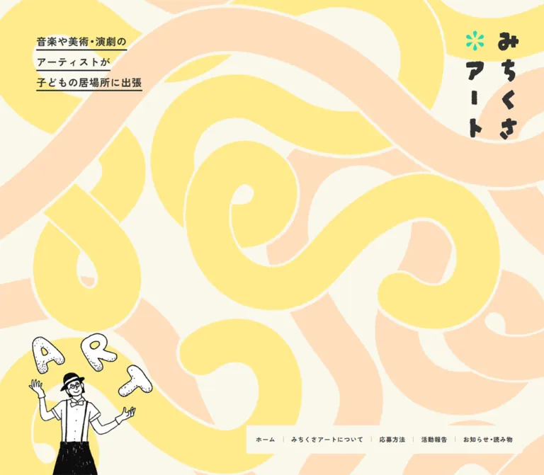
子どもの居場所にアートを届ける活動サイト。淡い黄色とピーチ色の大きな曲線、手描きの人物イラスト、ミント色のボタンを組み合わせた親しみやすいデザイン。
オリジナルサイトを見るMichikusa Art / みちくさアート — Style Reference
A children's arts program expressed through wandering pastel paths, handwritten identity, and quietly generous space.
Original URL: https://y-michikusa.org/ Final URL: https://y-michikusa.org/ Theme: light; warm cream, white, pale yellow, peach, charcoal, and mint Inspected: September 12, 2026, at 11:31:51 UTC / 20:31:51 JST, using the supplied browser observation Viewports: desktop 1440 × 1000 CSS pixels; mobile 390 × 844 CSS pixels Scope: the current homepage. Visual captures cover the desktop opening, a middle introduction state, and the footer; mobile captures cover the opening and footer. Rendered DOM and computed styles additionally cover the explanatory sequence, news entries, application section, and annual-report module. Linked pages and the report document were not opened.
Michikusa Art introduces a program that brings artists to places where children spend time in Yokohama. Its homepage combines expressive illustration with practical routes to program information, applications, activity reports, and announcements. This is an organizational homepage with several destinations and recurring content.
The opening is almost entirely artwork: enormous yellow and peach ribbons wander across warm paper, with a small underlined message at the upper left, a vertical wordmark at the upper right, and a black-and-white juggler near the lower left. The restrained placement of text lets the background establish the identity.
Further down, white space and large peach rings organize illustrated explanations. Mint pill links provide a clear action language. The lower report panel introduces a broad yellow surface, and the footer returns to the opening pattern in a much quieter cream-on-cream treatment. The same vocabulary works at three scales: landscape-sized curves, circular explanatory frames, and compact rounded controls.
How to Read This Reference
- Measured means a value reported in the supplied computed styles or element rectangles. Rectangle dimensions can include transforms and are not necessarily authored CSS dimensions.
- Visually estimated means an approximation from the original-page captures. Artwork colors, textured edges, and several large radii belong to this category; no pixel-sampling tool was used.
- Calculated means arithmetic based on a supplied value, such as converting a viewport unit into pixels.
- Recommended means guidance for a new implementation, including the CSS starter. It is not a claim about the original site's code or behavior.
- Token names beginning with
--mc-are implementation aliases created for this reference. The supplied source properties--glidand--bghare identified separately. - Desktop and mobile observations are distinct. A missing middle-section mobile screenshot limits visual conclusions even where mobile DOM measurements exist.
Tokens — Colors
Default Palette
| Name | Value | Suggested token | Evidence and role |
|---|---|---|---|
| Warm Paper | #faf8ed |
--mc-paper |
Measured body background: rgb(250, 248, 237). Establishes the warm base beneath the decorative artwork. |
| Charcoal Ink | #333333 |
--mc-ink |
Measured text color: rgb(51, 51, 51). Used for navigation, headings, paragraphs, and footer text. |
| Action Mint | #2ad8b5 |
--mc-mint |
Measured primary-link background and inverse-link text: rgb(42, 216, 181). Also visually echoed by the flower-like identity mark and small arrows. |
| White | #ffffff |
--mc-white |
Measured primary-link text and inverse-link fill. The introduction's large open field also appears white. |
| Path Yellow | approximately #ffeb8a |
--mc-yellow |
Visually estimated from the large opening ribbons and lower report panel. The artwork's exact source color is unavailable. |
| Path Peach | approximately #ffdfbd |
--mc-peach |
Visually estimated from the opening ribbons and explanatory rings. |
| Quiet Pattern | approximately #f5f2e3 |
--mc-pattern |
Visually estimated pale motif in the footer. It sits close to Warm Paper in lightness. |
The measured mint value is the implementation authority for ordinary controls. The appearance of mint inside artwork can differ slightly because of image encoding, rendering, or antialiasing; a separate brand-green token is not established by the evidence.
Palette Relationships
The yellow and peach shapes occupy large areas but have low visual aggression. Charcoal carries readable information and illustration outlines. Mint is more saturated and therefore remains conspicuous even when used for a small arrow or flower mark.
Keep the footer pattern substantially quieter than the opening. It should be recognizable as the same family of wandering curves without competing with contact information.
The supplied custom-property inventory also includes general WordPress colors, gradients, and shadows. Their availability does not establish their use on this homepage. They are excluded from the design palette and surface system.
No alternative theme or theme-switching control was evidenced.
Tokens — Typography
Japanese Interface and Body Copy
Measured family declaration: YakuHanJP, "Zen Kaku Gothic New", sans-serif.
This stack appears throughout the sampled interface. Most navigation and headings use weight 700; descriptive paragraphs use 500. The combination is substantial and approachable, with enough weight to remain distinct over an illustrated environment.
The computed declaration establishes the requested font stack, not which font supplied every individual glyph. Font files, loading behavior, and fallback rendering were not separately inspected.
The source root font size is 10px at both inspected widths. The body changes from 16px / 24px on desktop to 14px / 21px on mobile. Ordinary paragraphs frequently override the body size, so setting all mobile text to 14px would undersize the principal content.
Graphic Identity and Display Headings
The vertical wordmark, horizontal footer wordmark, introduction title, and short question headings have distinctive graphic forms. Their sampled heading elements contain no extracted text. Treat their visible lettering as artwork or non-text graphics until the actual assets are available.
Do not apply the sampled 16px heading font size to reproduce these graphics. That value describes the containing element's inherited typography, not the size of the visible lettering.
| Graphic | Desktop measured box | Mobile measured box |
|---|---|---|
| Vertical opening wordmark | 141.11 × 287.44px |
96.33 × 196.22px |
| Introduction title | 281.67 × 160.33px |
156 × 88.80px |
| Explanatory question heading | 223.78 × 58.38px |
142.34 × 37.13px |
| Horizontal footer wordmark | 268 × 36.45px |
200 × 27.20px |
The visible question labels include だれが? and なにを?. Their irregular forms should not be replaced by an invented display-font attribution.
Type Scale
Values below are computed font size / line height, not screenshot estimates.
| Role | Desktop | Mobile | Weight | Tracking |
|---|---|---|---|---|
| Body defaults | 16 / 24px |
14 / 21px |
700 |
0.8 / 0.7px |
| Desktop navigation / mobile navigation elements | 16 / 16px |
16 / 16px |
700 |
0.8 / 0.7px |
| Opening message | 26.64 / 39.96px |
19.5 / 29.25px |
700 |
1.0656 / 0.78px |
| Introduction paragraph | 18.72 / 32.76px |
16 / 28px |
500 |
0.936 / 0.8px |
| Explanatory captions | 20 / 35px |
16 / 28px |
500 |
1 / 0.8px |
| Main pill-link labels | 20 / 30px |
16 / 24px |
700 |
0.8 / 0.7px |
| News section heading | 50 / 57.5px |
24 / 24px |
700 |
2 / 0.96px |
| News entry titles | 24 / 36px |
24 / 36px |
700 |
0.96px |
| Application heading | 40 / 60px |
28 / 42px |
700 |
1.6 / 1.12px |
| Application paragraph | 20 / 35px |
16 / 28px |
500 |
1 / 0.8px |
| Annual-report title | 32 / 44.8px |
28 / 39.2px |
700 |
1.28 / 1.12px |
| Annual-report paragraph | 18 / 31.5px |
18 / 31.5px |
500 |
0.9px |
| Footer navigation | 20 / 30px |
16 / 24px |
700 |
0.8 / 0.7px |
| Contact information | 16 / 28px |
14 / 24.5px |
500 |
0.8 / 0.7px |
| Copyright | 12 / 21px |
11 / 19.25px |
500 |
0.6 / 0.55px |
Mobile navigation elements are present in the DOM, but their visible/open state was not verified. Their type measurements should not be interpreted as a screenshot of an opened menu.
Two details are particularly useful when adapting this system: news titles remain 24px on mobile, and the report paragraph remains 18px. Mobile hierarchy is maintained through selective resizing and reflow.
Tokens — Spacing & Shapes
Source Properties and Scaling Limits
| Source property | Supplied value | Calculated desktop value | Calculated mobile value |
|---|---|---|---|
--glid |
4.34vw |
62.496px |
16.926px |
--bgh |
calc((100vw) * 1.61) |
2318.4px |
627.9px |
The declarations are known, but their consuming rules were not supplied. Do not assume that every gutter derives from --glid, or that --bgh is the visible hero height. The captures show a viewport-filling opening composition, while the DOM also includes displaced and transformed coordinates.
Measured Spacing and Control Geometry
| Element | Desktop | Mobile | Interpretation |
|---|---|---|---|
| Opening message position | approximately 95.03px from top and left |
right edge approximately 25.73px from viewport edge |
Measured at the sampled capture state; the message changes corners. |
| Desktop navigation strip | approximately 702.42 × 66px |
not visible as a horizontal strip | Combined link geometry, including narrow separators. |
| Navigation link padding | 25px vertically, mostly 19.2px horizontally |
sampled links have 0px padding |
Mobile hit areas and visibility need separate verification. |
| About pill | 348.81 × 100px |
273 × 64px |
Measured rendered rectangle. |
| About pill padding | 35px 45px |
20px |
Measured. |
| News index pill | 187.78 × 80px |
240.25 × 54px |
A wider relative target on mobile. |
| Application detail pill | 312.97 × 80px |
327.63 × 54px |
Mobile width follows the section's inner width. |
| Report detail pill | 312.97 × 84px |
327.63 × 58px |
Its rectangle is 4px taller than the other inverse pill; the cause is not supplied. |
| Footer padding | 125.194px on all sides |
46.8px 23.4px 31.2px |
Direct computed values. |
| Footer navigation row advance | 52px |
44px |
Calculated from successive link positions. |
Shape Language
| Shape | Evidence | Reusable treatment |
|---|---|---|
| Pill controls | Measured radius 1440px desktop and 844px mobile |
Use 9999px to express the same fully rounded ends. |
| Desktop navigation wrapper | Approximately 6px radius, visually estimated |
A modestly rounded paper strip; keep it much less rounded than CTAs. |
| Explanatory rings | Approximately 790–800px outer diameter and 100–110px band thickness in the desktop middle capture |
Large peach frames with visibly imperfect edges. |
| Report panel lower corners | Approximately 120px desktop and 40px mobile, visually estimated |
Broad rounding belongs to the section boundary. |
| Headline underlines | Approximately 2–3px, visually estimated |
Individual charcoal rules following each text line. |
There is no visible universal rounded-card or shadow system. Shape hierarchy comes from very large curves, very round buttons, and mostly unboxed text.
Recommended Spacing Aliases
For a new implementation, a practical scale is 8, 16, 24, 32, 48, 64, 96, 128px, supplemented by fluid outer gutters. These are proposed aliases, not recovered source tokens. Preserve the larger section intervals; a uniformly compact layout would remove much of the site's character.
Components
Opening Artwork Stage
Role: establish the program's identity before presenting detailed information.
The desktop capture is filled edge to edge by cream, yellow, and peach artwork. The forms resemble broad paths or ribbons, with looping turns and subtle roughness at their edges. They extend beyond the viewport and create movement through composition even in a still frame.
Place four foreground elements over this field: the underlined message at upper left, vertical identity at upper right, juggler at lower left, and navigation at lower right. Keep the center largely free of interface text.
The juggler is drawn in black and white, with a hat, suspenders, raised hands, and separate A, R, and T forms overhead. Its contrast makes it a focal point despite occupying a comparatively small portion of the scene.
On mobile, the composition is rearranged. The vertical identity appears at upper left, the juggler remains lower left, and the message moves to lower right. The pattern is cropped into a tall field of large loops. The captured logo is partially above the top boundary; the evidence does not establish whether that clipping is a permanent layout rule or a capture/scroll state.
Opening Message
Role: explain the service in three short lines.
The actual text is:
音楽や美術・演劇の
アーティストが
子どもの居場所に出張
Each line has its own charcoal underline, closely following the line's width. The desktop block is left aligned; the mobile arrangement aligns the three lines toward the right edge. Preserve these deliberate line breaks rather than allowing arbitrary wrapping.
Use live text for this message. Its measured desktop size is 26.64px, reducing to 19.5px on mobile, with weight 700 and approximately 0.04em tracking.
Primary Navigation
Role: expose the site's five principal destinations.
The visible labels are ホーム, みちくさアートについて, 応募方法, 活動報告, and お知らせ・読み物. On desktop, they sit in a warm-paper strip near the lower-right corner of the opening. Fine muted vertical separators divide the links.
The strip begins around x: 681.42px, y: 877.84px in the 1440 × 1000 opening capture. Its right and bottom clearances are approximately 56px. Each link is 66px tall, with substantial vertical padding around a compact 16px label.
A second navigation copy is present in the desktop DOM above the initial viewport. The middle capture shows navigation across the top-right area. These observations establish different visible placements, but not the exact sticky/fixed mechanism, switching threshold, or transition sequence.
Extracted desktop link text is duplicated inside several anchors. Only one label per destination is visibly rendered. Do not reproduce the duplicated accessible text in a new implementation.
The mobile capture does not show the desktop strip. Although vertically arranged navigation links exist in the mobile DOM, no opened menu or toggle interaction was supplied. A small mint fragment at the top edge is insufficient evidence to identify a menu control.
Introduction Block
Role: explain the idea behind the program.
In the desktop middle capture, a large two-line graphic title sits over a paragraph and a mint About link in the left portion of the page. The paragraph is approximately 438px wide, set at 18.72px / 32.76px, weight 500.
The title is narrower than the paragraph and centered within that column. The approximately 349px-wide About pill is also centered beneath the copy. This creates a deliberate sequence of centered graphic, readable paragraph, and centered action.
The right side carries a vertical sequence of much larger circular explanations. Their outer edges approach or overlap the horizontal territory of the left column, creating a continuous composition without rectangular containers.
On mobile, the introduction paragraph measures 312px wide, or 80% of the viewport. The About link appears after the explanatory sequence in the extracted content order and measured positions. Preserve that change in reading order when adapting the page.
Circular Explanation
Role: answer the practical questions of place, people, and activity.
Each explanation combines a peach ring, a short graphic question heading, a black-and-white illustration, and a centered caption. The supplied desktop middle capture clearly shows the artist explanation: a person alongside a trumpet, palette, brush, and other art references. The next visible circle begins with なにを? and another juggler illustration.
Captions use 20px / 35px on desktop and 16px / 28px on mobile. The meaning is concise: the activity takes place at children's spaces in Yokohama, is led by arts professionals, and creates exploratory play time.
The circles are large enough to be partially outside the captured viewport. Preserve their scale and sequential rhythm. Turning them into three small, equally sized feature cards would substantially change the composition.
The desktop question-heading positions advance by roughly 756–761px in the sampled DOM; mobile positions advance by roughly 419–421px. These are measured positional differences, not a recovered row-gap declaration. Mobile ring appearance was not visually captured.
Pill Link
Role: provide a recurring, easily recognized route to another page.
The primary treatment is a mint fill, white bold label, fully rounded ends, and a small right-pointing chevron. The inverse treatment is white with mint lettering and chevron.
There are two important sizes: the desktop About link is 100px tall, while ordinary desktop detail links are approximately 80px tall. Mobile equivalents are 64px and approximately 54px. These differences should remain intentional rather than forcing every action into one fixed height.
The source defines a 0.4s cubic-bezier(0.68, -0.6, 0.32, 1.6) transition on these links. Its overshooting curve is known; the property changes and visual hover endpoint were not exercised.
News and Reading Entries
Role: show current activity and provide access to the journal archive.
The DOM contains three dated entries, followed by 一覧へ. The latest supplied item is dated July 13, 2026. Each link contains a headline and category/date metadata.
Desktop measurements place the entry stack on the left and the large section heading on the right. Each sampled entry link is approximately 657 × 164px, with a headline box approximately 427px wide. The section heading uses 50px / 57.5px.
On mobile, the heading becomes 24px / 24px, and entry rectangles become approximately 295px wide and 305–342px tall. Headlines remain 24px / 36px. Their position lower within each link indicates substantial content or space before the title, but the supplied element inventory does not identify that region's assets.
This section is supported by DOM measurements rather than a supplied visual frame. Do not infer thumbnail subjects, image crops, separators, or decorative treatments that were not captured.
Application Section
Role: invite eligible facilities to apply.
The section contains the heading 応募方法, a short explanation, an annual-eligibility note, and an inverse pill linking to /entry/.
Desktop text occupies a roughly 626px-wide region, with the approximately 313px-wide action positioned to its right. The heading is 40px / 60px; body copy is 20px / 35px. On mobile, the text and button share an approximately 328px-wide inner column, with a 28px heading and 16px body text.
White heading/body text and a white button with mint lettering are measured. The section container's background was not included in the computed excerpt, and the section is outside the supplied screenshot frames. A mint section fill is used as a compatible recommendation in the CSS starter, not as a verified container-color measurement.
Annual-Report Module
Role: promote the current report and provide both direct-document and activity-report routes.
The lower module uses a large yellow surface with rounded bottom corners. Its visible controls include PDFダウンロード with a mint downward arrow and a white 詳しくはこちら pill.
Desktop DOM geometry establishes a cover region at left, report title and description beside it, and a separate right-side heading/action group. The cover link has a measured width of approximately 194px; its short inline anchor height is not the image height. The description is approximately 376px wide, set at 18px / 31.5px.
On mobile, the cover link is approximately 131px wide and centered above the title and copy. The report paragraph remains 18px. The download link and wide white detail pill are centered below it. The separate desktop 報告書ダウンロード heading is absent from the mobile extracted text.
The supplied copy identifies the fiscal-year report and states that programs were delivered at 61 facilities. Treat this as maintained editorial content rather than a permanent design token.
The report-document URL is present in the DOM. No download behavior, file contents, opening target, or document accessibility was tested.
Footer
Role: repeat navigation and provide project contact information.
The footer occupies approximately 756px on desktop and 535px on mobile. Its pale patterned background echoes the opening artwork at much lower contrast.
Desktop navigation forms a vertical list at upper left. Farther down, the horizontal wordmark sits over the address and contact block; copyright is aligned near the lower right. The large open region to the right is part of the composition, not an empty column waiting for additional widgets.
Measured desktop padding is approximately 125px. Navigation advances in 52px rows, with 20px labels. The wordmark is 268px wide, and contact text uses 16px / 28px.
Mobile changes to a single left-aligned column with 23.4px horizontal padding. Navigation advances in 44px rows, the wordmark is 200px wide, and contact copy uses 14px / 24.5px. Copyright follows underneath. The address and email wrap naturally across several lines.
The visible contact text includes 認定NPO法人 STスポット横浜内. This establishes the wording of the project's contact location; it should not be expanded into unsupported legal or production claims.
Tokens — Motion & Interaction
| Element or behavior | Supplied evidence | What can be concluded |
|---|---|---|
| Ordinary navigation and news links | 0.2s ease-in-out |
A short transition is defined; its changed properties and endpoint are unverified. |
| Opening wordmark container | 0.6s ease-in-out |
A longer transition is defined; entrance, repositioning, or other trigger is unknown. |
| Opening message | 0.6s ease-in-out |
Same timing family as the wordmark container; no complete sequence was supplied. |
| Pill and download links | 0.4s cubic-bezier(0.68, -0.6, 0.32, 1.6) |
The timing curve allows anticipation and overshoot; exact scale or displacement is not established. |
| Desktop navigation placement | Lower-right opening strip and top-right navigation in the middle capture | Different scroll-state placements are visible; implementation and thresholds are unknown. |
| Introduction positioning | Screenshot composition differs from some sampled offscreen coordinates | Geometry may depend on transforms or scroll state; a specific pinning or parallax mechanism cannot be asserted. |
| Sampled element animations | animation: none |
No keyframe animation was reported on those sampled elements at that moment. This does not establish a motion-free page. |
The supplied capture process waited for finite motion and layout stability, temporarily paused perpetual animations during readiness checks, and resumed them afterward. Still images therefore do not establish animation direction, looping duration, or frame-by-frame behavior.
No hover, keyboard, menu-opening, or link-activation sequence was provided. Do not describe an opened mobile menu, animated juggler, moving background, or exact scroll choreography as verified.
For a new implementation, retain the short transition timings for controls and make decorative movement optional. A subtle arrow displacement is an appropriate recommendation; continuous bouncing is not required by the observed identity.
Surfaces
| Surface | Appearance | Evidence |
|---|---|---|
| Opening field | Warm paper with oversized yellow and peach artwork | Visually observed; paper color measured, artwork colors estimated. |
| Introduction field | White with peach rings and charcoal illustration | Visually observed in the desktop middle capture. |
| Navigation strip | Warm, nearly paper-colored surface with small rounded corners | Visually observed. |
| Primary action | Mint fill and white type | Measured. |
| Inverse action | White fill and mint type | Measured. |
| Application area | White text and an inverse action; full container fill unavailable | Partially measured, not visually captured. |
| Report area | Broad yellow panel with large rounded lower corners | Visually observed in desktop and mobile lower captures. |
| Footer | Warm paper with a pale, low-contrast version of the opening motif | Visually observed. |
No soft elevation shadows, glass blur, glossy gradients, or outlined card grid are visible in the supplied frames. Use color fields, artwork boundaries, scale, and whitespace to separate content.
Imagery
The artwork combines soft color mass with firm black linework. Background curves have slightly ragged edges, while the figures use thin contour lines, solid dark clothing, and occasional stippling. The juggled letters are irregular and dotted rather than clean typographic glyphs.
The illustrated people and recognizable tools communicate the program directly. A palette, trumpet, brush, and performer connect the abstract paths to real art activities. The imagery feels handmade without requiring every interface element to be distressed.
The flower-like mint symbol is a compact identity accent. It appears within the wordmark and should remain tied to branding rather than becoming a repeated decorative bullet throughout the page.
Observed Asset References
Asset file URLs and formats were not supplied. The following inventory identifies visible roles without inventing paths.
| Asset role | Observed treatment | Availability limitation |
|---|---|---|
| Opening background | Very large yellow and peach looping paths on cream | Exact image source, format, crop rules, and motion are unknown. |
| Vertical identity | Charcoal Japanese lettering with mint flower-like mark | Container dimensions are measured; asset URL is unavailable. |
| Juggler | Black-and-white performer with floating A, R, and T forms |
Visible on desktop and mobile; full intrinsic dimensions are unknown. |
| Introduction title | Large two-line graphic lettering | Rendered box is measured; implementation format is unknown. |
| Explanatory illustrations | Artist/tools and performer drawings within peach rings | Some scenes are visible; the full image inventory is unavailable. |
| Report preview | A printed report cover, partly visible in the desktop lower capture | Link target is known, but cover image source and full artwork are not. |
| Footer motif | Pale variation of the large looping pattern | Exact colors, opacity, and reuse mechanism are unknown. |
| Horizontal identity | Charcoal wordmark with mint symbol | Desktop/mobile width is measured; asset URL is unavailable. |
Use authorized artwork when available. A smooth CSS circle is a useful structural fallback for the explanatory rings, but it does not reproduce their textured edges. Do not apply pixelated image rendering globally: the captures show rough illustration edges, not a verified low-resolution pixel-art system.
Photography is not visible in the supplied original-page frames. The unpictured news region does not provide enough evidence to characterize its image subjects.
Layout & Responsive Behavior
The page is a long, vertically traversed homepage. Reported document heights are 8106px desktop and 5782px mobile. These are capture-state measurements, not recommended fixed heights.
| Area | Desktop observation | Mobile observation |
|---|---|---|
| Opening identity | Upper right | Upper left, partly clipped in the supplied state |
| Opening message | Upper left, left aligned | Lower right, right aligned |
| Juggler | Large lower-left illustration, partly outside the frame | Smaller lower-left illustration, with the full figure visible |
| Navigation | Horizontal paper strip in the opening; top-right placement in middle capture | Horizontal strip absent; menu state unverified |
| Introduction | Narrow copy column alongside oversized circular explanations | 312px-wide copy; explanations followed by the About link in DOM order |
| News | Entry stack left, large section heading right according to DOM geometry | Heading above taller, narrower entries |
| Application | Copy left, action right | One inner column approximately 328px wide |
| Report | Cover, description, and separate action area | Cover above copy, then download and detail links |
| Footer | Large inset; navigation and contact at left, copyright at right | Single column with 23.4px side gutters |
The mobile layout is recomposed rather than uniformly scaled. The About action moves later in the content sequence, the report's separate side heading disappears, and footer copyright joins the normal vertical flow.
No tablet viewport or breakpoint declarations were supplied. The 48rem breakpoint in the CSS starter is a recommendation. It should be tested with the actual font files and artwork, especially because the desktop navigation needs approximately 702px before allowing room for surrounding margins.
Some sampled rectangles lie outside their nominal viewport, including the introduction title and paragraph. Since the captures and geometry represent different scroll-dependent states, those coordinates are insufficient to diagnose permanent horizontal overflow. A new implementation should still explicitly test for unwanted horizontal scrolling.
Do’s and Don’ts
Do
- Keep the opening dominated by large, cropped pastel paths.
- Preserve the measured paper, charcoal, and mint colors in ordinary UI.
- Use yellow and peach as broad spatial elements, with mint concentrated on actions and identity details.
- Retain the contrast between graphic lettering and readable Japanese interface text.
- Keep the opening message as three individually underlined lines.
- Preserve the desktop balance of small corner elements around a largely open center.
- Give explanatory circles enough scale to extend beyond a single viewport fragment.
- Maintain the mobile About-link order after the explanatory sequence.
- Keep the report paragraph at a comfortably substantial mobile size.
- Repeat the opening motif quietly in the footer.
- Preserve the five-destination information architecture and distinct report/document links.
Don’t
- Don't replace the opening composition with centered marketing copy and a large central CTA.
- Don't shrink the explanatory sequence into a conventional three-card feature grid.
- Don't add shadows, glass panels, or gradients merely because generic CMS tokens contain them.
- Don't substitute an unsupported font name for the illustrated lettering.
- Don't make every mobile type size proportional to the smaller body default.
- Don't reproduce duplicated DOM label text in accessible link names.
- Don't infer thumbnail content or image treatments for unpictured news entries.
- Don't hardcode the captured negative logo position as a mobile requirement.
- Don't invent animation loops, scroll thresholds, or menu behavior.
- Don't fill the footer's deliberate open space with unrelated widgets.
Recommended Implementation Additions
These are recommendations for a new implementation, not verified features of the original page:
- Give the graphic wordmarks and question headings appropriate accessible text. The supplied text extraction does not establish their existing alternatives.
- Make the two
詳しくはこちらlinks distinguishable in context and accessible naming: one leads to application information, the other to activity reports. - Preserve a single accessible label when visual duplication is used for a text transition; hide purely decorative copies from assistive technology.
- Check mint/white contrast. Using the measured colors, white against mint is approximately 1.8:1, while charcoal against mint is approximately 7:1. Charcoal labels on mint, or a darker mint such as the proposed
#0b7563on white, provide more readable variants. - Use at least 44px interactive targets for mobile navigation and download controls. Some measured link boxes are shorter than this, and surrounding hit-area behavior is unknown.
- Provide keyboard-visible focus and reduced-motion handling.
- Keep the top navigation readable over graphic headings in scrolled states; verify its surface and collision behavior with actual content.
- Preserve meaningful reading order in the DOM when moving the About action between desktop and mobile layouts.
- Mark decorative patterns as decorative and retain intrinsic dimensions for content imagery to limit layout shifts.
- Indicate document type and, when known, file size for the report link. Do not invent a file size from the available evidence.
Agent Prompt Guide
Quick Color Reference
- Base paper: measured
#faf8ed. - Text and linework: measured
#333333. - Primary action: measured
#2ad8b5with white lettering in the observed design. - Inverse action: measured white with mint lettering.
- Large path colors: estimated yellow
#ffeb8aand peach#ffdfbd. - Footer motif: estimated
#f5f2e3on warm paper. - Accessible optional variants: charcoal on mint, or proposed dark mint
#0b7563on white.
Overall Prompt
“Create a Japanese community arts program homepage inspired by Michikusa Art. Build an opening scene from oversized, softly textured yellow and peach paths on warm cream #faf8ed. Place a vertical graphic wordmark at the upper right, a three-line charcoal underlined message at the upper left, a black-and-white juggler at the lower left, and a compact five-link paper navigation strip at the lower right. Use YakuHanJP, Zen Kaku Gothic New, sans-serif for ordinary text, with bold headings and medium-weight paragraphs. Continue into a white introduction with a narrow copy column and a vertical sequence of very large peach rings containing hand-drawn people, art tools, graphic questions, and centered captions. Use mint #2ad8b5 pill links, an editorial news area, application information, a yellow annual-report panel, and a spacious cream patterned footer. Recompose the opening on mobile and place the About link after the explanations. Keep unverified motion optional.”
Example Component Prompts
- Opening message: “Set
音楽や美術・演劇の,アーティストが, and子どもの居場所に出張as three separate bold charcoal lines, each with a close-fitting underline. Use approximately 26.6px desktop type and 19.5px mobile type. Align left in the desktop upper-left corner and right near the mobile lower-right corner.” - Circular explanation: “Create a very large peach ring with a subtly imperfect edge around a white center. Place a short graphic question above a black-and-white artist illustration and a centered two-line caption. Keep the ring large enough to be partially cropped during scrolling; avoid a rectangular card shell.”
- About link: “Create a fully rounded mint pill approximately 349 × 100px on desktop and 273 × 64px on mobile. Center a bold Japanese label and small right chevron. Use the measured 400ms overshooting timing curve, but treat any hover displacement as a new implementation choice.”
- Report module: “Use a broad pale-yellow section with strongly rounded lower corners. On desktop, arrange a report cover beside title and description, with a separate white detail pill to the right. On mobile, center the cover above the text, keep the paragraph at 18px, and stack a PDF download link and wide white pill below.”
- Footer: “Use a very pale version of the opening path motif on warm cream. Place a vertical navigation list at upper left, followed by a horizontal graphic wordmark and readable contact lines. Keep extensive desktop whitespace and right-aligned copyright; stack everything at 390px width with roughly 23px side gutters.”
Quick Start
CSS Custom Properties
This is an implementation starter, not recovered source CSS. It uses a conventional 16px root, measured interface colors and typography, estimated artwork colors, and a proposed 768px breakpoint. Layout approximations remain explicit: circular borders substitute for textured ring assets, the unpictured application panel receives a recommended mint fill, and no scroll-pinning behavior is implemented.
Load the evidenced font stack from approved sources. Supply authorized opening, mobile-opening, and footer artwork through the image custom properties; they default to none, so the CSS works without inventing asset URLs.
Suggested structure: .mc-hero contains the artwork, wordmark, message, figure, and navigation. .mc-intro contains .mc-intro-copy, .mc-vignettes, and .mc-about-link as grid siblings so the action can move after the explanations on mobile. Report content uses .mc-report-feature and .mc-report-aside. An optional native <details class="mc-menu"> disclosure is a recommended mobile navigation implementation, not an observed original interaction.
:root {
  /* Measured interface colors */
  --mc-paper: #faf8ed;
  --mc-ink: #333333;
  --mc-mint: #2ad8b5;
  --mc-white: #ffffff;

  /* Visual estimates for artwork and broad surfaces */
  --mc-yellow: #ffeb8a;
  --mc-peach: #ffdfbd;
  --mc-pattern: #f5f2e3;

  /* Recommended accessible accent variant */
  --mc-mint-readable: #0b7563;

  --mc-font: YakuHanJP, 'Zen Kaku Gothic New', sans-serif;
  --mc-weight-body: 500;
  --mc-weight-bold: 700;
  --mc-leading-body: 1.75;
  --mc-radius-pill: 9999px;
  --mc-radius-panel: 120px;
  --mc-gutter: min(8.694vw, 125.194px);

  /* Timings observed in computed styles */
  --mc-motion-link: 200ms ease-in-out;
  --mc-motion-identity: 600ms ease-in-out;
  --mc-motion-action: 400ms cubic-bezier(0.68, -0.6, 0.32, 1.6);

  /* Assign authorized image values in the consuming project */
  --mc-hero-art: none;
  --mc-hero-art-mobile: var(--mc-hero-art);
  --mc-footer-art: none;
}

html { font-size: 16px; }
body { margin: 0; }
.mc-site, .mc-site * { box-sizing: border-box; }
.mc-site {
  color: var(--mc-ink);
  background: var(--mc-paper);
  font-family: var(--mc-font);
  font-size: 16px;
  font-weight: var(--mc-weight-bold);
  line-height: 1.5;
  letter-spacing: 0.05em;
}
.mc-site img { display: block; max-width: 100%; height: auto; }
.mc-site a { color: inherit; }
.mc-site p { font-weight: var(--mc-weight-body); }
.mc-container { margin-inline: var(--mc-gutter); }

.mc-hero {
  position: relative;
  min-height: 100vh;
  min-height: 100svh;
  isolation: isolate;
  overflow: hidden;
}
.mc-hero-art {
  position: absolute;
  inset: 0;
  z-index: -1;
  background: var(--mc-paper) var(--mc-hero-art) center / cover no-repeat;
  pointer-events: none;
}
.mc-hero-logo {
  position: absolute;
  top: 5.5vw;
  right: 4.5vw;
  width: min(9.8vw, 141.11px);
  margin: 0;
}
.mc-hero-copy {
  position: absolute;
  top: 6.6vw;
  left: 6.6vw;
  display: flex;
  flex-direction: column;
  align-items: flex-start;
  gap: 0.5em;
  margin: 0;
  font-size: clamp(19.5px, 1.85vw, 26.64px);
  line-height: 1.5;
  letter-spacing: 0.04em;
}
.mc-hero-copy span { border-bottom: 2px solid currentColor; }
.mc-hero-figure {
  position: absolute;
  left: 5.2vw;
  bottom: -8px;
  width: min(23vw, 331px);
  pointer-events: none;
}
.mc-hero-nav {
  position: absolute;
  right: 3.9vw;
  bottom: 5.616%;
  display: flex;
  align-items: center;
  border-radius: 6px;
  background: var(--mc-paper);
}
.mc-hero-nav a {
  position: relative;
  padding: 25px 19.2px;
  font-size: 16px;
  line-height: 1;
  letter-spacing: 0.05em;
  text-decoration: none;
  white-space: nowrap;
  transition: color var(--mc-motion-link);
}
.mc-hero-nav a:first-child { padding-left: 24px; }
.mc-hero-nav a:last-child { padding-right: 24px; }
.mc-hero-nav a + a::before {
  content: '';
  position: absolute;
  left: 0;
  top: 50%;
  height: 15px;
  border-left: 1px solid #c6bba5;
  transform: translateY(-50%);
}
.mc-menu { display: none; }

.mc-pill {
  display: inline-flex;
  align-items: center;
  justify-content: center;
  gap: 16px;
  min-height: 80px;
  padding: 25px;
  border: 0;
  border-radius: var(--mc-radius-pill);
  background: var(--mc-mint);
  color: var(--mc-white) !important;
  font: 700 20px / 1.5 var(--mc-font);
  letter-spacing: 0.04em;
  text-align: center;
  text-decoration: none;
}
.mc-pill::after {
  content: '';
  flex: 0 0 7px;
  width: 7px;
  height: 7px;
  border-top: 2px solid currentColor;
  border-right: 2px solid currentColor;
  transform: rotate(45deg);
  transition: transform var(--mc-motion-action);
}
.mc-pill--inverse {
  color: var(--mc-mint) !important;
  background: var(--mc-white);
}
/* Optional contrast improvements for a new implementation */
.mc-pill--readable { color: var(--mc-ink) !important; }
.mc-pill--inverse.mc-pill--readable {
  color: var(--mc-mint-readable) !important;
}

.mc-intro {
  display: grid;
  grid-template-columns: minmax(0, 438px) minmax(0, 1fr);
  grid-template-areas: 'copy scenes' 'action scenes';
  grid-template-rows: auto 1fr;
  column-gap: 3.3vw;
  padding: 128px 5vw 128px 13vw;
  overflow: hidden;
  background: var(--mc-white);
}
.mc-intro-copy { grid-area: copy; padding-top: 80px; }
.mc-intro-title { width: 281.67px; margin: 0 auto 48px; }
.mc-intro-copy p { margin: 0; font-size: 18.72px; line-height: 1.75; }
.mc-about-link {
  grid-area: action;
  justify-self: center;
  align-self: start;
  width: min(100%, 348.81px);
  margin-top: 48px;
  padding: 35px 45px;
  min-height: 100px;
}
.mc-vignettes { grid-area: scenes; }
/* Smooth rings are structural fallbacks for textured artwork */
.mc-vignette {
  display: flex;
  flex-direction: column;
  align-items: center;
  justify-content: center;
  gap: 24px;
  width: min(55.2vw, 795px);
  aspect-ratio: 1;
  margin-left: -7vw;
  padding: 40px;
  border: clamp(64px, 7.2vw, 104px) solid var(--mc-peach);
  border-radius: 50%;
  background: var(--mc-white);
  text-align: center;
}
.mc-vignette-title { width: 223.78px; margin: 0; }
.mc-vignette-art { width: 280px; max-height: 250px; object-fit: contain; }
.mc-vignette p { margin: 0; font-size: 20px; line-height: 1.75; }

.mc-journal {
  display: grid;
  grid-template-columns: minmax(0, 657px) minmax(0, 438px);
  grid-template-areas: 'items heading' 'items action';
  gap: 48px;
  padding-block: 128px;
}
.mc-journal-heading {
  grid-area: heading;
  margin: 0;
  font-size: 50px;
  line-height: 1.15;
  letter-spacing: 0.04em;
}
.mc-news-list { grid-area: items; display: grid; gap: 80px; }
.mc-news-item { display: flex; gap: 24px; text-decoration: none; }
.mc-news-title {
  margin: 0 0 24px;
  font-size: 24px;
  line-height: 1.5;
  letter-spacing: 0.04em;
}
.mc-news-meta { display: flex; flex-wrap: wrap; gap: 12px; }
.mc-journal-link { grid-area: action; justify-self: end; align-self: end; }

.mc-panel {
  display: grid;
  grid-template-columns: minmax(0, 626px) minmax(240px, 313px);
  align-items: center;
  justify-content: space-between;
  gap: 48px;
  padding: 100px 10.867vw;
  border-radius: 0 0 var(--mc-radius-panel) var(--mc-radius-panel);
}
/* The application fill is a recommendation, not a measured container color */
.mc-entry { background: var(--mc-mint); color: var(--mc-white); }
.mc-entry h2 { margin: 0 0 20px; font-size: 40px; line-height: 1.5; }
.mc-entry p { margin: 0; font-size: 20px; line-height: 1.75; }
.mc-report { background: var(--mc-yellow); }
.mc-report-feature {
  display: grid;
  grid-template-columns: 194px minmax(0, 1fr);
  gap: 56px;
  align-items: start;
}
.mc-report-title { margin: 0 0 15px; font-size: 32px; line-height: 1.4; }
.mc-report-copy p { margin: 0; font-size: 18px; line-height: 1.75; }
.mc-report-aside h2 { margin: 0 0 35px; font-size: 40px; line-height: 1.5; }
.mc-report-aside .mc-pill { width: 100%; }
.mc-download {
  display: inline-flex;
  align-items: center;
  min-height: 44px;
  margin-top: 20px;
  font-size: 20px;
  text-decoration: none;
}
.mc-download::after { content: '↓'; margin-left: 12px; color: var(--mc-mint); }

.mc-footer {
  padding: 125.194px;
  background: var(--mc-paper) var(--mc-footer-art) center / cover no-repeat;
}
.mc-footer-nav { display: grid; gap: 17px; justify-items: start; }
.mc-footer-nav a {
  padding-bottom: 5px;
  font-size: 20px;
  line-height: 1.5;
  text-decoration: none;
}
.mc-footer-bottom {
  display: flex;
  justify-content: space-between;
  align-items: flex-end;
  gap: 48px;
  margin-top: 127px;
}
.mc-footer-logo { width: 268px; margin-bottom: 15px; }
.mc-contact { max-width: 520px; margin: 0; font-size: 16px; line-height: 1.75; }
.mc-contact a { overflow-wrap: anywhere; }
.mc-copyright { margin: 0; font-size: 12px; line-height: 1.75; }

.mc-site :focus-visible {
  outline: 3px solid var(--mc-ink);
  outline-offset: 5px;
}
@media (hover: hover) {
  /* Recommended endpoint; only the timing is source-derived */
  .mc-pill:hover::after { transform: translateX(2px) rotate(45deg); }
}

/* Proposed breakpoint; verify with actual fonts and artwork */
@media (max-width: 48rem) {
  :root { --mc-gutter: 6vw; --mc-radius-panel: 40px; }
  .mc-site { font-size: 14px; }
  .mc-hero-art { background-image: var(--mc-hero-art-mobile); }
  .mc-hero-logo {
    top: max(24px, env(safe-area-inset-top, 0px));
    left: 9vw;
    right: auto;
    width: 24.7vw;
  }
  .mc-hero-copy {
    top: auto;
    left: auto;
    right: 6.6vw;
    bottom: 10svh;
    align-items: flex-end;
    font-size: clamp(17px, 5vw, 21px);
  }
  .mc-hero-figure { left: 6vw; bottom: 10svh; width: 35.5vw; }
  .mc-hero-nav { display: none; }

  /* Optional native disclosure, not a reconstruction of the original menu */
  .mc-menu { display: block; position: absolute; top: 24px; right: 6vw; z-index: 2; }
  .mc-menu summary {
    min-width: 44px;
    min-height: 44px;
    padding: 12px;
    border-radius: 9999px;
    background: var(--mc-mint);
    cursor: pointer;
  }
  .mc-menu nav {
    position: absolute;
    right: 0;
    width: min(280px, 88vw);
    padding: 24px;
    background: var(--mc-paper);
  }
  .mc-menu nav a { display: block; padding-block: 12px; text-decoration: none; }

  .mc-pill { min-height: 54px; padding: 15px; font-size: 16px; }
  .mc-intro {
    grid-template-columns: minmax(0, 1fr);
    grid-template-areas: 'copy' 'scenes' 'action';
    grid-template-rows: auto;
    gap: 48px;
    padding: 64px 0;
  }
  .mc-intro-copy { padding: 0 10vw; }
  .mc-intro-title { width: 156px; margin-bottom: 32px; }
  .mc-intro-copy p { font-size: 16px; }
  .mc-about-link { width: 70vw; min-height: 64px; padding: 20px; margin-top: 0; }
  .mc-vignette { width: 108vw; margin-left: -4vw; padding: 24px; border-width: 12vw; gap: 12px; }
  .mc-vignette-title { width: 142.34px; }
  .mc-vignette-art { width: 150px; max-height: 140px; }
  .mc-vignette p { font-size: 16px; }
  .mc-journal {
    grid-template-columns: minmax(0, 1fr);
    grid-template-areas: 'heading' 'items' 'action';
    padding-block: 64px;
    gap: 48px;
  }
  .mc-journal-heading { font-size: 24px; line-height: 1; }
  .mc-news-list { margin-inline: 6vw; gap: 56px; }
  .mc-news-item { flex-direction: column; }
  .mc-journal-link { justify-self: center; width: 70%; }
  .mc-panel { grid-template-columns: minmax(0, 1fr); gap: 32px; padding: 48px 8vw; }
  .mc-entry h2 { font-size: 28px; }
  .mc-entry p { font-size: 16px; }
  .mc-report-feature { grid-template-columns: minmax(0, 1fr); gap: 32px; text-align: center; }
  .mc-report-cover { width: 131px; justify-self: center; }
  .mc-report-title { font-size: 28px; }
  .mc-report-aside h2 { display: none; }
  .mc-download { font-size: 16px; }
  .mc-footer { padding: 12vw 6vw 8vw; }
  .mc-footer-nav { gap: 15px; }
  .mc-footer-nav a { font-size: 16px; }
  .mc-footer-bottom { display: block; margin-top: 52px; }
  .mc-footer-logo { width: 200px; }
  .mc-contact { font-size: 14px; }
  .mc-copyright { margin-top: 16px; font-size: 11px; }
}

@media (prefers-reduced-motion: reduce) {
  .mc-site *, .mc-site *::before, .mc-site *::after {
    transition: none !important;
    animation: none !important;
    scroll-behavior: auto !important;
  }
}
The CSS does not attempt to synthesize the distinctive background paths, graphic lettering, or illustrations. Its news styles establish typography and reflow without inventing an unseen thumbnail system. Confirm mobile ring fit, long labels, and intermediate widths when real assets and content are available.
Tailwind v4 Token Mapping
Optional aliases for a project already using Tailwind v4. This does not establish that the original site uses Tailwind. Define the custom properties above first.
@theme inline {
  --color-paper: var(--mc-paper);
  --color-ink: var(--mc-ink);
  --color-mint: var(--mc-mint);
  --color-mint-readable: var(--mc-mint-readable);
  --color-path-yellow: var(--mc-yellow);
  --color-path-peach: var(--mc-peach);
  --color-quiet-pattern: var(--mc-pattern);

  --font-body: var(--mc-font);
  --text-body-mobile: 16px;
  --text-report-body: 18px;
  --text-news-title: 24px;
  --text-section-mobile: 28px;

  --spacing-page-gutter: var(--mc-gutter);
  --radius-pill: var(--mc-radius-pill);
  --radius-section: var(--mc-radius-panel);
}
Sources & Evidence
- Inspected original and final page: https://y-michikusa.org/. The supplied observation reports HTTP
200, identical original/final URLs, and the titleみちくさアート. - Capture date: September 12, 2026, at
2026-09-12T11:31:51.750Z; local equivalent September 12 at 20:31:51.750 JST. - Desktop evidence: 1440 × 1000 CSS-pixel viewport; opening, middle introduction, and lower-page/footer captures; rendered DOM, link destinations, computed styles, and reported document height of 8106px.
- Mobile evidence: 390 × 844 CSS-pixel viewport; opening and lower-page/footer captures; rendered DOM, computed styles, and reported document height of 5782px.
- Observed destination references:
/about/,/entry/,/report/,/journal/, three news URLs, and an annual-report document URL appear as links on the inspected homepage. Their destination contents were not inspected. - Interaction evidence: the supplied browser traversed scroll positions and performed readiness checks. Different navigation placements are visible across desktop captures. Computed transition timings are available; hover, menu activation, keyboard behavior, and exact scroll choreography are unverified.
- Inspection limits: analysis used only the supplied original-page captures and observation. No additional browsing, commands, file access, image sampling, or document retrieval was performed. Image source URLs, font files, full stylesheet rules, and tablet behavior were not supplied.
Measured values describe the current captured page. Estimated colors and geometry, accessible variants, the proposed breakpoint, and the CSS implementation choices are explicitly adaptations.
# Michikusa Art / みちくさアート — Style Reference

> A children's arts program expressed through wandering pastel paths, handwritten identity, and quietly generous space.

**Original URL:** [https://y-michikusa.org/](https://y-michikusa.org/)
**Final URL:** [https://y-michikusa.org/](https://y-michikusa.org/)
**Theme:** light; warm cream, white, pale yellow, peach, charcoal, and mint
**Inspected:** September 12, 2026, at 11:31:51 UTC / 20:31:51 JST, using the supplied browser observation
**Viewports:** desktop 1440 × 1000 CSS pixels; mobile 390 × 844 CSS pixels
**Scope:** the current homepage. Visual captures cover the desktop opening, a middle introduction state, and the footer; mobile captures cover the opening and footer. Rendered DOM and computed styles additionally cover the explanatory sequence, news entries, application section, and annual-report module. Linked pages and the report document were not opened.

Michikusa Art introduces a program that brings artists to places where children spend time in Yokohama. Its homepage combines expressive illustration with practical routes to program information, applications, activity reports, and announcements. This is an organizational homepage with several destinations and recurring content.

The opening is almost entirely artwork: enormous yellow and peach ribbons wander across warm paper, with a small underlined message at the upper left, a vertical wordmark at the upper right, and a black-and-white juggler near the lower left. The restrained placement of text lets the background establish the identity.

Further down, white space and large peach rings organize illustrated explanations. Mint pill links provide a clear action language. The lower report panel introduces a broad yellow surface, and the footer returns to the opening pattern in a much quieter cream-on-cream treatment. The same vocabulary works at three scales: landscape-sized curves, circular explanatory frames, and compact rounded controls.

## How to Read This Reference

- **Measured** means a value reported in the supplied computed styles or element rectangles. Rectangle dimensions can include transforms and are not necessarily authored CSS dimensions.
- **Visually estimated** means an approximation from the original-page captures. Artwork colors, textured edges, and several large radii belong to this category; no pixel-sampling tool was used.
- **Calculated** means arithmetic based on a supplied value, such as converting a viewport unit into pixels.
- **Recommended** means guidance for a new implementation, including the CSS starter. It is not a claim about the original site's code or behavior.
- Token names beginning with `--mc-` are implementation aliases created for this reference. The supplied source properties `--glid` and `--bgh` are identified separately.
- Desktop and mobile observations are distinct. A missing middle-section mobile screenshot limits visual conclusions even where mobile DOM measurements exist.

## Tokens — Colors

### Default Palette

| Name | Value | Suggested token | Evidence and role |
| --- | --- | --- | --- |
| Warm Paper | `#faf8ed` | `--mc-paper` | Measured body background: `rgb(250, 248, 237)`. Establishes the warm base beneath the decorative artwork. |
| Charcoal Ink | `#333333` | `--mc-ink` | Measured text color: `rgb(51, 51, 51)`. Used for navigation, headings, paragraphs, and footer text. |
| Action Mint | `#2ad8b5` | `--mc-mint` | Measured primary-link background and inverse-link text: `rgb(42, 216, 181)`. Also visually echoed by the flower-like identity mark and small arrows. |
| White | `#ffffff` | `--mc-white` | Measured primary-link text and inverse-link fill. The introduction's large open field also appears white. |
| Path Yellow | approximately `#ffeb8a` | `--mc-yellow` | Visually estimated from the large opening ribbons and lower report panel. The artwork's exact source color is unavailable. |
| Path Peach | approximately `#ffdfbd` | `--mc-peach` | Visually estimated from the opening ribbons and explanatory rings. |
| Quiet Pattern | approximately `#f5f2e3` | `--mc-pattern` | Visually estimated pale motif in the footer. It sits close to Warm Paper in lightness. |

The measured mint value is the implementation authority for ordinary controls. The appearance of mint inside artwork can differ slightly because of image encoding, rendering, or antialiasing; a separate brand-green token is not established by the evidence.

### Palette Relationships

The yellow and peach shapes occupy large areas but have low visual aggression. Charcoal carries readable information and illustration outlines. Mint is more saturated and therefore remains conspicuous even when used for a small arrow or flower mark.

Keep the footer pattern substantially quieter than the opening. It should be recognizable as the same family of wandering curves without competing with contact information.

The supplied custom-property inventory also includes general WordPress colors, gradients, and shadows. Their availability does not establish their use on this homepage. They are excluded from the design palette and surface system.

No alternative theme or theme-switching control was evidenced.

## Tokens — Typography

### Japanese Interface and Body Copy

**Measured family declaration:** `YakuHanJP, "Zen Kaku Gothic New", sans-serif`.

This stack appears throughout the sampled interface. Most navigation and headings use weight `700`; descriptive paragraphs use `500`. The combination is substantial and approachable, with enough weight to remain distinct over an illustrated environment.

The computed declaration establishes the requested font stack, not which font supplied every individual glyph. Font files, loading behavior, and fallback rendering were not separately inspected.

The source root font size is **10px** at both inspected widths. The body changes from **16px / 24px** on desktop to **14px / 21px** on mobile. Ordinary paragraphs frequently override the body size, so setting all mobile text to 14px would undersize the principal content.

### Graphic Identity and Display Headings

The vertical wordmark, horizontal footer wordmark, introduction title, and short question headings have distinctive graphic forms. Their sampled heading elements contain no extracted text. Treat their visible lettering as artwork or non-text graphics until the actual assets are available.

Do not apply the sampled `16px` heading font size to reproduce these graphics. That value describes the containing element's inherited typography, not the size of the visible lettering.

| Graphic | Desktop measured box | Mobile measured box |
| --- | --- | --- |
| Vertical opening wordmark | `141.11 × 287.44px` | `96.33 × 196.22px` |
| Introduction title | `281.67 × 160.33px` | `156 × 88.80px` |
| Explanatory question heading | `223.78 × 58.38px` | `142.34 × 37.13px` |
| Horizontal footer wordmark | `268 × 36.45px` | `200 × 27.20px` |

The visible question labels include `だれが?` and `なにを?`. Their irregular forms should not be replaced by an invented display-font attribution.

### Type Scale

Values below are computed font size / line height, not screenshot estimates.

| Role | Desktop | Mobile | Weight | Tracking |
| --- | --- | --- | --- | --- |
| Body defaults | `16 / 24px` | `14 / 21px` | `700` | `0.8 / 0.7px` |
| Desktop navigation / mobile navigation elements | `16 / 16px` | `16 / 16px` | `700` | `0.8 / 0.7px` |
| Opening message | `26.64 / 39.96px` | `19.5 / 29.25px` | `700` | `1.0656 / 0.78px` |
| Introduction paragraph | `18.72 / 32.76px` | `16 / 28px` | `500` | `0.936 / 0.8px` |
| Explanatory captions | `20 / 35px` | `16 / 28px` | `500` | `1 / 0.8px` |
| Main pill-link labels | `20 / 30px` | `16 / 24px` | `700` | `0.8 / 0.7px` |
| News section heading | `50 / 57.5px` | `24 / 24px` | `700` | `2 / 0.96px` |
| News entry titles | `24 / 36px` | `24 / 36px` | `700` | `0.96px` |
| Application heading | `40 / 60px` | `28 / 42px` | `700` | `1.6 / 1.12px` |
| Application paragraph | `20 / 35px` | `16 / 28px` | `500` | `1 / 0.8px` |
| Annual-report title | `32 / 44.8px` | `28 / 39.2px` | `700` | `1.28 / 1.12px` |
| Annual-report paragraph | `18 / 31.5px` | `18 / 31.5px` | `500` | `0.9px` |
| Footer navigation | `20 / 30px` | `16 / 24px` | `700` | `0.8 / 0.7px` |
| Contact information | `16 / 28px` | `14 / 24.5px` | `500` | `0.8 / 0.7px` |
| Copyright | `12 / 21px` | `11 / 19.25px` | `500` | `0.6 / 0.55px` |

Mobile navigation elements are present in the DOM, but their visible/open state was not verified. Their type measurements should not be interpreted as a screenshot of an opened menu.

Two details are particularly useful when adapting this system: news titles remain 24px on mobile, and the report paragraph remains 18px. Mobile hierarchy is maintained through selective resizing and reflow.

## Tokens — Spacing & Shapes

### Source Properties and Scaling Limits

| Source property | Supplied value | Calculated desktop value | Calculated mobile value |
| --- | --- | --- | --- |
| `--glid` | `4.34vw` | `62.496px` | `16.926px` |
| `--bgh` | `calc((100vw) * 1.61)` | `2318.4px` | `627.9px` |

The declarations are known, but their consuming rules were not supplied. Do not assume that every gutter derives from `--glid`, or that `--bgh` is the visible hero height. The captures show a viewport-filling opening composition, while the DOM also includes displaced and transformed coordinates.

### Measured Spacing and Control Geometry

| Element | Desktop | Mobile | Interpretation |
| --- | --- | --- | --- |
| Opening message position | approximately `95.03px` from top and left | right edge approximately `25.73px` from viewport edge | Measured at the sampled capture state; the message changes corners. |
| Desktop navigation strip | approximately `702.42 × 66px` | not visible as a horizontal strip | Combined link geometry, including narrow separators. |
| Navigation link padding | `25px` vertically, mostly `19.2px` horizontally | sampled links have `0px` padding | Mobile hit areas and visibility need separate verification. |
| About pill | `348.81 × 100px` | `273 × 64px` | Measured rendered rectangle. |
| About pill padding | `35px 45px` | `20px` | Measured. |
| News index pill | `187.78 × 80px` | `240.25 × 54px` | A wider relative target on mobile. |
| Application detail pill | `312.97 × 80px` | `327.63 × 54px` | Mobile width follows the section's inner width. |
| Report detail pill | `312.97 × 84px` | `327.63 × 58px` | Its rectangle is 4px taller than the other inverse pill; the cause is not supplied. |
| Footer padding | `125.194px` on all sides | `46.8px 23.4px 31.2px` | Direct computed values. |
| Footer navigation row advance | `52px` | `44px` | Calculated from successive link positions. |

### Shape Language

| Shape | Evidence | Reusable treatment |
| --- | --- | --- |
| Pill controls | Measured radius `1440px` desktop and `844px` mobile | Use `9999px` to express the same fully rounded ends. |
| Desktop navigation wrapper | Approximately `6px` radius, visually estimated | A modestly rounded paper strip; keep it much less rounded than CTAs. |
| Explanatory rings | Approximately `790–800px` outer diameter and `100–110px` band thickness in the desktop middle capture | Large peach frames with visibly imperfect edges. |
| Report panel lower corners | Approximately `120px` desktop and `40px` mobile, visually estimated | Broad rounding belongs to the section boundary. |
| Headline underlines | Approximately `2–3px`, visually estimated | Individual charcoal rules following each text line. |

There is no visible universal rounded-card or shadow system. Shape hierarchy comes from very large curves, very round buttons, and mostly unboxed text.

### Recommended Spacing Aliases

For a new implementation, a practical scale is `8, 16, 24, 32, 48, 64, 96, 128px`, supplemented by fluid outer gutters. These are proposed aliases, not recovered source tokens. Preserve the larger section intervals; a uniformly compact layout would remove much of the site's character.

## Components

### Opening Artwork Stage

**Role:** establish the program's identity before presenting detailed information.

The desktop capture is filled edge to edge by cream, yellow, and peach artwork. The forms resemble broad paths or ribbons, with looping turns and subtle roughness at their edges. They extend beyond the viewport and create movement through composition even in a still frame.

Place four foreground elements over this field: the underlined message at upper left, vertical identity at upper right, juggler at lower left, and navigation at lower right. Keep the center largely free of interface text.

The juggler is drawn in black and white, with a hat, suspenders, raised hands, and separate `A`, `R`, and `T` forms overhead. Its contrast makes it a focal point despite occupying a comparatively small portion of the scene.

On mobile, the composition is rearranged. The vertical identity appears at upper left, the juggler remains lower left, and the message moves to lower right. The pattern is cropped into a tall field of large loops. The captured logo is partially above the top boundary; the evidence does not establish whether that clipping is a permanent layout rule or a capture/scroll state.

### Opening Message

**Role:** explain the service in three short lines.

The actual text is:

> 音楽や美術・演劇の
> アーティストが
> 子どもの居場所に出張

Each line has its own charcoal underline, closely following the line's width. The desktop block is left aligned; the mobile arrangement aligns the three lines toward the right edge. Preserve these deliberate line breaks rather than allowing arbitrary wrapping.

Use live text for this message. Its measured desktop size is `26.64px`, reducing to `19.5px` on mobile, with weight `700` and approximately `0.04em` tracking.

### Primary Navigation

**Role:** expose the site's five principal destinations.

The visible labels are `ホーム`, `みちくさアートについて`, `応募方法`, `活動報告`, and `お知らせ・読み物`. On desktop, they sit in a warm-paper strip near the lower-right corner of the opening. Fine muted vertical separators divide the links.

The strip begins around `x: 681.42px, y: 877.84px` in the 1440 × 1000 opening capture. Its right and bottom clearances are approximately 56px. Each link is 66px tall, with substantial vertical padding around a compact 16px label.

A second navigation copy is present in the desktop DOM above the initial viewport. The middle capture shows navigation across the top-right area. These observations establish different visible placements, but not the exact sticky/fixed mechanism, switching threshold, or transition sequence.

Extracted desktop link text is duplicated inside several anchors. Only one label per destination is visibly rendered. Do not reproduce the duplicated accessible text in a new implementation.

The mobile capture does not show the desktop strip. Although vertically arranged navigation links exist in the mobile DOM, no opened menu or toggle interaction was supplied. A small mint fragment at the top edge is insufficient evidence to identify a menu control.

### Introduction Block

**Role:** explain the idea behind the program.

In the desktop middle capture, a large two-line graphic title sits over a paragraph and a mint About link in the left portion of the page. The paragraph is approximately 438px wide, set at `18.72px / 32.76px`, weight `500`.

The title is narrower than the paragraph and centered within that column. The approximately 349px-wide About pill is also centered beneath the copy. This creates a deliberate sequence of centered graphic, readable paragraph, and centered action.

The right side carries a vertical sequence of much larger circular explanations. Their outer edges approach or overlap the horizontal territory of the left column, creating a continuous composition without rectangular containers.

On mobile, the introduction paragraph measures 312px wide, or 80% of the viewport. The About link appears after the explanatory sequence in the extracted content order and measured positions. Preserve that change in reading order when adapting the page.

### Circular Explanation

**Role:** answer the practical questions of place, people, and activity.

Each explanation combines a peach ring, a short graphic question heading, a black-and-white illustration, and a centered caption. The supplied desktop middle capture clearly shows the artist explanation: a person alongside a trumpet, palette, brush, and other art references. The next visible circle begins with `なにを?` and another juggler illustration.

Captions use `20px / 35px` on desktop and `16px / 28px` on mobile. The meaning is concise: the activity takes place at children's spaces in Yokohama, is led by arts professionals, and creates exploratory play time.

The circles are large enough to be partially outside the captured viewport. Preserve their scale and sequential rhythm. Turning them into three small, equally sized feature cards would substantially change the composition.

The desktop question-heading positions advance by roughly 756–761px in the sampled DOM; mobile positions advance by roughly 419–421px. These are measured positional differences, not a recovered row-gap declaration. Mobile ring appearance was not visually captured.

### Pill Link

**Role:** provide a recurring, easily recognized route to another page.

The primary treatment is a mint fill, white bold label, fully rounded ends, and a small right-pointing chevron. The inverse treatment is white with mint lettering and chevron.

There are two important sizes: the desktop About link is 100px tall, while ordinary desktop detail links are approximately 80px tall. Mobile equivalents are 64px and approximately 54px. These differences should remain intentional rather than forcing every action into one fixed height.

The source defines a `0.4s cubic-bezier(0.68, -0.6, 0.32, 1.6)` transition on these links. Its overshooting curve is known; the property changes and visual hover endpoint were not exercised.

### News and Reading Entries

**Role:** show current activity and provide access to the journal archive.

The DOM contains three dated entries, followed by `一覧へ`. The latest supplied item is dated July 13, 2026. Each link contains a headline and category/date metadata.

Desktop measurements place the entry stack on the left and the large section heading on the right. Each sampled entry link is approximately `657 × 164px`, with a headline box approximately 427px wide. The section heading uses `50px / 57.5px`.

On mobile, the heading becomes `24px / 24px`, and entry rectangles become approximately 295px wide and 305–342px tall. Headlines remain `24px / 36px`. Their position lower within each link indicates substantial content or space before the title, but the supplied element inventory does not identify that region's assets.

This section is supported by DOM measurements rather than a supplied visual frame. Do not infer thumbnail subjects, image crops, separators, or decorative treatments that were not captured.

### Application Section

**Role:** invite eligible facilities to apply.

The section contains the heading `応募方法`, a short explanation, an annual-eligibility note, and an inverse pill linking to `/entry/`.

Desktop text occupies a roughly 626px-wide region, with the approximately 313px-wide action positioned to its right. The heading is `40px / 60px`; body copy is `20px / 35px`. On mobile, the text and button share an approximately 328px-wide inner column, with a 28px heading and 16px body text.

White heading/body text and a white button with mint lettering are measured. The section container's background was not included in the computed excerpt, and the section is outside the supplied screenshot frames. A mint section fill is used as a compatible recommendation in the CSS starter, not as a verified container-color measurement.

### Annual-Report Module

**Role:** promote the current report and provide both direct-document and activity-report routes.

The lower module uses a large yellow surface with rounded bottom corners. Its visible controls include `PDFダウンロード` with a mint downward arrow and a white `詳しくはこちら` pill.

Desktop DOM geometry establishes a cover region at left, report title and description beside it, and a separate right-side heading/action group. The cover link has a measured width of approximately 194px; its short inline anchor height is not the image height. The description is approximately 376px wide, set at `18px / 31.5px`.

On mobile, the cover link is approximately 131px wide and centered above the title and copy. The report paragraph remains 18px. The download link and wide white detail pill are centered below it. The separate desktop `報告書ダウンロード` heading is absent from the mobile extracted text.

The supplied copy identifies the fiscal-year report and states that programs were delivered at 61 facilities. Treat this as maintained editorial content rather than a permanent design token.

The report-document URL is present in the DOM. No download behavior, file contents, opening target, or document accessibility was tested.

### Footer

**Role:** repeat navigation and provide project contact information.

The footer occupies approximately 756px on desktop and 535px on mobile. Its pale patterned background echoes the opening artwork at much lower contrast.

Desktop navigation forms a vertical list at upper left. Farther down, the horizontal wordmark sits over the address and contact block; copyright is aligned near the lower right. The large open region to the right is part of the composition, not an empty column waiting for additional widgets.

Measured desktop padding is approximately 125px. Navigation advances in 52px rows, with 20px labels. The wordmark is 268px wide, and contact text uses `16px / 28px`.

Mobile changes to a single left-aligned column with `23.4px` horizontal padding. Navigation advances in 44px rows, the wordmark is 200px wide, and contact copy uses `14px / 24.5px`. Copyright follows underneath. The address and email wrap naturally across several lines.

The visible contact text includes `認定NPO法人 STスポット横浜内`. This establishes the wording of the project's contact location; it should not be expanded into unsupported legal or production claims.

## Tokens — Motion & Interaction

| Element or behavior | Supplied evidence | What can be concluded |
| --- | --- | --- |
| Ordinary navigation and news links | `0.2s ease-in-out` | A short transition is defined; its changed properties and endpoint are unverified. |
| Opening wordmark container | `0.6s ease-in-out` | A longer transition is defined; entrance, repositioning, or other trigger is unknown. |
| Opening message | `0.6s ease-in-out` | Same timing family as the wordmark container; no complete sequence was supplied. |
| Pill and download links | `0.4s cubic-bezier(0.68, -0.6, 0.32, 1.6)` | The timing curve allows anticipation and overshoot; exact scale or displacement is not established. |
| Desktop navigation placement | Lower-right opening strip and top-right navigation in the middle capture | Different scroll-state placements are visible; implementation and thresholds are unknown. |
| Introduction positioning | Screenshot composition differs from some sampled offscreen coordinates | Geometry may depend on transforms or scroll state; a specific pinning or parallax mechanism cannot be asserted. |
| Sampled element animations | `animation: none` | No keyframe animation was reported on those sampled elements at that moment. This does not establish a motion-free page. |

The supplied capture process waited for finite motion and layout stability, temporarily paused perpetual animations during readiness checks, and resumed them afterward. Still images therefore do not establish animation direction, looping duration, or frame-by-frame behavior.

No hover, keyboard, menu-opening, or link-activation sequence was provided. Do not describe an opened mobile menu, animated juggler, moving background, or exact scroll choreography as verified.

For a new implementation, retain the short transition timings for controls and make decorative movement optional. A subtle arrow displacement is an appropriate recommendation; continuous bouncing is not required by the observed identity.

## Surfaces

| Surface | Appearance | Evidence |
| --- | --- | --- |
| Opening field | Warm paper with oversized yellow and peach artwork | Visually observed; paper color measured, artwork colors estimated. |
| Introduction field | White with peach rings and charcoal illustration | Visually observed in the desktop middle capture. |
| Navigation strip | Warm, nearly paper-colored surface with small rounded corners | Visually observed. |
| Primary action | Mint fill and white type | Measured. |
| Inverse action | White fill and mint type | Measured. |
| Application area | White text and an inverse action; full container fill unavailable | Partially measured, not visually captured. |
| Report area | Broad yellow panel with large rounded lower corners | Visually observed in desktop and mobile lower captures. |
| Footer | Warm paper with a pale, low-contrast version of the opening motif | Visually observed. |

No soft elevation shadows, glass blur, glossy gradients, or outlined card grid are visible in the supplied frames. Use color fields, artwork boundaries, scale, and whitespace to separate content.

## Imagery

The artwork combines soft color mass with firm black linework. Background curves have slightly ragged edges, while the figures use thin contour lines, solid dark clothing, and occasional stippling. The juggled letters are irregular and dotted rather than clean typographic glyphs.

The illustrated people and recognizable tools communicate the program directly. A palette, trumpet, brush, and performer connect the abstract paths to real art activities. The imagery feels handmade without requiring every interface element to be distressed.

The flower-like mint symbol is a compact identity accent. It appears within the wordmark and should remain tied to branding rather than becoming a repeated decorative bullet throughout the page.

### Observed Asset References

Asset file URLs and formats were not supplied. The following inventory identifies visible roles without inventing paths.

| Asset role | Observed treatment | Availability limitation |
| --- | --- | --- |
| Opening background | Very large yellow and peach looping paths on cream | Exact image source, format, crop rules, and motion are unknown. |
| Vertical identity | Charcoal Japanese lettering with mint flower-like mark | Container dimensions are measured; asset URL is unavailable. |
| Juggler | Black-and-white performer with floating `A`, `R`, and `T` forms | Visible on desktop and mobile; full intrinsic dimensions are unknown. |
| Introduction title | Large two-line graphic lettering | Rendered box is measured; implementation format is unknown. |
| Explanatory illustrations | Artist/tools and performer drawings within peach rings | Some scenes are visible; the full image inventory is unavailable. |
| Report preview | A printed report cover, partly visible in the desktop lower capture | Link target is known, but cover image source and full artwork are not. |
| Footer motif | Pale variation of the large looping pattern | Exact colors, opacity, and reuse mechanism are unknown. |
| Horizontal identity | Charcoal wordmark with mint symbol | Desktop/mobile width is measured; asset URL is unavailable. |

Use authorized artwork when available. A smooth CSS circle is a useful structural fallback for the explanatory rings, but it does not reproduce their textured edges. Do not apply pixelated image rendering globally: the captures show rough illustration edges, not a verified low-resolution pixel-art system.

Photography is not visible in the supplied original-page frames. The unpictured news region does not provide enough evidence to characterize its image subjects.

## Layout & Responsive Behavior

The page is a long, vertically traversed homepage. Reported document heights are **8106px desktop** and **5782px mobile**. These are capture-state measurements, not recommended fixed heights.

| Area | Desktop observation | Mobile observation |
| --- | --- | --- |
| Opening identity | Upper right | Upper left, partly clipped in the supplied state |
| Opening message | Upper left, left aligned | Lower right, right aligned |
| Juggler | Large lower-left illustration, partly outside the frame | Smaller lower-left illustration, with the full figure visible |
| Navigation | Horizontal paper strip in the opening; top-right placement in middle capture | Horizontal strip absent; menu state unverified |
| Introduction | Narrow copy column alongside oversized circular explanations | 312px-wide copy; explanations followed by the About link in DOM order |
| News | Entry stack left, large section heading right according to DOM geometry | Heading above taller, narrower entries |
| Application | Copy left, action right | One inner column approximately 328px wide |
| Report | Cover, description, and separate action area | Cover above copy, then download and detail links |
| Footer | Large inset; navigation and contact at left, copyright at right | Single column with 23.4px side gutters |

The mobile layout is recomposed rather than uniformly scaled. The About action moves later in the content sequence, the report's separate side heading disappears, and footer copyright joins the normal vertical flow.

No tablet viewport or breakpoint declarations were supplied. The `48rem` breakpoint in the CSS starter is a recommendation. It should be tested with the actual font files and artwork, especially because the desktop navigation needs approximately 702px before allowing room for surrounding margins.

Some sampled rectangles lie outside their nominal viewport, including the introduction title and paragraph. Since the captures and geometry represent different scroll-dependent states, those coordinates are insufficient to diagnose permanent horizontal overflow. A new implementation should still explicitly test for unwanted horizontal scrolling.

## Do’s and Don’ts

### Do

- Keep the opening dominated by large, cropped pastel paths.
- Preserve the measured paper, charcoal, and mint colors in ordinary UI.
- Use yellow and peach as broad spatial elements, with mint concentrated on actions and identity details.
- Retain the contrast between graphic lettering and readable Japanese interface text.
- Keep the opening message as three individually underlined lines.
- Preserve the desktop balance of small corner elements around a largely open center.
- Give explanatory circles enough scale to extend beyond a single viewport fragment.
- Maintain the mobile About-link order after the explanatory sequence.
- Keep the report paragraph at a comfortably substantial mobile size.
- Repeat the opening motif quietly in the footer.
- Preserve the five-destination information architecture and distinct report/document links.

### Don’t

- Don't replace the opening composition with centered marketing copy and a large central CTA.
- Don't shrink the explanatory sequence into a conventional three-card feature grid.
- Don't add shadows, glass panels, or gradients merely because generic CMS tokens contain them.
- Don't substitute an unsupported font name for the illustrated lettering.
- Don't make every mobile type size proportional to the smaller body default.
- Don't reproduce duplicated DOM label text in accessible link names.
- Don't infer thumbnail content or image treatments for unpictured news entries.
- Don't hardcode the captured negative logo position as a mobile requirement.
- Don't invent animation loops, scroll thresholds, or menu behavior.
- Don't fill the footer's deliberate open space with unrelated widgets.

## Recommended Implementation Additions

These are recommendations for a new implementation, not verified features of the original page:

- Give the graphic wordmarks and question headings appropriate accessible text. The supplied text extraction does not establish their existing alternatives.
- Make the two `詳しくはこちら` links distinguishable in context and accessible naming: one leads to application information, the other to activity reports.
- Preserve a single accessible label when visual duplication is used for a text transition; hide purely decorative copies from assistive technology.
- Check mint/white contrast. Using the measured colors, white against mint is approximately **1.8:1**, while charcoal against mint is approximately **7:1**. Charcoal labels on mint, or a darker mint such as the proposed `#0b7563` on white, provide more readable variants.
- Use at least 44px interactive targets for mobile navigation and download controls. Some measured link boxes are shorter than this, and surrounding hit-area behavior is unknown.
- Provide keyboard-visible focus and reduced-motion handling.
- Keep the top navigation readable over graphic headings in scrolled states; verify its surface and collision behavior with actual content.
- Preserve meaningful reading order in the DOM when moving the About action between desktop and mobile layouts.
- Mark decorative patterns as decorative and retain intrinsic dimensions for content imagery to limit layout shifts.
- Indicate document type and, when known, file size for the report link. Do not invent a file size from the available evidence.

## Agent Prompt Guide

### Quick Color Reference

- Base paper: measured `#faf8ed`.
- Text and linework: measured `#333333`.
- Primary action: measured `#2ad8b5` with white lettering in the observed design.
- Inverse action: measured white with mint lettering.
- Large path colors: estimated yellow `#ffeb8a` and peach `#ffdfbd`.
- Footer motif: estimated `#f5f2e3` on warm paper.
- Accessible optional variants: charcoal on mint, or proposed dark mint `#0b7563` on white.

### Overall Prompt

“Create a Japanese community arts program homepage inspired by Michikusa Art. Build an opening scene from oversized, softly textured yellow and peach paths on warm cream `#faf8ed`. Place a vertical graphic wordmark at the upper right, a three-line charcoal underlined message at the upper left, a black-and-white juggler at the lower left, and a compact five-link paper navigation strip at the lower right. Use `YakuHanJP, Zen Kaku Gothic New, sans-serif` for ordinary text, with bold headings and medium-weight paragraphs. Continue into a white introduction with a narrow copy column and a vertical sequence of very large peach rings containing hand-drawn people, art tools, graphic questions, and centered captions. Use mint `#2ad8b5` pill links, an editorial news area, application information, a yellow annual-report panel, and a spacious cream patterned footer. Recompose the opening on mobile and place the About link after the explanations. Keep unverified motion optional.”

### Example Component Prompts

1. **Opening message:** “Set `音楽や美術・演劇の`, `アーティストが`, and `子どもの居場所に出張` as three separate bold charcoal lines, each with a close-fitting underline. Use approximately 26.6px desktop type and 19.5px mobile type. Align left in the desktop upper-left corner and right near the mobile lower-right corner.”
2. **Circular explanation:** “Create a very large peach ring with a subtly imperfect edge around a white center. Place a short graphic question above a black-and-white artist illustration and a centered two-line caption. Keep the ring large enough to be partially cropped during scrolling; avoid a rectangular card shell.”
3. **About link:** “Create a fully rounded mint pill approximately 349 × 100px on desktop and 273 × 64px on mobile. Center a bold Japanese label and small right chevron. Use the measured 400ms overshooting timing curve, but treat any hover displacement as a new implementation choice.”
4. **Report module:** “Use a broad pale-yellow section with strongly rounded lower corners. On desktop, arrange a report cover beside title and description, with a separate white detail pill to the right. On mobile, center the cover above the text, keep the paragraph at 18px, and stack a PDF download link and wide white pill below.”
5. **Footer:** “Use a very pale version of the opening path motif on warm cream. Place a vertical navigation list at upper left, followed by a horizontal graphic wordmark and readable contact lines. Keep extensive desktop whitespace and right-aligned copyright; stack everything at 390px width with roughly 23px side gutters.”

## Quick Start

### CSS Custom Properties

This is an implementation starter, not recovered source CSS. It uses a conventional 16px root, measured interface colors and typography, estimated artwork colors, and a proposed 768px breakpoint. Layout approximations remain explicit: circular borders substitute for textured ring assets, the unpictured application panel receives a recommended mint fill, and no scroll-pinning behavior is implemented.

Load the evidenced font stack from approved sources. Supply authorized opening, mobile-opening, and footer artwork through the image custom properties; they default to `none`, so the CSS works without inventing asset URLs.

Suggested structure: `.mc-hero` contains the artwork, wordmark, message, figure, and navigation. `.mc-intro` contains `.mc-intro-copy`, `.mc-vignettes`, and `.mc-about-link` as grid siblings so the action can move after the explanations on mobile. Report content uses `.mc-report-feature` and `.mc-report-aside`. An optional native `<details class="mc-menu">` disclosure is a recommended mobile navigation implementation, not an observed original interaction.

```css
:root {
  /* Measured interface colors */
  --mc-paper: #faf8ed;
  --mc-ink: #333333;
  --mc-mint: #2ad8b5;
  --mc-white: #ffffff;

  /* Visual estimates for artwork and broad surfaces */
  --mc-yellow: #ffeb8a;
  --mc-peach: #ffdfbd;
  --mc-pattern: #f5f2e3;

  /* Recommended accessible accent variant */
  --mc-mint-readable: #0b7563;

  --mc-font: YakuHanJP, 'Zen Kaku Gothic New', sans-serif;
  --mc-weight-body: 500;
  --mc-weight-bold: 700;
  --mc-leading-body: 1.75;
  --mc-radius-pill: 9999px;
  --mc-radius-panel: 120px;
  --mc-gutter: min(8.694vw, 125.194px);

  /* Timings observed in computed styles */
  --mc-motion-link: 200ms ease-in-out;
  --mc-motion-identity: 600ms ease-in-out;
  --mc-motion-action: 400ms cubic-bezier(0.68, -0.6, 0.32, 1.6);

  /* Assign authorized image values in the consuming project */
  --mc-hero-art: none;
  --mc-hero-art-mobile: var(--mc-hero-art);
  --mc-footer-art: none;
}

html { font-size: 16px; }
body { margin: 0; }
.mc-site, .mc-site * { box-sizing: border-box; }
.mc-site {
  color: var(--mc-ink);
  background: var(--mc-paper);
  font-family: var(--mc-font);
  font-size: 16px;
  font-weight: var(--mc-weight-bold);
  line-height: 1.5;
  letter-spacing: 0.05em;
}
.mc-site img { display: block; max-width: 100%; height: auto; }
.mc-site a { color: inherit; }
.mc-site p { font-weight: var(--mc-weight-body); }
.mc-container { margin-inline: var(--mc-gutter); }

.mc-hero {
  position: relative;
  min-height: 100vh;
  min-height: 100svh;
  isolation: isolate;
  overflow: hidden;
}
.mc-hero-art {
  position: absolute;
  inset: 0;
  z-index: -1;
  background: var(--mc-paper) var(--mc-hero-art) center / cover no-repeat;
  pointer-events: none;
}
.mc-hero-logo {
  position: absolute;
  top: 5.5vw;
  right: 4.5vw;
  width: min(9.8vw, 141.11px);
  margin: 0;
}
.mc-hero-copy {
  position: absolute;
  top: 6.6vw;
  left: 6.6vw;
  display: flex;
  flex-direction: column;
  align-items: flex-start;
  gap: 0.5em;
  margin: 0;
  font-size: clamp(19.5px, 1.85vw, 26.64px);
  line-height: 1.5;
  letter-spacing: 0.04em;
}
.mc-hero-copy span { border-bottom: 2px solid currentColor; }
.mc-hero-figure {
  position: absolute;
  left: 5.2vw;
  bottom: -8px;
  width: min(23vw, 331px);
  pointer-events: none;
}
.mc-hero-nav {
  position: absolute;
  right: 3.9vw;
  bottom: 5.616%;
  display: flex;
  align-items: center;
  border-radius: 6px;
  background: var(--mc-paper);
}
.mc-hero-nav a {
  position: relative;
  padding: 25px 19.2px;
  font-size: 16px;
  line-height: 1;
  letter-spacing: 0.05em;
  text-decoration: none;
  white-space: nowrap;
  transition: color var(--mc-motion-link);
}
.mc-hero-nav a:first-child { padding-left: 24px; }
.mc-hero-nav a:last-child { padding-right: 24px; }
.mc-hero-nav a + a::before {
  content: '';
  position: absolute;
  left: 0;
  top: 50%;
  height: 15px;
  border-left: 1px solid #c6bba5;
  transform: translateY(-50%);
}
.mc-menu { display: none; }

.mc-pill {
  display: inline-flex;
  align-items: center;
  justify-content: center;
  gap: 16px;
  min-height: 80px;
  padding: 25px;
  border: 0;
  border-radius: var(--mc-radius-pill);
  background: var(--mc-mint);
  color: var(--mc-white) !important;
  font: 700 20px / 1.5 var(--mc-font);
  letter-spacing: 0.04em;
  text-align: center;
  text-decoration: none;
}
.mc-pill::after {
  content: '';
  flex: 0 0 7px;
  width: 7px;
  height: 7px;
  border-top: 2px solid currentColor;
  border-right: 2px solid currentColor;
  transform: rotate(45deg);
  transition: transform var(--mc-motion-action);
}
.mc-pill--inverse {
  color: var(--mc-mint) !important;
  background: var(--mc-white);
}
/* Optional contrast improvements for a new implementation */
.mc-pill--readable { color: var(--mc-ink) !important; }
.mc-pill--inverse.mc-pill--readable {
  color: var(--mc-mint-readable) !important;
}

.mc-intro {
  display: grid;
  grid-template-columns: minmax(0, 438px) minmax(0, 1fr);
  grid-template-areas: 'copy scenes' 'action scenes';
  grid-template-rows: auto 1fr;
  column-gap: 3.3vw;
  padding: 128px 5vw 128px 13vw;
  overflow: hidden;
  background: var(--mc-white);
}
.mc-intro-copy { grid-area: copy; padding-top: 80px; }
.mc-intro-title { width: 281.67px; margin: 0 auto 48px; }
.mc-intro-copy p { margin: 0; font-size: 18.72px; line-height: 1.75; }
.mc-about-link {
  grid-area: action;
  justify-self: center;
  align-self: start;
  width: min(100%, 348.81px);
  margin-top: 48px;
  padding: 35px 45px;
  min-height: 100px;
}
.mc-vignettes { grid-area: scenes; }
/* Smooth rings are structural fallbacks for textured artwork */
.mc-vignette {
  display: flex;
  flex-direction: column;
  align-items: center;
  justify-content: center;
  gap: 24px;
  width: min(55.2vw, 795px);
  aspect-ratio: 1;
  margin-left: -7vw;
  padding: 40px;
  border: clamp(64px, 7.2vw, 104px) solid var(--mc-peach);
  border-radius: 50%;
  background: var(--mc-white);
  text-align: center;
}
.mc-vignette-title { width: 223.78px; margin: 0; }
.mc-vignette-art { width: 280px; max-height: 250px; object-fit: contain; }
.mc-vignette p { margin: 0; font-size: 20px; line-height: 1.75; }

.mc-journal {
  display: grid;
  grid-template-columns: minmax(0, 657px) minmax(0, 438px);
  grid-template-areas: 'items heading' 'items action';
  gap: 48px;
  padding-block: 128px;
}
.mc-journal-heading {
  grid-area: heading;
  margin: 0;
  font-size: 50px;
  line-height: 1.15;
  letter-spacing: 0.04em;
}
.mc-news-list { grid-area: items; display: grid; gap: 80px; }
.mc-news-item { display: flex; gap: 24px; text-decoration: none; }
.mc-news-title {
  margin: 0 0 24px;
  font-size: 24px;
  line-height: 1.5;
  letter-spacing: 0.04em;
}
.mc-news-meta { display: flex; flex-wrap: wrap; gap: 12px; }
.mc-journal-link { grid-area: action; justify-self: end; align-self: end; }

.mc-panel {
  display: grid;
  grid-template-columns: minmax(0, 626px) minmax(240px, 313px);
  align-items: center;
  justify-content: space-between;
  gap: 48px;
  padding: 100px 10.867vw;
  border-radius: 0 0 var(--mc-radius-panel) var(--mc-radius-panel);
}
/* The application fill is a recommendation, not a measured container color */
.mc-entry { background: var(--mc-mint); color: var(--mc-white); }
.mc-entry h2 { margin: 0 0 20px; font-size: 40px; line-height: 1.5; }
.mc-entry p { margin: 0; font-size: 20px; line-height: 1.75; }
.mc-report { background: var(--mc-yellow); }
.mc-report-feature {
  display: grid;
  grid-template-columns: 194px minmax(0, 1fr);
  gap: 56px;
  align-items: start;
}
.mc-report-title { margin: 0 0 15px; font-size: 32px; line-height: 1.4; }
.mc-report-copy p { margin: 0; font-size: 18px; line-height: 1.75; }
.mc-report-aside h2 { margin: 0 0 35px; font-size: 40px; line-height: 1.5; }
.mc-report-aside .mc-pill { width: 100%; }
.mc-download {
  display: inline-flex;
  align-items: center;
  min-height: 44px;
  margin-top: 20px;
  font-size: 20px;
  text-decoration: none;
}
.mc-download::after { content: '↓'; margin-left: 12px; color: var(--mc-mint); }

.mc-footer {
  padding: 125.194px;
  background: var(--mc-paper) var(--mc-footer-art) center / cover no-repeat;
}
.mc-footer-nav { display: grid; gap: 17px; justify-items: start; }
.mc-footer-nav a {
  padding-bottom: 5px;
  font-size: 20px;
  line-height: 1.5;
  text-decoration: none;
}
.mc-footer-bottom {
  display: flex;
  justify-content: space-between;
  align-items: flex-end;
  gap: 48px;
  margin-top: 127px;
}
.mc-footer-logo { width: 268px; margin-bottom: 15px; }
.mc-contact { max-width: 520px; margin: 0; font-size: 16px; line-height: 1.75; }
.mc-contact a { overflow-wrap: anywhere; }
.mc-copyright { margin: 0; font-size: 12px; line-height: 1.75; }

.mc-site :focus-visible {
  outline: 3px solid var(--mc-ink);
  outline-offset: 5px;
}
@media (hover: hover) {
  /* Recommended endpoint; only the timing is source-derived */
  .mc-pill:hover::after { transform: translateX(2px) rotate(45deg); }
}

/* Proposed breakpoint; verify with actual fonts and artwork */
@media (max-width: 48rem) {
  :root { --mc-gutter: 6vw; --mc-radius-panel: 40px; }
  .mc-site { font-size: 14px; }
  .mc-hero-art { background-image: var(--mc-hero-art-mobile); }
  .mc-hero-logo {
    top: max(24px, env(safe-area-inset-top, 0px));
    left: 9vw;
    right: auto;
    width: 24.7vw;
  }
  .mc-hero-copy {
    top: auto;
    left: auto;
    right: 6.6vw;
    bottom: 10svh;
    align-items: flex-end;
    font-size: clamp(17px, 5vw, 21px);
  }
  .mc-hero-figure { left: 6vw; bottom: 10svh; width: 35.5vw; }
  .mc-hero-nav { display: none; }

  /* Optional native disclosure, not a reconstruction of the original menu */
  .mc-menu { display: block; position: absolute; top: 24px; right: 6vw; z-index: 2; }
  .mc-menu summary {
    min-width: 44px;
    min-height: 44px;
    padding: 12px;
    border-radius: 9999px;
    background: var(--mc-mint);
    cursor: pointer;
  }
  .mc-menu nav {
    position: absolute;
    right: 0;
    width: min(280px, 88vw);
    padding: 24px;
    background: var(--mc-paper);
  }
  .mc-menu nav a { display: block; padding-block: 12px; text-decoration: none; }

  .mc-pill { min-height: 54px; padding: 15px; font-size: 16px; }
  .mc-intro {
    grid-template-columns: minmax(0, 1fr);
    grid-template-areas: 'copy' 'scenes' 'action';
    grid-template-rows: auto;
    gap: 48px;
    padding: 64px 0;
  }
  .mc-intro-copy { padding: 0 10vw; }
  .mc-intro-title { width: 156px; margin-bottom: 32px; }
  .mc-intro-copy p { font-size: 16px; }
  .mc-about-link { width: 70vw; min-height: 64px; padding: 20px; margin-top: 0; }
  .mc-vignette { width: 108vw; margin-left: -4vw; padding: 24px; border-width: 12vw; gap: 12px; }
  .mc-vignette-title { width: 142.34px; }
  .mc-vignette-art { width: 150px; max-height: 140px; }
  .mc-vignette p { font-size: 16px; }
  .mc-journal {
    grid-template-columns: minmax(0, 1fr);
    grid-template-areas: 'heading' 'items' 'action';
    padding-block: 64px;
    gap: 48px;
  }
  .mc-journal-heading { font-size: 24px; line-height: 1; }
  .mc-news-list { margin-inline: 6vw; gap: 56px; }
  .mc-news-item { flex-direction: column; }
  .mc-journal-link { justify-self: center; width: 70%; }
  .mc-panel { grid-template-columns: minmax(0, 1fr); gap: 32px; padding: 48px 8vw; }
  .mc-entry h2 { font-size: 28px; }
  .mc-entry p { font-size: 16px; }
  .mc-report-feature { grid-template-columns: minmax(0, 1fr); gap: 32px; text-align: center; }
  .mc-report-cover { width: 131px; justify-self: center; }
  .mc-report-title { font-size: 28px; }
  .mc-report-aside h2 { display: none; }
  .mc-download { font-size: 16px; }
  .mc-footer { padding: 12vw 6vw 8vw; }
  .mc-footer-nav { gap: 15px; }
  .mc-footer-nav a { font-size: 16px; }
  .mc-footer-bottom { display: block; margin-top: 52px; }
  .mc-footer-logo { width: 200px; }
  .mc-contact { font-size: 14px; }
  .mc-copyright { margin-top: 16px; font-size: 11px; }
}

@media (prefers-reduced-motion: reduce) {
  .mc-site *, .mc-site *::before, .mc-site *::after {
    transition: none !important;
    animation: none !important;
    scroll-behavior: auto !important;
  }
}
```

The CSS does not attempt to synthesize the distinctive background paths, graphic lettering, or illustrations. Its news styles establish typography and reflow without inventing an unseen thumbnail system. Confirm mobile ring fit, long labels, and intermediate widths when real assets and content are available.

### Tailwind v4 Token Mapping

Optional aliases for a project already using Tailwind v4. This does not establish that the original site uses Tailwind. Define the custom properties above first.

```css
@theme inline {
  --color-paper: var(--mc-paper);
  --color-ink: var(--mc-ink);
  --color-mint: var(--mc-mint);
  --color-mint-readable: var(--mc-mint-readable);
  --color-path-yellow: var(--mc-yellow);
  --color-path-peach: var(--mc-peach);
  --color-quiet-pattern: var(--mc-pattern);

  --font-body: var(--mc-font);
  --text-body-mobile: 16px;
  --text-report-body: 18px;
  --text-news-title: 24px;
  --text-section-mobile: 28px;

  --spacing-page-gutter: var(--mc-gutter);
  --radius-pill: var(--mc-radius-pill);
  --radius-section: var(--mc-radius-panel);
}
```

## Sources & Evidence

- **Inspected original and final page:** [https://y-michikusa.org/](https://y-michikusa.org/). The supplied observation reports HTTP `200`, identical original/final URLs, and the title `みちくさアート`.
- **Capture date:** September 12, 2026, at `2026-09-12T11:31:51.750Z`; local equivalent September 12 at 20:31:51.750 JST.
- **Desktop evidence:** 1440 × 1000 CSS-pixel viewport; opening, middle introduction, and lower-page/footer captures; rendered DOM, link destinations, computed styles, and reported document height of 8106px.
- **Mobile evidence:** 390 × 844 CSS-pixel viewport; opening and lower-page/footer captures; rendered DOM, computed styles, and reported document height of 5782px.
- **Observed destination references:** `/about/`, `/entry/`, `/report/`, `/journal/`, three news URLs, and an annual-report document URL appear as links on the inspected homepage. Their destination contents were not inspected.
- **Interaction evidence:** the supplied browser traversed scroll positions and performed readiness checks. Different navigation placements are visible across desktop captures. Computed transition timings are available; hover, menu activation, keyboard behavior, and exact scroll choreography are unverified.
- **Inspection limits:** analysis used only the supplied original-page captures and observation. No additional browsing, commands, file access, image sampling, or document retrieval was performed. Image source URLs, font files, full stylesheet rules, and tablet behavior were not supplied.

Measured values describe the current captured page. Estimated colors and geometry, accessible variants, the proposed breakpoint, and the CSS implementation choices are explicitly adaptations.