
DESIGN REFERENCE
株式会社ファミット|現場写真と縦書きが印象的な企業サイト
倉庫やスタッフの写真を大きく使い、青とオレンジをアクセントにした資材卸会社のサイト。欧文セリフ体、縦向きの番号ラベル、細い罫線で情報を整理しています。
オリジナルサイトを見るFAMIT — Style Reference
Everyday warehouse work framed by editorial serif type, blue labels, and precise ruled layouts.
Website: www.famit.info Original URL: https://www.famit.info/ Final URL: https://www.famit.info/ Theme: light gray content canvas, photographic opening, blue shop section, and charcoal footer. Inspected: September 17, 2026, 05:18 JST; supplied retrieval timestamp September 16, 2026, 20:18:20.063 UTC. Viewports: desktop 1440 × 1000 and mobile 390 × 844 CSS pixels. Scope: the current corporate homepage: header, hero, product ticker, four business features, product categories, photographic divider, ordering process, online-shop link, contact methods, recruitment banner, news, and footer. Linked pages and expanded navigation were not inspected.
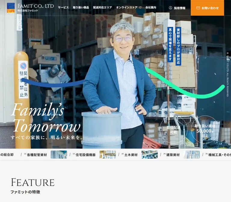
FAMIT presents a materials wholesaler through people, inventory, and everyday work. The opening photograph occupies almost the entire desktop viewport. White italic English lettering sits low on the left, two narrow blue Japanese slogans stand vertically toward the right, and outlined circles summarize delivery and inventory claims. An orange contact block gives the header one unmistakable action accent.
Below the opening, the design becomes quieter and more architectural. Large Cinzel headings introduce sections; bold Japanese subtitles identify their purpose. Narrow numbered rails, thin borders, square photographs, and generous spacing organize practical information without elevated cards. Noto Sans JP handles navigation and descriptions, while Zen Old Mincho gives feature statements a warmer editorial voice. The footer closes the page with a substantial charcoal grid.
This is a corporate homepage with several destinations and audiences: trade customers, online shoppers, applicants, and readers of company news. Preserve that information architecture when adapting the visual language.
How to Read This Reference
- Measured means a value supplied in the rendered DOM, computed styles, or embedded CSS evidence. Dimensions are CSS pixels unless stated otherwise.
- Estimated means a visual approximation from the original-page screenshots. These values were not independently sampled or measured with additional tools.
- Recommended means implementation guidance for an adaptation, not a verified feature of the original.
- Token names in this document are reusable aliases. Original custom-property identifiers are shown where available.
- Screenshots and DOM records represent separate moments. The product rail shows different leading categories between captures; do not treat that as a change in category identity or count.
- Only the supplied evidence was analyzed. No additional browsing, commands, file inspection, or interaction testing was performed.
Tokens — Colors
Default Palette
| Name | Value | Alias / source | Role and evidence |
|---|---|---|---|
| Light Canvas | #f5f5f5 |
--color-canvas |
Measured body background and desktop carousel-button background; the principal light surface |
| Charcoal | #262626 |
--color-ink |
Measured content text and footer background |
| FAMIT Blue | #0f52a1 |
--color-blue; source --s-color-fea7ed2f |
Measured vertical slogan fills, detail-link text, and online-shop section background |
| Contact Orange | #f38716 |
--color-orange; source --s-color-699f910b |
Measured desktop contact block and mobile menu button |
| Reverse White | #ffffff |
--color-white; source --s-color-58aa5ee5 |
Measured navigation over photography, hero copy, shop copy, and footer text |
| Light Rule | Approximately #dddddd |
--color-rule |
Estimated from product, news, and section dividers; exact border color was not supplied |
| Dark-Surface Rule | Approximately #666666 |
--color-rule-dark |
Estimated from footer divisions; use as a starting point, not a measured source token |
The source stores blue, orange, and white as eight-digit hex values ending in ff. Their six-digit equivalents above preserve the fully opaque color.
Declared but Unassigned Values
The supplied custom properties also contain #171f2e and linear-gradient(#ffc260ff, #ee6f00ff). Their existence does not identify the components that use them. In particular, the inspected header action has a measured solid orange background. Do not replace it with the declared gradient without additional evidence.
Cool cyan, teal, and steel-blue tones are prominent inside the photography. They are image colors, not additional verified interface tokens. Keep the photographs naturally varied rather than recoloring every image to a single brand hue.
Tokens — Typography
Cinzel — English Section Headings and Numbers
- Measured family:
Cinzel. - Source alias:
--s-font-8faf4e03. - Weight:
400on the sampled section titles, vertical feature/category labels, process numbers, and hero-side copyright. - Character: formal, inscription-like serif forms with a small-cap appearance.
- Role: creates a consistent editorial framework around utilitarian product and service information.
The section strings are Feature, Products, Flow, Online shop, Recruit, and News. Preserve their source casing; the letterforms themselves provide the capital-like appearance.
Noto Sans JP — Navigation and Information
- Measured family:
'Noto Sans JP'. - Source alias:
--s-font-e28acfe1. - Weights:
400for descriptions and dates,500for detail links and sampled mobile footer links, and700for navigation, subtitles, category headings, and contact headings. - Common tracking:
0.02emfor body and link text;0.06emfor section subtitles and category headings. - Body rhythm: a generous
2line height in feature, product, and process descriptions.
This readable sans-serif system prevents the decorative English headings from making the page feel ceremonial or difficult to use.
Zen Old Mincho — Japanese Statements
- Measured family:
'Zen Old Mincho'. - Source alias:
--s-font-c98d9824. - Weight:
700. - Tracking:
0.1emon the hero tagline and feature headings. - Role: the Japanese hero promise and the four business-feature statements.
Keep this distinction: feature statements use Mincho, while product-category titles use Noto Sans JP.
Archivo — Contact Number
The FAX number uses measured Archivo, weight 500, at 35px / 35px on both supplied viewports, with 0.7px tracking. Its source family alias is --s-font-e1b9923d. The unchanged mobile size makes the number a clear focal point in the stacked contact section.
Hero Lettering and Brand Artwork
The visible two-line Family’s Tomorrow lettering is a large white italic serif composition. Its font and asset format are not identified by the supplied element samples. The H1 wrapper reports sans-serif at 32px, but that wrapper value does not describe the visible lettering.
Treat the lettering and logo as artwork requiring an authorized asset or a separately specified approximation. Although Cormorant Garamond, Inter, and Manrope appear in declared font variables, their use in this lettering or other sampled components is not established.
Type Scale
All values below are measured unless marked otherwise. A dash means the corresponding measurement was not supplied or the element was absent from that viewport's rendered view.
| Role | Family / weight | Desktop size / line height | Mobile size / line height | Tracking |
|---|---|---|---|---|
| Main English section heading | Cinzel 400 | 62 / 62px |
48 / 48px |
Normal |
| Online-shop English heading | Cinzel 400 | 50 / 50px |
42 / 42px |
-0.02em |
| Japanese section subtitle | Noto Sans JP 700 | 22 / 26.4px |
16 / 19.2px |
0.06em |
| Feature statement | Zen Old Mincho 700 | 30 / 30px |
22 / 22px |
0.1em |
| Hero Japanese tagline | Zen Old Mincho 700 | 26 / 41.6px |
19 / 30.4px |
0.1em |
| Vertical hero slogan | Noto Sans JP 700 | 17 / 20.4px |
— | 0.1em |
| Feature/category side label | Cinzel 400 | 19 / 19px |
14 / 14px |
Normal |
| Product/process heading | Noto Sans JP 700 | 18 / 21.6px |
17 / 20.4px |
0.06em |
| Main descriptive text | Noto Sans JP 400 | 15 / 30px |
14 / 28px |
0.02em |
| Detail-link label | Noto Sans JP 500 | 16 / 27.2px |
15 / 25.5px |
0.02em |
| Standard header link | Noto Sans JP 700 | 15 / 22.5px |
Hidden in closed header | 0.02em |
| Header recruitment/contact label | Noto Sans JP 700 | 16 / 24px |
Hidden in closed header | 0.02em |
| Ticker category | Noto Sans JP 700 | 18 / 18px |
18 / 18px |
0.06em |
| Ticker category number | Noto Sans JP 700 | 8 / 8px |
8 / 8px |
0.06em |
| Process number | Cinzel 400 | 22 / 26.4px |
16 / 19.2px |
0.06em |
| Contact introduction | Noto Sans JP 700 | 24 / 40.8px |
20 / 34px |
0.02em |
| Contact-method heading | Noto Sans JP 700 | 20 / 34px |
18 / 30.6px |
0.02em |
| FAX number | Archivo 500 | 35 / 35px |
35 / 35px |
0.02em |
| News date and title | Noto Sans JP 400 | 15 / 25.5px |
14 / 23.8px |
0.02em |
| Footer company name | Noto Sans JP 700 | 15 / 15px |
14 / 14px |
0.06em |
| Footer address | Noto Sans JP 400 | 15 / 15px |
14 / 14px |
0.06em |
| Hero-side copyright | Cinzel 400 | 12 / 16.8px |
Not shown | 0.04em |
Tokens — Spacing & Shapes
Spacing character: broad section intervals, narrow numbered rails, and compact local label groups. No single source spacing unit is established.
Spacing Scale
| Use | Desktop | Mobile | Evidence |
|---|---|---|---|
| Header logo left inset | 40px |
16px |
Measured link position |
| Main section-heading left inset | 60px |
24px |
Measured heading positions |
| Footer identity left inset | 60px |
32px |
Measured logo positions |
| English heading to Japanese subtitle | 8px |
6px |
Calculated from measured text boxes |
| Hero artwork to Japanese tagline | 10px |
7px |
Calculated from measured boxes |
| Detail circle to label | 12px |
8px |
Calculated from link and label positions |
| Standard desktop navigation spacing | 24px |
— | Measured successive links |
| Product heading to description | 12px |
12px |
Calculated from measured text boxes |
| Feature heading to body | 33px |
23px |
Calculated from measured text boxes |
| News-row padding | 30px 40px |
24px |
Computed styles |
| News date-to-title gap | 42px horizontally |
10px vertically |
Computed styles and positions |
| Ticker vertical padding | 11px |
4px |
Computed styles |
| Flow section top padding | 100px |
80px |
Computed styles |
| Shop-link padding | 80px 60px 0 |
48px 24px 0 |
Computed styles |
| Space before first Feature heading | 124px |
60px |
Calculated from section and heading positions |
Border Radius
| Element | Treatment | Status |
|---|---|---|
| Header action, menu button, news links, main sections | 0 |
Measured |
| Product and feature panels | Square visual boundaries | Observed in captures where visible |
| Carousel arrow buttons | 50% |
Measured |
| Detail-link arrow rings | Circular | Observed; 46px desktop and 42px mobile link height |
| Hero claim rings | Circular, about 160px diameter |
Screenshot estimate |
| Small ticker photographs | Slight corner rounding, approximately 4px |
Screenshot estimate |
Fine rules are approximately 1px in the screenshots. Border widths were not included in the computed-style samples.
Layout Measurements
| Element | Desktop | Mobile | Qualification |
|---|---|---|---|
| Document height | 7173px |
About 8383px |
Supplied document-height readings |
| Header | 1440 × 90px |
390 × 62px |
Measured |
| Header identity link | 269 × 57px |
180 × 38.14px |
Measured |
| Desktop contact / mobile menu | 189.92 × 89px |
62 × 61px |
Measured |
| Hero | 1440 × 932px |
390 × 684px |
Measured |
| Hero lettering wrapper | 400 × 169.72px |
296 × 125.59px |
Measured; not a font-size reading |
| Ticker | 68.75px high |
54.75px high |
Measured |
| Product rail repeat pitch | 455px |
390px |
Calculated from repeated category-label positions |
| Product description width | 318px |
300px |
Measured |
| Photographic divider | 540px high |
420px high |
Measured section boxes |
| Flow section | 547.39px high |
863.19px high |
Measured |
| Online-shop section | 380.80px high |
500.03px high |
Measured |
| Contact section | 470px high |
845.78px high |
Measured |
| Recruitment banner | 520px high |
409.19px high |
Measured |
| News section | 382.39px high |
818.56px high |
Measured |
| Footer | 487.30px high |
671.77px high |
Measured |
The DOM container beginning with Feature also includes Products. Its measured height must not be attributed to the four feature entries alone.
Components
Corporate Header
Role: company identity, primary navigation, recruitment, and contact access.
The desktop header overlays the photograph with a transparent background. Its horizontal identity link begins at x=40px; navigation occupies the center-right. Five standard destinations precede a separate recruitment area and an orange contact block. The store destination carries a small external-link symbol. Recruitment uses a person symbol, and contact uses an envelope.
The orange action measures approximately 190 × 89px, ending 40px before the viewport's right edge. It is a square architectural block rather than a pill. The recruitment area is approximately 159px wide with 30px horizontal padding.
At 390px, the logo becomes 180px wide and a 62px orange menu tile occupies the top-right corner. The screenshot shows three white horizontal lines. The expanded menu, focus handling, animation, and scroll-persistence behavior are unverified; do not infer them from the closed button.
Photographic Hero
Role: connect the company's practical work with its family-oriented message.
The desktop hero is 932px high. An embedded source rule sets the desktop height to calc(100vh - 68px), matching the measured viewport. The image shows a worker carrying a pipe outside the warehouse, with building surfaces and equipment left visible as context.
The lower-left lettering wrapper begins at approximately (60, 666.69) and measures 400 × 169.72px. The Japanese line すべての家族に、明るい未来を。 follows after 10px. The combined copy ends 44px above the hero's lower boundary.
Two separate blue strips begin at y=154px. Their measured widths are 32.39px, separated by approximately 14px. They carry 真心で現場を支えます and 資材卸しのプロが即対応. Each strip fits its own text height; they are not forced into identical blocks. A thin right-side rail holds small vertical copyright text.
Two white outline circles near the lower-right contain 即日配送可能 and the inventory claim 50,000 with supporting Japanese text. Their approximately 160px diameter is a screenshot estimate. They present claims; no action behavior is established.
On mobile, the image fills a 390 × 684px region with a close view of the worker. The lettering starts at x=24px, remains on two lines, and is 296px wide. The Japanese line is 19px. Blue slogans, claim circles, and the side copyright are not shown in the supplied mobile hero. The hero's full mobile height rule is not available; 684px is an observation, not proof of a particular viewport formula.
Product Ticker
Role: continuously summarize the range of goods immediately beneath the hero.
A shallow light band alternates a bold business descriptor, slash separators, small raised category numbers, category names, and compact stock photographs. Five categories repeat in the DOM. The photographs are approximately 94 × 47px in the captures.
The text remains 18px on both viewports. Mobile reduces vertical padding rather than shrinking the category labels. Content is visibly clipped at the left and right edges, making the band read as a passing inventory strip.
Embedded CSS verifies an overflowing wrapper, child groups with min-width: 1700px, and a first-group animation of slide1 60s -30s linear infinite. The full keyframes were not supplied. Treat this separately from the larger product carousel below.
Bilingual Section Heading
Role: establish a repeatable hierarchy for long-page navigation.
Place a regular Cinzel English heading above a bold Noto Sans JP subtitle. The desktop pair uses 62px and 22px; mobile uses 48px and 16px. The small interline gap, 8px desktop and 6px mobile, keeps the two labels together despite their different visual weights.
Most pairs align to the left content inset. Recruitment centers the pair over photography. The online-shop heading uses its own smaller 50px desktop and 42px mobile scale.
Numbered Feature Entries
Role: explain stock depth, staff expertise, small-order support, and delivery capability.
Each entry combines a narrow vertical FEATURE 01–FEATURE 04 label, a Japanese Mincho heading, a relaxed sans-serif paragraph, and image-bearing markup. The first two desktop paragraphs measure approximately 599px wide; mobile paragraphs are 285px wide.
Desktop headings begin at x=141px, while the vertical label sits at x=20.5px. Mobile headings begin at x=73px, with the label at x=13px. This retained side-rail relationship is a defining detail: the phone layout does not simply move every element onto the same left edge.
Successive feature labels are separated by 391px vertically on desktop and 502px on mobile. The supplied screenshots do not show the complete feature rows, so their exact image crops and image-column proportions are not verified. Do not infer those from paragraph coordinates alone.
Product Category Carousel
Role: introduce five product families through real inventory photography.
Each unit has a narrow vertical CATEGORY rail, a large rectangular photograph, and an open text panel beneath. The desktop capture shows roughly three full units and a fragment of the next. The repeat pitch is 455px; the visual rail is approximately 60px wide. Photographs appear approximately 395 × 300px in that capture.
The lower panel has a bold 18px Japanese heading and 15px / 30px descriptive text. Fine vertical rules divide neighboring units, and a horizontal rule closes the row. There is no visible shadow or large radius. Photos show fittings on shelves, packaged building materials, and hanging tools; inventory remains in its working environment.
The five families are piping supplies, residential equipment, civil-engineering materials, building materials, and machinery/tools. The original uses 建築資材 in the ticker and 建設資材 on the sampled category card. Preserve source wording when documenting it rather than silently normalizing the labels.
Two desktop arrow buttons measure 46 × 46px, with a 16px gap between their boxes. The mobile record retains a horizontal sequence with a 390px repeat pitch, a 14px side label, and a 300px description width. Desktop arrow buttons are not present in the supplied mobile element sample. Swipe handling, autoplay timing, and button results were not tested.
Circular Detail Link
Role: a restrained route to fuller information.
A thin blue circular outline encloses a small right arrow; the label 詳しく見る sits outside the circle. The desktop product link measures 139.61 × 46px; its label begins 58px after the link's left edge, giving a 12px gap after the circle. Mobile measures 126.5 × 42px, with an 8px gap.
The product link is centered below the rail. The desktop news link sits under the heading at the left; mobile places it below the news list. On darker promotional sections, related directional treatments use white text. The sampled source declares transitions, but the exact hover end state is not supplied.
Full-Width Photographic Divider
Role: return attention to the people handling the stock between product information and process information.
A full-width image section separates Products from Flow. The desktop capture shows staff talking among shelving and blue fittings. Its measured section height is 540px on desktop and 420px on mobile.
Use a deliberate crop that retains faces and warehouse context. The aspect ratio changes substantially across viewports, so a single unreviewed center crop is unlikely to be reliable. No caption, click destination, or parallax behavior is established for this divider.
Ordering Process
Role: explain the three steps from inquiry to delivery.
The steps are 01 inquiry, 02 stock and situation confirmation, and 03 delivery by company staff. Each combines a Cinzel number, bold Noto Sans JP heading, and descriptive text. Desktop positions place the three steps beside one another; mobile places all three in a vertical sequence.
On desktop, the number positions recur approximately every 480px, dividing the full width into thirds. On mobile, numbers remain in a slim left rail while headings begin at x=117px and body copy at x=63px. Preserve the difference between the compact heading group and the wider explanatory text. The supplied evidence does not identify any process icon artwork, so no specific icon set is prescribed.
Online-Shop Banner
Role: route customers to the separate nationwide store.
This entire section is a rendered anchor to the linked shop. Its measured background is #0f52a1, with white typography. The desktop text group begins at x=802px, while mobile text begins at x=24px. This establishes a desktop composition with text toward the right and a mobile reflow, but does not identify the unsupplied artwork in the other portion of the banner.
The section uses an English title, Japanese subtitle, short availability statement, and directional label オンライン販売「はいかん君」はこちら. The anchor's padding changes from 80px 60px 0 to 48px 24px 0, and its measured gap changes from 60px to 40px.
Contact Methods
Role: provide practical contact channels after the service explanation.
A centered introduction precedes FAX, form, and LINE options. On desktop, the three methods occupy approximately equal 480px columns. The form's entire sampled column is an anchor measuring approximately 480 × 370px. White headings use 20px / 34px, while the FAX number is much larger at 35px.
Mobile stacks the methods. The form and LINE anchors each measure approximately 390 × 245.59px with 24px top and 28px bottom padding. The desktop LINE presentation includes QR-registration instructions; mobile exposes a direct LINE destination.
The mobile LINE block's sampled heading repeats メールでのお問い合わせ, even though its destination and lower label identify LINE. This is a source-copy inconsistency, not a recommended pattern.
The contact section's sampled parent background is transparent, and its final composite backdrop is not visible in the attached captures. White text is verified; an exact background color, gradient, or photograph cannot be assigned from these records.
Recruitment Banner
Role: introduce recruitment through the company's people.
The entire banner links to recruitment. A centered white Cinzel title, Japanese subtitle, two-line invitation, and circular directional treatment sit over staff imagery. The visible desktop image fragment is darkened enough to separate white foreground elements; the precise overlay color and opacity are not supplied.
The desktop banner is 520px tall; mobile is approximately 409px. Mobile source text includes a #loop_photo rule declaring loopAnimation-left 400s linear infinite. This is evidence of a very slow photo-loop declaration, not proof of its complete travel distance or seamless behavior.
News List
Role: show recent company and product updates without adding a second card system.
Desktop divides the section into a 340px heading area and an 1100px list. Each of the four sampled rows is 87.5px high with 30px 40px padding. A 78px date box precedes the title with a 42px gap. Fine horizontal rules span the list, and a vertical rule separates it from the heading area.
Mobile moves the heading above the list. Each date sits above its title with a 10px gap and 24px row padding. The sampled rows measure approximately 117.59px high. The archive link moves beneath the rows and becomes centered.
The displayed dates are from June and July 2024. They are content dates; this reference describes the page delivered during the September 2026 inspection.
Corporate Footer
Role: company identification, complete navigation, social destinations, and legal closure.
The measured footer background is #262626. Desktop places a broad identity region on the left and two narrower navigation columns on the right, divided by thin gray rules. The left region occupies approximately 908px in the screenshot. Its logo link is 114 × 117.48px, followed horizontally by the company name and address with a measured 38px separation.
A social strip sits along the bottom of the identity region, with icons and small labels for X, Google Business, and Instagram. A separate copyright row spans the full footer. The layout uses substantial empty space around the identity instead of filling the footer with decorative material.
Mobile places the logo above the company details. The logo link measures 78 × 80.38px and begins 32px from the left, 40px below the footer top. Below the identity block, navigation remains in two equal-width columns divided at approximately x=195px. Links use measured 14px / 21px type and recur every 50px vertically. Social destinations move below both columns and display icons without visible captions.
The original footer directly identifies the company as 株式会社ファミット. No production credit is established by the inspected homepage evidence.
Tokens — Motion & Interaction
| Treatment | Evidence | What can be concluded |
|---|---|---|
| Common element transition | 0.3s cubic-bezier(0.4, 0.4, 0, 1) in computed styles |
A shared transition timing is declared; individual hover/reveal end states are not established |
| Carousel arrow transition | 0.4s cubic-bezier(0.4, 0.4, 0, 1) |
Measured on desktop arrow buttons; click results untested |
| Body background transition | background 0.5s cubic-bezier(0.4, 0.4, 0, 1) |
Declared background interpolation; no theme-switching interaction is evidenced |
| Product ticker | slide1 60s -30s linear infinite on the first repeated group |
Explicit continuous-animation declaration; full keyframes unavailable |
| Recruitment photo | loopAnimation-left 400s linear infinite in mobile embedded CSS |
Explicit slow-loop declaration; exact geometry unavailable |
| Product rail state | Different leading categories in DOM and screenshot records | Multiple rail positions are evidenced; their trigger and timing are unknown |
| Hero media | Different photographic views in desktop and mobile captures | Media format, autoplay, duration, audio, and transition behavior are unverified |
| Mobile navigation | Closed orange menu button | Expanded menu appearance and behavior are unverified |
Many sampled wrapper elements report animation: none. This does not negate animation on descendants, pseudo-elements, or separate media.
The capture process temporarily paused perpetual animations during readiness checks and resumed them afterward. Static captures therefore should not be used to estimate motion speed. For an adaptation, retain the slow ambient character of the verified loop declarations and keep interaction feedback brief.
Surfaces
| Surface | Appearance | Function |
|---|---|---|
| Main canvas | Solid #f5f5f5 |
Shared background for informational sections |
| Content panels | Same light surface with fine rules | Group categories, process information, and news |
| Hero | Full-bleed warehouse photography with white foreground | Human and operational introduction |
| Slogan strips | Solid blue rectangles | Compact emphasis within the photograph |
| Header action / mobile menu | Solid orange square-edged block | Strong navigation accent |
| Online shop | Solid blue with white text | Distinct destination section |
| Recruitment | Staff photography with dark visual treatment | Readable recruitment invitation |
| Footer | Solid charcoal with gray rules | Dense navigation and company details |
There is no general elevation system visible in the supplied captures. An embedded rule specifies drop-shadow(0 0 24px rgb(0 0 0 / 0.16)) for hero artwork; this targeted readability treatment should not become a shadow on every panel.
Imagery
Photography carries the company's identity. The visible subjects are staff handling pipe, warehouse conversations, fittings, long packaged materials, and rows of hanging tools. The images retain shelves, shutters, labels, boxes, and work equipment. These details make the business tangible.
The photographs look bright and cool, with pale building surfaces and blue workwear recurring across the page. This is an observed visual impression, not a measured color-grading recipe. Preserve skin tones and the distinction between product categories. Avoid applying a heavy universal blue overlay.
The brand mark contains textured blue and orange/yellow areas. Its irregular internal texture is part of the artwork and should not be replaced with two plain CSS rectangles in a faithful implementation.
Observed Asset References
No complete image or video resource URLs were supplied for reliable reuse. The following identifies asset roles without inventing filenames.
| Asset role | Original-page evidence | Implementation guidance |
|---|---|---|
| Horizontal header identity | Visible in desktop/mobile captures; measured home-link boxes | Use the authorized combined logo artwork |
| Vertical footer identity | Visible in both footer captures | Preserve its separate compact arrangement |
| Hero photograph/media | Original desktop and mobile opening captures | Review subject placement at each viewport; media format remains unknown |
| English hero lettering | Visible two-line composition and measured H1 wrapper | Use authorized artwork; do not infer its font from the wrapper |
| Ticker stock thumbnails | Visible in both opening captures | Use small crops corresponding to each category |
| Category photography | Desktop product-rail capture | Preserve rectangular shelf and merchandise views |
| Staff divider photograph | Desktop capture and background-image markup | Supply a separate responsive crop if needed |
| Recruitment photo strip | Visible desktop fragment and #loop_photo CSS reference |
Keep photography separate from the centered foreground text |
Layout & Responsive Behavior
The page follows a stable content order across both inspected viewports: hero, ticker, features, products, staff photograph, process, online shop, contact methods, recruitment, news, and footer. Mobile changes grouping and proportions substantially while retaining the same corporate structure.
| Relationship | Desktop observation | Mobile observation |
|---|---|---|
| Header | Full navigation with separate recruitment and contact areas | Logo and orange menu tile |
| Hero hierarchy | Artwork, Japanese line, vertical slogans, two claim circles, side copyright | Artwork and Japanese line over a close photographic view |
| Section inset | Generally 60px |
Generally 24px |
| Feature numbering | Vertical labels in a narrow left rail | Rail remains, with smaller 14px labels |
| Product categories | Approximately three units visible, plus overflow | One viewport-width repeat pitch, with further units offscreen |
| Process | Three horizontal steps | Three vertically stacked steps |
| Shop copy | Positioned toward the right | Begins at the standard left inset |
| Contact | Three columns with desktop QR guidance | Stacked methods and a direct LINE link |
| News | Heading beside list; dates beside titles | Heading above list; dates above titles; archive link below |
| Footer | Identity beside two navigation columns | Identity above two navigation columns; social icons beneath |
The desktop opening fills approximately one viewport when hero and ticker are combined: 932 + 68.75 = 1000.75px. The mobile opening totals 738.75px, allowing the next section's heading to enter the 844px screenshot.
A 1140px media query is visible in line-break-related source text. That does not establish the exact header-collapse breakpoint or the complete responsive system. Any breakpoints in the Quick Start below are adaptation choices.
Measured document width remains equal to the viewport even though ticker and carousel descendants extend beyond it. Contain intentional horizontal overflow within those components rather than allowing the entire document to scroll sideways.
Do’s and Don’ts
Do
- Build around the measured light canvas, charcoal text, blue links, and orange header accent.
- Give warehouse photography enough area to show both people and their working context.
- Pair Cinzel English headings with compact bold Japanese subtitles.
- Retain Zen Old Mincho for feature statements and the Japanese hero promise.
- Preserve vertical numbered rails on mobile as well as desktop.
- Use thin rules and square boundaries to organize product and news content.
- Keep detail links as a small circular arrow beside text.
- Preserve the two-column mobile footer and the separate company-identity block.
- Keep the FAX number visually prominent across viewports.
- Treat media crops and the changing product-rail position as state-sensitive details.
Don’t
- Don't convert the corporate information architecture into a single-purpose sales funnel.
- Don't replace shelf photography with unrelated isolated product renders or generic office imagery.
- Don't turn every informational block into a rounded, shadowed card.
- Don't use orange as the default fill for every link or panel.
- Don't describe the hero as verified video or invent its playback settings.
- Don't assign Cormorant Garamond to the hero merely because it appears in a font variable.
- Don't assume every declared source color or gradient is visible on this page.
- Don't shrink the ticker labels into unreadable mobile microtype; they remain
18pxin the evidence. - Don't flatten the mobile footer into one long navigation list.
- Don't reproduce the mobile LINE heading's email wording in a new implementation.
Recommended Implementation Additions
These are recommendations for a new implementation, not verified original-site features:
- Give the menu button an accessible name,
aria-expanded, andaria-controls. Specify and test its open state separately. - Keep arrow controls at least
44 × 44pxas interactive targets, even when their visible mobile ring is42px. - Add a visible keyboard-focus outline that works on light, photographic, blue, and charcoal surfaces.
- Expose each ticker category once to assistive technology; make duplicated animation groups hidden and noninteractive.
- Provide a way to pause ambient movement. Under reduced motion, show a static or manually scrollable ticker and stop the recruitment photo loop.
- If video is chosen for an adaptation, provide a poster and explicit playback handling. Do not treat those choices as recovered source behavior.
- Check white foreground contrast across every chosen hero crop and media frame. Use a local scrim where required rather than darkening all photography indiscriminately.
- Preserve the mobile direct LINE link and label it as LINE contact. A QR code alone is inconvenient on the same device.
- Give logo links and image-based hero lettering meaningful text alternatives. Empty extracted link text does not by itself establish whether the original accessible name is missing.
- Let long Japanese labels wrap without fixed-height clipping, especially in the process and footer sections.
Agent Prompt Guide
Quick Color Reference
- Main canvas:
#f5f5f5. - Body text and footer:
#262626. - Links, vertical slogans, and online-shop section:
#0f52a1. - Desktop contact block and mobile menu tile:
#f38716. - Reversed text and outlines:
#ffffff. - Light rules: approximately
#dddddd; exact source border color unverified. - Main geometry: square panels, fine dividers, circular arrow outlines.
Overall Prompt
“Create a Japanese materials-wholesaler corporate homepage using FAMIT's observed visual relationships. Open with a large warehouse photograph, white two-line italic English artwork at the lower-left, a tracked Japanese Mincho tagline, narrow blue vertical slogans, and two outlined delivery/inventory claim circles on desktop. Overlay a transparent header with a compact logo, white navigation, and one square orange contact block. Follow with a shallow inventory ticker, large regular Cinzel section headings, bold Japanese subtitles, vertical numbered rails, rectangular stock photographs, and fine gray rules on a #f5f5f5 canvas. Use Noto Sans JP for practical information, Zen Old Mincho for feature statements, a blue online-shop band, a photographic recruitment banner, a ruled news list, and a charcoal footer. At phone width, use an orange menu tile, simplify hero overlays, stack process and contact sections, and retain two footer navigation columns. Treat unverified interactions and media behavior as separate implementation decisions.”
Example Component Prompts
- Header and hero: “Create a 90px transparent desktop header over bright warehouse photography. Place a 269px-wide authorized identity asset at a 40px left inset, white 15px bold Japanese navigation, and an approximately 190px orange contact block. Anchor the two-line hero artwork low on the left. At 390px, use a 62px header, 180px logo, and a 62px orange menu tile; remove secondary hero claims from the compact composition.”
- Product category: “Build a square-edged inventory panel with a narrow vertical Cinzel CATEGORY rail, a broad shelf photograph, and a light-gray text panel. Use an 18px bold Japanese category title, 15px body text with 30px line height, and thin shared dividers. Arrange units in a horizontal rail; use a single viewport-width repeat pitch on phones.”
- Detail link: “Place a fine blue circular outline around a small right arrow, with the Japanese label 詳しく見る outside the circle. Use a 46px circle and 12px label gap on desktop, 42px and 8px on mobile. Keep the surface transparent and provide a larger invisible touch target if needed.”
- News: “Use a 340px desktop heading column beside four full-width ruled rows. Set each date in a 78px column before a short Japanese title. On mobile, place the heading above the rows, stack each date above its title, and center the archive link below.”
- Footer: “Create a charcoal corporate footer with a spacious identity area, two navigation columns divided by thin gray lines, a social strip, and a separate copyright row. On mobile, stack the identity above two equal navigation columns and show the social destinations as accessible icon links below them.”
Quick Start
CSS Custom Properties
This is a reusable adaptation, not recovered source CSS. Exact colors and sampled typography are preserved. Border colors, component grid choices, intermediate breakpoints, and unsampled spacing are recommendations. Load the named fonts through your project's authorized font setup; this snippet does not fetch them.
The hero expects an image or media element with .hero__media, and authorized lettering artwork inside an H1 using .hero__title-art. The ticker expects two identical .ticker__group children inside .ticker__track; mark the duplicate with data-clone, aria-hidden, and inert. Its optional animation uses a simplified equal-group loop because the complete original keyframes were not supplied.
:root {
  /* Measured palette */
  --color-canvas: #f5f5f5;
  --color-ink: #262626;
  --color-blue: #0f52a1;
  --color-orange: #f38716;
  --color-white: #ffffff;

  /* Estimated rule colors */
  --color-rule: #dddddd;
  --color-rule-dark: #666666;

  /* Measured families; generic fallbacks are recommendations */
  --font-body: 'Noto Sans JP', sans-serif;
  --font-section: 'Cinzel', serif;
  --font-statement: 'Zen Old Mincho', serif;
  --font-number: 'Archivo', sans-serif;

  --text-body: 15px;
  --text-section: 62px;
  --text-subtitle: 22px;
  --text-feature: 30px;
  --text-category: 18px;
  --text-index: 19px;
  --text-link: 16px;
  --leading-body: 2;
  --tracking-body: 0.02em;
  --tracking-label: 0.06em;
  --tracking-statement: 0.1em;

  --page-inset: 60px;
  --header-inset: 40px;
  --header-height: 90px;
  --rail-width: 60px;
  --detail-diameter: 46px;
  --detail-gap: 12px;
  --product-pitch: 455px;
  --rule-width: 1px;

  --ease: cubic-bezier(0.4, 0.4, 0, 1);
  --motion-ui: 300ms;
  --motion-control: 400ms;
}

* { box-sizing: border-box; }
body {
  margin: 0;
  color: var(--color-ink);
  background: var(--color-canvas);
  font-family: var(--font-body);
  font-size: var(--text-body);
  line-height: var(--leading-body);
  letter-spacing: var(--tracking-body);
}
a { color: inherit; }
button { font: inherit; cursor: pointer; }
img { display: block; max-inline-size: 100%; }
h1, h2, h3, p { margin: 0; }

.site-header {
  position: absolute;
  z-index: 10;
  inset: 0 0 auto;
  display: flex;
  align-items: center;
  gap: 40px;
  block-size: var(--header-height);
  padding-inline: var(--header-inset);
  color: var(--color-white);
  border-bottom: 1px solid rgb(255 255 255 / 25%);
}
.site-header__brand { flex: 0 0 269px; }
.site-header__nav {
  display: flex;
  align-items: center;
  gap: 24px;
  margin-inline-start: auto;
}
.site-header__nav a {
  font-size: 15px;
  font-weight: 700;
  line-height: 1.5;
  text-decoration: none;
  white-space: nowrap;
}
.site-header__actions { display: flex; align-self: stretch; }
.site-header__actions a {
  display: inline-flex;
  align-items: center;
  justify-content: center;
  gap: 8px;
  padding-inline: 30px;
  font-size: 16px;
  font-weight: 700;
  text-decoration: none;
}
.site-header__contact { background: var(--color-orange); }
.site-header__menu {
  display: none;
  place-items: center;
  inline-size: 62px;
  block-size: 61px;
  padding: 0;
  border: 0;
  border-radius: 0;
  color: var(--color-white);
  background: var(--color-orange);
}

.hero {
  position: relative;
  isolation: isolate;
  block-size: calc(100vh - 68px);
  min-block-size: 600px;
  color: var(--color-white);
  overflow: hidden;
}
.hero__media {
  position: absolute;
  z-index: -1;
  inset: 0;
  inline-size: 100%;
  block-size: 100%;
  object-fit: cover;
  object-position: var(--hero-position, 50% 50%);
}
.hero__copy {
  position: absolute;
  inset-inline-start: var(--page-inset);
  inset-block-end: 44px;
  max-inline-size: calc(100% - 2 * var(--page-inset));
}
.hero__title-art {
  inline-size: 400px;
  block-size: auto;
  filter: drop-shadow(0 0 24px rgb(0 0 0 / 16%));
}
.hero__tagline {
  margin-block-start: 10px;
  font-family: var(--font-statement);
  font-size: 26px;
  font-weight: 700;
  line-height: 1.6;
  letter-spacing: var(--tracking-statement);
}
.hero__slogans {
  position: absolute;
  inset-block-start: 154px;
  inset-inline-end: 285px;
  display: flex;
  align-items: flex-start;
  gap: 14px;
}
.hero__slogan {
  writing-mode: vertical-rl;
  text-orientation: upright;
  padding: 7px 7px 8px 5px;
  background: var(--color-blue);
  font-size: 17px;
  font-weight: 700;
  line-height: 1.2;
  letter-spacing: 0.1em;
}
.hero__claims {
  position: absolute;
  inset-inline-end: 70px;
  inset-block-end: 30px;
  display: flex;
  gap: 20px;
}
.hero__claim {
  display: grid;
  place-content: center;
  inline-size: 160px;
  aspect-ratio: 1;
  border: 1px solid currentColor;
  border-radius: 50%;
  text-align: center;
  font-size: 20px;
  font-weight: 700;
  line-height: 1.25;
}

.ticker { overflow: hidden; padding-block: 11px; }
.ticker__track { display: flex; inline-size: max-content; }
.ticker__group {
  display: flex;
  flex: none;
  align-items: center;
  gap: 32px;
  min-inline-size: 1700px;
  padding-inline-end: 40px;
  white-space: nowrap;
}
.ticker__item {
  display: inline-flex;
  align-items: center;
  gap: 20px;
  font-size: 18px;
  font-weight: 700;
  line-height: 1;
  letter-spacing: 0.06em;
}
.ticker__item img {
  inline-size: 94px;
  block-size: 46.75px;
  object-fit: cover;
  border-radius: 4px;
}
/* Optional adaptation, not the original keyframe implementation. */
.ticker[data-animate='true'] .ticker__track {
  animation: inventory-pass 60s linear infinite;
}
.ticker:is(:hover, :focus-within) .ticker__track {
  animation-play-state: paused;
}
@keyframes inventory-pass {
  to { transform: translateX(-50%); }
}

.section-heading { padding-inline: var(--page-inset); }
.section-heading__en {
  font-family: var(--font-section);
  font-size: var(--text-section);
  font-weight: 400;
  line-height: 1;
  letter-spacing: normal;
}
.section-heading__ja {
  margin-block-start: 8px;
  font-size: var(--text-subtitle);
  font-weight: 700;
  line-height: 1.2;
  letter-spacing: var(--tracking-label);
}

.feature {
  display: grid;
  grid-template-columns: var(--rail-width) minmax(0, 1fr);
  border-block-start: var(--rule-width) solid var(--color-rule);
}
.index-rail {
  display: flex;
  justify-content: center;
  padding-block-start: 28px;
  border-inline-end: var(--rule-width) solid var(--color-rule);
}
.index-rail span {
  writing-mode: vertical-rl;
  font-family: var(--font-section);
  font-size: var(--text-index);
  font-weight: 400;
  line-height: 1;
  letter-spacing: normal;
}
.feature__body { padding: 80px; }
.feature__title {
  margin-block-end: 33px;
  font-family: var(--font-statement);
  font-size: var(--text-feature);
  font-weight: 700;
  line-height: 1.2;
  letter-spacing: var(--tracking-statement);
}
.feature__body p { max-inline-size: 600px; }

/* Manual scrolling is the fallback until carousel behavior is specified. */
.products-rail {
  display: flex;
  overflow-x: auto;
  overscroll-behavior-inline: contain;
  scroll-snap-type: x proximity;
  border-block: var(--rule-width) solid var(--color-rule);
}
.product {
  display: grid;
  grid-template-columns: var(--rail-width) minmax(0, 1fr);
  flex: 0 0 var(--product-pitch);
  min-inline-size: 0;
  scroll-snap-align: start;
}
.product__main {
  min-inline-size: 0;
  border-inline-end: var(--rule-width) solid var(--color-rule);
}
.product__image {
  inline-size: 100%;
  block-size: 300px;
  object-fit: cover;
}
.product__body { padding: 40px; }
.product__title {
  margin-block-end: 12px;
  font-size: var(--text-category);
  font-weight: 700;
  line-height: 1.2;
  letter-spacing: var(--tracking-label);
}

.detail-link {
  display: inline-flex;
  align-items: center;
  gap: var(--detail-gap);
  min-block-size: 44px;
  color: var(--color-blue);
  font-size: var(--text-link);
  font-weight: 500;
  line-height: 1.7;
  text-decoration: none;
}
.detail-link__circle {
  display: grid;
  flex: none;
  place-items: center;
  inline-size: var(--detail-diameter);
  block-size: var(--detail-diameter);
  border: 1px solid currentColor;
  border-radius: 50%;
  transition: background-color var(--motion-ui) var(--ease),
              color var(--motion-ui) var(--ease);
}
.detail-link__circle svg { inline-size: 16px; block-size: 16px; }
.detail-link--reverse { color: var(--color-white); }

.photo-divider { block-size: 540px; overflow: hidden; }
.photo-divider img {
  inline-size: 100%;
  block-size: 100%;
  object-fit: cover;
  object-position: var(--divider-position, 50% 50%);
}
.flow-grid, .contact-grid {
  display: grid;
  grid-template-columns: repeat(3, minmax(0, 1fr));
}
.flow-step { padding: 40px; }
.flow-step + .flow-step {
  border-inline-start: 1px solid var(--color-rule);
}
.contact-number {
  font-family: var(--font-number);
  font-size: 35px;
  font-weight: 500;
  line-height: 1;
  letter-spacing: 0.02em;
}
.shop-banner {
  display: grid;
  grid-template-columns: minmax(0, 1.3fr) minmax(0, 1fr);
  gap: 60px;
  padding: 80px 60px 0;
  color: var(--color-white);
  background: var(--color-blue);
  text-decoration: none;
}
.shop-banner .section-heading__en {
  font-size: 50px;
  letter-spacing: -0.02em;
}

.news {
  display: grid;
  grid-template-columns: 340px minmax(0, 1fr);
}
.news__intro { padding: 100px 60px; }
.news__list { border-inline-start: 1px solid var(--color-rule); }
.news-row {
  display: grid;
  grid-template-columns: 78px minmax(0, 1fr);
  gap: 42px;
  min-block-size: 87.5px;
  padding: 30px 40px;
  border-block-end: 1px solid var(--color-rule);
  line-height: 1.7;
  text-decoration: none;
}
.news__more-mobile { display: none; }

.site-footer {
  color: var(--color-white);
  background: var(--color-ink);
}
.footer-grid {
  display: grid;
  grid-template-columns: minmax(0, 1fr) 250px 282px;
}
.footer-identity {
  display: flex;
  align-items: flex-start;
  gap: 38px;
  padding: 60px;
}
.footer-identity__logo { flex: none; inline-size: 114px; }
.footer-identity address {
  padding-block-start: 32px;
  font-style: normal;
  letter-spacing: 0.06em;
}
.footer-nav {
  display: flex;
  flex-direction: column;
  align-items: flex-start;
  gap: 24px;
  padding: 60px;
  border-inline-start: 1px solid var(--color-rule-dark);
}
.footer-nav a { text-decoration: none; line-height: 1.5; }
.footer-social, .footer-legal {
  display: flex;
  align-items: center;
  gap: 32px;
  padding: 16px 60px;
  border-block-start: 1px solid var(--color-rule-dark);
}
.footer-legal { font-family: var(--font-section); font-size: 12px; }

/* Recommended feedback; the original hover end state was not sampled. */
@media (hover: hover) {
  .detail-link:hover .detail-link__circle {
    color: var(--color-white);
    background: var(--color-blue);
  }
  .footer-nav a:hover { text-decoration: underline; }
}
:where(a, button, [tabindex]):focus-visible {
  outline: 3px solid currentColor;
  outline-offset: 4px;
}

/* Adaptation breakpoint; original header-collapse threshold is unverified. */
@media (max-width: 1140px) {
  .site-header {
    --header-height: 62px;
    padding-inline: 16px 0;
    gap: 16px;
  }
  .site-header__brand { flex-basis: 180px; }
  .site-header__nav, .site-header__actions { display: none; }
  .site-header__menu { display: grid; margin-inline-start: auto; }
  .hero__slogans, .hero__claims, .hero__copyright { display: none; }
}

/* Adaptation breakpoint for the supplied phone composition. */
@media (max-width: 767px) {
  :root {
    --text-body: 14px;
    --text-section: 48px;
    --text-subtitle: 16px;
    --text-feature: 22px;
    --text-category: 17px;
    --text-index: 14px;
    --text-link: 15px;
    --page-inset: 24px;
    --rail-width: 40px;
    --detail-diameter: 42px;
    --detail-gap: 8px;
    --product-pitch: 100%;
  }
  /* Matches 684px at 844px height; this mobile formula is recommended. */
  .hero { block-size: calc(100svh - 160px); min-block-size: 560px; }
  .hero__media { object-position: var(--hero-position-mobile, 50% 50%); }
  .hero__copy { inset-block-end: 56px; }
  .hero__title-art { inline-size: 296px; }
  .hero__tagline { margin-block-start: 7px; font-size: 19px; }
  .ticker { padding-block: 4px; }
  .section-heading__ja { margin-block-start: 6px; }
  .feature__body { padding: 60px 32px 32px; }
  .feature__title { margin-block-end: 23px; }
  .product__body { padding: 32px 24px; }
  .product__image { block-size: 250px; }
  .photo-divider { block-size: 420px; }
  .flow-grid, .contact-grid { grid-template-columns: minmax(0, 1fr); }
  .flow-step + .flow-step {
    border-inline-start: 0;
    border-block-start: 1px solid var(--color-rule);
  }
  .shop-banner { grid-template-columns: 1fr; gap: 40px; padding: 48px 24px 0; }
  .shop-banner .section-heading__en { font-size: 42px; }
  .news { grid-template-columns: minmax(0, 1fr); }
  .news__intro { padding: 80px 24px 40px; }
  .news__intro .detail-link { display: none; }
  .news__list { border-inline-start: 0; }
  .news-row { grid-template-columns: 1fr; gap: 10px; padding: 24px; }
  .news__more-mobile { display: flex; justify-content: center; padding: 32px 24px 80px; }
  .footer-grid { grid-template-columns: repeat(2, minmax(0, 1fr)); }
  .footer-identity {
    grid-column: 1 / -1;
    flex-direction: column;
    gap: 24px;
    padding: 40px 32px 56px;
  }
  .footer-identity__logo { inline-size: 78px; }
  .footer-identity address { padding-block-start: 0; }
  .footer-nav { padding: 32px 32px 56px; border-block-start: 1px solid var(--color-rule-dark); }
  .footer-nav:first-of-type { border-inline-start: 0; }
  .footer-nav a { font-size: 14px; font-weight: 500; }
  .footer-social, .footer-legal { padding-inline: 32px; }
  .footer-social__caption { display: none; }
}

@media (prefers-reduced-motion: reduce) {
  .ticker[data-animate='true'] .ticker__track { animation: none; transform: none; }
  .ticker { overflow-x: auto; }
  .ticker [data-clone] { display: none; }
  .recruit__photo { animation: none !important; }
  .detail-link__circle { transition: none; }
}
The footer CSS simplifies the desktop social-strip placement. For a closer match, keep that strip within the broad identity column while the two navigation columns extend alongside it. The feature-image arrangement, contact backdrop, recruitment media, and menu-open state require separate specifications because their complete visual or behavioral evidence is unavailable.
Tailwind v4 Token Mapping
Optional aliases for an implementation already using Tailwind v4. This does not identify the original site's framework. Define the custom properties above first.
@theme inline {
  --color-famit-canvas: var(--color-canvas);
  --color-famit-ink: var(--color-ink);
  --color-famit-blue: var(--color-blue);
  --color-famit-orange: var(--color-orange);
  --color-famit-rule: var(--color-rule);

  --font-famit-body: var(--font-body);
  --font-famit-section: var(--font-section);
  --font-famit-statement: var(--font-statement);
  --font-famit-number: var(--font-number);

  --text-famit-body: var(--text-body);
  --text-famit-section: var(--text-section);
  --text-famit-subtitle: var(--text-subtitle);
  --text-famit-feature: var(--text-feature);
  --text-famit-category: var(--text-category);

  --spacing-famit-inset: var(--page-inset);
  --spacing-famit-rail: var(--rail-width);
  --spacing-famit-control: var(--detail-diameter);
  --radius-famit-panel: 0px;
}
Sources & Evidence
- Inspected original and final page: FAMIT corporate homepage. Supplied response status: HTTP 200; original and final URLs are identical.
- Capture timestamp:
2026-09-16T20:18:20.063Z, corresponding to September 17, 2026, 05:18 JST. - Desktop evidence: 1440 × 1000 viewport, three original-page captures covering the opening, product rail and staff-image transition, and news/footer. Supplied document height: 7173px.
- Mobile evidence: 390 × 844 viewport, two original-page captures covering the opening and footer. Supplied document height: approximately 8383px.
- Rendered evidence: page text, link destinations, bounding rectangles, computed typography and colors, custom properties, transition declarations, and embedded ticker/recruitment CSS fragments. These support additional structural observations beyond the screenshot coverage.
- Inspection method reported with the evidence: an initial observation lasting at least five seconds, document/image readiness checks, finite-animation and layout-stability checks, and scrolling through intermediate positions. Perpetual animations were paused for readiness checks and then resumed. SharedWorkers and service workers were disabled.
- Limitations: no expanded menu, hover end states, carousel-button activation, swipe gesture, contact submission, shop visit, or recruitment-page visit was supplied. Complete media URLs, full animation keyframes, and the hero's media type were unavailable. Delayed content and unexercised interactions remain unverified.
All measured findings refer to the current page represented by these supplied captures and DOM records. Estimated geometry and recommended implementation choices are labeled throughout.
# FAMIT — Style Reference

> Everyday warehouse work framed by editorial serif type, blue labels, and precise ruled layouts.

**Website:** [www.famit.info](https://www.famit.info/)
**Original URL:** https://www.famit.info/
**Final URL:** https://www.famit.info/
**Theme:** light gray content canvas, photographic opening, blue shop section, and charcoal footer.
**Inspected:** September 17, 2026, 05:18 JST; supplied retrieval timestamp September 16, 2026, 20:18:20.063 UTC.
**Viewports:** desktop 1440 × 1000 and mobile 390 × 844 CSS pixels.
**Scope:** the current corporate homepage: header, hero, product ticker, four business features, product categories, photographic divider, ordering process, online-shop link, contact methods, recruitment banner, news, and footer. Linked pages and expanded navigation were not inspected.

FAMIT presents a materials wholesaler through people, inventory, and everyday work. The opening photograph occupies almost the entire desktop viewport. White italic English lettering sits low on the left, two narrow blue Japanese slogans stand vertically toward the right, and outlined circles summarize delivery and inventory claims. An orange contact block gives the header one unmistakable action accent.

Below the opening, the design becomes quieter and more architectural. Large Cinzel headings introduce sections; bold Japanese subtitles identify their purpose. Narrow numbered rails, thin borders, square photographs, and generous spacing organize practical information without elevated cards. Noto Sans JP handles navigation and descriptions, while Zen Old Mincho gives feature statements a warmer editorial voice. The footer closes the page with a substantial charcoal grid.

This is a corporate homepage with several destinations and audiences: trade customers, online shoppers, applicants, and readers of company news. Preserve that information architecture when adapting the visual language.

## How to Read This Reference

- **Measured** means a value supplied in the rendered DOM, computed styles, or embedded CSS evidence. Dimensions are CSS pixels unless stated otherwise.
- **Estimated** means a visual approximation from the original-page screenshots. These values were not independently sampled or measured with additional tools.
- **Recommended** means implementation guidance for an adaptation, not a verified feature of the original.
- Token names in this document are reusable aliases. Original custom-property identifiers are shown where available.
- Screenshots and DOM records represent separate moments. The product rail shows different leading categories between captures; do not treat that as a change in category identity or count.
- Only the supplied evidence was analyzed. No additional browsing, commands, file inspection, or interaction testing was performed.

## Tokens — Colors

### Default Palette

| Name | Value | Alias / source | Role and evidence |
| --- | --- | --- | --- |
| Light Canvas | `#f5f5f5` | `--color-canvas` | Measured body background and desktop carousel-button background; the principal light surface |
| Charcoal | `#262626` | `--color-ink` | Measured content text and footer background |
| FAMIT Blue | `#0f52a1` | `--color-blue`; source `--s-color-fea7ed2f` | Measured vertical slogan fills, detail-link text, and online-shop section background |
| Contact Orange | `#f38716` | `--color-orange`; source `--s-color-699f910b` | Measured desktop contact block and mobile menu button |
| Reverse White | `#ffffff` | `--color-white`; source `--s-color-58aa5ee5` | Measured navigation over photography, hero copy, shop copy, and footer text |
| Light Rule | Approximately `#dddddd` | `--color-rule` | Estimated from product, news, and section dividers; exact border color was not supplied |
| Dark-Surface Rule | Approximately `#666666` | `--color-rule-dark` | Estimated from footer divisions; use as a starting point, not a measured source token |

The source stores blue, orange, and white as eight-digit hex values ending in `ff`. Their six-digit equivalents above preserve the fully opaque color.

### Declared but Unassigned Values

The supplied custom properties also contain `#171f2e` and `linear-gradient(#ffc260ff, #ee6f00ff)`. Their existence does not identify the components that use them. In particular, the inspected header action has a measured solid orange background. Do not replace it with the declared gradient without additional evidence.

Cool cyan, teal, and steel-blue tones are prominent inside the photography. They are image colors, not additional verified interface tokens. Keep the photographs naturally varied rather than recoloring every image to a single brand hue.

## Tokens — Typography

### Cinzel — English Section Headings and Numbers

- **Measured family:** `Cinzel`.
- **Source alias:** `--s-font-8faf4e03`.
- **Weight:** `400` on the sampled section titles, vertical feature/category labels, process numbers, and hero-side copyright.
- **Character:** formal, inscription-like serif forms with a small-cap appearance.
- **Role:** creates a consistent editorial framework around utilitarian product and service information.

The section strings are `Feature`, `Products`, `Flow`, `Online shop`, `Recruit`, and `News`. Preserve their source casing; the letterforms themselves provide the capital-like appearance.

### Noto Sans JP — Navigation and Information

- **Measured family:** `'Noto Sans JP'`.
- **Source alias:** `--s-font-e28acfe1`.
- **Weights:** `400` for descriptions and dates, `500` for detail links and sampled mobile footer links, and `700` for navigation, subtitles, category headings, and contact headings.
- **Common tracking:** `0.02em` for body and link text; `0.06em` for section subtitles and category headings.
- **Body rhythm:** a generous `2` line height in feature, product, and process descriptions.

This readable sans-serif system prevents the decorative English headings from making the page feel ceremonial or difficult to use.

### Zen Old Mincho — Japanese Statements

- **Measured family:** `'Zen Old Mincho'`.
- **Source alias:** `--s-font-c98d9824`.
- **Weight:** `700`.
- **Tracking:** `0.1em` on the hero tagline and feature headings.
- **Role:** the Japanese hero promise and the four business-feature statements.

Keep this distinction: feature statements use Mincho, while product-category titles use Noto Sans JP.

### Archivo — Contact Number

The FAX number uses measured `Archivo`, weight `500`, at `35px / 35px` on both supplied viewports, with `0.7px` tracking. Its source family alias is `--s-font-e1b9923d`. The unchanged mobile size makes the number a clear focal point in the stacked contact section.

### Hero Lettering and Brand Artwork

The visible two-line `Family’s Tomorrow` lettering is a large white italic serif composition. Its font and asset format are not identified by the supplied element samples. The H1 wrapper reports `sans-serif` at `32px`, but that wrapper value does not describe the visible lettering.

Treat the lettering and logo as artwork requiring an authorized asset or a separately specified approximation. Although Cormorant Garamond, Inter, and Manrope appear in declared font variables, their use in this lettering or other sampled components is not established.

### Type Scale

All values below are measured unless marked otherwise. A dash means the corresponding measurement was not supplied or the element was absent from that viewport's rendered view.

| Role | Family / weight | Desktop size / line height | Mobile size / line height | Tracking |
| --- | --- | --- | --- | --- |
| Main English section heading | Cinzel 400 | `62 / 62px` | `48 / 48px` | Normal |
| Online-shop English heading | Cinzel 400 | `50 / 50px` | `42 / 42px` | `-0.02em` |
| Japanese section subtitle | Noto Sans JP 700 | `22 / 26.4px` | `16 / 19.2px` | `0.06em` |
| Feature statement | Zen Old Mincho 700 | `30 / 30px` | `22 / 22px` | `0.1em` |
| Hero Japanese tagline | Zen Old Mincho 700 | `26 / 41.6px` | `19 / 30.4px` | `0.1em` |
| Vertical hero slogan | Noto Sans JP 700 | `17 / 20.4px` | — | `0.1em` |
| Feature/category side label | Cinzel 400 | `19 / 19px` | `14 / 14px` | Normal |
| Product/process heading | Noto Sans JP 700 | `18 / 21.6px` | `17 / 20.4px` | `0.06em` |
| Main descriptive text | Noto Sans JP 400 | `15 / 30px` | `14 / 28px` | `0.02em` |
| Detail-link label | Noto Sans JP 500 | `16 / 27.2px` | `15 / 25.5px` | `0.02em` |
| Standard header link | Noto Sans JP 700 | `15 / 22.5px` | Hidden in closed header | `0.02em` |
| Header recruitment/contact label | Noto Sans JP 700 | `16 / 24px` | Hidden in closed header | `0.02em` |
| Ticker category | Noto Sans JP 700 | `18 / 18px` | `18 / 18px` | `0.06em` |
| Ticker category number | Noto Sans JP 700 | `8 / 8px` | `8 / 8px` | `0.06em` |
| Process number | Cinzel 400 | `22 / 26.4px` | `16 / 19.2px` | `0.06em` |
| Contact introduction | Noto Sans JP 700 | `24 / 40.8px` | `20 / 34px` | `0.02em` |
| Contact-method heading | Noto Sans JP 700 | `20 / 34px` | `18 / 30.6px` | `0.02em` |
| FAX number | Archivo 500 | `35 / 35px` | `35 / 35px` | `0.02em` |
| News date and title | Noto Sans JP 400 | `15 / 25.5px` | `14 / 23.8px` | `0.02em` |
| Footer company name | Noto Sans JP 700 | `15 / 15px` | `14 / 14px` | `0.06em` |
| Footer address | Noto Sans JP 400 | `15 / 15px` | `14 / 14px` | `0.06em` |
| Hero-side copyright | Cinzel 400 | `12 / 16.8px` | Not shown | `0.04em` |

## Tokens — Spacing & Shapes

**Spacing character:** broad section intervals, narrow numbered rails, and compact local label groups. No single source spacing unit is established.

### Spacing Scale

| Use | Desktop | Mobile | Evidence |
| --- | --- | --- | --- |
| Header logo left inset | `40px` | `16px` | Measured link position |
| Main section-heading left inset | `60px` | `24px` | Measured heading positions |
| Footer identity left inset | `60px` | `32px` | Measured logo positions |
| English heading to Japanese subtitle | `8px` | `6px` | Calculated from measured text boxes |
| Hero artwork to Japanese tagline | `10px` | `7px` | Calculated from measured boxes |
| Detail circle to label | `12px` | `8px` | Calculated from link and label positions |
| Standard desktop navigation spacing | `24px` | — | Measured successive links |
| Product heading to description | `12px` | `12px` | Calculated from measured text boxes |
| Feature heading to body | `33px` | `23px` | Calculated from measured text boxes |
| News-row padding | `30px 40px` | `24px` | Computed styles |
| News date-to-title gap | `42px` horizontally | `10px` vertically | Computed styles and positions |
| Ticker vertical padding | `11px` | `4px` | Computed styles |
| Flow section top padding | `100px` | `80px` | Computed styles |
| Shop-link padding | `80px 60px 0` | `48px 24px 0` | Computed styles |
| Space before first Feature heading | `124px` | `60px` | Calculated from section and heading positions |

### Border Radius

| Element | Treatment | Status |
| --- | --- | --- |
| Header action, menu button, news links, main sections | `0` | Measured |
| Product and feature panels | Square visual boundaries | Observed in captures where visible |
| Carousel arrow buttons | `50%` | Measured |
| Detail-link arrow rings | Circular | Observed; 46px desktop and 42px mobile link height |
| Hero claim rings | Circular, about `160px` diameter | Screenshot estimate |
| Small ticker photographs | Slight corner rounding, approximately `4px` | Screenshot estimate |

Fine rules are approximately `1px` in the screenshots. Border widths were not included in the computed-style samples.

### Layout Measurements

| Element | Desktop | Mobile | Qualification |
| --- | --- | --- | --- |
| Document height | `7173px` | About `8383px` | Supplied document-height readings |
| Header | `1440 × 90px` | `390 × 62px` | Measured |
| Header identity link | `269 × 57px` | `180 × 38.14px` | Measured |
| Desktop contact / mobile menu | `189.92 × 89px` | `62 × 61px` | Measured |
| Hero | `1440 × 932px` | `390 × 684px` | Measured |
| Hero lettering wrapper | `400 × 169.72px` | `296 × 125.59px` | Measured; not a font-size reading |
| Ticker | `68.75px` high | `54.75px` high | Measured |
| Product rail repeat pitch | `455px` | `390px` | Calculated from repeated category-label positions |
| Product description width | `318px` | `300px` | Measured |
| Photographic divider | `540px` high | `420px` high | Measured section boxes |
| Flow section | `547.39px` high | `863.19px` high | Measured |
| Online-shop section | `380.80px` high | `500.03px` high | Measured |
| Contact section | `470px` high | `845.78px` high | Measured |
| Recruitment banner | `520px` high | `409.19px` high | Measured |
| News section | `382.39px` high | `818.56px` high | Measured |
| Footer | `487.30px` high | `671.77px` high | Measured |

The DOM container beginning with Feature also includes Products. Its measured height must not be attributed to the four feature entries alone.

## Components

### Corporate Header

**Role:** company identity, primary navigation, recruitment, and contact access.

The desktop header overlays the photograph with a transparent background. Its horizontal identity link begins at `x=40px`; navigation occupies the center-right. Five standard destinations precede a separate recruitment area and an orange contact block. The store destination carries a small external-link symbol. Recruitment uses a person symbol, and contact uses an envelope.

The orange action measures approximately `190 × 89px`, ending `40px` before the viewport's right edge. It is a square architectural block rather than a pill. The recruitment area is approximately `159px` wide with `30px` horizontal padding.

At 390px, the logo becomes `180px` wide and a `62px` orange menu tile occupies the top-right corner. The screenshot shows three white horizontal lines. The expanded menu, focus handling, animation, and scroll-persistence behavior are unverified; do not infer them from the closed button.

### Photographic Hero

**Role:** connect the company's practical work with its family-oriented message.

The desktop hero is `932px` high. An embedded source rule sets the desktop height to `calc(100vh - 68px)`, matching the measured viewport. The image shows a worker carrying a pipe outside the warehouse, with building surfaces and equipment left visible as context.

The lower-left lettering wrapper begins at approximately `(60, 666.69)` and measures `400 × 169.72px`. The Japanese line `すべての家族に、明るい未来を。` follows after `10px`. The combined copy ends `44px` above the hero's lower boundary.

Two separate blue strips begin at `y=154px`. Their measured widths are `32.39px`, separated by approximately `14px`. They carry `真心で現場を支えます` and `資材卸しのプロが即対応`. Each strip fits its own text height; they are not forced into identical blocks. A thin right-side rail holds small vertical copyright text.

Two white outline circles near the lower-right contain `即日配送可能` and the inventory claim `50,000` with supporting Japanese text. Their approximately `160px` diameter is a screenshot estimate. They present claims; no action behavior is established.

On mobile, the image fills a `390 × 684px` region with a close view of the worker. The lettering starts at `x=24px`, remains on two lines, and is `296px` wide. The Japanese line is `19px`. Blue slogans, claim circles, and the side copyright are not shown in the supplied mobile hero. The hero's full mobile height rule is not available; `684px` is an observation, not proof of a particular viewport formula.

### Product Ticker

**Role:** continuously summarize the range of goods immediately beneath the hero.

A shallow light band alternates a bold business descriptor, slash separators, small raised category numbers, category names, and compact stock photographs. Five categories repeat in the DOM. The photographs are approximately `94 × 47px` in the captures.

The text remains `18px` on both viewports. Mobile reduces vertical padding rather than shrinking the category labels. Content is visibly clipped at the left and right edges, making the band read as a passing inventory strip.

Embedded CSS verifies an overflowing wrapper, child groups with `min-width: 1700px`, and a first-group animation of `slide1 60s -30s linear infinite`. The full keyframes were not supplied. Treat this separately from the larger product carousel below.

### Bilingual Section Heading

**Role:** establish a repeatable hierarchy for long-page navigation.

Place a regular Cinzel English heading above a bold Noto Sans JP subtitle. The desktop pair uses `62px` and `22px`; mobile uses `48px` and `16px`. The small interline gap, `8px` desktop and `6px` mobile, keeps the two labels together despite their different visual weights.

Most pairs align to the left content inset. Recruitment centers the pair over photography. The online-shop heading uses its own smaller `50px` desktop and `42px` mobile scale.

### Numbered Feature Entries

**Role:** explain stock depth, staff expertise, small-order support, and delivery capability.

Each entry combines a narrow vertical `FEATURE 01`–`FEATURE 04` label, a Japanese Mincho heading, a relaxed sans-serif paragraph, and image-bearing markup. The first two desktop paragraphs measure approximately `599px` wide; mobile paragraphs are `285px` wide.

Desktop headings begin at `x=141px`, while the vertical label sits at `x=20.5px`. Mobile headings begin at `x=73px`, with the label at `x=13px`. This retained side-rail relationship is a defining detail: the phone layout does not simply move every element onto the same left edge.

Successive feature labels are separated by `391px` vertically on desktop and `502px` on mobile. The supplied screenshots do not show the complete feature rows, so their exact image crops and image-column proportions are not verified. Do not infer those from paragraph coordinates alone.

### Product Category Carousel

**Role:** introduce five product families through real inventory photography.

Each unit has a narrow vertical `CATEGORY` rail, a large rectangular photograph, and an open text panel beneath. The desktop capture shows roughly three full units and a fragment of the next. The repeat pitch is `455px`; the visual rail is approximately `60px` wide. Photographs appear approximately `395 × 300px` in that capture.

The lower panel has a bold `18px` Japanese heading and `15px / 30px` descriptive text. Fine vertical rules divide neighboring units, and a horizontal rule closes the row. There is no visible shadow or large radius. Photos show fittings on shelves, packaged building materials, and hanging tools; inventory remains in its working environment.

The five families are piping supplies, residential equipment, civil-engineering materials, building materials, and machinery/tools. The original uses `建築資材` in the ticker and `建設資材` on the sampled category card. Preserve source wording when documenting it rather than silently normalizing the labels.

Two desktop arrow buttons measure `46 × 46px`, with a `16px` gap between their boxes. The mobile record retains a horizontal sequence with a `390px` repeat pitch, a `14px` side label, and a `300px` description width. Desktop arrow buttons are not present in the supplied mobile element sample. Swipe handling, autoplay timing, and button results were not tested.

### Circular Detail Link

**Role:** a restrained route to fuller information.

A thin blue circular outline encloses a small right arrow; the label `詳しく見る` sits outside the circle. The desktop product link measures `139.61 × 46px`; its label begins `58px` after the link's left edge, giving a `12px` gap after the circle. Mobile measures `126.5 × 42px`, with an `8px` gap.

The product link is centered below the rail. The desktop news link sits under the heading at the left; mobile places it below the news list. On darker promotional sections, related directional treatments use white text. The sampled source declares transitions, but the exact hover end state is not supplied.

### Full-Width Photographic Divider

**Role:** return attention to the people handling the stock between product information and process information.

A full-width image section separates Products from Flow. The desktop capture shows staff talking among shelving and blue fittings. Its measured section height is `540px` on desktop and `420px` on mobile.

Use a deliberate crop that retains faces and warehouse context. The aspect ratio changes substantially across viewports, so a single unreviewed center crop is unlikely to be reliable. No caption, click destination, or parallax behavior is established for this divider.

### Ordering Process

**Role:** explain the three steps from inquiry to delivery.

The steps are `01` inquiry, `02` stock and situation confirmation, and `03` delivery by company staff. Each combines a Cinzel number, bold Noto Sans JP heading, and descriptive text. Desktop positions place the three steps beside one another; mobile places all three in a vertical sequence.

On desktop, the number positions recur approximately every `480px`, dividing the full width into thirds. On mobile, numbers remain in a slim left rail while headings begin at `x=117px` and body copy at `x=63px`. Preserve the difference between the compact heading group and the wider explanatory text. The supplied evidence does not identify any process icon artwork, so no specific icon set is prescribed.

### Online-Shop Banner

**Role:** route customers to the separate nationwide store.

This entire section is a rendered anchor to the linked shop. Its measured background is `#0f52a1`, with white typography. The desktop text group begins at `x=802px`, while mobile text begins at `x=24px`. This establishes a desktop composition with text toward the right and a mobile reflow, but does not identify the unsupplied artwork in the other portion of the banner.

The section uses an English title, Japanese subtitle, short availability statement, and directional label `オンライン販売「はいかん君」はこちら`. The anchor's padding changes from `80px 60px 0` to `48px 24px 0`, and its measured gap changes from `60px` to `40px`.

### Contact Methods

**Role:** provide practical contact channels after the service explanation.

A centered introduction precedes FAX, form, and LINE options. On desktop, the three methods occupy approximately equal `480px` columns. The form's entire sampled column is an anchor measuring approximately `480 × 370px`. White headings use `20px / 34px`, while the FAX number is much larger at `35px`.

Mobile stacks the methods. The form and LINE anchors each measure approximately `390 × 245.59px` with `24px` top and `28px` bottom padding. The desktop LINE presentation includes QR-registration instructions; mobile exposes a direct LINE destination.

The mobile LINE block's sampled heading repeats `メールでのお問い合わせ`, even though its destination and lower label identify LINE. This is a source-copy inconsistency, not a recommended pattern.

The contact section's sampled parent background is transparent, and its final composite backdrop is not visible in the attached captures. White text is verified; an exact background color, gradient, or photograph cannot be assigned from these records.

### Recruitment Banner

**Role:** introduce recruitment through the company's people.

The entire banner links to recruitment. A centered white Cinzel title, Japanese subtitle, two-line invitation, and circular directional treatment sit over staff imagery. The visible desktop image fragment is darkened enough to separate white foreground elements; the precise overlay color and opacity are not supplied.

The desktop banner is `520px` tall; mobile is approximately `409px`. Mobile source text includes a `#loop_photo` rule declaring `loopAnimation-left 400s linear infinite`. This is evidence of a very slow photo-loop declaration, not proof of its complete travel distance or seamless behavior.

### News List

**Role:** show recent company and product updates without adding a second card system.

Desktop divides the section into a `340px` heading area and an `1100px` list. Each of the four sampled rows is `87.5px` high with `30px 40px` padding. A `78px` date box precedes the title with a `42px` gap. Fine horizontal rules span the list, and a vertical rule separates it from the heading area.

Mobile moves the heading above the list. Each date sits above its title with a `10px` gap and `24px` row padding. The sampled rows measure approximately `117.59px` high. The archive link moves beneath the rows and becomes centered.

The displayed dates are from June and July 2024. They are content dates; this reference describes the page delivered during the September 2026 inspection.

### Corporate Footer

**Role:** company identification, complete navigation, social destinations, and legal closure.

The measured footer background is `#262626`. Desktop places a broad identity region on the left and two narrower navigation columns on the right, divided by thin gray rules. The left region occupies approximately `908px` in the screenshot. Its logo link is `114 × 117.48px`, followed horizontally by the company name and address with a measured `38px` separation.

A social strip sits along the bottom of the identity region, with icons and small labels for X, Google Business, and Instagram. A separate copyright row spans the full footer. The layout uses substantial empty space around the identity instead of filling the footer with decorative material.

Mobile places the logo above the company details. The logo link measures `78 × 80.38px` and begins `32px` from the left, `40px` below the footer top. Below the identity block, navigation remains in two equal-width columns divided at approximately `x=195px`. Links use measured `14px / 21px` type and recur every `50px` vertically. Social destinations move below both columns and display icons without visible captions.

The original footer directly identifies the company as `株式会社ファミット`. No production credit is established by the inspected homepage evidence.

## Tokens — Motion & Interaction

| Treatment | Evidence | What can be concluded |
| --- | --- | --- |
| Common element transition | `0.3s cubic-bezier(0.4, 0.4, 0, 1)` in computed styles | A shared transition timing is declared; individual hover/reveal end states are not established |
| Carousel arrow transition | `0.4s cubic-bezier(0.4, 0.4, 0, 1)` | Measured on desktop arrow buttons; click results untested |
| Body background transition | `background 0.5s cubic-bezier(0.4, 0.4, 0, 1)` | Declared background interpolation; no theme-switching interaction is evidenced |
| Product ticker | `slide1 60s -30s linear infinite` on the first repeated group | Explicit continuous-animation declaration; full keyframes unavailable |
| Recruitment photo | `loopAnimation-left 400s linear infinite` in mobile embedded CSS | Explicit slow-loop declaration; exact geometry unavailable |
| Product rail state | Different leading categories in DOM and screenshot records | Multiple rail positions are evidenced; their trigger and timing are unknown |
| Hero media | Different photographic views in desktop and mobile captures | Media format, autoplay, duration, audio, and transition behavior are unverified |
| Mobile navigation | Closed orange menu button | Expanded menu appearance and behavior are unverified |

Many sampled wrapper elements report `animation: none`. This does not negate animation on descendants, pseudo-elements, or separate media.

The capture process temporarily paused perpetual animations during readiness checks and resumed them afterward. Static captures therefore should not be used to estimate motion speed. For an adaptation, retain the slow ambient character of the verified loop declarations and keep interaction feedback brief.

## Surfaces

| Surface | Appearance | Function |
| --- | --- | --- |
| Main canvas | Solid `#f5f5f5` | Shared background for informational sections |
| Content panels | Same light surface with fine rules | Group categories, process information, and news |
| Hero | Full-bleed warehouse photography with white foreground | Human and operational introduction |
| Slogan strips | Solid blue rectangles | Compact emphasis within the photograph |
| Header action / mobile menu | Solid orange square-edged block | Strong navigation accent |
| Online shop | Solid blue with white text | Distinct destination section |
| Recruitment | Staff photography with dark visual treatment | Readable recruitment invitation |
| Footer | Solid charcoal with gray rules | Dense navigation and company details |

There is no general elevation system visible in the supplied captures. An embedded rule specifies `drop-shadow(0 0 24px rgb(0 0 0 / 0.16))` for hero artwork; this targeted readability treatment should not become a shadow on every panel.

## Imagery

Photography carries the company's identity. The visible subjects are staff handling pipe, warehouse conversations, fittings, long packaged materials, and rows of hanging tools. The images retain shelves, shutters, labels, boxes, and work equipment. These details make the business tangible.

The photographs look bright and cool, with pale building surfaces and blue workwear recurring across the page. This is an observed visual impression, not a measured color-grading recipe. Preserve skin tones and the distinction between product categories. Avoid applying a heavy universal blue overlay.

The brand mark contains textured blue and orange/yellow areas. Its irregular internal texture is part of the artwork and should not be replaced with two plain CSS rectangles in a faithful implementation.

### Observed Asset References

No complete image or video resource URLs were supplied for reliable reuse. The following identifies asset roles without inventing filenames.

| Asset role | Original-page evidence | Implementation guidance |
| --- | --- | --- |
| Horizontal header identity | Visible in desktop/mobile captures; measured home-link boxes | Use the authorized combined logo artwork |
| Vertical footer identity | Visible in both footer captures | Preserve its separate compact arrangement |
| Hero photograph/media | Original desktop and mobile opening captures | Review subject placement at each viewport; media format remains unknown |
| English hero lettering | Visible two-line composition and measured H1 wrapper | Use authorized artwork; do not infer its font from the wrapper |
| Ticker stock thumbnails | Visible in both opening captures | Use small crops corresponding to each category |
| Category photography | Desktop product-rail capture | Preserve rectangular shelf and merchandise views |
| Staff divider photograph | Desktop capture and background-image markup | Supply a separate responsive crop if needed |
| Recruitment photo strip | Visible desktop fragment and `#loop_photo` CSS reference | Keep photography separate from the centered foreground text |

## Layout & Responsive Behavior

The page follows a stable content order across both inspected viewports: hero, ticker, features, products, staff photograph, process, online shop, contact methods, recruitment, news, and footer. Mobile changes grouping and proportions substantially while retaining the same corporate structure.

| Relationship | Desktop observation | Mobile observation |
| --- | --- | --- |
| Header | Full navigation with separate recruitment and contact areas | Logo and orange menu tile |
| Hero hierarchy | Artwork, Japanese line, vertical slogans, two claim circles, side copyright | Artwork and Japanese line over a close photographic view |
| Section inset | Generally `60px` | Generally `24px` |
| Feature numbering | Vertical labels in a narrow left rail | Rail remains, with smaller `14px` labels |
| Product categories | Approximately three units visible, plus overflow | One viewport-width repeat pitch, with further units offscreen |
| Process | Three horizontal steps | Three vertically stacked steps |
| Shop copy | Positioned toward the right | Begins at the standard left inset |
| Contact | Three columns with desktop QR guidance | Stacked methods and a direct LINE link |
| News | Heading beside list; dates beside titles | Heading above list; dates above titles; archive link below |
| Footer | Identity beside two navigation columns | Identity above two navigation columns; social icons beneath |

The desktop opening fills approximately one viewport when hero and ticker are combined: `932 + 68.75 = 1000.75px`. The mobile opening totals `738.75px`, allowing the next section's heading to enter the 844px screenshot.

A `1140px` media query is visible in line-break-related source text. That does not establish the exact header-collapse breakpoint or the complete responsive system. Any breakpoints in the Quick Start below are adaptation choices.

Measured document width remains equal to the viewport even though ticker and carousel descendants extend beyond it. Contain intentional horizontal overflow within those components rather than allowing the entire document to scroll sideways.

## Do’s and Don’ts

### Do

- Build around the measured light canvas, charcoal text, blue links, and orange header accent.
- Give warehouse photography enough area to show both people and their working context.
- Pair Cinzel English headings with compact bold Japanese subtitles.
- Retain Zen Old Mincho for feature statements and the Japanese hero promise.
- Preserve vertical numbered rails on mobile as well as desktop.
- Use thin rules and square boundaries to organize product and news content.
- Keep detail links as a small circular arrow beside text.
- Preserve the two-column mobile footer and the separate company-identity block.
- Keep the FAX number visually prominent across viewports.
- Treat media crops and the changing product-rail position as state-sensitive details.

### Don’t

- Don't convert the corporate information architecture into a single-purpose sales funnel.
- Don't replace shelf photography with unrelated isolated product renders or generic office imagery.
- Don't turn every informational block into a rounded, shadowed card.
- Don't use orange as the default fill for every link or panel.
- Don't describe the hero as verified video or invent its playback settings.
- Don't assign Cormorant Garamond to the hero merely because it appears in a font variable.
- Don't assume every declared source color or gradient is visible on this page.
- Don't shrink the ticker labels into unreadable mobile microtype; they remain `18px` in the evidence.
- Don't flatten the mobile footer into one long navigation list.
- Don't reproduce the mobile LINE heading's email wording in a new implementation.

## Recommended Implementation Additions

These are recommendations for a new implementation, not verified original-site features:

- Give the menu button an accessible name, `aria-expanded`, and `aria-controls`. Specify and test its open state separately.
- Keep arrow controls at least `44 × 44px` as interactive targets, even when their visible mobile ring is `42px`.
- Add a visible keyboard-focus outline that works on light, photographic, blue, and charcoal surfaces.
- Expose each ticker category once to assistive technology; make duplicated animation groups hidden and noninteractive.
- Provide a way to pause ambient movement. Under reduced motion, show a static or manually scrollable ticker and stop the recruitment photo loop.
- If video is chosen for an adaptation, provide a poster and explicit playback handling. Do not treat those choices as recovered source behavior.
- Check white foreground contrast across every chosen hero crop and media frame. Use a local scrim where required rather than darkening all photography indiscriminately.
- Preserve the mobile direct LINE link and label it as LINE contact. A QR code alone is inconvenient on the same device.
- Give logo links and image-based hero lettering meaningful text alternatives. Empty extracted link text does not by itself establish whether the original accessible name is missing.
- Let long Japanese labels wrap without fixed-height clipping, especially in the process and footer sections.

## Agent Prompt Guide

### Quick Color Reference

- Main canvas: `#f5f5f5`.
- Body text and footer: `#262626`.
- Links, vertical slogans, and online-shop section: `#0f52a1`.
- Desktop contact block and mobile menu tile: `#f38716`.
- Reversed text and outlines: `#ffffff`.
- Light rules: approximately `#dddddd`; exact source border color unverified.
- Main geometry: square panels, fine dividers, circular arrow outlines.

### Overall Prompt

“Create a Japanese materials-wholesaler corporate homepage using FAMIT's observed visual relationships. Open with a large warehouse photograph, white two-line italic English artwork at the lower-left, a tracked Japanese Mincho tagline, narrow blue vertical slogans, and two outlined delivery/inventory claim circles on desktop. Overlay a transparent header with a compact logo, white navigation, and one square orange contact block. Follow with a shallow inventory ticker, large regular Cinzel section headings, bold Japanese subtitles, vertical numbered rails, rectangular stock photographs, and fine gray rules on a #f5f5f5 canvas. Use Noto Sans JP for practical information, Zen Old Mincho for feature statements, a blue online-shop band, a photographic recruitment banner, a ruled news list, and a charcoal footer. At phone width, use an orange menu tile, simplify hero overlays, stack process and contact sections, and retain two footer navigation columns. Treat unverified interactions and media behavior as separate implementation decisions.”

### Example Component Prompts

1. **Header and hero:** “Create a 90px transparent desktop header over bright warehouse photography. Place a 269px-wide authorized identity asset at a 40px left inset, white 15px bold Japanese navigation, and an approximately 190px orange contact block. Anchor the two-line hero artwork low on the left. At 390px, use a 62px header, 180px logo, and a 62px orange menu tile; remove secondary hero claims from the compact composition.”
2. **Product category:** “Build a square-edged inventory panel with a narrow vertical Cinzel CATEGORY rail, a broad shelf photograph, and a light-gray text panel. Use an 18px bold Japanese category title, 15px body text with 30px line height, and thin shared dividers. Arrange units in a horizontal rail; use a single viewport-width repeat pitch on phones.”
3. **Detail link:** “Place a fine blue circular outline around a small right arrow, with the Japanese label 詳しく見る outside the circle. Use a 46px circle and 12px label gap on desktop, 42px and 8px on mobile. Keep the surface transparent and provide a larger invisible touch target if needed.”
4. **News:** “Use a 340px desktop heading column beside four full-width ruled rows. Set each date in a 78px column before a short Japanese title. On mobile, place the heading above the rows, stack each date above its title, and center the archive link below.”
5. **Footer:** “Create a charcoal corporate footer with a spacious identity area, two navigation columns divided by thin gray lines, a social strip, and a separate copyright row. On mobile, stack the identity above two equal navigation columns and show the social destinations as accessible icon links below them.”

## Quick Start

### CSS Custom Properties

This is a reusable adaptation, not recovered source CSS. Exact colors and sampled typography are preserved. Border colors, component grid choices, intermediate breakpoints, and unsampled spacing are recommendations. Load the named fonts through your project's authorized font setup; this snippet does not fetch them.

The hero expects an image or media element with `.hero__media`, and authorized lettering artwork inside an H1 using `.hero__title-art`. The ticker expects two identical `.ticker__group` children inside `.ticker__track`; mark the duplicate with `data-clone`, `aria-hidden`, and `inert`. Its optional animation uses a simplified equal-group loop because the complete original keyframes were not supplied.

```css
:root {
  /* Measured palette */
  --color-canvas: #f5f5f5;
  --color-ink: #262626;
  --color-blue: #0f52a1;
  --color-orange: #f38716;
  --color-white: #ffffff;

  /* Estimated rule colors */
  --color-rule: #dddddd;
  --color-rule-dark: #666666;

  /* Measured families; generic fallbacks are recommendations */
  --font-body: 'Noto Sans JP', sans-serif;
  --font-section: 'Cinzel', serif;
  --font-statement: 'Zen Old Mincho', serif;
  --font-number: 'Archivo', sans-serif;

  --text-body: 15px;
  --text-section: 62px;
  --text-subtitle: 22px;
  --text-feature: 30px;
  --text-category: 18px;
  --text-index: 19px;
  --text-link: 16px;
  --leading-body: 2;
  --tracking-body: 0.02em;
  --tracking-label: 0.06em;
  --tracking-statement: 0.1em;

  --page-inset: 60px;
  --header-inset: 40px;
  --header-height: 90px;
  --rail-width: 60px;
  --detail-diameter: 46px;
  --detail-gap: 12px;
  --product-pitch: 455px;
  --rule-width: 1px;

  --ease: cubic-bezier(0.4, 0.4, 0, 1);
  --motion-ui: 300ms;
  --motion-control: 400ms;
}

* { box-sizing: border-box; }
body {
  margin: 0;
  color: var(--color-ink);
  background: var(--color-canvas);
  font-family: var(--font-body);
  font-size: var(--text-body);
  line-height: var(--leading-body);
  letter-spacing: var(--tracking-body);
}
a { color: inherit; }
button { font: inherit; cursor: pointer; }
img { display: block; max-inline-size: 100%; }
h1, h2, h3, p { margin: 0; }

.site-header {
  position: absolute;
  z-index: 10;
  inset: 0 0 auto;
  display: flex;
  align-items: center;
  gap: 40px;
  block-size: var(--header-height);
  padding-inline: var(--header-inset);
  color: var(--color-white);
  border-bottom: 1px solid rgb(255 255 255 / 25%);
}
.site-header__brand { flex: 0 0 269px; }
.site-header__nav {
  display: flex;
  align-items: center;
  gap: 24px;
  margin-inline-start: auto;
}
.site-header__nav a {
  font-size: 15px;
  font-weight: 700;
  line-height: 1.5;
  text-decoration: none;
  white-space: nowrap;
}
.site-header__actions { display: flex; align-self: stretch; }
.site-header__actions a {
  display: inline-flex;
  align-items: center;
  justify-content: center;
  gap: 8px;
  padding-inline: 30px;
  font-size: 16px;
  font-weight: 700;
  text-decoration: none;
}
.site-header__contact { background: var(--color-orange); }
.site-header__menu {
  display: none;
  place-items: center;
  inline-size: 62px;
  block-size: 61px;
  padding: 0;
  border: 0;
  border-radius: 0;
  color: var(--color-white);
  background: var(--color-orange);
}

.hero {
  position: relative;
  isolation: isolate;
  block-size: calc(100vh - 68px);
  min-block-size: 600px;
  color: var(--color-white);
  overflow: hidden;
}
.hero__media {
  position: absolute;
  z-index: -1;
  inset: 0;
  inline-size: 100%;
  block-size: 100%;
  object-fit: cover;
  object-position: var(--hero-position, 50% 50%);
}
.hero__copy {
  position: absolute;
  inset-inline-start: var(--page-inset);
  inset-block-end: 44px;
  max-inline-size: calc(100% - 2 * var(--page-inset));
}
.hero__title-art {
  inline-size: 400px;
  block-size: auto;
  filter: drop-shadow(0 0 24px rgb(0 0 0 / 16%));
}
.hero__tagline {
  margin-block-start: 10px;
  font-family: var(--font-statement);
  font-size: 26px;
  font-weight: 700;
  line-height: 1.6;
  letter-spacing: var(--tracking-statement);
}
.hero__slogans {
  position: absolute;
  inset-block-start: 154px;
  inset-inline-end: 285px;
  display: flex;
  align-items: flex-start;
  gap: 14px;
}
.hero__slogan {
  writing-mode: vertical-rl;
  text-orientation: upright;
  padding: 7px 7px 8px 5px;
  background: var(--color-blue);
  font-size: 17px;
  font-weight: 700;
  line-height: 1.2;
  letter-spacing: 0.1em;
}
.hero__claims {
  position: absolute;
  inset-inline-end: 70px;
  inset-block-end: 30px;
  display: flex;
  gap: 20px;
}
.hero__claim {
  display: grid;
  place-content: center;
  inline-size: 160px;
  aspect-ratio: 1;
  border: 1px solid currentColor;
  border-radius: 50%;
  text-align: center;
  font-size: 20px;
  font-weight: 700;
  line-height: 1.25;
}

.ticker { overflow: hidden; padding-block: 11px; }
.ticker__track { display: flex; inline-size: max-content; }
.ticker__group {
  display: flex;
  flex: none;
  align-items: center;
  gap: 32px;
  min-inline-size: 1700px;
  padding-inline-end: 40px;
  white-space: nowrap;
}
.ticker__item {
  display: inline-flex;
  align-items: center;
  gap: 20px;
  font-size: 18px;
  font-weight: 700;
  line-height: 1;
  letter-spacing: 0.06em;
}
.ticker__item img {
  inline-size: 94px;
  block-size: 46.75px;
  object-fit: cover;
  border-radius: 4px;
}
/* Optional adaptation, not the original keyframe implementation. */
.ticker[data-animate='true'] .ticker__track {
  animation: inventory-pass 60s linear infinite;
}
.ticker:is(:hover, :focus-within) .ticker__track {
  animation-play-state: paused;
}
@keyframes inventory-pass {
  to { transform: translateX(-50%); }
}

.section-heading { padding-inline: var(--page-inset); }
.section-heading__en {
  font-family: var(--font-section);
  font-size: var(--text-section);
  font-weight: 400;
  line-height: 1;
  letter-spacing: normal;
}
.section-heading__ja {
  margin-block-start: 8px;
  font-size: var(--text-subtitle);
  font-weight: 700;
  line-height: 1.2;
  letter-spacing: var(--tracking-label);
}

.feature {
  display: grid;
  grid-template-columns: var(--rail-width) minmax(0, 1fr);
  border-block-start: var(--rule-width) solid var(--color-rule);
}
.index-rail {
  display: flex;
  justify-content: center;
  padding-block-start: 28px;
  border-inline-end: var(--rule-width) solid var(--color-rule);
}
.index-rail span {
  writing-mode: vertical-rl;
  font-family: var(--font-section);
  font-size: var(--text-index);
  font-weight: 400;
  line-height: 1;
  letter-spacing: normal;
}
.feature__body { padding: 80px; }
.feature__title {
  margin-block-end: 33px;
  font-family: var(--font-statement);
  font-size: var(--text-feature);
  font-weight: 700;
  line-height: 1.2;
  letter-spacing: var(--tracking-statement);
}
.feature__body p { max-inline-size: 600px; }

/* Manual scrolling is the fallback until carousel behavior is specified. */
.products-rail {
  display: flex;
  overflow-x: auto;
  overscroll-behavior-inline: contain;
  scroll-snap-type: x proximity;
  border-block: var(--rule-width) solid var(--color-rule);
}
.product {
  display: grid;
  grid-template-columns: var(--rail-width) minmax(0, 1fr);
  flex: 0 0 var(--product-pitch);
  min-inline-size: 0;
  scroll-snap-align: start;
}
.product__main {
  min-inline-size: 0;
  border-inline-end: var(--rule-width) solid var(--color-rule);
}
.product__image {
  inline-size: 100%;
  block-size: 300px;
  object-fit: cover;
}
.product__body { padding: 40px; }
.product__title {
  margin-block-end: 12px;
  font-size: var(--text-category);
  font-weight: 700;
  line-height: 1.2;
  letter-spacing: var(--tracking-label);
}

.detail-link {
  display: inline-flex;
  align-items: center;
  gap: var(--detail-gap);
  min-block-size: 44px;
  color: var(--color-blue);
  font-size: var(--text-link);
  font-weight: 500;
  line-height: 1.7;
  text-decoration: none;
}
.detail-link__circle {
  display: grid;
  flex: none;
  place-items: center;
  inline-size: var(--detail-diameter);
  block-size: var(--detail-diameter);
  border: 1px solid currentColor;
  border-radius: 50%;
  transition: background-color var(--motion-ui) var(--ease),
              color var(--motion-ui) var(--ease);
}
.detail-link__circle svg { inline-size: 16px; block-size: 16px; }
.detail-link--reverse { color: var(--color-white); }

.photo-divider { block-size: 540px; overflow: hidden; }
.photo-divider img {
  inline-size: 100%;
  block-size: 100%;
  object-fit: cover;
  object-position: var(--divider-position, 50% 50%);
}
.flow-grid, .contact-grid {
  display: grid;
  grid-template-columns: repeat(3, minmax(0, 1fr));
}
.flow-step { padding: 40px; }
.flow-step + .flow-step {
  border-inline-start: 1px solid var(--color-rule);
}
.contact-number {
  font-family: var(--font-number);
  font-size: 35px;
  font-weight: 500;
  line-height: 1;
  letter-spacing: 0.02em;
}
.shop-banner {
  display: grid;
  grid-template-columns: minmax(0, 1.3fr) minmax(0, 1fr);
  gap: 60px;
  padding: 80px 60px 0;
  color: var(--color-white);
  background: var(--color-blue);
  text-decoration: none;
}
.shop-banner .section-heading__en {
  font-size: 50px;
  letter-spacing: -0.02em;
}

.news {
  display: grid;
  grid-template-columns: 340px minmax(0, 1fr);
}
.news__intro { padding: 100px 60px; }
.news__list { border-inline-start: 1px solid var(--color-rule); }
.news-row {
  display: grid;
  grid-template-columns: 78px minmax(0, 1fr);
  gap: 42px;
  min-block-size: 87.5px;
  padding: 30px 40px;
  border-block-end: 1px solid var(--color-rule);
  line-height: 1.7;
  text-decoration: none;
}
.news__more-mobile { display: none; }

.site-footer {
  color: var(--color-white);
  background: var(--color-ink);
}
.footer-grid {
  display: grid;
  grid-template-columns: minmax(0, 1fr) 250px 282px;
}
.footer-identity {
  display: flex;
  align-items: flex-start;
  gap: 38px;
  padding: 60px;
}
.footer-identity__logo { flex: none; inline-size: 114px; }
.footer-identity address {
  padding-block-start: 32px;
  font-style: normal;
  letter-spacing: 0.06em;
}
.footer-nav {
  display: flex;
  flex-direction: column;
  align-items: flex-start;
  gap: 24px;
  padding: 60px;
  border-inline-start: 1px solid var(--color-rule-dark);
}
.footer-nav a { text-decoration: none; line-height: 1.5; }
.footer-social, .footer-legal {
  display: flex;
  align-items: center;
  gap: 32px;
  padding: 16px 60px;
  border-block-start: 1px solid var(--color-rule-dark);
}
.footer-legal { font-family: var(--font-section); font-size: 12px; }

/* Recommended feedback; the original hover end state was not sampled. */
@media (hover: hover) {
  .detail-link:hover .detail-link__circle {
    color: var(--color-white);
    background: var(--color-blue);
  }
  .footer-nav a:hover { text-decoration: underline; }
}
:where(a, button, [tabindex]):focus-visible {
  outline: 3px solid currentColor;
  outline-offset: 4px;
}

/* Adaptation breakpoint; original header-collapse threshold is unverified. */
@media (max-width: 1140px) {
  .site-header {
    --header-height: 62px;
    padding-inline: 16px 0;
    gap: 16px;
  }
  .site-header__brand { flex-basis: 180px; }
  .site-header__nav, .site-header__actions { display: none; }
  .site-header__menu { display: grid; margin-inline-start: auto; }
  .hero__slogans, .hero__claims, .hero__copyright { display: none; }
}

/* Adaptation breakpoint for the supplied phone composition. */
@media (max-width: 767px) {
  :root {
    --text-body: 14px;
    --text-section: 48px;
    --text-subtitle: 16px;
    --text-feature: 22px;
    --text-category: 17px;
    --text-index: 14px;
    --text-link: 15px;
    --page-inset: 24px;
    --rail-width: 40px;
    --detail-diameter: 42px;
    --detail-gap: 8px;
    --product-pitch: 100%;
  }
  /* Matches 684px at 844px height; this mobile formula is recommended. */
  .hero { block-size: calc(100svh - 160px); min-block-size: 560px; }
  .hero__media { object-position: var(--hero-position-mobile, 50% 50%); }
  .hero__copy { inset-block-end: 56px; }
  .hero__title-art { inline-size: 296px; }
  .hero__tagline { margin-block-start: 7px; font-size: 19px; }
  .ticker { padding-block: 4px; }
  .section-heading__ja { margin-block-start: 6px; }
  .feature__body { padding: 60px 32px 32px; }
  .feature__title { margin-block-end: 23px; }
  .product__body { padding: 32px 24px; }
  .product__image { block-size: 250px; }
  .photo-divider { block-size: 420px; }
  .flow-grid, .contact-grid { grid-template-columns: minmax(0, 1fr); }
  .flow-step + .flow-step {
    border-inline-start: 0;
    border-block-start: 1px solid var(--color-rule);
  }
  .shop-banner { grid-template-columns: 1fr; gap: 40px; padding: 48px 24px 0; }
  .shop-banner .section-heading__en { font-size: 42px; }
  .news { grid-template-columns: minmax(0, 1fr); }
  .news__intro { padding: 80px 24px 40px; }
  .news__intro .detail-link { display: none; }
  .news__list { border-inline-start: 0; }
  .news-row { grid-template-columns: 1fr; gap: 10px; padding: 24px; }
  .news__more-mobile { display: flex; justify-content: center; padding: 32px 24px 80px; }
  .footer-grid { grid-template-columns: repeat(2, minmax(0, 1fr)); }
  .footer-identity {
    grid-column: 1 / -1;
    flex-direction: column;
    gap: 24px;
    padding: 40px 32px 56px;
  }
  .footer-identity__logo { inline-size: 78px; }
  .footer-identity address { padding-block-start: 0; }
  .footer-nav { padding: 32px 32px 56px; border-block-start: 1px solid var(--color-rule-dark); }
  .footer-nav:first-of-type { border-inline-start: 0; }
  .footer-nav a { font-size: 14px; font-weight: 500; }
  .footer-social, .footer-legal { padding-inline: 32px; }
  .footer-social__caption { display: none; }
}

@media (prefers-reduced-motion: reduce) {
  .ticker[data-animate='true'] .ticker__track { animation: none; transform: none; }
  .ticker { overflow-x: auto; }
  .ticker [data-clone] { display: none; }
  .recruit__photo { animation: none !important; }
  .detail-link__circle { transition: none; }
}
```

The footer CSS simplifies the desktop social-strip placement. For a closer match, keep that strip within the broad identity column while the two navigation columns extend alongside it. The feature-image arrangement, contact backdrop, recruitment media, and menu-open state require separate specifications because their complete visual or behavioral evidence is unavailable.

### Tailwind v4 Token Mapping

Optional aliases for an implementation already using Tailwind v4. This does not identify the original site's framework. Define the custom properties above first.

```css
@theme inline {
  --color-famit-canvas: var(--color-canvas);
  --color-famit-ink: var(--color-ink);
  --color-famit-blue: var(--color-blue);
  --color-famit-orange: var(--color-orange);
  --color-famit-rule: var(--color-rule);

  --font-famit-body: var(--font-body);
  --font-famit-section: var(--font-section);
  --font-famit-statement: var(--font-statement);
  --font-famit-number: var(--font-number);

  --text-famit-body: var(--text-body);
  --text-famit-section: var(--text-section);
  --text-famit-subtitle: var(--text-subtitle);
  --text-famit-feature: var(--text-feature);
  --text-famit-category: var(--text-category);

  --spacing-famit-inset: var(--page-inset);
  --spacing-famit-rail: var(--rail-width);
  --spacing-famit-control: var(--detail-diameter);
  --radius-famit-panel: 0px;
}
```

## Sources & Evidence

- **Inspected original and final page:** [FAMIT corporate homepage](https://www.famit.info/). Supplied response status: HTTP 200; original and final URLs are identical.
- **Capture timestamp:** `2026-09-16T20:18:20.063Z`, corresponding to September 17, 2026, 05:18 JST.
- **Desktop evidence:** 1440 × 1000 viewport, three original-page captures covering the opening, product rail and staff-image transition, and news/footer. Supplied document height: 7173px.
- **Mobile evidence:** 390 × 844 viewport, two original-page captures covering the opening and footer. Supplied document height: approximately 8383px.
- **Rendered evidence:** page text, link destinations, bounding rectangles, computed typography and colors, custom properties, transition declarations, and embedded ticker/recruitment CSS fragments. These support additional structural observations beyond the screenshot coverage.
- **Inspection method reported with the evidence:** an initial observation lasting at least five seconds, document/image readiness checks, finite-animation and layout-stability checks, and scrolling through intermediate positions. Perpetual animations were paused for readiness checks and then resumed. SharedWorkers and service workers were disabled.
- **Limitations:** no expanded menu, hover end states, carousel-button activation, swipe gesture, contact submission, shop visit, or recruitment-page visit was supplied. Complete media URLs, full animation keyframes, and the hero's media type were unavailable. Delayed content and unexercised interactions remain unverified.

All measured findings refer to the current page represented by these supplied captures and DOM records. Estimated geometry and recommended implementation choices are labeled throughout.