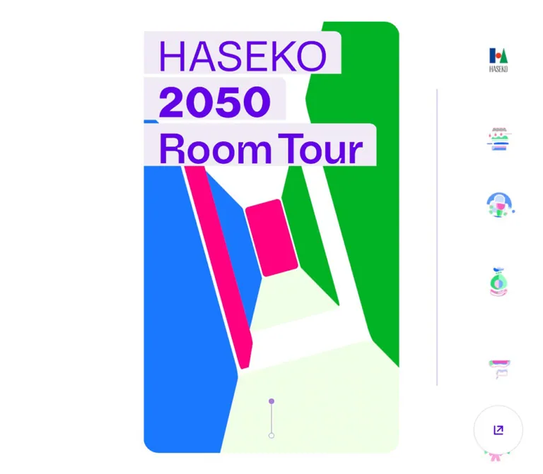
DESIGN REFERENCE
長谷工「HASEKO 2050 Room Tour」
2050年の住まいを紹介する長谷工のプロジェクトサイト。淡い水色の縦長パネル、紫のナビゲーション、鮮やかな幾何学イラストとルームツアー動画が特徴。
オリジナルサイトを見るHASEKO 2050 Room Tour — Style Reference
A pale blue window into future homes, framed by purple navigation and bright geometric inventions.
Website: HASEKO 2050 Room Tour
Original URL: https://www.haseko.co.jp/roomtour2050/
Final URL: https://www.haseko.co.jp/roomtour2050/
Theme: light; white surroundings, a pale cyan opening stage, and saturated illustration accents.
Inspected: September 12, 2026. Supplied evidence timestamp: 2026-09-12T07:05:08.550Z, or 16:05:08.550 JST.
Viewports: 1440 × 1000 CSS px desktop and 390 × 844 CSS px mobile.
Scope: three desktop and two mobile opening-state captures; rendered DOM, element rectangles, custom properties, and computed styles for navigation, media entries, article teasers, related links, and the footer. Article destinations, playback, sound toggling, sharing, and complete transition sequences were not independently exercised.
HASEKO 2050 Room Tour presents a housing-futures project through speculative illustrations and room-tour media. Its strongest visual relationship is between a dense, useful desktop index and a remarkably spacious central presentation. The index contains five small photographic video previews. The center gives a single question or invention almost an entire screen: a house on wheels, an architectural arrangement of people and passages, or a collection of colorful symbols.
The interface uses purple for orientation, pale surfaces for breathing room, and pink, blue, and green for the illustrated world. Rounded stage corners and circular controls soften the composition. Small photographs supply tangible architectural context alongside the abstract drawings. Preserve this balance of project information, moving artwork, and open space when adapting the design.
How to Read This Reference
- Measured means a value appears in the supplied rendered DOM or computed styles. Rectangles are rounded to two decimals in most tables.
- Source token means a custom property was supplied. Its existence does not prove that every similarly named component uses it.
- Calculated means a value was derived from a supplied formula or rectangle.
- Visual estimate means an approximation from the captures. Estimated color hex values are implementation suggestions, not pixel samples.
- Recommendation means guidance for a new implementation. The CSS Quick Start includes an explicit mobile width correction and an accessible compact menu that were not observed features.
- Visibility matters: offscreen elements and obscured navigation can have measurable rectangles. Their DOM presence does not establish that they were visible or operable in a capture.
Tokens — Colors
Default Palette
| Name | Value | Evidence / token | Role |
|---|---|---|---|
| Canvas White | #FFFFFF |
Source --color-white, --color-glbnav; white Share button measured |
Desktop surroundings, navigation surface, white controls |
| Interface Purple | #5803D4 |
Measured rgb(88, 3, 212) on text links and heading wrappers |
Japanese navigation text, section accents, project teaser copy |
| Opening Cyan | Approximately #E9F9FD |
Visual estimate; the stage fill declaration was not supplied | Large opening presentation surface |
| Pale Lavender | #F0EBF5 |
Source --bg-color-details, --color-bdr; lower section fill measured |
Subtle separators and a lower navigation section |
| Content Gray | #F2F2F2 |
Source section-background tokens and measured section fills | Media and editorial content surfaces |
| Text Black | #000000 |
Source --color-text; measured body and CTA parent color |
Supporting text and some control content |
| Terrace Green | #00B225 |
Source --color-green; measured teaser text |
The terrace project's content accent |
| Link Room Blue | #1978FF |
Source --color-blue; measured teaser text |
The LINK ROOM project's content accent |
| Fine Violet Outline | Approximately #D8C1FF |
Visual estimate | Share-button outline and the isolated desktop vertical rule |
The visible wordmark is a softer purple than much of the navigation. Its exact graphical fill was not supplied. Several English labels have empty text in the DOM extract, so their visible color should not be inferred from a black parent color value.
Illustration Palette
These are visual approximations for new artwork. The actual illustration assets may contain additional shades, transparency, and changing colors.
| Name | Approximation | Visual use |
|---|---|---|
| Candy Pink | #F76AC4 |
Roofs, doors, figures, curved architectural pieces |
| Clear Blue | #5993F7 |
House bodies, circles, columns, tubes |
| Bright Green | #1CDE65 |
Wheels, bases, passages, figure details |
| Soft Mint | #8AEBB1 |
Roof triangles and large secondary shapes |
Keep these illustration colors distinct from the measured green and blue used by article text. Their brighter appearance is part of the artwork, not evidence that the corresponding interface tokens are inaccurate.
Translucent Controls
| Treatment | Measured value | Context |
|---|---|---|
| Terrace media CTA | rgba(0, 178, 37, .5) |
Link to ?article=terrace |
| LINK ROOM media CTA | rgba(25, 120, 255, .5) |
Link to ?article=linkroom |
| Making-of media CTA | rgba(255, 0, 130, .5) |
Link to ?article=projects |
| Sound-control surface | rgba(0, 0, 0, .1) |
Circular control in media sections |
| General hover token | rgba(0, 0, 0, .05) |
Source --color-hover; application not verified |
The final appearance of a translucent CTA depends on the material beneath it. Preserve alpha when placing these controls over media. A flat pastel replacement will produce a different result.
Tokens — Typography
Japanese Text and Interface
The declared body family begins with toppan-bunkyu-gothic-pr6n, followed by Segoe UI, Japanese system sans-serif families, and a generic sans-serif fallback. Most sampled Japanese text uses weight 600.
This supports a compact, substantial Gothic texture. It does not prove that the first family successfully rendered every glyph; font loading and glyph-level fallback were not separately recorded. Use the named family only when available and appropriately licensed.
Account Names and Copyright
The sampled account handles and copyright use neue-haas-grotesk-display, sans-serif, weight 500. These small Latin labels introduce a lighter, tightly organized texture beneath the Japanese creator names.
Do not automatically assign this family to all visible English navigation. The wordmark and several menu labels are graphical or otherwise absent from the extracted text, and their exact rendering method was not supplied.
Graphical Lettering and Opening Copy
The desktop wordmark reads HASEKO 2050 Room Tour, with stronger emphasis on 2050 Room Tour. Its H1 wrapper is text-empty in the extract. Treat the visible wordmark as identity artwork rather than deriving its typography from that wrapper's 14px font size.
The opening frames show a vertical Japanese statement and short horizontal questions. Examples include つぎの つなぐを どうつくる?, 旅する家?, and 家族街? 仲間街?. The questions are modest in scale compared with the surrounding space and illustrations.
Type Scale
| Role | Desktop | Mobile | Weight / line height | Evidence |
|---|---|---|---|---|
| Root font size | 10px |
12.1875px |
400 | Computed HTML style |
| Body default | 14px |
17.0625px |
600 / normal | Computed BODY style |
| Japanese movie-group label | 16.667px |
14.067px |
600 / 1 | Measured link |
| Thumbnail creator name | 13.889px |
11.722px |
600 / 1.3 | Measured paragraph |
| Thumbnail account handle | 13.889px |
11.722px |
500 / 1.3 | Measured paragraph |
| Article teaser text | 19.444px |
16.411px |
600 / 1.6 | Measured paragraph |
| Related-link caption | 16.667px |
14.067px |
600 / 1.5 | Measured paragraph |
| H3 wrapper | 34.722px |
29.305px |
400 / 1 | Computed, but sampled wrappers have no text |
| Copyright | 13.889px |
11.722px |
500 / normal | Measured paragraph |
| Question-title token | 27.778px |
23.445px |
Assignment not verified | Calculated from --fs-questions-title |
| Question-text token | 34.722px |
29.305px |
Assignment not verified | Calculated from --fs-questions-text |
Article teaser tracking measures 0.05em: approximately 0.972px on desktop and 0.821px on mobile. The Japanese movie-group label measures 0.7px desktop tracking and 0.853px mobile tracking; retain these as measurements rather than assuming they derive from the label's own font size.
The sizing system is mixed. The mobile body default grows while many height-based tokens shrink. Copying source rem numbers into a conventional 16px-root application would therefore change the proportions. The Quick Start uses explicit sizes and height-based clamps instead.
Tokens — Spacing & Shapes
Density: tightly nested desktop navigation around an open central scene.
Primary layout anchor: a constant 40px top and bottom stage clearance.
Scaling: many controls and labels respond to viewport height through bounded clamp() formulas.
Responsive Unit
The supplied source defines:
--main-space: 40px;
--block-H: calc(100vh - 40px * 2);
--movie-height: calc(100vh - 40px * 2);
--kv-height: calc(calc(100vh - 40px * 2) * 1.5);
--inner-width: 84%;
Consequently, the stage-height basis is 920px on desktop and 764px on mobile. The opening section's measured layout height is 1380px and 1146px respectively, exactly 1.5 times that basis. This longer section rectangle should not be confused with the cyan panel visible in one frame.
Measured main widths divided by the stage-height basis are approximately 0.5896 at both viewports. This is a useful calculated proportion; the original width declaration itself was not supplied.
Spacing Scale
| Use | Source or measured relationship | Desktop | Mobile |
|---|---|---|---|
| Stage top/bottom clearance | Source --main-space |
40px |
40px |
| Outer navigation left inset | clamp(11.1111px, 1.7361vh, 18.75px) |
About 17.36px |
About 14.65px |
| Brand top / Share edge inset | clamp(26.6667px, 4.1667vh, 45px) |
About 41.67px |
About 35.17px |
| Nested navigation indentation | clamp(28.8889px, 4.5139vh, 48.75px) |
About 45.14px |
About 38.10px |
| Navigation row gap | clamp(13.3333px, 2.0833vh, 22.5px) |
About 20.83px |
About 17.58px |
| Gap between thumbnail links | Difference between measured rectangles | 6.94px |
5.86px |
| Thumbnail caption side inset | Difference between measured rectangles | 13.88px |
11.72px |
| Editorial content side inset | Calculated 8% of main width | 43.40px |
36.04px |
Mobile navigation figures describe measurable DOM geometry. That navigation is not visible in the supplied mobile opening frames.
Border Radius
| Element | Value | Evidence |
|---|---|---|
| Opening panel | Approximately 28px desktop, 24px mobile |
Visual estimate |
| Navigation container | 0px |
Source --glbnav-radius |
| Thumbnail image | About 6.94px desktop, 5.86px mobile |
Source --nav-movie-img-radius |
| Article container | About 20.83px desktop, 17.58px mobile |
Source --article-radius; open article not inspected |
| Share, Sound, Close | Circle | Measured square boxes with very large radii |
| Article links | Pill | Measured very large radii |
The huge computed control radii, such as 1440px, simply ensure circular or pill geometry. A reusable implementation can use 50% for square controls and 999px for pills.
Layout Measurements
| Element | Desktop: 1440 × 1000 | Mobile: 390 × 844 |
|---|---|---|
| Main column | x 448.78, y 40, width 542.44px |
x 0, y 40, width 450.47px |
| Visible opening-stage height | About 920px |
About 764px |
| Main element layout height | 16677.81px |
13908.16px |
| Reported document height | 1000px |
844px |
| Brand wrapper | 290.27 × 19.44px at 62.48, 41.66 |
244.98 × 16.41px in DOM; not visible in capture |
| Primary navigation link | 336.80 × 27.77px |
284.27 × 23.44px in DOM |
| Video thumbnail link | 100.69 × 133.31px |
84.98 × 112.52px in DOM |
| Share button | 104.16 × 104.16px at 1294.17, 854.19 |
87.91 × 87.91px at 266.92, 720.94 |
| Sound button | 62.5 × 62.5px |
52.75 × 52.75px |
| Editorial inner width | 455.64px |
378.39px |
The mismatch between document height and main height indicates a viewport-contained or otherwise controlled presentation. The supplied properties do not identify the precise scrolling element or transformation strategy.
Components
Desktop Identity and Navigation
Role: persistent project identity and direct access to content.
The visible left region begins with the wordmark at approximately x62, y42. Below it, an icon and Room Tour label lead into three numbered groups. A fine horizontal rule separates those groups from five secondary links: Details, Statement, Projects, Interviews, and Links.
The layout has three clear indentation levels: the outer icon axis near x17, the group/brand axis near x62, and the thumbnail axis near x104. This nesting makes the menu understandable despite its small components.
The primary links have approximately 27.77px-high boxes. Secondary rows begin about 48.59px apart on desktop. The menu has a white background, colorful pictograms, purple lettering, and no enclosing card or shadow. Its position remains visually stable across the three supplied desktop frames; the exact positioning declaration was not included.
The brand points to #section0. The Room Tour entry points to #n-movie0. Secondary destinations are #n-details, #n-about, #n-projects, #n-interviews, and #n-links.
Numbered Movie Group
Role: organizes room tours by architectural concept and making-of content.
Each group contains a colorful emblem, a number and title, followed by a small row of portrait previews. The observed grouping is:
| Group | Visible label | Previews | Targets |
|---|---|---|---|
| 1 | 棚田テラス |
Two | #n-movie0, #n-movie1 |
| 2 | LINK ROOM |
Two | #n-movie2, #n-movie3 |
| 3 | Behind the Scenes |
One | #n-movie4 |
The thumbnails follow the heading by approximately 6.94px on desktop. About 20.83px separates a thumbnail row from the next group heading. Retain the uneven two/two/one content structure when reproducing this specific index.
Video Thumbnail Link
Role: a compact visual entry into a room-tour segment.
The entire portrait preview is an anchor. Its anatomy is a cropped photographic frame, small rounded corners, a centered white triangular play symbol, and two white text lines near the bottom: creator name and account handle. At desktop size, the link is about 100.69 × 133.31px, close to a 3:4 ratio.
The caption region is only about 72.94px wide. Long names and handles visibly truncate. The first frame includes architecture and a person; the making-of preview shows a goat. Preserve the documentary specificity of these images rather than replacing all previews with architectural renderings.
The source transition is opacity 0.15s linear. Its triggering selector and target opacity were not supplied. Link destinations are evidenced; whether activating one starts playback immediately is unverified.
Opening Question Stage
Role: introduces the project's speculative housing ideas through a concentrated visual sequence.
A tall pale cyan panel sits at x448.78 on desktop and fills the visible region from y40 to about y960. It is centered on the viewport, independently of the navigation's width. Rounded corners and the uninterrupted cyan field give each question a contained, almost poster-like setting.
One frame contains only the vertically arranged statement つぎの つなぐを どうつくる?. Its narrow column sits left of the panel's center. Another places a wheeled house in the upper-middle area, with 旅する家? well below. A third shows a compact architectural composition above 家族街? 仲間街?.
Visual estimates: the illustrated forms span roughly 270–330px on desktop, depending on their silhouette. The wheeled house occupies about 60% of the panel width. Captions sit near the lower fifth, separated from the artwork by substantial empty space.
Treat these as alternative scene compositions. Their exact ordering, timing, and trigger are not established by the still captures.
Symbol Collection State
Role: presents the illustration vocabulary as a small collection.
The fifth capture shows nine symbols in a three-by-three arrangement within the cyan field. Subjects include the wheeled house, an enclosed pod, architectural blocks, and abstract domestic devices. Each symbol remains small, with ample space between rows and columns.
The grid is centered within the wider logical mobile panel. Because that panel exceeds the viewport, the collection is not centered on the visible 390px screen. Preserve the three-column organization when studying the original state, and distinguish that observation from a corrected responsive implementation.
Right Illustration Strip and Vertical Rule
Role: adds peripheral continuity with the central artwork.
A sequence of small colorful motifs sits near the desktop's right edge, on an axis aligned with the Share button's center at approximately x1346. A thin pale violet rule stands separately around x1067, extending roughly from y188 to y813. These are two distinct elements, separated by substantial white space.
The motifs change position or pose between captures. A portion of this strip also appears above the cyan panel in mobile captures. No supplied link mapping establishes that these motifs are navigation controls, so treat their interactive role as unknown.
The source exposes --icons-width: 135px; its exact assignment was not provided. Individual visible motifs are much smaller than 135px.
Share Button
Role: sharing utility, identified by the button's DOM text Share.
The visible symbol is an upward-right arrow emerging from a small open square. It sits in a white circular button with a very thin lavender outline and no visible shadow. Although the icon resembles an external-link symbol, its evidenced identity is Share.
The desktop button is approximately 104.16px across, with 41.67px right and bottom clearances. Mobile uses about 87.91px, with 35.17px clearances. On mobile it overlaps the cyan panel's lower region and extends slightly below the panel's bottom edge.
The opened sharing interface, platform behavior, and fallback mechanism were not captured.
Media Segment and Sound Control
Role: connects room-tour content with deeper project information.
This component is supported by offscreen DOM and computed geometry. The supplied screenshots show its sidebar previews, not the complete media presentation.
The DOM contains five movie targets, creator information, circular Sound buttons, and colored pill links to related articles. Sound buttons have a 10% black surface and measure 62.5px on desktop. The first desktop control sits about 20.83px from the media region's top and right edges.
The corresponding article links use two-line Japanese labels such as 棚田テラスについてくわしく知る, accompanied by an arrow. Filled CTA heights measure about 61.11px desktop and 51.56px mobile. Desktop widths range from approximately 210 to 221px according to content.
A source token reserves nine stage heights for movie-related layout. This is not evidence of nine distinct movies: the actual index identifies five.
Editorial Teasers and Related Links
Role: provides explanatory content beyond the room tours.
The DOM identifies terrace and LINK ROOM explanations, a project statement, project information, interviews, and related corporate links. Teaser text and CTA rectangles are aligned within an 84%-width inner column. Green identifies the terrace teaser; blue identifies LINK ROOM; purple appears in project and interview teaser copy.
White pill links labeled くわしく見る measure approximately 180.02 × 63.11px on desktop and 152.27 × 53.56px on mobile. They point to ?article=terrace, ?article=linkroom, ?article=projects, and ?article=interviews.
These destinations were not opened. A CLOSE button is present in the DOM, but that alone does not establish a tested modal or article-overlay interaction. Do not invent the opened article layout from its tokens.
Repeated Navigation and Footer
Role: returns visitors to project content and corporate information.
A lower pale lavender section repeats the room-tour and secondary navigation structure. The repeated links do not represent additional videos. The footer includes the HASEKO copyright and a company link. Related links also include the corporate recruitment site.
These lower regions are documented through rendered DOM and computed styles, without matching full-page screenshots.
Tokens — Motion & Interaction
| Treatment | Evidence | What can be concluded |
|---|---|---|
| Opening composition changes | Different statement, illustration, and collection frames | The presentation has changing visual states; order, timing, and input mapping remain unverified |
| Peripheral motif movement | Different positions and poses across captures | The strip participates in the changing visual presentation; continuous-loop behavior is not established |
| Thumbnail opacity | opacity 0.15s linear |
A short opacity transition is declared; endpoint and trigger are unknown |
| Media-area indicator opacity | opacity 0.4s on sampled paragraphs |
A fade is declared on those elements; exact indicator semantics are not established |
| Ease-in token | cubic-bezier(.55, .055, .675, .19) |
Available source easing, without a verified component assignment |
| Ease-out token | cubic-bezier(.165, .84, .3, 1) |
Available source easing, without a verified component assignment |
| Navigation anchors | Fragment URLs and query links | Destinations are present; scroll duration and route-transition behavior are unverified |
| Sound, Share, Close | Button elements and labels | Control identities exist; resulting states were not tested |
Most sampled wrappers report animation: none. This does not establish a motionless page: descendant graphics, media, or script-driven changes may not appear in those wrapper properties.
The capture process waited at least five seconds initially, considered finite visible animations, and temporarily paused perpetual animation during readiness checks before resuming it. These safeguards support usable stills, but they do not provide a timeline or prove that every delayed state was reached.
Recommended implementation approach: keep each scene's text and illustration within stable bounds, animate authorized artwork separately, and preserve an intelligible static state. Do not assign an invented auto-advance interval or scroll-scrubbing curve as though it were measured from this site.
Surfaces
| Layer | Appearance | Structural purpose |
|---|---|---|
| Outer shell | White | Holds the desktop index and peripheral motifs |
| Opening stage | Pale cyan, large rounded corners | Concentrates attention on one question or composition |
| Navigation | White, mostly unboxed | Keeps the dense content index lightweight |
| Thumbnail | Photographic crop, small radius, white overlays | Supplies recognizable media entry points |
| Editorial/media regions | Measured light gray and pale lavender surfaces | Separates content groups within the narrow column |
| Media CTA | Translucent green, blue, or pink pill | Connects a segment to its explanatory article |
| Utility controls | White circle or translucent dark circle | Distinguishes sharing from media controls |
The visible opening interface uses flat surfaces. Separation comes from whitespace, fill changes, thin rules, and rounded silhouettes rather than an elevation system.
Imagery
The illustration language combines circles, triangles, semicircles, rounded tubes, stepped edges, small doorways, and checkerboard strips. Buildings and people share the same geometric vocabulary. A home can become a vehicle; figures can become part of a building; pipes and windows can become expressive graphic pieces.
Edges are clean and smooth. Depth comes from overlapping shapes and occasional shaded segments within the limited palette. The artwork does not rely on photorealistic lighting or a uniform outlined-icon style. Use object-fit: contain for these compositions so their irregular silhouettes retain clear space.
Photography has a separate job. The portrait previews resemble social room-tour videos, with people, buildings, embedded lettering, play symbols, and compact account labels. Cropping is appropriate for these previews; it is not appropriate for the central speculative illustrations.
Observed Asset References
No original image, font, vector, or animation file URLs were included in the supplied evidence. The following identifies visual asset families without inventing filenames or formats.
| Asset family | Evidence | Use |
|---|---|---|
| Project wordmark | Desktop captures 1–3 | Top-left identity |
| Wheeled house | Desktop capture 2; mobile capture 5 | Large scene illustration and small collection symbol |
| Architectural community composition | Desktop capture 3 | Future-living question illustration |
| Abstract modular composition | Mobile capture 4 | Large illustrated scene |
| Nine-symbol collection | Mobile capture 5 | Three-by-three collection state |
| Multicolor navigation pictograms | Desktop captures 1–3 | Room-tour groups and secondary navigation |
| Photographic previews | Desktop captures 1–3 | Five media entry points |
| Peripheral motifs | All supplied capture groups | Right-side or partially visible top decoration |
Use authorized original assets when available. Asset format and animation technology must be established separately; smooth appearance alone does not prove SVG or a particular motion library.
Layout & Responsive Behavior
Desktop Composition
At 1440 × 1000, the main column occupies approximately 37.67% of viewport width and is centered exactly around x720. The navigation's right edge is near x354, leaving about 94.62px before the main panel begins. To the right of the panel, a rule, wide white interval, and motif strip extend the composition without adding another content column.
The presentation reads as a narrow visual story with a full content index alongside it. The main panel should remain visually centered even though the two peripheral regions have different densities.
Observed Mobile Clipping
At 390 × 844, the main column starts at x0 but measures 450.47px wide. It exceeds the viewport by 60.47px, approximately 15.5% of viewport width. Its logical center is x225.23, about 30.23px to the right of the screen center.
This explains the missing right-hand panel corners and the right-shifted composition in the mobile captures. The inner editorial width also remains 84% of this wider column, or about 378.39px, rather than 84% of the visible screen.
Navigation retains measured mobile rectangles in the DOM but is not visible in these opening screenshots. Its hiding or occlusion mechanism was not supplied. There is no evidenced hamburger-menu interaction to describe.
The Share button remains fully positioned within the viewport. By contrast, the offscreen media Sound button has a measured mobile x-coordinate of 380.14px and a width of 52.75px, extending beyond the right edge. Its appearance in an active media state requires separate verification.
Recommended Responsive Adaptation
For a new implementation, cap the story width to the viewport while retaining its height-derived desktop proportions:
/* Recommended width correction; not the observed mobile rule. */
.story-stage {
  width: min(100%, calc((100dvh - 80px) * 0.5896));
}
Keep the original 40px vertical breathing room where the device permits it. Provide a visible, keyboard-operable compact navigation when the desktop index cannot fit. Verify that media controls, article links, and Share stay within the usable screen and safe-area boundaries.
Only two viewport sizes were inspected. The original breakpoint, tablet behavior, short-landscape behavior, safe-area handling, and browser-toolbar resizing remain unverified.
Do’s and Don’ts
Do
- Keep the desktop story column narrow and centered, with generous white surroundings.
- Preserve the navigation's nested icon, group, and thumbnail alignment.
- Use purple for orientation and the measured green/blue accents for their corresponding project content.
- Give each opening illustration plenty of unoccupied cyan space.
- Keep the two/two/one grouping of the five observed media previews.
- Preserve portrait photography, white play symbols, and compact creator captions.
- Use clean geometric forms with pink, blue, green, and mint variation.
- Identify the outlined arrow control as Share.
- Separate visible screenshot findings from offscreen DOM findings.
- Document the mobile clipping when describing the original; label any width correction as an adaptation.
Don't
- Don't stretch the central illustration across the desktop viewport.
- Don't add shadows, glossy panels, or large filled buttons to every region.
- Don't replace the varied illustrated motifs with one generic outline-icon set.
- Don't crop the central compositions as though they were photographic previews.
- Don't assume every visible label inherits the body's font and text color.
- Don't count repeated footer links as additional media entries.
- Don't claim the peripheral motifs are clickable without interaction evidence.
- Don't invent autoplay timing, a scroll animation library, sharing behavior, or an opened article interface.
- Don't reproduce inaccessible clipping as a required visual feature of a new site.
Recommended Implementation Additions
These are proposed improvements, not verified original features:
- Cap the mobile content width and test every control against the actual viewport edge.
- Provide a compact navigation with the same hierarchy and a usable return path to the opening scene.
- Audit accessible names for graphical wordmarks and menu links. Empty extracted text alone does not prove that accessible names are absent.
- Give icon-only controls explicit names and expose sound state through suitable semantics.
- Keep essential captions readable; consider a 14px minimum for new mobile thumbnail captions instead of reproducing the measured 11.72px.
- Make touch targets at least 44px while preserving the visible pictogram sizes.
- Support reduced motion with a complete static scene and an independent way to access all project content.
- Supply captions or transcripts for room-tour media and meaningful alternatives for illustrations that carry a question's meaning.
- Provide visible keyboard focus and prevent floating controls from covering focused content.
- Preserve navigation and article access if animation or optional media fails to load.
Agent Prompt Guide
Quick Color Reference
- Outer canvas and white controls:
#FFFFFF. - Measured interface purple:
#5803D4. - Opening panel approximation:
#E9F9FD. - Measured lower surfaces:
#F0EBF5and#F2F2F2. - Measured article accents: terrace
#00B225, LINK ROOM#1978FF. - Illustration approximations: pink
#F76AC4, blue#5993F7, green#1CDE65, mint#8AEBB1. - Utility outlines: a very light violet, approximately
#D8C1FF.
Overall Prompt
“Create a housing-futures project website with a white desktop canvas, a narrow centered pale cyan presentation panel, and a dense left content index. Use purple navigation, small colorful geometric pictograms, and five portrait room-tour previews grouped two, two, and one. Give the opening panel large rounded corners and present one speculative domestic illustration or short Japanese question at a time. Illustrations should combine circles, tubes, doors, triangles, and architectural figures in pink, blue, green, and mint. Add a sparse peripheral motif strip and a thin outlined circular Share control. Keep the central artwork uncropped and the surrounding space generous. For the new mobile implementation, fit the panel to the viewport and provide accessible compact navigation.”
Example Component Prompts
- Movie index: “Build a white side index with a colorful emblem, purple numbered title, and two small portrait video links beneath it. Use approximately 101 × 133px previews on a 1000px-tall desktop viewport, 7px corner radii, a narrow 7px gap, white triangular play symbols, and two compact creator-caption lines near the bottom.”
- Question scene: “Place a geometric house on wheels within a tall pale cyan rounded panel. Center the illustration around the upper-middle region, leave generous space beneath it, and place the purple question
旅する家?near the lower fifth. Use flat pink, blue, and green shapes with smooth edges.” - Vertical statement: “Create a restrained opening state containing the Japanese statement
つぎの つなぐを どうつくる?in a narrow vertical purple column, offset left of the center of a pale cyan panel. Preserve broad empty space around the text.” - Symbol collection: “Arrange nine distinct domestic-future pictograms in a spacious three-by-three collection. Use irregular geometric silhouettes, consistent small visual scale, and pink, blue, green, and mint accents. Keep each symbol on the shared cyan field without a separate card.”
- Share control: “Create a white circular Share button with a thin pale violet outline and a small purple outward-arrow symbol. Use a diameter near 104px on a 1000px-tall desktop and 88px on an 844px-tall phone. Keep its accessible name explicit and its action separate from its visual styling.”
Quick Start
CSS Custom Properties
This is an implementation adaptation, not recovered source CSS. It uses measured colors and source height-based clamps, approximate illustration colors, and geometry derived from the captures. The 0.5896 panel ratio and several navigation ratios are calculated approximations. The 1100px breakpoint, compact menu, focus styling, and mobile width cap are recommendations.
Apply .story-stage to the main content column. Each .scene can contain .scene-art and .scene-caption, a .scene-statement, or an .icon-sheet. The desktop .site-nav contains the brand, navigation rows, movie groups, and secondary links. Use authorized assets; media playback, scene sequencing, and sharing require separate behavior.
:root {
  /* Measured interface colors */
  --rt-white: #ffffff;
  --rt-ink: #5803d4;
  --rt-text: #000000;
  --rt-lavender: #f0ebf5;
  --rt-gray: #f2f2f2;
  --rt-terrace: #00b225;
  --rt-linkroom: #1978ff;

  /* Visual approximations */
  --rt-cyan: #e9f9fd;
  --rt-outline: #d8c1ff;
  --rt-art-pink: #f76ac4;
  --rt-art-blue: #5993f7;
  --rt-art-green: #1cde65;
  --rt-art-mint: #8aebb1;

  /* Adapted stacks; font files are not included */
  --rt-font-ja: toppan-bunkyu-gothic-pr6n, 'Segoe UI',
    'Hiragino Kaku Gothic Pro', 'Hiragino Sans',
    YuGothic, Meiryo, sans-serif;
  --rt-font-latin: neue-haas-grotesk-display, sans-serif;

  /* Source-derived scales */
  --rt-label: clamp(10.6667px, 1.6667vh, 18px);
  --rt-caption: clamp(8.8889px, 1.3889vh, 15px);
  --rt-body: clamp(12.4444px, 1.9444vh, 21px);
  --rt-question: clamp(17.7778px, 2.7778vh, 30px);
  --rt-statement: clamp(22.2222px, 3.4722vh, 37.5px);
  --rt-edge: clamp(26.6667px, 4.1667vh, 45px);
  --rt-nav-left: clamp(11.1111px, 1.7361vh, 18.75px);
  --rt-nav-indent: clamp(28.8889px, 4.5139vh, 48.75px);
  --rt-nav-icon: clamp(17.7778px, 2.7778vh, 30px);
  --rt-nav-gap: clamp(13.3333px, 2.0833vh, 22.5px);
  --rt-brand-w: clamp(185.7778px, 29.0278vh, 313.5px);
  --rt-brand-h: clamp(12.4444px, 1.9444vh, 21px);
  --rt-thumb-radius: clamp(4.4444px, .6944vh, 7.5px);
  --rt-share-size: clamp(66.6667px, 10.4167vh, 112.5px);
  --rt-sound-size: clamp(40px, 6.25vh, 67.5px);
  --rt-row-height: clamp(39.1111px, 6.1111vh, 66px);

  /* Source stage clearance with a recommended dynamic viewport */
  --rt-stage-space: 40px;
  --rt-panel-h: calc(100vh - 80px);
  --rt-panel-w: calc(var(--rt-panel-h) * .5896);

  /* Ratios estimated from measured component rectangles */
  --rt-nav-w: calc(var(--rt-nav-icon) * 12.125);
  --rt-thumb-w: calc(var(--rt-nav-icon) * 3.625);
  --rt-thumb-h: calc(var(--rt-nav-icon) * 4.8);
  --rt-thumb-gap: calc(var(--rt-nav-icon) * .25);
  --rt-panel-radius: 28px;

  /* Declared source motion values */
  --rt-thumb-transition: opacity 150ms linear;
  --rt-media-transition: opacity 400ms ease;
  --rt-ease-in: cubic-bezier(.55, .055, .675, .19);
  --rt-ease-out: cubic-bezier(.165, .84, .3, 1);
}

@supports (height: 100dvh) {
  :root {
    --rt-panel-h: calc(100dvh - 80px);
  }
}

* { box-sizing: border-box; }

body {
  margin: 0;
  color: var(--rt-text);
  background: var(--rt-white);
  font-family: var(--rt-font-ja);
  font-weight: 600;
}

button, a { -webkit-tap-highlight-color: transparent; }
button { font: inherit; }

.story-stage {
  width: min(100%, var(--rt-panel-w));
  margin: var(--rt-stage-space) auto;
}

.scene {
  position: relative;
  isolation: isolate;
  min-height: var(--rt-panel-h);
  overflow: hidden;
  border-radius: var(--rt-panel-radius);
  background: var(--rt-cyan);
  color: var(--rt-ink);
}

.scene-art {
  position: absolute;
  left: 50%;
  top: 47%;
  width: 64%;
  height: 46%;
  object-fit: contain;
  transform: translate(-50%, -50%);
}

.scene-caption {
  position: absolute;
  inset-inline: 8%;
  bottom: 16.5%;
  margin: 0;
  text-align: center;
  font-size: var(--rt-question);
  line-height: 1.35;
  letter-spacing: .08em;
}

.scene-statement {
  position: absolute;
  top: 20%;
  left: 28%;
  margin: 0;
  writing-mode: vertical-rl;
  font-size: var(--rt-statement);
  line-height: 1.2;
  letter-spacing: .1em;
}

.icon-sheet {
  position: absolute;
  inset: 24% 7% 25%;
  display: grid;
  grid-template-columns: repeat(3, minmax(0, 1fr));
  grid-template-rows: repeat(3, minmax(0, 1fr));
  place-items: center;
}

.icon-sheet img {
  display: block;
  width: min(58px, 80%);
  height: 58px;
  object-fit: contain;
}

.site-nav {
  position: fixed;
  z-index: 20;
  top: var(--rt-edge);
  left: var(--rt-nav-left);
  width: var(--rt-nav-w);
  max-height: calc(100dvh - var(--rt-edge));
  overflow-y: auto;
  color: var(--rt-ink);
  background: var(--rt-white);
}

.site-brand {
  display: block;
  width: var(--rt-brand-w);
  height: var(--rt-brand-h);
  margin: 0 0 var(--rt-edge) var(--rt-nav-indent);
}

.site-brand img {
  display: block;
  width: 100%;
  height: 100%;
  object-fit: contain;
}

.nav-row {
  display: grid;
  grid-template-columns: var(--rt-nav-icon) minmax(0, 1fr);
  align-items: center;
  gap: var(--rt-nav-left);
  min-height: var(--rt-nav-icon);
  color: inherit;
  text-decoration: none;
  font-size: var(--rt-label);
}

.nav-row > img {
  width: var(--rt-nav-icon);
  height: var(--rt-nav-icon);
  object-fit: contain;
}

.movie-group {
  margin-top: var(--rt-nav-gap);
  margin-left: var(--rt-nav-indent);
}

.movie-grid {
  display: flex;
  gap: var(--rt-thumb-gap);
  margin-top: var(--rt-thumb-gap);
  margin-left: var(--rt-edge);
}

.movie-card {
  position: relative;
  display: block;
  flex: 0 0 var(--rt-thumb-w);
  width: var(--rt-thumb-w);
  height: var(--rt-thumb-h);
  overflow: hidden;
  border-radius: var(--rt-thumb-radius);
  color: var(--rt-white);
  text-decoration: none;
  transition: var(--rt-thumb-transition);
}

.movie-card > img {
  display: block;
  width: 100%;
  height: 100%;
  object-fit: cover;
}

.movie-card__play {
  position: absolute;
  top: 50%;
  left: 50%;
  width: 0;
  height: 0;
  border-top: 13px solid transparent;
  border-bottom: 13px solid transparent;
  border-left: 20px solid white;
  transform: translate(-40%, -50%);
}

.movie-card__caption {
  position: absolute;
  inset-inline: var(--rt-caption);
  bottom: var(--rt-caption);
  font-size: var(--rt-caption);
  line-height: 1.3;
}

.movie-card__caption p {
  margin: 0;
  overflow: hidden;
  white-space: nowrap;
  text-overflow: ellipsis;
}

.movie-card__account {
  font-family: var(--rt-font-latin);
  font-weight: 500;
}

.nav-tail {
  display: grid;
  gap: var(--rt-nav-gap);
  margin-top: var(--rt-nav-gap);
  padding-top: var(--rt-nav-gap);
  border-top: 1px solid var(--rt-lavender);
}

.desktop-rule {
  position: fixed;
  top: 18.75vh;
  left: calc(50% + var(--rt-panel-w) / 2 + 76px);
  height: 62.5vh;
  border-left: 1px solid var(--rt-outline);
  pointer-events: none;
}

.icon-rail {
  position: fixed;
  inset-block: 0;
  right: calc(var(--rt-edge) + var(--rt-share-size) / 2 - 67.5px);
  width: 135px;
  display: flex;
  flex-direction: column;
  align-items: center;
  gap: 11vh;
  overflow: hidden;
  pointer-events: none;
}

.icon-rail img {
  flex: 0 0 60px;
  width: 60px;
  height: 60px;
  object-fit: contain;
}

.share-button {
  position: fixed;
  z-index: 30;
  right: max(var(--rt-edge), env(safe-area-inset-right, 0px));
  bottom: max(var(--rt-edge), env(safe-area-inset-bottom, 0px));
  display: grid;
  place-items: center;
  width: var(--rt-share-size);
  height: var(--rt-share-size);
  padding: 0;
  border: 1px solid var(--rt-outline);
  border-radius: 50%;
  color: var(--rt-ink);
  background: var(--rt-white);
  cursor: pointer;
}

.share-button svg { width: 22px; height: 22px; }

.article-teaser {
  padding: 8%;
  background: var(--rt-gray);
  color: var(--rt-ink);
}

.article-teaser p {
  font-size: var(--rt-body);
  line-height: 1.6;
  letter-spacing: .05em;
}

.article-cta {
  display: inline-flex;
  align-items: center;
  justify-content: center;
  gap: 1em;
  min-height: var(--rt-row-height);
  padding: .75em 1.5em;
  border: 1px solid var(--rt-lavender);
  border-radius: 999px;
  color: var(--rt-text);
  background: white;
  text-decoration: none;
}

.media-cta--terrace { background: rgba(0, 178, 37, .5); }
.media-cta--linkroom { background: rgba(25, 120, 255, .5); }
.media-cta--projects { background: rgba(255, 0, 130, .5); }

/* Recommended feedback; the source hover endpoint was not supplied. */
@media (hover: hover) {
  .movie-card:hover { opacity: .78; }
}

:where(a, button, summary):focus-visible {
  outline: 2px solid var(--rt-ink);
  outline-offset: 4px;
}

.compact-nav { display: none; }

/* Recommended breakpoint and mobile navigation, not recovered behavior. */
@media (max-width: 1100px) {
  .site-nav, .desktop-rule { display: none; }

  .story-stage {
    width: min(100%, var(--rt-panel-w));
    margin-inline: 0;
  }

  .scene { border-radius: 24px; }

  .compact-nav {
    position: fixed;
    z-index: 40;
    top: 6px;
    left: 12px;
    display: block;
    max-width: calc(100vw - 24px);
    color: var(--rt-ink);
    background: white;
  }

  .compact-nav summary { cursor: pointer; }

  .compact-nav[open] {
    max-height: calc(100dvh - 12px);
    overflow-y: auto;
    padding: 8px 12px;
    border: 1px solid var(--rt-lavender);
  }

  .compact-nav a {
    display: flex;
    align-items: center;
    min-height: 44px;
    color: inherit;
  }
}

/* Recommended static alternative; media and script need separate handling. */
@media (prefers-reduced-motion: reduce) {
  .scene-art, .icon-rail, .movie-card {
    animation: none !important;
    transition: none !important;
  }
}
This CSS supplies the shell and component styling. It intentionally leaves scene sequencing unspecified because the supplied evidence does not establish its timing. Use a native details element for the recommended .compact-nav, and keep decorative motifs out of the accessibility tree when they carry no additional meaning.
Tailwind v4 Token Mapping
Optional aliases for an implementation that already uses Tailwind v4. This does not identify the original site's framework. Define the custom properties above first.
@theme inline {
  --color-roomtour-ink: var(--rt-ink);
  --color-roomtour-cyan: var(--rt-cyan);
  --color-roomtour-lavender: var(--rt-lavender);
  --color-roomtour-gray: var(--rt-gray);
  --color-roomtour-terrace: var(--rt-terrace);
  --color-roomtour-linkroom: var(--rt-linkroom);
  --color-roomtour-pink: var(--rt-art-pink);

  --font-roomtour-ja: var(--rt-font-ja);
  --font-roomtour-latin: var(--rt-font-latin);

  --text-roomtour-caption: var(--rt-caption);
  --text-roomtour-label: var(--rt-label);
  --text-roomtour-body: var(--rt-body);
  --text-roomtour-question: var(--rt-question);

  --spacing-roomtour-edge: var(--rt-edge);
  --spacing-roomtour-stage: var(--rt-stage-space);
  --spacing-roomtour-share: var(--rt-share-size);

  --radius-roomtour-panel: var(--rt-panel-radius);
  --radius-roomtour-preview: var(--rt-thumb-radius);
}
Sources & Evidence
- HASEKO 2050 Room Tour: original and final URL; supplied HTTP status 200; page title
HASEKO 2050 Room Tour. - Supplied current-page evidence captured September 12, 2026 at
07:05:08.550Z: three desktop frames at 1440 × 1000 and two mobile frames at 390 × 844 CSS px. - Rendered DOM and computed styles: element rectangles, declared font families, weights, sizes, line heights, colors, backgrounds, radii, transition strings, fragment destinations, query destinations, and custom properties.
- The original page's copyright identifies HASEKO Corporation, and its rendered links include the corporate website and the recruitment website. Those destinations were not separately inspected for this reference.
- Inspection limitations: no independent browsing was performed for this document; original asset URLs and complete stylesheets were not supplied; no click-result logs, full motion timeline, open article captures, or tested Share/Sound states were available. SharedWorkers and service workers were disabled during capture.
This reference describes the current supplied page evidence. Visual color approximations, inferred geometry, and implementation improvements are labeled separately from measured source values.
# HASEKO 2050 Room Tour — Style Reference

> A pale blue window into future homes, framed by purple navigation and bright geometric inventions.

**Website:** [HASEKO 2050 Room Tour](https://www.haseko.co.jp/roomtour2050/)
**Original URL:** https://www.haseko.co.jp/roomtour2050/
**Final URL:** https://www.haseko.co.jp/roomtour2050/
**Theme:** light; white surroundings, a pale cyan opening stage, and saturated illustration accents.
**Inspected:** September 12, 2026. Supplied evidence timestamp: `2026-09-12T07:05:08.550Z`, or 16:05:08.550 JST.
**Viewports:** 1440 × 1000 CSS px desktop and 390 × 844 CSS px mobile.
**Scope:** three desktop and two mobile opening-state captures; rendered DOM, element rectangles, custom properties, and computed styles for navigation, media entries, article teasers, related links, and the footer. Article destinations, playback, sound toggling, sharing, and complete transition sequences were not independently exercised.

HASEKO 2050 Room Tour presents a housing-futures project through speculative illustrations and room-tour media. Its strongest visual relationship is between a dense, useful desktop index and a remarkably spacious central presentation. The index contains five small photographic video previews. The center gives a single question or invention almost an entire screen: a house on wheels, an architectural arrangement of people and passages, or a collection of colorful symbols.

The interface uses purple for orientation, pale surfaces for breathing room, and pink, blue, and green for the illustrated world. Rounded stage corners and circular controls soften the composition. Small photographs supply tangible architectural context alongside the abstract drawings. Preserve this balance of project information, moving artwork, and open space when adapting the design.

## How to Read This Reference

- **Measured** means a value appears in the supplied rendered DOM or computed styles. Rectangles are rounded to two decimals in most tables.
- **Source token** means a custom property was supplied. Its existence does not prove that every similarly named component uses it.
- **Calculated** means a value was derived from a supplied formula or rectangle.
- **Visual estimate** means an approximation from the captures. Estimated color hex values are implementation suggestions, not pixel samples.
- **Recommendation** means guidance for a new implementation. The CSS Quick Start includes an explicit mobile width correction and an accessible compact menu that were not observed features.
- **Visibility matters:** offscreen elements and obscured navigation can have measurable rectangles. Their DOM presence does not establish that they were visible or operable in a capture.

## Tokens — Colors

### Default Palette

| Name | Value | Evidence / token | Role |
| --- | --- | --- | --- |
| Canvas White | `#FFFFFF` | Source `--color-white`, `--color-glbnav`; white Share button measured | Desktop surroundings, navigation surface, white controls |
| Interface Purple | `#5803D4` | Measured `rgb(88, 3, 212)` on text links and heading wrappers | Japanese navigation text, section accents, project teaser copy |
| Opening Cyan | Approximately `#E9F9FD` | Visual estimate; the stage fill declaration was not supplied | Large opening presentation surface |
| Pale Lavender | `#F0EBF5` | Source `--bg-color-details`, `--color-bdr`; lower section fill measured | Subtle separators and a lower navigation section |
| Content Gray | `#F2F2F2` | Source section-background tokens and measured section fills | Media and editorial content surfaces |
| Text Black | `#000000` | Source `--color-text`; measured body and CTA parent color | Supporting text and some control content |
| Terrace Green | `#00B225` | Source `--color-green`; measured teaser text | The terrace project's content accent |
| Link Room Blue | `#1978FF` | Source `--color-blue`; measured teaser text | The LINK ROOM project's content accent |
| Fine Violet Outline | Approximately `#D8C1FF` | Visual estimate | Share-button outline and the isolated desktop vertical rule |

The visible wordmark is a softer purple than much of the navigation. Its exact graphical fill was not supplied. Several English labels have empty text in the DOM extract, so their visible color should not be inferred from a black parent `color` value.

### Illustration Palette

These are visual approximations for new artwork. The actual illustration assets may contain additional shades, transparency, and changing colors.

| Name | Approximation | Visual use |
| --- | --- | --- |
| Candy Pink | `#F76AC4` | Roofs, doors, figures, curved architectural pieces |
| Clear Blue | `#5993F7` | House bodies, circles, columns, tubes |
| Bright Green | `#1CDE65` | Wheels, bases, passages, figure details |
| Soft Mint | `#8AEBB1` | Roof triangles and large secondary shapes |

Keep these illustration colors distinct from the measured green and blue used by article text. Their brighter appearance is part of the artwork, not evidence that the corresponding interface tokens are inaccurate.

### Translucent Controls

| Treatment | Measured value | Context |
| --- | --- | --- |
| Terrace media CTA | `rgba(0, 178, 37, .5)` | Link to `?article=terrace` |
| LINK ROOM media CTA | `rgba(25, 120, 255, .5)` | Link to `?article=linkroom` |
| Making-of media CTA | `rgba(255, 0, 130, .5)` | Link to `?article=projects` |
| Sound-control surface | `rgba(0, 0, 0, .1)` | Circular control in media sections |
| General hover token | `rgba(0, 0, 0, .05)` | Source `--color-hover`; application not verified |

The final appearance of a translucent CTA depends on the material beneath it. Preserve alpha when placing these controls over media. A flat pastel replacement will produce a different result.

## Tokens — Typography

### Japanese Text and Interface

The declared body family begins with `toppan-bunkyu-gothic-pr6n`, followed by Segoe UI, Japanese system sans-serif families, and a generic sans-serif fallback. Most sampled Japanese text uses weight `600`.

This supports a compact, substantial Gothic texture. It does not prove that the first family successfully rendered every glyph; font loading and glyph-level fallback were not separately recorded. Use the named family only when available and appropriately licensed.

### Account Names and Copyright

The sampled account handles and copyright use `neue-haas-grotesk-display, sans-serif`, weight `500`. These small Latin labels introduce a lighter, tightly organized texture beneath the Japanese creator names.

Do not automatically assign this family to all visible English navigation. The wordmark and several menu labels are graphical or otherwise absent from the extracted text, and their exact rendering method was not supplied.

### Graphical Lettering and Opening Copy

The desktop wordmark reads `HASEKO 2050 Room Tour`, with stronger emphasis on `2050 Room Tour`. Its H1 wrapper is text-empty in the extract. Treat the visible wordmark as identity artwork rather than deriving its typography from that wrapper's 14px font size.

The opening frames show a vertical Japanese statement and short horizontal questions. Examples include `つぎの つなぐを どうつくる?`, `旅する家?`, and `家族街? 仲間街?`. The questions are modest in scale compared with the surrounding space and illustrations.

### Type Scale

| Role | Desktop | Mobile | Weight / line height | Evidence |
| --- | --- | --- | --- | --- |
| Root font size | `10px` | `12.1875px` | 400 | Computed HTML style |
| Body default | `14px` | `17.0625px` | 600 / normal | Computed BODY style |
| Japanese movie-group label | `16.667px` | `14.067px` | 600 / 1 | Measured link |
| Thumbnail creator name | `13.889px` | `11.722px` | 600 / 1.3 | Measured paragraph |
| Thumbnail account handle | `13.889px` | `11.722px` | 500 / 1.3 | Measured paragraph |
| Article teaser text | `19.444px` | `16.411px` | 600 / 1.6 | Measured paragraph |
| Related-link caption | `16.667px` | `14.067px` | 600 / 1.5 | Measured paragraph |
| H3 wrapper | `34.722px` | `29.305px` | 400 / 1 | Computed, but sampled wrappers have no text |
| Copyright | `13.889px` | `11.722px` | 500 / normal | Measured paragraph |
| Question-title token | `27.778px` | `23.445px` | Assignment not verified | Calculated from `--fs-questions-title` |
| Question-text token | `34.722px` | `29.305px` | Assignment not verified | Calculated from `--fs-questions-text` |

Article teaser tracking measures `0.05em`: approximately 0.972px on desktop and 0.821px on mobile. The Japanese movie-group label measures 0.7px desktop tracking and 0.853px mobile tracking; retain these as measurements rather than assuming they derive from the label's own font size.

The sizing system is mixed. The mobile body default grows while many height-based tokens shrink. Copying source `rem` numbers into a conventional 16px-root application would therefore change the proportions. The Quick Start uses explicit sizes and height-based clamps instead.

## Tokens — Spacing & Shapes

**Density:** tightly nested desktop navigation around an open central scene.
**Primary layout anchor:** a constant 40px top and bottom stage clearance.
**Scaling:** many controls and labels respond to viewport height through bounded `clamp()` formulas.

### Responsive Unit

The supplied source defines:

```css
--main-space: 40px;
--block-H: calc(100vh - 40px * 2);
--movie-height: calc(100vh - 40px * 2);
--kv-height: calc(calc(100vh - 40px * 2) * 1.5);
--inner-width: 84%;
```

Consequently, the stage-height basis is 920px on desktop and 764px on mobile. The opening section's measured layout height is 1380px and 1146px respectively, exactly 1.5 times that basis. This longer section rectangle should not be confused with the cyan panel visible in one frame.

Measured main widths divided by the stage-height basis are approximately `0.5896` at both viewports. This is a useful calculated proportion; the original width declaration itself was not supplied.

### Spacing Scale

| Use | Source or measured relationship | Desktop | Mobile |
| --- | --- | --- | --- |
| Stage top/bottom clearance | Source `--main-space` | `40px` | `40px` |
| Outer navigation left inset | `clamp(11.1111px, 1.7361vh, 18.75px)` | About `17.36px` | About `14.65px` |
| Brand top / Share edge inset | `clamp(26.6667px, 4.1667vh, 45px)` | About `41.67px` | About `35.17px` |
| Nested navigation indentation | `clamp(28.8889px, 4.5139vh, 48.75px)` | About `45.14px` | About `38.10px` |
| Navigation row gap | `clamp(13.3333px, 2.0833vh, 22.5px)` | About `20.83px` | About `17.58px` |
| Gap between thumbnail links | Difference between measured rectangles | `6.94px` | `5.86px` |
| Thumbnail caption side inset | Difference between measured rectangles | `13.88px` | `11.72px` |
| Editorial content side inset | Calculated 8% of main width | `43.40px` | `36.04px` |

Mobile navigation figures describe measurable DOM geometry. That navigation is not visible in the supplied mobile opening frames.

### Border Radius

| Element | Value | Evidence |
| --- | --- | --- |
| Opening panel | Approximately `28px` desktop, `24px` mobile | Visual estimate |
| Navigation container | `0px` | Source `--glbnav-radius` |
| Thumbnail image | About `6.94px` desktop, `5.86px` mobile | Source `--nav-movie-img-radius` |
| Article container | About `20.83px` desktop, `17.58px` mobile | Source `--article-radius`; open article not inspected |
| Share, Sound, Close | Circle | Measured square boxes with very large radii |
| Article links | Pill | Measured very large radii |

The huge computed control radii, such as 1440px, simply ensure circular or pill geometry. A reusable implementation can use `50%` for square controls and `999px` for pills.

### Layout Measurements

| Element | Desktop: 1440 × 1000 | Mobile: 390 × 844 |
| --- | --- | --- |
| Main column | `x 448.78`, `y 40`, width `542.44px` | `x 0`, `y 40`, width `450.47px` |
| Visible opening-stage height | About `920px` | About `764px` |
| Main element layout height | `16677.81px` | `13908.16px` |
| Reported document height | `1000px` | `844px` |
| Brand wrapper | `290.27 × 19.44px` at `62.48, 41.66` | `244.98 × 16.41px` in DOM; not visible in capture |
| Primary navigation link | `336.80 × 27.77px` | `284.27 × 23.44px` in DOM |
| Video thumbnail link | `100.69 × 133.31px` | `84.98 × 112.52px` in DOM |
| Share button | `104.16 × 104.16px` at `1294.17, 854.19` | `87.91 × 87.91px` at `266.92, 720.94` |
| Sound button | `62.5 × 62.5px` | `52.75 × 52.75px` |
| Editorial inner width | `455.64px` | `378.39px` |

The mismatch between document height and main height indicates a viewport-contained or otherwise controlled presentation. The supplied properties do not identify the precise scrolling element or transformation strategy.

## Components

### Desktop Identity and Navigation

**Role:** persistent project identity and direct access to content.

The visible left region begins with the wordmark at approximately x62, y42. Below it, an icon and `Room Tour` label lead into three numbered groups. A fine horizontal rule separates those groups from five secondary links: `Details`, `Statement`, `Projects`, `Interviews`, and `Links`.

The layout has three clear indentation levels: the outer icon axis near x17, the group/brand axis near x62, and the thumbnail axis near x104. This nesting makes the menu understandable despite its small components.

The primary links have approximately 27.77px-high boxes. Secondary rows begin about 48.59px apart on desktop. The menu has a white background, colorful pictograms, purple lettering, and no enclosing card or shadow. Its position remains visually stable across the three supplied desktop frames; the exact positioning declaration was not included.

The brand points to `#section0`. The Room Tour entry points to `#n-movie0`. Secondary destinations are `#n-details`, `#n-about`, `#n-projects`, `#n-interviews`, and `#n-links`.

### Numbered Movie Group

**Role:** organizes room tours by architectural concept and making-of content.

Each group contains a colorful emblem, a number and title, followed by a small row of portrait previews. The observed grouping is:

| Group | Visible label | Previews | Targets |
| --- | --- | --- | --- |
| 1 | `棚田テラス` | Two | `#n-movie0`, `#n-movie1` |
| 2 | `LINK ROOM` | Two | `#n-movie2`, `#n-movie3` |
| 3 | `Behind the Scenes` | One | `#n-movie4` |

The thumbnails follow the heading by approximately 6.94px on desktop. About 20.83px separates a thumbnail row from the next group heading. Retain the uneven two/two/one content structure when reproducing this specific index.

### Video Thumbnail Link

**Role:** a compact visual entry into a room-tour segment.

The entire portrait preview is an anchor. Its anatomy is a cropped photographic frame, small rounded corners, a centered white triangular play symbol, and two white text lines near the bottom: creator name and account handle. At desktop size, the link is about 100.69 × 133.31px, close to a 3:4 ratio.

The caption region is only about 72.94px wide. Long names and handles visibly truncate. The first frame includes architecture and a person; the making-of preview shows a goat. Preserve the documentary specificity of these images rather than replacing all previews with architectural renderings.

The source transition is `opacity 0.15s linear`. Its triggering selector and target opacity were not supplied. Link destinations are evidenced; whether activating one starts playback immediately is unverified.

### Opening Question Stage

**Role:** introduces the project's speculative housing ideas through a concentrated visual sequence.

A tall pale cyan panel sits at x448.78 on desktop and fills the visible region from y40 to about y960. It is centered on the viewport, independently of the navigation's width. Rounded corners and the uninterrupted cyan field give each question a contained, almost poster-like setting.

One frame contains only the vertically arranged statement `つぎの つなぐを どうつくる?`. Its narrow column sits left of the panel's center. Another places a wheeled house in the upper-middle area, with `旅する家?` well below. A third shows a compact architectural composition above `家族街? 仲間街?`.

**Visual estimates:** the illustrated forms span roughly 270–330px on desktop, depending on their silhouette. The wheeled house occupies about 60% of the panel width. Captions sit near the lower fifth, separated from the artwork by substantial empty space.

Treat these as alternative scene compositions. Their exact ordering, timing, and trigger are not established by the still captures.

### Symbol Collection State

**Role:** presents the illustration vocabulary as a small collection.

The fifth capture shows nine symbols in a three-by-three arrangement within the cyan field. Subjects include the wheeled house, an enclosed pod, architectural blocks, and abstract domestic devices. Each symbol remains small, with ample space between rows and columns.

The grid is centered within the wider logical mobile panel. Because that panel exceeds the viewport, the collection is not centered on the visible 390px screen. Preserve the three-column organization when studying the original state, and distinguish that observation from a corrected responsive implementation.

### Right Illustration Strip and Vertical Rule

**Role:** adds peripheral continuity with the central artwork.

A sequence of small colorful motifs sits near the desktop's right edge, on an axis aligned with the Share button's center at approximately x1346. A thin pale violet rule stands separately around x1067, extending roughly from y188 to y813. These are two distinct elements, separated by substantial white space.

The motifs change position or pose between captures. A portion of this strip also appears above the cyan panel in mobile captures. No supplied link mapping establishes that these motifs are navigation controls, so treat their interactive role as unknown.

The source exposes `--icons-width: 135px`; its exact assignment was not provided. Individual visible motifs are much smaller than 135px.

### Share Button

**Role:** sharing utility, identified by the button's DOM text `Share`.

The visible symbol is an upward-right arrow emerging from a small open square. It sits in a white circular button with a very thin lavender outline and no visible shadow. Although the icon resembles an external-link symbol, its evidenced identity is Share.

The desktop button is approximately 104.16px across, with 41.67px right and bottom clearances. Mobile uses about 87.91px, with 35.17px clearances. On mobile it overlaps the cyan panel's lower region and extends slightly below the panel's bottom edge.

The opened sharing interface, platform behavior, and fallback mechanism were not captured.

### Media Segment and Sound Control

**Role:** connects room-tour content with deeper project information.

This component is supported by offscreen DOM and computed geometry. The supplied screenshots show its sidebar previews, not the complete media presentation.

The DOM contains five movie targets, creator information, circular Sound buttons, and colored pill links to related articles. Sound buttons have a 10% black surface and measure 62.5px on desktop. The first desktop control sits about 20.83px from the media region's top and right edges.

The corresponding article links use two-line Japanese labels such as `棚田テラスについてくわしく知る`, accompanied by an arrow. Filled CTA heights measure about 61.11px desktop and 51.56px mobile. Desktop widths range from approximately 210 to 221px according to content.

A source token reserves nine stage heights for movie-related layout. This is not evidence of nine distinct movies: the actual index identifies five.

### Editorial Teasers and Related Links

**Role:** provides explanatory content beyond the room tours.

The DOM identifies terrace and LINK ROOM explanations, a project statement, project information, interviews, and related corporate links. Teaser text and CTA rectangles are aligned within an 84%-width inner column. Green identifies the terrace teaser; blue identifies LINK ROOM; purple appears in project and interview teaser copy.

White pill links labeled `くわしく見る` measure approximately 180.02 × 63.11px on desktop and 152.27 × 53.56px on mobile. They point to `?article=terrace`, `?article=linkroom`, `?article=projects`, and `?article=interviews`.

These destinations were not opened. A `CLOSE` button is present in the DOM, but that alone does not establish a tested modal or article-overlay interaction. Do not invent the opened article layout from its tokens.

### Repeated Navigation and Footer

**Role:** returns visitors to project content and corporate information.

A lower pale lavender section repeats the room-tour and secondary navigation structure. The repeated links do not represent additional videos. The footer includes the HASEKO copyright and a company link. Related links also include the corporate recruitment site.

These lower regions are documented through rendered DOM and computed styles, without matching full-page screenshots.

## Tokens — Motion & Interaction

| Treatment | Evidence | What can be concluded |
| --- | --- | --- |
| Opening composition changes | Different statement, illustration, and collection frames | The presentation has changing visual states; order, timing, and input mapping remain unverified |
| Peripheral motif movement | Different positions and poses across captures | The strip participates in the changing visual presentation; continuous-loop behavior is not established |
| Thumbnail opacity | `opacity 0.15s linear` | A short opacity transition is declared; endpoint and trigger are unknown |
| Media-area indicator opacity | `opacity 0.4s` on sampled paragraphs | A fade is declared on those elements; exact indicator semantics are not established |
| Ease-in token | `cubic-bezier(.55, .055, .675, .19)` | Available source easing, without a verified component assignment |
| Ease-out token | `cubic-bezier(.165, .84, .3, 1)` | Available source easing, without a verified component assignment |
| Navigation anchors | Fragment URLs and query links | Destinations are present; scroll duration and route-transition behavior are unverified |
| Sound, Share, Close | Button elements and labels | Control identities exist; resulting states were not tested |

Most sampled wrappers report `animation: none`. This does not establish a motionless page: descendant graphics, media, or script-driven changes may not appear in those wrapper properties.

The capture process waited at least five seconds initially, considered finite visible animations, and temporarily paused perpetual animation during readiness checks before resuming it. These safeguards support usable stills, but they do not provide a timeline or prove that every delayed state was reached.

**Recommended implementation approach:** keep each scene's text and illustration within stable bounds, animate authorized artwork separately, and preserve an intelligible static state. Do not assign an invented auto-advance interval or scroll-scrubbing curve as though it were measured from this site.

## Surfaces

| Layer | Appearance | Structural purpose |
| --- | --- | --- |
| Outer shell | White | Holds the desktop index and peripheral motifs |
| Opening stage | Pale cyan, large rounded corners | Concentrates attention on one question or composition |
| Navigation | White, mostly unboxed | Keeps the dense content index lightweight |
| Thumbnail | Photographic crop, small radius, white overlays | Supplies recognizable media entry points |
| Editorial/media regions | Measured light gray and pale lavender surfaces | Separates content groups within the narrow column |
| Media CTA | Translucent green, blue, or pink pill | Connects a segment to its explanatory article |
| Utility controls | White circle or translucent dark circle | Distinguishes sharing from media controls |

The visible opening interface uses flat surfaces. Separation comes from whitespace, fill changes, thin rules, and rounded silhouettes rather than an elevation system.

## Imagery

The illustration language combines circles, triangles, semicircles, rounded tubes, stepped edges, small doorways, and checkerboard strips. Buildings and people share the same geometric vocabulary. A home can become a vehicle; figures can become part of a building; pipes and windows can become expressive graphic pieces.

Edges are clean and smooth. Depth comes from overlapping shapes and occasional shaded segments within the limited palette. The artwork does not rely on photorealistic lighting or a uniform outlined-icon style. Use `object-fit: contain` for these compositions so their irregular silhouettes retain clear space.

Photography has a separate job. The portrait previews resemble social room-tour videos, with people, buildings, embedded lettering, play symbols, and compact account labels. Cropping is appropriate for these previews; it is not appropriate for the central speculative illustrations.

### Observed Asset References

No original image, font, vector, or animation file URLs were included in the supplied evidence. The following identifies visual asset families without inventing filenames or formats.

| Asset family | Evidence | Use |
| --- | --- | --- |
| Project wordmark | Desktop captures 1–3 | Top-left identity |
| Wheeled house | Desktop capture 2; mobile capture 5 | Large scene illustration and small collection symbol |
| Architectural community composition | Desktop capture 3 | Future-living question illustration |
| Abstract modular composition | Mobile capture 4 | Large illustrated scene |
| Nine-symbol collection | Mobile capture 5 | Three-by-three collection state |
| Multicolor navigation pictograms | Desktop captures 1–3 | Room-tour groups and secondary navigation |
| Photographic previews | Desktop captures 1–3 | Five media entry points |
| Peripheral motifs | All supplied capture groups | Right-side or partially visible top decoration |

Use authorized original assets when available. Asset format and animation technology must be established separately; smooth appearance alone does not prove SVG or a particular motion library.

## Layout & Responsive Behavior

### Desktop Composition

At 1440 × 1000, the main column occupies approximately 37.67% of viewport width and is centered exactly around x720. The navigation's right edge is near x354, leaving about 94.62px before the main panel begins. To the right of the panel, a rule, wide white interval, and motif strip extend the composition without adding another content column.

The presentation reads as a narrow visual story with a full content index alongside it. The main panel should remain visually centered even though the two peripheral regions have different densities.

### Observed Mobile Clipping

At 390 × 844, the main column starts at x0 but measures **450.47px wide**. It exceeds the viewport by **60.47px**, approximately **15.5% of viewport width**. Its logical center is x225.23, about 30.23px to the right of the screen center.

This explains the missing right-hand panel corners and the right-shifted composition in the mobile captures. The inner editorial width also remains 84% of this wider column, or about 378.39px, rather than 84% of the visible screen.

Navigation retains measured mobile rectangles in the DOM but is not visible in these opening screenshots. Its hiding or occlusion mechanism was not supplied. There is no evidenced hamburger-menu interaction to describe.

The Share button remains fully positioned within the viewport. By contrast, the offscreen media Sound button has a measured mobile x-coordinate of 380.14px and a width of 52.75px, extending beyond the right edge. Its appearance in an active media state requires separate verification.

### Recommended Responsive Adaptation

For a new implementation, cap the story width to the viewport while retaining its height-derived desktop proportions:

```css
/* Recommended width correction; not the observed mobile rule. */
.story-stage {
  width: min(100%, calc((100dvh - 80px) * 0.5896));
}
```

Keep the original 40px vertical breathing room where the device permits it. Provide a visible, keyboard-operable compact navigation when the desktop index cannot fit. Verify that media controls, article links, and Share stay within the usable screen and safe-area boundaries.

Only two viewport sizes were inspected. The original breakpoint, tablet behavior, short-landscape behavior, safe-area handling, and browser-toolbar resizing remain unverified.

## Do’s and Don’ts

### Do

- Keep the desktop story column narrow and centered, with generous white surroundings.
- Preserve the navigation's nested icon, group, and thumbnail alignment.
- Use purple for orientation and the measured green/blue accents for their corresponding project content.
- Give each opening illustration plenty of unoccupied cyan space.
- Keep the two/two/one grouping of the five observed media previews.
- Preserve portrait photography, white play symbols, and compact creator captions.
- Use clean geometric forms with pink, blue, green, and mint variation.
- Identify the outlined arrow control as Share.
- Separate visible screenshot findings from offscreen DOM findings.
- Document the mobile clipping when describing the original; label any width correction as an adaptation.

### Don't

- Don't stretch the central illustration across the desktop viewport.
- Don't add shadows, glossy panels, or large filled buttons to every region.
- Don't replace the varied illustrated motifs with one generic outline-icon set.
- Don't crop the central compositions as though they were photographic previews.
- Don't assume every visible label inherits the body's font and text color.
- Don't count repeated footer links as additional media entries.
- Don't claim the peripheral motifs are clickable without interaction evidence.
- Don't invent autoplay timing, a scroll animation library, sharing behavior, or an opened article interface.
- Don't reproduce inaccessible clipping as a required visual feature of a new site.

## Recommended Implementation Additions

These are proposed improvements, not verified original features:

- Cap the mobile content width and test every control against the actual viewport edge.
- Provide a compact navigation with the same hierarchy and a usable return path to the opening scene.
- Audit accessible names for graphical wordmarks and menu links. Empty extracted text alone does not prove that accessible names are absent.
- Give icon-only controls explicit names and expose sound state through suitable semantics.
- Keep essential captions readable; consider a 14px minimum for new mobile thumbnail captions instead of reproducing the measured 11.72px.
- Make touch targets at least 44px while preserving the visible pictogram sizes.
- Support reduced motion with a complete static scene and an independent way to access all project content.
- Supply captions or transcripts for room-tour media and meaningful alternatives for illustrations that carry a question's meaning.
- Provide visible keyboard focus and prevent floating controls from covering focused content.
- Preserve navigation and article access if animation or optional media fails to load.

## Agent Prompt Guide

### Quick Color Reference

- Outer canvas and white controls: `#FFFFFF`.
- Measured interface purple: `#5803D4`.
- Opening panel approximation: `#E9F9FD`.
- Measured lower surfaces: `#F0EBF5` and `#F2F2F2`.
- Measured article accents: terrace `#00B225`, LINK ROOM `#1978FF`.
- Illustration approximations: pink `#F76AC4`, blue `#5993F7`, green `#1CDE65`, mint `#8AEBB1`.
- Utility outlines: a very light violet, approximately `#D8C1FF`.

### Overall Prompt

“Create a housing-futures project website with a white desktop canvas, a narrow centered pale cyan presentation panel, and a dense left content index. Use purple navigation, small colorful geometric pictograms, and five portrait room-tour previews grouped two, two, and one. Give the opening panel large rounded corners and present one speculative domestic illustration or short Japanese question at a time. Illustrations should combine circles, tubes, doors, triangles, and architectural figures in pink, blue, green, and mint. Add a sparse peripheral motif strip and a thin outlined circular Share control. Keep the central artwork uncropped and the surrounding space generous. For the new mobile implementation, fit the panel to the viewport and provide accessible compact navigation.”

### Example Component Prompts

1. **Movie index:** “Build a white side index with a colorful emblem, purple numbered title, and two small portrait video links beneath it. Use approximately 101 × 133px previews on a 1000px-tall desktop viewport, 7px corner radii, a narrow 7px gap, white triangular play symbols, and two compact creator-caption lines near the bottom.”
2. **Question scene:** “Place a geometric house on wheels within a tall pale cyan rounded panel. Center the illustration around the upper-middle region, leave generous space beneath it, and place the purple question `旅する家?` near the lower fifth. Use flat pink, blue, and green shapes with smooth edges.”
3. **Vertical statement:** “Create a restrained opening state containing the Japanese statement `つぎの つなぐを どうつくる?` in a narrow vertical purple column, offset left of the center of a pale cyan panel. Preserve broad empty space around the text.”
4. **Symbol collection:** “Arrange nine distinct domestic-future pictograms in a spacious three-by-three collection. Use irregular geometric silhouettes, consistent small visual scale, and pink, blue, green, and mint accents. Keep each symbol on the shared cyan field without a separate card.”
5. **Share control:** “Create a white circular Share button with a thin pale violet outline and a small purple outward-arrow symbol. Use a diameter near 104px on a 1000px-tall desktop and 88px on an 844px-tall phone. Keep its accessible name explicit and its action separate from its visual styling.”

## Quick Start

### CSS Custom Properties

This is an implementation adaptation, not recovered source CSS. It uses measured colors and source height-based clamps, approximate illustration colors, and geometry derived from the captures. The `0.5896` panel ratio and several navigation ratios are calculated approximations. The 1100px breakpoint, compact menu, focus styling, and mobile width cap are recommendations.

Apply `.story-stage` to the main content column. Each `.scene` can contain `.scene-art` and `.scene-caption`, a `.scene-statement`, or an `.icon-sheet`. The desktop `.site-nav` contains the brand, navigation rows, movie groups, and secondary links. Use authorized assets; media playback, scene sequencing, and sharing require separate behavior.

```css
:root {
  /* Measured interface colors */
  --rt-white: #ffffff;
  --rt-ink: #5803d4;
  --rt-text: #000000;
  --rt-lavender: #f0ebf5;
  --rt-gray: #f2f2f2;
  --rt-terrace: #00b225;
  --rt-linkroom: #1978ff;

  /* Visual approximations */
  --rt-cyan: #e9f9fd;
  --rt-outline: #d8c1ff;
  --rt-art-pink: #f76ac4;
  --rt-art-blue: #5993f7;
  --rt-art-green: #1cde65;
  --rt-art-mint: #8aebb1;

  /* Adapted stacks; font files are not included */
  --rt-font-ja: toppan-bunkyu-gothic-pr6n, 'Segoe UI',
    'Hiragino Kaku Gothic Pro', 'Hiragino Sans',
    YuGothic, Meiryo, sans-serif;
  --rt-font-latin: neue-haas-grotesk-display, sans-serif;

  /* Source-derived scales */
  --rt-label: clamp(10.6667px, 1.6667vh, 18px);
  --rt-caption: clamp(8.8889px, 1.3889vh, 15px);
  --rt-body: clamp(12.4444px, 1.9444vh, 21px);
  --rt-question: clamp(17.7778px, 2.7778vh, 30px);
  --rt-statement: clamp(22.2222px, 3.4722vh, 37.5px);
  --rt-edge: clamp(26.6667px, 4.1667vh, 45px);
  --rt-nav-left: clamp(11.1111px, 1.7361vh, 18.75px);
  --rt-nav-indent: clamp(28.8889px, 4.5139vh, 48.75px);
  --rt-nav-icon: clamp(17.7778px, 2.7778vh, 30px);
  --rt-nav-gap: clamp(13.3333px, 2.0833vh, 22.5px);
  --rt-brand-w: clamp(185.7778px, 29.0278vh, 313.5px);
  --rt-brand-h: clamp(12.4444px, 1.9444vh, 21px);
  --rt-thumb-radius: clamp(4.4444px, .6944vh, 7.5px);
  --rt-share-size: clamp(66.6667px, 10.4167vh, 112.5px);
  --rt-sound-size: clamp(40px, 6.25vh, 67.5px);
  --rt-row-height: clamp(39.1111px, 6.1111vh, 66px);

  /* Source stage clearance with a recommended dynamic viewport */
  --rt-stage-space: 40px;
  --rt-panel-h: calc(100vh - 80px);
  --rt-panel-w: calc(var(--rt-panel-h) * .5896);

  /* Ratios estimated from measured component rectangles */
  --rt-nav-w: calc(var(--rt-nav-icon) * 12.125);
  --rt-thumb-w: calc(var(--rt-nav-icon) * 3.625);
  --rt-thumb-h: calc(var(--rt-nav-icon) * 4.8);
  --rt-thumb-gap: calc(var(--rt-nav-icon) * .25);
  --rt-panel-radius: 28px;

  /* Declared source motion values */
  --rt-thumb-transition: opacity 150ms linear;
  --rt-media-transition: opacity 400ms ease;
  --rt-ease-in: cubic-bezier(.55, .055, .675, .19);
  --rt-ease-out: cubic-bezier(.165, .84, .3, 1);
}

@supports (height: 100dvh) {
  :root {
    --rt-panel-h: calc(100dvh - 80px);
  }
}

* { box-sizing: border-box; }

body {
  margin: 0;
  color: var(--rt-text);
  background: var(--rt-white);
  font-family: var(--rt-font-ja);
  font-weight: 600;
}

button, a { -webkit-tap-highlight-color: transparent; }
button { font: inherit; }

.story-stage {
  width: min(100%, var(--rt-panel-w));
  margin: var(--rt-stage-space) auto;
}

.scene {
  position: relative;
  isolation: isolate;
  min-height: var(--rt-panel-h);
  overflow: hidden;
  border-radius: var(--rt-panel-radius);
  background: var(--rt-cyan);
  color: var(--rt-ink);
}

.scene-art {
  position: absolute;
  left: 50%;
  top: 47%;
  width: 64%;
  height: 46%;
  object-fit: contain;
  transform: translate(-50%, -50%);
}

.scene-caption {
  position: absolute;
  inset-inline: 8%;
  bottom: 16.5%;
  margin: 0;
  text-align: center;
  font-size: var(--rt-question);
  line-height: 1.35;
  letter-spacing: .08em;
}

.scene-statement {
  position: absolute;
  top: 20%;
  left: 28%;
  margin: 0;
  writing-mode: vertical-rl;
  font-size: var(--rt-statement);
  line-height: 1.2;
  letter-spacing: .1em;
}

.icon-sheet {
  position: absolute;
  inset: 24% 7% 25%;
  display: grid;
  grid-template-columns: repeat(3, minmax(0, 1fr));
  grid-template-rows: repeat(3, minmax(0, 1fr));
  place-items: center;
}

.icon-sheet img {
  display: block;
  width: min(58px, 80%);
  height: 58px;
  object-fit: contain;
}

.site-nav {
  position: fixed;
  z-index: 20;
  top: var(--rt-edge);
  left: var(--rt-nav-left);
  width: var(--rt-nav-w);
  max-height: calc(100dvh - var(--rt-edge));
  overflow-y: auto;
  color: var(--rt-ink);
  background: var(--rt-white);
}

.site-brand {
  display: block;
  width: var(--rt-brand-w);
  height: var(--rt-brand-h);
  margin: 0 0 var(--rt-edge) var(--rt-nav-indent);
}

.site-brand img {
  display: block;
  width: 100%;
  height: 100%;
  object-fit: contain;
}

.nav-row {
  display: grid;
  grid-template-columns: var(--rt-nav-icon) minmax(0, 1fr);
  align-items: center;
  gap: var(--rt-nav-left);
  min-height: var(--rt-nav-icon);
  color: inherit;
  text-decoration: none;
  font-size: var(--rt-label);
}

.nav-row > img {
  width: var(--rt-nav-icon);
  height: var(--rt-nav-icon);
  object-fit: contain;
}

.movie-group {
  margin-top: var(--rt-nav-gap);
  margin-left: var(--rt-nav-indent);
}

.movie-grid {
  display: flex;
  gap: var(--rt-thumb-gap);
  margin-top: var(--rt-thumb-gap);
  margin-left: var(--rt-edge);
}

.movie-card {
  position: relative;
  display: block;
  flex: 0 0 var(--rt-thumb-w);
  width: var(--rt-thumb-w);
  height: var(--rt-thumb-h);
  overflow: hidden;
  border-radius: var(--rt-thumb-radius);
  color: var(--rt-white);
  text-decoration: none;
  transition: var(--rt-thumb-transition);
}

.movie-card > img {
  display: block;
  width: 100%;
  height: 100%;
  object-fit: cover;
}

.movie-card__play {
  position: absolute;
  top: 50%;
  left: 50%;
  width: 0;
  height: 0;
  border-top: 13px solid transparent;
  border-bottom: 13px solid transparent;
  border-left: 20px solid white;
  transform: translate(-40%, -50%);
}

.movie-card__caption {
  position: absolute;
  inset-inline: var(--rt-caption);
  bottom: var(--rt-caption);
  font-size: var(--rt-caption);
  line-height: 1.3;
}

.movie-card__caption p {
  margin: 0;
  overflow: hidden;
  white-space: nowrap;
  text-overflow: ellipsis;
}

.movie-card__account {
  font-family: var(--rt-font-latin);
  font-weight: 500;
}

.nav-tail {
  display: grid;
  gap: var(--rt-nav-gap);
  margin-top: var(--rt-nav-gap);
  padding-top: var(--rt-nav-gap);
  border-top: 1px solid var(--rt-lavender);
}

.desktop-rule {
  position: fixed;
  top: 18.75vh;
  left: calc(50% + var(--rt-panel-w) / 2 + 76px);
  height: 62.5vh;
  border-left: 1px solid var(--rt-outline);
  pointer-events: none;
}

.icon-rail {
  position: fixed;
  inset-block: 0;
  right: calc(var(--rt-edge) + var(--rt-share-size) / 2 - 67.5px);
  width: 135px;
  display: flex;
  flex-direction: column;
  align-items: center;
  gap: 11vh;
  overflow: hidden;
  pointer-events: none;
}

.icon-rail img {
  flex: 0 0 60px;
  width: 60px;
  height: 60px;
  object-fit: contain;
}

.share-button {
  position: fixed;
  z-index: 30;
  right: max(var(--rt-edge), env(safe-area-inset-right, 0px));
  bottom: max(var(--rt-edge), env(safe-area-inset-bottom, 0px));
  display: grid;
  place-items: center;
  width: var(--rt-share-size);
  height: var(--rt-share-size);
  padding: 0;
  border: 1px solid var(--rt-outline);
  border-radius: 50%;
  color: var(--rt-ink);
  background: var(--rt-white);
  cursor: pointer;
}

.share-button svg { width: 22px; height: 22px; }

.article-teaser {
  padding: 8%;
  background: var(--rt-gray);
  color: var(--rt-ink);
}

.article-teaser p {
  font-size: var(--rt-body);
  line-height: 1.6;
  letter-spacing: .05em;
}

.article-cta {
  display: inline-flex;
  align-items: center;
  justify-content: center;
  gap: 1em;
  min-height: var(--rt-row-height);
  padding: .75em 1.5em;
  border: 1px solid var(--rt-lavender);
  border-radius: 999px;
  color: var(--rt-text);
  background: white;
  text-decoration: none;
}

.media-cta--terrace { background: rgba(0, 178, 37, .5); }
.media-cta--linkroom { background: rgba(25, 120, 255, .5); }
.media-cta--projects { background: rgba(255, 0, 130, .5); }

/* Recommended feedback; the source hover endpoint was not supplied. */
@media (hover: hover) {
  .movie-card:hover { opacity: .78; }
}

:where(a, button, summary):focus-visible {
  outline: 2px solid var(--rt-ink);
  outline-offset: 4px;
}

.compact-nav { display: none; }

/* Recommended breakpoint and mobile navigation, not recovered behavior. */
@media (max-width: 1100px) {
  .site-nav, .desktop-rule { display: none; }

  .story-stage {
    width: min(100%, var(--rt-panel-w));
    margin-inline: 0;
  }

  .scene { border-radius: 24px; }

  .compact-nav {
    position: fixed;
    z-index: 40;
    top: 6px;
    left: 12px;
    display: block;
    max-width: calc(100vw - 24px);
    color: var(--rt-ink);
    background: white;
  }

  .compact-nav summary { cursor: pointer; }

  .compact-nav[open] {
    max-height: calc(100dvh - 12px);
    overflow-y: auto;
    padding: 8px 12px;
    border: 1px solid var(--rt-lavender);
  }

  .compact-nav a {
    display: flex;
    align-items: center;
    min-height: 44px;
    color: inherit;
  }
}

/* Recommended static alternative; media and script need separate handling. */
@media (prefers-reduced-motion: reduce) {
  .scene-art, .icon-rail, .movie-card {
    animation: none !important;
    transition: none !important;
  }
}
```

This CSS supplies the shell and component styling. It intentionally leaves scene sequencing unspecified because the supplied evidence does not establish its timing. Use a native `details` element for the recommended `.compact-nav`, and keep decorative motifs out of the accessibility tree when they carry no additional meaning.

### Tailwind v4 Token Mapping

Optional aliases for an implementation that already uses Tailwind v4. This does not identify the original site's framework. Define the custom properties above first.

```css
@theme inline {
  --color-roomtour-ink: var(--rt-ink);
  --color-roomtour-cyan: var(--rt-cyan);
  --color-roomtour-lavender: var(--rt-lavender);
  --color-roomtour-gray: var(--rt-gray);
  --color-roomtour-terrace: var(--rt-terrace);
  --color-roomtour-linkroom: var(--rt-linkroom);
  --color-roomtour-pink: var(--rt-art-pink);

  --font-roomtour-ja: var(--rt-font-ja);
  --font-roomtour-latin: var(--rt-font-latin);

  --text-roomtour-caption: var(--rt-caption);
  --text-roomtour-label: var(--rt-label);
  --text-roomtour-body: var(--rt-body);
  --text-roomtour-question: var(--rt-question);

  --spacing-roomtour-edge: var(--rt-edge);
  --spacing-roomtour-stage: var(--rt-stage-space);
  --spacing-roomtour-share: var(--rt-share-size);

  --radius-roomtour-panel: var(--rt-panel-radius);
  --radius-roomtour-preview: var(--rt-thumb-radius);
}
```

## Sources & Evidence

- [HASEKO 2050 Room Tour](https://www.haseko.co.jp/roomtour2050/): original and final URL; supplied HTTP status 200; page title `HASEKO 2050 Room Tour`.
- Supplied current-page evidence captured September 12, 2026 at `07:05:08.550Z`: three desktop frames at 1440 × 1000 and two mobile frames at 390 × 844 CSS px.
- Rendered DOM and computed styles: element rectangles, declared font families, weights, sizes, line heights, colors, backgrounds, radii, transition strings, fragment destinations, query destinations, and custom properties.
- The original page's copyright identifies HASEKO Corporation, and its rendered links include [the corporate website](https://www.haseko.co.jp/hc/) and [the recruitment website](https://www.haseko.co.jp/hc/saiyo/). Those destinations were not separately inspected for this reference.
- Inspection limitations: no independent browsing was performed for this document; original asset URLs and complete stylesheets were not supplied; no click-result logs, full motion timeline, open article captures, or tested Share/Sound states were available. SharedWorkers and service workers were disabled during capture.

This reference describes the current supplied page evidence. Visual color approximations, inferred geometry, and implementation improvements are labeled separately from measured source values.