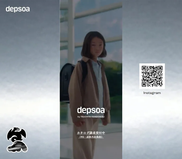
DESIGN REFERENCE
depsoa(デプソア)|土屋鞄のランドセル
銀灰色の背景に細い中央カラムを配置したランドセルのブランド・商品一覧ページ。写真、青いアクセント、ステッカー装飾を組み合わせ、スマートフォンでは画面幅いっぱいに展開します。
オリジナルサイトを見るdepsoa — Style Reference
A narrow urban product catalog framed by cloudy silver, dark photography, and bold die-cut stickers.
Website: depsoa
Original URL: https://tsuchiya-randoseru.jp/collections/depsoa
Final URL: https://tsuchiya-randoseru.jp/collections/depsoa
Theme: light product and support surfaces, a dark photographic opening, and vivid blue accents within silver-gray desktop surroundings.
Inspected: September 12, 2026. Supplied evidence retrieval timestamp: 2026-09-12T12:16:03.179Z, equivalent to 21:16:03 JST.
Viewports: desktop 1440 × 1000 and mobile 390 × 844 CSS pixels.
Scope: the current branded collection page: opening, concept, features, four randoseru series, support goods, ranking, stores, catalog request, news, social links, and support footer. Visual captures cover the desktop opening, an Actlight product section, and the footer, plus the mobile opening and footer. Other sections are principally documented through rendered DOM measurements.
The page combines brand storytelling with a working product catalog. A dark, full-height photographic opening establishes an urban, functional mood. The page then presents engineering claims, named product series, prices, availability, store appointments, and practical customer information. The current title references the 2027 collection, while the catalog request promotes 2028 entry; both are present in the inspected version.
Its defining choice is the desktop composition. The central page remains only 375px wide, surrounded by expansive silver-gray imagery. A white wordmark sits at the upper left, black-and-white stickers occupy the lower left, and an Instagram QR block remains on the right across the supplied scroll captures. On a phone, the central page expands to the full 390px viewport and the surrounding desktop composition disappears.
Inside that narrow strip, the design alternates large product imagery with compact shopping information. Blue series lettering and circular specification badges provide emphasis. Thin rules organize the catalog; outlined rectangles organize support links. Generous spacing between sections gives the dense product information room to breathe.
How to Read This Reference
- Measured means a value appears directly in the supplied element bounds, computed styles, or custom properties.
- Derived means arithmetic from measured bounds, such as a grid gap or a centered margin.
- Estimated means an approximate visual reading of a supplied current-page screenshot. Estimated colors were not sampled with a pixel-reading tool.
- Recommended means an implementation choice for a new build, including the Quick Start breakpoint, accessibility additions, and fallback behavior.
- Token names are descriptive implementation aliases unless explicitly identified as original custom properties.
- Computed parent styles do not always describe visible lettering. Several heading and link wrappers inherit fonts or colors that differ from their apparent child artwork or text. Those differences are identified below.
- Interaction evidence is limited. Link targets and button presence are documented; their resulting screens, selected states, playback behavior, and persistence were not exercised in the supplied record.
Tokens — Colors
Default Palette
| Name | Value | Suggested token | Role and evidence |
|---|---|---|---|
| Charcoal | #464645 |
--color-ink |
Measured body, product, and footer text: rgb(70, 70, 69). The mobile top strip appears similar, but its own background was not separately sampled. |
| Electric Blue | #5F73FF |
--color-blue |
Measured store-link text and lower catalog CTA fill: rgb(95, 115, 255). The visible series title, weight badge, and opening catalog lettering use a visually corresponding blue. |
| White | #FFFFFF |
--color-white |
Measured body background, opening catalog pill, store pills, and reversed text. Also visible in the wordmarks and sticker outlines. |
| Cool Paper | Approximately #F4F6F3 |
--color-paper |
Estimated visible product and footer surface. Do not substitute the body's measured white for this apparent inner surface without checking the relevant background layer. |
| Studio Gray | Approximately #C5C9CB |
--color-studio |
Estimated square product-image backdrop. This may be embedded in image assets rather than supplied by CSS. |
| Cloud Slate | Approximately #76838D |
--color-frame-fallback |
Representative estimated midtone in the desktop surroundings. The actual background is textured and varies from dark slate to almost white. |
| Social Green | Approximately #06C755 |
--color-social-green |
Estimated green in the visible LINE registration banner. Confined to that external service's promotion. |
Color Behavior
The desktop frame is an image treatment, not a flat gray panel. It has fine grain, diffuse cloudy forms, and a broad pale band across the lower middle. A simple gradient can serve as a temporary fallback, but it will not reproduce the material character.
The opening uses white identity and navigation against dark photography. Its catalog link reverses to a white capsule with blue visible lettering. In the lower catalog-request section, that relationship flips: the measured button is blue with white text.
Store headings and paragraphs compute to white; their pills compute to white backgrounds with blue text. The backing layer for this section was not included in the sampled styles or supplied screenshots. Its exact fill should therefore remain unverified. A blue backing is a reasonable proposed adaptation, not a measured original value.
Original custom properties also include --color-border-rgb: 212 213 207, muted charcoal at 60% opacity, and other general shop-theme colors. Their presence does not establish their use on every visible rule or component. The page's catalog and footer should be matched from their actual appearance rather than from the entire global theme palette.
Tokens — Typography
Japanese Body and Product Information
- Measured family:
dnp-shuei-gothic-gin-std, sans-serif. - Base:
14px, weight400, line height22.4px. - Editorial paragraphs: commonly
14px / 23.8px, equivalent to1.7line height. - Series descriptions: weight
600; concept paragraphs use500. - Character: compact Japanese sans-serif text with modest emphasis and restrained tracking.
- Implementation alias:
--font-body.
These are computed family declarations. The evidence does not include a separate audit of which font file rendered each glyph.
Feature and Catalog Headlines
- Measured family:
ryo-gothic-plusn, sans-serifon the functional headline and catalog-request heading. - Feature headline:
24px / 36px, weight500, tracking-0.72px, or-0.03em. - Catalog heading:
20px / 30px, weight500. - Feature explanations:
14px / 23.8px, weight500. - Implementation alias:
--font-feature.
The concept headline instead uses the body family at 24px / 33.6px, weight 500. Preserve that distinction when reproducing measured typography.
Confirmed English Display Typography
- Measured family:
roc-grotesk, 'Roc Grotesk', sans-serif. - Confirmed roles:
News,SNS, andStore list. - News and SNS:
36px / 36px, weight500, with7pxbottom padding on a43pxheading box. - Store list:
24px / 24px, weight400. - Implementation alias:
--font-display.
The visible Actlight title is blue sans-serif lettering, approximately 28px tall in its line. Its own child-level font declaration was not included. Using the confirmed display family for this title is an implementation recommendation, not a verified font attribution.
Heading Wrappers and Brand Artwork
Many H2 wrappers compute to garamond-premier-pro, dnp-shuei-mincho-pr6n, serif at 22px / 35.2px. Series H3 wrappers compute to the same stack at 20px / 32px, despite a measured box height of 30px and visually different lettering in the product capture.
The hero H1 has no extracted text and measures 222 × 96px. Its computed 26px serif font is not the visible depsoa wordmark. Treat the wordmark and its by TSUCHIYA RANDOSERU byline as supplied brand artwork. Do not rebuild their appearance by styling the empty wrapper as a conventional text heading.
Utility Typography
The View MOVIE button declares 'Roboto Mono', sans-serif at 12px / 12px, weight 400. News tabs declare Arial at 16px / 16px; an empty-text icon button declaring Arial does not establish a visible typography role.
Most sampled text uses normal letter spacing. Global declarations such as --font-heading--spacing: 0.25em and --font-paragraph--spacing: 0.5em should not be copied indiscriminately: the measured page text generally does not use them.
Type Scale
| Role | Size / line height | Weight | Evidence |
|---|---|---|---|
| Body and product name | 14px / 22.4px |
400 |
Measured at both viewports |
| Series description | 14px / 23.8px |
600 |
Measured at both viewports |
| Concept paragraph | 14px / 23.8px |
500 |
Measured |
| Concept headline | 24px / 33.6px |
500 |
Measured |
| Feature headline | 24px / 36px |
500 |
Measured; -0.03em tracking |
| Catalog heading | 20px / 30px |
500 |
Measured |
| News and SNS | 36px / 36px |
500 |
Measured |
| Store list | 24px / 24px |
400 |
Measured |
| City pills | 16px / 16px |
400 |
Measured |
| Footer section labels | 14px / 22.4px |
400 |
Measured |
| Footer secondary links | 12px / 22.4px |
400 |
Measured |
| Movie utility | 12px / 12px |
400 |
Measured |
| Opening LINEUP / STORE lettering | Approximately 24px |
Visually regular | Screenshot estimate; parent links compute to 14px |
| Visible series title | Approximately 28px / 30px |
Visually regular | Screenshot estimate |
| Weight badge numeral | Approximately 36–38px |
Visually regular | Screenshot estimate |
| Footer opening-hours note | Approximately 10px |
Visually regular | Screenshot estimate |
Tokens — Spacing & Shapes
The page uses ordinary pixel-scale typography and spacing. The HTML root is measured at 16px; there is no evidence of an unusual rem-scaling system.
Spacing Scale
| Use | Value | Status |
|---|---|---|
| Product grid column gap | 8px |
Derived at both viewports |
| Footer button gap | 8px |
Derived at both viewports |
| Series title to description | 8px |
Derived from measured bounds |
| Hero label-to-icon gap | 11px |
Measured on link wrappers |
| Hero navigation to catalog pill | 12px |
Derived |
| Product grid row gap | Desktop 24px; mobile 12px |
Derived from successive product-link bounds |
| Social-section side inset | 15px |
Measured |
| Footer inner side inset | 18px |
Derived from heading and rule widths |
| Main content side inset | 20px |
Derived at both viewports |
| Hero navigation column gap | 20px |
Derived |
| Series description to product grid | 27px |
Derived |
| Concept left inset | 36px from the strip edge |
Derived; 16px deeper than ordinary content |
| Hero wordmark box to navigation | 52px |
Derived at both viewports |
| Footer top clearance | 60px |
Derived from section and heading bounds |
Border Radius
| Element | Radius / shape | Evidence |
|---|---|---|
| Opening navigation | 17px on a 34px-high link |
Measured |
| Opening catalog request | 40px on a 69px-high link |
Measured |
| City and store-detail pills | 18.5px on a 37px-high link |
Measured |
| Lower catalog request | 34px on a 62px-high link |
Measured |
| Movie button | 9.5px on a 19px-high box |
Measured |
| News tabs | 3px 3px 0 0 |
Measured |
| Footer links | 0 |
Measured |
| Series feature image | Approximately 9px |
Screenshot estimate |
| Product image tiles | Square corners | Visually observed |
| Weight badge | Circle, approximately 120px diameter |
Screenshot estimate |
Layout Measurements
| Element | Desktop: 1440 × 1000 | Mobile: 390 × 844 | Interpretation |
|---|---|---|---|
| Central strip | 375px, starting at x 532.5 |
390px, starting at x 0 |
Measured inner containers; desktop margins are each 532.5px |
| Ordinary content width | 335px |
350px |
Strip minus two 20px insets |
| Hero section height | 1000px |
844px |
Exactly the inspected viewport height |
| Hero wordmark box | 222 × 96px, x 609, y 675 |
222 × 96px, x 84, y 504 |
Identity retains its size |
| Opening navigation links | Each 157.5 × 34px |
Each 165 × 34px |
Two equal columns with a 20px gap |
| Opening catalog pill | 335 × 69px, y 869 |
350 × 69px, y 698 |
Bottom clearance is 62px desktop and 77px mobile |
| Product tile width | 163.5px |
171px |
Two columns with an 8px gap |
| Typical randoseru link height | Approximately 287.42px |
Approximately 294.42px |
Includes image and metadata; not a recommended fixed height |
| Favorite button | 28 × 28px |
28 × 28px |
Positioned 8px from the image's top and right edges |
| First ranking entry | 280 × 291px |
280 × 291px |
Centered feature entry |
| City pill | 160.5 × 37px |
168 × 37px |
Two columns, 14px horizontal gap |
| Footer action | 335 × 56.41px |
335 × 56.41px |
Remains capped at 335px on mobile |
| Document height | Approximately 13,498.03px |
Approximately 14,064.86px |
State-dependent capture measurements |
The shell is narrow on desktop without being uniformly scaled down. The logo, body text, and footer actions retain their sizes while selected content widths change.
Components
Desktop Frame and Persistent Identity
Role: establish the brand outside the scrolling product narrative.
The frame fills the viewport with cloudy silver-gray imagery. The central strip separates this image into broad left and right fields. A white depsoa wordmark is approximately 145px wide at roughly 35px from the top and left edges. A black sticker cluster with thick white outlines sits near the lower left, approximately 190px wide. A roughly 154px square QR image sits near the center of the right field, with an Instagram caption below.
The same side composition remains in the opening, product, and footer captures while the center changes. This supports a viewport-anchored visual treatment; the exact positioning declarations were not supplied. No parallax movement is established.
The desktop side fields are part of the composition. They do not contain additional product columns or a expanded navigation menu.
Mobile Brand Strip
Role: maintain a small identity marker while the page fills the screen.
The mobile captures show a dark, approximately 26px-high bar across the top, with a small centered white depsoa wordmark. It is present in both the opening and footer views. Exact fixed-versus-sticky implementation is unverified.
The large corner logo, left stickers, desktop background fields, and QR block are absent from the mobile captures. Decorative stickers still appear within the page before the footer.
Opening Hero
Role: introduce the brand and provide direct routes to products, stores, and the catalog request.
The opening is a full-height photographic field confined to the central strip on desktop and filling the mobile width. The desktop capture shows stairs, railings, hard shadows, and water. The mobile capture shows a close view of black bag materials, straps, and hardware. Both are dark enough for white branding and fine outlined controls.
Stack a 222 × 96px brand-artwork box above two outlined navigation capsules. Place the white catalog capsule underneath. The internal rhythm is unusually consistent: 52px from the brand box to navigation, then a 12px gap before the catalog link.
The navigation links point to #product and #shoplist; the opening catalog link points to #catalog. Each navigation capsule contains a large visible English label and a small circled downward arrow. The catalog capsule contains two centered Japanese lines plus a blue circled arrow.
The hero's media format is unverified. Different desktop and mobile subjects could reflect responsive assets, different frames of moving media, or both. Autoplay, looping, muting, and media duration must not be inferred from these stills.
Concept Block
Role: explain the brand attitude before technical and commercial content.
The DOM records a heading composed of Concept, Beyond, and Function, followed by the Japanese headline 感じるままに、進め。, three short paragraph groups, and View MOVIE.
Content begins 36px from the strip's left edge, versus the normal 20px inset. The sampled heading and body text are white. The concept headline is 24px, and the body uses medium-weight 14px text with 23.8px line height. Its explicit line breaks create a deliberate reading cadence.
The movie button is a compact 128 × 19px utility with a 9.5px radius and 12px Roboto Mono declaration. Its resulting player or overlay was not captured. The concept section's exact background artwork is outside the supplied screenshot coverage.
Functions and Features
Role: organize the brand's engineering claims into three recognizable groups.
The DOM presents lightweight construction, durability, and multiple functions as Feature 001, Feature 002, and Feature 003. Claims include a stated weight range of approximately 980–1,230g, a six-year repair guarantee, capacity, reflection, automatic locking, and water resistance.
A two-line 24px headline introduces the section. Body copy uses the standard 14px editorial treatment. Measured explanatory text occupies a narrow right-hand region: approximately 141px on desktop and 148px on mobile. This supports a split visual/text composition inside the strip rather than a full-width paragraph for every feature.
The feature artwork and complete label anatomy were not captured visually. Preserve the numbered content hierarchy without inventing illustrations, icons, or animation sequences.
Series Feature Panel
Role: introduce one product family through a large image, a concise description, and its available models.
The Actlight capture shows a roughly 335px square photograph of a black randoseru placed diagonally against reflective gray architectural surfaces. The image has slightly rounded corners. Two small pagination dots sit near the lower center.
A blue circular badge overlaps the image's lower-right edge and extends below it. Its approximate diameter is 120px. Small white labeling introduces a much larger 約980g figure, followed by a tiny qualifying note. The overlap is essential: clipping the entire image wrapper would cut off the badge.
Below the image, stack a small Series label, a blue English series name with a smaller Japanese name on the same line, and a semibold Japanese description. The text is left aligned. Leave 8px between the title box and description, followed by approximately 27px before the product grid.
Thin vertical rules appear just inside the catalog strip's edges, with horizontal rules separating series. Their exact source element structure was not included.
Product Grid and Product Tile
Role: make individual models comparable and navigable.
The inspected collection contains four randoseru series: Edgetone with three models, Optcolor with four, Hueline with two, and Actlight with one. Three support products follow. Keep these actual group sizes; a final unpaired tile remains in the first grid column.
The grid stays at two columns on desktop and mobile. Each tile consists of:
- A square studio product image on a gray field.
- An outline heart at the upper right, inside a measured 28px button.
- An availability overlay when applicable.
- A small black depsoa wordmark beneath the image.
- A model number and Japanese name, commonly wrapping to two lines.
- A yen price and a smaller tax or shipping note.
There is no separate raised card surface around this information. The product images provide their own visual boundaries.
The image width is 163.5px on desktop and 171px on mobile. Column gaps remain 8px; measured row gaps change from 24px to 12px. Product names use 14px / 22.4px regular text. Do not duplicate names simply because the text extraction contains repeated product strings; the screenshot shows a single visible metadata stack.
Product links include model-specific URLs and variant parameters. Favorite state, persistence, and interaction with the product link are unverified. For a new implementation, use a product anchor and a separate sibling favorite button rather than nesting interactive controls.
Availability Overlay
Role: communicate a model's current order status without removing its image or metadata.
The visible Actlight tile includes a translucent gray horizontal band across the image with centered white 受付終了 text. It retains the product name and price below. The DOM also includes 残りわずか for one Edgetone model.
These are model-level states. Keep them data-driven; they do not imply that the collection page itself is discontinued. The precise band opacity and the low-stock state's visual treatment were not sampled.
Ranking
Role: give additional emphasis to selected products after the complete lineup.
Two ranking entries appear in the supplied DOM. The first is a centered 280px-wide feature with a 291px total link height at both viewports. The second is smaller: 157.5px wide on desktop and 168px on mobile.
The ranking therefore has a deliberate size hierarchy. Do not replace it with an evenly sized three-item row or invent a third rank. Imagery and rank-label styling outside the supplied product capture remain unverified.
Store Directory and Flagship Details
Role: connect browsing to trying products in person.
The measured content includes a Stores heading, a Store list subheading, an overview link, explanatory copy, and fourteen city links. City links form two columns with a 14px horizontal gap and a 9px vertical gap. Their height is 37px, with white fill, blue 16px text, and an 18.5px radius.
Most city destinations are appointment URLs. The Nakameguro link points to an original-site store page. The flagship block includes a two-line heading, address, map link, access information, and a full-width store-detail/reservation pill. A rental-service paragraph follows.
The flagship heading has 66px of left padding, suggesting reserved space beside its text; the corresponding decoration was not shown. A larger vertical region appears between this heading and the address on mobile. Do not invent its content or reproduce it as an arbitrary blank spacer.
Catalog Request
Role: provide the main request action after visitors have reviewed products and stores.
The lower catalog block uses a 20px / 30px heading, an image region, a note that the pictured catalog is for 2027 entry, explanatory copy about three brands, and a blue request link for the 2028 catalog.
The measured CTA is 335px wide on desktop and 350px on mobile, 62px high, with a 34px radius. It has white 14px text, blue #5F73FF fill, 24px 10px padding, and subtle 0.07px tracking. Its destination is the original site's catalog product URL.
Keep the year and eligibility copy editable. The current hero and lower block already distinguish the audience and catalog year from the collection title.
News Tabs and Rows
Role: surface operational updates and media coverage within the brand page.
A measured 36px Roc Grotesk heading introduces two equal-width tab buttons, labeled お知らせ and メディア掲載. Each tab is 43px high with small 3px upper corner radii. Their widths are 167.5px on desktop and 175px on mobile.
The captured content contains four dated news links. Rows use 14px / 21px text and 16px 27px 17px padding, with heights of 75px or 96px depending on wrapping. Approximately 1px separates successive row bounds.
The sampled row widths are 333px on desktop and 335px on mobile, so the inner news region does not simply mirror the mobile tab width. The selected tab styling and tab-switch result were not visually captured.
Social Promotions
Role: extend the brand experience through Instagram and LINE.
The social section uses 15px side padding, slightly wider content than the standard 20px-inset sections. The Instagram promotion is 345px wide on desktop and 360px on mobile. Its measured grid reserves 56px for a graphic and uses a 20px column gap, with explanatory text alongside it.
The LINE promotion is a separate large linked block. The desktop footer-area capture shows its bright green registration strip and the label LINE 友だち登録する.
Six individual Instagram post links occur in the mobile DOM in a region before the social promotions. Equivalent links are absent from the desktop record. Their actual image content and loading behavior were not captured, so this difference cannot establish an intentional mobile-only feed.
Support Footer
Role: end the page with clear customer-service routes and related-brand navigation.
A loose collage of blue, black, and white stickers precedes a generously spaced light footer. A centered CONTACT label sits above two outlined rectangular links: よくあるご質問 and ご利用ガイド. Telephone information and a small underlined contact-form link follow.
A second centered label, BRAND, introduces matching rectangles for 土屋鞄のランドセル and grirose, followed by an underlined brand-directory link. A thin horizontal rule and a small black depsoa logo close the page.
The rectangles measure 335 × 56.41px at both viewports, with zero radius and 16px 24px padding. Their vertical gap is 8px. On the 390px phone, they are centered at x 27.5 rather than stretching to the ordinary 350px content width.
Keep the closing logo modest, approximately 102px wide by visual estimate. This is a quiet service area; its rectangle geometry differs intentionally from the promotional capsules above.
Tokens — Motion & Interaction
| Treatment | Evidence | What can be concluded |
|---|---|---|
| Ordinary link feedback | Computed text-decoration-color 0.125s ease-in-out, color 0.125s ease-in-out |
A short color/underline transition is declared. Final hover colors were not captured. |
| Some button feedback | Computed color, box-shadow, and background-color transitions at 0.125s ease-in-out |
Transition properties exist; the resulting state was not exercised. |
| Generic hover duration | Source variable --hover-transition-duration: .25s |
Available in the shop theme; application to these product tiles is unverified. |
| Generic hover transforms | Source variables --hover-scale-amount: 1.03, --hover-subtle-zoom-amount: 1.015, --hover-lift-amount: 4px |
Do not treat these as observed product movement. |
| Generic surface transition | Source variables .3s and cubic-bezier(0.32, 0.72, 0, 1) |
No corresponding opened surface was captured. |
| Hero media | Different photographic subjects in desktop and mobile stills | Motion, media type, sequence, and autoplay policy remain unverified. |
| Series pagination | Two visible dots on the Actlight feature image | Multiple-image presentation is suggested; swiping and automatic advance were not tested. |
| Product image navigation | Some desktop product records include 44 × 44px buttons at image edges | Controls are present in the desktop DOM; behavior and mobile gesture support are unverified. |
| News tabs | Two button elements | Switching behavior and selected-state appearance are unverified. |
| Favorite hearts | 28 × 28px buttons and visible heart outlines | Activation, confirmation, and persistence are unverified. |
| Internal navigation | Explicit #product, #shoplist, and #catalog hrefs |
Destinations are known; smooth scrolling and focus management are not established. |
The sampled elements report animation: none. This does not prove that the whole page is static: video, unsampled descendants, pseudo-elements, or script-driven effects may exist. Likewise, a computed transition of all without a reported duration is not evidence of a visible animation.
For a new implementation, keep routine feedback restrained and retain the measured 125ms link-transition character. Add further motion only after its behavior is specified and tested.
Surfaces
| Layer | Appearance | Evidence and purpose |
|---|---|---|
| Desktop surroundings | Grainy, cloudy silver-gray image | Visually observed; frames the narrow page |
| Opening | Dark architectural or material photography | Visually observed; supports white identity and navigation |
| Product and footer canvas | Very light cool neutral | Visually observed; exact color estimated |
| Series feature image | Square photographic composition with slight rounding | Visually observed in Actlight |
| Product tile | Square gray image field with unboxed metadata below | Visually observed |
| Specification badge | Blue circle with white type | Visually observed; overlapping emphasis |
| Promotional action | White capsule with blue lettering, or blue capsule with white lettering | Visible opening treatment and measured lower CTA |
| Store content | White text and white pills with blue labels | Measured; underlying backing layer unverified |
| Support links | Transparent/light rectangles with fine charcoal outlines | Visually observed and measured geometry |
| Availability | Translucent horizontal gray band | Visually observed; exact opacity unverified |
There is no visible general-purpose elevation system in the supplied product and footer captures. Structure comes from rules, photography, contrast, and geometry. Shadows within a product photograph belong to the image and should not be confused with card shadows.
Imagery
The current visual language centers on black materials, metal fittings, reflective surfaces, hard architectural shadows, and cool gray surroundings. The product feature photograph turns a practical object into a sculptural subject through diagonal placement and directional light. Small SKU images then return to straightforward, consistent product views.
The sticker artwork introduces a different texture: thick white cutout borders, solid black shapes, a brushed monochrome fill, a bold arrow, and a blue creature-shaped graphic carrying the depsoa name. Their overlap and occasional cropping add looseness around an otherwise precise catalog. They are decorative brand artwork, not a general-purpose icon set.
Use smooth photographic rendering. There is no evidence for pixelated image scaling, duotone recoloring of every asset, or uniform monochrome treatment of all products.
Observed Asset References
No image or media asset URLs were included in the supplied evidence. These references identify roles, not downloadable filenames.
| Asset role | Observed appearance | Implementation guidance |
|---|---|---|
| Desktop surrounding image | Diffuse silver-gray clouds and fine grain | Supply an approved high-resolution image; maintain the broad tonal distribution |
| Brand artwork | White opening and corner logos; black footer and product logos | Preserve the actual wordmark and byline proportions |
| Hero media | Architecture/water on desktop; black straps and hardware on mobile | Provide a stable poster and define responsive cropping explicitly |
| Desktop stickers | Black silhouettes and brushed texture with heavy white outlines | Preserve transparent edges and the original silhouette |
| Footer collage | Overlapping arrow, brushed shape, and blue wordmark-bearing creature | Keep irregular overlap; clip only where the intended composition requires it |
| Actlight feature photograph | Diagonal black bag against reflective gray surfaces | Use a square display region and preserve material detail |
| Product images | Front or three-quarter bag views on neutral gray | Keep product scale consistent across a series |
| Instagram QR artwork | Black code within a white square | Preserve its quiet zone and provide an ordinary clickable destination too |
The shell and component geometry can be recreated in CSS. The brand identity still depends on suitable photography, authentic logo artwork, and the sticker assets.
Layout & Responsive Behavior
The desktop layout is a single narrow page within a wide composition. At 1440px, a 375px strip creates 532.5px of surrounding space on either side. Several outer section nodes still measure the full 1440px viewport; their meaningful inner content is constrained to the central strip. Do not infer full-width content from the outer SECTION bounds alone.
At 390px, the page uses the full viewport width. Ordinary content grows from 335px to 350px because the 20px side insets remain constant. Two-column product tiles consequently grow from 163.5px to 171px. Product names remain 14px; the main wordmark remains 222 × 96px.
The footer has its own width rule. Its actions remain 335px wide on both devices, while the surrounding footer region becomes wider on mobile. A single max-width applied indiscriminately to every descendant would lose this distinction.
Hero Positioning
The measured hero controls can be described as a 263px-high cluster:
- Brand box: 96px.
- Gap to navigation: 52px.
- Navigation: 34px.
- Gap to catalog: 12px.
- Catalog pill: 69px.
This cluster ends 62px above the desktop viewport bottom and 77px above the mobile viewport bottom. Those are observed results at two viewport sizes, not proof of the source positioning formula. The Quick Start reproduces these results with bottom positioning and adds a minimum hero height for short screens.
State Differences That Need Verification
The mobile document is approximately 567px longer, despite its shorter hero and slightly wider content. Two significant differences are visible in the DOM record:
- The mobile flagship block has approximately 236px more space between its heading and address than the desktop block.
- A 325px region containing six Instagram post links appears before the mobile social-promotion section and is absent from the desktop record.
These may involve media loading, embedded content, responsive behavior, or a combination. The supplied evidence cannot determine the cause. Reserve space for known media in a new implementation rather than hardcoding unexplained blank regions.
The original breakpoint was not supplied. The Quick Start uses 900px as a recommended breakpoint for switching between the full-width mobile page and the framed desktop layout. Tablet widths, landscape phones, browser zoom, and safe-area behavior remain untested.
Do’s and Don’ts
Do
- Preserve the 375px desktop strip and the expansive surrounding imagery.
- Let the page fill the phone width while retaining its compact typography.
- Keep
#464645for measured body text and#5F73FFfor the confirmed blue accent. - Use authentic brand artwork for the depsoa wordmark and its byline.
- Pair large editorial product images with compact two-column SKU grids.
- Keep the Actlight specification badge overlapping the image edge.
- Use thin rules and image boundaries to organize shopping information.
- Preserve the difference between rounded promotional links and square support links.
- Keep footer actions capped at 335px in the inspected mobile layout.
- Treat availability, catalog year, and model counts as editable content.
- Distinguish photographic shadows from interface elevation.
- Keep the desktop QR code supported by a normal text or image link.
Don't
- Don't widen the catalog into a conventional multi-column desktop store grid.
- Don't scale the entire phone layout as one image or transform.
- Don't apply the inherited serif H1 font to recreate the visible logo.
- Don't assume every English heading uses the same verified font declaration.
- Don't turn every product into a rounded, shadowed card.
- Don't replace textured silver imagery with an unrelated colorful gradient.
- Don't spread the LINE promotion's green throughout the primary UI.
- Don't clip an overlapping badge by placing overflow hidden on its whole wrapper.
- Don't invent a third ranking item or duplicate extracted product names.
- Don't interpret an ended model's ordering period as an ended website.
- Don't assert autoplay, parallax, smooth scrolling, or favorite persistence from the available stills.
- Don't reproduce unexplained loading-dependent gaps as fixed empty sections.
Recommended Implementation Additions
These are proposed improvements, not verified features of the original page:
- Preserve a textual accessible name for the hero identity even when its appearance uses an image or mask. The text extraction alone does not establish the original H1's accessible name.
- Verify names for favorite buttons, image-navigation controls, and linked image promotions. The supplied element record does not include a complete accessibility tree.
- Enlarge the interactive area of 28px favorite controls and the 19px movie utility toward 44px without unnecessarily enlarging their visible artwork. Keep neighboring targets separate.
- Check small blue text and white text on blue for contrast. If needed, introduce a darker functional blue for small text while preserving the brand blue in larger graphics.
- Provide visible keyboard focus and ensure the existing skip-link destination becomes useful on focus.
- Account for the mobile brand strip when navigating to anchored sections.
- If hero media moves, provide a poster, an appropriate pause mechanism, and reduced-motion behavior. Avoid audible autoplay.
- Keep product links and favorite buttons as separate interactive elements.
- Implement news tabs with a defined selected state, keyboard behavior, and associated panels if they actually switch content.
- Give product and editorial images explicit dimensions; reserve space for social embeds to reduce layout movement.
- Keep key product status information in text, not exclusively in a translucent image overlay.
- Test at 320px, intermediate tablet widths, short landscape heights, and increased text sizes before adopting the proposed breakpoint.
Agent Prompt Guide
Quick Color Reference
- Main text: measured charcoal
#464645. - Confirmed accent: measured electric blue
#5F73FF. - Reversed text and capsules: measured white
#FFFFFF. - Product/footer surface: estimated cool paper
#F4F6F3. - Product-image fallback: estimated studio gray
#C5C9CB. - Desktop frame: textured silver-gray imagery;
#76838Dis only an estimated fallback midtone. - Green belongs to the LINE promotion, not the general action system.
Overall Prompt
“Create a branded randoseru collection with a 375px-wide central page on desktop, surrounded by expansive cloudy silver-gray imagery. Place a white brand logo at the upper left, bold black-and-white die-cut stickers near the lower left, and an Instagram QR block in the right field. On phones, let the central page fill the screen and use a slim dark brand strip at the top. Start with full-height dark product or architectural photography, a centered brand lockup, two fine white outlined navigation capsules, and a white catalog-request capsule. Continue into light product surfaces with compact Japanese sans-serif text, blue series lettering, large square editorial photographs, and two-column product grids. Use electric blue #5F73FF, charcoal #464645, fine rules, overlapping circular specification badges, and a quiet footer of square outlined links. Keep imagery and spacing central to the identity.”
Example Component Prompts
- Opening hero: “Build a portrait photographic opening with a 222 × 96px brand-artwork box. Leave 52px before two equal outlined navigation capsules, each 34px high, then 12px before a 69px white catalog pill. Use white visible navigation lettering and blue catalog lettering. Keep the background dark enough for the thin controls. Define media behavior separately.”
- Series introduction: “Use a square editorial photograph of a black technical bag against reflective gray surfaces, with subtly rounded corners. Overlap its lower-right edge with a roughly 120px blue circle containing white weight information. Below, place a small Series label, blue English series name, smaller Japanese name, and a 14px semibold description.”
- Product grid: “Create two columns with an 8px gap. Each unboxed item contains a square gray-backed product image, a small upper-right outline heart, an optional translucent availability band, a black brand mark, a two-line Japanese model name, a yen price, and a small tax note. Keep odd final items in the left column.”
- Support footer: “Create a light cool-neutral footer with generous top space. Center a small CONTACT label above two square-corner outlined links, each capped at 335px wide and about 56px high, separated by 8px. Add telephone details and an underlined contact link, then a matching BRAND group, a fine rule, and a small black logo.”
- Desktop frame: “Frame a narrow scrolling page with a full-viewport cloudy silver-gray photograph. Keep a white corner logo, lower-left die-cut stickers, and a right-side QR block visually anchored while the central page scrolls. Do not add movement unless explicitly specified.”
Quick Start
CSS Custom Properties
This is an adaptation using descriptive class names, not extracted source CSS. Measured values are preserved where practical. Estimated image colors and geometry are labeled. The 900px breakpoint, minimum hero height, focus treatment, and reduced-motion handling are recommendations.
Supply approved artwork through image elements and --frame-image. Fonts require separately configured, appropriately available font resources; the declarations below do not load them. The stylesheet does not implement media playback, favorites, carousels, or tab behavior.
:root {
  /* Measured colors */
  --color-ink: #464645;
  --color-blue: #5f73ff;
  --color-white: #ffffff;

  /* Visual estimates and image fallbacks */
  --color-paper: #f4f6f3;
  --color-studio: #c5c9cb;
  --color-frame-fallback: #76838d;
  --color-rule-soft: #c2c5c3;
  --frame-image: none;

  /* Computed font declarations from the supplied page */
  --font-body: dnp-shuei-gothic-gin-std, sans-serif;
  --font-feature: ryo-gothic-plusn, sans-serif;
  --font-display: roc-grotesk, 'Roc Grotesk', sans-serif;
  --font-utility: 'Roboto Mono', sans-serif;

  --text-body: 14px;
  --text-small: 12px;
  --text-feature: 24px;
  --text-section: 36px;
  --leading-body: 1.6;
  --leading-editorial: 1.7;

  /* Measured layout relationships */
  --desktop-strip: 375px;
  --content-inset: 20px;
  --footer-action-width: 335px;
  --product-column-gap: 8px;
  --product-row-gap: 12px;
  --hero-bottom: 77px;
  --hero-brand-gap: 52px;
  --mobile-bar-height: 26px;
  --rule: 1px;

  /* Measured controls; estimated editorial-image geometry */
  --radius-nav: 17px;
  --radius-store: 18.5px;
  --radius-catalog: 34px;
  --radius-hero-catalog: 40px;
  --radius-editorial-image: 9px;
  --badge-size: 120px;

  --link-transition: 125ms ease-in-out;
}

* {
  box-sizing: border-box;
}

.depsoa-layout {
  margin: 0;
  color: var(--color-ink);
  background: var(--color-paper);
  font-family: var(--font-body);
  font-size: var(--text-body);
  line-height: var(--leading-body);
}

.depsoa-layout img {
  display: block;
  max-inline-size: 100%;
}

.depsoa-layout a {
  color: inherit;
  transition:
    color var(--link-transition),
    text-decoration-color var(--link-transition);
}

.depsoa-layout button {
  font: inherit;
}

.depsoa-frame,
.desktop-aside {
  display: none;
}

.depsoa-page {
  position: relative;
  z-index: 1;
  inline-size: 100%;
  margin-inline: auto;
  background: var(--color-paper);
}

.content-inset {
  padding-inline: var(--content-inset);
}

.mobile-brandbar {
  position: fixed;
  z-index: 20;
  inset: 0 0 auto;
  display: grid;
  place-items: center;
  block-size: var(--mobile-bar-height);
  background: var(--color-ink);
}

.mobile-brandbar img {
  inline-size: 52px; /* Screenshot estimate */
  block-size: auto;
}

.hero {
  position: relative;
  block-size: 100vh;
  block-size: 100svh;
  min-block-size: 520px; /* Recommended for short viewports */
  color: var(--color-white);
  background: #292c2d; /* Recommended media-loading fallback */
}

.hero-media {
  position: absolute;
  inset: 0;
  inline-size: 100%;
  block-size: 100%;
  object-fit: cover;
}

.hero-content {
  position: absolute;
  z-index: 1;
  inset-inline: var(--content-inset);
  inset-block-end: var(--hero-bottom);
}

.hero-brand {
  inline-size: 222px;
  block-size: 96px;
  margin-inline: auto;
  object-fit: contain;
}

.hero-nav {
  display: grid;
  grid-template-columns: repeat(2, minmax(0, 1fr));
  gap: 20px;
  margin-block-start: var(--hero-brand-gap);
}

.hero-nav a {
  display: flex;
  align-items: center;
  justify-content: center;
  gap: 11px;
  min-block-size: 34px;
  border: var(--rule) solid var(--color-white);
  border-radius: var(--radius-nav);
  color: var(--color-white);
  font-family: sans-serif;
  font-size: 24px; /* Visual estimate of the visible lettering */
  line-height: 1;
  text-decoration: none;
}

.hero-catalog {
  display: flex;
  align-items: center;
  justify-content: center;
  gap: 11px;
  min-block-size: 69px;
  margin-block-start: 12px;
  padding: 12px;
  border-radius: var(--radius-hero-catalog);
  background: var(--color-white);
  text-align: center;
  text-decoration: none;
}

.depsoa-layout .hero-catalog {
  color: var(--color-blue);
}

.concept-copy {
  padding-inline: 36px 20px;
}

.feature-heading {
  margin: 0;
  font-family: var(--font-feature);
  font-size: var(--text-feature);
  font-weight: 500;
  line-height: 1.5;
  letter-spacing: -0.03em;
}

.section-title {
  margin: 0;
  padding-block-end: 7px;
  font-family: var(--font-display);
  font-size: var(--text-section);
  font-weight: 500;
  line-height: 1;
}

.lineup-rail {
  position: relative;
}

.lineup-rail::before {
  content: '';
  position: absolute;
  inset: 0 10px;
  border-inline: var(--rule) solid var(--color-ink);
  pointer-events: none;
}

.series {
  padding: 26px var(--content-inset) 24px;
  border-block-start: var(--rule) solid var(--color-ink);
}

.series-media {
  position: relative;
  aspect-ratio: 1;
  margin: 0 0 30px;
  border-radius: var(--radius-editorial-image);
}

.series-media > img {
  inline-size: 100%;
  block-size: 100%;
  border-radius: inherit;
  object-fit: cover;
}

.series-badge {
  position: absolute;
  inset-inline-end: -2px;
  inset-block-end: -37px;
  display: flex;
  flex-direction: column;
  align-items: center;
  justify-content: center;
  inline-size: var(--badge-size);
  aspect-ratio: 1;
  padding: 10px;
  border-radius: 50%;
  color: var(--color-white);
  background: var(--color-blue);
  font-size: 12px;
  line-height: 1.35;
  text-align: center;
}

.series-badge strong {
  font-family: var(--font-display);
  font-size: 38px;
  font-weight: 400;
  line-height: 1.1;
}

.series-kicker {
  margin: 0;
  font-size: 14px;
}

.series-title {
  display: flex;
  flex-wrap: wrap;
  align-items: baseline;
  gap: 8px;
  margin: 0;
  color: var(--color-blue);
  /* Recommended visual match; this child font was not sampled. */
  font-family: var(--font-display);
  font-size: 28px;
  font-weight: 400;
  line-height: 30px;
}

.series-title small {
  font-family: var(--font-body);
  font-size: 12px;
}

.series-description {
  margin: 8px 0 27px;
  font-weight: 600;
  line-height: var(--leading-editorial);
}

.product-grid {
  display: grid;
  grid-template-columns: repeat(2, minmax(0, 1fr));
  gap: var(--product-row-gap) var(--product-column-gap);
}

.product-card {
  position: relative;
  min-inline-size: 0;
}

.product-link {
  display: block;
  text-decoration: none;
}

.product-media {
  position: relative;
  aspect-ratio: 1;
  background: var(--color-studio);
}

.product-media img {
  inline-size: 100%;
  block-size: 100%;
  object-fit: contain;
}

.product-favorite {
  position: absolute;
  z-index: 2;
  inset-block-start: 8px;
  inset-inline-end: 8px;
  display: grid;
  place-items: center;
  inline-size: 28px;
  block-size: 28px;
  padding: 0;
  border: 0;
  color: var(--color-ink);
  background: transparent;
  cursor: pointer;
}

.product-availability {
  position: absolute;
  inset-inline: 0;
  inset-block-start: 50%;
  transform: translateY(-50%);
  padding: 10px 4px;
  color: var(--color-white);
  background: rgb(152 152 151 / 55%); /* Estimated overlay */
  text-align: center;
}

.product-wordmark {
  inline-size: 64px; /* Screenshot estimate */
  block-size: auto;
  margin-block: 8px 4px;
}

.product-name,
.product-price {
  margin: 0;
  font-size: 14px;
  font-weight: 400;
  line-height: 1.6;
}

.product-note {
  margin: 4px 0 0;
  font-size: 12px;
}

.store-grid {
  display: grid;
  grid-template-columns: repeat(2, minmax(0, 1fr));
  gap: 9px 14px;
}

.depsoa-layout .store-pill {
  display: flex;
  align-items: center;
  justify-content: center;
  min-block-size: 37px;
  padding: 6px 10px;
  border-radius: var(--radius-store);
  color: var(--color-blue);
  background: var(--color-white);
  font-size: 16px;
  line-height: 1;
  text-decoration: none;
}

.depsoa-layout .catalog-action {
  display: block;
  min-block-size: 62px;
  padding: 24px 10px;
  border-radius: var(--radius-catalog);
  color: var(--color-white);
  background: var(--color-blue);
  font-size: 14px;
  line-height: 1;
  letter-spacing: 0.07px;
  text-align: center;
  text-decoration: none;
}

.news-tabs {
  display: grid;
  grid-template-columns: repeat(2, minmax(0, 1fr));
}

.news-tabs button {
  min-block-size: 43px;
  border-radius: 3px 3px 0 0;
  font-family: Arial, sans-serif;
  font-size: 16px;
  line-height: 1;
}

.news-row {
  display: block;
  padding: 16px 27px 17px;
  border-block-end: var(--rule) solid var(--color-ink);
  font-size: 14px;
  line-height: 1.5;
  text-decoration: none;
}

.support-footer {
  padding: 60px 18px 30px;
  text-align: center;
}

.footer-label {
  margin: 0 0 10px;
  font-size: 14px;
  font-weight: 400;
  line-height: 1.6;
}

.footer-links {
  display: grid;
  gap: 8px;
}

.footer-action {
  display: block;
  inline-size: min(100%, var(--footer-action-width));
  margin-inline: auto;
  padding: 16px 24px;
  border: var(--rule) solid var(--color-ink);
  border-radius: 0;
  text-decoration: none;
}

.footer-secondary {
  font-size: 12px;
  text-underline-offset: 3px;
}

.footer-rule {
  margin-block: 24px 40px;
  border: 0;
  border-block-start: var(--rule) solid var(--color-rule-soft);
}

.footer-logo {
  inline-size: 102px; /* Screenshot estimate */
  margin-inline: auto;
}

/* Recommended focus and anchored-navigation handling */
.depsoa-layout :focus-visible {
  outline: 2px solid currentColor;
  outline-offset: 4px;
}

.depsoa-page [id] {
  scroll-margin-top: calc(var(--mobile-bar-height) + 12px);
}

@media (min-width: 900px) {
  /* Proposed breakpoint; not an observed source query. */
  :root {
    --product-row-gap: 24px;
    --hero-bottom: 62px;
    --mobile-bar-height: 0px;
  }

  .depsoa-page {
    inline-size: var(--desktop-strip);
  }

  .depsoa-frame {
    position: fixed;
    z-index: 0;
    inset: 0;
    display: block;
    background-color: var(--color-frame-fallback);
    background-image: var(--frame-image);
    background-position: center;
    background-size: cover;
  }

  .desktop-aside {
    position: fixed;
    z-index: 2;
    display: block;
  }

  .side-logo {
    inset-block-start: 35px;
    inset-inline-start: 35px;
    inline-size: 145px;
  }

  .side-stickers {
    inset-block-end: 38px;
    inset-inline-start: 60px;
    inline-size: 190px;
  }

  .social-qr {
    inset-block-start: 50%;
    right: calc((100vw - var(--desktop-strip)) / 4);
    inline-size: 154px;
    margin: 0;
    transform: translate(50%, -50%);
    text-align: center;
  }

  .social-qr img {
    inline-size: 154px;
    aspect-ratio: 1;
    background: var(--color-white);
  }

  .social-qr figcaption {
    font-size: 20px; /* Screenshot estimate */
    line-height: 1.2;
  }

  .mobile-brandbar {
    display: none;
  }
}

@media (prefers-reduced-motion: reduce) {
  .depsoa-layout a,
  .depsoa-layout button {
    transition: none;
  }

  /* Pause or replace moving media in the media controller too. */
}
Assembly: use .depsoa-layout on the page wrapper or body. Place .depsoa-frame, the desktop aside elements, and .mobile-brandbar alongside .depsoa-page. Inside the page, place .hero-media and .hero-content within .hero; place .hero-brand, .hero-nav, and .hero-catalog within the content cluster. A product card should contain a product link and a separate favorite button. Keep the weight badge inside the positioned .series-media wrapper, outside any image-only clipping layer.
Do not apply a generic darkening filter to all media. Prepare the opening's contrast through suitable assets or a separately tuned overlay, and retain natural product detail in the catalog.
Tailwind v4 Token Mapping
Optional aliases for a project already using Tailwind v4. This does not identify the original site's framework. Define the custom properties above first.
@theme inline {
  --color-depsoa-ink: var(--color-ink);
  --color-depsoa-blue: var(--color-blue);
  --color-depsoa-paper: var(--color-paper);
  --color-depsoa-studio: var(--color-studio);

  --font-depsoa-body: var(--font-body);
  --font-depsoa-feature: var(--font-feature);
  --font-depsoa-display: var(--font-display);
  --font-depsoa-utility: var(--font-utility);

  --text-depsoa-body: 14px;
  --text-depsoa-small: 12px;
  --text-depsoa-feature: 24px;
  --text-depsoa-section: 36px;

  --spacing-depsoa-strip: 375px;
  --spacing-depsoa-inset: 20px;
  --spacing-depsoa-grid-gap: 8px;

  --radius-depsoa-nav: 17px;
  --radius-depsoa-store: 18.5px;
  --radius-depsoa-catalog: 34px;
}
Sources & Evidence
- Inspected original and final page: https://tsuchiya-randoseru.jp/collections/depsoa. The supplied browser record reports HTTP 200 and identical original/final URLs.
- Capture context: September 12, 2026; evidence retrieval at
2026-09-12T12:16:03.179Z. Desktop viewport1440 × 1000; mobile viewport390 × 844, both in CSS pixels. - Visual evidence: supplied current-page desktop opening, Actlight/product-area, and footer captures; mobile opening and footer captures. Screenshot-based colors, decorative positions, and unmeasured lettering sizes are explicitly estimates.
- Rendered evidence: full-page text, link destinations, sampled element bounds, computed typography, selected colors, radii, padding, transition declarations, and general theme custom properties at both viewports.
- Interaction scope: supplied scrolling exposed different document positions. Link targets and button elements were inspected through the record. There is no recorded activation sequence for movie playback, favorites, carousels, news tabs, product pages, appointments, or catalog submission.
- Capture limitations: the browser used an initial observation of at least five seconds and bounded checks for document loading, layout stability, finite animation completion, and visible image decoding. Continuous animations were paused during readiness checks and resumed afterward. These checks do not prove delayed-content completeness or establish motion behavior.
- Coverage limitations: the complete stylesheet, child-level styles for every visible heading, image/media URLs, and an accessibility tree were not supplied. Service workers and SharedWorkers were disabled during inspection. Linked destinations were not opened for this analysis.
This reference describes the current rendered collection page represented by the supplied evidence. Measurements describe that capture state; visual estimates and recommended implementation choices are identified separately.
# depsoa — Style Reference

> A narrow urban product catalog framed by cloudy silver, dark photography, and bold die-cut stickers.

**Website:** [depsoa](https://tsuchiya-randoseru.jp/collections/depsoa)
**Original URL:** https://tsuchiya-randoseru.jp/collections/depsoa
**Final URL:** https://tsuchiya-randoseru.jp/collections/depsoa
**Theme:** light product and support surfaces, a dark photographic opening, and vivid blue accents within silver-gray desktop surroundings.
**Inspected:** September 12, 2026. Supplied evidence retrieval timestamp: `2026-09-12T12:16:03.179Z`, equivalent to 21:16:03 JST.
**Viewports:** desktop `1440 × 1000` and mobile `390 × 844` CSS pixels.
**Scope:** the current branded collection page: opening, concept, features, four randoseru series, support goods, ranking, stores, catalog request, news, social links, and support footer. Visual captures cover the desktop opening, an Actlight product section, and the footer, plus the mobile opening and footer. Other sections are principally documented through rendered DOM measurements.

The page combines brand storytelling with a working product catalog. A dark, full-height photographic opening establishes an urban, functional mood. The page then presents engineering claims, named product series, prices, availability, store appointments, and practical customer information. The current title references the 2027 collection, while the catalog request promotes 2028 entry; both are present in the inspected version.

Its defining choice is the desktop composition. The central page remains only **375px wide**, surrounded by expansive silver-gray imagery. A white wordmark sits at the upper left, black-and-white stickers occupy the lower left, and an Instagram QR block remains on the right across the supplied scroll captures. On a phone, the central page expands to the full 390px viewport and the surrounding desktop composition disappears.

Inside that narrow strip, the design alternates large product imagery with compact shopping information. Blue series lettering and circular specification badges provide emphasis. Thin rules organize the catalog; outlined rectangles organize support links. Generous spacing between sections gives the dense product information room to breathe.

## How to Read This Reference

- **Measured** means a value appears directly in the supplied element bounds, computed styles, or custom properties.
- **Derived** means arithmetic from measured bounds, such as a grid gap or a centered margin.
- **Estimated** means an approximate visual reading of a supplied current-page screenshot. Estimated colors were not sampled with a pixel-reading tool.
- **Recommended** means an implementation choice for a new build, including the Quick Start breakpoint, accessibility additions, and fallback behavior.
- **Token names** are descriptive implementation aliases unless explicitly identified as original custom properties.
- **Computed parent styles do not always describe visible lettering.** Several heading and link wrappers inherit fonts or colors that differ from their apparent child artwork or text. Those differences are identified below.
- **Interaction evidence is limited.** Link targets and button presence are documented; their resulting screens, selected states, playback behavior, and persistence were not exercised in the supplied record.

## Tokens — Colors

### Default Palette

| Name | Value | Suggested token | Role and evidence |
| --- | --- | --- | --- |
| Charcoal | `#464645` | `--color-ink` | Measured body, product, and footer text: `rgb(70, 70, 69)`. The mobile top strip appears similar, but its own background was not separately sampled. |
| Electric Blue | `#5F73FF` | `--color-blue` | Measured store-link text and lower catalog CTA fill: `rgb(95, 115, 255)`. The visible series title, weight badge, and opening catalog lettering use a visually corresponding blue. |
| White | `#FFFFFF` | `--color-white` | Measured body background, opening catalog pill, store pills, and reversed text. Also visible in the wordmarks and sticker outlines. |
| Cool Paper | Approximately `#F4F6F3` | `--color-paper` | Estimated visible product and footer surface. Do not substitute the body's measured white for this apparent inner surface without checking the relevant background layer. |
| Studio Gray | Approximately `#C5C9CB` | `--color-studio` | Estimated square product-image backdrop. This may be embedded in image assets rather than supplied by CSS. |
| Cloud Slate | Approximately `#76838D` | `--color-frame-fallback` | Representative estimated midtone in the desktop surroundings. The actual background is textured and varies from dark slate to almost white. |
| Social Green | Approximately `#06C755` | `--color-social-green` | Estimated green in the visible LINE registration banner. Confined to that external service's promotion. |

### Color Behavior

The desktop frame is an image treatment, not a flat gray panel. It has fine grain, diffuse cloudy forms, and a broad pale band across the lower middle. A simple gradient can serve as a temporary fallback, but it will not reproduce the material character.

The opening uses white identity and navigation against dark photography. Its catalog link reverses to a white capsule with blue visible lettering. In the lower catalog-request section, that relationship flips: the measured button is blue with white text.

Store headings and paragraphs compute to white; their pills compute to white backgrounds with blue text. The backing layer for this section was not included in the sampled styles or supplied screenshots. Its exact fill should therefore remain unverified. A blue backing is a reasonable proposed adaptation, not a measured original value.

Original custom properties also include `--color-border-rgb: 212 213 207`, muted charcoal at 60% opacity, and other general shop-theme colors. Their presence does not establish their use on every visible rule or component. The page's catalog and footer should be matched from their actual appearance rather than from the entire global theme palette.

## Tokens — Typography

### Japanese Body and Product Information

- **Measured family:** `dnp-shuei-gothic-gin-std, sans-serif`.
- **Base:** `14px`, weight `400`, line height `22.4px`.
- **Editorial paragraphs:** commonly `14px / 23.8px`, equivalent to `1.7` line height.
- **Series descriptions:** weight `600`; concept paragraphs use `500`.
- **Character:** compact Japanese sans-serif text with modest emphasis and restrained tracking.
- **Implementation alias:** `--font-body`.

These are computed family declarations. The evidence does not include a separate audit of which font file rendered each glyph.

### Feature and Catalog Headlines

- **Measured family:** `ryo-gothic-plusn, sans-serif` on the functional headline and catalog-request heading.
- **Feature headline:** `24px / 36px`, weight `500`, tracking `-0.72px`, or `-0.03em`.
- **Catalog heading:** `20px / 30px`, weight `500`.
- **Feature explanations:** `14px / 23.8px`, weight `500`.
- **Implementation alias:** `--font-feature`.

The concept headline instead uses the body family at `24px / 33.6px`, weight `500`. Preserve that distinction when reproducing measured typography.

### Confirmed English Display Typography

- **Measured family:** `roc-grotesk, 'Roc Grotesk', sans-serif`.
- **Confirmed roles:** `News`, `SNS`, and `Store list`.
- **News and SNS:** `36px / 36px`, weight `500`, with `7px` bottom padding on a `43px` heading box.
- **Store list:** `24px / 24px`, weight `400`.
- **Implementation alias:** `--font-display`.

The visible Actlight title is blue sans-serif lettering, approximately 28px tall in its line. Its own child-level font declaration was not included. Using the confirmed display family for this title is an implementation recommendation, not a verified font attribution.

### Heading Wrappers and Brand Artwork

Many H2 wrappers compute to `garamond-premier-pro, dnp-shuei-mincho-pr6n, serif` at `22px / 35.2px`. Series H3 wrappers compute to the same stack at `20px / 32px`, despite a measured box height of 30px and visually different lettering in the product capture.

The hero H1 has no extracted text and measures `222 × 96px`. Its computed `26px` serif font is not the visible depsoa wordmark. Treat the wordmark and its `by TSUCHIYA RANDOSERU` byline as supplied brand artwork. Do not rebuild their appearance by styling the empty wrapper as a conventional text heading.

### Utility Typography

The `View MOVIE` button declares `'Roboto Mono', sans-serif` at `12px / 12px`, weight `400`. News tabs declare Arial at `16px / 16px`; an empty-text icon button declaring Arial does not establish a visible typography role.

Most sampled text uses normal letter spacing. Global declarations such as `--font-heading--spacing: 0.25em` and `--font-paragraph--spacing: 0.5em` should not be copied indiscriminately: the measured page text generally does not use them.

### Type Scale

| Role | Size / line height | Weight | Evidence |
| --- | --- | --- | --- |
| Body and product name | `14px / 22.4px` | `400` | Measured at both viewports |
| Series description | `14px / 23.8px` | `600` | Measured at both viewports |
| Concept paragraph | `14px / 23.8px` | `500` | Measured |
| Concept headline | `24px / 33.6px` | `500` | Measured |
| Feature headline | `24px / 36px` | `500` | Measured; `-0.03em` tracking |
| Catalog heading | `20px / 30px` | `500` | Measured |
| News and SNS | `36px / 36px` | `500` | Measured |
| Store list | `24px / 24px` | `400` | Measured |
| City pills | `16px / 16px` | `400` | Measured |
| Footer section labels | `14px / 22.4px` | `400` | Measured |
| Footer secondary links | `12px / 22.4px` | `400` | Measured |
| Movie utility | `12px / 12px` | `400` | Measured |
| Opening LINEUP / STORE lettering | Approximately `24px` | Visually regular | Screenshot estimate; parent links compute to 14px |
| Visible series title | Approximately `28px / 30px` | Visually regular | Screenshot estimate |
| Weight badge numeral | Approximately `36–38px` | Visually regular | Screenshot estimate |
| Footer opening-hours note | Approximately `10px` | Visually regular | Screenshot estimate |

## Tokens — Spacing & Shapes

The page uses ordinary pixel-scale typography and spacing. The HTML root is measured at 16px; there is no evidence of an unusual rem-scaling system.

### Spacing Scale

| Use | Value | Status |
| --- | --- | --- |
| Product grid column gap | `8px` | Derived at both viewports |
| Footer button gap | `8px` | Derived at both viewports |
| Series title to description | `8px` | Derived from measured bounds |
| Hero label-to-icon gap | `11px` | Measured on link wrappers |
| Hero navigation to catalog pill | `12px` | Derived |
| Product grid row gap | Desktop `24px`; mobile `12px` | Derived from successive product-link bounds |
| Social-section side inset | `15px` | Measured |
| Footer inner side inset | `18px` | Derived from heading and rule widths |
| Main content side inset | `20px` | Derived at both viewports |
| Hero navigation column gap | `20px` | Derived |
| Series description to product grid | `27px` | Derived |
| Concept left inset | `36px` from the strip edge | Derived; 16px deeper than ordinary content |
| Hero wordmark box to navigation | `52px` | Derived at both viewports |
| Footer top clearance | `60px` | Derived from section and heading bounds |

### Border Radius

| Element | Radius / shape | Evidence |
| --- | --- | --- |
| Opening navigation | `17px` on a 34px-high link | Measured |
| Opening catalog request | `40px` on a 69px-high link | Measured |
| City and store-detail pills | `18.5px` on a 37px-high link | Measured |
| Lower catalog request | `34px` on a 62px-high link | Measured |
| Movie button | `9.5px` on a 19px-high box | Measured |
| News tabs | `3px 3px 0 0` | Measured |
| Footer links | `0` | Measured |
| Series feature image | Approximately `9px` | Screenshot estimate |
| Product image tiles | Square corners | Visually observed |
| Weight badge | Circle, approximately `120px` diameter | Screenshot estimate |

### Layout Measurements

| Element | Desktop: 1440 × 1000 | Mobile: 390 × 844 | Interpretation |
| --- | --- | --- | --- |
| Central strip | `375px`, starting at x `532.5` | `390px`, starting at x `0` | Measured inner containers; desktop margins are each 532.5px |
| Ordinary content width | `335px` | `350px` | Strip minus two 20px insets |
| Hero section height | `1000px` | `844px` | Exactly the inspected viewport height |
| Hero wordmark box | `222 × 96px`, x 609, y 675 | `222 × 96px`, x 84, y 504 | Identity retains its size |
| Opening navigation links | Each `157.5 × 34px` | Each `165 × 34px` | Two equal columns with a 20px gap |
| Opening catalog pill | `335 × 69px`, y 869 | `350 × 69px`, y 698 | Bottom clearance is 62px desktop and 77px mobile |
| Product tile width | `163.5px` | `171px` | Two columns with an 8px gap |
| Typical randoseru link height | Approximately `287.42px` | Approximately `294.42px` | Includes image and metadata; not a recommended fixed height |
| Favorite button | `28 × 28px` | `28 × 28px` | Positioned 8px from the image's top and right edges |
| First ranking entry | `280 × 291px` | `280 × 291px` | Centered feature entry |
| City pill | `160.5 × 37px` | `168 × 37px` | Two columns, 14px horizontal gap |
| Footer action | `335 × 56.41px` | `335 × 56.41px` | Remains capped at 335px on mobile |
| Document height | Approximately `13,498.03px` | Approximately `14,064.86px` | State-dependent capture measurements |

The shell is narrow on desktop without being uniformly scaled down. The logo, body text, and footer actions retain their sizes while selected content widths change.

## Components

### Desktop Frame and Persistent Identity

**Role:** establish the brand outside the scrolling product narrative.

The frame fills the viewport with cloudy silver-gray imagery. The central strip separates this image into broad left and right fields. A white depsoa wordmark is approximately 145px wide at roughly 35px from the top and left edges. A black sticker cluster with thick white outlines sits near the lower left, approximately 190px wide. A roughly 154px square QR image sits near the center of the right field, with an Instagram caption below.

The same side composition remains in the opening, product, and footer captures while the center changes. This supports a viewport-anchored visual treatment; the exact positioning declarations were not supplied. No parallax movement is established.

The desktop side fields are part of the composition. They do not contain additional product columns or a expanded navigation menu.

### Mobile Brand Strip

**Role:** maintain a small identity marker while the page fills the screen.

The mobile captures show a dark, approximately 26px-high bar across the top, with a small centered white depsoa wordmark. It is present in both the opening and footer views. Exact fixed-versus-sticky implementation is unverified.

The large corner logo, left stickers, desktop background fields, and QR block are absent from the mobile captures. Decorative stickers still appear within the page before the footer.

### Opening Hero

**Role:** introduce the brand and provide direct routes to products, stores, and the catalog request.

The opening is a full-height photographic field confined to the central strip on desktop and filling the mobile width. The desktop capture shows stairs, railings, hard shadows, and water. The mobile capture shows a close view of black bag materials, straps, and hardware. Both are dark enough for white branding and fine outlined controls.

Stack a 222 × 96px brand-artwork box above two outlined navigation capsules. Place the white catalog capsule underneath. The internal rhythm is unusually consistent: 52px from the brand box to navigation, then a 12px gap before the catalog link.

The navigation links point to `#product` and `#shoplist`; the opening catalog link points to `#catalog`. Each navigation capsule contains a large visible English label and a small circled downward arrow. The catalog capsule contains two centered Japanese lines plus a blue circled arrow.

The hero's media format is unverified. Different desktop and mobile subjects could reflect responsive assets, different frames of moving media, or both. Autoplay, looping, muting, and media duration must not be inferred from these stills.

### Concept Block

**Role:** explain the brand attitude before technical and commercial content.

The DOM records a heading composed of `Concept`, `Beyond`, and `Function`, followed by the Japanese headline `感じるままに、進め。`, three short paragraph groups, and `View MOVIE`.

Content begins 36px from the strip's left edge, versus the normal 20px inset. The sampled heading and body text are white. The concept headline is 24px, and the body uses medium-weight 14px text with 23.8px line height. Its explicit line breaks create a deliberate reading cadence.

The movie button is a compact 128 × 19px utility with a 9.5px radius and 12px Roboto Mono declaration. Its resulting player or overlay was not captured. The concept section's exact background artwork is outside the supplied screenshot coverage.

### Functions and Features

**Role:** organize the brand's engineering claims into three recognizable groups.

The DOM presents lightweight construction, durability, and multiple functions as `Feature 001`, `Feature 002`, and `Feature 003`. Claims include a stated weight range of approximately 980–1,230g, a six-year repair guarantee, capacity, reflection, automatic locking, and water resistance.

A two-line 24px headline introduces the section. Body copy uses the standard 14px editorial treatment. Measured explanatory text occupies a narrow right-hand region: approximately 141px on desktop and 148px on mobile. This supports a split visual/text composition inside the strip rather than a full-width paragraph for every feature.

The feature artwork and complete label anatomy were not captured visually. Preserve the numbered content hierarchy without inventing illustrations, icons, or animation sequences.

### Series Feature Panel

**Role:** introduce one product family through a large image, a concise description, and its available models.

The Actlight capture shows a roughly 335px square photograph of a black randoseru placed diagonally against reflective gray architectural surfaces. The image has slightly rounded corners. Two small pagination dots sit near the lower center.

A blue circular badge overlaps the image's lower-right edge and extends below it. Its approximate diameter is 120px. Small white labeling introduces a much larger `約980g` figure, followed by a tiny qualifying note. The overlap is essential: clipping the entire image wrapper would cut off the badge.

Below the image, stack a small `Series` label, a blue English series name with a smaller Japanese name on the same line, and a semibold Japanese description. The text is left aligned. Leave 8px between the title box and description, followed by approximately 27px before the product grid.

Thin vertical rules appear just inside the catalog strip's edges, with horizontal rules separating series. Their exact source element structure was not included.

### Product Grid and Product Tile

**Role:** make individual models comparable and navigable.

The inspected collection contains four randoseru series: Edgetone with three models, Optcolor with four, Hueline with two, and Actlight with one. Three support products follow. Keep these actual group sizes; a final unpaired tile remains in the first grid column.

The grid stays at two columns on desktop and mobile. Each tile consists of:

1. A square studio product image on a gray field.
2. An outline heart at the upper right, inside a measured 28px button.
3. An availability overlay when applicable.
4. A small black depsoa wordmark beneath the image.
5. A model number and Japanese name, commonly wrapping to two lines.
6. A yen price and a smaller tax or shipping note.

There is no separate raised card surface around this information. The product images provide their own visual boundaries.

The image width is 163.5px on desktop and 171px on mobile. Column gaps remain 8px; measured row gaps change from 24px to 12px. Product names use 14px / 22.4px regular text. Do not duplicate names simply because the text extraction contains repeated product strings; the screenshot shows a single visible metadata stack.

Product links include model-specific URLs and variant parameters. Favorite state, persistence, and interaction with the product link are unverified. For a new implementation, use a product anchor and a separate sibling favorite button rather than nesting interactive controls.

### Availability Overlay

**Role:** communicate a model's current order status without removing its image or metadata.

The visible Actlight tile includes a translucent gray horizontal band across the image with centered white `受付終了` text. It retains the product name and price below. The DOM also includes `残りわずか` for one Edgetone model.

These are model-level states. Keep them data-driven; they do not imply that the collection page itself is discontinued. The precise band opacity and the low-stock state's visual treatment were not sampled.

### Ranking

**Role:** give additional emphasis to selected products after the complete lineup.

Two ranking entries appear in the supplied DOM. The first is a centered 280px-wide feature with a 291px total link height at both viewports. The second is smaller: 157.5px wide on desktop and 168px on mobile.

The ranking therefore has a deliberate size hierarchy. Do not replace it with an evenly sized three-item row or invent a third rank. Imagery and rank-label styling outside the supplied product capture remain unverified.

### Store Directory and Flagship Details

**Role:** connect browsing to trying products in person.

The measured content includes a `Stores` heading, a `Store list` subheading, an overview link, explanatory copy, and fourteen city links. City links form two columns with a 14px horizontal gap and a 9px vertical gap. Their height is 37px, with white fill, blue 16px text, and an 18.5px radius.

Most city destinations are appointment URLs. The Nakameguro link points to an original-site store page. The flagship block includes a two-line heading, address, map link, access information, and a full-width store-detail/reservation pill. A rental-service paragraph follows.

The flagship heading has 66px of left padding, suggesting reserved space beside its text; the corresponding decoration was not shown. A larger vertical region appears between this heading and the address on mobile. Do not invent its content or reproduce it as an arbitrary blank spacer.

### Catalog Request

**Role:** provide the main request action after visitors have reviewed products and stores.

The lower catalog block uses a 20px / 30px heading, an image region, a note that the pictured catalog is for 2027 entry, explanatory copy about three brands, and a blue request link for the 2028 catalog.

The measured CTA is 335px wide on desktop and 350px on mobile, 62px high, with a 34px radius. It has white 14px text, blue `#5F73FF` fill, `24px 10px` padding, and subtle `0.07px` tracking. Its destination is the original site's catalog product URL.

Keep the year and eligibility copy editable. The current hero and lower block already distinguish the audience and catalog year from the collection title.

### News Tabs and Rows

**Role:** surface operational updates and media coverage within the brand page.

A measured 36px Roc Grotesk heading introduces two equal-width tab buttons, labeled `お知らせ` and `メディア掲載`. Each tab is 43px high with small 3px upper corner radii. Their widths are 167.5px on desktop and 175px on mobile.

The captured content contains four dated news links. Rows use 14px / 21px text and `16px 27px 17px` padding, with heights of 75px or 96px depending on wrapping. Approximately 1px separates successive row bounds.

The sampled row widths are 333px on desktop and 335px on mobile, so the inner news region does not simply mirror the mobile tab width. The selected tab styling and tab-switch result were not visually captured.

### Social Promotions

**Role:** extend the brand experience through Instagram and LINE.

The social section uses 15px side padding, slightly wider content than the standard 20px-inset sections. The Instagram promotion is 345px wide on desktop and 360px on mobile. Its measured grid reserves 56px for a graphic and uses a 20px column gap, with explanatory text alongside it.

The LINE promotion is a separate large linked block. The desktop footer-area capture shows its bright green registration strip and the label `LINE 友だち登録する`.

Six individual Instagram post links occur in the mobile DOM in a region before the social promotions. Equivalent links are absent from the desktop record. Their actual image content and loading behavior were not captured, so this difference cannot establish an intentional mobile-only feed.

### Support Footer

**Role:** end the page with clear customer-service routes and related-brand navigation.

A loose collage of blue, black, and white stickers precedes a generously spaced light footer. A centered `CONTACT` label sits above two outlined rectangular links: `よくあるご質問` and `ご利用ガイド`. Telephone information and a small underlined contact-form link follow.

A second centered label, `BRAND`, introduces matching rectangles for `土屋鞄のランドセル` and `grirose`, followed by an underlined brand-directory link. A thin horizontal rule and a small black depsoa logo close the page.

The rectangles measure 335 × 56.41px at both viewports, with zero radius and `16px 24px` padding. Their vertical gap is 8px. On the 390px phone, they are centered at x 27.5 rather than stretching to the ordinary 350px content width.

Keep the closing logo modest, approximately 102px wide by visual estimate. This is a quiet service area; its rectangle geometry differs intentionally from the promotional capsules above.

## Tokens — Motion & Interaction

| Treatment | Evidence | What can be concluded |
| --- | --- | --- |
| Ordinary link feedback | Computed `text-decoration-color 0.125s ease-in-out, color 0.125s ease-in-out` | A short color/underline transition is declared. Final hover colors were not captured. |
| Some button feedback | Computed color, box-shadow, and background-color transitions at `0.125s ease-in-out` | Transition properties exist; the resulting state was not exercised. |
| Generic hover duration | Source variable `--hover-transition-duration: .25s` | Available in the shop theme; application to these product tiles is unverified. |
| Generic hover transforms | Source variables `--hover-scale-amount: 1.03`, `--hover-subtle-zoom-amount: 1.015`, `--hover-lift-amount: 4px` | Do not treat these as observed product movement. |
| Generic surface transition | Source variables `.3s` and `cubic-bezier(0.32, 0.72, 0, 1)` | No corresponding opened surface was captured. |
| Hero media | Different photographic subjects in desktop and mobile stills | Motion, media type, sequence, and autoplay policy remain unverified. |
| Series pagination | Two visible dots on the Actlight feature image | Multiple-image presentation is suggested; swiping and automatic advance were not tested. |
| Product image navigation | Some desktop product records include 44 × 44px buttons at image edges | Controls are present in the desktop DOM; behavior and mobile gesture support are unverified. |
| News tabs | Two button elements | Switching behavior and selected-state appearance are unverified. |
| Favorite hearts | 28 × 28px buttons and visible heart outlines | Activation, confirmation, and persistence are unverified. |
| Internal navigation | Explicit `#product`, `#shoplist`, and `#catalog` hrefs | Destinations are known; smooth scrolling and focus management are not established. |

The sampled elements report `animation: none`. This does not prove that the whole page is static: video, unsampled descendants, pseudo-elements, or script-driven effects may exist. Likewise, a computed transition of `all` without a reported duration is not evidence of a visible animation.

For a new implementation, keep routine feedback restrained and retain the measured 125ms link-transition character. Add further motion only after its behavior is specified and tested.

## Surfaces

| Layer | Appearance | Evidence and purpose |
| --- | --- | --- |
| Desktop surroundings | Grainy, cloudy silver-gray image | Visually observed; frames the narrow page |
| Opening | Dark architectural or material photography | Visually observed; supports white identity and navigation |
| Product and footer canvas | Very light cool neutral | Visually observed; exact color estimated |
| Series feature image | Square photographic composition with slight rounding | Visually observed in Actlight |
| Product tile | Square gray image field with unboxed metadata below | Visually observed |
| Specification badge | Blue circle with white type | Visually observed; overlapping emphasis |
| Promotional action | White capsule with blue lettering, or blue capsule with white lettering | Visible opening treatment and measured lower CTA |
| Store content | White text and white pills with blue labels | Measured; underlying backing layer unverified |
| Support links | Transparent/light rectangles with fine charcoal outlines | Visually observed and measured geometry |
| Availability | Translucent horizontal gray band | Visually observed; exact opacity unverified |

There is no visible general-purpose elevation system in the supplied product and footer captures. Structure comes from rules, photography, contrast, and geometry. Shadows within a product photograph belong to the image and should not be confused with card shadows.

## Imagery

The current visual language centers on black materials, metal fittings, reflective surfaces, hard architectural shadows, and cool gray surroundings. The product feature photograph turns a practical object into a sculptural subject through diagonal placement and directional light. Small SKU images then return to straightforward, consistent product views.

The sticker artwork introduces a different texture: thick white cutout borders, solid black shapes, a brushed monochrome fill, a bold arrow, and a blue creature-shaped graphic carrying the depsoa name. Their overlap and occasional cropping add looseness around an otherwise precise catalog. They are decorative brand artwork, not a general-purpose icon set.

Use smooth photographic rendering. There is no evidence for pixelated image scaling, duotone recoloring of every asset, or uniform monochrome treatment of all products.

### Observed Asset References

No image or media asset URLs were included in the supplied evidence. These references identify roles, not downloadable filenames.

| Asset role | Observed appearance | Implementation guidance |
| --- | --- | --- |
| Desktop surrounding image | Diffuse silver-gray clouds and fine grain | Supply an approved high-resolution image; maintain the broad tonal distribution |
| Brand artwork | White opening and corner logos; black footer and product logos | Preserve the actual wordmark and byline proportions |
| Hero media | Architecture/water on desktop; black straps and hardware on mobile | Provide a stable poster and define responsive cropping explicitly |
| Desktop stickers | Black silhouettes and brushed texture with heavy white outlines | Preserve transparent edges and the original silhouette |
| Footer collage | Overlapping arrow, brushed shape, and blue wordmark-bearing creature | Keep irregular overlap; clip only where the intended composition requires it |
| Actlight feature photograph | Diagonal black bag against reflective gray surfaces | Use a square display region and preserve material detail |
| Product images | Front or three-quarter bag views on neutral gray | Keep product scale consistent across a series |
| Instagram QR artwork | Black code within a white square | Preserve its quiet zone and provide an ordinary clickable destination too |

The shell and component geometry can be recreated in CSS. The brand identity still depends on suitable photography, authentic logo artwork, and the sticker assets.

## Layout & Responsive Behavior

The desktop layout is a single narrow page within a wide composition. At 1440px, a 375px strip creates 532.5px of surrounding space on either side. Several outer section nodes still measure the full 1440px viewport; their meaningful inner content is constrained to the central strip. Do not infer full-width content from the outer SECTION bounds alone.

At 390px, the page uses the full viewport width. Ordinary content grows from 335px to 350px because the 20px side insets remain constant. Two-column product tiles consequently grow from 163.5px to 171px. Product names remain 14px; the main wordmark remains 222 × 96px.

The footer has its own width rule. Its actions remain 335px wide on both devices, while the surrounding footer region becomes wider on mobile. A single max-width applied indiscriminately to every descendant would lose this distinction.

### Hero Positioning

The measured hero controls can be described as a 263px-high cluster:

- Brand box: 96px.
- Gap to navigation: 52px.
- Navigation: 34px.
- Gap to catalog: 12px.
- Catalog pill: 69px.

This cluster ends 62px above the desktop viewport bottom and 77px above the mobile viewport bottom. Those are observed results at two viewport sizes, not proof of the source positioning formula. The Quick Start reproduces these results with bottom positioning and adds a minimum hero height for short screens.

### State Differences That Need Verification

The mobile document is approximately 567px longer, despite its shorter hero and slightly wider content. Two significant differences are visible in the DOM record:

- The mobile flagship block has approximately 236px more space between its heading and address than the desktop block.
- A 325px region containing six Instagram post links appears before the mobile social-promotion section and is absent from the desktop record.

These may involve media loading, embedded content, responsive behavior, or a combination. The supplied evidence cannot determine the cause. Reserve space for known media in a new implementation rather than hardcoding unexplained blank regions.

The original breakpoint was not supplied. The Quick Start uses **900px as a recommended breakpoint** for switching between the full-width mobile page and the framed desktop layout. Tablet widths, landscape phones, browser zoom, and safe-area behavior remain untested.

## Do’s and Don’ts

### Do

- Preserve the 375px desktop strip and the expansive surrounding imagery.
- Let the page fill the phone width while retaining its compact typography.
- Keep `#464645` for measured body text and `#5F73FF` for the confirmed blue accent.
- Use authentic brand artwork for the depsoa wordmark and its byline.
- Pair large editorial product images with compact two-column SKU grids.
- Keep the Actlight specification badge overlapping the image edge.
- Use thin rules and image boundaries to organize shopping information.
- Preserve the difference between rounded promotional links and square support links.
- Keep footer actions capped at 335px in the inspected mobile layout.
- Treat availability, catalog year, and model counts as editable content.
- Distinguish photographic shadows from interface elevation.
- Keep the desktop QR code supported by a normal text or image link.

### Don't

- Don't widen the catalog into a conventional multi-column desktop store grid.
- Don't scale the entire phone layout as one image or transform.
- Don't apply the inherited serif H1 font to recreate the visible logo.
- Don't assume every English heading uses the same verified font declaration.
- Don't turn every product into a rounded, shadowed card.
- Don't replace textured silver imagery with an unrelated colorful gradient.
- Don't spread the LINE promotion's green throughout the primary UI.
- Don't clip an overlapping badge by placing overflow hidden on its whole wrapper.
- Don't invent a third ranking item or duplicate extracted product names.
- Don't interpret an ended model's ordering period as an ended website.
- Don't assert autoplay, parallax, smooth scrolling, or favorite persistence from the available stills.
- Don't reproduce unexplained loading-dependent gaps as fixed empty sections.

## Recommended Implementation Additions

These are proposed improvements, not verified features of the original page:

- Preserve a textual accessible name for the hero identity even when its appearance uses an image or mask. The text extraction alone does not establish the original H1's accessible name.
- Verify names for favorite buttons, image-navigation controls, and linked image promotions. The supplied element record does not include a complete accessibility tree.
- Enlarge the interactive area of 28px favorite controls and the 19px movie utility toward 44px without unnecessarily enlarging their visible artwork. Keep neighboring targets separate.
- Check small blue text and white text on blue for contrast. If needed, introduce a darker functional blue for small text while preserving the brand blue in larger graphics.
- Provide visible keyboard focus and ensure the existing skip-link destination becomes useful on focus.
- Account for the mobile brand strip when navigating to anchored sections.
- If hero media moves, provide a poster, an appropriate pause mechanism, and reduced-motion behavior. Avoid audible autoplay.
- Keep product links and favorite buttons as separate interactive elements.
- Implement news tabs with a defined selected state, keyboard behavior, and associated panels if they actually switch content.
- Give product and editorial images explicit dimensions; reserve space for social embeds to reduce layout movement.
- Keep key product status information in text, not exclusively in a translucent image overlay.
- Test at 320px, intermediate tablet widths, short landscape heights, and increased text sizes before adopting the proposed breakpoint.

## Agent Prompt Guide

### Quick Color Reference

- Main text: measured charcoal `#464645`.
- Confirmed accent: measured electric blue `#5F73FF`.
- Reversed text and capsules: measured white `#FFFFFF`.
- Product/footer surface: estimated cool paper `#F4F6F3`.
- Product-image fallback: estimated studio gray `#C5C9CB`.
- Desktop frame: textured silver-gray imagery; `#76838D` is only an estimated fallback midtone.
- Green belongs to the LINE promotion, not the general action system.

### Overall Prompt

“Create a branded randoseru collection with a 375px-wide central page on desktop, surrounded by expansive cloudy silver-gray imagery. Place a white brand logo at the upper left, bold black-and-white die-cut stickers near the lower left, and an Instagram QR block in the right field. On phones, let the central page fill the screen and use a slim dark brand strip at the top. Start with full-height dark product or architectural photography, a centered brand lockup, two fine white outlined navigation capsules, and a white catalog-request capsule. Continue into light product surfaces with compact Japanese sans-serif text, blue series lettering, large square editorial photographs, and two-column product grids. Use electric blue #5F73FF, charcoal #464645, fine rules, overlapping circular specification badges, and a quiet footer of square outlined links. Keep imagery and spacing central to the identity.”

### Example Component Prompts

1. **Opening hero:** “Build a portrait photographic opening with a 222 × 96px brand-artwork box. Leave 52px before two equal outlined navigation capsules, each 34px high, then 12px before a 69px white catalog pill. Use white visible navigation lettering and blue catalog lettering. Keep the background dark enough for the thin controls. Define media behavior separately.”
2. **Series introduction:** “Use a square editorial photograph of a black technical bag against reflective gray surfaces, with subtly rounded corners. Overlap its lower-right edge with a roughly 120px blue circle containing white weight information. Below, place a small Series label, blue English series name, smaller Japanese name, and a 14px semibold description.”
3. **Product grid:** “Create two columns with an 8px gap. Each unboxed item contains a square gray-backed product image, a small upper-right outline heart, an optional translucent availability band, a black brand mark, a two-line Japanese model name, a yen price, and a small tax note. Keep odd final items in the left column.”
4. **Support footer:** “Create a light cool-neutral footer with generous top space. Center a small CONTACT label above two square-corner outlined links, each capped at 335px wide and about 56px high, separated by 8px. Add telephone details and an underlined contact link, then a matching BRAND group, a fine rule, and a small black logo.”
5. **Desktop frame:** “Frame a narrow scrolling page with a full-viewport cloudy silver-gray photograph. Keep a white corner logo, lower-left die-cut stickers, and a right-side QR block visually anchored while the central page scrolls. Do not add movement unless explicitly specified.”

## Quick Start

### CSS Custom Properties

This is an adaptation using descriptive class names, not extracted source CSS. Measured values are preserved where practical. Estimated image colors and geometry are labeled. The 900px breakpoint, minimum hero height, focus treatment, and reduced-motion handling are recommendations.

Supply approved artwork through image elements and `--frame-image`. Fonts require separately configured, appropriately available font resources; the declarations below do not load them. The stylesheet does not implement media playback, favorites, carousels, or tab behavior.

```css
:root {
  /* Measured colors */
  --color-ink: #464645;
  --color-blue: #5f73ff;
  --color-white: #ffffff;

  /* Visual estimates and image fallbacks */
  --color-paper: #f4f6f3;
  --color-studio: #c5c9cb;
  --color-frame-fallback: #76838d;
  --color-rule-soft: #c2c5c3;
  --frame-image: none;

  /* Computed font declarations from the supplied page */
  --font-body: dnp-shuei-gothic-gin-std, sans-serif;
  --font-feature: ryo-gothic-plusn, sans-serif;
  --font-display: roc-grotesk, 'Roc Grotesk', sans-serif;
  --font-utility: 'Roboto Mono', sans-serif;

  --text-body: 14px;
  --text-small: 12px;
  --text-feature: 24px;
  --text-section: 36px;
  --leading-body: 1.6;
  --leading-editorial: 1.7;

  /* Measured layout relationships */
  --desktop-strip: 375px;
  --content-inset: 20px;
  --footer-action-width: 335px;
  --product-column-gap: 8px;
  --product-row-gap: 12px;
  --hero-bottom: 77px;
  --hero-brand-gap: 52px;
  --mobile-bar-height: 26px;
  --rule: 1px;

  /* Measured controls; estimated editorial-image geometry */
  --radius-nav: 17px;
  --radius-store: 18.5px;
  --radius-catalog: 34px;
  --radius-hero-catalog: 40px;
  --radius-editorial-image: 9px;
  --badge-size: 120px;

  --link-transition: 125ms ease-in-out;
}

* {
  box-sizing: border-box;
}

.depsoa-layout {
  margin: 0;
  color: var(--color-ink);
  background: var(--color-paper);
  font-family: var(--font-body);
  font-size: var(--text-body);
  line-height: var(--leading-body);
}

.depsoa-layout img {
  display: block;
  max-inline-size: 100%;
}

.depsoa-layout a {
  color: inherit;
  transition:
    color var(--link-transition),
    text-decoration-color var(--link-transition);
}

.depsoa-layout button {
  font: inherit;
}

.depsoa-frame,
.desktop-aside {
  display: none;
}

.depsoa-page {
  position: relative;
  z-index: 1;
  inline-size: 100%;
  margin-inline: auto;
  background: var(--color-paper);
}

.content-inset {
  padding-inline: var(--content-inset);
}

.mobile-brandbar {
  position: fixed;
  z-index: 20;
  inset: 0 0 auto;
  display: grid;
  place-items: center;
  block-size: var(--mobile-bar-height);
  background: var(--color-ink);
}

.mobile-brandbar img {
  inline-size: 52px; /* Screenshot estimate */
  block-size: auto;
}

.hero {
  position: relative;
  block-size: 100vh;
  block-size: 100svh;
  min-block-size: 520px; /* Recommended for short viewports */
  color: var(--color-white);
  background: #292c2d; /* Recommended media-loading fallback */
}

.hero-media {
  position: absolute;
  inset: 0;
  inline-size: 100%;
  block-size: 100%;
  object-fit: cover;
}

.hero-content {
  position: absolute;
  z-index: 1;
  inset-inline: var(--content-inset);
  inset-block-end: var(--hero-bottom);
}

.hero-brand {
  inline-size: 222px;
  block-size: 96px;
  margin-inline: auto;
  object-fit: contain;
}

.hero-nav {
  display: grid;
  grid-template-columns: repeat(2, minmax(0, 1fr));
  gap: 20px;
  margin-block-start: var(--hero-brand-gap);
}

.hero-nav a {
  display: flex;
  align-items: center;
  justify-content: center;
  gap: 11px;
  min-block-size: 34px;
  border: var(--rule) solid var(--color-white);
  border-radius: var(--radius-nav);
  color: var(--color-white);
  font-family: sans-serif;
  font-size: 24px; /* Visual estimate of the visible lettering */
  line-height: 1;
  text-decoration: none;
}

.hero-catalog {
  display: flex;
  align-items: center;
  justify-content: center;
  gap: 11px;
  min-block-size: 69px;
  margin-block-start: 12px;
  padding: 12px;
  border-radius: var(--radius-hero-catalog);
  background: var(--color-white);
  text-align: center;
  text-decoration: none;
}

.depsoa-layout .hero-catalog {
  color: var(--color-blue);
}

.concept-copy {
  padding-inline: 36px 20px;
}

.feature-heading {
  margin: 0;
  font-family: var(--font-feature);
  font-size: var(--text-feature);
  font-weight: 500;
  line-height: 1.5;
  letter-spacing: -0.03em;
}

.section-title {
  margin: 0;
  padding-block-end: 7px;
  font-family: var(--font-display);
  font-size: var(--text-section);
  font-weight: 500;
  line-height: 1;
}

.lineup-rail {
  position: relative;
}

.lineup-rail::before {
  content: '';
  position: absolute;
  inset: 0 10px;
  border-inline: var(--rule) solid var(--color-ink);
  pointer-events: none;
}

.series {
  padding: 26px var(--content-inset) 24px;
  border-block-start: var(--rule) solid var(--color-ink);
}

.series-media {
  position: relative;
  aspect-ratio: 1;
  margin: 0 0 30px;
  border-radius: var(--radius-editorial-image);
}

.series-media > img {
  inline-size: 100%;
  block-size: 100%;
  border-radius: inherit;
  object-fit: cover;
}

.series-badge {
  position: absolute;
  inset-inline-end: -2px;
  inset-block-end: -37px;
  display: flex;
  flex-direction: column;
  align-items: center;
  justify-content: center;
  inline-size: var(--badge-size);
  aspect-ratio: 1;
  padding: 10px;
  border-radius: 50%;
  color: var(--color-white);
  background: var(--color-blue);
  font-size: 12px;
  line-height: 1.35;
  text-align: center;
}

.series-badge strong {
  font-family: var(--font-display);
  font-size: 38px;
  font-weight: 400;
  line-height: 1.1;
}

.series-kicker {
  margin: 0;
  font-size: 14px;
}

.series-title {
  display: flex;
  flex-wrap: wrap;
  align-items: baseline;
  gap: 8px;
  margin: 0;
  color: var(--color-blue);
  /* Recommended visual match; this child font was not sampled. */
  font-family: var(--font-display);
  font-size: 28px;
  font-weight: 400;
  line-height: 30px;
}

.series-title small {
  font-family: var(--font-body);
  font-size: 12px;
}

.series-description {
  margin: 8px 0 27px;
  font-weight: 600;
  line-height: var(--leading-editorial);
}

.product-grid {
  display: grid;
  grid-template-columns: repeat(2, minmax(0, 1fr));
  gap: var(--product-row-gap) var(--product-column-gap);
}

.product-card {
  position: relative;
  min-inline-size: 0;
}

.product-link {
  display: block;
  text-decoration: none;
}

.product-media {
  position: relative;
  aspect-ratio: 1;
  background: var(--color-studio);
}

.product-media img {
  inline-size: 100%;
  block-size: 100%;
  object-fit: contain;
}

.product-favorite {
  position: absolute;
  z-index: 2;
  inset-block-start: 8px;
  inset-inline-end: 8px;
  display: grid;
  place-items: center;
  inline-size: 28px;
  block-size: 28px;
  padding: 0;
  border: 0;
  color: var(--color-ink);
  background: transparent;
  cursor: pointer;
}

.product-availability {
  position: absolute;
  inset-inline: 0;
  inset-block-start: 50%;
  transform: translateY(-50%);
  padding: 10px 4px;
  color: var(--color-white);
  background: rgb(152 152 151 / 55%); /* Estimated overlay */
  text-align: center;
}

.product-wordmark {
  inline-size: 64px; /* Screenshot estimate */
  block-size: auto;
  margin-block: 8px 4px;
}

.product-name,
.product-price {
  margin: 0;
  font-size: 14px;
  font-weight: 400;
  line-height: 1.6;
}

.product-note {
  margin: 4px 0 0;
  font-size: 12px;
}

.store-grid {
  display: grid;
  grid-template-columns: repeat(2, minmax(0, 1fr));
  gap: 9px 14px;
}

.depsoa-layout .store-pill {
  display: flex;
  align-items: center;
  justify-content: center;
  min-block-size: 37px;
  padding: 6px 10px;
  border-radius: var(--radius-store);
  color: var(--color-blue);
  background: var(--color-white);
  font-size: 16px;
  line-height: 1;
  text-decoration: none;
}

.depsoa-layout .catalog-action {
  display: block;
  min-block-size: 62px;
  padding: 24px 10px;
  border-radius: var(--radius-catalog);
  color: var(--color-white);
  background: var(--color-blue);
  font-size: 14px;
  line-height: 1;
  letter-spacing: 0.07px;
  text-align: center;
  text-decoration: none;
}

.news-tabs {
  display: grid;
  grid-template-columns: repeat(2, minmax(0, 1fr));
}

.news-tabs button {
  min-block-size: 43px;
  border-radius: 3px 3px 0 0;
  font-family: Arial, sans-serif;
  font-size: 16px;
  line-height: 1;
}

.news-row {
  display: block;
  padding: 16px 27px 17px;
  border-block-end: var(--rule) solid var(--color-ink);
  font-size: 14px;
  line-height: 1.5;
  text-decoration: none;
}

.support-footer {
  padding: 60px 18px 30px;
  text-align: center;
}

.footer-label {
  margin: 0 0 10px;
  font-size: 14px;
  font-weight: 400;
  line-height: 1.6;
}

.footer-links {
  display: grid;
  gap: 8px;
}

.footer-action {
  display: block;
  inline-size: min(100%, var(--footer-action-width));
  margin-inline: auto;
  padding: 16px 24px;
  border: var(--rule) solid var(--color-ink);
  border-radius: 0;
  text-decoration: none;
}

.footer-secondary {
  font-size: 12px;
  text-underline-offset: 3px;
}

.footer-rule {
  margin-block: 24px 40px;
  border: 0;
  border-block-start: var(--rule) solid var(--color-rule-soft);
}

.footer-logo {
  inline-size: 102px; /* Screenshot estimate */
  margin-inline: auto;
}

/* Recommended focus and anchored-navigation handling */
.depsoa-layout :focus-visible {
  outline: 2px solid currentColor;
  outline-offset: 4px;
}

.depsoa-page [id] {
  scroll-margin-top: calc(var(--mobile-bar-height) + 12px);
}

@media (min-width: 900px) {
  /* Proposed breakpoint; not an observed source query. */
  :root {
    --product-row-gap: 24px;
    --hero-bottom: 62px;
    --mobile-bar-height: 0px;
  }

  .depsoa-page {
    inline-size: var(--desktop-strip);
  }

  .depsoa-frame {
    position: fixed;
    z-index: 0;
    inset: 0;
    display: block;
    background-color: var(--color-frame-fallback);
    background-image: var(--frame-image);
    background-position: center;
    background-size: cover;
  }

  .desktop-aside {
    position: fixed;
    z-index: 2;
    display: block;
  }

  .side-logo {
    inset-block-start: 35px;
    inset-inline-start: 35px;
    inline-size: 145px;
  }

  .side-stickers {
    inset-block-end: 38px;
    inset-inline-start: 60px;
    inline-size: 190px;
  }

  .social-qr {
    inset-block-start: 50%;
    right: calc((100vw - var(--desktop-strip)) / 4);
    inline-size: 154px;
    margin: 0;
    transform: translate(50%, -50%);
    text-align: center;
  }

  .social-qr img {
    inline-size: 154px;
    aspect-ratio: 1;
    background: var(--color-white);
  }

  .social-qr figcaption {
    font-size: 20px; /* Screenshot estimate */
    line-height: 1.2;
  }

  .mobile-brandbar {
    display: none;
  }
}

@media (prefers-reduced-motion: reduce) {
  .depsoa-layout a,
  .depsoa-layout button {
    transition: none;
  }

  /* Pause or replace moving media in the media controller too. */
}
```

**Assembly:** use `.depsoa-layout` on the page wrapper or body. Place `.depsoa-frame`, the desktop aside elements, and `.mobile-brandbar` alongside `.depsoa-page`. Inside the page, place `.hero-media` and `.hero-content` within `.hero`; place `.hero-brand`, `.hero-nav`, and `.hero-catalog` within the content cluster. A product card should contain a product link and a separate favorite button. Keep the weight badge inside the positioned `.series-media` wrapper, outside any image-only clipping layer.

Do not apply a generic darkening filter to all media. Prepare the opening's contrast through suitable assets or a separately tuned overlay, and retain natural product detail in the catalog.

### Tailwind v4 Token Mapping

Optional aliases for a project already using Tailwind v4. This does not identify the original site's framework. Define the custom properties above first.

```css
@theme inline {
  --color-depsoa-ink: var(--color-ink);
  --color-depsoa-blue: var(--color-blue);
  --color-depsoa-paper: var(--color-paper);
  --color-depsoa-studio: var(--color-studio);

  --font-depsoa-body: var(--font-body);
  --font-depsoa-feature: var(--font-feature);
  --font-depsoa-display: var(--font-display);
  --font-depsoa-utility: var(--font-utility);

  --text-depsoa-body: 14px;
  --text-depsoa-small: 12px;
  --text-depsoa-feature: 24px;
  --text-depsoa-section: 36px;

  --spacing-depsoa-strip: 375px;
  --spacing-depsoa-inset: 20px;
  --spacing-depsoa-grid-gap: 8px;

  --radius-depsoa-nav: 17px;
  --radius-depsoa-store: 18.5px;
  --radius-depsoa-catalog: 34px;
}
```

## Sources & Evidence

- **Inspected original and final page:** [https://tsuchiya-randoseru.jp/collections/depsoa](https://tsuchiya-randoseru.jp/collections/depsoa). The supplied browser record reports HTTP 200 and identical original/final URLs.
- **Capture context:** September 12, 2026; evidence retrieval at `2026-09-12T12:16:03.179Z`. Desktop viewport `1440 × 1000`; mobile viewport `390 × 844`, both in CSS pixels.
- **Visual evidence:** supplied current-page desktop opening, Actlight/product-area, and footer captures; mobile opening and footer captures. Screenshot-based colors, decorative positions, and unmeasured lettering sizes are explicitly estimates.
- **Rendered evidence:** full-page text, link destinations, sampled element bounds, computed typography, selected colors, radii, padding, transition declarations, and general theme custom properties at both viewports.
- **Interaction scope:** supplied scrolling exposed different document positions. Link targets and button elements were inspected through the record. There is no recorded activation sequence for movie playback, favorites, carousels, news tabs, product pages, appointments, or catalog submission.
- **Capture limitations:** the browser used an initial observation of at least five seconds and bounded checks for document loading, layout stability, finite animation completion, and visible image decoding. Continuous animations were paused during readiness checks and resumed afterward. These checks do not prove delayed-content completeness or establish motion behavior.
- **Coverage limitations:** the complete stylesheet, child-level styles for every visible heading, image/media URLs, and an accessibility tree were not supplied. Service workers and SharedWorkers were disabled during inspection. Linked destinations were not opened for this analysis.

This reference describes the current rendered collection page represented by the supplied evidence. Measurements describe that capture state; visual estimates and recommended implementation choices are identified separately.