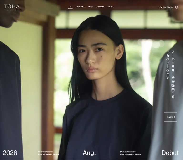
DESIGN REFERENCE
TOHA(トハ)|アーバンリサーチのリカバリーウェア
自然光の写真、白い細字、縦書きコピーで静かな世界観を伝えるブランドサイト。黒と白の大きな面を切り替え、ルック・記事・店舗情報へ導く構成と、モバイルでの大胆な再配置が特徴。
オリジナルサイトを見るTOHA / URBAN RESEARCH — Style Reference
Quiet clothing, natural light, and white lettering held within generous stretches of image and space.
Original URL: toha.urban-research.co.jp
Final URL: toha.urban-research.co.jp
Theme: alternating photographic, black, and white sections; restrained navy interface accents.
Inspected: September 11, 2026, at 13:11:18.678 UTC / 22:11:18.678 JST, using the supplied browser evidence.
Viewports: desktop 1440 × 1000 and mobile 390 × 844 CSS pixels. The corresponding document content widths were 1425px and 375px.
Scope: the current brand homepage, including Top, Concept, the Look teaser, the Feature entry, collapsed regional Shop controls, and desktop/mobile footer presentations. Screenshots visually cover the opening, part of Concept and Look, and the ending. Feature and additional Concept layouts are supported by rendered DOM measurements. Linked lookbooks, editorial articles, the online store, and social pages were not inspected.
TOHA introduces recovery clothing through a brand website with editorial content and store discovery. Full-viewport imagery establishes the atmosphere before smaller passages explain the brand and fabric. A lookbook invitation and a dated feature story bridge that atmosphere to clothing and people; regional shop controls provide a practical ending.
The interface uses regular-weight typography, widely tracked navigation, thin rules, square geometry, and very little ornamental chrome. Green leaves, dark clothing, wood, tea, and glass supply the color. Desktop compositions distribute text toward the edges of broad images. Mobile reorganizes those relationships: the hero headline becomes horizontal, release information becomes a compact block, Concept takes more vertical space, and the footer becomes a separate white section.
How to Read This Reference
- Measured values come from the supplied rendered DOM at the two stated viewports. Values are rounded for readability where appropriate.
- Visual estimates describe screenshot geometry or appearance that was not included in computed styles. They are labeled explicitly.
- Derived values are calculations from supplied measurements, such as section heights or navigation gaps.
- Recommendations describe a reusable implementation. They are not claims about the original source code.
- Token names are implementation aliases. The supplied custom-property records are empty; original variable names are unavailable.
- The
15pxdifference between viewport width and document content width is capture/browser geometry. Do not reproduce it as a permanent white rail. - Captures freeze CSS animations. Menu opening, accordion expansion, hover behavior, keyboard operation, media playback, and transition timing were not exercised.
- The final attached image is a listing thumbnail. It was used only for correspondence checking and contributes no current-design observations below.
Tokens — Colors
Default Palette
| Name | Value | Suggested token | Evidence and role |
|---|---|---|---|
| Stage Black | #000000 |
--color-black |
Measured Concept background; visually fills the Shop ending on both viewports |
| Paper White | #ffffff |
--color-white |
Measured Look and Feature backgrounds and mobile footer; measured text over dark imagery |
| TOHA Navy | #10162a |
--color-navy |
Measured mobile menu tile, desktop year-menu entry, Feature headline, and coming-soon text |
| Metadata Gray | #999999 |
--color-muted |
Measured desktop feature update date |
| Image Metadata Gray | #e6e6e6 |
--color-on-image-muted |
Measured mobile feature update date |
| Transparent Overlay | transparent |
— | Header and many links have transparent computed backgrounds; imagery remains visible behind them |
White rules and outlined symbols are visually present in the screenshots. Their exact border color declarations were not supplied. Reusing the surrounding white text color is a faithful implementation recommendation.
Photographic Color
Olive and leaf greens dominate the captured desktop opening. The lower Concept photograph adds nearly black shadows, warm wood, clear glass, and a muted red flower. The mobile opening emphasizes navy clothing and brown architectural surfaces. The visible Look crop adds pale glass and yellow-green tea.
These are image colors, not measured interface tokens. No fixed green or brown CSS accent can be established from the evidence. Keep their variation within the photography instead of turning them into navigation fills or category badges.
Tokens — Typography
elza-text — Latin Interface Text
- Measured stack:
elza-text, sans-serif. - Measured weight:
400throughout the sampled Latin interface text. - Roles: navigation, Look links, release information, feature labels, update dates, coming-soon text, and copyright.
- Character: a restrained sans serif whose small size and generous tracking leave the imagery dominant.
dnp-shuei-gothic-kin-std — Japanese Text
- Measured stack:
dnp-shuei-gothic-kin-std, sans-serif. - Measured weight:
400. - Roles: hero headline, Concept copy, vertical Look labels, feature headline, and regional shop buttons.
- Character: light visual density, open spacing, and controlled line breaks. The sampled hierarchy does not depend on bold headings.
These are computed family declarations, not independently verified font files. No font URLs or licensing information were supplied. Load authorized fonts when available and provide a suitable Japanese sans-serif fallback.
Brand Artwork
The TOHA wordmark is a thin, widely spaced identity lockup with a much smaller URBAN RESEARCH line beneath it. Its anchor measures 105 × 40.80px on desktop and 69.16 × 26.88px on mobile. Those are link bounds, not a measured logo font size. Preserve the authorized logo artwork instead of approximating it with ordinary text.
Type Scale
Values below are measured unless marked estimate. Each size/leading pair is in CSS pixels.
| Role | Desktop size / leading | Mobile size / leading | Tracking |
|---|---|---|---|
| Primary navigation | 12 / 13.8 |
Full navigation not visible | Desktop 1.92px, or 0.16em |
| Compact mobile section label | — | 11.44 / 13.156 |
1.144px, or 0.1em |
| Hero Japanese headline | 23 / 36.8 |
17.68 / 26.52 |
Desktop 0.1em; mobile 0.12em |
| Look link | 14 / 16.1 |
10.4 / 11.96 |
Desktop 0.1em; mobile normal |
| Release date | Approximately 42px estimate |
26 / 29.9 |
Mobile normal |
| Small release caption | Approximately 9px estimate |
9.36 / 13.572 |
Mobile 0.06em |
| Concept definition and manifesto | 14 / 25.2 |
12.48 / 22.464 |
0.11em |
| Fabric explanation | 14 / 23.8 |
12.48 / 21.216 |
0.2em |
| Vertical Look labels | 24 / 27.6 |
12.48 / 14.352 |
0.15em |
| Feature English label | 16 / 21.44 |
12.48 / 19.968 |
Normal |
| Feature Japanese headline | 18 / 28.08 |
13.52 / 23.9304 |
Normal |
| Feature update date | 12 / 12 |
10.4 / 10.4 |
Desktop 0.1em; mobile 0.05em |
| Coming-soon text | 12 / 23.4 |
11.44 / 18.1896 |
0.1em |
| Regional shop labels | 15 / 22.5 |
13 / 19.5 |
0.12em |
| Copyright | 12 / 13.8 |
10.4 / 11.96 |
Desktop 0.09em; mobile normal |
| Mobile Instagram label | — | 13 / 14.95 |
0.03em |
The release captions appear italic in the opening captures; their computed font-style was not supplied.
Root-Size Caution
The measured root font sizes are 19.2px at a 1440px viewport and 5.2px at 390px. Both equal viewport width divided by 75. This is consistent with a viewport-derived root, but the authoring formula and breakpoint rules were not supplied.
The root and body also report Times. Actual sampled interface elements explicitly use the two sans-serif stacks above. Do not interpret the inherited root declaration as the visual typography system, and do not copy presumed source rem values into a conventional 16px root.
Tokens — Spacing & Shapes
Density: sparse at the section level, compact within navigation and captions. Geometry: square image regions, square menu tile, fine straight rules, and unrounded regional controls.
Spacing Scale
These are observed component measurements, not evidence of a universal spacing scale.
| Use | Desktop | Mobile | Status |
|---|---|---|---|
| Logo left / top | 27 / 30px |
21.83 / 28.16px |
Measured |
| Navigation link gap | 24px |
— | Derived from adjacent link rectangles |
| Hero headline right inset | 50px |
Left inset 26px |
Derived / measured |
| Hero Look link right inset | 42px |
19.75px |
Derived from content width |
| Look link padding | 24px 8px 24px 22px |
18.2px 6.24px 17.16px 19.76px |
Measured |
| Feature section top / bottom padding | 176 / 155px |
93.6 / 0px |
Measured |
| Feature row padding | 26px 16px |
18.2px 18.2px 50.96px |
Measured |
| Feature column gap | min(40px, 4%) |
Single column | Measured declaration |
| Shop label left / right padding | 45 / 40px |
28.08 / 24.96px |
Measured |
| Mobile menu line gap | — | 4.68px |
Measured |
| Mobile footer top / bottom padding | — | 85.8 / 60.32px |
Measured |
| Fine separator | Approximately 1px |
Approximately 1px |
Visual estimate; consistent with row pitch |
Border Radius
| Element | Observed treatment |
|---|---|
| Mobile menu tile | Measured 0px radius |
| Feature link container | Measured 0px radius |
| Regional buttons | Measured 0px radius |
| Look links | Measured 0px radius; visually two horizontal rules |
| Photographic regions | Square visible edges |
There is no visible general-purpose shadow or rounded-card system in the supplied captures.
Layout Measurements
| Element | Desktop | Mobile |
|---|---|---|
| Document content width | 1425px |
375px |
| Document height | 5879.13px |
7074.19px |
| Header element bounds | 1425 × 70.80px |
375 × 57.19px |
| Hero height, derived from Concept start | 1000px |
844px |
| Hero headline bounds | 73.59 × 328.91px |
233.94 × 53.06px |
| Hero Look link | 86.75 × 64.09px |
63.30 × 47.30px |
| Fabric explanation column | 480px |
213.19px |
| Feature link | 1000 × 302px |
375 × 602.64px |
| Regional button | 780 × 100px |
362 × 104px |
| Regional row pitch | 101px |
105px |
| Five-row group including visible outline | Approximately 782 × 506px |
Approximately 364 × 526px |
| Mobile menu visible tile | — | 31.19 × 31.19px |
| Footer element | Zero-height box; children appear over the ending | 375 × 445.41px |
The footer measurement is significant: its desktop element has zero height even though copyright and logo links are visibly present above the document end. Use the screenshot to understand the visible surface; the footer's computed white background does not create a visible white desktop panel in this state.
Components
Persistent Header
Role: maintain identity and access to the homepage sections, store, and social account.
The desktop composition has three visually separated groups:
- TOHA logo at
x: 27px,y: 30px. - Five navigation links near the horizontal center:
Top,Concept,Look,Feature, andShop. Online Storeand an Instagram outline icon at the upper right.
Navigation text starts at approximately y: 37px, with 24px gaps. White text sits directly over the photographic or black field. A short thin underline appears beneath Top, Concept, or Shop in the corresponding supplied captures. The evidence establishes these displayed states, but not the mechanism that selects them.
The header remains at the top of the supplied scrolled screenshots. This supports a visually persistent treatment; the CSS positioning property itself was not included in the measurements.
A 2026 link is also recorded beneath Look in the desktop DOM, with a navy background, 12px padding, and bounds of approximately 59.64 × 37.80px. It is not visibly open in the supplied opening screenshot. Treat it as a DOM-supported year-menu entry; its opening trigger is unverified.
On mobile, the logo shrinks and the full desktop navigation is replaced visually by a navy square containing two short white lines. A compact section label is present in the DOM, reporting Feature in one state. A faint, partly obscured label appears beside the control in the lower mobile capture. The opened menu, its contents, and focus behavior are not supplied.
Full-Viewport Hero
Role: introduce the brand through atmosphere, clothing, and a short positioning statement.
The hero occupies one inspected viewport on both devices. The desktop opening shows large green leaves and a bright water droplet against a dark, softly focused background. The image extends to the edges of the content area, with no enclosing card or opaque header bar.
The headline quotes the source positioning: アーバンリサーチが提案するリカバリーウェア. On desktop it forms two vertical Japanese columns near the right edge, beginning at y: 286.09px. Its measured width is only 73.59px, while its height is 328.91px. The Look link sits below it at y: 695.91px.
The bottom line distributes 2026, two copies of the small English recovery caption, Aug., and Debut across the width. The approximately 42px release text is a visual estimate; the desktop DOM excerpt does not include its type measurements.
The mobile capture shows a seated person in loose navy clothing on a wooden veranda, holding a small glass. The garment silhouette and surrounding architecture fill the tall crop. The release information becomes 2026 Aug. above Debut at the lower left, beginning at y: 586.55px. One small caption follows at y: 666.08px.
The Japanese headline moves to the bottom left and becomes horizontal, with two lines at 17.68px. The small Look link aligns beside it at the bottom right. This is a different composition, not a uniformly scaled desktop hero.
The captures do not establish whether hero imagery is a video, slideshow, responsive still asset, or another media arrangement.
Ruled Look Link
Role: invite entry into the current lookbook without introducing a large filled CTA.
The component contains the Latin label Look, a small right-pointing outlined triangle, and thin rules above and below. Its sides remain visually open. Desktop dimensions are approximately 86.75 × 64.09px; mobile dimensions are 63.30 × 47.30px.
This treatment appears both in the hero and at the end of the Look teaser. Preserve its quiet proportions, small label, and generous vertical breathing room. The destination recorded for these links is /look/2026.
The triangle is a visual directional cue. No playback behavior was established for this link.
Concept Sequence
Role: explain the meaning of TOHA and introduce the fabric story while maintaining the photographic mood.
The Concept section has a measured black background and white text. On desktop it spans 2000px, or two inspected viewport heights. On mobile it spans 3376px, or four viewport heights.
The introductory content contains a short definition beginning TOHA(トハ)= 常白 and a longer manifesto. Their narrow, tall text bounds support vertical Japanese composition. On desktop the definition sits toward the right at x: 1111px; the manifesto sits toward the left at x: 178.13px. Both begin around document y: 1440px.
Mobile separates these passages vertically. The definition starts at document y: 1266px, while the manifesto starts at y: 2110px: exactly one inspected viewport apart. Both occupy compact columns near the horizontal center.
The later fabric explanation uses horizontal paragraphs. Its desktop column is 480px wide at x: 691.13px; the mobile column is 213.19px wide and centered. Tracking remains unusually generous at 0.2em.
The supplied desktop crop shows a glass vase and muted red flower on a dark wooden surface behind this explanation. Two visible thin white pictograms depict a circular pulse-like mark and a bent arm with a plus sign. Their visible size is approximately 48px, an estimate. The crop does not establish the complete icon set.
The page describes CERAFLUX and recovery-related benefits. This reference records the presentation of that copy, without independently validating the product statements.
Look Teaser
Role: provide an image-led entry to the 2026 lookbook.
The recorded link spans the entire section: 1425 × 1057.34px on desktop and 375 × 651.33px on mobile. Vertical labels quote 常白, 装, and 二〇二六, with a separate Look link near the lower-right corner.
In the supplied desktop crop, the beginning of this section shows a close-up glass vessel containing tea on the left, occupying approximately 633px, or 44% of the content width. A large white region remains to its right. A narrow white separation is visible beneath the preceding photograph.
Only the beginning of the Look section is pictured. The white area may belong to the composition or the captured reveal state; the evidence does not establish the complete image arrangement. Do not invent a finished collage or copy this crop as a proven permanent two-column layout.
The mobile section dimensions and typography are measured, but its media composition is not shown in the supplied mobile screenshots.
Feature Entry
Role: connect the brand to a current editorial story.
The rendered entry links to /feature/sennosuke-kataoka and contains:
- A
Newlabel. TOHA with Sennosuke Kataoka.2026.09.08 Update.- The Japanese headline
常白(トハ)──余白を纏い、自分に還る。. - A
Viewcue.
The desktop row is centered within a 1000px width and uses CSS grid. Reported tracks are 200px 594.562px 96px, with a column gap of min(40px, 4%). This supports media, text, and action zones. Some text rectangles span approximately 729.28px, so the measurements should not be reduced to three rigid, independent boxes for every child.
The row has 26px 16px padding and a measured height of 302px. The English label is black, the Japanese heading is navy, and the date is gray. A separate two-line More Contents / Coming Soon message follows with extensive vertical padding.
Mobile changes to one 338.63px inner grid column within a full-width 375px link. The link becomes 602.64px tall. The date moves near its top right and changes to light gray; the English label appears lower in the entry and is white. The Japanese heading follows in navy.
No Feature screenshot is supplied. These positions and colors are DOM evidence; the underlying image crop and the precise white-text backdrop remain unverified. The feature subject is not evidence of a website production credit.
Regional Shop Controls
Role: organize physical store information by Japanese region.
Five collapsed buttons form one centered, thinly outlined rectangle on black. Source labels are:
北海道・東北・信越関東北陸・東海近畿・中国・四国九州・沖縄
Each row has left-aligned white Japanese text and a thin plus symbol near the right edge. Desktop button areas are 780 × 100px, with 45px left padding and 40px right padding. Rows advance in 101px increments, consistent with a one-pixel separator.
The group begins about 223px into the desktop Shop section. Broad empty black space surrounds it. Its total visible outlined area is approximately 782 × 506px.
Mobile keeps the same five-row organization. Button areas become 362 × 104px, leaving very small outer margins within the 375px document. Text decreases to 13px, but row height slightly increases. The last two rows are visible in the supplied lower mobile capture.
The DOM identifies these controls as buttons, and the plus marks suggest disclosure. Expansion, panel content, open-state symbols, and animation were not tested.
Footer and Corporate Links
Role: close the experience with operator identity, shopping access, and social discovery.
On desktop, copyright sits at the lower left of the black ending. White URBAN RESEARCH and UR ONLINE STORE lockups sit at the lower right. There is no visible separate white footer panel in this capture, despite the footer element reporting a white background and zero height.
On mobile, the footer becomes a distinct white section after the black Shop area. It measures 445.41px high and stacks:
- An Instagram outline icon above
TOHA Instagram. - Two black corporate/store lockups in a centered horizontal group.
- A small centered copyright line near the bottom.
The large vertical gaps are part of this composition. Preserve the alternate light and dark logo treatments with authorized assets. The recorded corporate and store links identify destinations, not the paths of the logo files.
Tokens — Motion & Interaction
| Treatment | Available evidence | What can be concluded |
|---|---|---|
| Desktop year-menu opacity | opacity 0.25s cubic-bezier(0.215, 0.61, 0.355, 1) |
Measured transition declaration; trigger and visible sequence untested |
| Desktop year-menu transform | transform 0.45s cubic-bezier(0.19, 1, 0.22, 1) |
Measured declaration; transform distance and direction unavailable |
| Instagram link transform | transform 0.3s cubic-bezier(0.19, 1, 0.22, 1) |
Measured declaration; actual transform and trigger untested |
| Navigation underline | Different links are underlined in supplied section captures | Visible section-related states; scroll tracking and click behavior unverified |
| Header persistence | Header remains at the top of opening and lower-page captures | Persistent visual behavior; exact positioning implementation unavailable |
| Regional disclosure | Button elements and plus marks | Collapsed affordance observed; expansion untested |
| Mobile menu | Button and two-line navy tile | Closed visual state observed; opened state untested |
| Hero media | Different imagery appears in current desktop and mobile captures | Responsive or temporal media differences are possible; playback cannot be established |
| Other element transitions | Many records contain only transition: all |
No usable duration or motion pattern can be inferred |
| CSS animation | Sampled records report animation: none; captures freeze CSS animation |
Insufficient evidence to conclude the whole site is static |
For an adaptation, reserve the recorded easing curves for small menu and social details. Large parallax effects, scroll scrubbing, autoplay behavior, and image reveal sequences would be new design decisions.
Surfaces
| Surface | Appearance | Function |
|---|---|---|
| Hero | Edge-to-edge photograph or media frame with white overlay text | Establishes the clothing and lifestyle atmosphere |
| Concept | Black base with dark photographic scenes and white text | Creates a slow, immersive explanation |
| Look teaser | White section base with imagery and white labels where visible | Opens the seasonal lookbook route |
| Feature | White base, navy headlines, gray metadata | Supports editorial information |
| Shop | Solid black with white outlines and labels | Makes regional information legible and orderly |
| Desktop ending | Visually continuous black with white identity marks | Closes the dark Shop composition |
| Mobile footer | White with black marks and large gaps | Provides a separate, spacious ending |
| Menu tile / year entry | Solid navy, square corners, white details | Gives compact navigation a discrete surface |
Depth comes from photography. Interface hierarchy comes from placement, contrast, and rules. No visible elevation system is needed to reproduce these captured states.
Imagery
The current images connect clothing to ordinary, tactile surroundings: leaves holding water, a glass vessel, tea, dark fabric, wood, and a quiet veranda. Natural directional light and deep shadows provide contrast without making the interface itself colorful.
The desktop opening allows the leaf and droplet to occupy the center while the darkest right-hand area supports vertical text. The mobile opening uses the body and garment as the principal vertical shape, with release information over the lower-left portion and the headline close to the bottom edge.
Keep photographic detail smooth and natural. Do not apply pixelation, synthetic texture, or a standardized color wash. Avoid assuming that every image should use the same crop: the two opening compositions serve different aspect ratios and text placements.
Observed Asset References
No image, video, SVG, poster, or font-file URLs were included in the supplied evidence. The references below identify visible material without inventing asset paths.
| Reference | Observed material | Verified use |
|---|---|---|
| Current desktop capture 1 | Green leaves and a water droplet | Opening background |
| Current desktop capture 2, upper region | Glass vase, muted red flower, wood, deep shadows | Lower Concept background |
| Current desktop capture 2, lower-left region | Glass vessel containing tea | Visible beginning of Look teaser |
| Current mobile capture 4 | Seated person wearing loose navy clothing on a veranda | Mobile opening background |
| Current captures 1–5 | TOHA identity lockup | Header branding |
| Current desktop capture 3 and mobile capture 5 | URBAN RESEARCH and UR ONLINE STORE lockups | Footer identity and destination links |
| Current desktop capture 2 | Thin white benefit pictograms | Concept explanation |
| Current captures and DOM | Instagram outline, plus signs, two-line menu, small Look triangle | Utility and navigation cues |
Use original assets only when authorized and available. The listing thumbnail is excluded from this asset inventory.
Layout & Responsive Behavior
Measured Page Sequence
Coordinates are document positions, not positions within the scrolled screenshots.
| Section | Desktop top / height | Mobile top / height | Evidence |
|---|---|---|---|
| Hero | 0 / 1000px |
0 / 844px |
Height derived from Concept start |
| Concept | 1000 / 2000px |
844 / 3376px |
Measured section bounds |
| Look | 3000 / 1057.34px |
4220 / 651.33px |
Measured section bounds |
| Feature | 4057.34 / 821.78px |
4871.33 / 913.45px |
Measured section bounds |
| Shop ending | 4879.13 / 1000px |
5784.78 / 844px |
Derived from surrounding section boundaries |
| Footer element | 5879.13 / 0px |
6628.78 / 445.41px |
Measured; desktop children extend above the element |
Desktop Composition
The opening and Concept are organized around the viewport. Text remains small relative to the image field. The later editorial row introduces a centered 1000px width, and the regional controls narrow further to approximately 782px including their outline.
This produces three distinct horizontal scales: full-width atmosphere, a broad editorial entry, and a narrower store-information group. Avoid imposing one max-width container on all three.
Mobile Recomposition
- The full desktop navigation is no longer visible; a compact menu control takes its place.
- The hero headline changes from vertical to horizontal writing.
- The distributed release banner becomes one left-aligned block, with one caption instead of two repeated captions.
- Concept doubles its viewport-height allocation from two screens to four.
- Introductory Concept passages separate into different vertical positions instead of sharing the desktop band.
- Fabric copy narrows from
480pxto213.19px. - The Feature grid becomes a single column and rearranges metadata.
- Shop remains a five-row stack and nearly fills the content width.
- The footer gains its own white surface and substantial height.
Only two viewport sizes were supplied. The actual breakpoint, intermediate widths, landscape handling, safe-area rules, and browser-toolbar behavior are unknown. The Quick Start uses a recommended 768px breakpoint and a conventional root size; these are implementation choices.
Do’s and Don’ts
Do
- Let large photographs and quiet spaces carry the initial impression.
- Keep the measured interface palette centered on black, white, and
#10162a. - Use regular-weight Latin and Japanese sans-serif typography.
- Preserve the desktop vertical headline and its deliberate mobile horizontal version.
- Keep the Look action small, open-sided, and defined by two thin rules.
- Maintain separate widths for immersive sections, editorial content, and regional controls.
- Retain the long Concept sequence and the additional space it receives on mobile.
- Keep shop rows square, generously tall, and separated by fine rules.
- Preserve the distinct white mobile footer.
- Treat logo lockups and photographic crops as essential assets.
Don't
- Don't replace the opening with a large boxed sales headline and oversized button.
- Don't convert the editorial entry or regional list into rounded shadow cards.
- Don't promote photographic greens and browns into unsupported interface accent colors.
- Don't make every heading bold to manufacture hierarchy.
- Don't scale the entire desktop composition down uniformly for mobile.
- Don't force the full desktop navigation into the mobile header.
- Don't treat the Look triangle as proof of a video player.
- Don't invent accordion content, menu screens, or scroll animation from closed still captures.
- Don't turn the captured white area in Look into a confidently reconstructed unseen layout.
- Don't use the listing thumbnail to supply current imagery or production attribution.
Recommended Implementation Additions
These are recommendations for a new implementation, not verified original features:
- Give the mobile menu button an accessible name, an expanded state, and at least a
44 × 44pxhit area while retaining its approximately31pxvisible tile. - Implement regional disclosures with keyboard-operable controls and correctly associated panels. Native
detailsis a practical alternative to custom button scripting. - Add clear focus indicators to the small navigation and Look links.
- Keep overlay text legible across every intended media frame. Verify header contrast as it crosses white sections and choose an appropriate logo treatment.
- If motion is introduced, respect reduced-motion preferences and supply a meaningful static frame. Add playback controls where moving media requires them.
- Validate the smallest captions on real phones. Their measured sizes are useful reference values, but a new product may need larger accessible text.
- Preserve intentional Japanese line breaks and provide sensible text order when changing writing direction.
- Keep additional store details reachable without fixed-height clipping after a disclosure opens.
- Use responsive image sources, appropriate crop positions, and reserved dimensions. Media outside the opening can load progressively without changing the layout.
Agent Prompt Guide
Quick Color Reference
- Dark stage and Shop:
#000000. - Light editorial surfaces and mobile footer:
#ffffff. - Reversed text and rules: white.
- Menu tile and editorial headline accent:
#10162a. - Desktop update metadata:
#999999. - Mobile image-overlay metadata:
#e6e6e6. - Green, brown, and fabric color: supplied by photography, not extra interface tokens.
Overall Prompt
“Create an editorial clothing brand homepage inspired by the current TOHA website. Use a full-viewport photographic opening, a small thin logo at the upper left, regular-weight tracked navigation, white overlay text, and a two-column vertical Japanese headline near the desktop right edge. Place release information across the bottom and use a small Look link between two thin horizontal rules. Continue through a spacious black photographic Concept sequence, a seasonal lookbook invitation, a white editorial feature area, and a narrow five-row regional shop disclosure list on black. Use black, white, and restrained navy #10162a; keep corners square and omit card shadows. On mobile, switch the hero headline to two horizontal lines, consolidate release information at the lower left, extend the Concept sequence, stack the feature entry, and introduce a separate white footer. Do not assume unverified video or scroll effects.”
Example Component Prompts
- Desktop hero: “Build a full-viewport image composition with small white navigation at the top, a
105pxlogo lockup at the upper left, and a23pxregular Japanese headline in vertical columns near the right edge. Add a compact Look link with top and bottom rules, then distribute release text across the bottom. Keep the center available for the image.” - Mobile hero: “At a
390 × 844reference viewport, use a tall clothing photograph, a small upper-left logo, and a navy two-line menu tile. Place2026 Aug.andDebutin a26pxblock toward the lower left. Use a horizontal two-line Japanese headline near the bottom and a small ruled Look link beside it.” - Concept: “Create a black photographic narrative with compact white Japanese passages. Use
14pxdesktop text with generous tracking, vertical introductory copy, and a480pxhorizontal fabric-description column. Separate introductory passages into additional mobile screen space and narrow explanatory text to approximately213pxat the supplied phone size.” - Feature entry: “Create a centered
1000pxeditorial entry with a200pxmedia track, flexible text, and a small View zone. Include a New label, a regular Latin story label, a navy Japanese headline, and a gray date. Convert it to one column on mobile. Verify image placement before applying white overlay text.” - Shop: “Place five square regional disclosure rows inside one fine white outline on pure black. Use
100pxdesktop row heights,15pxregular Japanese labels, generous left padding, and thin plus marks at the right. On mobile, nearly fill the content width and retain approximately104pxrow heights.” - Footer: “Finish desktop with small white copyright and white corporate/store lockups over the black ending. On mobile, create a separate white footer with a centered Instagram icon and label, a horizontal pair of black identity lockups, and small centered copyright separated by broad vertical gaps.”
Quick Start
CSS Custom Properties
This is an adaptation of the measured appearance, not extracted source CSS. It retains a conventional root font size. The desktop release size and one-pixel rule token are screenshot estimates. The breakpoint, accessible hit area, normal-flow desktop footer, and native disclosure implementation are recommendations.
The classes assume supplied logo and media assets. Font declarations do not download the original fonts.
:root {
  /* Measured interface colors */
  --color-black: #000000;
  --color-white: #ffffff;
  --color-navy: #10162a;
  --color-muted: #999999;
  --color-on-image-muted: #e6e6e6;

  /* Computed family names; load authorized fonts separately */
  --font-latin: 'elza-text', sans-serif;
  --font-japanese: 'dnp-shuei-gothic-kin-std', sans-serif;
  --weight-regular: 400;

  --text-nav: 12px;
  --text-hero: 23px;
  --text-body: 14px;
  --text-look: 14px;
  --text-shop: 15px;
  --text-release: 42px; /* Desktop visual estimate */
  --tracking-nav: 0.16em;
  --tracking-body: 0.2em;
  --tracking-shop: 0.12em;

  --feature-width: 1000px;
  --shop-width: 782px; /* Approximate outer outlined width */
  --shop-row-height: 100px;
  --rule-width: 1px; /* Visual estimate supported by row pitch */
  --radius: 0;

  /* Recorded declarations; original triggers are unverified */
  --motion-social: 300ms cubic-bezier(0.19, 1, 0.22, 1);
  --motion-menu-opacity: 250ms cubic-bezier(0.215, 0.61, 0.355, 1);
  --motion-menu-transform: 450ms cubic-bezier(0.19, 1, 0.22, 1);
}

* {
  box-sizing: border-box;
}

body {
  margin: 0;
  color: var(--color-black);
  background: var(--color-white);
  font-family: var(--font-japanese);
  font-weight: var(--weight-regular);
}

button,
summary {
  font: inherit;
}

a {
  color: inherit;
}

img {
  max-width: 100%;
}

:where(a, button, summary):focus-visible {
  outline: 2px solid currentColor;
  outline-offset: 5px;
}

/* Recommended offset for a persistent header */
section[id] {
  scroll-margin-top: 84px;
}
Component CSS
The hero expects an image element with .hero__media, a headline, a Look link, a desktop release strip, and a separate mobile release block. The Look link can contain an inline outlined triangle SVG using stroke: currentColor and fill: none.
.site-header {
  position: fixed;
  inset: 0 0 auto;
  z-index: 20;
  height: 71px;
  color: var(--color-white);
}

.site-brand {
  position: absolute;
  top: 30px;
  left: 27px;
  display: block;
  width: 105px;
}

.site-brand img {
  display: block;
  width: 100%;
  height: auto;
}

.primary-nav {
  position: absolute;
  top: 37px;
  left: 50%;
  display: flex;
  gap: 24px;
  transform: translateX(-50%);
}

.primary-nav a,
.header-actions a {
  position: relative;
  font-family: var(--font-latin);
  font-size: var(--text-nav);
  line-height: 1.15;
  letter-spacing: var(--tracking-nav);
  text-decoration: none;
}

.primary-nav .is-current::after {
  position: absolute;
  right: -3px;
  bottom: -7px;
  left: -3px;
  height: var(--rule-width);
  background: currentColor;
  content: '';
}

.header-actions {
  position: absolute;
  top: 37px;
  right: 32px;
  display: flex;
  align-items: center;
  gap: 8px;
}

.header-actions a {
  padding: 5px;
}

.menu-toggle,
.mobile-section-label {
  display: none;
}

.hero {
  position: relative;
  isolation: isolate;
  min-height: 100vh;
  min-height: 100svh;
  color: var(--color-white);
  background: var(--color-black);
}

.hero__media {
  position: absolute;
  inset: 0;
  z-index: -1;
  width: 100%;
  height: 100%;
  object-fit: cover;
  object-position: var(--hero-crop, center);
}

.hero__headline {
  position: absolute;
  top: 28.6%;
  right: 50px;
  margin: 0;
  writing-mode: vertical-rl;
  font-size: var(--text-hero);
  font-weight: 400;
  line-height: 1.6;
  letter-spacing: 0.1em;
}

.look-link {
  display: inline-flex;
  align-items: center;
  justify-content: space-between;
  width: 86.75px;
  height: 64.1px;
  padding: 0 8px 0 22px;
  border-block: var(--rule-width) solid currentColor;
  font-family: var(--font-latin);
  font-size: var(--text-look);
  line-height: 1.15;
  letter-spacing: 0.1em;
  text-decoration: none;
}

.look-link svg {
  flex: none;
  width: 8px;
  height: 10px;
  fill: none;
  stroke: currentColor;
}

.hero__look {
  position: absolute;
  right: 42px;
  bottom: 24%;
}

.hero__release-desktop {
  position: absolute;
  right: 20px;
  bottom: 25px;
  left: 20px;
  display: flex;
  align-items: center;
  justify-content: space-between;
  gap: 24px;
}

.release-date {
  margin: 0;
  font-family: var(--font-latin);
  font-size: var(--text-release);
  line-height: 1.15;
}

.release-note {
  margin: 0;
  font-family: var(--font-latin);
  font-size: 9.36px;
  font-style: italic; /* Visual adaptation */
  line-height: 1.45;
  letter-spacing: 0.06em;
}

.hero__release-mobile {
  display: none;
}

/* Place these copy styles within separately composed media stages. */
.concept {
  color: var(--color-white);
  background: var(--color-black);
}

.concept__vertical-copy {
  margin: 0;
  writing-mode: vertical-rl;
  font-size: var(--text-body);
  line-height: 1.8;
  letter-spacing: 0.11em;
}

.concept__technical-copy {
  width: min(480px, 100%);
  font-size: var(--text-body);
  line-height: 1.7;
  letter-spacing: var(--tracking-body);
}

.concept__technical-copy p {
  margin: 0 0 24px;
}

.feature {
  padding-block: 176px 155px;
  background: var(--color-white);
}

.feature-entry {
  display: grid;
  grid-template-columns: 200px minmax(0, 1fr) 96px;
  align-items: center;
  column-gap: min(40px, 4%);
  width: min(var(--feature-width), 100%);
  min-height: 302px;
  margin-inline: auto;
  padding: 26px 16px;
  text-decoration: none;
}

.feature-entry__media {
  display: block;
  width: 100%;
  height: auto;
}

.feature-entry__label {
  font-family: var(--font-latin);
  font-size: 16px;
  line-height: 1.34;
}

.feature-entry__title {
  color: var(--color-navy);
  font-size: 18px;
  font-weight: 400;
  line-height: 1.56;
}

.feature-entry__date {
  color: var(--color-muted);
  font-family: var(--font-latin);
  font-size: 12px;
  line-height: 1;
  letter-spacing: 0.1em;
}

/* The desktop footer uses a normal-flow box in this adaptation. */
.shop {
  min-height: calc(100svh - 100px);
  padding: 222px 24px 100px;
  color: var(--color-white);
  background: var(--color-black);
}

.region-list {
  width: min(var(--shop-width), 100%);
  margin-inline: auto;
  border: var(--rule-width) solid currentColor;
}

.region + .region {
  border-top: var(--rule-width) solid currentColor;
}

.region summary {
  display: flex;
  align-items: center;
  justify-content: space-between;
  min-height: var(--shop-row-height);
  padding: 0 40px 0 45px;
  list-style: none;
  font-size: var(--text-shop);
  line-height: 1.5;
  letter-spacing: var(--tracking-shop);
  cursor: pointer;
}

.region summary::-webkit-details-marker {
  display: none;
}

.region__plus {
  position: relative;
  flex: 0 0 24px;
  height: 24px;
}

.region__plus::before,
.region__plus::after {
  position: absolute;
  top: 50%;
  left: 0;
  width: 24px;
  height: 1px;
  background: currentColor;
  content: '';
}

.region__plus::after {
  transform: rotate(90deg);
}

/* Recommended open state; the original was not exercised. */
.region[open] .region__plus::after {
  transform: rotate(0deg);
}

.region__panel {
  padding: 0 45px 32px;
  font-size: 14px;
  line-height: 1.8;
}

.site-footer {
  display: flex;
  align-items: flex-end;
  justify-content: space-between;
  min-height: 100px;
  padding: 30px 0 30px 42px;
  color: var(--color-white);
  background: var(--color-black);
}

.footer-social {
  display: none;
}

.footer-logos {
  display: flex;
  align-items: center;
}

.footer-logos a {
  display: inline-flex;
  align-items: center;
  justify-content: center;
  width: 156px;
}

.footer-logos img {
  display: block;
  max-width: 125px;
  max-height: 40px;
}

.footer-copyright {
  margin: 0;
  font-family: var(--font-latin);
  font-size: 12px;
  line-height: 1.15;
  letter-spacing: 0.09em;
}

@media (max-width: 768px) {
  /* Recommended breakpoint, not a recovered source value. */
  :root {
    --text-hero: 17.68px;
    --text-body: 12.48px;
    --text-look: 10.4px;
    --text-shop: 13px;
    --text-release: 26px;
    --shop-row-height: 104px;
  }

  .site-header {
    height: 58px;
  }

  .site-brand {
    top: 28.16px;
    left: 21.83px;
    width: 69.16px;
  }

  .primary-nav,
  .header-actions {
    display: none;
  }

  .mobile-section-label {
    position: absolute;
    top: 35px;
    right: 57.2px;
    display: block;
    max-width: 96px;
    overflow: hidden;
    font-family: var(--font-latin);
    font-size: 11.44px;
    line-height: 1.15;
    letter-spacing: 0.1em;
    text-overflow: ellipsis;
    white-space: nowrap;
  }

  .menu-toggle {
    position: absolute;
    top: 19.6px;
    right: 11.8px;
    display: grid;
    place-items: center;
    width: 44px;
    height: 44px;
    padding: 0;
    border: 0;
    color: var(--color-white);
    background: transparent;
  }

  .menu-toggle__tile {
    display: flex;
    flex-direction: column;
    align-items: center;
    justify-content: center;
    gap: 4.68px;
    width: 31.2px;
    height: 31.2px;
    background: var(--color-navy);
  }

  .menu-toggle__line {
    width: 10px;
    height: 1px;
    background: currentColor;
  }

  .hero__headline {
    top: auto;
    right: auto;
    bottom: 43.15px;
    left: 26px;
    max-width: calc(100% - 130px);
    writing-mode: horizontal-tb;
    line-height: 1.5;
    letter-spacing: 0.12em;
  }

  .look-link {
    width: 63.3px;
    height: 47.3px;
    padding-inline: 19.76px 6.24px;
    letter-spacing: normal;
  }

  .hero__look {
    right: 19.75px;
    bottom: 44.19px;
  }

  .hero__release-desktop {
    display: none;
  }

  .hero__release-mobile {
    position: absolute;
    bottom: 17.87%;
    left: 26px;
    display: block;
  }

  .hero__release-mobile .release-note {
    margin-top: 19.75px;
  }

  .concept__technical-copy {
    width: min(213.19px, calc(100% - 40px));
    margin-inline: auto;
  }

  .concept__technical-copy p {
    margin-bottom: 16.63px;
  }

  .feature {
    padding-block: 93.6px 0;
  }

  .feature-entry {
    grid-template-columns: minmax(0, 1fr);
    padding: 18.2px 18.2px 50.96px;
  }

  .feature-entry__label {
    font-size: 12.48px;
    line-height: 1.6;
  }

  .feature-entry__title {
    font-size: 13.52px;
    line-height: 1.77;
  }

  .feature-entry__date {
    font-size: 10.4px;
    letter-spacing: 0.05em;
  }

  /* Apply only when positioned over verified contrasting imagery. */
  .feature-entry__label.on-media {
    color: var(--color-white);
  }

  .feature-entry__date.on-media {
    color: var(--color-on-image-muted);
  }

  .shop {
    min-height: 100svh;
    padding: 128px 5.5px 190px;
  }

  .region summary {
    padding-inline: 28.08px 24.96px;
  }

  .region__panel {
    padding-inline: 28.08px 24.96px;
  }

  .site-footer {
    display: grid;
    justify-items: center;
    gap: 104px;
    min-height: 445.4px;
    padding: 85.8px 0 60.32px;
    color: var(--color-black);
    background: var(--color-white);
  }

  .footer-social {
    display: flex;
    flex-direction: column;
    align-items: center;
    gap: 12px;
    font-family: var(--font-latin);
    font-size: 13px;
    line-height: 1.15;
    letter-spacing: 0.03em;
    text-decoration: none;
  }

  .footer-logos {
    gap: 18.2px;
  }

  .footer-logos a {
    width: 138px;
  }

  .footer-copyright {
    font-size: 10.4px;
    letter-spacing: normal;
  }
}

@media (prefers-reduced-motion: reduce) {
  /* Recommended behavior for any added motion using these tokens. */
  :root {
    --motion-social: 0ms linear;
    --motion-menu-opacity: 0ms linear;
    --motion-menu-transform: 0ms linear;
  }
}
The Concept media stages, full Look composition, menu panel, active-section logic, and media playback require separate implementation. Their unobserved behavior is intentionally not encoded here. Use light or dark authorized footer assets to match each surface.
Semantic Accordion Example
This recommendation uses native disclosure behavior. The original evidence exposes buttons; it does not establish that the source uses details.
<div class='region-list'>
  <details class='region'>
    <summary>
      <span>関東</span>
      <span class='region__plus' aria-hidden='true'></span>
    </summary>
    <div class='region__panel'>
      <!-- Insert verified store names, addresses, and destination links. -->
    </div>
  </details>
</div>
Repeat the component for the five observed region labels. A custom mobile menu still needs its own accessible panel behavior; a visual button alone does not implement navigation.
Tailwind v4 Token Mapping
Optional aliases for a project already using Tailwind v4. This does not imply that the original site uses Tailwind. Define the properties above first.
@theme inline {
  --color-stage: var(--color-black);
  --color-paper: var(--color-white);
  --color-toha-navy: var(--color-navy);
  --color-metadata: var(--color-muted);
  --color-image-metadata: var(--color-on-image-muted);

  --font-latin: 'elza-text', sans-serif;
  --font-japanese: 'dnp-shuei-gothic-kin-std', sans-serif;

  --text-navigation: var(--text-nav);
  --text-hero-copy: var(--text-hero);
  --text-concept: var(--text-body);
  --text-look-link: var(--text-look);
  --text-region: var(--text-shop);
  --text-debut: var(--text-release);

  --spacing-navigation-gap: 24px;
  --spacing-region-row: var(--shop-row-height);
  --radius-square: 0;
}
Sources & Evidence
- Current TOHA homepage: supplied original-page response, title, rendered text, links, computed styles, element rectangles, and current desktop/mobile captures. Retrieved September 11, 2026, at
13:11:18.678 UTC. The original and final URLs are identical and the reported HTTP status is200. - Current screenshots: desktop opening, lower Concept / beginning of Look, and Shop ending at
1440 × 1000; mobile opening and Shop / footer ending at390 × 844. Only these five captures supply visual observations. - Recorded destination links: 2026 lookbook, Sennosuke Kataoka feature, TOHA online store, and TOHA Instagram. Their hrefs were supplied; their destination pages were not inspected.
- Operator evidence: the original page title and copyright name URBAN RESEARCH Co., Ltd., and its footer links directly to the corporate website.
- Listing thumbnail: correspondence only. Branding and layout correspond to the current desktop opening, while the featured image differs. It was excluded from the design and asset analysis.
- Supplied structure reference: used only to organize the token tables, component guidance, prompts, and Quick Start.
Production attribution remains unknown.
# TOHA / URBAN RESEARCH — Style Reference

> Quiet clothing, natural light, and white lettering held within generous stretches of image and space.

**Original URL:** [toha.urban-research.co.jp](https://toha.urban-research.co.jp/)
**Final URL:** [toha.urban-research.co.jp](https://toha.urban-research.co.jp/)
**Theme:** alternating photographic, black, and white sections; restrained navy interface accents.
**Inspected:** September 11, 2026, at 13:11:18.678 UTC / 22:11:18.678 JST, using the supplied browser evidence.
**Viewports:** desktop `1440 × 1000` and mobile `390 × 844` CSS pixels. The corresponding document content widths were `1425px` and `375px`.
**Scope:** the current brand homepage, including Top, Concept, the Look teaser, the Feature entry, collapsed regional Shop controls, and desktop/mobile footer presentations. Screenshots visually cover the opening, part of Concept and Look, and the ending. Feature and additional Concept layouts are supported by rendered DOM measurements. Linked lookbooks, editorial articles, the online store, and social pages were not inspected.

TOHA introduces recovery clothing through a brand website with editorial content and store discovery. Full-viewport imagery establishes the atmosphere before smaller passages explain the brand and fabric. A lookbook invitation and a dated feature story bridge that atmosphere to clothing and people; regional shop controls provide a practical ending.

The interface uses regular-weight typography, widely tracked navigation, thin rules, square geometry, and very little ornamental chrome. Green leaves, dark clothing, wood, tea, and glass supply the color. Desktop compositions distribute text toward the edges of broad images. Mobile reorganizes those relationships: the hero headline becomes horizontal, release information becomes a compact block, Concept takes more vertical space, and the footer becomes a separate white section.

## How to Read This Reference

- **Measured** values come from the supplied rendered DOM at the two stated viewports. Values are rounded for readability where appropriate.
- **Visual estimates** describe screenshot geometry or appearance that was not included in computed styles. They are labeled explicitly.
- **Derived** values are calculations from supplied measurements, such as section heights or navigation gaps.
- **Recommendations** describe a reusable implementation. They are not claims about the original source code.
- Token names are implementation aliases. The supplied custom-property records are empty; original variable names are unavailable.
- The `15px` difference between viewport width and document content width is capture/browser geometry. Do not reproduce it as a permanent white rail.
- Captures freeze CSS animations. Menu opening, accordion expansion, hover behavior, keyboard operation, media playback, and transition timing were not exercised.
- The final attached image is a listing thumbnail. It was used only for correspondence checking and contributes no current-design observations below.

## Tokens — Colors

### Default Palette

| Name | Value | Suggested token | Evidence and role |
| --- | --- | --- | --- |
| Stage Black | `#000000` | `--color-black` | Measured Concept background; visually fills the Shop ending on both viewports |
| Paper White | `#ffffff` | `--color-white` | Measured Look and Feature backgrounds and mobile footer; measured text over dark imagery |
| TOHA Navy | `#10162a` | `--color-navy` | Measured mobile menu tile, desktop year-menu entry, Feature headline, and coming-soon text |
| Metadata Gray | `#999999` | `--color-muted` | Measured desktop feature update date |
| Image Metadata Gray | `#e6e6e6` | `--color-on-image-muted` | Measured mobile feature update date |
| Transparent Overlay | `transparent` | — | Header and many links have transparent computed backgrounds; imagery remains visible behind them |

White rules and outlined symbols are visually present in the screenshots. Their exact border color declarations were not supplied. Reusing the surrounding white text color is a faithful implementation recommendation.

### Photographic Color

Olive and leaf greens dominate the captured desktop opening. The lower Concept photograph adds nearly black shadows, warm wood, clear glass, and a muted red flower. The mobile opening emphasizes navy clothing and brown architectural surfaces. The visible Look crop adds pale glass and yellow-green tea.

These are image colors, not measured interface tokens. No fixed green or brown CSS accent can be established from the evidence. Keep their variation within the photography instead of turning them into navigation fills or category badges.

## Tokens — Typography

### `elza-text` — Latin Interface Text

- **Measured stack:** `elza-text, sans-serif`.
- **Measured weight:** `400` throughout the sampled Latin interface text.
- **Roles:** navigation, Look links, release information, feature labels, update dates, coming-soon text, and copyright.
- **Character:** a restrained sans serif whose small size and generous tracking leave the imagery dominant.

### `dnp-shuei-gothic-kin-std` — Japanese Text

- **Measured stack:** `dnp-shuei-gothic-kin-std, sans-serif`.
- **Measured weight:** `400`.
- **Roles:** hero headline, Concept copy, vertical Look labels, feature headline, and regional shop buttons.
- **Character:** light visual density, open spacing, and controlled line breaks. The sampled hierarchy does not depend on bold headings.

These are computed family declarations, not independently verified font files. No font URLs or licensing information were supplied. Load authorized fonts when available and provide a suitable Japanese sans-serif fallback.

### Brand Artwork

The TOHA wordmark is a thin, widely spaced identity lockup with a much smaller URBAN RESEARCH line beneath it. Its anchor measures `105 × 40.80px` on desktop and `69.16 × 26.88px` on mobile. Those are link bounds, not a measured logo font size. Preserve the authorized logo artwork instead of approximating it with ordinary text.

### Type Scale

Values below are measured unless marked **estimate**. Each size/leading pair is in CSS pixels.

| Role | Desktop size / leading | Mobile size / leading | Tracking |
| --- | --- | --- | --- |
| Primary navigation | `12 / 13.8` | Full navigation not visible | Desktop `1.92px`, or `0.16em` |
| Compact mobile section label | — | `11.44 / 13.156` | `1.144px`, or `0.1em` |
| Hero Japanese headline | `23 / 36.8` | `17.68 / 26.52` | Desktop `0.1em`; mobile `0.12em` |
| Look link | `14 / 16.1` | `10.4 / 11.96` | Desktop `0.1em`; mobile normal |
| Release date | Approximately `42px` **estimate** | `26 / 29.9` | Mobile normal |
| Small release caption | Approximately `9px` **estimate** | `9.36 / 13.572` | Mobile `0.06em` |
| Concept definition and manifesto | `14 / 25.2` | `12.48 / 22.464` | `0.11em` |
| Fabric explanation | `14 / 23.8` | `12.48 / 21.216` | `0.2em` |
| Vertical Look labels | `24 / 27.6` | `12.48 / 14.352` | `0.15em` |
| Feature English label | `16 / 21.44` | `12.48 / 19.968` | Normal |
| Feature Japanese headline | `18 / 28.08` | `13.52 / 23.9304` | Normal |
| Feature update date | `12 / 12` | `10.4 / 10.4` | Desktop `0.1em`; mobile `0.05em` |
| Coming-soon text | `12 / 23.4` | `11.44 / 18.1896` | `0.1em` |
| Regional shop labels | `15 / 22.5` | `13 / 19.5` | `0.12em` |
| Copyright | `12 / 13.8` | `10.4 / 11.96` | Desktop `0.09em`; mobile normal |
| Mobile Instagram label | — | `13 / 14.95` | `0.03em` |

The release captions appear italic in the opening captures; their computed `font-style` was not supplied.

### Root-Size Caution

The measured root font sizes are `19.2px` at a `1440px` viewport and `5.2px` at `390px`. Both equal viewport width divided by 75. This is consistent with a viewport-derived root, but the authoring formula and breakpoint rules were not supplied.

The root and body also report `Times`. Actual sampled interface elements explicitly use the two sans-serif stacks above. Do not interpret the inherited root declaration as the visual typography system, and do not copy presumed source `rem` values into a conventional `16px` root.

## Tokens — Spacing & Shapes

**Density:** sparse at the section level, compact within navigation and captions.
**Geometry:** square image regions, square menu tile, fine straight rules, and unrounded regional controls.

### Spacing Scale

These are observed component measurements, not evidence of a universal spacing scale.

| Use | Desktop | Mobile | Status |
| --- | --- | --- | --- |
| Logo left / top | `27 / 30px` | `21.83 / 28.16px` | Measured |
| Navigation link gap | `24px` | — | Derived from adjacent link rectangles |
| Hero headline right inset | `50px` | Left inset `26px` | Derived / measured |
| Hero Look link right inset | `42px` | `19.75px` | Derived from content width |
| Look link padding | `24px 8px 24px 22px` | `18.2px 6.24px 17.16px 19.76px` | Measured |
| Feature section top / bottom padding | `176 / 155px` | `93.6 / 0px` | Measured |
| Feature row padding | `26px 16px` | `18.2px 18.2px 50.96px` | Measured |
| Feature column gap | `min(40px, 4%)` | Single column | Measured declaration |
| Shop label left / right padding | `45 / 40px` | `28.08 / 24.96px` | Measured |
| Mobile menu line gap | — | `4.68px` | Measured |
| Mobile footer top / bottom padding | — | `85.8 / 60.32px` | Measured |
| Fine separator | Approximately `1px` | Approximately `1px` | Visual estimate; consistent with row pitch |

### Border Radius

| Element | Observed treatment |
| --- | --- |
| Mobile menu tile | Measured `0px` radius |
| Feature link container | Measured `0px` radius |
| Regional buttons | Measured `0px` radius |
| Look links | Measured `0px` radius; visually two horizontal rules |
| Photographic regions | Square visible edges |

There is no visible general-purpose shadow or rounded-card system in the supplied captures.

### Layout Measurements

| Element | Desktop | Mobile |
| --- | --- | --- |
| Document content width | `1425px` | `375px` |
| Document height | `5879.13px` | `7074.19px` |
| Header element bounds | `1425 × 70.80px` | `375 × 57.19px` |
| Hero height, derived from Concept start | `1000px` | `844px` |
| Hero headline bounds | `73.59 × 328.91px` | `233.94 × 53.06px` |
| Hero Look link | `86.75 × 64.09px` | `63.30 × 47.30px` |
| Fabric explanation column | `480px` | `213.19px` |
| Feature link | `1000 × 302px` | `375 × 602.64px` |
| Regional button | `780 × 100px` | `362 × 104px` |
| Regional row pitch | `101px` | `105px` |
| Five-row group including visible outline | Approximately `782 × 506px` | Approximately `364 × 526px` |
| Mobile menu visible tile | — | `31.19 × 31.19px` |
| Footer element | Zero-height box; children appear over the ending | `375 × 445.41px` |

The footer measurement is significant: its desktop element has zero height even though copyright and logo links are visibly present above the document end. Use the screenshot to understand the visible surface; the footer's computed white background does not create a visible white desktop panel in this state.

## Components

### Persistent Header

**Role:** maintain identity and access to the homepage sections, store, and social account.

The desktop composition has three visually separated groups:

1. TOHA logo at `x: 27px`, `y: 30px`.
2. Five navigation links near the horizontal center: `Top`, `Concept`, `Look`, `Feature`, and `Shop`.
3. `Online Store` and an Instagram outline icon at the upper right.

Navigation text starts at approximately `y: 37px`, with `24px` gaps. White text sits directly over the photographic or black field. A short thin underline appears beneath Top, Concept, or Shop in the corresponding supplied captures. The evidence establishes these displayed states, but not the mechanism that selects them.

The header remains at the top of the supplied scrolled screenshots. This supports a visually persistent treatment; the CSS positioning property itself was not included in the measurements.

A `2026` link is also recorded beneath Look in the desktop DOM, with a navy background, `12px` padding, and bounds of approximately `59.64 × 37.80px`. It is not visibly open in the supplied opening screenshot. Treat it as a DOM-supported year-menu entry; its opening trigger is unverified.

On mobile, the logo shrinks and the full desktop navigation is replaced visually by a navy square containing two short white lines. A compact section label is present in the DOM, reporting `Feature` in one state. A faint, partly obscured label appears beside the control in the lower mobile capture. The opened menu, its contents, and focus behavior are not supplied.

### Full-Viewport Hero

**Role:** introduce the brand through atmosphere, clothing, and a short positioning statement.

The hero occupies one inspected viewport on both devices. The desktop opening shows large green leaves and a bright water droplet against a dark, softly focused background. The image extends to the edges of the content area, with no enclosing card or opaque header bar.

The headline quotes the source positioning: `アーバンリサーチが提案するリカバリーウェア`. On desktop it forms two vertical Japanese columns near the right edge, beginning at `y: 286.09px`. Its measured width is only `73.59px`, while its height is `328.91px`. The Look link sits below it at `y: 695.91px`.

The bottom line distributes `2026`, two copies of the small English recovery caption, `Aug.`, and `Debut` across the width. The approximately `42px` release text is a visual estimate; the desktop DOM excerpt does not include its type measurements.

The mobile capture shows a seated person in loose navy clothing on a wooden veranda, holding a small glass. The garment silhouette and surrounding architecture fill the tall crop. The release information becomes `2026 Aug.` above `Debut` at the lower left, beginning at `y: 586.55px`. One small caption follows at `y: 666.08px`.

The Japanese headline moves to the bottom left and becomes horizontal, with two lines at `17.68px`. The small Look link aligns beside it at the bottom right. This is a different composition, not a uniformly scaled desktop hero.

The captures do not establish whether hero imagery is a video, slideshow, responsive still asset, or another media arrangement.

### Ruled Look Link

**Role:** invite entry into the current lookbook without introducing a large filled CTA.

The component contains the Latin label `Look`, a small right-pointing outlined triangle, and thin rules above and below. Its sides remain visually open. Desktop dimensions are approximately `86.75 × 64.09px`; mobile dimensions are `63.30 × 47.30px`.

This treatment appears both in the hero and at the end of the Look teaser. Preserve its quiet proportions, small label, and generous vertical breathing room. The destination recorded for these links is `/look/2026`.

The triangle is a visual directional cue. No playback behavior was established for this link.

### Concept Sequence

**Role:** explain the meaning of TOHA and introduce the fabric story while maintaining the photographic mood.

The Concept section has a measured black background and white text. On desktop it spans `2000px`, or two inspected viewport heights. On mobile it spans `3376px`, or four viewport heights.

The introductory content contains a short definition beginning `TOHA(トハ)= 常白` and a longer manifesto. Their narrow, tall text bounds support vertical Japanese composition. On desktop the definition sits toward the right at `x: 1111px`; the manifesto sits toward the left at `x: 178.13px`. Both begin around document `y: 1440px`.

Mobile separates these passages vertically. The definition starts at document `y: 1266px`, while the manifesto starts at `y: 2110px`: exactly one inspected viewport apart. Both occupy compact columns near the horizontal center.

The later fabric explanation uses horizontal paragraphs. Its desktop column is `480px` wide at `x: 691.13px`; the mobile column is `213.19px` wide and centered. Tracking remains unusually generous at `0.2em`.

The supplied desktop crop shows a glass vase and muted red flower on a dark wooden surface behind this explanation. Two visible thin white pictograms depict a circular pulse-like mark and a bent arm with a plus sign. Their visible size is approximately `48px`, an estimate. The crop does not establish the complete icon set.

The page describes CERAFLUX and recovery-related benefits. This reference records the presentation of that copy, without independently validating the product statements.

### Look Teaser

**Role:** provide an image-led entry to the 2026 lookbook.

The recorded link spans the entire section: `1425 × 1057.34px` on desktop and `375 × 651.33px` on mobile. Vertical labels quote `常白`, `装`, and `二〇二六`, with a separate Look link near the lower-right corner.

In the supplied desktop crop, the beginning of this section shows a close-up glass vessel containing tea on the left, occupying approximately `633px`, or `44%` of the content width. A large white region remains to its right. A narrow white separation is visible beneath the preceding photograph.

Only the beginning of the Look section is pictured. The white area may belong to the composition or the captured reveal state; the evidence does not establish the complete image arrangement. Do not invent a finished collage or copy this crop as a proven permanent two-column layout.

The mobile section dimensions and typography are measured, but its media composition is not shown in the supplied mobile screenshots.

### Feature Entry

**Role:** connect the brand to a current editorial story.

The rendered entry links to `/feature/sennosuke-kataoka` and contains:

- A `New` label.
- `TOHA with Sennosuke Kataoka`.
- `2026.09.08 Update`.
- The Japanese headline `常白(トハ)──余白を纏い、自分に還る。`.
- A `View` cue.

The desktop row is centered within a `1000px` width and uses CSS grid. Reported tracks are `200px 594.562px 96px`, with a column gap of `min(40px, 4%)`. This supports media, text, and action zones. Some text rectangles span approximately `729.28px`, so the measurements should not be reduced to three rigid, independent boxes for every child.

The row has `26px 16px` padding and a measured height of `302px`. The English label is black, the Japanese heading is navy, and the date is gray. A separate two-line `More Contents / Coming Soon` message follows with extensive vertical padding.

Mobile changes to one `338.63px` inner grid column within a full-width `375px` link. The link becomes `602.64px` tall. The date moves near its top right and changes to light gray; the English label appears lower in the entry and is white. The Japanese heading follows in navy.

No Feature screenshot is supplied. These positions and colors are DOM evidence; the underlying image crop and the precise white-text backdrop remain unverified. The feature subject is not evidence of a website production credit.

### Regional Shop Controls

**Role:** organize physical store information by Japanese region.

Five collapsed buttons form one centered, thinly outlined rectangle on black. Source labels are:

- `北海道・東北・信越`
- `関東`
- `北陸・東海`
- `近畿・中国・四国`
- `九州・沖縄`

Each row has left-aligned white Japanese text and a thin plus symbol near the right edge. Desktop button areas are `780 × 100px`, with `45px` left padding and `40px` right padding. Rows advance in `101px` increments, consistent with a one-pixel separator.

The group begins about `223px` into the desktop Shop section. Broad empty black space surrounds it. Its total visible outlined area is approximately `782 × 506px`.

Mobile keeps the same five-row organization. Button areas become `362 × 104px`, leaving very small outer margins within the `375px` document. Text decreases to `13px`, but row height slightly increases. The last two rows are visible in the supplied lower mobile capture.

The DOM identifies these controls as buttons, and the plus marks suggest disclosure. Expansion, panel content, open-state symbols, and animation were not tested.

### Footer and Corporate Links

**Role:** close the experience with operator identity, shopping access, and social discovery.

On desktop, copyright sits at the lower left of the black ending. White URBAN RESEARCH and UR ONLINE STORE lockups sit at the lower right. There is no visible separate white footer panel in this capture, despite the footer element reporting a white background and zero height.

On mobile, the footer becomes a distinct white section after the black Shop area. It measures `445.41px` high and stacks:

1. An Instagram outline icon above `TOHA Instagram`.
2. Two black corporate/store lockups in a centered horizontal group.
3. A small centered copyright line near the bottom.

The large vertical gaps are part of this composition. Preserve the alternate light and dark logo treatments with authorized assets. The recorded corporate and store links identify destinations, not the paths of the logo files.

## Tokens — Motion & Interaction

| Treatment | Available evidence | What can be concluded |
| --- | --- | --- |
| Desktop year-menu opacity | `opacity 0.25s cubic-bezier(0.215, 0.61, 0.355, 1)` | Measured transition declaration; trigger and visible sequence untested |
| Desktop year-menu transform | `transform 0.45s cubic-bezier(0.19, 1, 0.22, 1)` | Measured declaration; transform distance and direction unavailable |
| Instagram link transform | `transform 0.3s cubic-bezier(0.19, 1, 0.22, 1)` | Measured declaration; actual transform and trigger untested |
| Navigation underline | Different links are underlined in supplied section captures | Visible section-related states; scroll tracking and click behavior unverified |
| Header persistence | Header remains at the top of opening and lower-page captures | Persistent visual behavior; exact positioning implementation unavailable |
| Regional disclosure | Button elements and plus marks | Collapsed affordance observed; expansion untested |
| Mobile menu | Button and two-line navy tile | Closed visual state observed; opened state untested |
| Hero media | Different imagery appears in current desktop and mobile captures | Responsive or temporal media differences are possible; playback cannot be established |
| Other element transitions | Many records contain only `transition: all` | No usable duration or motion pattern can be inferred |
| CSS animation | Sampled records report `animation: none`; captures freeze CSS animation | Insufficient evidence to conclude the whole site is static |

For an adaptation, reserve the recorded easing curves for small menu and social details. Large parallax effects, scroll scrubbing, autoplay behavior, and image reveal sequences would be new design decisions.

## Surfaces

| Surface | Appearance | Function |
| --- | --- | --- |
| Hero | Edge-to-edge photograph or media frame with white overlay text | Establishes the clothing and lifestyle atmosphere |
| Concept | Black base with dark photographic scenes and white text | Creates a slow, immersive explanation |
| Look teaser | White section base with imagery and white labels where visible | Opens the seasonal lookbook route |
| Feature | White base, navy headlines, gray metadata | Supports editorial information |
| Shop | Solid black with white outlines and labels | Makes regional information legible and orderly |
| Desktop ending | Visually continuous black with white identity marks | Closes the dark Shop composition |
| Mobile footer | White with black marks and large gaps | Provides a separate, spacious ending |
| Menu tile / year entry | Solid navy, square corners, white details | Gives compact navigation a discrete surface |

Depth comes from photography. Interface hierarchy comes from placement, contrast, and rules. No visible elevation system is needed to reproduce these captured states.

## Imagery

The current images connect clothing to ordinary, tactile surroundings: leaves holding water, a glass vessel, tea, dark fabric, wood, and a quiet veranda. Natural directional light and deep shadows provide contrast without making the interface itself colorful.

The desktop opening allows the leaf and droplet to occupy the center while the darkest right-hand area supports vertical text. The mobile opening uses the body and garment as the principal vertical shape, with release information over the lower-left portion and the headline close to the bottom edge.

Keep photographic detail smooth and natural. Do not apply pixelation, synthetic texture, or a standardized color wash. Avoid assuming that every image should use the same crop: the two opening compositions serve different aspect ratios and text placements.

### Observed Asset References

No image, video, SVG, poster, or font-file URLs were included in the supplied evidence. The references below identify visible material without inventing asset paths.

| Reference | Observed material | Verified use |
| --- | --- | --- |
| Current desktop capture 1 | Green leaves and a water droplet | Opening background |
| Current desktop capture 2, upper region | Glass vase, muted red flower, wood, deep shadows | Lower Concept background |
| Current desktop capture 2, lower-left region | Glass vessel containing tea | Visible beginning of Look teaser |
| Current mobile capture 4 | Seated person wearing loose navy clothing on a veranda | Mobile opening background |
| Current captures 1–5 | TOHA identity lockup | Header branding |
| Current desktop capture 3 and mobile capture 5 | URBAN RESEARCH and UR ONLINE STORE lockups | Footer identity and destination links |
| Current desktop capture 2 | Thin white benefit pictograms | Concept explanation |
| Current captures and DOM | Instagram outline, plus signs, two-line menu, small Look triangle | Utility and navigation cues |

Use original assets only when authorized and available. The listing thumbnail is excluded from this asset inventory.

## Layout & Responsive Behavior

### Measured Page Sequence

Coordinates are document positions, not positions within the scrolled screenshots.

| Section | Desktop top / height | Mobile top / height | Evidence |
| --- | --- | --- | --- |
| Hero | `0 / 1000px` | `0 / 844px` | Height derived from Concept start |
| Concept | `1000 / 2000px` | `844 / 3376px` | Measured section bounds |
| Look | `3000 / 1057.34px` | `4220 / 651.33px` | Measured section bounds |
| Feature | `4057.34 / 821.78px` | `4871.33 / 913.45px` | Measured section bounds |
| Shop ending | `4879.13 / 1000px` | `5784.78 / 844px` | Derived from surrounding section boundaries |
| Footer element | `5879.13 / 0px` | `6628.78 / 445.41px` | Measured; desktop children extend above the element |

### Desktop Composition

The opening and Concept are organized around the viewport. Text remains small relative to the image field. The later editorial row introduces a centered `1000px` width, and the regional controls narrow further to approximately `782px` including their outline.

This produces three distinct horizontal scales: full-width atmosphere, a broad editorial entry, and a narrower store-information group. Avoid imposing one max-width container on all three.

### Mobile Recomposition

- The full desktop navigation is no longer visible; a compact menu control takes its place.
- The hero headline changes from vertical to horizontal writing.
- The distributed release banner becomes one left-aligned block, with one caption instead of two repeated captions.
- Concept doubles its viewport-height allocation from two screens to four.
- Introductory Concept passages separate into different vertical positions instead of sharing the desktop band.
- Fabric copy narrows from `480px` to `213.19px`.
- The Feature grid becomes a single column and rearranges metadata.
- Shop remains a five-row stack and nearly fills the content width.
- The footer gains its own white surface and substantial height.

Only two viewport sizes were supplied. The actual breakpoint, intermediate widths, landscape handling, safe-area rules, and browser-toolbar behavior are unknown. The Quick Start uses a recommended `768px` breakpoint and a conventional root size; these are implementation choices.

## Do’s and Don’ts

### Do

- Let large photographs and quiet spaces carry the initial impression.
- Keep the measured interface palette centered on black, white, and `#10162a`.
- Use regular-weight Latin and Japanese sans-serif typography.
- Preserve the desktop vertical headline and its deliberate mobile horizontal version.
- Keep the Look action small, open-sided, and defined by two thin rules.
- Maintain separate widths for immersive sections, editorial content, and regional controls.
- Retain the long Concept sequence and the additional space it receives on mobile.
- Keep shop rows square, generously tall, and separated by fine rules.
- Preserve the distinct white mobile footer.
- Treat logo lockups and photographic crops as essential assets.

### Don't

- Don't replace the opening with a large boxed sales headline and oversized button.
- Don't convert the editorial entry or regional list into rounded shadow cards.
- Don't promote photographic greens and browns into unsupported interface accent colors.
- Don't make every heading bold to manufacture hierarchy.
- Don't scale the entire desktop composition down uniformly for mobile.
- Don't force the full desktop navigation into the mobile header.
- Don't treat the Look triangle as proof of a video player.
- Don't invent accordion content, menu screens, or scroll animation from closed still captures.
- Don't turn the captured white area in Look into a confidently reconstructed unseen layout.
- Don't use the listing thumbnail to supply current imagery or production attribution.

## Recommended Implementation Additions

These are recommendations for a new implementation, not verified original features:

- Give the mobile menu button an accessible name, an expanded state, and at least a `44 × 44px` hit area while retaining its approximately `31px` visible tile.
- Implement regional disclosures with keyboard-operable controls and correctly associated panels. Native `details` is a practical alternative to custom button scripting.
- Add clear focus indicators to the small navigation and Look links.
- Keep overlay text legible across every intended media frame. Verify header contrast as it crosses white sections and choose an appropriate logo treatment.
- If motion is introduced, respect reduced-motion preferences and supply a meaningful static frame. Add playback controls where moving media requires them.
- Validate the smallest captions on real phones. Their measured sizes are useful reference values, but a new product may need larger accessible text.
- Preserve intentional Japanese line breaks and provide sensible text order when changing writing direction.
- Keep additional store details reachable without fixed-height clipping after a disclosure opens.
- Use responsive image sources, appropriate crop positions, and reserved dimensions. Media outside the opening can load progressively without changing the layout.

## Agent Prompt Guide

### Quick Color Reference

- Dark stage and Shop: `#000000`.
- Light editorial surfaces and mobile footer: `#ffffff`.
- Reversed text and rules: white.
- Menu tile and editorial headline accent: `#10162a`.
- Desktop update metadata: `#999999`.
- Mobile image-overlay metadata: `#e6e6e6`.
- Green, brown, and fabric color: supplied by photography, not extra interface tokens.

### Overall Prompt

“Create an editorial clothing brand homepage inspired by the current TOHA website. Use a full-viewport photographic opening, a small thin logo at the upper left, regular-weight tracked navigation, white overlay text, and a two-column vertical Japanese headline near the desktop right edge. Place release information across the bottom and use a small Look link between two thin horizontal rules. Continue through a spacious black photographic Concept sequence, a seasonal lookbook invitation, a white editorial feature area, and a narrow five-row regional shop disclosure list on black. Use black, white, and restrained navy `#10162a`; keep corners square and omit card shadows. On mobile, switch the hero headline to two horizontal lines, consolidate release information at the lower left, extend the Concept sequence, stack the feature entry, and introduce a separate white footer. Do not assume unverified video or scroll effects.”

### Example Component Prompts

1. **Desktop hero:** “Build a full-viewport image composition with small white navigation at the top, a `105px` logo lockup at the upper left, and a `23px` regular Japanese headline in vertical columns near the right edge. Add a compact Look link with top and bottom rules, then distribute release text across the bottom. Keep the center available for the image.”
2. **Mobile hero:** “At a `390 × 844` reference viewport, use a tall clothing photograph, a small upper-left logo, and a navy two-line menu tile. Place `2026 Aug.` and `Debut` in a `26px` block toward the lower left. Use a horizontal two-line Japanese headline near the bottom and a small ruled Look link beside it.”
3. **Concept:** “Create a black photographic narrative with compact white Japanese passages. Use `14px` desktop text with generous tracking, vertical introductory copy, and a `480px` horizontal fabric-description column. Separate introductory passages into additional mobile screen space and narrow explanatory text to approximately `213px` at the supplied phone size.”
4. **Feature entry:** “Create a centered `1000px` editorial entry with a `200px` media track, flexible text, and a small View zone. Include a New label, a regular Latin story label, a navy Japanese headline, and a gray date. Convert it to one column on mobile. Verify image placement before applying white overlay text.”
5. **Shop:** “Place five square regional disclosure rows inside one fine white outline on pure black. Use `100px` desktop row heights, `15px` regular Japanese labels, generous left padding, and thin plus marks at the right. On mobile, nearly fill the content width and retain approximately `104px` row heights.”
6. **Footer:** “Finish desktop with small white copyright and white corporate/store lockups over the black ending. On mobile, create a separate white footer with a centered Instagram icon and label, a horizontal pair of black identity lockups, and small centered copyright separated by broad vertical gaps.”

## Quick Start

### CSS Custom Properties

This is an adaptation of the measured appearance, not extracted source CSS. It retains a conventional root font size. The desktop release size and one-pixel rule token are screenshot estimates. The breakpoint, accessible hit area, normal-flow desktop footer, and native disclosure implementation are recommendations.

The classes assume supplied logo and media assets. Font declarations do not download the original fonts.

```css
:root {
  /* Measured interface colors */
  --color-black: #000000;
  --color-white: #ffffff;
  --color-navy: #10162a;
  --color-muted: #999999;
  --color-on-image-muted: #e6e6e6;

  /* Computed family names; load authorized fonts separately */
  --font-latin: 'elza-text', sans-serif;
  --font-japanese: 'dnp-shuei-gothic-kin-std', sans-serif;
  --weight-regular: 400;

  --text-nav: 12px;
  --text-hero: 23px;
  --text-body: 14px;
  --text-look: 14px;
  --text-shop: 15px;
  --text-release: 42px; /* Desktop visual estimate */
  --tracking-nav: 0.16em;
  --tracking-body: 0.2em;
  --tracking-shop: 0.12em;

  --feature-width: 1000px;
  --shop-width: 782px; /* Approximate outer outlined width */
  --shop-row-height: 100px;
  --rule-width: 1px; /* Visual estimate supported by row pitch */
  --radius: 0;

  /* Recorded declarations; original triggers are unverified */
  --motion-social: 300ms cubic-bezier(0.19, 1, 0.22, 1);
  --motion-menu-opacity: 250ms cubic-bezier(0.215, 0.61, 0.355, 1);
  --motion-menu-transform: 450ms cubic-bezier(0.19, 1, 0.22, 1);
}

* {
  box-sizing: border-box;
}

body {
  margin: 0;
  color: var(--color-black);
  background: var(--color-white);
  font-family: var(--font-japanese);
  font-weight: var(--weight-regular);
}

button,
summary {
  font: inherit;
}

a {
  color: inherit;
}

img {
  max-width: 100%;
}

:where(a, button, summary):focus-visible {
  outline: 2px solid currentColor;
  outline-offset: 5px;
}

/* Recommended offset for a persistent header */
section[id] {
  scroll-margin-top: 84px;
}
```

### Component CSS

The hero expects an image element with `.hero__media`, a headline, a Look link, a desktop release strip, and a separate mobile release block. The Look link can contain an inline outlined triangle SVG using `stroke: currentColor` and `fill: none`.

```css
.site-header {
  position: fixed;
  inset: 0 0 auto;
  z-index: 20;
  height: 71px;
  color: var(--color-white);
}

.site-brand {
  position: absolute;
  top: 30px;
  left: 27px;
  display: block;
  width: 105px;
}

.site-brand img {
  display: block;
  width: 100%;
  height: auto;
}

.primary-nav {
  position: absolute;
  top: 37px;
  left: 50%;
  display: flex;
  gap: 24px;
  transform: translateX(-50%);
}

.primary-nav a,
.header-actions a {
  position: relative;
  font-family: var(--font-latin);
  font-size: var(--text-nav);
  line-height: 1.15;
  letter-spacing: var(--tracking-nav);
  text-decoration: none;
}

.primary-nav .is-current::after {
  position: absolute;
  right: -3px;
  bottom: -7px;
  left: -3px;
  height: var(--rule-width);
  background: currentColor;
  content: '';
}

.header-actions {
  position: absolute;
  top: 37px;
  right: 32px;
  display: flex;
  align-items: center;
  gap: 8px;
}

.header-actions a {
  padding: 5px;
}

.menu-toggle,
.mobile-section-label {
  display: none;
}

.hero {
  position: relative;
  isolation: isolate;
  min-height: 100vh;
  min-height: 100svh;
  color: var(--color-white);
  background: var(--color-black);
}

.hero__media {
  position: absolute;
  inset: 0;
  z-index: -1;
  width: 100%;
  height: 100%;
  object-fit: cover;
  object-position: var(--hero-crop, center);
}

.hero__headline {
  position: absolute;
  top: 28.6%;
  right: 50px;
  margin: 0;
  writing-mode: vertical-rl;
  font-size: var(--text-hero);
  font-weight: 400;
  line-height: 1.6;
  letter-spacing: 0.1em;
}

.look-link {
  display: inline-flex;
  align-items: center;
  justify-content: space-between;
  width: 86.75px;
  height: 64.1px;
  padding: 0 8px 0 22px;
  border-block: var(--rule-width) solid currentColor;
  font-family: var(--font-latin);
  font-size: var(--text-look);
  line-height: 1.15;
  letter-spacing: 0.1em;
  text-decoration: none;
}

.look-link svg {
  flex: none;
  width: 8px;
  height: 10px;
  fill: none;
  stroke: currentColor;
}

.hero__look {
  position: absolute;
  right: 42px;
  bottom: 24%;
}

.hero__release-desktop {
  position: absolute;
  right: 20px;
  bottom: 25px;
  left: 20px;
  display: flex;
  align-items: center;
  justify-content: space-between;
  gap: 24px;
}

.release-date {
  margin: 0;
  font-family: var(--font-latin);
  font-size: var(--text-release);
  line-height: 1.15;
}

.release-note {
  margin: 0;
  font-family: var(--font-latin);
  font-size: 9.36px;
  font-style: italic; /* Visual adaptation */
  line-height: 1.45;
  letter-spacing: 0.06em;
}

.hero__release-mobile {
  display: none;
}

/* Place these copy styles within separately composed media stages. */
.concept {
  color: var(--color-white);
  background: var(--color-black);
}

.concept__vertical-copy {
  margin: 0;
  writing-mode: vertical-rl;
  font-size: var(--text-body);
  line-height: 1.8;
  letter-spacing: 0.11em;
}

.concept__technical-copy {
  width: min(480px, 100%);
  font-size: var(--text-body);
  line-height: 1.7;
  letter-spacing: var(--tracking-body);
}

.concept__technical-copy p {
  margin: 0 0 24px;
}

.feature {
  padding-block: 176px 155px;
  background: var(--color-white);
}

.feature-entry {
  display: grid;
  grid-template-columns: 200px minmax(0, 1fr) 96px;
  align-items: center;
  column-gap: min(40px, 4%);
  width: min(var(--feature-width), 100%);
  min-height: 302px;
  margin-inline: auto;
  padding: 26px 16px;
  text-decoration: none;
}

.feature-entry__media {
  display: block;
  width: 100%;
  height: auto;
}

.feature-entry__label {
  font-family: var(--font-latin);
  font-size: 16px;
  line-height: 1.34;
}

.feature-entry__title {
  color: var(--color-navy);
  font-size: 18px;
  font-weight: 400;
  line-height: 1.56;
}

.feature-entry__date {
  color: var(--color-muted);
  font-family: var(--font-latin);
  font-size: 12px;
  line-height: 1;
  letter-spacing: 0.1em;
}

/* The desktop footer uses a normal-flow box in this adaptation. */
.shop {
  min-height: calc(100svh - 100px);
  padding: 222px 24px 100px;
  color: var(--color-white);
  background: var(--color-black);
}

.region-list {
  width: min(var(--shop-width), 100%);
  margin-inline: auto;
  border: var(--rule-width) solid currentColor;
}

.region + .region {
  border-top: var(--rule-width) solid currentColor;
}

.region summary {
  display: flex;
  align-items: center;
  justify-content: space-between;
  min-height: var(--shop-row-height);
  padding: 0 40px 0 45px;
  list-style: none;
  font-size: var(--text-shop);
  line-height: 1.5;
  letter-spacing: var(--tracking-shop);
  cursor: pointer;
}

.region summary::-webkit-details-marker {
  display: none;
}

.region__plus {
  position: relative;
  flex: 0 0 24px;
  height: 24px;
}

.region__plus::before,
.region__plus::after {
  position: absolute;
  top: 50%;
  left: 0;
  width: 24px;
  height: 1px;
  background: currentColor;
  content: '';
}

.region__plus::after {
  transform: rotate(90deg);
}

/* Recommended open state; the original was not exercised. */
.region[open] .region__plus::after {
  transform: rotate(0deg);
}

.region__panel {
  padding: 0 45px 32px;
  font-size: 14px;
  line-height: 1.8;
}

.site-footer {
  display: flex;
  align-items: flex-end;
  justify-content: space-between;
  min-height: 100px;
  padding: 30px 0 30px 42px;
  color: var(--color-white);
  background: var(--color-black);
}

.footer-social {
  display: none;
}

.footer-logos {
  display: flex;
  align-items: center;
}

.footer-logos a {
  display: inline-flex;
  align-items: center;
  justify-content: center;
  width: 156px;
}

.footer-logos img {
  display: block;
  max-width: 125px;
  max-height: 40px;
}

.footer-copyright {
  margin: 0;
  font-family: var(--font-latin);
  font-size: 12px;
  line-height: 1.15;
  letter-spacing: 0.09em;
}

@media (max-width: 768px) {
  /* Recommended breakpoint, not a recovered source value. */
  :root {
    --text-hero: 17.68px;
    --text-body: 12.48px;
    --text-look: 10.4px;
    --text-shop: 13px;
    --text-release: 26px;
    --shop-row-height: 104px;
  }

  .site-header {
    height: 58px;
  }

  .site-brand {
    top: 28.16px;
    left: 21.83px;
    width: 69.16px;
  }

  .primary-nav,
  .header-actions {
    display: none;
  }

  .mobile-section-label {
    position: absolute;
    top: 35px;
    right: 57.2px;
    display: block;
    max-width: 96px;
    overflow: hidden;
    font-family: var(--font-latin);
    font-size: 11.44px;
    line-height: 1.15;
    letter-spacing: 0.1em;
    text-overflow: ellipsis;
    white-space: nowrap;
  }

  .menu-toggle {
    position: absolute;
    top: 19.6px;
    right: 11.8px;
    display: grid;
    place-items: center;
    width: 44px;
    height: 44px;
    padding: 0;
    border: 0;
    color: var(--color-white);
    background: transparent;
  }

  .menu-toggle__tile {
    display: flex;
    flex-direction: column;
    align-items: center;
    justify-content: center;
    gap: 4.68px;
    width: 31.2px;
    height: 31.2px;
    background: var(--color-navy);
  }

  .menu-toggle__line {
    width: 10px;
    height: 1px;
    background: currentColor;
  }

  .hero__headline {
    top: auto;
    right: auto;
    bottom: 43.15px;
    left: 26px;
    max-width: calc(100% - 130px);
    writing-mode: horizontal-tb;
    line-height: 1.5;
    letter-spacing: 0.12em;
  }

  .look-link {
    width: 63.3px;
    height: 47.3px;
    padding-inline: 19.76px 6.24px;
    letter-spacing: normal;
  }

  .hero__look {
    right: 19.75px;
    bottom: 44.19px;
  }

  .hero__release-desktop {
    display: none;
  }

  .hero__release-mobile {
    position: absolute;
    bottom: 17.87%;
    left: 26px;
    display: block;
  }

  .hero__release-mobile .release-note {
    margin-top: 19.75px;
  }

  .concept__technical-copy {
    width: min(213.19px, calc(100% - 40px));
    margin-inline: auto;
  }

  .concept__technical-copy p {
    margin-bottom: 16.63px;
  }

  .feature {
    padding-block: 93.6px 0;
  }

  .feature-entry {
    grid-template-columns: minmax(0, 1fr);
    padding: 18.2px 18.2px 50.96px;
  }

  .feature-entry__label {
    font-size: 12.48px;
    line-height: 1.6;
  }

  .feature-entry__title {
    font-size: 13.52px;
    line-height: 1.77;
  }

  .feature-entry__date {
    font-size: 10.4px;
    letter-spacing: 0.05em;
  }

  /* Apply only when positioned over verified contrasting imagery. */
  .feature-entry__label.on-media {
    color: var(--color-white);
  }

  .feature-entry__date.on-media {
    color: var(--color-on-image-muted);
  }

  .shop {
    min-height: 100svh;
    padding: 128px 5.5px 190px;
  }

  .region summary {
    padding-inline: 28.08px 24.96px;
  }

  .region__panel {
    padding-inline: 28.08px 24.96px;
  }

  .site-footer {
    display: grid;
    justify-items: center;
    gap: 104px;
    min-height: 445.4px;
    padding: 85.8px 0 60.32px;
    color: var(--color-black);
    background: var(--color-white);
  }

  .footer-social {
    display: flex;
    flex-direction: column;
    align-items: center;
    gap: 12px;
    font-family: var(--font-latin);
    font-size: 13px;
    line-height: 1.15;
    letter-spacing: 0.03em;
    text-decoration: none;
  }

  .footer-logos {
    gap: 18.2px;
  }

  .footer-logos a {
    width: 138px;
  }

  .footer-copyright {
    font-size: 10.4px;
    letter-spacing: normal;
  }
}

@media (prefers-reduced-motion: reduce) {
  /* Recommended behavior for any added motion using these tokens. */
  :root {
    --motion-social: 0ms linear;
    --motion-menu-opacity: 0ms linear;
    --motion-menu-transform: 0ms linear;
  }
}
```

The Concept media stages, full Look composition, menu panel, active-section logic, and media playback require separate implementation. Their unobserved behavior is intentionally not encoded here. Use light or dark authorized footer assets to match each surface.

### Semantic Accordion Example

This recommendation uses native disclosure behavior. The original evidence exposes buttons; it does not establish that the source uses `details`.

```html
<div class='region-list'>
  <details class='region'>
    <summary>
      <span>関東</span>
      <span class='region__plus' aria-hidden='true'></span>
    </summary>
    <div class='region__panel'>
      <!-- Insert verified store names, addresses, and destination links. -->
    </div>
  </details>
</div>
```

Repeat the component for the five observed region labels. A custom mobile menu still needs its own accessible panel behavior; a visual button alone does not implement navigation.

### Tailwind v4 Token Mapping

Optional aliases for a project already using Tailwind v4. This does not imply that the original site uses Tailwind. Define the properties above first.

```css
@theme inline {
  --color-stage: var(--color-black);
  --color-paper: var(--color-white);
  --color-toha-navy: var(--color-navy);
  --color-metadata: var(--color-muted);
  --color-image-metadata: var(--color-on-image-muted);

  --font-latin: 'elza-text', sans-serif;
  --font-japanese: 'dnp-shuei-gothic-kin-std', sans-serif;

  --text-navigation: var(--text-nav);
  --text-hero-copy: var(--text-hero);
  --text-concept: var(--text-body);
  --text-look-link: var(--text-look);
  --text-region: var(--text-shop);
  --text-debut: var(--text-release);

  --spacing-navigation-gap: 24px;
  --spacing-region-row: var(--shop-row-height);
  --radius-square: 0;
}
```

## Sources & Evidence

- **[Current TOHA homepage](https://toha.urban-research.co.jp/):** supplied original-page response, title, rendered text, links, computed styles, element rectangles, and current desktop/mobile captures. Retrieved September 11, 2026, at `13:11:18.678 UTC`. The original and final URLs are identical and the reported HTTP status is `200`.
- **Current screenshots:** desktop opening, lower Concept / beginning of Look, and Shop ending at `1440 × 1000`; mobile opening and Shop / footer ending at `390 × 844`. Only these five captures supply visual observations.
- **Recorded destination links:** [2026 lookbook](https://toha.urban-research.co.jp/look/2026), [Sennosuke Kataoka feature](https://toha.urban-research.co.jp/feature/sennosuke-kataoka), [TOHA online store](https://www.urban-research.jp/shop/label/toha), and [TOHA Instagram](https://www.instagram.com/toha_ur/?hl=ja). Their hrefs were supplied; their destination pages were not inspected.
- **Operator evidence:** the original page title and copyright name URBAN RESEARCH Co., Ltd., and its footer links directly to [the corporate website](https://www.urban-research.co.jp/).
- **Listing thumbnail:** correspondence only. Branding and layout correspond to the current desktop opening, while the featured image differs. It was excluded from the design and asset analysis.
- **Supplied structure reference:** used only to organize the token tables, component guidance, prompts, and Quick Start.

Production attribution remains unknown.