DESIGN REFERENCE
Muturelism Conference 2025|集・交・問・わくらば
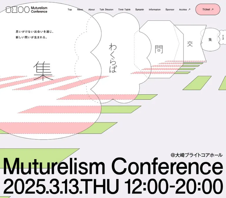
細い輪郭線の幾何学図形と巨大なタイポグラフィが印象的なカンファレンスサイト。淡い紫の背景にピンクと黄緑を配し、重なり合うセッションパネルと遠近感のある図案で共創を表現。
オリジナルサイトを見るMuturelism Conference 2025 — Style Reference
A conference program arranged as outlined paper shapes, with pastel pathways receding through an oversized typographic poster.
Website / original URL: 2025.muturelism-conf.jp Final URL: https://2025.muturelism-conf.jp/ Theme: light lavender canvas, white shapes, black typography, pink and pale green accents. Inspected: September 13, 2026, at 04:12 JST; supplied retrieval timestamp: September 12, 2026, at 19:12:23.186 UTC. Viewports: desktop 1440 × 1000 and mobile 390 × 844 CSS pixels. Scope: supplied browser captures of the desktop opening, one middle Talk Session state, and footer; mobile opening and footer; rendered text and links across the page, with sampled computed styles through the timetable. Other sections have partial DOM evidence rather than complete visual coverage.
Muturelism Conference is a dedicated event website with a substantial program, speaker directory, timetable, practical information, and ticket information. The current page retains its March 13, 2025 event content and displays the registration status “受付終了.” The supplied inspection reports HTTP 200 at the unchanged URL.
Its identity comes from four recurring outlined silhouettes associated with “集,” “交,” “問,” and “わくらば.” They appear as miniature logo marks, enormous foreground graphics, session containers, and a repeating footer pattern. Thin contours and dotted construction lines keep these large forms visually light. Black display lettering supplies weight, while pink and green strips establish a shallow, diagrammatic perspective.
The page alternates between expansive poster compositions and remarkably small program text. Desktop content moves across the canvas in offset groups. Mobile changes the composition and reading order substantially: the event title moves above the illustration, session information becomes vertically sequenced, and the footer becomes a narrow column aligned toward the right.
How to Read This Reference
- Measured means a value explicitly supplied in rendered element bounds or computed styles.
- Calculated means arithmetic using those measurements, such as a gap between adjacent element bounds. It does not establish the underlying CSS formula.
- Estimated means a visual approximation from the current-page captures. Accent hex values, contour thicknesses, and artwork lettering sizes belong to this category.
- Recommended means guidance for a new implementation. The CSS and prompts below are adaptations, not recovered source code.
- All named
--conf-*tokens are implementation aliases. Actual source custom properties are identified separately. - Desktop and mobile screenshots are independently composed captures. Differences between them do not prove animation behavior.
- Sampled document coordinates describe the recorded layout. They should not be treated as the transformed positions of panels in the separate middle-page screenshot.
Tokens — Colors
Default Palette
| Name | Value | Alias | Evidence and role |
|---|---|---|---|
| Lavender Canvas | #F1EFF5 |
--conf-canvas |
Measured BODY background, rgb(241, 239, 245), at both viewports. The continuous page and footer ground. |
| Text Ink | #000000 |
--conf-ink |
Measured on navigation, section labels, paragraphs, and session text. Also a practical approximation for the near-black illustration contours. |
| White Paper | approximately #FFFFFF |
--conf-paper |
Visually observed shape interiors. No corresponding fill declaration was supplied. |
| Soft Pink | approximately #FAC4C9 |
--conf-pink |
Estimated from the registration capsule, foreground strips, and exposed portions of overlapping shapes. |
| Pale Green | approximately #C9E697 |
--conf-green |
Estimated from perspective pathways and the small paired marks beside speaker portraits. |
| Pickup Yellow | approximately #F5F45A |
--conf-pickup |
Estimated from the small serrated “Pickup” sticker in the middle desktop capture. A local highlight. |
| Muted Link Gray | approximately #88838C |
--conf-muted |
Estimated from underlined company links in the footer paragraph. |
Use black text on the pale accents. The pink registration capsule remains legible through ink-colored lettering and a fine outline; white lettering would weaken that relationship.
White and lavender serve different purposes. White identifies the large outlined objects, while lavender remains visible between them. Making every surface white would remove much of the composition's depth.
Source Variables and Limits
The supplied computed properties include transparent --g-color-* values and gradient-position variables. These declarations do not demonstrate a visible gradient system. The captures show predominantly flat fills.
Loading-related properties include --rebranding-loading-bg: #e5e5e5 and --rebranding-loading-bar: #222. These are declared values, not evidence of a visually inspected loading screen. They are excluded from the stable page palette.
No alternate theme or theme selector was evidenced.
Tokens — Typography
Measured Interface Family
Source family: "太ゴB101 JIS2004".
This family is computed on navigation labels, section markers, news text, About copy, session titles, speaker names, and timetable text. The supplied source alias is --s-font-32a5d15b.
The measured weight is consistently 400 across these roles, including the visually substantial session titles. Preserve that distinction: a font's drawn character can feel bold without a computed 700 weight.
Recommended fallback: system-ui, sans-serif. Load the source family separately only when an appropriate licensed font resource is available. Declaring its name alone does not supply the font.
Display Lettering and Logos
The opening title and date are much larger than the surrounding interface. Their visible lettering is heavy, tightly fitted sans-serif typography, but the supplied H1 contains no extracted text. Its computed 32px size describes the wrapper and does not explain the rendered display artwork.
The source also declares Lato through --s-font-768c0789. No supplied computed text sample establishes where it is used. Do not assign Lato to the giant title, dates, or logos based only on that declaration.
The footer “muture” wordmark has distinctive connected and cut-through letterforms. Treat it as identity artwork. Its appearance does not establish a reusable body or display font.
Type Scale
Unless marked estimated, values below are measured. Each size and line-height pair is in CSS pixels.
| Role | Desktop size / line height | Mobile size / line height | Tracking / treatment |
|---|---|---|---|
| Header navigation | 13 / 15.6 |
Hidden in the opening capture | Normal tracking, weight 400 |
| Registration status | 13 / 18.2 |
11.7 / 16.38 |
Normal tracking, black text |
| Section number | 12 / 12 |
10 / 10 |
6px desktop and 5px mobile tracking; both 0.5em |
| Section label | 18.72 / 18.72 |
18.018 / 18.018 |
Small English label, weight 400 |
| News date | 12.96 / 18.144 |
10.998 / 15.3972 |
Normal tracking |
| News headline | 14.976 / 23.9616 |
12.987 / 20.7792 |
Line height 1.6 |
| About introductory label | 13.968 / 19.5552 |
11.7 / 16.38 |
Normal tracking |
| About lead paragraph | 19.872 / 39.744 |
12.987 / 25.974 |
Line height 2; tracking 0.1em |
| About supporting paragraph | 14.4 / 28.8 |
14 / 28 |
Mobile tracking 0.05em |
| Session topic / hashtags | 16.992 / 27.1872 |
12.987 / 20.7792 |
Line height 1.6 |
| Session title | 28.8 / 46.08 |
23.985 / 38.376 |
Weight 400; centered within its text region |
| Session description | 11.952 / 19.1232 |
10.92 / 17.472 |
Tracking 0.02em; left aligned |
| Speaker affiliation in sessions | 11.952 / 19.1232 |
9.36 / 14.976 for groups; 9.984 / 15.9744 in opening/keynote samples |
Compact multi-line text |
| Speaker name in sessions | 20.016 / 32.0256 |
14.976 / 23.9616 |
Name follows affiliation |
| Timetable time | 18 / 36 |
15.99 / 31.98 |
Line height 2 |
| Timetable session title | 16.992 / 25.488 |
12.987 / 19.4805 |
Line height 1.5 |
| Timetable category | 13.968 / 25.1424 |
11.973 / 21.5514 |
Line height 1.8 |
| Opening event title | Approximately 140px apparent type scale |
Approximately 70–74px apparent type scale |
Estimated from artwork; not a measured font declaration |
| Opening date / time | Approximately 125–135px apparent type scale |
Approximately 40–42px apparent type scale |
Estimated; desktop and mobile use different line arrangements |
The strongest typographic contrast is between the opening poster and the program details. Section headings remain around 18px even when the surrounding graphics occupy most of the viewport.
Recommended readability adjustment: retain the proportions of titles and metadata, but consider raising mobile descriptions and affiliations to at least 13–14px. Allow the surrounding shape to grow instead of clipping the larger text.
Tokens — Spacing & Shapes
Spacing Scale
The evidence supports a recurring group of practical values, but not a single universal spacing formula.
| Use | Desktop | Mobile | Evidence |
|---|---|---|---|
| Header padding | 18px 28px 16px 24px |
20px |
Measured |
| Common content edge | Approximately 100.8px |
19.5px |
Measured section positions; equivalent to approximately 7% and 5% of viewport width |
| Navigation link gap | 24px |
— | Calculated from adjacent link bounds |
| News control gap | 16px |
Approximately 9.44px |
Calculated from button bounds |
| News card horizontal separation | 40px right padding within each card |
24px between cards |
Measured padding / calculated mobile pitch |
| News card internal gap | 24px |
16px |
Measured |
| Session topic-to-title gap | 48px |
24px |
Calculated from text bounds |
| Session title-to-description gap | 48px |
24px |
Calculated from text bounds |
| About section top padding | 160px |
100px |
Measured |
| Talk Session section top padding | 160px |
100px |
Measured |
| Timetable section top padding | 160px |
100px |
Measured |
| Timetable break-label vertical padding | 24px |
16px |
Measured |
Use 16, 24, 40, and 48px for component rhythm, with 100–160px for major section entrances. These values coexist with percentage-based positioning and custom artwork proportions.
Shape Vocabulary
| Shape | Visual anatomy | Observed uses |
|---|---|---|
| Gather form | Tall rounded silhouette with repeated inward scallops along the sides | “集” motif, logo, large scene objects, footer repetition |
| Exchange form | Straight top and bottom, inward-pointing waist, angular sides | “交” motif, logo, session-related geometry |
| Question form | Octagon with clipped corners and long straight vertical edges | “問” motif, logo, large session panels |
| Encounter form | Multi-lobed cloud or flower silhouette | Vertical “わくらば” motif, logo, session panels |
| Perspective strip | Long quadrilateral with angled ends; size decreases into the distance | Green pathways and pink crossing bands |
| Capsule | Fully rounded rectangle with an ink edge | Registration status and tiny paired speaker marks |
| Circle | Fine outlined ring or photographic crop | News controls, social links, speaker portraits |
| Serrated seal | Small irregular starburst with a bright fill | “Pickup” emphasis |
The illustrated silhouettes are more specific than ordinary border-radius presets. Their contour rhythm, concave edges, and relationship to neighboring forms are essential.
Estimated stroke: approximately 1 CSS pixel in the desktop captures. Recommended SVG implementations should preserve a fine stroke across scale changes with vector-effect: non-scaling-stroke where appropriate.
Layout Measurements
| Element | Desktop | Mobile | Status |
|---|---|---|---|
| Header | 1440 × 90px |
390 × 96px |
Measured |
| Logo link box | 260 × 51px at x=24 |
175 × 48px at x=20 |
Measured; visible artwork has internal whitespace |
| Registration capsule | Approximately 120 × 55px |
Approximately 84 × 36px |
Screenshot estimates; parent bounds not supplied |
| Mobile menu button | — | 33.25 × 35.328px |
Measured |
| Opening MAIN region | 1440 × 1000px |
390 × 657.719px |
Measured |
| Common News / timetable section width | 1238.391px |
351px |
Measured |
| News card box | 283 × 379.297px, including 40px right padding |
211.859 × 326.172px |
Measured |
| News control box | 40.906px square |
33.016px square |
Measured |
| About lead column | 643.953px |
302.125px |
Measured |
| About company-link object | Approximately 272.328 × 269.641px |
Approximately 162 × 162px |
Measured |
| Session description column | 302.391px |
239.953px |
Measured |
| Session affiliation/name column | Often 160.688px |
Often 130.906px |
Measured |
| Talk Session section height | 5595.344px |
7118.109px |
Measured layout snapshot |
| Document height | 15638px |
Approximately 19303px |
Reported document measurements |
The two About link objects overlap horizontally by approximately 43.13px on desktop and 25.66px on mobile, calculated from their bounds. Both are close to 16% of an object's width. This is a useful reusable proportion for overlapping decorative frames.
Components
Persistent Header
Role: identity, section navigation, and registration status.
The header is transparent, with the event logo at left and a compact navigation row toward the right. The desktop links are “Top,” “News,” “About,” “Talk Session,” “Time Table,” “Speaker,” “Information,” “Sponsor,” and “Access.” The final link has a small diagonal external-direction arrow and an 8px measured internal gap.
The navigation starts around x=612.55px at the desktop viewport. This leaves a broad open interval after the 260px logo link box. A pink outlined registration capsule finishes the row near the right edge.
The header remains at the top of the supplied middle and footer captures, supporting persistent positioning visually. Its exact position declaration was not supplied. Background shapes remain visible behind it, including behind the mobile logo at the footer.
At 390px, the navigation row is replaced visually by a small button drawn as three stacked outlined ovals with dotted interior details. The logo and registration status remain visible. The menu's expanded state was not supplied.
Registration Status Capsule
Role: communicates the current event registration state.
Use a pale pink fill, a fine dark border, fully rounded ends, centered black text, and generous horizontal breathing room. The current label is “受付終了.” It is a status message; no destination for this header element appears in the supplied link list.
Do not assume disabled-button semantics, a tooltip, or a ticket-opening action. A static status element is the appropriate starting point for an adaptation unless further behavior is specified.
Opening Poster
Role: makes the event name, date, venue, and central theme immediately recognizable.
The desktop opening fills the measured 1000px viewport height. Huge white contours cross the scene, with smaller forms receding toward the upper right. Pink strips intersect these forms; pale green strips continue through the background like a diagrammatic floor. Some edges are solid and others dashed, creating the impression of visible and hidden boundaries.
The short Japanese statement sits in the upper-left area: “思いがけない出会いを通じ、新しい問いが生まれる。” The event name spans almost the full width near the bottom, with the date and time underneath. “@大崎ブライトコアホール” is right aligned above the large title.
The giant lettering and the illustration share the canvas directly. There is no separate opaque headline card or boxed text overlay.
On mobile, the title becomes two lines above the illustration. The scene is cropped horizontally, retaining the large foreground form and its receding companions. The short statement sits toward the lower right of the graphic area. Date, time, and venue then appear as a compact left-aligned block. This opening ends around 658px, allowing the News heading and controls into the first screen.
Section Marker
Role: indexes the long page without competing with its artwork.
Pair a small English section label with a tiny parenthesized number offset above and to its right. The observed sequence runs from News (1) through Ticket (8).
The number uses unusually wide 0.5em tracking. The label stays close to 18px on both viewports. Preserve this restrained scale and the raised number relationship when adding new sections.
News Rail
Role: presents dated event updates in a horizontal sequence.
Each item groups media, a small date, and a short Japanese headline. The desktop item box is 283px wide, with 40px of right padding and a 243px text region. Mobile items are approximately 211.86px wide, separated by 24px, with part of the next item visible.
Previous, pause, and next controls form a small horizontal group. They appear as fine outlined circles in the mobile capture. Some sampled outer button wrappers report zero border radius, so their visible circular outline should not be attributed automatically to the wrapper itself.
The DOM contains repeated update entries and a pause control. These support a carousel-like structure, but autoplay timing, wrapping behavior, and control effects were not demonstrated. One update has a recorded external article link; do not assume every news item opens the same kind of destination.
About Introduction and Company Links
Role: explains the conference's purpose and connects it to the organizer.
Desktop uses a wide lead paragraph at the left and two overlapping linked objects at the right. The lead's 19.872px type, double line height, and 0.1em tracking give the Japanese copy a deliberate, spacious rhythm.
The linked objects lead to information about the organizer and its work. Their labels use compact multi-line text. Two label layers occupy the same supplied bounds; their presence alone does not establish a particular hover transition.
Mobile places the lead in a narrower 302px column and moves the overlapping link objects below it. Supporting paragraphs remain around 14px with double line height, larger than the mobile session descriptions. Preserve this distinction between reflective introductory copy and dense program notes.
Talk Session Composition
Role: presents the conference's eight session entries as a sequence of graphic objects.
The recorded session IDs are A0, A1, A2, B2, A3, B3, A4, and A5. Each combines a session identifier, topic or hashtags, a larger title, descriptive copy, and one or more speakers.
In the middle desktop capture, large white panels overlap across the viewport. Angular hourglass and octagonal panels coexist with scalloped forms. Dotted grids, diagonal dotted hatching, and pale patterned silhouettes fill the surrounding field. Parts of preceding sessions are visibly concealed by foreground panels.
This capture establishes layering and occlusion, but not its cause. It does not verify draggable cards, a sticky stacking sequence, parallax, or a specific scroll animation. For reuse, retain the contour vocabulary and offset placement while ensuring every session has a readable state.
Session Text Panel
Role: provides the session's main editorial hierarchy.
Its anatomy is:
- A small black rectangular ID stamp with white text.
- A centered topic line and, where present, hashtags.
- A centered Japanese title, usually two or three lines.
- A narrower left-aligned description lower in the shape.
- An adjacent or subsequent speaker region.
Desktop topic-to-title and title-to-description gaps are both 48px in the sampled entries. Mobile reduces these gaps to 24px. Titles retain a generous 1.6 line height.
The description column is approximately 302px on desktop and 240px on mobile. Keep this text inside the contour's safe central area. The outer shape may be broad, but that does not make its full bounding rectangle suitable for text.
Speaker Group Inside a Session
Role: associates a topic with its participants.
The desktop capture shows circular color portraits, a tiny green mark resembling two stacked capsules at the portrait's right edge, and an affiliation/name block to the right. Portraits appear approximately 80–85px across; this is a screenshot estimate.
Affiliation text precedes the larger speaker name. Long affiliations wrap into several lines. The green paired mark repeats consistently and functions visually as a connector; no interactive meaning was verified.
The mobile DOM places speaker information below the corresponding session description. Opening and keynote entries have a different measured affiliation size from the multi-speaker groups. Do not normalize every original text role to one size when documenting the source.
Pickup Sticker
Role: locally emphasizes the closing-session panel.
A small bright yellow serrated seal appears near the upper-left area of the A5 form, accompanied by a tiny illustrated hand and the label “Pickup.” Its approximately 60px visual footprint is minor relative to the large white panel.
Use this as an occasional editorial annotation. No click behavior or universal featured-state system was evidenced.
Time Table
Role: converts the editorial session sequence into a practical schedule.
The desktop DOM places the section heading and calendar link in a left region, with the schedule occupying the broader right region. Time labels precede session information; parallel A/B sessions share time slots. Break and movement labels create a separate rhythm between sessions.
At the 14:00 slot, the two desktop text columns begin around x=552.48px and x=962.03px. On mobile they begin around x=63.42px and x=383.38px, placing most of the second track beyond the visible viewport.
Mobile explicitly displays “スワイプでご覧いただけます.” A recorded break row is approximately 625px wide inside the 351px section, supporting an intentionally wider schedule region. Horizontal gesture behavior was not exercised.
The calendar link precedes the schedule in desktop extracted text and follows it on mobile. Detailed timetable border and fill styling is not established by the supplied screenshots.
Speaker Directory
Role: provides longer biographies and optional external profile links.
The rendered text confirms a separate Speaker section containing names, organizations, roles, biographies, and links such as “Profile Link,” “LinkedIn,” and “note.” This is distinct from the compact speaker groups inside sessions.
The supplied visual captures do not establish the directory's complete layout or any open/closed states. Do not infer a modal, accordion, hover biography, or card grid from the existence of profile text alone.
Information, Sponsor, Ticket, and Contact
Role: provides event logistics and external actions.
The Information content is structured as label/value pairs: event title, date, venue, capacity, fee, and organizer. It records 200 participants, a ¥3,300 fee, and “株式会社Muture” as organizer, with an official company link.
The Sponsor section contains company links and an inquiry destination. The Ticket section includes the price, tax note, privacy information, cancellation copy, an external ticket link, and Contact. Full visual anatomy for these sections is not available in the supplied captures.
A routing difference is present in the evidence: desktop Contact points to an email address, while the mobile Contact link points to the ticket page. Activation was not tested. A new implementation should explicitly define and verify these destinations.
Footer Pattern and Organization Block
Role: closes the page by bringing the identity system back at a smaller, repeating scale.
The footer's upper illustration repeats the four white outlined motifs in three staggered rows. Desktop motifs are approximately 105px wide and 120px tall. The sequence is clipped at the viewport edges, creating the feeling of an extended field rather than a centered decorative badge.
Green perspective strips spread below the pattern and continue off the left edge. A large amount of lavender space separates these graphics from the organization information.
Desktop places a narrow company paragraph around the center-right and a separate group farther right containing three social circles, the black wordmark, and copyright. The paragraph is approximately 350–355px wide; social circles appear about 57px across.
Mobile places the wordmark first, followed by a roughly 283px paragraph aligned around x=84px, then three approximately 45px social circles and copyright. The content remains visibly biased toward the right. The social destinations correspond to X, note, and a podcast.
Tokens — Motion & Interaction
Declared Transitions
| Target | Supplied computed declaration | What is established |
|---|---|---|
| BODY background | background 0.5s cubic-bezier(0.4, 0.4, 0, 1) |
A background transition is declared; no palette-changing trigger was demonstrated. |
| Header, links, and many content elements | 0.3s cubic-bezier(0.4, 0.4, 0, 1) plus generated custom-property transitions |
A common 300ms transition vocabulary exists; actual changed properties and states are only partly specified. |
| Desktop H1 wrapper | 0.3s cubic-bezier(0, 0.71, 0, 1) plus custom-property transitions |
A distinct easing is declared on the wrapper; the visible title's animation was not established. |
| News controls | 0.4s cubic-bezier(0.4, 0.4, 0, 1) |
A 400ms transition is declared; hover and activation results were not recorded. |
| Sampled elements | animation: none |
No named CSS animation is reported on these sampled elements. This does not exclude other elements, embedded artwork, or script-driven motion. |
Interaction Evidence and Limits
| Feature | Evidence | Unverified behavior |
|---|---|---|
| Section navigation | Original-page anchor destinations in the desktop link inventory | Scroll duration, active-section tracking, and focus handling |
| Mobile menu | Visible button and measured bounds | Expanded panel, animation, dismissal, and keyboard behavior |
| News carousel | Horizontal item sequence, duplicates, previous/pause/next controls | Autoplay interval, loop mechanics, pause persistence, and swipe support |
| Mobile timetable | Explicit swipe instruction and content extending beyond the viewport | Gesture response, scroll snapping, and keyboard navigation |
| Hero scene | Perspective composition and layered contours | Automatic movement, morphing, pointer response, and timing |
| Session overlap | One settled middle capture with extensive overlapping panels | Whether overlap is static, scroll-linked, or produced by another mechanism |
| External actions | Recorded href values | Destination-page availability and successful action completion |
The browser collection included an initial observation of at least five seconds and readiness checks for layout, images, and finite motion. Perpetual animations could be paused during checks and resumed afterward. This protocol does not prove that a particular component animates, nor does it provide its timing.
Recommended adaptation: use the measured 300–400ms easing family for restrained state changes. Keep decorative motion independent of essential text and provide a static reduced-motion presentation. Do not invent a continuous hero animation as an observed feature.
Surfaces
| Layer | Appearance | Purpose |
|---|---|---|
| Page ground | Flat lavender | Maintains continuity across the long document |
| Primary graphic object | White fill, fine dark contour | Carries motifs and session content |
| Patterned object | Pale fill with dots, dotted grid, or diagonal dotted lines | Adds density around white foreground panels |
| Perspective path | Flat green or pink quadrilateral | Connects scene elements and implies depth |
| Registration status | Pink capsule with dark text and outline | Makes a small persistent state prominent |
| Session identifier | Black rectangular stamp with white letters | Provides compact program indexing |
| Social / carousel control | Fine circular outline with a small central symbol | Supplies utility without a heavy button surface |
| Editorial annotation | Yellow serrated sticker | Highlights one local item |
No soft shadow system is visible in the supplied captures. Depth comes from scale, occlusion, cropping, and the contrast between solid and dashed edges.
Imagery
Geometric Illustration
The dominant image language is a precise outline drawing with playful silhouettes. It combines crisp angular cuts, repeated scallops, sparse dashed edges, and broad flat fills. It is neither a realistic 3D scene nor a rough hand-drawn sketch.
Perspective is carried mainly by repeated strips and diminishing scale. Shapes can remain front-facing while their neighbors shrink into the distance. Preserve that deliberately diagrammatic quality when producing additional illustrations.
Pink regions read as crossing bands or exposed layers. Do not assume a blend mode from their appearance; the supplied evidence does not establish whether the color is authored as separate geometry, transparency, or clipping.
Photography
Natural-color portrait photography appears inside circular crops in the session capture. The surrounding interface keeps the color palette limited, but faces are not recolored into a duotone system. Use well-positioned portraits with enough space around the face to survive circular cropping.
The mobile opening reveals the top of a photographic News thumbnail within an angular frame. The full news-image treatment is not visually documented in that capture.
Pattern and Icon Treatment
Use evenly spaced dots and dotted lines for the patterned silhouettes. These are orderly drafting-like textures, not random grain. Keep them away from the central reading area of a text panel.
The mobile menu's stacked oval drawing belongs to the same contour family. The small paired green speaker marks and outlined social circles extend this vocabulary into utility elements.
Observed Asset References
| Asset group | Evidence available | Reuse implication |
|---|---|---|
| Event logo | Visible in both viewport sizes | Preserve the four-mark lockup and two-line event name; exact asset URL was not supplied. |
| Opening title, date, and scene | Visible in current captures; H1 has no extracted text | Exact format and font origin remain unverified. Keep identity artwork separate from semantic text. |
| Session portraits | Visible circular color photographs | Individual image paths were not supplied. |
| News media | Rendered pseudo-element background-image references to hosted assets | Several references are truncated; do not manufacture complete URLs from filename fragments. |
| Footer wordmark | Visible on desktop and mobile | Use approved identity artwork rather than a guessed font. |
| Footer motif field | Visible repeated contours and green paths | Rebuild from consistent vector components when original artwork is unavailable. |
SVG is a practical recommendation for new contour artwork. The evidence does not establish that every visible graphic in the original is an SVG.
Layout & Responsive Behavior
Observed Changes
| Area | Desktop: 1440 × 1000 | Mobile: 390 × 844 |
|---|---|---|
| Header | Full navigation, 260px logo link | 175px logo link, registration capsule, illustrated menu button |
| Opening composition | Illustration dominates above a bottom title/date block | Two-line title first, illustration next, date/time and venue below |
| Opening height | 1000px | Approximately 657.72px |
| Common section width | Approximately 86% of viewport | Approximately 90% of viewport |
| News | Rail begins well into the desktop section in the sampled state | Rail begins near the left margin, with the next item partially visible |
| About | Lead text and company links alongside one another | Company links move below lead text |
| Sessions | Text and speaker regions occupy adjacent parts of broad compositions | Speaker information follows descriptions vertically; text groups alternate horizontal offset |
| Timetable | Two parallel session columns within the right region | Wider internal schedule with a swipe instruction |
| Footer | Paragraph beside social/logo/legal group | Logo, paragraph, social links, copyright in a right-biased vertical sequence |
Mobile session description blocks alternate between approximately x=39px and x=101.39px, with a consistent width near 240px. This preserves lateral rhythm even though the primary reading sequence is vertical. The supplied mobile captures do not show those panels directly; this observation comes from measured DOM positions.
The desktop Talk Session section is about 5595px tall in the layout snapshot; mobile is about 7118px. Mobile expands the program vertically instead of merely scaling the desktop scene down.
A source media rule at max-width: 1280px appears in the provided responsive line-break styling. Its presence does not establish the navigation-collapse or overall layout breakpoint. No tablet viewport was supplied.
Recommended breakpoints: use a content-driven compact header near 1100px and a single-column composition near 768px as starting points. These are implementation choices to test, not recovered source breakpoints.
Keep decorative overflow in dedicated clipping wrappers. Essential text, links, and focus indicators should remain reachable even when neighboring artwork extends beyond the viewport.
Do’s and Don’ts
Do
- Keep the measured lavender background
#F1EFF5continuous across the page. - Reuse the same four contour families from the logo through the footer.
- Preserve the distinction between white objects and the lavender space around them.
- Use thin dark outlines, flat pastel strips, and intentional edge cropping.
- Pair enormous opening lettering with small, restrained section labels.
- Keep session IDs, topics, titles, descriptions, and speakers in a consistent hierarchy.
- Preserve natural-color portraits inside circular crops.
- Recompose the mobile opening instead of shrinking the desktop poster.
- Retain horizontal access to parallel timetable tracks.
- Treat the current “受付終了” label as registration status.
- Keep each session readable when adapting the observed overlapping composition.
Don’t
- Don’t replace the four silhouettes with an unrelated assortment of generic blobs.
- Don’t turn the whole program into identical rounded rectangles with shadows.
- Don’t add glossy gradients, glass blur, or realistic lighting to the flat illustration system.
- Don’t treat the H1 wrapper's
32pxstyle as the visible opening title size. - Don’t claim Lato is the title font merely because a variable declares it.
- Don’t apply
font-weight: 700to every text role when the measured interface uses400. - Don’t force all mobile content into centered, equally padded blocks; the offsets are characteristic.
- Don’t preserve graphic overlap at the cost of permanently concealing content.
- Don’t make pale green or pink the color of small text on white.
- Don’t invent autoplay timings, drag behavior, or hover effects from static captures.
- Don’t present the dated ticket content as evidence that registration is currently open.
Recommended Implementation Additions
These are recommendations for a new implementation, not verified original features:
- Supply a semantic text heading and a machine-readable event date even when the visible opening uses artwork.
- Mark repeated decorative motifs and construction lines as hidden from assistive technology.
- Give the illustrated menu, News controls, and social links explicit accessible names.
- Expand compact control hit areas toward 44 × 44px while keeping their visible outlines close to the original scale.
- Add a visible dark focus outline and sufficient scroll offset for the persistent header.
- Increase small mobile affiliations and descriptions where practical; let shaped panels expand with text and zoom.
- Make the timetable overflow region keyboard-scrollable and retain a visible instruction or other overflow cue.
- If autoplay is implemented, make pause effective and persistent during focus or direct interaction.
- Provide a reduced-motion state in which every session remains visible without completing a movement sequence.
- Verify that Contact, ticket, and calendar destinations have the intended purpose on every breakpoint.
- Place a plain, current registration-status explanation beside any retained ticket action when adapting an event page after registration closes.
Agent Prompt Guide
Quick Color Reference
- Canvas: measured
#F1EFF5. - Text: measured
#000000. - Shape interiors: approximately
#FFFFFF. - Pink capsule and crossing strips: estimated
#FAC4C9. - Green perspective strips and speaker connectors: estimated
#C9E697. - Local Pickup sticker: estimated
#F5F45A. - Separation: fine outlines, dotted patterns, and overlap.
Overall Prompt
“Create a Japanese conference website using a continuous lavender canvas #F1EFF5, black text, white outlined geometric objects, pale pink #FAC4C9, and pale green #C9E697. Build a consistent four-shape vocabulary: scalloped vertical form, angular hourglass, clipped-corner octagon, and lobed cloud. Use these in the logo area, a large perspective illustration, shaped session panels, and three staggered rows of footer motifs. Set the desktop opening as a full-height poster with oversized sans-serif event lettering and date information near the bottom. On mobile, place the two-line event title above the illustration, followed by date, time, and venue. Keep section labels near 18px with tiny raised parenthesized numbers. Use compact Japanese program typography, circular color portraits, black session-ID stamps, and tiny paired green connector marks. Preserve offset composition while keeping all essential content readable. Treat exact display artwork and unverified interactions as separate implementation requirements.”
Example Component Prompts
- Header: “Create a transparent persistent conference header. Place a four-symbol event lockup at left, small 13px section links at right, and a pale pink outlined capsule labeled ‘受付終了’. On mobile, retain the identity and status, and use a compact menu symbol made from three stacked outlined ovals. Add an accessible name and keyboard-operable disclosure behavior.”
- Session panel: “Design a white octagonal or scalloped program panel with a fine black contour. Place a black A4 stamp above centered topic text, a two-line Japanese title around 29px on desktop, and a narrow left-aligned description below. Pair it with circular speaker portraits, small affiliations, larger names, and paired green capsule marks. Keep patterned decoration outside the text's safe region.”
- Opening illustration: “Draw a flat vector scene of large white outlined symbols diminishing toward the upper right. Add long pale green quadrilaterals as pathways and pink strips crossing the white forms. Mix solid and dashed boundaries. Use no shadows or realistic lighting. Keep title and event details as separately accessible content.”
- News rail: “Create a horizontal event-news rail with image-led items, a small date, a short Japanese headline, and fine outlined previous/pause/next circles. Show a partial next card on mobile. Use approximately 243px desktop content widths and 212px mobile cards. Define autoplay only if explicitly requested.”
- Footer: “Repeat the four outlined motifs in three staggered rows clipped at both screen edges. Extend pale green perspective strips into generous lavender whitespace. Place a narrow company paragraph beside a social/logo/legal group on desktop. On mobile, order the wordmark, paragraph, social circles, and copyright vertically in a column biased toward the right.”
Review Prompt
“Compare the implementation at 1440 × 1000 and 390 × 844. Check the lavender ground, four recurring silhouettes, fine outlines, title placement, section-number treatment, session text hierarchy, portrait connectors, timetable overflow, and right-biased footer. Separate measured source values from visual approximations. Identify any text hidden by decoration and any interactions that lack explicit requirements or verification.”
Quick Start
CSS Custom Properties
This CSS is a static adaptation using a conventional root font size. Interface type values use measured endpoints; accent colors, display typography, panel geometry, and layout breakpoints are approximations or recommendations. It does not load fonts or reproduce the original scene's unverified behavior.
:root {
  /* Measured colors */
  --conf-canvas: #f1eff5;
  --conf-ink: #000000;

  /* Visual approximations */
  --conf-paper: #ffffff;
  --conf-pink: #fac4c9;
  --conf-green: #c9e697;
  --conf-pickup: #f5f45a;

  /* The named source font requires a separately licensed resource. */
  --conf-font: '太ゴB101 JIS2004', system-ui, sans-serif;
  --conf-display-font: system-ui, sans-serif;
  --conf-weight: 400;
  --conf-nav-size: 13px;
  --conf-section-size: 18.72px;
  --conf-index-size: 12px;
  --conf-topic-size: 16.992px;
  --conf-session-size: 28.8px;
  --conf-description-size: 11.952px;
  --conf-affiliation-size: 11.952px;
  --conf-name-size: 20.016px;
  --conf-news-date-size: 12.96px;
  --conf-news-title-size: 14.976px;

  /* Source-derived spacing and recommended geometry */
  --conf-section-space: 160px;
  --conf-text-gap: 48px;
  --conf-rule: 1px;
  --conf-pill: 999px;
  --conf-ease: cubic-bezier(0.4, 0.4, 0, 1);
  --conf-ui-time: 300ms;
  --conf-control-time: 400ms;
}

* {
  box-sizing: border-box;
}

body {
  margin: 0;
  color: var(--conf-ink);
  background: var(--conf-canvas);
  font-family: var(--conf-font);
  font-weight: var(--conf-weight);
}

button,
input {
  font: inherit;
}

a {
  color: inherit;
}

img,
svg {
  display: block;
  max-width: 100%;
}

.conf-section {
  width: 86%;
  margin-inline: auto;
  padding-block-start: var(--conf-section-space);
  scroll-margin-top: 110px;
}

.conf-header {
  position: fixed;
  z-index: 50;
  inset: 0 0 auto;
  display: flex;
  align-items: center;
  gap: 26px;
  min-height: 90px;
  padding: 18px 28px 16px 24px;
  background: transparent;
}

.conf-brand {
  display: flex;
  align-items: center;
  flex: 0 0 260px;
  min-height: 51px;
}

.conf-nav {
  display: flex;
  align-items: center;
  gap: 24px;
  margin-inline-start: auto;
  font-size: var(--conf-nav-size);
  line-height: 1.2;
}

.conf-nav a {
  text-decoration: none;
  white-space: nowrap;
}

.conf-registration {
  display: grid;
  place-items: center;
  flex: 0 0 auto;
  min-width: 120px;
  min-height: 55px;
  padding: 10px 20px;
  border: var(--conf-rule) solid var(--conf-ink);
  border-radius: var(--conf-pill);
  background: var(--conf-pink);
  font-size: 13px;
  line-height: 1.4;
}

.conf-compact-menu {
  display: none;
}

/* Approximate display lettering; approved artwork can replace it. */
.conf-hero {
  position: relative;
  isolation: isolate;
  display: flex;
  flex-direction: column;
  justify-content: flex-end;
  min-height: 100svh;
  padding: 90px 20px 20px;
}

.conf-hero-art {
  position: absolute;
  z-index: -1;
  inset: 0;
  overflow: hidden;
  pointer-events: none;
}

.conf-hero-title {
  margin: 0;
  font-family: var(--conf-display-font);
  font-size: clamp(64px, 9.7vw, 144px);
  font-weight: 700;
  line-height: 0.95;
  letter-spacing: -0.055em;
}

.conf-hero-date {
  margin: 8px 0 0;
  font-family: var(--conf-display-font);
  font-size: clamp(48px, 8.8vw, 132px);
  font-weight: 700;
  line-height: 1;
  letter-spacing: -0.055em;
}

.conf-hero-venue {
  align-self: flex-end;
  margin: 0 0 8px;
  font-size: clamp(16px, 2vw, 29px);
}

.conf-hero-statement {
  position: absolute;
  top: 19%;
  left: 7%;
  max-width: 24em;
  margin: 0;
  font-size: 17px;
  line-height: 2;
  letter-spacing: 0.1em;
}

.conf-section-label {
  display: inline-grid;
  grid-template-columns: auto auto;
  align-items: end;
  gap: 4px;
  margin: 0;
  font-size: var(--conf-section-size);
  font-weight: 400;
  line-height: 1;
}

.conf-section-label sup {
  align-self: start;
  transform: translateY(-100%);
  font-size: var(--conf-index-size);
  line-height: 1;
  letter-spacing: 0.5em;
}

.conf-news-toolbar {
  display: flex;
  align-items: center;
  justify-content: space-between;
  gap: 24px;
  margin-block-end: 48px;
}

.conf-controls {
  display: flex;
  gap: 16px;
}

/* Recommended larger hit area than the measured mobile controls. */
.conf-control {
  display: grid;
  place-items: center;
  width: 44px;
  height: 44px;
  padding: 0;
  color: var(--conf-ink);
  background: transparent;
  border: var(--conf-rule) solid currentColor;
  border-radius: 50%;
  cursor: pointer;
  transition:
    color var(--conf-control-time) var(--conf-ease),
    background-color var(--conf-control-time) var(--conf-ease);
}

.conf-news-rail {
  display: flex;
  gap: 40px;
  overflow-x: auto;
  padding: 4px 4px 16px;
}

.conf-news-card {
  flex: 0 0 243px;
  min-width: 0;
  text-decoration: none;
}

.conf-news-card time {
  display: block;
  margin-block-start: 24px;
  font-size: var(--conf-news-date-size);
  line-height: 1.4;
}

.conf-news-card h3 {
  margin: 8px 0 0;
  font-size: var(--conf-news-title-size);
  font-weight: 400;
  line-height: 1.6;
}

/* Adapted panel composition; no original scroll behavior is implied. */
.conf-session-pair {
  display: grid;
  grid-template-columns: repeat(2, minmax(0, 1fr));
  align-items: stretch;
  width: min(1040px, 92%);
  margin: 80px auto;
}

.conf-shape-panel {
  position: relative;
  isolation: isolate;
  min-width: 0;
  padding: 100px 18% 80px;
}

.conf-shape-outline {
  position: absolute;
  z-index: -1;
  inset: 0;
  width: 100%;
  height: 100%;
  overflow: visible;
  pointer-events: none;
}

.conf-shape-outline path {
  fill: var(--conf-paper);
  stroke: var(--conf-ink);
  stroke-width: var(--conf-rule);
  vector-effect: non-scaling-stroke;
}

.conf-session-id {
  display: table;
  margin: 0 auto 24px;
  padding: 3px 8px;
  color: var(--conf-paper);
  background: var(--conf-ink);
  font-size: 13px;
  line-height: 1.2;
}

.conf-session-topic {
  margin: 0;
  text-align: center;
  font-size: var(--conf-topic-size);
  line-height: 1.6;
}

.conf-session-title {
  margin: var(--conf-text-gap) 0;
  text-align: center;
  font-size: var(--conf-session-size);
  font-weight: 400;
  line-height: 1.6;
}

.conf-session-description {
  margin: 0;
  font-size: var(--conf-description-size);
  line-height: 1.6;
  letter-spacing: 0.02em;
}

.conf-speakers {
  display: grid;
  align-content: center;
  gap: 44px;
  margin: 0;
  padding: 0;
  list-style: none;
}

.conf-speaker {
  display: grid;
  grid-template-columns: 80px minmax(0, 1fr);
  align-items: center;
  gap: 24px;
}

.conf-portrait {
  position: relative;
}

.conf-portrait img {
  width: 80px;
  aspect-ratio: 1;
  object-fit: cover;
  border-radius: 50%;
}

.conf-portrait::before,
.conf-portrait::after {
  content: '';
  position: absolute;
  z-index: 1;
  right: -10px;
  width: 22px;
  height: 6px;
  border: 1px solid var(--conf-ink);
  border-radius: var(--conf-pill);
  background: var(--conf-green);
}

.conf-portrait::before { top: calc(50% - 6px); }
.conf-portrait::after { top: 50%; }

.conf-speaker-affiliation {
  margin: 0;
  font-size: var(--conf-affiliation-size);
  line-height: 1.6;
}

.conf-speaker-name {
  margin: 0;
  font-size: var(--conf-name-size);
  font-weight: 400;
  line-height: 1.6;
}

/* Recommended native horizontal scrolling for parallel tracks. */
.conf-timetable-scroll {
  overflow-x: auto;
  padding: 4px 4px 16px;
}

.conf-timetable {
  width: 100%;
  min-width: 640px;
  border-collapse: collapse;
}

.conf-timetable th,
.conf-timetable td {
  padding: 16px 24px;
  text-align: left;
  vertical-align: top;
  border-bottom: 1px solid var(--conf-ink);
  font-weight: 400;
  line-height: 1.6;
}

/* Decorative texture for empty background shapes only. */
.conf-dot-field {
  background-color: var(--conf-canvas);
  background-image: radial-gradient(var(--conf-ink) 0.6px, transparent 0.8px);
  background-size: 8px 8px;
}

.conf-footer-content {
  display: grid;
  grid-template-columns: minmax(0, 355px) 210px;
  grid-template-areas: 'copy social' 'copy logo' 'copy legal';
  justify-content: end;
  align-items: start;
  gap: 28px 88px;
  padding: 80px 6% 80px;
}

.conf-footer-copy {
  grid-area: copy;
  margin: 0;
  font-size: 13px;
  line-height: 1.8;
}

.conf-footer-social {
  grid-area: social;
  display: flex;
  justify-content: space-between;
  gap: 16px;
}

.conf-footer-social a {
  display: grid;
  place-items: center;
  width: 57px;
  height: 57px;
  border: 1px solid currentColor;
  border-radius: 50%;
  text-decoration: none;
  font-size: 12px;
}

.conf-footer-logo { grid-area: logo; }
.conf-footer-legal { grid-area: legal; margin: 0; font-size: 10px; }

/* Recommended compact-header breakpoint, not a measured source rule. */
@media (max-width: 1100px) {
  .conf-nav { display: none; }
  .conf-registration { margin-inline-start: auto; }
  .conf-compact-menu { display: block; }
}

/* Recommended composition breakpoint with measured mobile type values. */
@media (max-width: 767px) {
  :root {
    --conf-section-size: 18.018px;
    --conf-index-size: 10px;
    --conf-topic-size: 12.987px;
    --conf-session-size: 23.985px;
    --conf-description-size: 10.92px;
    --conf-affiliation-size: 9.36px;
    --conf-name-size: 14.976px;
    --conf-news-date-size: 10.998px;
    --conf-news-title-size: 12.987px;
    --conf-section-space: 100px;
    --conf-text-gap: 24px;
  }

  .conf-section { width: 90%; }
  .conf-header { min-height: 96px; padding: 20px; gap: 14px; }
  .conf-brand { flex-basis: 175px; min-height: 48px; }
  .conf-registration {
    min-width: 84px;
    min-height: 36px;
    padding: 8px 12px;
    font-size: 11.7px;
  }

  .conf-hero { min-height: 0; padding: 96px 20px 0; }
  .conf-hero-title { order: 0; font-size: 18.2vw; line-height: 0.95; }
  .conf-hero-art {
    position: relative;
    inset: auto;
    order: 1;
    flex: 0 0 290px;
    width: calc(100% + 40px);
    margin: 20px -20px 0;
  }
  .conf-hero-statement {
    position: relative;
    inset: auto;
    order: 2;
    width: 47%;
    margin: -72px 0 0 auto;
    font-size: 12px;
    line-height: 2;
  }
  .conf-hero-date { order: 3; margin-top: 44px; font-size: 10.6vw; line-height: 1.05; }
  .conf-hero-venue { order: 4; align-self: flex-start; margin: 10px 0 0; font-size: 16px; }

  .conf-controls { gap: 8px; }
  .conf-news-rail { gap: 24px; }
  .conf-news-card { flex-basis: 211.859px; }
  .conf-news-card time { margin-top: 16px; }

  .conf-session-pair { grid-template-columns: minmax(0, 1fr); }
  .conf-shape-panel { padding: 72px 14% 64px; }
  .conf-speaker { grid-template-columns: 64px minmax(0, 1fr); gap: 20px; }
  .conf-portrait img { width: 64px; }

  .conf-footer-content {
    grid-template-columns: minmax(0, 283px);
    grid-template-areas: 'logo' 'copy' 'social' 'legal';
    justify-content: end;
    gap: 40px;
    padding: 60px 24px 40px;
  }
  .conf-footer-logo { width: 176px; justify-self: end; }
  .conf-footer-social { justify-self: end; }
  .conf-footer-social a { width: 45px; height: 45px; }
  .conf-footer-legal { justify-self: end; }
}

/* Optional recommended reading-comfort mode. */
.conf-comfortable .conf-session-description,
.conf-comfortable .conf-speaker-affiliation {
  font-size: 14px;
  line-height: 1.8;
}

/* Recommended focus and hover feedback; not verified original states. */
:where(a, button, summary, [tabindex]):focus-visible {
  outline: 2px solid var(--conf-ink);
  outline-offset: 4px;
}

@media (hover: hover) {
  .conf-control:hover {
    color: var(--conf-paper);
    background: var(--conf-ink);
  }
  .conf-nav a:hover { text-decoration: underline; }
}

@media (prefers-reduced-motion: reduce) {
  .conf-header,
  .conf-control {
    transition: none;
  }
  .conf-timetable-scroll,
  .conf-news-rail {
    scroll-behavior: auto;
  }
}
Example Shaped Panel Markup
This self-contained example demonstrates the outline/content separation. The octagonal path is an adaptation, not a traced original asset. preserveAspectRatio='none' lets this example grow with its copy; production artwork may need a more carefully controlled contour.
<article class='conf-session-pair conf-comfortable'>
  <div class='conf-shape-panel'>
    <svg class='conf-shape-outline'
         viewBox='0 0 500 650'
         preserveAspectRatio='none'
         aria-hidden='true'>
      <path d='M75 1H425L499 75V575L425 649H75L1 575V75Z'/>
    </svg>
    <span class='conf-session-id'>A4</span>
    <p class='conf-session-topic' lang='ja'>
      NTTグループ企画セッション<br>#AI活用 #地域共創
    </p>
    <h3 class='conf-session-title' lang='ja'>
      共創への<br>パラダイムシフト
    </h3>
    <p class='conf-session-description'>
      Place the approved session description here. Keep the paragraph
      within the central reading region and let the panel grow with it.
    </p>
  </div>
  <div class='conf-shape-panel'>
    <svg class='conf-shape-outline'
         viewBox='0 0 500 650'
         preserveAspectRatio='none'
         aria-hidden='true'>
      <path d='M250 20C340 -20 490 30 470 150
               C510 210 510 270 470 325
               C510 380 510 445 470 500
               C490 620 340 670 250 630
               C160 670 10 620 30 500
               C-10 445 -10 380 30 325
               C-10 270 -10 210 30 150
               C10 30 160 -20 250 20Z'/>
    </svg>
    <ul class='conf-speakers'>
      <li>
        <p class='conf-speaker-affiliation'>Approved organization and role</p>
        <h4 class='conf-speaker-name'>Speaker name</h4>
      </li>
    </ul>
  </div>
</article>
For portraits, use the .conf-speaker and .conf-portrait hooks with an actual supplied image. Keep meaningful image alternatives and avoid inserting placeholder file URLs. A compact navigation disclosure and functional News controls require their own behavior; CSS alone does not implement them.
Tailwind v4 Token Mapping
Optional aliases for a project already using Tailwind v4. This mapping is a recommendation and makes no claim about the original site's framework.
@theme inline {
  --color-canvas: var(--conf-canvas);
  --color-ink: var(--conf-ink);
  --color-paper: var(--conf-paper);
  --color-soft-pink: var(--conf-pink);
  --color-pale-green: var(--conf-green);
  --color-pickup: var(--conf-pickup);

  --font-conference: var(--conf-font);
  --text-section: var(--conf-section-size);
  --text-topic: var(--conf-topic-size);
  --text-session: var(--conf-session-size);
  --text-description: var(--conf-description-size);
  --text-speaker-name: var(--conf-name-size);

  --spacing-section: var(--conf-section-space);
  --spacing-text-gap: var(--conf-text-gap);
  --radius-capsule: 999px;
  --ease-conference: var(--conf-ease);
}
Sources & Evidence
- Inspected original and final page: Muturelism Conference 2025. Both URLs are identical; the supplied browser result reports HTTP 200.
- Capture timestamp:
2026-09-12T19:12:23.186Z, equivalent to September 13, 2026, 04:12:23.186 JST. - Desktop evidence: 1440 × 1000 CSS-pixel opening, middle Talk Session, and footer captures; reported document height 15638px.
- Mobile evidence: 390 × 844 CSS-pixel opening and footer captures; reported document height approximately 19303px.
- Rendered DOM and computed styles: element bounds, text, link destinations, source font variables, background colors, type sizes, line heights, tracking, spacing, and transition declarations. Measurements cover the opening, News, About, Talk Session, and portions of Time Table.
- Original-page identity evidence: Information names “株式会社Muture” as organizer and links its official website. The footer displays the corresponding company wordmark and copyright. No production credit was independently verified on the inspected page.
- Inspection limitations: supplied still captures and rendered evidence were analyzed without additional browsing or command execution. Exact artwork files, display-font identity, full intermediate-section styling, menu-open states, hover states, carousel operation, timetable gestures, and decorative motion remain partly or wholly unverified.
This reference describes the current page served at the inspected URL. Measurements belong to the supplied capture states; visual estimates and implementation recommendations are labeled separately.
# Muturelism Conference 2025 — Style Reference

> A conference program arranged as outlined paper shapes, with pastel pathways receding through an oversized typographic poster.

**Website / original URL:** [2025.muturelism-conf.jp](https://2025.muturelism-conf.jp/)
**Final URL:** [https://2025.muturelism-conf.jp/](https://2025.muturelism-conf.jp/)
**Theme:** light lavender canvas, white shapes, black typography, pink and pale green accents.
**Inspected:** September 13, 2026, at 04:12 JST; supplied retrieval timestamp: September 12, 2026, at 19:12:23.186 UTC.
**Viewports:** desktop 1440 × 1000 and mobile 390 × 844 CSS pixels.
**Scope:** supplied browser captures of the desktop opening, one middle Talk Session state, and footer; mobile opening and footer; rendered text and links across the page, with sampled computed styles through the timetable. Other sections have partial DOM evidence rather than complete visual coverage.

Muturelism Conference is a dedicated event website with a substantial program, speaker directory, timetable, practical information, and ticket information. The current page retains its March 13, 2025 event content and displays the registration status “受付終了.” The supplied inspection reports HTTP 200 at the unchanged URL.

Its identity comes from four recurring outlined silhouettes associated with “集,” “交,” “問,” and “わくらば.” They appear as miniature logo marks, enormous foreground graphics, session containers, and a repeating footer pattern. Thin contours and dotted construction lines keep these large forms visually light. Black display lettering supplies weight, while pink and green strips establish a shallow, diagrammatic perspective.

The page alternates between expansive poster compositions and remarkably small program text. Desktop content moves across the canvas in offset groups. Mobile changes the composition and reading order substantially: the event title moves above the illustration, session information becomes vertically sequenced, and the footer becomes a narrow column aligned toward the right.

## How to Read This Reference

- **Measured** means a value explicitly supplied in rendered element bounds or computed styles.
- **Calculated** means arithmetic using those measurements, such as a gap between adjacent element bounds. It does not establish the underlying CSS formula.
- **Estimated** means a visual approximation from the current-page captures. Accent hex values, contour thicknesses, and artwork lettering sizes belong to this category.
- **Recommended** means guidance for a new implementation. The CSS and prompts below are adaptations, not recovered source code.
- All named `--conf-*` tokens are implementation aliases. Actual source custom properties are identified separately.
- Desktop and mobile screenshots are independently composed captures. Differences between them do not prove animation behavior.
- Sampled document coordinates describe the recorded layout. They should not be treated as the transformed positions of panels in the separate middle-page screenshot.

## Tokens — Colors

### Default Palette

| Name | Value | Alias | Evidence and role |
| --- | --- | --- | --- |
| Lavender Canvas | `#F1EFF5` | `--conf-canvas` | Measured BODY background, `rgb(241, 239, 245)`, at both viewports. The continuous page and footer ground. |
| Text Ink | `#000000` | `--conf-ink` | Measured on navigation, section labels, paragraphs, and session text. Also a practical approximation for the near-black illustration contours. |
| White Paper | approximately `#FFFFFF` | `--conf-paper` | Visually observed shape interiors. No corresponding fill declaration was supplied. |
| Soft Pink | approximately `#FAC4C9` | `--conf-pink` | Estimated from the registration capsule, foreground strips, and exposed portions of overlapping shapes. |
| Pale Green | approximately `#C9E697` | `--conf-green` | Estimated from perspective pathways and the small paired marks beside speaker portraits. |
| Pickup Yellow | approximately `#F5F45A` | `--conf-pickup` | Estimated from the small serrated “Pickup” sticker in the middle desktop capture. A local highlight. |
| Muted Link Gray | approximately `#88838C` | `--conf-muted` | Estimated from underlined company links in the footer paragraph. |

Use black text on the pale accents. The pink registration capsule remains legible through ink-colored lettering and a fine outline; white lettering would weaken that relationship.

White and lavender serve different purposes. White identifies the large outlined objects, while lavender remains visible between them. Making every surface white would remove much of the composition's depth.

### Source Variables and Limits

The supplied computed properties include transparent `--g-color-*` values and gradient-position variables. These declarations do not demonstrate a visible gradient system. The captures show predominantly flat fills.

Loading-related properties include `--rebranding-loading-bg: #e5e5e5` and `--rebranding-loading-bar: #222`. These are declared values, not evidence of a visually inspected loading screen. They are excluded from the stable page palette.

No alternate theme or theme selector was evidenced.

## Tokens — Typography

### Measured Interface Family

**Source family:** `"太ゴB101 JIS2004"`.

This family is computed on navigation labels, section markers, news text, About copy, session titles, speaker names, and timetable text. The supplied source alias is `--s-font-32a5d15b`.

The measured weight is consistently `400` across these roles, including the visually substantial session titles. Preserve that distinction: a font's drawn character can feel bold without a computed `700` weight.

**Recommended fallback:** `system-ui, sans-serif`. Load the source family separately only when an appropriate licensed font resource is available. Declaring its name alone does not supply the font.

### Display Lettering and Logos

The opening title and date are much larger than the surrounding interface. Their visible lettering is heavy, tightly fitted sans-serif typography, but the supplied H1 contains no extracted text. Its computed `32px` size describes the wrapper and does not explain the rendered display artwork.

The source also declares `Lato` through `--s-font-768c0789`. No supplied computed text sample establishes where it is used. Do not assign Lato to the giant title, dates, or logos based only on that declaration.

The footer “muture” wordmark has distinctive connected and cut-through letterforms. Treat it as identity artwork. Its appearance does not establish a reusable body or display font.

### Type Scale

Unless marked estimated, values below are measured. Each size and line-height pair is in CSS pixels.

| Role | Desktop size / line height | Mobile size / line height | Tracking / treatment |
| --- | --- | --- | --- |
| Header navigation | `13 / 15.6` | Hidden in the opening capture | Normal tracking, weight `400` |
| Registration status | `13 / 18.2` | `11.7 / 16.38` | Normal tracking, black text |
| Section number | `12 / 12` | `10 / 10` | `6px` desktop and `5px` mobile tracking; both `0.5em` |
| Section label | `18.72 / 18.72` | `18.018 / 18.018` | Small English label, weight `400` |
| News date | `12.96 / 18.144` | `10.998 / 15.3972` | Normal tracking |
| News headline | `14.976 / 23.9616` | `12.987 / 20.7792` | Line height `1.6` |
| About introductory label | `13.968 / 19.5552` | `11.7 / 16.38` | Normal tracking |
| About lead paragraph | `19.872 / 39.744` | `12.987 / 25.974` | Line height `2`; tracking `0.1em` |
| About supporting paragraph | `14.4 / 28.8` | `14 / 28` | Mobile tracking `0.05em` |
| Session topic / hashtags | `16.992 / 27.1872` | `12.987 / 20.7792` | Line height `1.6` |
| Session title | `28.8 / 46.08` | `23.985 / 38.376` | Weight `400`; centered within its text region |
| Session description | `11.952 / 19.1232` | `10.92 / 17.472` | Tracking `0.02em`; left aligned |
| Speaker affiliation in sessions | `11.952 / 19.1232` | `9.36 / 14.976` for groups; `9.984 / 15.9744` in opening/keynote samples | Compact multi-line text |
| Speaker name in sessions | `20.016 / 32.0256` | `14.976 / 23.9616` | Name follows affiliation |
| Timetable time | `18 / 36` | `15.99 / 31.98` | Line height `2` |
| Timetable session title | `16.992 / 25.488` | `12.987 / 19.4805` | Line height `1.5` |
| Timetable category | `13.968 / 25.1424` | `11.973 / 21.5514` | Line height `1.8` |
| Opening event title | Approximately `140px` apparent type scale | Approximately `70–74px` apparent type scale | Estimated from artwork; not a measured font declaration |
| Opening date / time | Approximately `125–135px` apparent type scale | Approximately `40–42px` apparent type scale | Estimated; desktop and mobile use different line arrangements |

The strongest typographic contrast is between the opening poster and the program details. Section headings remain around 18px even when the surrounding graphics occupy most of the viewport.

**Recommended readability adjustment:** retain the proportions of titles and metadata, but consider raising mobile descriptions and affiliations to at least 13–14px. Allow the surrounding shape to grow instead of clipping the larger text.

## Tokens — Spacing & Shapes

### Spacing Scale

The evidence supports a recurring group of practical values, but not a single universal spacing formula.

| Use | Desktop | Mobile | Evidence |
| --- | --- | --- | --- |
| Header padding | `18px 28px 16px 24px` | `20px` | Measured |
| Common content edge | Approximately `100.8px` | `19.5px` | Measured section positions; equivalent to approximately 7% and 5% of viewport width |
| Navigation link gap | `24px` | — | Calculated from adjacent link bounds |
| News control gap | `16px` | Approximately `9.44px` | Calculated from button bounds |
| News card horizontal separation | `40px` right padding within each card | `24px` between cards | Measured padding / calculated mobile pitch |
| News card internal gap | `24px` | `16px` | Measured |
| Session topic-to-title gap | `48px` | `24px` | Calculated from text bounds |
| Session title-to-description gap | `48px` | `24px` | Calculated from text bounds |
| About section top padding | `160px` | `100px` | Measured |
| Talk Session section top padding | `160px` | `100px` | Measured |
| Timetable section top padding | `160px` | `100px` | Measured |
| Timetable break-label vertical padding | `24px` | `16px` | Measured |

Use 16, 24, 40, and 48px for component rhythm, with 100–160px for major section entrances. These values coexist with percentage-based positioning and custom artwork proportions.

### Shape Vocabulary

| Shape | Visual anatomy | Observed uses |
| --- | --- | --- |
| Gather form | Tall rounded silhouette with repeated inward scallops along the sides | “集” motif, logo, large scene objects, footer repetition |
| Exchange form | Straight top and bottom, inward-pointing waist, angular sides | “交” motif, logo, session-related geometry |
| Question form | Octagon with clipped corners and long straight vertical edges | “問” motif, logo, large session panels |
| Encounter form | Multi-lobed cloud or flower silhouette | Vertical “わくらば” motif, logo, session panels |
| Perspective strip | Long quadrilateral with angled ends; size decreases into the distance | Green pathways and pink crossing bands |
| Capsule | Fully rounded rectangle with an ink edge | Registration status and tiny paired speaker marks |
| Circle | Fine outlined ring or photographic crop | News controls, social links, speaker portraits |
| Serrated seal | Small irregular starburst with a bright fill | “Pickup” emphasis |

The illustrated silhouettes are more specific than ordinary border-radius presets. Their contour rhythm, concave edges, and relationship to neighboring forms are essential.

**Estimated stroke:** approximately 1 CSS pixel in the desktop captures. Recommended SVG implementations should preserve a fine stroke across scale changes with `vector-effect: non-scaling-stroke` where appropriate.

### Layout Measurements

| Element | Desktop | Mobile | Status |
| --- | --- | --- | --- |
| Header | `1440 × 90px` | `390 × 96px` | Measured |
| Logo link box | `260 × 51px` at `x=24` | `175 × 48px` at `x=20` | Measured; visible artwork has internal whitespace |
| Registration capsule | Approximately `120 × 55px` | Approximately `84 × 36px` | Screenshot estimates; parent bounds not supplied |
| Mobile menu button | — | `33.25 × 35.328px` | Measured |
| Opening MAIN region | `1440 × 1000px` | `390 × 657.719px` | Measured |
| Common News / timetable section width | `1238.391px` | `351px` | Measured |
| News card box | `283 × 379.297px`, including `40px` right padding | `211.859 × 326.172px` | Measured |
| News control box | `40.906px` square | `33.016px` square | Measured |
| About lead column | `643.953px` | `302.125px` | Measured |
| About company-link object | Approximately `272.328 × 269.641px` | Approximately `162 × 162px` | Measured |
| Session description column | `302.391px` | `239.953px` | Measured |
| Session affiliation/name column | Often `160.688px` | Often `130.906px` | Measured |
| Talk Session section height | `5595.344px` | `7118.109px` | Measured layout snapshot |
| Document height | `15638px` | Approximately `19303px` | Reported document measurements |

The two About link objects overlap horizontally by approximately 43.13px on desktop and 25.66px on mobile, calculated from their bounds. Both are close to 16% of an object's width. This is a useful reusable proportion for overlapping decorative frames.

## Components

### Persistent Header

**Role:** identity, section navigation, and registration status.

The header is transparent, with the event logo at left and a compact navigation row toward the right. The desktop links are “Top,” “News,” “About,” “Talk Session,” “Time Table,” “Speaker,” “Information,” “Sponsor,” and “Access.” The final link has a small diagonal external-direction arrow and an 8px measured internal gap.

The navigation starts around `x=612.55px` at the desktop viewport. This leaves a broad open interval after the 260px logo link box. A pink outlined registration capsule finishes the row near the right edge.

The header remains at the top of the supplied middle and footer captures, supporting persistent positioning visually. Its exact `position` declaration was not supplied. Background shapes remain visible behind it, including behind the mobile logo at the footer.

At 390px, the navigation row is replaced visually by a small button drawn as three stacked outlined ovals with dotted interior details. The logo and registration status remain visible. The menu's expanded state was not supplied.

### Registration Status Capsule

**Role:** communicates the current event registration state.

Use a pale pink fill, a fine dark border, fully rounded ends, centered black text, and generous horizontal breathing room. The current label is “受付終了.” It is a status message; no destination for this header element appears in the supplied link list.

Do not assume disabled-button semantics, a tooltip, or a ticket-opening action. A static status element is the appropriate starting point for an adaptation unless further behavior is specified.

### Opening Poster

**Role:** makes the event name, date, venue, and central theme immediately recognizable.

The desktop opening fills the measured 1000px viewport height. Huge white contours cross the scene, with smaller forms receding toward the upper right. Pink strips intersect these forms; pale green strips continue through the background like a diagrammatic floor. Some edges are solid and others dashed, creating the impression of visible and hidden boundaries.

The short Japanese statement sits in the upper-left area: “思いがけない出会いを通じ、新しい問いが生まれる。” The event name spans almost the full width near the bottom, with the date and time underneath. “@大崎ブライトコアホール” is right aligned above the large title.

The giant lettering and the illustration share the canvas directly. There is no separate opaque headline card or boxed text overlay.

On mobile, the title becomes two lines above the illustration. The scene is cropped horizontally, retaining the large foreground form and its receding companions. The short statement sits toward the lower right of the graphic area. Date, time, and venue then appear as a compact left-aligned block. This opening ends around 658px, allowing the News heading and controls into the first screen.

### Section Marker

**Role:** indexes the long page without competing with its artwork.

Pair a small English section label with a tiny parenthesized number offset above and to its right. The observed sequence runs from News `(1)` through Ticket `(8)`.

The number uses unusually wide `0.5em` tracking. The label stays close to 18px on both viewports. Preserve this restrained scale and the raised number relationship when adding new sections.

### News Rail

**Role:** presents dated event updates in a horizontal sequence.

Each item groups media, a small date, and a short Japanese headline. The desktop item box is 283px wide, with 40px of right padding and a 243px text region. Mobile items are approximately 211.86px wide, separated by 24px, with part of the next item visible.

Previous, pause, and next controls form a small horizontal group. They appear as fine outlined circles in the mobile capture. Some sampled outer button wrappers report zero border radius, so their visible circular outline should not be attributed automatically to the wrapper itself.

The DOM contains repeated update entries and a pause control. These support a carousel-like structure, but autoplay timing, wrapping behavior, and control effects were not demonstrated. One update has a recorded external article link; do not assume every news item opens the same kind of destination.

### About Introduction and Company Links

**Role:** explains the conference's purpose and connects it to the organizer.

Desktop uses a wide lead paragraph at the left and two overlapping linked objects at the right. The lead's `19.872px` type, double line height, and `0.1em` tracking give the Japanese copy a deliberate, spacious rhythm.

The linked objects lead to information about the organizer and its work. Their labels use compact multi-line text. Two label layers occupy the same supplied bounds; their presence alone does not establish a particular hover transition.

Mobile places the lead in a narrower 302px column and moves the overlapping link objects below it. Supporting paragraphs remain around 14px with double line height, larger than the mobile session descriptions. Preserve this distinction between reflective introductory copy and dense program notes.

### Talk Session Composition

**Role:** presents the conference's eight session entries as a sequence of graphic objects.

The recorded session IDs are A0, A1, A2, B2, A3, B3, A4, and A5. Each combines a session identifier, topic or hashtags, a larger title, descriptive copy, and one or more speakers.

In the middle desktop capture, large white panels overlap across the viewport. Angular hourglass and octagonal panels coexist with scalloped forms. Dotted grids, diagonal dotted hatching, and pale patterned silhouettes fill the surrounding field. Parts of preceding sessions are visibly concealed by foreground panels.

This capture establishes layering and occlusion, but not its cause. It does not verify draggable cards, a sticky stacking sequence, parallax, or a specific scroll animation. For reuse, retain the contour vocabulary and offset placement while ensuring every session has a readable state.

### Session Text Panel

**Role:** provides the session's main editorial hierarchy.

Its anatomy is:

1. A small black rectangular ID stamp with white text.
2. A centered topic line and, where present, hashtags.
3. A centered Japanese title, usually two or three lines.
4. A narrower left-aligned description lower in the shape.
5. An adjacent or subsequent speaker region.

Desktop topic-to-title and title-to-description gaps are both 48px in the sampled entries. Mobile reduces these gaps to 24px. Titles retain a generous `1.6` line height.

The description column is approximately 302px on desktop and 240px on mobile. Keep this text inside the contour's safe central area. The outer shape may be broad, but that does not make its full bounding rectangle suitable for text.

### Speaker Group Inside a Session

**Role:** associates a topic with its participants.

The desktop capture shows circular color portraits, a tiny green mark resembling two stacked capsules at the portrait's right edge, and an affiliation/name block to the right. Portraits appear approximately 80–85px across; this is a screenshot estimate.

Affiliation text precedes the larger speaker name. Long affiliations wrap into several lines. The green paired mark repeats consistently and functions visually as a connector; no interactive meaning was verified.

The mobile DOM places speaker information below the corresponding session description. Opening and keynote entries have a different measured affiliation size from the multi-speaker groups. Do not normalize every original text role to one size when documenting the source.

### Pickup Sticker

**Role:** locally emphasizes the closing-session panel.

A small bright yellow serrated seal appears near the upper-left area of the A5 form, accompanied by a tiny illustrated hand and the label “Pickup.” Its approximately 60px visual footprint is minor relative to the large white panel.

Use this as an occasional editorial annotation. No click behavior or universal featured-state system was evidenced.

### Time Table

**Role:** converts the editorial session sequence into a practical schedule.

The desktop DOM places the section heading and calendar link in a left region, with the schedule occupying the broader right region. Time labels precede session information; parallel A/B sessions share time slots. Break and movement labels create a separate rhythm between sessions.

At the 14:00 slot, the two desktop text columns begin around `x=552.48px` and `x=962.03px`. On mobile they begin around `x=63.42px` and `x=383.38px`, placing most of the second track beyond the visible viewport.

Mobile explicitly displays “スワイプでご覧いただけます.” A recorded break row is approximately 625px wide inside the 351px section, supporting an intentionally wider schedule region. Horizontal gesture behavior was not exercised.

The calendar link precedes the schedule in desktop extracted text and follows it on mobile. Detailed timetable border and fill styling is not established by the supplied screenshots.

### Speaker Directory

**Role:** provides longer biographies and optional external profile links.

The rendered text confirms a separate Speaker section containing names, organizations, roles, biographies, and links such as “Profile Link,” “LinkedIn,” and “note.” This is distinct from the compact speaker groups inside sessions.

The supplied visual captures do not establish the directory's complete layout or any open/closed states. Do not infer a modal, accordion, hover biography, or card grid from the existence of profile text alone.

### Information, Sponsor, Ticket, and Contact

**Role:** provides event logistics and external actions.

The Information content is structured as label/value pairs: event title, date, venue, capacity, fee, and organizer. It records 200 participants, a ¥3,300 fee, and “株式会社Muture” as organizer, with an official company link.

The Sponsor section contains company links and an inquiry destination. The Ticket section includes the price, tax note, privacy information, cancellation copy, an external ticket link, and Contact. Full visual anatomy for these sections is not available in the supplied captures.

A routing difference is present in the evidence: desktop Contact points to an email address, while the mobile Contact link points to the ticket page. Activation was not tested. A new implementation should explicitly define and verify these destinations.

### Footer Pattern and Organization Block

**Role:** closes the page by bringing the identity system back at a smaller, repeating scale.

The footer's upper illustration repeats the four white outlined motifs in three staggered rows. Desktop motifs are approximately 105px wide and 120px tall. The sequence is clipped at the viewport edges, creating the feeling of an extended field rather than a centered decorative badge.

Green perspective strips spread below the pattern and continue off the left edge. A large amount of lavender space separates these graphics from the organization information.

Desktop places a narrow company paragraph around the center-right and a separate group farther right containing three social circles, the black wordmark, and copyright. The paragraph is approximately 350–355px wide; social circles appear about 57px across.

Mobile places the wordmark first, followed by a roughly 283px paragraph aligned around `x=84px`, then three approximately 45px social circles and copyright. The content remains visibly biased toward the right. The social destinations correspond to X, note, and a podcast.

## Tokens — Motion & Interaction

### Declared Transitions

| Target | Supplied computed declaration | What is established |
| --- | --- | --- |
| BODY background | `background 0.5s cubic-bezier(0.4, 0.4, 0, 1)` | A background transition is declared; no palette-changing trigger was demonstrated. |
| Header, links, and many content elements | `0.3s cubic-bezier(0.4, 0.4, 0, 1)` plus generated custom-property transitions | A common 300ms transition vocabulary exists; actual changed properties and states are only partly specified. |
| Desktop H1 wrapper | `0.3s cubic-bezier(0, 0.71, 0, 1)` plus custom-property transitions | A distinct easing is declared on the wrapper; the visible title's animation was not established. |
| News controls | `0.4s cubic-bezier(0.4, 0.4, 0, 1)` | A 400ms transition is declared; hover and activation results were not recorded. |
| Sampled elements | `animation: none` | No named CSS animation is reported on these sampled elements. This does not exclude other elements, embedded artwork, or script-driven motion. |

### Interaction Evidence and Limits

| Feature | Evidence | Unverified behavior |
| --- | --- | --- |
| Section navigation | Original-page anchor destinations in the desktop link inventory | Scroll duration, active-section tracking, and focus handling |
| Mobile menu | Visible button and measured bounds | Expanded panel, animation, dismissal, and keyboard behavior |
| News carousel | Horizontal item sequence, duplicates, previous/pause/next controls | Autoplay interval, loop mechanics, pause persistence, and swipe support |
| Mobile timetable | Explicit swipe instruction and content extending beyond the viewport | Gesture response, scroll snapping, and keyboard navigation |
| Hero scene | Perspective composition and layered contours | Automatic movement, morphing, pointer response, and timing |
| Session overlap | One settled middle capture with extensive overlapping panels | Whether overlap is static, scroll-linked, or produced by another mechanism |
| External actions | Recorded href values | Destination-page availability and successful action completion |

The browser collection included an initial observation of at least five seconds and readiness checks for layout, images, and finite motion. Perpetual animations could be paused during checks and resumed afterward. This protocol does not prove that a particular component animates, nor does it provide its timing.

**Recommended adaptation:** use the measured 300–400ms easing family for restrained state changes. Keep decorative motion independent of essential text and provide a static reduced-motion presentation. Do not invent a continuous hero animation as an observed feature.

## Surfaces

| Layer | Appearance | Purpose |
| --- | --- | --- |
| Page ground | Flat lavender | Maintains continuity across the long document |
| Primary graphic object | White fill, fine dark contour | Carries motifs and session content |
| Patterned object | Pale fill with dots, dotted grid, or diagonal dotted lines | Adds density around white foreground panels |
| Perspective path | Flat green or pink quadrilateral | Connects scene elements and implies depth |
| Registration status | Pink capsule with dark text and outline | Makes a small persistent state prominent |
| Session identifier | Black rectangular stamp with white letters | Provides compact program indexing |
| Social / carousel control | Fine circular outline with a small central symbol | Supplies utility without a heavy button surface |
| Editorial annotation | Yellow serrated sticker | Highlights one local item |

No soft shadow system is visible in the supplied captures. Depth comes from scale, occlusion, cropping, and the contrast between solid and dashed edges.

## Imagery

### Geometric Illustration

The dominant image language is a precise outline drawing with playful silhouettes. It combines crisp angular cuts, repeated scallops, sparse dashed edges, and broad flat fills. It is neither a realistic 3D scene nor a rough hand-drawn sketch.

Perspective is carried mainly by repeated strips and diminishing scale. Shapes can remain front-facing while their neighbors shrink into the distance. Preserve that deliberately diagrammatic quality when producing additional illustrations.

Pink regions read as crossing bands or exposed layers. Do not assume a blend mode from their appearance; the supplied evidence does not establish whether the color is authored as separate geometry, transparency, or clipping.

### Photography

Natural-color portrait photography appears inside circular crops in the session capture. The surrounding interface keeps the color palette limited, but faces are not recolored into a duotone system. Use well-positioned portraits with enough space around the face to survive circular cropping.

The mobile opening reveals the top of a photographic News thumbnail within an angular frame. The full news-image treatment is not visually documented in that capture.

### Pattern and Icon Treatment

Use evenly spaced dots and dotted lines for the patterned silhouettes. These are orderly drafting-like textures, not random grain. Keep them away from the central reading area of a text panel.

The mobile menu's stacked oval drawing belongs to the same contour family. The small paired green speaker marks and outlined social circles extend this vocabulary into utility elements.

### Observed Asset References

| Asset group | Evidence available | Reuse implication |
| --- | --- | --- |
| Event logo | Visible in both viewport sizes | Preserve the four-mark lockup and two-line event name; exact asset URL was not supplied. |
| Opening title, date, and scene | Visible in current captures; H1 has no extracted text | Exact format and font origin remain unverified. Keep identity artwork separate from semantic text. |
| Session portraits | Visible circular color photographs | Individual image paths were not supplied. |
| News media | Rendered pseudo-element background-image references to hosted assets | Several references are truncated; do not manufacture complete URLs from filename fragments. |
| Footer wordmark | Visible on desktop and mobile | Use approved identity artwork rather than a guessed font. |
| Footer motif field | Visible repeated contours and green paths | Rebuild from consistent vector components when original artwork is unavailable. |

SVG is a practical recommendation for new contour artwork. The evidence does not establish that every visible graphic in the original is an SVG.

## Layout & Responsive Behavior

### Observed Changes

| Area | Desktop: 1440 × 1000 | Mobile: 390 × 844 |
| --- | --- | --- |
| Header | Full navigation, 260px logo link | 175px logo link, registration capsule, illustrated menu button |
| Opening composition | Illustration dominates above a bottom title/date block | Two-line title first, illustration next, date/time and venue below |
| Opening height | 1000px | Approximately 657.72px |
| Common section width | Approximately 86% of viewport | Approximately 90% of viewport |
| News | Rail begins well into the desktop section in the sampled state | Rail begins near the left margin, with the next item partially visible |
| About | Lead text and company links alongside one another | Company links move below lead text |
| Sessions | Text and speaker regions occupy adjacent parts of broad compositions | Speaker information follows descriptions vertically; text groups alternate horizontal offset |
| Timetable | Two parallel session columns within the right region | Wider internal schedule with a swipe instruction |
| Footer | Paragraph beside social/logo/legal group | Logo, paragraph, social links, copyright in a right-biased vertical sequence |

Mobile session description blocks alternate between approximately `x=39px` and `x=101.39px`, with a consistent width near 240px. This preserves lateral rhythm even though the primary reading sequence is vertical. The supplied mobile captures do not show those panels directly; this observation comes from measured DOM positions.

The desktop Talk Session section is about 5595px tall in the layout snapshot; mobile is about 7118px. Mobile expands the program vertically instead of merely scaling the desktop scene down.

A source media rule at `max-width: 1280px` appears in the provided responsive line-break styling. Its presence does not establish the navigation-collapse or overall layout breakpoint. No tablet viewport was supplied.

**Recommended breakpoints:** use a content-driven compact header near 1100px and a single-column composition near 768px as starting points. These are implementation choices to test, not recovered source breakpoints.

Keep decorative overflow in dedicated clipping wrappers. Essential text, links, and focus indicators should remain reachable even when neighboring artwork extends beyond the viewport.

## Do’s and Don’ts

### Do

- Keep the measured lavender background `#F1EFF5` continuous across the page.
- Reuse the same four contour families from the logo through the footer.
- Preserve the distinction between white objects and the lavender space around them.
- Use thin dark outlines, flat pastel strips, and intentional edge cropping.
- Pair enormous opening lettering with small, restrained section labels.
- Keep session IDs, topics, titles, descriptions, and speakers in a consistent hierarchy.
- Preserve natural-color portraits inside circular crops.
- Recompose the mobile opening instead of shrinking the desktop poster.
- Retain horizontal access to parallel timetable tracks.
- Treat the current “受付終了” label as registration status.
- Keep each session readable when adapting the observed overlapping composition.

### Don’t

- Don’t replace the four silhouettes with an unrelated assortment of generic blobs.
- Don’t turn the whole program into identical rounded rectangles with shadows.
- Don’t add glossy gradients, glass blur, or realistic lighting to the flat illustration system.
- Don’t treat the H1 wrapper's `32px` style as the visible opening title size.
- Don’t claim Lato is the title font merely because a variable declares it.
- Don’t apply `font-weight: 700` to every text role when the measured interface uses `400`.
- Don’t force all mobile content into centered, equally padded blocks; the offsets are characteristic.
- Don’t preserve graphic overlap at the cost of permanently concealing content.
- Don’t make pale green or pink the color of small text on white.
- Don’t invent autoplay timings, drag behavior, or hover effects from static captures.
- Don’t present the dated ticket content as evidence that registration is currently open.

## Recommended Implementation Additions

These are recommendations for a new implementation, not verified original features:

- Supply a semantic text heading and a machine-readable event date even when the visible opening uses artwork.
- Mark repeated decorative motifs and construction lines as hidden from assistive technology.
- Give the illustrated menu, News controls, and social links explicit accessible names.
- Expand compact control hit areas toward 44 × 44px while keeping their visible outlines close to the original scale.
- Add a visible dark focus outline and sufficient scroll offset for the persistent header.
- Increase small mobile affiliations and descriptions where practical; let shaped panels expand with text and zoom.
- Make the timetable overflow region keyboard-scrollable and retain a visible instruction or other overflow cue.
- If autoplay is implemented, make pause effective and persistent during focus or direct interaction.
- Provide a reduced-motion state in which every session remains visible without completing a movement sequence.
- Verify that Contact, ticket, and calendar destinations have the intended purpose on every breakpoint.
- Place a plain, current registration-status explanation beside any retained ticket action when adapting an event page after registration closes.

## Agent Prompt Guide

### Quick Color Reference

- Canvas: measured `#F1EFF5`.
- Text: measured `#000000`.
- Shape interiors: approximately `#FFFFFF`.
- Pink capsule and crossing strips: estimated `#FAC4C9`.
- Green perspective strips and speaker connectors: estimated `#C9E697`.
- Local Pickup sticker: estimated `#F5F45A`.
- Separation: fine outlines, dotted patterns, and overlap.

### Overall Prompt

“Create a Japanese conference website using a continuous lavender canvas `#F1EFF5`, black text, white outlined geometric objects, pale pink `#FAC4C9`, and pale green `#C9E697`. Build a consistent four-shape vocabulary: scalloped vertical form, angular hourglass, clipped-corner octagon, and lobed cloud. Use these in the logo area, a large perspective illustration, shaped session panels, and three staggered rows of footer motifs. Set the desktop opening as a full-height poster with oversized sans-serif event lettering and date information near the bottom. On mobile, place the two-line event title above the illustration, followed by date, time, and venue. Keep section labels near 18px with tiny raised parenthesized numbers. Use compact Japanese program typography, circular color portraits, black session-ID stamps, and tiny paired green connector marks. Preserve offset composition while keeping all essential content readable. Treat exact display artwork and unverified interactions as separate implementation requirements.”

### Example Component Prompts

1. **Header:** “Create a transparent persistent conference header. Place a four-symbol event lockup at left, small 13px section links at right, and a pale pink outlined capsule labeled ‘受付終了’. On mobile, retain the identity and status, and use a compact menu symbol made from three stacked outlined ovals. Add an accessible name and keyboard-operable disclosure behavior.”
2. **Session panel:** “Design a white octagonal or scalloped program panel with a fine black contour. Place a black A4 stamp above centered topic text, a two-line Japanese title around 29px on desktop, and a narrow left-aligned description below. Pair it with circular speaker portraits, small affiliations, larger names, and paired green capsule marks. Keep patterned decoration outside the text's safe region.”
3. **Opening illustration:** “Draw a flat vector scene of large white outlined symbols diminishing toward the upper right. Add long pale green quadrilaterals as pathways and pink strips crossing the white forms. Mix solid and dashed boundaries. Use no shadows or realistic lighting. Keep title and event details as separately accessible content.”
4. **News rail:** “Create a horizontal event-news rail with image-led items, a small date, a short Japanese headline, and fine outlined previous/pause/next circles. Show a partial next card on mobile. Use approximately 243px desktop content widths and 212px mobile cards. Define autoplay only if explicitly requested.”
5. **Footer:** “Repeat the four outlined motifs in three staggered rows clipped at both screen edges. Extend pale green perspective strips into generous lavender whitespace. Place a narrow company paragraph beside a social/logo/legal group on desktop. On mobile, order the wordmark, paragraph, social circles, and copyright vertically in a column biased toward the right.”

### Review Prompt

“Compare the implementation at 1440 × 1000 and 390 × 844. Check the lavender ground, four recurring silhouettes, fine outlines, title placement, section-number treatment, session text hierarchy, portrait connectors, timetable overflow, and right-biased footer. Separate measured source values from visual approximations. Identify any text hidden by decoration and any interactions that lack explicit requirements or verification.”

## Quick Start

### CSS Custom Properties

This CSS is a static adaptation using a conventional root font size. Interface type values use measured endpoints; accent colors, display typography, panel geometry, and layout breakpoints are approximations or recommendations. It does not load fonts or reproduce the original scene's unverified behavior.

```css
:root {
  /* Measured colors */
  --conf-canvas: #f1eff5;
  --conf-ink: #000000;

  /* Visual approximations */
  --conf-paper: #ffffff;
  --conf-pink: #fac4c9;
  --conf-green: #c9e697;
  --conf-pickup: #f5f45a;

  /* The named source font requires a separately licensed resource. */
  --conf-font: '太ゴB101 JIS2004', system-ui, sans-serif;
  --conf-display-font: system-ui, sans-serif;
  --conf-weight: 400;
  --conf-nav-size: 13px;
  --conf-section-size: 18.72px;
  --conf-index-size: 12px;
  --conf-topic-size: 16.992px;
  --conf-session-size: 28.8px;
  --conf-description-size: 11.952px;
  --conf-affiliation-size: 11.952px;
  --conf-name-size: 20.016px;
  --conf-news-date-size: 12.96px;
  --conf-news-title-size: 14.976px;

  /* Source-derived spacing and recommended geometry */
  --conf-section-space: 160px;
  --conf-text-gap: 48px;
  --conf-rule: 1px;
  --conf-pill: 999px;
  --conf-ease: cubic-bezier(0.4, 0.4, 0, 1);
  --conf-ui-time: 300ms;
  --conf-control-time: 400ms;
}

* {
  box-sizing: border-box;
}

body {
  margin: 0;
  color: var(--conf-ink);
  background: var(--conf-canvas);
  font-family: var(--conf-font);
  font-weight: var(--conf-weight);
}

button,
input {
  font: inherit;
}

a {
  color: inherit;
}

img,
svg {
  display: block;
  max-width: 100%;
}

.conf-section {
  width: 86%;
  margin-inline: auto;
  padding-block-start: var(--conf-section-space);
  scroll-margin-top: 110px;
}

.conf-header {
  position: fixed;
  z-index: 50;
  inset: 0 0 auto;
  display: flex;
  align-items: center;
  gap: 26px;
  min-height: 90px;
  padding: 18px 28px 16px 24px;
  background: transparent;
}

.conf-brand {
  display: flex;
  align-items: center;
  flex: 0 0 260px;
  min-height: 51px;
}

.conf-nav {
  display: flex;
  align-items: center;
  gap: 24px;
  margin-inline-start: auto;
  font-size: var(--conf-nav-size);
  line-height: 1.2;
}

.conf-nav a {
  text-decoration: none;
  white-space: nowrap;
}

.conf-registration {
  display: grid;
  place-items: center;
  flex: 0 0 auto;
  min-width: 120px;
  min-height: 55px;
  padding: 10px 20px;
  border: var(--conf-rule) solid var(--conf-ink);
  border-radius: var(--conf-pill);
  background: var(--conf-pink);
  font-size: 13px;
  line-height: 1.4;
}

.conf-compact-menu {
  display: none;
}

/* Approximate display lettering; approved artwork can replace it. */
.conf-hero {
  position: relative;
  isolation: isolate;
  display: flex;
  flex-direction: column;
  justify-content: flex-end;
  min-height: 100svh;
  padding: 90px 20px 20px;
}

.conf-hero-art {
  position: absolute;
  z-index: -1;
  inset: 0;
  overflow: hidden;
  pointer-events: none;
}

.conf-hero-title {
  margin: 0;
  font-family: var(--conf-display-font);
  font-size: clamp(64px, 9.7vw, 144px);
  font-weight: 700;
  line-height: 0.95;
  letter-spacing: -0.055em;
}

.conf-hero-date {
  margin: 8px 0 0;
  font-family: var(--conf-display-font);
  font-size: clamp(48px, 8.8vw, 132px);
  font-weight: 700;
  line-height: 1;
  letter-spacing: -0.055em;
}

.conf-hero-venue {
  align-self: flex-end;
  margin: 0 0 8px;
  font-size: clamp(16px, 2vw, 29px);
}

.conf-hero-statement {
  position: absolute;
  top: 19%;
  left: 7%;
  max-width: 24em;
  margin: 0;
  font-size: 17px;
  line-height: 2;
  letter-spacing: 0.1em;
}

.conf-section-label {
  display: inline-grid;
  grid-template-columns: auto auto;
  align-items: end;
  gap: 4px;
  margin: 0;
  font-size: var(--conf-section-size);
  font-weight: 400;
  line-height: 1;
}

.conf-section-label sup {
  align-self: start;
  transform: translateY(-100%);
  font-size: var(--conf-index-size);
  line-height: 1;
  letter-spacing: 0.5em;
}

.conf-news-toolbar {
  display: flex;
  align-items: center;
  justify-content: space-between;
  gap: 24px;
  margin-block-end: 48px;
}

.conf-controls {
  display: flex;
  gap: 16px;
}

/* Recommended larger hit area than the measured mobile controls. */
.conf-control {
  display: grid;
  place-items: center;
  width: 44px;
  height: 44px;
  padding: 0;
  color: var(--conf-ink);
  background: transparent;
  border: var(--conf-rule) solid currentColor;
  border-radius: 50%;
  cursor: pointer;
  transition:
    color var(--conf-control-time) var(--conf-ease),
    background-color var(--conf-control-time) var(--conf-ease);
}

.conf-news-rail {
  display: flex;
  gap: 40px;
  overflow-x: auto;
  padding: 4px 4px 16px;
}

.conf-news-card {
  flex: 0 0 243px;
  min-width: 0;
  text-decoration: none;
}

.conf-news-card time {
  display: block;
  margin-block-start: 24px;
  font-size: var(--conf-news-date-size);
  line-height: 1.4;
}

.conf-news-card h3 {
  margin: 8px 0 0;
  font-size: var(--conf-news-title-size);
  font-weight: 400;
  line-height: 1.6;
}

/* Adapted panel composition; no original scroll behavior is implied. */
.conf-session-pair {
  display: grid;
  grid-template-columns: repeat(2, minmax(0, 1fr));
  align-items: stretch;
  width: min(1040px, 92%);
  margin: 80px auto;
}

.conf-shape-panel {
  position: relative;
  isolation: isolate;
  min-width: 0;
  padding: 100px 18% 80px;
}

.conf-shape-outline {
  position: absolute;
  z-index: -1;
  inset: 0;
  width: 100%;
  height: 100%;
  overflow: visible;
  pointer-events: none;
}

.conf-shape-outline path {
  fill: var(--conf-paper);
  stroke: var(--conf-ink);
  stroke-width: var(--conf-rule);
  vector-effect: non-scaling-stroke;
}

.conf-session-id {
  display: table;
  margin: 0 auto 24px;
  padding: 3px 8px;
  color: var(--conf-paper);
  background: var(--conf-ink);
  font-size: 13px;
  line-height: 1.2;
}

.conf-session-topic {
  margin: 0;
  text-align: center;
  font-size: var(--conf-topic-size);
  line-height: 1.6;
}

.conf-session-title {
  margin: var(--conf-text-gap) 0;
  text-align: center;
  font-size: var(--conf-session-size);
  font-weight: 400;
  line-height: 1.6;
}

.conf-session-description {
  margin: 0;
  font-size: var(--conf-description-size);
  line-height: 1.6;
  letter-spacing: 0.02em;
}

.conf-speakers {
  display: grid;
  align-content: center;
  gap: 44px;
  margin: 0;
  padding: 0;
  list-style: none;
}

.conf-speaker {
  display: grid;
  grid-template-columns: 80px minmax(0, 1fr);
  align-items: center;
  gap: 24px;
}

.conf-portrait {
  position: relative;
}

.conf-portrait img {
  width: 80px;
  aspect-ratio: 1;
  object-fit: cover;
  border-radius: 50%;
}

.conf-portrait::before,
.conf-portrait::after {
  content: '';
  position: absolute;
  z-index: 1;
  right: -10px;
  width: 22px;
  height: 6px;
  border: 1px solid var(--conf-ink);
  border-radius: var(--conf-pill);
  background: var(--conf-green);
}

.conf-portrait::before { top: calc(50% - 6px); }
.conf-portrait::after { top: 50%; }

.conf-speaker-affiliation {
  margin: 0;
  font-size: var(--conf-affiliation-size);
  line-height: 1.6;
}

.conf-speaker-name {
  margin: 0;
  font-size: var(--conf-name-size);
  font-weight: 400;
  line-height: 1.6;
}

/* Recommended native horizontal scrolling for parallel tracks. */
.conf-timetable-scroll {
  overflow-x: auto;
  padding: 4px 4px 16px;
}

.conf-timetable {
  width: 100%;
  min-width: 640px;
  border-collapse: collapse;
}

.conf-timetable th,
.conf-timetable td {
  padding: 16px 24px;
  text-align: left;
  vertical-align: top;
  border-bottom: 1px solid var(--conf-ink);
  font-weight: 400;
  line-height: 1.6;
}

/* Decorative texture for empty background shapes only. */
.conf-dot-field {
  background-color: var(--conf-canvas);
  background-image: radial-gradient(var(--conf-ink) 0.6px, transparent 0.8px);
  background-size: 8px 8px;
}

.conf-footer-content {
  display: grid;
  grid-template-columns: minmax(0, 355px) 210px;
  grid-template-areas: 'copy social' 'copy logo' 'copy legal';
  justify-content: end;
  align-items: start;
  gap: 28px 88px;
  padding: 80px 6% 80px;
}

.conf-footer-copy {
  grid-area: copy;
  margin: 0;
  font-size: 13px;
  line-height: 1.8;
}

.conf-footer-social {
  grid-area: social;
  display: flex;
  justify-content: space-between;
  gap: 16px;
}

.conf-footer-social a {
  display: grid;
  place-items: center;
  width: 57px;
  height: 57px;
  border: 1px solid currentColor;
  border-radius: 50%;
  text-decoration: none;
  font-size: 12px;
}

.conf-footer-logo { grid-area: logo; }
.conf-footer-legal { grid-area: legal; margin: 0; font-size: 10px; }

/* Recommended compact-header breakpoint, not a measured source rule. */
@media (max-width: 1100px) {
  .conf-nav { display: none; }
  .conf-registration { margin-inline-start: auto; }
  .conf-compact-menu { display: block; }
}

/* Recommended composition breakpoint with measured mobile type values. */
@media (max-width: 767px) {
  :root {
    --conf-section-size: 18.018px;
    --conf-index-size: 10px;
    --conf-topic-size: 12.987px;
    --conf-session-size: 23.985px;
    --conf-description-size: 10.92px;
    --conf-affiliation-size: 9.36px;
    --conf-name-size: 14.976px;
    --conf-news-date-size: 10.998px;
    --conf-news-title-size: 12.987px;
    --conf-section-space: 100px;
    --conf-text-gap: 24px;
  }

  .conf-section { width: 90%; }
  .conf-header { min-height: 96px; padding: 20px; gap: 14px; }
  .conf-brand { flex-basis: 175px; min-height: 48px; }
  .conf-registration {
    min-width: 84px;
    min-height: 36px;
    padding: 8px 12px;
    font-size: 11.7px;
  }

  .conf-hero { min-height: 0; padding: 96px 20px 0; }
  .conf-hero-title { order: 0; font-size: 18.2vw; line-height: 0.95; }
  .conf-hero-art {
    position: relative;
    inset: auto;
    order: 1;
    flex: 0 0 290px;
    width: calc(100% + 40px);
    margin: 20px -20px 0;
  }
  .conf-hero-statement {
    position: relative;
    inset: auto;
    order: 2;
    width: 47%;
    margin: -72px 0 0 auto;
    font-size: 12px;
    line-height: 2;
  }
  .conf-hero-date { order: 3; margin-top: 44px; font-size: 10.6vw; line-height: 1.05; }
  .conf-hero-venue { order: 4; align-self: flex-start; margin: 10px 0 0; font-size: 16px; }

  .conf-controls { gap: 8px; }
  .conf-news-rail { gap: 24px; }
  .conf-news-card { flex-basis: 211.859px; }
  .conf-news-card time { margin-top: 16px; }

  .conf-session-pair { grid-template-columns: minmax(0, 1fr); }
  .conf-shape-panel { padding: 72px 14% 64px; }
  .conf-speaker { grid-template-columns: 64px minmax(0, 1fr); gap: 20px; }
  .conf-portrait img { width: 64px; }

  .conf-footer-content {
    grid-template-columns: minmax(0, 283px);
    grid-template-areas: 'logo' 'copy' 'social' 'legal';
    justify-content: end;
    gap: 40px;
    padding: 60px 24px 40px;
  }
  .conf-footer-logo { width: 176px; justify-self: end; }
  .conf-footer-social { justify-self: end; }
  .conf-footer-social a { width: 45px; height: 45px; }
  .conf-footer-legal { justify-self: end; }
}

/* Optional recommended reading-comfort mode. */
.conf-comfortable .conf-session-description,
.conf-comfortable .conf-speaker-affiliation {
  font-size: 14px;
  line-height: 1.8;
}

/* Recommended focus and hover feedback; not verified original states. */
:where(a, button, summary, [tabindex]):focus-visible {
  outline: 2px solid var(--conf-ink);
  outline-offset: 4px;
}

@media (hover: hover) {
  .conf-control:hover {
    color: var(--conf-paper);
    background: var(--conf-ink);
  }
  .conf-nav a:hover { text-decoration: underline; }
}

@media (prefers-reduced-motion: reduce) {
  .conf-header,
  .conf-control {
    transition: none;
  }
  .conf-timetable-scroll,
  .conf-news-rail {
    scroll-behavior: auto;
  }
}
```

### Example Shaped Panel Markup

This self-contained example demonstrates the outline/content separation. The octagonal path is an adaptation, not a traced original asset. `preserveAspectRatio='none'` lets this example grow with its copy; production artwork may need a more carefully controlled contour.

```html
<article class='conf-session-pair conf-comfortable'>
  <div class='conf-shape-panel'>
    <svg class='conf-shape-outline'
         viewBox='0 0 500 650'
         preserveAspectRatio='none'
         aria-hidden='true'>
      <path d='M75 1H425L499 75V575L425 649H75L1 575V75Z'/>
    </svg>
    <span class='conf-session-id'>A4</span>
    <p class='conf-session-topic' lang='ja'>
      NTTグループ企画セッション<br>#AI活用 #地域共創
    </p>
    <h3 class='conf-session-title' lang='ja'>
      共創への<br>パラダイムシフト
    </h3>
    <p class='conf-session-description'>
      Place the approved session description here. Keep the paragraph
      within the central reading region and let the panel grow with it.
    </p>
  </div>
  <div class='conf-shape-panel'>
    <svg class='conf-shape-outline'
         viewBox='0 0 500 650'
         preserveAspectRatio='none'
         aria-hidden='true'>
      <path d='M250 20C340 -20 490 30 470 150
               C510 210 510 270 470 325
               C510 380 510 445 470 500
               C490 620 340 670 250 630
               C160 670 10 620 30 500
               C-10 445 -10 380 30 325
               C-10 270 -10 210 30 150
               C10 30 160 -20 250 20Z'/>
    </svg>
    <ul class='conf-speakers'>
      <li>
        <p class='conf-speaker-affiliation'>Approved organization and role</p>
        <h4 class='conf-speaker-name'>Speaker name</h4>
      </li>
    </ul>
  </div>
</article>
```

For portraits, use the `.conf-speaker` and `.conf-portrait` hooks with an actual supplied image. Keep meaningful image alternatives and avoid inserting placeholder file URLs. A compact navigation disclosure and functional News controls require their own behavior; CSS alone does not implement them.

### Tailwind v4 Token Mapping

Optional aliases for a project already using Tailwind v4. This mapping is a recommendation and makes no claim about the original site's framework.

```css
@theme inline {
  --color-canvas: var(--conf-canvas);
  --color-ink: var(--conf-ink);
  --color-paper: var(--conf-paper);
  --color-soft-pink: var(--conf-pink);
  --color-pale-green: var(--conf-green);
  --color-pickup: var(--conf-pickup);

  --font-conference: var(--conf-font);
  --text-section: var(--conf-section-size);
  --text-topic: var(--conf-topic-size);
  --text-session: var(--conf-session-size);
  --text-description: var(--conf-description-size);
  --text-speaker-name: var(--conf-name-size);

  --spacing-section: var(--conf-section-space);
  --spacing-text-gap: var(--conf-text-gap);
  --radius-capsule: 999px;
  --ease-conference: var(--conf-ease);
}
```

## Sources & Evidence

- **Inspected original and final page:** [Muturelism Conference 2025](https://2025.muturelism-conf.jp/). Both URLs are identical; the supplied browser result reports HTTP 200.
- **Capture timestamp:** `2026-09-12T19:12:23.186Z`, equivalent to September 13, 2026, 04:12:23.186 JST.
- **Desktop evidence:** 1440 × 1000 CSS-pixel opening, middle Talk Session, and footer captures; reported document height 15638px.
- **Mobile evidence:** 390 × 844 CSS-pixel opening and footer captures; reported document height approximately 19303px.
- **Rendered DOM and computed styles:** element bounds, text, link destinations, source font variables, background colors, type sizes, line heights, tracking, spacing, and transition declarations. Measurements cover the opening, News, About, Talk Session, and portions of Time Table.
- **Original-page identity evidence:** [Information](https://2025.muturelism-conf.jp/#information) names “株式会社Muture” as organizer and links its official website. The footer displays the corresponding company wordmark and copyright. No production credit was independently verified on the inspected page.
- **Inspection limitations:** supplied still captures and rendered evidence were analyzed without additional browsing or command execution. Exact artwork files, display-font identity, full intermediate-section styling, menu-open states, hover states, carousel operation, timetable gestures, and decorative motion remain partly or wholly unverified.

This reference describes the current page served at the inspected URL. Measurements belong to the supplied capture states; visual estimates and implementation recommendations are labeled separately.