
DESIGN REFERENCE
株式会社ヤマチク - 竹の、箸だけ。
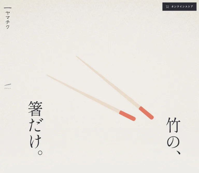
生成りの紙肌、明朝体の縦書き、大胆な余白で竹箸の魅力を伝える企業サイト。箸のビジュアルを中心に、ものづくりの物語、取り組み、読み物、採用へとつなぐ構成。
オリジナルサイトを見るYamachiku — Style Reference
Bamboo chopsticks suspended over warm paper, with the spacing and vertical rhythm of a Japanese essay.
Website: hashi.co.jp Original URL: https://hashi.co.jp/ Final URL: https://hashi.co.jp/ Theme: warm light canvas with a charcoal footer; no selectable theme was evidenced. Inspected: September 17, 2026, at 03:49 JST. Supplied capture timestamp: September 16, 2026, at 18:49:16.504 UTC. Viewports: desktop 1440 × 1000 CSS pixels; mobile 390 × 844 CSS pixels. Scope: the current corporate homepage: opening product composition, brand narrative, concept-video preview, projects, factory-shop and product links, journal, recruitment banner, persistent controls, and footer. Visual evidence consists of three desktop captures and two mobile captures, supplemented by rendered text, links, element rectangles, and computed styles. Linked pages and store checkout were not inspected.
Yamachiku presents a manufactured everyday object with unusual patience. A pair of bamboo chopsticks occupies a broad field of lightly textured paper. The phrase “竹の、箸だけ。” is split into two vertical groups near the lower edges, while a narrow graphic wordmark occupies the upper-left corner. Fine strokes, regular-weight Mincho typography, and substantial empty space give the product room to establish its identity.
This is a long corporate homepage with several destinations, including company information, bamboo chopstick education, collaborations, products, news, and recruitment. Its structure moves from a spacious brand narrative into denser editorial information, then ends with a photographic recruitment banner and a dark navigation footer. A small, consistently sized store link remains available around this slower reading experience.
How to Read This Reference
- Measured values come from the supplied rendered DOM and computed-style records. Coordinates refer to the stated viewport or document position, as indicated.
- Visually observed details come from the current-page screenshots. Approximate colors and dimensions are explicitly marked as estimates; they were not obtained through a pixel-sampling tool.
- Derived values are calculations from measured rectangles, such as column gaps and aspect ratios. They do not establish the original CSS implementation.
- Recommended values and code are adaptations for a new implementation. The original breakpoint, complete stylesheets, font files, and media source URLs were not supplied.
- Custom-property names introduced here are implementation aliases. The supplied
--header-heightand--viewport-widthare actual source properties. - Numerous WordPress preset colors, gradients, and shadows appear in the custom-property inventory. Their presence does not establish visible use. They are excluded from the design palette below.
Tokens — Colors
Default Palette
| Name | Value | Suggested token | Evidence and role |
|---|---|---|---|
| Warm Paper | #efece8 |
--color-paper |
Measured: body background, rgb(239, 236, 232). The principal page surface. |
| Charcoal Ink | #2d2d35 |
--color-ink |
Measured: body text, persistent store-button fill, and dark footer background. |
| Reversed White | #ffffff |
--color-white |
Measured: footer navigation and store-button text; footer store-button fill. |
| Photo Label | rgba(255, 255, 255, 0.85) |
--color-photo-label |
Measured: recruitment link-label background. Keeps fine lettering readable over photography. |
| Pale Bamboo | Approximately #e8d7c3 |
--color-bamboo |
Visual estimate: pale shafts in the current hero captures. An image color, not a confirmed UI token. |
| Navy Paint | Approximately #30445e |
--color-product-navy |
Visual estimate: painted ends in the current desktop hero. |
| Green Paint | Approximately #619b83 |
--color-product-green |
Visual estimate: painted portions in the current mobile hero. |
| Recruitment Accent | Approximately #ff5a3a |
--color-recruit-accent |
Visual estimate: thin orange-red outline and lettering of the desktop recruitment stamp. |
The visible interface depends on paper, charcoal, and reversed white. Product paint and photography supply additional color without turning those colors into a site-wide button system. The small recruitment stamp is a local accent.
The hero has visible grain that becomes less pronounced toward the bottom. Later paper areas, including the space around the concept video, look flatter. Do not apply a strong texture uniformly to every surface.
Color Relationships
- Paper supports almost all editorial text and links.
- Charcoal changes role from text color to full-width footer background.
- The persistent store control uses white on charcoal; its footer counterpart reverses to charcoal on white.
- Recruitment copy sits on small translucent white strips, allowing most of the photograph to remain unobstructed.
- Navy and green belong to the photographed or rendered product. A difference between the two captured hero arrangements does not prove an interactive color selector.
Tokens — Typography
Primary Family
Measured computed stack: 'Shippori Mincho', serif.
The sampled body, paragraphs, links, cards, and footer navigation consistently declare this stack at weight 400. Font-file loading and the exact rendered fallback were not independently checked. The root HTML element reports Times, but the body overrides it; Times is not the appropriate primary typography reference for the page.
Regular-weight Mincho lettering provides both the quiet editorial voice and the larger navigation character. Hierarchy comes from size, spacing, placement, and writing direction rather than heavy weights.
Graphic Identity and Vertical Type
The narrow “ヤマチク” wordmark is visibly graphic, with an irregular horizontal stroke above its vertical lettering. Its actual asset format was not supplied. Preserve authorized logo artwork rather than assuming ordinary text in the page font will reproduce it.
Vertical lettering is directly visible in the hero and desktop footer. The tall, narrow story and section-heading rectangles also support a vertical composition, although writing-mode was not included in the supplied computed-style fields. The Quick Start uses writing-mode: vertical-rl as an implementation choice.
Type Scale
All measured text below uses weight 400.
| Role | Desktop size / line height | Mobile size / line height | Tracking | Evidence |
|---|---|---|---|---|
| Body default | 16px / 18.4px |
Same | Normal | Measured inheritance; not a recommended reading-paragraph leading. |
| Narrative paragraphs | 19px / 49.4px |
17px / 44.54px |
0.04em |
Measured; wide spacing between vertical text columns. |
| Main narrative links | 17px / 37.4px |
Same | 0.08em |
Measured for “ヤマチクについて” and “竹のお箸について”. |
| Project introduction | 15px / 30px |
14px / 28px |
Desktop 0.06em; mobile 0.04em |
Measured. |
| Secondary text links | 14px / 30.8px |
Same | 0.08em |
Measured for project and journal destinations. |
| Shop/product titles | 15px / 22.5px |
14px / 21px |
0.05em |
Measured. |
| Featured journal title | 17px / 27.2px |
Same | 0.04em |
Measured. |
| Compact journal title | 15px / 24px |
Same | 0.04em |
Measured. |
| Journal excerpt | 11px / 19.25px |
Same | 0.04em |
Measured; unusually small and worth reconsidering in an adaptation. |
| Footer navigation | 21px / 21px |
19px / 20.9px |
Desktop 0.11em; mobile 0.04em |
Measured. |
| Store control | 14px / 15.4px |
Same | 0.04em |
Measured. |
| Address and telephone | 12px / 24px |
Same | 0.08em |
Measured. |
| Recruitment link label | 14px / 14px |
15px / 15px |
0.08em |
Measured; excludes its padding. |
| Hero phrase | Approximately 80–90px |
Approximately 56–64px |
Not measured | Visual estimate; individual headline styles were not supplied. |
The H2 section-heading wrappers report 16px, but their nested title treatments were not sampled. Do not interpret the wrapper value as a verified size for every visible section-marker glyph. Similarly, the menu button reports 16px, while its tiny visible “メニュー” caption has no separately supplied measurement.
Tokens — Spacing & Shapes
Underlying character: pixel-sized utility controls and generous section spacing, with large areas reserved for the product and narrative.
The evidence does not establish a universal spacing scale. The following values are recurring measurements that can be converted into reusable tokens.
Spacing Scale
| Value | Observed use |
|---|---|
4px |
Recruitment label padding; menu button's internal gap. |
8px |
Main text-link horizontal and bottom padding; mobile shop/product media-to-title gap. |
12px |
Store icon-to-label gap. |
16px |
Mobile project side gutters; gaps between footer buttons; desktop shop/product media-to-title gap. |
20px |
Mobile footer horizontal padding and left logo position. |
24px |
Derived project-introduction-to-media separation at both inspected widths. |
32px |
Mobile footer vertical padding; mobile header logo top position. |
40px |
Desktop logo top inset; derived mobile footer navigation gaps. |
50px |
Derived horizontal gaps between desktop footer navigation columns. |
54px |
Derived desktop gap between shop and product cards. |
64px |
Derived desktop gap between the two main narrative links; desktop footer bottom padding. |
80px |
Desktop side rail; desktop footer top padding; right content margin in the projects area. |
100–120px |
Major section top padding. |
150px |
Desktop journal bottom padding. |
Border Radius and Rules
| Element | Treatment | Evidence |
|---|---|---|
| Store buttons | Square, 0px radius |
Measured. |
| Shop/product and journal link wrappers | Square, 0px radius |
Measured. |
| Recruitment text strips | Square, 0px radius |
Measured. |
| Text-link underlines | Fine charcoal rule | Visible; approximately 1px, not measured from a border property. |
| Footer secondary buttons | Thin rectangular outlines | Visible; exact border color and width unmeasured. |
| Recruitment stamp | Narrow vertical oval | Visible on desktop; not a general button shape. |
There is no evidenced general-purpose shadow or rounded-card elevation system. The rounded painted ends of the chopsticks are product geometry, not a reason to round the interface.
Layout Measurements
| Element | Desktop: 1440 × 1000 | Mobile: 390 × 844 | Status |
|---|---|---|---|
| Opening scene | Ends at document y = 1000px |
Ends at y = 844px |
Measured from the next section's start. |
| Header wrapper | 80 × 1000px |
390 × 0px |
Measured; mobile children occupy overlay positions despite the zero-height wrapper. |
| Header wordmark | 41px wide; visible artwork approximately 113px tall |
41 × 113px wrapper at (20, 32) |
Width and mobile rectangle measured; desktop artwork height inferred from wrapper padding. |
| Menu target | 45 × 45px at (17.5, 477) |
45 × 45px at (329, 16) |
Measured. |
| Persistent store link | 180 × 44px at (1247, 13) |
180 × 44px at (210, 800) |
Measured. |
| Narrative section | Approximately 2578.56px tall |
Approximately 2588.95px tall |
Measured. |
| Main project media link | 976.81 × 488.41px |
358 × 358px |
Measured; approximately 2:1 versus 1:1. |
| Shop/product card widths | 461.41px each |
175px each |
Measured. |
| Gap between those cards | 54px |
8px |
Derived from rectangles. |
| Recruitment banner | 1440 × 450px |
390 × 200px |
Measured. |
| Dark footer | Approximately 557.11px tall |
Approximately 850.61px tall |
Measured. |
| Scrollable document | 7669px |
7340px |
Reported document height. |
The body and outer footer rectangles do not include the full lower dark-footer extent. Use the reported scrollable document height when describing overall page length; summing those parent rectangles would undercount the page.
Components
Persistent Identity and Menu Control
Role: maintain a compact orientation point while leaving the page open for editorial content.
On desktop, a transparent 80px rail runs down the left side. The 41px wordmark sits about 20px from the left and 40px from the top. The 45px menu target sits at the rail's vertical center. Its symbol resembles two slender, angled chopsticks, with the small “メニュー” caption beneath it.
On mobile, the layout separates into two corners: wordmark at (20, 32) and menu at (329, 16). The rail no longer consumes a conventional block of horizontal content space.
The desktop lower-page capture shows the menu mark reversed over the dark footer while the upper logo remains dark over the photograph. This supports adapting individual controls to their local background. The mechanism—alternate assets, CSS, or another technique—is unverified.
Interaction boundary: a menu button is present, but no menu-opening click or open-state capture was supplied. The dark mobile image corresponds to the bottom footer, as confirmed by its measured link and button positions. It should not be used as proof of a menu overlay.
Persistent Store Link
Role: provide a steady route to commerce alongside the brand narrative.
A square charcoal rectangle contains a fine cart icon and the label “オンラインストア”. Its measured anatomy is 180 × 44px, 14px regular Mincho text, 0.04em tracking, and a 12px icon-to-text gap.
Desktop placement is 13px from the top and right. Mobile placement is flush with the bottom-right corner, leaving the lower-left portion of the screen open. The same-sized control remains visible in the supplied lower-page captures.
The destination is https://yamachiku.stores.jp/. The link is evidenced; its target-window behavior and the shopping experience are not.
The footer contains a second store link with a white fill and charcoal text. Keep the persistent and footer instances visually related while respecting their different surrounding surfaces.
Opening Product Composition
Role: establish the brand through the material and silhouette of its product.
The desktop opening uses three principal elements: textured paper, a freely placed chopstick pair, and the split vertical phrase. The product occupies an estimated rectangle from roughly x = 455–1080px and y = 395–680px. Both sticks angle toward the upper-right; dark navy painted ends sit toward the lower-left. Large empty areas remain above and around the pair.
“箸だけ。” appears near the lower-left, while “竹の、” appears near the lower-right. Their unequal starting heights create a balanced asymmetry. They do not form a centered horizontal headline over the product.
The mobile capture has a different composition: a nearly parallel vertical pair centered at approximately x = 195px, extending visually from about y = 132px to 721px. Green painted portions appear in the middle of the image. The two text groups remain near the lower sides, with the left group beginning higher than the right.
These are observed arrangements, not a verified animation sequence. Do not infer a particular rotation, color cycle, or scroll-controlled transformation from two viewport captures.
Brand Narrative
Role: turn the product's physical qualities into a slow reading sequence.
The narrative begins directly after the full-height opening and adds 120px of top padding at both inspected widths. It contains several short Japanese passages about handling food, bamboo, daily meals, and the maker's identity.
Desktop passage rectangles are dispersed across the width. For example, the first begins around x = 938px, the second around x = 266px, and another around x = 852px. They are not simply stacked inside one conventional centered text column. The measured 19px text and 49.4px line height give the narrow blocks widely separated columns.
Mobile text reduces to 17px with 44.54px line height. The narrative remains approximately as tall as its desktop counterpart, preserving the long pacing. The closing passages occupy adjacent narrow blocks beginning around x = 68px and 189px.
The two final links use visible underlines and the measured 17px link style. Desktop places them on one row with a derived 64px gap. Mobile centers them in separate rows, approximately 61.4px apart from top to top.
The supplied screenshots do not show every narrative scene. Exact intermediate imagery, crops, and any reveal choreography remain unverified.
Concept-Video Preview
Role: connect the written narrative to place and people.
The desktop middle-page capture shows a large video preview of a rural landscape. A white vertical wordmark overlays the scene, with a red play control in the center and provider title chrome along the top. The preview starts at approximately the rail's right edge, x = 80px, and extends to the viewport's right edge in the visible crop.
Two underlined narrative links sit above it in a generous paper field. The media frame is square-cornered and unboxed; it is not presented as a floating card.
The visible player is identifiable as a YouTube embed, but its URL, playback behavior, poster source, mobile crop, consent behavior, and audio settings were not supplied. The red play button belongs to the media provider, not the site's core action palette.
Editorial Section Markers
Role: identify the shift from narrative to navigable content.
The supplied text includes PROJECTS paired with “ヤマチクの取り組み” and JOURNAL paired with “読み物、お知らせ”. On desktop, their heading wrappers begin at x = 160px, are 48px wide, and are tall rather than wide. The content beside them begins around x = 383px.
On mobile, these heading wrappers move above the content and become centered at x = 176.5px, with a width of 37px. Their measured heights are 240px for projects and about 213.6px for journal.
This establishes a substantial vertical heading zone rather than a small horizontal section label. Exact nested artwork and glyph sizes were not available in the supplied screenshots or sampled styles.
Projects Lead and Paired Destinations
Role: introduce collaborations and provide routes to the physical shop and product collection.
The desktop projects section has a narrow heading area on the left and a broad content area on the right. Its introductory paragraph uses 15px / 30px text. A large linked media region follows, measuring approximately 976.8 × 488.4px. A smaller underlined link to project examples sits beneath it toward the right.
On mobile, the content has 16px side gutters. The introductory paragraph uses 14px / 28px, with a further 10px horizontal padding inside its 358px box. The lead media link becomes square at 358 × 358px, and the examples link is centered below it.
Two destination cards follow: “ファクトリーショップ 拝啓” and “ヤマチクのお箸”, accompanied by SHOP and HASHI labels in the rendered text. They remain side by side on mobile. Desktop uses approximately 461.4px columns with a 54px gap; mobile uses 175px columns with an 8px gap.
The difference between card heights, title positions, and internal gaps implies media boxes close to 3:2 at both widths. This ratio is derived, since image-element rectangles were not separately provided. Titles sit outside the media area, with 16px separation on desktop and 8px on mobile. The factory-shop title wraps to two lines on mobile.
Journal
Role: provide a current editorial and news index with a clear featured item.
The desktop arrangement gives the first article a tall featured position on the left and three compact article rows on the right. This is a hierarchy of one lead item plus a list, rather than four equal cards.
The featured link measures approximately 458.4 × 557.8px on desktop and 336 × 435.4px on mobile. Its measured padding is 16px 16px 16px 37px. The title uses 17px / 27.2px text.
Each compact desktop row is about 460.4 × 130px. Mobile rows become 338 × 130px, stacked beneath the featured item. The title starts 169px to the right of the row's left edge at both widths, indicating that the leading media-and-spacing region is retained while the text area shrinks. That text area measures about 291.4px on desktop and 169px on mobile.
Compact titles use 15px / 24px, and excerpts use 11px / 19.25px. Title rectangles are two lines high in the supplied measurements, but the truncation technique was not captured. Avoid asserting a particular line-clamp implementation.
Each entry contains a date, category, title, and excerpt in the rendered content. Exact date/category styling and thumbnail imagery are unverified. The “すべて見る” link is right aligned on desktop and centered on mobile.
Recruitment Banner
Role: introduce the people behind the product and link to recruitment.
A full-width photograph shows two smiling staff members holding colorful chopsticks in a bright workspace. The people occupy the left and central parts of the desktop crop, leaving a quieter area for copy on the right.
The banner measures 450px high on desktop and 200px on mobile. The desktop copy begins approximately 170px below the banner's top; the mobile copy begins 22px below it. The phrase “ともに、竹のお箸を 1000年先へ。” is distributed across small white text strips rather than one large panel.
The recruitment label has a short leading rule and a translucent white background. Its measured padding is 4px; text is 14px on desktop and 15px on mobile. On mobile, the label sits toward the lower-right, approximately 22px above the banner bottom.
A narrow orange-red RECRUIT oval is visible on desktop. The mobile rendered text omits that label, and no mobile recruitment screenshot was supplied; its mobile visibility should remain unclaimed.
The whole recruitment banner links to /recruit/.
Dark Footer
Role: provide a complete secondary navigation system and company contact details.
The footer uses the exact charcoal background #2d2d35, reversed white navigation, a larger graphic wordmark, and three rectangular utility links. It provides a clear visual ending after the recruitment photograph.
On desktop, six navigation destinations are arranged as vertical text columns, progressing from the company link on the right toward contact on the left. The collaboration entry has an additional small label. The measured primary type is 21px, with 0.11em tracking. The wordmark appears to the right of the link group at 55px wide.
The utility buttons sit beneath the links in one row: store, factory shop, and recruitment. Each is 180 × 44px, with 16px gaps. Below that, the address and telephone share a line in 12px / 24px text.
Mobile changes the navigation to horizontal text in a vertical list, using 19px / 20.9px type and approximately 40px gaps. The link group starts at x ≈ 147.7px, leaving a separate left column for the 41px wordmark. The three utility buttons stack with 16px gaps. The address and telephone return to the left gutter near the bottom.
The mobile footer is approximately 850.6px tall—slightly taller than the inspected viewport. Treat it as normal scrollable content. The persistent store control overlays the lower-right corner; do not constrain the footer to a fixed-height menu panel.
Tokens — Motion & Interaction
| Treatment | Supplied evidence | What can safely be reproduced |
|---|---|---|
| Wordmark opacity transition | opacity 0.3s cubic-bezier(0.33, 1, 0.68, 1) |
A short opacity transition; trigger and endpoint opacity are unverified. |
| Store and footer links | 0.16s cubic-bezier(0.33, 1, 0.68, 1) |
A brief interaction transition; changed properties and final hover appearance are not fully supplied. |
| Underlined text links | color 0.16s cubic-bezier(0.33, 1, 0.68, 1) |
Color-transition timing is measured; hover color is not. |
| Shop/product destination links | The same 160ms color transition |
Preserve restrained feedback without inventing image zoom. |
| Hero product pose | Different desktop and mobile captures | Reproduce the captured compositions; timing and motion mechanism are unknown. |
| Menu | Button and label present | A menu affordance exists; open/close behavior is untested. |
| Video | Preview and play control visible | Provide a media entry point; playback and autoplay are unverified. |
| Persistent controls | Similar viewport positions across supplied scroll captures | Support persistent placement; exact source positioning rules were not supplied. |
Several sampled elements report animation: none. That only describes those elements at sampling time; it does not rule out animation on descendants, pseudo-elements, media, or JavaScript-driven graphics. Similarly, a transition value of all without a duration is not evidence of visible animation.
The capture process waited for bounded readiness and temporarily paused perpetual animations during checks before resuming them. This does not provide a recording of the hero's movement. No hover, keyboard-focus, menu-opening, or video-playback sequence was supplied.
For a new implementation, use the measured 160ms and 300ms timings for modest feedback. Any additional product animation should be specified separately, with a static reduced-motion composition.
Surfaces
| Layer | Appearance | Purpose |
|---|---|---|
| Opening canvas | Warm paper with fine, fading grain | Establishes a tactile context for bamboo. |
| Editorial canvas | Predominantly flat warm paper | Keeps long passages and content groups continuous. |
| Media regions | Square-cornered images and video | Provide emphasis through scale and subject matter. |
| Persistent store control | Charcoal rectangle with white details | Maintains a compact, recognizable commerce route. |
| Recruitment labels | Small translucent white strips | Protects text contrast without covering the photograph. |
| Footer | Full charcoal field | Separates global navigation and contact information. |
| Footer utility links | One white fill and two outlined rectangles | Creates a clear local hierarchy without shadows. |
Avoid introducing a layer of pale cards on top of the paper. The paper itself is the shared content surface; spacing, image edges, and writing direction establish the grouping.
Imagery
The opening product is isolated and slender. Its grain and painted ends remain legible without a pedestal, heavy shadow, or decorative frame. It is shown at a scale that feels deliberate but leaves more empty space than a typical product-commerce hero.
The concept-video preview supplies landscape and geography. The recruitment photograph supplies people, natural expressions, tools, and an actual working environment. These subjects connect the quiet product image to the place and labor behind it.
Keep photography natural in color. The current evidence does not support a duotone filter, grain overlay on all photographs, artificial vignette, or pixelated rendering. Paper texture and photographic detail serve different roles.
Observed Asset References
The supplied evidence contains destination links but no original image src, video URL, logo path, or texture path. The references below identify usage, not downloadable asset URLs.
| Asset | Original-page evidence | Implementation guidance |
|---|---|---|
| Vertical wordmark | Header and footer captures | Use authorized artwork with appropriate light/dark treatment. Asset format is unknown. |
| Desktop chopstick pair | Desktop opening capture | Preserve pale bamboo, navy painted ends, and the open diagonal arrangement. |
| Mobile chopstick pair | Mobile opening capture | Use suitable portrait artwork or verified responsive composition; do not assume a simple rotation matches it. |
| Paper grain | Opening captures | Use a subtle, licensed texture with a gradual fade. Original file and compositing method are unknown. |
| Rural video preview | Desktop middle-page capture | Preserve the broad landscape framing. Media source and poster path were not supplied. |
| Recruitment photograph | Desktop lower-page capture | Keep people prominent and retain space for the text strips. |
| Project and journal media | Measured linked regions in the DOM | Dimensions are evidenced; exact images and crops are not visible in the supplied captures. |
| Cart, menu, and factory-shop marks | Persistent controls and footer | Match the fine-line or graphic character; do not assume a particular icon library. |
CSS can reproduce the layout and typography, but the product artwork, logo, paper texture, and photography need their own authorized assets.
Layout & Responsive Behavior
The page preserves a long reading sequence at both inspected widths. Mobile is not simply a compressed desktop screenshot: control placement, media proportions, content ordering, and footer writing direction change independently.
| Area | Desktop observation | Mobile observation |
|---|---|---|
| Identity | Full-height left rail | Separate upper-left logo and upper-right menu |
| Store control | Top-right with 13px offsets |
Bottom-right, flush to the edges |
| Hero product | Open diagonal pair | Narrow vertical pair |
| Hero phrase | Two large vertical groups | Two smaller vertical groups retained |
| Narrative | Dispersed narrow passages | Narrow passages retained with smaller text and new positions |
| Narrative links | One row | Two centered rows |
| Section headings | Left-side vertical zone | Centered vertical zone above content |
| Project lead | Approximately 2:1 |
Square |
| Shop/product cards | Two columns | Still two columns |
| Journal | Featured item beside three rows | Featured item above three rows |
| Recruitment | 450px high |
200px high |
| Footer navigation | Vertical text columns | Horizontal text in a vertical list |
| Footer buttons | One horizontal row | One vertical stack |
| Contact line | Address and telephone together | Address and telephone on separate lines |
The projects area has a particularly useful desktop alignment: heading at x = 160px, content beginning near 383.2px, and content ending at 1360px. At the inspected width, this leaves an 80px right margin and a large separation from the left identity rail.
Section padding changes selectively. The narrative keeps 120px 0 30px on both widths. Projects change from 120px 0 78px to 100px 0 20px. Journal changes from 120px 0 150px to 120px 0 80px. The footer changes from 80px 0 64px to 32px 20px.
The actual source properties report --header-height: 1000px and --viewport-width: 1440px on desktop, then 844px and 390px on mobile. Their update mechanism is unknown. The source breakpoint cannot be recovered from only two viewport samples.
The Quick Start uses a recommended 64rem breakpoint and modern viewport units. Test intermediate widths, short landscape screens, zoom, and safe areas before treating that adaptation as production-ready.
Do’s and Don’ts
Do
- Keep the measured paper and ink colors:
#efece8and#2d2d35. - Use regular-weight Shippori Mincho where available, with a serif fallback.
- Preserve vertical typography where it is part of the composition, especially the hero and desktop footer.
- Give the chopsticks substantial empty space and retain their slender proportions.
- Keep the store control compact at approximately
180 × 44px. - Preserve the long narrative pacing instead of shortening every section to fit one screen.
- Retain the featured-plus-list journal hierarchy.
- Keep the two shop/product destinations side by side at the observed mobile width.
- Use square media boundaries, thin rules, and small rectangular controls.
- Let landscape and workplace photography supply warmth and human context.
- Recompose the footer for mobile instead of rotating the desktop navigation as a single image.
Don’t
- Don’t replace the opening with a centered horizontal headline, a large CTA stack, and decorative feature cards.
- Don’t treat the homepage as only a sales landing page; preserve its corporate and editorial destinations.
- Don’t promote the product's navy or green paint into an invented global action palette.
- Don’t add heavy shadows, glossy gradients, glass surfaces, or large rounded containers.
- Don’t use a generic font rendering as a substitute for the graphic wordmark.
- Don’t assume the mobile footer capture is an open menu.
- Don’t invent a hero rotation timeline, hover zoom, autoplay setting, or scroll choreography.
- Don’t stretch one desktop product image into the mobile composition without checking the result.
- Don’t copy inherited WordPress preset colors into the visible design system.
- Don’t hard-code the entire page or mobile footer to one viewport height.
Recommended Implementation Additions
These recommendations are for a new implementation and are not verified features of the original page.
- Give the graphic home link an accessible name. Give decorative cart and menu artwork empty text alternatives when the control already has a readable label.
- Expose the hero phrase once in a logical reading order. Decorative per-character spans should not create fragmented or duplicated announcements.
- Add a visible keyboard-focus outline that works on both paper and charcoal surfaces.
- Implement a future menu with a real button,
aria-expanded, focus management, Escape handling where appropriate, and a clearly identified close action. - Preserve the observed
45pxmenu target while enlarging only the hit area of other small controls when needed. - Consider increasing journal excerpts from the observed
11px, particularly on mobile. Allow rows to grow rather than clipping enlarged text into a fixed130pxbox. - Use a logical heading hierarchy. The supplied DOM uses
H1elements for journal titles; an adaptation can retain their appearance while using appropriate nested headings. - Reserve enough bottom clearance for the persistent store link and device safe areas so it cannot cover essential links.
- Provide a descriptive video title, captions where available, and a clear user action before audible playback.
- Use responsive media sources for the square mobile project region, portrait hero composition, and short recruitment crop.
- Keep decorative animation optional, with a stable product pose under reduced-motion preferences.
Agent Prompt Guide
Quick Color Reference
- Main canvas: measured
#efece8. - Main text and persistent store fill: measured
#2d2d35. - Footer text and footer store fill: measured
#ffffff. - Recruitment text-strip surface: measured
rgba(255,255,255,0.85). - Product bamboo, navy, green, and recruitment orange-red: local image/accent references with estimated values, not confirmed global source tokens.
- Texture: very fine paper grain in the opening, fading toward the lower area.
- Elevation: no general shadow system.
Overall Prompt
“Create a Japanese bamboo-chopstick maker's corporate homepage inspired by the current Yamachiku reference. Use warm paper #efece8, charcoal #2d2d35, regular Shippori Mincho typography, vertical Japanese text, square media, and generous empty space. Build a full-height opening with an isolated slender chopstick pair and the phrase ‘竹の、箸だけ。’ split into two vertical groups near the lower sides. Place a small graphic wordmark at upper-left, a restrained menu control in a desktop side rail, and a 180 × 44px store link at upper-right. Continue into a slow brand narrative, a large concept-video preview, projects, paired shop/product destinations, a featured-plus-list journal, a full-width recruitment photograph, and a charcoal footer. On mobile, move the store control to bottom-right, use portrait product artwork, center the vertical section markers, and convert footer links to horizontal text rows. Use only evidenced motion timings; treat any additional animation as a separately specified feature.”
Example Component Prompts
- Opening scene: “Compose a warm paper viewport with subtle fading grain and a slender bamboo chopstick pair. Keep most of the upper canvas empty. Place ‘箸だけ。’ vertically at lower-left and ‘竹の、’ vertically at lower-right, with staggered starting heights. Use a graphic vertical logo at upper-left and no large central CTA.”
- Projects section: “Build a wide desktop content region beside a narrow vertical heading zone. Add a short Mincho introduction, a large 2:1 media link, and a restrained underlined destination link. Below, place factory-shop and product cards in two equal columns. On a 390px screen, use 16px side gutters, make the lead media square, and keep the lower cards side by side with an 8px gap.”
- Journal: “Create one featured editorial item beside three compact thumbnail-and-text rows. Use regular Mincho titles at 17px for the lead and 15px for the rows. Include date, category, and brief excerpt without colorful badges or raised card surfaces. Stack the lead above the rows on mobile.”
- Recruitment banner: “Use a full-width natural workplace photograph with people on the left and a quieter area on the right. Place short Japanese copy on separate translucent white strips, followed by a small rule-led recruitment label. Add only a narrow orange-red outline stamp as a local desktop accent.”
- Footer: “Create a charcoal footer with white vertical navigation columns, a graphic wordmark on their right, and three square
180 × 44pxutility links below. On mobile, keep the logo in a separate left column, turn the links into horizontal text rows, stack the utility buttons, and place contact details at the lower-left.”
Quick Start
CSS Custom Properties
This is an implementation scaffold, not recovered source CSS. It combines measured colors, type values, and component dimensions with explicitly chosen layout rules. The 64rem breakpoint, hero placement percentages, heading internals, and media handling are recommendations. Original artwork and complete interaction logic must be supplied separately.
The selectors assume a header containing .brand and .menu-toggle, a separate .store-cta, a .hero with .hero-art and two .hero-word elements, editorial sections with .section-heading and content, and a footer containing .footer-main, .footer-brand, and .footer-contact. In the footer, .footer-main contains the navigation and utility-button row.
:root {
  /* Measured interface colors */
  --color-paper: #efece8;
  --color-ink: #2d2d35;
  --color-white: #ffffff;
  --color-photo-label: rgb(255 255 255 / 85%);

  /* Measured font declaration; load the font separately */
  --font-editorial: 'Shippori Mincho', serif;
  --weight-regular: 400;
  --text-story: 19px;
  --leading-story: 2.6;
  --text-store: 14px;
  --text-contact: 12px;

  /* Measured control geometry */
  --rail-width: 80px;
  --brand-width: 41px;
  --menu-size: 45px;
  --store-width: 180px;
  --store-height: 44px;
  --radius-ui: 0px;

  /* Adaptation values, not recovered source formulas */
  --page-gutter: clamp(24px, 5.5556vw, 80px);
  --rule-width: 1px;
  --paper-texture: none;
  --safe-bottom: env(safe-area-inset-bottom, 0px);

  /* Measured transition timings */
  --ease-out: cubic-bezier(0.33, 1, 0.68, 1);
  --motion-link: 160ms var(--ease-out);
  --motion-brand: 300ms var(--ease-out);
}

* {
  box-sizing: border-box;
}

body {
  margin: 0;
  color: var(--color-ink);
  background: var(--color-paper);
  font-family: var(--font-editorial);
  font-size: 16px;
  font-weight: var(--weight-regular);
}

a {
  color: inherit;
}

button,
input {
  font: inherit;
}

img {
  display: block;
  max-width: 100%;
}

/* Persistent identity */
.site-header {
  position: fixed;
  inset: 0 auto 0 0;
  z-index: 30;
  width: var(--rail-width);
  pointer-events: none;
}

.brand,
.menu-toggle {
  position: absolute;
  pointer-events: auto;
}

.brand {
  top: 40px;
  left: 19.5px;
  width: var(--brand-width);
  transition: opacity var(--motion-brand);
}

.menu-toggle {
  top: 50%;
  left: 17.5px;
  display: flex;
  flex-direction: column;
  align-items: center;
  justify-content: center;
  gap: 4px;
  width: var(--menu-size);
  height: var(--menu-size);
  padding: 7px 0;
  border: 0;
  color: inherit;
  background: transparent;
  transform: translateY(-50%);
  cursor: pointer;
}

/* Apply to individual controls when their backdrop is dark. */
.brand.is-on-dark,
.menu-toggle.is-on-dark {
  color: var(--color-white);
}

.button {
  display: inline-flex;
  align-items: center;
  justify-content: center;
  gap: 12px;
  width: var(--store-width);
  max-width: 100%;
  min-height: var(--store-height);
  border: var(--rule-width) solid transparent;
  border-radius: var(--radius-ui);
  font-size: var(--text-store);
  line-height: 1.1;
  letter-spacing: 0.04em;
  text-decoration: none;
  transition:
    color var(--motion-link),
    background-color var(--motion-link);
}

.store-cta {
  position: fixed;
  top: 13px;
  right: 13px;
  z-index: 40;
  color: var(--color-white);
  background: var(--color-ink);
}

/* Hero positions below approximate the supplied compositions. */
.hero {
  position: relative;
  min-height: 100vh;
  min-height: 100svh;
  isolation: isolate;
}

.hero::before {
  position: absolute;
  inset: 0;
  z-index: -1;
  background-image: var(--paper-texture);
  mask-image: linear-gradient(#000, transparent 96%);
  content: '';
  pointer-events: none;
}

.hero-art {
  position: absolute;
  top: 53.5%;
  left: 53.25%;
  width: min(44vw, 640px);
  transform: translate(-50%, -50%);
}

.hero-art img {
  width: 100%;
  height: 100%;
  object-fit: contain;
}

.hero-word {
  position: absolute;
  margin: 0;
  writing-mode: vertical-rl;
  font-size: clamp(60px, 6.25vw, 90px);
  font-weight: 400;
  line-height: 1;
  letter-spacing: 0.04em;
}

.hero-word--left {
  top: 59%;
  left: 13.5%;
}

.hero-word--right {
  top: 68%;
  right: 10%;
}

/* Narrative scene placement requires its own content composition. */
.story {
  padding-block: 120px 30px;
}

.story-passage {
  margin: 0;
  writing-mode: vertical-rl;
  font-size: var(--text-story);
  line-height: var(--leading-story);
  letter-spacing: 0.04em;
}

.story-links {
  display: flex;
  justify-content: center;
  gap: 64px;
}

.text-link {
  display: inline-block;
  padding: 0 8px 8px;
  border-bottom: var(--rule-width) solid currentColor;
  font-size: 17px;
  line-height: 2.2;
  letter-spacing: 0.08em;
  text-decoration: none;
  transition: color var(--motion-link);
}

.text-link--small {
  font-size: 14px;
}

/* At 1440px, these columns begin near x=160 and x=383.2. */
.editorial-section {
  display: grid;
  grid-template-columns: 18.6% minmax(0, 1fr);
  margin-left: calc(var(--rail-width) + var(--page-gutter));
  margin-right: var(--page-gutter);
}

.section-heading {
  justify-self: start;
  margin: 0;
  writing-mode: vertical-rl;
  font-weight: 400;
}

.projects-section {
  padding-block: 120px 78px;
}

.project-intro {
  margin: 40px 0 24px;
  font-size: 15px;
  line-height: 2;
  letter-spacing: 0.06em;
}

.project-lead-media {
  display: block;
  width: 100%;
  aspect-ratio: 2 / 1;
  object-fit: cover;
}

.project-pair {
  display: grid;
  grid-template-columns: repeat(2, minmax(0, 1fr));
  gap: 54px;
  margin-top: 38px;
}

.project-card {
  display: flex;
  flex-direction: column;
  gap: 16px;
  min-width: 0;
  text-decoration: none;
}

.project-card img {
  width: 100%;
  aspect-ratio: 3 / 2;
  object-fit: cover;
}

.project-card h3 {
  margin: 0;
  padding-right: 50px;
  font-size: 15px;
  font-weight: 400;
  line-height: 1.5;
  letter-spacing: 0.05em;
}

.journal-section {
  padding-block: 120px 150px;
}

.journal-layout {
  display: grid;
  grid-template-columns: repeat(2, minmax(0, 1fr));
  gap: 54px;
}

.journal-feature {
  min-width: 0;
  padding: 16px 16px 16px 37px;
  text-decoration: none;
}

.journal-feature-title {
  font-size: 17px;
  font-weight: 400;
  line-height: 1.6;
  letter-spacing: 0.04em;
}

.journal-list {
  display: grid;
  align-content: start;
  gap: 69px;
}

/* The 130px media width is an adaptation of the measured offset. */
.journal-row {
  display: grid;
  grid-template-columns: 130px minmax(0, 1fr);
  gap: 39px;
  min-height: 130px;
  text-decoration: none;
}

.journal-row img {
  width: 130px;
  aspect-ratio: 1;
  object-fit: cover;
}

.journal-row-title {
  margin: 0;
  font-size: 15px;
  font-weight: 400;
  line-height: 1.6;
  letter-spacing: 0.04em;
}

.journal-excerpt {
  font-size: 11px;
  line-height: 1.75;
  letter-spacing: 0.04em;
}

.recruit {
  position: relative;
  display: block;
  height: 450px;
  text-decoration: none;
}

.recruit-image {
  width: 100%;
  height: 100%;
  object-fit: cover;
}

.recruit-copy {
  position: absolute;
  top: 170px;
  right: 6.8%;
  margin: 0;
}

.recruit-copy-line {
  display: table;
  padding: 4px;
  background: var(--color-photo-label);
}

.recruit-label {
  position: absolute;
  top: 270px;
  right: 8.2%;
  display: flex;
  align-items: center;
  gap: 10px;
  margin: 0;
  padding: 4px;
  background: var(--color-photo-label);
  font-size: 14px;
  font-weight: 400;
  line-height: 1;
  letter-spacing: 0.08em;
}

.recruit-label::before {
  width: 32px;
  height: 1px;
  background: currentColor;
  content: '';
}

/* Footer geometry follows the measured desktop relationships. */
.site-footer {
  padding: 80px 0 64px;
  color: var(--color-white);
  background: var(--color-ink);
}

.footer-inner {
  display: grid;
  grid-template-columns: minmax(0, 572px) 55px;
  column-gap: 68px;
  row-gap: 24px;
  width: min(695px, calc(100% - 40px));
  margin-inline: auto;
}

.footer-main {
  grid-column: 1;
  grid-row: 1;
  min-width: 0;
}

.footer-brand {
  grid-column: 2;
  grid-row: 1 / span 2;
  width: 55px;
}

.footer-links {
  display: flex;
  flex-direction: row-reverse;
  justify-content: center;
  align-items: flex-start;
  gap: 50px;
  margin: 28px 0 60px;
  padding: 0;
  list-style: none;
}

.footer-link {
  display: block;
  writing-mode: vertical-rl;
  font-size: 21px;
  line-height: 1;
  letter-spacing: 0.11em;
  text-decoration: none;
  transition: color var(--motion-link);
}

.footer-link--project {
  display: flex;
  flex-direction: column;
  gap: 8px;
}

.footer-link-eyebrow {
  font-size: 12px;
  line-height: 1;
}

.footer-actions {
  display: flex;
  gap: 16px;
}

.footer-actions .button {
  flex: 0 0 auto;
}

.button--paper {
  color: var(--color-ink);
  background: var(--color-white);
}

.button--outline {
  border-color: rgb(255 255 255 / 40%);
  color: var(--color-white);
  background: transparent;
}

.footer-contact {
  grid-column: 1;
  margin: 0;
  font-size: var(--text-contact);
  font-style: normal;
  line-height: 2;
  letter-spacing: 0.08em;
}

/* Recommended accessible state; original focus styling is unknown. */
:where(a, button):focus-visible {
  outline: 2px solid currentColor;
  outline-offset: 4px;
}

/* Recommended breakpoint; only 1440px and 390px were inspected. */
@media (max-width: 64rem) {
  :root {
    --text-story: 17px;
    --leading-story: 2.62;
    --page-gutter: 16px;
  }

  .site-header {
    inset: 0 0 auto;
    width: 100%;
    height: 0;
  }

  .brand {
    top: 32px;
    left: 20px;
  }

  .menu-toggle {
    top: 16px;
    right: 16px;
    left: auto;
    transform: none;
  }

  .store-cta {
    top: auto;
    right: 0;
    bottom: 0;
    min-height: calc(var(--store-height) + var(--safe-bottom));
    padding-bottom: var(--safe-bottom);
  }

  /* Supply portrait artwork; these dimensions alone cannot create it. */
  .hero-art {
    top: 50.6%;
    left: 50%;
    width: 30px;
    height: min(70svh, 600px);
  }

  .hero-word {
    font-size: 60px;
  }

  .hero-word--left {
    top: 64.5%;
    left: 12%;
  }

  .hero-word--right {
    top: 72%;
    right: 10%;
  }

  .story-links {
    flex-direction: column;
    align-items: center;
    gap: 24px;
  }

  .editorial-section {
    grid-template-columns: minmax(0, 1fr);
    margin-inline: var(--page-gutter);
  }

  .section-heading {
    justify-self: center;
    margin-bottom: 40px;
  }

  .projects-section {
    padding-block: 100px 20px;
  }

  .project-intro {
    margin-top: 0;
    padding-inline: 10px;
    font-size: 14px;
    letter-spacing: 0.04em;
  }

  .project-lead-media {
    aspect-ratio: 1;
  }

  .project-pair {
    gap: 8px;
  }

  .project-card {
    gap: 8px;
  }

  .project-card h3 {
    padding-right: 40px;
    font-size: 14px;
  }

  .journal-section {
    padding-block: 120px 80px;
  }

  .journal-layout {
    grid-template-columns: minmax(0, 1fr);
    gap: 32px;
    padding-inline: 10px;
  }

  .journal-list {
    gap: 17px;
  }

  .recruit {
    height: 200px;
  }

  .recruit-copy {
    top: 22px;
    right: 18px;
  }

  .recruit-label {
    top: auto;
    right: 18px;
    bottom: 22px;
    font-size: 15px;
  }

  .site-footer {
    padding: 32px 20px;
  }

  .footer-inner {
    grid-template-columns: 41px minmax(0, 1fr);
    column-gap: 62px;
    row-gap: 80px;
    width: 100%;
  }

  .footer-brand {
    grid-column: 1;
    grid-row: 1;
    width: 41px;
  }

  .footer-main {
    grid-column: 2;
    justify-self: center;
    width: min(197.6px, 100%);
  }

  .footer-links {
    flex-direction: column;
    justify-content: flex-start;
    gap: 40px;
    margin: 88px 0 60px;
  }

  .footer-link {
    writing-mode: horizontal-tb;
    font-size: 19px;
    line-height: 1.1;
    letter-spacing: 0.04em;
  }

  .footer-link-eyebrow {
    line-height: 1.1;
  }

  .footer-actions {
    flex-direction: column;
  }

  .footer-contact {
    grid-column: 1 / -1;
  }

  .footer-contact-line {
    display: block;
  }
}

/* Recommended reduced-motion support for this scaffold. */
@media (prefers-reduced-motion: reduce) {
  .brand,
  .button,
  .text-link,
  .footer-link {
    transition: none;
  }
}
The texture property intentionally defaults to none: assign an approved grain asset rather than inserting an invented original-site path. The CSS also leaves video integration, menu behavior, article truncation, background-aware control states, and any hero animation to explicit implementation decisions.
Tailwind v4 Token Mapping
Optional aliases for a project already using Tailwind v4. This does not imply that the original website uses Tailwind. Define the scaffold variables before using the mappings.
@theme inline {
  --color-paper: #efece8;
  --color-ink: #2d2d35;
  --color-reverse: #ffffff;
  --color-photo-label: rgb(255 255 255 / 85%);

  --font-editorial: 'Shippori Mincho', serif;

  --text-story: var(--text-story);
  --text-utility: 14px;
  --text-contact: 12px;
  --text-journal-lead: 17px;
  --text-journal-row: 15px;

  --spacing-rail: 80px;
  --spacing-menu: 45px;
  --spacing-store-width: 180px;
  --spacing-store-height: 44px;
  --spacing-page-gutter: var(--page-gutter);

  --radius-ui: 0px;
  --ease-editorial: cubic-bezier(0.33, 1, 0.68, 1);
}
When adapting this mapping, avoid redefining a variable as a reference to itself. For example, rename the scaffold's responsive story-size property to --site-story-size and map --text-story: var(--site-story-size) if both layers share the same CSS scope.
Sources & Evidence
- Yamachiku original and final homepage: HTTP
200; page title “株式会社ヤマチク - 竹の、箸だけ。”. The same URL was reported before and after navigation. - Capture time:
2026-09-16T18:49:16.504Z, equivalent to September 17, 2026, at 03:49 JST. - Desktop evidence: 1440 × 1000 CSS pixels; opening, concept-video area, and recruitment/footer screenshots; rendered text, destination links, element rectangles, and computed styles.
- Mobile evidence: 390 × 844 CSS pixels; opening and bottom-footer screenshots; the corresponding rendered DOM and computed-style measurements.
- Verified source properties: viewport-specific
--header-heightand--viewport-width; body colors; the declared Shippori Mincho stack; sampled type sizes, spacing, border radii, and transition shorthands. - Navigation evidence: homepage anchors identify company, bamboo education, projects, factory shop, products, journal, recruitment, contact, external store, map, and telephone destinations. Those linked experiences were not independently inspected.
The supplied capture process waited at least five seconds initially, checked bounded layout/text stability and image readiness, and traversed intermediate scroll positions. It does not guarantee completion of delayed content or reveal unexercised interactions. No direct click, hover, keyboard, video-playback, or hero-animation recording was provided. Exact breakpoints, original media paths, font loading, and full animation behavior remain unverified.
This reference describes the current page shown in the supplied inspection. Measured values, visual estimates, derived geometry, and implementation recommendations are identified separately throughout.
# Yamachiku — Style Reference

> Bamboo chopsticks suspended over warm paper, with the spacing and vertical rhythm of a Japanese essay.

**Website:** [hashi.co.jp](https://hashi.co.jp/)
**Original URL:** https://hashi.co.jp/
**Final URL:** https://hashi.co.jp/
**Theme:** warm light canvas with a charcoal footer; no selectable theme was evidenced.
**Inspected:** September 17, 2026, at 03:49 JST. Supplied capture timestamp: September 16, 2026, at 18:49:16.504 UTC.
**Viewports:** desktop 1440 × 1000 CSS pixels; mobile 390 × 844 CSS pixels.
**Scope:** the current corporate homepage: opening product composition, brand narrative, concept-video preview, projects, factory-shop and product links, journal, recruitment banner, persistent controls, and footer. Visual evidence consists of three desktop captures and two mobile captures, supplemented by rendered text, links, element rectangles, and computed styles. Linked pages and store checkout were not inspected.

Yamachiku presents a manufactured everyday object with unusual patience. A pair of bamboo chopsticks occupies a broad field of lightly textured paper. The phrase “竹の、箸だけ。” is split into two vertical groups near the lower edges, while a narrow graphic wordmark occupies the upper-left corner. Fine strokes, regular-weight Mincho typography, and substantial empty space give the product room to establish its identity.

This is a long corporate homepage with several destinations, including company information, bamboo chopstick education, collaborations, products, news, and recruitment. Its structure moves from a spacious brand narrative into denser editorial information, then ends with a photographic recruitment banner and a dark navigation footer. A small, consistently sized store link remains available around this slower reading experience.

## How to Read This Reference

- **Measured** values come from the supplied rendered DOM and computed-style records. Coordinates refer to the stated viewport or document position, as indicated.
- **Visually observed** details come from the current-page screenshots. Approximate colors and dimensions are explicitly marked as estimates; they were not obtained through a pixel-sampling tool.
- **Derived** values are calculations from measured rectangles, such as column gaps and aspect ratios. They do not establish the original CSS implementation.
- **Recommended** values and code are adaptations for a new implementation. The original breakpoint, complete stylesheets, font files, and media source URLs were not supplied.
- Custom-property names introduced here are implementation aliases. The supplied `--header-height` and `--viewport-width` are actual source properties.
- Numerous WordPress preset colors, gradients, and shadows appear in the custom-property inventory. Their presence does not establish visible use. They are excluded from the design palette below.

## Tokens — Colors

### Default Palette

| Name | Value | Suggested token | Evidence and role |
| --- | --- | --- | --- |
| Warm Paper | `#efece8` | `--color-paper` | **Measured:** body background, `rgb(239, 236, 232)`. The principal page surface. |
| Charcoal Ink | `#2d2d35` | `--color-ink` | **Measured:** body text, persistent store-button fill, and dark footer background. |
| Reversed White | `#ffffff` | `--color-white` | **Measured:** footer navigation and store-button text; footer store-button fill. |
| Photo Label | `rgba(255, 255, 255, 0.85)` | `--color-photo-label` | **Measured:** recruitment link-label background. Keeps fine lettering readable over photography. |
| Pale Bamboo | Approximately `#e8d7c3` | `--color-bamboo` | **Visual estimate:** pale shafts in the current hero captures. An image color, not a confirmed UI token. |
| Navy Paint | Approximately `#30445e` | `--color-product-navy` | **Visual estimate:** painted ends in the current desktop hero. |
| Green Paint | Approximately `#619b83` | `--color-product-green` | **Visual estimate:** painted portions in the current mobile hero. |
| Recruitment Accent | Approximately `#ff5a3a` | `--color-recruit-accent` | **Visual estimate:** thin orange-red outline and lettering of the desktop recruitment stamp. |

The visible interface depends on paper, charcoal, and reversed white. Product paint and photography supply additional color without turning those colors into a site-wide button system. The small recruitment stamp is a local accent.

The hero has visible grain that becomes less pronounced toward the bottom. Later paper areas, including the space around the concept video, look flatter. Do not apply a strong texture uniformly to every surface.

### Color Relationships

- Paper supports almost all editorial text and links.
- Charcoal changes role from text color to full-width footer background.
- The persistent store control uses white on charcoal; its footer counterpart reverses to charcoal on white.
- Recruitment copy sits on small translucent white strips, allowing most of the photograph to remain unobstructed.
- Navy and green belong to the photographed or rendered product. A difference between the two captured hero arrangements does not prove an interactive color selector.

## Tokens — Typography

### Primary Family

**Measured computed stack:** `'Shippori Mincho', serif`.

The sampled body, paragraphs, links, cards, and footer navigation consistently declare this stack at weight `400`. Font-file loading and the exact rendered fallback were not independently checked. The root HTML element reports Times, but the body overrides it; Times is not the appropriate primary typography reference for the page.

Regular-weight Mincho lettering provides both the quiet editorial voice and the larger navigation character. Hierarchy comes from size, spacing, placement, and writing direction rather than heavy weights.

### Graphic Identity and Vertical Type

The narrow “ヤマチク” wordmark is visibly graphic, with an irregular horizontal stroke above its vertical lettering. Its actual asset format was not supplied. Preserve authorized logo artwork rather than assuming ordinary text in the page font will reproduce it.

Vertical lettering is directly visible in the hero and desktop footer. The tall, narrow story and section-heading rectangles also support a vertical composition, although `writing-mode` was not included in the supplied computed-style fields. The Quick Start uses `writing-mode: vertical-rl` as an implementation choice.

### Type Scale

All measured text below uses weight `400`.

| Role | Desktop size / line height | Mobile size / line height | Tracking | Evidence |
| --- | --- | --- | --- | --- |
| Body default | `16px / 18.4px` | Same | Normal | Measured inheritance; not a recommended reading-paragraph leading. |
| Narrative paragraphs | `19px / 49.4px` | `17px / 44.54px` | `0.04em` | Measured; wide spacing between vertical text columns. |
| Main narrative links | `17px / 37.4px` | Same | `0.08em` | Measured for “ヤマチクについて” and “竹のお箸について”. |
| Project introduction | `15px / 30px` | `14px / 28px` | Desktop `0.06em`; mobile `0.04em` | Measured. |
| Secondary text links | `14px / 30.8px` | Same | `0.08em` | Measured for project and journal destinations. |
| Shop/product titles | `15px / 22.5px` | `14px / 21px` | `0.05em` | Measured. |
| Featured journal title | `17px / 27.2px` | Same | `0.04em` | Measured. |
| Compact journal title | `15px / 24px` | Same | `0.04em` | Measured. |
| Journal excerpt | `11px / 19.25px` | Same | `0.04em` | Measured; unusually small and worth reconsidering in an adaptation. |
| Footer navigation | `21px / 21px` | `19px / 20.9px` | Desktop `0.11em`; mobile `0.04em` | Measured. |
| Store control | `14px / 15.4px` | Same | `0.04em` | Measured. |
| Address and telephone | `12px / 24px` | Same | `0.08em` | Measured. |
| Recruitment link label | `14px / 14px` | `15px / 15px` | `0.08em` | Measured; excludes its padding. |
| Hero phrase | Approximately `80–90px` | Approximately `56–64px` | Not measured | Visual estimate; individual headline styles were not supplied. |

The `H2` section-heading wrappers report `16px`, but their nested title treatments were not sampled. Do not interpret the wrapper value as a verified size for every visible section-marker glyph. Similarly, the menu button reports `16px`, while its tiny visible “メニュー” caption has no separately supplied measurement.

## Tokens — Spacing & Shapes

**Underlying character:** pixel-sized utility controls and generous section spacing, with large areas reserved for the product and narrative.

The evidence does not establish a universal spacing scale. The following values are recurring measurements that can be converted into reusable tokens.

### Spacing Scale

| Value | Observed use |
| --- | --- |
| `4px` | Recruitment label padding; menu button's internal gap. |
| `8px` | Main text-link horizontal and bottom padding; mobile shop/product media-to-title gap. |
| `12px` | Store icon-to-label gap. |
| `16px` | Mobile project side gutters; gaps between footer buttons; desktop shop/product media-to-title gap. |
| `20px` | Mobile footer horizontal padding and left logo position. |
| `24px` | Derived project-introduction-to-media separation at both inspected widths. |
| `32px` | Mobile footer vertical padding; mobile header logo top position. |
| `40px` | Desktop logo top inset; derived mobile footer navigation gaps. |
| `50px` | Derived horizontal gaps between desktop footer navigation columns. |
| `54px` | Derived desktop gap between shop and product cards. |
| `64px` | Derived desktop gap between the two main narrative links; desktop footer bottom padding. |
| `80px` | Desktop side rail; desktop footer top padding; right content margin in the projects area. |
| `100–120px` | Major section top padding. |
| `150px` | Desktop journal bottom padding. |

### Border Radius and Rules

| Element | Treatment | Evidence |
| --- | --- | --- |
| Store buttons | Square, `0px` radius | Measured. |
| Shop/product and journal link wrappers | Square, `0px` radius | Measured. |
| Recruitment text strips | Square, `0px` radius | Measured. |
| Text-link underlines | Fine charcoal rule | Visible; approximately `1px`, not measured from a border property. |
| Footer secondary buttons | Thin rectangular outlines | Visible; exact border color and width unmeasured. |
| Recruitment stamp | Narrow vertical oval | Visible on desktop; not a general button shape. |

There is no evidenced general-purpose shadow or rounded-card elevation system. The rounded painted ends of the chopsticks are product geometry, not a reason to round the interface.

### Layout Measurements

| Element | Desktop: 1440 × 1000 | Mobile: 390 × 844 | Status |
| --- | --- | --- | --- |
| Opening scene | Ends at document `y = 1000px` | Ends at `y = 844px` | Measured from the next section's start. |
| Header wrapper | `80 × 1000px` | `390 × 0px` | Measured; mobile children occupy overlay positions despite the zero-height wrapper. |
| Header wordmark | `41px` wide; visible artwork approximately `113px` tall | `41 × 113px` wrapper at `(20, 32)` | Width and mobile rectangle measured; desktop artwork height inferred from wrapper padding. |
| Menu target | `45 × 45px` at `(17.5, 477)` | `45 × 45px` at `(329, 16)` | Measured. |
| Persistent store link | `180 × 44px` at `(1247, 13)` | `180 × 44px` at `(210, 800)` | Measured. |
| Narrative section | Approximately `2578.56px` tall | Approximately `2588.95px` tall | Measured. |
| Main project media link | `976.81 × 488.41px` | `358 × 358px` | Measured; approximately `2:1` versus `1:1`. |
| Shop/product card widths | `461.41px` each | `175px` each | Measured. |
| Gap between those cards | `54px` | `8px` | Derived from rectangles. |
| Recruitment banner | `1440 × 450px` | `390 × 200px` | Measured. |
| Dark footer | Approximately `557.11px` tall | Approximately `850.61px` tall | Measured. |
| Scrollable document | `7669px` | `7340px` | Reported document height. |

The body and outer footer rectangles do not include the full lower dark-footer extent. Use the reported scrollable document height when describing overall page length; summing those parent rectangles would undercount the page.

## Components

### Persistent Identity and Menu Control

**Role:** maintain a compact orientation point while leaving the page open for editorial content.

On desktop, a transparent `80px` rail runs down the left side. The `41px` wordmark sits about `20px` from the left and `40px` from the top. The `45px` menu target sits at the rail's vertical center. Its symbol resembles two slender, angled chopsticks, with the small “メニュー” caption beneath it.

On mobile, the layout separates into two corners: wordmark at `(20, 32)` and menu at `(329, 16)`. The rail no longer consumes a conventional block of horizontal content space.

The desktop lower-page capture shows the menu mark reversed over the dark footer while the upper logo remains dark over the photograph. This supports adapting individual controls to their local background. The mechanism—alternate assets, CSS, or another technique—is unverified.

**Interaction boundary:** a menu button is present, but no menu-opening click or open-state capture was supplied. The dark mobile image corresponds to the bottom footer, as confirmed by its measured link and button positions. It should not be used as proof of a menu overlay.

### Persistent Store Link

**Role:** provide a steady route to commerce alongside the brand narrative.

A square charcoal rectangle contains a fine cart icon and the label “オンラインストア”. Its measured anatomy is `180 × 44px`, `14px` regular Mincho text, `0.04em` tracking, and a `12px` icon-to-text gap.

Desktop placement is `13px` from the top and right. Mobile placement is flush with the bottom-right corner, leaving the lower-left portion of the screen open. The same-sized control remains visible in the supplied lower-page captures.

The destination is `https://yamachiku.stores.jp/`. The link is evidenced; its target-window behavior and the shopping experience are not.

The footer contains a second store link with a white fill and charcoal text. Keep the persistent and footer instances visually related while respecting their different surrounding surfaces.

### Opening Product Composition

**Role:** establish the brand through the material and silhouette of its product.

The desktop opening uses three principal elements: textured paper, a freely placed chopstick pair, and the split vertical phrase. The product occupies an estimated rectangle from roughly `x = 455–1080px` and `y = 395–680px`. Both sticks angle toward the upper-right; dark navy painted ends sit toward the lower-left. Large empty areas remain above and around the pair.

“箸だけ。” appears near the lower-left, while “竹の、” appears near the lower-right. Their unequal starting heights create a balanced asymmetry. They do not form a centered horizontal headline over the product.

The mobile capture has a different composition: a nearly parallel vertical pair centered at approximately `x = 195px`, extending visually from about `y = 132px` to `721px`. Green painted portions appear in the middle of the image. The two text groups remain near the lower sides, with the left group beginning higher than the right.

These are observed arrangements, not a verified animation sequence. Do not infer a particular rotation, color cycle, or scroll-controlled transformation from two viewport captures.

### Brand Narrative

**Role:** turn the product's physical qualities into a slow reading sequence.

The narrative begins directly after the full-height opening and adds `120px` of top padding at both inspected widths. It contains several short Japanese passages about handling food, bamboo, daily meals, and the maker's identity.

Desktop passage rectangles are dispersed across the width. For example, the first begins around `x = 938px`, the second around `x = 266px`, and another around `x = 852px`. They are not simply stacked inside one conventional centered text column. The measured `19px` text and `49.4px` line height give the narrow blocks widely separated columns.

Mobile text reduces to `17px` with `44.54px` line height. The narrative remains approximately as tall as its desktop counterpart, preserving the long pacing. The closing passages occupy adjacent narrow blocks beginning around `x = 68px` and `189px`.

The two final links use visible underlines and the measured `17px` link style. Desktop places them on one row with a derived `64px` gap. Mobile centers them in separate rows, approximately `61.4px` apart from top to top.

The supplied screenshots do not show every narrative scene. Exact intermediate imagery, crops, and any reveal choreography remain unverified.

### Concept-Video Preview

**Role:** connect the written narrative to place and people.

The desktop middle-page capture shows a large video preview of a rural landscape. A white vertical wordmark overlays the scene, with a red play control in the center and provider title chrome along the top. The preview starts at approximately the rail's right edge, `x = 80px`, and extends to the viewport's right edge in the visible crop.

Two underlined narrative links sit above it in a generous paper field. The media frame is square-cornered and unboxed; it is not presented as a floating card.

The visible player is identifiable as a YouTube embed, but its URL, playback behavior, poster source, mobile crop, consent behavior, and audio settings were not supplied. The red play button belongs to the media provider, not the site's core action palette.

### Editorial Section Markers

**Role:** identify the shift from narrative to navigable content.

The supplied text includes `PROJECTS` paired with “ヤマチクの取り組み” and `JOURNAL` paired with “読み物、お知らせ”. On desktop, their heading wrappers begin at `x = 160px`, are `48px` wide, and are tall rather than wide. The content beside them begins around `x = 383px`.

On mobile, these heading wrappers move above the content and become centered at `x = 176.5px`, with a width of `37px`. Their measured heights are `240px` for projects and about `213.6px` for journal.

This establishes a substantial vertical heading zone rather than a small horizontal section label. Exact nested artwork and glyph sizes were not available in the supplied screenshots or sampled styles.

### Projects Lead and Paired Destinations

**Role:** introduce collaborations and provide routes to the physical shop and product collection.

The desktop projects section has a narrow heading area on the left and a broad content area on the right. Its introductory paragraph uses `15px / 30px` text. A large linked media region follows, measuring approximately `976.8 × 488.4px`. A smaller underlined link to project examples sits beneath it toward the right.

On mobile, the content has `16px` side gutters. The introductory paragraph uses `14px / 28px`, with a further `10px` horizontal padding inside its `358px` box. The lead media link becomes square at `358 × 358px`, and the examples link is centered below it.

Two destination cards follow: “ファクトリーショップ 拝啓” and “ヤマチクのお箸”, accompanied by `SHOP` and `HASHI` labels in the rendered text. They remain side by side on mobile. Desktop uses approximately `461.4px` columns with a `54px` gap; mobile uses `175px` columns with an `8px` gap.

The difference between card heights, title positions, and internal gaps implies media boxes close to `3:2` at both widths. This ratio is derived, since image-element rectangles were not separately provided. Titles sit outside the media area, with `16px` separation on desktop and `8px` on mobile. The factory-shop title wraps to two lines on mobile.

### Journal

**Role:** provide a current editorial and news index with a clear featured item.

The desktop arrangement gives the first article a tall featured position on the left and three compact article rows on the right. This is a hierarchy of one lead item plus a list, rather than four equal cards.

The featured link measures approximately `458.4 × 557.8px` on desktop and `336 × 435.4px` on mobile. Its measured padding is `16px 16px 16px 37px`. The title uses `17px / 27.2px` text.

Each compact desktop row is about `460.4 × 130px`. Mobile rows become `338 × 130px`, stacked beneath the featured item. The title starts `169px` to the right of the row's left edge at both widths, indicating that the leading media-and-spacing region is retained while the text area shrinks. That text area measures about `291.4px` on desktop and `169px` on mobile.

Compact titles use `15px / 24px`, and excerpts use `11px / 19.25px`. Title rectangles are two lines high in the supplied measurements, but the truncation technique was not captured. Avoid asserting a particular line-clamp implementation.

Each entry contains a date, category, title, and excerpt in the rendered content. Exact date/category styling and thumbnail imagery are unverified. The “すべて見る” link is right aligned on desktop and centered on mobile.

### Recruitment Banner

**Role:** introduce the people behind the product and link to recruitment.

A full-width photograph shows two smiling staff members holding colorful chopsticks in a bright workspace. The people occupy the left and central parts of the desktop crop, leaving a quieter area for copy on the right.

The banner measures `450px` high on desktop and `200px` on mobile. The desktop copy begins approximately `170px` below the banner's top; the mobile copy begins `22px` below it. The phrase “ともに、竹のお箸を 1000年先へ。” is distributed across small white text strips rather than one large panel.

The recruitment label has a short leading rule and a translucent white background. Its measured padding is `4px`; text is `14px` on desktop and `15px` on mobile. On mobile, the label sits toward the lower-right, approximately `22px` above the banner bottom.

A narrow orange-red `RECRUIT` oval is visible on desktop. The mobile rendered text omits that label, and no mobile recruitment screenshot was supplied; its mobile visibility should remain unclaimed.

The whole recruitment banner links to `/recruit/`.

### Dark Footer

**Role:** provide a complete secondary navigation system and company contact details.

The footer uses the exact charcoal background `#2d2d35`, reversed white navigation, a larger graphic wordmark, and three rectangular utility links. It provides a clear visual ending after the recruitment photograph.

On desktop, six navigation destinations are arranged as vertical text columns, progressing from the company link on the right toward contact on the left. The collaboration entry has an additional small label. The measured primary type is `21px`, with `0.11em` tracking. The wordmark appears to the right of the link group at `55px` wide.

The utility buttons sit beneath the links in one row: store, factory shop, and recruitment. Each is `180 × 44px`, with `16px` gaps. Below that, the address and telephone share a line in `12px / 24px` text.

Mobile changes the navigation to horizontal text in a vertical list, using `19px / 20.9px` type and approximately `40px` gaps. The link group starts at `x ≈ 147.7px`, leaving a separate left column for the `41px` wordmark. The three utility buttons stack with `16px` gaps. The address and telephone return to the left gutter near the bottom.

The mobile footer is approximately `850.6px` tall—slightly taller than the inspected viewport. Treat it as normal scrollable content. The persistent store control overlays the lower-right corner; do not constrain the footer to a fixed-height menu panel.

## Tokens — Motion & Interaction

| Treatment | Supplied evidence | What can safely be reproduced |
| --- | --- | --- |
| Wordmark opacity transition | `opacity 0.3s cubic-bezier(0.33, 1, 0.68, 1)` | A short opacity transition; trigger and endpoint opacity are unverified. |
| Store and footer links | `0.16s cubic-bezier(0.33, 1, 0.68, 1)` | A brief interaction transition; changed properties and final hover appearance are not fully supplied. |
| Underlined text links | `color 0.16s cubic-bezier(0.33, 1, 0.68, 1)` | Color-transition timing is measured; hover color is not. |
| Shop/product destination links | The same `160ms` color transition | Preserve restrained feedback without inventing image zoom. |
| Hero product pose | Different desktop and mobile captures | Reproduce the captured compositions; timing and motion mechanism are unknown. |
| Menu | Button and label present | A menu affordance exists; open/close behavior is untested. |
| Video | Preview and play control visible | Provide a media entry point; playback and autoplay are unverified. |
| Persistent controls | Similar viewport positions across supplied scroll captures | Support persistent placement; exact source positioning rules were not supplied. |

Several sampled elements report `animation: none`. That only describes those elements at sampling time; it does not rule out animation on descendants, pseudo-elements, media, or JavaScript-driven graphics. Similarly, a transition value of `all` without a duration is not evidence of visible animation.

The capture process waited for bounded readiness and temporarily paused perpetual animations during checks before resuming them. This does not provide a recording of the hero's movement. No hover, keyboard-focus, menu-opening, or video-playback sequence was supplied.

For a new implementation, use the measured `160ms` and `300ms` timings for modest feedback. Any additional product animation should be specified separately, with a static reduced-motion composition.

## Surfaces

| Layer | Appearance | Purpose |
| --- | --- | --- |
| Opening canvas | Warm paper with fine, fading grain | Establishes a tactile context for bamboo. |
| Editorial canvas | Predominantly flat warm paper | Keeps long passages and content groups continuous. |
| Media regions | Square-cornered images and video | Provide emphasis through scale and subject matter. |
| Persistent store control | Charcoal rectangle with white details | Maintains a compact, recognizable commerce route. |
| Recruitment labels | Small translucent white strips | Protects text contrast without covering the photograph. |
| Footer | Full charcoal field | Separates global navigation and contact information. |
| Footer utility links | One white fill and two outlined rectangles | Creates a clear local hierarchy without shadows. |

Avoid introducing a layer of pale cards on top of the paper. The paper itself is the shared content surface; spacing, image edges, and writing direction establish the grouping.

## Imagery

The opening product is isolated and slender. Its grain and painted ends remain legible without a pedestal, heavy shadow, or decorative frame. It is shown at a scale that feels deliberate but leaves more empty space than a typical product-commerce hero.

The concept-video preview supplies landscape and geography. The recruitment photograph supplies people, natural expressions, tools, and an actual working environment. These subjects connect the quiet product image to the place and labor behind it.

Keep photography natural in color. The current evidence does not support a duotone filter, grain overlay on all photographs, artificial vignette, or pixelated rendering. Paper texture and photographic detail serve different roles.

### Observed Asset References

The supplied evidence contains destination links but no original image `src`, video URL, logo path, or texture path. The references below identify usage, not downloadable asset URLs.

| Asset | Original-page evidence | Implementation guidance |
| --- | --- | --- |
| Vertical wordmark | Header and footer captures | Use authorized artwork with appropriate light/dark treatment. Asset format is unknown. |
| Desktop chopstick pair | Desktop opening capture | Preserve pale bamboo, navy painted ends, and the open diagonal arrangement. |
| Mobile chopstick pair | Mobile opening capture | Use suitable portrait artwork or verified responsive composition; do not assume a simple rotation matches it. |
| Paper grain | Opening captures | Use a subtle, licensed texture with a gradual fade. Original file and compositing method are unknown. |
| Rural video preview | Desktop middle-page capture | Preserve the broad landscape framing. Media source and poster path were not supplied. |
| Recruitment photograph | Desktop lower-page capture | Keep people prominent and retain space for the text strips. |
| Project and journal media | Measured linked regions in the DOM | Dimensions are evidenced; exact images and crops are not visible in the supplied captures. |
| Cart, menu, and factory-shop marks | Persistent controls and footer | Match the fine-line or graphic character; do not assume a particular icon library. |

CSS can reproduce the layout and typography, but the product artwork, logo, paper texture, and photography need their own authorized assets.

## Layout & Responsive Behavior

The page preserves a long reading sequence at both inspected widths. Mobile is not simply a compressed desktop screenshot: control placement, media proportions, content ordering, and footer writing direction change independently.

| Area | Desktop observation | Mobile observation |
| --- | --- | --- |
| Identity | Full-height left rail | Separate upper-left logo and upper-right menu |
| Store control | Top-right with `13px` offsets | Bottom-right, flush to the edges |
| Hero product | Open diagonal pair | Narrow vertical pair |
| Hero phrase | Two large vertical groups | Two smaller vertical groups retained |
| Narrative | Dispersed narrow passages | Narrow passages retained with smaller text and new positions |
| Narrative links | One row | Two centered rows |
| Section headings | Left-side vertical zone | Centered vertical zone above content |
| Project lead | Approximately `2:1` | Square |
| Shop/product cards | Two columns | Still two columns |
| Journal | Featured item beside three rows | Featured item above three rows |
| Recruitment | `450px` high | `200px` high |
| Footer navigation | Vertical text columns | Horizontal text in a vertical list |
| Footer buttons | One horizontal row | One vertical stack |
| Contact line | Address and telephone together | Address and telephone on separate lines |

The projects area has a particularly useful desktop alignment: heading at `x = 160px`, content beginning near `383.2px`, and content ending at `1360px`. At the inspected width, this leaves an `80px` right margin and a large separation from the left identity rail.

Section padding changes selectively. The narrative keeps `120px 0 30px` on both widths. Projects change from `120px 0 78px` to `100px 0 20px`. Journal changes from `120px 0 150px` to `120px 0 80px`. The footer changes from `80px 0 64px` to `32px 20px`.

The actual source properties report `--header-height: 1000px` and `--viewport-width: 1440px` on desktop, then `844px` and `390px` on mobile. Their update mechanism is unknown. The source breakpoint cannot be recovered from only two viewport samples.

The Quick Start uses a recommended `64rem` breakpoint and modern viewport units. Test intermediate widths, short landscape screens, zoom, and safe areas before treating that adaptation as production-ready.

## Do’s and Don’ts

### Do

- Keep the measured paper and ink colors: `#efece8` and `#2d2d35`.
- Use regular-weight Shippori Mincho where available, with a serif fallback.
- Preserve vertical typography where it is part of the composition, especially the hero and desktop footer.
- Give the chopsticks substantial empty space and retain their slender proportions.
- Keep the store control compact at approximately `180 × 44px`.
- Preserve the long narrative pacing instead of shortening every section to fit one screen.
- Retain the featured-plus-list journal hierarchy.
- Keep the two shop/product destinations side by side at the observed mobile width.
- Use square media boundaries, thin rules, and small rectangular controls.
- Let landscape and workplace photography supply warmth and human context.
- Recompose the footer for mobile instead of rotating the desktop navigation as a single image.

### Don’t

- Don’t replace the opening with a centered horizontal headline, a large CTA stack, and decorative feature cards.
- Don’t treat the homepage as only a sales landing page; preserve its corporate and editorial destinations.
- Don’t promote the product's navy or green paint into an invented global action palette.
- Don’t add heavy shadows, glossy gradients, glass surfaces, or large rounded containers.
- Don’t use a generic font rendering as a substitute for the graphic wordmark.
- Don’t assume the mobile footer capture is an open menu.
- Don’t invent a hero rotation timeline, hover zoom, autoplay setting, or scroll choreography.
- Don’t stretch one desktop product image into the mobile composition without checking the result.
- Don’t copy inherited WordPress preset colors into the visible design system.
- Don’t hard-code the entire page or mobile footer to one viewport height.

## Recommended Implementation Additions

These recommendations are for a new implementation and are not verified features of the original page.

- Give the graphic home link an accessible name. Give decorative cart and menu artwork empty text alternatives when the control already has a readable label.
- Expose the hero phrase once in a logical reading order. Decorative per-character spans should not create fragmented or duplicated announcements.
- Add a visible keyboard-focus outline that works on both paper and charcoal surfaces.
- Implement a future menu with a real button, `aria-expanded`, focus management, Escape handling where appropriate, and a clearly identified close action.
- Preserve the observed `45px` menu target while enlarging only the hit area of other small controls when needed.
- Consider increasing journal excerpts from the observed `11px`, particularly on mobile. Allow rows to grow rather than clipping enlarged text into a fixed `130px` box.
- Use a logical heading hierarchy. The supplied DOM uses `H1` elements for journal titles; an adaptation can retain their appearance while using appropriate nested headings.
- Reserve enough bottom clearance for the persistent store link and device safe areas so it cannot cover essential links.
- Provide a descriptive video title, captions where available, and a clear user action before audible playback.
- Use responsive media sources for the square mobile project region, portrait hero composition, and short recruitment crop.
- Keep decorative animation optional, with a stable product pose under reduced-motion preferences.

## Agent Prompt Guide

### Quick Color Reference

- Main canvas: measured `#efece8`.
- Main text and persistent store fill: measured `#2d2d35`.
- Footer text and footer store fill: measured `#ffffff`.
- Recruitment text-strip surface: measured `rgba(255,255,255,0.85)`.
- Product bamboo, navy, green, and recruitment orange-red: local image/accent references with estimated values, not confirmed global source tokens.
- Texture: very fine paper grain in the opening, fading toward the lower area.
- Elevation: no general shadow system.

### Overall Prompt

“Create a Japanese bamboo-chopstick maker's corporate homepage inspired by the current Yamachiku reference. Use warm paper `#efece8`, charcoal `#2d2d35`, regular Shippori Mincho typography, vertical Japanese text, square media, and generous empty space. Build a full-height opening with an isolated slender chopstick pair and the phrase ‘竹の、箸だけ。’ split into two vertical groups near the lower sides. Place a small graphic wordmark at upper-left, a restrained menu control in a desktop side rail, and a `180 × 44px` store link at upper-right. Continue into a slow brand narrative, a large concept-video preview, projects, paired shop/product destinations, a featured-plus-list journal, a full-width recruitment photograph, and a charcoal footer. On mobile, move the store control to bottom-right, use portrait product artwork, center the vertical section markers, and convert footer links to horizontal text rows. Use only evidenced motion timings; treat any additional animation as a separately specified feature.”

### Example Component Prompts

1. **Opening scene:** “Compose a warm paper viewport with subtle fading grain and a slender bamboo chopstick pair. Keep most of the upper canvas empty. Place ‘箸だけ。’ vertically at lower-left and ‘竹の、’ vertically at lower-right, with staggered starting heights. Use a graphic vertical logo at upper-left and no large central CTA.”
2. **Projects section:** “Build a wide desktop content region beside a narrow vertical heading zone. Add a short Mincho introduction, a large 2:1 media link, and a restrained underlined destination link. Below, place factory-shop and product cards in two equal columns. On a 390px screen, use 16px side gutters, make the lead media square, and keep the lower cards side by side with an 8px gap.”
3. **Journal:** “Create one featured editorial item beside three compact thumbnail-and-text rows. Use regular Mincho titles at 17px for the lead and 15px for the rows. Include date, category, and brief excerpt without colorful badges or raised card surfaces. Stack the lead above the rows on mobile.”
4. **Recruitment banner:** “Use a full-width natural workplace photograph with people on the left and a quieter area on the right. Place short Japanese copy on separate translucent white strips, followed by a small rule-led recruitment label. Add only a narrow orange-red outline stamp as a local desktop accent.”
5. **Footer:** “Create a charcoal footer with white vertical navigation columns, a graphic wordmark on their right, and three square `180 × 44px` utility links below. On mobile, keep the logo in a separate left column, turn the links into horizontal text rows, stack the utility buttons, and place contact details at the lower-left.”

## Quick Start

### CSS Custom Properties

This is an implementation scaffold, not recovered source CSS. It combines measured colors, type values, and component dimensions with explicitly chosen layout rules. The `64rem` breakpoint, hero placement percentages, heading internals, and media handling are recommendations. Original artwork and complete interaction logic must be supplied separately.

The selectors assume a header containing `.brand` and `.menu-toggle`, a separate `.store-cta`, a `.hero` with `.hero-art` and two `.hero-word` elements, editorial sections with `.section-heading` and content, and a footer containing `.footer-main`, `.footer-brand`, and `.footer-contact`. In the footer, `.footer-main` contains the navigation and utility-button row.

```css
:root {
  /* Measured interface colors */
  --color-paper: #efece8;
  --color-ink: #2d2d35;
  --color-white: #ffffff;
  --color-photo-label: rgb(255 255 255 / 85%);

  /* Measured font declaration; load the font separately */
  --font-editorial: 'Shippori Mincho', serif;
  --weight-regular: 400;
  --text-story: 19px;
  --leading-story: 2.6;
  --text-store: 14px;
  --text-contact: 12px;

  /* Measured control geometry */
  --rail-width: 80px;
  --brand-width: 41px;
  --menu-size: 45px;
  --store-width: 180px;
  --store-height: 44px;
  --radius-ui: 0px;

  /* Adaptation values, not recovered source formulas */
  --page-gutter: clamp(24px, 5.5556vw, 80px);
  --rule-width: 1px;
  --paper-texture: none;
  --safe-bottom: env(safe-area-inset-bottom, 0px);

  /* Measured transition timings */
  --ease-out: cubic-bezier(0.33, 1, 0.68, 1);
  --motion-link: 160ms var(--ease-out);
  --motion-brand: 300ms var(--ease-out);
}

* {
  box-sizing: border-box;
}

body {
  margin: 0;
  color: var(--color-ink);
  background: var(--color-paper);
  font-family: var(--font-editorial);
  font-size: 16px;
  font-weight: var(--weight-regular);
}

a {
  color: inherit;
}

button,
input {
  font: inherit;
}

img {
  display: block;
  max-width: 100%;
}

/* Persistent identity */
.site-header {
  position: fixed;
  inset: 0 auto 0 0;
  z-index: 30;
  width: var(--rail-width);
  pointer-events: none;
}

.brand,
.menu-toggle {
  position: absolute;
  pointer-events: auto;
}

.brand {
  top: 40px;
  left: 19.5px;
  width: var(--brand-width);
  transition: opacity var(--motion-brand);
}

.menu-toggle {
  top: 50%;
  left: 17.5px;
  display: flex;
  flex-direction: column;
  align-items: center;
  justify-content: center;
  gap: 4px;
  width: var(--menu-size);
  height: var(--menu-size);
  padding: 7px 0;
  border: 0;
  color: inherit;
  background: transparent;
  transform: translateY(-50%);
  cursor: pointer;
}

/* Apply to individual controls when their backdrop is dark. */
.brand.is-on-dark,
.menu-toggle.is-on-dark {
  color: var(--color-white);
}

.button {
  display: inline-flex;
  align-items: center;
  justify-content: center;
  gap: 12px;
  width: var(--store-width);
  max-width: 100%;
  min-height: var(--store-height);
  border: var(--rule-width) solid transparent;
  border-radius: var(--radius-ui);
  font-size: var(--text-store);
  line-height: 1.1;
  letter-spacing: 0.04em;
  text-decoration: none;
  transition:
    color var(--motion-link),
    background-color var(--motion-link);
}

.store-cta {
  position: fixed;
  top: 13px;
  right: 13px;
  z-index: 40;
  color: var(--color-white);
  background: var(--color-ink);
}

/* Hero positions below approximate the supplied compositions. */
.hero {
  position: relative;
  min-height: 100vh;
  min-height: 100svh;
  isolation: isolate;
}

.hero::before {
  position: absolute;
  inset: 0;
  z-index: -1;
  background-image: var(--paper-texture);
  mask-image: linear-gradient(#000, transparent 96%);
  content: '';
  pointer-events: none;
}

.hero-art {
  position: absolute;
  top: 53.5%;
  left: 53.25%;
  width: min(44vw, 640px);
  transform: translate(-50%, -50%);
}

.hero-art img {
  width: 100%;
  height: 100%;
  object-fit: contain;
}

.hero-word {
  position: absolute;
  margin: 0;
  writing-mode: vertical-rl;
  font-size: clamp(60px, 6.25vw, 90px);
  font-weight: 400;
  line-height: 1;
  letter-spacing: 0.04em;
}

.hero-word--left {
  top: 59%;
  left: 13.5%;
}

.hero-word--right {
  top: 68%;
  right: 10%;
}

/* Narrative scene placement requires its own content composition. */
.story {
  padding-block: 120px 30px;
}

.story-passage {
  margin: 0;
  writing-mode: vertical-rl;
  font-size: var(--text-story);
  line-height: var(--leading-story);
  letter-spacing: 0.04em;
}

.story-links {
  display: flex;
  justify-content: center;
  gap: 64px;
}

.text-link {
  display: inline-block;
  padding: 0 8px 8px;
  border-bottom: var(--rule-width) solid currentColor;
  font-size: 17px;
  line-height: 2.2;
  letter-spacing: 0.08em;
  text-decoration: none;
  transition: color var(--motion-link);
}

.text-link--small {
  font-size: 14px;
}

/* At 1440px, these columns begin near x=160 and x=383.2. */
.editorial-section {
  display: grid;
  grid-template-columns: 18.6% minmax(0, 1fr);
  margin-left: calc(var(--rail-width) + var(--page-gutter));
  margin-right: var(--page-gutter);
}

.section-heading {
  justify-self: start;
  margin: 0;
  writing-mode: vertical-rl;
  font-weight: 400;
}

.projects-section {
  padding-block: 120px 78px;
}

.project-intro {
  margin: 40px 0 24px;
  font-size: 15px;
  line-height: 2;
  letter-spacing: 0.06em;
}

.project-lead-media {
  display: block;
  width: 100%;
  aspect-ratio: 2 / 1;
  object-fit: cover;
}

.project-pair {
  display: grid;
  grid-template-columns: repeat(2, minmax(0, 1fr));
  gap: 54px;
  margin-top: 38px;
}

.project-card {
  display: flex;
  flex-direction: column;
  gap: 16px;
  min-width: 0;
  text-decoration: none;
}

.project-card img {
  width: 100%;
  aspect-ratio: 3 / 2;
  object-fit: cover;
}

.project-card h3 {
  margin: 0;
  padding-right: 50px;
  font-size: 15px;
  font-weight: 400;
  line-height: 1.5;
  letter-spacing: 0.05em;
}

.journal-section {
  padding-block: 120px 150px;
}

.journal-layout {
  display: grid;
  grid-template-columns: repeat(2, minmax(0, 1fr));
  gap: 54px;
}

.journal-feature {
  min-width: 0;
  padding: 16px 16px 16px 37px;
  text-decoration: none;
}

.journal-feature-title {
  font-size: 17px;
  font-weight: 400;
  line-height: 1.6;
  letter-spacing: 0.04em;
}

.journal-list {
  display: grid;
  align-content: start;
  gap: 69px;
}

/* The 130px media width is an adaptation of the measured offset. */
.journal-row {
  display: grid;
  grid-template-columns: 130px minmax(0, 1fr);
  gap: 39px;
  min-height: 130px;
  text-decoration: none;
}

.journal-row img {
  width: 130px;
  aspect-ratio: 1;
  object-fit: cover;
}

.journal-row-title {
  margin: 0;
  font-size: 15px;
  font-weight: 400;
  line-height: 1.6;
  letter-spacing: 0.04em;
}

.journal-excerpt {
  font-size: 11px;
  line-height: 1.75;
  letter-spacing: 0.04em;
}

.recruit {
  position: relative;
  display: block;
  height: 450px;
  text-decoration: none;
}

.recruit-image {
  width: 100%;
  height: 100%;
  object-fit: cover;
}

.recruit-copy {
  position: absolute;
  top: 170px;
  right: 6.8%;
  margin: 0;
}

.recruit-copy-line {
  display: table;
  padding: 4px;
  background: var(--color-photo-label);
}

.recruit-label {
  position: absolute;
  top: 270px;
  right: 8.2%;
  display: flex;
  align-items: center;
  gap: 10px;
  margin: 0;
  padding: 4px;
  background: var(--color-photo-label);
  font-size: 14px;
  font-weight: 400;
  line-height: 1;
  letter-spacing: 0.08em;
}

.recruit-label::before {
  width: 32px;
  height: 1px;
  background: currentColor;
  content: '';
}

/* Footer geometry follows the measured desktop relationships. */
.site-footer {
  padding: 80px 0 64px;
  color: var(--color-white);
  background: var(--color-ink);
}

.footer-inner {
  display: grid;
  grid-template-columns: minmax(0, 572px) 55px;
  column-gap: 68px;
  row-gap: 24px;
  width: min(695px, calc(100% - 40px));
  margin-inline: auto;
}

.footer-main {
  grid-column: 1;
  grid-row: 1;
  min-width: 0;
}

.footer-brand {
  grid-column: 2;
  grid-row: 1 / span 2;
  width: 55px;
}

.footer-links {
  display: flex;
  flex-direction: row-reverse;
  justify-content: center;
  align-items: flex-start;
  gap: 50px;
  margin: 28px 0 60px;
  padding: 0;
  list-style: none;
}

.footer-link {
  display: block;
  writing-mode: vertical-rl;
  font-size: 21px;
  line-height: 1;
  letter-spacing: 0.11em;
  text-decoration: none;
  transition: color var(--motion-link);
}

.footer-link--project {
  display: flex;
  flex-direction: column;
  gap: 8px;
}

.footer-link-eyebrow {
  font-size: 12px;
  line-height: 1;
}

.footer-actions {
  display: flex;
  gap: 16px;
}

.footer-actions .button {
  flex: 0 0 auto;
}

.button--paper {
  color: var(--color-ink);
  background: var(--color-white);
}

.button--outline {
  border-color: rgb(255 255 255 / 40%);
  color: var(--color-white);
  background: transparent;
}

.footer-contact {
  grid-column: 1;
  margin: 0;
  font-size: var(--text-contact);
  font-style: normal;
  line-height: 2;
  letter-spacing: 0.08em;
}

/* Recommended accessible state; original focus styling is unknown. */
:where(a, button):focus-visible {
  outline: 2px solid currentColor;
  outline-offset: 4px;
}

/* Recommended breakpoint; only 1440px and 390px were inspected. */
@media (max-width: 64rem) {
  :root {
    --text-story: 17px;
    --leading-story: 2.62;
    --page-gutter: 16px;
  }

  .site-header {
    inset: 0 0 auto;
    width: 100%;
    height: 0;
  }

  .brand {
    top: 32px;
    left: 20px;
  }

  .menu-toggle {
    top: 16px;
    right: 16px;
    left: auto;
    transform: none;
  }

  .store-cta {
    top: auto;
    right: 0;
    bottom: 0;
    min-height: calc(var(--store-height) + var(--safe-bottom));
    padding-bottom: var(--safe-bottom);
  }

  /* Supply portrait artwork; these dimensions alone cannot create it. */
  .hero-art {
    top: 50.6%;
    left: 50%;
    width: 30px;
    height: min(70svh, 600px);
  }

  .hero-word {
    font-size: 60px;
  }

  .hero-word--left {
    top: 64.5%;
    left: 12%;
  }

  .hero-word--right {
    top: 72%;
    right: 10%;
  }

  .story-links {
    flex-direction: column;
    align-items: center;
    gap: 24px;
  }

  .editorial-section {
    grid-template-columns: minmax(0, 1fr);
    margin-inline: var(--page-gutter);
  }

  .section-heading {
    justify-self: center;
    margin-bottom: 40px;
  }

  .projects-section {
    padding-block: 100px 20px;
  }

  .project-intro {
    margin-top: 0;
    padding-inline: 10px;
    font-size: 14px;
    letter-spacing: 0.04em;
  }

  .project-lead-media {
    aspect-ratio: 1;
  }

  .project-pair {
    gap: 8px;
  }

  .project-card {
    gap: 8px;
  }

  .project-card h3 {
    padding-right: 40px;
    font-size: 14px;
  }

  .journal-section {
    padding-block: 120px 80px;
  }

  .journal-layout {
    grid-template-columns: minmax(0, 1fr);
    gap: 32px;
    padding-inline: 10px;
  }

  .journal-list {
    gap: 17px;
  }

  .recruit {
    height: 200px;
  }

  .recruit-copy {
    top: 22px;
    right: 18px;
  }

  .recruit-label {
    top: auto;
    right: 18px;
    bottom: 22px;
    font-size: 15px;
  }

  .site-footer {
    padding: 32px 20px;
  }

  .footer-inner {
    grid-template-columns: 41px minmax(0, 1fr);
    column-gap: 62px;
    row-gap: 80px;
    width: 100%;
  }

  .footer-brand {
    grid-column: 1;
    grid-row: 1;
    width: 41px;
  }

  .footer-main {
    grid-column: 2;
    justify-self: center;
    width: min(197.6px, 100%);
  }

  .footer-links {
    flex-direction: column;
    justify-content: flex-start;
    gap: 40px;
    margin: 88px 0 60px;
  }

  .footer-link {
    writing-mode: horizontal-tb;
    font-size: 19px;
    line-height: 1.1;
    letter-spacing: 0.04em;
  }

  .footer-link-eyebrow {
    line-height: 1.1;
  }

  .footer-actions {
    flex-direction: column;
  }

  .footer-contact {
    grid-column: 1 / -1;
  }

  .footer-contact-line {
    display: block;
  }
}

/* Recommended reduced-motion support for this scaffold. */
@media (prefers-reduced-motion: reduce) {
  .brand,
  .button,
  .text-link,
  .footer-link {
    transition: none;
  }
}
```

The texture property intentionally defaults to `none`: assign an approved grain asset rather than inserting an invented original-site path. The CSS also leaves video integration, menu behavior, article truncation, background-aware control states, and any hero animation to explicit implementation decisions.

### Tailwind v4 Token Mapping

Optional aliases for a project already using Tailwind v4. This does not imply that the original website uses Tailwind. Define the scaffold variables before using the mappings.

```css
@theme inline {
  --color-paper: #efece8;
  --color-ink: #2d2d35;
  --color-reverse: #ffffff;
  --color-photo-label: rgb(255 255 255 / 85%);

  --font-editorial: 'Shippori Mincho', serif;

  --text-story: var(--text-story);
  --text-utility: 14px;
  --text-contact: 12px;
  --text-journal-lead: 17px;
  --text-journal-row: 15px;

  --spacing-rail: 80px;
  --spacing-menu: 45px;
  --spacing-store-width: 180px;
  --spacing-store-height: 44px;
  --spacing-page-gutter: var(--page-gutter);

  --radius-ui: 0px;
  --ease-editorial: cubic-bezier(0.33, 1, 0.68, 1);
}
```

When adapting this mapping, avoid redefining a variable as a reference to itself. For example, rename the scaffold's responsive story-size property to `--site-story-size` and map `--text-story: var(--site-story-size)` if both layers share the same CSS scope.

## Sources & Evidence

- [Yamachiku original and final homepage](https://hashi.co.jp/): HTTP `200`; page title “株式会社ヤマチク - 竹の、箸だけ。”. The same URL was reported before and after navigation.
- **Capture time:** `2026-09-16T18:49:16.504Z`, equivalent to September 17, 2026, at 03:49 JST.
- **Desktop evidence:** 1440 × 1000 CSS pixels; opening, concept-video area, and recruitment/footer screenshots; rendered text, destination links, element rectangles, and computed styles.
- **Mobile evidence:** 390 × 844 CSS pixels; opening and bottom-footer screenshots; the corresponding rendered DOM and computed-style measurements.
- **Verified source properties:** viewport-specific `--header-height` and `--viewport-width`; body colors; the declared Shippori Mincho stack; sampled type sizes, spacing, border radii, and transition shorthands.
- **Navigation evidence:** homepage anchors identify company, bamboo education, projects, factory shop, products, journal, recruitment, contact, external store, map, and telephone destinations. Those linked experiences were not independently inspected.

The supplied capture process waited at least five seconds initially, checked bounded layout/text stability and image readiness, and traversed intermediate scroll positions. It does not guarantee completion of delayed content or reveal unexercised interactions. No direct click, hover, keyboard, video-playback, or hero-animation recording was provided. Exact breakpoints, original media paths, font loading, and full animation behavior remain unverified.

This reference describes the current page shown in the supplied inspection. Measured values, visual estimates, derived geometry, and implementation recommendations are identified separately throughout.