DESIGN REFERENCE
mont 火と水が巡る、野沢温泉の宿
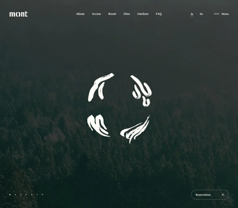
野沢温泉の宿「mont」の公式サイト。暗い山岳・雪景色を全画面に敷き、白い筆致のシンボル、繊細なセリフ体のナビゲーション、控えめな予約ボタンで世界観を伝えています。
オリジナルサイトを見るmont — Style Reference
A dark alpine landscape framed by small ivory controls and an open circle of brushwork.
Website: mont
Original URL: https://mont-nozawaonsen.com/
Final URL: https://mont-nozawaonsen.com/
Theme: dark photographic homepage with warm ivory foreground details; cream and brown tokens also exist in the document.
Inspected: September 12, 2026, using supplied original-page captures and rendered DOM evidence. Retrieval timestamp: 2026-09-12T11:19:23.680Z, equivalent to 20:19:23.680 JST.
Viewports: desktop 1440 × 1000 CSS pixels; mobile 390 × 844 CSS pixels.
Scope: the current Japanese homepage in its closed navigation and reservation state, two captured landscape scenes, responsive header and bottom controls, and the homepage's navigation and booking-link inventory. Expanded panels and linked pages were not visually inspected.
mont presents its homepage as a single atmospheric viewport. Mountain ridges and a snow-covered woodland occupy the entire canvas, subdued into dark blue-green and gray-green tones. A warm white symbol made from four separated clusters of brushstrokes sits near the center. The small mont wordmark, fine serif navigation, seven tiny scene indicators, and outlined Reservation control remain at the edges.
This is the entrance to a hospitality website with separate information and booking destinations. Its homepage does not display a large promotional headline, introductory paragraph, room cards, or a visible editorial footer in the supplied states. The landscape establishes place; the emblem supplies the strongest contrast; the perimeter controls make the rest of the site accessible without filling the scene with text.
How to Read This Reference
- Measured means a value appears in the supplied computed styles, custom properties, or element rectangles. Measurements are CSS pixels unless stated otherwise.
- Calculated means arithmetic performed on those measured values, such as the gap between adjacent navigation links.
- Estimated means a visual approximation from the current original-page screenshots. These values are not pixel samples or recovered source declarations.
- Recommended means an implementation choice for a new project. The CSS below deliberately labels choices that the evidence does not establish.
- DOM-only means an element or link exists in the extract but its visible, interactive state was not demonstrated. A nonzero rectangle does not establish that an element is painted or usable in the captured state.
- Token names introduced here are descriptive aliases. Source custom-property names are identified explicitly.
The selected anchor and button wrappers mostly report 16px / 24px, although their visible labels appear smaller. Descendant text styles, clipping, artwork, and pseudo-elements are not fully represented in the extract. Preserve that distinction when translating measurements into components.
Tokens — Colors
Visible Homepage Palette
| Name | Value | Evidence | Role |
|---|---|---|---|
| Warm Ivory | #fffdf8 |
Measured: source --color-W; computed foreground on visible header links and Reservation |
Text, small icons, and the light foreground system over photography |
| Alpine Teal | Approximately #19383b |
Estimated visual reference, not a sampled color or source token | Representative dark blue-green tone in the landscape; useful as an image-loading fallback |
| Transparent Control Surface | rgba(0, 0, 0, 0) |
Measured on visible links and buttons | Allows the photograph to continue through controls |
| Quiet Ivory Rule | Suggested rgb(255 253 248 / 0.38) |
Recommended approximation | Thin reservation outline and minor dividers |
| Inactive Scene Dot | Suggested rgb(255 253 248 / 0.48) |
Recommended approximation | Muted scene indicators; the active dot appears much brighter |
The emblem and wordmark visually belong to the same warm white foreground family. Their asset fill values were not separately extracted, so do not describe their exact artwork colors as measured.
The dark field comes from the rendered imagery and its treatment. The evidence does not identify whether grading is baked into the assets, applied with a CSS overlay, produced by another rendering layer, or combined. Alpine Teal is a practical descriptive approximation, not the site's recovered background declaration.
Declared Supporting Colors
| Name | Source token | Measured value | Confirmed scope |
|---|---|---|---|
| Main Cream | --color-BG |
#fffdf8 |
Computed HTML and body background; covered by imagery in the captured homepage |
| Secondary Cream | --color-BG2 |
#faf6ed |
Declared; no corresponding visible surface established here |
| Brown Ink | --color-B |
#291010 |
Computed body text and DOM-only navigation content |
| Key Brown | --color-KEY |
#311313 |
Declared; visible component assignment unverified |
| Deep Brown | --color-D |
#0e0606 |
Declared; visible component assignment unverified |
| Black | --color-DB |
#000000 |
Declared; visible component assignment unverified |
| Error Red | --color-ERR |
#ff2121 |
Declared; no error state inspected |
The numerous generic preset colors, gradients, and shadows in the document are not evidence of a visible rainbow palette or card-elevation system. They should not be carried into a reference for this homepage.
No selectable color theme was observed. The cream document background and dark photographic presentation are different layers of the same captured page.
Tokens — Typography
Source Serif Stack
The body and sampled navigation/control wrappers declare:
font-family: YakuHanMP, "Noto Serif JP", "Hiragino Mincho ProN",
  "Yu Mincho", YuMincho, serif;
font-size: 16px;
font-weight: 400;
line-height: 24px;
This is a declared stack, not proof that every listed font downloaded or supplied the visible glyphs. The serif character is visible in the small English navigation and utility labels. No bold display headline appears in the captured composition.
The HTML element has a system sans-serif stack, but the body overrides it. Using the root declaration alone would misrepresent the visible interface.
Ancizar Serif — Limited Verified Assignment
"Ancizar Serif" precedes the body stack on the DOM-only Navigation heading and copyright paragraph. The copyright has measured 13px type, 16px line height, and 0.39px tracking, equivalent to 0.03em.
The extract does not establish that Ancizar Serif is the rendered face for every visible English label. Do not extend that assignment to the whole header as a measured fact.
Brand Artwork and Semantic Title
The visible mont wordmark has distinctive irregular serif forms and is presented through a graphic-bearing home link. Its asset format is not identified. Preserve approved brand artwork instead of approximating the wordmark with an assumed font.
A semantic h1 containing mont is present in a 1 × 1px offscreen rectangle. The large central brushwork is a separate visual element. The page title, mont 火と水が巡る、野沢温泉の宿, is metadata rather than a visible hero headline in these captures.
Type Scale
| Role | Measured value | Visible interpretation / limitation | Reusable choice |
|---|---|---|---|
| Body baseline | 16px / 24px, weight 400 |
No long-form homepage paragraph is visible | Retain for future body content, without inventing such content here |
| Desktop navigation wrappers | 16px / 24px, weight 400; link rectangles 16px high |
Visible lettering appears approximately 12–14px; descendant size was not supplied |
Recommended starting point: 13px / 16px |
| Language and Menu wrappers | 16px / 24px; rectangles 20px high |
Small serif utility labels | Recommended starting point: 13px / 20px |
| Reservation wrapper | 16px / 24px, weight 400 |
Visible label appears approximately 13px |
Recommended starting point: 13px, with vertical flex alignment |
| DOM-only copyright | 13px / 16px, tracking 0.39px |
Not visible in the closed homepage capture | Exact measured style for that element only |
Semantic h1 |
16px / 24px; 1 × 1px rectangle |
Visually concealed | Preserve an accessible page name |
| Wordmark | Graphic box, not a measured text size | Desktop 84px wide; mobile 70px wide |
Use artwork at the observed proportions |
Visible navigation spacing is airy, but exact leaf-level letter spacing was not extracted. A modest 0.02–0.03em is a recommended starting point for an adaptation, not a recovered header declaration.
Tokens — Spacing & Shapes
Responsive Units
The following custom properties were measured at both viewport sizes:
| Source property | Desktop | Mobile | Interpretation |
|---|---|---|---|
--gridPC |
1.125px |
0.3046875px |
Consistent with viewport width divided by 1280 |
--gridSP |
3.6923076923076925px |
1px |
Consistent with viewport width divided by 390 |
--vw |
14.4px |
3.9px |
One percent of viewport width |
--vh |
10px |
8.44px |
One percent of captured viewport height |
--svh |
10px |
8.44px |
Matches the same height unit in these samples |
--spacing |
.0625rem |
.0625rem |
Equivalent to 1px at the measured 16px root |
The divisor formulas are inferred from the two samples; their source expressions were not provided. Both desktop and mobile grid properties exist at both widths. Their presence does not mean all components scale using one universal unit.
A property named --bp is 8px. This does not reveal the navigation's actual media-query breakpoint.
Spacing Scale
| Use | Desktop | Mobile | Evidence |
|---|---|---|---|
| Wordmark left inset | 56.25px |
20px |
Measured |
| Wordmark top inset | 52.44px |
30px |
Measured, rounded |
| Gap between primary navigation links | 34px |
Navigation absent from visible header | Calculated from adjacent link rectangles |
| Language-to-Menu gap | 51px |
31px |
Calculated from rectangles |
| Menu icon-to-label gap | 10px |
10px |
Measured wrapper gap |
| Reservation horizontal padding | 19px |
15px |
Measured button padding |
| Reservation inner box bottom clearance | 41px |
21px |
Calculated from viewport and button rectangle |
| Scene-dot center interval | Approximately 25px |
Approximately 20px |
Estimated from screenshots |
| Visible scene-dot diameter | Approximately 5px |
Approximately 5px |
Estimated from screenshots |
The desktop wordmark inset equals 50 × --gridPC at the measured width. That numerical relationship is useful, but it does not prove the original selector uses that formula.
Border Radius
| Element | Appearance | Evidence / implementation note |
|---|---|---|
| Landscape | Full rectangular viewport | Observed; no rounded media frame |
| Reservation outline | Capsule, approximately half its height at each end | Visually observed; a 9999px CSS radius is a suitable adaptation |
| Scene indicators | Small circles | Visually observed |
| Reservation end icon | Small circular outline with a central dot | Visually observed; exact construction unverified |
| Header links and Menu | Unboxed, square layout rectangles | Measured transparent wrappers |
The Reservation button itself reports border-radius: 0px, while the screenshot clearly shows a rounded outline. The visible shape may belong to another element, a pseudo-element, or artwork. Its implementation was not extracted. Reproducing the appearance with a pill border is reasonable; calling that the button's measured source radius is not.
Layout Measurements
| Element | Desktop 1440 × 1000 |
Mobile 390 × 844 |
Status |
|---|---|---|---|
| Main and document height | 1000px |
844px |
Measured; document height equals viewport height |
| Home-link artwork box | 84 × 25.61px at (56.25, 52.44) |
70 × 21.33px at (20, 30) |
Measured |
| Primary navigation group | Approximately 566.63px wide, from x = 436.69 to 1003.31 |
Not visible | Calculated; exactly centered at x = 720 |
| Language wrapper | 55.59 × 20px at (1209.31, 55) |
49.59 × 20px at (221.56, 32) |
Measured |
| Menu button | 67.84 × 20px at (1315.91, 55) |
67.84 × 20px at (302.16, 32) |
Measured |
| Reservation inner button | 170 × 43px at (1212.75, 916) |
163 × 37px at (206, 786) |
Measured |
| Visible Reservation envelope | Approximately 172 × 45px |
Approximately 165 × 39px |
Estimated, including outline |
| Central brushwork bounds | Approximately 292 × 318px |
Approximately 186 × 205px |
Estimated visible artwork, not asset-box dimensions |
| Brushwork center | Approximately (720, 520) |
Approximately (195, 422) |
Estimated; around 52% and 50% of viewport height respectively |
| Scene indicators | Seven; near y = 938px |
Seven; near y = 805px |
Visually observed; coordinates estimated |
Components
Full-Viewport Landscape Stage
Role: establish the location and atmosphere before visitors choose a destination.
The landscape reaches all four edges. There is no content-width container, image border, or exposed cream margin. Current captures show a distant mountain panorama and a closer snow-covered woodland with curving tracks. Both are subdued enough for small ivory controls to remain legible.
The main element and document match the viewport height in both recorded sizes. This supports a one-screen homepage composition in the inspected states. It does not identify whether the implementation uses fixed positioning, absolute layers, a viewport-height section, or another rendering arrangement.
For an adaptation, use a positioned media stage with independent foreground layers. Keep the image crop separate from the emblem and controls so portrait reframing cannot distort the identity artwork.
Header Wordmark
Role: persistent site identity and a link to the homepage.
The white mont artwork occupies the upper-left corner with substantial desktop clearance. Its measured desktop aspect ratio is approximately 3.28:1; the mobile dimensions preserve that ratio. It becomes only moderately smaller on mobile, from 84px to 70px wide.
The containing link points to https://mont-nozawaonsen.com/. A 500ms transform-related transition is declared on it, but the trigger and transformed state were not demonstrated.
Desktop Primary Navigation
Role: direct access to the site's main hospitality information.
Seven links form a single centered horizontal line:
About, Access, Room, Dine, Outdoor, HARVEST LONG TABLE, FAQ.
Their measured gaps are 34px. The group spans approximately 566.63px and is centered independently of the unequal widths of the logo and right-side utilities. Preserve this true central alignment with a centered layer or equivalent layout.
The long event label remains on one line at 1440px. The navigation is not visible at 390px; it does not wrap into another header row.
The extracted text contains repeated labels, including differently capitalized copies. Only one visual label per destination is apparent in the screenshots. These copies may support a visual effect, but no rollover behavior was verified.
Observed homepage destinations are /about/, /access/, /room/, /dine/, /outdoor/, /harvest-long-table/, and /faq/. Their page designs are outside this reference's scope.
Language Control
Role: provide access to the English version while showing the current language.
The visible treatment is Ja, a faint short vertical divider, and En. A small underline marks Ja in the captured Japanese state. The sampled wrapper is an anchor whose destination is /en/; the extract does not establish two independently clickable top-level language links.
The language group stays beside Menu on mobile. Its box contracts from approximately 55.59px to 49.59px, while the utility gap contracts from 51px to 31px.
Additional English and 日本語 links occur near or beyond the viewport edge in the DOM. They are not a second visible language row in the supplied composition.
Menu Trigger
Role: expose the broader navigation structure.
The visible control pairs two fine horizontal lines with the word Menu. The line icon is approximately 25px wide; the measured icon-to-label gap is 10px. The transparent button has the same 67.84 × 20px rectangle on desktop and mobile.
Both Menu and Close occur in the extracted button text. The screenshots show the closed Menu state. The open panel's appearance, opening direction, focus behavior, and close animation were not exercised.
For a new implementation, retain a real button and connect its expanded state to the navigation it controls. The visible compactness should not dictate an equally small touch target.
Central Brushwork Emblem
Role: provide the homepage's strongest identity signal.
Four separated groups of irregular white strokes describe an open circular form. Dry edges, uneven stroke widths, and the empty center give it a hand-painted character. It is not a regular circular border or a set of generic line icons.
The visible bounds are approximately 292 × 318px on desktop and 186 × 205px on mobile. It remains horizontally centered, sits slightly below the desktop's vertical midpoint, and is approximately vertically centered on the phone.
The symbol has no accompanying caption in the supplied states. Use approved artwork with its original negative space and intrinsic proportions. The evidence does not identify the individual forms' official meanings or establish whether the mark animates.
Seven Scene Indicators
Role: communicate the current position within the background presentation.
Seven tiny dots sit at the lower left. The desktop sequence uses approximately 25px between centers; mobile uses approximately 20px. Active and inactive dots differ mainly in brightness, with no visible number, label, track, or enclosing panel.
The first desktop capture shows the second dot bright; subsequent desktop and mobile captures show the third dot bright. Together with the changing landscape, this establishes multiple captured presentation states. It does not establish the total asset inventory, autoplay interval, click handling, or swipe support.
A new implementation can make these semantic scene-selection buttons, but that functionality must be described as an implementation choice until tested on the original.
Reservation Control
Role: keep booking access available in the bottom-right corner.
The visible anatomy is a transparent capsule with a thin ivory outline, the serif Reservation label on the left, and a small outlined circle with a central dot on the right. There is no filled accent color or shadow.
The inner button measures 170 × 43px on desktop and 163 × 37px on mobile. Its outline appears about one pixel beyond that box. The visible outer edge sits approximately 40px above the desktop bottom and 20px above the mobile bottom. Its vertical center aligns with the scene indicators.
The DOM identifies Reservation as a button, rather than a direct room-booking anchor. Three associated booking links exist:
| Source label | Observed destination | Verification |
|---|---|---|
Book for Room |
https://www.chillnn.com/198658d72122d1 | Link present in homepage DOM; destination not opened |
Book a Table |
https://www.tablecheck.com/ja/mont/reserve | Link present in homepage DOM; destination not opened |
Book for HARVEST LONG TABLE |
https://www.chillnn.com/ja/198658d72122d1/plan/19fab7c9a4415b | Link present in homepage DOM; destination not opened |
These link rectangles extend toward and beyond the viewport bottom in the closed-state extract. Their presence does not mean the links are visibly overflowing, nor does it reveal the expanded booking panel's arrangement. Do not recreate those closed-state coordinates as an open menu.
Navigation Content — DOM-Only Evidence
Role: provide a broader site directory and secondary information.
A separate navigation structure contains About, Access, Room, Dine, Outdoor, and FAQ, followed by Company, Career, News, Privacy Policy, Contact, Instagram, and © mont.
Its primary link rectangles measure 353 × 55px on desktop and 330 × 55px on mobile. Desktop rows begin at x = 1047px, with a 70px vertical interval. Mobile rows begin at x = 40px, with a 60px interval. These are measured layout facts about concealed content, not a screenshot of an opened panel.
Brown text is computed for this structure. Its surrounding surface, transition, image treatment, and full open-state layout remain unverified. The desktop top navigation includes HARVEST LONG TABLE, while the extracted secondary primary-link group does not. Do not silently treat the two inventories as identical.
Tokens — Motion & Interaction
| Treatment | Evidence | What can be stated |
|---|---|---|
| Brand transform transition | Measured 0.5s cubic-bezier(0.3, 0, 0.1, 1) for transform, translate, scale, and rotate |
A half-second eased geometric transition is declared; trigger and endpoints are unknown |
| Reservation transform transition | Measured 0.6s cubic-bezier(0.3, 0, 0.1, 1) for the same property group |
A slightly longer eased geometric transition is declared; actual movement was not demonstrated |
| Shared easing | Source --ease-a: cubic-bezier(.3, 0, .1, 1) |
Suitable exact token to preserve where its application is known |
| Generic transition defaults | 150ms; cubic-bezier(0.4, 0, 0.2, 1) |
Declared defaults; not proof of a particular component's hover behavior |
| Landscape changes | Different current-page landscapes and active dots across captures | Multiple scene states exist; transition type, duration, and trigger are unverified |
| Repeated navigation labels | Duplicate text in extracted links | Possible effect-related markup; no confirmed text-roll interaction |
| Menu and Reservation expansion | Buttons and associated hidden content exist | Expanded visual states and keyboard behavior were not tested |
| Emblem movement | No motion trace supplied | Do not assert rotation, drawing, morphing, or continuous animation |
The capture process observed the initial page for at least five seconds and used bounded checks for loading, finite motion, layout stability, and image decoding. Perpetual animations were paused for readiness checks and resumed afterward. Consequently, repeated still frames do not prove that a scene is static.
The sampled elements report animation: none, but media and decorative descendants are not comprehensively represented. This cannot establish that the whole page has no animation or video.
Recommended motion direction: keep foreground geometry restrained and let scene changes carry most of the movement. A roughly 1000ms opacity crossfade is a reasonable optional starting point for a new implementation, not an observed source duration. Provide a static reduced-motion mode and explicit playback control if adding automatic cycling.
Surfaces
| Layer | Appearance | Purpose / evidence |
|---|---|---|
| Document foundation | Warm cream #fffdf8 |
Measured HTML/body background, covered in the visible homepage |
| Landscape | Dark, low-saturation mountain or snow imagery | Full visual canvas |
| Image treatment | Broad blue-green/gray-green darkening | Observed appearance; implementation and opacity unknown |
| Identity artwork | Warm white graphic forms | Clear central and upper-left anchors |
| Header controls | Transparent, fine serif labels | Navigation without a separate header band |
| Reservation | Transparent capsule and thin light outline | Distinct booking access with minimal visual weight |
| Scene indicators | Tiny bright/muted circles | State information with no enclosing surface |
| Concealed navigation content | Brown computed text | Surrounding panel surface not visually verified |
There is no visible card grid, generalized shadow system, frosted-glass panel, or floating filled toolbar in these captures. Layer hierarchy comes from contrast, position, and small outlines.
Imagery
The current scenes establish an alpine winter setting through depth and texture. One shows distant ridgelines above a darker foreground mountain. Another looks across snow, bare trees, long shadows, and curved tracks. These are environmental views rather than product cutouts or room-detail collages.
Keep tonal variety within the dark treatment: distant mountains should remain distinguishable, snow should retain surface detail, and foreground trees should not collapse into a uniformly black mass. The ivory artwork needs strong separation, but excessive dimming would remove the sense of place.
The mobile snow scene uses a portrait composition while retaining recognizable landscape features. A cover-style crop is a useful implementation strategy, although the original crop algorithm and asset selection were not extracted. Choose focal positioning per scene and validate it at both inspected aspect ratios.
Observed Asset References
No image filenames, media URLs, video sources, SVG paths, or font-file URLs were supplied in the original-page extract.
| Asset or visual | Current evidence | Asset-level limitation |
|---|---|---|
| mont wordmark | Upper-left graphic in desktop and mobile captures; linked rectangle measured | File URL, format, and internal artwork bounds unknown |
| Central brushwork | Four separated stroke clusters visible at both sizes | File URL, format, and animation capability unknown |
| Mountain panorama | Current desktop capture | Media type and native dimensions unknown |
| Snow woodland scene | Current desktop and mobile captures | Shared-versus-separate responsive asset choice unknown |
| Menu lines | Two thin horizontal strokes | CSS, SVG, or other construction not identified |
| Reservation end symbol | Ring and central dot | Construction and exact dimensions not extracted |
Use authorized imagery and identity assets. The CSS can reproduce the framing, crop behavior, and control treatment; it cannot replace the character of the original brushwork or landscape photography.
Layout & Responsive Behavior
The desktop header uses three visual zones: a small left-aligned wordmark, an independently centered primary navigation group, and language/Menu controls at the right. Its content sits near y = 65px, leaving most of the upper field visually quiet.
At 390px, the entire primary navigation row disappears. The wordmark remains at the left, while language and Menu stay on the same upper row at the right. Horizontal page clearance decreases from approximately 56px to 20px; the header moves upward from roughly 52px to 30px.
The emblem changes scale selectively. Its estimated width decreases from 292px to 186px, while viewport width decreases from 1440px to 390px. It therefore occupies about 20% of desktop width and 48% of phone width. This increased relative prominence is central to the mobile composition.
The bottom controls also retain useful size instead of shrinking proportionally with the viewport. The Reservation inner width falls only from 170px to 163px. The dot interval tightens, and both groups move closer to the bottom edge. Their shared horizontal baseline remains visible.
| Behavior | Desktop observation | Mobile observation |
|---|---|---|
| Main composition | One full viewport | One full viewport |
| Primary header links | Seven visible links | Hidden from the visible header |
| Language and Menu | Upper right | Upper right, narrower separation |
| Wordmark | 84px wide |
70px wide |
| Central emblem | Smaller fraction of frame | Larger fraction of frame |
| Scene indicators | Lower left, approximately 25px intervals |
Lower left, approximately 20px intervals |
| Reservation | Lower right, approximately 40px bottom clearance |
Lower right, approximately 20px bottom clearance |
| Below-fold sections | None visible in recorded state | None visible in recorded state |
Only these two widths were inspected. The actual breakpoint, tablet behavior, landscape-phone arrangement, resize continuity, and browser-toolbar behavior are unknown. The Quick Start uses 72rem as a recommended breakpoint to protect the wide centered navigation; this is not a recovered source query.
Viewport units and safe-area handling should be tested on real devices. Although a source property named --svh is present, the extract does not establish which selectors use it or whether safe-area insets are implemented.
Do’s and Don’ts
Do
- Keep the homepage organized around one full-viewport environmental scene.
- Preserve warm ivory
#fffdf8for the measured foreground control color. - Maintain dark blue-green and gray-green imagery with enough detail to recognize snow, trees, and mountain layers.
- Use the approved wordmark and brushwork as distinct graphic assets.
- Center the desktop navigation independently of the unequal side groups.
- Keep the central emblem more prominent relative to screen width on mobile.
- Retain compact serif utility labels and substantial surrounding negative space.
- Align the lower-left indicators and lower-right Reservation control on a common center line.
- Preserve separate booking destinations for rooms, dining, and HARVEST LONG TABLE when implementing the booking choices.
- Keep measured source facts separate from visual estimates and proposed interactions.
Don’t
- Do not add a large visible slogan or introductory copy and describe it as part of the captured homepage.
- Do not turn the landscape into a rounded card inside a conventional content container.
- Do not replace the brushwork with a clean geometric ring, generic logo font, or unrelated icon set.
- Do not apply every declared preset color, gradient, or shadow to the visible design.
- Do not assume the cream body background is the visible homepage canvas.
- Do not scale desktop controls down in direct proportion to viewport width.
- Do not force all seven desktop navigation links into the phone header.
- Do not treat duplicate DOM text as confirmed animated lettering.
- Do not claim video playback, autoplay cadence, swipe, parallax, or emblem animation without further evidence.
- Do not use concealed booking-link coordinates as the intended expanded-panel layout.
Recommended Implementation Additions
These are additions for a new implementation, not verified features of the original:
- Give the home-link graphic an accessible name and preserve a semantic page heading. Treat redundant decorative emblem artwork appropriately for assistive technology.
- Use real buttons for Menu and Reservation, with
aria-expandedandaria-controls. Implement focus management, Escape handling, and focus restoration for any overlay. - Ensure concealed navigation and booking links are unavailable to keyboard focus until their containing interface opens. Do not rely on opacity alone.
- Provide clearly visible keyboard focus on controls over every scene.
- Keep scene dots visually small while providing larger interactive areas. The observed mobile spacing is only about
20px; widen it or offer another accessible scene-control arrangement. - Aim for
44pxtouch targets where practical. The source Menu box is only20pxhigh, and the mobile Reservation inner box is37pxhigh. - If scenes rotate automatically, offer pause/resume and stop automatic progression for reduced-motion users. Removing a CSS transition alone does not stop a JavaScript timer or video.
- Open booking choices into available viewport space and allow internal scrolling when needed. Validate all three destinations on a short phone viewport.
- Use a stable viewport-height strategy, safe-area padding, and scene-specific focal points. Preserve essential controls during mobile browser-toolbar changes.
- Load a useful first scene promptly and defer later scenes where appropriate. Keep the dark fallback and foreground identity readable while media loads.
Agent Prompt Guide
Quick Color Reference
- Visible control foreground: measured
#fffdf8. - Main document foundation: measured
#fffdf8, largely covered on the homepage. - Body and concealed navigation ink: measured
#291010. - Secondary cream: declared
#faf6ed, visible assignment unverified. - Representative landscape fallback: estimated
#19383b. - Reservation rule: recommended ivory at approximately
38%opacity. - Inactive dots: recommended ivory at approximately
48%opacity. - Avoid introducing a bright filled booking color into this composition.
Overall Prompt
“Create a hospitality website homepage inspired by the current mont composition. Fill the viewport with a dark, low-saturation alpine landscape. Place a small approved white wordmark in the upper-left corner and a larger irregular brushwork emblem near the center, with ample open space around it. Use delicate serif navigation and utility labels in warm ivory #fffdf8. On desktop, center seven primary navigation links independently of the logo and right-side language/Menu controls. Place seven tiny scene indicators at the lower left and a transparent outlined Reservation capsule at the lower right. On a narrow phone, hide the primary link row, retain language and Menu, use approximately 20px side clearance, and increase the emblem's relative prominence. Keep all imagery and identity artwork independent of the responsive control layout. Treat menu expansion, booking-panel design, and media timing as separately specified behavior.”
Example Component Prompts
- Desktop header: “Over a full-screen dark mountain image, place an 84px-wide white wordmark about 56px from the left. Center a single serif navigation row with approximately 34px gaps. At the right, show Ja and En with a short divider, followed by a two-line Menu icon and label. Keep the header transparent and unboxed.”
- Mobile scene: “At 390 × 844, use a portrait crop of the snow landscape. Place a 70px-wide wordmark at approximately 20px left and 30px top. Keep language and Menu on the upper-right row. Center approved brushwork at approximately 186px visible width. Preserve recognizable snow and tree detail beneath the dark treatment.”
- Reservation control: “Create a transparent ivory-outline capsule with a small serif Reservation label and a ring-and-dot symbol at the right. Target an approximately 172 × 45px visible desktop envelope and 165 × 39px mobile envelope. Keep it near the bottom-right edge with 40px desktop and 20px mobile bottom clearance. Connect it to separately implemented room, dining, and event booking choices.”
- Scene indicators: “Use seven approximately 5px ivory dots with brightness indicating the current scene. Match roughly 25px desktop center intervals. For a usable mobile adaptation, widen the observed 20px spacing enough to support practical button targets. Keep the group visually aligned with the Reservation control.”
- Optional scene motion: “Use a restrained opacity crossfade between approved landscape assets while the header, emblem, and booking access remain spatially stable. Start with a 1000ms transition as a proposed design choice, provide pause and reduced-motion behavior, and do not present that duration as measured from the reference.”
Quick Start
CSS Custom Properties
This is a visual-shell adaptation of the closed homepage. Exact source colors, font stacks, and known transition curves are retained. The scene tint, visible utility type size, pill construction, responsive breakpoint, and optional crossfade are recommendations.
Use a .mont-hero containing .mont-photo media layers, .mont-shade, and an image with .mont-emblem. Add a .mont-header containing .mont-brand, .mont-nav, and .mont-utilities. The utilities contain .mont-language and .mont-menu; the footer contains .mont-dots and .mont-reservation. Use actual links and buttons, with decorative icon elements hidden from assistive technology.
Approved image and font files must be supplied separately; no asset URLs were recovered. The code does not implement the uninspected expanded panels or a media controller. Assign .is-active to the displayed scene and update aria-current only when an actual scene controller is implemented.
:root {
  /* Exact source colors used by the sampled document. */
  --mont-ivory: #fffdf8;
  --mont-ink: #291010;
  --mont-paper: #fffdf8;
  --mont-paper-soft: #faf6ed;

  /* Estimated or recommended photographic treatment. */
  --mont-scene: #19383b;
  --mont-shade: rgb(7 26 28 / 0.60);
  --mont-rule: rgb(255 253 248 / 0.38);
  --mont-dot-idle: rgb(255 253 248 / 0.48);

  /* Source stacks; supply the corresponding fonts separately. */
  --mont-font: YakuHanMP, "Noto Serif JP", "Hiragino Mincho ProN",
    "Yu Mincho", YuMincho, serif;
  --mont-font-latin: "Ancizar Serif", var(--mont-font);

  /* Recommended leaf-level typography based on visual scale. */
  --mont-ui-size: 13px;
  --mont-ui-tracking: 0.03em;

  /* Mobile measurements and visual approximations. */
  --mont-inset: 20px;
  --mont-header-top: 30px;
  --mont-bottom: 20px;
  --mont-logo-width: 70px;
  --mont-emblem-width: 186px;
  --mont-emblem-y: 50%;
  --mont-utility-gap: 31px;
  --mont-language-width: 49.6px;
  --mont-reservation-width: 165px;
  --mont-reservation-height: 39px;
  --mont-reservation-padding: 15px;

  /* Exact observed easing and transform-transition durations. */
  --mont-ease: cubic-bezier(0.3, 0, 0.1, 1);
  --mont-brand-motion: 500ms var(--mont-ease);
  --mont-reservation-motion: 600ms var(--mont-ease);

  /* Optional recommendation; original scene timing is unknown. */
  --mont-scene-motion: 1000ms var(--mont-ease);
}

* {
  box-sizing: border-box;
}

body {
  margin: 0;
  color: var(--mont-ink);
  background: var(--mont-paper);
  font-family: var(--mont-font);
  font-size: 16px;
  line-height: 1.5;
}

.mont-hero {
  position: relative;
  isolation: isolate;
  inline-size: 100%;
  block-size: 100vh;
  block-size: 100svh;
  min-block-size: 30rem;
  overflow: hidden;
  color: var(--mont-ivory);
  background: var(--mont-scene);
}

.mont-hero :where(a, button) {
  color: inherit;
  font: inherit;
}

.mont-photo,
.mont-shade {
  position: absolute;
  inset: 0;
  inline-size: 100%;
  block-size: 100%;
  pointer-events: none;
}

.mont-photo {
  z-index: 0;
  display: block;
  object-fit: cover;
  object-position: var(--scene-position, 50% 50%);
  opacity: 0;
  transition: opacity var(--mont-scene-motion);
}

.mont-photo.is-active {
  opacity: 1;
}

.mont-shade {
  z-index: 1;
  background: var(--mont-shade);
}

/* Reduce this overlay if the supplied imagery is already graded. */
.mont-emblem {
  position: absolute;
  z-index: 2;
  inset-inline-start: 50%;
  inset-block-start: var(--mont-emblem-y);
  display: block;
  inline-size: var(--mont-emblem-width);
  max-inline-size: 52vw;
  block-size: auto;
  transform: translate(-50%, -50%);
  pointer-events: none;
}

.mont-header {
  position: absolute;
  z-index: 3;
  inset-block-start: calc(
    var(--mont-header-top) + env(safe-area-inset-top, 0px)
  );
  inset-inline: var(--mont-inset);
  display: flex;
  align-items: center;
  justify-content: space-between;
}

.mont-brand {
  display: block;
  flex: none;
  inline-size: var(--mont-logo-width);
  line-height: 1;
  transition: transform var(--mont-brand-motion);
}

.mont-brand img {
  display: block;
  inline-size: 100%;
  block-size: auto;
}

.mont-nav {
  display: none;
}

.mont-utilities {
  display: flex;
  align-items: center;
  gap: var(--mont-utility-gap);
}

.mont-language,
.mont-menu,
.mont-reservation {
  font-size: var(--mont-ui-size);
  font-weight: 400;
  line-height: 20px;
  letter-spacing: var(--mont-ui-tracking);
}

.mont-language {
  display: inline-flex;
  align-items: center;
  justify-content: space-between;
  inline-size: var(--mont-language-width);
  min-block-size: 24px;
  text-decoration: none;
}

.mont-language .is-current {
  text-decoration: underline;
  text-underline-offset: 5px;
  text-decoration-thickness: 1px;
}

.mont-language-separator {
  inline-size: 1px;
  block-size: 7px;
  background: var(--mont-rule);
}

.mont-menu {
  display: inline-flex;
  align-items: center;
  gap: 10px;
  min-block-size: 24px;
  padding: 0;
  border: 0;
  background: transparent;
  cursor: pointer;
}

.mont-menu-icon {
  position: relative;
  display: block;
  inline-size: 25px;
  block-size: 6px;
}

.mont-menu-icon::before,
.mont-menu-icon::after {
  position: absolute;
  inset-inline: 0;
  block-size: 1px;
  background: currentColor;
  content: "";
}

.mont-menu-icon::before {
  inset-block-start: 0;
}

.mont-menu-icon::after {
  inset-block-end: 0;
}

.mont-footer {
  position: absolute;
  z-index: 3;
  inset-inline: var(--mont-inset);
  inset-block-end: calc(
    var(--mont-bottom) + env(safe-area-inset-bottom, 0px)
  );
  display: flex;
  align-items: center;
  justify-content: space-between;
  gap: 16px;
}

.mont-dots {
  display: flex;
  flex: none;
  align-items: center;
  gap: 0;
  margin-inline-start: -9.5px;
}

/* The 24px mobile interval is an accessibility adaptation. */
.mont-dot {
  display: grid;
  flex: none;
  place-items: center;
  inline-size: 24px;
  block-size: 24px;
  padding: 0;
  border: 0;
  background: transparent;
  cursor: pointer;
}

.mont-dot::before {
  inline-size: 5px;
  block-size: 5px;
  border-radius: 50%;
  background: var(--mont-dot-idle);
  content: "";
}

.mont-dot[aria-current="true"]::before {
  background: var(--mont-ivory);
}

.mont-reservation {
  display: inline-flex;
  flex: none;
  align-items: center;
  justify-content: space-between;
  inline-size: var(--mont-reservation-width);
  block-size: var(--mont-reservation-height);
  padding-inline: var(--mont-reservation-padding);
  border: 1px solid var(--mont-rule);
  border-radius: 9999px;
  background: transparent;
  cursor: pointer;
  transition: transform var(--mont-reservation-motion);
}

.mont-reservation-icon {
  display: grid;
  flex: none;
  place-items: center;
  inline-size: 12px;
  block-size: 12px;
  border: 1px solid currentColor;
  border-radius: 50%;
}

.mont-reservation-icon::before {
  inline-size: 4px;
  block-size: 4px;
  border-radius: 50%;
  background: currentColor;
  content: "";
}

.mont-hero :focus-visible {
  outline: 2px solid var(--mont-ivory);
  outline-offset: 4px;
}

.mont-sr-only {
  position: absolute;
  inline-size: 1px;
  block-size: 1px;
  padding: 0;
  margin: -1px;
  overflow: hidden;
  clip-path: inset(50%);
  white-space: nowrap;
  border: 0;
}

/* Recommended breakpoint; the source breakpoint was not supplied. */
@media (min-width: 72rem) {
  :root {
    --mont-inset: clamp(40px, 3.90625vw, 72px);
    --mont-header-top: 52.44px;
    --mont-bottom: 40px;
    --mont-logo-width: 84px;
    --mont-emblem-width: 292px;
    --mont-emblem-y: 52%;
    --mont-utility-gap: 51px;
    --mont-language-width: 55.6px;
    --mont-reservation-width: 172px;
    --mont-reservation-height: 45px;
    --mont-reservation-padding: 19px;
  }

  .mont-nav {
    position: absolute;
    inset-inline-start: 50%;
    inset-block-start: 50%;
    display: flex;
    align-items: center;
    gap: 34px;
    transform: translate(-50%, -50%);
    font-size: var(--mont-ui-size);
    line-height: 16px;
    letter-spacing: 0.02em;
    white-space: nowrap;
  }

  .mont-nav a {
    text-decoration: none;
  }

  .mont-dots {
    gap: 1px;
  }
}

/* Allow the bottom groups to remain reachable on very narrow screens. */
@media (max-width: 23rem) {
  .mont-footer {
    flex-wrap: wrap;
    row-gap: 8px;
  }

  .mont-reservation {
    margin-inline-start: auto;
  }
}

@media (prefers-reduced-motion: reduce) {
  .mont-hero *,
  .mont-hero *::before,
  .mont-hero *::after {
    animation: none !important;
    transition: none !important;
  }
}
The mobile dot buttons intentionally use a 24px center interval instead of the approximately 20px observed interval. The negative group margin keeps the first visible dot close to its observed left position. The 30rem minimum stage height and narrow-screen wrapping are practical safeguards for uninspected small viewports; at the two supplied sizes, the stage remains viewport-height.
Adjust the scene overlay against the actual assets. A pre-darkened photograph plus the full recommended tint may become too dark. Preserve the visible relationship rather than applying an assumed overlay twice.
CSS cannot pause an independent media controller. Reduced-motion handling must also stop automatic scene timers or video playback as appropriate. Expanded navigation and booking content require their own accessible implementation and testing.
Tailwind v4 Token Mapping
Optional aliases for a new project using Tailwind v4. Define the custom properties above first. This mapping is not a claim about the original site's build setup.
@theme inline {
  --color-mont-ivory: var(--mont-ivory);
  --color-mont-ink: var(--mont-ink);
  --color-mont-paper: var(--mont-paper);
  --color-mont-paper-soft: var(--mont-paper-soft);
  --color-mont-scene: var(--mont-scene);
  --color-mont-rule: var(--mont-rule);

  --font-mont: var(--mont-font);
  --font-mont-latin: var(--mont-font-latin);

  --text-mont-ui: var(--mont-ui-size);
  --spacing-mont-inset: var(--mont-inset);
  --spacing-mont-logo: var(--mont-logo-width);
  --spacing-mont-emblem: var(--mont-emblem-width);

  --radius-mont-pill: 9999px;
  --ease-mont: var(--mont-ease);
}
Sources & Evidence
- mont — current Japanese homepage: original and final URL are identical; supplied response status is
200. - Capture record: retrieved September 12, 2026 at
11:19:23.680 UTC/20:19:23.680 JST. Three supplied original-page desktop images show the1440 × 1000viewport; two original-page mobile images show390 × 844. - Rendered DOM and computed styles: supplied snapshots include element rectangles, font declarations, foreground/background colors, transition declarations, custom properties, document heights, and navigation/booking destinations at both viewport sizes.
- Visual state evidence: the desktop images show a mountain panorama and a snow woodland scene, with a different bright scene indicator. Mobile images show the snow scene and the responsive closed header. No expanded Menu or Reservation capture was supplied.
- Readiness limitations: the capture process includes an initial observation of at least five seconds and bounded loading, animation, stability, and image-decoding checks. Those checks do not establish semantic completeness, continuous-motion timing, or the behavior of unexercised controls.
- Inspection boundaries: analysis uses only the supplied current-page evidence. Linked information pages, booking destinations, complete stylesheet source, media files, font loading, hover states, keyboard flows, and intermediate responsive widths were not independently inspected.
All source-specific measurements in this document are scoped to those records. Visual estimates and implementation recommendations are labeled explicitly; concealed DOM content is not presented as a verified open-state design.
# mont — Style Reference

> A dark alpine landscape framed by small ivory controls and an open circle of brushwork.

**Website:** [mont](https://mont-nozawaonsen.com/)
**Original URL:** https://mont-nozawaonsen.com/
**Final URL:** https://mont-nozawaonsen.com/
**Theme:** dark photographic homepage with warm ivory foreground details; cream and brown tokens also exist in the document.
**Inspected:** September 12, 2026, using supplied original-page captures and rendered DOM evidence. Retrieval timestamp: `2026-09-12T11:19:23.680Z`, equivalent to 20:19:23.680 JST.
**Viewports:** desktop `1440 × 1000` CSS pixels; mobile `390 × 844` CSS pixels.
**Scope:** the current Japanese homepage in its closed navigation and reservation state, two captured landscape scenes, responsive header and bottom controls, and the homepage's navigation and booking-link inventory. Expanded panels and linked pages were not visually inspected.

mont presents its homepage as a single atmospheric viewport. Mountain ridges and a snow-covered woodland occupy the entire canvas, subdued into dark blue-green and gray-green tones. A warm white symbol made from four separated clusters of brushstrokes sits near the center. The small mont wordmark, fine serif navigation, seven tiny scene indicators, and outlined Reservation control remain at the edges.

This is the entrance to a hospitality website with separate information and booking destinations. Its homepage does not display a large promotional headline, introductory paragraph, room cards, or a visible editorial footer in the supplied states. The landscape establishes place; the emblem supplies the strongest contrast; the perimeter controls make the rest of the site accessible without filling the scene with text.

## How to Read This Reference

- **Measured** means a value appears in the supplied computed styles, custom properties, or element rectangles. Measurements are CSS pixels unless stated otherwise.
- **Calculated** means arithmetic performed on those measured values, such as the gap between adjacent navigation links.
- **Estimated** means a visual approximation from the current original-page screenshots. These values are not pixel samples or recovered source declarations.
- **Recommended** means an implementation choice for a new project. The CSS below deliberately labels choices that the evidence does not establish.
- **DOM-only** means an element or link exists in the extract but its visible, interactive state was not demonstrated. A nonzero rectangle does not establish that an element is painted or usable in the captured state.
- Token names introduced here are descriptive aliases. Source custom-property names are identified explicitly.

The selected anchor and button wrappers mostly report `16px / 24px`, although their visible labels appear smaller. Descendant text styles, clipping, artwork, and pseudo-elements are not fully represented in the extract. Preserve that distinction when translating measurements into components.

## Tokens — Colors

### Visible Homepage Palette

| Name | Value | Evidence | Role |
| --- | --- | --- | --- |
| Warm Ivory | `#fffdf8` | Measured: source `--color-W`; computed foreground on visible header links and Reservation | Text, small icons, and the light foreground system over photography |
| Alpine Teal | Approximately `#19383b` | Estimated visual reference, not a sampled color or source token | Representative dark blue-green tone in the landscape; useful as an image-loading fallback |
| Transparent Control Surface | `rgba(0, 0, 0, 0)` | Measured on visible links and buttons | Allows the photograph to continue through controls |
| Quiet Ivory Rule | Suggested `rgb(255 253 248 / 0.38)` | Recommended approximation | Thin reservation outline and minor dividers |
| Inactive Scene Dot | Suggested `rgb(255 253 248 / 0.48)` | Recommended approximation | Muted scene indicators; the active dot appears much brighter |

The emblem and wordmark visually belong to the same warm white foreground family. Their asset fill values were not separately extracted, so do not describe their exact artwork colors as measured.

The dark field comes from the rendered imagery and its treatment. The evidence does not identify whether grading is baked into the assets, applied with a CSS overlay, produced by another rendering layer, or combined. Alpine Teal is a practical descriptive approximation, not the site's recovered background declaration.

### Declared Supporting Colors

| Name | Source token | Measured value | Confirmed scope |
| --- | --- | --- | --- |
| Main Cream | `--color-BG` | `#fffdf8` | Computed HTML and body background; covered by imagery in the captured homepage |
| Secondary Cream | `--color-BG2` | `#faf6ed` | Declared; no corresponding visible surface established here |
| Brown Ink | `--color-B` | `#291010` | Computed body text and DOM-only navigation content |
| Key Brown | `--color-KEY` | `#311313` | Declared; visible component assignment unverified |
| Deep Brown | `--color-D` | `#0e0606` | Declared; visible component assignment unverified |
| Black | `--color-DB` | `#000000` | Declared; visible component assignment unverified |
| Error Red | `--color-ERR` | `#ff2121` | Declared; no error state inspected |

The numerous generic preset colors, gradients, and shadows in the document are not evidence of a visible rainbow palette or card-elevation system. They should not be carried into a reference for this homepage.

No selectable color theme was observed. The cream document background and dark photographic presentation are different layers of the same captured page.

## Tokens — Typography

### Source Serif Stack

The body and sampled navigation/control wrappers declare:

```css
font-family: YakuHanMP, "Noto Serif JP", "Hiragino Mincho ProN",
  "Yu Mincho", YuMincho, serif;
font-size: 16px;
font-weight: 400;
line-height: 24px;
```

This is a declared stack, not proof that every listed font downloaded or supplied the visible glyphs. The serif character is visible in the small English navigation and utility labels. No bold display headline appears in the captured composition.

The HTML element has a system sans-serif stack, but the body overrides it. Using the root declaration alone would misrepresent the visible interface.

### Ancizar Serif — Limited Verified Assignment

`"Ancizar Serif"` precedes the body stack on the DOM-only Navigation heading and copyright paragraph. The copyright has measured `13px` type, `16px` line height, and `0.39px` tracking, equivalent to `0.03em`.

The extract does not establish that Ancizar Serif is the rendered face for every visible English label. Do not extend that assignment to the whole header as a measured fact.

### Brand Artwork and Semantic Title

The visible mont wordmark has distinctive irregular serif forms and is presented through a graphic-bearing home link. Its asset format is not identified. Preserve approved brand artwork instead of approximating the wordmark with an assumed font.

A semantic `h1` containing `mont` is present in a `1 × 1px` offscreen rectangle. The large central brushwork is a separate visual element. The page title, `mont 火と水が巡る、野沢温泉の宿`, is metadata rather than a visible hero headline in these captures.

### Type Scale

| Role | Measured value | Visible interpretation / limitation | Reusable choice |
| --- | --- | --- | --- |
| Body baseline | `16px / 24px`, weight `400` | No long-form homepage paragraph is visible | Retain for future body content, without inventing such content here |
| Desktop navigation wrappers | `16px / 24px`, weight `400`; link rectangles `16px` high | Visible lettering appears approximately `12–14px`; descendant size was not supplied | Recommended starting point: `13px / 16px` |
| Language and Menu wrappers | `16px / 24px`; rectangles `20px` high | Small serif utility labels | Recommended starting point: `13px / 20px` |
| Reservation wrapper | `16px / 24px`, weight `400` | Visible label appears approximately `13px` | Recommended starting point: `13px`, with vertical flex alignment |
| DOM-only copyright | `13px / 16px`, tracking `0.39px` | Not visible in the closed homepage capture | Exact measured style for that element only |
| Semantic `h1` | `16px / 24px`; `1 × 1px` rectangle | Visually concealed | Preserve an accessible page name |
| Wordmark | Graphic box, not a measured text size | Desktop `84px` wide; mobile `70px` wide | Use artwork at the observed proportions |

Visible navigation spacing is airy, but exact leaf-level letter spacing was not extracted. A modest `0.02–0.03em` is a recommended starting point for an adaptation, not a recovered header declaration.

## Tokens — Spacing & Shapes

### Responsive Units

The following custom properties were measured at both viewport sizes:

| Source property | Desktop | Mobile | Interpretation |
| --- | --- | --- | --- |
| `--gridPC` | `1.125px` | `0.3046875px` | Consistent with viewport width divided by `1280` |
| `--gridSP` | `3.6923076923076925px` | `1px` | Consistent with viewport width divided by `390` |
| `--vw` | `14.4px` | `3.9px` | One percent of viewport width |
| `--vh` | `10px` | `8.44px` | One percent of captured viewport height |
| `--svh` | `10px` | `8.44px` | Matches the same height unit in these samples |
| `--spacing` | `.0625rem` | `.0625rem` | Equivalent to `1px` at the measured `16px` root |

The divisor formulas are inferred from the two samples; their source expressions were not provided. Both desktop and mobile grid properties exist at both widths. Their presence does not mean all components scale using one universal unit.

A property named `--bp` is `8px`. This does not reveal the navigation's actual media-query breakpoint.

### Spacing Scale

| Use | Desktop | Mobile | Evidence |
| --- | --- | --- | --- |
| Wordmark left inset | `56.25px` | `20px` | Measured |
| Wordmark top inset | `52.44px` | `30px` | Measured, rounded |
| Gap between primary navigation links | `34px` | Navigation absent from visible header | Calculated from adjacent link rectangles |
| Language-to-Menu gap | `51px` | `31px` | Calculated from rectangles |
| Menu icon-to-label gap | `10px` | `10px` | Measured wrapper gap |
| Reservation horizontal padding | `19px` | `15px` | Measured button padding |
| Reservation inner box bottom clearance | `41px` | `21px` | Calculated from viewport and button rectangle |
| Scene-dot center interval | Approximately `25px` | Approximately `20px` | Estimated from screenshots |
| Visible scene-dot diameter | Approximately `5px` | Approximately `5px` | Estimated from screenshots |

The desktop wordmark inset equals `50 × --gridPC` at the measured width. That numerical relationship is useful, but it does not prove the original selector uses that formula.

### Border Radius

| Element | Appearance | Evidence / implementation note |
| --- | --- | --- |
| Landscape | Full rectangular viewport | Observed; no rounded media frame |
| Reservation outline | Capsule, approximately half its height at each end | Visually observed; a `9999px` CSS radius is a suitable adaptation |
| Scene indicators | Small circles | Visually observed |
| Reservation end icon | Small circular outline with a central dot | Visually observed; exact construction unverified |
| Header links and Menu | Unboxed, square layout rectangles | Measured transparent wrappers |

The Reservation button itself reports `border-radius: 0px`, while the screenshot clearly shows a rounded outline. The visible shape may belong to another element, a pseudo-element, or artwork. Its implementation was not extracted. Reproducing the appearance with a pill border is reasonable; calling that the button's measured source radius is not.

### Layout Measurements

| Element | Desktop `1440 × 1000` | Mobile `390 × 844` | Status |
| --- | --- | --- | --- |
| Main and document height | `1000px` | `844px` | Measured; document height equals viewport height |
| Home-link artwork box | `84 × 25.61px` at `(56.25, 52.44)` | `70 × 21.33px` at `(20, 30)` | Measured |
| Primary navigation group | Approximately `566.63px` wide, from `x = 436.69` to `1003.31` | Not visible | Calculated; exactly centered at `x = 720` |
| Language wrapper | `55.59 × 20px` at `(1209.31, 55)` | `49.59 × 20px` at `(221.56, 32)` | Measured |
| Menu button | `67.84 × 20px` at `(1315.91, 55)` | `67.84 × 20px` at `(302.16, 32)` | Measured |
| Reservation inner button | `170 × 43px` at `(1212.75, 916)` | `163 × 37px` at `(206, 786)` | Measured |
| Visible Reservation envelope | Approximately `172 × 45px` | Approximately `165 × 39px` | Estimated, including outline |
| Central brushwork bounds | Approximately `292 × 318px` | Approximately `186 × 205px` | Estimated visible artwork, not asset-box dimensions |
| Brushwork center | Approximately `(720, 520)` | Approximately `(195, 422)` | Estimated; around `52%` and `50%` of viewport height respectively |
| Scene indicators | Seven; near `y = 938px` | Seven; near `y = 805px` | Visually observed; coordinates estimated |

## Components

### Full-Viewport Landscape Stage

**Role:** establish the location and atmosphere before visitors choose a destination.

The landscape reaches all four edges. There is no content-width container, image border, or exposed cream margin. Current captures show a distant mountain panorama and a closer snow-covered woodland with curving tracks. Both are subdued enough for small ivory controls to remain legible.

The main element and document match the viewport height in both recorded sizes. This supports a one-screen homepage composition in the inspected states. It does not identify whether the implementation uses fixed positioning, absolute layers, a viewport-height section, or another rendering arrangement.

For an adaptation, use a positioned media stage with independent foreground layers. Keep the image crop separate from the emblem and controls so portrait reframing cannot distort the identity artwork.

### Header Wordmark

**Role:** persistent site identity and a link to the homepage.

The white mont artwork occupies the upper-left corner with substantial desktop clearance. Its measured desktop aspect ratio is approximately `3.28:1`; the mobile dimensions preserve that ratio. It becomes only moderately smaller on mobile, from `84px` to `70px` wide.

The containing link points to `https://mont-nozawaonsen.com/`. A `500ms` transform-related transition is declared on it, but the trigger and transformed state were not demonstrated.

### Desktop Primary Navigation

**Role:** direct access to the site's main hospitality information.

Seven links form a single centered horizontal line:

`About`, `Access`, `Room`, `Dine`, `Outdoor`, `HARVEST LONG TABLE`, `FAQ`.

Their measured gaps are `34px`. The group spans approximately `566.63px` and is centered independently of the unequal widths of the logo and right-side utilities. Preserve this true central alignment with a centered layer or equivalent layout.

The long event label remains on one line at `1440px`. The navigation is not visible at `390px`; it does not wrap into another header row.

The extracted text contains repeated labels, including differently capitalized copies. Only one visual label per destination is apparent in the screenshots. These copies may support a visual effect, but no rollover behavior was verified.

Observed homepage destinations are `/about/`, `/access/`, `/room/`, `/dine/`, `/outdoor/`, `/harvest-long-table/`, and `/faq/`. Their page designs are outside this reference's scope.

### Language Control

**Role:** provide access to the English version while showing the current language.

The visible treatment is `Ja`, a faint short vertical divider, and `En`. A small underline marks `Ja` in the captured Japanese state. The sampled wrapper is an anchor whose destination is `/en/`; the extract does not establish two independently clickable top-level language links.

The language group stays beside Menu on mobile. Its box contracts from approximately `55.59px` to `49.59px`, while the utility gap contracts from `51px` to `31px`.

Additional `English` and `日本語` links occur near or beyond the viewport edge in the DOM. They are not a second visible language row in the supplied composition.

### Menu Trigger

**Role:** expose the broader navigation structure.

The visible control pairs two fine horizontal lines with the word `Menu`. The line icon is approximately `25px` wide; the measured icon-to-label gap is `10px`. The transparent button has the same `67.84 × 20px` rectangle on desktop and mobile.

Both `Menu` and `Close` occur in the extracted button text. The screenshots show the closed Menu state. The open panel's appearance, opening direction, focus behavior, and close animation were not exercised.

For a new implementation, retain a real button and connect its expanded state to the navigation it controls. The visible compactness should not dictate an equally small touch target.

### Central Brushwork Emblem

**Role:** provide the homepage's strongest identity signal.

Four separated groups of irregular white strokes describe an open circular form. Dry edges, uneven stroke widths, and the empty center give it a hand-painted character. It is not a regular circular border or a set of generic line icons.

The visible bounds are approximately `292 × 318px` on desktop and `186 × 205px` on mobile. It remains horizontally centered, sits slightly below the desktop's vertical midpoint, and is approximately vertically centered on the phone.

The symbol has no accompanying caption in the supplied states. Use approved artwork with its original negative space and intrinsic proportions. The evidence does not identify the individual forms' official meanings or establish whether the mark animates.

### Seven Scene Indicators

**Role:** communicate the current position within the background presentation.

Seven tiny dots sit at the lower left. The desktop sequence uses approximately `25px` between centers; mobile uses approximately `20px`. Active and inactive dots differ mainly in brightness, with no visible number, label, track, or enclosing panel.

The first desktop capture shows the second dot bright; subsequent desktop and mobile captures show the third dot bright. Together with the changing landscape, this establishes multiple captured presentation states. It does not establish the total asset inventory, autoplay interval, click handling, or swipe support.

A new implementation can make these semantic scene-selection buttons, but that functionality must be described as an implementation choice until tested on the original.

### Reservation Control

**Role:** keep booking access available in the bottom-right corner.

The visible anatomy is a transparent capsule with a thin ivory outline, the serif `Reservation` label on the left, and a small outlined circle with a central dot on the right. There is no filled accent color or shadow.

The inner button measures `170 × 43px` on desktop and `163 × 37px` on mobile. Its outline appears about one pixel beyond that box. The visible outer edge sits approximately `40px` above the desktop bottom and `20px` above the mobile bottom. Its vertical center aligns with the scene indicators.

The DOM identifies Reservation as a button, rather than a direct room-booking anchor. Three associated booking links exist:

| Source label | Observed destination | Verification |
| --- | --- | --- |
| `Book for Room` | https://www.chillnn.com/198658d72122d1 | Link present in homepage DOM; destination not opened |
| `Book a Table` | https://www.tablecheck.com/ja/mont/reserve | Link present in homepage DOM; destination not opened |
| `Book for HARVEST LONG TABLE` | https://www.chillnn.com/ja/198658d72122d1/plan/19fab7c9a4415b | Link present in homepage DOM; destination not opened |

These link rectangles extend toward and beyond the viewport bottom in the closed-state extract. Their presence does not mean the links are visibly overflowing, nor does it reveal the expanded booking panel's arrangement. Do not recreate those closed-state coordinates as an open menu.

### Navigation Content — DOM-Only Evidence

**Role:** provide a broader site directory and secondary information.

A separate navigation structure contains About, Access, Room, Dine, Outdoor, and FAQ, followed by Company, Career, News, Privacy Policy, Contact, Instagram, and `© mont`.

Its primary link rectangles measure `353 × 55px` on desktop and `330 × 55px` on mobile. Desktop rows begin at `x = 1047px`, with a `70px` vertical interval. Mobile rows begin at `x = 40px`, with a `60px` interval. These are measured layout facts about concealed content, not a screenshot of an opened panel.

Brown text is computed for this structure. Its surrounding surface, transition, image treatment, and full open-state layout remain unverified. The desktop top navigation includes HARVEST LONG TABLE, while the extracted secondary primary-link group does not. Do not silently treat the two inventories as identical.

## Tokens — Motion & Interaction

| Treatment | Evidence | What can be stated |
| --- | --- | --- |
| Brand transform transition | Measured `0.5s cubic-bezier(0.3, 0, 0.1, 1)` for transform, translate, scale, and rotate | A half-second eased geometric transition is declared; trigger and endpoints are unknown |
| Reservation transform transition | Measured `0.6s cubic-bezier(0.3, 0, 0.1, 1)` for the same property group | A slightly longer eased geometric transition is declared; actual movement was not demonstrated |
| Shared easing | Source `--ease-a: cubic-bezier(.3, 0, .1, 1)` | Suitable exact token to preserve where its application is known |
| Generic transition defaults | `150ms`; `cubic-bezier(0.4, 0, 0.2, 1)` | Declared defaults; not proof of a particular component's hover behavior |
| Landscape changes | Different current-page landscapes and active dots across captures | Multiple scene states exist; transition type, duration, and trigger are unverified |
| Repeated navigation labels | Duplicate text in extracted links | Possible effect-related markup; no confirmed text-roll interaction |
| Menu and Reservation expansion | Buttons and associated hidden content exist | Expanded visual states and keyboard behavior were not tested |
| Emblem movement | No motion trace supplied | Do not assert rotation, drawing, morphing, or continuous animation |

The capture process observed the initial page for at least five seconds and used bounded checks for loading, finite motion, layout stability, and image decoding. Perpetual animations were paused for readiness checks and resumed afterward. Consequently, repeated still frames do not prove that a scene is static.

The sampled elements report `animation: none`, but media and decorative descendants are not comprehensively represented. This cannot establish that the whole page has no animation or video.

**Recommended motion direction:** keep foreground geometry restrained and let scene changes carry most of the movement. A roughly `1000ms` opacity crossfade is a reasonable optional starting point for a new implementation, not an observed source duration. Provide a static reduced-motion mode and explicit playback control if adding automatic cycling.

## Surfaces

| Layer | Appearance | Purpose / evidence |
| --- | --- | --- |
| Document foundation | Warm cream `#fffdf8` | Measured HTML/body background, covered in the visible homepage |
| Landscape | Dark, low-saturation mountain or snow imagery | Full visual canvas |
| Image treatment | Broad blue-green/gray-green darkening | Observed appearance; implementation and opacity unknown |
| Identity artwork | Warm white graphic forms | Clear central and upper-left anchors |
| Header controls | Transparent, fine serif labels | Navigation without a separate header band |
| Reservation | Transparent capsule and thin light outline | Distinct booking access with minimal visual weight |
| Scene indicators | Tiny bright/muted circles | State information with no enclosing surface |
| Concealed navigation content | Brown computed text | Surrounding panel surface not visually verified |

There is no visible card grid, generalized shadow system, frosted-glass panel, or floating filled toolbar in these captures. Layer hierarchy comes from contrast, position, and small outlines.

## Imagery

The current scenes establish an alpine winter setting through depth and texture. One shows distant ridgelines above a darker foreground mountain. Another looks across snow, bare trees, long shadows, and curved tracks. These are environmental views rather than product cutouts or room-detail collages.

Keep tonal variety within the dark treatment: distant mountains should remain distinguishable, snow should retain surface detail, and foreground trees should not collapse into a uniformly black mass. The ivory artwork needs strong separation, but excessive dimming would remove the sense of place.

The mobile snow scene uses a portrait composition while retaining recognizable landscape features. A cover-style crop is a useful implementation strategy, although the original crop algorithm and asset selection were not extracted. Choose focal positioning per scene and validate it at both inspected aspect ratios.

### Observed Asset References

No image filenames, media URLs, video sources, SVG paths, or font-file URLs were supplied in the original-page extract.

| Asset or visual | Current evidence | Asset-level limitation |
| --- | --- | --- |
| mont wordmark | Upper-left graphic in desktop and mobile captures; linked rectangle measured | File URL, format, and internal artwork bounds unknown |
| Central brushwork | Four separated stroke clusters visible at both sizes | File URL, format, and animation capability unknown |
| Mountain panorama | Current desktop capture | Media type and native dimensions unknown |
| Snow woodland scene | Current desktop and mobile captures | Shared-versus-separate responsive asset choice unknown |
| Menu lines | Two thin horizontal strokes | CSS, SVG, or other construction not identified |
| Reservation end symbol | Ring and central dot | Construction and exact dimensions not extracted |

Use authorized imagery and identity assets. The CSS can reproduce the framing, crop behavior, and control treatment; it cannot replace the character of the original brushwork or landscape photography.

## Layout & Responsive Behavior

The desktop header uses three visual zones: a small left-aligned wordmark, an independently centered primary navigation group, and language/Menu controls at the right. Its content sits near `y = 65px`, leaving most of the upper field visually quiet.

At `390px`, the entire primary navigation row disappears. The wordmark remains at the left, while language and Menu stay on the same upper row at the right. Horizontal page clearance decreases from approximately `56px` to `20px`; the header moves upward from roughly `52px` to `30px`.

The emblem changes scale selectively. Its estimated width decreases from `292px` to `186px`, while viewport width decreases from `1440px` to `390px`. It therefore occupies about `20%` of desktop width and `48%` of phone width. This increased relative prominence is central to the mobile composition.

The bottom controls also retain useful size instead of shrinking proportionally with the viewport. The Reservation inner width falls only from `170px` to `163px`. The dot interval tightens, and both groups move closer to the bottom edge. Their shared horizontal baseline remains visible.

| Behavior | Desktop observation | Mobile observation |
| --- | --- | --- |
| Main composition | One full viewport | One full viewport |
| Primary header links | Seven visible links | Hidden from the visible header |
| Language and Menu | Upper right | Upper right, narrower separation |
| Wordmark | `84px` wide | `70px` wide |
| Central emblem | Smaller fraction of frame | Larger fraction of frame |
| Scene indicators | Lower left, approximately `25px` intervals | Lower left, approximately `20px` intervals |
| Reservation | Lower right, approximately `40px` bottom clearance | Lower right, approximately `20px` bottom clearance |
| Below-fold sections | None visible in recorded state | None visible in recorded state |

Only these two widths were inspected. The actual breakpoint, tablet behavior, landscape-phone arrangement, resize continuity, and browser-toolbar behavior are unknown. The Quick Start uses `72rem` as a recommended breakpoint to protect the wide centered navigation; this is not a recovered source query.

Viewport units and safe-area handling should be tested on real devices. Although a source property named `--svh` is present, the extract does not establish which selectors use it or whether safe-area insets are implemented.

## Do’s and Don’ts

### Do

- Keep the homepage organized around one full-viewport environmental scene.
- Preserve warm ivory `#fffdf8` for the measured foreground control color.
- Maintain dark blue-green and gray-green imagery with enough detail to recognize snow, trees, and mountain layers.
- Use the approved wordmark and brushwork as distinct graphic assets.
- Center the desktop navigation independently of the unequal side groups.
- Keep the central emblem more prominent relative to screen width on mobile.
- Retain compact serif utility labels and substantial surrounding negative space.
- Align the lower-left indicators and lower-right Reservation control on a common center line.
- Preserve separate booking destinations for rooms, dining, and HARVEST LONG TABLE when implementing the booking choices.
- Keep measured source facts separate from visual estimates and proposed interactions.

### Don’t

- Do not add a large visible slogan or introductory copy and describe it as part of the captured homepage.
- Do not turn the landscape into a rounded card inside a conventional content container.
- Do not replace the brushwork with a clean geometric ring, generic logo font, or unrelated icon set.
- Do not apply every declared preset color, gradient, or shadow to the visible design.
- Do not assume the cream body background is the visible homepage canvas.
- Do not scale desktop controls down in direct proportion to viewport width.
- Do not force all seven desktop navigation links into the phone header.
- Do not treat duplicate DOM text as confirmed animated lettering.
- Do not claim video playback, autoplay cadence, swipe, parallax, or emblem animation without further evidence.
- Do not use concealed booking-link coordinates as the intended expanded-panel layout.

## Recommended Implementation Additions

These are additions for a new implementation, not verified features of the original:

- Give the home-link graphic an accessible name and preserve a semantic page heading. Treat redundant decorative emblem artwork appropriately for assistive technology.
- Use real buttons for Menu and Reservation, with `aria-expanded` and `aria-controls`. Implement focus management, Escape handling, and focus restoration for any overlay.
- Ensure concealed navigation and booking links are unavailable to keyboard focus until their containing interface opens. Do not rely on opacity alone.
- Provide clearly visible keyboard focus on controls over every scene.
- Keep scene dots visually small while providing larger interactive areas. The observed mobile spacing is only about `20px`; widen it or offer another accessible scene-control arrangement.
- Aim for `44px` touch targets where practical. The source Menu box is only `20px` high, and the mobile Reservation inner box is `37px` high.
- If scenes rotate automatically, offer pause/resume and stop automatic progression for reduced-motion users. Removing a CSS transition alone does not stop a JavaScript timer or video.
- Open booking choices into available viewport space and allow internal scrolling when needed. Validate all three destinations on a short phone viewport.
- Use a stable viewport-height strategy, safe-area padding, and scene-specific focal points. Preserve essential controls during mobile browser-toolbar changes.
- Load a useful first scene promptly and defer later scenes where appropriate. Keep the dark fallback and foreground identity readable while media loads.

## Agent Prompt Guide

### Quick Color Reference

- Visible control foreground: measured `#fffdf8`.
- Main document foundation: measured `#fffdf8`, largely covered on the homepage.
- Body and concealed navigation ink: measured `#291010`.
- Secondary cream: declared `#faf6ed`, visible assignment unverified.
- Representative landscape fallback: estimated `#19383b`.
- Reservation rule: recommended ivory at approximately `38%` opacity.
- Inactive dots: recommended ivory at approximately `48%` opacity.
- Avoid introducing a bright filled booking color into this composition.

### Overall Prompt

“Create a hospitality website homepage inspired by the current mont composition. Fill the viewport with a dark, low-saturation alpine landscape. Place a small approved white wordmark in the upper-left corner and a larger irregular brushwork emblem near the center, with ample open space around it. Use delicate serif navigation and utility labels in warm ivory `#fffdf8`. On desktop, center seven primary navigation links independently of the logo and right-side language/Menu controls. Place seven tiny scene indicators at the lower left and a transparent outlined Reservation capsule at the lower right. On a narrow phone, hide the primary link row, retain language and Menu, use approximately 20px side clearance, and increase the emblem's relative prominence. Keep all imagery and identity artwork independent of the responsive control layout. Treat menu expansion, booking-panel design, and media timing as separately specified behavior.”

### Example Component Prompts

1. **Desktop header:** “Over a full-screen dark mountain image, place an 84px-wide white wordmark about 56px from the left. Center a single serif navigation row with approximately 34px gaps. At the right, show Ja and En with a short divider, followed by a two-line Menu icon and label. Keep the header transparent and unboxed.”
2. **Mobile scene:** “At 390 × 844, use a portrait crop of the snow landscape. Place a 70px-wide wordmark at approximately 20px left and 30px top. Keep language and Menu on the upper-right row. Center approved brushwork at approximately 186px visible width. Preserve recognizable snow and tree detail beneath the dark treatment.”
3. **Reservation control:** “Create a transparent ivory-outline capsule with a small serif Reservation label and a ring-and-dot symbol at the right. Target an approximately 172 × 45px visible desktop envelope and 165 × 39px mobile envelope. Keep it near the bottom-right edge with 40px desktop and 20px mobile bottom clearance. Connect it to separately implemented room, dining, and event booking choices.”
4. **Scene indicators:** “Use seven approximately 5px ivory dots with brightness indicating the current scene. Match roughly 25px desktop center intervals. For a usable mobile adaptation, widen the observed 20px spacing enough to support practical button targets. Keep the group visually aligned with the Reservation control.”
5. **Optional scene motion:** “Use a restrained opacity crossfade between approved landscape assets while the header, emblem, and booking access remain spatially stable. Start with a 1000ms transition as a proposed design choice, provide pause and reduced-motion behavior, and do not present that duration as measured from the reference.”

## Quick Start

### CSS Custom Properties

This is a visual-shell adaptation of the closed homepage. Exact source colors, font stacks, and known transition curves are retained. The scene tint, visible utility type size, pill construction, responsive breakpoint, and optional crossfade are recommendations.

Use a `.mont-hero` containing `.mont-photo` media layers, `.mont-shade`, and an image with `.mont-emblem`. Add a `.mont-header` containing `.mont-brand`, `.mont-nav`, and `.mont-utilities`. The utilities contain `.mont-language` and `.mont-menu`; the footer contains `.mont-dots` and `.mont-reservation`. Use actual links and buttons, with decorative icon elements hidden from assistive technology.

Approved image and font files must be supplied separately; no asset URLs were recovered. The code does not implement the uninspected expanded panels or a media controller. Assign `.is-active` to the displayed scene and update `aria-current` only when an actual scene controller is implemented.

```css
:root {
  /* Exact source colors used by the sampled document. */
  --mont-ivory: #fffdf8;
  --mont-ink: #291010;
  --mont-paper: #fffdf8;
  --mont-paper-soft: #faf6ed;

  /* Estimated or recommended photographic treatment. */
  --mont-scene: #19383b;
  --mont-shade: rgb(7 26 28 / 0.60);
  --mont-rule: rgb(255 253 248 / 0.38);
  --mont-dot-idle: rgb(255 253 248 / 0.48);

  /* Source stacks; supply the corresponding fonts separately. */
  --mont-font: YakuHanMP, "Noto Serif JP", "Hiragino Mincho ProN",
    "Yu Mincho", YuMincho, serif;
  --mont-font-latin: "Ancizar Serif", var(--mont-font);

  /* Recommended leaf-level typography based on visual scale. */
  --mont-ui-size: 13px;
  --mont-ui-tracking: 0.03em;

  /* Mobile measurements and visual approximations. */
  --mont-inset: 20px;
  --mont-header-top: 30px;
  --mont-bottom: 20px;
  --mont-logo-width: 70px;
  --mont-emblem-width: 186px;
  --mont-emblem-y: 50%;
  --mont-utility-gap: 31px;
  --mont-language-width: 49.6px;
  --mont-reservation-width: 165px;
  --mont-reservation-height: 39px;
  --mont-reservation-padding: 15px;

  /* Exact observed easing and transform-transition durations. */
  --mont-ease: cubic-bezier(0.3, 0, 0.1, 1);
  --mont-brand-motion: 500ms var(--mont-ease);
  --mont-reservation-motion: 600ms var(--mont-ease);

  /* Optional recommendation; original scene timing is unknown. */
  --mont-scene-motion: 1000ms var(--mont-ease);
}

* {
  box-sizing: border-box;
}

body {
  margin: 0;
  color: var(--mont-ink);
  background: var(--mont-paper);
  font-family: var(--mont-font);
  font-size: 16px;
  line-height: 1.5;
}

.mont-hero {
  position: relative;
  isolation: isolate;
  inline-size: 100%;
  block-size: 100vh;
  block-size: 100svh;
  min-block-size: 30rem;
  overflow: hidden;
  color: var(--mont-ivory);
  background: var(--mont-scene);
}

.mont-hero :where(a, button) {
  color: inherit;
  font: inherit;
}

.mont-photo,
.mont-shade {
  position: absolute;
  inset: 0;
  inline-size: 100%;
  block-size: 100%;
  pointer-events: none;
}

.mont-photo {
  z-index: 0;
  display: block;
  object-fit: cover;
  object-position: var(--scene-position, 50% 50%);
  opacity: 0;
  transition: opacity var(--mont-scene-motion);
}

.mont-photo.is-active {
  opacity: 1;
}

.mont-shade {
  z-index: 1;
  background: var(--mont-shade);
}

/* Reduce this overlay if the supplied imagery is already graded. */
.mont-emblem {
  position: absolute;
  z-index: 2;
  inset-inline-start: 50%;
  inset-block-start: var(--mont-emblem-y);
  display: block;
  inline-size: var(--mont-emblem-width);
  max-inline-size: 52vw;
  block-size: auto;
  transform: translate(-50%, -50%);
  pointer-events: none;
}

.mont-header {
  position: absolute;
  z-index: 3;
  inset-block-start: calc(
    var(--mont-header-top) + env(safe-area-inset-top, 0px)
  );
  inset-inline: var(--mont-inset);
  display: flex;
  align-items: center;
  justify-content: space-between;
}

.mont-brand {
  display: block;
  flex: none;
  inline-size: var(--mont-logo-width);
  line-height: 1;
  transition: transform var(--mont-brand-motion);
}

.mont-brand img {
  display: block;
  inline-size: 100%;
  block-size: auto;
}

.mont-nav {
  display: none;
}

.mont-utilities {
  display: flex;
  align-items: center;
  gap: var(--mont-utility-gap);
}

.mont-language,
.mont-menu,
.mont-reservation {
  font-size: var(--mont-ui-size);
  font-weight: 400;
  line-height: 20px;
  letter-spacing: var(--mont-ui-tracking);
}

.mont-language {
  display: inline-flex;
  align-items: center;
  justify-content: space-between;
  inline-size: var(--mont-language-width);
  min-block-size: 24px;
  text-decoration: none;
}

.mont-language .is-current {
  text-decoration: underline;
  text-underline-offset: 5px;
  text-decoration-thickness: 1px;
}

.mont-language-separator {
  inline-size: 1px;
  block-size: 7px;
  background: var(--mont-rule);
}

.mont-menu {
  display: inline-flex;
  align-items: center;
  gap: 10px;
  min-block-size: 24px;
  padding: 0;
  border: 0;
  background: transparent;
  cursor: pointer;
}

.mont-menu-icon {
  position: relative;
  display: block;
  inline-size: 25px;
  block-size: 6px;
}

.mont-menu-icon::before,
.mont-menu-icon::after {
  position: absolute;
  inset-inline: 0;
  block-size: 1px;
  background: currentColor;
  content: "";
}

.mont-menu-icon::before {
  inset-block-start: 0;
}

.mont-menu-icon::after {
  inset-block-end: 0;
}

.mont-footer {
  position: absolute;
  z-index: 3;
  inset-inline: var(--mont-inset);
  inset-block-end: calc(
    var(--mont-bottom) + env(safe-area-inset-bottom, 0px)
  );
  display: flex;
  align-items: center;
  justify-content: space-between;
  gap: 16px;
}

.mont-dots {
  display: flex;
  flex: none;
  align-items: center;
  gap: 0;
  margin-inline-start: -9.5px;
}

/* The 24px mobile interval is an accessibility adaptation. */
.mont-dot {
  display: grid;
  flex: none;
  place-items: center;
  inline-size: 24px;
  block-size: 24px;
  padding: 0;
  border: 0;
  background: transparent;
  cursor: pointer;
}

.mont-dot::before {
  inline-size: 5px;
  block-size: 5px;
  border-radius: 50%;
  background: var(--mont-dot-idle);
  content: "";
}

.mont-dot[aria-current="true"]::before {
  background: var(--mont-ivory);
}

.mont-reservation {
  display: inline-flex;
  flex: none;
  align-items: center;
  justify-content: space-between;
  inline-size: var(--mont-reservation-width);
  block-size: var(--mont-reservation-height);
  padding-inline: var(--mont-reservation-padding);
  border: 1px solid var(--mont-rule);
  border-radius: 9999px;
  background: transparent;
  cursor: pointer;
  transition: transform var(--mont-reservation-motion);
}

.mont-reservation-icon {
  display: grid;
  flex: none;
  place-items: center;
  inline-size: 12px;
  block-size: 12px;
  border: 1px solid currentColor;
  border-radius: 50%;
}

.mont-reservation-icon::before {
  inline-size: 4px;
  block-size: 4px;
  border-radius: 50%;
  background: currentColor;
  content: "";
}

.mont-hero :focus-visible {
  outline: 2px solid var(--mont-ivory);
  outline-offset: 4px;
}

.mont-sr-only {
  position: absolute;
  inline-size: 1px;
  block-size: 1px;
  padding: 0;
  margin: -1px;
  overflow: hidden;
  clip-path: inset(50%);
  white-space: nowrap;
  border: 0;
}

/* Recommended breakpoint; the source breakpoint was not supplied. */
@media (min-width: 72rem) {
  :root {
    --mont-inset: clamp(40px, 3.90625vw, 72px);
    --mont-header-top: 52.44px;
    --mont-bottom: 40px;
    --mont-logo-width: 84px;
    --mont-emblem-width: 292px;
    --mont-emblem-y: 52%;
    --mont-utility-gap: 51px;
    --mont-language-width: 55.6px;
    --mont-reservation-width: 172px;
    --mont-reservation-height: 45px;
    --mont-reservation-padding: 19px;
  }

  .mont-nav {
    position: absolute;
    inset-inline-start: 50%;
    inset-block-start: 50%;
    display: flex;
    align-items: center;
    gap: 34px;
    transform: translate(-50%, -50%);
    font-size: var(--mont-ui-size);
    line-height: 16px;
    letter-spacing: 0.02em;
    white-space: nowrap;
  }

  .mont-nav a {
    text-decoration: none;
  }

  .mont-dots {
    gap: 1px;
  }
}

/* Allow the bottom groups to remain reachable on very narrow screens. */
@media (max-width: 23rem) {
  .mont-footer {
    flex-wrap: wrap;
    row-gap: 8px;
  }

  .mont-reservation {
    margin-inline-start: auto;
  }
}

@media (prefers-reduced-motion: reduce) {
  .mont-hero *,
  .mont-hero *::before,
  .mont-hero *::after {
    animation: none !important;
    transition: none !important;
  }
}
```

The mobile dot buttons intentionally use a `24px` center interval instead of the approximately `20px` observed interval. The negative group margin keeps the first visible dot close to its observed left position. The `30rem` minimum stage height and narrow-screen wrapping are practical safeguards for uninspected small viewports; at the two supplied sizes, the stage remains viewport-height.

Adjust the scene overlay against the actual assets. A pre-darkened photograph plus the full recommended tint may become too dark. Preserve the visible relationship rather than applying an assumed overlay twice.

CSS cannot pause an independent media controller. Reduced-motion handling must also stop automatic scene timers or video playback as appropriate. Expanded navigation and booking content require their own accessible implementation and testing.

### Tailwind v4 Token Mapping

Optional aliases for a new project using Tailwind v4. Define the custom properties above first. This mapping is not a claim about the original site's build setup.

```css
@theme inline {
  --color-mont-ivory: var(--mont-ivory);
  --color-mont-ink: var(--mont-ink);
  --color-mont-paper: var(--mont-paper);
  --color-mont-paper-soft: var(--mont-paper-soft);
  --color-mont-scene: var(--mont-scene);
  --color-mont-rule: var(--mont-rule);

  --font-mont: var(--mont-font);
  --font-mont-latin: var(--mont-font-latin);

  --text-mont-ui: var(--mont-ui-size);
  --spacing-mont-inset: var(--mont-inset);
  --spacing-mont-logo: var(--mont-logo-width);
  --spacing-mont-emblem: var(--mont-emblem-width);

  --radius-mont-pill: 9999px;
  --ease-mont: var(--mont-ease);
}
```

## Sources & Evidence

- [mont — current Japanese homepage](https://mont-nozawaonsen.com/): original and final URL are identical; supplied response status is `200`.
- **Capture record:** retrieved September 12, 2026 at `11:19:23.680 UTC` / `20:19:23.680 JST`. Three supplied original-page desktop images show the `1440 × 1000` viewport; two original-page mobile images show `390 × 844`.
- **Rendered DOM and computed styles:** supplied snapshots include element rectangles, font declarations, foreground/background colors, transition declarations, custom properties, document heights, and navigation/booking destinations at both viewport sizes.
- **Visual state evidence:** the desktop images show a mountain panorama and a snow woodland scene, with a different bright scene indicator. Mobile images show the snow scene and the responsive closed header. No expanded Menu or Reservation capture was supplied.
- **Readiness limitations:** the capture process includes an initial observation of at least five seconds and bounded loading, animation, stability, and image-decoding checks. Those checks do not establish semantic completeness, continuous-motion timing, or the behavior of unexercised controls.
- **Inspection boundaries:** analysis uses only the supplied current-page evidence. Linked information pages, booking destinations, complete stylesheet source, media files, font loading, hover states, keyboard flows, and intermediate responsive widths were not independently inspected.

All source-specific measurements in this document are scoped to those records. Visual estimates and implementation recommendations are labeled explicitly; concealed DOM content is not presented as a verified open-state design.