
DESIGN REFERENCE
Atle DELTA(アトレデルタ)|秋田の宿泊・飲食・創作拠点
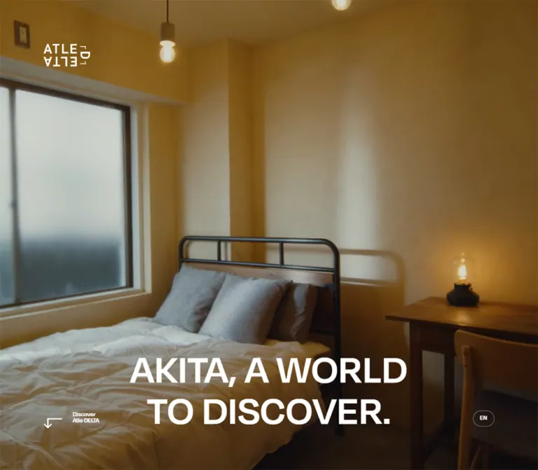
温かな室内写真と大きな欧文見出しを軸に、宿泊・飲食・創作活動を紹介する複合施設の公式サイト。デスクトップの全面写真から、モバイルの余白豊かな構成へ大胆に切り替わります。
オリジナルサイトを見るAtle DELTA — Style Reference
Warm, lived-in imagery framed by oversized type and a restrained monochrome interface.
Website / original URL: atledelta.com Final URL: https://atledelta.com/ Response: HTTP 200; original and final URLs match. Theme: a light interface, white type over desktop hero imagery, and a charcoal news section. No selectable color theme was verified. Inspected: September 17, 2026, at 04:54 JST. The supplied capture record is timestamped September 16, 2026, at 19:54:51.120 UTC. Viewports: desktop 1440 × 1000 and mobile 390 × 844 CSS pixels. Scope: the current Japanese homepage. Visual evidence covers three desktop opening frames and two mobile opening frames. Rendered DOM and computed-style evidence additionally cover the introduction, facility links, news, access information, desktop gallery structure, footer, and inactive navigation/article subtrees. Linked pages and transaction flows were not inspected.
Atle DELTA presents a mixed-use destination through three activities: STAY, EAT & TALK, and WORK. Its homepage combines a place introduction, facility navigation, editorial updates, access information, and booking/store links. Those functions should remain distinct when adapting the design.
The opening screen makes its strongest impression through proportion. On desktop, photographic detail fills the viewport while a large white, two-line statement sits low in the frame. The compact rotated-letter logo occupies the upper-left area; discovery and language controls occupy the lower corners. On mobile, the composition changes substantially: a black logo and booking control sit on a light canvas, the black headline appears above a separate landscape image, and broad empty space surrounds both.
The interface supplies relatively little color. Timber, amber light, dark furniture, and coffee provide warmth in the visible imagery. Below the opening screen, the measured structure uses generous spacing, narrow facility descriptions, compact pill links, a dark news interval, and practical access and booking information.
How to Read This Reference
- Measured means reported in the supplied rendered DOM, computed styles, or custom properties. Element rectangles are rendered bounds at the captured state; they are not always untransformed CSS dimensions.
- Visually observed means directly visible in the supplied current-page screenshots. These screenshots show the opening screen, not the entire homepage.
- Estimated means judged from screenshot geometry, such as the mobile image radius. Estimates are identified explicitly.
- Calculated means derived from measured values, such as the width of one grid column.
- Recommended means an implementation choice for a new build. Breakpoints, accessibility enhancements, fallback behavior, and the Quick Start interpolation are recommendations unless otherwise stated.
- Computed font stacks identify declared families, not proof of which font file rendered every glyph. Font loading and licensing were not independently audited.
- Duplicate strings such as
READREADandENENoccur in extracted text. They do not establish that two labels are visibly displayed. Use one readable label in an adaptation. - Some navigation and article elements have measurable rectangles despite not appearing in the screenshots. Their presence does not demonstrate an opened menu, active dialog, or completed interaction.
Tokens — Colors
Default Palette
These are exact source custom-property values. Roles distinguish confirmed application from declarations whose use is not established by the supplied views.
| Name | Value | Source token | Evidence and role |
|---|---|---|---|
| Light canvas | #f7f7f7 |
--color-bg |
Computed BODY and MAIN background at both viewports; visibly surrounds the mobile hero |
| Black | #000000 |
--color-black |
Main interface text; computed booking-panel fill; visible mobile logo, headline, and booking pill |
| White | #ffffff |
--color-white |
Desktop hero lettering; news-section text; mobile facility-link backgrounds in the DOM |
| Charcoal | #38383a |
--color-charcoal |
Exact computed background of LATEST NEWS |
| Caption gray | #8a8a8a |
--color-caption |
Declared supporting-text token; specific use is not established by the sampled elements |
| Black boundary | rgba(0,0,0,.2) |
--color-border-black |
Declared light-surface boundary color; consistent with the faint mobile control outlines |
| White boundary | hsla(0,0%,100%,.4) |
--color-border-white |
Declared reversed boundary color; consistent with the desktop EN outline |
Additional Declared Colors
| Value | Source token | Limit on interpretation |
|---|---|---|
#222222 |
--color-dark |
Declared; no sampled element establishes its specific role |
#302e2d |
--color-night |
Declared; do not infer an activated night theme from its name |
#41a79f |
--color-blue |
Declared teal value; not established as a visible primary action color |
Warm brown and amber are photographic characteristics of the current hero frames, not measured interface tokens. Keep the canvas neutral rather than turning those image colors into a brown UI theme.
The desktop-to-mobile foreground reversal is a layout treatment: white text on photographic media becomes black text on a light surface. No user-operated theme change was observed.
Tokens — Typography
Display and Interface
Computed stack: degular, ryo-gothic-plusn, 'Hiragino Kaku Gothic ProN', 'Hiragino Sans', Meiryo, 'Yu Gothic', sans-serif.
The sampled headline, navigation, utility links, and general interface use this stack, usually at weight 500. The large opening statement feels forceful because of its size, uppercase presentation, and compact line height. Its measured weight is not 700.
The visible line break is intentional:
AKITA, A WORLD
TO DISCOVER.
The logo is a distinctive graphic arrangement of letters, including rotated lettering. Its container font size does not describe the logo artwork. Use an authorized logo asset instead of approximating the mark by typing the brand name.
Japanese Body Copy
Computed stack: neue-haas-grotesk-text, ryo-gothic-plusn, 'Hiragino Kaku Gothic ProN', 'Hiragino Sans', Meiryo, 'Yu Gothic', sans-serif.
Facility descriptions and introductory paragraphs use weight 400; several access labels use 500. Body leading is generous compared with the headline: typically 1.7, with introductory copy at 1.6.
A neue-haas-grotesk-display class declaration also appears in the supplied page text, but the sampled hero heading computes to the Degular-led stack. Do not substitute the display family merely because it is declared elsewhere.
Type Scale
All values below are measured computed values, rounded where indicated.
| Role | Desktop | Mobile | Weight | Notes |
|---|---|---|---|---|
| Base interface | 14px / 23.8px |
13px / 22.1px |
500 |
General body/interface inheritance |
| Opening headline | 108px / 108px |
39px / 39px |
500 |
Two lines; normal letter spacing |
| Introductory paragraphs | 17.99px / 28.784px |
14px / 22.4px |
400 |
Copy stack |
| Facility paragraphs | 14px / 23.8px |
13px / 22.1px |
400 |
Copy stack |
| Facility H2 containers | 21px / 35.7px |
19.5px / 33.15px |
500 |
Parent values only; descendant lettering was not sampled |
| News label | approximately 12px / 20.397px |
11px / 18.7px |
500 |
Compact section label |
| News-link container | 14px / 19.6px |
13px / 18.2px |
500 |
Descendant title/date styles may differ |
| SEE ALL NEWS | 17.99px / 28.784px |
14px / 22.4px |
500 |
Unboxed text link |
| Access subheading | 16.38px / 27.846px |
15.21px / 25.857px |
500 |
Copy stack |
| Hero EN link | approximately 12px / 20.397px |
11px / 18.7px |
500 |
Outlined pill |
| Social pill | 14px / 16.8px |
13px / 15.6px |
500 |
Compact label with asymmetric vertical padding |
| Footer primary links | 17.99px / 17.99px |
14px / 14px |
500 |
HOME, STAY, EAT & TALK, WORK |
| Mobile navigation subtree | Not established | 39px / 31.98px |
500 |
DOM-only values; opened appearance was not captured |
The facility H2 bounds do not equal a simple two-line block at their parent line height. Child styling or artwork contributes to their geometry. Those parent values are insufficient to recreate the subbrand lettering accurately.
The visible Discover captions are smaller than the overall control suggests. The button parent computes to 14px on desktop and 13px on mobile, but nested caption styles were not included. An approximately 10–11px visible caption is a screenshot estimate, not a measured child token.
Tokens — Spacing & Shapes
Responsive Unit
This site uses conventional pixel-sized root text alongside a viewport-derived column system. It does not use the unusually small root unit found in some experimental interfaces.
The supplied desktop grid token is:
--grid: calc(6.25vw - 20px * 2 / 16 - 20px * 15 / 16);
--margin: 20px;
--gap: 20px;
This describes 16 columns after subtracting two outer margins and fifteen gutters. At 1440px, one column is 68.75px, and one column plus gutter is 88.75px.
The mobile token is:
--grid: calc(12.5vw - 14px * 2 / 8 - 14px * 7 / 8);
--margin: 14px;
--gap: 14px;
This describes 8 columns. At 390px, one column is 33px, and one column plus gutter is 47px.
The source also declares --vh: 1svh. The opening section measures exactly one viewport high in both captures. The breakpoint between the two grid definitions was not supplied.
Spacing Scale
| Use | Desktop | Mobile | Status |
|---|---|---|---|
| General outer margin | 20px |
14px |
Source tokens |
| General grid gutter | 20px |
14px |
Source tokens |
| Single column | 68.75px |
33px |
Calculated at inspected widths |
| Header-space token | 67.925px |
57.2px |
Calculated from source formulas |
| Opening logo left inset | 108.75px |
14px |
Rendered bounds |
| Opening logo top inset | 108.75px |
14px |
Rendered container bounds |
| Discover icon/label gap | 20px |
14px |
Computed button gap |
| News vertical padding | 140px |
78px |
Computed section padding |
| News horizontal padding | 20px |
14px |
Computed section padding |
| News item padding | 10.5px |
0px |
Computed link padding |
| News row separation | One row | approximately 40px |
Calculated from mobile item bounds |
| Booking-panel padding | 14px |
13px |
Computed values before any rendering transform |
| Facility link bottom padding | 84px |
0px |
Measured parent styles; mobile children provide internal spacing |
The header-space formulas evaluate to:
- Desktop:
20px + (68.75px + 20px) × 0.54 = 67.925px. - Mobile:
14px + (33px × 2 + 14px) × 0.54 = 57.2px.
These tokens help explain alignment, but do not imply that all section spacing is a multiple of one small base unit. Large spaces also depend on viewport and section composition.
Border Radius
| Element or token | Value | Evidence |
|---|---|---|
| Standard panel | 6px |
Source --corner; mobile facility links and booking panels compute to this value |
| Inner corner | 4px |
Source --corner-inner; particular application not established |
| Pill | 200px |
Source --r-btn; language and social links |
| Circular control | 50% |
Source --r-circle; exact header icon wrapper style not sampled |
| News-link container | 0px |
Computed at both viewports |
| Desktop hero media | Square viewport edges | Visible in screenshots |
| Mobile hero image | approximately 14px |
Screenshot estimate; not the measured 6px panel token |
A separate --thin: 4px variable is declared. Its role is not established; it should not be treated as the universal border width. Fine control outlines appear approximately 1px thick, but their exact border widths were not included in the element sample.
Layout Measurements
| Element | Desktop 1440 × 1000 | Mobile 390 × 844 |
|---|---|---|
| Opening section | 1440 × 1000px |
390 × 844px |
| Logo container | x 108.75, y 108.75; 137.5 × 83.34px |
Header H1: x 14, y 14; 80 × 47.23px |
| Headline container | x 353.25, y 678.75; 733.5 × 216px |
x 0, y 246.48; 390 × 78px, with 33px horizontal padding |
| Hero media | Visually fills the viewport | Approximately x 2, y 350; 386 × 217px, estimated from screenshots |
| Hero EN link | x 1289.27, y 861.08; 41.98 × 30.17px |
x 337.5, y 785; 38.5 × 27.83px |
| Intro paragraph | 512.5px wide, beginning at x 730 |
362px wide, beginning at x 14 |
| Main facility link | 521.25px wide, centered |
390px wide |
| Facility description | 448px wide, centered |
362px wide |
| Day/night description | 336px wide, centered |
362px wide |
| News link | 335px wide |
174px wide |
| MAIN rendered height | approximately 14075.20px |
approximately 7561.80px |
The record reports document heights of only 1000px and 844px, even though MAIN and descendant rectangles extend much farther. This indicates that the document-height field alone is unsuitable for judging page length. The exact scrolling architecture was not established.
Components
Desktop Opening Screen
Role: introduce the place through atmosphere and identity before presenting detailed information.
The current desktop frames use full-viewport photographic imagery: a timber desk and chair, a dark lamp base, warm highlights, and a textured wall with a large soft shadow. The white interface sits directly over this material detail.
The composition has four principal anchors:
- A small graphic logo at approximately
109pxfrom the top and left. - A centered two-line headline low in the viewport, measured at
108px / 1. - A lower-left Discover control combining an angular downward arrow and a two-line caption.
- A small outlined EN pill at the lower right.
The title container ends approximately 105px above the viewport bottom. This creates a low visual center while leaving the upper portion of the frame available to the imagery. Avoid moving the headline to the geometric center of the screen.
A conventional top navigation bar is not visible in the desktop opening screenshots. Navigation strings exist elsewhere in the DOM, but their visibility after scrolling is unverified.
Mobile Header and Opening Screen
Role: retain immediate booking access while giving the image and headline separate space.
The header is a compact three-column arrangement with 14px padding and gaps. Its reported tracks are 80px, approximately 225.41px, and approximately 28.59px.
The left column contains the black logo. The middle region aligns a black BOOK NOW pill toward the right; its link rectangle is approximately 95.52 × 26.03px. The final region contains an outlined circular control with a small cross-like symbol. The inner button measures approximately 26.59 × 26.69px. Its action was not exercised; adjacent navigation markup suggests a navigation function, but the open state is not visually verified.
The headline begins around y 246.48px, leaving a large pause below the header. It uses black 39px type on #f7f7f7. A separate rounded landscape image begins around y 350px, approximately 25.5px below the headline box. Its estimated 386 × 217px dimensions are consistent with a 16:9 ratio.
The visible image shows coffee pouring into a tilted glass. Discover remains at the lower left and EN at the lower right. The design preserves empty space below the image rather than expanding it to fill the screen.
Discover and Language Controls
Role: offer a quiet next step and language route without competing with the opening statement.
Discover is a semantic button in the DOM. The arrow is an angular, bent downward mark, not a filled circular arrow button. Its parent uses an inline-flex layout with a 20px desktop or 14px mobile gap. The button's exact scroll destination and animation were not tested.
EN is an anchor to https://atledelta.com/en/. It uses a large pill radius, small type, and a faint outline. On desktop it reverses to white over the image; on mobile it is black on the light canvas. This is a known destination, not evidence that the English page was inspected.
Introduction and Story Link
Role: explain the mixed-use purpose of Atle DELTA and offer a longer story.
The introduction follows the opening section. Its three paragraphs describe the meeting of people, technology, and initiatives, followed by a short closing statement. Desktop copy occupies a 512.5px column beginning at x 730, placing it in the right half of the page. The section reports grid tracks of 532.5px and 690px; those parent values do not by themselves explain every internal alignment.
On mobile the copy spans the 362px content width. Introductory text decreases from approximately 18px to 14px, while keeping 1.6 leading.
See our Story is a separate linked block beneath the copy. Its measured bounds are 246.25 × 126.39px on desktop and 188 × 100.42px on mobile. The mobile block is right-aligned at x 188. Its destination is a YouTube video. The record establishes a link, not an inline video player or modal playback behavior.
Social Links
Role: provide secondary routes without creating a separate visual hierarchy.
YouTube, Instagram, X, and Facebook appear as compact pill links. At desktop size their heights are approximately 27.89px; on mobile they are approximately 26.03px. Desktop padding is 3.5px 16.8px 5.6px, and mobile padding is 3.25px 15.6px 5.2px.
The post-introduction desktop row is aligned toward the right edge. The mobile row begins at the 14px left margin. The links use modest inter-pill gaps rather than large individual card containers.
Numbered Facility Links
Role: organize the destination into three complementary activities.
Each principal link groups a number, an activity label, a facility name, Japanese descriptive copy, and READ text:
| Number | Activity | Facility name | Destination |
|---|---|---|---|
| 01 | STAY | DELTA HOSTEL | /stay/ |
| 02 | EAT & TALK | マチノミナト COFFEEHOUSE | /eat-and-talk/ |
| 03 | WORK | CREATORS' GARAGE | /work/ |
These are large linked content compositions, not merely small READ buttons. At the desktop sample, their link boxes are centered at 521.25px wide and approximately 806–813px tall. Paragraphs sit in a narrower 448px measure. The sampled parent backgrounds are transparent.
On mobile, each principal link spans the full 390px width with a white background and 6px radius. Descriptive copy is inset to 362px. Their measured heights range from approximately 563px to 590px.
Substantial regions occur between the mobile content blocks. The supplied DOM sample does not identify all media occupying those regions, so their appearance should not be invented from the paragraph coordinates. Preserve the measured distinction between broad section composition and narrow readable text.
Day and Night Links
Role: explain two uses of the coffeehouse within EAT & TALK.
DAY : CAFE and NIGHT : PUB each combine a heading, READ text, and a descriptive paragraph. Both route to /eat-and-talk/.
On desktop, their parent links occupy the same 521.25px centered width as the facility composition, while the paragraphs narrow to 336px. On mobile, both paragraphs use the full 362px content measure. This creates a secondary information layer within the food-and-drink section rather than a fourth and fifth equal facility category.
Latest News
Role: show current activity and provide access to the news archive.
This is the clearest measured surface change below the opening screen: white content on #38383a. The section has 140px 20px desktop padding and 78px 14px mobile padding.
Four article links form one desktop row. Their left positions are 20, 375, 730, and 1085px, giving 335px items with 20px gaps. On mobile, the same four entries form two columns and two rows: 174px items at x 14 and x 202, with a 14px column gap and approximately 40px between rows.
Each entry exposes an article title, date, and READ label. The latest recorded item is dated July 7, 2026. Item heights vary, particularly for the fourth article; equal-height cards are not established. The supplied sample does not identify the individual article-image assets.
The section title is small, approximately 12px on desktop and 11px on mobile. SEE ALL NEWS is centered below the entries and links to /news/. Keep this archival action visually lighter than the booking action.
Access Information
Role: make a physical visit practical.
The section includes a postal address, Google Maps link, public-transport guidance, driving information, and a parking-information pill. The map link points to https://maps.app.goo.gl/tnBWktFqLKxUibDA7; the parking link points to the facility's Instagram account.
Desktop address and travel information begin in the right half at x 730. On mobile, the address and map link are centered, while transport subheadings and supporting text return to the 14px content margin. The parking pill is also centered.
The section measures 1000px high on desktop and approximately 1146.16px on mobile. Large areas without sampled text are not sufficient evidence to identify a map illustration, photograph, or animation. Their visual content remains unverified.
Desktop Linked Gallery Region
Role: provide additional routes to facilities and the store; exact interaction is unverified.
The desktop DOM contains repeated linked entries for CREATOR'S GARAGE, DELTA HOSTEL, CAFE, and ONLINE STORE. Their coordinates extend horizontally beyond the viewport, reaching more than 3000px from the left. Recorded boxes alternate between approximately 335 × 310px and 246.25 × 387px, with varied vertical positions and white text.
These measurements establish a staggered horizontal arrangement in the rendered structure. They do not establish dragging, autoplay, a carousel, scroll-driven translation, or the appearance of the underlying imagery.
The corresponding sequence is absent from the supplied mobile extraction, where access information leads directly into the footer. A swipeable mobile replacement should not be assumed.
Booking and Store Panels
Role: provide explicit commercial destinations after the place introduction.
The booking panel combines BOOK HOSTEL NOW, the source label 宿泊予約する, and an external-direction affordance. Its background computes to black with white text. The store counterpart combines ONLINE STORE with オンラインストア and uses a transparent background with black text in the sample.
Both use 6px corners and a two-column internal grid. Mobile navigation-subtree panels measure 362 × 108px, with 13px padding, a 14px gap, and reported 240px 80px tracks. Their destinations are the hostel booking service and https://store.atledelta.com/ respectively.
Footer versions have smaller rendered bounds than their internal grid dimensions would suggest. The mobile footer panel is approximately 347.52 × 103.68px, exactly 96% of the 362 × 108px navigation-subtree rectangle. This is consistent with a scaled state, but a transform declaration was not supplied. Treat these as captured bounds, not a requirement to hardcode the smaller width.
Footer
Role: combine booking, orientation, navigation, and legal information.
The footer includes the booking/store panels, graphic identity, address, MAP and Access links, primary facility routes, NEWS and FAQ, company-related links, social links, language, copyright, Terms, and Privacy Policy.
Desktop primary navigation begins around x 730, while secondary links begin around x 1262.5. Mobile reorganizes these into narrower groups: primary navigation starts at x 14, and secondary links at x 249. Social links form a separate row beneath the navigation.
A button with no extracted text is present in the footer. Its purpose was not confirmed. Do not assign it a back-to-top behavior without further evidence.
Navigation and Article Subtrees
Evidence level: DOM only.
The mobile extraction contains large navigation links, language choices, smaller utility routes, social links, and the two commercial panels. The screenshots show the opening page with this content concealed. The navigation's opening direction, backdrop, focus handling, and close behavior were not tested.
An additional article/share subtree includes Copy URL, social sharing labels, and SEE ALL NEWS. Some of its desktop bounds lie beyond the viewport. This does not establish that news links opened an article panel during inspection.
Tokens — Motion & Interaction
Measured Transition Declarations
| Target | Desktop declaration | Mobile declaration | Evidence limit |
|---|---|---|---|
| MAIN color treatment | Background and color, 0.2s ease-in-out |
Same | The trigger and resulting states were not exercised |
| Introductory paragraph reveal | Opacity and transform, 1s cubic-bezier(.19,1,.22,1) |
1.4s with the same curve |
Delays of 0.3s, 0.4s, and 0.5s; start/end transforms unknown |
| Address reveal | 1s, custom-out curve, 0.3s delay |
1.4s, same curve and delay |
Declaration only |
| Access footer link reveal | 1s, custom-out curve, 0.4s delay |
1.4s, same curve and delay |
Declaration only |
| Social and parking pill borders | 0.3s cubic-bezier(.4,.64,.68,1) |
Same | Exact hover colors were not sampled |
| Language-link border | 0.4s ease-in-out |
Same | State transition was not exercised |
| Terms and Privacy underline treatment | Background-size, 0.4s cubic-bezier(.19,1,.22,1) |
Same | Endpoint geometry was not supplied |
| Header icon-button width | Not established | 0.6s cubic-bezier(.76,0,.24,1) |
No opened-state capture |
| Large mobile navigation links | Not established | 1s cubic-bezier(.19,1,.22,1) |
Inactive subtree; changed property not established |
Source Easing Tokens Useful for Reuse
| Token | Value | Confirmed application in sample |
|---|---|---|
--ease-custom-out |
cubic-bezier(.19,1,.22,1) |
Paragraph opacity/transform transitions and legal-link background-size transitions |
--ease-sine-out |
cubic-bezier(.4,.64,.68,1) |
Pill border transitions |
--ease-power3-in-out |
cubic-bezier(.76,0,.24,1) |
Mobile header-button width transition |
The stylesheet declares additional power, sine, expo, and back curves. Their presence does not prove that each curve is active in the inspected composition.
Visible Motion Evidence and Limits
The desktop captures show the same interface over different photographic frames: the desk composition changes, and another frame emphasizes the wall shadow. The mobile captures also show slight differences in the coffee image. This establishes time-varying imagery consistent with moving media. The supplied element sample does not identify a video node, media URL, playback rate, audio state, loop interval, or transition method.
Most sampled elements report animation: none. That does not exclude video, script-driven animation, transforms, or descendant animation.
No click, hover, menu-open, language-switch, booking, or gallery interaction outcome was supplied. Keep the distinction between a known link destination, a declared transition, and an observed behavior.
Surfaces
| Surface | Treatment | Role and evidence |
|---|---|---|
| Main canvas | #f7f7f7 |
Computed page background and visible mobile opening canvas |
| Desktop hero | Edge-to-edge photographic media | Visually observed; foreground is white |
| Mobile hero media | Inset landscape rectangle with softly rounded corners | Visually observed; radius is estimated |
| Mobile facility links | White, 6px corners |
Computed DOM values |
| News section | #38383a with white text |
Computed DOM values |
| Booking panel | Black with white text, 6px corners |
Computed DOM values |
| Utility pill | Transparent fill and fine contrasting boundary | Radius and boundary colors are supplied; precise border width is not |
| Store panel | Transparent background, black text, 6px corners |
Sampled state |
The visible opening screen has no soft card shadows or glass effects. Below-the-fold box shadows were not included in the supplied style fields, so a page-wide absence of shadows cannot be certified. A restrained, flat implementation is consistent with the available evidence.
Imagery
The current desktop imagery emphasizes material and light: wood grain, a worn desk edge, a curved chair back, a dark lamp base, warm illumination, and a large soft shadow on textured plaster. The mobile opening image shows coffee pouring into a tilted glass, with metal hardware, bubbles, and a dark, softly focused background.
This is close observation of a place rather than a catalog of isolated amenities. Cropping and shallow focus allow small physical details to carry atmosphere. The large type remains clean and neutral against those textures.
Desktop media fills a 1440:1000 viewport in the captured state. Mobile separates the media into an approximately 16:9 window. Whether the site selects different assets or different moments from related media cannot be established. Do not force a single desktop crop onto mobile without checking the subject placement.
Observed Asset References
No logo, photograph, poster, or video file URL was included in the supplied original-page evidence. Do not fabricate an asset manifest.
| Visual item | What is established | What remains unknown |
|---|---|---|
| Atle DELTA mark | Visible graphic letter arrangement in black and white treatments | File path, format, and view box |
| Desktop hero media | Several current photographic frames | Media URL, encoding, playback attributes, and poster |
| Mobile hero media | Coffee-pouring image with changing detail between captures | Asset relationship to desktop media |
| Discover arrow | Angular bent downward mark | Original asset path or complete drawing instructions |
| External-link arrow | --i-exarrow-r contains an inline SVG in a 20 × 20 coordinate box |
Which individual rendered links use the token |
| News and gallery assets | Link structures and dimensions are available | Individual images and crop rules |
Use authorized imagery and identity assets when available. If creating analogous imagery, prioritize real materials, directional light, detail, and quiet framing. Keep generated or substitute assets clearly separate from any claim about the original site.
Layout & Responsive Behavior
Desktop
The opening screen is an immersive media composition. The logo sits well inside the viewport, aligned to an inset of 108.75px, while the main site grid elsewhere uses 20px outer margins. These are two distinct spacing regimes.
The introduction places readable copy in the right half. Facility links then use a narrow, centered composition, with descriptions constrained further inside it. News expands to four columns across the available width. Access information returns to right-half alignment, followed by a desktop structure that extends horizontally beyond the visible viewport and then the footer.
Mobile
The opening screen changes foreground color, media framing, title placement, and header visibility. It is a recomposition rather than a uniform scale reduction.
The page grid changes to eight columns with 14px gutters. Introductory and facility copy use the 362px content width. Facility content links become full-width white panels. News retains two columns, even at 390px. Access combines centered address/map information with left-aligned travel text. Footer navigation and commercial panels stack into narrower groups.
Implementation Boundaries
Only 1440px and 390px widths were supplied. Tablet behavior, intermediate breakpoints, landscape phones, browser zoom, and very short viewports were not visually tested.
Several recorded child positions do not follow a simple static calculation from parent padding. For example, desktop news-child positions and footer-panel bounds cannot be fully explained by the supplied parent styles alone. Avoid converting every absolute Y coordinate into a hardcoded margin; state-dependent transforms or positioning may contribute.
Recommended: use normal document flow for the new implementation unless custom scrolling is a deliberate requirement. Reproduce the spatial relationships and confirmed responsive changes before adding a more complex scrolling system.
Do’s and Don’ts
Do
- Preserve the strong desktop/mobile change in the opening composition.
- Use the measured light canvas
#f7f7f7, black actions, and charcoal news surface#38383adistinctly. - Keep the desktop title low in the frame and retain its two-line break.
- Use the measured
500headline weight before experimenting with heavier alternatives. - Preserve the authorized graphic logo and its generous desktop inset.
- Let photography provide warmth while keeping interface colors restrained.
- Keep facility descriptions narrower than their surrounding compositions on desktop.
- Maintain the numbered STAY, EAT & TALK, and WORK hierarchy.
- Preserve the four-column desktop and two-column mobile news arrangements.
- Give pills compact proportions and fine outlines.
- Keep booking, story, language, map, and article destinations semantically distinct.
- Label inferred behavior and unverified media details when handing the reference to another agent.
Don't
- Don't keep the desktop full-screen background treatment unchanged on mobile.
- Don't fill the mobile opening whitespace with extra slogans, badges, or feature cards.
- Don't turn the three facility links into a generic row of identical desktop cards.
- Don't use the declared teal token as a primary CTA color without evidence for that role.
- Don't round every component to the estimated mobile hero-image radius; regular panels use
6px. - Don't recreate the logo from ordinary text or assume parent H2 styles describe subbrand artwork.
- Don't print duplicated extraction strings as visible UI labels.
- Don't assume the header's cross-like control is a theme switch.
- Don't describe the gallery as draggable, looping, or scroll-driven without further inspection.
- Don't infer video sound, autoplay attributes, or transition timing from still captures.
- Don't treat the viewport-sized document-height field as proof that the page contains only one screen.
- Don't identify blank regions or unrecorded image assets from surrounding text alone.
Recommended Implementation Additions
These are recommendations for a new implementation, not verified features of the original site:
- Enlarge compact control hit areas to approximately
44 × 44pxwhile retaining small visual pills where practical. Space enlarged targets so their active areas do not overlap. - Give the icon-only header control an accessible name. If it opens navigation, implement
aria-expanded, a clear close action, keyboard navigation, and appropriate focus return. - Give the graphic logo a meaningful accessible name. Keep the headline and facility descriptions available as text.
- Hide decorative duplicate label layers from assistive technology if using animated text replacements.
- Keep paragraph content visible when reveal scripts fail or reduced motion is requested.
- Provide a static poster and pause mechanism for persistent moving imagery. Honor reduced-motion preferences in media logic; CSS alone cannot pause a video.
- Check white-text contrast across all desktop media frames. A subtle scrim is one possible addition, but its opacity must be tested against the actual imagery.
- Preserve a usable mobile first screen on short displays. Let content grow beyond one screen when necessary rather than allowing the header, headline, and controls to collide.
- Use responsive image sizes and reserve media dimensions to reduce layout shifts. Avoid loading large offscreen imagery before essential opening content.
- Keep news titles readable at zoom and allow variable item heights. Consider a one-column fallback only where narrower widths or enlarged text require it.
Agent Prompt Guide
Quick Color Reference
- Light canvas:
#f7f7f7. - Main ink and booking fill:
#000000. - Reversed type and mobile facility surfaces:
#ffffff. - News background:
#38383a. - Light-surface boundary:
rgba(0,0,0,.2). - Media-surface boundary:
rgba(255,255,255,.4). - Warm amber and timber brown belong to imagery; no exact image-color tokens were measured.
- The declared teal
#41a79fhas no verified primary-action role in the supplied evidence.
Overall Prompt
“Create a homepage for a mixed-use destination combining accommodation, a coffeehouse, and creative workspace, using Atle DELTA's observed composition as a reference. Use a restrained black, white, and #f7f7f7 interface with documentary imagery of timber, light, and coffee. On desktop, fill the opening viewport with imagery, place an authorized graphic logo well inside the upper-left corner, and set a large white two-line statement near the bottom center. Add a small angular Discover control at lower left and an outlined language pill at lower right. At phone width, switch to a light canvas, show a compact black logo and booking action in the header, place the black statement above a separate rounded landscape image, and retain generous whitespace. Continue with an introduction, three numbered facility links, a charcoal news section, access information, and booking/store panels. Use a 16-column desktop grid with 20px gutters and an 8-column mobile grid with 14px gutters. Keep unverified gallery and menu behavior out of the specification.”
Example Component Prompts
- Opening screen: “At 1440 × 1000, use a full-bleed warm interior image with a white logo approximately 109px from the top and left. Center a two-line uppercase statement low in the frame at 108px with line-height 1 and weight 500. Keep discovery and language controls small. At 390 × 844, use a light background, a 39px black headline above an approximately 386 × 217px inset image, and a compact booking header.”
- Facility composition: “Create a numbered linked section for STAY, EAT & TALK, or WORK. At desktop size, center a roughly 521px composition with descriptive copy constrained to 448px. At phone size, use a full-width white panel with 6px corners and 14px text insets. Keep the facility identity, descriptive copy, and READ affordance within one coherent link.”
- News section: “Create a
#38383anews region with white text, a small uppercase section label, four 335px-wide items with 20px gaps at 1440px, and two 174px columns with 14px gaps at 390px. Allow variable heights. Include a title, date, and READ label for each entry and a centered archive link below. Use article imagery only when assets are supplied.” - Booking panel: “Create a black booking link with white English and Japanese source labels, 6px corners, compact padding, and a right-hand affordance region. At 390px, target an untransformed 362 × 108px panel with 13px padding and a 14px internal gap. Pair it with a quieter store panel. Keep the destinations as real anchors.”
- Motion handoff: “Use the recorded custom-out easing for optional paragraph reveals: 1 second on desktop and 1.4 seconds on mobile, with 0.3/0.4/0.5-second staggered delays. Start with visible content, add motion only after initialization, and disable it for reduced motion. Do not invent media playback or gallery animation behavior.”
Quick Start
CSS Custom Properties
This is a reusable adaptation, not a recovered stylesheet. It preserves measured palette values, typography stacks, grid calculations, and principal proportions. The 767px breakpoint, fluid headline interpolation, mobile stage-centering formula, hover endpoints, and short-screen fallback are recommended choices. The approximately 14px mobile image radius is a screenshot estimate.
Use a .delta-site wrapper. The opening markup should contain .delta-hero__brand, a .delta-hero__stage containing the title and media, and the two lower controls. Give the title two block-level spans. The media wrapper can contain an authorized image or video; no asset URLs are provided here. The separate .delta-header contains the mobile logo, booking link, and icon control.
Load appropriately licensed fonts separately. The CSS keeps a conventional root size and applies the observed pixel sizes to components.
:root {
  /* Exact source colors */
  --color-bg: #f7f7f7;
  --color-black: #000;
  --color-white: #fff;
  --color-charcoal: #38383a;
  --color-caption: #8a8a8a;
  --color-border-black: rgba(0, 0, 0, .2);
  --color-border-white: rgba(255, 255, 255, .4);

  /* Computed source font stacks; font files are not included */
  --font-interface: degular, ryo-gothic-plusn,
    'Hiragino Kaku Gothic ProN', 'Hiragino Sans',
    Meiryo, 'Yu Gothic', sans-serif;
  --font-copy: neue-haas-grotesk-text, ryo-gothic-plusn,
    'Hiragino Kaku Gothic ProN', 'Hiragino Sans',
    Meiryo, 'Yu Gothic', sans-serif;

  --text-base: 14px;
  --text-intro: 17.99px;
  --text-small: 11.998px;
  --leading-body: 1.7;
  --weight-interface: 500;
  --weight-copy: 400;

  /* Source-derived desktop grid */
  --margin: 20px;
  --gap: 20px;
  --column: calc(6.25vw - 20px * 2 / 16 - 20px * 15 / 16);
  --header-space: calc(20px + (var(--column) + 20px) * .54);
  --hero-inset: calc(var(--margin) + var(--column) + var(--gap));

  /* Recommended interpolation; equals 108px at 1440px */
  --text-hero: clamp(56px, 7.5vw, 144px);

  --corner: 6px;
  --corner-inner: 4px;
  --r-btn: 200px;
  --hero-mobile-radius: 14px;

  /* Source transition values */
  --ease-custom-out: cubic-bezier(.19, 1, .22, 1);
  --ease-sine-out: cubic-bezier(.4, .64, .68, 1);
  --ease-power3-in-out: cubic-bezier(.76, 0, .24, 1);
  --reveal-duration: 1s;

  /* Recommended contrast aid; tune against actual media */
  --hero-scrim-opacity: .12;
}

* {
  box-sizing: border-box;
}

body {
  margin: 0;
}

.delta-site {
  position: relative;
  color: var(--color-black);
  background: var(--color-bg);
  font-family: var(--font-interface);
  font-size: var(--text-base);
  font-weight: var(--weight-interface);
  line-height: var(--leading-body);
}

.delta-site :where(a, button) {
  color: inherit;
  font: inherit;
}

.delta-site :where(img, video) {
  display: block;
  max-inline-size: 100%;
}

.delta-site :focus-visible {
  outline: 2px solid currentColor;
  outline-offset: 4px;
}

.delta-header {
  display: none;
}

.delta-hero {
  position: relative;
  isolation: isolate;
  min-block-size: 100svh;
  overflow: clip;
  color: var(--color-white);
}

.delta-hero__stage {
  display: contents;
}

.delta-hero__media {
  position: absolute;
  inset: 0;
  z-index: 0;
  overflow: hidden;
}

.delta-hero__media > :is(img, video) {
  inline-size: 100%;
  block-size: 100%;
  object-fit: cover;
}

.delta-hero::after {
  position: absolute;
  inset: 0;
  z-index: 1;
  background: rgb(0 0 0 / var(--hero-scrim-opacity));
  content: '';
  pointer-events: none;
}

.delta-hero__brand {
  position: absolute;
  z-index: 2;
  inset-block-start: var(--hero-inset);
  inset-inline-start: var(--hero-inset);
  inline-size: calc(2 * var(--column));
}

.delta-hero__title {
  position: absolute;
  z-index: 2;
  inset-inline-start: 50%;
  inset-block-end: calc(var(--hero-inset) - 3.5px);
  inline-size: max-content;
  max-inline-size: calc(100% - 2 * var(--margin));
  margin: 0;
  transform: translateX(-50%);
  font-size: var(--text-hero);
  font-weight: 500;
  line-height: 1;
  letter-spacing: normal;
  text-align: center;
  text-transform: uppercase;
}

.delta-hero__title > span {
  display: block;
}

.delta-pill {
  display: inline-flex;
  align-items: center;
  justify-content: center;
  gap: .15em;
  padding: .25em 1.2em .4em;
  border: 1px solid var(--color-border-black);
  border-radius: var(--r-btn);
  background: transparent;
  line-height: 1.2;
  text-decoration: none;
  transition: border-color .3s var(--ease-sine-out);
}

.delta-pill--filled {
  border-color: var(--color-black);
  color: var(--color-white) !important;
  background: var(--color-black);
}

.delta-language {
  position: absolute;
  z-index: 2;
  inset-inline-end: var(--hero-inset);
  inset-block-end: var(--hero-inset);
  padding: .25em .8em .4em;
  border-color: var(--color-border-white);
  font-size: var(--text-small) !important;
  line-height: 1.7;
  transition: border-color .4s ease-in-out;
}

.delta-discover {
  position: absolute;
  z-index: 2;
  inset-inline-start: var(--hero-inset);
  inset-block-end: calc(var(--hero-inset) + 5.8px);
  display: inline-flex;
  align-items: flex-end;
  gap: var(--gap);
  min-block-size: 72px;
  padding: 0;
  border: 0;
  background: transparent;
  text-align: start;
  cursor: pointer;
}

.delta-discover__label {
  /* Estimated visible caption size; child styles were unavailable */
  font-size: 11px;
  line-height: 1;
}

.delta-intro {
  display: grid;
  grid-template-columns: repeat(16, minmax(0, 1fr));
  gap: var(--gap);
  padding: var(--header-space) var(--margin) var(--margin);
}

.delta-intro__copy {
  grid-column: 9 / span 6;
  font-family: var(--font-copy);
  font-size: var(--text-intro);
  font-weight: 400;
  line-height: 1.6;
}

.delta-intro__copy p {
  margin: 0 0 1em;
}

.delta-socials {
  display: flex;
  flex-wrap: wrap;
  gap: .5em;
}

.delta-facility {
  display: block;
  inline-size: min(521.25px, 100%);
  margin-inline: auto;
  padding-block-end: 84px;
  color: inherit;
  text-decoration: none;
}

.delta-facility__copy,
.delta-daynight__copy {
  max-inline-size: 448px;
  margin-inline: auto;
  font-family: var(--font-copy);
  font-weight: 400;
  line-height: 1.7;
}

.delta-daynight__copy {
  max-inline-size: 336px;
}

.delta-news {
  padding: 140px var(--margin);
  color: var(--color-white);
  background: var(--color-charcoal);
}

.delta-news__heading {
  margin: 0 0 48px;
  font-size: var(--text-small);
  font-weight: 500;
}

.delta-news__grid {
  display: grid;
  grid-template-columns: repeat(4, minmax(0, 1fr));
  align-items: start;
  gap: var(--gap);
}

.delta-news__item {
  display: grid;
  min-inline-size: 0;
  padding: 10.5px;
  color: inherit;
  line-height: 1.4;
  text-decoration: none;
}

.delta-news__item img {
  inline-size: 100%;
  block-size: auto;
}

.delta-news__all {
  display: flex;
  justify-content: center;
  gap: .75em;
  margin-block-start: 48px;
  font-size: var(--text-intro);
  text-decoration: none;
}

.delta-action {
  display: grid;
  grid-template-columns: minmax(0, 1fr) 157.5px;
  align-items: center;
  gap: var(--gap);
  max-inline-size: 600px;
  min-block-size: 180px;
  padding: 14px;
  border: 1px solid var(--color-black);
  border-radius: var(--corner);
  color: var(--color-white) !important;
  background: var(--color-black);
  line-height: 1.4;
  text-decoration: none;
}

.delta-action--store {
  color: var(--color-black) !important;
  background: transparent;
}

.delta-reveal {
  /* Visible by default; a separate controller may add reveal states */
  transition:
    opacity var(--reveal-duration) var(--ease-custom-out),
    transform var(--reveal-duration) var(--ease-custom-out);
}

@media (hover: hover) {
  /* Recommended endpoints, not verified original hover states */
  .delta-pill:hover {
    border-color: currentColor;
  }
}

/* Recommended breakpoint; the original breakpoint is unknown */
@media (max-width: 767px) {
  :root {
    --text-base: 13px;
    --text-intro: 14px;
    --text-small: 11px;
    --text-hero: clamp(30px, 10vw, 52px);
    --margin: 14px;
    --gap: 14px;
    --column: calc(12.5vw - 14px * 2 / 8 - 14px * 7 / 8);
    --header-space: calc(14px + (var(--column) * 2 + 14px) * .54);
    --reveal-duration: 1.4s;
  }

  .delta-header {
    position: absolute;
    inset: 0 0 auto;
    z-index: 10;
    display: grid;
    grid-template-columns:
      calc(2 * var(--column) + var(--gap)) minmax(0, 1fr) 28.6px;
    align-items: start;
    gap: var(--gap);
    padding: var(--margin);
  }

  .delta-header__book {
    justify-self: end;
  }

  .delta-header__control {
    inline-size: 28.6px;
    block-size: 28.6px;
    padding: 0;
    border: 1px solid var(--color-border-black);
    border-radius: 50%;
    background: transparent;
  }

  .delta-hero {
    color: var(--color-black);
    background: var(--color-bg);
  }

  .delta-hero::after,
  .delta-hero__brand {
    display: none;
  }

  .delta-hero__stage {
    position: absolute;
    inset-inline: 0;
    inset-block-start: calc(50% - 15.2px);
    display: grid;
    gap: 25.5px;
    transform: translateY(-50%);
  }

  .delta-hero__title {
    position: static;
    order: 0;
    inline-size: 100%;
    max-inline-size: none;
    padding-inline: var(--column);
    transform: none;
  }

  .delta-hero__media {
    position: relative;
    inset: auto;
    order: 1;
    inline-size: calc(100% - 4px);
    aspect-ratio: 16 / 9;
    margin-inline: 2px;
    border-radius: var(--hero-mobile-radius);
  }

  .delta-language {
    inset-inline-end: var(--margin);
    inset-block-end: 31px;
    border-color: var(--color-border-black);
  }

  .delta-discover {
    inset-inline-start: var(--margin);
    inset-block-end: 38.3px;
    min-block-size: 35.8px;
  }

  .delta-intro {
    grid-template-columns: repeat(8, minmax(0, 1fr));
    row-gap: 52px;
  }

  .delta-intro__copy {
    grid-column: 1 / -1;
  }

  .delta-facility {
    inline-size: 100%;
    padding: var(--margin);
    border-radius: var(--corner);
    background: var(--color-white);
  }

  .delta-facility__copy,
  .delta-daynight__copy {
    max-inline-size: none;
  }

  .delta-news {
    padding-block: 78px;
  }

  .delta-news__grid {
    grid-template-columns: repeat(2, minmax(0, 1fr));
    gap: 40px var(--gap);
  }

  .delta-news__item {
    padding: 0;
  }

  .delta-action {
    grid-template-columns: minmax(0, 1fr) 80px;
    inline-size: 100%;
    min-block-size: 108px;
    padding: 13px;
  }
}

/* Recommended protection for short phone displays */
@media (max-width: 767px) and (max-height: 650px) {
  .delta-hero {
    min-block-size: 720px;
  }
}

@media (prefers-reduced-motion: reduce) {
  .delta-site *,
  .delta-site *::before,
  .delta-site *::after {
    animation: none !important;
    transition: none !important;
    scroll-behavior: auto !important;
  }
}
The CSS establishes the opening composition and reusable content primitives. It intentionally leaves facility artwork, news assets, the unidentified access visual, navigation behavior, and gallery behavior to verified assets and a separate implementation. The stage-centering approximation places the mobile headline near y 246.5px and the media near y 350px at the supplied viewport.
Tailwind v4 Token Mapping
Optional aliases for a project already using Tailwind v4. This does not claim that the original website uses Tailwind. Define the properties above first.
@theme inline {
  --color-canvas: var(--color-bg);
  --color-ink: var(--color-black);
  --color-paper: var(--color-white);
  --color-news: var(--color-charcoal);
  --color-muted: var(--color-caption);

  --font-display: var(--font-interface);
  --font-body: var(--font-copy);

  --text-hero: var(--text-hero-size);
  --text-caption: var(--text-small);
  --text-intro-copy: var(--text-intro);

  --spacing-page: var(--margin);
  --spacing-gutter: var(--gap);
  --spacing-column: var(--column);

  --radius-panel: var(--corner);
  --radius-pill: var(--r-btn);
}

/* Separate alias avoids a self-referencing theme variable */
.delta-site {
  --text-hero-size: clamp(56px, 7.5vw, 144px);
}

@media (max-width: 767px) {
  .delta-site {
    --text-hero-size: clamp(30px, 10vw, 52px);
  }
}
Sources & Evidence
- Inspected original and final page: Atle DELTA. The supplied record reports HTTP 200 with no URL change.
- Capture record: September 16, 2026, 19:54:51.120 UTC, equivalent to September 17, 2026, 04:54:51.120 JST. Individual screenshot timestamps were not supplied.
- Desktop evidence: 1440 × 1000 CSS-pixel viewport; three current-page opening frames plus rendered text, link destinations, element rectangles, computed styles, and custom properties.
- Mobile evidence: 390 × 844 CSS-pixel viewport; two current-page opening frames plus the corresponding DOM and computed-style samples.
- Visual scope: opening-screen layout, colors, logo placement, typography appearance, controls, and changing photographic frames. Lower-page appearance is supported primarily by DOM measurements rather than screenshots.
- Interaction scope: destinations and transition declarations are available. No completed menu, hover, discovery, article, booking, language, or gallery interaction was documented.
- Capture limitations: the supplied process waited for load, finite motion, layout/text stability, and image decoding within bounded time limits. It temporarily paused perpetual animation during readiness checks and then resumed it. These checks do not establish that delayed content, all media, or all interaction states were exercised. SharedWorkers and service workers were disabled.
- Interpretation limits: asset URLs, device pixel ratio, intermediate responsive breakpoints, actual font-file selection, and the complete scrolling mechanism were not supplied. Inactive template text, including an extracted
404label, does not describe the visible homepage response.
This reference describes the current supplied homepage evidence. Measurements, screenshot estimates, calculations, and recommended implementation choices are separated throughout.
# Atle DELTA — Style Reference

> Warm, lived-in imagery framed by oversized type and a restrained monochrome interface.

**Website / original URL:** [atledelta.com](https://atledelta.com/)
**Final URL:** [https://atledelta.com/](https://atledelta.com/)
**Response:** HTTP 200; original and final URLs match.
**Theme:** a light interface, white type over desktop hero imagery, and a charcoal news section. No selectable color theme was verified.
**Inspected:** September 17, 2026, at 04:54 JST. The supplied capture record is timestamped September 16, 2026, at 19:54:51.120 UTC.
**Viewports:** desktop 1440 × 1000 and mobile 390 × 844 CSS pixels.
**Scope:** the current Japanese homepage. Visual evidence covers three desktop opening frames and two mobile opening frames. Rendered DOM and computed-style evidence additionally cover the introduction, facility links, news, access information, desktop gallery structure, footer, and inactive navigation/article subtrees. Linked pages and transaction flows were not inspected.

Atle DELTA presents a mixed-use destination through three activities: STAY, EAT & TALK, and WORK. Its homepage combines a place introduction, facility navigation, editorial updates, access information, and booking/store links. Those functions should remain distinct when adapting the design.

The opening screen makes its strongest impression through proportion. On desktop, photographic detail fills the viewport while a large white, two-line statement sits low in the frame. The compact rotated-letter logo occupies the upper-left area; discovery and language controls occupy the lower corners. On mobile, the composition changes substantially: a black logo and booking control sit on a light canvas, the black headline appears above a separate landscape image, and broad empty space surrounds both.

The interface supplies relatively little color. Timber, amber light, dark furniture, and coffee provide warmth in the visible imagery. Below the opening screen, the measured structure uses generous spacing, narrow facility descriptions, compact pill links, a dark news interval, and practical access and booking information.

## How to Read This Reference

- **Measured** means reported in the supplied rendered DOM, computed styles, or custom properties. Element rectangles are rendered bounds at the captured state; they are not always untransformed CSS dimensions.
- **Visually observed** means directly visible in the supplied current-page screenshots. These screenshots show the opening screen, not the entire homepage.
- **Estimated** means judged from screenshot geometry, such as the mobile image radius. Estimates are identified explicitly.
- **Calculated** means derived from measured values, such as the width of one grid column.
- **Recommended** means an implementation choice for a new build. Breakpoints, accessibility enhancements, fallback behavior, and the Quick Start interpolation are recommendations unless otherwise stated.
- Computed font stacks identify declared families, not proof of which font file rendered every glyph. Font loading and licensing were not independently audited.
- Duplicate strings such as `READREAD` and `ENEN` occur in extracted text. They do not establish that two labels are visibly displayed. Use one readable label in an adaptation.
- Some navigation and article elements have measurable rectangles despite not appearing in the screenshots. Their presence does not demonstrate an opened menu, active dialog, or completed interaction.

## Tokens — Colors

### Default Palette

These are exact source custom-property values. Roles distinguish confirmed application from declarations whose use is not established by the supplied views.

| Name | Value | Source token | Evidence and role |
| --- | --- | --- | --- |
| Light canvas | `#f7f7f7` | `--color-bg` | Computed BODY and MAIN background at both viewports; visibly surrounds the mobile hero |
| Black | `#000000` | `--color-black` | Main interface text; computed booking-panel fill; visible mobile logo, headline, and booking pill |
| White | `#ffffff` | `--color-white` | Desktop hero lettering; news-section text; mobile facility-link backgrounds in the DOM |
| Charcoal | `#38383a` | `--color-charcoal` | Exact computed background of LATEST NEWS |
| Caption gray | `#8a8a8a` | `--color-caption` | Declared supporting-text token; specific use is not established by the sampled elements |
| Black boundary | `rgba(0,0,0,.2)` | `--color-border-black` | Declared light-surface boundary color; consistent with the faint mobile control outlines |
| White boundary | `hsla(0,0%,100%,.4)` | `--color-border-white` | Declared reversed boundary color; consistent with the desktop EN outline |

### Additional Declared Colors

| Value | Source token | Limit on interpretation |
| --- | --- | --- |
| `#222222` | `--color-dark` | Declared; no sampled element establishes its specific role |
| `#302e2d` | `--color-night` | Declared; do not infer an activated night theme from its name |
| `#41a79f` | `--color-blue` | Declared teal value; not established as a visible primary action color |

Warm brown and amber are photographic characteristics of the current hero frames, not measured interface tokens. Keep the canvas neutral rather than turning those image colors into a brown UI theme.

The desktop-to-mobile foreground reversal is a layout treatment: white text on photographic media becomes black text on a light surface. No user-operated theme change was observed.

## Tokens — Typography

### Display and Interface

**Computed stack:** `degular, ryo-gothic-plusn, 'Hiragino Kaku Gothic ProN', 'Hiragino Sans', Meiryo, 'Yu Gothic', sans-serif`.

The sampled headline, navigation, utility links, and general interface use this stack, usually at weight `500`. The large opening statement feels forceful because of its size, uppercase presentation, and compact line height. Its measured weight is not `700`.

The visible line break is intentional:

`AKITA, A WORLD`
`TO DISCOVER.`

The logo is a distinctive graphic arrangement of letters, including rotated lettering. Its container font size does not describe the logo artwork. Use an authorized logo asset instead of approximating the mark by typing the brand name.

### Japanese Body Copy

**Computed stack:** `neue-haas-grotesk-text, ryo-gothic-plusn, 'Hiragino Kaku Gothic ProN', 'Hiragino Sans', Meiryo, 'Yu Gothic', sans-serif`.

Facility descriptions and introductory paragraphs use weight `400`; several access labels use `500`. Body leading is generous compared with the headline: typically `1.7`, with introductory copy at `1.6`.

A `neue-haas-grotesk-display` class declaration also appears in the supplied page text, but the sampled hero heading computes to the Degular-led stack. Do not substitute the display family merely because it is declared elsewhere.

### Type Scale

All values below are measured computed values, rounded where indicated.

| Role | Desktop | Mobile | Weight | Notes |
| --- | --- | --- | --- | --- |
| Base interface | `14px / 23.8px` | `13px / 22.1px` | `500` | General body/interface inheritance |
| Opening headline | `108px / 108px` | `39px / 39px` | `500` | Two lines; normal letter spacing |
| Introductory paragraphs | `17.99px / 28.784px` | `14px / 22.4px` | `400` | Copy stack |
| Facility paragraphs | `14px / 23.8px` | `13px / 22.1px` | `400` | Copy stack |
| Facility H2 containers | `21px / 35.7px` | `19.5px / 33.15px` | `500` | Parent values only; descendant lettering was not sampled |
| News label | approximately `12px / 20.397px` | `11px / 18.7px` | `500` | Compact section label |
| News-link container | `14px / 19.6px` | `13px / 18.2px` | `500` | Descendant title/date styles may differ |
| SEE ALL NEWS | `17.99px / 28.784px` | `14px / 22.4px` | `500` | Unboxed text link |
| Access subheading | `16.38px / 27.846px` | `15.21px / 25.857px` | `500` | Copy stack |
| Hero EN link | approximately `12px / 20.397px` | `11px / 18.7px` | `500` | Outlined pill |
| Social pill | `14px / 16.8px` | `13px / 15.6px` | `500` | Compact label with asymmetric vertical padding |
| Footer primary links | `17.99px / 17.99px` | `14px / 14px` | `500` | HOME, STAY, EAT & TALK, WORK |
| Mobile navigation subtree | Not established | `39px / 31.98px` | `500` | DOM-only values; opened appearance was not captured |

The facility H2 bounds do not equal a simple two-line block at their parent line height. Child styling or artwork contributes to their geometry. Those parent values are insufficient to recreate the subbrand lettering accurately.

The visible Discover captions are smaller than the overall control suggests. The button parent computes to `14px` on desktop and `13px` on mobile, but nested caption styles were not included. An approximately `10–11px` visible caption is a screenshot estimate, not a measured child token.

## Tokens — Spacing & Shapes

### Responsive Unit

This site uses conventional pixel-sized root text alongside a viewport-derived column system. It does not use the unusually small root unit found in some experimental interfaces.

The supplied desktop grid token is:

```css
--grid: calc(6.25vw - 20px * 2 / 16 - 20px * 15 / 16);
--margin: 20px;
--gap: 20px;
```

This describes **16 columns** after subtracting two outer margins and fifteen gutters. At 1440px, one column is **68.75px**, and one column plus gutter is **88.75px**.

The mobile token is:

```css
--grid: calc(12.5vw - 14px * 2 / 8 - 14px * 7 / 8);
--margin: 14px;
--gap: 14px;
```

This describes **8 columns**. At 390px, one column is **33px**, and one column plus gutter is **47px**.

The source also declares `--vh: 1svh`. The opening section measures exactly one viewport high in both captures. The breakpoint between the two grid definitions was not supplied.

### Spacing Scale

| Use | Desktop | Mobile | Status |
| --- | --- | --- | --- |
| General outer margin | `20px` | `14px` | Source tokens |
| General grid gutter | `20px` | `14px` | Source tokens |
| Single column | `68.75px` | `33px` | Calculated at inspected widths |
| Header-space token | `67.925px` | `57.2px` | Calculated from source formulas |
| Opening logo left inset | `108.75px` | `14px` | Rendered bounds |
| Opening logo top inset | `108.75px` | `14px` | Rendered container bounds |
| Discover icon/label gap | `20px` | `14px` | Computed button gap |
| News vertical padding | `140px` | `78px` | Computed section padding |
| News horizontal padding | `20px` | `14px` | Computed section padding |
| News item padding | `10.5px` | `0px` | Computed link padding |
| News row separation | One row | approximately `40px` | Calculated from mobile item bounds |
| Booking-panel padding | `14px` | `13px` | Computed values before any rendering transform |
| Facility link bottom padding | `84px` | `0px` | Measured parent styles; mobile children provide internal spacing |

The header-space formulas evaluate to:

- Desktop: `20px + (68.75px + 20px) × 0.54 = 67.925px`.
- Mobile: `14px + (33px × 2 + 14px) × 0.54 = 57.2px`.

These tokens help explain alignment, but do not imply that all section spacing is a multiple of one small base unit. Large spaces also depend on viewport and section composition.

### Border Radius

| Element or token | Value | Evidence |
| --- | --- | --- |
| Standard panel | `6px` | Source `--corner`; mobile facility links and booking panels compute to this value |
| Inner corner | `4px` | Source `--corner-inner`; particular application not established |
| Pill | `200px` | Source `--r-btn`; language and social links |
| Circular control | `50%` | Source `--r-circle`; exact header icon wrapper style not sampled |
| News-link container | `0px` | Computed at both viewports |
| Desktop hero media | Square viewport edges | Visible in screenshots |
| Mobile hero image | approximately `14px` | Screenshot estimate; not the measured `6px` panel token |

A separate `--thin: 4px` variable is declared. Its role is not established; it should not be treated as the universal border width. Fine control outlines appear approximately 1px thick, but their exact border widths were not included in the element sample.

### Layout Measurements

| Element | Desktop 1440 × 1000 | Mobile 390 × 844 |
| --- | --- | --- |
| Opening section | `1440 × 1000px` | `390 × 844px` |
| Logo container | `x 108.75, y 108.75; 137.5 × 83.34px` | Header H1: `x 14, y 14; 80 × 47.23px` |
| Headline container | `x 353.25, y 678.75; 733.5 × 216px` | `x 0, y 246.48; 390 × 78px`, with `33px` horizontal padding |
| Hero media | Visually fills the viewport | Approximately `x 2, y 350; 386 × 217px`, estimated from screenshots |
| Hero EN link | `x 1289.27, y 861.08; 41.98 × 30.17px` | `x 337.5, y 785; 38.5 × 27.83px` |
| Intro paragraph | `512.5px` wide, beginning at `x 730` | `362px` wide, beginning at `x 14` |
| Main facility link | `521.25px` wide, centered | `390px` wide |
| Facility description | `448px` wide, centered | `362px` wide |
| Day/night description | `336px` wide, centered | `362px` wide |
| News link | `335px` wide | `174px` wide |
| MAIN rendered height | approximately `14075.20px` | approximately `7561.80px` |

The record reports document heights of only `1000px` and `844px`, even though MAIN and descendant rectangles extend much farther. This indicates that the document-height field alone is unsuitable for judging page length. The exact scrolling architecture was not established.

## Components

### Desktop Opening Screen

**Role:** introduce the place through atmosphere and identity before presenting detailed information.

The current desktop frames use full-viewport photographic imagery: a timber desk and chair, a dark lamp base, warm highlights, and a textured wall with a large soft shadow. The white interface sits directly over this material detail.

The composition has four principal anchors:

1. A small graphic logo at approximately `109px` from the top and left.
2. A centered two-line headline low in the viewport, measured at `108px / 1`.
3. A lower-left Discover control combining an angular downward arrow and a two-line caption.
4. A small outlined EN pill at the lower right.

The title container ends approximately `105px` above the viewport bottom. This creates a low visual center while leaving the upper portion of the frame available to the imagery. Avoid moving the headline to the geometric center of the screen.

A conventional top navigation bar is not visible in the desktop opening screenshots. Navigation strings exist elsewhere in the DOM, but their visibility after scrolling is unverified.

### Mobile Header and Opening Screen

**Role:** retain immediate booking access while giving the image and headline separate space.

The header is a compact three-column arrangement with `14px` padding and gaps. Its reported tracks are `80px`, approximately `225.41px`, and approximately `28.59px`.

The left column contains the black logo. The middle region aligns a black BOOK NOW pill toward the right; its link rectangle is approximately `95.52 × 26.03px`. The final region contains an outlined circular control with a small cross-like symbol. The inner button measures approximately `26.59 × 26.69px`. Its action was not exercised; adjacent navigation markup suggests a navigation function, but the open state is not visually verified.

The headline begins around `y 246.48px`, leaving a large pause below the header. It uses black `39px` type on `#f7f7f7`. A separate rounded landscape image begins around `y 350px`, approximately `25.5px` below the headline box. Its estimated `386 × 217px` dimensions are consistent with a `16:9` ratio.

The visible image shows coffee pouring into a tilted glass. Discover remains at the lower left and EN at the lower right. The design preserves empty space below the image rather than expanding it to fill the screen.

### Discover and Language Controls

**Role:** offer a quiet next step and language route without competing with the opening statement.

Discover is a semantic button in the DOM. The arrow is an angular, bent downward mark, not a filled circular arrow button. Its parent uses an inline-flex layout with a `20px` desktop or `14px` mobile gap. The button's exact scroll destination and animation were not tested.

EN is an anchor to `https://atledelta.com/en/`. It uses a large pill radius, small type, and a faint outline. On desktop it reverses to white over the image; on mobile it is black on the light canvas. This is a known destination, not evidence that the English page was inspected.

### Introduction and Story Link

**Role:** explain the mixed-use purpose of Atle DELTA and offer a longer story.

The introduction follows the opening section. Its three paragraphs describe the meeting of people, technology, and initiatives, followed by a short closing statement. Desktop copy occupies a `512.5px` column beginning at `x 730`, placing it in the right half of the page. The section reports grid tracks of `532.5px` and `690px`; those parent values do not by themselves explain every internal alignment.

On mobile the copy spans the `362px` content width. Introductory text decreases from approximately `18px` to `14px`, while keeping `1.6` leading.

See our Story is a separate linked block beneath the copy. Its measured bounds are `246.25 × 126.39px` on desktop and `188 × 100.42px` on mobile. The mobile block is right-aligned at `x 188`. Its destination is a YouTube video. The record establishes a link, not an inline video player or modal playback behavior.

### Social Links

**Role:** provide secondary routes without creating a separate visual hierarchy.

YouTube, Instagram, X, and Facebook appear as compact pill links. At desktop size their heights are approximately `27.89px`; on mobile they are approximately `26.03px`. Desktop padding is `3.5px 16.8px 5.6px`, and mobile padding is `3.25px 15.6px 5.2px`.

The post-introduction desktop row is aligned toward the right edge. The mobile row begins at the `14px` left margin. The links use modest inter-pill gaps rather than large individual card containers.

### Numbered Facility Links

**Role:** organize the destination into three complementary activities.

Each principal link groups a number, an activity label, a facility name, Japanese descriptive copy, and READ text:

| Number | Activity | Facility name | Destination |
| --- | --- | --- | --- |
| 01 | STAY | DELTA HOSTEL | `/stay/` |
| 02 | EAT & TALK | マチノミナト COFFEEHOUSE | `/eat-and-talk/` |
| 03 | WORK | CREATORS' GARAGE | `/work/` |

These are large linked content compositions, not merely small READ buttons. At the desktop sample, their link boxes are centered at `521.25px` wide and approximately `806–813px` tall. Paragraphs sit in a narrower `448px` measure. The sampled parent backgrounds are transparent.

On mobile, each principal link spans the full `390px` width with a white background and `6px` radius. Descriptive copy is inset to `362px`. Their measured heights range from approximately `563px` to `590px`.

Substantial regions occur between the mobile content blocks. The supplied DOM sample does not identify all media occupying those regions, so their appearance should not be invented from the paragraph coordinates. Preserve the measured distinction between broad section composition and narrow readable text.

### Day and Night Links

**Role:** explain two uses of the coffeehouse within EAT & TALK.

DAY : CAFE and NIGHT : PUB each combine a heading, READ text, and a descriptive paragraph. Both route to `/eat-and-talk/`.

On desktop, their parent links occupy the same `521.25px` centered width as the facility composition, while the paragraphs narrow to `336px`. On mobile, both paragraphs use the full `362px` content measure. This creates a secondary information layer within the food-and-drink section rather than a fourth and fifth equal facility category.

### Latest News

**Role:** show current activity and provide access to the news archive.

This is the clearest measured surface change below the opening screen: white content on `#38383a`. The section has `140px 20px` desktop padding and `78px 14px` mobile padding.

Four article links form one desktop row. Their left positions are `20`, `375`, `730`, and `1085px`, giving `335px` items with `20px` gaps. On mobile, the same four entries form two columns and two rows: `174px` items at `x 14` and `x 202`, with a `14px` column gap and approximately `40px` between rows.

Each entry exposes an article title, date, and READ label. The latest recorded item is dated July 7, 2026. Item heights vary, particularly for the fourth article; equal-height cards are not established. The supplied sample does not identify the individual article-image assets.

The section title is small, approximately `12px` on desktop and `11px` on mobile. SEE ALL NEWS is centered below the entries and links to `/news/`. Keep this archival action visually lighter than the booking action.

### Access Information

**Role:** make a physical visit practical.

The section includes a postal address, Google Maps link, public-transport guidance, driving information, and a parking-information pill. The map link points to `https://maps.app.goo.gl/tnBWktFqLKxUibDA7`; the parking link points to the facility's Instagram account.

Desktop address and travel information begin in the right half at `x 730`. On mobile, the address and map link are centered, while transport subheadings and supporting text return to the `14px` content margin. The parking pill is also centered.

The section measures `1000px` high on desktop and approximately `1146.16px` on mobile. Large areas without sampled text are not sufficient evidence to identify a map illustration, photograph, or animation. Their visual content remains unverified.

### Desktop Linked Gallery Region

**Role:** provide additional routes to facilities and the store; exact interaction is unverified.

The desktop DOM contains repeated linked entries for CREATOR'S GARAGE, DELTA HOSTEL, CAFE, and ONLINE STORE. Their coordinates extend horizontally beyond the viewport, reaching more than `3000px` from the left. Recorded boxes alternate between approximately `335 × 310px` and `246.25 × 387px`, with varied vertical positions and white text.

These measurements establish a staggered horizontal arrangement in the rendered structure. They do not establish dragging, autoplay, a carousel, scroll-driven translation, or the appearance of the underlying imagery.

The corresponding sequence is absent from the supplied mobile extraction, where access information leads directly into the footer. A swipeable mobile replacement should not be assumed.

### Booking and Store Panels

**Role:** provide explicit commercial destinations after the place introduction.

The booking panel combines BOOK HOSTEL NOW, the source label `宿泊予約する`, and an external-direction affordance. Its background computes to black with white text. The store counterpart combines ONLINE STORE with `オンラインストア` and uses a transparent background with black text in the sample.

Both use `6px` corners and a two-column internal grid. Mobile navigation-subtree panels measure `362 × 108px`, with `13px` padding, a `14px` gap, and reported `240px 80px` tracks. Their destinations are the hostel booking service and `https://store.atledelta.com/` respectively.

Footer versions have smaller rendered bounds than their internal grid dimensions would suggest. The mobile footer panel is approximately `347.52 × 103.68px`, exactly 96% of the `362 × 108px` navigation-subtree rectangle. This is consistent with a scaled state, but a transform declaration was not supplied. Treat these as captured bounds, not a requirement to hardcode the smaller width.

### Footer

**Role:** combine booking, orientation, navigation, and legal information.

The footer includes the booking/store panels, graphic identity, address, MAP and Access links, primary facility routes, NEWS and FAQ, company-related links, social links, language, copyright, Terms, and Privacy Policy.

Desktop primary navigation begins around `x 730`, while secondary links begin around `x 1262.5`. Mobile reorganizes these into narrower groups: primary navigation starts at `x 14`, and secondary links at `x 249`. Social links form a separate row beneath the navigation.

A button with no extracted text is present in the footer. Its purpose was not confirmed. Do not assign it a back-to-top behavior without further evidence.

### Navigation and Article Subtrees

**Evidence level:** DOM only.

The mobile extraction contains large navigation links, language choices, smaller utility routes, social links, and the two commercial panels. The screenshots show the opening page with this content concealed. The navigation's opening direction, backdrop, focus handling, and close behavior were not tested.

An additional article/share subtree includes Copy URL, social sharing labels, and SEE ALL NEWS. Some of its desktop bounds lie beyond the viewport. This does not establish that news links opened an article panel during inspection.

## Tokens — Motion & Interaction

### Measured Transition Declarations

| Target | Desktop declaration | Mobile declaration | Evidence limit |
| --- | --- | --- | --- |
| MAIN color treatment | Background and color, `0.2s ease-in-out` | Same | The trigger and resulting states were not exercised |
| Introductory paragraph reveal | Opacity and transform, `1s cubic-bezier(.19,1,.22,1)` | `1.4s` with the same curve | Delays of `0.3s`, `0.4s`, and `0.5s`; start/end transforms unknown |
| Address reveal | `1s`, custom-out curve, `0.3s` delay | `1.4s`, same curve and delay | Declaration only |
| Access footer link reveal | `1s`, custom-out curve, `0.4s` delay | `1.4s`, same curve and delay | Declaration only |
| Social and parking pill borders | `0.3s cubic-bezier(.4,.64,.68,1)` | Same | Exact hover colors were not sampled |
| Language-link border | `0.4s ease-in-out` | Same | State transition was not exercised |
| Terms and Privacy underline treatment | Background-size, `0.4s cubic-bezier(.19,1,.22,1)` | Same | Endpoint geometry was not supplied |
| Header icon-button width | Not established | `0.6s cubic-bezier(.76,0,.24,1)` | No opened-state capture |
| Large mobile navigation links | Not established | `1s cubic-bezier(.19,1,.22,1)` | Inactive subtree; changed property not established |

### Source Easing Tokens Useful for Reuse

| Token | Value | Confirmed application in sample |
| --- | --- | --- |
| `--ease-custom-out` | `cubic-bezier(.19,1,.22,1)` | Paragraph opacity/transform transitions and legal-link background-size transitions |
| `--ease-sine-out` | `cubic-bezier(.4,.64,.68,1)` | Pill border transitions |
| `--ease-power3-in-out` | `cubic-bezier(.76,0,.24,1)` | Mobile header-button width transition |

The stylesheet declares additional power, sine, expo, and back curves. Their presence does not prove that each curve is active in the inspected composition.

### Visible Motion Evidence and Limits

The desktop captures show the same interface over different photographic frames: the desk composition changes, and another frame emphasizes the wall shadow. The mobile captures also show slight differences in the coffee image. This establishes time-varying imagery consistent with moving media. The supplied element sample does not identify a video node, media URL, playback rate, audio state, loop interval, or transition method.

Most sampled elements report `animation: none`. That does not exclude video, script-driven animation, transforms, or descendant animation.

No click, hover, menu-open, language-switch, booking, or gallery interaction outcome was supplied. Keep the distinction between a known link destination, a declared transition, and an observed behavior.

## Surfaces

| Surface | Treatment | Role and evidence |
| --- | --- | --- |
| Main canvas | `#f7f7f7` | Computed page background and visible mobile opening canvas |
| Desktop hero | Edge-to-edge photographic media | Visually observed; foreground is white |
| Mobile hero media | Inset landscape rectangle with softly rounded corners | Visually observed; radius is estimated |
| Mobile facility links | White, `6px` corners | Computed DOM values |
| News section | `#38383a` with white text | Computed DOM values |
| Booking panel | Black with white text, `6px` corners | Computed DOM values |
| Utility pill | Transparent fill and fine contrasting boundary | Radius and boundary colors are supplied; precise border width is not |
| Store panel | Transparent background, black text, `6px` corners | Sampled state |

The visible opening screen has no soft card shadows or glass effects. Below-the-fold box shadows were not included in the supplied style fields, so a page-wide absence of shadows cannot be certified. A restrained, flat implementation is consistent with the available evidence.

## Imagery

The current desktop imagery emphasizes material and light: wood grain, a worn desk edge, a curved chair back, a dark lamp base, warm illumination, and a large soft shadow on textured plaster. The mobile opening image shows coffee pouring into a tilted glass, with metal hardware, bubbles, and a dark, softly focused background.

This is close observation of a place rather than a catalog of isolated amenities. Cropping and shallow focus allow small physical details to carry atmosphere. The large type remains clean and neutral against those textures.

Desktop media fills a `1440:1000` viewport in the captured state. Mobile separates the media into an approximately `16:9` window. Whether the site selects different assets or different moments from related media cannot be established. Do not force a single desktop crop onto mobile without checking the subject placement.

### Observed Asset References

No logo, photograph, poster, or video file URL was included in the supplied original-page evidence. Do not fabricate an asset manifest.

| Visual item | What is established | What remains unknown |
| --- | --- | --- |
| Atle DELTA mark | Visible graphic letter arrangement in black and white treatments | File path, format, and view box |
| Desktop hero media | Several current photographic frames | Media URL, encoding, playback attributes, and poster |
| Mobile hero media | Coffee-pouring image with changing detail between captures | Asset relationship to desktop media |
| Discover arrow | Angular bent downward mark | Original asset path or complete drawing instructions |
| External-link arrow | `--i-exarrow-r` contains an inline SVG in a `20 × 20` coordinate box | Which individual rendered links use the token |
| News and gallery assets | Link structures and dimensions are available | Individual images and crop rules |

Use authorized imagery and identity assets when available. If creating analogous imagery, prioritize real materials, directional light, detail, and quiet framing. Keep generated or substitute assets clearly separate from any claim about the original site.

## Layout & Responsive Behavior

### Desktop

The opening screen is an immersive media composition. The logo sits well inside the viewport, aligned to an inset of `108.75px`, while the main site grid elsewhere uses `20px` outer margins. These are two distinct spacing regimes.

The introduction places readable copy in the right half. Facility links then use a narrow, centered composition, with descriptions constrained further inside it. News expands to four columns across the available width. Access information returns to right-half alignment, followed by a desktop structure that extends horizontally beyond the visible viewport and then the footer.

### Mobile

The opening screen changes foreground color, media framing, title placement, and header visibility. It is a recomposition rather than a uniform scale reduction.

The page grid changes to eight columns with `14px` gutters. Introductory and facility copy use the `362px` content width. Facility content links become full-width white panels. News retains two columns, even at 390px. Access combines centered address/map information with left-aligned travel text. Footer navigation and commercial panels stack into narrower groups.

### Implementation Boundaries

Only 1440px and 390px widths were supplied. Tablet behavior, intermediate breakpoints, landscape phones, browser zoom, and very short viewports were not visually tested.

Several recorded child positions do not follow a simple static calculation from parent padding. For example, desktop news-child positions and footer-panel bounds cannot be fully explained by the supplied parent styles alone. Avoid converting every absolute Y coordinate into a hardcoded margin; state-dependent transforms or positioning may contribute.

**Recommended:** use normal document flow for the new implementation unless custom scrolling is a deliberate requirement. Reproduce the spatial relationships and confirmed responsive changes before adding a more complex scrolling system.

## Do’s and Don’ts

### Do

- Preserve the strong desktop/mobile change in the opening composition.
- Use the measured light canvas `#f7f7f7`, black actions, and charcoal news surface `#38383a` distinctly.
- Keep the desktop title low in the frame and retain its two-line break.
- Use the measured `500` headline weight before experimenting with heavier alternatives.
- Preserve the authorized graphic logo and its generous desktop inset.
- Let photography provide warmth while keeping interface colors restrained.
- Keep facility descriptions narrower than their surrounding compositions on desktop.
- Maintain the numbered STAY, EAT & TALK, and WORK hierarchy.
- Preserve the four-column desktop and two-column mobile news arrangements.
- Give pills compact proportions and fine outlines.
- Keep booking, story, language, map, and article destinations semantically distinct.
- Label inferred behavior and unverified media details when handing the reference to another agent.

### Don't

- Don't keep the desktop full-screen background treatment unchanged on mobile.
- Don't fill the mobile opening whitespace with extra slogans, badges, or feature cards.
- Don't turn the three facility links into a generic row of identical desktop cards.
- Don't use the declared teal token as a primary CTA color without evidence for that role.
- Don't round every component to the estimated mobile hero-image radius; regular panels use `6px`.
- Don't recreate the logo from ordinary text or assume parent H2 styles describe subbrand artwork.
- Don't print duplicated extraction strings as visible UI labels.
- Don't assume the header's cross-like control is a theme switch.
- Don't describe the gallery as draggable, looping, or scroll-driven without further inspection.
- Don't infer video sound, autoplay attributes, or transition timing from still captures.
- Don't treat the viewport-sized document-height field as proof that the page contains only one screen.
- Don't identify blank regions or unrecorded image assets from surrounding text alone.

## Recommended Implementation Additions

These are recommendations for a new implementation, not verified features of the original site:

- Enlarge compact control hit areas to approximately `44 × 44px` while retaining small visual pills where practical. Space enlarged targets so their active areas do not overlap.
- Give the icon-only header control an accessible name. If it opens navigation, implement `aria-expanded`, a clear close action, keyboard navigation, and appropriate focus return.
- Give the graphic logo a meaningful accessible name. Keep the headline and facility descriptions available as text.
- Hide decorative duplicate label layers from assistive technology if using animated text replacements.
- Keep paragraph content visible when reveal scripts fail or reduced motion is requested.
- Provide a static poster and pause mechanism for persistent moving imagery. Honor reduced-motion preferences in media logic; CSS alone cannot pause a video.
- Check white-text contrast across all desktop media frames. A subtle scrim is one possible addition, but its opacity must be tested against the actual imagery.
- Preserve a usable mobile first screen on short displays. Let content grow beyond one screen when necessary rather than allowing the header, headline, and controls to collide.
- Use responsive image sizes and reserve media dimensions to reduce layout shifts. Avoid loading large offscreen imagery before essential opening content.
- Keep news titles readable at zoom and allow variable item heights. Consider a one-column fallback only where narrower widths or enlarged text require it.

## Agent Prompt Guide

### Quick Color Reference

- Light canvas: `#f7f7f7`.
- Main ink and booking fill: `#000000`.
- Reversed type and mobile facility surfaces: `#ffffff`.
- News background: `#38383a`.
- Light-surface boundary: `rgba(0,0,0,.2)`.
- Media-surface boundary: `rgba(255,255,255,.4)`.
- Warm amber and timber brown belong to imagery; no exact image-color tokens were measured.
- The declared teal `#41a79f` has no verified primary-action role in the supplied evidence.

### Overall Prompt

“Create a homepage for a mixed-use destination combining accommodation, a coffeehouse, and creative workspace, using Atle DELTA's observed composition as a reference. Use a restrained black, white, and `#f7f7f7` interface with documentary imagery of timber, light, and coffee. On desktop, fill the opening viewport with imagery, place an authorized graphic logo well inside the upper-left corner, and set a large white two-line statement near the bottom center. Add a small angular Discover control at lower left and an outlined language pill at lower right. At phone width, switch to a light canvas, show a compact black logo and booking action in the header, place the black statement above a separate rounded landscape image, and retain generous whitespace. Continue with an introduction, three numbered facility links, a charcoal news section, access information, and booking/store panels. Use a 16-column desktop grid with 20px gutters and an 8-column mobile grid with 14px gutters. Keep unverified gallery and menu behavior out of the specification.”

### Example Component Prompts

1. **Opening screen:** “At 1440 × 1000, use a full-bleed warm interior image with a white logo approximately 109px from the top and left. Center a two-line uppercase statement low in the frame at 108px with line-height 1 and weight 500. Keep discovery and language controls small. At 390 × 844, use a light background, a 39px black headline above an approximately 386 × 217px inset image, and a compact booking header.”
2. **Facility composition:** “Create a numbered linked section for STAY, EAT & TALK, or WORK. At desktop size, center a roughly 521px composition with descriptive copy constrained to 448px. At phone size, use a full-width white panel with 6px corners and 14px text insets. Keep the facility identity, descriptive copy, and READ affordance within one coherent link.”
3. **News section:** “Create a `#38383a` news region with white text, a small uppercase section label, four 335px-wide items with 20px gaps at 1440px, and two 174px columns with 14px gaps at 390px. Allow variable heights. Include a title, date, and READ label for each entry and a centered archive link below. Use article imagery only when assets are supplied.”
4. **Booking panel:** “Create a black booking link with white English and Japanese source labels, 6px corners, compact padding, and a right-hand affordance region. At 390px, target an untransformed 362 × 108px panel with 13px padding and a 14px internal gap. Pair it with a quieter store panel. Keep the destinations as real anchors.”
5. **Motion handoff:** “Use the recorded custom-out easing for optional paragraph reveals: 1 second on desktop and 1.4 seconds on mobile, with 0.3/0.4/0.5-second staggered delays. Start with visible content, add motion only after initialization, and disable it for reduced motion. Do not invent media playback or gallery animation behavior.”

## Quick Start

### CSS Custom Properties

This is a reusable adaptation, not a recovered stylesheet. It preserves measured palette values, typography stacks, grid calculations, and principal proportions. The `767px` breakpoint, fluid headline interpolation, mobile stage-centering formula, hover endpoints, and short-screen fallback are recommended choices. The approximately `14px` mobile image radius is a screenshot estimate.

Use a `.delta-site` wrapper. The opening markup should contain `.delta-hero__brand`, a `.delta-hero__stage` containing the title and media, and the two lower controls. Give the title two block-level spans. The media wrapper can contain an authorized image or video; no asset URLs are provided here. The separate `.delta-header` contains the mobile logo, booking link, and icon control.

Load appropriately licensed fonts separately. The CSS keeps a conventional root size and applies the observed pixel sizes to components.

```css
:root {
  /* Exact source colors */
  --color-bg: #f7f7f7;
  --color-black: #000;
  --color-white: #fff;
  --color-charcoal: #38383a;
  --color-caption: #8a8a8a;
  --color-border-black: rgba(0, 0, 0, .2);
  --color-border-white: rgba(255, 255, 255, .4);

  /* Computed source font stacks; font files are not included */
  --font-interface: degular, ryo-gothic-plusn,
    'Hiragino Kaku Gothic ProN', 'Hiragino Sans',
    Meiryo, 'Yu Gothic', sans-serif;
  --font-copy: neue-haas-grotesk-text, ryo-gothic-plusn,
    'Hiragino Kaku Gothic ProN', 'Hiragino Sans',
    Meiryo, 'Yu Gothic', sans-serif;

  --text-base: 14px;
  --text-intro: 17.99px;
  --text-small: 11.998px;
  --leading-body: 1.7;
  --weight-interface: 500;
  --weight-copy: 400;

  /* Source-derived desktop grid */
  --margin: 20px;
  --gap: 20px;
  --column: calc(6.25vw - 20px * 2 / 16 - 20px * 15 / 16);
  --header-space: calc(20px + (var(--column) + 20px) * .54);
  --hero-inset: calc(var(--margin) + var(--column) + var(--gap));

  /* Recommended interpolation; equals 108px at 1440px */
  --text-hero: clamp(56px, 7.5vw, 144px);

  --corner: 6px;
  --corner-inner: 4px;
  --r-btn: 200px;
  --hero-mobile-radius: 14px;

  /* Source transition values */
  --ease-custom-out: cubic-bezier(.19, 1, .22, 1);
  --ease-sine-out: cubic-bezier(.4, .64, .68, 1);
  --ease-power3-in-out: cubic-bezier(.76, 0, .24, 1);
  --reveal-duration: 1s;

  /* Recommended contrast aid; tune against actual media */
  --hero-scrim-opacity: .12;
}

* {
  box-sizing: border-box;
}

body {
  margin: 0;
}

.delta-site {
  position: relative;
  color: var(--color-black);
  background: var(--color-bg);
  font-family: var(--font-interface);
  font-size: var(--text-base);
  font-weight: var(--weight-interface);
  line-height: var(--leading-body);
}

.delta-site :where(a, button) {
  color: inherit;
  font: inherit;
}

.delta-site :where(img, video) {
  display: block;
  max-inline-size: 100%;
}

.delta-site :focus-visible {
  outline: 2px solid currentColor;
  outline-offset: 4px;
}

.delta-header {
  display: none;
}

.delta-hero {
  position: relative;
  isolation: isolate;
  min-block-size: 100svh;
  overflow: clip;
  color: var(--color-white);
}

.delta-hero__stage {
  display: contents;
}

.delta-hero__media {
  position: absolute;
  inset: 0;
  z-index: 0;
  overflow: hidden;
}

.delta-hero__media > :is(img, video) {
  inline-size: 100%;
  block-size: 100%;
  object-fit: cover;
}

.delta-hero::after {
  position: absolute;
  inset: 0;
  z-index: 1;
  background: rgb(0 0 0 / var(--hero-scrim-opacity));
  content: '';
  pointer-events: none;
}

.delta-hero__brand {
  position: absolute;
  z-index: 2;
  inset-block-start: var(--hero-inset);
  inset-inline-start: var(--hero-inset);
  inline-size: calc(2 * var(--column));
}

.delta-hero__title {
  position: absolute;
  z-index: 2;
  inset-inline-start: 50%;
  inset-block-end: calc(var(--hero-inset) - 3.5px);
  inline-size: max-content;
  max-inline-size: calc(100% - 2 * var(--margin));
  margin: 0;
  transform: translateX(-50%);
  font-size: var(--text-hero);
  font-weight: 500;
  line-height: 1;
  letter-spacing: normal;
  text-align: center;
  text-transform: uppercase;
}

.delta-hero__title > span {
  display: block;
}

.delta-pill {
  display: inline-flex;
  align-items: center;
  justify-content: center;
  gap: .15em;
  padding: .25em 1.2em .4em;
  border: 1px solid var(--color-border-black);
  border-radius: var(--r-btn);
  background: transparent;
  line-height: 1.2;
  text-decoration: none;
  transition: border-color .3s var(--ease-sine-out);
}

.delta-pill--filled {
  border-color: var(--color-black);
  color: var(--color-white) !important;
  background: var(--color-black);
}

.delta-language {
  position: absolute;
  z-index: 2;
  inset-inline-end: var(--hero-inset);
  inset-block-end: var(--hero-inset);
  padding: .25em .8em .4em;
  border-color: var(--color-border-white);
  font-size: var(--text-small) !important;
  line-height: 1.7;
  transition: border-color .4s ease-in-out;
}

.delta-discover {
  position: absolute;
  z-index: 2;
  inset-inline-start: var(--hero-inset);
  inset-block-end: calc(var(--hero-inset) + 5.8px);
  display: inline-flex;
  align-items: flex-end;
  gap: var(--gap);
  min-block-size: 72px;
  padding: 0;
  border: 0;
  background: transparent;
  text-align: start;
  cursor: pointer;
}

.delta-discover__label {
  /* Estimated visible caption size; child styles were unavailable */
  font-size: 11px;
  line-height: 1;
}

.delta-intro {
  display: grid;
  grid-template-columns: repeat(16, minmax(0, 1fr));
  gap: var(--gap);
  padding: var(--header-space) var(--margin) var(--margin);
}

.delta-intro__copy {
  grid-column: 9 / span 6;
  font-family: var(--font-copy);
  font-size: var(--text-intro);
  font-weight: 400;
  line-height: 1.6;
}

.delta-intro__copy p {
  margin: 0 0 1em;
}

.delta-socials {
  display: flex;
  flex-wrap: wrap;
  gap: .5em;
}

.delta-facility {
  display: block;
  inline-size: min(521.25px, 100%);
  margin-inline: auto;
  padding-block-end: 84px;
  color: inherit;
  text-decoration: none;
}

.delta-facility__copy,
.delta-daynight__copy {
  max-inline-size: 448px;
  margin-inline: auto;
  font-family: var(--font-copy);
  font-weight: 400;
  line-height: 1.7;
}

.delta-daynight__copy {
  max-inline-size: 336px;
}

.delta-news {
  padding: 140px var(--margin);
  color: var(--color-white);
  background: var(--color-charcoal);
}

.delta-news__heading {
  margin: 0 0 48px;
  font-size: var(--text-small);
  font-weight: 500;
}

.delta-news__grid {
  display: grid;
  grid-template-columns: repeat(4, minmax(0, 1fr));
  align-items: start;
  gap: var(--gap);
}

.delta-news__item {
  display: grid;
  min-inline-size: 0;
  padding: 10.5px;
  color: inherit;
  line-height: 1.4;
  text-decoration: none;
}

.delta-news__item img {
  inline-size: 100%;
  block-size: auto;
}

.delta-news__all {
  display: flex;
  justify-content: center;
  gap: .75em;
  margin-block-start: 48px;
  font-size: var(--text-intro);
  text-decoration: none;
}

.delta-action {
  display: grid;
  grid-template-columns: minmax(0, 1fr) 157.5px;
  align-items: center;
  gap: var(--gap);
  max-inline-size: 600px;
  min-block-size: 180px;
  padding: 14px;
  border: 1px solid var(--color-black);
  border-radius: var(--corner);
  color: var(--color-white) !important;
  background: var(--color-black);
  line-height: 1.4;
  text-decoration: none;
}

.delta-action--store {
  color: var(--color-black) !important;
  background: transparent;
}

.delta-reveal {
  /* Visible by default; a separate controller may add reveal states */
  transition:
    opacity var(--reveal-duration) var(--ease-custom-out),
    transform var(--reveal-duration) var(--ease-custom-out);
}

@media (hover: hover) {
  /* Recommended endpoints, not verified original hover states */
  .delta-pill:hover {
    border-color: currentColor;
  }
}

/* Recommended breakpoint; the original breakpoint is unknown */
@media (max-width: 767px) {
  :root {
    --text-base: 13px;
    --text-intro: 14px;
    --text-small: 11px;
    --text-hero: clamp(30px, 10vw, 52px);
    --margin: 14px;
    --gap: 14px;
    --column: calc(12.5vw - 14px * 2 / 8 - 14px * 7 / 8);
    --header-space: calc(14px + (var(--column) * 2 + 14px) * .54);
    --reveal-duration: 1.4s;
  }

  .delta-header {
    position: absolute;
    inset: 0 0 auto;
    z-index: 10;
    display: grid;
    grid-template-columns:
      calc(2 * var(--column) + var(--gap)) minmax(0, 1fr) 28.6px;
    align-items: start;
    gap: var(--gap);
    padding: var(--margin);
  }

  .delta-header__book {
    justify-self: end;
  }

  .delta-header__control {
    inline-size: 28.6px;
    block-size: 28.6px;
    padding: 0;
    border: 1px solid var(--color-border-black);
    border-radius: 50%;
    background: transparent;
  }

  .delta-hero {
    color: var(--color-black);
    background: var(--color-bg);
  }

  .delta-hero::after,
  .delta-hero__brand {
    display: none;
  }

  .delta-hero__stage {
    position: absolute;
    inset-inline: 0;
    inset-block-start: calc(50% - 15.2px);
    display: grid;
    gap: 25.5px;
    transform: translateY(-50%);
  }

  .delta-hero__title {
    position: static;
    order: 0;
    inline-size: 100%;
    max-inline-size: none;
    padding-inline: var(--column);
    transform: none;
  }

  .delta-hero__media {
    position: relative;
    inset: auto;
    order: 1;
    inline-size: calc(100% - 4px);
    aspect-ratio: 16 / 9;
    margin-inline: 2px;
    border-radius: var(--hero-mobile-radius);
  }

  .delta-language {
    inset-inline-end: var(--margin);
    inset-block-end: 31px;
    border-color: var(--color-border-black);
  }

  .delta-discover {
    inset-inline-start: var(--margin);
    inset-block-end: 38.3px;
    min-block-size: 35.8px;
  }

  .delta-intro {
    grid-template-columns: repeat(8, minmax(0, 1fr));
    row-gap: 52px;
  }

  .delta-intro__copy {
    grid-column: 1 / -1;
  }

  .delta-facility {
    inline-size: 100%;
    padding: var(--margin);
    border-radius: var(--corner);
    background: var(--color-white);
  }

  .delta-facility__copy,
  .delta-daynight__copy {
    max-inline-size: none;
  }

  .delta-news {
    padding-block: 78px;
  }

  .delta-news__grid {
    grid-template-columns: repeat(2, minmax(0, 1fr));
    gap: 40px var(--gap);
  }

  .delta-news__item {
    padding: 0;
  }

  .delta-action {
    grid-template-columns: minmax(0, 1fr) 80px;
    inline-size: 100%;
    min-block-size: 108px;
    padding: 13px;
  }
}

/* Recommended protection for short phone displays */
@media (max-width: 767px) and (max-height: 650px) {
  .delta-hero {
    min-block-size: 720px;
  }
}

@media (prefers-reduced-motion: reduce) {
  .delta-site *,
  .delta-site *::before,
  .delta-site *::after {
    animation: none !important;
    transition: none !important;
    scroll-behavior: auto !important;
  }
}
```

The CSS establishes the opening composition and reusable content primitives. It intentionally leaves facility artwork, news assets, the unidentified access visual, navigation behavior, and gallery behavior to verified assets and a separate implementation. The stage-centering approximation places the mobile headline near `y 246.5px` and the media near `y 350px` at the supplied viewport.

### Tailwind v4 Token Mapping

Optional aliases for a project already using Tailwind v4. This does not claim that the original website uses Tailwind. Define the properties above first.

```css
@theme inline {
  --color-canvas: var(--color-bg);
  --color-ink: var(--color-black);
  --color-paper: var(--color-white);
  --color-news: var(--color-charcoal);
  --color-muted: var(--color-caption);

  --font-display: var(--font-interface);
  --font-body: var(--font-copy);

  --text-hero: var(--text-hero-size);
  --text-caption: var(--text-small);
  --text-intro-copy: var(--text-intro);

  --spacing-page: var(--margin);
  --spacing-gutter: var(--gap);
  --spacing-column: var(--column);

  --radius-panel: var(--corner);
  --radius-pill: var(--r-btn);
}

/* Separate alias avoids a self-referencing theme variable */
.delta-site {
  --text-hero-size: clamp(56px, 7.5vw, 144px);
}

@media (max-width: 767px) {
  .delta-site {
    --text-hero-size: clamp(30px, 10vw, 52px);
  }
}
```

## Sources & Evidence

- **Inspected original and final page:** [Atle DELTA](https://atledelta.com/). The supplied record reports HTTP 200 with no URL change.
- **Capture record:** September 16, 2026, 19:54:51.120 UTC, equivalent to September 17, 2026, 04:54:51.120 JST. Individual screenshot timestamps were not supplied.
- **Desktop evidence:** 1440 × 1000 CSS-pixel viewport; three current-page opening frames plus rendered text, link destinations, element rectangles, computed styles, and custom properties.
- **Mobile evidence:** 390 × 844 CSS-pixel viewport; two current-page opening frames plus the corresponding DOM and computed-style samples.
- **Visual scope:** opening-screen layout, colors, logo placement, typography appearance, controls, and changing photographic frames. Lower-page appearance is supported primarily by DOM measurements rather than screenshots.
- **Interaction scope:** destinations and transition declarations are available. No completed menu, hover, discovery, article, booking, language, or gallery interaction was documented.
- **Capture limitations:** the supplied process waited for load, finite motion, layout/text stability, and image decoding within bounded time limits. It temporarily paused perpetual animation during readiness checks and then resumed it. These checks do not establish that delayed content, all media, or all interaction states were exercised. SharedWorkers and service workers were disabled.
- **Interpretation limits:** asset URLs, device pixel ratio, intermediate responsive breakpoints, actual font-file selection, and the complete scrolling mechanism were not supplied. Inactive template text, including an extracted `404` label, does not describe the visible homepage response.

This reference describes the current supplied homepage evidence. Measurements, screenshot estimates, calculations, and recommended implementation choices are separated throughout.