DESIGN REFERENCE
制作の記録|岡田雄基
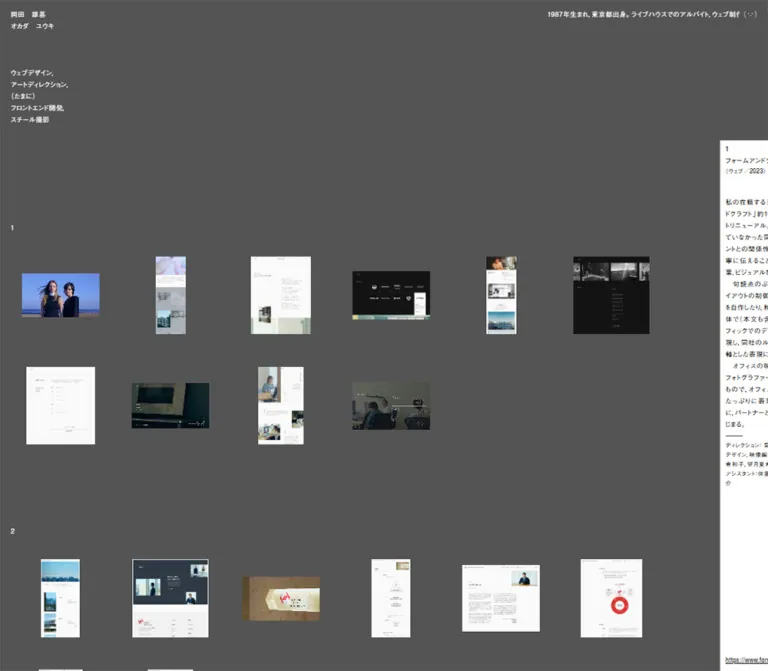
グレーの背景に小さな作品画像を整然と並べた岡田雄基のポートフォリオ。小さな白文字、広い余白、画面端に覗く白い解説パネルが特徴です。
オリジナルサイトを見るYuki Okada — Style Reference
A personal work archive arranged like small prints on a gray mounting board.
Original URL: ykokd.com
Final URL: ykokd.com
Theme: medium-gray canvas, white catalog text, and a white project-information panel with black text.
Inspected: September 13, 2026, Japan Standard Time. Supplied evidence timestamp: 2026-09-12T19:51:59.327Z.
Viewports: desktop 1440 × 1000 and mobile 390 × 844 CSS pixels.
Scope: the current thirteen-project portfolio, including opening, intermediate, and end-of-page desktop captures; opening and end-of-page mobile captures; and supplied rendered DOM and computed styles. Expanded panels and direct thumbnail interactions were not exercised.
The page identifies its owner as 岡田雄基, with the phonetic name オカダ ユウキ beneath it. Its visual hierarchy is unusually quiet: the name, project headings, descriptions, and contact links largely share one small, regular-weight type scale. Position, spacing, image proportions, and the reversal from gray to white establish the hierarchy.
Projects appear as groups of miniature website captures, photographs, and graphic specimens. Each image keeps its own proportions inside a regular spatial grid. Large areas of gray separate the header, numbered projects, and footer. A narrow white information panel peeks into the desktop viewport from the right; on mobile, it becomes a bottom-right panel with only its heading area visible. The composition feels like a working archive with an accompanying annotation sheet.
How to Read This Reference
- Measured means a value appears in the supplied computed styles, custom properties, or element rectangles.
- Calculated means arithmetic based on those measured values. Calculations are identified explicitly.
- Visual estimate means a dimension or arrangement inferred from the supplied screenshots. Image-element measurements were not included in the DOM extract.
- Recommendation means guidance for a new implementation. The CSS, responsive breakpoint, accessibility additions, and panel state hooks below are adaptations.
- Source variables retain their supplied names. Other token names are descriptive aliases.
- The original root font size is 10px. Its
1.2rembody text is therefore 12px, not 19.2px. The Quick Start uses explicit pixel-based tokens without changing the host application's root size. - Project screenshots are content inside this portfolio. Their colors, typefaces, layouts, and described interactions do not automatically belong to the portfolio interface.
Tokens — Colors
Default Palette
| Name | Value | Suggested token / source variable | Role | Evidence |
|---|---|---|---|---|
| Mounting Gray | #545454 |
--color-canvas / --bg-color-main |
Continuous page background behind identity, galleries, and footer | Measured body background and source variable |
| Canvas White | #ffffff |
--color-on-canvas / --font-color-main |
Name, services, biography, project numbers, and contact links | Measured text color |
| Annotation White | #ffffff |
--color-paper / --bg-color-nega |
Project-information panel | Source variable and visible panel |
| Annotation Black | #000000 |
--color-on-paper / --font-color-nega |
Project title, description, credits, and destination URL | Measured panel text color |
| Rule Gray | #545454 |
--color-rule / --border-color-main |
Available rule color; visually consistent with the short divider inside the panel | Source variable; divider assignment not directly sampled |
The two white roles share a value but serve different functions: one is text on gray, the other is a contrasting surface. There is no observed interface accent color. Blue, green, cream, yellow, and red appear inside individual project images.
Calculated contrast: white against #545454 is approximately 7.57:1; black against white is 21:1. Strong contrast does not eliminate the reading difficulty of 9–12px text.
Theme Behavior
Only this palette is evidenced. No theme selector or alternate shell palette was demonstrated. Preserve the neutral frame and allow the project material to supply color.
Tokens — Typography
Portfolio Sans-Serif Stack
The computed family on the body, headings, paragraphs, and sampled links is:
font-family:
  nimbus_sans_lregular,
  'Gothic Medium BBB',
  'Gothic Medium BBB JIS2004',
  sans-serif;
All sampled visible text uses font-weight: 400. The name is an h1, and project titles are h2 elements, but neither receives an enlarged or bold heading treatment.
This is an observed family stack, not proof that every glyph resolved to a particular face. The evidence does not include per-glyph font resolution or reusable font files. The Times value on the root element is not the visible interface's principal typeface.
The project description for Skyterrace mentions the typeface Brown in connection with that project's logo. That does not identify the portfolio's interface font.
Type Scale
| Role | Desktop | Mobile | Line height | Tracking | Evidence |
|---|---|---|---|---|---|
| Body and descriptions | 12px |
11px |
21.6px / 19.8px |
0.96px / 0.88px |
Measured |
Name / h1 |
12px, weight 400 |
11px, weight 400 |
21.6px / 19.8px |
Same as body | Measured |
Project title / h2 |
12px, weight 400 |
11px, weight 400 |
21.6px / 19.8px |
Same as body | Measured |
| Services and profile | 12px |
11px |
21.6px / 19.8px |
Same as body | Measured |
| Footer links | 12px |
11px |
21.6px / 19.8px |
Same as body | Measured |
| Project destination URL | 10.2px |
9.35px |
18.36px / 16.83px |
Inherited 0.96px / 0.88px |
Measured |
| Category/year and credit details | Approximately the small-text scale | Approximately the small-text scale | Compact, consistent with the surrounding panel | Not separately measured | Visual estimate |
Source Typography Variables
| Variable | Desktop | Mobile | Interpretation |
|---|---|---|---|
--font-size-base |
1.2rem |
1.1rem |
12px and 11px at the measured 10px root |
--font-size-s |
calc(1.2rem * .85) |
calc(1.1rem * .85) |
85% small-text scale |
--lh-base |
1.8 |
1.8 |
Shared leading |
--ls-base |
.08em |
.08em |
Body tracking |
--font-size-en |
104% |
104% |
Declared English-size adjustment |
--ls-en |
.04em |
.04em |
Declared English tracking adjustment |
The English variables are present, but their selector assignments are not included. Applying 104% to the base sizes would produce 12.48px and 11.44px; those are calculations, not measurements of every English label. Sampled English links still report the inherited body tracking.
Typography principle: maintain a narrow scale and use line breaks and placement to distinguish roles. A large display headline would substantially change the composition.
Tokens — Spacing & Shapes
Spacing Scale
The source frequently expresses vertical spacing as a multiple of one text line. A base line is 21.6px on desktop and 19.8px on mobile.
| Use | Desktop | Mobile | Evidence |
|---|---|---|---|
| Main left inset | 20px |
12px |
Measured; --column-margin-left |
| Main right inset | 220px |
12px |
Measured; --column-margin-right |
| Declared column gap | 20px |
10px |
--column-gap |
| Main top padding | 410.4px |
257.4px |
Measured |
| Main top formula | 12 × 1.8 × 19 |
11 × 1.8 × 13 |
--main-margin-top, calculated in pixels |
| Project separation token | 129.6px |
59.4px |
--works-gap: six desktop lines / three mobile lines |
| Main bottom padding | 194.4px |
118.8px |
Measured; nine / six base lines |
| Name-to-services gap | Approximately 64.8px |
Approximately 39.6px |
Calculated from measured element rectangles |
| Footer bottom padding | 18px |
16px |
Measured |
The source also declares --page-margin-top as one desktop line and 0.88 mobile lines, yielding 21.6px and 17.424px. The measured header rectangle begins at approximately 16.8px and 13.03px instead. Do not substitute the token calculation for the actual rectangle or assume the missing positioning rule.
Layout Measurements
| Element | Desktop: 1440 × 1000 | Mobile: 390 × 844 | Status |
|---|---|---|---|
| Header rectangle | x: 20, y: 16.80, width 1400px |
x: 12, y: 13.03, width 366px |
Measured |
| Name block height | 43.19px |
39.59px |
Measured; two text lines |
| Services block top | 124.78px |
92.22px |
Measured |
| Services block height | 107.97px |
98.98px |
Measured; five text lines |
| Main content width | 1200px |
366px |
Calculated from measured padding |
| Visible gallery columns | Six | Three | Screenshot observation |
| Approximate largest image dimension | 143–144px |
99–100px |
Visual estimate |
| Nominal panel width | 294px |
280px |
Source --txt-w; wrapper width not separately sampled |
| Panel text width | 244px |
230px |
Measured heading and paragraph rectangles |
| Panel text left edge | 1361.80px |
120px |
Measured |
| Visible panel surface origin | Approximately (1352, 259) |
Approximately (110, 791) |
Visual estimate |
| Document height | 7352.84px |
6583.47px |
Measured |
The desktop panel exposes approximately 88px of white surface. Relative to the declared 294px width, that is roughly 30%. A 70% horizontal translation can reproduce this geometry, but the original transform rule was not supplied.
On mobile, the visible panel is approximately 280px wide and exposes about 53px at the bottom. This is a change in panel placement, not simply a scaled desktop sidebar.
Gallery Geometry
A six-column reconstruction inside 1200px, with five 20px gaps, produces tracks approximately 183.33px wide. Centering images inside those tracks with approximately 20px of clearance per side produces a maximum image dimension of 143.33px, closely matching the desktop captures.
A three-column reconstruction inside 366px, with two 10px gaps, produces tracks approximately 115.33px wide. Approximately 8px of internal clearance produces a maximum image dimension of 99.33px.
These are useful reconstruction calculations. The supplied DOM does not expose the gallery wrapper's grid declaration, tile padding, or image sizing rules. Mobile row centers appear approximately 135px apart, suggesting a vertical gap near one 19.8px text line rather than necessarily the 10px column-gap token.
Border Radius and Elevation
- Image specimens have visibly square corners.
- The annotation panel has square corners.
- No rounded card shells, pill labels, or shadow-based elevation system appear in the supplied captures.
- A short, fine horizontal divider separates description and credit material in the panel. Approximately 32px wide and 1px thick is a visual estimate suitable for reconstruction.
Components
Identity Header
Role: establish the author with minimal visual weight.
Place the name at the upper-left page inset, followed by the phonetic name on a second line. The source labels are 岡田 雄基 and オカダ ユウキ. Preserve their deliberate spacing and regular weight.
The header spans nearly the full viewport, but its visible identity occupies very little width. Its semantic h1 does not look like a conventional hero heading. Later captures show the galleries without this header, so there is no evidence that the identity remains fixed during scrolling.
Services Block
Role: describe the author's working disciplines in a compact vertical list.
The observed five-line stack is:
ウェブデザイン,アートディレクション,(たまに)フロントエンド開発,スチール撮影
It shares the header's left alignment and body typography. The isolated parenthetical line gives the text a conversational rhythm. Preserve explicit line breaks instead of converting the services into badges, icons, or a horizontal navigation row.
Profile Strip and Small Mark
Role: provide biographical context while leaving the gallery canvas open.
Desktop shows a narrow, clipped line of biography near the upper-right edge. The first measured paragraph starts at x: 1033.34px and is approximately 1664.70px wide. A duplicate paragraph follows immediately after it. The paragraph width describes the moving content, not the visible window.
The supplied computed animation is 30s linear infinite paused profileLooper. The duplicated text and named animation establish a looping-profile implementation. Its keyframes and exact travel distance were not supplied.
A small face-like typographic mark appears at the upper-right edge. On mobile, this mark remains visible while the biography is not visibly presented as the desktop strip. The mobile paragraph samples report no animation and contain a 390px left padding. The mark's click, hover, or touch behavior is unverified.
Numbered Project Group
Role: organize multiple visual specimens into one project.
The archive contains thirteen numbered projects. A small white number at the left introduces each group. Project names and narrative information live in the separate white panel, keeping the gray image field visually sparse.
The sequence begins with SEE/SAW and ends with Skyterrace. The observed intermediate groups include SHIMZ Labo, MD PAPER PRODUCTS 15周年, and BONX. There are no large project-title banners between groups in the supplied captures.
Use a vertical sequence of project sections. Within each section, maintain consistent image centers and let the number of specimens determine the number of rows.
Image Specimen Grid
Role: present an overview of the work through small, individually proportioned images.
Desktop uses six columns; mobile uses three. Portrait website captures, landscape screens, photography, and logo specimens share the grid without being cropped into a common aspect ratio.
For SEE/SAW, nine visible specimens form six plus three items on desktop and three rows of three on mobile. BONX appears as six specimens across one desktop row and two mobile rows. Skyterrace uses three specimens: signage photography, a portrait architectural photograph, and a logo presentation.
The visual rhythm comes from regular centers around unequal image silhouettes. A tall website capture remains narrow; a wide screen remains short. The exposed gray between these shapes is a defining part of the layout.
No direct image click, enlargement, drag, or hover effect was demonstrated. Build such controls only as explicitly identified additions.
Project-Information Panel
Role: supply the title, context, process notes, credits, and destination for a project without placing those details beneath every thumbnail.
Observed anatomy:
- A project number on its own line.
- A project title beneath it, using the same regular-weight scale.
- A smaller category/year line, such as
(ウェブ/2025). - A substantial gap before the description.
- Japanese narrative text with a 1.8 line height and visible paragraph indentation where supplied by the content.
- A short horizontal rule and compact project-credit text.
- A small destination URL.
The description begins approximately 99px below the heading rectangle's top on desktop and 90px below it on mobile. These distances include the two-line heading, category metadata, and intervening whitespace.
The nominal panel width exceeds the measured text width by 50px at both sizes. The visible left inset is approximately 10px. A reconstruction using 10px left and 40px right padding reproduces the text width, but the original allocation of the remaining width is unverified.
On desktop, most of the panel extends beyond the right edge. Its exposed strip still contains fragments of the description. On mobile, the panel sits against the lower-right edge, showing mainly the number and title. Neither an expanded state nor its opening mechanism was supplied.
Project Panel State
Role: associate the annotation surface with an entry in the archive.
The desktop captures show panels for SEE/SAW, SHIMZ Labo, and Skyterrace at different scroll positions. The final mobile capture shows BONX in the panel even while Skyterrace is visible above it.
This establishes that the displayed project can change during the capture sequence. It does not establish an exact scroll threshold, hover-selection rule, or automatic nearest-section algorithm. The mobile state is a useful reason to avoid inventing a simple one-to-one scroll rule.
The DOM includes descriptions for all thirteen projects at overlapping panel coordinates. Those rectangles do not mean all descriptions are simultaneously visible.
Project Destination Link
Role: connect the archive entry to its corresponding external work.
Links are shown as literal URLs, using the 85% small-text scale. The source contains a destination for each of the thirteen projects. Some shorter descriptions place their URL close to the viewport bottom; the longer SEE/SAW description pushes its link below the initial desktop viewport.
Opening behavior, target attributes, and the destination pages themselves were not inspected. Keep these links distinct from the thumbnail interaction model.
Contact Footer
Role: provide a quiet conclusion and direct contact routes.
The footer contains three stacked text links: メール, Instagram, and Twitter. The visible Twitter label points to an x.com destination. Keep the observed label when reproducing the current interface.
The footer shares the gray canvas and left inset of the gallery. It has no enclosing card, large contact headline, social icons, or contrasting background. Its measured position follows the main document content, supporting a normal-flow footer rather than a fixed toolbar.
Tokens — Motion & Interaction
| Treatment | Evidence | What can be stated | Limitation |
|---|---|---|---|
| Desktop biography loop | 30s linear infinite paused profileLooper on duplicated paragraphs |
A repeating profile animation is defined | Keyframes, direction, and complete cycle were not supplied |
| Mobile biography | Sampled paragraphs report animation: none |
The desktop paragraph animation is not active on those sampled mobile elements | Other activation paths or wrappers are unverified |
| Base transition duration | --ts-duration-base: .1s |
A 100ms duration token exists | Target properties and components are unknown |
| Reverse duration | --ts-duration-reverse: .06s |
A 60ms reverse-duration token exists | The corresponding reverse action is unknown |
| Base easing | cubic-bezier(0, .66, .52, 1.71) |
The declared curve allows overshoot | It cannot be assigned to a thumbnail or panel as an observed fact |
| Panel project changes | Different titles appear across the scroll captures | Multiple project states were rendered | Selection triggers and thresholds are unknown |
| Changing visual specimens | Corresponding SEE/SAW and Skyterrace items show different imagery across captures | Some displayed material differs between capture states | Animation, media format, responsive replacement, and timing cannot be distinguished from still images |
The capture procedure temporarily paused perpetual animations during readiness checks and resumed them afterward. The sampled paused profile state therefore does not prove that the site intentionally leaves its biography stopped for visitors.
Most other sampled elements report no animation. Their transition: all summary, without an evidenced duration and target state, does not establish visible movement.
Recommended motion approach: retain a calm archive. Where new panel controls need feedback, the declared 100ms and 60ms tokens provide a plausible starting point. Treat that assignment as an adaptation. Provide reduced-motion behavior and an accessible static biography.
Surfaces
| Layer | Appearance | Function |
|---|---|---|
| Page canvas | Flat #545454 |
Unifies the complete archive |
| Header and footer | Transparent on the canvas | Keep identity and contact information visually lightweight |
| Image specimens | Native project colors and square image boundaries | Carry the page's visual variety |
| Annotation panel | Solid white with black text | Separates narrative information from the image field |
| Credit divider | Short, fine gray rule | Creates a small editorial break inside the annotation |
There is no observed texture on the gray canvas. Avoid adding grain simply because the arrangement resembles a physical mounting board. Depth comes from the panel's placement and color reversal, not from a shadow stack.
Imagery
The archive's imagery is documentary. It shows actual design outcomes: desktop and mobile website compositions, selected photographic scenes, product presentations, and graphic identity specimens.
SEE/SAW supplies fashion and hair imagery alongside pale website layouts. SHIMZ Labo introduces blue-and-green illustrated environments and interface screens. MD PAPER PRODUCTS brings cream paper tones and stationery photographs. BONX supplies several distinct website compositions. Skyterrace closes the sequence with white architecture, signage, and a logo.
These visual differences belong to the projects. The portfolio makes them coexist by controlling size, alignment, and surrounding gray space rather than recoloring them.
Observed Asset References
Individual image URLs, intrinsic dimensions, and media MIME types were not included in the evidence. The following is a visual inventory, not a list of downloadable assets.
| Project group | Visible material | Presentation |
|---|---|---|
| SEE/SAW | Nine website and photographic specimens | Mixed portrait and landscape proportions; six-column desktop / three-column mobile arrangement |
| SHIMZ Labo | Illustrated overview, tall page capture, several interface screens, and an additional landscape illustration | Six items across the first visible desktop row, followed by another item |
| MD PAPER PRODUCTS 15周年 | Pale title treatment, long page captures, paper-product grids, and photography | Multiple rows; the supplied intermediate capture cuts through the lower material |
| BONX | Six website compositions with varied brand and product treatments | One desktop row / two mobile rows |
| Skyterrace | Signage photograph, portrait architecture photograph, and logo specimen | Three items with different aspect ratios |
Implementation guidance: use authorized project assets, preserve their proportions, and provide responsive resolutions appropriate to their display size. Use normal image rendering for photographs and website captures. No pixelated rendering treatment was established.
For any animated specimen, preserve its poster frame and aspect ratio during loading. Do not infer GIF, video, canvas, or a particular player library from the still captures.
Layout & Responsive Behavior
Desktop — 1440 × 1000
The header starts near the upper-left corner, while the biography occupies a narrow region at the upper right. The main archive begins at 410.4px from the document top, leaving a large quiet field between the services and the first project.
The main uses 20px left padding and 220px right padding, leaving 1200px for the gallery. Six image columns occupy that region. The last column's images end around x = 1200px, with a substantial gray interval before the white panel begins around x = 1352px.
The panel stays at approximately the same screen coordinates across the supplied desktop scroll captures. That is consistent with viewport-anchored presentation, although its positioning declaration was not included.
The complete desktop document measures approximately 7353px high. Project groups vary in height with their visual material; the page is not a sequence of equal-height full-screen slides.
Mobile — 390 × 844
The left and right main insets become 12px. Text decreases from 12px to 11px, but the source keeps the 1.8 line height and .08em tracking. The gallery becomes three columns instead of collapsing to one large image per row.
Main top padding decreases to 257.4px. The first project's nine specimens occupy three rows, and the next project number enters near the lower portion of the opening capture. The mobile layout therefore retains the archive's overview quality.
The white panel moves to the bottom-right: approximately x = 110px, width 280px, and top = 791px. Its visible 53px strip overlaps the page. The footer remains visible to its left in the final capture.
The desktop biography strip is not visibly reproduced beside the mobile name. Only the small upper-right mark remains apparent. The evidence does not establish how a mobile visitor reveals the full biography.
Responsive Boundaries
Only two viewport widths were supplied. The actual breakpoint, intermediate column counts, landscape behavior, safe-area rules, browser zoom behavior, and device pixel ratio are unknown.
The Quick Start uses a recommended 767px breakpoint to connect the two observed states. Validate intermediate widths before using it in production. Treat full panel access, text zoom, and footer reachability as explicit implementation requirements.
Do’s and Don’ts
Do
- Keep the shell palette anchored to exact gray
#545454, white, and black. - Preserve the small, regular-weight name and project headings.
- Use position and blank space to establish hierarchy.
- Keep image aspect ratios intact inside regular gallery tracks.
- Preserve the six-column desktop and three-column mobile overview at the inspected sizes.
- Group multiple specimens under a single project number.
- Keep project descriptions in a distinct white annotation surface.
- Retain the quiet, three-line contact footer.
- Distinguish source motion tokens from verified component behavior.
- Provide a readable, keyboard-accessible way to reveal complete project information in a new implementation.
Don't
- Don't introduce a large marketing hero, oversized slogan, or dominant conversion button.
- Don't turn every specimen into a rounded card with a title, badge, and shadow.
- Don't crop all images to a uniform landscape or portrait ratio.
- Don't use colors from individual projects as global interface accents.
- Don't replace the spacious gray field with dense captions beneath every image.
- Don't assume thumbnails enlarge, drag, or select a project on hover.
- Don't claim the small upper-right mark is a verified menu button.
- Don't copy the source rem numbers into a 16px-root application without conversion.
- Don't attribute the typography or interactions of a showcased project to this portfolio.
- Don't reproduce the panel's clipped resting state as the only way to access its text.
Recommended Implementation Additions
These are recommendations for a new implementation, not verified features of the original page:
- Give every project a semantic heading and stable identifier, even when the visible gallery label is only a number.
- Use meaningful image alternatives describing the specimen, such as a project's mobile page or architectural signage. Avoid repeating a project name as the only alternative for every image.
- If thumbnails select or open content, use native buttons or links with visible focus and adequate target size. The generous tile area can serve as the target without enlarging the image itself.
- Provide an explicit panel toggle with
aria-expandedand an accessible label identifying the project. Keep clipped or inactive panel contents out of the tab order. - Make the opened panel independently scrollable and ensure that the longest description and destination URL remain reachable.
- Offer a reading treatment around 14–16px for long descriptions, especially on mobile, while retaining compact gallery labels where appropriate.
- Make biography text available in a static accessible location. Suppress duplicate looping copies from assistive technology.
- Respect reduced-motion preferences for biography movement, panel transitions, and animated specimens where controllable.
- Reserve image dimensions to prevent layout shifts. Load below-the-fold imagery progressively while keeping the opening specimens ready.
- Test mobile footer targets and panel overlap with text enlargement and safe-area insets.
Agent Prompt Guide
Quick Color Reference
- Canvas:
#545454. - Identity, numbering, and footer:
#ffffff. - Annotation panel:
#ffffffwith#000000text. - Fine panel rule:
#545454. - Accent colors: supplied by project imagery, with no additional global action color.
- Surface treatment: flat and square, without decorative texture or elevation shadows.
Overall Prompt
“Create a personal design-work archive inspired by Yuki Okada's current portfolio. Use a continuous #545454 canvas, small regular-weight white sans-serif text, a two-line name at the upper left, and a five-line services block below it. Leave a large open field before the numbered projects. Arrange small, uncropped website captures and photographs in six columns at 1440px and three columns at 390px. Center mixed aspect ratios inside consistent tracks. Put project titles, category/year, narrative notes, credits, and literal destination URLs in a narrow white annotation panel with black text. Its resting composition peeks in from the desktop right edge and mobile bottom-right edge. Provide an explicit accessible reveal control as an implementation addition. Finish with three plain stacked contact links.”
Example Component Prompts
- Identity: “Set a Japanese name and phonetic reading on two lines in 12px regular sans-serif, 1.8 line height, and .08em tracking. Position the block 20px from the desktop left edge. Place a five-line services list roughly three text lines below the name. Keep the surrounding gray space open.”
- Project gallery: “Build a numbered group of nine small project specimens on #545454. At 1440px, use six columns within a 1200px content region, then place the remaining three items on the next row. Preserve each asset's aspect ratio and cap its visible dimension near 143px. At 390px, use three columns with image dimensions near 100px.”
- Annotation panel: “Create a square white project-information surface approximately 294px wide on desktop and 280px on mobile. Stack a small number, regular title, category/year, narrative, short divider, credits, and a literal URL. Match the captured edge-peeking composition, then add a keyboard-operable expanded reading state. Treat the expansion behavior as new functionality.”
- Contact footer: “End a long gray archive with three white text links aligned to the gallery's left edge: メール, Instagram, and Twitter. Use the same small regular type scale and line height as the header, with generous preceding gray space and no separate footer surface.”
Quick Start
CSS Custom Properties
This CSS reconstructs the measured shell and approximates the image-grid and panel geometry. It does not reproduce undocumented selectors or interaction logic.
Use .portfolio-header with .identity, .services, and an optional .profile-window; .portfolio-main with repeated .work sections containing .work-index and .work-grid; .work-tile items containing images; and .portfolio-footer for contact links.
The panel uses .project-sheet, a native .project-sheet__toggle button, title and category children, and a .project-sheet__body containing description, credits, and destination. A controller must update data-open, aria-expanded, the selected project, and the inactive body's inert state. Those state conventions are recommendations.
The gallery tracks, image insets, 767px breakpoint, and panel transitions are reconstruction choices. The biography is static in this starter. The named fonts require separately authorized font setup; no font files are bundled or implied.
:root {
  /* Measured interface colors */
  --color-canvas: #545454;
  --color-on-canvas: #fff;
  --color-paper: #fff;
  --color-on-paper: #000;
  --color-rule: #545454;

  /* Observed family stack; provide licensed fonts separately */
  --font-portfolio: nimbus_sans_lregular,
    'Gothic Medium BBB',
    'Gothic Medium BBB JIS2004',
    sans-serif;
  --text-base: 12px;
  --text-small: calc(var(--text-base) * .85);
  --leading: 1.8;
  --line: calc(var(--text-base) * var(--leading));
  --tracking: .08em;
  --weight-regular: 400;

  /* Measured desktop dimensions and source-derived spacing */
  --edge-left: 20px;
  --edge-right: 220px;
  --column-gap: 20px;
  --header-top: 16.8px;
  --services-gap: calc(var(--line) * 3);
  --main-top: calc(var(--line) * 19);
  --work-gap: calc(var(--line) * 6);
  --main-bottom: calc(var(--line) * 9);
  --footer-bottom: 18px;

  /* Gallery reconstruction from screenshot geometry */
  --gallery-columns: 6;
  --gallery-row-gap: 20px;
  --tile-inset: 20px;

  /* Source panel width plus estimated resting geometry */
  --sheet-width: 294px;
  --sheet-top: 25.9vh;
  --sheet-shift: 70%;
  --sheet-padding-top: 5.6px;
  --sheet-padding-left: 10px;
  --sheet-padding-right: 40px;
  --sheet-rule-width: 32px;

  /* Source tokens; assigning them to the panel is an adaptation */
  --motion-base: 100ms;
  --motion-reverse: 60ms;
  --ease-base: cubic-bezier(0, .66, .52, 1.71);
  --safe-bottom: env(safe-area-inset-bottom, 0px);
}

* {
  box-sizing: border-box;
}

body {
  margin: 0;
  min-height: 100vh;
  overflow-x: hidden;
  color: var(--color-on-canvas);
  background: var(--color-canvas);
  font-family: var(--font-portfolio);
  font-size: var(--text-base);
  font-weight: var(--weight-regular);
  line-height: var(--leading);
  letter-spacing: var(--tracking);
}

a {
  color: inherit;
}

.portfolio-header {
  position: absolute;
  top: var(--header-top);
  right: var(--edge-left);
  left: var(--edge-left);
}

.identity,
.services,
.work-index {
  margin: 0;
  font: inherit;
  letter-spacing: inherit;
}

.identity > span,
.services > span {
  display: block;
}

.services {
  margin-top: var(--services-gap);
}

.profile-window {
  position: absolute;
  top: 0;
  right: 0;
  width: min(386.7px, 40vw);
  overflow: hidden;
  white-space: nowrap;
}

.profile-window p {
  margin: 0;
}

.portfolio-main {
  padding:
    var(--main-top)
    var(--edge-right)
    var(--main-bottom)
    var(--edge-left);
}

.work + .work {
  margin-top: var(--work-gap);
}

.work-index {
  margin-bottom: var(--line);
}

.work-grid {
  display: grid;
  grid-template-columns:
    repeat(var(--gallery-columns), minmax(0, 1fr));
  column-gap: var(--column-gap);
  row-gap: var(--gallery-row-gap);
  margin: 0;
  padding: 0;
  list-style: none;
}

.work-tile {
  display: grid;
  place-items: center;
  min-width: 0;
  aspect-ratio: 1;
  margin: 0;
  padding: var(--tile-inset);
  border: 0;
  border-radius: 0;
  background: transparent;
  box-shadow: none;
}

.work-tile img {
  display: block;
  width: 100%;
  height: 100%;
  min-width: 0;
  min-height: 0;
  object-fit: contain;
  border-radius: 0;
}

.portfolio-footer {
  margin-right: var(--edge-right);
  margin-left: var(--edge-left);
  padding-bottom: var(--footer-bottom);
}

.portfolio-footer a {
  display: block;
  width: fit-content;
  text-decoration: none;
}

.project-sheet {
  position: fixed;
  z-index: 10;
  top: var(--sheet-top);
  right: 0;
  bottom: 0;
  display: flex;
  flex-direction: column;
  width: var(--sheet-width);
  min-height: 0;
  overflow: hidden;
  padding:
    var(--sheet-padding-top)
    var(--sheet-padding-right)
    calc(10px + var(--safe-bottom))
    var(--sheet-padding-left);
  color: var(--color-on-paper);
  background: var(--color-paper);
  border: 0;
  border-radius: 0;
  box-shadow: none;
  transform: translateX(var(--sheet-shift));
  transition:
    transform var(--motion-base) var(--ease-base),
    top var(--motion-base) var(--ease-base);
}

.project-sheet[data-open='false'] {
  transition-duration: var(--motion-reverse);
}

.project-sheet[data-open='true'] {
  transform: translateX(0);
}

.project-sheet__toggle {
  display: block;
  flex: none;
  width: 100%;
  margin: 0;
  padding: 0;
  border: 0;
  color: inherit;
  background: transparent;
  font: inherit;
  letter-spacing: inherit;
  text-align: left;
  cursor: pointer;
}

.project-sheet__number,
.project-sheet__title,
.project-sheet__kind {
  display: block;
  margin: 0;
  font-weight: 400;
}

.project-sheet__kind {
  font-size: var(--text-small);
}

.project-sheet__body {
  display: flex;
  flex: 1;
  flex-direction: column;
  min-height: 0;
  margin-top: calc(var(--line) * 1.7);
  overflow-y: auto;
  overscroll-behavior: contain;
}

.project-sheet__body > p {
  margin: 0 0 var(--line);
}

.project-sheet__credits {
  font-size: var(--text-small);
}

.project-sheet__credits::before {
  display: block;
  width: var(--sheet-rule-width);
  margin-bottom: calc(var(--line) * .4);
  border-top: 1px solid var(--color-rule);
  content: '';
}

.project-sheet__url {
  display: block;
  margin-top: auto;
  padding-top: var(--line);
  font-size: var(--text-small);
  overflow-wrap: anywhere;
  text-decoration: none;
}

/* Recommended focus treatment */
a:focus-visible,
button:focus-visible {
  outline: 2px solid currentColor;
  outline-offset: 3px;
}

@media (hover: hover) {
  .portfolio-footer a:hover,
  .project-sheet__url:hover {
    text-decoration: underline;
    text-underline-offset: 3px;
  }
}

/* Recommended breakpoint; the original breakpoint is unknown */
@media (max-width: 767px) {
  :root {
    --text-base: 11px;
    --edge-left: 12px;
    --edge-right: 12px;
    --column-gap: 10px;
    --header-top: 13.03px;
    --services-gap: calc(var(--line) * 2);
    --main-top: calc(var(--line) * 13);
    --work-gap: calc(var(--line) * 3);
    --main-bottom: calc(var(--line) * 6);
    --footer-bottom: 16px;
    --gallery-columns: 3;
    --gallery-row-gap: var(--line);
    --tile-inset: 8px;
    --sheet-width: min(280px, calc(100vw - 24px));
    --sheet-top: calc(100dvh - 53px - var(--safe-bottom));
    --sheet-shift: 0%;
    --sheet-padding-top: 4.8px;
  }

  .profile-window {
    display: none;
  }

  /* Recommended expanded reading state */
  .project-sheet[data-open='true'] {
    top: 12px;
    bottom: calc(12px + var(--safe-bottom));
  }
}

@media (prefers-reduced-motion: reduce) {
  .project-sheet {
    transition: none;
  }
}
The image grid intentionally uses square layout areas with object-fit: contain. The visible images retain their individual silhouettes. The panel's resting offsets approximate the supplied screenshots; its expanded state, focus treatment, hover underlines, and safe-area handling are recommended additions.
Tailwind v4 Token Mapping
Optional aliases for an implementation that already uses Tailwind v4. Define the custom properties above first. This mapping does not imply that the original site uses Tailwind.
@theme inline {
  --color-mount: var(--color-canvas);
  --color-on-mount: var(--color-on-canvas);
  --color-annotation: var(--color-paper);
  --color-on-annotation: var(--color-on-paper);
  --color-archive-rule: var(--color-rule);

  --font-archive: var(--font-portfolio);
  --text-archive: var(--text-base);
  --text-archive-small: var(--text-small);

  --spacing-archive-gap: var(--column-gap);
  --spacing-archive-line: var(--line);
  --spacing-archive-inset: var(--edge-left);
  --spacing-annotation-width: var(--sheet-width);
}
Sources & Evidence
- Original and final website: https://ykokd.com/. The supplied observation reports HTTP 200 and no URL change. The rendered page title is
制作の記録|岡田雄基. - Capture date: September 13, 2026, JST, corresponding to the supplied retrieval timestamp
2026-09-12T19:51:59.327Z. - Desktop evidence: three supplied current-page captures at 1440 × 1000 CSS pixels, covering the opening, intermediate projects, and end of the archive; rendered DOM and computed styles at that viewport.
- Mobile evidence: two supplied current-page captures at 390 × 844 CSS pixels, covering the opening and end of the archive; rendered DOM and computed styles at that viewport.
- Measured material: body palette and typography, source custom properties, header/main/footer geometry, panel text rectangles, project text, destination links, and the profile animation declaration.
- Observed state changes: scrolling exposed different numbered groups and different displayed project annotations. No direct thumbnail activation, panel expansion, keyboard interaction, or biography-control interaction was supplied.
- Readiness limitations: the supplied procedure waited for document load, finite animation and layout stability, and visible-image decoding within bounded time limits. Perpetual animations were paused during checks and resumed afterward. This does not establish completion of all delayed content or a full motion cycle.
- Inspection boundaries: individual media URLs, original gallery selectors, breakpoint rules, complete keyframes, font-resolution details, and expanded panel behavior were unavailable. Linked project sites were not inspected. No additional browsing was performed for this reference.
This document describes the current portfolio supported by the supplied original-page evidence. Project-specific credit text describes individual showcased works; it does not establish production credits for the portfolio interface itself.
# Yuki Okada — Style Reference

> A personal work archive arranged like small prints on a gray mounting board.

**Original URL:** [ykokd.com](https://ykokd.com/)
**Final URL:** [ykokd.com](https://ykokd.com/)
**Theme:** medium-gray canvas, white catalog text, and a white project-information panel with black text.
**Inspected:** September 13, 2026, Japan Standard Time. Supplied evidence timestamp: `2026-09-12T19:51:59.327Z`.
**Viewports:** desktop `1440 × 1000` and mobile `390 × 844` CSS pixels.
**Scope:** the current thirteen-project portfolio, including opening, intermediate, and end-of-page desktop captures; opening and end-of-page mobile captures; and supplied rendered DOM and computed styles. Expanded panels and direct thumbnail interactions were not exercised.

The page identifies its owner as 岡田雄基, with the phonetic name オカダ ユウキ beneath it. Its visual hierarchy is unusually quiet: the name, project headings, descriptions, and contact links largely share one small, regular-weight type scale. Position, spacing, image proportions, and the reversal from gray to white establish the hierarchy.

Projects appear as groups of miniature website captures, photographs, and graphic specimens. Each image keeps its own proportions inside a regular spatial grid. Large areas of gray separate the header, numbered projects, and footer. A narrow white information panel peeks into the desktop viewport from the right; on mobile, it becomes a bottom-right panel with only its heading area visible. The composition feels like a working archive with an accompanying annotation sheet.

## How to Read This Reference

- **Measured** means a value appears in the supplied computed styles, custom properties, or element rectangles.
- **Calculated** means arithmetic based on those measured values. Calculations are identified explicitly.
- **Visual estimate** means a dimension or arrangement inferred from the supplied screenshots. Image-element measurements were not included in the DOM extract.
- **Recommendation** means guidance for a new implementation. The CSS, responsive breakpoint, accessibility additions, and panel state hooks below are adaptations.
- **Source variables** retain their supplied names. Other token names are descriptive aliases.
- The original root font size is **10px**. Its `1.2rem` body text is therefore **12px**, not 19.2px. The Quick Start uses explicit pixel-based tokens without changing the host application's root size.
- Project screenshots are content inside this portfolio. Their colors, typefaces, layouts, and described interactions do not automatically belong to the portfolio interface.

## Tokens — Colors

### Default Palette

| Name | Value | Suggested token / source variable | Role | Evidence |
| --- | --- | --- | --- | --- |
| Mounting Gray | `#545454` | `--color-canvas` / `--bg-color-main` | Continuous page background behind identity, galleries, and footer | Measured body background and source variable |
| Canvas White | `#ffffff` | `--color-on-canvas` / `--font-color-main` | Name, services, biography, project numbers, and contact links | Measured text color |
| Annotation White | `#ffffff` | `--color-paper` / `--bg-color-nega` | Project-information panel | Source variable and visible panel |
| Annotation Black | `#000000` | `--color-on-paper` / `--font-color-nega` | Project title, description, credits, and destination URL | Measured panel text color |
| Rule Gray | `#545454` | `--color-rule` / `--border-color-main` | Available rule color; visually consistent with the short divider inside the panel | Source variable; divider assignment not directly sampled |

The two white roles share a value but serve different functions: one is text on gray, the other is a contrasting surface. There is no observed interface accent color. Blue, green, cream, yellow, and red appear inside individual project images.

**Calculated contrast:** white against `#545454` is approximately **7.57:1**; black against white is **21:1**. Strong contrast does not eliminate the reading difficulty of 9–12px text.

### Theme Behavior

Only this palette is evidenced. No theme selector or alternate shell palette was demonstrated. Preserve the neutral frame and allow the project material to supply color.

## Tokens — Typography

### Portfolio Sans-Serif Stack

The computed family on the body, headings, paragraphs, and sampled links is:

```css
font-family:
  nimbus_sans_lregular,
  'Gothic Medium BBB',
  'Gothic Medium BBB JIS2004',
  sans-serif;
```

All sampled visible text uses **font-weight: 400**. The name is an `h1`, and project titles are `h2` elements, but neither receives an enlarged or bold heading treatment.

This is an observed family stack, not proof that every glyph resolved to a particular face. The evidence does not include per-glyph font resolution or reusable font files. The `Times` value on the root element is not the visible interface's principal typeface.

The project description for Skyterrace mentions the typeface Brown in connection with that project's logo. That does not identify the portfolio's interface font.

### Type Scale

| Role | Desktop | Mobile | Line height | Tracking | Evidence |
| --- | --- | --- | --- | --- | --- |
| Body and descriptions | `12px` | `11px` | `21.6px` / `19.8px` | `0.96px` / `0.88px` | Measured |
| Name / `h1` | `12px`, weight 400 | `11px`, weight 400 | `21.6px` / `19.8px` | Same as body | Measured |
| Project title / `h2` | `12px`, weight 400 | `11px`, weight 400 | `21.6px` / `19.8px` | Same as body | Measured |
| Services and profile | `12px` | `11px` | `21.6px` / `19.8px` | Same as body | Measured |
| Footer links | `12px` | `11px` | `21.6px` / `19.8px` | Same as body | Measured |
| Project destination URL | `10.2px` | `9.35px` | `18.36px` / `16.83px` | Inherited `0.96px` / `0.88px` | Measured |
| Category/year and credit details | Approximately the small-text scale | Approximately the small-text scale | Compact, consistent with the surrounding panel | Not separately measured | Visual estimate |

### Source Typography Variables

| Variable | Desktop | Mobile | Interpretation |
| --- | --- | --- | --- |
| `--font-size-base` | `1.2rem` | `1.1rem` | 12px and 11px at the measured 10px root |
| `--font-size-s` | `calc(1.2rem * .85)` | `calc(1.1rem * .85)` | 85% small-text scale |
| `--lh-base` | `1.8` | `1.8` | Shared leading |
| `--ls-base` | `.08em` | `.08em` | Body tracking |
| `--font-size-en` | `104%` | `104%` | Declared English-size adjustment |
| `--ls-en` | `.04em` | `.04em` | Declared English tracking adjustment |

The English variables are present, but their selector assignments are not included. Applying 104% to the base sizes would produce 12.48px and 11.44px; those are calculations, not measurements of every English label. Sampled English links still report the inherited body tracking.

**Typography principle:** maintain a narrow scale and use line breaks and placement to distinguish roles. A large display headline would substantially change the composition.

## Tokens — Spacing & Shapes

### Spacing Scale

The source frequently expresses vertical spacing as a multiple of one text line. A base line is 21.6px on desktop and 19.8px on mobile.

| Use | Desktop | Mobile | Evidence |
| --- | --- | --- | --- |
| Main left inset | `20px` | `12px` | Measured; `--column-margin-left` |
| Main right inset | `220px` | `12px` | Measured; `--column-margin-right` |
| Declared column gap | `20px` | `10px` | `--column-gap` |
| Main top padding | `410.4px` | `257.4px` | Measured |
| Main top formula | `12 × 1.8 × 19` | `11 × 1.8 × 13` | `--main-margin-top`, calculated in pixels |
| Project separation token | `129.6px` | `59.4px` | `--works-gap`: six desktop lines / three mobile lines |
| Main bottom padding | `194.4px` | `118.8px` | Measured; nine / six base lines |
| Name-to-services gap | Approximately `64.8px` | Approximately `39.6px` | Calculated from measured element rectangles |
| Footer bottom padding | `18px` | `16px` | Measured |

The source also declares `--page-margin-top` as one desktop line and 0.88 mobile lines, yielding 21.6px and 17.424px. The measured header rectangle begins at approximately 16.8px and 13.03px instead. Do not substitute the token calculation for the actual rectangle or assume the missing positioning rule.

### Layout Measurements

| Element | Desktop: 1440 × 1000 | Mobile: 390 × 844 | Status |
| --- | --- | --- | --- |
| Header rectangle | `x: 20`, `y: 16.80`, width `1400px` | `x: 12`, `y: 13.03`, width `366px` | Measured |
| Name block height | `43.19px` | `39.59px` | Measured; two text lines |
| Services block top | `124.78px` | `92.22px` | Measured |
| Services block height | `107.97px` | `98.98px` | Measured; five text lines |
| Main content width | `1200px` | `366px` | Calculated from measured padding |
| Visible gallery columns | Six | Three | Screenshot observation |
| Approximate largest image dimension | `143–144px` | `99–100px` | Visual estimate |
| Nominal panel width | `294px` | `280px` | Source `--txt-w`; wrapper width not separately sampled |
| Panel text width | `244px` | `230px` | Measured heading and paragraph rectangles |
| Panel text left edge | `1361.80px` | `120px` | Measured |
| Visible panel surface origin | Approximately `(1352, 259)` | Approximately `(110, 791)` | Visual estimate |
| Document height | `7352.84px` | `6583.47px` | Measured |

The desktop panel exposes approximately 88px of white surface. Relative to the declared 294px width, that is roughly 30%. A 70% horizontal translation can reproduce this geometry, but the original transform rule was not supplied.

On mobile, the visible panel is approximately 280px wide and exposes about 53px at the bottom. This is a change in panel placement, not simply a scaled desktop sidebar.

### Gallery Geometry

A six-column reconstruction inside 1200px, with five 20px gaps, produces tracks approximately **183.33px** wide. Centering images inside those tracks with approximately 20px of clearance per side produces a maximum image dimension of **143.33px**, closely matching the desktop captures.

A three-column reconstruction inside 366px, with two 10px gaps, produces tracks approximately **115.33px** wide. Approximately 8px of internal clearance produces a maximum image dimension of **99.33px**.

These are useful reconstruction calculations. The supplied DOM does not expose the gallery wrapper's grid declaration, tile padding, or image sizing rules. Mobile row centers appear approximately 135px apart, suggesting a vertical gap near one 19.8px text line rather than necessarily the 10px column-gap token.

### Border Radius and Elevation

- Image specimens have visibly square corners.
- The annotation panel has square corners.
- No rounded card shells, pill labels, or shadow-based elevation system appear in the supplied captures.
- A short, fine horizontal divider separates description and credit material in the panel. Approximately 32px wide and 1px thick is a visual estimate suitable for reconstruction.

## Components

### Identity Header

**Role:** establish the author with minimal visual weight.

Place the name at the upper-left page inset, followed by the phonetic name on a second line. The source labels are `岡田 雄基` and `オカダ ユウキ`. Preserve their deliberate spacing and regular weight.

The header spans nearly the full viewport, but its visible identity occupies very little width. Its semantic `h1` does not look like a conventional hero heading. Later captures show the galleries without this header, so there is no evidence that the identity remains fixed during scrolling.

### Services Block

**Role:** describe the author's working disciplines in a compact vertical list.

The observed five-line stack is:

- `ウェブデザイン,`
- `アートディレクション,`
- `(たまに)`
- `フロントエンド開発,`
- `スチール撮影`

It shares the header's left alignment and body typography. The isolated parenthetical line gives the text a conversational rhythm. Preserve explicit line breaks instead of converting the services into badges, icons, or a horizontal navigation row.

### Profile Strip and Small Mark

**Role:** provide biographical context while leaving the gallery canvas open.

Desktop shows a narrow, clipped line of biography near the upper-right edge. The first measured paragraph starts at `x: 1033.34px` and is approximately `1664.70px` wide. A duplicate paragraph follows immediately after it. The paragraph width describes the moving content, not the visible window.

The supplied computed animation is `30s linear infinite paused profileLooper`. The duplicated text and named animation establish a looping-profile implementation. Its keyframes and exact travel distance were not supplied.

A small face-like typographic mark appears at the upper-right edge. On mobile, this mark remains visible while the biography is not visibly presented as the desktop strip. The mobile paragraph samples report no animation and contain a 390px left padding. The mark's click, hover, or touch behavior is unverified.

### Numbered Project Group

**Role:** organize multiple visual specimens into one project.

The archive contains thirteen numbered projects. A small white number at the left introduces each group. Project names and narrative information live in the separate white panel, keeping the gray image field visually sparse.

The sequence begins with SEE/SAW and ends with Skyterrace. The observed intermediate groups include SHIMZ Labo, MD PAPER PRODUCTS 15周年, and BONX. There are no large project-title banners between groups in the supplied captures.

Use a vertical sequence of project sections. Within each section, maintain consistent image centers and let the number of specimens determine the number of rows.

### Image Specimen Grid

**Role:** present an overview of the work through small, individually proportioned images.

Desktop uses six columns; mobile uses three. Portrait website captures, landscape screens, photography, and logo specimens share the grid without being cropped into a common aspect ratio.

For SEE/SAW, nine visible specimens form six plus three items on desktop and three rows of three on mobile. BONX appears as six specimens across one desktop row and two mobile rows. Skyterrace uses three specimens: signage photography, a portrait architectural photograph, and a logo presentation.

The visual rhythm comes from regular centers around unequal image silhouettes. A tall website capture remains narrow; a wide screen remains short. The exposed gray between these shapes is a defining part of the layout.

No direct image click, enlargement, drag, or hover effect was demonstrated. Build such controls only as explicitly identified additions.

### Project-Information Panel

**Role:** supply the title, context, process notes, credits, and destination for a project without placing those details beneath every thumbnail.

Observed anatomy:

1. A project number on its own line.
2. A project title beneath it, using the same regular-weight scale.
3. A smaller category/year line, such as `(ウェブ/2025)`.
4. A substantial gap before the description.
5. Japanese narrative text with a 1.8 line height and visible paragraph indentation where supplied by the content.
6. A short horizontal rule and compact project-credit text.
7. A small destination URL.

The description begins approximately 99px below the heading rectangle's top on desktop and 90px below it on mobile. These distances include the two-line heading, category metadata, and intervening whitespace.

The nominal panel width exceeds the measured text width by 50px at both sizes. The visible left inset is approximately 10px. A reconstruction using 10px left and 40px right padding reproduces the text width, but the original allocation of the remaining width is unverified.

On desktop, most of the panel extends beyond the right edge. Its exposed strip still contains fragments of the description. On mobile, the panel sits against the lower-right edge, showing mainly the number and title. Neither an expanded state nor its opening mechanism was supplied.

### Project Panel State

**Role:** associate the annotation surface with an entry in the archive.

The desktop captures show panels for SEE/SAW, SHIMZ Labo, and Skyterrace at different scroll positions. The final mobile capture shows BONX in the panel even while Skyterrace is visible above it.

This establishes that the displayed project can change during the capture sequence. It does not establish an exact scroll threshold, hover-selection rule, or automatic nearest-section algorithm. The mobile state is a useful reason to avoid inventing a simple one-to-one scroll rule.

The DOM includes descriptions for all thirteen projects at overlapping panel coordinates. Those rectangles do not mean all descriptions are simultaneously visible.

### Project Destination Link

**Role:** connect the archive entry to its corresponding external work.

Links are shown as literal URLs, using the 85% small-text scale. The source contains a destination for each of the thirteen projects. Some shorter descriptions place their URL close to the viewport bottom; the longer SEE/SAW description pushes its link below the initial desktop viewport.

Opening behavior, target attributes, and the destination pages themselves were not inspected. Keep these links distinct from the thumbnail interaction model.

### Contact Footer

**Role:** provide a quiet conclusion and direct contact routes.

The footer contains three stacked text links: `メール`, `Instagram`, and `Twitter`. The visible Twitter label points to an `x.com` destination. Keep the observed label when reproducing the current interface.

The footer shares the gray canvas and left inset of the gallery. It has no enclosing card, large contact headline, social icons, or contrasting background. Its measured position follows the main document content, supporting a normal-flow footer rather than a fixed toolbar.

## Tokens — Motion & Interaction

| Treatment | Evidence | What can be stated | Limitation |
| --- | --- | --- | --- |
| Desktop biography loop | `30s linear infinite paused profileLooper` on duplicated paragraphs | A repeating profile animation is defined | Keyframes, direction, and complete cycle were not supplied |
| Mobile biography | Sampled paragraphs report `animation: none` | The desktop paragraph animation is not active on those sampled mobile elements | Other activation paths or wrappers are unverified |
| Base transition duration | `--ts-duration-base: .1s` | A 100ms duration token exists | Target properties and components are unknown |
| Reverse duration | `--ts-duration-reverse: .06s` | A 60ms reverse-duration token exists | The corresponding reverse action is unknown |
| Base easing | `cubic-bezier(0, .66, .52, 1.71)` | The declared curve allows overshoot | It cannot be assigned to a thumbnail or panel as an observed fact |
| Panel project changes | Different titles appear across the scroll captures | Multiple project states were rendered | Selection triggers and thresholds are unknown |
| Changing visual specimens | Corresponding SEE/SAW and Skyterrace items show different imagery across captures | Some displayed material differs between capture states | Animation, media format, responsive replacement, and timing cannot be distinguished from still images |

The capture procedure temporarily paused perpetual animations during readiness checks and resumed them afterward. The sampled `paused` profile state therefore does not prove that the site intentionally leaves its biography stopped for visitors.

Most other sampled elements report no animation. Their `transition: all` summary, without an evidenced duration and target state, does not establish visible movement.

**Recommended motion approach:** retain a calm archive. Where new panel controls need feedback, the declared 100ms and 60ms tokens provide a plausible starting point. Treat that assignment as an adaptation. Provide reduced-motion behavior and an accessible static biography.

## Surfaces

| Layer | Appearance | Function |
| --- | --- | --- |
| Page canvas | Flat `#545454` | Unifies the complete archive |
| Header and footer | Transparent on the canvas | Keep identity and contact information visually lightweight |
| Image specimens | Native project colors and square image boundaries | Carry the page's visual variety |
| Annotation panel | Solid white with black text | Separates narrative information from the image field |
| Credit divider | Short, fine gray rule | Creates a small editorial break inside the annotation |

There is no observed texture on the gray canvas. Avoid adding grain simply because the arrangement resembles a physical mounting board. Depth comes from the panel's placement and color reversal, not from a shadow stack.

## Imagery

The archive's imagery is documentary. It shows actual design outcomes: desktop and mobile website compositions, selected photographic scenes, product presentations, and graphic identity specimens.

SEE/SAW supplies fashion and hair imagery alongside pale website layouts. SHIMZ Labo introduces blue-and-green illustrated environments and interface screens. MD PAPER PRODUCTS brings cream paper tones and stationery photographs. BONX supplies several distinct website compositions. Skyterrace closes the sequence with white architecture, signage, and a logo.

These visual differences belong to the projects. The portfolio makes them coexist by controlling size, alignment, and surrounding gray space rather than recoloring them.

### Observed Asset References

Individual image URLs, intrinsic dimensions, and media MIME types were not included in the evidence. The following is a visual inventory, not a list of downloadable assets.

| Project group | Visible material | Presentation |
| --- | --- | --- |
| SEE/SAW | Nine website and photographic specimens | Mixed portrait and landscape proportions; six-column desktop / three-column mobile arrangement |
| SHIMZ Labo | Illustrated overview, tall page capture, several interface screens, and an additional landscape illustration | Six items across the first visible desktop row, followed by another item |
| MD PAPER PRODUCTS 15周年 | Pale title treatment, long page captures, paper-product grids, and photography | Multiple rows; the supplied intermediate capture cuts through the lower material |
| BONX | Six website compositions with varied brand and product treatments | One desktop row / two mobile rows |
| Skyterrace | Signage photograph, portrait architecture photograph, and logo specimen | Three items with different aspect ratios |

**Implementation guidance:** use authorized project assets, preserve their proportions, and provide responsive resolutions appropriate to their display size. Use normal image rendering for photographs and website captures. No pixelated rendering treatment was established.

For any animated specimen, preserve its poster frame and aspect ratio during loading. Do not infer GIF, video, canvas, or a particular player library from the still captures.

## Layout & Responsive Behavior

### Desktop — 1440 × 1000

The header starts near the upper-left corner, while the biography occupies a narrow region at the upper right. The main archive begins at 410.4px from the document top, leaving a large quiet field between the services and the first project.

The main uses 20px left padding and 220px right padding, leaving 1200px for the gallery. Six image columns occupy that region. The last column's images end around x = 1200px, with a substantial gray interval before the white panel begins around x = 1352px.

The panel stays at approximately the same screen coordinates across the supplied desktop scroll captures. That is consistent with viewport-anchored presentation, although its positioning declaration was not included.

The complete desktop document measures approximately 7353px high. Project groups vary in height with their visual material; the page is not a sequence of equal-height full-screen slides.

### Mobile — 390 × 844

The left and right main insets become 12px. Text decreases from 12px to 11px, but the source keeps the 1.8 line height and .08em tracking. The gallery becomes three columns instead of collapsing to one large image per row.

Main top padding decreases to 257.4px. The first project's nine specimens occupy three rows, and the next project number enters near the lower portion of the opening capture. The mobile layout therefore retains the archive's overview quality.

The white panel moves to the bottom-right: approximately x = 110px, width 280px, and top = 791px. Its visible 53px strip overlaps the page. The footer remains visible to its left in the final capture.

The desktop biography strip is not visibly reproduced beside the mobile name. Only the small upper-right mark remains apparent. The evidence does not establish how a mobile visitor reveals the full biography.

### Responsive Boundaries

Only two viewport widths were supplied. The actual breakpoint, intermediate column counts, landscape behavior, safe-area rules, browser zoom behavior, and device pixel ratio are unknown.

The Quick Start uses a **recommended 767px breakpoint** to connect the two observed states. Validate intermediate widths before using it in production. Treat full panel access, text zoom, and footer reachability as explicit implementation requirements.

## Do’s and Don’ts

### Do

- Keep the shell palette anchored to exact gray `#545454`, white, and black.
- Preserve the small, regular-weight name and project headings.
- Use position and blank space to establish hierarchy.
- Keep image aspect ratios intact inside regular gallery tracks.
- Preserve the six-column desktop and three-column mobile overview at the inspected sizes.
- Group multiple specimens under a single project number.
- Keep project descriptions in a distinct white annotation surface.
- Retain the quiet, three-line contact footer.
- Distinguish source motion tokens from verified component behavior.
- Provide a readable, keyboard-accessible way to reveal complete project information in a new implementation.

### Don't

- Don't introduce a large marketing hero, oversized slogan, or dominant conversion button.
- Don't turn every specimen into a rounded card with a title, badge, and shadow.
- Don't crop all images to a uniform landscape or portrait ratio.
- Don't use colors from individual projects as global interface accents.
- Don't replace the spacious gray field with dense captions beneath every image.
- Don't assume thumbnails enlarge, drag, or select a project on hover.
- Don't claim the small upper-right mark is a verified menu button.
- Don't copy the source rem numbers into a 16px-root application without conversion.
- Don't attribute the typography or interactions of a showcased project to this portfolio.
- Don't reproduce the panel's clipped resting state as the only way to access its text.

## Recommended Implementation Additions

These are recommendations for a new implementation, not verified features of the original page:

- Give every project a semantic heading and stable identifier, even when the visible gallery label is only a number.
- Use meaningful image alternatives describing the specimen, such as a project's mobile page or architectural signage. Avoid repeating a project name as the only alternative for every image.
- If thumbnails select or open content, use native buttons or links with visible focus and adequate target size. The generous tile area can serve as the target without enlarging the image itself.
- Provide an explicit panel toggle with `aria-expanded` and an accessible label identifying the project. Keep clipped or inactive panel contents out of the tab order.
- Make the opened panel independently scrollable and ensure that the longest description and destination URL remain reachable.
- Offer a reading treatment around 14–16px for long descriptions, especially on mobile, while retaining compact gallery labels where appropriate.
- Make biography text available in a static accessible location. Suppress duplicate looping copies from assistive technology.
- Respect reduced-motion preferences for biography movement, panel transitions, and animated specimens where controllable.
- Reserve image dimensions to prevent layout shifts. Load below-the-fold imagery progressively while keeping the opening specimens ready.
- Test mobile footer targets and panel overlap with text enlargement and safe-area insets.

## Agent Prompt Guide

### Quick Color Reference

- Canvas: `#545454`.
- Identity, numbering, and footer: `#ffffff`.
- Annotation panel: `#ffffff` with `#000000` text.
- Fine panel rule: `#545454`.
- Accent colors: supplied by project imagery, with no additional global action color.
- Surface treatment: flat and square, without decorative texture or elevation shadows.

### Overall Prompt

“Create a personal design-work archive inspired by Yuki Okada's current portfolio. Use a continuous #545454 canvas, small regular-weight white sans-serif text, a two-line name at the upper left, and a five-line services block below it. Leave a large open field before the numbered projects. Arrange small, uncropped website captures and photographs in six columns at 1440px and three columns at 390px. Center mixed aspect ratios inside consistent tracks. Put project titles, category/year, narrative notes, credits, and literal destination URLs in a narrow white annotation panel with black text. Its resting composition peeks in from the desktop right edge and mobile bottom-right edge. Provide an explicit accessible reveal control as an implementation addition. Finish with three plain stacked contact links.”

### Example Component Prompts

1. **Identity:** “Set a Japanese name and phonetic reading on two lines in 12px regular sans-serif, 1.8 line height, and .08em tracking. Position the block 20px from the desktop left edge. Place a five-line services list roughly three text lines below the name. Keep the surrounding gray space open.”
2. **Project gallery:** “Build a numbered group of nine small project specimens on #545454. At 1440px, use six columns within a 1200px content region, then place the remaining three items on the next row. Preserve each asset's aspect ratio and cap its visible dimension near 143px. At 390px, use three columns with image dimensions near 100px.”
3. **Annotation panel:** “Create a square white project-information surface approximately 294px wide on desktop and 280px on mobile. Stack a small number, regular title, category/year, narrative, short divider, credits, and a literal URL. Match the captured edge-peeking composition, then add a keyboard-operable expanded reading state. Treat the expansion behavior as new functionality.”
4. **Contact footer:** “End a long gray archive with three white text links aligned to the gallery's left edge: メール, Instagram, and Twitter. Use the same small regular type scale and line height as the header, with generous preceding gray space and no separate footer surface.”

## Quick Start

### CSS Custom Properties

This CSS reconstructs the measured shell and approximates the image-grid and panel geometry. It does not reproduce undocumented selectors or interaction logic.

Use `.portfolio-header` with `.identity`, `.services`, and an optional `.profile-window`; `.portfolio-main` with repeated `.work` sections containing `.work-index` and `.work-grid`; `.work-tile` items containing images; and `.portfolio-footer` for contact links.

The panel uses `.project-sheet`, a native `.project-sheet__toggle` button, title and category children, and a `.project-sheet__body` containing description, credits, and destination. A controller must update `data-open`, `aria-expanded`, the selected project, and the inactive body's `inert` state. Those state conventions are recommendations.

The gallery tracks, image insets, 767px breakpoint, and panel transitions are reconstruction choices. The biography is static in this starter. The named fonts require separately authorized font setup; no font files are bundled or implied.

```css
:root {
  /* Measured interface colors */
  --color-canvas: #545454;
  --color-on-canvas: #fff;
  --color-paper: #fff;
  --color-on-paper: #000;
  --color-rule: #545454;

  /* Observed family stack; provide licensed fonts separately */
  --font-portfolio: nimbus_sans_lregular,
    'Gothic Medium BBB',
    'Gothic Medium BBB JIS2004',
    sans-serif;
  --text-base: 12px;
  --text-small: calc(var(--text-base) * .85);
  --leading: 1.8;
  --line: calc(var(--text-base) * var(--leading));
  --tracking: .08em;
  --weight-regular: 400;

  /* Measured desktop dimensions and source-derived spacing */
  --edge-left: 20px;
  --edge-right: 220px;
  --column-gap: 20px;
  --header-top: 16.8px;
  --services-gap: calc(var(--line) * 3);
  --main-top: calc(var(--line) * 19);
  --work-gap: calc(var(--line) * 6);
  --main-bottom: calc(var(--line) * 9);
  --footer-bottom: 18px;

  /* Gallery reconstruction from screenshot geometry */
  --gallery-columns: 6;
  --gallery-row-gap: 20px;
  --tile-inset: 20px;

  /* Source panel width plus estimated resting geometry */
  --sheet-width: 294px;
  --sheet-top: 25.9vh;
  --sheet-shift: 70%;
  --sheet-padding-top: 5.6px;
  --sheet-padding-left: 10px;
  --sheet-padding-right: 40px;
  --sheet-rule-width: 32px;

  /* Source tokens; assigning them to the panel is an adaptation */
  --motion-base: 100ms;
  --motion-reverse: 60ms;
  --ease-base: cubic-bezier(0, .66, .52, 1.71);
  --safe-bottom: env(safe-area-inset-bottom, 0px);
}

* {
  box-sizing: border-box;
}

body {
  margin: 0;
  min-height: 100vh;
  overflow-x: hidden;
  color: var(--color-on-canvas);
  background: var(--color-canvas);
  font-family: var(--font-portfolio);
  font-size: var(--text-base);
  font-weight: var(--weight-regular);
  line-height: var(--leading);
  letter-spacing: var(--tracking);
}

a {
  color: inherit;
}

.portfolio-header {
  position: absolute;
  top: var(--header-top);
  right: var(--edge-left);
  left: var(--edge-left);
}

.identity,
.services,
.work-index {
  margin: 0;
  font: inherit;
  letter-spacing: inherit;
}

.identity > span,
.services > span {
  display: block;
}

.services {
  margin-top: var(--services-gap);
}

.profile-window {
  position: absolute;
  top: 0;
  right: 0;
  width: min(386.7px, 40vw);
  overflow: hidden;
  white-space: nowrap;
}

.profile-window p {
  margin: 0;
}

.portfolio-main {
  padding:
    var(--main-top)
    var(--edge-right)
    var(--main-bottom)
    var(--edge-left);
}

.work + .work {
  margin-top: var(--work-gap);
}

.work-index {
  margin-bottom: var(--line);
}

.work-grid {
  display: grid;
  grid-template-columns:
    repeat(var(--gallery-columns), minmax(0, 1fr));
  column-gap: var(--column-gap);
  row-gap: var(--gallery-row-gap);
  margin: 0;
  padding: 0;
  list-style: none;
}

.work-tile {
  display: grid;
  place-items: center;
  min-width: 0;
  aspect-ratio: 1;
  margin: 0;
  padding: var(--tile-inset);
  border: 0;
  border-radius: 0;
  background: transparent;
  box-shadow: none;
}

.work-tile img {
  display: block;
  width: 100%;
  height: 100%;
  min-width: 0;
  min-height: 0;
  object-fit: contain;
  border-radius: 0;
}

.portfolio-footer {
  margin-right: var(--edge-right);
  margin-left: var(--edge-left);
  padding-bottom: var(--footer-bottom);
}

.portfolio-footer a {
  display: block;
  width: fit-content;
  text-decoration: none;
}

.project-sheet {
  position: fixed;
  z-index: 10;
  top: var(--sheet-top);
  right: 0;
  bottom: 0;
  display: flex;
  flex-direction: column;
  width: var(--sheet-width);
  min-height: 0;
  overflow: hidden;
  padding:
    var(--sheet-padding-top)
    var(--sheet-padding-right)
    calc(10px + var(--safe-bottom))
    var(--sheet-padding-left);
  color: var(--color-on-paper);
  background: var(--color-paper);
  border: 0;
  border-radius: 0;
  box-shadow: none;
  transform: translateX(var(--sheet-shift));
  transition:
    transform var(--motion-base) var(--ease-base),
    top var(--motion-base) var(--ease-base);
}

.project-sheet[data-open='false'] {
  transition-duration: var(--motion-reverse);
}

.project-sheet[data-open='true'] {
  transform: translateX(0);
}

.project-sheet__toggle {
  display: block;
  flex: none;
  width: 100%;
  margin: 0;
  padding: 0;
  border: 0;
  color: inherit;
  background: transparent;
  font: inherit;
  letter-spacing: inherit;
  text-align: left;
  cursor: pointer;
}

.project-sheet__number,
.project-sheet__title,
.project-sheet__kind {
  display: block;
  margin: 0;
  font-weight: 400;
}

.project-sheet__kind {
  font-size: var(--text-small);
}

.project-sheet__body {
  display: flex;
  flex: 1;
  flex-direction: column;
  min-height: 0;
  margin-top: calc(var(--line) * 1.7);
  overflow-y: auto;
  overscroll-behavior: contain;
}

.project-sheet__body > p {
  margin: 0 0 var(--line);
}

.project-sheet__credits {
  font-size: var(--text-small);
}

.project-sheet__credits::before {
  display: block;
  width: var(--sheet-rule-width);
  margin-bottom: calc(var(--line) * .4);
  border-top: 1px solid var(--color-rule);
  content: '';
}

.project-sheet__url {
  display: block;
  margin-top: auto;
  padding-top: var(--line);
  font-size: var(--text-small);
  overflow-wrap: anywhere;
  text-decoration: none;
}

/* Recommended focus treatment */
a:focus-visible,
button:focus-visible {
  outline: 2px solid currentColor;
  outline-offset: 3px;
}

@media (hover: hover) {
  .portfolio-footer a:hover,
  .project-sheet__url:hover {
    text-decoration: underline;
    text-underline-offset: 3px;
  }
}

/* Recommended breakpoint; the original breakpoint is unknown */
@media (max-width: 767px) {
  :root {
    --text-base: 11px;
    --edge-left: 12px;
    --edge-right: 12px;
    --column-gap: 10px;
    --header-top: 13.03px;
    --services-gap: calc(var(--line) * 2);
    --main-top: calc(var(--line) * 13);
    --work-gap: calc(var(--line) * 3);
    --main-bottom: calc(var(--line) * 6);
    --footer-bottom: 16px;
    --gallery-columns: 3;
    --gallery-row-gap: var(--line);
    --tile-inset: 8px;
    --sheet-width: min(280px, calc(100vw - 24px));
    --sheet-top: calc(100dvh - 53px - var(--safe-bottom));
    --sheet-shift: 0%;
    --sheet-padding-top: 4.8px;
  }

  .profile-window {
    display: none;
  }

  /* Recommended expanded reading state */
  .project-sheet[data-open='true'] {
    top: 12px;
    bottom: calc(12px + var(--safe-bottom));
  }
}

@media (prefers-reduced-motion: reduce) {
  .project-sheet {
    transition: none;
  }
}
```

The image grid intentionally uses square layout areas with `object-fit: contain`. The visible images retain their individual silhouettes. The panel's resting offsets approximate the supplied screenshots; its expanded state, focus treatment, hover underlines, and safe-area handling are recommended additions.

### Tailwind v4 Token Mapping

Optional aliases for an implementation that already uses Tailwind v4. Define the custom properties above first. This mapping does not imply that the original site uses Tailwind.

```css
@theme inline {
  --color-mount: var(--color-canvas);
  --color-on-mount: var(--color-on-canvas);
  --color-annotation: var(--color-paper);
  --color-on-annotation: var(--color-on-paper);
  --color-archive-rule: var(--color-rule);

  --font-archive: var(--font-portfolio);
  --text-archive: var(--text-base);
  --text-archive-small: var(--text-small);

  --spacing-archive-gap: var(--column-gap);
  --spacing-archive-line: var(--line);
  --spacing-archive-inset: var(--edge-left);
  --spacing-annotation-width: var(--sheet-width);
}
```

## Sources & Evidence

- **Original and final website:** [https://ykokd.com/](https://ykokd.com/). The supplied observation reports HTTP 200 and no URL change. The rendered page title is `制作の記録|岡田雄基`.
- **Capture date:** September 13, 2026, JST, corresponding to the supplied retrieval timestamp `2026-09-12T19:51:59.327Z`.
- **Desktop evidence:** three supplied current-page captures at 1440 × 1000 CSS pixels, covering the opening, intermediate projects, and end of the archive; rendered DOM and computed styles at that viewport.
- **Mobile evidence:** two supplied current-page captures at 390 × 844 CSS pixels, covering the opening and end of the archive; rendered DOM and computed styles at that viewport.
- **Measured material:** body palette and typography, source custom properties, header/main/footer geometry, panel text rectangles, project text, destination links, and the profile animation declaration.
- **Observed state changes:** scrolling exposed different numbered groups and different displayed project annotations. No direct thumbnail activation, panel expansion, keyboard interaction, or biography-control interaction was supplied.
- **Readiness limitations:** the supplied procedure waited for document load, finite animation and layout stability, and visible-image decoding within bounded time limits. Perpetual animations were paused during checks and resumed afterward. This does not establish completion of all delayed content or a full motion cycle.
- **Inspection boundaries:** individual media URLs, original gallery selectors, breakpoint rules, complete keyframes, font-resolution details, and expanded panel behavior were unavailable. Linked project sites were not inspected. No additional browsing was performed for this reference.

This document describes the current portfolio supported by the supplied original-page evidence. Project-specific credit text describes individual showcased works; it does not establish production credits for the portfolio interface itself.