
DESIGN REFERENCE
レトロ印刷|紙とインクの質感を伝える印刷サービスサイト
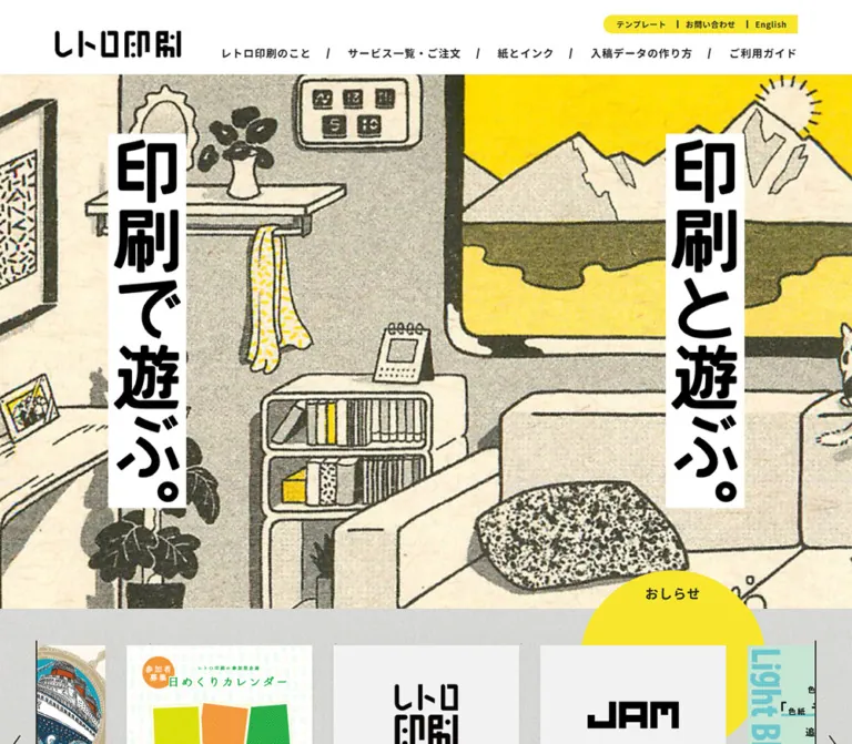
花柄の印刷表現に大きな縦書きコピーを重ね、黄色の円形見出し、印刷機のイラスト、紙の質感を持つフッターで構成した印刷サービスのホームページ。
オリジナルサイトを見るRetro Insatsu — Style Reference
A printing-service homepage that pairs orderly navigation with the grain, color overlap, and bold lettering of a printed poster.
Website / original URL: retroinsatsu.com
Final URL: https://retroinsatsu.com/
Response: HTTP 200; the original and final URLs are identical.
Theme: light surfaces, dark typography, yellow accents, and multicolor printed artwork.
Inspected: September 17, 2026, at 05:22:12 JST. The supplied inspection timestamp is 2026-09-16T20:22:12.087Z.
Viewports: desktop 1440 × 1000 and mobile 390 × 844 CSS pixels.
Scope: the current homepage: initial header and hero, news and editorial content, printing explanations, service-guide entry points, print resources, customer-work links, shop information, and footer. Visual evidence consists of three desktop captures and two mobile captures, supported by rendered text, link destinations, element rectangles, and computed-style excerpts. Linked pages and activated menus were not inspected.
Retro Insatsu combines a practical printing-service directory with the visual character of its product. The current hero is a full-width field of oversized orange flowers against muted reddish brown, with cream centers, fine hatching, and uneven ink texture. Two narrow white strips carry the black vertical slogans “印刷で遊ぶ。” and “印刷と遊ぶ。”. The artwork supplies the scale and energy; the navigation remains compact and direct.
Below this opening, the page serves several purposes: publishing operational notices, teaching printing techniques, explaining material behavior, directing visitors toward ordering and preparation guides, showing customer work, and introducing a physical shop. Its structure is a long service homepage with editorial content. The defining visual relationships are large artwork against small utility text, circular accents against square information blocks, and crisp rules against textured paper.
How to Read This Reference
- Measured means a value is present in the supplied rendered DOM or computed styles. Element bounds describe the captured state, not necessarily the original CSS declaration.
- Calculated means a value follows directly from measured bounds, such as the gap between consecutive carousel items.
- Estimated means a dimension, color, or appearance was judged from a supplied screenshot. Estimated hexadecimal colors are implementation approximations, not pixel samples.
- Recommended means guidance for a new implementation. Breakpoints, accessibility improvements, and starter-code behavior are recommendations unless explicitly identified otherwise.
- Named tokens are descriptive aliases introduced by this reference. No site-specific semantic token system was exposed in the evidence.
- Visibility matters: the DOM includes menu panels, offscreen carousel items, and repeated navigation. A nonzero rectangle does not establish that a panel was visible or opened.
The mobile header overlap is an observed rendering condition. Record it faithfully when describing the current site, but use a deliberate, readable mobile arrangement in a new implementation.
Tokens — Colors
Default Palette
| Name | Value | Suggested token | Evidence and role |
|---|---|---|---|
| Interface white | #ffffff |
--ri-white |
Measured body and header background; also visually present in the slogan strips and circular explanation panels |
| Text ink | #222222 |
--ri-ink |
Measured body, navigation, news titles, and dates |
| News yellow | #f8e62d |
--ri-yellow |
Measured fill of the circular “おしらせ” heading |
| Pale gray | #f3f3f3 |
--ri-pale |
Measured carousel-control background; the three-guide section appears close to this tone |
| Link blue | #4a91d6 |
--ri-link |
Measured on news anchors; their title and date children explicitly render in dark ink |
| Notice blue | Approximately #a9d3fa |
--ri-notice |
Estimated from the narrow important-notice band |
| Graphic black | Approximately #000000 |
--ri-graphic-ink |
Visual approximation for the logo and heavy slogan artwork; distinct from measured body text |
| Flower orange | Approximately #b65f1d |
--ri-art-orange |
Estimated dominant orange in the current hero artwork |
| Background brown | Approximately #965b51 |
--ri-art-brown |
Estimated reddish-brown field behind the flowers |
| Printed cream | Approximately #c6b68b |
--ri-art-cream |
Estimated flower centers and fine printed marks |
| Footer paper | Approximately #d8d9d3 |
--ri-paper |
Estimated base tone beneath the footer's grain and fibers |
The yellow utility ribbon and back-to-top circle look related to the news yellow, but their exact fills were not included in the computed-style excerpt. Reusing #f8e62d for those elements is a practical approximation, not a measured equality.
A red warning value, #e8373d, appears in the DOM for a print-size restriction within extended navigation content. It is a contextual warning color, not a dominant homepage accent, and that panel was not visibly opened.
Theme Presets
Only one light presentation is evidenced. No theme selector or dark mode was observed. The multiple colors within print examples belong to the artwork and printing demonstrations.
The exported custom properties include standard WordPress colors, gradients, shadows, and font sizes. Their presence does not establish that the homepage uses those treatments. Build the reference palette from rendered elements and visible surfaces, not from the complete preset inventory.
Color Distribution
Use white and pale gray for information, dark ink for text and rules, and yellow for a small number of recognizable landmarks. Let the printed artwork occupy large colored areas. The orange and brown hero colors should not automatically become button colors or category badges throughout the interface.
Keep texture inside artwork and paper surfaces. The white header, black navigation, and white slogan strips remain clean enough to read immediately.
Tokens — Typography
Interface Typeface
Measured family stack: YakuHanJPs, 'Noto Sans JP', sans-serif.
This stack is declared on the body and sampled interface elements. The evidence establishes the computed family list, but does not independently verify which font file supplied every glyph. The root HTML element reports Times; the body overrides it, so Times is not the interface typography reference.
The interface uses regular text for descriptions and dates, medium weight in some extended navigation content, and bold text for primary navigation, card titles, and group headings. Generous body leading and slightly expanded tracking balance the dense Japanese navigation labels.
Graphic Lettering
The wordmark, oversized vertical slogans, and curved explanation headings have distinctive drawn forms. Their typeface or production method is not established by the evidence. Treat them as graphic assets when reproducing the appearance. Applying the interface font at a larger size will not recreate their irregular proportions.
The hero slogans are visible in the screenshots but absent as ordinary text in the supplied main-content extraction. That supports treating their visual lettering separately from the measured live-text scale; it does not establish a particular image format.
Type Scale
| Role | Desktop value | Mobile value | Weight | Tracking | Evidence |
|---|---|---|---|---|---|
| Body | 15px / 30px |
14px / 28px |
400 |
1.125px / 1.05px |
Measured |
| Important-notice date | 13px / 13px |
Same | 400 |
Inherited body tracking | Measured; inline rectangle is taller than its line-height |
| Utility navigation | 12px / 12px |
Same | 700 |
0.6px |
Measured |
| Primary navigation | 16px / 16px |
Same | 700 |
1.125px / 1.05px |
Measured |
| News-circle heading | 20px / 22px |
Same | 700 |
1.125px / 1.05px |
Measured |
| News title | 14px / 21px |
Same | 700 |
1.125px / 1.05px |
Measured |
| News date | 12px / 24px |
Same | 400 |
1.125px / 1.05px |
Measured |
| Extended-menu section label | 18px / 18px |
Same | 700 |
Inherited | Measured; opened state unverified |
| Extended-menu descriptive copy | 14px / 25.2px |
Same | 500 |
0.7px |
Measured; opened state unverified |
| Print-size preview heading | 28px / 30.8px |
24px / 33.6px |
700 |
Inherited | Measured in menu-related content, not the hero |
| Three-guide headings | Approximately 20px |
Not visually established | Bold | Visually expanded | Screenshot estimate |
| Circular explanation body | Approximately 18px / 36px |
Not visually established | Medium to bold appearance | Visually expanded | Screenshot estimate |
| Footer group headings | Approximately 15–16px |
Approximately 14px |
Bold | Visually expanded | Screenshot estimate |
| Footer links | Approximately 12px / 24px |
Children not visible | Regular | Visually expanded | Screenshot estimate |
Body tracking calculates to 0.075em at both inspected widths. The navigation inherits the body's pixel tracking while retaining a 16px font size; applying 0.075em independently to every element would slightly change those proportions.
The strongest hierarchy comes from graphic lettering, weight, rules, and shape. Ordinary content headings do not need the same scale as the hero slogans.
Tokens — Spacing & Shapes
Layout character: broad desktop artwork and generous section space, with compact navigation and dense footer information.
No universal spacing unit was exposed. The following scale groups observed values into reusable aliases without claiming a source design system.
Spacing Scale
| Value | Use | Evidence |
|---|---|---|
4px |
News-date top padding | Measured |
8px |
News-date bottom padding; gaps in some menu link stacks | Measured or calculated from bounds |
12px |
Space between news media and title; utility-scale padding | Calculated for news; measured in menu content |
16px |
News title/date side inset; menu-link side padding | Measured |
20px |
Mobile hero-strip edge clearance; social-icon gaps | Screenshot estimates |
24px |
News-circle padding; mobile footer side inset | Measured for circle; estimated for footer |
32px |
News-card gap; circular explanation image inset | Calculated for cards; estimated for explanation |
40px |
Desktop footer column gap | Screenshot estimate |
Approximately 64px |
Space above headings in the three-guide section | Screenshot estimate |
160px |
Desktop outer margin around a 1120px content span | Measured/calculated at 1440px only |
Border Radius
| Element | Treatment | Evidence |
|---|---|---|
| Header and ordinary information blocks | Square | Measured on sampled elements |
| News heading | 100% radius on a 280 × 280px box |
Measured |
| Printing explanation panel | Circular, thin dark outline | Screenshot observation; about 504px across in the visible desktop example |
| Social controls | Circles | Screenshot observation |
| Back-to-top control | Circle | Screenshot observation |
| Utility ribbon | Rounded left end and square right edge | Screenshot observation |
| Hero slogan strips | Essentially square rectangles | Screenshot observation; any corner rounding is minimal |
Roundness has specific jobs: labels, explanation discs, and compact controls. It is not a general rounded-card treatment.
Layout Measurements
| Element | Desktop | Mobile | Evidence |
|---|---|---|---|
| Document height | 7918.17px |
9880.94px |
Measured root rectangles |
| Main content starts | y = 135.375px |
Same | Measured |
| Important-notice band | Approximately 25.375px high |
Same | Calculated from header start and screenshot |
| Initial header | 110px high |
110px high |
Measured |
| Main header content span | 1120px, starting at x = 160px |
Logo-heading box 310px, starting at x = 40px |
Measured; mobile navigation uses different alignment |
| Logo link box | 190 × 83.80px |
Same | Measured anchor box, not visible logo-ink bounds |
| Scrolled desktop header | Approximately 48px high |
No clean equivalent established | Screenshot estimate |
| Left hero strip | Approximately 129 × 624px, at 240, 233 |
Approximately 83 × 381px, at 20, 249 |
Screenshot estimates |
| Right hero strip | Approximately 129 × 624px, at 1071, 233 |
Approximately 84 × 381px, at 287, 401 |
Screenshot estimates |
| News heading | 280 × 280px, at 1016, 965.375 |
280 × 280px, at 55, 834.969 |
Measured |
| News card | 280 × 300px |
258 × 283.5px |
Measured sampled carousel items |
| News media region | 280 × 210px |
258 × 193.5px |
Measured; both calculate to 4:3 |
| News-card gap | 32px |
32px |
Calculated from consecutive item positions |
| Footer content | Approximately 1120px wide |
Approximately 342px, with 24px side margins |
Screenshot estimates |
| Social controls | Approximately 40 × 40px |
Approximately 40 × 40px |
Screenshot estimates |
| Back-to-top control | Approximately 56 × 56px |
Approximately 56 × 56px |
Screenshot estimates |
The news-heading top lies 830px below the main start on desktop and approximately 699.59px below it on mobile. These offsets are known; the hero's exact CSS height and overlap rule are not.
Components
Important-Notice Strip
Role: expose a current operational announcement before the main navigation.
A shallow light-blue strip spans the viewport. Its inner content aligns with the desktop content column. An outlined “重要なお知らせ” label precedes a compact date link. The date links to a specific announcement on the JAM website.
At the inspected mobile width, the label begins at the left edge and the date begins near x = 106px. The strip stays approximately 25px high. The displayed announcement date is content, not the inspection date.
Primary Header
Role: identify the service and provide direct access to ordering and preparation information.
The initial desktop header is a 110px white band below the notice. Its content occupies a centered 1120px span. The black wordmark sits at the left. To the right, a small yellow utility ribbon sits above a row of five bold navigation links:
- “レトロ印刷のこと”
- “サービス一覧・ご注文”
- “紙とインク”
- “入稿データの作り方”
- “ご利用ガイド”
Black slash separators divide the primary links. This creates an editorial line of text rather than a row of boxed buttons.
The utility ribbon contains template, contact, business-day, and English controls. The English link resolves to /en/contact/; the evidence does not establish a full-site language switch. The “営業日” element has no normal destination in the excerpt, and calendar content exists in the DOM. Its activation behavior was not tested.
Scrolled desktop captures show a white header approximately 48px high, a smaller wordmark, and the primary link row. The notice and utility ribbon are absent from that visible strip. A persistent compact state is therefore visually supported; the fixed-versus-sticky mechanism and its trigger threshold remain unknown.
Extended Navigation Content
Role: organize a substantial printing-service catalog beneath the five main categories.
The DOM contains groups for paper sizes, ink characteristics, material categories, file preparation, binding, ordering guidance, samples, templates, and contact routes. Desktop measurements include four 250px-wide information entries spaced across the 1120px content span, and paper-category entries around 159px wide.
Sampled menu rows use square white surfaces, bold 16px labels, 15px medium-weight links, and padding such as 12px 16px. These values are useful for extending the navigation language.
No supplied screenshot shows an activated panel. Do not infer hover-only opening, click toggling, a particular dropdown animation, or reliable mobile behavior from the extracted rectangles. Several mobile menu-related rectangles extend outside the viewport, but their visible state is not established.
Printed Hero
Role: communicate the physical character and playfulness of the printing service.
The artwork runs edge to edge beneath the header. Oversized orange flower shapes, cream centers, diagonal scratches, and a reddish-brown field feel like an enlarged print sample. The visible surface is textured and slightly uneven, with no separate gradient or glossy overlay evidenced.
Two white vertical strips frame the composition. Their large black lettering has blunt, irregular shapes and much greater visual weight than the navigation. On desktop, the strips share the same top edge and sit symmetrically inside the broad artwork field. On mobile, they are smaller and deliberately staggered: the left strip begins roughly 152px above the right.
Preserve the clear white backing around each slogan. It separates the lettering from the busy print without a shadow, blur, or translucent panel. The slogans are the hero's dominant message; no large primary action button is visible within the captured hero.
Circular News Heading
Role: mark the transition from brand artwork to current information.
The “おしらせ” heading occupies a measured 280px yellow circle with 24px padding, 20px bold type, and a 22px line-height. On desktop it is positioned toward the right and extends slightly beyond the usual content alignment. On mobile it is centered at x = 55px.
The label sits near the top of the circle rather than at its center. The circle continues down into the news region, functioning as a large section marker. It is a heading, not evidence of a clickable yellow CTA.
News Card and Carousel
Role: present timely service notices and product announcements.
The measured card anatomy is particularly reusable:
- A square-cornered
4:3media region: 280 × 210px on desktop and 258 × 193.5px on mobile. - A 12px gap before the title.
- A title inset 16px from each side, using
14px / 21px, weight 700. Sampled titles occupy two lines, or 42px. - A date row using
12px / 24px, with4px 16px 8pxpadding. - A 32px gap before the next card.
The complete sampled card is 300px high on desktop and 283.5px on mobile. Its anchor background is transparent in the computed excerpt. Avoid assuming a white card body or elevated container where none is established.
The DOM contains six distinct news destinations, repeated instances, Previous/Next buttons, and desktop pagination labels 1–6. A sampled desktop Previous button is 56px wide and 315px high with a pale-gray background. Its textual label is visually suppressed by zero-sized typography, so the actual visible arrow artwork cannot be inferred from the label styling alone.
Repeated entries and negative item coordinates are consistent with a looping carousel. They are not separate articles and do not establish autoplay timing, swipe support, or a particular library. News Previous/Next labels are absent from the mobile news text extraction, while the later resource carousel still exposes them.
Editorial Columns
Role: extend the service with practical knowledge.
The “役立つコラム” and “レトロ印刷のタネ” labels introduce content about paper and ink compatibility, preparing booklets, ink clogging, and custom cutting. The DOM exposes four distinct article destinations with repeated entries.
This confirms an editorial collection, but the supplied screenshots do not isolate its visual layout. Preserve the article-title/date hierarchy and printing-related imagery in a new implementation; do not copy exact card dimensions or carousel behavior from the news section without labeling that reuse as a recommendation.
Printing-Characteristic Discs
Role: explain the appeal and limitations of the printing process through physical examples.
The source copy introduces registration shifts, uneven coverage, ink-density variation, color overlap, and ink transfer. In the visible desktop example, the final topic, “手につく”, appears inside a large white circle with a thin dark outline over the floral print field.
The circle is approximately 504px across. Its anatomy consists of a curved graphic heading, centered explanatory text, and a wide photo of ink-stained fingers against printed paper. The photo occupies the lower part of the circle and follows a rounded lower crop. The text remains on white, with substantial separation from the patterned background.
A fine dot screen is visible across the surrounding artwork in this section. The evidence does not distinguish whether that screen is baked into an image or applied as a separate layer. Only the final explanation disc is shown clearly enough to describe its geometry; the full sequence and any alternating arrangement are not visually established.
Three Guide Entry Points
Role: answer three common questions and route visitors into the service information.
The desktop capture shows three evenly distributed entries on a pale-gray field:
- “レトロ印刷ってなに?” with a line illustration of a Risograph machine.
- “入稿は難しい?” with separate print layers, ink-color circles, and a plus sign.
- “紙とインクを知りたい!” with three illustrated ink drums and small color labels.
Each heading sits between two dark horizontal rules approximately 280px wide. The ruled heading bands are about 48px high, followed by around 36px of space before the illustrations. Illustrations are roughly 250–280px wide, but their different proportions are preserved.
These are open columns on a shared surface, without enclosing card borders or shadows. The DOM supplies a descriptive paragraph and a destination link for each entry beneath the portion shown in the screenshot. The illustrations explain the service rather than acting as generic decorative icons.
Print Resources and Customer Work
Role: connect process knowledge to examples visitors can use or explore.
The “もっと印刷で遊ぶ!” collection links to ink-mixing samples, a printed sample catalog, screen-tone guidance, and custom color charts. Its DOM includes repeated items and Previous/Next controls. Exact slide dimensions and interaction outcomes were not supplied.
The jam_oki section introduces selected customer print projects and links to Instagram. Four individual post destinations appear in the evidence, with captions naming paper and ink combinations. Their presence supports a customer-work collection, but does not establish its grid columns, image crops, or whether captions appear as hover overlays.
Use actual print examples with material information when extending this section. Keep paper and ink names legible rather than reducing the collection to an unexplained image wall.
Shop Information
Role: support an in-person visit or printing consultation.
The “JAMのお店” section includes introductory copy, address, two telephone purposes, opening hours, holidays, transit access, the shop website, and a visit-request form link. The mobile text breaks telephone information onto additional lines.
This is a structured information block with a practical action at the end. The supplied evidence does not establish a map, booking modal, form design, or successful submission. A definition list is a recommended semantic implementation for its label/value content.
The page independently describes JAM as the service operator and names 株式会社JAM in its footer trademark statement. The linked brand marks elsewhere in the footer do not identify website production credits.
Paper-Texture Footer
Role: provide a comprehensive directory and close the page with a material surface.
A light gray paper texture covers the footer. Fine fibers, irregular specks, and subtle tonal variation remain visible behind dark text. The texture is restrained enough to support dense navigation.
The desktop composition has five layers:
- Three centered, approximately 40px social circles for Twitter, Facebook, and Instagram, with about 20px gaps.
- Six navigation groups arranged in three columns and two rows.
- Thin dark rules under each group heading and compact link stacks beneath.
- A centered row of JAM, SURIMACCA, and SURUTOCO marks.
- Legal links at the lower left and the trademark/copyright line toward the lower right.
The columns begin near x = 160, 547, and 933px, implying widths around 347px and 40px gaps. The related marks retain different visual widths; they are not forced into identical square containers.
On mobile, the footer uses roughly 24px side margins. Only the six category headings are visible, each in an approximately 44px-high ruled row. The child links shown on desktop are absent from the mobile visible-text extraction. This is a compact or collapsed-looking state; expansion behavior was not tested, and no disclosure indicator is clearly visible.
The brand marks reflow into two on the first row and one centered below. Legal links stack vertically, and the trademark and copyright lines separate. Social icons remain in one centered row.
Back-to-Top Control
Role: offer a persistent return route on a long page.
A yellow circle approximately 56px across appears near the lower-right viewport corner in scrolled captures. It contains a simple white upward chevron and sits approximately 24px from the right and bottom edges on both inspected sizes.
A # destination appears in the link evidence, consistent with a top-of-page link. Its activation, scroll duration, visibility threshold, and focus behavior were not tested. Keep this control visually secondary to the content and give it an explicit accessible name in a new implementation.
Tokens — Motion & Interaction
| Treatment | Evidence | What can be concluded |
|---|---|---|
| General links and sampled carousel buttons | Computed transition reports 0.3s |
A 300ms transition is declared; the changed property and endpoint are not established for every control |
| News titles and dates | opacity 0.3s |
These children explicitly transition opacity; the actual hover opacity was not supplied |
| Compact desktop header | Smaller header visible in scrolled captures | A different scrolled presentation exists; threshold, timing, and implementation are unknown |
| News and resource carousels | Repeated items, offscreen positions, Previous/Next labels | Carousel structure is supported; autoplay, drag, swipe, easing, and looping outcomes were not tested |
| Business-day calendar | Calendar content and “営業日” control in DOM | Calendar functionality is suggested; its opened appearance and activation were not verified |
| Footer group changes | Desktop children visible; mobile children absent | Responsive content visibility differs; accordion behavior is unverified |
| Back-to-top | Circular chevron control and # link evidence |
Return-to-top intent is supported; smooth scrolling is not verified |
| Hero and background effects | Static captures only | No evidence sufficient to claim a slideshow, parallax, or animated texture |
Most sampled elements report animation: none. This is not proof that the entire page is motionless: the excerpts do not cover every element or JavaScript-driven transform.
The supplied capture process waited for document load, visible image decoding, sampled stability, and finite animations within stated time limits. Perpetual animations were paused during readiness checks and resumed afterward. These procedures improve capture stability but do not establish complete behavior or the absence of delayed content.
Recommended motion: retain short opacity feedback around 300ms, provide manual carousel navigation, and respect reduced-motion preferences. Do not invent elaborate motion to account for the printed texture; the visual character is already carried by the artwork.
Surfaces
| Layer | Appearance | Function |
|---|---|---|
| Notice strip | Flat pale blue | Operational announcement |
| Header | Clean white with dark lettering | Reliable navigation over a visually dense page |
| Hero field | Full-width floral print with grain and hatching | Brand expression and demonstration of print character |
| Slogan backing | Opaque white vertical rectangles | Strong separation between lettering and artwork |
| Explanation disc | White circle with a thin ink outline | Readable teaching content within a patterned environment |
| Guide section | Pale gray, dark rules, open columns | Clear route selection |
| Yellow landmarks | Solid circles and a compact ribbon | Section recognition and small utility emphasis |
| Footer | Light gray fibrous paper texture | Dense directory with a tactile finish |
No general shadow-based elevation system is visible. Separation comes from contrasting surfaces, rules, whitespace, outlined circles, and image boundaries.
Imagery
The current design depends on printed material qualities: irregular ink density, rough paper, fine hatching, color overlap, and visible production artifacts. These qualities are contextual evidence of the printing process. They should remain concentrated in artwork and samples rather than reducing the sharpness of navigation text.
The hero flowers are large enough to extend beyond the viewport edges. Avoid shrinking the pattern into a tidy wallpaper repeat. The mobile crop still shows large individual forms, preserving the print's physical scale.
The teaching illustrations use clean dark outlines with a few ink-colored fills. The Risograph machine, separated print layers, and ink drums are specific equipment and process diagrams. Photography appears in the explanation of ink transfer, where skin, paper, and pigment provide direct physical evidence.
Use normal high-quality image scaling. The observed grain is not evidence for globally applying image-rendering: pixelated.
Observed Asset References
No original image src values or background-image URLs were supplied. The inventory below identifies observed roles without inventing asset paths.
| Asset role | Appearance | Evidence and implementation treatment |
|---|---|---|
| Main wordmark | Compact black custom lettering | Visible in initial and scrolled headers; use authorized artwork |
| Hero background | Orange flowers, cream centers, reddish-brown field | Visible on desktop and mobile; retain grain and large crop |
| Two slogan strips | Black vertical lettering on white | Visible at both widths; preserve lettering and staggering |
| Printing explanation image | Ink-stained fingers and printed paper | Visible in the final desktop explanation disc |
| Process illustrations | Printing machine, separated color layers, ink drums | Visible in the three-guide section; preserve linework and differing proportions |
| Footer texture | Pale gray paper with fibers and specks | Visible on desktop and mobile; keep contrast subtle |
| Social marks | White symbols in dark circles | Visible in both footer captures |
| Linked brand marks | JAM, SURIMACCA, SURUTOCO | Visible in footer with original proportions |
| News and customer-work media | Reserved media regions and linked content | DOM supports their presence; individual original asset URLs are unavailable |
Use original assets when authorized and available, or commission equivalent printing-related imagery. CSS can reproduce the layout and simple geometry, but cannot recreate the site's particular wordmark or print artwork.
Layout & Responsive Behavior
Page Sequence
| Order | Region | Evidence coverage |
|---|---|---|
| 1 | Important notice and primary header | Desktop/mobile screenshots and computed styles |
| 2 | Printed hero and vertical slogans | Desktop/mobile screenshots |
| 3 | News | Rendered text, links, and measured card geometry; circle edge visible in initial captures |
| 4 | Practical editorial columns | Rendered text and links |
| 5 | Printing-process introduction and characteristic explanations | Rendered text; final explanation disc visible on desktop |
| 6 | Three guide entry points | Desktop screenshot and rendered text |
| 7 | Additional print resources | Rendered text and carousel controls |
| 8 | Customer-work collection | Rendered text and Instagram destinations |
| 9 | JAM shop information | Rendered text and links |
| 10 | Social links, directory, brand marks, and legal footer | Desktop/mobile screenshots and rendered text |
Desktop
The 1440px viewport uses a 1120px central alignment, leaving 160px on either side. The header, guide content, and footer relate to this alignment, while the hero and section backgrounds extend across the viewport.
The hero's slogan strips sit roughly 80px inward from the content-column edges. Their shared top edge makes a balanced opening. The lower page mixes large circular explanations with straight ruled navigation and a three-column footer.
The long document is about 7.9 viewport heights at the inspected desktop size. The compact persistent header and lower-right top control support navigation across this length.
Mobile
Several elements visibly adapt at 390 × 844:
- Body type changes from
15px / 30pxto14px / 28px. - The hero slogans shrink and stagger vertically while remaining near opposite edges.
- The 280px news heading becomes centered without shrinking.
- News cards narrow from 280px to 258px, retaining the
4:3media region and 32px gap. - Footer navigation becomes six compact heading rows.
- The three footer brand marks wrap into two rows, and legal text stacks.
- Shop contact text uses additional line breaks.
Other parts do not resolve cleanly. The initial header remains 110px high. Its 190px-wide logo overlaps the utility and primary navigation, the English utility wraps onto another line, and the final primary-navigation row extends to about y = 160px even though the main starts at y = 135.375px. The footer capture also retains overlapping header content at the top.
These are visible problems in the supplied current rendering. Their cause is unknown. No hamburger menu or clean mobile navigation drawer appears in the captures.
The mobile document is approximately 9,881px tall. A taller mobile page is established, but the screenshots do not prove how every intermediate section stacks.
Recommended Responsive Rules
Use the desktop's 1120px content cap with approximately 24px mobile gutters. Separate the logo, utility navigation, and primary links into normal layout rows before they collide. Keep primary labels readable rather than retaining a fixed header height after wrapping.
The starter below uses a 1200px navigation breakpoint and a 700px content breakpoint as implementation choices. Neither is an observed source breakpoint. It retains the asymmetric mobile hero while correcting the navigation overlap.
Do’s and Don’ts
Do
- Preserve the combination of a practical service directory and expressive print artwork.
- Use the measured interface stack, dark ink, generous body leading, and compact bold navigation.
- Keep the current floral artwork large, textured, and cropped at the viewport edges.
- Place the two vertical slogans on fully opaque white strips.
- Retain the mobile slogan stagger and the centered yellow news circle.
- Use square news media, small dates, and clear title hierarchy.
- Explain printing with equipment illustrations and physical print examples.
- Use thin dark rules to organize guide headings and footer groups.
- Keep the footer's paper texture quiet enough for dense navigation.
- Distinguish visible state, DOM-only structure, and recommended behavior.
Don’t
- Don't reduce the homepage to a single promotional message and CTA.
- Don't substitute a generic font treatment for the custom logo and slogan graphics.
- Don't convert every content block into a rounded, shadowed card.
- Don't treat the large yellow news heading as a button.
- Don't turn the artwork's orange and brown into a universal UI status palette.
- Don't reproduce the observed mobile navigation collision as a desirable layout feature.
- Don't treat offscreen carousel clones as additional unique content.
- Don't assume a dropdown was opened because its descendants have measured rectangles.
- Don't claim autoplay, parallax, swipe support, or footer accordion behavior without interaction evidence.
- Don't promote unused WordPress gradients and shadows into the visible design system.
Recommended Implementation Additions
These are recommendations for a new implementation, not verified features of the inspected page:
- Give the header a responsive layout that grows with wrapped content. If introducing a collapsed menu, provide an explicit button, expanded state, and keyboard operation.
- Include an accessible text equivalent for the hero slogans and a useful home-link name for the wordmark.
- Keep decorative floral artwork out of the accessibility tree; give process diagrams meaningful alternatives.
- Preserve a logical heading hierarchy. The supplied DOM uses an H1 for the news heading as well as a logo-related H1; a new implementation can use one meaningful page heading and section-level headings below it.
- Give carousel controls accessible names, visible focus indicators, and a usable manual path through all articles. Keep cloned slides out of keyboard and reading order.
- If mobile footer groups collapse, implement real disclosures with visible state indicators. Do not simply hide their child links.
- Ensure the persistent header does not cover focused content or anchor destinations.
- Supply a visible focus treatment on textured surfaces and avoid relying on opacity changes alone for interaction feedback.
- Load correctly sized artwork while preserving paper grain. Reserve image dimensions to prevent layout shifts.
- Disable optional autoplay and animated scrolling when reduced motion is requested.
Agent Prompt Guide
Quick Color Reference
- Interface white:
#ffffff, measured. - Main text:
#222222, measured. - News-circle yellow:
#f8e62d, measured. - Pale control surface:
#f3f3f3, measured on a carousel control. - Link blue:
#4a91d6, measured on news anchors. - Notice blue: approximately
#a9d3fa. - Artwork orange and brown: approximately
#b65f1dand#965b51; these describe the current image, not global action colors. - Footer paper: approximately
#d8d9d3, with a subtle real texture.
Overall Prompt
“Create a Japanese printing-service homepage inspired by the current Retro Insatsu design. Use a white header with a custom black wordmark, compact bold navigation divided by slashes, a yellow utility ribbon, and a narrow pale-blue notice strip. Build a full-width hero from oversized orange floral print artwork with visible grain and hatching. Place two large black vertical slogan graphics on opaque white strips. Follow with a yellow circular news heading, square-edged article media, practical printing explanations, three illustrated guide entries, customer print examples, shop information, and a dense directory footer on pale textured paper. Use dark rules and whitespace for structure. On mobile, stagger the two slogan strips, center the news circle, and arrange navigation into readable rows without overlap.”
Example Component Prompts
- Header: “A 1120px-wide desktop header composition inside a white full-width band. Place a black custom wordmark at left, a small yellow utility ribbon at upper right, and five 16px bold Japanese navigation labels with slash separators below. Use the measured Noto Sans JP family stack for live text. Reflow the header when labels no longer fit.”
- Hero: “An enlarged orange-and-brown floral Risograph print with cream centers, scratches, and uneven ink coverage. Place two narrow white vertical strips carrying bold black slogan artwork near opposite sides. Align them at the top on desktop and offset the right strip downward on mobile. Keep the surrounding UI sharp.”
- News card: “A flat article link with a 4:3 media region, a 12px gap, a two-line 14px bold title inset by 16px, and a 12px date below. Use a 280px desktop width, a 258px phone width at the reference viewport, and a 32px gap between items. Avoid shadows and large corner radii.”
- Printing explanation: “A large white disc with a thin black outline over textured floral artwork. Add a curved graphic heading, centered process explanation, and a photograph of ink on fingers and paper cropped into the lower area. Use the circle as an educational panel.”
- Guide section: “Three open columns on pale gray. Give each a bold Japanese question between two thin dark rules, then a specific printing illustration: machine, separated color layers, or ink drums. Continue with explanatory text and a direct guide link.”
- Footer: “A pale fibrous-paper footer with three centered dark social circles, six ruled navigation groups, three differently proportioned brand marks, and small legal text. Use three directory columns on desktop. For mobile, implement genuine accessible disclosures if collapsing the links.”
Evidence Boundary Prompt
“Use only the supplied current-page captures and original-page DOM to make factual design claims. Label estimated artwork colors, screenshot dimensions, inferred carousel structure, and recommended breakpoints. Do not invent image filenames, font identities for graphic lettering, animation timing, or production credits.”
Quick Start
CSS Custom Properties
This is an adaptation, not a recovered stylesheet. It preserves measured type and card geometry while approximating screenshot-only elements. It deliberately provides a readable mobile header.
Set --ri-hero-image and --ri-paper-image to authorized image URLs in your project. Their defaults are none because original asset URLs were not supplied. Use real slogan artwork for the two .slogan-strip images and provide an equivalent accessible page heading.
The 900px desktop hero, 770px mobile hero, and 70px news overlap are reconstruction choices. Together they approximate the measured offsets from the main start to the news-circle top; they are not source CSS values. The starter does not implement carousel JavaScript, compact-on-scroll header behavior, or footer disclosures.
:root {
  /* Measured interface colors */
  --ri-white: #ffffff;
  --ri-ink: #222222;
  --ri-yellow: #f8e62d;
  --ri-pale: #f3f3f3;
  --ri-link: #4a91d6;

  /* Visual approximations */
  --ri-notice: #a9d3fa;
  --ri-paper: #d8d9d3;
  --ri-art-brown: #965b51;

  /* Supply authorized assets; no source paths were available */
  --ri-hero-image: none;
  --ri-paper-image: none;

  /* Measured typography */
  --ri-font: YakuHanJPs, 'Noto Sans JP', sans-serif;
  --ri-body-size: 15px;
  --ri-body-leading: 30px;
  --ri-tracking: 1.125px;
  --ri-utility-size: 12px;
  --ri-nav-size: 16px;
  --ri-card-title-size: 14px;
  --ri-date-size: 12px;

  /* Geometry and reusable spacing */
  --ri-content: 1120px;
  --ri-gutter: 24px;
  --ri-space-8: 8px;
  --ri-space-12: 12px;
  --ri-space-16: 16px;
  --ri-space-24: 24px;
  --ri-space-32: 32px;
  --ri-news-width: 280px;
  --ri-news-circle: 280px;
  --ri-control-size: 56px;
  --ri-rule: 1px solid var(--ri-ink);
  --ri-feedback: 300ms;
}

* {
  box-sizing: border-box;
}

body {
  margin: 0;
  color: var(--ri-ink);
  background: var(--ri-white);
  font-family: var(--ri-font);
  font-size: var(--ri-body-size);
  line-height: var(--ri-body-leading);
  letter-spacing: var(--ri-tracking);
}

img {
  display: block;
  max-width: 100%;
  height: auto;
}

button,
input,
select,
textarea {
  font: inherit;
}

.page-width {
  width: min(
    var(--ri-content),
    calc(100% - var(--ri-gutter) - var(--ri-gutter))
  );
  margin-inline: auto;
}

a {
  color: inherit;
  text-underline-offset: 0.2em;
}

:where(a, button, summary):focus-visible {
  outline: 3px solid var(--ri-ink);
  outline-offset: 4px;
}

.sr-only {
  position: absolute;
  width: 1px;
  height: 1px;
  padding: 0;
  overflow: hidden;
  clip-path: inset(50%);
  white-space: nowrap;
}

/* Approximate the observed notice-strip height */
.notice-strip {
  min-height: 25.375px;
  background: var(--ri-notice);
  font-size: 13px;
  line-height: 1;
}

.notice-strip .page-width {
  display: flex;
  flex-wrap: wrap;
  align-items: center;
  gap: 8px 16px;
  min-height: inherit;
  padding-block: 4px;
}

.notice-label {
  padding: 1px 3px;
  border: var(--ri-rule);
  font-size: 12px;
}

/* Desktop composition; scroll-state behavior is separate */
.site-header {
  position: relative;
  z-index: 10;
  background: var(--ri-white);
}

.header-inner {
  display: grid;
  grid-template-columns: 190px minmax(0, 1fr);
  grid-template-areas:
    'brand utility'
    'brand primary';
  gap: 20px 60px;
  min-height: 110px;
  padding-block: 20px 26px;
  align-items: end;
}

.brand {
  grid-area: brand;
  display: block;
  width: 190px;
}

.utility-nav {
  grid-area: utility;
  justify-self: end;
  display: flex;
  flex-wrap: wrap;
  align-items: center;
  gap: 8px 14px;
  padding: 8px 12px 8px 24px;
  border-radius: 999px 0 0 999px;
  background: var(--ri-yellow);
  font-size: var(--ri-utility-size);
  font-weight: 700;
  line-height: 12px;
  letter-spacing: 0.6px;
}

.utility-nav a {
  text-decoration: none;
}

.primary-nav {
  grid-area: primary;
  display: flex;
  justify-content: space-between;
  margin: 0;
  padding: 0;
  list-style: none;
  font-size: var(--ri-nav-size);
  font-weight: 700;
  line-height: 16px;
}

.primary-nav li {
  display: flex;
  align-items: center;
  white-space: nowrap;
}

.primary-nav li:not(:last-child)::after {
  content: '/';
  margin-inline: 24px;
}

.primary-nav a {
  text-decoration: none;
}

/* Artwork dimensions below are screenshot-based adaptations */
.print-hero {
  min-height: 900px;
  background-color: var(--ri-art-brown);
  background-image: var(--ri-hero-image);
  background-position: center;
  background-size: cover;
}

.hero-inner {
  position: relative;
  width: min(100%, var(--ri-content));
  min-height: inherit;
  margin-inline: auto;
}

.slogan-strip {
  position: absolute;
  top: 98px;
  width: 130px;
  height: 624px;
  object-fit: contain;
  background: var(--ri-white);
}

.slogan-strip--left {
  left: 80px;
}

.slogan-strip--right {
  right: 80px;
}

/* The circle is a section heading, not a button */
.news-section {
  position: relative;
  padding-block: 46px 48px;
  background: var(--ri-pale);
}

.news-section > .page-width {
  position: relative;
}

.news-heading {
  position: absolute;
  top: -116px;
  right: -16px;
  width: var(--ri-news-circle);
  height: var(--ri-news-circle);
  margin: 0;
  padding: 24px;
  border-radius: 100%;
  background: var(--ri-yellow);
  font-size: 20px;
  font-weight: 700;
  line-height: 22px;
  text-align: center;
}

/* Accessible native horizontal overflow; not the source carousel */
.news-track {
  position: relative;
  z-index: 1;
  display: flex;
  gap: var(--ri-space-32);
  overflow-x: auto;
  padding: 8px 0 16px;
  scroll-padding-inline: 8px;
}

.news-card {
  flex: 0 0 var(--ri-news-width);
  min-width: 0;
  color: var(--ri-ink);
  text-decoration: none;
  background: transparent;
}

.news-card__media {
  width: 100%;
  aspect-ratio: 4 / 3;
  object-fit: cover;
  border-radius: 0;
}

.news-card__title {
  min-height: 42px;
  margin: 12px 16px 0;
  font-size: var(--ri-card-title-size);
  font-weight: 700;
  line-height: 21px;
  transition: opacity var(--ri-feedback);
}

.news-card__date {
  display: block;
  padding: 4px 16px 8px;
  font-size: var(--ri-date-size);
  line-height: 24px;
  transition: opacity var(--ri-feedback);
}

/* A recommended hover endpoint; only the duration was observed */
@media (hover: hover) {
  .news-card:hover .news-card__title {
    text-decoration: underline;
  }
}

.guide-section {
  padding-block: 64px;
  background: var(--ri-pale);
}

.guide-grid {
  display: grid;
  grid-template-columns: repeat(3, minmax(0, 1fr));
  gap: 40px;
}

.guide-heading {
  max-width: 280px;
  margin: 0 auto 36px;
  padding-block: 10px;
  border-block: 2px solid var(--ri-ink);
  font-size: 20px;
  line-height: 26px;
  text-align: center;
}

.guide-illustration {
  width: min(100%, 280px);
  height: 210px;
  margin-inline: auto;
  object-fit: contain;
}

/* Texture must remain subtle behind directory text */
.site-footer {
  padding-block: 80px 40px;
  background-color: var(--ri-paper);
  background-image: var(--ri-paper-image);
}

.social-links {
  display: flex;
  justify-content: center;
  gap: 20px;
  margin-bottom: 64px;
}

.social-link {
  display: grid;
  place-items: center;
  width: 40px;
  height: 40px;
  border-radius: 50%;
  color: var(--ri-white);
  background: var(--ri-ink);
}

.social-link svg {
  width: 24px;
  height: 24px;
}

.footer-grid {
  display: grid;
  grid-template-columns: repeat(3, minmax(0, 1fr));
  gap: 48px 40px;
}

.footer-heading {
  margin: 0 0 12px;
  padding-bottom: 12px;
  border-bottom: var(--ri-rule);
  font-size: 15px;
  line-height: 20px;
}

.footer-links {
  margin: 0;
  padding: 0;
  list-style: none;
  font-size: 12px;
  line-height: 24px;
}

.footer-links a {
  text-decoration: none;
}

.brand-links {
  display: flex;
  flex-wrap: wrap;
  justify-content: center;
  align-items: center;
  gap: 32px 80px;
  margin-block: 64px;
}

.brand-links img {
  max-height: 28px;
  width: auto;
}

.footer-legal {
  display: flex;
  flex-wrap: wrap;
  justify-content: space-between;
  gap: 24px;
  font-size: 11px;
  line-height: 24px;
}

.back-to-top {
  position: fixed;
  z-index: 20;
  right: 24px;
  bottom: max(24px, env(safe-area-inset-bottom));
  display: grid;
  place-items: center;
  width: var(--ri-control-size);
  height: var(--ri-control-size);
  border-radius: 50%;
  background: var(--ri-yellow);
}

.back-to-top::before {
  content: '';
  width: 18px;
  height: 18px;
  margin-top: 9px;
  border-top: 3px solid var(--ri-white);
  border-left: 3px solid var(--ri-white);
  transform: rotate(45deg);
}

/* Recommended breakpoint: prevent the observed header collision */
@media (max-width: 1199px) {
  .header-inner {
    grid-template-columns: minmax(0, 1fr);
    grid-template-areas: 'brand' 'utility' 'primary';
    gap: 16px;
    padding-block: 16px;
  }

  .utility-nav {
    justify-self: start;
    max-width: 100%;
  }

  .primary-nav {
    flex-wrap: wrap;
    justify-content: flex-start;
    gap: 12px 24px;
    line-height: 1.5;
  }

  .primary-nav li:not(:last-child)::after {
    content: none;
  }
}

/* Recommended content breakpoint; not a recovered source rule */
@media (max-width: 700px) {
  :root {
    --ri-body-size: 14px;
    --ri-body-leading: 28px;
    --ri-tracking: 1.05px;
    --ri-news-width: min(258px, calc(100vw - 48px));
  }

  .primary-nav {
    display: grid;
    grid-template-columns: minmax(0, 1fr);
    gap: 0;
  }

  .primary-nav li {
    white-space: normal;
  }

  .primary-nav a {
    display: block;
    width: 100%;
    padding-block: 10px;
  }

  .print-hero {
    min-height: 770px;
  }

  .slogan-strip {
    width: 84px;
    height: 381px;
  }

  .slogan-strip--left {
    top: 114px;
    left: 20px;
  }

  .slogan-strip--right {
    top: 266px;
    right: 20px;
  }

  .news-heading {
    right: auto;
    left: 50%;
    transform: translateX(-50%);
  }

  .guide-grid,
  .footer-grid {
    grid-template-columns: minmax(0, 1fr);
  }

  .site-footer {
    padding-block: 56px 40px;
  }

  .social-links {
    margin-bottom: 40px;
  }

  .brand-links {
    gap: 24px 64px;
    margin-block: 40px;
  }

  .footer-legal {
    flex-direction: column;
    padding-bottom: 56px;
  }

  /* Links remain available until real disclosures are implemented */
  .footer-links {
    display: block;
  }
}

@media (prefers-reduced-motion: reduce) {
  .news-card__title,
  .news-card__date {
    transition: none;
  }
}
The starter's horizontal news list is usable without a carousel library. Add Previous/Next controls and state management only when implementing the full interaction. Keep headlines at their natural height if replacement content needs more than two lines; do not enforce the observed card height by clipping essential text.
Footer links intentionally remain visible in this baseline. To obtain the observed compact mobile silhouette, introduce accessible disclosure controls before hiding those lists.
Tailwind v4 Token Mapping
Optional aliases for a project already using Tailwind v4. This is not evidence that the original website uses Tailwind. Define the custom properties above first.
@theme inline {
  --color-ink: var(--ri-ink);
  --color-paper: var(--ri-paper);
  --color-pale: var(--ri-pale);
  --color-news-yellow: var(--ri-yellow);
  --color-notice: var(--ri-notice);
  --color-link: var(--ri-link);

  --font-interface: var(--ri-font);
  --text-body: var(--ri-body-size);
  --text-body--line-height: var(--ri-body-leading);
  --text-utility: 12px;
  --text-card-title: 14px;
  --text-card-title--line-height: 21px;
  --text-navigation: 16px;

  --spacing-content: 1120px;
  --spacing-gutter: 24px;
  --spacing-card-gap: 32px;
  --spacing-news-card: var(--ri-news-width);
  --spacing-news-circle: 280px;
  --spacing-top-control: 56px;

  --radius-disc: 50%;
}
Sources & Evidence
- Inspected original and final page: https://retroinsatsu.com/. Both URLs are identical, with a supplied HTTP status of 200.
- Capture record:
2026-09-16T20:22:12.087Z, corresponding to September 17, 2026, 05:22:12 JST. Dates displayed within announcements are page content. - Desktop evidence:
1440 × 1000CSS-pixel viewport; initial hero, printing-explanation/guide transition, and footer captures. Root document height measured approximately 7918.17px. - Mobile evidence:
390 × 844CSS-pixel viewport; initial hero/header and footer captures. Root document height measured approximately 9880.94px. - Rendered evidence: page title, visible text, link destinations, sampled element rectangles, computed fonts, colors, spacing, radii, transitions, and exported custom properties. The computed-style excerpts contain both visible interface elements and menu/carousel content whose active visibility is not established.
- Original-page attribution evidence: the shop introduction describes JAM as the operator, and the footer identifies 株式会社JAM in its trademark statement. No website production credit is established by the inspected page evidence.
- Interaction coverage: supplied scrolling exposes the compact desktop header and lower sections. No supplied click, hover, keyboard, swipe, calendar-opening, footer-expansion, form-submission, or carousel-advance result establishes those behaviors.
- Inspection limitations: image asset URLs, complete stylesheets, font-file resolution, source breakpoints, and precise screenshot color samples were not supplied. The capture process used readiness limits and disabled SharedWorkers and service workers; delayed or unexercised behavior remains unverified.
This reference describes the current supplied homepage rendering. Exact values are attributed to the DOM evidence; screenshot estimates and implementation recommendations are identified separately.
# Retro Insatsu — Style Reference

> A printing-service homepage that pairs orderly navigation with the grain, color overlap, and bold lettering of a printed poster.

**Website / original URL:** [retroinsatsu.com](https://retroinsatsu.com/)
**Final URL:** [https://retroinsatsu.com/](https://retroinsatsu.com/)
**Response:** HTTP 200; the original and final URLs are identical.
**Theme:** light surfaces, dark typography, yellow accents, and multicolor printed artwork.
**Inspected:** September 17, 2026, at 05:22:12 JST. The supplied inspection timestamp is `2026-09-16T20:22:12.087Z`.
**Viewports:** desktop `1440 × 1000` and mobile `390 × 844` CSS pixels.
**Scope:** the current homepage: initial header and hero, news and editorial content, printing explanations, service-guide entry points, print resources, customer-work links, shop information, and footer. Visual evidence consists of three desktop captures and two mobile captures, supported by rendered text, link destinations, element rectangles, and computed-style excerpts. Linked pages and activated menus were not inspected.

Retro Insatsu combines a practical printing-service directory with the visual character of its product. The current hero is a full-width field of oversized orange flowers against muted reddish brown, with cream centers, fine hatching, and uneven ink texture. Two narrow white strips carry the black vertical slogans “印刷で遊ぶ。” and “印刷と遊ぶ。”. The artwork supplies the scale and energy; the navigation remains compact and direct.

Below this opening, the page serves several purposes: publishing operational notices, teaching printing techniques, explaining material behavior, directing visitors toward ordering and preparation guides, showing customer work, and introducing a physical shop. Its structure is a long service homepage with editorial content. The defining visual relationships are large artwork against small utility text, circular accents against square information blocks, and crisp rules against textured paper.

## How to Read This Reference

- **Measured** means a value is present in the supplied rendered DOM or computed styles. Element bounds describe the captured state, not necessarily the original CSS declaration.
- **Calculated** means a value follows directly from measured bounds, such as the gap between consecutive carousel items.
- **Estimated** means a dimension, color, or appearance was judged from a supplied screenshot. Estimated hexadecimal colors are implementation approximations, not pixel samples.
- **Recommended** means guidance for a new implementation. Breakpoints, accessibility improvements, and starter-code behavior are recommendations unless explicitly identified otherwise.
- **Named tokens** are descriptive aliases introduced by this reference. No site-specific semantic token system was exposed in the evidence.
- **Visibility matters:** the DOM includes menu panels, offscreen carousel items, and repeated navigation. A nonzero rectangle does not establish that a panel was visible or opened.

The mobile header overlap is an observed rendering condition. Record it faithfully when describing the current site, but use a deliberate, readable mobile arrangement in a new implementation.

## Tokens — Colors

### Default Palette

| Name | Value | Suggested token | Evidence and role |
| --- | --- | --- | --- |
| Interface white | `#ffffff` | `--ri-white` | Measured body and header background; also visually present in the slogan strips and circular explanation panels |
| Text ink | `#222222` | `--ri-ink` | Measured body, navigation, news titles, and dates |
| News yellow | `#f8e62d` | `--ri-yellow` | Measured fill of the circular “おしらせ” heading |
| Pale gray | `#f3f3f3` | `--ri-pale` | Measured carousel-control background; the three-guide section appears close to this tone |
| Link blue | `#4a91d6` | `--ri-link` | Measured on news anchors; their title and date children explicitly render in dark ink |
| Notice blue | Approximately `#a9d3fa` | `--ri-notice` | Estimated from the narrow important-notice band |
| Graphic black | Approximately `#000000` | `--ri-graphic-ink` | Visual approximation for the logo and heavy slogan artwork; distinct from measured body text |
| Flower orange | Approximately `#b65f1d` | `--ri-art-orange` | Estimated dominant orange in the current hero artwork |
| Background brown | Approximately `#965b51` | `--ri-art-brown` | Estimated reddish-brown field behind the flowers |
| Printed cream | Approximately `#c6b68b` | `--ri-art-cream` | Estimated flower centers and fine printed marks |
| Footer paper | Approximately `#d8d9d3` | `--ri-paper` | Estimated base tone beneath the footer's grain and fibers |

The yellow utility ribbon and back-to-top circle look related to the news yellow, but their exact fills were not included in the computed-style excerpt. Reusing `#f8e62d` for those elements is a practical approximation, not a measured equality.

A red warning value, `#e8373d`, appears in the DOM for a print-size restriction within extended navigation content. It is a contextual warning color, not a dominant homepage accent, and that panel was not visibly opened.

### Theme Presets

Only one light presentation is evidenced. No theme selector or dark mode was observed. The multiple colors within print examples belong to the artwork and printing demonstrations.

The exported custom properties include standard WordPress colors, gradients, shadows, and font sizes. Their presence does not establish that the homepage uses those treatments. Build the reference palette from rendered elements and visible surfaces, not from the complete preset inventory.

### Color Distribution

Use white and pale gray for information, dark ink for text and rules, and yellow for a small number of recognizable landmarks. Let the printed artwork occupy large colored areas. The orange and brown hero colors should not automatically become button colors or category badges throughout the interface.

Keep texture inside artwork and paper surfaces. The white header, black navigation, and white slogan strips remain clean enough to read immediately.

## Tokens — Typography

### Interface Typeface

**Measured family stack:** `YakuHanJPs, 'Noto Sans JP', sans-serif`.

This stack is declared on the body and sampled interface elements. The evidence establishes the computed family list, but does not independently verify which font file supplied every glyph. The root HTML element reports Times; the body overrides it, so Times is not the interface typography reference.

The interface uses regular text for descriptions and dates, medium weight in some extended navigation content, and bold text for primary navigation, card titles, and group headings. Generous body leading and slightly expanded tracking balance the dense Japanese navigation labels.

### Graphic Lettering

The wordmark, oversized vertical slogans, and curved explanation headings have distinctive drawn forms. Their typeface or production method is not established by the evidence. Treat them as graphic assets when reproducing the appearance. Applying the interface font at a larger size will not recreate their irregular proportions.

The hero slogans are visible in the screenshots but absent as ordinary text in the supplied main-content extraction. That supports treating their visual lettering separately from the measured live-text scale; it does not establish a particular image format.

### Type Scale

| Role | Desktop value | Mobile value | Weight | Tracking | Evidence |
| --- | --- | --- | --- | --- | --- |
| Body | `15px / 30px` | `14px / 28px` | `400` | `1.125px` / `1.05px` | Measured |
| Important-notice date | `13px / 13px` | Same | `400` | Inherited body tracking | Measured; inline rectangle is taller than its line-height |
| Utility navigation | `12px / 12px` | Same | `700` | `0.6px` | Measured |
| Primary navigation | `16px / 16px` | Same | `700` | `1.125px` / `1.05px` | Measured |
| News-circle heading | `20px / 22px` | Same | `700` | `1.125px` / `1.05px` | Measured |
| News title | `14px / 21px` | Same | `700` | `1.125px` / `1.05px` | Measured |
| News date | `12px / 24px` | Same | `400` | `1.125px` / `1.05px` | Measured |
| Extended-menu section label | `18px / 18px` | Same | `700` | Inherited | Measured; opened state unverified |
| Extended-menu descriptive copy | `14px / 25.2px` | Same | `500` | `0.7px` | Measured; opened state unverified |
| Print-size preview heading | `28px / 30.8px` | `24px / 33.6px` | `700` | Inherited | Measured in menu-related content, not the hero |
| Three-guide headings | Approximately `20px` | Not visually established | Bold | Visually expanded | Screenshot estimate |
| Circular explanation body | Approximately `18px / 36px` | Not visually established | Medium to bold appearance | Visually expanded | Screenshot estimate |
| Footer group headings | Approximately `15–16px` | Approximately `14px` | Bold | Visually expanded | Screenshot estimate |
| Footer links | Approximately `12px / 24px` | Children not visible | Regular | Visually expanded | Screenshot estimate |

Body tracking calculates to `0.075em` at both inspected widths. The navigation inherits the body's pixel tracking while retaining a 16px font size; applying `0.075em` independently to every element would slightly change those proportions.

The strongest hierarchy comes from graphic lettering, weight, rules, and shape. Ordinary content headings do not need the same scale as the hero slogans.

## Tokens — Spacing & Shapes

**Layout character:** broad desktop artwork and generous section space, with compact navigation and dense footer information.

No universal spacing unit was exposed. The following scale groups observed values into reusable aliases without claiming a source design system.

### Spacing Scale

| Value | Use | Evidence |
| --- | --- | --- |
| `4px` | News-date top padding | Measured |
| `8px` | News-date bottom padding; gaps in some menu link stacks | Measured or calculated from bounds |
| `12px` | Space between news media and title; utility-scale padding | Calculated for news; measured in menu content |
| `16px` | News title/date side inset; menu-link side padding | Measured |
| `20px` | Mobile hero-strip edge clearance; social-icon gaps | Screenshot estimates |
| `24px` | News-circle padding; mobile footer side inset | Measured for circle; estimated for footer |
| `32px` | News-card gap; circular explanation image inset | Calculated for cards; estimated for explanation |
| `40px` | Desktop footer column gap | Screenshot estimate |
| Approximately `64px` | Space above headings in the three-guide section | Screenshot estimate |
| `160px` | Desktop outer margin around a 1120px content span | Measured/calculated at 1440px only |

### Border Radius

| Element | Treatment | Evidence |
| --- | --- | --- |
| Header and ordinary information blocks | Square | Measured on sampled elements |
| News heading | `100%` radius on a `280 × 280px` box | Measured |
| Printing explanation panel | Circular, thin dark outline | Screenshot observation; about 504px across in the visible desktop example |
| Social controls | Circles | Screenshot observation |
| Back-to-top control | Circle | Screenshot observation |
| Utility ribbon | Rounded left end and square right edge | Screenshot observation |
| Hero slogan strips | Essentially square rectangles | Screenshot observation; any corner rounding is minimal |

Roundness has specific jobs: labels, explanation discs, and compact controls. It is not a general rounded-card treatment.

### Layout Measurements

| Element | Desktop | Mobile | Evidence |
| --- | --- | --- | --- |
| Document height | `7918.17px` | `9880.94px` | Measured root rectangles |
| Main content starts | `y = 135.375px` | Same | Measured |
| Important-notice band | Approximately `25.375px` high | Same | Calculated from header start and screenshot |
| Initial header | `110px` high | `110px` high | Measured |
| Main header content span | `1120px`, starting at `x = 160px` | Logo-heading box `310px`, starting at `x = 40px` | Measured; mobile navigation uses different alignment |
| Logo link box | `190 × 83.80px` | Same | Measured anchor box, not visible logo-ink bounds |
| Scrolled desktop header | Approximately `48px` high | No clean equivalent established | Screenshot estimate |
| Left hero strip | Approximately `129 × 624px`, at `240, 233` | Approximately `83 × 381px`, at `20, 249` | Screenshot estimates |
| Right hero strip | Approximately `129 × 624px`, at `1071, 233` | Approximately `84 × 381px`, at `287, 401` | Screenshot estimates |
| News heading | `280 × 280px`, at `1016, 965.375` | `280 × 280px`, at `55, 834.969` | Measured |
| News card | `280 × 300px` | `258 × 283.5px` | Measured sampled carousel items |
| News media region | `280 × 210px` | `258 × 193.5px` | Measured; both calculate to `4:3` |
| News-card gap | `32px` | `32px` | Calculated from consecutive item positions |
| Footer content | Approximately `1120px` wide | Approximately `342px`, with 24px side margins | Screenshot estimates |
| Social controls | Approximately `40 × 40px` | Approximately `40 × 40px` | Screenshot estimates |
| Back-to-top control | Approximately `56 × 56px` | Approximately `56 × 56px` | Screenshot estimates |

The news-heading top lies 830px below the main start on desktop and approximately 699.59px below it on mobile. These offsets are known; the hero's exact CSS height and overlap rule are not.

## Components

### Important-Notice Strip

**Role:** expose a current operational announcement before the main navigation.

A shallow light-blue strip spans the viewport. Its inner content aligns with the desktop content column. An outlined “重要なお知らせ” label precedes a compact date link. The date links to a specific announcement on the JAM website.

At the inspected mobile width, the label begins at the left edge and the date begins near `x = 106px`. The strip stays approximately 25px high. The displayed announcement date is content, not the inspection date.

### Primary Header

**Role:** identify the service and provide direct access to ordering and preparation information.

The initial desktop header is a 110px white band below the notice. Its content occupies a centered 1120px span. The black wordmark sits at the left. To the right, a small yellow utility ribbon sits above a row of five bold navigation links:

- “レトロ印刷のこと”
- “サービス一覧・ご注文”
- “紙とインク”
- “入稿データの作り方”
- “ご利用ガイド”

Black slash separators divide the primary links. This creates an editorial line of text rather than a row of boxed buttons.

The utility ribbon contains template, contact, business-day, and English controls. The English link resolves to `/en/contact/`; the evidence does not establish a full-site language switch. The “営業日” element has no normal destination in the excerpt, and calendar content exists in the DOM. Its activation behavior was not tested.

Scrolled desktop captures show a white header approximately 48px high, a smaller wordmark, and the primary link row. The notice and utility ribbon are absent from that visible strip. A persistent compact state is therefore visually supported; the fixed-versus-sticky mechanism and its trigger threshold remain unknown.

### Extended Navigation Content

**Role:** organize a substantial printing-service catalog beneath the five main categories.

The DOM contains groups for paper sizes, ink characteristics, material categories, file preparation, binding, ordering guidance, samples, templates, and contact routes. Desktop measurements include four 250px-wide information entries spaced across the 1120px content span, and paper-category entries around 159px wide.

Sampled menu rows use square white surfaces, bold 16px labels, 15px medium-weight links, and padding such as `12px 16px`. These values are useful for extending the navigation language.

No supplied screenshot shows an activated panel. Do not infer hover-only opening, click toggling, a particular dropdown animation, or reliable mobile behavior from the extracted rectangles. Several mobile menu-related rectangles extend outside the viewport, but their visible state is not established.

### Printed Hero

**Role:** communicate the physical character and playfulness of the printing service.

The artwork runs edge to edge beneath the header. Oversized orange flower shapes, cream centers, diagonal scratches, and a reddish-brown field feel like an enlarged print sample. The visible surface is textured and slightly uneven, with no separate gradient or glossy overlay evidenced.

Two white vertical strips frame the composition. Their large black lettering has blunt, irregular shapes and much greater visual weight than the navigation. On desktop, the strips share the same top edge and sit symmetrically inside the broad artwork field. On mobile, they are smaller and deliberately staggered: the left strip begins roughly 152px above the right.

Preserve the clear white backing around each slogan. It separates the lettering from the busy print without a shadow, blur, or translucent panel. The slogans are the hero's dominant message; no large primary action button is visible within the captured hero.

### Circular News Heading

**Role:** mark the transition from brand artwork to current information.

The “おしらせ” heading occupies a measured 280px yellow circle with 24px padding, 20px bold type, and a 22px line-height. On desktop it is positioned toward the right and extends slightly beyond the usual content alignment. On mobile it is centered at `x = 55px`.

The label sits near the top of the circle rather than at its center. The circle continues down into the news region, functioning as a large section marker. It is a heading, not evidence of a clickable yellow CTA.

### News Card and Carousel

**Role:** present timely service notices and product announcements.

The measured card anatomy is particularly reusable:

1. A square-cornered `4:3` media region: 280 × 210px on desktop and 258 × 193.5px on mobile.
2. A 12px gap before the title.
3. A title inset 16px from each side, using `14px / 21px`, weight 700. Sampled titles occupy two lines, or 42px.
4. A date row using `12px / 24px`, with `4px 16px 8px` padding.
5. A 32px gap before the next card.

The complete sampled card is 300px high on desktop and 283.5px on mobile. Its anchor background is transparent in the computed excerpt. Avoid assuming a white card body or elevated container where none is established.

The DOM contains six distinct news destinations, repeated instances, Previous/Next buttons, and desktop pagination labels 1–6. A sampled desktop Previous button is 56px wide and 315px high with a pale-gray background. Its textual label is visually suppressed by zero-sized typography, so the actual visible arrow artwork cannot be inferred from the label styling alone.

Repeated entries and negative item coordinates are consistent with a looping carousel. They are not separate articles and do not establish autoplay timing, swipe support, or a particular library. News Previous/Next labels are absent from the mobile news text extraction, while the later resource carousel still exposes them.

### Editorial Columns

**Role:** extend the service with practical knowledge.

The “役立つコラム” and “レトロ印刷のタネ” labels introduce content about paper and ink compatibility, preparing booklets, ink clogging, and custom cutting. The DOM exposes four distinct article destinations with repeated entries.

This confirms an editorial collection, but the supplied screenshots do not isolate its visual layout. Preserve the article-title/date hierarchy and printing-related imagery in a new implementation; do not copy exact card dimensions or carousel behavior from the news section without labeling that reuse as a recommendation.

### Printing-Characteristic Discs

**Role:** explain the appeal and limitations of the printing process through physical examples.

The source copy introduces registration shifts, uneven coverage, ink-density variation, color overlap, and ink transfer. In the visible desktop example, the final topic, “手につく”, appears inside a large white circle with a thin dark outline over the floral print field.

The circle is approximately 504px across. Its anatomy consists of a curved graphic heading, centered explanatory text, and a wide photo of ink-stained fingers against printed paper. The photo occupies the lower part of the circle and follows a rounded lower crop. The text remains on white, with substantial separation from the patterned background.

A fine dot screen is visible across the surrounding artwork in this section. The evidence does not distinguish whether that screen is baked into an image or applied as a separate layer. Only the final explanation disc is shown clearly enough to describe its geometry; the full sequence and any alternating arrangement are not visually established.

### Three Guide Entry Points

**Role:** answer three common questions and route visitors into the service information.

The desktop capture shows three evenly distributed entries on a pale-gray field:

- “レトロ印刷ってなに?” with a line illustration of a Risograph machine.
- “入稿は難しい?” with separate print layers, ink-color circles, and a plus sign.
- “紙とインクを知りたい!” with three illustrated ink drums and small color labels.

Each heading sits between two dark horizontal rules approximately 280px wide. The ruled heading bands are about 48px high, followed by around 36px of space before the illustrations. Illustrations are roughly 250–280px wide, but their different proportions are preserved.

These are open columns on a shared surface, without enclosing card borders or shadows. The DOM supplies a descriptive paragraph and a destination link for each entry beneath the portion shown in the screenshot. The illustrations explain the service rather than acting as generic decorative icons.

### Print Resources and Customer Work

**Role:** connect process knowledge to examples visitors can use or explore.

The “もっと印刷で遊ぶ!” collection links to ink-mixing samples, a printed sample catalog, screen-tone guidance, and custom color charts. Its DOM includes repeated items and Previous/Next controls. Exact slide dimensions and interaction outcomes were not supplied.

The `jam_oki` section introduces selected customer print projects and links to Instagram. Four individual post destinations appear in the evidence, with captions naming paper and ink combinations. Their presence supports a customer-work collection, but does not establish its grid columns, image crops, or whether captions appear as hover overlays.

Use actual print examples with material information when extending this section. Keep paper and ink names legible rather than reducing the collection to an unexplained image wall.

### Shop Information

**Role:** support an in-person visit or printing consultation.

The “JAMのお店” section includes introductory copy, address, two telephone purposes, opening hours, holidays, transit access, the shop website, and a visit-request form link. The mobile text breaks telephone information onto additional lines.

This is a structured information block with a practical action at the end. The supplied evidence does not establish a map, booking modal, form design, or successful submission. A definition list is a recommended semantic implementation for its label/value content.

The page independently describes JAM as the service operator and names 株式会社JAM in its footer trademark statement. The linked brand marks elsewhere in the footer do not identify website production credits.

### Paper-Texture Footer

**Role:** provide a comprehensive directory and close the page with a material surface.

A light gray paper texture covers the footer. Fine fibers, irregular specks, and subtle tonal variation remain visible behind dark text. The texture is restrained enough to support dense navigation.

The desktop composition has five layers:

1. Three centered, approximately 40px social circles for Twitter, Facebook, and Instagram, with about 20px gaps.
2. Six navigation groups arranged in three columns and two rows.
3. Thin dark rules under each group heading and compact link stacks beneath.
4. A centered row of JAM, SURIMACCA, and SURUTOCO marks.
5. Legal links at the lower left and the trademark/copyright line toward the lower right.

The columns begin near `x = 160`, `547`, and `933px`, implying widths around 347px and 40px gaps. The related marks retain different visual widths; they are not forced into identical square containers.

On mobile, the footer uses roughly 24px side margins. Only the six category headings are visible, each in an approximately 44px-high ruled row. The child links shown on desktop are absent from the mobile visible-text extraction. This is a compact or collapsed-looking state; expansion behavior was not tested, and no disclosure indicator is clearly visible.

The brand marks reflow into two on the first row and one centered below. Legal links stack vertically, and the trademark and copyright lines separate. Social icons remain in one centered row.

### Back-to-Top Control

**Role:** offer a persistent return route on a long page.

A yellow circle approximately 56px across appears near the lower-right viewport corner in scrolled captures. It contains a simple white upward chevron and sits approximately 24px from the right and bottom edges on both inspected sizes.

A `#` destination appears in the link evidence, consistent with a top-of-page link. Its activation, scroll duration, visibility threshold, and focus behavior were not tested. Keep this control visually secondary to the content and give it an explicit accessible name in a new implementation.

## Tokens — Motion & Interaction

| Treatment | Evidence | What can be concluded |
| --- | --- | --- |
| General links and sampled carousel buttons | Computed transition reports `0.3s` | A 300ms transition is declared; the changed property and endpoint are not established for every control |
| News titles and dates | `opacity 0.3s` | These children explicitly transition opacity; the actual hover opacity was not supplied |
| Compact desktop header | Smaller header visible in scrolled captures | A different scrolled presentation exists; threshold, timing, and implementation are unknown |
| News and resource carousels | Repeated items, offscreen positions, Previous/Next labels | Carousel structure is supported; autoplay, drag, swipe, easing, and looping outcomes were not tested |
| Business-day calendar | Calendar content and “営業日” control in DOM | Calendar functionality is suggested; its opened appearance and activation were not verified |
| Footer group changes | Desktop children visible; mobile children absent | Responsive content visibility differs; accordion behavior is unverified |
| Back-to-top | Circular chevron control and `#` link evidence | Return-to-top intent is supported; smooth scrolling is not verified |
| Hero and background effects | Static captures only | No evidence sufficient to claim a slideshow, parallax, or animated texture |

Most sampled elements report `animation: none`. This is not proof that the entire page is motionless: the excerpts do not cover every element or JavaScript-driven transform.

The supplied capture process waited for document load, visible image decoding, sampled stability, and finite animations within stated time limits. Perpetual animations were paused during readiness checks and resumed afterward. These procedures improve capture stability but do not establish complete behavior or the absence of delayed content.

**Recommended motion:** retain short opacity feedback around 300ms, provide manual carousel navigation, and respect reduced-motion preferences. Do not invent elaborate motion to account for the printed texture; the visual character is already carried by the artwork.

## Surfaces

| Layer | Appearance | Function |
| --- | --- | --- |
| Notice strip | Flat pale blue | Operational announcement |
| Header | Clean white with dark lettering | Reliable navigation over a visually dense page |
| Hero field | Full-width floral print with grain and hatching | Brand expression and demonstration of print character |
| Slogan backing | Opaque white vertical rectangles | Strong separation between lettering and artwork |
| Explanation disc | White circle with a thin ink outline | Readable teaching content within a patterned environment |
| Guide section | Pale gray, dark rules, open columns | Clear route selection |
| Yellow landmarks | Solid circles and a compact ribbon | Section recognition and small utility emphasis |
| Footer | Light gray fibrous paper texture | Dense directory with a tactile finish |

No general shadow-based elevation system is visible. Separation comes from contrasting surfaces, rules, whitespace, outlined circles, and image boundaries.

## Imagery

The current design depends on printed material qualities: irregular ink density, rough paper, fine hatching, color overlap, and visible production artifacts. These qualities are contextual evidence of the printing process. They should remain concentrated in artwork and samples rather than reducing the sharpness of navigation text.

The hero flowers are large enough to extend beyond the viewport edges. Avoid shrinking the pattern into a tidy wallpaper repeat. The mobile crop still shows large individual forms, preserving the print's physical scale.

The teaching illustrations use clean dark outlines with a few ink-colored fills. The Risograph machine, separated print layers, and ink drums are specific equipment and process diagrams. Photography appears in the explanation of ink transfer, where skin, paper, and pigment provide direct physical evidence.

Use normal high-quality image scaling. The observed grain is not evidence for globally applying `image-rendering: pixelated`.

### Observed Asset References

No original image `src` values or background-image URLs were supplied. The inventory below identifies observed roles without inventing asset paths.

| Asset role | Appearance | Evidence and implementation treatment |
| --- | --- | --- |
| Main wordmark | Compact black custom lettering | Visible in initial and scrolled headers; use authorized artwork |
| Hero background | Orange flowers, cream centers, reddish-brown field | Visible on desktop and mobile; retain grain and large crop |
| Two slogan strips | Black vertical lettering on white | Visible at both widths; preserve lettering and staggering |
| Printing explanation image | Ink-stained fingers and printed paper | Visible in the final desktop explanation disc |
| Process illustrations | Printing machine, separated color layers, ink drums | Visible in the three-guide section; preserve linework and differing proportions |
| Footer texture | Pale gray paper with fibers and specks | Visible on desktop and mobile; keep contrast subtle |
| Social marks | White symbols in dark circles | Visible in both footer captures |
| Linked brand marks | JAM, SURIMACCA, SURUTOCO | Visible in footer with original proportions |
| News and customer-work media | Reserved media regions and linked content | DOM supports their presence; individual original asset URLs are unavailable |

Use original assets when authorized and available, or commission equivalent printing-related imagery. CSS can reproduce the layout and simple geometry, but cannot recreate the site's particular wordmark or print artwork.

## Layout & Responsive Behavior

### Page Sequence

| Order | Region | Evidence coverage |
| --- | --- | --- |
| 1 | Important notice and primary header | Desktop/mobile screenshots and computed styles |
| 2 | Printed hero and vertical slogans | Desktop/mobile screenshots |
| 3 | News | Rendered text, links, and measured card geometry; circle edge visible in initial captures |
| 4 | Practical editorial columns | Rendered text and links |
| 5 | Printing-process introduction and characteristic explanations | Rendered text; final explanation disc visible on desktop |
| 6 | Three guide entry points | Desktop screenshot and rendered text |
| 7 | Additional print resources | Rendered text and carousel controls |
| 8 | Customer-work collection | Rendered text and Instagram destinations |
| 9 | JAM shop information | Rendered text and links |
| 10 | Social links, directory, brand marks, and legal footer | Desktop/mobile screenshots and rendered text |

### Desktop

The 1440px viewport uses a 1120px central alignment, leaving 160px on either side. The header, guide content, and footer relate to this alignment, while the hero and section backgrounds extend across the viewport.

The hero's slogan strips sit roughly 80px inward from the content-column edges. Their shared top edge makes a balanced opening. The lower page mixes large circular explanations with straight ruled navigation and a three-column footer.

The long document is about 7.9 viewport heights at the inspected desktop size. The compact persistent header and lower-right top control support navigation across this length.

### Mobile

Several elements visibly adapt at `390 × 844`:

- Body type changes from `15px / 30px` to `14px / 28px`.
- The hero slogans shrink and stagger vertically while remaining near opposite edges.
- The 280px news heading becomes centered without shrinking.
- News cards narrow from 280px to 258px, retaining the `4:3` media region and 32px gap.
- Footer navigation becomes six compact heading rows.
- The three footer brand marks wrap into two rows, and legal text stacks.
- Shop contact text uses additional line breaks.

Other parts do not resolve cleanly. The initial header remains 110px high. Its 190px-wide logo overlaps the utility and primary navigation, the English utility wraps onto another line, and the final primary-navigation row extends to about `y = 160px` even though the main starts at `y = 135.375px`. The footer capture also retains overlapping header content at the top.

These are visible problems in the supplied current rendering. Their cause is unknown. No hamburger menu or clean mobile navigation drawer appears in the captures.

The mobile document is approximately 9,881px tall. A taller mobile page is established, but the screenshots do not prove how every intermediate section stacks.

### Recommended Responsive Rules

Use the desktop's 1120px content cap with approximately 24px mobile gutters. Separate the logo, utility navigation, and primary links into normal layout rows before they collide. Keep primary labels readable rather than retaining a fixed header height after wrapping.

The starter below uses a 1200px navigation breakpoint and a 700px content breakpoint as implementation choices. Neither is an observed source breakpoint. It retains the asymmetric mobile hero while correcting the navigation overlap.

## Do’s and Don’ts

### Do

- Preserve the combination of a practical service directory and expressive print artwork.
- Use the measured interface stack, dark ink, generous body leading, and compact bold navigation.
- Keep the current floral artwork large, textured, and cropped at the viewport edges.
- Place the two vertical slogans on fully opaque white strips.
- Retain the mobile slogan stagger and the centered yellow news circle.
- Use square news media, small dates, and clear title hierarchy.
- Explain printing with equipment illustrations and physical print examples.
- Use thin dark rules to organize guide headings and footer groups.
- Keep the footer's paper texture quiet enough for dense navigation.
- Distinguish visible state, DOM-only structure, and recommended behavior.

### Don’t

- Don't reduce the homepage to a single promotional message and CTA.
- Don't substitute a generic font treatment for the custom logo and slogan graphics.
- Don't convert every content block into a rounded, shadowed card.
- Don't treat the large yellow news heading as a button.
- Don't turn the artwork's orange and brown into a universal UI status palette.
- Don't reproduce the observed mobile navigation collision as a desirable layout feature.
- Don't treat offscreen carousel clones as additional unique content.
- Don't assume a dropdown was opened because its descendants have measured rectangles.
- Don't claim autoplay, parallax, swipe support, or footer accordion behavior without interaction evidence.
- Don't promote unused WordPress gradients and shadows into the visible design system.

## Recommended Implementation Additions

These are recommendations for a new implementation, not verified features of the inspected page:

- Give the header a responsive layout that grows with wrapped content. If introducing a collapsed menu, provide an explicit button, expanded state, and keyboard operation.
- Include an accessible text equivalent for the hero slogans and a useful home-link name for the wordmark.
- Keep decorative floral artwork out of the accessibility tree; give process diagrams meaningful alternatives.
- Preserve a logical heading hierarchy. The supplied DOM uses an H1 for the news heading as well as a logo-related H1; a new implementation can use one meaningful page heading and section-level headings below it.
- Give carousel controls accessible names, visible focus indicators, and a usable manual path through all articles. Keep cloned slides out of keyboard and reading order.
- If mobile footer groups collapse, implement real disclosures with visible state indicators. Do not simply hide their child links.
- Ensure the persistent header does not cover focused content or anchor destinations.
- Supply a visible focus treatment on textured surfaces and avoid relying on opacity changes alone for interaction feedback.
- Load correctly sized artwork while preserving paper grain. Reserve image dimensions to prevent layout shifts.
- Disable optional autoplay and animated scrolling when reduced motion is requested.

## Agent Prompt Guide

### Quick Color Reference

- Interface white: `#ffffff`, measured.
- Main text: `#222222`, measured.
- News-circle yellow: `#f8e62d`, measured.
- Pale control surface: `#f3f3f3`, measured on a carousel control.
- Link blue: `#4a91d6`, measured on news anchors.
- Notice blue: approximately `#a9d3fa`.
- Artwork orange and brown: approximately `#b65f1d` and `#965b51`; these describe the current image, not global action colors.
- Footer paper: approximately `#d8d9d3`, with a subtle real texture.

### Overall Prompt

“Create a Japanese printing-service homepage inspired by the current Retro Insatsu design. Use a white header with a custom black wordmark, compact bold navigation divided by slashes, a yellow utility ribbon, and a narrow pale-blue notice strip. Build a full-width hero from oversized orange floral print artwork with visible grain and hatching. Place two large black vertical slogan graphics on opaque white strips. Follow with a yellow circular news heading, square-edged article media, practical printing explanations, three illustrated guide entries, customer print examples, shop information, and a dense directory footer on pale textured paper. Use dark rules and whitespace for structure. On mobile, stagger the two slogan strips, center the news circle, and arrange navigation into readable rows without overlap.”

### Example Component Prompts

1. **Header:** “A 1120px-wide desktop header composition inside a white full-width band. Place a black custom wordmark at left, a small yellow utility ribbon at upper right, and five 16px bold Japanese navigation labels with slash separators below. Use the measured Noto Sans JP family stack for live text. Reflow the header when labels no longer fit.”
2. **Hero:** “An enlarged orange-and-brown floral Risograph print with cream centers, scratches, and uneven ink coverage. Place two narrow white vertical strips carrying bold black slogan artwork near opposite sides. Align them at the top on desktop and offset the right strip downward on mobile. Keep the surrounding UI sharp.”
3. **News card:** “A flat article link with a 4:3 media region, a 12px gap, a two-line 14px bold title inset by 16px, and a 12px date below. Use a 280px desktop width, a 258px phone width at the reference viewport, and a 32px gap between items. Avoid shadows and large corner radii.”
4. **Printing explanation:** “A large white disc with a thin black outline over textured floral artwork. Add a curved graphic heading, centered process explanation, and a photograph of ink on fingers and paper cropped into the lower area. Use the circle as an educational panel.”
5. **Guide section:** “Three open columns on pale gray. Give each a bold Japanese question between two thin dark rules, then a specific printing illustration: machine, separated color layers, or ink drums. Continue with explanatory text and a direct guide link.”
6. **Footer:** “A pale fibrous-paper footer with three centered dark social circles, six ruled navigation groups, three differently proportioned brand marks, and small legal text. Use three directory columns on desktop. For mobile, implement genuine accessible disclosures if collapsing the links.”

### Evidence Boundary Prompt

“Use only the supplied current-page captures and original-page DOM to make factual design claims. Label estimated artwork colors, screenshot dimensions, inferred carousel structure, and recommended breakpoints. Do not invent image filenames, font identities for graphic lettering, animation timing, or production credits.”

## Quick Start

### CSS Custom Properties

This is an adaptation, not a recovered stylesheet. It preserves measured type and card geometry while approximating screenshot-only elements. It deliberately provides a readable mobile header.

Set `--ri-hero-image` and `--ri-paper-image` to authorized image URLs in your project. Their defaults are `none` because original asset URLs were not supplied. Use real slogan artwork for the two `.slogan-strip` images and provide an equivalent accessible page heading.

The 900px desktop hero, 770px mobile hero, and 70px news overlap are reconstruction choices. Together they approximate the measured offsets from the main start to the news-circle top; they are not source CSS values. The starter does not implement carousel JavaScript, compact-on-scroll header behavior, or footer disclosures.

```css
:root {
  /* Measured interface colors */
  --ri-white: #ffffff;
  --ri-ink: #222222;
  --ri-yellow: #f8e62d;
  --ri-pale: #f3f3f3;
  --ri-link: #4a91d6;

  /* Visual approximations */
  --ri-notice: #a9d3fa;
  --ri-paper: #d8d9d3;
  --ri-art-brown: #965b51;

  /* Supply authorized assets; no source paths were available */
  --ri-hero-image: none;
  --ri-paper-image: none;

  /* Measured typography */
  --ri-font: YakuHanJPs, 'Noto Sans JP', sans-serif;
  --ri-body-size: 15px;
  --ri-body-leading: 30px;
  --ri-tracking: 1.125px;
  --ri-utility-size: 12px;
  --ri-nav-size: 16px;
  --ri-card-title-size: 14px;
  --ri-date-size: 12px;

  /* Geometry and reusable spacing */
  --ri-content: 1120px;
  --ri-gutter: 24px;
  --ri-space-8: 8px;
  --ri-space-12: 12px;
  --ri-space-16: 16px;
  --ri-space-24: 24px;
  --ri-space-32: 32px;
  --ri-news-width: 280px;
  --ri-news-circle: 280px;
  --ri-control-size: 56px;
  --ri-rule: 1px solid var(--ri-ink);
  --ri-feedback: 300ms;
}

* {
  box-sizing: border-box;
}

body {
  margin: 0;
  color: var(--ri-ink);
  background: var(--ri-white);
  font-family: var(--ri-font);
  font-size: var(--ri-body-size);
  line-height: var(--ri-body-leading);
  letter-spacing: var(--ri-tracking);
}

img {
  display: block;
  max-width: 100%;
  height: auto;
}

button,
input,
select,
textarea {
  font: inherit;
}

.page-width {
  width: min(
    var(--ri-content),
    calc(100% - var(--ri-gutter) - var(--ri-gutter))
  );
  margin-inline: auto;
}

a {
  color: inherit;
  text-underline-offset: 0.2em;
}

:where(a, button, summary):focus-visible {
  outline: 3px solid var(--ri-ink);
  outline-offset: 4px;
}

.sr-only {
  position: absolute;
  width: 1px;
  height: 1px;
  padding: 0;
  overflow: hidden;
  clip-path: inset(50%);
  white-space: nowrap;
}

/* Approximate the observed notice-strip height */
.notice-strip {
  min-height: 25.375px;
  background: var(--ri-notice);
  font-size: 13px;
  line-height: 1;
}

.notice-strip .page-width {
  display: flex;
  flex-wrap: wrap;
  align-items: center;
  gap: 8px 16px;
  min-height: inherit;
  padding-block: 4px;
}

.notice-label {
  padding: 1px 3px;
  border: var(--ri-rule);
  font-size: 12px;
}

/* Desktop composition; scroll-state behavior is separate */
.site-header {
  position: relative;
  z-index: 10;
  background: var(--ri-white);
}

.header-inner {
  display: grid;
  grid-template-columns: 190px minmax(0, 1fr);
  grid-template-areas:
    'brand utility'
    'brand primary';
  gap: 20px 60px;
  min-height: 110px;
  padding-block: 20px 26px;
  align-items: end;
}

.brand {
  grid-area: brand;
  display: block;
  width: 190px;
}

.utility-nav {
  grid-area: utility;
  justify-self: end;
  display: flex;
  flex-wrap: wrap;
  align-items: center;
  gap: 8px 14px;
  padding: 8px 12px 8px 24px;
  border-radius: 999px 0 0 999px;
  background: var(--ri-yellow);
  font-size: var(--ri-utility-size);
  font-weight: 700;
  line-height: 12px;
  letter-spacing: 0.6px;
}

.utility-nav a {
  text-decoration: none;
}

.primary-nav {
  grid-area: primary;
  display: flex;
  justify-content: space-between;
  margin: 0;
  padding: 0;
  list-style: none;
  font-size: var(--ri-nav-size);
  font-weight: 700;
  line-height: 16px;
}

.primary-nav li {
  display: flex;
  align-items: center;
  white-space: nowrap;
}

.primary-nav li:not(:last-child)::after {
  content: '/';
  margin-inline: 24px;
}

.primary-nav a {
  text-decoration: none;
}

/* Artwork dimensions below are screenshot-based adaptations */
.print-hero {
  min-height: 900px;
  background-color: var(--ri-art-brown);
  background-image: var(--ri-hero-image);
  background-position: center;
  background-size: cover;
}

.hero-inner {
  position: relative;
  width: min(100%, var(--ri-content));
  min-height: inherit;
  margin-inline: auto;
}

.slogan-strip {
  position: absolute;
  top: 98px;
  width: 130px;
  height: 624px;
  object-fit: contain;
  background: var(--ri-white);
}

.slogan-strip--left {
  left: 80px;
}

.slogan-strip--right {
  right: 80px;
}

/* The circle is a section heading, not a button */
.news-section {
  position: relative;
  padding-block: 46px 48px;
  background: var(--ri-pale);
}

.news-section > .page-width {
  position: relative;
}

.news-heading {
  position: absolute;
  top: -116px;
  right: -16px;
  width: var(--ri-news-circle);
  height: var(--ri-news-circle);
  margin: 0;
  padding: 24px;
  border-radius: 100%;
  background: var(--ri-yellow);
  font-size: 20px;
  font-weight: 700;
  line-height: 22px;
  text-align: center;
}

/* Accessible native horizontal overflow; not the source carousel */
.news-track {
  position: relative;
  z-index: 1;
  display: flex;
  gap: var(--ri-space-32);
  overflow-x: auto;
  padding: 8px 0 16px;
  scroll-padding-inline: 8px;
}

.news-card {
  flex: 0 0 var(--ri-news-width);
  min-width: 0;
  color: var(--ri-ink);
  text-decoration: none;
  background: transparent;
}

.news-card__media {
  width: 100%;
  aspect-ratio: 4 / 3;
  object-fit: cover;
  border-radius: 0;
}

.news-card__title {
  min-height: 42px;
  margin: 12px 16px 0;
  font-size: var(--ri-card-title-size);
  font-weight: 700;
  line-height: 21px;
  transition: opacity var(--ri-feedback);
}

.news-card__date {
  display: block;
  padding: 4px 16px 8px;
  font-size: var(--ri-date-size);
  line-height: 24px;
  transition: opacity var(--ri-feedback);
}

/* A recommended hover endpoint; only the duration was observed */
@media (hover: hover) {
  .news-card:hover .news-card__title {
    text-decoration: underline;
  }
}

.guide-section {
  padding-block: 64px;
  background: var(--ri-pale);
}

.guide-grid {
  display: grid;
  grid-template-columns: repeat(3, minmax(0, 1fr));
  gap: 40px;
}

.guide-heading {
  max-width: 280px;
  margin: 0 auto 36px;
  padding-block: 10px;
  border-block: 2px solid var(--ri-ink);
  font-size: 20px;
  line-height: 26px;
  text-align: center;
}

.guide-illustration {
  width: min(100%, 280px);
  height: 210px;
  margin-inline: auto;
  object-fit: contain;
}

/* Texture must remain subtle behind directory text */
.site-footer {
  padding-block: 80px 40px;
  background-color: var(--ri-paper);
  background-image: var(--ri-paper-image);
}

.social-links {
  display: flex;
  justify-content: center;
  gap: 20px;
  margin-bottom: 64px;
}

.social-link {
  display: grid;
  place-items: center;
  width: 40px;
  height: 40px;
  border-radius: 50%;
  color: var(--ri-white);
  background: var(--ri-ink);
}

.social-link svg {
  width: 24px;
  height: 24px;
}

.footer-grid {
  display: grid;
  grid-template-columns: repeat(3, minmax(0, 1fr));
  gap: 48px 40px;
}

.footer-heading {
  margin: 0 0 12px;
  padding-bottom: 12px;
  border-bottom: var(--ri-rule);
  font-size: 15px;
  line-height: 20px;
}

.footer-links {
  margin: 0;
  padding: 0;
  list-style: none;
  font-size: 12px;
  line-height: 24px;
}

.footer-links a {
  text-decoration: none;
}

.brand-links {
  display: flex;
  flex-wrap: wrap;
  justify-content: center;
  align-items: center;
  gap: 32px 80px;
  margin-block: 64px;
}

.brand-links img {
  max-height: 28px;
  width: auto;
}

.footer-legal {
  display: flex;
  flex-wrap: wrap;
  justify-content: space-between;
  gap: 24px;
  font-size: 11px;
  line-height: 24px;
}

.back-to-top {
  position: fixed;
  z-index: 20;
  right: 24px;
  bottom: max(24px, env(safe-area-inset-bottom));
  display: grid;
  place-items: center;
  width: var(--ri-control-size);
  height: var(--ri-control-size);
  border-radius: 50%;
  background: var(--ri-yellow);
}

.back-to-top::before {
  content: '';
  width: 18px;
  height: 18px;
  margin-top: 9px;
  border-top: 3px solid var(--ri-white);
  border-left: 3px solid var(--ri-white);
  transform: rotate(45deg);
}

/* Recommended breakpoint: prevent the observed header collision */
@media (max-width: 1199px) {
  .header-inner {
    grid-template-columns: minmax(0, 1fr);
    grid-template-areas: 'brand' 'utility' 'primary';
    gap: 16px;
    padding-block: 16px;
  }

  .utility-nav {
    justify-self: start;
    max-width: 100%;
  }

  .primary-nav {
    flex-wrap: wrap;
    justify-content: flex-start;
    gap: 12px 24px;
    line-height: 1.5;
  }

  .primary-nav li:not(:last-child)::after {
    content: none;
  }
}

/* Recommended content breakpoint; not a recovered source rule */
@media (max-width: 700px) {
  :root {
    --ri-body-size: 14px;
    --ri-body-leading: 28px;
    --ri-tracking: 1.05px;
    --ri-news-width: min(258px, calc(100vw - 48px));
  }

  .primary-nav {
    display: grid;
    grid-template-columns: minmax(0, 1fr);
    gap: 0;
  }

  .primary-nav li {
    white-space: normal;
  }

  .primary-nav a {
    display: block;
    width: 100%;
    padding-block: 10px;
  }

  .print-hero {
    min-height: 770px;
  }

  .slogan-strip {
    width: 84px;
    height: 381px;
  }

  .slogan-strip--left {
    top: 114px;
    left: 20px;
  }

  .slogan-strip--right {
    top: 266px;
    right: 20px;
  }

  .news-heading {
    right: auto;
    left: 50%;
    transform: translateX(-50%);
  }

  .guide-grid,
  .footer-grid {
    grid-template-columns: minmax(0, 1fr);
  }

  .site-footer {
    padding-block: 56px 40px;
  }

  .social-links {
    margin-bottom: 40px;
  }

  .brand-links {
    gap: 24px 64px;
    margin-block: 40px;
  }

  .footer-legal {
    flex-direction: column;
    padding-bottom: 56px;
  }

  /* Links remain available until real disclosures are implemented */
  .footer-links {
    display: block;
  }
}

@media (prefers-reduced-motion: reduce) {
  .news-card__title,
  .news-card__date {
    transition: none;
  }
}
```

The starter's horizontal news list is usable without a carousel library. Add Previous/Next controls and state management only when implementing the full interaction. Keep headlines at their natural height if replacement content needs more than two lines; do not enforce the observed card height by clipping essential text.

Footer links intentionally remain visible in this baseline. To obtain the observed compact mobile silhouette, introduce accessible disclosure controls before hiding those lists.

### Tailwind v4 Token Mapping

Optional aliases for a project already using Tailwind v4. This is not evidence that the original website uses Tailwind. Define the custom properties above first.

```css
@theme inline {
  --color-ink: var(--ri-ink);
  --color-paper: var(--ri-paper);
  --color-pale: var(--ri-pale);
  --color-news-yellow: var(--ri-yellow);
  --color-notice: var(--ri-notice);
  --color-link: var(--ri-link);

  --font-interface: var(--ri-font);
  --text-body: var(--ri-body-size);
  --text-body--line-height: var(--ri-body-leading);
  --text-utility: 12px;
  --text-card-title: 14px;
  --text-card-title--line-height: 21px;
  --text-navigation: 16px;

  --spacing-content: 1120px;
  --spacing-gutter: 24px;
  --spacing-card-gap: 32px;
  --spacing-news-card: var(--ri-news-width);
  --spacing-news-circle: 280px;
  --spacing-top-control: 56px;

  --radius-disc: 50%;
}
```

## Sources & Evidence

- **Inspected original and final page:** [https://retroinsatsu.com/](https://retroinsatsu.com/). Both URLs are identical, with a supplied HTTP status of 200.
- **Capture record:** `2026-09-16T20:22:12.087Z`, corresponding to September 17, 2026, 05:22:12 JST. Dates displayed within announcements are page content.
- **Desktop evidence:** `1440 × 1000` CSS-pixel viewport; initial hero, printing-explanation/guide transition, and footer captures. Root document height measured approximately 7918.17px.
- **Mobile evidence:** `390 × 844` CSS-pixel viewport; initial hero/header and footer captures. Root document height measured approximately 9880.94px.
- **Rendered evidence:** page title, visible text, link destinations, sampled element rectangles, computed fonts, colors, spacing, radii, transitions, and exported custom properties. The computed-style excerpts contain both visible interface elements and menu/carousel content whose active visibility is not established.
- **Original-page attribution evidence:** the shop introduction describes JAM as the operator, and the footer identifies 株式会社JAM in its trademark statement. No website production credit is established by the inspected page evidence.
- **Interaction coverage:** supplied scrolling exposes the compact desktop header and lower sections. No supplied click, hover, keyboard, swipe, calendar-opening, footer-expansion, form-submission, or carousel-advance result establishes those behaviors.
- **Inspection limitations:** image asset URLs, complete stylesheets, font-file resolution, source breakpoints, and precise screenshot color samples were not supplied. The capture process used readiness limits and disabled SharedWorkers and service workers; delayed or unexercised behavior remains unverified.

This reference describes the current supplied homepage rendering. Exact values are attributed to the DOM evidence; screenshot estimates and implementation recommendations are identified separately.